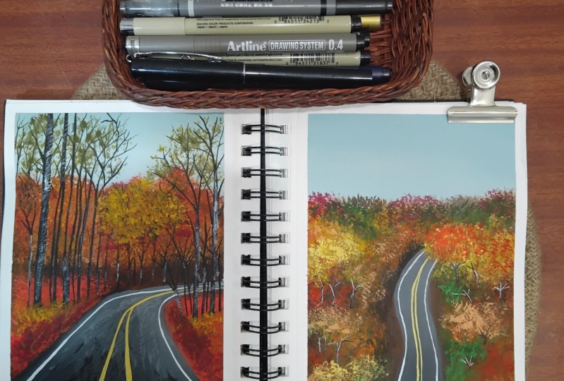
Transcripts
1. Welcome to the Class!: Autumn is nature's
way of showing us how beautiful change can be. It's that time of
the year again, when the days start
to get shorter, nights get longer, leaves change colors and the
temperature starts to drop. It is one of my
favorite seasons, but I still haven't experienced autumn and it's true
authentic form. One of my things on the
bucket list is to go on long road trips in
the season so that I can experience the
beautiful change in the shades of nature
with my own eyes. Hello everyone. My name is bile and welcome to yet another Skillshare class. I'm an artist and an art
educator based and periphery, where I take classes online and offline to help people
fall in love with art. I go by the name that's simply
aesthetic on Instagram, where I'm constantly sharing everything that's happening
in my daily life. And all my artworks
are displayed there. In this class, we
are going to go on a wonderful painting
journey together to explore some autumn inspired artworks using the
medium gouache. I love how versatile this medium is and I
cannot wait for you to try it out to paint these two
beautiful roads of autumn. Don't worry if you're a
beginner because everything in this class as
explained in real time, which means you can gathering your supplies and
paint along with me. I will also be sharing some
tips and tricks that I tend to use when I paint
using this medium. We'll start off by
knowing the right type of art supplies that you
need for this class. And then explore some really
fun gouache techniques that will help you understand
the medium vector. Once you have mastered
our gouache techniques, we'll learn how to
apply them to paint these two beautiful autumn
landscapes together. If this is something that
you resonate with us and join me in the class and
I'll see you inside.
2. Materials Used: Awesome. Let us talk about all the supplies that we
need for today's class. We will be discussing each
and everything in detail from a color palette to the
paper brushes, everything. So the first thing that I
want to talk to you guys about is the gouache paints. I'm going to use the squash beans from
Winsor and Newtons. I have a bunch of
different colors laid out in front of me. And for white, I will be using this gigantic tube
from Bruce, true, you can use any brand and this is in the shade
titanium white, which works out
surely when we are trying to tone down the
vibrancy of the colors. I have cadmium yellow, cadmium orange,
Alizarin, crimson, burnt sienna, burnt umber, sap green, Prussian
blue, and jet black. So you can use these
colors or you can find similar colors
in your palette. We have chosen very warm
colors for our autumn class. As you can see, we have all those reds,
yellows, and browns. We will be using
some shapes directly and we'll be mixing some
more colors along the way. So more on that in
the project lesson. Next, let's talk
about the paper. Over here. I'm going to use this watercolor paper from HR. This is a 300 GSM,
50% cotton paper. It's in the size A4. I will be cutting
this A4 paper into half and using that
for our class project. As you can see, one
part is missing. It's a nice textured papers
so it works out really well. Gua Sha is not very
picky with the paper. So you can use any
paper above 230 GSM. And you're good to go. Next, let's talk
about the brushes. I'm going to use a bunch
of different brushes here. But just to give
you a basic idea, I am going to use a
size 18.14 flat brush. Now I use the flat
brush for making clean base colors when
I want even blends. Next, I have three
round brushes, so I have a size
eight round brush. As you can see, the tip
is more rounded here. I use this for just
spreading out the colors. Next I have a nice
long round brush, which means that
the tip comes to a really fine point and it works out really well
for making more details. This is size six. I use a size six
brush and this size one liner brush for all my details and the
cheese and the leaves, all those details
in the branches. I tend to use those two brushes. Next I have a spoiled brush. This is literally some
brush which lost a shape, but I didn't want to throw
it away because you can get gorgeous textures
using a spoiled brush. Especially when you're trying
to paint autumn scenes. You don't want to work a lot
on the individual leaves. Then you can also use this
nice rough fan brush as well. So pick whatever is
more easier for you as foiled brush or a fan brush, whatever is convenient,
you can use that for creating the
texture of your leaves. So now that we're done
with our paints, brushes, and paper, let us discuss the other
materials that we need. I have a mixing palette. This is just a
ceramic plate that I'm using as a mixing palette. Next, I have two jars of water. One is a dirty jar of water. As you can see, I will be
using to clean my brush. And the other one is for a much more cleaner supply
when I want to make fresh colors so that my
paint doesn't get muddy. Next, I have these
kitchen towels which are thicker so it absorbs
a lot of water. You can use a cloth rag, whatever is available with you. Next, I have a
pencil and an array, an eraser, obviously
to sketch things out. And I have this masking
tape as well to secure the paper on all four
sides on this wooden boat, actually, I think
it's a clipboard. So I tend to use this
as my base because it's nice and mobile so I can
just move it around, bring it closer to
me while I paint. I tend to use this, make sure that you just
taped down the paper. Well, that is the only thing
that you have to really keep in mind other than that
we have everything sorted. So let us quickly
get started with our future lessons and discuss
some quash techniques.
3. Blending, Layering & Brush Techniques: Awesome. Let us start learning
some techniques. And before we move on to that, let me give you a quick
overview about the medium. Gouache is an opaque medium with layering capabilities
of acrylics. And it can be G wetted using water, just like watercolors. One squash is dry. It has this gorgeous
matte finish. And because of its matte finish, It's very easy to
digitize your work. And that is why a lot of illustrators and artists
prefer this medium. Because of its matte finish. Wash the darker
colors dry, lighter. Once they are completely dry, the lighter colors tend
to dry slightly darker. So that is the only thing
that we have to keep in mind. It is a very versatile
medium because it gives you the opportunity
to fix your mistake. Unlike watercolors, once
it's gone, it's gone. But with quash,
you can always go back and fix your mistakes. Don't turn the vibrancy
of our color in gouache, we tend to add white instead of water because
adding water is going to make it have a thin consistency and it starts to behave more
like watercolors. And lastly, always use freshly squeezed pin
from the tubs or tube fin you're
painting with quash and that is it for
our short overview. Alright, so let us start
with our techniques. Now I've taken my A5 paper. This is the same
paper that I'll be using for the projects. And I've colors on my palette, such as yellow, orange,
red, and white. I want to show you a bunch of different techniques that you can use to understand
gouache better. So we'll be exploring brush techniques, consistency,
blending, layering. You can also not only use
this for this class project, but it'll also help you
understand the medium and use them in your own
art, Artworks as well. So I have my brush and this
is freshly squeezed paint, as you can see, it has a nice
thick, creamy consistency. And it's thick to
a point where if I just brush over on
a textured paper, you can see that
it doesn't cover the entire papers as
smooth as you'd want. It. Toilet needs a
little bit of work. When you're working
with gouache, you want to make sure that your brush is wet
and you also have a little bit of water into your paint because when
you go over on your paper, it creates a nice, smooth blend without textures. Don't get me wrong.
That texture can be used for a lot of
different things. I use them for a lot
of different things. But when you're working
on the first few layers, It's better to add water into your pins to get a nice
milk like consistency. As you add more water
into your paint, your paint gets lighter. So you can see here
I'm using a lot of water and immediately lost its opacity and it started
acting like watercolors. You can use squash in many different forms from
different consistency. So you can have
thicker consistencies, you can have thinner
consistencies. Now, I want to
show you that when you want to get a lighter
color in gouache, you have to add white into it. So usually with watercolor is B, we're just adding
a good amount of water into the paint to
get a lighter shade. But with quash, you have to add white to it to get
a lighter shade. Each time I'm adding
more white into my mix. As you can see, it loses, loses its yellow
vibrant color and it gets into this nice muted
tone down pale yellow sheet. Here's what I've
tried to explain. This is the consistency along with how to get lighter
shades in gouache. Next, let's talk about blending. Now I've spoken a
lot about blending in a lot of my previous classes. But in this one I
want to focus more on what we will be using. This method adds for
the class project. There are two types of planning
that I want to show you, which is just the direct
color blending that we do in our milk like
consistencies. So I add a good amount
of water because that's the base layer and
I want to build on it. I'll explain more why that is the case in the larynx section. But for now, I want
to show you how you can blend two
colors together. I'm starting off with the
yellow sheet as the base, and I'll add orange at the top. Now in this section, you can either directly mix them because they
are both warm colors. It's very easy to
directly mix them. You're not gonna get
any muddy colors when you mix them
together because they are still on the same
side of the color wheel. You can just go in this left and right motion to blend the yellow and
the orange together. This is one way to do it. The other one is to just
use white in the middle while the blending is happening so that you don't
get the muddy colors. But right now we're
going to focus just on the direct
color blending, because this is the
easiest form of blending. The only thing that
you have to keep in mind is that you're going in this left and right motion and your paint and your
brush has to be wet. It has to have a
little bit of water to make the blending
process easier. Now the next type of
planning that I want to show you is with a round brush. I was using flat
brush all this while. With a round brush. I want to show you
a slightly wet on wet technique
for your gouache. Now, wet on wet
technique is definitely much more easier when it
comes to watercolors. But they can be applied in a very similar manner for
our gouache paints as well. And instead of a wetting
our paper first, overused, I'm just
applying a layer of paint. While the paint is still wet, I'm adding another
color, as you can see, because this is a nice
water-soluble medium, it's slightly blend with
the color that was wet. I'm just adding different blogs as you can see in
different sections. And as soon as I add
the other colors, It's slightly blend with the color that's next
to it that has water. Now this works really well
when you want to build on as a base for something else on which you're going to layer different textures on. Let's say you have a
tree and you want to get the base colors in so that when you add in textures
for your leaves, you can still see a hint of green in the
background without having to have a plain
dark background. I'll show you how you can use
this really fun technique. The only thing that
you have to keep in mind is that your
paint has to be wet. When you are doing this, you can add different
colors while the paint is wet and it will just slightly have
this blurred out effect. The sides are going
to be blurred out. It's not going to be exactly like what happens
with watercolors. But you still end up achieving a little bit of
glow doubt effect, which I really like when I want something in
the background. These are the two blending techniques that I
wanted to show you that we will be using
in our class project. And I'm very excited for you to see how we can apply
both of these. Let's talk about
the next technique, that is the layering technique. Now when it comes to layering, the only thing that you
have to keep in mind is that your base layer or
the previous layer that you've added should be
of a thinner consistency as compared to the
layer that you're going to add over it. Now what I mean by
that is if you have a thin layer at the
base like I'm using in this block is the
nice milk consistency that I generally tend to
use for my base colors. If you use this and add a
thicker consistency over it, chances of reactivating
the base color are going to be a lot
less because it's, it's kinda the consistency is thinner so it will not
reactivate as much. But if I were to have a really thick consistency and add a thicker
consistency over it, it will reactivate the
base color and you'll end up picking up that
shared while layering. Now the next blog
that I'm adding right here with the
red and the orange. It's of a thicker consistency, almost like a cream
like consistency. This one, when it dries, even if it's fully dry, it. When you add another
layer over it, there are chances
that you might pick up the base color and I'll
show you how that happens, which is very cool. And that is why I prefer
to have my base layers. The first layer is
going to be really nice and thin the layer over it, it's going to be
slightly thicker or of the same
consistency rather, but mostly my last few layers are of thickest consistency
and I make sure of it. Now both of these
blocks have dried. So I want to show you
how when you layer over, let's say with white on
a lighter consistency, how nicely it clears over it without
reactivating the paint. But whereas it comes
to this thicker blog, it will reactivate
it. It's very cool. Let's watch. I have taken my round brush and I'm just going to sway over, make a few different shapes, make some leaves, make some
lines, make some curves. Go ahead and make
whatever shape you want. If you see the wide stance, nice and opaque over
this section, right? You don't see orange or
yellow right below it. And this happens because my
previous layer was lighter. So if I layer over it, you want very easily reactivate the paint unless
you're going over and over in that section
a couple of times. Now the white might get
slightly toned down. So usually when I'm adding white into any over any
other darker colors, I make sure that I do two coats. Now, section in
the second block, if you see the white
doesn't stand out as much and you can still see it's reactivating the red and
there are some streaks, no matter how thick of the consistency of
white is going to be, it's still going to
slightly reactivate the red and it will turn
out to be slightly pink or even your strokes
are going to be pink. Now, it's not that
it's completely wrong and it's not
fixable at this point, it is definitely fixable. You just have to wait for
this to dry and layered over. And then it gets back to
that proper white shade. But As a personal preference, I prefer the base
layer to be lighter. So all your skies, all your base colors are
either going to be in the milk like consistency or
inconsistency slightly lighter. So that when I layer
overhead maybe four times, five times, doesn't matter. It shouldn't reactivate
the paint at the base. These are just a few things that you have to keep in mind. It also comes with
practice and you usually end up
understanding what works for you when you
keep painting regularly. Now the next thing
that I want to talk to you guys about is the
brush techniques. It is very important
to know your brush and understand the wonderful
capabilities it holds. And I'm going to
show you a couple of different brushes, flat brushes, round brushes, liner brush, and a few spoiled
brush for textures. I want to show you how you
can use these brushes to achieve beautiful strokes
and where you can use them. The first one is a flat brush. Now with a flat brush, It's very easy to apply paint evenly on a
larger surface of area. This works really
well for blending for our skies are just
adding base layers. It can be used straight
in it's flat side, it's sideways or
perpendicular to the paper. When you do that, you get thin strokes with
the flat brush. When I use it flat at 90 degrees and then use it as a vertical,
perpendicular line. I get three different
stokes, fat, slightly medium, and the thin
stroke with my flat brush. Now this also depend on the
size of your flat brush. So keep that in mind. Next I have a round brush. This one is much more rounded, and the second one is
much more pointed. Different variations. Let me show you what
you can do with your normal round brush. This one's more
rounded at the edge. With the maximum pressure
that I apply on this brush, I get a slightly thicker stroke covering a good surface area. If I apply minimum pressure, I get slightly thinner strokes. And with the lightest pressure holding it perpendicular
to the paper, I get really thin brush strokes. So it all depends on the
way that your brush looks, the shape of your brush, and the amount of pressure
that you are applying. I'll show you what
I mean by this. This is a long round brush
and it has a really thin tip. So as you can see, the end of that brush is slightly pointed. It's not as rounded
as the previous one. And I end up getting very, very thin strokes
using this brush. And this one is from
the brand Princeton. Whoops, I just ended
up dropping my brush, but I'm just going
to fix that section. I'll show you the other
liner brush next. Let's try the size one. Thin, long liner brush. By that time, I'm
just going to get rid of this paint
and get back to you. Alright? Now that I've tried to
salvage my paper somehow, let us move ahead without paying much attention
to that mess. And you have this
long round brush, which is from the brand pan art. And it gets these
really thin strokes. So usually I end up
using this brush with all the details in my trees and all the finer details
wherever I need them. So as you can see with
the maximum pressure, you get nice thin strokes and then you have the
newest drugs based on, based on different
pressure that you apply. Next, I want to show you how
you can achieve the textures for your autumn trees easily
using a spoilt brush. So I tend to use a spoilt brush, which is an old brush, and its bristles
have fanned out. So it doesn't make sense. It's not going to
retain a shape. But instead of throwing them, I like to use them for a
lot of different textures. Now, I tend to press
on it, you know what, the cleat just to make sure that the hairs all spread out. And with that, when I tap in, it creates this rough
texture, fanned out. Texture and effect for
your trees where you don't have to go on the individual
leaves and other details. So all you're doing
is just tapping. You can also vary the tapping depending on
different pressures. You, if you apply
very light pressure, you will get slightly
thinner, lesser strokes. And when you add
more, you'll get a more spread out version. Now you can do this
using a flat brush, I mean a fan brush or
spoiled brush over here, I'm using a small brush, but I'll also show you
how you can do that with your hog hair fan brush, which works are really good
in terms of the texture. Now, for my autumn trees, all the foliage section
of my autumn trees, I just tend to go around
in different colors. So I add the reds and
orange and yellow. There's not really any
exact method that I follow. I just wanted to let Ella
fall and I will vary between these yellows
and oranges and browns. So wherever in the
reference picture I see reds and oranges, I just tend to put it
depending on that. And then to layer over it, I add in the lighter colors. That's more on the layering bit. I don't want to show you that exact section
because we'll be covering that when we're doing
the class project and following the same method. Once we're done with, let's say the outer
parts of the tree. You can use your thin brush
to just make the trunk. I'm roughly making a shrunk, not exactly focusing on
the shape of the tree. So I tend to tap in, let's say the foliage section. Then draw the trunk and
the little branches that you see and then go
over and tap and again, just to cover in that branches
that we've added over so that it doesn't look like the branches just outside
and the trees are behind, the leaves are behind it. So I tap the foliage, make the trunk and the branches, and then tap over
to slightly cover those bits at the top. So that is how I
work with the trees. As you can see,
like I was saying, I take a in the lighter shade, usually adding a little bit of white to the yellows
and oranges, whatever I'm using,
step in and this way it covers those branches
that you just meet. Next, let's just try
a similar thing, similar tree using a fan brush. Now for the fan brush, it makes the process
slightly easier because what I tend to do is add in, let's say the red color
to the left side, left half, and the right color, not right color, the orange
color to the right half. This way I have two
colors on my palette, so I just turn them around. Wherever I want
to add in orange, add flip and add
orange, better add red. I flip it to the red
side and added so it's usually works really
well for dual colors. And in case you
want to save time, mostly the texture between both of them is slightly similar. I feel like with the fan
brush you get very, very, very detailed strokes
with the spoilt brush, you get slightly
fanned out effect. Which is really funny
because you think with the fan brush,
you'll get that effect. But eventually both of
them looks the same. I tend to switch between spoiled brushes and fan brushes just to add in
different textures. Mostly for the fan brush, I use as the base. And if I want to add more
details, more leaf structures, I tend to use the
spoilt brush because I feel like that gives
me more details. And just randomly added that switching between
oranges and reds. And then you can
just make the trunk again very similar
to the previous one. And that's exactly what I'll be doing in my class
project as well. Obviously, you can play
with the shape of the tree. I'm not entirely
focusing on the shape because there are
way too many trees in our class projects. I just want you guys
to have fun with this tapping method
because, you know, way too many details and information eventually
kills the fun out of what we're here for. So don't worry about getting the perfection
in your cheese. Just focus more on just
trying this technique out. Obviously, you can mask
this with a few more. Autumn paintings,
fall paintings look, look at the reference picture and see how the colors look. So it's always all about
fun and exploring. Right now I just want to
share my secrets with you and as to how I make my trees. So as you can see, it's
pretty easy, right? It was just tapping in using a spoiled brush or even a fan brush to achieve
beautiful textures. And you can add them in different
places, different ways. You can make a cheese
looked a friend. A lot of things can be done, but this is the method
that I tend to follow. To add in a little
bit of highlight, I just roughly use a thick
consistency of paint, brush it over to add
in a little bit of details to the trunk so
that they're just not flat. Of them that I just leave
this as is, this is very, very minimum detail trees that I showed you are using a fan
brush and a smaller brush. So I hope you enjoyed learning different techniques and
knowing how to use them. In your class project. We are going to combine different techniques to
make our class project. And it's gonna be so much
fun and I'm really excited to show you how each
effect is done. Make sure that you practice this just to get a little
bit of hands-on experience before you move ahead with the main class project. So I'll see you in
the next lesson.
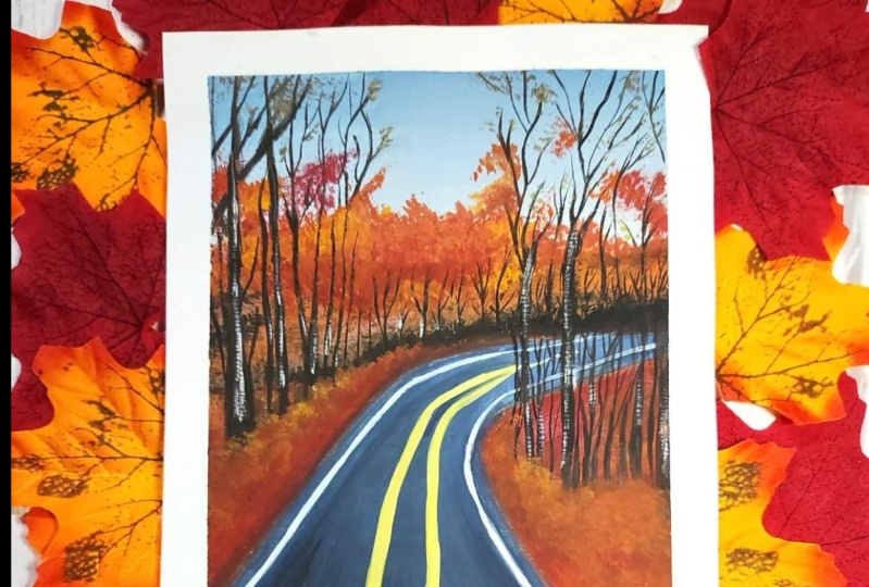
4. Project 1 Part 1 : Sketch & Background Layer: Alright, so let's start with
our first-class project. So if deep down my paper
on all four sides, this has an A5 size paper. I've got all the colors that I mentioned earlier on my palette. So I have yellow, orange, brown, black, a little bit of blue
and white on my palette. This is what we are
going to paint today. You can download the
reference picture from the resources part of the class. And we'll have this
reference picture with hue. And you can follow it along when you're making the sketch. But if you don't want to do
that, that's completely fine. I will be showing the
reference picture here. Here's my take on this painting. I did try it out before
showing how to do it. You guys, and I'm absolutely in love with
the way it has turned out. So I'm really excited to
go about this painting. Alright, so let us start
with our base sketch. As you can see,
we've got the road, right and you've got trees
on either sides of the road, turns slightly when it
reaches the center. And it comes from
two different sides. You've got the lines
coming in from two sides, leaving a little bit of
space on the left side, I'm going to make a slant line. You can scattered
dots slightly below the center of the pin people. And then you can join the line
and right at that center, make a line that is parallel to the base of the paper, right? This shows that
at that distance, the road exit turn, it's not a straight road, right? It's okay if you want
the road to be straight. But in this reference picture, the road turns towards
the right side. And that is exactly
what we want to show. For the, for the line that is coming in
from the right side, you are going to bring
in the line leaving a little bit of space on the
right side of the paper, again, slightly below the
line that you already made, right below that, leaving
some space are going to curve that curve, that section. It doesn't have to
be straight turn. It has to be slightly curved, almost like making a very
thin C shape, right? So we've got the rods in place. I'm also sketching
out the markings on the road just to give
me a rough idea, this does get covered
when we are going to paint the road,
add in degrees. It does get covered,
but it's totally fine. This just gives us a
nice idea about how the road looks.
Gotten the roads. Now that is, move,
move ahead and sketch out the other
elements that we see. If you look very carefully
on the left side, we have one chunk of
land, a slanting up. It's like a hill that you
are seeing on the side. Of course, it's endless. We're not seeing
beyond our sketch. So there's a little
slant right behind. That is a little bit of the hilly section on
which the trees lie, which is right above
that turn off the road. So Scott trees on the left, right, and in front of us. Now I'm not going to draw each and every
detail of my tree. This is just a basic sketch. Once we start painting, we add in more details. At the back, right, right behind all this
tree that you see, a hill sloping downwards. You can place that
in roughly as well. Then of course you have so many trees on the
left and right sides. You can sketch them
out or you can just leave them as is because
they get covered. And you have this
basic sketch with hue, which shows you
where the road is, where the land is, on the either side
where the leaves are. So once you're done with that, we can start painting
our artwork. Alright, so let us start
with the sky first. I'm going to use my size two
flat brush for the sky wash. I'm going to make a
mix of Prussian blue. I'm just going to
add a little bit of water into my brush, adding Prussian blue and
a little bit of black, and then lots of white. Now when you do this, you get
this very pale blue color. We want it to have a
slightly gray touch to it. And that is why
we add black into that mix so that
it looks slightly gray and makes the sky look like it does in the
autumn season, right? You don't have a lot of sun. You have a lot of
clouds because of which the sky looks just
gray and plane. So to get that color and
not make it look too gray, you can make a mix of Prussian
blue, black, and white. So let us start with
the top of the paper. I'm going to move in this
left and right stroke. If you notice the
consistency of my paint, it's not too thick. It has a very nice
milk consistency, which works really well
for background washes. A slightly thinner
consistency would work too, but you'd have to add two layers of it to make
it nice and opaque. Now, I'm going to go in this left and right motion
and slightly move downwards. And each time I move downwards, I'm going to add a little bit of white directly on
my brush and then blend it on the paper itself
with a little bit of water. The idea is to
have a gradient in the sky where you have
this greenish mix, which is darker at the top and slightly lighter
when it reaches that area of the hill that
we sketched out, right? So it's very simple. You're just moving in this
left and right motion. Unless you see or until you see a nice plane force
in the, in the sky. So a nice gradient is where
you're supposed to stop. Obviously, you can go over
again to fix your blend. But if you get a nice gradient, like it looks right now, I've got darker bits
and the lighter bits, you're going to stop
and wait for it to dry. Now that my sky is
completely dry, we're going to go ahead
and add in a base wash for all the other elements
that you see in this sketch. The road, the little sections on the either side
of it, the heel, we're going to add
some colors to all of them using our second
blending method, where you just tap in the
colors while the paint's still wet so that the edges
blend with one another. So I'm going to go
ahead and swatch out burnt sienna, burnt umber. And right now I'm not
gonna make any mix. And even if I do
is just going to be to get a darker
version of the brown. So to my burnt umber, I've added black to get a
darker value of the brown. Next we have orange just directly from the
tube swatching out. We've got a little bit
of the crimson color. This is the alizarin
crimson sheet. You can also take
another bit of yellow, but I'm not going to use
the yellow shade right now. What I'm going to do is just add a very thin
consistency of the paint. It's almost like like what? I wouldn't call it exactly water because
that'll be too thin. But it's not milky as well. It's slightly, slightly thinner than the milky
consistency that we use. Using my round brush, I'm going to start off with
the burnt sienna color. And below that, add in
little bit of burnt umber, add a little bit of black. So over here, I'm not
really thinking a lot. Alright? There's not a
lot of thought process in involved in the way
I'm adding this color. I'm just trying to add
different variations so that it just doesn't look too
dark at all places. What a little bit of orange, I want a little bit
of a warmer brown. I want a little bit of BB, let's say a darker,
deeper brown shade. And that's exactly
what I'm doing. Just playing around
with different browns. Even if you look at
the reference picture, the base that is there, it's very dark and it has
different tones to it. It's not pure black. And that is why I wanted
to play around with this little section where we add in different
colors in the base. And then of course built
over this little section, I'm doing all of this while
the paint is still wet. As you can see, the paint does not completely
blend with each other, usually, like it does
with watercolors. When you have a wet surface, you add in the paint
and paint spreads. It's not like that, but the edges really blend into one another
and it's slightly softer. And that is exactly
the look that we want. We don't want it fully blended. We just want the
edges to not visually sharp so that we
can build on this. So I'm just playing around
here with the brown, as I mentioned, little darker
browns and warmer browns. The only thing that
I'm keeping in mind is that I'm having a little bit of darker browns where I want to show a difference in
the pieces of land, let's say right above the
road where the road tones, I want it to be darker
there so that I can show the depth in
that little section. And then right above the left side where we
had two pieces of land. I want it to be darker there as well so that we can add inside the lighter colors in the section that's
right next to the road, which is closer to the observer. Other than that, feel free to just play around
in that section. So adding some
brown, some orange, some burnt sienna, burnt umber appear around
and add in the colors. The only thing that you
have to keep in mind is that you should be quicker. So don't think so much with what color
to please play around. Be quick. The idea is to have these blended edges with
one another enough, none of course, and are gonna be really pure blended edges. But of course it should
happen while the paint is still slightly wet so that the edges are not sharp and it doesn't look like
you are layering over one another and just
end up looking like one single layer because
that's the look that we need. Right now. I'm just moving on to the next section over here. I've started with a
little bit of the brown and add it in red because In the reference picture, that little section
is a lot more red. And I see a lot of different shades of
red in that section. So that is why I went with the base color as
red in that area, of course, mixed
with a little bit of orange and brown as well. So I'm again using the
same method as I did earlier to blend everything
together roughly. Just to add in a
background wash. It does go through its stages
where it looks very crazy, but it gets better when you
add in the layers over it. Alright, now we're
moving on to the section that is on the right
side of the road. So I'm using a mix of
orange and red with a little bit of red or leads
more orange over here. And I'm going to apply it on the right side of
my road and then add in the deeper
colors right next to it to show the
depth in that area. Now, we're going
to have a lot of trees coming out
from that section, and that needs to
be slightly darker. And we can achieve
that by just adding in a little bit of darker, deeper browns after we add in the orange color right
next to the road. Once we're done
with this section, while this dries, let us
make the mix for our road. So I'm going to mix
black paint with white. And I'm just directly gone into the section where I mix
the color for the sky. But the idea is to mix black, white, and a little
bit of blue together. And that will be the
color for my role. Now I'm not going
for perfection here. Like I said, this
is my base layer. I will be adding
another layer of this just to make
things look better. But I'm starting off with
this nice grayish color. And I'm moving my
brush as you can see, in the direction where
the road is, right, which means that it's slanting when I'm making my brush
movement in that exact motion. To achieve that effect, you will see that there's
almost like a line that I'm following from half of the paper I wanted
slanting towards the left. And on the right side I'm going slanted towards the right, coming to that center point. Now of course, we have
different colors for our roads to give
it that effect, where it turns, the area
that is going to turn, that section appears lighter. And the ear that's closer to the observer appears
to be darker. So we're just roughly going to place in the
colors right now. And this is just, like I said, base color. So you can achieve
this lighter gray mix by just adding white
into the paint. And brush your move your brush in the
direction of the road, like I said, to get
that nice blend. Otherwise, it will look
a little bit weird. So make sure that you are
brushing your brush over that section in the direction
of the road like I did. But again, this is
the base layer, so do not worry about
perfection once it dries, we will add another layer over this to make everything
appear much better. I'm really happy with the
way this looks right now. Of course it has stages
like I mentioned before. But trust the process after adding a couple of
more layers over this, it turns out very beautiful. And it's fairly very
simple to paint. Do trust the process. Once you're done with this, much of the background washes, you're going to wait
for this to dry. And in the next
lesson we will be adding some details
to our foliage, adding in all the fall colors. So see you in the next lesson.
5. Project 1 Part 2 : Adding Foliage Layer: Alright, now that our
base is completely dry, it's time for us to add
another layer over this, to add in the textures
that you see. For the texture, I am
going to use my fan brush, which is this nice
hog hair fan brush. It's really love. It's, the bristles
are really spread out so it creates a
beautiful texture. If you don't have
this flat brush, you can also opt for
this spawned brush, like I was mentioning earlier. You can use this brush to get in the same type of textures, but either of them will
work the same way. So pick whatever you like, switch between them as well, just see which brush helps
you get that texture. I'm going to start off with
the spoiled brush for now, and then switch to
my fan brush later. We'll have to add in different
colors in this area. And these colors have to be lighter as compared to
what you already have. Which means if you are
going to add a brown, yellow brown needs
to be lighter. Since we haven't added
a lot of orange. If you add an orange directly without adding
any white to it, it will show up and it'll be a nice warm addition
to that shade. But here I'm using a mix
of burnt sienna and white. As you can see,
it's a lot lighter. And when I use the
shade to stamp over roughly over base color, it is going to create that nice texture
of these trees that are distance which have a lot of these four leaves
on them, right? So we've got a lot of browns and oranges and yellows coming in. You're going to use this
color and start stamping. And all of that area is not
going to be the same color. So what I mean by
that is you will be switching between
these colors. So some places you'll
have the brown, some places you'll
have in the orange. And then you're just going
to go about stamping, really, adding in the texture and moving around with
the different shapes. So I'm going to switch to my fan brush now to just show you how the
texture is look, you will not notice a huge difference in the way
the texture is done out. It's very similar to your
spoilt brush as well. So again, moving around
with the different browns. Now you can look at
the reference picture to understand where to
place which browns. But honestly, I just
like to go with the flow and just move around
with oranges and browns. It doesn't really matter. You're not trying to copy, paste your reference picture, but you're just trying to
get in all the elements and try to paint it in our own way and add
in our own touch. So the idea is to have a lot of different warm
colors in the background. The only thing that you have
to keep in mind here is to not cover your base
where the road is, that little area where
we added the black. Remember, you want to make sure that you're not
covering that Asia entirely with these
lighter colors that you're going
to add over it. Now, other than that, you are free to just add in the browns and whichever
sections you want. You can add in more
white to make a, make that section slightly
more lighter and shade. Or just use y, yellows and oranges directly like I'm doing play
around with that area. There is no right or
wrong in this section. Trust me. Only keeping in mind that
that arrow that you see at the base where it
touches the road, you want to make sure
that it has lack deep color because that shows
the depth in that Asia. And in case you
have covered it by mistake or went over
with your brush stroke, you can always fix it by adding the same kind of structure and texture over that area so you can preserve that
depth that you see. I have switched to my smaller brush again to get
in some smaller textures. I'm just making sure that
the top of that slope or that hill has that nice
textured leaf effect. I've just gone ahead
and done that. And I felt like I overdid the part where it
touches the road. I'm just going to take in some dark brown shade which
is burnt umber and black. And I'm like I said, using the same
stamping method to add in the texture in that
area and that fills it, causing any extras brushstrokes
that I might have added, and then makes it appear darker. So as you can see, it
looks really, really nice. In this area. You can see a
lot of different textures. And this is a layer which is the added
over the base layers. As you can see, the Bezier
really adds to its mean, like it's the background
of that section. I also went ahead and added
some strokes in the left side because I felt like
the Brown was too much in that area and not
the depth was not. You are getting created. So I just added some brown
in that left section and the next sheet that
I'm going to mix is red. So for the left
section of the hill, if you notice in the reference
picture there's a bit of red colors that you see, right? So I'm going to go
ahead with a mix of red and orange and then switch
between these two colors. And using the stamping
method again, I'm going to add a texture. Now that we've done
with the left section, I'm going to apply a
similar kind of texture on the right side of
the road as well. Don't worry. Like I said, it goes through its phases. The second layer
that we have added, just to add the textures. And once we add the trees
and the leaves on the trees, it will add to the effect that
you want to create and add to the look of the fall
roadside, it look much better. Trust me, just just
just in the process, I'm done with the textures
on either side of the roads and that
hill in the front. So I'm just going
to stop right here. Wait for this to dry completely and I'm loving
the texture play here. It was so much fun to
just add in these stamps. So wait for this to
dry and once it dries, we are going to go ahead
and sketch out our trees. Now, this step is
obviously you can skip it, but I thought that it would
be much better to draw it out to understand the
placement of these trees. Now, the way I'm placing
these three strokes are these branches are very similar
to the reference picture. So you're going to look at
your reference picture and just sketch the tree the
way that you see it. So I hope you've downloaded the reference picture from
the resources section. So if you haven't, please do, it will give you a better idea. It will also help you
understand as to how I view my paintings, how I view a reference picture, and how I tend to
put it on paper. So if you do it
side-by-side in that way, you'll learn along with me
as well as to how to view, how to pinpoint the elements, how to sketch them out. But of course, if you
don't haven't done it, don't want to do it, it's fine. You can follow me along and
learn from this as well. I've just placed
out the trees on either sides of the road so
they are going to be taller. I said they're gonna be since they're closer to the observer, they're going to appear longer.
They're going to be tall. And that hill section at the
back where the road turns, that is going to be with
trees that are shorter. So you're going to
have that variation, show the variation in
the road in that way. So the trees that are closer to that term will appear shorter. And the ones which are still
more towards the end of the painting are
going to meet dollar almost touching the
top of the paper. Once you're done, please sing
your, your three strokes. You're going to stop and
just leave it right there. Because the idea is to not make the exact things that you see. I like to sketch them out and
give myself a basic idea. And then when I paint over it, a few things might
change her in there. Also, I'm not focusing on the tinier details
in the branches. I'm just adding them in. Some of them to understand
what it looks like. But I'm not focusing more
on the tiny, tiny details. The idea is to have the
tree sort of coming in. This you motion at
the top so that this gives that look that if
it was a spring season, it would cover it in that dome shape maybe or
slightly in the dome shape. That's why I gave that
a little bit of curve. Now once I'm done with
the sketch in the trees, I'm going to redo
my ground, my road. So why did I say ground? It's road. So I'm going to redo my road. And I'm going to use the same
colors that I used earlier, which is a mix of black
and a little bit of white, so a darker gray. That's what we'd call a darker gray at the base at
the bottom which is closer to the observer and the area where
the road turns, it's going to have a slightly lighter version of
the same color. So a little bit more white into that color is what
we're going to do. Again, make sure that
you are going with your brush in the
motion of the row, in the detection of the road, where it's going to
that center point. You want to make your
brush strokes in that way. And of course, at the tone, you are going to turn it towards the right side of the road. And again, I'm just
roughly bringing in the lighter colors
over the darker or lighter gray over
the darker green, just brushing in that
direction so that that glue is created while
preserving that blend. You want to just go
back and forth in this area so that the lighter
gray and the darker gray, they don't end up looking really awkward and just lying
over one another, right? So just make sure that
they're slightly blunted. Now I'm going with
a very darker gray, which is mostly just black with a little bit of white
and I'm brushing that from the bottom to
the top in that same going towards
the center motion. So that I create a
little bit of texture on the road using
this dark color. And then I'm just brushing it over and I'm done with this bit. So we're going to
wait for this to dry. And in the next lesson we
will be painting our trees.
6. Project 1 Part 3 : Adding Trees & Details: Alright, Once that this
section is completely dry, I'm switching to my size
six long round brush because I need finer
details in my trees. I'm going to be using
a combination of that along with my liner brush for the trunks and the little
branches that you'll see. What I feel is that
in this section, once you've added
the base textures, it's good to add in the
trees first and then go over and added more
textures for our leaves. So that works really well, so that you're not just placing the trees on top
of all the layers, but it's kind of like a sandwich of the layers for the trees. I'm going to make a mix of
burnt umber and black to get this nice dark brown shade
like I watched earlier. And this one is just a slightly more opaque
version of it. It has very little water in it. And I'm going to use this
thick consistency of paint. It's almost like a pasty
creamy consistency. And using this consistency, I'm going to start with making those branches and tree
trunks that we sketched out. This process is very time-consuming and there's
no right and wrong are just going to follow the trees
and the way that you sketched out or see in
your reference picture, they don't have to
be exact as well. You can always play
around in that area. And as you can see
in that section, when you're placing the trees on either sides of the road, the tree trunk is just
they're lying on top, right. And that is why
when you place it like this and then
go over and add in more texture in that
area of all the leaves and fallen leaves and all
the leaves on the trees. It will make that little
section look less awkward. So don't worry, it does
look like that for now, but when we add in
more layers of red, it's going to look much better. Like I said, for the trees, I do it in this middle layer because then it's like
a sandwich and you have textures behind the tree and then you'll have
textures over the tree. So you know that way it
works really well at hiding the ends of the trunk
where it meets the land. So like I mentioned earlier, the trees that are more towards left are closer to the observer, are going to be thicker, bigger because they are
closer so they appear bigger as you move towards the center
of the painting, Let's put it like that. The tree is going to appear thinner because they
are at a distance, you're going to see
less of those trees, less details of those trees. I'm just working on my
brush strokes like that. And you can see wherever I
want to make thinner lines and adding lesser pressure with my size six round brush itself. Wherever I want thicker lines, I am adding more
pressure on my brush. So in this way, it's good to know how much pressure you should be applying
on your brush. So albeit school for your brush exercises to help you get familiar
with your brush and help you understand
how much pressure is too much pressure
for your brushstrokes. So I'm done with the trees on the left side,
as you can see, we've got that nice effect of the trees towards the left
appearing bigger and thicker. And as we move, it
appears thinner. I love the look that
is coming in with the tree trunks and
I'm going to repeat the process on the left
side trees as well. And even the ones that are
behind that red piece of land, those trees are
going to be very, very thin and small because
they're at a distance, but we're still going
to be able to see them. And that is why we are drawing them because they
had slightly bigger. And we want to add in a
little bit of texture in that section with make
it appear more orange. So it has a lot
of orange leaves, yellow leaves and red leaves. So it's going to play
around with that area. And all the trees that
are towards the left, towards the right side, I'm going to make them
slightly thinner because that era sort of gets covered with the trees that
are in front of it. So it's okay if you skip in a little detail
from that section, you don't have to go all
the way towards the right. I'm just making these
vertical strokes to show that there are trees in that area in that
depth that we have tried to show with the
darker brown at the base. This entire process is just
about adding the tree trunks. As you can see, I
am not focusing so much on the individual
branches a lot. Now, if you look at
the reference picture, there are way too many
branches and the smallest, smaller ones that
are so many of them. But for now, I'm not
focusing so much on them because I want to
just place my trees first, make sure that they look
nice when they're together. And when I'm done with that, we can add more details and
textures on them later. Again, in this area, you can follow the tree that the way that you see them
in the reference picture, or follow me along and make sure that your trees have
that variation. That's how you create
that effect of depth in your painting when you just play around with the sizes
of your objects. So like I said,
the trees that are more closer to the road, like the broad road side, they're going to appear thicker, bigger and the ones that
are still moving closer to the center of the painting
are going to appear smaller. Play around with that section and add in the trees the
way that you see it. And you're good to
go with that layer. Just adding a few
little final touches with the main
branches that I see. Once this is done, I am going to let this
layer completely dry. And then over this, we will be adding on the brighter colors of
the leaves that we see. Now that this section
is dried out, it's time to whip out our fan brushes or are spoiled brushes for
some more textures. Over here I will be playing
with these two brushes, the fan brush and
the spoilt brush. And I will be adding colors
that are more brighter. What I mean by that
is that these colors are going to be more orange, more of the reds that you
see darker versions of it. I'm going to add it in that way. I'm just going to add
a little bit of water on my brush and mix it out with the red and the orange so that the red is
just not too deep. But it's like a more
vibrant version of the red. I've been using the
crimson shade here. And that is why adding
a little bit of orange makes it more vibrant is what I feel not too dark because actually
crimson is a very deep shade. Adding in a bit of orange
really brightens it up. And I'm going to go ahead and start tapping these two colors. You can also load up
some more oranges, orange shade in some sections, and some sections can
be the deeper color. The idea is to play around
with these three shades, the red, the orange, and the yellow, to add
in some more textures. Now, if you can
see very closely, I'm starting with the center of those three strokes that
I made just to show that these leaves are in front and in back in some of the smaller branches that
there might have been. So don't worry about
where you're placing it. The only thing you have to
keep in mind that is to lay around the two shades and put it somewhere
in the middle. It can be anywhere that is
somewhere in the middle. Then when you come to
the trees that you see, which we made on
that hill section where the road is turning, you're going to add and much more orange and yellow
trees and that section. You can also look at
the reference picture to understand how
the placement is. Go with the flow, look at what the
reference picture shows you and just play around. I've also made a lighter version of the color by adding in a little bit of white into
my yellow and orange mix. Like I said here, I'm not really thinking
the process through. The idea is to just add
in different colors, such as the reds, oranges, yellows, some lighter
colors and just fill in all the branches that you
made with these leaves. I'm adding in a little bit of the orange color and switching
between the Reds as well. And I've covered
the entire section of the hill bit where
the road turns. So all those tiny trees
that we made in that area covered with the orange
and the red leaves. So in this, in this section
we really just working in, in, in like a combined
layer formation. I would say we're not
waiting for any layer to completely dry before
we go ahead and add. A different color
stroke over it. The idea is to just
simultaneously do it like I showed you in
the technique lesson. It will just simultaneously tapping different
colors wherever you feel like adding
more orange to it. Wherever you feel like
adding more red to it, It's completely fine. Eventually you're painting is going to turn out beautiful. So don't really
overthink this step. Now that I'm done with all my oranges and red,
the deeper colors, I noticed that the reference
picture has a little bit of yellow trees in that section. So I am going to load my
brush with some yellow paint. I'm also going to swatch
out all the shapes that I used just in case you'd like to see there is orange red
mixture that I just swatch. So it's a nice warm
orange red color. And I'm going to load my
fan brush with that shade. And I'm going to just tap
in some controlled strokes. And by controlled
strokes, I mean, that they're not
going haywire with the texture like we were before. We're just playing
around over here. I want to be more controlled because I'm going to add this only on certain trees so you can pick the
tree that you want. I am picking the last tree in this section that's
on the right side. So just assuming what the
tree is going to look like, I'm going to tap in this
yellow paint over it. You can also go ahead and add in a few more strokes of cad, yellow on other cheese as well. Just to bring out different
colors in that area. Don't worry if you
cover go ahead and cover your tracks and your branches, that's
completely okay. And we've done it actually
in that way so that we have it cupboard and it doesn't look like it's
just standing there. If you really notice over here, you can see a huge
difference with the sandwich layer that I was talking about for the trees. It looks like they are
in front of one layer, but behind another layer. That's the perfect look
that we are going with. And I'm really happy with
the way this has turned out. You can also go ahead and tap in these lighter colors near the base of these trunks
that you made as well, so that you cover that
and it looks like it's buried beneath all
the leaves and they're all these
leaves that have fallen and covered that section. So you can easily achieve
that by tapping in these lighter colors
at the base as well. You don't have to
do it entirely. You can just make a
few strokes as well. The idea is to make sure
that you're not able to see the end of the trunk where
it lies on the surface. So you can just cover that slightly and you'd
be good to go. I'm really happy with the
way this has turned out. And I know it looks a little
bit crazy, but don't worry. In the next lesson we will be adding more details to this, fixing a few little strokes, adding in our
details to the road, everything's going
to look much better in the next lesson.
So see you there.
7. Project 1 Part 4 : Adding Final Details: Alright, now it's
time for us to add in some details
into our painting. Work more on the nitty-gritties
of our painting. I'm going to switch to my size six round brush and size one liner brush for
all these details. And we're coming back
to the mix that we made earlier using our brown
and black for the tree. So we're switching
back to the same mix. We are going to go over the area that is
covered and bring it forward because this little
section that you see the middle of the trees where I told you just stamp
in the colors. That area is forward, right? So we've got all the
beautiful leaves behind this. So the trees that are
behind that section are holding these
beautiful leaves. But the trees that are closer to the observer are much more forward and we need
to bring that in. So I'm just going to
go over that section. Repeat the brushstrokes, not coming all the way to the
bottom as you can see, I'm not coming all the way. I'm just filling in
the middle space. And I'm not doing the same
for the trees in the back. I'm just going to make
a few brushstrokes. I love how the tree
looks and that section for the tree which has
the yellow and the orange, I'm just going to make
a few branches appear. Not all the way, just a few very thin strokes because you're going
to be able to see the branch at which these leaves lie on because it's
the fall season, the trees are falling off. You're going to be
seeing those branches. So just making very
thin strokes and that Ada and bringing back, I'm bringing these cheese forward and pushing
those leaves back. Alright, so I'm really
happy with the way we have made the
trees come forward. So it's time for us to
switch to a very thin brush. I am switching to my size one liner brush because
now is the time we are going to add all the final
branches that you see. So go ahead and play
around in this section. Make tiny branches coming out of the ones that you
already sketched. These are gonna be really thin, very delicate, very light
pressure on your hands. So you can make as many as
you want in this little area. And then we'll be
adding more details and more leaf on that section. So don't worry about that. I am just going to be extending these
branches and adding in some tiny delicate twigs sized branches from
this little section. I'm really happy with the
way this looks right now. So I am using a
mixture of yellow, a little bit of yellow
and black so that the color is slightly
lighter, brown shade. And I am going to be adding
these little tabs that appear to be some tiny
leaves that are yet to fall. And they're really just brown
little dots in the cheese. So I'm just going to add in
those steps on my branches. So you'll be making some of them just using
your round brush. And then you can also
use your fan brush to add in a little more
texture in that area. So go ahead and use your long-run brush for now
to just tap in some dots. Like we've done in
our previous class, classes where we've learned
how to make these dots. But this is not more, not more free in the
way they appear. They are not really
very consolidated like the spring season paintings
that we have done before. So I really like how minimum
these steps are for now. So there's a very fine line in overdoing and
other doing this. So they're just going to
make sure that we don't overdo these little dots. And once we're done with
our long-run brush, we can also switch
our fan brush. Again, I'm adding a
little bit of water into this and slightly thinning down the consistency
because I want this to appear slightly transparent. And that is why I'm not using a thick consistency
and I'm just using my fine brush to tap this in on some of the
branches as well. Very light taps,
not overdoing this. This is just to add in radiation to the
shapes of our taps. Once we're done with this, we are going to wait for this to dry and then we'll move
on to the next step. Alright, now that
we're done with this, if you notice the trees
look really flat, right? And we want to add in
some texture to the tree. So for that, I'm just going
to switch to my round brush, my normal round brush. And I'm going to mix my white paint with a
little bit of yellow, just tiny bit of yellow. And I'm going to use a thicker consistency and
use the dry brush technique, which is basically using a
thick consistency of paint. And when you rub it across
or textured paper that we are using now it's going to create beautiful
textures on your, on your sections that
you are brushing over. I'm just using my flat brush, thick consistency of paint, getting rid of the extra pain so that my brushes slightly try by brushing over the tape
bit of my, of my paper. And then I'm just
going to add in some textures using that. So I'm assuming the lighter
bits of my trees to be on the left and the
right side of the tree. So the left trees are
on the right side. The lecture I want to add
is on the right side. And for my rights section trees I wanted on the left side. So keep that in mind and
just go ahead and use a dry brush technique to add in the textures on
all your trees. I'm really happy with the
way how adding this texture has made our trees
Bob a lot more. And when you're done with this, you're going to wait
for this layer to dry before you move
on to the next step. Alright, now that we're done with all our beautiful textures, It's time for us to
go ahead and add in some deeper darker colors
in the leaves that are on the left and right side
because I feel like there's a lot of yellow and
orange in that section. The pure to be more lighter
once it's completely dried. So I want to add in some
deeper colors in that wet. Before I go ahead and
add my road markings, I'm going to go ahead with
my brown shade mixed with a little bit of red and orange just to get a deep brown shade. I'm just going to go ahead
and brush it across and tap in some extra
textures in that area. For now, if you notice, the road looks like
a separate bit and these little left
and right sections look like a separate bit. To make it appear as
one blended section, I'm just going to wet my brush and just brush it
across the edges of these two layers together so that this slightly
blend into one another, creating a smooth transition. Alright, now that we're
done with this section, it's time for us to
add our road markings. And I'm going to do
that by switching to my liner brush because it gives me really fine detail lines. And I'm going to use
a mix of just white for the markings on the left
and right sides of the road. And for the center of the road, I am going to be
using a yellow color. Using my white mix, I am carefully going
to draw the line, leaving a little
bit of gray space. You want to make sure
that you're leaving that little space where
it blends with the brown, not exactly at the edge or
the border where they were. Both of these columns intersect. You want to leave a
little bit of gray space. The other thing that you have to keep in mind when you are making these markings are that the section that is
closer to the observer, the marking is going to
appear bigger in that area. And as you go away
from the observer, your marking is going
to become thinner. So that is why you
have to work on the control of the
pressure on your brush. And also make sure that you don't have
a very thick brush. Because if you read the
section where the road turns, you might end up making
a line that is thicker. So be very patient
and controlled. In this section, you're going to make this line on the left side. You're going to repeat that line again on the right side as well. You can move your
board around to make it comfortable for
you as much as possible. Again, leaving some gray space. Be very controlled and be
very slow in this process. Another thing that you
have to keep in mind is to follow the way or road. Looks. Rice, your road is
going to move and turn in the same way
that your markings are. So make sure that
you are slowing the process and also keeping in mind the way that
your road is turning. Alright, now before I go ahead and add in
the center lines, I want to add in a little
more texture to my road. And I'm going to
achieve that by using black paint and the
dry brush technique. I am going to just make
sure that my brush is dry and I'm not loading
up a lot of paint. If you think you
have extra paint, you can always brush it on
the sides where the tape is to get rid of it or
on your tissue cloth. And just use a little
bit of paint on your brush to get this
nice texture on your road. As you can see, my brush
movements are again, keeping in mind that there's a point where the
road is turning. So all my brush strokes
are going to be that way. When you reach that area
where the lighter gray is, I'm going to switch to
a smaller sized brush. Again, following the
dry brush technique, I am going to add in some
texture using that brush. If you ever feel like you've
added way too much paint, you can always brush it or
blended out if it's too much. Because gouache is very
forgiving that way. So all you have to do is in this section is to
add in some textures. Once you're done with
this, you're going to wait for this to dry and then we'll go ahead and add the markings in the
center of our road. Alright, so now that my
layer is completely dry, I am just going to
go ahead and draw the center line of my
road once with pencil so that it's easy for
me to just make the lines when I'm painting them and I'm
not making any mistakes, so use a pencil and draw them. Again. These two lines are going to be further apart when they are
closer to the observer. And as it moves away, it's going to somewhat appear as one single line
because you're not going to see these two lines as two different lines
from that distance. The color that I
will be using is going to be a mix of
white and yellow. You can add in a little bit
of orange there as well. Basically, it's a nice
light yellow shade that we are going with. Once you are done
with your blend, you are going to
go ahead and start making the center
line for your road. I always tend to start off with thin lines first
before I go ahead and add in a thicker
section of that line because I feel like I'm in
control in that section. Otherwise, if I mess up, then I'll have to live
with that size of line and it's an entire
process to fix it. So make sure that you're
making thinner lines force. You can always go ahead
and go over that area again just to make sure that your line is thicker
in that area. So I've made these two lines further apart as you can see, and as they reach that point
where the road is turning, they appear to be one single line because
they are at a distance. And once I am done with
that size of line, it's time for me to
carefully just make them slightly thicker
on both the sides. Again. Right now you are in the liberty to make it as thick as you want. The only thing is that
it should become thinner when it reaches that
section or that point. So that is the only thing
that you have to keep in mind when you are making
your road markings. Alright, so I'm
really happy with the way our painting
looks right now. So just go back and
have a look at it. If there's anything that you feel that you want to change, you can always go ahead
and fix it at this point. Maybe add in a few
extra branches are some fuel leaves that you
think might look good. Now's the time to fix it. I feel that in my painting, in the right side, sorry, the left side of the
trees have a little less red as compared to what you can see in
the reference picture. And I wanted to appear
much, much warmer. So I've gone ahead and tap, done a little bit off
those red leaves. They will get
lighter as they dry. And that is why, you know, it looks really big right
now on dark right now, but it does get lighter once you let it dry for some time. This is it. I really like the
way this looks right now. We'll let it dry completely
before pulling the tape. Alright, now for
our favorite bar, that is the tape peel makes
sure that you're peeling away from the paper so that you
don't tear your painting. And I really loved
this process because your painting look so beautiful
with those white borders. Alright, so here's
a final painting. I am so happy with the
way this has turned out. Before we go ahead and
have a closer look at it, take a white pen or a marker
and sign your name at the bottom of the
painting because this is such a special
moment for us. Alright, so here's a closer
look at our painting. I love the texture play
in this, in this artwork, those trees, texture
on the trunk, the leaves, everything,
texture on the road. Everything is so, so beautiful. And I hope you enjoyed
painting project one with me. I'm really excited to show you project to see you
in the next lesson.
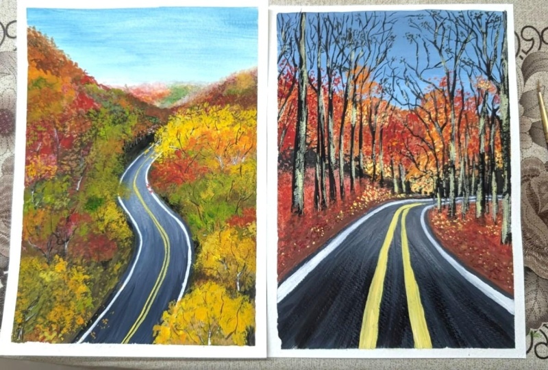
8. Project 2 Part 1 : Sketch & Background Layer: All right, Welcome to
Project Two of this class. I've taken my A5 paper
and taped it down on all four sides and also taking the colors
out on my palette. I've added green as an extra color compared
to the previous palette. Colors that we had agreements. The only shade that's sort
of added into that list. But again, all the other
browns and orange-yellow that I mentioned
is on my palette. And for today's project, we are going to be painting this aerial view of
beautiful autumn road. And I love, love, love this picture so much. I mean, look at those
greens, orange, red lake. Name, the warm color. And you will find
it in this picture. Now, it's so beautiful that I am actually excited to take you on this journey to
paint this artwork. I hope it turns out
exactly the way that I envision it in my mind. But let's, let's go ahead
and do this together. I did try it out. And over here there were a
few changes that I wanted to make based on the
colors that you see, but let's try and
give it another go for the main class project. So the first thing that
we are going to do is create our sketch, right? You're going to look at
the reference picture. I have put the reference
picture on the left side. You can also download it
from the project section, projects and resources section. You can download
it. And right now, our elements are the
main focus of our, of our painting is going to be placing where the mountain or the hills are and also the road. Other than that, anything
that you see in this, in this reference
picture is going to just be a process that we are going to
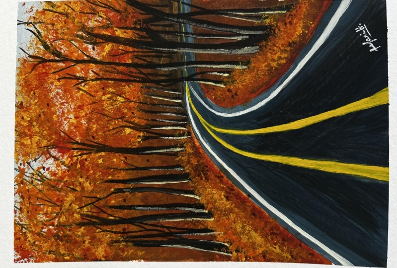
weighing along the way. So you can see that the road
is not straight here, right? The road is like
this nice swaying. It's going through
its twists and turns. I wouldn't say twice,
but definitely done. So it's almost like an
S shape that you see. Of course the S is not
exactly like that, but it's more bent at the top. And then the road comes in from the bottom and then just slightly deviate
towards the right side. So that's what we're
going to place. You are going to look at
the reference picture and place it the exact same way. Now, unlike our
previous class project, we are not going to
focus so much on expanding the area that's closer to the observer
because this, this picture is
taken from a height. Of course it's an aerial view. So things are a
little different. And the way we approach this, this reference picture
and this painting is going to be
slightly different. But of course, all
our texture play is going to be very similar. I'm just roughly
sketching out In what way I would want
my trees to look like. Now, this is, again, not a compulsion because this little section gets covered entirely
with our paints, so it does not really matter. But again, I feel
like sketching it out once gives you a clearer idea of how you would want
to place things. If you look closely at
the reference picture, there are only a few trunks
and branches that you see. Other than that,
everything that is that is visible to your eyes are just beautiful colors
of these autumn leaves. Very few branches are going
to be visible to you. So you're going to
try and achieve this full volume
units, autumn tree. Look into our painting. I'm really happy
with the sketch. It was very simple,
not very complicated. So let us go ahead
and start painting. Let us start off with
the color of the sky. So I'm going to use my flat
brush because it's much more convenient to use
a flat brush for these background
washes for the sky. So I'm going to mix a
little bit of white on my palette along with
a tiny bit of blue. Casey, the way I pick my blue, it's just tiny bit. I'm also going to add
in a little bit of black into it to
get that bluish, grayish color for the sky. If you notice in the
reference picture, the sky is very pale. It's almost like a
foggy, misty look. And to achieve that, you get this beautiful
shade that we need for this guy using a mix of
blue, white, and black. So I'm going to start off by applying that at the
top of my painting. It's going in this
left and right motion. And each time I come down, I'm going to add in a
little bit of white to slightly lighten the
color for the sky. I don't want it
to be just plain, but a nice gradient wash with this gray shades to achieve
the lighter gray color, I just have to add
in a little bit of white into my painting. Alright, so you're always
going to keep in mind that you're going to move in
this left and right motion. And that helps you achieve that nice gradient wash
that we need for this guy. And I'm really
happy with the way the sky looks right now. So let's wait for it to dry. And then we'll move
on to the next step. Alright, my sky here
is completely dry. So now the first thing
that we're going to do is go in sections. So if you notice the area that is further most away
from the observer, they're going to start
off with that first. Now to achieve that misty look along with the
colors in the sky, I am going to start off with
the white pale color first. So I'm going to switch to
my round brush over here and we're going to
apply that wet on wet, I would say blending method where you have a little bit of the wet paint and you're
going to add in paint over the area in that section where the
paint is still wet. When you do that, it just
slightly blends in and just roughly create
that blended look. And that is exactly
what we need. We need a slightly blended look. Now I'm going to play around
with the colors over here. Watch me carefully add
white at the top because that's the area that is going
to appear much more misty. And then while the
paint is still wet, I'm adding these
vertical strokes which depict the far of foliage. In that section, you're going to see a
little bit of green, a little bit of red, a
little bit of orange. So all those colors that
are on your palette, just make sure that you're
adding a little bit of white in water and white into it and then
just adding it in carefully. If you ever feel like
you've added too much, you can always just use a
clean brush to blend it out. Your paint in this section
is going to be slightly wet so you have the time and the liberty to just
mix it around, blended around without
making it look too harsh. Now, if you notice very
carefully the colors are very pale and that's exactly
what we need to get. That nice, foggy, misty
look into this area, into this section that you see. This little section
actually just comes in with what's in your
mind in the moment. Now, I would like to tell you that do add green or add red
here and add orange here. But that is not exactly what, what's going on in my head. I am just looking at the
reference picture and I've assumed that there's
some green, yellow, red, blue, brown, whatever,
wherever the warm, fully autumn leaf colors are. I'm just adding that in, blending it out
just so that they are evenly spread around. And I'm just blending
them slightly with one another to get
this nice, misty look. I'm really happy with the
way it looks right now. So I'm going to wait
for this to dry. Once it's dry, as you can
see, it's completely dry. The colors, some
colors got darker, some colors got lighter. And that's exactly what we need for it to have
that little variation. Now we're moving onto
the next section. This little section, again, we're going to repeat the same
step that we did earlier. You're going to have a little
bit of brown in this area. Instead of going
ahead with white, I am moving on with a
little bit of brown, adding in a little
bit of yellow, again, doing all of this
while the paint is still wet so that it's slightly
blend with one another. So I'm going to play
around with yellow. I'm going to play
around with brown. I'm going to play around
with a little bit of orange. So like I said in this section, I'm not really
thinking it through. If you look at the
reference picture, you will see there are
some blue blob of blue, green blogs, some yellow blobs. Some, it's almost like
a tongue twister. So this has got some
different blobs of colors. So this acts as the leaves and the foliage of that
little area that you see. And other than that, it's all just texture
play and all of that. I'm just, as you can see, adding in different
colors and trying to get them to slightly merge
into one another. This can be achieved easily
when your paint is still wet. So I don't have to you
don't have to worry about cleaning your brush completely before moving on
with the next color. You can always just
wipe it off and just lift off another
color and add it in. Once I had the base color or the base layer in while
the paint was still wet. Now I can add an blobs of
color, which with that, I mean that I can add in
some red and then mix it around and some
green mix it around, adding some yellow
mix it around. Again, repeating
the process that we did earlier in that
section. Over here. If you notice, I didn't add a lot of white because I didn't want the entire section
or the entire area to be misty or leave
the top part and the left part of it is going to have that slight
misty effect. Other than that, I
want the desktop, the area to have that
nice vibrancy and for it to not be really pale like the area that you see behind it. Now what happens when
you do it this way? You create depth into your
painting where you can easily see that the pill section is further away
from the observer. And then this little section, this point of focus
is still closer. So it has some missed
around that area, but not all the way to the
bottom that you can see. I've gone ahead and
added some yellow. Again, just playing
around with colors. Don't limit yourself to
the colors that I'm using. V know the warm colors. So just go ahead and
play around with it. Make tiny strokes, making some textures also,
if you'd like, once you're happy
with the way it looks like I am right now, you are going to stop and
let it completely dry. And in the next
lesson we will be adding our background wash. So see you there.
9. Project 2 Part 2 : Painting the Base Layer: Alright, so let us start adding the colors of the areas
that we have left, starting off with the road, the first thing that I
want to cover is the road. So I'm going to start off
with the slight creek, Carlos, very similar to the
one that we use for the sky. And in the same mix, I'm going to add
in a little bit of black to make the gray pop
out a little bit more. And I want to start off with
the section in the road. Don't worry if you go beyond
There's no end for it. We're going to fill that
in with a tree texture, so don't worry about it. I want to start off with the lighter gray
color from the top. And then at the bottom, we're going to have
some darker gray. This is how we'll be bringing in the variation in the road. We're going to have darker
gray at the bottom, let's call it bottom half, and it will transition into
the lighter gray bits. Now, this part can be slightly tricky because
it's going to take you some time to achieve that nice blend of the
light gray and dark gray. Why I am saying that is because in this
little section what happens is that since
the road turns, it might be tricky in, in getting that nice blend, but don't worry about it now, that is something that we
will fixed together and get a nice blend in that section together later in this lesson. Now that we have
the color for the, for the road and space
and it's completely dry. We are going to go ahead and
add in the background wash for the remaining sections
on either sides of the road. Now if you look very carefully, I just don't want to add in a flat black wash for
the background color. I want it to have
different colors like in the previous
class project. So that when you go ahead
and add in textures over it, it stands out better. It looks like it has that
nice undertone effect to it. So I'm starting off
with burnt umber. And I've added burnt
umber in the side. And then right where the
section meets the road, I'm just using green and the same with the same
brush, flat brush. I'm just tapping it in with
the green and blending it in. And then again switching
to my brown and just playing around
in that section. You can also switch to a round brush and do the
same process. Over here. I am just going to tap in
different sections where now I'm using burnt sienna
to add in that color. The only thing that
I will be keeping in mind in this area
is where the road meets the land on the either side where the trees are going to be that section. I want that little
brim to be slightly darker because I want to show
the effect of the shadows. The trees are going to cost
that shadow in that section, so it's going to appear darker. Other than that, feel free to play around
with the colors. Feel free to play around
with the different greens, different browns, and
just mix them together. I'm going to switch to
my round brush. For now. I'm going to go ahead and again, add in a little bit of
the burnt sienna color. And as you can see, I'm
just mixing it around. Loading my brush up
with some green, again, repeating the process, playing around with different colors. Now that I've added
in all my colors, I am going to go ahead
and make the top bit of the section appear
slightly foggy and Miss D. So we'll go ahead and
load my brush with some white and then
tap it at the top while the paint is still wet
and slightly blend it out. Doesn't have to be perfect. This is just the base layer. So don't worry, go ahead and add a little bit of white
to get that slight, slight little, little
bit of the misty look. You can also go ahead and add in some darker colors
wherever you feel. Like I said, the
darker bits are only going to be more important in the area that is
ching, the road side. Other than that, feel free to slightly play around
with the colors. It doesn't matter. I'm also going to
add in a little more black and burnt sienna, burnt umber mixed
in the end where I want to show that this
section is more dense. So I'm just going to add
that in on the left side. Again, not a problem if you don't do it the exact same way. Now that I'm done with the land that's on the left
side of the road. Let's go ahead and repeat the same process on the right
side of the road as well. Starting off with
the brown color, if you look very closely
at the reference picture. Vc up a good amount
of land in this area, which means that ground
the plane surface. And then a lot of different
leaves of course, from top, I'm just adding a little
bit of green in that ADR to show different variations
and not just brown. I wanted to show a
little bit of green. I went ahead and just add the green on the sides of the road, and then again, adding in some more darker colors to
show the depth in my trees. Now, one thing you must have
noticed is the way I add my paint is not in one
particular brush stroke. And it almost looks
like little chunks, I would say, right? It looks like different blocks, different surfaces,
different sections. And I'm doing that
because I want my trees when I added the textures to look
like different trees, either all different trees. And that is why if you
just blend the colors out in the flat form and
that we do for the sky. It is not going to bring
out that same effect. If you notice once this
left side, Let's take e.g. when it's trying, there
are certain bits that are darker and certain bits
that are drying lighter. And that's exactly
the way I wanted this way when I add in the textures
and other layers over it, it is going to appear
much more better and much more denser and
follow athletes some orange, green, and yellow
at the top width as you can see now we've got the
entire section covered out. We figured out where
the land is and where the trees are going to be, and where the darker
bits are going to be, almost sort of figured out. I wouldn't say completely. If you also notice on
the right side section, you can almost see
which tree is where. That is exactly
the way I wanted. And we're going to wait for
this to completely dry. Alright, now that my
section is completely dry, my paper is completely dry. We can go ahead and
play around with the road a little bit and add in some cool textures on it. You're going to start off
with a lighter gray color and the darker
gray color, again, make that mix and you don't
have to get the exact shade. This is, this is your moment. You can fix things getting
a darker gray color or a lighter gray color depending on what you want the
road to look like. I want the top of my road where the turn is to be lighter, to appear lighter section
which is at the bottom half, I would say to appear darker. Now over here the
trick is to just get that nice blend
and also add in a little bit of shadow towards
the left side of the road. So I am just going to play
around in this section. To be very honest with you. I felt like because of the turn, the blending process is
going to be slightly tricky. I have a feeling that
it might be tricky, but I'm pretty confident in you guys if you're gonna
do it really well. The only thing to keep in mind is you're going to go up,
you're going to come down. There are chances
that the light gray is gonna be more
overpowering and sometimes darker
gray is going to be more overpowering.
But don't worry. The idea is to just get a nice blend in those two lighter gray
and dark gray color. Once you're done with that, obviously adding in the
textures is not that difficult. The only other thing
that I have to keep in mind is to blend them and adding a tiny bit of shadow in
the left side of the road. Now you can switch
between brushes. You can switch between flat
brushes and our brushes to find out whatever
is convenient for you. I am really happy with the way the blend is coming
out in the section. You've gotten the
darker bits for the bottom part of my road. And of course, the
lighter gray color at the top where
I want it to be. I'm just gonna go
ahead and give it that one final smooth blend
movement with my brush. Then I'm going to
go ahead and load up some darker gray color, almost very close to black. And I'm going to apply
it from the bottom and move it along the
shape of my road. Remember, it's very
important to move along the shape of your fraud. Then again, just blending a
few things here and there to make that nice smooth
transition between the colors. And I'm actually
this, at this moment, I would say that I'm happy with the way the way the road looks. We're going to wait
for this to dry. And in the next
lesson we will be adding in all the
details to our trees.
10. Project 2 Part 3 : Adding Foliage Texture: All right, before we go ahead and add the details
to our trees, let us go ahead and add the
road markings. For that. I'm going to be using my
size one liner brush, which is a really
nice thin brush. You can use a thinner
brush if you'd like. We need to get really
thin lines and this one because the road is
from an aerial view. So I'm going to load my
brush with some white quash. I'm carefully going
to go ahead and make the lines along the road. You're going to follow the shape of the road that you have. Make sure that you are leaving
in a little bit of space, little bit of gray area, not going over the line where the ground bit
touches the road. So make sure that you
leave in a little bit of gray space and carefully follow the shape of the
road and paint over it. If you are not confident with just going with
the flow for now. You can also go ahead
and sketch it out once using a pencil and then
go over that area. Just to give you that
little confidence that you can do this
without any mistake whenever it comes to adding very straight lines and where
you have to really focus. Sometimes we tend to overthink that process
and end up messing up. So in case you feel a little bit scared
to make them move, then always, it's easier to
sketch it out with a pencil. So I've added those two
lines, as you can see, following the shape of my road
to the way the road turns, I'm just going to turn my
markings on the road in the same way that the lines at the bottom
are slightly thicker. And as we go towards the top, since that eta is
still further away from the point of where
the picture is taken. So make sure that
the lines are just slightly thicker as
compared to the top. For the markings in the
center of the road, I'm going to make a mix of yellow along with a
little bit of white. So I'm going to get this
nice pale yellow shade. And using this pale yellow shade will be making the markings. Again. Over here
you're going to have two parallel lines next to each other in the
middle of the road. For this unit we very controlled
with your brush, okay? So if you're not confident here, he can sketch it out first, make sure that it is in
the middle of the road before you go ahead and
start making the lines. If you notice very carefully, I am very gentle with my brush. Very, very minimal
pressure is being applied. I'm barely even
touching my brush. I mean, I am
touching my brush on the paper and that is why I'm able to create
the brush stroke, but I'm barely applying any pressure if I were to
put it in those words. So I'm going to go ahead and
make very thin lines first, this gives me the confidence
that the lines look good. And then I can go
ahead and slightly thicken the ones that
are in the bottom half. Because of course that
area is slightly closer to the observer as compared to the area
that is at the top. Going to make,
going to be making two parallel lines very
close to one another. So again, very, very gentle. Be concentrating this point. Very slow movement
with your hands, you can make smaller,
smaller brushstrokes. And in the era that is
in the bottom half, you can show that the lines are still much more apart as compared to the
lines at the top. They can sort of merge
into one another because we want to show
the depth in the painting. And we can achieve that
by just making the lines likely appear like they're
merged into one another. So go ahead and make
these two parallel lines. If you look very carefully. At the second tone, I have made my lines appear like they have
merged into one. But other than that, like those, that S curve that you see, you can still see those
two thin parallel lines. So I'm really happy
with the way the marking on my road looks. Now. I just want to blend out the road and the
ground bit together. Right now there's a bit of
white spaces in between. So I can fix that by just
loading my brush with a little bit off diluted black. I would say it's a
very thin consistency or very light wash. I'm going to take
that and then do it up with some water
and that shade and even some brown and just blend those two edges together so that this slightly merge
into one another. Again, using the same brush, I can easily blend those two
colors with one another. And since gouache can be
reactivated once it's dry, this works out really well
when you want to smoothen out the edges and not
have any sharp edges. So I'm really happy
with the way the slugs. And once everything dries, it's time for us to add
the texture to our trees. Before we go ahead and
add in the textures, I'm going to just
roughly sketch out some branches and some trunks. In the deeper parts of
my foliage section. I'm just going to make
some branches so that I know that this section
needs to be avoided at avoided as in
that I don't want to add in a lot of
texture in this area because I want to show
the branches and have them be in the
picture rather than everything looking just
crazy with a lot of leaves. So that is why I'm sketching this end so that I know, okay, this is the area where I want
to avoid a lot of texture. And the ways in which
I'm adding this as very similar to the
reference picture. The reference picture,
you will notice that there are some
branches that you see, but they're very few. And you don't have to worry
about placing them in the exact exact location. He can still play around and
just move things around. That is completely okay. I am also going
to make sure that the tone at the top has a bit of darkness because I feel it's
too light and I want to show that dense density of
the trees in that area. So I'll be adding all of that and I'll show you
how you can do that. But for right now
I've just sketched out the trees and then
we're going to go ahead and play around with
a lot of different colors. In the previous class project, we played around a lot of
orange and a lot of red. But in this one we are
going to have a lot of yellow and green as well. Some starting off with
a light brown shade, which is a mix of burnt
sienna and white. I'm using my spoilt brush. I'm just going to
tap in the texture. And to be very honest with you, you are free to move around with the textures and
the colors, right? So don't worry about placing the colors in the
exact order that I am. I am just actually having fun here and adding this texture is one of my favorite ways to achieve these beautiful
autumn trees. I have tried so many
Class Projects, played around with so
many class projects to get in different textures. And I think this works
out really well. So go ahead and
enjoy the process. Don't think too much. The idea is to have a lot
of greens, yellow, orange. So just play around
in the section. We add the background color. So you can also color
coordinate and add green over the green area are
slightly brown age or you can add that wherever you
see a little bit of yellow, go ahead and add a
lighter yellow over it. Where you see orange. Add an orange. You can add in some red,
some deeper browns. And sexually enjoyed the process of tapping in the colors. I'm also switching
between a little bit of Fred and adding in some yellow. Sometimes if you've
had a lighter brown, so the browser is
not going to show up so much, but nobody. We are going to be
playing around and adding another layer over
this just to make everything a pure,
much more prominent. So this is just the base
layer for the texture. When it comes to the area where I had sketched out the cheese, you can notice that I am tapping in the textures
on that just to show that it's a part
of the tree and it appears as a whole tree. So that I leave in that
little bit of space where I can paint the trunks liter. So I'm switching to
my fan brush now because I sometimes enjoy
the Texas is a fan brush a little bit more when I
want some dense so strokes because they're very
close to one another when you work with a fan brush. So I'm just going to
switch to my fan brush and then repeat the process
of adding in the texture. You can also add a nice
light consistency of the paint where
it's not to take. Once it dries, it'll
dry out really nice and then you can layer over it
to get in more textures. But again, the process is
very interpretative and it's just all about having
fun and not thinking so much. If you notice, another
thing that I'll tell you is that I am not going all the
way to the road. Right? You'll notice that I've
left the road space because I want to show that
that's plain ground. Let's call it playing ground. And the trees are slightly
away from the road, is not exactly at the edge where the ground meets
the road section. There's a little bit of space, little bit of ground space. And only next to
that are the trees. So you can achieve that by
just leaving in that area. One more thing
that you'll notice is as the paint is drying, it's getting lighter, right? The green that I applied
got lighter than it looked when I had just
made those strokes. So remember that sometimes
the paint dries out lighter. So don't worry about
it, Just wait for it to dry to see how it looks. And they can work on the
texture as according to that. But I'm really happy with
the way this is turning out. You've got a bit of Fred, a bit of orange, green, lot of different color
plays happening. And if you look at the
reference picture as well, there are a lot of different
colors in it as well. It's not just browns or if it's not just
orange and yellow. You've got trees of
every shade that you can imagine in the picture. And it's just a
breathtaking view, right? So go ahead and play around in this section
adding cheese, where you would want green. Go ahead and add green, really just don't focus a lot in the perfectionism
of this section. Alright, so I'm done with
the trees on the left side. So while it dries, I will switch towards the ground space that
is on the right side, and then add in textures
in that area as well. In this area is
likely want to show more details and emphasis
on the color yellow and orange only in this area because in the
reference picture that's a lot of yellow colors and green orange colors
in this section. So I'm just going to
focus more than that. And even in the background
we had add those colors, it works out really well. So I started off with yellow, the mirror mix of
yellow and orange. And right below that I
will be adding brown. This way there's a little bit
of density that's created, a level of contrast
that's created. It shows the depth in, in the trees and it shows
the lighter bits and of course the darker
bits and the bits that are under three mode, or whether you have the
shadows and all of that. So I'm just going to add in
the textures based on that, where when I just tap in, you can see the
yellow, the orange, and of course the brown bits. And then switching
to my green color, I'm going to be adding
some green trees. Again, playing around with the textures and different
colors of autumn. Right at the corners,
right corners. I want to have some
yellow and orange trees. So that is why I've loaded my brush with some
yellow and orange. And I'm just going
to tap in some trees make it appear much more
denser and Fuller in that section because this eta is still slightly closer
to the observer. So we're going to add
in the trees based on that and just look how
beautiful it looks, right? There are some
obviously certain steps that are still remaining, but I'm so happy with the
way this looks so colorful. And we've added in
so many textures so easily just using a fan
brush and a spoiled brush. And I'm just going to
enjoy this process and add in some taps
with my light color, this nice yellow, orange, greenish color at the base where I have not
added the texture. So this just shows
the leaves and that areas and fallen leaves. So I'm just going to brush it across to create some textures, not so much because
don't overdo this because it's very easy to just tap in and make
something look viewed. So yeah, I'm really happy with the way this
has turned out now, so I'm just going to let it dry and then we'll move
on to the next step. Alright, now that we're
done with this section, it's time for us to add in those strengths
and those branches that I was talking about. So I'm going to
create a dark mix of black and burnt umber so that the sheet is really nice
and dark reviews this shade in our tree trunks of the
previous class project, It's just the same color. I don't want to use
black directly. So that is why I've made
this dark brown mix. By mixing burnt umber
and a tiny bit of black. I'm going to go ahead
and just go over the section which I sketched in case you are confused
where your sketches, of course, go ahead
and feel free to just make that sketch again. So you're just going to go ahead and add
in these branches, if you notice
they're really tiny. The very few details, but adding this detail really
adds up to your painting. It gives you the view at which your leaves are
lying upon rights. It's not just little
different blobs of colors, but they are resting. They are part of a tree, the leaves of a particular tree. So you just want to
slightly show that. And if I know in this section it looks
a little bit awkward, but once we are done
with this layer, we will be adding in
some more textures on our leaves so that
it comes over this, over these little branches
that we sketched out. Right at the top, I've
made the trunks and I'm just going to load my brush with a light wash of the black color. And I'm just going
to blend it out using water as you can see. This way, I can create a nice, dense look for that area. If you ever feel that
you overdid something, you can always load
your brush with some water and
lifted off as well. Right now, it again, like I said, it might look a little bit weird,
but don't worry, when we add in textures
over this section, it will appear to
be much better. I've added a few little
details of the trees and the left side doing the same
on the right side as well. Adding in some details
for the branches. Very thin brush strokes. You don't have to do
the entire section. You can just add in some
floating ones as well. Doesn't have to be a whole tree. Just a few strokes to show that, okay, this is a branch, this is at which the tree is going to have its leaves upon. So that is the basic idea
that we are going with. Alright, so I'm
really happy with the way the branches
look right now. So I'm just going to go ahead
and add in some textures to the trunks using white paint. Again, you can add a little
bit of brown into this, but using my thin brush, the dry brush method, I am going to just add in
a little bit of texture. It doesn't have to
be the whole thing. It's just a little
bit of texture to add in the
highlights to my trees. Very few brushstrokes,
you didn't have to cover the entire
branch or the trunk. Just brush it over and that will add to the highlights of
the branches that you see. If at all you feel that you've
overdone with the white, you can always go ahead and load your brush with the
darker color and brush it across so
that you'll cover any extra white
paint that you have. So it's a very
workable in that way. You can always play around and just see whatever works for you. This is it for this lesson. In the next lesson, we will be adding final
details to our painting.
11. Project 2 Part 4 : Adding Final Details: Alright, now that our base
layer is completely dry, it's time for us to switch
to our spoilt brush and we are going to go ahead and add in some more textures. I'm going to start off
with the yellow color, the orange color,
and the green color. So all of these colors
are going to be what we use for
stamping in the sheets. So starting off with the yellow, we are going to go
ahead and add in some textures play around. Make your CI appear more fluffy with these gorgeous
colors of autumn. So I'm going to start off
slow, start off small. Then as I move around, I'm just going to switch
to the different shades. I'm not going to really work on cleaning my brush here because it's okay to have a little bit of green and yellow together. You're just going
to work in that, in that form itself. You don't have to
clean your brushes. Right now. If you notice that
when I add in the texture, it stands out even more as
compared to the previous one. Because over here when
you add in the texture, it acts as another layer. And plus it stands out even more because the base
layer is completely dry. So this way the trees
appear much more fuller. So whenever you're working
on trees of autumn, to be, to be precise on the subject, you're working on
trees with autumn. You want to make sure
that you are working in at least 32 to three layers, like we had the base layer. Then we add another
layer of red, and then we added another layer. So this is going to work around indifferent layers to make
your tree stand out even more. Make it appear Dan. So without having to really work hard in
just a single layer. And in such paintings, layering is literally
everything. So once you master layering, you can break down a
particular painting into different parts and
then work with it. For an example, if
I were to tell you that I showed you this
picture and I said, You know what, this is,
what we are going to paint. If you had no clue as to how to go about it if you
didn't think it through, if you didn't know that, Okay, there are different parts
in which you make it work. You'd be really confused. How how did we get this
effect as to how did we make the trunk and the branches
be as a sandwich layer? Or how is the base color very similar to the textures
that we are adding over it? At the same time,
completely different. So it's all about when you
look at a reference picture, it's all about breaking it
down in different forms, in different bits and then
working our way through it. Now if you notice when
you add in the textures, it stands out even
more and it looks like a fluffy tree with beautiful,
gorgeous autumn leaves. I've also added some
strokes on the road, very small, tiny brush strokes. I just wanted to show that
these leaves are on the road as well and not just on
either sides of the road. And that is it. Right now. I'm just playing with
textures, to be honest. Just moving around with colors. It doesn't have to be the same
color that you see below. It can also be
another color over, let's say we had
green base there. You can add in a bit of
orange in that section. That's completely okay. You don't have to work around in that exact color
order or anything. So I'm really happy with
how the left side looks. Let's move on to the right side. I'm going to start off
with the yellow color, tapping in the yellow color, also making sure that I'm
covering the road area. Right? So when we started off with painting the painting
the road and the road, either side of the
eight around the road. We had separate sections. They could really see where
the road ends, right? But once I've added in the
texture and fill that in, you can see that the
road just submerges into turns in and goes
into the section that is not visible to the observer. From this angle, you
can see the road that as an endless section. You can see that as
just goes as long road. But in this picture frame
that we are painting, that's the only section of
the road that you can see. So make sure that you are just extending the texture
that you're adding with your spoiled brush to cover that little area so
that it's not very visible. Other than that, again, the process is very
interpretative, just playing around with
extras for our Autumn Leaves. Alright, so I'm really
happy with the way it looks over here. Right now. I'm just going to
load my brush with some brown paint and go ahead and make
some more branches. But I, but I feel that it
got covered up with many, many layers that we
added over it and a lot of different textures
that we added over it. So I'm just going to go
ahead and just sketch out a few more branches that are visible through these
leaves as well, so they are still visible. I'm just gonna go ahead
and lightly draw them out. As you can see, I'm not
making long strokes, I'm just making a
few shorter strokes to show these branches. Alright, now that we're done
with most of our detailing, it's time for us to
go ahead and just add a'd Few highlighted
oranges and yellow colors. These colors are not gonna be the shades in
its natural form, but rather you're going to add in a little bit
of white into it. All the other colors that
we walked around with in this painting were just
in its normal form mostly. But right now, I'm
just going to go ahead and add in a
little bit of white into that so that it appears
to be lighter and stands out as compared
to the previous layer. And just go ahead and
make a few strokes to depict the highlighted
bits of our tree. So there are certain sections
and certain leaves are areas that are going to
appear a lot more lighter. The color of the leaves are
going to be all different. So this way we add in a little bit of variation
into our painting. This is a section
and especially, I would say though the air, the timeframe where it is
going to go ahead and add in any final details that
you would like to add. If big a step back, actually just look at it. And if there's anything
that you'd like to fix, anything that you want to add, maybe a branch that you
think would look good here. Go ahead and do that. This is your moment to just take a step
back and look at it, analyze it and see if
there's anything you'd like to change about it
and make those changes. I am actually really happy with the way this painting
has turned out. Though it was a little
bit complicated to depict and showed
the different trees, but I think we've managed
to do a good job in showing a variation of many different colored
trees in that area. I've also gone ahead
and added some texture in that area right
next to the road so that it shows the
different leaves and textures off the
ground in that area. You can also tap in some
fallen, fallen leaves. And once you're done with that, you're going to let
it completely dry before you paint the tape off. Now, for the moment of truth, that is the tape
billing section, which is my favorite
pet about working so hard on a painting
to see those clear, crisp, clean edges is what brings me so much
serotonin in life. And just peel the tape
off away from the paper. Okay, just, just
keep that in mind. Other than that, take
your pen white pen, white marker, black pen, black marker or
whatever and sign your name to make this yours. You've worked really hard on
it and I'm so proud of you. Let's have a closer
look at this painting. So if you take a closer look, you'd see so many textures
in your painting, all achieved with this point
brush and a fan brush. You can see the beautiful
shades of the autumn foliage. You can see the misty
mountains in the background. The gorgeous row, like just imagine being on a road
trip on the store or God, that is like a dream for me. The misty mountains,
definitely my favorite. We've got a beautiful look
with just minimum efforts. I would like to say, this is, this is
our final painting. I hope you enjoyed
painting along with me.
12. Conclusion. See You in Next class.: And this is it. You guys have reached
the end of the class. I hope you enjoyed painting these two beautiful autumn
landscapes with me. If you've painted
along and enjoyed, don't forget to upload
your class projects in the project section and do
leave a little review for me. I find it really motivating. You can find me on Instagram
at this simply aesthetic, if you want to share
artworks with me there, don't forget to tag me. And you can also reach
out to me if you have any questions regarding
art in general. You can also watch a few of my other classes that I
have here on Skillshare. I have about 12 classes, including this one, which covered different
mediums and subjects. This is it I hope you enjoyed, and I shall see you
in the next class. Bye.
 Payal Sinha, TheSimplyAesthetic- Artist & Educator