Transcripts
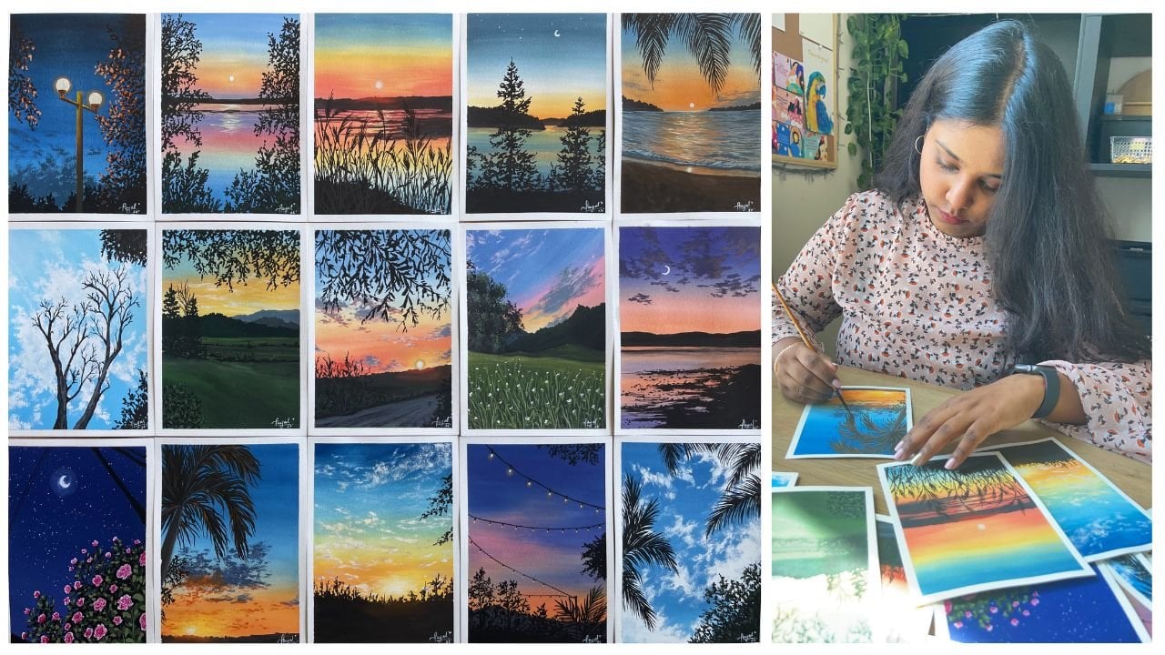
1. Welcome to the Class: Taking a trip to the
beach can be therapeutic. There is a feeling of
satisfaction and relaxation you feel when you're soaking
in the warmth of the sun, listening to the sounds of the crashing waves and feeling the soft sand
under your feet. I can spend hours at the beach looking at the sparkling water from the reflection
of the sun and the patterns and the
colors that paints. I also get this extreme modes to recreate what I see
and put it on paper. I'm sure a lot of you feel the same and that is
why I'm bringing to you this class where
we're going to explore this beauty together. Hello everyone. Welcome to
my eighth Skillshare class. My name is Payal. I'm an artist and an art
educator based in Bahrain. I teach students online
and offline to fall in love with art and unleash
the artists in them. You can find me on social media @thesimplyaesthetic where I'm constantly
sharing my artworks. I'm really excited about
this class because we're painting using
the medium gouache. Gouache is an opaque medium
between acrylics and watercolors and very
versatile and forgiving. Even if you make any mistakes, it's very easy to rectify
it and start over. I'm so excited to share my knowledge about
this medium with you all and explore the
topic of seas together. Don't worry if you have
no prior knowledge about the medium because
we're going to discuss everything in detail. We're going to start
off by knowing the right type of
art supplies that we pick when painting
with gouache, and then move on to learning a little bit about the medium. I'll also be sharing
my tips and tricks with you all inside the lesson. We'll learn few of the basic
gouache techniques that we need to know that will help you understand the
medium better. Then, knowing this knowledge of the basic gouache techniques, we'll paint sky,
clouds, and waves. Once you've practiced
our basics, we're going to apply
all of this and paint our very own seascape. Don't worry if you're a beginner because
you can join in too. I have designed this class in a way so that it's
broken down in smaller bits and it's very
easy to follow along. If you have an hour
and a half to spare, then join me in this
class and let us explore the beauty of gouache
and seascapes together. See you in the class.
2. Art Supplies You Need: [NOISE] Let us talk about
all the art supplies that we need for today's class. The first thing that
I want to talk about and focus on is the paper. For showing on the
techniques and the elements, just the clouds and the waves, I will be using these loose
sheets of papers and they are from the brand
Canson of Montel CVs. It's a 300 GSM paper
and it is cold pressed. I think this paper is perfect
for painting with gouache. They are easily available
in the market and it's much more budget friendly
or pocket friendly. You can use these papers
for painting with gouache. You can use any paper for
that matter actually, anything that's above 230 GSM with a little less texture the cold press works very well. Anything of that sort works perfectly for gouache
since it's very versatile when it comes
to the surface and it's not as picky as watercolors. You can use these
loose sheets of papers for your class
project as well. You can pick the size that
you want to paint on. This is size 15 by
21 centimeters. I will be painting
the class project in my sketchbook and
this sketchbook is from the brand Etcher and it's the
accordion sketchbook. You wouldn't believe that
the weight of the paper is 230 GSM and it's just
perfect for gouache. I have absolutely
fallen in love with the sketch book and I've added so many different
beach paintings in it and I'll be painting one of our class project in my
sketchbook from Etcher. Like you can see, it
has very less texture, which is perfect for
gouache because it makes the blending process
really easy. You might have to choose
four papers that have lesser textures because you
don't want to spend a lot of time on blending. That is it about the paper. You can choose the
size that you want. You don't have to go for the
size that I am going for. Absolutely, anything is fine as long as
you're happy with it. The next thing that
I want to talk to you guys about is the paint, which is very important. I will be using a bunch of different shades which are
very limited by the way, you don't need a lot
of different colors. The first thing that you need in your palette is titanium white. As you can see, I
have a huge tip of titanium white by
the brand Brustro. Titanium white or white in general is used a lot
when it comes to painting with gouache because
you're going to use it for toning down the vibrancy
of your paints, blending, absolutely anything. For instance, we're
going to use it for our waves and clouds, we need a lot of white. The next thing that we
need are these two colors, that is Prussian blue
and lemon yellow. We will be using Prussian
blue and lemon yellow mixed together to get that turquoise
and aqua green color, which I'll talk
to you guys about when we are painting
these elements. That is it. You do not
need any other colors. Just lemon yellow and
Prussian blue is going to help you get through
the entire painting. The next thing that I have
is this burnt sienna color. You can use a brown
shade that you'd like. Pick any brown that you want. I'm going for burnt sienna. The next and the last color
that you need is black. That is, we need black
in a very little amount. Just a bit of black
is all we need. These are just the
five colors that we need for today's class. Very limited color palette. I'm going to create
some beautiful mixes that I will show
you in the class. It's going to be really
exciting to just find out how much these five colors
are capable of together. The next thing that
I want to talk to you guys about is the brushes. I'm going to use a bunch of different sizes of brushes such as the flat brush,
the round brush. Then I just play
around with that. I have different
sizes of flat brush. I have size 6 round brush. As you can see, it doesn't
come to a really fine tip. It's perfect for
painting the clouds. The next one is this
long round brush by Princeton and it comes
to a really fine tip. I use this brush for painting all the
details of my waves. But if you don't have a brush
that comes to a fine tip, you can downsize the brush. We can go for a
size 2 or size 1, 0 whatever that comes to a really fine tip for
adding the details. For me, this brush
works perfectly. The size 6 brush is my brush of choice when I'm adding
details to my waves. Now that we know all about
our paper paints and brushes, let us talk about the
little things that we need. You need two jars of water. One is going to be the one
where you rinse your brush and the other one is going to
be a fresh supply of water. Having two jars of
water is really important because you
don't want to make your mixes really
muddy and load up the colors from your
previous mixes. The next thing on the
list is a mixing palette. I'm just going to
use a ceramic plate, as a mixing palette, and I have two
little plates here. One is going to be for all
the other colors that I mix and the other one
is just for pure white so that I'm not adding and
mixing any other colors in my white because you need the fresh white
for the waves. The next thing that you
need is a cloth, tissues, anything to just wipe your
brushes and you need pencils, scales, eraser, all that
basic stuff for sketching. We're doing a very basic sketch, so it's not that important. The last thing on the
list is a masking tape. That's pretty much it
for all the supplies. Now that we have
everything on the list, let us quickly move on and know a little bit
about the medium. See you in the next lesson.
3. Gouache Overvire & Tips: Let us talk about
the medium gouache. Gouache is an opaque medium
with layering capabilities of acrylics where you can layer lighter colors over
darker colors, and reversibility of
watercolors where you can reactivate the paint once
it's dry using water. It has a beautiful matte finish
once it's completely dry. You can always fix your mistakes by applying an opaque
layer of paint, re-wetting the base
layer and starting over. Gouache is very
forgiving that way. Let me share a few
tips that will help you understand
the medium better. Always use freshly
squeezed paint from the tube and always add a little bit of
water to thin down the consistency and make the
blending process easier. Make sure that
your base layer is lighter and thinner as
compared to the layers that you'll add over it
because it's very easy to reactivate the base
layer if it's too thick. We'll talk more about this in
detail in the next lesson. When it comes to
painting with gouache, we tone down the vibrancy of the color by adding
white and that is why we need a big tube of white as compared
to the other colors. We can also make the consistency of the
paint really thin, just like watercolors to
add glazes over our paints. Always pick paper with
smoother texture because that makes the blending
process a lot easier. I preferably like to
use synthetic hair brushes when it
comes to painting with gouache because
they are smoother, they make the blending
process easier and I'm scared to draw in
my natural hair brushes. For gouache, I choose for
the synthetic hair ones. I always keep two jars
of water with me, one to rinse my brush and
one to load up fresh supply or clean supply of water when I'm mixing different shades. That is it. In the next lesson, let us talk about the
basic gouache techniques.
4. Gouache Techniques : Let us understand the medium in detail by knowing
a little bit about the different techniques
that will help us in painting our
class project. It also helps you understand
a lot about the medium. Using my flat brush, I've just taken my
Size 6 flat brush and the first thing that
we're going to talk about is the consistency. Consistency is the ratio between your water
and your paint. If you don't add any water, it's going to be thick. Wash paint is almost like
acrylics in terms of the consistency freshly
squeezed out from the tube, so it's nice and thick. Here I've taken some
Prussian blue on my palette and I haven't
added any water. There's no water
content in my brushes, but it's just freshly
squeezed tube. If I apply this on the paper, it's going to be nice and thick, really thick, almost like a baseline consistency when
I'm applying it on the paper. Also, if I just move
it around a lot more, it's going to give me
that dry brush strokes. This is very much useful
when you're adding textures on your painting
in the foreground layers. The next consistency
that I want to show you has a little bit of water. When I add a teeny
tiny bit more water, just like the tip of my
brush is dipped in water and applying that water
and making a mix so it's much more
smoother at this time. This makes the paint more flowy, so the blending is easier. Again, you can use this consistency in the
foreground elements, and that works really well. It's nice and opaque, you don't see the
background layer or the white of the paper. That's why it's more
beneficial to use this consistency
for the foreground. The next consistency
that I'm going to show you is going to be used for our medium layers
where you want to see a bit of the previous
layer but not so much. It's lot more lighter, it's almost like a
milk-like consistency. It's not too watery, but it's not too opaque, it's like translucent
consistency when you apply it on the paper. The last consistency
that I want to show you is the watery consistency. It has a lot of water. When you add a lot of water, since it's squash paints, which is a water-soluble medium, it starts to behave
like watercolors. So when I'm applying the stroke, you can see it looks like I'm
painting with watercolors. So use this consistency like a mix of the third and the
fourth consistency for my background layers where
I want to slightly see the background or the white
of the paper as well. You can just walk around with different water contents
to understand how your paint works and is really good exercise for you
to get used to your pink. The next thing that
we're going to talk about is layering. I'm going to show you
three different types of layering and two different
types in a way that you can understand what layering or what the consistency of
the previous layer is supposed to be to get an overlay paint without
reactivating the previous layer. Since we're painting
with gouache, it can be easily
reactivated with water, so we don't want that when
you're working in layers. The first block
that I'm creating is the first consistency. It's freshly squeezed
tube without any water. You can imagine it's nice and it's like a
thick consistency. The second consistency is
the third consistency. The third block is the
second layering section, so this little block is going to be of the third consistency, it has a good amount of water. You can see it's nice
and translucent, you can see a bit of the
paper in the background. The last one that I
want to show you, I've added a bit more water, so it's still in between the third and
the fourth consistency. It's nice and it's slightly more transparent than the
second block that I created. I'm just going to show
you these three blocks. Why I'm doing this is
because I want to show you where you can reactivate the paint when
you're painting with gouache since it's very easy to
deactivate the background layer. In the third block, I'm not waiting for
the paint to dry. You see, I'm taking my smallest
size flat brush and when I apply my paint on the brush, it's just going to blend in
with the background layer. It's just likely turn into a lighter version of the blue instead of
being just white. You have to wait for
the background layer to completely dry before you go
ahead and layer your paint, it has to be completely dry. You can use this technique
when you're trying to blend, let's say two colors together in a way that you don't
want to have sharp edges. You can use this type
of blending where the background layer
is wet and you're just overlaying with
different layers, we'll do that and it can be beneficial as well but if you're letting a new
want sharp edges, you want to make sure
that the background layer is completely dry. Now the first two
blocks are dry, so I'm just going
to show you what happens when you layer white on your thick consistency paint. You see when you apply it, it just reactivates
the background layer. Since it's a thick layer, it's very easy to reactivate it and when
you layer it with white, just reactivates and it
forms again a part of blue, you can see those blue strokes
and you don't want that. In the third block, I'm going to show you how you're going to
layer your paint. Here when you're layering
layers one over the other, you want to make sure that
the background layer is slightly lighter as compared to the layer you apply on top. If your background layer, let's say is of the second block
consistency and you're applying a fourth
block consistency, it's going to not
show up that well. You want to make sure that
as you move ahead in layers, the background layer is the
lightest the consistency. The amount of water
that you're adding in your paint should slightly reduce so that
you're building up the layers and it shows
one over the other. When it comes to gouache paints, that's how you work with when
you're layering your paint. Make sure that the
background layer is thinner as compared to your foreground layer or
the layers that you are applying in your painting. I hope [LAUGHTER] all of
this just makes sense. I understand it can be a
little bit difficult to grasp, but you can just follow
these exercises and try it out for
yourself to see what consistency works for you. The next thing that
I want to show you is the blending process. Now over here, you're going to try out two different
types of blending. One is just blending two colors together and the other one is going to be blending with
white in the middle. I'm just going to
take my Prussian blue and my flat brush and
I'm applying it on the left side of my paper and then I'm going
to clean my brush, load it up with some
lemon yellow and apply it on the right side to
just create that block. Then I'm just going to
move in this to and fro motion and try and blend the blue and
the yellow together. When I blend the lemon yellow and the Prussian
blue together, you get that clean
mix as you can see. There's a very evident green mix when I just blend these
two colors together. This is your straight form of blending where
you're just trying to blend two colors together
without adding any white. If you're using colors on the opposite sides
of the color wheel, you're going to go ahead and
create secondary colors. If you're using two
different primary colors, you're going to get secondary colors when you are trying to blend
them together. This is your one type of blending that is
straight blending. But if you want to avoid
that very evident green mix, you can use the second type of blending which is
blending with white. I'm just going to go ahead
and just move my paint unless I'm really happy with
the way the blend looks, I'm just going to
work on the blend. That's how it is, you're
just going to keep blending, keep moving your
paint until you are completely happy with the
way everything looks. The next type of blending like I mentioned
is blending with white where you don't create
that evident green mix. Over here, I'm going to take some Prussian blue
on my palette again, and then that will be on
the left side of the block, and then lemon yellow will start on the right
side and we leave the little white band space
to blend them together. As you can see here I
added a bit of water, almost like a lot of water, so I got a consistency of the
third block at the top and then I'm going to apply
it on the paper and then lemon yellow on the
right side of the block. Again, left and right or to and fro motion and then
you are just going to apply it and you see I have this little white band
space in the middle. That is where I will
apply the white paints. Clean your brush completely, load it up with white, and then when you apply
the white in the middle, you're going to just go ahead
in this to and fro motion to see and create the blend. It takes a bit of time. You have to keep wetting your brush and moving your
paints in the left and right motion to create
that perfect blend. It's just the matter of, like I said, just moving
the paints around. Just go ahead and try this out. Over here, you'll
notice that you're not creating that green
mix, but rather, you do have a light yellow and a light blue shade in the sky or like in
your block, sorry. But it's a nice transition
of the paint is really good, transition from the yellow
to the blue is good and there's no evident
green in the mix, and that is exactly
what we want. Most of the times when I'm
painting my sky and I want to blend my yellows
and blues together, I go for this form of blending
where I use white to just try and mix these two colors together and I think it
just works perfectly. Yeah. That's the two types of blendings that are very
important to know. You can go ahead and
pick what works for you and depending on the colors that you are going to
choose for your painting. Mostly, I go for the
second form of blending. The last technique that I
want to talk to you guys about is the dry
brush technique. Like it says in the name as dry, your brush should have
no water content. The consistency of your paint is going to be of
the first block, so it's just freshly
squeezed tube paint and you're just going to tap off the excess paint in case
you're loading it up and then you just brush
it over your paper. As you can see, it creates
this beautiful texture. Because of the cold press
texture on the paper, it creates that nice texture. Then you can use
this technique to add the details to your
waves and the form. It works really well for your foreground
elements when you want to just add
a bit of texture, you don't want to get
into the details of it, so you just brush it over and then you get a
beautiful texture. The volume of the
texture again depends on how much paint you're applying and the pressure that
you're applying. If you apply more pressure, you'll get very close
consolidated strokes. If you're just applying
really light texture, so you get light brush,
dry brush strokes. That's pretty much it with
a dry brush technique. You're just applying dry brush loaded with paint on
your paper. That's it. You can just try these little
techniques out for yourself and see and work
with your paints. That is the most important part. Now, let us go ahead and learn our clouds and the
waves in the next lesson.
5. Exercise: Sky, Clouds & Waves: Let us learn how to create beautiful
blends in our sky, at the clouds, and how to paint the waves. Here are some of my artworks in my sketchbook where I've
painted beachscapes. As you can see, I've
added the clouds, we have the beautiful waves. The process in which I paint
these remains the same, so the basic steps
remains the same. The only thing that changes
is the reference picture, and how your waves look
or how the clouds look. In this lesson, I want
to share with you my simple steps in which I paint the waves and the clouds. As I mentioned before, the process in which that you paint them remains the same, the only thing that
will change is the reference picture and the
direction in which it goes. The first thing that
we're going to talk about is the sky and the clouds. As you can see, for the sky
we have a background wash which is a beautiful gradient
wash. On top of that, the second layer
is for the clouds. Let us start painting that. I'm going to take Prussian
blue on my palette. I'm going to take out lemon yellow as well because
we need that for the waves. I'm just going to take out all the colors that I
need on my palette. I've Prussian blue,
lemon yellow, I'm also taking out my burnt
sienna color on the side, lots and lots of white paint
because that is one of the main things that we need for painting clouds
and the waves, so you need to take are a lot of white paint on your palette. Then we can just
directly start with our painting for our clouds. I'm going to take my flat brush, this is a Size 6 flat brush, and I'm going to add
lots of water in my mix. As you can see, I have
more water lesser pigment, and I'm adding a bit
of white to the mix to get a lighter version
of the Prussian blue, I don't want it to be too dark. As you can see, my mix is nice and flowy, that is because it's
the background layer. Remember how I told you that the background layer
or the layer before, or the first layer let's say, has to be lighter and as we go ahead in our painting
and adding more layers, we can increase the consistency and make the layers thicker. Here's a quick swatch of
the colors that I'm using. You have your Prussian blue. You can get many
different variations of the blue by just
switching between the amount of white
that you're adding in. If you add more white, you're going to get
really light blue. If you're adding lesser white
or medium amount of white, you get a medium blue and then
you have the Prussian blue in the darkest form. That is it. Using the light blue shade, I'm going to go ahead and start creating the
background wash. I'm going in this left
and right motion. Once I was done with it, I'm just going to load my
brush with water and white, and I'm just going to
start applying it and moving to the bottom in
this left and right motion. The idea here is to get a gradient wash
which goes from the lightest blue at the bottom and it goes to lightest blue, then you have the medium blue, and then you have the blue in the darker version at the top. The idea is to have a
gradient wash. You can get the perfect gradient wash by just laying out
the three colors, and then moving in this left
and right motion to just blend all these three
different variations of blue together. When you just go ahead
and blend it out a couple of times so you
will get a seamless blend, you won't even be able to see the strokes
that you've made. That is how you get
that perfect blend, perfect background wash. Go ahead in this left
or right motion, blend these three different
blues together to get a nice gradient wash. Now, my background layer
is completely dry. Remember it has to
be dry before you go ahead and move to
adding the next layer. I'm going to take some white in another section
where there's no water, and I've taken my
Size 6 round brush which does not come
to a really fine tip. I'm going to use that brush, and start with the
dry brush stroke that we learned before. I'm going to go ahead in
this circular motion, and I'm creating these clusters together to depict the clouds. Now, you can have a look at a reference picture to
see how the clouds look. I'm just creating these
clouds in a way that I feel like they should
look in the sky. In my sections, I'm just going from
left to right, stopping in the middle and
leaving it right there, and then adding some
bigger clouds on the top. Just have this zigzag
motion in the clouds. The idea here is to actually practice how much paint
to pick on your brush. Remember how I told you that if you take more brush and
apply more pressure, you will get this
consolidated dry brushstroke, and if you apply
lesser pressure, you'll get nice
lighter brushstroke. Here, we're just using
a combination of that. For the mean denser clouds, we're going to apply
more pressure, load up more paint on our
brush to get that fluffy look. Wherever we want to add just light washes or
just scattered clouds, we're just going
to slightly brush over and apply lesser pressure, and you'll be able to create those beautiful clouds just with some simple brushstrokes. As you can see here, I'm
just slightly brushing over to add those scattered
clouds and to add a bit of more texture
in the sky for the scattered clouds and
that is how you create them. You get a better idea of your clouds once you look
at a reference picture, that's when you know
exactly how they look. This is one of the easiest ways in which you can add clouds without having to focus more on the details
in the shadows, especially when you're making
these daylight beat skips. This is the perfect cloud in my opinion that for it's
quite very easy to paint and it's really fun to
just go ahead and add textures in your clouds and not having to worry
about the shadows. Go ahead and give this a try. Don't forget to try it out
before you go ahead with the class project because it
just builds your confidence. I know we don't want to do
these exercise lessons, but these are meant to just build your confidence
so that when you're painting the class
projects you're just happily going to
confidently do it. The next thing that
we're going to learn is how to paint the waves. I'm quickly going to show you
the swatch of the colors. First, we have the Prussian blue color
in its darkest form. That is going to be
the darker part of the ocean or the waves that
we are going to paint. The next thing that I'm
going to show you is the Prussian blue and that
aqua green or turquoise color. How you get that
color is by just adding yellow to your
Prussian blue color, and then adding a bit
of white to this. There are many different
variations in which you can get different versions of
turquoise and aqua green color. If you have more
yellow and white, you get the aqua
green color and if you have slightly
more amount of blue, then you get that
deep turquoise color. You can play around
with your colors, with your Prussian
blue and lemon yellow and white combination, just play around and see
actually what is the color that you need for your waves
that you are going to build. Here, I just have a
little bit of yellow, blue, and white in my mix. Next, I'm going to just create the color for the sand which is my burnt sienna and
white mixed together, and that is going to be
the color for my sand. Let us start painting the waves. The first color that we need for the waves is the
Prussian blue color. Then you're going to add
a generous amount of water to it because this
is the background layer. I'm just going to
layer it down and put it down in this
few little strokes, a small section of
the Prussian blue, which is the furthest away
section of the ocean. Then I'm going to transition
to the turquoise color, which is a mix of
the Prussian blue, lemon, yellow, and white. I've just added a little
more white to the mix and I've gotten this lighter shade and then I'm applying that. We have already
done three colors here and done Prussian blue, then we have the turquoise
and a lighter version of it. The last color that we
need is the color for the sun before we go ahead
and blend everything. Adding a bit of
white to the mix, I'm adding the sand color and applying it from the bottom, and going to slowly move upward and blended with
the turquoise color. Now as you can see, we
have all our colors laid down.The only thing we need to do is just
blend everything. I'm creating this wavy motion
because that's where I want my wave to be and
slight under the wave, I want a mix of the
sun and the water. That's why we've gone ahead and mixed them together
to get that color. It looks really good when you lay it on the foam
part of the wave. I've just added a bit more
blue at the top because I felt the turquoise is overpowering and the blue was
not that visible. Now, remember the
layering technique that I showed you that you
layer with the wet paint, you do that when you don't
want to get sharp edges. That is exactly what
we're doing right here. We're just going to
apply a layer or a mix of our wet
paint on the surface, which is already wet, and you'd get that
nice blended finish. Right over here in
the blue section, I've added more white to the
turquoise so that I can get a lighter color and I'm applying it in this left
and right motion, which is just going to show the different
movement in my waves. Going to go ahead with the
lighter turquoise color first. Then you're going to
load your brush with some amount of Prussian blue. You're going to
put it right under the turquoise or the lighter turquoise
color that you've added. This will add the shadow part of the movement and the waves. You have the lighter
ones at the top, and then you will
have the shadow part at the bottom and
this will just add a lot of detail to your base
and they won't look flat. They'll look like
they have movement. They're going to come
crashing towards the shore. Just add lots of details
and it's just one layer. Remember it's just one layer, it was the whole layer that was wet where we did all of it. Now that my paint is
dry, as you can see, it's completely dry and you see that the layer
has dried altogether. You see that different texture as you see the different colors. Now, I'm going to go
ahead and add a lot of white to my turquoise mix. You have a lot of white, so you get this
light blue color. This is going to be
the color that I use for the second layer. This will add a little bit
more highlights to my waves. I'm just going to go ahead
in using my size six brush, which comes to a
really fine tip. I'll go ahead and
add these details. Remember those waves
that we created with the lighter
turquoise color, we're just going to go ahead
and add these wiggly lines over it so that this
goes ahead and adds a little more details and highlights to the
waves and makes it feel like there's a lot
of movement on the water. Here, the consistency
of your paint is again slightly thicker than
the bottom layer. There's a little less
water in that mix. I'm just going to go ahead
and add a few of the details. I'm not going to focus
more on the foamy part because we want that part
to be with just the white. This is your second layer
that you've applied for the lighter blue to be on the background layer
for the waves. Now, I'm going to clean
my brush completely. The next thing that
we're going to do is make the foam and
add more highlights. I'm going to load my brush with some white paint and
I'm going to create the wave or the
direction in which the wave crashes at the shore. It's just a wiggly line
like that and you're using clean water right over
here so that you're not mixing and blending
any other colors. I've just made that line first. This is going to form
the base at which I will form and build my
waves to be on. Once you're done with that, now, we're going to slowly start
moving the waves upwards. How am I doing that? I'm just brushing it up
and creating these lines. This is not yet the
dry brush stroke. Over here, I'm adding
a little more details by just moving it. Being very light with my brush. Don't worry if the stroke is
not what you want it to be. You're going to go
ahead and play and add more details first before we
add the dry brush stroke. Over here, the consistency
is thick but not too thick. I would say the
second block that I showed you, it's
that consistency. If you want it to be
thick so that it layers over the background layer
and doesn't reactivate it, so you want it to be thick but not too thick that you're not able to add details to it. I'm going to go ahead
and add these waves. Right at the first
very white foamy part, I'm going to create
another one which is of the waves
that have already crashed and going
back into the water. That is why I've
added that detail. Again, let's say that we want to talk about the
direction in which this goes. We're supposed to be looking at a reference picture
that makes it easier, but I'm just going with what
comes into my mind and what is the reference picture that
we're going to paint also. This one is moving slightly
towards the right direction. As you can see, my waves
are the form details that I'm adding a slightly
facing the right side. You want to slightly
give it a direction so that it does not look awkward. I've just given it
the right direction. Now using the white paint, I'm going to add a bit
more highlights to the lighter blue or the second
layer that we laid down. This will add more
highlights in our paintings. This will make it look like it's going to
crash to the shore. It's just going to add different layers and make
it have the highlights. Basically, that is the point of this little layer
that we're adding. You can also add
these little dots in separate places so that it's
not just for the waves, it's also for the sunlight shining on the water and you
have the reflection of that. It's just like snide
sparkling water. That is the look that
you're going for. Just add those little dots. That is going to be
your third layer that you have added
for your painting. Go ahead and add more details. Over here again, you don't
have to make it look perfect. The idea here, this is
practice the brush stroke, practice the way your
waves will look. Practice it before we
go ahead and paint our main class project. The last thing
that we need to do is add shadows to our waves. You can do that by making a mix of a lot of water and the
brown paint and just go over and add it right below the wave that has crashed
at the short byte. When you do that, it
makes it look more 3D. It makes and adds a lot
of detail to it so that the waves look like
they're not just standing there
without any purpose. Over here, I've gone
ahead and added the shadow to be
all over the wave. But it may actually plays an important role when you know where the light source
is coming from, if it's from the left
side of the right side, so you know how to add the details to your
shadows based on that. The last thing that I'm doing, which is adding a lot of texture with my dry
brush on my wave. You can just go ahead
and brush it over. Add a little bit of
texture to your waves. I'm just brushing it
over very likely using the dry brush stroke method
that I showed you before. This adds a lot of like I said, extra and more
details to your waves and makes them look
fuller. That is it. This is another simple way
in which I make the waves. This is a little
more detail than my previous class where I showed you simple ways in
which I make the waves, but this is slightly more detail and I think when
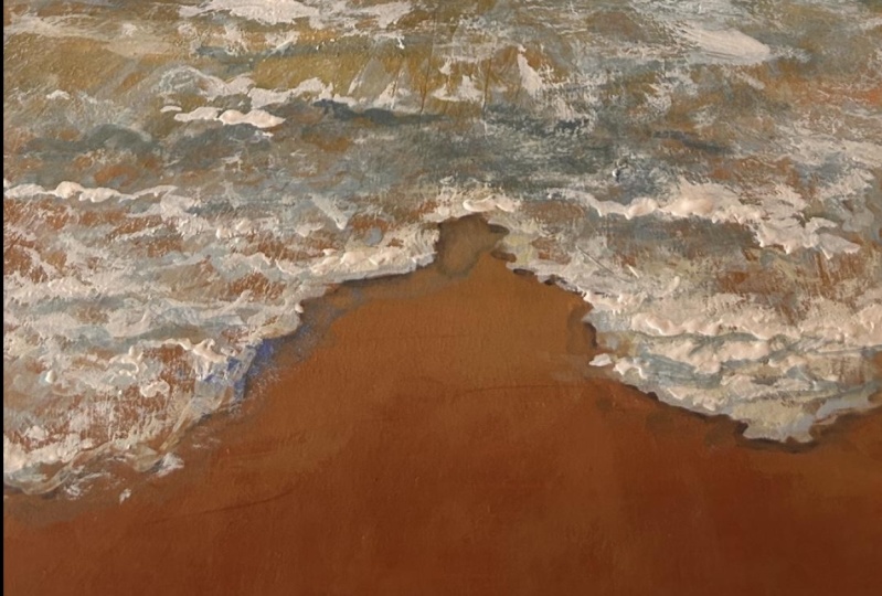
you're making detail, it keeps it works perfectly. Here's a closer look of
the wave and the clouds. I think they turned
out really well. Let us go ahead and use all our knowledge and
start our class project.
6. Project Part 1: Painting the Sky: [NOISE] Let us paint
our class project. Here I've taken my actual
sketchbook and you can see a bunch of different artworks that
are already in them. I'm going to paint
on the left side and I will be taping down all the four sides of my sketchbook using
my masking tape. The picture that we're taking inspiration from is right here. It's a beautiful seascape. The waves crashing at the shore is really
nice and foamy, and it has this
beautiful blue sky and I absolutely love this one. We're going to be painting this. You can download this image from the resources
part of the class so that you have the reference
image with you as well. But we'll keep it on the side
so that you'll know how I'm going to recreate
this with gouache. To the first thing
that we're going to do is make our horizon line. Using my scale, I'm
just going to divide my paper into the sky portion
and the ocean portion. I've made this line, divided it. This one third and two
third at the bottom. You can make it at half as well, but I wanted to give the
waves more space and that is why I slightly reduce
the size of the sky. The next thing that
I'm going to do is just roughly sketch
out the waves, so where the wave crashes at the shore at really foamy
part the sea foam part, I'm going to sketch that out. It's just random wavy lines. Then whatever main
waves you see, any of those main lines
that you see in the forms, you're going to just
roughly sketch that out. It's going to get covered when you're going
to apply paint. But this just gives you a rough idea of how the
wave is going to look. You can also put it in so that you know the direction in
which your waves are going. As you can see, this
is all just slightly facing towards the right side. You have the right side waves slightly pointing
towards the left side. That gives it that 3D look. Then you're going to paint it. Once you're happy with
the rough sketch, we are going to
start with the sky. I've taken my Size
18 flat brush, and I'm going to just take
all my colors on my palette. The first thing that we
need is Prussian blue. I'm just going to
take out a bit of Prussian blue on my palette. The next color that you
need is lemon yellow. We've discussed this before. We're just combining everything
that we've learned in the previous lessons and
I'm going to combine all of it and paint
the class project. I've taken lemon yellow. I'm going to take titanium
white on my palette. As you can see, I've taken a lot of titanium white because we need a lot of white when
you're painting with gouache. Now that I have all these
colors that I need for now, I'm going to just put
in the side and take my flat brush, dip it in water. Now, give it a nice wash, load your brush with
a lot of water. Since it's the background layer, you're going to be adding
more amount of water in your brush when
you're painting. For the sky, like we did before, they're going to be
three different colors. You will have your Prussian
blue in its deep dark form. Here is just a light wash of the Prussian blue that
will be at the top. Next color that we
will be using is Prussian blue with a bit
of white in the middle. That will be our medium color
and the third color that we will need is a blue
with more white. When you add more white to
the mix, it becomes lighter. We're going to use and combine these three different
shades of blue for our sky, so just let us quickly dive in. As you can see, it's almost like
I'm painting with watercolors and that
is because I have added a fairly good amount of
water in the brush so that it's nice and flowy and
it's easier to blend. We have the darker
blue at the top. Then I'm applying that same blue mixed with a
little bit of white. Still again, the consistency
is of the light one. It's still nice and
loose or almost like a water-like consistency and I'm blending it in
with a darker blue. At the bottom just right
above the horizon line, I will apply the lightest
[NOISE] blue color. We're just going to go in this left and right
motion to blend these three colors together with the lightest blue
being at the bottom, the medium blue and the
darkest blue at the top. Go in this left-hand
right motion. If you think your
brush is drying, just add a tiny bit of water because that makes the
blending process easier, reactivates your paint and
it's always fun to blend. Go in this left
and right portion and blend the colors together until you are happy with the blend between
these three colors. If you ever feel that
any of your colors are overpowering
the other shades, then you can just apply
it and then again, move in this left and right
motion to blend it in. Here I felt like the medium blue or the light blue
was overpowering and I wasn't able to see
the dark blue shade so I went ahead and added
some darker blue at the top and then I'm going this left and right
straight motion to just blend everything in. Now that my background
layer is dry, it's time for us to
paint the clouds. We're not going to exactly make the clouds in the way that
is in reference picture, but we'll just play around and
add our own little clouds. I'm using my Size 2 round
brush and I will be using the dry brush technique for the clouds like
I showed you before. Just load your brush with some
paint and you'll be adding these tiny strokes to make
the clouds at the horizon. At the horizon, the
clouds are going to be smaller because they're really far away or at a distance from the observer and the
clouds that will be above will be slightly bigger
because it will give that 3D look that these clouds are slightly closer
to the observer. Go ahead and make these tiny
strokes for the clouds. It's very similar
to the thing that we've done before in
the exercise lesson. You are just playing around and adding these little blocks. You can also look at the
reference picture to just get an idea of how you'd want to make the clouds at
the horizon line. When it comes to
painting clouds, I really like experimenting and trying different shapes
and sizes for the clouds and different ways in which
I can make these clouds without making it really
complicated and time-consuming. Because I love painting
on a daily basis and I like completing
one painting each day, so that is why I tried to keep
it as simple as possible. Over here as you can see, I have taken a bit of inspiration from the
reference picture, but what I am making is
completely different from what the reference
picture looks like. There's a lot of shadow play
in the reference picture, which I did not want to
focus on for this painting. I just wanted it to be simple, I wanted it to be fun, and I wanted it to be
not so time-consuming. I just went ahead with
a dry brush stroke, which works perfect for me, for my paintings for clouds where I don't want to add
a lot of details to it. There are times when I
make these clouds and add a lot of shadow
work to it as well. I've done that and that is when I'm focusing more on the skies. In my dramatic skies lessons, if you've watched that, you must have noticed how
much shadow play goes into painting the
clouds of that lesson. Over here, it's lot more simple. Since it's a bright sky, you can go ahead and add
the rough texture to your clouds in the sky and it
will just look like clouds. You don't have to work really hard to make it
look like clouds. Like I said, a simple
method in which you can add the clouds to your painting
on a bright sunny day. [MUSIC] The sky of my
painting, as you can see, instead of that just a little bit of a white
being in the sky, I went ahead and added clouds, a slightly more denser
form of clouds. But if you see a side-by-side
comparison between the two, you'd see that I am just
keeping the positioning of my clouds in the same way as you can see in the
reference picture. It's just that my
clouds look different. But the positioning
of where I want to make these clouds slightly
remains the same. It's very similar to
the exercise lessons. If you've done the exercise, you would know how to place these little clouds
and how I am doing it. If in a place you feel like
you added too much white and it looks really not like the rough texture
that they're going for, you can just lightly smudge
it with your fingers as well. It just spreads
the paint out and it gives that dry brush look. Just go ahead and
play around until you're happy with the
way your sky looks. In the next lesson, we are going to go ahead
and paint our sea. [MUSIC]
7. Project Part 2: Painting the Waves: [MUSIC] Let us
paint our sea bed. For that, I'm going to use
my size 10 self flat brush. You can use any size of the flat brush that
is slightly bigger so that you can cover a bit
of distance in your painting. I'm going to use three
colors for this. You will have to use the dark, deep Persian blue, you'll have the turquoise
blue, and the brown mix. I'm just going to quickly take a bit of brown on
my palette because that was the only color that I didn't squeeze out
on my palette. I'll just quickly squeeze that out and then we'll
start painting. I'm going to add
a lot of water in the Persian blue mix and
carefully load it on my flat brush and go over the horizon line so that I
make this nice straight line. Just use your flat brush, go over the horizon
line carefully, and then once you
are done with that, you can slowly start
bringing it down. Just go into this left and right motion and start
bringing the blue color down. Now, just like the
exercise lesson, we will transition
from the deeper blue, that is the Persian blue to
our turquoise blue color, so we'll be making
a mix of that. As you can see, I am not
creating that flat blend. I'm leaving a bit of
white spaces in between so that I can add the
turquoise blue in the middle, just like we did in
the exercise lesson. Also, I'm using the
sides of my flat brush so that I'm not using a lot
of surface area of my brush. Just the sides of
my brush will give in that nice uneven blend. Here I've mixed my
Persian blue and lemon yellow together to get a
turquoise blue color with white. Now, the depth of
the auto vibrancy of your color will
depend on how much blue or the yellow you add. If you add more blue, you get turquoise too color. If you add more yellow, you will get an
aqua green color. Then obviously,
when you add white, it gets torn down and you get a more
base-dense color look. For now, I'm going
with a deeper version of the turquoise blue, and here's a quick
swatch of the color. Then to the same mix
when I add white, you will see that the color gets torn down and it
becomes lighter. These are the two colors
that I'll be using for now for adding the
details to my waves. I'm just going to go ahead
and load my brush with the turquoise blue color
and then just add it in. Then I'm just going
to take a bit of Persian blue on my
brush and just blend the colors together
so that they don't just randomly stand out. Rather, they look
slightly blended in. Here I'm using the sides
of my brush to blend it. As you can see, using the
sides of my brush will give that uneven wave
finished to my painting. Also, you don't using a lot
of surface area and you don't want the blend to
be flat like your sky, you want it to have that
uneven wave finish. Now, this portion
where I sketched my sea form are the wave
crashing at the shore out. That is brown and then
the bottom part is brown or a darker
version of the brown. Now, this section where I've sketched out
the sea foam bed, that is going to be a
lighter brown color. That is my burnt sienna
mixed with white. Then at the bottom you have a darker version of
the burnt sienna, which basically
means lesser white. I'm loading my brush
with that burnt sienna and white mix and then
slightly filling it in the space where I made the sketch so that is
the lighter color and then we'll slowly
just transition the brown and the
turquoise to go together. At the bottom, I
have darker version, here you can see it's slightly
darker as compared to the section where I added
the white and the brown mix. For the bottom, I'm not going
for a straight flat wash, I'm rather giving
it this angle where the center is my
point and I have my brushstrokes going
left and right from the center so that I'd
give that nice 3D look. Then I'm just going to add
the brown in the space again, wherever I sketched it out. Don't worry if it does not
look clean and perfect for now because we're
going to work in layers and we're going
to fix everything. Now, load your brush with a
bit of water and just blend the turquoise blue together
with the brown mix, and make sure that
you are not going beyond the sketched bit of the sea foam because
that's where your blue is not going
to get shown right. The turquoise blue
is not going to be crystal clear right there. Just make sure that you stay in the line that you sketched
and you'll be good to go. Then once you're happy
with how the blend looks, you're just going to
wait for everything to dry and then we'll go
ahead with the next layer. Now that my painting
is completely dry or my base layer
is completely dry, you're going to go ahead
and switch my brush to my size 6 long round brush. It comes to really
fine tip surfaces, my brush of choice when it
comes to painting waves. Once your layer has dried, it's time for us to add
more details to it. By adding more details to
it means you're going to define the waves a
little bit more, add the shadow bit
for the waves and the highlight bit for
your waves because right now the painting
looks really flat. You're going to load
your brush with the Persian blue color
first so that access the deeper shadow in the ocean bed or the
sea bed at a distance. Go ahead and go over
the horizon line again and then start
making these lines. These lines are very random. There is no particular order
in which I'm doing it. I'm just leaving a
little bit of space of the layer that's below it and then making these
long thin lines strokes. This will act as the deeper
color for the ocean. Over this, we'll start
layering with more colors. Now, as you come closer to the turquoise bit or where you
see more of the turquoise, you will be switching over
to like a darker version of the turquoise and you'll do that by adding more Persian
blue to the mix. When you add more Persian blue, you'll get a darker
version of the color, a darker turquoise color, and you will be using that color to add the shadow
bit for your waves. I'm using this color, the darker turquoise color, and I'm going to add
and make to fill in the spaces between the blue that I just
added at the top. You're just going to
make those same lines and this will act as the highlight bit
for your waves. [MUSIC] If you feel like you're waves, let's say your darker wave or the lighter waves
that are above, then you can just go
over and layer it again and that solves everything. It's very easy to fix your mistakes when it comes
to painting with gouache. Now in our turquoise bit, we are going to go ahead and add the shadow parts like
I mentioned earlier. Taking the deeper
turquoise color, you're just going to go
ahead and make these waves. They're almost like, just make a stroke, apply more pressure,
and release. You don't make the
waves to be flat. You do try to make them
in a straight line, but the waves are not straight. I hope you understand
what I'm trying to say. They're all going in
the straight line, but they are not straight, they have a little curve to it. Let's say the starting point and the end point are
in the same level. But when you are
making the center bit, you are just giving it a
little bit of a curve. Then once you lay that down, what you're going to do is go
ahead and clean your brush, load it with a bit of water, almost like just wet your brush, and then just clean in the bottom wave bit
or bottom curve bit. This way, the bottom bit
just merges or blends with the background layer so that acts as the
shadow of your waves. Now, where do you want
to lay the shadows? You can have a look at the
reference picture to get idea of where or what
size your waves are. Over here I'm taking inspiration from the
reference picture, but I'm also, while
I'm painting, I'm just going ahead and
doing my own thing as well. I've just gone and you
can see I've added the waves and then
blended the bottom bit with the background so that the edges are not
just very sharp. [MUSIC] You're going to repeat the
step of adding these waves right until you see the blend between the turquoise
and the brown. Then you can also add
these smaller waves in-between just to
fill in the space. You're making those smaller, thin strokes of the
curved lines and then just leaving it and you're not going to blend that with
the background layer. You can also choose to blend it. That's completely on you. Like I said, when I'm
in my painting process, I just like to do my own thing. I do take inspiration from
the reference picture, but I just tweak
it in my own way. I'm just going to go ahead and
blend things in wherever I feel like they need
lending and just make it stand out wherever
I just want it to stand. You can also load your
brush with a bit of water and slightly a bit of the turquoise
blue color and just add in those waves to
make it more defined. Again, that's a
personal preference. You're just going to go
ahead and play around. If you think you've messed up, you don't have to
worry about it, you can just load
your brush with some Persian blue,
the turquoise color, and the brown color and
just blend everything in and reactivate the
paint and just start over, which means you come
back to your step 1 of your base layer and then add
the details all over again. There's literally no messing up when it comes to gouache, you can always fix your mistakes by blending things
and then going back to your base layer
and that is so forgiving, how many times I've had
to blend everything and to come back to the
base layer so that I can start adding
the details again. You don't have to worry
about your mistakes, you can always fix it. Now, right here I'm
going to go ahead and just fix a little bit
off the beach portion. I want the sand bit
to be slightly more blended and a bit darker
than your previous layer. Just go ahead and load your brush with the darker
version of the brown. That's just bouncy and add
a little bit of white. I'm just going to make these diagonal strokes left and right and the center beds so that it gives that look
of the sand moving towards the beach or the sand
moving towards the water. That's pretty much of it. Once you're done with this, you're just going to wait
for everything to dry. Again, just blend it
until you're happy. This is your choice. You can keep blending
until you're happy with what your base
layer looks like. In the next lesson, we will be adding details to our sea foam.
8. Project Part 3: Adding Details to the Seafoam: Now it's time for us to add the
details to our seafoam. How we are going
to do that is by creating a few more
layers on our painting. First I have taken white and
I'm adding a tiny bit of the blue shade in it
because I don't want it to be pure white just yet. I just wanted to have a little bit of the
blue color in it, so you can see me
mixing this shade. This will be the color
that I will be using for my layer which is going to act as the highlights for the waves in the background, and then we'll move on to adding the white for the seafoam. We're going to start off by adding the highlights
on the waves. As you can see,
we've already added a few little tweaks of the lighter shade of
turquoise on the top, but here we're just going
to add in more details. This makes it look more real. We're just going to
go ahead and add it in that swiftly
motion itself, this time leaving a little
bit of spaces in between. When you leave these spaces, it acts as the
highlighted portion, like the sun is reflecting
the colors on the waves, and that way you can see
the movement in the water, and that is why
adding this layer really changes everything. I'm going to go ahead
and add that on all the waves or
the darker parts of the waves that we
had added before. We can also look at the
reference picture to try and understand where
the lighter part goes. Over here, I'm just adding it on top of the darker
waves that I made. Make sure that
you're not covering the darker waves
because you want to show the shadow of the wave, and then you can add the
highlighted portion on the top. This way it acts
like the movement on the water and you can see the deeper colors and
the lighter colors. Again, this will only
extend until the mix where you have the turquoise
color mixing with the brown, until where you
see the turquoise, that's where you'll
be adding that in. Let's go ahead and add these
little tweaks and dots and the wavy lines on the top of the darker waves that
you had already laid down. Remember, this acts
like the highlights, so you want to make sure
that you're able to see the blue that is underneath. One other thing to
keep in mind is to not make these lines straight lines, you want to give them
a motion or give them a wave motion so that you see
the movement of the water. If you will make just
a straight line, then it doesn't really
show the movement, it looks really flat. When you give them a wave, specifically a wave
moving upward, so you have a line straight
and then you slightly move it upwards and then
bring it down like a curve, then it acts like the movement. We're just going to fill in
the entire space with this. Again, it's very easy to overdo this step, I
totally understand. Because I've done that
many times in the past, it's very easy to overdo, and that is why we add
the shadow bit first, because that gives us
an idea of where we want the highlighted
portion to be so that we don't go overboard. Wherever you've added
the deeper blue color in the previous layer, you're just going to
add the highlights on top of it and then even these little dots
somewhere on the sides. Now I'm just going to
sketch out my waves again, just to give me an idea of how I want the direction
of my form to be. Use your pencil and just
sketch it out lightly. You do not have to sketch each and everything of the seafoam, you don't have to go over
each and every detail. I'm just giving it
that angle so that when I go ahead with
my white gouache, I know in which direction I want the main
seafoam lines to go. Then everything else that
you see is just a filler. Now I'm going to mix
my white paint and add a very tiny bit of blue that is just from the side
of the previous blue, because we want to
work in layers. For my seafoam, I will be using a very light version of the blue and a very
tiny bit of black. This creates that little
bluish-gray shade, and then this will act as the shadow bit for your seafoam. It will be as the shadow bit of your seafoam so that when you go ahead and layer it
again with the white, you don't have to work
a lot with the layers, so this will make the
process very easy. I'm just going to load my brush with the light blue mix
that we just created, and I'm going to outline the seafoam bit first because
that's the important part, because you would know where your seafoam ends, and
that's the sketch. Outline that first
and everything else after that is just
adding details to it. Just load your brush, apply more pressure and make it nice and thick because that's
really closer to the observer. After that with
light hand pressure, you're just going
to go ahead and start adding in these strokes. Now, it's very similar
to the exercise lesson, so you're just creating
these random strokes. Make sure that
you're not loading your brush with a lot of paint, you're just slightly
leaving it to dry so that you can create that
textured look as well. Then you're just
going to have a look at your reference picture
and see how the waves look, and try and get
those strokes in. Over here, I'm applying a really light pressure
on the brush and just moving it in that zigzag motion and trying to
brush the waves up. Remember, how I
told you that you might have to give it a
little bit of direction because that gives
that 3D look or that look that the
center portion is closer to the observer and the side is still a
little further away. To do that, you will have to give away a
little bit of direction. My left ones are slightly curving
towards the right side, and my right one will be slightly moving
towards the left. The center portion
will also have a little right direction
or the angle to it. I'm just going to go ahead
and make that stroke. At the top where you see the mix between the
turquoise and the brown, that is where I
will be just making these tiny lines like
finer details and lines. Remember the waves
that are closer where we just outlined the waves, that's where everything
will be bigger. As we move upwards, the size of it will
slightly decrease, so you might have
to switch between your brushes if you don't have a brush that comes to
a really fine tip. Over here I'm using my
Size 6 long round brush, and I'm able to get
thicker strokes and the thinner strokes with
just the same brush. That's pretty much it for the
way in which you do this. Again, there is
no perfect way in which I create my waves, I'm just looking at the
reference picture and trying to lay it down
in the same way. Remember that the bottom
portion where the seafoam ends, that's where your
foam will be thicker, and as you move upwards,
it'll become thinner. That's the only thing
to keep in mind. The direction, that is the
other thing to keep in mind, and other than that you're
just having fun and brushing your brush over in the dry brush stroke
to get the details in. Once I'm done with that, I'm just going to load my brush with the same color and add in a little bit of the details to the waves in
the back as well. This shows the seafoam being
formed at the top so that the wave is going
to come forward and crash at the shore, and this is just to
add the extra detail. This is something that I
went in with my own head, felt like adding it, so I did. It wasn't in the reference
picture and that is where it plays a very
important role for you to just walk with your
creativity to add in things and change things from the reference
picture that you see. Go ahead and have fun. Like I said, there's no perfect way in
which you do this, it's all about having fun
and enjoying the process. That's pretty much it. Have fun, enjoy the process. That's the main goal right here. Once this layer has
completely dried, it's time for us to add
titanium white just as is. As you can see, I've added
a tiny bit of water, not so much, I've
just wet my brush, and I will be using
this white shade, which is just the pure
titanium white shade, and I will be going
over the seafoam again. Like I said, we will
be laying it over those slightly grayish
blue shade that we just made so that that
acts as a shadow, and the titanium white on it
will act as the highlight. I'm just going to
go ahead and do the same process again by
just outline it again, and this time I will
lay over the white on the strokes that
we've already made, leaving a little
bit of space for the gray layer so that
you can still see it. You can see me laying
over the white, but leaving that little space for the gray so
that you can see, and that will act
as your shadow. The process here is just repeating the process that you
did or repeating the layer that you did in the
previous by leaving a little bit space to the previous layer
so that you can see the shadows and
you're just adding the highlights using
your titanium white. Enjoy this process. Once you're done adding the titanium white to
the entire seafoam bit, you're going to wait for that
layer to completely dry, and in the next lesson
we'll be adding the final details
to our painting.
9. Project Part 4: Adding Finals Details: [NOISE] We've reached the end of the painting and we're
just going to be adding some final details to make
it pop out a bit more. The first thing that
we're going to do is add the shadows for our seafoam. I've just taken my Size 6
brush and I'm going to be creating a mix of my burnt sienna and
a tiny bit of black. Here you can see me
mix burnt sienna with a very little amount of black. This just makes the brown
a little bit more darker, and that is why we've
added black to the mix. Here I'm adding a bit more water to make it nice and loose. We don't want it
to be too thick, we want the mix to
be nice and thin. Then, we're just going to
carefully outline the area of the seafoam that we've
just made majorly focusing on the right
side of the wave. As you can see, I'm
just outlining, and I'm making thin lines
in the left side and thicker ones to the
right side where the shadows are
going to be more. Then I'm going to
clean my brush and load my brush with a
little bit of water, and just like we
did for the waves, will be slightly
just blending it in so that we get rid
of the sharp edges. The bottom portion just slightly blends with the
background layer that we have so that it does not look too sharp and just
sitting there. It shouldn't nicely just blend with the background layer, and that is why I've just
gone ahead and reactivated that section and blended it
with the background layer. [MUSIC] [BACKGROUND] The next
thing that I'm going to do is just add a bit more shadows
to the seafoam part. I'm going to add
a lot of water to the same brown mix to
make it really loose. We are just going for a
very transparent mix. Actually, it's almost very
close to watercolors. You see that pieces of the
brown that is in between. We're just going to
slightly glaze it in. We're not applying a very thick
consistency of the paint. It's very light, very close
to the water-like mix. We're just adding that in so that that portion
is a bit darker, and it shows the depth
or it shows that the water or the seafoam is
on top of that sand color. That is why we've
gone ahead and added a bit of that glazing
with the brown. We're just going to apply it in the middle section
of all those areas. It's okay for it
to be imperfect. It doesn't have to be
exactly in the space, you're just glazing
it in and if you think it has
overpowered the white, you can go ahead and add the
white strokes on it again. Now, the last thing that
we're going to do is apply a little bit of
texture for our sandpit. We're just mixing our brown and the black
colors together. I'm going to make a nice mix
of that color, quite loose, and then I'm covering up the entire painting and
then tapping my brush against another brush to
get these little splatters. It's very easy. Load your
brush with little paint. Don't take a lot of paint
on the brush, otherwise, the dots or the splatters that
you'd get will be bigger. If you load in lesser
amount of photo, you will get smaller
dots and that is what we want for the texture
of our sand. Make sure that you're covering your painting because
we don't want the splatters to go on
the entire painting. It's just to be there
in the sandpit. Just go ahead and splatter some of the
texture for our sand. We're almost done
with our painting. We're just going to
go ahead and add a bit more texture
wherever we feel like it. I'm adding it in the middle
of my painting to show the reflection of the
bright sky on the water. Now is your chance
to go ahead and fix anything that
you don't like, add in a bit more titanium, whiten places where
you think it has gone down and you want to
make it look more fine. Now is your chance to
just go ahead and add in your final details wherever
you feel that it's necessary. For adding more texture, you can just use the
dry brush technique that I taught you earlier. Just wipe off the excess paint and just add in the picture. Once you're happy with it, you are just going to
carefully peel the tape off, and you have reached the
end of the painting. You can see me
struggling here to peel the tape off and that is
because it's on the sketchbook. I was trying really hard to peel the tape off in the most
aesthetic way possible. But since it was taped on the sides and it was
all over the place, it was a bit difficult. But just be slightly careful
while peeling the tape. Don't be very
reckless like I am, because you don't want to ruin all the hard work that
you've worked on. Carefully peel the tape
off and you'll have a beautiful painting
right in front of you. Oh my God, I love how
this has turned out. I'm sure if you
followed me along, you realize how not too
difficult the process was. We've gotten the details, we've gotten beautiful seafoam, the sky looks so pretty, everything looks so nice, and was also very
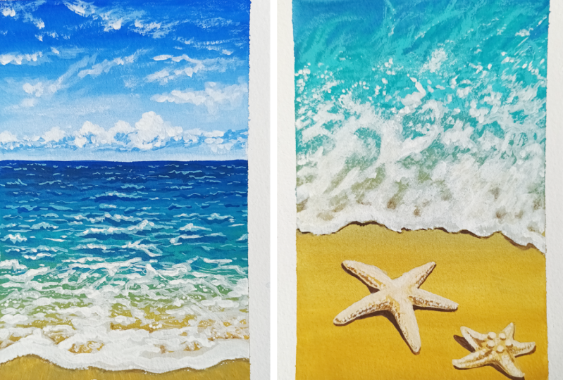
easy to follow. Here are some other artworks
that I've painted using a similar method but
different reference pictures. I hope you enjoyed
the painting process of the one that we painted
today in this class. [MUSIC]
10. Final Thoughts, See You in Next Class: This is it you guys. We've reached the
end of the class. I hope you enjoyed painting along with me and
learned a little more about gouache and the beautiful subject
of seascapes. I want you guys to paint a
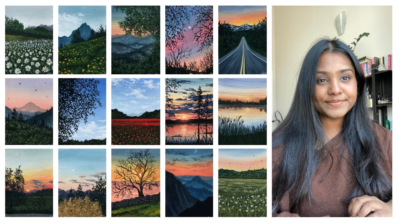
few of these on your own. I'm uploading nine different
images that you can download from the projects
and resources part of this class and try it out. We're using the same steps
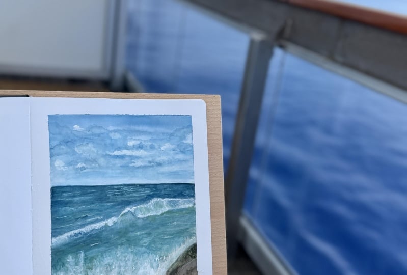
that we have learned. Here are my versions
in my sketch book. You can find the
still images of these on my Instagram
@thesimplyaesthetic. If you enjoyed painting
along with me, don't forget to leave a
review down under this class, and do upload your projects because I love seeing
your recreations. Don't forget to share
this class with your friends because it
would mean a lot to me. Until then, happy painting, and I shall see you in
the next class. Bye bye.
 Payal Sinha, TheSimplyAesthetic- Artist & Educator