Transcripts
1. Hello and Welcome Back!: Nature has been a
source of inspiration for artists and creative
since the world began. Besides the calming sound
spots and the scent of grassed nature can help us get back to a sense
of expansion. There's no better place to start your art journey than nature, because you can capture
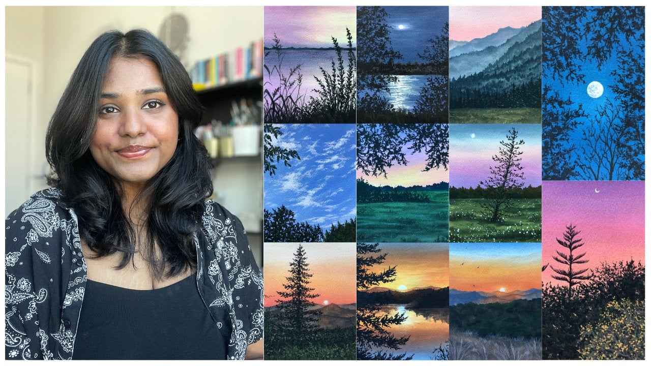
beautiful landscapes on paper. Hello everyone. Welcome to my Skillshare class and the very first
quash Challenge. My name is Brian. I'm an artist and an art
educator based in battery. You can find me on social
media are simply aesthetic. I'm constantly sharing
my love for art, apart from painting for myself and exploring
different mediums. I teach students online
and offline to explore the creative side and
unleash the artists in them. In this class, I'm
here to make you fall in love with
the medium quash, and explore it by painting
15 different landscapes. My journey with corps started around two-and-a-half
years ago when it had just started to gain a lot of popularity in the art world, my curiosity drove me to try
this medium out for myself. I immediately fell
in love with it. One thing that helped me
improve my knowledge of the medium and my art was
painting consistently. And in this course challenge, I'm going to help
you do that as well. For the next 15 days, we are going to paint 15 beautiful landscapes together using the medium gouache. Told very few are
still starting out the medium or have never
tried it out for yourself. Because we are
going to start from the basics and work our way up. We'll start off by learning
about the right type of art supplies that we need
for painting with quash. I'll be walking you through
some basic wash techniques that you need to
know when you're starting out with the medium. This will help you understand the capabilities
of course better. We'll also practice some
elements such as trees, branches, and
leaves, even clouds. This will give you
a basic idea of what to expect in
the class projects. Once we've gathered all
our basic knowledge, will go on a wonderful
painting spree and paint 15 beautiful and
unique landscapes over the next few days. If you are someone who's
been wanting to improve on, even start out with the medium. Then join me in this
challenge and let us explore the beautiful world of
quash and nature together.
2. Class Overview: I'm so excited that you decided
to join this challenge. We are going to have
so much fun together. This 15 day gouache challenge is actually going to
run for 30 days. Where starting from today, every alternate day, I will
be uploading a class project. Each project takes about
30 to 40 min to complete. And since not all of us can complete one
painting in one day, I decided to give you two
days of caps so that you can split it half and half and
complete your class projects. But for the next one goes live. Lot of you are familiar
with the medium quash, but if you're new to it, let me tell you all it's
wonderful properties. Gouache is an opaque medium with clearing
capabilities of acrylics, where you can learn lighter
colors over darker colors, and reversibility
of watercolors, where you can reactivate
the paint once it's dry. And you can do that by adding
a little amount of water. It has a beautiful matte
finish once it's dry. Gouache is a very
forgiving medium. So this means that even
if you make a mistake, you can easily rectify it
by adding a bit of water, blending it out,
and starting over. We will be exploring
the wonderful world. Of course, starting from
the cost techniques. Now these techniques
will help you understand the median vector, will explore
consistency, layering, blending and dry brush
technique in detail. I've also included
some practice lessons where we're going to
talk about the cheese, branches, leaves, and
clouds and detail. In the beginning of
each class project, I will be mentioning all
the colors that I'm using. We will be creating
these cute swatch cards. But I'll show you the exact color mixed ratios
that I'm using. Everything in the
class is explained in real time so that it is
easy to follow along. I'm really excited about this. Let us talk about the details of our art supplies in
the next lesson.
3. Art Materials Required: Let's talk about all
the art materials that you need for the class. We're going to talk in
detail about the paint, brushes, paper, and all
those sort of things. Starting off with the
paper, for this class, I will be using Strathmore
already cut watercolor papers, which is a 300 GSM
and 100% cotton. It's of the size five by 7 ". Feel free to use any size
that you want to paint on. But do have a small because
it's easier to paint, takes less time as well. I chose these papers because
I really like the size. It has very light texture. It does not have
a lot of texture. And it's 100% cotton. I feel 100% cotton paper
gives you better results. But it's not important to have it when you're
just starting out. You can use any people like
the Canson multiple papers. I feel that they give
you similar results. They're nice, easily available and light on your
pocket that as well. I will be using these papers
to show you a bunch of different techniques and the further lessons
that you'll find. So, yeah, go ahead
and pick a paper that's above 250 GSM
and we're good to go. Next, let's talk about paints. I'm going to use these tubes of gouache paints from the
brand Winsor and Newton. I will talk about the shades in detail before each
project that I upload. So you will find
the colors there, but yeah, we need only
our basic colors. I'm not going to mention
any extraordinary colors. Next I have a tube of permanent
white and titanium white. Now, I would suggest that
you have a tube of titanium white because it's much more opaque and it works
perfect for our clouds. But if you don't have
titanium white, don't worry, you can get similar results with any byte that
you have as well. So you need a large, big tube of white
because we end up using white a lot when it comes
to painting with gouache. Next, let's talk about
our brushes. Now. I have a detailed lesson. When I'm just talking
about brushes, different brush
strokes and getting to know your brushes
a little bit better. That these are all
synthetic hair brushes. I'll just give you a basic
idea on what my brushes are. I have a bunch of flat
brushes of different sizes, a bunch of round
brushes of size 642, whatever you want to have, and a bunch of
detailing brushes. Now, I also have
a spoiled brush, but I'll show you
what you can do with the spoilt brush much
later in this class, which is amazing by the way. So do check the lesson out when I'm talking about the brushes. And that will help you know, your brushes and the brush strokes that you can
make a little bit more. Next, we're going to talk about all the other little
things that we need, starting off with
the mixing palette. Now, I'm going to use
the ceramic mixing palette because I really
liked the feel of it, right? It doesn't form any bubbles and it's easier to mix
the colors on it. So you can just take any
ceramic plate that you find. Next, I have two jars of
water, as you can see. One is for rinsing my brush and the other one is for loading fresh clean water so that we're not making any muddy colors. It really helps to have
two jars the photo, because one can be 31, can be cleaned and
you're making fresh, beautiful colors when
you're mixing them. Right now, you also
need an eraser. You need that for making basic sketch that
we're going to do. So keep that in handy as well. Next is this 1 " masking tape. This masking tape is
the one that I'm going to use the tape down my paper. Next I have this clot that
I'd be wiping my brushes. You can use any kitchen towel to choose anything that's
available with you. Right at the bottom I have a wooden club board where I
will be taping down my paper. You can use any
surface to tape down your paper. And that's it. These are all the art materials that we need for this class. The very simple, very basic. Now, I do have this
swatch cards that I made. I will show you why I'm
using them when you're painting the class projects because I'll be just swatching
the colors that I make. So I'm just actually cutting
down the paintings that I didn't like and using the
back of it to swatch them. So you can use any paper
for that long, short, small, anything works
perfectly fine. And that is it. In the next lesson
we're going to discuss, you guessed it right. Our wash techniques.
4. Brushing Over Gouache Techniques: Alright, let us brush over some of our gouache techniques. The first one that
we're going to talk about is consistency. The consistency of gouache
paints if the ratio between the pain and the amount of water that
you're adding to it, right. Let me quickly show you a
few different consistencies. So this is a freshly
squeezed paint directly from the tube. As you can see, it's a nice
thick paste like consistency, right? It's nice and pick. My brush has no water and
advocate it's completely dry. And as you can see
when I mix the paint, I'm just trying to make
the clump go away. It's very thick. It's almost like a paste. And when I brushed over
this paint on my paper, you will see that it will
create a very rough texture. Now we will use this consistency of the
paint to our own benefit. And I will show you
how you can do that. But for now you can
just see how it creates that rough
texture when I apply it, it's not very smooth and the brushes not just
gliding over right. Now, I'm going to apply a little bit of water
into the pit, right? So I'm just loading my brush
with him this little bit of water and mixing
it with my paint. As you can see, there's
a nice velvety kind of consistency. It's not as thick as
the previous one, but it's not pinned
down as well. Now this consistency
of the paint we end up using mostly when you're trying to add details in
the foreground. Because over here the paint is nice and it's opaque, right? So it's going to be
standing over there. The previous layers that we add. This consistency works
really well when you're trying to add details
in the foreground. Now the next consistency is where I add a little more water. Now this is going to make the paint lot more
easy to spread around, a lot more blender book and very evenly spread out as
you can see when I apply it, it's so easy to just glide
my brush over the paper. This will be the
consistency that we use for our
background less, right? So when we're making a sky or anything of that sort
in the background, we end up using this
consistency of the paint. As you can see two so
easy to just spread around them that little
section and it's spread nice. And even right now
you can also get a nice thin down consistency when you add a lot of
water to your paint. So here I'm adding a
generous amount of water. And when I do that, I
create this constancy, which is almost
like what colors, as you can see,
can see the paper. The bottom right, you can
see the white of the paper. Now. You can also use
this consistency when you're trying to
glaze over another layer, lets you end up using
a pin consistently. But these are the
four consistencies that you just need to
have a rough idea about. For our class, we'll be
using a byte combination of different consistencies to
just go ahead and try it out. So like over here
I was saying what the glazing when you
add a lot of water, you can just glaze over a previous layer and add a hint of the layer
that you're applying. So let's say have blue. I can glaze over
and make an area purple by adding a thin
layer of read over it. You can just go ahead. Now is your time to
just play around. I'm just mixing
different consistencies, different kind of
water ratios in my paints and just seeing
how everything looks when I just glide over my paper. And I'm just having
fun here really. I'm not thinking of anything. I'm just having
fun and trying to work with different
consistencies. So just give this a try out. Because when you do that, you understand for
yourself as well that how much water you need to add in your paint watches, what is too much water? What is too little water? So it's good practice
before we just start ahead and paint
our first painting. Now that we've done
with our consistencies, we got a good idea of it, right? So let us talk about blending. Now. In the blending, I'm going to talk about three
different blending. The first is going to be a gradient where
moving from one color, darker version of one color to a lighter version
of the same color. So on I will tell you
as we move ahead. So the first one
Let's talk about is the blending with
just one color. And we're going to bring it
down and have a graded wash. So for now as you can see, I'm adding a little
bit of water, getting something off the
third consistency, right? And I'm getting that,
I'm going to use that paint to start
applying it from the top. I'm going to apply that at the top and then slowly go into this left and right motion
and start bringing it down. Now when I do that, I'm just trying to make
a layer, even layer. And I say make like an inch
of that pink with that color, I'm going to add a
little bit of white in it and then apply
it in the same method. Now what I'm trying to do here
is make a gradient, right? So when you're making a sky
which is of a single color, you end up using one
single color for the sky. So if the sky is blue, if it's a bright sky, you will see lighter versions
of the color at the bottom. And then as this guy
goes endless upwards, it's going to be a
little bit darker. And that is why having to know the gradient wash
is very important. So all you have to do is
lay down the darker color, a medium color, and then load your brush with
white at the bottom. And just keep going in this
left and right motion. Now this might take a bunch of different tries to get
the perfect blend, but you have to keep blending, keep moving your colors
around to see where you feel happy with the
gradient in the sky. If you feel like you've
added the colors, it's not blending, then
just go ahead, clean-up, brush and dry it with
a little bit of water, and then you can just go
solve all your problems. So since gouache is rebuttable, you have endless
possibilities and opportunities to just
fix your mistakes. As you can see, I bought
the blue dot, right? So I can just clean
my brush and just use my dry brush to move
it around and fix it. So this might take
a couple of times, couple of tries to get that perfect blend since we're also not taping
down the paper, it might take a couple of
tries to get that gradient, but do give this a try, try it out for yourselves
with just any color. We can use any color here. Just try it out and see how the gradient wash works for you. The idea is just going
that left and right motion and keep moving upward and
we get that nice gradient. Now let us move on to the
next type of planning, which is the direct
color blending. I've talked about this a lot
in my other classes as well, which I am talking about
the medium gouache, in which I also mentioned that when you're directly
blending two colors together, you have to see that it will form the mix of
those two colors. In the middle. Here, I'm going to mix
red and blue together. And we know that when we
mix red and blue together, we get similarly if you make blue and yellow
will get green. Over here you'll see I applied the blue at the top and
read at the bottom, I'm cleaning my brush and just moving the red
upwards, right? So when I'm moving
the write-up forwards and moving the blue downwards, I'm mixing these
two colors directly and then creating a
blend between them, which will be the purple. So the, the area where the
red and blue merge together, that's where you will see
the purple in the sky. Then you will have a
wash that it's gradually moving towards the blue side. So as you can see,
there's a bit of purple, it's too dark. I think it's not that visible,
but I'm sure you love. You're able to see
that little bit in the middle where the two
colors are merging together. Again, go into this
left and right. Motion really helps to
blend things seamlessly. So that's what I'm doing, moving in the left
and right motion in one direction until I'm happy
with how the brand looks. Here's a closer look. I hope you can see the
purple which is too dark. You can still see
it in the middle. Now let me show you the
next type of blending, which is blending with white. So we're doing the same sort of blending that we
did before, right? But only here in
that white-space, whether red and blue will merge, will use white to
blend it in and get a nice color in the middle. Let us load our brush with
some paint at the top. Alright, so I'm
applying some paint at the top and bring it down a little bit and then
clean my brush completely. Alright, and then add the red. And the step is same
like the previous one. But instead of blending it all the way with the same color, which is just blend the
red and blue together. I'm going to be mixing white in it and
blending them together. So applied red at the
bottom, as you can see, it's a nice thin consistency because I'm just trying to blend the colors together and
just mix it right in. Because I'm not going
to use a lot of paint for this little exercise. And as you can see, when I blend white
in, it got lighter. I have a light to blue and a lighter pink blend
in the middle. I'm just going to
go ahead and repeat the process a couple
of times, right? So apply red at the
bottom again and then move it upwards and do the
same thing with the blue. And then use white again to just kind of blend it
into half the white. Be more dominating. If you can say it, either more dominating and more evident. So there's a seamless blend. In getting the light pink and the light blue
in the middle. And then it transitions
to the darker colors. So again, going the left and right motion is very important. It takes some time, but keep moving left and
right and left and right until you are happy
with how the blend logs. You can also go ahead, add in a bit more white
if you think the white is not showing up a lot, go ahead and add a
little more white. And the darker colors at
the top and bottom just to make the gradient a
little bit more evident, you can do that as well. Now again, it's, it's time for you to have fun and explore. So even if you don't get the
perfect blend its own right, because you're just learning, they're just
exploring the medium. So it's fine if we
are here to have fun. That's what I'm
doing, having fun. So just blend the colors together and until
you are happy, you're gonna keep
doing that step. Once you think
that the sky looks amazing or blend looks amazing, you are going to stop right
there and let it dry. On variety shows a closer look at our blends that
we just created. So you have a gradient wash. The second is the
dark color blending. Third one is blending of
two colors with white. In our class projects I will
mention type of blending that we're going to use so you'll get a better idea of it. This is a fun little
exercise just to cover the basics and brush over things we probably already know. But yeah, let us move on to the next part that is
layering and layering, I want to show you two different
types of blocks, right? So when you're
layering with gouache, it is important for you to know what the previous layers
consistency has to be. Because since gouache
is rebuttable, right? You can reactivate
the paint and you can move the layers below. So that is why it's important
to know the consistencies. So for the first block, I'm going to create
a consistency that is between a third
and fourth one. So it's not too thick and
not to pin down as well. So it's just a consistency
in the middle where it's kind of painter
in my opinion, as compared to the other
layers that I would add on it. So it's still very thin. And the other block
that I'll create is going to be off the second
consistency, the second block. So it's going to be pic, right? It's going to be off that
nice, creamy consistency. Now what happens is when
you're layering on a block, what will happen is
the paint will get reactivated and it's easy
to move the paint around. Whereas if the paint is
completely dry and you're using it on a thinner
than PEDOT layer, your paint will not be reactivated that easily
and you can layer over without moving
the previous layers. And it's easier
to move that way. But I'll show you how you can use it to your benefit as well. So I'm creating a second block, which is of the
picker consistency. As you can see, the
second block is much more opaque as compared to the
first one that I created. And that is because
it has more paint. Do you have a lot of
paint on your brush? And that is why
it's more opaque. Alright, so I've laid
both mine blocks down. I'm going to wait for
this to completely dry. It has to be completely dry. And then I'll show you how
you can layer over this. Alright, so I've
taken my round brush and I'm going to pick a bit
of the white pigment and I'm going to make a
consistency that is of the second
consistency, right? Because it's going to be
like a nice velvety finish. It's not going to be too thick, but it's not going to be
thin enough to reactivate. That means we have to make
it slightly pickup as compared to kind of like the
consistency that is below. So as you can see when I make a stroke with the white, right, it's still white because the background layer
is nice and pain, so it's not very easy to
reactivate the paint. If I go over the line
a couple of times, if I'm making a line
and go over it, smearing it again and again. What happens is that
the base paint gets reactivated and instead of having a nice white
opaque layer, you end up having kind of like
the blue get reactivated. So video you'll
see I'm smudging. You see that I'm smudging
the paint, right? I'm moving around. And because of that, the base layer is getting
reactivated and it's moving. And we don't want that, but we can use things
to our benefit, right? So let's say we were
creating clouds. Those smears are clouds. I can fix that. Adding another layer.
Now as you can see, I'm doing another one
on the thicker layer. This time you see that
when I'm moving my brush, the paint that's getting
reactivated is a lot more so it's a lot
more intense blue. And even when I make the leaves, It's not opaque like
the previous layer. So it's moving. Each time I make a brushstroke paint at the
bottom is getting reactivated. So when you're
working with gouache, you want to make sure that
the base layer is thinner. The consistency of
the base layer is tell them when you
apply the next layer, it's not going to
get reactivated. So there are a little
bit of tips and tricks. When it comes to
painting with gouache. You can see when I'm
making the same line, it's a lot more blue. Rights, even if I
make thin lines, thick lines, it's going
to be a lot more blue. If I want to get a really
nice opaque finish, even if I use a lot of paint or a thicker
consistency of paint, if I move a lot of times, it'll still
reactivate the paint. So the best way to do is make
your layer completely dry. So the left side, my
white was completely dry. So when you go over the white and add another
layer of white, it's going to be opaque. So as you can see
now it's nice and opaque and white, right? So for that you have to be a
little bit patient when it comes to painting with
gouache and layering. And most of the
paintings that we do involves a bit of
layering in them. And let's fix the clouds
and the right side. So now what I've
done is yours to blow that I reactivated as the shadows and my
clouds and I'll just go over and add a
little bit of white. Pick the consistency. That is the force consistency means directly from the tube. And when I apply that, that
adds up the highlights. Right? So just go ahead and
make a bunch of strokes and see if your paint is
getting reactivated or not. We're making pen strokes
and just one direct stroke. It's getting, it's
nice and opaque, but if I had a lot
of water to it, it will reactivate the paint
and it will not be opaque. So this is just a little trick
that you have to follow. The previous layers, consistency
has to be thinner and the consistency of the paint
that you're going to apply over it has to be thicker than the previous
layer. Basically. That's what it means. Go ahead, try a
bunch of strokes on your paint and see which
one works for you. Now, the last technique
that I want to talk about is the dry
brush technique. Okay? So now in the dry
brush technique, as the name suggests, it's a dry brush. So you're just going to
load your brush with the thickest consistency of the paint that I showed you
directly from the tube. The brush is dry. Okay. It does not
have any water in it. And I'm just going
to use that brush and then I kind of like
smooth it over my paper. It creates this nice
textured finish. Can you see how the texture is? It follows the
texture of the paper. That is why a cold
pressed paper works well because you get these
nice texture layer well, when you're working
with wash and you want to add textures
to your painting, you use the benefit of
having cold pressed paper. Now going to ask me, where do we use these
dry brush techniques? You can use this kind
of consistency and this kind of technique when
you're painting clouds, we're not trying
to add details to your water without really
adding a lot of details to it. And you just want
to add in texture, uneven texture on the ground, on the road, you end up using the dry brush
method over here. I'm trying to just create a rough structure
for the clouds. Okay? So as you can see, it's
a nice dry brush stroke that I am using for the texture. Next, I'll show you if
you add a little bit of water in it, you can kind of make the texture that
you see in the water. So the reflections you can add using this consistency,
this method. You can also add in the
uneven ground on the water, those little rocks and those kinds of
textures on the water. You can also show the kind of like the
movement in the water using this texture in the really far away Ada that's
below the horizon line. So you can use this texture in a lot of places and we
are going to be using the dry brush method a lot in most of our paintings
and to our benefit. So give this a try. Work with different
consistencies. You'll notice that if the
paint is nice and pick enough, we'll get a nice consistency. But if it's ten, you won't
be able to achieve that. That is, these are all the different techniques
that you need to know. What's the consistency
that we learned. I hope you understood
the consistency that we need for painting
with gouache. Next, we have different
types of blending. So we did the graded wash, the direct color blending, and the blending with white. So we'll use these combinations and our paintings as well, and I'll tell you exactly
where we use them. Next, we learned a little
bit about layering. So make sure that the base layer is thinner as compared to
the layer you add over it. That is the takeaway from
the layering exercise. And we're going to
use them a lot when we're learning to create clouds
in the upcoming lessons. Next, we learned about
the dry brush technique. And I'm so excited for
you guys to use them in your artworks and create
beautiful textures. That is it. I hope you enjoyed brushing
over our gouache techniques. In the next lesson, we are going to get to
know our brushes better.
5. Get to Know Your Brushes: All right, let us get
to know our brushes. I'm going to take a bunch of different brushes
that are flat round, long, round liner brush
detailing brushes. And I'll show you
exactly what I mean. That is explore how these
brushes can be used to their full benefits and we can use them to get
different brush strokes. Let's start with a flat one. I'm going to take my
size 18 flat brush. We generally tend to use
flat brushes for all our sky blends and everything
that is in the background, we end up getting a
flat brushes for that. So let's start with our
size 18 flood brush. Now I'm going to load my
brush with a bit of paint. And as you can see, the
first stroke that I make is the extreme
pick off my brush. So the thickness of my brush
is it's a size eight brush. And as you can see,
it's really pick when I just don't my brush,
let's say 180. I get to use the side of my brush and that's going to be off so some thickness, right? So you can use that
as a stroke as well. You have the flat of
the brush to twist it. You can use this side
of the brush, right? It's going to have
some thickness. Using that thickness
to create a stroke. And the last one is
the pen stroke that you are creating
by just vertically holding your brush perpendicular to the paper and creating
a nice pen stroke. You're going to get three different strokes
with your brush. You can use them in different
directions as well. So you can get blending
in different directions. I'll show you another cool
property of flood brush. You make a flat stroke. When you slowly turn your brush, you get to a thin stroke. If you stick again, you'll get a nice
thick stroke again. So it's almost like the king, like a scale if it was flexible
and when you twist it, it's almost like that. The stroke is exactly like that. Let's try it again with
our size ten brush. So I have the flat
stroke, right? When I twist my brush 180, I get the thickness stroke that is of the side of my brush. As you can see. The last one is holding
my brush perpendicular to the paper and then get those
nice thin strokes, right? So three strokes with
your flat brush, multiple different
blends that you can create, but
three main strokes. Let's try that again.
Flat with our brush. Bring it straight,
make that thin stroke, and then twist it again. When you do that, you create a nice
scale that's bent. Or I'm just going to add a little more paint so that you really see the difference. It really does look like
I twisted it right. So that's the amazing
property of flat brush. You can just learn how
to move your brushes in different angles and create beautiful strokes and movements. That was also exploring
flat brushes. And I'll show you a bunch of different
examples where I've used flat brushes and they mostly end up using them for
our background washes, like I said, you can
get beautiful skies and beautiful blends using
just your flat brush. So most of my ground and sky backgrounds are done
using flat brushes. Now next we're going to
explore size six round brush. And size six round brush. As you can see, one of the brushes comes to
a really fine tip. The other one's more
rounded, like name suggests. And both of these work in
their own beautiful way, can create their own
beautiful stroke. And they're both sides six. So let's explore how
both of these work. Okay? So first, I have my round brush, so it's not very pointed. It does not come to
a really fine tip. So as you can see,
this is my pick a stroke that I'm making, right? So maximum pressure is applied. Sure, I'm applying
medium pressure. And then last row
that I'm applying is of very light pressure. But as you can still see, the thickness of
the line remains the same because it lists not
come to a really fine tip. So that is going to
be my tennis stroke. But you can use
this type of brush for having creating Stokes where you want the
rounded edges. If you want very round clouds, we can use this brush very well. Or when you're making leaves in your trees and adding some details where you want
things to be more round. You end up using this brush and strokes are amazing,
absolutely love it. Now the next thing that
we're going to explore is a size six round brush. It comes to a really fine tip. And what I mean by that,
I'll just quickly show you. Here is the one
that I'm applying really takes a lot of pressure. I have medium
pressure right here. The third stroke and the
force drug is going to be off the light pressure. I'm applying very light
pressure and you can see the difference
between the two. I can get really fine tip. I don't have to
change my brushes. And that is why
having a brush that comes to a really
fine tip is important because you can use them to create thicker and
thinner strokes together. It works really well
when you're trying to paint trees and branches
and things like that. Because if you don't have that, then you'll have to switch between your bigger sized brush. And then for final details, you'll have to switch to
your smallest size brush. Again, one thing that this long-run brush
is known for is for, It's really nice steps you
can get pure for leaves and branches and lots of details put in with just one brush. This is the only long round
brush that I have actually, and I can do an entire
painting with this brush. I think it's really
good if you don't have a brush that
comes to really fine, don't worry, you can use a combination of
different brushes. It will just take a
little more time, but it's completely okay to have two brushes
to do the work. Next, I have a size
one liner brush and a size zero normal
round detailing brush. Okay, so both of these brushes can be used for
applying details. If you want really thin
strokes somewhere, some really thin
details somewhere, you can end up
losing this brush. And I really like
using this brush for adding final details are
painting palm trees and leaves. Because it comes to
a really nice tip. It's nice and
rounded and there's something about this
brush that I really like. But you're the main thing to keep in mind is
that you're just looking for a brush that
can come to a fine, right? You can use them to create finer details in your
painting suggests the cheese, the branches and the leaves
and things like that. So go ahead, try
your brushes out. Alright, because all the
brushes that you think you are going to
use for this class, the kidney like the flat brushes around brushes and
things like that. And just try this out
once because that is just going to give you
confidence on brushes. You're going to feel
confident about your brushes. And you're going to just practice a little bit
before we go ahead. Alright, now I'm just
going to show you a combination of my
round brush and how I use my detailing brush to create a tree or the
details and the treat. So I've taken my round brush
and I'm loading it up for the little bit of paint I
created, or thick branch. And then using my
size zero brush, I'm creating these
finer details, which are my finer
branches, right? So you can use a combination of different brushes to
create different strokes. Once I've added
this sub branches, I'm going to load my
brush with some paint, my size six round
brush that I use to create the main branch
and add in the leaves. And that is how you can use a combination of two brushes
to add in the details. It's completely okay to do that. If you don't have a brush
that comes to a really fine, it was all times. Round brushes do have
at least a good IP. Even if they don't, you can use your thinner brush for
the finer details. And that is it. These are all the brushes
that we are going to use in our class today. So we're going to use a
bunch of flat brushes, round brushes, long round
brushes, and niggling brushes. These brushes are
of a similar size, so I have the size six
round brush size six, round brush, size
ten, flat brush, size 18, flat brush and
size one, liner brush. And I'm just going to use
these brushes for the class. I'm not going to use
any other brushes, but even if I do use any other brushes in the
upcoming class projects, in case I forget, it will be of the same brand and they're going to
be of the same type. Nothing is going to change. They're all round
brushes mostly. But yeah, that is it. I hope you learned something from this exercise on getting more confidence about how
to move your brushes, how to make them done so to
get some brushstrokes in. And now they're going to use these brushstrokes,
use these movements, and learn how to paint different types of
trees and branches. In the next lesson.
6. Practise: Trees, Bracnhes & Leaves: Alright, so let us practice
different types of trees. Talk about the branches
and leaves because these are going to be a major form of
foreground elements. So we'll be adding
different types of bushes, leaves and things like
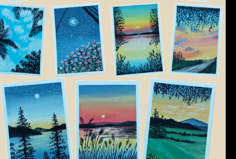
that in our full round, even wildflowers in some cases. And here are some
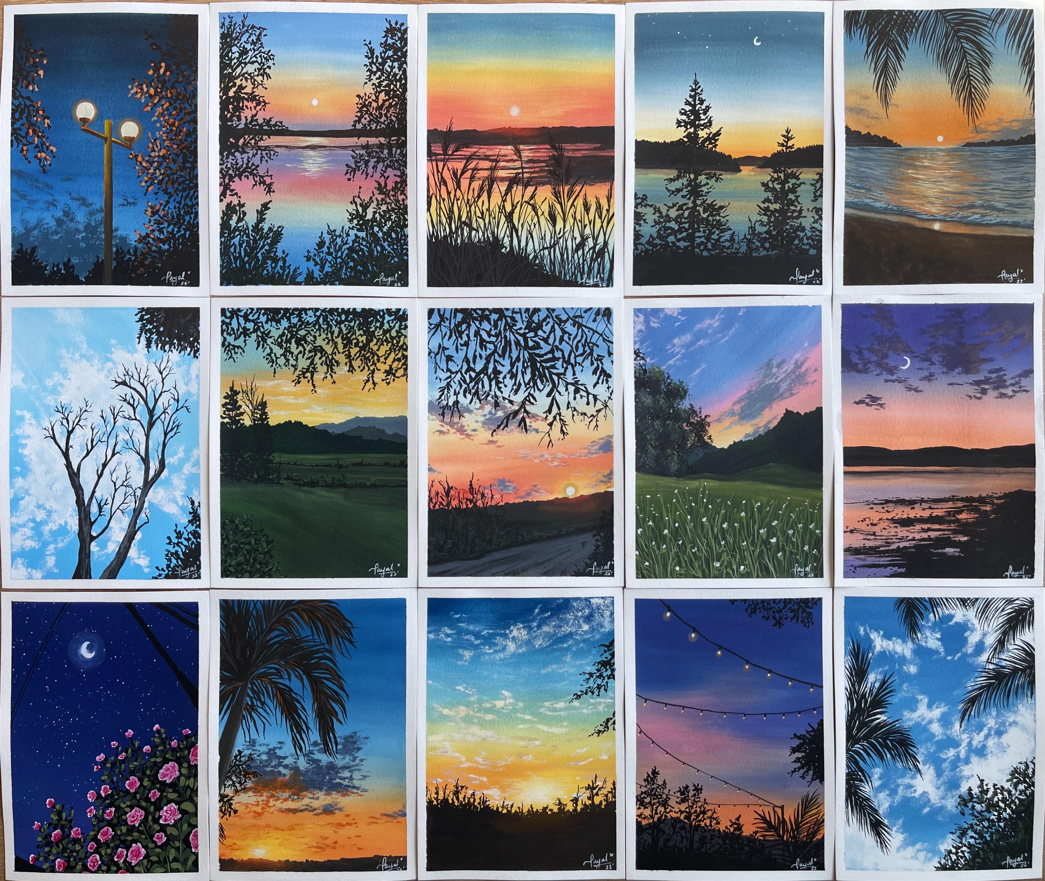
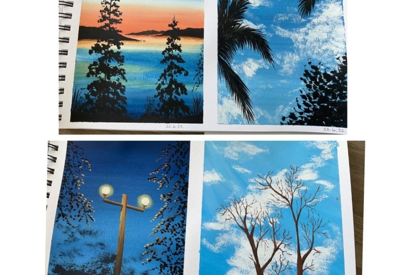
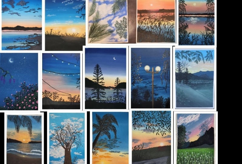
of the sneak peeks of our class projects. But you get an idea, so you need to know how
to make different types of trees and how the strokes
are made with our brushes. So that is quickly get started. Alright, so the first type of tree that I want to talk
about is the pine tree. We're going to talk about
palm trees, wildfires, and the basic tree
shape as well. But first we'll talk
about pine trees. Now, I'm sure a lot of you are aware with the shape
of the pine tree. Now, there are various
different methods in which you can make them, the ways, different
forms in which you can find pine trees
and the nature. But we're going to go for something that is simple, right? So like a basic structure. Now, as you all know, the pine tree is really
thin at the top and it like the main trunk, if you call it, it's another top and it extends to be really
thick at the bottom. And then you have these
individual leaves coming, but individual branches coming out from all around the tree. And then you have those
leaves on the branches. I'm just scribbling the leaf. I'm not going ahead with
a proper structure. But for an example, this is what the tree structure
is going to be, right? And each time the
branch extrudes out from the main trunk it goes because the bottom one is
going to be widespread. As the top ones, they're going to be really small because it's growing that way. So the bottom one is
going to be spread out and top one's
going to be smaller. So here's a basic study
of the pine tree. Now, what I want to focus
more on is how the leaves are formed right here I'm using
my size six round brush, which comes to a
really fine tip. Using this brush, I'll show
you how I make the leaf. So make them mean branch that is coming out from
the main trunk, I make a branch and then I have these little
leaves around it. Now there is no proper
structure that I follow. I'm just going to make these leaves come out from the left and right side
and some in the middle, in the direction of the leaf, or in the direction in which
the branch is going, right. So if it's moving
towards the upside, if it's the direct directing
towards the upward motion, I'll have the leaves coming and moving to the upward direction
to see if they're going downwards that have them going in that
direction immediately you have to make the leaves
following that detection. And the way I make them, it's just tap in these
little dots around them. So this is just an uneven shapes that I tap around my treat. I'm at the top of the tree. I just made these
left and right lines, wiggly lines that will show the budding leaves and the
budding branches at the top. And each time I do that, I increase the size of the branch and the
left and right motion. Another thing to keep
in mind when you're making that tree is to also make leaves in the
center of the trunk. Now you will not only have leaves in the left side
and the right side, you will have some in
the middle as well because it's going to
be all around, right? So don't forget to tap in
some in the middle as well. So you can practice
the stroke just a couple of times to get more confident about during this type of tree
in your painting. The main thing that
you have to learn here is how to make the leaves right? But I promise you that it's just weakly lines in the
left and right direction. There is no proper structure, yo-yo just tapping in these
uneven shapes together to get a replica of the pine
tree that you are adding. So that's the easiest way
in which you make that. Next, we're going to talk
about the palm trees. As you know, you
have the main trunk. From the top of the trunk, you will have these
leaves coming out in all directions, right? You'll have them in
the left direction, will have them in
the right dimension happen moving upwards. It's almost like opening
of some sort, right? It just expands in all directions from
that top of the trunk. And that is the shape
of our basic palm tree. And the major thing that you need to practice
here is the leaf. And I'll show you
exactly how you make the strokes and how you
have to follow them. So I'm going to use my
size six round brush, which is coming to
a really fine tip. Again, I'd like to mention that you can use
a thinner brush. So here are some of the
examples of the pine tree, sorry, the palm tree leaves. I've used in my painting, right? So it's just the leaves. I haven't hadn't
really big structure for the tree as a whole. So if you just know how to add the leaves,
you're good to go. So you start off by making
the main stem, right? Main stem. And then using your brush, you're going to tap at
the stem and release leaves in these
little curved lines. Alright, that's
all you're doing. Now the direction
which the leaf goes is going to be the direction
in which the stem cogs out. The stem is going upwards. You'll have the
leaves also moving upwards and spreading out. If it's bent, you'd have to bend the leaves out in
that direction. I hope this is making
sense to you, right? Because in these leaves
you're following the structure of the main stem. So see over here, I've
curved it down, right? So I'll have the
leaves moving down. And the other, the opposite
side is not going to be as visible because
it's completely bent. It's completely folded. E.g. the stroke that I'm
making use just lines. So you're tapping at the stem and then releasing these lines. That's all you're doing
here. Tapping and then just lifting off your
brush from the paper. That in lifting the brush off, tap and lift the brush off. And you can do that in
multiple different directions. So I would suggest you
practice this with your brush ones so that you are confident with making these leaves in
different directions. The next bit that
we're going to learn is making wildflowers
and their leaves. But you'll find them
growing near lakes. And these are just these
long stems with a bunch of different leaves or petals, I would say coming out and you have these leaves going
in different directions. Now you're going
to be making them. I mean, just imagine
them being like a smaller version of
your palm leaves, right? You have a big stamp. But instead of it going all
the way from the bottom, it's just making those
lines at the top. So you'll have these wild
flowers right at the top. And not all the
way to the bottom. So it's just a bunch of strokes towards the left and
a bunch towards the flight. Now again, these
are going to be in the direction that you're
making the line in. So if they're left there
be moving towards left. If they're right, they're
moving towards the right. And I'll just give you a
closer look of how they look. Just from the line. You have strokes coming from the left side
and the right side. And that is, it. It's really simple to make. All you need is a brush
that comes to a fine. The Pill. If you don't have a bigger
brush or comes to a fine tip, just use a smaller
brush for the leaves. What you need to do is make
long strokes like this. One long stroke and it can
bend it, press and release. Now this can be in various
different directions. You make us true,
bend and release. Make a stroke bend, or give it a direction
and release not these are going to be the leaves that you add in these wildflowers, okay? So you have one leaf going up, down, one bending towards the right or left or in
different directions. But all you have to do is tap on your brush and then
release it, right? And that's how you
will be adding the leaves to your bile flowers. Now the last thing
that we're going to learn is a basic tree. Instead of giving it a name, I thought of keeping a basic
because most of the trees follow the same
type of structure. You have a main trunk
and you have a bunch of different branches coming
out of them, right? So that is the basic idea
of what a tree looks like. You have a big trunk
and then you have bigger branches and then you
have some smaller branches. And if it's a tree during
the spring or autumn, you'll have leaves on them. So let us learn how we can
create that using our brushes. So let me just quickly
draw the basic idea first and then we'll shift to
painting them with our brush. So I'm loading my brush. That is my size six round
brush with black paint. And then I'm just going to apply more pressure and then
slowly decrease it, right? Then I'm going to start making branches coming out from
different directions. Now I'm just going to make
it a little bit, baby. And the lines are not straight
in CME create wavy lines. And then for the leaves, I just stopped my brush and create these little
structures are like little irregular shapes
that are going to act as the leaves
on my branches. Now you can add
multiple branches, multiple sub branches, tiny, tiny branches and leaves. That totally depends on the
look that you're going for. And we'll explore many different
such trees in our class. Projects that are
going to come forward. So you're going to
totally enjoy creating different types of
trees over here. I'm going to show you a
quick look at the close-up. So here I have a
bunch of branches coming out and I'm making that irregular shaped
the tinier branches and then tapping in
some dots around them that are going to act as the little leaves that are
growing on my branches. So here's a closer look of what the branch is going
to look like. Now, I'm going to show you another set of
branches, right? So you're going to have a main branch and then
some more sub branches. Remember that the branches will, if the main branches
going upwards, sub-branches will move upwards or somewhat in the
same direction. They will not come totally
in the opposite direction. Right? Next I'm switching to my
size six round brush, which was not a brush that
will come to a fine tip. And over here you see the, the kind of like the design of the leaf that I make is
going to be different. It's going to be more round. So wherever you want to add more rounded leaves and
details of leaves are going to be more structured and you want really nice round keys. That's where you go ahead
and use this brush. Now again, you don't
have to do it. It's just that different
brushes give different types of brushstrokes and
different types of locks, which can be achieved by
a normal brushes so well. So as you can see,
when I tap my brush, I get a more rounded
edge, right? It's more like leaves
and more round balls. And you understand what
I'm trying to say, right? So you have more curved edges, you don't have sharp point. The other one would give
you more sharp edges. This one gives you
more rounded edge. So that's the only difference
between these brushes. So I'm just going
to quickly create another branch and then show you the tinier
branches that you add. You can add, like I said, multiple different
branches on your tree. So you can just make
them nice and fine and then add leaves and
then fix it later on. Here are all the little
brush strokes that you can use for painting
different types of trees. So we learned pine trees, palm trees, wildflowers
and leaves. And a basic idea of a
tree which we will be exploring a lot in our class, in the upcoming class projects, you're going to enjoy
completely enjoy painting different types of
trees in the foreground, and that is it. In the next lesson, we are
going to explore how to paint two different types
of clouds to see you there.
7. Practise : Sky & Clouds: All right, Welcome to the lesson where we are going
to explore and paint two different types of clouds in our class projects, which I'm going to give
you another sneak peak, will be painting a bunch
of different clouds, some of which are in the sunset, some of which are going
to be in broad daylight. It's a bright sky and
routing clouds and not. So in today's lesson
or this lesson, I'm going to show
you how to paint these two different types of
clouds that we need to know. The first cloud
that we're going to learn is going to be in a bright sky or a blue
sky during the daytime. So start off by applying a layer of Prussian blue at the top. Now, we're going to create the gradient blend that
we learned earlier. We learned how to apply a graded wash where you have the darker color at the top and a lighter color
at the bottom. And that is exactly
what we need to do for our first set of clouds
that we are going to learn. So start off with a dark
color at the top and slowly start blending
it down using white. So I'm going to speed up the process here because
I'm just going to repeatedly do the
same stuff that is going this left and
right motion to create a gradient wash until I am happy with the way
the wash locks. So the process is
again very repetitive. Keep going left and right
and when the White up and then moving into float down until you get a nice wash. I'm happy to wait for the sky and the blend
looks right now, so I'm just going to
leave it right here and wait for it to
completely dry. And once the paper
is completely dry, we're going to go ahead
and make the clouds that I will be using my
size six round brush. Using that brush, we're going to load it up with
some paint that is directly from the tube
without any water. So there's no water in my brush. You can take out a
good amount of white on your palette because
we're going to use it a lot. So we're going to start
off with this movement. As you can see, I'm
just rubbing my brush over on the paper going in this left and
right motion, right. I'm just moving it up and down and in different
directions. Just, just move it. Just a wiggle your
brush on the paper. And since your brush is dry
loaded with some thick paint, as you can see, paint is not, the bottom layer is not
getting reactivated. So we're getting, even though it might dry up to
be slightly blue, but we can layer over to
add highlights in it. And we're just going
to go ahead and add in these clouds in the sky in this wiggly motion and
adding the texture. Now, you couldn't do that with making the texture as well, but you'd have sharp edges and that is something that I don't
want to add in the clouds. I want that roughness. I want the uneven
edges in my clouds. That is why I've
gone ahead and use the TikTok consistency because I want that rough edges, right? That's exactly what
you're going to do. Just brush over your brush
and paint over your paper. And that way you'll be
able to get that stroke. Now what I'm doing is loading my brush with a
little bit of water. And right at the bottom
or in the center, I'm just reactivating the
paint and blending it in. Now what this does
is it creates, reactivate the paint and creates the shadow in our
clouds and the clouds. So instead of going
ahead and adding gray to the Cloud and
adding a lot of details. You can easily add in
details by just reactivating the bottom layer and
adding in the shadows. And then once it's dry, you go ahead with just your
thick white paint again. And once you brush it over, the reactivated layer
and the blue layer, basically that is at the bottom. It goes ahead and
adds highlights to it and that we
are cloud looks much more detail without really having to do a lot of
details and a dry. So just go ahead, load your brush with some
paint thick paint. As you can see, the consistency of my paint is really thick. And I'm just going to go ahead
and add in some texture. And I've added the big
chunk of clouds, right? And now I'm going to add
in some smaller ones. So I'm adding in some
tiny, tiny ones. And as you can see over here, my brush shape is not
completely round. I've pressed it from both sides
and kind of made it flat. I get these nice thin strokes. So this way you can use
your round brush to add in some final details
like your flat brushes well, where you just kind of move them around and make your brush flat from both sides and then add in those thinner
details using that. So as you can see, I'm using that brush to make thinner
strokes and add in some tiny, tiny clouds floating around. My big chunky clouds as well in the upcoming
class projects, but we are going to
paint these scenes. I'll be using the same
method to add in the clouds, but in different forms. So the clouds are going
to look different. And in this lesson, I just wanted to give you a
basic idea of how it's done. So as you can see, we just use the dry brush technique
for the clouds. And that is the technique that I generally end up using a lot specially for the
clouds because I like the texture that it creates. The dry brush creates
these beautiful textures. We've seen how you can
add those texture. So I just use a thick
consistency of paint brush over the paper and it just creates these beautiful textures
for the clouds. Now, in the next cloud section, I want to show you how you can make kind of like
a sunset cloud. For that, I'm mixing my
cadmium orange wet wipes. I'm creating a
lighter version or much tone down version
of the orange color. Then I'm going to
apply it at the bottom and at the top I'll
have a blue shade, which will merge with white. And that will merge
with the orange. And I'm sure you guys know by now what type
of blending disease. This is the blending
with white method, where you're blending
the two colors together using white paint so that you don't create
the muddy color. And since orange and blue
together will create a muddy gray color which you
can use for your benefit. By the way, those
are beautiful colors that go in the same scheme
when you're painting. I'll show you what, how, and why we use those. But you can watch them, but that's not the color
that we want in the sky. At least use white
to blend it in, blend the two colors together. Again, I'm going to
speed up the process here just a little
bit because we are just blending and it's
just replicative process. We are repeating the
paint's going up and down, trying to blend the two
colors together seamlessly. Alright, now that my
paper is completely dry, we're going to go ahead
and add the clouds. But before that, let me show you a bunch of different clouds that we are going to paint
in our class projects. So most of the clouds are gray, as you can see. They either have a blue
undertone to it or a purple undertones to it and have these beautiful highlights. I'm going to show
you how you can get those grades in this painting. Now, to get those grades, you are going to be
mixing the basic colors that you are mixing in your
painting, in your sky with. We have used orange,
blue here, right? So I'm going to mix
my orange color with my blue color adequate, of black and white in it. And then I'll just blend
all of these together. So basically making a
little portion of ratio. So you just mix, mix,
mix these colors. So now you'll see that we have a nice kind of like a
bluish undertone to it. In this, I will add
a tiny bit of red. Now when I add a tiny
bit of red to it, what happens is that the blue
and the red data together, they're mixed together and
form a purple color and that is going to give it that
nice hint of purple in it. So it's a nice gray that we
made using the colors all of our sky instead of just mixing black and white together. So now I'm going
to load my brush, my size six brush and brush. And we're going to be using the same dry brush technique to make the clouds load your brush, tapping the extra
paint on a paper, on a rough paper, whatever
or on your cloth. And then again, going
in that vaguely motion, we're going to go ahead
and add the clouds. What we are doing here
is that we're making smaller clouds instead of
making extremely big ones. And this just gives
the illusion that these clouds are
still at a distance. The clouds in the
previous stroke, we're much more closer, much more right above the head. That is why they are bigger. To add smaller clouds, you're making these same
strokes but in lesser area. And my brushes rather
flat and round. So I've just pressed on my round brush by
loading the paint. And that makes my round
brush slightly flat. And then I'm using that sideways
to add in that strokes. As you can see, you get
these nice thin lines. So the clouds at the bottom are going to be smaller, right? And the clouds at the top
are going to be bigger. Right there at the top. I will make clouds that are even bigger than the mid section. And that's how you
make these clouds. So the clouds at the bottom are closer to the horizon
line and they are much more in the distance rather than the clubs
that are at the top, they're much closer to you so
they appear bigger in size. So I'm using my same color, that same gray without
slightly poeple undertone. I'm using that to add in the clouds coming
from the left side, from the right side. And then some of which
are in the middle. So you can add these tinier
clouds in the sky as well, which will be the tiny, tiny clouds floating in-between
all your bigger clouds. And once we're done with that, we will move on to
adding the highlights. So remember, we go from this step of adding
the base color, that is our gray color
with the purple undertone. Then we move on to
adding highlights to it. And to add the highlights, we just add more
Revit to the paint. Since we're doing a single
color highlight over here, I'm not adding the orange colors like the other class projects. So I'm just going to go
ahead with a single color. So I've just added
more white to the mix. And then I'm just going to
apply it at the bottom of the clouds and leave it
right under their right. Not all the way are not
covering the entire Cloud. You're just adding
it at the bottom. As you can see, you will see that you have these really
sharp lines, right? You have really sharp
edges, but don't worry, we will be blending it
in so that it looks all hold together like
one single cloud, rather than just you're in a
bunch of different layers. So you can use this
light gray color to add in some clouds in
the sky as well. So some more floating clouds can be added using the same color. As you can see, my brush
again is slightly flat down. That way I'm able to add in
thinner, thinner clouds. Now I'm switching my brush to
this size six round brush. It's a clean brush. I've loaded it up with
a little bit of water. And as you can see, I'm just
reactivating the edges and blending it. Right now. You can blend it
using just water or you can load your brush with a little bit of
the darker color. Then when you reactivate it, you just mix it together so
that they just blend, right? Amen, they looked
even spread out. It doesn't have to be perfect. You're just going to reactivate the edges and just make
them blend together so that it does not have
those sharp edges that you can clearly see are
laid above one another. So all you need
is a clean brush, a little bit of water to
just add in the details of just removing those sharp edges from our second
layer on the clouds. If you think that the layer just got blended in
and got really dark, we can load your brush with
the lighter gray and apply it at the top just to add the
highlights more properly. Just in case you think
you've turned them down a lot and it's
not very visible, you can fix it. Again, like I said, cautious, very versatile and
forgiving that way. You can fix your mistakes by
just reactivating your pain. I'm just adding a bunch of different clouds which are
actually just texture, the dry brush texture, I'm just rubbing my brush. The paint is click my brushes dry and that way I
add these clouds, which would appear to be
the scattered clouds, so they're not together, they are much
scattered in the sky. I'm just rob my brush across
the paper and then it just automatically does the job
for me of like blending it. Now the last set of
clouds and I want to add in that orange
section, right? So for that, I'm using, I've added more orange
to the same gray mix. And I'm going to add
them at the bottom where the color of the
sky is more orange. You don't have to do this. I just thought of adding a
few extra clouds in the sky. Now it's all about playing
and seeing what works for us if we like what we see. And if you don't, you
can always fix it by just rewetting it and
taking it off the paper. So that's okay. I'm happy
with how this looks. So now we've created two
different types of skies. And I hope that gave you an idea how we work
with our clouds. Now there are endless
possibilities and color combinations and the way you lay them one over the other, which we will explore
in this class over the next 15, 30 days. So I'm really excited for that. Now that we've covered
all our practice beds, you've learned everything
that we need to know. We are quickly going to dive into the
painting of the one. I'm really excited to see
you in the next lesson.
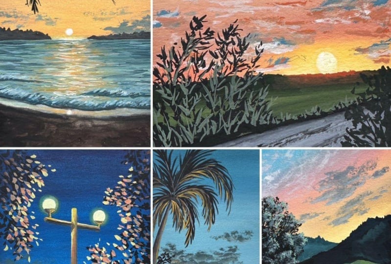
8. Day 1 Part 1 : Purple Sky: To start day one with
this beautiful painting, I love how this guy looks here. The clouds look amazing and even the ground looks so good. I love the texture. So let's talk about the colors. You need, cadmium orange. So you can use a cadmium orange or any orange color
that you have. Next we need primary red. Now I'm using primary red. You can use crimson on any other red that you
have in your palette. Next, I need Prussian blue. Now, Prussian blue
is important because it's a more darker, deeper blue. Next I have lamp black, and I'm going to use my
white tube of paint. So I have permanent white
from Winsor and Newton. All the other colors are
firms that are Newton and I have titanium
white from Brewster. Now titanium white
is more opaque. So I like going to a
titanium white for my clouds or when I'm mixing my colors
to get a lighter version. But you can use any white tube of paint that you have with you. Now we will be mixing
our own color palette, are making their own colors, and these are the colors
that will make and use in our class project
we'll be using are colors that I just showed you to make these new colors,
these B cell shapes. So let's quickly start, right? So I have taped on my paper on all four sides and taking my
colors out on my palette. Now the first thing that we
will do is create a sketch. So I've taken my skills
and I'm going to divide my paper in this two-thirds,
one-third ratio. Alright? So the tooth
hood part is going to be the sky and the bottom part
is going to be the crown. Make sense, just draw
a line. Very simple. Now that you have
your horizon line figured out or created, you're going to go ahead and make this draft mountain shape. So this is going
to be the mountain that is at the horizon line. And I'm quickly just
making a sketch of my shore which has
an uneven texture. Look now I'm just
scribbling these lines. They're not straight,
so you want to go full zigzag over here. Right? Now, we will this will get cupboard when they're
painting or what a bit. So you don't have
to make it perfect. I'm just putting it there to get an idea of where it should be. Let's mix our colors now, the first color
that I've mixed is using my cadmium
orange and white. A little more amount of white. I've added in my
orange and I get this nice space to orange color. Cadmium orange without the white is very vibrant and in quash, when do you want to
tone down the colors? We add white. Now the next color
that I'm making is by mixing my orange color and red color together
and I'm adding a little bit of white in it. Now when I mix these
three colors together, I get a nice base to
peachy pink color. This is going to be the color
that will blend my blue, my orange together without getting muddy shade in between. Next, I'm mixing Prussian blue with the red shade and
adding white to it. When you do that, you create this beautiful blue, which is my absolute favorite. Like I cannot even tell you how passionate I am
about this color. It's so nice and
it's so pleasing, which is just a mixture of my primary that and my
Prussian blue galaxy. Get this beautiful cut off. Alright, let's start painting. I've taken my flat brush. You can use any brush
that you have right here, starting with the orange
color at the base. Then I've added the two pink, peachy pink that have made a lot that on top of my orange. Now I'm going in this
left and right motion. As you can see. I'm just going in this
left and right motion. I'm not going all
over the place. When you're painting or
blending with quash, you want to make sure that you're blending
in one direction. When you do that, you're
blends are more seamless, they're more smooth, and they are more like
just transitioning beautifully from one color to the other. Fits all
over the place. It's not really that appealing, especially when you're
going for a transitional, a gradient wash. Now, once they applied
the blue at the top, I've started bringing
it down and I'm just using a little bit of water each time I feel that
my brush is dry. Now, when you see the
pink and the blue, right, you're just going to maybe add a little bit of
water to your brush and blend them together. Remember how I
told you that that is going to be the color
that will help me blend. Transition from orange
to pink to blue because pink and blue will not
make that new muddy color, but orange and blue. So that is why having
that hint of pink in the sky and blending it with the blue was a better
idea and a choice. All right, so I'm just going in this left and right
motion to blend. Remember that when you're
blending with gouache, you want to make sure
that we're still using the creamy consistency
because your brush dries up. When you're going over
knower and blending it, you have the urge to
add more water to the paint or more
water on the paper, but avoid doing that. Just slightly wet your brush
and you can just easily and smoothly blend your creamy
consistency of the paint. Because when you do that,
your paint is going to dry nice and opaque without showing the whites of the paper are showing
the paper underneath. So I've just got gone in this left and right
motion until I was really happy with how the sky dome light
while the paper dries or the sky dries, let us quickly move ahead
and paint the water. Now I'm going to show you a little different way of blending the colors
in the water. And that is because
there's a little bit of technicality that goes in why
it's being done that way, but I'll try my best
to explain it to you. Start off with the
base two orange color right below the horizon
line in this thin strips, as you can see, I'm just moving my flat brush and it's
fairly light pressure. I'm just adding making
one pen stroke, not all the way
with my flat brush. And right below that, I'll add a black line, not follow me now, I'm
adding a black line. Right below this black line. I'm adding orange again, this time a little bit more. Then I'm just going to
quickly brush it over the black ones to
smoothen the black color. Now, that black color is
the more diluted version, that is why it's
not fully black. Now right below the
orange, I have blue. And right below the blue, I will add orange again. And then the pink
color in the sky, and then the blue
color in the sky. Now let me explain why it
is all over the place. Why is it just not orange, pink, and blue all the way? What happens is right
below the horizon line, you have the deflection of the ether that is right
above the horizon line, then the black line is
actually the reflection of your mountain that you
will make some sense. We haven't made the mountain. It does not make a
lot of sense, right? And then right below that, you have the colors of the sky. Right below the black, you
have the orange and the blue. Now, this is the color that
is at a distance when you look at deep into the ocean or deep into
the scene, right? It's add the distance and the
next set of colors that it transitioned from blue
to again being orange, pink and blue again. That was the area that is
closer to the observer. Then when observer standing, he sees the colors
being reflected again in that sequence
that was in the sky. Alright? That is why the area right below the horizon line
is different from what it would normally reflect because we are
making a vast see over here. That is why the area right below it is different
than the colors are being repeated
again to the edges that are still closer
to the observer. Now once you have all
your colors laid out, you can go ahead and let
everything once again, that is the best
part about quash. If you don't like the blending, if you've just put
things in there, you can go ahead,
reactivate the paint, blend it again and
make it nice and smooth just the way you
want it to be locked. So I'm just going to go ahead in this left and right motion and
blend everything together. You'll notice that the
black line has faded. Just picking it out
in a bit so that it looks a little bit more evident
than it does right now. Because that is the
reflection of my mountain. Again, when you're
adding the reflection, make sure that your black
line is not too dark. Alright? Otherwise, it wouldn't go with the colors of the sea that
you're already making. So make sure that it's a
little more diluted version. You can add a little bit
of orange to it to make it a little more
brown if you'd like. But I've just gone
with a diluted version of the black then to pay all kind of like smudge out the edges
are smooth out the edges. You can just load your
brush with a little bit of water and just
blended into that. It's not a sharp
line and that is it. You are done with the water bit. So I'm just going to go ahead
and tweak it a little bit. Go in this left and right motion to make the blend smoothly. And that is it. Now I'm happy with
it, so I'm going to let my paper completely dry. Now that my paper
is completely dry, I'm going to go ahead and
add the clouds. Clouds. I have taken the same blue mix that we made with
the red, right? And this time I've added a
little more black to it. Remember, black is a
very overpowering color, okay, So you don't, you don't want to add
a lot of plaque. You just want to
add a small touch with your brush and
you're good to go. I want a darker color
of the blue basically. Now, remember how I showed
you the dry brush technique. We're going to apply that
for painting our clouds. So we'll see me rub it
against the tape a couple of times just to get rid of any excess paint that I
might have over here, you want to make sure that
your brush is nice and dry. Because if it's not dry, you're going to end up making these shapes that are
too sharp at the edges. We don't want that. We want it to be nice
and uneven and have a little bit of texture because that's how clouds
look right there, not just blobs with sharp edges. They have nice texture around the more kind of like
smushed out at the edges. And that is why making
sure that your brush is dry really helps when it
comes to painting clouds. He owed, I've used a
mixture of the paint. Alright, so when you're
making a thick mix that could, could pick consistency. That's when your brush is nice and dry because
when you load your brush and only loading very thick consistency
of the paint, then since you're
not adding water, your brushes just loading thick paint and then
you apply on the paper. It looks nice texture. Alright, so we're going to
use that for making clouds. Over here. I've started with
the bottom Clouds and I made them really small. And as we move upward, I'm adding bigger
clouds and making them kind of clustered together. Over here you'll see that
the clouds are clustered and the edges have
texture. Alright? And the middle one is kind
of like just altogether, almost like a, like
a solid color. Just the edges are textured. That is the idea that
you're going with our clouds when you're making
the clouds at the bottom, which is near the pink color, That's where you are going
to make them smaller because those are the clouds
that are at a distance. The ones above that are more
closer to the observer. And that is why they are bigger. So I'm just going to go
ahead and add these clouds. So I'll have these
clouds coming from the left and the right side, and there'll be
some in the middle. So I'm just playing around. You can follow me
along over here to see how I'm applying
these clouds. We can see how my
brush movement is in this left and not
left and right. I wouldn't call it
left and right. In this zigzag motion. That's what you call it. I think some just kind of
like shaking my brush. I'm just shaking
my brush or just rubbing it over my paper. And then that creates
this nice texture. Alright? Because when you're
tapping the brush, first, you are applying the paint
and when you move it, you create that uneven effect
for the clouds as well. So everywhere that
I've added the clouds, you'll see I'm following
the same brush movement. And it is very important to know your brushes and
know your brush movement. And that completely changes the way in which
you make clouds. The only thing that
you need to keep in mind is that the
bottom clouds are going to be smaller than the clouds above are
going to be pickled. And don't forget
to add those tiny, tiny clouds in-between the
bigger shapes that you're meeting that adds to the
effect in the Cloud. And that is it. I am not going to tell you
that this is the only way in which will add the
clouds are this is the exactly is on location. You want to add your clouds. Because I want to be free. I want you to do it
however you want. As long as the clouds are making you happy,
just go with it. I don't want to
confine your intro just exactly how I'm
showing you. Alright? I've mentioned the points, you can follow it
along or you can just do your own thing. Over here, dry brush technique is the main technique
that we're using. Shaking your brush
to get the clouds is one way to add really nice texture and
clouds in your sky. Just that the bottom
ones are smaller and the ones above are going
to be slightly bigger. The clusters of it are going
to be slightly bigger. And that is it. Now we're going to add the
highlights for the clouds. For that, I've made a mix of the same color that we
were using for the clouds. I've added a bit of white
and paste to orange color. So just mixing the basal
orange color and that color would make sense if it's
too dark at a bit of white. So basically we
are trying to get a nice green mix
for the highlights. Now, since it's a sunset and the sun is completely
below the horizon line, but in the sky still has
that nice sunset colors. That is why the clouds
are not just bright, but they're still in
the night sky Zone. So they have nice
green highlights. For that. I'm just
going to go ahead. Use the same motion that we used for adding
the rough texture. That's exactly what
we're going to do. I'm going to add it at
the bottom of the cloud. Alright, so right at the bottom, I'm going to go ahead
and add the highlights. Now you must be noticing that
once the color is trying, it's trying to be a lot lighter. And that happens with quash
the colors dry a little bit lighter than the color that
you will actually lead down. Now the thing that we have
to do here is just blend these two colors together so that they don't look so hard. What have sharp edges
next to each other? For that, I'm just
going to use my brush, clean brush, loaded with a little bit of water
and blend it in. Now, you can do that in
some places if you want. You can also add the
color for the clouds. And just fun when you're
using the wet brush, it will just blend in. So you can just use clean water to blend
it or even the darker color and the lighter color
together to just blend them. I generally like using
the water method. And if I think it
just looks too odd, then I go ahead and did
it with the darker color. Now over here, when
you're painting this, it's all about the judgment. It's all about how you
want it to appear, right? If you like that roughness in your clouds or
the sharp edges, you can just leave
it there as well. Otherwise, just blend it, slightly wet, clean brush, you just see me smoothen out the edges since
gouache is rebuttable, you can read but the pain, fix the lines and
things like that. It works in our favor so you
can just wet it slightly, make it more seamless, make it look like
the cloud is as a whole and tiles are
highlighted with that nicely
seamlessly transition step darker part of the cloud. It can do that but just vetting the edges and making them. As you can see, the sharp
lines are gone now. They look more sick,
not exactly seamless, I would say, but yeah, they are nicely
smoothened out now. And that really adds to
the way the clouds look. I'm really happy with the
way the sky looks right now. And I'm not going to overwork on this
section and draw in it, so I'm just going
to stop right here. And in the next lesson
we are going to be painting our shore bit. So see you in the next lesson.
9. Day 1 Part 2 : Purple Sky: Alright, welcome to
part two of day one. And now it's time to add all the details in
black for our painting. I'm going to load my
size six round brush. And I'm just going
to mix a little bit of black paint with
a bit of water. And now you're going
to start off by making that irregular
mountain shape. If it's gone by
blending the sky, you can sketch it out again
or you can just bring it. There is no perfect
way to do it. Alright? So you're just going to
create that uneven shape. Remember when
you're making this, I've noticed a lot
of time people don't move the brushes and, you know, the lines
are very straight. You don't want it
to be straight. You want it to be really uneven. So just go up and down in
the movement while you're making and carefully
at the horizon line, make that nice, clear line, and then just fill in the entire space with
your black paint. Remember how I told you that? If you are going to sketch
out all the shore bits, it's going to get covered when
you're blending the water. So that's exactly what happened. So we'll be sketching
it out again. Now making a thin line with the black where
the reflection of the mountain was
going to leave it as is. Or I don't touch it. I know the edges are sharp. We will fix it later on. I just want to lay
it out there today. Don't forget. Now, we're going to take a pencil and sketch
out the shore bits. Remember I showed it was
in a zigzag motion, right? Or like an uneven shape. It wasn't straight carving out. So we're going to do
the exact same thing. You're going to take
your pencil and start making these little
lines that are uneven. So some are longer than they are shot and then long again
and then they're shot. You can see what I'm doing
with the pencil over here. There is literally no way
to describe this. I guess. It's just uneven. Alright. You want that uneven? Kind of like the surface where some bits are rocky and
some bit has water. That's basic idea. Now we're going to start off
with the painting bit of it. Load your brush with
some black paint and start filling in that shape. I'm starting off with an uneven rocky shape so that
it looks like it's rocky. And then I'm just making these nice thin lines over here and you have to be very
controlling of your brush. I mean, I wouldn't really
call it controlling. You have to be really light
with your brush as well, but you should know how
to move your brush. When you combine those
things together, you get a nice like the exact
brush stroke that you want. So here, I'm just going to go ahead and fill in that space. They will see me
use a little bit of the dry brush technique as well, just where I want the edges to be rough and have a
little bit of a texture. Now at the top, I'm going to go ahead and just make the
surface uneven, right? Because we want to show
that ground. It's a ground. So it has to be uneven, there has to be rocks because
that's exactly what we're making and that is why the uneven shape
needs to be there. So I'm just lightly going in this left and right motion and being very light with my brush, but controlling my brushstroke, need to know where to apply it. Again. There isn't a perfect
way to do this. Though. Uneven shape. You can make it
however you want. Remember it has to be longer and some places shorter
in some places. Alright? Because the
water is not going to exactly form a division
where this is my bet. You can be the rock
on the other side. Know, it's going to be uneven. Alright, I'm sorry
for that very, very stupid analogy, but it's going to
be uneven, alright? And you have to make
it look like that. So here you'll see me just
moving my brush, right, just like clouds, but here it's more straight and
left and right. And just fill in that
space and color it in, add a little bit
of texture because that will be the part where
there's just these tiny, tiny bits of rocks and
then water over it. That really adds
to the painting. So when you add a
lot of texture, it looks really good. So over here, I've just created
this basic shape first. And then I'm going to create
the remote texture in it. Add a few little smaller
rocks so that it adds to the painting and
makes it look complete. Alright, now that I'm
done with the ground bed, I'm going to go ahead and
slightly smooth out the edges. Remember how I showed you,
we're going to fix it. That's exactly what we're doing. I'm loading my brush
with a little bit of water and a little bit of, let's say a diluted version of the black paint and then a lot of water and just
a slight touch of black. Then I'm just going
to blend it right in. So now the sharp edges are gone. It looks more blended
with the ground water. And it looks more like
a reflection, right? It makes more sense now. So I just wanted to
deepen the color of the reflection and then
just blend it out slightly. Now what we are going to do, I had to fix a little bit off my mountain right here because the lines are really sharp. I went ahead and just
added another code. Now we're going to add
little rocks, tiny, tiny bits in the, in the short part. So I'm just making these
irregular shapes at the top of the ground and then adding some around the shapes
that I created. Now, they are very random, okay, I am literally just
thinking about where I can add them and
then just adding these dots. Now they're not exactly dots. You want the base
to be a lot more flatter and the top
to be more curved. So that's the because
it's in the water or it's like just peeking
through the water. It's going to be flattened at the base but more
curved at the top. That is what I'm doing, trying to make the base flat. Or you can just add these tiny, tiny rocks however you want to make sure
that they're tiny, they're not too large because
they are added distance. They're not going to be huge. So tiny, tiny rocks and the
water wherever you'd like. I don't confine you and tell you exactly
where to add them. Just go ahead and have
fun in this process. Alright, now that I'm done
with adding the rocks, I'm going to add a
little more texture. Like I said, we're going
to be making the edges more texture and add
those tiny, tiny details. For that, load your brush
with some black paint, thicker consistency
would be good. And then you're
just going to brush it below those shapes
that you'll need. Add a little more texture
to the painting and add anymore little rocks
that you would like. But just add texture
now over your, there is a little bit of a
tendency to overdo the step, but be very gentle, just a few little
strokes at the end. We're just adding the texture
and it will look amazing. So don't overdo the
texture just a little bit. And you are good to go. Alright, I'm really happy with the way everything else logs, and now it's time for us to add the final touch
and make it complete. And that is by adding
a crescent moon in our painting that will just
light up. That's paintings. So load your brush. I'm using my size six brush because it comes to
a really fine tip. You can use a size
zero brush and then make a little bit of all inverted C. And then just make the middle section
little bit more thicker and the ends more sharp. That makes the perfect
crescent moon inverted X0. That's what we're writing. And making the center portion of the middle part a
little bit thicker. And that is it. We are done with
adding the moon. I think it looks so pretty. They can go ahead
and layer it once again if you think
it's too light. So wait for the layer
to dry and then you can let it again. That is it. We are done with the painting. Once everything dries,
you're going to quickly build the tape off. And oh my God, look at that. I am so happy with the
way this painting turned out because it was not so
difficult to paint, right? The composition
was quite simple, but we learned so much in this painting from the
beautiful blend in the sky, the clouds, the gray
highlights to it, the uneven shore and
that cute crescent moon. I hope you enjoyed
painting this with me. Here's a cute little
sneak peek for a D2, and I'm really excited for it. So see you there.
10. Day 2 Part 1 : Break of Dawn: Hello everyone, Welcome to the second day of the challenge. This is the painting for today, which is a beautiful sunrise and loves the clouds in the sky. Let's know the colors
that I'm using. Cadmium yellow. So you need a warm
yellow and orange color. Use cadmium orange. Next we need a blue. I'm going to go for
Prussian blue, right? And lamp black. So we're going to be making
a mix for the brown. You can use brown
if you want to, but I've been making
my own brown for that louis part in
the foreground. Next, I need white
paint so you can use a titanium white to work
perfectly for the class. So just take any white. These are the colors that
we are using for the Cloud. So I'll show you how to mix these colors when we
are painting the sky. So let us quickly get started. Alright, so I've
taped on my paper on all four sides and
taking the colors out, as I mentioned, on my palette. And the first thing
that we're going to do is create a rough sketch. So I'm making this slanted line and the bottom of my paper. Right now, this is going to be my crown space.
Right above that. I'll have my son in
towards the right side. And then I'm just making
these little branches. They're not very dark, they're not very
perfectly put out. It's just very random, just as a sketch
that I would make just to give myself
an idea, right? So I'm just going to
roughly put it out there just to know
what would go there. Now, it's time for
us to talk about the colors that we're
going to use in our sky. The first color is
going to be my cadmium yellow mixed with a
tiny bit of white. So it's just going to
tone it down very little. And it's going to be the
color right around the sun. Next is my cadmium orange mixed with a little bit of
cadmium yellow and white. So it's like that nice yellow, orange color mixed
with white but tone, the vibrancy down, like I
mentioned earlier in gouache. You add white to tone
down the columns. Next color that we need is my Prussian blue
mixed with white. So I've just taken a little
bit of Prussian blue, added a little bit
of white to it. And then I get this color. It's still like a nice
deep Prussian blue color, but slightly toned
down and lighter than the Prussian blue
directly from the tube. Alright, Let us start painting. So I'm just going to make sure that I clean
my brush right here. I had a little bit
of blue and if I, even if you have a
little bit of glow, yellow is going to turn green. And that is why I made another
puddle where I'm making the same yellow color
that I squashed earlier. And now I'm going
to start applying it in thin strokes like this. And leave a little bit of whitespace in the middle
where the sun will be. So this is slightly
from the center line of the paper is slightly
towards the right side. And then around it, I will lay down the
yellow, orange color. So you'll have the
whitespace in the middle, then you'll have
yellow around it, and then you'll have the
yellow orange color and then slightly darker version of the orange color around that. So it's just going to
be a transition, right? So as you can see, I'm
going to go ahead and I'm applying that little strokes just to lay down all the colors. Now I'm going to switch to
my size two round brush. And I've taken just
white and added that in the whitespace that
we have in the middle. Now, the white will slightly
mix with the yellow and turn into this very pale
and bright yellow color. And that's exactly what we
need to show, the bright sun. And I'm just going
in this left and right stroke to just
read that out in the. So that's just not
a circular shape, but it's more spread out. And then I'm just
going to even out the colors that
I've already laid. So I'm not going
to mess a lot in this area because if I do that, I'll mess up with the sun
and I don't want to do that. So I'll just leave the
colors right there. And then we'll start with
the blue at the top. I have the Prussian
blue on my brush. I added a little bit of water to it to make
it nice and flowing. But still the consistency
is quite creamy, I would say are velvety. It's not too thin. Alright, and using that, I'm going to move
in this left to right motion and apply it
all over the top surface. And as it moves down, I will just load my
brush with a little bit of white without really cleaning my brush just
a little bit of white and water and then
blend it down. Now, the white will mix
with the blue that's on the brush already that you've already loaded from
the previous stroke. Then it will slowly
start toning. Offered lighter blue color, lighter Prussian blue color. That's exactly what
we're seeing right here. It's blending into
this light blue color. And each time you move in
this left and right stroke, you're just blending the colors together so that these
asleep painless. Seamless transition
between the darker blue to the lighter blue and
then eventually to the white that we'll transition into the orange that whitespace
that I have in the middle. That is going to be
the space where I use just white paint, like wet white paint. And then I'll start
blending it in this left and right motion, moving it upwards and downwards. As you can see, we created
a little bit of green, so I will just clean
my brush completely, load my brush with the yellow, orange color and try
and fix that slightly because we don't want that
very evident green in the sky. Alright, so just go in this
left and right motion. Now here, the step is
varied appetitive. What I'm trying to
do is just blend the white band with the blue
and with the audience so that you can see the
transition happening from the yellow to the orange to the light blue color
in the middle, too, light blue and then
to darker blue at the top. And now that I've laid
everything down, I think, or if you think you want
to change something, you want to mix the colors
a little bit better, merge them a little bit better
now it's time to do it. So I'm just going to
go and fix in my sky. If you think your first
blend was good enough, you don't have to
repeat that step. This is only to fix in
things that you don't like. Why the blending vector, right? So since gouache
is a rebuttable, even if the yellow orange
portion had dried out, you can revise it and then blend it again and that
is the best part. I'm just going to go ahead and now mix everything together. Each time you feel like
your brush is dry, slightly wet the
brush I'll give very, very little, just
a little bit of clean water and then go ahead
and start blending again. I'm just having that
nice transition rate and trying to put in the darker colors because I thought that the
blue just got really light with the light colors
that I moved upwards. So just add, add a
little bit of darker blue at the top if
needed for you. And I've done that. I've
added a darker blue at the top and then blended
it down a little bit. Over here. The process
is all about moving left and right and blending
it altogether. The area around the
sun is quite dry, so I'm loading my round brush again with a little
bit of white. I'm applying that again in that area that I did
because the color, the white color dried
out to be lighter than I thought and imagined
and wanted it to be. So adding a little bit
of white around it, it's going to make it nice and opaque and then just move it around so that the color is
not just standing there, but it looks like the
sun is glowing bright. So just create that
rough texture around the sun by just using
your dry brush technique. As you can see here, that's
exactly what I've done. I've tried to blend the white slightly with the
background by using fresh, clean supply of water. This way, the illusion
is created that the sun is glowing and it's really bright and white as compared to the rest of
the colors in the sky. Right? Now, the painting
is completely dry. And once your painting
is completely dry, we are going to be adding
the texture clouds. Now, I didn't mess up for
one bit in this part, which I will show you
where you are not mixed my white color with a little bit of orange
like very little, exactly the color that
we used for the sun. Alright, so we're going to use the dry brush technique
and add in the clouds. Now the clouds are the
top in the blue area. I don't like them, but I'll show you if you ever
made a mistake like that, how you can fix it. I didn't want to show you guys the whole process of
making wrong clouds. So instead I'll show
you how to fix it. Alright, so I'm mixing a
little bit of orange and yellow into my same white mix. Okay, So using this color, I will be adding the
clouds that in the yellow, orange, and red green
little section. Over here. Again,
we're going to use the dry brush technique like we did in the
previous lesson. We've used to white or a light. Hello over here because we want to show the bright clouds. They don't have a lot
of shadows in them. Currently. The sun is just
rising and it's hitting all the clouds and then grasping onto the
color of the sun. And they're all just
bright in the sky. So that is why we have that nice white color
or off-white color. You're going to be adding
the rough texture. Remember your brush
has to be dry in this process because only then you'll be able
to add the texture, okay, and we need that texture. We want that rough look in our clouds when it's all
spread out on it's not. Having those sharp
edges are very evident sharp edges
to make it clear. That is why the dry brush
technique is very important. So what does dry
brush technique? It is just your brush without any water and just
a little bit of paint. As you can see when I
glide over the paper, it creates that texture, right? So I have clouds coming
from the left and coming from the right and
they're all smaller clouds. I'm not making them really large because these are still further
away from the observer. The blue clouds are going to be bigger because
they are closer, are much more above the
observer's head to be exact. And so we're going to go
ahead and add in the texture. Load your brush, use the dry brush technique
and add in the clouds. I want you guys to be free here. I want you guys to add
the clouds wherever you feel like adding and you know, the color that we're adding. Now the next color that
I'm making is this nice, kind of like basal orange
gray color, right? Or like a tan color to be exact. What I've done is just mixed a little bit of
Prussian blue with black and then with
a slight bit of orange to this creates
that nice tan color. And using that, I'll
add in a little bit of shadows to the clouds that
are closer to the sun, or write or have
these darker clouds very close to the sun. So again, using my
same dry brush method, I'm going to go ahead
and add in these clouds. Add them anywhere in that area around the
sun or the yellow, orange fit, you'd have these
darker clouds around it. And then we'll add
a little bit of highlights on them using the pale off-white color that we just used for
the clouds above. All right, once you're
done adding those clouds, we're going to add the
highlights like I mentioned. So again, use your
dry brush technique, load that white
color that we use, and then just add it on the
clouds or around the clouds, you can even almost
cover the shape of the clouds that we made. But it's good to leave
a little bit of hint of tan around it so that it
looks like the shadows. And here we're just adding clouds wherever
we feel like it. We want to add any text shows. We'll go ahead and
add those textures. So this is your play area. Go ahead and add these clouds. Remember, the top part is going to be bigger
clouds and the smaller, the bottom part is going to be smaller clouds to
just go ahead and add a little texture
wherever you want. Or you can just follow me along and see where
I'm adding them. But here is your play zone. So just feel free to add the
clouds where you feel like, alright, now that I'm done with all the clouds
at the bottom, I'm going to show
you how you can fix your paintings if you have
made a mistake like I did. So load your brush with
water and then just start blending it
out on the paper. You might have to be a little bit rough
ER loaded brush with a little more water
than expected. But do that, you can lift off paint from the paper
as well if you'd like. Or you can just go
ahead and add in the same colors and
try to blend them. Now the only thing that
you have to keep in mind that you have
to do is to match the colors at the bottom so that it's not that very evident that you did something suspicious for you
made a mistake, right? So you want to just slightly
match the colors over here. I think we match the colors, but the line was still
evident. But that's alright. It will dry and not
have that line. Alright, let's go
ahead and start adding the clouds. Over here. I'm going to add the same
texture as you can see. I have that little movement in my brush for the texture
like I showed you before. And you're just going to add
in texture clouds over here. There are more, it's
more about the texture than it is about the
cluster of clouds. You've seen this clouds in the sky that they're not
together but they're like spread across and it's like a nice smooth
texture in the sky. That's exactly the look
that we're going for, or that's the imagination
that we are going with. So adding the
texture coming from the right, moving downwards, towards the left and the
left ones are going to be smaller textures as compared to the textures from
the right side. Alright, now I'm
just going to add in a few more clouds and left or right from
the left side that it's coming towards
the right just a little bit and they merge with the clouds coming towards
the left from the right. Alright, so they kind
of merge together. So adding the
texture, if you want, you can do the same thing, but from the opposite
side as well. Feel free to do that. But here it was more about the texture that we
added in the sky. I'm just going to
go ahead and add in a little more clouds wherever
I feel is necessary. Or if you're happy with how
your clouds have turned out, you can stop right
here, but remember, don't be too hard
on yourself, okay? You don't have to
make the clouds look perfect or
whatever you've done up to now is going to look fantastic once you have
everything laid out, I promise you that, right? So just go ahead and relax. If you like your painting, It's very easy to get
into that zone where you want to overwork because
you want to fix things. But even if you have even if you have a first
glance painting anything, it looks good, then
stop right there. Don't overdo it, right. Stuff. If you're happy, then we can
move on to the next part. In the next lesson, we'll be painting the
foreground together. So see you there.
11. Day 2 Part 2 : Break of Dawn: Alright, let's start
with part two. Here. I have mixed
my black paint with a little bit of orange so
that it has that brown color, or right, and right
under the sun, the foreground is going
to be much more orange. I'll show you how to do
that, but let us start with the foreground on the
left and right side. So I've taken my size six brush, which comes to a
really fine tip. So I'll be using that brush
itself to make the branches. But if you don't
have a brush that comes to a nice fine tip, you can use the
smallest size brush. Okay? Alright, let us
start with the branches. So making these very
thin strokes, right? Very thin lines and
just wiggly shapes, honestly just branches
and then just random, random thoughts
and shapes around it than not at all perfect. If I were to redo this painting, I won't be able to copy
the exact same thing because this is completely
out of my mind, is just what I feel in the moment and that is
exactly what I'm doing. Alright, I'm just
making these shapes, some of them taller, some of them smaller, some of them are thicker, some of them thinner. And that is exactly
what you have to do. Just go with the flow. Alright, you're just
making these lines and then tap in some
dots around it. Make some branches, make
some leaves play around. This is, again, your playground. You are going to
play and mix and match whatever you
feel like doing. So now what I'm going to do is just make these branches
and right below fill in the entire shape at
the bottom with just black. Hello, right? I mean, that makes with rid of orange, that brown, dark
brown, deep brown mix. I'm just going to fill it right? And so this is going
to continue right, until we reach
that some portion. Alright, and then just going
in this random motion, I'm going to fill it right in. You don't have to be careful about the direction in which
you're moving your brush. It's very random, just so
cologne, up-down, left-right. It's completely choice. You can do it however you want. Yeah, go ahead and create these little details of the
branches and the shrubs. Alright, so we've
kind of reached that era which is
around the sun. So for that, I'm mixing my orange color with
a bit of black. And as you can see, when I mix
these two colors together, I get a nice orange color. So the more orange you add, the more lighter it's
going to be, right? You get a nice kind
of like a bond of a color which is between born sienna and burnt
umber, in my opinion. So it's darker if you add more black and it's going to be lighter if you add more orange. Now using this color, I'm going to go ahead and
create some branches. Alright, start off
with those little, little shapes in the middle. So adding some branches
using that color. And then we will move it into our ground so that we can
spread it out evenly. So as you can see, I've spread the whole thing in that layer, which is right under the sun. All right, so we can add in
the branches on top of it with the same color and then again transition
into the black. So what I'm doing here is adding the darker color so
that we can just blend the orange with the brown, the depot grounds so that
there's a nice transition. You can see the glow.
You can do that by layering the brown
oval and then taking the lighter brown color
and going over it and just mixing and blending it in. Now if it's not blending, load your brush with
some clean water and just even out the edges. That's completely fine. But when both of
your paint is wet, you should easily be able
to just kind of like sway over the darker brown
color and create that effect. It shouldn't be that difficult. It's both the dark
brown color and the lighter brown that
you're laying in bed. Alright, now I'm happy with
that little glow in the sun, right under the sun. What that Asia is, it has that nice
light brown color. So I'm just going to go ahead
and make those branches and those little shapes of trees and shrubs and all
that right under it. And then again transition
to the darker color as I move away from the Asia
right under the sun. This is, again, a very
deputy tough process. I'm really not following
a step right here. I'm just going with the flow, adding these little shapes
controlling my brush movement. Of course, having a good
grip over the brush, having a good knowledge
of my movement. And rest of that. Other than that, it's
all just imperfections. Go ahead and make some, some strokes, make
some branches, all of that after that,
it's just a game that you play is just a fun. Yeah. Go ahead and add these in. Once I was done with
the bottom portion, I thought of adding
a few branches coming from the right to
the left as well as I'm creating one branch
and then adding in little strokes left
and right around it, creating those sub branches and adding a little bit of
details for the leaves. Just because I felt
like the sky needed some branches coming at the top as well and
not just the ground. Because of that, I
added a few branches and leaves coming out
from the right side. Now you can make this coming
up from the left side. You can even go ahead
and add some more, make them bigger if you
want to go with that. This is again, your playground so you
can choose what to do. I'm here to tell you
how to do them, right? So adding these branches, you can make them on the
right side and the left side, even from the top. Wherever you wish to place them, go ahead and place them. Remember that the
branches coming down the sub branches will also
move in the same direction. They will have an
angry, but they will move in the same
direction, right? Just that is the only
thing to keep in mind. Once you are happy with whatever you want to
place these branches, that will be the end
of our painting. After that, we're not
going to be adding any more details
because we are done. Once your painting
is completely dry, I'm going to carefully peel the tape off and oh
my God, look at that. This when it started out, I made a little mistake that I wanted to
correct in the clouds, but I'm so happy with the
way this has turned out. You can't even see where those mistakes because it all laid out together and now
it just looks so amazing. I'm so happy with the nice glow in the
ground and those branches. They look so cute and the
texture in the clouds, oh my God, it's to die for. I hope you enjoyed
watching the two. And here's a little
sneak peek of our D3. I'm really excited. So see you soon.
12. Day 3 Part 1 : Fairy Light Evenings: Hello everyone,
welcome to day three. I hope you're all having
fun in this challenge. This is the painting
for today is this beautiful fairy
light evening. I love how the sky
looks in this, the fairy lights and
nice and flowing. So let us quickly talk about
the colors that we need. I'm going to use
cadmium orange here, so it's a nice orange color. Next, I have primary red. So you need a red color for that beautiful purple blue sky. Next I have Prussian blue. I have my white tilde. So as you can see, I need big, big tubes of white paint. And lastly, I have the lamp, black colors. You
need a black codon. These are the shapes that we're going to be making inside. Plus I'll show you
how to get each of these colors while the painting. So let us quickly get started
with our class project. Alright, so I've taped on my
paper on all four sides and taking the colors out on my
palette as we discussed, the first step is creating
our rough sketch. Alright, so for this one, what I am going to do is create just a rough idea of what is going to
happen in the painting. I've taken my pencil. You're going to have one set of uneven mountains
right at the bottom. Right. You can just get
whatever shape you want to go where you want them
bigger in one side, smaller on the other side, whatever you wish for. Next, I have a
slanting ground shape. Now this is the ground on which my trees
are going to lie. So I'm just going to
quickly sketch out a few little stems and
branches and trans. This will give me a rough idea of where the tree
is going to go. Of course, all the
details will come in when we are making the
exact same thing. So add a feudal strokes, rough sketches in the
background at the bottom. Now, for the fairy lights, I have one coming from the top. You can make these fairy lights. However you want to make them. Alright. I have three layers. I have one at the
top which is closer, and 2.3 of them at the bottom. So this is a mid one which
is slightly in the middle, and the last two go together, attaching themselves to a pole. And that's going to
be the furthest. A fairly light. Alright, let us talk
about the colors. I am mixing. A little bit of my cadmium
orange with white to get this nice pistol
kind of orange color. So this is the color that
we'll be using for the sky. Next, I want to make a nice little peachy
pink color as well. So I'm just adding
a little bit of red to the same orange mixture. So I get this nice
coral pink color. Next, I have to make
the color for the sky. For that, I'm making mixing my Prussian blue
with my primary red. Adding a little bit of white to color depends majorly
on the red color. So what I'm trying to say is
like if you want more fun, you're going to add
more red to it. But I'm happy with
that just slight hint of red in my color. So these three are
the basic colors that I'm going to
use for my sky. Alright, so let's
start painting. So as you can see, all the consistencies
that I have are off like a nice
smooth consistency. So we're going to start off with the orange color at the bottom. And we're going to slowly
work our way upwards. Now, I'm adding a little bit of yellow to the same
orange mix and I'm adding that in as
well just to get that warm yellow
color in the sky. And then I'm using that pink shade or the cooler
pink shade that we made. And I'm going to add
that in the sky as well. So you're just
trying to blend in all these colors and
put them in the sky. Now over here you have two
options to blend it, okay? You can go for straight
blend or like, more like a gradient blend rise. You're gonna go from the
dark colors at the bottom, go to the lighter
color and then using white blend and blend it
with the blue at the top. Or you can do what I'm
doing and I'm just trying to have an uneven blend
in the sky, right. So I'm just going to
load up some blue, start applying it
at the top and then slowly start bringing it down. Working our way down. Again. We have the milk
like consistency, so it's nice and trans loosen. The base layer has
to be thin, right? So it has to be slightly thinner as compared to the
layers that we're going to add over to figure that out
in our techniques lessons. So let that happen, let that milk consistency be the blending consistency
that you have. Now right over here, as you can see. I'm going to be mixing it
with a little bit of white. I'm trying to blend in the
blue color at the bottom, so I'm slowly trying
to bring that down. And you see that
I'm not bringing it all the way towards
the left side. I'm leaving that little space. And that is the
space where I'll be adding a nice pink color. So you can use the same pink
color that we made before, R or S washed out
and showed you. Or you can make a
lighter pink color and then add that two
from the left side, stopping midway to the right. It looks very all over
the place right now. It That's right. But blending everything together
is going to fix it. So as you keep moving
your colors around, adding in darker
tones of the colors and just trying to blend
everything together. It will all come to place
and who not look so odd. So over here, the process is to just lay down
the base colors first. As you can see, we've laid down all the colors that we need. And then we're going to add in another layer for
slowed up paint, brushes with paint again. Then go ahead and blend
everything together. Like I said, I wanted to do
something different with this guy here and I
have a gradient wash. And that is why I
tried to mix the blue and the pink in the
middle together. So over here, the blending processes where it's going
to take time for this guy. So we have to keep moving
our colors around. Keep adding a darker tonal
value of the colors. As you can see, I'm
mixing my pink color. I'm adding a little
bit of orange, red, white and orange together for that nice coral
pink color that in the sky blended it with the flu in the left
and right motion. So since squash
can be wet, right, you can re wet surface and
paint over again so you always have the opportunity to keep blending and moving
your colors around. I'm just going to slightly move the pink upwards to the blue. And again, as you can see, it looks like it's just
standing over the blue. But once we blend everything in, once we add water to upbeat, I've just re-read that area and mix it well with the pink
that I just laid on top. It will blend together
and look even. Alright, so we're just going to move the paint around and blend it in when you are trying to mix the pink and
the top of the blue. Just be Betty night
with your brush. Now when you're very
light with your garage and applying very light
pressure on your brush, the paint will just
slightly move and blend in, rather than just the white, let's say superimposing
on the blue or the blue taking over the pink color
that we had and then just letting it all a
sham so we don't want that to be very light with your brush when you're
blending it in. Or when you do that, you get
that nice bloat out effect. Over here, the pressure that
you apply on your brush. It's important to remember
cool light with it. See what you want
to add the colors. And again over here, this is your space. You can meet the sky
however you want. That's why I mentioned. We can make a straight blend
or the graded wash as well. Not a problem. You
can go with it. There's nothing right
or wrong with the sky. I just felt like doing
something different. So I thought I should
just add that we have that flowed out
unevenness in the sky. Straight washes are good
to go ahead and just enjoy the process of
blending because we're here to understand
the medium better, understand the
movement of our brush, understand the pressure
that we apply. So it's all about having fun
in this space right here. So once you're happy with how
the blend is going to lock, all your sky looks perfect
if you think it looks good, but we'll stop right there and wait for it to completely dry. Before we go ahead and
move on to our next step. I'm really happy with the
way the sky looks right now. So I'm just gonna wait for it to dry and then start off
with the next step. Alright, so now that the
paper is completely dry, it's time for us to move
on to the next step. We are going to sketch out
a string lights again, and then paint over it. I'm going to have three sets. String lights, one is very
close to the observer. Second one is somewhat
in a medium frame, and the last one is really
far away from the observer. And just attaching itself to actually have for string lanes are lines,
if you want to call it. You've got four of those. And once you sketch that out, we'll be adding a
few little details to it and then
quickly moving on to the painting with gouache because it's opaque
as you can see. Our sketch got
covered completely, right, so we just have
to sketch it out again. So once you're done
with the base sketch, which is off the string
lines are the cables. It's time for us to add in
those vertical lines moving downwards for the lamp holders in which the bulb will stand. Bigger ones and the first-line because they are closer
to the observer, the next ones are going to be slightly smaller and advocacy they are closer to one another. Distance between them
average use them. Because since they
are further away, the distance between them
is gonna get smaller and it's going to appear much
more closer to one another. And as you move to the last two, it's going to be much more closer as you meet
the second one. I'm very, very close as compared to the first
one that you made. So just work on the distance to slightly increase the distance. There is no perfect distance in which
you're going to make them make sure that they
are the same width apart, are the same distance apart, and just increase the distance
with each line you make. And now that we're done with it, we are going to
paint it with black. So I've loaded my brush size six round brush, bigger brush, which comes to a really
fine tip because we want to add a very
light details. And what we are going
to do is just over line cable that we just
drew so carefully, just overline the sketch
that we just made. The cables that are that is the first cable is
going to be pick up, like I said, because it is
closer to the observer. And you are going to sketch
out this lamp holder as well. So they are going to be bigger because they're closer
to the observer. Now that we're moving to the
next one, as you can see, you're going to slightly decrease the pressure that
you're applying on your brush. And these cables are
going to be lighter or smaller as compared to the cables that you
sketch in the first one. And a lamp holders are going
to appear smaller as well. So as you can see, the
thickness that I'm making them ad has reduced. Now, in case you feel like your sketch does not follow the width video
going to go for. You can always fix it right here because the paint is
the permanent one. Everything else can be erased. Now the third one and the fourth one are going
to be even lighter. So you can switch, your brush
gets even smaller brush. If you're not very
confident with the pressure on your
brush, It's okay. You can change your brush
and you will get smaller. A thinner line effect on it. Paint over the pole that
you sketched out as well. So just go over and
paint that fall. And then again, sketch
out the fourth line and add in the lamp
holders in them as well. Again, you're going to
make them even smaller. So the lamp with other
lamp holders are going to be even tiny or as compared
to the previous ones. So that is the only
thing that you have to keep in mind here. Now that we're done with this, we are going to go ahead and paint the mountain that we
sketched in the background. For that, I'm going to mix my Prussian blue with a little
bit of black and white. So I want to create a
color which still is a little bit blue in shade
and not completely gray. And that is why I'm mixing with the same Prussian
blue color so that it has that hint of blue in it. Go ahead and just paint over
the sketch that you made. Now, I completely forgot that we didn't have
to paint over. I'm in pain before
ball first and the mountains are going
to be behind that, so it's going to get covered. But don't worry, you
can just paint over the pole and then
make the poll again. That is completely okay. And once you are done
painting the mountains, you're going to let
everything dry. So as you can see, our
painting is coming together. You can see that things
are happening and it's going to look
good ones are fine. Loop picture is ready. Just go ahead and
add the mountain. And then we are going to
move on to the next step. So in the next lesson, we will be adding the light bulbs and all the
details in the foreground.
13. Day 3 Part 2 : Fairy Light Evenings: Alright, let's start
our foreground section. So for that first, I'm going to just make
the ball or evidence. Remember last time we
had to paint over it, I'm just going to paint over the mountain layer and then make it more bold and stand out. And now it's time for
us to paint the lipids. For that, I'm mixing two colors, yellow and orange and
adding white to this. Now what we are going to do is try and get that
nice Chloe effect. So as you can see, it's
a very nice light, yellowish orange color. And to get the glowing effect, what we have to do
is load our brush with paint applied in
the circular form. So we'll just apply it
in the circle form. And as you can see, it just stands out with
those sharp edges. What we are going to do is
just look cleaner, brush, loaded with a little
bit of water and just blend out the
edges carefully. Just a little bit just around
circle that we just made. We can blend it out. Now, you can keep two brushes with you. One is going to be the brush that you
make, the circle width. And second brush is just going to be the brush you load with clean water and just blend or kind of like
blur out the edges. Start. It's not that sharp. So as you can see, I'm making the circle and then
just blending it out. Now, the bulbs that are in the first few bulk flux in the
first three or four bulbs, they're going to be
slightly bigger. As we move. To the other words, you're going to slightly
decrease the size of the bulb or the size of the glow
that the bulbous making. This just gives
that illusion that the bulb or the string
lights are slowly going away from the observer
and lattice by the size of the bulb is red,
you're saying, right? Pretty simple. The circle
and blur out the edges. Now, these bugs will
decrease in the string. The other string, all
the words are going to be of the same light, are the same size because it
is in that same lane, right? It's trait, it's not we're
not giving the illusion that it's closer and
it's moving away. It's in front of the observer
in that same distance, all the light will
appear of the same size. Over here as you can see, when the color dries out, it will dry out a bit lighter, but don't worry,
we're going to apply it in two or three layers. This way you get a
nice glowing effect in your fairy lights. Went to repeat the
process for all of them, they're doing the same thing. You can also make the
bulbs altogether and then blow it out using
your clean brush. This step makes it easier. You don't have to keep
switching between the brushes. So that's exactly
what I'm doing here. Plus these worlds are smaller
So you don't really have to worry about a drying
out quickly or whatever. Even if it dries out, it's not a problem
because you can read that the gouache paint and it is
going to do the same thing. That is blurred out
the edges, right? So you just have to make sure that you're blowing up
the edges and that is going to repeat the same step
in the other birds as well. Keeping in mind that in
this one you're going to slightly decrease the size. So the size of the bug here
is going to be really tiny. Just go ahead and make those
bugs smear out the edges. And then we'll move
on to the next layer. Alright, so now that
we're done with the first base
layer for the claw, we're going to go
ahead and repeat the step this time
making the size of the bud slightly smaller as compared to you did
what you did earlier. Then again, we are going
to load our second brush, a smaller size brush with
a clean layer of water, or keep clean water. Then just blend and
blur out the edges. As you can see, the glow is even standing out more
over here, right? So it looks more like it's a bulbous own and it's creating
that nice light around it. And that is exactly
what we want. You can also add a little bit of orange in your mix just to make that glow more bright. Orange, give it that
nice moody color. Add a little bit of orange
to it and then blend it out. Repeating the same step. Or you can just add a
little bit of orange to your color mix and
do the same step. And over here, I'm not going
to repeat the process for the other valves because they
are still at a distance. And I don't want to
repeat the same step, but rather just add in
the final bulk color, which will be the light yellow sheet that
we've made audience. You can add a little
more bite to it. And as you can see,
when I'm adding in the circles on the bulb, it looks like the light was on. It's creating that
nice glow around it. And I really like the
way the bulb looks. So you just have to
do two layers in the string that was
closest to the observer. Since the other birds are
really at a distance, we didn't not need
to work on it. A lot was really
easy to do that. Just go ahead, Adam,
the tinier dots. Remember that the dots
that you create now should be smaller as compared
to the glow around it. Because if you cover
the whole thing, then it's not going to
have that glow effect. So just make them smaller as
compared to the one that you made earlier or blurred out section that
you made earlier. All right. Once the people
completely dries, we're going to erase the
lines are the sketch that we made because
we did I did go ahead and make some
different shapes or different places where the
light bulbs were placed. So just to get rid of all of those evidences of my mistakes, I'm going to erase my sketch. And now it's going to do all the fun part that is
either in the foreground, trees and elements and all that. It is a time-consuming process, but that surely makes
a painting stand out. So just load your brush
with a little bit of black paint and then you are going to first
make the ground. So just fill in the entire ground shape that
you have to color it all in. And then we are going to go
ahead and add the trees. You can wait for this layer to completely dry so that
you're not smudging painter noun or have your
hands go over it by mistake. So wait for it to dry. And then we're going to
go ahead and add trees. Now. You can add trees in whatever shape or
whatever size you want. Alright, so you
remember how we learned the basic tree shape, right? In the practice session, we're just going to repeat
a bunch of those trees. Now you are free to play
around with the shapes. Free to play around
with the sizing, right? So I'm just going to switch between some bigger
ones, some smaller ones. Displays is where you have fun. This is the space
that you are going to add and whatever
comes to your mind. Because that what, that, what that is what makes
your mind work really well. So exercise your brain, think about what
you want to add, what shape you want
to give it over here. But just like I said,
adding the basic tree. So let's go ahead
and add a bunch of these different trees now can you can vary them inside this. The left ones are going
to be slightly bigger. As you move towards
the right side, you want to slightly
decrease the size of the trees and
branches and shrubs, whatever you wanna call
it that you're making, just slightly decrease
all of those things. And then we will add
the other details. So we'll just switch between
different types of trees. The first layer that we're
adding are the first section which we're adding
are going to be just random tree shapes. We were playing around
with different sizes. So enjoy the process
of adding this end. Go ahead and play around. So now that we're done adding all the elements of the
trees and the left side, I thought of adding a bunch of them on the right side as well. Now, these are going
to be coming from, let's say there's
a tree actually on the outside of the paper. And then you have a bunch
of branches and leaves coming from outside the
paper to our painting. So that is why you're not
seeing the whole tree, but rather just a bunch of
different branches and leaves. Since the left of the vapor is filled with those
string lights. Adding them towards the
right side really just adds into your painting and makes it look
all put together. Make a bunch of branches
and add leaves on them. Now you're free again
to play around with the shape of the leaves
you want to add in. Just go ahead and fill
out the space that you are really seeing on that
right side, in the middle, right at the bottom
right corner, I'm going to add up illustration of a bunch
of bombing leaves. Now we've learned how
to draw this, right? And I'm doing this in the
corner without the tree because I want to show that the observer is
standing at a distance. He sees the crown, the mountains, the fairy
lights, all of that. But these palm trees
that he's seeing, other families
actually that he's seeing is closer
to the observer, closer to his eyes. And that is why it appears to be just the
leaves and not the tree. That is what I'm trying to say. So just make a bunch of leaves. I'm making two of them
to fit in that corner. Then one in which you
just see a section of it. I can give them
different elections in the way that you will
want to flow with it. Try to just make them go in any different directions
that you want. It's not compulsory to give it the same detection
that I'm making. We're just adding two
to three illustrations of the bomb leaves feel free to correct anything that
you want to add, anything that you want
in the ground section, feel free to do that as well. Play around, fill the space. Like I said, this is
your playground, right? Go ahead, add in any of the illustrations
off the leaves or branches that you want to add in the broad term section
of our painting. Last thing that I am going
to do is just fill in the spaces between these
trees that you can see. I'm just going to add a bunch of different weekly shapes just to depict those swallow or trees or shrubs
that are around it. Just to fill in
that space, really. We're done with the bottom
part of our painting when we add those little
shapes just to fill in. And then at the top, I wanted to add a bunch of branches and days just
to make the painting look complete
because I felt like the top right corner log
the little bit empty. So I'm just going to make a bunch of branches
and add in the leaves. Now we've learned how
to make that right. So you're just going to
repeat the same step, adding some branches coming
from the top and add in some random shapes around
it to depict the leaves. Now, feel free to make them in whatever
direction you want. It does not have to be the exact direction
in which I am making. Remember if you're making them facing towards the left side, then you'll have a bunch of branches facing
towards the left side. If you're making them
towards the right side, then you'll have them facing
towards the right side. So you just have to like
play around in that zone. That is, once you are
done with that section, that will be the end
of our D3 painting. We'll wait for the entire
section to dry and then have a real digitally therapeutic
deep feelings session. Alright, that is
carefully peel the tape. Now remember that
you have to peel away from the paper
so that you're not creating any tears because
that would be just so sad. And it has happened to
me many times before when I've drawn the
entire painting, but I've learned to be careful. And this is our final painting. I think it looks so gorgeous. The evening sky is so pretty. The glowing strain lights or the fairy lights
have turned out so beautiful and all
the elements of the trees looks
so nice together. Here's a little
sneak peek of what's coming on day four.
So see you there.
14. Day 4 Part 1 : Dusk with Pines: Hello everyone, Welcome to
day four of the challenge. This is our painting for today, which is this beautiful task in these pine trees
and make view. So let's talk about the colors. We have cadmium yellow, so you need to have a
yellow, warm yellow color. Next, I have cadmium orange. So you need a nice orange color. We have Prussian blue, that is absolutely
my favorite Pro that I keep using
again and again. Next you need big
tubes of white. You just need to
basically titanium white. Next we have lamp black. So these are the
colors that you need. And this is a small idea of the shapes that we'll
be making in the class. So let us quickly get
started with our painting. I've taped on my paper
on all four sides and taking the colors out on
my palette as discussed. And now we are going to
create our base sketch. For that. I'm going to take
my scale and divide my people in two-third
and one-third. Basically leaving more
place for the sky bet than the lake or
the riverbed right? Next, once you have the line sorted and that is
your horizon line, we're going to sketch out
a bunch of mountains. I'm going to have one mountain
coming from the left side, extending towards the right and slightly in other
sides of n decreases. Then similarly, I'll have
another one in the background. So you just want to add in
like two or three mountains. Now we'll make this perfect
when we are actually painting the mountains and
add the details to it, but this is just a rough sketch. Next, we're going to
have a bunch of like an uneven ground
in our foreground. Then have to pine trees. So the shape of the ground can
be jolly of random, right? I'm not really going
for perfection here is just uneven and that is why it's taller in some places and smaller
in some places. And then you have to pine trees. One is taller and
one is shorter. And that is going to
be our base sketch. Let us talk about the colors. I am going to make a nice base, yellow, orange color for that. I'm mixing my cadmium orange and a tiny bit of cadmium yellow, mixing it with white. So you get this nice, like a pistol,
orange, yellow color. To tone down the vibrancy
of the orange and yellow. You can add white
to the more, wait, you add, the more toned
down it's going to be. Next. I'm making a nice light
yellow color as well. For that, I'm mixing my
cadmium yellow with bytes. So each time you add white, you're toning down the
vibrancy of the color. Now let us make our
blue color for this, I want to have like
a grayish blue mix. So I'm mixing my Prussian
blue with a tiny bit of black in it and a
tiny bit of white. So as you can see, when you mix a little bit of black in it, it kind of gets into
this indigo shade. And that is the color
that I want for this guy, rather than just having
the Prussian blue as-is, I've made the mix width push
in blue, black, and white. All right, That is
it about the shades? That is start painting. I'm going to take my flat brush, makes sure that it's
completely clean and does not have any blue residue in it. Otherwise it's going
to become muddy. Load your brush with the yellow, orange shade that you made right at the bottom
near the mountains. And then add in the yellow color right
at the top and solid to smooth in this left and right
motion and blend it in. You just want to have a
tiny hint of the yellow, orange color, not a lot. Mostly. It's yellow. And then right above that
are right on top of that, you're going to use white and blend or work upwards
with the yellow sheet. So kind of like getting a lighter version of
the color in the sky. Next, we're going to leave
that right there and switch to our blue shade that we mixed. So just start from the top and slowly work your
way at the bottom. As you can see, the color
is not just crushing load, it has a hint of black in it, and that is why the
color has changed into this beautiful blue shade. So you're going to just move in this left and right motion and slowly start bringing
the color down. Now, it's going to be the blending with white technique
that we learned, right? So we're going to
use white to blend the color that is the blue
with the color that is yellow so that there is a
seamless blend between the two rather than having the
muddy shade in between. So over here, you're
going to take your time to just blend
the colors together. Since you've already
done three days of our squash challenge and painted three
beautiful paintings. I'm sure by now you must be
picking up the techniques. You must be picking on
the blending technique. And over here we're using
blending with white. It's going to take some time. You just have to move
your way through this. So blending takes a little
bit of time and patients, so be patient and
just keep moving in this left and right technique
or left and right movement, to blend in the yellow and the blue together without making a mess in between where they are transitioning from each other. So use white blending the colors and you'll be really
happy with the way the blend comes out
when you just put in a little bit of work so you can add a little bit of water in your brush every time you feel
like it's getting too dry. So adding just a
tiny bit of water, what this does is
reactivate the paint and just helps with
the blending process. I'm really happy with the way
the blend looks in the sky, so we're just going to leave
that right there for it to dry and we are going to
paint the reflection of it. Now, we did this
before we've done this in the first-class project, cigarettes start off with the orange color right
below the horizon line. Since you're seeing that color, you're seeing the
orange in the sky, then you're going to transition
it to the yellow shade, just like what you
see at the top. So now over here, since we don't want
the blend to be exactly seamless like the sky. I'm going to bring in the
yellow down and just leave some spaces on the left and right side and make bigger wash, leaving a little bit of space. In that little space, I'm going to make a lighter
version of the Prussian blue and the black mix and
just add that in. So you're going to go
with a lighter shade because I want to see how it looks first before I go ahead and blend everything in there, you're going to ask
me that for this guy, we made a seamless blend and right here we're just
adding the yellows and the blues together without really living spaces in-between. But don't worry,
we're going to blend everything in it and it's going to look nice and smooth. Over here. We're just adding in
the colors first. The bottom, I'm adding the darker version that
is the color of our sky. I did leave a little
bit of space, a white spaces in
between that I can use that space to just kind of
blend the colors together. Alright, so I'm
just going to load my brush with a
little bit of white, and now it's time to start blending, eaten
everything together. Just going to load the
brush with white and a little bit of water and start moving in the left and right motion, blending
them together. I'm going to clean my
brush and then load it up with a little bit of blue
and a little bit of flight. Then just go over the
yellow that we need to have a hint of blue in it. And then again, move in
this left and right motion. Now we've done this type
of reflection before. You see the colors of the sky, but you also slightly
going to see the colors mixed because
of the different waves. So you are having somewhere, you having yellow in the places and the blue in bits and pieces. So just go ahead and
add in the yellow color once you are done
with the blending, and then add a little bit of
the orange shade as well, just to add the colors
of the sky in there. Then again, just
try and blend it out with each other so that it just doesn't
look like it's standing. Now I'm going to add
in these tricks with the orange just to
show the reflection, a bit of the reflection
we're not meeting really sharp reflection because the sun has already
set and we're not going to have
really sparkling water, but rather just kind of hint of the sky is going to be
reflected on the water. Over here. I'm going
to dry my brush, loaded up with a bit
of yellow and just try and blend
everything together. Careful use the
flats of your brush. Have control over your brush, and then just mix them together so that
it's seamless and it just does not stand like
as-is on the paper. That being just needs to be slightly blended
with one another. And that will be eight. Once you're done with this bit, QR want to leave it right there. I know it's very easy to
overwork on this section, so just go nice and slow
and see the reflection. To be nice and seamless. The goal is to just have seen as plants because it's still water. The water is not moving, so we don't have a lot of
details to add to the water. Alright, now that my
paper is completely dry, we are going to add the details to our
mountains for that, I'm going to make a mix
of my black, white, and a little bit of
orange that it has that nice brown, dark brown shade. So here's a quick swatch of it. It does look gray in the
picture, but trust me, with a little bit of orange, you're making a brown. So I'm going to go
with a nice milk like consistency for this because this one is going to
be in the background. So I wanted to create actually
three sets of mountains. So one is really,
really far away. That is why it's going
to appear lighter as compared to the ones
that I'll make after this. So go ahead with the milk like consistency so that
when it dries, it has a little transparent
transparency to it so that when the ones that are at a buffet or in front of it, it's going to look more opaque. Alright, so once that dries, you're going to use the darker
version of the same color. And that is why I
asked you to go for a lighter mix of the color, which means more water
so that when it dries, it has that nice
transparency to it. Now for the mountains
in the foreground, not foreground, but
let's say middle ground. They're going to have these little uneven shapes
which I'm just making by making
lines with my brush. I'm just making a line
so that it looks like these mountains have
some trees on it. And it's really, really
closer to the horizon, but still really far away. They can make the base of that mountain to be
slightly forward. Which means you can make it slightly below the horizon line so that it gives the
illusion that it is closer. Not really in the same line
or in the same level as the first mountain that
we made it slightly closer and it just gives that illusion of the
distance between them. And then you're going
to make another one from the left side in the same way that you
made the right side one. And then again join them
slightly below the horizon line to give that illusion that it has a little bit of
distance between them. So once I make those
lines at the top, which gives the illusion of the trees or the uneven
surface on the mountain. I go ahead and just fill
in that entire space. This is really easy to do. So just going to fill
the entire thing in. And as you can see, this has created this
nice illusion that you have two of these mountains
closer to one another. And this one in the background, which is really,
really far away. And then color also add
in because it's or it's lighter as compared to the
ones that's closer, right? You're going to wait for this to slightly dry and then
we're going to add in the shadows or the reflection for the mountains at the base. And they're going to do that by just loading your brush with it. Surely thin consistency
of the same shade. So it's really watery like
it's very honest like t. And then I'm going
to use that to add in the reflections for it. You're not really going
ahead with a lot of details. You're just making a
bit of line and then slightly kind of
blending it with the background on both sides so that the edges are
not really sharp, but rather blended out. And that is it. We are done with the first part. In the next lesson, we are going to be painting the foreground.
So see you there.
15. Day 4 Part 2 : Dusk with Pines: Let us paint the foreground
section now makes sure that your background and your
mountains are completely dry before you go ahead
and stop this step. So you're going to start off
by making the sketch again, since it's coupled with
odd layer of paint. So sketching it out again
makes the most sense. So I have the uneven ground and two sets of pine
trees, as I mentioned, I'm just trying to slightly put in where I want
my branches to be, where you don't have to
sketch out all the branches, just a little idea
or little hint. Then I have, like I said, to pine trees once
taller than the other. And then again, adding in a few branches here and there to give myself a little idea, motor sketching out a bunch of different smaller
shrubs around the tree. Again, just for the basic idea, we're going to start painting. So I have loaded my brush, my size six brush, and I'm going to fill in the entire space for
them down first. So what you are
going to do is just fill in the ground, right? You can see it's uneven. God, just completely going
to cover it with black. Then once this is done, you're going to wait for
this to completely dry before we go ahead
and add details to our pine trees so that we don't mess it up and
lifted on our risks. So make sure that it's dry. So for the pine tree, you're going to
start off by making the main trunk or
the main stem first. And then like we learned before, you start off with the tinier, tinier details at the top and
work our way to the bottom, slightly increasing the
size of the branch. As we move downwards. You're going to have smaller, smaller branches protruding
outside at the top. And then as you move down, you're going to
slightly increase the branches on each side. We've learned how to make
these branches, right? So I'm just following what we have learned in our
practice session. So here the only difference
is that a tree is bigger, so each time you go down, they're going to just
slightly increase the size. Now makes sure that
you're not completely increasing the size by a lot. Otherwise, by the end, by the section you
reach Nirvana ground, you're going to have really,
really big branches. So make sure you're on
just slightly increasing the size of these branches and
just adding in the leaves. Now makes sure that since you're adding left branches,
right branches, make sure that you're adding
a little bit of leaf, that structure that we
learned or the shape, that random shape that we learn
to put in middle as well. So that it gives the illusion
of the tree being for 360, but not just left and right adds into the details of the tree, even if it's in the
silhouette form. You can add in the
details to make it look. Right. So make sure that you are making some little shapes
in the middle as well. The process of adding
the details to the pine trees fatty depth
data of like I mentioned, you're just increasing the
size of the branches and the leaves each time you
move downwards, right? So as you go lower, you're going to increase the
size, added the details. It's fairly that potato. We've figured out
how to do this. I've showed you how
to add the details in your leaves in the exercise. In case you haven't watched
it, to give it a watch. And kind of just see this little section of
adding the buying sheet. And then you can
come back to this. And this will give
you an idea and you will not have to just
follow what I'm doing, but rather, you don't exercise your own brain and do
it in your own style. Now I'm not saying
that following me as wrong. I'm
not saying that. I'm just saying that you do not have to look at the screen, but rather you will be enjoying
the process of creating, which I think is more important. And once you've figured out, once you know
actually what to do, you're just going to add the
details to the pine trees. So I think it's
really fun that way. So do watch it if you haven't. If you already know
how to do this, don't worry, go ahead
and enjoy the process. As you can see. I'm done
with my first pine tree. And once I'm done with that, I will just add in
some little details around the tree as well. Then other grounds section, I'll add in some more
details and then just play around with this area. And now you are free to make them or makes us area
however you want. You can add the
trees that you want. You can add in the branches and leaves and shapes that you'd like completely feel free to
experiment in this section. There's no right and wrong
and just enjoy the process. I'm not going to talk a
lot here because again, like I mentioned, the
process is very reparative. So I'm just doing the thing that I've mentioned
before that is filling out that space that we have put little shrubs and branches and details in-between
the trees as well. And then just the two pine
trees as we sketched out. So again, the process
is replicative. I'm not going to talk a lot. So just enjoy the process of adding these pine trees
in your foreground. Alright, now that I'm done adding the details
and my pine tree, I'm going to go
ahead and just add a cute little crescent moon
and some details and the sky. So for that, I'm
taking my size six brush because it comes
to a really fine tip. If you don't have that, switch to a smaller size brush. Your brush with some white
paint makes sure that the consistency is a little thicker so that it's
nice and opaque. And you can add a full moon or half-moon
or crescent board. Feel free to experiment
in this section, don't worry,
everything is correct. So I'm just adding a tiny
little crescent moon right at the top. Making a C, just trying
to get in the edges to be really sharp and the middle
section to be thicker. And that is just go
ahead and tap in a few stars and dots. You can vary the
size of the dots. So this is one way to add in the stars where your stars
are much more control. You have control over vey, you're going to add them. The other way in
which you can add the stars is by the
tapping method. So we're just going to load
the brush with some paint and tap it against a brush
or pencil, anything. And when you do that, it makes these plateaus and that
can be your stars as well. So I'm not going
with a lot of them, just a tiny bit. So once this is done, we are going to be our tape carefully pulling
away from the paper. As you can see, we have
cotton crisp edges and every time I build the tape, it's just happiness
all over again. And of course we finished an entire painting and
it looks so good, right? So that's really good. I absolutely love how
this guy logs that are flexion of the mountains
and the pine trees. This was a very, fairly easy kind
of project, right? We didn't have to add a
lot of clouds and details. So I think it was nice and easy. And I hope you learned
something new and practice something
new with the medium. Here's a little sneak peek
of what's coming on D5. So see you soon.
16. Day 5 Part 1 : Reeds on the River Bank: Hello everyone. Welcome to
day five of the challenge. This is the painting for today. I am so excited to paint
this one with you all. Let me quickly tell you guys about the colors that we need. So I'm going to use
cadmium yellow. We have primary trend. We have cadmium orange. Next we have
crushing blow, lamp, black, and a big
tube of white paint. So these are the colors that
you need for the class. And here's a quick swatch of the shapes that we'll be
mixing for the class project. So I'll tell you all about it when we are painting inside. Let us quickly get started
with the painting. I have taped down my paper
on all four sides and taking the colors out on my
palette as we discussed. And the first thing
that we are going to do is create a rough sketch. So I am going to divide
my paper in half. The first half is going
to be for the sky, and a second one is going
to be for the lake bed. Next, I'm just going to make
these uneven shapes that is going to depict the far off land that is away from the observer. Then you also have these lines that depict the roughness
in the shallow water. I'm not making
really deep water. We are going to have
some shallow water. We're going to have some land that you can see on the water. And right at the
bottom we will have this uneven ground and we'll have some reads growing on it. So that's the idea that we are going fault or the water-based. We are going to paint
and land on the water, but that we're painting is very similar to our class project, one that we painted. But here we're going to
add more colors into it. That is quickly just
start painting. I'm also sketching out a tiny little sun right in
the center of my paper. So you can sketch it out, you can leave it and
then add them later. That's completely on you. So here's the basic sketch. Now that is mix all the colors that we need for
the class project. So I'm going to mix
my cadmium orange and the primary red together. Now going to make this
nice peachy color that we've been making in
the past projects as well. And then add a bit of white to it to tone down the vibrancy. So here's swatch of the color. As you can see,
it's very nice and it's not too pink and it's not too orange, like the color. And in-between. Next, I'm going to take my cadmium orange and a
little bit of white to it, just to tone down the
vibrancy of the color and get this nice
little orange color. You also second color that
we'd be using for the sky. The third color is going
to be our yellow shade, mixed with a little
bit of white, again, to tone
down the vibrancy. So here's a swatch of the yellow that we need for the sky. Then lastly, we
have our blue here. We're going to mix our
Prussian blue color with a tiny bit of black
and then add white to it. So it's a very similar
color mix that we made in our previous
class projects as well. So with these class
projects that we paint will slowly start getting a hang of the colors that
we're going to use. You'll notice as some
of the colors are very similar to the ones we have
mixed and done before. So once you mix your Prussian blue at tiny bit of
black and white, this color that I'm
going to sketch out is going to be
slightly grayish, right? It's going to have a tiny bit
of green undertone to it, but it's still nice and blue. So this is the color that we
need to use for this guy. So let us quickly start
painting the sky. I'm going to start off with the peachy color that I
made right in the middle. Alright, at the bottom, Let's save and then move ahead with our orange mix that we
created near the sun. So you want the sun area to
be nice and warm, right? And then you can have
the colors around it. On top of the orange, we're going to have the
yellow mix that we made. So the yellow and
the white together, that makes us going to
be right at the top. And the yellow mix
is going to be transitioning to the blue. So as you know, we'll be
using are mixing with our blending with the
white method here to blend in the yellow and the blue so that
they don't create any deep evidenced
green shade in the sky. It can be very light. That's okay. But I don't want it
to be really evident. Once you're done laying
out the warm colors, we're going to lay the
blue at the top and slowly start blending the
blue downwards. Then leave that little space in between where
we will be using just a clean brush and
a bit of white paint. Using this white paint, it again going to be for blending the yellow
and the blue together. Over here the method is again, very simple and replicate if you're just trying
to blend the colors with one another and try and have a very seamless
blend in the sky. So this might take a
little bit of time. To finally fall in
love with the blend. So it does take a
few little tweaks. You have to add in more colors. You have to do a little bit
of work with the blending, but you can go with this as much as you want until
you're really happy with it. Now I'm just going to go ahead
and lay the colors again. So starting with
the peachy color, then the orange bed than the
yellow and the blue again. So I'll just do it all
over again and try and blend all of
this color together, right where the sun was. I wanted to be a
little bit lighter. So I went ahead and added a
tiny bit of white and blended it with the colors
that were already on the palate and this
left and right motion. And to get that center
area to be nice and white, we can just move your
brush from the left to the right and right to
the left and stop midway. This way doesn't
reach all the way in the center where the
white is and it just, just not blend everything
to be together. So over here, just be a little
bit careful when you're adding in the white bit or you can leave it as is as well. That's completely okay. Over here, like I mentioned, the process is all about blending and living
your paints around. So just go ahead and
enjoy the process of Moving your colors around and falling in love with the blend of the sky because that is more important than achieving
the perfection. So enjoy the process. Learn the process of
blending and using your brush to just mix the colors that
you want in the sky. I'm happy with the
way this guy look. So let us quickly paint
the league bit as well. For this, I'm going to just reflect the colors of
the sky on the water. Here we're not
adding deflection of the far-off land that
is near the horizon. So don't worry about it. Just start off with the
BCCI color at the base, then transition to your orange and the yellow and then
to the blue video. Just go ahead and have fun. The only thing that
I'm doing here is adding a tiny bit of orange starting from the horizon
line in this lakeside motion. The fixed, the
reflection of the sun. It doesn't have to be perfect
because we'll be adding the reflection of the sun
once it's completely dry. So don't worry about it. Go ahead and enjoy the process is just laying that update. Colors in this middle
affect the League ADL. I'm doing the entire blending
process of the background, especially the
skies and the legs with my size ten flood brush. Feel free to use any size of flood brush that
you will like. Flat brushes really makes
the planning process easier. And even so, make sure that you're using a flat
brush for this process. Other than that, we
are just repeating the colors in the sky
on the land over here. Make sure that you're
not going all the way to the uneven ground that
we sketched out because it doesn't make any sense to do the blending process until there because
we're going to go ahead and cover that with our black paint and
draw the reads on it. That's okay. You can
leave that space empty. We'll just go ahead and add
in the illustration data on. Over here. I'm just adding a little bit of the darker colors at the
base because I felt like the gods slightly blended out while I was blending all
the colors together. So I went ahead and
added the colors from the horizon line and then
from the side so that they appear darker in the side
and slightly lighter in the middle because
there will be having the reflection of the sun. So just go ahead and
do a little bit for correction because make sure
that it's just not light. That is the only thing
that I'm trying to say. Just try to make it not so light because you have to add in the dark colors that are near the horizon line
and it's going to reflect the exact same bit. So just go ahead and add that. But if you haven't if you haven't gotten lighter and
that's completely okay. You don't have to
follow the same step. You can skip it entirely. Once you're happy with the
blend that you have created, you can completely let the
paper dry and then we'll go ahead and move on to our foreground elements and
the middle ground elements. And then paint all of that. So now that my paper
is completely dry, as you can see, I
can rub my hand over it without
reactivating the paint. It's time for us to add in
the details in our paintings, the more blocks details. The first thing that
I'm going to do is add the sun for that. I'm loading my size
six brush and then loading it up with a
little bit of width, a little bit of white paint. The consistency of the
paint can be nice and thick because we are we want it
to be nice and opaque. So it can be a
thick consistency. So you're just going to
go ahead and add this in the circular form you
can sketch out with a pencil as well if you're not
confident with the circle, once you add in the color
and the entire circle, you're going to slightly
deactivate, clean the brush, loaded up with some
clean supply of water, and just slightly
reactivate the paint around the size so that if you blend
it with the background. So we've done this before
with the moon as well. So it's just the same process. You're going to slightly reactivate the paint
from around the sides of the moon and make sure that it blends with the background. Once that is completely dry and then once it's
completely dry eyes, you'll go ahead and loaded with paint again and
just make it more opaque. So doing this, making the edges slightly blended out and lighter just kind of adds to the
glowing effect, right? We've done this in the
previous class project where we added to the glowing
effect of the fairy lights. So it's kind of like that, that really adds to
the glowing effect of the sun or the moon
or the fairy lights. Anything that you want to add the glowing effect to kind of like smearing out the edges and making it blend with the
background just adds to it. While the sun dries. We're just going to
sketch out some of the non-profit that I was talking about near
the horizon line. Now this is completely random. We remember how in the fourth class project I just added in these structures
and just went with it with whatever felt right. This is exactly going
to be like fat. There's no proper order
in which I want it to be. But the land space
just has to be in the first one-third
of the painted area, let's say until the orange bit, until there you would want
that color to be just as is. And we're going to load our
brush with a brown mix, which I've made
mixing my orange, black, orange and
black together, that's a nice
orange light color. You can add a little bit
of white to this as well. I'm using a light version of it as in like a
thicker version of it. And with really light pressure, I'm just going to
go ahead and move my brush more like
a dry brush stroke, but the paint is not completely
thick and that is why the texture is not very
much of a dry brush stroke. But still, I'm just
going ahead with inferiorly light handed more. And I'm adding the
lighter colors in the first little section
near the horizon line. Next, I'm going to add
a little more black into the mix and then get a
darker version of the color. And then we'll add in the, let's say mountains, the horizon line
with the darker bit. So with this color, you are going to add and add the corners from the
left and the right side, slightly turning
towards the middle. And I'm leaving that
space empty for now. And that is because
I want to add in like a glowing color to it. So when the sun
falls in that area, in that mountain bed, let say, it's going to have some sort of glowing effect on
that little section. So for that, I'm just
going to load my brush with a little bit of orange
and a little bit of red. So I'm just going
to add that in, in that section and just
slightly blend it out with the black that there
already is on the bank. So just be a little
bit careful in case you want to lose
the colors around. You have to make sure
that your brushes clean. Otherwise you'll end up loading
the entire section with just black paint and the
glowing effect won't be there. So each time you
move your colors, make sure that we're
slightly cleaning the brush while you're
doing that step. Because like I said, you don't want to make
it completely black. I am saying this because
I've done this before. And that just kind of ruined the whole effect
that I was going for. Now we're going to add the same land on
the water as well. So over you're like we did
with the lighter color. We're going to repeat
the same step. I'm just moving in this
random motion with a jolly light handed
motion, right? Very light pressure on my brush. And we're making the
land exactly like we did in our
first-class project, where you're just moving in the brush and trying to
add in some details. Now I'm also going to go ahead
and slightly gets rid of any extra paint I
have on my brush just to get that nice
dry brush stroke. And that really adds to the
texture on the painting. And as you can see, it's
really coming together. You can see the lighter
color in the layer. You can see the
darker color that I'm just laying out now. Then right in the center
where the sun's rays falls. Again, loading my brush
with a little bit of cad red and orange mix
and just adding that in just so that the sun has that glowing effect on the land in this little section as well. And that is it we're done with the first part of this lesson. In the next lesson, we are going to be doing all the details in
the foreground.
17. Day 5 Part 2 : Reeds on the River Bank: Alright, so I'm just
going to go ahead and add in a little more
details of the land. So just again, a very light pressure on the brush
and just add in some textures and
some reflections of the land that UC to that
texture access to reflection. And I'm just going to
leave it right here. I'm really happy with
the way this looks. And now I'm going to mix a
very light shade of yellow, which is just a lot of white
and a tiny bit of yellow. And that is going to act as the color that I go with
for the reflection. So right under the sun, I'm just going to
make these little, little lines different sizes. Some of them are
going to be longer, some of them are
going to be shadow. I'm just going to
go ahead and add in the deflections by just
making these lines. Now, they're all straight, but makes sure that you're not making each of them
in the same length. Whereas what they
mean is that if the previous line finishes off, let x distance and you
want the next line to be at x plus one, basically. So just don't make
it all fully street. This make them smaller and longer indifferent side
so that it adds to the look of it all and does not just look like
it's standing right there. Consistency. And you can
also go ahead and add a tiny bit of texture
if you're like. Now, once this
section is drying, we are going to go ahead
and do our ground, but until then, so
the reflection bit will dry until that time. So I'm just going
to mix a little bit of my black and the
orange together. So it's just actually a lot
more black and a tiny bit of orange because we don't
want it to be just black. So that is why I'm
adding the orange. Then I'm just going
to go ahead and make these little lines,
as you can see. That is going to be my grass
and the details in my read. So I'm just going with
that random motion. This is the base layer and on this I will be adding
all the other details. So this one, I'm just going to go ahead
and give it a little bit of texture or kind of a shape in the background
on which the details. But it needs to
just go ahead and add in some grass shapes around that as well so that it just doesn't look like a flat ground, but rather it has
a little bit of textures and details to it. So this is going
to be app-based. So I've just added grasses, grass in different directions. Some of it is facing
left or facing right. And that is it. Now I'm just going
to slightly increase the size of these reads. So these are going to be the
dollar bras that I'm making. Just go ahead and enjoy the process of making
really, really tall ones. So until now we were
doing the shorter one. So now we're going to
make the taller ones. Now this will also act as the kind of like the stem at which I'll be making the shape. Or basically though, wild flowers that I was
talking about in the practice lesson
it to rest on top of this and this is
just the base stem for it. So as you can see, I'm applying pressure and slightly releasing it
as I moved upward. And then just releasing it, I'm going to give you
that thicker to attend. Stem look. Now, we're
going to add in the wild flower shape that I was talking about in the
practice lesson. So you're just going
to repeat the process. Go ahead and add in these little shapes in the
left and right direction. To make a nice read Look,
we've practiced this. We're just adding
the shape of it on the stems that we just drew. Now you don't have to
make it on all of them. Some of them can just have the
little buds on it as well, or just developing reads. It doesn't have to be just the complete
shape of that fwrite, so it can be just a
little bugs as well. Go ahead and create that on the stems that you
want to add them to. Feel free to play around
with the sizes of them. Feel free to make some longer, some bigger, some smaller. So this is your
playground and enjoy the process of making them. Once I was done adding the
shapes of the wildflowers, I went ahead and add in
some leaves as well. So these leaves can be in
different directions as we practiced in
our lesson before. So I'm just going to
add some leaves in different directions and
making some bugs as well. You can go ahead and add in these little blobs in
some stems that will act as the wild flowers that are just on their
way to death, love. And they are not yet there. So there's a read that's
really closer to the sun. So I went ahead with a nice
light orange sheet for that, so that the glowing
effect is created on my wildflower as well. And I just went ahead
and added it in some of the other shapes that are
closer to the sun as well, just to add in the color. So since the shade that is the red one is going to
be a slightly darker, she doesn't really show up
that much, but that's okay. Just adds to the color and just makes it
look much better. So you're just going
to play around in this section until you are happy with how this
little ADR logs. So you are free to go ahead
and fill out the spaces, add in some grass sheets as well whenever you feel like it. So enjoy this little section. Once you are done with that, you are going to wait for
this layer to completely dry. And while this dries, we're going to make another
mix which is just going to be a light gray mix. So I'm just mixing my black, my orange bit orange color and red color with a tiny
bit of black and white. So when I mix these
colors together, I get a color that is lighter than the
black that was there. And we're doing this
because we want to add in some lighter grass in the foreground and don't want to leave
with just black, right? So I wanted to add in some
lighter colors to this. When the head with this
makes and as you can see, Julie shows up on the
black paper over here. I'm not making a new sheets
and the wildflower shapes, I'm actually just making
these long grass, tall grass shapes and just
adding it in the foreground, which is really,
really closer to the observer in that section. And that will just add some
lighter colors that you add. So go ahead and add in
as many as you want. Make sure that you're
not entirely covering up the black that is
in the background versus rather adding the detail
that we already laid out. Once you're done with that, you're going to let the
painting completely dry and then carefully
in the tape off. And I'm sure you'll get
these beautiful crisp edges. And the painting is going
to look much better once the tape comes off, as you can see, it is looking so beautiful. I love the colors in the sky, the reflection that shallow
waterlogged and the ground in the background
and the foreground, which was the reeds, looks so beautiful together. I really like the
color combination of this class project a lot. And I really hope you
enjoyed watching the five. And here's a small
little sneak peek of what's coming on day
six. See you soon.
18. Day 6 Part 1 : English Countryside: Hello everyone,
Welcome to day six. This is our class
project for today, which is this beautiful
English countryside. They are going to paint
the beautiful skies and the greenery in this artwork that is talking
about the colors. We have, cadmium
yellow, cadmium orange. So you need a yellow and
orange shade for the sky. Next we have Prussian blue. As usual, we're using
Prussian blue, lamp, black. Next I have sap green, and then a big tube
of white paint. So these are the colors that we need for our class project. And you're all the
shades that we will be mixing for the class, which I'm going to
show you inside. So let us quickly get started. Alright, so I've
taped on my paper on all four sides and taking the
colors out on my palette. As we discussed, the first
thing that we are going to do is create our base sketch. So now we're going to divide our paper into halves, right? So the top portion is
going to be for the sky. Horizon line is going to divide
the sky from the ground. Pushing Europe drawn a
straight line for the sky, bottom for the cross and all
the land in the background. I'm going to sketch out
three sets of mountain. So you have one mountain that is closer to the observable, and then you have two
mountains in the background. And the shape of these mountains are very random as you can see, I've not really
thought through this. I've just created
that uneven shape. Next I'm going to sketch
out a shape which is going to be the land that is kind of like moving upwards in the foreground
in the background. I'm making these lines
that are going to be the nonce that you see
near the horizon line with some trees and shrubs and all those sorts of
foliage happening in the middle ground. So that curved line
that I made is going to be the ground at which
the trees will rest, which is going to be
in the foreground. Next, I also have some of these trees and branches
coming from the top. So over your, I'm just randomly making lines to
give myself an idea of where I want to rest my trees and how I want
my branches to look. Now this is not a
perfect sketch, it is just a rough
sketch to give yourself a small little idea of where our elements are
going to be placed. Alright, now that we have
our basic sketch ready, it's time for us to
start with the sky bit. So for that, I'm going
to mix a bunch of different colors and I want
to show you these shades. So first we have bite, orange, yellow, and blue. So these are going to be
the colors for the sky. So I'm going to mix
a little bit of yellow with my white paint. And as you can see, it
becomes really light, right? So we need a really nice
light color for the sky, almost like the sunrise
about to happen. And that is why that yellow is there in the sky right next, I'm mixing yellow and
orange with white. So I'm getting this nice
yellow orange color, which is not too deep. Here. We're using white to
tone down the vibrancy of the color as we've done
many times in the past. Next, for the blue, I'm
mixing my blue paint, my Prussian blue paint, with a little bit
of white color. And as you can see, when I mix my blue and my wife together, I get this nice blue color. Now you can use a
cerulean blue as well. But I like the shape of the light tonal value
of the Prussian blue. Now we're going to
start painting the sky. So we're going to start
off with the yellow shade as the base where I will be painting this right
above the mountains. So this is going to be
the color that you add in right above the mountains. Make sure that your brush is clean and only
loading clean water. Because otherwise you load up
some blue and become green. So be careful about
that a little bit. So we're going to start moving in this left-hand right motion, adding in that
pale yellow color. And then transitioned from that pale yellow
color to this nice pastel yellow, orange colors, as you can see, I'm
just applying it in, rubbing it across the page in
this left and right motion. This time I'm just flipping
my brush slightly and using the pin side of the
brush to add in the color instead of
spreading it flat. Right? Now using this color, you're going to be just blending them together, these two colors. You're going to move them
around and blend them together. So this is just going to be a couple of strokes left
and right to add it. And as you can see, this is not straight, right? There's a little bit of a gradual increase in the
orange in the right side. I don't want that
blend to be straight. I want a little bit of
unevenness in the blend, and that is why I've added a little bit extra of the
orange on the right side. Now here you can see
I'm touching the orange and the blue together, right? So when you do that, you're getting a slight
hint of green in the sky, as you can see,
it's not too green. There's a slight hint of green
and you're just going to use white to blend
them together. So over here, you're
just going to be moving left and right, blending in the colors, adding more colors
where it's needed. And then just having fun
around with the blend. And over here I feel like the sky looks
a little bit flat. So what I am going to do is
add in some of these strokes and using the thinner
side of my brush. And that way I'm adding strokes, as you can see, instead
of big flat ones, I'm adding thinner strokes. And that way there's
this nice color in the sky where
it's even yellow, but a part of it is deep orange and you have this deep orange
streaks as well. This creates a lot of
accent to the sky. It looks really beautiful
when you do that, where you're just effortlessly trying to bring in
different colors in the sky without having to really work hard to bring
the colors out. So just go ahead, blend around, have
fun in this guy. Now, in case you want to go for a pure flat Blend, Go for it. No one's going to stop you. You're here to have fun. She's just enjoy the
process of blending your colors until that sky
blend makes you happy. Alright, now that my
sky is completely dry, it's time for us to
add in some clouds. We're going to add
a little clouds, which is actually just a mix of white paint and a bit of yellow, that nice pale yellow color. And I'm just vertically moving
my brush across the paper. As you can see, not very detail. I'm just adding in
these little details to the sky that will
act as the flight. Clouds in the sky. Brush, brush, brush
across the paper. And then you'll be able to get these nice strokes
for the clouds. Make sure that you're using a thick consistency
of the paint. Because that way you get that rough texture that
you need for the clouds. So as you can see over here, when I'm adding in the clouds, it has dried and it got
a little bit lighter. So what I am going to do here is add a little more white to the paint and then go over
the same section again. But you don't have to do
this if you're using bean that is opaque enough
and pale yellow enough, and in case of dry
ice to be lighter, you can repeat the
process just to make it stand out
a little bit more. So just going to go ahead and add these clouds in the sky. So as you can see,
not very detailed, just adding in some X shows in the sky that are going
to depict the clouds. Then we will move on
to the next step. We're not adding any
highlights and shadows here, just going ahead and adding a little bit of
texture in the sky. The sky dries. I'm going to go ahead and start
painting the mountains. For that. I've mixed my Prussian blue with a little bit of black and
white to get this gray shade. Now I'm going to use this color to make the
background mountains. The last one that
you see is going to be off a nice light gray color. Then we shall transition to the darker colors
coming forward, right? So go ahead, make a mix of a nice light gray
shade and add it on the last mountain and
wait for it to dry. Once the paint is
completely dry, we are going to go ahead
and add a little bit of green to our mix
and a little more black just to make
the grape have a slight green undertone
to it and darker. So here's a swatch of the
shape that I've made. It's a nice dark gray color
with a hint of green in it. And that is going to
be the color that you make for the middle
mountain to go ahead and make these vertical strokes
here and then fill in that section with this color
and wait for it to dry. Alright, now that both the
mountains are completely dry, we're going to go ahead and paint the one that's
closer to us. I'm mixing black with a
little bit of blue so that I get a really dark
color for the mountains. And what I'm going to do is I'm going to start
applying it and this vertical stroke and load my brush with a little
bit of green midway. So what I'm, what I'm trying
to do here actually is not have a very clean blue
or dark color itself, but rather have green
in little places. You can easily achieve that when you load your brush with
the darker color and then slightly loaded up
with a little bit of the green shade and then just mix it all together so
that it doesn't look like you've added
green from the top, but rather, it looks
like it's nicely blended with the darker color
in the background as well. You can also load your brush
with a little bit of green and just spread it across. And then load your brush with
a darker color and go over it so that it creates that unevenness in
the mountain, right? And that's exactly what we want because when we
look at a mountain which is covered
with green trees, it's going to have darker spots, lighter spots, which means darker green and lighter green. And that is why
we went ahead and created that little
effect for a mountain. Here you can see there's an unevenness in the
mountain that is exactly the type of color variation that
I was looking for. So go ahead and play around in this section as
much as you want. And when you are
happy with the way the slopes are going to
wait for this to dry. And then we're going
to go ahead and paint all the greens and
the ground bit. Alright, now the next
thing that we are going to do is take our flat brush. Start with a green mix that I'm making by mixing a
little bit of green, black and a tiny bit of white. Alright, so when I
mix these colors, I'm going to have a dark green, but at the same time, slightly lighter version of it. And using that color, I'm going to apply it right
below the horizon line. Now this is going to act as like the lighter color in the ground. Next, I'm going to take a little bit of the
darker shade of the green and then apply it
in this vertical motion. As you can see, I'm not
making flat strokes, but rather these
thin strokes using the thinner section or the
vertical portion of my brush. And I'm getting these
nice thin strokes. And I'm doing that
because I want an unevenness in the ground. I don't want it to be flat. And when I create
strokes like these, I get this nice unevenness in the ground so that you
can see the lighter beds, you can see the darker
bits of the ground. Rather than just having a flat surface which
is just transitioning, or a graded wash which is just transitioning from a light
green to dark green. So you lay down your light green first and then adding
the darker green. And since the paint is wet, it's going to nicely
just blend in with the background
light green color. You're going to bring
this mix all the way to the curve
that I sketched out, which I told you it's going
to be the ground that is in the foreground section until they are going to play
around with this color. Add in some more darker colors if you feel like you want to add more dark green
into your blend. So I'm adding these two
streaks of very dark colors on which will rest my trees
and bushes, like I told you. Next, unpicking the
light green color and applying it in that
curved section, right? And then I'm going
to make a green mix, which is of a darker green mix, then start applying it
in this diagonal motion. Now I'm doing this because I want to give that effect that the ground is moving
towards the left, right. And that is why I'm
going to blend in that diagonal motion
itself so that, that effect is created. But it looks like I'm
standing on the ground, moves towards endings upward. Okay, so that's the basic idea
of what I'm trying to do. And I'm just adding a darker
green color each time. I'm going to go ahead
and add in the colors. You're transitioning
from a lighter green and then moving to the dark
green at the base. Now, it looks very
uneven, right? But we're going to blend everything and fix
everything so it does not look that uneven and does not look like it's just
all over the place. So go ahead. Luteal brush with
some paint again. By the time your background or the middle ground
section of the ground, it's going to be dry, so it's more easy
for you to blend things out and go ahead and just move in that diagonal
motion so that you get a nice graded wash over here. Instead of having a
lot of unevenness, you can go for a nice
graded wash as well. I'm going to go ahead
with a little bit of black and I'm going to apply
it from the right corner, moving in the diagonal
motion going upwards. When I do that, that effect
is created, as you can see, it looks like the hilus
moving upwards or you're moving from going down. So when I add in
the darker colors, it looks like that. So you can go ahead
and add that. And that will be it
for our base layers. And once you are done and
happy with the blend, you're going to wait
for this to dry. And in the next lesson
we'll be adding our details of the
cheese and bronchus, etc. So see you there.
19. Day 6 Part 2 : English Countryside: Alright, Let us start painting all the details of the trees
and branches and knees, et cetera, on our painting. I'm going to start off with a really deep dark green color. I'm going to start off by making these random shapes
in the background. But these are going
to be the trees and all the other foliage
elements that are really far, far away in the
middle ground, right? So that is why the shape that
I'm making is very random. I'm just trying to put in
some strokes that are longer and some of them
that are shorter in this one straight line. Hello, I'm also slightly trying
to create this line that connects them so that
you know that it's on one plane land, right? So just go ahead and
add those lines in. And as you can see, it's
just one straight line. Not exactly straight,
but you are kind of straight line and
those are very small. Then I'm going to go ahead and make the same type of shape. But this time I'm going
to increase the size. I'm going to increase the size. What happens? It shows that these
trees that you see are still closer to the
observer on the right. They are in the middle ground, but they're still
slightly closer to us. And that is why the shape that we're making are
going to be bigger as compared to the ones that
we put in the previous line. And as you can see,
I'm just going with the circular motion. I'm using my size
six round brush and I'm just going in
a circular motion, adding in these little foliage. Now there is no exact
shape that I'm making. Whoops, I just dropped my brush, but we can fix that. So I'm just not making
any exact shape, but rather just a
random cluster strokes together so that they show
that this is some foliage. We don't have to work a lot on the details in this section. So I've just added that in. Cleaning my brush
and slightly using clean water to blend that
layer with the background. Now, when you do that, it just creates a
slight shadow effect. And that is why it looks like it's not just
standing there, but rather it's on the ground and it's creating
some sort of shadow. Next, we're going to add in a
little bit of green on this just to work with the different colors
and our foliage, right? So I'm making a medium green
shade by just mixing green, yellow, and black together. I'm going to use this green and just add it at the
top of the foliage, just to add in some greens. This doesn't have to be
really bright green, but rather kind of
like the green that we used for the ground itself. That can be the green
that you're going with. This just adds in a lot of
green or details and it just doesn't make the foliage look like it's
just black, right? So when you work in
different layers is just add storage to just go ahead and add in some strokes at the top, make sure that
you're not covering the entire black base that you created and just adding
in details on top of it. So as you can see when I added that medium green color and then added a lighter version
of the green color. It shows the different colors
of the green in the land. I'm just going to go
ahead and use that paint to add in a little bit of
texture on the ground. So we're just using the
dry brush stroke method. I'm just loading my brush
with them a little bit of a deep green shade. And what we'll do is
we'll just go ahead and add a little bit of texture. And this way, you can bring in a lot of
acts and to your ground, even without actually
having to work a lot on it. So you're just creating
that roughness, that texture on the paper and
just looks very beautiful. Just add in the texture
using the dry brush stroke. Now we're done with the
middle ground part. We're not going to
add any more details. I'm creating a really
nice deep green color by mixing sap green and black. And now we're going
to start off by making our pine trees. You remember how
I showed you that we sketched out too tall trees. You have one tree that's
going to be the tallest one. And you start adding
the strokes for the pine trees like
we learned before. You start from the tip and you move ahead in this
left and right motion, adding in the branches and
then adding in the leaves on each of those can play
around with the shape. We can play around
with the size. We can add in as many decent
branches as you want. This totally on Hill. Says go ahead and add
the first pine tree. Once we reach the bottom, we're not just going
to let the CI just sit on the land
without giving it any date is we're going to bring in a little bit of
shadow under the tree. You're going to load your
brush with a little bit of water and the paint that you
already had on your brush. Okay. So you create
this nice light, watery wash and then you
spread it out on the ground. As you can see, when you
spread it out on the ground, it creates that
nice shadow effect. Might look like it's just sitting there and it
looks very awkward. Don't worry, you're going
to take some clean water and slightly blend it
out in the background. When you do that
because it's squash, you reactivate the
paint and just blends evenly out
and it looks good. Next, I'm adding
just a tall branch, trunk stem, whatever
you want to call it. Now I'm adding a few little
branches on the top. I've switched to a size one liner brush here
because I want really, really fine details
on that branch. So you can switch to
a smaller size brush so that you get
those really nice, fine details when it
comes to the branches. So you're going to go ahead
and add one tall branch slightly bigger than your
pine tree that you just male. Next, right next to it. You're going to have
another pine trees. You're going to
follow the same step. Start from the trip, go in that left and right. Don't forget to add in some
details in the middle as well so that it gives it a 3D
effect for your pine tree. We've done that in the
previous class project. So I'm pretty sure that you
have it figured out by now. If you haven't, don't worry, this can be a practice
and I'll step closer towards getting pine trees
that usually really adores. So don't worry, go ahead and create another pine tree
using the same method. Alright, sounds that
I'm reached the bottom, right in the foreground. I reach the bottom. I'm going to create another
small little foliage, just a branch and add in some twigs and some little
branches around it. As you can see, it looks like
there is a shadow effects. I'm just loading my brush
with a little bit of water and slightly
planning it out to make it look nice and even
and not make it look weird. So just blend it out in case you feel like you need
to soften the edges. Go ahead and do that with just
a clean brush and a tiny, tiny bit of water. Now, I'm just going to
make the same color again, which is my deep
green color by mixing black and our sap
green together. And we are going to start off by making some branches
coming from the top. At the bottom. Using my size round brush, I'm going to go ahead
and make a few branches. Now you can make them
how ever you want. I don't want to come
find you in this stage. I don't want to tell you that this is exactly
where you'll add it. No. Feel free to add them. Coming from the top,
coming from the left side, coming from the right side, wherever you want
to add branches, go ahead and add
a couple of them. And then you're going to switch
to a smaller size brush, which is let's say your size
one or a size zero brush. And you're going to start off by making some more
branches protruding out and tapping in the dots that will depict the
details of the lease. Go ahead and fill all the
branches with that stroke. We've learned how to make the stroke right in
our practice lesson. So I'm sure you
have a hang of it. If you don't go ahead and practice this as
your practice-based, treat this as one of
your practice feces. So the idea here is to
just add in the detail on all the branches and cover the top portion with
branches and leaves. And you are just going to repeat the step to fill in all of them. Whenever I'm trying to
make this sort of leaves, I make sure that I
am going slow byte because sometimes when you off doing one thing, repeatedly. Kind of tend to get bored and you don't really
know what's happening. So I've tried my best
to take it slow, take little breaks in between in case you feel like this is a really long process
because I totally understand making branches and leaves
and adding this detail, in fact, is a really, really time-consuming
process because you're really working hard to make
those tinier branches, adding in those little
leaves and trying to give it a nice look
of a tree with leaves. And if it was just branches, it would have been much easier. But since it has leaves on it, you're working really
hard. So don't worry. If you feel like
it's getting a lot, you can take a small
little break and then come back to it
after your little break, and then you feel
refreshed and then you can start working on this. Again. Now we're very close to
the end of our painting. Actually. Just have a few
little details to get done. And that will be it. Just a few more
steps, I promise. This one is the most
time-consuming one. After this, whatever we have to add are going to be
the little details and they are going to
get over really fast. We're also going to
make some leaves and branches coming out
from the bottom left corner that
these can be slightly thicker and larger because I want to show that this is very, very close to the observer. So I'm going to
go ahead and make all these branches
and then add in some little shapes
around them to show the foliage pet in it. This is going to
be the last part. When you add in the
details for any sort of foliage in the
silhouette form, right? So just go ahead and add some. Some are fed from
the left corner. Not a lot, just a little bit. So you have longer leaves, a different type of leaves. So the way you move your brush will depict the kind
of Li filmmaking. So over here again,
I'm not really going into detail of my leaf, but rather I'm just making the strokes that I'm
making slightly longer. That it looks like these leaves are longer as compared
to the leaves that are on the top coming
from the branches at the top. So you can give that
a little variation as well with just
your brush stroke. Once we're done with this, we're going to go ahead and add in a little
bit of highlights, envision more green to
the foliage that is at the bottom left corner of
the color that I'm mixing, a sap green, white, and yellow. So you're going to mix
these colors together and go ahead and tap it
in on the leaves on. Anyway, you want this is just to show the
different layers and the different greens that
are there in that foliage. We just don't want
it to be black. We want it to be having
some sort of a green mix. We can also add a
little more white to that mixture just
to lighten it more. This way you can work your
way up in the layers. And this way we can add
in more highlights and little more details to the foliage in the
left corner over here. And I've gone with the
mix that was darker, so it matched the color
at the background. And then I went ahead
and add a little more white so that it
stands out even more. And as you can see,
I'm just tapping in some strokes
using that color. As you can see, it's really
kind of bringing that out. It's popping out and that
is exactly what you want. Again, not focusing a
lot on the details, but rather just adding in the layers to
make it look nice. I'm also adding a few
little line strokes to depict some branches in that foliate
section so that it just doesn't look like it's
just leave standing there. And that is it. That was the last
bit of our painting. This one was a
little bit longer. I'll let you more detail as compared to the previous
ones we have done. But as you can see, we have a lot more
colorfully happening here. We're working with the
beautiful, beautiful greens. And I'm so happy with the
way this has turned out. I absolutely loved the
background mountains, the middle ground foliage, and the foreground details. Everything just
looks so beautiful, put together, just
amazing in my opinion. I hope you enjoyed watching
this class project. Here's a little sneak peek
of what's coming on, D7. And I'm really excited for it. So see you soon.
20. Day 7 Part 1 : Summer Sky: Hello everyone, Welcome to
day seven of our challenge. This is what we are
going to paint today. It's a beautiful
summer sky and we have some tree elements of the palm leaves
and other branches and leaves in the
picture as well. So we're going to have a lot of Cloud work happening
in this class project. Let's talk about the colors. We have lab black. We have Prussian blue, that is going to be
the color for the sky. Rights. You can use any
blue that you want. You don't have to go
with Prussian blue. Next I have sap green
and a big tube of white paint because you need to be having enough white
to make the clouds. And I can use titanium white
because that's the most opaque white and it's going to really show up in the clouds. So here's a swatch of the
colors that we'll be using. Very simple, very
limited colors. So let us quickly get started
with our class project. The first thing that
I am going to do is obviously create
a basic sketch. Over here. We're
not really going ahead and adding a lot of
details for the sketch. We're just going to add a few little branches
which will give us an idea about where the palm leaves are going
to be coming out from. This is just a rough sketch, a rough idea of how
I want it to look. I'm not going to go ahead and create all the details, right? So you don't need to put
that and you just need to make the main stems to just give yourself a little idea where you want things to be. And that is it you
are good to go. We're going to really win the whole process of adding
the clouds over here. Alright, so let us start
with the background color. Here. I'm using my flat
brush and I'm going to mix Prussian blue
and white together. As you can see, it creates
this nice light blue shades. I just automatically
becomes lighter. And this is going to happen with whatever glue your use rights. They're just going to kind
of tone down the vibrancy of the color by mixing
white into your paint. You can also go
for another shade by adding a little
bit of black to it. It will also make, give this
guy a little gray look. But since we want
it to be bright, I'm just mixing my
Prussian blue and white together and
he'll swatch of color, as you can see, it's this beautiful sky blue or a paste style
baby blue shade. And I'm going to
start applying it from the top of the paper and move in the left and right direction and
start going downwards. So basically we are going
to create a graded wash. So each time I come
down slightly going to increase the amount
of white in my paint and just go in that left and right motion to blend
it all together and create that they did
wash and that is it. So go ahead and use your paints to create a graded
wash in the background. The process of creating
the graded wash might take a little bit
of time because you are going to blend each and every different grade of the color or the tonal value
of the color together. So that, that forms a nice
seamless blend in the sky. So don't worry if you're taking
longer than usual to try and blend the colors in,
it's completely okay. It does take a little bit
of time to get the blend. Perfect. Just go ahead and use your flat brush
to blend the colors. You can also add a little bit
of blue at the top just to give that gradient wash a lot. I mean, make it a lot better. So once you're happy with the
way this guy has blended, you're going to
wait for it to dry. And then we'll move on
to adding the clouds. Alright, so overhear my
paper is completely dry. And now I'm going to
load my round brush. This is a size six round brush. And I'm going to start
adding the clouds. So as you can see, I'm slightly just loading my brush with a
little bit of paint. Here again, dry brush technique, There's no water in my brush. The paint is quite
thick so that when I go ahead and this
circular motion, I can add the clouds. And you can also see
because I'm going over a particular area
a couple of times, it's reactivating
the background Sale. And you can see a little bit
of blue hint in the sky. Don't worry, it is completely okay to have a little
bit of blue hint. We're going to use it to
our benefit by making that, are using that actually to act as the shadows and the
clouds. As you can see. I'm just going with the
dry brush technique when over my section in
the circular motion. Just creating rough
textures around it. Other thing to keep
in mind here is that the type of clouds
that we're going for, are these clouds that are, let's say over your head, right? So when the clouds
are over your head, you see them differently
as compared to what you'd see them
at a distance. So that is why I'm
making the clouds spread out more and they
look a little bit flat. And that is because
you're looking at them from down, straight up. Now I'm going into circular
motion, adding in the clouds. I'm going to add a
couple of them of different sizes and
different shapes. And I'm going to go ahead and apply maybe two
layers over this. And why I'm doing that
is because like I said, since I go in that
circular motion, it's slightly reactivates the
paint and the background. And that is why it gets blue. So there's very little
hint of blue in my paint, especially in sections
that are larger. The smallest sections
don't show the white or the blue
as much actually, but the biggest, biggest
sections show a lot of blue because it's going a lot in that motion and you're
moving in that motion. And I reactivate the paint and mix that Section
appear blue. So you're going to
go ahead and add another coat of paint over it, leaving a little bit
of the blue spaces. So that that appears to be kind of like the
shadows in the clouds. And then when you
add in another code that makes that
section more opaque, and that acts as the highlighted bits
width within the clouds. So that way you can add a lot of variations and a lot of
details to your clouds without actually having
to work in sections or create very detailed
accents to them. So you can just go ahead and layer your paint or white paint. And that will add in
a lot of details. So as you can see here, I'm going to hand and just
adding the base layer first. So I'm just adding clouds of different sizes
and shapes coming out from different directions so
that I know where I want to place these clouds are where the placement of each
of these sections are. Once I have the section
place properly or all the clouds placed in those little bits where
I want them to be. I can go ahead and
start working in layers to make the edges more opaque or more white as compared to the
other sections. Where I want a little bit of the blue hint in it to
act as the shadows. Alright, so now that I almost
have the base layer set in, We're gonna go ahead and start
applying more white paint in sections so that
it looks more opaque. Now, when you look at this
painting very closely, you'll see where the
different brushstrokes are. But when you look at the
whole complete picture that will do, of course, moving in forward in the class
or in the lesson actually, you will see a lot of difference in the way the whole
picture appears. And it's going to turn
out really beautiful. So go ahead, work in sections
and add more white paint, especially at the
edges and adding some more strokes or you
think they're necessary. And that's how you'll be adding that 3D look
into your clouds. And once you have the
tree elements placed in, it's going to look like
a beautiful summer sky. And I can guarantee you that. So go ahead, play
around in this section. Add clouds and whatever
direction you feel like it. As you can see, I'm just
using my round brush, just brushing over the paper in this circular motion
and somewhere kind of flattening my brush
as well and adding a thinner strokes
wherever necessary. You can just play in this
section, like I said, play around when
you're happy with how the clouds have turned out while you're working
in different layers. They can stop right there. I am actually really happy with the way that clouds
are turning out. As you can see, adding the second layer
off the white paint has really added to the
depth of my clouds. Now, like I mentioned earlier, it might look a little bit odd, just the way it is in
the sky right now. But don't worry, once we add in all the details of
the tree elements, it's going to turn out
Surely really beautiful. You can also go ahead and add in a few different textures and
the sky like I'm doing here. It's just my dry brush with a little bit of paint on
my brush across the paper, it creates that
beautiful textured, dry brush technique
texture in the sky which shows the scattered clouds with clouds that are very, very scattered and
they're not very dense. And that is it for this guy bit. We're going to stop right here. And in the next lesson we will be adding in all
the three elements. So see you there.
21. Day 7 Part 2 : Summer Sky: Alright, Let us start adding in all the tree elements
in our painting. For that, I'm using my size six round brush because it comes to
a really fine tip. And I'm mixing sap green and the black color together
because I don't want to use black directly
in my painting. I feel like it's just
too dark and it's solid for the color
preferences that I want. And it just does not go with, you know, the whole vibe of the painting in
very simple terms. So I mix the colors that I need, browns or even greens to create a dark version
of the same color. And that way, it looks much better and just kinda feels
like it belongs there. You're going to start off
by loading your brush with some paint and
creating these palm leaves. Now, if you're not very
confident about the process, you can sketch the main stems out once again and
then go over it. I am just going to win the entire process and add
in some leaves forever I feel like it and
different detections and just play around
in this section. But if you are not confident, don't worry, you can
sketch it out, Go over it. Like I said, we are here
to enjoy the process. So you're going to add in palm leaves and enjoy the
process of adding these leaves. Honestly, adding palm
leaves can be really therapeutic because
you're missing those repetitive lines, right? This is repeating the process again and again and
again and again. And it is sort of very
therapeutic in its own way. It does take a little
bit of time to get complete or look up the palm leaves are just
added them all in place. But it's really, really fun if you enjoy the process
of adding this end. We have learned in our practice lesson how
to add these leaves. And you're just going to follow the same step that
we did earlier. That is create the
main stem and go ahead and add the leaves
on either side of it. So you're adding
individually leaves, more control stroke going in
the direction of the leaf, are going in the direction
of the main stem. Actually, if it's going left, you give that left curvature. Or if it's going right, kind of give it that right
covariates are just trying to match the direction in which the leaves are going. So just enjoy the process and add in a bunch of palm leaves. Don't be obliged to follow
the same thing as I'm doing. Feel free to play around
with the direction in which you want to add them
and add as many as you want. So just imagine, think of
standing under a bunch of different commentaries and
then looking right up at the sky and sort of imagine
what you would see, right? Imagine like a palm tree
on your left at the top, some bomb, She's
towards the right. And just see how you kind of
like imagine how you would see those leaves falling in the picture frame
that we're painting. And then you have the
beautiful sky at the top. So just think about it
in a very nice way. Imagine what DO painting and enjoy the process and
add these palm leaves. Britney little bit off
mediation in the painting. I wanted to add a bunch of other types of trees
in there as well. I'm going to load my brush
with that same color. And I'm making branches
and tapping in leaves around it just
in the right corner, moving towards the,
towards afford or like, sort of like a
leftward direction. You can add a bunch of these
leaves and branches as well. This really adds a lot of variations and different types of trees that
you're adding into. It just looks like
a natural picture. And like I said, gives a lot of variation
to the painting. So go ahead and add branches
coming from the right side, moving in a lot of directions. You can give them the
straight left elections likely going upwards. Not a problem at all. You're just going to
go ahead and add in some branches and leaves
coming from the right corner. You don't have to add them
from the right corner. Don't worry, you can add
them wherever you feel. You have space. In case you don't have space, it can completely skip this
process as well. Don't worry. Just do what fits
in your painting or fits in the thing
that you were imagining. If you don't have these trees, you can completely not make
them in your painting. I just thought it would add in a little more variation
in my painting. So I went ahead and add them. Alright, now that I'm done with the base off the painting, I'm going to go ahead
and add in a little bit of light and shadow play in
my right corner branches. So I'm mixing of lighter green color as
compared to what I did and paste some mixing black and green together where
there's more of a green. Now, I'm going to go ahead
and tap it in there, just on some of the lease so
that it has that mid-tone. And then we'll add
more white to it and slightly adding the
highlights to them as well. So just going to go ahead and
tap this in your painting. Now this just adds a lot of
volume to those sections, especially that section exactly. I didn't want to add
them on the palm leaves. I just went ahead
and added them only on this right branch section. Once I'm done with that, I'll go ahead and
wait for this to dry, and then we'll go ahead and add in the lighter colors to it. Alright, so now I've used a mix of the same green
and black color, but this time there's a
little bit of white to it so that the color
becomes lighter. And I'm going to go ahead and
just dab in some leaves and just make some strokes of the branches over
the same section. Make sure that you're not adding a lot of this because I just want this to be a little bit of highlight in that section. So don't overdo this section. Just adding a few little
strokes of the branches and a few little dabs depicting the leaves in that
little easier. You're just going to be
adding them a little bit or I don't overdo this like
I mentioned earlier. Once you're done with that, make sure that you're adding a few little branches
as well, right? So you just don't want peace, but rather a few
little branches. And even if you overdo
section, don't worry, we can go ahead with the darker green bit and then
just sort of cover that up. And once you're done with that, you're going to wait for
it to completely dry. Then carefully
peel the tape off. And oh my God, it has turned out so beautiful. Once the tape comes off, really that section where you paint over the DB comes off. Then it shows the white border. And then you're
painting just right in that nice white border and
it just looks so beautiful. It is literally
my imagination of standing under this section and looking right up at the sky. And the summer sky
looks so beautiful. And even our palm trees have
turned out so pretty so. Yeah, I am so happy with the
way this has turned out. Here's a little sneak peek
of what's coming on the eat. So see you soon.
22. Day 8 Part 1 : Midnight Roses: Hello everyone,
Welcome to day eight. So we've crossed more than
half of the challenge, and here's what we're
painting today. It's a beautiful night sky with some floral elements
in the foreground. So let's talk about
the colors. We need. Cadmium yellow. Next I have primary each read. Next, I have sap green. So we're going to be using these colors for all
our floral elements. Then we have Prussian
blue and lamp black, which is going to be the color for the background or the sky. And lastly, a big tube of
white paint, obviously. And here is a smallest swatch
card of all the colors that we'll be mixing that I'll
show you inside the class. So let us quickly get started. So I've taped on my paper
on all four sides using my masking tape and
taking the colors out on my palette as we
previously discussed. For this class project is not really a very difficult sketch. It's very simple. We just have some floral
elements in our foreground. And the remaining bit
is just a gradient sky, like a dark blue sky. And then we have
some power lines that are going to
cross in our painting. And that is it
really necessary to create an evidence sketch
because it's going to get covered eventually and you just have
a base idea of it. Let us quickly just start painting the
background for that. I'm going to mix my
Prussian blue color and mix it with a
little bit of red. Now when we mix our
Prussian blue color with our primaries red, right, we get this nice
deep purple color. So just really,
really makes the blue slightly go towards
the reddish side. And it's not really verbal, but it's just a very, very dense blue color, right? So I'm going to use the
shade for this guy, which I think looks so pretty. The night sky. Eventually when you
create a graded wash, it's going to just look
so nice using this color. I am going to start
from the top, moving my way downwards in
this left and right motion. Now, in case you have
not gotten the shade, you can use your Prussian
blue as is as well. There's no problem in
using Prussian blue as is. So you don't need to
mix any red in it. Now using a thin consistency of the paint because it's
the background color. I am going to just go into this left and right
motion to create, wash off the shade and adding
a little bit of white to the paint because I want a gradient wash like we
have learned before. The graded wash comes with using different tonal
values of the color. So here I have a
lighter shade of the same blue that we
worked with earlier. So you're just going
to use that color, going that left
and right motion. And sort of blend
the darker color, but deeper blue with
our lighter blue, which is not too light,
It's just a medium tone. So we're just adding
white to slightly tone down the vibrancy
of the color. And using the shade, we are going to
create a graded wash. So go ahead, keep moving in this left and
right portion and less until you get
a nice graded wash, a seamless blend
between the colors. And once you're done with that, you're going to let it dry before we move on
to the next step. Alright, now that my
paper is completely dry, as you can see, it's
nice and opaque. We're going to go ahead
and add in some stars. I'm going to load
my round brush with a nice thin consistency
of the white paint. Make sure that it's not too
thin but not too thick. Otherwise it's not going
to drop in the stars. Now going to load your
brush with paint, dab against another brush, make sure that
you're not loading your brush with a lot of pain. Otherwise it starts at you, splatter will be larger. So if you have little amount
of paint on your brush, you're gonna get tinier stars. So just go ahead and tap, tap, tap against another
brush and you will end up with plenty
of stars in the sky. Now once the stars
are completely dry, we're going to add our moon using my size six round brush. You can use the smallest
size brush here. You're going to add a
nice crescent moon. Like at the top somewhere. You can completely change the direction or the
size of it as well. But I am making a tiny
moon, tiny crescent moon. Once I'm done with that,
I'm going to clean my brush and load it
with clean water. And I'm just going to
slightly blurred out the edges slowly trying
to move it around. This is going to create
a glow around my mode. And that is why I'm
reactivating the paint and just moving it around
in the circular motion, trying to just create
a glow around this. Now, this time the
crescent moon that you made is going to blow it out. You're not going to be able
to see this, but don't worry, we will be adding the crescent
moon over this or over this layer when
it's completely dry so that it's nice and
opaque and it stands out. I'm going to just clean
your brush tool with clean water and just move
the white paint around very carefully until you
get a nice glow around the crescent moon
that you just created. Each time the fields are white is getting really overpowering. You can just clean your brush, loaded with clean water
and just slightly liftoff the extra white that you have or just slightly
blended out, that it just does
not look white, but rather gifts that
glowing effects. We want very, very light white shade around
our crescent moon. And we're going to wait
for this layer to dry. Now as you can see, this section has dried. So I'm going to load my
brush with white paint and go ahead and create
a crescent moon again. This time when you do it, you can really see the
glow over that section. And once I add in the crescent
moon, as you can see, it looks like that
glow around the moon and the shine around
the mourners there. And that is the effect
we were going for. I'm so happy with the
way it has turned out. In case you want to
change something, you can always reactivate your paint and just
fix your mistakes. And this is it for the moon bit. Now, I'm just going
to mix a little bit of black and blue color itself. Doesn't have to be
pure black shade. Mix it in with the blue. It's a very, very
dark color, right? And that is going to form the base of our floral elements. Use your smallest size
brush because it gives, you are going to be
making a bunch of branches and leaves over here. In my left corner, I'm just making a slope. And that slope is going to depict the roof of
one of the houses. And around that, we're going to have our branches and leaves. It's like a rose bush
that I'm going for. So I'm just going
to start off with smaller branches and I'm
going to tap in the leaves. Now we'll be working in a lot
of layers in this section. So it doesn't really matter if you are perfecting this area. You're just creating the pace at which most of your layers
are going to lie on. So go ahead, play around
with, in this section, you can change the shapes
and sizes of the ********, can even flip it around. Make a mirror image of the spin thing that's
completely up to you, not a problem at all. So you're going to be adding
some branches and leaves. So in this little
section that I'm making in from the
left side of my paper. I'm going to make full
branches and leaves. And as I move towards
the right side, I'm just going to add
in the branches and leaves at the top and
whatever area is remaining, I'm going to completely
fill it in with this dark shade so that
it's just nice and opaque. And this is the section at which most of my layers and add
my flowers rely upon. I want that dense look. And because of that,
I'm just making these branches and
leaves and just covering the entire right corner
section with the black paint. And once you're done with that, you will let this dry. And then we're gonna
go ahead and add in our further layers and the
basis for our rows, et cetera. Just go ahead and add in
your branches and leaves. Feel free to play around. In this section. I'm really happy with the way the base for my
Bush has done out. And once you're happy
with this little section, you're going to wait for
it to dry completely. Before we go ahead and
add our further Laos. Alright, so now that
my base is dry, we're going to make some
white basis for our roses. Now I could go ahead and add our pink roses on the
black surface itself, but it wouldn't come out as bright as I actually wanted TO. So I'm adding that white face. And on this when I go
ahead and add the roses, it's going to look really
bright and nice little, retain that light pink shade. Load your brush with some wipe in white because
it's the most white, opaque, white and a
thicker consistency. Now, there are chances that when you're applying
this blob you will reactivate the black paint in
the base. But that's okay. You can just go ahead and
apply another layer of it. And it'll be nice and white. Some starting with tiny blobs in the section that I have where I made the branches
in the left section. And even at the, at the top, I'm making smaller blocks
because this will show that these tools
is really high up, so it's tall bush. And when you add in
these smaller doses, gives that illusion
that it's at a very tall, the longer distance. And at the base I'm adding a
bigger base for the roses. As you can see, the blogs are bigger as compared to
the ones added at the top. And then even in the corner, they'll, they'll be bigger ones. So we're just going
to play around with the sizes at the top. As you can see, I'm
making smaller blocks that in a way is going
to give that illusion. And the base are at the
bottom near the corner, you're going to slightly
increase the size. Now, if you look very
carefully over here, you'll see that I'm
reactivating the black paint. And this will happen because
gouache can be revealed, but nobody wants
this layer dries. You can just go ahead and add another layer of
the white paint. This way, it'll be
nice and opaque and stay wide rather than have
those black streaks in. Now in the bigger blocks
that I'm creating, I am trying to sort of give
it that rose shape, right? So I have blogs in motion
and at the bottom I have few battles that
I wanted to make on. So I'm just going to go
ahead and give that shape. But don't worry, you can
always play around with the shape of the roses
or any sort of flowers. It's okay, you can
go ahead and make it in any way that you want. This is as a place where
you can play around with. So just go ahead and create
even circular blocks. That's completely fine. As long as you are happy
with the way it looks, you are good to go. So you're just going to
add in a few little basis. And once you're happy with it, we are going to let this
layer completely dry. And in the next lesson, we will be adding the details to our roses and also adding
in all our petals. So see you there.
23. Day 8 Part 2 : Midnight Roses: Alright, so let us start
painting details in for that first thing that
I am going to do is slightly make my white
base more opaque, as I told you in the previous lesson,
since our reactivate, reactivated a little
bit of the black bean, I just want to go ahead and add another layer of the white
so that it's nice and big. And as you can see, when I'm adding the second day, you can't really see the
black that was reactivated. So in this way you
can fix any mistakes where you feel you have
reactivated the previous layer. So yeah, I'm just
gonna go ahead and add another layer of white over the base that I created
in the previous lesson. Why this section dries. Let us go ahead and
make the leaves. So the base layer was
black and over it, I'm going to add a layer
of dark green shade for which I'm just mixing my
green and black together. And as you can see, it creates this nice
deep green shade. You can also add a very
light amount of white to it, but I would suggest
you skip it for this step because you want
that deep green shade. I'm just going to use the shade. Go ahead with a
more rounded brush, which does not come
to a really fine tip. And that is because
over here you want to add that nice leaf structure, which comes very well with a brush that does not
come to a fine tip. Using this brush, I'm going
to go ahead and start making a bunch of different
details for the leaves. Now, don't forget to add your stems for your
roses are flowers. Let's just call them flowers. Don't forget to add
those stems in as well. And go ahead and play
it out and just make some stems and some
leaves in that section. All sort of covering, let's say, 80 per
cent of the area. You don't want to leave a lot
of black in there as well. So let's say we're just covering about 80 to 85 per cent of that section with
our green paint. Once I'm done with that, we are going to let
this layer completely dry before we go ahead
and add the next layer. So again, remember to
make the stems as well so that it gives our flowers
something to rest on. So that is very important. Other than that, you are free to play around with the sizes and directions
of your leaves. Alright, while the green dries, we're going to go
ahead and add the is to add flag for which I've mixed my primary red
shade with a bit of white. So I've got this nice
light pink shade and that is going to be
the base of the rows. And the rows. I am going to just
go ahead and add details of a darker red color. And that will give the
illusion of the petals. Now we don't really have
to work with full details. We're just going to
add two colors in to sort of give it
a bit of depth. So I'm using two brushes here. One is my size six
brush that comes to a really fine tip
and the other one is a size six or eight
brush as well, which I'm going to
use for the base. So as you can see, I'm using the light pink
shade as the base. And while the paint
is still wet, I'm just going to go ahead
and just make these lines. The very simple way
to draw the rows are just going to make
these lines are sort of like these
curved lines actually that will depict the
depth in your roses. So we're not, like I said, we're not going to work a lot
in the details of our rows. We just need to get in two different colors in and since white is already the base, it will show up when you
add the lighter pink color. So you basically have
three color details going on that is
your light pink, white, and our
primary red as is. You're going to repeat the
process for all your roses. So starting from the smaller one to the bigger
ones that you have, you're going to repeat the
step on all of them. Now. You wish to change the colors. You can go ahead
with that as well. You can meet the roses. The yellow, orange color. You can play around with
white roses as well. Where you just sort of
add in details using a light gray color or even
a light yellow color. Where you can just use that as the videos or photos is
to show different petals. So feel free to play around. In this section,
you can even add different flowers
that you wish to add. So you are free here. Go around and add in the shapes and details to
your roses one-by-one. Now this is going to be a bit of a time-consuming process. But that is why I made sure that we are using two
brushes because that makes it really easy to add the details rather than
making the base there. And then going ahead and adding the Beatles is really quick. If you are going to use to
paint brushes simultaneously. So go ahead and enjoy this process of adding the
details to your flowers. Alright, now that we are
done with our flowers, but I'm going to
go ahead and start with our layers for the leaves. For that, I'm going to mix
my sap green color with a little bit of water to
work with the consistency. Sort of pin the pin down the
consistency of the paint. And I'm going to add a little bit of a dark
green color that we made, just a tiny bit of it. Not a lot. Don't add blacks. You can use the
shade that we used earlier when in a little
bit of that amount. And this way, we are
going to start using this color and add in some
details for the leaves. Now over here, I
am only covering, let's say, 60% of the area. So make sure that
you're not covering the entire section
that you did earlier. So you want to show a
little bit of the black. You want to show a little bit of a deeper green
color that we used. So that is why we're going to reduce our strokes that we made. And we've done this
before, right? You are just going to
reduce the strokes. This way. All your
layers will show up one-by-one when you
start adding them. So again, you're going to follow the same process for
making leaves here. Don't worry about the stems. Weekend, I'm bad
in the last layer. So just go ahead
and make a little, make a bunch of different
strokes for the leafs. Work with different sizes, with different shapes,
play around in this area, and you'll be using that
to add the lease for this third layer for
our foliage section. Alright, so I forgot to swatch the previous color that we use. So here's the middle green color that we used for this layer. Now once that is dry, we're going to go ahead
and create the shade. That is by mixing a
little bit of white and a little bit of
yellow to the same mix. Okay? So when you do that, you get a nice sac, greenish color mixed
with the yellow shade. So it has that nice
yellow undertone to it. And using that shade, I'm going to start tapping
in more leaves this time, again using the
strokes that you make. I'm only covering 30% of the
area that I covered before. As you can see, I am
making it even smaller, even less controlled strokes
so that you're able to see all the different
layers that we have worked on previously. Just go ahead and add even lesser amount of
green in this section. Don't forget to
add in stems using this light green color because this is the last green color
that we're working with. So make sure that
you're adding that in. And then we'll move on to
the other details that is adding in a bit of a shadow to the stem using
the black paint. So I'm going to
put my brush with a dark black color
and then start making these little basis for the roses to lie upon and then make a
straight line downwards. Now this will just act as a
little bit of a shadow play. Not very detailed. I'm just making a line. Very thin stroke,
right? Very thin. Use a very small size brush. If you don't have a brush
that comes to a fine tip, you're going to use
that and just make this little left and
right stroke under the rows and make a
straight line below. So that's a stroke
that you're going for. And you can just add them on roses that are bigger mostly. And just tiny strokes under the smaller roses
that you have in. This will just give that
illusion of the rows lying on some base rather than
just floating in the air. And I'm just going to
load my brush with a little bit of the green shape, light cream color
that we just used. Go ahead and make
the same stroke, the left and right stroke under the kind of like
making an x or a v actually under the rows
and meeting a line down so that the black doesn't
look too overpowering. And that is it for
our roses bit. Now we're just going to
use the black color to carefully make the power lines. And you can either wait for your row section of the folded
section to completely dry, or it can just start right
away carefully making controls lines moving from
the left, going upwards. You're going to go ahead and add a bunch of these at the top. Right. Now, it doesn't matter what direction
you're going in. It's completely
okay to make just two or three or six of these. That is completely your choice. Now over here, since I did
not have a very steady hand and I sort of got very anxious while making
these straight lines. I just ended up not making them straight and that
was really bothering me, especially on the right side. So what I'm going to do is load my brush with the
black paint itself. Just make a thick line
instead of thin lines. Now that is okay. These
are the ways in which we improvise and
fix our mistakes. Fixed thing that we don't like, rather than just starting over. And it would be a
very tedious task to start over and you worked
really hard in this section. So why not just
fix your mistakes? So now that I have
filled in black, I really liked the way it. Once you're done with it and everything dries carefully
being the tape off. And I am really happy with the way this
painting has turned out. I actually loved the
color for the sky. If you ask me, that deep blue color
is so gorgeous. And the stars, the glowing moon. And of course, our bush of
roses in the foreground. And especially to fix my
lines which kinda look funny, but I like how it's looking. In this complete frame. I'm so happy with it. And I hope you enjoyed
painting this one and his little sneak peek of what's coming on day nine.
So see you soon.
24. Day 9 Part 1 : Dawn River: Hello everyone.
Welcome to day nine. I can't believe it's D9 already. Here's what we're going
to paint today is this beautiful dawn sky. And it's a late to concede the nice reflection of
the sun and beautiful, beautiful trees and branches
and the foreground. And let us talk about
the colors quickly. So you need cadmium yellow. You're going to use cadmium
orange at this point, the colors are very replicative. You must have noticed
we have primary red. Next we have sap green. We have Prussian blue, lamp, black, and a big, big tube of white paint. That's okay if you don't have
a big tube of white pain, but it's just white
paint with you and your other columns that
will be mixing in the club. So let us quickly,
quickly get started. So I've taped off my people
on all four sides and taking the colors out on my
palette as we discussed. And the first thing
that we are going to do is create our base sketch. So it's very important to
have our elements and are basic idea of the painting
in place before we start. So use your scale and create a line that is going
to be a horizon line separating your sky from the water bed or
lake bed, right? And then right above
the horizon line, I'm going to sketch out this irregular surface
that's going to act as the mountain in the
background looks really, really far away. Right below it. I'm just going to sketch
out sort of like a line. You remember if you've done this before in a
previous class project, just going to show the
reflection of the mountain, but at a distance
not right below the below the horizon line. Next to the foreground,
we're going to have a bunch of different
branches and leaves. Now I'm not going to create the exact sketch because
it's not a button. It's gonna get cupboard
and you're going to paint. It doesn't make sense to
sketch it out perfectly, but it's just a rough sketch and a rough idea to
place our branches. Now, let's talk about the
colors for the sky, right? So I'm going to mix
my primary red color and I'm going to add a little
bit of my cadmium orange. Now, these two colors
will be mixed together. It's going to create that
nice red, orange color. I like a coral color. If you asked me, then to that, I'll be adding white. And when I add white, you'll be able to see the
major difference in the color. Here's a quick swatch
off the shade. So it's a nice coral pink color that we're going
to use in our sky. Next we're going to have orange, so we need a pastel
orange color. For that. I'm going to mix my
cadmium orange with white. So here's a quick
swatch of the color. I want the sky to be
really nice and warm. It should look like the new, the beginning of a new day. And that is why I'm using
these nice warm colors. Next we have pastel
yellow color. For that. I've mixed my cadmium
yellow and cadmium orange, just in a little bit
of quantity, very, very little cadmium orange, cadmium yellow and
of course white. The next sheet that we have
is our Prussian blue color. So I'm just going to mix my
Prussian blue with white in a generous amount so that the color really
gets toned down. And do that, I'm going
to add a little bit of red just to give that
nice purple on the tone. Or like a red undertone, just add a small amount of red. If don't want to add that,
it's completely okay. We can just mix up
Prussian blue color with your white and
you're good to go. So let us quickly,
quickly start painting. At the base, I'm starting off
with the light blue color. So it's just added a little
more white to that mix. And I'm just going to
apply it right above that. I'm going to add my current
bank or the red color, let's call it red color. The best tell red color. And I'm going to blend
it with the blue. And when I do that,
as you can see, it quickly turns into this really dark purple,
lavender color. But go with it, blend it in. Next on that you're
going to lay off a little bit of your orange. And I'm just adding a
little bit of white to the mix because
it got too dark. Next, right above that, I'm going to go ahead
and add the yellow. So in case you want
to blend the colors, you can use the previous curves
and blended at the base. So I use my pink color to
blend it with the dark color, the blue color at the
base, and the orange. You can use colors in a mix and then fly and
blend them together. Now, I've laid out the yellow above the orange,
plenty of it out. And I'm going to
add a darker color from the corners, right? So I'm going to add the red from the left and right
and just stop midway. Don't go all the
way to the middle because you want that
is yellow in the sky, which is going to be
the glue from the sun. Now I'm going to start off
with the Prussian blue, the light blue
color from the top. Bring it down in this
left and right motion, but make sure that you're
leaving a little bit of space in between so that you can blend your yellow or the
warm color with a cool color without
creating any muddy colors. Now, since this is a sunrise, we want the sky to be very, very light in color. We don't want any
dramatic colors in the sky because
it's a sunrise. You want that seem to be soft and glowing just
like the New Day. So go ahead, use white to blend your yellow color
with the blue color. As you can see, it does
not create Corinne. There's a nice transition between the yellow and the blue, and I think it looks
absolutely gorgeous. Now, once we have all
the colors in place, now we have had our blue at the base and we've had
a pink, orange, yellow. Right now it's time for us
to add in some more details. So you're going to
go ahead and repeat the process to start off
with the blue at the base, blended in with
the orange color. Then slowly add
the pink color to just going to repeat the
process all over again so that you get a nice
blend in the sky and everything looks all
nice and put together. In case you're happy with
your previous blend itself, then you can just leave
it as this and wait for it to dry before you go
ahead and paint the base. Now, I've just added a little more yellow in the
middle and try to blend it out. Because the yellow was slightly yellow
actually slightly blended with the orange
and the non globe. And I want that low in the
sky when it comes to the sun. So that's why I
added a little bit yellow in the center
and just blend it out. So I'm really happy with
the blend in the sky. And I'm going to
leave it right there. I'm gonna go ahead and start
painting our lake bit. Now for the leg, I'm not
really complicating things. I'm going to start off with the yellow right below
the horizon line. To the yellow, there'll be a transition to
the orange color. Yellow, then you have
the orange color. And then right below
the orange color, I'm going to lay down the red. So all the three colors
that we use in our sky, we are going to lay them
right below one another. And then we are going to add the blue color that we added right above
the horizon line, blended with the colors that we already
laid out so that it just doesn't look really
awkward standing there, right and right below your flu. We're going to start over again. You're going to have
red, orange, and yellow. And then we'll have the blue at the base and then it's
blending with yellow. So it's just going to
repeat the color in our sky all over. So you have a yellow, orange, red, then it
has the blue color, and then you have the red, orange again, right
below the horizon line. I know that sounds very
complicated. Complicated. So go with it, right? So just keep in mind that you are adding the yellow and the orange color right
below the horizon line. Then the red color. Repeating the process
of adding the blue and all the colors that
you used in the sky, which is one little bit of section below the
horizon line to have the brighter
colors and then reflect the colors that is there in the sky in very simple terms. Alright, now here, the
entire process of lending. So you have to constantly
wet your brush, load up your brush with a little bit of
photo because that really makes the
blending process easy. And you're going to go in
this left and right motion and just blend all the
colors together. Again. Remember that we're using the same colors that
we used in the sky. After meeting that
little section. You have the bright colors, which was the yellow
and the orange shade. And then again, the
transition is exactly like the transition
was in our sky. So just go ahead and create
this background blend. Once you're done with that, you're going to wait for
this to dry before we go ahead and add
in more details. Alright, now that my
paper is completely dry, it's time for us to add
the details. For that. I'm mixing my orange color
with a little bit of black. So I'm going to have this nice dark brown, deep brown shade. I'm going to use
this and apply it as that irregular shape or the mountain shape I
was talking about. You, I'm going to use my size
six round brush to do that. We can use the smallest
size brushes well, or whatever brush you
are comfortable with, which is going to come
to a really fine tip, some carefully
going in that line. So make sure that at least
the baseline is treat right. And above that, you
can play around with the shape of
the mountain, right? So doesn't have to be exactly in the way that I'm making it. But the only thing that
you have to keep in mind is that base line, the horizon line, try to make
it straight and that is it. So here you can see I'm just making the
straight line first. And then on top of it, I'm adding that
irregular shape that is going to be the mountains
and that really, really far we learned or distance from the
actual observer, which is very close to the trees and branches that we
will be adding in a bit. Once you're done creating
the mountain shape, you're going to go ahead
and make sure that it's all filled in properly and make sure that the
line is straight. It's very important.
Like I said, the line has to be straight
because otherwise it does not give the nice horizon
lines effect. I wouldn't say effect, but like when you have a
straight horizon line, it separates your
sky and land in a really good way to make sure that your
line is straight. Next to add the reflection
of the mountain in a forward or a distance that is slightly closer
to the observer. I'm going to go ahead and use a slight dry brush
technique where I'm loading my brush
with some paints and making that same line
as we did earlier. Slightly bringing in
some texture below this. Now when I bring
in extra below it, it kind of adds to the
reflection of the mountain, which is at a distance. Just adds into the reflection or the move adds into the
movement of the water. Actually, you're going to go ahead and just add a
little bit of texture. And I can skip this step as
well if you don't want it, that's completely a
personal preference. So once I'm done with this, I'm going to add the sum. Alright? So I'm going to mix
my white sheet with a very, very little amount of yellow. Now this is just to add that
hello, hint, the white. Alright, so make sure
it's not too yellow. Just a very, very
ripped or a tiny, tiny amount of yellow is going
to be added to the white. I'm just going to go
ahead and carefully make a tiny circle
in the middle. Now, where do you want to place? This is going to be the location where
you added the yellow. So that is why I said I want
the bag glow in the sky or that yellow bit in the sky because I was going
to make the sun. Because you can see
I've added a really, really tiny sun and wind to clean my brush
and blend out the edges. It's very similar to
the moon thing that we did in our previous
class project. But here I'm just
going to carefully go around the sun and make sure that I'm
not overdoing it. And I'm just slightly
blurring out the edges so that it's
not very sharp. Right? Under the sun. They're going to have
the reflection of the sun on the
water and fill out. I'm going to use the same
white and yellow mixture. As you can see, I'm
making these lines. These are going to be tiny, tiny stroke, straight
strokes that you're making. Just make sure that you're
not adding all of them in the same size or
the same distance. Slightly wanted to
play around with it. So make sure that you are
making some of them thicker, some of them thinner. Some of the more spread out long ago, some
of them shorter. So play around with
that EDA so that it just does not look
very representative. I'm just going to add a
little bit of reflection of the sun on my water pit, on my water body. So I'm just going to add tiny, tiny bit of the
reflection as you can see right under the sun. That is it for our
background portion. Now, you're going to
wait for this to dry. And in the next lesson
we'll be adding all the details to
our foreground.
25. Day 9 Part 2 : Dawn River: Alright, now, once
everything has dried, it's time for us to go ahead and paint the
branches and leaves. So I'm going to
go ahead and make the set of branches
that I want from the left and right and
the bottom section doesn't have to be
exactly perfect. But this is the time
where you go ahead and make the branches
where you want them to be. When you do have
some coming out from the left side moving upwards, then I'm going to have a
bunch of them at the bottom. And similar to the left side, I'll have them coming from the right side moving
slightly upwards. So go ahead and add a bunch
of different branches, different sizes,
different shapes. Go ahead and feel free
to play around in this section that
you don't have to make it exactly like mine. I am just going ahead with the idea of covering
them from three sides. That is, from the left,
right, and bottom. For the color, I'm going
to mix my sap green with blood because I don't
want to use black as is, but instead have a darker
version of the green. And that is why I am
mixing my sap green and black together to get a
deep dark green shade. Using this color, I will be making all the
branches and leaves. I'll be using my size
six round brush for the branches and leaves as well. So go ahead and play
around with your brushes. Feel free to explore different sizes and
different shapes. In this time where you're going to go ahead
and add in the branches. So just carefully go ahead and redraw the shape of the branches that you've
just sketched out. So go ahead, make sure
that you're going ahead and adding the shape
of the branches first. So once you have the
branches in place, you can go ahead and add all the little details
for the leaves. Now, there is no proper way to do it or there's no
perfect way to do it. Rather, you are going to
just explore and have fun. I switch to my size one liner
brush because it gives me more rounded strokes rather
than having sharp ones. And I want to have those
rounded strokes for the lease. That'll be switching
between the two brushes. But like I said, go ahead and feel free to explore your brushes
in this section. So I'm just going
to use this brush, go ahead and create all
these branches and leaves. The process is very repetitive because
I'm going to do this for all the branches
that I've sketched out. So it's going to take some time, but be patient
because once you have the branches and the leaves
and foliage placed in, it's going to look so good, I promise you that. So just be a little
patient and go ahead and add in these details. Like I mentioned on yeah, I would request you guys to play around with the shape
of the leaves as well. When you play around with that, what happens is that it
adds a lot of variations. Shows that you're having different plants
in the foreground. And not just your siem, strokes going all over again. Play around, make a line, and then have leaves
coming left and right instead of having
the random stroke. And this way, it, like I said, it just adds to having different types of plants
in the foreground. And that is exactly
what I've done. I've, I'm going to
have the branches and the leaves in the left and
right at the top in one way and the ones at the bottom in a different way so
that it kind of adds a lot of variety
into the picture. As I mentioned, audio at this process is very
time consuming, so I'm just going to keep
quiet and let you enjoy the process of creating
these branches. I'm pretty sure by now you guys, what I've already figured out, how to add in these different strokes for
the branches and leaves. So the idea of the
15 days, of course, challenged with justice to
get you comfortable with painting landscapes and
using the medium gouache. So I'm very confident that by now you should have
learned a lot about the medium and also a lot about the different
elements that we tend to use in our
landscaping things, right. So I hope this has
helped me, you guys, and I'm just gonna keep
quiet now and let you enjoy the process of adding these branches and leaves
in the foreground. Alright, sounds like I'm done adding the foliage
in the foreground. I'm just going to mix a green shade which has gone as dark as the one
that I laid down. This is a slightly
lighter color. And I'm going to use
this and kind of add a layer over the plants
that are in the bottle. So not the left and
right branches, but rather the ones
that are at the bottom. This is just to add a
little variation in the color so that it
just doesn't look flat. And like I have a dark color. So I just wanted to add a
little bit of variations. You can also add
a little extra to this that you add in a
little more highlights. But I didn't want to do
that for this landscape. So I'm just going to
leave it right here once I'm done with the
second layer of green, which is green that is
lighter than the base layer. Once it dries, it kind of adds to a variation in the color. So you'll have a very dark green and a green
that is lighter. Now again, for your,
you're not going to cover the entire area like
we've done before. We'll just be covering,
let's say 70% of the area. Just to add in a
little variation. And that is a chicken
leave it as is. And once you are done
with the entire thing, you are going to let it dry
before we beat off the dates. Alright, now that my
painting is completely dry, I'm going to peel the tape off. And as I promised, it looks so nice. It looks so beautiful with
our plants in the foreground. And the silhouette of
this dance looks so nice. The colors of the sky is
actually just saw so pretty. And I absolutely loved
painting this one. This painting, painting
any sort of landscape which has folios involve
just teaches me a lot about patients
because adding them a lot of time and it's something that requires a lot
of patients as well. So this is what I
learned when I'm painting from these landscapes. And I hope you
learned that to and enjoyed painting this
artwork for the nine. And here's a little
sneak peek of what's coming on day ten. So see you soon.
26. Day 10 Part 1 : The Evening Road: Hello everyone, Welcome to date. Then I'm really excited for this painting because
we have some beautiful, beautiful clouds
in the sky here. And it says the evening
road for everything toxins. So prettier. Let us talk about the colors. So you're going to
use cadmium yellow. So a nice warm yellow color, cadmium orange, which is again, another nice warm color. Next we have primary address. We have sap green. So we're going to use sap
green. So the grounds. Next we have Prussian blue or favorite blue when it
comes to painting Sky, we're going to use a big, big tube of white paint. Again, it doesn't
matter if you have a big tube of white
paint or not. And lastly is our
lamp black color. So here are all the
colors that we need, and here's a swatch
of the colors that we're going to be mixing. So let's quickly,
quickly get started. I've ticked on my paper on all four sides and taking the
colors out on my palette. And we're going to
create a rough sketch. I'm drawing a line
from the bottom of my left side moving
towards the right. As you can see, it's like
a road which is broader at the left side and gets narrower when it moves
towards the right. So it acts to that,
doesn't look flat. It's going to give
it that 3D look. Next, instead of drawing
a straight horizon line, I'm going to have a
slant line just slightly parallel to the side of
the road that I made. Next on top of the
slant horizon line, I'm going to draw the sun, just a rough sketch for the sun. So here you can see
we have the road, you're going to have
the horizon line, which is going to be
the ground in the far, far distance, right? Yeah. The road you have
the line next in front, right above the road. Let's say we'll
have a little bit of foliage action going on. So we'll have some trees, some bushes and
elements like that. So I'm just placing that
in right at the top. You will have some branches and leaves off some tree
coming into the view. Again, does not matter that
you create a proper sketch. A rough sketch is
completely okay. And now that I have a basic
idea of what's where that is, quickly get started
with painting the sky. For that, I'm going
to use my flat brush. By now. You have figured out you're going to use flat
brush for this guy. I'm pretty sure you know that. Let us talk about
the first color. I'm going to mix orange
and red to create that nice coral pink color that we've created in
the past as well. This is the swatch of that nice peach coral
pink color, right? So that's going to
be one beautiful, nice, warm shade in the sky. Next you're going to clean
your brush and load up some cadmium orange and
mix it with white again, just to tone down the vibrancy. And here's our pistil
orange color, right? So this is going to be the
orange color of your sky. The above is going to meet the slightly pinkish
color in the sky. Next we have yellow
mixed with white. So a nice light yellow color, yellow color, the
areas around the sun. So that's going to be
the color of the urine around the sun for
that nice clear, perfect. For the sky. I'm going to mix my Prussian
blue with white color. And as you can see, it
really tones down and creates this nice baby
blue sky blue shade. And I'm going to add a
little bit of red to it. Now, if you don't
have primary red, we can totally skip this step so that it doesn't
get really purple. But I'm starting a
tiny bit of red so that the color goes
slightly warmer. And this is the shade that I'm shade of blue that I'm
going to use for the sky. Let us quickly start painting. Alright? So I'm going to start off with the yellow shade around the Sun carefully just going in this circular motion
to just add it there. And around that,
I'm going to add my orange color and then just
blend it with the yellow. Now, it's not important to
make the globe very evident. It's okay, but you just want to add in the color around the sun. Next, I'm going to add
in that pink color, coral color that we
mixed at the top and then load our brush with
orange and move upwards. You have orange or yellow, orange and pink
from the left side and then again orange at
the top because we're going to transition
from the orange to this light yellow color
and then to the blue. So that's the mix of colors that I'm going
with right now. I'm going to create that nice pastel yellow color
and just add it around the sun once
again just to make it more bright and
evident in that area. And then I'm also
adding a little bit quiet because
I felt it was too dark as compared to the sky
that was laid out around it. So over here, you're
actually going to be playing around a
lot with the colors. Because it's going to take some time for the blending
process to happen. And that's the best part about painting with quash because. It's not like you
have to work quickly. You can take your sweet
time adding the colors. If you don't like it, you
can add another layer. You can reactivate the paint
and just move them around until you're actually happy
with the sky. Look, right. I'm just playing around
with the sky over here, enjoying adding
different strokes. So I made thinner
strokes so that I get some pink in
that orange area. And so well, and now
I'm going to use white to slightly tone down the color near the orange bit
so that when the transition happens from the orange to the blue or the warmer
color to the cooler color, we don't get green. You totally want to
avoid that green mix. I'm starting off with the Prussian blue mix that
was with white at the top. And I'm going in this
left and right motion slightly bringing
it down. Each time. I'm making sure my brush is wet so that the blending
processes easier. Again, make sure that
it's slightly lighter and thin because that
way you'll not be reactivating that fair when you're going to
add in the clouds. I've also added a little bit
yellow above the orange. And using a lot of for white, I'm going to transition the
colors with one another. So you're going to have the
yellow and the blue bulge. And together with white paint, that is great, you're going to use the blending with
white technique. And as you can see, I'm just constantly moving
in the left and right motion to bring in that blend between
the yellow and blue. As you can see, there's
a nice transition That's a very light blue has nicely blended with the yellow without having
greens and the sky. And that is what happens when
you use the blending with whys technique and you
also turn down the colors. We've got some
really nice space. They're looking
colors in the sky, and I absolutely love this. Now what I'm going to do now is actually fixed
blending a little bit. So I'm just going to go
ahead and load my brush with a little bit of water
and a little bit of white paint that I
just can lighten that pink area in my sky because
I think it's too bright. Then slowly just move
the colors around. I'll also add a little bit
of white if necessary, or yellow around the sun so that the glow is still
there and it's not gone. Over here. I'm just
moving and mixing and blending everything together so that there aren't
any harsh edges, are, there aren't
sections where you can really see the blend
or the brushstrokes. I'm just trying to blend
everything together. And you can do that by just
slightly wetting your brush. And the water is just
going to do its magic. And once you're happy
with how the blend looks, they're going to wait for it to dry and then we'll move
on to the next step. Alright, now that
my paper is dry, I've actually mixed
Prussian blue, red, and orange together to get this nice gray color of the steel into adding
white to it as well. So it's a nice purplish, grayish, bluish
color to be exact. I'm going to use this
this consistency, which is a nice thick
consistency and we're going to add clouds in our sky. Remember, we're going to use
the dry brush technique, collect, going to use the dry brush technique
to add in the Cloud. So we're just going to load
your brush with the paint, move it around and create
different sections. Now, one question that
I might get asked is why did we end up
creating this shade? Why didn't we end up creating a normal gray color which was just a mix of our
black or white. And I'll tell you
why you do that. You want to mix the colors
or make the clouds in the sky with the colors that are actually using
in the background. And when you end up doing that, you're clouds look like
they're Parker Sky and not just random floating
objects, right? So since I've mixed
my orange, yellow, and blue here to get the
shade along with white. It looks like it's
a part of the sky. It is using the same colors that we used for the background. So whenever you're making
any clouds for that matter, try to see if we can use
the colors that you've used in the background
for the clouds. Most of the times
it's really works out when you mix your blue, yellow, and red together to
get a nice warm color, right? So warm color as in
like a warm gray color. So most of the times
that works out. So all you have to do is just
try it out and swatch it on a paper and see if you like it over you or I'm just using, like I said, the
dry brush technique to add in some clouds. Now the areas that
are at the top, I'm going to make
bigger clouds and the areas that are sort
of around the sun. I'm going to add
tiny strokes because I want to show that
this is at a distance. And the ones in that
slight blend between the yellow and blue shade
are closer to the observer. And that is why the clouds
appear bigger and fluffier. And the ones near the sun as slightly smaller because
they are at a distance. Now this is going to
be my base layer. Of course, we'll be adding some more colors on top of this. And it's going to make our clouds really
nice and glowing. So I'm going to mix that color, pink shade and the
distal orange color and add a little bit of white mixed to slightly tone down the vibrancy
of the color. So he was a swatch of the shade. As you can see, it's a very
light base tell yellow, orange color, if I
were to call it. So almost like a
skin tone shade. That's what the skin
tone colors were, the ones that we
used to get earlier. So it's almost like
a peach color. Let's call it that, I guess. So using this color will be adding the lighter
parts in my clouds. I'm just going to go
ahead and use this sheet to add it at the
bottom of my clouds, especially for the class
that I made at the top. And slightly make
sure that you're not using a lot of paint, but rather a thick consistency of the paint and just get rid of any excess paint that you might have using a
darker version of the same color by
just adding a little more of that pink, orange color. I'm going to add
it around the sun. So we're just going
to play around with the variations of the
colors that we have. I'm also going to use just
orange color as is, alright, and use this orange
color to create a darker color so that I'm
not really using gray clouds, but I have some sort of
orange red color or dark, warm clouds in the sky as well. Now, these guys will
be mostly around the area where we
have the sun, right? So you're going to have
the Walmart clouds near the sun at the top. We're not going to add it a
lot is just the clouds that I want to add around my
son to show the warm, warm clouds in the sky. All clouds that are
taking in the colors of the warm colors
of the sun actually. Now, I'm going to add the shade on my clouds as well
and a little bit. And then using a clean brush, slightly blend it with
a background color. When I blend it right in good, just using water and just sort of getting rid
of the harsh edges. You can see that now it looks
like the cloud is slightly clothing because we just added a little bit of
highlight to our clouds. So it's just going
to go ahead with your brush with a little bit
of water and blend it right? And you can also add some
lighter clouds in the sky. I'm using the same
light peach color and mixing it and
adding it on the wall. Mcleod's so orange red one. And then slightly blending that in as well so that I get
rid of any harsh edges. I'm also going to add some
tiny clouds in the sky, along with some big ones that we added earlier so that
this little bit of variations of different sizes and different shapes in my sky. I like the light color of my clouds got a
little bit too faded. So I'm just adding
that in again. And then I use my clean brush, just lightly blend
the harsh edges. So go ahead and add some tiny, tiny clouds in the sky. Let's just add in some
variations and a little bit of contrast in the
colors of your clouds. Once I was done playing
around with this section, I felt like the bigger clouds needed a little
more details to it. So I went ahead with my peach orange color and then added that
in the sky as well just to create a bunch
of different Clouds and more shapes actually around the ones that I have
already laid out. Again using the dry
brush technique. Now, you are free to
not do the step or you're free to actually play
around if you feel like it. Here is just a little example of what I do when I'm painting. I just go around and play around with different colors and
see what looks good. I felt like three
Gray was just sitting there and the red was just
sitting there as well. Like the light red color. If we add in a
little more clouds, things would look better. So this is just an example
of how I play around. So you're always free to look, look at your painting and see if you're actually satisfied
with what you are doing. Most of the times,
you're not gonna be satisfied because you're
always going to think that OK, what I can do better, There's a very fine
line between being satisfied and overdoing things. Here I was not
satisfied as just added a few more strokes and quickly realized that if
I don't stop right now, I might draw in this. So I'm just, I just stopped
right away because I know at the top section we'll be adding the trees and branches, so most of it is
going to get covered. So there's no point adding
more clouds at the top right. Okay, so now I'm just going
to go ahead and add the sun. Make it nice and white, right? So you just want to define
the sun that you have. I'm using white paint
at the base and then adding a little bit
of yellow on top of, again, using my brush, which is the loaded
with just water. And suddenly going
to make the edges blurred out so that
they're not really sharp. And there's a nice glow
that's created around it. And we're going to wait for
this section to dry so that we can layer over
our son once again, once it's dry, it's not that
that yellow bit is dry. You can see it looks very dark yellow and it does not
go with the background. So I'm just going
to load my brush with a little bit
of white paint. So very, very controlled
amount of water. You'll add on this. And then
quickly just go over in that section and make a circle where you sketched
out or wherever the sun was. So carefully make that
sunshade clean your brush and slightly pleura out the
edges with very little, very controlled and just
very little, Alright. Just to make the edges wet and blurred out rather
than it being really, really harsh around the sun. And that is it. Once you're done with this, you are going to
stop right there and wait for this section
to completely dry. Before we move on
to the next step. In the next lesson,
we'll be adding the details to the foreground
and the middle ground. So see you there.
27. Day 10 Part 2 : The Evening Road: Alright, let's start painting the middle ground bit first. So for that, I'm going to mix my sap green color with
a little bit of black. So I'm going to get
a dark green mix and that is exactly the
shape that I'm looking for. A nice dark green mix, not completely black and not just green in its natural form. You want a dark green mix? I'm going to start
applying this color, moving from the left
side to the right side. And then I'm also going
to make sure that I'm having this watercolor shapes. That is not a flat surface, but rather it shows the
unevenness of the trees and that little section
that is where I'm going with that uneven
movement in my brush. And the consistency of my
paint is not very thick, so I have a nice, Let's say, milky
consistency for the paint. And I'm going to start
applying it from the left, moving towards the right. Now when you come to the
ADR right below the sun, I'm going to mix my orange with a little bit of red so I
get a nice dark color. And I will be using
this color to apply it in the area right
below the sun. And this will give it
that nice glowing effect. And as soon as we
cover a little bit of this section will again
apply the dark green mix. And as you can see,
it turns brown and that is the color
that we need to show the nice glowing effect of the sun on this little
section of our ground. So as you can see,
you will have to work a little bit on the
blending just to make sure that it's all blended together and not
just standing there. And then I'm going to
load my brush with some green color and applied in the area
right at the bottom, coming all the way
to the road that we created until they are going
to apply the green mix. So as you can see, it's a
nice brownish green color. And that is the
color that we need. It's like a nice evening road. The colors are not
going to be as bright. And that is why we are adding a tone down
version of the color. So we have a lot of dark
greens and browns in the mix. Right at the top,
implying a little bit of black just to give
the radiation. And I'd like to just separate the ground from
the middle grounds. You have the foreground bit
and the middle ground bit. So I'm just using a
darker color so that you can see the separation
between them. And then right in
the bottom corner, I'm making a slant line so that the roadblocks
more defined. So as you can see, you have
a nice mix off the ground. And now we're going to create
the color for the role. It's going to be a
nice light gray color for which I'm mixing black and white together
to get this gray shade. I'm going to apply it in
the area that is remaining, that is the white fit. And as you can see, I'm just gonna go
ahead and spread it around so that you're not
using just the plain color. Sometimes you can even load it with a little bit of
black so that it gives the unevenness of
the ground and gifts and adds texture off
the ground actually. So I'm just going to
go ahead and apply it evenly spread across. And as you can see, it gives that
illusion of the road getting narrower
on the right side. I'm also going to add a little
bit of the darker tones of gray in the
crown so that there is a variation in the
color and then adds a little bit of a
texture on the road. So as you can see, I'm
moving in this strokes which are gonna be
thicker in the left. And as they move upwards, I'm lifting my brush so that the stroke is slightly thinner. And so that there is that illusion that I
was talking about. Now, once this section is done, we're going to wait for
it to dry completely before we go ahead and
add further details. So once you're happy with how the colors in
the ground look, you've gotten all the
little textures going on. They're going to wait for
it to completely dry. Alright, now that this
section is fully dry, we are going to go ahead and add some foliage elements and some plant elements
in the foreground. I'm going to start off
by making this line. That is going to be
the land at which my plants are going
to lie on, right? So I'm just slightly going to apply it and then
blend it out with the ground using a
clean brush loaded with a little bit of photos so that the strokes are just
not very harsh, but rather they act
like the little bit of shadows created by our plants. Then using this nonce, nice dark color which
is very close to black, but it does have a little
bit of green in it. We're going to go ahead and
make some plans shapes. Now I'm gonna talk
to you guys about the shape that you
have to work on them. And the only thing that
you have to keep in mind is that the
leftmost plants that you make should be
slightly bigger as compared to the
plants that you will make as you transition
to the right side. Now, why we do that
is very simple. We're doing that because
this side of the road, the left side of the road is
much closer to the observer. It gives that illusion. As we move towards
the right side, as you can see, the road is
getting narrower, right? Which means it's a lot more
away from the observer. That is why the plants in that section are going to appear smaller as compared to the plants that are
on the left side. So as you transition
towards the right side, I am going to slowly start
not adding a lot of teachers. As you can see, the
leftmost has a lot of branches and
things like that. But the right ones and this tiny little blobs
that I'm making in, just to give that illusion. Once I'm done with that, I'm just going to let this dry. I'm doing this because I will
be adding another layer of a lighter green
color at the top, which will really add into
the details of our plans. So just go ahead and add
a few little branches and feudal structures of the bushes and trees on the left side. Make sure that you're
transitioning to a smaller bet as you move
towards the right side. Now I'm just going
to mix green with a little bit of white and
black and then use that color, which is going to act as the highlighted bit for the plant section that is
there in the foreground. So for that I'm just
loading my brush. I'm going to go over the
stroke that I've already made. And I'm just going to add in
a few little details to it. Now, you don't have to go over the entire plant shape that you've made. We've
done this before. You're just going to cover a little bit of fat just so that it adds little variations
in your plans. And they just don't look like
they have one single color, but rather they have bits that are lighter because the sunlight is going to fall
on them and some of them are darker
as the shadows. So just a few little strokes to add in the details
in your plant. So go ahead and add that
to around in this section. Assuming you want
the light to fall, I would say the light
is going to fall on the right side because the
sun is on the right side. So it's just going to add a few little details from
the right side. We're not going to make it
really bright because this is still further away
from where the sun is. But adding another layer, which is the one
that we're adding of a lighter green color really adds fill our shape of
the plants that we have. And that is why we are
doing this different layer. So go ahead and add that until you are happy
with how it looks. Alright, I'm also going
to load my brush with the darker green color and add some plants on the right side. Now, the right side
luxury empty and I didn't want it to be just as is. So I decided to add a few little leaves and branches coming from
the right side, which is the right
side of the road. So similarly how you have the
foliage on the left side, you're going to have that
on the right side as well. And that is why I went
ahead and added back. So you don't have to add another layer of
green over this, but feel free if you
feel like doing that, it's completely okay to
add in another layer of a lighter green as you did
in the previous section. And using my dry
brush stroke method, I'm just going to apply
this dark black color on the road so that it adds to the texture of
the road, right? So as you can see, the dry
brush has really created a beautiful texture and I really like how the
road looks right now. So once we're done
with this section, it's time for us to add the branches and
leaves at the top. But I absolutely love how
everything looks right now. I love the sky, I love the road. It just looks
amazing altogether. So going, go ahead and sketch out a few branches
coming from the top. Now, feel free to
experiment in this section. You've done this before. You're just going to
have some branches coming out from the top. So make them however you want. You don't have to follow the exact same shape
as I am doing. But if you wish to, then feel free to do it using that nice
dark mix of color. That is my dark black mixed with a little
bit of green shade. I am going to use that color and apply it all over the branches and leaves
that I will make from now. You can also mix a little
bit of orange in that. Just to give it that
nice brown look. But it's not going to be very evident because still
black is going to be the overpowering color and it's going to make the
mixture really dark. So adding a little bit of
orange adds to the brown shade, but not as much because we want the color
to be really dark. I'm going to go ahead and
start making these branches. Now, feel free to experiment with the type of branches
and leaves that you want. You can make longer
branches and you can make the leaves a lot
longer as compared to the ones that we
have done before. Or you can just
go ahead and make these branches and leaves very similar to the ones that
you've done before. Here I felt making those same branches
and leaves was getting a little
bit repetitious. So what I did was
I went ahead and made longer branches and
the leaves a lot longer. So the way I stamp
my brush is going to depict the type of
leaf it's going to have. So when you stamp your brush
and slightly drag and lift, you're going to
have longer leaves. So just go ahead and play
around in this section, the process is very repetitive because you're
going to do it all over in the top section
of our painting. So the main reason that
I didn't add a lot of clouds in the blue part of the sky was because of this, because we're going
to add a lot of these branches and three
elements at the top. Most of that section
gets blocked out. It didn't really make sense
to work really hard with making the clouds
and then having them covered up with these elements. So once these are
going to get pleased, you're painting is going
to turn out so beautiful. So just trust the process of adding these
repetitive strokes of your brushes and creating these elements and enjoy
the process. And yeah, I am going to just keep quiet for now
because I know this process is very repetitive and having the right piece of
mind or status very important because it's very easy to get angry in this
little section, especially for me because
it's very debilitating and it takes a lot of time to fill up that little section. So I'm just going to
keep quiet From now on. You can just enjoy the music in the background and getting zone and fill out this little section
with your tree elements. I am really happy with the
way it's done in, out. It does not look totally
blocked away as well, right? Just delivered to see
major part of the sky through these elements of
the branches and leaves. But at the same time, it fills out the top section. You look like you're
standing under a tree staring at this
beautiful evening. Road. And funds have
time to just look around and see what ever you
feel there's an empty space. You can add in some branches and leaves just to make it look
a little bit more fuller. And once you're happy with it, let it dry and it's
time to build the tape. So carefully pull
away from the paper. Make sure that you are
going slow because you do not want to tear your painting. And it has happened
so many times in the past with me
where I've built tape and a bit of the paint that comes off and it's just really heartbreaking so
big a little bit careful in this section. And oh my God, let's just take a
moment to admire how beautiful this
has turned out. To get that sky, the road or goddesses, this view is to die for it. To actually stand here
and look at that sunset is something that I've you
already need to do in life. And that is it for this date. And I hope you enjoyed painting this evening road
with me, heels, a little sneak peek into what's
going to come on day 11. Trust me, it's going
to be so much fun. So see you soon.
28. Day 11 Part 1 : Glowing Street Lamp: Hello, hello, Welcome
to day 11 and look at the class project that we're going to paint today. Looks absolutely
gorgeous, doesn't it? I'm so excited to walk
you through the process of painting this beautiful
glowing lamppost. So let us quickly
start off by knowing the colors. You're going to use. Cadmium yellow. Next, you're going to
have cadmium orange. There's a lot of warmth going
on in this class project, so you need those warm colors. Next, you have burnt umber. Next, Prussian blue, our
favorite tool for this guys. You need lamp black, then you need a tube
of white paint. So you are going with my permanent white wash paint
from Winsor and Newton. And here's a quick swatch of all the colors that
we're going to make. So let us quickly get started
with the painting bit. Alright, so the first thing that we're going to do here is create the background and not create the sketch. For that. Here's a quick swatch of
my Prussian blue color. We're going to transition from the Prussian
blue color as is, and it's not true form. And then we're going to actually transition it in two forms. That is the darker version
and a lighter version. The declination is
nothing but your Prussian blue mixed with
a little bit of black. And when you do that, it makes
it nice, deep dark color. And I'm going to go ahead and
move in that left and right motion slowly transitioning to your normal Prussian blue color, and then transition
to a lighter version, which you will get
by adding white. So you know how you can
turn down the colors when you're painting with
gouache using just bite, right? So as you can see, I started off with a darker color at the top, which is pushing low,
mixed with black. I'm slowly transitioning
to my normal blue, which is just Prussian blue as this makes sure
that you're cleaning your brush in the
process so that you're not just mixing all
the colors together. And to transition all
the way to the bottom. I'm going to mix my Prussian
blue with a little bit of white and keep going in that to and fro motion with my brush,
with my flat brush. And you're gonna get this
beautiful transition. Not this might take some time because you're going
to keep blending this, trying to get that
nice gradient wash. So this is going to
take some time while you keep moving in that
left and right motion. And make sure that you have a good consistency
for the background. And by good consistency, I mean, it should be
like consistency. It should be almost like water. Not very thin, but very low
so that it's easy to blend. Since the background, we
don't want to work with a very thick consistency
because it does not make sense. And you want the layer to
be light so that when you lead off with this new add
the second layer of this, it's not going to reactivate
the paint at the bottom. So that is why the
background layer is always preferred to be
lighter consistency. Now I'm happy with
how the blend logs, but I'm just going
to go ahead and add some darker colors
at the top because I felt like it turned out
to be a little bit lighter. So I'm just going to
add a darker color at the top and keep
moving in the left and right portion to get that nice gradient and
the blend in the sky. So keep doing this step until you are happy with how
the gradient has dawned. And once, once you're
happy with how it looks, you're just going to
wait for it to dry and then move on with the next step. Alright, now that the
background is completely dry, I'm going to load my size six round brush
with some Prussian blue. I'm going to add a little
bit of black to it just to make a nice
dark gray color. I'm doing this because I want to make the clouds
using the shade. I'm also adding a
little bit of white could just make it more opaque. And here you can see the
sheet that I'm going with. It's a nice gray color
that I'm making. And that is going to be the color that is going
to be for the clouds. And I don't want
to be just black. The grade that you get
mixing black and white. I didn't want that gray. I want it the color
of the sky that is the blue color
to be a part of it. And that is why I'm
mixed Prussian blue in my pain because you can see it's a nice bluish gray color. Now for the clouds, I'm going to just go with that dry brush stroke that
we've learned before. Now we're going to go
in that circular motion and just move my brush around to create these rough textures
for the clouds at the bottom. Now you don't have to do
it all the way till the top and add a lot of clouds because I
want it to be ready. Minimum, minimal actually
at the background. And I didn't want
a lot of clouds, so I just went ahead with. A cluster of clouds
at the bottom. And at the top,
I'm just going to leave it free as is because I want the main focus to be
off the street lamp, right? Yeah, so just go ahead and add
some clouds at the bottom. Now feel free to go ahead and add clouds as you
want to add them, play around with the shape. Because if you do
that on your own, we're also going to exercise your brain and be a
good practice for you. I'm going to have bigger
clouds at the base and then also have some tiny
floating ones at the top. Don't worry about
the perfection in the shape because most
of the bottom part of the cloud is going
to get covered with the elements that we add that as off the
trees and branches. Most of it is going
to get covered. But I still wanted to have
the clouds in the sky, right? I wanted them to be there. So once the picture
is completely done, it does not look just like
this guy spleen empty. I wanted some dark clouds. So just add some clouds
at the base basically. Now you can totally skip
step also if you want. But I like those
clouds and I really think it looked really good
once everything is in place. So as you can see, I have a cluster of bigger
clouds at the base. And then I have the smaller clouds at
the top for charges, having the time of their life floating around with
a bigger clouds. And once you're done with that, you're just going to stop right there and wait for it
to completely dry. And then we'll move
on to the next step. And that is of
adding our trees and branches in the
section at the bottom. Alright, so now that my paper is wet and
the clouds have dried, I'm going to go ahead and load my brush with some black paint. Black assets. It's a nice evening sky. So I just want to
use black color. And I'm going to go ahead
and make some trees, not trees exactly, but some
bushes right at the base. So that's going to be the
one that is at the bottom. We want to just cover the base or the bottom
of the painting with some irregular
branches and leaves. So just go ahead and play that section and add
some irregular shapes. So you can do this all the way. From the left and right side. We'll have some elements
coming ahead as well. I'll show you all
that right now. I just want to cover the base. Remember how I told you
you don't have to worry about the shape of the clouds
because majority of it, it's gonna get cupboard,
especially the base, so you don't have to work on your perfect base
shape for the Cloud. So now that we have
these elements laid out, the clouds look even better
in the background, right? So once we'll start
placing everything, it's going to look
very good together. So go ahead and add
these uneven shapes. Make sure that you're
not making all of them in the same size, but rather go ahead and playing
with the different sizes. You're going to make
some of them taller, some of them shadow. So when you do that, it adds some nice variation in the base or whatever structure
that you're painting. So let's go ahead and
play with that again. Don't forget to make
them in different sizes. And once you're done
with that, wait for this layer to
completely dry. Alright, now that this
is completely dry, we are going to go
ahead and create the sketch for our lamp post. And that is why we didn't
do it earlier because everything would get
covered up with our beam. So it makes more sense
to draw it right now. So I'm going to do,
go ahead by making two parallel lines right next to one another at
a very small distance, let's say around 4mm distance. And then make the first one is slightly shorter
than the other one. Not by a lot. Just slide, right? Just so that when you join them, it gives that angular
shape, right? The next thing that
we're going to do is make a slightly tilted line. Now, you don't have to make a line that is
completely tilted, just slightly
tilted at an angle. So that this gifted
illusion that the leftmost
lamppost is slightly closer and the light lamppost or the bulb actually,
it's slightly away. Alright, so it gives
that illusion of a little bit of that angle
at which it's rotated. And you're going to
similarly make the top one slightly shorter
than the long one. So that when you join
them and gifts that, like I said, angular movement. And then at the top of it you're going to raise two circles. Now I'm pretty sure that
you're not able to see the exact sketch that
I'm going width. But in case you're confused, you can go back to
the starting of the video to just see
what it looks like. When you paused the video there, you can click a picture of
it on your phone as well, just so that you can look at
it and sketch the post out. As you can see. You can see the shine from my pencil
what it looks like. You can pause here and
have a look at it. Then once you're done with that, it's time for us to
start painting it. Now. Since the lamppost is on, while this on, it's
going to create that nice glowing effect, right? You're going to have a transition between
the warmer colors. So the first one color
that we're going to use is going to be this
nice yellow mix. And I'm going to
add a little bit of white to it slightly, not by a lot, very less. I'm going to start from the top. Now, this is a section that
is going to be the test because it's closest
to those light bulbs. I'm bringing it down slightly. Next using the same brush, I'm going to mix a little bit of orange in it and apply
it right at the bottom. Now don't worry about
perfection here, because for now our main focus is to just get the
colors in, right? So you have the base
laid out first. Next, I'm going to use the
same brush, not washing it, mixing it with a little bit of brown color in case of brushes to dry out a
little bit of water. And then you're going
to apply that right below the orange
slightly bend of it. Not by a lot. Just
a little blending as needed so that you
can see the transition. Now, I haven't really worked
on the transition yet. So it still uneven, but it just laying
the colors first. And at the bottom you have
the dark brown color, which is just your burnt
umber mixed with black. So as you can see, I'm going for the transition from
the warmest color, that is the yellow. And it slowly transitions to the orange and
then to the brown, and then to the
dark brown color. Once you've laid everything out, you're going to clean your brush and load these paints again, just to go over that
section once again so that you are applying it this time slightly making sure that
you're blending it together. And how are you
going to blend it by just going over
that left or right, as you can see, I'm just
going over this section. So if I made yellow, I'm going over the yellow with the orange. I have add orange. I'm going over the orange
with a little bit of brown. And once you're done with that, you clean your brush, dry it, and slightly go in this upward motion
and downward motion, trying to get a nice
blend in that section. So just try to make sure that they are going into
singular stroke. Because when you go in
that single stroke, you don't end up just
blending the colors out, but rather just creating
that transition. Going in that single stroke
is very important in case you feel like you messed up and a particular color
just overpowered a lot. You can always go
back and layered. Again, just adding the darker colors are
the lighter colors, whatever you messed up, so that you get that
nice transition. I felt like the
darker brown color got overpowered by the
normal brown color. I went ahead and added the
dark brown shade as well. So I'm just going to work on this section until I'm happy with how the
transition looks. So this might take a little
bit of time to finally get that transition like I'm
talking bought from the yellow to the orange to the
brown and the darker brown. But be patient with it, walk in that section and have a little more control
over your brush. And once you do that, you
are definitely going to get that nice created wash in this middle section
using our four colors. Alright, so I'm happy
with how it looks now. So I'm just going
to wait for this to dry and then we'll go ahead and add our diagonal rods
right in our lamppost. So we're going to start off
with the brown shade here. Alright, so I'm just going
to mix my brown color. And then I'm going to just outline or filling that in
dissection that we sketched. So go ahead and make that Section stop midway in
the watercolor lamppost. Vertical rod not lamppost, vertical cross-section of a
lamppost, let's call it that. Stopped midway. And then
in the same section here continuing on the
other side, right? So that's going to be
from the end of the rod. So if you look very
carefully here, I have the left one coming
stopping midway because that's attached to the lamp
post, the vertical rod. And then you have the other
section from somewhat behind. You're not able to see
it go through exactly. So that is how that
illusion gets created. So I've just gone ahead and
added the brown color first. And once I'm done
with the brown, I'm going to add
orange on top of it. So just a thin layer
of orange at the top. And while I'm doing that
is because I want to show a major part of
the shadows in that rod because the bulb
is at the top of the bottom section
of it is not going to receive a lot of light. But the top at which
the bulb progress, it's going to receive
a lot of light. And that is why it
has to be slightly brighter and the base
has to be darker. On the other side,
I'm going to go ahead with the
same orange color. And again, in that one
stroke of thin line, you can use a smaller
size brush here just to make sure that you are getting
those nice thin lines. As you can see, you can straight away distinguish
where the darker bit is and whether light of it is. You can also take a little bit of black paint slightly just to outline that section
so that it makes the definition between
these two sections a little more prominent. And then using a
clean brush and also slightly blend them
to one another. And when you do that, it
creates that seamless blend. It does not look like you have two sections laying
one over the other, right below the left side rod, the horizontal one, I created a little under it so that
that casts a shadow. You can use a dark
brown shade or even that block that
we used for that. Now that we're done
with all of this, it's time for us to
work on the buds. So I'm just going with the
first layer for the boat. This is going to
take a lot of time to get the perfect bulb glow. So we're going to go ahead
with a pistol, orange color. And we're just going to
outline that section, the circle that we sketched
out using this color. Go ahead and load
your brush again. You can use a smaller size
pressure if it's comfortable. If you pay really
close attention, you will notice that the
left one is slightly higher. Night there's a distance
between them as compared to the
right one which is almost touching the base
of the horizontal rod. Then using a clean
brush with just water, I'm going to slightly get rid of the harsh edges around it. This is going to be the
first layer that we make. Now to get that nice
glowing effect, it is going to take
us a few layers until we're really happy
with how this looks. This might not look
that great right now, but I promise you, you have to be a little
bit patient with the lamppost to get that
nice glowing effect. I'm just going to leave
this section right here. And in the next lesson, we're going to be painting all the other details.
So see you there.
29. Day 11 Part 2 : Glowing Street Lamp: Alright, now that
we have created a small glow around our bulbs, It's time for us to
make the mean globe, but we'll start off by mixing white and a
little bit of yellow. This is going to be
our first base layer. I'm applying it in the
circular motion and then wetting my brush and
just using water, slightly, blend the edges out. Now for this section, for that nice glow effect, you'll have to
work in a bunch of different layers until you
get that nice glow finish. So this is going to take
a little bit of time, so be a little patient
with this step. So the only thing that
you have to keep in mind is to get the edges nice and blurred out because
we want to create that glow. Now, once that layer
completely dries, as you can see, the
white has almost faded. So it's time for us to
load our brush with the white and yellow again and
apply it in a section, in the circular section. Make sure that you are inside the base that you
already created earlier. You don't want to
go beyond that. So making this inside
that shape some carefully just filling in
that section with the mix. That is like I mentioned, my white paint mixed with a
little bit of yellow color. So I'm going to apply
it in the middle. As you can see, you can
see that glow around it. But here we still have really sharp edges
of the bulb, right? And that is why I
said it will take some time to get it perfected. So that glow around the bulb is really
out there invisible. Now I'm going to clean my
brush and load my brush with just clean water, right? So here you can use another
brush so that it's easier. And I'm going to
nicely just make sure that I'm blurring the
edges out to the edges. I'm going to add a little bit of the orange color because
I felt that the white, yellow, yellow, white mix that we created was
really overpowering. And I wanted that nice, warm orange light
around the globe. So I added that in a
very pinched wrote. And then again, I'm blending it out with the background
using my clean brush. As you can see, as I
do that carefully, it sort of creates that
glow around the bulb. This is, let's say, our third layer that
we have worked on, the bulb and maybe a
few more to go until we get that nice crisp
glow in our light bulb. So as you can see, the glow
is getting there, right. You see that glow around it, which is nice and light, but there's a vibrant part
of the lamppost as well, which is the main bulb where
the light is emitting from. That is why it takes
a bit of time. It's very similar to the
moon glow that we created. But in the moon one, it was
a lot more easier because you're not working
with different colors but just white paint. And here we have to work with our warm yellow
and the orange bit. Now once that dries, we're going to load our
brush with the same yellow, white mix and then
layer it again. Making this just ensures that we get a nice thick opaque glow. And again, inside the ring
that was blurred out, right? So inside the inner
circle, Let's call that. I'm applying that in
the inner circle. And once I apply
it in that circle, I'll carefully just line it with the orange paint
again so that I get that nice warm glow
around that section. So make sure that
you're cleaning your brush each time and loading very controlled amount of paint quite
thick, not too thin. So a nice milk consistency. And then applying it
in the ring light in the ring motion. And then going to
slowly blurred out the section with
your clean brush. While that dries. I'm just going to
go ahead and create a little more highlights
in my lamp post. Right? So I just felt
like a little more yellow would look
nice in that section. And I'm actually
really happy with the way the bulb
looks right now. I love the glowing effect
that we have on the bus. And we are just going
to sort of play around here and add in some warmer colors
wherever necessary. I thought maybe a little bit of orange color on the vertical
posts will look really good. So I went ahead and
did that as well. So this is your section
where you sort of fix things that you don't like or work on it a little bit more. So once that bulb
section is dry, we're just going to
go ahead and create the base at which our
bulb lies, right? So you need to give it
that section to rest on. For that, I'm just using the
brown paint and I'm making this trapezium shape
and then bringing it down to the horizontal post. And the right one is just going to be a trapezium
because you're not going to be able to see the vertical section
that attaches with the horizontal lamppost because that's how
the angles work. So you might see
a tiny bit of it, but not a lot. That's exactly what I've done. I'm not showing a
lot of that section. While I make the base. Now, we laid out
the first color, that was the brown color. And this will add a
little bit of highlights. And we're going to do
that by waiting for this layer to dry and then go ahead and add similar highlights like we did for the
lamppost itself. So I'm going to take
a lighter brown color and applied right? Like at this section at
which the bulb lights. So that's where the
highlights are going to be. So as you can see when
I apply this section, it really brings out the
details in that base. So once you're done with that, I'm just going to add a
little bit of oranges well, to bring in a lot of
warm in that section. So just carefully see when I'm placing it towards
the right side. And this depends on where you want the light to come from. If you think that the sort of your brush strokes are
really harsh and you're just going to go ahead and
clear it out with your clean brush like
we've done for the lamp. All right. So just
going to sort of mix and match with the
lights and shadows here. And it shouldn't be that difficult because we're not
adding a lot of details. We're just going to add
a little bit of details. So the highlights are
not going to play a very important role in that sexual like it did
for the poll itself. But rather you can just, just add it on the right side
for the left bulb and on the left and the middle
section for light bulb. Once you're done with
those little details, you're going to stop right there and wait for this to dry. And then now, once
everything has dried, we will add the trees and branches from the left
and right direction. Now, feel free to explore
this little section. Right? There is no
foundations here. Go ahead and add them in whatever shape and
size that you want. I am just going to have
branches coming from the left side and
the right side. And I'm going to make sure
that I don't cover the bulk because I want that
to be the main focus. Once you're done with
adding the base layer with the black thing for the
branches and leaves. Then we'll go ahead and
add the lighter leaves on because you have the
lamppost which is emitting this beautiful, beautiful light. And it's going to create a nice light around on all the objects that
are in that vicinity. So the branches and these
leaves are going to repeat. I have some light falling on
them and that is why it will have some lighter
leaves in the picture. So first base color that
we are going to create is using our black paint as is. So just go ahead and add your branches and leaves from the left and
right direction. Alright, once this layer is Dr, you're going to go
ahead and make a mix of this nice dark brown color. Basically we're trying
to work in layers, so we're going to have
black as the first layer. The second layer is going
to be of this brown shade, which I've just mixed using the burnt umber and a
little bit of white. I'm just going to go
ahead and sort of gaba, 75% of the area that's
around the light bulb. So you don't have to go at the sections that
are all the way towards the left and right side or in the area that
is at the bottom. We're just going to go ahead and create these little strokes of the leaves around the area
that's around the bulb, right? So as you can see, I'm
just tapping it in. Again, the strokes on
has to be perfect. It doesn't have to
cover the black or go over the black imperfection. Know, it can be over the black, covering it, but
not the entire bit. And you are just going to lay it in that little section
that's around the bulb. Now, just go ahead
and add it in. While we're doing that is
because you're going to work in layers and the brown color is going to be our second layer. And as we move up, they're going to
add lighter colors. And add the lighter
colors it will surround and focus more in the area that's in the bulk vicinity or receiving
the light from the bulb. So that is why the brown is
going to be more spread out. And the second layer is
going to be slightly more concentrated
in little sections. So go ahead and add
this brown color. In sort of thoughts, left-hand, rightmost section of the edges of these branches
and leaves actually. Alright, what is the
second layer is dry. We're going to go ahead
and make a mix of orange and a little
bit of white. I'm going to go ahead and
add this color are round. The area that's more
closer to the bug. So as you can see, the
strokes are not as many as the brown color, and they are only
concentrated in that middle section
of the painting, Let's call it bad, right? And a few strokes at the bottom, but not that many, majorly concentrated in
that little middle section and more at the edges
of the leaves, right? So just go ahead and
create the strokes. This is your third layer
that you're painting, almost only covering the
50 per cent of that era. That is around our light bulb. All right, Once your
third layer is dry, it's time for us to add
the lightest color, which is of a mix of burnt
umber, yellow, and white. To have this nice light
color, as you can see, it's lighter than
the orange shade and the lightest color. And you're going to go ahead and create the strokes again. This time concentrating more in the outer edges of these
branches and leaves. And again in the area that
is closer to the lamp post. So more concentrated in
that middle section, right? Just go ahead and
add some strokes in the same way that
you did earlier. So this is going to be your final layer that
you're going to add. Once you're done with this,
this is going to be the end. And I'm going to wait for
it to dry before you do any Pit tape peeling my bad
tape peeling business, right. It's going to wait
for everything to dry before you go ahead and do that. So as you can see, it's
really coming out now, right? You can see the glow is casting the highlights
on our leaves. And you're going to have,
you're going to see the darkest leaves
and the brown ones. The orange ones are the
lightest ones that are very, very close to the lamp post. And once you add all
these leaves in, it really brings out the glow
of the lamppost as well. So before it just
looked like it was growing but it was
not coming out. But now you can see that
the lamppost disgusting. It's beautiful light on
our branches and leaves. Alright. Once the paper is dry, like I said, you're going
to feel the tip carefully, a view from the paper and get these beautiful crispy edges and just look at that
painting and the edges. Let's appreciate that
for a moment as well.
30. Day 12 Part 1 : Coconut Palm: Hello everyone, welcome
to the 12th of ours. Challenge shows the
artwork for today. I absolutely loved the glow and the sunset and the
colors of the clouds. And I'm really happy with the way the palm
tree has turned out, and I'm really excited to walk you through the process
of painting this. So let us quickly
discuss the colors. We're going to use. Our cadmium
yellow, cadmium orange. And we're going to use these
warm colors for the Cloud. So we also want to use
primary Redman can use your cadmium
red here as well. Not a problem. So these are all the warm
colors that you need. Next, we have Prussian blue. Obviously. Prussian blue is
like my favorite go-to blue shade that I use. Next we have black and
obviously our white theme. I have both my brands here. I have the Winsor and Newton
one and the Brewster one. But you can use any white shade. Here are the colors that we'll
be mixing in this lesson. So that is quickly get
started with the process. Alright, so I've
done my paper on all four sides and taking the
colors out on my palette, as we discussed earlier. And then the first thing
that we are going to do is create the sketch
right at the base. I have the ground bit, not the ground, but rather surface of the
earth, let's call it. From the side, I'm going
to have a palm tree, a section of the
palm tree rather. So you have two lines going and slightly meeting
at one point but don't join them, stop midway. And then we have the leaves
coming out from either side. So just going all
over the place. I don't want to sketch
it out perfectly because it will get covered up. But as you can see, you
get an idea that you have surface of the Earth at the base or the ground at the base. And then you have the tree
protruding from the left side. Lettuce mix the colors. Next, I'm going to load my brush with cadmium
yellow and white, the hue associated with mixing. I'm pretty sure by now, you would have gotten the
hang of all the colors that I tend to use in
my class project. Most of the times they're
very similar, right? We all have walked around with a lot of
different combinations, but the color slightly
remains the same. Alright, so here's the
orange shade mixed with our cadmium orange
and the white shade. Next we have the blue
jay that we're mixing. So it's a mix of
Prussian blue and white and a little bit of black. So like I said, by now you have you might have had the color
mixes figured out. I'm pretty sure and confident
in you guys for that. So if not, please, oh, it's a mix of white
and blue and black. These are the three
shapes we're going to use for the sky. Alright, so I'm going to start
off with my yellow shade, my size down of size four. If I'm not confused, size four, round brush, I'm starting
with that in the middle. And I'm going to
go ahead and add a little bit of white
to it because I want that section to
be a lot brighter because that's the section
where the sun will be. Then I'm just spreading it out just using my round brush here. And then I'm going in that
semicircular motion and adding a little bit of the orange
color above the yellow. So I'm doing this by now. I'm sure you would have
figured out why that is to create the glow around
the sun, right? So for that law, you have
to make sure white, yellow, and orange together so that, you know, that look comes
off the glowing sun. And then around that section
now we can switch to our flat brush and then
just add it there. Now, this is the basic mix. So you're gonna go slow. And the colors planet around, it doesn't have to be perfect. And when we're done laying
all the colors together, we can again reactivate
the paint and slightly make them blend
wherever necessary. As you can see, I've
laid out the orange. You can see the glow. White. Yellow glow is there. And then I'm just
going to add it in a little bit more and
spread it around. So that is slightly blends with the orange that
is already there. And has that yellow
tone in the sky at the bottom and right where
I want my son to be. I'm just going to add a
little bit of white again and blend it out just like I
did with the yellow shade. And this time instead of going
in a circular motion and sort of went with
watercolor blend. And the vertical
blend is very uneven. It's not straight. So I'm just going with
those little strokes lightly trying to
get it in the sky. And I'm actually happy with
the way that section looks. I like that glow that's
there in the sun. I'm just going to
load my brush with some white paint and apply
it right above the orange. Because we're going
to use the blending with white method and we are going to blend these
two colors together. I added white and then
added a little bit of blue, just to put it there. Next, I'm going to start
with a darker blue shade from the top and
slowly bring it down. So start with the darker
blue at the top and go in that left and right
motion or to and fro motion, and keep bringing
that color down. Each time you bring
it slightly down. Just add a little bit
of water to the mix so that the blending
process is easier. Add a little bit of white. So now that I've added the
halfway added blue color, I'm going to add a little
bit of white into that mix. And when I add white, it's going to nicely blend into the lighter blue color
that I laid out. So just go ahead and keep going and then left
and right portion until you get a nice
seamless blend in the sky. So once you have
laid out the colors, you can start again from
the beginning, right? And what I mean by
that is in case you're not happy with the way the
orange looks in the sky, or you want to change
something or blend something, now would be the perfect
chance for you to go on fix those things. So I'm just going
to add a little bit of water on my brush to slowly reactivate the paint
that's already on the paper and then
just blend it out. I felt like the orange
was not nicely blended with the blue or that
white section rather. So I just reactivated the paint using my wet brush and slowly just random that to and fro motion and then just
blend it, it around. But you can lay those
colors out again as well. And keep going in the
left-right motion until you are happy with the
way the blend blocks. So I'm just gonna go ahead
and fix those things. And they can watch
me fix those things wherever I've sort of like there was a need to rectify or blend
those colors out. But eventually you're
going to end up with a nice glow
around the sun bit, which is going to be on the
left side of the paper. And around that you will
have a little bit of yellow, which will transition to
the light blue color. And then as we move upwards, you will have a
darker blue shade. So those are the colors that we're going to be working with. Once you're happy with
the way the blend looks, you're going to wait
for the paper to dry. And then we will move
on to the next step. Alright, now that the
paper is completely dry, it's time for us to
start adding the clouds. For that first one I'm going
to do is create the sun. For that, I'm mixing my white
color with yellow color. I'm going to go
ahead and lay this in that section where
I want the sun to be. Now, this is going to be the clouds near the
brightest part, that is our sun section. And that is why I want to have this nice yellow
strokes in the sky. They're also act as the sun. And once I lead the sun
section out nicely, even act as the glowing
part of the sky. Next, I'm going to make
some little bit of orange color as S, So it's just my orange shade. And I'm going to use
the dry brush method to add in some little
strokes around the yellow bit that I
just added to depict the vomer clouds that
are closer to the Sun. Now the strokes are small
because I want to show that these clouds are not very
close to the observer's view. They're very far at a distance. And that is why you have the clouds very small and they are warmer because
they're closer to the sun. So go ahead and add these little tiny strokes
with your dry brush. Stroke around the sun. Once you're done with that, I'm just going to reactivate
my yellow bit, alright? And then add the
yellow bit right under the orange that
was already there. This way you sort of add highlights to those little
clouds that you have. And it just does not
look very orange as is. Once you're done with that, you're going to load your
brush with a little bit of the white color and
applied as the SOC, as a circle in the sun bit and slightly have few little
strokes coming around this. It creates those are brightest clouds around
the sun section. And that is why it's
not a perfect circle, but rather just slightly
spread out in the background. Next, I'm going to mix my
Prussian blue color with a little bit of orange and
a little bit of yellow. And mix these three colors
together along with poor white to create
this dark gray mix. Now, we could have used
black and white, right? You would have said by couldn't
be used black and white, but we don't want to use black and white because it just looks great as it does not go
with the colors of the sky. That is why you end up mixing
these neutral colors that are made using the same colors of your sky that you have
laid out in the background. We've discussed this in the
previous class projects. So if you followed me alone, you know what I'm talking about? But yeah, so I've
just mixed yellow, orange, and blue and a little bit of white together
to get this color. Now, this is going to be used for the clouds
that are in the dark, a bit of the sky, not closer to the Sun since
it's a sunset sky, the colors are going to
vary according to that. These are my darker
clouds in the sky. For that, you're using
that gray shade. And the strokes, as you can see, they are slightly bigger, but still they're not
really big because again, this is, I won't show
that these clouds are somewhere there in the
middle section of sky. They're not very close
to the observer, but they still
slightly closer as compared to the ones
closer to the sun. Alright? So you're
just going to create these strokes somewhere
above the sun. Right? Now, play around
in the shape and size of the clouds. I don't want to bound you guys, but don't forget to add those little floating clouds around your main cloud section. Now, this is going to be built
up in many, many layers. So don't be very judgmental
at this section. Don't judge your Clouds
too soon because we are going to have a lot of
layers walking around it. Now to my blue about it, a little bit of white to
make it slightly lighter. I'm going to use the same dry
brushstroke method and add some more clouds that are slightly closer to
the sun, right? In that little section,
the orange section. Let's go to the audit section. In that section, the clouds
are going to be slightly lighter and that is why
I'm using the color. I'm just going to go
ahead and add that in the orange bit, just a few strokes. And once you're done with that, you're going to use the
darker gray color that we mixed and add in some more
floating clouds at the top. Also, in this section, I'm just going to play
around with the clouds. So I'm adding this
little section. I'm slightly going to
move it upwards as well, just to go ahead and add different variations
in my cloud. As you can see, I'm still using a thick consistency
of the paint and a really dry brush to add
the textures in my clouds. So like I said, feel free to experiment
with the shape of the clouds and the size
that you want it to be, because that is how you are
going to develop your skill. I know painting clouds can be slightly tricky and challenging, but you can also
follow me along. I am actually just having
so much fun making these little tiny strokes to
form the clouds and my sky. So just follow me along and then I'll guide you through
the next step for now. It is just adding
these random strokes. So form these darker
clouds in the sky. Alright, so I'm happy
with how the clouds, the base of the
cloud watch logs. I'm adding a little
bit of white to my gray section like
we used at the bottom, near the orange area. And using that colors, I'm just going to add it, add the bottom part
of the clouds. And I'm doing that because
I want to show the lighter in my clouds are like the highlighted
bits in my clouds. And that is why I'm just
adding in some strokes. Majorly at the lower part of the clouds and somewhere
in the middle so that it shows the unevenness in the clouds and shows that
the cloud is not flat, so you will have to add it
somewhere in the middle. And so well, once you
blend everything out, it looks like a
nice fluffy cloud. Once I'm done with
adding this layer. As you can see, you can clearly differentiate those
two layers from one another. We can clearly say that you
have a darker gray bit, you have a lighter gray bit, but we have to slightly
blend that out. And to plan that out, all you have to do
is clean your brush, get rid of any paint, then slightly add a little
bit of water, very, very tiny amount of water, and blend those edges
into one another. And when you do that,
those two edges, the sharp edges will blur out. And they will look like they
are a part of the sky and not just two separate
layers of clouds. Alright, so now that I'm
done with this section, I'm going to mix a little bit of orange and white
together because we are going to show the lighter or like let's say the reflection or the colors,
Let's say columns. Let's call that colors. Colors of the sunset or the sky in the area that's around
the sun on the clouds. So the bright, vibrant
part of my clouds, clouds are going to have the darker color that
is the gray color. But at the same time
it will also be absorbing the light
from the sun, that is the orange
because it's a sunset. Right below in the lower
part of my clouds. I'm adding this nice
orange color, right? This deep orange color. I'm just going to go ahead
and add it at the base. Also adding in some tiny, tiny floating clouds just to make it look nice
altogether so that it looks like they
are happy and not angry with between these
two colors, right? Because they have very
different colors like the gray and the orange trying
to blend into one another. I'm just going to
add the orange in the lower butt
part of my clouds. And this area is
going to be slightly above our sun, right? So only that section of the cloud is going to
receive the scholar. That is why the lower bit, the shade also adding tiny floating clouds and all those other clouds
were in that vicinity will have this sort of
vibrant color on them. So again, pick consistency. Thin strokes, lighter strokes, controlled strokes are
going to be applied in our sky and in our clouds. And once when we're
done with this, you can see you can
purely differentiate that layer on top
of my gray clouds. But now it's time for us
to slightly blend it in. Because when we blend it in, it all looks like it's
part of one cloud, right? Once you are done adding those little floating
clouds around that area, you're going to
clean your brush and then slightly blend
the colors out. Alright, so now I've cleaned
my brush completely, gotten rid of any pain, any residual of
paint on my brush and just loaded it with
a little bit of water. And as you can see, I'm slightly smudging the edges
out and blending it with the grape without
applying a lot of pressure. There's very light pressure. I'm slightly just trying
to brush the orange to the grave without applying
a lot of pressure in case you feel like the
oranges completely gone. You can load your brush with the orange paint and
slightly added there so that the orange remains
and just doesn't become some muddy color. In case you're having
issues with the same brush, you can always change
your brush and use a thinner brush to
work in that section. So I've switched to my
size six round brush here. And I've loaded it with a
little bit of orange juice, just adding the orange
wherever I felt, it slightly got dissolved
in the blending process. And you have to be a little
bit careful here because you don't want the muddy
color to be very evident. So go slow in that section. Then you blend this neutral
gray color with our orange. It's going to become
slightly brown. And that is where you have
to be slightly careful because you want the
orange to be overpowering. And when you do that, it creates that glow in
the clouds without getting our attention into the slightly
brown color that's there. I've also loaded my brush with
a little bit of yellow to add more highlights to
those orange clouds that are floating
in the area around the sun because I
felt that could use a little bit of highlights. You can also add a little
bit of the yellow in that orange gray clouds as well. And then again slightly blended out that they look all happy to be one single layer
rather than being multiple, different, different
layers, right? Once you're done
with that, you are going to stop and wait till clouds to completely dry. Before we move on
to the next step. Here's a little sneak peek of what's coming in
the next lesson. So see you there.
31. Day 12 Part 2 : Coconut Palm: Alright, now that we're done
with the most difficult bit, which is the sky, Let's
paint the crown bit. For that. I'm making
a mix of black and the orange color together to
get this dark brown shade. And using that color, I will be applying it
in the ground portion. Alright, so I'm going to apply it from the left
and right section, leaving that section
right under the sun, slightly empty because
we will be using our orange color to show
that glow in that area. As you can see,
I've nicely avoided that little section and filled out the entire other spaces
with the brown color. And right under the sun, I'm just using my orange color and then applying
it right in and slightly blending it with
the black color itself. You can just slightly
blend it out. So I just doesn't look that odd. So go ahead and load your brush with a
little bit of orange, mix it in and slightly
bring it in words. And then make sure that
there is a nice blend between the black or the dark brown color with the orange color that
you just added in. Again, I've added some
vertical strokes to show that unevenness of the
Earth's surface, right? So you've got some
mountains or houses or whatever in the background
near the horizon. So you can just add in those irregular strokes
and leave it as is to show that
unevenness on the crown. And in case you want to
slightly blend things out, can go ahead and do that
until you are happy with how that little section
looks right under the sun. Then what you're gonna
do is clean your brush. Alright, so once you are
happy with the blend, you are going to
clean your brush and load your brush with a
little bit of white paint. I'm just quickly swatching them the colors that I used for the ground bit just because I forgot to
swatch it earlier. But yeah, clean your brush and load it with a little bit of white just to make that sun section pop
out a little bit more. And then I'm slightly
blurring out the edges so that it looks as if it's
a part of this guy. So slowly just go in this
vertical stroke like we did previously with the sky
and lend it out slightly. Alright, so we're done with majority of our work
and the bottom section, and now it's time to
paint our file tree. No, sorry, I'm not fine tree. I just always end up
confusing the two. I don't know why.
Anyway, so we're going to paint the
palm tree. For that. I'm mixing my orange and black color to get
a dark brown shade. In case you're not confident
you can sketch it out. Again. You have a thicker or trunk slowly narrowing down
as you move upwards. It'll be thinner at the
top and wider at the base. And that's how you will
bring out the illusion of the height of our pine tree, not find g from tree. And then you are going to have those individual
branches for the leaves, for our palm leaves. So you'll have those individual
branches coming out. So you can sketch this out ones in case you
are not confident, you can watch how the
structure looks right here. Pause it and swatch,
I mean, not swatch. Pause it and sketch it out and making way
too many mistakes. But yeah, posit, sketch it
out and then follow along. Here. I'm using my
size six round brush. Once you have the base ready, we are going to add the leaves, like we learned in
our elements section. We've learned how to
paint these palm tree. So you're going to follow that. If you, if you pay really
close attention to the leaves, you can see I bend them in
the direction that my leaves, leaves are bending into the
main stem that we have. If it bends downwards, then my leaves slightly
have the same sort of curve or that the main stem has. So make sure that
you're following that. Be controlling this section. You can add these leaves or
wherever you want as well. You can change the shape or
the direction if you want. Feel free, feel free to
explore in this section. So now this is where it's gonna be a little bit
time-consuming because first we have to get the base and then put in our
highlights that will really make our palm
tree pop out even more. So it's going to have the glow or there's light coming from the sun that's
going to go under. Horizon. So yeah, take your
time with this process, be slow and steady. And once we're done
with this layer, I'm going to come back
and tell you what we are going to do until then. Enjoy the process of
painting the palm leaves. Alright, so we're done. Awesome. What with the palm
trees section? I'm also going to have
a little section of some other branches
and leaves coming in that area because I wanted to add some more plant
elements right here. I'm just going to make
some branches and add in some leaves
on it at the bottom. And also have this one
section of palm leaf, one like one stem
and a few little leaves of some other palm tree
that is in the background. So this is how you add in Slack smaller elements of
some other objects that are not fully
in the picture, like these branches and
leaves and the other strokes that I'm going to
add in this way, you have a focus on
one object, e.g. here we have it
on our palm tree. Like other than that you have these smaller
elements around it. So you make the
painting look fuller and have different elements
and all that jazz going in. So for this section, I'm just going to
go ahead and add in some other
branches and knees. So once you're done with that, we are going to start working on the highlights of our bunk tree. So yeah, go ahead
and add a bunch of different branches and leaves
around your palm trees. All right, Now that we've
done with the base layer, I am mixing the shade. This is a gray
sheet or just black and white with bad Prussian blue that's
already on my palette, which is going to use
that gray and add a little bit of highlights on
the right side of the tree. And then using our brush, we're going to slowly
blow the sharp edges out. So I'm going to show
you how I do that. Alright, so again,
using that gray shade, which is the grid that we
used in our sky as well. I'm going to go
over the layer of each of these individual
branches, right? So you can see that
middle section, the branches that we made in the beginning
before we added the lease. I'm just going to go ahead and layer that section
with this query. Gallo. Now, this is one of the
tricky bits of our painting. Where to add the highlights
for the section. Where to add the orange highlights
and the gray highlights. So we're going to
work in layers. This one is the
gray bit, alright? If you ever feel like you've gone overboard in this section, don't worry, you
can always fix it. You can go ahead and
add in the brown color again just to fix your mistakes. Alright, so now I'm going to create this brown shade, okay, so I've just makes my orange
with the black color, and this time it's
slightly lighter. I'm using this nice light
orange brown color. I'm going to go ahead
and make the leaves of the branches that
are at the bottom. Alright? And what I mean by that is all the leaves that come in
this section that are at the bottom will receive the
light from the sun. Alright? So as you can see this
little section at the top, let's say I'm just
going to go over the gray line with this
orange brown color. The leaves that are lower, you can see how I'm
highlighting those leaves with this color because
they are lower, right? You're able to see the orange or the light
falling directly from the sun on the leaves and casting beautiful,
beautiful highlight. Alright? Again, if you feel like you're going overboard in any section, you can always layer it with dark color and
fix your mistakes. So over here, I'm just sort of visualizing
where the light is going to be and how I would want the orange
bit to stand out. Alright, I'm just
experimenting here. Or you can follow me along. Or you can just watch me do this little experiment
and then paint. Because it's pretty
easy to sort of follow around when someone's doing something and it's very easy to follow what
they're doing. But I want you guys to
understand why I'm doing. You saw I added the orange, but I quickly
realized that that is not where the light would fall. Right. So I was very quickly lifting my paint
with the darker color and I fill it right
in because I was not the right place for of
the orange section to be. So this is how you end
up fixing things going over layer is trying to understand the composition
of lights and shadows. It takes a lot of understanding. So over here you can see,
I'm experimenting, right? You can see wherever
I felt like the gray was just standing out too much or the orange was
standing out too much. I quickly just went ahead
and fix those mistakes. My idea here was to add this orange bit at the
bottom of these leaves, especially the ones
in the right side of the palm leaves or the
palm tree basically, because that is the section
that's going to receive most of the light from the sun. And that is why
they are going to appear lighter in color. So all my orange strokes are the lighter medium brown color is in that section and
wherever it's not needed, I just went ahead and added some more strokes to fill it in. You can also go ahead
and let it again and add some extra leaves around that section to fit fix
anything that was messed up. So you can see I had messed
up that left corner. I went ahead and laid it again
just to make things appear better in that area and
not as fixed that section. So once that section
is completely dry, now we're going to add
the more orange pet. So this is just orange. Again, the lower bit off the leaves are going
to receive that line. So I am carefully layering only the lower bits
of the leaves of my palm tree and add in that
color in the, in the leaf. Carefully just highlighting the main stem slightly and then adding in the strokes for these individual leaves in
the bottom part of my CEJ. Now, as you can see, this is standing out now it
makes sense right earlier. Since I was experimenting, I'm thinking along
the way while I was painting where the
lights are going to be. So it looks really
weird in the beginning, I was really scared
if I messed up, but I'm so glad that the
light and shadow bit is. Making sense now. And you can always go ahead
and layer like I said, in case you don't like
the way something looks, you can always layer over
it and fix it. Alright. Now I'm just layering over the main stem slightly because I felt like the
oranges too overpowering. I just went ahead
and did it again. Now as you can see, if you can pay attention, you can see the
highlighted sections are the lights of the sun falling directly on the lease
and that area being glowing orange in shades. So yeah, go ahead and follow
me along in this section. I'm just sort of letting
wherever black is needed, adding in some extra strokes for the palm leaves and just sort
of playing around really. So come join me in this little experiment section where we paint our palm tree. Alright, so I'm really happy with the way this
actually looks. I don't want the orange
to be too overpowering. Now I'm just going to add some gray in my CI for that again, I'm using the grid that
we used earlier and then layering it over
on my main trunk and the leaf just to define where each of these individual
leaves live, right? So the left section of the palm tree was
not really defined. But now once I add these
individual strokes and in that main stem, you can really see where each of the leaves
are coming out from. Slightly blend the
gray in the trunk and you are good to go
with your painting. I am so happy with the
way this has turned out. Our little experiment with
the pine tree worked and carefully peel the tape
off away from the paper. Remember that? And do that only once your
painting is completely dry, but not feel the tape while
the painting is still wet. So here's a look
at your finished. I absolutely love how
this one has turned out. I love the tree, I loved that
experiment personally. It was so challenging, but so much fun to paint. The clouds look lovely, the sky looks lovely, and I'm really happy
with this painting. Here's a little sneak peek of
what's coming on data team. And I'm so excited.
So see you soon.
32. Day 13 Part 1 : End of Winter: Hello. Hello everyone,
Welcome to day 13. He was a class
project for today. It's this beautiful
end of winter sky. So let's talk about the gallows. The first shade
that I'm using is primary blue and you
can use it all in blue, aren't even your Prussian
blue and you can make it lighter.
That's not a problem. Next I have and **** brown can use set-builder any brown
shade that you have, you need lamp black
and of course your titanium white color
because it's opaque and the clouds are going
to turn out amazing when you use titanium white. Here are the shapes that we'll
be making for this class. Very simple, very limited. So let us quickly get
started with our painting. Alright, so I've taped my paper on all four
sides and taken the colors out on my palette,
as discussed earlier. The first thing that we
are going to do is create our basic sketch for this
painting in the foreground, I'm going to have a tree. It's just a tree. It does not have any
leaves on it it out, make sure that the
trunk at the bottom is larger and as you move upwards over a
slightly decrease the size of your branches. And this way, it creates the illusion that you are
standing under the tree and you're looking up directly
at it when you make the base bigger or let's say more vital and it narrows
down as you move up. It adds to that look. That is a very simple
sketch that we need. You don't have to even do it. Perfect leaves just to add the placement
of these objects. Next, I'm going to mix my primary blue with a little
bit of white just to tone down the vibrancy
of the color and make it lighter for the sky. I want the color or the blue color at the
base to be darker. As we transition up, I want to decrease the color, which means I want it to
be lighter at the top. So the base is
going to be darker. And as we move up, we have a lighter shade of blue. They can do that in
the same way that we've been doing the
blends in our sky, right? We start with the
darker color at the top or the darker color at
the top and then move slightly lower and
add a little bit of the lighter shade
in our mix, right? So he can do exactly that. You can start off with a
darker color at the base here and move upward and have the
colors at the top each time, adding a little bit
of white to your mix. So as you can see, each time
that I'm moving upwards, I'm adding a little more white. The consistency of the paint
can be slightly thin or middle-class consistency so that you have a nice opaque pain, but at the same time it's nice, movable and blend group. If you pay close attention here you can see the top section of the people is lighter as compared to
the bottom section. And that is exactly
what you want here. I'm just making the blend
to be slightly diagonal, but you can make the blend
to be straight as well. That's not a problem. I just wanted to go with the
diagnostic blend. So I went with the
diagonal blending motion. But you can have its trade. Actually want the sun rays coming from the top
falling on my clouds. And for that, I felt the diagnostic blend would
make a lot of sense. So I went in the bag. No motion. Once you create the
background day, you're going to wait for
your paper to completely dry before you go ahead
and do anything else. Now that the paper
is completely dry, I'm going to use my size
six round brush and start using the dry brush
technique to add in the Cloud. So I'll start off with
little, little sections. And again, using consistency
of paint and just brushing my brush over the paper to create that
texture of our clouds. And as you can see, there's
no proper motion or this glow particular
right method to do it. I just like to move around
in that circular motion and then slightly go to and fro in that motion so that it
creates that texture. I always end up working in different blobs, different
little sections. And then eventually
it ends up all connecting and forming
a big cloud of its own. So I don't, I try not
to overthink this step. Because the more you end up overthinking where to place
the clouds and where you have to make it look perfect
and all that you end up not enjoying the process of creating these clouds
or even end up not enjoying the beautiful
dry brushstroke method. So just be at ease. You can follow me along here. You can see how I
work in little, little sections without worrying about the shadows of my clouds. And when you're working
with gouache is actually so much
easier to add shadows, especially when you're having brighter skies in
your paintings. It's very. Easy to add shadows because
you don't really have to work hard like acrylics because there you have to sort
of build up that layer. But with gouache, this is
going to be my first layer. And when I want to add shadows, I'll slightly wet
my brush and add, reactivate the paint at the base so that it creates
those shadows. It's a lot more easier. I'll show you the
process, but yeah, go ahead and don't worry
about the shadows. But for now, you can see I started with
that little section, like keep adding little
more strokes around so that it eventually forms
into this one big cloud. So the look that I'm going for a slightly in a way that you are standing under the tree and you're looking up. So they're not looking
straight above your head up. But you're looking like
diagonally at a 45-degree angle. You're looking up in
that in that way. So that is why I wanted
the clouds to be more enlarged because they're going
to be more closer to you. And hence we have
those big clouds. Now as you can see, those
little sections that I added a slowly coming together and forming one singular
piece of cloud. And that has a lot of little
clouds around bad sections. You're going to add a
lot of those little floating through
the clouds as well. But eventually just trying
to make one whole Cloud together so that you can add all your details
in that section. And it looks so pretty once everything is just
all put together. So go ahead and add these steps. Don't forget to add those
little fluffy clouds as well. You can also get rid of extra
paint from your brushes, brush across the paper so that
you get the rough texture. Now, this will depict the clouds that I'm not very
volume illness, but they're just forming
and around your main cloud. And that is why it
has that light extra rather than being nice and
opaque like the other clouds. So the more paint to add, the more followed or opaque
your clouds are going to be. If you slowly just get rid
of the paint where you are, just slightly dipping your paint and the brush and getting rid of the excess paint and
you're just using the paint system stuck
to your results. Those clouds are going
to be less voluminous. They're going to be more
about the texture in the clouds are the ones that are still
forming in the sky. So I really liked that. Alright, so now that I'm
done with adding the clouds, like I said, I'll show you the cool way in which I
add the shadows over here. And that is by just
cleaning our brush, loading it up with a
little bit of water. And going in this
circular motion, I want the shadow
to be mostly in the center of the
sections that I created. Just a little amount of water. You are going to
reactivate the paint. Alright? Already reactivating the
white that is going to move. But at the same time, you are reactivating the
blue that is underneath. And that blends with the white color to form
that light blue shade. So wherever you move your
brush, that wet brush, wherever you move that brush, you end up creating
those shadows. As you can see, I
didn't have to create another light blue color
to work with the shadows. It was just my layer beneath and the layer of white
that was on the top of it. So that is it. If you ever feel like
you have a lot of white and it's another
blow is not showing up. All you have to do
is clean up brush, move the white around, and then wipe your brush, and then go over it again. This way you get rid of
that excess paint in case you have that and the
blue is not revealing. So you can walk in that section
as well. As you can see. I'm mostly worked in the middle of the
little sections that I created and added those
shadow layers in for it. So now that I have
my shadow layers, I'm really happy with
the way it looks. We are going to wait
for this to dry. And then slowly just add
another layer of white over there so that it
just doesn't look so odd and looks more blended. This time, I'm just
loading a little bit of a white on my brush
and then blending it in so that the white and the blue merge
together and form an even lighter blue around the blue that is
already as the shadow. So you're going to
have little sections which have darker blues, but at the same time,
those little sections that have slightly lighter blue. So that once we add
the final layer, the opaque white layer
over this again, or the highlights, if you'd
like to call it that way. When we add in the highlights, there is a lot of variations and the blue colors that's going on. Now a lot of times
you might ask, why do we have the gray
shadows in our clouds? Now? If I were to add
the gray shadows, it would not go well with the
painting because it's just going to be white and then
using black for the caret. But when you use the color of the sky that you
see as the shadows, it really makes the
cloud look like it's a part of that sky and not
just random object, right? Alright, moving on. I'm going to load my brush with a little bit of the white, again, dry brushstroke method. I'm slightly brushing
it over as you can see, it's not as opaque as
the previous layer. Still very light. I'm just adding in a
little bit of texture in that shadow section
that we just painted. So when you do that, you're not like overlapping the whole thing
with white again, but you're just
adding the texture to form the highlights
in your painting. And this is going to be
actually a good time for you to add in any
other floating clouds, fixing the textures of the
main clouds that you have. So this is a section
where you just go around and explore the things
that you can do. So as you can see, I added
the highlights in the clouds, but also went ahead
and added a little bit of texture around those clouds itself so that the
edges don't look rounded but rather more
spread out into the sky. Just have those
roughness in the edges. That was the look
that I was going for. And once I'm happy with
how everything looks, you're going to
wait for it to dry. And then you're going to have a really light wash
off a white paint. Very light. A good amount of photos should be
there in your brush. Nice thin consistency of white. Then you are going to load a fat brush and slowly just make these diagonal lines
in very light motion. Do not press really hard on your brush
because as you know, wash is very easily
reactivated with water. So I'm just lightly making
that texture as you can see with my
brush, flat brush. And the consistency
of the white paint is also very light. And I'm also getting
rid of any extra beat. And very light handedly, I'm adding the sun rays. Now if you're not
confident about it, you can totally skip this step. In the next lesson, we'll be adding all the
details to a foreground. So see you there.
33. Day 13 Part 2 : End of Winter: Alright, so once this layer is completely dry for
the foreground, we're going to sketch
our tree again. I'm pretty sure because of
all the layers that we added, our sketches going
to get covered up. So it's time for us to add another little sketch
of all the elements, such as the branches
and the tree trunks, have them all set in place. So again, I'm going to
sketch out two main trunks. So I'm going to have one on the left side and one
slightly on the right side. But you're going to
have two main trunks and then some little branches
coming from these trunks. Now feel free to explore the
type of tree want to add. Since I said it's a winter sky and I'm going to have
leaves over this. But just the main tree. And on the right
and left, sorry, the top and bottom
corners of the painting, I just want to add a
few little bushes. Alright, the color that I'm
going to use is going to be this very deep dark brown, which is a mix of the
Van **** brown that I was talking about with
a little bit of black. So it creates that
really deep dawn of black or brown color. Alright, so now I'm using
my size six round brush. And this brush really
comes to a nice fine tip. And that is why I
chose this brush. But in case you don't
have a fine tip brush, you can use a size four, size two brush here as well. So as you can see,
the trunks and the b's are bigger and as I move upwards is going
to get thinner. It's gonna get
narrowed down, right? And as I move even
more up into my tree, it's going to get
thinner and thinner. Now over here, like
I said before, I want you guys to explore. You don't have to paint the tree in this exact shape
that I'm painting it in. So feel free to add
the branches where you want to add the branches or in some other sub branches,
tiny branches. So just enjoyed this
little section. Alright? So you can switch
between two brushes here. One can be a size two brush, and for the final branches, you can use a size zero brush to get those nice, fine branches. Now, usually what I
tend to do is create the basic structure of my tree are the main
shape of the tree. And then move ahead and add
all the tinier branches and all those little things that
I want going on in my trees. Once I'm done with
the basic structure, this section might take
a little bit of time because you're going to have all your attention
to the details. And you're going to have a
lot of different pressures show that you're applying
on your crushes. It is going to take some time to finally add in all the
details to your tree, but be patient with it
and enjoy the process. I'm going to keep quiet
now so that you can just get into your zone
and paint the tree. First focus is going to be about just painting the basic
structure of our tree, adding those tiny branches
and bigger branches. And right after that we'll
add in our branches on a little bit of leaves on the up and down corners
on the right side. So that it said, I'm
just going to keep quiet now so that you can
enjoy this process. Alright, now that I'm done with my basic structure for
the tree, like I said, we're going to add some
branches and some strokes just done the left
and right side, top and bottom corner. Now the left-hand side, I
keep saying left and right, but it's the right corner, up and down corners of
the right hand side. You can also add them to the
left corners if you want. Again, feel free to
explore this section. I just went ahead and added
that to the right side. Again, it's very similar to the things that
we've done before. You have this branches
and then you have a bunch of different strokes
that are going to depict. The leaf for this just adds, adds a lot of variation
into your painting. And that's why I went
ahead with just a few little like the bush or the
tree outside the frame. Just kind of picking
into our painting. I really like the look of it. So just go ahead and add that. Wait for this to completely dry. And then we'll be adding a
little bit of texture on our tree trunk and the
median of a painting. So, enjoy the process of adding these little bushes
in your painting. Alright, now that I'm
done with this section, I'm going to wait for this
little section to dry and then move to our trees that
we just painted earlier. Now over here you
must have noticed, I use a different brush
because this brush gives them more rounded brush
stroke rather than the other one which gave
more sharp strokes. I wanted the more
rounded finished. That is why I went with
a different brush, going to make a
slight lighter color which is just your
black mixed with the color of the trunk that you had with a
little bit of white, so you get that nice gray color. I'm going to use this color
to add texture on the tree. You're going to
have a really dry, thick consistency and
you're gonna slightly just brush over the left
side of the painting. And this way you end up creating a little bit of
extra on your tree. Suggest using a nice
dry brush stroke with a very light handedly
you're going to brush it over. And the more light you add, the extra is going to
pop out even more. So if you press on it, then it's not going to create
that texture. So make sure that you're
not applying a lot of pressure on your brush. And as you can see, it has added a nice, nice, nice, beautiful
texture to the trunks. I didn't go ahead and do
it on all of the branches, just the main trunk. Once you're done with
it, you are going to carefully build the tape off. As you can see, there's
this nice sun rays falling on our clouds. And we've got this
beautiful tree and all those elements
in the foreground, and it looks so gorgeous. Here's the final piece
without the tape. Every time the tape peels off, the painting really just
pops out even more. And that's like one
of my favorite bits. As you can see, the clouds
looks so beautiful in this painting and I'm
pretty sure you would have gotten it up till now. We've done protein
paintings till date, which is a very big deal. So give yourself a pat
on the back for that. Here's our second last painting, which is going to be
the default in things. So see you soon.
34. Day 14 Part 1 : Island Sunset: Hello, Hello everyone. Welcome to day 14. Here's the class
project for today is this beautiful island sunset. You can see the clouds, the beautiful reflection
of the sun on the water, or palm leaves and
the foreground. Let us talk about the colors. You need. Cadmium yellow. You're going to have
cadmium orange with you. Next you'll need Prussian blue. So these are very
basic colors that we've used many times before. Next we have lamp, black and a tube of white. These are all the colors
that you need and yours, a little swatch of shapes
that we'll be mixing. So let us quickly get started with our class
project for today. Alright, so I've taped down
my paper on all four sides and taken the colors out on
my palette as we discussed. The first thing that
we are going to do is create our basic sketch. So I missed picking
our pressure in blue, so I just pulled that out
as well on the ballot. But yeah, let us quickly
get started with a sketch. The first thing
that I'm going to do is create the horizon line. So take a scale and just divide your paper
into two halves. So draw one line and that is going to be
your horizon line. Right above the horizon line, I'm going to have two mountains, or let's say one. I like, What about 11
mountain on the left side? Next, I'm going to
sketch out two waves, two diagonal, uneven
lines like this. And I'm doing that
because one section is going to be the mean
wave and one is going to be the vet sand with the waves
going back into the ocean. And in the foreground
at the top, you're going to
have some fun leaf. So I've just added
those strokes in, but this is what our basic
sketch is looking like. You have a horizon line, one mountain on the
left, and R waves. Let's start painting
the sky first. For that, I'm going
to mix my orange, cadmium orange with a
little bit of white. So, you know, you've made the shade before he was
a swatch of the color. It's just a pretty
tone down version of our bright, bright orange. Next, I have my Prussian
blue mixed with white, a tiny bit of black. So we have also used
the shape before. So here's a swatch
of that color. So these are the two colors
that we need for the sky. And we'll also use
a little bit of yellow in the sky as well. But let us make this
mix the yellow as well. So now I have my yellow mixed
with a little bit of white. So just another tone down
version of the shade. These three fellows, Let
us start painting the sky. It's the first thing that
I'm going to do is have the yellow shade in the
middle of the paper. So that is the section where
my son is going to be. I just want that
Ada to be nice and yellow right around that color. I want the orange shade to be. And then I'm just adding
a little bit of white on my brush just to blend these
colors with one another. I'm just roughly adding
the colors for now without really focusing more on what
the outcome is going to be. But I'm just laying
out the rough colors. And once I'm done with
the rough colors, I'll go ahead and
add in more details. So for now, I'm roughly laying the color style I made to gray or blue shade
and Adobe to create, but I'm just mixing
it again the corner. And make sure that you're using the blending with white method to blend your orange and blue together so that
you don't get that clean. Now that I have a rough
idea of the colors, I can go ahead and add
another layer over it, right? So we've done this many
times in this class, right? So we've done that
a couple of times. I'm pretty sure by now, you have a good idea of
how to place the colors, how to blend your colors, how to layer color. So I have that much
confidence in you guys now. So for now, I am going to go ahead and layer
colors again so that this time I'm creating more of a good blend in the
sky at the blend that I want my sky to look. So it's going to be
yellow and orange near the horizon line
or near that section. Because that is where I
want the sunset colors, that nice yellow colors,
yellow, orange colors. And they're not going
to have a little go ahead and add a little bit of blue from the left
and right side, leaving that orange sections
still there and back. This way you add a little bit of gray tones in your sky as well. So as you can see when I add in the blue from the left and right side created that
nice bluish, grayish color. But don't worry,
we're going to let again and fix everything and make everything seamless so they could die with
the blending process. Makes sure that you adding
a little bit of yellow near the center of the painting
where the sun is going to be. And this process is again,
very interpretative. You're just going to keep blending or left and
right and adding in the colors until you have a little warm
color in the middle. And then you have the blue
from the left and right side. And then at the top, I felt like the warmth of my painting really
just went away. So I'm just going to add a little more orange
in the lower part of the sky so that I bring in the wall back into the painting. So whenever you feel like either of the color
starts overpowering the other, you can always stop, take a step back and
add in your color that was being overpowered
overshadows you just going to go
ahead and add that, you bring back that color. As you can see when
I added the orange, we're back to that nice, warm in the lower
part of the sky. Do that in case you sort of ended up making the lighter
tone of orange in place. And once you're done with this, I'm really happy with actually how this guy looks right now. So I'm just going to
leave it here to try. And by the time that
isn't It's trying face, we can walk in our water
or the ocean as well. For that, I'm going to be using the colors of the sky itself. So you're pretty sure, you know that
you're going to use the same colors that
is there in the sky. For that, I'm going
to go ahead with the same blue color, right? So I have this blue,
this blue color. I'm going to add it
at the horizon line, right below the horizon line, and then carefully have it
in the left and right side. I want the orange
section to be only in the middle of the water
body that I'm painting. Why I want that
is because that's where the deflection of
a sun is going to be, or the brighter part
of the sun is going to be on the left and
right section of this water body is going to be gray and it's going to
have the colors of the sky. That is why I thought, I mean, that is why I'm going to
go ahead with that fellow. Over here. It looks very uneven. I've just laid out
the color first. Now I'm going to go ahead
with a lighter tone of the blue shade that
we use for the sky. And just blend everything out. Now, when you're
blending it out, you might end up taking
the orange color. But don't worry,
you can always add the orange over it again. You'll see me do.
So as you can see, the sort of tone down the
color of the orange shade. But we are going to go ahead
and add the orange again. And when we do that, we can bring back the color, this shade or this color has applying all of this
all the way until the end of the second wave
section that I sketched out. So all until they are going
to add the same color. As you can see, I have the nice
orange bit as well. For this, we're going to
be working in layers. So this is going to
take a lot of times, especially for the water body
to add in all the layers. So don't worry, this
is your first layer. It's going to look a
little bit out of place. You, but don't worry, we're going to fix everything. Everything is going
to look amazing once we add in multiple
layers to our section. And I'm pretty happy
with how the water blend for the baseline
look so that if B, we're going to wait
for it to dry, and then I'm just
going to go ahead and add a little darker gray shade. The blue shade that
we use in the sky in the left and right sides of that little section
so that you have a darker bits into
the water body. So as you can see, adding in that little dark
blue color really makes those middle section of the water body
really stand out. So now there is a final time
that I'm done with this. We're going to wait
for this to dry. Now what I'm gonna
do is sort of just blend out the section right
above the horizon line. Because I totally forgot that we had just one set of mountains. So I ended up leaving
a lot of whitespaces. So I'm just going to fill
that white space right in so that there's no
whitespaces into a water body. But now I'm done with it. So I'm going to wait
for this to dry. Now that our water is
completely dry, that is, go ahead and paint the sun and added all
the details to our sky. The first thing that I'm
going to do is just take my round brush and add a tiny sun in the
middle of the paper. As you can see, you can
also take your pencil and also cool using a pencil
and then fill that right in. Or you can just use
your small-sized brush and add in the circuit
using your smaller brush. Now, what I am going to do is add a bunch of clouds in my sky. And to do that, I'm
just going to load my brush with the darker
blue color that we mixed, mostly the grayish
color that we mixed. And then I'm going to add it
in the lower part of my sky. I'm just going to have
clouds in the lower section, not all the way up until
the blue part of the sky. I just want it to be
there in the lower part. And over here, as you can see, we're using the dry brush method so that we have nice
textures in our clouds. I'm going to load my round brush and add in the clouds in my sky. I'm going to have a bunch of
like a cluster of clouds on the right side and then a little bit on the left side as well. But feel free to add the clouds. How you feel, wherever
you feel, to add them. This is how I've added
the clouds in my sky, but I want you guys
to feel free and experiment if you would
like, in this section. Alright, so now that I'm
done with the clouds, I have not added a lot to
just a little bit of texture. I'm going to make the
mountain for that. I am mixing my black paint with a little bit of orange
and I'm going to use that color to add in the mountains in the
distance on the left side. So just load your brush with
that shade instead of make that uneven stroke
on the left side and just fill the color right
in to make a mountain, make sure that you're not
making a nice lake on even sloppy one,
that uneven stroke. In that section. I also decided to add a
little smaller version on the right side as well. So just like how you have
the slope on the left side, I wanted to have a very sort of flattened
version of the same thing. It can be though
land at a distance. It can be some sort of a
city that you're seeing, but it's not very detail. So you can just have these uneven strokes and
just add it right there. Once you're done with
this, you're going to wait for this to completely dry. Now, I'm just going to mix my black with a little
bit of orange color. And we're going to
paint the side. Since it's a sunset, we're not going to have
really bright sand colors. We just need to show the highlighted bits in
the sun that can be done by just showing the
lighter brown color. And for the rest of it, which is still further away from where you can see
the light falls on it. You can just use the normal
dark black sheet for that. Just mix it with a
little bit of orange. But this can be the darker brown shade
that you're adding in. As you can see, I'm just filling in that space using that color. The only thing that I've made
sure is that the one closer to the wave that we did
is a little bit lighter. Next, I'm just going to
add these little strokes, but just my round brush. And I'm just adding in this
strokes the scan showed the unevenness on the
sun, the footprints. But if we're not getting
into the details of it, so we're just adding in these strokes to
pick the unevenness. So you can just add a bunch
of different strokes. You have to do this while
the paper is still wet so that you don't have those sharp edges and you don't really have to work a lot, all kind of Lepanto
sharp edges and just make sure that you're doing that while the paint is still wet. Then you are just
going to wait for this to dry once
you're done with this. And we are done with
all the base layers for our waves and are
sad beds, et cetera. And we'll be done
with this section. So once you're happy
with how the sad lux, wait for this to completely dry. Next, we are going to start
working on the waves. For that, I have mixed my blue with a
little bit of black. As you can see, you get a
nice bluish gray shade. I'm going to start
applying this in these really thin
strokes who write under the mountains that
have added really tiny, tiny thin strokes right under the shape above
the horizon line. So we'll get into a lot of details about how you add
this in the next lesson, where we will be
adding the details to the water. So see you there.
35. Day 14 Part 2 : Island Sunset: Alright, so let
us start painting the second layer
that we were doing. So for that, we're going to use this nice dark bluish gray
shade, like I mentioned. They're going to start
off with this shape being right from the left and right side of the paper
or the water body. That is because the center bit, which is right under
the sun is going to be of a lighter color. That is going to be
our orange color. Over here. As you can see, I'm just making
these nice thin strokes. These are nice long thin strokes coming directly
from the left and the right side of the paper. And then using the same shade, I am going to outline the sketch that we did
for the second wave, like I told you earlier. So this is going to be
the mean crashing wave. Over here. I'm going to slightly make a diagonal motion
stroke, as you can see. Now I just want to show this as this to be the crashing waves. So this is going to be slightly diagnosed or hasn't
angled from the paper. And you have to make it
towards the water body, right? But don't make it straight
upwards because that doesn't really add up
to the crashing waves, so make it at an angle. So as you can see,
I've done that. Then again, using my same
dark bluish gray color. I'm going to go ahead and add a little more detail and
make another smaller wave. This can be the
waves that are still forming and that's
going to crash. But there's gonna be
a shadow bit to that. Now, this layer that
we are making is actually a dark, dark layer. This is going to be the
shadows of our water body. So go ahead and follow me along. And mostly I'm adding
this in the left end dr direction and just making maybe one long wave that we just did and another one
using the same color. And other than that, I'm just adding these thin strokes to just add in a little
bit of details into R1. Alright, next, I'm just
adding a little bit of orange to the same
bluish gray color. This is going to be another
near that I'm adding again, I'm adding this in the left
and right side as well. This color is lighter but it
will dry out to be darker. So don't worry about it. I'm just using that color to
add a little more detail, especially in the middle
of the water body, right? In the middle section. I'm adding this color and then
adding in a little bit of highlights on the
Crashing Waves as well. So use this tan color and then just apply a
little more detail. So the same thin long strokes. Alright, the next sheet
that I've mixed as my orange with a
little bit of white. And then I'm going to add in the shade in that
same long strokes, long controlled uneven strokes. And right under the sun section. As you can see, it's the same color as the layer
that we applied earlier. And that is why once it dries, it's not going to
stand out even more because to make it
stand out a lot, we need to add a lot
of white to the mix. But it acts as a good layout. It adds as a good
detail once it's dry. So you have to be patient
with that section. Next to add the
highlighted color, I am going to mix my Prussian blue with
a little bit of white, more white this time, as you can see, it is really standing out a
little bit more Socratic, little bit of black in it as
well so that it gets flat. Same bluish gray color. This is going to be
the shade that I use for adding in the
highlights in my water. As you can see, I'm still making those controlled long strokes coming in from the
left and right side. Make sure that
you're not covering all darker gray color
that you laid out previously because we
want to be able to see all those layers that
we've been working on. This is going to be more of the highlighted colors
into our water. You're going to add
that from the left and right side are going to add that on the Crashing Waves as well. Now, even if it looks very
out of place right now, don't worry because
we can always, we will be in the future steps, in the upcoming
steps will be just slightly blending all
of this with water. That those tropes, I'm not that harsh as they appear right now. But do go ahead and add
this brush stroke on their crashing waves and all over the left-hand side
section, or feel wonderful, I am mixing another
darker gray version similar to the ones
that we used earlier, so that I can add
in at the bottom of the crashing waves
that will add shadows. As you can see, I'm
doing that exact step. I'm adding it over the highlighted bits
that I added as well. Just so that the
highlight is not that overpowering
and you're able to see the shadows in
that section as well. Since this is a very different
from the water body, but like beat scapes that
we have done previously, even in my previous classes, because this is a sunsets of the colors that you're
using are a lot different as compared to the
colors that we have learned anytime in the past. Next, I'm just going to use the same darker
grayish color version, bluish gray color wash. They're going to use
that and then apply it again from the left
and right side. So like I said, this whole section is just
kind of like an experiment. You are adding a bunch
of different layers, are trying to play
around with a bunch of different layers to see
how everything looks over your I'm not
adding a lot of strokes and I'm just
making sure that my brush is really
dry so that I can add in a bunch of texture
into my water vet, right. As you can see, I'm
just brushing it over. But that's sort of adds to the texture into my
water rather than those individual brush strokes that we've been
adding it all audios. This time, we're just adding in a little more texture
into the section. I've just added a little more
black into the same beat. And then I'm going to go
ahead and make a bunch of individual brush
lines just to add in a little more sort of
texture and color. And now I'm just adding a
little bit of highlight in the center bit of my painting by using a mix of white and orange. This time a little more white. So that is a truly stands out. So as you can see, the
orange is really popping up, popping out in the section right now as you can see, again, I'm just going to
brush it over to add eight the textures first. So once I have in the textures, I can go ahead and work
with the highlights. So right now I just want
to walk with a picture. So they added that nice,
beautiful orange texture. And then again going back with the gray color
and add again some more textures onto
my water body section. Alright, now that, that
section is completely dry, I can go back to sort of adding a couple of more highlights
and that is going to be it. I'm just going to
go ahead and make those individual
brushstrokes stand out a little bit more. And then add that in
the middle section of my water body as well where the orange is just a
little bit, not a lot. And again, we're not
adding a lot of strokes, but just going over the texture that we added so
that it doesn't, it doesn't look like it's
just the texture and have those individual
brushstrokes as well. Alright, next I'm mixing
white and yellow together. And that is going to
be the color that I use for the highlight
strike under the sun. As you can see, you're
going to start off with little strokes right
under the sun. And as you come all the way down or all the way
closer to the observer, rigorous, sort of increase the reflection that
you're adding. It's very similar to the
ones that we've done before. You're just going to increase the size of the
reflection and also make sure that you are not having
that gradual increase, but rather there's an
unevenness in your painting. Makes sure that the highlight
has that unevenness. This section is going to
be right under the sun. Those are the only two
things that you need to keep in mind for your painting. But right now I'm
just going to add a little bit of
shadow for our waves, right, right on
through waves are going to have a bit of shadow. I'm gonna do that by just using a darker gray color to
brush over that section. And you can do that by just using a very thin
consistency of the paint. Now, I'm using the
brown color again in this very thin consistency
as we can see, and I'm just covering the
entire whitespace that I had. Once I have this
nice consistency, thin consistency going over, I can just blend out the harsh
edges into my son as well. Then use use water
to just brush up. And clean the edges in the lighter part of
that section as well. Because there's this little bit bad that you see
between the wave, wave them sad is going
to be the wet sand, which is going to reflect
the colors in the sky. Now, again, using
that inconsistency of that brown, brownish, grayish color, I'm going to add that as the shadow
under my waves. So as you can see, I'm
just outlining the waves. Then I'll be using water to just clean out the edges. Right. Now. You can go
ahead and fix it. Some things added a
little more highlights in sections where you'll
feel it's necessary. Because again, experiment and we're just here to have
fun in this section. Now, painting the water body of this painting was more like
I said, an experiment. I am just trying to work in
different layers and sort of get all the
colors that I would like for the water to have. I want it to have
those dark bits and the light bits as well. And that is why there's
a lot of to and fro motion of adding shadows and the light
colors and dark colors. I'm just going to go
ahead and add a bunch of life TO bluish, grayish strokes in my
paintings right now, because I felt the
dark coat color is really overpowering, especially after the
gallows completely dry. Now that I'm happy with this
section, I'm going to stop. I'm going to go ahead
and add a little bit of highlight in my
water and even make my son pop out a little
bit more because I felt once I tried it really sort of got darker and
then tried under the sun. Remember how I said that little band is going to
reflect the colors of the sky. They're going to
have the reflection of the sun there as well. I'm just going to make a
small circle and then use my wet brush to blend out the edges that
you will not have sharp edges in that section, you'll have more blood
out because there's just water on an uneven surface. That is your son. And that is why the
color won't really be, the reflection won't
really be proper, but you'll just see the bright
sun standing right there. So I'm just going
to go ahead and darken the sand section a
little bit more answers. Blending out using my wet brush. And then I'll do the same
thing for the sun as well. Use my wet brush to blend out the edges
and then kind of make these horizontal strokes
to just spread the color around in that band so that
it's not like a circle, but it's sort of spread out and the color spread
out on the sand. And then even add a little
bit of highlights on the water again because
there's too much highlight. So I'm just gonna go ahead
and add a little bit more of the reflection
of the sun on the water. I'm happy with how
the water BitLocker. I just need to fix the bad
between the wave and the sand. That little section. I just want to fix it a little bit more. I'm gonna do that by
making the kind of like the shadow of my waves and then more sharper and
then blend it out. Then have a little more gray
color into that section. And it can do that
again, like I said, by using your clean brush with just little bit of
water and blending out the edges and then
using that same paint to mix a gray color
around in that area. And as you can see, the sun
slightly got dull down. But don't worry, if
you're just going to use your white paint again and add it in
that section again. And then clean your brush. And just use your
clean brush, right? You're just going to
use your clean brush to blend out the
edges and then make some horizontal strokes
around it so that you kind of blend it in in the sand. You'll have it a little
bit spread out rather than having a perfect
circle in that area. You can also sort of tone down the vibrancy of the color
by adding a little bit of orange in that section and then spreading
that color out. And as you can see, I have spread the sun section
of the bit out. So it's not a perfect circle. But still it's nice and vibrant in that area where the
reflection of the sun should be. Once you're done with
that, you're going to wait for this to completely dry. And in the next lesson
we'll be adding all the details and folk
now for a palm leaf. So see you there.
36. Day 14 Part 3 : Island Sunset: Alright, now that
we're done with our background and
the water body, we are going to make
our orange with a little bit of
black and then use that color to add all the
details for our leaves. I always get confused between fine leaves and Family Services. There's this long
pause because I wanted to make sure that I was
saying the right thing. So we're going to use
to make our families. So for that, you can see
he was a swatch of color. It's the slides black color, close to black color, I would say it's not your black. Orange mixed with black
or dark brown color. And now in this section, feel free to add your palm
leaves wherever you want, in whatever direction
you want, right? I don't want to stop your guys, but tell you that just do this. Please feel free to
experiment intersection and enjoy the process of
adding your companies. So over here, I'll
have 11 or two, just the whole of the palm leaves is what
I'm trying to say. The whole of the bomb knees. And then the other section
is just going to be a little sections of
fat that you see. And adding little sections of these families
religious into the law, rather than just having
all the palm leaves. If you add the whole of the
palm leaves and all of those. So make sure that you're adding sections of just
the leaves as well. And this way it
looks more natural. It looks much more better. Rather than having just
all the bomb needs to be full palm leaf strokes. Go ahead and enjoy the process of adding your family
still waiting. Alright, I'm really happy
with the way this S dot out. Actually. Only the last
thing that I'm gonna do, a slightly blend out the colors water body
just a little bit. And I'm doing that by just using a clean brush with a
little bit of water. Just a little bit of water. There is no paint on my
brush, It's just water. I'm just sort of like blending those colors out a little bit so that all the strokes
are not released sharp and they're slightly
blended with one another. So very light movement
as you can see, I'm not applying a
lot of pressure. And then I am just going to blend out the colors for
the middle section as well, because I felt like there
was not a lot of details in the highlights of the
sun. That section. Just blend it out. The white, yellow, white color
that we used earlier, slightly blended it out
with the background so that that acts more
as one of the layers. Then once I'm done with
this, as you can see, I'm not adding a
lot of pressures, just slightly tweaking things. I am going to go ahead and
mix white and yellow again, and then go ahead and
add the highlights right under the sun. Once again. That is it. I'm done tweaking
the beam thing here. I'm really happy with the
way this has turned out. Actually. The highlights
that I'm going to add, going to be the last thing
that I do for this painting. Once you're done with this, you're going to wait for
this to completely dry. And then once the section, this layer is completely dry, you are going to carefully
peel the tape off. I'm trust me, once you
pull the tape off, the painting is going
to stand out even more. I am in love with
this big thing. It was a little bit challenging. I'm sure it was challenging
for you as well because there was a lot of
layers involved in the water, in the river or lake
or river ocean, sea, because there's lots of
details involved in that. But I'm sure you
must have enjoyed the process of painting surface. Here's our final artwork. As you can see, the
papers come out and it looks much,
much Beautiful. I love the reflection
of the sun on the wet sand section that
we were able to create. It looks beautiful. I am so happy with the
way this has stalled out. And I really, really
hope you guys enjoyed beating the 14th class
project with me. And here's a sneak peek of our last and final
class project. I'm so excited,
so see you there.
37. Day 15 Part 1 : Fresh Air: Hello everyone, Welcome to the last and final
day that is Dave, 15 of our challenge here is
what we're painting today. That's the look beautiful. Well, that has quickly
get started and discuss all the colors that we need to paint this
beautiful artwork. First, you're going
to have cadmium yellow on your palette. Again, as you must
have figured by now, the colors are very
interpretative. We have primary red. Next we have sap, green, so we need a lot of different greens that
are painting the style. We have Prussian blue, we have lumped together in the darker greens
into my painting. And lastly, we have white beans, so you need white quash with you to add in all the toned-down
versions of the color. Here's a quick swatch
of all the sheets that will be mixing. So let us quickly get
started with painting. I've taped on my people on all four sides and taken all the colors out
on my palette. As I mentioned earlier, the first thing that
we are going to do is create a sketch. I'm pretty sure you have
everything figured out by now. All the steps that we go through while painting
with gouache. So let's create our sketch. I'm creating this uneven shape, as you can see, just
follow me along, right. One die, slight
slant line actually. And then I'm going to have
three mountains, right? One after the other. And then on the left side, you're going to have
a tree which is full of the different
lashes, green color. We'll add all of that. You don't have to sketch
it out perfectly. The main thing that
you need to sketch out other three mountains, going to have one small, one slightly bigger and
one on the left side. Right? Now feel free to
just work with the shape. You can play around with the
shape, no problem at all. I'm just going with
three sets of mountains, hills, one after the other, just to add it to my painting. And I'm just going to fix just the sizes here and
there wherever I feel it's necessary and go over and raise all the unnecessary
lines in my sketch. This is what's happening
in the middle ground. In the foreground, we're
going to have a bunch of stems and flowers and all
of that action going on. So you don't have to sketch
all of it perfectly. Again, this is just going to
be a rough sketch just to put in the elements in
place roughly at once. We're done with
that, we are quickly going to start painting the sky. So for this guy, I'm going
to create the theme. Our usual colors that we
generally tend to make. So I'm mixing red,
the primary red, and the yellow color together
just to get a nice peachy, yellowish orange color, right? So you can see here the swatch
of that shade over here. I've not used orange
directly because I want a little bit of
that red undertone in my orange color that I mixed. And you get that
beautiful orange shade when you mix your red
and yellows together. And it's absolutely gorgeous
when you mix it that way. And hence, I did not
use orange just as this stuff mixed my primary red with a
little bit of white. As you can see, it turns pink. It's a beautiful pink color
that we need for our sky. So for now you can see
we've got two colors. Next, we have a mix of our Prussian blue and
primary red color to get a nice bluish
purple color. Now, it's not too
popular as you can see. It's not too purple. The amount of blue
that I'm mixed in paint is more as
compared to the red. The red just adds to that nice red undertone
to the color. He was a swatch of that
sheet, as you can see, it's just a very nice,
warm blue color. And when you add in white, it really tones the vibrancy
down and it looks so good as a nice tone down
version of a blue color. Next, we're going to mix a
little bit of white and yellow together to get a nice tone down version of
the yellow sheet. So these are going to
be the four shades that we use for this guy. So let us start paint. Now, I've taken my flat brush. I'm going to start
off with the yellow shade right in the
center of my painting. And then have this orange
color that we mixed around it. And then around that orange
we're going to have color. And the pink color is going
to transition to the blue. Now, all this time, we have been blending the
sky in a street format. We've been blending
it left and right. It's all street over here. But we're going
to do is slightly blend the colors
in a diagonal way. What I mean by that is you're going to give a little bit of angle when you are
blending the colors. As you can see, I'm not
blending It's trait. I'm blending it at an angle. And when I do that, all
the blends that I created, my sky and the sky's
color is going to be all in this
little diagonal method. So I've added in the
yellow and the orange. Then the pink is more diagnosed. As you can see, there's a nice movement in the ink
blend that I'm making. And the pig transitions
to the blue that is also going to be
spread out in a diagonal way. When you're going to have a sky. The colors like a
skylight diagonal motion. The clouds, the placements of the clouds are
also going to be slightly diagonal or at
that angle so that it all goes with the overall picture and does not look odd, right? So just be careful about that. When we add the clouds, you have to give it a
slight angle as well. Now we're going to
just enjoy the process of blending all these
colors together. And now, by now, you know all the four
shades that we are using foot first step, we place the colors
out on the paper. As you can see, I've
placed the yellow, I've placed the orange, I've placed the pink. And then I'm blending
the pink and the blue together with a
little bit of white. So I don't have any other
unnecessary colors in the sky, but I just have that
nice seamless blend between the pink
and the blue color. Once I'm happy with the placement of all
the colors in the sky, I'm going to load
the paint again and all those little sections
that we just created. Then use a little
bit of paint and the water to blend all
these colors together. So once you have all the colors placed in, as you can see, you can always layer over it and add another set of paints over that same section
and then sort of done everything out so that it looks nice and even and blend it out together
with one another. So go ahead and enjoy the
process of blending the sky. I want you guys to really
work this time with your own all stuff that you actually gathered in
all these 15 days, 14 days, if you've
been painting, what do you guys to just use? Everything that you've learned? I'm pretty sure, like the
steps that we're doing are very similar to the ones
that we have done earlier. So it's nothing really
different that's happening. Like, I'm sure you
must have figured out by now, the blending process. How do you use the amount of water that you're going to
use and all that stuff. So go ahead and enjoy the
process of learning your sky. The only thing that
you have to keep in mind is that the blend mode happening is in the
slight diagonal motion. And other than that, I'm
pretty sure you've got this. Alright, once the sky
is completely dry, they're going to go ahead and mix the shade that we
need for the clouds. The first color that
I'm going to mix it, a little bit of yellow, a little bit of red
into my blue mix, and a tiny bit of
black into white. Now, if it gets too dark, you can always add
white, light red. And as you can see, you get this nice
and warm gray color. No, you don't have to use just black and white
for the fig tree. When you mix a little
bit of yellow, when you mix a little
bit of blue and red, you create that nice
neutral sort of create that goes with the color
of your sky as well. And it's not just the
black and white gray. Make sure that you're
using a little bit off the colors that you're
using in the sky as well so that you get that nice
gray color that's warm and goes well with the colors
that are in the background. All right, like I mentioned, you're going to have the clouds in the diagonal motion as well. I am using the blending
dry brush technique. Actually want to use a dry brush technique and
sort of add the clouds. In the pink section, mostly in the pink section. And this section that
is transitioning from the pink to the
blue in that area, I'm going to add the clouds
using the dry brush method. As you can see, a lot of
texture is being created. When I'm adding the clouds. It makes the process of adding
the clouds a lot simpler. And you get these
beautiful textures. The only thing that you
have to keep in mind that your paint consistency needs to be thick and also
your brush needs to be dry. And if it's not dry, you're not gonna get
that beautiful dry brush strokes on the paper. I'm just adding a block of
clouds in this section since it's a nice sons sort of
thing that's going on. I want that area to be nice. And three, in that
little section. And you're just going
to go ahead and add gray clouds in that little
area that I am adding it. And right now, right in
the section where it's transitioning from the pink
to the blue. This is the ITO. You have clouds that
are going to be a lot more real, right? So this is the base
color that I've added. That is a nice
darker gray color. And I'm done adding the
clouds for this now. Now to this, I am going to add a little
bit of highlights. We're gonna do that by just mixing a little bit of white to the same paint mix that we used, a gray color that we used. And right under the
sections of the clouds, I'm just going to
go ahead and add in these highlights in the
lower parts of the clouds. I can add this in because
I want to show that this section receives a little
bit of light from the sun. And that is why it's going to have a little bit of the
lighter gray color in it. And then you can just
use a clean brush to kind of get rid of the harsh edges around the second layer
that we just added. So clean brush, just
a little bit of water will just blend out
these harsh edges. Both these layers will look
together as one single layer. So go ahead and add the highlights in the
lower part of your clouds. You don't have to go all
the way to the entirety, the entirety of the clouds. Just in that little section
that you think would receive the light from the sun. You're going to go ahead and add the highlights in that section. Alright, now I'm done with
the highlights in that bit. I want to add a little more
clouds on the left side. And the top corner
of my painting. For that, I'm mixing white with the pink color that we use. Now I want to use a
nice white color, but I don't want to
use white as is. And I want the clouds there to have a particular sheet or
a particular undertone. For that, I just thought
mixing it with a pink color, I would really go
well with the theme that we are in right now. I've just makes the pink
and the white together. It's more white and a
little bit of pink. As you can see, I'm
just going to use the same dry
brushstroke to sort of add a few little clouds on
the left corner as well. Again, remember it
has to be slightly in the same diagonal
motion as the sky, so that it looks like a part of one sky and not
all over the place. So make sure that you are giving it a little
bit of an angle when you are adding the
pinker clouds in the sky. Alright, so I'm
really happy with how this has turned out. You're going to wait
for this to dry. And in the next lesson
we'll be adding all the details and our middle ground and
foreground. So see you there.
38. Day 15 Part 2 : Fresh Air: Alright, let's start
painting the mountains. For that, I've
mixed a little bit of blue and the black color, a little bit of white
together to get this nice, deep bluish gray color. And that's going to
be the first color that I use for the
far-off mountains. As you can see, I'm just
creating this uneven shape, makes sure that you are
bringing in a little bit of unevenness when you are
painting the mountains. And then I'm just
loading my brush directly with a
little bit of green, just to add in a little bit of the roughness of the
green color as well. This can be very random. It does not have to be properly
blended or spread out. I'm just adding a little bit of the greenish color at the
base of the mountains. This section is
majorly going to get covered later on with the tree. So it doesn't really
matter if it gets that perfect color blend or not. We just need to just add in the colors and then just hope
fourth section to dry out as a lighter version of the
Greek column so that it is nicely differentiated from the other mountain
that we paint. Alright, so we're just
going to let this be here. I'm just adding a little more
unevenness at the top of a mountain and then wait
for this to completely dry. Now that this is
completely dries, you can see it has turned out as a nice darker gray color. I'm gonna go ahead and
add a second Mountain, which is going to be
a mix of the same blue and a bit more
black this times, this time it's a little
bit more darker. It's not black entirely. It has a lot of blue in it, but it's a lot more darker
version of the same color. Now over here I'm
going to go ahead and create that uneven shape. Again. This is my
second Mountain which is still at a
distance from the observer. And I'm carefully going around
the top of the mountain, giving in that nice
unevenness in the structure. And then when I
come ahead to fill in this little area all
the way to the bottom, I'm going to load my brush with a little lighter
consistency of the color. And that is because I want
this section to be wet for a little bit more time
so that I can go ahead and add in a little
bit of clean it up. So make sure that you have a thinner
consistency when you're working with it so that it
stays wet for a bit more time. And that increases the
walkability of your sections. You can go ahead and add
in another color while the paint is still wet so that you don't have
those harsh edges. I've just loaded my brush with a little bit of grade,
as you can see, I'm just applying it to dry it in section that
is under the sun. Alright, so as you can see, I have carefully
added the green, blend it with the black color. And then I'm going to
go ahead and bring in some more textures and unevenness on the
top of a mountain. Just to have that structure that I'm even that's
on the surface. You can add in the green screen once it dries will
not show up a lot, but it will still be visible. In this section, you
will see a little bit of green in your mountain. So it's very important
to work with it, even if it's not
extremely green. So once you're done with this, you're going to wait
for this layer to completely dry before
we move on to the next. Alright, note that both
mountains are completely dry. I'm going to take my round
brush, my long round brush, and then I'm going to have a tree in the left
side of my painting. So going to have
some branches coming in directly without the base. And then you're gonna make
some more branches on the tree trunk and
all of that and add a little bit off thieves on it. There's gonna be
completely full. It's going to be completely full of leaves and
it's going to be nice and lush green to the
first layer that we add is actually the
deepest, deepest layer. That is your black color mixed with a little
bit of green. Alright, so that is going
to be the deepest layer. And then we'll work in layers to add in the lighter colors to it. So go ahead and add a bunch of structures of leaves and
branches on the left side. Alright, now that I'm
done with this section, I actually want to go
ahead and add a little bit of texture with my spoilt brush. So I'm using a brush that is really spread out the businesses to spread out and it does
not have proper shape. Using that type of
brush or even using a hog hair brush really
helps because you can add in that rough texture. This helps a lot
when you want to add very fine details to the
leaves or your foliage. And you don't want to work with your normal brush to
add them that texture. So this one works really well. If you don't have a hog
hair brush or any brush that is really stiff, right? So if you don't have
that, don't worry, you can completely skip the
step as well and just go ahead with your
normal brush as well. But in case you have a brush
that is spoiled and you can use the bristles of the brush
to get in this texture. Then please go ahead and add in a little bit of that in the
outer part of your tree. They are doing this
as the base layer. So each time we go ahead and add another layer to sort of add in more texture and use different colors
to lead over this. So, yeah, just go ahead
and as you can see, I've done that on
the outer part of the tree just to
add in those tiny, tiny details to my. Alright, once the session
is completely dry, we're going to go ahead
with our second layer, and that is just my green color mixed with a little
bit of white, just a tiny bit of white. But it's going to be mostly
just the deep green color. And then I'm going
to add a little bit of black to it as well. And using this mix, I'm going to go ahead and add in the picture this
time covering, let's say, 80 per cent of the area that we just
painted with the black. So coupled that with
this green color. Alright, once you have
covered almost 80 per cent of your foliage section with
the textures of this brush, you're going to wait for
it to completely dry. Once it's completely dry. Here's the swatch off the
shade that we used earlier. Section is completely dry. We're going to go ahead and add a little bit of
white into the same mix. As you can see, we get
a lighter color here. This time we're
going to cover only, let's say 50 per cent of the area that we
covered earlier. As you can see, I'm focusing more
in little sections. And I'm assuming the
light to come from the right side and
fall on the left side. So mostly the outer
section of the leaves, outer section of little
sections that are working with the outermost or the
right side section of that area is going
to receive the light. And that is why I'm working in those little rounded sections. You can see me add the highlights or this
layer only in that area. And once this section dries, you're going to wait for it too. Once you're done
with this section, going to wait for it to dry and then add a little more
white to your paint. Elegant work in those little
sections this time only covering 30% of those
different areas. Focusing more on the section AD, AD or highlights
in that section. So go ahead and add in the
highlights in your tree. You can do the same process with your normal brush as well. If you don't have
a spoiled brush. Alright, so once
we're done with this, I'm just going to
load my round brush with a little bit of the
darkest color that we use and add in a few details of the branches
just to define this, this little trees section. Define this section and add in some details and give it
a more structured look. Right now are just looks
like there's a lot of leaves and foliage involved, but we just want to add
in a little more details of branches and a
few little chunks, a few little tiny branches. So just go ahead and add in a little bit more
details in your area. And then once you're
done with that section, for this to dry, and then we'll
move on to the next step. I'm really happy with the
way this looks right now. So I'm just gonna
make sure I don't overdo with the details in
the branches and all that. And I'm just going
to go ahead with the medium green that we use and just add in
a few more strokes. Because if I had got to
highlight it and then in case I covered any of
the highlights by a lot, I'm just basically fixing
this up a little bit. Once you're done with
that, you're going to use that medium green
color that we mixed earlier and use that to cover the third
mountain that is in. It's not a mountain really, it's just the uphill row ground. So I'm going to use that
color and sort of fill in that section with a
nice deep green color, which is actually a mix of
green, black, and white. And then I'm just loading a
little bit of black color to add in few little
details in that section. That's just not flat. So I'll just use the
black color to add in a little more texture
and color through it. And once it's completely dry, we are going to move to the last and final
part of the ground. We're going to start off
with a light green mix, which is a mix of our sap green, a little bit of
yellow and white. So that is going to be
the color that I use at the top both section
of the code. And then I'll slowly transition to a slightly
darker green color. So just going to add a
little more green to the same mix that we used
earlier in lateral section. And add a little more
black and then go ahead and add in
that green again. Now, I want to show that transition between
the two greens. Because the deeper
green color is going to be the color
where we add in all the details for our flowers and stems
and things like that. And that is why there is
a drastic difference in the color of the green
that we're using. So as you can see, we
have a lighter green and then we have a
slightly darker green. And then add the base. I'm just going to use this
nice deep green color, which is the mix,
some green and black. That is going to be the color as the bottom row section and over you and I'm actually
making these lines, as you can see, which
is going to act as the stems and the
deeper parts of the stems. So go ahead and you don't
have these strokes. I'm just using my flat brush to roughly add that and it
doesn't have to be perfect. So go ahead and add in this detail with your
darkest green color. Alright, so I am done
adding the details of the grass and the stem section
with the deep green color. So I'm just going to
wait for this to dry. And in the next lesson we'll
be adding all the details, I think in the flowers and stems and all that.
So see you there.
39. Day 15 Part 3 : Fresh Air: Alright, now that everything
is completely dry, that is, our B cell
is completely dry. Let us make a mix of a
lighter green color, which is going to
be our sap green, mixed with a little bit of white and a tiny
bit of yellow. Then what you're going
to do is just make those vertical strokes
depicting the shape of the stems and the base element
for a florist rely on, you're going to be making
these vertical lines of different sizes. Make sure that they are flowing around in different
sides as well. And they are uneven.
So this is going to be the second layer that
you're going to apply. That you can go from sort of making the stroke from the
bottom and releasing it upward or starting from the top of where you want the stroke to be and then
releasing it downward. So it can work in both
of these methods. As you can see that I'm doing, I'm making some strokes
that are going to be from bottom to top and
release them upwards. And the other, I'm bringing
them from top to bottom, the ones that I make from top to bottom and actually going to be the stems at which my
flowers will lie orange. They have a more rounded
edge to rest upon. The other ones are just these three strokes that are Madigan. So it doesn't really matter what the shape of it is going
to be, so doesn't matter. So yeah, go ahead and
add this and once you're done with this section, you're going to wait
for this to dry. Once this is completely dry, I'm going to make another
mix which is going to be off the sap green color and a lot more yellow into the mix
and a little bit of white. This time you have a dream that is slightly warmer in color. And if, let's say in
the previous one, we covered almost the
entirety of the area. In this one we are going to make a bunch of fewer strokes. We're still going to, let's
say cow 50% of the area, but this time making
fewer strokes. And especially we're
going to add a little bit of more details and variations into the
stems and the leaves. Over here, my strokes
are going to be from top and releasing
them to the bottom. Again, as you can see, they're all different sizes. And this one's in
the foreground, like the ones at the bottom, are going to have a little
more strokes that will depict the leaves in my structure,
the base structure. There isn't really any particular way in
which I'm doing that. I'm just making these
irregular lines coming from the main stem. That is going to be what
the leaves looks like. So you're gonna do that
at the base section and then just add in
these strokes just to add a lot of variations in different layers into
your foreground. Go ahead and add that. You could also
make these little, almost like a soccer club, but these can be the flowers
that I get two tones. You can add those
details in as well. Alright, so I'm really happy
with the way the system and out at once I'm
done with this section, you're going to wait for
it to completely dry. And in the next part, we'll add in the flowers. So now that the layer
is completely dry, I'm going to load my brush
with some white paint. And as you can see, I am going to have different
variations in the flowers. I'm ready to stopping
in a random shape. I'm not really following
up a shape here. I'm just tapping it in because
you don't want to move on to work a lot
with the details. You're going to rest your
flowers on stems that you mean. The lightest stems
that you've made, you're going to rest
your flowers on them. So go ahead and add
these little variations. You can also play around with the shape of it so you can make some of them bigger and
smaller sum of all round. Some of them in this
wheel is regular shapes. So go ahead and play around. In this section, we'll
just add a bunch of flowers into your foreground. Once they've done
adding the flowers, I'm just going to
go ahead and add a really nice light green color to add a little more highlights. In this section,
we're going to just make a few strokes
with a scalar. It doesn't have to be a lot, just a few little strokes. I'm going to add them in the section in-between
where you don't have green, but you want to add
the highlights. It doesn't, it's not
really following a particular light
and shadow method. I'm just adding in the
stroke's too so that these desert stems look a lot more brighter as compared
to the other one. So just go ahead
and add in a few. You can also make a few little
leaves and add in a few, but if you want, so just go ahead and add
in a bit more highlights. And then I'm just going to load my brush with the
black color and sort of make a few more
of these lines as well. Just to add in a
little more details with the black color. And I'm actually happy
with the way this looks. I'm just going to
stop right here. And once everything
is completely dry, we are going to kill the TPP carefully
away from the paper. So as you can see, we've
got nice clear crisp edges. And once the tapers off, the paintings really
stands out even more. And here's what our final
painting looks like. I am so happy with the
way this has turned out. I love the blended sky, the clouds, the lashes, green colors, and the flowers and elements in the foreground. It all really goes
so well together. The colors look so good. I'm so happy altogether. And I hope you enjoyed watching
and painting this day. 15th class project with me. Let us sort of collect all the 15 paintings
that we have painted. Let us see what they look like altogether in the next lesson.
40. Final Thoughts: The TO guys have reached the end of our 15 days, of
course challenge. I hope you enjoyed painting 15 beautiful landscapes with me over the course of 30 days. I also learned a lot
about the medium. I tried to cover as
many different types of skies and elements as I
could in these 15 days. And we've covered a lot. If you asked me if you've got some beautiful sunrise skies, evening skies, night skies. We've covered all
different types of skies and different
elements as well. I hope you totally enjoyed
painting landscapes with fee. And I'm pretty sure you've
got everything covered now. And I'm very confident in your
guys that you can pick up your paints and sort of pick your own landscape image
and give it a goal. I'm sure that I have that much faith and
confidence in your guys. After the 15 days
of the challenge. I would love to see
your creations, so assemble them all together and share them with
me on Instagram. At this simply aesthetic, you can also upload it under the project section
of the class. Don't forget to leave a little review down
for me as well. And if we're interested,
you can watch my other classes
on Skillshare to, Here's a little
less humble of what my 15 big things look together. And I'm so happy with the
way this has turned out. I'm really excited to see yours. Anyway. See you soon
in the next class. Bye.
 Payal Sinha, TheSimplyAesthetic- Artist & Educator