Transcripts
1. Welcome to the Class: Hello everyone, Welcome to
the first class of 2023. I hope you're having a
wonderful start today. My name is bile. I'm an artist and
an art educator based in Bahrain,
originally from India. You can find me on
Instagram at the simply aesthetic where I'm constantly
sharing my love for art, posting about any
upcoming workshops happening online and offline, selling my artworks and
a few handmade products. If you've been following me in my art journey for
the past two years, you know that I am in love
with the medium gouache. Along with me, a
lot of you showed interest in learning
about the medium as well. And keeping that in mind. I am so excited to bring
to you this class, which is also a ten
day gouache challenge. Starting today for
the next 20 days, we're going to explore
the winter season by painting then gorgeous
landscapes together. Before we move on with
our class projects, I will brush over the
right type of art supplies that you need when it comes to painting with the
medium gouache. And along with that,
I'll brush over some quash techniques that will help you understand
the medium better. We'll also do a
quick exercise on painting clouds and
different types of trees and adding
textures to them. And using our basic
knowledge will start off with the
first class project. I will be uploading one class project
every alternate day so that it's not a
lot of pressure on you to keep up with
the challenge. You'll have ample time to finish one class project before
the next one goes live. Everything in this class
is explained in real time, which means you can join this challenge even
if you're a beginner. This class covers a lot of
cool tips and tricks that will help you understand so much
about the medium gouache. So if you want to kick start this year with a
really fun challenge, then gather up your supplies, setup a cozy painting
environment, and join me in the class. See you.
2. Materials Used: Let's talk about all
the art supplies that we need for today's class. I'm going to discuss the pins, paper brushes, and all the other things that
you need to get started. The first thing that
we're going to talk about is the sketchbook. I'm going to be
using a sketchbook instead of loose sheets, but you can use loose
sheets as well. Feel free to use them. So I'm going to use
this sketch book, which is called the sketchbook
from fairytale art. I'm just trying to look for the description of
the sketchbook, but I found the paper. So it's a 320 GSM paper. It's 100% cotton. Now you do not need to go
for this specific paper. Gouache is very versatile. It can work on a lower
weight of paper as well. So you can go for
25280, whatever. And it works out perfectly fine. It doesn't have to
be a 300 GSM paper. I just really like the
texture of the paper and the sketch just feels
really nice to me. I've used this in one
of my previous classes. This is a new sketch book
that I'll be starting off. And I will be using
the sketchbook. Feel free to use loose sheets or any other sketchbook
that you might like. Everything works for this class. It doesn't have to be
exactly the sketchbook. Alright, so we're
done with our paper. The next thing that
we are going to discuss is our paint, right? So I use these
paints from Winsor and Newton designers,
gouache paints. These are my favorite
quash paints. Obviously, you can use any brand that is available
with you. It doesn't matter. And you can use it in any form. It can be the ones
available in jars or the tube ones
are the jelly cups. Any brand is completely okay. The idea is to just
have fun here. So I'm just going to use a
very limited color palette. So I have this shape, primary red, and next
I have Prussian blue. This blue is my
favorite to work with. I end up using Prussian
blue a lot in my artworks. But if you don't
have Prussian blue, you can always use
any other blue that is available with you. Next, I have cadmium yellow. It's a very nice,
warm yellow color. Next I have ultramarine blue. I have used ultramarine
blue only in about one or two class projects
that we'll be painting. If you don't have
ultramarine blue, you can always switch
to cobalt blue. Next I have jet black, which is a nice deep dark color. Next I have burnt umber. So usually for my trees, I end up using a mixture of the jet-black and
the burnt umber. Lastly, I have this big tube of titanium white from Bruce. Bruce, true? I really like how
opaque this color is. Booster is a good brand, so it works out
really well for me. So this is all about
our gouache paints. You can always use
gouache in any form, like I mentioned earlier, feel free to just use what
is available with you. Alright, now that we're
done with the pills, that is discuss our brushes, I'm just going to be using a
very limited set of brushes. I just have a flood
brush along round brush, and a thinner size brush will
have a size 14 flood brush, which I'll be using for
all my background washes. Again, this depends on
the size of my paper, so the size works out
really well for me. Next I have size
six round brush. Now, if you've been
following me for a while, you know, I love this brush. It gives you these
really thick strokes and also comes to a really
fine tip which gives you all the little finer
details that you can get and get an even more detail. And I'll be using this
size zero, a round brush. It again comes to a really
fine tip when it's wet. And it's really good for
all the finer details. As you can see, it has a
really, really thin tip. So you want to go
for a brush that comes to that depth
that you can add in all the finer details
in your painting. If you don't have
a brush that comes to a really fine
tip, don't worry, you can always do gophers sizes of brushes that are
about double zero, triple zero because that
will come to a fine tip. Next I have the spoilt
brush for all my texture works in case I want to show some foliage in the background. I end up using this for that nice drafts effect
for the background. Alright, now that we have
discussed our main supplies, tennis, talk about the other
few things that you'd need. I have this plate. It's a ceramic plate, which I like using four as
a mixing palette. So you can use any mixing
palette that you want. Make sure that you have two jars of water available with you. One is for rinsing
your brush thoroughly, and one is to load up your
brush with some freshwater. In case you are going to suppose you two primary colors and
you don't want to mix up. So it's always good to have
some clean water next to you. Along with that, I have
some kitchen towel. You can use a cloth,
rag, tissue papers, whatever you have around you. This is only to get rid of the extra paint that
is on the brush. Lastly, I have a masking tape, some pencil and eraser. And this is pretty much it. These are all the
supplies that you need for the class
to get started. So gathered up and I'll see
you in the next lesson.
3. Gouache Overview & Techniques: All right, let us talk
about the medium gouache. So what is gouache? Gouache is an opaque medium with hearing capabilities
of acrylics, and it can be reactivated using water, just like watercolors. It has a beautiful matte finish. Once it's dry,
it's not finished. It can be easily digitized. And that is why a lot of illustrators prefer to
work with the medium. In gouache, darker colors, dry, lighter and lighter colors,
sometimes dry darker. It is a very versatile
medium as you can fix your mistakes by just
re-wetting the paint and starting over in wash when we want to tone down
the vibrancy of the paint, we add white and we add water
for a thinner consistency. We always prefer to use
freshly squeezed paint because the gouache is opaque when it's fresh from the tube. So I would suggest
you always use fresh paint when you're
painting with gouache. Alright, now that we
have this sorted, let us learn a few
wash techniques. Alright, there are four types of gouache techniques that I
want to focus on today. One is consistency, blending, layering and dry
brush technique. All these four
techniques will give you an overall idea about the medium and will also be very helpful when you are
painting with gouache. All the artworks
that we paint in this class are going to use a combination of
these techniques. So I would suggest
you take some time out and try this
out for yourself. The first technique
that we're going to learn is consistency. So what is consistency? Consistency is the ratio
between the paint and the water when you just have squeezed freshly
from the tube. But consistency of the paint is really thick as
you can see here. It's very thick, almost
like acrylic paints. This type of consistency
will give you these harsh, thick strokes if you brush
over your cold pressed paper. You can also use
this consistency to add a lot of texture
into your painting. Now, I'm just going to dip
my brush in water just by a tiny bit and add
it on my paint. And as you can see, it pinned down the consistency. If you think it's not
pinning it down really well, you can always add a little
bit more water into the mix. As you can see, as I
add a little bit of what the consistency
becomes a lot thinner and it's a lot more smoother when I'm trying
to apply it on the paper. Now, remember how it has properties of
watercolors as well. So in gouache, when you add
more water into the mix, the consistency
becomes thinner and the paint starts behaving
like watercolors. So if I add more water into my mix like I'm doing
here, you can see, I can, when I make
a brush stroke, you can see how I'm able to
see the white of my paper. The more water you
add into your paint. More pin down paint is I can use this thin
consistency for glazing. Or when you want to have more of a watercolor
effect into your painting, you can always use
this consistency. But I prefer using the
fourth consistency with just sort of like a
milky consistency for my background layer and a creamy consistency for all the layers that
I add on top of it. The next thing that
I want to talk to you guys about is how you change the tonal
value of your color. Now in watercolors, when you want to change the tonal value, you sort of add white into
it to make it lighter. But in quash, you cannot do
that because then it will change the consistency
of the paint, right? So for that, you add
white into your mix. Now, the lighter you
want your color to be, the more amount of white
you're going to add in it. So if I were to add a
little bit of white, I might get a slightly
lighter blue. And if I had a lot of
fight into the paint, I'll get this nice baby
blue or a pistol do color. Again to change the tonal
value of the color in gouache. Add white. Instead of adding. Now you can play
around with a bunch of different colors that
you might have around you. Because adding white
into your paint really changes the appearance
of the color. As you can see over here, I was using Prussian blue. I am using Prussian blue, right? And Prussian blue is
a very deep color, but as soon as I bite into
it, it completely changes. And a few hours more like a cobalt blue shade.
And that's the beauty. Of course, you can really change the colors by just
adding white in them. Alright, the next exercise
that we're going to do is going to help you understand the blending
and layering method. I've taped down my paper on all four sides and created
these two little sections. But I'll show you how you
can create a gradient wash, which means creating
a background color using a single color and having a few different
shades to it. So we'll start off with a mix of Prussian blue and white, right? And I'm using the consistency where it's almost
like a milk paint, look at paint and the water consistencies almost like milk. And now once I cover almost
one-third of the paper, I'm going to add a little
bit of white into it. And then I'm going to go in this left and right
motion, move it downwards. So each time I go down, I make sure that I'm
sort of blending it with the previous
brushstrokes that I have. And each time as I move down, I'm going to add a little
bit more white into the paint or just
take white paint directly and brush it over the section and
mix it with the blue. As you can see, I've got this nice gradient of blue where the top part has a nice deep blue color
and the bottom part has a lot lighter shade right now to blend
all of it together, I will move up and down
while going left and right. So going left and
right and up and down simultaneously will give you a very clean blend in your sky. If you are not used to
the blending technique, then you just have to
practice this a little bit. But once you've mastered
blending technique, you've almost mastered how to get the perfect shade
in the background. So take your time and just
get the blending right. The next section, I'm
going to show you how to mix two or
three colors together. Now, the left side was a
gradient wash over here, we're going to have
yellow, orange, and that transition into
a blue color at the top. So I've taken some yellow
and red on my palette. And I'm going to clean
my brush and get rid of any blue paint
that it might have. Then we are going
to mix a little bit of my yellow paint
and white paint to get a slightly tone
down version of the yellow because it's too
vibrant in its natural form. So I'm adding a little bit
of white to tone it down. Next, I'm using a
little bit of red into the same paint mixture
so that I get orange. So the primary red and
cadmium yellow together will give you this nice orange
color that you need. It's not too vibrant and it's a very toned down orange shade. So now that I've applied
it roughly in that side, I'm going to take up a
little bit more yellow and white because I felt like that was too little
at the bottom. So I'm just fixing
that up right now. I'm going ahead with the orange again just to place
the shades in there. Next, I'm going to clean
my brush and get rid of any extra red, orange color it might have. Then switch to the
blue at the top, repeating the step that we did earlier in the
previous section. So go ahead with
the blue that is darker and then add a
little bit of white to tone down the vibrancy of the color and
make it light up. You're going to leave this room white bands space that you see. Because in that section
we will add white paint. Now the white paint
is very crucial at this step because
that is going to act as the easier in which
you'll be able to blend the blue with the orange without having any muddy
colors in the middle. You load up your brush with
a little bit of white. Focus on that line first where you've just
left it as is below the white band and blend
it out with the white. So that is a seamless color
transition happening. Once you are happy with that, you can obviously
move up and down all the way so that you create a seamless blend
from the yellow to orange to the white
transitioning towards the blue. This might take a
couple of trials. Sometimes it happens when you're trying it out for
the first time, but don't be disheartened. All you have to
keep in mind is to go in this nice left
and right motion. As you can see, I don't
go all over the place. I make sure that I make the swift left to right
motion with the brush. Pretty straightforward, right? Let your hands be loose. Don't try to apply a lot of pressure because
you don't want that, right when your hands
are all nice and loose, you get nice blends. And that works out
really well for me. I'm really happy with the
blend on both my sections. So I'm just going to
leave it to dry here. Once it's dry, now
that it's dry, we are going to go
ahead and paint clouds. So in the left section
I'll show you how I add just white clouds
in my bright skies. You can add these in any skies. Originally doesn't have to be for this class project itself. And this is what I call the linear form of
making the clouds. So I've loaded my brush with some paint and the consistency of the paint is really thick. And it's like almost like the first consistency
that we watched earlier. And using that, I'm
holding the brush almost like horizontal to the paper at a very acute angle honestly. And I'm just making the strokes very linear and
horizontal, right? Almost like lines,
but just tapping it in to give little variations. So this is what I call the linear way of making the clouds, but I'm just brushing over some textures on the sky rather. It's not very detailed
way of making clouds. These are just some
textures you'd like to add in clouds in your skies at a distance
where you don't want to show a lot
of details into it. Now there are a
lot of variations in which you can do this, right? You can add a little
bit of shadows to add in some color as well. So it works out really well. And this is also a very nice example of
the dry brush technique. So as I showed you earlier, the thick consistency of
the paint that you used to add texture on the paper is called the dry
brush technique. You can use it in
a lot of places like I tend to use
it for my clouds. Obviously I'm loading up
a lot more paint when I'm making clouds so that it
appears a little bit fuller. But when I want to add
textures and my trees that I will show you
later in this lesson. You'll see how I
add texture using the dry brush technique
for my clouds. I mean, it majorly depends on my reference picture of
how it appears to me. So I just tend to add
these linear form of clouds or wherever
I'd like, right? As you can see, I'm just making
them all over the place. I'm making them very irregular, not very confined in one place. I'm just letting it
loose and be in the sky. Alright, so moving on to
the next set of clouds, I am mixing a little bit of red and yellow
together to get this deeper orange
shade that I'll use for the clouds over here. I'm just brushing over some
extra water that it might have because this one is not really pick in
its consistency. But I'm using the same linear
form of making the clouds. In this one, I
actually wanted to show you the difference
when I said you add in a different color
to make it lighter or to show areas at which the
sun rays fall directly. And that appears to be lighter in the clouds
as compared to the ones at the top which
might not receive that light. So this way you
can make it appear fuller for the light colors. I'm just adding a
little bit of white and a tiny bit of yellow
into that same mix. And applying it at
the bottom section, which is where the
yellow sky is. What I was facing, the
yellow of the sky. I'm adding it on that. So that that appears to be the lighter part of the clouds. Adding lighter parts
in the Cloud is also another very effective
way in which you can show depth in your painting. Now let's say you want
a sunset painting. In Sunset paintings,
obviously the clouds are going to have a bunch of
different shades on it. Some parts of the
clouds are going to receive the light
directly from the sun. And the ones above might not receive the same
amount of flight. And to show that variation, well, you can add
different colors on it. Now sometimes when you lay
colors one over the other, it might have these sharp edges. Sometimes when the paint is still wet and you're
applying that color, It's tends to blend. If the paint is not blending
with the previous layer, you can always use
just a damp brush to smooth out the edges
and it will be perfect. But if it does, it's
all well and good. You can also add some
floating clouds around the mean Cloud sections
that you might see as well. Just so that they
appear fuller and not just as one
object in the sky. I'm so happy with the way our exercise clouds
have turned out. As you can see, we used a combination of all the gouache techniques
that we learned, such as the blending,
layering, dry brush, and also talked a
little bit about consistency of our paint. Now, in the next part, I'm going to teach you how
to paint different types of trees that we use in our class project and also
how to add textures on them. There are three types
of tree structures that I'm going to talk
to you guys about today. So the first one
is the pine tree, the birch tree, and
the normal tree. The color combination
that I use for my trees is lamp black and
the burnt umber. I don't like using black
directly in my painting, so most of the times I mix
it with another color to get a deep shade of a certain color, let's say round here
for that example. To get that brown shade, I'll just add a little
bit of black to get a deeper tone and it
works out really well. Alright, so as you can see, I'm mixing black and
brown together so that it's not black in
its natural form, but rather a sepia shade color. The first type of tree
that we are going to paint, the pine tree. Now, we're almost all familiar with the shape
of the pine tree, right? It's almost like a triangle. Each time the branch
below it slightly becomes longer and wider as compared
to the branches at the top. In making these
brushstrokes with a brush, you have to keep in
mind that you're not only making them in the sides, but also in the middle to
give it that round structure. Let's try painting
at once, right? I'm going to start off
with the center trunk first using my size
six long-run brush. I've made my center stroke. I'm going to start off with these little strokes at the top. Now you can switch to
a smaller size brush because that gives you
a lot more definition. I've switched to my
size zero brush, which comes to a
really fine tip. And as you can see, I'm removing strokes in the
left and right direction and also making these strokes in the center part so that
they appear fuller. Now, these pine trees are
going to have snow on them. So not really focusing a lot in the in giving them
a proper shape. Because of course the
snow on top of it, we'll cover a little bit of the tree so it doesn't really matter if you're
looking on the ship. One thing that I keep in mind is that the strokes
at the bottom of my branch should be visible
than a pure like a tree. So that when the snow is on top of that actually can still see those little strokes, right? So I have these brushstrokes
coming left and right. And if you see carefully, I increase the size of the
branch, make them wider. At the bottom you can have a few branches just there
without any leaves on them. And as you come towards
the bottom, you can, like I said,
increase the whites, white span, span of the tree. The branches become wider. And of course I'm making
strokes in the middle. Now what are these brushstrokes? I don't really think
about a perfect, I wouldn't say it's a
perfect brush stroke. It's just moving around
the student for motion, just stopping a cluster of dots. The dots put like
random blobs together. But trying to give these
blobs are little shape. Make them appear like a
branch in your mind tree. I call it the bottom of
my tree a little bit, so I'm just having a few more
branches in that section. Now there are many
different forms, shapes in which the pine
tree is visible in nature. But this is the most
simplest one that we are going to stick to in
our class project. I'm going to let
this section dry for now because we will be
discussing the next tree. And after all of the
base layer is done, I'll show you how
to add textures and effects into your tree, such as snow or the texture in your birch tree or
your normal trees. So the next type of
tree that I want to talk to you got to talk to you guys about
is our bloodstream. They have a lot of
tongue twisting that's happening right now. So for the birch tree, you will make one
vertical stroke and have a few thinner
branches patrolling our fade in different
directions wherever you want. Really, it doesn't matter so much in what way
are placing it. I'm just placing some random
branches around the section, not making it appear
so filler and the branches are really slim. And then down. The next tree that we're
going to talk about is your simple tree actually just
what you'd see in nature. Now, this comes in various
different sizes and forms. This is not the only way
in which you can do it. The idea here is to get
used to the brushstroke. Learn to transition between
the thicker brush strokes to the thinner brush strokes to get the smaller branch
details into it. So right now I'm
not going to make so many smaller branches
because they're not needed, will work more on them when we're making
the class project. And when you have a
reference picture for a treat makes it a
lot easier for you to follow along and sort of get an idea of what and where the
branches are going to go. Alright, so now that I'm done
with the base layers of all The three trees that I
wanted to talk about, I'm going to wait
for them to dry. And then we'll add
details to this. Alright, let us start
with the first form of texture that is adding
snowed your tree. For that, I'm again using my round brush and
mixing some white paint. Now this again, the white
of the snow is going to depend on the color
that we're going with. Sometimes we might add a
slightly bluish tint to it. If you want to show the color of the sky reflecting
on the snow. But right now we're
sticking to white. And I'm tapping the
white in this left and right motion on the branch
and also in the middle. So as you can see, I'm
making some blogs in the middle and some
towards the sides, making sure that I'm not
covering every bit of my tree, but I should be able to see the deeper parts of
the tree as well. So you've got some
centers strokes and some sides strokes. And this way you'll be able to add snow in your pine trees. Now, this, It's a
very simple format in which we're doing
just an example. We'll learn more in detail when we're actually doing
it in a class project. For the birch tree
to add the texture, I'm just using a flat brush, a smaller size flat brush. You can use a round
brush as well. It doesn't matter. Using the dry brush technique, we'll add in the white
bits into our bloodstream. Now this bush tree can
be done in two formats, which is having white
as the base layer first and then adding
black textures to it, or black as the base layer and you add white texture to it. So both of these is correct. See what appeals to
you more and stick to it when you're adding
textures into your painting. Alright, so I'm really happy
with the way this looks. Just to make some bits
appear more white, I'm switching to a smaller
sized round brush, which is my size zero. Then I'm going over
the layer so that it appears more opaque because ln white over a darker layer
sometimes might dry out great. So to make it more
white, you can add another layer of red so that it stands out even more
than it did before. So as you can see, we are done with the
details in our birch tree. Now we're just going to
stick to a little bit of texture in our last tree,
which is very simple. Again, using my dry
brush technique, I'm just going to
brush over the trunk to add in the
texture, the trunk. So this is again,
another simple way in which you can add texture into your tree by using
the dry brush method. And that is it. These are the three
trees that we needed to know before we jump right
into our class project. I hope you enjoyed watching and learning
about the quash techniques and how you can use
a combination of these two paint,
clouds and trees. We will be using these types of clouds and trees in
our class projects. I'm so excited to get
started with that. In the next lesson, we'll
be talking a little about all the ten class projects that we'll be painting together.
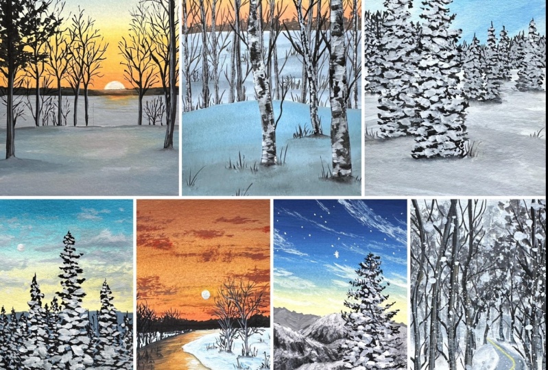
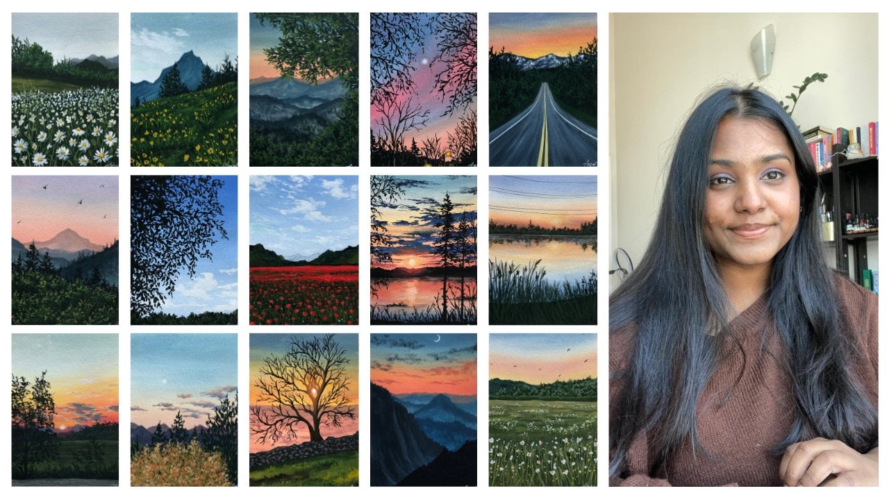
4. Class Projects: All right, before we move on
to a first-class project, I wanted to give you
a little tour of all the ten paintings that
we'll be doing together. We're going to be
using a combination of all the techniques
that we learned in the previous lesson and use
them in our class projects. So let me show you the first
painting that we're doing. As you can see, we've
used that beautiful blue, yellow sky with the
clouds that we've used is used pine trees
with snow on them. And a little few elements
that we can learn while we're painting the
class project itself. In the next painting, we are painting the
tree that we learned. The third type of tree, the sky blend is
of the second of the tools section
that we did with the yellow, orange, and blue. And we've added
texture to our tree, obviously painted the
color in for our snow. And all of that really
pretty class project. And so much fun to
paint this one. This one's really pretty. The third class project is this beautiful mountain
scape with a dark sky, I would say like a sunset sky. So you've got a little bit of a hint of yellow at the bottom. We've got some beautiful
snow effect, right? And we've got some pine trees. The next class project, we are using our second method to blend in yellow
and blue together. Along with that, we've added some clouds and added
some texture to it, and again made another type
of tree with snow on it. The fourth class project, sorry, this is the fifth one. The fifth class project is of this beautiful little
forest section where you have
these birch trees. If you've got a lot of
details into our birch trees, got some beautiful texture
going on, on our snow. So a major part of this class is going to be how to
paint the snow as well. Again, we've got a
bright blue day with some pine trees and texture on our pine trees with
the snow on it. The next class project is of this beautiful sunset league. Oh my God, I love
this one so much. This is like my
favorite class project. I think we've got some beautiful reflection game happening here. We've used the dry
brush stroke method for the clouds and some tree
and textures on them. The next is this coaches. I would say a road,
a snow covered road. You've got trees on either side. We've got some beautiful
snow on it as well. Next we have this
frosted a branch tree. You can see we've played around with the gray and white to show that frosty effect
into our painting. Around with that, we've
got some very nice graze in the painting which you
can learn when you mix them. There'll be a really
fun experiment on how to make this
type of gray color. The last class project is
off the snowfall route, which I think is so pretty. I was so happy with the way the snow actually turned
out in the painting. So we're using a lot of texture
maps are a lot of trees and a lot of tapping that we'll learn
in the class projects. These are all the
class projects that we will be painting together
in this challenge. Again, I will be uploading one class project every
alternate days so that you can take your time
and split this class into probably finished
it in two days. So that is not a lot of
pressure because I want you guys to learn and
enjoy this challenge. Alright, now that we're
done with a little brief, let us start with our
first-class project. See you.
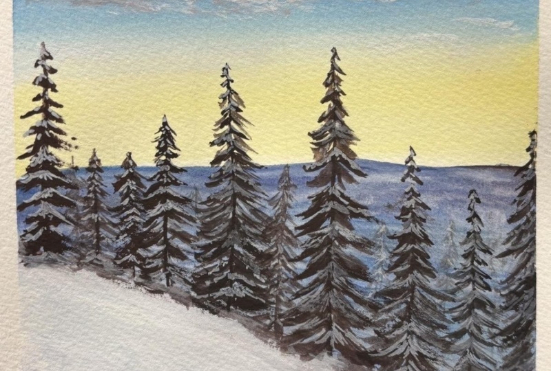
5. Project 1 Part 1 : Snowy Winter Morning: Welcome to the first
class project, which is this beautiful
snowy winter morning. The colors that we'll be
using for this class, or cadmium yellow, primary red, Prussian blue, burnt umber, titanium white, and lamp black. So I've taped on my paper on all four sides and
taking the colors out on my palette and using the pencil B will be sketching
out the elements first. Here on the left, I've put
the reference picture. You can download this
reference picture from the projects and resources part of the class so that you have one for
your reference tool. So if you look very carefully
in the reference picture, in the background, we
have some land space. We've got a horizon where
the sky meets the land. But we aren't really clear about what are all the elements
in that section. So we're just dividing
our paper into half. Then you can see a snow-covered
land in the foreground. So I'm just sketching that
out as well as you can see. It's sort of like a slope. Right? Behind the slope we
have all our pine trees. Drawing each of our pine trees. I'm just placing the
taller ones that I see just so that I know
what tree goes where. You can do this very roughly. Eventually when you
paint over your sketch, it's all going to go
because gouache is opaque. But this just gives
us a rough idea about what our
structure looks like, what our painting looks like. I've just made these very
thin lines very lightly. I don't want to have
a very dark sketch. It should be very light so that when I apply my layer of paint, it shouldn't be seen
through it, right? So I'm just going to apply
a very thin strokes, very light strokes
with my pencil. And then just get the
placement of the trees. If you don't want to make the trees, that's
completely fine. As you have the reference
picture with you, you can always refer to
it and see how it goes. So now that we're done
with our base sketch, I'm happy with the way it looks. We are going to go ahead and start a painting for this guy. I'm going to start off
with the first shade using my size 14 flat brush. You can use a size
12 or whatever size flat brush that you have. Make sure that it's on the
biggest size so that it covers a lot of surface area. For the first color, I'm using
a mix of yellow and white. As you can see,
there's a good amount of white and only a tiny bit of yellow because I don't want my yellow to be so overpowering. It's just getting to
the morning, right? So it's not very,
very bright yet. So I just have very, very light yellow color, very pastel yellow color. And I'm going to
apply it at the top, Right, right above the
line that we made. And moving in the left
and right motion. I'm going to slowly
move my yellow upwards. Now, like we did in
our exercise lesson, moving in the left and right
strokes is the best way to blend because it ensures
that your base is flat. Next, I'm using a mix of
white and Prussian blue. As you can see, it's
not a very dark blue. It's a very light blue and
that's the shade that we need, a very light blue, leaving a little bit of space between the
blue and the yellow. I'm moving the blue upwards
instead of coming downwards, I am moving the blue plot. Every time I move upwards, I can slightly
increase the amount of blue in my mix so that it creates that graded wash. Now the graded wash
can be done both ways. You can go from top to bottom
and bottom to top as well. Whatever is more
comfortable with you, go ahead and do that. Make sure that you are moving in this left and right
motion so that you get a nice clear blend. Here's the swatch for my
darker blue that I used. It's just the same. The only difference that
comes is the quantity of blue paint in the white
and blue mix is more. Now that we have both
our colors laid down, what we're going to do is use white to blend the blue
and the yellow together. Now whenever I start blending, I make sure that I start
off with that line where the blue is at the
line where the yellow is, so that that area of paint
gets reactivated and starts moving around with
the blue and the white. The idea is to get a
seamless blend between these colors that transition from yellow to the
white to the blue. Now this might take some time, but you have to keep
moving in this left and right brushstroke motion
so that you go to Create, you get to create a
very seamless blend. You'll have to clean
your brush every time you bring blew
down or yellow up so that you don't
get the yellow and the blue area or the blue
and the yellow area, right? So just move in this
left and right motion. And you should have a very nice, seamless blend in your sky. Whenever you feel a color is being underpowered
or overpowered, you can always go
back and fix it, add more paint or add more white into the mix and
create the blend. Right now I'm really happy with how the blend is turning out. And just want to get rid of a few of the streaks that I see. Other than that,
I really like it. So I'm just going to let
this dry right here. Now through the sky
is completely dry. We are going to go
ahead and paint the ground space that we
could see behind the trees. Now, I'm not going to focus
a lot on the details. Like I said, you're
not really going to see exact details
in that section, but we're just going
to add a little bit of texture and play
around in that area. I'm using a mix of brown, red, and white just to create sort
of like a burgundy color. And I'll show you all
the colors that are making really over here. I'm just playing, I'm just
playing with the shades. Are just trying to mix
a color that I would try to get using the limited
color palette that I have. I've mixed blue and red first, and two that I've added
a tiny amount of brown. There's very little brown
so you can't really see. So I've used this darker shade and I'm just outlining
that section first. And the consistency of my
paint is slightly thin. It's not too thick
right? Right now. I'm just trying to
get in the colors, so I've taken down or use
a deeper color at the top, and I'm just using white
with the same brush, not adding any other
color into my brush. And I'm just using a little bit of that shade and
moved it around. And then I loaded my brush
with a little bit of black on cleaning my brush using the same shade and
moving it around. Like I said earlier,
we will just be adding textures and playing
around in that area, trying to get in different
colors in place. Make sure that you are careful around the section
where the snow is. Because I want to
leave it white. Because leaving it
white ensures that when you add shadows and
white quash over it, it's a lot more
easier to show up as compared to when you would
add a base color to it. Right now again, like I said, I'm just playing
around of added some black really over here. Just feel free to do
whatever you want. Okay? This entire section
that you see, it might look odd right
now, but don't worry, because this section
is not going to be fully visible right now. It looks like it's
all over the place. So I'm just gonna go ahead using my same size 14 flat brush. Add in some darker
colors somewhere. Add in some darker greens, some darker blue is
play around just to create a section where you
see in the far of land, where you might see some hills, some houses, you're not really going to
focus on the details here. You're just focusing
on trying to get an appearance of land
behind those trees. Because there is something
behind those trees that is not visible because the trees are the elements
of a foreground. So instead of having
a really flat ground, I went ahead and made
it sort of Halley, just to give that effect, like I said, with
the darker gray, I'm adding some more texture in using my brush
vertically to the paper, adding in some thin strokes. If you're not very comfortable
and confident about that, you can always switch to
a round brush as well. Now, I'm using a deeper
blue color, again, using it vertically to the
paper to get in some texture, some thin lines, very random. Really, it's not
a particular way in which it's done, right? It's very random. To be very honest with you. There's not a lot of thought
happening in my brain at this exact moment
when I'm painting this, because I'm just having fun. I'm just trying to
create different colors. Trying to create
different sections where there are darker shades, lighter bits, snowy
bits. Just having fun. Like I said, this area is
not going to be visible. So you shouldn't really stress out on it and just have fun. I'm really happy with the
way the land space lock, so I'm just going to leave
it right here to dry. And while that dries, we
can work on our clouds. So I'm using a mix of white, little bit of yellow, right? And I will add a little bit
of pink into the scholar. So there are two shades
that I'll be using. This one, this grayish color. And a color which
has a little bit of red and blue, if you'd like. So that there's a
variation in the clouds. As you can see, this is the
shade that I'm using first. And using the dry brush method, we are going to go ahead and
create some linear clouds. So go ahead and create
the clouds as you would see in the reference
picture as well. If you're not very confident
on where to place them, you can follow me along, you can see how I'm doing it. I'm doing it in the area that is on the bluer side, right? I haven't reached the
yellow section yet, so I'm using the
darker color first. And over this I will
add more highlights by adding more white clouds. Or if I laid down white clouds and I
would add shadows to it. It works both ways. You have to, you have
to actually make the judgment in that,
in that moment. Alright, so I'm just adding this color
and as you can see, immediately when the
color dries out, it dries out to be
slightly lighter. So keep that in mind. The colors are going to
dry slightly lighter. Like I said, I will, now that I've laid
down a darker color, I will add in some highlights by using the same
dry brush method. And I will add in some
lighter clouds in the sky. Now over here, I'm making the
clouds lighter at the top. Because in the sky in
this morning bit we're going to add a little
moon phase as well, because it's just
getting morning. The moon is still in the sky. The moon is always in the sky, but the moon is still
clearly visible in the sky. And the morning, the hint of
mourning is just coming in. So I've just added, brightened up my clouds
because honestly in that moment the clouds
looked a little bit darker. So this is another example of the judgment that you
make while painting. You'll look at your structure or the shape that you're making. And woman, think back and see
what is it missing, right? What can I add to this? What can I remove from this? What can I work on? So that's the
judgment you'll have to make in that moment. I'm just adding in some
more lighter clouds, some fluid or Cloud, some
more texture in the sky. I'm just playing around
having fun with the clouds. The way I'm holding my brush is slightly angular
to the paper. It's not perpendicular, there's an acute angle
and the way I'm holding my brush so that I get that nice linear
shape that I need. Not making the
clouds look fluffy, but rather more like in
the horizontal format. And just play around. I'm adding in some more whiter clouds in the yellow section, but it's not going to be fully visible because that section
is really very light. And again, they're gonna be
a lot of trees in that area. So I'm not going to be
very clearly seen that. But it's always good to add
in some textures and details, even in the background
so that even if the little section shows
a peak of that era, you're still going
to be able to see all the stuff that's
happening in that section. It's going to, it's all
going to make sense when you actually
reach the end of the painting and that all
starts to make much more sense. It looks very different
from the beginning. So go ahead and add in some clouds and enjoy the
process of adding clouds. Don't pee, you know, constraint, but this exact format, you can do it in your
own way as well. Alright, so I'm really
happy with the way the clouds look right now. So I'm not going to overdo this. And we're going to
go ahead and add a moon at the top
somewhere in the corner. Not really in the corner, but
center-left, I would say. So. I'm gonna go ahead
and use white paint, a little bit of white
paint on my brush. I'm going to make a silk good. So very small circle is
going to be dead in the sky. And then I'm just gonna
leave it sort of halfway, like a crescent
moon, I would say. And I'm going to clean my brush using just water
or the damp brush. I'm going to move the paint around to make it
appear full up. Now when you do
this, what happens, what happens is it gives that illusion of that
phase and the Moon where one bit is darker and the other bit is very
light and faint. So you can easily distinguish
between the darker bit, more opaque bit of the moon
and the sort of translucent. I wouldn't say it's translucent, but you know that
lighter bit of the mode. I'm really happy how the
background looks right now, so we're going to wait
for everything to dry. And in the next lesson we'll be adding all our pine trees.
6. Project 1 Part 2 : Snowy Winter Morning: Alright, now that our base color or the background layer
is completely dry, we are going to go ahead and start painting the snow slope. For that, I'm using a
mix of Prussian blue, a little bit of red and black, just a very light thin
down version of the color. Then at the top I'm adding a
little bit of white gouache. And then using water, I'm going to blend the
two colors together. This way it will
create a nice gradient where the top part is going to be brighter and the bottom is going to have
that blue shade, which will turn
lighter by the way, when you add white
quash and blend it in. This way, you'll
be able to create a little bit of shadow
effect in the snow. When you're painting
snow in gouache, instead of just
leaving it flat white, we tend to make the shadows
in so that the 3D effect, it looks much more real. Alright, now that the snow
bit has completely dried, we all are a paper filled
with colors, right? So every section is
filled with colors. And now we're going to
work on our pine trees. For that, I'll be using my
size six round brush and a size zero round brush that I showed you
in the materials lesson. Starting off with a
size six round brush, I'm going to be using a mix
of black and burnt umber. So these two are the
colors that I'll be mixing together for the tree. As you can see, it's
a very deep color, very close to black, but it's not really black. There's just a tiny bit of black and more burnt
umber in the mix so that I get a sepia
color, a deep color. Now you can look at the reference picture,
please. Your trees. Again. In case you are not sure about painting
from the reference picture, you can follow me along. I'm just sketching out
different variations of the trees which is
represented by this line. And then I'll be adding
more details to it. The idea is to really
them insights, alright, you're going to have some
bigger trees and that, those trees are actually
closer to the observer. And so they appear
bigger and taller. And the ones at the
back you'll see I have a few strokes that are smaller
than lines that I drew. Those are the trees
that are going to be slightly further
away from the observer. So this way you can
add in a little bit of the 3D effect using the method that we
learned earlier in the elements less than
or the exercise lesson. You're going to use
that to make the tree. Now, there might be places in which the tree is going
to overlap one another. So in that case you're going
to make the shorter trees have a slightly smaller strokes so that they appear
that they're far away. And the ones in the front, those are the taller ones, are going to have
bigger strokes. Now at the same
time you will see me making the tree
appear fuller. And I'm doing this because
we're going to add snow on it. So right now, it looks
all crazy, right? It doesn't look
like a pine tree, but when we add the
snow on top of it, it's going to bring out
the details a lot better. Right now. The process
here is very Deputy. We are going to be covering all the foreground or section above the
snow with pine trees. Like I mentioned earlier, you can also switch
between the brushes. So the trees that are
at the background, the shorter ones
you can make that using size zero brush
and make the brush, the branches and the leaves very small as compared to
the ones in front. So that it adds to
that variation. It shows that those trees
are little further away. The bigger ones
are closer to us. So over here the process
is very repetitive. So I'm just going to give you
time to enjoy the process. I'm not going to
increase the speed of the video so that you
can just watch and paint along with me
rather than having to decrease or increase the
speed at this moment, right? So this process is
very repetitive. You can pause at any
minute if you feel like I'm still going faster for us, have a look and
paint along with me. It's gonna be really fun.
You can also look at the reference picture to
understand the elements better. Or sometimes spend to
play along, right? So I, I play a lot with
my reference picture, so I don't make it
exactly like that. And every time that I sit down to paint from a
reference picture, the outcome turns out slightly
different, which is good. It doesn't have to be an exact replica of your
reference picture, so everything turns
out great in the end. So take your time, enjoy
the reputation of process, and get your trees
nice and ready. In this section, I have
made a few thinner strokes with my size zero brush just to add in some more
sharper details. So you can do that wherever you feel that the painting
looks really flat. You can add in some details. You can also add in some
vertical strokes and branches to depict some trees in the
background like I'm doing here. Wherever you feel
that there is a space between the trees and you
want to sort of fill that up. You can always make some
brushstrokes and some lines and twigs and branches to
make it appear follow. But yeah, so as you can see, there's a variation between
dollar pine tree which is closer and the shorter ones
which are in the background. So it really just brings in that the taller
one is closer to us. Again with the snow, it
will look a lot more different and a lot more sense. One of the tricks in
which you can make a pine tree appear fuller is by making a few strokes
in the middle as well. So few lumpy strokes
in the middle, right? So that really adds to the effect of making the
pine tree appear fuller. Earlier when I used
to paint pine trees, I would always just have brushstrokes and decide
on the either side. Right. So I would
have left and right. I would never I would never put something in
the middle where the trunk and when I did that, the tree just appear
to be really empty. There was something wrong
with it. I can feel it. Another thing that I
used to do was start the branches on the left and right side at
the same point. That also really made my tree look very
different and very weird. Alright? Another thing
that I used to do was to increase the size of my pine trees are the
branches the size increases. I would just make it very even. That looked like a little
bit awkward to look at the eyes because no pine trees like it's gonna be perfectly
moving out, right? So going to have some smaller branches
in the middle as well, or just some leaves
hanging in there. It's all about adding
variations into your tree. You're not going to make
it very symmetrical at this point or very structured. You have a structure to
follow. Don't get me wrong. You have to be in that
triangular shape. But it's not going to be
super triangular, right? I mean, I'm sure
you must have seen the Christmas tree appears more triangular as compared to the Alpine set we're
painting right now. But yeah, go ahead
and enjoy painting. These trees have almost reached
the end of this section. I agree that this is a very
time-consuming process, but obviously this is the most important
bit of our paintings. So we've covered almost half of all the pine trees
that we needed to add. And right now, I'm just gonna go ahead and add in some
details in the background. Like I mentioned earlier, you're going to be adding
some in the background so that you have the appearance of these smaller trees in
the background as well. And you're not just going to have the pine trees
and that shape. You're also going to make
some dollar branches that he would see me do in the end when I reach
towards the right side. And when I do that, it also
sort of adds variations into the type of trees that you
can see in my Fintech. I feel like the space
behind the trees looks very empty and that is why to
make it appear more fuller, I am going to add in
some branches and a few sort of like vertical
branches and trees around it. This way, this section is
going to appear fuller. At the same time, it's not going to overpower the trees
that you see, right? I don't want to
cover that or add in something that will take
away from their shape. But rather add in a
tree that's more empty, just the branches and
the trunks visible. And that will just add
variation into the, into the trees that you
can see in your painting. And at the same time just
make it a bit prettier. So yeah, go ahead
and add that in. Just wanted to pop
a pill and give you that piece of information based on the changes
that I'm making. But yeah, I'm really happy
with the way this is turning out and we've
almost reached the end, we just need to add
one more pine tree in the right corner. And then we'll be good to go.
7. Project 1 Part 3 : Snowy Winter Morning: Alright, so we've reached the
end of this class project. So this is the final part. Before we go ahead
and add the snow, you're gonna look
at your painting, all the background
trees that you've made. And they're going to see
where things can be changed. Maybe some finer details
can be added at the top. Maybe you can make the
double sharp or add in a smaller tree in the background if you think
it looks a little bit empty. In the right section,
I felt like it could use a few extra branches, just an empty tree in that section because it
looked a little empty. So I'm just adding
minor strokes and that section just to
add in some details. But if you're happy with
higher overall picture looks, you can go ahead and
start adding the snow. Now for this, no, I don't
want to use just white. So I'm going to mix white with a little bit of blue and
a little bit of black. So it's just a tiny hint of it. The major portion of your mixture ratio is
going to be more of white, just a tiny bit of black and
tiny bit of blue so that you have a color with a little
bit of Tintin it, right? So I'm just going to show you
what the swatch looks like. So this is the color
that I'm using. As you can see, there's a
blue undertone to this color. It's not pure white. Alright, so using my
size zero round brush, which comes to a
beautiful fine tip, I'm going to start
adding this node. Now, the way in which
you add the snow is very similar to the one we did
in the exercise lesson. We're going to be adding
smaller dots at the top. And as you come down, you're going to increase
the size of the stroke. Make sure that you are
adding the snow on the top portion or right and not just doing it in the
left and right side, but rather in the
middle as well. So if you look very carefully in the way
in which I'm doing, the middle sections are
more rounded, right? And the left and
right side ones are a lot more sort of
elongated, right? We can see how the middle one is more round side one's a
little bit more elongated. Now the size of your snow that you're going to
paint also depends. What? Depends on
where the tree is. The tree, if it's closer, they're going to be seeing
more details in it. We're gonna be seeing
more snow details in it. And that is why the
strokes are fuller, their wider, they're
bigger and they're shape is much more detailed. You're going to be
making the snow all the way to the bottom
where the slope start. We will make the merge local
lot more realistic later on by maybe wetting the
surface and making it one. But don't worry about
that right now. You're just going to focus on
adding the smoke along with the bigger strokes of the snow that you've
added on your tree. Don't forget to add in
some smaller ones as well as this adds to the
details in your tree. So the snow is just not going
to be in big chunks, right? It's gonna have some sections where there's a
little bit of snow. That is what I'm
doing. I'm just adding in some little sections as well. Now when we come
to the trees that are behind the dollar 1's, the brushstrokes is going
to be a lot more smaller. As you can see, I'm
making very thin strokes, adding in very deep or less
details in that section. Because this is the area where it's not very clearly
visible to you. You know that there's a tree, it has some details. But we want to skip into
adding a lot of details to it. We just want to add in some snow and leave
it right there. So I'm going to repeat the
process for all these trees. You can skip the ones where there are just
branches for now. But wherever there
are pine trees, you're going to
follow this step. So smaller brushstrokes
for the ones that you see in the background
and bigger ones for the ones that you see
in the foreground. Or that is closer
to the observer. Now we added a
little hint of color into a white because
when this dries, it's going to dry out
to be slightly lighter. It won't be as opaque as it looks when you first
lay down the color. And that is completely okay because that is
the effect that we want to make certain areas
appear much more brighter. We will add a second
layer in that section, and that way it will
appear more opaque. Now we read this tree which
is in-between two tall trees. So again, I'm going to switch
to smaller brushstrokes, just adding in some
details, small strokes. And that will be the way in which I add snow in
the background trees. Now, in this ADR, using a small size brush, which comes to a
really fine tip, plays a very important role because then you
are able to make, because strokes and
smallest strokes using the same brush and not having to keep switching
between brushes, which I think works really
well because you don't want to move around with
your art supplies a lot. If you have one brush that
does most of the job, then it's all good, right? So for me it's this brush, the size zero round brush, which comes to a
really fine tip. It does the job really well
and I absolutely love it. Alright, so I'm just going
to repeat the process again. As I mentioned, this
is very similar to the previous lesson
where there's a lead, a little less talking, and a lot more doing. So, enjoy the process of
adding snow onto your truth. Like I mentioned earlier, you will be adding the snow
all the way to the bottom. And once you're done with that, we will fix that entire section, make it appear as one. But right now you're going to be adding the snow all
the way to the bottom. Actually, I'm really
happy with how everything looks up to. I love where the snow meets the slope and also the slowest
turning out really well. One more thing that
I wanted to point out here is wherever
you feel that you've done so much of the white maybe or snow
is very overpowering, or you're not able to see
the background layer, which is the darker
part of the tree. You can always wait for that
layer to dry and you can just go over with black
and fix that section. So this way it is
very versatile so that you don't miss
out on anything. But you can also get a
lot of details, Stan, without really having to
worry about making mistakes. If you think something
has overpowered, you can fix that. Now we've almost reached
the end of that area. As you can see, I'm adding
very little strokes in that section just to show that those trees are in
the background. And I'm really liking the
way this is turning out. Alright, now that my base layer for the snow has
completely dried, we're going to spice things up a little bit and make the
trees in the foreground, the snow on the trees in the
foreground appear brighter. And I'm gonna do that by
adding a little bit of white, just white without any mix of color in it, just pure white. This is titanium white, so it is much more opaque. So it will also depend on the type of white
that you're using. I'm using the same white. I'm going to go ahead and add it to the bottom as
well just to blend it out. And you don't have to put
this white everywhere. You can just put this byte at the tips wherever you feel
like it, It's very sad done, but I'm mostly working
on the trees that are closer in viewpoint. So I've just added some strokes with the white and added
it at the bottom as well. And now I'm just brushing it out using the dry brush method, taking up some more white and brushing it in this role to sort of create a little bit
of extra into your snow, other than it looking very flat. And for that, a textured
paper works out really well. So you can see adding in the white and just
moving it around is adding a little bit of
texture which really shows up once the paper is fully dry. And for the moon, I'm just going to redo that
section slightly because I felt and try it out a little
bit lighter than I expected. But other than that, everything in this Asia
looks good for now. All right, so now you're
going to take a step back, look at your painting and
see where you want to add in your finer details if you're happy with it, good to go. You don't have to do anything. But in case you feel like maybe the snow was overpowered and you need to add in some
more brush strokes to make it appear better. Some more leaves
around the pine trees, some more sections, sharper
sections at the top. Feel free to do that. Some places that
you might want to add some more snow,
you can do that. This is really just a timeframe in which you take a step back. Maybe you could go have a walk around the
house and then come back to this with
fresh eyes so that you can really see
what's missing. Right now, I felt like at this second treats
second closer tree, I didn't add enough snow. On the third one, I didn't have enough branches on
the right side. That is exactly what I'm
moving out and fixing. But other than that, I am really happy with the
outcome of this painting. Our first class project
looks gorgeous, right? So right now, just take a step back and fix
anything that you'd like. And if you're done with that, you're going to let
it dry and then we will be the tape off
and do our review. Alright, so now it's time for the grand reveal of those
crisp, clean edges. Make sure that you pull
away from the paper because then you ensure that
you're not going to tear your painting. Many times what
happens is when you're pulling in the same direction or you pull away from the paper. I mean, like, you know
what a clear way. You tear some bits of the paper and then it just goes all the way
into your painting. And that's the saddest
thing that can happen. I don't want that
to happen to you. So make sure that
you're pulling away in this horizontally and
closer to the paper, but at the same time
away from the paper. This is, it. This is how a painting looks with
those crispy clean edges. I love how this one
has turned out and I really hope you enjoyed painting the first-class
project for me. If you've painted this, please do upload it in the project section
because I want to see you see the progress as
you go and all the ten days. So make sure that
you just posted. I would love to see how you did on day one, and this is it. I shall see you on day two where we'll be
painting this beautiful, gorgeous golden hour together.
8. Project 2 Part 1 : Golden Hour: Hello everyone, welcome
to project tool, which is this beautiful
golden sunset. The colors that I'm using
are cadmium yellow, primary red, Prussian blue, burnt umber, titanium
white, and lamp black. All the colors that I use in the previous class
project where using the same colors here as well. Alright, so I've
taped on my paper on all four sides and taking the
colors out on my palette, as I mentioned earlier. So the first thing that
we are going to do is create our basic sketch. This way we'll understand where the placement of a
horizon line is, and also understand
what the elements are and where they placements are
in our reference picture. So first I'm going to
make a horizontal line dividing the people
two-third and one-third. This is going to be
where the foreground is. Right behind that I'm making
another horizontal line, which is going to
be my horizon line. Now this line is where
the sun is setting. You can see that
and the sky gets separated from all
the elements in the ground or the land, right? So I've gotten that. Next. I'm sketching out just
a random shape of this mountain at a distance
from just making a very thin, uneven shape right above that is where our
son is going to be. You don't have to
make it this dark. I just made it this dark at
this moment to show you, make sure that it's
not, not too dark. Alright, so now that we have all our horizon lines and
all of that in place, We'll just give us an idea
of where the leak is, where the land is, of course, where the sky. Now right above the land, which is our foreground element, we have an uneven shaped, maybe some fallen snow. And then obviously we have
a bunch of different trees, as you can see in our
reference picture of different sizes. So I'm not going to
sketch it out properly. I'm just making a
few placements of them randomly on the paper
just so that I know, when we start painting, it's going to get covered. So it doesn't really
make sense to make a proper sketch and have all the branches and
branches in place. You know, roughly place the
elements in DOD painting. Now that it's done, I'm just going to show you where the sunset colors
will be on the lake. So we just wanted to
bring in a little bit of orange where the
sun is setting. And you're not going to be
working on a lot of texture in that area because it's
still slightly far away. So you're not going to be
seeing the leg in detail. But we try to achieve a similar look of a lake by
adding in some textures. So yeah, this is pretty much it. I am happy with the way the
sketch looks at the moment. So we're just going
to stop right here and start painting. Alright, so the first
thing that we are going to paint a sky, so I'm using my
size 14 flat brush. You can use any flood brush
that you have with Q. For this guy, I'm going
to go with colors such as yellow,
orange, and blue. Now to make the orange, I will be mixing my yellow
and primary reject together, that is cadmium yellow
and primary red together. But in case you don't want to do that, It's completely fine. You can use orange directly
from the tube as well. Here, I'm mixing equal
parts of yellow and red and adding white into it and I will get this beautiful orange shade. So I'll just show you a
swatch of the orange color. So right now I'm working on the consistency because it's
too watery at the moment. So I'm just adding in some
more paint to make it slightly more secure than more
like a water consistency. So I'm just going to
apply this color at the area right above
the horizon line. Now, as you can see, the color is not too
orange or very bright. And that is exactly
what we need. We don't want our shade to
be really bright orange. And when we add white into it, you tone down the vibrancy of the color which works
out really well. This is the first color
that I'm going to apply. Right above that, I'm
going to make another mix that is of yellow and white, again, toning down the
vibrancy of the color. Here's a swatch of the
shade that I'm using. So when you turn
down the vibrancy, it gives you this very
nice pistol colors that we need for this guy, rather than the bright
orange and bright yellow. So you're just going to go in this left-hand
right motion using this color and slowly
start moving upwards. Now that I'm here, I'm going to stop and work on
the blue because we have to bring the blue down and move the yellow up to create
that nice blend. Very similar to the
exercise we talked about in the beginning
of this class. So right now, I'm mixing
Prussian blue with white. Now you can always vary
the quantity of Prussian blue to make the color
deeper or lighter. Obviously, when
you add more blue, you will get a much
more deeper color. To this. I've added a tiny
hint of black as well. You can skip this step.
It doesn't matter. Right now, I'm just working
on that perfect shade that I just switched to bad about it. Black, just to give it a much more muted shade rather than just being
very bright blue. So using this color, I'm going to start at the top and go in this
left and right motion, start bringing the
blue colored down. The idea is to create the nice blend between
the two shapes. And the trick to doing
that is using byte. So now that I'm happy
with the blue there, I'm going to load up
some white on my brush. You make my brush a little bit damp if you think it's
getting dried out. And then again, moving this
left and right motion. Sometimes you'll go up
and then sometimes you'll come down to get that
nice blend in the sky. Now that I'm happy
with the blue part, I'm going to go ahead and draw
that line where the yellow is using a little bit of
white and a yellow shade. And then again, go ahead in this left and right motion
to blend them together. Right now the process
is very interpretative. I've laid out all my colors, but I have to create that
good blend in the sky right? For that, I tend to go ahead
and wet my brush completely, clean it off with
any paint, load up, just a little bit of
shade wherever necessary. And then again, go ahead in this left and right motion
moving upwards and downwards. That's the judgment you will have to make when you're doing your own blends to see which color is
going to wear, Right? So for me, I felt it got
to yellow at this moment. So I'm going to
clean my brush off, load up some white to fix
it so that it doesn't go all the way to the blue
to create the green shade. And you just have to make the judgment
when you're blending. But the idea is to keep moving
in one a One Direction, which is the to
and fro direction in motion that
we're working with. And then with just
a few more strokes, he'll be able to create a
beautiful blend in a Skype. Right now. I love to
blend in the sky, so we're going to
wait for this to dry. Alright, Now, let us
work on the sun bit. So I'm going to start off with some white sheet mixed
with yellow for that area. Apply it in the circular
space that we left behind. If you haven't left
that area, don't worry, you can always paint over
it and blend it out. It works both ways. I added a little
bit of red and just blended it with the
sun color because I was trying to get a nicer
ring around the sun, but it didn't really
turn out that well. But that's okay. We're gonna try another method which is add a little bit of yellow and red together to get an orange shade. This time adding a
little more of the red so that it's
much more deeper. Hello. So I'll just show you a
swatch that I'm using. It is an orange shade. It just has a little bit
more red into the mixture. That is why it looks
a lot more vibrant. So we're going to go
ahead and just blend it out in that area
where the sun was. Not just in a circle, but the area around it. And using your brush
or damp brush, you can blend it out with the sky so that it doesn't
have those harsh lines. And then this is just to create a nice clear it around the sun. Once this dries, now
that this is fully dry, we are going to go ahead and mix yellow and white together, but this time more white. The paint. So it almost looks white with just a hint of
little yellow in it. And I'm just going to apply
that as you can see in the sun area to give it the sun effect that
the sun is setting. Makes sure that your
circle is nice and round. You can work on it
with a round brush. You can use a smaller
round brush if you want or if you're okay with
your bigger round brush. And you can get thin strokes
and you're good to go. Right now I really like the
way the sun looks and it's completely dry so we can move
ahead with our league bit. So I've made a mix of
Prussian blue, black, and white this time a little more black than
the Prussian blue. I get this nice gray color. And using your flat brush, we are going to be creating
the texture in the lake, but I've just left that area where the mountain
is going to be blank. So we're going to start off
this below the horizon line. And I'm just using the
same shade and covering up the entire area
with this green color. You can always add a
little bit more water in this area because
we're gonna be doing a bunch of different colors. Like here, I've added more
white into the same mix. And using my flat
brush worth carey, I'm getting these thinner
strokes and that's, that's sort of adding a
little texture and depth. To my painting,
this way I can see the deeper parts and the
lighter parts of the lake. I also left a little area where the sun is so that I can add in the orange in that area to show that that's
where the sun hits. The sun rays are
hitting the ground. It's creating that nice
orange glare around that Ada. You'll also see the shade
in the reference pictures. If you look at the
reference picture, you get an idea of why I'm
doing exactly what I'm doing. But yeah, that section
got a little too orange. I went ahead and add a
little bit more gray around that area so that it's just not too orange and
just in your face orange. Next, I'm going to load my
brush with a little bit of white paint using
my round brush. I'm just making these
horizontal strokes, smaller horizontal strokes. That is going to give me the lighter bits
in my lake drying. So as you can see, it looks
a lot lighter and sort of gives me a variation that
there's movement in the water. But we're not going
to give it a lot of details because it's
really far off, so we're not going to work
a lot on the details. The only thing that
we'll do is add in a little bit more texture into the painting that it
shows it to leak. And we can distinguish this from the color that we'll
have in the foreground, which should be very similar. Alright, now I'm creating a mix for the
mountains over here. You just need a dark shade. I'm mixed black, brown and
Prussian blue together. But feel free to just mix brown or black or black
and brown together. Whatever makes you feel better. Go ahead and experiment
this on your own as well. I'm just carefully going over
the horizon line, right? So make sure that your horizon
line is nice and straight. The area above it, the mountain above it can
always be worked with. That's not a problem. Also, as you can see, I've left a nice little space
where the sun is, because that is where I want to have the lighter
bits in the mountain, which means that area will
receive the sun rays directly. So it's going to appear
brighter to the eyes as compared to the mountains on the left and the right side. For the area in the middle, I'm going to make an
orange color again. You can mix red and yellow together or red and brown together just to
get a deeper color, you're going to apply it
in the middle section and blend it out with the mountains on the left and right side. You can also add in
some more color, the deeper color to just make sure that it blends
with one another. But in the end, when you finish your strokes, you'll have something
like this where you have a brighter bit for a
mountain where the sun is. And then of course you'll
have the darker bits for the mountains
in the either side. Alright, so you can just
go ahead and add in a little bit more paint in case you feel like the
ground overpowered, the darker brown overpowered. And you need to bring out a
little bit of brightness. You can just go ahead
and add some paint, make it darker deeper, make the judgment in the
moment when you're painting. Once you're done with this,
I'm going to stop right there and let it fully dry. Alright, now that this is dry, we're going to go ahead and
add in some textures as I was talking about for our lake. I'm just using the
same mix that I used for the water,
but this time again, adding a little bit more black so that the shade
appears darker. I'm using my dry
brush technique. I'm just going to go
ahead and brush over the section just to
add in some texture. As you can see, I'm
not really doing anything making
horizontal strokes. But this way I'm going to add texture in my painting
just to show that this is the leak because we're not working in the league
bit and a lot of details. Adding a little bit
of texture does the job for us because we
have a lot of elements in the foreground
that we have to look for rather than paying
attention in the lake. So just adding in the texture
will do the job for you. Go ahead and add in the texture using
dry brush technique, will have to keep in mind that your brush needs to be dry. Even if it's, even if it has a little bit or a loser
consistency of paint, it will not give you
the desired result. So just make sure that it's dry. In case if you live loaded more paint or it's still water, you can always buy put on
a tissue or just brush it across the masking tape to
make sure that it's still dry. Alright, now that I'm
done with the texture, I'm just going to go ahead and perfect the foreground line because I felt I
couldn't see it. And also that uneven shape
that I was talking about, I couldn't see it, so I just
went ahead and drew that. I can. And then we are
going to just sketch out the trees that
we see in that area. Right now you can take your time to sketch out
the trees properly. You don't have to work
on all the branches, but if you feel
comfortable in doing so, please go ahead and do that. If you're not confident enough in just going with the flow
and making the branches. You can always take your time, look at the reference
picture and sketch out at least the trunk, what the shape of the trunk is, how the major branches look
and where they're placed. You can go ahead and do that. I just make sure that I
get the structure right. So if it's bending towards
the left or right, I tried to get that
structure right and take my time with the
sketching process here. All the smaller
branches are really like what comes to
me in the moment. I go ahead and do that. But again, like I said, you can get the get those structures and as well
a few feel comfortable. Or you can just work on the shape of the
trees that you see. Alright, so I'm
really happy with the way the tree is
looked at the moment. So in the next lesson, we'll go ahead and
paint them together.
9. Project 2 Part 2 : Golden Hour: Alright, so let us move on and start painting all the
trees that we sketched out. I'm going to be using my
size zero round brush, which comes to a
really fine tip. And it's going to help me out to achieve those thin branches, brushstrokes that I need. I'm creating a mix
of black and brown together so that I get
this deep sepia shade. Instead of just using black, I always prefer using
a mix of two colors. You can also add in a
little bit of blue in it. It's always worth
just playing around with colors and experimenting. I've mixed these three colors
together very similar to the shape that we used for the mountains in the background. And we're going to start off by making the main trunks first. The structure in which
you will make the tree as you'll make the
main trunk first. Then you will project
out all the branches like the main
branches that you are probably seeing in the
reference picture. So you can make it
exactly like you see it. Or you can always play around. Feel free to do that. You don't have to
make the executory. Then after you're done
with the main branches, you'll add in the
smaller branches, which are all those tinier ones that you see all
around the tree. So this process is
very repetitive. And you're just
going to be making similar types of trees all over. Make sure that you're very them. Make sure that you're
wearing them in sizes and also in the shapes. So you don't want
all the trees to look exactly the same, right? You don't have to
bring a huge change in the structure to make
them look different. The only thing that you'll
have to do is probably make a main trunk and then maybe have two
or three bigger branches, or maybe a slanting
bigger branch or just two trees standing
very close to one another. This way you will be
able to add variations. You'll also see me
add different trees, but the way in which I'm adding the trees
remains the same. So I just finished
the first one. As you can see, we've
made the main trunk, we added the branches
are sub branches. And everything looks very put
together in this structure. As you can see, I
went halfway up and split the main branch
in different parts. And now I'm going to go ahead
and add the sub branches. So this is again, a very creative process and it's going to take some
time to complete this one. So I'm just going
to leave you here. You can watch me and
paint along with me. I've already explained how you're going to paint the tree. It's very similar to the one we did in the exercise lesson. If you don't want to
follow that structure, feel free to make
any empty tree, which means without any leaves. At this moment, these far
off trees have no leaves. So you just have to make the basic structure
of the tree to play around with the brush strokes
and just enjoy the process. I'm really happy with
the way the trees on the left side
are turning out. Also one more thing I
would like to tell you is that not to worry if you feel like your branches are sort of overlapping and just
hitting on each other, It's completely fine because
this is a landscape. It doesn't have to be that the
individual trees will have that exact same distance
between them or they're not touch each
other, It's completely fine. There are sometimes
people asked me a question that if
there are two trees, how are we going to
show that one tree is closer or there's a small
distance between them. One way in which you
can achieve that look, sort of look is by
making the tree that is behind to be slightly
off a lighter shade. So maybe you can add
in a little bit of water so that the
consistency is thinner. So when you make the
brush strokes they appear lighter and the one in front
will be slightly darker. Even though they are
on the same plane, which is on the same
line that you're making them that is visible to the, to the observer, right? I can see that these trees are in one line at that section. But maybe when you go
closer to that area, you'll notice that the trees
are not really in one line. They have a few inches
of gap between them. This way you can achieve that. Look, I'm really happy
with this section. I added a few branches and twigs and the bottom to add in some more details
in the empty space. But now we're going to go
ahead and take a little break. Move our first round, and then we're going to replicate something similar
on the right side as well. Alright, now that we are back with a little
five-minute break. Let us go ahead and paint
the ones on the right side. Again, similar
process. In this one, you're just going to have a little variation in
the size of the tree. So they're going to slowly, gradually increase in size. As you can see by the sketch
and the reference pictures. If you're following
the reference picture, you'll be able to really understand what
I'm talking about. The trees are gradually
increasing in size. So that's what we're
going to try and portray in our painting as well. And if you're not, then you can just follow me along again. Replicative process, I'm
going to leave you to enjoy this one in silence. Alright, so not the
two trees are done. I'm going to just add in
a little empty shrub. Maybe you could
say it was a shrub before the winter season hit. So I'm just making
smaller strokes and that section to just
fill up the space. The structure is again very similar to the way in
which you make the tree. The only difference comes here is that the brushstrokes
are really going to be minute and find that shows that this is
something smaller in size. So you'll have to make
really fine strokes if you have a brush that is not giving you these fine strokes
and you can always switch to a smaller size brush. That is to just have these
brushstrokes in our painting, no matter what brush
we use to achieve it. Alright, so we're
gonna move on to our last tree of this section, again, making a good amount
of paint on my palate. So in gouache, we tend
to use a lot of paint. You must have noticed
that you tend to use a lot of p because you're using creamy consistency of
the paint rather than a watery one, comes
to watercolors. You have a little bit of
pigment and a lot of water. So not using a lot of
pain, but with gouache, you actually end up using
a good amount of paint, again, as compared
to watercolors. So, yeah, go ahead and add our last tree into this section and then we will
move on to the next step. All right, reference picture. You will notice that before the foreground element at the top where the
trees are used, a little bit of fallen
snow in that section. So we're just going
to get that in place. I'm using this darker
grayish color, very similar to the one that
we used for the league. Just a little more black
and blue amount is there. I'm just going to go ahead and add that in that area of fully. So if you want to show the lighter bits in
the snow, again, you will just add
in a little bit of white and that way it
will lighten the color. I'm using actually
this lighter color in areas where the sun is, albeit you'd think the sun
rays are going to fall. But right now all you
have to keep in mind that it's in the top
section of that layer. And on the bottom, you will be having the darker colors in. Once you're done with the
lighter colors at the top, you can always switch back to the darker shade and
add it at the bottom. And this variable to
create that variation of the dark and light a bit of the snow instead of
just leaving it white. So remember, when
you're painting snow, you will have to work on with the shadows rather than
just leaving it white. So I'm just adding a
few more strokes of the white just to lighten the
width a little bit more. But otherwise, I really like
the way this has turned out. We're going to wait for
this to dry and then we will be painting our
foreground to get them. All right, now that
everything is dry, we're going to go
ahead and start painting this snow
in the foreground. So for that, I'm using this light gray color very similar to the
one that we use, the league or on the lighter
bits of the snow on the top. I'm using my flat brush. I'm just going to apply it. Makes sure that you
are keeping in mind that sun rays are going to
fall in this section as well. So keep that slightly empty. Then to add the darker
bit off the snow, you can mix a little bit
of red into your blue, black, and white mix. This way you are going to
be adding, Let's go deeper. Pinkish, gray color actually. Right now I'm just
playing around with lighter bits and
darker bits of grades. The grades, they're
just having fun here, right over here. It's all about enjoying the process of adding different
colors into the snow. Right in the middle. I'm
going to go ahead with that orange mix that we
used earlier and add that in my snow just to show that this is a
section where the light falls and that is why it's
appearing to be lighter. And then whatever
empty space you have, you can fill it in with
a light gray color. So again, to blend
everything out, you'll be using this left
and right brush motion. Now that we have all
the colors laid out, it's time for us to add in more shadows and
perfect it even more. I'm going to start off
with the base to add in some more darker color, right? And you can make
the data color by mixing blue and red together. This way you're adding a
bluish tone to your snow, which is very similar to
the color of the sky. Again, you can vary in the
brushstrokes that you make. So you can make
them directly flat or makes them slightly angular so that they
are these thin strokes. A little, little
bit of black into my brush strokes just to
add in a deeper tone. Now I've added this structure, this shade in the area where
the trees are going to be. Now if you look at the
reference picture, there are true trees
in the foreground. One that I've put on the left
side is where the tree is going to be and then one
but I put it on the top, is where the other
tree is going to be. If you don't want to make it exactly at this moment
because you're confused. You can market or
you can leave it and we can make this in the, after this is dry when
painting the tree, we can add in the shadows at
that moping to just decide, make the judgment of
what you want to do. When we are painting the tree, we end up adding a little bit of shadow in that
moment as well. So again, feel free to judge
if you want to make it right now or you want to
make it when you're making, when you're adding the tree. Here, I felt like my darker
bits got sort of blended out. So I'm just adding
a little bit of black and blue together. And then I'm going to
add in the shadows, like I mentioned, where
the tree is going to be. One is here on the left side. I'm just going to add the paint and then clean
my brush and blend it out. I'll do that. And this is on
the right side where it is, as you can see, they're
not on the same level. The right one is slightly upward as compared
to the left one. And then using a
damp clean brush, I'll just blend it out
with the previous layer. Again, adding in
some more texture into the snow by
making these strokes on the ground for adding
more shadows into your snow. Snow that's already
on the ground. Again, using a damp brush, you can just blend it out. And this is one of the biggest things that
I like about gouache is that you can really blend things out when
they're still wet. And it looks really nice when you just add
it and blend it out. Even if the paper is dry, you can add it and blend it with the previous layer with
just a damp brush. And that is, I think one of my favorite
things about the medium, again, adding in a little bit of orange and blending it out, adding white wherever necessary. Again, you'll have to
make the judgment here. Right now. I'm really happy with the way the snow looks
in the foreground. So we're going to let
this completely dry. And in the final
part of the class, we will be adding our
foreground trees.
10. Project 2 Part 3 : Golden Hour: Alright, let us go ahead and pin two trees in the foreground, one on the left and
one on the right. Using a pencil just
to understand how thick I want my
trunk to look like. And then again on either sides, I'm going to do the same
thing just to give me an idea of what the size of my
trunk is going to be. You can also go ahead
and just start painting. You don't have to
do this process. So I went ahead with my
size zero brush again. And I'm going to go ahead and
paint the main trunk first. In this, you can add
in a little bit more black just so that you make
the scholar of peak this way, like I mentioned in
the previous lesson, that will give the illusion
that this is closer. That's why it's more opaque, it's more darker, right? So once I'm done
with my trunk first, I'm going to clean my brush. And actually using a damp brush, you can sort of clear
this section out, which means merge the trunk with the ground right now
it looks really flat. So using a round brush, I added a bit of
white just so that it matches the snow
color that we have. And then you just need
to redirect that area. Or maybe if you've just started, then that section
will be slightly wet. You will not have any problem in merging it with the snow. So you're just going
to move it around. And as you can see, when I mix the white and the snow color together
with the trunk color, blend in and it shows good at that's where
it starts and if called the snowfall and then
that Asia and that is why the snow has covered
the trunk and you cannot see the
ground over there. I felt like it wasn't really
blend it out properly. So again, using a damp brush, I just blend it out the edges so that they look much better. But right now I'm
really happy with the way this is looking. So we're gonna go ahead and
start painting the tree. Alright, so we're
gonna start off with the top most first. Now you're going to ask me
the shape of the tree in the reference picture
is very different from the one we did
in the background. I agree with you. This tree, the process in which
you make the tree is very similar to a pine trees. The only thing that you
have to keep in mind is the structure, right? So over here, I would
really suggest that you keep a copy of the reference
picture beside you. Again, if you don't have
the reference picture, I've uploaded the
reference picture and the projects and
resources section. By the way, if you like, if you don't wanna
do that, it's fine. You can paint along with me, but I would suggest having it
with you because, you know, this we also look at the
reference picture and understand how we are portraying that on
our painting, right? Everybody looks at a reference
picture differently. Everybody's way of
understanding a picture, understanding the
element is different. Probably the way in which I understand my reference
picture might not be the way in which
you understand the reference picture and
it's completely fine. We've all got our
own PRBs, right? So look at it, understand it, understand
the structure, understand the ways in which
the branches are moving. Right here, like I mentioned, very similar to the pine tree. But the only thing is, instead of having it in
that triangular shape, we're going to cut that off. But the ways in which I am putting the branches in the left and right side remains the same. This overhear the
branches that are coming out are going to be
3D like pointing upwards. We look at the
reference picture, it's nicely pointing upwards. That is the look that we
are trying to achieve. The ways in which I'm tapping
my brush is very random. Okay. Just like how
I told you in the in the pine tree bark
that we were doing, then you're just
going to tap it in. You're not going to make one singular branch and
then dab around it. You're going to assume that this is the
waves and the way in which the branches moving
upward and then step it in. And given that
illusion that there are a lot of leaves
in that section. So over here you're
going to have fun, even if it doesn't
turn out perfect or the way in which you want enjoy the process of adding
this new type of tree into your painting. Although here I
was really trying to kind of constrain myself into not opening up the cheek
because I didn't want to cover the trees that
we made behind so much. But if you look at the
reference picture, the branches are
really nice and white. Right, so I'm just
going to go ahead and widen these branches. So add in some more strokes on the branch to make it appear
fuller and also widen it, make them longer, and
make them appear fuller. Always play around. Take a step back if
you feel like Okay, I'm not understanding,
it doesn't look good. Then take a step back. Probably take a walk
around the house and come back with fresh
eyes and I'm pretty sure you'd be able to catch
what's missing or catch something that you
would like to fix. So right now, I
just went ahead and did the street in the left side. I'm actually happy with
the way this looks. I like that the branches
are really wide apart. The right side War
and the left side is outside the paper,
but that's okay. You're still going to
be adding the strokes. Don't forget to add in
some little branches and strokes in the
middle as well so that it doesn't look so awkward. The drunk, it should not be just visibly awkward
standing there. So make sure that you're making some in the middle as well. Now we're going to move on
to our right side tree. This tree is very similar to the ones we made
in the background. Just a bigger version of it. Of course, it's going to be of a deeper shade because
it's in the foreground. But the structure in which
you make it as very similar. So I'm pretty sure you're
not gonna have any issues with making this tree because we've already learned
our brushstrokes. As you can see right
now at the bottom where the trunk meets the land, it looks awkward, right? So to fix that, load up your
brush with a little bit of white paint to the
wet the surface and just blend it out with the crown so that it looks like the
snow has fallen in that area. I'm in the snow has
fallen in that area. So it blends in and it looks
like there's a cluster of snow in that section and
it merges with the ground. So now that we have our major structure
ready for the tree, we can start adding all
the smaller brushstrokes, all the smaller branches that
you see can play around, add as many as you want. So as you can see, there's
a gradual increase in the size of the trees
and that Ada, Right? So this one, these ones, these two actually are
closer to the observer. So that is why they are bigger. You're able to see more branches here, more thicker structures. So keep that in mind and
paint along with me. I felt like the
chair that left leg. Likely empty. So I went ahead and
added some more strokes, made a few more branches
played around with a few more brushstrokes and that area in the middle
of the trunk as well, so that this tree
appears follow. You can skip this step. If your tree looks good, you don't have to
follow this exact step. I just felt like mine looked
a little bit empty and an end a little bit
just sad, I would say. So I just went ahead and added a few brush strokes
to look at the alpha. Alright, so I'm really
happy with the way that trees have turned out. So what we're going to
do here is actually use the dry brush method to
add in some texture. So I'm making a mix
of our brown shade, that was the burnt
umber mixed with blue and a little bit of white. You can make a thick creamy
consistency and you can brush it on the sides
of your masking tape. And this way you will have this nice dry brush
that you can work with. This way you can add
textures into your painting. Now the question is, where are you going to
add the texture? So remember wherever
the light source is, four here for our painting here, our light source is in the
middle of the paper, correct? This way, for the left trees, the trees on the
left side will have the texture on the right side of the painting just to add
in some lighter bits. And for the right side trees, the texture will be
on the left side. So keep that in mind
when you're adding the texture in any painting, not just this one, in any way, anything that you do
by yourself as well. Remember that you have to keep in mind where the
light source is. And that way you're able to create these textures that will make sense and make your
painting turn out amazing. Like now we're done
with the texture. I am so happy with the way the painting has
turned out, right? The next step is to
just go ahead and add a few more branches
if you'd like. I would like to add in a few more finer strokes into my painting
wherever necessary, some more branches,
some more details. So this is the moment
that you're going to do it wherever you
feel is necessary. If you think of
painting looks all put together and good,
skip the step. Feel free to skip this step. It's completely
fine. I felt like a few more branches around the trees in the background
would look good, but very fine details. So I'm just going ahead with
very light hand pressure. Very light pressure on my hand. On the brush, not on my hand. With a very light
pressure on the brush. I am creating these fine strokes using my size zero brush. Feel free to use any brush that it gives you these
type of brushstrokes. And once you are happy with how your painting looks,
you're just going to stop. Alright, so now that our
painting is completely dry, we're going to go
ahead and carefully peel off the tape
off from the paper. And as you know, this is
my favorite step because it really makes the
painting come together. And what do I mean
by that is that you have some paint around
on the masking tape as well. So when it gets peeled off, you really see the painting. That nice clean border. And it looks really nice and it makes the
painting come together. So be careful when you're
peeling this tape. And once you're done with that, you have this beautiful, gorgeous painting
in front of you. I am so happy with the
way this has turned out. Look at the gorgeous glow on the snow that we were
able to capture. The trees, the finer details and the branches, the texture. Everything looks so put together and it's such a
beautiful upcoming. Alright, so we're
done with the tools. See you in D3 here. Sneak peek of what's coming. See you.
11. Project 3 Part 1 : Winter Night: Hello there, Welcome
to Day three, which is of this
beautiful winter night. Let me talk about the colors
that I'm going to use. I'm using cadmium
yellow, primary red, Prussian blue, burnt umber, titanium white, and lamp black. So very similar colors
to the one that we've used in the
previous class project. So let's get started. Alright, so I've
taken my paper on all four sides and taking the
colors out on my palette. As I've mentioned earlier, the first thing that
we are going to do is obviously create sketch. So here's the reference
picture on the left. You can see there's
a nice slow ground that we are going to
have a pine tree on. And then in the
background you can see those tiny trees
where the slope is, that it's really far
away from the observer. Behind that you have
a bunch of mountains, but I'm not going to work on the phone that
you see in the image, will just be working on adding details to the
mountains because that is a little bit tricky
to achieve and it's a whole different experience
to learn on its own. So I'm going to
skip that for now. But we'll be adding
everything else that we see in our
reference picture. So you've got one big
pine tree in the middle. That is going to be our main
subject for our building. Again, I'm not going to
sketch out the pine tree in complete detail because it's not that necessary
at the moment. So we're just going to
place it to understand a basic structure where
it is going to be. Now that we're done with that, we can also add in a Mountains just to understand where
the mountains are. There are a bunch of them
like two or three that we'll be doing can sketch
them out accordingly. I would suggest downloading
the reference picture to understand how we take references from these
images on your own. You can see there are a lot of things that we will change and add on our own as we go
along in his painting. So it's gonna be a
really fun experience to understand what to do in class from the
image and what to leave. Alright, so I'm really happy
with our base sketch here. And we're going to let this be and start with our painting. Alright, so we're going to
start painting our sky first. Again, we'll switch
to a flat brush here. I'm going to make a really
cool color right now. Let me show you how to get a nice slightly purple mix using Prussian blue
and primary red. I'm going to load my brush
with some Prussian blue and mix a little
bit of red in it. And as soon as I blend
these two colors together, the color completely changes. Now this is very similar to
a shade called a **** three, if I'm sure that's not
how you pronounce it, but it's something like that. So it's very similar
to that color. It's like a deep blue color
with a hint of purple in it. I think that's how
you would explain it. But this is the mix
that we are going with. It's not Prussian blue
directly or pople in its natural form. It is a pure blend between our Prussian blue and
primary data together. So that's the first shade that
we're going to work with. The next one is a mix of
yellow and white together. Now the yellow that
you will see in the reference picture
is very faint. It's like very,
very light, right? So we have to add that in
the base just to show that the sun has just set, right? So there's this color
that it's leaving behind. But it's not very evident because the Knight
has taken over. So we'll start off with
that color at the base, right above all the mountains
that we sketched out. So that will be the
color at the base. Will clean your
brush completely. And then you'll switch
to your blue color. And then add the
blue at the top. Right now I'm just taking
a little bit of white on my brush just to move the
yellow slightly upward. And I felt like
the yellow got to faint when I mixed
it with the white. So I'm just adding a little
bit of yellow in and then moving in this left and right
motion to move it upwards. I'm really happy with
how the yellow looks, switching to our blue shade. Right now the consistency
is slightly watery, but I'm okay with
that because we're trying to lay down colors first. And then again, when we move in this left and right motion, add in some more white. It will become opaque as we
go along in the process. Right now, I just
added the blue, the deeper blue color, and then I added a
little bit of white into my mix to make it lighter. Here's the shade that
we are going with. And then we'll be moving in this left and right motion to get it to blend
with the deeper color. Now, as we've
learned in the past, blending in this left and
right motion is the trick. Right? You'll have to keep blending. Moving from the left and right. Moving from the
left to the right, swaying around and then just
mixing the colors together. It's not very tricky, but that is the key to get
good blend in your sky, you will have to keep moving. You will have to keep applying
pressure on your brush and just wetting the
area in case it has dried out or using a damp brush, I can get the same effect. And it's all good when you are trying
to blend it this way. Right now, I'm just loading my brush with a
little bit of white in the section
where the yellow is supposed to merge with the blue. Then again moving to the
left and right motion. I'm trying to get a nice blend between the yellow and the blue. Right now, I feel that the
blue is just too light. I feel like the white has
overpowered the blue. Now, it doesn't look
like a night sky. So to make the sky look like the night sky are
going to add in the deeper color at
the top and then slowly start bringing it down. So you can do this now, or you can read for the
paper to completely dry. And then you can
add a second layer over this background
wash that we are giving. This way it will be
nice and opaque and also deeper in color. So we're going to keep moving in this left and right motion until you are happy with what
your Skype land looks like. I'm really happy with the
way the sky looks right now. So I am just going to
let this section dry. And once it's completely dry, we'll move on to the next step
that is adding the clouds. Alright, my background
layer has completely dried. So now it's time for
us to add the clouds. For the clouds, I will be using the same shade that I have used in the yellow
bit at the bottom. Using that color and using
the dry brush method, we will be adding the clouds and the textures of how
clouds in the sky. Here's a swatch of the
shape that I'm using. I think it consists of
a little more yellow than the previous
color that we use, but more or less it's in
the same color range. Does the total
value has changed, that's slightly darker
than the previous one. Alright, so you're going to load your brush with some paint, make sure that the
consistency is thick and your brush is dry. Because we're going to use
a dry brush method here. Now using the dry brush method, we will be tapping
in our clouds. As you can see, this is again a very good example of the
linear formation of clouds, which means we're
not really working on the thickness or the
fluffiness of the clouds. Rather we are working
on adding the texture. So you get that texture by
using the dry brush method. And when you go in this
motion horizontally, you will get beautiful clouds. And all you have to
do is tap and move around based on the clouds that you see in the
reference picture. Or you can just do this
by your own as well, by your own imagination. It's completely Okay. I'm going on with this
color in this section, which is lighter, blue
and the yellow bit. So it makes sense to
use a similar color. And we had to make
it darker because this guy already
had the yellow bit. So make, making a darker
version of that shade made more sense that it
would show up on the light, the color that we have
in the background. Right now, I've just
added one sort of band like TechShop
for the clouds, leaving a little bit of
space because you don't want your clouds to look as
one single line, right? It shouldn't be following
one single part. It can be in the same area, same, let's say height. But you will have to give
them an individual shape and an individually size according to what the reference
picture sees. I also went ahead and added some clouds in that
yellow area, though, it's not fully visible
once it's dry, it will show up a lot more
than it's doing right now. So I'm really happy
with the clouds wherever the yellow and
the light bits of the sky was nighttime first to add some more texture in the sky
using the dry brush method, but with a slightly light
blue colored clouds. For that, I am going to mix
blue and white together, so more white, less blue. Here's a swatch of
the shade that I got. This is again, just a mixture of Prussian blue and
white together. Using our dry brush method, we'll be adding in some texture. Over here. I'm actually not making leaner
formation of clouds, but rather I'm using the dry brush method to
add these diagonal clouds. Because almost like adding these very scattered clouds
that are in the sky, they're not a cluster,
but rather just, just spread out in
a particular order. So you can achieve this effect
in your painting by just brushing your brush with
paint over your paper. Now for this texture, cold press paper works
really well because it has nice texture and you can use this texture to your benefit when you use dry
brush technique. And just lightly brush
over that section. It creates this
beautiful texture as you can see right now. If you didn't know, if I didn't show you
how we made this, you would be a
little bit confused as to how we got that extra. But now you know the
trick is dry brushstroke. And your textured paper, that is your cold pressed paper. Using the light blue color, we can also add in some more
floating clouds in the sky. And overall dislike. Have fun with the Cloud section. You're almost done with all the texture play that we needed for this class project. So right now I'm just going
to leave this peak is it's very easy to overwork in
the sky with the clouds. I'm really happy. Let this dry out. And now we're going
to go ahead and start painting the mountains. I'm using a mix of brown, black, and white together. So this is the first shade
of gray that I made. I wanted this to be
lighter because as closer we get to the observer, the darker the color of the
mountain is going to be. This one was perfect for the fire of mountains
that we could see. So I'm just going
to fill in the ones that are in the same area. So that is my furthermore
mountain can have the scholar. Once you're done with
that, you're going to wait for this to dry. And then we'll add the
second layer in front of it. Alright, now that this
section has completely dry, we are going to go ahead and add the mountains in front of it. Now, as I mentioned earlier, the farthest away mountain
is going to appear lighter. And as you move forward, it's going to get darker
and darker, right? Our baking and
transitional color, which means that gray that
we're using is going to be darker than the one
that we used earlier. In this one, obviously
we'll have a little more black in our mix. And obviously the why it
will be slightly less. You'll get a grade that is
darker than the previous one. Again, using a round brush
here for more precision, we will go ahead and
add the mountain. If you'll notice very carefully, I am not going with
very clean strokes, which means my
mountains don't appear to be just exactly covered with the same consistency of
paint are the same color. Basically if, if, if, if that makes sense, I am moving it around in
very random brushstrokes. So if I were to use clean
brush strokes here, obviously there'll be an
even spread of color. Since I'm not using a
clean brush stroke, I get this random specks of white in the paper as
well as you can see, there are some sections that appear lighter and some darker, and that's completely
okay because we don't want it to lie flat. But whatever detail
we can give in to our painting using just
one layer of paint. It's all good to go. Like in the mountain. Before that you can see there's a little bit of texture
play that's happening without it was
unintentional texture play. You can leave it like that as
well because it looks nice. Now while our layers drying, we can go ahead and
add in some stars. I'm just using my round brush
to just make a few stars, but you can go
ahead and splatter some around the sky
wherever you feel like it. I just wanted to have it in the random order with
my brush itself. So I went ahead and did that. I also made one star to
shine a little bit brighter. And I failed miserably
in this section, so you don't have
to do this one. I just showed you that
in the painting process. A lot of times we do something that we don't
like, but we can fix. Right now. I'm just going to
leave it as is. I'll go along with my painting
and if I don't like it, I will make the
necessary changes. Alright, now that my mountain
has dried completely, it's time for us to
add in a little bit of extra on the
mountains that is slope. So for that, I'm going
to make a mix of a little bit of the
black and white that we used, and obviously white. Now the idea is to use a light gray color and using
a dry brush method, again, we are going to add the
texture to this acts as the mountain is covered
with snow at the top. Now you can just
carefully move around. The idea is to use
the dry brush method. That's exactly what I'm doing. In case you feel like you
are using a lot of paint. That's slightly okay
as well because we want some sections
to be more opaque, especially the tip of
the mountain, right? All the ones at the
bottom can be nice, rough textured, but the
tip can be slightly opaque and that's
completely fine. So I'm done with the mountain
on this leftmost section. And now I'm just going
to go ahead and add in some texture on the
rightmost as well. Make sure that you're
not making it flat. That is, you're not just making these
brushstrokes downwards. You want to give them an angle, maybe the left or the right. This way you also understand which way the
mountain is facing. So all the ones that are
moving towards the left side, you kind of get an idea of the way the
mountain is shaped. It's not flat, right? There are a lot of structure that's going on in the mountain. It's not flat. So you'll
have to bring that by making these snow textures on the mountain at a
particular angle. So I'm really happy with the
way this looks right now. I'm just going to add
in some more texture and play with texture. This is obviously something
that is in the background. So even if you don't end up adding a lot of details to it, it will be completely fine too. Just leave it at that. Because again, this is
really far away, right? So I've just added some dry
brush strokes texture to show those little specks
of snow on the mountain, which is just all around,
not just at the tip. And I am happy with the
way this looks right now. I'm just going to
let this be as is. And once this completely dries, we are going to
paint the mountain in the front and add
all the details to it.
12. Project 3 Part 2 : Winter Night: Alright, let us go ahead
and paint the foreground. Now. For that, I'm going to paint
the mountain that is there behind the main sloping
land that we sketched out. For that I'm using
a mix of white and black and adding a little
bit of brown in it. Obviously, I'm going to try
and keep this color darker because this is a mountain that is closer to the observer, so it's going to appear
much more darker. I'm starting off with this color using my flat brush at the top. As you can see,
I'm not trying to make any clean brush strokes, just trying to
cover that area and go along the shape
of the mountain. That this way you'll
be able to add in some texture because some part will appear darker,
some lighter. As you can see, that
we'll use that to our benefit by using it in the textures that we add a head. Right now, instead
of trying to get the entire mountain to
look one single color, you can always leave it
a little bit uneven. It doesn't have to
be the exact shade. Now I'm going to
make some more paint of the same color because God, over and add the bottom, I will add in a little bit
of green color just so that that area appears lighter and the top section
appears darker. Now, this is where
we are actually changing a few bits and
pieces of our work. So in case you want to get the exact look that is in the reference picture,
you can do that. But if you want to follow
me along over here, I changed a few things instead of going for that misty effect, which is a really different
topic to teach on its own. So I wanted to skip
that at the moment. But instead of doing that, I went ahead and
added a little bit of gray at the bottom. And then we'll go ahead and
add in some textures to our mountain and just innovate and paint
this in our own way. So as you can see, I've added a little bit of
gray at the bottom. And now that all the color is laid out and every inch of
this mountain is covered. I'm going to go ahead and switch to my round brush just to get in some more uneven or texture in. And then we're gonna
wait for this to dry. And once this is completely dry, we'll add in our textures, that is the snow on our
mountain in the next step, which is after this dries. Alright. So now that my base
there has tried again using that same color that
we use for the snow earlier. That is byte with a
tiny hint of blue. And using a dry brush technique, we are going to go ahead
and start adding texture. Now, again, you're going to move in the direction
of the mountain. And what I mean by that, instead of laying down your
brush strokes really flat, you are going to
give it an angle. And this way you can sort of give the illusion of the
slope in the mountain, right? Your mountain is
sloping upwards, it's not straight up,
it's at an angle. To achieve that look in
your painting. You can do. You can get that look in
your painting by just making these dry brush
strokes at an angle. Now over here, honestly, I'm just having so much fun because I'm doing
this on my own. So this entire section is
sort of more experimental. I wanted to keep the
way in which we add the snow-covered mountain
to be very simple. Mountains are very, very tricky subject to master on its own. And I wanted to
keep this subject for another class which
will be much more detail. But right now we're
just having fun because this is something
in the background. You can always just
adding the texture and leave it instead of really
working on the details. So as you can see over here, I've added some slope and added the dry brush stroke to depict
the snow on my mountains. And then some bits
are much more opaque, which will show that the
snow in that area is small. And some of it just had
these light brushstrokes. As you can see, that the pigs just textures on our mountain. So you can go ahead and
play around in the section. If you want a better
understanding of what I'm trying
to depict here, then you can just open
any Mountain View. And especially at night Mountain View and
you'll get an idea of what I'm trying to achieve
and do in this moment. But I am just doing
everything that I want to in my own imagination. Right now I felt
like the texture on my mountain was a lot. We're going to learn
how to sort of blend it out and make
it appear much more natural than it just
looking really covered in snow and not making any sense with check which
section is where, what's frontwards bag right
now it looks a lot more flat than I actually
want it to be. So we are going to
work on trying to get that flatness out once we laid out our layout,
all our lecture. So I'm really happy with
the texture in the moment. Like, especially in the, in the middle
section, the texture has turned out really nice. But the left one still
looks a little bit crazy, so we're going to fix that. And fix that. What you'll do
is just use your damp brush. You can load up a little bit
of the darker color paint. But even if you don't do that, It's completely fine because when you use your damp brush, you will be reactivating the paint at the base and then
you can just blend it out. So I have just used a
clean brush over here. Just clean brush and a
little bit of water. And I'm just tapping in water in the sections that are actually want to blend out. And then using a
little drier brush, which means I'll get
rid of the extra water. I'm just blending it
out and as you can see, it's reactivating the
paint at the base and adding in a little bit of a
shadow effect that I want. If you think that you did a lot of shadow in that section, then you can go ahead
and add in the white on top just to make it
appear more natural. And now I like how
this section looks. Because there is darker bit, which is the background
color that will aid. And also a medium color, a middle color that is the gray. And then obviously you
have the white on top. So this way it shows
that the mountain that at the bottom is
slightly in front. And that is why it's casting a little bit of
shadow and that's why this section at the bottom
appears to be darker. Alright, so I'm happy
with that little section. Now let us fix this area in
the left corner as well. Because it looks like it's the picture is all
over the place. So again, using my damp brush, I'm just going to reactivate
the paint and move it around so that I get a nice
gray shade in that section. Then we will just
add the snow on top. Alright, so I'm really not very happy with the left corner. Like I mentioned. Something about that. Iga seems off to me. So what I'm going
to do is just blend everything out instead of
trying to work in sections, I'm just going to apply
more pressure and sort of blend that
entire section out. And then once it dries, we will fix it in the next step and add
in some textures on it. While the bottom left
corner is drying, we can go ahead and add in
some more snow at the top, which will make those
sections appear darker than what
I mean by that is we need a few little sections where the snow is much
more opaque and brighter. And to achieve that look, we'll just have to go over the base layer that we laid
out for the slow once more. And that will make it shine
and make it much more opaque. Alright, now that my
leftmost section is dry, I just wanted to try out and see if I was making
the strokes right. And I'm actually
really happy with what it looks like
at the moment. I've just added some
textures at left and right angles to depict the
slope of the mountain. And again, I'm going
ahead and adding in some more snow at the top
to make it nice and opaque. And that is it. This is what our snow covered mountains in
the night look like. I really like the way
this has turned out. So I'm going to try and not overwork on this
because it's very easy to play around with the direction
and just overdo that. So I'm just going to
try not to do that in the moment and stop right here. Again, mountains are
a little bit tricky, so don't worry if you don't
get it exactly right. We will cover this
mountain topic in another Skillshare class, which would be much
more detail than just specifically for mountains. Anyway, moving on
to our next bit, which is adding
those far off trees that we could see in
our reference picture. Again, you can take the
reference picture out and look at it to understand. Right now, I'll just have to go ahead and make a
dark grayish shade. Makes sure that it's
not the same color as the mountain that you laid
out. It should be darker. Or if if the background color that you laid out
was to too dark, then you can go with
a lighter shade. Just to keep that in mind, make the judgment and
the call in that moment. So I'm using this dark gray
shade and I'm just going to go ahead and make
these tiny pine trees. You don't have to make
them look perfect, right? Because they are
in the background. We'll be adding some snow
covered snow on top of them. So it will add in some textures. Instead of making
full pine trees, you can also make
these lines and just tap in some texture
in that area. Some brushstrokes in that
area to show that there's just a series of these pine
trees in the background. So you'll have to cover all the way till the
middle of the paper, almost in the
middle of the paper where the front
most mountain is. There, you will have to
multiple spanning tree. So go ahead and add that in. Alright, now that I've
added all the pine trees, I'm gonna go ahead and add
in some texture on them. And to add in some texture, I have to show that
there's snow in that area. Now, this is very simple, right? We've done this in the past, but this time we're
just going to be working in smaller sections. So make sure that you
have a small size brush. And you're just
going to be tapping, tapping in these little strokes in the way that you want
a pine tree to look like. So make sure that you're tapping in the strokes in that way, which is more like that
triangular format. And once you add it in
those little sections, it gives that nice illusion that there is snow in that area. Now, as for the color, you don't have to use white directly because
this is far off. It has a little bit of a lighter shade in that area
because it's the night sky. We're going to work on a very lighter gray shade
instead of just white. So yeah, that's pretty much it that you have to keep
in mind in this moment. The process, sometimes
it's very repetitive, so I tend to keep quiet because I want to
give you time to understand these things
in your own way as well. Because the more you look at it, the more you trust. So just look how I'm doing it. It's much easier to
watch and learn, right? And that is why we're
doing this class. So go ahead and look how I'm
making these brushstrokes, keeping in mind that I want to show that it's a pine tree. So I have to move my brush
in that exact order. Even though I have not made the exact shape
of the pine tree, I will have to work in
that order so that it gives the illusion
that these are pine trees in the background. Once you're done with
that, you will stop and then we will paint around. Alright, now that we're
done with this section, we are going to go ahead
and paint our ground, which is the snow covered slope that we see in the front moles, which is our foreground. So for that I'm going
to mix a little bit of blue and black and white, can add in a little bit
of red in it as well, just to show that the snow is in the similar shade of the sky because it's going to reflect
the color of the sky. For that, I've mixed white, black, a little bit of red. Starting off with that color, I'm going to go ahead and add
it in the slope completely. So it's very easy to just
make one single layer of the color and then add in
our shadow bits into it. Over here, we do not have a lot of elements in the foreground, so we don't have to really work a lot in the shadow
of our artwork. It's very simple. So use this color and cover
that section completely. And then using the
darker gray color, I'm going to just add in a few little
strokes just to show that it's an uneven ground instead of it being
completely flat. Adding in a little
bit of shadow, adds a lot of movement in
your objects right now, it appears more 3D than
it was appearing before, which was very flattened 2D. So I've added a little bit
of shadow into my snow. You can also go ahead
and add in lighter snow, which is just white. And that's exactly
what I'm doing now. So I'm using a lighter color
and adding that in so that that area acts as
the highlight width, which means that that
is brighter than the darker shade and the medium shade Suo
was just playing around with different colors
in case you feel like your shadows are gone and
they're not really visible, then you can go ahead
and add that in again. So really just have
fun play around and make the judgment
as you paint. That is why we are using
a reference picture because instead of just
following it as a tutorial, I want you guys to
have a look and understand your reference
picture and then try and do it in your own form as well
and make your own goals and judgments right under where
the tree is going to be. I've added a little more shadow, but in case you're
not doing that, we can perfect it when we paint the tree and add
in the shadows later. But yeah, this is
pretty much it. We're going to wait
for this to dry. And in the next lesson
we will be adding a tree and add the
final details.
13. Project 3 Part 3 : Winter Night: Alright, coming to
our final part, which is painting
pine trees and adding in some final details. For that. The first thing that
I'm going to do is sketch the pine
tree because I want this pine tree to be
slightly more detailed. I just want to work a lot on the leaves and shape
of the tree more. So you can look at the
reference picture to understand the
shape of your tree. Looking at your tree and just understanding what it looks like and maybe understand
the placements of the branch or the
movements of it. Give you a clear idea in the way in which you
are supposed to work. If you notice very carefully
in the reference picture, the branches are really
pointing upwards like this nice curve in the branch
that I want to capture. Also the branches and the
leaves appear fuller, right? So I want to capture
that as well. So instead of going
all the way down, just to understand
a few branches, I made the shape
and sketch it out. But now I'm just going to go
straight into painting it. So the first thing that is
to use a smaller size brush, because again, it's
going to give you a nice control over
your brushstrokes. And the scenario
strokes are the nice, the more detailed and nice painting it's going to turn out and the tree is
going to turn out. The first thing that
we're going to do is make this nice line, which is thicker at
the base and thinner at the top as we've
done in the past. And then again,
starting off with really thin strokes at the top, I'm going to go ahead and
paint the pine tree again. This time you will see that
I'm adding more leaves and much more brush
movements in each of the branches rather
than just leaving it random and rounded. I would say the past few that I've done this
much more rounded. This one, I want it
to be nice and sharp. So I'm just going
to work a little bit on thinner strokes. That is eight. That is
the only change that you will see in this
type of pine tree. It's much more detailed
and a lot more structure in this section that is eight. So I'm just going
to go ahead and start painting that area. Just adding in some
more brushstrokes and making it appear fuller. Now the process is very repetitive and we've
done this in the past. So you're just going to
do this by yourself. Understand, look at the
reference picture as well. Look at the way I'm making it. That is how I am able to
analyze the pine tree and put it into brush strokes and
just make it on the paper. And then you can also look at the reference picture to understand what the
shape of the tree actually was and how I am sort of understanding it
and putting it on paper. I hope that makes
sense. I'm just going to keep quiet now so that you can follow me along
and paint the tree. One more thing is that
don't forget to make those leaf structures in the
middle of the tree as well. Because a lot of times I've
noticed people tend to make the pine trees and
just left and right the branches just on
the left and the right. And they forget to add
them in the middle, which makes the tree
look very weird. So make sure that you are adding these brushstrokes in
the middle as well. And that's pretty much
it. Another thing. Now, one more thing
before I go is that instead of making dots
to make the branches, this time we're making
lines and thin strokes. And that's how we
are able to get this type of look
into our painting. If you notice, if you go
back and notice how I made the pine trees in the
previous class projects, you'll notice that I'm using much more rounded
brushstrokes over here. It's much more thinner
and longer brushstrokes. And that's how I'm able to get this sharp effect in
our tree and that's it. Now, I'm just going
to keep quiet. And you're going to watch
and paint along with me. As I've reached the
end of my tree, I'm going to move
a little bit of shadow effect at the
bottom using a damp brush and just paint from the brush
strokes that we already laid out and just blend
it in with the ground. This way it doesn't look really
awkward that the tree is lying just flat without casting any shadows on our grounds. So make sure that you're adding that's structured
in the color in. Again, just using a damp brush. There's nothing
fancy needed here. And once it dries,
until it dries, you can go ahead and just add in some more finer details into
your tree if you'd wish to, or if you are happy with
the way your tree looks, then you can just let
this tree completely dry. And in the next part, which is just after your
tree has completely dry, dried, we will go ahead
and add snow on top of it. So that is going to
be our next step. But before that makes sure that your tree has completely dry. You can also use a hairdryer
to speed up the process, whatever works for you. The idea is to add in the
snow once the stripe. So right now I'm really happy with the way the shape of the
tree has turned out. So I'm just going
to let this dry. And now that my tree has dried, it is time for us to go
ahead and add the smoke. Again. This knowest not
going to be just white. It is going to have a
hint of blue in it. So I'm just making a shade which has a little bit of blue in it. Here you can see what
the color looks like. You can also add in
a tiniest bit of black into the color just to
give it that gray effect. But you can also just
use Prussian blue and white as is for the painting. So again, I'm going to be using my size one or zero. I forgot. But a smaller size brush
before our painting, I think it's a size one. So I'm going to be using that brush to add in
the final details. And right now again, we are going to be
focusing on top of the, of the leaf or the branch. So you're going to be
painting that at the top. And for the structures in
the middle of the tree, you will be making it slightly, you'll make it slightly
pointing downwards. So this word shows
that that section is actually facing towards you. If you see very closely in
which the way in which I'm actually making
the brush strokes is the left and the right
side ones are fine, but the ones in the
middle are either slightly towards
the left or right. And that way you are able to
add in this illusion that, that it's in front of us. In the reference picture, there isn't a lot of
snow on the tree. I just wanted to add a
good amount of snow in that section so that
it doesn't look just really flattened, empty. So adding the snow
makes the tree a pure follow and nicer. So I just went ahead
and added bigger blobs. And then I'm just going
to play around and add in some smaller sections as well. And then again, once this dries, we can add in some more white paint on
top of those structures that are closer to the observer to make it
appear nice and opaque. And then obviously the
others will be underneath, which is this grayish color
that we've used that will act as the snow that has a
little bit of shadow in it. So as I mentioned earlier, we'll use white to
just add in snow at the top of the
layer that we've already added in some places. You don't have to do it
in all the sections. You can just do in a few of them and make sure that
you're adding it on the top per section, not that the bottom one. And that we will be able
to add a little bit of shine into your snow. Lastly, I am using a dry brush method to add in
some texture to the snow, just so that it is
a little bit of finer textures on the snow rather than it being just flat. And for this, I'm using white paint and using
the dry brush technique. I went ahead and add in some
textures on my snow bit. Alright, now, I'm not really fond of the way the star looks. So I'm just going to fix that. And I will do that
by making it into, turning it into a mold. And again, this is a very
good example of the way in which you made the judgment
as you paint as you go. If you don't like something,
you would change it. I've just added some more stars, and instead of just making
them one-by-one individually, I decided to tap in some very, very fine stars as well, not overdoing it
very fine, very few. And then again, as I
mentioned earlier, I will change this into a mood. I'm just drawing a circle
first using my white paint. And then I will
use my damp brush to soften the edges. This way. It'll create a nice
glow around my moon. So using a damp brush will
just soften the edges. And you can also use
a towel to brush off or wipe off the extra water or
paint that you pick up. Because sometimes
you might pick up paint and then spread it around as we go to create that effect. So make sure that your brush
is nice and clean when you are cleaning off the
edges of your paint. And then I've just added
some more paint on the left side so that it
looks like a moon phase. One of the moon
phases that turns into a full moon as a
squad for that look, but you can just add in
any moon, crescent moon, full moon, wherever you'd like. Once you are Moon is dried, you are going to peel the
tape away from the paper and make sure that you read
these nice crispy edges. I did ended up tearing a tiny bit in the left
side as you can see. But I'm not really upset
because I can easily fix it by just using a
little bit of gray paint. The only thing that I'm
happy about it is that it wasn't a big tear, luckily. But yeah, this is
our final painting. I'm so happy with the
way this has turned out. I know this might be a
little bit tricky to work with because we've got mountains and the textures on them. But I hope it wasn't
too difficult and I was able to break it down
in easiest steps for you. Here's a closer look
at your painting. As you can see, we've
got beautiful mountains. We've got gorgeous
textures on them. And we've got a
beautiful pine tree with snow and moon and stars. It's just such a pretty
painting and pretty concept of landscape all put together in one over
winter landscape. Put together in
one. This was a D3. This is what we are going
to paint in the forest. So see you there.
14. Project 4 Part 1 : Solitude Tree: Alright, welcome to day four. I'm so excited to paint this
class project with you. Let's talk about the
shades that I'm using. I'm using cadmium
yellow, primary, red, Prussian blue, burnt umber, titanium white, and lamp black. So as you've noticed by now, we're using very
similar, I mean, just the exact shades actually for all
our class projects. But at the end, our final result always
readings in the shades. This is all about
color mixing and the cool things we can
do with color mixing. If taken the shades
out on my palette and taped down my paper
on all four sides. So the first thing that
we are going to do is create our basic sketch. So take your pencil and you're going to sketch
out what you see. As you can see in the
reference picture, we have one ground, right? So you're going
to sketch that in dividing a paper in
two-third and one-third, almost just going to
roughly draw a line. You don't need a scale
because we don't want that sharp line. But we want the ground to
be just nicely uneven, not exactly sharp, and a straight line
basically at the top of it. I'm going to make
these uneven mountains in the background. As you can see, there
are certain things that I will be changing about the painting as compared
to the reference picture. But we'll try and keep
our main subject that is this tree, same, right? So this pine tree is here, the shape and all
is very different. We'll talk about it when we are actually painting the tree. This is almost like a view that you get off this tree
standing right in front of it. If you're obviously
these pine trees are really tall, right? So because of that, the
shape of this appears to be different culture
slightly tilting your phone upwards while
taking this picture. So that's how you're getting a different outlook on the
shape of the pine tree. But nonetheless, we're
going to be painting the same structure that you see in your
reference picture. So not sketching out the tree all the details
of the tree right now, because we're going to paint the sky and it's going to go. So we'll do all of that when
we are painting the tree. So starting off
with my flat brush, we're going to paint the sky. If you look at the
reference picture, we've got some beautiful
yellows and blues in the sky. We're going to achieve that just starting off with yellow, I'm going to mix
yellow and white because yellow just adds is very vibrant and I don't want to use such a vibrant shade in
my painting right now. So I'm going to add a
little bit of white to tone down the vibrancy
of the color. And using my flat brush, I'm going to apply it
at the base by now. I'm pretty sure you would have
gotten the hang of things. Gotten the hang of how we
work through from scratch, how we're working upwards, how we're working
towards art, painting. By now, I'm pretty sure you've
gotten the hang of things. How you look at a
reference picture, how you understand the colors
and put them on the paper. So I put the darker yellow at the bottom and on to that mix, I've added a little bit
more white to tone it down even more and make
it much more lighter. Added that slightly upwards
and blended it out. Again, I'm going to repeat
the step so that I get an even lighter blue or yellow, sorry, not even lighter yellow. And then you move it upwards and then going in this
left and right motion, you want to blend it out. Here you can see the
three shades and if coordinate gorgeous
blend, gradient, blend in our yellow, the blue, I'm going to mix Prussian
blue and red together. I love this color combination, really mixing blue and red
together to get this like a deeper blue shade that
has a hint of red in it. Now obviously you can play
around with the color. And what I mean by
that is you can always play around with the
ratio of the shades, which means you can either
add more blue or more red. And depending on what color
overpowers more in the mix, it's going to be like that. So if there's more red, the mix will be moving
towards the purple side. If it's more blue
than it will be, obviously blue or more. And then obviously white
plays a very important role. So to tone down the
color, I've added white. Then sort of repeating the same step as we did
earlier with the yellow. You're going to just take
white and blend it out. I'll probably get two or
three shades of blue in whatever makes it easier for you to blend and
move around to that. Right now the idea and the
thing that we're going to focus on is blending these
two shapes together. So as you've learned before, that blending them
directly but create that muddy green color
that we don't need. So to avoid that we
mix it with white. And then obviously over
here I'm going halfway with my blends just to try and create an uneven blend between them. What I mean by that is maybe in one block, in one section, they might be a little bit more white on the right
side and a little bit more blue on the little
less blue on the left side. I mean, I hope you're
understanding what I'm saying. The only thing that we're
doing here is blending. Just go ahead with the blending. The thing that I was
trying to say is that if you can always work
around with your brush, maybe certain
places you can make more blue and certain places
you can add more white. It doesn't have to
be a straight blend, gets straight blend every time that you blend
these colors. Right now you can see I'm
bringing the blue down or more on the left
side and I've left the right-side adds is right. So you can always play
around with your blends. It doesn't have
to be a straight, clean, crisp, and
blend all the time. Right now I'm happy with
how the blend looks. You're going to wait for this
to dry and then we'll move on to the next step that
is adding the clouds. Alright, now that my
base layer has dried, it's time for us to
add clouds in our sky. So for that, I'm actually
going to use a mix of yellow and red
and white together. I don't want to use
just yellow clouds are just very orange clouds. I want the clouds to focus more towards the
yellow orange shade. Obviously the yellow
consistency or quantity or ratio is more. And obviously the
white is more tools. You've got a really, really
light shade of yellow, orange color I would save, like I said, yellow. The quantity of yellow or
the ratio of yellow is more. You can always play
around in this section and play with the
clouds and colors. Really just the idea is to explore and learn because that's the only way
you will learn. I will teach you how
to do certain things, how to make certain things, how to blend certain things, how to make a
particular element. But unless you do it yourself, unless you are try
it out for yourself. Experiment with the, with
the colors yourself, you will not get a hang of it. At this. This is coming from personal
experience as well. When I used to watch videos, probably on YouTube and just
learn and try to do things. I would never get it right
when I actually just stopped doing that and started
experiment egg-like, learned a particular
technique and started applying them on my own, and experimented with colors, and experimented with
lights and shadows. I got a better understanding
of how things are done. Anyway, coming back
to the painting, we are making these
linear clouds. Can look at the
reference picture to understand the placements
of the clouds. Or by now I'm pretty sure
you know that we are using the dry brush technique, how we're moving our brush. We're going in this
horizontal motion and tapping and moving. This way. We're able to create
these type of clouds that are much more
flatter, I would say. Now you can make, you can
make these clouds long. And what I mean by
that is it can be a continuation of one particular
shape in a long manner. Or you can just tap in
like I am right now. This sort of shows that
there are very tiny, tiny sections of
clouds in the sky. They're all clusters of tiny, tiny clouds in the sky together. So that is how I'm working
with in this section. I just wanted to try out
another way in which you can add these dense looking
clouds without really having to work a lot on
this brush motion, right? So again, go ahead and start
dabbing with the color, this yellow, orange
color and create a bunch of these
clouds at the bottom. Now this is the section
where we have white. You can also put this in the section where
we have yellow, or you can use a darker
color, the yellow, orange color that we mixed, which was, which
had more red in it. If you notice the palette, I'll come back to that later when I'm adding it in
that section right now, I'm focusing on this eta, which is much more like lighter. So there's a mix of light
yellow and light blue together. At the section where
there is more yellow, I wanted to add in
a darker color. I'm mixing in the same mix. I'm adding just a little
bit more red to get a much more orangey
version of the shade. I'm just going to go ahead
and apply it at the bottom of these little clouds
that have made, again using the same
motion, the same technique. Everything remains the same. We're just going to apply
it at the bottom so that it adds a little bit of
color into our painting. Alright, so I'm really happy with how this looks right now. I'm not going to overdo this. To blend these two
colors together, you can just use a
damp brush and move it around and it will become
one single entity, which means you
can just blend out those harsh edges and it looked like you did this
together effortlessly. Now again, switching back
to the clouds at the top, I'm going to be adding more
white into my yellow shade. And I'm doing this
because as you notice, one stroke that I made on the right side was
not really showing up that well in the blue area. So adding more white
into it ensures that you get a much more brighter color. Now, I'm going to use the dry brush technique and
add in some more clouds. Now over here, I am going
to go at this angle. You see the way I'm
holding my brush. I'm using the dry
brush technique now. I just wanted these clouds
to feel like this sort of above you and they're
moving in towards The, into us the distance. And that is why I made
them at an angle. You can achieve that by just tapping your brush and
dragging it at an angle. Instead of going in
that horizontal motion, you can go in the
horizontal motion, but just keep in mind that
you will have to give, have to give these
clouds a little bit of an angle rather than it being
like horizontal, right? You can see that
they are sort of, they feel like they're
coming from the top of the paper and moving
towards the left, right. Can you see how
that's happening? It's coming from the top
of the paper and moving towards the left soap in towards the right
and the top section. Or to be more authentic,
good and follow. And you can see more
shapes and as they transition towards
the right side, the brushstrokes are
getting thinner. And this way you're able to add a little bit of shape
into these clouds, a little bit off of the three-dimensional
effect into your Clouds. So I'm just adding some at the top and section
between them. I will be making fuel
floating clouds here and there just to so
don't fill in that space. Now even if you're not
filling in that space a lot, it's fine because
the tree is going to be in front of it
and it will sort of take away from the empty
space that you'll see. So don't don't be admin about filling up the space because you don't
have to do it, right? So I really like the way this
is turning out right now. I'm just adding some
more lighter clouds. The lighter yellow
shade on top of the clouds I laid at the bottom just to add in some
lighter colors to it. You can skip this step
if you want or added. It's completely up to you. This is a judgment that you'll make in the moment when you are painting to see if you
like what it looks like. So make sure that you add in just a few little float clouds. They're having fun
dancing on their own. And once you're happy with this, you are going to let it dry. And then in the next lesson, we will be adding
all the details to our foreground and the
areas above the horizon.
15. Project 4 Part 2 : Solitude Tree: Alright, let us go
ahead and paint all the elements that are below the horizon line
and our mountains. So for that, I'm
going to make a mix of brown and black together. You can add in a
little bit of white into it because we're not
going for a deep black color, but rather gray shade. So this is a deep dark
gray shade that I've made. And using my round brush, I'm just going to go
ahead and apply it all over in the area above
the horizon line. Now just be careful. Do not go beyond the horizon line because we
have to work with whites. So I would suggest that if you don't have those darker colors, are the darker
grays that you see. You'll be able to get a
white in the snow well, and obviously the
shadows and this Nobel. So make sure that
you're careful around the line which is
at the horizon. And also one thing that
you can do is not be very careful and keen about
making one even blend. Be very light handed
with this because we want those little
empty or not empty, but those lighter
spaces that you see, I have left that so that it
adds a little bit of texture into our mountains without really having to
do a lot of work. Again, I am going to
go ahead and darken the bottom bit and add the top. I will load my brush with
a little bit of white and light than the top
sections of the mountains. A little bit more. Here I'm cleaning my brush and I'm going to load my
brush with just white. And while the paint
is still wet, I'm just going to go ahead
and add it on my mountains. I don't want to work a lot
on the details because these mountains are really
far away from the observer. So he's not gonna be
seeing a lot of details. In this section, is just
going to see that there is some white snow on these
mountains at the distance. So one trick to get that nice uneven blend
is to work on that area. While the paper is still wet, while it's still
fresh and wet on dry. In case you feel like
your paint has dried, you can go over the same layer again with the same shades
and then add the white. This time while the paint is still wet so that it just softly blends with each other and
doesn't have any harsh edges. Alright, now that my
mountains have dried, I'm going to go ahead and
start working on the snow. Now for the snow, we're going to switch back to our flat brush, load up some white
paint at a tiny hint of blue in it because we want it to reflect the color of the sky. In that, I'm going to
add in a little bit of black and brown
mix that we used. And then again lighten
it up with more white. So this is the shape
that I'm using. As you can see, it's a very
light blue color mixed with a little bit of black and brown. They're going to
go ahead and cover the area below the horizon line. Now this is going to
be the lighter shade of color that you're using. You're gonna be working with
different shades of blue in the ADR to show
variations in our snow. So I'm just going
to go ahead and apply the lighter
color first and then darken it with a little
more blue in that area. And go ahead and use
a very damp brush. If you ever feel like
your brush is dry, you can use just a little bit of water or just
tapping your brush and add it so that
reactivates the paid and helps you make the blending
process a lot easier. Now that I have my base
layer for the snow ready, I can switch back
to my round brush. Or if you'd like to
use the flat brush, you can go ahead with that. I'm just loading my brush
with a little bit of white, just white and adding
it at the top so that that area appears
to be lighter. You're going to play around
with different colors so that you can show
that there are bits which has lighter
shades and there are bits that have darker shade. Right now, mixing a
darker blue color, as you can see again, using the same mix that
we have used before, that is our blue, black, white. You can add in a little
bit of red to play around. And this is the shade
that I'm using. As you can see, it's
a deeper blue shade. And using this color, you can add in a little bit
of shadow into your snow. So I'm going to add the shadow
right under where the tree is blended out with
the previous layer. And then again,
you can add it all around at random places just to show different textures
into your painting. When you do this brush stroke while the paper and the paint
is still fresh and wet, it will blend out a lot easier rather than doing
it once the paint, once that section
is completely dry. So you want to work on
this layer while it's still wet so that it's easier
to move around and blend. So as you can see, I've added a little bit of darker color. And if I feel like I've added too much of the darker color, I can load my brush up
with some white and then make these vertical,
horizontal strokes again. And just blend everything out. Alright, so right now, I am really happy with the way the blend
in the snow looks. So I'm going to wait
for this to dry before we go ahead
and add a tree. Alright, now that my base
has completely dried, you can see we've added a lot of nice textures into our snow, added some shadows
and some highlighted. It's switching to my size, one round brush.
Just a small sizes. And Russia are going
to make a deep color that is black mixed with a little bit off brown
that is burnt umber. And I'm going to make this
deep, almost black color. And that is going to be
the color for your tree. Make sure that the
consistency of the paint is not very thick, but not too thin as well. Because if it's too thick, then you will have problems
in making the brushstrokes. And if it's too thin,
then you'll be able to see the previous
layer which we don't want because this tree
is nice and opaque, right? So you're gonna start
off at the bottom. Exactly why you'd show the tree. If you cannot see the drawing, you can go ahead
and draw it again. I'm going to go ahead and
make a big trunk standing up, nice and tall first. So carefully go with your
smallest size brush you can have some little
pointy edges to this, to the tree as well. You can look at the
reference picture to really understand the
shape of the tree. Because unless you see what
the shape of the tree is, you will not understand what is the effect or the look
that I am going for. The first thing you will do is have the base structure ready. That is the vertical
structure of the tree first. And then right at the top, you will go ahead
and start taking those branches and
leaves out, right? So we'll start off really
small with these very, very small, fine brush strokes. As you can see, the
movement of my brush is really just tapping and
moving in this very, very small minute where there's a very small
movement in my hands. I'm just being very light and gentle with my brush movements and put the pressure
that I'm applying on my brush because my
brush is gonna do the job. I've started load the page
and move in this it's almost like vibrating
my hands, right? That's the brush
movement that you're going to go for now to really understand the placement of the pine trees and in
what way I'm making this, you'll have to look at the reference picture
that will give you a clearer idea of how to place your branch and where
to place your branch. Now as you can see in
the reference picture, we have a tree which is not very triangular in shape as
the other pine trees, we're going to go ahead and
depict that sort of shape. It's a lot more grounded. And like I said, this picture
that is taken is really from the point of
view that you are standing right in
front of this tree, are taking this picture. Since this tree is really tall, you're sort of looking at
it upwards at an angle. So make sure that you are getting bad shape
of the tree in. But if, in case
you're not able to do that, It's completely fine. You can go ahead
and make the tree make the pine tree
in whatever way you are most comfortable with. Right here, I'm trying to depict the exact shape of the tree as I see in the
reference picture. So we're going to
remove the branches in the same direction as we
see in the reference photo. But like I said,
you don't have to make it exactly like this. You can make the tree in whatever way feels most
comfortable to you. If you don't like the
shape of the tree, you can always place another
type of tree in front of the background that
you've already laid out. And then you can work
in that way as well. If you'd like to make the same tree as you did in
the previous class project, then you feel free to put
that type of tree in as well. So whatever really speaks
to your heart in the, in the moment, go
ahead and do that. The idea is to just
learn as we go. And as you practice, you get better with
the medium gouache. So just do whatever
makes you happy, right? So right now I am
going to just keep quiet so that you enjoy the
process of making the tree. And if you don't want to, if you're very confused
of what type of tree to make them just follow me along. The entire process
is in real time, so I haven't really
sped up anything. This is me making the
tree in real time. So in case you feel like
I'm still going too fast, you can obviously
reduce the speed of the video and paint
along with me. But this is the real time video, real-time footage
of what I'm doing. And now I'm just going
to let you enjoy that. I am really happy with
the shape of the tree, so I'm just going
to stop right here, stop overworking on my
tree and let this dry. And in the next lesson we
will be adding the snow on a tree and the final
details into RPT.
16. Project 4 Part 3 : Solitude Tree: Alright, now that the
base layer has dried, it's time for us to add snow and really define the
painting even more. So going to go ahead with
a light blue gray color, just like the ones that we've used at for the snow
and the bottom. So the similar mix, you're going to use a
similar mix, again, loading your brush a size
zero, size one brush. And I'm first going to go
ahead and using my dry brush, I'm gonna go ahead and add
in a little bit of texture on the tree using
the same color. Merge the tree with
the ground as well. So load up your brush with
a little bit of white and using a damp brush, you can just reactivate the
paint and blend it out with the ground state
doesn't look like two elements standing
on top of each other. But it looks like
one single entity. So it looks like the
ground, the trace vertical and perpendicular
to the town, but you have the snow covering where the tree models
with the ground. Alright, coming
back to our snow, you're going to go
ahead and start adding the texture
on the trunk first. Make sure that your brush is dry because that works really well for adding
dry brush strokes. And then you can
go ahead and start adding the snow on top of all the leaves that you've made using the same technique
like we've learned before, adding it on the top. The left and right ones
are going to appear longer and the one in front is
going to be more like blobs. And make sure that
you're not covering the entire branch because then you'll not be able to see what the structure
of the tree is. And you want to preserve
the structure of the tree. Just going to add snow
on top of that layer. If you feel like you're the
snow that you're adding on top is not very fight
or not very opaque. Then number one tip would be to use thick
consistency of paint. And number two tip would be to go over that layer again once it's completely dry so that you can make it nice and opaque. Sometimes it happens
if you're not using titanium white color
might end up lighter. The white snow that you
add might end up lighter. So you can always go ahead and make another layer over it just to make it nice and opaque. If you are not getting opaque layers over it so
that if you're not covering the black or the strokes that you're making is
because you're not using a slightly
thicker consistency of paint with gouache. Every time that you add a
layer on top of the other one, you make sure that that layer is thicker inconsistency as
compared to the previous one. Because only then
you'll be able to add structure into it and make
the layer nice and opaque. Right now, I'm really happy with the way the snow is coming out. If you ever feel that you added too much snow and you didn't
want it to be like that, then you can always
go ahead and fix your fixer stuff wherever
you need it to be fixed by adding the black paint or the base color so that it
goes back to the same shape. But you'll have to
wait for it to dry. Because if you do it
while it's still wet, then just blend out and create a gray in that area
which you don't need. So make sure that it's
dry before you go ahead and add anything else. I felt like the white was
two are not very opaque. So I went ahead and added a few extra strokes on
top of the previous one, just to make it nice and opaque. Along with the strokes
and the snow on my chia, also gone ahead and
added a few strokes of the same color on top
of my snow as well to add in a little bit of
texture in that area. It's not very visible, but once it dries, it adds a tiny hint of
texture, which is good. So I really like the way it
turns out once it dries. So it works really well. You can skip this
step if you want. I just wanted a little
extra texture in that area. So I went ahead and did that. You can also add in some grass shapes and twigs
shapes around the tree, at the bottom, or at the sections where you've
made more shadows? I have made them
very fine because I was not sure if I
wanted to add that. Just went ahead and added
just a few tiny strokes. And I actually like the
way this is right now. And now we're going to do
is just go ahead and add in any tiny brush
strokes or changes or anything that we'd like
to add in a painting. Sometimes when you are done
with it and we come back, suppose I took I took Kovach right now of while
I was painting this, I just got up and came back. And so my painting and saw that there were a few changes that I could make and make my tree
looks slightly better. So I went ahead and did that. But if you are happy with the way your
tree has turned out, you can just leave
it right there. Also, sometimes
people are, I mean, we all do actually
have a tendency to overwork or nod painting. So don't do that to see if you can add in a few
extra strokes or make some branch more pointy or whatever makes you feel
better in the moment to that. So I'm really happy with
how this painting has turned out and what the
structure looks like. So I'm just going
to carefully peel the tape away from the paper. Remember, away from the paper so that you don't
tell your painting. And as you can see, we have this very pretty
crispy clean edges, which is like the worst part about painting with
your paper taped down. I have all the four
edges come off now. And painting really
just comes out and looks a lot better
than it does without, with the tape on. Here is a closer look
of the painting. Honestly about this painting. The most favorite part about this painting for
me is the clouds. I really liked the
way the clouds have turned out and the
mountains have turned out. The snow looks great. The tree could be better, but obviously, it's still good. It's still working well, it's still pretty and I loved the overall picture
of this artwork. And that is it for day four. See you on day five.
17. Project 5 Part 1 : Birch Tree Forest: Welcome to day five, which is this beautiful
birch tree forest. Can't believe we're on the
fifth project already. That is, talk about the colors. So very similar colors to
a previous class project. But as you can see,
the shades you've mixed are so different. The colors I'm using are
cadmium yellow, primary red, Prussian blue, burnt umber, titanium white, and lamp black. Let us get started. Alright, so I've taped
down my paper on all four sides using
the masking tape, also have pulled out a pea size amount of all
the colors on my palette. As I mentioned before, obviously the quantity
of white is more. So let us get started
with the sketch. Now, I'm going to reduce
the size of the picture. That is, the reference picture
is more vertical and the people and the surface that I'm working on is much more square. So I'm just going to
go ahead and crop dot Skype ocean and in bed so that it appears to be
a little more square. But here's the full reference
image for your reference. Alright, so first thing
that I've done is made the horizon line. Now the horizon line is just right in the top
portion over here. Like I said, we're reducing the size from the
top for the Skype. So I've got somewhere
around one-third of the paper is my horizon line. And now in this painting we have three sections that
we have to work in. One is the background, second is the middle
ground where you see these thinner birch trees. So it's somewhere in
the middle ground where you can see a ground space. And these trees are behind
that level of ground. That's going to be a
middle ground section. Now you do not have to work on all the
details of your trees. You can obviously leave that for later because as we paint, it's going to go, your
sketch is going to go there working on the
main elements first. So if you look very carefully
in the reference picture, we've got a middle ground in
which we have these trees, which is right in front
and behind our foreground. Then all that snow-covered
land that you see in the background has a little bit of shrubs
and tweaks that we will sketch right
in the foreground. Our main focus is
on these two trees. So they are going to
appear thicker and bigger because they are
closer to the observer. Just keep that in mind, right somewhere
in-between that we have another tree which is
sort of medium in size. It's not as close
to the observer, it's not as thin as the
trees at the background. So just keep that in mind and sort of place
your elements first. I've just roughly sketched
the idea of my painting out. And now we're quickly going
to go ahead and start. So we're going to start
off with our sky first. So switch to your flat brushes. Load up a little
bit of red, right? So I'm using primary red, adding a little bit of yellow
in it to make orange color. So you'll have to sort of add yellow or red depending on the orange that your
color is giving you. Or you can just use orange directly and add it with
a little bit of white, whatever is easier for you, go ahead and do that. I like having these
basic colors on my palette and then
working my way and mixing. But if you are still not
comfortable with that, to break your head on it, go ahead and load up some
orange mixed with white. Here's the shade
that I've gotten. As you can see, it's a
nice warm orange color. And we are going to go ahead and apply that at the bottom. And right above that, I want it to transition
to a yellow shade. I'm going to mix
yellow with white just to tone down the
vibrancy of the color, apply it on top of the orange that we've
already laid out. And you're going to move in
this left and right motion. Now, whenever I want clean and very even
blends in my sky, I go, I tend to move
from left to the right, extreme left to
the extreme right. But in case you do
want that clean blend, you can always stop midway so that The order doesn't
reach the extreme ends. As you can see, it's
not reaching here. Next I'm making a blue shade. So I have blue mixed with
white and you can add a teeny tiny bit of black in
it as well if you'd like. And you're going to
apply it at the top. Now as you can see, the
color of my sky is very, very light, not going
for a dark blue color. That is why I've added
more white into my paint. Now what I'm gonna
do is just switch to plain white paint
to slowly start, to try and bring the
blue downward, slowly. Going to do that. And the trickier to have very clean blends is
to clean your brush. I was taking a private
lesson recently and I realized that I tend to clean my brush because
it's a subconscious, the subconscious
movement for me. I don't have to think so much. But a lot of people are
not very used to that. Especially people who
are just transitioning from watercolors to goulash, or they are trying both mediums. So you tend to get confused
in the way you move, to remember to clean
your brush and dab of the extra paint for that nice creamy
wash in your painting. Now I've added a little bit
of blue and a little bit of red in it to create
this darker shade. And then added white to slightly tone the vibrancy
of the color down. When to apply it at the top and then slowly start to
bring that down as well. So right now I'm just
working to and fro to fix the blend in my Skype. And I will do this until I feel satisfied with
the way my sky looks. If you think your sky looks
good, you like the Blend. Go for it stopped right here. Don't overwork. I was not really happy with how the yellow
has sort of faded. So I'm just gonna go
ahead and add that, adding a little bit of orange, adding little bit of
Phi, depending on what my blend for
this guy looks like. That is a judgment that you'll
have to make as you go. And as you paint to
make your blends even smooth or just use a
damp brush and move in this left and right motion and we'll get rid of any harsh, harsh brush strokes that
you might see right now. Happy with the blend. So I've let it dry. And now that this is dry, I'm going to show
you how I'm going to paint the snow color. Again using a mix of blue, red, nice bit of black,
and a lot of white. This is the color for the
snow that I've chosen. Again, you can just use blue and this thing
as well, white. Right now you're going
to start off with a flat layer of the scholar, a light tone of this shade to depict your
snow in the middle ground. Alright, so you're going to
go ahead and cover that area. Make sure that
you're not covering the foreground section
that we made because we want to use and
define that section. We want to use a slightly darker color and
define that section. But more on that later. Right now, you are
just going to create a flat blend of the shade
that I just told you about. Then using a darker
version of the same color, which means that we'll
have a little bit of blue, an extra amount of blue, switching to my round brush so you can switch
to a round brush. And I've added a little more red in it to make it
slightly warmer. Then I'm going to go ahead
and add textures like this. Random textures like this. This will ensure that we have some unevenness in the slope. Otherwise it looks really flat. And if you look very closely
at the reference picture, we're defining the area
where you see those trees, those little shrubs and
those little plants, right? So I'm just defining that area, adding a little bit
of white on top of it to lighten it out. If you think it's too dark, then you can just play around
with different colors here, play around with the dogs, play around with the light. Wherever there is a darker
tone of the color, right? We want to ensure that we get in some plants in that area, some grass, some twigs that
you see in the picture. I'm adding those
shadows in my snow for that exact purpose so
that once it dries, I can use it for this exact thing to
show that this is the shadow of the
plants that are lying. And also to depict the
unevenness of the ground. Right now I really like the
way this looks while this dries or you can let it completely dry and then
move on to the next step. Whatever you're more
comfortable with, you're going to go ahead
and add in those far of trees that you see in the background right
above the horizon line, I would suggest that
you wait for it to completely dry before you
move on to this step. Now switching to my round brush, I'm making a mix. I'm going for a lighter
brown color, I would say, but instead of
using light brown, I want to mix black
and brown together. I've burnt umber
and black together and I've added white in it. Now, this makes it like a
light brownish, grayish color. I would say. This is really good color going with the color
palette that we are having in our
reference pictures. We have a lot of browns and
a lot of warmer shades. So we're going to stick to that. Right now. I am going to go
ahead with this color and just pick carefully. I will just carefully go
around the horizon line first. And then on top of that, I'll just add these
random strokes carefully. Now these strokes need
not be perfect, okay, So you don't want it
to be nice and looking exactly like it does in
the reference picture is just adding little
dots around that section so that it depicts these trees, these far off elements of
our ground at a distance. So there's no need to work or overwork on this little section. So make sure that you are
just tapping your brush. Moving around, playing with shapes will make all
of them the same size. So playing with shapes play a very important role in this. If all of them looks same, then it will not add to the
variation that you see. Right now I'm
switching to my size zero brush and adding a little
bit more white into that. And obviously making some more paint because
it needed that. I am going to go ahead and just define the
area a little bit. So when I define a
certain section, Let's say I'm defining the
edges towards the right, making them appear taller. This will add a distance
into your painting, a point of focus
into your painting. It shows that this area is above the horizon line
and at a distance. But at the same time, I want to show that probably
the right side is closer, the middle one is further away. The left side is still
slightly closer. This way you can add in a variation in
the point of focus, in a variation into
your painting. And this way you'll be
able to show that the middle section or whatever
section you want to go with. Really, that's why I asked you to play around
with the sizes and not make them all
appear the same size. Right now, it looks like these, these elements are
at a distance, but there's a certain, certain sexual like
the right-most area is closer to the
observer and that is why the trees appear
to be taller. But yeah, this is
pretty much it. I'm happy with the way the trees look at the
horizon line anyway, they are not really something
your eyes are going to fall to first because we'll have a lot of
trees in the foreground. But yeah, the next thing that we are going to work with are the trees and those
little shops that I was talking about in
the middle ground. I'm going to make
this shade, again. It's going to appear
slightly darker than the one that we used for the
area above the horizon line, but slightly in the
same or same color. Family, I would say it's still the same color but just
slightly darker, just slightly. And using a very light
pressure on your brush, you're going to make
these little strokes that are going to show that these are little
plants in that area. Now, using a damp brush, you are going to
reactivate the base of the color and blend it with
the white of the snow. Now, this will ensure that you have a little bit
of shadow play going around. At the same time. It doesn't look like
these graphs are, these little plant elements are just hanging there randomly. It looks like they
belong to the ground. So just use a damp brush, you can clean it
and then get rid of the extra water on your brush just to ensure that you're not you're not loading
up a lot of water. We do not need a lot
of water to do that. You just need a
clean, damp brush. Alright, so I'm
just going to play around in this section, added plants at that shadow that we created earlier, right? So we created a bunch
of little shadows, play around with that. Add your plants on that, and then just
reactivate the base and let it merge with the ground. So you're going to repeat
this step in the areas that you think might need some grass. Look at the reference picture, see where the grass lives. Try to look for the
placements yourself. This will also help
you in analyzing the reference
picture on your own because that's very important. The way in which I look at a reference picture might not be the same way in which you
look at a reference picture. And that is what makes
all of us unique artists. You are learning from me. Learning from me, and learning
all the things that I do, the way in which I
view things, right? But when you start to
learn the techniques and apply it in your own way, you probably look at these elements differently
as compared to what I do. So, so that is what
makes each of us unique and different
from one another. Alright, so I'm just
going to go ahead and come back to our painting. So I've just gone ahead
and added a little bit off plant elements
playing around. I don't have to do
the exact thing that's in the reference picture. I just have to take the idea, the essence of what the
reference picture is, and then work my way through it. Change a few things
that I don't like, add a few things that I would like to have in my painting. This is all about
playing and having fun. Alright, so I'm really
happy with the way our little grass elements are looking in the
middle ground. So what I'm gonna do
is stop right here. And in the next lesson, we will add the trees and the branches that you see
in the middle ground.
18. Project 5 Part 2 : Birch Tree Forest: Alright, let us go
ahead and start painting the birch trees that we see in the
middle ground. Now, before you go ahead
and start painting, you can either sketch
out the individual trees again or you can just go
ahead and do it as I am. I'm not really sketching it out. I'm looking at the
reference picture though. So I'm going to be placing it in somewhat the similar way that I see in the reference picture. The color that I'm
using is a mix of black and brown with a
little bit of white. So it's just a tone darker than the previous color
that we mixed. Just slightly darker than that. So I'm going to go
ahead and load up my brush with this color, and I'm using my
round brush here. So I'm gonna go ahead and start painting these
vertical lines. Now they aren't just words
because straight upwards, I'm going to give
them a slight bend that Ben is not like a curve, that's almost like a slant. So your tree is not going
to go straight upwards, is going to slightly slanted towards the left
or the right side. Also, talking about
the thickness, you'll have to make sure that
you're not making it too thick because these trees
are still at a distance. So remember to not
make them to take. That is one thing
to keep in mind. The other thing that you can
do to keep in mind is that I said make it
slanting slightly, could make all of them straight
or all of them slanting. Now one thing that you can do to make a painting
look much more natural and probably bring a
little bit of realism in it. And you can do that by making the trees slant in
opposite directions. What I mean by that
is if there are two trees next to each other, they're not going
to be straight up or slanting both
of both of them. And I'm going to slant
towards the left, or both of them are going
to slam towards the right. You're just going to bring
that little variation into your painting by giving it opposite directions when
you're making them. As you can see, I'm not making two trees in a very similar way. They're all going to
be slightly different. If one bend towards
the left side, the other will bend
towards the right side. And by very little degrees
it's not a huge land, it's just a very minute slant. But again, if you
are comfortable, you can go ahead and
sketch your sheets out first before you go ahead
and start painting them. Now to approach birch trees, there are two methods, alright, so as you know, birch trees, the trunk is very
grayish or white or yellowish and it has a paper
like texture to it, right? If you've seen those trees, we'll see that it has a very
cardboard like finish to it. So there are two ways in which
you can achieve this look. One is by painting
a gray color first, and then going ahead and adding textures with the black
or the darker color. Or you can go ahead and make a dark base that
I am doing right now. And then add a white
textures on top of that. So it can be done in both ways. I like doing the darker
base first and then adding the whiter layer over it because that's how I
see it in my head. But there are both
ways to achieve this. They both give a very
different look to your trees. The grayish base turns
out to be a lot more brighter as compared to this method that we're going to approach our birch trees with, which is the dark base. There are two ways in
which you can do it. It also depends on the
reference picture. If your tree is look much
more brighter in the picture, you can go ahead and
use the white base, I mean the grayish base first before you go ahead and add
the black color texture. But over here I felt like the trees did look
slightly darker. So this was the method
that I went in. You can try both methods to see what you like in your
painting as well. So maybe you can do
this one as I'm doing, and then you can practice this again with a different type of tree color
combination, right? So that way you work on board, the way I am done layering, the first layer for my trees, I'm going to wait
for this to dry before we add in any textures. Alright, so now that
this has dried, I'm going to switch to a
small size flat brush. Now if you don't have
a small flat brush, don't worry, you can just use
your own brushes as well. I'm using a size zero if I'm
not wrong is a size zero? Size one. Size one
makes more sense. Is a size one flat brush. It's a very it's a detailing brush that's
really small and size, but you can use your
round brush as well. I'm making this
gray mix of color, which is in the same
color family of which is a mix of black and
brown and white in it. So it still has that
warmer undertone to it. Rather than just
being flat, gray. I'm going to go ahead and add
the textures on my trees. As you can see, they're
very fine textures, right? So I'm just going from
left to right and on. I'll make a few strokes from left to right
and then switch the direction and have some strokes coming
from the right-to-left. This way it will give
the illusion that the branch is circular. It's cylindrical, not
circular, cylindrical. That's the word.
It'll be cylindrical. And to achieve that look, you will have to work in
textures alternatingly. Which means that you will have some strokes
on the left side. Move upwards, then move
to the right side, add some strokes and
then just switch, just alternate between the two. And that way you'll be able to add gorgeous textures in it. Now, one more thing
that you can keep in mind is you can
bring whichever tree you want to be in front by going ahead and adding the strokes on the front tree at
the intersection. Now I will show you
when it comes when I'm painting that
section so that you understand what I'm
talking about right now. I'm just adding the
texture as you can see, going left, moving from the left and then
moving from the right. Adding textures or the
right Coming to the middle, adding textures on the
left coming to the middle, since the area is very small. You can also add these
straight strokes in the middle and then some on the right and sell
them on the left. So just play around
with this area. It's a very small surface that we are painting on
for the texture. So it doesn't matter if it
doesn't turn out really well. Over here. I'm not using the
dry brush technique, but I'm still going with a very thick
consistency of paint. So it's almost like I
wouldn't say Paste, but like creamy consistency. That would be the way
in which I describe it. Now what I mean, I was
saying that you can bring the tree in front as you
can notice, the left tree, I didn't make any brushstrokes in the middle where
it intersects from, intersects the other tree. When I paint the other one, I make those textures in front. This way it gives
the illusion that the one that is slanting
towards the right is behind and the one that's moving straight upwards
is in the front. That is how you can
bring in the effect that one tree is slightly in front and the other
one is at the back. So right now you're
gonna be adding the textures on all
of these trees. And then we will move on to the next step that is
making the final branches. Alright, so I'm really happy
with the way the textures have turned out in these
trees in the middle ground. So we're going to let
this dry and switch to our size zero round brush. Basically, you need
a brush with a very, very fine tip so that you can make a lot of thin strokes
because that's the idea, that's the branch size
that we're going for. To make the branches, they're not going to be
like your normal tree. These branches are going
to be moving upwards, but they're still going to
be very close to the tree. And what I mean by that, it's not going to fan
out a lot, alright? It's going to be very narrow and closer to the tree as you can see how I'm making the branches, it's going upwards,
moving upwards. Not a lot of branches, right? Not a lot of other
details coming out from the first
branch that I put out. And it's moving upwards,
very narrowed in. And that is going to be the technique that
we're going to use. You can look at the
reference picture to understand how the
branches are coming out. There are a lot of branches that are there in the
reference picture. So honestly just put that aside and go along with the flu. The idea is to remove these branches coming from
the left and right side. Now one more thing,
one more tip to keep in mind is that suppose the first branch
comes out at the top and towards the left side, the other one is going to
not be on the same level. You're going to make
it slightly lower. So bring in a little bit
of distance between them. Don't make them on
the same level, bring it down, and
then move it up. What? All the branches are
going to move upwards. So remember that and just make these branches all over
your remaining trees. Now this is a very
time-consuming process. I totally agree with you. Honestly. There were
so many branches that we could put
into a painting. I still went ahead and removed a lot of branch
details so that this doesn't end up being a
really long project because there are a lot of
details that you can add, but I tried to simplify
it as much as possible. One more thing that you can
actually get out of this is practice your brush strokes. So when you make these branches, you'll get a good hang of how much pressure you
will have to apply. When you keep doing these repetitive motions
with your brush, with your hands, your
brain gets used to it. So when you end up painting
something by yourself, you automatically
know what you have to do and you know how
much pressure to apply. You also learn a lot
about your brushes. So this might be something
that takes up a lot of time to do to reach
the final outcome. But at the end of the day, you're learning a lot of, a lot out of it. You are learning a lot
about the pressure, like I said, the hand
movements, the brushstrokes. And it's going to be beneficial for you because
you'll end up using these type of brushstrokes in your paintings that you pick up and decide
to do on your own. These are very
simple brushstrokes. They can be used everywhere. It's not like it's specifically
for this project itself. So that's the cool part about learning from these classes. Now what I've gone
ahead and done is added a few strokes at
the bottom as well, just to show that these are
some plants at the base. They're not trees, just
some twigs and branches and at the bottom
just like we did in the middle ground,
in the background. So just those shapes. You're just going to
bring it in forward at that line where it
meets the foreground. So I'm just going
to leave you over here, enjoy the music. I'm paying all of these
branches in your bloodstream. Alright, so we've
almost reached the end. I am so happy with
the way this has turned out and it's
looking so pretty, the color is really nice. It's not too dark, but not too light as well. The branches have
turned out very pretty. So what I'm gonna do is just stop right here for this lesson. And in the next lesson
we will be painting our foreground and adding the details to the trees
in the foreground.
19. Project 5 Part 3 : Birch Tree Forest: Alright, let us go ahead and
paint the foreground first, so we will add the color for the snow first before we go
ahead and paint the trees, I'm going to be using a
very similar color to the palette that we've used in the background for the snow, but this time just adding a little more blue into the mix. So I'm just gonna
go ahead and make that mix of color first
and make sure that you're using a flat brush
because it covers up a lot of area using
flat brushes. So use your flat brush and just go ahead and
load up some color and add in this first so you're going
to lay it flat first. So not it doesn't have
to be a very clean wash, but just go ahead and
cover the entire area with the shade before
you go ahead and add in the shadows
for the trees, make sure that you're getting
all those edges, right. So where the line was, it can go slightly above
that so that you don't miss any white spots and
don't miss anything. Make sure that you're covering
the entire area so that it doesn't look like you've
worked in sections. And that's one of the tricks
in which you actually work. You can go beyond the
sketch slightly so that you are not making it feel like you've worked
in these different, different layers and
different different sections. So I've gone ahead and added this bluish gray color
at the base first. Now, if you didn't
have the sketch, then you could have
sketched the tree again. The idea is to actually make
the shadows in the area where you see the
tree now doesn't have to be like an exact shadow. What I mean is that it's
not like the sun is falling from the
opposite direction and casting a very sharp shadow. No, I just want to
add in a little bit of different shades in my
snow where the tree is. I'm going to be adding
a little bit of black into the mix and a little bit of
blue so that I get a darker version of this color. I'm gonna go ahead and
just add it in where I want to show a difference
in the way the ground is. I've had two trees. As for the sketch,
as you can see, I'm adding a little bit
of gray right under that. And then obviously
I'll blend it out, blend out the edges
status not that sharp. I also decided to have two more trees in the
foreground itself, but slightly behind the bigger
tree that you could see. And then I went ahead and
added some more texture using the same gray
color just to play around in that area and just have different shades
of the snow color. If you think that, suppose you added too much gray, Let's say you want to fix that. You can always add in white
or water to blend it out with the previous color
so that it's not as overpowering as you think. I'm just going to use a
damp brush and get rid of those really harsh
edges on my shadows. And fix all of that and
write and let it dry. Alright, now that this layer
has dried, as you can see, there's quite a lot lighter
as we thought it would. So keep that in mind whenever you're
painting with gouache, the color is going to
dry out slightly lighter than it appears when you
first lay it on the paper. Now we're going to go
ahead and paint the tree. This time the color is going
to have a little bit more black as compared to the
previous layer of trees. I look at the reference picture for the way in which
the tree moves. Left tree that is slightly
behind the main two trees. It's still think
towards the left a very sharp that actually you can make that in that way
and move it upwards. And the right one which is in
and around the same level, it's just going upwards with a slide tilt towards
the left side. So you're going to
paint that first. The reasons why you're
adding more black into the paint is because this
is in the foreground. So you're going to be able
to see it much more clearly. Now using a damp brush, you are going to reactivate the base and just merge
it with the ground, clean your brush, and
then you're going to go over that area again so that you get rid of the harsh edges. And now it looks
like it's a part of the tree and you're
going to let it dry. Alright, now that this
has completely dried, we can switch to
our round brush. And this time I'm going to
use dry brush technique. You can use your round brush or your smallest size flat
brush for the texture. And using the dry
brush technique, you're going to go
ahead and add in the details on your birch trees. Like I mentioned, some from the left side, the right side. And also using a very dry brush, you can just brush it vertically
as well for the texture. But since this is still in slightly at a distance
from the observer, I'm not going to add in a
lot of texture in that area. Are those watercolor textures
like I was talking about. Moving onto my right side tree. Some strokes on the left
towards the middle, some from the right
towards the middle. Using the dry brush technique and add in beautiful textures. So go ahead and do that
on both the trees. Once you're done with this, you're going to let it dry
before you go ahead and add in any branches coming
out from that area. All right, So I like the
way the texture has turned out using the very similar
method that we did in the past for our
little branches in the previous trees, we're just going to repeat
the same step and have some branches coming from
the left and the right side. Now you don't need to
have a lot of branches, just have a couple
on the left and a couple in the right
side moving upwards, not coming out and
fanning out a lot. Keep that in mind.
That is like literally the way in which you remember
the shape of the tree. You have to remember that don't make it really
fanning outwards. It has to be very
close to the tree. So I'm actually really happy with the way these two
trees have turned out. As you can see, there's
a little bit of darkness and it would show us that it is in front
of the other trees. But when we lay in the other two trees that we
have in the main foreground, they will appear to be in the
middle of those two layers. So that's pretty cool. I really like the way this
is looking right now, so I'll let this dry and then we will move on
to the next tree. So once, now that
this has dried, we are going to switch back to our dark black brown shade. Mix this color using burnt
umber and your black paint. And then you're going to
go ahead and make a thick, nice trunk of the birch tree. Now you can look at the
reference picture to give the tree the
direction it needs. Or you can just make
them sort of moving upwards without a lot of
tilt and slant in them. Now the right side tree is just slightly more in front
of the left one. Just give it a slight
variation so that it looks a lot better than just
being in the same line. Now I've added poetry's
sort of vertically upwards, not slanting, are moving
towards a particular direction. They're pretty straight up, moving straight upwards without slanting the other
traits that we made. And right now you can
see that the tree looks like it's just standing
flat on top of our snow. We're going to give it that
blend using your own brush. I'm going to reactivate
the base and just move ahead in this circular
motion as you can see. And this way it ensures that you have sort of soften
the sharp edge of the tree and blended it out with the ground by reactivating the color on the
ground, the snow color. Now, make sure that you clean your brush and
Casey load up a lot of black because otherwise
they'll just move everywhere. I like the way this looks now, so I'm going to let it dry. Alright? Now that
the base is dried, we are going to go ahead
and add in the texture. Remember how I
showed you that you can either add the texture, make the trainee the gray, and then move on with the
black textures or have the black or brown base and
have the textures in Greece. So I prefer having it
in gray at the top. So I'm just going
to go ahead and using my smaller flat brush, I'm gonna go ahead and
add in the textures. Now at this point,
you will be paying more attention to the
details of the texture. You will have to look at
the way the texture is on the tree and then go ahead
and add in the texture. Now it's again in
the same format. And what I mean by that is
left to slightly right in the middle and right
to left in the middle. Still preserve the
little black space. Don't make them very continuous. You want to leave some
spaces on the sides as well. So the format in which you
make the texture is the same. But it's just that
this is going to be slightly bigger and
more space to work on. So you'll have to
add in more details. Now there are times
that if whiter dries, it's going to dry out lighter. So you can go ahead and
repeat the process again, just to make that section turn out to be a
little bit brighter. It all depends on the type
of paint you're using. For me, titanium white
is pretty opaque. So it works out for me in one
layer or at max two layers. I'm going to use a dry
brush technique to add in some more
texture on my tree, like I said earlier,
that watercolor texture. So I'm going to add that using
the dry brush technique. If you move it upwards, it adds those
vertical strokes into your trees and just really
adds into the details. So now that I'm done
with the left tree, I'm going to move on
to the right traits repeating the same steps again. Once you're done adding
the texture to your tree, a wing, Good luck. Those few branches like we
did in the previous tree. On my camera just started
going all crazy out-of-focus. So I'm not including that part because it's
very shaky and blurry, so you're not able to see it. But all I've done is added a few branches from the
left and right side, keeping in mind that the
size of the branch is going to be thicker,
slightly thicker. I'm just a few towards the
left and the right side. Now, what you can do is you can pause in that exact moment, which is right now. You can pause in
this section and make the tree before you go ahead and do the other things, I've just gone ahead
and added some twigs, a little grass shape
at the base as well, just to add in some
little textures of the tiny details
in the foreground. So I'm going to repeat
that step with you. But in case you have not seen, you can stop right here and make the branches
first before you go ahead and add
those little details. Alright, you will be adding the grass detail and
then using a damp brush, you will also
reactivate the base and make it feel like it's a part of the ground rather
than it being just dead on the lying
flat on the snow. So I like doing all the grass shapes first
or just a lot of them first. And then using a
clean, damp brush, I reactivate the base and
just make it look like it's one part of the picture and not just different
layers over one. So right now we're just going to reactivate the base
layer, which is the snow. This sort of mix it around
so that it blends in with the grass and the twigs
that you've added over it. And other than that, you can just go ahead and play around. Adding some more depends on
wherever you want it to be. If you don't like how they look, then you can not
add them as well. This is completely
a personal choice. I just felt like
adding some so that the snow in that area does
doesn't look so flat. Now I'm going to load
up my brush with the same color and just tap
it around very lightly to create just some few dots
to fuse plateaus of snow, of black dots on my snow. Just very, very fine. Don't overdo that because
it's very easy to overdo it. And the trick to
that is don't use varied pin consistency of paint because then you will
add up a lot of these dots. We don't need a lot, just
a few little splatters on the foreground. Then I've gone ahead and
added some more details for the cross to split up what
I felt was necessary. So now it's actually
really your time to look at the painting and see what's something that you can add in it or
what's something that you can fix and play around? This is the section, this
is the time to look at it. Some more grass if you
feel like it or just blend out the ones
that you don't like, adding some splatters
if you'd like. So really just play around and see what other changes
that you can make. If there are any. If you are happy
with your painting, then you let the whole thing dry and try not to overwork
on it because there's a very fine line between having enough grass shapes and twigs to really
having a lot of them. So make sure you don't do that and take a step back and
let it completely dry. I'm happy with the way
this has turned out, so I'm going to let it dry. Once it's completely dried, I'm going to peel the tape off. Now I'm gonna do that by
just pulling it away from the paper to reveal
these nice clean edges. And that really brings
out the painting to life. Other appealing does look good without with the edges as well, with the tape on
the edges as well. But when you really
feel the tape off, the extra paint around
the sides cause, and the painting has that
nice white border around it, which makes your painting
look so beautiful. Even if you made any mistakes, it's going to get covered up. Because you're going to
see the painting in a lot, in a lot better way
because of the edges. Anything looks good anyway, intake looks good
to me honestly. If you have those nice,
clean, crisp edges. So be nice and gentle
with your tape and make sure that you're
not telling your paper. And now that all the
tape has come off, Look at how beautiful our
painting has turned out. I love the textures that
we were able to achieve on our trees, those
little branches. The color of the sky and
the snow is all to die for. I am so happy with this. And this was the five. I hope you enjoyed
watching this one. If you did, please
don't forget to upload your class projects
in the project section, and I will see you
on day six. Buh-bye.
20. Project 6 Part 1 : Bright Winter Day: Hello, Welcome to Project six, which is of this
bright winter day. Now the colors we're
using a very simple. They're just ultramarine blue, burnt umber, titanium,
white, and black. So just for shade is what you need for
this class project. So let us get started. Alright, so I've
taped online people on all four sides using my masking tape and taking the four colors
out on my palette. Now, if you don't have
ultramarine blue, you can go with
Prussian blue as well. I just wanted to sort of change the color for this guy went
with ultramarine blue, but if you don't have it,
it's completely fine. So the first thing we're
gonna do is create a sketch. Now as you can see in the reference picture
that's on the side, we've got a beautiful
daytime sky below that, right at where I would
say the middle ground is, you have a very uneven sort of horizon line
that you can see. I'm just roughly sketching
that in the background we have a slightly
mountain structure. I wouldn't say a mountain. It's probably like a hill. That area with a lot of
pine trees right there, a lot of pine trees
with snow on it. The foreground you
have a couple of bigger trees and then some
smaller ones as well. So I've got a lot
of pine trees that will have to work on this time. Right now what you're going
to do is just sort of understand the placements
of your trees. Where the backtrace out
where the middle trees are and where our two
front trees are. Now it doesn't have to
look exactly like that, so don't really worry
about Getting them in that exact spot or
the exact size. All you have to do is
remember that there are some trees in the background right above the horizon line. And there are some in the middle ground and there's
some in the foreground. I'm also sort of
sketching out where the lighter and the darker parts
of the snow are going to be. Just to give myself an idea
in how I'll be working on the textures for the
different levels of the snow that is there. Other than that, I've
just put out where the trees are going to be and
I'm happy with the sketch. We're just going to get
started with the sky. Now, I'm pretty sure by
now you're pretty much familiar the process
of things, right? And how I tend to work
with my paintings. Now, a lot of artists probably don't prefer adding
white into everything, every color that they work with. I like how white adds a little bit of
softness into the colors. So I add white and
everything that I paint, every landscape that I paint, I make sure that I had a
little bit of white in it, even if it's a darker color. Now, over here,
instead of going with our clean flat wash, Right? We were going left to right in all our paintings after now we're going left to
right for the Skype. This time I'm going diagonal. And honestly, we're not
working on the sky in the exact way that we see
in our reference picture. We're just going to
create a sort of a gradient looking sky in which the leftmost part of the
sky is going to be vibrant. It's going to be whiter. The right on top and the
bottom is going to have a little bit of a deeper
tone of the blue shade. Now if you see the way in
which I'm moving my brush, I not only move it flat, I move it slightly
diagonally as well. What I mean by diagonally, I rotate my brush and get the
pinna part of my flat brush to get into thin
strokes that you can see in the middle
that I created. So you can really work with the flat brush to not
only get flat washes, but also nice thin
strokes and add in a little bit of texture
into your Skype. So you can achieve beautiful
thin strokes and textures and looks interior sky without really having to
work in different layers. Right now we're
working on one layer, but at the same time, add a little bit of
white in that Ada that shows that it's a
lighter part of the sky. This is pretty much it. I actually liked the
way the sky looks, so we're going to let it dry and then move on
to the next step. Alright, now that my sky
is completely dried up, we are going to go
ahead and paint the pine trees that
are at the top. Now, this is not a very
detailed version of that. So we don't really have
to put in a lot of effort to get each and
every tree, right. We're just going to create
one background wash and then work on the snow
that is on top of it. So I'm creating a mix of white, burnt umber and black. Make sure that the color is
not too dark because then the trees that are
in front of it will not really show up on that. So make sure it's not too dark. And then you're going
to go ahead and use your round brush and create
these vertical strokes. Now, I am saying to create these vertical
strokes is it really adds to the detail to the
top of your pine trees. They're not flat like the other mountains
that we did, right? So we need to bring in a little
bit of detail at the top, even though the bottom
looks a lot more clustered. The top will have this viewpoint of different sizes
of our pine trees. So you're going to be
working in that format. So at the bottom, you can just use
one brush stroke or two brush leg straight
brushstrokes too. Covered that surface, but just be careful than at the top, you are adding details
of different sizes. And in different
sizes of brushstrokes really insures to bring out the different trees effect into your,
into your background. I can even do this
for the mountains where I have a mountain
at a distance, but I don't want to work
a lot on the details. And to mountain filled
with lots of pine trees. Using the same method. In that as well, you will
make the IP of that structure or that layer the more pointed and have a
lot more details. And at the bottom
you can just use these swooping method from left to right to
just cover the area. That's exactly what I'm doing. As you can see, I'm not really working in
different sections. I am just covering
that entire area. Now, if you notice very
carefully in the middle section, I got a little bit of gray. That is because I kept moving on that section a couple
of times and reactivate the paint that was at the base of the blue
got reactivated and started mixing
with the color. And if that ever happens to you, all you have to do is load up a little bit of the
darker color that you are using and just
cover that area right now. I'm fine with this. I'm not really going to
try and fix it that much because I have a lot of snow
coming on top of this layer, so that's completely fine.
It's gonna get cupboard. But in case you'd be doing something else and this
happens then just load up the darker color
and fix that area and it will dry out
to be perfectly fine. Let's wait for this to dry and then we'll move
on to the next step. Alright, let us switch
to our size zero or size one brush because
we're looking for a brush that will give
us fine brushstrokes. And I'm going to make this grayish color that
is a mix of white, black and a little
bit of burnt umber. There's a lot more
white into my mix. I'm gonna go ahead and
start adding snow. Now look very carefully at
the way in which I'm adding the snow and go into
define different trees. Now the way in which you
can define different trees is by working in
smaller sections. And just like how we would
adding snow on top of fat, cheese in those
different branches. You're going to apply the
same method this time make your branches seem a
little bit more imaginary. So instead of really having
that detailed feign for a few imaginary of branches left and right and some
in the middle. And you've working in
different sections. So when I worked
at the top layer, I want to show that
those trees are behind the ones that are
working in the front. The front ones are going
to have a different, is going to be a
different tree and the one behind is going
to be a different tree. This is how you will be adding different the look
of different trees in this flat layer and bring it out to appear like
individual trees. Ivc very carefully
and working on these trees that I want to
show that they are in front. So that's why the strokes appear bigger and slightly thicker. And then when I
started working at the layer that is
in the background, which is at the top. I will just make smaller
strokes and stop halfway. Why I'm saying that
I'll stop halfway is because there's a tree
in front of it, right? So you're not gonna be seeing
the entire tree now, again, working on a tree
that's in the front, left and right, and
some in the middle, it looks like a pine tree. And in the background just make sure that you are showing
different trees and just stopping midway
because you'll have to show the trees in
the foreground. Now this entire structure
is very time-consuming. So just enjoy this
process of adding the trees and wants a gun with doing that on the
entire section, I will guide you further on
what you're supposed to do. Even if you don't get this
exactly like how I'm doing it, It's completely
fine because these are going to be in
the background, so don't stress over it and
just enjoy the process. Alright, now that we're
done with the trees in the area above
the horizon line. We're going to go ahead and paint the ground while it dries. So I'm going to switch back to my flat brush and
we're going to walk on different sections
where you have the deeper color and the lighter color for
the gray of the ground, I'm just going to
use the same color that I used for the tree, but this time adding
in a little bit more white into it so that
it gets lighter. And obviously to get
in the lighter colors, I will use white. I'm going to start off
with the first section. Like I said, I sketched out the different sections
in which I'll have the darker and the
lighter colors. So I have applied
the darker gray at the top and then
using my light shade, I'm blending it at the
top, cleaning my brush, switching back to just white in the area right below
the horizon line. So I want that section
to be lighter. And then where the
smaller trees are going to be adding in a
little bit of gray. We're just trying to get different sections of the
snow so that it's not flat. But rather it shows
that these two are different levels
of snow in that area. And because there are different
levels on the ground, there are lighter bits and there are darker bits to the snow. So you're going
to achieve all of that with just a flat brush. Even if, if you're,
if you think that your blend is not proper,
it's completely fine. You lay out the color first and then you're
using your brush. You can just always go
ahead and blend things in even more to make it look
much more natural and flat. Alright, now that I'm
done with this lesson, I wanted to go ahead and add in a little bit
of the darker shades. So I'm using my gray
color again and adding in the grace and the area where I want the trees to live. Now, if you made a sketch this doing this is going
to be very easy for you. But in case you haven't made the sketch really properly,
It's completely fine. You can look at the
reference picture again and understand it. You can download the
reference picture from the project and
resources section so that you have the picture from which we are getting
inspired from with you. So that when you
probably do this, again, practice
this on your own, you would do it from the
picture rather than doing it from your previous painting. This way you'll be able
to analyze how we look at a reference picture and go about painting
that on the paper. Now, I'm really liking the way
our blend is coming along. I felt like there's
too much gray, went back with the white to add in a little
lighter color to it. But if you think your blend is good and it's just
going to leave it right here and let it fully dry. Use a hairdryer to
speed up the process. And once you're done with
that, in the next lesson, we will be adding the
trees in the foreground.
21. Project 6 Part 2 : Bright Winter Day: Alright, now that
we are done with our background and foreground, snow has completely dry, that land has completely dried. We're going to go
ahead and paint all the trees that we see in between the background
and are meaningful ground. So I am going to sketch
out all the trees first, even the ones that
are closest to the observer so that I
understand the placement and how apart I'm supposed to make them the ones that
are at the back, they're going to appear to be closer because obviously
they're at a distance. So they appear to be
more closer than they are the ones that are
slightly in front. They will have a little
more gap as you see. I've just noted down
some of the trees just like how you see it
in the reference picture. And we're gonna go
ahead and start making our mix for the trees. So I'm mixing a little bit
of brown and black together. Again, very similar
color this time, make sure that it's darker
than the previous level, but not as dark as the one that will make
it in the foreground. Or even if it's the same, it doesn't matter, it's fine. You can just go ahead
with a darker shade. Then you're going
to go ahead and start making pine trees. Remember the size of your pine
trees and the way in which the branches and
the trunk appeared depends on the distance, which means how far apart
they are in the picture. So if they are very far away, they will appear to have a lot more simpler strokes because you're not going
to see a lot of details. And we'll just have to
add the snow on it and then you can just cover
up everything, right? But when you're making
ones that are closer, you'll likely see
more details in it. So you'll have to work a little
bit more on trying to get the shape and the way in
which the leaves are. Right. Now I'm going for
a very simpler form of making the pine trees like I taught you in our
exercise lesson. I'm pretty sure by now
you have a hang of it. You're going to make
these trees all over. This might take some time, but like I said, and I keep saying, always
enjoy the process. So you'll be making these trees. Now. Just like how we've done in our previous
class projects, how we've merged
arteries to this. We're going to do the
exact same thing. Make sure that you're
using a clean brush and just damp brush. Reactivate the base
color and sort of try and merge it with the snow. It's okay to have a little
bit of shadow in that area. And that is why we
do this method to actually create a
lot more shadow so that we don't have to create that shadow
effect separately. So instead of doing it again
with a different shade, you just sort of Z wet the
surfaces and merge them into one another to create
a darker color underneath. You're going to repeat
this process to complete all the trees that you
see in your painting, except for the two that will be the closest to the
observed cigarettes, skip those two
like I've skipped. I know what to cover the
entire surfaces with snow keeping in mind where
the distance of the tree is, which means it gets further
away or closer to us. Just keep that in mind
on into other process. You can also do this
thing where you create the tree first and then go ahead and create a shadow effect
using a damp brush. Right now I'm just going
to leave that brush and load up my size six round brush. And just using the damp brush, I'm reactivating that base and
just adding in the shadow. And right now we're working on the shadow in a way that it's spread out moving slightly
towards the left side. So I'm assuming the
light is sort of top, but at the right
side of my painting. And that is why you can see
the shadow in that way. So there are two ways
in which you can do it. One is immediately or one after you're done
making the trees. I am really happy with the way this section looks right now. So you're going to let
this layer dry completely. And then we'll go ahead and
add snow in that section. Alright, now that my layer
has completely dried, we're going to go ahead
and start making our snow. So I'm using a mix of white. You can add in a
little bit of your lacking it just a tiny
bit to get a darker, I mean, a lighter gray color. And using that shade, you're going to go ahead and start adding the snow strokes. Very similar to what
we've done in the past. Keeping in mind that you will have some on the
left and some on the right and some in
the middle as well. And make sure that you're
not covering the entire tree because we want to be able
to see the branches as well. So you should be able to
see the shape of the tree. So keep in mind that
you leave a little bit of space at the bottom so
that we're able to see it. That is pretty much eight. You're going to repeat
this step to all of them. Very reparative
process, this art, this class project, honestly, it was a lot simpler, I will say, with very
reparative steps. So we've done some, some complicated
ones in the past. So I wanted to give
you guys a break for the sixth one and have
something simple, have something very
easy to paint and just relaxed rather than
keeping in mind a lot of, a lot of different
information and a lot of different
points, right? So this is lot more
simpler class project, a lot more simpler things
that you can paint. So just, just enjoy
this class project, the upcoming class project,
just slightly complicated. So this is the class project
where you will actually enjoy and paint and get ready
for the next one, right? So yeah, just go
ahead and repeat the process until you are
done covering all the cheese. Alright, so I am
almost done covering my entire middle ground section, I would say with snow. And I was really happy with
the way this looks because it really looks like the sun
is shining right at the top. And we are in this
winter wonderland place. We're going to let this dry. And in the next
lesson we will do, we will be doing a
final part which is painting our foreground
trees and snow.
22. Project 6 Part 3 : Bright Winter Day: All right, Now we're
going to go ahead and move on to our
final two trees. So you have these two
trees in the foreground. Now like I said, we'll be
keeping in mind the sizes. This tree is going to be bigger, which means it'll be seeing
more of the trunk war, spread out, crunches
and leaves to the side. Very similar to the ones that we did in the first class project. So just using those techniques
and those steps in mind, you are going to go ahead
and paint this one. I have these branches on the left and the right
side, as you can see. And then I'm making some
in the middle as well. Don't forget to make them
in the middle as well. A lot of times I've seen
that you miss out on that and that is why
you your tree and stop looking a
little bit wonky and not the same way as mine do. Then sometimes you might
have questions as to why my tree is not turning
out the way yours is. That's because first thing, I do not make them just on
the left and the right side. Now the middle portion without
the snow looks very funny. I will totally agree
with you on that. It looks weird. This is the time where you
might think that, oh no, I think I'm
doing something wrong. My tree is not looking good. But when you add in the snow, it all makes sense, especially when you're
working with these types of trees where you have to
put snow on top of them. You have to make a little
more opaque sections. Because on top of
that you'll be adding the snow and you'd only
seeing a part of it. So the more opaque
section you have, the better it is. So it might look weird now, but just hanging there, it's going to look good
when you add in the snow. Going to be doing this
for both the trees, like I mentioned,
using similar step. Don't forget to blend
it with the ground. So once usually at
the bottom making clean-up brush and load up
another brush with just water. Not a lot of water also
because sometimes it might get watery and it'll
be all over the place. Just a little bit
of water is enough. And then you're
just going to blend it in with the ground. Now if you think that
you do not have enough, enough of those finer
strokes and you can go ahead and
add that as I am, I felt like they looked
empty in certain places. So I went ahead and added
a few more strokes. And right now the tree,
I agree with you. It looks a little bit weird, but when we add in the snow, It's going to look much better. So you're gonna do this
for 31 and then go ahead and paint 32
in the same method, just bring in a slight height difference
between the two so that they don't look like an identical copy
of one another. So make sure that
you're bringing in a little bit of
height difference, but other than that, the
entire step is the same. So just go ahead
and add that in. So I decided to merge these two trees with
the ground together. So once I finished
painting both of them, I loaded my brush
with just water, reactivate the paint
and just started moving it around so that they
blend in together. Now if you ever feel that dark color is
overpowering a lot, then you can just go ahead
and load up a little bit of white and then add that ain't
like I'm doing right now, and then blend it in. You always have the
option to move around, fix things, change
things with the garage. So it's never like you've made a mistake that
cannot be corrected. So you can always go ahead and fix things if you don't like it. Alright, now that The layer has dried, my tree has dried. It's time for us to move on to our final step is to add
in the snow on our trees. Now as you can see,
a man in the snow in a way that I have left, right, and some in the middle. And that is why having
that opaque section in the middle is good
because then it covers up the area and
you can still see a little bit of the
darker color in it. If I didn't have
the middle section, it will look really weird. If I had to thin
branches in the middle, then it might not
look that good. So it's good that you
added in a little bit of the chunkier and thicker
strokes in the middle. So you're going to go ahead
and repeat the entire step of adding snow like you did in
the past on both your cheese. So really just enjoy
this class project. Enjoy the process
of painting this. If you ever feel
like you're white, is not as opaque, but it's getting
gray. I'm into gray. We are going with a gray shade, but if you feel like
it's too great, then you can go ahead
and add another layer over this to make it nice and big are
just some strokes to make sure that you have
some shinier parts onto your a snow that
is on the trees. Alright. I'm really happy with the way the snow
looks right now. So what I'm gonna
do is let that dry. And when that's drying,
I'm adding a little bit of texture onto my ground by just using some
white paint and brushing it over using
dry brush technique. This does not make a lot of
difference in this view. But once it's dry, it adds in a beautiful
texture on the ground. And it can really see it
when you view this painting through some side angle and
not just trade looking at it, the texture turns out to be really beautiful once it's dry, but I'm really happy
with the way this looks. I can see a few corrections
that I would like to make, but I'm going to let
everything dry first. And now that this is dry, I'm going to go ahead
and change a few little, little things that
is just add in some finer details wherever I feel like I added
too much notes, I'll fix and add
in some branches. Or I didn't add enough snow
to add in some more snow. I felt like I did
not have a lot of finer details in my tree. So I went ahead and added
some finer strokes is to show that these are the pointy
thin branches and leaves. Went ahead and did that and added some more details
of the branches. But I felt like I
added too much snow. Right now is really
just the point where you fix things
that you don't like or add things that
you think will look good. So this is the moment
where you make those changes and corrections. So just go ahead and do that. If you think your painting
looks good as is, then please you don't have to go ahead and add any final details. Like I am I felt like my
needed a little bit more work. And especially
there's two trees in the front needed a few, little more work because they were closer to the observer, which means he can see
much more details, right, like I mentioned
in the previous lesson, it needs more details, so I added more final
branches to this. But if you feel like
yours look good. You can just stop right
here and not do anything. One other thing I went ahead
was with a dark gray color. I added some details
in the background, which was the hilly pine trees, the cluster of pine
trees that we made. They can go ahead
and add in some more strokes in that section. But again, these things and these changes are
really optional. So you just make the judgment as you go as you're
making a painting. If you feel it requires
a few changes, then go ahead and do that. If not, you are good to go. One last thing that I did
in my painting with add a1, the final two egg shaped like we've done in
the previous class project. So it's just added a few
smaller strokes because I felt the ground looked a little bit flat and needed a
few more elements. Just went ahead and
added that and that was it, peeled off my tape. And here's a closer
look at your painting. It's a lot more simpler than our previous class projects
that we've worked on. But I really wanted you guys to work on something
simple but yet fun. So I really had fun painting
this hope you enjoyed too. Don't forget to upload
your class projects. And I would love to see them. This is a glimpse
of what's coming in the next class
projects. So see you soon.
23. Project 7 Part 1 : Dramatic Winter Sunset: All right everyone,
welcome to Project seven, which is this dramatic
winter sunset. The colors that I'll be using, our cadmium yellow primary red, Prussian blue, burnt umber, titanium white, and lamp black. So I'm not going to be using blue specifically
in the painting, but probably just for the
shadows we can happen. So just keep a little bit
of that on your palette. Alright, so I've taped on
my paper on all four sides and taken all the colors that I mentioned earlier on my palette. The first thing that
we are going to do is create our base Sketch. So what do you
want to do is take your pencil and you are
going to create the sketch. Now. You'll have
the sky divided, I mean your paper
divided into two parts. Obviously that's
going to be the one above your horizon line and the area below
your horizon line. So I have an area which divides the
paper into two halves, let's say two halves. Alright, so using my pencil, I'm just going to go
ahead and draw that line. Right above that. I have a bunch of
different plans, or let say some element right
above the horizon line. It's not very visible. Maybe it's a bunch of
different trees in that area. I'm just going to roughly
draw that horizon line is not a straight line that
distinguish It's like a lot of snow has
gathered in that area. All right. Now let's come in. Let's come to the
lake river bed, not leak better job of it. So I have a sharp curves is like a very squished C and has
very sharp turn in it. And right next to that,
leaving some space, I'm going to draw
the remaining area. It's going to come
all the way to the left side of the paper. Then it's going to turn in that same sharp manner
as we made earlier. Remember they will not be at that same point where the tone and what I mean
by that is it will not, the curve will not
lie on the same line. It will be slightly lower so that it looks much more natural. Now right above the left side we have a bunch of
different trees. You can also look at the
reference picture yourself. And this will give
you a proper idea of what goes where
we have a lot of different trees and shadows of these trees that are being
casted on the river. So you have a lot of
tall trees on the left, and then you have a bunch of smaller trees on the right side. Obviously, I am roughly
sketching out everything. This is not the perfect sketch. Based on what we're
supposed to paint. On the right side, we have smaller trees and that is why I was saying
that the tone is not going to lie
on the same line because leftmost area is slightly closer and
the right one is still further away
from our viewpoint. Somewhere not in the center
of my paper is the sun. So make sure you're making it slightly towards the right side. And then obviously
you have a lot of different shadows that I'm
roughly sketching out. Sketching out the
shadow is going to be beneficial because
then you will really understand in what
way they are going to appear on the painting,
on the water. But you will have to make sure
that you are sketching out the tree in the same way that you are going to
actually be drawing the tree. Not all the branches for
the major structure should be the same as how it
will look on the water. Alright, our basic
sketch is ready. Let us go ahead and
paint our sky first. Now for the sky,
you can see from the reference picture
that we have a lot of warm colors in, right? So I'm going to start off with this white mixed
with yellow color. So that'll be the first shade, loading it up with my flat brush because that's really nice to apply for a larger area. And I want to start off with the pen strokes with my brush. As you can see, I'm not
making really sharp, flat brush strokes
to this color. I will add in my primary red. And if you don't want to use primary red and yellow together, you can obviously use
orange color as is. I am not using orange. I'm making my own orange mix. So I'm using a mix
of primary red, white, and yellow together. You can use orange as well. Now, I'm gonna go ahead and
use this color and apply it in the area at the bottom
that is all around the sun. So I'm using the
pen strokes as in the same manner that
I did for the sun. So nice, uneven, flat strokes. You can also load
up some yellow in case you got rid of that. And they're going to move
this yellow upwards. And what I mean by that
is above the audience, you're going to lay down the
yellow and then start using these flat brush
strokes to blend the orange and the
yellow together. Alright. Right now, I am just
moving in this left and right man of trying to blend
all the colors together. Now if you notice
very carefully, there is a hint of a deeper, warmer color, which
is not exactly brown, but it's very close to ground. So I'm making this mix, which is a mix of orange and
my burnt umber together. And it's not burnt umber
in its natural form. So I've just mix the colors
that we've already used for the sky in this bit so that it just doesn't
look really off. So I'm gonna go ahead and mix a little bit more of the yellow, the red, and the brown color. If you don't have, if you're not using the
yellow and the red mix, then you can obviously,
like I said, make your make orange
mix and go with that. I am applying a lighter
shade of that at the top. And then now to blend
it all with my yellow, I will be using a
little bit of a white. White will ensure that we get
lighter bit of the yellow, lighter bits of the
brown color to be all mixed together in the sky. When they blend
into one another, it doesn't look too flat. Right now I feel like the sky at the top looks
a little bit money. So I'm just going
to go around in Let's left and right motion and see if I can warm up the top. I felt like the brown
really didn't do a lot of the good thing
that I really wanted it to. So I'm going to go ahead
and add in a little bit of a deeper orange
color at the top. So as you go at the top, make sure that you are
adding a little bit of orange in that area. Now, like I said, this
is the moment actually when you'll be making
your judgment, your call. If you need to make it more orange or if you need
to make it more brown, depending on what your
color mix looks like. The idea is to have
a nice warm red, orange, brownish colored
in your sunset in the sky. And obviously that part
of the sky is not in the picture which
turns almost black. Not exactly Blackboard
darker gray, so that's not in the picture. Alright, so now I
wait for it to dry. And once the layer
has completely dried, I'm going to go ahead
and make a mix for all the clouds and the little
textures that you see. So I first made a mix up the color and I wasn't
really happy with it. So I'm making my own mix which
is a little bit of blue, red, yellow, and a
little bit of brown. So I'm really just
playing around with the colors that I
might want to use in the sky and in the painting and just trying
to get a darker version of the color by myself and just making my
own mixes right now. So you'll have to
really explore and have fun with the colors
and mix colors. And only then you'll really
enjoy the process of color mixing because
color mixing is really important when
it comes to painting. Alright, now I'm
going to go ahead with the dry brush technique to add in these darker
clouds at the bottom. Now if you notice
very carefully, you have a darker set
of clouds at the base, and then at the top you have a slightly lighter
set of clouds. They are lighter in color. They're not as dark as the
one that I've just laid out. Now, the only reason
this has gotten darker is because I
added a little bit of the Prussian blue in this mix to give it that slight purplish, grayish undertones that you see in your clouds
at that point. So to achieve that color, I went ahead with
a bit of blue in my red and brown and a
slightly yellow mix. Really a lot of mixing with
the colors is happening. And I am just making sure that I play around with the
textures as well. Because I don't want
to work in a lot of details in that area. Now to the same mix of added a little bit more of
the yellow color. So that I can add this around the area that is closer to
the sun because the clouds, they will appear slightly
lighter than the clouds in the further left
and right sections. Now, to my yellow, orange mix that I
had on my palette, I added a little bit of red just to give it
that orange color. As you can see, it's not very similar to the shade that we used in the background because I haven't added white in this yet. So that is why the
shade appears to be a lot darker and deeper and richer in color as compared to the previous layer,
which included what? White in it. Now,
going ahead with some more textures using
the dry brush technique, I am going to go ahead and
add in some more texture. As you can see, these
textures in the sky as well. They're not really
like fluffy clouds. They're just little
textures that you've seen in the sky
of a particular color. That's exactly what I'm
doing and that is adding in a little bit of texture using
these colors in the sky. So I'm going to be adding
this texture is just around playing with the number of flowers and the ways in
which I can add the clouds. Now one thing that I would
like to tell you is to not be very sort of attached
to your reference picture. A lot of times people
tend to be really attached to it and focus more on getting your painting to look exactly like your
reference picture. If you don't have to do that, you don't have to make
your painting look exactly like your
reference picture. You're just trying to capture in the colors captured
in the element. And as you go with
your painting process, you just end up adding
your own touch to this. Now, if like e.g. with the clouds
that are made don't look exactly like the clouds
in the reference picture. And that's completely
okay because I'm adding my own touch to these clouds, the sky to the top bit, to the area above
the horizon line. I'm just having fun and
adding my own touch to this. Now many times you feel
like when you're painting, you will realize that
this looks good. Whatever work you did on your painting to add in
your own stuff to it, your own touch to it. It looks good. And sometimes you'll not like what you did
and that's okay. That's the learning process you need to make mistakes to grow. If you don't make mistakes
and you never find out the things that you're good at and the things
that you can fix, the things that
are meant for you, things that you are good at. Anyway, I finished the
clouds with the red, deeper color and now
moving on to the sun, I'm highlighting that bit with a little bit of white
and yellow mix, but I felt like the yellow
in the sky around the sun. God, a little bit faded. So I'm just using yellow. And I'm just going
over the color that, the white color that I laid out. Now, what will happen is you'll reactivate the paint
and you'll blend it out. It's completely okay to mix it around in
this rough manner, in a zigzag manner and
using a damp brush, you will just sort of
blend the edges out. That's how you'll go ahead
and reactivate the paint at the base and make sure that
the yellow unit stays there. Instead of getting
lightened out. Now, right now I really
like the way this looks. I can go ahead and add
the sun bit area over it. But even if it doesn't have
those sharp edges, It's okay. We want it to look like that. We don't want
really sharp edges. You can do this while
your paint is slightly wet to and you're
going to let it dry. So I'm really liking the way
the sky looks is definitely one of the other fun projects that I've done in this class. It was really fun painting this, and it was not
only fun teaching, but it was also fun painting this painting along
for the class. So now that this has
completely dried up, we're going to go
ahead and start adding our little elements that we can see above the horizon line. I'm going to mix a little bit
of the brown and the black, make sure that you have more of the brown color because this
is still in the background. It's a deep color, but
makes sure that you're having more brown
into young mix. I'm going to make these
vertical motions to your area. This just shows that
there are a bunch of different trees of different
sizes in that section. You're not going to work
a lot in the details, but just add these
vertical, vertical strokes. And as you reach the area
above the horizon line, you will just blend it in, in that manner, which is easier to sort of just reached the
end of the horizon line. Right now we're just
working on the top bit. And as I come down, I'm just going to fill in
the section with my brush. Now you can fill in that area where you roughly sketched out this fallen snow as well or you can leave it wide,
whatever you prefer. I tend, I ended up
leaving it white because I want it to preserve
the white of the paper. But in case you don't,
then that's okay as well. You can always lay right
over it to fix it. It's really in the background. So it doesn't make a lot of different to the view
of the observer. Alright, so I'm
really liking the way this area above the horizon
line looks right now. We're going to let
this dry and focus on the snow and other bits
that we need to add. Later on. I felt like the sun
got slightly faded, like not as vibrant as I wanted. So I'm just gonna go
ahead and load up some more white
and fix that area. And using my damp brush, just blend out the
edges and make it merge with the
previous layer. Alright, I really like the
way this looks right now. And we are going to go ahead and start making all the snowpack. Alright, Now there are
two ways in which you can approach this,
this painting. The first would be
to make the sky, make the reflection
on the water, and then add in the
snow and the sides. And the other is the one
that I'm doing right now. In the moment I felt like that
was the right thing to do, but in case you pick either of them, It's completely fine. I'm making a purple mix by
mixing white, not white, sorry, blue, red, and obviously wide because that'll
be the shadow bits, right? So you're going to
mix these colors for a nice light ish purplish shade. That will be the color that you use for the shadows
in your snow. Again, you can have
different variations of it. And what I mean by
that is you'll have lighter color for the snow and the darker
color for the snow. I'm going to go ahead with
this nice vibrant mix. And two that I've
added a little bit of yellow and orange, some really just
mixing around a bunch of colors until I find
the perfect shade. I felt like this was a
lot better than just using flat white in my painting. So I mixed all of these
colors together to get an creation mix which
has a little bit of flu, which has a little bit of
red and yellow, just tiny, tiny amounts again on a lot
with tiny, tiny bits of it. I'm gonna go ahead and cover my entire section of the
snow area with this color. So you can use a lot
of white to really just fill up that space. A lot of water as well to fill up that space because
then we'll be going ahead with another layer
over this when we're done painting the water bit as well. So I've added a little
bit of purple just to show the shadowy
part in my snow. And then going ahead
with a little bit of the previous grayish
mix and then adding that in as well
and blending it out. As you can see, I'm not doing a really perfect job in this
section because I really just want to mark in the
space and mark in the colors. And then when we are done
painting the riverbed, we will redo this and work
on this section again. Now, if you don't
want to do this right now, It's completely fine. You can do the lit bit first and then move on to adding
the snow on the sides. I felt like this was
the right thing to do in the moments I went
ahead with that. But whatever works
for you do that. Along with the
white of the snow, I've added a little
bit of a deeper color, the top where I want the
shadowy part of my snow to be. Now you'll be able to
see the shadowy part in the snow and you look at
the reference picture, so please do keep
it along with you. Wherever the trees are and
whenever there is a difference in the way the snow
is on the ground, you will see different
colors to this. It's not going to be always
flat, white. Remember that? So here are the swatches of
the two colors that I have. So I am just going to add the shadowy bit with
the darker color. And for the lighter color I
have the lighter gray mix. Now again, this is not the perfect way in
which you do it. I was just done this
for the moment because I wanted it laid
out before I went ahead and painted the reflection
of the sky in the lake. I really like the way this
is looking right now. So what I'm gonna do is let
this layer completely dry. And in the next lesson
we will be painting all the reflections and
details in the lake bit.
24. Project 7 Part 2 : Dramatic Winter Sunset: Alright, now that this
layer has completely dried, let us go ahead
and start painting the color that you
see in the league. But you're going to start
off by first laying out similar colors that
you see in the sky. So what do we see in the sky? We see that brown
mix that we made. We see the orange bits, we see the yellow bits. So let us place all
of that in that area, in the league bit area
in that same manner. So darker colors on
the areas around that. And in the middle
where the sun is, you're going to have
yellow and you're going to have the orange
colors in that area. Now, this section
does not have to be the exact reflection of
the colors in the sky. Why I'm saying that is
because we are not going for an exact still
stagnant water. Whenever you're painting
stagnant water, you can get the
reflection to be exact. But whenever you're painting
of water that is flowing or a moving body of water,
let's put it that way. Whenever you paint a
moving body of water, you want there to be. To show that movement. You will make sure that you are taught making the exact
reflection and you're making it seem a
little bit wobbly if I were to put it
in a dome, right. So now that I have all the
oranges and the deeper colors in right under where
the sun is going to be. Remember to understand the
placement of the Sun, alright? So right where the
sun is going to be, I'm going to lay down the jello. I missed out a
little bit of spots. I'm just filling that in
with a deeper, darker color. Obviously, you can
use a little bit of the yellow in that section because the yellow is spread
out in the sky, right? So you can use that to go
all the way at the back. I'm using just a deeper color. You don't need to put yellow in that section because
that either gets covered with the tree that we will paint in the
foreground, liter. So as you can see, I have added yellow in the atria right under where the
sun is going to be carefully going around the edges of those Noland or the
land that we painted. Now over here, the
way in which we function is very
similar to watercolors. So if any of you who are
watching this class, if you've painted
with watercolors, then you might find the next
few steps a lot easier. Because we are going to be
painting a lot with the wet-on-wet technique that
we do in, in watercolors. So you're doing all the
painting while the paper is still wet right
under the sun. I've added a little
bit of white using my round brush just to show the reflection of the
sun on that area. Now, I need to also show the darker bits
in my water, right? What I'm gonna do with that
is just add in a darker, deeper brown in this section where the trees are going to be, alright, so I'm going to make a mix of black and brown and use a slightly thinner
consistency of paint. I'm going to apply
it in this corner. But if you look at the reference
picture very carefully, you will see this eta
is really dark, right? It's not the exact
reflection of the sky. And there's lot of reflection of the trees that are happening. And that is why I'm going with this color with a
deep brown shade. I'm just adding a deeper
tonal value of that in the corners and
then spreading it out. Then, right, then
I am going to make these vertical strokes
and then spoil it. Make it, and then spoil it. When you do that, it ensures that there's a
movement in the water. This is one of the
easiest ways in which you can sort
of add shadows, reflections of the
element above the ground. And to show the reflection
of that on water. That's how you will do
it. Now obviously we will be working in layers. And once this is dry, we will add another
layer over it and then sort of blend it out
with the previous cell. I'll show you all of that is, it was really fun
project to pay. I pretty much sound very excited and enthusiastic about it. And this might be
slightly challenging, but trust me, this
is so much fun. And you are, I'm sure you learn so much about
gouache when you paint with this because this
one's slightly different way using a really super
cool technique here. Now, right under
where the two trees, smaller trees are going
to be on the land. I'm going to go
ahead and add in the brown again in that same manner. I'm making these horizontal
strokes and spreading it out. Now these horizontal
strokes ensure that this one has a
movement in the water. Boiled that area by just using my round brush and blend it
out with my previous layer. Obviously, we will be adding another layer over
this. Right now. Just add in a hint and an essence of the color
onto your paintings. They're just going to not
work on the details are exact shapes in which the
branches are and all that. I'm adding that in, but
immediately as I do, I will spoil it and go in
the horizontal manner just so that I blend it out with
this guy, with the water bit. So to do this, to blend it out, all you need is a damp brush. You don't need paint. You do not need
anything on your brush. All you need is your damp brush. Do not use a very
wet brush because then you will have a lot of
water on your, on your brush. We don't need a lot of water. We just need your brush
to be slightly damp. Alright, so I felt
like the white of the area had sort of gone away. I'm going to go ahead
and add that in. Now. As I'm doing, I realized that the location of the
reflection was not a right. So I'm just going
to blend this out because I don't like
the way it looked. It was not exactly
under that area. So I've just blended it out. And then I will add in the white again this time please sing it right under the
sun that I see. So I'm just going to
let that dry a bit. You can also use your flat brush or slightly damped flat brush, not wet flat brush, just stamp flat brush will do. And I'm just blending
all that color together. The idea. And the only thing that will
make this painting look a lot more natural is where it's blended with one another. Alright, so I added a little more reflection
right under the sun. So I'm going to let this dry. This is going to dry
out to be a little bit lighter as compared to
what it looks right now. So then we can add in
more details later on. So yeah, I like pretty much
how this looks at the moment. So let this dry and
until when it's dry, we'll move on to the next step. Alright, so now that
this paper has dried up, we are going to go ahead and start painting the snow
bits in our ground again. So as you can see, it looks
really bluish right now, right There's a lot of
blue and gray color. So what I'm gonna do is just use white paint to add
in the textures. Now, these textures
are very similar to the ones that we've done
in the past when we painted this node and then went ahead and added just white to add highlights into the snow and obviously add in the texture
of the snow as well. This is exactly
what we're doing. Now this step ensures
that all those little whitespaces that you might
have in your painting, the spaces between the lake bit, I mean, to live a bit, I keep saying Lake, but the river bit
sort of blends in. So you get a nice sort of seamless continuation
of your painting and it doesn't look like separate
sections and objects. So it's very important to
ensure that you do not leave any white spaces in-between two elements in your painting. So I'm gonna go ahead and add
the snow all over the area. Obviously covered in
all the whitespaces that you might see. And the way in which
I'm making this is imagining where the
sun is going to fall. Sunlight is going to
fall on the edge of the left side and the
top of the right side. But I've also added a little
bit of it on the left aid, like on the left side of
the right block of land. Many left right block of land. I've added in the edge of it. And then obviously I'm
adding some more at the edge of the right
section as well. So that's where the sunlight
is going to hit R Snow. I really like the way
this is turning out. It has added a lot of
texture into the ground. And working into layers for snow is pretty much I
feel very essential. If you don't walk into
layers and you have just a flat layer of snow. When you do two layers, it makes it look
much more natural. Alright, so really like
the way this looks. So moving on to adding
in some little ripples around the area where the
sunlight hits the water. Now, this time I
ensure that I am going in the area
right under the sun. So as you can see, the location of the ADR really
changed everything. And this makes it look
a lot more unnatural. Like I said the previous day, I might try out lighter and
that's exactly what happened. So adding in the white did not feel like the
location was two off. Alright, so now that
everything has dried up, I am switching to my
size zero round brush. This brush gives me a
really nice fine tip. And what we're going to
do now is start adding all those little trees that you see in the
reference picture. Now, you can either sketch
all the trees out first or you can just go looking at the reference picture and
just make those trees. You have small trees,
very small details. If you don't have a brush
that gives you a fine tip, then switch to a very, very small fine brush. What I mean is if your size
zero is not giving you this fine tips,
change your brush. Sometimes you might get
really thin strokes with a size one brush
or a size two brush. It all depends on the
type of brush you have. We need redefine
strokes in that area. You're going to be,
you're going to be working in
different sections. So the tree, the structure
of the tree is very simple. The ones that we
have learned before. It's a normal tree with a
bunch of different branches. And there are many of them. So be prepared to do that. Working in this area, which is not as far as the
area above the horizon line, but it's somewhat in the middle, that's called the middle ground. It's this area in
the middle ground. And I'm adding these
little dots as well, which shows that probably
rocks in that area. There's a big, big, huge rocks along with the trees. So that's all we're
going to sketch. Look at the reference picture and analyze your,
analyze it yourself. When you do that, you really
understand the way in which you will look
at a picture, right? I've said this in my previous
class projects as well. While we were painting that when you look at a reference
picture yourself, you really, really
addresses to it. You might not see the picture the same
way that I do, right? For me, probably I see a lot
more details as compared to what you might see because I've had more
practice at painting. I have more experience at doing this because
I've made hundreds of landscapes using gouache
in the past few years. And because of
that, since they're all actually derived from
a reference picture, because of that, I have really built up an eye for detail. So you will only build
that IF for detail. Unless until you do it yourself or I'm
trying to say is you only have the deed eye for
detail if you do it yourself. So all you have to do is look at the reference picture
alongside my painting process. Because you'll see the reference which you will see the details. And I will show you how it's brought to life
on your painting. Alright, so moving
back to the painting, have added a bunch
of different trees, a bunch of different those
rocks and structures in that area also added a few little strokes above the
horizon line for a deeper, darker color in that Asia. So I'm really just playing
around with the trees. You don't have to
get the trees to be the exact shape as you see
in the reference picture. You can play around
with the shape and the size of the
branch and the, the way the tree looks. All you have to do is
sort of place them in a similar manner as they are
in the reference picture. Alright, so moving
on to the area that is in the left
land closer to us. I'm going to start
off in the EDA, we're actually already
sketched out the shadow. I'm also meeting these
little grass shapes is little twig shave that you're pretty much done in the past, previous class projects as well. So you have your tree, the tree is going to be in
any shape that you will like, make those branches in. And you'll have two main cheese that you're able to
see in this section. And obviously a lot of more details with the
grass and all that. So the grass and there's
little structures on the land are going to be
very, very fine, right? You have to be very
gentle and light and soft airbrush and all the other things are all the other branches
just done in that manner. When you reach the
area right above the sun or the area
closer to the sun, I would suggest you
make a mix like an orange mix and make your
branches using that color. Because even though it's a very, very fine color difference or you would say a fine detail to pull it
into your painting. It really does make your
painting look flat. Do that, make sure that that
area that is around the sun, you make the branches
using a lighter shade of color and not just
that deep, dark brown. I've laid out my first
tree using a damp brush. I blended it with the ground. Remember to do that, especially for the trees
that are closer to us. Remember to blend
it with the ground. I can play along with
the details aren't as many are sort of
brush shapes and those random dots to depict unevenness or areas
that don't have snow. And you can see the land. We can play around with that. And play around, really just play around
with this section in this structure because it's fun to play around with
the painting process. You don't have to make
it exactly so adding the trees the way you
want and complete this, this little section,
All by adding a little bit of those
grass shapes around it as well so that it
doesn't look clean. If an honors very
carefully, honestly, I'm just enjoying the process of adding these shapes
and branches. Having to think
about getting it to be an exact replica of the
reference picture is really what has gotten me into painting with reference images
and painting landscapes. Because you can go to
this beautiful places. First thing that's really, really a fun thing to do, visit these beautiful places
by just painting them. And you can always add
things that you wish were there or remove things
that you don't like. It's always fun, right? It's always fun to add things like things
in your own manor. See if you can really
challenge yourself into replicating a tree
to be exactly like that. So when each time you
paint a landscape, you just end up
enjoying the process of changing things and adding things and challenging yourself. And that really is one of the biggest reasons
I paint landscapes. Alright, coming back to
the waiting process, I like how this right
section has turned out, so we're going to let it dry. And in the next lesson
we will be adding all the bigger trees and shadows and final
details to our painting.
25. Project 7 Part 3 : Dramatic Winter Sunset: Alright, so the first thing that we are going to do now is create the reflection of
the tree on the water. Now we've already
added the deeper, darker color in as a background layer when
we were making the wash. But now we're just
going to go ahead and define it even more. So going to load your brush, your smaller size brush
with some paint and start making these strokes similar to the one that you
see on the top. Now they don't have to be
exact because like I said, we will be sort of blending it out with
the previous layer. You just want to show that this little section is a
little bit more detail and we're just trying to
work with layers to define that area a
little bit more. So I've gone ahead and added the reflection in the way
that I see on the top. So I'm just going to
bring in similar strokes. We see two trees. I'm trying to bring in those two are trees into
my reflection. And then using a
damp flat brush, I'm going to blend
it out like this. You can see I'm just sort
of roughly moving it out. Not enough fully flat manner. I'm also twisting my brush to
get the thinner portion of my brush and then I'm going
to sort of mess it around. Now, switching back to the round brush and adding
in some more details, some more branches as I see. Now to get a really nice blend. Like, as you can see, that little section looks like I blended it out in
the second layer. So to avoid that, you are going to
use a clean brush, clean damp brush, and
move it around again. So every time that you
brush over this section, you kind of picking up a
little bit of the paint. Once you guys to dip
the brush in water and clean it and sort of re wet the surface and using a damp
brush so that you're not really moving the
colors around a lot. And you're just sort of
blending it instead of moving everything and making
it look like you did a lot of the blending
process in the second layer. Alright, now that
this section is dry, as you can see, I've got a really nice reflection of
the trees. And it looks nice. And even so your reflection
might look weird in that moment because that section is wet and the
other area is dry. But let it be once it dries, it blends into one layer. The next thing that
we are going to do is add in these trees that we see that are
slightly bigger than our previous trees that
we laid out in that area. So you look at the
reference picture and place these trees. They're very similar to the
trees that you laid out in the previous lean, I would say. And this one's closer. So everywhere you
added that shadow, you're going to repeat
the tree in that area. So this process is
very repetitive. Just going to go ahead and add
trees in that area and add trees in this leftmost curve
where it meets the water, you add in some more strokes
in that area as well. So what you're gonna
do now is just enjoy the process of adding these
trees in that section. So you can play around art, as many trees as you want and
play around with the shape. Really just do whatever feels
right to you in the moment. Alright, so I'm really
liking the way this looks. I have added some more
twigs and grass like shapes in the area where
it meets the water. Now, we will be adding
a little more off the deflection details
in that section. But first I'm looking at getting all the elements
in place in that area. Before I go ahead and
add in the reflections, I've added some more
tree shapes and now I'm going to
add a bigger tree, the taller tree that you see
in the reference picture. And that'll be somewhat
at the corner of your leftmost part of the land. So it's a nice tall tree. You will use your round
brush itself to make that. Then you will make it
really nice and tall. And then to blend it
out with the ground, you will be using a damp brush. So I'm pretty sure that by
now you've figured it out. I switched my brush
to a long-run brush. So that because I'm
making because strokes, it's good to switch to
a bigger sized brush. I'm going to go ahead and
make a nice tall tree, some main branches coming out of my tree so that I have the basic structure
of the tree is ready. Then to blend it out with
the ground, I will add, use a damp brush to just mix and move the color
around so that it looks like it's a part of one single entity to tree
coming out of the ground. That's how you'll be able
to play around with sort of like getting your tree to
merge with the ground. We've done it in the past, I'm pretty sure by now, you have a good hang of things. You have a good grip
over the things that the steps that we do while painting these
winter landscapes. If you feel like the brown
that you load up is too much, you can go ahead and
take a little bit of a white to do
the same process. Either way, the idea is to merge these two colors with
one another so that they look as one layer
instead of being two separate sections
merging into one another. Alright, now that we are done
with the main structure, you're going to go
ahead and switch back to your smaller size brush to get in on the finer details
that you see in your tree. Right now, just add in as many final branches that
you can see in your trees. These are very fine strokes, so it's not like there's
too much of them. Just add as many as you want in that area and
enjoy this process. Then we'll move on to adding more shadows and
reflections into our water. Alright, so I'm really liking the way this is turning out. Now that all the
elements are in place, it's time for us to
make the shadow. So switching back to
my smaller size brush, I'm just going to make these downward strokes
for these trees. Very light consistency of paint. It's not tooth pain,
It's very watery. That's where the paint
is very transparent. So remember that you're using a very watery consistency
of the paint. And as you can see, as
soon as I liked it, put it down on my paper, it's creating that
reflecting effect. And then using my
flat brush and blend it out with the previous layer. Just going to use
the thinner side of your flat brush
and mix it around. Move it around so that
it doesn't look like it's pure reflection
of what you see. We want that unevenness
into our reflections. So you're going to
use a flat brush so that you can also
use a round brush. But I feel like fat brush
gives you the option to have thinner strokes and
at the same time you can cover up larger
areas as well. Now that I've blended
it out as gone ahead and just added
a few more strokes that are more
evident on our land, on the structure that
was very uneven. And you can always add in more darker colors at that
corner because I want that area to be darker and
the others to appear lighter. So I increase the
quantity of the black and add in
the darker colors. I really liked the way
right now the shadows are looking and the trees are looking, everything looks great. So what I'm going to do is
just let that dry first. And while that dries, we are going to go
ahead and add in some extra details at that
foreground that you see. So I've gone ahead and
added some grass shapes. Now you can add in these
grass shapes and use a damp brush to blend it with the previous layer like
we did with the tree. So it's the same process. Again. Make sure that you
don't overdo this step. This ad and a few
of these shapes, sometimes it's very
easy to add in a lot of them because these
are very fine detail. So you feel like, Oh, let me add some here. Let me add some there. But try not to overdo this area. Alright? One of the ways
in which you will get these nice swift strokes is by being very light
handed with your brush. So don't try to
control it so much. The more you try to control it. The Bureau, the stroke will be strata
be very gentle with it. Try to be very light
with that area. Alright, now the next thing
that we have to do is get the shadow in for the
land that you see. Now, the land is on the water. It's not going to not cost
ME shadow in the end, using my thin brush, I'm just loading the
deep dark brown color and adding in the shadow, just making a line and
then using a damp brush to get rid of the sharp edges and get it to merge with the, with the, with the water. So make that line and then just use a damp brush to
move the colors around. Now that we're done with
the leftmost section, if you ever feel
like you did it did a lot of the black
and the white went. Then you can go ahead and add in a little bit of
the white as well. I wanted to fix the shape
of the snow at that top. So I went ahead and
added some white to make that a little bit more uneven and you don't like to give it a very
uneven structure. That's what I ended up
doing in that area. Because I felt like that
was the right thing to do in the moment to make it
appear much more natural. Alright, so now that this area is nicely blended
with the water, I really like the
way this looks. Or what you're going
to do is repeat the same step on the
other side as well. What you're going
to do is load up your brush with a little bit of the black or the
dark brown mix. And I want to repeat the
step in the same way. Make sure that it's
not the black, but a deep dark brown color. Because we don't want
to use black directly into our painting.
Very carefully. You are going to make
a line where the, where the snow land
meets the water. And it will make that line. As you can see, this really, really helps you define
the structure of the land because your land is going to cause some
shadow on the water. Doing this really
ensures that you don't make some sort of
pop out even more. So what I've done is
just made online and blended that harsh line in. That is towards the water side of blended it with
just a damp brush so that you don't get to see those really harsh lines in your painting and it's
all nice and blended. Alright, so I really like the way this painting
is coming along now. Now the last thing that I want
to do is add texture into my painting using the
dry brush technique. I'm going to add in
texture into my trees. Now I'm not, I don't have
to do it for all the trees. I will do it for the trees
that are closer to us. And what I mean by
that is this big, tall tree that's closer to us. I can add texture on that. I can also add texture on the trees that are on
the right hand side. On the right side, I can
add in textures on that, and I could also add textures on the trees that are in
that middle range. So wherever the trees
are slightly bigger, you can add textures
on that area. This way you'll be able to
define the structure and make, make them appear
which one's closer, which one's further away. Using this texture method, you can make that easier, pop out even more. And that is the main part
that you will have to do. Other than that, you're going
to analyze your painting and see if there's something
that you'd like to add. I wanted to add in a little
bit more whiter colors into my snows or when
the hair with just white and added in some texture, I felt like I could add in a little more
reflection of the sun. Went ahead and did
that with the white. The sun could be a little
bit more brighter. So I went ahead and made another layer over
the sun and sort of blended out the outer edge
so that it's not too harsh. Again, went ahead and added some more texture on the trees. This is really the
moment where you feel and see and correct
anything that you feel is wrong
in your painting or that could use a little
bit more improvement. So you'll just do
that. I really like the way the painting
looks right now. So I'm going to
peel off the tape. And here's the result. I didn't film the
tape peeling process. I'm sorry about that, but here you go with
the final picture. I really, really loved this
class project so much. Everything about this
is just beautiful. I don't have words to describe how much I love
this class project. Anyway, this was it for the 7.8.
26. Project 8 Part 1 : Skiing with a View: Hello everyone, Welcome to
Project eight in which we are going to paint a
beautiful scheme view. The colors that we're using or cadmium yellow parameters
that Prussian blue, burnt umber, titanium
white, and lamp black. So by now, I'm pretty
sure you know what our favorite colors for
painting landscapes are. So let us quickly dive
right into the painting. I've taped down my paper on all four sides and taking the
colors out on my palette, as I mentioned earlier. And as usual, our first step is to create the basic
sketch of what we see. So the reference
picture is going to point out on your left side. So we're going to sketch
out everything that we see. Obviously there is a
horizon line, right? And that is where
that skiing root n, not n is basically, but you're seeing bunch
of trees above it. So let's say it's easier for
us to sketch from there. Right above that
obviously you can see a bunch of pine trees
that are closer. And then there is a series of pine trees that
are further away. So you're just going
to release all of that just to show the
different colors when you are going
to start painting. On the left side. I mean, our skiing route has
been divided into parts, each of which has a
lot of pine trees. There's so many of these
on the either side. So the only way in which you
can show the variation is by making different sections in these prisoners show
you how you paint that. But right now we're working
on the sketching bit, subdivided my route into do little curves
are little arcs. And then obviously I have
just roughly sketched out the placement of the
trees on the either side. In the middle, we're
going to have the road. I'll try to keep this the painting of this
reference picture as simple as possible, because this looks like
a very simple painting. But when you come
down to painting it, it can be a little bit tricky, but I will try my
best to help you understand and keep it
as simple as possible. Alright, now that the
basic sketches study, it's time for us to
start painting the sky. Now, for the sky,
I wanted to go for a very vibrant and
dramatic color. I didn't want it to be done. So when you painting skies that you don't
want to be done, you're going to add more pigment and less of the white paint. By now. You know, watching me for the
past seven days, you've figured out how I
like to work with my colors. What are my preferences? I like to add a
little bit of white to tone down the vibrancy. And obviously the vibrant
you want it to be, the lesser amount of
white you will add in it. So I'm starting off with
an orange color and I want to transition to be
orange to yellow to blue. I'm going to start off
with orange at the pace that I'm going to
mix a yellow color. And the orange color by made, was made by mixing. Why? Red and yellow, by the way, you can choose orange as is from your
palette. No problem. Anyway, I've switched to my yellow color and
I'm blending it in. Now, if you notice
very carefully, I am not going in this
straight horizontal motion. I'm trying to bring
in a little bit of variation in my
brush movements. Alright? Now, going
for a blue color, now, I don't want it to
be just a mix of Prussian blue and white color. I want a little bit
of warmth in it. And I'm going to mix Prussian blue with a little bit of red and obviously white to lighten
the vibrancy of the color. And I'm adding it at the top
and moving it at an angle. Now I don't want the blend to be straight like I've mentioned. To give that whenever
you're painting sky, you have multiple options
of blending this guy. Now, it can be a straight plan, it can be diagonal blend. It all depends on the
reference picture and honestly really the type of
sky that you want to make. Right now, I wanted to go for a much diagonal version
in the blending. So that's what I'm doing. Not going left to right, straight horizontal motion, but giving it a
little bit of anger. Now when I come
to the part where the blue and the yellow is, I'm going to go ahead and load my brush with a
little bit of white. And this way I will
be able to make the blending process
a lot easier and make sure that my yellow and blue doesn't blend together
to give me three. So by now, I'm pretty sure
you know how this is done. I have full confidence in
you that you have picked up a lot of little tips and tricks and the way
in which I work. So I've got full faith
and confidence in you. Alright, so right now, I'm just going to go ahead and blend all of them together. And you're going to be
doing this until you're happy with the way
your sky looks, right? So you'll you'll keep doing
it right now. I feel like. The yellow and the orange
bit look very flat. They look like they're
going left to right, but the blue is going in that diagonal motion
effects that I will just go ahead and start moving the colors in the
diagonal manner itself. Right now, if you
notice very carefully, I am not making flat blends. I'm using a thinner part of my brush and holding my
brush in a way that I get these nice flat strokes, like, like I showed
you in the earlier lessons are probably in
my previous classes. I've showed you that brush
movement in which sort of tilt your brush to get thin strokes
using your flat brush. That is exactly what
I'm doing right now. Trying to tilt my brush slightly so that I get
those thinner strokes. And it acts as little
streak or a hint of yellow in the red or a
hint of white in the blue. So this way it's not a
flat blend and there are these streaks of different
colors that you are adding in. Right now I'm just working
with the blending process. This sometimes especially
when you're working for diagonal sort of blending
or you're trying to achieve those streaky colors, like I was saying, when you're
trying to achieve that, the blending process takes
a little bit of time. And everything when
it comes to gouache depends on blending,
especially for the sky. So if you have a good blend in your sky or painting is
going to turn out great. But if you don't get a
good blend in your sky, sometimes you're
painting might not turn out to be
appealing to the eyes. Anyways, you're going
to go back and forth, back and forth until you
are happy with the way the sky looks over you. You'll watch me change things, add particular different colors, add white to mix them together, or just play around
with the colors. Really. I would say that
there is no right and wrong here until you get
a good blend obviously. But there is no right and
wrong in terms of which, in terms of what I'm trying
to say is that there is no right in terms. I've said in terms of
way too many times. What I'm trying to say
here, let me clear my head. What I'm trying to say here is, you do not have to focus on a particular color
being less or more, unless you are happy with
the blend in your sky. Oh my God, got it. So
there was this funny in this video. I'm
sorry about that. I just sometimes
get really drill into my own thoughts
and forget words. Anyway, moving on, what I'm doing right
now is switching to my round brush is
going to give me these nice thin strokes. You can do the flat
brushes while but I switched to a round brush, my size six round brush and just streaks that
I was talking about. That's exactly what I'm doing. I'm trying to add
in these tricks. So moving my brush in this slightly curvy
diagonal motion, right? They're going to have
white in where the blue and the light
colors of the sky is. And as you come down
to the deeper colors, have the yellow and
the orange you'll be using the deeper
color that is your red mixed with a little
bit of yellow and white. Just to add in those
streaks as you can see, I'm doing this while
the paper is still wet. It's not completely dry. And because of this, I get a nice finished to the
brush movement that I have. It's not too sharp
because it's wet, it's slightly blends in with the sky and you cannot always use a little bit of water
to even out the edges. But yeah, this is
pretty much it. I like the way this guy looks. So what I'm gonna do is just let this section completely dry. Then we will move on
to the other bits. Alright, so now that my
base is completely dry, it's time for us to move
on to the layer which we saw that has the
trees in the background. Right? Now I don't want to work on the details
of the trees, but I want to show that
there is some base of a mountain on a hill
in the background. Basically going to mix
my black, my brown, and a little bit of
white together to get warm and gray
shade as you can see, it's not as cool as just
your black and white. It has a little bit
of warmth in it. Anyway, I'm going
to go ahead with this shade and start making these vertical strokes for that uneven movement at the top. And I'm just using the same color to bring
it all the way down to the horizon line. Now I'm going to make
sure that I don't have to do all the way
towards the left and the right because
that entire section is going to cover it with a lot of pine trees that were on the either side of the
reference picture, right? So you don't have to do it all the way to
the extreme ends. You can just do it somewhat. In the middle of your painting. I've made those rough
strokes and bought down this color all the
way till the horizon line. I'm just adding a little
more white into it to lighten the color
and add the tip. I'm adding the same brushstrokes to sail, rough brushstrokes. Again, we're gonna be adding this just randomly at the top and just roughly bringing
it down to the bottom. It doesn't have to be exact. I'm just roughly bringing
it down as you can see, making sure that it's
not a perfect blend. I'm just gonna go ahead and
make this vertical strokes until I feel pretty
much content with it. And after that, we're
gonna do is just add in some darker bits
to the same section. So how are you going to
add these darker bits? These darker bits, by maybe
adding a little bit of black to darken that color
by just a little bit. So when you darken that
color a little bit, you obviously get a darker
shade of the same color. And then you can add and play with the textures and
a little bit more. Now these areas are
not fully visible, so it doesn't matter if it is not looking so
great at the moment. Honestly, I'm happy with
the way this looks. You're going to let this dry and then we'll do the next bit. Alright, now that this has
tried, as you can see, there's a little bit of
texture that's created. And now we're going to focus on the trees that were
in the foreground. I'm going to mix
my black and brown together and apply a nice
thin consistency of it. You can also add a little
bit of blue in it. Really we're just trying
to mix our own colors rather than using black
because that's just too flat. Anyway, using a smallest
size of the brush, you are going to start
making these tiny, tiny pine trees above
the horizon line. Now your brushstrokes don't have to be perfect because these
trees are at a distance, as you can see, my trees
literally not perfect. I'm not working so much
on the shape of it, trying to give it that
exact pine tree look more. You don't have to that
because these trees are at a distance and it doesn't matter if they look are really good in
their shape or not, because the snow is
what is going to give it the shape that you need. You're going to make a
bunch of these trees. Don't go towards the
extreme left and right. Again, you just need to focus
on getting these trees to be in that area where that
road needs the horizon line, at least that area
needs to be complete. So go ahead and make a
bunch of these pine trees. Remember to give them a variation in their
height, obviously. And make sure that when
you're making the pine tree, making one, let's
say it's forward. The next one can be next to
it, but slightly behind. So you will not be making the
full tree as you can see, I'm just making
half of the tree. And that's how you'll be
able to add variation in, in terms of the distance. So some of them will appear
closer and some of them will appear further away even
though they are at a distance. Alright, so using a
slightly lighter mix of the grade that
we used earlier, I'm just adding a lot
of white into that. As you can see, this will be the color of the
snowed that I use. By using my same
small-sized brush. I'm gonna go ahead
and start adding these left and right
strokes to my pine trees. Again, don't worry on making them look perfect because
they're at a distance. Remember that some of the
trees are gonna be closer, so you're gonna be seeing
all the branches and some of them are going
to be further away. So it'll be just
there'll be the forward, so you'll be seeing
the full tree. So just keep that variation in mind as to which
stream needs to look. You want to put in the front and which three you want
to put up with that. Either way, you'll be just
making these brushstrokes. Oh sure, that did a lot
of snow on these trees. Alright, so whenever you feel that maybe you did a lot of the white and you want to show the darker bits of
the pine tree again, then you can go ahead
with your black and just fix out anything that
you want to change. Anyway. I just had a few
connections to me and I'm really happy with the way the slopes are going
to let this dry. And in the next
lesson, we will be painting all the trees
in the foreground.
27. Project 8 Part 2 : Skiing with a View: Alright, so now that my
base layer has dried, everything at the
top looks good. That is, go ahead and
create the skin road. Now for that, I'm going to use a mix of our dark
gray, light gray. And this time, instead of just having brown, black, and white, I've added a little bit of blue to give it that
blue undertone that it needs for it to be a nice reflection of the
colors of the sky as well. So I'm starting off with this
deeper color at the bottom. And as I go up, I'm going to leave that
space white for now. Because then we will be adding the lighter bits of patella, which means a lighter
gray color or just fight. And then blend everything in the way in which
I'm moving my brush. If you pay close attention,
it's not straight. I'm giving it that
nice curve so that it looks like a road moving
towards that area. So keep that in mind. Don't make straight
lines going upwards. Rather give it that
nice little curve in your brush movement. Now you can go back and forth
with the darker color and the lighter color depending
on how you want it to look. Remember that the bottom
most portion is going to be slightly darker and the
top arrow is going. The bottom portion is
going to be darker and the top area is
going to be lighter. And you're just going to
go ahead and even cover the left and right
areas as well, roughly. As you can see, I'm not
really adding a darker color in that area because we have
a bunch of different trees. But I decided to just
go ahead and cover up that space as well instead
of leaving it blank. But right now, I'm
really happy with the way everything looks once the trees are in place and we go over a second layer and
a second coat over this. Everything turns out
to be a lot better, but right now, everything
looks great over the years. Let this dry and we'll
move on to the next step. Alright, now that this
has completely dried up, you're going to
switch to your size six round brush or any
bigger sized round brush. And you're going
to take a mix of you're black and you're
burnt umber together. So a nice deep color. You are going to start
making the trees. Now. You can start
off with the trees at the back and then bring
out the cheese in the front. Why I'm saying that is
because you're going to have a bunch of different
trees at the back. And then there are probably
two or three trees that are in the front and
they are more in focus. And you'll be seeing a
lot more details on that. So to achieve that, look, you'll have to start
off with the trees that are in the background
and then move forward again to not focus a lot on the
structure of the tree. Because as I mentioned earlier, I want this to be a lot more
simpler for you guys to achieve so that you
understand how we're approaching a painting
from a reference picture. And if it's simpler, it's fun as well. We've done a very difficult
one in the previous project. I guess it was a little
bit tricky to achieve. This one. I wanted it to be a lot more easier and
fun to play around with. But at the same time, I want it to give you guys
a really nice result. So as you can see, I've started off with
the trees, taller trees. And then as I'm approaching
towards the horizon line, the height is decreasing. And now I'm, since the
height is decreasing, it gives us that nice illusion. These trees are further
away and you're moving somewhere rather than it
being of the same height. So whenever we are
making a painting, you will have to play
around with the size. And that is the only way
in which you can add that effect in your painting.
Look a lot more 3D. It, it'll get that look rather
than looking really flat. If you also notice, I have
changed the color here. I went for a deeper gray shade rather than it being just black. And I'm going to go ahead
and just sort of cover the entire portion
where the land is. So wherever I mean by the line, but I mean where the
trees are the case, you're just going to
go ahead and cover that entire section
with this shade. Make sure that again, this
shouldn't be really flat. I'm a straight line
towards the horizon. It should be a slightly
curved arc shape that we drew earlier. I'm going to repeat that
instead of it being straight. What I've done is also sort
of blended out the edges. I've just taken my brush with a little bit of water and just blend it out the sharp edges. And what we're going to do now is just let this layer dry. And then we'll go ahead
and add a lot of snow. And details to this so that it looks a lot more like these are trees rather than it
being just a block of different shades of gray. Anyway, we're going to
repeat the process, make a bunch of different
mixes on the side. But I mean by that is
just going to repeat the color that you
use, the dark color. And then you're
going to start off by making some more
trees on the left side. Now, similar to what
you've done on the left, you'll be doing there
on the right side. A little bit just
directionally challenged here. The same type of phrase
that the way to the left, you'll be repeating the
same process on the right, adding a bunch of sheets. As you can see, I'm
very free flowing with my brush over here, right? I am not forcing myself
to make perfect strokes. I'm just making strokes
that look like pine trees. I'm just covering up that area. So that's exactly what you're
going to be doing as well, to focus on getting
perfect strokes, but rather just
let yourself lose. When you let yourself lose. Even though you're painting
is probably not one of the most detail or
spectacular painting. But when you let yourself looms, you realize that a lot of brush strokes that
you make does not require very controlled
strokes at this time. Honestly, when I'm
looking at it, I feel like I have increased the speed of
the video, but I haven't. I promise you this
is all in real time. As you can see, I'm moving
really fast with my brush. I'm trying to be as
quick as possible, but really thinking if the final outcome is
going to be great or not, or I have to make a
perfect painting. Now I'm really not thinking about a lot
of details right here. I'm just playing and having fun. Now that we're done with
this little section, we're going to let this dry. Along with me having fun over
here with this painting. I want you guys
to enjoy as well. I don't want to give you a lot
of inflammation over your, I really want you to enjoy
the process of being swift and quick with your
brush and just letting go. This is the art of letting go. Let go of the need for it to be perfect and just
enjoy the process. Alright? Okay, now that there's two sections have
completely dried, it's time for us
to add the snow. So I've switched to my
size zero round brush, which gives me
really fine details. Using that brush,
I'm going to start making a bunch of
details for the trees. So starting off with, let's say the leftmost
section is one whole tree. I'm going to bring
it to the bottom. And then behind that we have a bunch of different
trees as well. So going to go
ahead and just add snow in different,
different section. Eventually they all sort
of merge into one another. And you not be seeing a lot
of details in them unless you are really trying
to look for making, I'm trying to look for them
to be individual trees. So you don't have to
really focus so much. And just add these little one, make a line and then
just add a bunch of different strokes around it for it to appear as a pine tree. I hope I'm making sense
because honestly over here, I'm just enjoying and doing
whatever comes in my mind. Just thinking about the
process in the moment, right? I'm not really thinking about who is this brushstroke
going to give me the exact look of a tree or is it looking like a tree or not? And that is, it resists. This is where I
wanted this to be a fun moment where you're
not thinking so much. Looking at the reference
picture and you're just enjoying the process
of painting. Alright, so as you can see, I've just gone ahead
and added a lot of these strokes in different,
different sections. So they look like these pine
trees in the background. In front of this, you're going to have
a few more trees. So that is going to be the
main focus of the left side. So really, you don't have to focus so much on
this little section to make it look perfect. Because then once you have
those two other trees, a lot of this area gets hidden. So that is one thing
to keep in mind. And right now, just
go ahead and add these shapes everywhere and cover this entire
section with the snot. So this is a very
time-consuming process. So I'm just going to
leave you to it to enjoy making these brushstrokes
along with some music. My approach for painting the
trees on the right side, we're most likely to give that illusion
that obviously you're only able to see one
side of the string. You're not seeing
the whole tree. You can achieve that by just painting sort of
half of the view. So as you can see,
I'm starting off and just going towards the left. I'm not making the strokes
on the right side. Right. And I started with the
most further away section. And as I come forward towards
the light of the paper, I am leaving a
little bit of space. Now, if you, if you
really pay attention, this does look like there are a bunch of different trees in that area and they're only
able to see one part of it. Leaving that section empty. I went ahead and started with
the rightmost part, again, just moving from
this little portion where the masking tape this and moving it towards the left, just to give the
illusion that we're seeing a part of the tree, one side of the tree and you're not able to see the whole tree, obviously, because
the remaining of the tree is facing
to the other side, which we are not using
from our painting, right? So that's how you get that
illusion into your painting. And I'm really liking
this approach as well, in which you only paint
one side of the tree. Now, the my brush movements are very louis as you can see, very swift, very loose, not thinking it through
and just showing one section or one part of
it and covering that area. Now, there will be a lot of trees in the foreground again. So this few sections will be blocked out, but that's okay. You're just going to cover all the bits that
you see right now. Anyway, I'm really happy with the way this looks
at the moment. So you're going to let this dry. And in the next lesson
we will be painting our foreground trees again and adding further
details to it.
28. Project 8 Part 3 : Skiing with a View: Alright, welcome to the final
part of our class project. You're going to go ahead and
load your size six brush. This brush works out
for me because it gives me thin strokes
and thick strokes. But obviously pick up the
brush that works for you. Now, loading my brush
with the mix of our black and brown paint, a burnt umber paint, you're going to be
making a bunch of trees in the eight
and that's closer r, that is towards the
outside of that area. This time you're going
to slightly work on the shape of the tree, right? Probably try making this
a little bit detail, not so detailed. But obviously we're not
going to let ourselves completely lose like
we had had earlier, just trying to sort of work
on the shape over here. Now you're going
to have a bunch of these trees moving
towards the horizon line. Now, these trees, how will you show the
variation in these trees? You will show the variation
in these trees by decreasing the size of it as
we move towards the horizon. Right now, this one is a very, very tall tree as we can tell. But as we move towards
the horizon line, the size of it is
going to decrease. Along with these trees, I will make a bunch
of different shapes. Some twigs, some
branches at the bottom just to give it a little
bit of variation, rather than just being
about all about trees. So I want to just play
around with that as well. So you can just go
ahead and add them wherever you feel like it. You can look at the
reference picture as well to sort of understand the
placement of them. Alright, so now that we're
done with our first tree, I'm going to go ahead
and move on to country. As you can see, it is slightly smaller than the one
that is on the left. Now the one thing that
I'm gonna do first is to sketch out all the trunks, or that is make all the
chunks using my brush. And then go ahead and
add in all the details. I'm going to have maybe
three or four trees on the left side and then have
more on the right side. This process is going to
take a little bit of time, so I'm just going to let you enjoy this bit with some music. Alright, now that
I'm done adding the cheese on the left side, and I'm really happy with the
way this looks right now. You're going to go ahead and add some trees on the
right side as well. Now for the trees
on the right side, I don't want a lot of trees
like you can see on the left. I want maybe one or two trees. So repeating the same process. Instead of making one full tree, I want one section to
just have a few branches. So again, you can play around
with different variations. I wanted one section
to have branches and maybe how one full tree. So I'm gonna go
ahead and do that. It's the same process, but we're repeating it on
the right side as well. Alright, so I'm
really happy with the way this looks like now
as you can see the doubt, the snow, it looks
too flat, right? So the snow is where the
magic of our painting lies. So once this layer
has completely dried, only then you'll move on to
the process of adding yard. Alright? Now that this section
has completely dried out, you're going to go ahead and
load up your grid paint. Make sure that it's
not too great. It should be just a
slight hint of gray. Then you're going to
load your brush with paint and start making the snow. Focusing on where
your leaves out. Make sure to make
some in the middle as well so that it
doesn't look too flat with the leaves
and the details only on the left
and the right side. I'm pretty sure by
now you're all pros at making pine trees
and snow on them. And this is where
the art of painting a particular subject again
and again helps you. When you paint pine trees with
snow in different styles, PAT change the composition of your painting or just have
a similar composition, but two different skies. You known a lot
about blending and about painting trees and
adding snow on them. And I think we've done a pretty good amount
of these trees. And with full confidence, I can say that you
might be a lot more confident at
painting these trees and adding snow as you were in the beginning or enough
first-class project, right? So as you paint, you really learn so much
about a particular subject. Anyway, you're going
to go ahead and add the snow and all your trees. So I'm just going to let
you enjoy the process. There is not much to explain. You can watch the way
in which I'm doing it. It's pretty loose,
very light handedly, I'm doing the entire process. I, like I said in the
beginning as well, this project was all about
relaxing and letting loose, enjoying the process
of everything that we have learned until now. Right now that we
are done adding the snow on our pine trees, we're going to go ahead and
just walk on the skin root. So what I've done
now is just sort of added wide at the base as well so that it
looks like it has melted and merge
into one another. I'm just going to load
my brush with white. And we're just going to add in some more highlights and
shadows in our area. So we'll start off with white and using the
dry brush technique, I'm just going to add in some texture around
that Asia at the base. Then I'll move on to a darker color because I
feel like she's too white. There's not a lot of
shadow play happening. So to fix that shadow play, I am going to load up a little bit of the deeper
gray color that we mixed. As you can tell, there
is a bit of blue in it. So that's why the color
looks bluish and I'm adding that in with my flat brush
and then with my round brush, I'm sort of blending that
area out with one another. So when you do this while
the paint is still wet, you have the opportunity to
blend it with one another without having very
sharp streaks and edges. What I've done
here is just taken my damp brush and I'm blending out the edge with one another so that it doesn't
have that sharp edge. And it does look like it's a
part of one painting rather than different layers over one another and it
shouldn't look so flat. Alright? So one more
thing that I've done is just not kept it straight
flat. You know what I mean? That it's not like one line
of white entries over it. I've just added some
random strokes. I would say that it
looks like the snow has fallen in that area and
accumulated in that era. So it has an uneven shape around the tree meets that land. Alright, so I'm really
actually enjoying, I've really enjoyed
the process and really like how this has
turned out for now. I just feel like the snow part of the
painting is to gray. So I'll try and build layers over it so
that that snow bit shines out a little bit
more because I feel like it's too flat and it doesn't really show the
difference between the trees and the front of the trees
that are in the back. Obviously you can see, you
can tell a difference, but it's still not
that evidence. So once this layer dries out, we'll go ahead and just add in a little bit more couple of
snow strokes at the top. Alright, so this layer
has completely dried out. Now. I'm just gonna go ahead and add in some extra
details wherever necessary. So this is basically your point at which you decide what are the things you need
to fix and what are the things that you need to add? Like I said, I wanted to
add in some snow bit. And I also felt like the
base still looked like two different layers
and they were not merging into one another
just the way that I wanted. So when the head with
a damp brush and reactivated that
area and just got the darker color
and the white part of the snowed sort of
blend into one another. One more thing that I'm
going to focus on is adding the snow bit at the top. Again, just to show a
little bit more highlight. Using just white,
you're going to go ahead and just repeat
the strokes that we see. Remember to not cover all of the white or gray area with
white color. Don't do that. Just add a few strokes to show
highlights in your trees. You're just going to
do it at some places, not all over the layer that
you have already applied. So don't do that to it in some places to add in
highlights into your painting. Obviously, you can play
around with the highlights. You can play around
with how much you want to highlight
in your painting. I just want it to
do a little bit so that it shines enough and gets a little bit
more upbeat because I felt like it tried
out a little bit dull. And this is what happens when you're painting
with white gouache. Sometimes white gouache, it can be difficult for
you to actually make. The white gouache is
usually really opaque. And if you're not
using titanium white, then sometimes you'll
have to work in multiple layers even
with titanium white. Whenever I have to do a
really, really opaque layer, I have to go and like
at least two layers or three to make it nice and opaque so that
you're not seeing the previous layer and obviously go with a thick
consistency of paint. So this is what
happens when you're painting with whitewash. And if you're not
using titanium white, then you might have to
do a couple of more. But that's okay. We can work in different layers and make
our painting turn out a lot more beautiful with that nice
opaque white that we need. Alright, so right now, while all that I
did was just add in a couple of more
highlights in my painting. And just see wherever the shape of the tree if you want to fix or some snow that
you want to add. This is really the moment
where you fix things and just see what you feel in the moment can be connected or added. That's completely on you. And once you're done with that, you're going to let
this layer completely dry and you're done
with your painting. Once I layer is completely dry, I'm going to go ahead and peel the tip of make sure
that you're peeling it away from the paper
because there are chances that you might take your painting if
you don't do that. So just be careful
in the process. And like, I'm pretty sure, you know by now that
the billing process is really my favorite
because you get to see the painting without
the paint all over on the edges and
with a nice clean border, painting really pops out and I feel like it looks
so much prettier. And yeah, this is
pretty much it. Actually. I am so happy with the way this
painting turned out. Though. It involved very
simple brushstrokes and movements and elements. But even then the painting
looks very beautiful. I feel like the
colors are popping, the gray and the
white is really nice. So yeah, this is pretty much it. If you painted along with me, don't forget to upload
your class projects. I would love to see them. This is it for the ETE. See you in the ninth
class projects.
29. Project 9 Part 1 : Frosted Branches: Hello there everyone.
Welcome to Project nine, which is of this beautiful
frosted branches, the shades in the
background, as you can see, a very different from
the ones that we have done in the previous
class project. When asked, the color
palette remains the same. So we using the same six colors, we have cadmium yellow, primary red, Prussian blue, burnt umber, titanium
white, and lamp black. So let us quickly get started. I've taped down my paper on
all four sides and taken the colors out on my palette
as discussed earlier. So initially I wasn't really thinking of adding a
little bit of blue, but I did end up taking a little bit of
blue on my palette. The first thing that
we are going to do is start off with
our basic sketch. So here's a reference picture
that you can download as well from the Project
and Resources section. And we'll be able to
do that if you're signing up through your laptop. Moving on. Here we
have the base sketch. We have a horizon line. Right above the horizon line. As you can see, there are
two sets of details, right? So there is one set of, let's say, a forest eta, which is even further away, slightly in front of it, we have another set of trees. And it is darker because it
is closer to the observer. And in the foreground we got
two trees with this view, the full frosted branches. So as you can see, it appears a lot more gray than just being normal or dark brown
or black shade, right? So we're going to
try and achieve that nice frosted branches
in this painting. So that's going to
be the major goal. For today. You're going to roughly
sketch out the placement of these trees now they
don't have to be exact. You're just going to roughly put it there because when
you make the background, it's going to get covered. So it doesn't really make
a difference if you're really going for a
nice sketch or not. So don't worry about making
your sketch look perfect. Just have all your
elements in place. And once you're happy with
how the sketch looks, you are going to stop right
there and start painting. The first thing
that we are going to paint is the sky, right? So we're going to start off from the era right above
the horizon line. Now, I'm pretty sure by now, you've got full hang of how
things work around here. How you're supposed to approach your reference picture higher supposed to start a painting. Anyway. The first thing that
we are going to do is create the mix of that
orange color that we see. They can use orange directly or use a mix of cadmium
yellow and primary red. And we'll get this beautiful, almost a yellow, orange shade. It's not too orange
as you can see. It's nice and light and vibrant. So that is going to be the
base color right above that. I want it to have a little
bit of just the yellow color. It's a pale yellow color. Like I made that makes using
my cadmium yellow and white. And I'm just going to load
my flat brush with it and start blending it
into the orange. Now these colors, they all
lie in the same shade. Range, are the same family. And that is why blending them
is a lot easier and I don't have to worry about
getting any muddy colors. If you look very closely
at the reference picture, we have a shade in the sky, which is almost like a pink, but also a little bit
of a corporate, right? But it's more of a pink magenta shade,
but it's really light. So I'm just going to mix
different colors and see how it works
into my orange mix. I ended up adding a little
bit of blue and pink, red in it, and obviously
white to lighten it. And I was able to
achieve this color. Now color mixing is
really an art of its own. It takes some time to really understand how to
work with shades and how to mix them using a very basic colors that are
available in our palette. For this guy, I just
went with blue, a little bit of that yellow, orange color that we had, and white obviously to get them lighter tonal value of it. Now, why did I do that? Why did I not take
pink directly? That's a good
question. And that is because I want the colors that I use in my sky to be a byproduct of the colors that I'm mixing that are
available in the sky already. So let's say we have
orange and yellow. I would want to add
a hint of that into my pink that I'm making are
the purple that I'm making. And that's why I ended up
with this shade in the sky. So right now I'm just
using water to blend everything and to blend the
purple and the yellow color. I used white very
similar to what you would do when you are blending yellow and blue together
because they are still complimentary colors
and they are away from each other. So
they might make. Oh, that muddy shade
in the middle. So to avoid that, we used
white to blend them together. Alright, now that the
sky is completely dry, we are going to go
ahead and start working on the area
above the horizon line. Now I want to make a gray shade, again using the
similar colors in my palette rather than
going for a new shape. That is, let's say
picking up gray color as I'm mixing a
little bit of black, the red color, and blue
color along with white. That the gray is not just
a mix of black and white, but rather has the colors
of the sky that we've used. So you've got red and blue, a mix of that in the
sky right at the top. Using that colors, you
can nicely make agree by just varying the amount of black you add in it and the
white that you add in it. I've got this nice
light gray color with hints of blue
and red in them. And I'm going to
start off by making these vertical strokes for the tree section of the forest section that is at a distance so they are lighter. So you don't really have to
go for a dark gray shade. You have to go for
a lighter color. And you don't have
to also spread it across towards
the left direction. You don't somewhere
where you want to mark that the forest area
that's in front covers it. You can just stop
right there and just cover the entire section
until the horizon line. So as you can see,
it's nice and flat. So you can take a little
bit of a darker color and just add in some variations
as well if you'd like. Or you can just leave
it flat like this. I feel like it looks too flat. So I could have just added
a lighter tonal value of it to sort of bring some
areas to appear lighter. Anyway, now we're going to
go ahead and paint the area that is in front of
that forest section. This time the color
is going to be.com. So as you can see in
the reference picture as well, it appears darker, which means you have a lot more black
pigment in your mix. Into the same mix,
you're just going to add a little bit
more black in it. It'll give you a nice
dark gray color. Again, using these
vertical strokes, you are going to
cover that area. Now, these vertical
strokes that you make will be slightly different
than our previous stroke. Because this is closes, you're going to be seeing
a lot more details. One more thing that you
can do to really bring variation into this
area is number one, vary the size and the height of these
strokes that you make. So don't make all of them in a similar up-and-down manner. Make some of them really tall, some of them shorter as compared to their
previous strokes. And this way you'll be
able to add variations. Second thing that you're
going to do here is really between a dark gray
and a light gray. It's not a completely
light gray. But agree that is
just one tonal value, lighter than the darker
gray that you're using. And you're going to be doing
that with your same brush. You don't really have
to clean your brush or why paid or
anything of that sort. You just need to lift your
brush while it's wet, you're going to
add lighter gray. And while it's wet,
you're going to add in the darker gray. And this will ensure that
these two colors merge into one another and they will not have those sharp edges. One more thing that I'm
doing as you can pay attention is I'm not bringing that area lad down
like we did earlier. We just spread it across almost
like using a flat brush. But over here, I'm still making those vertical strokes and sort of having a
little bit of that zigzag motion in place so that that area doesn't
look just flat. It looks like there are a
bunch of different trees in that area and it has a
little bit of variation. Basically. These are the
simple ways in which you can sort of add
textures and play around with values and make
an object appear to be 3D. It will look like there
is a variation in darker trees and
lighter shades rather than just being flat. And like I mentioned, donors
feeling like the left, rightmost section was
a little too flat. So I went ahead with some
darker grays and just add in some more
cheese in that area. So as you can see now, it's like one free flowing section of different trees with within
the gray shade range. Alright, so I'm really happy with the way this is
looking right now. I just went ahead and added
some more lighter gray wherever I felt it could use. But yeah, I am overall happy with how this section
has turned out. Now I'm switching to my
flat brush and we are going to work on the snow on the land. So going to vary between
very light, light color. So here I have just
two white on my brush. Maybe it has a little bit of hint of pink and blue is
if you've used earlier, but I haven't purely mixed
any shade in it yet. Then I am going ahead
with the darker gray, adding it in the area
where the tree was and just other areas above
the ground level, I would say where
the main tree is, sort of behind it or
below the horizon line. I've added a little more Greek that this shows that
that area has a little bit of foliage and a little bit of shadow is being
caused in that area. So to make the foreground or the bottom layer
not appear so flat, you'd be adding grain
little sections so that it appears to have a
little bit of movement and the ground seems
to have snow with a little bit of shadow in it and you just don't have
to make it flat. So I'm pretty sure by now, you guys are pros
at playing around with your reference
picture and playing around with the
shadows in the snow. I have full confidence
in you guys. I think after the sixth
or seventh class project, I just I just know that
you guys are going to ace whatever painting we are doing in this
challenge together. Alright, so I'm
really happy with the way this flux right now. So you're going to let it dry. And once it's dry, you're going to start
painting the tree. So going to be switching
to a smaller size brush, I am searching to a
size six round brush, making a mix of black and brown together so that
it's not flat black. Remember that you're not using black directly into
your painting, but rather making a depot
dark color offer shade that is very closer to black. So using this shade, I'm going to be making the tree. Now if you're not very confident
enough about the tree, then you can sketch it out again right now with full details. Wherever you want the
main branch to be, where you want those are the
sort of the branches to be. This way you'll have
a good idea about the trunk and how the tree is turning and in which direction
it's going. All of that. And after that, all these
little branches and the frost-free frosted
branches that we're supposed to me that
can just be free flowing and in
whatever direction. So right now as you can see, a tree really is not a
straight tree, right? It's got curves and
grooves and it's got different branches coming from two different directions. So you can look at the
reference picture for understanding the shape
of the tree and to understand how the
tree is curving out and where are these bigger
branches coming out from, from our main trunk. So whenever you look at
a reference picture, that's how you're going to
analyze the shape of the tree. And based on that, obviously you will
be tweaking a lot of things while you're
making your tree because you're not
really replicating the exact story in that
exact perfect manner. Surface, trying to
understand how it is and then put it
into your painting. Over here, you'll be either looking at the reference picture or do it exactly how I am. I did look at the reference
picture that gave me the idea of two trees
being in that area. And then after that, I just went around and played with
the shape of the tree. So if I felt like the
tree was just too empty, then added some
more branches of my own wherever I felt like it. One thing to keep in mind about these branches are that
they will be coming out and moving in the
same direction in which the tree is moving
and in the same direction. And then it will be moving
in that direction rather than moving in the
opposite direction, right? So the tree is moving upward and slanting at 30 degrees than yard sub branches
coming out of it will be just sort of left
and right direction, but they will be still
moving upwards, right? That is the only thing that
you have to keep in mind. Now, if your brush is not
giving you very fine details, then you can switch to a
smaller size brush for all the smaller branches that
you will add in your tree. One more thing that you
have to keep in mind is that you'll have to merge
the tree with the snow. And if you didn't guess it, then you know now that you're supposed to merge the tree and I'm pretty sure you
know how you do it. You're just going to use a
damp brush, wet that area, cleaner brush of
tasks too much of the black or the darker color, and then just blend it
out with the ground. This way the tweets
doesn't look too flat sitting there on top
of your gray color. But now it looks like it's
a part of the land and it is just emerging
from the ground. That's exactly the look that
we're going for. Right now. I'm switching to a size zero
round brush because I need a lot more finer
details and my painting and a lot more finer branches. So I'm just going to switch to that shade and using this color, I'm going to go ahead and add in all the tiny, tiny branches. And I'm not really looking at the reference picture
at this time. I'm just going to go
ahead and she leaves these branches sort of in the same direction in
which my tree is flowing. So really just go back
and do your own thing. If you feel like that's
the right thing for you, or just play around and
add these branches. Your tree does not have to
look exactly like my tree. And in that way, you're painting is going
to be very unique to you. Even though you've learned
from this tutorial, that is by me. So even when you're doing that, you end up making something
so unique because you have not exactly replicated that. When you do that,
you really learn a lot about painting landscapes, because the way I view things might not be the same
way in which you do it. So this is where
everything changes for us, everything becomes different
and unique in our own way. So I'm just going to let
you add in these branches, take your time, slow and
just enjoy the process. Alright, so really like
how this has turned out. So what I'm gonna
do is let this dry. And in the next lesson
we will be painting on a fast and branches and adding the final
details together.
30. Project 9 Part 2 : Frosted Branches: Alright, you guys,
Let us start adding all frosted branches on a tree so we can start
off with this gray color. Again, it's a mixed off
the similar shades of our sky with black and white. As you can see, this is
still a deeper shade of gray because I want to
make those branches first, then add in more highlights
using an even lighter color. So I'm going to start off
with this gray shade. And you will start making these
different branches coming out from your main branches
that you've already made. Now this is going to be a
very time-consuming process and a rapid theta one. So there isn't really
much to explain here. So I could have just produced straight through
this entire process in a sped-up version. But I don't want to do that. And I actually want
you guys to take your own sweet time
and just watch the actual time it takes to really make these
little tiny branches. Now they can be very
therapeutic as well. Because the art of repeating
something again and again puts you in the sense
of the subconscious mind. I would say not subconscious, that would be just
pushing it a lot. But you get into the strands where you're just
making these shapes, but your mind is
just really calm. It is almost feels
like you're not in the moment, but you're
doing all the work? I do. I think of doing a very bad job at explaining
what I'm trying to say. But it's just the art of doing this type of data of
thing again and again, which has a very, very common calming
effect on your mind. I think it's pretty great. And the class project was
really easy to pay it. I mean, from the previous
ones that we have done, there were a couple
of ones that were slightly difficult and
had a lot of steps, but this one is
fairly easy, right? You've got a tree,
you're just adding frosted branches on it. And it's just repetitive process again and again and again. I think this is really
great for learning the blends in the sky and also a good practice for
a winter landscapes. So what I'm gonna
do now is quiet. Let you enjoy this process of adding the branches
in real time. So I've not sped up
the video at all. It's all real time videos. And just add in your branches
with this gray color. And when we are
adding highlights, I'll guide you through
the remaining step. But right now you're
just going to make your tree appeal for love using these tiny, tiny branches. Alright, so we're done
with our base color. Now, what I'm gonna do
is just adding more white into my mix and start
making some more branches. You can also overlying the
ones that are already there. And this is going to
act as highlights. So right now, it might not appear like it's making
a lot of difference. But once this color
dries to dry out, to be slightly lighter and
the null show up even more. It looks like the
shade difference between them is really less. But it will show up once it's dry because it's going
to dry out lighter. So we're just gonna go ahead and make a few of these strokes. Now we're not going to cover the entire section because
these are highlights. So it's just going to highlight some sections are right now. We don't have a son in focus or a main light
source and focus. So you can just go
ahead and cover almost the entire tree in all directions with
these lighter strokes. I really like how it looks
right now as you can see, we've added a lot of variation
in a frosty branches. Now we're gonna go ahead
and add in some texture to the tree because the
trunk looks very flat. So using the dry brush stroke, you're going to go ahead
and add in the texture. Let's say it's just frost
on the trunk as well. So using this, it
really, as you can see, has made the trunk pop
out even more and you're gonna go ahead and cover some
of the branches as well. That it doesn't
look like it's just flat on the trunk itself. I will take a little bit of the white paint and then
adding it at the base and blending it with the ground
as well so that it looks like there are some accumulated
snow in that area. Alright, I really like
how this looks right now. There are certain things that I would like to change here. But other than that, the composition looks amazing. I love how we were
able to achieve all the textures that we needed. So what I'm gonna
do now is using that darker color that
we used for the tree. I'm going to go ahead
and release out some grass and
twigs and the base. Just to add in some
more details on the land part because
it looks a little flat. I'm just lightly going to add in the small vertical strokes
in different directions. They're very randomly placed. There is really not a
lot of thought involved. I'm just trying to add
in different elements on the ground so that it
doesn't look so flat. Right? Before we added these, they look really flat curves. It looked like just
the tree where the main focus and we've got
no other plant elements. So change that. I've added some
light brushstrokes. You can also keep
your brush to be slightly dry to add
in some textures, in some places, get
those broken effects. So really just trying
to play around with all the techniques that we've learned in all your paintings. It's always a combination of different techniques that we've
learned in the beginning. And then you just apply them to achieve what you see in
your reference picture. So when you look at
a reference picture, you just think about, okay, this is done this way. I can achieve the
textures on the trunk. In this way. I can achieve the texture on the
sky in this way. So it's all about using the techniques that
we've learned and trying to apply them. Now as you can see
here, I'm using the dry brush techniques sort of add texture at the back because there aren't
a lot of details, but there's a little bit
of texture on the ground, so you can achieve that by just using the dry brush method. Anyway, I really like how
this looks right now. So I'm going to stop here and then take a step
back and really see what are the things that we can change about it or fix. Right now I feel
like it could use a little more of the
whiter highlights. So this time I'm
going with just white alone with not really a lot of black pigment and
just white alone. Adding in some more
highlights in my painting. As you can see, it's
not all over the place. It's just in areas which
I felt a little bit dull and could use a little bit of the highlights and
the vibrancy of it. So I'm just going to
go ahead and do that. If you feel like
you need it to add some more branches and you can go ahead and
do that as well. So really, this is the judgment
that you will be making while painting based
on your outcome. So you will see what
are the things you like if there's something, some, some texture that's missing
or some other shape of the tree you want
to change and add in some more branches
to fix that. Go ahead and do that. So really just take your call, look at it, make the
judgment see what looks off. Or if you're happy with it, then you can completely
skip this step. It's not necessarily, this
is just me trying to add in some final strokes
and details to really put my
painting altogether. As you can see, adding in that extra white highlights
is making my tree pop up even more and really
show the effect that I was going for and that
is the frosted branches, the ice, ice to be
on the branches. I really like how we've captured that painting in this
very simple format, right? It's, it's, it wasn't
that complicated. Anyway, once you're
done with that, you're just going to
peel the tape off and just look at this clean edges and higher painting is looking so beautiful,
put together, right? I loved the color of the sky and how we were able to
achieve those shades, but just mixing the
shades in our palette, just the basic colors
that we've been using for all our
class projects. So I think the
blending and the color mixing was really
great deal here. Anyway, this is it
for this project. I'll see you in the next one. That is our last and
final class project.
31. Project 10 Part 1 : Road Trip in Winters: Hello everyone, Welcome to your last and final class
project of the challenge. In this project, we've tried to get in the elements
such as snow, the snow fall
alongside the road and the beautiful trees
with no leaves on them. So the colors that we're using a very simple way using
just burnt umber, titanium white lamp
black and a little bit of cadmium yellow for
the lines on the road. And that is it. So
let us get started. I've taped on my paper
on all four sides and taken the colors out on
my palette as discussed, I just have white and
black and burnt umber on my palette for now. I'll take a little bit of yellow when I'm making those lines. So the first thing that
we are going to do is create the sketch. As you can see, this sort of like a horizon line
in the background, which is not very clear. But the road comes in from that. So it's very narrow at the top because we're trying to
show that distance right? So it's like at a distance the road turns towards the left. And then we have two
sides of the road. One on the left
which comes in this very which is of this letter C, I would say but a lot
more crunched like that. Like someone tried
to pass it from the top and bottom and obviously facing the
other direction. And the other one is more like an S-shape again in
the other direction, but a little bit
crunched in size. You're going to place that are from somewhere
in the middle of your paper and then have the
roads moving on either side. Now though, the endpoint of this road is
going to get covered with all the trees
and the foliage that we have in the foreground. Not going to be
really seeing where the Rhode Island store or
what the direction is. We're just going to
see that it turns towards the left side. Now you can sort of
change the shapes. Sometimes if you feel
like your sketch is not turning out so well. So just keep that in mind
that you're looking at the reference
picture on the left and creating the sketch. Now in the foreground, there is a little bit of partition or the
snowfall that's there. And behind that we
have the trees. So I've just made that line
so that I remember to make that little partition to show different colors in the snow. And we've got a bunch
of different trees now they're all over the place. The trees that you will be
sketching out are the ones in the foreground majorly
with the darker trunk. Everything that you see as
gray in the background. We'll capture that
by just adding gray details and
rough brushstrokes in that atrium, right? I've also went ahead
and sketched out the horizon line
just to make it a little bit easier
for understanding. I'm not sketching
out the trees in detail because it's
gonna get cupboard. I just want to know the
placements of these elements. Another thing that I am
okay with the sketch, write this all gets scoured and there'll be a lot of details that we
will be adding in. So this is for sure going to get covered because just keep this reference picture with you. I have uploaded it in the
project and resources section. So I can keep this picture
with you to understand how I'm approaching this
reference image. And then you can learn from
that as well so that when you have to go ahead and do ones from
your reference images, it's easier for you
to approach them. So that's all fun
and games here. This is the last
final class project, or remember that we are
going to have a lot of fun painting this final piece. Alright, so now that we
are done with our sketch, we're going to start off by painting the
background first. So if you look very
closely in the background, we see a lot of inquiry
of foliage, of the trees. It's not very clear because it's in the background, right? And it's very rough. It's almost, it's out-of-focus. You're not seeing a lot
of details in that area. So to capture that, we're going to make this light gray shade with is just a mix of black
and white here. I'm going to just roughly
apply it everywhere. It can also be a sort of
thin consistency of paint. It doesn't have to
be really thick. Now over here, I'm
going to apply that wet on wet technique
where my base layer, which is this light gray, is going to act as
too wet surface. And on top of this, when
I add in another color, since that layer is wet, it is going to help me create that blurred out effect
with a lot more ease, just like we do in watercolors. If you guys are familiar
with the medium, you know exactly what
I'm talking about? When you do this wet
on wet technique, since the surface is wet, you end up making these
images to be blurred out. So it works out really well when you want to
achieve that sort of look in your painting using a very thin
consistency of paint. I've gone ahead and
applied it all over. The area above the
horizon line and switching to my
long round brushes, they just need a round
brush because you're going to make a lot of different
brushstrokes here. And using that brush, I'm going to just tap
in these brush strokes. As you can see,
they're very randomly placed because a lot
of this is going to get covered eventually with all the trees in details
in our foreground. So I want to create the
effect that these are the trees in the
background which has lot of like let's
say mist in the air. And because of that, it's not that clearance at a distance. Security that look by just randomly placing
these brushstrokes. As you can see, the consistency of paint is not that thick, it's quite thin, almost
like watercolors. And then I'm just
going to go ahead and apply this when the
paint is still wet. So you're not waiting for your background
layer to dry here. While you do it,
you can see this is bloat out effect
right at the top. You can see it's
just more just with the previous layer without creating any sharp
or harsh lines. When this dries, it will dry out together as
one single layer. And it would not look
like we would in two different separate
sections are layers. I really like how
this looks right now. This artwork really goes
through phases where it starts to look a little
bit funky in between. But this is all the process
of creating art, right? There will be a time in your painting process
where you feel like your art work is not really
what you are going for. But trust me guys, you have to finish it once
you finish your painting. That's when it all comes together and starts to
make a lot more sense. Alright, so we are done with our top layer first,
as you can see, once it has dried, it truly looks like
one single blend. Now what we're going to
do is focus on the road. So we're going to paint in our roads before we go ahead and paint in trees along the sides. And I'm doing that because we've got the trees that will
come over the road. So it makes more sense
to finish the road first than to do it later on. I'm going to go ahead with
this dark mix of color. It's just black and
white together, so it's a dark gray color. And over you're,
in this project, we're really working with a lot of different shades of gray. And we can achieve these
different shades of gray by just altering the amount of black and white that you have
in your palette. You can also add in a little
bit of brown whenever you want your grade to
be slightly warmer. So you can do that as well. But right now we're just mixing
black and white together. I haven't touched my
brown and I'm going to go ahead and cover the bottom portion
with the darker gray. And loading my brush with
little bit of white, I'm going to start making
the brushstrokes at the top. Now I'm doing this
because I want to add a variation in the shades of the road where it turns into the left side,
into the horizon. It appears lighter
to the observer. And since the road
part that is at the bottom is going to
appear closer to us. Appear it's closer to us, so it is darker, shade. This might take a little
bit of time for you to get that perfect
blend, but keep going, keep blending and adding white if you think
the white is more, or if the black is
more overpowering. But add black if you
think the white is too much like I felt like
it got really light. So I added black at
the base to just add in the darker color
back into my painting. My brush movement is going to be in the way the
road moves, right? So since it's going
from both sides, it comes towards the center. I'm going to make the
brushstrokes that, in that exact manner. And as it turns, the road turns, I'm also making sure
that I move my brush in the same way so that it is
really in line with my sketch. And it shouldn't look
awkward that my, my road is moving
in a particular way and my brushstrokes
are in Adobe. So to avoid that, you make
sure that you are making these brushstrokes really in the same way that
your road is moving. Anyway. I really like how this
is looking right now. So you're going to let this dry. And once it's dry, you are going to
go ahead and start adding the whites
of your snow first. I'm just going to take a
little bit of white paint and start applying it all
over the section, which is a white. Make sure that you're not making a straight line
and that horizon, you're just sort of making it slightly up and down just to add textures and variations in the way the snow has
fallen in that area. Again, it's going
to get covered, but still just go ahead
and lightly add that in. Now, why am I adding white? That is because I want a base
color first for my slope. Then on top of that, I will
go ahead and add graze wherever it's needed and
just adding the variations. Right now I just want
to fill this section with the color before we go ahead and add in any
more details in that area. So the consistency of my white
paint is not really thick. It's just a very nice
thin consistency because I just wanted to fill in that area with this color first, like I said, not going to really use a lot of white paint. You just need a thin
consistency of paint to sort of just in the colors in its place. Alright, so really like
how this looks right now, we have really covered the area where the
snow meets the road. That was the main
point of this as well, to make that blend in these two shades to be
together and properly placed. This is it for now. In the next lesson,
we will be adding more details in a middle ground.
32. Project 10 Part 2 : Road Trip in Winters: Alright, now let us
go ahead and add in the trees that we are seeing that are in the middle
ground section. So we're going to
be waiting between different layers for the
tree so that we have a darker gray that are in the front and the black
that is in the front, and the darker gray
in the middle, and obviously a lighter
gray in the background. Right now I'm mixing my
black and white together. I'm adding a little
bit of brown in it just to bring in a
little bit of warmth. Here is a shade that I'm using. As you can see,
it is darker than our previous layer and that
is exactly what we need. Now you can sketch
these trees out with your pencil first before
you go ahead and make them, if you're not comfortable. But really these details are
not going to matter so much because you're going
to add in a little bit of foliage section over it. And it's all just
randomly placed. But if you are still
not confident about it, then it's not a problem
because you can sketch it out. No one's going to question
you about it. I promise. It's all about doing
things that are easier for you and for
your understanding. I might do it this way. You don't have to
do it this way. You can sketch it out and do it in a way that's more
comfortable to you. One thing that you're going
to keep in mind over here is to pay attention on the
ways of making the trees. The trees that are closer
to the road is smaller. This brings in the
illusion that the set of trees are still
even further away. And as you move towards
the left and right side, as you can see, I've
slightly increase the size. So this way it adds that, that effect that we are
standing really in this. Wherever we are standing,
these trees are very further away at
a distance, right? I haven't added a
lot of branches and details to that because these are still in the background. And I'm going to go
ahead and load my brush. This is a really sparse
point brush, right? So all the bristles
are spread apart, but it works really well for adding textures and
these rough strokes. But if you don't have
a spoiled to price, then I can just use
your round brush itself to add them this texture. They don't have to be perfect. And you can see that they're
very loosely placed. I'm just tapping it in randomly and filling in
that entire section. Like I mentioned earlier, they'd be a lot
of trees that are in front of this entire section. So these details will
be mostly hidden. So we're just trying to
get in place and get it all the different
foliage colors in place. And as we go we'll be adding
more layers on top of it. So we're going to
be using your brush to add in the textures. Now, I'm using very thin
consistency of paint. I'm not really going for
a thick consistency. So just use a milky
consistency of paint to add in the textures and they are very
loosely placed. So you're going to
fill all the trees with the foliage is to show that these are a set of leaves or branches that
are further away. There are a lot of details
and you can't really tell what the details are. Now if you look at the
reference picture, you'll see what
I'm talking about. There's a lot of stuff
happening in that area. It has a lot of different
gray tonal values and we're just trying to easily place those tonal values
and our painting. Alright, so really like the
way this looks right now. Once you're done adding
the foliage section, we're going to go
ahead and switch back to our round brush and make sure that the the trunk as nicely blended with
the snow layer. Using my damp brush, I'm just going to try and
reactivate the base and just blend it into the ground so
that it doesn't look so flat. Just sitting there on top. With this layer, it
should be nicely blended into the ground, right? So we've done this in the
plot in the passage is repeating the
techniques to achieve different or reference images and paint different paintings using very similar
combination of techniques. Alright, I really like the
way this looks right now. So you're going to let
this dry completely, and then we're going to
move on to the next step. All right, Now, this
is very nicely dried, as you can see, dried
out a little bit lighter than the color
actually looked. And now what do you want to do is just take your
pencil and sketch the line of the road
again using your pencil. So I'm going to go
ahead and just draw the lines as I see them
in my reference image. Remember that they will be thicker and broader at the base. And as you move towards the The center of our painting, it is going to become thin
because we want to show that there's a variation in the size and the road and to bring in all the
distance and perspectives. Anyways, you're going
to go ahead with this mixture of
yellow and white. As you can see,
it's a nice yellow, but it's not too yellow. That's why adding
white really helps. And using a round brush
you are just going to paint this entire section in. And since you have
a sketch for this, it's going to be very easy. One thing I would suggest
here is to be very nice and slow because we are trying
to fill in the lines. Over here. You're trying to
follow a sketch. The more gentle and the more control your
brush movement is, the better your stroke is
going to look. Obviously. Now, I always say that when
you try to control something, you might end up the brush pens and that's when you're going for a much more natural look on your trees and mountain
details or whatever. But for here you have to be slightly control of your
brush p.sit nice and slow. Take your time. And then you're going to let this layer dry. Why I'm saying this is
because this layer is not completely opaque
as you can see. And if I tried to go
back and forth a lot, it will reactivate the gray. We're just going to
let this layer dry. And once it's
completely dried up, you're going to go ahead
and layer it again. So as you can see
now, this has dried. It dried out to be
a lot more yellow than what I initially placed. But we're gonna go
ahead and just layer the entire section once
again using the same method. And this time when
it dries the road or the line on the road is
going to be very nice and big. So you wouldn't be able to see the road through
your brush stroke. Alright, so really like the
way this looks right now, what you're going
to do is let this dry and then we are going to go ahead and start sketching out all the trees that
are in this area, again in the snow area, again on either
sides of the road. So what I'm gonna do is
take my pencil again. Now over here, I want to show the partition where the snow is. I want to show that the
snow is at a height. So that is what I'm sketching. That's the height of
the snow that's fallen. And behind that, there are
a bunch of different trees. Again, I'm just
trying to look at the reference image and
roughly placed these trees. I'm not focusing more on the trees that are
exactly in front of us. So I'm focusing
more on the trees that are sort of in-between, this slightly deeper gray
but behind a main gray, black, dark deep color trees. Alright, now that I'm
done with the trees in the left eye will
move on to the right, again showing the partition, which is going to show
that this is the height of the snoRNAs in that area. And then I'm going to
place the trace again. Now, these trees are
very randomly placed, keeping in mind that the
left ones are going to be smaller in height as compared to the ones on the
left and the right side to the ones
which are closer to the center of the road is
going to be smaller in height. Now that we're done
with our sketch, I really liked the way the
trees have been pleased. I'm going to make a mix of
brown and black together. Now, I'm blending it on the mix that there
was gray already, which will pick up the hint
of the the white in it. So I'm not specifically
adding white in the paint. But this does bring in a
little bit of difference when the paint is
completely dry. So using this color
and my round brush, I'm gonna go ahead and
start sketching out the trees in a similar
manner that I did earlier. Now over here, I will
release a few branches, but not a lot because again, we'll be adding our foliage
using our spoiled brush. Going to go ahead and
just loosely and light handedly make a bunch of
branches on your trees. Now over here we're not
focusing on blending it with the ground because we are
waiting to finish everything. And then we will use a damp brush to blend
it with the ground. So right now what you're
gonna do is just go ahead and paint all your trees
that you sketched out. Alright, so really like the way the trees are looking right now. So what I'm gonna do
is clean my brush and get rid of anything
that might be on it. And then using a damp brush, I'm just going to
reactivate the base. Keep in mind that whenever
you feel like you are loading up a lot of gray, then you clean your
brush and just use water to blend it out with the crown. This will also add
a little bit of the shadow effect in the
snow that we need to do. So instead of adding it
specifically as shadows, we just use the base
of our trees to add in textures in our snow. So you're just going to
reactivate the paint at the base and just sort of a blend everything
out to add in textures. Now, if you feel like
the lines are too harsh, then you can go ahead and
just use a damp brush, cleaner, damp brush to blend everything
with the base color. Now we're going to go
ahead and switch to our spoilt brush and make
a dark, dark gray mix. Now this is very deep, rich in gray color, right? It's not black. So it did pick up
some of the gray at the base and it's mixed and
merge into one another. And I really like
the way this looks. It's not as deep
because we still have a bunch of trees to
add in the foreground. And this works perfectly
well for that. We're going to load
this and again create a bunch of foliage on
top of the cheese. Now, you are going to just go ahead and
randomly place them. These are not in any
particular order. You're just trying to make
a tree appear fuller. Now, if you have taken
my previous class, which was of this autumn
landscapes, correct? They were autumn landscapes is completely forgot what
I was talking about. There's one of those
autumn landscapes. If you did take that class, which was the one plus the
class previous to this, I think that class had a similar type of tree
making structures. So if you are
interested in actually painting these trees instead
of being monochrome, if you'd like to
paint them in colors, then you can watch
that class as well. It includes very, very similar methods of adding
foliage in your tree. So if you like this one, then you can watch that as well. And if you liked that one, then I'm pretty sure
you found this one so much easier to
do because you're already familiar with the
tapping technique that we used. So right now I'm
really happy the way we have covered our foliage. As you can see, all
the grades that were before this have
been slightly covered. But that is exactly how
we wanted it to be, to just have that misty
effect in the background. But let us not be flat. You do need to add in a
little bit of details to really show what is the, the, the image that
you're going for right? Now I'm switching to my dry
brush technique just to sort of add a little bit
of texture on my tree. Load your brush with a
little bit of white and just brush it over your trunks. And this way you will have this nice textured
effect on the cheese. You can also use some
of this white paint to blend out your snow if
you think they have not. Turned out really well. I really like the way
this looks right now, so I'm going to let this dry. And in the next lesson
we will be painting all our other details
into our painting.
33. Project 10 Part 3 : Road Trip in Winters: Alright, so we are at the last part of our
painting process, which is adding the trees in the foreground and all
our final finer details. So you're going to go ahead and make a mix of brown and black. This time we're going
to use the darker shade because these trees
are in the foreground. So you're gonna be seeing
a lot more details and a lot more color and depth. Alright, so making
this deep, deep shade, as you can tell on the camera, you really can't
tell the difference between the two sheets
that are laid out. But in person, I promise
you this one's a lot more darker than the one
that you saw before. Now using that you're
going to make a bunch of these tall trees that will reach almost the
end of your paper. We're going to make it
all the way till the top. As you can see, my
trees are not straight. They are not just moving
straight upwards. There is a slight bend
in the, their movements. Either they are
slightly towards the left or slightly
towards the right. But they do move in
a little wobbly way. They're not straight up. And once you're done with that, you're going to
release a bunch of these branches out of it. Now you're just going to place the branches
wherever you'd like. I'm trying to not pressurize you into doing it in
a particular way. This slide, it looks different as compared
to a reference picture. But really at this point, I wanted to add my
own hint to it. So you can go ahead and change
it up also if you'd like, do it in a way that you want to do it That's
completely on you. I encourage this type of
behavior because I would love to see you do
it in your own way, applying the techniques
that we have learned in this class. So the idea is really to learn the techniques
and known how to do it. And then obviously once
you figured that out, it's always fun to
do things yourself. So anyway, we're gonna go
ahead and add in branches wherever we'd like them to be. I really like the way
these branches look. Obviously there are a
lot of more details to add and it really
looks different once you have the snow and all those other
details at the top. So now that I'm done with
the trees on the left, I'm going to switch to
the trees on the right. Again, sort of making this
similar kind of trees, really nice, really
thick trees moving in different directions and
adding branches on them. So it's just a
repetition of what we've done on the left side. On the right side. Alright, so really like the
way this is turning out, I just have to add in
some more branches on the right side using
my size six brush. If you think your brush
is too thick for this, then you can switch to a smaller size brush to
add an extra details. I know what you're
gonna do now is let this section completely dry and then we'll add
in some more details. Alright, now that my painting
has completely dried up, we're going to go ahead and
add in some more trees. This time not reaching
all the way at the top, but slightly making some
smaller ones at that curve, please, because I felt
like that could use a few trees in that area. And then I'm going to
go ahead and add in some more branches and
some more details. I felt like that
center portion looked really empty in terms of
the foreground details. So when the head and add in some more trees and
some more branches, really just making the judgment, making the call. While painting. If there is something that you want to change or if there's something that you want to add, if it doesn't look
good, you fix it. So really just, you
know, you're always, constantly thinking about
ways in which you can change things or fix
things if you don't like the way it's turning out. Now we're going to go ahead
and switch to a mix of brown and white together to get
this skin tone color, you can add in a little bit
of black in it because it was just too almost like skin
color and like that. And I wanted a lot more
monochrome colors. So when the head
with a little bit of black in it and using
the dry brush technique, I went ahead and added
texture on our painting. So whenever you
see a burnt umber, usually with white, makes
it very skin color. I think a lot of portrait
artists use them. So I really just
didn't strike me that that will be the
color it would make. But yeah, so whenever you are making colors and mixing colors, you're really just
experimenting, right? You're constantly, probably
you'll end up making five different shades
that you don't like unless you find
something that you do. That's all about
playing with colors and really working around in different sections and
seeing what works for you. Anyway. So using
that lighter color, I've gone ahead and
added a little bit off. Show on my paint tankers, These trees in the foreground, they have a lot more details. So adding in that details
really ensures that your treatise look
just flat right there, but it has a little bit of texture on it and
it looks really good. Another half done. This deeper, darker shade. I went ahead with
white and added in some more texture
and the base, not all the way up, but mostly where the snow is. Just sort of around that era of added that extra haven't
gone all the way up. If you'd like, you can go all
the way up in some of them. I don't want to go all the
way up and all of them. So I just went ahead on
like one or two trees, but mostly at the base, I added that whiter
shade of white. Alright, now is the time
for us to really add in our final details
for our cheese. So I'm going to go ahead
and switch to my size zero round brush
and using a mix of my burnt umber and black paint, I'm gonna go ahead and start
adding some more branches and fill up the spaces where I felt it looked a little
bit empty and could use some more branch play,
just more details. So I'm just gonna go ahead and use my smallest size brush
to add in the details. Now, if you think your
painting looks good here, you don't have to
repeat the step. You can skip this step. It's completely optional. But I felt like I could use a little more branches
and details on my trees because I felt like
there was too much trunk and very little branches
in the painting. I've just gone ahead and added some more branches
coming out from the top, coming out from my tree, really just filling up the space and going
with what I felt, what feels right in the moment. If I like, maybe adding in some more branches
would make me feel good and also be
good for the painting. So just gone ahead
and done that. So you can do this
if you'd like, or you can skip this
if you don't want it. Alright, so really like the way this is looking right now. So I'm gonna go
ahead and switch to my white paint because
I wanted to outline that area where the snow
is a little bit more just to show variation where
the height of the snow is, using the brush are really
sort of going over, I would say the trunks
that you've already made, this ensures that
you really make it. Show that that that
portion of the trunk is in the snow and you can't
really see a lot of it. So this is one way in which
you can sort of cover your trunks and snow instead of blending it with
the land as well. Over here we have some
thick amount of snow. And that is why I went
ahead with this method. I'm just adding in
a little bit of gray in my paint and
blending it out. Because this way it ensures
that I add in a little bit of shadows in the snow as
well in certain places. Right? Now the next thing that I
am going to do is add in some more branches because I feel like that's the
right thing to do. Some more finer details before
I move ahead to sort of blending the road out a little bit and adding in
some darker bits to the road. Alright, so now what
I'm gonna do is switch to my round brush, which is my size
zero round brush, and using a darker gray color, I've just added a little bit
of the shade at the corner. And then using my brush, I'm just going to
blend it out so that it looks like the snow and
the land of sort of merged. And they have a little
bit of shadows. And also it looks like one single layer rather
than looking really flat. And I also had
those two droplets on my road which I felt, I mean, they were
bothering me since the time when I saw them. Since the beginning of the
lesson when after we've painted the snow bit
the ground with anyway. So moving on, I went ahead
and added texture on the, on the road using
the dry brush stroke with a little bit of
a lighter gray color. Again, keep in mind
that you are moving these brush strokes
in the same manner, where in the same way that
the road turns basically. So now that we have all our
textures and details in, we're going to do our
last and final bit, which is my favorite bit. When, whenever it comes
to spattering paint, I'm so excited and
happy about it. I'm going to load
my round brush, bigger sized round
brush first with some white paint and
I'm going to tap it against another brush. Tapping against another brush. You can either tap it against your finger or some other
pencil or anything, but you're really
tapping it against something to create
these plateaus. Now remember that the thicker your paint consistency
is going to be, the more finer your
splatters are going to be. If you use a thick
consistency of paint, your splatters are
gonna be really small. So we don't want that. We need them to be slightly Rogers. I'm using a nice and
thin consistency of paint and then
using my brush, I'm just gonna go ahead and
make this bigger blobs. And this, I want to
show that these snow, the snow particles are closer to the observer so he's able to
see them in a lot bigger, in a bigger size as
compared to the ones that are smaller right
in the background. This way, you can really add variation in your snow
that you put down. So when you add
in small details, that is the snow
that's further away, then you can just go
ahead and add and make n bigger details for the
snow using your brush. And I'll just makes you feel
like you are in the snow. Wireless snow is falling. So I think it's very
good and fun detail and I'm so glad we took the book time to really capture one of these
types of paintings. Because I felt like this
is the only one which is missing in our
winter painting. And I had to had to include it just so that we could paint this pretty simple monochromatic
painting together. Very final details, right? There weren't a lot of
complicated details. I feel like the
brushstrokes are very simple and very similar to the ones that we have done in our previous
class projects. So I hope you enjoyed painting these snow splatters with me. Once your painting
is completely dry, you're going to do is clean the tip of from your painting. And once you do that, that's when the painting
really starts popping. So now that we have clear edges, can you see how beautiful
your painting looks? That's no, looks so beautiful usually really feel like you are in this moment while the
snowfall is happening and probably you're driving to
some place crossing a forest, which has snow on
either side of it. So this was our tenth and final class project from our ten days of
gouache challenge, inspired by winter season.
34. Thank You for Watching: And this is it. You guys. We've reached
the end of the class. Thank you so much for
joining me in this ten days, of course, challenge inspired
by the winter season. If you've watched the
class up to here, that means you have ten
gorgeous landscapes with you painted in your sketch books are on your loose papers. I hope you enjoyed painting
these landscapes where we covered a little bit of
everything such as legs, pine trees with snow frosted
branches and so much more. If you've painted along with me, then do upload your
projects under the projects and resources
section of this class. I would love to see your paintings and give
my feedback on them. And if you liked this class, then do leave a little
review down for me because that's
really motivates me to make more classes
and come out with things that you love to
watch and learn from. If you liked this class. And I'm pretty
sure you'll like a few of my other
classes that I have. I have about 13 classes
in total on Skillshare. So you can head to
my profile and join other challenges or watch
a few of my other classes. And lastly, if you want
more inspiration on landscape paintings with gouache and acrylics and watercolors. Then you can follow me on my Instagram by the handle,
the simply aesthetic. I'm constantly sharing
all my paintings. This is it. I will see you in the next class and I hope
you enjoyed this one. Thank you so much.
 Payal Sinha, TheSimplyAesthetic- Artist & Educator