Transcripts
1. Welcome to the Class!: Around water gives
our brains and our census or restaurant
overstimulation. Do not quiet, but the
sound of water is far more simple than
the Sound of Music. Voices are cities. As humans, we are naturally
drawn to aquatic cues and often associate this color
with qualities like calm, depths, openness and visit him. And I guess that is
why we're all able to spend Rs by a water
body because it gives us a sense of peace like
no other. Hello everyone. My name is bio, I'm an artist and the Skillshare top
teacher based in battery. I often go by the name
thesimplyaesthetic. On all social media platforms. You can find me on
Instagram under the same handle where I'm
constantly sharing my artwork, my inspirations,
and a little bit about the upcoming
workshops and classes. My artworks are heavily
inspired by nature and my goal is to instill the
same passion and others where they can
learn, get inspired. I'm painting things that
they see around them. For this class, I
would like to invite you all to join me on a really FUN seven day
painting challenge where we're exploring the wonderful subject of ocean
waves, beaches together. Painting this subject
using Gouache may seem intimidating because there's so many details to work with. But let me tell you that with the right type of
understanding of composition, Painting principles and Colours, you will find that
it's actually so easy and fan to Paint will
Start this class by exploring the right type of Art materials you need to
pick when you're painting with gouache and then dive into the color
palette of this class. I'll discuss all the
colors and details. Next, we'll explore
some gouache techniques that we will use in this class. And using these gouache
techniques will practice four exercise lessons before diving into the main
class projects. These exercise
lessons will give you a basic idea of what to
expect and how to achieve a particular painting and using all the knowledge that
we've gathered up to now, we will approach those seven
gorgeous paintings together. So if this topic P2 interests and join me
in the class because I'm really excited to see everything that you can
create using the scores. See in the next lesson
2. Class Overview: Thank you so much for
joining me in this class. I'm really excited to take
you on this painting journey. Before we begin, let me give you a quick overview of what you
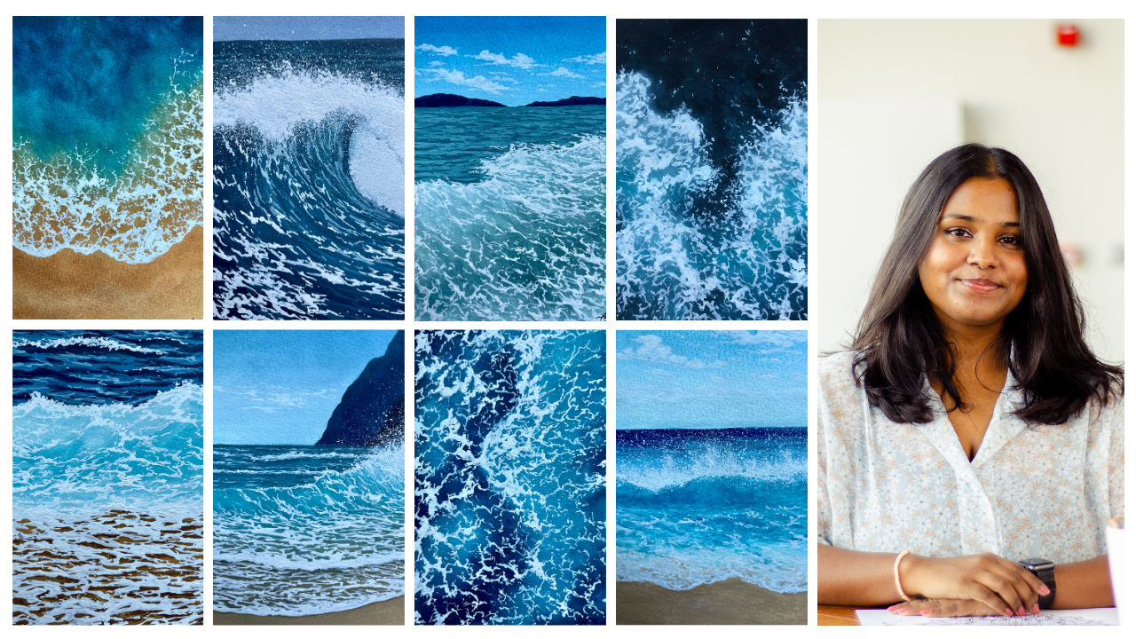
can expect from this class. Here is seven Class
Projects that we will be painting over the
course of 14 days. Every alternate day, I'll
upload the class project. This way you have
ample time to finish one before the next
one goes live. Each class project is unique in terms of colour
Palette composition, and even some techniques. But don't be intimidated
by this because I am going to walk you through each
and every step carefully. And we're going to
do this together. We'll start off by talking
about the right type of odd supplies you need to pick when you're
painting with gouache. And then discuss the color
palette for this class. Along with the sheets
that I'll be using, I'll show you some unique
mixes that I make when I'm painting what escapes will
also discuss the tonal value, which you will help
you understand how to create lighter
colors in Gouache. Will also talk about the basic gouache techniques
such as consistency, blending and layering,
and then apply these techniques to Paint
for exercise lessons. Now, each lesson is unique
in the way that we'll talk about different compositions for the Waves and the beaches
that we're targeting. We've got Sky Clouds, beaches, a review of the beach, and also a Crashing
Waves that will practice before we try it
out in our class project. This way you have an
idea of what to expect. And then using this knowledge, we will paint seven gorgeous
seascapes together. By the end of this class, you're going to have the seven paintings with you
that you're going to be so proud of and
won't stop boasting. So I will see you in the next lesson where we're
discussing the materials
3. Materials Used: Alright, so let us talk about all the supplies that
you need to have. Before starting with this class. I'm going to talk
about the paper first. I am going to be using
this Bockingford paper. I'm trying it for
the first time. It's the traditional
watercolor paper at acid free, 300 GSM and cold pressed, right? So this is an A4 size paper. I will be making it half and
using an A5 size of paper. But I really like this
paper for its texture. I like having a
bit of texture on my paintings and I don't
like it to be playing. That's just a
personal preference, but you can use hot press
paper if that's what you like. Gouache is very versatile
that way so you can absolutely use
it on any paper. It doesn't have to
be even 300 GSM or 100% cotton or whatever. It works well on all
peoples, but it's again, a preference that you have that what people works for you. Alright, so that's
it about the paper. I'm not going to
dive deep into it. Next, we're going to talk about the colors are the paints. I will be using my favorite
brand of gouache paints. This is the Winsor and
Newton gouache paints. If you've been following
my Gouache classes, you know how much I love the creamy consistency and the color payoff of this pinned. You can use any Gouache
that you have with you. It doesn't have to be
Windsor and Newton. You just need a bunch
of colors that we will talk about in the next lesson. I will be using this titanium white
color from Bruce, true? Now, I always run out
of white very quickly. So that's why I have a bigger, larger tube of white
paint from another brand. Again, the brand
does not matter. You can use the Gouache
paints that you have. Next, talking about the brushes. I will try to use very
minimal brushes here. I have to flood brushes
that I'll be using. It's a size 18 and size stent. Now the A11 is really good
for flat washes and covering a larger area and
a smaller one is obviously good for background
washes for smaller areas. So I just prefer having
two different sizes. Next, round brushes, I
have size 04 and again, each one of them is
important in their own way. The larger one for larger areas, the smaller one
for finer details. You will be actually,
you see me using a combination of these
brushes in my class project. This is it about the brushes. Now coming onto the next thing, we have discussed, paper
paints and brushes. Now all the other little
things that you need to have, you need to have
two jars of water. This is important because
the first jar acts as your main well in which you're cleansing and
cleaning your brush. And the second one is like
a fresh supply of water. So like a double rains
or whenever you want to use a clean water
to make a new mix, it works out really well. So I will suggest always keeping two jars of
water with you or two containers of water with you when you're painting
with gouache. Alright, Onto the next thing, keeping in line with
the theme that we have, that is the beach and the
Waves and ocean theme. I'm using my shell
shaped palette. You can use any palette. I'm using a ceramic one I liked the way the color mixes on
that personal preference. Again, you can use
anything don't be bound to a ceramic Mixing palette
next to have a spray bottle. Now, I will show you how you can use this in the
practice lessons. But try and have like a
spray bottle with you. It makes the process
a lot easier. We're able to spread
water evenly, spread water on a larger surface without having to
use a brush for it. So this one works really well. Try to keep one if you have one. Next, we're going to talk
about the other things. I have, Masking tape,
very important. It helps you tape down your
paper on all four sides. I love having those
nice clean edges. And I'll be taping this on
a clipboard that I have. So you can flip flip or tape
down your paper on anything, any surface that you
can move around. Because that makes
the painting process easier and not
bound to the table. So that's why I like
keeping it on a clipboard. Next are the supplies
that you need to have is just scaled pencil eraser, just your normal
stationery items will help you create
your basic sketch. Lastly, before I forget, the last item that you need
on the list is a toothbrush. I know that sounds funny. But notice is not
a Used to brush. This is the new
one that I'm using specifically for the
Painting purposes. But it was really when you want to create splatters of the salt. So whenever you want to show that the wave is Crashing and they're these little water
splatters everywhere. I really like using
the toothbrush. And this is pretty much it. These are all the
supplies that you need. Gather them and I'll see
you in the next lesson.
4. Colour Palette: Okay, So before we dive into the practice lessons
of the techniques, I want to take a
moment to discuss all the colors that we will
be using for the class. We'll be discussing.
Appreciate that I will use, starting off with the
different shades of blue are the tubes
of blue that I have. Here. I have
Prussian blue color, Turquoise blue color and
cobalt turquoise light. So these three tubes of paint, I'll be using a different
tonal values of it, of course, but these three sheets are
the ones that I'll be using. Different shades of blue. So depending on
the dark to light, wherever I need Turquoise or
the cobalt turquoise color, I'll be using these triplets makes to have the
different shades of brown. I haven't diarchy Brown. I have burnt sienna and
I have yellow ocher. If you don't have one
die keep brownie can use septicemia or even burnt
sienna with black. Next coming on to the
other sheets that I will need that is going
to help us achieve, let's say Turquoise color if you don't have Turquoise color. So I have primary red. I'll be using this for, I think one Class
Project next to have lemon yellow and black color. Lemon yellow and
Prussian blue sort of gives you a Turquoise color. I will talk more about it later. And lastly, for the most
important color in your palette, it has to be white paint. I told you I run out
of white very fast. It's because that's
how you're making lighter shades when you're
painting with Gouache. Unlike watercolors,
you're not adding water. You're adding white to lighten the vibrancy are the
tonal value of the color. So we're going to
be using these. I think there were nine
or ten, about ten shades. I'll be using them for the class projects
and practice lessons. But let this swatch
everything out and see what they look like so you
can get similar shades. Yearn to have all the
colors on my palette. I've got nine different
shades plus white. So N Colours. We're going to start off by swatching the blue shade first. Now, don't worry about the
consistency and how you're consistency or
your the thickness of the famed is supposed
to be like right now. I will be talking more about
it in the next lesson. Right now we're
just going to focus more on what the
color looks like. Just dipped my brush
in a bit of water, just added on the Paint, the dot of paint that I have. And this is your darkest
tonal value of Prussian blue. I haven't added any white. I haven't added a lot of water, so you can see how it's
a very deep color. Now there are various
sheets that you can create, but just Prussian blue, by adding different
amounts of white to it. We will talk more about
it in the end when I'm showing you a swatch
of all the colors. Next color on my list
is the Turquoise blue. Now for the Ocean paintings
that were going to do today, I feel like the
Turquoise blue color is such a beautiful shade that captures like
the lighter parts of your Ocean and
even the cobalt, turquoise, it really captures that sort of yellow greenish
color of your water. This is the Turquoise, blue. They can see it's a
lot more blue, right? Rather than being something on the yellow spectrum or has a bit of green,
has a lot of blue. And this is where I use it. You can see that
I've used it and blue paintings and even like the darker at Veritas
little bit of greenery, I'll consistency
or like the color. That's what I've
used it as well. And there'll be using
the Turquoise color in a lot of different places
in the class project. It's almost like a very
important sheet for you to have, will talk about how you can
make something similar later. Next color that I have is
called cobalt turquoise light. So this is a very,
very vibrant color. And even though it is
on the same spectrum, it is Turquoise color. It is a lot more vibrant
rather than being done, you can clearly see
how these two shades a completely different
from one another. And the cobalt
turquoise color is such a beautiful shade
like I mentioned earlier. To capture the lighter parts of your portion said works out really well when
you want to capture those sort of Colours
in the water. These three shades, particularly
from Winsor and Newton. What I'm going to be using, obviously changing a
lot of tonal values, making it darker or lighter depending on what I'm
trying to achieve. You can make Colours
very similar to this, using the colors
that you've probably already have in your set. So we have to talk about that. We have to serve achieve
Colours similar if you don't have these particular
shapes with you, I will tell you how
you can achieve those I also want to show
you like a bunch of different blues that
I will mix in use. And the blue that
I really like for my paintings whenever I want to capture like a deeper shade, which is not a shade
that's closer to, I would say indigo. But it still a very, very deep Prussian blue color. I really imbedded describing
what I'm trying to save. But this color is actually
a mix of Prussian blue and my Van ****
brown or like sepia. You can take this color. I'll show you when I swatch it, you can really see the
difference that I'm trying to, I've talked about. This one has that
earthy brown undertone to it because it
has brown color. And we will be using this particular shade in
one of our class projects. So you can see how
it turns into, I would say it's like a thin yellow green
or yellow blue color. If I were to put them
in one of those shades, I would say it's closer to that. I really like this color a lot. You can mix it on your own
by just mixing Turquoise, blue, and your brown color. That is a Van **** brown color. Next I have a mix of
Prussian blue and black. Immediately you
see how the shade is very different from
the previous one. This one falls mood
under the indigo color. I would say it's,
it's like a very, very deep Prussian blue
color which has black in it. And it's like the
deep end negotiate. So that's how you can make
this dark blue color. It is a mix of your Prussian
blue and black colors. You can see how these two
shades at different, right? I'll see an example
where I've used this indigo color for
all these darker parts. I've used the indigo shade and you can see how it captures that extreme
depth in the ocean. Nonetheless, talk about, hi, you can make these
two shades of colors very close enough,
similar to those. Obviously having the colors
in your palette already. Now to make Turquoise color, one way you can achieve
it is by Mixing your blue and green shade or
your blue and yellow sheets. So we know that blue and
yellow when mixed together, will give you a green light. So painting we're trying to
achieve all of this will be basic concept
that we know. Okay? I'm just simply Mixing my Prussian blue with
a bit of yellow. So be very careful on
the yellow because you can easily turn
it into a very, very bright green color, which we don't need,
need the color to be more on the blue side. So I've mixed my Prussian
blue bit of yellow and white. Obviously this can be lighter, but I swatch it, it
appears to be really dark, but it can be made lighter
with a bit of white. When you add an ID,
it gets lighter. You can obviously
adjust the tonal value. We're not gonna get
the exact color. Color match from the tube, but we can achieve shades
similar to it right? Now. You can see
how when I added more white into my paint, it has immediately
gotten lighter. Again, if I were to
add a bit more blue, I feel like we
could achieve that almost very similar to the
Turquoise from the tube. It's just missing a
bit more of the blue. But you can see how it
gets into that same range. So when you want to add
those light the colors, you can do it using the shape. Next, I'm mixing
yellow and my blue. Again. This time I've added
a bit more yellow color. Now, obviously the cobalt
turquoise colorism, a lot more Towards
the bluer side. And this one has
turned out to be a lot Towards the greener side. It's not blue enough, it's a bit green. This is because the yellow, the amount of yellow that
was in my palette was more. Again, you can adjust it by
adding a bit more blue in it and a bit more white and then to light
and end it all depends. I felt like the perfect
ratio for you to get a cobalt turquoise
color is to mix Turquoise blue with
yellow and white. I can immediately see
how this color is very close to the
cobalt turquoise color. If you have Turquoise blue
with you by any chance, please do use it for achieving this cobalt,
turquoise, blue shade. It's really nice, it
matches really well. And you can just immediately create the shade by
just mixing some color. So these are the
different shades of blue that I will be using. Now, like I mentioned earlier, the values will change when
I'm making the painting. It'll be lighter or darker
depending on how it is. Next, let us what all the other browns and
all the other shades. So here I haven't **** brown, like I mentioned earlier, it's a very many beautiful shade
of brown that I really like. It's pretty nice and deep And if you don't
have this color, you can use sepia or
burnt sienna mixed with black so you get a color
which is similar to that. Next I have burnt sienna color. You can see how it's a
gorgeous, earthy color. I love how warm it is. And a mix of these two shades. That is when ****
brown and burnt sienna is like such a beautiful
blend for your sand. I mean, that's what I think
personal preference again, it all also depends on the
reference image itself. Next, I have yellow ocher. Now, all of these
different shades of brown that I have of using a mix of them and trying to
create the shade for the sun, make it lighter or
darker depending on what the reference
images and what the vibe of the picture is and what
we're trying to capture. But these three
shades of brown are the ones that I will be
using in my painting. Now, coming on, the next
shades that I have, I have to use lemon yellow. So I did tell you, right, you have to have lemon
yellow on your palette. If you're going to be creating your Turquoise blue or your
cobalt turquoise shade. It's a beautiful
yellow color which is so vibrant and
immediate leg I feel like the name just goes with the color when
you look at it, you think of a lemon. At least that's
how I pictured it. I look at this color and I immediately know
it's lemon yellow. And it also reminds me of lemon. This is one shade that
I'll keep with me, but me to swatching colors
or even working with different shades,
different primary colors. To be very specific, makes sure that you are cleaning your brush completely
and double rinsing them so that you don't end up making a secondary
color on a muddy mix. Next color on my palette
that I have is primary red. Now, I will be using this
color only Particularly in one Class Project for
having a very purple color. And that's the only, I'm using this red color. So if you don't want to use
it in any of your paintings, you can totally skip it. I'm just giving you that choice. Next sheet that I have
on my list is black. Obviously, it is useful whenever you want to
get darker shade. I wouldn't say always, but for certain colors
like Janet create indigo shade or just a little
bit of a darker color, you can use a bit of black. These are going to be all
the colors that I have. Lastly, I don't think
it makes any sense, but I'm still swatching
a white paint. Just just one Part
of me was like, I'm not going to
leave that space. Mtm is going to
swatch it with white. So that's what I've
done up swash too wide. But these are going to be
the Colours exactly from the tube and some
mixes that I will be using for my class projects. So bunch of combination of different shades will
come into the play and don't really worry
about it because I will be showing
you all the colors, how I make it, and also what the swatch of the color is while I'm trying to go ahead and
add that to my paintings. So you'd go through that
entire process while painting. But these are going to be
the colors that I'll have. Ten Colours, about ten colors. Keep them with you when
you start painting. Now one thing that I'm
going to do is write down the names for it so that
you don't forget, right? But before I do that, let
me swatch and show you what I meant about the
tonal value of the color. So here I have
Turquoise blue as it. So that's the color. Next one I'm doing is adding a tiny amount of white into it. You can clearly see the
color has gotten lighter. Now, I'm going to add in
some more white into it. Immediately, the color
has gotten lighter. Now over here, I'm not
playing with the consistency. The consistency
remains the same. But when I want to
create a lighter color, I will add white into it. And if you feel like
you're consistency is becoming thicker, then you add a bit of
water to make it workable. But the basic idea is that the more white you add
into a painting, the lighter, sorry,
knocked Painting. The word white you
add into your mix. The lighter, your color
is going to appear. So you can see how I bought this beautiful
turquoise shade into this very light color,
light blue shade. So that's how you play
with the tonal value of the color when you're
working with Gouache, obviously you can make it
darker by adding black. Over here. I've
named everything. You can see all the colors
and the mixes that I've made, and also the tonal value. So you can pause here, just noted down if you'd like. I've got all the different
shades that I spoke about, all the mixes that I've made, and also the tonal
value of the color. So you can just take a
moment to pause, noted down, create your own Palette and
have that with you study, you find it easier when
you start painting. I hope you found this
color palette lesson helpful and it
helped you give you a clearer idea of
what to expect in the next lessons and in your
class and in the paintings. And using this little
bit of information, let's dive into the
basic gouache techniques that you need to know before diving into the painting process
5. Basic Gouache Techniques: Alright, let me give you a quick Gouache
Overview before we discuss the different gouache
techniques in detail. As we know, gouache is an opaque medium with leading
capabilities of acrylics, and it can be easily reactivated using water,
just like watercolors. So it is a medium in-between
acrylics and watercolors. Gouache has a beautiful
matte finish once it's dry. And due to this
property that it has, it can be easily digitized. And that is why it's
so popular amongst illustrators and artists heard Laughter, digitize their work. To get Gouache, one thing
that you have to keep in mind is that data Colours, my dry lighter and lighter
colors might dry darker. So this is something that it
takes time getting used to. But once you figured it out, it's not something that really changes the concept of painting. Gouache is a very
versatile medium and you can easily fix
your mistakes by just re-wetting the paint and
starting over so you have no room for
ruining your paintings. In Gouache, we add white
to tone down the vibrancy of the color and water for
a thinner consistency. We will talk more about
this later in the video. Lastly, whenever you're
painting with Gouache, keep in mind that
you want to use freshly squeezed
pain because gouache is opaque when it's
fresh from the tube. And if you reactivate the paint
once it's completely dry, there are chances
that it might not give you that level of obesity. Alright, now that we
have the quick overview, let's talk about the
different cost techniques. Here, I want to talk about the three different
techniques that will help you understand the medium that
we'll talk about, consistency, blending
and layering, first being consistency. Now what is consistency? Consistency is the
ratio that you have between your
paint and water. So when you're
painting with gouache, if you add more water, you get a thinner consistency. And if you add less water, you get a thicker consistency. You would have
taken four shades. I've got white, Turquoise, blue, Prussian blue, and brown. And I have a dry brush. When I apply this dry brush on this blob of paint that I have that is the Turquoise blue. You can see how it has
that creamy consistency. And I've added nor water my
brush, it's completely dry. When I load up the paint directly and apply
it on the paper, it creates this X should effect. Now the texture that
you can see is not only coming from the
consistency of the pain, but also the paper has a bit
of importance to play here. I'm using cold press
paper and that's why it has a bit more texture, right? But again, even if you use
it on a hot press paper, will still be able to have
that kind of texture. Next, I'm adding a bit
of water into my mix. Now we know painting
with Gouache, this consistency almost
feels like it has like a, it's like all consistency
that's between milk consistency and like a cream or a gel kind of
consistency, the soft gel. This kind of consistency
is lot more useful when you're painting
in your final layers. And you want your
paint to be extremely opaque and have no color
from the background. So you tend to use
the consistency. You can see how it's a lot more workable than the previous
swatch that we did. It's nice and opaque, but you're able to work
with it and create a nice opaque layer without
having a lot of texture. You can use this consistency and even like the first
one in your first, the final layers that you have. Next type of consistency that I'm showing you is a lot more, I would say like a milk
kind of consistency. So it has a little
bit of obesity, but it is a lot more workable and a lot panel
than the previous one. So this kind of
consistency works really well for your background layer. So let's say you want
a background wash for your Sky, for whatever, whatever you're
painting in landscapes, this is a very good consistency
to have and will be working a lot with this
type of consistency. The next one that
I'm going to do is a consistency that has
a bit more water in it. So it's not completely
like a watery consistency, but it is still a
lot thinner and lighter so you can see
how it's very light. I am not I wouldn't say it's completely opaque because I can still see a little bit of the
paper through this layer. But at the same time, it is quite translucent. That's put it that way. Then you can use this
consistency when you want to create light background washes. And especially when you're
working in a lot of layers that comes in handy when you want to
just give it that hint of color and then
build it on later. I think it works
really well for that, so it will be using the third and fourth
consistency a lot. The last final consistency is lot more watery consistency. You can see how it's very light. It almost feels like you're
painting with watercolors. You can see the
paper through it. It's not very opaque. This one works a lot
more for glazing, or you want to just
add a hint of color over the previous
layer that you have. So it's not like you
can not use this. But again, there are
different places in which we tend to use all these
different consistency. Now, the next thing that we
are going to talk about, its blending, linear
painting with gouache. Blending has both the benefits, like I mentioned, it is similar to acrylics and watercolors. So we're going to use that together to do two different
types of blending. First one is going to
be a gradient wash, which you can use differently. This is just to give
you a basic idea of how you can blend colors to have their gradient where
you go from dark to light and just get
them to look seamless. And the second one is really cool technique that
I discovered in the past few months
and have been loving when it comes to painting
water and Ocean. So what I've done here
is taped down my paper on all four sides
using my normal tape. The first type of blending
that I'm going to show you is the gradient wash. Now if you've been
following my classes, I've taken the past few classes. You are familiar with
this type of blending because it's a very
common type of blend that I teach most of the times because it's
useful for your skies. It can be useful for
being take water. It can be useful in lot of
places where you just want to blend from dark to light. Now, this is a
single color blend. You can do this with two colors, three colors, how much ever
colors you want to put. But the idea remains the same. What I'm doing here is
I've added darker blue. And each time on each
little section that I have, like a 1 cm section that I take, especially in this
surface area that I have, I am adding more white into it. Now the idea when
you're blending, are trying to
create a blend that seamless with different
shades of blue. As you come down,
you're getting it to be lighter is to make sure that you are
starting immediately from the point
where you left off. So I've added more white
into my mix and I'm starting exactly at the point
where the darker blue, as you can see, especially when you're
working with brushing load kind of stain your paper. And it can be a bit difficult to get that harsh line to blend in. And whenever you are facing
something like that, my basic idea would be to add a bit more white
and going to go over that section a
couple more times to add a layer over it so that that harsh line
is not that visible. And then obviously you
will have to clean your brush and just
go top to bottom or bottom to top just to make sure that you
have a seamless blend. So I really liked the way
the blend looks right now. I'm not going to
overbook this section. I like how there's a
beautiful gradient is not so overworked. And obviously you
can do this with as many shades of
blue that you'd like. So this is your
first BIPOC blend. Now, the next type of
blended forgot to focus on is the pool technique that I was talking about in this field. Going to apply the law of
a wet on wet into Gouache, because gouache is very
similar to watercolors. Now, obviously,
unlike watercolors, will have to really build on the vibrancy of the
pain that we have a couple more times than what you could do watercolors
and probably a single layer or maybe into. But the idea remains the same. So first we wet the surface, then you can see
when I add my faint obviously the paint
also has to be slightly towards
the thinner side. I wouldn't say very thin. But the second and
third consistency, if you add that in and
because the surface is wet, you can see how the paint moves. Again. The paint does not move. Very similar to watercolors. It does not just
go with the floor, but it still does kind
of blend into one another where you don't get
these harsh lines, right. But you're still able to blend them to merge into one another. We will be using this blending technique in two of our class projects as
far as I remember clearly, but I might have just use
this in another place, in another project as well. But to definitely we are
going to be using this. And you can see how it creates
that illusion of depth, light and let's say a
different shade of blue. And it can dissolve,
merges into one another. Again, when this dries, it might dry a
little bit lighter. Once it's like water has fully
evaporated from my paper, it might dry lighter, but you can build this
on and two layers are three layers to get
that beautiful blend, especially when
you're looking at an aerial view of the ocean. This is a very good
technique that you can use. I was still happy when I found
this out and I was like, I need to teach this
and I need to do this for myself because
it's so good at, it works exactly
like watercolors. Obviously it has a different, a different feel to it. But you can create
beautiful paintings without having to physically
do a lot of blending So these are the two blend that will be using a lot in
our class projects. And I hope you learned
something from this. Next thing that we're going
to talk about is layering. Now, leering, very common
as the name suggests. It's the idea of adding
one layer over the other. If you watched my
previous classes, you know how it goes? Video painting with gouache. And it's going to
be the same thing. The basic idea is you want to have a thinner
consistency at the base. And as you build on your layers, you want to add
slightly thicker, slightly thicker layer over it. And by thick, I don't mean
like extremely thick, but the consistency
needs to build on it. Now why I'm saying that is because if you have a
thick consistency at the base itself and you try
to add a layer which is baby, let's say at the same
consistency level or slightly thinner, it will reactivate the paint and you will end up with
a muddy mix or it'll be, you'll end up reactivating
and picking on the previous color in the
layer that you want over it. And to avoid that, my, my basic rule would be to light just build on
the consistency. Start off with a
thinner layer and then you build on the layers. So over you and I have my
Prussian blue color and I am going to apply a nice
thicker consistency, let's say the second
consistency all over one section and just
kinda evenly spread it. You can see how thick
and nice it is right? Now if I was to add
something on it, I'm pretty sure it would
reactivate the paint. So I'm just going to apply
this in one section. The second section, I'm going to put up some more
paint because I just ended up using all the
Prussian blue that I took out for one section. So I'm just going to add a
bit more water into this. Basic idea is that
this layer does not need to be that thick, so it will fall under the third, the fourth consistency that
I switched out earlier. You can clearly
see the difference in the color because this one appears to be a lot
more lighter, right? Clearly you can see the
difference in the two blocks. So now I'm gonna do is
just evenly spread it and let these two sections
completely dry. And then we'll add layer over it and see how the magic happens. Alright, so both my
blocks are dried, obviously the second one, right? Dark, so it cannot clearly
see the difference. But if you will see
this in-person, he could tell the first
one is a lot more thicker. Now I'm going for a consistency which
is like the second or the third one for
my white paint. And immediately when
I brush it over across the Paint or across
the previous layer, it picks on the layer. You can see how it's
reactivating it. Now, it's not like
it's not workable. You can work with
the consistency. But when you're working with, let's say white, white
is the color that will, even if you're working on
the second block, also, it might still pick on the color and it will still
show the previous layer. So you might have
to walk in like two or three layers
with the white to kind of get it
to look the opaque, bright white that it is. But in the first
one you can see, just picks on the color. You can see how the white has turned into like this
light blue shade. And it's very common for it to happen if your previous
layer is thick. Now I'm just going
to clean my brush, make sure I have no blue
on my brush. First. I'm going to load
up some more white. And again, working in the
same consistency like with, like somewhere between the second or the third consistency. I am going to apply it
on the second block. Now, again, over here, another thing that really
matters is the amount of pressure that you
apply on your brush. If you apply a lot of
pressure on your brush, it is going to reactivate
the paint at the bottom. The basic, because you can reactivate Gouache
with water, right? Even if it's paint, wet paint, it will
reactivate a little bit. The idea would be to add a little less pressure
on your brush. If you do that, you
will not reactivated. But again, that is all. There is a difference in the way the white looks in this section, I would say as compared
to the first block. And it will also dry lighter. Remember this lighter
colored, which is white, once it's completely dry, it will dry to be lighter
than it looks right now. There is still a
difference in the white. This one's a lot more opaque. That's a lot more white. And it's not a reactivating the color as much as
the previous one. It does look like it
is in this section. But trust me, in real time
when I see with my own eyes, it's not as much like
I said with white, it will dry to show
the previous layers, you'll have to work in two
layers or let's years, I would say is the minimum that you'd have
to do with white. Most of the times
are we will have to go for a slightly thicker layer. And obviously with this blue, it ends up reactivating
the paint. But once it's dry, you will really be able to see the difference that
I was talking about. It because the
paint is still wet. It kinda looks very similar. But once it completely dries, the second block
is going to be so much more lighter
than the first one. So I'm just going to create some more little
shapes just to kinda fill up my section and
leave it to dry completely. And then let's see what
the paint looks like. Alright, so here we have
that, like I mentioned, the second one has dried a lot lighter than the first block. Here you have the layering. This is how it works. This is just to give you a basic idea and we'll also
talk about how you can apply these basic techniques and in your class projects and to create different things. Let's have a closer look. We spoke about consistency,
blending and layering. Just three main important
techniques that you need to know when you're
working with Gouache. I hope you found this helpful. In the next lesson, we'll do some practice exercises and apply these techniques and them
6. Exercise 1 : Sky & Clouds: Alright, so now we're going
to practice some applications of the techniques that we
learned in the previous lesson. Before we dive into
the class project, I'm going to show you
how you can apply the different gouache techniques to use them in our paintings. So we have consistency,
blending and layering, and we'll be using
different combinations of peace in our class
projects quickly. Just going to show you what
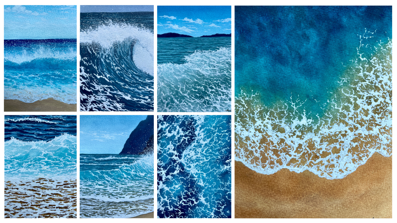
are class projects look like. So these other seven
paintings that we are going to Paint together
in this challenge, each painting is, I would say, very similar in
terms of the pain, but they are very
unique from one another in terms of the colors are
in terms of the techniques. But again, it is a combination of the techniques we're going to use and learn and create how to paint
different water bodies. Let's say Waves. Let's say Sky. Sky is not
a water body but Waves. You've got Clouds, you've got these different see
form the structure, the splatters, all of that. So I want to give you a
quick overview of that. Let's practice that
a little bit so that when we dive into the painting, It's not that new to us. I have divided my A4 paper into four parts and each part will
be painting each element. So the first one that we're
going to do is your Sky. So here I have my size
18 flat brush because it covers a larger
surface area easily. We're going to use the
first blending technique that I showed you in which
you are creating a gradient. So that's the blending
technique that we're going to focus on. Basic idea. We start off with
a darker color at the top and you slowly move
down to the lighter one. So here I'm just
vetting my brush very lightly and I'm going to
take my Prussian blue color. Now. Do this
Prussian blue color. I am going to add
a bit of white. So I don't want that exact deep
Prussian blue color that as is as the shade of it. I want to lighten
it up a little bit. I'm adding a bit
of white into it. Now what I'm going to do is add just the
consistency basically off the paint to get into the total food consistency
that we talked about. Once you get into
that consistency, I'm going to apply
it at the top part of my paper, of my section. And then slowly move left and right and a little bit down. They can see I've covered, let's say an inch, an inch like 1.5 cm or so. Now I'm going to light
the color even more. So I'm adding a bit more white and again, adjusting
the consistency. The consistency is
even throughout. And then I'm going to apply
that right where I left off. So I'm going to cover
that area first. And then once you go over
it a couple of times, that sharp, harsh
line that you see, it goes away and then you
can slowly move downwards. Now we're gonna do that again. So we are going to
gradually decrease the vibrancy of the paint
and get it to tone down, get it to get lighter. Use the third shade that I get. Again are just the
consistency so that it matches and start right
where you left off, so that you are getting rid of that line and that kind of
blends in with this new color. And then you can move downwards. So each time you do that, you are going to
follow these steps. Make sure you are
just the consistency. Get a lighter color. Start right by your left off. Clean your brush,
add more white, and then start again. So there will be a little bit of constant cleaning
of the brush. That is something I feel people take time to get
used to when you're painting with
gouache is a lot of cleaning of the brush
that you have to do. And if you don't, then
you end up loading the darker color in the lighter areas which you don't want, especially for the
blends in the sky. So keep that in mind. Kino brush and dry
off the extra water. Now you can see how I've got this gradient and
this guy, right? I've got darker
colors at the top. And it's slowly transitions to a lighter which
is at the bottom. Once you've laid out
all your colors, one thing that really helps us, you clean your brush and don't dry off the
brush completely. Have a bit of water in it. And using the water, you just keep going
left and right, and you move upwards
or downwards. So this way you
ensure that you get the entire blend to
look nice and seamless. And there's no harsh lines in between and things like that. I really liked the blend
that has happened here, so let it dry. Once it completely dries off, you are going to start
painting the Clouds. Now, remember how I told you
that the consistency has to be thinner
because you have to layer with a thicker
layer on top. So we are going to use
that same concept here. The background layer that
I have is thinner so that I can add a thicker
consistency of clouds on top The class that we're going
to paint in this class, I'm keeping it very simple. I'm not going to over-complicate
it because this class focuses more on the water
bodies than it does on Clouds. So the Clouds are
going to be simple. If you've taken my
previous classes, I'm pretty sure
you're familiar with these types of
clouds that I make. And I like to call them
like my horizontal Clouds, in which we're trying to capture Clouds that are added distance. So you're not seeing
that fluffiness of it. You are seeing some
sort of fluffiness, but it's not very fluffy. I'm going to start off with, let's say an inch above
the blender I have. And then we'll slowly
transition slightly upwards. We're not going to
add a lot of Clouds. Now the technique
here to achieve these type of horizontal
Clouds, like I said, is to hold your
brush almost like 45 degrees to the paper or even 30 if you want really
fine lines and then move horizontally, right? You can see how I'm not moving my brush in like up
and down motion. I'm moving them left to right,
like horizontally, right. Then obviously you can
adjust the shape of it depending on the way you
like your Clouds to look. There is no particular order
that you have to follow. And by order, I mean the shape. You can keep the, the base Flat and just have these
little curves on the top. So it's not very, I would say complicated to do. You're going to achieve these
nice horizontal Clouds. So I'm gonna show
you two right now. So this is where you're just adding a bit of
Clouds at a distance. Like have an essence that yes, we have these clouds
in the background. The other one is to have
Clouds that are still a little bit more clues in that when we're
making those clouds. Again, the same concept, that is your horizontal Clouds. But this time at the top, I want to move in this
slide circular motion. I get that kind of fluffy
effect in my Clouds. You can see how the
base is quite flat. And then on top you've
got a little bit of those curved flux coming in. Now, if you notice
very carefully, the white is going to, it looks a little bit
dull right now, right? It's not very vibrant, is not very opaque. It is to showing a bit of blue. And that's the thing with white. When you're working with white, either you'll have
to use a very, very thick consistency of paint, which I feel is not very workable when you're trying
to Paint with Gouache, unless your electron to add
some details and you can use that thick consistency
of paint otherwise, for Clouds and
stuff, it's not very workable because
you have to create, you have to constantly move your brushes and create
different shapes. So for that, two
layers works best. Now coming back to the
shape of my Clouds, once I'm done with the overall
structure of the clouds, I like to add some clouds like tiny ones just floating
around it so you can see me add these little
horizontal shapes kind of connecting
with the Clouds. And I feel like with Clouds. This is something that
really comes from within. When you do a lot of paintings, when you practice it a lot and do it a lot of
times it's just kind of like gets engraved
in your head and you don't really think so much. You look at the picture,
the reference image that you have and just
kind of understand the way in which the Clouds are flowing and then
you end up creating something on your own. So it's completely okay to create something on
your own as well. As long as you're capturing
the essence of the painting, we're not going
for hyper realism, so it does not really make a difference based on the way in which you want
your clouds to look, to go ahead and enjoyed
to practice this once, just so that you
are brushing over. If you've done this in the past, you just get a
practice once again. And if we're trying it for the first time, then you'll get, get familiarized with the
technique and the way in which I process the Sky and Clouds. This is what the
Sky and Clouds will look once it completely dry. Now it might be
dry very quickly. Gouache dries very fast. You don't really
have to wait a lot. Once it dries,
you're going to add, I'm just adding some, an extra layer over on the top bar just to
show that let's say the light source on the
Clouds is coming from the top and that's
where the top part of the fluffy part
of the Clouds. It's going to be a
little bit more vibrant. But otherwise, this is
how you paint your Clouds and the Sky and
do practice this. And then we'll move
onto the next bit. In the next lesson, we'll be exploring
the concept of beaches and I can create those different layers.
So see you there.
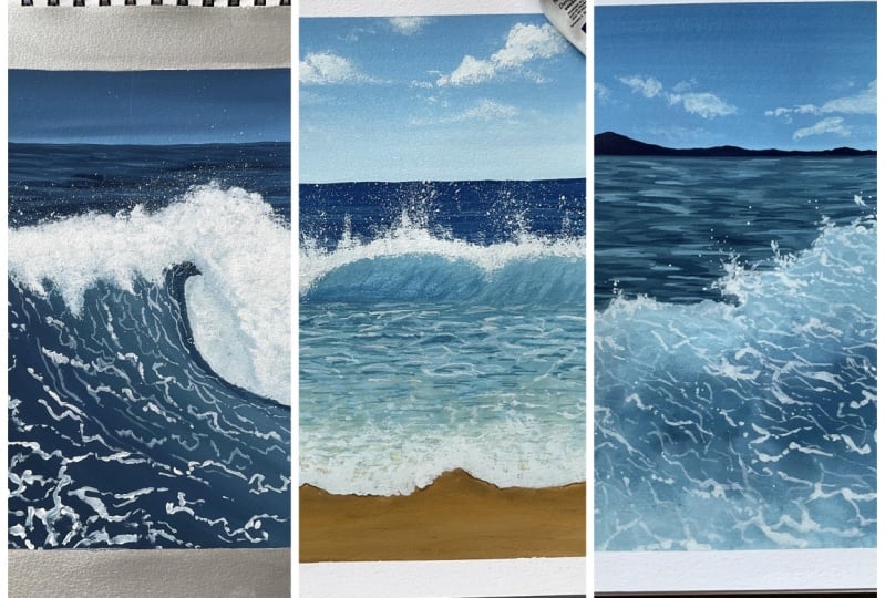
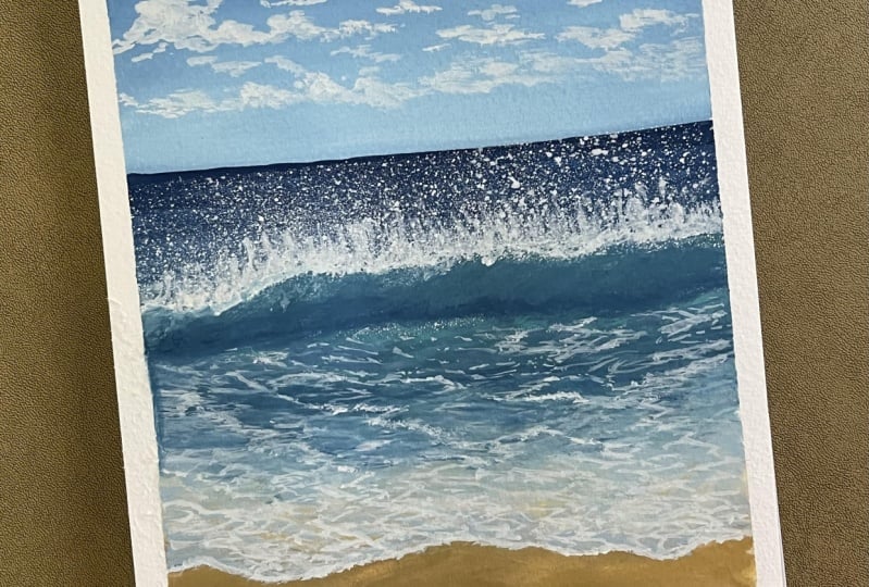
7. Exercise 2 : Beach Waves: Alright, so the next
practice section that we're going to do is going to be for the Waves
Crashing at the beach. You've got the
depths of the wave. You've got the sea
foam around it. The first one I showed
you over here also, we've got a similar concept. We're seeing the sun
through the water and also like a wave is like Crashing about the
Crashing just like in the air that the concept
that we're going for. So we'll take a
section of a dried, a small part of this
painting that we have here to
understand the concept with which we work and
just practice this once before we dive
into the main painting. Alright, so the
first thing that we do whenever you're painting
a section like this one, even when you're painting the
actual artwork is to create your base sketch to understand
the structure of it. The first thing I'm
sketching out is the wave that's
Crashing at the beach. They've got that see
for me Part of it and that water that
touches the beach. Next thing that I'm going
to sketch out is the wave. That's like curving towards
going to crash on the beat. So that's what I'm sketching. The third line that I've drawn, like second from the bottom is the part where the water
and sand kind of need. So you can see how data is a very evident transition
in that, right? That it appears a
lot more vibrant. And the one before or above that it's like a lot
more blue or Turquoise. We have to have like four or five sections where
the topmost is the wave, the line under it as like your shadow part that's being caused because
of the weeks. And then the third
one is the partition. In the fourth one is the water obviously Crashing on the beach. You've got few lines to
understand the basic concept. It's not like you can only apply this and that
particular painting. You can also use
that concept of used very similar concepts that obviously a lot more
closer version of it. But the same type of
concept is being applied. You obviously use the
same type of steps. Just the composition
will change even here. We've got similar concept. The only thing that's changing is the composition
of the painting. Maybe the colors might
slightly differ. But overall, the
process in which you make the painting
remains the same. The consistency that
we're going to work with is going to be the
third and fourth one. Initially the fourth one I would say because
we're going to start layering and be working in a bunch
of different layers. And it works very well
like that because you're able to build on
without reactivating the base. I'm just going to get the painting that we're
taking reference from on top so that you can really see what
I'm going with. First, I'm starting
off with a blend of Prussian blue and
a bit of white, very, very light
amount of white. I'm going to hold my brush perpendicular to the paper using the thinner part of my flat brush to create Stokes strokes
that looks like this, like the ones that I'm applying. So they appear to be thinner
strokes and shorter strokes. Next, I'm adding a bit of white into my paid to
lighten the color. And then again, using
the same method, I'm adding these strokes. Now. Why am I adding
these strokes? These drugs are a lot more helpful when you want to
create that illusion of depth and the lighter parts in the water at a distance where we don't have to work a
lot on the details. But using this method you can easily add in those
sorts of effects. Now I'm adding an even
lighter color of blue, which is about it more
white into the same mix. Again, using the
same brushstrokes, short strokes, short
horizontal strokes. You can see how illusion of the lighter part of the
ocean is coming in, right? If you ever feel like, Oh, I feel like about
it too much light, I'm not seeing the depth enough. Then you can go
back and just add a bit more of the dark color. I'm adding a bit of
dark because I felt like it just to light right now. I'm adding an in-between those lighter strokes
so that I'm still not covering all the
lighter strokes. I really liked the
way this looks. Once it dries, we focus
on the next part, especially for this
little painting. We don't see a lot of
the ocean at the back. The main focuses like the Crashing Waves and the way that's
already on the beach. So we don't really have to
work a lot on the details, but just capture a
slight essence of it. Next, I'm going to mix my cobalt turquoise light
color with a bit of white or light in it slightly. You can make your
own cobalt mix. I've taught that in the
color palette lessons. If you've skipped that,
please do watch it. And I'm going to be in that
fourth and fifth consistency now because we are going to go ahead and just add a
background layer to the painting. So the basic idea is you
go with a thin consistency first to understand the
placement of the color. And then later on you add on it and then build on
it and other details on. So first of all, the cobalt Colour, a cobalt
turquoise color, and then I've added
Prussian blue below it. Why I've done that is
because I want to show that illusion that
because the wave is up in the air that's
receiving light and it appears to
be a lot lighter. And because of that, there is
a shadow that's being cast on the water that's still
rising upward, curving up. And because of that
there is a bit of the blue colored in. Then again, using
my cobalt color, cobalt turquoise color. I am adding the Waves way at the bottom till that
second line that I drew. Now what I'm going
to do is let this be right there and
focus on the cell. So we're going to bring the
blue down and then move to stand up and then blend
everything in-between. The sun, I'm mixing
my Van **** brown, yellow ocher and a bit of white. So this is the color that I get and I'm going to
apply it very lightly. You can see how the consistency of my paint is a very thin, very, very thin, but it's
still a lot lighter. This is not the
consistency that you generally work with for
your final painting, but it works really well
when you're building on it. Next, I'm using a lot of
white into my sad mix. And I'm kind of blending that in that little strip
that I had empty. And then you're slowly going
to blend it with the blue. Once you have done that, I'm switching to a round brush. Then using my round brushes
in size four round brush, I am making these strokes and bringing it down slowly
going to just go ahead and kind of slightly make these horizontal strokes and horizontal curves and bring it down so that even the sand, which is kind of merging into the water has that
effect that yes, there is a bit of
water mixing elements, not just sand color. I hope you're understanding
what I'm trying to say here. To capture that essence, that there's a little bit of the blue color in
the sand as well. So overall, I really
liked the way this looks. So we're going to
let this completely dry and then move on
to the next steps. Alright, so now that this
section has dried up, it's time for us to
layer over this again. This time when you're
working with the Leo, the consistency is not too thin. You're going with that
third consistency. So again, we will repeat, almost repeat the same process that you did earlier. This time. You just kinda carefully
making sure that you are covering all the spaces. You're covering all the
crevices that you've missed or would like to
add a different color too. So just kinda building on, I'm going with my
cobalt turquoise for us and you can see how just
with my flat brush, I've left a little space for
the blue because I wanted to add that after I clean my
brush and with an own brush, I'm just carefully adding
the blue color as well. You can see how the
space is am utilizing the space and then just using a clean brush with
just a bit of water. I'm blending it in with the previous color
so that it's not, it doesn't have
those harsh lines. Then again, switching
to my round brush, I am creating these little
squiggly lines now, there is no better
way to describe it. And this will just making
a bunch of horizontal. They like very curved while just all over
the place really just trying to capture the
different shades of blue and my water on the Waves. And then kind of get it to
merge with D or C form parts. This is almost like creating a base on which
the sea foam will address later on so that it doesn't look just
bland and just wipe. It should have a
bit of color in it. After you're done with the blue, I'm also going ahead with that light sand
color that I mixed, which is when Tikki brown, yellow ocher and a lot of white. And then again, using
that same method, you can see how I am
adding these horizontal, uneven lines and squiggles in, adding different
layers of the color. This is how you
build on yard Waves. You have to do it in two
or three layers that you get that kind of
effect in your water. You just have to very
carefully watch what I'm doing here because
I feel like that makes a lot of difference
than explaining. Also, over here, I am
moving this color in to the blue as well as you can carefully see how I
am moving it upwards, not all the way till
that Crashing Waves, but yeah, Very much
further in as well. Next, I'm going with a mix of my Turquoise blue or the cobalt turquoise blue and a little bit
of Prussian blue. And then this time
using this color, I'm adding some
depth in the waves. So again we are, we added the lighter
cobalt color, right? And now we're adding a
little darker colors compared to what we did earlier to create
that kind of waves, created that kind of tap
the essence of depth. And again, it doesn't have to be perfect
the first time you lay it. Right now, I feel like
the blue just came out to be two into the
lightest space that I had I'm just gonna go ahead
and cover that up with D, lighter sand color that I mixed. This is how you go
back and forth. And the basic idea is
to have the illusion of light and depth in your painting to have
that kind of effect. That because water
is not still right, it has a lot of movements. You're just kind of capturing that movement with
these strokes. You're trying to get all
of those Movement in place where one part is up, uploads it to receiving
that light and also a shadow that it's costings it just kinda going back
and forth with it. And it's not perfect. So it doesn't have
to look exactly like the reference image
or anything of that sort. Once I'm done with the water, I have just gone ahead and added another layer
for the sand, just that I have it in place. Then I'm going to go
ahead and just add in some more those uneven shapes. But I wouldn't necessarily
even at the top if I feel like I could bring
in some Waves downward, basically just adding
a bunch of layers and lines and squiggles around
to play with the depth. I really liked the
way this looks. So I'm just gonna
leave it right here once I'm done adding a
few more and let it dry, and then we'll work on the CFO. Alright, so now that
this section is dry, it's time for us to work
on the lightest layer, which is your white paint. So now we're going to start
off with the sea foam at the beach straightaway using
our small round brush, I'm using my slides
forearm brush. You can use a size zero
brush here as well. I'm mixing a nice
creamy consistency of my wife pain because I want
it to be nice and opaque. I'm going to start off
with the wave first. First thing we're going to do is outline the basic structure. That sharp evident partition that you had your kind of covering that with
your white paint. Like I mentioned
earlier, with white, it might dry down to not
be as bright and opaque. So you'll have to walk
into layers. Right here. I'm working with those
horizontal strokes that I mentioned earlier. Now, what do we mean by
these horizontal strokes? I don't mean exactly
horizontal lines, but the process in
which you move, right, I'm not make, you
can see how I'm not making the waves to go try it like in at an
angular anything. It is all consisting of that same kind of flow
with the wave, right? The way in which it moves
at my waves are also like a sea foam is also moving
along the same lines. And even though it is entering the blue are
part of the water, I'm still moving
it in that kind of like like I would say like
a smaller angle manner. I'm not making it
too dramatic where it goes away from the
viewpoint that you have. You shouldn't look awkward. It should look in line with the, the viewpoint that you have. So shouldn't be like your Mixing the waves go vertically in, that would look off. So that is why we have
to work in that manner. So you can see how I am leaving this white color over the
darker layers that I had taken. See how there's a bit of
blue below the white. And you have to
like, I know it's not something that happens. You have to very
much think about it. It's something that makes
more sense when you do it. So when you add white over
the blue that you have, you can see how it shows, okay, this is the shadow of the C
form that you are seeing. And when we just did, did all that in the previous step for the
white came into play. It looked a little bit awkward, like what is the point? Why are we doing this?
And this is the point. When you add the darker layers, when you add white over it, it makes a lot more sense. You can see how the waves are moving in that
light and shadow mano where the sea foam
is casting a bit of shadow on the water and we're trying to play it
in that manner. Right now. I started off
with bigger strokes. Now at the top there
are short strokes. Focusing on that. Again, that's sharp
partition that you have between the darker
blue and the Turquoise. So I'm just outlining it first very carefully,
very unevenly. Remember that it has to
be very uneven because that's when the natural form
of nature comes into play. It doesn't have to be even. Next them that I'm doing is with a very thick
consistency of paint. Actually, I am moving
these strokes upwards. Can you see just dragging
my brush upwards? This kind of creates
that illusion that the Crashing Waves casting this beautiful seafood and splatters to this fly all over. And when I do this, it creates that denser effect and you can create that flow
that's coming in. So it works really well
when you just kinda create this actual first before you add in those
splatters on the top, While that is drying, again, I'm switching back to
those waves at the bottom. Just adding teeny-tiny
details wherever I feel like good ad bit of light or highlight to the
Waves and the water. Once you're done with that, the next thing
that we will focus on is adding the splatters on top and making that Crashing
Waves a very beautiful one. Alright, so now that
this section has dried, you can see in my
reference image how there is those plateaus
that we have to create. So I'm just going to
go ahead and cover all the remaining bits and just focus on that
particular area that I have using my toothbrush. That's where the toothbrush
comes into play. You're going to create,
like, I wouldn't say, a very thin consistency has
to be on the creamy side. And then you're
just going up and brush over the bristles. And it will create
these platters. Make sure that you're keeping
your brush very close to the paper so that these plateaus don't fly out everywhere. And another thing that I like
to do while I'm doing this is once one section that you
have is like a stable paper, I don't unmoving that. The next thing that
I'm doing is having this paper that I
can move around. If I were to just
leave the paper flat on the surface
when I take the paper. Or you can clearly see that we didn't line
where you're like, okay, let's clutters have
not moved beyond this point. And that is why you
want to make sure that you are moving
your brush and paper depending on which area of the wave that
you are targeting. Right? Now you can see
how we've got splatters on top and splatters
on the bottom. Now one thing that
I don't like is the look of all these
plateaus at the bottom. So to get rid of them,
what I'm gonna do is just to wet my brush. And just with my wet brush, I'm going to blend
every thing in. Now. Right now it might look
like a crazy step to do. Why are you brushing over
all those white splatters? But once it dries, it makes
a lot more sense because I didn't want the white
spatters to be everywhere. In the reference image that you will see that
you can download. By the way, you'll see how
it's lot more controlled. And to achieve that, you
have to work and blend that out slightly so that the splatters look a
lot more controlled. Now, over here we've
captured a very similar look to the final painting that you're seeing
on the left side of. A lot of things will change. The way in which the waves move, will change, the
structure might change. But the step, the overall
step in which you're working, remained the same, right? You can see how we worked
in different layers, which is an important part. By the way, we are gonna be working in a lot of layers
and all our paintings you'll have to use see me to at least two or three layers to achieve the final painting. You can also use
the same step for the second painting over here
on the left that you see, or even the third one. Very similar concept. The same sort of play
with the lights and the shadows and highlights at the contrast and
things like that. But the process will
remain the same, the way in which you think
will remain the same. This is it for this
exercise lesson. I'll see you in the next one.
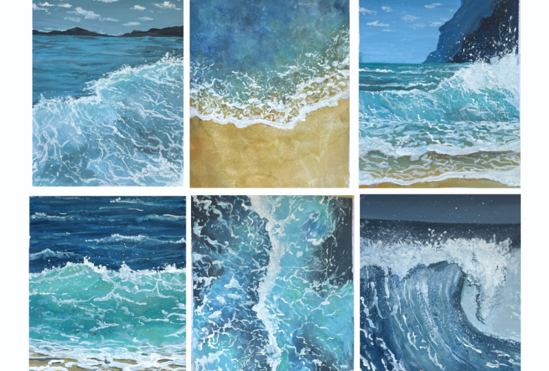
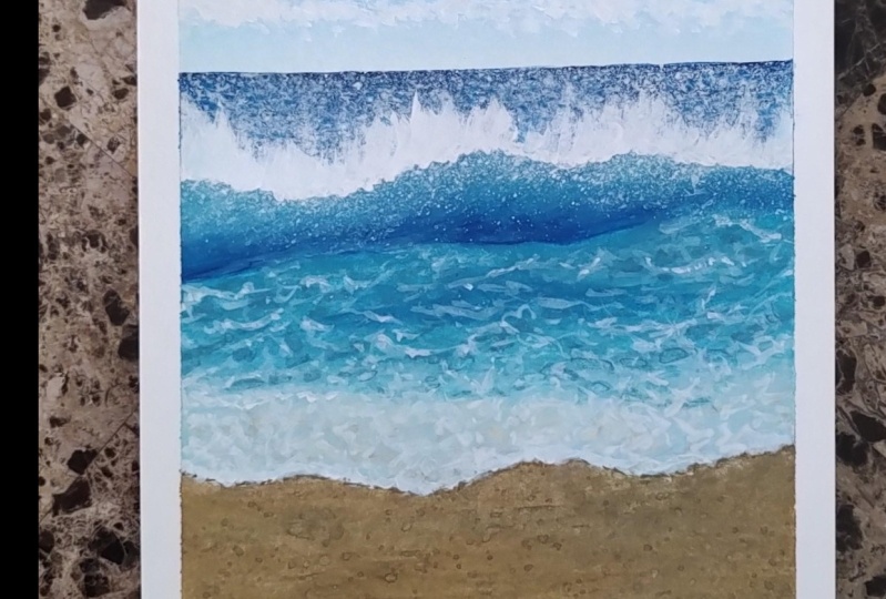
8. Exercise 3 : Top Ocean View: Alright, so another line, Sky and almost like a Beach
Seascape that we will use. The next thing that we
are going to learn is almost like an aerial view or a very deep view of the ocean where we see the
deeper, darker parts of it. So for example, we
have this one here. We have to focus on
the different shades of the ocean, even here, this is an aerial view of the beach or the water body or the ocean that
we are looking at. In this type of painting. Whenever you're painting
something like that, we use them watercolor
consistency. So I'm going to how you can create this using the techniques
that we learned earlier. Over here, Let's see, we're
going to paint a section of the painting that you have
on the left, for example. The first thing you'll
do is obviously understand where the
waves crashing the beach. So we need to know where this
the form is going to be. Again, does not have to be exactly like your
reference image. You can always play around. You can see how we have
caught a beautiful blend. In the background. You've got the,
the ocean is much, you can see the sun and in
the water form as well. And that's kind of merging
into the deeper ocean body. And you've got a lot
of darker colors and deeper colors if we have
to play around with it. Whenever you're painting
something like that, the first step is to use
the wet-on-wet technique, very similar to watercolors and that you will build onto it. The first thing that I'm going
to do with wet my surface, use a flat brush, make sure spread the water
evenly on the entire surface. So it's nice and even and clear. Alright, and once you have that, you are going to start
adding color on it. So we have to make sure that
our base is prepped and nice and ready to
have paint on it. Next, I'm switching to my size than round brush
because I want to be able to spread the water on a larger surface or
even larger area. So the first color that
I'm going to mix is a mix of Prussian blue and
my Van **** brown. Remember how I showed you in the color palette
lesson that, that deep blue color that you need you can
achieve using this shade. So that's exactly the one
that I'm going up and I keep brown and Prussian blue. You can see how it's such a
beautiful deep dark color. Now when you painting with gouache and doing the
wet-on-wet technique, the Colours just spread over. Once it dries, it dries
down a little bit lighter. So you have to do this in
like two layers to really achieve that vibrant mix. Two or three, I would say. Next I'm mixing my cobalt
turquoise with a bit of my Prussian blue and a bit of pen diarchy branch that comes
in that same color family. And this is going to be the
lighter color that I use. And I can clearly see
how this is different from the left painting. The colors are slightly
different and it's okay. I'm not using the exact shade, but rather we want to focus more on getting feedback nuclide. You can see how I
swallow my brush, but at the same time I
tap my brush as well. When you tap, it is kinda blooms and with the
different colors and kind of blends in without really having to really swirl your brush. You can also get those
little specks of darkness and depth
in your Ocean, especially when you're
painting the aerial view. Now, the next color
that I'm mixing is my Van **** brown and
yellow ocher with a bit of white to cover the sun. Again, this is very
different from the reference image because
there have used burnt sienna. But over here I
just wanted to use the same color that I have on my palette without having
to add more shades to it. So I'm just keeping the
Colours separately over here, focusing more on the techniques. Now over here we are blending the sand with the Turquoise. Can you see how I am
straightaway swelling my brush and getting them to blend into one another
and also tapping. Now what happens when you
do this as it creates a path or a background for
your C form to rest on, the more careful you are with the shape in which you
are trying to move them. Obviously you cannot
control the way they blend, but you can obviously
control the, the direction in which they go that will act as a base for
you to add sea foam on it. So this is my first layer. I'm gonna let this
dry completely first. And then the second
thing we're gonna do is layer over it. Here you can see how
there are still a bit of whitespaces that are there. Now what I'm gonna do is
using my spray bottle. I'm just going to carefully spray over this entire section. That's what I've
covered the top parser that the water doesn't go there, but it is spread evenly
and spray bottles do a good job here because
you don't have to move your brush around and you're not going to reactivate the paint. Now what I'm going to do is
repeat the process again. So I've just sped up
this little part because Obviously, we're just repeating the step again what
we did earlier. You add the darker
colors and then you add in the lighter color,
which is your Turquoise. Make sure that you're cleaning
your brush and you can also lift off excess
paint or excess. Wonder if you feel like
there's a lot of water. And then go back to your Turquoise at that in
and make sure that you are working on getting the
blend to be really nice. And I wouldn't say even, but the desired
blend that you want, and most of the time Do
desired blend that you see. You look at the reference images really usually can really tell where the depths
are going to be in where the light
part is going to be. So you follow that as well. So it has to be like the dark, almost modules into the light
and light also merges into the dark without really having very distinctive
separation points. And then I'm doing the same
thing with the sun as well. So the sand that has
the sea foam on it. Again, the Son and
the beach that you're seeing as we're just going
to repeat the process. You can see how I'm using
a mixture of brushstrokes, that is your swirls, you adapt and just getting all of this to blend
into one another. Once I'm happy with that, I will also move on to
the beach part where I'll add the sand again so that I get that to be nice and even Do. I really liked the
way the water looks? I'm not going to overwork this section because
we've got C form, add majority of the bottom part where especially
the muddy color is. I really liked the
way this looks. I am going to let it dry completely and then we'll add
the sea foam on top of it. Alright, so now
that this section has completely dried up, you can really see how the second layer has made
so much of a difference. You can clearly see how
vibrant the colors look. Now, we're going to start
off with the CFO first. And for that, I'll be using my size zero round brush
because the waves are, the CFO needs to look very fine here because we're
using an aerial view. And for that, the
stroke that you need to make have
to be very defined. What I would say
a lot more finer. Alright, so I'm using a very, very thick, thick
creamy consistency. You can see how the
consistency look. And I'm gonna go ahead and
first out line the wave. Very similar to the
previous practice, but that we did where
you outline the wafers, gives you a more basic idea with the direction is going to be
aware the wave needs to end. I just outline that first. And then slowly, I am
going to go ahead and start releasing these strokes, which are like these broken
swirls, shot broken swirls. They're going in all directions. And organ the
direction also matters on the reference image as well. You'll see some like
the one that I'm making is going from right and moving slowly upwards towards
the left at an angle. So that particular
right-side portion of the wave of the sea foam is going to follow
that direction. The center one again
is going to don't don't try and make the center one leg go vertically upwards, give it a bit of direction. I feel like that makes
it look a lot more natural than it just looking. Blending is going
straight upwards. Another thing that you
will see do is you can see how I have used a
combination of pickers, jokes, thinner strokes, and their own set of
interconnected, right? So it's almost like a, I was actually painting and thinking about it in a way that it all looks like. On NAEP. They're all interconnected. The sizes are different, the direction is different, but they're all interconnected. That's one thing you can visualize when you're
painting this, even though whatever
direction they're going in, a few smaller strokes
might connect them. Really the only way in
which I could really describe this to you
is it's a very uneven, It's very broken, short
strokes and the kind of going in all directions
and in all directions. I mean, you can see how I
move from right to left, but for the left section
and moving from left to right and slightly
upward and then curving. And there's a lot of
things that you can do. It makes a lot more
sense when you look at a picture and see how these
things exist in nature. Because we painting landscapes, it is something that
exists in nature. Right now for this
particular practice session, I'm not really going into all the details and trying
to perfect this because I just want you to focus
on the technique more than the final picture. So it's a good practice. It's very like these
broken strokes that you can practice. Try connecting them. You can feel like I'm getting bored with
this little section. You can completely switch to the left side and then get something to come out from left. And then as you go
you connect them. So this is not something
that you should think so much about, but rather just
enjoy the process. And I'm sure like
when you're painting, you will end up doing
something that makes sense. I usually like to function
like that where don't like to think so much about what
my next step is going to be, but more about just enjoying that journey and then just
doing it all the way. Is that that's what I would say. I like to put it like that. But overall, this is what
your waves are going to be. Like I said, you can perfect
this in a lot better way, but right now we're just
focused on the technique. I hope you enjoyed painting
this practice lesson. In the next one, we'll explore all the details of
a Crashing Waves
9. Exercise 4 : Crashing Waves: This lesson, alright, now the
next practice lesson that we're going to do is for
this particular wave, a close-up of this wave that's going up and
it's crashing down. The colors are a lot
more intense here. I'll try to do it
in a very simple sort of colors that are
already on my palette. But the first thing
that you do when you are painting
something like that, sketch out the waves
so you want to understand the placement
of everything, right, in which direction
it is, where it's going. You want to just have
that picture clear. So take some time
when even the one, the painting that I
have on the left side, you can observe that or the reference image is also
there in the practice. In the project and
resources sections which you can
download and look at. Even if you don't
want to do that. These are available in the each of the projects that
are usable for a sketch. You can have a look at that
and then go along with it. You can see how
I've sketched out the foamy part at the top just to get the basic idea and obviously that curve
for the Waves, everything in the
background of it. You can see the depth of the ocean and the remaining
space that you see where the waves crashing has a lot of the splatters already that
you're seeing from before. Honestly, we're
not going to walk so much on the details for that. So let's get into the
painting process. I'm going to just load
up some more Prussian blue because we tend to
use a lot of pressure. Louise's, I love using Crashing
grown on my paintings, so I ran over it really fast. Here I have my Prussian blue and my Van
**** brown that I'm mixing together to get
already deep blue color, just like what we
did in the B21, which is on top of this, which we did the first one. We're going to use that
same concept here as well. Now what I mean by that
is you're going to use those thin strokes using your flat brush to cover up a big chunk of it
with the darker color. And then you lighten the shade. You can use the same shade, but a lighter color of it. And then add that in
and fill in that space. So very similar
to what we did in the first beach water body
exercise that we did. So we're going with it,
same concept here as well. So just going to cover
that entire section, make sure that you have a good amount of
the lighter bits, a good amount of
the darker bits. And you can just
blending everything into one another and not
leaving any empty space. So that's a little bit important
thing to keep in mind. Even though this section is not something that you see a lot of work so that it looks good
enough in the background. Even if it's in the background. I felt like I did a
lot of lighter bits, so I went ahead and added
some darker bits here, just some more depth
into my Ocean using the same watercolor brush technique that I
taught you earlier. And I really like
the way this looks. I'm going to let this dry first. Alright? Now that this section
has completely dried up, before we go ahead and
paint the Crashing Waves, it's time for us to create
that background first. So I'm going to go with this turquoise light turquoise
color that I have. I'm just going to cover that
entire section fully first. Now why I'm doing this is
because that little section, It's like something
that rests in the background of
the Crashing Waves. Obviously, we could also say that that section
is already crashed. Although sea foam and the lighter splatters
are there all over. That's what I've added, a bit
of white and blended that just roughly into the
background as well. Now, we're not going
to walk a lot in the details of that section because like I
mentioned earlier, you do tend to not pay a lot of attention
to it because that's not the exact important point in the composition
that we're going for. Next, I'm going with
my turquoise color. First. I have my Turquoise
and my blue color, and then I'm in that same code. So you want to make
sure that you're moving along your sketch here. I'm adding the darker color. So basically I will again
just stain the paper, which is just create a
background for the colors that I want and then
build on top of it. So I've got the lighter
turquoise color, then I've got a medium shade and an app called
a darker shade. This, if you really
think about it, is just like the first
blend that we did, the thing that we do for Skype. But this time we're not really
focusing on getting like a seamless blend and getting a perfect blend
and things like that. So the first thing I'm doing
is creating that background. Again, you can see
how I'm making these thin strokes
with my brush as well. It adds a really good texture for your final
painting or for that, for the final look when it dries But again, we will be
layering over this. So it does not make a lot of difference even if it's
not a perfect blend. Now that I've added the colors, I'm going to let it
completely dry first. Alright, so now that this
section has completely dried, it's time for us to this. Again. What I'm going to do is just repeat
the process again. So I'm going to mix my
cobalt turquoise color with a bit of blue and
it has a bit of brown. And then that's gonna be the
lighter color that I have. And I'm going to
apply that and make sure that I'm covering
up this section evenly and it's spreading out evenly and a lot more
opaque than before. Next color that I
have is a mix of my Prussian blue and my
wenn die keep round. Obviously it is a
little less darker. And then the extreme end is
going to be the darker color. And once I lay the Colours
down next to one another, I'm just going to
clean my brush. And using a clean brush, I'm just going to
get everything to blend into one another
lot more seamlessly. This time again, I'm adding a few little strokes here and there of the
lighter color as well. So that kind of blend and
it's not just to Flat, that hasn't been part
of that depth in it, even as a single layer. Once that dries,
it's time for us to start adding some details on it. Doing for the Beach
that is on top of it. We added a darker color first, right, of the blue, and then we added highlights
on it. Over here. We're going to go with
a similar concept. But now that we have
the base ready, it's time for us to add some
lighter highlights on it. So I'm going to start off
with a mix of Prussian blue, turquoise, and a white fill
the shape that I have. It's a lighter color. I'm going to go along
the flow that I have. And I'm going to create those
similar squiggly lines, but this time they're
not very sweetly. They follow the shape of
my will be if that I have. Another thing to keep in
mind is you want to be very gentle with the pressure
that you're applying on it. You don't have to apply a lot of pressure and a lot
of thicker strokes. These are very fine strokes
if you don't have a lot of good control over your
brush and the pressure, then you can do the
smallest size brush and ensure that you
get smallest strokes. You can see how I'm having
these broken section of these waves are like
the details for the Waves. Let kinda flows along the
shape of my B that's going up. I'm going along that shape. I've got some longer strokes, I'm short strokes or
combination of it. And you have to follow that. Once you're done with this
strip, which is lighter, you will go for a color which is slightly darker, of course, in the same color family, but you don't want
it to be as bright, you want it to match with
the background color. So be ready for an
even lighter color for the first trip because that
the color that is lighter. Now that we're working
on the second section where the colors
a lot for deeper. We still want to
show those details. But using a color which
is not that light. So again, I'm using that same method in which
I'm creating those strokes. But over here, I
am making it with a different shade and also following the shape
along the wave. So that's one thing that
you have to keep in mind. You can also make these
darker strokes with a darker color in the
lighter area as well. Obviously, this is
not the end of it. We're going to add some more white details on it which shows those little sea foam that
QC go along with the Waves. We will add those
details as well. So this is like the second
detailing that you are doing, like a mid-tone detailing
that you do it. And then on that
you add more Asia. So I'm just gonna
go ahead and add this along the whole
surface first. Obviously are not
covering all of it. But you're still kind of
creating details in it to have that beautiful
illusion of depth and the lighter parts just going to show the movement on the water. Once you're happy with that, while it's drying, we will
move on to the lighter bits. I really like the way
this looks right now. Overall, I'm really happy with the overall outcome
in the way it looks. So what I'm gonna do
is clean my brush completely and then
using a light color. So I'm not going with a
plain white color here. I'm going with a lighter color, which is again still
Towards the blue of family. And using that color, I will add all the details for the C phone first are
especially at the waves, are the white details on top. And then I'll go ahead and
add that at the bottom. Sophia, you can see
how using this very, very light shade of blue As the shade that I'm using
and just make it very, very big strokes and covering
up the entire section. You can go up on this little spaces that
you have left, right? You can go beyond that as well. So your basic idea is to create a fluffy white area of for yourself to work on an
add splatters on liter. So just like what we did
in the beach section, you're gonna do
something very similar. So you will also have
those elements go upwards and those
sections flowing upwards. And then we'll add
splatters on top of that. Very carefully using a brush, you're going to go ahead and
add in this area and just cover up that entire
section using this color. The reason why I left that whitespace as it's
a lot easier to just lay over white as a single color first instead of
building it on, right? And also those plateaus get
a lot more concentrated. It's a lot more easier to achieve the look in that manner. That is the only reason I went with a space that
I left already. Again, one more thing that
you have to keep in mind is that this is your
right time to change the shape of the white area of your Waves in case you don't
like the way it looks. So this would be the
perfect time for you to maybe make it a little bit
bigger than bit smaller, depending on the reference
image and what the look is in case you change something as the perfect time to fix it. So you can see how I've added
this lighter blue shade. And the other thing
that I am going to do after I apply white on all over that section is to add a bit of a shadow
that's been caused. And I'm going to use that
darker color that I haven't added at the bottom while
the paint is still wet. We do want this to sort of merge into the white that
you already have. And because we'll be adding
splatters with white on top, I don't want it to
look very flat. If you feel like
those darker colors creating a lot of
harsh lines and you can just use more white to cover it or use a clean
brush to mix it. But this is what it should
look like once that completely dries or while
that is trying, even. The next thing
that you can do is work on the form that you are seeing at the bottom area. I'm just going to load up some
more white on my palette. And I am going to go ahead
and start creating that. Now, what is this white that
we are going to add words, this highlight that
we're going to add. So it's that sea foam,
like I was saying, it's all like verb. It's almost connected. So that's the highlight
that we're adding that this is going
to go up and then crash down to the sea foam and the lighter highlights
that you see in the water. That is exactly what we have
to cover in this section. Now again, you will clearly see what I'm talking
about when you look at the reference image
or when you see a picture in real, right? Or real image. When you
see that you can really tell the details that
you are picking on the, the, the way a composition in
which you're picking it on. So it makes a lot more sense
when you see a real picture. Again, it is there in the
project and Resources section. You can download it from there. Then have a look at is
named under each project that you have to can
have a look at that and then keep it with you. Not only for this, for this
class, for this painting, but also for you to
sit down and analyze it later on when
you are done with it and you want
to kind of paints something that's
similar over here. But I'm doing is creating
the white highlights on top of the middle tone that I was talking about
that you've already had. I'm just going to again
follow that same route. Your white can be bigger. These tropes can be, they
are, as you can see, a lot larger than, a lot thicker than the
previous strokes that I added. So it's going to be
along the same lines, along the same way, following the same route, but you can make them
bigger or smaller. Like I said, reference
image makes a whole lot of difference in
which you pick on it. I think I will put
a reference image somewhere on this paper
or on the screen right now for you to really
have a look as to how I'm approaching
this particular section. Now, in the reference image, obviously the color
is a lot different the way my painting looks
as a lot different. And also I have simplified
a lot of things from the image so that it's not very complicated because there are a lot of details in this one. As you can clearly see, the ways look a
little bit different. But I wanted to approach it
in a lot more simpler manner, which still kind of captures the essence of this painting, captures what the
composition is. But at the same time is
not as complicated to approach than if
you were to make it look exactly like
the reference image. And this is what I
always say as well. Your painting does
not have to look exactly like an exact replica
of the reference image. You can still look at a picture, break it down in your own ways, and approach it in your
own ways. And when you Painting, keep
practicing, do it on your own and all that stuff. You have an eye for it. You have an eye for how to analyze the composition
and how to look at it. I've taught so many
students and the bus, when they first started
painting with me, they didn't know how
to approach something. And eventually in like maybe a few months when
they kept practicing, they were able to see
things differently. They were able to see the
reference images differently and how the entire composition, they could change the
composition and still feel very confident about it
without getting scared. Anyway, coming back
to the painting, I am going to go
ahead and add in some more white dots on the
waves that you are seeing. So I'm not going to just leave it with this light blue color. I'm gonna go ahead and
add in some white. I'm still leaving the place
for that darker color that we added so that
when we add splatters, you can still see it through. Now, the next thing
that we are going to do is work on this flatter. So I'm just gonna go ahead
and cover everything. Cover all the other
painting so that I don't end up splattering
anything on them. Then the next thing that
we're going to do is get another people for
you to move around. So like I said, when
you make the status, you want to have a section in
which you can move around. So I'm going to switch
to my toothbrush. You forgetting my toothbrush. And using that, I will create
those splatters, right? So again, make sure that the
consistency is not too thin. Because if it's too thin, then the spatters just go
all over the place and you don't have a lot
of control over it. And make sure that you are keeping it very
close to the paper. When you keep it very close, you have lot more control over those plateaus
and where they go. And also make sure that you
are moving your paper as you go so that you have a bit more control in the direction in which
we are going to do. Now, one more thing to
keep in mind is this is the basic technique in which
we go about this painting. When we are painting
something or when we painting from the
actual reference image that I showed you, you will see how we approach
it in a similar manner, but also a little
bit differently. But over here, I just
wanted to give you a basic idea of how things work. When you have to approach
a painting like this, you're just gonna go ahead
right now and create splatters and make sure that you are covering
the entire surface carefully in a lot
better manner, and not only splatters, you can also use your round brush and
create some bigger dots, ambiguous plateaus around these. The ones that you already have
to add a bit more detail. So it's not like
you have to only stick to the splatters itself. You can add in some
more extra details wherever you feel like
you could use some. And go ahead and
really just let, let your heart out. Just let whatever
you're feeling, whatever your mind phase your heart says, go
ahead and do that. There is no right
and wrong here. And when you approach
it a couple of times, you'll really get
more confident and also understand
what and how to do. This is all about building up the confidence to
approaching a little bit, Paint a little, building
up the confidence to achieve paintings that
are a lot more detailed. That is why I wanted to create
this class and also give you like a practice lesson
and exercise lesson. Where if I were to tell you this is what
you're going to Paint, you don't freak out because it does have a
lot more details than the previous challenges
that we've done where the details are
a lot more minimal. Now, again, we
could approach this even in an even more
detailed fashion. But I wanted to keep it
like this medium zone, but it's not too easy, but not too detailed. And I hope you enjoy
painting along with me. And enjoy the challenge. Painting the challenge and painting along with
me as much as I enjoyed filming
this entire class. Anyway, I've taped I mean, I've peeled off my tape from
what both sides and these are the four practice
lessons that we did. I hope you get a clearer
idea of what we're going to, what you can expect
in this class and also what the
techniques are. And if you practice this, I'm sure you have a better idea of approaching the paintings that we are going to
do in this challenge. It's, it is going to be
a really FUN challenge because we are going a step further in a Gouache journey VR, going to add more details and I really wanted
bring you along with me. So we've got these
three different types of ocean bodies that
we're going to pay it. You've got the atrial view, the beach, and also like
the Crashing Waves. And we're gonna be
approaching a few more along the same sort of practice
lessons that we did. I hope you enjoyed
painting this. I will see you in the
first class project
10. Project 1 Part 1 : Turquoise Beach: Hello and welcome to your
first-class project. Here's what we're
painting today. You can see the
colors that we've used here are the
swatches as well. So let us talk about all the
colors that we'll be using. First, I have Prussian blue. The second color that I have
is cobalt turquoise light. You can use cobalt
turquoise if you have or you'll have to
mix yours if you don't. Using lemon yellow, if you are
unaware of how to do that, you can watch the
color palette lesson. Next, I have when **** brown. Next, I have yellow ocher. And lastly for the
most important color for this project that is white. So gathered all your colors, get your supplies, and let's begin with the
sketching process. So I've taken out all the
colors on my palette and tape down my paper on all four
sides here are all the colors. I've got white, blue, Turquoise, and the two shades of brown
that I mentioned earlier. This is all the
colors that I have. The first thing that
we are going to do when you are going to
paint something like this, a composition like this, is to create your
basic sketch and also Start off with
the horizon line. For the horizon line, I'm going to use my skill
and I'm going to divide my paper in a way that I have a major part are like
two-thirds of the portion is for the water body
and the Beach area, and one-third is
the Sky and Clouds. So I'm going to carefully
just place my scaling away, make sure that you're
making a straight line. And using a pencil, you're
just going to draw the lines. You can see how I have
one-third for the sky, or even reduce the sky
area a little bit. But you get a basic idea, you need major portion
for your Beach. The first thing
that I'm going to, the next thing that
I'm going to do is create the sketch of
where the waves are. Like. You can see in
the reference image, you can sketch it out. It doesn't have to be
exactly like that. And make sure that you
have very light sketch. You don't have to really press down on your pencil
to create the sketch. Now that we understand
where that portion is, we're going to focus on
the way that's Crashing. Leaving like an inch of space or like half
an inch of space. I will go ahead and
outline the top parts. You can see where the waves
are flowing upwards, right? Only going to focus on
the top part of it. So that top line of
sketch, that top line. And you can see
how that top line costs almost like
a shadow under it, which you can achieve by using that Prussian
blue color over here. Very same concept of the practice lesson
that we did earlier. If you haven't done that, please make sure
that you watch it. Just that it's a lot
easier for you to follow. You can see how that is a
shadow under it is like a curve that's coming in and that is
casting a beautiful shadow. The next thing that we have to focus more on are the Waves. They've got a big chunk of
land which is just very light and does not have a lot of blue color and not a
very sharp shadow cup. I mean, your sand color as well. This is like your basic sketch. We're not going to do a
lot of sketching here. I like to keep my sketches to the minimum and let us
dive into the painting. The first thing that
we are going to do is create a background. So I have my size, 18.10 flood brushes
ready with me over here. I'm using my size 18 Flat Brush. The reason why I'm doing
that is because it can cover larger surface area without having to do a lot
of blending work. Going to dip my brush in water and then load up
some Prussian blue first and then add in a bit of white in
it to light in it. You can see how it's not a very, very deep shade of blue light. It's quite light. I would say. I am keeping the
color to the light, shade of blue
because I wanted to show us like a daytime sky. This is the color that we
have using this shade, I'm just going to apply it using the left and right motion. Very similar to your
practice lesson. The first blend that we
did, that technique, you're just going to follow
that, create the background. And as you go down, you are going to lighten
the tonal values. So adding more white, you're going to lighten it up, then apply it again. Move in that left
and right motion. Make sure that you
are maintaining the consistency of paint just so that you don't end up with
a thicker consistency and the thinner consistency and just a blend of
all consistencies, you want to try and
maintain the consistency. Now that I'm done
with this blend, I'm going to clean my brush. You can see how I'm
cleaning it completely and then load up a bit more
white on my brush. You can do it
directly with white, or you can just
create a blend on your palette and then
move it upwards as well. Anything but the idea is to have a very light
Sky at the bottom. And that transitions into
the lighter blue and then it transitions to the whatever darker blue that
we have at the top, right. So once you are done
laying the color, I would suggest is
cleaning your brush. And then going over
this section again just so that you are confident
and happy about your blend. And that's why I said
cleaner brushes because many times does happens
to the best of us. We end up adding our brush and the lighter area and putting in the darker colors
in that section. So make sure you clean
your brush and go over that section again just so
you have a seamless blend. I like my blend,
so I'm just going to leave it to dry for now. And once it's
completely dried up, we can start adding the Clouds. So here my section has dried. You can see how the
background is lighter. And that is why it
works really well, because we can layer
over this using a slightly thicker
consistency of white paint. Now, I'm going to switch
to my round brush, which is my size four
round brush for this. And create a nice
creamy consistency, workable consistency for my
Clouds, which I'll be using. And then we're going to
start making the Clouds. So the basic idea, even in
the reference image that you can see is we get to have a bunch of Clouds at the bottom
which local optima Flat. And as we move upwards, we get a slightly fluffier
versions of the Cloud. So when you're
painting these Clouds, you're gonna be working
exactly like that. If you don't know
what I'm talking about in terms of
the reference image, then please do download it from the Projects and
Resources section. It's called project one. This will give you a better
idea of how to analyze the picture on your own and also follow me along for
the techniques, but also you can look
at it and see, okay, there you could totally not like something
that I'm doing. Not be happy with
something that I'm doing. You could, you would want to achieve, approach
it differently. Let's completely okay,
we're all here to learn the techniques and then apply
them in our own manner. So you could download it, have a look at it and see. You don't see it side-by-side
while you're painting. Now coming back to the Cloud, you can see how I've
got to see these like a whole line of my horizontal Clouds
are all interconnected. Obviously they're not
have the same size. So I'm varying the height
of it and the depth of it. But they do move in that same
line once I reach halfway, going to leave it there, and then focus on
creating a bunch of other horizontal
Clouds on top of it, just slightly on top of it. And then add in some
more details with it. Along with these horizontal
short stroke that I'm making, I will also make some tiny ones. So then let all those Clouds can interconnect and just
connect with one another and just look
a lot more seamless. Alright? I feel like I'm really enjoying this
process right now where I'm adding the Clouds and their oldest horizontal
bunch of Clouds. And you can really tell that
they are at a distance. They're not close to you. And that is why I'm not seeing the whole fluffier
version of it. And that's how you
bring that variation. When you look at
Clouds, added distance, That's how you see
them visually, that's how they appear to you. Now, then I'm done
with these Clouds, which is the horizontal Clouds. I'm going to slowly start moving into the other
Clouds where which has a bit of more fluffiness
that will rest on top of it. And these Clouds, I would say, are a lot more closer
to the observers. So that is why they appear
bigger and a lot more fluffier because the observer is seeing a lot
more details to it. You start off with
a flat base again. And just like how I taught you in the practice
lesson as when you start adding those
rounded edges on top, make sure that you're
doing short strokes. Be very patient with it, very gentle with it. And you can obviously
vary the shape as you go. And that is why when
you go very slowly, a lot more mindfully, I would say you get to change things along the way and you don't feel like you're
ruining things. So just be gentle with it. Just be slow with it. And if you feel like there's something that
you would like to change, you can totally do that. I am going to go
ahead and add in some whole bunch
of clouds that are connected to one another and just kinda flow in altogether. I'm going to let you watch this on your own because
the process is very similar and just a
potato and I'm just adding a bunch of
different sized Clouds. And then I'll get back
to you in the next step. Alright, so really
liked the shape and the whole appearance of the Clouds and how
it's turning out. So what I'm gonna
do is I'm going to leave it to dry first. And then we can add in another
layer over this just to bring out the opacity of these
clouds a little bit more. So I think I'm just gonna
do that in the next step. Alright, so now that this
has dried completely, but I'm gonna do is again, using my round brush, I'm going to go with a slightly thicker
consistency of paint. You can see how
it's very creamy. I'm going to add this at
the top of my clouds, again, assuming that the light
is falling from the top. And even on the reference image, you can see that the top, top portion of the clouds
appear to be a lot more opaque and that are
lot more like white. And that happens because you want to show that the
light is falling on, appears brighter and
things like that. So you can just achieve that
by adding another layer over your Clouds just to bring
up the opacity of it. And this is also another time for you to really
change any shapes. If you'd like. Add in some extra floating
Clouds if you'd like. And just really added
any final details to your Skype Ocean
that you would like, play around with it,
enjoy the process. And once you're happy with
the way you Sky looks, you just let it be and then we'll move on
to the next portion. I feel like my Sky could use
some more smaller Clouds are more floating clouds would like to change the
shape in some of them. And I'm just going ahead
and done that here. I've added some more obesity wherever I felt
like it could use. But other than that, I really liked the
way this looks. I'm just gonna leave
it to dry and then we'll focus on the water pit. Alright, so now that
we're done with this guy, the next thing that
we are going to do is paint the water bird. Starting with the brush that I'm going to use that as the
size Stan flood brush, like I showed you earlier
in our practice lesson, we'll start off with
a darker color. And these strokes
that you're going to make is going to
be perpendicular. So this is the sheet
that I'm using in that same little section
where I had a bit of white, I added pressure
in blue and just got a deeper shade of blue. And using my brush, you could say perpendicular
to the paper, I'll create those strokes. First. I want to go
over the line very carefully before I go ahead
and make those drugs. I'm not going and
creating a slightly line. I want to get that
nice straight lines. So that's why I'm going
carefully this way. And then once I
reach that section, I can clearly just
load my brush up with more paint and have my brush
perpendicular to the paper. And go ahead and create these strokes as
you can see, right? So you're going to be leaving some white spaces in-between.
So that's the trick. You leave a bit of whitespaces. And next I'm going to add
a bit more white into it. This is the color that I get. It is a shade lighter. And you are going to fill up those empty whitespaces
that you could see. You are going to do
this all the way. That wave that you
had sketched out. Now again, you are not
going to be seeing a lot of the details of this
little section like the photo area of the
ocean because you have all those plateaus and Waves and the form that
we have to work on. But it's still better to
just sort of add that in. Next, I'm going for a
slightly more lighter color, then adding that in and
blending that in as well. So I've added a bit of
the cobalt turquoise in this to get it
in that same shade. Once I do that, I felt like it was just all two
lights have gone ahead with the darker color and added that in there as well. You will have to go a little bit back-and-forth until
you are happy. I am really happy with the
way this looks right now, so I can let it dry. You could also add in
some lighter tones if you feel like it. But overall, you don't have
to add in a lot of details. Your Flat brushes and these short strokes are
going to do the trick We're going to let this dry now. And once that dries, we'll paint the remaining bits. Alright, so now that
my section I've tried, you can see how the color dried to be a little
bit more darker, right? This is done. We'll
focus on the next steps. So starting off with my
cobalt turquoise color, I'm mixing that with a
bit of the Prussian blue. And I am going to add
in some white in it. I felt like it got too dark, so I'm just mixing it
again in another section. But it does have a
bit of blue and a bit of the cobalt turquoise
color mixed with white. That's the shade
that I'm going for. You can also use Turquoise blue directly here. If you have that. You don't have the
cobalt turquoise color. I sometimes just put a bunch
is Colours on my pattern. Just try and mix and
get the similar shades. So I just go about in that way, but you can use Turquoise
blue here if you have that available color
mixer on Turquoise blue. The first thing that
I'm doing is again, we're going with a slightly
lighter consistency, right? Don't worry about having
a thick consistency. I'm going to go ahead and
apply that carefully, first of all, under the sketch so that I get that sheep right. You can see how I'm
actually moving it in this diagonal brushstroke, I would say moving
towards the left leg, slanting towards the right. And I'm going to bring that
in like that animal to blending it in that
similar manner. Where I just bring that in and just kinda get them to
blend with one another. The idea behind getting them to blend with
one another is to just for the blue to not just look like it's
just too harsh, right? You don't want it
to look that harsh. And that's why
it's better if you just use your clean brush, like just a clean wet
brush to blend it in. Now I'm adding the blue and I feel look at
the reference image. There's a shadow
that's being caused. The color of water
there looks blue. That's exactly what I've done. I've added that blue and then
I've cleaned my brush and I'm going to just kinda
blended into one another. Once you do that, you can focus on bringing the
color further down. So again, you are going to
maintain the consistency. It doesn't have to be
that thick and you're going to start
bringing it downwards, leaving that little
blue section as is, it doesn't have
to be very harsh, but it doesn't have to be
fully blended out as well. And now I'm going to bring
the color for the mowed down. You can look at the
reference image again to understand the
placements of it, right? And I'm going to leave a good
space for the blend to be with my browns and those different the sand
colors that we have. I'm just going to
roughly kind of bring it down very
short strokes. You can add those
short strokes as well. And again, making the color
a little bit more lighter. I'll go ahead and add that
and bring it further down. So very roughly, you
are going to bring it further down very unevenly. And as you bring it down, you are getting closer to the area where the wave
crashes does send. Alright, so now that we are
done with the water bit, we're going to move on
to our sand portion. So I'm going to
make sure that I'm cleaning my brush completely. And I'm creating a mix
that is a mix of Van **** brown and my yellow ocher color. Still ensuring that I have a lot more of the yellow ocher color. And I'm going to
add white to it. And this is the shape that I get and I'm going to
nicely apply it first, add that sketch
where we had where the sun or the waves
crashing the beach. And then using a clean
brush and a little bit more white into the same mix, I'm gonna go ahead and
start pushing it upwards. So we get that beautiful
light blend in the color and we're covering that entire surface
area with the shade. You can see how I
am just filling up the whitespaces that I had left from earlier with this Colours, you can just carefully
fill that in. Then we just watched
the color out for you as well in a bit. But right now I'm
just going to clean my brush and I'm going to use my round brush to just push that in slightly into
the blue as well, just so that we get a lighter
shade of color in the blue. And so that we have a bunch of different layers and Colours to work with when we add
furthermore details to it. Over here you can see
how I've just added are those little details and it
looks like a beautiful blend. So leaving that, now we're gonna go ahead and create a
darker mix for the sad. So when dark brown, I have my yellow ocher and just a tiny amount
of white in the mix, didn't have to have
a lot of white. And here's a swatch
of the color. Swatch of the color
and using the shade, I am going to apply
it completely in the bottom portion,
covering every bit. So I'm just going to carefully
go ahead and apply that. Be careful under the
sketch that you have, make sure that you
are going very carefully around that area. You can also add in some of
the darker colors inside. At the very bottom
portion of your sketch, just to add a different sense of shade into it so that it's just not all light color
and just blend it out. So this is what your
section looks like. Once you add the sand color, obviously will have to
work in a bunch, more, bunch of more layers to really
bring out the Painting. So right now you're
just going to leave it, clean your brush, and using a wide I'm in my
round, round brush. I'm just going to blend the
darker color in slightly. I felt like just a
little slightly. I wanted to blend it out. Now also add some more strokes, just some more lines and some more depths of
this darker color, which will act as
the shadow when we start laying out
the whites over it. So this is what the
layer looks like. And I, we're going
to let this dry completely before we move
on to the next step. And I will see you in the next part where we
add more details to it.
11. Project 1 Part 2 : Turquoise Beach: Alright, so now that we're
done with the base layer, we're gonna go ahead and add a second layer over this to get everything to look
nice and opaque and just build on the layers, right? I'm going to start off and
repeat the process again. Starting off with my
turquoise color that I have, which is a mix of
my cobalt turquoise and a bit of Prussian
blue and white. So that's the color that
I'm applying on top. And then you can see how I'm
bringing it down again in that diagonal motion and going with the
flow of the Waves. Next, I'm going to just load up my brush with a bit of
Prussian blue and white color. Adding that at the bottom, same location, same places. You can do a little bit
of changes here and Beth and I am adding that in certain places
as well where I want the color of the water
to be a lot more blue. So that at that. And next, I'm just going to use a clean brush to
blend everything out. So just to get these colors
to merge into one another. We know painting with Gouache, this technique really helps a lot to get rid of
any harsh lines, any harsh edges, and just get two colors to blend
into one another. I'm going to load my brush with some of the Turquoise color and start bringing it down again using the same
method that we did. So you can have
bigger strokes in combination with some
shorter strokes. And when you do it that way, it ensures that you are
adding a bit of darkness. And then when you lay it over
with the lighter colors, you're adding a bit of
the light colors and just getting everything to
merge into one another. This time we're doing
it a little bit more perfectly, I would say. Now I'm going with
a light blue color, which is a mix of my Prussian
blue and a bit of white. And I'm going to add that
using my round brush. And I've also added a bit of
the Turquoise color to it. This is the color that I'm
going to use to bring it in that sad Asia that you
can see that Sandy bit. I'm going to bring
this color in Waves. And then what I'm
gonna do is make the short strokes with the lighter color in the
deeper parts as well. Now, like I mentioned earlier, you're going to add lights and shadows and play around with it to create that kind of
texture that you see in water. So you've got a lot
of depth in it, a lot of shadow play in it. Even though you're not doing it exactly like the
reference image, but you still want to
capture that essence of it. Next, I'm going with
that light sand color, which is the mix
often **** brown, yellow ocher, and white. And I'm adding that in as well. And creating these
beautiful light strokes. Again, we want it to be
uneven and not flat. That's why there are a
lot of Colours involved. I wouldn't say a lot of colors, but a lot of layers involved for you recreate that kind of transition where you are seeing lighter colors using
darker colors, the resting over the darker
colors and creating that kind of light and shadow
play in your painting. Now, using my brush, I am going to go ahead and start creating with a lighter color. By the way, it's a very, very light shade of
my Turquoise color. You can also use your
Prussian blue and white here with a bit of lemon
yellow to create that color, very light color though. I'm going to start
creating these light uneven, sweetly strokes. These are, these strokes show
the movement in the water. And you can see how an
ad, this light color, you can see the
pop of the layer. You can clearly tell
that this layer is all the highlights
in the water and all those Ito's has received
a light and that kind of listening over the
deeper parts of the water. So that's exactly
what you can see here in this little section. In terms of the tonal value, we are going for a
very light shade of color to add over
and add highlights. So as we proceed further into our layers and the
way we add more layers, the idea is to add lighter and lighter
and lighter colors over so that altogether, the final picture
ends up looking a lot more details
whether we have a bit of contrast
in our painting, which is the deeper colors and obviously the highlights in
our brain things as well. So you can see how I'm
creating these strokes, almost I would say, over the darker blues
so that there is a bit of F over on which I'm
laying the lighter color. I'm not doing a lot
of strokes and you can see how this color is
not extremely vibrant. There's just a gradual
difference in the tonal value. As it dries, it has
dried a little bit darker than you first
apply the color. But again, it's
not showing up so much and it's not very evident. I mean, it is evident,
but what I mean, it's not really harsh white. Now the next color
that I'm Mixing us for the sun because I want
to redo that layer once before I go ahead and start
painting the sea foam. So I'm gonna go ahead and create the color for the
Sun, similar shade. This time the consistency I
wanted to be a little bit thicker so that
when it dries down, it's nice and opaque. So I'm just going to go
over with my flat brush and carefully just cover
that entire section below the sketch that I've made below the sea
foam area where the waves are crashing the
beach. You can see how Applying the second
layer has made that entire section
nice and opaque, a lot more prominent. So you're gonna go
ahead and carefully just cover this entire section. And while that dries, you can go ahead and
switch to your white brush and start working on the right. So we're gonna go
ahead and start working on the waves again, I felt like I needed some
more lighter blue color. And this time again, making
it really nice and light. I am going to go ahead and
add more details to it. So the color is in fact, I would say very similar to
the one that we used earlier. So I'm just trying to match a similar color format so you can see how it's
that same color. Now I'm gonna go ahead and start adding in
some more details slowly moving into the
water bit as well. What I mean by that is the
area where the waves go up and crash or like curve
in and crush them carefully adding some
details in that area. Again, the details are, again like I mentioned, they are very short strokes, horizontal strokes, trying to go with the
flow of the water. So you can see how it's not very vertically moving
into the water. There is that gradual shift
in terms of the curve of it. I'm going with the
flow of the water. But at the same time, I am just going
to make sure that my strokes are in line
with the background. And this time I'm making a
lot more shorter strokes. I'm making some smaller dots just to show the brighter parts of the water are all glittery part of the water which
reflects all the light. So I'm trying to achieve
that kind of look here. And you can see how
these trucks already nice and short and small, very delicate
strokes I would say. And course you can apply this depending on how
your painting looks. You don't have to exactly
follow my painting or follow the way exactly
that I'm going for. You can proceed in
that manner in which you are making it in
line with your painting. But you have to just keep in
mind the way the strokes. I'm only because that's the important part to
understand how the stroke set. And for me, honestly, the best way to describe it as just small, gentle strokes. If you ever feel like
you've brought the blue in too much into
the brighter part, then you can just
go ahead and use your clean brush to
kind of blended in. I felt like I could
add in some more blue so that you could it could, would act as like
the shadow beast. When I lead the white over it, I really liked the way this entire section
is turning out right. I feel like you've got
a lot of details in, but I also feel like we've got a lot of lighter details now. I would like to add in
some darker details. So I'm using a mix
of my Turquoise and Prussian blue
together with white. Just adding in some
darker details. But these details I'm adding, as you can see below, the lights that are lighter
color that I've added. That in a way creates
a shadow effect. Again, if you feel like
you've added too much of the shadow or too
much of the highlights, you can go ahead and
just clean it up or just add white
over it and blend it. And I'll use a clean
brush to blend it. And that way, you're
gouache is very forgiving. You can always go back
and fix your mistakes. I feel like it's all good, but I feel like the
blue is really sharp. So I'm just gonna go ahead
with my clean brush and kind of blended into the background. I'm not just blending
it altogether. I'm keeping a bit of
the color in place, but still I'm blending
it a little bit so that it bulges and it's
not that harsh. You can always go back with
your clean brush and get rid of any harsh lines
that you might see. And feel like, okay, It's due to too harsh,
it's too strong. This Colours coming off too strong in go ahead and clean it. Now the next thing that
I'm going to do is focus on the lighter part. So I'm going to select an area on my palette which does
not have any color. And I've gone ahead with this
little corner on the shelf. And this is the blue
color that I get naked. See how it has a very, very light hint of blue. And it's white, but
it's majorly white. So now I'm gonna go ahead with this color and start
making this sea foam. Now, for the sea foam, I might choose to go with
two layers because I feel like that's how
the whole vibrancy of the color comes out. That's why I chose that. This one should have a little
bit of that blue tint. So that when I go ahead and
apply just white on top, it really makes the
painting or the make the C form a lot more
three dimensional. And it stands out even more. Again here one more thing
you can keep in mind is how I'm moving my brush. You can see how I hold my brush perpendicular
to that paper. And the way in which I'm moving my brush to create
the sea foam is, are these really short strokes? Again, it is going
in line with P wave. So the way the wave moves, I move my brush very
similar to that. So this one, for this one, I want it to be a little
bit horizontally moving in. I didn't want it to
be vertical strokes. I'm just moving in
line with that. You can see outlined the final way where it crashes the beach. And then I've got those little strokes that
I'm adding in kind of getting it to merge
into the water agency. You're gonna go ahead
and do the same thing. Screenshot strokes creates
monasteries very similar to our practice lesson that you've done. Enough
practice lesson. We basically just
practice this once before we went ahead and
did our final painting. I'm pretty sure by now you have a bit more of practice and you know how to achieve the look that we're
going for right? Along with just the leaves, I'm adding some
strokes on top on the water or the
Turquoise area as well. Just to get a little
bit more details and a little bit more of
the lighter colored in. So wherever you feel
like you could add in some more of the color, please go ahead and do that. I'm giving you for creative
freedom here as well. I'm just here to tell you
the right techniques to approach it in the right concept in which you approach it. But the strokes that you make the way you approach
it is, again, totally depending on
what you feel like you you don't have to make
an exact replica. Remember that? I'm gonna go ahead and add in some
of the white all over. You can see how along with those squiggly
stroke, short stroke, I also make these little
dots and lines that resemble just the literary
part of the ocean, water. I am really liking the way this looks and
it's coming along. So now that I'm done with this, I wanted to add a bit of the lighter turquoise color in the wave that's coming
in and going to crash. And you can see how I'm adding that little bit of
that cooked tropes. It's like curve
towards the left. And when you see I
apply the stroke, you can see how it's harsh, its resting over the layer. So first you apply that in at the details depending on
how you want it to be. And then using a clean brush
with not a lot of water, I'm just going to
roughly blend that in. The water ensures that this layer blends in and
it's not that harsh, It's not that sharp and you
cannot see it that well. But at the same time you added that hint of lighter
color in your painting. I really liked the way
this layer has turned out. You're going to stop
here, let it dry. And in the next
lesson we will work on our Waves and splatters
12. Project 1 Part 3 : Turquoise beach: Alright, so this is a licensed
final part for this class. And now that everything
has dried up, you can see how the
white is not as vibrant as you need because it
had a British blow in it. I am going to use my pure
titanium white colour and add that on my paper as like
the last and final layer. This time the
consistency of the paint two is nice and thick and I'm gonna go ahead and just create very similar strokes covering. I would say not all of
the strokes that we laid out from earlier you
want to add on it? You should be still able to see the previous layer
that we have added. I'm just going to
carefully go ahead and add this all over. Now. Literally this step
honestly just means that you are layering over the previous one and
adding highlights to it. I'm just gonna go ahead
and add highlights on the bottom part where the waves are
crashing the beach, even those white spots
that you see on top, I will be adding
details there as well. And I'm gonna be very
carefully adding more details at the wave that is
Crashing on the beach. And then in the water when I go, I'll be a little bit like I
would just add a little bit of the highlights using the pure white new. See me do that. But focusing majorly on
this little portion. So go ahead and just add similar strokes like
you did earlier and cover this
bottom portion where you're seeing the most
whiter part of the sand. Alright, so not
that I'm done with the major portion of the sand, but I'm going to slowly
transition into the water part. So again, very similar
brushstrokes like I did earlier, but this time a
covering over going over the layer that you've already added in just
adding some highlights. So we're not adding too many of those because if
you add too many, then there'll be a lot of this lighter tonal value and very little of the
darker colors. So you have to be a little
bit careful when you do that. You can just watch
how I do it first. See what the final
picture turns out to be, as in the final layer
turns out to be. Then you can go ahead and do
that so that you're not only just following me
along as you go, but you're watching
how I do it and then applying it in your
own painting as well. So it doesn't have to
be exactly like mine. But you proceed in
a way that makes more sense to your painting and the way in which
you are moving. So you can see how I've
added some lighter strokes. And this time you
can really tell the water is a lot more clear. But because of the movement
in the water and sand, there is a bit of
depth in the water. And the water is
getting deeper as you go and as you look
into the painting. So whether Waves
Crashing The water is still a little bit more, not that deep I would say. But at the back of the
water is a lot more deeper and then that
merges into the sky. So I really like
the way this has turned out and it's going
to add in a couple, a few more strokes. And once I'm done with that, you let this dry and we focus on the main splatter and the waves that are
going to crash later. So I'm just gonna
leave it to dry. And then we'll move
on to the next one. Alright, so now I'm gonna go
ahead and work on the layer that is the wave layer that's going to crash on the beach. Soldier's going to curve
in and then crash. For that again, I'm mixing my pure white writing and paint. I've made sure my brush
has been completely cleaned and I'm not
using dirty water. I'm using clean water, so there's no chance
for any other mixes. Now what I'm gonna do is
carefully outline the layer where the blue kind of
merges into the darker blue, the lighter blue and the
darker blue kind of much And also you can go ahead
and create your own sort of wave movement that
you want, right? Even if you sketched it
out a lot more Flat, he didn't like the
way it looked. Nice your chance to rectify it. I wouldn't say you can
completely change the shape, but you can sort
of move a little bit up and down if
it doesn't matter. So first I'm going to
outline it very carefully and you can see how
I'm making small, I would say strokes, dots, I would say
connecting it all together so that there's
a sense of unevenness. Very similar to what we did in the axilla exercise
lesson as well. So you outline it first. Then you create those. Drag your brush upwards, that you create that splatter
moving upward effect. Once you do that, then you
add in your splatters are the smaller white dots
using your brush. So I've gone ahead
and just outlined all of this very carefully. Be very slow with it. You can, like I said, you can change a few shapes here and then that's
what I'm doing now. Bringing it, bringing
some a little bit more down as I wanted it to be
and they look very flat. Now I'm going to switch to my size zero brush
because I want to have a lot more controlled
and smaller drags of what is Flat is going upwards using a
thick consistency of paint and a dry brush. So you notice how I did
not add any white in it. That ensures that I'm just
loading up Paint and no water. I'm dragging my brush upwards. And because you are going
to use a thick consistency, which is the first
consistency that we saw in the techniques lesson, using a thick consistency. And that's why it creates
this sort of textured effect. Going with a smaller
brush gives you a lot more control in a way though, these drugs don't out
to be very carefully, go ahead and drag
your brush upwards. One other thing that I'm
keeping in mind as I am playing around with
this sizes of them. You can see how not
all the drugs that are making are really
tall or really short. I'm using a combination
of it so that when I add the splatters and the overall
picture is ready, it doesn't look very patterned or something
that has an exact shape. Because in nature a
lot of things have a very uneven and imperfect. They do have very
exact shapes as well. But most two times this beauty in the
imperfection, right? So you're going with
that same thought. You want to have
uneven splashes. They don't have to
be the same size. And look at the whole picture
here. It looks really nice. You can clearly
tell the Texture. Coming onto the
foam kind of gets from pig go to the lighter one. And that's where the
texture blends into the darker part of the
ocean that we're seeing. Right now what I'm going to
do is with my same brush, I'm going to layer this again. So the whole concept
when I've told you with white is you have
to layer it twice. You can also lead at once, but twice really brings
out the vibrancy of the color and ensures that
it does look really opaque, white and stands out, right? So that's what I'm
going ahead and kind of outlining the structure. Again, not entirely,
but in some places I am then going to blend it with those drugs of
brushstrokes that I made. So very lightly. I'm gonna go ahead and complete this entire thing with
my size zero brush. Alright, so now that
this has dried up, I'm gonna go ahead and
start adding the splatters. Before I go ahead and do that, I'm going to protect my
Sky and ensure that I have covered that area
with another paper. And now moving onto my brush, this is the brush
that I'll be using. I'm going to dip it very, very lightly in water. Very likely you do
not have to load up any excess amount of water. And then I'm going
to mix that water with the color just to
have a workable blend. I want to ensure that
it's not too thin, but it shouldn't be
too thick as well, otherwise the status
will be too tiny. Now, I'm going to
just ensure that I'm splattering it on
the designated area, which is going to be set
above the waves that we have, even if you will be
on that, it's okay. We can blend it out like we did not practice lesson as well. I'm gonna go ahead and
carefully add these splatters. Remember, you want
to ensure that your brush is closer
to the paper. The toothbrush needs
to be closer to the paper so that the way
in which you splatter, this is a lot more controlled and you're not getting those
splatters everywhere. Another thing to keep in
mind is that you need to have a paper that you
hold with your other hand, not your working hand. To ensure that you're
not splattering on the remaining part of
the painting as well. So you can see how very controlled with this
movement, right? I'm just ensuring
that I go slow. I go nice and slow in
this entire section. And each time I
feel like my brush is dry or the Paint or the
spiders are not coming around. So when I go ahead and carefully load up and then start this entire process again. Overall, I'm really
liking the way this entire structure
has come around. And you can see how I've got
splatters everywhere and it has raised a little bit lower than our
expected it to be. So what I'm gonna do
is just clean that up, like I've taught you in
the practice lesson. They just kind of
blend that out. When I was blending, I felt like I removed
a bit of the blue. So what I'm gonna do
is I'm just going to add in some of the darker
blue which create, which creates that shadow
effect in the water. So I'm quickly
going to add that. And that's why when I sell that gouache
is very forgiving. And then a lot of
things that you can do is exactly this thing
that I'm trying to say. Even though we've reached the
final part of our painting, we've reached the final part, but it's not like you
cannot change a few things, you cannot add a few things. I'm just gonna go ahead
and add the blue. And then using a wet brush, just a clean wet brush, you can blend it out. The color might look darker
than it is right now. And that is because it's wet. Once it dries, it will dry down to be a little bit lighter
than it looks right now. Just using a clean brush, you can get rid of
those harsh lines. You can get rid of those
very prominent edges in between the two colors. If you feel like it's
not happening that well when you can add in some of the lighter
color as well. And then clean your brush. And using a clean brush, you can blend that
out as well as you can keep going back and forth with this until you are happy with what your final
painting looks like. I really liked the way my
painting has turned out. I'm just going to
stop right here, let it dry and then we'll
peel the tape off together. Right? So now we are on our final step that is
peeling the tape off. There's something so
satisfying about this step because it's majorly like I feel like it's sense
of accomplishment. Get here like I finished it. I've worked so hard
and my painting, let me peel the tape of and
reveal the final picture. And most of the times the
final picture really comes through when you peel the
tape off from all four sides. Let us have a closer
look at our painting. I hope you enjoyed
painting along with me. Don't forget to
sign up paintings, by the way, here's
a closer look. I love everything
about this picture. Honestly the Colours,
the depth of the see, the Crashing Waves,
the splatters, everything is just so gorgeous
and well-put-together. I hope you enjoyed
painting day one. Here's a sneak peek of what's coming on D2. So see you there.
13. Project 2 Part 1 : Towards the Shore: Hello and welcome to day two. Here's what we're
painting today. It's a beautiful aerial view of the ocean or let us
talk about the colors. The first shade that I have
with me is Prussian blue. Secondly, I have cobalt,
turquoise light. In place of this, you can
use Turquoise blue or mixture on Turquoise shade
that I showed you earlier. Next, I have burnt sienna. I have in the ICU brown. And lastly, for the browns, I have yellow ocher. These three are the shades, and I have titanium white for all the lighter details
that we're going to add, such as the cecil together supplies and
let's get started. So over here, I've taped down my paper on
all four sides on my clipboard and
taking the Colours out on my palette one by one. I like to separate them
in a way they can see how yellows and browns are
isolated together. Why does isolated and blue
and the blues are isolated? So I just kinda like to
place them like that. So we're going to create
a basic sketch first. So here's your reference
image. On the left. You can download that from the Project and
Resources section. It's all a month as
the project number. This will be under project two. So we're going to start
off by marking some, some elements of
our composition. So over here, very sharp transition that we're
seeing is still waves. The waves crashing
Towards the Shore and has this beautiful sea foam
textures in the ocean. So we're going to
sketch that first. Now, you don't have to exactly mimic what you're
seeing in the reference image. Always remember that it doesn't have to be an exact replica of what you're seeing. But we're just going
to go ahead and capture the essence of
the paintings over here. I have gone ahead and created my own sort of wave
Crashing at the Shore. It's not very much
similar to it, but again, it is kind
of inspired from that. Now also your, you can
see that the Texture reaches into the ocean up
until a certain point, right? So we're gonna
carefully sketch that. One more thing that when you
look at the reference image, you'll notice is that from the left side and
almost at the center, the way in which
the CFO moves as kind of straight upwards, but obviously at an angle
from the right side, it's kind of going into what's
left is lot more slanted. So opening here what I'm
trying to basically please and mimic is the way in
which the flow is not. It doesn't have to
be exactly by Mimic. I meant like capture
that essence. This have to be
exactly like that. One more thing that you can
do from reference images is really kind of changed
the way things look. You can even zoom into the painting and create
something from that. So it's not like you have
to always create the entire or the whole reference
image as is. Now. The reason why I've sketched
out where the sea foam ends, because if you look at
the reference image, you see how they're in
that particular portion. There is a bit of the sand kind of going into the
water and there's a bit of that brownish color. When you sketch where the waves are ending or
the textures ending, you can work with your colors according to that, over here, I felt like I could
change the shape of my Waves which is
Crashing at the Shore. I just went ahead
and rectified it, but overall, I liked the sketch. We're going to start
painting process. Now, let's painting process. We are going to use
the second type of techniques that I showed you
in the techniques lesson. And we also learned
the application of it and practice
this exercise. I'm pretty show you if you've
done the practice lessons, I'm sure you have a you know, what to expect and how we're going to proceed
with this, right? The first step that
we're going to do is make sure that you
keep your spray bottle ready with you because
we are going to need it for this project. We're going to start
off with layering our entire surface full
width, just water. Now, hello with watercolors, you are almost there with the technique because
we're going to use the Watercolour kind of property of gouache
in this lesson. Now, when I tried this out
for myself and experienced how you could apply wet on wet on this particular project. And to achieve these effects, I was blown away because I don't know why
I never thought of it. But once I did and I did a couple of paintings
with this technique, I was blown without beautiful, that blend turns out, and I just couldn't wait, I had to teach you the
technique over here. I'm going to use a size Stan, round brush because
there's bigger round brush helps me apply paint
on a larger surface. We're going to start off with that beautiful blue
mix that I was talking about that
I like to use for these people are
Ocean paintings. Now over here you can see how the color has a bit of
that Turquoise and like the teal blue color in the
reference image as well. And if you were to just
use Prussian blue, I don't think you could
capture that effect. And that's why I'm
using a mix of Prussian blue and
then Nike brand for that beautiful blue color. Over here, I'm
going to start off with just making sure myself, this is a wet because it
depends on where you are. Sometimes your paper might
dry quicker and that's why you need to have a spray
bottle. Now that consistent Off my paint. I wouldn't
say it's really thick. It is Towards the
slightly lose sight because you want your paint
to spread with the water. Now over here, I'm
going to start tapping and swirling
with my brush. There is no particular method. I was just say go ahead and tap and just do what you
would like really and let the water and
the paint blend in together and
create the magic. Now why is it Tap and so on? There's a reason behind that. But obviously not everyone stopping soils are
going to look the same. But when you tap and scroll, you add extra paint wherever you're
tapping and because of the water spreads out and
creates this beautiful effect. Can you see how there's
deeper and lighter colors? You want to create
something similar. Now I'm gonna go ahead and
mix my Turquoise blue. That's my cobalt turquoise
blue with a bit of Prussian blue and the Van **** brown so that we are in that
same color family. And this will end up being your lighter color right below the Prussian blue
that I just added. I'm going to add that
and also blend it into the blue so that it
doesn't look like all the colors are standing
next to each other, but more like they are
blending into one another. Next about it, a bit more of the wenn die keep brown
and you can see how get, how I get this shape. So basically we are
transitioning into the sandy part of the aerial view of the
ocean that we are getting. If you do it this way, that transition is
not that are weird, I would say or muddy. And you slowly just move it. And now the colors
might look a lot more intense when they are wet again. But don't worry because
we want the colors to dry out and
we'll be doing this in a bunch of different
layers for us to finally finish the
background color. Now that I've done this
particular section, I'm just going to get rid of
that extra pain that I had. Next, I'm mixing Prussian blue, yellow, ocher when Jackie
Brown and a bit of white. And this is the
color that I get. Now in the CDC. It's a little bit muddy and
it has a bit of blue in it. And I wanted to
keep that because I want it to transition
with the water. Now in that section where
the waves are being pulled back or like Crashing
and then being pulled back. There is a blend or the
color blend has a bit of water and has a bit
of the sandy color. We have to work with that. You don't want a Colours to be two different and distinctive
from one another, but rather kind of
just like blend in. And that's what
we're doing, right? So each time I go ahead and
in this tapping, swirling, even see how the
movement of my brush is. Small movements. And you load up the paint, get it to blend with it, and keep moving it down slowly. Now, I'm sure you have
this question is, what did the sketch layer a
roll off in this painting? But I'll tell you why,
why that was important. And I'm going to
load up a little bit of burnt sienna on my palette, but I'll tell you what I mean. When you have that sketch, you understand where the
sandy part is or where the waves are crashing and going in and where
the sea foam is. You can work with that blend in that same manner what
you are on my palette, I'm mixing burnt sienna with a bit of Van
****, brown and white. I'm just going to walk on a sandy part of this
entire painting. Again, like I mentioned earlier, we will be working in, in multiple different
layers so that we build on the why brands CNAME
density of the colors. Now with the sketch coming back to that particular
point with the sketch, you know where to stop and
whether Sandy potters. And that eventually
leads to you being very easily being able to add the C4 when you
know where to do it. And that really works out. You'll see how that happens in the class projects further
down in the third part, or even the second part rather, over here, this time
the color for the sand. I may have not added
a lot of white in it, so you can see how it's
lot more white blend. And I wanted to be that way, especially for the
background layer. And you can see this
is the last part that we are adding
any color too. If you notice how the intensity of the color
is going away, right? Because the color is drying, so it's going to try lighter. And that's why you need to
work in multiple layers to really capture that
essence of the depth, the lighter part of the ocean. I'm gonna go ahead
and just carefully make sure that I know where the wave end side
don't forget later on. But overall, I really like
the first blend for this. We're going to let
this completely dry. Remember it has to completely dry before
you to the next step. So leave it there with
a hairdryer, whatever. But only when it's
completely dried like nowadays on my screen On your screen how
it's dried up. Only then you are
going to proceed. Now the first thing that
I'm gonna do is actually just create the sketch again. I don't want to mess
up and makes sure that I have everything in place. I really liked the way
the waves are moving. And for the remainder
of the part, you don't really have
to sketch anything out. You can change a few things even if even if
it's not perfect, it's okay, doesn't have to
be right now over here. Instead of taking a brush
and applying water, spreading it with the brush, I'm gonna use the spray bottle. Now. This one just
makes it easier, ensures that you're not moving the colors are a lot
with your flat brush, but rather just getting
your surface nice and correct for you to add
the second layer on it. Now, you've done
the exercise lesson so you know what you're doing. That is adding a
second layer to this. Over here, again will be
Mixing the same shades and repeating the entire process again to intensify the color. Now over here you can
see how the colors don't have to be
lighter blue, right? But immediately when
I add this blue, you can see how it spreads in. And then obviously you
have a background color. The intensity of the color
comes out a lot more. And as you build on it, usually get that
perfect background that you're looking for. Now, I think with watercolors, obviously this is a
lot more easier to achieve because that's
what they're meant for. Over here with gouache, the colors are a little bit
difficult to move around because even though they
are similar to watercolors, they consistencies
are different, right? So we're trying to work with it. We're trying to work
and make it varies. Use it similar to watercolors to achieve that beautiful blend. So there's so many
possibilities with this medium. And this is one of them
which I absolutely love for Ocean paintings. Trust me, after you do
this particular project. If you are someone who
loves painting ocean, you are not going to stop. You're like, Oh my
God, I need to use this particular technique
using Gouache for literally all my Ocean
paintings that I do, especially for the
ILO View ones. Alright, coming back to this, you see how I've
tapped same process, same procedures seem step just adding another layer over
it. So I've added that. Next, I'm switching back
to my turquoise color. Again, Mixing the same mix, which is my cobalt, turquoise, my Prussian blue, and a
bit of Van **** brown to get into the
same color family. And then tapping that in to the same areas that
we covered earlier. Now over your if you
feel like you could go a little bit
more into the blue, please feel free to do that. I am going a little
bit into the blue, so that the blue
area is not just blue and the tacos era
is not just Turquoise. So a little bit of
the Prussian blue comes into the
Turquoise section, and a little bit of the
Turquoise color goes into the deeper blue section because the ocean does not discriminate between the colors, right? It's all kind of like a blend mixed together to create
something so beautiful. So we're gonna do
that. You're gonna get everything to blend into one another
beautifully. Over here. I feel like I'm done with
the Turquoise section. Another thing that
you can really do, and it's a technique and
it's a tip that I would like to give you is
if you feel like, Oh, I feel like I've
got too much of paint, too much of the Colours
is floating around. I don't know what to do. Then
you just dry your brush. You can easily just lift off the paint very similar
to watercolors. With a dry brush, the
paint is just going to go back into your brush and you can lift off the color
from your paper. It does not just
apply for a color. You can also load
up excess water if you feel like there's too
much water on your paper. I'll works perfectly for that. Next, I'm coming back
to my brown color, which is a mix of
Van **** brown, a little bit of yellow
ocher and white. Adding that in doodle, Turquoise, blue
section over here, I will try and be a little
bit more careful because I want those streaks to go and very carefully so
that when I'm adding little, all the sea foam on top of it, it doesn't look bad upwards. It also acts as the base
and also the layer at which I know where to
end my CFO, right? So I'm just going to be
very careful whether you could switch to
a smaller brush, if that makes you
a little bit more comfortable with the process. But overall, you can use
your big brush as well. But you can see how they stopped the tabs that are making. I like the smaller ones, very gentle taps so that it blends in Medicare
fully into that area. Now, I'm moving on
to those Sandy pod. Now over here, if you
notice on your paintings, if you feel like you're water
is drying really quick, then you can use a CFO, I mean Nazi for the spray bottle to kind of just a
very wet the surface. And it'll be nice and
prepped for you to go ahead. Again, I'm going ahead
with my brown color. I've added a bit of burnt
sienna in it because I want the color of the Santa
not be but Towards the, I would say blacker side
or the darker side. But a lot more Towards the
vibrance, sandy color. What I hope to I'm sorry, I'm trying to say over here. Right. So this is the color
that I've used for this side. You can see how the blend is a lot more better with the
second layer, right? It looks very similar
to the reference image, I would say you have, you been able to
capture the color very carefully, very properly. And I really like
the latest flux. Now, I'm gonna go ahead
and add the sand in, applied using a flat
brush or round brush, whatever is more
comfortable to you. You've got to keep that in mind. Whatever's more comfortable
to you, you do that. I am just playing around with the different colors of Brown's that I have on my palette. I have added, took the burnt
sienna more at the Ada, which is right below the sea foam or where
the wave crashes. And then a little bit more of the dark Van **** brown
color at the bottom just so that I have this differentiates the sand
should not look Flat. And that was the idea
that I was going with. I don't want it to
look Flat overall. I really liked the blend. So we're going to let this completely dry before we
move on to the next step. And in the next lesson, we'll be adding the sea
foam and extra details
14. Project 2 Part 2 : Towards the Shore: Alright, so here's
how my artwork looks with the
second dried layer. But I still feel
like I could make the depth a little bit more darker like the darker colors. After they've dried out. I feel like they're a
little bit lighter than I want them to look. So I would think
I'll go ahead and do another layer majorly, again, focusing into the deeper
parts of it rather than your lighter buds, right? I'm just gonna go ahead
and with my spray bottle, I'm just going to rewet
the entire surface. Now honestly, it's like a
decision that you make as you go where you think you'll just work on
this particular area, but you end up doing kind
of like the whole thing. Again, I'm gonna go ahead
and just this time use a lot more of the Van **** brown and ensure that the
color is a lot more deeper. And the consistency of my paint, as well as not
very, I would say. It's still slightly
towards the creamy aside because I want the
colors to stay in place. Not entirely same place, but a lot more, I
would say controlled. And I wanted to spray out a little like a lot and
kind of blend in. I want to preserve
the darker colors so the consistency of my
paint does not do pin, I would say as compared to the previous times,
have used this color. If you see how when I tap
my brush on my surface, it stays where I'm tapping and making the
brushstrokes, right? It is blending in. I'm not saying it's not, but it still stays in place. Only the edges are
kind of blending in. That's not really
flowing as much. You can clearly see how
it isn't flowing as much. And I am leaving a
little bit of preserving a little bit off the
darker colors from before, that the colors from before. And I'm just going to go
ahead and start bringing this color Towards
the Turquoise side. Like I mentioned, you
will have a little bit of the darker colors and
the Turquoise era as well. And then when you add
the turquoise shade, you will push it into
the blue as well. And that's why I'm
just tapping very slowly leaving a little bit
of the species so that you can see the previous layer and the color through it
and in-between them. And I feel like I'm done with the darker color now
I'm not going to add in anymore and will switch
to the Turquoise color. So I'm gonna go ahead and
load up my cobalt turquoise, mixed it with a bit of the brown color and
the blue color. And if you think it's
a little bit too dark, you can add white to
lighten it slightly. Again, I'm going
to start tapping it in and you can see how I am moving this color into
the blue as well. So I kind of tap bit, ensure that the blue is sort of blended in with the
Turquoise sheets, not just standing on top. Turquoise shade is kind of blending into the blue as well. Very lightly. I'm not pressing my brush a lot, I'm just letting the
tip of my brush kind of do all the blending process. And I'm also tapping in
some of the Turquoise in the remaining spaces from the
GPhC, the previous sheet, somewhere in-between those
and just adding a bit of the Turquoise color
so that once it dries can drive into
this blended mix, I'm going to clean my brush. I would just have clean
brush, just the brush. I'm going to blend
everything now. Right now, I'm not
using any paint just to clean brush and I'm just
going to tap my brush, get rid of the extra water on the tissue and then blend it in. Once I'm done with
that, I'm switching back to the sand color. I'm going to add
that in as well. So you remember the mix
that we made earlier, it's all those same colors at this time the mix has
a bit of blue in it. You have your yellow ocher
and when they keep Brown, that was the color that we used. And I'm just blending it in. You can see how the blend
is lot more control now, it's not flowing everywhere. But because the surface
is wet and it's prepped, it's kind of more
general like moving, it's not very harsh. The brushstrokes are not harsh. Now that I'm done
with the sand color, which kind of blends
in with the water. Again with my clean brush, I'm just gonna go
ahead and kind of blended into the brown that
was there from before. And overall, I really
like the blend. Now I'm not going to work
on the sun, but again, But overall I like this color, so I'm going to let
this completely dry up and then we'll
move on to the next step. Alright, so now that
this layer has dried up, you can clearly see how the deeper colors are
standing out a lot more. And it's a blend that's very similar to what we want to achieve based on
the reference image. You can see how
there's a little bit of the light and the shadows. And now we're going to
work on the sea foam. So I'm just going
to clean my palette Then we're gonna go
ahead with that. I have to brushes here size 4.0. So it can be switching
in-between them. So I'll go with
taste force is zero depending on that with
brushstrokes, I want, I'm going to use
size zero for now, and I'm just going to load my brush with some clean water. Make sure that you have
clean water with you. Because we're
working with white. I'm just going to load
up some white border on my palette and create a mix
which is nice and creamy. You want the color to
be nice and creamy. And you want to blend it and
mix it with a little bit of white so that it's
in that workable state. Alright, and then you're
going to move the palette aside so that you have enough space to move on
and create the structure. But with your size, zero brush and thin
brush basically, first thing that I'm
going to do is outline the structure that I want
to paint very carefully, very light handed leaf. You can load up the
paint several of times if you feel like you're
being that's getting over. And then you're
going to go ahead and outline the
entire structure. You basically get an idea of where the waves
and how they look. Once you kind of outline
and you can go ahead and start adding
more details to it. For the details, you can look
at the reference image too. Get a basic idea of what
they way they move, how they move, how they're
blending in better stop. And like I mentioned earlier, you will stop at where that
muddy blue brown mixes. But now that we know where our Waves and where the
waves crash at the Shore, you're going to
slowly start creating these tiny strokes and
moving them inward. Now there is no exact order. Not all the index are
going to look alike. Even mine doesn't look like the reference image or
even not like the one. If I were to recreate this, I could not do the exact
same thing, right? Because every time
you sit down to it, you approach it differently. The basic idea that
I'm going with here is a very tiny small strokes. And from this left side, the waves are slanting
in towards the right. You can see how the diagonal, but I'm not going to make
all the waves go diagonally. I am going to move slowly. I'm going to add
a bit of texture, which means you can use
a dry brush technique, kind of add some texture and a thick
consistency of paint. Strokes are not very not exactly like how they would look if you just
want to draw a line. It also has the roughness
affects your effectiveness. And if you feel like I'm working way too
much on this side and I need a change of perspective and in what
direction I should go. And you can leave this left side and start
doing the right side. That's how I like
to do it as well. In bits and pieces,
I go everywhere. Then I just connected
with one another. Over here, you can see how the bottom most part of
the wave is a lot thicker. And from that emerges
a lot of thin lines. A very uneven wiggly moving all over the
place, tiny broken, a combination of a lot
of different strokes. And the mood. I'm even you'll make them look. The more broken you
make them look, the more Texture
you make them look, the more natural the
effect is going to be. You can see how another,
the bottom part, I just literally went on the top portion and I'm
making some more strokes. And I'm going to go ahead and bring that in so you can see how I work with this
entire structure. Very uneven, just all of the place using a combination
of different strokes, tinier ones and bigger ones. The main goal that I'm going
for here is I need to stop where the Waves colour is, where that muddy color is. I need to stop right there. It's not like I
can't go beyond it. But I want most of my waves to be in that era and stop
at that area itself. Now over here, it is going
to be a very long process. I would say. It's
something that takes time, a little bit of patients. But if you're really going
to dive into the process, it can be so therapeutic
where you just have the reference image or the
basic idea in front of you. And you look at it. Just, just look at it. Just observe the reference
image and you know, the strokes that you're
supposed to make. It's broken small and you have to get everything to
connect to one another. Then you just observe
the reference image and enjoy the process of doing it and connect all
your waves together. I would like to imagine these textures like a
web or a net, right? How everything is
interconnected. And even in these
ways, if you were very closely observe it when they crash on the Shore
and then go back. And the sea foam that's created. They are very connected. You can see the
textures obviously, but even with smaller, like Those tiny bubbles
that come in it. I feel like they're all
interconnected with one another. Like to think of it in a
way that it looks like a web or it looks
like a net, right? So it's just kinda like
a whole connection of different of those white
colors and see form. It's all connected
to one another. That's just an idea that
I have a go with that. So whenever I think of
creating these CFO, the CFO, I think of it as okay, in whatever direction they go, wherever they go, however they
are supposed to look like. Eventually at the
end of the day, I am supposed to. The next thing, even if
they're not entirely connecting with
very evident lines. But the flow kind of connect set or the way in which it looks
kind of connect set, right? So you can see how
I keep moving in that same man and smaller
strokes, bigger strokes. And I'm also trying to trying
to have a combination of this with a lot more
thicker sea foam. And then you have
all these Tino ones. So this where you add a bit of character into your
painting as well, where some parts are thicker, a lot more closer, closely knit. And the other puzzle
lot more spread. That kinda looks like it's
a lot more wide apart. So different combinations,
different set of strokes mixed together. And really just no particular
order in which you to this, you look at the
reference image and just try to follow along with me, or just follow along with
the reference image, even if it doesn't look
exactly like that, you can clearly see how
in the reference image itself you have some paths
that are a lot more thicker. Citizens is try and
follow that same order. Wherever it's thinner, you
kind of try and follow that order like I could
in the reference image, you can clearly see
one Part which is very evidently a
lot more thicker. Kind of trace that
out right now so that the remaining Waves AD is just coming from it connecting
with the bottom one, a lot more thicker and then slowly transitions
into a tunnel one. So all of the idea that
you get for the type of structure that is
supposed to make comes from the reference image. And that's why I always say
that these paintings are inspired from something that
you really see in nature. And when you observe it, you know exactly how
to proceed with it. And all you need to know is
the techniques, the colors, and just like how to
approach an artwork. If I were to do
this five years ago or even three years ago, I don't think I
would approach it in the same way as I'm
doing right now. The way every time, in fact, every time I sit down and
paint, the approach changes. And moreover than the approach when I sit down like
I kind of like okay, I could add more details. I could do it in
this particular way. I could approach it in
that particular way so that it always changes when
you sit down and paint. So I would always
suggest that when you are painting
along with me and learning something
from my class, sit down and look at the
reference images as well, and try to do it again,
if, if possible, try to do it again while you're not following
me along, right? See, you follow me along
donor techniques for me, learn how I approach it. Then sit down with
those techniques, think about it and see if you can approach
it differently. See if you can add something. Maybe I left something, maybe I didn't want to add
that particular detail, but you do you can do
that as well, right? So that's how it works, That's the beauty of it. You can always approach
a very similar, are the same reference
image differently. And that's, that's, that's
the magic of each of us. We all have our own ideas on ways in which we'd
like to do things. So I make, I feel like that makes all of us
really unique right? Over here. I'm just going to leave you in this BED
because you're gonna continue this adding
of details in the CFO. In the next lesson,
I'll see you there.
15. Project 2 Part 3 : Towards the Shore: Alright, so now that I'm done with adding of details
up until here, you can see how the basic
idea that I'm going with here is to cover
the bottom part first. And then we'll move on to
that top right movement that you can see the Waves. So Overview and I'm
focusing more in the bottom most portion. You can also change the shape of the waves
here if you'd like, maybe you went to upwards to downwards and you want
to slightly change it. Please feel free to do that. You can always change
the way your waves look. The mode, tinier strokes
you add in this painting, the more very light handedly, the more you go ahead and add these brushstrokes,
I'm unnatural. They're going to look. It's
not like when you put down your brush and you're creating a brushstroke gives
supposed to continue it. The way in which I
work is I tried to have these very broken
strokes, like I said, broken short strokes and kind of get them to
connect with one another. So that's like the
idea behind the Waves. I'm gonna go ahead
and just leave you and let you do
this on your order. You can watch me as you do it. And the structure remains
the same same shot, broken strokes you are creating, loading up your brush
and making sure that you are consistency
remains same. So don't forget about that. Make sure that your
consistency is same and I'm gonna
leave you right here. And once we move on to
the rightmost section, I'll come back to
you and explain what we're doing there now. Alright, so we're almost
done with this section. I felt like some areas
could use a little bit more of the white paint and make get them to
look a lot thicker. But overall, I really
liked the way this looks. So what we're gonna
do is go ahead and start continuing
on the right side. From the right side, the movement of water
there I'm going with and that is the
reference images well, is coming from the right and it moves upwards and tilts
towards the left. So that's the kind of flow
that I'm going to follow. It's not like as opposed to continue the flow
like I mentioned all you're also that is supposed to cover the same
place. No, it's not. You can literally start from the top and work your
way to the bottom, or start from the bottom and
work your way to the top. This is literally
personal preference and how you'd like to do it. The only thing that you'll
want keep in mind is you want to make sure
that you're Waves kind of stopped somewhere where that muddy color
as in you're not going dive deep into the
deeper side of the color, deeper side of the ocean. You don't want to go all
the weight on that so you make sure that you're
Waves end there. And then again, the
process is same. Keeping in mind
where the flow is and the direction in which those sea foam
is going to move. Then again, you can add a combination of
these thicker see forms, smaller details,
shortest, broken strokes The same combination, but
they're gonna go ahead and fill that entire section so
you can watch me as I do it. There's nothing
that's changing here. The process again
is the same thing, but we're just adding a bit
more details and filling up this right side
section completely. Alright, so now that I'm done with like the main structure, I'm gonna go ahead and
just add these tiny dots and very, very fine details. I would say very short
strokes, just almost dots. And I wouldn't
normally say dots. They like kind of short strokes. If I were to put it exactly, I don't want them to
be exactly like a dot. There. Broken strokes. This acts as the
waves are the see from that can just blends into the water and it's
not too sharp. You must have noticed, even
in the reference images, fake can just short, short strokes are
very tiny strokes and just kinda blends
into the water. That's exactly what I'm
doing here as well. Right now you're going
to take a look at your picture and your
reference image as well. And then look at it and feel undecided where you want
to add those finer details. If there's something
that's missing, that's something that
you'd like to add. I'll put up the reference
images so that we can look at it from
the screen itself. And you don't have to go ahead and look at open another
window to see it. But go ahead and just add
these tinier details, finer details into
your painting. It makes a lot of difference. Let me tell you when you
add these finer details, the painting gets a lot more of that realistic feel in it. Looks a lot more,
not sure a lot more. The idea that you're
trying to achieve. So you can also make
certain sections thicker if you want
them to look a little bit more opaque now
is your chance to go ahead and make it look
a little bit more opaque. So just take a step back. If you want, go, want to walk, walk around your house
and come back to those painting after like ten, 15 min with a fresher set of eyes or like vision,
you point whatever. And then look at it and see where you would
like to change certain things and go
ahead and add that in, rectify it, fix it. You don't want to do anything. Don't do anything. That works as well. Alright, so I feel
like I always go ahead and add in a lot of finer
details here in there. And There's a fine line
between overworking on your painting
and just letting it be and being satisfied with it. I feel like we said point. So I'm going to let this dry completely because it
was a thicker layer, might take a few extra minutes. But now that this has dried up, I'm gonna go ahead and peel
the tape off very carefully. And you can see how the magic of those white edges
are going to pop up. And you're going to have
this beautiful painting right in front of you. Those edges are going to make everything look a lot
more put together, an, a lot more in-frame. And the basic idea comes into play where
you're like, okay, this is a section that
I'm supposed to focus on. Let's have a closer
look at our painting. I've signed my
painting. Make sure that you sign yours too. Don't forget to do that. And let's have a
closer look over here. You can see how there's
this beautiful blend of the lighter color over
the darker color and with the muddy
color and the sand, the texture in the sand, the sea foam look spectacular. This one has to be one of my favorite paintings
from this class. Let me tell you I really
liked the colors of this one. So this is it for the to sneak peek of what's coming on day
five? So I'll see you soon.
16. Project 3 Part 1 : Ocean Texture: Hello and welcome to your
third Class Project. This is what we're
painting today. Let us talk about all the
colors that we'll be using. So here I have Prussian blue, I have cobalt turquoise
light instead of this, you can also use
Turquoise blue or Mixing your own Turquoise
blue as we learned earlier, but it was available with you. Next, I have jet black
and titanium white, so just four colors that we'll
be using for the project, but will make different
tonal values as we go. I've taped down my people on all four sides and
taken the colors out. And as we know, the
first step towards achieving any main thing are proceeding
with any painting. It's creating a basic sketch. On the left you have
a reference image that you can download. Now the question here is, what are you going to sketch
in this particular part? The basic idea that
I'm going with this, I need to have a
separate region for the lights and the darker
colors. Not entirely. I would say the
light that are on the leftmost side or just
at the bottom right side. But I want that curve that you're seeing in the
reference image to be placed into my
sketch or as a sketch. Just so I know where the
lighter parts are rare, the Ocean Texture are, the colors are kind of going
up and it appears lighter. And where I have to achieve
with the darker colors. The sketch here is very
be done very lightly. We will not entirely
follow the sketch. And what I mean by that, you don't have to
follow each and every element and where the lights are going
to be entirely. But this gives you a
basic idea of where and how to achieve that
kind of color, right? So I've just create
a very light sketch. You can see I've
just sketched out the lighter parts,
especially that curve. That curve is the
most important part. Once you're done with that, we can proceed with
the reference, I mean, with the painting process, with the colors on my palette. So I like to sketch, it gives me a basic idea. So I'm just going to
proceed with the painting. Instead of using my flat brush, I'm just using the spray bottle to wet the entire surface. Then you can use a flat brush
to religious go ahead and ensure that the water has
evenly spread on your paper. So I'm just using
my flat brush here, making sure that water is
nice and evenly spread out. You can go left and right, top and bottom, whatever, just to get everything
to look nice and even and prepped before we
start adding the colors. Again for this project, the process in which
we achieved this is very similar to what we've
done in the second one. We will be achieving
this layer so that we're building on the light and
depth of our painting. And then add the
Ocean Texture on it. Some starting off with
my turquoise color, which is my cobalt
turquoise color. Now I'm adding a bit of white, add a bit of
Prussian blue in it. Again, you could use
Turquoise, blue, and white instead of this mix. You can use that color directly. So this is the shade that I get. You can see how it's very light. And I'm going to add this color in the lighter regions first. The way in which
will proceed is, I would say very similar to
watercolors where we were. We have to add the
lighter colors first and then proceed and add
the darker colors, right? We're going to be doing that same exact thing for
this project as well. It's moving in that
same exact manner. So we're going to start off with the lighter color on top. And then we are going to move to the medium tones or
the darker tones. I really like the way in which, kind of like the lighter
colors are getting in place. You can look at the
reference image and understand better for yourself as well as to where
you want to add it. You can see how am going
that same COVID era, even though it's not
entirely inside the line, it still is somewhat
around that age, right? So this is where it might look different from
the reference image. And again, we're not trying
to recreate it completely, but we proceed in that manner. Next, I've made a slightly
darker blue to the scene, makes about it a bit of
Prussian blue and white in it. This time, I'm going around the lighter
colors where you've just added and you're just
trying to get this color to blend in with
the lighter color. And you can see how
unlike watercolors, it doesn't really just
blend in very seamlessly, but it kind of sits next to each other and gives
you a basic idea. And also over here, the colors will
blend differently because obviously the
medium is entirely different and will also have to work in multiple layers to build on the color and bring out the
vibrancy of the color. Next, I'm loading my brush with some Prussian blue
and adding a bit of black to the same color to get a really deep tone of
blue, adding black. Remember I showed
you in the color palette lesson as well. Adding black gives you this beautiful indigo
looking shade. And that's the
perfect mix for that, is your black and
Prussian blue together Using this color, I will go ahead and add that
for the deeper parts. If you feel like a paper is dry, you can always prayed
with your spray bottle, adding a bit of water so that your paint blends
in a lot easier. I can see how over
here I'm a little bit more controlled over in the way in which I
move my brush and how much darker colors
I'm adding integrate. First, you just want
to roughly place it. And you don't want to work with the blending process entirely. You just want a lovely
place the first. And this way you have
the flow rate in, you know, where the
color is going to be, how you want it to look. Then you can always do the blending process
with just clean brush or a lighter color just
to get everything to merge into one another. I feel like that It's a very
good step to keep in mind. Now you can see how I've added
the darker colors around the Turquoise color or the slightly Madonna of the
Turquoise color that I added. And then you can, I'm
working with it now. I'm just adding it in. Then I've cleaned
my brush over here. I'm just cleaning my
brush entirely tapping of the extra water and just using
my brush, just the brush. I'm moving the colors around. Sometimes you might load up the darker color
with your brush. So you'll have to keep cleaning your brush in
between so that you don't load up a lot of the darker colors and put
them in the lighter colors. So that is something
that you have to keep in mind when
you're working with the blending process
that you want to keep cleaning your brush, keep rinsing, and making
sure that you are not loading up a lot of the darker colors and blending
it into the lighter parts. Now that I've worked with this, I'm going to clean
my brush again. And then I'm going to make that lightest tone
of blue that we use, the first shade of
blue that we used. And again, add that
in the lighter parts. So I'm adding it in
the lighter parts and blending it with all the colors that have
reached that agar, right? You can see how I'm
just adding it in, blending it out, adding
it and blending it out. If I feel like I'm
loading up a lot of bringing out a lot of the
darker colors into that area. Then I will clean my brush
again and go ahead with it. But since this is
the first layer, we don't really have to
work on perfection here. It's almost like trying to
stay in the paper properly. And then eventually we will go ahead and add another layer, which will make everything
a lot more better. You can go ahead and
just move the colors around because our main focus
is on the Ocean Texture. That is your form at the
end of texture on it. I'm going to be a
lot of attention to the details
that are below it. But obviously if you
are able to capture the light and shadow part
of the depth of the ocean. It's a plus point for you. It is, it makes a lot of
difference and I'm going to light does not like it does
not make any difference. It does make a lot
of preference. But again, you don't
have to really work on the perfection
of headway. You are like, Yeah, this is the depth and this is
the lighter parts. No, you can make it in
your own way as well. As long as you are capturing
what we want to achieve. I'm going to let
this dry completely. And now that might be
biased, completely dried up. It's time for us to repeat
this process again just to intensify the color and get all the lights and shadows
to really be in place. So here I'm using
my spray bottle to wet the entire surface again, just so that an paper is nice and prep for the second layer. So again, you know, the spray bottle
works really well. And I think these are
the only two projects in which you needed the second
one and the third one. So now I'm gonna go ahead and
repeat that entire process. You're gonna go ahead with the lighter colors
at the medium color. The darker color, kind of blend everything into one another again and intensify the color. So I'm making the mix of
a little bit of cobalt, turquoise, blue,
Prussian blue and white. A lot of white actually to get that really light tone
that we had used earlier. And then add that into
the lighter bits. Over here you can see how
immediately as I added, the papers gotten
a lot more opaque. The color is
intensifying as we go. And obesity is really what makes the colors
really stand out, pop out a lot more. Unlike watercolors in
which, where you would, you couldn't really
lighten the surface if you've already added the
darker colors in a dry. But over here in case
you feel like no, I don't like I want
you to be like the you can go ahead and add
the lighter color on it. This is one really good
benefit of Gouache. I would say that especially when you're painting something like this and you feel like, Oh no, I was not able
to control my colors. I feel like everything
just kind of blended in a way
that I did not like. You can go ahead and fix it. You can add light colors
over darker colors, and it's perfect
that way right over here have used a lot more
Turquoise based color. I haven't added any blue in it. And that's why it has that mode brighter shade, I would say, of added that into all the sections where I
wanted that middle tone, that medium blue color, and I'm adding it around
the other sections as well. So I'm just really tapping going around the
surface and adding the lighter colors
wherever I feel like it needs light of bits. Now, you can look at the
reference images well, to get an idea of where
you'd like to do it. After awhile of looking
at the reference image, I tend to go with the flow and do things in a
way that I would like to do them in or which
feels right to me in the moment for my painting
and how I'm approaching it. So it may differ. You may want to do
it differently. You may your sections may look different and
that's completely okay. It's sections don't have to
look exactly like mine or its actions don't
have a look exactly like the reference image. They have to look something
that comes for you, like from the inside. So you have to work
around it based on that. Next, I'm adding
the darker color. That is a mix of Prussian
blue and my black color. And you can see how
this time when I added the color is a lot
more in Bends, right? It's lot more deeper. You can really say, okay, these are the depths
of the ocean and I can tell that these are the
depths of the Ocean. So you're gonna go ahead and add the deeper colors
leaving that curve. And remember, that curve
really has a lot of the Ocean Texture popping
up and it appears lighter. So you want that texture or
that area to be really there so that you are able
to proceed with the Waves and the details
on it accordingly. So just make sure
that you are adding the color and dissolving
that curve that you've made. I'm gonna go ahead
and just add in the darker colors almost at the same places
where added earlier. But if you feel like
there's something that you could change some other places where you'd like to add
some darker colors. Please feel free to go
ahead and do that as well. I've also added some dabs of like a slightly lighter blue. I would say it's not as light as the others that we've added. But I've added a mix of
those in-between so that it makes the process in
which I use to just use, I used the clean brush
to blend everything. It makes the process
lot more easier so you can see how I'm just
doing a clean brush, cleaning my brush and
just clean water to use that to blend everything
and just move it around, unlike watercolors, but I
think he could just move your paper and your board around and the colors
were just blend. Unlike that over
here, you'll have to slightly work with
the bending process. You will have to keep
rinsing your brush, going back and
forth with that to blend these colors into
one another and get them to look really merged and really blended
into one another. So this is a bit of a process. But the overall result, I feel like doing really well. It looks beautiful,
especially once you add the texture on top, the details on top, it is going to turn
out perfectly. And I know that's for sure
because this technique, even though it requires you
to work in a bunch of layers, the overall result of
it is a really good and you must have noticed in the previous class
project that we did, the result is really good. And overall, like once you have all the details and
it looks so beautiful. So over here you can see how I'm still preserving that curve, even though blending it in, but still preserving
that light Part a lot. Well, overall, I really
liked the blend right now. I'm liking how it's
all coming along. I might, I am still thinking if I
should do another layer, but I will judge that as we
go and see if I like it. Once it's completely dried up, I've just blended all the
colors into one another. You can see how many times I
go back and forth with it. My dishes all different
shades of blue. And now that I've
done it everything, I'm going to let
this completely dry and make the judgment if I
should do another layer. But this is it for this lesson. I will see you in the next one.
17. Project 3 Part 2 : Ocean Texture: Alright, so here's what my
dried-up people looks like. This is a second
Leon and there are few things I would like
to change about this, like, I don't like that blend that there is between
the light and dark. I feel like it's too
harsh and it's not as for what I like or I could do a lot better
with the third layer. I'm gonna go ahead and
do the third layer, but if you feel like you're
blend looks perfect, please feel free to
skip the next 5 min or so so that you can dive
into the adding texture. But I'm gonna rewrite the
surface using my spray bottle. And then we are going to go
ahead and repeat the process. Now over here, I will
not be adding it ready, pretty much like entirely
like we did earlier, will be in a lot more
control state, I would say. Before I go ahead and
add the lighter colors, I'm gonna go ahead and blend those harsh lines
that I was seeing, right? I'm using just my lighter
color for it so that it adds a layer on top
and blends that harsh, the harsh edges or lines
that we were saying. And then I'm going to create
that very light consistency or very light color and add
that in the lighter parts. You're just repeating
that entire process. And this time the consistency of my paint is I would say a lot more creamy or as compared to very nice and
loose like before. I'm just going to
place the color. You can see how the color is not moving and diode D, right? It's not going all over the place like the
previous layers. And that is because I want it to be a lot
more control here. So I'm gonna go ahead and add the lighter colors wherever I feel like I could
use a bit of light. And then using a clean brush
and just a bit of water, again, blend it out. Just water, a bit of water
in your brush actually. And your clean brush is
going to do the job. I really liked the way
can see how that curve is really popping out a lot more. Looks a lot more defined. Again, you can add
lighter colors if you feel like there are certain
regions that required it, I will suggest that you clean your brush in intervals
so that you are not loading a lot of the darker colors in
the lighter regions. So make sure that you're
cleaning your brush, drying your brush,
cleaning your brush, drying your brush, this slide, you have to keep going
back-and-forth with it. I'm really liking
the way this looks. It could use a bit of
the darker colors. So I'm just going
to go ahead and make that mix that is of my Prussian blue and the
black color together. And I'm going to go
ahead and add that just slightly in the bottom
part or the corners are the edges where it
could use a bit more of the darker shapes you can see I'm not bringing it
in entirely right. I'm just adding it on
the edge and then slowly just making a few
strokes inwards or just letting it be as-is
so that I can use just my clean brush to
blend everything out again. So here again, you can see how the colors are
just sitting there. They're not moving so much. And that is because they are
not very thin inconsistency. There are going to be a lot more just where you lay them to be. Then I will clean
my brush once I'm happy with the way I've added the darker colors
and just using P water, I'm gonna go ahead and blend it. You can see how
I'm bringing it in and then rinsing my brush again, drying of getting rid
of that extra paint, but extra color on my brush. I felt like the paper had
slightly started drying. So I'm gonna go
ahead just add to add just a bit of water to make sure that it's nice
and wet and going ahead and blending
everything out again. So not that the paper is wet, you can see how the colors are
moving a little bit better because the surface has
been prepped, it's wet. It's going to move and
flow with the water. And I'm just using
my clean brush to blend two colors together. And this time
instead of tapping, I'm just moving my brush. So that blend is not as harsh. And especially once it dries, it doesn't show up
to be that Todd, if you feel like you're
loading up too much of the darker colors in
the lighter regions, then you can just go ahead
with the lighter color, layer it over and blend it out. So this is something
that you'll have to keep going back-and-forth width. I am actually really
liking the way the overall blend
is turning out. I love how the, this, that curve that we wanted to preserve and even the
lighter colors are rounded. And I'm just kinda blends
in with the darker colors. Alright, so now
that this is done, I am going to let it dry. I really liked the
overall blend. I feel like because we
added this third layer, everything looks a lot
more blended and seamless. And I would really like to just let this be for now
and not overwork this. And then the next part, we'll be adding details. So I'm just going to let it dry completely and let's
have a look how it looks. Alright, so in other,
the surface has dried. You can see how
the blend is a lot better than previous one. Obviously the color
for the lighter bits has dried out a little bit. I would say darker,
but it's okay. I really like this. I'm
using my size zero brush and I have cleaned my palette of all the
blues that there was, so that I can mix my white
and different shades of white and add the texture in The first color that I'm
going to use or mix is my just just white paint,
just titanium white. And it could use a
little bit of blue. So I'm just going
to go ahead and add a small amount
of blue in it, a very, very tiny amount. It could also be like the
glue that you've picked up and you've left some amount of blue on I just
like on my palette, so I'm not adding
anything specific. It's a very, very, very
light tone of blue. Are white because I want
to layer it over later and then just get
those opaque regions that make it a lot better. Now, this entire process, I would say of adding the Ocean Texture like we did in the previous
class project. But I would say in the previous
Class Project it was a lot less as compared to now. And then this class project, using this blend of color, really nice and thick
consistency of paint as well. I am going to go ahead and start adding the Ocean Texture. Now, the Ocean Texture, like we did in the
previous class project. And I told you that they
have to be connected. Even though if they
are connected by little dots and
little short strokes. But you want to give the overall appearance
of the Texture as a connected sort
of web or a net, that kind of
connection is there. So I'm gonna go ahead and start meeting the Straus
entirely like that. One thing that really brings out the natural log of
the painting is to have variations in terms of the size and the strokes
that you're making. So you don't want to make all the brushstrokes
that you put out a look the same going the same directions
and stuff. Over here. We don't have to be really picky with the direction
in which it's going. Because we are not painting, I would say like a wave that's Crashing at the Shore and
going back or whatever. This one's a lot more of
like one Part of the wave and one section of it which has these beautiful textures and they can flow in
different directions. So we don't have to be really picky in
terms of direction, but you can always look
at the reference image to understand the flu with
which they are going. So over here, I'm going to
be working in sections. Yes, I have left part done
and then I'll switch to that curved section and
add details based on that. And, or like go back to this left section
and add more details. So I'm going to be,
you're going to see me do a lot of back and forth in this area and really do
add the Ocean Texture. Like I mentioned, the only
thing you keep in mind is having different variations. Getting them to look
kind of connected, even if it's with
small squiggly lines, uneven strokes, even gods. But try to give, give, give it as much
connection as you can because that brings
out that flow in it. Because they are like when the, when the wave crashes and the
white C4b part comes out, they'd all emerging from one particular area and
then spreading out. I would say like because
their origin place is from one area of one object or one
disturbance on the water. It creates that sea foam
that's kind of interconnected. So you want to have that effect
in our painting as well. So just make sure that you are bringing in that
particular connection. In. Other than that, you're just going to go
ahead and created based on the flow that you want and
how you want it to be. So I'm just going to leave
you over here for a bit. You can watch me because I have not increase the speed of this. I haven't made it faster or like we did two times or
whatever because I want you to observe, see how I'm doing it and then flew along
with me and I don't want to cut out
time based on that. So I'm just going to
leave you here for a bit. You can watch how I'm doing it. Just different short strokes and making certain
sections a lot thicker and bigger and
having shorter and smaller, thinner strokes
emerging from it. And it's almost like making thunder like a lot
of thunder strokes. I would I would like to
put it that way a lot more than the strokes
and thin ones really do look like
thunder or I would even say like branches. I didn't, I do not go into
that concept entirely, but again, just Thunder strokes would be a lot better to explain this. Then. So two places I
have a lot more thicker. And again, it's a combination
of thin, big shot dots, everything that you possibly
can put in this area, you go ahead and
put it in there. And right now will only
work up until the curve. And then again proceed
later on into the curve. So just go ahead,
I'm gonna leave you here and then I'll pop back in wherever I'm changing
certain things and adding a
different colored in. So I'm just gonna
leave it here for a bit and then I'll get you once I have something
to say about this Alright, so another thing done with this particular section, I really liked the way
this is coming along. And now I want to
transition this color into the curved
section over there. Instead of having
just plain white, I am going to mix a blue shade, which is again a
lot, a lot light. I wouldn't say it's
entirely blue, but again, it's deeper than the color
that I was just using. Right? And this way, your Waves and the textures
that you're adding, they don't look very flat. You don't look like yeah,
it's all just white and it's just a layer on top of the
other layer that you've added, all the background layer
that you've added. It adds a sense of all lot more opaque layers and some darker layers in the background and then
some lighter layers on top. So just kind of add
that variation. And using this color, I will be focusing more on, let's say the area that's beyond that curves like on
the rightmost side and then bring some into the
curved wave section as well aware the curve is but majorly focusing on the ends
because I want a lot more opaque and bright white for the Waves in that era
around the curve. But using this shade, I'll go ahead and
add details of, let's say, some thunder strokes, like I mentioned earlier,
those dunder strokes. And add that again, connect them and add led them to connect with
ones on the left as well. If you feel like this, you're getting a bit confused
with how to continue the continuity of the
Waves and the texture. You can go ahead and start an entirely separate section
and then walk your way. However you feel like it again, does not have a proper direction or I wouldn't say Just
direction but a proper way. You can move it in different
directions as you like. If you are feeling confused than a look at the
reference image, I will put up the
reference image cured for a bit so that
you can look at it and see how I'm
proceeding with it and then proceeded
in your own way. So I'll just put this up here. And then I'm going to
leave you to adding these Waves and
details because I don't want to force
anyone to do it entirely and exactly
how I do it. Because this is something
that you really learn and observe from the reference
image and put that on paper, you just need the
technique for it. I feel like, you know
the technique now. I'm just going to put
the reference image. You can watch it and then continue this with
the darker color. And once you switch
to the lighter one, I'll come back again and let
you know how we go about it. Alright, so now that we're done with the lighter blue
color that we added, I'm switching back to work on the waves that
are at the curve. For the Waves here,
I want them to be bigger and a
lot more thicker. And that's why the brush strokes that I'm
adding a lot more, I would say press down and the strokes are coming
out in that exact manner. The way in which the waves
move is like you wanna go from the left and kind
of spread it across. On the right side. You start from the left and spreaded across on
the right side. And the strokes are gonna be a lot more thicker like
I mentioned earlier, because we want to show
that evident wave that is coming up which is lot more lighter and that's why
it has to be thicker. And then when you
proceeded towards the right and decrease
the size of it, you kind of add that
variation that okay, this one's kind
of spreading out. And let's say the connectivity
that I was talking about, it's kinda breaking up, but it's still connected, but it's not as
opaque in a lot and not that much
intense on its own. So I really liked the way I'm
going about this right now. It's going to come altogether. And I'm going to
start with the code. First. I have the placement
of the waves I want around the curve and then slowly start transitioning it outwards. So overall, I'm just going to
leave you for a bit again. You can do this and
follow me along. And then I'll get you in a bit. Alright, so now
that I'm done with the overall white
deposit the curve, I'm using my blue
color again to add in some smaller strokes in filling up the surface
and bringing in that connectivity with the
white and the more opaque one. Now in the next lesson
we will be adding more layers to this and
adding more opacity to this. But right now I'm just focusing on those smaller blue area. Like I said, you have
those intense wide wherever the water is disturbed and creates that for me, effect. And as it spreads across and apart from
the point of origin, it kind of just
disintegrate and becomes the form just like
gets more apart and then kind of break and
the connectivity is lost. And that's how we're trying to capture those details in
this class project as well. So it's a lot more
intense around the curve because the color is lighter
and as it moves apart, it is kinda breaking
and you're getting those lighter shades of blue is not even that
intense or white. And a fan of just
like goes away. So you can see how we are
working in that same manner. Short simple strokes
are going to make major difference when you're working in Waves of this kind. So be very slow with it'd be very mindful of your strokes. And just go ahead and add that. Don't overthink it. But again, be mindful with
the strokes, be slow with it, and enjoy the process of
creating this because these Waves painting
because it's such repetitive motion, right? It can be so therapeutic
when you are painting this because you're just repeating the process again
and again and again. And you really enjoy it
at the end of the day. This is a from this lesson, I will see you in
the next one where will add more details to the Waves and bring out
the of the city even more
18. Project 3 Part 3 : Ocean Texture: Alright, so now another
spot we're going to continue with
our Ocean Texture. I'm going to start off with
that lighter blue or shade. And I'm going to remove
this series of patterns, I would say like the
ocean where extra. I'm going to remove that from the more opaque
section that I have at the curve and then move it upwards and then just
flow with it and fill that entire top left
space that we have. I'm going to start off and do it with a light blue color because I want to layer white
on it later on, which will bring out
the opacity a little bit more and just add a
lot more detail right now if you notice the
strokes look a lot of I wouldn't say a lot
but similar in size. Right? Only the
curved section on the left bottom part has
the difference in the size. Can clearly see that part of the Texture is a
lot more thicker. And overall everything else
is around the same size. Now they're not I wouldn't
say they're the same size, but they are like in that same
opacity and the same size. And in the sense that it's only a little bit sure in there, there is a little variation
in the size is not a lot. Especially on the left,
bottom and the curve, the sizes lot thicker. So of course you can see
that variation a lot better. So right now we're
going to focus on adding in more details and
flowing in the Texture. And again, you can
flow the direction of the texture based on
however you like it, or based on the reference image. I am moving the left side that you can see
slightly upwards. And I've also got some of the patterns emerging
from the curve vision and moving from the right to the
left in this curved manner, which is slightly
moving upwards. So overall, at the end, the idea is to join them
together and get them to mod Z. Remember how I was
talking about getting these patterns to
be interconnected. And that's the idea that we
always have to keep in mind, especially for
patterns like this. You want to keep
them interconnected. The more connected they are, the more natural and
free-flowing it's going to look. I'm just gonna go ahead and add in some of the details for the texture using
this light blue color and fill up this entire section. And I'm going to leave
you right now for a bit because the process
is very repetitive. I haven't increased
the speed so that you can watch me do
this in real time. You can follow me along. All you have to do is
just look up and observe and then do it on your sheet if that's what you like doing. And after that, once
I'm done with it, I'll come back and tell you what the next step
is going to be. Alright, so overall, I really liked the way
this is looking. I love how the waves are
interconnected, right? They're all like
joint and together, but you can still tell
that there's something missing the missing paddles that we're going to add
an and we have to add in some more obesity in our painting so that these Waves kind of stand
out even more, right? So we're going to
focus on that first So here I have titanium
white on my palette, as you can see on that corner. I'm just reactivating
whatever paints left of it on my palette and
adding white to it to get the lightest
color possible, a color that's very
close to white or white? Most most leaf I've made
them mixed, correct. But it's a very light color and we are going to
focus on creating more obesity and making our
strokes are lot more thicker, a lot more vibrant and the
strokes to stand out more. Another question is, Where are you going to make these strokes? Firstly, you're
going to focus on the area which is
the curve, right? That era, the waves are
going to be a lot thicker. Even if you look at
the reference image, you can see how the waves are thicker and they're
lot more opaque. I will tell lot more white. It appears a lot more white as compared to the remaining bits. And that is why we use that lighter shade of blue
instead of just using white. Because that way,
when we add white, it really shows up a
lot more and brings out the different tonal value of whites that you are
playing around with. And that's why I've
used that color. So focusing majorly on the lighter part of the wave
and the curve of the wave. I'm gonna go ahead and
start making the stroke. Now another way to make the strokes and the
ways to look a lot more natural is that you'll
start with a thicker, thicker brush stroke, like let's say at the curve now that
we're making it there. And as you transition
and progress towards the end or like
move towards the right, you slowly kind of want to decrease the size of it
so that if merges with the strokes that
you've already made in that rightmost section, right? And so that transition
that you have between the thicker strokes
and thinner strokes, it isn't that harsh, but a lot more seamless and
smooth along with the curve. I'll also be adding some more strokes for
this nice strokes. On the left corner, you could already
see how I started off with those thicker
strokes, right? Give you more control
on your brush. Makes sure that you are holding your brush perpendicular
to the papers so that it's a lot more easier for
you to control the way and the thickness in which you're applying
these brushstrokes. Along with the one at the curve, I'm going to add
different variations of these thicker strokes
at the bottom and bring up the opacity of it. Really just look at
the reference image, analyze it, and just
go with the flow. You don't have to do it exactly
like the reference image. As I said, focus mostly on the edges where you have
the lighter colors. That is something that you could work with and that will make the process in which you add these lighter strokes easier. We have to focus more
in the region that, that is a lot more lighter. So wherever the light
blue colors you see, you want to add these thicker
strokes in the same way. Now another thing to keep
in mind is you want to add these thicker strokes over the stroke that
you've already made. It's not like you're
creating new strokes. If you feel like you want
to add certain variations, maybe some small dots and
small lines and small strokes. You can add a
rounded, but majorly, you want to add these
thicker strokes over the strokes that
you've already made so that you are following the direction that format in which you've
already laid out the strokes. And it's not very
awkward for you to lay a completely new
set of strokes, right? So you want to work
in that manner. I can see I've moved
from the curve, moved it into the lighter color. And I'm adding in some more
strokes on the top as well. And kind of adding different variations
for these brushstrokes. I'm just going to go
ahead and do that. I'm going to leave you to it, look at it, observe, and then analyze your painting and apply what you're seeing in your artwork and how you are doing it currently
as you go, right? So your Waves might
look different from mine and that's
completely okay. And you have to work
with your Waves based on the way
your painting looks. Alright? Overall, I really like the way the
waves are looking. You can really tell
that difference in the shades of the sea
foam that we've added. Now the last step
that we have to do is add in some splatters. So I'm just going to
use my round brush. And then I'm going to load up a nice creamy consistency of you don't want to
make it too thin. Then tap it against
another brush and just add this all
over your surface. Now you don't want
to overdo this step. So remember, don't
pick up a lot of paint and splatter so much. Just a little bit
to add some dots and details and splatters
in your painting. And once everything dries up, it's time for us to peel
the tape of the member. You want to ensure that your layer has
dried because we're using a slightly thicker and creamy consistency of the paint. Right? So you want
to ensure that everything has dried before
you peel the tape off. And you can immediately see how those clean edges bring
out the, you know, like the essence of the depth and the lighter
parts of our buildings a lot more along with those beautiful sea
textures that you can see. If the CFO, I really like the overall feel
of this painting. The color palette
is so beautiful, just to combination
of lighter colors and darker colors and a bit
of work on the waves. But you end up with such a beautiful painting
that really shows you the lights and depth of the ocean and how deep and
beautiful the ocean is. This is your third
Class Project. Here's a sneak peek
of what's coming on day four. So
I'll see you there.
19. Project 4 Part 1 : Hills & Beach: Hello and welcome to your
fourth class project. Here's what we're
painting today. Let us talk about all the
colors that I'll be using here. I have Prussian blue. The next color I have is
cobalt turquoise light. You can use a turquoise
color directly. Next I have some brown shades. This is my mendik brown and
I have yellow occa with me. Next I have jet black. Lastly, on my palette, I have titanium white. These are a bunch of
six colors that I'll be using and mixing
different tonal values of. Let us get started with
the painting process. Here I have the
colors on my palette. So I have blue, white, all the black and
the sand colors, and the browns that I
need on my palette. And I've taped down my
paper on all four sides. And let's start with
the basic sketch first. On the left, you can see
is the image from where I'm taking inspiration
for this project. You can download this from the Project and
Resources section. We're going to be dividing this in two different sections. I have a horizon line which
I drew using a scale. First I'm going to place the
elements that are above it. Clearly you can see on
the left side we've got two sets of hills, right? One is at the back, which appears to be
slightly lighter than the second one or a part of the second one that we're
seeing in front of it, which appears to
be a lot darker. There is only a very slight color variation in those, right? You can see it's just
almost the same shade, but because of some fog or
some light in the distance, we're seeing them as two
distinctive shades of mountain. So I'm going to sketch
that out first. The first one reaching all
the way up to the top. The second one or
the one that's in front only reaches half way. You're going to place that in according to the
reference image. That's the only element that
is above the horizon line. Next I'm going to sketch out the wave that is
crashing at the shore. The bottom most line, you can see how it's almost
like a slant, right? I'm going to sketch
that out first. The next thing that
I'm going to place in my painting is the wave that's
in process of crashing. It's moving upwards and
it's almost going to crash. I'm going to sketch
that out first. Now, carefully going around, you can clearly see how there's a difference in the
color variation, right? One at the back is
a lot more darker and the wave that's going to
crash and it is curving in, appears to have that
beautiful turquoise color. So you're going
to place that in, and then we are going
to be adding a lot of details using our color. You can clearly see how there is so much detail for the
sea foam here, right? A lot of whites in our painting. And we'll add all these details when we are adding
the white color. I'm just going to sketch
out a line below it which differentiates in
the height of my waves. I can clearly see how, where the white ends and then
the wave starts below that. I've sketched another line where you can clearly see there is a wave that's crashing in, it has curved in crash, and you can see only
the white foam there. And then we've got three sets of different wave details
to act over here for. One is one that's curving in, second that's crash and moving forward and retreating back. These are the three
different variations that we're supposed
to work with. Now I'm going to keep
the sketch very simple, just understand the
placements of it. I'm not going to add
extreme details. And again, it does not make any difference because we
will have to paint over it. And since quash is opaque, you sketch is not going
to be seen as well. I just wanted to perfect the
shape of the first line. That is the way that's
retreating back carefully. And just change it a bit. But overall, I'm really
happy with the sketch. Let's start with the
painting process. Now, for the painting process, the first thing that
we're going to do is work on the sky. I'm using my size 18
brush because I have to create just a
very even blend in the sky and it works
really well to do it with a flat brush that's bigger
for the color, for the sky. I'm going with a mix of
Prussian blue and white in that beautiful,
creamier consistency. I wouldn't say very creamy, but a lot more
opaque consistency. And I'm using this paint
and adding it at the top. The idea here is to start off with the darker
color at the top. Move in that left and right direction so that you're
blending it evenly. As you go down with every half an inch of area
that you are covering. You just go down and add the lighter color
and then blend it in. Again, I'm using my brush here, you can see the shade that
I made and I'm going to go ahead and apply it right
where I left off first. That that blend
is nice and even, and then bring it
down slowly again. You can blend it in with
the darker color as well, so that the blend does
not look very uneven. The idea is to have a very
seamless blend in your sky. Now that I'm done
with that color, I'm going to add in a little bit of white into the same mix. We're making any different
mixes here into the same mix. I will add this
color and then go ahead and apply it in this
left and right direction. And blend it out
first before I go ahead and add in
another shade below it. Sometimes, especially with blue, it stains the paper. And it might be a bit difficult
to blend it properly, especially when you're
mixing different shades. In case you're stuck in
that kind of situation, all you have to do is
add a bit of blue or match the color from the
previous stroke that you made, the previous color
that you made, and then blend it with the
new one that you've added. That way, that harsh
line kind of goes, you'll have to work your way in this manner,
especially for blues. I've noticed that a lot with blues it could be for a
different color as well. But yeah, again, I
notice a lot with blue. And I'm just going
to clean my brush and just blend everything out. But I overall really like
the way the blend looks. So we're going to let this dry and now that my
paper has dried up, it's time for us to
add some clouds. So the clouds for this class, I'm going to keep it
very minimal, right? And I'm not going to
add in a lot of clouds, a lot of details to the
clouds because they're just at a distance and even
in the reference image, you can clearly see
it at a distance. And you're only seeing
a few floating clouds. And like I taught you in the
exercise lesson as well, we will just be creating
these horizontal strokes, you remember The first. I mean, even for the sky and the clouds that I taught
you. The first part of it. We're not adding the
fluffier versions of it, we're just adding the
first part of it in which you see those horizontal clouds. Just using my round brush size four and a creamy consistency
of the white paint, I'm going to make these
horizontal strokes and create a bunch of
clouds in the sky. Now, you don't have
to overdo this. You don't have to add so many, you don't have to add
it up in the sky as well to somewhere below half of the sky surface area
that we're bucking with is where your
clouds are going to lie. So we want to show that these
clouds are at a distance, they're really far away
from the observer. That's why he's not able to see a lot of details in there. And these clouds
are quite close to the horizon line that brings in the distance
of these clouds. Again, he's not seeing
a lot of details, she's not seeing
a lot of details. And it's just the essence of these horizontal clouds
is floating in the sky. I've just added a
bunch of strokes, some bigger, some smaller, and a beautiful
combination of these. Once you're done
with that, we are going to move onto the hills. Now I'm switching to a
smaller size flat brush. For this one I'm using a mix
of Prussian blue and black. That beautiful indigo color that I was talking about is the one that we'll use
for the hills here. First, with this color,
I want to go with, I would say a mix,
which is again, a lot more bluer
than a bit darker. I would say I want
it to be lighter. And like I said, these two hills are very close in
terms of color. And they're just just one
is darker than the other. With my flat brush, I'm
going to go ahead and first create the outline of the hill
that I want to work with. Now, one technique that I think really works in this
section is to have a very, uh, I would say slightly
thinner consistency and just be very rough
with your brush strokes. Okay. And by rough, I mean you just blend
it out very unevenly, especially for
these hills, right? The more uneven they are, the more natural they
are going to look. Because you've seen so
many variations of color, the surface is not flat, right? The surface has a bunch of different heights
and depths in it. Unevenly, blending it out makes a big difference in the
overall structure of it. And when it dries, it
looks very beautiful. So you can see I've just unevenly covered
the surface with my flat brush and I'm making some strokes along the
shape of the hill. And I am overall really happy
with the way this looks. Honestly, I really like the way this section has turned out, so I'm going to let
this dry for now. All right, so now that
this section has dried, that is the hill at the back, we are going to switch
to the next color which is going to be a lot deeper than the one that
we added before. So it's again a mix of
Prussian blue and black, but this time a lot more black. So that this color is sort of very close to
the black color. And I'm using my round brush
for this one because it's a smaller area and I want to be a bit more precise with the way, the way in which
I add the color. Again, unevenly
adding the color. Using my round brush, you can add a bit of
water because you want the consistency to be nice and thin and just
uneven at the bottom. I'm just going to carefully go ahead and cover the surface, making sure that
I'm not entering that wave line that I had
initially sketched out. So you don't want to be in that zone because we don't want the dark color to come in. And then using a bit
of the lighter shade, which I've just added the same color into the
white and the blue mix. I'm adding some taps and
some details so that there is a variation of the color and it just doesn't look so flat. Overall, this is done. I'm happy. So we're
going to let this dry. All right, so now that
this section has dried up, it's time for us
to start painting the area that is below
the horizon line, further areas below
the horizon line. First we'll work on the
C that is at the back, that is the C and
the details that are behind the wave
that's crashing in. Right? And I'm going to
start off with my size ten flat brush because obviously we have a lot
of details to add here. Over here, I'm mixing
turquoise blue, that is my cobalt turquoise, into the same mix which
had, I would say, prussian blue, turquoise blue, white, and a bit of black. It's all that mixed together. This is the shade that I get. And you can clearly see how
it does have a bit of black. Because there is the colors a
lot more toned down, right? It's a lot more towards, like this grayish undertone
in it that you can see. I'm going to go ahead and first outline the area below the
horizon line very carefully. And then I'm going
to add a bit more of the turquoise blue
in the same mix. And using those strokes, that is using my brush and holding it
perpendicular to the paper. I'm going to go ahead
and cover the surface. For this, we have to
work in layers and add in details accordingly before we go ahead and proceed with the layers that
is in front of it, that is your waves that are
crashing in front of it. I've just unevenly covered the surface first
with this color. Once I'm done with that, I am going to just
go ahead and add a darker mix which has a bit of the cobalt
turquoise color, a bit of crush and blue. And I just want to make
it slightly more darker. And then using a round brush, I'm just going to make these
horizontal strokes short, horizontal strokes that acts as the layer where there is
depth in the sea, right? So I'm just going to
go ahead and add that. And then using a mix of the pressure blue and
black that I have. This is the color that
I have on my palette. Just a deeper shade, but not as deep as the one
that we used for the hill. I'm going to go ahead and make these short strokes again to act as the layers and
the depth in the ocean. The darker and the lighter bits. I'm just going to
go ahead and make these short strokes and
horizontal strokes. Now, these can have
variations in sizes. The variations in the
location for it where you don't want all
continuous ones to be right below
one another, right? You want to have a variation in it where it looks a
lot more natural. So you want to just
add shorter strokes. And you want to add in a way that not two lines go
parallel over one another, if that makes any sense. When you break it off and not
make it look very parallel, it looks a lot more original. Once you're done with that, I'm just cleaning my brush and getting rid of any
harsh lines that I saw. Right. I wanted to kind
of blend them into one another and you can clearly do that with
just a clean brush. You can just re, wet
the surface and add, get the layers to
blend into one another without having
those sharp edges. And for it to not look
like one single layer. So I'm just going to stop here. I really like the
way this looks. We have to add a lot
more details on it, and we'll do that
in the next lesson.
20. Project 4 Part 2 : Hills & Beach: All right, so now we're
going to go ahead and start adding more details
to the sea area, Right? So I'm going to start off
with my turquoise blue, that is my cobalt
turquoise color. In that I'm adding a bit of
Prussian blue and a bit of that indigo shade that I
have at the bottom are the paints gray color that
I have at the bottom. So I'm just going to go ahead and this is the color that
I have and I'm going to go ahead and use that to
kind of just add in some extra details
in just to kind of get everything to look nice
and evenly spread out. This color is very similar to the shade
that's in the back. Not the darker one,
but the lighter color that is there in the background. I'm going to go ahead and add this color over those areas. I'm not covering
the darker colors that I've already
had because I'm going to use that as the
color that is in depth. Right. I'm going to go
ahead and just cover up the areas that are of the lighter color in
the background for now. Then we'll add more
layers over it. Add some lighter
layers, lighter layers. And then bring everything
to look put together. So you're going to go ahead and cover up the surface
very carefully. Make sure that you are leaving those darker bits and you're
not covering it entirely. Next, I'm going to
clean my brush and add in some white into it. Now, I'm not immediately
going with a very, very light shade of
color because I want to build over this and then
slowly proceed with it. So I'm going to go
ahead with this shade that I took and showed
you earlier and you are going to go
ahead and fill this in between those darker colors. Again, we are adding lighter
shades over our layers. You want to preserve those darker colors and whatever spaces you
have in between, you are going to add this
color in between so you can see how I'm not going ahead and adding it
over the darker colors. Once this color dries, it will dry down to be a little bit darker than
it initially looks. So keep that in mind as well. When you are mixing your shades, your colors are going
to sometimes dry darker as they would
look when they are wet. I've added some strokes and
some details with this color. Next, I'm adding in some
more white into the mix. Right at this time,
the color is a lot lighter and it's a nice
and light shade of blue. Here's the color that I get. This is a very light
shade of blue. As you can see using this color. I will go ahead and add in some more extra details
this time you want to focus on this being the lighter parts and the waves that are
coming into place. And you want to place
them right over your darker colors that
you've laid right. So remember that you
want to place this very carefully over the darker
colors that you have. In this way, it looks like
the waves are coming in. There's a movement in the
water and they're coming in from a distance and you
can see it right now, and they will eventually crash. We've got a lot of
details to work in the front area or the
foreground as well. This section is like
your middle ground area. I've got this one
nice long strip. As you can see,
you can tell that this one is a wave
that's just flowing in. It's going to come, it's
already forming and it's going to crash soon
after this one goes back. Next, I'm adding
some more details, very short, broken strokes. You can place some more waves, some more waves that
are being formed. And you can see how I'm
placing it right over the darker colors and how I'm just using the
tip of my brush. If you're not confident that you'll make
very thin strokes with your size for brush, you can switch to a smaller
size brush as well, so that you have more control
over your brush strokes. And you can see how
I've added this again right above the
darker colors so that it shows like the wave that are forming and that
will crash eventually. So I've almost got
like two layers of waves waiting to come
and crash at the shore. In between all of that, you can also add in some more details, some more of these
lighter strokes for the colour and just
some extra details around. I'm also adding some
details with this color right above the wave that is going to come
and crash as well. This is to just get all the areas to have
beautiful shades of layers and not anything
to look like it's empty along with the
ones in the front. But it also added some
at the back as well. Very lightly, very
thin, short strokes, because it is a lot
more further away than the two crashing waves that
we've got to work with. But overall, I am really liking the way this layer
has turned out. You can see how this has that
beautiful light blue color. But once this dries, we're going to go ahead and
add some more white details before we go ahead and start
painting the remaining bits. All right, now that
this section has dried, I have just loaded some
white paint and I'm adding this over those
sort of waves that are going to crash and move
ahead and just add that right over and especially
at the top of the lighter blue
color very carefully. You want to add this over the lighter blue colors
and make them as taps, not as lines like
we did earlier. Not like those short
broken strokes, but almost like little taps. But they're like continuous. And you know, they go one after the other and forms
like a chain. It is in fact a line now that
when you think about it. But it's made in like these taps and they're not like
horizontal strokes. You can see, I'm careful
you just tapping it in, having variations of the sizes. Not everything is
just same size. I'm doing that for the one
at the bottom as well. I've just added some
more taps there to bring out the color
and show that, yes, these waves are forming and
they will eventually come and crash along with this layer
with these two waves. You can also add in some at
the bottom, some around it. And just add some
more shorter strokes to add in some more lighter
details into your waves. And it's not just
at these two waves. You can also make some dots to kind of show
the brightness of the water and all the
lighter bits in your water. Overall, I'm really liking the way this section
has turned out. I love how there is that
effect that there is, there's a flow in the water and eventually this wave is going to crash. That
is right below. It's going to crash
and then it's going to move back and the new
ones are going to come. So I really like
the way this looks, so we're going to let
this try and then paint the background
for the next bit. All right, so now we're going to start off with adding the color for the waves that
we're seeing in the front and the elements
of the foreground. So we've got two sets of waves
which will be all white, covered with a lot of sea foam. And then the last one,
which is the third one, which is going to curve in and crash is going to have a lot
of different shades of blue. Starting off with a mix
of cobalt turquoise and my Prussian blue together
with a bit of white. So this is the color that I get. It's very similar to your
turquoise blue color. If you don't have this, you mix your own turquoise
color as well. And I'm going to
start off by first outlining the shape carefully. Now, over here, if
you feel like you want to change the
shape a little bit or modify certain things and make something stand up
even more or go lower, you can go ahead and
do that as well. The next color
that I'm mixing is cobalt turquoise
with a bit of white. So there's no
Prussian blue in it. The right most section which has a lot of
those splatters and the waves just
crashing and has a lot of those sea foam bits. And the whiter bits in the air is going to appear lighter. That's why I have that transition
between the two colors, where I have a
slightly deeper blue on the left side and somewhat, almost more than
half of the wave, I have that lighter color. I'm just going to blend it in. Now if you notice
very carefully, I'm going in the
way the wave moves. I'm not making fat strokes, but almost like a
curve, like a blend. This way your motion of brush and the way in
which your brush moves is very similar to
the way in which the waves are going
to crash and come up. It makes a lot of difference if you blend it in that manner and you'll have that
beautiful transition come in when you add in
a lot of layers as well. Right now, we are just focusing
on creating a base layer. And only later we
go ahead and add the second layer and
add in more details. Now that I'm done with
all the bluer bits, we're going to add a bit of Dak brown and a slight amount of
yellow occur in my paint. And this is the
color that I get. So it's a mix of two different shades of like a brown and a blue mix together. Right? So you get this
like a muddy green shade. And I want to add that in
because it is going to act as a base layer for you to start adding a lot of sea
foam details on it. I felt like it looked
a little too green, so I added a bit of
Prussian blue blue in it to kind of make it more
towards the bluer side. But it's still like that
weird mix, like a muddy mix. Next I'm adding a bit more
of the wind, aka brown. And a bit of yellow occur to
kind of get in that white. I mean, not white but like
that brown er, shade. And here's a swatch
of the color so you can see how it's a
brown color, right? And I'm going to
blend it in first. You can see how this color is going to act as
the background. And it will make
a lot more sense. When you have all the colors in place and do
the second layer, that's when it really
pops up a lot more and you can really tell
the difference of why I have a lot of these
muddy colors mixed in. Now that I'm done
with this brown, which is this particular
color because, you know, the waves are kind. Or the, the blue is rather
blending in with the brown. And that's why it looks
that particular way. Next I'm mixing Dak, brown, yellow occur
and white together. And here's a swatch
of the color. You can see how
it's a brown color, which is not as deep as the one that we have in the background. And you're going to go ahead
and add that in as well. The consistency of the
paint here does not really make a lot of difference because we are not
going for a thick, creamy consistency, or consistency in which your paints look a
lot more opaque. But rather, we are
just like placing in the colors so that
we know what goes were. And it gives us a basic idea
for K. This color goes here, this color goes
here, and this is what the background is
supposed to look like. And then once this dries,
you kind of layer over. So this one would
be very similar to the first class project that we did in which we had a
bunch of different layers. Right. And then we proceeded with it and added more details. So right now I really
like the way this looks. We're going to let this dry, and then in the next part we will add in some extra
details to this. All right, so now
that my background has completely dried out, I've just sketched out
where the two waves are going to be just for a better
understanding of mine. Because, you know, those lines were gone
after I added this layer, but I went ahead and
added that again. Again, if you feel like you
wanted to rectify something, please feel free and play around with the waves
and the shape of it. If that's what you'd
like to do Now, we're going to go
ahead and start adding the colors again, right? So I'm going to mix my cobalt turquoise
with a little bit of Prussian blue and that
weird indigo color that I had with white. So I get a lighter color, very similar to the one that we've used in the
background also. And I'm going to go ahead and
start adding that color in. And you can see how, again, over here I am moving in the direction of the
wave as it curves, I'm flowing along
with the curve. Next, I've added a bit
more white into it, just to lighten the color. And like I mentioned
earlier as well, you're going to lighten the
color in the right side. I've lighten the color
and then I'm going to apply that in the
right most section. Right now it does not
look blended at all. I've just put the colors in and then using
my round brush, I'm going to just add in
some extra thinner details. So that I have a
lot more control over the way in which the
waves are going to look. Just with a clean brush, just with my clean brush, I can also blend the lighter color and the
darker color together. And then load up
the darker color. And just make sure
that I am filling up that entire surface
with this layer, which has made it
a lot more opaque. Now, right, you can see how
it's a lot more opaque. It's a lot more detailed. Now I'm going to add in a bit
of the indigo color in it. Just so that I have a
bit of a darker color. So that I can add
in a little bit of details for depth
or a little bit of details for some
darker colors. In right now, we're
just going to play around with a bit of dark, a bit of flight, So that even though this wave is kind
of coming in and crashing, obviously, it's not going
to be all flat, right? It's going to be a
bit of movement and a bit of unevenness in it, so we kind of have
to capture that with of lighter colors
and darker colors. Next, I'm going to load
up some lighter color. And you can see how
I'm adding that right along the shape of the
wave as it curves in. I'm adding those almost
like curved lines, right? And don't worry about
it standing out a lot more or it
looking too vibrant. Because you can always
go ahead and use a clean brush to smudge out the edges better
for the lighter bits. You can use a lot more white, whiter color to add
in some details. Next, I'm going to go ahead and while that's drying
in the background, we can go ahead and
add the color for the. More like horizontal
parts of it. Right over here in that brown, I added a bit of turquoise and I'm just blending it all in. And then first I'm
layering it down so that I create that blend between the wave and the horizontal part where the sea foam is going to lie or the fluffier
part of the waves. Blend it in with my round brush and then
again go back with my flat brush and then add
in the second layer over it. You can see how clearly
when you add this, the layer starts looking
a lot more opaque, a lot more detailed. And obviously you
are going to see a huge difference with
the second layer itself. Now this particular
section where I've just added this mix, the muddy mix has a lot of
the C foam on it, right? We don't really have to work a lot on the
opacity of this. If it's uneven, it will look a lot better because
it will create that uneven effect on the ground where see a bit of light and
dark and things like that. Like it makes a lot more
sense as the bigger picture. Next I've made this mix, which is a mix of my brown color with a bit of
that indigo side that I had. And then I'm adding
that in between those two lines that
I sketched out. Right, I'm just
putting this color in between those two lines
as you can clearly see. Then again, with a clean brush, you can just blend
it in and move it into the muddy
section as well. Now over here, the
question is like, why are we using a muddy mix? Why are we using a color that is not entirely venky
brown or not entirely? I would say yellow occur now. The reason being over here is that basically we want to
create shadows in our painting, the colors that we're already
using in our painting. If he were to use just browns
and just very harsh browns, it would not look as appealing, in my opinion as it would
if you were to just use these kind of mixes on which you're
going to layer white. I feel like that looks a lot better as an overall picture. But again, everyone has their
own preference right now. I really like the way the
layers look right now. But I feel like I could do a little bit more work for the wave that is crashing
in and curving in. I'm going with this
beautiful lighter mix of color of it curse
blue and white. And then I'm going to add
in some more details. The way in which I'm
moving with the details, I am just creating
the same stroke along the shape and the
direction of the wave, but I'm bringing
it from the top. Now, this is actually like
a third layer, I would say, where you're trying to make the lighter bit stand
out a lot more. Then eventually we will add waves and all
the whiter details. But that's why I've not
used white entirely. I've used a light shade
of blue using this color. Even in the reference picture. You see how there is those curved lines that acts as the lighter
bits in your painting. I'm just placing that
in very carefully. I'm just going from the top, bringing it down along the
direction of the wave. Now, again, if you feel like
your lines are too harsh, you can use a clean
brush and blend it out. There is no going wrong with a right over here on
the left side as well. I've added some
very fine details. If you feel like that color entirely turns out to be
too dark for that lay out, then you can use a bit of the turquoise color
in it to make it a bit darker so that it goes in line with the transition
in the color that you have, where the left side
is a lot darker and the right side is a
lot more lighter. Right, along with the turquoise
color being in the wave, we are going to make
a few in that area where the muddy mix is that
it just blends in together. Using my round brush. Again, size four round brush, I'm going to create a curve in which it moves into the wave, but at the same time
it's a little bit more horizontal as well. Again, in a similar way, we will add white on it. This is almost like creating a base for your white
to rest on later. I'm just blending it
into the wave also, then carefully go in the left
more section short strokes, it might look a lot
more vibrant right now. Again, that is because the color is wet and
it hasn't dried. Once it dries, it ends up being a lot darker
than it appears. Initially, I've added this
detail to blend my white, or rather the wave and
the darker bit together so that it's easier during the transition phase when
I add in the white color. Along with this area
being all over in that middle section where the browns and the turquoise meet. I'm also adding some strokes
in that very horizontal, broken manner up until those
two lines that I have. So I'm not covering
those two lines, but somewhere in that first
line where I've made, I'm going to add that in
all the way till there. Now you can see
how these strokes, they don't really matter,
I would say, overall. But it does add a hint of that lighter color
into your painting, so that once you layer over it, it has that bit of
blue underlying it, and then it has that brown
color underneath it as well, and then the white lays over it. So it's like adding a bunch of layers for your final picture. Again, you don't
have to worry so much about the perfection here, because overall, it doesn't
make a lot of difference. But it does add a hint of
color into your painting. You can see how I've added
all the way to that line, the second line or the
first line from the top. Once you're done with
that, you let it dry. In the next lesson, we'll
add all the white details.
21. Project 4 Part 3 : Hills & Beach: In this lesson, we are going to work on all the lighter bits of our painting here to have a mix of a really
bright white color. Maybe it has a little bit
of blue, but that's okay. I'm going to start off by
outlining the wave first. I'm starting off
with the left side and moving towards the right. And I'm going to
follow the sketch or the base that
I've already made. You can see how I'm not making straight lines and just very, I would say evident strokes
or definite strokes. They're very small movements. They are a combination
of taps as well and just very slowly transitioning
towards the right side. As I transition towards the right side and
the right most area where there is a lot of the splatters and
the details. Right. I'm going to go ahead
and just tap my brush. Make some of those grass shapes. If you followed my
previous classes, not this class, but previous classes, you know what
I'm talking about? Just these very free flowing strokes in
different directions. You just add that in. And then just some dots
on the top that will act as the base when you
layer the splatters over. So it just doesn't look like your splatters as just there. There's something at the back as well right now on
the right side. You can see how I have those
strokes coming in from the top and then just
spreading all over, right? And it's also like kind of transitioning down
and curving in, right, Obviously you're
supposed to follow the shape of the wave
in which it's flowing. So I've added that
on the right side. And then again, loading my brush with some more white paint. Make sure that your
point is very nice and intact and you don't
have a very blunt brush. You want it to be
nice and pointy so that you can add different
variations of brush draws. I've also made the consistency
very nice and creamy, so that the colors,
when I lay them down, they're nice and opaque. So these are just some
tips to keep in mind. Now from the top, I'm going to release these
shapes like some taps. And they're interconnected
with one another. And I'm going to release them in again following the
direction of the wave. That's why all those
lighter colors that we laid in the background, they act as a base for you
to guide you where and the where and what the
direction is going to be. If you have that in, it's a lot easier for you
to be like, okay, this is the way in
which I flow with my brush and the direction is going to be in
that particular way. It makes it easier. I'm
going to start adding these fine strokes and I want them to just flow in with the direction in
which the waves are coming and going to crash. Right? Remember the
flow is important. It's very similar to the
kind of waves that we've done earlier in which
they are interconnected, they have to be connected. And they're just a combination
of these short strokes, some curve, some dots. Really, just look at
the reference image. I'll put that on the side here as well so
you can see it for yourself and understand what
exactly I'm talking about. And you want to just put that
there and start bringing these colors down as you bring it down so you can
see how I'm curving it in. And as I reach at the bottom, I'm making it turn towards
the horizontal direction, if it makes more sense. Because this is curving in. That's why the waves and the details are
curving in like that. But as you come down, right, as you come to that level
where the water is, you can see how it becomes
a lot more flatter, right? A lot more like horizontal. So you want to merge
that in, in that way. You bring in that direction, that flow of the water. As you come down and you reach that muddy mix where those
two colors blend in together. You want to bring
them in a way that it starts getting horizontal. Because after that, we
start adding strokes in a very horizontal manner
and cover everything in. As I transition again
to the right side, the brush strokes
also will increase the thickness you want to
slightly increase that. You're carrying that variation in along with you so
that it's not just flat but you know the size is
increasing and because it's at a higher height as compared to the one on the left where it's
just kind of building in. You want to show that
transition with your brush. So thicker on the right side and slightly thicker and more
fine on the left side. Now as I'm moving towards
the right and blending in with those waves and where the splatters
are going to be, I don't have to be very defined in that region
because there's going to be a lot of splatters and a lot of white paint all
over the place. It does not really make
that big of a difference. But again, just if you
want to keep that flow in and you want to keep the
details of the flow in, then you can just not be very lazy and add
those details as well, but they do end up
getting covered with your white splatters and those white details
in that area. Once you're done with that, you slowly start bringing it down and we start working on the layers in that
horizontal manner. You can see how I'm
just starting with a bunch of brush strokes going
in that horizontal manner. And they're kind of like
curves, you would say, in different directions, but they're kind of
interconnected as well. So you want to like
just kind of curves, a bunch of different swig lines. I would say if I were
to put it and you just put that in and
just swerve them around and reach the first set of line that you made, right? So you can see how there is
no finite brush movements. I'm just kind of bringing it in and I've outlined that layer, this part of the video. I just didn't want
to, like I went back and just did it by myself. But the basic idea is to
just make these swerves and get them to all be
kind of interconnected, but you also leave a little
bit of space through which you are able to
see the previous color. And that's where all
that details that you put in, you know, makes sense for you to
be able to see it from the white right where the
line is, you take it. Okay, here's the
finished version. You can pause and you
can fade up until here with me where I've
got these waves, like the first set of wave
where it crashes and you know, all those white
foam details on it, stops and that merges
with the layer of or the water or the wave
that's going to crash in. Now, we're going to move
on to the next one. The next one I'll show you
exactly how I go about it. So here I have my white paint. I'm making sure the consistency
of my paint is nice and even the first
thing that I do is kind of outline the structure. So this one is very
similar to the one, the first class project
that we have done. The only thing that
really changes here is that I would say this is a
lot more closer Persian, a lot more sea foam details
as compared to the other one. That's the only way in which you know the whole
composition changes. But overall, it does
have a crashing wave. It does have a wave
that's curving in, it has all those platters
and things like that. So very similar to it, but still again, it's
not completely similar. Now I'm going to go
ahead and start adding these curved lines and those swerved lines that
I was talking about. It's just like a bunch of brush strokes in
which very uneven, some are broken, some are
short, some are thick, and you just combine all of it together and cover
up the entire area. There is no, I would say, need for it to look exactly in a particular way for you to
just start from left and then proceed towards the right or any direction to follow. You can really just
start from the middle, connected up in the right side and left side and just go about
however you feel like it. Because even in the
reference image, most of that area is
covered in white foam. If you look very carefully it
was covered in white form. Right? So you're just kind of going to do the same thing here. The only thing that
you have to keep in mind that even if you
go up and down in terms of direction
and in terms of placements of the white
foam or the sea foam, you want to make sure that
you are still moving in that horizontal direction
where your brush strokes are. They don't go like in
a vertical manner, they are all in that
horizontal manner. Again, obviously, it will
change a little bit in going slightly tilting
upwards or downwards. By horizontal, I don't mean it has to be completely horizontal. It is horizontal in terms of the way in
which the waves are. All right, so you're going to go ahead and add this entirely. Fill this until that wave
that you just finished, you reach up up until there. Then I'll tell you
all the other details that you have to add. I'm not increasing the speed
here because I want to keep it real time so you
can just follow me along. But once you reach
up, Puttal there, I will let you know
what to do next. H. All right, so overall, I really like the way
this painting is. Turning out all those
details for the sea foam, and you can still see
that layer beneath it. I feel like it looks
so good together. I'm just going to add
in a few more details where I see empty spaces, but overall, I really like it. So we're going to let this dry. The next thing we'll do is work on the shadow part
and some splatters. Before we go ahead and
work on splatters, I'm just going to go
ahead and add a bit of shadow underneath the
first wave that's crashed. Right. And you can see
how there are clearly two different sets of thick
white layers of wave. Let me see. Right, so for the first one,
I'm mixing a very, very light consistency,
almost like a watercolor consistency
of the brown paint. And I'm adding it right
underneath the first layer. This way you add a bit of like a shadow effect
in your painting. And it does not look very flat. Earlier it was
looking a bit flat. And then with a darker color, I'm just going to go ahead and define that line a little bit more just so that you know that transition
of the shadow is, again, not very light, but you're able to see a definite difference
between the two. Again, if you feel
like the lines are too harsh or the
color is too harsh, you can go ahead and smoothen it out with a clean brush,
like I'm doing here. You have to be very
light and gentle with this step and make sure
that the layer that you're adding is very thin in
consistency that you're not disturbing the white
layer that is beneath it. You want to be very careful when you are doing
something like that. Next, I'm mixing the
same brown color and I'm going to add that underneath the second wave that
has crashed as well, to add in a bit of shadow
effect there as well. Carefully go ahead
and add it in. You don't have to outline
the entire section, but just work in the waves which are
like tilting outwards. You want to add the
waves there as well. Then again, with a clean brush, you just smoothen
those harsh edges out so that they look like they have blended to one another and doesn't look very
harsh in that area. And then if you
feel like any areas where you added too
much of the shadows, you can go ahead with your
white paint and add that over it so that you're covering those regions that
you don't like. Wherever you feel
like you've added too much of the dark colors. Like I've gone ahead and just added that at the layers
where it's nice and even now and it does look
like the wave is resting on top of the shadows and
not the other way around. Sometimes it might
appear that way. So you can just go ahead
adding white again on top and then everything comes
back to its natural form. Overall, you can see
how we're able to see the difference
in the two sets of waves that are crashing right Now that we're
done with this part, it's time for us to go ahead
and add in this platters. Now for the platters, since we've done
this in the past, I'm sure you know the method. The first thing is to
cover up our section so that we are aware that we're not adding these
platters everywhere. Next, I have my toothbrush
with me and I'm going to add a bit of water in
my paint so that it's nice and workable
and not too thick. And I'm going to load
up my brush with the paint and make sure that one of your
section is movable. That is one set of paper. It's with you in your
other hand so that you're moving it around and
you're going to carefully, very close to the brush, you're going to splatter some white pits all
over the place. Now, the reason why I say move
your paper is because you don't want it to be concentrated in that slant manner, right? You want the
splatters to kind of flow in different directions and you want it to go
beyond some point. And like some of them,
not all of them. And that's why you kind
of cover your sections. That you make sure you move
your sections so that it's not just concentrated in that
particular triangular area. Right now, I'm
concentrating more on the right side so that I have that entire
section covered in, because even in the
picture, only that section has those platters. Overall. I'm going to stop here. I really like the
way this looks. Once everything dries up, it's time for us to
peel the tape off. As we know, as we
feel the tape off, the painting starts
popping up a more. We are able to see a lot more
of the details stand out. A lot more of the work that
we have done stand out. And, you know, your
painting just looks a lot better once you have
those white borders in. I really like everything. But before I go ahead and
have a closer look at this, and before we do have
a closer look at it, make sure that you
sign your paper because it's very important. You've worked too hard on it. Right? Here's a close
up of our painting. I love the combination of the
hills and the beach view. The colors, obviously
they are spectacular. Those beautiful turquoise
and deeper blues and the sea foam is like
everything is just too good. Here's a sneak peek of
what's coming next. So see you there.
22. Project 5 Part 1 : Middle of the Ocean: Hello and welcome to your
fifth class project. This is what we're
painting today. It's a beautiful
view that you can probably see when
you're in the middle of the ocean on your boat and the disturbance create that creates that beautiful texture. The colors that I'm
using are Prussian blue. Next I have turquoise blue to change the color
of the water, slightly **** brown here. Lastly, on my palette
is titanium white. These are going to be
the four shades that I'll use to create
this entire painting, obviously wearing the
different tonal values. Let's start with the
painting process. Over here, we have the paper and I've got all
the colors on my palette. I've got white brown, and those two blues that
I mentioned earlier. I've also taped down my paper
on all four sides and we're going to start off with
the basic sketch first. As you can see on the left
is your reference image. Using my scale and pencil, I'm going to divide my paper. The first one third of the
paper is going to be for the sky and the remaining bits is going to be for the water. I've made the reference image, or I've adjusted
the reference image in a way that I
don't have a lot of sky space and focus
more on the water Bd right above the horizon line. I've got two hills or
mountains at a distance. They are very, very small, so make sure that you are not increasing the height of it. You want to keep the height very small and very low so that
you can really see that yes, these mountains are
at a distance, right? So that is going
to be your detail that is above the horizon line. Now very clearly in
your reference image, you can see that there is
a partition where we've got the sea foam bits and
the deep sea in that area. And beyond that part
you can see how, you can only see the
lighter parts and the darker parts of the water and you can see the
movement of it, but not so clearly. A basic idea is to place
that partition correctly. I'm just sketching that
out very carefully, where you can clearly
see that the details are going to be different
and the way we approach it is going
to be different. Right. All the area that's below the
sketch that I've made, I'll be approaching it in a different manner as compared
to the area that's in between the horizon line and that sketch that will be
approached differently. The sketch is very simple, we just need to get
the partition in. Now that I have my
basic sketch ready, let's start with the
painting process. Starting off with the sky first. Over here, again,
we are going to be using a very simple
b***d in the sky, a simple gradient sky. Here I have my Prussian blue, to which I'll add
in a bit of white to lighten the color so that
blue is not that intense. And here's the swatch of the
color that I'll be using. It's very similar to the
sky colors that we've used in the past and in the
previous class projects. You're going to start off
with this color at the top, and I'm sure by now you
know how to bring it down. How to sort of
b***d your sky and change the colors gradually as you come down and
b***d them together. I would suggest that you use a slightly bigger brush here, because again, that makes the b***ding process
a lot easier. And you don't have
to constantly use a smaller brush and go so
many times over those layers. Having a bigger brush, really flat brush, really helps. I am using a size 18 flat brush here and then I've
lightened the color. That means I've added more
white to lighten up my blue. B***ding it in and ensuring that those two colors b***d
into one another. One more thing that you can
do and keep in mind when you are making that gradual
change in the colors is to clean your brush
and add a bit of white into your brush so that
the color becomes lighter. Most of the times, if you
don't clean your brush, you are loading up that
deeper blue color. It probably why you're b***ding
makes the color end up looking darker than what you intend for the
color to look like. So make sure that
you are cleaning your brush completely before you go ahead and
make another shade. I'm just going to go ahead and b***d the sky very carefully. Once you've almost
placed the colors, you can clean your
brush and just use a clean brush to
b***d the colors. That's also something
that's really helpful where you don't really have to keep loading up the
color and b***ding it in. You just lay it roughly. And then you can just use a clean brush to
b***d everything together and get rid of any harsh lines between the two colors that
you've laid out. Eventually, when
your paint will dry, it will have that beautiful, gradual change in the
color where you've got the darker at the top and the
lighter at the bottom. You can also intensify
the color if you feel like it or go
with two layers of paint. If you want it to be
really nice and opaque. But since we're doing
a lot of layering, we're not going to go for that very opaque finish or we don't need
to do two layers. I really like the
way the b***d looks, so I'm just going
to let this dry. Now that my base layer
has completely dried up, it's time for us
to add the clouds and I'm going to switch to my size four round
brush for that. The clouds in the reference
image look different. I don't want to go for
that intensified look for the clouds and I
want to go ahead and add my own versions
of the clouds. But if you feel like you
want to add that version, you can try to add it. I haven't really taught
that in this lesson, so you might not be aware
of how to approach it, but if you feel like you can, please feel free to do it. The clouds that I
am going to add in my painting is those horizontal
clouds that I taught you earlier where you're
moving your brush in that horizontal manner and creating those far off
clouds at the distance. I did not, again, want to go for those fluffier clouds that you can see in the reference image, and that's why I chose this one. And when I say that
you can change things about a reference image,
this is what I mean. You can change certain things if you don't feel like
approaching it in the same exact manner as
the reference image is. Now for the clouds, here I am adding a bunch
of different shapes. And it's not like that
one continuous set of clouds like we done
in the previous ones. I would say there is a
variation in terms of height and in terms of
where the placement is. I'm making some at the bottom, some at the top, and also making some of the
edges on the top a little bit more rounded so that it has that bit of fluffier feel to it. Even though it is at a distance. Feel free to approach the clouds in the
manner that you want. But over here I am going with the horizontal clouds and I've already taught this in the
previous class projects. And even in the
practiced lesson, there isn't really anything
different that's happening. One thing to keep in
mind when you're adding these clouds is I
want to concentrate them more in the lower
half of the sky and not go beyond that or reach
the top part of the sky. Because if I do go there, I'll have to make them quite
differently, I would say. So I'm just concentrating
all my clouds in the lower half of
the sky portion. That is the sky surface area
that we're working with. Once you're done with layer one, you can go ahead
and add layer two to make it a little
bit more opaque. Because we're working
with white and there are chances that it might
be not that opaque. Or the first layer might dry
lighter to intensify it. We are going to go ahead
and add second layer, especially at the top
part of the clouds, so that it looks very beautiful
and opaque and fluffier. Even though it is at a distance. I really like the way
the clouds look here. I'm not going to really overwork and add so many of these. I'm just going to kind
of connect them and add in any fluffier
fields to it. But overall, I really like
the way the clouds look. I'm just going to
leave this section here and then we'll focus
on adding the hills. All right, so now that
my clouds are dried up, it's time for us to add the hill that is above the horizon line. For that, I'm going to switch to my round brush itself
and I'm mixing Mendik brown with Prussian
blue to get a very, very deep, intensified
blue color. And when you really look
at it from a distance, it looks like it's black. But it's not black, right? It's a mix of two
different shades. That is n dak brown and
your Prussian blue color. And it gives you this beautiful
deep color that we need. And I'm going to go
ahead and carefully, using my round brush,
make the hill. Keep in mind that you don't
want to make it really flat. You want to have that
irregular shape in it, even though it is at a distance. You don't want it
to be entirely very flat or your strokes
to be very flat. Just keep a little bit of movement in your
brush so that you can see that uneven texture or uneven shape of your heels. First, you have one
on the left half, and then somewhere on the right half you
have another one. You can see how I make
very short movements in my brush to ensure that everything does not
look very flat. And carefully, go ahead and make sure that
you are over the line and your horizon line is nice and intact and
you're not going below it. You can, but try to avoid that because we want to go with the different color
mix below it. I really like the overall
feel of the painting. You've finished all the
areas that is above the horizon line and
once that dries, we will move on to the area
below the horizon line. All right, so now
we're going to focus on the area which is in between, so below the horizon line and before the sketch
that we have created. So I'm going to go with
a mix of Prussian blue, turquoise, blue, a bit of
Bendik brown and white. So here's the color that I get. So it's not entirely blue, it's kind of muted because I've added a bit of brown in it. And using this color, I'm
going to go ahead and roughly fill up this entire
section with a base layer. Carefully go below the horizon. Nine, make sure that
you are covering all those little
bits very carefully. Ensure that you have
a nice straight line. If you don't, then
you can go back with the darker color and add that in the mountains to ensure that
you get a straight line. And then keeping my brush
perpendicular to the paper, I'm going to roughly cover
up that entire section. You don't really have to ensure that everything
looks nice and flat. If it looks uneven, trust me, it works because then
it adds a bit of character into your base layer and it does not look very flat. Make sure that you
are not going for a very flat finish
in your painting. And you can see how I'm
using the top part and using my brush perpendicular
to the paper so that I get those thinner strokes
with my flat brush. And it creates that
kind of thin strokes. And when it dries, you know, some areas will have more
colors, some will have less. And then that kind of adds as an uneven tone for
the background color. So I'm going to go ahead and add that entirely in your surface, and I'm done with that. I'm going to let this dry, and then we'll move
on to the next bit, which is adding the
next layer on top. All right, so now that the
section has dried completely, you can see how those uneven
strokes with my brush created a beautiful
unevenness in the background, which is really helpful. Next, I'm mixing Prussian blue, turquoise, blue brown,
and a bit of white. Again, the same
color combination, but over here you want more
of the blue and the brown. So that you get a color that's deeper than the one that
you've already put. Remember, you want
a darker color, and this is the
color that I get. It's a beautiful mix
of these four shades. And you can see how it's muted because we've added
the brown color to it. Using this color
and my round brush, you can see how I'm
going to start making these thin strokes
at the top just to create that sense of light and depth in my water and to show
the movement of the water. The ones at the bottom, which is that bottom section which is right
before the sketch, those movements are going to be a lot thicker and you're
going to see it a lot better. The ones below the horizon line, they're going to be small
and very thin over here. I'm also going ahead and
flowing with the water. And the sketch that I have, you can see how I'm not making all of them very horizontally. I'm moving with my
sketch because let's say you're taking a boat ride and there's a movement
in the water. The water flows in the way
it was disturbed, right? And that is exactly why I'm capturing it in
that same manner. And it has to be short
strokes and very uneven. So you tap and release your brush and I'm creating
very, very short strokes. This is just layer one
of the whole thing. We have to do this
in multiple layers to create that beautiful effect that you can see in the final painting that
you saw in the beginning. Or even to make it look
like the reference image, you'll have to work
in multiple layers. So I've added this color first, You can see how
I've left ****** in between from the previous
color that I had. So that we can add
lighter bits in it. And add any darker
bits if necessary. And right below
the horizon line, these strokes are going to
be a lot more horizontal. And try to keep it as
short and thin as you can, so that you can bring in that effect of
distance here as well. So that area below the
horizon line is further away. That's why these strokes
are a lot thinner and the ones at the bottom
are going to be thicker. I really like the way
this has turned out. Once you're done with
this, you are going to get rid of those harsh edges. Now, right now, it
looks like you've got a base layer and you've
got color over it. Right? It's all b***ded in. To b***d everything in, I'm just going to use
my smaller size, flat brush and water. Just water. Nothing else
and not a lot of water. So I'm just dipping my brush and water drying off
the extra water. Just with my brush, I'm going
to brush over the section. I don't want to get rid
of this layer entirely. You don't want to get rid of the color that
you've already added. But you can see how
when I b***d this over, it merges in with
the previous color. And then we can lay
it over again and add more details to this that
will do in the next lesson.
23. Project 5 Part 2 : Middle of the Ocean: All right, so now
that we are done with the base layer of the deeper bits or the
depth in our ocean, we're going to go on with
the third layer in which we are going to add in some
more of the darker bits. That is the depth of the ocean. Using the same color
that we did previously, you can make it a little bit
more darker than before. That is completely okay, but you want to still be slightly on the
same color range. You're going to go ahead and add a new bunch of strokes can overlap the previous one and can be a completely
new location. And that's why we left a lot of gap in the
previous layer. We left a lot of space, right? Because we want to add the
second layer of the depth, and then we also want to add lighter bits into our painting. And that's why I left
a bunch of space. But again, you can use the
same color to kind of overlap the previous brush strokes
that you had and then make some new ones if you feel like adding them there as well. To the process almost remains
the same in which you're adding darker bits and you are adding it all the
way to the horizon line. Keeping in mind that these lines are going
to be very uneven, you don't want it to be flat. You can go with like short
strokes very light handedly. What I mean by that
is you don't want to make very flat strokes. You make flat strokes, they appear to be not in line with the painting
and they look really flat to make it look a lot more natural and make it look
like the depth of the ocean. You can also observe the
reference image here to really see where those
depths lie and how they move so that
you can capture the essence of it in
that same manner. Over here I have
added the darker bits and I'm really liking
the way this looks. Right? The third layer, you can see how it has added a lot more character into it. And you can really see
that unevenness in the background where you have some lighter bits
of the turquoise. And then you have some b***ded darker bits that we did
in the previous lesson. And then again,
obviously, you have this new layer that
we have added. Now, the next color that
I've made is the same mix, but it has a lot
more white in it. Just to lighten the
color a little bit. And then using this color, you're going to add
it in all those areas that are in between the
Sandwich area where you have, let's say, two layers
of darker colors and the depth you want to add
this color in between. And make sure that
you're not entirely covering the background
color that you have, but you're layering this in between the darker colors
that you've added. I hope this is making sense. I'm going to try and be able to show it to you
in a proper manner. Because obviously, since I'm holding my brush
perpendicular to the paper, it's very difficult to see these brush stroke
through an overhead shot. Just observe this
very carefully. Also observe the reference
image side by side, where you can really see where the depth and
the lights are and how you can show the difference
using different colors. Just observe that before you go ahead and make that
in your painting. I've gone ahead and added this color entirely in the
area which is in between. I'm also making some
shorter strokes, some dots, trying to fill up that
space as well as I can, honestly, so that there is
that difference in the color. If you feel like the
color that you made dried down to be a little bit
darker than you expected, then you can add some more
white to your painting, I mean into your mix. And then add that again as a layer in between
the deeper colors. Just so that you bring
out the vibrancy of the whiter bits that
you are using overall, I'm really liking the
way this lurks because the main focus is in the
bottom waves, right? We don't really have
to work so hard to give it that perfect detailing. It's okay with capturing them in like three
to four layers, just so that you can tell, yes, there is movement in the
water and you're able to find the difference in them. You can show the
water is moving, You've got the depth, you've
got the lighter bits, and I really like
the way the slicks. I'm going to move
on to the next bit. Now for the next
bit, we are going to use the same technique that we've done in the previous
two class projects like the second
and the third one. And that is using the wet
on wet technique over here. Instead of using a spray bottle, I am using my flat
brush and adding it entirely in the bottom area where I want the waves to be. The basic idea that
we're going with is we'll be using
three different layers to get the color to look very intense and
beautiful and b***ded. Because that's the background on which all the sea foam rests. Right? So you want to keep it in that same manner so I'm
going to do exactly that. I've prepared my space where
I want the color to be. I'm going with a mix of white
and turquoise blue to get a beautiful light shade
of color to which I'm also adding a bit
of the **** brown, very, very little bit of it. Just to kind of be in line with the color
that we are using. I'm going to go ahead and
using my flat, I mean, my round brush, I'm going to go ahead and add that on the top. If you also look at
the reference image, you can clearly see how that top section
is a lot brighter. And then somewhere in
the middle you have that deep color because
you're really seeing the depth of the ocean
in that section and not a lot of the
lighter details in it. Then again, at the bottom, you
are seeing a bit of light. We want to capture it
in that same manner. The middle section is going to have a lot of the darker color and the top and
the bottom section is going to have
the lighter colors. You can also see how I'm not laying the brush strokes
in a very flat manner. In very horizontal or a
very vertical manner. It is diagonal, so I want to show that flow of water where the waves are moving up and creating that
sea foam detail. For the middle color, I'm mixing a bit of Prussian blue
and the indice brown. So very similar to the
previous darker color that we used for the details
in the middle section. That's the color that I'm using. And I'm using my round brush
here again to kind of just add this color in and b***d
it with the darker color. So it does not have to
be very perfect here. Because this is again,
just the first layer. We want to block our
colors first, let it dry, and then we'll do this
process maybe two times more and
intensified a little bit better so you
can see how it like almost been able to capture the lighter
and the darker parts. Obviously, we can
perfect this in a lot better way in
the second layer. And I'm trying to also
make my brush strokes in that same manner so you
can see the flow of water very well and you kind of capture it
in that same manner. So overall, I'm really
liking the b***d here. I really like the
way this looks. I'm going to let this dry and then we'll move
on to the next step. All right, so now that this
layer has tried completely, it's time for us to apply
the second layer to intensify the color using my
flat brush and some water. I'm just going to go
ahead and layer this and prep my paper so that
the colors b***d. When I lay them over, I'm trying and not brushing on the layer a lot because I don't want to reactivate it that much. I'm just trying to very lightly add water on the
section so that, you know, your paper is nice and prepped for
the second layer. Now we're going to
go ahead and add the same colors like
we did earlier. So you've got white, you've got turquoise blue, and a bit of the brown color. And you can add more white to kind of make the color lighter. So just keep that in mind. We want that section
to be lighter, and as soon as I add the second color or
that is a second layer, you can see how the layer has become a lot more
intense and a lot more opaque than it did in
the first section. That's why I've mentioned
this earlier as well. You need to do at least
two to three layers for b***ds in gas
when you're using the wet on wet technique
to get that opacity in and get the colors to be
really nice and intensified. I'm using the same
brush strokes, the same kind of color, the same kind of motion, and just placing the colors
in exactly like that. Even in the reference image, you can see how the
color is deeper in the middle and the top and the bottom section is
a lot more lighter. I am moving my colors in the same manner and trying to capture a similar kind of
effect in my painting. Using my round brush
size, round brush. I'm going to go ahead and add
the lighter colors first. I really like the way the
lighter colors look right now. Switching on to
the darker color, which is a mix of Prussian
Blue and Nike Brown. A bit of white if needed, but I'm just using the
white that I used earlier in the mixes to kind of get the colors to be
exactly like that. But if you're mixing
something new, please do add a bit of
white into your mix. And then using the same brush and a very rough brush stroke, I'm adding the color in. You can see how I want to place it in a way that
it looks like it's the deeper part
and you're seeing the darker colors in your layer. And also it kind of b***ds
in with the lighter colors. You'll just have to
kind of move the paint around a little bit to
get it to look like that, like it's b***ded in now. Right now, you can see
how the lighter color in the darker color just kind
of sit separately, right? But that's okay. In the
next layer that we'll add, we'll add even lighter shades and create those
brush Brooks in a way that it looks a lot more better when we add
the sea foam on top. So I've gone ahead and
made a deeper color. Just added that in the middle. And then using my brush and
a clean brush, actually, I'm just going to b***d
it out and make sure that it kind of mixes in
with the background color. If you feel like your
color is very intense, it's not b***ding out, then all you need is a clean brush. You can lift the paint
off and you can also kind of get it to b***d
with the other colors. I really like the
way this looks. So we're going to
let this dry now. All right, so now that
this has dried up, you can see how the lighter bits have dried down to
be a bit darker. Now our main focus is going
to be adding lighter colors and creating a base
and a direction for the base on which the
sea foam is going to lie. So you don't have just the
intense white sea foam, right? You've got those lighter colors. Like a very light blue color
as well in the background. And then over it you've got the sea foam and all the
details that will come in. You want to work in
that same manner. I've wet the surface again. You could see how very
lightly I brushed over a bit of water to
just sprep my surface. And then using a mix of white and the same color
that we used earlier, but this time the shade
is a lot lighter. So a lot more white
is there in my brush. I'm going to go ahead and add this on the top and
the bottom section. This time we're
going to be a little bit more careful
around the edges. And as I bring it down, I'm kind of creating
these shorter strokes. Like right now I'm covering up the section,
but as I bring it down, I will start making
these little strokes that look like waves. And it's on the same kind of manner in which I make
those waves, right? And you want to go ahead and
make it in that same flow in which it's that diagonal flow
that I want in my painting. I'm trying to create these shorter strokes in
that same manner. And that's why using my round brush is a
lot more beneficial. Because it allows me to add thicker and shorter strokes or thinner strokes
at the same time. That way it really helps. Now it's not like
I'm only moving in the top and the bottom portion where the
lighter color was. Using the lighter color,
I'm creating a bunch of these waves and details in a way on which if I were
to add the sea foam, it wouldn't look that awkward. Then I've also added
a bit more white to lighten up the top
section a little bit more so that it appears to
be a little bit more brighter than it
looks right now. Then using this color, I'm going to create
these waves or details for the sea foam at
the base of the sea foam. In the same manner in which the flow where I want to
show it like diagonally, that's the same
flow in which I am moving this particular
section as well. Once you've covered up your top and bottom
with the lighter color, you're just going to use
this color to add in some extra details so that
it's a lot easier for you. When this dries down, it will add a bit of detail into your background
on which when you rest the sea foam and all the bright white,
titanium white color, it will not look that awkward, like it just rests on
a particular layer, but it does not
have any details in the background and it's just resting as just another layer. You want to create that connection between
all the layers? I really like the way
this looks for now, so we're going to let this dry. In the next lesson, we will be adding all the details
for our sea foam.
24. Project 5 Part 3 : Middle of the Ocean: All right, so now that we are done with the background layers, you can see how it has created this beautiful movement
that we can still see. Now we'll go ahead and add
in all the details for the sea foam that are caused by a disturbance
on the water. Here I'm mixing my titanium
white with a bit of water, so that I get a very nice,
creamy, workable consistency. So I can just move my
colors around a lot easier. And using this color, we are going to go ahead and start painting this sea foam. So I'm just going to
go ahead and make sure that the consistency is
really nice and well, and everything's just
b***ded together nicely. And I'm going to
start off by creating little strokes on the
leftmost section. So the way in which I'll focus and move on would
be like I started from the left section
and just go ahead and create the waves in the same manner that
we've done earlier. So nothing really
changes here again, just the direction in which they move and flow would change, but the overall process
remains the same. I will be putting up the
reference image on the left so that you can
really see how I am putting that into
consideration when I'm making the waves and how I'm flowing and creating the
strokes accordingly. From the top you can see
how in the left section it flows in that diagonal
manner, right? I'm creating those brush
strokes in that same manner and they're very fine even
in the reference image. Also, you can see how
it's combined with not just these random strokes or swiggy lines that you'd call it. But along with that it has
the small dots as well, some shorter strokes as well. As you move towards the right, the angle with which it's
like slanted decrease. And it almost looks like
horizontal strokes, right? Like, especially in
the top right section, right half, you'd see the
strokes in that manner. So you want to keep into
consideration what the strokes look like and how the foam is flowing when
you're making this. And that's why I've put
the reference image here. You can look at this
and follow along. The process. Again,
like I mentioned, is the same like we've done in the previous class projects. The only thing that changes here is the flow with
which it's going. I'm combining that with starting from the top,
bringing it down. Or if I feel like I should start from the bottom
and move it up, I can go ahead and
do that as well. Remember in the last
lesson, in the last part, when I added the final layer
with the lighter color, I told you when you add that, it kind of acts as the base. So even in the reference image, you can see how there is that light color beneath all the C foam that
we are seeing. Right, So that's exactly what I wanted to capture and
that's why I went ahead and did that layer where the white and the
lighter blue is on the top. And you can see those
strokes b***ding in. And that's exactly why I did it. So when you add the C foam, it does not look very flat, but rather it has like a
bag on which it rests. Now that I'm done with bringing it up halfway to my paper, I'm starting off with the
strokes on the bottom. And you can see how the flow of the strokes are on
the bottom as well. It kind of moves upward from
the right. From the left. It goes left from the
center, it flows up. And then from the right section it flows towards the left. Almost like joining
the direction in which the waves are going. Like the top part, it
wants to join that. That's exactly the
way in which I'll move with my brush
stroke as well. Over here, you're
just going to look at the reference image and
create these strokes. Like I mentioned earlier, the reason why I've put the reference image
on the screen is for you to look at the flow
and create it accordingly. Along with your
bigger swiggy lines. You are going to go ahead and
add in some dots as well, which are going to act
as connecting sort of structures and then everything kind of has to flow
together, right? So we're going to go
ahead and complete this entire process by creating a bunch of
these swiggy lines. Now you know there's no better way to describe
this, because in nature, this is such an
imperfect way of, of something that's like
just existing in nature. And it's so imperfect and
beautiful at the same time. And also, not two ways
would look alike, right? The structure and the way in
which the foam would come. It might not look
exactly the same. And that's why when you sit
down to create this as well, you're just going to
look at the picture or the reference image
and try and create something that looks
similar to it. You don't have to create the exact same brush stroke or the exact same
placement of it. But when you create something and you
know the flow of it, you want to just move the brush strokes in the same manner like
even I'm trying to do. I'm not creating
something that's exactly the replica of
my reference image. But something that
captures that composition. Captures the colors and the essence of the
reference image. So you could see
from the right side, when I've made the brush troops, I moved it towards
the left, right? And as I'm coming down, I'm bringing it all the way down and going all the
way till the corner. So trying to capture
something that looks like the reference
image right now. When your white dries, it might dry down to be a little bit lighter, but that's okay. We will go ahead and
add another layer over. Make certain sections pop up even more like even
in the reference image. You can see some places
have very intense white, whereas the others have a like, a little lighter shade of white. As in like a duller
total value of white. To create something
like that, when you just layer it over, the background color and the color with which
the white dries down, that's enough to intensify it a little bit more or make
it a lot more opaque. You can go ahead
with a second layer. Now that I've entered
the top section, you can see how my brush strokes are going to go ahead
and start being a lot more horizontal because that's how the
waves are flowing, that's what the
flow of water is. And I want to capture
it exactly like that. That's why my strokes,
you can see how immediately the angle
with which they're flowing down has
reduced and they turn up looking a
little bit more flat. Look at the reference image and capture things
according to that. I'm going to leave you
here so that you enjoy the process without listening to me talk about
every little thing. Because this is a very
meditative process where you don't have
to go for perfection. You don't have to
make something look exactly like the reference
image or anything. But just enjoy the
process of creating these broken, uneven,
swiggly lines. To keep in mind is be very
gentle with your brush and just have that put where
you know very lightly. If you brush over, you
get thinner strokes. If you apply a little bit more, you get a thicker stroke. And along with that, you want to make sure that
you're holding your brush perpendicular to the
paper so you have a lot more control over
your brush stroke. Just a few things
to keep in mind. Go ahead and create
this and I'll catch you when there's something new to do onto this. 0, 0. All right, so
another I've created like the base structure of the sea foam and understood
the flow of the sea foam. I'm going to go ahead and add
in a few extra details at the bottom just to see if
they're nicely connected. A few dots and a few lines. If I could add, I'm
going to go ahead and do that just to make sure that my base line is nice
and ready before I go ahead and start intensifying
the lighter color over it, That is the second layer
of white over it to intensify or bring out the
opaqueness of the white color. But overall, I'm really liking the way this looks right now. So once you're done and once you're happy with
your base layer, you are going to let it dry
completely just so that you have a fresh layer
to rest over and then move on to the
next bit Over here, my painting has
completely dried up. You can see how beautiful
the white has turned out, but I feel like there
are certain sections where I could
intensify the color, and that's why I am making a nice creamy consistency of my, uh, my white quash. And using my round brush, I'm just going to tap in some splatters in that area because even in the
reference image, you can see there are some
splatters in that area. As you notice, as you see
in the reference image, you can download it
from the project and resources section just in
case you're not aware. Or put it up there and you are going to
intensify the color depending on where you're seeing a lot more opaque
version of the white. Now, it doesn't have to be ex, just saying it again and again, but it doesn't
have to be exactly where it is in the
reference image. You just have to place it
around where you're seeing it in the reference image curve. You remember we had a sketch
where you're very evidently seeing a transition
between what's at the back or what's in the middle ground and what's
in the foreground. You want to make sure that
you're layering your strokes properly so that you're covering that sketch
a little bit. When you do that partition, that line or where
that difference was, it gets covered and you're not really seeing it that well. You can see how all
over that sketch, I've layered my white in a way. I've got smaller dots
b***ding into the back color, or the backwater section, or the middle ground section. There's just very fine dots. Fine, short strokes creates that b***ded effect into your two different sections that you have in your painting. Now that I'm happy with at
least that border line, or at least that
sketch that I have, I'm going to go ahead and just intensify the colors
in certain sections. Just playing around and
adding a second layer over. Now, it doesn't have to be
exactly on the previous layer. If you feel like there's
somewhere you want to add in some more of the foam, feel free to do that. You have endless possibilities and options to play
around with here. I understand that these
class projects in this class or this class entirely in general is a little
bit more complicated. It is almost like a step up from all the guash classes that I've had in the past where we're working a lot in the
details and especially with water paintings and seascapes
and waves and oceans. I feel like the more
details you add, especially with Guash,
the more details you add, the more, you know,
beautiful it turns out. And by details I don't mean
it has to be very tough, it has to be exactly like
the image or whatever. But whenever you are painting
and you're adding details, the more details and the
more work you put into it, the more patient you
are with your painting, the more beautiful
it's going to be. And that's like the concept,
especially with Gouache. You have to be very
patient because you know it's a pay between acrylic
and watercolors, right? So you have to work
with both properties. You have to know both
properties and how it works. There are certain things to figure out when you're
painting with Gouache. There is a chance that you
might find this class a bit complicated
or a bit complex. The class projects are not, I would say easy, but it's not very
difficult as well. Just you need to know
the right techniques, the right painting principles. You're discovering colors, how to mix these beautiful shades. And once you have
that figured out, and you practice this
a couple of times, so that's something
that's very important. You have to practice
the practice lessons. You might have to do it like
a couple of times to really understand the way in which the wave looks or the way in
which the sea foam flows, or the way in which your brush strokes
are supposed to be. It might take a bit of practice. It might take maybe two tries
or three tries to do it. But as you go, you will see how you are
learning something new every time you're discovering
the mistakes that you made in the
previous time you tried it. And each time it's going
to be an improvement. And that comes from personal
experience as well. And you know just like how you are growing in your art journey, I am someone who's growing
in my art journey as well. So as I teach and I practice
and I discover new things, I am growing and I
want the same for you. So I want you to grow as well. So don't be like, yeah,
it's so complicated, I don't think I could do it. Give it a try and see what, you know, the whole why is. Now that I'm done with
leering the second leer, I've just gone ahead
and splattered some dots very lightly. I'm not adding too many, I just want to just lay
some splatters just for those fine dots that you can see in the reference
image as well. But overall, I'm really happy with the opacity of the color. Some sections look
a lot more intense, some sections look a
little less intense. And I'm overall really happy with the way it's turning out. Now, honestly, you
can take a walk, come back to this
with a fresh vision and a fresh eyes,
fresh viewpoint. And then look for any
details that you could add. And if you don't want to
add anything and if you're happy with the way your painting looks, then you can stop. I've also said this in the past, and I'm going to say it again. There is a very
fine line between adding details and
overworking on your painting. So this is something that you'll have to teach yourself that, hey, stop, it's enough. We all have to practice
and learn how to do that. Honestly, you could go on and on a painting and not
be able to stop, but I'm going to
stop right here. I really like the
way this looks. Letting it dry and then
peeling the tape off. Make sure that you're
pulling your tape away from your paper so that you're
not tearing anything, your sides are not tearing. And you get those
clear, beautiful edges. And you can see how now that I have this white
border around it, everything looks so beautiful. Here's a closer look
at our painting. You can see how beautiful
that flow of water is, the flow of the sea foam is, and in the middle, you can see
the movement in the water. In the background, you can see the clouds and the mountains. Overall, I love this
plus project so much. We're going to stop
right here and here's a sneak peak of what's
coming in the next one.
25. Project 6 Part 1 : Crashing Waves: Hello and welcome to your
sixth class project. Here's what we're
painting today. Let us talk about all
the colors first, here I have Prussian blue. Next on my palette, I'll keep some turquoise blue. Next, I'm going to keep a
little bit of red, not a lot. This is primary red, I have di brown. Next I have jet black color. Lastly, on my palette, I'll keep titanium white for
all the lighter details. These are going to be the colors and this is your final painting. Let us get started with
the sketching process. I've taped down my paper on all four sides and taken the
colors out on my palette. So I have white brown, I've got black blue, and the Prussian blue,
turquoise, blue. All those colors. Ready? Let
us begin with the sketch. On the left is the
reference image that we're getting inspired from and you can clearly see how there are two different
things to work with. Right in the background, you've got a bit of the sky portion. I'm
sketching that out. You can see how the horizon
line is really up right now because we're not
taking a lot of the sky portion
into consideration. Right below that we see
a part of the ocean. It's in the background. It's b***ded into
the same background, but we're also seeing the
crashing wave in focus. We're just going to
sketch that first. Now, before you go ahead
and bring into account all the splatters and all the water going
everywhere into account, you want to focus more on those definite shapes that
you're seeing, the splatters. And that shape entirely
can be changed, can be worked on later. But you have to place in that curve so you can see how
I'm placing in that curve. How the wave curves in and falls and all the
whiter details are there. Below that you have all those
beautiful shades of blue. And behind that at
one part you can also see the wave that has
crashed behind it, right? So the lot of white
details are there. A lot of slight blue is there, but it's almost white in
that particular section. And that's going to be,
let's say, a middle ground. And in the foreground, in focus, we have the beautiful
crashing wave, the sea foam that you see
in all the whiter details. And you can see how they are going in flow with
the curve, right? The colors are also
b***ded in the flow. This is very similar to the fourth exercise
lesson that we did. So if you've done that lesson, this project is going to be very easy for you to follow along. It's an exact replica
of the practice lesson, but with a little
bit more detail. Let's start with the
painting process. So the first thing that I'm
going to paint is the sky. And the sky colors
are very simple. There is a hint of purple if you really look at the
reference image carefully. So I'm mixing Prussian blue with a little bit of black to
get this deeper shade. And then to that I'm adding a bit of white and
you can see how the color has turned into
this blue gray color. I would say it's not entirely that purple shade that
you need for that. I'm adding a bit of
red on my palette, which I forgot to add earlier. I'm just adding that
in very little. We're not using a lot of red, so you don't really have to take a lot of it out on the palette. As soon as I add that in, you can see how the
color has changed into that beautiful
purple shade. It also has a mix of blue in it and white
and black in it. This is the color that we get. You can make a mix around
the same particular shade. You don't have to
get the exact color. If you are somewhere close, you can achieve that as well. Next, I've added a bit
more white into it. And here's the shade that I get, just a slightly lighter color. And then I'm going
to add that in and b***d everything out. I'm trying to keep the b***d
as simple as possible, not trying to do a lot of G radiation and the graded
wash and things like that. I'm trying to keep it
all a single color or slightly light at the bottom and I'm
also making sure that I'm very careful around
the horizon line. I'm going to keep it
plain and flat here. I'm done with the sky portion, it was that easy. Once that dries, we'll focus on the water bit that you
see in the background. Now for that you can see how there isn't a lot of
detailing in that, right? I'm mixing a bit of black and blue into the same mix that I've used earlier for the sky. Then I'm also going to
add in a bit of red in it to make that purple
color that we used earlier. But this time we want to use
a slightly darker color. The quantity of white
that I add will be very, very little, just from what's remaining from the
previous b***d that I had. And using my flat brush, I'm just going to add that in carefully around
the horizon line, just ensuring that the line is nice and intact and straight. Once I'm done with that,
I'm going to focus with my brush in this vertical motion and vertical way in which I make the brush stroke so that I first cover up the
entire section. So you want to cover the
era that you sketched out, even the right side
section, right side corner. And you can see how
everything rests flat, right to my color. I'm adding a bit of black in it. And I'm going to start making those vertical strokes for
the depth in the ocean. I don't have to make it entirely very perfect because
it's in the background, you're not seeing a lot
of the details from that. And also a major
portion of it gets covered when you add
the sea foam on top. So I've made a bunch of
strokes just to give it that unevenness and
once that dries, it dried up like this. I just added a few
more details with my round brush before
it was drying, so it ended up
looking like this. But just with your round
brush or flat brush, you can add the same
darker color in. And then you'll be
able to achieve a b***d like this once it dries. Next I'm going to mix my
turquoise blue with a bit of white and a bit
of the brown color, and this is the
color that I get. I've also added a bit
of Prussian blue in it. And using this color, I'm
going to go ahead and add that in the background
of the crashing wave. And by that I mean the
one on the right side on which the crashing wave
rests and is in focus. Now you don't have to be
really careful around the curve that you're seeing as in the crashing curve
that you're seeing. Because that shape can
be rectified later. You can just leave a
bit of space like I've left here for us
to work on later. I also added a lighter color
and b***ded it out with the darker color that I
had because I felt like that blue was a little too deep. So I went ahead and added
a lot of white into the mix so that it's
easier for me to rest the splatter
on it later on. I'm also making sure that I am very careful
around the edges. I'm going to let
this dry and see how the color is. All right. So now that this
color has dried up, I feel like it is a bit too blue and it's kind of not matching with the aesthetic
of the background. So I'm adding a bit of the darker blue that
I used earlier into my same blue that
I used in just to kind of get the colors to
match with one another. And then using a lighter shade, which is just mixed with white into that
same shade range, I am going to add
white and just fill up that entire section and b***d it out so that the color
is not that blue, but it still has that
tinge of gray blue color that matches with the overall
feel of the painting. And it's not just like entirely different
from the colors that we're using elsewhere. I'm just going to go ahead
and b***d everything in, make sure that you're b***ding it with the flow of the water. And by that I mean
you're curving it in as the waves flow. Just so that you have that seamless transition
between the colors. And it does not look
very different. And all over the place I feel like still
it's a bit darker. So I'm adding a lot
more white into that section and just
filling it in with the dots and this will
act as the background for us on which we will rest
all the splatters on. That's why I felt like adding a lot more white into that
section would be a lot helpful for us later on when
we add the splatters on it. But overall, I'm really liking
the way this is looking and I'm just going
to make sure that that b***d on the top
is nice and perfect. Once we're done with that, we
are done with this section. While that dries, because I feel like that
extreme corner would have dried by now because
gh dries a lot quicker. We are going to
focus on painting the background for
the crashing wave. I'm going to switch to
my size ten flat brush, which gives me a lot more
control over my brush strokes. So here I'm mixing turquoise blue with a bit
of Prussian blue. And the brown color that is
my in ****, brown color. To get a shade that looks
something like this. To which I've added a bit
of my white paint in it. And this is going to
be your first layer, so you don't really have to
focus on perfection here, but focus on blocking
in the colors. I'm going to reach that
on top until where the white part of the wave
is going to start later on, so you don't have to go
entirely into the white. But below that you just determine that sketch as you see in the
reference image. Next I'm going with a
mix of the darker color, which is my Prussian blue black. A bit of white, and I think there
was a bit of red. But I've not added
anything else. It just remains there. This is the color that I have. You could also add a bit of
brown into the same mix, but very, very lightly. And I'm going to add that in and b***d it with the layer that I just laid out so that everything b***ds
into one another. And you can see how
the consistency of the paint is
quite thin, right? It's not very thick. The way in which I'm b***ding is going along the
flow of the wave. You want to keep that
curve going and you want to make sure that it's not
ending up looking flat. Next, I've mixed black and the Prussian blue together to
get this really deep shade, which I'll be using in
the bottommost section. Again, I'm going to go
ahead and use this color and b***d it in with
the previous layer. And you can also bring
in some strokes of the darker color into
the medium shade that we used so that it
doesn't look like all the colors rest
one after the other, but they look b***ded
with one another. Right? And you want to
keep that b***d in going and not make it look like
it just next to each other. And then you can
see how I'm using my flatter part of the brush and then
sometimes the thinner part of my flat brush to create that b***d along the
flow of the wave. This part that we're doing is very similar to the
fourth exercise lesson. In case you've not done that, I would suggest that you go ahead and just
look at it once. Try it out for yourself
and see how you feel so that it's easier for
you to follow this along. I felt like I wanted
to lighten the color a little bit on the
right side of the wave. So I added turquoise blue into the same darker mix that I
had with a bit of white. So I'm just kind of using all the colors that I've
used early and mixing them with one another to create different variations in
tonal values of the color. So you don't have to end up mixing different
shades each time. But into the same kind of, well, you're mixing a bunch of
different shades of blue. I've just blocked
in all the colors. You can see how some strokes
are in the darker section and darker strokes are in the lighter section and some lighter strokes are
in the darker section. You want to have that b***d? I've also added the same
lighter blue that I use in the right more section
and added that into the background
wave that's crashed. I just felt like I
wanted to add that in with a lot more
white to brighten up that section a little
bit more so that you can see a clear
difference between the background wave
and the wave that rests in front and is
in focus in the front. I'm just going to go ahead
and b***d all the edges out, make sure that the b***d
looks nice and seamless. And once we're done with that, we're done blocking the colors. So we are going to let everything dry before we
move on to the next layer. All right, so none of
the section has dried. It's time for us to layer again. That is, add the second layer to make everything very
nice and opaque. So I'm mixing my shade. I've added a bit
of Prussian blue, the turquoise blue color, along with some
brown and white to get a color that's very similar to the one
that we applied earlier. Just the only thing here is that this one's slightly darker. So here's a swatch of
the color that I have. You can see how this
one is a bit darker. Right. And I'm adding that
in the first lighter part of the ocean or where the curve is or where the
crashing wave is. So I'm just going
to add that in. Then we're also going to
create a darker color, which is a mix of Prussian blue and the brown
color together. This color I'll used and add a few little strokes in between them so that when I b***d
these using my round brush, I can just create that sense
of light and dark together. Because I told you
like it will not rest next to one another
but rather be like a b***d. You'll be seeing a bit of the darker color
in the lighter color. A bit of the lighter color
in the darker color. So you want to b***d it
in that same manner. Over here, I'm using
my round brush to add in some more of the strokes. And then using a clean brush, I can also load up
a little bit of the lighter shade and b***d everything in
together so that, you know, the lines
are not that harsh. We're just repeating the process again and get everything
to be nice and opaque. I've also added
the lighter color into the darker bits as well. As you can see, I'm b***ding the darker strokes in
with my round brush. Now I'm going back to
adding some more strokes of the darker color
in the lighter one just to create that effect. That curve in my ocean where it doesn't look
like all the colors are just resting flat. Right, I've just added that in. You'll keep going back and forth until you're very
happy with the b***d. I really like the b***d on
this particular section, but I'm going to get
the darker color in so that I can add that
in the remaining bits, I'm using a mix of my
Prussian blue and black, and that's going to
be my darkest color. I'm going to go ahead
and add that in the remaining bits where the
darker color is going to be, even in the reference image, you can see how that section
appears to be very dark, then the one on the right of the crashing wave appears
to be very light. I'm just going to capture the
colors in that same manner. Remember when I told
you that the colors won't rest next to one another? Because if it does, then it ends up looking
something like this, where it looks very flat. You have to b***d them together. You have to get the darker
bits in, the lighter bits, and the lighter bits
into the darker bits. You just have to b***d
everything in together. I'm going to focus
on that and I will constantly move in
the curved manner. I'm flowing with the structure
of the crashing wave, which is like going inward
and it's going to crash. You're going to go
ahead and just use flat brush or even
your round brush for this to use a combination of it. Wherever you want thinner
details like I'm adding here, I'm using my round brush
because it gives me a more precise effect. But if you want to
cover a larger area or if you want to
b***d them together, you can use flat brush just to get everything to
be nice and seamless. Again, you can see how
I'm going back with my flat brush to
b***d everything in. That's how you are going to work with this particular layer. You can clearly see how
with the second layer, everything looks a
lot more opaque. There are a lot of details
left to add to this. This is just like the base of all the details that are yet to come on the crashing wave. But overall, you can
see how this has made such a difference
for us because it's going to be a lot
easier for us to add the details and
you can clearly tell the lighter and the
darker parts of the crashing wave how
it appears to be. I'm really happy with
the way this is looking. I'm just going to make a
few more finishing touches, and once I'm done
with this, I'm going to let this dry completely. In the next lesson,
we'll be adding all the details to
our crashing wave.
26. Project 6 Part 2 : Crashing Waves: All right, so now
that this layer has completely dried up, it's time for us to start
adding details onto them. Trying to get in
some more layers in and to bring out
the colors a lot more. Here I'm mixing my
Prussian blue with brown and a lot more
of the white color, and you can see how the
shade is a lot lighter. I've also added a bit of
turquoise blue into the mix. But let me just watch the
color out for you so that you can see what the
shade exactly is. We're going to follow
the same kind of rules that we've learned in
our exercise lesson. Maybe I might be adding a
bit more details into it. But the overall structure, the overall idea
remains the same. Now the thing that
I'm going to do here is I'm going to add in some strokes in that
same curved manner. Because I want to add in some lighter bits
into my painting. Right now, everything is like
one single layer, right? But I want some lighter bits
to stand out a lot more. So I'm going to create that
effect first using my brush. I'm just going to go ahead and
create a bunch of strokes. Some shorter, some
a continuous one, but almost on a, create that same sort of effect, the same sort of wave
effect that we can see. And adding this basically will ensure that you get
the lighter colors in. Now if you look very
carefully here, the stroke that I'm adding
almost looks like it's resting on top of my
previous layer, right. There is no b***d to it. And this might look weird
because it's not sort, you know, mixed in b***ded. And it just looks
like it's something on top of the previous layer. So don't worry about
that right now. We are going to focus more on creating these strokes First, you can see have added a lot more concentrated
version of these strokes. Obviously, I've left
enough space in between through which you
can see the previous layer. But still the strokes
here are a lot more closer to one
another, right? They are like close knit,
lighter shades together. So I've added that in on the right side of
my crashing wave. And I'm going to add in some
more on the right side. But they're going to be a
lot, a lot less in number as compared to the ones on the right side of
my crashing wave. Because on the left
side I want to just add a hint of
the lighter color, just just tiny hints
of the lighter color. And remember you have to flow with the direction in which
the wave is crashing. So even if it was in the other way around,
it looked different. Then also you'll be following
the same kind of structure, where you want to
flow with the wave, you want to flow with the
direction in which it's going. So that effect that you're going to bring
in of the lighter and the darker colors in looks
beautiful and seamless. On the left, you can
see how the strokes are a lot less on
the right side, a lot more concentrated, a lot more closer obviously. You can see it looks
a lot messy here because they're
all just laying on top of the previous
color and it does not look like it has had a
good time b***ding in. But go ahead and add that in, because the next thing
that we're going to do is create like a mix of the color. And we're going to b***d
it with our flat brush. Now before we go
ahead and do that, I just felt like I
wanted to add in some more darker colors
in between as well, before I went ahead and
b***ded everything in. It's just a mix
of my black color and my Prussian blue color. Just slightly. I'm adding a few strokes
in just a few wherever I felt like it could use a little
bit of the darker color. I've gone ahead and added
that in very little amount as compared to the
previous color or the lighter color that
we have laid down. But overall, looks good. I feel like we are ready
to b***d everything in using my flat brush and just a clean brush with
a little bit of water. I'm just going to re, wet the
surface and b***d it out. Now, over here, you
have to be a little bit careful because you don't
want to go back and forth, back and forth with
the same brush. You want to b***d everything. Then you want to
clean your brush, then dry off the extra water, and then go back again. You can go like maybe
once or twice over the same thing to
b***d it out nicely, but try to avoid going more than at least two or three times
over the same section. Because if you do
that, then you end up b***ding everything in. We still want to preserve
that strokes that we've had. We just want the
layers to kind of b***d into one another. And if you feel like you could
add some more extra color, extra darker colors,
go ahead and do that. But overall, I feel like I'm really happy
with the way this looks. And in the next
part, once it dries, we'll add in some
whiter details. All right, so now that
the section has dried up, you can see the reference
image on the left. Obviously the colors
are a bit different. I wanted to achieve this
with a different kind of color palette without having a lot of that aqua green color. So that's why the
colors look different. But the structure,
we're going to try and keep it in that same manner, or get inspired from
it and create our own. The color of white that I
have is not entirely white, I would say it is
white with a very, very tiny hint of blue in it. But of course, again,
very close to white. And you're going to
go ahead and create those white sea foam bits on the water as you're
seeing on the left side. You're going to
create it again in that same manner in
which the wave flows. We've done this in
the exercise lessons. If you've done that,
it's going to be a lot easier for you
to follow along. You're just looking at the
reference image really and following the way in
which the foam is flowing. So you want to look
at it and see, okay, I've got some on the
left then it goes up, so I'm going to add that in. On the right side,
there's a lot, I mean, a lot more of the lighter
bits which is under the wave. On the left side,
we've got a lot more of the foam areas, right? We've got a lot more
of the white color in. So you're going to place
that very similar to what your reference image is and the way in
which it's flowing. So you're going to
look at the reference image and add that in. With short strokes,
you can make some, you can make some dots
as well and try to, trying to keep them connected. So the way in which
it flows is very similar to the ones that
you've learned in the past. The only thing that really
changes is the way in which it's laid out and the way
in which the structure is. So that's almost like the
only thing that changes. So right now I'm just going
to go ahead and add that in all over and then we'll add in some extra
details next to it. Once I'm done with all the smaller bits
on the right side, I'm focusing more on
the bigger ones and a lot more concentrated ones on the center and the left
side of the painting. And you can see how
it's flowing, right? You can see how the sea
foam kind of goes with the direction in which the crashing wave is going to come. There is really no
different direction to it. You have to follow the direction in which
the waves flow to bring in that natural kind of
curve format that there is. And there's nothing
changing here. And everything is kind of just, it's like a puzzle, it
just fits together. And then you have
your overall picture. You always have
to make sure that you are going with the flow. Especially with water going with the flow in which
the water is going. So the sea foam is also going
to flow along with that. That is something that
you have to keep in mind. It might be different for a lot of different types
of landscapes, but with oceans and waves, I feel like the background that you create is
like the direction in which you know the
sea foam is going to go and the direction in which you
know how everything flows. So I'm just going
to go ahead and add all these whiter details. I'm going to skip some
parts because it's a very repetitive
process and by now I'm pretty sure that you are used to what you're
supposed to do. I might just cut
some clips off so that we can get over with
this painting a bit quicker. You can pause here
and just have a look at the way in which
I've laid it out. I've created a lighter color
because I want to add in some lighter strokes on along with the white
that I've had. So I'm just going to
go ahead and create these strokes in the same manner that I'm laying the white color. Remember the way in which I'm laying the white is going to be the same way in which I lay
this lighter color as well. So that everything that all the other layers over here are going to be in
the same format, They're going to be
in the same layer. And it does not look
awkward because we've got the whiter bits
and then we've got the light colors in as well. And then over which we will lay some more extra
white colors, Some more strokes, and then
fit everything together. This light color that I
have is going to be more concentrated on the
right side of the wave, so you can see where
the lighter bits are. As I'll move towards
the darker colors, I will use a little bit more of the Prussian
blue and black into the same mix that I
get a color which is closer to the background
of that particular site. On the left, you've got
a darker shade, right? So I'm mixing a bit of Prussian Blue and
Nike brown and black together into the same puddle so that I have a darker shade. And again, I'm going to use that same strokes to
create those lines. And to create darker, or I would say slightly lighter
bits on the darker width. But overall, here's what the
entire section looks like. So you can just go ahead
and pause right here and see what I've done and then follow me along
for the next bits. I've gone ahead with
the darker color, added some in the
lighter side as well. I feel like I've had way
too many light color, darker color that it
might be a bit confusing. But I hope you're able
to follow me along. I understand it can be a bit complicated with all
these different shades, but overall, this
pause, have a look, and then it'll be a lot
easier to follow me along. Now that I'm done with
all the lighter bits and darker bits that
I was talking about, we are going to go
ahead and start adding the white foam foam bits again. I'll put the reference
image again on the painting on the
video on the left. You can download it for
yourself from the Reference and resources section
on Skillshare. You'll have to use a laptop
to download that. I think so. I hope you are downloading the reference images
that you can see it for yourself and analyze the
details on your own as well. I've gone ahead and
added some more white. That is the foam color. You can see how
it was a lot more concentrated on the left side. So you can see how
all the white bits that I add on the left side are connected to one another and they are
flowing with the wave. So you're just going to
add the details on top. It might appear or sound a
bit complicated right now, but I feel like if you have
followed the practice lesson, it will be a lot more easier
for you to make this. We're using the same format. If you want to remove
some details from this, feel free to do that as well. There is no compulsion, I would say, to create
it in this exact manner. Feel free to just
switch things up a bit. I've also gone ahead with a lighter blue and I've
added some strokes of the foam structure and the way in which the wave
moves using that color. But overall, I feel like I'm done and I'm not going to
overwork this section, so I'm going to stop
right here, let this dry, and in the next
lesson, we will be focusing on all the splatters
and the whiter details.
27. Project 6 Part 3 : Crashing Waves: All white. In this lesson, we are going to focus more on the details of the foam
of the crashing wave. And along with that,
all the platters and details that we need
to add on my palette, I've made a b***d of white with a tiny amount
of blue in it. And ensure that
the consistency of my paint is nice and thick
so that when I lay it, it's a lot more opaque and
it does not get lighter. That's the basic idea that I'm going with when
you're laying this. Now's the time to
determine the shape of the way in which the
crashing wave looks. I'm not entirely going with the shape of the,
the foam on the top, just like the reference image, but instead I'm going
with something that I felt like doing in the moment. But if you feel like you want to follow the reference image, then please feel free
to do that as well. And the only thing that you'll
have to keep in mind is the kind of technique or the way in which we're
going to approach it. And then you can obviously use it in whatever way you want. I am just going with the
basic structure first. I'm not going with
the entire structure. Keep that in mind. Just the base structure for the section because
we are yet to do that little right corner that has a lot of
those flatter details. We are yet to do that,
and that's why I'm not doing this wave entirely, but just determining
the shape of F and the way in
which it will flow. Once you have
everything together, you're going to go
ahead with your brush. Add that in. Determine
the shape of fed, the way in which you
want it to flow. Obviously, you can add
in a lot more details later when the platters come into play and all those finer water droplets
going everywhere. Like I said, it's something
that you can determine later. But right now you focus more on the basic shape of your
sea foam structure. I really like the way the
swan's looking right now. Obviously it looks incomplete, so it looks funny. But give it time, it's going to look a lot better. Once we have all the details in, I'm going to let this dry. Once that's dry, I've placed
three papers on the site, just focusing on
the right corner where the light blue color is. We are going to go ahead
with a bunch of white paint. I'm going to use my brush
and just platter some in the background so that I get these thicker droplet details. But obviously that's not going to suffice for the
entire section. I'm going to switch to my tooth brush technique to
fill in that entire section. I've just added
some droplets first just to give it a base
for it to rest on. And I'm going ahead
with my toothbrush again and I'm going to make a nice mix
first on my pallet, because we need a good
amount of paint to do this. I felt like my paint
was over on my part, so I've added some more paint. But overall, I'm just going
to go ahead and start creating these platters using
my toothbrush everywhere. Concentrating on that
particular section. Now over here, I'm not using a moving paper because it's only a very small
area that I have to have. But I will again,
move it slightly in my last toothbrush
motion that I add, so that there are some splatters that go everywhere as well, and it does not look like
it's entirely concentrated, that little trapezium
shape that you're seeing. Make sure that you are
keeping that in mind. Whatever splatters you have that have entered the
crashing wave section, you can easily b***d it out. I felt like some of it
entered that section. That's okay. You can completely
b***d it out and fix it. Once you are done
adding the splatters, I'm going to go ahead and remove all the paper
because I'm done with the splatters and
you can clearly see how we've got
that trapezium shape. I went ahead and fixed that
using my b***ding technique. That is just use of wet brush
to b***d everything out. Just with my round brush, I'm going to go ahead
and put everything in place because you can
clearly see how the wave, the crashing wave b***ds
in with the background. Right, I'm going to
let it dry first. Now that the section has dried, I'm going to go ahead
and add in some shadows into the wave so that
you can clearly see the difference between
the crashing wave and the color from the back. The middle section
that you could see. I'm just going to
add in some shadows. This shadow is going to be a almost on the bottom
where the wave is. You can see me how I'm
adding it at the bottom. Then obviously you
can b***d it out. It doesn't have to look like
a line to b***d it out. I'm using a bit of white paint and then pushing it
upwards like that, it b***ds in slightly. Then again, this white color
had a bit of blue in it. That's why it b***ds
in a lot better. So you can see how I've
added the shadows. Using the shadow
effect really helps determine the crashing wave
and it just does not look. Very flat because
you've got a bunch of layers in and you
can clearly tell, okay, this is where it ends. This is how it looks. This one is not resting or b***ding it with the
background that you have. You just have to place
it in that manner. So I'm just going to
go ahead and add in some more shadows
in between as well. Just to add in more
details into it. And if you ever feel like
you've added too many, you can always go ahead with just white and b***d
everything out. You don't have to go
overboard with the shadows. You're just going to add a few strokes and once
you're done with that, you are going to let
it completely dry. Then in the next part we will
add in more whiter details. All right, so now that this
section has right completely, it's time for us to
go ahead and start adding more whiter
details on it. This time being a little bit more careful with
the brush strokes and ensuring that we are getting the shape in which we
want this to flow, right? So I'm going to be very slow with the way in
which I add this. Unlike the previous
time I added it, because I just wanted to
create the base over here. I'm going to be a little
bit more careful. Add in some more
dots, some taps. You can see how I'm holding
my brush penco to the paper, which gives me more control over using just the tip of my
brush for the details. So you're going to go
ahead and add this entirely on your crashing wave. One thing to keep in mind
is make sure that you are not going over the shadow
that you have created. Because obviously if you
add a layer over it, it will kind of, you know, cover that you want
to make sure that you are keeping a bit
of those shadows that you worked so
hard for adding in there so that it does
not get covered entirely. And you're just
going to rest this in little taps over
the previous layer. So you're not entirely
covering the previous layer, you're just adding to it. So this is something that you
should keep in mind so that you're not going over with this lighter color
all over the place. Because these plates will
end up covering, you know, a major portion of
it with the brush. You don't have to really
cover every single detail. So you can see how
I've added some of those taps like really
in the air as well as just little dots just to
show like the bigger plates that will come in once we use the toothbrush to
create those fine ones. Obviously, we can add in onto that kind of later as well when we are adding our final details and just like the final
details into the painting. So we can do that then as well. But right now I'm just adding
a few taps to kind of bring out the opaquity and
add in a lighter color. You can see how I haven't covered the shadow
bits that we added. Right. I have left them in there so that you have a b***d of both these colors together. I'm kind of almost done
with this particular shade. And then we will add in some more extra details
for the bottom portion, for the sea foam in
the bottom because I felt like it could use
some more white color. But right now I am focusing more on the plateaus that
are on the top. All right. So I really
like the way this looks. So what I'm going
to do is I am going to leave it right here and not overwork this
section and let it dry. And while that is drying and,
you know, in the process, because it's a very
nice and thick layer, it might take a
few extra minutes. While that is happening, I'm going to go ahead and bring out the opacity of the foam on
the bottom a little bit more. Like I mentioned
earlier, when you add in two layers of white, that color pops up a lot more. Right, so that is exactly what I'm going for here as well. I am adding some extra sort of layer to the one that's
already existing so that the white overpowers and becomes a little bit
more opaque, stands out. And this is that pop
of color that we could bring out
into our sea foam. The strokes that I'm adding now, that is the brush strokes
that are adding now are going to rest over the ones
that you've already laid. So you're not adding
entirely new brush strokes, you're just adding onto the
ones that were existing. You could add a few more
like on your own as well. You could add a couple of them around the ones
that are already laying. If you feel like, okay,
this could use a little bit more of a few more
details, you can add that, but you want to focus
entirely on the ones that are already existing in case you want to change
certain things, you are free to do so as well. Right now we've got a lot of the wider details in
the bottom as well. Just like how it does in the
reference image as well. It has a lot of
the foam details. Right, That's exactly what
we're doing here as well. I really like the way
this is turning out. Once I'm done with the
details in this section, I am going to let this dry
and make sure that everything is dried up before we go ahead and start adding the platters. All right, So I really
like the way this looks. I'm going to leave
it here, let it dry, and then we add the splatters. All right, so now
what I'm going to do is take my toothbrush and
start adding splatters. Make sure that you have
a good amount of paint on your palette so that you
can keep loading it up. I've added a paper on
top and then I have a moving paper just like
how we've done in the past. And you're going to
concentrate most of the splatters on the whiter
bits, on the sea foam bits. And you are going to
move your paper in a way so that you're not getting these
splatters everywhere. And that's why this moving paper plays a very important role, especially when you're
creating something like this. Because you have a
lot more control over how you want them to flow. Then again, it does
not always mean that it's concentrated in that
particular section itself, but it flows along with the
way in which the shape is. Make sure that you
have one paper on the ground so that you're not getting the splatters everywhere on the things that
are in the back. Then again, one that
moves so that you're not getting everything on the
bottom sections as well. You're trying to concentrate everything in the
way the waves flow. So I'm going to
go ahead and just add these splatters everywhere. So the first thing that we'll
do is add the splatters. So these are very fine
splatters, right? You can see how they are
very fine, very minute. Again, they are not
going everywhere. After once we're done with that, we will add in some extra
ones just to add in some bigger droplets or bigger water bits
using a round brush. That will give us
a lot more detail and a lot more structure to it. And it just does not look like all fine water droplets
and water foam in the air. So I'm going to use
my round brush here and start adding
a few extra dots. And you can clearly
see how there is a difference in the dots, right? The ones with the toothbrush
are very fine and the one with the round brush are going to be a
bit more bigger. And you're kind of adding
a few extra structure and you're kind of adding
a bit of flu in it. So you're just adding
a few extra dots. Remember it is taps, it is dots. And you can also
change the structure very slightly here
with your brush, you can add a lot more of the
obesity using just white. So that section stands
out a little bit more. But overall, you know, adding your white with the round brush is just going to add in
some extra details. Before you are kind
of done with it, just take a look if you feel
like you want to add in some extra details
you are going to do. But I am happy with this. So I'm just going
to let everything dry now that everything
has dried up. I'm going to peel the tape off. Make sure that you're
peeling the tape away from the paper so that you're not tearing a beautiful painting. A lot of times students have this problem that the tape
of tears off the paper. So be very gentle and
slow with the process and make sure that you are
peeling away from the paper. This is your final painting. I really love how
the colors are, the splatters, the details, everything is just spectacular. I really love the
whole technique that is involved in creating
something like this. It's almost like a
puzzle coming together. I hope you enjoyed
painting this. Here is a sneak peek of what's your last project going to be.
28. Project 7 Part 1 : By the Beach: Hello and welcome to your last and final class
project of this class. Here's what we're
painting today. Let us talk about the colors. I will keep Prussian blue,
cobalt turquoise, light. I will also keep yellow
occur, **** brown. Next I'll have jet black. And lastly on my palette
I'll keep titanium white. So these are going to be the colors that
I'll keep with me and have different tonal
values as we start painting. I've taped on my paper
on all four sides here, as you can see, using
my masking tape. And I've caught all the
colors on my palette. I've caught white, cobalt, turquoise, Prussian blue, black, and the browns separately, so that everyone has
their designated location and they don't end up
getting mixed together. So the first thing that
we're going to do here is sketch everything out
based on our reference image. If you closely analyze
the reference image, you can see how we've got three different
sections to work with. We've got this very
evident turquoise or a light turquoise
color, right? So we're going to
sketch that exact line out where there is that
difference, right? So I'm going to sketch
that out as I see, so it doesn't have to
be entirely perfect, but you're kind of going to
capture it in that same way, leaving that same space on top. In the background where you
see that deep blue color, you can clearly see one set of wave that's
kind of building on. So you've cut the
whiter details on top, so I'm sketching that out. And then all those bigger waves or wherever you're
seeing that great depth, the greater darker color, I'm just going to
roughly sketch that out. It does not make a
lot of difference because we'll be
adding them as we go. But overall, that's
the basic idea. Now at the bottom we've got this clear partition
where you're able to see the sand, right? So this is probably like a very, very close up of the crashing wave that's
coming at the shore. And that's why you're seeing a lot more larger
details, right? Like the sea foam looks really huge and it's covering
up a lot of space. And clearly you're seeing a great separation
between the sand, the turquoise color, and
also the background, which is the darker blue color. So you basically have three different sections to work with. And I'm not going to sketch out all the details for the foam because you end up covering everything up when
you have the background. But clearly you need to have three different
sections to work with. The first section that
we're going to work with is the background, which is the darker blue color. For that, I'm going to mix my Prussian blue color along
with a bit of white color. So you can see how this
is the color that I get. The consistency
is not too thick. I would say it's quite towards the lighter consistency or a thinner consistency
to this color. I'll also add a bit of black to get that indigo
looking shade. And obviously, I'm going to keep it lighter because I want to add a darker shade on top for the darker details
in my painting. This is the color that I
have mixed using this color. I'm basically going to cover this entire section
using my flat brush. I'm using ten flat brush here. You could also use a size 18 flat brush or a bigger size flat brush,
whatever you have. The basic idea is to cover the entire section using
this particular color. You have to be careful around
the sketch that you've made because you don't want to
enter that particular area. So make sure that you
are very careful around that section and just ensuring that you're not going
beyond your sketch. That's the only thing
that keep in mind. But other than that, you also don't have to
keep into account that you want your layer or the background
layer to be very flat. It has to be uneven like
we've done in the past. We haven't made everything
very flat, right? We have left a little bit of
lights and darks in there. Next, I'm mixing a little
bit of Prussian blue and black together using
my round brush. And I'm not letting
my background dry entirely because I don't
want it to dry entirely. I want to add the darker bits
or the depths of my ocean using the wet surface itself,
using my round brush. I'm going to go ahead
and just clearly mark that one wave that
was still forming. First you can see how my paint or the background
is not very wet. I wouldn't call it very wet. So the colors are not
kind of b***ding all over the place and they kind
of just stay there. But you want to make sure
that you're doing this while the paint is still
wet so that still, whatever you're able to
b***d out, it's still there. And you are able to get the colors to kind of
b***d into one another. And if you feel like
your surface is drying, you can always add a little
bit of water and spread it out so that it's easier for
you to add the darker colors. Now you're going to look at the reference image and add the darker bits wherever
you feel like it. The most evident one is
that long one which goes. Really across from one
side to the other. And the other ones
that you add are really just smaller bits. And this is just the
first layer, right? So even if you are not
perfecting the section, and you don't have
to perfect it, but if you're not happy
with it entirely, you can always add some more when you do
the second layer. So we will be doing two layers
for this section to really capture the deeper parts of the water that we're
seeing in the background. Along with the larger strokes or the larger brush strokes that I've made in
the background. As you approach
the bottom sketch where you have that
clear partition, you want to make smaller
strokes and a little bit of a thinner stroke so that you are also adding a combination
of different strokes. It's not just big strokes, you've got smaller strokes, you've got some larger
ones, some broken ones. And again, make sure that you're not making it entirely flat, but rather you're pressing on your brush and then
releasing it very lightly to create that
b***d out effect. Now you're going to
let this dry first. This is what it looks once
it has dried completely. But remember how I told
you we will be working in two layers and that's exactly
what we're going to do. I'm going to re wet the surface using a bigger flat brush. The idea behind using a
bigger flat brush here is that you're able to
cover a larger surface, you know, with a single
brush without having to go back and forth many times. You don't want to
go many times over the same layer because it
might move the colors around. Since it is very similar
to water colors. Right? You can easily
reactivate with water. You don't want to go over
the same section again. And again, I'm
mixing a little bit more of my Prussian
blue and indigo color. This time a slightly
thicker consistency. It's not entirely thick, but
it's just slightly thicker. And I'm going to
go ahead and again add the darker
colors in this time, you can add in some
few extra strokes than you did last time. Go over some areas that
you left last time and those areas that you're
going to go over which are empty in between
the ones that you have, try and make very thin strokes. It just adds into it without having very prominent
brush strokes. And it just adds
that depth effect which will really
help you guide as you go over in the next
layer where you're adding the lighter color over it or adding more highlights over it. I'm going to go ahead
and add in some waves, really just looking at
the reference image and adding some of them from
the reference image. That is some I'm just going with the flow and adding
however I feel like it. At the end of the
day, you want to have some depth into your ocean and that's exactly what
we are capturing. It doesn't have to always look entirely like the
reference image itself. Here's what this second
layer looks like, So I'm going to let this
completely dry first. Now that this layer
has tried completely, it's time for us to add
in some lighter bits, and if needed, add in
some extra darker bits. So I'm going to create a mix of Prussian blue, white, and black. It's basically the same mix
that we've used earlier. The only thing that's going
to change is the quantity of white and obviously a very
tiny amount of black. Here's the color, the
swatch of the shade. And we're going to go ahead
and use a round brush for it. The consistency is
towards the thicker side, I would say, I wouldn't say
entirely thicker, but again, the creamier side where if I were to lay
the stroke on top, it will be and it will
appear nice and creamy. The basic idea that
I'm going with now is whatever space you see that is in between your darker color that you've added in your ocean. You want to add a bunch of strokes in between
as lighter colors. And you're not entirely supposed
to cover all the space. You want to leave
a little bit of the background color
peeping through, but you're going to follow the path in which you are seeing the background layers and you want to preserve
the darker colors. The basic idea is to
proceed in multiple layers, especially for the
section because if you look at the reference
image as well, you will notice how there are
so many colors interplay. And by so many colors I mean they're not
entirely different shape, they're just different
tonal values of the same color, right? So you want to proceed
in a similar manner in which you're creating
that sort of effect where you're slowly moving up the ladder in terms
of the tonal value. And by up, I mean
you're making the color lighter as you go. So this one is going to be the first lighter shade that we'll add after
the background color. Another thing that
you will notice here is that as I apply this, the color appear to be
darker once it's dry. So when I apply it a lighter and once it dries, it's darker. Another thing that
you have to keep in mind is the way in which
you proceed with it. So what is the brush stroke
that you're adding, right? The brush stroke here is short. Continuous motions. And it's almost like
creating a bunch of swiggy lines together
and following a path. And it doesn't have to
be all interconnected. You can break some
of them and you can create some in
whatever way you like. Honestly, there's no
perfect manner to do this. But it has to be uneven, short, and very flowy. So you're going to
flow with the way in which you have added
the background layer. And that is why adding
that depth is important. That darker color in
the background layer is important because it gives
you an idea of the way in which you're supposed
to approach it and an idea of the way in which the areas that you're
supposed to cover. So right now, you
clearly knew, okay, whatever space I see in between the darker
colors that I've added, it needs to have this
type of brush drop. So this is what it
looks like right now. Now, the next thing
that I'm going to do is I need to work on
the darker bits. Okay, I need to rework on the
darker bits, I would say. Because right now, if you
look at it very carefully, it looks like the lighter color just rests on top of
the background layer. There is no kind of connection between the darker color
and the lighter color. Right? So I'm just mixing
the same dark color that I've used earlier
and I'm going to redo those ****** along
with those ****** entirely, which had the darker bits. I am going to also cover some
smaller sections where I could add in a little bit
of this darker color. Right now, there might be
a lot of ****** that look like they don't have a
shadow of the water. And that's why it's not creating that movement in the water
that we actually want. That's why in certain places, in those places in between those lighter swiggy brush
strokes that we just added, I can add in some small tiny
finos strokes just below it so that it creates that effect of shadow in
that section as well. And there is that beautiful
movement in the water. Right now, I'm focusing
very much in the sections that have already already
had the darker color. I'm also slowly
adding a few tinier, thinner strokes in between. But you can clearly see, right? You can clearly tell where those tiny strokes
have come from. And you can see how they're not very flat or very horizontal. There is, like I would say, slight movements
in them as I go. I don't want them to be
really entirely flat. That's why as I create
those brush strokes, I follow the movement and the path of the
water that I am on, Which is a very important thing to keep in mind when
you're painting water and you're painting oceans
and things like that or that subject entirely that every brush stroke
that you add has to follow the direction
in which the flow is. For your final painting, obviously to look a lot
original or a lot realistic, you want to follow
that kind of motion. And it doesn't have
to be entirely very similar to the reference image. Obviously, as you go
and as you paint, a lot of things change. And you'll have to approach
it based on the painting that you are doing and you are on and what your
brushstrokes look like. But I'm just here to tell you the exact process and the technique in which
you'll achieve it. This is what it looks like. For now, we're going
to let this dry, and then the next
lesson we'll add some extra details and
create the background.
29. Project 7 Part 2 : By the Beach: All right, so now we're
going to go ahead and add in some more color and layer over our ocean that is
in the background. So I'm going to mix
my Prussian blue with a little bit of white and black and very little black and a lot more
of the Prussian blue. So you can see how
this color looks a lot more towards
the bluer side. Right along with that, it has a good amount
of white as well. Here's a swatch of the
color that I'm using. I'll be using this
shade to add in the color in the lighter
sections that you were saying, just like how we
did in the past. We are going to do
that here as well. We're just adding on to the
layer that we already have, that is the existing layer. We're just adding another set of color over it to add
in a lot more details. You're going to go ahead and use the same method like we have
done in the past as well. You're leaving a little
bit of the background, a little bit of the previous
lighter color that we added. And you're just adding over
that section slightly, not covering everything using
this particular section. So go ahead and fill
that entire section with this color S All right, I'm really liking the way this looks right now. This blue is going
really well with the darker color that
we had from before. And it's creating that beautiful
b***d between the two. But we are not done
yet because we've got a little bit more of the lighter colors to add over this. While this is drying, what I'm going to do is mix
the next shade that I'll be using that is
going to be a similar mix. It will just have a lot
more of the white color. I'm going to make sure
that I'm cleaning my brush properly to the
same mix that I've used now that is just now the strokes that
I was making with the color, the same mix. I've added a lot more white. And here's a swatch of the
color that I'll be using. And we're going
to use this color to add in some highlights. So I'm going to focus
on adding highlights in very certain places,
some in the middle. And the strokes that I'm also making are very short strokes. We don't have to
cover all the areas and they're very random. And they're over this particular color that
I just laid out. You can see how I'm not
going into the deeper color. And I'm going to go ahead and add these highlights
in certain places, focusing majorly in the
center part of the ocean bit. And then some towards
the side as well. Now this color might
look like it's a little bit darker when I apply
it because it has white. But once it dries, it
will dry down to be a slightly lighter
than it looks right. Now, I feel like this is one
confusing thing about guage, but the more you paint
with the medium, you get familiar with how the colors are
going to dry down. You can see how I'm not covering this in all places, right? I've just picked certain
spots and I'm adding the highlights using
this lighter color in just those certain spots. With very short strokes, very random strokes, and very free flowing
strokes, I would say. They're not entirely like flat or horizontal,
or just lines. They're also a combination
of dots and tabs. And also my brush is completely perpendicular
to the paper so that I have more control over the way in which my brush
strokes are going to be. So this is the lighter
color that I've added over the layers
that I've had before. We're going to let
this try and then focus on the lighter bits, which is the extreme highlights. All right, so now that
this section has tried, it's time for us to mix white paint on the side
and it has a hint of blue, so I think it's perfect. I don't want it to be
fully white, so a hint of Blue is really good. And I'm going to go ahead
and add the white over the waves that went from
left to right all the way. I'm going to go ahead and add in some white dots and taps
over it just to show that, yes, this is a wave that's going to crash and
come towards the shore. And it's in the background,
it's still foaming. And there's movement
in the water and the speed with
which it's coming. It's creating this disturbance, which in turn is creating that beautiful sea foam detail along with the main wave that we wanted to show that
it's going to crash. We're also going to tap in some more whiter details and highlights in waves in
the background as well. Maybe you have a bunch
of other bigger waves, waves in the background. You can add in those
taps on those as well. On the top, I feel
like there are a few that could use some taps. I'm going to add that very
few details for those. You don't have to tap in a lot. Just a few dots here and
there would suffice. You don't have to really
get into the details of it. Once you're done with this, you are done with
the detailing and the painting bit
for the background. I'm really happy with the
way this looks right now. I'm going to let
this try and then we'll paint the background
for the other parts. All right, so now we're
going to start painting the background for all
the details and the wave that we have in the foton
for which I'm mixing my cobalt turquoise
with a little bit of white and a bit of the blue color that is
the Prussian blue as well. So here's the lighter
shade that I have. So I'm going to be using a
combination of two colors, so the first one needs
to be really light, so I'm using that lighter
color on the top. The consistency is
very thin because this is just the first layer,
the first background. We can always build on this in the second layer
and we just want to block in our colors before we go ahead and start adding
any details to it. This is going to be the
lighter color that I add, even in the reference image. You can see how light blue
this particular section is. Next, I'm mixing a little bit of the cobalt turquoise color
with a bit of the blue shade, the lighter blue that I used for the highlights in
the previous layer. I'm going to go ahead and
add that right below it. I want to create like a sandwich
between the two colors, where the top is going
to be very light, the middle section is
going to be a bit darker. And then we want
to move again to a lighter bit in the bottom. Then we have the
browner details. I'm b***ding this in a way that I'm going in that curved manner to show the movement of
the water that we have. So it's not all flat. For the bottom portion, it can be flat because this section needs to b***d in with the brown which almost lays flat, right? The sand section is flat. I am b***ding that
in a flat manner. As you can see, this
color is very light. Remember, you want the color
to be very nice and light. It's not flat again.
I've got a little bit of this crooked bottom right. It has some dense in which
the brown can go in. The color for the sand I'm
mixing is a mix of Dak, brown and yellow
occurred together. And here's a mix or b***d of
color that I'll be using. And then again,
with my flat brush, I'm going to go ahead and
just add this color all over in the area right below the light of blue
that I just laid out. So the basic idea is to
block in our colors. So I'm just going
to go ahead and make sure that I mix a lot of the browns because I've just finished the entire
mix that I just made. And again, the consistency
is very nice and thin. It doesn't have to be thick because it's just
the base layer. And you can see how there is a mix of two
colors here, right? I've got a mix of ****
brown and yellow occur. And then at the bottom, I'm
just using a lot more of the Vandyke brown because I want a deeper shade of brown in
that particular section. Again, I'm making sure that the consistency of the paint
is really nice and thin. Because this is the base layer, I just want to block in the color and make
sure that I'm covering that entire section properly before I go ahead and
do the second layer. Now, along with just laying everything flat
with my flat brush, I'm adding a few
strokes just here and there to add in an
unevenness in the sand. Now, if you look at the
reference image very carefully, you'll see that right
below the sea foam, it's casting a bit
of shadow play. Right? And that's exactly
what I'm trying to capture. It doesn't have to be perfect. You're just going to add in
some strokes to show that. And you can always
fix it as you go. You can lay white over
it and completely block this out and add
the shadows later. But adding the shadows in this layer kind of
gives you an idea of, okay, where it's supposed to be and how it's
supposed to go. Just to kind of understand
that a little bit better. And that'll help you add
in the foam a lot better. So I'm going to go ahead with my round brush and add
a bunch of strokes, very random strokes, some thick, some thin, they're
just flowing in. And you're going to go
ahead and add that in. And then you let it dry. The round brush, you could do it with a round brush
or a flat brush, whatever was more
comfortable for you. I switched between
the flat brush and the round brush because I wanted thinner strokes
in that section. I'm also using my wet
brush to b***d out any harsh edges of this darker color
out because I just didn't want it to
stand out so much. Here's the layer, we're
going to let this dry first. Now that this section has dried, you can see how the
colors have gotten a little bit lighter, I would say, in terms
of its vibrancy. So now we're going
to go ahead and do a second coat of the color. We're going to repeat the
entire process again. I'm going to mix my brown
paint with my turquoise color, with a bit of
Prussian blue in it. Very, very tiny amount
of Prussian blue in it. And this color you can
see is very light. That's exactly the color that we want it to
be, very light. I'm going to carefully
add that on top. And now is a chance to change the shape a little
bit if you'd like. Make certain sections a bit
more sharp if you'd like. Now is the time to just
add in any more details. If you feel like it, I'm
adding this color at the top and at the bottom
where the lighter colors are. And you can say, I'm just
carefully b***ding it around the brown color
that we just laid out. Then eventually, just
to create that b***d, you can just use
your clean brush. You really don't have to use
any particular color also, but over here just to
make it nice and opaque. In the middle section as well, I've added the
darker blue and then I'm b***ding it out in
this diagonal manner. I would say it's kind of going with the flow of the water. Just to b***d everything
out with one another. Again, if you are not very comfortable with your
flat brush itself, you can also switch to
your round brush and make sure that you are adding the strokes
according to that. And you can always
add some more color, some more of the darker
color if you feel like that darker color is gone or some more of
the lighter color. If you feel like you added
too much of the darker color, make sure that you
are flowing along with the way in which
the water is going. Because this water
is kind of upwards, right there is a bit
of height to it. So I'm going to create my brush strokes in
that same manner. Now I'm using my flat brush and that light turquoise
color that we used to kind of add in the lighter bits because
there was a lot of dark. And I'm going to perfect the shape and kind
of bring it down and create a sort of
texture over the paint. Just so that when the
white rests on top of it, it's not very flat. It has that little base
for it to rest on. Just a few details you
don't have to add in a lot. Once you're done and happy with your turquoise color
like I am right now, I'm going to go ahead and start
doing the sand bet again, just to make everything
nice and opaque. So you're going to repeat
that entire process in which you first lay the
background color and then you lay those little strokes
for the darker color to act as the shadow for which the white foam is
going to rest on. I hope this is making sense. You have done five or
six different paintings by now with four different
exercise lessons. So I know that by now you've
almost figured it out. You know how you're going to approach different paintings, and even if you don't entirely
know how to approach it, at least you are thinking about the techniques that
you've learned in the past. And the combination
of techniques, the composition, the
painting principles, how to use different
wash techniques, and how you can you just combine them to
create a painting that is related to water,
related to seascapes. So I have full faith in you guys and I'm
sure that this is all making sense and is not just gibberish that
I'm talking right now. So now that I'm done with
the background layer, I'm going to go ahead and
start adding a bunch of strokes just to act as a
shadow for the next bit. But I'm just going to go
over the same sections that I laid out the
strokes in earlier. But if you feel like
there are a few more that you could add and
you want to add, and it's never too many of the shadows because our entire section is
covered with foam. As many as you can,
just add that in, creates that beautiful
contrast between the lighter and the darker
shades of brown as well. But overall, I'm really happy
with the way this looks, so we're going to let this dry. In the next lesson, we will add our C foam and all the details.
30. Project 7 Part 3 : By the Beach: Right now it's time
for us to add in all the details with white that you're seeing
in the reference image. Starting off with
my round brush, which is a slice
four round brush, I'm going to go ahead
and start tapping some details in majorly focusing on outlining
the top layer first. And then slowly we'll bring it down and add in
those extra layers. Now over here I'm going to be and holding my brush really
perpendicular to the paper. And you know that
this should give you a really nice control over your brush strokes and
how you're applying it. If you look, pay
closer attention to the way in which I'm tapping. The small taps and a few
or very minute movement in the brush will give you that uneven
effect that you want. It's not entirely
dragging my brush and it's not entirely just
tapping my brush as well. It's like drag and
tapping my brush simultaneously in very little amounts to create that effect. Now that I've outlined
the basic structure here, I'm going to start
bringing the waves in, start making those strokes in as you're seeing in
the reference image. I'm going to place the
reference image on the left so that you can really tell how
I'm bringing the strokes in, how the basic idea
is going to be, and how I'm going to
create that foam effect. Now if you look at the
reference image on the left, you can clearly see
how the lighter bits, there's a lot of light
bits on the top right. And that's exactly why we added a lot of those
lighter colors. And then there is white that
is resting on top of it. That's exactly what we're
trying to capture here as well. Other than that, honestly, you're going to look at
the reference image and create the white foam details
in that similar manner. You can see how
the flow there is a flow coming down as well. That is from almost the center, there is like a connected sea foam detail that comes down. And then you've got a lot
more coming and sliding in towards the left curved section. I hope that's making sense. So you're going to capture
those major sections first. All those very prominent
ones that you're seeing. A lot more of the opaque
whites that you're seeing, you'll capture those first. And then you can always add
in those fellow strokes to connect things
here and there and how you want them to flow and
how you want them to look. There are endless
possibilities for you to play around with the
direction of the foam. The basic idea is it shouldn't
come down vertically. Do you want to try
and give it a bit of direction and then
bring it down slowly? You have the reference
image on the left. I've put it there
for you to look and analyze how you're going to put that in your
particular painting. I am looking at the
reference image, but I'm also changing a
few things here and there. If I feel like it, it might not look exactly like
the reference image. And like I've always mentioned, it doesn't have to
look exactly like it. So you're going to create
small dots, small taps, drag your brush, and try and make it as irregular as you can. The more irregular
your strokes are, the more natural
it's going to look. So be very patient with it, be very slow with it, and just take breaks in between. There's no rush to complete your entire painting
in one setting. You can always stop for now, come back to it tomorrow after a while so that you are really looking at it with a fresh pair of eyes.
That's what they say. So you're just like looking
at it completely with a different perspective and you're not going to miss
out on all the details. And you have the energy
to add in details, I feel like with
quash and escapes. In general, you
have to add details and the detail is going to make your entire painting
turn out so beautiful. Like when I started painting, I would be so lazy
to add details and I wanted to finish one
painting and one sitting. And I was like, no, I need
to get it done in like 14 minutes because there was this need to paint every day. And again, I was just
too lazy to add details. And then slowly as
I kept practicing with quash and started
creating more paintings, I realized that the
more slow I am with it, the more gentle I am with it, the more patient I am with it, the more beautiful the
painting is turning out. And the whole magic
lies in layers, right? Like even for this
particular painting, if I stopped at the first layer and just
added white on top, would it look this
beautiful and realistic? No, it would not.
So the more effort and time you give
to your painting, the more beautiful
it's going to look. If that's the goal
that you have, you want to create
beautiful artworks. You want to create artworks
that are not just, you know, appealing to the eyes
as the final product. But also the whole
process of painting it, the process of
analyzing things that you're seeing around you
and putting it on paper. If you find that
process beautiful and that is something
that you want to achieve, then being very slow. And being very mindful about the painting
is very important. That's something to
keep in mind whenever you're painting anything
using specifically. Because I paint a lot with gash, so I know I feel like it's the same with
acrylics as well, and even watercolors, Even
though they're different, you have to and you need to enjoy the process
of creating rather than just finishing it off in a particular
amount of time. Obviously, the
more you practice, the more you do,
you build up speed. If doing one painting
might take you 2 hours, it's not going to take the other person the
same amount of time. If they have a lot of practice, they can do it in 2 hours. I mean, 1 hour less
time, basically. That's something
to keep in mind. So just enjoy the
process right now. Over here, I am almost
done with, you know, adding the strokes on
the turquoise section, you can see how I've
kind of outlined where that partition is between the brown and the turquoise
color, right? And now I'm going to start slowly bringing it
down into the browns. Now over here in
the brown section, you can see how the strokes are almost laying flat, right? They don't have a, I would say a direction
in which they're moving up or moving
left or right. No, they are almost
horizontal and flat. They are going up and down, but they are not moving in
a particular direction. So you're going to
capture that in a similar manner
for your reference. You have the left image that is the reference image
for you to look at it. The form that I add on top
in this particular section might be a little bit
different than it looks in the reference
image itself. Another thing that
I'm doing here is remember how I told you we added the shadows
in the sand part, in the first layer itself, and I am going to preserve that. I am going to create the sea foam that I'm
adding is going to be on top of that particular section
so that when you add it, you're still able to see
that darker brown below it. I hope that's making sense. So we're going to rest
the sea foam on top. So you're going to look at
the reference image and just follow me along and you
complete this entire section. And then together we
will go ahead and add in the further
details to it later s. All right, so now that I'm done adding the sea foam at
the brown section, I'm just going to go ahead and
add in some extra details, extra bushes in the
turquoise section, even in the sand section
that I could see. And basically, now's the
time to have a look at it and see where else can
you add in details. And we do that honestly
because once you have the base and all
those major strokes that I was talking about set in, you can really flow things in different directions and add
in some extra touches to it. Are we done with it
yet? No, we're not. There are a few
things that we are yet to add into our painting. But right now, I'm
just going to take the time to add in
some more strokes, some more taps around the
ones that I've already added. Because the water
does not only have those most prominent sea
foams. Right. It has those. Extra sea foams as well, and just some of them appear as tiny dots on the water too. So you've got a lot of
those details to capture. So now is the time to really
take a break, honestly, and come back and add in those extra details wherever you feel like it.
Wherever you feel like. Okay, No, there is a
connectivity that I could put in and really just use your imagination and
see where you could add them and you can go
ahead and add those. There is no right or wrong here. You're not going to mess it up, so don't be scared about that. Trust yourself. Trust
your instincts. And go ahead and add in that extra dot and
extra brush stroke, if that's what you
feel like it's going to make your painting
look spectacular. Go ahead and add that in. I am honestly, really happy with the way I've done this
particular section. I'm just going to add in some
extra dots here and there, But overall really
happy with this. Now the next thing that
we are going to do is after it dries, is to add in some extra shadows. In some sections, I
feel like there are some sections that
could be used in shadows where I
haven't added them. I'm going to go ahead with
a mix of mendik brown and the yellow ocher
color and add that in. Again, there is no
wrong here because if you feel like you added too much white in a
particular area and you want to break
that white off, then that's the section
on which you'll add in your brown color and create that separation between those two white
details that you've added. If you feel like you need to add some shadows in those areas, then using this color, you can add in the
shadows as well. We are almost done with
our entire painting. Now is just our time to
add in some extra details to it and really just
go back and look at it for the changes
that we can make. Maybe, you know,
sometimes when we are painting and we just
go with the floor, we end up creating a few extra strokes that
were not really necessary. So it's time for us
to cover those in. If you've made those, that is, once you're
done with that, you could also go
ahead and add in some extra brush strokes
with the white as well. So I'm going to
mix my white paint here and make sure
that it's that nice, beautiful, creamy
consistency of the paint. And then using that, I'm
going to just add that over the white foam that I've already laid along with those
big, prominent strokes. You can add in some
smaller strokes as well, just some pino strokes, just to add in some
more details to it. And for it to not
look that flat, you could go ahead
and do that as well. Now adding the second
coat of white, it's just going
to make sure that those sections appear a lot more prominent and opaque
and things like that. So that second layer is very helpful for that
particular thing. Then again, it's also very helpful to add in
some extra details. Now is the time for you
to go ahead and do that. I'm just going to
go ahead and add in some extra details
wherever I feel like it. I added a few details
with the brown. What happens is when you lay
brown on top of the whites, it will look very awkward
once it dries because you can clearly see that the brown is resting on top of the white. To just cover that
around the edges, I add in a little bit of
white so that you know that yellow is pushed
back into that layer, which is in the
back, and then the white rests on top of it. That's the basic concept
with which I'm working. I'm adding a few details wherever I've added
the browns to separate them and then add the white on top of it so
that the brown goes back. I hope that's making sense. But if you haven't done that, then you're just going
to go ahead and add in some extra details if you feel like it, wherever
it's necessary. A few connecting strokes. If you feel like adding them, please feel free to add
those there as well. 0. I'm really happy with the way in which this entire painting
has turned out. Honestly, when I was making
the background layer, you wouldn't expect it to
look like this, right? So I feel like the
entire magic of this painting lies in the sea
foam details that we add. And it really makes that
painting up so well, and I loved adding these details for the white
sea foam in my painting. Now I'm going to let my painting dry completely and now that it has the one last thing
that we are going to do to this painting
is add some splatters. I'm taking my round brush
and into the same white mix, I'm going to add in a bit of extra water to make
it nice and flowy, not as creamy as before. And then I'm going to tap it against another brush like this, just to create a few splatters. You're not going to overdo this, we're just going to add in
few splatters here and there. And once you're done with that, you are done with
your final painting. Let it dry, and now that it has, let's peel the tape
off carefully. Remember, you're
peeling away from the paper so that you're
not tearing your paper. And sometimes this staple to depends on the type of
paper you're using. So if you're using a handmade
or hand pressed paper, it ends up peeling the
paper along with it. So that's something
to keep in mind. But overall, if you're using a cold pressed paper,
it should be fine. Here's a final painting, let's have a closer look at it. I love this painting so much. It has to be in my top three
paintings from this class. I mean, everything about this
painting is spectacular. The beautiful background,
the turquoise, the b***d with the sand, the sea foam, it's
all so beautiful. This is it for this project. I will give you my final
thoughts in the next one.
31. Final Thoughts: And this is it. You guys, thank you so much for
joining me in the class. I hope you enjoyed
painting along with me. And learn something new about the medium quash and how to approach this
sort of subject. You can download
all the images from the project and resources
section if you'd like to view them and try them for yourself again to
understand how you would like to approach that particular painting if
you enjoyed painting with me. Don't forget to leave a review down under this class
because that really motivates me to do more and also helps this class reach
a wider audience. If you've painted the projects, do upload them under the project section
so I can view them. And it will also create a
little mini community under this class and you can watch what others
are doing as well. If you're sharing the
artworks on Instagram, don't forget to tag me
at the simply aesthetic. I would love to see your
projects on there as well. And share it with my followers to inspire them to create too. I guess this is pretty much
it from me from this class. I will see you soon in
the next class. Bye bye.
 Payal Sinha, TheSimplyAesthetic- Artist & Educator