Transcripts
1. Introduction: Water is one of the most
mesmerizing elements to paint, ever changing, reflective
and full of quiet moment. Welcome to this calming
journey of painting water, where every ripples
tells his story. Hi, everyone. I'm Duty. I'm a watercolor artist. And I'm so excited
to invite you to this beautiful
watercolor challenge that is all about
painting waters. In this class, we'll explore
the beauty of water and how a single drop creates soft ripples and beaks
the silence of the water. When it first started
with painting water with watercolors, it felt far more challenging
than it really was. But capturing that softness was something I truly
struggled with. Another mistake that I made
was choosing the wrong paper. I didn't realize the importance
of the paper quality, how it holds water, how it helps to blend the soft
colors that we use. This class is designed, especially for the beginners. Together, we'll understand
how the colors blend, how light dances on the water, and how small details
can create depth. Within a very short period, this class we'll learn
five different paintings in five days in a very
short period of time. I will be guiding you step by step with simple techniques, a little magic, and all
the colors you need, covering supplies, tips,
and tricks along the way. By the end of this class, you'll not just be painting waters. We'll be painting a moment of calm glowing watercolors
and dynamic contrast. I cannot wait to begin
with this class. Grab your brushes, paint, and paper, and
let's get started.
2. Classproject + Overview: Thank you so much for
joining me in this class. I'm so happy you decided
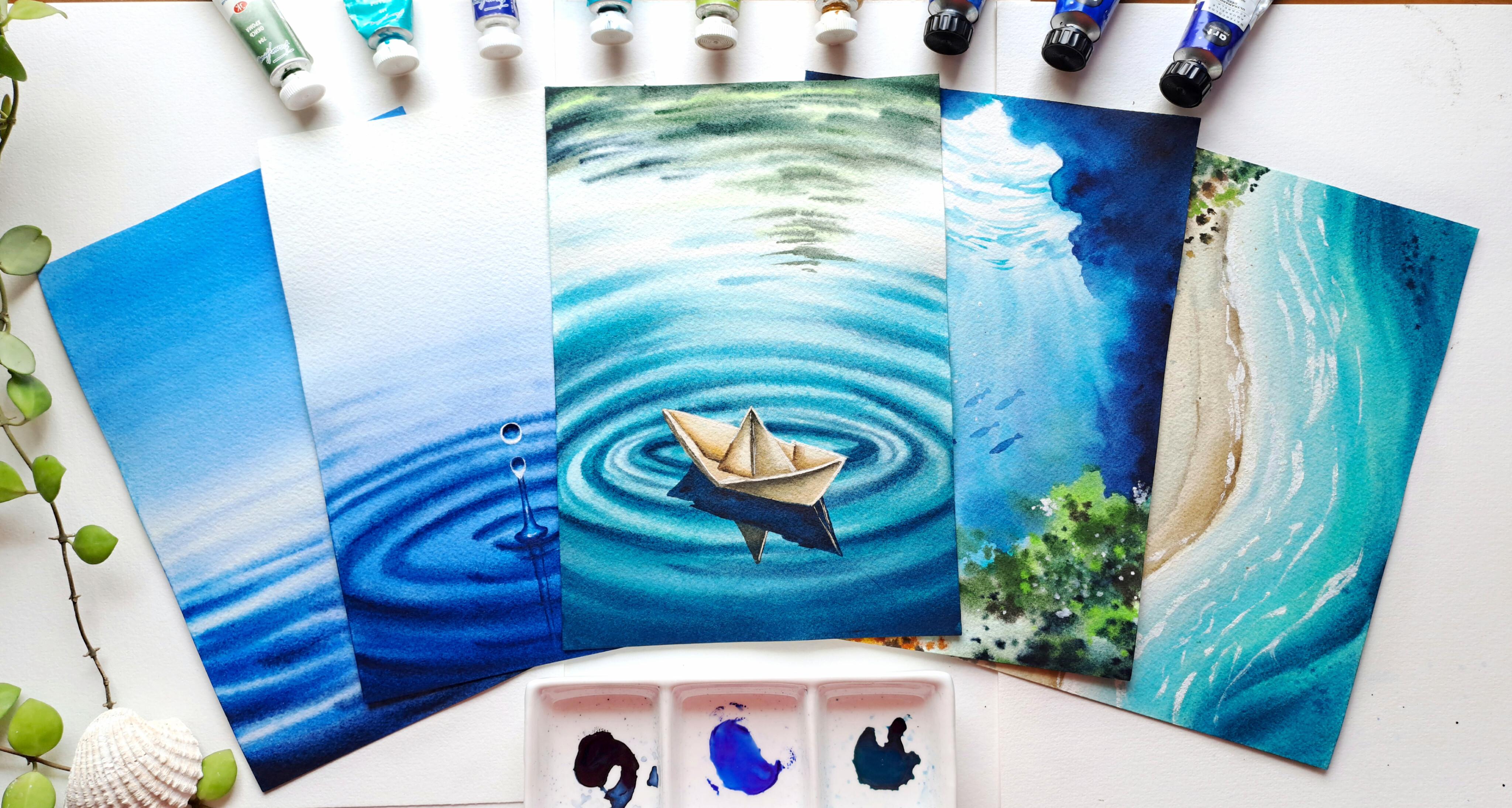
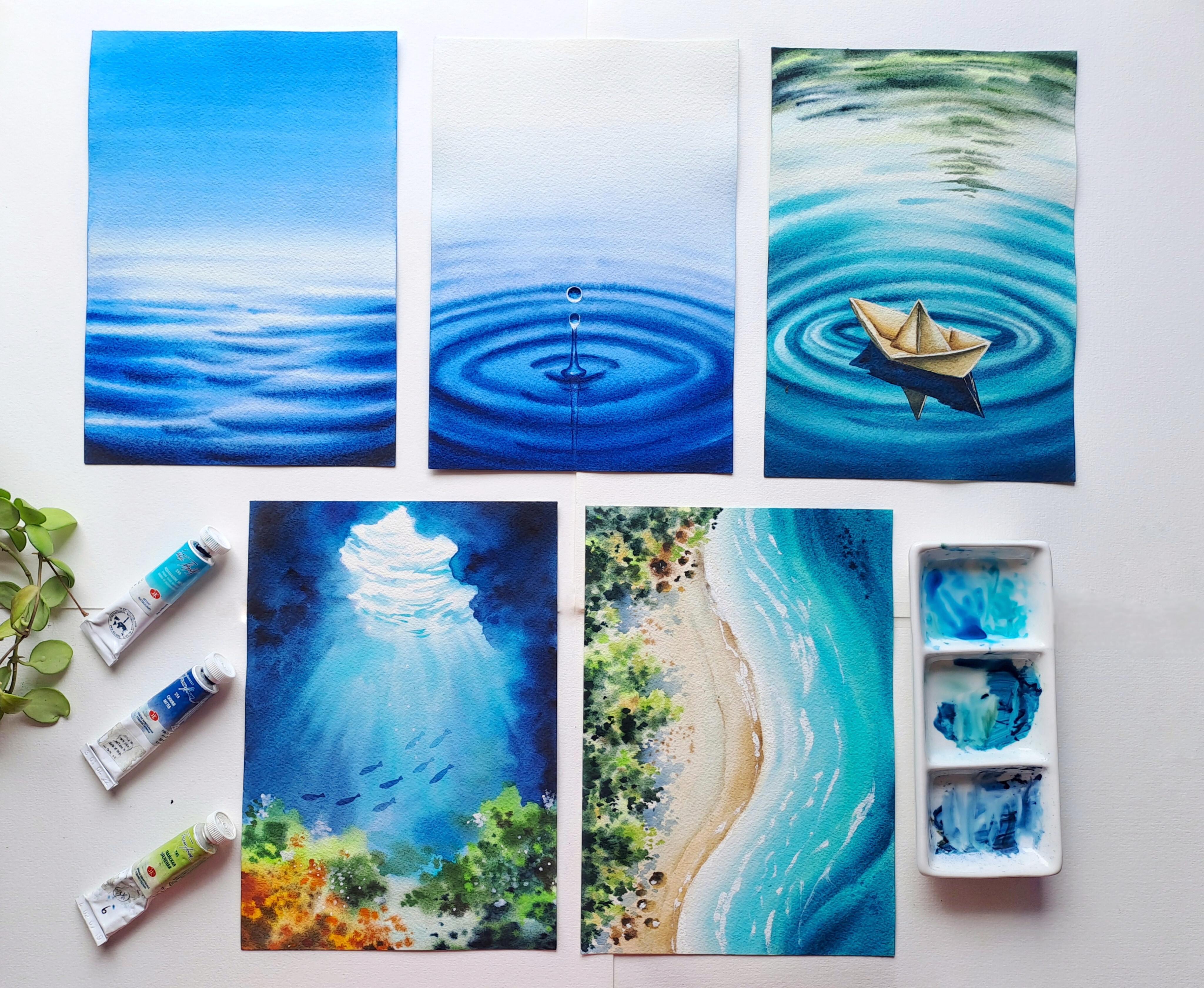
to paint along with me. This challenge includes five different paintings
over five days. Each project has been carefully selected and designed using simple techniques so that both beginners and
intermediate artists can enjoy the process. Every painting is unique and explores a different style
of watercolor water scene. The best part is that these projects don't
take long to complete, which means you can easily fit them into your
busy schedule, but just a little time each day. You can join me daily and
paint along step by step, or you can just work
at your own pace. There's no rush at all. Just enjoy the creative process. By the end of this class, you will feel more
confident painting water in different styles
and techniques. In the next video, I'll
be walking you through all the materials that you'll be needing for this
class. See you there.
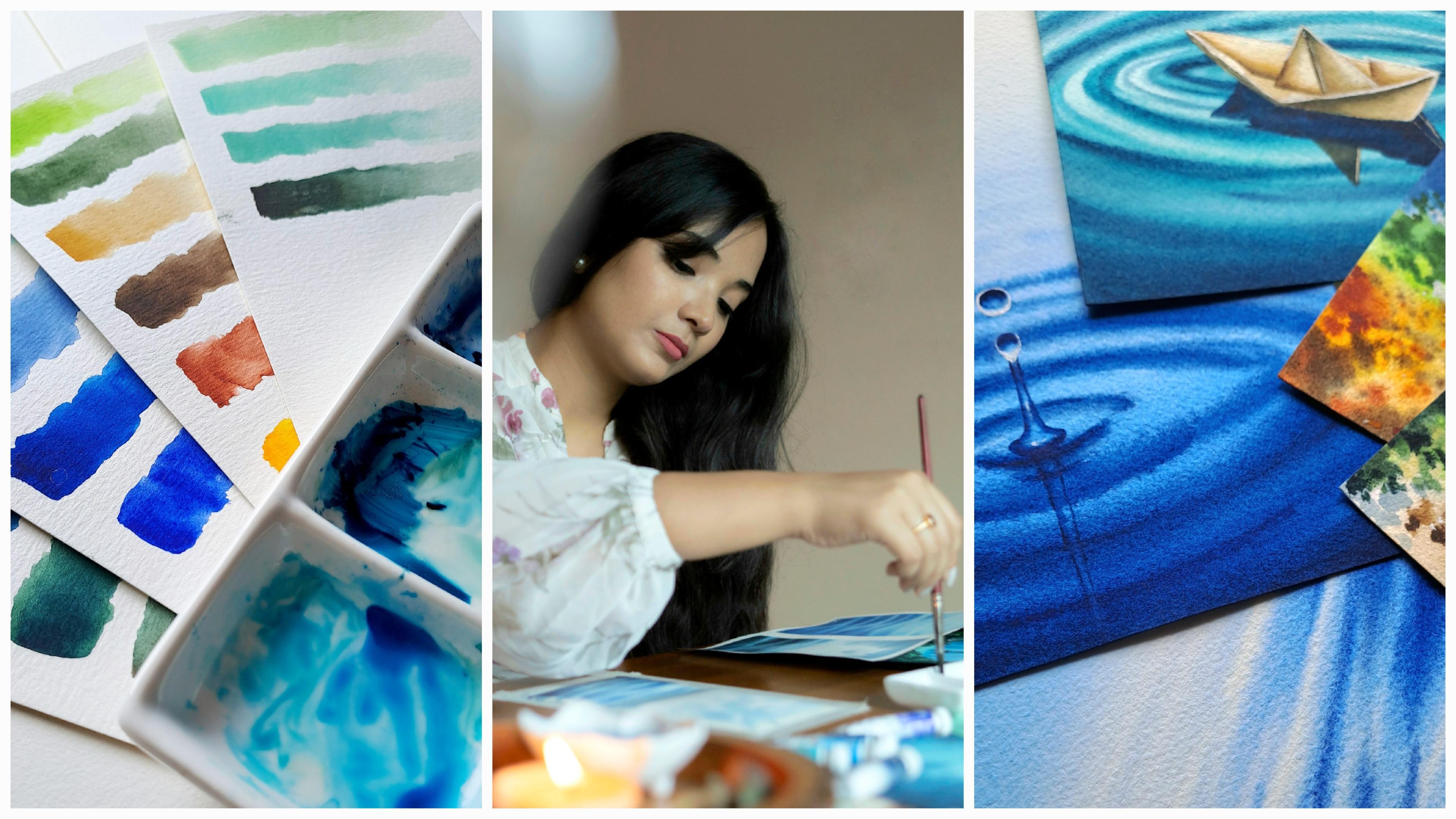
3. Materials used: Hey, everyone. In this video, I'll mention all the supplies you will need for this class. All these years of painting, I realize that paper is the most important aspect
of a watercolor painting. I'm going to use Archie's
watercolor paper. It is a cold pressed
paper, having fine grain. It is lightly textured and
is of 300 gsm and 140 LB. The size of this
paper is A five. It has 12 sheets which
are of 100% cotton. You can go with any artist's
grade watercolor paper having 300 Gasm and 100% cotton. This paper is not glued. Hence, I'm going to use
it sticking over a board. This is an acrylic board. It's transparent. I'm going to put the paper
over this board. You can use any board of your choice or just tick
the paper on your desk. I have used this masking fluid for two of the projects here. This is a masking fluid
from NevskyaPatra. You can use any other
masking fluid you want. Okay, now coming to the watercolors that
I'm going to use, I have used watercolor tubes from white knights, NewkaPita. This is a Russian brand. And also a few colors
from the art philosophy. It's an American brand. I've also included a separate
class called color palette, where you will find
all the information regarding the colors that
you'll need for this class. And also added the
pigment number. To mix the color, you
will need a palette. I'm using this
ceramic palette here. I'll be using this
ceramic palette as well. You can use any palette
of your choice. Even a kitchen plate
would work just fine. Now, coming to the brushes, I have used majorly only
three brushes here. So this is a wash brush
in size three quarter. This is from Princeton brush. I'll be applying water
with it on the paper, and also we'll be using it
for some smooth gradient. The second brush is
a round brush in size H from the
velvet touch series. From Princeton brushes. I'll be using this brush for mostly covering
the larger areas. This is a size six
round brush from Aqua Eid series of
Princeton Bush. I'll be using this for smaller areas or just
for adding details. The last brush is for applying masking
fluid onto the paper. This is an old brush. Do not use your good brushes for applying masking fluid
or else it will get shruined and also always
put the brush into dish soap before you put
it into the masking fluid. The next important thing
that you will need is a white wash paint to
add some highlights. This one is from NevskaaPatra. Again, you can use any
other brand of your choice, a spray bottle to
rewet our paints or the painting if it
dries up too quickly. Then we'll be needing
two jars of water, one for scraping off the
colors from the brushes, and another one for when
we need clean water. Two cotton towels, one to wipe off the water
from the brushes, and another one to soak excess water from
the paper if needed. And that's all the materials for the class that
you'll be needing. So gather your supplies
and let's get started.
4. Color Palette: O. Let's have a thorough look on the colors that I'm
going to use in this class. One of the main color
that I use a lot for my aqua project is
cobalt turquoise. It's one of my favorite. Let's see the pigment number. It says PB 28. This is from White Knights. It's a Russian brand. It gives a very beautiful, pale blue green hue. It gives a vibrancy
to the water. O I have used this color in this painting to add the light
hue in the water. Also, I've used it to show how the light travels
in this painting. The next shade is
aquamarine mist. It's also from white knights. It says PB 29 and PG seven. It is a granulating watercolor. It is basically a mix of
ultramarine and halo green. It's more of a dark
turquoise shade. You can also make
your own shade by using ultramarine and
halo green together. The third shade is
Identrine blue. Again, from the same
brand white knight. It says PB 60. It is an intense dark blue, which I'll be using to add depth and shadows in the water. You can totally skip this
color if you do not have one, as I have used it only for one painting to add
some sense of depth. You can also use Prussian
blue or Indigo for the same. Here I have added
some Identrin blue to add some depth over the case. Here comes Cobalt blue from
the Bran Art Philosophy. The pigment number here
is PB 29 and PB 15. It is a mix of ultramarine
blue and halo blue. I often use it for the skies. Even here, I have used it for my gradient sky for
the first painting. Now, here comes the
ultramarine blue. This is from art
philosophy as well. The pigment number is PB 29. You can totally skip this paint, as I just used it for
only one painting. Here comes the indigo from
the brand art Philosophy. The pigment number is PB 27, PB 15 and PBK six. This is a dark moody blue. This is a dark moody blue mostly used for shadows
in this course. Well, that's all
about the blues, Let's check out
the other shades. The first green
color that I'll be using is me green
from white knights. The pigment number is
PY three and PG 36. It is a beautiful, bright, yet light green with
yellow undertone. If you don't have this color,
that is totally alright. You can use a mix
of sap green and a little lemon yellow to
get this kind of shade. I have used it over the beach painting for the
trees to get a softer tone. The second grain is chromium
oxide from white knights. The pigment number is PG 17. It is a very unique
shade of green, making it idle for
painting foliage, moss, or any realistic
natural elements. You can also just
skip this color as I have used it only
for one painting. Here I have used for adding the texture of underwater moss. Now, this is a very
versatile shade that is naples yellow
from white knight. It says PY 42, PY 35, PO 20 and PW four. I will be using this shade for the paper boat and the white
sand for the beach painting. Now, the next shade
is Van ****'s Brown. The pigment number is PR
one oh two and PBK eight. You can use any dark
brown which you have. I'll be using it for adding some depth over the
beach and paper boat. This is English red
from White Knights. Having pigma number
PR one oh one, it is an earthy brick red shed. You can also use bone
Siena instead of this. I have used it to paint the corals in our
underwater painting. Now, there comes a
beautiful golden yellow in the shade name permanent yellow deep from art philosophy. The pigment number
says PY 53 and PY 55. You can also mix a
little orange in your lemon yellow for
this kind of shade. Okay, the last color is permanent yellow orange
from art philosophy. The pigment number is PY 53
PY 55 and PO 73. All right. So now, there are
some certain colors we'll be using by
mixing the Our colors. The first one is a mix of cobalt blue and ultramarine
to get a vibrancy. The second one is the same
shade mixed with indigo. That is, I mixed the cobalt
blue and ultramarine, along with indigo to
get a darker tone. See? Over here, I have used it. Now, here I add cobalt
blue and indigo. I'm going to use this shade for adding depth to the ripples. Now, here I mixed aquamarine mist with indigo for making it a
little darker value. The next shade is a mix
of me green and indigo, which gives a
beautiful dark green. Here I have added some shadows
with this green. Okay. Again, if you use Van
***** Brown with this, it gives an earthy green shadow. Now I'm adding some naples
yellow with van ***** brown for the sand texture for the beach painting
that we'll be needing. Here we have added this
color to get a texture over the beach and for some depth. Now, I'm adding some
cobalt turquoise with me green to create a cobalt
greenish color for the sea. We're going to paint on our fifth project
an aerial beach. Just trying to bring
the exact value. Adding some more Cobl turquoise. So that's all about the
colors, you in the next class.
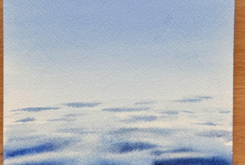
5. Project- 1 Calm Horizon Sea: Let's start our first project. Since the sketchpad
is not glued, I'm gonna tear a paper and
put it on my acrylic board. Just hearing a paper. I'm going to use this
three quarter washbush from Princeton for
applying water. Now, let's wet the paper evenly. Apply a generous
amount of water, do not make in tropic wet. The paper must soak enough water to maintain the moisture. Now I flip the paper
and apply water evenly, just like on the other side. I do it three to four times. I left the paper,
soak the water. This way, there wouldn't
be any air pockets. So while the paper is
getting soaked with water, we prepare our palette. But this painting, we'll
be taking Cobalt blue, ultramarine blue, and indigo. Now sprinkling some water to activate the colours
with my spree bottle. I'm using the sein wash brush. We dilute a generous amount of water with our cobalt blue. Consistency of this
paint should be thin so that it helps maintain
the transparency. We'll be applying the
scallet the top of the sky. As we come down, we'll be making it lighter by
diluting with water. Just simply run the brush
back and forth to get a keen blent washing my brush, and wiping it off. And with the damp brush, I'm trying to blend the color. Taking some more paint to make the sky a
little more darker, using the same brush
stroke, back and forth. Blending the colors in, taking some more
paint and water. Can you see the
smooth blend here? How gorgeous the sky looks now. Now, I'll be wiping
the site so that the paint water doesn't
slide into the paper. So now we let our paper
to get dried. All right. I'm going to wet the
lower portion of the paper once again
with the wash brush. I'll be taking my round
brush size h and picking up some cobalt and ultramarine
blue and mixing them. The stroke should be clean, straight lines back and forth, leaving some white
gaps in between. Back and forth, line strokes. The more we reach to the upper
surface towards the sky, we use as less
paint as possible, leaving it a little blurry
to make it look natural. See, I've loaded my brush
just once with color. Now, again, loading it up
for some deeper strokes. But don't forget to leave
some white gaps in between. Towards the sky, I make thinner strokes of ripples with the
tip of the brush. Now, I take some indigo into the ultramarine
and mix it well. I'll be adding on the bottom
of the ripples to add some depth and texture. See? Like that. Do not paint over the entire
light blue ripples. Make sure the lighter
part is still visible to make the
water look natural. Adding some more shadows here. And the purpose is to just add the shadows not to
cover it completely. I'm just adding some random
line strokes in between Now, taking a dry brush. This is a size six round brush. I'm going to even out
some of the ripples, which has a hard edge. It makes the ripples
look more natural. I'll be lifting up some colors. Make sure your brush is clean. I'm using this
technique to bring out the highlights from
beneath the colors. Clean your brush every
time with a tissue paper. Or you can also
use a damp towel. Just evening out the hard edges. Now, we keep our
paper aside to dryer. I'm again cleaning the
sides of the paper so that the paint water doesn't
school back into it. And our first painting is ready. So in the next class.
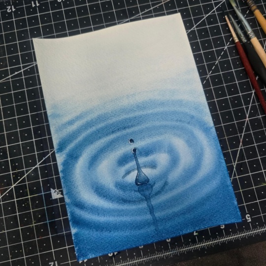
6. Project- 2 Ripple Drop: Welcome to day to.
Today we are gonna paint water drop on
a circular ripple. I have prepared my pencil
sketch for the water droplet, and we need to mask
the water droplet to secure it from the paints. I'm using an old brush to
apply the masking fluid. Make sure that you have
dipped your old brush into a dish soap before putting
it into the masking fluid. Loading the tip of my brush with fluid and applying
a very thin layer onto the water droplet. All right. It's done.
So in this painting, we're only going
to use two paints, Cblesblue and indigo,
sprinkling some water. I'm wetting the paper using the wash brush evenly just like we did in
the previous class. I'm going to speed up
this section a bit. Now, flipping and wetting
the other side as well. Do this two to three times. Now what I'm going to do
is take the acrylic boat and putting a masking
tape roll under it to make it tilted downwards so that the color
flows downwards. So let's start painting, loading my Princeton
Neptune washbrush with cobas blue in a
thinner consistency, diluting it with water. I'm scraping off
the excess paint. Now, leaving a little
white space in the top, I start in a semi
circular pattern, back and forth with the brush. Why am I leaving some
white space above? Because the paper is wet and the color would start
spreading a bit upwards. So by leaving some white space, we can manage to maintain a balance of light
in the painting. So the untouched white area above acts as a natural
source of brightness, creating contrast
against the cobalblw. I'm watching the
brush. Wiping it off and with a damp brush
I'm blending it in. This makes the painting feel
more luminous and alive. I'm trying to blend the
colors for a very even tone. I'm going to use a second layer. So taking the same cabal
blue at this time, putting the color from bottom
of the paper towards up. Blend it very well so that
there isn't any lines. Now, over here do not
take excess colors. It would make the
paper very muddy. I'm taking my size
eight round brush. While the paper is still wet, we quickly create the ripples. I'm adding some indigo
to cobalt bleu. Taking some fresh paints again. This is cobalt Bleu. Mixing it with indigo. This time, using a more
thicker consistency. Here I start adding
the ripples from the downside of the paper
in a curvy pattern. See? I'm using the tip of my brush for painting
the ripples here. See, the pattern is in
a semicircular stroke. See, a semicircle. Back and forth, strokes. Make sure the circle must surround the point
we have made over there, the place we have put
the masking fluid to make our water drop, it should be around it. Do not take excess paint here. We do not want our
colors to look muddy, adding some shadows
here with indigo. Now, towards the center, we make another circular
ripple in the form of a puddle to capture the natural movement
created when a water drop falls
onto a surface. Towards the upper
side of the paper, we start adding more ripples
in a semi circular form. The cells make up
shape of a puddle. Taking some more
intigo and adding some shadow here
in the foreground. Now what happens, then when
a drop hits the water, the impact spreads outward
in a circular way. By repeating and expanding
the circular ripples, we can show the motion. Here I'm adding some
more circular rippers exactly at the center
position of the puddle. Making it a bit darker. Some more shadows here. All right. Now, I grab my
Size six round brush and start adding some more ripples on the upperside of the paper. Make sure this cobalt flue has some thinner consistency
here so that the ripples are very light and
softer to balance the light coming from up and
to make the painting glue. Once again, I'm removing the excess paint in water so that it doesn't
scroll back to the paper, and we let it get dry. So now our paper is
completely dried up. Now, we need to remove
the masking fluid. You can use an
eraser to do that. I also use my fingers when
it's for a smaller area. I'm going to paint my
water droplet with my Princeton aquali
round brush in size six. You can use any smaller
round brush you have. I have taken a very thin amount of mix of cobalt
blue and indigo. I drop the color on
the upper side of the circle job, blending in, leaving a little white space and leaving the white space to capture the light
coming from above. Picking some indigo
for adding shadow. I'm adding the indigo at
the edge of the drop. See on top of the drop. All right. Now we are painting the second drop with the
same technique and process. First the lighter blue and
then shadow with indigo, leaving a little white space
below to capture the light. Taking some more indigo
to add some shadows. Now, I take some indigo
and draw an outline of water strip shooting upward
with the tip of my brush. Because when a droplet
hits the surface, the water tends to bounce up. I'm filling it with a very thinner consistency
of cobalt blue. I'm lifting up the
excess paint over here to maintain
the transparency. That's it. You leave it to dry. Once it is completely dried, we take our white wash paint with the same size six brush. I'm adding the white paint
on the lower side of the droplet to show the light that is reflected
from the upper side. Adding some highlight over
this droplet as well. Okay, now I take some indigo
and mix it with cobalt, and we need to make the
reflection of the water strip. Just here beneath
the water strip, we make the reflection. Just a narrow strip here. I'm making it with the tip
of my size six round brush. So here, this ship could be a little curvy way because
the water is moving. We do not have to make
it exactly straight. It can be a little curvy. That shows that the
water is moving. I'm blending it a bit
for a natural look. And we're done. I
hope you enjoyed it. See you in the next class.
7. Project- 3 Floating Paperboat Part-I: Okay, everyone. Welcome to the third project
of this challenge. Let's get started. I have already pre sketched
the paper boat. I'm also going to add the
sketch in the resource section. Now, we need to mask the boat. We do not want it to get
drenched in the colors just yet. So I've taken out
the masking fluid. Now I'm taking an old brush, dipped in dish soap. I'm going to mask the boat. Put it a very thin layer. We'll be kneading six colors
here, cobal turquoise, aquamarine, indigo, may green, naples yellow, and
Van ***** brown. Taking up my Princeton three quarter wash
brush to wet the paper. Just like the last
two paintings, we're going to wet both
the sides of the paper evenly without any puddles. I'm speeding this area
as it is just the same. I'm going to use my
size eight brush now. Okay, taking some bal turquoise. Adding some water. I'm starting from the very bottom
of the paper, and I move towards upwards. Just some random ripples
line ripples back and forth. If you do not have
cobal turquoise, you can also use cerulean blue. As we go upwards, the color would fade. Can you see how fade the color is as it goes towards upwards? I'm adding some more
Kobalt turquoise here. So here, what we need
that the top needs to be very light and smooth, the middle a bit darker, and the bottom
with deeper tones. See, the upper portion is
very light and smooth blends. I'm making the ripples with the tip of my size eight brush. Very soft ripples over here. I'm not loading with
more colors here. Okay, I add a second layer
here at the bottom with the Coval turquoise
with the wash brush. You can also use a
flat brush here. I'm blending the color. I'm adding a little
aquamarne mist with my cobal turquoise. With a very medium consistency, I start making the
circular ring ripples at the center
surrounding the boat. Each ring followed the shape
of expanding water movement. Make sure the paper
is still wet. When you wet both the
sides of the paper, it generally helps to retain the moisture for
quite some time. The rings are smaller
towards the boat and larger towards the surface to show the movement
of the water. Here I add smaller ripples. The more it goes upwards, it becomes lighter to
retain the source of light. I'm blending the color over
here. It's quite edgy. Now, I take some aquamarne mist and start making the ripples
darker in the bottom. As the water moves closer
to the foreground. I'm leaving the light
shade water beneath. Don't cover the entire
water with deeper tones. It would look very muddy. Blending the colors here. Adding some shadow
with the same color. I'm adding some more
rings around the boat. Adding some shadow over here to make the ripple
look a bit thicker. I'm adding some
more darker rippers to form a shape of a puddle. Okay, now I wash my brush. See how beautiful the circular
ripples have turned out. I'm mixing some indigo
with the aquamarine. You can also use turquoise
instead of aquamarine. I'm giving some texture
to the ripples over here. Can you see how
beautiful it looks So shadows here as well. I'm lifting up some
colors from here with a clean brush. And that's it. Okay, I'm wetting the paper
over here a bit over the top. I see it has been dried. Make sure the water is clean. I'm going to use some me green
and dilute it with water. Using the same brush, making just line dripples in a very soft manner
over here in the top. Just very thin and
soft ripples here. Do not take excess
amount of paint but do not want to get
the texture muddy. See the glow. Okay.
Now we're going to add some indigo into our me green to get a darker
tone of green. You can also use sap green over here some random
strokes over here. Above the me green we
have already painted. Making small lines for
the tip of the brush. Do not cover the entire
light green portion over here that would lose the light and make the
painting look dull. If you do not have me
green, that's totally fine. You can just use sap
green and mix it with a little lemon yellow to get a very beautiful
lighter shade of green. Then just cleaning my brush, I'll be adding some
van dites brown to the darker green
for an early tone. Now, these lines are very small above the darker
green we have already used. Very thin strokes over
here, can you see? As we go down, the strokes become even smaller and thinner. Now, I'll be evening out some of the harsh lines
with a dry brush. Also removing some paint
by the lift up technique. Keep a tissue handy. And now we wait for it to dry.
8. Floating Paperboat Part- II: So now my painting
is completely dry. We can remove the
masking fluid now. You can use an eraser or simply your
fingers to remove it. I have speed up this part a bit. Alright, I'm going
to resketch as the masking fluid has removed
the lines by the pencil. Just a little bit touch up here. Okay, I'm grabbing my size eight brush for
painting the boat. I wet the boat at first. Diluted some water with
some naples yellow. It gives a paper
boat a sunlit glow suggesting light touching
the paper from above. We cover the entire
boat with naples yellow with a very thinner
consistency at first. Taking some thicker
maple yellow pigment for the folds of the paper boat
and the inner creases. Here we put the thicker
pigment for the shadows. Blending blending the color over
here for a natural finish. Here at the fold, we also blend the colors with some water. Now I have taken up some andyks brown to start
adding the shadows. At the outer part of the
boat, I'm adding the brown. You can use any dark
brown of your choice. Adding some naples
yellow with the brown. I'm filling the inner
portion with brown for making the fold visible and
adding the sense of depth. Diluting it again with water blending it in
for a natural finish. Adding some depth here
in the corner as well. This portion, I'm
adding some naples yellow where the
paper tucks inward. I'm adding some van
***** brown with cobalt turquoise and also
some green and indigo. And now I'm going to put
it on the outer part of the boat for a beautiful
earthy shadow. This is going to
create a dimension on the outer side of the boat. Clearing the brush and taking up some more naples yellow and
adding this shadow here. Make sure it doesn't
go out of the boat. We do not want to get
our ripples ruined. Okay. So more naples yellow
for the inner crease. Adding some more shadow to
the inner corner and leaving the upper side of the
boat in light colour. Now, the inner fold which divides both the sides
of the paper boat, I'm using a thicker nipples
yellow pigment at first. Here, the pigment is quite rich. Okay, now with a clean
brush, I'm blending it in. We leave the upper
part of the boat in the lighter shape to capture
the light over here. Some more pigments
here to create depth. This way, the paper
boat doesn't look flat. Alright, we need to create the shadow of the
paper boat over here. It is one of the most
important elements in the painting because it is what makes a paper boat feel like it's truly
floating on the water. I'm mixing indigo with aquamarne to get a darker
shade of turquoise. Using a blue base dark shadow allows it to merge
naturally into the water. I'll place the shadow
directly beneath the boat slightly extending
to the lower right, which follows the direction of light source coming from
the upper left corner. The shadow naturally falls opposite of the
direction of light. Can you see the shadow
is a bit tilted over here towards
the righter side? Taking some more indigo. So the darkest shadow appears closest to the
underside of the boat. This is where the least
amount of light reaches. Use a thinner stroke over here. The consistency of
the paint should not be very dark over here. The ripples wouldn't be visible. Alright, I'm adding
some van ***** frown for the shadow of the
triangular fold over here. Just right beneath the
triangular fold of the paper boat. All right. Now the last spot. When the whole painting
is completely dry, I'm going to use a white
wash for some highlights. You can use white elpin as well. I'm just forming
a line over here. See at the edge to make
it more stand out over the water putting a very fine line here. See, the paperboard looks even beautiful with the
highlights here. And some here for the light. Now a thin line over here
over the reflection. All right. Just like that. And we're done. Look
how gorgeous it looks. All right. See you
in the next class.
9. Project-4 Underwater light Part-I : Welcome to the fourth
project of this challenge. Today we are gonna paint a beautiful underwater scene
with lots of vibrant shedes. We'll start by wetting
the paper first. I'm using my Princeton
three quarter wash brush, wetting the backside
of the paper first. I'm speeding up this part a bit, as it's just like the scene like our last three paintings. And then I flip it and wet
the front side evenly. Mm. Now, I'll be using my size H round
brush from Princeton. We'll start with bal turquoise. You can also use cerulean blue if you do not have
cobal turquoise. Now, since the light is coming
from the top left corner, so the streak should be going towards the light
from the bottom, towards the light in
the upper portion. The center in the above
should stay white to preserve the light so that there is an
azure glue in the painting. The first wash is
going to be soft. So dilute some water with
the Kobal turquoise, or if you are using
cerulean blue. Now I'm using a thicker
consistency of the same color, creating a sense of
depth and clarity. Just normal streak which goes
from downwards to upwards. Now, I'm using a
little indentrn blue here in the down portion
to add some depth. If you do not have indentrn
blue, it's totally fine. You can use Prussian blue. I've added a little indigo
for some shadow here. Just wiping out the
excess colors and the water over here so that it doesn't scroll
back to the paper. Again, I'm mixing some indigo
with the Identrin blue. The pigments here
should be thin here. We do not want our
colors to get muddy. Blending the colors
in for an even tone. I'm adding some Kobal
turquoise down here. Just dropping in
the colors here. So more inde trinblue and
some indigo for shadows. Now, while the
paper is still wet, I'm making a loose outline of the cave with medium consistency
of cobalt turquoise. You can also create
your own shape, but make sure the light
is coming from the top. Do not forget to
preserve the light. I'm trying to use as much
less paint possible here. Trying to blend it in with
the texture of water. Alright, the paper down
here feels a little dry, so I'll be giving
it a light wash with clean water
using my wash brush. So the coral reef
would be very loose here and we're not going
to overdfine them. I'll be starting with may green. Diluted it with water. Just dropping small
strokes here. You can see it's
getting mixed with the blue above. No worries. It makes it look more natural. I'm mixing some
cobol turquoise with me green to get a
cobol greenish color. You can choose any
color of your choice. You do not have to be
particular about coral reef. Now I'm adding some
chromium oxide green. You can use any shade
of green you have. You can also use a sap cream. So chromium oxide here
is a granulating shade, so it helps a lot for
adding some texture. Alright, I have cleaned
my brush, wiped it off. Now I'll be taking taking some more of that cobol greenish
shade, blending it here. All right. Now in the left side, I'm using golden
yellow to add some warm to create a contrast
in this painting. You can also use any other
yellows if you want. I'm just allowing the colors
to blending naturally here. Heels more organic or white. Now, I'm going to take some English red.
This is a brick red. You can also use
burn Siena for this. I'm adding this for creating
some depth and texture. Make sure this paint is very thick and not diluted
with much water. I added some vandykes
brown and the brick red, now giving some splatters. Do not forget to cover
the rest of the painting. We do not want our
water to get ruined. Splats always gives a
very natural finish. I really, really love them. Adding some more green here. Now I am darkening the
green with some indigo. All right, some brown, as well. It really looks good
now. Can you see? Okay, scraping up some
excess colors from here to bring out the
light underneath. Just adding a looking
more brown over here. Putting some orange
here for some vibrancy. You can use any color over here, red, orange, yellow,
anything. Anything would go. Now we're gonna let the
painting get dried. And after that, we
are gonna give depth to the cave. Okay?
10. Underwater Light Part-II: So our paper is dry now. So now our gluing
base is established. Now we need to deepen the surrounding cake,
the darker shades. I'll be using dentrine blue
and filling up my color here. Diluting a bit water. The color pigment is
kind of thick over here, but I'm adding water
here to blend it in washing my brush again
and blending again. Taking up color and just
some random strokes here. We want a very
natural finish here, so we do not want to
smooth surface over the cave because caves are
built in with a rough texture. See, I'm using the damp brush over here to blend the colors, now adding some indigo to get an intense
outlook and adjust the depth I need to spray some water over here. All right. Taking indigo again and just putting a streak from the down part to the
upper part here. I'm making it a little blurry in the bottom to give an idea of the blurry water repeating
the same process here. Do not cover the beginning
of the cave with darker tones because we need
their place to remain light. Straping off the excess
color from here. So the more far it goes, the color becomes darker to suggest that the light cannot
fully reach over there. H So more indentrine
blue over here. It's a very thick paint
I'm using over here, but I'll be diluting
it with water. So indigo to add some
depth over here. Can you see as soon
as I added indigo, the central light even
strengthened? Yes. The light at the cave opening
appears very bright now. I'm taking some fresh
beans from the tube. This is co turquoise. I'll be adding this
color in the bottom. The consistency of the paint
over here is quite thick. Again, I'm going to
dilute it with water, making it a little blurry in the bottom to give an
idea of the blurry water. This creates an illusion of the suspended light
moving through the water. I'm adding some green
here for some contrast. Dropping the colors over here. Some more shadows here
with the dantrine blue. So this place looks quite light, so I'm going to add
some more indigo over here to add
some more depth. The strokes would be from
downwards to upwards. I'm just blending the
colors with a damp brush. Some more dry paint over
here to create some texture. Lifting up some color from
here to show the light. Now, always clean your
brush after every lift. Keep a tissue handy
or a paper towel. Now, I'm going to
use my Sisix brush. We'll be adding some
very soft ripples here at the cave opening, where the light begins to
give a hint of moving water. So I'll be adding lots of
water in my cobalt turquoise. You need a very thin
consistency over here. See, very small and
thin strokes over here. I'm making the ripples here
with the tip of my brush. Make it very light because we want to
capture the light area. Okay, so I think we can add some more shadows over here
to highlight the case. I'll be using my
size Ad brush again. Here, I'm using some
cobalt turquoise to add a little bit more shadow
blending it with water. So dry indigo over here. And that's it. The
cave has been done. Now, I'll be taking some
white quash for putting some drops over here
down in the coral. Some tiptp drops over here. You can also use a white gelpen, some little splatters over here. We'll be adding some
small fishes over here. I'm using my size
six round brush and taking some very
thinner consistency of indians string blue, you're going to make
the fishes over here. You can use any color
of your choice, red, yellow, orange,
any bright colors. I'm choosing blue. Small lines. And we make the tail over here. These are very
simple kind of fish. The consistency of paint
is very light over here. Adding some more fishes. And our painting is done here. I hope you liked it. See
you in the next class. Oh
11. Project-5 Tropical Beach Part-I: Now it's time to paint the last painting
of this challenge. I'm going to start by
wetting both the sides of the paper evenly
without any puddles. I do this two to three times, at least to get the
paper soaked in water. I speed it up a bit, as it's just the same as all the paintings we have
done before in this project. I'm picking up some
Kobal turquoise diluted with lots of water. I'm using my size h
round brush here. This is going to be
an aerial beach view. I'm making a curvy line here
and just blending the color. Taking some more pigments
and blending in. So more pigments and putting it over here to give
a darker value. I'll be using my three
quarter wash brush. Make sure your brush is clean. I'm going to blend
the colors over here so that there are no lines. Mixing some more
colors over here. Now, I'll be mixing
some may green in the cobalt turquoise to get
a cobol greenish shade. Just blending the color in. I'm cleaning my brush. I'm taking some
more pigments here, turquoise, a little
thicker pigment. I'll just wash my brush and clean it up properly,
wiping it off. And with that damp brush, I'm going to blend the
colors of the sea. I'm taking some more
pigment over here, just at Cobl turquoise. See how rich the pigment
looks over here. The colors have
really blending well. Alright, I'm mixing
some cobalt turquoise with the ultramarine
mist over here. I also added some green into it. Now adding them here at the
corner for some shadow. Just create these lines here. Let the lines just
flow inside the water. That is totally fine if
the lines are visible. It helps create a texture and
make it look more natural. The lines should be wavy.
Make sure about that. Now, with my damp wash brush, I blending the colors
properly for an even finish. I'm using some fresh
pigment of aquamarine here. I'll be adding some
moose schkes here at the end to add
depth in the water. I start from the corner. The pigment here is quite
thick inconsistency. I'm not covering
the shoreline here. We want the shoreline
to be very light. So I'm adding the shadow
in the back portion. So I'm adding the
shadow in the corner. So more aquamarine mist. So aquamarine mist is
a granulated shade, so it really helps for adding
some texture in the water. Boom. So time for some splatters. I'm using here aquamarine
mist, and that's it. Always cover the rest of the
sheet F you use splatters, we do not want to get the
entire painting wasted. Now it's time for the beach. With my size eight brush, I'm mixing a little Van ****
crown with naples yellow. You can use any
other darker brown. The consistency is
quite thin at first. The tone and value here is very light in the middle where
we are painting our beach. Now we take some
more pigments here. But the consistency needs
to be very light at first. Okay, now I'm taking
some rich pigment. I have added a little van ***** brown in the naples yellow. This helps to add some texture. I really love
Niplesylo as it always helps to capture
that sunlit value. So our beach is ready over here. We are going to paint the
trees in the next video.
12. Tropical Beach Part-II: Okay, so I'm picking up
my size six round brush from Princeton Aqua it. Now, I take some
me green and mix it with a little bit
of naples yellow. Just chopping in the colors. And we're painting the
trees in layers of colours. Taking just the ma grene now. Make sure the paper is wet, or you can also spray
some water if it's dry. Do not cover the entire beach. We need three different
parts in the painting. You're using light
to shade first to capture the light
over here the beach. Just dropping in the colors. Adding some naples yellow, here. Oh I see the beach
looks kind of flat. So I'm gonna splatter
some van ***** brown for adding some
texture over the beach. I'm going to add some rock over here with a thicker
andiks brown. Just some random texture
of rocks over here. Do not add too many, though. Okay. Time to add a darker value to the
trees for adding jet. So I'm adding indigo
and megren together. I'm also grabbing some andyk brown in it to get the ody tone. Okay, now just dropping
in the colors over it. We leave some light shed untouched because we need to
capture the light over here. Do not cover the entire
light green portion. Um, I can see it looks kind of dark now. I'm adding some more lighter values of tree here and there. You can use just the me green or add some maples
yellow over it. I'm taking some van ***** Brown to cover the rocky portion. I have added some
indigo in the Van ***** brown to give a darker
value to the rocks. Okay, I'll be adding some shadow over here because the
beach looks really flat. Also use born Siena for this. I'm just dropping
in the Van ***** brown with maple yellow. See here at the shoreline. It gives so much
more depth here. With a clean brush, I'm
blending in the color. I'm adding some more shadows
here over the trees. Just some darker green to
make the trees more dense. Now, some lighter
values over here. Some more darker values here. Now, it looks so much
better now, isn't it? I really love to create these small leafy
pattern over here. Make sure to maintain a balance of light
and dark over here. You need to capture the light at every aspect over here in
the beach and the trees. I'm just using the tip of my
brush to add the texture. Adding some more
rocks over here. I'm quickly grabbing some naples yellow for adding it over here. So shadows and all. For adding some more rocks. I really love doing this. Alright, it's done now. And now it's done. We need to get our painting
dried off first, and then we are going to add some more highlights
with the white wash. Grabbing my white wash paint and my size six
round brush here, taking some white
wash paint out. See how I'm adding the
guash over the shore line? Some rough white lines here in the sea to add
the texture of wave. The white gosh should
not be watery over here. I'm using the raw white wash
from the bottle itself. I'm using dry paint over here to create the
foam of the sea. It helps to show that
the water is moving. I'm going to add a little
more details over here. I'm going to add a little
more details over here. So using some naples
yellow and Van ***** brown for some shadows
here on the shoreline. So I'm going to take some
indigo and make some water in it and make a very thin
consistency, very thin. We'll be adding shadows over here in a very loose
way near the trees. See? Like this. Just near the trees. Simply drop the colors over here with the
tip of your brush. Yeah, just like that. The
color over here should be very thin because it's
creating the shadow. You want it to be
transparent enough? And our final painting is ready. And if you enjoyed this
process, do give it a try. Thank you for
joining me. Bye bye. And
13. Thank You For Joining!: Congratulations on
finishing this class. Thank you so much for joining in this lovely
watercolor journey. Together, we have mastered five distinct ways
to paint water. We learned about
smooth gradients, captured the precision
of a water droplet, explode reflection
with the paper boat, dive deep into the
underwater scene. And finally, ended at
a vibrant beach scene. I hope now you feel more confident enough
to use this skills that you have learned
in this class in your own creative project. If you enjoyed this class, please don't forget tonigaRview. Helps other students to
find the course and also encourages me to make such
more classes for you all. I'm so excited to see
all of your paintings, whether it's just
one or all five, please don't forget to share
them in the project gallery. And until then, painting you
in the next class. Bye bye.
 Dyutisnata Chatterjee, Watercolor Artist