Transcripts
1. Introduction: Hello, and welcome
to my tutorial on painting Himalayan
Blue poppies. Today, we're going to dive into creating the staunning
blue flowers, focusing on capturing
their unique character and vibrant colors with
watercolor techniques. In this tutorial,
we will explore how to bring out the rich
blue tones of the petals. Create an interesting and
dynamic background and capture the intricate details that make these
flowers so special. Whether you are an intermediate or advanced watercolor artist or even a beginner looking
to elevate your skills. This lesson will offer
you new techniques and ideas to help you
improve your painting. We'll start by masking off some of the tiny elements
of the painting. You will see how
effective masking fluid can be in preserving
small details. Next, we will move on
to building a lively, expressive background
that complements the flowers without
overpowering them. From there, we will focus on
the flower buds and stems, including the delicate hairs that make them so distinctive. I'll show you how to capture these subtle details to add realism and texture
to your painting. Finally, we'll tackle the
magnificent blue petals and their striking contrast with the bright yellow centers, bringing the entire
composition to life. The end of this tutorial, you will have your
very own painting of Himalayan blue poppies, along with a solid
understanding of some advanced
watercolor techniques. I'm excited to guide you
through this creative process, sharing tips and
tricks along the way, that may even inspire you to see your future paintings
in a new light. If you're ready to begin, gather your watercolor paints, brushes, and paper,
and let's get started.
2. Project and Resources: I've prepared some valuable
resources for your project, which you can find in the
projects and resources section. There you will have
access to a PDF with a list of the supplies
I used for this painting, reference photos and my
finished painting to guide you, line drawings in various sizes that you can print
and transfer onto your watercolor paper with the size that best
fits your preferences. I painted this piece on
a 16 by 12 inch size. You will also find work in progress photos to help
you follow along and focus on specific areas and templates for creating
your own color wheel. Feel free to explore
these resources and use them to create your unique and
beautiful painting. Please share your
progress shots and final painting with the class in the projects and
resources section. I also encourage
you to check out each other's work in the
student project gallery. It's always inspiring
to see the creativity of your fellow students and
your support means a lot. Don't forget to like and comment on each
other's projects. Lastly, I highly
recommend watching each lesson before you
begin your painting. This will give you a
clear understanding of what to expect in each
part of the tutorial. If you find this class helpful, I would greatly appreciate
an honest review. Your feedback helps me
improve the content and assist other students in deciding whether
to join the class. Thank you in advance
for your support.
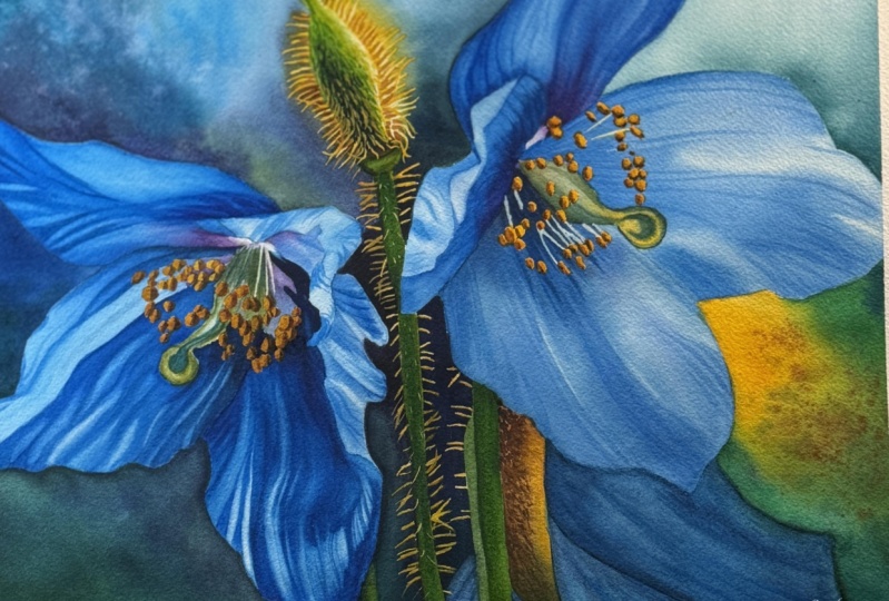
3. Inspiration and Composition: This tutorial was actually
inspired by one of the members of my art school who prefers to remain anonymous. Not only did she suggest the idea of painting
Himalayan blue poppies, but she also provided us with some staning
reference photos. A big thank you to
her for sharing these images and allowing us to use them for
this painting. Of all the photos, one immediately
caught my attention. It was exceptional. There was something so dynamic
and captivating about it, and I knew it would be a perfect reference
for our painting. Now, a little background
about this photo. It was taken in the gardens of government House in Victoria,
British Columbia, Canada. This is a truly
breathtaking setting, spanning 36 acres of
carefully maintained gardens, native woodlands and
historic buildings. This state serves as the residence of the
lieutenant governor of British Columbia and has been designated as a national
historic site of Canada. The gardens themselves are
beautifully managed by volunteers from the friends of government House
gardens Society, ensuring that they bloom with vibrant plants
throughout the year. With this context, you
can now appreciate the stanning environment that serves as the backdrop
for our painting. The photo itself is fantastic. It's full of energy, interesting details,
and of course, those breath taking colors. The vibrant blue of the puppies
is particularly striking. While that's what makes the
flowers so mesmerizing, it also poses a challenge when capturing it
in water color. Though it would be
wonderful to paint the entire scene or a
composition with many flowers, would be too overwhelming
for this tutorial. Initially, I considered
focusing on a single flower, but the group of flowers on the right side of the image
really stood out to me. The combination of
the open flowers, the but with its
spiky statements, the centers of those flowers and the delicate stems reminded
me a bit of fireworks, a burst of color and energy. I thought this would make
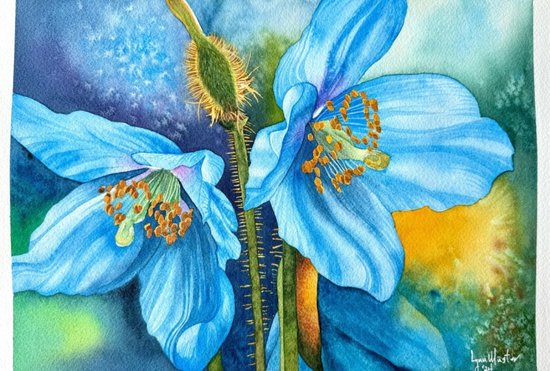
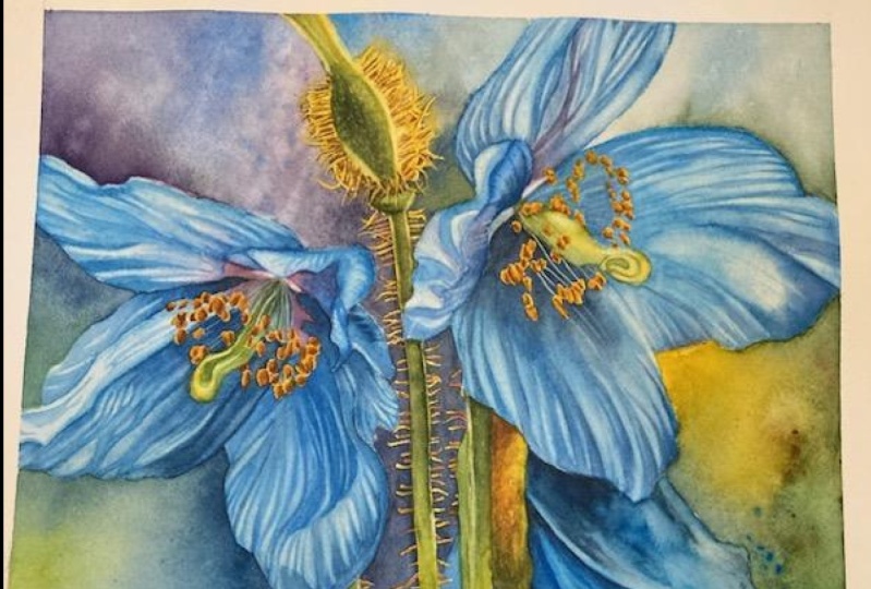
an exciting composition. So I began planning. This painting, I knew I
wanted to work on either a 12 by nine or 16 by 12
inch paper size. Both have a four by
three aspect ratio, but I was more inclined toward the larger size for
two key reasons. First of all, bigger
size, bigger impact, larger paintings often
have that extra w factor. And second of all, more
space for details. Working on a bigger
surface makes it easier to capture finer details
like the flower centers, which would be more
challenging on a smaller size. The first step was to check
how the composition would look if I cropped the image
to fit these proportions. Here's where some
useful tips for composition come in.
The rule of thirds. As you can see, when you
crop an image in photoshop, there is usually a grid that divides the frame into thirds, both horizontally
and vertically. You can always imagine
a grid like this. This is known as
the rule of thirds. The points where
these grid lines intersect are called
focal points, and placing key elements
of your composition near these points creates a more balanced and visually
appealing painting. For this painting, I
wanted to position the centers of the flowers
close to those intersections. If you are painting a
landscape, for example, you might place the
horizon line along one of the horizontal lines or position a tree near one of
the vertical lines. The rule of thirds works well for flower
compositions too. It actually works
for every subject. Extending beyond the frame. One technique I like to use
is allowing some elements like flower petals to extend beyond the
edges of the paper. This serves two things. First, it gives the painting
an intimate feel as if you are up close and almost
stepping into the scene. Second, it makes
the background more manageable by dividing
it into smaller, easier to paint sections. Avoiding tangents. A tangent occurs when elements
in the painting touch in a way that feels awkward or
creates an undesirable shape. For instance, if a petal just barely touches the
edges of the paper, it can create attention that distracts from the
overall composition. It's better to either
pull the petal away from the edge or extend it
further beyond the frame. Similarly, avoid placing
petals or leaves too close together if they create an
unnatural or distracting line. I once made this obvious
and very visible mistake in one of my
painting with roses. Here on the left side, you can see that the leaves and petals formed a
nearly straight line, which disrupted the
flow of decomposition. In hindsight, I should
have adjusted the leaves or added more to avoid
that awkward shape. Modifying decomposition. When I cropped the reference
photo for the poppies, I noticed that the upper left part of the composition
felt a bit empty. I also really wanted
to include the bad as I found it
visually interesting. Using photoshop, I
simply cut the bad from its original spot and moved
it lower within the frame. Additionally, I removed
some of the less important stems on the left side to
simplify the composition. Once I was happy with
the general composition, I started thinking about
the color palette, not only for the blue petals, but also for the background. I knew I wanted to
introduce some changes to make the background more
dynamic and interesting, and we'll dive deeper into
this in the next section, where I'll share the
fool proof color scheme I used for this subject.
4. Choosing Colors and Color Scheme: To start, you will need a
color wheel with 12 colors. You can purchase one of them, but I highly recommend
creating your own using the colors
from your palette. It gives you a much
better understanding of how your specific
paints behave, and you will always have a handy reference that
matches your tools. In the class resources, you will find a PDF file
with a closer look at my own color wheel along with templates if you would like
to create one for yourself. Typically when making
a color wheel, we start with the three
primary colors, red, yellow, and blue and mix them to
create the full spectrum. But my color wheel
is a bit different. Instead of focusing on mixing, the purpose here in this
particular color wheel is simply to visually arrange the actual colors I
use from my palette. For example, instead of mixing yellow and
blue to get green, I directly used windsor green. Similarly, I didn't mix any colors to get
yellowish green. I just used green gold. I only mixed colors. I don't have on my
palette like turquoise, which I made by combining
green and blue. I also mixed orange using transparent orange
and a warm yellow. Even though I have
windsor violet, I don't use it as often as my mix of magenta and
ultramarine blue. So that's what appears on
my color wheel as well. Goal of this wheel
isn't to teach mixing, but rather to give you a visual reference
for selecting colors. When I need a yellowish
green, for example, I don't think about what to mix, I just grab green gold. For this painting, I decided to use a foolproof color scheme I learned from Jane or
Hofstadter in her book, seven keys to great paintings. It's a simple yet
effective approach, especially when
you're unsure about which colors to choose.
Here's how it works. The first step is to identify the dominant
color in your painting, which is often the color
of the main subject. In our case, it's the cool blue of the
Himalayan blue poppy. Once you know the
dominant color, rotate your color wheel so
that the solar is at the top. But we won't use just
one blue, one color. This color scheme includes two analogous colors on either side of the
dominant color. These will make up the main color palette
of the painting. The closer the analogous color
is to the dominant color, the more you will use it. So we'll use more blue
than purple, for example. Next, jump to the
opposite side of the color wheel to find the complimentary color
to your dominant blue. In this case, that's orange. Then look at the colors
on either side of orange, yellowish orange,
and reddish orange. These will serve
as accent colors. They won't dominate
the painting, but will be added in small amounts to
complement the blues. You can also use
different shades, tints, and levels of saturation
for each of these colors. That way you have even
more options to play with while keeping the
color scheme cohesive. This method gives
you a total of five analogous a complimentary color and two split
complimentary colors. It's a great way to create a
balanced harmonious palette. To help visualize this, let's look at two examples. If you have a physical
color wheel, like I do, you can cut pieces of paper
to cover unnecessary colors and reveal only those from
a specific color scheme. You can create shapes for
various color schemes. For example, this shape represents a complimentary
color scheme. This one illustrates a double complimentary or rectangular tetratic
color scheme. You can rotate it and adjust the colors to fit your
painting concept. This shape depicts an
analogous color scheme or what some might call an extended analogous
color scheme. If it includes three colors,
it's considered analogous. If it includes five colors, it's often referred as
an extended analogous. Finally, this bat like shape represents a foolproof color
scheme for our painting. It includes five
analogous colors, a complimentary color
to the dominant one, and two split
complimentary colors. Actually, we could also
say that it's a mix of an extended analogous
color scheme and analogous color scheme on the other side of the wheel. Can rotate this shape around your color wheel to feed
different subjects. To test how different
background colors affect the overall composition, I used the procreate
app on my iPad. I experimented with adding some yellow to the background
as an accent color. In the upper part, I used
lighter colors and hints of blue to echo the main subject
and suggest some sky. At the bottom, I added a muted purple part of the
analogous color scheme. Initially, the
balance felt good, but the flowers weren't
standing out enough. I tried incorporating
more green which unified the background and brought more focus
to the flowers. This made the shape of the flower on the
left much clearer. I then shifted the
background colors on the left side to purple, which I thought looked great. I kept the analogous
color scheme dominant with small
accents of yellow, green, and brown
complementing the design. Remember, art is not math. The color scheme is
just a guideline. You don't have to
stick to it rigidly. Let it help you
decide on colors, but feel free to experiment. One final tip is to always pay
attention to tonal values. While I was testing colors, I constantly kept
tonal values in mind. A painting needs enough
contrast to really shine. For example, I want to
keep the left side of the background dark to contrast
with the lighter petals. On the right, the tonal
values will shift with the flowers appearing darker against a lighter background. While the yellow
and blue tones on the bottom right might be
similar in tonal value, they contrast
beautifully in hue. Now, let's talk about
the specific colors we'll be using in this painting. As you may have noticed, photos on a screen often look more saturated
than real life. So don't worry if the colors in your painting don't
match exactly. The blue in our reference
photo is bright and striking, leaning more towards
turquoise than ultramarine. My first choice was windsor blue green
shade and cobalt blue. If you have these,
they will work well. But I remembered that
I also have a tube of Manganese blue hue that
I had never used before, and I thought that it would be a great opportunity
to try it out. Monanganese blue hue is
a fantastic blue color. Although it's made with the same PB 15 pigment
as windsor blue, it has a different
more turquise shade That is still not too green. I thought it would pair
perfectly with windsor blue. Manganese blue and
Windsor blue green shade became the main blues I used. I also used paints
gray to create the darkest blues and incorporated cobbled
blue here and there. I used cobbled blue because
when mixed with windsor blue, they create a nice
deep neutral blue that I noticed in the shadows. Besides the blue, we will
also need a bit of purple. I'm going to add just a touch of quin acdon magenta to the blue. For the yellow, normally, I would use Windsor yellow deep. However, before I
started painting this, I refilled the paints
on my palette. Instead of using
Windsor yellow deep, I accidentally squeezed
out Indian yellow. I only noticed this when I was about to throw away
the empty tubes. There is Indian yellow on my palette instead of
Windsor yellow deep, and I used it in this
blue puppy's painting. I wanted to let you know
about this because I know that some of you follow my
color choices very closely. However, any warm yellow like new gamboge,
hansa yellow deep, Mayan yellow, or even
quinacridone gold, although it might be
a bit too brownish, could be used as well. Also one more note, Windsor yellow deep and Indian yellow are almost the same. You can barely see the
difference between them. For the green, I used winds
are green, yellow shade, and also incorporated burnt
sienna in a few places. Now that we've covered
the color scheme, let's move on to preparing the sketch and line drawings. I
5. Preparing a Sketch: Once my reference
image was ready, I moved on to preparing
the line drawing. For this, I used the
procreate up on my iPad. I created a new Canvas
measuring exactly 16 by 12 " and inserted
the reference image. To make tracing easier, I lowered the
opacity of the image and started on a new layer
for the line drawing. I used a monoline brush with some stabilization
for the tracing. This is always a fun part
of the process. For me. There is something
very satisfying about using procreate
to trace the outlines. For areas where the
image wasn't clear, like parts of the flower bad, I inserted the original photo and traced those
sections from the photo. Some may argue that
tracing is cheating, but I don't think using digital
tools is cheating at all. These are just tools that help us in our creative journey. In fact, I don't even spend time debating whether
tracing images, using white paint,
using black paint, or even using masking
fluid is cheating, It's art and we have
the freedom to do whatever works for us if
we have helpful tools. Why not to use them? What truly matters is the end result. Once the line drawing
was complete, I exported it to my computer and opened it in affinity publisher. There I added a black box around the image to mark the
boundaries of the artwork. I then saved the file and
opened it in split print, which allowed me to resize the image to the
exact dimensions I needed and split it into
multiple pages for printing. Once the line
drawing was printed, I cut off the
unnecessary margins, and I taped all the
pieces together. After taping, we
should have a clean, assembled line drawing that's ready to be transferred
onto watercolor paper. The method you choose for transferring the
drawing is up to you. I like to use a very
affordable light pad I purchased a few years ago. I tape the line drawing to the back of the
watercolor paper, place everything
on the light pad, and turn off the room lights
to make tracing easier. I start by marking the four
corners of the drawing on the watercolor paper so I know
where to apply tape later. Then using an HB pencil, I carefully trace
the entire image. This way, I don't have to
worry about proportions or spend too much time
fine tuning the sketch. I can trace it directly
and jump into painting. Always double check that you've traced everything
before moving on. Once that's done, I like to use a needed eraser to gently
roll over the pencil lines. This helps to remove
any axis graphite and lighten the sketch so it
doesn't overpower the painting. I attach the watercolor paper to a gator board using staples. I place the staples about 1 " apart from each other to
secure the paper properly. I don't pre wet the paper. Finally, I apply masking tape around all four
sides of the paper. This will give the finished painting a nice
clean white border. When the painting is done, I will cut off the
stapled margins, leaving about one quarter inch of white border
around the edges. With the sketch now prepared, we can move on to the next
step applying masking fluid.
6. Applying Masking Fluid: M. Normally, I would mask off the edges of the flower to make painting
the background easier. However, in this case, since the petals have
very simple shapes, I'll keep masking them and
just paint around them. But we definitely
want to mask out the tiny details like the fine hairs on
the bud and stems, as well as the statens in
the centers of the flowers. For this, I'll be using
Windsor Newton masking fluid. I pour a small amount
into an old cup and quickly close the barrel to keep the fluid fresh for longer. For those fine hairs, we could use a tiny brush, but there are other tools
that work just as well, like an embossing tool, deep pen, a toothpick, needle, rolling pen, or anything else that you
think would work here. I will be using a deep pen for this task because it allows for smoother and varied lines depending on how much
pressure is applied. Before starting,
it's a good idea to test the flow on a
scrap piece of paper. The masking fluid is
flowing properly, we can begin applying
it to the painting. Since these hairs
are quite fine, I want the tip to be sharp while keeping the base of
the hair a bit wider, closer to the butt. To achieve this, I press the
pen harder near the base of each hair and then gradually lighten the
pressure towards the tip. Alternatively, instead
of using masking fluid, you could opt to add the tiny hairs later
using opaque paint. For instance, after
completing the painting, you could use gase or acrylic
ink to add the hairs. This is also a valid option. Feel free to go this route
if it suits your preference. In fact, I will also
be using a bit of acrylic ink mixed
with water colors at the end to make final adjustments and add
more hairs where necessary. When applying masking fluid, try to make the lines
random and natural. Avoid making them too
straight or parallel. Give them a bit of wiggle, let them bend and allow them to overlap or cross each other. Remember, nature is beautiful
in its imperfections. Also, be sure to add some hairs on both
sides of the stem. When it comes to the
center of the flowers, I applied masking
to a few filaments. However, the real
focus is on masking out those small yellow
anthers, the round shapes. For this part, I switched
to an embossing tool. It makes it easier to cover those round shapes effectively. The embossing tool,
also known as a pen often used in nail art, is a simple metal tool with
a small ball at the end. Since it doesn't have a
reservoir for the masking fluid, you will need to keep
dipping it into the fluid. Still, it's very effective for small details and it's
easy to clean afterward. While working, I accidentally spilled some masking
fluid onto the painting. If this happens to
you, don't panic. The best thing to do
is wait for it to dry completely before
attempting to remove it. If you try to clean
it up while it's wet, you could end up
making a bigger mess. Once it's dry, it
will peel off easily. Also applied masking fluid to the tiny light spots at the
bottom of the flower centers. This is just to preserve those light areas that we want to keep in
the final painting. You'll find an image in
the class resources that shows exactly where I
applied the masking fluid. This should give
you a clear idea of where masking is necessary. Now, let the masking fluid dry completely before moving
on to the next step, which is applying the first
layer to the background.
7. Background - First Layer: Now that the masking
fluid is completely dry, we can remove the accidental
spill without any issues. The background of
our painting is nicely divided into
several areas, which makes it easier to paint. We will work on one
section at a time, starting with the
upper left corner. Let's start by
preparing our colors. I have Manganese blue hue here, which I will squeeze out onto
a separate plate for now. I'm not sure if I
want to replace any color on my main palette
with this color yet. For the moment, it
will stay separate. Here I'm preparing cobalt blue. In the upper part of
the mixing space, I will also mix paints gray, and on the left, I will
add quinacrodon magenta. I plan to mix
magenta with paints gray to create a
dark muted purple. Notice that I'm
adding a touch of mancanese blue hue
to these colors. This helps to create a common denominator
among the colors, sharing a harmonious blend. Repeating the main
subjects color in the background enhances
overall color harmony. Before diving into those
purples and blues, let's start by applying a
warm yellow around the bud. I'm using Indian yellow. If we apply this yellow now, it will help us remember not to cover this area with
the background colors, especially on the right side. To paint the background,
we need a larger brush. I'm using a size 12 brush. A big brush holds
more water and paint, allowing us to cover
areas more quickly. Start with a light tone of blue. We're working wet and dry, which is efficient with a large
brush for quick coverage. Use a very watery paint
consistency so that the colors blend seamlessly on the paper without visible brush marks. Apply the light blue tone first, focusing on the color
composition and tonal values. Near the petal, switch
to a darker tone, but keep it watery. Avoid creamy consistency to maintain a wet
application throughout. When the paint is still wet, begin adding darker tones and adjusting the
colors as needed. While we use the reference
photo for color inspiration, the key focus should be on the distribution
of tonal values. Remember, tonal values are far more crucial than the
colors themselves. Paint around the yellow
areas carefully. Near the stem, use an
even darker tone and continue painting downward
with a dark shade, add more paints gray
to deepen the color. Keep in mind that this
is not our final layer. While you could complete this in one layer by applying
dark colors directly, I plan to revisit this area later for adjustments
and additional details, as you will see in
the final painting. Painting this area
in two layers will allow us to achieve a
richer depth of color. As we move downward, there's no need to worry
about the hairs on the stem since they are
protected by masking fluid. I'm rotating the
painting here to make it easier to
create a straight line. I know that it might be
a bit annoying to watch, and I usually try to
keep the painting in one position even if it's
uncomfortable to paint. But in this case, it
was really necessary. We've covered a nice
section so far. The colors look good, not too saturated, which
is exactly what we want. Using less saturated colors in the background makes the main subjects colors
appear more vibrant. This technique helps achieve that rich vibrant
look for the petals. Additionally, the
high color contrast with the warm yellow on the right side makes both colors appear more
energetic and vivid. Next, let's focus on the smaller triangular
shape on the left. For this area, I'm starting with a dark mix of windsor blue, cobbled blue, and paints gray. The combination of cobbled
blue and windsor blue creates a deep neutral blue and paints
gray darkens it further. Sorry, again, for
rotating the painting, but it's easier to
work with this shape, having it on the left side. In this section, we'll begin
adding green at the bottom to maintain color continuity
behind the petal. I'm using Windsor
green, yellow shade, which will mix with
the blues to create a rich turise that
fits our color scheme. In the bottom left corner, let's start with Windsor green
mixed with Indian yellow. This combination
creates a rich green similar to Hooker's green. I also added a touch of magenta to introduce
purple tones, but I ended up moving away from the reference and decided to
stick with a deep turquoise. If you prefer a closer
match to the reference, feel free to mix
more magenta and blue to create a purple hue. Sometimes these quick decisions are part of the
painting process. Oh. Tilt or painting to help the
paint flow and blend nicely. Oh Next, let's move on to the upper part and work on the right
side of the stem. I'm starting with
Manganese blue. I'm using a lot of water and painting around
the yellow areas. The water might be slightly
tinged with previous colors, but that's perfectly fine. It can help in painting
the lightest areas. Carefully paint
around the petals. Now, add some dark blue and
windsor green to this area. Let this color to create a
deep neutral green tone. H h add more paints gray to
darken the area further. You should now see
a difference in tonal value between the left
and right sides of the stem. This difference is also
why I will need to apply another layer on the left side to deepen the color and
match the tonal values. Continue painting with
this deep dark tone until you reach the blue
petal at the bottom. Next, pick up Manganese
blue hue or cobalt blue, if you're using that and paint the petals extending the
blue into the background. We will use the negative
painting technique later to define this shape. In the upper right corner, start again with
the tinged water. Then mix winds or green with the dark blues and apply it to the corner and
along the petal. Allow the colors to
spread and blend. You can also add a touch of manganese blue hue to this mix. If the paint isn't spreading
well, add more water. Here I use my spray
bottle to quickly add more water to this area without disrupting the
paint with the brush. The water might flow
onto the petal, but we'll address that later. Finally, let's focus on
the bottom right corner. Begin with clean Indian yellow
and apply it to this area. Blended out slightly to
create a smooth transition. Now pick up winds or green
and add it to the mix. Make sure to add plenty of water to keep the
area thoroughly wet. Next, take a Manganese blue hue and apply it to
the entire flower, allowing it to blend
with the other colors. Even though Manganese
blue is quite watery, it still provides a rich tone. This isn't a diluted wash, but the strength of the color while maintaining
a watery consistency. Beginning to use a negative
painting technique here. Our goal is to connect the
flower with the background, creating the effect of the
flower emerging from it. In this first step, we're applying colors
to both the flower and the background as if they
were one integrated piece. I want the bottom right
and upper left corners to be a bit more dynamic. Instead of leaving
them with flat, smooth washes, I aim to
create more texture. To do this, I'm spattering some manganese blue
to add blue dots. I will further develop
these areas in the second layer to add
additional texture and depth. At this stage, we can
clean up the edges by removing any excess water
or paint from the tape. When the paint is still wet, but no longer overly so, just as light sheen remains, we can spatter some clean water to create additional effects. If the sheen has disappeared
as it has on the left side, it's too late to add water now. If you prefer not to add these effects, that's
perfectly fine. However, they can add extra interest and enhance the watercolor look
of the background. Now, take a look at the paper. At this point, you should
see a low sheen on it. I will speed up the video here. Once the sheen is gone, the paper will still
be wet inside, even if it's not visible. When the sheen has disappeared, you can use a hair dryer to
dry everything completely. I used to let paintings
dry naturally, which took a long time, but now I rely on a hair dryer. Just remember that using
a hair dryer heats the, so be sure to wait a few minutes for it to cool down
before applying paint. If you paint too
quickly after heating, the paint can dry too fast and become
difficult to work with. In the next part, we will enhance and complete
the background.
8. Background - Second Layer: Oh. The first layer
has dried completely. Now let's take a
look at it and make any necessary adjustments before we begin painting the flowers. First, we need to
address any paint that has spilled over
onto the petals. I will use a scrubber brush. It's the Windsor Newton
galeria brush size four. With a damp brush,
I'll gently scrub the area and then blot
it with a paper towel. I won't be able to remove all of this because those
are staining colors, but this will help lighten
this area as much as possible. This is also a good time to refine the edges of the petals. If the background colors have created jagged edges
on the petals, use the scrubber brush to gently work the paint on the
edges and smooth them out. Dab the area with a
paper towel to lift excess paint and achieve clean smooth edges
on your petals. Now it's time to focus
on the background, particularly the upper left
and bottom right corners. Let's prepare more paint, specifically dark neutral
purples and blues. I'm starting with a generous
amount of paints gray. Below that, I will clean a space on my palette to mixed blue, windsor blue, and
quinacrodon magenta. We'll blend these colors on the paper to achieve
the desired effect. At this stage, we'll be
painting wet and wet to allow the colors to spread and blend smoothly on the paper. Let's start with a
deep dark blue that includes a touch
of quad magenta. Oh. Shift the color towards blue, then incorporate a
bit of windsor green. Remember, your background
will likely differ from mine. It's impossible to
replicate it exactly. Feel free to get creative with your color choices
and techniques. Maybe you want to
use different colors or paint the background
in your own unique way. I'm just sharing one approach
to achieve this effect. I've also added Manganese
blue hue to the mix. As I approach the bad, I want to shift the color
more towards purple. So I'm incorporating
paints gray and magenta. Tilt your painting in
different directions to encourage the paint
to move and blend. You can drop in some water or spatter paint to create
interesting effects, but it's best to
wait until there is a bit less water
on the paper. I noticed a slight indent on the paper because it's
a bit and to prevent the paint from pulling in those areas and keep
moving the painting. I'm spattering some of that lovely manganese blue hue to add a vibrant blue touch. Now, let's remove
any excess water to ensure the surface
is evenly wet. Tilt or painting to distribute the colors and water
across the paper. Next, apply a dark mix of magenta and paints gray
working downwards. At the bottom, I want to match the color to the one on the
other side of the stem. I'm adding more windsor
blue with a touch of green. Switch to a smaller brush. I'm using a size eight and dip it in water to
spatter some water drops. With a low sheen
steel on the paper, this is the perfect
time to do this. The smaller brush helps
create finer drops, giving you that
desired effect of soft spots without the
risk of overly letters. I'm really pleased with how
it's turning out so far. At this stage, I believe
that once the paint dries, the tonal values will
match the tones of the two dry areas on the
left and at the bottom. I don't plan to apply
another layer to those areas since they
seem dark enough already. However, I do want to slightly darken the
area on the right side of the bud to better align with the tonal
value on the left. I'm wetting this area and adding some darker tonal values with lighter tones at the top and
darker tones at the bottom. For the lower part I'm using
more paints gray and adding a touch of Indian yellow to achieve a deep dark green tone, allowing the paint to
spread in the water. I'm also adding more water to give it more room to spread. This was a bit risky, but I also applied Indian
yellow to the hairs. My aim was for the yellow to blend smoothly with the blue. The risk was that the blue could spread too much
into the yellow area, potentially covering
it completely and causing me to lose
that yellow color. However, knowing that yellow generally pushes
away other colors, I decided to take this risk. If you're unsure, it's
better to wait and add the yellow later when we
move on to painting the bud. Also spattering
some water droplets to achieve those
soft lighter spots. Next, let's darken the
small section to match the tonal value of the area
on the left side of the stem. Apply this dark blue
only in the background, avoiding the petal
at the bottom. This is a bit of a negative
painting technique where we paint
around the object, in this case, around the blue petal to
bring out its shape. I won't be adding another layer to the upper right corner, so let's move on to
the bottom right. First, paint this
tiny triangular shape to define the petal shapes. Now it can be really
creative in this area. If you're satisfied with your
first layer, that's great. I want to add a bit
more texture here. I'm starting by applying a
water layer in this area, carefully working
around the blue petal. Now I'm going to drop in
some rich juicy colors. First, I will use a
slightly darker shade of Manganese blue hue, mixed with just a
touch of pines gray, though it remains predominantly
Manganese blue hue. I'm applying this
near the petal. Notice how the colors spread nicely in the water,
creating soft edges. In the corner, I'm adding a mix of windsor blue
and Indian yellow, and I'm also spattering
some Indian yellow mixed with a touch of
the green I just used. Oh. Finally, I think a worm burnt
sienna will work well here. I'm adding that in as well. It might look a bit chaotic
now, but that's intentional. I want various colors blending together
to create textures with both soft and hard edges along with some spatters
of paint and water. This adds a creative
touch to the painting. While I appreciate realism, I also enjoy living room for
creative interpretations. Now clean up the edges and let
everything dry completely. In the next part, we
will paint the bad and the stems. I
9. Bud and Stems: Before starting on
the bad and stems, remove the masking
fluid from the hairs. You can use your
fingers or as I prefer, a rubber masking pick up
tool for a cleaner removal. This will reveal the shapes
that we've preserved, along with any
potential mistakes, like how some of my stem hairs appear to float instead of
being part of the stem. We will correct these
later with opaque paint. For this section, I'll be
using a size six brush. I've set aside the
Manganese blue hue for now and also changed my
water to keep it fresh. Prepare Indian yellow and
burn Sienna for the hairs. If you add a little paints
gray to the burnt sienna, you will get a less
saturated brown. Adding more paints gray
will give you a dark brown, which we'll need later. Start with Indian yellow, carefully applying
it to all the hairs. If you accidentally paint
outside the lines, don't worry. On the right side, apply
the yellow at the tips of the hairs and try to leave some white paper
close to the butt. Clean your brush, blot
it on a paper towel, and then use a damp brush to gently blend through
the white area. This will allow some of the
tinged yellow water and yellow from the hairs to create a very pale shade of yellow. Next, add a tiny bit
of windsor yellow to your yellow brown mix to get
a very light watery tone. Apply this from the top, leaving the right side white. When you reach the bat, use more winds or green to
cover it with a warm green, leaving the right
side unpainted. Run Indian yellow along the edge of the green
for a warm glow. Keep the right side of the
bat unpainted for highlights. At the bottom of the
stem, apply burnt sienna. If we mix windsor green
with burnt Ciena, we can create a
nice natural green. Use this green to paint
the stems covering the middle part of each stem while leaving
the edges white. Next, apply yellow to
the edges of the stems. Making the edges warmer and lighter than
the middle section, will give the stems
a warm glow and importantly create the
illusion of a rounded form. Continue applying the
green to the lower part of the stems using more Indian
yellow at the bottom. This will ensure the stems
are and lighter at the base. O Additionally, cover the hairs with Indian
yellow to complete the look. On some of the hairs, apply burn Ciena to introduce more color variation and prevent them from
looking too similar. This will add
interest and reflect the different amounts
of light they catch, creating a range of tones. Also apply the green to
the two shorter stems. Once we've finished, dry
everything with a hair dryer. When everything is dry, we have a solid
base to build on. Now we can add more depth by incorporating
shadowing and details. I'll be using a size
ten brush for this. Prepare a dark mix
of Indian yellow, winds are green,
and paints gray. Additionally, we will also need a lighter and warmer shade of Indian yellow and
green for the details. Start by applying the green
from the upper part of the stem to create a
shadow on the left side. When you reach the butt, apply a water layer over it, except for the white highlight. Then pick up the dark
green and apply it to the left side and
the bottom of the butt, keeping the right
side lighter in tone. A at the bottom of the stem at Moor Burn Siena. Next, pick up a
slightly denser and darker green tone and
apply to the bud, leaving the left edge lighter to represent
reflected light. This will help create a
rounded form by keeping both the left and right
sides of the bud lighter. While you're working
in this area, also paint the negative
shapes between the hairs. Use a darker tone to define the hairs by painting
the spaces between them. I do the same on the right side using Burnt
Sienna for this purpose. Oh. Add more yellow to the hairs. If you're working on a
smaller size than 16 by 12, this might be challenging, and you may need to
simplify the process. If I were painting on
a 12 by nine size, I might s k masking the hairs and add them
later with opaque paint. Use a hair dryer to dry
this area completely. Once dry, use a scrubber brush to soften the edge
of the high light, creating a nice glowing effect. You can also use this brush
to lift some paint on the left side to bring
back the reflected light. At this point, the
bat may still look flat and lacking
in darker tones, as well as texture. To fix this, use a
dark green tone and apply many tiny marks with
just the tip of your brush. This will add a hay texture to the bat and introduce
darker tones. For the upper right side, switch to a lighter green to highlight the
warmer side of the bd. Next, let's move on to the stem, apply dark green to the stem, making it lighter
on the right side. For the brown area, use a mix of burn Siena and pains to add those tiny marks. Now, switch to a larger
brush as I stan, will work well here
and paint the stems. Apply dark green in
the center and keep the edges a bit lighter to
create a natural gradient. Apply the green to the
other two stems as well, keeping the upper parts as they are in the
shadow under the petals. Gradually lighten the color
towards them of the stems. Finally, for an optional
additional layer of detail, use opaque paint to
refine the hairs. Acrylic ink works well, but white guash is
also a good choice. Mix it with some
yellow and brown to achieve an opaque
light brown color. Use this mixture to
define the hairs more clearly and to add tiny
hairs to the bat and stems. Instead of using white
guash or acrylic ink, you might consider purchasing
gua or acrylic ink in various colors and using
them straight from the tubes. While white is useful, mixing it with other
water color panes often results in a pastel. Having a range of ready
colors can be more practical. For instance, using yellow ocher gouache
paint could simplify adding those hairs rather than mixing acrylic ink
with water colors. I actually have around
12 gouache colors, which proved very
useful when I painted a piece featuring
Bs for my brother. While the painting was primarily
done with water colors, you can see that the
green plants over a dark background were
created with guache. Similarly, the yellow flower and some leaves were painted with gouache over a dark
blue background. The blue sky was painted with
water colors and once dry, I added the plants on top. This technique is
quite effective. Although the painting isn't 100% water color because
of the use of gouache, it doesn't really
matter since it wasn't intended for competition. What matters is
the final result. H. Great, the stems and the
bad are complete. So now we can move on to
painting the main flowers. I hope you're excited
for the next steps.
10. Initial Layer on the Petals: Before we start
painting the petals, it would be a good idea
to add some color to the sepal as it seems
quite lonely and sad. Apply some green to the left
side behind the stem first, then move on to
the sepal itself. Try not to overthink
this process. Focusing too much on perfection can detract
from effectiveness. At this stage, we are aiming
to apply basic colors. Although it's a small area, it has a few colors. Start with burn
Siena at the top, then switch to Indian yellow. Next, blend burn Siena
with paints gray to create a darker brown H Finally, add some green, making sure to darken it
towards the lower part. It doesn't have to be painted. Hard edges or blooms
are completely fine. Nature is perfect in
its imperfections. We will revisit this area
later to add more texture. For now, this is just the base. Darken the corner
in the upper part, and if needed, darken the green on the stem as well,
just like I did. That's all for this
part. Now let's move on to the petals. For the petals, I will be
using Manganese blue hue. Alternatively, you
can also use a very, very diluted wash of
windsor blue green shade. Start by applying a mix of
Manganese blue hue with magenta to the purple areas close to the center
of the flowers. Use more magenta and less blue. By applying this mix now, we will have it in front of us, which will help us remember not to extend the blue too far. We want to preserve
those purple areas. Even if some blue is
applied over them, the area will still
retain its purple hue. Blend away this
purple so that it transitions well with
the blue later on. Finally, let's dry this
quickly with a hair dryer. And now the fun part begins. We need a large brush. I will be using a size 12. Ensure your manganese blue hue is clean and diluted with water. At this stage, we need
a light tone of this blue to create the lightest
areas on our petals. This initial layer will give us a nice blue undertone and will also serve as
our highlights. Start applying the paint on the left hand side
of the petals. Use your largest brush and a very watery
paint consistency. Since we're working wet and dry, it's crucial to keep
the paint well diluted. It's a good idea to
use a small container, squeeze some paint
into it, add water, and mix it very well to create
a lot of diluted paint. This way, you won't need
to keep adding water. You will simply dip your
brush into the mixture, maintaining a consistent
paint consistency throughout. I will be diluting the paint
on the palette as I go, aiming to keep the
consistency fairly uniform. Apply this blue
eye on the petals, except for the tip of the
stamen and the purple areas. Blend the blue into the purple where they meet. O. I'm also diluting more paint to prepare for the
second flower. Even though we are
applying a flat blue wash, try to move your brush in the direction of
the petal shapes. For example, paint from the
center towards the tip or sa. If the petal is slightly
bent, follow that curve. This way, if any brush
marks do appear, they will follow the
natural shape of the petal, making them less noticeable. F Now that we have a nice blue base, it. Make sure that it's completely before moving on
to the next step. This is at this stage.
11. Flower in the Back: Now that we have a base
blue on all our flowers, we can start adding
shadows and details. The flower in the back will be a good area for experimentation. In this part, we will
paint this flower and test if our color choices
for shadows work well. Spoiler alert, they will. In addition to
Manganese blue hue, we'll need a mix of
cobalt blue and windsor blue to create a rich
deep neutral blue. For the darkest blues, we will use paints gray. I'll be using a size ten brush. Although I initially began
by applying a water layer, I realized that the area
is small enough to paint. At this stage, we need to focus on the distribution
of tonal values. We only have a range
of blues to work with. Manganese blue for
the lightest value, a mix of cobalt blue
and windsor blue for the middle value, and paints gray for
the darkest blue. A useful technique is to
convert your reference photo to black and white to focus
only on tonal values. This is a smart move at every stage of the
painting process. For example, you
can take a photo of your painting at
a certain stage, converted to black and white and do the same with
your reference photo. Comparing these
gray scale images, helps ensure that
the tonal values in your painting match
those of the reference. While colors are
not relevant here, the key is to ensure that darkened light areas are
accurately represented. For example, this
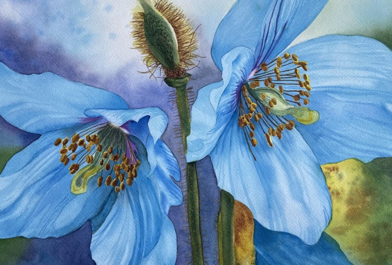
entire flower is generally than the main flower because it's in the background. We need to capture
that difference. Also note that the area under the petals is darker
than the rest. This contrast is crucial as it helps define each
shape and petal. After completing and
drying this first section, I'll switch to a size 12 brush. I'll start by applying
the dark tones to the petal and then fell in
the areas between them. However, I made a
significant mistake here. Notice how my paint has created an wash and how quickly
hard edges have formed. This happened because I didn't wait long enough for
the paper to cool down. A few moments ago, I used a hair dryer, which heated the paper. As mentioned earlier, it's
crucial to wait until the paper cools down
after using a hair dryer. Otherwise, the paint will
start drying too quickly, and that's exactly
what happened here. I really struggled to achieve
a smooth wash and blend the colors effectively
because the paint was drying very quickly
in some areas, leading to an uneven wash. Initially, I blamed the Manganese blue
hue for this issue, but it was actually my mistake. Learn from this and
make sure the paper is fully cooled down after
using a hair dryer. To be completely honest, I was very frustrated
at this stage and even considered discarding the painting and starting over. I struggled with this area and wasn't pleased
with the result. However, I'm really glad
I didn't give up because this flower and the background have become my favorite
parts of this painting. I love the texture of this
flower and how it turned out. Lately, I've developed
an appreciation for textures and imperfections
in watercolor paintings. Do you think this flower has
its own unique character? The beautiful with a slight greenish tint
from the background, making it a bit more
greenish blue compared to the reference and
the two main flowers. I think it looks really cool. Now let's move on to adding some shadows to
the main flowers.
12. Shadows on the Main Flowers: Oh. This part shouldn't be too difficult if you're familiar with the wet
on wet technique, but it will require
some patients. Make sure you have enough
time to work on it calmly. It took me around 1.5 hour
to complete the stage. The goal here is to add
shadows to the petals. We will use the wet on
wet technique to create smooth colored
transitions between the shadows and the light blue that's already on the paper. It's helpful to have
a separate container of clean water for
applying the water layer. I'm using a size 12 brush and I will paint each
petal individually. Start by applying a water
layer over the first petal. Look at the water layer from
an angle to make sure that it's applied evenly and
there are no dry spots. Next, pick up windsor blue
and begin applying it. Focus on the dark
areas where the petals overlap and the indentations
and folds on the petals. I've switched to a
size eight brush. At this stage, we're not
adding details such as veins. The goal is to paint
shadow areas and establish the basic
form of each petal. The darker spots will suggest indentations while lighter areas will indicate raised parts. This approach helps visually represent how the
petals bend and fold. After finishing the first petal, move on to another petal that isn't adjacent to the one
you have just painted. This helps prevent
paint or water from flowing to the
neighboring petals. I skipped the petals
directly next to the first one and focused
on the separate petal. For this darker petal, I started with paints gray
near the center and then transitioned to windsor
blue as I moved downward. Observe how the paint
spreads as you apply it. Adjust the paint consistency based on how much you
want it to spread. If you want to limit the spread, you can either use a
denser paint consistency, which will result in
a darker tone or wait a few more seconds for the water on the paper
to be absorbed slightly. Less water on the paper will
result in less spreading. H Try to leave some gaps between
your dark areas. These gaps will create
highlighted sections that suggest raised areas
or s on the petals. The color applied in the first layer represents
the highlights. Maintaining some lighter
gaps will help in effect. If the paint spreads too far and covers too much of the area, you can lift it out
while it's still wet. If highlights are completely covered and you can't save them, let everything dry fully. Later, you can use
a scrubber brush to lift out the paint and
restore some highlights. Now there's nothing more to
do on the flower on the left, so I'm moving on to the
flower on the right. I will start with the two
large petals on the right. I'm wetting the entire
area of the petal. Notice that I'm not
rushing the process. It's important to work
slowly and carefully. The water layer dries quickly, stay calm and apply a
second layer of water. The second layer will not dry
as fast as the first one. If necessary, apply
a third layer. Even in a hot climate, the third layer will not dry immediately due to the physical
properties of the paper. This process known
as priming involves the first layer of water
soaking into the paper quickly. This may give the impression that the paper is drying fast, but the paper remains
moist inside. The second layer of water
will stay on the surface longer because the paper already contains moisture
from the first layer. Typically two water
layers are sufficient, but if the second layer
evaporates too quickly, a third layer can be applied
to ensure proper priming. On these petals, I'm
following the same process. After applying two
layers of water, I'm adding windsor blue. The key point here is where
the darker tones are placed. The lower petal is generally with more
pronounced shadows, especially near the center, so I'm pains in that area. I'm tilting the painting
to control the movement of the paint until
it sells into place. Next, let's return
to the first flower. To make sure that the
petals are really dry, I'm using a hard dryer. For this petal, I'm not applying water over
the entire surface. I've left one area for the
highlight with hard edges. This illustration shows
where the water was applied. Start by applying dark blue
in the upper section and work towards creating a
smooth transition from dark to light blue. Oh Next, move to the lower
part of the petal and continue applying
the shades of blue. Notice how hard edges
form where the surface. Use a darker tone of blue
near the center of the petal. Once you've applied this, you can leave the
petal as it is. For this similar section, start by applying a water layer, then add some darker blue. Remember to lighter gaps
between the darker areas to ct. On this petal, in
addition to the blues, we can in a touch of magenta in the purple
area near the center. Pay attention to how
my brush strokes follow the petal shape
to ensure a natural. Oh. We're now down to
the smaller petal. I'll be painting them in the same manner as
the larger petals, so there is nothing new here. I will switch the camera angle to give you a
different perspective. Oh, Once you've completed
this stage, let everything dry completely. Taking a break from
painting is a good idea, as this was likely the most challenging
part of this tutorial. So celebrate your progress. In the next part,
we will add ins and deepen the shadows
on the petals, using a technique to
finalize the details. Congratulations on
getting this far. See you in the next part.
13. Details on the Petals: Make sure everything is
completely dry before we move on to adding more
details to the petals. We'll be focusing on
adding vein lines and darkening some shadows
using a size six brush. Start by using a light tone of a windsor blue and apply it
with a wet on dry technique. This means we'll be
working directly on the dry paper allowing us to create precise
lines and details. At this stage, I'm using a
bit of artistic license. Instead of trying to recreate the reference
photo exactly, I aim to capture the
essence of the petals. While we could meticulously replicate every
detail and shadow, we can also simplify
the process. My goal is to paint lines of varying widths to represent the folds and veins
on the petals. This is a great opportunity
to practice both wet on dry technique and
your brushwork skills. When adding vein
lines and shadows, keep the following tips in mind. Paint lines that follow the natural curves and
folds of each petal. This helps convey how the
petals are bent and folded, creating a more
realistic texture. Use the tip of the brush for thin lines and apply more
pressure for wider lines. This allows you to
vary the width of your lines to match the different folds and
veins of the petals. Begin with a light
tone of winds or blue. This way, you can see
if the lines are in the right place and
have the desired shape. If they are not quite right, you can easily adjust them. Lighter tones also make any
corrections less noticeable. Build up your details gradually. Start with the
lighter lines and add darker tones as needed to
enhance shadows and depth. This approach helps
maintain control over the final look and ensures
a more polished finish. By following these guidelines, you'll be able to create detailed and expressive lines that enhance the texture
and depth of your petals. We can also use this stage to
deepen some of the shadows. Remember, you can always employ a darker or lighter
shade of blue. Introducing tonnel
variations within those stripes will make them
appear even more dynamic. On the petals, we need to recreate the
attractive curvature. There is a dark shadow
indicating the indentation, so use darker blue tones to capture the shadowed
area accurately. It's crucial to follow the
shape of the petal closely. Although these lines
might seem random, they align with the
petal structure to effectively convey its form. In this lighter area, I'm first adding shadow
near the edge of the petal and then some stripes to
indicate the petals ness. We can also slightly
darken the area close to the edge while keeping
the edge itself lighter. This technique helps to
illustrate roundness. The form shadow is der while the lighter
edge reflects light, a common characteristic
of rounded objects. For the smaller petals, just a few curved
lines should suffice. At this stage, I'm not
closely referring to the ph. Instead, I take a mental note of the most prominent
elements, shapes, and values, and
then integrate that with my vision of what will
look good in the painting. M Oh. Near the center of the flower, we can adjust the hue to include more purple
by adding magenta. We want to retain that purpish
tint in these flowers, which have distinctive colors, blue petals, purple
centers, and contra stats. In the area of the statements, we have white filaments
and yellow anthers. Since the filaments reflect
the blue of the petals, they are not truly white. You can paint the
negative spaces between them to
define their shapes. Alternatively, if you prefer, you can also use opaque paint to apply the filaments
directly over the blue. Notice how light the color is that I am applying
to the petal. Just one tone darker than
what's already on the paper. I'm adding a saddle pattern
with these stripes to avoid a flat appearance and give the petals more visual interest. You should be able to replicate all those lines accurately. However, if you want to match
my work more precisely, including the direction and
placement of the lines, it's better to follow the
photo rather than the video. The video shows the
process and technique, but watching me paint hundreds of stripes may not
be as helpful. Before we move on to
painting the statements, let's finish the sepal on the
flower in the background. We only need to
add some texture, so this will be straightforward. Start with burn Ciena, using a six bruh, apply a of tiny marks with
the tip of your brush. For the yellow areas
used indian yellow. In the darker areas, mix pains gray with burnt sienna to achieve
a deeper brown tone. By applying lots of those
short brush strokes, we can create an
intriguing hairy texture. It actually resembles the
fibrous outer layer of a shell. Note that these marks
are straight lines, but tiny arc shapes. Finally, use a damp
brush to gently wrap the yellowish area to
soften the texture slightly. With this, we can
complete this section. In the next and final part, we will finish the painting
by adding statements.
14. Stamens: Before we remove the masking
fluid from the anthers, let's paint the
areas around them. Since the anthers
are still protected, we can easily paint
the remaining parts without worrying
about accidentally covering the yellow anthers. Start by applying various
colors between the filaments. Use purple to reflect
the purple center and in Indian yellow
and windsor blue to introduce a green hue. Apply more purple on the
left and right sides and blend more yellow and blue in the middle to create
a pleasing green. Use a very pale version of this green to paint
the main statement. The paint dries quickly because we're using very small
amounts of paint, and the technique of
painting is wet and dry. This allows us to return to certain areas and adjust their tones and
colors very quickly. Focus primarily on the tones, ensuring there is
sufficient contrast and that the area
is dark enough. Compare it with other
dark areas, for instance, if the shadows on the
petals are darker, this area might need
additional dark tones. Paint the shape running
through the middle of the statement
with a darker green. Finally mix a bit of Indian
yellow with a touch of windsor blue and applied to the tip of the sta to the tone. Repeat the process on the
center of the right flower. Start with a pale, muted green, a blend of Indian yellow, and windsor blue, toned down with a touch
of burnt sienna. Add more yellow to the tip of the stamen for a war effect. Once we have a solid
base of colors, we can start adjusting the tonal values and
colors as needed. Paint the round shapes at the tip to create
the swirly form. I initially painted between the filaments to
define their shape, but we can also
add the filaments later using opaque paint
once the base is dry. Now, let's let everything
dry completely before removing the masking
fluid from the an hunters. I'm again using my rubber
masking pickup tool. Now we can reveal
clean white shapes that we can now color
with yellows and browns. But first, let's use
a scrubber brush to gently soften the edges of the tiny white shapes
we've masked out. Currently, they appear as
cut and paste white shapes. Softening the edges will integrate them seamlessly
into the petal. If we hadn't masked them, we would likely
have painted over these areas and lost
the light effect. Alternatively, we can use white opaque paint to
paint these shapes. Now it's time to paint
the yellow anthers. Use Indian yellow
with just a touch of burned Siena to achieve
the desired color. The first layer is quite simple. All we need to do is cover everything with this base color. Use more burned Siena on the
flower on the left as it is more in shadow and more yellow on the
flower on the right. After applying this base
color to all the anthers, dry everything with a hair dryer before moving on to
the second layer. For the second layer, prepare two shades of brown. One pure burnt sienna
for a lighter brown, and a mix of burnt
sienna with paints gray, for a darker brown. Begin by applying burnt
sienna to each anther, painting shadows
while preserving the highlighted areas
from the previous layer. The yellow color from the first layer will be visible and it will
create highlights, while the burnt sienna
will create the shadows. Notice how the anthers
begin to take shape. The shadowing adds dimension, making them look like
little golden coins. Once you've finished
applying burnt sienna, switch to the darkest brown, and add a touch of it
where the anthers meet. This will enhance the
dimensionality of the anthers. Applying this dark
brown will give the anthers a more three
dimensional appearance. Notice how a single color
creates a flat shape. Adding a second tone
introduces some dimension. Making the object look slightly
more three dimensional. However, adding the third tone provides even greater depth. Making the anthers appear
truly three dimensional. This is why tonal
values are so crucial. They help us define the form
of an object effectively. Repeat the same process on the anthers of the right flower. Since these anthers are warmer
and more exposed to light, mix Indian yellow
with burnt sienna to create a lighter
warmer brown tone. Finally, apply the
dark brown to at depth and make the anters
appear three dimensional. With this, your
painting is complete. You can now sign it and
celebrate your accomplishment. If you like, you can use white guash to paint
additional filaments, though I haven't done so because I believe the existing
filaments are sufficient. However, if you prefer, you can carefully
paint filaments that connect each anther to
the center of the flower. Next, remove the masking tape to reveal a clean white border. Later, I will remove
the painting from the gator and carefully trim
the edges with staples, leaving just a wide border. In the final part
of this tutorial, we will summarize
what we've learned.
15. Summary: First of all,
congratulations on taking up the challenge and painting
this beautiful flower. It's certainly not
the easiest project, but it's undeniably unique
with its fabulous colors. I hope you are thrilled
with your result. Let's take a moment to summarize what we've
covered in this tutorial. We learned how to adjust the
reference to fit our vision, and how to prepare
an effective sketch that serves as a solid
foundation for our painting. We explored how to use the color wheel and
color schemes to our advantage and reaching our painting with harmonious
and striking colors. We delved into creating a
captivating background with beautiful watercolor
textures and added a hairy texture
to the plants, bringing them to life. We discovered how masking
fluid can help us achieve fine details like
the hairs on the plant, adding a realistic
touch to our painting. We emphasized the importance
of tonal values and how they contribute to the three dimensional
look of objects, enhancing the depth and
realism of our painting. T hank you so much for joining me on this creative journey. I truly appreciate the time you've dedicated
to this tutorial. If you've completed your
painting, congratulations. You've done a fantastic job, and I hope you are
proud of your work. Thank you very much for
watching and happy painting by
 Krzysztof Kowalski, Watercolor artist