Transcripts
1. Welcome To The Class!: Hello, everyone. My
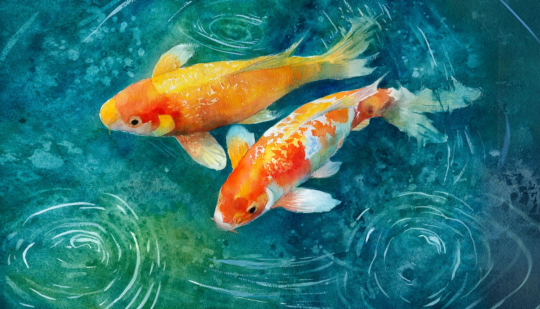
name is Will Elliston. And today, we're
painting a pair of yfish gliding through
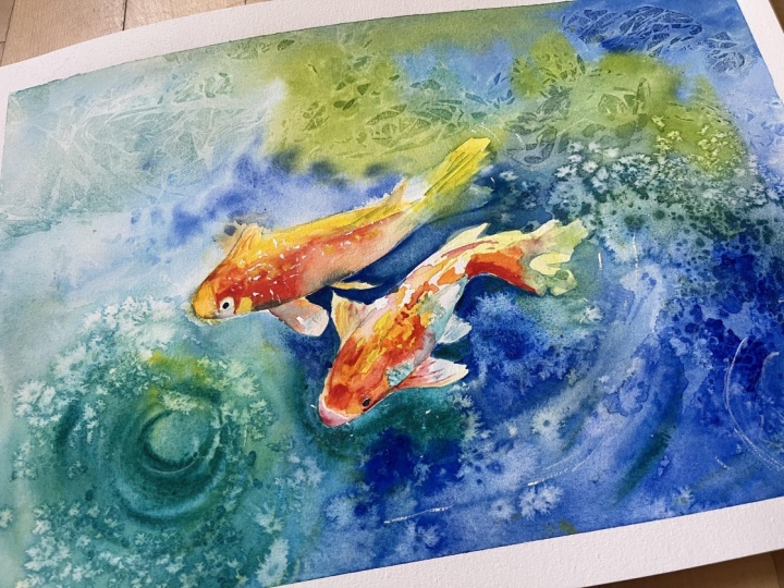
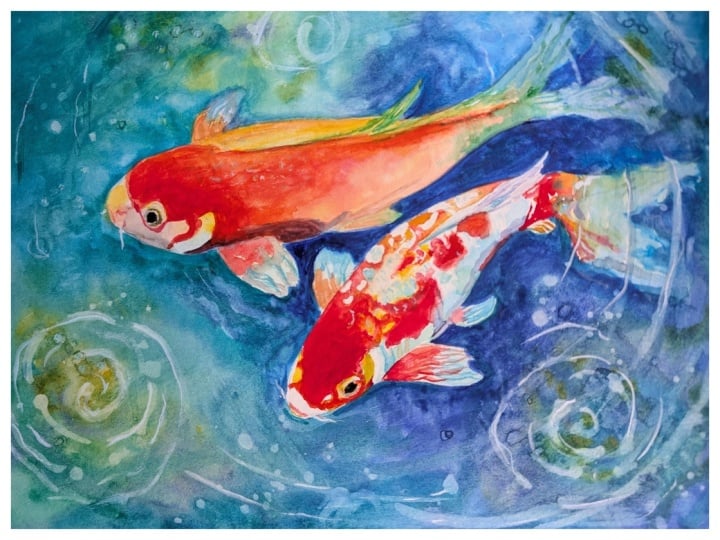
luminous water in watercolor. This subject is a joy
for color lovers, warm oranges and reds
playing against deep, cool greens and blues. We will focus on clean shapes, a simple value plan, and varied edges so the fish
feel buoyant and alive. Soft merges suggest depth. Selective accents
describe eyes and fins, and saved paper gives those
crisp, wet highlights. The surrounding water becomes
a stage of drifting color, gentle ripples and
textured passages. I've been a professional
artist for many years, exploring lots of different
subjects from wildlife and portraits to cityscapes
and countryside scenes. I've always been entranced by the possibilities
of watercolor, but when I started,
I had no idea where to begin or
how to improve. I didn't know what
supplies I needed, how to create the
effects I wanted, or which colors to mix. Now I've taken part in many
worldwide exhibitions, been featured in magazines, and been lucky enough
to win awards from well respected
organizations such as the International
Watercolor Society, the Masters of
Watercolor Alliance, Windsor and Newton, and the SAA. Watercolor can be overwhelming
for those starting out, which is why my goal is
to help you feel relaxed and enjoy this medium in
a step by step manner. Today, I'll be guiding you
through a complete painting, demonstrating a variety
of techniques and explaining how I use all
my supplies and materials. Whether you're just starting out or already have some experience, you'll be able to
follow along at your own pace and improve
your watercolour skills. If this class is too challenging
or too easy for you, I have a variety of classes available at different
skill levels. I like to start off with a free expressive
approach with no fear of making mistakes as we create exciting textures
for the underlayer. As the painting progresses, we'll add more details to bring it to life and
make it stand out. I strive to simplify
complex subjects into easier shapes that
encourage playfulness. Throughout this class, I'll be sharing plenty of
tips and tricks. I'll show you how to turn
mistakes into opportunities, taking the stress out of
painting in order to have fun. I'll also provide you with
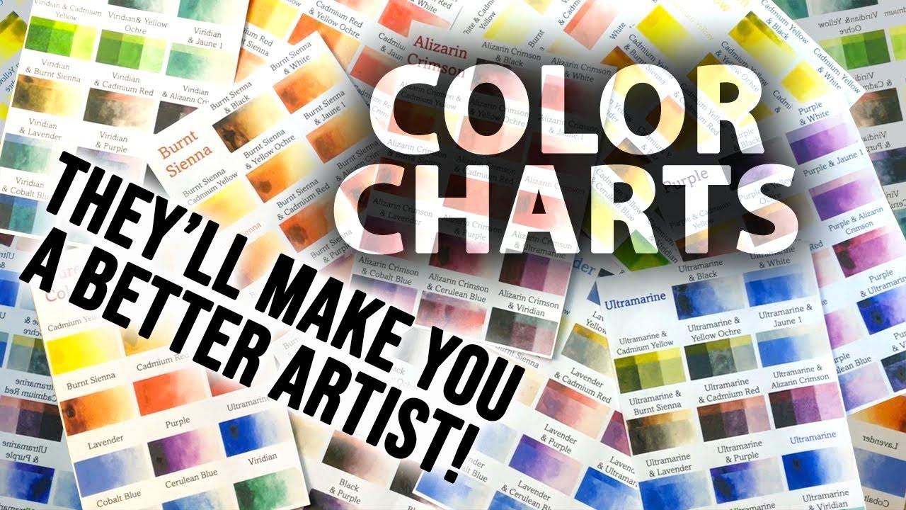
my watercolor mixing charts, which are an invaluable tool when it comes to choosing
and mixing colors. If you have any questions, you can post them in the
discussion thread down below. I'll be sure to read and
respond to everything you post. Don't forget to follow
me on Skillshare by clicking the Follow
button at the top. This means you'll be the
first to know when I launch a new class
or post giveaways. You can also follow me on Instagram at Will Elliston
to see my latest works. So let's get started and paint Koi that glow with
movement and calm.
2. Your Project: Thank you so much for
joining this class. Our aim is a serene
painting in which two koi fish feel weightless and the water
breathes around them. Thinking broad
silhouettes, letting the warm koi colours glow
against a cool, harmless pool. Keep the water loose and layered with soft
transitions that sink into depth and delicate rings that hint at surface ripples, suggest scales with broken color rather than tight detail, and let a few decisive
accents carry expression, preserve fresh
whites for sparkle, allow granulation
to become texture, and give the composition space so the calm mood can settle. In the resource section, I've added a high
resolution image of my finished painting
to help guide you. You're welcome to
follow my painting exactly or experiment with
your own composition. As we're going to be focusing on the painting aspect
of watercolor, I've provided templates
you can use to help transfer or trace the
sketch before you paint. It's fine to trace when using it as a guide for
learning how to paint. It's important to
have the underdrawing correct so that you can relax and have fun learning the
watercolor medium itself. Whichever direction
you take this class, it would be great
to see your results and the paintings you
create through it. I love giving my
students feedback, so please take a photo
afterwards and share it in the student project gallery under the project
and resource tab. I'm always intrigued to
see how many students have different approaches and how they progress with each class. I'd love to hear
about your process and what you learned
along the way, or if you had any difficulties. I strongly recommend
that you take a look at each other's work in the
student project gallery. It's so inspiring to see
each other's work and extremely comforting to get the support of your
fellow students. So don't forget to like and
comment on each other's work.
3. Materials & Supplies: Before we get started
with the painting, let's go over all the materials and supplies you'll
need to paint along. Having the right materials can greatly impact the
outcome of your artwork. So I'll go over all the supplies I use for
this class and beyond. They're very useful to have at your disposal and we'll make it easier for you
to follow along. Let's start with the
paints themselves. And like most of the materials
we'll be using today, it's a lot to do
with preference. I have 12 stable colours in my palette that I
fill up from tubes. They are Cadmium
Yellow, Yellow Ochre, burnt sienna, Cadmium
red, Alizarin Crimson, tramarne blue, cobalt blue,
serlean blue, lavender, purple, Viridian, black, and
at the end of the painting, I often use white gouache
for tiny highlights. I don't use any
particular brand. These colors you can
get from any brand, although I personally
use Daniel Smith, Windsor and Newton
for Holbein paints. So let's move on to brushes. The brush I use the most is
a synthetic round brush like this Escoda Purl brush
or this Van Gogh brush. They're very versatile because
not only can you use them for detailed work
with their fine tip, but as they can hold
a lot of water, they are good for
washers as well. They're also quite affordable, so I have quite a few
in different sizes. Next are the mop brushes. Mop brushes are good for
broad brush strokes, filling in large areas and creating smooth
transitions or washes. They also have a nice tip that can be used for smaller details. But for really small details, highlights or anything
that needs more precision, I use a synthetic
size zero brush. All brands have them,
and they're super cheap. Another useful brush to have is a Chinese calligraphy brush. They tend to have long bristles
and a very pointy tip. They're perfect
for adding texture or creating dynamic
lines in your paintings. You can even fan them
out like this to achieve fur or feather
textures as well. And that's it for
brushes. Onto paper. The better quality
of your paper, the easier it will be to paint. Cheap paper qwinkles easily
and is very unforgiving, not allowing you to
rework mistakes. It's harder to create
appealing effects and apply useful techniques
like rubbing away pigment. Good quality paper, however, such as cotton based paper, not only allows you to rework
mistakes multiple times, but because the pigment
reacts much better on it, the chances of
mistakes are a lot lower and you'll be more likely to create
better paintings. I use archers paper because that's what's available
in my local art shop. A water spray is
absolutely essential. By using this, it
gives you more time to paint the areas you
want before it dries. It also allows you to
reactivate the paint if you want to add a smooth
line or remove some paint. I also have an old rag or t shirt which I use
to clean my brush. Cleaning off the paint
before dipping it in the water will make the
water last a lot longer. It's always useful to
have a tissue at hand whilst painting to
lift off excess paint. Also, you never know when an unwanted splash or drip might occur that needs
wiping away quickly. I also have a water dropper
to keep the paints wet. When you paint, it's
important to have them a similar consistency to what
they're like in the tubes. This way, it's easier to
pick up sufficient pigment. A hair dryer is useful
to have for speeding up the drying time and controlling the
dampness of the paper. And lastly, masking tape. And this, of course, is just to hold the paper down still onto the surface to stop it sliding
around whilst painting. Also, if you plan on
painting to the edge, it'll allow you to create a
very crisp, clean border. And that's everything
you need to paint along in today's class. Now, let's get on and
start the drawing.
4. Preparing The Composition: So when drawing this out, forget for the time being
that you're drawing fish. Just think of the general shape. So I'm just drawing
some ellipses, and I'm trying to make
it very gesturial. I'm thinking about the gesture, the rhythm of the lines, going over it again and
again and again with a soft lead pencil,
just mapping it out, adding some ripples, and
then we can switch over to a finer line and look at the details and bring out
the character of the fish. So this top one is angled outwards as if it's
going up towards the left. And the fish on the bottom
is kind of angled downward, so it's kind of
flowing downwards. So it's creating a kind
of sense of movement. And I just kind of be a bit more abstract
with the fins at the back, the tail because
they're going to be distorted by the flickering of the water, the
ripples of the water. But the most important
thing is to make sure the silhouette of
these fish are very clear and easy to read because the fish are going to
be negatively painted. So, of course, we're going
to paint the colors inside, but we're going
to use the water, the dark pigment of the water
to paint around negatively. So we need a clean
edge to this drawing.
5. Fin Underlayers: We're going to start this
painting by painting the fish first and then
the water around it later. But if we want the fish to blend into the water rather than just look
like it's stuck on, we're going to have
to think about which parts of the fish are
deeper into the water. I want to create the feeling
that they're coming up to the surface maybe to feed
or something like that. So the heads are going
to be a bit brighter. On the top of the fish, going to be closer
to the surface than the tails and the fins. So I'm pre-wetting
these tails and fins, and we're going to add a
little bit of cool pigment to contrast with that warmth of the fish that
we'll paint later. So I'm using clean water just to pre wet the
paper in those areas. And now I'm mixing some serlean blue and just dropping it in. And because I pre-wetting the whole of the area around it, it'll be a nice soft
edge, no hard lines. And this is just a nice
way to ease ourselves into the painting process because having a pure white canvas
could be quite intimidating. So just starting
off step by step, a bit of Viridian green. It doesn't matter if
you have a few marks outside because
we're going to be painting the background a nice rich dark blue,
much darker than this. So we'll cover up the
mistakes later on. And there's really no
rule in these areas. You could have it
as green as you want or as blue as you want. Whatever color that you
want to have your water, drop it on nice and softly. I'm mixing in a bit of
yellow into this water mix. It's kind of green
turquoise mix on the tail. Creating a bit of variety
within all the cool colors. Blending it over all
the fins and the tails. Dropping it in. A nice
wet on wet soft texture. With this one on the
left at the top. I'm not going all the way to the fisher's body, just the tip. And I'm even painting a
bit of the gills here.
6. Adding Yellow: Now we can start
incorporating some yellow, some pure Cadmium Yellow, a lovely vibrant color
when it's kept pure. And I'm using it
purely on the top of the gill here as it blends into that turquoise green blow, very light because it's just an underlayer
for the time being. Filling out this bottom
thin on the top fish, a bit more green than blue. Working a bit more
of that back tail. It can be quite hard to
judge your values at this stage because we don't
have any darks on the paper. It's all light at the moment, so we've got to consider
how dark it will get. But we don't have to be too harsh on
ourselves because we can always add more
pigment later. And if it's too dark, we
can always scrub away. So even though watercolor is seen as an
unforgiving medium, there is actually quite a
lot of flexibility with it. We can still edit and
correct mistakes later on. So you shouldn't be feeling
hesitant or fearful. There's always an opportunity
to correct in the future. So that's just about it
with the fins and the tail. Maybe the central
fin we can fill in with that Yellow
Ochre kind of color. This is just so that again, it's not a complete cutout. So not all the edges
are going to be hard against the
dark background. We want some areas to blur and blend in to make
it more seamless, creating that
variety of edge. A.
7. Top Fish Underlayer: Now that we finished
the fins and the tails, we could start painting the
main body of the top fish, and I'm going to use pure
Yellow Ochre to begin with, so you don't need to worry about mixing any oranges
for the time being. Just straight from the pan, I'm using a pure Cadmium Yellow. Using a very strong
consistency at the top. It's not thick. It's not pasty, but
it's not watered down. You can see it's
got full vibrancy. And then once we cover that
top plane of the fish, we can use pure water
to blend it out, and as it curves
down to the side of the fish, it becomes thinner. And that's how we create
that illusion of form. Now, that top thin looks
a bit odd staying white, so I'm going to use a bit of Yellow Ochre
to paint that section. I don't want it to
be exactly the same. I want there to be a
bit of a difference. If I were to use Cadmium Yellow, it would be hard to see where the thin ends and
where the body begins. And it gives it a
nice golden color. It's tonally different too, rather than adding
black to a yellow, which will actually make it
look a bit muted and green. We can use Yellow Ochre, which just makes it
seem like a golden hue. A little bit of red Cadmium red, that is on the tip of my brush, nice and diluted whilst
the yellow is silo wet. And again, that creates a
kind of golden feeling. Of course, red and
yellow do make orange, but it's just the
slightest bit of red, so it actually makes
it feel golden. Now I'm going to clean my brush, and using pure water, I'm going to wet the rest
of the area and you can see how it's going to
blend down bit by bit. Notice that I didn't
do it straight away. I allowed the yellow to
dry a tiny bit first because if I did it when
the yellow was very wet, shimmeringly wet, then it would just blend down and it would be in a very flat wash. So I gave it time to
absorb and dry a bit so that the sheen of the paper wasn't white. I
wasn't glistening. Had no strong reflection. And that means that there'll
still be a soft edge, and you can see how
that yellow blends gradually as it curves
around the body. And now we can start
thinking about adding the red to
make it orange.
8. A Touch of Grey: But before we start
adding the red, I'm mis using black
or neutral tint. It's a completely
muted gray color, kind of the opposite of what
this painting is about, which is about nice, vibrant oranges and greens. But adding this gray here, a little touch of gray that
contrast is quite powerful. If you think about it
the other way around, if you have a gray
scene or a painting that's muted and you just
have a touch of vibrancy, how powerful that tiny
spot of vibrancy is, this is a similar kind of thing. Having a painting that's fully vibrant and a few
spots that are muted, it's aesthetically pleasing
to have that contrast. Then touching some burnt
sienna around the eye because, again, I don't want the whole of the fish to be full vibrant. Adding that little
bit of variety is what makes a painting
interesting, but it's controlled. And then within that
controlled section, we can be playful. So we're following the rules
of art and composition. But because we're
using those rules inside the framework
of those concepts, we can experiment and be abstract and
create fun textures. So I wanted a bit more
strength in these fins, so I'm using that
yellow, pure yellow, and then water to spread it out. You can also use a
tissue if it's too strong to suck out
some of that pigment. I want to add some subtle
lines to this fin, where you can imagine when the fins close,
it's got creases. Little shadows, and that's
what these lines are about. It's very subtle
for the time being. We can emphasize these later. But I'm just making
the most of the wet on wet stage at the moment.
9. Mixing Orange: Now we can start being very
bold with this cadmium red. Starting off in light,
then building up. So I'm mixing my oranges
mainly on the paper. I'm not really using my palette to create
those oranges yet. So I now know that area is dry enough so I can paint
around that gill. And because the wash above dry, you can see how it's blending
orange into that yellow. If you're not used to
mixing your colors on the paper rather
than on the palette, then you can always
start off slowly. You don't need to go
bold straightaway because some pigments are
more potent than others. When mixing an orange, for example, the red is much
more potent than the yellow. So you don't need as much red as yellow to find the
middle ground. So I've added quite
a lot of red there, but I need to make up for that
by adding more yellow now. And I can actually
take away some of that red by making
a thirsty brush and then washing it on my
sponge or on a towel. Then bringing that wash down
right to the very edge, we're creating a nice clean
silhouette of the fish. But within that silhouette, we can start thinking
about form and texture. So you can see there's a
general center line at the top, where the orange is
on one side and it's yellow on the other that line follows the very
top of the fish. And then we can think about
the curvature on each side. But I'm not being
very scientific and specific with it. Oh. Painting around the
eye, creating layers. Making it a bit richer. Having fun experimenting
with the variety and all the different combinations between orange, yellow and red. So we've got pure
yellow in some areas, we've got pure red right here and experimenting with
everything in between. Making the most of this
wet on wet stage by now dropping on pure water. And because we had yellow
for the underlayers, we put red on top, when
we put on pure water, it pushes the red away
to create orange areas, allowing watercolor to
do its thing for us.
10. Fun Textures: Using a tissue
every now and again to soak up the water if
there's too much on there. So again, you can
see from the tip of the fish going up to the
middle, there's a line. It's an abstract line, but if you squint, you can see that it flows goes along the top
in the middle. And I'm trying to preserve
that quite clearly. And then everything is quite
abstract on the other side. It's that main line that
creates that feeling of volume. But I make sure
it's a soft line. Then we've got the
hard line where the eye is going horizontally
across the fish, and that also helps give
the fish a bit more form. It helps describe the angle and the curvature a bit better. That line was getting
a bit too hard, so I just using water
just to soften it out, scrub it around a bit. H. And you can see towards the end of the
fish where that middle thin is before we reach the tail, I've got a hard line there. So I've got a hard line contrasting against
the soft lines. And now I'm painting this fin here with basically a pure red. There might be a touch
of yellow one there. But again, I'm making the
most the full potential of all the colors from pure red
to pure yellow and orange. I'm mixing a bit of
ultramarine and mix with it, it actually creates a shadow. It's like a purple color. And actually, with the orange, it makes gray. It neutralizes itself. But I'd prefer to
use this blue to create a shadow than pure black because they're
complimentary colors. It's always going to
be more interesting. Dropping more pure water
as it starts to dry. And the more texture
that you want, the more you can mess around
with the drying times, getting it almost close to dry
and then wetting it again.
11. Top Fish Tail: Now it's time to start
painting the tail, and instead of using orange, because that tail's underwater, I'm going to mix
green in with it. So Viridian green mixed with that bit of that orange
that we used before so that it's nice and
harmonized and blending it bit by bit into that
water we just painted. Every now and again, using
pure Viridian due to its nice vibrancy using some thin strokes at the top, again, to define or describe the crinkles in
the fins on the tail, where the shadows are forming. Again, creating a
variety of texture. We've got the nice wet on wet soft blendings going
on in the body, and then we've got the kind of sharp staccato line
work going on the fins. Now that we've given these
fins a bit of time to dry, adding a few more crinkles
to those as well. Adding some cerrillan there
to make it a bit stronger. Now that the thin areas
have dried a bit more, I'm going to go back
and add a few more of these lines for where they're folding,
creating sharp shadows. And it helps make them
a bit darker because now that it's dried, it looks a bit lighter
than it did before. So I'm feeling that it has to be a bit more darker and adding a bit of
warmth to that one, just to play on the contrast
between cool and warm. Making this eye a kind of ring, so adding that line at the bottom to make it a bit
of a circle around the eye, connecting it with the two
sides, softening this edge.
12. Starting The Bottom Fish: I'm using a light wash of
Burnt Sienna just over the eye on the bottom
fish, just to cover it. And then I'm going to soften
the edge with a clean brush, and a bit of a tissue to kill
the whiteness of the area. Because the top fish, we painted with a kind
of wet on wet technique. We painted it underlay, and then we have a nice
expressive with wet on wet blotting of pigment. But this bottom fish, we're
going to do differently. We're going to use hard edges. It's got a kind of
speckled texture on there. So we're experimenting with
two ways to paint these fish. We're not going to use a
wash for this bottom fish. I'm adding just an
accent of orange here. It's actually pure red. And tiny little accents like that give the
painting this feeling of detail and sharpness without actually having to paint all that
painstaking detail. It just gives the illusion
of detail without actually having to do all that
heavy lifting, that work. That said, this fish is a bit more fiddly
than the last one, but that doesn't actually
mean it's more difficult. As long as we've got
the pencil lines clear, it's just like coloring
in, painting in numbers. So at the moment, I'm thinking
of it as a single wash, even though there's a kind
of intricate shape to it, I'm filling it out
as if it's one wash, so I'm using pure
yellow to begin with. And slowly starting
to add red into it. And, of course, the red
blends with the yellow itself to create orange. So I'm filling out
the largest shapes first, the broadest shapes. And then we got to think
about how to connect them. And notice how I've
switched to a smaller brush now compared to the larger brush we used with the fish above. So I'm purposely not painting
in every single area. I'm adding little dots and then connecting them
to the main shapes. The good thing is it's
a limited palette, so it doesn't matter
whether it's yellow, orange or red, they'll all mixed together
and be harmonized. And because we have
a strong silhouette, it already feels
like it's a fish. We don't need to think about
the perspective too much. The form is kind of illusion.
13. Adding Cools: So as long as I keep
some of those whites, I'll be happy. The
white of the paper. That's what makes this
particular fish stand out preserving those whites because they'll be the lightest
part of the painting, and they'll contrast with the deep blues and greens
of the background, and, of course, the
reds of the fish. And because of this
high contrast, that makes this fish
the focal point. The fish above is actually
the secondary fish. This is the main character. It has more visual
stimuli going on. So you can see with this fish, starting from the front
that there's a kind of clear blend from red to yellow. Red at the top, and it blends
in the middle to yellow. It's they're both still orange, but it's a red
dominated orange on the top half and a yellow dominated orange on
the second half. And then as we move towards
the back of the fish, as we go along, you can
see how we're starting to integrate a few
whites of the paper. So on the front half, they almost look
like white spots. But when we get towards the center of the
fish at the top, you can see it converts
and it no longer becomes an orange fish
with white spots. It becomes a white fish
with orange spots. So there's a gradual
transition from white spots to orange spots as we move
across the back of the fish. You can see these
aren't really spots. At least they're
not clean spots. They're not perfect circles. They're very organic
random shapes. And I just have the pencil
lines as a kind of guide. I'm not being completely
loyal to them. I just have them there
to help guide me so that I'm aware I need to
preserve the white areas. And again, there's more white on the middle of the
fish than at the front. And this underside
that I'm painting now, I'm influencing and
integrating some blues, some Carillion
blues or turquoise. And at this stage, I'm trying to be careful
not to blend them with the wet washes of the
yellow and the orange. I'm trying to keep them
separate for the time being because I like the vivid, vibrant nature of these
turquoise Cerian blues. And if we were to mix them, they would lose that vibrancy. So especially here where I'm getting right to the edge of where the orange
meets the blue, a bit too strong there, so I
use a tissue to dab it out. Mixing in a bit of
viridian green instead. Also, something to be wary of that central line at
the top where the fin is. You're going to make sure
that's a clean, readable line. So on the top fish, you can see it's a clean, sharp, orange line bordering
the yellow wash. And on this bottom fish, it's a kind of white line. And I even added a blue
stroke to help to find that central line where
the fin pops out the back. And that anchors it,
so it's not all chaos.
14. Warm Splotches: This yellow area
has 80% dried now. It's not completely dry and
it's not completely wet. And this is a perfect time to start dropping in some reds. And this red it is very potent. So it might look like it's
thick, but it's not actually. And I want it to blend
softly into this yellow. That's why I'm adding it before the yellow
is completely dry. It's not the end of
the world, though. So if your yellow has dried, you don't need to
risk re wetting it. I'm just adding in
these organic spots. There might be a subtle kind
of description of the curve. The shape of these
spots are kind of angled in a way that define
that curve going around. But I'm making sure to keep
that central line clear. In your mind's eye, imagine that there's lines
following the curve of this fish going around like a grid that's placed
over the shape. And you can paint
these little spots so that they're in line
with that mental grid. It sounds complicated,
but you don't have to be completely
strict with yourself. It's just a guide to help you. And you can see I'm not clearly following any defined grid. It's just a little
mental practice to help. We wouldn't want to draw or
grid on the fish and paint directly on it
because it would look too contrived and too organized. It will lose the organic feel. Here I'm using pure
red cadmium red on the white of the paper. So there's no yellow
in this area at all. And there's something
about that contrast between the yellow on one side
and pure red on the other. It's quite exciting to me. Especially as we've added that green underlayers wash
right next to it, because green and red are
complimentary colors, much like orange and blue
are complimentary colors. This green and red look
beautiful together. So most areas of these fish are, of course, orange,
and that's done on purpose because the
background will be blue. It's complimentary
color with watercolor, and actually every medium, we've got to think ahead about the full composition
before we even paint it. So because we're going to use that blue
in the background, the orange will
compliment it very well, but because we've got red, we want to add influences of
green to complement the red, and the compliment
of yellow is purple. So we may want to add
some areas of purple as well into that blue wash. Even though we're
not painting it yet, it's something to consider
in our mind's eye. The good thing and fun thing, the liberating thing
about painting ifsh is that they
have so many organic, almost random textures on there. So we're really quite free when painting out these little textures
and shapes and spots. We don't have to be so
defined or accurate with them as long as we've
got the anchor points, the edges, the silhouette,
15. Refining Details: Now at the front of this fish, I'm just adding a little bit of pigment. It doesn't
really matter what. I'm going to use a little bit of Alizarin Crimson mixed with a
green to mute it out a bit. But you can use anything. Just to fill out this
silhouette a bit more. Helps create that
illusion of form, having a bit of a faded
edge to the fish. And I can extend
it as we move up. Then I might add a little bit of a shadow around the eye area. I'll be coming back over
the eye with pure black. But I just want to define the general shape around
it to begin with. The little curve that
goes underneath it. This is a good example
of me trying to work out how to make it work, how to simplify all the details into something
that's easy to read. It usually means squinting and then just blocking it out into a kind of simplified tone
and then connecting it. So adding a bit more orange. Bit of Alizarin Crimson
to make it a bit darker. Then using pure
water, a tiny bit, just to blend it upwards so that the edge of that shape
is a bit sharper. I need to add a bit more
distinction between this fin and the body
because at the moment, it's not very clear
where the fin attaches. So I'm using that
Alizarin Crimson mix. It's kind of a warm red color. Rather than orange red
color, it's more purple. But I'm adding some
orange into that now and then using a wet brush, blending it out at the edge. Then adding some strokes. So that we have a more textured
transition into the fin. I use a tissue actually to dab it rather than using water. It doesn't need to be
such a clean transition. Making it a bit more textured. H
16. Complementary Colours: Now it's time to paint
the tail of this fish, and I'm going to
use some lines to help define the curve a
bit to describe the form. So using a nice strong red and
using the tip of my brush, I'm just adding a little line that follows the curve upwards, then allowing a little
bit of the white of the paper to be preserved
in between that. Then we can start filling
out the rest of the area. At the moment, it's
pure cabm red. Then we can blend in some
yellow again to make it orange. Trying to keep it quite dynamic. Like I was saying before, purple is a complimentary
color to yellow. So I was looking for an
opportunity to use it, and this is a good
place to do so. So I've mixed some
purple on my palette, which you can mix yourself
if you don't have purple using any of your
blues and cadmium red. You can even use
Alizarin Crimson. But I prefer to use Syrian blue or turquoise
blue and camium red. And I'm playing
around with shapes and kind of abstract blending, so I've mixed a bit of green
to blend around there. And whilst it's wet, I'm
painting the border with orange. Because as this tail goes
deeper into the water, it becomes more muted and green. And within these muted colors, there's really no rules. I could make an excuse
to use any color really because it's just subtle. Just an excuse to have some fun. So I'm adding a bit
more purple here. Although it's quite dark. I'm using the purple to
describe more shading. A bit of green. Because
you have your core colors, which is obviously
orange at the moment. But within those core colors of whatever painting
it may be because each painting will have
a different core color, you can influence whichever
color you want into that. Little touches, and that's what creates the magic of having that harmony because
we're not adding colors that are
stealing the attention. They're just subtle things that influence it and create a
little bit of interest, a little bit of a variety.
And it's that balance. It's not overdoing it
that makes it special. That purple that I
used is very subtle, and most people viewing the painting
wouldn't even notice it unless I actually
pointed out, and that's not a bad thing. That's the way it's meant
to be. It influences the image without it
being overwhelming.
17. Painting The Eyes: Now I'm just adding a little bit of pure water over where I want
to paint the eye, giving it some time to absorb. It was just a tiny
bit of water just so that there's a slight
softness to the edge. And I'm using a dark
black bit by bit, starting from middle,
working my way outwards. I wouldn't want to start
outwards and work my way in because I want to make
sure the shape is right, so starting in the middle and then working my
way out bit by bit. And notice how these
aren't perfect circles. They're at a slight angle, following the
perspective of the fish. So this bottom fish, it's even more angled
compared to this top one and let that
dry out completely. And if there's too
much contrast between the black and the
color of your fish, make sure it's dried
completely and then you can go over with a very light wash
without interfering with it.
18. Pre-Wetting The Background: Now, when you're
happy with your fish, it's time to paint
the background. And I'm just preparing some
salt flakes I've got here. I usually go with
table salt very fine, but this is the first time I'm going to experiment
with large flakes, so I'm interested to
see how it'll go. I'm just pre preparing it
and putting it on the side there because I wouldn't want to mess with that halfway
through this wash. The idea of this
stage is very simple, but the execution is a
bit more complicated. So the idea is basically to
paint around all this area. So we're negative painting
the shape of the fish. But as you can see, it's
quite an intricate shape with a lot of different
edges going on, a few nooks and
crannies going on. So I'm using pure water to pre wet all that area first before we even
touch the pigment. And this acts as a
kind of safety line. Because it might take a bit of time to paint
around all of it. And we don't want to
leave any hard edges or at least we want to
minimize the hard edges. So pre-wetting it
just helps out a bit. I'm starting by not even
painting around the fish, just filling out the
outside area first with pure Cadmium
Yellow to start with, and then I can start integrating
whatever color I want. I'm starting to
integrate turquoise, a bit of serlean blue, and using the tip of my brush, you need, ideally, a larger
brush that still has a tip. You can see that my
brush isn't huge, but it's enough to fill
in a lot of pigment, but it still has a
nice tight point. And when it comes to colors, these are just
general guidelines. I encourage you to
experiment and explore. The basic idea is that they are cool colors and they complement
the colors of the fish. So even though I
started with yellow, blue is going to
be the main color. But I put that yellow down there because as it
mixes with the blue, it's going to make a
lovely green color. I'm not being too precious about what colors I actually
use at this stage. I'm just trying to cover
the area as fast as possible without
jeopardizing my precision because I don't want to
paint over these lines. So the priority at this stage is not to get your colors right. It's just to get the general feeling of the colors that you want
and fill out this area. Because we can always add more and more
colors as we go along. I'm trying to avoid
any hard edges. So I'm going back and forth
from the top and the bottom, each section so that no area
dries with a hard edge.
19. Working Fast But Precise: And when I move
from each section, I start off with
pure water just to spread it out a bit
more to give me time. I can use water that
I've already placed, pigment that I've
already placed on the paper to go back
and refine these areas. Try to keep it wet on wet. I don't want any area ideally to dry at this stage because I don't want there to
be many hard edges. But it doesn't actually matter in the end of
the day if there are some hard edges because
this water area is going to be abstract. It's not meant to be
anything definite. So you don't need to
stress too much about keeping it clean because the goal isn't to have
this water clean. It's easy to get over excited when adding lots of fun
expressive strokes. And sometimes I've actually
been so careful painting out the edges and the silhouette of the shape that when it comes
to the expressive parts, I just accidentally paint straight over them
into the main subject. Once we've painted
up at the edge, we can start adding more pigment to make sure the tone is right. Oh And if there's some areas
that are completely dry, you can use the water spray, but you have to be very careful that you don't spray the fish. I'm not scared to use pure
water and use lots of it. I'd rather there be
too much water on the paper than too
little at this stage, because we have
not enough water. I'll just dry too quickly and create too many hard shapes, and different sections won't
be well connected anymore. Paper quality has a lot
to do with it as well, because it's been a long time since I've used anything
but cotton based paper, but I know from experience
from using it in the past that non cotton based
paper doesn't dry evenly. So not only does
it crinkle a lot, but some areas just
for some reason, dry much faster
than other areas, and it creates a
lot of unevenness, which makes it difficult when you're painting large
washes like this. But again, it doesn't
need to be a nice, clean, even wash. And it's better
to work with precision than speed because we don't want to paint over these delicate fish
that we spent a long time painting inside of The strength of this painting relies on this negative
painting technique, the clear silhouette
of these fish. If you do end up painting
over some of these lines, if you go further
than you meant to, you go over the pencil lines of the drawing or
the silhouette, then we can correct
them at the end with transparent
watercolor gouache. So we're tightening in now. Notice how I don't go over
all of it one by one. I go back and forth
between each area.
20. Negative Painting: The tail is a bit more
abstract because it's going to be distorted
by the ripples, which is a blessing and a curse because it's going
to be more abstract, but sometimes it's harder to
work out abstract things. So at the moment,
I'm just painting the general shape of the tail
of the fins at the back. And we can deal with
it a bit later. The most intricate
part actually is the bit in between the two fish. But luckily, because
they're almost touching, we can kind of conveniently
connect the wash later on. Adding some really strong cabium yellow into the wash now
because it's still wet on wet. Now we can start painting
in between the fish, and I'm starting off quite strong with quite heavy pigment, and then we can use that pigment to spread out and connect. If I started light, I'd have to keep on adding
more and more and more. But if I add more pigment than I
actually need in that area, I can use that pigment to
spread out into other areas. And then by doing
that, it becomes weaker becoming the consistency
that I actually want it. With the tail, I'm adding a lot of swiggily kind
of curvy shapes. I'm trying not to keep
any straight lines on the tail because I want it to be distorted by the ripples on
the surface of the water. I over painted slightly on
the top of that top fish. The tip of my brush to gradually define the
end of this tail. And now I'm aware that it's
too light in this area. So which ether way
I paint it now, I'm going to come
back to it after it's dried out to darken it a bit,
but I'll have to be later. Now adding some pure water to start making a bit
more abstract, adding a bit more texture. And then without even
cleaning my brush, I can use the water and pigment on my brush to start
filling out this area a bit. And now you can really
start to see the contrast between these blue areas and orange dots and the dark pigment contrasting against the white of the paper that we
preserved on the fish. Using the TIF my brush to
paint the outline and then just filling it in and
then connecting it. Now, in hindsight, I've probably
left it a bit too late, but I'm going to sprinkle
on some salt now, and it strangely feels
like I'm feeding the fish. As I said, it's my first
time experimenting with such coarse salt flakes. But I'm okay experimenting
because the background, this water doesn't
need to be clean. So it's a good
opportunity to have fun being playful
and experimenting with different textures
and connecting this last bit into the main wash. And now
everything's connected.
21. Correcting The Tones: Now we've painted out
the silhouettes of the fish and covered the
whole of the water area. We can start being playful
and messing around. And we can do this
in numerous ways. We've already added the salt. Some areas have dried, so I'm just re wetting
them and activating them because I don't want there to be any hard edges where I
don't want them to be. I don't mind having some
hard edges later on, but I don't want them to
be in distracting areas. First of all, I've
got to think about possible shadows in the water. So I'm not sure how deep
I want this pond to be, but I'm going to make it slightly darker
directly underneath the fish to imply the shadows
on the bottom of the pond. And this is pure ultramarne. I'm excited to see what colors or choice of
blue you're going to use. And I'm using this
dark pigment to start implying ripples and swirls in a circular motion
going all the way around. And now I'm not afraid to
add really thick pigment. This consistency is
straight from the tube. If you're using pans that
are already pre dried, you really have to reactivate
them with water to get them a nice kind of jam
like consistency. Then I'm using a larger
brush now to add pure water and re agitate areas that have dried Now, when we use pigment that's
so thick like this, we've got to be aware
that when it dries, it's going to dry a lot
lighter than it looks, so we've got to overcompensate. We're doing a lot
of the color mixing directly on the paper again, which keeps everything nice and harmonized because
when we swirl the brush, not only are we
dropping pigment that we're picking up pigment and we're placing it on other
sides of the canvas. So it's all very
harmonized together. Maybe we can add
a bit more salt. And then this gets all mixed around as we continue painting. Dropping some pure water. There's some areas that
we can be a bit more abstract and some areas that
we can be a bit cleaner. This bottom left area and
maybe bottom right area, I want to be a bit cleaner
because I'm going to add ripples onto
the water later. Mixing again, some
pure yellow in there. Yellow isn't such a
strong pigment, actually. So when you mix other
colors with it, like the green and the blue, it just disappears very quickly. Because I don't
actually want there to look like there's
yellow in the background. I want green, but because I know this blue mixes with the green, it's safe to add yellow. Quite a lot more salt. Salt is best used when you put it on and
leave it untouched. So this isn't actually the
ideal way to use salt. I'm just doing it
because I don't mind experimenting and
why not really? They're just having
fun messing around. But if you want to make
the most of your salt, you should place it fairly
early on and just let it be.
22. Playing With Textures: So we've now built up the
tones a lot more than the first pass in
painting this water. Now I'm going to
start redistributing these little puddles
that have been picked up and place them in areas where I want them
to be more contrast. So up here on the
top of this fish, I want it to be a bit darker so that that silhouette
is a bit cleaner. That's really swirling
the brush around. You can see how wet my paper
is because it's really crinkled and forming little
valleys and little mounts. But because I've got the paper
really tightly taped on, it will dry flat again. Adding a few more of these
ripple lines wet on wet. But because the paper is
still actually sodden. It's so wet at the moment. A lot of these lines would
just dissipate and disappear, but that kind of helps
the illusion because I'll keep on adding these little
ripples as the paper gets drier and the
drier it gets, the more they'll
hold their form. So they'll start off
being very soft shapes, then gradually getting
tighter and tighter, which gives it a bit more depth. Just dropping more
pigment in where the salt is and underneath this fish. Notice how I've got
different areas of coolness. I've got pure blue, I've got very green areas. So turquoise areas. Now flicking pure water, and I'm going back and forth between using the hair
dryer to get it almost dry, a few more flicks and
the hair dryer again, just to agitate it darkening this bottom corner a bit more. Again, ideally, if you want to make the most
out of your salt, you have to let it
dry naturally so that the salt melts
has more time to melt. But I have more fun experimenting
with the hair dryer. So I'm kind of sacrificing
the salt effects now and just messing around with
the hair dryer and blotting it with more water. As the paper starts to dry, it's starting to
flatten out again. So I can pick up these little pools of
pigment and water and redistribute them on the little mounts where
it's a bit lighter.
23. Lifting Off Pigment: So now the paper is
dried completely. Even where the salt is, I made sure that it's
completely dry, and I'm flicking it
with pure water. There's no pigment. So if
it goes over the fish, it doesn't matter
because it's pure water, and I'm allowing it some time to reabsorb and
activate that pigment, and then I'm going to
use a tissue to rub away so that it leaves
some white spots. And this adds some
watery kind of texture, especially where the tails of the fish are
agitating the water, maybe a few bubbles. Not that the fish make bubbles, just because it just adds
that watery kind of feeling. Now I'm going to do
a similar thing, but instead of splats, I'm creating some curvy kind
of ripple like strokes. And from this angle, it's hard to see where
I'm applying the strokes. But if you look at your
painting from an angle, you can see where it's wet and
it's reflecting the light. That was quite subtle. So we can do a bit more and add a bit more water and give
it more time to reactivate. And also depends on the
pigment because some of the pigments are
highly staining, which means that even if you
add the water and rub away, it won't reveal the
white lines afterwards. So that's why on some
areas of my painting, it's not working so well. And then on those green areas like at the top and
the bottom here, it works a bit better because pigments are less
staining in those areas. But we'll come back and paint these ripples with more control with the white gouache later. So this is just a kind of subtle texture that
we're creating now. It's not hugely important. It's just about having
fun creating texture. Adding a few more here. I'm tilting my head
so that I could see the reflection of the light so that I know
what I'm painting, and then rubbing
away with a tissue. Basically doing two on
the bottom corners, one at the top, and then one large one that encompasses the whole
composition. H.
24. Creating Ripples: Now I'm going to do
a few tweaks to help incorporate the fish a bit
better into the water. First of all, I made
this little error here, where I misread my pencil
line and didn't paint enough. So I'm just painting in
this little area here, just roughly matching the
same color as the rest of it. Then scrubbing my brush a
bit to help blend it in. Then using this turquoise, I'm just using a light
wash to paint over this thin because it wouldn't be this light if
it's underneath the water. Of course, the whole
fish is in the water, but I'm trying to create
that illusion of depth. So I'm going to make it
a little bit darker. Likewise, with this fin
on the bottom fish. And I'm also softening
the edges a bit here. Using the kind of
direction of a ripple, I'm going back and forth to soften the line
and agitate it a bit. Lewis up here, creating
a feeling of flow. And it just helps blend
the fish into the water. Adding a bit more depth here as if it's a shadow
from the fish above. Just correcting
the tones now that we've painted that
water beneath. These things look
a bit too bright. It's like I said
at the beginning, it's hard to judge when the
whole of the paper is white. We don't know how to
correct the tones. Now I'm using whitewash basically
directly from the tube. I've dried the paper
completely as well. Adding a few strokes to
define these ripples. I'll create a nice hard edge. A few squiggly lines. These ones in the bottom corner, I'm keeping quite circular. I'm not painting just
clean circles, though. I'm creating little
forks in them. Using a circle as a guide and then straying
from the path a bit, so that they're almost circles, but they're just kind of
abstract squiggly circles. Same again on the left. I'm not completing the circle, just painting little sections overlapping different sizes. Like almost like
a layer of onion. Then maybe we can go quite thick because as you can see
on the right hand side, as it dries, it
becomes not as opaq. It goes a bit more translucent. It doesn't go as light. White's always
lighter when it's wet and black is always
darker when it's wet.
25. Adding Scales: I'm not sure what they're
called anatomically, but the little dangly bits
at the front of the fish, I'm just adding there like
little fish moustaches. Very subtle. Barely noticeable,
but they create that illusion of
detail and definition. And these little reflections
need to be quite sharp because if you think about the nature of
water and reflections, they have these
sharp reflections. They're not soft reflections. Now the last thing we can do is adding some texture
to the top fish. So instead of jeopardizing the lovely orange
wash that we did on the top fish by creating
some white scales, I've opted in to
come back at the end with white guh using very thick. It's hard to see on the camera, but it is very
thick consistency. I'm almost pasting it on so
that it doesn't dry weak. It's very if you're familiar
with impasto technique, I'm really pasting it on. And that also creates a kind
of dry brush effect as well. And again, these are quite
arbitrary shapes and lines. I'm following the general
direction of the fish, so the horizontal curve
and the vertical curve. But the placement of
them is quite random. As long as they're in the
middle, you'll be fine. And that's pretty much
the painting done.
26. Final Thoughts: I Welcome back. And congratulations
on completing this watercolor class
on painting coy fish. Today we saw how using
a simple value design and warm against cool color contrast
bring the fish forward. While soft merges, lifted light, and a few crisp edges
create life and clarity. We explored negative
painting to define forms, use broken color
to suggest scales, and let textured water and gentle ripples carry atmosphere. The same ideas work beautifully
for any aquatic subject. Remember, watercolour
painting is not just about technical skills, but also about expressing your creativity and
personal style. I encourage you to
continue exploring, experimenting and pushing
your boundaries to create your own unique
watercolour masterpieces. As we come to the
end of this class, I hope you feel
more confident and comfortable with your
watercolor painting abilities. Practice is key when it comes
to improving your skills, so keep on painting
and experimenting. I want to express my gratitude for each and every one of you. Your passion for
watercolor painting is so inspiring and I'm honored
to be your teacher. If you would like feedback on your painting, I'd
love to give it. So please share your painting in the student projects
gallery down below, and I'll be sure to respond. If you prefer, you can
share it on Instagram, tagging me at Will Elliston, as I would love to see it. Skillshare also loves
seeing my students work, so tag them as well
at Skillshare. After putting so
much effort into it, why not share your creation? If you have any questions
or comments about today's class or want any specific advice
related to watercolor, please reach out to me in
the discussion section. You can also let me know about any subject wildlife or scene you'd like me
to do a class on. If you found this class useful, I'd really appreciate
getting your feedback on it. Reading your reviews
fills my heart with joy and helps me create the best
experience for my students. Lastly, please click
the follow button Utop so you can follow
me on Skillshare. This means that you'll be
the first to know when I launch a new class
or post giveaways. I hope you feel ready to paint graceful Koi with
confidence and ease. I look forward to
seeing you all in future classes until then
happy painting. Bye for now.
 Will Elliston, Award-Winning Watercolour Artist