Transcripts
1. Introduction to texture art: Welcome to my colorful
pictured art course, a space where creativity meets relaxation
and where anyone even a complete beginner can create stunning three
D abstract art. In this course, I'll
guide you step by step through the entire
process in a fun, simple, and inspiring way. We'll start by
exploring the materials you'll need and how to
use them with confidence. I'll show you how to choose the perfect art reference that sparks your creativity and
fits your personal style. Then we'll dive into one of the most exciting
parts, mixing colors. You'll learn how to create
beautiful vibrant palettes and how to blend shades in a way that brings
your artwork to life. I'll also teach you how to make your own picture
paste from scratch so you can achieve that
rich three D effect without needing
expensive supplies. From there, we'll move into building your artwork
step by step, using a palette knife, creating depth, movement,
and unique patterns. We'll also cover
coating and finishing techniques to give your piece
polished professional look. This course is designed to be a fun, therapeutic experience. A chance to relax, express yourself freely,
and disconnect from stress. By the end, you'll
have a piece of art that is not only
visually satisfying, but also deeply personal. So take a deep breath, grab your tools, and let's start creating something
beautiful together.
2. Materials you need: So before we start our artwork, I want to take you
through the material that we're going to
use in this project. The material overall
is very simple. So you just need a canvas, a plain white canvas. So this is the
only palette knife that I'm going to use
during the process. As you can see, it's the
one with semi rounded top. Can find it easily
in any art store, and it's also usually present in any beginner palette knife set. The next thing
we're going to need obviously is acrylic colors. Here I'm using the tube ones. I prefer these because they
come in large quantities. I usually mix it
together to produce, like, new colors and a
new shades of the color. You can also use something like this basic acrylic color set. The good thing about
this that you find most of the colors that you're
going to need in this set, it's a 12 tube set, and it has all the colors that I usually want to
incorporate in my artwork. So just feel free to use any type of acrylic
colors that you have. As you can see, the material
used is very minimal. And when it comes to
the texture paste, I like making my texture paste myself because I use
large quantities of it. So I'm just going to
need a container, preferably a white container
to mix my texture paste in. And that's everything that I am going to need for
creating my texture art. I'm going to share with
you the recipe that I developed and that
I frequently use. So out there, there are multiple recipes for texture paste. I've tried so many of them, but this one that I developed, I like the consistency
and the texture. That's it for the art material. And up next in the next video, I'm going to share with you my recipe of texture paste
that I'm going to use in this project and also
use it to create the texture art
if you don't want to buy your own picture paste.
3. Texture paste making: I in this video, I'm going to show you exactly how I make my texture paste. The recipe of my texture
paste is very simple, and you can say that I use
only about three ingredients. So as you might
have heard before, many people use wall booty
for their texture art paste. So yeah, that's my
first ingredient. I usually use Wabudy Bower
or this re mixed body. Whether it was just
the Wabty powder or the pre mixed paste, they both work fine. The second ingredient
that I'm going to use is Plaster of Barris
or white gibsum. This white gypsum
is very critical to the mixture because
it is very important for the solidity of the
mixture after dryness and also it prevents the cracks from appearing after the
mixture dries out. I'm going to need
three quarters of a cup of gibsum or
plaster of Barris. The third ingredient
is basically water based white, bright wool paint. Of course, you can also
use acrylic colors. So the wall paint or the
acrylic color will give the mixture the
creamy white texture. And last but not least, you need some kind of lubricant. If you tried texture
paste before, we all know usually cracks. It is a very common problem that the texture paste will
crack after drying. But adding some lubricant like baby oil or I
have your glycerin. Just a few drops
of this will make your texture paste very
durable and non cracking. So that's everything
I'm going to need for making my texture paste. So let's get started
and make it. First of all, I'm going to add my old butte powder and plaster paris powder gonna
make sure to mix them. Now we want to mix
the powder with water until the powder forms
this creamy texture. So I'm just going to
add water and mix. Gonna add more water. We don't want any
clumps in our mixture. So we have to make sure to add enough water to dilute and
dissolve all the powder. Now that the mixture
is homogeneous, I'm going to go ahead and
add my acrylic color. Now that it's started to harden, I'm going to add some drops
of myglycern or baby oil. Some people use the wall
Buti mixture alone, but I've tried using it before. It does work, but it
definitely cracks. Maybe if you can
put your hands on some pre mixed butti that
is very rack resistant, you don't have to
do all the mixing. It's a little bit stiff, so that means I'm just
going to add more water. Also, if it's
watery, that means, of course, you have
to add more powder. We're just going to keep
adding water and powder until we reach this
creamy consistency. And that's it. Look at that. So when you see these strokes coming out of the texture with a lot of spikes
coming out of it, you know that the
texture paste is ready. Even very thick layers are
not going to crack with you. It's very creamy,
it's very flexible. Now that we made
our texture paste, let's get to the fun part. Start mixing the colors and
applying the texture paste.
4. Choosing a reference and color palette: I Okay, so now I'm going to take you through
the process of choosing the reference photo
and also deciding what colors are going
to be mixed together. I don't want to go deeply
and talk about color theory. I just want to make this process very simple since it's
a beginner project. I usually come to Pentrist
for my art inspiration. It's got a lot of beautiful
options. Look at that. You can find here multiple
options and inspirations. So I'm trying to look
for something with a simple palette,
but yet attractive. So for example, we are looking for something like that
with a combination of red, orange, white, and
different shades of it, we can take something even
more complicated, like, for example, this one here, this one here has let
me open it first. So this one here has a
combination of pink, green, yellow and blue verbal. It's a very interesting
color combination. Remember, once again,
we're just looking for a reference to take our
color palette from. But what I prefer
to do right now that I'm going to take
inspiration from nature. So I was thinking
about creating artwork that feels chilly and
suits the winter. I want something icy. So I will write on the
search bar North Pole Okay, so I'm going to take the
inspiration from a photograph, like a real time photograph. I really like this mixture
of blues and white, the chilly blues and white, so I'm going to
open one of them. Yeah, I really like the
combination of colors here, especially maybe this
one or this one. Okay, let's open this one. Yeah, it's perfect. If you can see the blues in the mountain, the whites and the yellows,
it's very awesome. So I'm just going
to save this one. Can you see this one? It would be an amazing reference
because it has, like, this gorgeous
mix of colors, the Burbos, the
whites, I'm sorry, the Burbos, the pinks, the oranges and
reds and the blues. Oh, my God, this definitely is going to go for
another day, okay? I might also recreate something
like this in the future. So I will take this one also because you see
this beautiful green. I really like it. So I'm going to save both
pictures just in case. So once I'm done choosing
my reference photo, now I want to extract
the colors from it. So you can go to Google and just write extract
colors from photo, and it would give you
multiple options for websites that you could use for extracting
colors from photo. But I'm going to go
with Adobe Colors. I think this one is
absolutely free. I've previously used it. I prefer Adobe Color, though. I do not know if it's
completely free, though, since I do have a subscription, but
I think it is free. So what I'm going to
do, I'm just going to select the photo
that I chose before, and it has here several
modes colorful or muted. So I'm just going
to go for pride and I'm looking for colors. And maybe I also try to pick
the exact shade that I want. So yeah, maybe this
white is good. For the blues, I
want dark blues. I want dark more vibrant
blues, to be honest. I'm not going to
use this one here. So my palette, maybe I was just going to take screenshots
of the colors that I like, so I'm going to take a
screenshot of this one here. I also like these
shades of blue here. To be honest, I was hoping
for a more brighter, more brighter or
more lighter blue. Let's try this one here. Yeah, these two
blues here are cool. Let's see the bright ones. Yeah, these are so cool. So I'm just going
to snap them so I have a color visualization
in front of my eyes. So once you chose your colors, now you want to figure out how you're going
to mix the shades. Like, how am I
going to make this blue if I only have just, for example, ultramarine blue. So probably it's a little
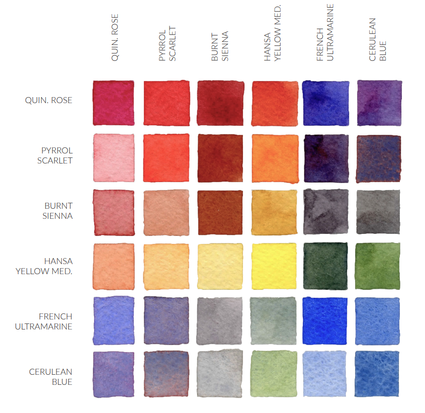
bit greenish blue, so it might need a little bit of green on the ultramarine. You can also use a color chart. There is something
called a color chart. This is an example of it. For example, we have this
beautiful yellow here, when it's mixed with pernsiena, it yields this brown,
this golden brown. Or maybe if I mix ultramarine
blue with this yellow, it's going to yield
this beautiful green, deep green color. So for example, I
want these shades. I want this and this
and this and this in my artwork because because they are very similar
to the ones here. I want to mix this
ultramarine blue with this brilliant blue to
yield this beautiful one. This is the lighter
version of it. This half of the chart is just the same as the other part, but it is just less pigmented. I'm also going to
add some yellow, so the yellow mixed with
the blue is going to yield a little bit of green, but since I'm not
going to too much. I want to add a little bit
of yellow to my mixture, so I have to expect
a hint of green or at least bluish green when
I mix the two colors. So, yeah, that's what
you want to look for before you start mixing
the colors together. Also, don't forget to
check the resources. For this chart, I'm
going to attach it in the resources so you can look it up and use it to help
you in the process. I'm also going to link the article that I
got the chart from.
5. Mixing the colors: I. So now that we chose the
picture or the photo or the artwork that we are going to take the
inspiration from, now it's time to mix the colors. So as you can see, I am trying
to replicate the icy blue, so I want my color mixture
to include white blue. I want more than
one shade of blue, maybe a little bit of yellow
and a little bit of green. So let me show you exactly
what I'm going to make. I'm going to take
a little bit of my texture paste
here first, okay? I'm going to add the
yellow color on it. Just a tiny bit of yellow. Maybe a little bit more. Just a tiny bit of green also. And I'm going to mix
it with the paste. So now I do have this
pastel greenish yellow. Okay. This is what I want now. Add, like, a pinch
of just a little bit of this blue
ultramarine blue, okay. And we're gonna mix. So it gave us this interesting yellow. So the majority of the mixture or the rest
of the mixture now, I'm going to add blue to it. It's literally a blue color
and a little bit of paste. It gives me this bright,
radiant blue. Okay. And then I'm also going to add, I think it's tallow blue. I'm going to add Okay. So that's it.
That's the mixture. And now we are going to
mix it just thoroughly. We don't want to mix it too much because I also want to keep the white paste and
my color mixture. Okay? So I'm just going
to thoroughly mix it. So it gives me this
beautiful color. And remember the yellow color that we made in the beginning. I'm also going to
add a bit of that. This yellow color that we made. I'm going to scrap it and add this hint of allow
inside my mixture. So now I've got this beautiful texture paste with all the colors that I want, and now it's time
for application. It's very easy to
mix the colors. You just have to know what
colors do you want to use. And it is a bonus
for you, of course, to know what colors
are going to be produced by mixing the
colors you choose. For example, you have to expect that mixing red and
yellow will produce orange and mixing
green and for example, red, going to produce brown. Don't forget to check the
resources for this class. I'm going to share with
you some of the mixtures, some of the colors that I used in previous projects
if you do not want to look up for references or come up
with your own colors.
6. Class Project : Alright. It's class
project time. Here's where things start
to get really exciting. So imagine this. Your
colors are perfectly mixed. Your texture paste is ready, and everything you prepared
is finally coming together. This is the moment where
you'll start applying your textured colors or your texture paste
onto the canvas. And, trust me, it's the most satisfying part
of the entire process. But before we get there, you
have one important step. Choosing your art reference and building your color palette. So think of it as setting the foundation
for the exciting moment. The more intention you
put in this stage, the more effortless and enjoyable the
application will feel. So take your time
selecting reference that inspire you and don't forget to check the
class resources. They'll guide you through
choosing your colors and mixing them in
a simple clear way. And if you're enjoying
the class so far, go ahead and follow so you can catch up with
the future classes. And also leave a review. It really helps, and
it means so much. So once your palette is ready, you'll be turning
those colors into a beautiful three
D artwork full of texture, movement,
and personality. After you finish
your class project, don't forget to share it. I'm so excited to
see what you create. And if you have any questions or you need help along the way, feel free to leave them in
the discussion section. So get ready because once
you reach that stage, you won't be able to stop.
7. Strokes application: Oh, here's my plank canvas, and that's where we're
going to work now. So I want to give the
background a color. So we are going
to talk about how to load the brush or
the palette knife. And with the back of the knife, I'm gonna dip it and just
take a binch of this. Make sure that the front
side is absolutely clean. Make sure that the sides
are also very clean. Okay. And now we are going to start
applying the first stroke, pressure in the middle
and rag like so. I hope you can see the
beautiful mixture of the white and the different
shades of blue and yellow. And now I'm going to
take my palette knife loaded once again the same way we loaded
it the first time. Don't forget to clean it
from the side because it's going to affect the
shape of the stroke. And when ready,
Put it like this. Reshape it freely. And then pressure in the middle. Drag. It's beautiful. It's really beautiful. The mixture of
colors is amazing. I'm now going to keep
applying my strokes. When I drag, I am trying to make my hand as steady as possible, so the stroke is as
straight as possible, also. The beautiful thing about
this technique is that you get a different
mixture every single time. It's just surprising every time. Every time a
different mixture of your favorite colors of
the colors of inspiration. And as I told you before, the most important part about
this technique is never to mix the colors with the
texture paste all the way. You need to mix them
very thoroughly. Look at this one. As I told you before,
don't forget to clean the knife from the front and
the sides or every time. Don't worry if your
hand gets missy. Beauty of this project is
getting messy with colors. This is one of the most
amazing ways that you can express yourself,
okay, through color. I cannot stress enough
that this process is very therapeutic and you have to try it yourself at least once to feel how beautiful
and therapeutic it is to play with colors and to produce an artistic piece
that is inspired by maybe a photograph that you like your favorite piece
of art or maybe like a previous
art that you made. You like the colors of it
and you want to recreate it. You want to recreate the colors. It's always fun time. So I have created
this project multiple and multiple times before because I wanted to test colors. It's really beautiful with
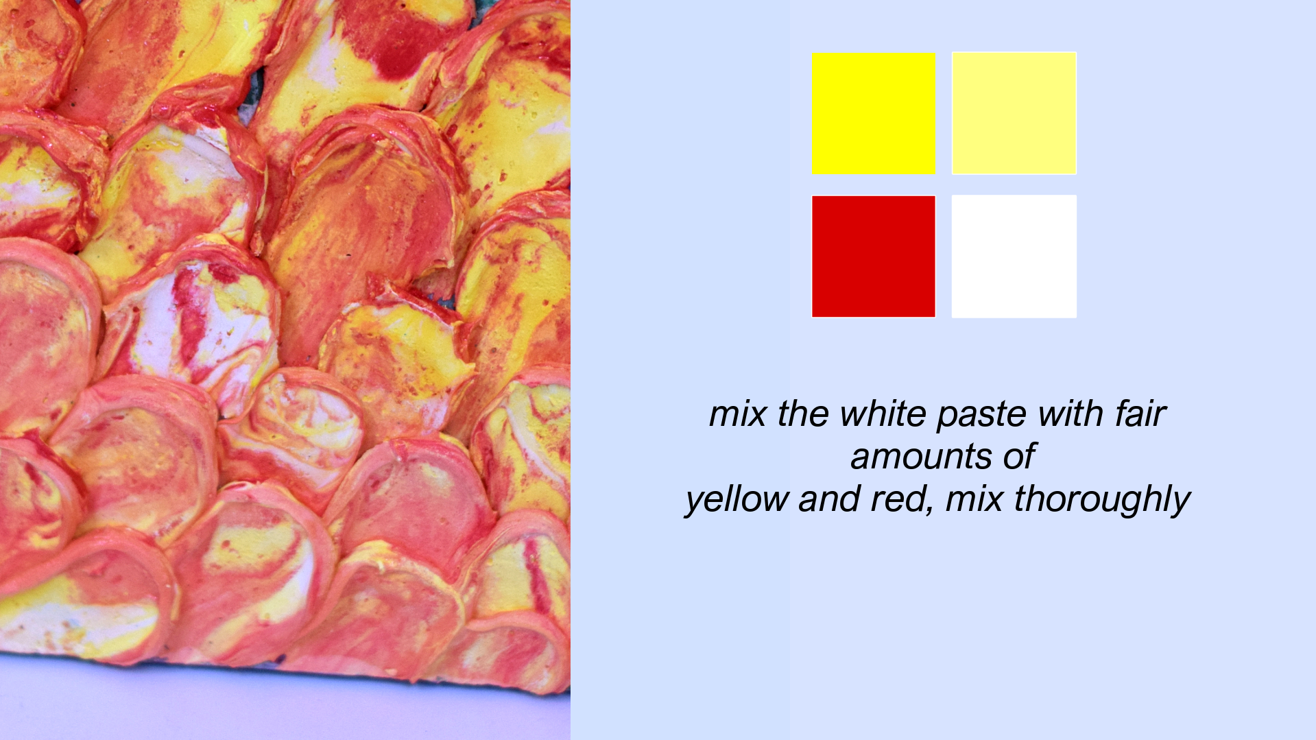
fiery colors like red, yellow, you know,
very fiery colors. But this is, as you can see, is inspired by the North Ball. So I wanted the colors
to be more chilly, icy, you know, white. Of course, you can always
reshape the stroke. If it's not dried yet, you can do anything you want. As I told you before,
we mix the mixture with the colors with the
acrylic colors thoroughly. So if you want the whites in
the strokes to be, you know, a little bit less
than it is right now, you can always mix it more. So, the more you mix it, the more this white disappears. The strokes that
I'm going to apply now they will be
having less white, more blue and yellow. And that's one of the
things that I want since we are approaching
the end of the project, the end of the banel. I want it to be more icy now, so I might add more
yellow to the mixture. Okay. I'm also going to add
more blue to the mixture. You notice the strokes
being more colorful now. So once you master the
color mixing and master the strokes and also
master the whole process, you can start playing with
the symmetry part of it. Like, for example, I can start playing on the size
of the strokes. For example, if I want the
size of the strokes to be similar or if I want not just the size,
but how they look like. So I'd concentrate more on concentrate more on the
symmetry of the strokes. This is one of the most
fun artistic projects that I ever worked on. Literally. I don't mean this specific one, but this whole technique,
it's very fun. And the results are
always amazing. Like, after I make them, I keep staring at how beautifully mixed
are the colors together? You know what I mean? And also the process itself is very fun. There is one thing you must
know if you want to have perfect strokes is that the
more you leave the paste, more firm it's going
to be the optimal is to work with the paste
as fast as possible. I can last you around
maybe an hour, but more than an
hour, it's gonna start it's going to
start being rigid. And when the paste is rigid, believe me, it's less
fun to work with. So now I'm going to
add the last one here. It's a little bit out. Now, we are done. It looks absolutely amazing. I
8. Varnishing your artwork: Varnishing the artwork to
protect it and make it more durable and also to give it this shiny, beautiful
plastic finish. So you can just use any
kind of pure varnishing, water based, of course, that you can find so
I'm going to dilute the varnish with a little bit of water to make it a
little bit more runny, so it can cover all the edges
and details of my artwork. I don't want it to
be very diluted. And you can apply
it with a brush. You can apply it with a sponge. You can even apply
it with your hand. Just want to protect
every and each stroke. When it comes to drying, I like to let my art dry
for at least 24 hours. I prefer just covering every
single one with my finger. It's never a good idea
to start applying the varnish before
your art is completely dried because the
varnishing water based is going to get
mixed with the colors. At this point, if
you can notice, my art is soaked
with the varnish. I'm going to let
it drip so it can cover all the spaces
between each stroke. Then do it the other way. Want to make sure it's
dripping everywhere. Make sure everywhere is
covered with the varnishing. If you notice any were
lacking the varnish, you can just add more. Try to make this
process very fast because we don't want
the texture paste to be soaked and we definitely
don't want to lose the vibrant colors
and the texture paste. With the effect of the
water in the varnish, in the diluted varnish. And that's it. It's all covered. I'm just gonna let it dry now. I'm going to use the hair dryer to dry it a little bit
'cause we do not want the water in the
varnish to be for long in contact with the
bigment, it might dilute it. So I'm just going to help it
a little bit with drying. I'm just gonna use
the air dryer now. So it's not fully dried yet. I'm going to let the rest just air dry and show
you the end result. Finally, that we are finished, this is the end result. You can definitely notice
the gorgeous shine to the artwork after
applying the varnish. And also the
varnishing coat helped a lot with making the
colors more vibrant. If you're using an MDF board
or even, like, a canvas, you can go ahead and add a cohesive color to the
sides like I did here. I definitely gives this
magical touch to the artwork.
9. Outro and final thoughts: And here it is finished, sealed, and completely yours. Take a moment to
really look at it. Because this didn't
happen in one step. You built it from
the very beginning. You started by choosing
an art reference that inspired you
something that felt right. Then you carefully selected
your color palette, mixing shades and creating combinations that felt
personal and unique. After that, you prepared your texture paste and
brought everything together so it was ready to become something
real on the canvas. And finally, you applied
it all, building depth, movement, and texture layer by layer until it became this. So this piece holds all of that, your choices, your creativity, your energy, and
even your feelings. And that's what
makes it special. And, truly, thank
you for being here and making it all the way
to this point with me. That really means a lot. If you haven't already, don't forget to share
your class project. I'm genuinely so excited to
see what you have created. And if you have any
questions or thoughts, you can always leave them
in the discussion section. I'm here to help you. If you enjoyed this experience, feel free to follow along
and leave a review. It really helps me keep creating more for
you in the future. And thank you so much for being here and for creating
this with me. I'll see you in the next one.
 Ala Elfeky, Artist / art Therapist