Transcripts
1. 1 Introduction: Hey, everyone. My name is Alfa, and I'm an artist here
in San Jose, California. In today's exciting and
fun painting class, I will show you how to paint a loose acrylic landscape using a reference photo while
still making it your own. Learn valuable skills in
breaking down shapes, great for beginners and beyond. I'm going to walk you through all the
materials that you will need and exercise on
color mixing and value. And then we're
going to go through this painting step by step. Alright, so let's get started.
2. 2 Materials: All right, so let's
talk materials. All of this I use for
the value sketch. So just any regular sketchbook, paper, pencil, whatever
you have will work. And then I use these markers. They're great colored markers
to do our little sketches. I'm going to link
them down below. But these are the
colors that I went for. You also need gesso
to prime your canvas and a masking tape
to tape the edges. This is the artist
tape that I use. And then this is the acrylic
paper that I always use. I just cut mine into
a six by eight. And then a glass palette, which I love, a scraper,
a bowl of water. And then I also use a gel medium to thicken up and to
extend my drying time. So I just use the pale
knife to scoop it up. Okay. I'll talk about more
of this in the class. And then as far as paints, these are my regular
paints that I mostly use. Again, we have alga maarin blue, burn sienna, crimson red, vermilion red, yellow ochre, yellow pale, then of course, you'll need some titanium white. Then I also used raw
sienna to prime my, um, my paper at the
very beginning. Okay, then these are all
the brushes that I've used. I will try and link what I can. So let's see, we've got
how many flat brushes. We've got two flat brushes here, one medium and one small, number eight and number ten. Okay. Then we've got
a few round brushes. So like two long tiny ones that I like to use
for details at the end of every painting, and then we've got these
two round brushes as well. All right. And then I
love this Pilbard brush. The Pilbard is, like, my
favorite of all kinds. This is my number one
brush that I use. Alright, so these
are the materials. Let's gather these and
move on to the lesson.
3. 3 Exercise Color Mixing: So here we're going to dive in a basic understanding
of color mixing. So let's start with
the color wheel, and I'm using simple and few
colors to demonstrate this, which are our primary colors. So here, I've laid
out ultramarine blue, cadmium red, lemon yellow,
and titanium white. So let's lay our
three basic colors first and then use these to make our complimentary colors which are green, purple and orange. So we're going to
make a green here by mixing blue and yellow. I often use this green
for landscapes rather than a green directly from a tube for a more
realistic shade, a green that you
can find in nature. So you can experiment with different shades of
green from blue, yellow, white, and I will actually demonstrate
that in a bit as well. All right, so then
mixing in red and blue will give you a purple. And then creating an orange her by mixing in red and yellow. So in a painting, try and use complimentary colors to
make your painting stand out. So if you can be intentional
of using green and red in your painting side by
side or like yellow and purple to grab
people's attention. So it doesn't have to
be a very bright color, but even, like, a subdued, desaturated version of that
will, you know, do the trick. So since I paint
landscapes a lot, and I'm going to go ahead
and show you how I kind of use color mixing in that category so that it
would be easier to follow, so just by mixing in
ultramarine blue, red, cadmium red and yellow,
you will get this, like, brown muddy toned color. And if you add white
to it, you will get a lighter version
of that color. So these are great
for, like, mountains, pathways, and just
nature in general. So here you can see how you can get such different greens. It all depends on how much blue you're adding or
yellow you're adding. So if you want warmer colors, you can mix in more of the yellows and those are
great for the foregrounds. And as you go further
back in a painting, because of atmospheric
perspective and how the light hits just
nature in general, you will notice that the
colors get more desaturated. So then adding in more of your ultramarine blues and your reds and maybe
even Born Sienna, all of that will desaturate
a color and mute it out. So those greens are great for mountains that are far back. Okay, so now let's move
on to painting skies, and I love using ultramarine
blue, titanium white, and a tapot of yellow in my mixing for Ao
desaturated sky look. Okay, so quickly, I'm just going to go from dark to
light here to show you how you can
achieve these more realistic landscape
colors in your painting. So once again, to get a green, you need to mix in
ultramarine blue, yellow, and a little
bit of the cadmium red to desaturate or dull the
color for a more natural look. And if you keep adding in
yellow or white to this mixing, it will give you the
opposite effect, so it will brighten
the scene up. So it's great for,
like, foregrounds or highlights in general. So that's my darkest green brownish sort of
color right there. And I'm going to lighten
that up by adding in more yellow and a little
bit of ultramarine blue. So now I'm going
to keep adding in some more whites
to brighten it up. And so we're just going
from darks to light here. I would encourage you to keep
trying this technique in different colors so you kind of get a stronger
sense of value. Now, let's do a more
saturated green here by mixing only blue ultramarine
blue and yellow. So we're not going to
do any of the darks, like the reds and the
blues in this one, so I just want you
to get a sense of how different the
green can look. And then, again, to
lighten this up, you can add in some more white. So mixing in cadmium red and pale yellow will give
you an orange color, which we all know, and to desaturate that, make sure for a
more deeper color, you can add in some
ultramarine blue. And obviously, the
lighter you want it, you can add in more
of your white. And also the amount of
red and yellow you add in the first place
will also dictate your initial base color. So yeah, play around with the
amount of yellows and reds that you add and
see what kind of different colors you
can get by doing that. So here's my suggestion. If you are extremely
new to painting, I would start with
the color vio, just like I showed and use all those colors and
play around with them by mixing all of them together and just experiment with them
to see what you can get. Meaning brighter in tone, you will need to mix your
lighter colors in general. So mixing your titan and whites, your yellows, all of
that will really help.
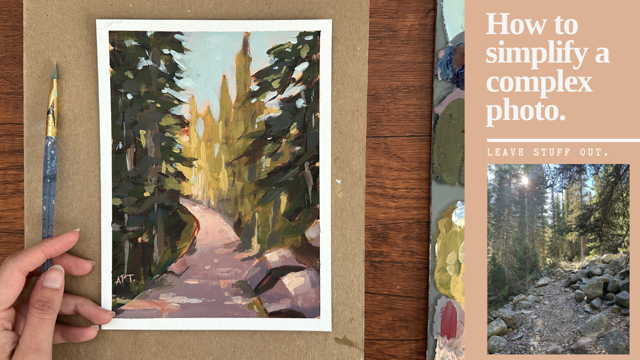
4. 4 Choosing Composition & Simplifying : All right, so this is the
picture that I'm choosing to paint from for this class. So I'm going to talk
about a few things here. Firstly, I'm going to
talk about why I chose this picture and what I
like about it and then how I'm going to simplify
it and crop it and tweak it based on the things that I don't
like about this picture. So first thing I liked about this picture is that
it has a focal point. Um, I know that it
has two focal points. It has the sun and it has
the pathway end here. That's actually
one of the things I did not like about this, and I'll talk about why
I chose to tweak that. But it's obvious that
there is a focal point. Um, the second thing I liked is that it has clear
shadow and light. You can see all of these
trees, this pathway, and these trees
here is in shadow, and then this is in light. Lastly, I like the
dynamic shapes. So we have different size of shapes and also in the light, a lot of there's not an equal
amount of shadow and light. There's clearly more shadow
than there is light. What I don't like
about this picture? I don't like that there's
two focal points. There's a sun and then there's this light that leads at
the end of the pathway. I find that confusing. I want to simplify that
and make sure that there's only one focal point to just
make it easy on the eye. So I think we're going
to crop the sun out. Also, I don't like that the
focal point is mid center. I usually have my focal points either above or
below the midpoint. I think I'm going to lower it out slightly and
change the shape. Um, and lastly, I mentioned
dynamic shapes earlier. Even though I see
dynamic shapes, I don't find that there's
enough dynamic shapes. In this case, I
don't know if the paintings about the pathway or the trees because they're
pretty equal in size. So I felt like I
wanted the trees to be more in focus and take
up most of my painting, just because they're so
grand and they look good. So I'm going to shorten up the pathway and make my painting mostly about the trees that we have more of bigger
and smaller sizes. So let's see. I think I'm going
to start from here. I will probably crop this out. Um, somewhere around there. And then we think Also, I'm not going to add these
many stones in the rocks. We're gonna definitely
simplify that. Okay. Well maybe do this much. So I'm going to shorten
this pathway right here. And I think I actually want to possibly even shorten it because it is going to be
in portrait form. So I think I'm going to
do it this way. Yeah. So this way now, the
trees are much bigger. So we've got let's start
from the pathway here. So we've got this ops
somewhere around there. I'll do that. That's
going to be the pathway. Again, it's not wooly middle, it's slightly below that. Then I think I'll
have the rocks here, possibly maybe one big one. This is going to
be one big rock, maybe one here, and
maybe one right there. This will be in light. This is going to be light. This is going to be this right here will
be darker valued. I love that these trees right here are leading towards the
Poco point, which is great. So we'll definitely
paint that accordingly. We'll paint it so that it's leading
towards the poco point. Then we'll just have some
trees there in the back. Yeah, I think I like this. So this right here will be dark. This will be dark. This
rocks will also be a darker. Everything will be in shadow, except for this part over here. And then even these
trees in the back, I think I'll make
it like a mid tone. So my sky and then this
area will be the lightest. But this will make more sense
once we do the next step, which is going to be
the value sketch. So let's move on
to that, and I'll show you how we can
simplify this further.
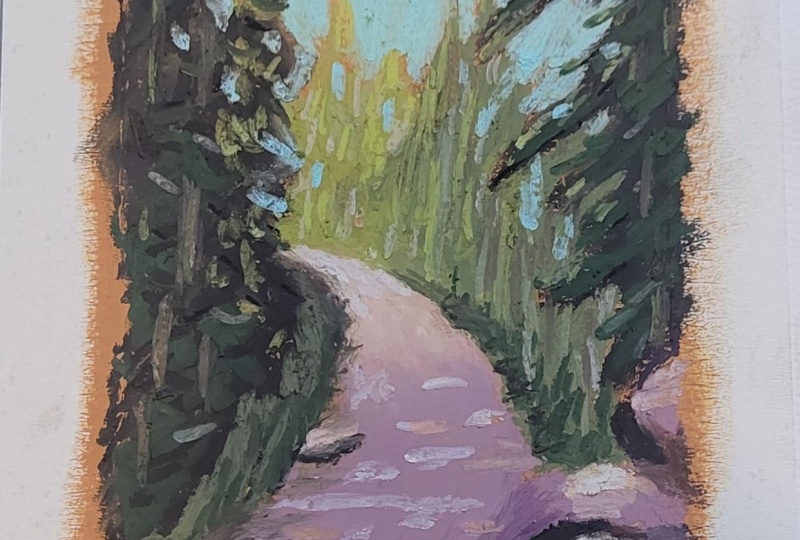
5. 5 Exercise - Value: Alright, so now let's
begin our value sketch. I've got my drawing paper pad, a pencil eraser, and this is something new that
I'm going to be trying out. I like having a midpoint. That way, I just have a grid
of where things will be. I like having a grid. I find that it is easy to place the focal point
and just figure out that you don't want things to
lie exactly in the middle. So, it just gives a good
perspective there. All right. I'm going to start
with the pathway first since that's leading
to our focal point. And what I'm going to do first is I'm
actually going to draw the picture exactly how
it is in the reference, and then we'll do another one right here and see how
we can tweak that, okay? What things that we can change. So what I do see in
the reference is, I think the focal point is literally almost mid center,
somewhere around there. We have this. This is
where the light needs. We have this little mark there, and then we have
all of these rocks. Now I'm just drawing
outlines of lines. I know that this is
my lightest light. These are all in mid
tone and shadow. Then we have a
little line there, and we have something
like that happening here. Then we've got these
trees in the back, so I'm just going to do that. Something like that, right?
So let's get our markers now. All right. Again, I'm looking
at the overall shape, okay? I'm not looking at details. We are just drawing
an outline of value. So we're just
capturing our darks and capturing our lights. This stage is really important because you should know after
you're done with the stage, you should be confident that your painting
will look good. And if you're not, then
you have to tweak things. Figure out what you can tweak in the composition or maybe play
with your shadow and light, um, so that at the end, your painting will
look nice, okay? So we've got the two main
darkish dark shadows. This will be like my mid tone. I'm going to get
this one out here. I actually like these markers. They're easy to do
these value sketches. Okay, so somewhere
on there, right? We've got the lights light, and then we have a bunch
of stones here. I'm also going to just
do this entire thing. That way, And I also do know that there's
like a shadow over here with, like, underneath the stone, so I'm just going to
lay that out just very roughly just so I know
where things are. Okay. And then this
will also be in shadow. I'm also going to keep
the back trees in shadow, but it will be a
different kind of light. It won't be too too dark. So I'm just doing
that, maybe have a little bit of light
there, something like that. Okay. Yeah, something like that. This is what I see
from the reference. Now, things I don't like, things I definitely want to
change is this middle point. I don't like that it's
dead center, right? You want to change
that focal point, make sure it's not
in the middle. Either you want to push
it up, move it down, or then on either side, and that's easy to play
with. I'm going to do that. What else I want to change? I think I want to elongate this tree a little bit more and maybe make these
shorten up the rocks. Let's just go ahead and
do the second All right. So we've got the midpoint again. And I just want to fix
that a little bit. Okay. All right, so now I think I'm going to change the shape
of the pathway slightly. I'm gonna curve it
up a little bit. Um, and bring it slightly
below the midpoint. Then we've got this area
which will be in light. Then also just imagine
this is the pathway. Then I think I just want
the rocks to be this much. We'll have possibly three rocks, a couple or maybe even three rocks is what
I was thinking. Maybe one right there, then one and then maybe
a smaller one. I want to play with
different shapes, make sure that one's larger, and then the other two are
slightly different sizes. Um, but that we can
figure out as we paint. Then we've got these trees that will be pretty
much the same. I'm going to just
bring that lower. Then we've got
these, which again, I love because I like
that it's pointing to the focal point and leads
our eyes towards that. I think I'll just
drop this down and just add that to the tree. We've got this shape here. Then at the back,
we're going to do like I'm just going
to do a little twes, maybe some tall, some small. But they're not going to be
too much in focus. Yeah. So this will be my light. This will be the focal
point over here now. And then, so let's
just skip this out. So I think I want all of
this dark, dark, right. And it will obviously have different shades of
darkness as well. We can now layer them up. Okay. And then we've got this I want to be in shadow. And then just right
beneath the rocks, we have, like some shadow there. Maybe I'll even
add a little rock somewhere around here,
like a very small one. Okay. And now, Alright, so let's get our This is going
to be our midtone color. So the road is
also significantly or the pathway is significantly. It's gonna be dark.
When I say dark, I mean, like in shadow.
That's what I mean. Yeah, I should use the word
shadow and light more often. Okay, so there we have the
pathway and the rocks. I'm also going to do the trees in the back will be a mid tone. So it will be in shadow. I think I may have certain
lights come in through. So right about here because I
feel like the sun will hit. So even these trees
should be light. So this will be the
lightest light, and then I'll have a
little bit of light there, and then obviously the sky
is going to be light too. I'm going to do one
really quickly, another one just to show you
what I meant about having this part You can take multiple tries
before you get it down. In fact, there's
very rarely I'll get it down within
the first try. So don't feel like you have to get it right the first
time you do a sketch. Keep sketching it out, play
with different compositions, figure out, you know,
what works best. And so this is there. And then this is the
B trees. All right. So now I'm going to actually
do this in light and also this in light and then maybe do most of this in shadow. Okay. So I have
These are our trees. Okay. And these are our trees that are leading
to the focal point there. What is it gonna be
in shadow Shadow, shadow. Maybe a
little one there. Um So we're gonna have This is all mid tone, midtone sto. And including some of this trees over here will
be in midtone as well. Then this one will be a
little bit more lighter. I'm just going to get that
different tone of color there. And then I think I'll
have these light in light the sun will
hit these two points. Again, this will be
the pathway here. So the sun will
hit here and here. But yeah, I think I'm leading
more towards this one. I do like that all of
this is mostly in shadow, but then there's
more light here. So very similar to this except I just wanted this area to
hit sunlight as well. All right, so now let's
turn this into our painting for the next lesson and we'll
see how these translate. Really important step,
don't miss out on this. Make sure you do
multiple sketches before you do every
single painting, just to set your light and shadow in place before
you actually paint. It'll just make the
painting process so much easier, trust me. You'll see in the
next step how we can just translate this. All right.
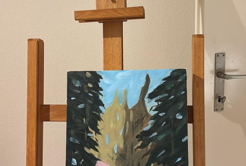
6. 6 Prep Canvas & Value Sketch: Here I've cut down my paper
to a six by eight inch. This is the acrylic
Strathmore paper, and I'm just prepping
my canvas with gesso. So you can use any flat brush
to put down a thin layer, not too thick, not too thin. You can even add some water
to help with mixing slightly. So make sure you coat
your edges properly. And once it's fully, fully dry, you will want to tape
down your edges. Again, I like doing this step because I just like
that it pins down my arts and also it leaves a really clean
border, which I like. And you can decide
on the thickness. That's totally up
to you. Sometimes I like my paintings with a little
bit of a thicker border. Sometimes I like
them really thin. But just make sure
that you only put down your tape once your
gesso has fully dried. This will help prevent tearing once you peel
it off at the end. Alright, so I painted the entire canvas with raw sienna and some
white for my background. Now, this stuff is
totally optional. Sometimes I like
doing this stuff. And I know a lot
of other artists also prefer this method. So this helps in a few ways. Firstly, I think adding
your value colors, so your lights and your
darks, it gets easier, especially your lights, since, you know, the background is not white anymore to begin with. But the main reason I love
this is because I love how you get the peak of that color
showing through in a painting. It gives it a painterly feel
and it adds more depth, when you can see little spots of this color through your painting
underneath the surface. I just adds two more
layers, I believe. Alright, so I'm just using
a regular sort of medium sized flat brush and painting the entire
thing this color. It doesn't have to be perfect. You can go in every direction and you just want to cover
the surface, basically. Now, in this lesson, I want to start with
the sketch phase. So please reference your
value sketch for this. And in case you've
skipped that lesson, please do watch that
before you start this. So I'm just creating
a midpoint grid here and I'm getting the
pathway sketch first. So look at the
reference pick side by side while you do this. And if you have already done the sketch phase previously
in the previous lesson, this step will be a lot easier. So this is where I
want my rocks to go and the other trees on
the either side of it. Just getting rough outlines
for placement purposes only. You don't have to get
in all the details. We're just sketching Over here, I'm just drawing the
trees in the very back. So this will be our mid
tones and our light tones. So I'm just getting
an outline of that. So here I'm sketching
out the rocks, just so I know where
things will be. Again, I'm not going to
add every single rock that we see in the reference. I want to simplify this
as much as possible. Only add things that I feel will give light to
the painting overall. And I'm just going to get
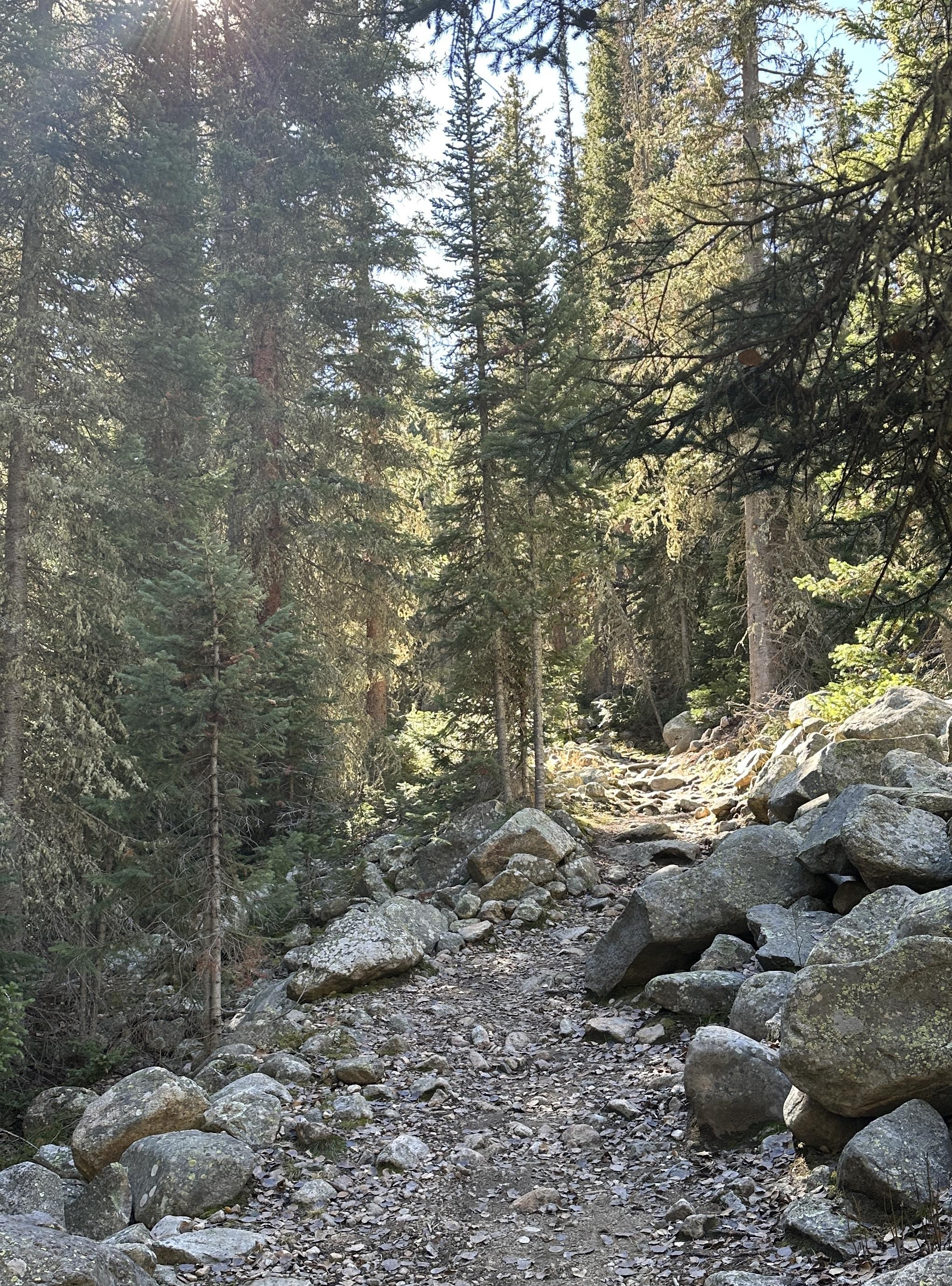
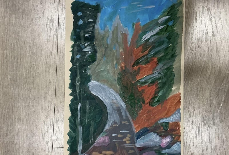
maybe two or three rocks here. So this reference photo was taken by me on a
hike where I live in California and so
you can right click save the reference and
enlarge it so that you can, you know, use it as your
painting side by side, or if it's easier, you can even print it out
if that works for you. Here I'm just getting some
impressions of the trees, um, you know, just so I
know how things will look. All right. And this will
complete our sketch phase, and we're going to
move on to painting.
7. 7 Painting - Blocking In Shapes: I'm using the Artisa
acrylic paint set, and I will list all the
names of these paints I used in the description
below. So check that out. But here I'm working
with ultramarine blue, born Sienna, crimson red, vermilion red, yellow pale, and yellow ochre, and of
course, titanum white. I'm using a medium
sized flat brush and I'm starting
with the shadows. I like working from dark to
light, most of the time. So I'm getting in some
ultramarine blue, yellow pale, and some borne Sienna and
crimson red for the dark value. I'm going to begin with
painting the left tree. So here I'm just going to
focus on blocking in shapes, which basically means
you are looking at the overall shape
rather than details. All the little jazz and
all the details and the layering of colors will
come in in the next phase. So keep your brush
marks loose and quick and paint in
different directions. I highly suggest referencing
back to your value sketch. If you've already
done that phase, this helps a lot, and these steps that I'm going to show you will
be a lot more easier. It's simply a translation
process from that step. So, yeah, I mean,
you probably heard me talking about
this multiple times, but yes, your value
sketch is everything. I feel like if you're
not happy with your initial value sketch phase, your painting is not going
to look good in the end. So really, make
sure that you take your time to get your darks
and your lights down first. And once you feel
like that's good, you can move on to
your painting phase. So take your time and do multiple value sketches
before you start painting, just to kind of acknowledge and figure out where you want
your darks and lights to go. Adding that same color
to the right side tree, I'm making sure to point my brush marks to
my focal point, which is the center light value that leads the pathway
at the very end. So intentionally direct
the viewer's eye by these tree shapes, right? So the branches of this tree will basically lead the viewer's
eye to our focal point. I'm just getting
the shadow part of the rocks down because it's pretty dark in
the reference as well. So I'm just kind of doing the
bottom part of the rocks. Okay, so next, I'm going to
block in the pathway down, which is our midtone. I'm getting in ultramarine
blue, crimson red, and some white with a little
bit of burn Sienna as well. I'm aiming for this deep plum, a purplish color
for the pathway, and I wasn't quite there yet, so I keep mixing in
colors to get there. I used some more white and some ultramarine blue
with this color, and I think I was happy
with the cooler tone. Constantly checking to see
if this is the right color, as you can see, I keep tweaking it until I
am happy with it. I wanted it to be a
little bit more cooler, so I'm adding more
ultramarine blue. And this color may not be very obvious when you
look at the reference, but I do see hints of
this in the pathway. And actually, when
you are painting plain air or just out in nature, you will see how
different the colors are actually compared to
when you take a picture. So this color, I think,
adds a really nice contrast with the greens and it
ends up really pretty. So I'm also going to be painting the rock this color
as my base color, and I will add to it
later to build form, but just getting this initial
base color down first, just so I don't get confused on, you know, where the pathway
and the rock start and end. And then I'm also adding
some slightly darker value to the side of the rock
where the shadow hits. Adding more blue
will make it darker. Now I'm just adding
in some more white to this pathway mixture to
get my lighter tones, and I'm also going to add
some yellow and crimson red. Make sure to blend
these two sharp edges. You don't want those,
like, sharp lines because they are such
a contrast in color. Okay, so now let's jump into the midtones of
the trees in the back. So I'm switching to a
full board brush here. I'm using ultramarine blue, pale yellow, crimson red, and some titanium white. O. Okay, so then I'm just going to
be using this color to block in the
trees in the back. So again, same method,
we're going to use different directions
and keeping it loose. So I'm just running
out of this color so I'm making more of the same. So I've got a
solution for people who have problems with their paints drying
out with acrylics. I think that's one
of the downsides to acrylics is that it dries
really, really fast. So here I'm pulling
out a gel medium. I'm going to link this
below if you're interested, but it can be really helpful to thicken up paint without changing its color,
which is amazing. So it extends the drying
time a bit more as well. And it's very handy to have around if you paint in
acrylics a lot, like I do. So I love using this when I just want to thicken up
my paint a little bit more, and also extend the drying time. Also, just a little fun fact, if you in case, have
to take a quick break, I'm not talking long
breaks, but short, maybe five to 10 minutes, I just had to go pick up my sweet little daughter
from her grandma's house, who lives like 10 minutes away, but I wanted I was in the
middle of painting this. So if that happens to you
and you want to extend drying time without losing all the colors on your palette, because I had a bunch of paint. You can also just use some foil and just wrap
that around gently. It doesn't have to be tight. If you can seal it, then great. But you can just
place that foil over your paints and it will extend the drying
time a little bit. That's a nice tip
to have as well. Here you can see I've
thickened up my paint, and I'm just going to finish up blocking these trees here. Also, I like using a
filbard brush for tweets, especially when I want a
bit of a sharper edge. I can use the sides
of the brush, the tip of this brush, and it'll give me
different kinds of shapes. What's running out
of color again? I'm just making more of
the same color green. Getting the same green to the bottom of the
left side trees here. I'm adding in some more
white and yellow to paint my lightest value of the trees where the
sunshine will hit. Overlapping some of
that lighter tone into my mine trees towards
the edge as well, kind of, like, you
know, blending the two colors a
little bit together. Okay, I'm getting
that same exact queen and putting in little specks of it on the darker shadow trees
that's at the very front. All right, so last part of
blocking in is the sky. I almost forgot about that part. I was going to move
on to the next phase, but then I remembered I
need to get my sky down. So I'm just using in white
blue and a hint of yellow. Just painting this empty
space with sky completely. I'm adding in some
negative painting by using the color of the sky to break up the trees on either side. So not too much, just
a little for now. Alright, so this completes
our blocking in stage, and let's move on
to the next lesson.
8. 8 Painting - Building Layers (Part 1): Alright, so now let's
focus on adding in some more details to
build the shapes further. Here I'm taking in
some ultramarine blue, some yellow pale, and
a little bit of red. I still want my green to be dark because this is a shadow tree, so you don't want your
greens to be too light. So you want different
shades of green, but primarily it should
be on the dark side. I'm just going to be
adding in some few strokes of that to build dimension. I'm going to speed this slightly because I was testing out
the colors on the side, but I wasn't happy with that. So then I decided to start from scratch with
a clean surface. So yeah, I just speed it
up a little bit because I just do it all
over again anyway. So here we go. I'm
going to go back to the Altraneblue and some
green and some crimson red. And yeah, this is exactly the green that
I was looking for, so we're going to get that in. I'm still using my
faux Board brush and working my strokes
left to right while holding the brush from its back handle to keep
my brush marks loose. I'm going to apply outward
strokes at the edge of my tree here and slightly
taper them at the tip. Don't focus on the
detail of the tree, but rather the overall shape to get that painter leaf
feel and make it loose. Using the same brush techniques on the right side of the tree. Again, I'm being intentional
of tapering my edges towards the focal point
over here to lead the viewer's eye towards
the focal point, which is the end of the pathway. While I still have my
green mixture wet, let's mix in some white
titanium white here to add a few tiny strokes
to the tree as well. So this is what I
was talking about earlier with the Filbert brush. You can see how I can make very thin brush strokes as well by using the
tip of the brush. It's quite a versatile brush, and I would highly
recommend you all to own a few of these in different
sizes if you don't already. I'm giving impressions of branches and twigs to the trees. Just a few subtle
details will do. I'm adding in some darker
queen to the sidewalk. Mixing in some ultramarine
blue, crimson red, and a little white for a darker value for the
pathway that we have here. It's almost like
this deep dark plum, and I'm adding this color to the darker value
of the rock as well. He Now, mixing in some
white and yellow to this dark purplish
color will give you the lighter value that
we need for the pathway. So you'll see how I go back and forth with adding darks
and lights because it is easier to do that when
your paints are still wet. And so just remember
that to make things warmer or
lighter in value, you just have to add in some more titanium white
or your yellows, or your warmer reds. And then to make things
desaturated or darker in value, you need to add your ultramarine blues and your crimson red. So I'm adding this
lighter value to just, you know, the right side of the rock where I want
my sunlight to hit. So I'm being very intentional
and consistent throughout. I wanted to now add some dappled light
across the pathway. I'm aware that you do not really see this a lot
in the reference, but I wanted to add it
because I think it'll just add to the scene
in a positive way. Feel free to remove add or even move subject matters when you're painting
from a reference. Because honestly,
it is very unlikely that most of the time
your reference will have all the fundamentals of what makes a
painting look good. So you will have to tweak
things as you go along. So to create this dappled light, I took in some titanium white, a little bit of the pale yellow, vermilion red and
a very little bit of the ultramarine blue. I'm using a number
two round brush here and I'm just adding that to the tips of the rocks and then also some dappled light
across the pathway. So I'm simply using my
brush and going across, and try and keep your brush
marks different sizes. So you want some smaller
and some larger, just vary them in thickness. Here, I just felt
the left small stone that I have the rock,
it's a little too dark, so I'm just kind of going
over with some Bonsiena over it so that it just darkens
and blends a little better.
9. 9 Painting - Building Layers (Part 2): I'm taking in some
ultramarine blue, some pale yellow
and crimson red, and some titanium white. I'm adding this color to
the trunks of the tree, also making sure to keeping
the shapes dynamic. So I'm playing with different
sizes and thickness. I'm using that same
color and getting it a bit on the road
for some texture. I felt like the tree trunks
were a bit too vibrant, so I wanted to
desaturate that color. So I'm using some
born sienna and some ultramarine blue
and a little bit of the yellow ochre
and crimson red. And I'm just kind of going
over some of the trunks here. I was kind of liking
this color for adding in more dimension and
form to the tree. I'm adding in some
more ultramarine blue, and I'm just using that to add some more
layers to the tree here, but I'm still keeping it on
the darker value overall. Adding a bit of the same color to the lighter
trees in the back, just at the bottom,
just a tiny bit, but I still want it to be
significantly lighter, right? So don't overdo this step. Okay, so now let's
move directions a little bit and focus on
the lighter trees now. So I'm getting in
more pale yellow this time with a little bit
of the ultramarine blue, red, and some titanium white. And I'm aiming for a bit more of a lighter queen than the existing base layer queen
that we have in the back. So I'm using my round brush, and I'm getting a few marks
of that in the background. I don't want to focus
too much and give too much detail to the background trees
because it is further away, so lesser details
make sense for that. I'm adding that same color
to the darker trees for impressions of little blotches
of light seeping through. Okay, so now I wanted to move on to adding a little more
highlight to our focal point. So I'm getting in some
ultramarine blue, some melon red, yellow, pale yellow, and lots of white. I'm getting that color to the
end of this pathway here. Just using my fingers to smudge
and blend the edge here, sometimes, you
know, fingers help. Adding that same
color to highlight the rocks a little bit,
but just a tiny bit. Adding a little
bit of burn Sienna and crimson red to this light, make sure that we already have just to give some
additional dapple light. It's very easy to get carried away in this section
because it's so much fun. But try and just be minimal overall and just to
make it look more natural. Cleaning up some
of the edges here as we are slowly
coming to an end. I'm just adding definition
to what I think it is needed a bit on the
pathway and the rocks.
10. 10 Painting - Final Details & Class Project!: Alright, so I peel
off the tape so that we can see what
we are working with. Always a very good and
satisfactory feeling, I think. If you're watching my
classes for a while, you will know that
I love getting off my long thin brush at the very end to get in
last minute fine details, to piece everything together. Making a y dark green here. So your ultramarine
blue, your cadmium red, you probably know
the drill by now, and just defining some
branches here and there. When in doubt, just
keep it minimal. It's always better to
have less than more. I know it's very easy to get carried away in this
section as well. So adding ly thin lines to give impressions of
branches and twigs. Here I'm getting in
some lighter values as well and adding fine details. This edge of this tree was
somewhat bothering me. You'll see what I am
talking about in a bit, but I just wanted
to cover that up. Fine tuning some of the
edges to the left tree. All right, so now I'm taking in the sky color that
we did initially, and I'm adding a few
marks of that color through the trees for
some negative painting. So this kind of helps break up the larger shapes slightly for some more
definition to the tree. I stepped away for a
bit and I felt like the pathway edge was too
clean for my liking. I wanted it slightly ruffled
since it is the outdoors. So I'm getting in some
ultramarine blue, cadmium red, born sienna and white and adding this darker value to the
edge of the pathway. I also felt like the
focal point edge of the pathway needed
some more definition. I'm getting a little
outline there. And this completes our loose acrylic landscape
painting for today. If you followed me
so far, well done, I can't wait to
see what you came up with. Share your projects. I would love to see them and do not forget to leave
this class a review. Ask me any questions in
the discussions tab below. I invite you to explore the different classes I
have created for you. Classes in watercolors,
as well as acrylics are available if
you want to learn more. So do consider following
me so that you do not miss out on future
painting classes from me. Follow me on Instagram to
keep up with latest updates, giveaways, and all
that fun stuff. Thank you once again
and happy painting. Okay.
 Alifya Plumber, Artist | Acrylics, Watercolors | Painter