Transcripts
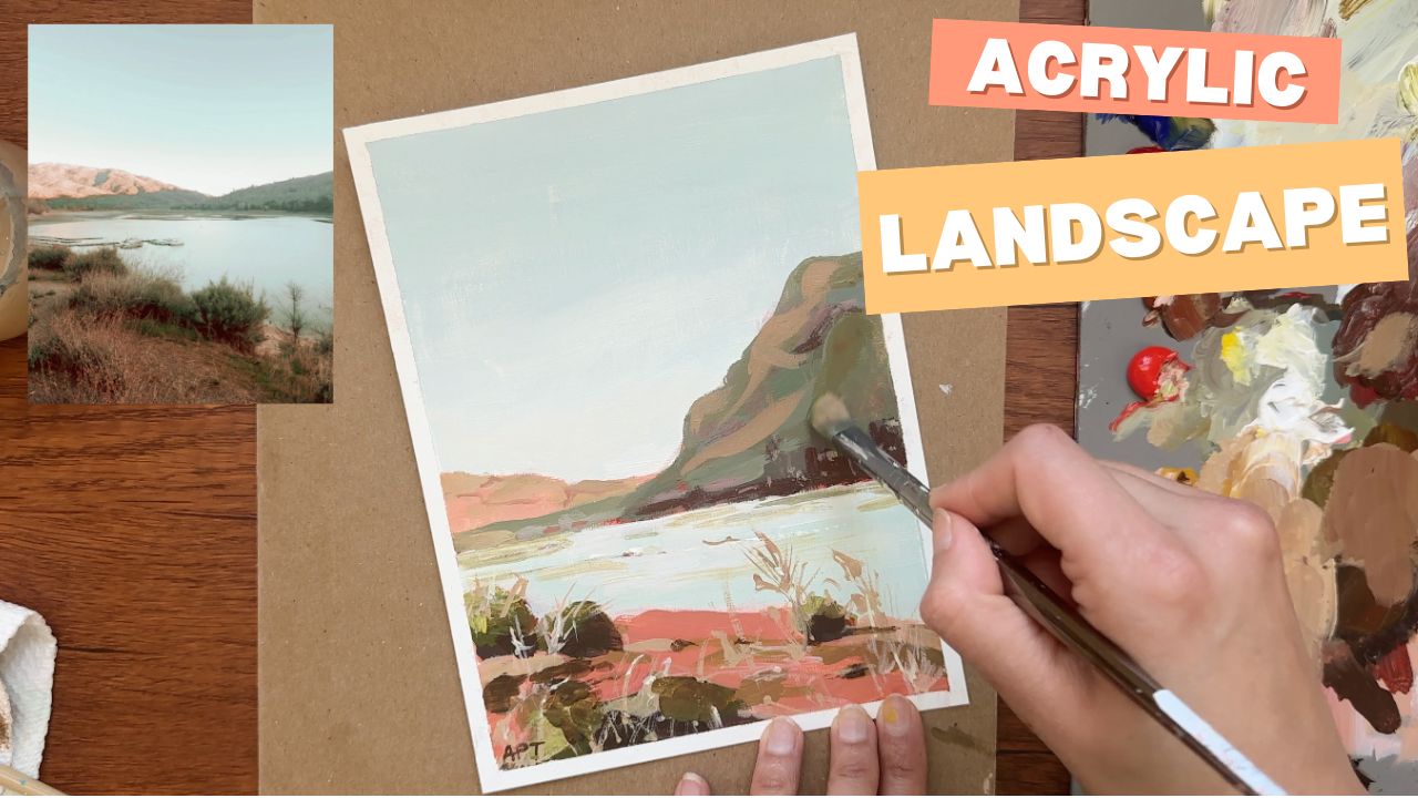
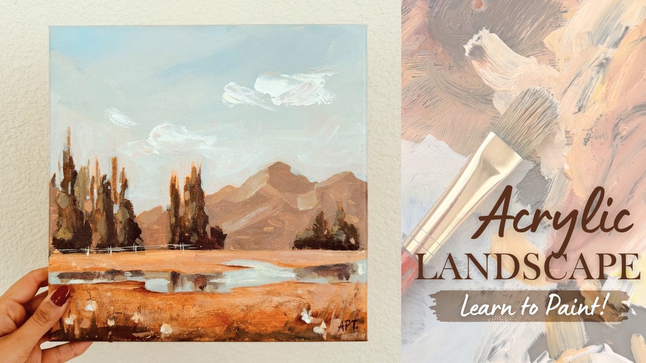
1. 1 Introduction: Hey, everyone. My name is Alfa, and I'm an artist here
in San Jose, California. In today's exciting and
fun painting class, I will show you how to paint a loose acrylic landscape using a reference photo while
still making it your own. Learn valuable skills in
breaking down shapes, great for beginners and beyond. I'm going to walk you through all the
materials that you will need and exercise on
color mixing and value. And then we're
going to go through this painting step by step. Alright, so let's get started.
2. 2 Exercise - Color Mixing: So we're going to
make a green here by mixing blue and yellow. I often use this green
for landscapes rather than a green directly from a tube for a more
realistic shade, a green that you
can find in nature. So you can experiment with different shades of
green from blue, yellow, white, and I will actually demonstrate
that in a bit as well. All right, so then
mixing in red and blue will give you a purple. And then creating an orange here by mixing in red and yellow. So in a painting, try and use complimentary colors to
make your painting stand out. So if you can be intentional
of using green and red in your painting side by
side or yellow and purple to grab
people's attention. So it doesn't have to
be a very bright color, but even, like, a subdued, desaturated version of that
will, you know, do the trick. So since I paint
landscapes a lot, and I'm going to go ahead
and show you how I kind of use color mixing in that category so that it
would be easier to follow, so just by mixing in
ultramarine blue, red, cadmium red and yellow,
you will get this, like, brown muddy toned color. And if you add white
to it, you will get a lighter version
of that color. So these are great
for, like, mountains, pathways, and just
nature in general. So here you can see how you can get such different greens. It all depends on how much blue you're adding or
yellow you're adding. So if you want warmer colors, you can mix in more
of the yellows, and those are great
for the foregrounds. And as you go further
back in a painting, because of atmospheric
perspective and how the light hits just
nature in general, you will notice that the
colors get more desaturated. So then adding in more of your ultramarine blues and your reds and maybe
even Born Sienna, all of that willy desaturated
color and mute it out. So those greens are great for mountains that are far back. Okay, so now let's move
on to painting skies, and I love using ultramarine
blue, titanium white, and a tabot of yellow in my mixing for am
desaturated sky L. Okay, so quickly, I'm just going to go from dark to
light here to show you how you can
achieve these more realistic landscape
colors in your painting. So once again, to get a green, you need to mix in
ultramarine blue, yellow, and a little bit of
the cadmium red to desaturate or dull the color
for a more natural look. And if you keep adding in
yellow or white to this mixing, it will give you the
opposite effect, so it will brighten
the scene up. So it's great for,
like, foregrounds or highlights in general. So that's my darkest green brownish sort of
color right there. And I'm going to lighten
that up by adding in more yellow and a little
bit of ultramarine blue. So now I'm going
to keep adding in some more whites
to brighten it up. And so we're just going
from darks to light here. I would encourage you to keep
trying this technique in different colors so you kind of get a stronger
sense of value. Now, let's do a more
saturated green here by mixing only blue ultramarine
blue and yellow. So we're not going to
do any of the darks, like the reds and the
blues in this one, so I just want you
to get a sense of how different the
green can look. And then, again, to
lighten this up, you can add in some more white. So mixing in cadmium red and pale yellow will give
you an orange color, which we all know, and to desaturate that, make sure for a
more deeper color, you can add in some
ultramarine blue. And obviously, the
lighter you want it, you can add in more
of your white, and also the amount of
red and yellow you add in the first place
will also dictate your initial base color. So yeah, play around with the
amount of yellows and reds that you add and
see what kind of different colors you
can get by doing that. So here's my suggestion. If you are extremely
new to painting, I would start with
the color vio, just like I showed and use all those colors and
play around with them by mixing all of them together and just experiment with them
to see what you can get. No
3. 3 Exercise - Value: So I'm a big believer in having
little quick sketches of your painting
before you actually paint to get down your value. And so if you don't know
what value really means, value refers to the lightness
or darkness of a color, which is very important
in a painting. So we use this to
create a sense of light, shadow, and dimension. It helps guides
the viewers eyes. So looking at my reference here, I'm going to establish where
things are going to go. And also don't feel forced to copy a reference picture exact. In fact, I would
suggest otherwise, simply use your reference
as a translation. So move things around that does not add
to the composition. Very rarely I will have the horizon line
directly in the middle. I always like to either move it up or down for
a more dynamic look, again, based on the scene
that I'm going for. So I'm going to move the horizon a little
bit lower because I just feel like with the sky and the
mountains showing more, it will give a more
impactful look. I'm also making
the left mountain bigger than it is
in the reference, as you can see, Um, I don't think I want to add
that many pushes in here. So feel free to eliminate and simplify your
painting as well. Don't feel like you need to add every single detail you see. So I'm also keeping,
like, scale in mind, so I want a variety
of sizes here, right? So you want to make sure
in a drawing sketch phase, you have different shapes. So some should be small, some are big, some are tiny. This will add to giving your
painting a dynamic look. Okay, so now comes
the value part. So let's shape these darks and lights so that
it's easier to paint. So looking at the reference, I do like that the
bushes are fly dark. I think they're the
darkest in the painting, and also the
mountain in the back has somewhat of a
dark feel as well. I'm going to keep
the foreground grass a medium toned value, and then the sky and the
water will be the lightest. So in a painting,
aim for dark tones, mid tones, and light tones to be visible and don't
make them all equal. So in this case,
I would say that my lightest tone will take up the majority
of my painting. All right, so let's
have a quick check. So in this box here, we've
got the darkest value, and then I'm going
to follow that with my mid tones and
then the lightest tone. So I mentioned earlier that your values should not be equal. So what I mean by is that
I would probably say that my lights is taking up about
70% of the painting here, and then my darkest is 20, and then I would say my
light tones is probably 10%. And sometimes it can
take a lot of tries and sketches before you narrow
down what you like. And here I was just playing with different value sketches, changing things up a little
bit just to make sure that what I pick at the end
is actually what I like. So after a couple of tries, I felt like I still feel like my first sketch was what
seemed more interesting to me, and it's more eye catching
with dynamic shapes. And the value is also not as
equal like the other ones. I like that the focus and the breakdown of shapes
is the large sky, which I think will
make the painting overall more appealing. So questions you
should be asking yourself before you start painting and when you're in the sketch phase is number one, what do you want
to be your focus? What is your focus
of your painting? Okay? So is it the mountains? Are they the trees?
Is it the lake? Figure that out
first. In this case, I wanted the sky to be taken
up majority of my painting. So figuring out
that in itself will help establish your
sketch from the get go. Okay? And then second
question you should be asking yourself is what your value
is going to be looking like. So figure out how much darks, midtones and lights you want
to make it interesting. And lastly, you want to
be asking yourself is, do I have enough sizes and shapes to make this
painting dynamic looking. And like I said before,
it will take you multiple sketches before you actually pin down what you like. It just so happens that
I like my first sketch, in this case, because I was
also somewhat pre prepared. But in reality, I would rarely go with my
first value sketch. Okay? So I hope this helps, and now we can move on
to the next lesson.
4. 4 Materials: Right and these
are the materials that I've used for
today's class. I have used the gesso to
prime my canvas beforehand, and I like using acrylic paper. I've used a six by
eight inch paper. And then I tape my edges down with this
artist's love tape. I use a bowl of water, a pencil, and then all the
paints that I've used. Again, I'm going
to list everything down so you can check that out. So we have ultramarine blue, bormlon red, which is
similar to cadmium red, and born sienna, yellow
ochre, crimson red, and yellow pale, which is
also like lemon yellow. And as far as the
brushes are concerned, I'm not very specific to brands here because I keep
changing them around. So any, medium sized flat brush, a filbert brush that's
also medium sized, and a filbert brush
basically has, like, a curve at the top, and then a round
rough brush and like, two thin long brushes that I
use for details at the end. And then you also
need a palette. I like using a glass palette. It's just easy to scrape, and then you'll need
a scraper with it as well that way
you can scrape off the paint at the end.
But any palette will.
5. 5 Prep Canvas & Value Sketch : Here I've cut down my paper
to a six by eight inch. This is the acrylic
Strathmore paper, and I'm just prepping
my canvas with gesso. So you can use any flat brush
to put down a thin layer, not too thick, not too thin. You can even add some water
to help with mixing slightly. So make sure you coat
your edges properly. And once it's fully fully dry, you will want to tape
down your edges. Again, I like doing this step because I just like
that it pins down my arts and also it leaves a rely clean border,
which I like. And you can decide
on the thickness. That's totally up
to you. Sometimes I like my paintings with a little
bit of a thicker border. Sometimes I like them rely thin. But just make sure
that you only put down your tape once your
so has fully dried. This will help prevent tearing once you peel
it off at the end. Alright, so now let's begin
our painting process. So, similar to the value sketch we did earlier
with the pencil, I'm now going to
translate that on our canvas but with paint. So I have burned
Siana here and I'm just around rough brush
to sketch this out. So since we already sketched our examples before we have
something to fall back on. So this is where our value
sketches really come in hand, and we know, where we
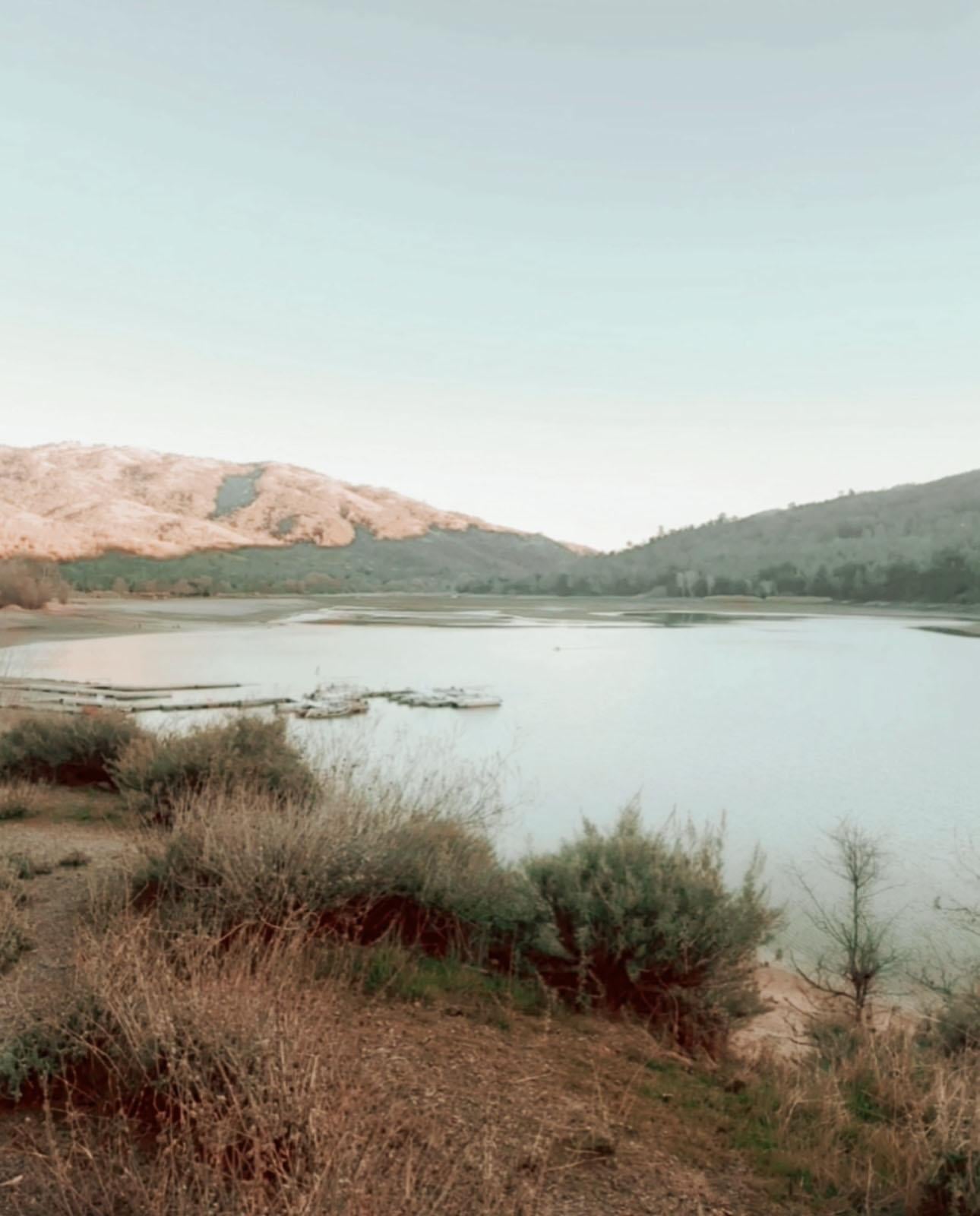
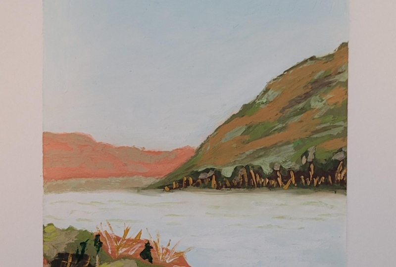
want our values to go. So this reference picture is a picture that
I've taken myself. It was on a hike
that I went with my family just around here
where I live in California. So I am going to be posting this reference picture down
below in the description, so make sure you
save it and you can open up side by side
as you're painting, or you can even print it out and paint from that if you wish. So just roughly
paint your darks, your midtones and your lights. Again, reference back to the
value sketch that we did, it's going to make
this process easier. I just swish to a flat brush here to paint the
larger shapes easily. So here I'm just laying
down the mitons. For the sky, I do want a
progression of dark to light and the horizon
area to be the lightest.
6. 6 Painting - Base Layers: All right, so I have laid
out my colors for today, and this is what I'm
going to be working with. I always will list
out all the paint colors down below on the description, so you
can check them out. But I am using ultramarine
blue, crimson red, Born Sienna, vermilion red, yellow ochre and yellow
pale and titanium white. And just for reference, this
is the Artisacrlic pain set. I'm using a flat number
12 Atislav acrylic brush here and I'm going to be
using that for the sky. I'm mixing in the blue with
some titan and white and very little yellow and simply painting horizontal
strokes for the sky. So I wanted the sky to be
slightly darker above, and I'm going to work my
way from dark to light, where the light is going
to be by the horizon line. And so since the water is
a reflection of the sky, I always do both parts
together just for convenience. So I'll just paint the
sky and then I'll use that same color and
transfer it to the lake. So yeah, since it's a mirror
effect with the lake, the horizon line will
be the lightest, and then the rest,
I'm going to be adding in a little bit
of darkness to it. Alright, so I'm just going
to go back to the sky and add more layers
to thicken up the paint a little bit more and just to kind of
solidify the sky. Alright, so let's now move on to blocking the other
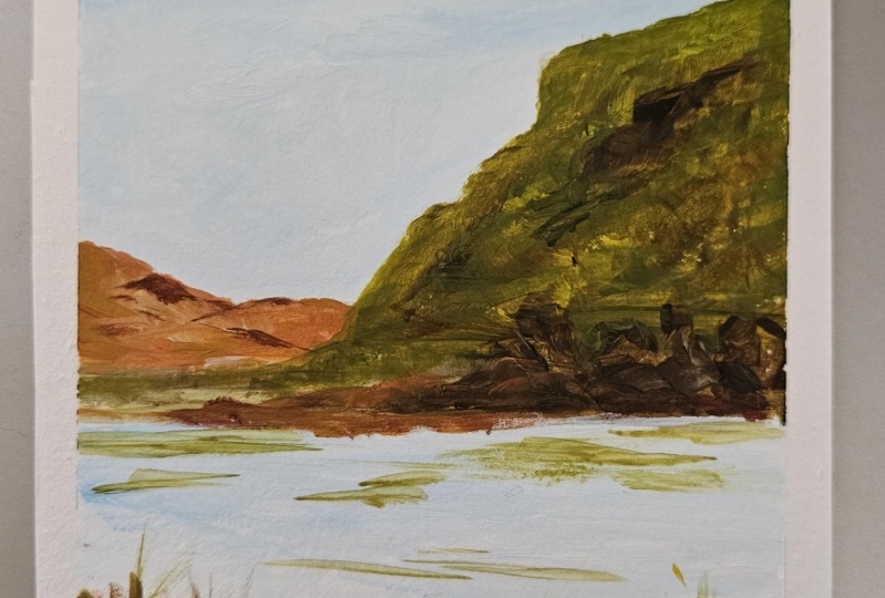
sections and shapes. I'm going to start with the
bigger mountain at the back. And again, make
sure to reference your value sketch that we created earlier so that you
just know where your darks, your mid tones and your
lights are going to go. So first step is we're going to have to create a green since
we don't have any greens. And I love creating
a green rather than using a green
directly from the tube. I just feel like it
looks a lot more realistic when you green when you mix colors
to get the greens. So for that, we're going to do I'm going to mix
the ultramarine blue, a little bit of the yellow, and some titanium white. And then to desaturate the
color for deeper green, a nudge of crimson red
will make that happen. Also, if you are confused on, just color mixing in general, I would highly suggest rewatching my previous
lesson on the color mixing, and I kind of go
in depth on how to get your greens and just
mix colors in general. So yeah, definitely do
not skip that lesson. So here I'm adding in more of the titanium white
to this mixture, and you will get a
lighter version of the same green that
we've just been using. So I'm just going to mix a little bit white,
and you'll see. And then I'm going
to add that to the back of this mountain here. So my deepest darkest color here will be the rock and the
bushes in the front. So again, I'm just creating
the same exact green, but if you add more crimson red, and if you add some
ultramarine blue, you will get that
deeper darker color. So I've seen in
the reference that the darkest darks are at
the bottom of these bushes. So I'm just going to
add this color at the bottom of these
bushes, rocks here. I wanted it to be much
darker than this color. So I also I also mixed in
some of the Vermeulion red, the crimson red, and the burn sienna along with
the yellow ochre. So basically, I've mixed
in all the colors except for yellow pale to
get this dark green. Using the same color but
adding some more white to mute the color a bit for the
mountain trees in the back. Alright, I switch
to a filbert brush. I find that this
brush, in particular, is really easy to work with when it comes
to trees and bushes. I always use this
brush for, like, because I think it
has a rounded edge. I just feel it naturally
applies to, like, trees and bushes or, like, rocks that have slightly
rounded edges, much easier. So yeah, if you have that,
get that out for this part. And then also I'm
making another green here by adding some
more yellow this time, and I'm going to add that to
the tops of the bushes here. So to get this green, you
want to add ultramarine blue, just a tiny bit of the
red, but more yellow. So just a reminder
that we are in the process of
blocking in colors. We're not adding any detail. We're just blocking
colors based on value. So we're just capturing our
darks, mitons and lights. Mm. Alright, so now let's
jump into our foreground, which will be our mid
tone for this painting. And I'm going to do this, like terracotta red tone
here, which I love. I think it's just gorgeous
against the greens. So we're mixing in
some crimson red, some titanium white, and
some yellow ochre for this. So for this mountain
at the very back, I'm going to use the same,
reddish pink terracotta color. But a lighter version of that, so I'm going to add in some
more white to get that. And one more thing
to keep in mind is atmospheric perspective
when it comes to painting, which basically means that
as things further away, we do see a more muted
hazy effect of colors, and you will see that
in nature as well. So if you look
around and you will see that as things are far away, you will notice things are
going to be more hazy. Right, so you want
to make sure that you translate that
in paints as well. So things are much more
vibrant as they are closer, and as they get further, they will dull out and
desaturate in color. Alright, so this completes
our blocking in stage. Now we can move on to adding
in details little by little.
7. 7 Painting - Building Dimension & Form: Alright, so here I'm just
trying to figure out what kind of color I want to add to the mountain
at the back here to build in more details
to this mountain. So I wanted to make
a green that is a slightly lighter version of this existing green
for the mountain, and my green paints were
slightly wet still, so I could just add in
some of the white to it, and it somewhat worked
in this situation. But then I had to add
some more colors to build more just to thicken
up the paint, as well. So in the end, I
like this, like, muted sage green color, and I'm just going
to be adding in simple strokes to this
to build dimension here. So my intention is to
keep this painting loose with simplified
details and shapes. So intentionally, I'm adding in a few strokes to the side of this mountain here where
the light source hits. So I see the reference
as well that the light source is
hitting from the left, so just keep that in mind
throughout your painting. It will help guide where your
lighter strokes will go. I wanted some of the reflection of the sky to also
hit the mountain. So I'm just using I'm just taking a little bit of the ultramarine blue
and some white, and, you know, I'm
just going to add tiny details to the
mountain right there. Alright, so now let's deepen up the trees in the foreground
of this mountain. So I'm taking in some blue, yellow, and more red for
a deeper brown tone. And I'm using a small
round rough brush to add in these details. So I'm just going to
keep this abstract in the background here,
just little trees. Again, they're really far away, so just a few simple strokes
will keep that loose. I'm going to add few vertico and some horizontal
strokes to mix it up. And you just want to add them quickly and make them loose. Also, holding your brush from the back handle will also
help in this technique. Adding some white to this
mixture for some highlights and to kind of have the light source hitting in different
directions to build dimension to the mountain. I'm trying to create this
warmer mustard color to add to the foreground, and I'm just going to
put in some few, like, marks to add dimension
to the foreground here. So I'm mixing in
some pale yellow, ultramarine blue,
and a bit of white. And then I'm also adding in some crimson red and
some born sienna. Desaturating this
color by mixing in ultramarine blue and adding that to the rocks and
bushes at the top. I'm adding in some
white to this mixture for the B mountain. Using that same
color, and I'm just going to add few strokes of that to the foreground and some to the
tips of the bushes. I did want my light source to
come from the left, right? So I'm keeping that light
source intentional. So I'm only adding
this light color to the left side of the rocks. At this point, I felt like
my rocks slash pushes were not as defined as much as
I would want it to be, so I wanted to amplify
the darks a bit more to simplify
the shapes further. So I am using ultramarine
blue, some red. And then I actually
pulled out some black. This time, it's
totally optional, but I just wanted to intensify
the darks a bit more. And then I also added some yellow to give it a
slightly warmer look. So I'm just going to
take this color and add a little bit to the rocks in the bushes to sort of
pull out the darks more. I am creating a warmer green by mixing in some more yellow, and so it just ultramarine
blue and some yellow. And then I'm going
to add this to the foreground
bushes at the top. Now, I'm adding in
some more yellow and white to this green mixture, and I'm going to put that
at the top again for some extra just some extra
highlights to the bushes. Mm. And then here I'm adding in simple
structure and form to the lake by using a
muted pale green, just thin, simple
horizontal line strokes. I was looking for
the whites to stand out more at the
horizon by the lake, so I'm just going in with mainly white and just
a tad bit of blue, red and yellow, but just
keeping it super light overall. I'm using a flat brush, and I'm going to work my way across in the center
of the lake here. So I'm going to use
that same color for the sky horizon as well. I'm taking a rough round
brush that I have, and then I'm just kind of using, like a muted green
portion of this and adding simple strokes
to that to the lake. Keeping it really simple here, my focus is not really
the lake portion. I kind of want that stoke clean, but just adding in
some dimension. H
8. 8 Painting - Final Details & Class Project!: Alright, so now for
the fun details that will awaken your painting
with only a few strokes, they are the easiest to do, but have the most impact,
in my opinion. So you can use any
long thin round brush. I went with a very light
terracotta pink color here, and I'm just using this to make fun movements by adding in some, like, stroke like
motions of grass. So here I'm mainly taking white, but I'm just mixing some
of the light colors, like the reds and the yellows, but just a very
small mdch of that, we're mainly using white. So you want to roughly make
these hand like motions upwards and in
different directions to add to the movement
of the painting. Don't overthink the step. Just go with the flow,
but also with that set, do not overdo it either. Less is More is my mantra when it comes to
painting in general. So you want to keep
this breaststroke really loose and fast, right? So you want to go
in swift motions upwards and also
make sure to go in different directions to sort of dictate the
movement of grass. So here I'm changing
up the direction and making it giving some, like, horizontal
strokes to the grass. This once again adds to the playfulness and interest and movement to the painting. Adding some few marks to the background
mountains as well, keeping it really tiny
and small, again, because it is really far back, so your marks should not be big. So keep them tiny, and it
will still have that impact. I was playing with
different heights here, and I wanted something a little
taller for more interest. Here, I'm using more white
with little yellow for some stronger highlights to make sure that your
white is more dominant. Alright, so now I always, always suggest stepping back,
observing your painting, and figure out if
you need to make any final changes
before you seal this. Okay, I, for one, felt
like I needed to add a bit more dynamic color as far as, like,
darks and lights. So you are mixing in
some deeper green for my darks to add to
the foreground. But if you are happy with
where you are at this stage, leave it alone, and
it should be good. And also, I felt
like the mountain in the back was missing
some light source. So I wanted to pull some
of that tan brown color from the back of that mountain and sort of add that color a little bit and some few
strokes to the left side of the mountain to represent the light source
coming from the left. So, yeah, here I was pretty much happy with
the colors so far, so I didn't want to
push it too much. I still want to
keep that intention and mindfulness of keeping
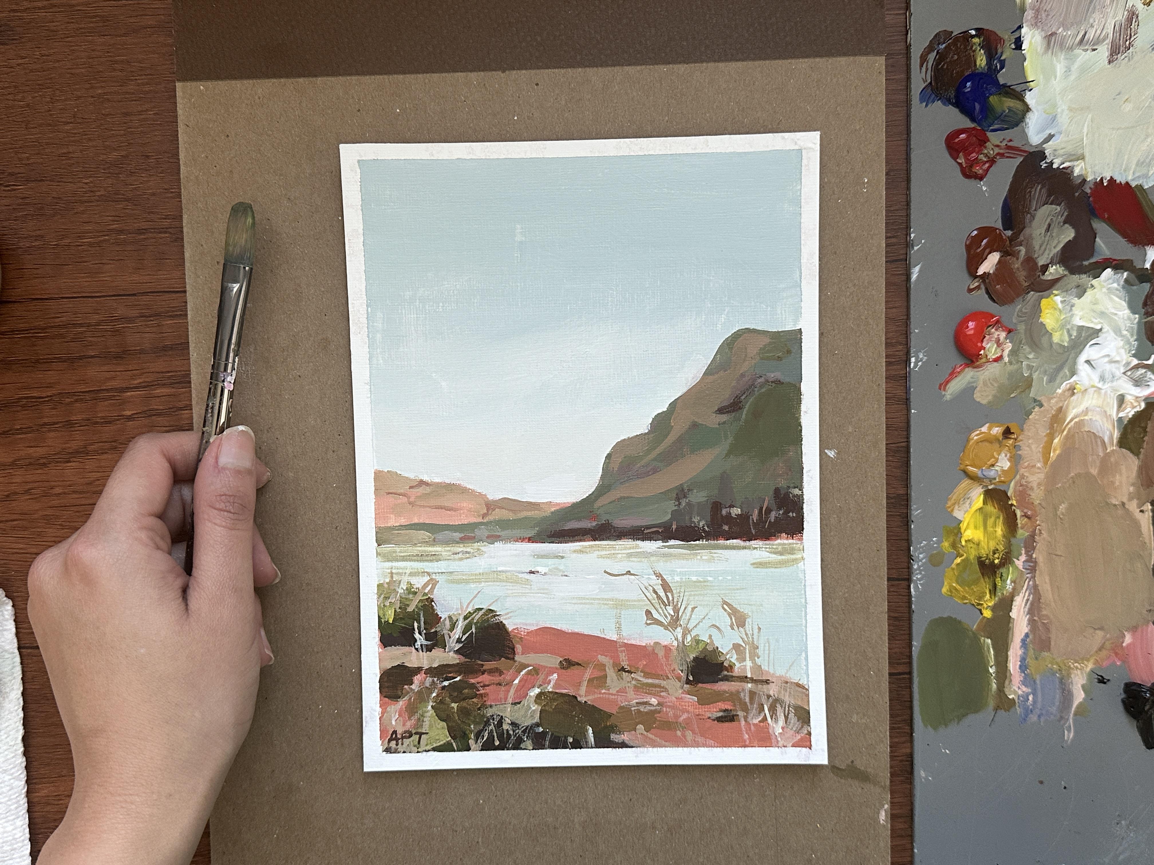
it simple and loose overall. And this completes our loose acrylic landscape
painting for today. If you followed me
so far, well done, I can't wait to
see what you came up with. Share your projects. I would love to see
them and do not forget to leave this
class a review. Ask me any questions in
the discussions tab below. I invite you to explore the different classes I
have created for you. Classes in watercolors,
as well as acrylics are available if
you want to learn more. So do consider following
me so that you do not miss out on future
painting classes from me. Follow me on Instagram to
keep up with latest updates, giveaways and all
that fun stuff. Thank you, once again,
and happy painting.
 Alifya Plumber, Artist | Acrylics, Watercolors | Painter