Transcripts
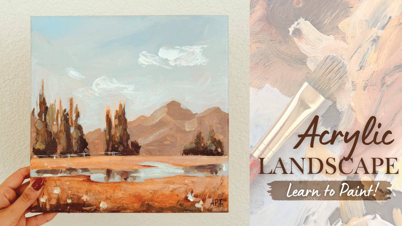
1. 1 Introduction: Hey, everyone. My name is Alfa, and I'm an artist here
in San Jose, California. In today's exciting and
fun painting class, I will show you how to paint a loose acrylic landscape using a reference photo while
still making it your own. Learn valuable skills in
breaking down shapes, great for beginners and beyond. I'm gonna walk you through all the materials
that you will need and exercise on color mixing
and form and dimension. And then we're gonna go through this painting step by step. Alright, so let's get started.
2. 2 Materials: These are all the materials that I've used for today's landscape. I have used a ten by
ten canvas board. You can use any size
that you'd like. And then as far as
brushes are concerned, we have one big flat brush of a medium size
filbd rough brush, and then also my most used
or favorite filbert brush, and then two flat brushes. And then I'll try
and list whatever I can in the discussion
stamp below. And then I also used a
palette knife and including some sort of palette with a scraper. And these
are all the paints. I will be listing that as well, so you can go through that. And then we've got
an open thinner. This just helps, like, slow down the drying
process a little bit, and, of course, just so
to prime our canvas. And, of course, you'll
need a bowl for water and a paper napkin.
3. 3 Exercise - Color Mixing: So here we're going to dive in a basic understanding
of color mixing. So let's start with
the color wheel, and I'm using simple and few
colors to demonstrate this, which are our primary colors. So here, I've laid
out ultramarine blue, cadmium red, lemon yellow,
and titanium white. So let's lay our
three basic colors first and then use these to make our complimentary colors which are green, purple and orange. So we're going to
make a green here by mixing blue and yellow. I often use this green
for landscapes rather than a green directly from a tube for a more
realistic shade, a green that you
can find in nature. So you can experiment with different shades of
green from blue, yellow, white, and I will actually demonstrate
that in a bit as well. All right, so then
mixing in red and blue will give you a purple. And then creating an orange her by mixing in red and yellow. So in a painting, try and use complimentary colors to
make your painting stand out. So if you can be intentional
of using green and red in your painting side by
side or like yellow and purple to grab
people's attention. So it doesn't have to
be a very bright color, but even, like, a subdued, desaturated version of that
will, you know, do the trick. So since I paint
landscapes a lot, and I'm going to go ahead
and show you how I kind of use color mixing in that category so that it
would be easier to follow, so just by mixing in
ultramarine blue, red, cadmium red and yellow,
you will get this, like, brown muddy toned color. And if you add white
to it, you will get a lighter version
of that color. So these are great
for, like, mountains, pathways, and just
nature in general. So here you can see how you can get such different greens. It all depends on how much blue you're adding or
yellow you're adding. So if you want warmer colors, you can mix in more of the yellows and those are
great for the foregrounds. And as you go further
back in a painting, because of atmospheric
perspective and how the light hits just
nature in general, you will notice that the
colors get more desaturated. So then adding in more of your ultramarine blues and your reds and maybe
even Born Sienna, all of that will desaturate
a color and mute it out. So those greens are great for mountains that are far back. Okay, so now let's move
on to painting skies, and I love using ultramarine
blue, titanium white, and a tapot of yellow in my mixing for Ao
desaturated sky look. Okay, so quickly, I'm just going to go from dark to
light here to show you how you can
achieve these more realistic landscape
colors in your painting. So once again, to get a green, you need to mix in
ultramarine blue, yellow, and a little
bit of the cadmium red to desaturate or dull the
color for a more natural look. And if you keep adding in
yellow or white to this mixing, it will give you the
opposite effect, so it will brighten
the scene up. So it's great for,
like, foregrounds or highlights in general. So that's my darkest green brownish sort of
color right there. And I'm going to lighten
that up by adding in more yellow and a little
bit of ultramarine blue. So now I'm going
to keep adding in some more whites
to brighten it up. And so we're just going
from darks to light here. I would encourage you to keep
trying this technique in different colors so you kind of get a stronger
sense of value. Now, let's do a more
saturated green here by mixing only blue ultramarine
blue and yellow. So we're not going to
do any of the darks, like the reds and the
blues in this one, so I just want you
to get a sense of how different the
green can look. And then, again, to
lighten this up, you can add in some more white. So mixing in cadmium red and pale yellow will give
you an orange color, which we all know, and to desaturate that, make sure for a
more deeper color, you can add in some
ultramarine blue. And obviously, the
lighter you want it, you can add in more
of your white. And also the amount of
red and yellow you add in the first place
will also dictate your initial base color. So yeah, play around with the
amount of yellows and reds that you add and
see what kind of different colors you
can get by doing that. So here's my suggestion. If you are extremely
new to painting, I would start with
the color vio, just like I showed and use all those colors and
play around with them by mixing all of them together and just experiment with them
to see what you can get. Meaning brighter in tone, you will need to mix your
lighter colors in general. So mixing your titan and whites, your yellows, all of
that will really help.
4. 4 Exercise - Dimension & Form : In this lesson, I'm going to
go over dimension and form. A form is a three
dimensional figure as opposed to a
shape being flat, how would you add a
form to an object? Well, in painting, you can
do that by adding color. In this example here,
we have dark tones, mid tones, light
tones, and highlights. This is exactly what
you need to turn a flat object and give it
some dimension and form, and I'm going to show you how. I'll be using red, black and white to
demonstrate this. So first, I'm going to block
in the shape with just plain red so that we can
have a base to start from. So this right here is an
example of a flat two D object, which we will now turn into
a three dimensional shape. Now I'm going to start
adding in my mid tones, so I'm going to
add some black and white to the red to create that. To get my dark tones, I'm going to add some more
black and fill in that edge. So now we're going to
take these two colors and blend them in between. You can already see how
this is forming a shape. Okay, now let's add in some light tones by
mixing in some white. Notice how I'm painting in
the direction of the ball. I'm not just painting
this up and down. Since this is a round shape, you want to kind of
paint in that curve. I'm just going to
go back and forth in between my dark
tones, midtones, and light tones until, you know, I'm satisfied and I feel
that this looks good. I'm just giving it a
rough background so that it doesn't feel like
this is just floating around. All right. And then
for the highlight, I'm going to take a lot more
white and a tiny dab of red. So a quick recap. Dark tones are achieved by mixing your
original color with some black, and then the more
white you mix in, you will get a gradient. So you can see how you
can move from a dark tone to a mid tone to light tones,
and then your highlights. All right, so I wanted
to show you how form is applied in
today's landscape, and you can see
that in the clouds. Even though clouds may appear
or white, it is not, right? It has dimension to make it
appear fuller and fluffy. So here you can see how
these dark tones, mid tones, and light tones are
applied to the clouds in this loose interpretation
style painting. You can also see dimension
in the hills, right? Again, if it was flat, I would have just painted it one color with no
buildup of flayers. But the fact that we have all
these different variations of greens and browns
gives it some shape. And even in the fence, by applying, you know, just a tiny little stroke of light tone and
highlights can give the fence some dimension
rather than just applying one straight
stroke of brown.
5. 5 Prep Canvas : Here I'm working with
a ten by ten canvas, and I am just going to be prepping the
canvas beforehand by esoing the entire
canvas with gesso. You can do this with
any flat brush, and I just like dipping
in my brush directly into my canvas and working or my gesso and just working
directly from there. You can also thin
it out a little bit by using water if you'd like. I like to do both,
and just cover the entire canvas doesn't
have to be too thick, but just once it's
completely dry, we can move on to the next step. So to begin, I'm simply tinting the entire canvas
within neutral color. So mixing in some yellow ochre and ultramarine blue
and some white. And this does not have to
be a very thick layer, but just enough to
cover the canvas. So I like doing this step
because I think it feels it's easier to visualize the colors better rather
than having that, you know, blank white surface. I'm also occasionally going to be using this open thinner, which slows down the drying process of the
paints a little bit, and it just kind
of thins it out, which can be quite handy
when working with acrylics. I have linked it below
if you are interested.
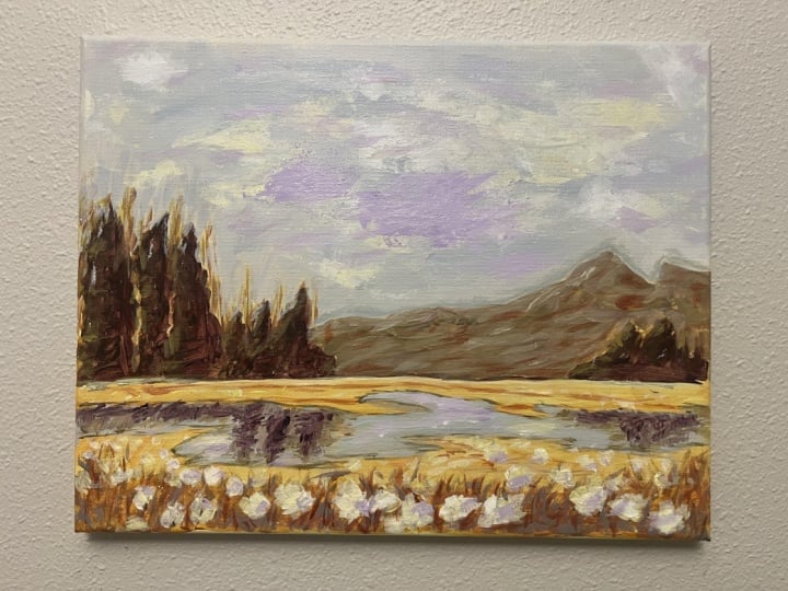
6. 6 Painting - Sketch: Alright, so once your
canvas has dried up, we're going to start
sketching our painting. And I'm just using
some ultramarine blue and bone Sienna for this, and I'm using a small
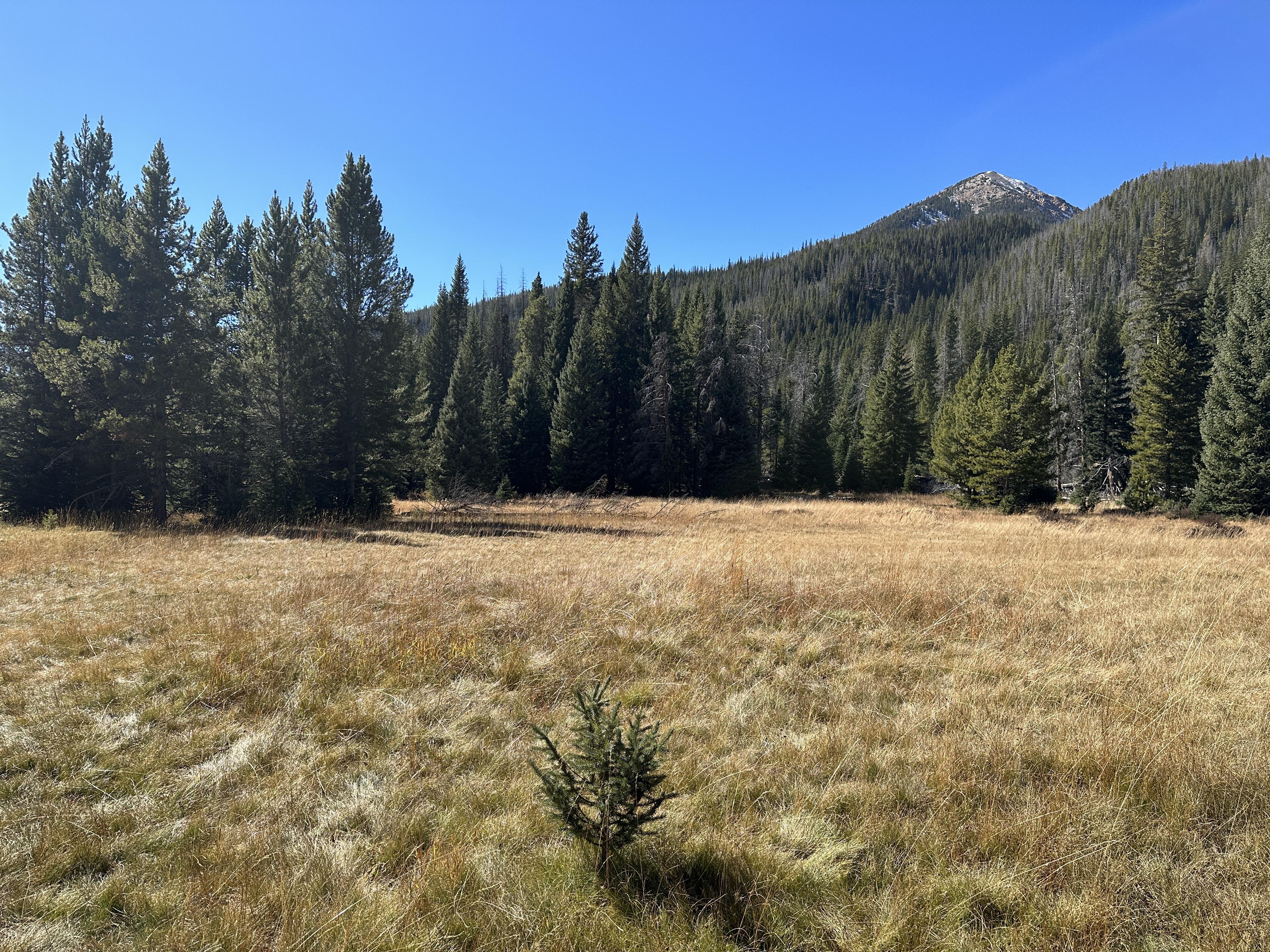
number six flatbush. So I do have my reference here
that I'm only going to be using for inspiration
to get a general guide, but I'm really going to be changing things up a little bit. So first up, I wanted to decide on where we're going to
put the horizon line, which means deciding what you want more of your
painting to be about. In this case, I wanted the sky to take up most of my painting, so I'm going to lower
the horizon line. And I always try
and avoid having the horizon line or your
focal point in the middle. It's just more visually pleasing if it's off
center slightly. Then here I'm roughly mapping out the
mountains in the back, following up with some
trees in the front. I'm also not going to be doing every single tree that
we see in the reference, but just a few also,
if you're interested, this picture was taken, almost, I think a year or two
years ago when I was on my trip to Colorado and, yeah, we were just hiking. My hubby and I, we
were on a hike, and I took this beautiful
little landscape from there. Okay, and I think
this is all the sketching that I'm
going to do for now. There's not much to
sketch at this point, so we're going to move
directly into painting.
7. 7 Painting - Blocking Shapes (Trees & Mountain): Now I'm switching to my medium sized filbert brush and I'm mixing in
ultramarine blue, crimson red, and
some yellow ochre to get the darkest darks
of the trees first. I always like working from
dark to light in acrylics. For the most part, I
find that much easier. Now, we just want to
get a lose impression of the shapes of the trees here, and I'm only painting
in the shadows first. So that's why we're using
the dark paints first. So we just kind of focus
on the shadows, okay? So we're not focusing on every single detail of
the tree because, first off, the tree
is far back, right? So you wouldn't really see
details in the first place. So just focus on getting
in the shape down. So I'm using the brush
from its back handle, and you just want to
utilize all sides of the brush to get
variety of brush strokes. So that's why I love using a filbert brush to paint trees. It's quite handy that way. If you look at the
reference, you can see the sun hitting
from the left side. So that's what I'm going
to follow as well. So all my shadows will be on
the right side of the train. Now, moving to my mid tones, we are going to start shaping this tree by giving it
some form and dimension. So I'm mixing in some
more yellow ochre to this mixture and a little bit of ultramarine blue to get a slightly lighter tone. So the sun is
hitting, like I said, from the left side, right? So we're going to follow
that applying this mid tones to the left side only and
keeping the right side dark. So this will help create that
dimension and form that, you know, we're looking
for in paintings. It's really important to capture the right light source, okay? So as long as you kind
of get the direction of where the light's hitting, um, it will kind of convey that in your
paintings as well. So the colors are very
subtle right now, I mean, the midtones and the dark tones, but it will come together. I think one of the
biggest mistakes, I think first time painters
do is sort of having this very drastic color change and difference between your
lights and your darks. And over the years of me
painting and learning, I've just learned that
the best paintings actually turn out when
you have you don't have to have those dark difference of colors between your
lights and your darks. I think those slight variation
of colors is all you need to make it look more
realistic, actually. Or are we going to pause on the trees for a bit and
come back to it later, but I wanted to move on to creating the base
layers of the mountain. So here, I'm adding
in some titanium white to this mixture
that we already have, and I'm going to also put in some Burn sienna and
some ultramarine blue. I didn't want to
make my mountains green like you see
in the reference, so I'm just trying
something different. I'm going with a or the
tone color instead. So I'm also adding in some
yellow ochre for some warmth. Using this color to paint the entire mountain one
color to begin with, we're just going to do
the base. Keep it simple. I like painting the sides of the canvas as I paint
just for convenience. It's easier when you have
your colors already, so I'm just going to bleed that into the sides as I go along. Okay, so now we have
one flat mountain here with one single
color, right? So now let's give this mountain
some shape and dimension. So like always, we
do this by adding in mid tones and then
your light tones. So I'm adding in some yellow
ochre with some white. I testing this color to
make sure that it's right, but I wanted it to be
slightly more cooler, so I'm adding in some
more ultramarine blue and crimson red. So just so you know, when you
want to make things cooler, you want to think
of your dark colors like your blues and your reds and when you want to lighten up and just make things
a bit more warm, your color palette more warmer, you want to add in your yellows and maybe your lighter reds
and whites and so forth. I'm applying small strokes
to only the left side of the mountain because
I'm keeping in mind of the direction
the sun is hitting. Uh I'm adding in some more white to
create a lighter tone, and I'm placing a few brush strokes of that to the mountain. So keep your brush
marks loose and quick and focus on different
sizes of brush marks. So you want to use
different shapes. So some big and some small
shapes to add interest and variety of different
brush marks in general. So here I'm adding in a
few marks of this color to the trees, little specs. Oh
8. 8 Painting - Blocking Shapes (Meadow & Sky): Now I'm switching to a rough fill word brush to
start painting the ground. So I'm mixing in
some yellow ochre, born sienna, some titanium white, and a little bit of blue. So I'm starting with the bottom I wanted that to be the darkest. So we're going to
just kind of work our way up a little bit. I'm painting this
rather rough and loose in different directions, just to give it the impression
of nature and grass. I'm adding in some
white to this mixture, and I'm just painting
the meadow above it. A rough brush helps
with this because I think it adds natural texture. Adding in some more white
here to the horizon line. Here I'm just painting in more different directions
to build more texture. I was just trying
to get a little darker tone to paint
the bottom here. So I'm adding in some
crimson red and both of these yellows to paint some
of these grass like shapes. So I'm using the
tip of the brush to paint in water cool strokes. All right, so let's give
this meadow a bit of a break and move on
to the sky so that we can just kind of capture all the colors to better
visualize things. So I'm using a larger flat
brush and I'm taking in some white and just a little bit of the yellow ochre and crimson
red to warm up the sky. Using this color to
paint the entire sky, and then I'm also going to paint the sides of
the canvas, too. Going in with a little specks of that sky color on
the trees as well for visual interest and also for some negative painting to kind of shape out
the trees better. Creating a slightly darker
version of the same mixture by adding a few strokes of that to the sky so that
it's not so flat.
9. 9 Painting - Building Layers: Here I'm attempting to add some clouds using
a palette knife. Now, you can totally skip
this step if you wish. Honestly, I'm still
on the fence if I like the painting more with
or without the clouds. In fact, I would love for
you to comment below in the discussion tab and let
me know your preference, but I just went along with
it to try something new. So you can use any
palette knife for this, and I just took in
a little bit of the yellow pale and some white, and I dabbed in my knife
in that color directly. And here I'm just grazing
this knife along the canvas. I'm just using this
using any brush to kind of whisk out the ends
for a softer look. Alright, so now I wanted to add some lighter highlights to the trees to finish
up that section. So far, we've got the dark
tones and the mid tones, but I think it needed a little highlight
to finish it off. So here I'm mixing in some blue, yellow pale, a little bit of the crisp red and some white. I'm using a small flatbush and I'm just going to go add in some few strokes of this to the left side of the
trees because remember, that is the lightest side
where the sun is hitting. Nothing too dramatic,
just a small change here. I'm just being very
mindful to vary in size of my brush marks and also going in with vertical and
horizontal strokes. I'm doing the same to
the mountains as well. I wanted a slight variation
of highlight here. So I'm getting in some blue, crimson red, white,
and yellow ochre. I'm not adding this everywhere, but only a few places
to make it stand out. All right, so going
back one more time to the meadow field to
build up some dimension. I'm adding in some blue and
crimson red and yellow ochre. So I just kind of wanted some more grassy
bits to the bottom, and I'm again working in
different directions, just keeping my brush
marks loose and quick, holding it from its back handle will help in making those marks. Stepping back, I felt like the cloud just needed to
tone down a little bit. It was too bright
and white for me, so I wanted to give it a little bit of shadow
to give it more shape. So I'm adding in some more
blue and crimson red to the white mixture
and just adding that to the bottom
of the cloud here. Using that same color
with a little bit of yellow ochre and adding some impressions of
flowers to the field. Adding in a few specks of dots, keeping my marks bigger in
the foreground and smaller in the back as we go towards the horizon to give
it more perspective. Using the splatter paint
effect to dab my brush for just some more impressions of more flowers of tiny flowers, you kind of want to do a water down version of the white paint. So make sure it's
kind of liquidty and then you just
have to dab and tap your brush along the field to give it that
splatter paint effect. To show more
perspective of depth, I thought of adding
in some fence far away by the horizon. Adding in details like this can really help scale and
elevate your painting. So I'm just using a number
one flat small brush for this section with some
white and yellow ochre.
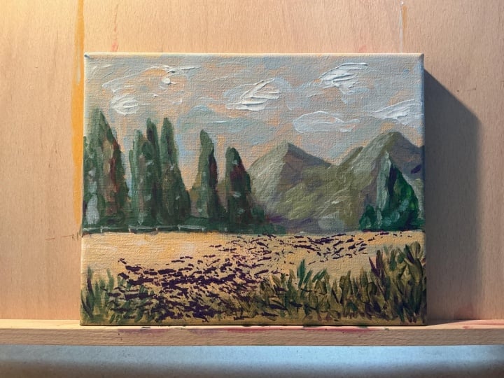
10. 10 Painting Final Details & Class Project: All right, so I had
a moment to step back and just take a look
at this painting overall, but I still felt like something was missing in this painting. I wanted to add more
depth to the foreground. It still felt like it
was a little flat to me, so I decided to add a stream of water in the middle there to break up the meadow, but more importantly, to give it more scale and
perspective of depth. So I'm using the same color
that we use for the sky. So taking in some
ultramarine blue and san yellow ochre and a
tat bit of crimson red. I'm using my filbert brush and painting the
little stream here. Think of these colors as a reflection from
the sky and trees. To paint the reflection
from the trees, you want to add in
some blue, yellow, red, white, just to get that in between
base color of the tree. It doesn't have to be perfect. You just want to
add little marks of this to where the
reflection would hit. You just want to give
it the impression of the tree and in
just a few places. Using some horizontal strokes
and some vertical strokes. So getting in some reflection of the shadow from the trees here, so just getting in
some crimson red and ultramarine blue
to the mixture. Following up with some of the reflection of the
clouds so just a little bit of white around some of
the trees in the water here. All right. And last
but not least, I'm just going to work around on the outskirts of the water just to differentiate
the land and the stream. So taking in some
darker tone colors and just outlining some
of the water stream. And this completes our loose acrylic landscape
painting for today. If you followed me
so far, well done, I can't wait to see what you came up with. Share
your projects. I would love to see
them and do not forget to leave this
class in review. Ask me any questions in
the discussions tab below. I invite you to explore the different classes I
have created for you. Classes in watercolors
as well as acrylics are available if
you want to learn more. So do consider following
me so that you do not miss out on future
painting classes from me. Follow me on Instagram to
keep up with latest updates, giveaways and all
that fun stuff. Thank you, once again,
and happy painting.
 Alifya Plumber, Artist | Acrylics, Watercolors | Painter