Transcripts
1. Introduction: Have you ever been mesmerized by all those YouTube
videos of people pouring paint and thought,
no I can't do that or try to made a [inaudible] or just
not sure where to start. In this class, I break down the process into easy
steps that will allow you to experiment and
create the effects you see in fluid and
abstract art today. Hi, I'm Jenny Guarino. I'm a fluid artist
working out of my studio gallery
in Houston, Texas, except when I'm traveling for inspiration or when
I'm here in Melbourne, working out of my home studio because I'm visiting
family and friends. A recent deep teach
that I created cloud waves is in the City
of Houston art collection. In this class, I'll
teach you the basics of creating an abstract
artwork in your style. You pour on a canvas or a panel and create
your own compositions. I emphasize your
individuality and choices and give you confidence to
find your own uniqueness. This is a fun way to create art it can be done in a small space. It's not intimidating as it's just one answer of
what you create. This class is for everyone, if you've never painted
before it's a great way to start and there's no lines to
draw or colors to fill in. It is introductory and covers
the steps at a high level, allowing you to create
in your own style. The course is structured in steps that break down the work. I teach this class for my
Houston studio and love giving students the wings to fly on their own and
create their own art. I'm excited to
share my tools and techniques with the
Skillshare community. There are many
options of what you can use to create
these artworks. If you're already painting you probably have most of the items, if not I'll provide a minimum
list with product options. Your class project, we'll create an artwork in your
colors and style. I can't wait to see
what you create. Next step, join me as I explain the project
in more detail.
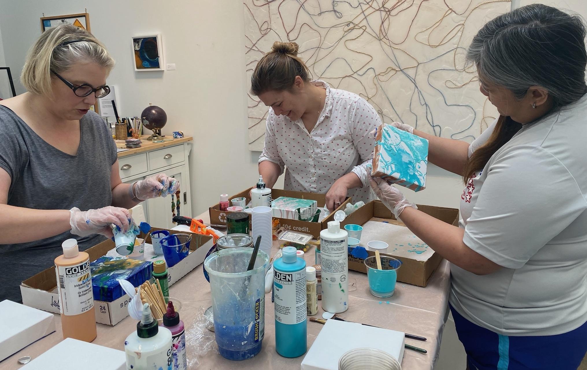
2. Skillshare Pouring Project: Hi, let's talk
about the project. As I explained in an intro, your class project
will be to make an artwork in your
colors and your style. This is my most popular
class that I teach out of my Houston studio and
I'm pleased to be sharing it with the
Skillshare online community. Hear are a few examples of small pieces that a
student worked on my work. The possibilities are endless. When you look at these, start
to think, what do you like? what don't you
like? be critical, what are you going to
create in this class? The steps we're going
to take to create your art work are,
firstly, inspiration. What inspires you? What gets your heart racing and
fills you with emotion? Look around you, find photos, drawings, preferably
your own work. Upload your chosen piece to the project gallery
once you have decided, and put away all the
rest for another time. Supplies. There are many
options for supplies. I'll help you sort
out what you have already and what you
need to purchase. Workspace, this is
messy work that can be done in a small
space if you're prepared, I'll help you set up your space. Color. With your
inspiration colors, we'll do some small tests to
see how they work together. It's a great way to get started, play with your paints and
understand your space. Make sure you share
your chosen combination on the project gallery. Preparation. Depending on your work surface
you have chosen, we need to make sure
your panel or canvas is properly prepared to get pure, long-lasting colors and for the paint to go
anywhere you want it. Mixing. Here's the fun part, let's mix up some paint. Pouring. The pour. You've thought about it,
your paints are ready, your surface is ready, you're ready, now let's
see what happens. The finishing and completion. Are you happy with
what you've done? Let's decide whether
anything more needs to be done besides removing tape. Your piece is ready
to hang or frame, show it off in the
project gallery. In this project, there
are three opportunities to share in the project gallery. Firstly, your color image as inspiration or your
color swatches. Secondly, your color tests where you try out your
paints for the first time. Thirdly, your final
finished abstract, uniquely you abstract artwork. Depending on what art
supplies you have already, there will be some purchases. I'll help you sort through
what you can find in the home already and then
what you need to purchase. There will be a detailed
PDF that you can print out to take and help
you with the shopping. If you don't want to buy
anything unnecessarily, please make sure you
watch the inspiration and materials lessons before
you make any purchase. I look forward to seeing in the first lesson and finding
out what colors inspire you.
3. Color Inspiration: What inspires you? What gets your heart racing
and fills you with emotion. That's what we're looking for in this lesson about
color inspiration. We're going to look at your
inspirations and choose what will inspire you to create an
original abstract artwork. For me, it's the world around me and the beauty of
the natural world. When traveling, I take
my iPad with me on my adventures and I sketch
and draw whatever I see, primarily focused on the colors. What colors are there in front of me that I can
capture on my iPad. Usually it's my most recent
travels that I work on next. I also take photos, although I find I'm not
getting the colors and mood as strongly as in the moment
on the site when I draw. With photos, I'm
working more from memory when selecting colors. But that's me. What about you? What colors inspire you? What do you see
that inspires you? Go have a look at your phone. What photos have you taken
with your phone lately? What photos in that whole
big gallery that you've got there standout
and appeal to you? They are a good start. If this doesn't work for you and you just want
to focus on color, then look around your house
at the colors you've chosen, like cushions,
curtains, paintings, and see what colors
inspire you there. You can also go to
a hardware store to their paint section and look at what you like
in their brushes and grab some test swatches. Think about what colors
you want to try? What mood do you want to convey? Look at the photos
or images you have, or the paint swatches. To start with, keep it simple in terms of
just a few colors, light, medium, and dark. I really like you
to think about what speaks to you and who
you are at this stage. If it ends up you
like an artwork that someone else has created
and want to copy it. That is always an option
and maybe okay for learning how to execute
a new technique. With the unpredictability of pouring yours will be different. But I challenge you to think
about putting your own twist or uniqueness to
everything you create. Use a color wheel
to help you see which colors work together. Complimentary colors create
the strongest contrast. Red-green, yellow-purple,
blue-orange. Adjacent colors are next
to each other and are more calming and some subdued, e.g. yellow to yellow and
orange to orange. No matter what you decide or how you approach
your inspiration, choose three or four colors. One light, medium, and one dark. Not too many at this stage, as you get a few extra colors
when they mix in the pool. Have you decided yet? Just close your
eyes and pick one. Put the others away in a
folder for another time. Now, share it with
everyone else. Post your inspiration photo, image or swatches of color
to the project gallery. I hope you've picked your two
or three or four colors or your image and share them
on the project gallery. Next, we're going to talk about what materials you have
and what you need to buy.
4. Materials: Now we're going to
talk about supplies. We're going to talk
about what you have already and what you don't. We'll go through in detail
what you need for you to wear, to protect your clothing and for your workspace and then what actual materials
to create the artworks. There's three sets of
things you need to think about when you're setting
up your workspace. When you watch this lesson, have a copy of the PDF
materials list that I've provided so that
you can check off what you need as you
go through the lesson. This is what I wear
when I'm painting, I have my gloves on nicely. You'll see me in some of
the videos without them, but I'm sure when I do
remember to put them on, I'm usually very grateful
because it makes the hand clean up a lot better. Then I just have my
apron and a top. That's what I wear
when I'm painting. When we talk about the
workspace, the floor, I actually have a drop
cloth on the floor, plastic cover on the table top, and then I work out
of these boxes, which you can see here. Usually have parchment
paper on the bottom and then I can move around
whatever I'm using. Here is an example of a
workspace setup in my studio. You need white sheets
of sketch paper, watercolor paper
for the color test. Then for your actual
painting itself, you'll need a small panel or
canvas from an art store, hardware store, or
Walmart will be fine, get a minimum of one
for your project. This example shows the cradled panel,
which has the sides. Then you have to make a
decision about a side, but it hangs on its own. You can also get a
timber preformed shape from the hardware
store or crafts store. As long as you just saw
and type the back of it, it will work just as well. If you want to get a few to play with, that's a great idea. Once you try one, you'll
have ideas for many more. I'm going to play around with a few color inspiration images and different painting services. You'll see snippets
of it through the demonstrations that follow. I always make sure I have a few extra little panels or canvases to play with the extra paint and have a bit of
fun on the side. For preparing your
paint surface, you'll need some painters tape, some scissors and something
to cut the tape with. You also need any
brand gesso or primer and a brush or
roller to put it on. Any acrylic paint can be used. You can use a tube paint
such as this Jo Sonja's. You can use golden products and they're in tubes
and all things. High fluid ones where you
just like little droplets go. At the hardware
store you can have containers of sample paint. Another brand that I really
like is this Lumiere brand. Any type of white is great, white is heavier and was thinking is very
good for pouring. The other interesting thing
is there are a lot of beautiful metallic
paints there and, particularly if you just choose
one that will stand out, they look particularly
interesting in a pour. Hopefully I've got the
message across now that we can be using any
acrylic paint that you have around the house or in your art room or craft room, in a craft store or a hobby
store or a paint store. As long as it's acrylic, we'll mix it with
some pouring medium and we'll create a pour. For my project and
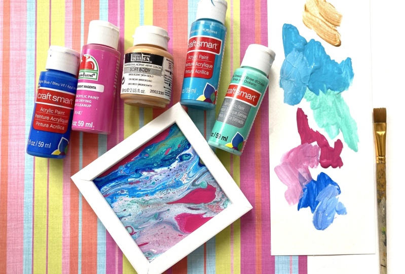
color inspiration, I'm choosing a photo of a cushion that I really
love in our house. It's got shades of brown and a pearly white that
I've chosen in my paints. There's a Lumiere
pearlescent white and a bit touch of green with
the green gold from Golden. There are many options
in pouring mediums. The main ones, golden GAC
800, such as this one, or golden pouring medium and also Liquitex pouring medium
is the other art product. Depending on supply issues, I've been able to get
one or the other. What I found is that you can interchange between the three. I primarily in my studio
use this particular one, although in this case it's
not called a pouring medium, but it works in the same manner. For the purposes of this class, you just need a small
container of pouring medium about this size, that
should be ample. You will hear people
using flow tool, which is available at paint
stores as a low cost option. I have tried this. The only issue with
this when using it is that it doesn't dry with
a nice shine and finish, and you'll need to put
additional coats to bring it up to the same standard
as you get when you're using a traditional
pouring medium. For mixing your paints, you
need some plastic cups, white or clear so you
can see the final color, and then some stirrings sticks, I use craft sticks
or plastic spoons. The plastic cups
are also useful to raise the painting off the
surface of your table. Now, with your
inspiration image, this is my image
that I've chosen. Decide on what paints, paint surfaces, and other materials that you
need to make your artwork. Watch your house to find
what you have already, then go to the list and
see what else you will need to buy and place their
order or go shopping. In the next lesson, we're going to talk about
setting up your workspace. You can follow this lesson even if you haven't
got all your supplies.
5. Setting up your Workspace: This is messy work,
but can be done in a small space if
you're prepared. I'll show you how to
set up your workspace. Also, remember to set up
so that when you pull, you can leave it in
the same place for 24 hours without moving it. Trust me, I've tried to move
things before they really dry and made a big
mess of my artwork. Here's my setup. A table, can be a desk. I used a dining table
for quite awhile. Any flat space will do. I like to stand up when I work, especially on large pieces
to navigate around them, but for smaller works,
you can sit at a chair or on a stool depending on
the height of the table. Cover the table with plastic. Clear a white plastic so you can judge the colors of
your artwork best. I often work inside of box as well lining up with parch and paper keeping sets of colors in one box and my work in another, making it easier to move them
around and put them away. To do the color test, you'll just need your workspace
setup with your paints, some white paper, a
brush, and some water. Go ahead and set
up your workspace, and I'll meet you in the next
lesson where we'll start with some color
tests of our paints.
6. Color Test: Now we can have some fun. With your inspiration
colors we'll do some small tests to see how your colors work
and blend together. It's a great way to get started and understand your space. Here's the setup.
We're going to use water to allow the paint
to flow rather than pouring medium as we're focused on just the colors
at this stage. With your inspiration
image nearby, get your paint colors and just play with them on the surface. Use some water to
push the paints around and lighten and
darken the colors. Which do you want
stronger more of? Which will be dominant? Is the contrast enough? Decide which color you like
the most of than the others, maybe think of it
in percentages. Like 50 percent of
a middle shade, 25 percent of a light, and 25 percent of a dark. If you need to, just
take note of what you've learned from the color
taste on your bit of paper. Percentages of darkness
and lightness, and maybe if you
mixed a couple of colors together and they
looked really good. This example shows blending
with a bit of titanium white, the fluid nature
with a few drops to blend down the color to get
the exact color that I want. Let those paint sit and dry, and you'll see with acrylics they do dry slightly darker, so take note of that. On your bit of paper write the colors that you used
next to each color, and if you mixed a
couple of blended, note that you had a
little bit of white with perhaps some red
that you mixed together. If you're planning on having
this artwork in your house, at this stage you
can actually put your color taste up against the wall in the
area where you're going to hang the artwork, and you can see whether
the colors are good or not and go back and make an
adjustment if necessary. Then take a photo and share an image of your color taste
in the project gallery. For the next lesson,
we're going to prepare the paint surface that
you're going to paint on. For that, you need
your workspace setup. You need your panel
or your canvas. You need just some form
of gesso or primer, paintbrush or roller,
tape and scissors. See you at the next lesson where we prepare the painting service.
7. Preparing the Painting Surface: Depending on the
work surface you've chosen we'll need
to make sure that your canvas or panel is properly prepared to take
the poured paint. A coat of gesso or paint
primer makes absolutely sure that you have a barrier between the
surface and your paint. This gives you pure
long-lasting colors. Next, I'll show you
a few examples of taping then gesso-ing
your painting surface. In this first example, I'm going to tape and then
gesso a cradle panel. We tape it to keep
the back clean, and I'll gesso the sides and the front later after
I've taped the back. There's many different
widths of painter's tape just choose the one closest to what you're
trying to tape, don't fuss too much. If you don't want the
paint to run over the edges of your painting then later on after
you've gesso-ed you can put tape on
the sides as well. Go ahead and tape the sides trimming the edges with
scissors as you go. Now we're ready to
gesso the cradle panel, we're going to do the sides and the front with a
quick thin coat, just find the biggest
brush that you've got that will make it
faster to do the gesso-ing. I don't mind brushstrokes, the texture, I rather
like a bit of texture. If you don't like it
when it's dry just give it a quick sand.
Then I'll let it dry. For a flat panel, I tape the back, trim the edges with scissors, and then in a similar manner do the gesso with the biggest
brush as I've got. As I mentioned before any gesso or paint primer will be fine. Lastly I'll show you
an unfinished board. This one need a few coats
so you can see that as I apply the gesso it's getting
absorbed into the wood, so at least two coats to create a barrier for a clean
color on the top later. Don't worry about
fingerprints, don't fuss. Then when you're finished,
just let it sit and dry. For a smoother finish and better adhesion
sand between coats. Prepare your
surface, let it dry, and we'll see you in
the next lesson where we will start to
mix some colors.
8. Mixing the Paint: Here's the fun part.
Let's mix up some paints. Have your inspiration
images nearby, and your color tests, and your paints, and you're pouring medium, at your workspace
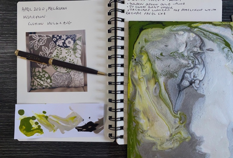
that you've set up. For my class project, I'm going to mix up
50 percent of Perl, 30 percent of the light brown, 10 percent dark brown, and 10 percent green. I've got three larger
mixing containers, and a little small one
for the fourth color. I have Liquitex pouring
medium, and GAC 800. I'm going to mostly use
Liquitex because that's what I have in my
studio at the moment. To remind myself of how
much paint I need to mix, I quickly check the
six-by-eight canvas panel I'll be painting on later. I'll start by squeezing some of the burnt Jo Sonja's painting into one of my plastic cups. Next, I'm adding
my pouring medium. If you remember,
I was only going to make 10 percent
of the burnts, so I don't need to make
a whole lot of it. I'm actually stirring,
and stirring to make sure that the brown, and the pouring medium are
mixed together really well. Then if you see I'm trying
to see how fluid it is, it needs to flow off the stick. I've decided to add a
bit more pouring medium to make it flow really well. The trick here is just to get a nice consistency that
the paint will drip. Now I'm going to go
through the same process with the pearlescent white. I hope you can see I'm
getting it out with a spoon just because
that's easier, and it's a bit more fluid
than the tube paint. Also, I wanted to have a higher quantity of this
because remember, I was going to do 50 percent
of the pearlescent white. Add the pouring medium, stir it through, mix it well, I'm using a spoon here. You can use a spoon or a stick. It's whatever you
feel like doing, and what works for you. I've decided that I
haven't made enough, so I'm going to add more
of the pearlescent so it's constant adjusting of paint, and pouring medium, and stirring, and mixing
to get the right quantity. I just make sure it's
blended in really well, and has a smooth consistency
when flowing off the spoon. Keep mixing, and
blending until it flows really nicely off
that spoon or stick. Understanding the
consistency is important because there are heaps of
different recipes out there. But because I like
to use any type of paint depending on the
thickness of the paint, I add different amounts
of pouring medium to get a similar consistency. I'm going to make
the light brown. I'm going to put the
pearlescent in my cup, and then I'm going
to add some of the dark brown tube paint. Now just add a little touch with the brand because I just
really want an off-white. I mix the paints together, and get that color right before I even add the pouring medium. It's much easier to
adjust just the color, and get the color to the correct shade before
you add the pouring medium. Of course, there's
no real rules here, and here I'm adjusting with some of the pearlescent
that's mixed with the pouring medium
before I add some more pouring medium to
get the color right. Now I'm going to mix a
small amount of green, if you remember, it
was about 10 percent. I just wanted to pop, and highlight within
the composition. The other thing
to think about at this stage is how thick, and thin you want your pour. Really thin means there'll
be a lot of movement, and flow, and interaction
of the colors. Thicker will stay more in place. You'll get more
experienced at it, but just take note of
that at the moment. I'm not covering
composition here. We're just having fun, and managing through, making sure we have
light, medium, and dark, one color more
predominant than others. The rest is all to do with your viewpoint when
you're pouring, and what spontaneously
happens when the colors are poured,
and mixed together. I like to do a quick color
test at this stage with the paints to make
sure that when they dry they look as good together
as I think they will. Don't fast too much though. This project is to
just get you started, and to have fun, and keep it as
simple as possible. Once you've finished mixing, cover the paints
with gladwrap or a lid to make sure
they don't dry out. Mixing can cause bubbles. If you see bubbles, let you paint sit for 10 minutes or so to let
the bubbles resettle, cover it with gladwrap, and they won't dry out at all. You can even leave them totally covered in gladwrap overnight. I'll see you at the next
lesson, which is the pour.
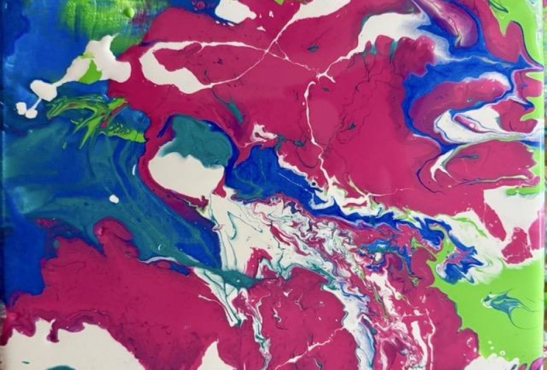
9. The Pour: The pour, you've
thought about it, we've done all this planning, and now we're actually
going to do the pour. You've got your poured paints, you have your surface prepared, and we're ready to go. For the pour, I have
my flat panel taped on the back and I'm
using a coffee tin to raise it off the table so that the paints can
drip off the side. You can use plastic
cups or lids, anything just to lift it up. Then make sure it's leveled, putting sticks or bits of paper underneath to level
off the corners. I'm going to show you a
few quick techniques, starting with a dirty pour, you can decide which ones you want to use for your artwork. For the dirty pour,
you need an empty cup, that's what you're going
to dip the paint in, starting with the white paint or a metallic because they are heavier and they will sink. I put them in first, and then add the other
different colors in any order. You can see the
dark brown isn't as fluid as it should be
because it's been sitting, and so I add a bit
more and adjust the pouring medium
at that stage. Dribbles of colors in
any order you like, it really doesn't matter. You can see, when
you look at it, it'll start to become quite interesting
and you can go over and over again all around
the different sides. I tip it slowly down
the side because I don't want to stop
creating bubbles. Don't stir it at
this stage because it's doing its own thing without any interaction from you. Just remember to have fun, this is looking so
interesting now, look at that. Isn't
that exciting? A bit of cleanup needed on
the panel so I quickly get out my rag and wipe that off. The cup's full of
paints we're going to sit the panel on top, flip it, you can leave it
there and let it sit and let the paint drip
down the sides of the cup. You can tap it, you can
do whatever you like. You can either now, release
it quickly or slowly. You can see that I've
just waited a little bit, a couple of seconds and then
I'm going to release it, and pull it off
relatively slowly. Doesn't that look wonderful? Look at that magic, I'm using my hands
and I'm tilting now, doing a bit of a tilt to spread the paint around and
change the composition. I'm tilting it slowly
and keeping it just too near the edge until I'm
happy with what I've done. Another technique you can try now is a scrape
and normally with a scrape you will pull paint over the top
of something else, and it will interact
with the other colors and create some very interesting
and spontaneous effects. Now I'm going to look at the
composition and balance out my colors with the dark and the light plan
that I had before. I'm filling in with some of the lighter brown and
I like to splash with my spoon drips because
they also will be interesting in a
finished painting. I'm continually tilting and playing with it
to move the paint around and get some balance that appeals to me in this painting. You can see there's
splashes that of white that I splashed earlier
or the pour color. Now have become more dramatic
as I moved it around. Now I'm going to add
my touch of green, and you can see I'm
painting there on with the craft stick that I'm using. It's like a paintbrush, just relax and have fun and it's like a big painting doodle. At this stage,
it's really about, I had that rough plan of
a little bit of brown, a little bit of
green, more of the light brown and a
lot of the pour. Now I'm going to add some more dark brown in for contrast, that means the other
colors will pop. I turned down the
brown a bit and add some pouring medium as well. I'm really just having a
bit of fun letting it drip. That's absolutely fine, swirling it around and in
the other color paints, and just really
having a fun time. Just remember, this
is meant to be fun, it's not serious. You're just playing
around with some paint. You've chosen the colors, you've thought about the colors, and it's about having
fun experimenting and observing and thinking and looking at it and
reacting to it, and deciding, do I like it as
it is or not at the moment? At this stage I'm deciding, I'm going to have a
few more splashes because I do like splashes. If you see some of my
work on my website, you'll see I like to have
drips and splashes there. At a certain stage,
you're going to have to decide when to stop. I'm just balancing and
filling in at the moment. If you're really not sure, stop and take a photo,
look at the photo. That often helps you design. If you see any
bubbles, you can use a toothpick to pop the bubbles, I also use a toothpick to
swirl some things around and add a little bit of texture and mix up the
colors a little bit. you see me doing a little
mini scrape there as well. If you're unsure, but you like what you see, stop, let it dry, cover up your
paints with glad Wrap, and when it's dry, you can decide what to do next. We'll talk about that
in the next lesson. Here's a photo of
my finished piece for the project gallery, wet. We should wait to see
what it looks like dry. Once you've played
around enough and think it looks ready to
stop, just stop. Let it sit, leave
it in place for 24 hours before you touch it or move it because
if you tip it, it will change the
composition and your plan, and maybe that's okay, but if you like what
you've got there, just don't touch
it and have it in a place where no one one
can move it or bump it. Then we'll see you
in the next lesson, which is about talking
about is it finished? Then the actual
finishing process.
10. Finishing your Artwork: Hi, how does your painting look? It's been 24 hours, so now you can pick
it up carefully. Have a look at it.
Decide whether you think it's finished. See how this one change
from wet to dry. The colors are a bit more
subdued in the dry one. Now the blue one had some greens and whites when it was wet, but dry, it looks
all washed out. It has a nice smooth effect and some parts are interesting. You can see what happen
when you look at the box. Although I leveled
it at the start, when I put it down
after pouring, a cap must have moved
and the paint slid off instead of holding in
the composition I made. You can see at the
bottom of the box a paint skin is formed
so thick it's still wet. This is an example
of something still interesting but not
a finished piece. I had to decide whether
to pour over the top filling some of these
interesting shapes. You don't have to cover it all. Maybe I'll just sow it
over and start again. One of the things I do when
I'm not sure if the work is finished or not is to
take a photo of it. When it's wet, take
a photo of it. When it's dry, take a photo of it and look at the photo and see from that view what
you like or don't like. Other thing you can do is
rotate the artwork 90 degrees. See which way you
like it best and if there's any
changes that need to be made because of the way it looks in a certain direction. If you're happy with it, fine. Go ahead and rip off the tape. If you want to correct an area
you don't like, go ahead. You've got that
leftover paint so can pour more over the top
and have an extra layer. It doesn't have to be
totally over the top, just in little dribbles. You can even mix up more
paint if you need to. If it's not and it needs a
little bit of touching up, then get your paints out, your leftover paints and just
touch it up and let it dry. Next, rip the tape off carefully without
damaging the front. You can protect the front
by putting a bit of parchment paper against it
when you're removing the tape. Then if there's any rough edges, trim the paint off
with a Stanley knife. For this red board, you could sign the
back and get it framed or attach a hanger and hang it as is or find some
cork and cut the cork to size. You can make a placement,
but you'd have to put a protective surface over
it to protect the paint. If you're not
finishing with resin, a spray code of
crawling varnish, you can follow the
directions on the can. Otherwise, finish
with the resin. Crawling is fine for the varnish and for the UV protection. Some brands of art
products actually have both vanish and UV
protection in one can. Just make sure
they're for spraying over acrylics and
you'll be fine. Your piece of
artwork is finished. Terrific. Don't forget to sign the back of your
painting with a pin. Take a photo of your artwork and show it off in
the project gallery. Best to use indirect
light when you take photos as there is a lot of glare if you have
direct light or flash on. Another tip when taking
photos is to take a side angle view so that
you can get the colors. Take a photo of the artwork, whether it's framed or unframed, and show it off in
the project gallery. Then let's wonder now, what are you going
to create next? What's your next ID going
to be for a poured-out? Next up, we're going to
talk about other ideas for artwork based on what you've learned and played with today and what you like to do.
11. What Next: [MUSIC] It's been a pleasure to go through this
journey with you. Thank you all for
your participation. I'm so pleased you unleashed your creativity and made your own unique artworks
as part of his class. What I'm going to do next? What ideas do you have that have come out of making
the other pieces? This little piece I made
with some leftover paint on a small square panel with some of the
colors that I enjoyed. This is a landscape structure
that I use quite often. I see clouds, I see
hills in my paintings. Then we have the skins, so the drips of the paint
forms sometimes some interesting shapes and forms and suddenly it could
be done with them. I'm not sure what, maybe
you've got some ideas. Lastly, something is wrong. I like the composition. Maybe I'll try that next time. Using your own ideas
and inspiration is so important in
the art world because it's what defines your art and you and it is an
expression of you, and that's what art's all about. This is my first
Skillshare class and I have many ideas
for future classes. Please, I would appreciate
any suggestions or ideas, or I'm happy to answer any
questions that you may have. Make sure you post your final piece on
the project gallery. I will look at
everything and I'm so excited to have a look
at what you create. You can see my artwork
on jennyguarino.com, or you can follow me on Instagram
@jennyswalkabout where I post my travels and what
I'm creating along the way. Be sure to follow
me on Skillshare as well for any new classes. Take care and see you
next time [MUSIC].
 Jenny Guarino, Traveling Creator Inspired by Color