Transcripts
1. Introduction: Hi, I'm Jenny Guarino. I'm a fluid artist working
out of my Houston studio. I want to take you
on my artistic journey from when I have an idea to when I actually
create the poured paint artwork. It's always an
adventure with lots of detours and wrong turns. And then finally
some magic happens. I teach from my Houston studio, and my goal is for everyone to be able to start
with an idea create some art and keep
on working on it until they are happy that
it's in their colors, their style, and it's
their own unique artwork. In this class, I want to
use the idea of a motif So in my case, I'm
choosing hearts. I've been thinking about hearts. I've had hearts on my mind for
quite a few months actually, and wanted to develop
this idea a bit further. The small in a smaller
sense to start with little three inch
squares to allow me to experiment and try out my ideas. I'm going to work
through it from drawings to the poured paint, and I'm going to
show you every step. I'm going to show
you the materials. You will need to create
your own artwork. You can choose your own motif. It could be a flower shape, a heart as per mine, which is absolutely fine or anything else that
you can think of. Come with me on
this journey as I explore the heart motif You can use the heart motif or some other motif and create some beautiful
little pieces that you can keep for yourself and put them on display or
give them as a gift. Come with me on this journey as we create some
artworks together.
2. The Project: Let's talk about the
project for this class. What I want you to do is
get your pen and paper, however you like to
put down your ideas, and we're going to
explore a motif. I've chosen heart
for this project. It's near to Valentine's Day. Then I'm going to
pick some colors and have it I'm using little
three inch panels. You can do whatever
size you like, get your favorite
tools for pouring. And you're ready to begin. I'm going to help you
through all the stages from making a template of the shape of your motif to
mixing and pouring the paints. We're going to talk about
backgrounds this time, how to get multiple
layers of colors to interpret your ideas that you've captured
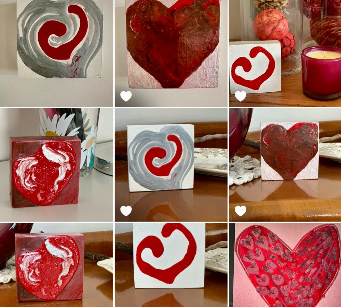
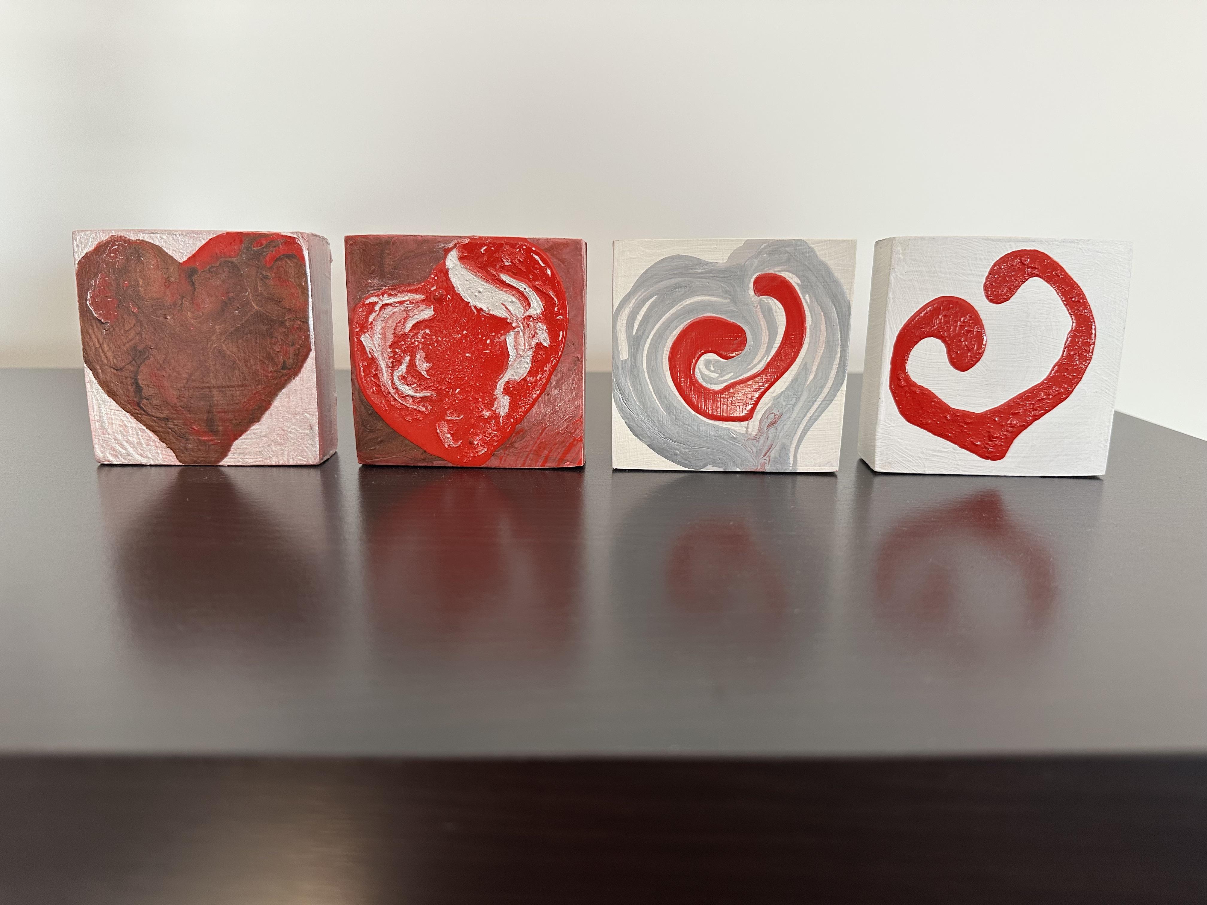
in your drawings. We will create four
different artworks. Then you want to upload and
share your completed results. With your finished artwork, you can display it or gift it. Next lesson is the materials.
3. Materials and Preparation: In this lesson, we'll talk about the materials and preparation. Before we get started, let's
have a good workspace setup. We need some cradled panels, some paints, and
just a few tools. For a materials by lesson list, download the PDF from the
project resource section. The cradled panels, I'm using three by three inch square
panels for this one. You can have them pre prepared with some background colors on them or even reuse something
that you don't like anymore. Paints. For paints, just find a few of your
favorite acrylics. And then a pouring medium to mix with the paints
to make it flow. I use GAC 800 and use
substitutes when I'm traveling. For the tools, it's really
some paint brushes. This time we'll use some Q-tips and small squeeze
bottles as well. This is just what I used. If you want more detail
and information, go and look at my previous
class on pouring. In this section,
I'll just give you a little reminder of
mixing your poured paints. I'm using a red tube paint and the flow medium I'm actually using is Joe Sonya's brand. I'm in Australia
and the GAC 800. You can get it, but I just had that available
more easily here. You can see because
I'm using tube paint, I actually need more
of that flow medium to get it to the right texture
and it does tend to go. The tube paint is a bit lumpy. Leave it overnight and
the bubbles will go away and you can also double check the next day if there's any lumps and make
sure they're gone. Although in some
of my paintings, you'll see there are lumps, and I actually as a
lot of you who follow me in the art will
know, I like texture, and I really don't
mind the bumps as long as they add a little
bit of interest to the work. These colors that
I've chosen are ones that I've thought about because I've been thinking
about hearts for a while. If you're struggling and not sure what colors
you want to use, you can look at
what I'm using and do something similar
or go your own path. In the next lesson
generating ideas, we'll cover that a bit more, so you can actually
wait until after that lesson to mix
up your paints. Or you might have
some pre mixed paints already that are leftover
from some other project. That's a great thing to use in this project when we're using
little squares as well. I wanted to use some of this pearlescent color that I love, and I've got a little bit
of paint left in the jar. So what I do then
is put a bit of the pouring medium straight into the jar and make my
mixture into the jar. And then I'm actually
sort of cleaning out the sides and getting
a maximum use of that paint that I love. Okay, here are the colors. They're all ready
to go, although when you can still
see a few bubbles, so I will leave them overnight or for a few hours just to
let the bubbles settle. And your panels or canvases, make sure they're
sanded and gessoed to the right finish that you
want and taped on the back. Here's my three inch
squares all ready to go. Next up, with your motif
idea and a pencil and paper, we'll generate some ideas.
4. Generating Ideas: In this Lesson, we're going to talk
about generating ideas. You're going to grab your
favorite drawing materials, which could be pen and paper, watercolor or an iPad. I've chosen hearts as my motif and I've played around with
the hearts on my iPad. You can choose whatever
motif you like. A motif could be a heart it
fits into a square format or some sort of flower or
simple shape like a circle. I'm going to draw also
with black and white pen. So it's sort of like
an experimentation. It's to get to know the shape and get to understand it and get to just in a repetitive way, work through your ideas and build that knowledge of the
motif that you've chosen. Here I'm just
building little dots into one of the heart shapes. And on each page
I've drawn squares. It's not really neat and tidy. It's just something
fun and relaxing and repetitive to inform you on the shape that
you're working with. This process is
really interesting because the more you work with the shape and work through different ideas,
you get more ideas. So you can see I'm writing love there and filling in the
heart in a different way. So it just gives
you more ideas for shapes and gets you to
understand your motif. Once I've played around
the black and white, I might I don't
always move to color, and I use my iPad for that.
You can also use watercolor. So I'll add different colors and shapes and play
around with them. And in the end
with these hearts, what I decided was
I'd create the heart, basic heart shape, red, bronze, silver, and white. So now I've decided
on my motif shape. I'm ready to go to
the next lesson, which is to create the template.
5. Making the Template: For my motif, I've got
a standard heart shape, so I want to make a template
for that to make it easier to get that shape
on my cradled square. You need construction paper, pencil, the cradled panel, and some scissors to
make the template. So I've got a sheet of paper. I'm going to lay my
cradled panel upside down and flat on
that, draw around it, and cut it with some
scissors to get the shape of the cradle
panel or the canvas. Okay, so I've got my
square that fits on here. I can use this as a stencil. I've been playing
around, as you know, with the heart by drawing them. So I know that I can fold it
in half and in half again. And with my pen, I can draw a
heart starting around here, and I can adjust it
if I don't like it. What I'm making sure of is that it's in the middle, roughly. If you want, you can fold it in half and just make
the one shape. Can I like this? Or you can do what I've done it
and it's not perfect. So it is, the art of
imperfection that I like. So I'm going to just
cut my heart out. Like I said, if you
wanted to make it exact, then you can see this isn't quite exact, but like
I said, I like that. If you are a more
precise person, feel free to just trim it
to the right shape now. Like this, I could trim it. I've already cut too much
out of the other side. Like I said, I like
my shape anyway. So this is my heart. If you want a perfect heart, fold it in half and just
draw a half a heart. This is my heart motif. Now, I just double check
that it fits perfectly on my cradled panel, and it does. And now I'm going to go ahead
and I'm going to gesso and sand and prepare the
cradled panel for paint. And, of course, I'll mix up
my poured paints, as well. In the next lesson, we'll create a first heart using
our template.
6. Create First Heart using a Template: Let's start on the
first painting. This will be the first of four. This lesson, you
need your template, your acrylic paints,
acrylic paints mixed with the pouring medium
and your cradled panel. Now, I do have a gessoed square, but I'm going to put another
layer because I want to have a nice clear surface
and a thicker paint, and I'm going to sand
it in between as well. So a couple of layers for
this particular pour, just to make sure it's as
finished as possible on the sides as well before I pour because I'm not sure
what's going to happen. So just making sure that it's all set up for success
before I start the poor. The first thing I'm
going to do is look at the sides and
put an undercoating of pink on the sides. I like to do this because it
adds to the layered effect. It makes the sides interesting, and it's a way of getting me started before I make
too many decisions. And now I'm going to scrape
some of the bronze over the side to give a more
interesting effect. And, of course, when
I pour on the top, there'll also be some
drips over this as well, so that'll even make it
more interesting as well. This is just a quick way to
get started on your painting. If you need to
patch it up later, of course, after
the pour, you can. That's fine. But at
least we've got going. And now I'm just scraping
some of the leftover paint in a very dry way onto the top of the panel to
unify the coloring. Now I'm going to use the
template and outline it using a pencil to get the shape so that I can go ahead
with the painting. But on that background,
I can't see the pencil, so I'm going to use
a different method. Now I'm going to
hold the template down firmly with one hand and with the pearlescent paint
the outline into the edges. That's working much better. Just remember, we're
just experimenting. We're trying to play and have
fun and learn from this, and we've got a few
blocks to play with, so we're just having a go at creating some
interesting paintings. Okay, so I take
the template off, and doesn't that look
really interesting now? You could actually just develop
this a little bit more, and that would be done,
but I'm going to take it in a different
way with pouring. So just a little bit
more of painting some of that pearlescent around
the outside of the heart, and I'm ready to
pour into the heart. Now, the thing about the pouring is i've let these
now go for a day. So I had them quite
runny when I mixed them, but now they're thicker. So especially the
bronze is thicker. I'm not going to adjust these. It's going to move the least. So this is when you think about how your colours
are going to move. This is quite runny and I've
got a little bit of pink. Which is not much off,
but it's thicker. So the runniest one, the one that's going
to move the most is the red, which
is what I want. So I'm just going to
create the shape with my craft stick with the
bronze in an outline. To possibly hold in the
pour into that rather than running over the
edges, so we'll see. When it's so small, it's
a bit of an experiment. I'm scraping back a little bit because I do like to
see bit underneath. It's quite pretty underneath. So we've got way more paint
than we need, probably. I'll put some of this red in. You can scrape it back
with a spoon or, you know, just a plastic spoon or a
palette knife with this. This is quite big, though. But this is just, like I
said, a little fun thing. So just grabbing what
materials we have nearby, and we're playing without
taking it too seriously. So if you like the variegated
look, you can do it. I'm thinking a couple of blobs. I'm working with the shapes. I'm working along
the shapes that I've created just by the scrape. And I do have the
lighter colour as well, but I think I like
just the two colors. The other thing I like to
do is I don't really want the whole edge to
be a solid brown, so I'm going to bring that up. And you can paint with
a paint brush like I'm just having fun with
my craft stick here. So the edge here is more red. And if you want, you
can pull your heart out and have it running just a
bit over the sides down here. So let that drip down there. So it'll coat come
around the side of it. And we've got a bit of a
dab here, a red blob. So one way is with a
bit of paper toweling. Another way to blob it
up is with a brush. And it means I can look
at this and think, well, does it look good
with the pink or do I like it with a pink background or do I like it with a white? It's sort of opportunity,
'cause you can always go over it with the white again
when the rest of it's dry. And I don't want to fiddle
too much because I'll break the walls of the poured paint. I'll cause myself more problems. So I'm gonna have to
come back to that and I could do that
now if I wanted too. Um, I'm going to drop a bit of brown bronze over the side
here and bring that bronze. Just trying to get a clean
edge on the bronze and maybe drop down here. So basically, when I say drop, there's going to be a dribble of paint coming down the side. And then I feel like this red needs to go
up and off there. I'm scraping back a little bit. There, that looks good.
I like the shape, so I'm just going to clean up with a bit of the
background color, add a bit into the heart
and see how it dries. What's interesting about
this one when it dried, we know acrylics dry darker and the red had some
translucent red in it, so you can see that. But it's also the
bronze settled, and the red is highlighted, and there's highlights
through there. So it's very interesting. And when you think
it's finished, I don't think it quite is. I don't like the way the
sides work with the front, so I'm going to work
some more on the sides. So I'm going to mix up
a little bit of paint, a pink color and work over
the top of the sides. And it's just really like
a cleaning up process to see what I like better. And so I might sometimes
this works out straightaway and you've got the right color and you
don't need to do anymore. Others need more work and
this needed more work. I'm still not happy with it. I'm going to put another
coat and it's more the pearlescent color
that's on the top. I want to really look like it flows from the pearlescent
color on the top. Just got a light colored
pink underneath it. I don't know about the contrast, I'm just going to
go over that again. It's just a matter of
continually looking at your work and
evaluating to make sure it's the best
finished product that makes you happy and
that you enjoy. And then when I'm happy with
that color of the sides, and I think it looks
balanced when you look at the overall composition from
the front and the sides, I'm going to just
get some Q-tips. I find Q-tips really handy, and I might just dampen
them a little bit to rub off areas where I
didn't really want the paint. So in this case, with the heart, I want that dribble
to still be there. So it's still wet in the sides. So at this stage, it's easy to remove. So I'm just using the cue tip as a way of getting that off
because it absorbs the paint. And then also a bit
of wet brush work as well just to get
work through that. So the wet brush
is just helping to loosen the paint and
then the cue tip to absorb the wet
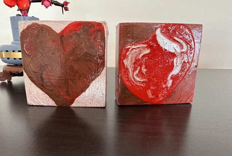
work afterwards. So here's the finished product. It's got a lot of texture and interest and contrast
that I love. Now that we've played
with one heart, let's try another one.
7. Create Second Heart using Persistence: This lesson is
about persistence, and it's in three parts as
I work through my idea. Here's a list of the materials I'll be using for this lesson. First of all, I'm drawing with my template, doing the pencil. It's on white, so this time
it stands out, that's fine. And my plan is here
to fill in and do a background with
the paints that I have, so I'll have a background
color and a foreground color. The background color I've painted on with
that pearlescent, a mixture of
pearlescent white and the Jo Sonyas background color. I'm doing the sides as well. Once again, the plan is
for a layered heart look, so I'm going to get the sides finished as much as
I can, as well here. Now I've got my
red metallic paint mixed with a little bit
of metallic bronze, and it's just paint this time. There's no pouring medium in it because I'm working
on a background. So I'll just use a little bit
of water to water it down, and I'm going to paint
into the heart shape. Once again, this is
just playing around and experimenting and seeing what
you like and don't like. This is a very fluid mixture, so I'm dropping some in
with a dropper as well, leaving some bits white. But then deciding to fill it in. Now, that looks
interesting there, but I'm going to keep on going. Now I'm just dabbing
in a little bit of the actual bronze
color as a contrast. This mirrors what we were
doing with the drawings or what I was doing with the
drawings in black and white. I had my little dots,
so I'm dotting them. I didn't like the dropper, so I switched to a brush. And I'm changing it up to
the left side of the heart looks a little
different than the right side of the heart, just as some of my black
and white drawings. Then a little bit tidy
up with the edges, and actually, you could
have stopped here. This could be enough
to just build on in that same pattern with maybe some thicker and heavier paints. But I decided to add another
layer of poured paint. This is part two of persistence. I pull out the colors
that I've mixed and just check it there the
right thickness that I want. Before I move on to pouring. And once again, I'm going to use the thicker paint
and my craft stick to basically build up an edge to hold the other more
thinner paint inside. The table wasn't quite level, so I just did a quick
adjustment then. Now I'm filling in
with that red paint, and we know this dries a darker red from the
previous square. So we know a bit more
about the colors. And I'm just adding some
different color layers in. In a way, I'm using the craft
sticks like I would a pen. I'm drawing in some
different shapes. I'm really working and trying not to mess up that heart shape, adding in some contrast
with the bronze and basically just exploring
and experimenting. And this is another point where potentially you could
stop and let that dry. But once again, I didn't. I
decided to put the pink in. And now the different
stages of this look quite beautiful as you can see the fluid paint
moving around. It is a tiny square, and there is a lot of
paint on I quickly whip around and do the sides to get the color of the
paint. I've got the sides. In doing that, I lost the heart, so I was sad about that and started adding
colors in again. And from a video perspective, at different points, this
is really interesting. I've included this little bit, and I've sped it
up so that you can just see how much I worked it and added color and change the shapes to try and
make something work here. The paint was too thin by now and runny and
moved too much. The problem was it
lost its shape with all that paint when it dried with the colors
all blended together, just dried really flat. It will make a nice
background. That's the thing. So some things when it
doesn't quite work, it's still going to work because that background is beautiful. So this leads to persistence Part three of this
particular lesson. Using my experience
from playing around, I'm thinking I could squeeze a heart on top of this and
have a beautiful background. But before I do it, because I'm a bit worried about things, I'm going to do a
little practice. And look at this.
That is so amazing. I really like that.
So I put that aside. I'll use it as a
guide for this one, and maybe I'll do something
else with that later. But with this heart,
I really want to fill the whole shape of the square. And I'm not going to do
my template anymore. I've tried that. I've used that. I'm
just going to use this other heart shape that I've made as an idea to get started. I made it too small,
don't like that. So I'm going to expand the area of that heart
out a little bit more. I like the uneveness of it. I like the left side of
the heart being lower. It's got a bit more movement, so I can work off that. And as you go along as we do, if you make a mistake,
I'll just wipe it off. Now, because the
surface is really shiny because that paint has gone hard and it's got
the medium in it, it's quite an easy surface to wipe off paint if
you make a mistake. I'm continually
looking at it and evaluating and deciding,
well, what do I want to do? So make sure you
remember to keep looking at your
artwork as you going. And here you're going to see me fiddling and
adjusting the shape, so I'm using the brush
to wipe back a bit of the paint and to change
the shape a bit more. And I'm wiping it off and
wiping it into the paper towel. Which will absorb
some of the paint. In this area, I'm taking it off. I'm just trying to make
it interesting, honestly. A bit of contrast
with the white, it's starting to look
really interesting. I'm comparing it
back to my shape. That looks good, but
as it is with me, I'm going to keep on
working it a little bit more to see if I can make
it even more interesting, but I could have
stopped back then. I'm adjusting the top of it. I'm just taking a
bit off the top and adjusting that
shape a little bit. The silver that I'm
putting in now, it's more contrasty and it's heavier so it's
not going to move. It's going to sit there
and stay. I like that. Now's the time to
make sure I clean up all the edges so I
have nice edges of the heart and I've blobbed a
bit of water on there just to make sure I really am getting off what I
want to get off. Pull your artwork up closer
to you just to get a bit closer to it to check that you have removed all the paint
that you wanted to remove. Just some final touches
to get those edges nice. Because it's so small,
attention to detail with some of the edges is important because it's going to
be more noticeable. I love the way this is looking just a final few touches and
it looks good. It's done. I think that looks good, so I'm going to pop
the bubbles with my blow torch as a final thing
to do before I let it dry. Doesn't it look great?
It's still drying, and you'll notice in
the finished one that holes gone because that
red is more fluid, it's moving very slowly as it dries, so it filled the hole. But it still looks wonderful. I really love it. Next up, we're going to work
on another heart.
8. Create Third Heart using Test Panel as a Starting Point: This lesson, we're
going to work off the little test heart that I
made in the previous lesson. You'll need the test heart
on the cradled panel, mixed poured paint, Q-
tip, and squeeze bottle. Just a quick reminder on
how this one was created. I'll show you on this
pre prepared one. If I squeeze, I'm just
doing a little test. It comes out and we have
some pretty shapes. Now, that looks even better
than anything else I've done before anyway. Oh here. I just love this
shape, but it doesn't seem quite enough
on that square. So I'm going to add
some light gray that I've mixed up and put in a squeeze bottle as
a first attempt, and I'm following
around that shape too. I like the shape, but
the shapes still there, but I've got a bit of
interest around the shape. Then I'm going to
add some silver, and I've accidentally
dropped a bit of the silver. I find that the Q-tips when you're working
this small format, are really good for removing
any drops or spills. Sometimes you need
to have a couple of goes at it with
maybe a little bit of wet water on the Q-
tip as well to help it, and then a dry end
to take it off. So once I've removed the drop, it's best to remove the drops as they appear when they're wet because it's much
easier to remove them. Then I'll go ahead
with the darker silver to add a little
bit more contrast. So I'm just looking at the shape and deciding what I
want to do with it. I could have left it
there, but as usual, I decide to keep on
going a little bit more, and I'm actually
using the tip of the squeeze bottle as my paint
brush as well to mix in. And also, I like to use
the Q-tip as well to shape to add a bit of shape
by pulling off some paint. I'm really using the
tip as a paintbrush. Adding paint,
removing paint into the different spots and
enhancing that shape. I'm just going to
keep on working with it and playing with it, adding and taking away paint
until I'm happy with it. And then, of course, I
always look at the sides to see how the sides are working and whether the
drips are falling, you can see the way
the heart falls. I'm going to want to have
a drip down the side there as well to look at. I'm about to stop here because I do really like the effect. And I'm going to
leave it to dry. Here it is another
beautiful finished piece, doing quite well here. In the next lesson, it'll
create the final heart.
9. Create Fourth Heart using Test Panel Design as Starting Point: In this lesson,
we're going to be inspired by the design I created by accident when I was
creating the second heart. Let's start by looking at
the shape we created before, pulling out my sketchbook
and trying to draw some shapes based on that that actually
fill the square panel. So once again, it's just
quick little sketches and trying to find
something that fills the space of
the cradled panel. I have a couple of
these that I like. That's what I'm
going to start with. For this one, once again, I'm actually adding
some extra coats of paint over the top of the panel just to make sure I've got good coverage
on the top and the sides, especially since this
time I'm trying to do just a red heart
squeezed on it, and the rest of it's
going to be my plan is the rest of the background
is going to be white. So to get it nice and smooth, I'm going to paint and sand until I'm happy
with the surface. Just another reminder, I use a pretty fine tooth
sanding block to sand the top and also the sides and the edges of
the cradle panel. And now I'm ready
to pour the paint. I have the red color that I like already in my
squeeze bottle, and I have the picture next to me and also
the original shape. So I'm just going to squeeze it. This is going much faster
than all the previous hearts, but this is just a quick idea based on what I've
done previously. I'll sit back and study it a little bit to see what
else I need to do, not to worry about the bubbles because I know I can pop them. There's a bit of graininess in the red paint, which I like. Once again, if you want
to smooth the finish, just make sure that you've got your paint mixed
together really well. You can pop bubbles with
the tip or a blow torch, one or the other or both. Here's the blow torch
popping a few of the bubbles, quick bursts. And the end result is
simple but impactful, and you can see
there are a couple of bits of texture there, which, like I said,
I really like. So we've made four hearts, based on our initial
idea of a heart motif. What we do next?
Larger, smaller? Let's talk about that next.
10. What Next?: In this class, we've
worked with a motif of the heart and created four artworks that
explore that theme. We've also created many
ideas for other artworks from drawings to accidents that happened during the creation
of the other artworks. I've got quite a few
ideas that I can work on the pink
and white heart. I could make them larger. I could make different colors. I could explore
through repetition, this idea of hearts
for quite a long time, the possibilities are endless.
11. Final Words: Well, thank you so much for coming on
this journey with me. I hope you see the
artistic process that it's not all perfect. Nothing works,
especially in my case, the same way every time, especially when you're
using fluid art or poured paint or anything with
water or pouring medium, means that you're going
to get unexpected results when the paint's mixed together. But it's a wonderful journey, and I love the surprises
that come along the way, and I can't wait to see
what you've created based on this process of
generating some ideas first, then choosing your colors and then experimenting
with layers of paint. Let me know how you went,
I'd love to see your work, and we'll see you
in the next class. I hope you enjoyed this class. And remember, you
can always contact me through Skill Share. You can follow me on Instagram to see the work
that I'm creating, or the inspiration that I'm getting as I'm
traveling the world.
 Jenny Guarino, Traveling Creator Inspired by Color