Transcripts
1. Intro toSweet and Easy Bubble Lettering Greeting Card: Hey, guys and
welcome. My name is Dolores Nascrin
and I'm coming to you from Sunny Manitoba, Canada. You've probably
heard me more than once mention that
lettering is something that's really
important to add to your portfolio if you're looking to license your work
or to sell it online. I myself have been
brushing up on my own lettering skills and I've arrived at a really cute technique that I think
you're going to like. It'll be fairly easy for you to reproduce and you're going to be able to put
your own spin on it. In this class, you're
going to learn some exciting new
techniques that modernize the classic bubble lettering you likely
experimented with in school. I want you to be able to easily incorporate lettering into your everyday creative workflow. With this class,
you're going to gain additional expertise
in manipulating brushes and enhancing your
own artistic ability. You're going to make projects
really stand out this way. It never hurts to get a
quick refresher on brushes. It's time to elevate your artistic skills
as lettering artist. Lettering artists
are in high demand and I'm hoping that by
the end of this class, you'll have a completed
greeting card design with your own original
hand lettered arch. Now if you happen to be watching this class on Skillshare, I'm going to encourage you
to hit the follow link. That way, you're
informed anytime I post a new class or anytime I
add to my discussions. You'll also want to get your name on the mailing
list of my website so that you'll get my
monthly newsletters and anything else that
I send out from there. That's the best place to learn about new artist
resources that I put out. Are you ready to get into
this lettering project? All right. Let's dig in.
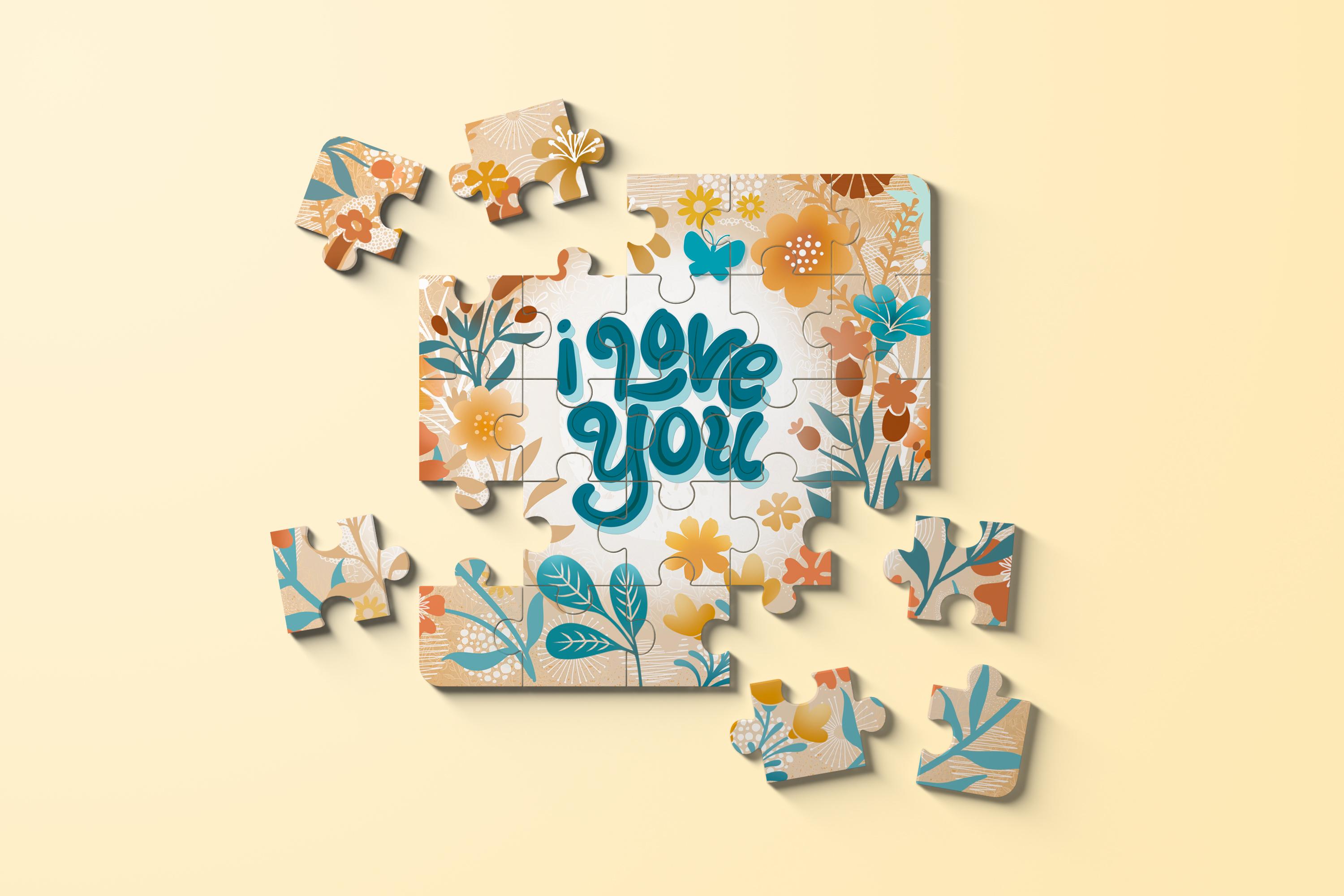
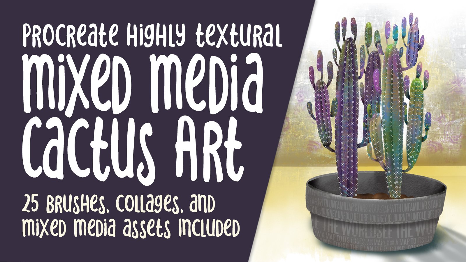
2. Lesson 1 Inspiration, Example and Color Palette: Hey, guys. Welcome
to lesson one. This lesson is all
about inspiration. I want to show you my
final lettering layout with all layers and effects
so that you can learn brush techniques for adding
elements and adding end of process changes to really make your
lettering your own. We'll also be exploring
specialized artist lettering layouts on
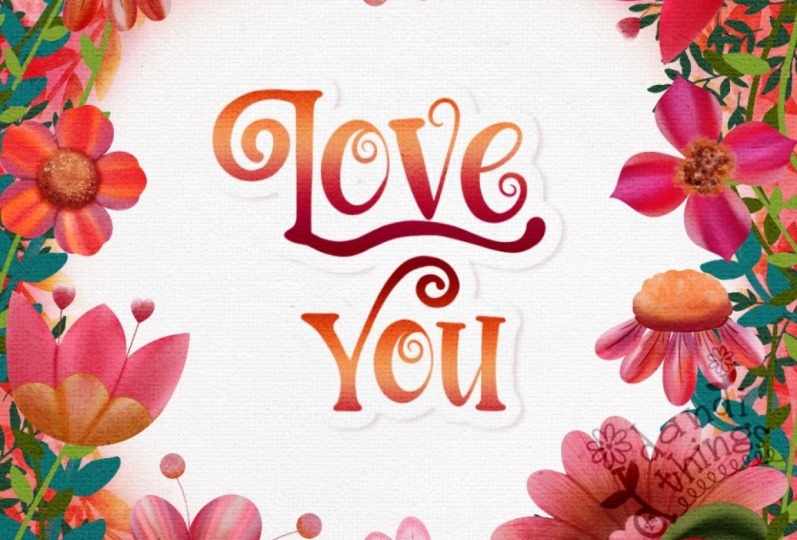
Pinterest. Let's get to it. This is how my lettering layout turned out when I
was completely done. There are a ton of
different layers here, but I'm going to
show you how easy it is to create all
of these effects. The brush set that I'm providing has a ton of the
stuff that you need, and I'm going to
be showing you a bunch of other tricks for creating additional motifs just by using your
brushes effectively. Before I arrived at this
iteration of the design, my colors and my layout were not nearly as
refined as this. I'm going to be showing
you exactly how to deal with making changes at the end that really
bring your color palette together and really make
your design cohesive, okay? And some artists that I
know literally have made their whole career on just
being good lettering artists. This is my board called
Lettering Ideas. I've got this one and I've got amazing Type Design as two places you could
look for inspiration. Looking through
here, you can see how elevated a lot of
these designs are. Some of these artists really have established
consistent look. For example, this artist
here, Jess Miller, if you've not seen her
lettering design before, I would suggest
you check her out, follow her on Instagram. She's constantly
posting new layouts and does a lot of lettering. I was looking through here to see if I could find something suitable for just a really
good example for this class. This is the lettering I
remember from middle school, the bubble lettering
that we used to create. It's similar to
this, but I think the style that I'm going to
show you is quite different. There's that one and
I will also take you into the type design should definitely
amalgamate these boards. Maybe this is a little bit more in keeping with what
I'm designing today, just some soft
rounded lettering. This is another example of what I would consider soft
rounded lettering. I don't particularly
like the wiggle that's been put
into those letters. This one is probably
the closest thing to what I am going to show
you how to do because I have been doing this rounded
lettering and I'm finding it actually a fairly easy
style to pull off. Let's dive right in in Procreate
to create this a design. I'm working with a
ten by ten layout. One of the reasons I have really concentrated my
lettering in the middle here is so that if I wanted to use this art on a POD site, let's say I was designing specifically five by
seven greeting cards. I know that I could use this
artwork and just crop it and I would have a beautiful
framing of my lettering. Within this flower mask. The other thing is
that I've also thought ahead to the possibility of
using the artwork this way. I've definitely tried to
concentrate the lettering in the middle so that I've got all this extra stuff
that I can cut off. I have used many different
mixed media finishes to create this background, as you can see,
there's been a lot of airbrushing and then these additional textures
that have been put in. I think all of it contributes to the overall cohesiveness
of the piece. This is what I want to really
show you how to do today. Let's start by
creating the document. We'll go into the
gallery and I'm going to suggest that you create a ten
by ten document for this. This is at 300 pixels per inch, so I know that the quality
is going to be really good if I want to use
this for greeting cards. If you don't have a preset in your gallery there
for ten by ten, you can definitely add
one here so you could do a new document set dt and save it and
maybe even label it. I do have a five by
seven card set up, but I don't want to use that
because I want to make sure that I have enough
space all around the edges to do what I want to do and be able to use
it on multiple items. A quick way for you to start
this would be to maybe use a pencil and then just
lightly sketch your lettering. I'm going to switch
to black here and I know I want to
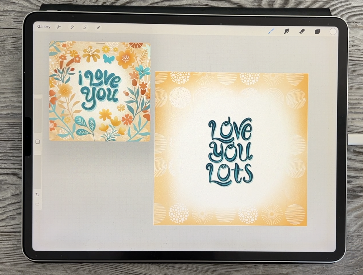
concentrate on the middle here, and I think I'm going to use that same phrase or
something similar. The other one said I love you, maybe this one, I'll
just put Love you lots. I just want to roughen my
lettering so that I have the positioning all of it
worked out beforehand. I'm doing it this way
so that if I have to move and center
things, I can do it. Those are my rough guidelines, what I'm going to do is
something like this, love you see I know already I'm going to
have to move that line and the word lots and you can decide if you want
to get cute with it, do some letters, uppercase,
some lower case, do whatever you need to do to infuse your own
personality into this. I'm moving this
over a little bit, and that's literally
how rough you can do your first letter guide. I'm going to center that
by having my snapping on. Now, it's not necessarily
visually centered. I'm going to actually
turn that off for set because of the centering is happening between this
far end and this far end. I've moved it over a little bit. I'm going to be
able to move this over once I do the lettering. Quite often, it happens that
when I do my lettering, I'm still going to be jostling the letters around and whatnot. The lettering brush
that I want you to work with is really, you can use any of the ones
that are in the top here. I've created this rounded
letterer that I like and I'm just going to
show you real quick and I'm going to do this
in a nice bright blue. Now, you can choose whatever color palette
you want to use. I think I use
something like this, let's just make this the
default, come back into here, clear what I was using
on my last project, and I'm going to just pick this turquoise for now randomly. Now I can go back to share here, save it as a JPEG, but I want to save it into my Photos gallery
because that's going to be the easiest way
for me to access it. Here I can do Save Image. Sometimes I do save to
files and I'll save it directly into the folder
that I'm working with, maybe the folder for this class. I'm just going to hit
Save Image because that's fast and then I'm going to
go back to this one here. And go to my Canvas again
this time reference, and this is the one that
is in the background here. This is my current Canvas. That's what it says
here at the bottom. Here, I'm just going to say
image and import the image. I'll pop me right into my photo gallery
and I can click on that photo and then
I can grab it from the top here and move
it into positions. This lettering was maybe
a little bit fancier, some of what I do here might be to add
some of the flourishes. Like the letter U, I may want to do a little
bit more like this. You can see that the Y that I did last time I had
a bigger flourish, it's completely up to you. I do like this L, maybe I'll try doing
something like that. What I'm doing here now
is just, first of all, practicing and seeing if the brush is going to
be ideal for this. This brush that I've created, depending on the
size you set here, you can press a lot harder to get an end to it,
like a bubble end. Bulbus and you can go into your properties
here and you could also change what your maximum
and minimum size are you could go quite small and then get
quite large with it. That might be fun. What I want to do with my lettering is to press harder at times to get thicker lines or softly
to get thinner lines. That's one of the things
that you can experiment with with that brush is just do maybe initially just some lines and
swirls and things and just decide how you're
going to want to work your lettering to be
interesting and unique to you. Let's start by
maybe I'm going to just reduce the opacity
of this layer a bit. Leave it dark enough so
that you can see it. I'm just using this
as a rough guide. Nothing has been worked out
here really in the way of spacing or anything or even
the sizing of my lettering. A lot of times what
I'll do is I'll just go in and do the
lettering quickly one time to see if maybe my brush is a little bit too big and I think
that it might be. I'm going to go just a
little wee bit smaller and then I can start just
quickly doing the lettering. Here again, you're thinking of thin and thick
and so you might want to start thin and then go a little bit heavier
and then thin out again. You can go with a heavy weight all the way around. I like that. If I wanted to do a swash here or liicature on my lettering, I could do something like this. As I'm going through
here, I'm going to be definitely putting a lot of personality
into it because I think that's the fun part
of a project like this. With my oh, I think
I'll go lightly and then heavy and
then light again and you can definitely do something really fun
with your curly cue. With the letter V, you could do it all in one brush stroke, so you can continue your
brush stroke this way. You could start heavy and go light and you could lift
up your brush and you could do another bit of a swash by pulling it
outwards that way. I don't want it quite touching, so I'm going to do this again, but I did like that effect, so I'm going to go heavy at
the beginning and lighten and then add a squash here. Again, Same thing with your one
stroke letters like E's, you want to maybe
practice a little bit. I might do something like
this so that my inner of my E is rounded and lighten up at the end when I'm
pulling that little swash. I'm also trying to balance
the size of my lettering. That's one of the things I'm looking at as I'm doing that. Last E was a little bit too
small. That's all right. I've got my first
word and before I do too much more. Rid
of whatever that was. I'm going to make that just a wee bit smaller and
I'm going to add a layer so that my next
word is actually on its own line and that'll give me a lot more flexibility when I'm trying to center
and everything. Let's go back to this color. Now for the letter U,
I might start and do a swirl like that so that
I can tuck it in here. I'm going to go a little
bit lighter and you can see how fun this could be and how much you could spend time learning and getting the feel for your brush.
That's all right. I like that one and
then I'm going to go a little bit heavier and then I'm just going to bring a bit of a swash out on this side. Could decide whether you want to do all your O's the same. You could even cut
and paste and use a previously created
letter if you need to. Yes, you could decide whether
you want to copy this O. Add a little bit there
accidentally on the V, so I'm going to do it again. Here I would do three
finger swipe down and I would do cut and paste so
that I could duplicate it, and then I would kinch these
two back together again. Then that O is separate and I can decide whether or
not I want to use it. Not sure I love it, but I could also change it and
take this one. I'm going to pinch it
together with the Y. You could definitely do
all of these letters on separate layers and then
combine them after. With this one, I could just
do a little bit of erasing. I'm going to get my posca
used as an eraser and I could just shorten that
out completely. That works. Then let's do the letter U, and I'm going to do a
little bit like this one. I'm going to start very heavy, lighten up and then go
very heavy at the end. I would have to do lettering like this every single day if I wanted to really be consistent
with. I do like that. I think that's turned out great. Add another layer and
let's do this one. Now again, we have two letters here that
we could use for this, you can decide whether
or not you want to duplicate the word love, bring it down here
and let's just cut the V and the E off
of it and try adding. I'm going to do the T and
the S on this other layer. Not quite sure about
this T. Again, I could go heavy and then light. That would be doable. I could start heavy and then go light. That one worked too. Then the S. Now what I suggest with
your Ss is that you go light at the beginning and then heavy in the middle and
then light at the end, and that one works for me. I'm thinking that this O is not going to work
for me for this. There's just too many
with this style, maybe I'll just erase
this whole area. It's still very consistently
looks like the other ones. We can still add this swatch
back again if we want. I think now I can check spacing
maybe move a little bit closer and this and this
are what I want to combine. Let's put them closer
together and pinch them. Basically now I've
got my lettering. I think overall, I can make
little adjustments like this. I'm also going to pinch them all together and reduce
the size of all of it so that I can have all
of that extra area to play with when I'm doing
my flowers and such. Here I'm going to
delete this layer and we're ready to move
into the next lesson, we're going to start
talking about how to fill out this layout.
3. Lesson 2 Lettering Detailing and Background Ideas: Hey, guys. Welcome
to Lesson two. In this lesson, we're going to accentuate the lettering with an inline and we're going
to create a drop shadow. We're going to fill the layers
with contrasting color and design and work on the background
using a soft airbrush, maybe some graphic patterns
and some color adjustments. The next thing I did
was to start adding a little bit of interest
to the lettering itself. I did that very simply by just putting a single line
throughout the center of it. If you look at it,
you'll see that each of these lines follows
that same original idea of thin and thick strokes. Let's use the same brush. This could be something
that you decide to change, but I'm going to use my
basic pen pressure brush. Now, I've got a
couple of brushes I'm supplying here for
this specific purpose, and I'm not sure if you're
going to want to use them, but this one here, I would just, of course, add a
new layer above. In my case here, originally, my lettering was quite
a bit darker and then I put an even
darker line in there. We could sample this color and then just simply go
a little bit darker. I just did that same idea of thin and then thickened
and then thinned it. That was a really simple
way for me to add it. One of the brushes though,
that I've added in here to give you something
that you could experiment with is
this dotted brush. This brush, I've created
in such a way that it also responds to the
pressure that you put down. The pressure also
affects how opaque. I don't know if you can see
it here on my drawing pad. Let me just clear the
drawing pad for sec. But I can go very lightly
and then as I press more, I'm getting not
only bigger dots, but I'm also getting
a more opaque dot. That starts really light
and then gets really dark. I'll just show you what
that one looks like. I'm going to go much smaller here and I'm not pressing very hard and then I'm pressing
harder and then I'm released that pressure
that I'm putting on it, and that is also a very viable
method that you could use. I'm going to leave it up
to you. You can decide, you may even have other brushes
that can work for this. I'll go back to my
pen pressure brush and I'm going to go through
and just put in these curves. Now, the nice thing
about it is that I've got these on another layer, so I'm going to
be able to affect these separately if I need to. I'm going a little bit too
heavy on this I'm going to do is I'm going to increase
the stabilization on this. I probably should be rotating my screen to get a
better line here and there's no law
that says that you can't stop partway
through and keep going. Sometimes it's just really hard to have something match up. I still don't like
that because I haven't really done
the same thing, which was going halfway
in the middle of it, so I'm going to do
it again and then I'm going to pull
that line way over. Something like this, you
could just use your eraser to remove I personally think that has added a lot of interest to the lettering
that I had there originally. That's definitely something
I'm going to leave in. Now, I'm comparing
this to this and I do like the fact that
this original one had heavier lettering, but I think we might be able to accomplish this with
the drop shadow. With this one, I had dark lettering and
I did light shadow, but I think I'm going to
do the opposite here. I'm going to duplicate my layer. I'm going to go to
the original layer here and you can do
this in numerous ways. You can do the select
method and then use the color that you want and then go back to your layer and fill. You can see that
it's colored it by looking at the layers palette. You could also do an
alpha lock then fill it. That's another method. It's just whatever method
suits you the best. I will take the
Alpha lock off this, but I've left the fill
that I put in there, so it is filled with
the color that I want. Now I can just rearrange, move it over a little bit so that I get the drop
shadow that I want. You can always use
the tapping method to move it a little
bit if you need to. This is a completely different look than what we have here. It's the opposite. I think I might even consider doing something like going to that layer using hue and saturation and brightness and just brightening
it a little bit. That would be another
thing that would possibly work or you could now that looks good too. You could go dark
with it and then go to the drop shadow layer, select, and then choose
a lighter color. Maybe I'll go as light
as this one here. You know that you can
sample the colors from within your
reference window as well. That's the color
that I have chosen there and here I could
feel it, it was. It that color, but it was close, select and then go back
and fill. There we go. Now I've got that
lighter color instead. These are all things
that you want to experiment with as you're
producing your artwork. But we also need to
start thinking about that background
and how it's going to play into
everything else here. I think the first thing I
want to do is just lay a little bit of color
around the outside here. In this case, I had
used just an airbrush. Hard to see here. I basically
went in and started by adding an airbrushed area
of this golden color. If I were to sample, it was somewhat like that and I just my great big soft airbrush, you can go to the set that
belongs with the software. It's a resident brush. You can use the
big soft airbrush. You could start just by putting a little bit of color
around the outside. I would round it
out in the corners here and you see how I'm
keeping it very light. That's pretty much
what I had there. You could go a little bit
darker around the very edge, which makes a very
nice frame and you can see that the stylus tip is basically off the
actual document and just going off
into the corners here. I've also added a couple of really nice graphic patterns
here that you can try. These are the exact
ones that I use. Now, I would go in with white or even a light a cream
color, make a new layer. Again, what you're
trying to do is just put in a little bit of texture and interest
in the background. I think I will go
to this pure white. You can see how this brush is actually a color
changing brush. Depending on the amount of
pressure I'm putting down, I am changing the color to add
the secondary color to it. What I want to do is make this secondary more of a color that
will work with our layout. I'm going to keep it
in this same family. I've now got it working with white and yellow.
You know what? I still don't even like
that. When you get a brush that has those
effects applied to it, what you want to do is go into color dynamics and I know it's going to be right here that I've put a secondary
color on it. Based on the pressure that
I would put on the brush, it's going to be
changed in color. I'm going to turn
that completely off, but that's definitely
something you can play with. I'm going to switch
to the white, which is what I wanted. I'm just brushing in a little
bit of that pattern into the background and
you can see that because I have left
this area in white, then where I'm painting
that's in the faded out area, it's disappearing
because it's pure white. At the moment I'm
going to leave that. We can make adjustments later. We can airbrush a
little bit closer, but I want to start
adding some of my imagery here before we get really
filling out the background. At this point, I just wanted to self a little bit of
background to work with. We're going to
definitely revisit the background once we've done
a little bit of the work. I know that, for example, in behind the lettering here, I even added an
additional pattern in white that's barely visible. But our next goal or our next
lesson is going to focus a little bit more on how to fill in the background and
how to do it cohesively. Even though I've got a bunch of brushes that I will show
you and you're going to be able to use want to also show you the way that
I used or the method I used to create that real almost frame or you could even describe this as a wreath
around the lettering. We'll meet in the next
lesson to work on that.
4. Lesson 3 Greenery and Background Motifs: Hey, guys. Welcome
to Lesson three. In Lesson three here,
we're going to fill out the background with
some leafy branches. We're going to
alter some colors, we're going to create
some curvature on some of the motifs, using warps and
liquefy adjustments, and then we're
going to add color detailing with the
soft airbrush. Let's get at it. With
this particular lesson, I think that you
could definitely use floral brush stamps that you already own I'm throwing in some of the
brushes that I use. You get a fairly
extensive selection here. I would start by definitely
dropping in a few of the flowers and
things that you think will help fill out the layout. I would do just plain
flowers first of all, I want you to continue to work with whatever color palette
that you've chosen. I'm sticking with this one. I don't think this one is
the exact one that I use. I might be able to find the palette if I really
concentrated on doing that, but I want to also show you just the quickest way I have this image saved
in my Photos gallery, so I might as well just use
it to create a new palette. I'm going to create new
palette from photo. I'll just grab the image that I want to use to create
the custom color scheme. I've now created it exact color palette
that this image used. Let's go back to the color
disc and I can clear this, although those colors all did look very much like
the originals. Now, this is super
annoying when you want to keep this open
and then this is so big, one of the things I suggest that you do is pull this right out here and you can even switch to your palette and just
have your palette here, and then we're not really
constrained with our space. We could also make this
a little bit smaller. I could make my reference
a little bit smaller, therefore making my document
just a wee bit bigger. Let's just start dropping
in a few of the flowers. Now, my suggestion here is to put only a few
in to start out with. I'm going to maybe
try to use what I had here as my guide
for making my flowers. I'm not going to make
them exactly the same because I'm not including all of those brushes in the set. But we can start by doing this. I'm going to make sure that I have a different
layer for it. I'm suggesting that you maybe at the beginning your flowers
all on separate layers. We're not close to using
up all our layers yet. Right now, if we were to check, we could go to the canvas
and go to crop and resize and I have 70
layers available there. I'm really good for layers. I might as well
separate my flowers, that'll give me a
little bit more of an opportunity to
move them after. I'm definitely going to
take advantage right now of the fact that I have
more layers that I can use. I could even add them
now just so that I'm not tempted accidentally
putting things where I don't need them to be. Going to go with a
little bit less foliage just as I'm showing
this example. Otherwise, we'll
be here all day. If you have a flower that you
can repeat somewhere else, you could just do
it this way too, you could duplicate it and
then you could move it. Right now, I'm just going to do a few of them, like I said. Maybe we'll put one of the
foliage brushes in here. Definitely, we can
start with that idea that we're creating
a rounded look and remember that you can
go into something like the warp or the distort and make some minor
changes to it. Now, I will caution you that. When you're making
changes like this, any amount of distorting
or anything like that, will soften your
brushes a little bit, so be cautious with that,
don't do it too much. Let's put in just maybe two
or three more and then I'm going to stop and
we're going to do a little bit of work on
what we already have here. I created this palette based
on this one, but to me, it seems like this one
has a little bit more of a reddish orange in here,
which doesn't show here. But let's just grab this
color and we'll go into the color wheel and just
slightly change the color of it. I want to go a little
bit brighter too and I'm going to go
just a wee bit bigger. The way I take a look at this is I look at these
flowers that I've just laid down here as the anchors to the piece and what I
don't this point is that there's these that are all the same size and just the positioning of
this one now bugs me. I'm going to dear, do
you see what I did here? I did accidentally
put two on one layer, but that's okay because
I think I'm going to make a couple of
changes here anyways. For the two that are
on the same layer, I can just take my selection
here and do a cut and paste. It stays in the
exact same place. It's just now on its own layer. What I need now is
a little bit of the greenery or stem
work that's going to really unify the piece. I'm going to keep it there. I'm going to move it
out a little ways, and then I'm also going to
lighten it quite a bit. You can do that by going into the hue saturation and brightness here and
you can brighten. That's pretty much what
I want right there. You could also have re selected that layer
and refilled it, but I just find
that hue saturation and brightness is
the fastest way. What I want to do now is leaf work and stem
work that I'm going to do with that lettering
brush to start out with. We're going to take that.
Let's try this round letterer, and that will make
a very nice stem. Let me select this color here, but I'm going to go a little
bit different from that. I'm going to go maybe a little bit lighter,
this one lighter. I want to just create a couple of stems to
use, first of all. I'm going to use this flower
here and I'm making a stem. Let's make sure that
I'm below that layer. I believe it's this one here. I'm going to select
the layer beneath then add a new layer and
we're going to put the stem in that one and then
we're going to add a layer above that one and that'll be the
stem on this side. We'll do something like this.
We can rearrange the order, absolutely no problem
at any point. I've made the stem quite large. I'm going to go maybe even
a little bit smaller, but I see how I've pulled it in and already we're
getting that feeling of the cupping of the flower, so I can do
something like that. Then I'm going to use my tapered pen pressure
brush to do leaves. What I want you to do
too at this point is to make sure that
you group anything that you think would either be just a good
organizational way or a way that you could then
move individual flowers. For these two, I'm going to group them even
within the group. These two, I need them
to be grouped as well. Now that actually just became
a subpart of the group. Now, it's just individual. If I wanted to move that flower, for example, it's all together. Just think about that as
you're putting it together. I'm putting this whole group
together because they're similar flowers and I want to make sure that
I leave my stem. For the leaves themselves, you're going to go
with a little bit bigger of a pen pressure brush. This is just that tapered
brush with pen pressure. As I start, I'm going to make sure that
I'm starting lightly. Now, have you ever had
this where it comes up and it's trying to discern which
layer you want to work with. This is a layer I
want to work with. I'm going to click on that
one and now I can use this to make my leaves and I have somehow switched
out of that color, so I'm switching back. What we want to do is really light pressure and then
really heavy pressure and then really light
pressure at the end to get that little bit
of a stem to connect. Don't overthink it if you
want very small taper, you can go in and you can
reduce the size of your brush. That's going to give you a
much smaller brush stroke. But I want to show you
also how you can adjust. This pen pressure brush, you can go in and you can go
into the properties and you can determine here your
minimum and your maximum size. I'm going to put it
right on the minimum so that it really comes
to a good point there. I'll see how that works. You can go in multiple
directions and we've created the first
part of the leafy branch that's starting to
really come together to make our wreath shape
around the plants. I'm going to do the
same thing here. I can go and turn off the
layer that's in the way. You can see that I'm not being entirely consistent
with my leaves. I'm trying to specifically change directions on
some of them so that they don't look too consistent
and now we can turn our other flower back on and you can see how it's starting to
really come together here. Now I think it's
really important for me to change colors. This is just a little bit
too much turquoise now, so I need to add either some
gold or some darker green. I'm going to do a
couple more stems and I'll just time lapse
it really quickly for you to just watch as I
start working on this and really creating a lot more going on
in the background. Another leaf shape you
can try is starting out light and then just putting more pressure
on at the end. I'm going to use
that rounded letter for the actual stem here and let's just make sure that this layer ends up
with this one here. I'm going to take them
right now and group them, and then with that tapered
pen pressure brush, I'm going to try this other
leaf where I'm going very light and then I'm
going heavier, a little bit smaller here. I got a little bit more of
a connecting stem there. I'm spacing these a little bit differently so that they also contrast in that
way and I'm just making some of them
just a wee bit smaller. Now, that doesn't suit
the angle of this flower, so that's something
I would adjust here. That makes that
work a little bit better now that
this is in a group, I can easily take it and move
it to be below that flower. Now this flower being
hollow would be something I would
deal with right now. I'm going to add a layer. I'm going to just draw the inside of the flower there where the
stamen and anther This should have been
within this grouping here. I think it's this one
here. I'm going to make sure that I
drag that in there. Now that whole flour is easily repositioned and that's exactly
what I'm going to do. I'm going to move it this way. I'm thinking that one of the things you could and should
do at this point would be to add a clipping mask
to this stem and leaf, make sure that
that's the one you designate it as a clipping mask. What I do now will only
affect these leaves. There I'm going to just grab
that soft airbrush again and I'm going to go with the
slightly darker heel color. I'm going to just
airbrush a little bit of darkness on these leaves so
that where they overlap here, it's a lot more pleasing. Here in the background,
you're actually going to be able to see
that there's a leaf. These are all little things
that you're going to do as you work your way through. We're also going to put some stamen and anther
bits within the flowers. We can add all kinds
of new foliage here. If you have any of the other brush sets that I've either sold or
given away in the past, the May floral brush set, I know has quite a bit of extra little things
that you could use. This would be a really good one. We could do that
one in, let's say, a really gold color and
we could add a new layer. Maybe I'll go above
all of these for now. I could stamp that one and it's not that big, so
I'll go even bigger. Stamp it anywhere, and
then you can move around. I think this would
be a really great background flower to have here, put it above the texture, and then remember that you
can take effect this one. You can either use
the warp to round it. Now we can pull this over and give it a little
bit of shape like this. The other thing that you
could do is go into liquefy. And set your push quite large and you could
push it into shape. For this one that's now getting distorted looking
at the top here, I would go smaller and just fix the distortion on that.
That worked quite well. You can definitely
go in as you make your brush smaller to push
and affect it separately. This part here, if I wanted
to move the whole flour over, I would maybe do it a little
bit bigger and move it by itself and then I
could go really small. This one now is starting
to look really distorted, so I would go in and just use a little bit of pushing and pulling to get
it to look good. This is another one of those things where you
don't have to really worry too much if it's something that's going to be really
in the background, you could definitely reduce the opacity of it and
things like that. It just becomes a filler
element to give a bit of depth. Overall, you can see how
many little things that I've added in the background to just make it more and
more interesting. Pretty much that's what
we're doing now is just going to go through and
make it more interesting. I'm going to add quite
a few new motifs before we come back in the next lesson and then I'm going to be
showing you how to do some of the finish some
of these flowers like that, all the details that you can put in to make it more
and more interesting. I'll have a bit
more done on here and then we can regroup
and talk about it.
5. Lesson 4 Added Details for Elevating Your Design: Welcome to Lesson four.
In Lesson four here, we're going to create
a quick brush, we're going to add
floral details to finish the composition. We're going to do some adjusting
on the lettering group, and we're going to generate a few ideas for adding interest. Let's get to it. I'm sure
this isn't what you expected. I'm on a completely separate document here because
I want to really quickly show you how to make
some of the flower centers, similar to what I've
used in the past. We're going to make it
into a brush so this is something that you'll be
able to use more than once. Switch to black
as your color and just the pen pressure brush
as your weapon of choice. What we're going to
do here is so simple, we're just going to pull some lines that get
thicker at the top. So you're almost not
putting any pressure on it. It's really light until the very end and you're going to want to do a little
bit of practice on this and you also
might want to put your stabilization even higher on the brush so that you can
get really smooth lines. I'm going to go really light
and then heavy at the end. I think the hardest part
is going really light. Then pressure at the end
is a little bit easier. It's just really hard
for me to not push down when I'm doing my
stroke, as you can see, you can definitely make more than one of
these if you want, but I'm going to show
you the one just so that you have the idea
of how it works. I know that I would have to
do a bunch so that they face different directions
or they work in different ways on
different brushes, and this is maybe smaller
than I would normally make. I would probably
make it quite a bit bigger just not knowing
what the end use is. But in this case, I do know the end use and I think
this will be big enough. I'm going to set my
snapping on because I want to make sure that
this is perfectly centered, and that's perfectly
centered there. I want to fill the
whole background with white so you can
either do that by adding a layer filled with white often default to this
method just because sometimes little
areas right down into these pointed spots
don't fill with white when you're just trying to fill and fill in the
rest of the layer. I do a separate layer for that. I'm pinching those two together and that's exactly what I
need to make the brush. Now three fingers white copy. If you had two layers separate, you could have done copy all, but I'm just going
to do copy here, and then I'm going to go to the set that I'm
using right now. You don't even have
to do that, but I do like going to the set that
I'm working on and then just duplicating
one of the brushes that I have because a lot of times the title that I
already have on it works. I'm going to duplicate
this. I know that the settings will
be great as well. That's another
reason to duplicate. I'm going to go into shape, I'm going to go to
edit and import and paste and there's
my little stamen. What I can do here too is I can rotate it to have it
in the right direction, done, and I've created
another little brush. Now, see this haze, this little black line
that's formed here. That's because I must
have accidentally moved that white layer
as I was working on it. I'm just going to fill that other empty
layer that was there. I'm going to pinch
those two together. I'm going to copy, and
let's just see and now that line and you've created your very first
flower stamen brush. Here, you could also make
it bigger or smaller. You really don't have to
make too many adjustments. I think we need it quite small. So let's just test it out first. I'm going to go back to
my main document here. I was visualizing it
for this flower here. I'm going to add a layer above that particular flower,
if I can locate it. This is here, I believe, and I'm going to stamp it. Now, on this one, I stamped it in white, which is what I've got
selected here already. I'm going to stamp it,
do it at an angle, I'm going to turn off the
snapping at magnetics and there is my first
statement, that all. You can go back to the other document and you could create a whole bunch
of different ones. I'm going to duplicate this one and use it
over here as well. I'll have to move it up in
the pecking order here and I know that this is where
it's right above this layer, and I'm going to reposition it. I must have something else
painted on the layer because I see it's made a very
large selection. When I have this happening and I know there's probably
something else there, I just move it right
to the very edge, and then the next
time I select it, it's back to being small because I've cropped off whatever
was interfering there. I'm really happy with that
and I could really use that with the other flower that's
shaped like that as well. I'll move it on top. And I would go through
and of course, aim these in the right
direction based on the flower. This one needs to move
up going on here. I ended up moving both of them, silly me. There we
go. Much better. Look at that. We've already
added that much detail. These four could be
grouped together. Then my next step is to add
detail to these flowers. I would go in a lot of
the flowers and just do these little bits
of shading and so on to really make the
brush look dimensional. Since I'm on this
set right here, I'm going to at this point, pinch these two
together because I know that I would do
them in the same way, they might as well be together. I'm going to add
a clipping mask. I'm going to grab
the soft airbrush. I'm going to sample the color, so I know that that's
the color I just have with the flowers and
then I'm going to go darker. I'm just going to
use my airbrush, as you can see here
to just darken. I'm softly darkening
the middle of it. And note how that really gives that flower
dimension and I'm going to select the same color as I had before and I'm also
going to go brighter. With that, I can add a
little bit of brightness to the ends of the petals just
to make it more interesting. Now, I went through
and I did that on a lot of the different
motifs here. You can also see that
on some of these, I added just a dotted middle. I have some premade ones, but I'm going to show you
how easy this is to do. I'm going to add that
and make it into a clipping mask for
this particular flower. Let's just group it
while we're at it. Now, these different
things that I've added in the background things that
I had in other brush sets. That would be these
little things. We're going to put those
together this swirly thing, I actually included
in your brush set so you can play
with that one. On this flower here,
then I want to go in and I'm going to
use my monoline, which I call my
Posca paint marker. You can find this in many of the sets from
many of the classes. But if you don't
have it, just go to the lettering brushes that are included with
Procreate and you'll find a monoline brush and
that's exactly what it is. That could be a
suitable color for it. Let me just see how
big that dot is. I go with good sized dot and then go a little bit
smaller to add a few more. While we're on this flower, then we might as well
also add a layer that we use for the airbrushing,
and in this case, I'm going to just take a lighter version of the color
and go around the outside, and then I'll take a darker
version of the color and just really subtly darken
the middle part of it. I'm getting much closer
to what my original was. Things like the butterfly. What I did there is and you
could choose to do this with a bunch of different
motifs that you have in here. But with the butterfly,
I duplicated it. I went to the bottom
layer and I selected it. I'm actually going to move
it so that you can see it. I'm going to reselect it. Now I can go and fill. If I put this on
Color fill here, right now as it's selected, I can do color fill
and it's going to show me the different colors
as I'm filling it. I can go to that category,
which is that blue, and then I can use the Gaugin and just
blur this slightly. I'm going to tuck it pretty much right back in where it was. But you can see now
that the butterfly itself really starts
to pop off the page. Those are a bunch of the
different things that I did and I know that when I was
finished this part of it, my lettering was really crowding the edges
where the flower was. What I ended up doing
with my lettering is grouping it and then I'm missing something
in my group here. Where's the rest
of my lettering? Missing my drop
shadow. Oh, dear. You see what happened
here is that light blue from the drop shadow of the lettering ended up
on my background layer. What I need to do here is make sure that you
don't have color fillon. I'm going to cut and
paste so that I can take that and bring it all the way up to be a part of
my lettering group. Group has everything now, so I can now resize it as a unit and I'm going to go
just a wee bit smaller. I think it's really important to have a little bit of space around your lettering to
really make it stand out. At this point,
essentially, we're done, of course, once you have all
of your motifs recolored. I'll spend some time this
evening colorizing everything, add enters to my flowers
playing with a layer order. I may end up adding
a few more motifs. This one here, for example, right in the very top corner. I had a little bit
more leaf work and some background elements
in there which you could make yourself or find
in a brush set that you own. Definitely, you could darken the outside edge a little bit more if you wanted
to at this point, go back to that layer, make
sure I have my big airbrush, go with one of the gold
colors, and again, make the airbrush quite
large and just kind fill in a little bit more
darkness because I think that really unifies
this outside bit. I could definitely go in and add stuff behind the lettering. I could add another texture. That might be a good one,
so just a really tiny dot. I'm going to make sure
that it's pure white. I'm going to add a layer here, and then I'm going to just put a teeny tiny bit
of yellow into it. Let's actually pick a very light yellow
to start out with. Then here I could add a little bit of texture
in behind the lettering. Depends on what it is, and definitely that's a
decision you're going to make based on the final vision that you have for your piece. That could actually even just be added to this background layer. You can go through
and definitely make some final adjustments. I know that mine
changed a lot at that stage when I
went through and I started airbrushing
all my flowers, making sure they had
centers, adding texture. In this case, I
think I worked on a soft yellowy peach color. Then when I added
the white in here, it really made this lettering stand these are all
things that you can do. I will leave it at that. You'll see me in my last lesson where I'm going to show
you some uses of this. I also did make sure that I left so much on
the outsides that I was sure that I would
be able to crop it to a five by seven if I
wanted to use this as a card. I will meet you in
that final lesson.
6. Lesson 5 Final Design, Conclusion and Wrap Up: Well, I hope you enjoyed this quick class on
lettering and I hope that this is a technique you
think that you could apply with your day
to day design work. My advice is to do
a ton of lettering, experimenting with each of the techniques that we
talked about today. I will fill a document
maybe 20 " by 20 " with 30 or 40
different phrases, as many as I can
squish in there. That way, as I'm working,
I'm loosening up, I'm getting a better handle on the technique and the
effects that I apply, I can consistently apply
to each of the words. This is the technique I've been using for years because it really is an efficient way
to produce unique lettering. More and more we're seeing lettering on licensed products. Just go to your local box store and check out the
Housewares department. You're going to
find lettering on so many different products. I hope you enjoyed
this class here today. If you're watching this
class on Skillshare, make sure that you
follow through with following me and check out my social media profiles through my profile page
here on Skill Share. I'll also encourage
you to get on over to my website and get your name
on my mailing list there. That way you miss
absolutely nothing coming from me and my team. Thanks so much for hanging
out with me today. I love this little
project and I hope you love it too. See you next time.
 Delores Naskrent, Creative Explorer