Transcripts
1. Intro to Easy Watercolour Seamless Patterns in Procreate using Brushes: Hi guys and welcome. My name is Dolores
nascar and I'm coming to you from sunny,
Manitoba, Canada. In this class, we're
going to be creating a vintage layout similar to what you would do as a collage piece in
an art journal. To make it easier,
I'm going to show you the use of the clone brush. You're gonna find this
really interesting and fun. When you're done
with this class, you're gonna be going
nuts with a bunch of your own photographs to produce this really cool vintage
GI distress look. And it's a lot easier
than you'd think. I'm gonna be providing
you with a few brushes. And my suggestion is
to start out with at least ten pictures that are possibilities
for your layout. I'm gonna be showing you
every step of the way, so don't worry,
it's not difficult. Now if you haven't
done so already, make sure you hit that
follow button up there. That way your informative any of my new classes as I post them and also any of the actual
posts that I send out. I'd also encourage you
to go to my website at the loris art dot ca and add your name to my
mailing list there. That's where I post a lot
of my artists resources and I'd really like you to be on that list so you
don't miss anything. Are you ready to get
into this project? All right, let's get started.
2. Lesson 1 Using the Clone Brush: Hey guys, welcome to lesson one. In this lesson I want to break down the use of the clone brush. I'm gonna be doing some examples with some photographs of my own. And I want you to also
take a look at some of the examples on Pinterest or wherever it is that you
go look for reference. I'm going to go through a few
of them with you to start out with just so that you have an idea of what
we're looking for. Let's get started. There
are a lot of examples here. This might be similar to the kind of thing that
I'm putting together. And I want to show you how
to do using the clone brush. Yeah, something
like this would be similar to the kind of
look that I'm after. I'm going to be using a
lot of my own photographs and a couple of bits of
vintage ephemera that I have. Now if you've been in my
other Procreate classes for mixed media art, you'll probably be
able to use some of the brushes that you picked
up in those classes. If you don't have a
lot of photographs to use than I would
suggest that you go to a site like Unsplash where you can find all kinds of vintage, vintage unrelated photos
that would be really usable. This typewriter
would be awesome. Just go through it And I guess decide on the kind of look
that you're going for. I'm gonna be showing you
the components that I have. And like I said, they're
all photographs that I've taken except for
maybe one or two. But you'll find that the
more vintage e the error to start with is the better they will look
in the long run. However, I have been using just simple
photographs that I have. And some of them are literally things that
I just went around the house and took
pictures of me in the last few days to
include in this class. So I'll show you some of
the actual items that I'm using just so
you get an idea of the kind of things
to look for and what would be good for
your layouts like what would work as far as the
content or the composition, and what kind of
things work best for backgrounds and
what kind of things work great for
foregrounds and whatnot. So we're going to be
going through all of that right away. And like I said, go through and take a look
at a lot of this sort of collaged journal arch. You're looking for a bunch
of different components. So it's sometimes this
might not necessarily work, but something like this
works because you've got things that work
well for just texture, like for background,
this sort of thing. And then you've got a few
things that you could use for foreground like these. So let's take a look at
the stuff that I have so you'll get a better idea
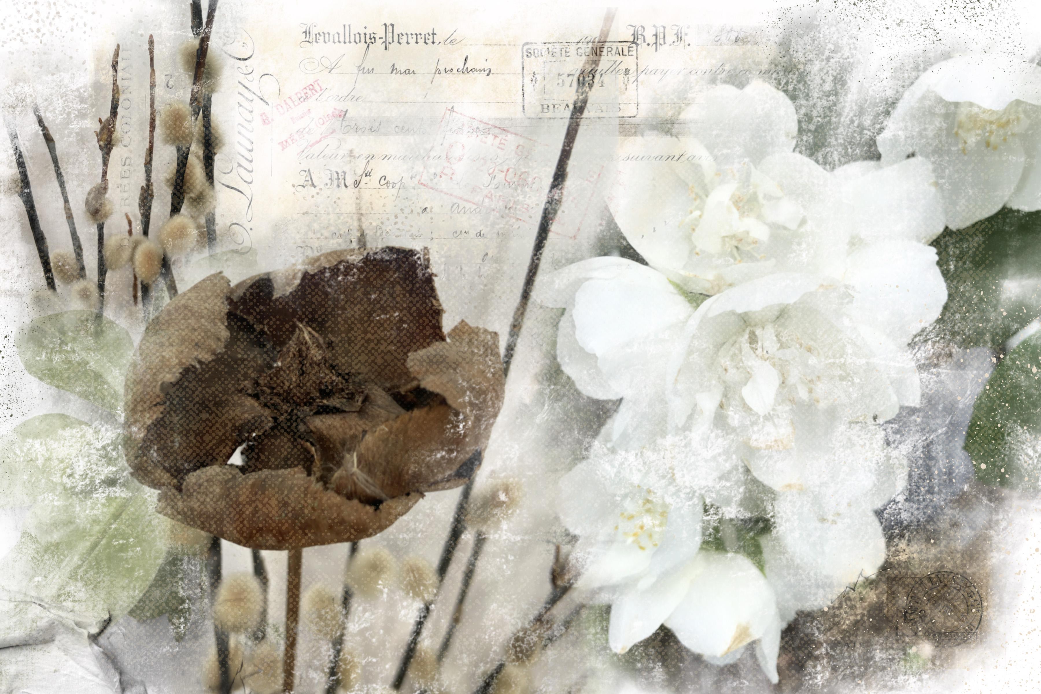
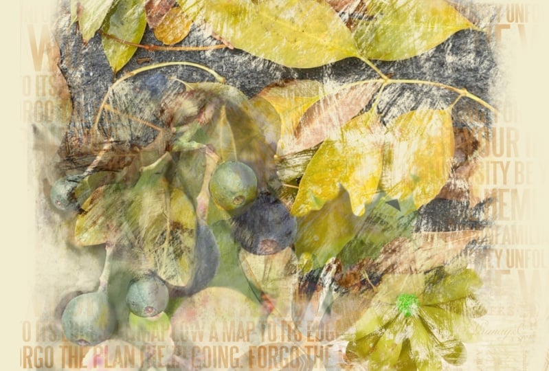
of what to look for. So the look that I'm going to be helping you achieve
is something like this. And in fact, these are
photographs I took myself. So I can actually give you
these if you'd like to use them just for the
experimental stage, just learning how to
use the clone brush. Some of these were
literally things I have here in my house. For example, that's
this component here. That's just dried
flower that I have. At this time a year. We have something called
***** willows here in Canada. And that's what these stems are that you see
in the background. We have a friend that
owns a local nursery and every year at the beginning of the year when these
are first coming out, which is this time a
year he cuts me a bunch. So I've got many bouquets
of these around the house. And here's another one
that's pretty cool. This is a sunflower
that I had in my garden and just
allowed it to dry out. So super interesting, lots of texture, very
interesting, sunflower. And we have a young
friend of one of my daughters who
love for gardening, and he had offered to
help us with a garden. In fact, he created the whole garden in
my yard from scratch, like literally turned all the
soil and created a garden. And he's been gardening here
for three or four years. And one of the things
he loves is to get heritage seeds and then
use those and plant them. And then that's how we
end up with some of these really odd looking
at plants like this. Anyways, I went through
and I literally just photographed them with
my, with my iPhone. This one here is a
beautiful flower. My mom had this shrub on the farm where they lived
and it was a mock orange. And so I had a couple
of pictures of that. So I have a whole
folder of images that I will find and
show you a second. I've got them here in my
folder for this class. These are the pictures that
I've got that so much, but these are sort
of vintage things are flowers that I like. I took these pictures at a wildlife preserve That's right near our place in Florida. These are just
some random plants and things around the house that was that was a
manatee that we saw. I probably wouldn't
use the hotspot somehow got snuck
into that folder. Here's some really great sort of facades that I saw in Savannah, Georgia and took pictures
of just the love, that sort of vintage,
rusty old look. And then here some swans that
could be definitely usable. And here's that mock
orange that my mom had growing in her flower bed. And just some other
random things, sunflowers that we had here. This is that we have
right here in our house. And then I just took some
random additional pictures that I could possibly use. I've got lots to draw from here. And you can see those last
two were the ones that I was showing you that I have
used in that first collage. So in the first lesson, that's what we're gonna do
is just import a picture. And I'm gonna show
you how exactly I use the clone tool to get
started on my collage. I will meet you in
that next lesson.
3. Lesson 2 Arranging Components and Adding More: Guys, welcome to lesson two. We've got a few of the
components that we need. We're gonna play around
with the arrangement at this point and we'll
probably add a few more. Let's get started. So to start this project, I'll quickly show you the different layers
here that I have. And that's using that brown
kind of a pod that I had. And then some of those
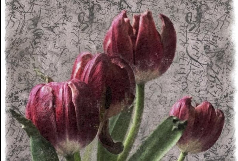
placebos in the background. This is the mock
orange over here. And you can see that it's got that really worn
out picture look that sort of a
vintage feel to it, like it's really old. And so I want to replicate that for the project for today. So let's go back
into the gallery and I'm going to
make a new document. I'm making it 12 by eight. You can make it 8.5 by 11, whatever you need
for your final use. And then what I'm
going to do is just import one of the pictures. So I have actually added
them into my photos app. And let's just bring this one in first because I think
that one's the most dramatic and I think that's
the one that you're going to really see the results
really quickly. I'm going to leave
it at this size, but I'm moving it over to the
side here because this is where we're going to
be doing our clones. So when it comes to brushes, I can give you a
couple of brushes. The one that I'm using is
this rough flat brush. I really liked that one
because it does have a lot of texture which is
kind of built into it. So you see all that sort of
texture that's already there. We're going to use it
as our clone brush. So I'm going to go into the adjustments menu here
and go down to clone here. And wherever you
see this circle, that's what you're
gonna be copying from. Now, I suggest that you start at one side and work your
way across and around. You don't want to really lift your brush once you
start painting. But you can see here
what it's doing is it's actually taking the
information from the picture and
duplicating it over here using that a brush. And that brushes textures, isn't that just the coolest
thing now I haven't lifted my brush and I
can kind of go around. The problem with
lifting your brush is then when you try to go back, you're not able to perfectly
replicate that original. So most of the time I try to
not go over anything twice. So as I'm working
my way through, I don't really want to go back now on this flower too much. The whole point is to
have it quite rough looking so I don't even
need these sharp edges. Those are something that I'm
going to be getting rid of. But basically that's how
I go about creating that. Now for the eraser, I'm also going to
sample that same brush. You can just hold
down your stylus on the erase icon and it'll say
erase with current brush. So that's what I want
for the erasing. For some reason it
didn't switch to that. So let me just grab that
rough flat brush again. And I'm just going to
go through here and actually take these
hard edges out. The bottom probably wouldn't matter because I
think I'm going to position it down on
the bottom anyways. Now you can see that that's on the same layer as this one. So now what we need to do
is get rid of that one. So I'm just going to use my
rectangular marquee here and just simply three
finger swipe down and cut. And so the only thing
left on this layer is that part of the image. Now to add additional
components here, I basically do the same thing. I'm going to go in here and
I'm going to insert a photo. And in this case, I want my mock orange which I thought I had
imported but I didn't. So let's just try
this one for now. So I'm going to again move
that over to the side here. I'm going to grab
my Clone Brush, double-check to make sure
it's that same brush again. And then let's just softly duplicate this
lovely little wine. So I'm going to
stop right there. I don't want to overdo it. I can use the eraser to take out anything
that I don't want. Then I'm going to use
my rectangular marquee, three-finger swipe down and cut. And then I'm left with
just my fern as well. Now you can see here just by
the nature of that texture, that it will have a nice
sort of a blending, blending, blending
texture that makes sense. The blend, the
texture will blend in nicely with the rest of it
with something like this. I also like to just kind of vintage up the color a
bit by going into hue, saturation and really
desaturating it quite a bit. I may leave a bit
of green in there, but I liked that it's a
little bit desaturated. And so now we have two
of our components. The next thing I really
want is that mock orange, but I think I have it
actually here in my photos. Way, way, way, way down. There's one of those
weird sunflowers. And see, I'm always
taking pictures of plants and other ephemera. Now this petunia would
actually work quite nicely to. This is just literally was in front of my
studio window here. So I had this and a bunch of pictures because I was drawing a
series of petunia, so I needed some reference. So again, same procedure. It's on its own layer. When you bring in a picture,
it'll be on its own layer into your clone set where
you want that to be. Shut this one off temporarily
and reselect that. Here we can just go through and you don't have to
do the whole planet. You can do just choice areas, It's completely up to you. Then I always like to
go in and soften up those edges even if there
wasn't a hard line. Again, with your marquee, three fingers swipe down
and cut and you can see how quickly we could get all
of our components together. So let's try to find that. I know that that's way
down because my mom and dad don't live
on the farm anymore. They now live here with us. When you go through your
pictures like this, It's like a flashback
of your life for the last
wherever many years. I've got thousands of
pictures stored here. Now the order of these pictures are from trips that we've taken. And you can see that
a lot of those could be used in collages like this. We like going to
museums and things, so we get lots of
vintage pictures. Okay, here we go.
Here's our mock orange. I'm gonna take this one here. I absolutely love this
grouping of flowers. I've actually drawn this, inked it then a couple of different other
techniques with it because I just loved
that flower so much. I definitely want to try to find one of these shrubs to use. So I'm gonna start
way over here on the side and I'm gonna go through and just do
my quick rendering. And literally that's
how quick it is. So I am quickly amassing all the components I need and I don't think I would
need both of those. So I think I'm going to
just delete that one. I think this is the
one that I prefer a bit of a hard edge there. It will get rid of it. And that's how I go
through and get all of my photographic
components ready. So at this point I'm ready to start composing this and adding some of my
other ephemera. So we'll do that or get started on that
in the next lesson.
4. Lesson 3 Texture and Pattern Brush Additions: Hi guys, welcome
to lesson three. Less than three here Let's start working on that
background a little bit. I'm going to show you
the advantage of having pattern brushes like I
have in my texture sets. I'll give you a couple of
those to play around with. You can also find vintage
ephemera all over the internet. A lot of it is free
or public domain. So I would suggest you collect
a few pieces in a folder. That way you've got a bunch to work with when you get started. Let's get to it. So it just kind of
roughly moved a few of the things around here. And I want to talk about this area in the back
that we're going to fill. I think it looks really
great to have full bits like cold handwriting or vintage advertising,
those sort of things. And you can, of course buy
them and you can create them. I've taken photographs of some
of the stuff that I have. I've got lots of old
handwriting of my grandma's, for example, in this case, I'm going to use a piece
that I already have. So I'm gonna show
you importing that. So I'm gonna go to Insert a File and I'm gonna go to my assets, and I go to collage elements and then I've got some
of these that have purchased or we could get is something like
one of these same thing. I can't remember five,
purchase these or if I've taken some scans of
books that I already have, I've got a lot of really old, old books and they're really
great for things like this. So again, we can move this
over to the side and we can use the clone tool
to clone this. So we can turn these off so
you can see what's happening. We've got my clone tool. You know, you're on the
clone tool by the way, because you get those two
little stars by your brush. Let's start at this
top corner here. And I'm putting very little
pressure on my brush at the moment because
I'm trying to get quite a light version of this. I'm not sure how
much of it I'll use. I want to get most of it because I'm gonna be erasing
away some of it. I'm going to get rid
of the original here, so we've got that. Now the other thing
that I use a lot, Let's turn this back on. The other thing I use a lot is my mixed media pattern
brushes that I've created. So right now I actually
just going to erase most of this so that we have
just the edges of it. Maybe a little bit of texts could be peeking through here. And you see I'm slowly going to be filling in this space all the way around now with my mixed media brushes
that I've created. I've got everything from vintage handwriting
to old music. I've got tons of just collage and handwriting
and things that I've done. Just scanned in and
created brushes with. If you've been in my ephemera
class for mixed media, you would've seen some of these. I'll give you a couple of these, but these are from
a set that I sell. So I'm not gonna give you the
whole thing by any means, but you can sample a
color that you've already got in your collage just to make sure that you're
being cohesive and just slowly start
building up those layers. Now, I did that on
the same layer, which is something I probably
wouldn't want to do. And I also think that my
handwriting is a bit small, so I'm gonna go into the
grain here and enlarge it. I think that works a
little bit better. And you can see that works
just beautifully for just giving us some extra
texture in the back of this. And then speaking of
texture, of course, we can work with textures like adding a background in a
really textured finish. Now for this, I'm just
going to continue with putting this
foreground stuff in. Let's check out what
else I have here. So maybe something collage like this would work
nicely as well. So I'm going to add a layer
here and I'm going to sample one of these sort
of gray green colors. And I'm just going to add a little bit of
collage in spots. And I've got that
on its own layer. So I'm going to be
able to work with the opacity to just kind of
it a little bit more subtle. So that is starting to
give it some life there. And I've got so many vintage
things that I've done here that I don't even really know what each of
them has in it. So let me just
sample this darker brown and I'm on my own layer
here or on another layer. And that one's got some really nice vintage
sort of elements. I don't particularly
like the brush itself or the shape of
the brush for this. So I'm going to go into my settings here
and actually let me duplicate this so
I'm not affecting the original one and I'm
going to go into the shape. And for this particular look
that I'm trying to achieve, I think something with a really rough edge like that would work. And I'm going to go into
the properties here and make the brush itself
is quite large. I'm spacing it out a little bit and adding a bit of a jitter. See, so the edges a little
bit more raw looking, see how rough that is now. And I think that works better, allows me to blend a
little bit more easily. That's working in well, especially with this stuff
that we have going on here, because it's on its own layer. You can, later on mess around
with the blending modes. We can also go into
hue and saturation and change our colors to see if something
else might work better. I don't actually
mind that color, but it might be nice to
have something warmer. So you can do
something like this. And I'm slowly but
surely building up all of my components
of my composition. So this is definitely
something that's really personal and may take you some time to fully
experiment with or to get the idea of how it is that you want your final one to look. You could definitely
be looking at reference as you're doing
this to get some ideas. But just imagine that you've got your art journal
open and your gluing in components and
you're painting in some staff and you're
building it all up in layers. So I think that's
good for this lesson. And in the next lesson I'm
going to show you the addition of some texture and paint to really rich in the
whole background and the look of the
entire layout here. I'll meet you in
that next lesson.
5. Lesson 4 Adding All Over Textures: Hey guys, welcome
to lesson four. In this lesson, I'm
going to be showing you how to add all over texture. For this lesson, I want
to start adding in things like the background
and the foreground. That's gonna give us
a lot more texture. You could have actually started with a background
if you wanted to. I'm going to add a
layer here so that I can move it underneath
everything. Oops, it's always easier to
pull that one above them, to drag the other one below. It's just tricky putting it
in right at the very bottom. I'm going to for now, turn off all the
other layers and you see if I put some
pressure on that with my style is right in that checkbox that
everything else is hidden. I'm going to just go into
my texture brushes here, and I'm going to
grab my favorites, which is apparently
not here anymore. That's why must affects
only moved it. Okay. I'm going to just duplicate
one of the ones I have here. I'm going to go in and
the sheep is fine. I'm going to go into the
green here and hit Edit. And I want to go for, It's like a textured paper with just sort of little
filaments in it. There are so many choices here. Literally I'm just taking
a resident texture here from procreate
so many choices, it's really tough, a tough call, and see if I can find that. I'm talking about. If not almost any of these
other ones would work. Distress Canvas is
actually very nice. Cotton paper is nice. Well, like I said, we can
work with any one of them. So let's take this pastel paper. I'm just going to leave it
with the settings it has there now and hit Done. And now I can go in and just do an overall texture in
the background here. I'm going to add another layer here by duplicating and
this one here maybe I'll it and fill it with
a very, very light color. So almost white,
very, very light. You can even lighten this more. You can experiment
with this because once you have all of
your other layers on, you'll see how that affects
the overall colors. So if I was to have that
off and then back on again, you can see how
much nicer it is. It really ties everything
together by having that. Now, I want to add
texture in choice places. So I'm gonna do a new layer
on top of everything. And for this one I'm going
to use a brush texture. This one here is sort of
like textured paint strokes. Let me just add a group
here for this class. So I've got that set so I can go into the set that
I'm copying from. I'm going to duplicate it here, and I'm going to drag
that into the set that I'm giving you just
so that I don't forget. And then this one here, I think I'm going
to go a bit darker, so let's go with that brown. And of course we're
gonna be able to dial back that extra. But if you painted all over
like this and then use Linear Burn or multiply as you're blending mode and
then screen it way back. You can see that you
get those brushstrokes throughout your image. So it really shows up on
the white, for example. That's something that it's
kind of fun to work with now, it's all over my Canvas. So what I might want to do is go in and in spots, erase it. So I might not want
it on some of these. If I don't, then I
can take it away. But you can see how
cool it is that it actually puts some
brushstrokes into our image there and almost looks like
we've got some kind of a varnish or something that we've painted that has given
us a bit of that texture. Let me try moving this leaf
lunch over a little bit. That works good to make
that a little bit bigger. I'm going to add another
layer here on top. Let's try a crackly
blended mixture. And I'm going to use green
here and see the texture that that's adding and then
that one you could also try blending mode. Sometimes screen is
really nice too, so you've got all that
stuff coming out, light instead of dark. But I think I'll just
stick with linear burn here and I'm going to bring
it right down as well. So you've got that there, but it's still really,
really subtle. I think I need stuff in here, so I'm going to
add another layer. I'm gonna go back to my, this is a new set
that I'm working on. I haven't got it
nearly done yet, but I've already got
like 50 at least brushes here that I'm going to be packaging at some
point in a set on my list, but definitely on my list. So that could be kind of fun to adding some lettering in there. Let's go with that
kind of a hand colored and just add a
little bit of that in there. I think that's a vintage
sign of some sort. It's one that I have
hanging in my cabin. That's really neat. And here we could again experiment with blending modes
to see what works a lot, just about everything works, but you just have to
ask yourself what your look is that you're
trying to achieve. I don't mind those light. I think that's what
I'm going to go with. I'm going to just reduce the
opacity but see how nice That's working out
on dark areas. So if I have it in
places like that, it really shows up and I'm really loving the
way this is looking. I think that I could really stop almost anytime here
and be happy with it. I'm going to go back to that
bottom layer here though. And I'm going to brush
in some sort of, and I would like a glow of this color around all the edges. So I've sampled that color, I'm gonna go a little
bit bigger or darker, and I'm going to
just grab rough, rough flat brush there. And I'm just painting. And painting right above the background
layer that I'm kind of sticking mainly to the edges. And you can see now
that that's really tied that color in everywhere else. Have that peeking through
in a couple of spots here just to really tie
everything together. And I'm getting to the point
now where I think I'm ready to add my finishing touches, which I think we can save
till the next lesson. I will see you there.
6. Lesson 5 Finishing Touches and Text 720p: Hi guys, welcome to lesson five. Unless a five here
we're gonna do all of those finishing touches. I want to show you
the addition of some lettering and some of
the effects that I use on that lettering to
make it really work well with our vintage palette
and our vintage style. That's good at it. So I've laid out
my artwork here in such a way that I've got an area that I can use for texts. What I did is I added a layer here that I use the
screen blending mode for. Let me just do that over
so that you can see it. But I want that
text to be in here. So I'm going to add
a layer and I'm above that texture
layer that I have. And I'm going to just choose
one of my texture brushes. Let's go to my old set
here and I'm going to use the big recycled
paper brush that I have. And I'm going to
just sample kind of an off whitish color there. So that's kind of ivory color. I plot it on a separate
layer and I'm just going to soften up
this area here. Actually what I'll do
is a much larger brush. And I'm just kind of making
area of white here or flight that I can use the
screen blending mode on to even lightened further. Having it on its
own layer like that allows me to be flexible with either adding more to it or changing the opacity or
whatever I want to do. I'm going to add
a new layer here now and I'm going
to import my texts. You can actually add texts just using your text tool here. It's up to you how you want to actually get your text in here. I created mine. I created mine and saved it as an as a photo here
just so that I don't spend too much time on texts for this particular class because the important thing is making
everything look vintage. Not so much how to do type. I've showed you that in quite
a few different classes. This text here that
I've brought it, I didn't do it as a PNG, which I should have so that
I have a plain background. But I can get around
that by using my automatic selection and selecting all of these areas
of white and removing them. I want to remove them
because the things that I'm going to do require
clipping masks. And if I have a clipping mask on that big square of white, it's not gonna be
only on my lettering, it's going to be on everything. So I want it to be no
background for now. Now that I've got
my text in here, I can start doing
things to age it. And the main thing I want
to do is add some texture. That's what I'll do first. So I'm gonna add a layer here. I'm gonna make it
a clipping mask. And then I'm gonna
go into my textures here and decide on something. I kinda liked this
roller texture, so I'm gonna try it. Not sure if the size
is okay or not. And science isn't too bad, but it's just too much of
a contrast with the block. So I think what I'll do first is colorize my lettering here. So I'm just going to do it
quickly with an Alpha Lock. And I'm going to sample
this brown color here. If it's alpha locked
and I do a fill, it's just going to
fill the lettering. So you can see now
that my lettering is brown for my texture that
I'm putting on there, I've just sampled one of these
colors in the background. So it's kind of a
greenish color, but it's a little bit
closer to the Brown, could even be darker, honestly. Let me go into that's the
brown that I had sampled. So let's go a little
bit lighter than that. And I kinda like that. You can see it's given kind
of a subtle texture in there. So that's nice. I like that. You can go in and definitely add little bits of
other color there. You can see that I am, this is kind of a spatter
or splatter brush. I'm adding a little
bit of that in there. And I think that's done
a really great job, but the lettering is
just a little bit too solid in comparison to some
of my other things here. So I think I'm going to go in and make some changes there. Now. I don't want to
permanently change the lettering just in case I
don't like what I'm doing, so I'm going to add a mask here. That way, whatever
I do on the mask, and I'm gonna do it
in black on the mask. Now I can do things like erase parts of it and it'll do
it non-destructively. So if I wanted to get rid
of that later on, I could. So I'm just gonna
go in here and I'm still using that spatter
brush, believe it or not. You can see I've just broken up the edges of it a
little bit there. I'm going to go to that other
brush that I was using, that rough flat brush because I think that one
would also work well. So if you go quite small, you can get in there
and just be very selective about what it
is that you're erasing. I think that that makes it
look a lot more vintage. So I think that has added to it, blending in with
everything here. And remember that
at this point I've got it above all my textures. And it's something
that you might consider doing is
putting it all into a group and then trying it below all your textures
to see how that would be. So that doesn't really work
with that lightened areas. So I'll put the lightened
area underneath. Then what that lightened area, I can also choose to enlarge or reduce
it to make it work. If I put it on free form, I can do just the area
of the lettering. And now I might want to even
go back and add some more. And here I'm just
using that flat brush. And I'm just kinda lightening a little bit more in that area, even though that wasn't the
lightest color that I had chosen there because
it's on screen mode. It was still lightning. I kinda like that. That seems to be allowing the
lettering to really lift. Now another thing
I'd like to do with that lettering is to have
a bit of a drop shadow. So I'm going to duplicate the
layer with the lettering. I'm going to go to
the bottom one. Actually, I can get rid of
a layer mask on that one. And I'm also going to take
the alpha lock off of it. Now I can select it. Let's change this to black and I can fill it
with the block. So if I move that,
you'll see that it is indeed filled with black. And now I'm gonna go
to my Gaussian Blur, and I'm going to blur that to both three
on the wrong layer. I'm just going to move it
off a little bit so I can see it better when
I'm doing the blur. So let's blur that softly. So I think I'm stopping at about 4% there for less
than five for sure. And then of course I can go in and set this for
a blending bode. I'm going to do multiply
and then I'm going to reduce that opacity
down to about 40%. And that really helps
to lift it off there. The other thing you can do is duplicate your
lettering again. Now the one that's on the top, what I want to do is take
that mask off of it. I'm going to fill this
one with a lighter color. So let's grab that color
that we had chosen for the background and
select and then fill it. I'm gonna move that
above that texture. These need to be clipped. Here we go. And this is the one that's
on top at the moment, and of course it's blocked out our lettering
that's underneath. But what we want to do here, this is the one that's
the clipping mask. What I want to do with this one here is also to blur
it a little bit. So we're gonna go to
the Gaussian Blur. And I'm softening it. And I'm going to about 13%. Now what I want to do is
duplicate this a few times. I'm going to pinch
all of those together so the white layer, light layer is on top. I don't know if I
had a blur there, so I'm going to blur
it a little bit more. Oh, I know what's happening
because I have it on the Alpha Lock and
forgot to turn that off. It wasn't blurring, so now I'll blur it and your hands.
Sorry about that. There we go. So that's blurred just a wee bit or you can see it there that the edges are
really soft if you, if you see it in comparison
to the brown there. Now I'm going to duplicate it. So every time I duplicate it, you can see it's getting darker, but it also works as a
way to add an outline. Although this outline
is not going to be on all sides of the lettering, I've taken all of those that
I duplicate it and put them into a group so that I can easily and quickly
flatten them down. And then what I want to do is move it just a little tiny bit and slide it in below
my lettering there. And so you can see that
I get that kind of a soft line on the outside. I'm going to just use my tapping here to move that
just a little bit. So it's only showing a little bit of a lighter
color around the lettering. And I think that that also makes it look
like it's vintage. Is that a word? Now this selecting your
lettering and then just using your tapping
to move it works well. So if you're kind of centered, you can see that it's moving, it just ever so slightly. I think that's
working out great. So now you can go through
and really assess what you've done here and ask yourself if you've got
it the way you want it, if it's working out well, my lettering might be a
little bit too light, so I could go in and select it, use hue and saturation to maybe saturated and
darken it a little bit. You could go back to that
soft layer that you did there and decide whether or not you want it to be a
little bit brighter. If so, you could just
switch to a white paint. Let's go to that. Let's use the roller
texture here and just add a little bit more
lightness in behind here. And every time we do this, if we're using a texture, I think that it's really
easy to get it to blend in and yet still cover
a little bit as well. And then you can decide
whether or not those highlights and
things that you did on the lettering are working. If it's too much, then you might want to
dial it back a little bit. You can redo your layer mask completely by just
eliminating it. Or you can also go
onto the layer mask. And if there's some area that is just a little bit
too much for you, you can paint it in white. Let's just use that
thick gouache and see I'm on my Layer Mask here, That's what I've got selected. That's the darker blue. And if I paint with white, see how it's kind of
eliminating some of that. Just lightening it
up a little bit so that it may be isn't breaking
up the lettering too much. And personally, I'm happy with the way this
has turned out. There's a lot of
little things I could do to add interests. I could certainly go and
add another layer here. Maybe I would go with. A really light color and get one of my textures here again. This one might be
nice and just some vintage looking leaves
in the background. I'll show you that
brush pattern. So the grain of it is, these are leaves and
branches and things from a really old and teach
plant book that I have. And you could go crazy here and add all kinds of
new and fun textures. And if you're interested in making any of those
brushes of your own, definitely go to
my ephemera class to find out how you can
make these into brushes. See how cool that is
to just be able to brush in CML it here. Some of these are backgrounds that I've just
literally taken out of my art journals to add
to make backgrounds. So this is a mixture of a whole bunch of
different things that I did and that I would maybe
go underneath to add. So that's kind of collage piece that I would've had
in my journals. And you can see how
interesting that is to add. So whenever you can make yourself some of these
brushes go for it. There's tons of them
available to buy as well. I've seen tons on
Creative Market. So I think that having a
bunch of brushes like that just at your beck and call
is the funniest thing. It's just nice to
have all of these. And there's just so
many things that you can do when you've
got these at hand. This one, for example, just adding kind of crazy
lines that I did and produced a pattern out of them so
that I could add them to that library of
patterns that I have. And so that's basically it
I'm rambling at this point. So I'm gonna cut
this lesson short. I'm gonna show you a couple of finished ones that I've done. Let me just get you
into my gallery here. So this is one that
I had started. I haven't quite finished. I'll probably go back and
use a different flower here because I've
already used this one. But see some of
these pictures are just vintage things that I've
done photos I've got that I've collected and how easy
it is at this point now that they're all in my document to create a really great
layout out of it. Here's one that I, it
didn't go quite as much into the vintage
look, but definitely, you can see here
all the addition of my different layers of clones that I've created
and then composed. And a lot of these were pictures
that I've taken myself. This is a plant that
I have right now. And I was doing some
experimenting with pattern design and had these
in my gallery of picture. So I used it. Then I want to show
you how you could use it for doing really
cool scrapbook layouts. So in this case, I've got my adorable
little grandson in here. I did the clone so that I could add a whole
bunch of texture to him, then added a bunch
of backgrounds and textures from my
mixed media stats, and then just added
some lettering. And this is a frame that I
created for another class. And I also have a
set of brushes that I'm creating for
frames like this. I'll give you all
the instructions in that other class on how
to create those frames. But this thing,
this whole layout, took me three-quarters of
an hour at the most to do. And that's because I had all
of those components ready. So another great application,
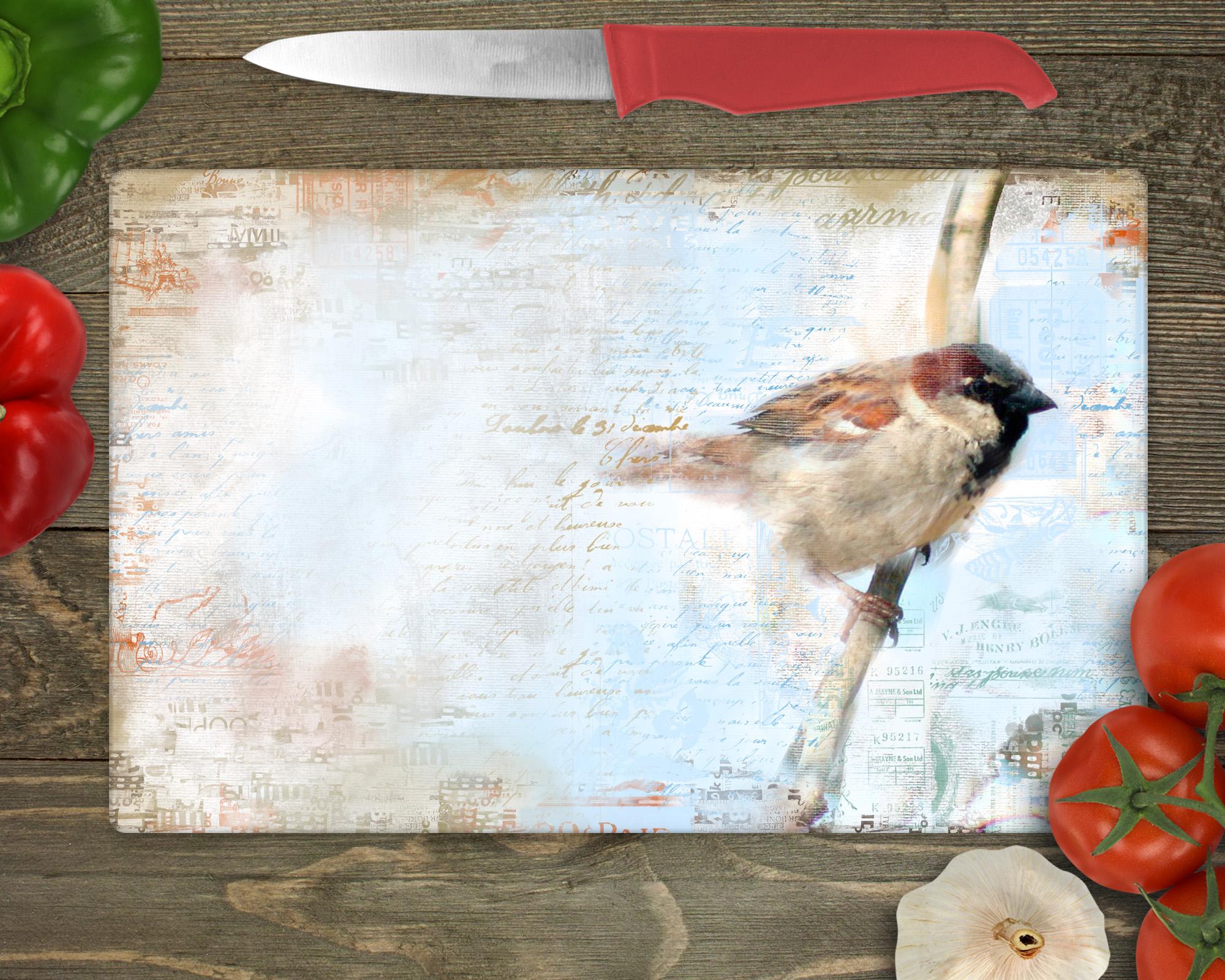
creating scrapbook layouts. And this one I love to just a
photo of a bird on the side here and then tons of ephemera office to make the
layout more interesting. Not even sure what I
would use this for, but I've created it. So those are just
different ideas, different things you could do. And I look so forward to
seeing your finished products. And I'll meet you in the wrap-up and you'll see a couple of mock-ups that I've
done with these. I'll see you there.
7. Lesson 6 Wrap Up and Mock Ups: Hey guys, welcome
to the wrap up. I want to show you this
quickly on a mock-up. I love showing these on
mock-ups to just really get a good idea of how they look
and how they could be used. I think that it's nice to
experiment with a bunch of different mock-ups
so that you get an idea of what kind of art is suited for a particular
application. For example, how
would you do wall art differently than something
like a cell phone case? So try it out on
different things just to get that kind of a feel. Now if you didn't do
so at the beginning of class and you enjoyed this one. And think that
you've possibly be able to listen to more
of my chattering. Definitely hit that
follow button up there. That way you'll be informed of my classes as I post them here. And also any of the post to all followers
that I send out. You'll be on that list
and you'll get them to. I'd also strongly
suggest that you go to my website and add your name
to my mailing list there. That's at Dolores art dot ca. Having your name on that
mailing list will give you all of the other
things I sent out. So if there's artists resources that I'm
giving away or whatnot, those are all things that I
would post on my website. So check it out. Thanks so much for hanging
out with me today. And if you ever want to take
a look at any of my stores, the biggest one is
it doesn't dot com. I've got one at society six and on art of where
here in Canada. I'm also on all kinds
of other POD sites, so you just have to
search out my name. It's kind of funny
when you do that. I find that I looked at that artwork and it's stuff that I did two or three years ago. So it's always kinda
weird to see it. I feel like a improve
all the time. So what I'm doing
now is stuff that's going to be out there
in a year or two, so it's always fun
to work that way. Anyhow, I would suggest
that you go through and put some of your
art on those POD sites. You never know, you could make a little bit of an income
that way. It's always nice. And I guess that's it for now. And I'll see you next time.
 Delores Naskrent, Creative Explorer