Transcripts
1. Intro Use Procreate for Earthy Digital Alcohol Ink and Marbling: Hi guys and welcome. My name is Dolores now Scranton. I'm coming to you from sunny, Manitoba, Canada. In fact, it's beautiful here today. I'm going to go for a walk as soon as I finish all my recording with God, a balmy, 24 degrees. Wow. Only last week it was minus 10. So Canada aporia. So I've been really excited about bringing you this class. I've been experimenting a lot with it. And I'm thinking that you're going to really enjoy it. I produced a class a long time ago called digital marble and alcohol ink textures using Photoshop. I have since bought an iPad, so I've had an iPad, your boat six months. I've replaced my really ancient one and I've got the iPads with Procreate 5. And I've been doing some amazing things with it, producing this alcohol Inca fats. I thought, why not put this into a class? If you were in my other class, you'll remember that my agent had said to me, The market is kinda saturated for this art, so don't spend too much time on it. Art that I had produced in Photoshop with the alcohol affects ended up being licensed to many different online POD sites. So he was wrong. So since of course have been producing more, he's asked me for more. So this class was really developed because I really wanted to be able to do this sitting on my couch. So I've been using Procreate 5 on the iPads, produces amazing and really realistic alcohol ink art. In this class, I'm going to share all the things that I've learned. And by the end of it, you should have a beautiful alcohol ink piece. Make sure if you like my classes that you hit that follow button up there. I really love seeing that many of you are following me and doing more than one of my classes. Thanks so much. I also really appreciate your comments and your questions and posting your projects. That's always really fun to see. And thanks also for the ideas that you've been giving me for future classes. If you have any more ideas for me, throw them my way. Always happy to accommodate. So are you ready to get started with his alcoholic stuff? All right. Let's get to it.
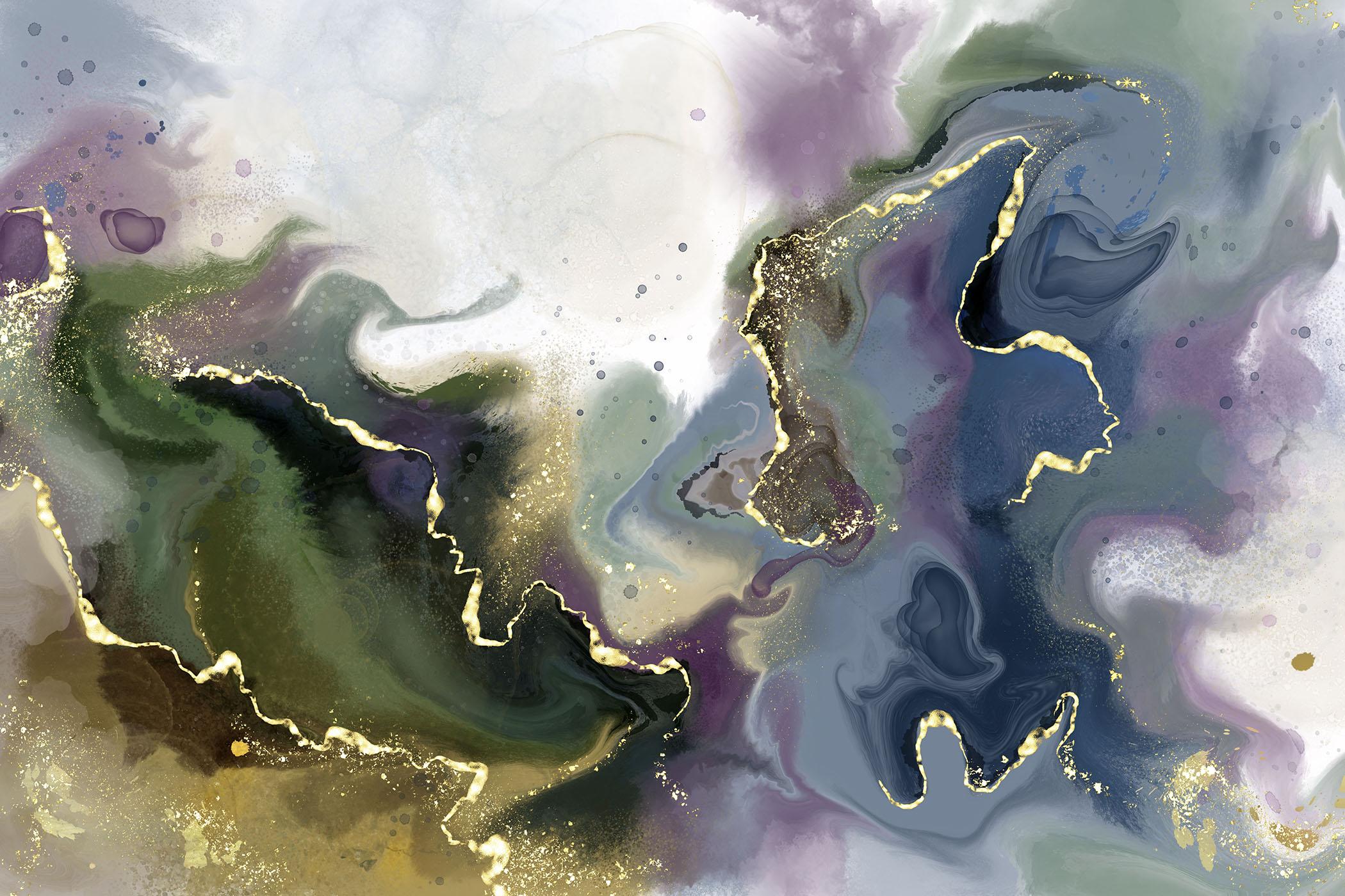
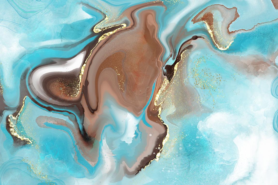
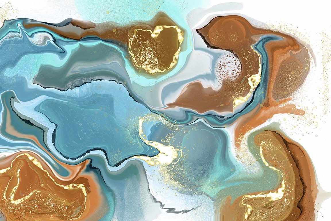
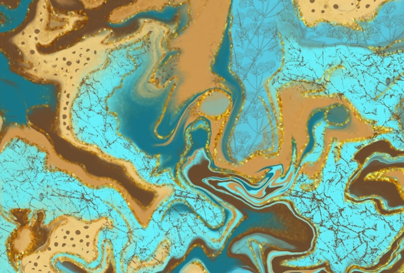
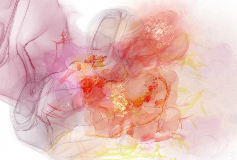
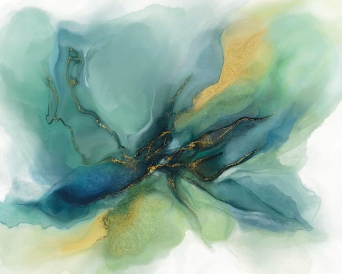
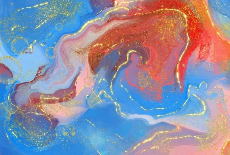
2. Introduction, Examples and Overview: Hi guys, welcome to lesson one. So unless a one here I'm going to show you a bunch of the examples of the work that I've done. And we're going to take a look at some inspiration. Of course, I've mainly start out on Pinterest and it can be showing you my marbling board that I have there. So let's get started. So I'm going to be doing my best to address you with this camera. As I worked with this camera, sometimes I just get too involved and then I don't really look up, but I'll do my best. This is one of the pieces that I created. This is the one that I've used on my titles. And I just loved the way it turned out. I mean, it's got some really great detail in here, some really wonderful areas that have turned out very realistically. I've got a bunch of other ones here and they all kind of have a different look. I'm going to be showing you how I achieve these different looks or provocative. Mainly concentrate on one artwork just to get through the class. But I'm going to be giving you as many pointers as I can. So there's going to be little things like this that we go through and I will walk you through as much of the technique as I can. When I'm getting started on a project like this, I often visit Pinterest. This is my board called marbling, alcohol, ink, and smoke. So I've got a real variety of pins here. The kind of look that I was trying to achieve was more in this vein here. This is a really good example and I'm going to show you how this one inspired me, but I also really wanted to incorporate the gold. Now if you've been in, I've had a couple of different classes on foiling techniques are adding gold trim. So this is kind of an expansion of that. I'm going to be showing you how I went about and added to these artworks. And then we're going to be talking about some brushes and things. So one of the things that you can do when you are in Procreate is that you can. Let's just get into this one here. I want to show you this one in particular because this one was inspired by the one I just showed you. So when you're in Procreate, you can bring up your doc and then you can grab the app and bring it and just kind of put it in on the side. So you just drag your icon there. You have to hold down while you're doing it. Drag your icon to this side and then you can have your Pinterest inspiration or whatever your inspiration is here on the side. Be looking at it as you are working. So that piece I was showing you with this one here. And you can pretty much see how that piece inspired this piece. So you see the different colors that I've used are very similar to this. I've got some areas that are very reminiscence of this one here. I've added water drops kind of in the same way. So we're going to probably walked through this sort of an idea. And I think I might try to work with these colors because I really think that these are pretty, so I'm going to temporarily close that off so you can just drag it again to the side and then you've got your artwork here. Now I'm going to make a new documents. I'm going to go into my gallery and I'm going to add, and I like to work really large. So I've got kind of a standard canvas that I use. The size of that canvas is 24 by 16 and it's 300 pixels per inch. Now, I work at this high resolution because what I do for art licensing needs to be in a really large, physically large size. So I would have it in probably 48 by 32. So 24 by 16 is about half size. I usually take these artworks into Photoshop. I enlarge them, and then I add a bunch of filters to lessen the effect of the interpolating that takes place when you enlarge. So these are little sort of finishing up things that I do for all intents and purposes. And for this class, I don't think we'll go through that whole process. I want to explain that all I've done that in other classes. So for today, we'll just focus here in Procreate. All right. I'm going to save the beginning of this for the next lesson and I will meet you there.
3. Initial Painting and Texturing: Hi guys, welcome to Lesson 2. In Lesson 2 here I'm going to be showing you my process for creating this alcohol ink look in Procreate. Initially, I'm going to be showing you brushes that are available here in procreate for free. But I'm going to be talking to you about purchase resources as well. So we're going to cover both methods for actually laying down color and getting started with this. So here in procreate, as you know, there are dozens of built-in brushes. I use mainly the resident brushes here to create my initial looks. So Let's see this one here. And this one here, this one here. And this one. These were all created just using brushes that are already here, existing in Procreate. I didn't find a lot of really great resources. So I wanted to just point out those as well. So let's go into Creative Market. And in Creative Market here, I just typed in alcohol, ink, brushes for Procreate. And really quickly, you can see that this is a very popular category and there are lots of different brushes available. I had already been experimenting with this before I bought brushes, but of course I couldn't resist and I went and bought these amazing alcohol ink brushes from Alina Jensen. Jensen has a ton of really great videos online, I think mainly through YouTube. So you can check her out. And she has a website. And on that website you can buy her brushes like you could buy this set for $19, but you can also get this bundle here. I thought this one here was a particularly good deal. You save over 60 percent and you get ten brush sets. And there were all kinds of additional resources there. So that's the one that I ended up buying a head, bought this gold rush along time ago for Photoshop. And I found it to be very good. And so you'll see later on that I will be using some of the brushes that I purchased it. But initially I want to show you how I created those without the use of purchase brushes. All right, so we're gonna go back into procreate here. And I'm going to start with some of the watercolor brushes that come with Procreate. So if you go to the water category here and you grab this wash brush, and let's think about the color palette. What I could do is import a color palette, or I could create my color palette. If I go into this gallery here, I could go back to this one. This is the one I do want to show you. I have saved this as a JPEG so I can go in and import that. I'll show you how I did that. What I did is I went to the gallery, selected, this one, gets select, Share, share it as a JPEG. It's going to ask me where I want to save it. I'm going to save it to my files here. You can save it to Dropbox or wherever you'd like. Then I'm just going to save it. Files and I'm going to put it in, let's put it in the reference folder and hit Save. And now I can import the photo. So just go to the Wrench icon there and insert a file. And we'll go into reference and grab the image. So now we have the image in here. We can use it as a reference. So we kids, well, let's start by sampling the colors. So I would go in here and I would go to the palettes. I'm going to add a new one by clicking here. And I'm going to start by just sampling some of the colors. So hold your finger down wherever you want to create that color and just click anywhere into these palettes here to save the color. Now we could put those right at the getting pulled down and move them. So you don't have to sample all the colors. But if you get kind of a general range of colors that you'd like to use and grab that later, blue, cream color here. I think I've got pretty much, I don't know, I don't have the greens, so let me add some green here, and that will be the palette I'll use for this project. For additional reference, I like to keep this image here. I like keeping it here on the Lear as reference, but I also want to importance as a reference here. So I'm gonna go to image here, import image. It's going to be my latest image here. And this I can keep for further reference throughout my project. So even if I were to have this off and working on another layer, this can stay here if I wanted to. So I can either turn it off when I don't need it and then go back and turn it back on. So that's under the wrench and Canvas and turn it back on and it'll, it'll be there. So I always have that for reference throughout the project. And I'm ready to start my painting. I'm actually just going to close that for now and hide this layer. And then on this layer, we're going to start the painting. So I've got these colors I can work with. I can actually make this my default pallets. So as long as I click Default here, when I go back to my disk, the palate will be here, so it's the top one and I can clear all these colors that I was using in my last project. I'm going to be showing you a bunch of different brushes, but for now I'm going to just start with watercolor. So, but it does start with a big wash. Lay down some of that. I'm going to get different tones happening. And I like kind of building out opacity of the brush to just get some of those darker areas in there and some light as well, maybe a little bit smaller. If you're unsure about your whole color composition, I would suggest that you keep your palette very limited at first. So I think maybe that's what I'll do. I won't use necessarily all of the colors, but I'll keep it to kind of three or four main color groups here. We've got lots of pink in here, we've got lots of green and I'm going to also work with the gold, and then maybe we'll add some other tones later on. So experiment with the different brushes so you can kinda get an idea of the effect that they're going to have when you start doing your liquefied. Adds a little bit of texture and grunge in there. I like working also with the spray paints. You can get some really neat sort of flicks of colors. So it's kind of a spatter look. Let's go a little bit more neutral, lighter, having Aleve that when you use the nozzles. Repaint novels, the harder you press, the more color you'll put down. But if you kinda don't press too hard, you'll get to see some changes in the tone, which is kinda neat. You'll see that that's a very nice effect. You see that gives them a lot of sort of noise in there, which is a really nice effect once we start marbling, okay? Okay, so I'm going to keep it really simple and I'm going to start using the liquefies. So go into your adjustments here down to liquefy. The main control that I'm going to use is this push. I'm going to show you all of these that are applicable as we work our way through. But let's start with just the pushing. I'm going to do a really large push. So you can see here, I'm going to keep these two settings low. I've got the pressure high, and you'll see that I can just simply pull and push the paint that I've got there. Now that's not exactly what I had in mind. And when I add a bit of distortion to it, I'm going to show you what the momentum does in a second, and I'm going to get my size a little bit smaller. And first I'm going to just kinda move within each of the different areas of color. So I'm sort of keeping them separate for now. But you can see already some really neat things happening there. And as we move around our paint, and I'm going to go a little bit bigger, and I'm going to start mixing between the colors. Now the cool thing about this momentum is that you can use it to kinda flip the page right across the whole canvas. So if that's something that appeals to you, you can definitely make use of that. Sometimes I just like doing that because it's a bit of a surprising result if that makes sense. So it's kind of a good way to initially move your paint around here. Now I'm going to reduce that down a bit. And I'm going to say really trying to create interesting areas. And now I'm going to be pulling my color in from one to another. A little bit more interest to try to get some really neat stuff happening there. Now I like it when I get an area like this, what I've done is told and then just kinda worked that area and made it larger. So that makes for a really interesting marbling kind of a look. So let's also bring some of that yellow in there and experiment with just doing those kind of moves where you're kind of just going round and round in one spot and see if that's something that you like. And you could stretch areas or compressed areas to try to get some really neat effects happening. Now I really love what's happening in here. And there's some really beautiful stuff happening in here. And I think what I need is a little bit more of a cream color in here. So I'm gonna go back to painting for a second and I'm going to get fat nozzle and I'm going to go to a soft, creamy color to add here. Don't sweat it too much because you know, you're going to move this stuff around still. Let's add a bit of spatter, tiny bit darker. And I liked this spout or setting because it's got a bit of a hue shift. So it's kinda neat because it's introducing some other colors into that little area. Definitely still add into these other areas as well. And let's add a little bit of super light and white. And now back to liquefy. And let's move that stuff around a little bit and go a little bit smaller to start out with. And I really do love what's happening here in this purple. And this is where you can decide, okay, what do I want to really feature here and how do I want that particular area to look? I love this dark vein that's going through here. And now I'm going to experiment with a couple of these other distortions. So let's try the twirl. You can see what that does. That twirls in one direction. This twirls and another pinching, it does exactly what it sounds like. It's squeezes an area together. So let's go larger so you can see the two that really small, you can get some really neat things happening with the individual lines. And then I like doing these sort of expanding blogs because that's something that you do see an alcohol and collage. So let's put a few of those in there. And actually produces a really nice look in some of these areas. So we can even look for specific flaws or what you would consider a flaw in the marble and then just expand it, make it more dramatic. Now crystals Doesn't really neat thing to where it adds some bumpiness. So you see what's happening there. You can always undo if you do something and you think, Oh my God, I just lost that perfect spot. Just undo and it'll go back. It's like it would if you weren't in the filter out a little bit of bumpiness in some areas there. And what's really cool is going back to those afterwards. So let's do kind of a dramatic area here. We'll go a bit bigger and you can go back in and push those. And pushing them kind of softens the effect. But you can see that it has a really nice natural look then. So I'm gonna do a little bit of work here off-camera. I'm just going to add a little bit of additional grunge texture. And then I'm going to come back to you and explain exactly how I went about it that, alright, so I will see you in the next lesson.
4. Adding Accents and Textural Interest: Hi guys, welcome to lesson 3. So in less than three here we're gonna take a look at adding that accent of gold. I'm gonna be showing you the traditional method that I used to use. And we're going to be just a bunch of other little things with adding texture and has the, our pattern. Let's get started. All right, so here's my file. I'm gonna give you a quick look here at the one I had at the end of the last lesson. You'll see that I've taken the time to add additional texture and to really move around my design to create it what I consider a better composition. You'll also note here that I have a couple of other layers, and I've also got kind of somewhat almost finished version there for you to look at. Now, I'm going to backtrack and explain what I've done here. So one of the first things I did was to go in, and of course I added more texture and I've moved things around really similarly to what we were doing at the end of the last lesson. This additional layer here I created in order to give myself a little bit more contrast. So I wanted to have really rich and the dark areas. Let me shut this off and you'll see what I've done here. So basically I've just use the spray paint to add additional darkness into those areas there. And you know, you don't have to be perfect, you don't have to mask it off or anything. I used a couple of different brushes here. So in some cases like here, this was just the, one of the watercolor brushes might not be in this set, might be another set that I've purchased, this expressive CD, which is a watercolor brush, and that was by PB, PK, realistic watercolors. You can get a very similar effect by going into the painting set here and using an oil paints or a turpentine to give you be on the right layer to give you that kind of smearing looking color. And then this layer and turn this off has some additional sort of smearing even deeper versions of the color. So then what I did is I took all of the three layers and I flatten them together by just pinching the three together. And then that gave me the everything on the same layer. So then I was able to go in and liquefy and push and move this stuff around a little bit more. Just sort of integrates those really deep, deep colors together. So then I did a bunch of moving around of all of my background and went through and I'll hide that one and I'll show you this. And here I'm going to hide the gold. And then you can see here, let me just show you just this layer. Right now I've got it on the color burn blending mode. If I was to go to normal, you would see what I have on that layer. Now, these little items were created, I'm going to go back to Color Burn. And then I'll put all these layers that are that layer back on. So you can see that those little areas were created with the luminance category. So I went into luminance here and I grab nebulas. So on that layer there, I painted nebulas which kinda give intensified. Here's a really good place to see it. It kind of intensifies whatever color is there. So with the color burn. So it's a combination of the color burn and the nebula that gives that effect. And while I was out at, I went through and added some of these. Others are not that one. Bokeh, the bokeh effect, which is really large, kind of polka dots. You can barely see them there, but they're a good example of one. So I did that and kind of overlapped in spots, you know, to create that really cool effect. Now it doesn't have to be done specifically in this green color. I would experiment, try some with black. You get a different kind of a look there. That would be actually very nice on the purple experiment with pure white. So you can experiment with any color because the color burn will blend the two together. So I'm going to go into a partially saved a document here, and I'm going to show you a couple of different ways to add the gold. So Alina has some really greets gold brushes to use. I wanna go back and show you the traditional way of adding gold to something like this. If you were in any of my adding golden glitter classes, I've got, I think two of them for adding the accents in either glitter or kind of a regular gold. Explain how to get this effect. So essentially what you need to do is import a gold or glitter accents. So I'm going to go to Insert a file. I already have some golden glitter received. This one is not by Elaine at this was a set that I bought on Creative Market by Abney. So I'll give you a link to that. So I have these goals here done. These are fairly large files, but what I've done is I've made an extra large one that will fit my Canvas. So I've got this, it's exactly the right size when I bring it in and it fits the canvas. So that's what I had done there. Let me just delete this one so you can see my whole process. Hi that temporarily and I'm going to show you this, which is the layer on which I painted what I want to be in gold. Okay, So on this layer, I've used just a regular inking pen, I think in a watercolor pan in the nap, done some additional detail with brushes. One of them I'm going to give you, it's one of the ones that I created. So that layer, when it's linked with this layer as a clipping mask will give me those gold edges. So here to apply this inserted image to this as a clipping mask, you just click on the layer itself right on the icon and hit the mouse. And you can see here that it is now Eclipse to that image. So only what's on this layer will show as an accent. So let me turn this one back on and you can see how beautiful that looks. It's really tied in the gold exactly where I need it. So the cool thing is you can be on this layer now and any painting that you do. So let's go to, I'm going to use organic brush here. I like using like twig or a bamboo or even hamper because they give kind of a broken line like the, if you look at the edges there, you get that sort of a cool, very natural look. Tweak is kinda cool too. So I'll take those off and you just look for areas in your image that look like they could use a little bit of an eye. Accents. So let me go back to camp and you could have whatever color, but let's do it as block just to make it easy and just choose the areas where you think gold would normally cool with the alcohol ink. So if you know how alcohol ink works for doing this kind of image, you basically drop your, let's say you're making a ceramic tile. You would have the ceramic tile and you'd have your ink on the ceramic tile. You use a method to push your ink. I have seen it demonstrated with a blow dryer or a really tiny fan. I was privileged enough to end up at the Savannah School of Art and Design. One day when we were there as tourists, I went to the university or the school and introduce myself as visiting faculty. And I had basically free rein to walking in and out of the classrooms. It was just so awesome. I wish that would have been a place that I could have attended when I was young enough. I guess I could still do it, but I'm a little long in the tooth for that. But it just happened on that day that the bookstore was having a kind of a trade fair. And at the trade fair they had hundreds of different supplier displays and demonstrations going on. There. We're going to get this four or five floors in that store. And there were booth set-up all around the perimeter. And yet he's little demonstrations were going on and I watch some incredibly talented students demonstrated the use of alcohol inks and they were doing these ceramic tiles. I was just fascinated. I've never actually done the alcohol ink, the real alcohol ink. And I was able to observe what was happening and they were explaining it as they went along. And what happened is when the Powerball the inks on there. So let's say they did straight lines of the purple and then the green and the brown, and then the gold. When they were pushing the ink, certain colors would pool in spots depending on how they pushed the Ang and they did it so expertly bad. The edges were often where the ink, gold ink would pool. So I was just flabbergasted. It was just so amazing and gorgeous, fascinating to watch. So anyways, what I wanna do is try to emulate that final look of that they were getting. And so usually the way that these kids had demonstrated it, they had the gold alongside the darkest edges. And so then I was doing the same thing here in my digital reproduction of it. Make sure I'm on the right layer and it's happening on my eraser. And then so, yes, as I paint on that layer, I can do as they were doing, which is to have the pool, the ink pooling on the edges that were dark. So the neat thing about this particular pen that I've chosen is it really reacts to 0 hard I press so I can go really lightly and get a thin line and then I can really pull it by pressing harder. So that was just a really fascinating experience and that's the look that I'm trying to emulate. Now. You can also add anything on that layer that gives a texture. So one of the brushes I'm going to give you is this brush of mine, which is just kind of large dots. So you can see that that lays down some really neat sort of uncommon texture is not exactly what you would get if you were doing alcohol ink, but I really like that. It's quite bold. And then the other one that I really like using for that luminance glimmer. So that really adds no almost more like spatter brush texture. And because we're on this layer, it's doing it in the glitter that we have there. But you could also use this one. Let's add a layer above. You can also use this one and choose whatever color you could use. A gold, I think I have a cold pellet here. This palette was actually one of Alina's. So you can get this if you buy that package. So it's really cool and you can actually paint in that color and you can get a very nice glimmer of fact, just with this brush that's actually built into procreate. So you can, yeah, you can just do, do that on this layer, go bigger and you can just kind of plopped down some color. But the neat thing is here we are on this other layer, we can actually pick something like one of the purples that we're using. And you can go in and paint glitter texture in whatever color that you choose. So that's one of the brushes here in Procreate if it's in the luminance category. And of course, experiment with some of these other ones too because they're really neat and they can add some pretty cool effects. That was kinda where I landed at the end of that whole experiment of bringing in that golden glitter. But I also want to show you a lean as brushes. So let's save those pressures of lameness for the next lesson. I'll show you how to import them. And then I'm going to show you how to use them and how much they really enhanced by project.
5. Adding and Using Purchased Brushes: Hi guys, welcome to lesson 4. So in Lesson 4 here we're going to take your really good luck at those important brushes by Alaina. I'm going to start by actually showing you how I download and install those precious. And then we're going to just take a good look at them and really start using them to add additional enhancements and details to my image. Let's get started. So Alina's brushes are available both on Creative Market and on her website and maybe others sources. I really don't know exactly. I went to her website here, so Alina Jensen.com and I clicked on this set here. You can see that that includes all kinds of fabulous brushes, lot of detail, spatter kinda stuff, and the gold trim. As I was lucky through it, I saw that she has several bundles. So I went in and took a look at the bundles and the bundle ended up getting I think it was this no, I think it was another one because it was $49. Had everything that she's produced up until 2020. Talk about a win-win. I can see with everything that's included in this package that overall it's going to be a real big time-saver for me. I can fully rationalize having spent that money because of all of the amazing things that I've found within this set here. Now, you can want to purchase it, it'll download and you'll see this little button here light up. I had also seen all of her stuff on Creative Market. So you could definitely go there to buy your different bundles or by your single brushes. So you can see that each of them Arab oh, you know, between 12, $20. So the $49 full set to me was completely worth it. Once it downloads or went through. At the download stage, you can specify where on your iPad that you want to save them. I personally see my downloads into my iCloud Drive and I've got a folder called Procreate add-ons. So that's where all of these different brush sets are, all of hers and a whole bunch of other ones too, and textures and things that I download. So once you have decided on which brush set that you want to actually upload, you can just click on whatever brush set it is and it will install it onto your iPad right into your procreate. So it's super-easy. So let's do this alcohol ink. And here's a bunch of the color swatches that I was talking about. So you could upload that into Procreate as well. So I've already got that, so I won't do it. I'll click on this brush set just so you can see how easy it is. You simply click on it and it imports very quickly. And now when you go back and take a look, you'll see your brush set has been added. Now, I've got a duplicate here so I could just click right on the brush icon there and you can hit Delete. So now I've got it here and we can get to work. Amongst the brushes that I really liked to hers, let me take a look at this. I'm just going to add a layer above this. And one of the ones that I've used frequently of her sat is the Inca pool edger. So what this one does is it even intensifies the edge of more. So you can sample the color. I'm going to go even a little bit darker. And you can paint this little edge, which looks a little bit more realistic as a pooled alcohol ink layer. So I do like that. So look how nice that edge looks now. And let's do the same thing here. We'll go into a little bit deeper, a shade and see we can paint along the edge here. And this is really nicely pressure sensitive. So the harder I press, the thicker the line will be, the bigger the pooling. So I sometimes look at it like, where am I going to want to pull the ink? And probably at this area would be a great one. So I would get that heavier. So that's where I would pool the gold. You can definitely go over it more than once because it has a buildup. So you can see this is just one layer and then if I go over it, this is the second layer and it comes in and creates an even darker area. So I really loved that little brush. So I've used that quite a lot. And that's for a deep green here. When he, How about hitting into the reds more? Here we go. Me, me that really rich edge. So every little step we do here starts to make it look even more realistic. Now her sat is extremely comprehensive. There are some friggin amazing different alcohol ink effects that you can do here. So maybe I'll open a new layer and I'll hide these two so I can show you some of the really neat, realistic brushes that she has. It's like, wow, that one is just amazing and they're all pressure sensitive. So the harder you press, the more detail that goes down. Her brushes are brilliant. I mean, what was my mind dependent doing this? Every kind of inquiry you can imagine lots of different spatters, really gorgeous batters. I've used them in lots of other projects, not even to do with the alcohol ink. This one's kind of neat. As you press harder, you can get a clear area. I'm just going to show you a few of my favorites here. I won't go through the whole set. The spray blender is really cool. Laid down for you to see how that works. So maybe I'll use that later. Yeah, In fact, let's go back to my layer here. I'll just delete that one and let's see how, how all of these things work in conjunction with what I've got laid down here. So these are really great, these textures that you can add. So these interact with the layer that you're painting on. So you see how that's just added kind of I don't know what you'd call it, like a wrinkle or something. And I'm not even changing color here. See, I've still got the purple and it's adjusting to whatever color I have laid down here. I mean, these are so comprehensive that it's not even worth me taking the time to create brushes like this, because These are just amazing and further $20 that you paid for the brush set, it's more than worth. And I can tell you right now, in depth is really nice. And that does a lot like what the color burn and the nebula. Dan Howard, just kinda Richardson's, the area here. Bleeds are neat. So you can go in and just how the colors bleeding together a little bit more. If that works for your design hairdryer, which kind of hard to see here, but it kinda pushes, pushes what you've got there already and just add some additional texture. Can you see that there at all? When I do this? See how you get those little pulled out inky sections like that. So that adds a ton of realism. Awesome. I used here is all just regular brush strokes. Really great textures that you can paint either in conjunction with what you've already got here or as an overlay layer. So you would add another layer. Let's put that down over here and then go in and blend that. So this is where you could experiment with your blending modes. The lightened is quite nice. It brings a nice texture into here. Okay, so that was lighten. And you notice here how the letter combination changes when we change the blending mode and it's for normal. Overly works nicely. Mckenna works nicely too. Overly, probably was the nicest one in my opinion. So you can do that sort of thing. And while you're at it on that layer, you can go through and add that into different spots. Let's go back to that other layer. And another one that I really liked, this infinity rings. So with the infinity rings, you can paint multiple layers of it to get that sort of effect of the ink spreading. Because if you've pushed it around with a dryer or a fan of some sort. And so that's pretty cool. So that's another one that I really liked. And again, that one would be a great one on this. Let me just undo these. That one would be a good one on your overlay layer. Pure black. And you look how subtle that is in yet so effectively creating what looks like alcohol ink pooling. And then don't forget, you've got blenders down here at the bottom. Whereas the blender sprayed blender and see how that's giving me this spray kind of stuff going on. And yet it's kinda of lightening up the edges of the pooling. So I loved that and we could add this in other spots as well. Let's go to white and see what happens on that overlay layer. Not much. Let's go back to our main layer. And you can see that it's adding some additional texture in these areas, mainly on the lighter areas. So I really like that effect. Believe me, you can get lost for hours doing this, this playing around. Last night. I did this one as I watch TV with my husband. I use some of my own techniques and some of those my own brushes. And then I went in and just added additional detail using Alina's brushes. And it was really mesmerizing and fascinating experience when I was working on. But you can see here some of the ones that I put in. So this was the one that I was kinda finalizing last night as well. And this is the one that we were just working on. So to just blow your mind more, I'm going to show you the other gold technique that I can do with Alina's brushes. So I'm going to save that for the next lesson are eight. I will see you there.
6. Adding Gold and Glitter Details: Well guys, we're in the homestretch. Unless lesson I'm going to show you how to add some of that gold and glitter detail. This time we're going to be using Alina's process to do that. Let's get started. So if you ordered that full set of what she had there, there is a gold brush sat. You can click on this import. And even that alcohol inks that had a few. So the alcohol ink set had a nice edger and kinda of a scatter brush in a really fine Boyle defined spatter. So this said I'm really excited to take a look at. So this gold rush that I actually had purchased, this, like I said, a few years back for Photoshop. Now, I've also imported the cold palette that she has, the metallics pallets. So for now I'm going to set that as a default so that when I go into my colors, they're listed right here. So I'm going to actually clear all of these out of there and let's get started. No, I think I'm going to stick to this basic gold here and all of these brushes. The gold finish, if that's the color that you chose. If you prefer copper, you can definitely go in and choose copper. This is the one that I want to use. And let's first look at the one in the alcohol ink sac. So at the top or here are metallic inks. So I like using the liner lecture, this foil liner here to do the edges. So it's a really nice bright foil. So let's add a new layer. I mean, you see that I've done quite a few layers here. So hopefully I don't run out of layers. One of the things about Procreate that I don't love, the fact that you can easily run out of layers. Let's start. This isn't the one we were working on, was it? Because we have that pooling. Let me go back to my gallery. And here's the one that we just did, the Pooley on K. So I'm going to kind of go along where I did the pooling. And I'm going to add that foil detail at that new layer. I've already done this. So I've got that one in a folder or in a layer folder, layer group. This must be the one that had the edging. Okay, Sorry about that. So we're going to hide these. This is the goal that I have there previously, but let's just delete this one and I'm going to do a new one from scratch. I like running that gold in the pooling, so I'm going to use the foil liner so you can get a better view of it. You can see here that the brush is very responsive to pressure. So I can get very nice thin lines and I can press hard to get additional pooling. So depending on how and where you want your pooling, you can just draw really nicely with the brush. And so you don't even have to worry about importing the gold or the glitter and making a clipping mask. This is all done for you. It's all part of the brush. So that's one of the things I thought was really great about this brush set. So that saves me additional time. And in producing this type of design. Of course you can rotate your canvas if you need to. So I like starting with that coil line and the neck are we in? And I add some of the different glitter that I have here. So let's go back to that liner kind of litres. So it's still in a line. If you can see here, it's very much contained within a line, but it gives you that additional control as opposed to spatter, which is a little bit wider. So that's very nice. I like that. So I can just kinda add wherever I think a little bit of oil compliments at design. And let's go in with this ink spotter now. And this is the one that's quite textural. You can add a great big area of it. So that's very lovely and great for filling out bigger spaces. And then I really like this fine ultrafine glitter because it's great for getting into some of these smaller areas. And you can see here that we're getting a real variety now of spatter sizes. So it really looks like glitter. Like look how great that is and you get those little stars forming. And so those are the ones that actually come with just the alcohol. Except now in this Gold Rush set, we've also got a bunch of additional and incredible things that you can do. So if you wanted to do a really large area, you could use some of these brushes. Remember that you can still adjust the sizes and the opacity of it doesn't really make much of a difference, I guess on that particular one. Confetti, very nice one too. And these are a little bit different as far as the way they color. So they're not quite as contrast. Glitter pen. Oh yeah, that's a nice one tube. So you can see it's quite different. More of a glitter instead of this foil. Also very sensitive to touch car is the amount of pressure you can put down on it. It's really pretty, hey, somebody's sparkles. Little bit of a contrast that works really nicely on the really dark areas. Now the bokeh effect is a lot like that in the first lesson where we're getting those great big dots. And some of them were out of focus. I mean, that might not be for this project, but it's still quite neat. I think we could put something like that in there. So really would take a lot of experimenting to figure out the exact look that you Wyatt. And if you wanted to do a collection, you probably want to be pretty consistent with the different ones that you used. This one, even a calligraphy pen. And it's a nice one. I could see that being really fun to play around with. So with these calligraphy pens, you can tell that the streamline is very high and that gives you those really smooth lines. Oh yes, I can see the rabbit hole now. It's already getting deeper. Basically, I would recommend that if you get a brush set like this, if you buy her sat, is that you take an evening to just experiment and play around with the different settings and see what you can come up with. I'm personally quite happy with the way this is all turned out. And I think I've made a really sound purchase by getting these brushes because I think I'm going to be using them a lot. And I think here I'm going to just do a little bit more work on my blending. Remember that at anytime you can still go back into liquefy and make changes. So you're not married to the first thing that you create when it comes to the marbling. And just do whatever it takes to make it look the way you are envisioning it. And as I look at this, overall, I'm quite happy with the composition. Basically follows the rule of thirds here quite nicely. I could do some additional work on the gold, but I'm fairly happy with how this whole thing has turned out. And so that was a combination of brushes that are built right into Procreate here and then finishing with some purchase brushes. So it's completely up to you. I would experiment before buying and decide on whether or not you can adequately create these sort of techniques using the watercolor brushes are brushes that you do own. You can always do the gold in the traditional way as I showed you in a couple of different courses. It's completely up to you. I know for myself if I'm going to be producing a collection and usually that's between 10 and 20 pieces, then the purchase of a 20 dollar brush set that makes my job much easier is more than worth it. All right, so I'm going to take some time off camera to play with putting some of my very new designs on some mockups to see how the look on various items. So I want to try a couple of really small items and a couple of big items. And I'll meet you in that next lesson and we'll review and probably wrap up. All right, I'll see you there.
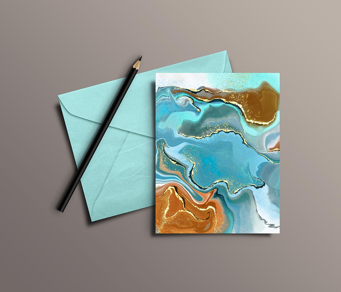
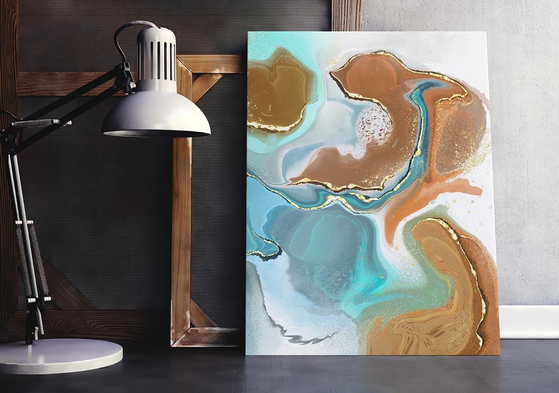
7. Conclusion and Wrap Up: Well, hey guys, we've made it to the end again. Thanks so much for hanging out with me this hour. I've got a bunch of examples here that I wanted to show you. And one of the things that I was really struck by is how versatile these patterns really are. They look great on honestly everything. All of these examples really show you that they worked for a really small sizes than the work beautifully on the really large pieces as well. I'd like to take the time to actually print some of these off and see how all of this translates when printed off on any particular item. I also want to thank you again for your patronage. Thanks for taking the time to take my classes. Thanks for posting and thanks for commenting. It really makes my day when I hear from you. If you haven't done so already, don't forget, hit that follow button. That way you'll hear about all of my courses as I released them. If you haven't done so already, check out my website at shop dot dollar art dossier and add your name to my mailing list that we'll find out about any of the free products that I post there. I also have a large store on docile.com, so you can check me out there in Canada at art of where I also sell on Society 6. And I really got to get on that. There's a lot of stuff I need to upload there. I really encourage you to do the same. Get your artwork on products and just test the market, see how it works out. So I guess this is Bye for now and I will see you in my next class. I'll be taking attendance so you better be there. Okay.
 Delores Naskrent, Creative Explorer