Transcripts
1. Intro to New Procreate Features: Hey guys and welcome. My name is alerts now sprints and I'm coming to you from sunny, Manitoba, Canada. In today's class, I want to show you some of the new features that are available now in the new version of Procreate. So if you've got Procreate on your iPad, you will have updated to the latest version, which is 5.2. At first it seems like the changes are really subtle. You'll just notice little things here and there. But when you really get into it, you're going to realize that this is a really powerful new upgrade. One of the things that got me really excited was playing with 3D models. So procreate provides you with all kinds of models to play with. And I have had just a blast experimenting with adding my own artwork to some of these 3D models and importing other artworks that I've already had complete. So one of the fun things was in experimenting with matching up a repeating pattern. And that's going to be one of the things that I'll go over in class with you today. There are some really great things to learn about the 3D workspace. And amongst those things are controls over every little aspect of your 3D artwork. So you can control the angles and the viewpoints on any of these different things by really easy gesture controls on your screen. And then you can also control things like lighting and the environment. So it is, like I said, super fun that we're going to have some publicly today as we go through and experiment with those different features. I'm just learning yet, so I probably don't even know smudge about what there really is available. So we're just going to get started. I'm just going to get you going. And just knowing a few little things really helped me out. So I'm sure that we can find some really great points to discuss. Now some of the other things that have been rolled out or some accessibility features. And there's a couple of them that are really, really useful and I'm going to show you those as well. So you're ready to get started. All right, the only thing I'm gonna do is remind you to hit that follow button up there. If you're interested in my classes, you can wait till the end and see if this is something that interests you and whether or not you liked me as a teacher. I will do my best to explain this as thoroughly as I possibly can. So let's get started.
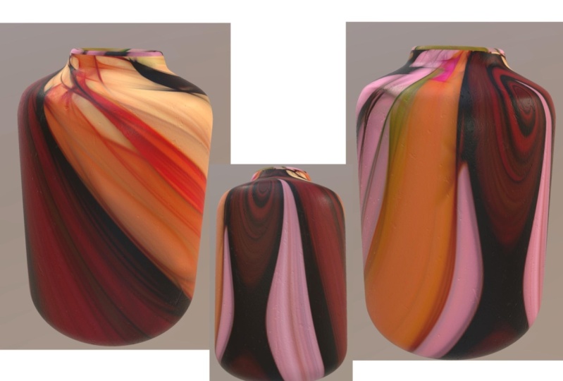
2. Overview and Inspiration: Guys, welcome to lesson 1 and less than one here I'm going to give you an overview of the class. So as I mentioned in the intro, I've only just started to use these 3D features, so I haven't, but overall sort of opinion of how each of the different models work. And I'm going to really start with a basic one, which is the pop can. Now, in order to get your new 3D workspace is what you need to do is go into the campus settings here. You're going to go into help. And once you hit help, you're going to go into what's new. And of course here it's giving us a demo of the whole sort of 3D experience. And this is where you're going to download the model path. It'll import into procreate. And it's going to give you sort of all of their base model that they're supplying you with, including the pop can, then there's the snowboard, there's rollerskates. Occasion, remember the other ones off the top my head, but you're going to see them here in a second. So go back into the gallery here, you'll see that all of my novels have been added. Rollerskate, boss, soda can, all kinds of different ones. I was going to do the sort of counter, but you know what, I think I'm going to do the ceramic vases dead. I think that'll be a little bit more suitable for the art that I've got that I want to show you how to work with. So let's just open that out and take a look here. So with 3D workspace, if you take a look in the layers palette, you've got the boss itself and the base layer. So this one is a very simple one. That's probably the easiest one. And you can see that two fingers or just your pinching with your two fingers will enlarge or reduce it or move it around here in your image area and you can import art to put on the boss. Actually, I think I am going to go back to the pop can because it's a few things here that I want to show you that are very different than what you're used to when you take a look at the actual layers here, these are called texture layers. I think our texture maps and each of these is separate. So if you go in and you want to make a change, you can select each of these separately. So you can the lid, you can select the can, you can select the tab. And within each of these, you're going to see that there's a base layer. And that base layer is where the art will be stored. So if you were to start painting on this right now, so let's just grab, this is why the pen won't move anything around because it's actually reserved for the painting. Your fingers are what you need for moving your image around. So like I said, you can move with one finger up and down to change the perspective of it. And of course, pinching and zooming with your two fingers will make it bigger or smaller. And this will move it around on your screen. So I'm gonna move it over a bit here so we can take a good look at those layers. Here. In my cam layer, there's the BCE, the can itself is, you can't actually affect the count. What you're doing is you're drawing on this base layer. So let's just get simple brush and we'll start paintings. When we start painting, you'll see that we are painting directly onto the can. But if I was to go around trying to go to the edges here, I'm actually not painting beyond the edge, you see that? So what the can itself does is it crops it. So in order for you to actually create a 3D artwork, that's where the base layer comes in. So in order to access, because base layer, what I need to do is go into the canvas here and you see where it, where it says 3D, we can click on that. And this now is exposed and it allows us to show the actual 2D texture. So the beauty of that is that I can now paint in three-dimensions. So it is a little confusing when you look at it here. Actually, I think this is the way a canned goes. The best way that I found to be able to look at both at the same time is to open up my reference. So I'll go to campus here and I open up my reference. And the can is here. It's already ready for b here. You can see that when I'm painting here, is going to be reflected right onto the can. I find that that's probably the easiest way you can make this nice and big. It's as if you're having like a live preview of what you're doing over here. That was one of the things that I found the most useful is having these two open. So that's something to keep in mind. Now if we're taking a look here at something like the tab and the lid, remember that what we've got here are two separate shapes. So when I showed you that in the layers panel here you can see the two different shapes. So there's a tab with its base painting layer. So you see now I've got that selected, so that's what's showing up over here. So if I were to start painting here, it's only going to show up in the lid, kinda see a little bit of a ghosted image of it here. So you know where your painting. Now, I would suggest that if you aren't going to do something with the tablet, say colorize it, that you add an additional layer here so that you're not messing with the really nice sort of metallic finish that you have on the original layer. So here you could add that as long as it's within this sort of mesh group here, you can add and you can make changes to it. So let's make my brush a little bit different on going. And one of my regular brushes, I'm going to go quite a bit larger and I'm going to streamline offer that to make it easier for me to paint. So this is another thing that's changed here in Procreate is the way that you choose your streamline. It used to be in the Stroke Path area, and now we have a completely different area called stabilization. And I will be explaining all of these different settings in a minute. But first of all, let's just reduce that stream line here. That is exactly how it used to be. We're going to hit Done a little bit bigger. And you can see here that I can now paints. And in this case, what's happening is I'm painting also onto the lid. Now the thing to know about the lid and the tab set here is that this layer here, this 2D version of it, has all three of the images on it, and that's why you see it labeled here as shared. So when you are going to color it in, you're going to color the tab separately. You have to be careful not to go over into this area or you are going to get the lid. But you can just vaguely see the LID area here. So if you were to switch colors here, you can see that you're covering that part of the lid. And then the REM itself could be even done in a completely different colors. So you kinda have to be careful not to sort of move into the other area or you're definitely going to be adding color, you don't necessarily want it. So with this one here, sample that color again, trying to figure out where it is that I'm missing that. So on-point far over as I can and it must be that it is just a highlight that is shown as such in the actual mesh itself. So I'm going to clear that off ethic. I just want my CAN to be playing. And I think what I'm gonna do is I'm going to import some things to put onto my cans, since it would be a lot easier for me to show you all of this with an imported image. That's what I'll do in the next lesson. I'll show you how we can actually import an image to place here on our Kan. And we can do both regular image and we can do a pattern if we'd like. One of the reasons I was interested in this in the first place was thinking about some of my earlier work that I had done on Society 6. And I can remember one of my friends ordering a coffee cup, insulated coffee cup. And it was really beautiful. Accept that when the pattern match at the back, it didn't have a full match. So in my opinion, it looked wrong. She didn't care. But as for me, I, I just, you know, as a purist wanted it to be perfect. That's one of the things I love about this 3D rendering is that I'll be able to have the repeating pattern actually meet and match up perfectly. So I'm going to show you those two things in the next lesson.
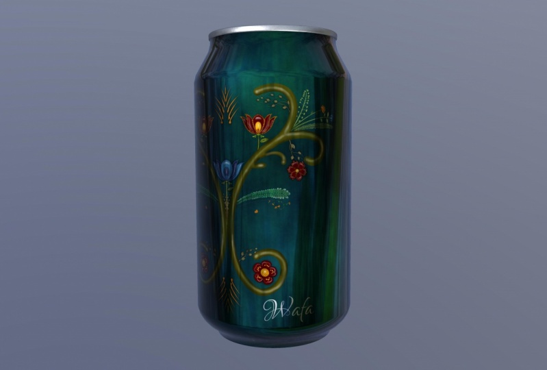
3. Importing and Positioning Art: Hi guys, welcome to Lesson 2. In Lesson 2 here we're going to play with a 3D model. I'm going to show you how to import art and then we're going to add a pattern and just experiment with placing that pattern and resizing it to have a perfect match on the scene. Let's get started. Okay, so for this lesson, I was going to show you how to insert some artwork that you already have existing. So we're back here with a blank Canvas. Remember that we've got all of these different surfaces that we can affect to know which surface that you're going to be working on. If you single tap it, you'll see that it kinda flashes blue and that shows you that that's the surface that you have selected. So the same thing would happen if I was to select the lid or the tab. And if I wanted to link two of them, and we just have to hold down this button here. And then you can see that I've linked and have selected both parts of the top. But what I want to do now here is to insert an artwork. So we have to go back to that 2D model. So we'll go back to part 2, the Actions menu here and go to 3D. And we're going to show the 2D mesh. And then remember that it's always most useful for you to also open up your reference so that you have your cam there to kind of see what you're doing. So right now you can see I've got that layer selected. You can see the slight image of it there. So I want to go back to my CAN and of course I can't click on my reference to get that activated. So I'm going to go into the can by just selecting it here in the Layers palette. And then we're going to do the 2D texture. We're going to go into the base layer here, showing the 2D texture here. I just had it so big that it was filling my entire screen. So I was a little confused. Now we've got it, We're ready to go and this is where we would be inserting our artworks. So I'm going to actually import an artwork to just give you an idea of how this works. So I'm going to go to my Actions menu. I'm going to go to the Add, and I'm going to insert a file. And the one I want to insert is an artwork from one of my other classes, just to be simple. And here we have it on the can. And you can see here I can use my stylus here to move this around if I wanted to, but you can see that the positioning is wrong. So what I would want to do here is move it down. And I'm thinking I might have to make it smaller. I'm not sure. Now you can see that it hasn't updated it automatically. What I need to do is deselect. And you'll see that then it is added here. So let's turn this around and you can see that I've got quite a gap there. So that is the gap had I left it the way it was, it probably would have been just fine. I'm going to actually change this to free form so that I can make it wider without making it taller because I think I've got the height. Okay. I wanted to meet that rim there. So let's see how that looks. We'll just click off and you can see that that has worked. Great. It has filled the space beautifully. You can see it's lined right up to the rim. And considering I didn't specifically create the artwork for this shape, it looks like it's a good first test, I would think. So. There are a few things to be learned by looking at this. And I think the first one is this, the fact that that seam does not match up. So that's something that we would have to take into account when we're creating artwork that we want applied to something that is three-dimensional. So it's a good lesson learned for any of you who are thinking of doing POD and things like mugs and cans, anything rounded that, that seam in the back is very noticeable if it's not done. I learned that lesson the hard way. So let's try a different experiment here. Let's bring in a repeat pattern that I have that I've already created. So I'm going to just clear this layer so I can go, He's lead and do it here. And I'm going to find a nice repeat pattern that I could import here. So let's go into my gallery. I've got a whole raft of patterns here somewhere. And let's just select one of these to export. So I will grab, I wanted something that it's going to be very noticeable for you. So something like this. You can see the repeat is that little flower on the side there. So let's take an export this ones. I'm exporting it by going into share here. I'm going to share it out as a JPEG. I'm going to save it to my files. I've been putting them into my class assets called flowers for so I'm going to hit Save here and now we can go back to our 3D model. Now currently I have all of these just loose here in procreate in my gallery. And what I'd rather have is a stack that has all of these. To create the stack, I'm going to just hold down on one of them and put it on top of the other one. And now I've created a stack. So I'm going to go through and I'm going to put them all in there. So hold your finger down on it and then wait to it opens before you let go. I'm not sure how many of these I'd end up using. I mean, I'm not sure that I would ever be designing bike helmet or a guitar, but you never know, I guess. And a lot of this can be done just for fun or as a way to show off your patterns for that's kinda the idea that I have here with this CAN is that I'll be able to use it as a display piece that I could have just for promoting a pattern or an artwork that I have. Go ahead now and go back into the 2D. And we'll bring that down to size so that we can have it side-by-side. And let's import that pattern. So I'm gonna go to Add, Insert a File, and I'm going to locate that pattern. And here it is here, and of course gets too big currently. So let's just set the snapping up here so that we can line up the pattern to itself very easily. So I'm going to go to half size here. And of course it's not meeting there yet. So what we're gonna do is we're going to duplicate path. So we can either duplicate here in the Layers palette or I'm just going to simply three finger swipe down, copy, and then three finger swipe down and paste. And then we're going to position that one right beside the original. So when I click off of it here, you can see that I now have the entire pattern there. And here's a look at the seam. So it does take a little bit of manipulating to get that to work perfectly. I'm going to meld those two together, so I'm going to pinch them together and then we're going to just make some adjustments to the size. And I'm going to go back to free form. And I'm also going to turn off the snapping and magnetics. So let's try going a little bit larger first. And that's not going to work. So let's try going a little bit smaller. So you have to click off of it in order to have it set in place. I'm just kinda keep hovering my finger over the arrow here and then I click Off. I guess it is larger than I would have had to have gone. I'm going to go taller as well. You can see I can use that there. And as I'm enlarging, I'm getting closer and closer to matching. Not going to go a little bit higher because I thought that space up there that I want to fill. So I'm getting really close. You can see that match is almost happening. Now the one thing you do have to be careful of is that you don't go too far because then you've cropped what you've got there. So I actually have to undo and go back a couple steps to get this right. As you get closer, it might not even be a bad idea to enlarge that. You're going just a tiny bit at a time until you get it as close as you need it to be. And I think that, you know, for the purposes of a mock-up, I think I now have it well enough position here that you cannot see that seem unless you were to enlarge it. And I don't think you'd be needing to do that for your mockup. After all, it is just a mockup. So that's very cool. I love that you can do this now with Procreate is just takes it one step further for us to be able to show off our patterns and our artwork in a really attractive way. Of course, you could take all of this and add backgrounds and what not. And we're going to experimental little bit with that in the next lesson. So I'll see you there.
4. Advanced Layer Controls: Hi guys, welcome to lesson 3. So in less than three here we're going to go through some of the advanced controls that you can have with your 3D image. Let's get started. Hey, for this lesson here I want to show you some advanced controls that I discovered. I'm going to use my skateboard. I've already experimental little bit with an abstract arts that I had, but I'm going to delete that one and I'm going to import a different file for us to experiment with. So when you bring in your artwork, you're going to see it come in like this with kind of a white square or outline on it. And you're going to find that some of the main and regular controls that you were using work just fine as far as enlarging or reducing. But sometimes what you want is a little bit more control. And down here you see as I imported it, these controls came up and automatic is what it's on right now. So it's doing everything based on what I do with my fingers. Now I want to go to this advanced control here just to show you a few other things. So when I clicked on advance, I get this new ring. That's something that we haven't seen before here in Procreate. And it is actually very neat. And I could see this being very useful. When you grab the outer ring, you can use it to enlarge or reduce your artwork. When you grab the circle here, you can use it, stuart, the artwork. And these little squares allow you to enlarge it kind of in a free-form way. So you're enlarging the height or you're enlarging the width here. Now with his circle, you can also use it to rotate what you've got there on Canvas. And sometimes when you've got your image kind of in a different position like this, it's really hard to sort of figure out what those controls will do. And what you can do is you can detach the ring completely. So if you click on the middle here, you either have it attached or detached. Now detached for me in my opinion, anyways, makes it easier to control some of these, especially if you have it kind of a sideways sort of a position. So here looking at it at an angle, you'll find that the detached ring might be a little bit easier for you to use because it's not directly on the image. And so it's a little bit less confusing. Remember that, you know, you're, you're still working the same way for controlling the positioning of the skateboard itself. So you notice there that my artwork flips onto the back side. So I want to talk to you a little bit about that too. So let's take a look at those advanced controls again and talk about that. I'm going to turn it sideways here so that you can see. But we're going to talk about this study here called projection. The way it's working now is the artwork is only on the one side, so you can see that it's on just the very bottom of it here. Now if we were to put the projection that a little bit higher, you would see now I've set it on bidirectional. You can see now that I've got the image showing up on both sides. Okay, so I've got it on the back. It's hard to get used to the positioning of this. One of the things that I am still learning. So you're going to find that there's a little bit of a struggle when it comes to that. But what this projection does is it allows you to have the artwork appear on two planes at the same time. So see when I'm pressing down on that dot there, I can see the top plane and the bottom plane. So the front and the back of the item. So you can see here that the same artwork is there on both sides and it's not doing it like a flip side version of it. It is just projecting that same artwork all the way through, if that makes sense. So that's another control that you have here That's a little bit fun to play with. Now another thing that's really kind of fun to play with is the environment that your model is in. So you can go back to the 3D settings here and there is a, an option there to choose the environments. And then within that environment you can make changes to things like the light. So you can move these around and see how that light is affecting highlights and so on, on the wheels. So that's something that you can play around with. You can also experiment with different types of exposure, different lighting. And now in this, your model is not super obvious. Some of the things other than the lighting, of course, that's pretty cool, but I found that the sunglasses when was really fun to look at. So let's open that one up. And when you are experimenting with this one, and you go into the lighting and environment, there, you can go in. And when you make changes here, you're going to actually see them reflected in the glass of the eyeglasses. So that's a studio, savage. Savage is the company that created procreate. So that must be their offices there. You can set it for an auditorium, City, nightlife, port side, industrial, sunrise. The time. All of these are really fun to play with two. So you could do some really cool stuff with your lighting as well as your environments. So that's a fun little extra thing that I never saw before in any program, let alone in Procreate. So there's another thing you can experiment with. So when you are in here and you are playing around with your lighting, one of the things you can do also is to click on the light settings and you'll be able to change the hue and the saturation of your lighting. And that can be really fun to experiment with as well. I think that's all I wanted to share with you about the 3D environment and working with the models. In next lesson though, I want to show you all about exporting. I'll see you there.
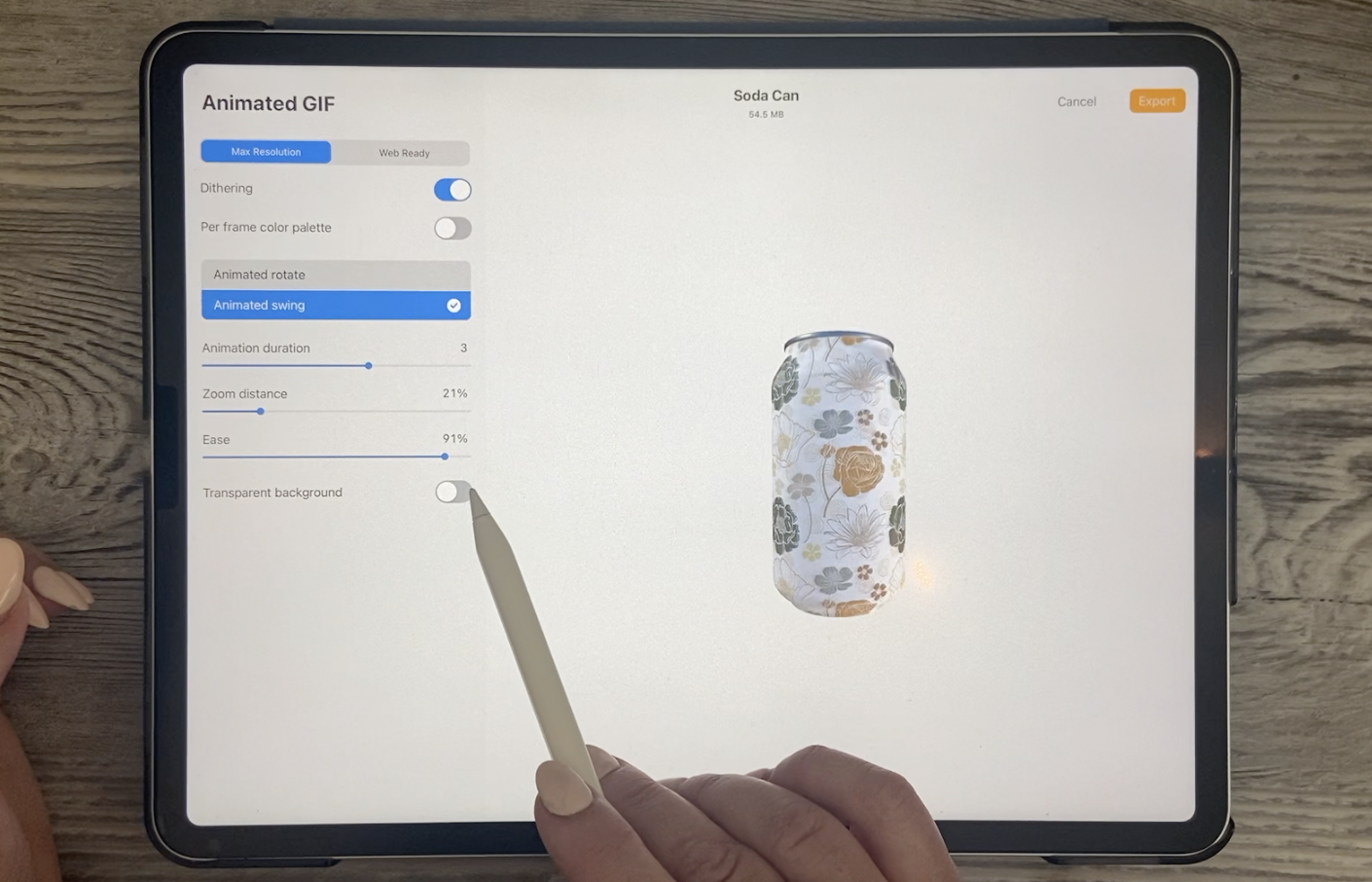
5. Exporting and Saving: Hi guys, welcome to lesson 4. In the intro I talked about all the different ways that you can export your 3D image. So let's take a look at that now. So I wanted to show you how you could export this file. There's a couple of really cool things that you can do that I've never seen before. So I thought I would show you those things. They're really kinda fun. So we're going to go back to our a 3D model only. So we're going to get out of the 2D texture and I'm going to just turn off my reference. So with this, you can export your image in whatever angle that you want. So you're gonna go to share and you're going to see some new options here. Now these two here, USD and OBJ, are for 3D modeling program so you can export and then open them again in those other programs. So that's what those two are. I don't know really anything about those. I'd be really interested to hear about it or figure it out at some point. But I wanted to show you these other things first, J peg, of course, is a method that and can export for use in other programs. And whenever you go to export, you want to put it into the position that you actually want your JPEG to be. So if you want this kind of an image that shows the top and the bottom, that's what you would do before you actually hit the Share image here on GPA. Now with the JPEG is going to come in with any of the backgrounds that you see here. So whatever you see on the screen is exactly what you have. So if you wanted to change that, of course you'd go into your lighting and environment and then you can make whatever changes. You don't change your lighting, change the position of the lighting, changed the environment. Whatever you do here is going to be what you're going to end up with on your export. With PNG, It's a little bit different because you can export it with no background. So if you wanted to do that, what you'd have to do is go into your 3D, go into your lighting and environment, and you would turn that completely off. So with that being off, now you can go back and export your PNG. And your PNG will be transparent. So the background will be transparent and you'll be able to bring it onto a different background so we can save it to Files and we can check that out a little bit later. So I'm just going to produce here, save and we're going to check that out in a minute. Now, one of the really fun things I thought was in this animated area, you can export. The animation is actually created for you and you can export it. Of course, you've got some different controls here. So if you want it to go a little bit slower, you bring that number up here in the animation duration, you can do a really fun thing called the animated swing, where it flips. It kinda goes one way and then it goes the other. It's a little bit more obvious if it's faster, you see how it's flipping. You can also zoom it in or zoomed out. The ease is what actually creates that rhythm, that slow in and slow out. So you're controlling that amount of time. So here it is a lot faster. Now with a gift, you can export it with a transparent background. I haven't tried that yet, so let's just take a look at that. We'll also save it to the same spot. And then the last one I want to show you here is the MP4, because the MP4 is the only one that you can choose, a square output. And a square output of course, is what you would want or need if you were posting on Instagram. So you can have all the same controls, any of the different animations, but having the outputs in whatever size you want is what makes it different here as an mp4. So then we can export that as well. So let's take a look at those files. I'm going to go into my files folder here to the folder I was saving in. And let's take a look at the soda can. So this was the MP4. So if we were to open it and play it is not beautiful. That's something that you could definitely use for promoting your work. Now this one is the animated GIF or GIF and how you want to pronounce it. And then let's take a look at that PNGs. So that was this one here? Yes. It sideways. I couldn't tell you. But let's open that up. And I guess the biggest way to or the best way to see how that would look is to go back into procreate and we'll go into a different documents that has a full background. Let's just grab one of these abstracts here. And then we're going to just place our file here. And you can see that's come in beautifully with no background. So this is something that you could put into an environment of your own. So there's a bunch of really fun ways to save out your project.
6. Accessibility and Other Features: Hi guys, welcome to lesson 5. So at this class would not be complete without me sharing some of the accessibility features that I find really, really useful. Let's get started. So there's a bunch of new features that I want to talk about in this lesson. So I'm going to go as quickly as I can. I'm going to just open up a random document here just so that we can have something to take a look at. And one of the things that was really exciting to me was this recents category in the brush library. Now if you're anything like me, you've got like Wait, committee brushes. And sometimes it's difficult to just grab the brush that you really need. And so the last eight brushes that I've used are here in my recent tab, which is just super great. I also have favorited a couple of them here. So the way to do that is to swipe it to the left and then you can either unpin or pins. So this tapered pen pressure brush is something I use all the time. So I'm going to pin that one is Posca marker. I also use all the time, so I'll pin it. This one is not one that I use very often. And you can see that the two that I really like are pinned to the top. And no matter what I view, even if I go and use five other brushes in between and create something super ugly. I will go back to that recents category and my two favorite brushes are still at the top here. So I thought that was a super useful new function and I know that I'm going to be using it a lot. I have in fact used a lot since my new five-point two has updated on my iPad here. Another thing that I thought was really great was a big change here in the color palettes. You're used to this, we've seen this before. Of course, this is something that we have had all along, but we can now also view the colors in our palette in a really large format. These colors here, this palette that I've got as my default one is what comes up here. I can keep scrolling down and I can find additional palettes that I have in my list. But what I really love about this is also that I can see these so well here it's just, it's just so much more accessible. So you can imagine someone that has issues with their eyesight of this would be an excellent way to look at the colors. Another feature that you might find really useful is the color identifier, which if you go into your Actions menu here and you go to the Help and go to advanced settings. You can scroll down to the bottom here and you can add a little feature here. Now what that does is when you're using your color picker here, you'll see that the color is identified. So that can be really useful for people with accessibility limitations. I worked with a guy who was colorblind. He was a fantastic artist, but colorblind, so he had to actually memorize a lot of kind of things to do with color, like what colors go together, what works, and what doesn't. And I think this would be super-helpful for somebody like him. So that's another new feature that I thought was pretty cool. And that doesn't just work with the color disk here. If you move around on your canvas, you can see that the color is identified up here and now my document is obviously a lot grayish orange, dark brown, and orange. So that could be helpful. I think it is anyways. Now one of the things I also just want to quickly mention is that now you can adjust or gets a bigger interface font size. Now this is not controlled here in Procreate, you'd have to go into your settings on your iPad and go to accessibility here. Now if you were going to change your display text Here, you go to larger texts. And if you increase, this is going to increase it, of course, everywhere on your iPad, but it will also increase it in Procreate, which it never did do before. So just so you know that now, but everything is a little bit bigger and that might be something that you find useful. Now another thing that I just want to point out too, is in the brush studio. So if you go into the brush studio, it has changed a little bit. So if we go into a particular brush, you'll see here that as a new category and it's called stabilization. So if you go here to stabilisation, this is where we are now studying our streamline options. So that's something that you're used to using, but there's a couple of other settings here too that helps you to stabilize. If you are somebody that's very shaky. I know myself, I have some days where I'm really shaky. And I think it's kind of a low blood sugar thing, but this is something that you'll have to experiment with because everybody's wait and technique for drawing lines is different. So what might work for you might not work for me. I can tell you exactly how I set it and it might not work at all. It'll be a little bit too constraining, but experiment with this a little bit so that you can figure out what works for you. Now, you're used to streamline. Streamline used to be found here in the stroke properties, but now it's found here with civilization. So we all know how streamline works. The higher the setting is, the better and smoother your curve will be. So that's nothing new for us. One thing that is new is this pressure setting and that pressure studying, of course, is very personal. You're going to have to do some experimenting to find out how that pressure affects the streamline. So depending on how hard I press, I can definitely change the way my lion looks. Now these two new features are something that we've never seen before. So stabilization and motion filtering are actually really useful if you have a shaky hand and I know sometimes I do have a shaky hand. That could be from, I don't know, drinking too much coffee or who knows? And sometimes I do have trouble keeping the line really nice and stabilize. So now if my hand was really shaky, it's really hard to draw a straight line. However, if I increase the stabilization, you can see that my line is very, very smooth. Now, motion filter also is great for helping you if you are a little bit shaky. This one, again, is something very personal. I can't tell you exactly what to set it out because it's going to be all to do with what you're feeling or how you draw, how old you are. All kinds of different things factor into it. So being older, I do have more shapes, I think than the average young person. So when I'm drawing, there's times when I'm shaky and especially notice that when I'm trying to draw, drawing curved this way is not a problem. But if I'm trying to draw kind of backwards or in an awkward position that my lions will be a little bit wiggly and that's where the motion filter will come in. So you can see that this line does have a little bit of a wobble, but as I increase this, it really straightens it out. And again, it can be too much at time. So you have to be really careful because you don't want it to not draw it. What you want it to draw, how you can set this individually for each brush here. Or you can go into your preferences here and go to the pressure of the smoothing here. And you'll find the stabilization in motion filtering here as well. And here you can set it so that it is universal. It's on all of your brushes. Once you kind of get the feel for it, I would suggest that you put your settings here in the preferences because you won't have to reset it for each individual brush. I would suggest that when you're first trying to figure out how all this works is that you make very small adjustments on each of these settings. I find that quite often my stabilization is susceptible at the 25 to 30 percent mark. I'm just kinda learning about them motion filtering, so I'm not that sure about that. One of the ways to check it is to change your tip attachment here it or turn it on or off when you have it on, you'll notice that your brush stroke is absolutely attached to your pen nib, okay? Turn it off. You'll find that the nib is a little bit behind where you're drawing. So if you set it higher, you'll find that that's quite noticeable, like it's following a little bit behind. I'll set it to the extreme here so you can see what I mean. So if I set that motion filtering really high, you'll see how weird it is. So I suggest trying it about halfway and then just seeing how that works for you now, this is not bad. I kinda like that. So that's just something I'm going to have to use for a few weeks before I know whether or not it's going to be really advantageous for me. Now, another thing that got me really excited was his new ability to work on multiple pages in a PDF document. So this has never been here before. So pages says something really great that you'll have to experiment with. I've been creating a bunch of documents for my new class, coming up on trend forecasting and bringing in the individual images is just one part of the job. The other part is in creating a document that has multiple pages. So that's one of the things I really like. Here. You can just add a new page and just watch this Layers palette here. When I add a new page, you'll see that I have a new blank. Now I'm going to really heat that motion or that line amounts and stabilization. So I'm going to bring that down. But you can see that as I add it here, it will show up on the little page and here in the Layers palette. And you see that the pages are numbered. This is one of the things I know I'm going to use a lot more of. Oh, yeah. And I just remembered that when you want to combine and make a single page with a couple of layers, like for example here I've got this page here, and I might want to have this image as part of that page. I just have to make sure that it's in a group. And then you can see here that it has shown up right on the page. So then I could obviously move it around if I wanted to and position it. So that's a very normal and intuitive interface. And I think in comparison to, let's say using something like Microsoft Word can move my pictures around. That can be a big pain, but I think I'm going to use this feature for sure. I really need to experiment with a lot before I can give you the full lowdown on it. But I thought if you are one of those people that does have to have a PDF documents, I wanted to give you this information right away. So there's just one or two more little things that I want to point out here. And one of them will affect how you, or whether you want to change. Using two fingers to control some stuff like enlarging and reducing. You can actually go in and change that. And this is also part of the system, but you can get to it by going to your help here and Advanced Settings, this will take you to procreate. This is all your apps that you have on your iPad. And here where we change the color description notifications, we had turned that on. We can also turn on single touch gestures companion. Now some people might not like this because it will definitely be on your screens. So if you don't like that, you can take it off. But the good thing about that is then if you wanted to, you could just use a single finger. Can take a bit of getting used to, but you can now use single finger gestures to enlarge or reduced for move something and just by tapping. And so that might be useful at times depends on the kind of document you're working on. Now, the other thing that I wanted to point out and I had forgotten to do this earlier was the brush size memory. So if we were to use our brush, describe any brush, doesn't really matter. Now, I had to turn that off by clicking Backup there. So just keep that in mind with my brushes. Let's get a color. And let's get a brush that actually shows. You can reserve the size if you use your brushes and I've issued the best one for me would be to set this favorite brush, refine the recent, something like the Posca marker. If I'm trying to keep my lines consistent between several documents, Let's say I'm working on a collection or something, then I could easily save the settings. So let's say I want to have a line that is always that size. I could then click here and opens up. And I could save that setting. You see how it shows up there. And then if I also then make lines that are bigger and I always want to keep that thickness. I could also save that one. So now with this pen, whenever it comes up, I'm going to have these two saved settings. Now if I wanted to get rid of them, simple, just press that minus Q0 at the top right-hand corner. So that's just a basic run through some of the new features that I think I personally will find useful. You're going to have two experimental, Of course, I know I'm always saying that, but it's just something that you have to use in order to figure out for yourself whether or not it works. Now I'm attaching a little bit of written information here. Make sure you check that out and let's meet in the next lesson where we can do a little bit of a wrap up. I'll see you there.
7. Closing Thoughts and Wrap Up: Hey guys, welcome to the wrap-up. I didn't want to close the class without showing you at least one project that I've done in 3D. And what's exciting to me here is that I've found a pillow 3D model and it was just a freebie. I just searched for free pillow 3D. And I was able to import that 3D model here into procreate and then add the fabric or the repeat pattern on it. Let's go back to look at that real quick. We could go to the 3D here and show the 2D texture. This is how it looks. So it was a really confusing document to work on. And even when I had the reference, of course is the pillow itself, I found that I had to move things around a lot. It was still pretty confusing to work on in order to figure it out, but I eventually did figure it out and was able to create this mock-up. And I think it would be really exciting because if we can find 3D models that are compatible with procreate, so I think that would be the OBJ 3D models. And we could import them here and we could make our own mockups. So that was one and the other one I thought would be really useful for me, would be some kind of, you know, room scene. So I did find a free couch and chair, Karen or what I said, living room furniture, mockup. And again, with that, I was able to, you know, kind of mess around with it until I figured it out. So at the moment, there isn't a lot available for us to use in, in my opinion, for certain types of projects that I do, but this one was really bitmap for some reason. I'm not sure why. So there's obviously a lot to learn by it again here and go and find my reference. And then with my reference, you can see here that I would be able to see all sides of my furniture. See it from a bird's eye view, see it straight on if I wanted to. The future prospects of this particular function in Procreate, I think, has a lot of possibilities. Because wrap-up is really not about the project or anything that we've produced in class, other than to just say thanks for attending. And I hope that you've enjoyed just learning a little bit about what's new in the appropriate program. If you liked this class, please make sure to give it a review and a little bit of an anecdote as to why you enjoy that. Are really appreciate your comments and everything that you say help with moving my classes up in the ranking order. All of that, of course, contributes to how many students will actually see the class and get some information out of it, just like you did if you didn't do so at the beginning, don't forget the hip out Follow button up there. That way you'll be informed of any of my classes as I released them. I'll also encourage you to go to my website at Dolores Hart got CA and Azure names, my mailing list there. That way you'll always be informed of anything that I do on my site, including changes to the artists resources pages. As far as artists resources go, don't forget to check out my Pinterest sites, Dolores art dealers, Nas cramped and teacher Dolores Nas grant. I share tons of resources for artists there as well. If you're curious about my work, you can check it out in my store at Zappos.com. That's my biggest tour, but I do have one at Society 6 as well. And I'm under the umbrella of out of the blue there, as well as under my own name Dolores. Now scratch in Canada, I sell at art of wire. And you can also find me on a bunch of other POD sites to search me out. Thanks again for following and thanks for attending today and I hope to see you soon in all of my other classes. Bye for now.
 Delores Naskrent, Creative Explorer