Transcripts
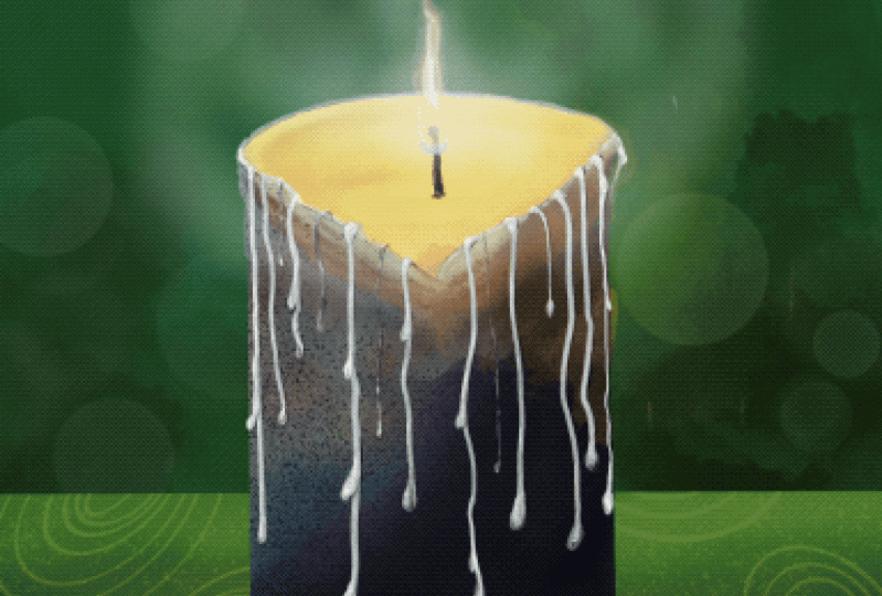
1. Intro Animated Christmas Candle in Procreate: Guys, welcome. My name is Dolores Nas current and I'm coming
to you from sunny, Manitoba, Canada. Sunny and cold. Wow, all of a sudden we're down to minus 30, you can believe it. So it seems like
just a few weeks ago we were outside
and it was 30 degrees. Anyhow, this project is one of those projects that
I thought would be a really nice one for Christmas. And just to kinda warm us up, It's a candle
that's illuminated. And we're going to
be doing this as an animation and procreate. This should be really fun. We'll go through a lot of different things as we work
our way through the class, including a bunch of work
with lighting and shadows. And of course, it's
going to be eliminated. So we're going to have a little bit of a
flickering flame. So this should be really fun. Now if you haven't
done so already, I'm going to encourage
you to visit my website at shocked off the loris art dossier and add yourself to
my mailing list. So you get all of my mailings. That site. That's
where I post a lot of artists resources and I've just recently added
some new ones, so check them out. Some of them are even free. And if you haven't
done so already, make sure you hit that
follow button up there. That way you'll be
informed of any of my new classes as I post them. So you're ready to get
into this animation. All right, Let's get to it.
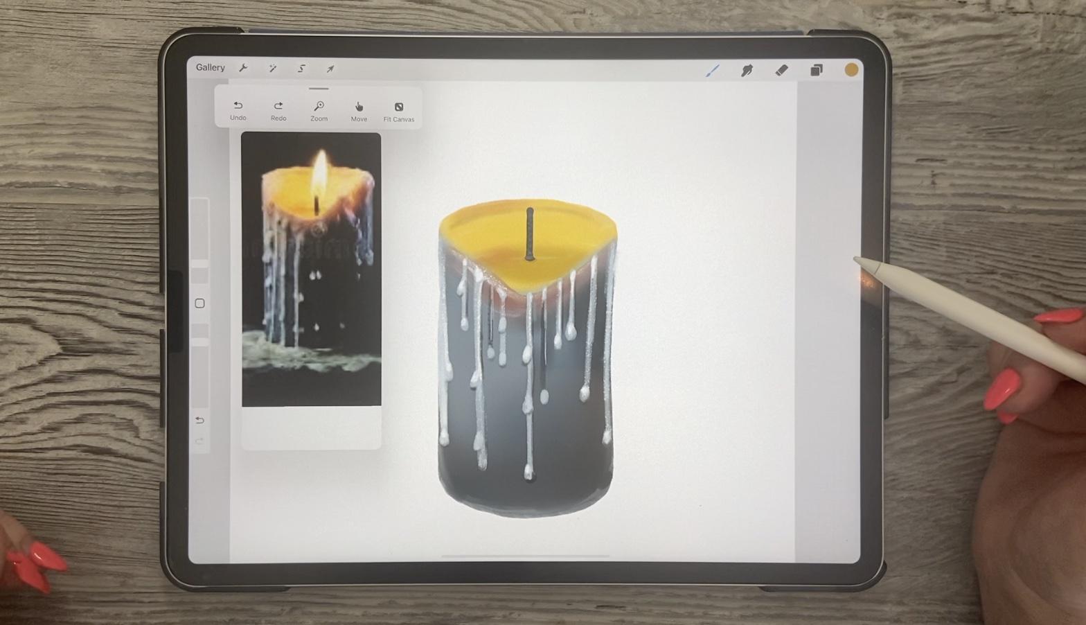
2. Lesson 1 Setting Up the Original Base lllustration: Hi guys, welcome to lesson
1 and less than one here I want to show you how to open
up a reference image, right? And procreate. So you always
have it there to follow. And we're also going to
talk you about lighting and reflection and
a whole bunch of other little things
to help us to make our little candle as
realistic as possible. We're actually going to be
doing drawing in this lesson, dry and painting.
Let's get started. So I thought that a
fun project to do before Christmas would be
an illuminated candle. So that's the project
we're working on. In fact, I've
brought this one in as reference in Procreate. So you know that you can
open up your reference here under Actions and there you can import
it in the image. So had saved that image to my camera roll and
imported it here. And I just kinda started
roughly sketching it out. So I know I'm going
to make some changes here and I want to go through
the whole process with you. So I'm going to
eliminate that layer. And I've got just kinda
my rough pencil here, which I guess I can still use. So what I wanna do is give
that impression of melted wax. So we're going to do
something like this, maybe not quite so elaborate and we're going to
colorize it to make it look like there is a live
flame there at the end. What we're going to do is
actually animate our flame. So we'll have a little bit
of movement in this one. So let's start out
just real quick by drawing out the shape. I'm going to be using
my gouache paints. So I've got a full set
of wash paints here that I've created over time. And I'm going to be
posting this brush set at some point on my website
and on Creative Market, but we're going to use
it for now anyways. And I'm thinking I'm going to stick to the colors
that they have here. So I like the kind of
a Navy ish blue there. So you know that you can just sample right from your image. And it'll come up here as we
just press on any part of your reference image and
you can get the color. So I think I'll
just rough it in, in this color first. And I can work on
this sketch layer because I'm going to end up
covering all of that over. So this is kind of a
textured brush that I have and I really like it
because it's a bit variable. And I think that
that works really well for distortive an image. One of the things that
we'll be playing with is a lot of lighting and shadows
and that sort of thing. So I think this brush
will work just fine. Now, you can see that the
bottom part is quite dark, but as you get
towards the top here, it definitely lightens up. And I think I wasn't going to
at first do this dip here, but I think I'll do that. So maybe I'll just erase
part of this here. And I'll just kinda
painted in, in this color. Even though I know
that will be kind of changing that a proportion to have it quite glowing
as it shows here. I can also sample
my yellow here. So I'll just kind of
rough that in as well. It's always a good idea to turn your artwork to be at
a good angle for you, for when you are trying to
get a really nice curve. So you can see the basically the inside of the melted
portion of wax. So there's a ridge that's
formed on the edge of the candle from the melted wax. And what happens is the
wax gets hot enough that sometimes a big edge like
this will come, come down. And then that allows a lot of the wax to escape and
start dripping down. So we've got that yellow there. I'm going to go a
little bit darker for just the very edge bit here. We're going to end up
probably hiding some of that. And I'm going to take
this blue again. I'm not going to go
necessarily with the exact colors of my
reference image here. But I will end up with kind of a lighter edge at the top here. And we can do that in a
number of different ways, which I'm going
to be showing you using air brushes and
that sort of thing. For now, let's just
fill this shape. So I'm pulling over my
color and then I am dragging to get the fill
to stay within my outline. And this is a textured brush. It has given us kind of a
weird inner outline there. That's fine. We need, we need this to
look kind of rough so it's going to be
quite forgiving. So I'm going to go with
a lighter shade here along the top just
to make a bit of a rim, uncle gets smaller. And what happens with the
candle is that it gets kind of translucent where it's thinned out and especially
when it's hot. And so you're going
to get these sort of thinner edges that then allow the light to kind
of start showing through. You can adjust the
opacity here on the sides so you could
take a bigger brush. We had forgot this
is a textured brush. So I'm going to build it up. This is something you could
do with blending as well. So I could be using
one of my blenders to that a little bit
more of a gradient, but we've got so much
that we can do here. I'm not going to really
sweat it too much. Once you've got the basic
shape there and don't be too hard on yourself because like I said, it's
very forgiving. Then we can start doing
some of the drips. So as you can see, the
drips are quite a lot lighter than the
main image area. Actually maybe before I do that, I'm going to do clipping masks. When I add a layer, make a clipping mask, and let's just
grab the airbrush, soft planned to airbrush. And let's put a little
bit of the darker shades in here at this 0. I'll do that before building out the wax that will be over top. So you can see I'm just lightly brushing in and I'm
going to try to get that same effect of it being quite a bit
darker at the bottom. And because it's
a clipping mask, you can see that
nothing paints beyond the edges of my candle here. So you can go quite
dark if you wanted to, in the bottom corner here. And what I like about this
is it's already giving that impression that this
is a more well-lit area. Now you can go
quite a bit darker on the outside edges as well. So I kind of made my brush a little bit smaller to do that. And you can see that the
point of my brush is way out here and that helps me to
get kinda just the edges. Let's go back to this one here. And let's just a little
bit of blending. Going to use my
soft blender here. I'm going to use my
buttery blender actually. And just for the
moment I'm going to put the alpha lock on so that I am just working on the image that doesn't
seem to be doing too much. So let's just get a brush. Was his hide that
shadow for now. And I think my best bet. And I think I've got the
alpha log too long. Yes. Let me go in with the Gaussian blurred and we'll just
blur a little bit. And that really
does a nice job of softening all of
these edges here. I'm going to go back
to my cautious here. And I think the
hutch Find all of these drips are going
to definitely work into kind of hiding any flaws. So let's draw a few
of those drips. Think this 30 Gua
should be just fine. We can add another layer that we create as a clipping mask. And when you're drawing
your sort of waxy drips, you're gonna go
quite a bit lighter. I'm going to go quite neutral. So over to the gray
side a little bit. And basically what
you're doing is dragging down straight lines are straight if they don't
have to be perfect. So don't, don't do
this trick where you get them perfectly
straight because it's almost better if they have a little bit of
character and the are a little bit bumpy and you're going to
want different lengths. And between them you don't want to have
totally consistent. And then anywhere along the way that you think is appropriate, just draw yourself some sort of blobby bits that
kind of stand out. So you're shaping them a
little bit like a teardrop. They don't have to be, but sort of teardrop shape
and a kind of like that. A couple of these drips appear
to have quite dark lines. Let's do a couple that are
just a little bit darker here, and then we can still do
the brighter drips on them. So we've got the basis
for our illustration now. And in the next
lesson I'm going to be showing you how
to do a lot of these highlights and
shadows that you see that really make these drifts
quite dimensional. All right, so I'll
see you there.
3. Lesson 2 Dimension and Adding Other Details: Hi guys, welcome to lesson 2
and Lambda 2 here I want to focus on adding some
dimensionality. Let's get started. Okay, so this lesson is
going to be all about adding some dimensionality to these
drips that we've made. So you can go through and do any sort of fix up
you want on these. But I really think that the more rest ticket looks is the better it
looks in the end, the less sort of
victory it'll look. So when you think about the light and the source
of light is going to be, of course, the flame here. That would mean that light
would likely be coming down and hitting the
top of most of these, you might have some
little bits of highlight on some other areas simply
because of the ambient light. But for the most
part, what I'm going to be doing is trying to lighten the top of my drips. So get your brush a lot smaller. At the moment, I've got
mine at 15, 50% or so. And I'm going to go through,
and I'm going to just kinda add sort of a glow on
the top of my drips. And you can see almost
instantly when you add this, you're getting a feeling
of dimension on these. So I'm doing that on
all of the drifts, but I'm also going
to be doing it on the sides of all of my lines. So for that I'm even
gonna go smaller. So I think I've got it
about four or five. Let me see if that's
going to be good. That's maybe too small. 9 or 10 percent seems
to be pretty good. I'm reducing the opacity, which means I may have to
build it up a little bit more, but I don't want it to be too
opaque and bright at first. This way I can kind of
control it a little bit more. So I'm going along the edges here and I'm adding
some brighter spots. Now if you find that the
texture on your dirty wash, if that's a brush that you
use now I'm going to be giving you the brushes
that I'm using today. But if you find that
the green is too big, you can go into the scale here and reduce the scale
of the texture. I've reduced it to
about 20 percent there. And those little dots
that are in there giving it the texture will
now be a little bit smaller. So I'm going in and
adding highlights. If they're too big,
definitely cool down a little bit in size. So that's the one aspect of creating dimension and that's
adding your highlights. I would think that
here at the top, they're going to be
quite bright because of the light that's
coming from the flame. And also the wax
is thinner here. So there's gonna be a lot more light coming
through the wax itself. That's the one aspect of it. The other aspect of course, is to get the shadows. So for that, I'll just sample my darker color
here at the bottom. And I'm going to go along any of the edges that would
be kind of turned in. So you know that
the wax strip would be kind of dimensional. And so it's going to be higher
where the highlights are. But then it kind of curls under. An underneath is where you're
going to have your shadows. So they show up
kind of like this, right along the edges. So you're going to
do that as well. And now we're really starting
to see some dimension. You can go ahead and put some shadow under most
of your drips here because that's exactly where the shadow would be with the light coming
in from the top, the shadow is going
to form, Hello, most of your
three-dimensional bits, like you're melting wax. So I'm just kind of
brushing that in lightly. You could go really dark. I'm pretty much pure
black on the bottom here. See if that shows up a little
bit on that dark color. Introduce you already how much dimension we're getting in here. I'm really liking this. Now. There is a kind of a ridge
of darkness that forums here underneath that hotbed of melted wax, that edge here. And there's also this
little glow of red. So I think those two
things we can accomplish on this clipping mask
that we created first. So let's get an airbrush again. So now that I have used that airbrushing will be
here in my recents. Should be yes, here,
soft blend here. And we're going to get a little bit of that
kind of a Reddy color. We could sample it from here. So this is a very grayish red. And for that, maybe we'd also want kind of a hard edge
along the top here. So one of the things
we could do is use our free hand
selection and sort of carefully follow that original
contour that we need. And then we'll invert
the selection. Now what that does
is it protects inside bit while allowing us
to spray on this outside. So I'm going to reduce
my opacity a little bit and make my brush
smaller because I really want to build that up
kind of gradually. So now the beauty of this, having done these on
layers is that all of our drips are still
going to be fine because they're on
the layer above. So you can see what's
happening there That's working out perfectly
for doing this. So that gives us that glow. I think we could go a little
bit later and yellow year, if that's a word, kind
of along the edge here. So I've made my brush
smaller and I'm going really read along the
edge of that selection. So that'll make that
edge kind of glow. And then I want to
get that kind of dark rich underneath here. So let's sample this
we're going to go with. So I guess that's about a, I'm doing it about
a 6% brush here, and I'm just putting
a little bit more of a shadow in this area. And I think while I'm at it,
I'm going to go even smaller and sort of give 4% here and sort of give a bit of a shadow along the drips that are on this side of the candle
because you can see on this side here, but it's darker. So I think that's great. And in order to de-select
that, so get that off, you just have to click on that selection about there
again and that clicks it off. And I think that worked
out good and I'd see a bit of our gluey orange bit here. So let's get that orangey color and just kinda
spring it in here. Oops, orange. I'm also just adding
a little bit here. And I'm going to go with
a little bit of gray, quite small and just kinda run a little bit agree in here. That helps make that other side look a little bit dimensional. And it just kind of
have a sharp corner there that I wanted to take out. So we're doing really good. I think as far as getting
this really dimensional, you don't have to
do too much more. You could definitely add
more detail if you wanted, you could have more drips. You can have about big pool of dripping down here.
I'm not sure. I'm going to add the x.
I think I'm going to be happy with it like this. So the last thing I need on this drawing here is a wit and I think that the width I want to position where I'm
going to have my flame. So I'm cheating a little bit here to take a look
at where I had my original flame and I will
shut that back down again. And this is where I'm
going to place my wick. So this is one of
those things to, you can decide on which
ever way is best for you. I'm going to use my art tapered pen pressure brush and I'm
going to draw the initial whipped fairly dark and I'm kind of bulging the top of
it because you know how a bird which usually
has that sort of bumpy texture and a little
bit frayed at the top. And I'm just also flaring that bottom
bit out a little bit. And I'm going to go a
little bit lighter. So I'm going a
little bit more into the mid-tones of my
blue-gray there. And I think for this one, I will just use
that quash that I was using and going a
little bit smaller. And I'm just going to draw a few lines through there that make it
look like it's woven. So I'm kind of crisscrossing. And I think that makes it
look a little bit more woven. It also helps add to
the dimensionality. And then you have thing
I want to do is go with a slightly darker yellow color here and just build
a bit of a change. Pool, I guess you'd say, of wax there at the bottom. So I think that's worked out. Okay, and at this
point we're ready to start thinking
about the next step, which is the flame that
we're going to add here. So I think we can do
that in the next lesson. I'll see you there.
4. Lesson 3 Setting Up the Lighting and Animation: Hi guys, welcome to lesson 3. In lesson 3 here
we're going to be working on the
lighting and we're going to be actually starting
that flickering flame. Let's get started. All right, So just want to point out a couple
of little things that I did here while I was
taking that break. I went in and added a little bit more brightness
to some of these, and I bumped up the
orange in the background. And the other thing I
did was I zoomed in real well and I added
a little bit of a hook of wax that would be kind of coming over the edge
of the candle like that. Other than that, we're ready to start working on our flame. And the brush that
I want to use, a brush that's in my
bling brushes Sache, this one is called
the on and actually let's just duplicate
that right now. And I'm going to throw that into your sex and I'm going
to be giving you, and this one already has kind
of a globe built into it. So I thought this
would be a really good one to use for the flame. So I'm going to sample, well, it really just looks
like white honestly. So I'm going to go into the yellow section here and
I'm going to go almost white. And I'm going to paint
a flame on there now because we're on such
a light background is not going to really show up. So why don't we first
add a background. So I am going to add
a new layer here. And I'm thinking we can fill the background with
something really dark. We can go with a really
dark crust or we could go with maybe a deep
teal kind of a color. I'm going to fill
that layer with it. And there's going to be
some changes that we will make to this
background later. I would like to
definitely make it look like it's sitting on some
kind of a table or something, but we can work on that later. Let's work on this flame. First of all, and I just
wanted to do that so that you'd see this neon
brush that I'm using. So we'll go back to that sort
of whitish yellow color. And as you can see here, there is already a globe
built in around the flame. So we're going to be doing
a animation with this. So actually need that to be on a separate
layer, which I did. And we're going to be
duplicating this layer multiple times in order
to create the animation. I've already done
one duplicate of it, and then I've also
added this glow here. So I wanted to show you that before we go ahead and
make any other duplicates. So of course, if the
candle was earning, it would have a bit
of a glow around it. I've made that way in fairly opaque so you
could just see it, it's full strength right now, but we can definitely
bring this down and maybe position it
just a little bit higher. So I created that really simply by the high
this one again, by just using that
same soft airbrush. So it should be in your recents. So that would be it right there. And then I just simply did, I think I did a
pure white to glow. Now we need a way
bigger brush for the nuts that's too
dark and too big, and I want to put it
underneath the flame. So what I'd need to
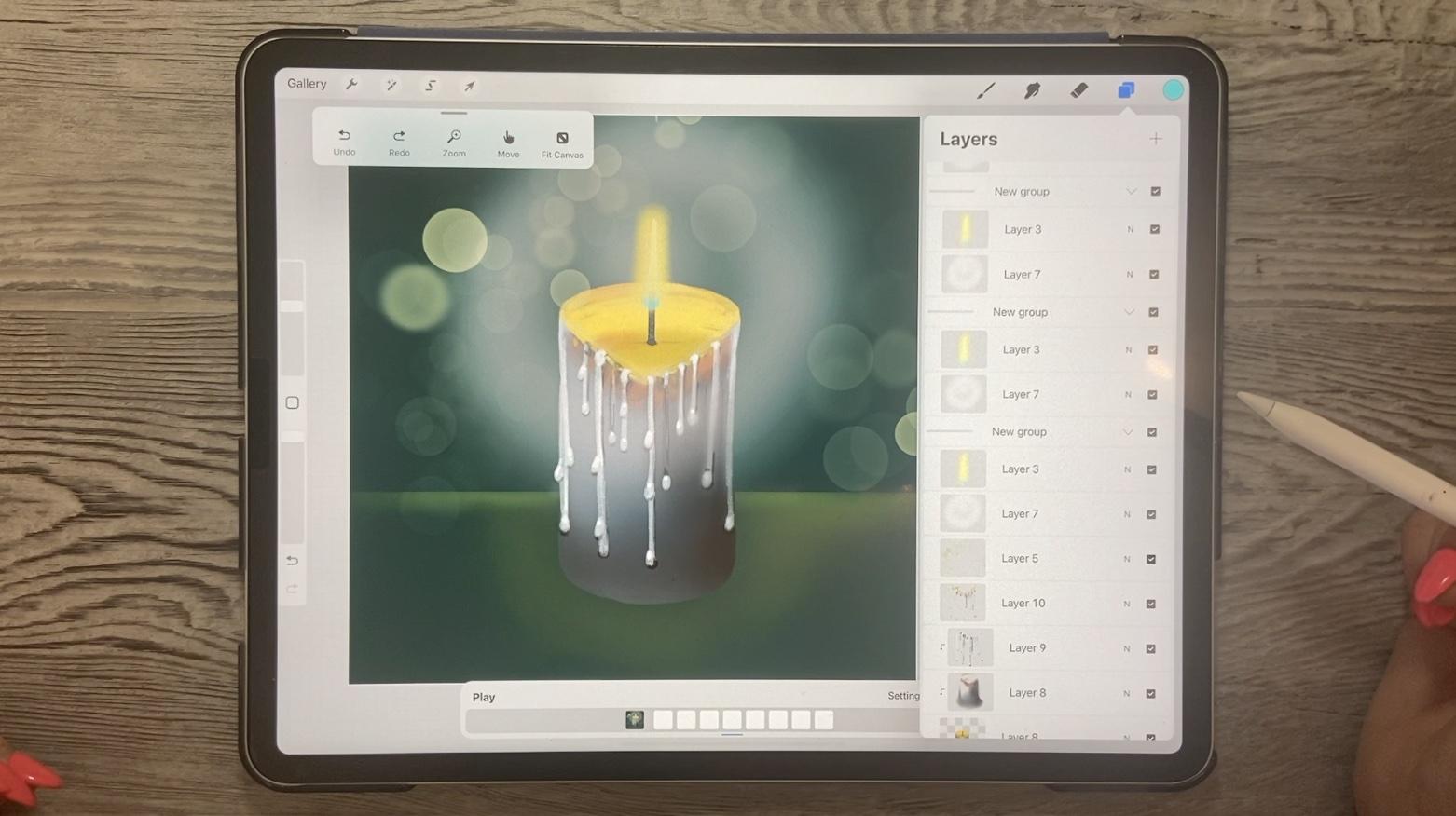
do is add a layer here and then create this glow. Now we want to create this glow and add it to the animation. So what I did here, as you can see, is I put
those into their own group. So to do a group, what you do is you just drop
one on top of the other, that will create a new group. I'm going to bring that one
outside of our main group. So this is our background or what would be
considered our background, and then this will be
considered our animation. So peas, other groups here will become our
animation course. The animation is not at all visible without the
background and stuff. So as far as the
background goes, I don't think we
need to worry about finishing it up right now. We could, if we wanted to. One of the simplest things I can think of for a background would be to turn off this
reference at the moment, one of the easiest ways would
be to add a layer above the dark background and
take a rectangle selection. So let's just make a big
selection here for the bottom. Now, that means that this part would be exposed and this
part is being protected. So we could start doing a
little bit of airbrushing here to create what would look
like the edge of a table. And then of course, a bit of a glow for the flame. So you can choose to
do it on this layer. You could have done it
on that original layer. I think I'm going to
stick with doing it here, and I'm going to
start at the glow. So I've got this white
still selected here. Maybe I'll go to more of a yellowy green color and we'll just add just a little
bit of lightness in here. Technically, this would
probably also Flickr, but I think we're not
going to include that in this first animation
has I want to keep it as simple as
possible for you. I'm going to go quite a bit brighter and do kind of
the edge of it here. So the edge of the table
or whatever it would be, would be brighter, go
with a smaller airbrush. And then we'd have
a pretty good sort of dimensional
looking area here. Now the other thing
we can do is add textures or add some
pattern to the table. These are all things
that you can add. Really makes your animation
more interesting. But for now I want to focus on just the idea of creating
the animation with you. So I'll leave those
details till the end. So when you're working
on an animation, you want to have what would be your background layer
completely separate from whatever is going to be
animated and we're going to have to turn on here
the Animation Assist. So let's grab that first. And you can see that
it has already added the background here
as my main frames. So we've got the frame with everything that we
need for the background. That's altogether
because I had it in a group that was
highlighted here. It's just whatever group
is on the bottom becomes your background and everything else will become
your animations. So did you notice
that as soon as I clicked to this group, that the little blue
line here shows that that's the one that we've
got as our second frame. And if I was to
turn this one on, you can see that it
comes up and that shows us our third frame
in our animation. So what we would do here is additional frames to
create the movement. So at this point there's little movement between
these two, believe me. So we will need to add a lot more frames in order for it to look
like an animation. I think the easiest way
to do this would be two, because I drew those
at different times. This one doesn't look like
it matches these two, so I'm going to actually
delete this one and we're going to just work with
this one as our main flame. I made it exactly the same
way as I did the other one. I want to add a little bit to this flame before we
do the animation. So we'll probably do the
animation in the next lesson. But right now I want to
take a close look at this and it look
more flame like. So amongst the things
I'd like to do here are add a little bit
of blue at the bottom. So let's grab a nice blue and we're still on
our soft blend here. So let's go quite a bit smaller. If you don't trust
yourself to be able to paint that on accurately, you can do that same
trick again where you do a freehand selection
and you don't have to do the whole flame
because you're just going to be doing it
at the bottom here. And then you could take your airbrush and basically
you just want to stick to the bottom
here so I can make my brush quite small. And I think that really adds
to the look of the flame. And I think that we can look
at that as our main blame. And in the next lesson, I want to show you how
we're going to add additional frames here
gives us that motion. And I've got a trick
up my sleeve to make the slight changes that we need to give us that motion that we
want for the flame. And yeah, we'll do that in
the next lesson or eight. So I'll see you there.
5. Lesson 4 Animating the Flame and Glows: Hi guys, welcome to lesson 4. So less than 4 here
I'm going to go into a lot more detail about how animation works
here in Procreate. Let's get started. So this is lesson where we're going
to be starting to enemies. This is one of the
simplest animations that you could probably
work on in Procreate. I'm going to be coming up with
a few other projects that will incorporate
animation at some point. But at this point
we're doing it. Like I said, the simplest we
could possibly come up with. And one of the things
that's really neat about the way procreate has their animation
programming setup is that you can take a group
like this and duplicate it. And as soon as I do that,
you'll see it come up here as our next frame. So that makes things a lot easier for us because
what we can do here now is just animate emotion
in the flame itself. And as far as movement, we actually want as little
movement as possible. So that's why this is such a
simple animation to produce. What I use is liquefies and we're
going to go into Liquify here and we're going to
use is the push Liquify. I'm going to go let me tell
you, but at 50 percent, let's try to 50 percent and we don't need to worry about
momentum or distortion. And I think the
pressure is probably okay about 30 or 40 percent. So you'll get the feel for
it after you've done a few. But what the push will do, I'll do a big push
and you'll see, you know, you could
push quite far, but basically you're just
wanted to push it ever so slightly so you can see the difference from
the first one, and that's really
what you wanna do. So each time you
adjust the flame, only want to move it slightly. Now as far as the glow, I also like to move that
around a little bit. So I'm going to use just
the selection tool here. So click on the
arrow and then just do a couple of clicks
off to the side. So wherever you click, if
you click in the middle here is going to move it
straight up and down. If you click in the
middle on this side, it's going to move it
straight to the side. That's enough motion,
believe it or not. And each time we do this, we can move that flickering
one way or the other. So we're going to be
duplicating this. Remember that the
first one Different, already see the difference
between the two. So basically that's all we need to do and we need
to keep repeating this. So let's duplicate. We'll do the same thing. We're going to go
into this layer and do a slight adjustments. You can just test
it out and decide whether you want motion to continue in one
direction or the other. So maybe I'll do another
one in this direction and maybe even pull it up
a little bit higher. And then I'm going
to go to my glow and I didn't count
how many times I had clicked the last one. So for sure this isn't
going to be the exact same, and I would keep doing that until I have
four or five of them. So let's take this one. And this time I'm
going to push it this side and I'm going to move
a little bit differently. So if I move, if I click
or tap on this corner, it kind of moves it in the
diagonal, but that's okay. I mean, we can have a little bit of variety in
what we're viewing here. So we'll do it one
more time, I think. And then I'm going to show you a trick that will make
it much more efficient. So let's get that guy
again equal phi pushing. And each time I do this, I'm trying to push it a
little bit differently. So there's never
a full repetition because really we just want
a flickering slightly. So now we've got 1, 2, 3, 4, 5, Let's see, and
select all of these. And then we're
going to group it. We're going to ungroup
it in a minute. But right now, a recent for grouping it is that we can then duplicate and then now we're
going to take these out. So I'm going to
select to the right by dragging to the right and
pull them out of the group. That can be a bit tricky
because you don't want to get them into another
group in one worked. And let's do the same
thing for this one. It doesn't matter
who's at the top or the bottom because they're identical and this group
should now be empty, or is it? Yeah, I've got my 10 here. So what I wanna do here is just play this one to
see how it looks. So now you can see I've got
some kind of a glitch there. So I've got some one of my
flames is either not on one of the frames here or
I've got something not moved. So I'm going to take a bit of time off camera to
figure that out. At as far as the motion goes, you can see that that
would be not bad. In fact, I could have gone
with a lot less motion is still could've looked
quite good there. So I'll figure out what my little problem is here and I'll come right back to you. As soon as I turned
off the camera, I remembered what it was
that I had done wrong. And that's that I had
to have the flame and glow also in the
main initial group, so in the background layer. So I just do it
dragged to the right here and then drag
them into this layer. So you just drag to the
right if you haven't got it, and then take those to select and drag them down into this
group. So now I've got four. So obviously I've got to
get rid of those two. And now let's test it and see. So we see now that
it's working fine, the glow, I think, could have a lot more
animation to it. The flame itself
looks all right, As far as the motion, let's go in and make some
changes to our glow here. So I'm going to go and
also enlarge it, I think. And there's no way that I
could do all of these the same unless I were to
select them all at once. So let's see if we can select a grouping
and enlarge them. Yeah, okay. So I can do that. So let's take the next three. And because I'm not measuring
or anything like that, I know that I will get that
motion that I'm looking for because they're
just not going to be consistently sized for space. So we're doing a
real ad lib here. When you're looking
at it like this, this looks terrible,
but when it plays, it does play individual
groupings at once. So each of these
is a phrase, oh, the previous and the
next one are hidden, and then you get your
nicer glow happening here. So let's play this now. And I think that
looks a lot more of like a glowing candle when you think we're definitely getting a lot more movement in here. So another thing we could do is to go in and make
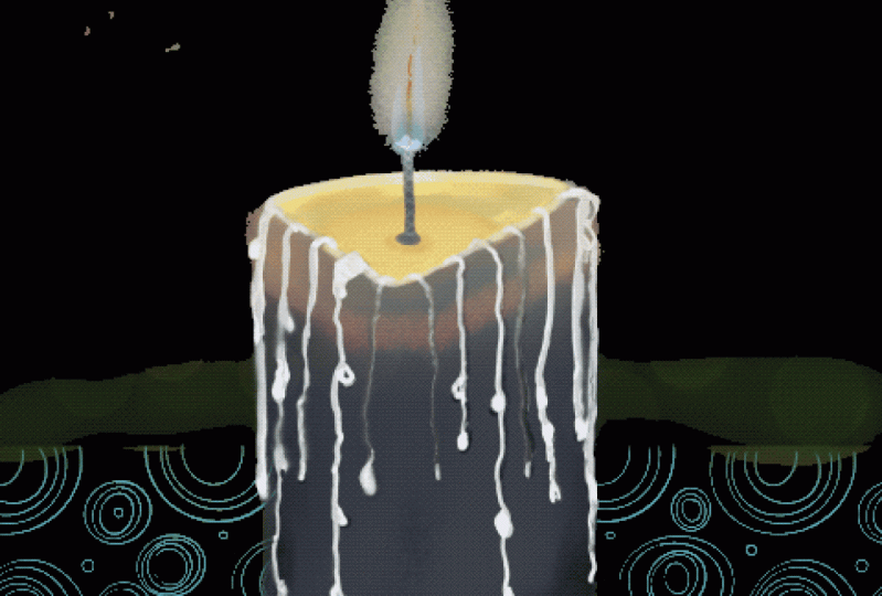
adjustments to our flame. I also thought that it
would be neat to add this layer with a bokeh
light in the background. So in the next
lesson, I'll do that. And then we're gonna do some
adjustment on the flame and just add anymore finishing touches
that I can think of. All right. So I'll
see you there.
6. Lesson 5 Adding Extras and Special Effects: Hi guys, welcome to lesson 5. So we're almost
at the end of it. We need to just add a few
special effects here. Let's get started. Now for this lesson,
I wanted to add some of that lighting
in the background. So just kind of special
effects, I guess you'd call it. And I think it really adds
to the overall looks. So we can add a new layer here. There are some great
luminance brushes already here in Procreate. So go to that luminance category there and grab the bokeh light. Either one would work. And let's go with kind of
yellow week gold color. So I'm going kind
of between the red and the yellow getting
that orange color there. And we're just going to paint some of this
in the background. And instantly to me, that makes it look like lighting and changes
in the light. Now in order for that to be
really effective though, I think we're going to need it duplicated and put into all
of the different layers. Let's go ahead and do that. So I'm doing one at a
time because then I can kind of move it a little
bit, slightly enlarge it. Or, and you can see here that because there's
semi-transparent, you can kinda see through to the previous layer to see the
changes that you've made. You can actually do a hidden skin so that you
can't see previous layers. I want to explain that
in this class just to keep this class quite simple. But once we're doing
some more sort of in-depth animations, you're going to want
to work with this to help see those previous layers. In this case, the
movement is so simple that I don't think we
need to worry about that. And settings also,
while we're here, I might point out these
different types of animation and you've been seeing as I've
played it as a loop him, when it's a loop, it
just will go from start to finish over
and over again. So you can experiment with these different settings now without the bulk of
light being done, It's kinda looking weird, but maybe when we're
done completely, we'll go in and try
all three of those. And then we'll also work on the frames per second here
and do a little bit of a townhouse to what speed would look the best or
our final animation. But for now, let's just
carry through with this bokeh effect that
we're moving around. So I'm going to
duplicate this one, take it into this layer and just move it ever so slightly. You can enlarge it a little bit. That works for you. And of course, after
a while you can just start going in and copying the ones
that you've done and putting them into
consecutive layers, make sure you put them in
the same position each time. So I'm putting it between
the glow and the flame, will see if that looks okay. Once we play it for
the first time, I'm just going to
duplicate it and move it up because it's too
much of a pain to move the layers sometimes
when you've got so many. So one of the things to
take note of here too, is that you are cropped
on these edges now. So you can't really
go any smaller. You see if you
crop it like this, you're going to get the edges showing quite prominently
and you don't want that. So your best bet is to
just move it ever so slightly and sometimes
just alternative frames, the way I've been
doing will work. So let's just play this quickly
and see how that looks. Now, we can see that the speed here is not going to be working. And so we're going to be
making some adjustments there. So let's go back into
the settings here. And I want to show
you an increase in the frames per second per
second and a decrease. So we'll do the
increase and play. And you can see that, no, that's not the way we
wanted to go at all. So let's stop it, pause it, and go into the frames
per second and reduce it, and then see how that one place. So that's a little bit better. And I think we could
even go less here. So let's go down
to H and hit play. And I think that one
looks not too bad. We can even go less. So let's try and that's
probably too slow. So it seems like five or six
seems to be a good rate. And of course you can
always go in and do things like reduce the
opacity on your oka. So if you went 250% ish on all of your layers that have
the bokeh doesn't have to be absolutely exactly the
same every time because the variation will have kind
of a good effect on its own. Remember to do that one that's
in the background as well. And I think you've got them all. Let's play this now and
see how that looks. So I think that looks good. I think that's
flickering quite nicely. And of course you can
make adjustments to this, use your own judgment and decide whether that
works for you or not. Now, remember that we have the, we have loop originally
and that goes from start to finish
over and over again. If we do ping pong, it goes from start to end
and then from N to start, and repeat that over
and over in one shot. I don't know if it would
work for us because we want this to be a
continuous animation. So I'm thinking that the
loop to me looked the best. So you basically have done your first animation by
following these steps. And of course, you could make
this a lot more complex, a lot more detailed, a lot more dimensional. You can add a lot of fun accents like color on the tablecloth,
things like that. But as it is now, you have created an animation. And because we've done it
here in a square format, this is a size that could work for Instagram, for example. In the last lesson, what I
wanted to do is just show you how you could export this. And then I think
we'll be wrapping up, so I'll see you in
that last lesson.
7. Lesson 6 Final Output Explained in Detail: Hi guys, welcome to lesson six. And less than 6 here
we're going to be talking about outputting this project as an animation that
you can use for your social media or for
anything for that matter, you can even send
this in an email and the recipient would have a nice little animated
image to see. Let's get started.
So before we get to the actual exporting of the little animation
that we've created here. I just wanted to
point out a couple of little things that I've
added. Nothing major. But I went in with a couple
of my pattern brushes and added a little
tiny bit of detail on the tablecloth or
whatever you'd call, I guess claudia or table. And I also added
this lettering here. So I just went to add, add text and then typed
in my lettering here. And so you can position it
where you need it to be. I've got it on the wrong
layer there obviously, but you would create
the lettering. I'm not gonna go through the
whole process because you probably know how
to do it or you've done it in other
classes of mine. I did the lettering in that kind of a bright
turquoise blue, and then I duplicated
it and did it in black and put it underneath. Now one of the
things you could do with that block lettering is you could go in and
blurred a little bit. So I'm not sure if you
can see that here. Let's enlarge little bit. But as I'm dragging, you can see that that
lettering is getting really fuzzy and that works
really nicely as well. So it seems totally up to you, That's definitely
completely optional. You everything I did is I went
in and added a little bit of kind of a spatter
texture to the candle. The thought that kind of, I don't know, Just give it a
little bit more character. So these are little things
that are completely optional, but I added them just
for the fun of it. And I'll include a
spatter brush of mine and a couple of texture
or a pattern brushes. I'm not sure if you
have, these are not from other classes. And I can see that a little bit of black
there from this pattern, but anyways, I'll ignore that. So easy for me to get
distracted as you can see. But let's go in and
look at the export. So you'll still go into the Share menu like you always do for exporting a picture. But here you're going to find
these different options. Now for what we've
created today, I would use an
animated GIF or GIF. And you can do a PNG. Let's say you did that
candle and you wanted to put it on some other kind of a background that
you already have. You could do an animated PNG. I haven't really
experimented with that, so I can't really give
you advice on it. But as far as the animated GIF, you can go in and it's got the setting that we did as
far as frames per second. You can make adjustments
again like here, even though we've
got that set at six, you could change it here. I am leaving it at the six. I think to me that
looks like the best. And dithering is something
that you want to do. Because if you don't, I'll show you what
it looks like. It does all of this
really simplifies it too much and reduces
the amount of color. What the dithering does is
it gives you these sort of fake interpolated levels of color that give it
that blending of fact, which is what you want. And then it's just
really simple. You just decide on whether you want it to be the
maximum resolution. And see here It's 32 megabytes. And if we go into web ready, so this would be
something ideal for putting on Instagram
or whatever. Then you see that it's reduced
it down to 830 kilobytes. So that's probably what
you would want to do because anything that you're
going to upload up there, we'll have kinda limitations. And this is a good amount
of memory it takes similar, it'll run quite smoothly. You can also use this one to include in emails, for example. Then you can hit the
Export button here. It's going to ask you where
you want to export it. I'm going to save it to
my Class Assets folder. So I've created a folder
here for this class. Rename it here, hit
Done and hit Save, and I've already got that. I'm going to replace it. And now I could go ahead and
take a look at that file. So let's just go
into files here. I'm going to go into my class, assets, wherever they may be. I don't like this. I prefer to have
this in columns, find it easier to navigate. And when we open this up, it doesn't open it in Procreate. So it opens it and you can see that it turned out quite nice. It's enlarged here
on this screen, so it's a little bit bitmaps. But obviously if it was
on Instagram or whatever, you would not have
to worry about that. So that's it. I mean, it seems so easy. It almost seems
unbelievably easy. It's just another
fun little project that you can do for Christmas. And I am sure, absolutely positive that
you will do fantastic job. A much nicer finish than
I did. I'm sure of it. And there's so many
different things that you could take into account here and add to make it more
interesting or whatever. So good luck, and I can't wait to see some of your
projects posted here. Alright, So I'll meet
you in the wrap-up.
8. Lesson 7 Wrap Up and Closing Thoughts: Hey guys, I'm glad you
made it to the end here. And I hope you have a really
cute little animation that you can use for something, maybe social media or to send. I don't know what the
possibilities are endless. Now that you've got
the basic knowledge of how animation works here, you could probably
start working on something a little
bit more details. I'm going to be adding
some other classes on animation in the future. So make sure you
keep that in mind. Make sure that you've
added yourself to my mailing lists and hit
that follow button up there. If you follow me, then
you'll get all of the information about
classes as I post them. So that's a really good way to keep up with what I'm doing. I try not to sound
too many posts out, so don't worry
about it too much. Now if you want to
check how any of my work you can definitely do that on site like Society 6. I'm there under my own name, but I'm also under the
umbrella of out of the blue. So you can check out out of
the blue there on Society 6. Also, I've got work at 1000.com, condyle and where
here in Canada, my biggest site is
actually at Sawzall.com. That's where you'll see
the biggest variety of my commercial work that I do. If you're looking to see some of my large abstract
work, indefinitely, societies six would be
the place to checkout or sites like I Canvas
and PI creative. I can't think of
all the other ones off the top of my head. You can just search
me out and I'm sure you're going
to find something. I'm so glad that you spent
this time here with me today. I've got plenty of classes
here that you can tap into. So when you have time,
just check them out. I really appreciate the follows and all of the nice
reviews that you leave me. It's great when you
say something about the class because that really helps other students
to choose classes. And I definitely take
a look at reviews when I'm about to choose a
class that I'm gonna do. So I guess that's it for now
and I will see you soon. Bye.
 Delores Naskrent, Creative Explorer