Transcripts
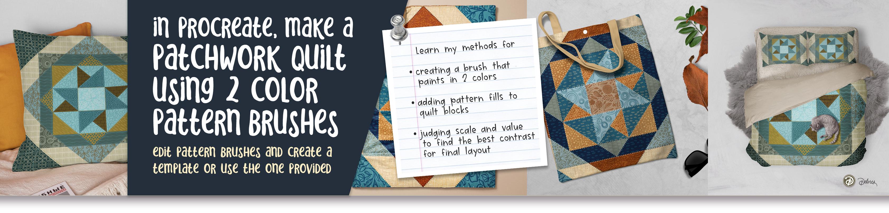
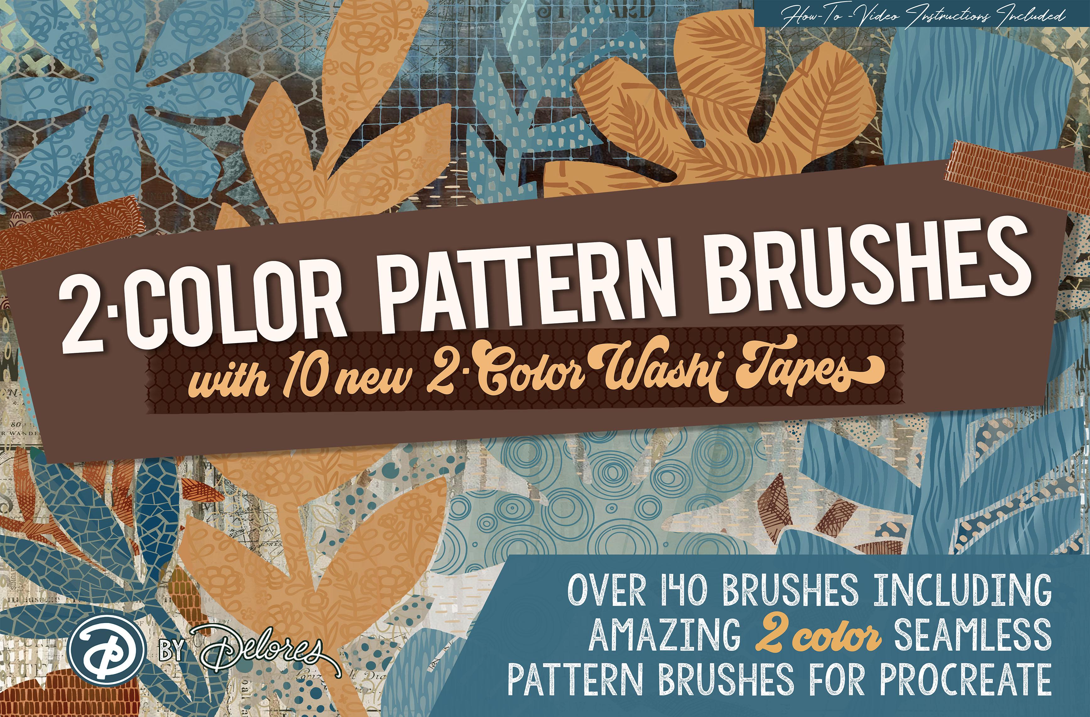
1. Intro to Create a Quilt with 2 Color Pattern Brushes : Hi guys and welcome. My
name is Dolores aspirin. I'm coming to you from
sunny, Manitoba, Canada. The class I'm bringing you
today is a really fun class that uses something completely different you probably
never seen before. And that's to color
procreate brushes. These brushes will paint two colors. It's
hard to believe. I've created a bunch that have a pattern and
I'm going to be explaining to you how to create this two-color
pattern brush. We're going to make a couple, and then we're going
to use them to create a super fun quilt. I have included everything in the package here so
that it's as easy as possible for you
to get right into the nitty-gritty and create your own fun finished
pattern quilt, complete with all
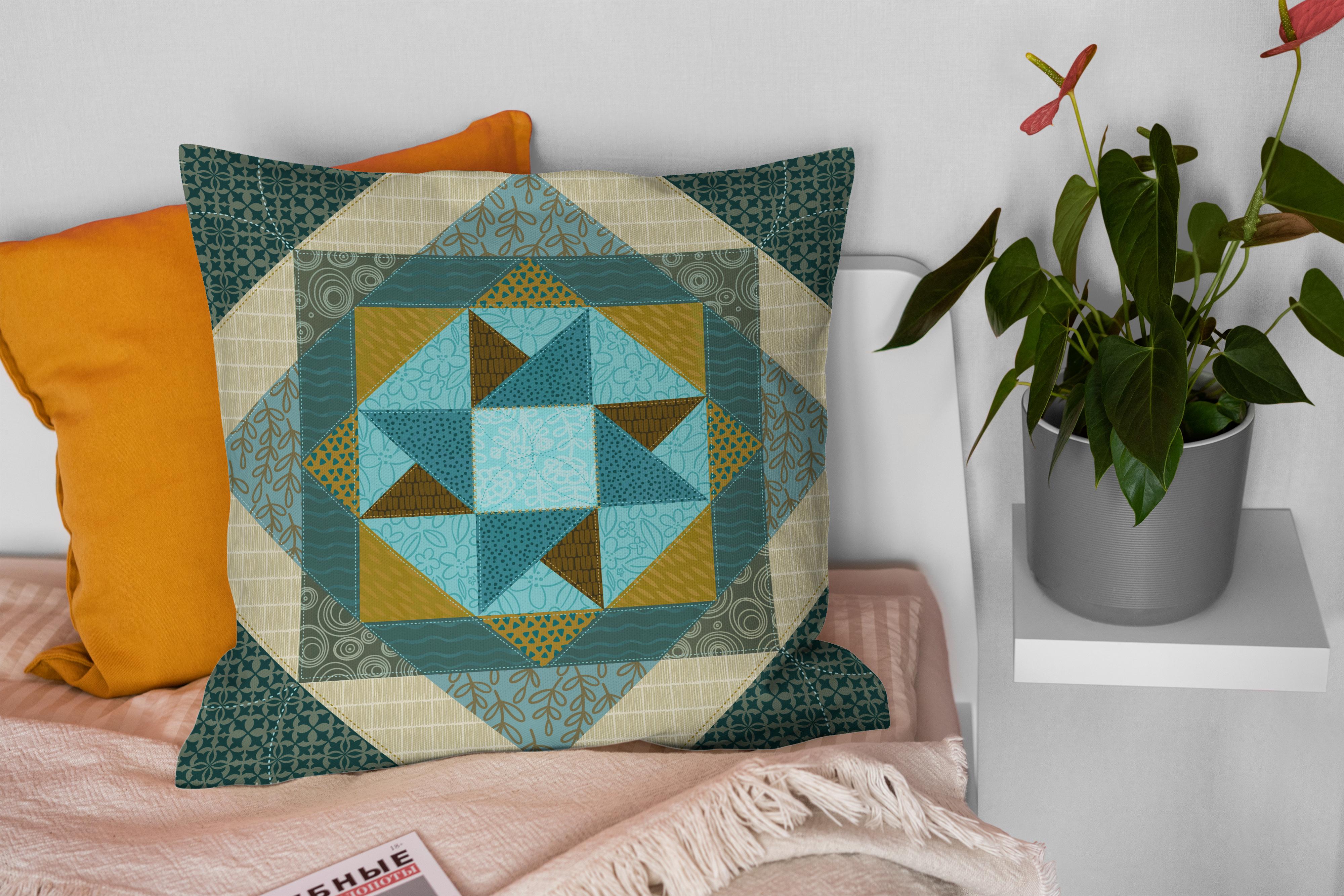
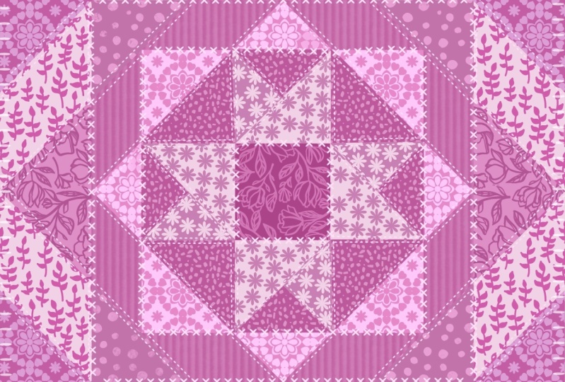
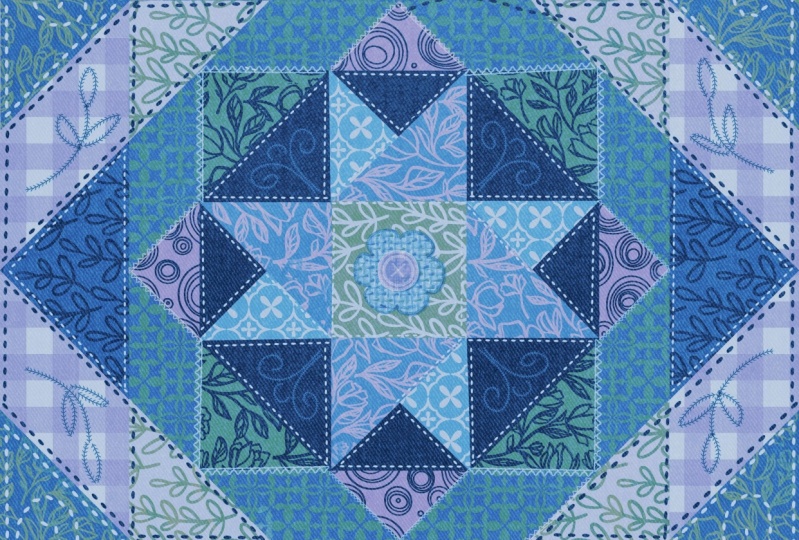
of the stitching. Here's a couple that I've
done just so that you get an idea of what it is that
we're working towards. I'm also providing you with a couple of different
color palettes. But of course you're welcome
to use anything of your own for any of you
sores out there. I think you're going to find
it really fun to do this in an electronic way and it's a really great way to
test out patterns. And also for people like me who are surface
pattern designers, it's a great way for B
to check out things like the scale and the way
of fabric can contrast. I really enjoyed this project. I've actually done three of these quilts now just for fun. Now if you haven't
done so already, I'm going to suggest
that you hit that follow button up there. That way you'll be
informed of any of my new classes as I post them. And of course then
you'll get any of the post to all followers
that I send out. I also strongly encourage
you to get on over to my website and add your name
to my mailing lists there. That's where I post all of my
downloads for the classes. And of course I've got lots of free goodies there as well. So check out my
artists resources. Are you ready to get
into this project? Alright, let's get into it.
2. Lesson 1 Inspiration and Overview of Objectives: Hi guys, welcome to lesson one. Lesson one here we're
going to just get started by taking a look at
some examples online. And I'm gonna explain to
you the methods that I used to create the template
that we're going to be using with our
two color brushes. Let's get started. I wanted to start
today's class with just a little bit
of inspiration. So I have just done a quick
search here for quilts. And while there are some
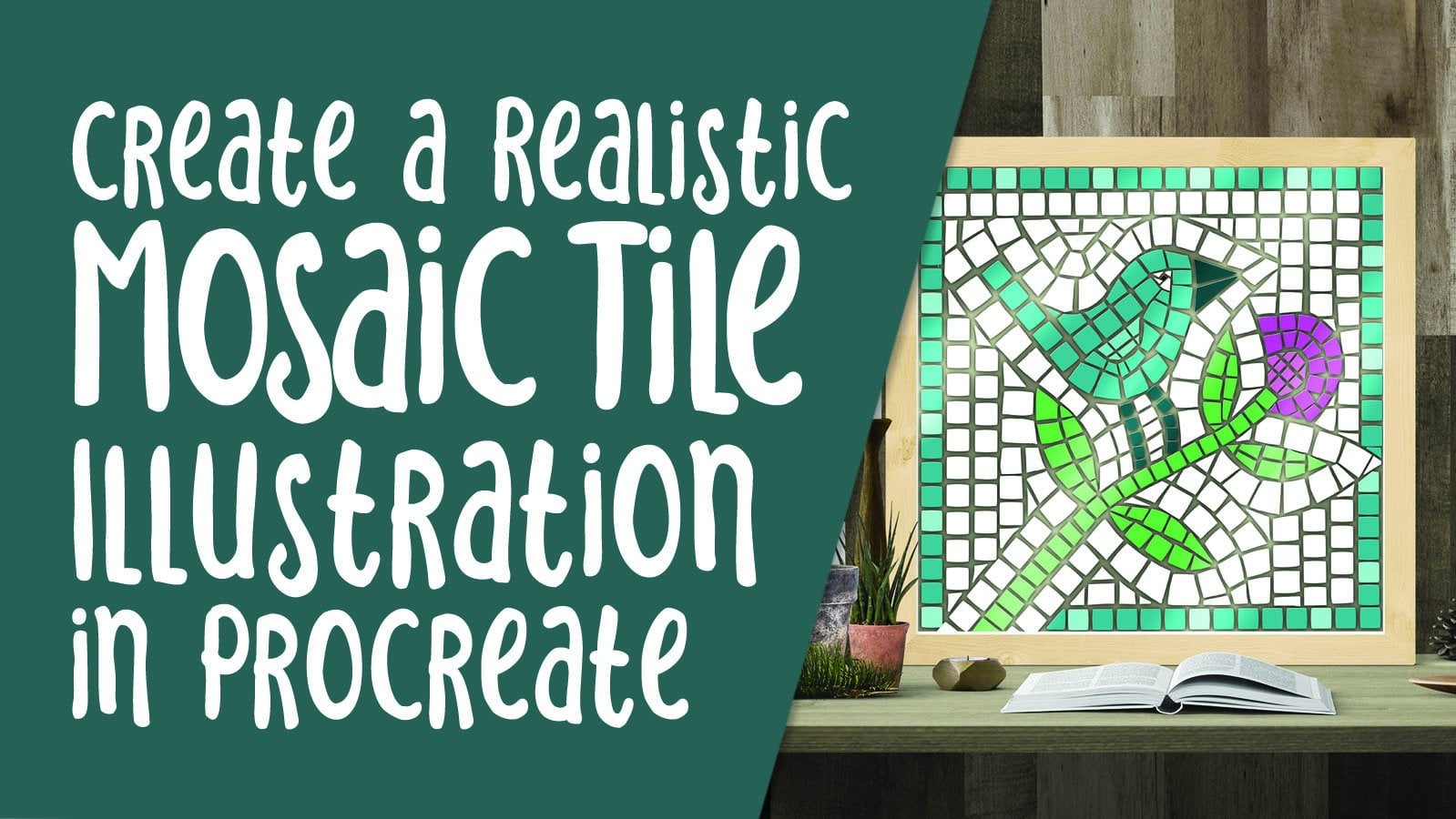
amazing quilts out there, I love some of these patterns. And the project that I have
lined up for you today starts with a template that
looks very much like this. I've got the shapes
broken up just like this, just with bold color, so that it will be
easy for us to use them to add our patterns too. I created a, I don't even know what the
name of the pattern is. There probably is a
specific name for it. I thought that what might
be fun to would be to look at Quilt illustrations, to just get an idea of perhaps something that
other artists are doing. And this is the closest
thing I have seen so far. Wow, that is actually amazingly similar to the example
that I have for class. So you saw the example
on the title slides. And basically this is what
we're going to be doing. We're going to use
patterns that we make. I'm going to give you one that I've already
created that has the two layers that allows for creating
a two-color brush. I'm gonna show you
how to edit it and put your own patterns in. And then what we're gonna do is use our brushes to
fill in the pattern. So I loosely based this
on an actual quilt that I had found a
reference for online. And what I did is I just blocked in all of the
different shapes. So e.g. that is my first shape. And for some of
them I was actually cutting out the other areas that we're going to be in
different levels here. And then I realized,
well, I really don't need to do that for
every one of them. Not all of them are cut out. So this is an example, this back one is an example
of one that I didn't cut out. But as you add all
of the other layers, of course, in different
areas get blocked out. I see I have a little bit
of a touch-up to do there. I'm going to make sure I clean this up before we
start using it. Yeah, so basically all of the
different layers are here. I have even set it up
in such a way that I've already got all of the
clipping mask layer is made. It's going to make it
really easy for you to just get in on this document and start adding your own details. So the way we're
gonna do that is to choose a layer doesn't
matter which layer. Let's just choose
this one for now, so that's the corner. So I could have cut
that out of the yellow, but then it's really not
necessary because it's literally blocking
out the yellow. These didn't even really
need to have colors because the two colors that we choose for our brushes are going to override whatever
in the background. So let's grab color brush, and you have the two color
brushes that are in the set. I'm going to actually just
give you one of these. I'm going to be showing
you how to make your own. As long as you've got some
patterns already made, you're gonna be able to
create your own brushes. Let's grab this one here, and let's go up here
and set our two colors. So this is the beauty
of this whole system, is that we can create
a two layered brush. And the two colors
that we choose as our primary and secondary
colors are going to be what creates the
color on the brush. As we go through the class, I'm going to be going
through color dynamics and discussing all of the different settings
here so that you are not confused
about what to do. You're going to get the brushes. I think most of them, I have
set up exactly like this where the color pressure for the secondary color
is at maximum, but there's absolutely nothing else being affected
at this point. Just under the color
pressure setting, the secondary color
will be set at max. And what this allows us to do is apply different
amounts of pressure. That's why we're in this
pressure category here to get different
effects with our brush. So if I'm painting
really lightly, you can see that it's using
just one of the colors. And if I was press hard, I would be using
the second color. So the drawing pad isn't really the best place to show that. I'm going to show it to
you here because then we can be really extreme with
our color choices here. So let's keep this one as a
light color and this one, let's go with a dark teal color. I'm just choosing that randomly. You don't have to you don't
have to choose a color that specifically matches
color that's there. But just to show
you how it works, what we'll do is go to that
layer and we have to go into the clipping mask for
reason we want to go to the clipping mask is to
avoid which has happened. I started coloring
on this layer. So you can see there's
no constraints. If I'm on the
clipping mask layer, you can see that as I paint, it's painting in those
two colors that I had, I had full pressure on and
that's why it looks like that if I was painting
really lightly, I haven't made any
other changes there. That painting really lightly
gives me this effect. So I'll do it from
a light to heavy. And then you can see
the effect that it has. So the heavier I
apply pressure is, the more that
secondary color will show without applying
a lot of pressure. The primary color as the only
color being visible there. I mean, that's kind
of a medium pressure. And here I'm pressing really
hard super light pressure. And there's barely
any contrast there. As we're going
through the class. I'm definitely you can explain
every step of the way. And by the end of the class, we're going to have
beautiful little quilt that can be used for so
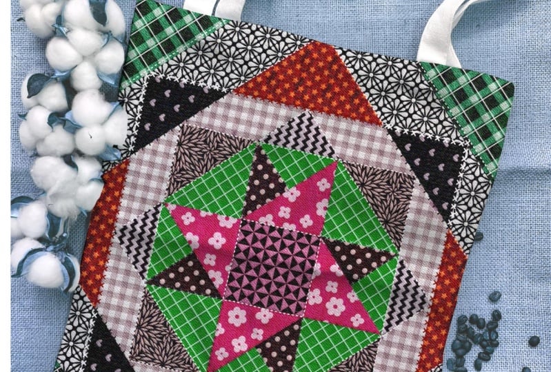
many different things. I can imagine using this as just a single printed image
for Canvas or a framed print. Or you could use it
as a background for something like a
greeting card or the examples that I showed you artwork to go on some
kind of a product. Alright? So that's basically
what we're going to go through to do in class. And we're gonna
go all the way to the stage of even adding
the stitching on. So let's meet you in than one
and I am going to explain how to create your very first
two-color pattern brush.
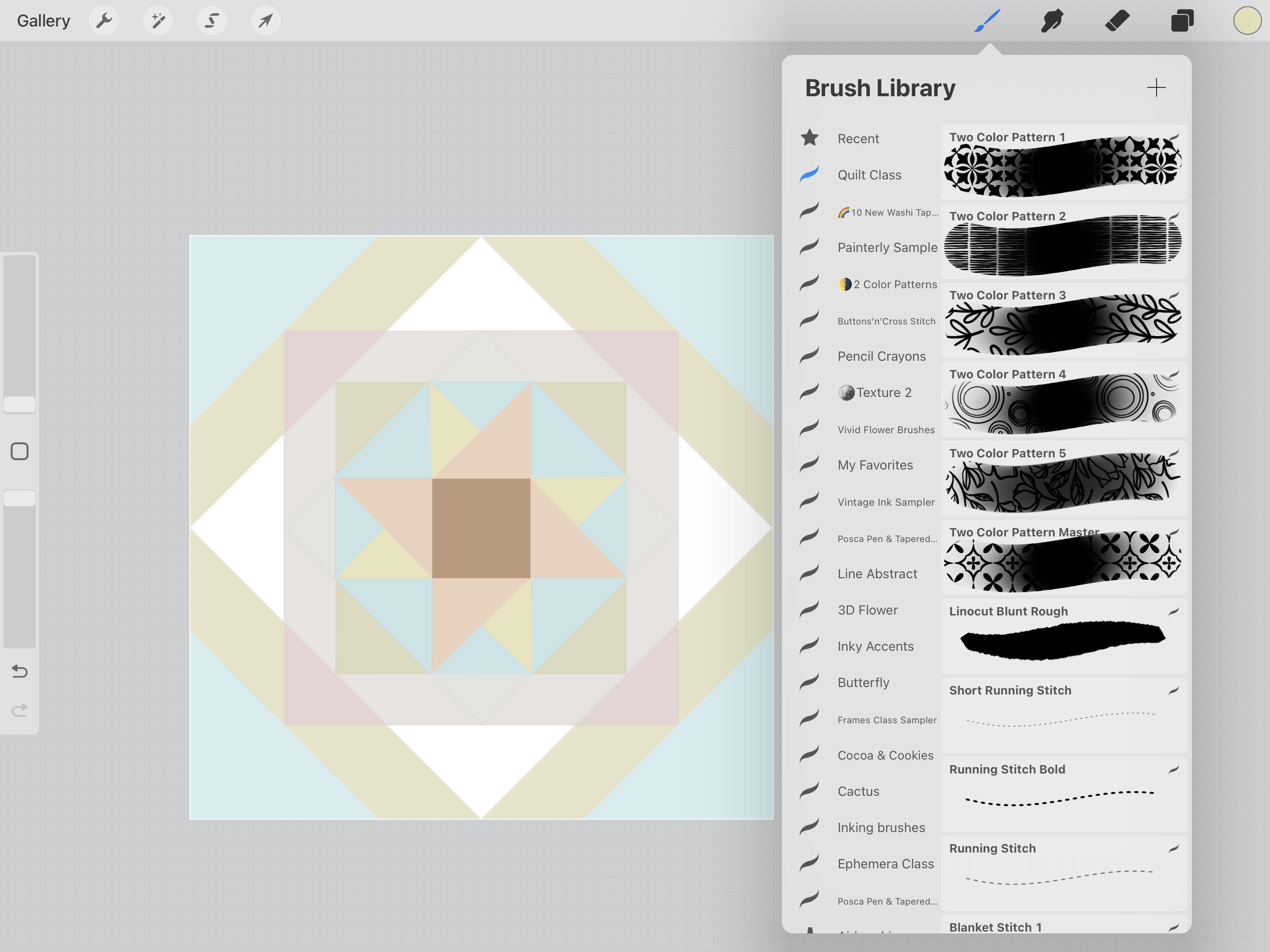
3. Lesson 2 Creating the Two Color Brushes: Hi guys, welcome to lesson two. In less than ten here, I'm gonna be giving you
one of my trade secrets. That's right. I'm gonna be showing you how
to adjust a two color brush. So I'm gonna be
giving you one that you can use as the
basis for your brush. It took me months
to figure this out. I hope that you're going
to really enjoy making your own two-color brushes
with your very own patterns. Let's get started. So to produce our first brush, I thought it might be fun to use a pattern from a ceramic tile
because I think we can make a very quick pattern
this way using the radial symmetry tool
in the Canvas settings. If you want to just grab
something that you see online. So let's say
something like this. I hope this has a close-up, so that's quite good.
Close up on it. You want to snap a
screenshot of it. So you use the two buttons, the one on the side, your power button, and the
closest volume button to it. And you just do a
quick snap of it, then you can adjust it here and hit Done and save
it to your photos. That's the fastest
way that I know of. And it's a little
bit of a cheat, but we're not going to copy
it absolutely Exactly. Then we go into Procreate. I've got a ten by ten
document open here. This document is 300
pixels per inch. The settings here,
300 pixels per inch by ten, hit Done here. And actually in the Canvas
settings here we want to go to the Drawing Guide
and Edit Drawing Guide. We're going to put
symmetry on here. And I think that we want to
do a quadrant and hit Done. So our four parts of this square are going to reflect this way and
reflect this way. Now we wanna go in
and add that photo. So it should be the very
last one that you've taken. And you might as well pretty
much fill the screen with it so that you've got something
really good to go from. I'm going to reduce
the opacity on that. I'm going to add a layer
and switch to my black. You can use your weapon
of choice personally, I think I'm just
going to use a Posca marker set fairly small. And I'm going to, all I really need is
this one corner here, whichever corner you're more
comfortable working with. And then you basically
just start drawing. Remember that you're
reflecting here. I'm going to go a
little bit bigger. Make sure your layer has
the Drawing Assist on. And then you can see that
it's going to draw here. I'm gonna go bigger so that
you can see it more easily. I don't want to
completely copy it. And you know what, I'm thinking? Maybe the radial repeat is
going to work better because we really only need like
this triangle here. So let's switch this up. Radial and that's actually
going to be perfect. You can see here, I'm going to make
this thicker and darker so that you can
actually see it better. And this triangle here, one of these triangles is all that you need
to worry about. You can roughly use
this for an idea. I think I'm going to
even lightened it more. And if you're uncomfortable
with just going for it, you might want to start
by doing a pencil sketch. Let's do that first just
to make it a little bit easier for all of us to do. And this also allows us to do some adjustments
so that we're not completely copying
other artists here. So you could do
something like this. And maybe in this case, I'll do something like this. And the pencil sketch
helps us to do things like fix things like this if
we're not happy with them, I'm thinking this one
could be a little bit shorter and this one could
be a little bit longer. A little bit of
erasing so that I don't get confused after. And then I can add
this other one here. And then you can decide
whether you want to add any more detail
to it than that. So you want to think about, do you want to have
this as your solid, which I think is what
I'm going to do, or do you want to have the
solid as the background? These are little
things that you can decide before you move on. And you can definitely
at anything else that you think is going to improve
the look of your pattern. So for me, that is the
guy that I want to use. So I'm going to turn
off the other one. That gives me a really
good look at it. I'm really happy with that. And I haven't completely
copied this other artist. I'm going to reduce the
opacity of this one. Now add a layer and set
this one on drawing assist. And then now I'll switch
to my Posca marker. And what I'm trying to do is
have them looking the same. They're not perfect. They're not exactly the same,
but they're pretty close. So here of course,
you can still do some correcting in the sense that you can slim out
things or thicken them up. This is an Uber quick
method to produce a really cute pattern that you can use to
make your brushes. So I can see here that that
didn't go perfectly straight. So I can straighten this out as I'm now doing the finished arch. You can always stop and hold
to get a really good curve, makes sure that your
shapes are closed. So you want to go up
a little bit bigger. I want this one to start
right across from there. So I think I've had
too much coffee today. My hands are a little shaky, so this one isn't the
same as that one. We could have even started
by using a reflected light, just done the single
reflection and then taking that
and duplicated it. But that's a lot of
work. And for what? I'm doing here at this point, I just want to show
you how to relate the patterns so we don't have
to perfect by any means. So I'm going to turn that pencil sketch off just so I
can get a better look. And I think that's
gonna be okay. So I'm going to colorize it
or fill the areas of black. All you need here is
a black and white. Okay, so, yeah, okay, I had to just reduce
the threshold here to about 65% and that field, okay? And actually,
that's really cute. I like it. That'll be just
fine for pattern. The only other thing we
need to do here now though, is to make sure that we have
a full white background. So you can do that in this case, I think you could just drag the white end and just make
sure that it's everywhere. Sometimes just to make
sure you can actually do a skew it on a separate layer and then combine the two layers. But in this case, there's no
inner shapes or anything. You could of course, go back and take a look at these kind of
patterns and you can see that these did
have inner shapes. But I think for all
intents and purposes, this pattern is just fine. So now we're ready to actually create the
brush with this. So what we're gonna do is
take one of the brushes. I'm going to give
you one of these, one of these two-color
pattern brushes. As a matter of fact, let's
just make your set right now. I'm going to call
this one quilt class, and these are my
two color patterns. I know some of you have
already purchased the set, but now you're going to know
exactly how to do this. So I'm going to grab that
tile one because I think it may have settings that work perfectly for
this particular brush. I'm going to drag it into
the quilt class brush set. I will delete that number there. So you're gonna get it
looking just like this. So what you wanna do is
duplicate it and then you're going to go into the shape here. And that's where
you're going to end up adding this as a green. We're all ready to go here. I'm going to three finger
swipe down and copy. I'm gonna go to that pattern. I'm going to go to Grain. I'm going to hit Edit, import. And that allows me to hit
this paste here and hit done. Just like that. You've got a really
cute little pattern. And I actually really like how this motif is different from
this motif if you see that. So it's pretty cool. I think that this is
going to work perfectly. Let me just change
something here. See this offset jitter, if ever you have
this happen where you've created the
brush and then you lift and then you go back and your pattern match write-up. You see that I turn
the offset jitter off, then it will line up perfectly. So you can see
that even though I lift my brush and go back down, it's worked perfectly
at this point. Let's not make any changes
to these brushes here. So this is the main brush. I've got it on heavy glaze. This is the secondary brush. And what the rendering here, I've got it on
uniform blaze and I think you're going
to find most of them are set up like that. We can make experiments later to just kinda figure out how these settings would
affect our brush. We don't need to do that
in this lesson though, so I will meet you
in the next one. See you there.
4. Lesson 3 Let's Talk About Contrast: Hi guys, welcome
to lesson three. Let's talk about contrast. In this lesson, I want to
show you how I logically pick out the different colors and contrasts of pattern and scale. This is a really good exercise
for any artist that is especially working in areas
like surface pattern design. Let's get to it. One of the things I found what I was
actually putting together my little quilt was that I needed a real contrast
with my patterns. So I wanted some that had a fairly large motif
or group of motifs. I use some that
weren't as textures. And some of these were just simple repetition
of things like lines or dots or circles. And you're probably going
to find that you want to do that if you haven't purchased the full brush that you're going to want to create a variety just so that it's
easier for you to put together your final quilt. So let's experiment
first by checking out that brush that
we just created. So the first thing I
wanna do is clear this layer so that we're starting
with a blank slate. As a matter of fact, what I will do right now
is doing it so I don't have to go through and
erase all of those before uploading it for you. So I'm going to have
that one as a master. And this is the one that
I'm going to work with. Creating this pattern was
actually not that easy. I thought it would be easy
because it's just a bunch of squares overlaid and whatnot. But really it actually ended
up being a fair bit of work, just simply getting
everything to match up. And that's not
absolutely perfect. I will give this a second look before I send it
or give it to you. But you don't think like this. It was actually
really hard to get them to line up perfectly. So I'm actually
going to be creating a couple of these using
Adobe Illustrator because easier to be accurate with a
vector-based program for something like this. But it'll still be fun and easy for you to use
when you get it. I'm going to just check
that brush first. And I'm thinking I will just
start with these corners. So here's the brush
that we created. And I am going to experiment with a very small
grain size at first. So I'm here only at 22%. And at the moment,
it's only going to use these two colors if you wanted
to change the two colors, this is the time to do it. So maybe you might want to
go with a deeper color. I have this palette chosen. Actually, you know,
I think I'll do, is I will give you this palette. But I think just
because I've already created one in this
color than I think I want to actually
experiment with doing wine with a completely
different color scheme. Let's see what I should use. I can give you both
of these so that you have a method to create it
very similarly to mine. And if you wanted to, you could go ahead and recolor
your quilt squares first. Sometimes it is easier because
then you have a little bit of a chance to work out
what's best in the light, what's best in the dark,
that sort of thing. So let's just go ahead and
do that first layer here. What I would need
to do is select and then choose what
color to fill it. And this is probably going
to be really similar. Then grab that one and then
I'm going to just say fill. So it's very close and let's just kinda
work our way around. So now I'm gonna go with
this lighter one here. I want to grab one of
the lighter shades here. So maybe this one here, select, Fill, and you're going to find
as you're doing this, that when you are filling with these different colors that
look good and some don't. So what you're
looking for here is more the value like the darkness or
lightness of the color. So I know that this was the
color I used previously. That would be this color here. This was the color I
use at the beginning. So that was this one here. So I really wanted
to pick something a little bit sort of mid-range, but I would like to switch
into this grouping here. So the different shades of kind of a yellow
and fill the layer. So that's kinda a greeny yellow. I mean, it's so funny, isn't it? That it looks so awful. That color, just isolated. And yet when you see it in a full palette, it looks great. So I don't know, that's
just an optical delusion. Okay, let's move on here. So next one I wanted to
choose is this here, this darker, navy color. I'll select it first. And that again is a dark color. So I think maybe here
I could switch to maybe this color and
fill the layer and then this will be my next
choice, somebody to select. And with this one I'm going
to contrast it with a yellow. And you can see how completely different
this looks already. So this is the next
one can select. And I'm going to switch
to maybe this one here. And of course, these
colors are all going to be changed by the brushes that we end
up using them then go a little bit less saturated. Forgot to select first. I think this is gonna be
the one that makes it look much different
than it does right now. So let's select this one is going to contrast
with that blue. So I think maybe this
would be a good one to do in one of the sort
of yellowy colors. And it could be a
darker or mid to darker tone because that blue
is a little bit lighter. I'm going to go even
darker and fill this one. I'm going to go quite light and I'm going
to go with a blue. And have I missed any
I think this one here, I don't remember doing that. Here we go. So that is one
that's left to be done, and that was a
fairly light color. So I'll select, and
I'm going to fill it with a color and there's
everything back on again. This is the new colors or
did we do we do this gold? I don't remember. I'm
going to select it. I'm pretty sure we did. Yeah, there we go.
So at this point I'm ready to start
and I'm going to start with that outside
level here first. That's this one here. This is what I wanna do is
be on the clipping mask. And I'm going to pick two
colors for this pattern. I think I will stick with this darker color
here as one of them. And then for the lighter color, I'm definitely going
to pick something here in my palette. So maybe that one there or
maybe a little bit darker. And then let's give this a shot. So main thing we're
looking at here is the scale of the pattern. And actually I think
that looks really good. So I had full pressure on there. So what that did was applied 100% of both
of these colors, you can definitely experiment. Remember that really
light pressure is going to give you just the
light color for everything. And then you can see that as
I'm adding more pressure, it's getting darker and darker, more contrast
because it's getting both of those colors
at full strength. I think that's what
I liked the best. So I'm going to go through, and this is what's great about
the two colored brushes is that it's just so
quick to fill that in. Look at how gorgeous
that looks already. I mean, we can almost
stop here and be happy, but not really because
we want to make more brushes and
we want to fill in all of these different areas
with contrasting patterns. So not only are we contrast in colors going from dark to light, dark to light, or also contrasting the type of
patterns that we put together. So I guess we'll meet in the next lesson and we'll
talk about what we'll do for our next
area. See you there.
5. Lesson 4 Design a Quick and Easy Blender Print: Hi guys, wanted to listen for less than four here
we're going to be creating a blender print. We're going to be creating it
with a line of block tool. And I'm going to show
you all kinds of different things to do
with the brush studio. So we're going to take a
look at offset jitter, which is what causes a pattern to not match up if you
lift up your brush. And any of the other settings
that I think are relevant. Let's get to it. So
what I'd like to do in this next area is to have
just a textural pattern. So I'm going to
show you a way to create something really simple. So this one here is one that we could
really quickly create, or this one here, this one literally was just scribbles over and over again. But I think it might be
fun to do this one here. So let's go back to our
document that we had set up. So I like to keep all of the brushes together
from one sat in order to make it easier for me to create
brush sets out of it. So this was the one
that I ended up using to create that brush. And you can see that all of these layers here
show a bunch of the brushes that
I did include in that to color brush
set that I did. So I'm going to do all the
ones for this class together. At this point, I want
to just turn that layer off and turn off
my drawing guide. I'm going to show
you a way to do this that is super easy. I'm going to use my tapered
pen pressure brush. You're definitely able to use
any brush that you'd like. Let's just check out some
of my older brushes here. I've got this that
I was looking for. I brought a bunch of lineup
cut brushes in here that actually worked really well
for something like this. It's a matter of fact, let's, we're just gonna be
working in block. Now let's check out a couple
of these to just see. And that could make a very good, interesting kind of a texture. So I will pop this one into your set so that
you can play with it. And this is what I
call a line of cut, a blunt as if this was a lineup cut knife making a
cut into the line of block. So I'm just going to
make a bunch of lines. I'm not going over
the edge at all. And what we're gonna
do is just repeat this group to create our brush. I'm using varying pressure. So some times I'm pressing harder and sometimes
I'm pressing more lightly so that I
get a variety in my strokes and I'm not even
ending them perfectly evenly. If you wanted them to,
you definitely could. This is your patterns, so you do whatever
you'd like with it. If you want to make adjustments, you can always use it
as an eraser as well. So I would go to Recent here
and the line will cut blunt, rough as an eraser here. I can use it to even these out a little
bit. If I wanted to. Switching back to the brush, you could even use it to extend your lines or have them have kind of contrasting ends so that they're not
identical to each other. And I think I'm going to
throw one more in here, like I've got the space for it. And now what I wanna do, and I don't normally
do this with a brush, but this is a completely
custom one that we're doing. I am going to add the
white at this point. You don't need to,
but I find that it's easier to check our
pattern by doing this. So we're going to
merge this one down. So the block is merged
down to the white. Now, we'll make sure that
we have are snapping on. And what we'll do is snap
this one to the center, makes sure that you see both
of the gold lines there and then duplicate it and grab it and slide
it over this way. So you can see that we've
got extra space in here. But I found that that was okay. Like when I did my pattern, I was just showing you, you can see the repeat. There was definitely spots where the spacing was more or less, but it's almost like he
gave it a bit of a rhythm. So I don't really mind that. I think I'll just leave
this one the way it is. Now I'm going to
merge this one down to have those together,
duplicate it, Bring it down, and just
make sure that you see that gold line that ensures that it's lined up
absolutely perfectly. And this can be used
so we can merge this down and we could
use this for our brush. This is actually a really
good way to do it because your quality of each of your lines is going
to be really good. I just want to take
another look at it in the full repeat. So I'm going to turn
that previous layer off. And this is just more of a
check than anything else. We can use this or we can
go back to the larger one, which will give us a
better quality pattern, something that we could use. Much larger sizes. Make sure you see that gold
line merge down, duplicate. And then again, you want
to see this gold line. So you could scroll up, make sure you don't scroll up on your selected object
or it will scale. So that's what would happen. So we don't wanna do that. But while it's still alive, we can make sure that we have both of these
gold lines showing up. You can go really nice and big. And there I can see
both gold lines. I can let go. And I know that this is going to be in the
perfect repeat. I can merge it down
and I like this. I think it's really cool that
it's almost like checkers. It's repeated sexual way that
it makes an actual pattern. I think this is
something really usable. So you could choose
to take that one. Copy this and take it in there. I'm going to choose
this larger one because I know for sure
that it's going to give me a very good
high-quality pattern repeat at large sizes. Now, the only thing
I've ever found it as a problem for me
when I do this is that sometimes there'll
be just a little hairline of unfilled area
along the edges. And it happened to be
enough times that what I do now is I'll add a layer, fill it with white, and then merge down the
pattern before I do my copy. Now I'm gonna go into my two-color brush original
so that one there, I'm going to duplicate it. And then I'm gonna go in, go to the Grain, edit the grain. This happens sometimes
you can see that it's frozen my program. So I literally have to
shut Procreate off. The only time I ever have
had Procreate do that to me is when I'm creating brushes
and go back into it. So I'm gonna go
back to my project here and I've got
that duplicate brush. Oh, I guess I gotta go
back to my brushes, sorry, back to my brushes here. Copy or to the Grain
edit, import and paste. So it's not frozen
anymore and I'm not sure. I can't remember if
there's a setting that I should use to rotate this. You can decide whether or not you want it to be the
lines going up and down, are the lines going
side-to-side? And believe it or
not, right now, this brush is set so that even though it looks like it's gonna be
going side-to-side. It's actually going to
paint on vertically. So the lines will be vertical. I, I'm sure there's probably
some kind of a setting here. I can't remember. I did try to figure it out and I couldn't
remember how to do it. So just know that that is
what's going to happen. So here I am painting the lines are vertical even though they were horizontal in
the brush studio. So now we can go back
to my project here. And the color area that I want to do now
is this one here. So that is this, this is the layer
that I want to be on. And then let's go ahead
and pick our two colors. I've taught this as the light green, just for the fun of it, let's go to two completely
different colors so that you can see that we can override whatever that color is that we have there
in the first place. The important thing to me is not so much the
color, but the tone. So I want it to be quite
light and quite subtle. So I think I'm going to
choose maybe this green here and then this light yellow. It's so easy to change
that it's honestly not going to be that hard
if we have to go back in. Okay. So those were the two colors. I don't like the way
they look together. They strobe, in my opinion. So what we need is for
one of those colors to be a little bit more contrasty. And I'm gonna go kind
of gray are with it. This one, let's
just change this to a really light
beige, cream color. And so if I'm going
really lightly, I'm still going to see
that green through there. But if I put full weight on it, you can see that I'm actually overriding the color
that's underneath here. So that's something
to keep in mind. Light really is only
giving you one color on the brush and showing through
to the background there. So I'm putting full
pressure on it. And what do you think
of the scale of that? Does that feel right to you? I'm thinking that it's
matching, matching, like it's too similar
in scale to that. So I'm going to
actually go in and I'm going to reduce the
size of migraine there. And let's just take a quick
look at the renderings. So I've caught that as
heavy glaze and I've got this as uniform glaze. I'm going to try heavy glaze. And I know that it makes the brush preview here a
little bit hard to see, but I just wanted to
see how different that makes the rendering does
cover that green better. And now I find that
this is to contrast. So I'm going to lighten
this a little bit and I'm going to go a tiny
bit bigger on the grain. And I think that
looks pretty decent. So instead of having that light green kind
of a background, I think I prefer this. Now this is one of the
things to note is that because I've lifted and
now I'm going back, I'm going to have a change
in the way it's appearing. And that's because
that is a glaze brush. So it's designed to be a
build-up kind of a brush. And the other thing I'm
noticing here is you see that the grain
is not lining up. And remember what I
told you about that. That's because of grain here, this offset jitter being on. So we definitely want
to turn that off. And you can see here by the way, that I've got these
different rendering, rendering is going that
I'm gonna go back to this one here and put it as
the uniform glaze again. And this one I'm going to
put as the heavy glaze. I don't know what is
up with that brush, but it looks like it's
somehow corrupted because the grain is no
longer showing up at all no matter what
settings I put here. So I'm glad that I duplicated
that original brush. I'm going to just delete here, and I'm going to
duplicate this one. And I'm gonna go back into
my brush document here. Make sure I'm on
the right layer. Three finger swipe
down and copy, grain, Edit, Import, Paste. So it's back to normal. And the only thing I need to
remember to do here is to change this offset
jitter to be off. And now we can go
back to the project. And one of the things you
could do if you had it, you had to close down
your document for whatever reasons now saved, you can just clear that layer and then just go back in and
start from scratch. So of course it's
setting it's on the wrong settings
here as far as color. I think I had something like that going to make that
a little bit lighter. And now that's
going on perfectly. So if I were to lift my brush, it matches up perfectly now
because I have that offset jitter off and I just did
this with full pressure. So that came out nice and
clean as far as the colors go. I want to go a little bit
smaller with migraine. And there we go. So really it's a bunch of different things that you're
experimenting with here. You're experimenting
with colors. You're just, you're also trying to think objectively about contrast and the values on
the color and of course, the grain, and how the grains work together to
create your final quilt. Just imagine yourself in a fabric shop and
you're walking around with the bolts of fabric
trying to figure out what things work well together. I think in the next lesson
we'll go through and we'll do a few more patterns and start filling this
out a little bit. Alright. I'll see you there.
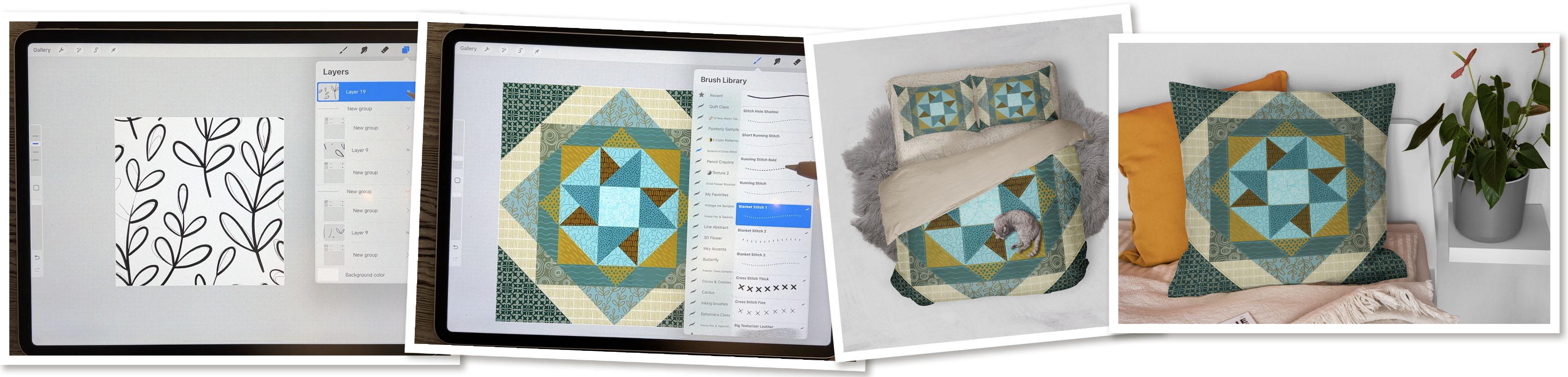
6. Lesson 5 Creating a Leafy Pattern: Hi guys, welcome to lesson five. While we're at it with
this outer design, why don't we create a little leafy pattern
for you as well. This shows you just a way to do it as quickly as possible. I find that this
method is quite quick, especially if you're doing
patterns for brushes, which don't need to be quite as detailed as get through it. So another thing you could do to have another few patterns is to go through any of your patterns that you
have created in the past. So I found a couple of these that I did use in
that collection, that set that I did. So this started out just like
any other pattern does with some initial drawing
of my little branches. Then I of course duplicated them and move them to the
four corners like we've done in so many other
pattern design classes and then filled in
any of the shapes. So let's maybe do one
really quickly together. I will add one here, ten by ten. I would of course, strongly suggest that you start with a bit of a
pencil drawing first. And let's do something really simple that is easy
to pull off quickly. Let's draw a couple of
branches with some leaves. Very simply. I think I'd probably
want to have one kind of curving over here. I've really kind of
avoided the other edges. So I think at this
point I'm just going to leave this and we're going to put just some really
quick placeholders into the corners like this, and that helps us
to duplicate this. I'm trying to keep this
as simple as possible. So what I want to do here
now is just duplicate. And we're going to throw these
into each of the corners. This is just a
sketch, so it's not quite as critical at
this point to get those gold lines lining up that you might as well good
habit to get into anyways, just to kinda give
you a routine. And you know, why we're
doing this is so that we can fill in
these spaces here. So at this point we could put
all of these into a group, flatten it, erase that, or back to our pencil. And then I can finish
drawing that one. And I can draw one in here. And you could at
this point decide whether everything else
looks okay to you. This one here I
think might not be bad if it was extended. We won't really
know that curve is perfect until we put it
back together again. But this is also going to be
missing a little piece here. So in a case like that,
what I do is again, put those little
placeholders in the corner. This time, just duplicate
it once so we can One over to the right and
this one over to the left, I can see it's gonna
be tight here. So I might want to actually
change this leaf wrong layer. I'm going to merge this down so they're on the same layer. I'm going to take that one out, go back to the pencil. And this one, I might
do something like this. And like I said, this
is a really quick one. I could do a few little
corrections here, trying to keep all those leaves
kinda consistent in size. And now what we wanna do is
we want to ink this one. So I think that I'm going
to ink this first layer. I'm not gonna do anything
that goes over the edges. Focus on, let's say
this stem here. Basically any of the
parts that aren't, I think this one, I'll wait for the stem when I have that
whole thing together. None of these are
completely together, but what we can do
is this where we can draw any of the full
leaves that we have. I think this one we
can do later on. Okay, so we've got quite
a bit of it done here. I'm going to group these will actually get rid of
these corner marks. Let's add another layer for
those registration marks. So i'm, I'm calling them registration marks because
basically that's what we're doing is using
them to register and perfectly line up to
the center lines. So it's a little bit
harder to do a group, but it's probably attainable. So now we've got
those corner marks. We can slide this whole
group to the center. And now it is very
important that we do get that
gold line showing, because now we're getting down
to the nitty-gritty here. Sometimes I'm
literally just moving my stylists itself until I
see that line flashing gold. You can also go up, really
nice enlarge like this. Now I can see the goal
line across the top, so I know I'm lining
up perfectly there. Then I let go. And then now. And this is what
I mean by groups are harder to do because sometimes they're just going to try to snap to something else. And now I can add
another layer and on it, I'm going to actually go through and delete that layer.
And delete that layer. So those markers are gone. But now I can go
through and draw any of these other things that
I couldn't do before. So again, I'm trying
to avoid the ones that are cut off at the
edges because I think I can reshift my pattern in order to get the full
repeat on those items there. So again, I'm going to need
all of this in a group now, corner marks, I'll add a layer, but my corner marks on. And this time I want to
shift top and bottom. So I need to make a
duplicate of this group. And this time I'm trying to get the half lined up and
that was pretty easy. I hope this one is as easy
as it looks pretty good. And now again, another group
or another layer story. In order to draw these bits. Oops, I got the Posca pen and I want the taper pin
pressure brush. And I know here that we've
got this piece missing there, so we'll have to do the
side-by-side thing again, but I think I'll draw it in any ways and then at the
end we'll just fix that up. Okay, so I think we're
pretty much good to go here. It's missing one thing here. Let's get rid of that
registration mark layer. It'll good thing I did that. I hadn't noticed this before. So close, I think I'll
draw this one in as well. So we're going to end up having to do these two little loops. That one might have been a
bit too high, the lower edge. And at this point, I want to get rid of any
of the pencil sketches. And I'm going to actually at this point move everything into this group and
flatten the group. I know we're missing a couple of leaves on the sides here. So what we need to do is we're going to end up having
to draw those two in. But I think at this point, we can flatten all of this. So it's all on one layer. You could do things
like go through and check for any little
errors like that, that you don't like. This is your chance
to fix them up. And you're going to find that
even a quick pattern like this can be very effective
for what we're doing. Hey, we got all of that
going on, everything's good. We know we need to
finish off those two, so let's add a layer of white. And now we're going
to merge this down because then we won't need to do those little registration
marks because the white is perfectly positioned
from the corners here. So let's duplicate
this so that we can do our little side-by-side
thing that we need to do. That one just went smooth as
butter into that position. That's all that gold line there. So I know that was centered and that shows the center there. So emergent town. Finish these shapes out here. And now you know the drill. We reduce this one
to fit the corner. Duplicate, duplicate,
position it. Make sure you see the
gold lines are down. Duplicate this one,
gold lines again, and then merge down. So I think that's
done an okay job. So let's three-finger
swipe and copy. Let's go into our brush, copy our masker,
go into the grain, and paste our new pattern. So now we've produced a
really cute little sort of a leafy ferns. And these are the
two colors that I'm thinking I want to
use on this section. So this is the one
I'm doing right now. So I've got the clipping
mask selected for it. What do you think of that color? I think that actually works really well because
that's really tying into basically the
value that I want it there. And I think as far as the
values go, it's great. This is dark, this is light. Then this is your
next kind of a tone. So I think that's
going to work for me. And I'm going to go
through now and just use some of the
brushes from my set to color up these
other areas or to add a pattern to
these other areas. So I think this one is
the one I wanna do next. I think I want to get
duller colors here. Maybe something like this. You can always
adjust your colors a little bit here we're still
staying in the same family. Go more like this color. And I want to have a
bit of a contrast. I've got sort of a floral
type thing going on here. So maybe for this one, I'll try maybe something
like this, just circles. That's not bad. So that's if I apply
full pressure, you can see which
color dominates. And of course, you can go really lightly and just
have your color, background color kind
of showing through. And I like that. Okay. But I think I would want
that a little bit darker, so I'm gonna go back to
the color of that layer. I'm gonna go to hue
and saturation. And I'm just going to darken a little bit and
I like that better. I'm just going to
quickly go through and do this so that we can move on to the next part
of the project. And I'm always kinda
thinking about the contrast of the pattern, the size of the texture
that I'm putting in. And of course, I have to go
to the clipping mask layer. Now those of you who do a lot of sewing and create quilts, you probably have a way
better idea than I do on how this all works and whether
the scale works correctly. I'm just winging it because
I have not made a quilt. I'm going to darken that
color just a little bit, so there's less of contrast. That's a little bit
too gray, I think. I think for this one,
I'm just going to do it very lightly so
that I do get some of that background color
showing through this one next, I'm just going to actually
sample that color, so that's one of my colors. And then with a
darker version of it, maybe not quite that dark. And for that one,
I'm gonna go with a fairly small scale and
very little contrast. Remember that you can also
go in here if you ever wanted to and adjust your
color dynamics, e.g. you could have it so
that the hue shifts a little bit on either side
of the color that you chose. You could have it more
saturated or unsaturated. You could have it darker. I'm only working on the
color pressure area here because that's the control
I like to have on my brush. But you can see that as I'm
applying different pressure, I'm kinda getting
different tones or different colors and that's because I've got
the hue shifting. So that's kinda neat too, so you can experiment. And I kinda like that. And I think that this one really almost looks like a bit of a shine or something
on the fabric. I liked that. I really
like the contrast. I think here I could
do something else, plural or leafy like that, but that's struggling a
little bit too much for this. I'll maybe choose the lightest blue and let's see
how that looks. Now that's with full pressure. And I'm thinking that light blue is just a little
bit too light. And I like that. Maybe a slightly smaller
grain would be better because the pieces here are actually
quite a lot smaller. That's this one here. I think we can go back to
just a sort of a pattern. And I'm going to go a little
bit darker on this one. Try to dark colors together
to see how that might look. And I think that Brown needs
to be lighter or green, whatever you wanna call
it. Still too dark. And I like that. I think that works on
the homestretch here. Just a very basic pattern. It's when it's just kinda dots. That's pressure makes it
a little bit lighter. Back into the browns
here I think. And they think that one we
could actually go to that darkest brown or is
that just too dark? Maybe a little bit too dark. And I'm going to slightly
reduce the size of the grain. So we only have that
one little piece left. I think I do want to have
one of the colors be that light blue could even
go a little bit lighter. So the two tones are
very, very light. And I think on this
one I want to put in one of my floral, I'm going to try that one out. And I like that. I'm going to go
smaller on the grain. You're going to find that the main thing you're
going in and changing, it's this green and now
I'm actually ready, believe it or not, to start
doing my stitching. Alright.
7. Lesson 6 Applying All of the Stitched Details: Hi guys, welcome to lesson six. I'm so excited to get to this stage because
this is where we add all of the fun little
details with the stitching. I'm gonna be explaining
to you my methods and show you a couple of examples of things
that you can do. Let's get at it. The buttons and cross
stitch class that we did when we did the felt bird, I think it was this is
the stitches that I have been using for this and
it's actually just perfect. So I'll give you a
couple of those. You probably have some
from the class itself to, and basically with these
patterns already in there, you want to close that group, add a new layer on top, and then that whatever
brush you choose, you want to have on that layer. And now it's just a matter of running your stitches
where you want them and deciding on the
color that's going to work. And oh, wow, I
mean, I love that. I think that is already
just fantastic. I found that the best
thing to do was to kind of avoid going over a corner like that of
another color because you're going to be wanting to stitch in that
direction as well. So if you do have
one that goes over, just get your brush fairly
small and just eliminate that. So you're ready for putting this touches around the other shapes. So once you decide on a stitch, then I would do
that entire shape. The same edge everywhere. And as you can see, what
I'm doing is holding down my pen to get a
perfectly straight line. You can even hold
down one finger to make sure it set a
perfect 90 degree angle. Stitch size-wise, you're going to have to
be the judge of that. If it's not big enough, then you can just adjusted here. I actually don't mind that size. And you can see that
what I've done is I've chosen a really good contrast. So I'm going to
go through and do a bunch of this
stitching off camera. I think it's really
fun to kind of vary which stitches
you're using. Something like a blanket
stitch might be nice, e.g. around the edges. You can definitely decide on
what colors you want to use. For this one, you might
want to go to one of your darkest colors as if
it's almost like a trim. Again, decide on the size you want for your tip, your stitch. If that's not big enough, then just slide that up and
that one's way too big. Jumps quite a bit,
but that's too small. So I find that you want to
get to that first corner. I'm just inside it and
then I'm doing just inside on this N2 and
straightening it out. You can do whatever
you want in between, you can be all crazy. And once you get
to the other spot, as long as you've started
it right in the corner. When you hold down
your stylist there, you're gonna get a
perfectly straight line. So this will be a tough call. Do I want to have
it all contrasting? So would actually be
better off to go light? Or would I be better off to
even do this whole length? I know that they're
stitching here, but it doesn't show. I could actually select
and change that area. What I think I'll
do right now is just share with you
the time lapses of me completing my
three designs here. And then I guess we'll meet in the wrap-up
and that's where I will show you my finished
quilt mockups and examples. Alright. I'll see you there.
8. Lesson 7 Debriefing, Mock Ups and Wrap Up: Well, here we are
at the wrap up. I hope you guys have
as much fun as I did. What I found was
that the first one took me a little bit more time. But as I produce
two or three more, I was able to do this whole
process very quickly. I personally found that
I learned a lot about contrast and scale
as I worked on this. And I'm really excited because
I have a cousin who is a quilter and she is going to create an actual quilt
with some of my fabrics. So this is a great
way for me to test things like scale and so on. Before I do any of the ordering, once I have that
project complete, I will definitely let
you take a look at it. I'm going to try to
plan the whole thing out on iPad first. Here are a couple
of mock-ups that I created with some of my designs. And I hope that you have time to create some mock-ups as well. I think that again, that's another great way
to learn more about scale. Now if you didn't do so at
the beginning of the class, I'd suggest that you hit
that follow button up there. That way you're informed of all my classes as I post
them here on Skillshare. I would also suggest that you
go to my website at Dolores art.ca and add your name
to my mailing list there. That way you're gonna get any of that other mail
outs that I sent, you know, things like freebies. You want to be on
that list as well. So I guess that's it
for today's class. I'm so thankful
that you were here with me and that you had fun. I hope you had fun anyways. I assure good. I will see you I guess
next time. Bye for now.
 Delores Naskrent, Creative Explorer