Transcripts
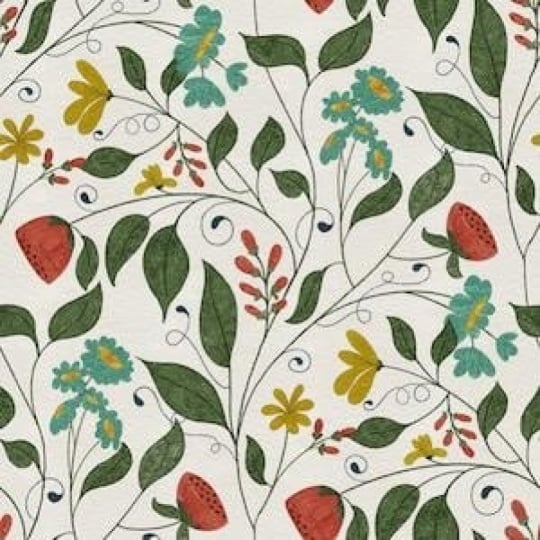
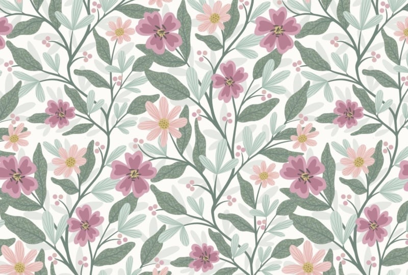
1. Intro to PRO 177 Elegant Trailing Floral in Procreate: Everybody. Welcome, welcome. Today, we're going to create a seamless trailing floral
pattern in Procreate. This is one of those
projects that feels really rewarding once
it all comes together. It can seem a little
complex at first, especially when you're trying to make everything repeat properly. But once you understand
the process, it becomes something you can
build on again and again. I'm still refining my
own approach to this. You're seeing a process
that's evolving, which I think makes
it more relatable. What I love most is how elegant these patterns look
when they're finished. That flowing vine and having
it repeat seamlessly is such a satisfying result
and we're going to take it step by step so you
feel confident as you go.
2. Lesson 1 Setting Up Canvas and Drawing Base Vine Structure: In this lesson, we're setting
up the canvas and using the drawing guides to create the structure
for our pattern. I'll show you how I sketch out the initial vine and how to position your start and endpoints so everything
lines up properly later. This part is nice and simple. We're going to build a
framework to work from. Lately, I've been
working on a lot of trailing floral
patterns and I love creating them in
Affinity Designer because I can see the entire
preview as I'm working. That said, it doesn't mean it's impossible to do in Procreate. Today I'm going to
be showing you how to create a trailing floral
pattern in Procreate. Let's go into Procreate and you can see I've
practiced it a few times. You can see that this
is one that I practice the entire method on and I'm going to be showing you
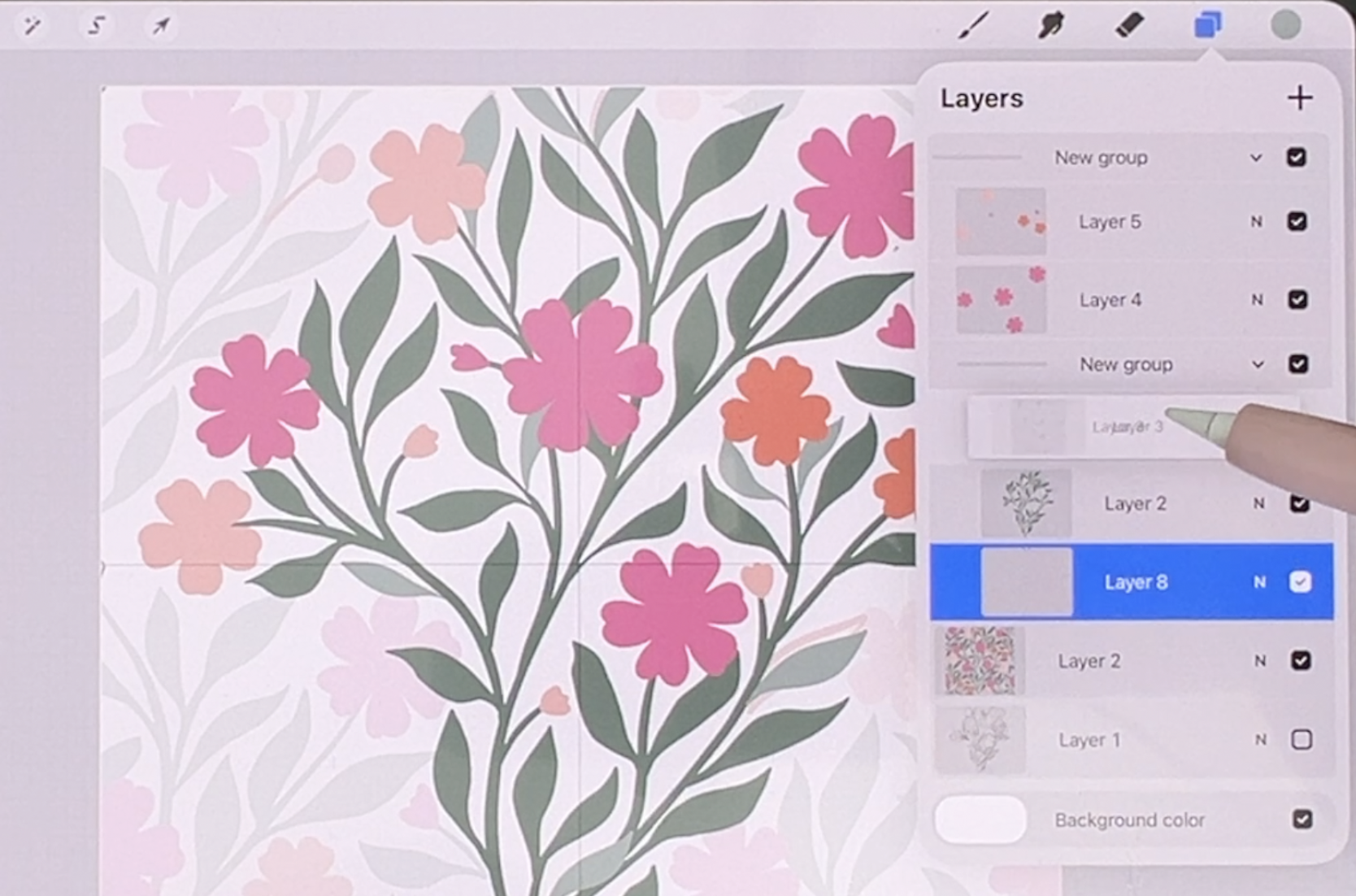
exactly how to do that. What I generally do is have my canvas and divide it by
using the drawing guide. Go into your drawing
guides here. This is just the grid size that I actually went to
the absolute maximum, so I only have the four corners. You don't have to put assisted
drawing on or anything, it's just to have
these two guides to do your initial vine and I also work mainly on
the top corners when I'm creating the repeat because what I need to do is then move it down and have the bottom half done to
perfectly fit with the top half. It sounds a little confusing
when I'm explaining it, so that's why I'm going to demonstrate the
whole thing to you. Just drawn this quick path. Generally, what you want to
do is work the first line, having it start and pretty
much in the same positions. You could just make a
little tick mark there or whatever you need in order
to have that happen. I'm just going to go down
the middle here and I'm going to make the line to
make sure that it meets. I've pretty much
started and ended it exactly where it needs to be. You can be pretty rough
about this one because this one will just become the basis from
which we're going to work. Then I also figure out a couple of the
branches that might be coming off of the vine and that's all you need to
do your initial testing. You really don't want
to have anything too much down here in
the bottom half yet. You can even start
with just the one, but let's start with the two. Actually, I'll just go back to the one that I had already drawn and you can see that
I didn't even go too far to the outside here. I want to generally
have the flow of the vine like that and this whole thing will repeat
down here and down here. I'm just going to
get rid of that one I was sketching and this will be the initial vine shape. Now, in order to test it, you can actually put a couple of marks in the corner here. You just
really need the two. These sides are meeting already, so we know that this
will just ensure that we can move it
and keep it squared. We're going to duplicate
and we're going to put four of them into
the corners here because this will
help us to figure out anything else that we
might want to do here. That one really
has nothing on it, but if you go through
and do all four, you'll get a much
better idea of how your trailing
floral will repeat. Now, it's really important
that you always meet those gold lines and it helps you to double
check things like this. You can see why this
isn't meeting is because this and this
weren't on the same spot. I would go back and then
just fix that up right away. You know, as you're starting this that you're
getting it accurate. Like I showed you, the best
way to do it is to make a little bit of a mark there
and then continue your vine. Now I know that the two
will generally meet. And I would do that test. We'll just duplicate it the
four extra layers here, we've got everything that
we need to do the test, make sure that you always
see the gold lines when you're dragging the
layer into the corners. Because at this point, what
we want to do is figure out what else we want to do
to fill out this pattern. You can see there's
some really big gaps here and that's great. You can put those four together. Those are the outside ones
that you're not going to need. But what you want
to do here now is to use those as a guide to
add to your initial layer. Times I even reduce the
opacity of that layer just so that I'm not going
to accidentally draw on it. This is the one I want to
use, and at this point, I can also sketch out
anything else that I want that could fill out
some of these areas. For example, here, I might add a vine that
goes up this way. We know that there's
lots of space here, so we could do one
that comes this way. And you might even consider having one or two that
go out to the side. I would tell you, at this point, believe it or not, you should
still do another test. We're going to get rid of
that layer that we had there, and this one we're
going to duplicate again the four times, we have all four corners
and this is why we test. We want to figure out whether or not we've put the branches
in the right place. You can see really clearly
why I would do this. Let's pinch these four
together here and we'll lighten it up so we know that that's this extra
layer that we have, but we can use it to fix
up this initial one. What was the problem here?
Obviously, these two lines, so these are too long or
this one is too long. Which one do we
want to get rid of? Personally, I think I
would get rid of this one. Make sure you're
on the main layer, so I want to get
rid of this one. I'm thinking that I should
shorten one of these, maybe this one, that
would bring that down. I think that one will be okay. This is the one here. Maybe here, this
is where we could branch off and do
something like this, just to add some interest, and guess what we're
going to do next. We're going to delete that. Again, we're going to do a test. Believe me, this is so
much more important to do than starting to do any of the drawing
at this stage. You absolutely need
and want to have this completely worked
out at this stage before you're doing any of
the inking or anything. When we take a look at it, we see it's a really
fully realized design. We can keep that layer and lighten it so we know that we're never going to work on that one. But we know now that
the main layer, this one here is
absolutely what we need in order to continue
with this project. Can also make judgments
at this point, for example, here, there is
a bit of an extra space. You might want to add
a little branch there, always add it to
that middle part. If you do add, then
you want to also go in and do that test again. Really, it's just worth it. Here, I think I would
maybe do it like this. It's in a slightly
different spot or I would do it like
this so that I know that I'm going to be
filling in this area a little even just
that small addition, even just something like this or like this, maybe like this, you're going to still want to
do the test at this point. In the next lesson, what we'll do is start roughly thinking about the leaves and the flowers
that we're going to add. It's just really important
for you to end up with this perfect layout before you
start doing anything else. Get to this point so that you've got the outside bit
that you can look at. But the main vine that
you're going to be working on needs to be all on its own
layer and all ready to go. I'll see you in the next lesson.
3. Lesson 2 Testing Repeat Layout and Adjusting Vine Flow: Now that we have our base vine, we're going to start testing
the repeat right away. You'll see how duplicating into the corners helps you visualize how the pattern
is going to flow. We'll make adjustments
together so everything connects smoothly
before moving forward. All right, we've got
this all ready to go now and we can
start thinking about how we might want to do our
leaves and our flowers. One of the things
I do as a test is to quickly add rough shapes in, and I think I'm going to think about those flowers
and things first. I want to make sure that
I'm on my own main layer. So the absolute stems
that we worked out, what I'm trying to do is to also space out those
flowers a little bit. I don't want them to
be too close together, for example, I don't want
them to form a line. I want them to be really
quite randomly spaced. Having this on the
outside here also helps me to make sure that I don't
go past where I need to be. I think I could
probably do one here. Don't worry if
you're overlapping onto something from
the other layer, your flower can
definitely overlap other parts of the vine.
This might be okay. I'm going to be able
to test this shortly, but then I can also rough in where I would
want the leaves. I'm going to be doing just a
very plain leaf that I can easily replicate with my
tapered pen pressure brush, but you of course, can draw the leaves in their
entirety if you want. I'm also thinking about the directionality of
this whole thing. If it's easier for you, draw the spine first and
then put the leaf on it. This one could easily
have additional leaves. This is a good way to just get the idea of
how it might work. I think here we could probably
do a smaller flower maybe. I'm trying to work in this top half and I'll
show you why in a minute. See, I'm trying to make it
different from this one, but also looking at how
the other leaves are going and I'm getting them so they're all pointing downwards. I could definitely do one
with a bit of a stem, so I could do something
like this and then have several leaves
coming off of that. I want this to be a
pretty full design. Here, I could do
something like this. I'm not sure about this one. I'm not sure if I want leaves here or if I'm going to
want another little flower, but let's just do this that
we can do our first test. I'll leave this open because I can either put a leaf there or a flower and we're going to get rid of that
original sketch layer. We're going to use
this one and I think that we'll see a problem
with this right away, but that's okay because that's
what this is all about. It's doing all the tests first. I've got the four duplicates. I've got the original there and now I can pop these
into the corner. So I'm doing it
very methodically. I usually do one layer at a time and go into
the four corners. This is excellent because
it's really giving me the idea of how my
whole pattern looks, and I thought I was
going to have a problem with one of these,
but I think I'm okay. What we're going to do is pinch these top ones together,
the sketch layer, that's the entire sketch layer and I'm going to make
it light so that I can see what's sketch layer
and what is my main layer. On my main layer now, I can go in and finish these up. I'm seeing this
other layer here. I know this is this area here, I can put a leaf into there. I think I'm going to
put some clusters of leaves here and it's okay if ends up going behind one of your flowers, that's
totally fine. But remember that you're
only adding to this layer. You don't need to add
to this one at all. That said, you can definitely
add a leaf that would hit that branch if you know that you want to have a leaf
there, you can do that. And here I'm hoping that I have the flowers
in good positions. Here I feel like
these are maybe too close together or too straight. That is this one here. I think I could move
this one lower. I'm going to just erase that, bring it in a little bit lower so it'll end
up being down here. Here, I think I could put
another little branch. Maybe I'll go the opposite
direction from this spot here, but then I could make this into just a little cluster of leaves. I'm not really trying
to replicate the one I had in my affinity, but I want to have it similar in that it's got
lots of small leaves, then the flowers and you know
what we have to do next. We're going to get rid of
that layer and then we're going to duplicate
and we're testing. This is basically
our final test. This will be the one
that we're going to use as a guide for inking. We've done all of this. We've worked out all of the positioning and
details before we even think about inking and final test like this shows us something that
we need to fix. We're going to take
that sketch the four that are in the
corners and lighten them up so that
we can go back to our main layer and we can
work out some of this. This is this area here and I'm thinking maybe a
flower would work there if I was to put in
a flower like that because this could be an
actual double stemmed flower. Instead of having
that leaf there, I could do something
like this where I have a smaller flower that's
going to be over here, and I know that I could
put in a few leaves. This is going to end
up being like this. I know that I could put in
a couple of leaves here. Those will end up
coming off of that. We may be able to
just leave that for now or sometimes what I've done, and it's a cheater way of
making sure that these meat is to have one leaf that actually goes
into that position. I don't think I'm going
to do it for this one. But I think this is
all going to work out and part of it will be
how we shape our flowers. There's spots like
this where I could have the leaf going
in behind the flower, and I think here we'd have a leaf and maybe
something like this. Let me do both of
those over again. Maybe I'll do both of
those at this angle. I'm not sure about this. This ends up being
this branch here. I think we've got
probably enough flowers, but we could test out a
flower in that position. It could be that what we do
is erase this whole thing, put the flower in or the
positioning for the flower, and then just redo the
way those leaves were. That's one of the ways
that you can also work it when you're
fixing up areas. Then what I'll do is meet you in the next lesson
where we're ready to start thinking about
our colors and our inking. I'll see you there with my duplicated and finished sketch.
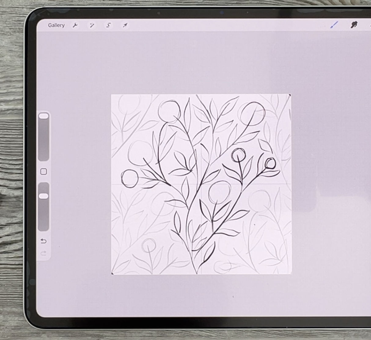
4. Lesson 3 Adding Leaves and Flowers to Build Composition: In this lesson,
we'll start adding leaves and flowers to
build out the design. I'll talk through
spacing and direction so the pattern doesn't look
too repetitive or stiff. The goal is to keep things
feeling natural and balanced as we develop the
composition. All ready. As promised, I finished that last test and I think
everything is good. I think I'm ready
to start inking. This leaf here, I'm just
going to tilt a little bit more when I'm inking it so
that it fills the space. I could easily just make
that change right now. I know it's going to have
to be more like this. You can decide what you
want to do either end your stem so that it goes
right into this leaf or you might want to
do something like this where you have
a little bit of a bud and anywhere else that you see that there's
maybe a little bit of space that you want to fill, go ahead and do that, but
just make sure you're doing it within this diamond shape. Maybe right here, we could
use one and right here, this actually fixes
this issue here. I think now this is my final
inking sketch that I need. I'm going to delete everything else and this is what
I'm going to work with and I'm going to make this quite a bit lighter
in the background. What I need to do now
is to do the inking. Let's choose a nice
color palette for this. Sure I'm anchoring for today, but I would choose
a palette that I could keep fairly simple. I think I do want pink
flowers. This might work. I don't think I'm
going to need any of these peach colors, but I'm going to choose this one as my active one
and I'm going to clear. I'm going to work within
this color palette, but I think I'm going to do
more pinks than peaches. We'll see. If you look
at this one here, I really like this
color scheme that had pinks and peaches
put together. And gray blue in the background
and teal colored leaves. Maybe that's what
we'll stick to. In fact, for a
situation like this, what I could do is a
screen capture of this. I only need a small part of
it and save it to my photos. Then I could go back
into Procreate here, go to my color palettes and add a palette and I'm going to
create new from photos. I'm going to grab
that one there. And that becomes my new palette that I'm going to work with. That's going to be
those exact colors. I really like this. I think
this is what we'll stick to. I'm going to grab the
darkest green or one of the darker greens
here to get started. I'm going to use my tapered
pen pressure brush. You'll know that's my favorite. Here I'm going to start
the inking and I know that this is going
to end up having to be fixed at some point, but I'm going to try
as best I can to mimic that thickness at
the top and at the bottom. You can also do it
like this where you don't even touch
the top and bottom. It's up to you, but
just know that you will have to probably make a little
bit of a correction there. Now, the other thing I'm going
to do is I'm going to vary my thickness a little
bit so that I'm not perfectly
consistent with it. That is my main stem and I know that I will end up having to make some
adjustments there, but now I can go through and add any of the other stems
that I want in there. This is the main nee. As you're going
along, you can be doing little bits of
correction if you need to. But you're wanting to keep your lines flowing
really nicely together and being quite consistent in the thickness that you're
using for the whole stem. Everything else
will probably end up being a little bit smaller, but I might do something
like these sprigs, and you can just
put a dot literally a dot when you're doing the flowers and that'll
look just fine. You could have these in
green if you wanted to. I think I'm going to wait and I'm going to try them in color. Then for the leaves themselves,
completely up to you, you can draw the entire leaf
by hand in this way or you could use extreme
pressure changes to make the shape of your leaf. So if you're comfortable
doing it that way, then go ahead and do it. So I start really light, and then I put heavy
pressure on and I then ease up on the pressure when I get to the
other end of it. I'm going to lighten this
sketch just a little bit more. So this is my preferred
way to do it, make sure that you're
on your inking layer. Another reason why
I like lightning this sketch because
then I know when I'm accidentally going on the layer that I
have as a guide, then the brush comes out
in a really light color. If you're comfortable
doing it this way, it can be very fast and
it doesn't mean that you can't do some of them in
this way if you want to. I think that it's nice
to have a little bit of variety with your
leaf shapes anyways. Times you might want
to have it extremely pointed or have a real
long stem at the end. If you're comfortable
doing it this way, then go ahead and do
it this way and if you prefer to do it by
drawing in your leaf, then do it that way. Neither of them is the right
or the wrong way to do it. Sometimes for the bigger
ones, it's a little bit easier for me to do it by
drawing the whole thing. Again, I'm trying to change
direction with some of them. I'm trying to be a
little bit inconsistent with them and I can
always go back with the eraser and make some of them pointy if they didn't end up that way
in the first place. It's completely up to you. This is really a stylistic
choice at this time, I'm going to go through and do all of these so we
can time lapse this. There's some times that I will do something
like this where I'm going to leave a bigger gap there and I'm going to
show you why in a minute. I've got all of the ones
in the dark color done, and what I want to do
now is also switch to slightly lighter shade and I'm going to add
some of the leaves on a different layer in
that alternate color. These will be on top
and this is why I left a gap here because I figured it would be nice to do
something like this. Here I could have this
leaf going over top, so I could do
something like this. And do I have them all? I
think there was one down here. So this one down here. I think that's
pretty good for now. Sometimes what I do is I hide my sketch for a second to
see how it looks overall, and there are some bumps and
things I'm going to fix. My hands are a little
bit shaky today. Now I'm ready to
actually do the flower. I'm going to add a layer and
I'm just going to use flour that is just a very basic flow you can do more than one flower. You can go to one of
your flower brush sets and grab a couple
of different ones. I've already made
these bigger from a previous project
I was working on, so I think I'll use that and I'm going to do some
of them in pink. I'm going to do one layer
for pink and I test the size by hovering a little bit over it,
and then I can see it. What I'm going to want to do is alternate where I'm
positioning these and a hard stamp will make
sure that it is opaque. I really like to do this
where I rotate to draw the flowers in because that makes them look a
little bit different. So I'm going to go a little
bit smaller with this one, then I think I'm going to
grab more of a peachy color. Grab a different flower,
slightly different. This one, I'll do the same thing where
I rotate the canvas. The reason you want
to rotate the canvas rather than rotating the flour itself is because you're going to be able to keep it nice and sharp. Now, you could have switched
layers for that so that you have the peach ones on their own layer. Let
me put this one in. Again, I'm going to rotate
and even lighter peach. I could even go to a slightly
different shape again. They're all a little
tiny bit different and I think that makes the pattern
nicer in the long run. I've got all of those and I don't know. Do I
draw this one in? I can't remember,
but we'll put it in and we can always
take it out if we don't want to because I'm not sure if this one ends
up being this one here. Let's put it in and
we'll go from there. Now, for those little
bulby things that we had, we could just go back to
the pen pressure brush or even the pasta Posca will give you a perfect circle
if that's what you want. I'm going to use my tapered
pen brusher brush because I think I would possibly change
the shape of it slightly. Instead of just circle that it actually looks
like a bit of a bud, I was calling it a bulb, but it's definitely a bud. Here, same idea. You could switch it up if
you wanted some of them to be in maybe the pink color, grab the pink to do this
one, and maybe this one. Overall, I think we've got
everything that we need here. Let's turn off the
sketch for a sack. This would be where I
would go in and make any corrections if I wanted to sharpen up some of the
leaves or change them. I'll do that off camera. I'll come back with
this finish and then we'll be able to check
out our entire repeat.
5. Lesson 4 Repeat Testing and Pattern Refinement: Here's where we refine everything and make those
important adjustments. We'll test the repeat again and fix any areas
that aren't working. So of course you could have
also just inked your flowers. I went through and really double checked everywhere that
I wanted to fix up. I made sure that these
leaves line up there. So that's the lighter ones because at first was going
to have them behind, but I think they're
going to be fine in the position that
they're in right now. Here's a good chance to again, look at it and
decide if there are empty spaces that
you might want to fill that one might
be one there. With that other one that I
did in Affinity Designer, I often put things in that weren't necessarily
even meeting the branches or
being at the end of a stem just to get the
balance really nice. That's something that
you could take a look at here at this point. I'm thinking we
probably could use a flower in maybe
this position here. Would go back to one
of the flower layers. Let's go to this one
and grab that pink, grab one of the
flowers that we use, and then add it even
though it's not at the end because there's
so much foliage there. I think it's going to look fine. I think for this one, I'll
really turn and I think I've got enough of a variety there
with the flowers this is, again, time to test. Let's go to the green
layer and we're going to grab the tapered
pen pressure brush, put little tabs in the corner, group all of this stuff
to just do the test. This is just a test unless
you just want it to be plain, then it could be
your final pattern. But what I want to do is add texture and
whatnot to these. I'm going to take each of these and move them
into the corner. I had five in total. Remember, you need to
see that snapping and already I see an error and
that was that extra flour. Remember, I was
questioning whether or not that should
be there or not. I'm just going to
backtrack before doing the test and actually get rid of that now because I do not need it and I
suspect it as much, but I just wanted to show you now we'll go back and
duplicate these groups, so we're going to get
the five in total, five, and then we're going to
pop those into the corner. Remember that you're trying
to see that gold line every time and don't hesitate to make your canvas
bigger if you need to. Just remember not to do your pinching on
the square itself, but to do it around the outside of it in order
to be able to position it. This is just a test, but this
tells us a lot right here. What I normally do at
this stage is I go in and I duplicate it because
we've done so much work. It would be a shame
if we lost any of it. Then I also like to pinch
these all together, duplicate that middle one, and flatten it so that we can
pinch these two together. That gives us the entire repeat that we can test. Let's
do that right now. We're going to
make four of them. This is going to give us a good bird's eye view
of the pattern. We're going to select
all four of those, make them half size, and we can just take and
individually move these to tell us about any gaps and things that
we might need to work on. This is the perfect
way to do it. I think overall, it's
really good at this point. This area here could use a
little this area right here. But otherwise, it really
looks pretty good. I think we're going to make that stem a little bit longer there. What I like to do
here is just to take only one of these squares and make the corrections
on it because this will be another thing that
we can use as a guide. Let's do this bottom one here. That's this corner and we'll just make those
little corrections there. Things like adding leaves. We're going to do all the different
things that we need to, but we're going to
do them in such a glaringly wrong color that it'll be obvious to us once we enlarge this to fit the rest of
the original size pattern. Here I would think about adding either a leaf
or another bud. I think a bud would be cute. I'm going to do
something like this so I know exactly what
I want to put there. I think here we would
need maybe a leaf. I'm thinking maybe another
bit of vine that comes out from that flower
and has a leaf on it, and I'm trying to stay
away from that guideline. Here, I think we could use something and same
with right here, Let's put the stem in like
this and we're going to leave it because we can go in
and draw that afterwards. Rough it in so you know,
but you can decide whether should that be a leaf or
should that be a bud? We could do something
like this and we're going to have that to deal with. I'm going to show you how
to do that in a second. What else do you
see? Maybe here. Here we could add another leaf. That could be in that
alternate leaf color, that would be cool there. This is that part that we
already know about here. I mean, other than
that, it's not bad. I guess this could use
a bit of a leaf here, and this is just going to guide us and we know that we can enlarge and I'm going to show you how we would deal
with that in a second. What we'll do is keep this one, we're going to
delete all of these, and we're going to duplicate this one because what
we're wanting to do here is to get that leaf
there at the bottom as well. So this is going to
be fairly rough, but this is the way
I would do it is I would take the rectangle
selection tool. What I want to do is
just cut that off, so I'm going to cut
and paste and I want to make sure that I
bring it straight down. With the snapping
and magnetics on, I can slide straight
down and add that. So we know that we've
got that full section. Here we can get rid of that that's overlapping
at this point. We're just going
to cut that off. We know now that
anything red is going to need to be added
to our main stem, this one here, and we would need to enlarge this
backup to full size. We need it roughly
and what we can do is really lighten that so that we can go back to our
main layer here. And make those
corrections. It's really easy to see what we
need to do here. You can put that beneath it
because all we need to see are these changes that we need to make here.
Let's do that. We're going to grab the
lighter green color, sampling that lighter green
color to add this leaf here, make sure that you're on
the layer that works with. We're going to just
add this one here. We're going to add
this one here. We're going to
draw one more here and that's going to be in behind the flower, which is perfect. Let's taper that
and a little bit. This is the one that's tricky
because you need to have it for the top and the bottom and you need for it to match up. I'm going to do that
one on a separate layer and I'm going to do that
part of the leaves. What I need to do is have the markings in the
corner because I'm going to duplicate and let's bring
these out so that we can hide the main layer so you can really see
what I'm doing here. I'm hiding everything else. I've got the marks
in the corner there. So what I can do is take this layer and move it down,
snap it to the center. We just need the
one copy of it and we'll just go in and
finish up those leaves. I'm just going to
quickly draw those, making sure that it
matches up perfectly. If you have to enlarge, go
as large as you have to, and we can actually finish that bottom off a
little bit nicer. I'm going really
big so that I can make sure that I match
it up beautifully. I think that's
going to work okay. Double check, triple
check if you have to use your eraser or your hand to just get that
perfectly aligned. Again, we're going to
do corner marks here. We're going to
duplicate that layer, and then we can do top
half, bottom half. Now we know that they're
perfectly aligned. We can pinch them together and we can bring
them into the layer. I'm going to put them
behind the main vine. Let's turn this group back on. We've got all of the
leaves here together in one group and we've got the
flowers in another group, which is going to make it
a lot easier for us to add any texture or
anything that we need, and you can do any
finishing you want on this. In the next lesson, I'll show
you what I'm going to do. It's going to be very
simple and basic so that we can test out that final
pattern. I'll see you there.
6. Lesson 5 Textures and Details to Finalize: In this lesson, we'll add texture detail to give
the pattern more depth. We'll use layers and clipping masks to build up interest and then assemble the final repeat so you can see everything
working together. This is also a good moment to make any last minute tweaks. Alright, we're ready to start the final leg of
our little journey here in creating some texture
and detail on these leaves. So let's take a quick look at this one in Affinity Designer. Here, what I did was
just a basic guash of a brush stroke. You
can do anything you want. You can even add textures
that you may have from kits that you've bought or had from me,
from other classes. For example, on
these leaves here, I could add a clipping mask and I could just grab
a texture that I have. Let's go to the bits and bobs from the card
challenge and I could grab something like
this chicken scratch because it's a lighter green that I have on my
brush right now, I could just go through and add that texture to all of
the dark green bits. Now, I think when I was
doing my corrections, I remember that I had wanted
to correct that spot there, so I'll go back and
do that in a second. But you can see how
quickly you could add texture because you're doing
it on a separate layer, you could always change your
mind if you don't like it. As I get to the top here, I'm just going a
little bit lighter. This is a texture that
you can really build on. You could do additional color. You wanted to go a little
bit brighter and you wanted to go in and add
a little bit here and there that's a little
bit brighter or take something from the
palette that you created. Some of these you
could go in and definitely make a
little bit different. Then you can do the same thing and go to the
lighter leaf layer, add a clipping mask, and then use the
darker color to go in and add a little bit of detail on those or you
could go lighter. At this point, you're using
your own artistic judgment. I remember that we had done
those in a different color. There you could go and add a clipping mask and add some of a different
color onto that. This is just a quick idea. You can do as much
detail as you want. The prettier you make
this at this point is basically the prettier your pattern is going
to be at the end. I'm going to grab my
jagged soft brush, which will give us
the same look as I have on the one
infinity Designer. I'm going to sample my pink and go just a
little bit lighter. And there I add a clipping
mask, check the size, and I could just
put a little bit of fresh work on these because
none of them are overlapping, I honestly could have had these two together to do this work, which would make
it a lot faster. I don't have to switch
to the other layer. All the pink ones
have been done. I'll sample this color and
go lighter to do these. You can decide whether you want to also add flower centers. I'm doing a really quick job
of this and I'm sure I'll go back in and do a lot of
additional finishing, but even that little bit of difference has added
I think a lot to it. I'm thinking this flower here, you see here in the background
could be slightly moved. I don't really like to do
a lot of moving of things, but I think in this case, it would make a little bit of a difference if I slightly move this to the left and I'm going to take off
the snapping and magnetics. You see it here, what I'm
trying to do is mitigate that bit of space there and
it's a very small move. I don't think it'll degrade
the quality that much, but I think it'll make a
difference to my overall design. Yes, you can decide
about whether you want to do flower centers. I've got plenty of premade
ones in brush sets. I would find one that I think would work. There's
a whole bunch of them. I think one of these would
probably work and I could add another clipping mask
and size it appropriately, maybe go a little bit lighter or darker and I could
add flower centers. This is a good time to also test again if you wanted to
and just double check. I'm going to pretend that I'm at the finish stage right
now and just go for it. I'm not sure about that whether the darker color
is going to work, but let's just go with it. I want to fix the
end of this one. I'm going to go to
my dark green here, sample the color and just use my pen pressure
brush to fix that. It was pretty good, but I just wanted to make
it even better. At this point, I'm
really at the stage where I would consider
this pretty much finished. I'm going to duplicate it
and in the next lesson, what we'll do is our final final of our pattern.
I'll see you there.
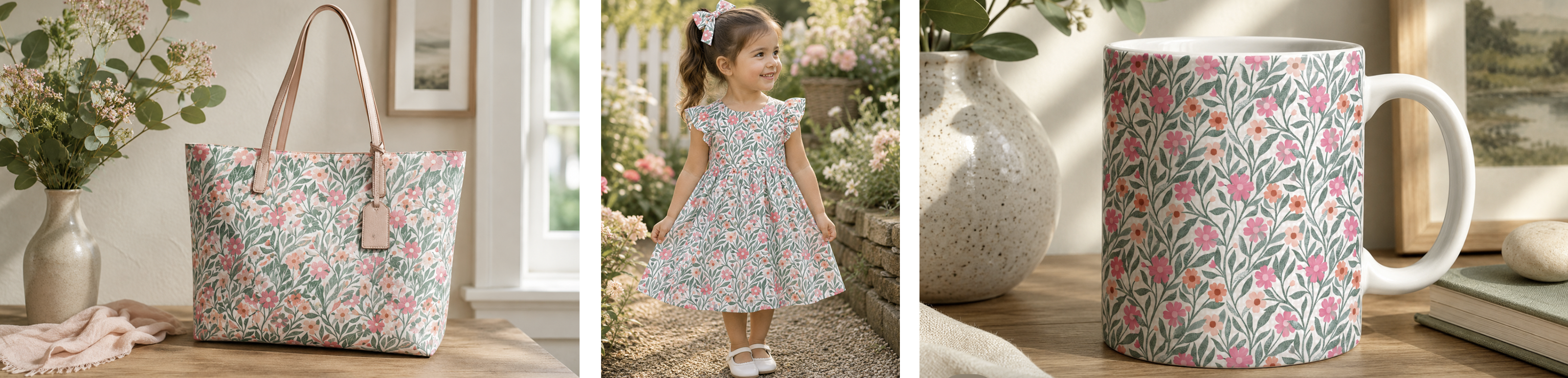
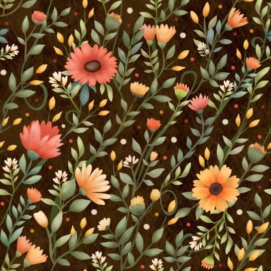
7. Lesson 6 The Final Reveal and a Mockup or Two : I always like to wrap things up, taking a look at the pattern and seeing how it works in context. I'm going to show you how its applied to these
different mockups. I like trying it on fabrics and stationary or other
surface design products. Here we are at the final stage where we're going
to duplicate this and put it into the
four corners and that's going to be our
finished patterns. I'm going to delete the sketch layers because
we don't need them. We know we have that other
document anyways as a backup. I take a look at
it at this point and think about some
of these spaces, whether I want to do
anything with them. If I do, I would
maybe do a new layer, and for that, you could really simply just put
some dots of color. You could draw leaves that could be coming
out from behind the flowers go to your layer and you could add something
here if you wanted to, and then you could go
and add your texture to it on the texture
layer. It's not bad. There probably are things
that I could improve, but I think I'm pretty close to what I would
consider finished here. Make sure you're on
the clipping mask to add any texture to it. I think that fills
in those areas. You'll know once you
do your final pattern, whether or not it is working
the way you want it to. At this stage, you could go
through and group everything. You can even if you
wanted to flatten this because you've got what you need for
the four corners. If you ever slightly
scared of doing that, then definitely go
in and duplicate first and then go in
and make that change. Here I would now
be able to flatten this group, erase these markers. I can leave these in to
help me do this next step, which of course is
duplicating and I need five in total so that
I can do each corner, put your snapping and magnetics back on if you had
turned it off. Pop each of those
into the corners. You're going to want to
group those four together, pinch those four
together so that you can erase that marker
in the middle. Now you've got your repeat
pattern. This is it. You've got it. You can take it in cases like this where
you've got that overlap, you might want to
put that underneath, and this is your
final pattern here. Really, this is perfectly viable as a pattern
exactly the way it is. You could duplicate
and do your check, taking each of these,
reducing it in size, hide that other one, and
then you can move these. I think it's gorgeous. I think this is
worked out really, really nicely. I love it. I think that another
thing that you could do is to add texture
to the background. I'm going to go back to having
just the one layer here, because I've got so many
patterns that I've created in my brush making that
are seamless repeats, I could easily take
and grab one of those. Let's go into one of those sets and see
what I've got here. Any of these patterns
could be put into the background and
work really nicely. I'm going to take something
pretty dense like this one, or maybe a stripe might be
cool and even with these where the lines are at an angle could be really viable or
something like this, a basket weave might be cute. I'm going to copy
that layer and I'm going to go back to the pattern. There's the final
one that we did here I would paste the layer, put it in behind,
and then that one we could colorize by putting
another layer above it. I can't just do the alpha lock because the white
is there as well, so there's no clear areas here. But what I do is I
just add a layer and then let's go with maybe
this light light pink here, maybe a little bit darker
and we'll just put an overlay on it by
using a blending mode. I think this lighting
works really nice I think that's probably
the best one for now. In order to change the
overall color of it, the best way to do
it, in my opinion, is to go to your selection panel here and change
this to color fill, and then go to the layer
that you want to fill. Let's just try it with
a really dark color. I know I'm not going
to use that color, but I just want you to
be able to see this. What you're going to do here is select and it's going to fill with whatever
color you have here, but that gives you the
freedom to do this, which is to move
around on your palette and change the background to
be whatever color you want. Reason that I'm doing that
rather than just an alpha lo, it's because this pattern that I created has
a white background. I think that's super cute. I think that this could
be a great pattern. In order to test this
because we can't flatten this layer because
that's what happens. What you want to do is copy all of this
together the way it is. I think I'm going
to lighten that background just a little bit more because I feel like this flower is really
getting lost in it. We could do that select again and it's a much
lighter color now. Check it out whether you
want to go light or dark. But I think just a
really light pinky color like that still allows that
flower to show through. But because we
can't flatten this or we lose the background, then what I would do here at this stage is do a copy
all. This is for testing. Three fingers swipe down, and then you can do this copy all and then we'll paste that. We have the layer that has the background
and everything on it. We can turn off those
other ones and this one, what we're going to do
is three copies of it, so we have four in total. We're going to select them
all, reduce them in size, and then now these can be moved so you can get your
final pattern here. That's this one and this one
and we can take two of them and move them down and then just take one
and move it to the side. That is a super cute pattern. I think that it's
turned out really well. You could turn
your guides off we have a perfect repeat.
I think it looks great. I think the texture
is really nice. I would definitely
spend more time on it with the coloring
and certain things like when I did the
repeat that I could have put the copy of the
leaves in behind. But otherwise, really as a test, this has turned out to be a really lovely
pattern. All right. Are you ready for
the final reveal? I made some changes here and amongst the
things that I did, I'm going to show you this
in an isolated layer. I have added a little tiny bit of shading to some
of the leaves. Let me isolate this too. I added some additional textures and things to the flowers. Remember, we did that part. We had added this detail, so just a little bit of
gouache painting in there. We had put the centers on. But then I also went
through and added some additional
textural lines in here. I think that really elevated
the flowers themselves. Let's take a look at the
whole thing together. That's it at the finish stage, ready to be repeated. This background is different. It's a slightly bolder
gingham pattern. I'll show it to you at full strength there
so you can see it. I've only got it
at about 20% here, but I liked that pattern better. At this point, I'm ready to do the final layout of the pattern and I
wanted you to see that. What I'll do is, of course, make my four corners. What I want to do this time
is grab the ones underneath. I'm going to keep this one
on top so we don't have that issue with the flour being under a leaf,
I think it was. We'll leave that
group on the very top now because I've got the
background within the group, I didn't need any of
those corner marks anymore and we can
just slide everything, grab the next group
here and of course, slide it into the corners, making sure my snapping and magnetics are on first and just being doubly sure that I
see both gold lines there. If you have to enlarge
it as big as you need to to see that that
snaps into the center, see I've got the two
gold lines there. Grab the next one and
we'll do the same thing, taking it right into the
very corner, enlarging. When you're enlarging and you've got it almost in position, make sure you don't touch it because you could
easily enlarge it. We're going to snap that in. The reason it gets so hard to do the snapping when you get to this stage is you've
got so many things that your design could snap to, it could be trying to snap to some of the leaves or
something like that. I just would rather
be 100% sure. That's why I am taking it up to this size to make sure
that I get that correct. And now I've got my
complete pattern. Here I would do
another test where I group all of these,
duplicate it, flatten the group,
turn off the big one, and then this one we would just do that simple corner test. You can duplicate it. I've
got the four that you need. That becomes our final tile. Now, again, I did have
that leaf in the front, so I'm going to go back and
fix that part of it up, but I'm going to
turn off my guides here so you can see it without the line going
through it there. I'm happy with it and I'm glad I did some of those leaves
a little bit darker. I'm going to go and let's
figure that one out. We've got this flower behind a leaf and we've got
this flower behind a leaf. We need to take this bottom
corner and move it up, and then we also need to take
the left bottom corner and move it up in the
stacking order until it's on top and that's
all it would take. Here we can do this test again, group, duplicate, flatten, make four versions of turn
off the main pattern tile, take all of these, reduce them down to one of the corners, doesn't
matter which one, and then you can move these
into the individual corners. Sometimes I do it this way. Sometimes I'll just do
the top two and then I'll copy them and put them
into the bottom two spots. But all in all, I'm very happy with this. I think that this is a
super viable pattern that I could use
in any collection. This could be the main
print in the collection. It could be coordinate. I could use all of these
elements in a card design, which is what I did with the one I had in Affinity Designer. I had the pattern that I
created and then I used that pattern to create one of the greeting
cards that I have. This is the one that
I did with that in the background and look
how pretty that looks. This is different enough
from this one that I could offer both of them in
a collection of some sort. I hope that's really
helped you to understand the process of making a trailing floral
pattern in Procreate. My personal choice
would be to do it in Affinity Designer where I
can see all the repeats. There's not so much
of the testing. But if you prefer
to use Procreate, you can certainly create a really beautiful design
with lots of detail, lots of texture, a
nice background. All of that could be easily
done here in Procreate. But otherwise, really as a test, this has turned out to be
a really lovely pattern. I hope this hasn't been
too confusing for you. The most important
thing that you need to remember is that when
you're working on it to work on that
center section only, that's where you're going
to do all of your texturing and drawing and fixing
and all of that stuff. Then in the end, you have a beautiful trailing
floral pattern like this. Thanks for sticking it out.
I hope you enjoyed it.
 Delores Naskrent, Creative Explorer