Transcripts
1. Intro to Retro Repeat Pattern in Procreate: Hey guys, Welcome. My name is Dolores nouns
Parents and I'm coming to you from sunny,
Manitoba, Canada. I'm bringing you a pattern
design class today because I was recently inspired
when I took a trip to ikea, I went through the
fabric department or the bedding department. And there I saw a bunch
of retro patterns. And it really got me thinking. It reminded me so much of the patterns that I
saw when I was working in the wallpaper store in the
seventies, the seventies. So that's quite a while ago. But I've seen a resurgence of the use of these
kinds of patterns. So I thought it
would be really fun to explore this in Procreate. So we're going to be producing a pattern from start to finish. And we're going to be using those really cool
seventies colors. So I hope you're
ready for some fun. Once we have the
pattern created, we're also going to be
making it into a brush. So there's that other little use that you could
possibly have for it. We'll see, I mean,
you just never know when you're going
to use these patterns. So whenever I do produce
a pattern in Procreate, I always try to make a
corresponding brush for it. Now if you haven't
done so already, I'd like to encourage you to hit the Follow button up there. That way you'll be
informed of any of my new classes as I post them. I'd really encourage
you to take a look at my website and add your name
to my mailing list there. So that's the loris art dot ca. That way you'll be
informed of any of the new classes that I'm
gonna be posting there. I'm gonna be alternating between Skillshare and my website. So it's just something that
you might want to check out and be on the list so that
you can get the information. And if it's class
you're interested in, you might possibly be
interested in joining there. We're going to start with
a little bit of a look at some of the patterns and the types of patterns I've
been talking about. So we'll do that in
the first lesson and I will meet you there.
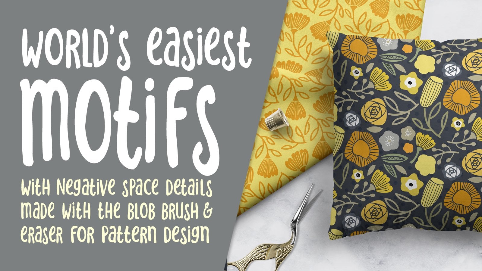
2. Lesson 1 Overview and Examples: Hi guys, welcome to lesson one. So as I promised, I want to
take a look at some examples here so that you can get a
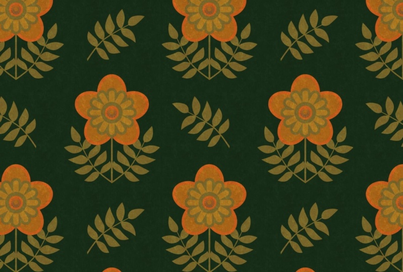
little bit of inspiration. Let's get started. This is going to be a mid-century modern kind of a pattern or that's
what I've got in mind for the class anyways, this is just so quintessential to the late
seventies and eighties. And I worked in a wallpaper
store at the time. So I was front row
center to seeing these kind of patterns
become really popular in the retail world. So this one I've looked
up as an OG pattern. An orgy pattern is basically
repeating S curves. So you can see through
the pattern here that the line is actually continuous
all the way through. Now, that's not exactly
what I had in mind. I want it to do
something a little bit more along the lines of, let's see if I can
find it again. I'll go to my Pinterest
boards because that's probably the easiest way where
I've actually saved a few, but yeah, this is the look that I'm interested
in doing today. We're gonna be doing something
a little bit like that. I've got some inspiration
that I'll show you once were in Procreate. But this is the,
basically the idea. So I don't know what
you'd call that, whether it's an OG or
whether it's a scallop. I think probably scallop. What's the scallop
shape you can see here? It's kind of like a cup
shape that repeats. So we're gonna do
something like that. And you can just tell by looking at my board here
and I don't have a lot. Maybe by the time
I post this class, I'll have a bunch
more added to this, but you can see what
colors dominated that era. Lots of orange, orange and
brown seem to be dominant. Brown for sure. And then, yeah, I see quite a bit of green
line greens and stuff. So we can either work
with that palette or we can work with the oranges. Oranges and harvest gold. Remember harvest
gold appliances? Go back to this one
here because I saw on this page here some
of these patterns. And I 100% remember having maybe even this exact
pattern because we all, my sisters nine, all had
ponchos for a couple of years. So maybe this was the pattern
my mom used. I don't know. But this whole outfit reminds me of
something that I would have had when I was in
my teens, mid-teens. A love these old
vintage patterns. So something I loved
taking a look at this, seeing those outfits and really the fabric played a
really big part in that look. So I'm going to try to stick
to palette that would have been popular around
that time and era. But you can of
course, experiment. Maybe on the last
lesson we'll do some color changes just
to see how it would look, maybe in a more modern
palette as well. But basically that's the
idea for this class. We're gonna go through and produce something
along the lines of something like this for this. Okay? And yeah, at the end we'll take a look at
it on some mockups. Maybe we can find some sort of retro mockup that we
could use the pattern on. Oh my gosh, look at this room. I think I would go absolutely cross-eyed if I had to sit in this room for any
amount of time, but hey, that's just me. So are you ready to get started doing some design work here? Okay, Let's meet in
the next lesson.
3. Lesson 2 Sketching and Drawing Initial Curves : Hi guys, welcome to lesson two. So unless a two here I want
to start out with a sketch. I find it a lot
easier to lay out my design or my
medallion that way. And then I think we can start working on the basic
shapes. Let's get started. I wanted to break this down
step-by-step and I'm showing you the finished
sketch that I did. And I always think it's
good to start with a sketch for something like
this because I don't know, it's just easier to lay it out. I'm going to show
you how to do that. I imported a picture, so I went to Canvas
to reference. And this is the picture
that I have that I am working towards. So I'm gonna change
it of course, but this is the idea that I had. And what I did was I
just started sketching. So this is the one I will
use I think, but we'll see, I'm going to just
give you a bit of a demo on the sketching process. I probably won't
complete the whole thing because I'll use that other one, but I just want to show you. So you can see here I've
got a central line running through and I've got that in the drawing guide because
I've got symmetry on. So what I want is vertical
symmetry so that I can duplicate whatever I'm
doing on the one side, to the other side really easily. As far as the guides go, you can make them darker, you can make them thicker, whatever works for you, and then click done. And now I know that
whatever I draw on this side is going to be
duplicated on this side, what I did though is I went and created another layer
with no assistance, no drawing assist on it. And I just started initially just kinda
blocking out the shape. I definitely want
to go to a pencil. And I originally started
by blocking out kind of a, an idea of what I wanted. So I've got clover shape,
I guess you'd call it. And a bit of a stem with a leaf. And I'm not reflecting it
right now because I'm not sure exactly how this
is going to look. I'm going to make another layer
where I refine my sketch. But for now I just
wanted to get an idea of how I might draw
that initial sketch. So it's just a pre-planning to the planning if that
makes any sense at all. So I've got just the
rough shapes that I want. And of course it helps that
I've already done this. So my drawing, I'm able to draw it to the specs that
I know I require. I'm going to erase
this side completely. What do I have an eraser there? And I think I've
got enough here to now start doing the
refined sketch. So I'm going to add a layer
and then I'm going to put the drawing assist
on for this layer. That way as I'm drawing it, I'm going to be duplicating
it on the other side. So I'm gonna go with a slightly
darker marker or pencil. And here I'm going to
reduce the opacity of this one to make it
easier on this one here, easier to draw this one here. And now you can see
that as I'm drawing, I'm getting that reflection. So this is where I'm
maybe a little bit more careful with my drawing because this is gonna be my
guide when I go to start doing the final
painting or inking. And you can see
how helpful having that reflection is there. I mean, there's
lots of ways to get around that if you
don't have that, if you're using another program that doesn't do reflection, you can always duplicate it and flip it and do things like that. But this is just so awesome that you can just do it right here in the program. So basically that's the idea
I went through and I just drew what I figured would be
somewhat my finished sketch. And then having that, I was able to easily
get started with drawing my actual
colored shapes. So I'm gonna go back to my original sketch
here so I can just, I think I'll just
wait, let me think. I'll just hide that for now. You can see here that
I also went through and when I was
doing the drawing, I would stop at the end and hold my stylist so that I
could get perfect curves. So that's something I wanted to just point
out real quick. So the same thing, like if I was to draw another layer here, I would do it like that. And you know that you can always draw the curve and then edit. So I can now take
and move some of these points individually
if I wanted to. So that's basically
in a nutshell, how I produce the sketch. So I'll go back to
my own sketch here. And now I'm ready to start blocking in some
of these shapes. So the drawing, I'm gonna
do with a Posca marker. And basically it's
the same idea. What I'm doing is I'm
going to be drawing, let's say this
individual area here. And that's one of
the reasons why I went through and I shaded
it just to give me, instead of a bunch
of repeating lines like this sketch has, you kinda lose track
of what has to be solid and what has
to be left open. So. On my sketch, I had actually
gone in and just help myself out a little bit by
coloring in those areas. Just a bit, just enough to know. So now I'm gonna give
you a demonstration of drawing the individual
areas of color. Now, I started by working on the inside and smallest
rings here because that way I wasn't going to be
covering anything up as I went through and painted the less
switch to this palette. Now, this palette I
created from that example, and I did that by
hitting this plus sign. And I went knew from photos. And in this case I have
the folder right there. And once I clicked on the photo, it produced the color
palette for me. Now, I'm going to
delete this one because I already
have it right here. And I went and set
this as my default so that when I was in
my color picker, I was able to access all of those colors really easily and quickly as well as of course, the disk as another means to create different
values for the color. Now you can dislodge this
and bring it over here. You can still be on the palette, and now I'm ready
to start drawing. So let's just start with
that first inner ring here. So we're gonna do this one here. And I'm going to show you
how I went about doing that. I'm going to use
this color palette, but I don't want to completely match what's going on over here. So I'm just going to start with colors that I'm not necessarily
matching up to that. The Posca paint
marker that I use is basically a monoline markers. So you can find that in your calligraphy brushes
right here in Procreate. And here I'm going to
just start drawing. And this layer I had not
indicated Drawing Assist, so I gotta go do that. The other thing you could
do with your marker at this point is set your
streamline really high. Everything very, very stable. And that's going to help you to draw a really smooth curves. So let's start right here. Now, I can let go and let procreate helped me get a
really smooth curve as well. I can still go in and edit
the shape like I showed you. So I could bring that
down a little bit. I can bring this one
over a little bit. Bring that one up a bit. Anything that you need
to do to adjust it. And I've got my marker
really thick here. You don't necessarily have
to have it that thick. Having it thick will give
you really blunt ends here. So if that's something
that you don't want, then make your brush
smaller and then continue on from that point and do the same thing over to here. And now what I'm gonna do
is the outer part of this, so that I'll be able
to fill it with start here and go down. You could definitely attempt
to do this without a sketch. But I would find it very hard to get everything perfectly
spaced without it. So it's your call of course. I'm also making sure
here that I am having the lines touch at this point so that I can
fill these shapes easily. So that's my next move
is to start filling. Now in a case like this, I've
got a little bit of depth, so I might go in
and fix that up. But now you can see we've
got our first ring drawn. In the next lesson, we're going to continue
with that drawing. Alright. I'll see you there.
4. Lesson 3 Coloring and Finishing the Motif: Guys, welcome to lesson three. We got quite a bit of that done. I think in this lesson, Let's just finish
off this medallion. Let's get into it. Alright, I'm going to continue
drawing my rings here. For lack of a better
descriptive word, I don't know if those are rings, but let's call them
rings for now. And I'm going to
just switch colors. You could do them
on separate layers. Maybe we'll do it
that way to start. And then if anything
will combine them on another layer after. Now, you could hide
that initial one just to make it easier to see what's happening
here at the bottom. And just basically go through the same process and make sure of course you put Drawing
Assist on first and away we go. I find that when you
have stabilization on, you can't draw as fast. Do an edit on the shape, just to round it out
a little bit more. And now I'll do the inside part. Now I find when starting
the curve here, you almost want to go a
little bit strange at first. And you see how much nicer that connection is right there. Go over the line a little bit, and then basically straight out when you first start
and you see how much nicer that connection
is than the one I had just done before that. I'm not gonna get that one. Perfect. I don't think I'm
gonna try that again. When you do that, holding your
stylist to get the curve, sometimes it's hard to get
these ends to be just right. So I might just rely on my stabilization to do a smooth enough curve
and leave it at that. So I think that looks
really nice and smooth, so I'm not too worried
and I can fill this one. So we've got two rings
done. Hide that one. The next one here, maybe I'll try more
of a greeny yellow. And what did I forget? Of course, Drawing
Assist telling you. I can definitely draw curves better when I can have the
positioning like this so I can work the sort of curve
that my hand likes to do. And now this one's
a hard one because it goes all the
way around there. Let's give it a shot that I had the wrong color here
compared to the outline. So I'll just do
an alpha lock and I'll just fill the layer
and now it all matches. This is what we've got so far. And I think what I'm gonna
do here is this outside. And then I'll color in-between
all of these ones here. So let's hide that
switch colors again. Let's go to something
a little bit yellower, maybe a tiny bit darker. And I'm going to do
this on another layer. I'm going to take that alpha
lock off before I forget. And new layer drawing assist
high, remember that time? And I'm thinking what I'll do is the inside here I'm going to leave a bit
bigger of a space, sort of match the spacing
between all of these. It's not perfect, but I can
go in here with an eraser and erase that and that
will do it on both sides. This is gonna be my design. It's different than
this one here. I'm also going to do this
little flower on the inside. And what I did there was to use the drawing assist but
with a radial repeat. And I'm going to bring
that centered down to the center of the flower
here approximately. So that when I go
back to my layers, I'll add another layer. But you can see when
I'm gonna be drawing, it'll be drawing it based on that center
point right there. And I think I'm gonna do
mine in a cream color and we're going to end up with more petals than we need here. But that's okay
because we can get rid of anything
that we don't want. Now, I'm wanting to leave a space between
the petals there. So that's why I redrew it. And you can see here
that obviously I can get rid of that bit for
this particular design. So we'll go and turn
off the Drawing Assist. And I'm just going
to use a selection, freehand selection
and just cut it. Everything looks like I did. And really getting
to the point now where I'm almost finished, I'm going to double-check the positioning on that because it might not
be perfectly centered. Yeah, it appears that it was. And then I think I just need
to draw this stem here. And I'm gonna go with
this color here. So I'm sampling that color
and I'm going to add a layer below my drawing assist on
and just kinda draw out. I still got it on radial
so I got to take that off. So let's go back. I want the vertical
and we centers itself. So that's really good. So I could actually grab and
continue from that yellow. So I think I'll do
that right now. They're not on the same layer, but just in case later on, it might be easier for me. So I'm going to go in this direction because
then I can kind of use procreates power to straighten
up the line like that. And then I'll get into a better position here
to draw my curve. But let's hide those other two or three
layers so that we're just down to that and
I can even turn off my sketch like that. My sketch back on. I'm trying
to remember what oh, yes. I had a little medallion there. So I'm just going to let me
turn off these things here. Oh yeah. This is open. Okay. So I
had to close that shape. Then I can feel that ends up
being our main big shape. Let's do the leaves now. I'm doing them a
bit lower because it seemed to me that
it was too tight here and I'm gonna give
that a second thickness. And then let's turn
on all of the layers. I'm going to turn
off the sketch. And then this is where you need to decide how you might want to finish this little area here. I'm gonna go to
the topmost layer and add another one above it. And on this one they did kind of a dark little center there. I'm also going to change
the order of these so that you see those yellows
will then meet up. And that makes that a
little bit cleaner. And this one here I see a
little sliver of white, so I'm going to
cut that off now. And then now let's decide
on what we wanna do here. So that is something
you could have probably had on your sketch. But you see I have a
little medallion there. I think I will just
do it like that. So I'm going to go to
that darkest brown. You can do whatever you want. You don't have to
follow what I'm doing. So I'm going to add a layer and it's
going to be on top of everything so that it can really finish up that area nicely. And I'm just going to
quick dry assist on. Kind of embarrassing how many times I do that
honestly in class, especially that
kinda looks to me like someone what they have there and take a
look at it overall, decide if you like it or not. And if you do, then of course just fill it. And I'm going to
just touch up that end bit there, just
with the eraser. Erasers might be
just a tad too big. And I'm happy with that. That's how I'm gonna do it. And now the final touch is adding all the colors
in-between here. So in the next lesson,
I'm going to show you that and then we're going to start working
on doing our pattern repeat. We also have to create
those little flowers in there or something like it. So I'll address that
in the next lesson. So I'll see you there.
5. Lesson 4 Readying the Swatch for Initial Test: Hi guys, welcome to lesson four. So unless a four
here I want to draw that additional
little flower that we're going to have as decor. And yeah, we'll finish off the complete single
pattern swatch. Let's get to it.
Alright, here we go. We have all of it drawn. This is your chance
to go in and make any corrections that you
might see like this, maybe I would start
to reshape it to match this one more closely
or going into this one. And it's kinda make sure that I've got the curves
the way I want them. I can also at this
point go in and do things like bring
these two a point. And I can see that
I actually did that touch up on
this layer instead. So I'm going to just do a quick repair their
cut and paste. And then that one, I will merge correctly with
this layer. It happens. What can I say? Now I want to fill in these
areas in-between. So there's a bunch of different
ways you could do that. I'm gonna do it by
grouping all of these. Then I'm going to
duplicate the group. So the initial group is
just there for safety. But with this group here, I can flatten having
it flattened. Now I can go in and just fill in all of the areas that I
want in different colors. So in this case, I would
rather work with the palette here because I can then
just drag the color in. So let's start with maybe
a British orangey color. We'll test it. Maybe I'll go a tiny bit
brighter or lighter. And you're always testing to be sure that you've got
enough of a contrast. If I were to pick
a color like say this one to put here
that's too close. That's exact one actually. To me, I don't know. Three
that looks a little bit dark, so I would lighten up to me
a little bit too bright. It's almost like it makes the colors are they
kinda get wiggly. I don't know how to describe
it, but I don't know. I don't like it when two colors are just vibrating together. So let's, so try
kind of a yellow, whitish yellow for
here and down here, what should we do,
dark or light? Let's try the dark first. I don't think that's
going to work because of that medallions. So we'll try just kind
of a dark orange note. Don't love that one. Yeah, there's no
yellow right there. So maybe a dark yellow would work to neon E are too bright. Let's just try
something really light, even lighter than the flower. We can always change the
flower if we wanted to. So maybe that's what I'll do. I'll go quite light, like a really creamy color. And then I'm gonna
go in and well, maybe before I fill it, I will darken the fill on this. So I've just selected
that color here. And then I'm gonna go just a little bit darker
and we'll fill. And now we can go back
to that light shade. And of course it always stays in your history here
if you've used it. And I don't mind that. I think here I'm just going to continue to
fill it with yellow. So this yellow, I think
is possibly the yellow. Yes. Very close. So it's a little bit different, but you could either play
up that difference there by putting in a lighter version or you can match it exactly. So I can just choose that
color and match it exactly. Now you see I have to
have the space open like that to fill it because
if it's already filled, then I change my color
and try to fill, it's going to feel a lot more. So remember to
keep that in mind. You could just go through
and continue to fill and finish off that motif
the way you like it. I'm going to also show you, so I'm going to hide
this one for now. And I'm going to show you the drawing of the flower
and you've probably already guessed because it's
just basically what we did with the little
petals at the bottom. We did a radial symmetry. And you could go through and decide how you
want to draw that flower. You could sketch it out first, I would strongly recommend
that you do that. You're not going to get
a five petaled flower like what is shown
in the picture here. But just go through,
add a layer, make sure you got a
cyst on and choose your color and decide on what you want your
flower to look like. So this is the amount of petals that you can
draw in radial, large one to fill that space. It's really up to you. Your, your eye is going to
be the design for this. So do something until it feels right and you can add
additional layers here. We could go with that. Let's see a brown center. Remember to put
Drawing Assist on. This is where I'm
comfortable drawing a curve. So I'm going to go
in this direction, draw it until you like it. You can feel it. You could add another layer. Also put on your Drawing Assist and grab a different color. And you could do the center. And again, you could draw like pebbles,
anything you want. You are the judge. So now we're ready to actually get started
because we've got all of our components and
I'm going to switch to the document that
I was working on originally to show
you that this is my finished medallion
from my practice. You can see my flower here. I drew it exactly like
I just showed you. I am not putting three. I just want to be a
little bit different, so I changed it to just the one. And I'm going to delete
all of this other stuff here so that we can do
our repeat together. So that's the one
I need to keep. I'm going to get rid of all of these additional ones here. And I'm going to
turn off my sketch. So what I did here
is kinda worked out the position or the
design that I wanted, rather than having three
flowers around them, you can experiment and
do whatever you'd like. If you do have three, you might want to
do a few sketches first to get the
positioning of them right. But for me, this is
going to work just fine. So we're going to, at this
point go into that folder. I am just going to add a layer here and make
sure that it's at the bottom of my stack
of layers in that group. And I'm going to choose a very light color to put
in as the background. That square is what's going to help us do our pattern repeat. So at this point we've
got everything we need and I've got this
finished adequately. As far as the color goals, you can definitely make
decisions about that yourself. I may end up after doing the
repeat enlarging my leaves. I'm not sure if I'm feeling like there's small now compare
it to that flower. But these are all things we'll address in the next lesson. Alright. I will see you there.
6. Lesson 5 Repeating the Swatch for a Pattern: Hi guys, welcome to lesson five. Less than five here,
we're going to be finishing off
that pattern repeat. And what I wanna
do is show you how to make that into
a brush as well. Alright, let's get started. We're ready to do our pattern repeat now
and I'm just going to turn off that
reference because we really don't need
it at this point. I've got that square and the
background and that's going to help me to do all
of my positioning. Now I see I've got this group embedded within
this other group, so I'm just going to
separate them and get rid of that because I
don't need it anymore. Sometimes that happens when I'm doing a bunch of
repeats and stuff and I have used this document for a couple of hours getting
all of this worked out. So it happens. My grandma used to
say that all the time except she'd never
pronounced her Hs. So it was always it happens. It happens. Okay. So here we go. We're ready to go. I'm going to
duplicate that layer. And I'm going to duplicate
it so that I have for two position and my
initial one is kept safe. Sometimes I even go
as far as to lock it, but I know I'm going to
need it in a minute, so I'm going to leave
it, then I'm going to make sure snapping
is on which it is. Let's go back to the
guides here for a second. I want to right now it's a white guide and I want
to make it black or very dark so that you can
see it and make it a little bit thicker and
pretty much full opacity. So now I can start
doing the positioning. So I'm going to
grab, and I always start with the top group here, and I always move it to
the top left hand corner. And then I follow and just go, go in a sequence so that
it's easier for me to work out because a lot
of times I will have these completely enlarged. So I can see that center line in the center where it meets, because that's really
important to line up two to get your pattern
repeat to work correctly. But let's just give this a shot. I'm going to grab my Move tool. And you can see with
the snapping on that it is snapping its way across. And I see that I
landed perfectly to see both of those
lines turn yellow. That's what you want. And you can't be off by even one pixel or
it's going to show. So you can see the
line here is yellow, but if you find it
hard to see here, just kinda watch over
here because you can see that if I'm not on
it, it's not yellow, but as soon as I do center it or get it perfectly lined up,
everything turns yellow. See I'm working my way around. This one is going to be
lower left and lower right. Now if ever, you're
having trouble getting it to stick where
you need it to. I usually do a
two-finger enlargement, making sure that I'm not
touching anywhere near that particular square because that could end up resizing it. And then I definitely
switch off of that before I move my
way down in size. So you probably guessed. Now what we need to do is
move this layer to the top and we're going to get rid of that cream colored
square that's in there. And you can see now that we've got our perfect repeat there. And the one thing I
was worried about, what's the spacing
or positioning of that flower and it looks like it's probably
gonna be okay. I still me. If I was going to use this
pattern and perfected, I would probably go back and make these
leaves a bit bigger, but hey, I'm just showing
you how to do it. It's probably not all that
necessary at the moment. Okay, so now let's
see if we have enough room to duplicate
this and do a bit of a task. So I'm always worried about
running out of layers, but so far so good. So I've kept my layers to a minimum and that's
really helped. And then this one,
I'm going to flatten it and turn off the other one. And then this one, instead of moving it to
the four corners, I'm actually making
a small version of it and duplicating it. And I can merge that down
and then duplicate again. And there's our test. Fairly happy with
that, actually, I think I could definitely
have moved that. Let's just hide the
guides for a sec. I could definitely have moved
that flower up a little bit and I still feel like those
leaves are too small. So I'd probably go back and
make the leaves bigger. But overall, I can see
that this was successful. And of course that's
always the main thing. So you can decide on any changes that you
might want to make. You can export this
as your swatch, so you can export that
or you could export. Let's merge this down. This one has a couple of
repeats on it already. If you wanted the
full sized swatch, you could duplicate this. I've reached my maximum
layers, so I can't do that. I would have to go into
the gallery, select it, and duplicate it here, then go into that duplication. And here I could do
things like get rid of the layers that I don't want
and I can flatten this. And that's my single swatch
so that swash would be suitable for uploading to
POD sites, for example. Or what I usually do is I export this and I import
it into Photoshop, so I have it as a
pattern repeat there. And that just gives me that double protection of hopefully I'm not losing
it at some point. It's something that I
really, really care about. There's a lot of things
that as I look at this, I would change, I
don't like that. This curve doesn't match this curve and that
sort of thing. But those are all
just aesthetics. As far as the success of the
pattern and the concepts, you have learned the concept
and you know exactly what to do to make the pattern. And that was really
my goal here, was to just show you
how exactly to do it. Now what can we do with this? Okay, well, we know
that we can output it to use in Photoshop. So I'll probably give you
a quick look at that. This would also be a really good candidate for
making a pattern brush. So you want to experiment
a little bit with that. I'll just give it a shot. I'm going to duplicate this
layer and I'm going to turn off the original
one now with a brush, you know what has to
be in black and white. So what I'm going to do
is go into the hue and saturation and brightness
and completely desaturated. So we have it in gray. Now you can see how now
it really lacks contrast. So here I would also go into my curves and darken and
play with the lighting. Just basically what
I'm doing is trying to give that a lot
more contrast. Because I think that would
work better for our brush. The brush will accept
these gray spots, so that's okay too. Like it's going to
be alright to not be completely black and
white, the gray will work. And I think that's really
good in contrast E. So let's give this a shot
and creating a brush. So I've got a course, a whole bunch of pattern
brushes already. Where are my patterns? Those are my pattern
brushes that I've created in other
classes and whatnot. And I could probably just
duplicate one of these, like let's say this plot here. And I'm going to just
copy this whole repeat. So three fingers
swipe down and copy. Let's go back to the
duplicate that I made. And I'm gonna be going into
the grain here to change it and go to Edit,
Import and paste. And hit Done. I hit done twice for
some mysterious reason. And we can adjust the size, the scale of the pattern itself. You can see that that's
going to work just fantastic as a pattern brush. So let's hit Done here, and I'm going to make
a new layer here. And let's pick a nice, Let's just go to a
different color completely. I'm gonna go into
a nice teal color and I think I could use
this. I honestly do. So let's go in and I'm
going to adjust that. Grant again, I went
a bit too small. And how fun Would
this be to play with? You can see how useful and fun it would be to have
a brush like this. And the other thing I
usually do is duplicate it, go back in and go back to
the shape and go to Edit. And then two-finger
tap will give it the negative
form of that brush. And so you'll see here that it paints more true
to the pattern itself. So that's a really fun, fun, fun thing to do. And we can go into that
brush and do edits like make the brush
and weight as big, as big as it can be here, as big as possible, we can do some really
cool color dynamics where we have the hue
changing as we paint. And we can even add
secondary color in here. I'm just guessing it all this. So don't necessarily copying
what I've done here. You could try a whole
bunch of different things. But look at this, see how the color is changing
as I'm painting that. And that can be so
cool, so effective. So I'm gonna go way
high on the hue here, lower on the secondary color and a little bit
smaller on the pattern. Not much. I just
want you to see, so it's changing from
purples to greens. Let's try brighter
color too and see how that would look. Pretty. So imagine using this
on a card or something. You could easily have this
sort of look like this. Make sure I get
everything covered and then add a text frame. For example, this
text frame is from my text frame class
that I have done. Let's go to a dark
teal, add a layer. I did add a liter,
liter already, but stamp that on. You don't like that
one that much. Let's try this one. And I couldn't do that one in a brighter color and then
fill with a soft color. And you can imagine, I'm going off on a tangent here, but wanted you to see
the possibilities, the things you could do with a really cool pattern
brush like that. And I can't wait to
see what you guys do. So I really think
this is it for now. I will probably do a few things
in Photoshop to show you. So I'm going to bring that
pattern swatch into Photoshop. And then maybe in
Photoshop will also apply that pattern
swatch to a mock-up. So we'll do that in
the next lesson.
7. Lesson 6 Photoshop and Pattern Applied to Mockups: Hey guys, welcome to lesson six. So in this lesson we're going to be finalizing things
in Photoshop. If you don't have Photoshop, then you might have
another program that you use that has some of the
similar capabilities. I like having my patterns
in both locations on my iPad and then
also on my desktop. I'm gonna be showing you some of the basic setup things
that I do in Photoshop. Let's get to it. Okay, So real quick here I'm
going to show you how to export and then we're going
to move into Photoshop. Here you go to your wrench
icon and the share. I'm going to save it as a JPEG, which is perfectly fine for exporting for use in Photoshop. So I'm now sending it to my desktop and then
we'll switch over. And I'll start recording my
whole process from there. When I transfer something
to my computer, it will come into
my downloads folder here and I see it already. I have not renamed it. I just call it untitled, which I should have
probably done when we were there in Procreate. But what I wanna do is show you just where it is and
how to move it around. So here it is in my
Downloads folder. I'm going to grab and put it
into this classes assets. And I already had
a repeat there, so just ignore that. But now we'll go
into Photoshop here. And I'm going to
open up a mock-up. I keep all of my mockups
in central locations. I have a mock ups folder here on one of my
external drives, and I also have one that's
in my Downloads folder, my main downloads folder. I've got a ton of them. I've just been kinda
putting the new ones in this new folder just so that I can get to the more easily. When I looked at that pattern, the first thing I
thought of was pajamas. So I had gone to creative
market to purchase a grouping of mock-ups that
showed someone in pajamas. So I got this group, which is actually
a very nice set. I'm going to just open
the top one here. You can see the one that
I ended up using for my titles because I've already done my titles for this class. Let's just open this up. And here's our cute
little mock-up. So most small cups will
have smart objects. I have bought mock-ups
that do not have smart objects and they're
kind of a pain to use. Generally look for
the smart object type of mock-up just to make
it easier for myself. Now I also want to open up that single repeat
that single swatch. So I'll go to my assets folder here and I'm titled, oh, so bad. I don't set a very good example BY when it comes
to naming files. So here we have
our single repeat. Now the easiest thing
to do is to just open up your pattern
options here, select whatever folder
you want to put it in. You can see I already
had one here with this. So all I need to do to add it to that is to
hit the plus sign. We could call it medallion
or whatever you want, just so that you'll remember and it's added to the set here. Now, the cool thing is that if I go into this other document, these patterns
still remain here. So that makes it very easy
for me to make my changes. I can use any pattern
that I want that I have here in this set
to do these pajamas. But what I wanna do is
open up the Smart Objects, so double-click on it. And here's that pattern that they have in their illustration. I'm going to select
that pattern. I guess it doesn't
really matter. You could get rid
of it completely. But what I do is I usually add this pattern adjustment
layer or layer adjustments. I don't know what
you call those. I think they're
layer adjustments. This comes up and now I can go and select the pattern here. I can also change
the scale of it. So I'm going to put it to
about 10% here and hit Okay, and now I need to save it. As I'm saving it, it'll be updating
the smart objects. So if I go into what
you can see here, it says it's updating and if I was to be in that other file, this would have to go
through its whole process before the pattern
is going to show up. Switch to this. And there we have, are absolutely adorable
pajama fabric. I think that looks really sweet. You could do all kinds of
different things here. You could go to the
adjustment layers here, add a hue and saturation
as an adjustment. And I would clip it by
holding down my option key and clicking on the line
that separates those two. And then now I could go
through and make my changes. Now I'm not sure
why that fattening, why it's just
changing one section, but that's okay. I can go back. And instead of doing
the adjustment here, I could go here to
my smart object, hit the hue and
saturation that I know it's going to
change it everywhere. And those are all pretty something about blue
that makes me think pajamas. Let's go over to about here. I'm going to desaturate
a little bit. And then I'm going to add
another adjustment layer. Actually, I'm going to add
a levels adjustment here. And because this is the
only layer in here, I don't have to really
lock those two together, but if I wanted to, I would just hold down my
option key and click here. And that means that these are now only affecting this layer. With the Levels adjustment, we could just kinda
play with it until we get a better contrast. And I'm going to
hit Save on that. And let's go here
and you can see my little Smart
Object is updating. So cute, actually in this
picture would have been really nice to have in pink because
of that pink betting. Let's try changing it again. So now I can easily go in here and just click on this layer and make the adjustments without having to
do anything else. So let's go pinky. I saw I do like the
contrast on that. If you didn't know, you could go in and still
make adjustments here if you want to make it brighter
or lighter and save that. And then when you go to your
other documents and update, second, we're going to see a really cute set
of pink pajamas. I'll probably throw
it on a couple of mock-ups to see how they look. And I will bring you that
in that last lesson. Oh, that's so cute. I think that's really adorable. I totally, totally
can see this being an excellent fabric for
so many different things. I mean, it'd be cute curtains
that would be great. Pillows, really
getting of any kind. I think it would
be super adorable. So I will meet you in the last lesson where
we'll have a bit of a wrap up and I'll
show you a couple more mockups. I'll see you there.
8. Lesson 7 Conclusion and Mockups: You guys, that's fine when you have all these patterns at the end that you can play with. I really enjoy working
with patterns. And this, the fact that I have the patterns
there in my programs, I can use them for
so many things. I always find that I use
them in my mixed media art. But it's also
something that I can use for very quick
little graphics for things like Instagram posts or for adding to my website. So I hope that you'll find these patterns
useful for you to, now that you know the technique, you can apply this to making all sorts of those
retro patterns. I think it would be so fun. And you can develop
a full set that you could sell on places
like Creative Market. I'm going to be adding a set of patterns into my artists
resources at some point soon. On my list, on my
very, very long list. So if you didn't do so
at the beginning of class and you enjoy the class, make sure you hit that
follow button up there. That way you'll be informed of my new classes as
I post them and anything else that I send out in the way of posts to
all my followers. Again, I'd like to
encourage you to get your name on my mailing
list for my website, which is Dolores art dot ca. Like I said, that's where I post my artists resources
and whatnot. And of course, any of the
classes symbols there, you just might want
to be on the list to be informed of them. You can definitely check
out my Pinterest sites. I have the Dolores art
Dolores NASTRAN site as well as the teacher
Dolores and aspirin site. So check the both out. They both have some great resources. You can check the surface
pattern design board on my Dolores art
site because it has a lot of good reference and I'm gonna be adding to it before I published his boss. So hopefully it'll
be bigger than the selection that you just saw as we went through
it in less than a one. So I want to thank you for
hanging out with me today. It's so much fun to be creating this stuff with someone else. And I really hope
that you enjoyed the class enough to
leave me a review. And if you can, when you do the review, just leave a little
bit of a comment on what you liked about
the class because that really helps other people
to choose the class to see if it's something that they would really like
for, for example. Well, I can't think of
anything else to say, so I guess I'll just say bye for now and I will see
you next time.
 Delores Naskrent, Creative Explorer