Transcripts
1. Intro and Overview Retro Floral Simple Quick Coordinates: Hi guys. Welcome. My name is Doris Aspirin, and I'm coming to you from Sunny Manitoba, Canada. Today it's supposed to reach a whopping 34 degrees. That's hot. I'm in a corner of what used to be in my studio and has now become my grandson's bedroom. My daughter is buying my house and we're in the throes of renovation. However, that does not stop me from producing a class. You know me. I love to work. So this is another course in the Siri's off simple and quick pattern designs. This is mainly for producing coordinate patterns, but I do review the creation of my hero print. We're gonna be using all sorts of illustrative filters and functions such as Pathfinder and alignment to help create these patterns really fast. Now it may take you a little bit longer than it took me for some of these, but fear not. The more you practice, the more repetition you have, the better you will become. Are you ready to get started? Let's start with just an overview. You sure don't have to look very far to get inspiration for retro florals. I typed retro floral design of the seventies Wow. Look at all the different examples that have come up. Talk about flashback to my my own childhood. I was 10 years old in 1970. So between 1970 and 1980 this Waas basically what I saw everywhere, I think I even remember there's a couple of them here that I swear her on either items that I owned or were pillows in our house. Think this one here, for example, was something that they actually made in Mak Tak. Because I remember my mom buying this stuff and lining kitchen cupboard drawers or something with it. And I think I had a poncho with fabric really similar to This is definitely a brown floral around background and these colors in C brown, green, orange. Those were some of the dominant colors of that particular era, so that inspired me to create this new pattern collection that I've been working on. I decided to go with kind of a line green and kind of an avocado pattern color to start out with. So you're going to see me work through creating a bunch of the coordinates for this set? I'll start by doing an overview of the creation of this mean pattern. So my hero pattern and then we're gonna go through and talk about the secondary and blender prints that I've designed to go along with. That almost all of the prints that I've designed as coordinates here have been done using some kind of technique that makes them very quick and easy to produce. You're gonna be learning at least five or six new techniques that I've not taught in any of my other courses. So let's head on into lesson one where we're gonna get started. Just talking about this hero print. I'll see you there.
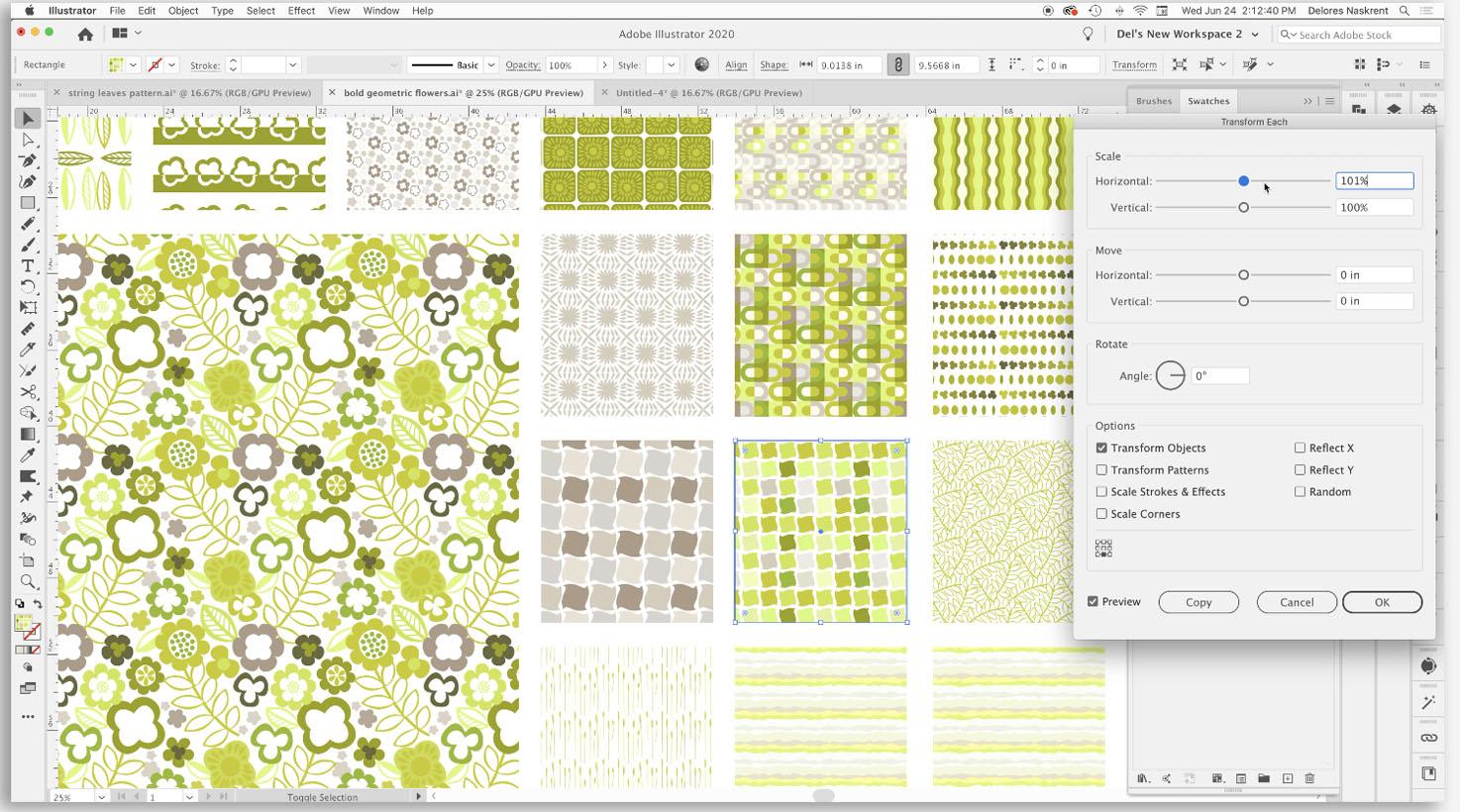
2. Lesson 2 Pucker, Bloat and Twist Filters 2: Hi, guys. Welcome to lessen, too. So this lesson is all about the pucker, bloat and twist Filters were gonna be creating some motifs and patterns using those filters ready to get started. All right, let's get into it. So if you were in my class simple and fast folk art motifs and patterns we started that class by creating a bunch of motifs really quickly using some of the filters. So I'm gonna show you just real quick A couple of those. I don't want to go into too much detail since we've already done that in another class. But pretty much all of these flowers were created using this technique, but he just feel this one. And I'm going to just show you real quick, and I'm gonna turn off my smart guys. If you ever want to turn them often on command, U turns them either on or off. Brought them off the moment a little bit less confusing. I want to go under effect, distort and transform, and I'm gonna go to pucker and bloat. So we used this in that last class to create some flowers and explained in that class how to create flowers with multiple pedals, so that's just a really simple for pedal based on a square. If you were to use the polygon tool while you're holding it down, you can use the upper down arrows toe add sides. The number of sides here determines how many pedals you're gonna have in your flour and then depending on how far you pull boat side that determines how deep the pedals are. So as you can see here, all of these flowers are different versions of that particular technique. When you see flowers with a different center, for example, this one here has six petals. But then it's got a four pedal interior than I would have used a square and then the same thing gone to pucker and bloat. Let me color that white so you can see it. And I'm going to make a short cut right now for pucker and blow have already gone in there three times. So we're gonna go to keyboard shortcuts and that will be under effect. And that will be a menu command effect distorting, transform, pucker and bloat. And I'm pretty sure I had one here, but I must have lost it somehow. a change it. What would you two dio command shift to will be my new pucker and bloat shortcuts. So friendship, too. There's my four sided interior and I would reduce it down, make adjustments, align them, do whatever I need to make it look like what I'm want for that particular flower. Okay, so that's a really quick rundown on how to do the flower. What have you is walking through a bunch of the techniques that I use in order to create these other little patterns that we're gonna be using as coordinates? The other thing I want to point out is the use of brushes in this pattern. That's another thing that I have included in many of my courses because brushes are a great way to really speed up the process of creating patterns. So for this particular such, I brought a few from the folk art class. I actually don't think I ended up using these three at all, but it created a lot of leaf brushes here that I used for making all of these different types of leaves that I have in the pattern. And then I've got this scatter brush here which I used to do things like stamping these little beige kind of flowers in the background. Okay, so a scatter brush can be used almost like a rubber stamp. Let's change our color here so a single stamp will give you just a single flower. It's gotta brush, of course. You know, if you make a path, you'll have a bunch of flowers. I just wanted to do some single flowers. Remember that the because of the stroke is what determines the size of your single stamp. So those air two of the other techniques I used besides the pucker and bloat I used the brush is to really speed up the process of creating this particular pattern. So that's kind of ah, run through of that pattern. And so let's get started on taking a look at some of these additional patterns that I created. I've got a few little inspiration pieces here, for some of the patterns were gonna be producing in this class. But I'm going to start with a couple of these really simple ones that I produced just so that you can get an idea now a couple of them I have not done yet So you see, I've got some spaces here, some repetition, so there's gonna be some additional ones that will add to this collection. As you can see, I've got probably way more than is necessary for a collection here. I often do this. I'll create a bunch of extra patterns and then decide in the end which ones make make the cut. So for now, we're going to be taking a look at this particular pattern here. This is one that I want to work on. So I want to just show you real quick. Another one of the shortcuts that's found in the same places. The pucker filter. So this one I created with a little square, which I field if you ever want to travel quickly between the two stroke or filler on the swatches palette, remember, you can use X on your keyboard. So the next one I want to show you this next filter I want to show you is found here as well. And this one is called Twist. You can see the exact amount of twists that I put on that square to get this sort of Ah, what does that call it? Kind of like a hound's tooth look. So again, this is something that you can you can change, you can go to really extremes. I settled for not too much off it extreme, but enough to make it interesting than what I did is I indicated that I went same. A duplication below it. When I'm doing is selecting and then dragging with my command and auction and shift keys held down. And I'm gonna do the same this direction. And let's just change some of these colors. This will give you a better kind of, ah view of the entire pattern when it's made and I'm going Teoh, lighten this green a little bit. So remember, you can double click on the swatch. A slight bit greener here, and I've got the basis for my pattern. I had this one a little bit tighter. We're gonna try one with a little bit more space, and everything I want to do is in this case, I'm going to duplicate this again because I want to make it look a little bit more random than this. Obviously, when you see this one here, it's pretty obvious that there are just the four different colors. So we're gonna go back. Teoh this selection here, you will even make one more room. And let's do a bunch of different things here just to make this completely different. And then you'll see that the repeat is a little bit less obvious. So I'm gonna select all of the icons we just created. A short cut for creating my pattern is always command apostrophe. A new pattern has been added to the swatches panel. Gonna just work a little bit on this spacing here, so we're going to go a little bit more. Let's try 9.4, and I quite like that one. It's quite different from the original. So we've thought it added to the swatches panel here. We could escape out of here. And let's just go and add this as one of our new alternate patterns. So it's quite different from the original. The scale is very different. You could even reduced scale further or in large. It's let's try. Sure, I have transformed patterns here selected and 77. It's like a good size, and that gives us another alternate, another nice little blender print to go with our main and I kind of like that. These darker lions in here almost give it like a checkerboard effect. So hey, you can't get much quicker than that for creating a pattern. That sounds like a challenge. I think we are going to attempt to do a few that are as fast. Is that? So? That was pattern number one. Also done one of the filters. So in the next lesson, I'm going Teoh play around a little bit with the Pathfinder palette so that we can see if we can be to that time in producing a cordage. I'll see you there.
3. Lesson 3 Pathfinder Tricks: Hi, guys. Welcome to lesson three. So in this class, we're gonna take a look at the Pathfinder tool and how that can work with our other filters to create some pretty neat Moti's Let's get started. Okay, So this particular pattern here is something that if you've been in my other classes, you'll have experience with producing or something similar. The way I started. This was to use on the lips. So our drew a tall and skinny ellipse. It's just kind of in large in this area. Then if you do shit c on your keyboard, you'll get the anchor point tool shift. See, you don't have to hold him down same time because shift see also gives you the cup tool sisters tool. So what you want is press the shift key and then the Seiki separately, and then you'll get this anchor point tool. So I just simply clicked into these endpoints. You've seen me do this in other classes, so I've got this pointy kind of the lips. Then I just drag shift and dragged a coffee of it. Command D will give you duplicates for the one that I was creating over here. You can see that I've got some of them positive with white negative space and then some of them white with green negative space. So I'm going to duplicate this group here. I'm going to draw a simple rectangle in course. You know that the shortcut for that for the rectangle tool is M. As you can see here, I'm going. Teoh, bring my Pathfinder pellet to the foreground and there are more than one of these that'll work for you. You can select everything here and you can do divide. You can send this rectangle to the back to make another color so you can see and then you can use the minus front here and it'll subtract. I'm going to do something a little bit different here because I want Teoh actually of thes cutting into the edge of my right grown rectangle there. So I'm gonna do that again. And the reason I want to do that is because I want to be able to independently move some of these points so that I don't have such a symmetrical pattern. Eight. So I am just going in and I'm moving some of these points around a little bit I'm going to do the same with this, so I'm making them a little bit less consistently. Spa based on sized and a little bit less rigid looking. I want this to be a little bit more hand drawn looking. So I've got the two. I'm going to actually color these same color. I'm going to bring them in a little bit closer. Let's just see what I did here. Yeah, that's pretty much when I had not this particular grouping and this particular grouping will look quite different when they're made into a pattern. You can see that this is a little bit bolder. Maybe we'll take a look at both of them. Let's start by duplicating this one. So I'm option dragging it just below. And then I'm I'm gonna use my rotate. It's tool. And I'm going Teoh option click in the middle here and set this at 1 80 hit. OK, so you can see I've got kind of this checkerboard effect with this, and then we're going to select it and make a pattern with. So let's take a look at that and see what we think. No, I think I'm going to change some of the spacing here. I'm going. Teoh, try seven. Looks like me may need a little bit more. 7.3. That's pretty good. What do you think? And I think height wise, it's pretty good. Let's try maybe a tiny bit more. 8.6. I mean, you can put whatever you want it here. It's depends on what you're after. I kind of like a nice tight spacing on that. Overall, I like the look of the feel of this pattern already. So I'm gonna say OK here. Actually, I'm gonna hit escape, and you can see that that pattern has been added over here on my swatches panel. And let's just truck on over here and replace another one of these duplicates that I have. So I'm going Teoh, choose that one. And I quite like that one. That's a really nice alternate, and that was pretty quick. Hey, now, the other one we're gonna do is this one here, and I'm going to borrows Flower. So I'm just about my direct select tool selected, which was a on my keyboard of drag, selected over that to select it really quickly. I am option dragging it over here and I'm going to make is to make sure that it's on group from the original over there on group there were goes, and I'm going to just make a duplicate ceviche. Now we're also going to do is rotate them a little bit so that they are exactly positioned the same, same as we did on that last one. Just add a little bit of variety. And then for that pattern, what I did is a rectangle again. I did the Pathfinder, and I'm pretty sure I did this. No, I think in this case I did the divide. Unless, you see, I'm gonna try a couple of different ones here. Interesting. Ah ha. Exclude. Execute is the winner. So sometimes you want to do a little bit of experimented to see if one will work better than the other. This is the effect I wanted. I wanted the flower to be flower outline to be both in the positive and the negative space . And I think what I'm gonna do, move this particular line here holding down my shift key to make sure that it's in nice and tight. I mean, that's too tight, and I think I'm just gonna try a pattern based solely on that particular strip. All right, so let's with the shortcut minus command apostrophe. I would strongly suggest that you have yourself a nice quick keyboard shortcut to get into your pattern tool. And let's make some adjustments here. I'm going to actually increase the amount of rose here so that I can get a really good look at it. And I'm gonna tighten up the width here for sure. Soul 16. Now you can see I'm having a bit of a problem right here. You see that? Even if I change the overlap here, it's not resolving the problem. And that's because I've got too much of an overhang on the rectangle. So I'm going to all that in on the one side, probably can move it in fairly close on both sides because this isn't much the space in between all of the flowers. So the combined just overhanging this overhang is going to be just fine. So I'm going to delete that swatch that was created and I'm going to go into my head and maker tool again. 14.4 and 4 15 point for that looks pretty good, and I like that. That's kind of fun. Just remind your ST Patrick's Day or something. I definitely think this is kind of a nice salt in it for a strike. So I think I'm gonna be happy with that escape. This was my original version of it. Let's just move this one off to the side, Put it over here with this one so that I can duplicate this wear and fill it with the alternate, so it's slightly different, as you can see, but the essence is the same, and you can see that was a super, super quick one to do so. In this lesson, we've produced, too, using strictly the Pathfinder tool whenever you possibly can use illustrators powerful tools to do the work for you to do a lot of the work for you. Now you could easily make alternates to this site doing things like changing the color of that bottom stripe, a change in the shape of that bottom line. Possibly you could do something like drawing a rectangle using. Maybe your Ruffin set that at a really low number. Like one, you could decide whether you want a smooth or sharp. Believe it. It order. Look. OK, make adjustments. You could have this as completely separate lines. So you've got it just like this and you do your pattern. Repeat. Let's just get that a quick run. That could be kind of fun. With an additional stripe, you could make this a different color. That could be really interesting. You could keep it the same color and use Pathfinder to school really big here. We're going to expand the appearance here so that we can pull these. I turned on my smart guides command you real quick so that I could get the guides so that I could find that up. Or you can use your alignment tools to bring them together, do that on both sides, and then use your pathfinder to do something like you could either combine it so you could have this sort of a look. Or you could undo that and you could exclude so that you have additional little strike that you've created in there. You could minus front to create a rough edge. You could divide and create an alternate color area here. This could be inthe e one of the lighter greens and again make that into a pattern and I mean so quickly. We have created so many little alternates and I love that. I mean, it's really quick you have to do maybe a little bit of work in here to make come line up, but that could be easily done using your alignments. Just grab this side and this side and make sure that they're perfectly aligned. Same thing with this point here and this point here, make sure that they're perfectly aligned and you'd have another perfect little pattern. So how quickly have we created three or four alternate patterns? One Teoh three for including the original. And you know what? I really quite like that one. So I think what I'm gonna do is make the new Swatch since I've done the aligning and you can see that kind of solve that problem where we had a little notches. Let's change with here when I'm changing the with What you see is just the rules come together. The andro was kind of come together and I don't mind that vertical spacing. Kiko. Maybe a little bit more. Let's try for like, it kind of been tight. So I'm going to save this one. This is gonna be one that I'm gonna have to replace that with this one. Word of some of these extras that I'm not using and yeah, that's cute. I like that. So that's another alternate that we've created in a very short period of time. So in the next lesson, I'm gonna show you a couple cool things that were going to dio create some of these other swatches. Okay, I'll see you there.
4. Lesson 4 Radial Duplication and Blending Tricks: Hi guys. Welcome to lessen. For So in this lesson, we're gonna use the radio rotate. Then we're going to do some fun stuff with the blending tool to create a really cool coordinate pattern. In this lesson, you'll also be introduced to the sister Jewel. Let's get started in this lesson. I want to talk about the use of the radio rotate as well as the use of the blending tool in creating some really quick coordinates. So let's start with the radio, rotate someone chill you some ideas similar to the two that you see here. They're super quick and can be done in numerous ways. What I have done here is a brushstroke. So I took one of my brushes, this one here, and I just created a single stroke. Quite simple. I increased it to about two points. Why, just so that it would be easier for you to see on screen, and what I want to do is rotate this around this central point so you're rotate tool can be access using R on your keyboard. What I like about it is that I can attack or pin a spot where I want the rotation point to be so I'm going to auction Click right here in the very center of its very end of my breast row. And I want Teoh rotate it using a multiple off 3 60 So I think I'm going to choose 30 degrees, and I think that will give us a little bit of space around. It won't have them too tight. You could set this to anything, but just make sure that it divides evenly into 360. So I was gonna show you this real quick. You could hit copy here, and then you could just simply hit the humanity to rotate when I had wanted to create here Waas kind of a square version of this. So what I did is I dream a little square in the background just the regular way that you would draw square command five is shortcut. See it here, make guides. That's what I used to make it. And then what I'm gonna do here is I'm just going to simply use my direct select and I've got my smart guides on, which allows me to drag these out and have them just kind of snapped onto that outside you , Guideline. So that's given me more of us. Square this one up here too. I'm going to use my alignment tools just to make sure that on each side they're perfectly aligned. And then I could just simply create a pattern by repeating this particular motive. That's one of the ways I could do it. I'm going, Teoh, Just say OK here. And the skate that has added that there. Now you can see here That about kind of a different motif in the center. I've got it separated and the same with this one here in this original one. I drew those individually when I want to show you. Here is a really quick way to divide these up so that I get two parts to it. So if you hit C on your keyboard, that gives you the scissors tool. And I'm just gonna just give you a quick, quick demonstration here. So I just looked in the middle of that line, and that has divided it for me. I'm going to turn off my smart guides for a set and I'm going Teoh. Actually, I'm gonna keep them on just momentarily. Let's draw a square that we can use as a guide. I'm going to align. This doesn't have to be perfect because I'm just going to be doing this pretty haphazardly . I don't want it to be absolutely perfect. I don't want it to look like a machine did it. I want to look like I actually painted these lines. So I'm going to just use this and that Make that square bigger. I'm holding down option and shifts of the time in large in the square from the center, man. Five turns it into a guide again. And no, I'm gonna go along and just cut right here pretty much at spot where the square intersects with the long restaurant that I have. I've created another version. Think I'm going to use my alignment tools. I've just dragged straight down just with the direct select tool so that I'm only selecting those particular points that air kind of going down the centre, and I'm going to align them just to be sure. And I've created another version of this particular if the original one here I had a lot more repeating, so I had the angle set at probably smaller than 30 money if I got here, I've got maybe 20. So I probably had it. 18 degrees repetition and a much thinner line. I wanted to see what the effect would be for this thicker one. The original one had a circle in the middle, so that's something you could also consider doing. We put a circle in the middle created guy, come in, and five, probably go in quite large and then just move my individual lines out. Those smart guys can be really annoying when you're working on something small. So I'm just turn them off again, temporarily command you. And this time I am going to draw a little circle that I'm going to leave in there born different kind of a software cream like creating, you know, two or three different versions off something just to see the effect to catalog in my own brain what these different little motifs can look like once they're repeated because you never really know. It's kind of find out. Eight. The actual repeat and you know, that's very, very different than that one that I had originally like this cool area that's created here , and I think maybe that would be fun with a little bit of a dot right there. That would be another really quick idea. So let's just escape out of here and let's take this dot and repeat it. We're gonna go bit smaller again. I'm holding auction and shift to make sure that I have there re sizing coming in from the middle. I just need to have it there in the one spot, and it's worth show up on all of my repeats here. I'm going. Teoh, tighten up this spacing. That's try 5.6, and that's kind of a fun and different look. That might be fun in a different color to that one new dot that we've created there. I like that. It's got a little bit of imperfection, for example, that these don't line up to each other perfectly. That's something you could fix. If you didn't like that, you could go in and just, you know, select these two and make sure that they line up. So I'm just selecting the outer most fights and aligning them. And let's try this one in one of our other colors. Maybe the darker green. Now what? It was a 5.6 you know, that could be a pretty cute coordinators. Well, let's try that with the Ward C. Yeah, like that's a very different again. Then this one and this one that I created. Let's go over here and at this run out of space is have to make some are too quickly duplicate these wares. I have drag selected over them with my direct, select jewel. And then I'm just option man shift and dragging to create duplicates of it. Now I'm going to grab that last pattern and stick it in there and quite like that. I think that's kind of fun. We've got one more for sure that I want to go over in this lesson. So let's take a look at this. We're gonna do a little bit of an experiment. This is something that I'm not sure if I showed you in any other classes, but we're going to use the blend tool to help us create a pattern. Here. Illustrator can take two items and create a blend between the two. They could differ in size, shape, color. Any of those things can be imputed, believe it or not by illustrators. So let's take a look at this. I'm going to elect both of those two shapes that I've got. I've just sent away space, um, maybe 2.5 3 inches apart, and I'm gonna go to object and bland, and what I'm gonna do first is go to the blend. Auctions, blend options is where we set the amount of steps that we wanna have between the two items that we've created. You can also do it with color, and you could do it with distance. In this case, I want to do it with steps. So let's let's leave it at six and give this a try. So that was just to set the options. And then you go back to the same area here and you see about a shortcut for my blend, which is an option B and that gives me a perfect blend between the two. So that's really neat. And the fun thing about it is you can use it to blend between shakes. So I'm going to do man shift, be again, And I have created a blend between two shapes that, as you could see, they rotate the change in size and the change in color. So that's a fun thing that you can do to create a repeat pattern. So I've already made this one into a header, but I want to try something a little bit different. I'll show you the original results with it like this. But what I want to do is also make a duplicate of this. Let's expand appearance first. So we're expanding the object and the Phil, and we're going to transform each or, as you saw there, command option ship deace. My shortcut. I'm going to reflect it, and I'm doing copy of it. Just gonna slide that over a little bit. You could do do that by using your arrow. He's I'm actually going to put it basically on top of the reflection of itself. Spare with me here. I want this dot to be singular. I don't want to copies of it. That's why I put it right on top of itself. I can delete it, and then I'm gonna do the same thing down here, and then I'm going to just re center this one between the two Gonna select this entire role here. Not sure why, but it changed the proportion of it a little bit here. So I'm going Teoh let out to be even. And then what I'm gonna do is eliminate this end one, because that will be the same as this over here. So I'm just deleting those two. And now let's try our repeat here. You see why I wanted to do this was to have this effect of dark to light and then dark to light again. So I'm going to adjust this a little bit escape here. I'm gonna move these a little bit closer together and tighten this up a little bit, quite that much. And I kind of like the effective at sea how it works with the dark delight. Dark delight gives that kind of undulating effect. So I like that a little bit tighter. No, maybe a little bit more. Yes. Yes, I like that. Very nice. Okay, so I'm gonna escape out of here now, and let's go and take a look at that other one that I originally created. So that was the original one. And this will be the new one. And you can see that those air very, very different. So this is without flipping or rotating or duplicating, and the spacing is quite a bit further apart. So very different effects, depending on how you exactly use that blend. So that is another very quick way to create coordinating or blender print. In the next lesson, we're just gonna take a look at the use of brushes to create some of the patterns I've got three or four. They're created with just brushes. So let's take a look at that real quick. In the next lesson, I'll see you there.
5. Lesson 5 Final Layout and Publishing: Hi guys, welcome to lesson five. I love this part. This is where we really finalize the layout and we get this uploaded and published. So I've got a Leo here that I'm quite happy with, and I'm thinking that this would be a good time to publish. You can take a look at it here in my preview. I think it looks super pretty. I'm actually thinking about my new house that I having built and I'm having a small house built and I'm keeping the bathroom really white because I want to be able to change out my shower curtains. I've already got that Mozi cluster, this one here, but this would be super nice as well. Now I was going to import a line art piece like this. You put in and I tried it and I actually didn't like it. To edit, no distracting. It didn't, it didn't work in the same way as this one. And I think the reason why is because this one had a lot of really big flowers in the background. And then the line art in the foreground looked really good. I just didn't like it on this one, so I've decided not to do that. So I think what I wanna do now is take you through the process of publishing. So we've got our little project complete, and my next step is to hit the Publish button. Before I do that, I'm actually going to go into edit here and purge all just in case I don't want any processing or memory issues at this point. I've saved it. So I'm sure that I've got this original here, and I'm going to hit this Publish button here. Now in this case, I think I'm pretty happy with choosing a flattened image upload. I've talked about the object level upload in a couple of other classes. Specifically the course that I have that goes through all of the features of Adobe designed to print and something like object level upload is really important when you're doing your work. Let's say, for example, greeting cards and you want the customer the ultimate end-user, I guess you'd say on the Zazen site, to be able to customize their card. And I don't think that would be important for a shower curtain. So I'm just going to hit OK here to upload a flattened image. The other thing is, this will load a lot faster as a flattened image. Now the cool thing is it's going to open up my browser for me. So it's going to take me straight to the spousal sites. So let's give it a second to do that. Yeah, and so here we are writing this acyl site. So again, R2 previews are here, which we've already seen, right in Photoshop. We were able to look at that particular preview and I liked what I see and we're looking at strain on, I think it's also very lovely. What I like about really bold designs like this is if you happen to be a person that keeps your shower curtain or shower open all the time. So you slide your whole shower curtain over to the side, a pattern like this looks super nice. I can tell you that from experience. So now that we're here in the site, we can hit the cell it button. If this were something like a card, greeting card or something else, like I do a lot of ornaments at Christmas time, and the ornaments are often customized by the customer. You can hit that edit designed button and you could put in template items that a customer could customize. In this case, I don't think it's necessary. So i would hit the cell it button. No, I would log in. It's gonna take me to the setup page and here I would do all of my information for listing the product, what comes to the title? I always try to make it as descriptive as possible. So I would do something like. I'm floral, watercolor or pole. We did put the word purple at the beginning. Now, shower curtain, if you can see up here it says it will be added automatically to the end of the title so you don't have to put that there. You could add additional words here, whatever you think is applicable. It might not be a bad idea to use your Google AdWords or check out some of these other curtains and see if you can find some really suitable keywords that they're using. I think on some of these sites, the keywords will actually be listed, but definitely keep that title as descriptive as possible. In this case, there's only one department that you can indicate here, depending on the type of product that you're doing, something like a greeting card could fall into several different categories. Need would be listed here than a really thoughtful and descriptive kinda of a story is a great idea here. It just gives additional keywords and information that can be searched out by customers. So again, here I would talk about the colors, talk about the composition, maybe the effect that you're trying to get tie-in as many senses as possible. So this is what I've come up with, that you should keep a Microsoft Word file for all of my descriptions. Also reviewed that in my last course, so I won't review it here. I can just select all and copy ticket into the browser and pastes to someone little spelling error there. But my description is, if summer can be captured an ascent lilac and lavender would be top on the list. This freshen bold plural is surely make you smile on even the coldest day of the year. Close your eyes and imagine you will definitely be asked, Where did you get that by any discerning guest, give your bathroom and outdoorsy, spiral-like atmosphere with this gorgeous shower curtain. I don't know. That might be a little bit too flowery, but rather err on the side of saying too much rather than S2 little. I've got lots of colors listed here. And I mean, it really makes you think of that when you are looking at the artwork, it just makes you feel late spring and gardens and all that good stuff. You're still going to be able to put keywords down at the bottom here. So here I would add things like Laila. Now you can put a comma between your descriptive words and you'll see that it will convert them all into separate tags. So I've got commas between all of those. As soon as I hit add tags, you'll see that these have all been added separately. So I've put in the obvious things that I had kind of in my description and in my title. I think I might change this to highlight because I think that's a nicer word, a little bit more catchy than you would put in additional information here. These are required. So obviously, this would be suitable for a general audience. I want everybody to be able to see it. I don't want a customize it button on there, and here's where you can set your royalty. So just for comparison sake, I'll tell you that the shower curtain bond Society, six or only I think fifty-five dollars? Yeah. Well, $69 regularly. And a lot of times they happen on sale. One thing to keep in mind when you're setting your prices here is not to price yourself out of the market completely. I have pretty much always just kept my rail to percentage of 20%. And that seems to be okay AMI and I've sold some shower curtains here as well as on societies six and red bubble. So I think that anybody looking for a beautiful custom shower curtain is willing to pay this amount. It's nice chunky royalty that you get here though. So you could maybe, you know, decide whether you maybe want to change that to 15. If you change it, it'll be updated here and you'll see per item, $10 is definitely a good amount to make. You don't necessarily sell a lot of shower curtains by this. Nice to get that little chunk every once in awhile, I'm going to leave it at 20. And then you can check this off because you're the original artists. You have the right, the copyright for it. And then you simply hit post it and it is now available in your store. So then you get to this page. It gives you a bunch of links to your products, to your store. These are things that you can email or post that will lead customers straight to your product. Generally, what I do when I am creating a product like this, I would go to my latest products created. Click on it and then this is something that you could share. You see all the share buttons down here if you wanted to post to Instagram or on your website, possibly you could also do a screenshot of this. So Command Shift four will give you these crosshairs. You can select the picture, maybe a portion of it, depending on where you're publishing it, your screenshot comes down to the corner of the screen here, if you're on a Mac, I'm not sure about a PC. I don't know exactly. I think I had when I did have a PC, I had a separate little software program to do screenshots and you can send it here or you can save it. You click on this Share button. You can open it up in preview and then you can save it to your desktop or wherever it is that you save your mock-ups. I'm gonna save it to my desktop for now. So I just hit command D on my Mac or you can click over here, hit Save. And then I've got a copy of that that I can boast. So we've basically gone through all of the steps here for you to publish rate from within Photoshop. This is quite a new extension, does not a lot of people that I know of that are using yet. I actually couldn't find any support material on it when I was first wanting to use it, I can find any tutorials on its use, and there was very limited information online about it. Even Adobe didn't have a really detailed description of how to go about using it, but I think already been using Photoshop and you're very comfortable with it. This is just one additional new little thing that you can add as an extension and just publish straight from here. And believe me, if it's in your Photoshop program like this, it is just a lot easier to do it. You don't have to save it out and then go to the marketplace website, upload your artwork. I don't know why this just seems so much more intuitive and convenient. So that's really the power of this particular extension, and I strongly recommend that you download it and install it. I'll talk a little bit more about that installation in the last lesson. So I will meet you there and we'll do a little bit of a wrap up.
6. Lesson 6 Geometric Ideas for Coordinates: Hi, guys. I had a lot of fine producing this unit. We're gonna be using Pathfinder mainly to create some really neat geo metrics. This will be great for some other alternative Coordinate patterns. Let's get started. Yes. So this unit, I would like to show you a few of these kind of geometric patterns that were also very, very common back in the day to see quite a variety. If you take a look through these samples or examples that I just quickly searched out online, I picked a couple of these toe work on. I've copied them into my document to have them. There is reference I'm not going to be the 100%. I'm definitely going to make some changes and make them more of my own. So a little bit more unique. Let's get started. So this 1st 1 here uses the Pathfinder pallets lot. So I found that the quickest and easiest way was to create a rectangle on. And I'm going to create one using a pretty round number so that it's easy for us to see the calculations. So I'm going to go with a four inch widths and a two inch high rectangle of this movie. This went out of the way. Now for the circular part, I'm going to obviously use the Ellipse tool. So remember those two l and and make it faster. Once you have the tool selected, you can just like in your image area. You see the crosshairs there. Once you click, you can type in the exact size. So here I'm going to do a two inch circle. You can link of those two together so you don't have to type both of the measurements. And I've now got a two inch circle, and I'm going to change the color of that just to make this a little bitty. So we're going to make sure that we align these and wonder ways you could do it is to have your smart guides on. So that's command you or you can use the alignment tool so you could center that you can align it to the left whichever way you need it to be a line. Now I've just done it to left here, and that is my first basic shape that I need Now. What I want to do is the inside shape, which is a smaller circle and that same thing I'm going to now type in one inch. And let's change the color of that. Keep these all different just to make it easier for you to see what I'm doing. So we've got now a circle over circle over rectangle and I want Teoh also create a rectangle am on your keyboard for rectangle going to create this at four inch with and one inch high. Select both of these rectangles and align them to the left of the circles. Okay, so this is the basic shape of what you need here. Now you can reduce the size of this rectangle line up Teoh the edge of the circle like soul . It's not 100% necessary, but this is the way I data. You probably approach this in seven different ways, honestly, but this is the way I did it. So I'm going to walk you through this real quick in this way. So then, one of the things that you could dio is use your pathfinder palette to divide the shapes and combine certain shapes. So I am gonna actually combine these two. So I'm going to use the unite to give me this long shape that I'm going. Teoh, use this and I'm going to divide. I'm selecting both the back, most rectangle and the circle, and I'm going to divide them using this Pathfinder function. And here is where you can now choose Teoh, Unite these. That's the look that you're going for, Like what I have here. So I'm now uniting them and you can see here exactly what I ended up with. You can see here that this particular design they've got thin and sick. I'm just kind of going for more of this consistent shape. So then the next thing I did waas get my rectangle to again this time creating a two inch rectangle two by two. Take that rectangle and align it to the left here. So basically, as long as I select by dragging straight down at this end, I can select and align those. And then again I can do the divide. So here, let's change some of these colors just so that we can see what's happening. I've basically got this sort of a shape happening kind of Ah, elongated C shape. So this new one that I'm creating this slightly different than what we've got here because I want to make it kind of different than this original one. I'm going to also draw an ellipse that is one inch that will be centered here. My smart guys help me to position that it just kind of clicks into position, which is nice. And what I'm trying to do is this kind of 1/2 circle thing happening over here. So I'm going to just divide that one in half. Let's see if I got a rectangle there. Yes, I do. So on point Teoh is divide here again. So now I will have to have so the circle and I can get rid of one. What kind of even like that with the white there. So I'm gonna leave that for now. Let's see. What else can we dio to make it even more interesting? I kind of like some of these being double like this now because I want to keep this one intact. I think what I'll do is I'll take it and duplicate it. Let's use the move tool. Long as I'm on one of my selection tools, I could hit return. This will allow me to move it. I don't want to move horizontally, but I know I want to move it vertically. The less preview that and you can see it will move down exactly where we wanted to get copy . So now I can make changes to this one keeping this one intact and that will make for a completely different second role, as you can see here. Okay, so, actually, let's also rotate that. So let's leave this 100 but go to 1 80 Preview that. So that's kind of neat. I'm going to say okay to that. So now I've got just an exact duplicate there, and I think what I'm going to do is also duplicate just this. So I'm going to use transform each again. I'm going to keep that this at zero. But I'm going to try my reflect and see how that looks, and I'm going to be moving it minus two. Let's see if that's gonna put where I want it. Yes, it iss so you can see that and I wanna make sure it's a copy so that original stays there. I'm gonna bring that to the front, and I'm going to change that slightly. So instead of being that really dark green, I'm going to go back to the screen and
7. Lesson 7 Roughened Stripe Pattern: Hi, guys. Welcome to lessen Seven in this unit. We're going to produce a really cool stripe. Let's get started. Yeah. So this is the last pattern I'm gonna be showing you kind of a cool play on the basic stripes. Something a little bit different, honestly, about so many ideas. I could easily do another class in this Siri's at some point And how this is the one going to take a look at. So this is basically just a version of a strike so easy and kind of touched on this when we were doing the Pathfinder unit. I'm gonna show you real quick how to break the strike and then how to go about making sure that it works in the pattern. Repeat basic idea is to draw a rectangle, turn off my smart guides temporarily, and then go to the rough in effect. Now, we know that we have to set these numbers really low. By the way, if you wanted to, you could work with this in a much larger size, which would give you smaller sort of extremes in the way the roughness is. This is because we're working on something quite small, but I like this. This is what I kind of had in mind. And you can, of course, also here choose corners moves. I'm gonna have this as a kind of a jagged pattern. That's the basic idea for producing the strike. I think I did two or three different rectangles, so I'm going to copy paste in front and pace in front again. So I've got three. We're going, Teoh rough in each of these individually, Ruffin was the last filter that I chose. So if I do command shift E, it will apply the filter, See if this is different and, yes, you can see it's different each time. So that works out really well, then you can simply overlapped. Um, I'm gonna change the color on a couple of these just so that we can see what's happening a little bit more easily. Select the rectangles and go to expand appearance. That's very important. Or it will not work. Once the appearance has been expanded, you can do your divide, and now you can actually go in and individually change each of these. So let's just experiment a little bit. Go to the it's watches we could make this one A little bit yellow, er lighter. Make this one also lighter, but maybe a little greener. And then you're basically ready for the next step. The next step, what you would do is select. I personally like doing this on a separate document, but I would select all of, um, I'm gonna drag select over at this time just to make sure I've got the whole thing went to my new documents paste. And then what I want to do is I want to cut the ends off blunt here, so I'm gonna just drag a rectangle over the whole thing, select everything. This is a little hard to tell. I'm gonna take the feel out of that. Now you can see the rectangle. What I need is to have the ends perfectly straight like this. So what I'll do first is divide. Now that allows me to get rid of all of this extra stuff. Just drag selecting over it with my direct select so you can see about it. Select that little owner area. There might be a pathfinder that was more appropriate. But what? I'm going to do this quick. So now that we've got that what I want to do is take this whole thing and reflected here on this side. That way, this particular end will be available to match up because it will be on the flip side of the duplicate. So all on your keyboard will give you your reflect Tual. I'm gonna option click here right at the end so that I know it's gonna lie not pretty during close. And make sure that I do a copy. They've overlapped, which is great. You can go through the trouble of actually connecting all these if you want. It's not 100% necessary. But if you're trying Teoh, reduce the amount of anchor points or for whatever reason, you may want to do that. And then now you'll see that when I go to make my pattern, you can't tell unless you look really closely where the lines intercept. I think before making it into a pattern. I'm going Teoh. You can see that the more you reduce the with this, the more ridges you have in a particular space. So if that's a look that you're interested in, that's how you would get it. Let's go into the pattern tool. And here, of course, you could make adjustments using your arrow tool so you haven't lined perfectly up at the scene. You could choose to adjust the height as well. Remember the white stripes going across would end up being a background color, or you could fill it with the background color. So that's pretty quick idea. I actually did mine with this particular strike. I wanted something really subtle. I did those exact same steps, and that's what you see this pattern. So those were the two versions I'm going to actually copies in back and fill with an alternate color so you can see what that would look like if we field that background space . So that's just another week idea for a pattern. And I think that I have got more than enough, and I think I've got more than enough here to choose from to create a collection of, let's say, 12 patterns. But what I want to do in the next unit is just give you a quick tour of the color ways palette so we can take a look at that alternate color way that created here. All right, so I will see you in the next lesson where we're gonna get that done
8. Lesson 8 Fun Experiments With the Recolour Tool: So in this last last year, we're gonna have some fun with color ways. This is meant to be just an introduction to the color ways and leading into another courses that I'm putting together. Let's get started. Creating color schemes and different color ways for my patterns is one of my favorite parts of the process. You see here that I created this color scheme and I will show you exactly how I did that do that super quick with an image that I found on Pinterest. I'm going to use some of these colors and I'm gonna tie it in with some of the original colors. So here I'm to make new color group going to use my eye dropper. Shortcut for that is the letter I I'm going to sample the colors and individually call them into the color group. Definitely want the avocado green. Believe that'll be book. Seems that so. I think I'll just grab it from there in a minute. Grab this light orange is ready. Orange. And then what? I'm gonna do You think I've got four here that I've just sampled from here? I'm going to grab a couple of these from the original set. Possibly couple more scrap this one here. I think that's good. I've got a good range here. Like combining or grabbing some of the colors from the original color group. I'll show you why in a minute. So I've got the same amount of colors in all three groups and they're gonna give us some very differing results. Now, generally, I would go through and individually re color my patterns. But for now, just for the fun of it, let's just select everything and go into our re color tool. So that's this icon on the talk control are here. Actually, you know, what I'm gonna do is I'm going to copy this whole set over and just option shift dragging it over. We're gonna go back into the color ways that where you can see it. I'm going to just click on the new color grew and wow, isn't that delicious? I mean, talk about fun and what I really like about this is that we've got some of the different color me in to the backgrounds here. If I wanted a color to remain the same, for example, and say this color here, if I wanted this one to remain the same on this pattern wherever it appeared in the original pattern in that color, if you click on this arrow here and that color would be the same in both palettes, the good thing about that is, if you are trying to sell this, let's say to a fabric company textile company, they might want somewhere enough similarities between the two patterns that they would display well or work well together. Now, I'm going to undo that. I'm readable back in here and show you something else with the re color tool. Okay, so let's click on that same color group. And I mean, I love this. Honestly, I could just be satisfied with this such I could also make some changes here. So, for example, this orange doesn't really work with that teal color. There I could cycle through a random change of color just by clicking on this button here. Now, I warn you that you can't undo and go back, so control or command zed will not take you back. So if you do land on one that you like, it's a really good idea to stop and save that particular color group. You can also click up here on this edit and select one color to change throughout by dragging this bigger circle. Now, I would unlinked, um so that I could move this individually and you could see what that's doing. Age the color here in the preview. So a couple different ways that you could work with the color in here and go back to this and let's just cycle through a couple more in just so you get the idea. So that's a really fun way to do this. And I mean, to me, this is definitely retro. But there's something fresh and new about this color scheme that could work right now in this day and age. I could really see this one being a good one. And I think three or four of the ones we cycled through were excellent. I think what works and what makes it look retro is this high contrast that we have between the different colors and the fact that we chose a lot of colors that were complimentary on the color scheme. So I think that's really neat and fun. I'm gonna council out of this one. Let's apply it again, and I like this 1st 1 here. So I think I'm going to just say OK here and then this would be completely saved. Now if I wanted to individually go in and change some of them, I could select just that particular one back to the color way here that select I got it. Drag select over it so that I select the background, which was that orange layer and took on the re color tool. Then the orange comes up here. So here I could again cycle through. Or in this case, what I might have to do is actually change this color or whichever one that I didn't really like going on. So it's it's not bad, but I think I would change, definitely change this orange out to be a little bit either darker and a bit darker. Let's do something like this, or I would change it out to be something a lot more neutral. If I wanted to actually use one of the colors that I have here in one of my color groups. I could do that as well just by clicking on the color that I want. So in this case to make this really work with this pattern, the euro print. I think I would also want Teoh change out this lime green and you know, what color would you be suitable? Knew I'd have to mess around with it to figure out what my preferences. So this could easily be one of my color ways. I actually really like how some of these work out, and I think that the color way would actually kind of informed my decision as to which ones I would include as my coordinates. Isn't this one kind of fun? I mean, that's really need. That's really unusual. Haven't really seen something like that recently or ever has a pattern. And this one is Superfund to I love how different these two look. Something like this, with the one color could easily be changed. Teoh, you know any of the colors that you might be missing in your overall Look, let's try this with that last color scheme as well. I'm kind of excited to see this one. Let's I'm gonna undo, Bring it back to square one and let's go into the re color artwork and let's choose our their color way again Very fun. I think this green is kind of khaki green, but I think that it's really neat As faras modernizing the color scheme, it's hit this randomly change color order button again just to get some fresh looks at that . That's fun to like that. It is so gratifying and so fun to do this. This is usually my favorite part, and I often mix and match. And what I really like about selecting some of the similar colors from one of the other color schemes is how well they can work together So you could see those two. You could definitely mix and match as faras, which patterns belong to which collection and thats very valuable for textile design. More here Now I could go into a lot of detail about some of the other things that the re color artwork palate would do, but I plan on doing a last completely about this tool and so I don't want Teoh What? All my eggs in this basket, I'm sure you understand, s so stay tuned and make sure you click follows of that. You'll get news of my upcoming classes. As I published that 12 more. You know, I think this would be really need to do something that is really neutral to. So, you know, you could take out that dark brown and replace it with another color and really have some fun experimenting with this re color artwork palette. But anyways, I digress. I'm going. Teoh, cancel. Let's take this collection. But it in a new document hide the art board based Make for gonna go in here. I'm going to save my colors. Pallets. I'm going to time lapses. This is something I'll cover in that other class. Some saving, as Dell's retro colors can go into here. Opens, watch, library. And here's the different retro color palettes. And let's just apply one to each of these groups. I think this one I'm gonna eliminate this color here. I'm going to change that to be an orange flat out orange color. So there'll be no yellow in this set it all. And yes, that's definitely retro. So there we've got to really quick versions in sort of the oranges altogether. Four done that really quickly, and I see many that could cross over between sets. This one here could easily move into this set. So that's my quick Reader's Digest condensed version of the re color tool here in Illustrator, I am going. Teoh, cut this lesson off now and that pretty much ends my class. So thanks for hanging in there. I will talk to you in the wrap up. See there.
9. Outro and Wrap Up: Well, guys, you made it. I am so glad I really enjoyed putting together this course. It was really fun to work on these new ideas for coordinate patterns. Now that I've done three of these courses, we've probably done at these 20 maybe 30 ideas. So I'm sure as you practice, you will get some really neat patterns created out of these techniques. That's my main objective. When I'm doing this is to have you get just warmed up and using all of the power of the illustrator filters to produce a really unique work. And it's fun and easy. If you like this course, please make sure to give me a thumbs up. If you're really interested in getting further information and reading my posts, then definitely hit follow up above. I'm always so thrilled to see returning students. I know that we've been going through some tough stuff lately, and this is a wonderful way to fill your time. And for me, it's been just therapeutic to be actually doing this work. While I'm pretty much still isolated out here in the country. If this is the first of my courses that you've checked out, please do take a look at some of the other ones I have to offer. Also, please make sure to check out my Pinterest sites. I've got one that's called the Lord's Art. Delores Nah, sprint. And then a 2nd 1 called teacher Delores NASCAR It These air filled with all kinds of awesome resource is for artists. Also, if you've got the time, can you leave me a nice little review? I really appreciate it. And I think it helps other students to decide whether or not to take the courses. So any little anecdotes that you have about the course, our super appreciated. So I guess this is bye for now. I'll see you soon. Take care.
 Delores Naskrent, Creative Explorer