Transcripts
1. Introduction: Hi, My name is Susanne on Dime, a watercolor artist watercolor. As the name suggests, it's a medium that uses a lot of water to paint with the vibrant as well as a translucent quality off the pigment, along with unpredictable, flowing nature off pigment on paper has won the hearts off a lot of artists, illustrators and designers. Unlike other mediums, watercolor is a medium where we have to learn how to stop controlling the flow off pigment on paper. On, let the water do its job. In today's class, we will be looking into some very basic watercolor techniques, like the wet in wet on the wet on dry techniques, as well as a little little bit off lifting off technique as well. I will also be talking about how much water do you use aunt, how much of pigment to use on when to use it. To get the desired effect for today's class project, we will be doing to what color paintings both off cloudy skies, the 1st 1 that is a cloudy sky with some buds. This was done using the wet on wet technique as well as the 2nd 1 which is again blue cloudy sky with a lit a small landscape at the bottom off it. Both these stagings were done using the wet on wet technique. I hope you will really enjoy working on these paintings just us, much as I did. This girl's is great for big in us, as we will be looking into the very basic techniques off.
2. Materials required: hello. In this video, we'll go through all the materials that were required for this course. First, let me start off with water color paint that I'll be using. I'm going to use paint from tubes as well as water colored cakes. It is not necessary that you need to have the exact materials, however. Watercolor pains in tombs moist and master more fresh compared to the watercolor cakes, which has to be activated with water a few minutes before you start painting. The pigments that I'll be using today are ultra marine blue. You can also use a several in blue or quit barge. Blue richer was available to you and other pigments that I'll be using is Eliza Rain Crimson Hue. It is grateful mixing purples. If you don't have this pigment, you can also use the normal crimson red, which is a very basic color in most palates. We would also be using some bon sienna, which will be mixed with ultra marine blue to create a very beautiful shadow for your flouts. It produces a very beautiful gray. Um, this one isjust Eliza vein, christened Crimson that I have a board into a little watercolor pan that I had now for the landscape. In our second project, we would need some hocus green. Or you can also use sap green, but also needs some raw sienna, which is a very nice golden yellow and also some Prussian blue to add in some deeper tones . It's optional for you to have some pains. Gree. If you'd like to add in some silhouettes of birds in the end to your painting now for the pallets, I'm going to use this white ceramic plate. It is only because I love to have a large mixing area, so I have enough pigment for painting and that I don't run out of them. You can use any palate that you have, um, now moving on to the precious. You will need a flat brush for your washer's or wetting the paper in the initial stages. You can also choose a smaller, flat brush if you don't have such a big one. But having a wider brush helps you to cover large areas compared to a smaller, flat brush. I will also need around pointed brush for dropping in the pigments off the clouds, and for that I'm going to use a size 10 round pointed brush or a mock brush, which is again around pointed one. It's your personal choice, which brush you need, but I would suggest that you have a least size 10 or 12 brush now moving on to the watercolor paper. What I have here is a 300 years in watercolor Baber cold pressed, which means it's got a slight texture to it. Um, I personally prefer using this one as the texture enhances my paintings as well. Now I would need some masking tape to tape my paper down. I would also need to jars of water, one for washing the brushes and the other for fresh, clean water so your paintings don't get muddy. Another essential material for this project is some tissues Oh, kitchen tellers or even toilet rolls. If you don't have to shoes, this is to dab or wipe out extra paint or pigment from brushes. As for last paintings, so that's about all the materials that we need for this course
3. Learning to observe: one of the most important practices that helps an artist. A girl apart from practice is a preservation. It's very normal for us to appreciate the wonderful world around us. Most of us are old by the beauty of the world we live in. To recreate them, however, we need to have a good observation skill. While observing, you see a lot of things that we don't see normally while just looking at them. It involves a mental process where you notice things that has an explanation. For example, in our subject, the clouds. We all know that visually, they are soft white shapes in the sky. But if you observe them carefully, you can also see that there are light areas as well, a shadowy areas. We also know that the look of rain clouds are completely different to that of the sunset sky. We can also observe the shapes of the clouds, so it helps us when we're painting them. Observing these things will help us to understand them better on hence produced better artworks. I encourage all of you who has decided to take up this project with me to give a try at observing the sky perhaps watched the clouds and enjoy it. While doing so, we will old find different things that interests us. This, in turn, is reflected in your paintings. To me, it was a large, cumulative clouds. It's beautiful shadows as well as the parts. It may be just something different for each of you. Why not give it a try?
4. Warm up session: Hello again. I hope your own ready with all the materials that we need for experimenting with water colors. So we're going to start off with some practicing for that have taken out some ultra marine blue from my tube. It's nice and moist now. I've also taken out some Alice Serene crimson, and we're going to try and experiment and do a few washes with these two colors. For now, as we move on, we would also need some bone Sienna and Rossi, you know. So I'm just going Teoh wet those watercolor case because I have watercolor cakes and they are quite dry. I wouldn't need them nice and moisture by the time I need to paint with them. And so I'm just going to give them a good clean and wet the surface. So it's nice and moist. No, I'm just going to dilute some ultra marine blue that I have on this plate or palate. So floated my brush with water on. I'm just gently starting to diluted, as you can see a start off quite watery on. Then I build up on it if I wanted to be a little bit more thicker, so as you can see I'm going into that pigment bit by bit and making the solution a big plastic up way way. I think I'm quite happy with the consistency of the pigment. As you can see here, it's not too watery and it's not too thick and creamy. It's summer in the middle. After that, I am going to watch me brush clean now. Dipped it in the freshwater jar on. Then I'm going to dilute some Alice Serene crimson hell on. I'm just going to prepare some purple as well with Allah. Serene crimson hue Andi Ultra Marine blue. As you can see here off screeched a nice purple. I'm just going to make it a little bit more sicker. Not to walk tree, because I'd like it to be the same consistency us. I have prepared the ultra marine blue, so I keep on going toe like get the same consistency, asked the ultra marine blue. So you can see here. It's not to purposely, it's more angling towards blue, so my intention is only to make a deeper tone off blue on that rent A tinge off Red has actually helped that way. After that, I washed my brush clean. Andi, let's start painting for the X first exercise. I'm going to start painting with ultra marine blue straightaway without wetting the paper beforehand. So it is a wet on dry wash that I'm demonstrating now. As you can see here, I'm just plainly painting it in with a brush not too technical, just plainly painting filling in that rectangle with the ultra marine blue that we prepared . Now, in the next step, while this box this still wet, I'm going to drop in some sample pigment. And this time I'm actually dropping in a tiny, bit more thicker pigment off the same color. So the same ultra marine blue, but not the one that we prepared, but slightly more sicker pigment. And you can see because that first layer was still quite wet. It's sort of blended in immediately. Now, for the next swatch, I'm going to wet the paper first, so I've cleaned my brush, dipped it in the freshwater Andi, now going to paint with that fresh water straight on to the paper without any pigment. So once of evenly wet it that area, and then I can go on and get some pigment onto the onto the brush. So if I show you a bit more closer you can see a thin film of water on that paper. You can notice that there's a slight shine to the paper where the paper is wet. Now I'm going to drop in some pigment in this area. So because we've already prepared that ultra marine blue, I'm just gonna load my brush. And this time I'm just gonna gently drop it in. So you can see that because that paper is quite wet. As soon as I put some pigment in its kind of defusing, there are no hard edges. If you can see it's blending in quite well. It's diffusing and dispersing off without any crisp edges. So you can see here that I have left out a small area without painting it. This is just to give an idea how you could create clouds in the sky. Now I'm going to show you how it may look if I waas to paint a cloud without wetting that paper. So here you can see I'm actually painting around the cloud shape, imagining that there's a cloud there that just painting around it and you can see that the edges are much more. Chris Pia. It's sometimes some clubs would need thes type off crisp edges, but mostly it's always better. It looks better if it's much more softer and off course. You can always work over it if you wanted a crisp edge. But when you do or wet in wet there you are giving yourself chances to make any corrections . If you had gotten wrong, so here, because that area is still quite what I can also go on in that area and left out some color if I like. So, as she saw here, I used some tissues to take up excess water from my brush, and I just went ahead and adapt that area and some color got lifted out. This is the lifting out technique that I was talking about. No. In this area, I'm actually going in with some deeper ultra marine. So the purple mixture that we have prepared earlier with Salazar in prisons crimson they're just placed that in that white area just at the bottom of the area. It's sort of gifts it more deeper Tomb, more like the underside of the cloud. Now you can also try out somewhere lifting out technique. While that area is still quite wet, you can see how nicely the pigment comes off. You can also do that in the wet on dry as long ness. That area is not dry. If that area has gone dry, it slightly more difficult to lift it out. Because all US watchers are still quite wet. It's fairly easy to lift out pigment. If it had dried out, then you would have to work on it a bit more to get that pigment out, and you may not get a nice white area. Now let's try and enhance that cloud in the middle box, so we're going to give a little bit more crispy edge for that cloud for that off. Just taken in some more ultra marine blue this time slightly bit more thicker consistency than the one on the people. So you can see as I'm dropping in that pigment. It's sort of blending in because that area is still quite wet, which means it's easier for me to blend it in, and there won't be any hard edges off patches left on the paper. So I am just that tiny drop off pigment has already given me nice, crisp edge for that cloud. Now, if you wanted to make that glue a bit more darker, you could always do that when that area is still quite wet. So I've actually gone in with some thick pigment this term. I did not diluted it all. I've just taken a tiny blob off it on the tip of my brush, not just place it in that wet area and because it's still quite what you can see, how nicely it's blended into this area. So which has immediately given me more deeper blue for the sky. Now, if I was to try that with this box here, you can see that if I put in deeper pigment off blue, it's not blending in us as much. Us. The middle Swatch biggest. This watch is not a wet in wet one, and it has already dried out a bit more moving on. I'm going to talk a little bit about how you could control the amount of water you use on the paper, so I'm just going to wet on area with my brush. So I've taken water on my brush, loaded it with water, and I'm moving it into circle emotion. And you can see there is quite a bit of water in this area because I have gone in and loaded my brush a few times and placed it on that paper. Now next, I'm going to wet another circle on this time, I'm not using us Muchas water as I did in the 1st 1 so it's only thing to or water in the second circle. So let's try to drop in some pig land in these Jews circles stuff. Let's start off with the 1st 1 where we used big bottles of water. As you can see the minute I dropped in some pigment, it is really flowing everywhere, and it is also creating a big back run where the water is flowing into the pigment. So if you imagine this on a larger scale, when we rent, you paint the clouds. It is going to go out of control with a huge amount off water. The paper tends to buckle and it creates little puddles on the surface of the paper and that we win. The paint dries. It's it's going to look very uneven now, with the second circle us. You remember we used only very little water. Not too little, but just the right amount. And you can see that how that pigment is blending in nicely in this circle. It's not too flowy, and it doesn't group as compared to the 1st 1 So controlling the amount of water you use is very important to create the desired effect, especially when we're painting clouds and sky. I don't think we need huge puddles of water saying that make sure that you don't take very little water because very little water is not going to give you the right effect. But we will discuss more about it while we are doing the project. Another important technique that I'd like to talk about is a watered down method. So there's some just going to paint in a swatch off color, and you can see here the colors quite wypr, and it's not so diluted now. If I was to water this down, I have to clean my brush first. I have to make sure that I have clean water on my brush. I don't need huge bottles of water for this, so I'm just going to take out some extra, a bit of water on my tissue, and I'm just going to gently paint on the side off that crisp edge off this watch so you can see here the minute I touched that area, the pain sort of blends in to the area where there is water, so we have to make sure that there's not a lot of water on the brush, because if there's huge puddles of water on the brush, then the pigment will not blend. But instant. The water will run into the pigment, creating a very different effect. So you can see here that I've managed to blend that swatch of color just by painting with plain water on this side of it. Again, we have to make sure it's not a lot of water. It's only a tiny amount of quarter just enough to blend that swatch. Now moving on. We're going to try and paint with two colors this time just to see how different pigments could blend together. So for this I am going to go in with some wet in wet wash. So I'm going to first wet my paper. I'm not going to use the whole paper, So it's only a small area that I'm going to bet on DSO. I'm using a smaller flat brush for the purpose. But if you were to do this on a larger piece of paper, I would such as that you have a wider flat brush to cover more area so you can see here that reflected the paper and it's not too much of water. It's only a thin room of water, and I'm making sure that the whole area is evenly vetted and there are no huge puddles here and there. So once have done that, I'm going to go on and use some blue. So we've already prepared some blue before. I'm just going to use that blue. As you can see here, it's not too watery not to think just somewhere in the middle. Andi. I'm just going to imagine that there's a cloud and painting around that shape, creating little circles or little blobs and placing pigment on thing ever on that every year. It is quite hard to paint negatively on to leave out white spaces in between, Um, but it is a great exercise for you to practice on to train your eye because this is what we will be doing in our project. So I'm I'm just making it a bit more darker with a tiny bit more pigment, because I felt the first wash was a bit too diluted. So you can see here because that area is quite wet. I don't have trouble with blending in that. Take a pigment now, while that area is still quite what I'm going to go in with some others Aaron Cretins and you. You can also use plain crimson you if you like. I'm not going to mix it on the palate this time, but rather I'm just going to take some claim pigment and I'm going Teoh. Use that straight on to the paper, just making sure that it's the same consistency as that off the blue that we used. So you can see that when I'm placing it onto the paper on because that blue is still quite wet. The red and the blue is mixing on the paper. It's not leaving any hard edges, but it's mixing very nicely. I'm gonna leave that there and see how well it makes it. While that's drying, I'm going to go in with some raw sienna are voluntary wetted that cake. So it's nice and moisture. Now I'm just going to get some pain, and I'm just going to paint a little area just below those clouds that we created now so you can see here I am not touching the wet area off blue and red on talk. Rather, I'm just painting just and I'm leaving a small area in between so that to color stone mix a lot. This is just to give you an idea off the landscape that we could be painting today. You could also tilt your paper to make the water throw down or in any direction that you like. Now we're going to try an experiment a little bit more. So for that, I'm wetting another area with my flat brush again. We don't need to wet it too many times, just a little bit to make sure that there's a nice, even thin film off water on the paper, and that it's not a huge puddle off water. So I'm going to go in and place some march marine blue, just like we did before. So again we're practicing painting and negative spaces, leaving out the white clouds and painting around it. So let's let's practice that a bit more until we're confident with that. So you can also paint these guys in any direction that you like. For example, if you want it to be a bit more slanting or if you want the clouds to look as if it's more like a rain cloud, you can always tilt that paper, and you can see here how that pigment is kind of flowing in the direction off my tilt. So while I'm leaving it tilted, I'm just going to mix a bit of burnt sienna with my ultra marine blue to create a nice gray . So if you've noticed those great rain clouds and how dark they could be, okay. But I'm just going to go in with the same consistency of the paint that I used to paint the blue. So this is still awfully great that I mixed with algae marine blue on burnt sienna, and I'm just going to place that on the underside of those white clouds because it's wet in . But again, you can see how nicely the paint is blending in. It's not leaving any hard edges on because our have tilted my paper. You can see how the pigment is sort of flowing in that direction, and you can see how that those clouds that we painted just now is quite different compared to the pink ones again. You can also left out some pigment if you think you need a bit more clouds. So if you couldn't paint around the cloud area if you couldn't do a negative painting, you could always try and lift out a little bit with your damp brush. As I'm doing Ko, as I said, it's not very easy to paint around an imaginary shape, and it may not create the correct effect that you're looking for. In that case, you can always lift out some pigment that's long us. The pain is still quite wet now with this. I think we're done with our experimenting and playing with water colors, and I'll see you in the next video for our project.
5. Project 1: hello and welcome to our first class project off painting simple, cloudy sky. So we start off with a taping the paper down. Next, I'm going to start preparing my watercolor pains before I start painting. This is only because when I start painting, I do not want to run out off pained. And then I might have to go back on bond. Prepare more paint at that time, there is a chance that you don't. You don't get the right consistency as you were painting with. So to avoid any confusion, we're going to prepare the pain first before we begin painting. As you can see here on the pallets, I have prepared some paint on its not too watery, and it's not even to think. When brought color dries. It has a tendency to dry quite light. Andi. If the consistency of the paint is quite watery, then when it dries, it's going to be really light, and this is the reason why we're making it a tiny bit more darker. Once I'm happy with the consistency of paint that I have prepared. I'm now going toe wet the paper for that. I'm going to use my flat brush. The weight of this brush is about two inch, and it gives a good coverage for a medium sized painting or even anything larger than that . So I'm just going to start by dipping it into some clean water. I don't want huge puddles off water on the paper, so are making sure that I'm applying it evenly. So first layer down. As you can see, I'm going over the paper a few times to make sure that the run nor puddles that's going to make the paper even more buckled and waving. So when we went a watercolor paper, it has a tendency to buckle, but we can stop it to an extent, which is why we have taped the paper down. However, when you wet the paper, we have to make sure that we're not using huge bottles of water to wet them on. That will cause the paper to buckle a lot more than it normally should. So which is why I take extra care in deciding how much of water I need to read the paper. So, as you can see here, I've gone over it twice. This is only because my watercolor paper, I realized that it has absorbed the first coat off water, so I've gone over it with a tiny bit more water. Not a lot, though. Once you're happy with wetting your paper, we can start painting. So we've already prepared are ultra marine blue to the current consistency that we like. So I'm just going to grab my mop brush. It's around pointed mop brush size 12. I'm just placing the pigment straight onto the paper, so, as you can see here because we had better that paper on the paper. Still quite what? When I place pigments on, you can see it's kind of defusing on. There are no hard edges, so the edges are sort of fed, feathering out. And when I am painting, I'm going to make sure I'm going to leave a lot of white space in between. If you remember, we are actually painting around the clothes on trying to leave that cloud white and color, and because the way we have wetted the paper, it's not too watery, and partly that white area is going to remain with very soft edges of blue. And this is exactly what we're looking for. So as you can see here to us the bottom. I have left a lot more white spaces, so I'm going to do another huge cloud right at the top. You can see I've just painted around that white cloud. I'm just finishing off the bottom with a few smaller clouds, bits and bobs. So painting around these white spaces and trying to leave these clothes white was in such an easy job. So I'm going to go in with a tissue. Andi left out a bit of pigment from the top of the area. So, as you can see here, it's bean easily lifted out because that area is still quite wet. Now, if your tissue has a lot of paint on it, we have to make sure that we use another area where there's no pain. So I'm just going to go around those white clothes, one small, just letting out a little bit more just to make it look a little bit more natural. You don't necessarily need to do this step if you're happy with the clocks that you were able to make in the first step. But if you think you need a big more of those white fluffy clouds. Your you can always go in with a white tissue and lift it out while the paint is still wet . Let me remind you that were actually painting this whole painting in wet on wet technique. Which means we have to work pretty fast so that we know the painting is still quite wet. And every layer that we add blends in nicely without leaving any hard edges. So I'm quickly going to prepare a little bit more ultra Marine blue and some and these are in grade and also some bond sienna. So in our next step, we're actually going Teoh give a little shadow to the underside of the clubs. And for that I'd like a little bit more gray shade which are making with my burnt sienna and ultra marine blue and a tiny tinge of Salazar in crimson so that consistency is pretty thick, as you can see, some going to water it down with a bit more clean water so you can see half. Actually, I'm actually watering it down a little bit more, making it a bit more diluted and gently placing that on the underside off the cloud. It is okay if you touch the blue, because when you, when that cream mixes with the blue, sort of create a very nice effect without leaving any hard edges so I can see that the paper is actually slowly, slowly beginning to dry, so I can use some plain water to just make the edges a bit more softer. If I like so moving on to the next big cloud, I can see that the paper is slightly dry, a bit more dry than I'd like it to be. So I'm just going to go in and rebuild that area, just a tiny bit of water, just to get everything going. So we have to make sure they're not huge puddles of water. So this is one reason why we need to work pretty fast on That is the reason why I have prepared, although paint Carly Iran. So we're not doing the same thing as we did with the first cloud. Just placing the gray that we made with ultra Marine blue Andi Burn CLR just placing them on the underside of the clothes as you can see him actually blending it in with the ultra marine blue that we had painted before and that Blair is still quite wet, so it's not leaving any hard edges. So I'm going to continue doing the same thing with all the other little clouds as well. So for the smaller clouds at the bottom, I'm actually going to mix a tiny bit off that Salazar in crimson as well, just to give it a more softer look. And, um, I have actually made those pigments slightly bit more softer as I come to the bottom of the page. This is only because these are smaller clouds, and I don't really need a lot of details on them, so this shadow off the clouds could be much softer. So that's country near placing that tiny tinge off gray very well, we think, is necessary again. We have to make sure that the paper and the pigment is to a little bit wet, so we're not making any hard edges. So going back to that large cloud we did in the beginning, I I feel that it still needs a little bit more darker tones just at the edges, so I'm just going to go in and drop in a little bit more pigment to vote those large clothes. So if you think you need a tiny bit more deep tone, you can always mix a little bit more deeper tone with the same colors that we mixed before . So it's not overly thick, but it's just slightly bit more deeper and with less water and more pigment this time. So I'm placing that very gently at the courtroom off those large clouds again, as she could see, I'm not painting in with the brush, literally dropping in the reason why I'm not painting in as because if I try to paint in it , I might actually be lifting off more pigment from the paper rather than dropping in. So we have to make sure that we're quite gentle and we're not really painting in with the brushes and only dropping the pigment. So I think we're nearly done with this painting. But before I finish off, I would like to end Hans that blew a little bit more in some areas, so not a lot, but just a tiny dots here. They're just around those clouds, especially because I feel that the wet on wet technique, a technique has let the blue kind of further out and diffuse too much. So I'm just I'm just gonna in and placed a little bit more large marine blue in ah, few areas where I think I need a bit more crispier lines. I wouldn't personally do this step in the beginning without wetting the paper. That's only because I still need that feathery diffused feeling off that soft clouds. But in some areas, I would still need a little bit more crispier edges. And this we can achieve by going back in on a second step or 1/3 step, where you can go back and end hands that blue with a tiny bit more pigment rather than trying to get this effect right from the beginning. So here I'm using very tiny bits off ultra marine blue just to enhance the top bit of that cloud, and you can see it has immediately given me a very crisp edge to cloud. Some people may not like the look off these crispy ash cloud, so if you're one of those people, you can always leave that step and then leave the clouds to be more feathery and solved again. I'm lifting out a few more clouds in that deep blue sky. The reason why I'm able to lift out color even now is because this whole painting is still rather wet. It's not completely dry, which means the pigments can come off pretty easily. Compare each to trying to do that on a very dry painting. You can see here, and the pigments are not really coming off us, much as it did in the beginning. But it's still okay. I just needed just option out that area, and it's worked pretty well, So we're finishing off this painting. It's still a little bit wet, and I have noticed that those those large clouds are actually missing a few highlights. So I'm just going to lift out a bit of color for this. I'm using a very clean brush, but quite them, which means it doesn't have huge blobs of water in the bristles. It's just wet enough for me to lift out. So the way I'm doing it iss I'm dabbing it on to my tissue to take out the extra water. I'm just gently placing the end of the brush just along those clouds, and you can see how how well the pigment has been lifted off. Just giving that very soft highlight and with this are painting is complete
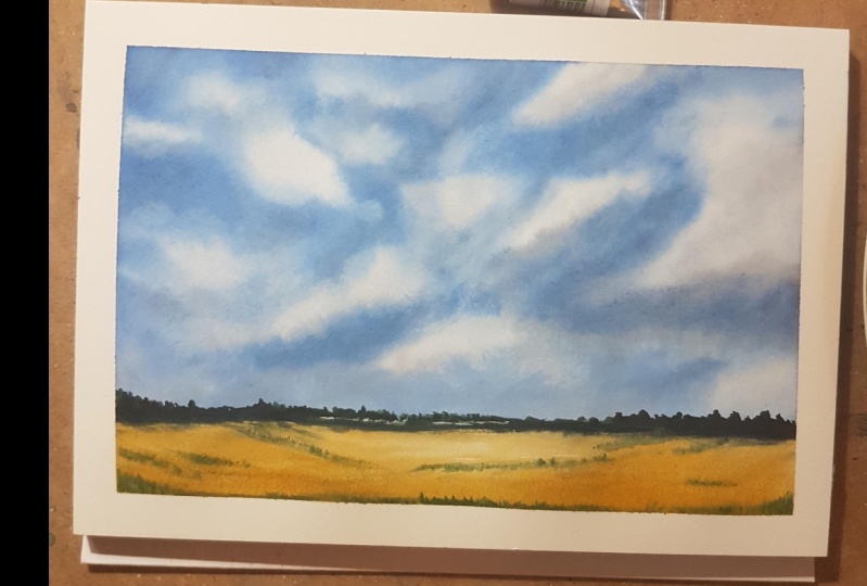
6. Project 2: welcome to our second project off cloudy skies. We're going to dio similar painting as of the first project, but only with a little hint or for landscape to what's the bottom say for this? I have taken a paper down and I'm now going to wit my paper. So when waiting our paper because we have a tiny landscape of the bottom We're going to leave that area dry for now. So I'm just going toe wet the paper till about forces off the paper weight. So once I'm happy with wetting the paper off just quickly prepared some ultra marine blue. The same consistency us we did for a first project on And just like how we painted our clouds and our skies in the first project, we're going to do the same thing for this project as well. So you can see here I am actually leaving white spaces just like how we did full project number one. If you notice I've actually used a smaller brush this brush iss sides 10 round pointed brush. The only reason why I used this brush is because it's got a nice point to tip, and for me, it personally feels like I'm in control a little bit more, so I'm just placing the blue on, leaving white spaces in between. You can place your clouds any way you want. You can have a number of small clouds. Or you could just have one large cloud or two clouds anyway, that you prefer as I'm coming to. It's the bottom off the page. I'm leaving more white spaces moving on. I'm just going to end Hans the sky with a tiny bit more blue. So starting with the top part, dropping in a bit more deeper tone off ultra marine blue. I haven't mixed anything at this stage because I would prefer that pure, ultra marine blue for the sky. But as you can see here, I have taken more pigment. Andi tiny bit lesser war tooken pitch to the first wash we made. And because that paper is still quite wet, it you can see the pigment iss feathering out on defusing, which means the sites are not hard edges anymore. Again, I'm going around the clouds, leaving the clouds white. It might look quite bright at this stage, but I can assure you that when mortar color dries out, it dries out pretty light. So all that bright pigments that you see when the water is still quite, which is going to mellow down a little bit. So please don't worry when you see such bright color, because it is definitely going to dry out and be more sober. So once you're happy with enhancing your sky, you can stop doing that. If you think you have already given a very bright sky right in the first wash, you do not need to repeat this step. This step is only necessary if you think your sky is looking a bit dull. Next, I'm going to prepare some gray for the underside of the clouds. So again, just like how we did in Project One, I'm going to use, um done Sienna Andi ultra marine blue to make a nice gray and just painting at the bottom off those clouds again. We're working wet in wet, which means the paper and the pigment should still be considerably wet at this stage. And you can see here that when I'm placing that gray, it is diffusing and making a feathery edge. Now, with this particular large clouds, I am actually making the edges a bit more lighter compared to the bottom off that cloud. So for that, Dan, you did that grey a bit more with more water, and I'm going in with that very light wash. If you notice I'm actually leaving a small white area on that cloud in the middle. Just my idea off trying to show that cloud has a double layered cloud. So once it dries, you would probably understand it a bit more So during the same thing for the other clouds as well again as I'm coming to, it's the bottom off the page. I'm going to make my shadow a little bit more diluted, so I don't want any hard edges and darker shadows at the bottom. So I'm just ever Sergent Li dropping in some pigment and let it blend. You can see here. Those shadows are much softer compared to that large cloud. Again, you may have noticed that I did use a tiny tinge off Eliza Rain crimson as well. This is just to give it a little bit more interesting. Look now working wet and wet still, which means the paper and the pigment is still wet. I'm just going to enhance that large cloud with a little bit more grey. So for this, um, preparing the paint with ultra marine blue and bon sienna and a tiny tinge of Allah serene crumbs and you and I'm just going to go over that gray cloud bit more just a the bottom, enhance that cloud a bit more. And as you can see here, I'm moving my brush quite swiftly. I'm not really placing it down completely on the paper. If I did that, I would probably be lifting off a lot more pigment than I'm placing them so very gently just placing the tip off that brush on dropping in the pigment. I'm doing the same with that dive. You should wash off grade that I did on that cloud, and you can see here because that paper is still quite wet. It's already feathered out on blended in nicely. Just enhancing the other clouds as well again very quick movements off your brush, using the tip of your brush, not placing, then them down completely now to finish off those clouds, just going to slightly lift out some pigment at the bottom off the clouds just to give a little bit of highlight to the clouds. So as you know that lifting out technique, we clean up brush, make it quite dump. Make sure that the brush is quite clean and it's damn not too watery. And if you paint over the areas where you want highlights, the pigment comes off. Leaving a white area, you can take up that extra pigment on your tissue. Make sure you keep washing your brush clean so you can see have created a nice highlight on that cloud. The reason why it's coming off so quickly is because that paint is still quite with. If it was try, it wouldn't have come off so easily. We would have had to do a little bit more scrapping to get that paint off. So if the painting is still quite wet, it's easy to lift off pigments. And I think we're nearly done with our clothes now, and we are going to move on to our landscape at the bottom off This painting now starting off with our landscape, I'm just going toe wet That area at this time when I went that white area, I'm going to make sure I'm leaving a small area without wetting it. This is just to make sure that the pigments off the clothes does not run into this area. So I'm not touching the clothes at all, actually staying a little bit away from them, making sure that there's a white Klein in between. So once I've waited the area, I'm just going to get some raw sienna, the consistency of the pigment, a similar to that off the ultra marine blue we used for the sky. So once you prepared the pigment, you can go on and directly place it onto that area on because that area is still quite wet . It's not going to leave any hard edges again. You can see how nicely that golden yellow raw sienna has blended into that area. Now, when I'm painting near the blue sky, I have to be extra careful not to go into the blue area so you can see here. I actually left a very tiny, every off white in the middle just to show some highlights, and I'm actually going in with some pure pigment without violating it, placing it in that landscape while that landscape is toe quite wet. I'm going to prepare some green and a little bit of Prussian blue just to show some deeper greens. So I'm just going Teoh, make some deep green just to paint some bushes in the landscape. You can notice here that the consistency of the pigment is quite thick. I've also adding in the tiny tinge off the elders Aaron Crimson, just to give more depth to the creen. Because that landscape this very tiny we won't be able to show a lot of details. So very small city limits should be perfect. So just a few lines on scribbles for bushes just outlining very rough, bush like shapes. You can even include trees if you like, or if you are not. That type of person likes these kind of landscapes. You can always go in and do a little city escape if you like anything that you prefer. Or it could just be Cem plane, golden yellow wheat fields, whatever suits your interest, adding in a few more details. As you can see here, they're only very tiny dots, little dashes or little flicks off the brush, and you can see how well it has enhanced that painting. So when we're doing a very minimal landscape like this. We need to make sure that we're not overworking a few lines and little staples and dots or a flick off. The brush can go a long way in these landscapes, just adding in a few more details in the foreground, little bushes on grassy areas in the foreground. Again, all these little details are completely your choice. If you are not a person who likes to do these little details, you can just finish it off with those bushes in the background and on this painting will be complete. Once you're happy with your welcome, you can leave this painting to dry, and if you prefer to add in a a few details off some silhouettes of birds, I will show that to you in the next video.
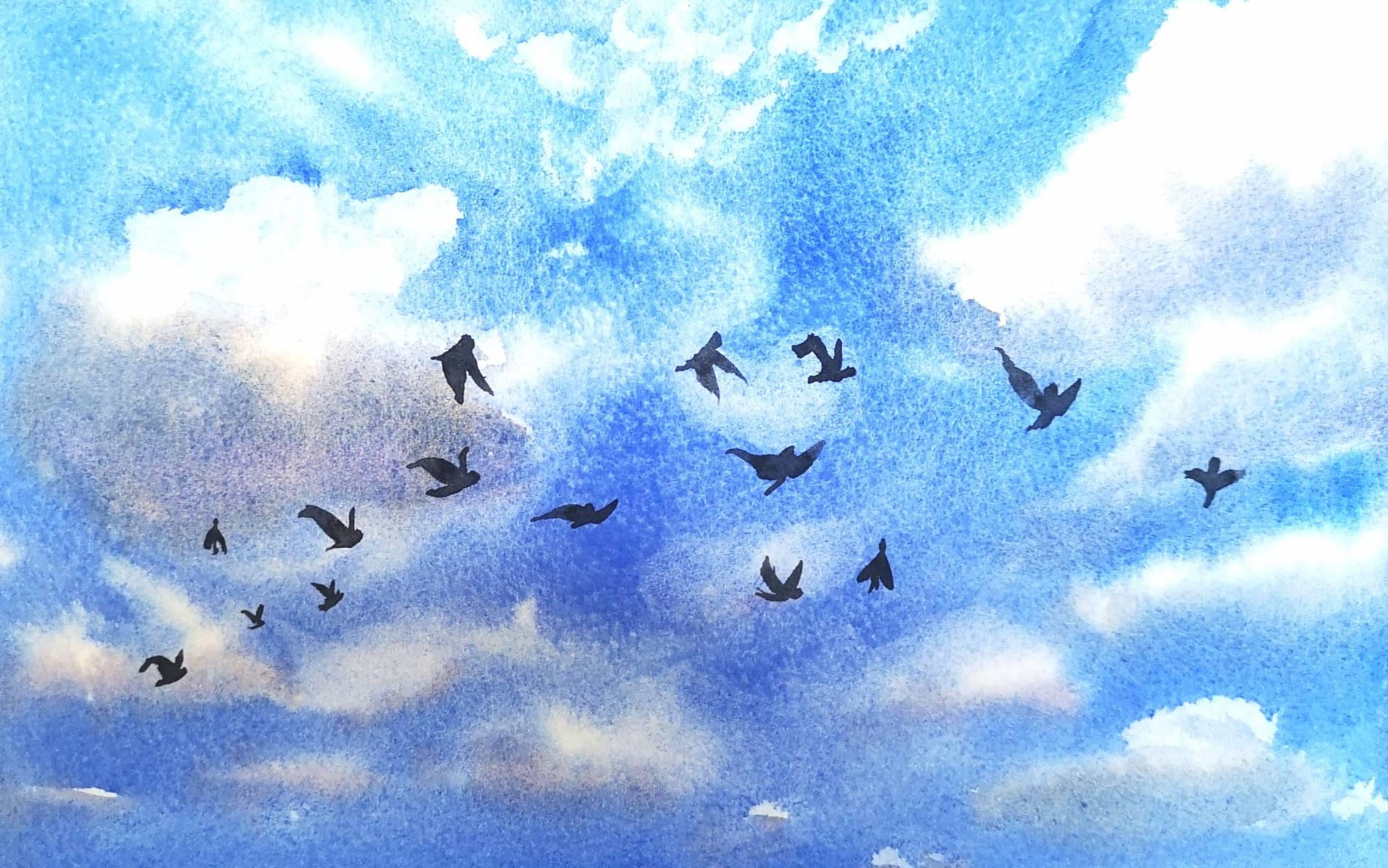
7. Finishing touches: so both are landscape paintings are now completely dry. I'm just going to show you how you could add some silhouettes of birds in the cloud. His guy. So for this, I'm using a tiny bit of Payne's gray. If you're not comfortable using paint for this purpose, you can also use black ink pen, so a floating my brush with some paint again. The consistency is similar to that off the ultra Marine we did in the beginning. So for painting in the birds during a few flicks with the brush just for the wings of the birds and a tiny dot at the bottom for the body off the Bard, you can do a few birds in the sky As you know. Normally, butts fly in in groups so you can dio a bunch of them in the sky. And, um, you can decide where to place them and how they fly. You can place us only birds as you like in the sky. Also, when placing buds, make sure that you have a size difference in them. For example, the birds that were painting right now are the larger ones, and if you like you can have a few more tiny butts right at the corner, off the sky. This sort of gives us a sense off death in the painting. So I'm just gonna place a few tiny butts just to give it the feeling that it's right at the background and we're actually looking into a cloudy sky. Moving on to our second project with the landscape in it is completely optional again for you to give any more details here again in the cloudy sky, I'm going to place a few more birds. So, as you can see here, wrap started off with tiny, birdlike shapes in the sky. I would like those thought to be far away from us can string that there's a landscape right in front of us. I'm just going to place those butts quite far away, so making sure they're only tiny adults or little flicks off the brush just to indicate that there birds and you can paint as many boats as you like in this guy. Oh, you can choose not to have birds is at all. It's totally up to you. This is a completely optional step. This is just enhance your painting, and just to bring on some interest into your painting and everybody sees their paintings differently, so you don't need to necessarily paint the same way I do. And with this are two projects are complete. I hope you're really enjoyed painting these simply cloudy skies with me through these two projects, we have actually learned the very basic techniques off watercolors, which is not just applicable to this painting. You can also use these techniques for any basic landscape, paintings and future if you like. The most important thing is that you're able to enjoy the techniques and you're able to enjoy the process off making paintings with these watercolor techniques that we have learned in these in this cause. Happy painting, everyone, and I see you soon with more videos.
 Suzanne Abraham, Artist