Transcripts
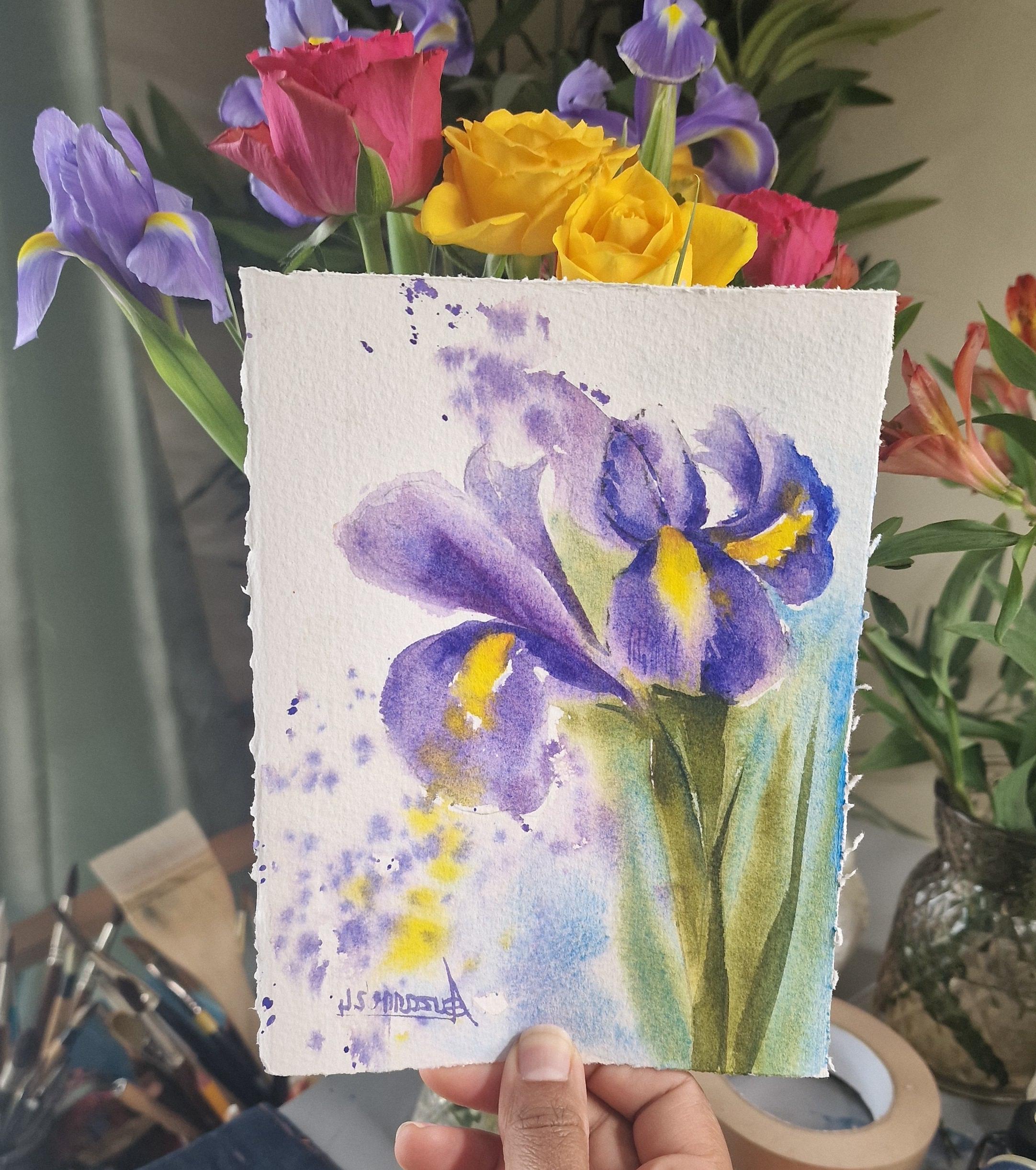
1. Introduction: Hello, I'm Suzanne. I'm a watercolor artist. My paintings and sketches are inspired by the things
I see around me. Usually during my walks. This time of the
year, I am drawn to the beautiful flowers
that I see around me. There are a lot of flowers that I love to paint at
this time of the year, but rises are one of the
flowers that stand out for me. Mainly because of
their blues purples, and yellow combinations. I really love the dreamy
quality of these flowers. Watercolor, I feel is the best way to portray
these delicate flowers, mainly because of the smooth
transition and color blend. In this class, we'll
be painting irises. You can paint them
from real flowers, or you can use the
reference picture that I have provided here. I had an opportunity to paint
from fresh cut flowers. However, it did not last until I was able to fill
in that for this course, which is why we have to
use a reference picture. However, if it's easily
available to you even now, you can paint from them. During this class, I
will walk you through the basic watercolor
techniques that is necessary to complete
this project. The techniques that I talk about here is not just for this class, but you can use it
for other themes or subjects that you would
like to paint in future. We will also discuss about
how to sketch these flowers and prepare your paper
before you start painting. Will also give you tips on
how to finish off a painting and remind you how to
take it step by step, giving yourself enough breaks. This is a fairly easy project. You don't need to
finish it in one go. As I said earlier, it is a great idea to take breaks and paint them in stages. Say on to find out more about the materials that we'll
be using for this project.
2. Suggested Materials: So Let's look at
all the materials we require for this project, starting off with
watercolor paper. I use 100% cotton
watercolor paper, but you can also use a
cellular watercolor paper. They are both great with
wet and wet washes. You may have two or three
small pieces of paper about A five and A four sizes approximately for rough
practice as well as for the main project for which I have used the larger
sheet of paper. You can use
watercolor paint from tubes as well as in pants. Some of the pigments that we require today are
ultramarine blue, permanent rose, cadmium yellow, olive green, and cerlne blue. I have listed them down in
the descriptions below. We'll also require a palette
to mix our paint in. And with watercolor brushes, I'm going to use two watercolor
brushes for painting. They are both round
pointed, medium sized. About size ten or 12. You would also need a pencil
for sketching the flower. I personally prefer using
a darker pencil like a four B or an aquaral
graphite pencil. It is really a personal choice, and you might also
need an eraser in case if you would like
to rub things off. We would also need
one jar of water. It is best to have a flat brush if you like to wet your paper
before you start painting, and also some kitchen towels or tissues to absorb excess water. For doing rough sketches
of the flowers, you can have a normal
Afs sheet of paper and also a drawing board to mount your watercolor
paper when painting.
3. Stretching & Preparing the paper: Our first step is to prepare
our watercolor paper. It is an optional step. However, I do feel that when
it's stretched and damp, it is easier to work with. If you do have the time
to leave it to dry, this is a good idea to try. First, I start off by
wetting the back of the paper with a flat brush. As you can see, I'm using a
generous amount of water. You can see how the
watercolor paper is slowly beginning to bend and warp. Now let's flip it and bring the good side up or the side that we would like to work with. You can see it's still warping. I'm going to add a
little bit more water on this side as well. It is always a good idea
to take it really slow. Just letting the paper
absorb some water. Again, I'm using a
generous amount of water to wet this side
of the paper as well. Now I'm going to
use this flat brush to paint a fine layer of water onto this paper and because the
underneath is also wet, it is going to stick onto the table or the
board that you're using. Right now, our paper is nice and flatly laid out
onto the surface. You can leave this to dry in its own time if you do have the time or if you'd
like to take a break. If not, we can use some tissues to absorb
some extra water, and we are good to go and
we can start straight away.
4. Practice Watercolour Washes: Now let's experiment with the watercolor paper
and the pigments. If you're using
watercolor cakes, it is a good idea to wet the watercolor cakes about two or 3 minutes before
you start painting. If you're using paint
from water color tubes, you can freshly squeeze
them out onto your palette. Let's start by introducing
a little bit of water using the brush
onto the palette. The reason why we
are introducing water onto this
pigment is to loosen it out and get a consistency that is
comfortable to paint with. I'm going to create a
medium consistency that I have a fair amount of water in there and a little
bit of pigment. I'm going to add a
little bit more water in the corner just to dilute it a little bit more
and make it even more weaker. On the other side,
I'm going to use very less water just to
smoothen that pigment out, but it's still got a lot of pigment compared to the water. Now let's try these
consistencies out onto the prepared
piece of paper. I'm going to start off with the thicker
consistency of paint, which has very less
water, more pigment. You can see that
it's not flowing very easily on this paper. I'm going to experiment with the brush strokes as
I go along as well. Now let's introduce a little bit of water into this painted area. I can see that my brush
is moving more smoothly. But at the same time, you
can see that the color is gone a bit lighter with every
bit of water that I add. Now let's add some more water and just make that very light. Now let's use the medium
consistency of paint here. That's the mixture where it has a little bit more water compared to the
first wash we tried. You can see that when I
place it on the paper, it is rather a light wash compared to the first
one that we did. I can still add a
little bit more water and make it even more paler. Now, let's take out
some extra water from the brush onto the tissue. Let's go straight into
some fresh paint, and let's try dropping that
pain into these wet areas. Let's observe how the pigment sits well into that wet area. It is a good idea to
note how the pigment flows and how it feathers
out on the edges, as you can see here. It's a good idea if
you'd like to try different types of
brushtrokes as well. Feel free to experiment with these techniques for as
many times as you like.
5. Practicing Watercolour Techniques & brush strokes: Now let's practice painting some petals using
the same techniques. I'm going to start off with some medium
consistency of paint. I'm going to use all the
bristles of my brush, place it down on the paper to start painting a
petal like shape. After that, I can introduce some more pigment
into that wet area, and to soften the
edge of that petal, I'm going to wipe
out extra paint on the tissue and just rub the brush on the
side of that shape. You can see how you
have a soft edge now. I'm going to drop in some more fresh pigment onto the top of that petal and you can see a gradation now
from dark to light. So Let's try that again
on the next petal. This time, I'm going to leave a little gap in the center
of that petal like shape. This is so that I can introduce an extra color and see how it works when the two colors
bleed into each other. But before that, I'd like to soften the edges of
the tip of that petal. I have washed my
brush clean here, took out extra water
on the tissue, and you can see that I've
rubbed the side of that petal, and it has gone really
soft and lighter. Now let's introduce some cadmium yellow to the center
of this petal. This time, I'm just using my wet brush and
some fresh paint. I'm going to introduce
that fresh paint into the wet surface. If I had added a bit
water into the palette, it wouldn't give
me the same effect and it could be more flowy, but I didn't want the pigment
to flow and bleed too much. This way, I am able
to control the amount of water and pigment
on this petal shape. You can also try lifting out
technique at this stage. For this, I have
washed my brush clean, took out all the excess
water on the tissue. If you rub that damp brush onto the surface
of that petal, you can see how I have lifted
out a little bit of color, and you can see a lighter area. I'm also going to introduce some fresh blue pigment
onto that petal, just to give a little
bit of a gradation. You can see the dark
and light areas now. Using some fresh pigment, again, I'm going to start
painting quick lines onto that petal just to give
it a little bit of a ture. Let's also experiment by wetting some areas and trying
to spatter some paint. We can also observe
when we spatter paint, how it reacts with a wet surface and how it reacts
with a dry surface. I'm going to wet the first petal a little bit more
just on the sides. I'm going to start by dropping in some
fresh pigment again. I'm also going to
spatter a little bit. And I can observe how the spatters feather
out in a wet area, whereas they are more contained and smaller
on a dry area. Feel free to experiment with all these techniques until
you're comfortable with it.
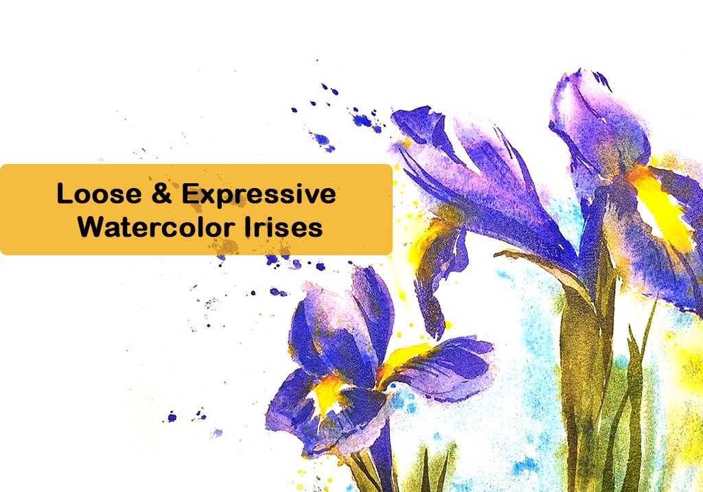
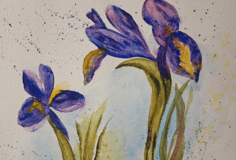
6. Project: Sketching The Flower: For sketching the irises, I'm going to use a normal
A five size paper, and I will transfer
the sketch onto watercolor paper once
I am happy with it. Now let's start
sketching the irises. They are quite a
seasonal flower, so I couldn't find it
in time for this class. However, because I was
painting it earlier on, I had taken a few
reference pictures while I had some
fresh cutter flowers. You may find that the
reference picture is long or in a portrait mode, whereas I'm trying to sketch
it in a landscape mode. The reason is because I'd like
to spread out the flowers and give it an interest as
a painting on the whole. I've decided to start sketching the flowers from the
right hand side. Starting off with
the main petal, the most prominent
petal that I can see. Trying to get the
shape of the petal. You could add a few lines
just to show the texture, but it's not necessary
at this stage. Let's start sketching
the two petals on top, the two smaller ones on top. I haven't marked out the
yellow area just yet because I feel I could do
that with watercolors. The flowers are pretty
easy to sketch, but if you find it difficult to get the shape and the form, the best trick to do
is to squint your eye. Don't think of it as a flower, but just translate the lines or the shapes that you see
in front of your eyes. I know it's not an
easy thing to do, but every time you
sketch or draw anything. It is best to just see them
as simple shapes and lines. If you can translate
those onto your paper, it feels a lot more
better and it looks a lot more like the subject
we are trying to draw. In this case, you could try
sketching the flowers out. Or if you're not too keen on it, you can use my reference picture and trace from the
reference picture. So Let's start sketching
the next flower. By looking at the
reference picture, I can see that it's slightly smaller compared to the
first one that we sketched. Comparing that, I'm going
to sketch a smaller flower, starting off with the
petal that you see on the right side and building
my way across the flow. Again, just looking at
them as simple shapes. It helps if I simplified it into simple geometric shapes and
then build details on it. It is also great if
you can start with very light pencil marks and then darken only the areas
that you think is right, so you can do away with the lighter pencil marks once you finish sketching
the whole thing.
7. Tracing/Transferring The Sketch: Now, the sketch is complete. I'm quite happy with
the orientation, and now it's time to transfer
it to a watercolor paper. You can either sketch it out yourself on the
watercolor paper or you can use this sketch to
transfer onto your main paper. My watercolor paper is
slightly smaller than A four. If your watercolor
paper is a size and the paper that you have
used is the same size, it's fairly straightforward
to transfer it. However, just for
demonstration purposes, I would like to show you how to transfer these irises
onto my watercolor paper. First, I flip my
sketch and using a four B or a three B pencil
or a graphite pencil, I'm going to shade the
back of my sketch. Once happy with the
shading at the back, I'm going to flip it again and place it on top of
the watercolor paper, and using a sharp pencil, we can now trace the flower. So you can see how nicely that flower has been transferred onto the watercolor paper. I would personally
like to sketch mine out directly onto
watercolor paper. So I am going to continue sketching the rest
of the flowers. However, if you like
to trace your flowers, you can continue to trace from the sketch that
we did initially.
8. Preparing Paper & Watercolour Pigments: Once the sketch is successfully transferred
onto the paper, we can now prepare our
water color paper. We follow the same
steps as we did for our initial rough sketches
on the watercolor paper. Our next step is to
prepare watercolor paint. I'm starting off by preparing ultramarine blue and a
little bit of permanent, mixing them together
to get the color of the iris flower
we're going to paint. It is always a good idea
to mix a little bit at a time and try it out on
a scrap piece of paper. Once I'm happy with the pigments
that I've made just now, I'm going to try it out on
a scrap piece of paper. We're starting off with
just a simple blush stroke. Just trying that out. Let's add some more water
to this saturated wash. So just add that and watch how the pigments flow down
into the wet surface. Next, I'm going to try
some cadmium yellow, which is the bright yellow
center of the flower. I'm going to use the
same techniques to add a little bit of
water into the paint, making it smooth and saturated. And the more water we
add the lighter it gets. You can try that out
on your paper as well. Next, I'm going to
try some olive green, which is the green
we'll be using for the stem of the plant. If you don't have olive green, you can also use a regular green or a sap green that you
have in your palette. If you add a small tinge of
red regular red into it, you should be able to mute
down the bright green color. I'm also going to try a
little bit of cerlin blue. I'll prepare all
these colors in about the similar consistency that
we need to paint them with. Cellin Blue is going to go in the background just to
give a nice background, a very calm background. This again is just
my personal choice of a calmer background. If you do have another blue
in mind for your background, you can try that as well. Now that we have prepared all
the paint that we require, we can start
painting the flower.
9. Painting Irises: Now let's start by preparing
a little bit more paint, so we don't run out halfway through while
we're painting the flower. I've gone into a little bit
more ultramarine blue and permanent rose to prepare the
purple color that I need. As you can see, I've
started painting with a saturated
consistency of paint. You can see that there's a
fair amount of pigment there. In my palette, I also have the raw colors that
I was working with, that is permanent rose
and ultramarine blue. I'd like to drop in a little bit of fresh permanent
rose or ultramarine blue into the wet area
of the petals just to make the wash look a
little bit more exciting. On another brush with
just water on it, I'm going to use it to drag the pigment into the other
areas of the petal as well, so you can see a very
smooth transition from dark to light on the petal. I can use the same petal to
do a little bit of lifting out as well in areas that I
don't need all the pigments. I'm going to take it very slow, take my time to do
one petal at a time. Now let's go into the yellow cadmium yellow for
the center of that flower. I'm going to start
with the center where I have left a space. But at the same time,
I wouldn't worry too much if the yellow
bled into the purple. If you think it's
bleeding into it too much and you want
to control that, the best way to do it is to wash your brush clean, make it damp, take out all the extra water, and gently lift out the
pigments that you don't need. Here I'm gently lifting out the yellow that bled
into the purple. Yes, it's going to
make a difference when it bleeds into the purple, but I can always use a little bit more
purple just to drop in the pigment there and bring back the purple
color of the petal. If your paper had been
kept at an angle, now is probably a good time to lay it flat on the table as you do not want these pigments to flow off the paper anymore. Now because it's quite wet, I'd like to lay it flat. Now I'm going to start
with the other petal on top using the same
purple mixture that we had created initially. Again, dropping in
a little bit of permanent rose or a mixture of more permanent rose
into this mixture, letting it all blend into
each other on the paper. You can see I started
off with a more purple. And now I'm going to grab a
little bit of permanent rose. Drop that into the wet
area of the petal, and you can see how
the color has become a little bit more purply, more mauve like compared
to the first purple. It's just getting a
variety in that petal, which is why I like
to try and mix the two colors on
paper sometimes. Again, using a wet brush, I can lighten that wash. I can also drop in more pigment in areas
where I think it's needed. Now let's start painting the
other petals of the flower. Moving down, I'm going to
start painting the next petal. I know the first petal that we painted is still quite wet. When I'm painting the
petals next to it, I'm not really touching
the first petal very. Leaving a little bit of a gap so the colors don't bleed
into each other too, creating a huge puddle. Now let's paint the next petal using the same mixture of ultramarine blue
and permanent rose. It is always a good idea to keep your brushstrokes
really smooth and soft. Again into this mixture, I'm going to add a tiny
bit of permanent rose. You can see that col
is blending into the purple color or the bluish purple color
that we had initially. Now is the time to lighten that wash towards the
end using a wet brush. For the last petal, I can see that
there's a little bit of yellow in the center as well. I'm going to go back into that
yellow with a clean brush. Drop that in on top of that petal and it into
the purple petal. It does create a very soft
effect if you can see how it's softly sp and feathering
out the wet areas nearby. I'd also like to keep the whole
thing a little bit loose. I'm going to add a little bit of spatters here. The same yellow. I'm going to cover
up the areas where I don't need the spatters to go. This is something that
you cannot control. It's always better to
cover up the areas and spatter paint into the
areas that is only necessary. The first flower is almost done. We just need to do the
stork using olive green. I'm going to prepare
some olive green. I have it nice and moist
on my palette right now. I just need to use a
little bit more water to create a consistency that
is more easily workable. I'm going to start painting
the stock in green. Again, being very mindful of not going into
the petal areas, especially if the
petal is quite wet. It is always best to leave a tiny space and
paint the green. To create depth within the
stock that I'm painting, I'm going to use
the same mixture that I used for the flower. The deep purple with
the green gives me a very dark shadow like color and drop that in
into the stock are just makes the whole
thing a little bit more. Now let's add some cerline
blue for the background. Again, being very careful not to paint too much
next to the green, which is still quite wet. But at the same time, I'd like it to touch in certain areas. There's a little bit of feathering out and
bleeding happening. You can already see
how the green is connecting and feathering out
into the cerline blue area, which is wet right now. It is best to leave it
to do its job one paper, and you will be left with
a beautiful outcome. Now let's move on to
paint the next flower. I'm starting off with
the purple petals again. I already have it pre
mixed on my palette. I'm going to start again in a similar fashion as how
we did the first flower, starting off with the purple and painting the
c with a yellow. Once I've placed all
the colors in place, I'm going to wash my
brush clean and add in a little bit more water
to lighten the washes, creating a little bit more
interest within the petals. The petal that is right
in front of us has a fold on the petal and I'm
going to lighten that area. You can see that in the
reference picture that it's slightly lighter where
it has been folded. I'm just going to pull
out some extra paint from there and create
that lighter area. Finally, I'm going to use some paint to spatter
on the paper, using the same purple color to spatter paint just
outside the flowers, keeping the whole
thing very loose. Now let's add the
green stork for that flower using
olive green again. Just painting that stork
and at the same time, if you like a little bit
more depth in there, I can go in and add a bit
more of that purple color of the flower into
the green just to make that green
in certain areas. Or if you need it lighter, you can always lift
out some pigments. Now to finish off
the background, I'm going to use
some ceraline blue to go around the flower. You could wait until the
flowers are completely dry. But if you would like to keep the whole thing
a little bit loser, then you can try while
the paint is still wet. Get some of the colors to
bleed into the blue as well. Finally, I'm going to add a few more stalks of the
flow into that wet area. To finish off the background, I can either add a few spatters or even add a little bit
more blue to the background. So let's have a look at how we can create
a soft background. One way of doing
that is to spatter the same blue into the
wet background area. This will work only if the
background is wet already. Otherwise, the
spatters can stick out as little droplets
on dry paper. You can see the
difference of how when I spattered
the first few blue, that it has blended nicely into the background,
which was quite wet. Between the gaps of the flowers, I'm going to add a
little bit of blue, being very careful not to mix
it with the flower itself. And to take out the soft edges, I'm going to wash
my brush clean. And gently add a little
bit more water to create a soft transition from dark
to light in the background. You can try the
same techniques on the other side of
the flower as well. Again, it is your choice
whether you would like the flower colors to mix with the background or you
want to keep it separate. If you want to keep it separate, I suggest that you leave a tiny space while you run
your brush around the petals. If not, you can
deliberately touch the petals using the brush and you can see how the purple
bleeds into the blue slightly. And also to keep the
background quite soft, you can add blue and
then use a wet brush to introduce water and make
it a little bit more diluted, creating a dark to light
wash. To finish off, I'd like to create a few more spatters in the wet area using
this bright yellow. I'm going to use the
brush to spatter some yellow paint because
that area is quite wet. You can see how
differently those spatters behave compared to the dry
spatters on the left side. With this, we have finished painting a couple
of iris flowers. I'm now going to let
it completely dry, and then I can decide if I need to work on it
a little bit more.
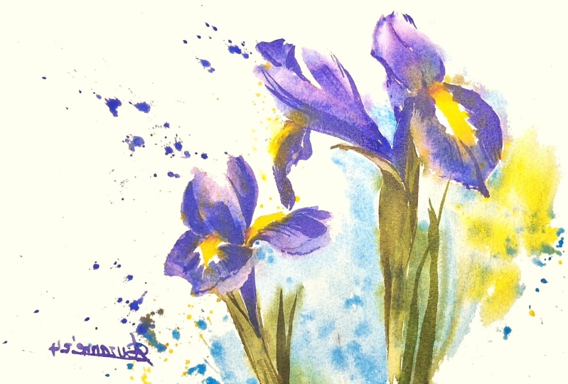
10. Finishing Touches: My painting is
completely dry now. I could leave it at this stage, or I can add a few more details, just to enhance a few areas, especially the area where
I'm working right now, I would like that color to
be a little bit more deeper, just showing some depth
behind that petal. I'm also going to paint over
a little bit of green stalk, where I think I would like a little bit more purple
of the iris flower. Also, just to define a
few edges, a few folds, I feel that it's very important
to pause at every stage and take a step back and look at the painting and ask
yourself questions like, does it need any more paint? Does it need to be
enhanced at all, or is it better that
it's left alone. It always depends on what you
think about your painting, and sometimes you may not even need to do this
step of enhancing. You could probably stop at
the first layer itself. So I'm just creating
some more texture on some of the petals. And I also like
to use my fingers just to smudge the
paint as I place them. And also, I can even use my nail to scrape
out paint if you like. Now, this petal that
I'm working on, I do feel that it
needs a little bit of deeper blue just to
show or depict shadow, especially because
I feel that petal is underneath the huge
petal that is right on top. So I feel that it is
a good idea to show a little bit of shadow or a deeper color for the
underside of that petal. This again is just
the way I feel. As you can see,
I'm not referring to my reference
picture right now, as it is the finishing touches, I'm just adding the details to make it look more pleasing
to the eye as a painting. And now I'm going to finish
off the second flower. Again, using the same techniques that I used for the first one. Adding a little bit of texture, a few lines and
fold of the petals. I'm using the same mixture of ultramarine blue
and permanent rose, and I haven't used any sort of shadow colors to deepen
any areas at this stage. I just feel that I can
get away with using the same two colors for the mixture of
this beautiful purple, and it will still
really vibrant. Just referring back
to my picture, and I can see that there's a slight fold on the petal
that I'm working on right now. So I'm going to see
if I can add that, leaving the edge quite
bright in light and adding an extra layer of purple
blue in the inside area. It has immediately given me the impression of
a folded petal. Finally, I'd like to
give a tiny bit of depth to where the yellow
bits of the flower is. I'm using permanent
rose to mix it with a little bit of yellow that I used for the center
of the irises. I would end up with a
peachy orangish color, which I'm going to use mainly
at the folds of the flower. I'm also going to add in a
tiny bit of ultramarine blue. It gives me like a rich
brownish grayish shade. Just a drop or just
a little brushtrok, just in the corner of the folds is more than
enough to enhance the area, so you can see that I'm only
placing it in the folds. I don't need it anywhere else. And once you've placed that in, you can also soften that
with the same techniques that we used before by
using a wet to damp brush, slowly softening those
harsh brush marks that were placed initially. And the main idea is that if you think your
brushes to watery, always have a tissue
handy so you can always wipe off extra water
on your tissue, not letting the water settle into the watercolor
paper at this stage. Just a few more stalk or stem of the flower because the background
is completely dry now, it is very easy to work over it. Placing extra leaps or
stem for the flower. You can also add little bits of texture of lines
on the stalk. With this, I have finished
painting the irises.
11. Final Thoughts: Hello, again, I hope you have enjoyed creating this
project with me. For finishing touches. It is a great idea to step
away from this painting for some time and give yourself
enough time to take a break. It is also a good
idea to leave it overnight and come back
to it the next day, and that is when you
feel quite refreshed and you'll be able to see the things that you need
to fix in this painting. Let's take a look at what
we have done so far. Now, looking at my painting, I can already see some areas where I think I
need to fix a few things. For example, this petal here, I feel is a little
bit overworked. I feel that if I lifted out some pigment, it
would look better. For lifting out, I am
going to use a damp brush, and if you have a brush that is slightly harder than
watercolor brushes. For example, if it is a brush that you use
for acrylics or oils, the bristles can be
a little bit harder, and it might be
easier to lift out some paint with these
harder bristles. I'm going to dampen my
brush or wet my brush, make it a little bit damp by
wiping it off on the tissue, and if you rub on the surface where you need
to lift out some paint, You're going to
wet that area and the paint eventually will
begin to be lifted out. You can use a tissue just to
soak it up or wipe it off. Make sure that you don't
have a lot of water on these brushes because you
can create a huge puddle. The best way to do it is to wet your brush and wipe it
off on a dry tissue, so you are left
with a damp brush. I hope you enjoyed
creating this project. Feel free to share
your processes and your end results in the
projects and resources section. It would be wonderful to
see what you produced. You can also open discussions if you'd like to ask
me any questions, and I'm always here to help. Happy painting, everyone. I
 Suzanne Abraham, Artist