Transcripts
1. Substance Painter Beginner's Guide to Game Texturing: Hello and welcome everyone
to our new course, Substance Painter beginners
guide to the texturing. I wanted to learn how to texture 3D models. So
professional level. What about creating
game assets that looked like they were created
by AAA games company? What if I told you
you could learn how to texture assets that look and feel like
they were hand painted in just a few hours. If you answered yes to
any of those questions, then I'm sure that
this course was made for you. Here it's pretty tutor. We have created a
game section course devoted to complete beginners. Even if you have never
textured anything before. With this course, you
will learn how to texture props and environments and
industry standard level in just a few hours. Substance painter, as
you may be a word, is a pretty complex program for both beginners amateurs alike. The goal here is to simplify
the process and may complete beginners with
no prior experience to finish our course. Leaving with skills
and knowledge, checks your own assets
and environments. When we all sat down as a theme, we designed this course. Our goal was to create a brief, yet informative online
class that anyone on any skill level could take
filler substance painter, and have created a professional
looking game asset. So the entire course
has been built from ground up
with this in mind, and I'm sure that you
will see that we have achieved this goal with
this fantastic courts. Best of all, Substance
Painter is now free to download for
students from Adobe. So there's never been
a better time to get started on your own journey
in breed texturing world. So let's dive into what
you will be learning in a forest and how we have
made this possible. The first part of the
course we'll be covering, setting up your models,
ready for texturing. If you are a beginner,
it's important to learn the right techniques from the
very start of the journey, we will be going for the
most common issues people have when it comes to bake
and our texture maps, this will give you the
best base possible before you actually
learn on being sexually. As we move on
through the course, we will be creating a wide
variety of materials. You will learn how to
turn these materials into something usable in all
of your future creations. Substance better at these are
known as smart materials. Simply put, the more of these special materials you
upgraded and have available, the faster your
workflow will become. Now, we all know what the UV unwrapping
and mapping can be, especially if you're new to
the world of 3D texture. So I'm happy to say that
as part of the course, we will be covering
amazing techniques to make the process a
lot more automated. Next up we will be looking
at how to easily create your own materials from textures we can find anywhere
on the Internet. This puts the power in your
hands as you're free to use your own imagination as to what materials
would you like to create. And of course, all
of this will be done just within the substance
painter itself. The whole thing will
help you to keep the process simple while still achieving a professional
texture to your model, which leads me to the
next part of the course. And it's going to be
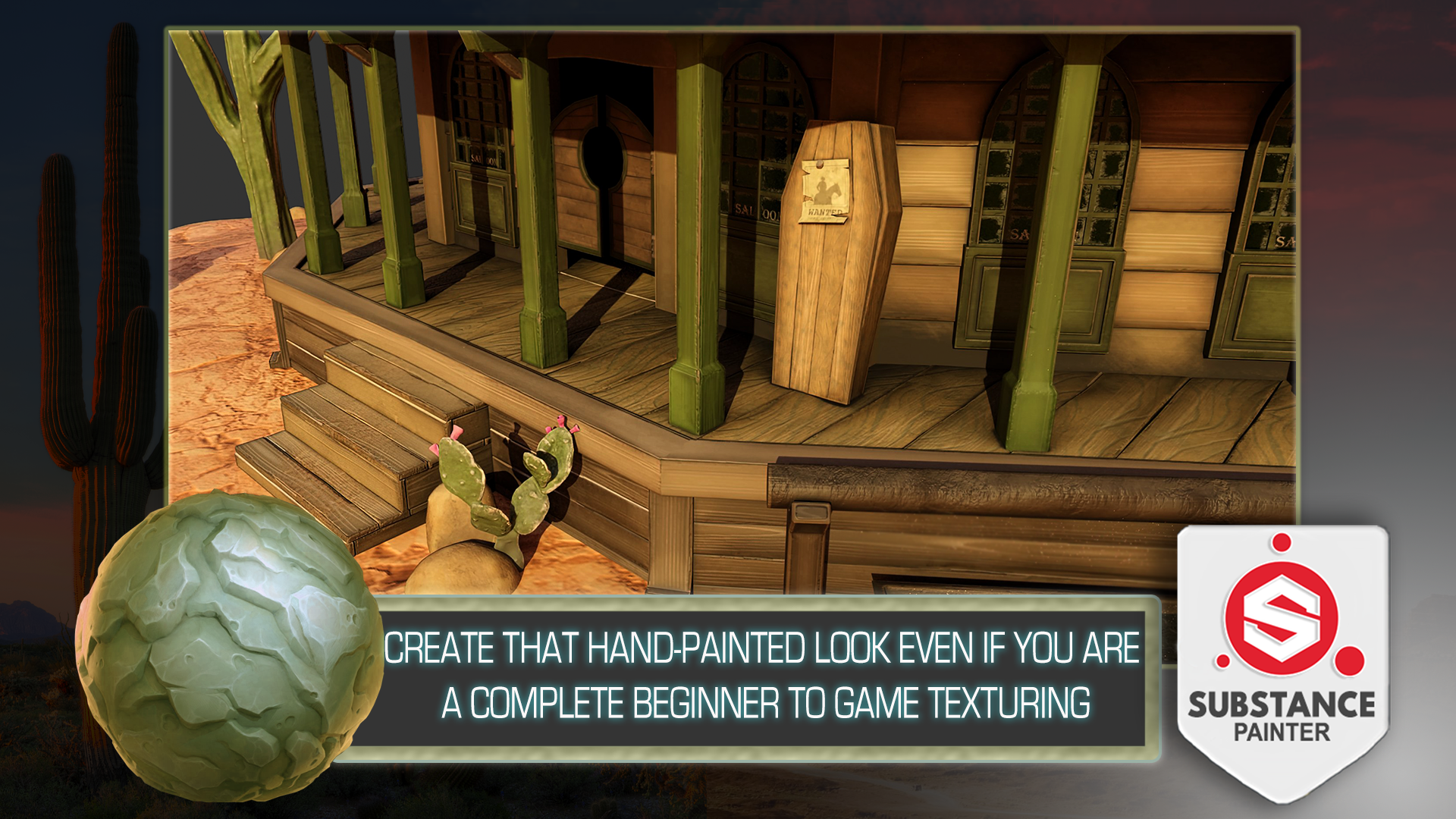
learning how to create that look and feel of
hand painted 3D models. If you're a fan of
stylized art and games, I believe you had to have
years of practice of experience to get anywhere
with your own texturing. Well, I'm here to show you how
to start a process and get amazing results in matter
of hours rather than years. Finally, to wrap up the course and give
you a complete guide, we had to include things
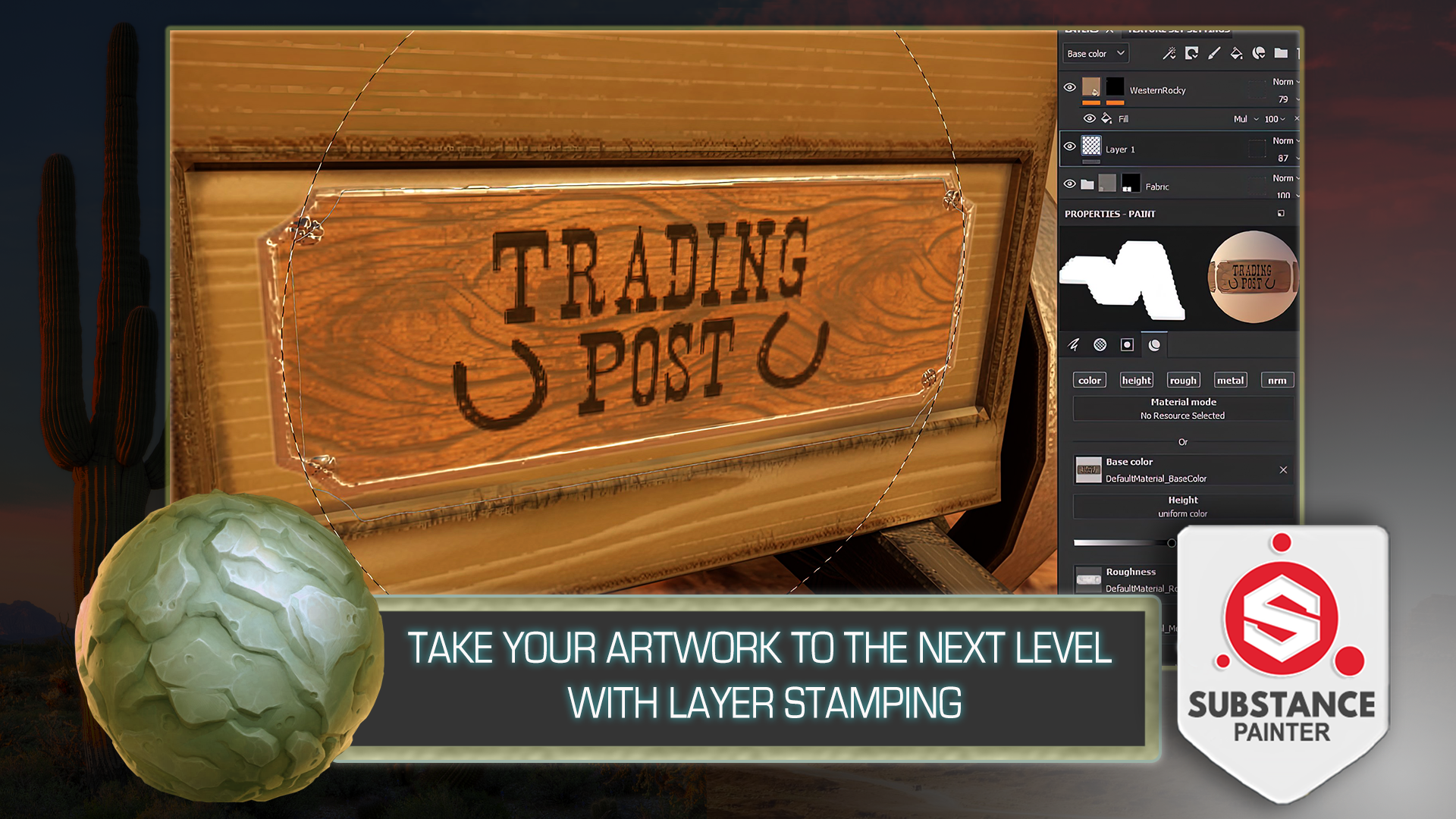
like alphas and decals. Mix this in with layers damping and you truly begin to
see your own 3D models, which the next level of detail gone are the days of
scoping every detail, most of them work can
be done with textures. These skills will help you
learn throughout the course. I think with this
course, we really have achieved that true substance
beta beginner's guide, and recovered most
of the techniques that can be used
within the software. You helped me create
the best game texture and more posts for yourself. So come join me and see how far your imagination
will take you. My name is Luke, and I'll be
seeing you in the course.
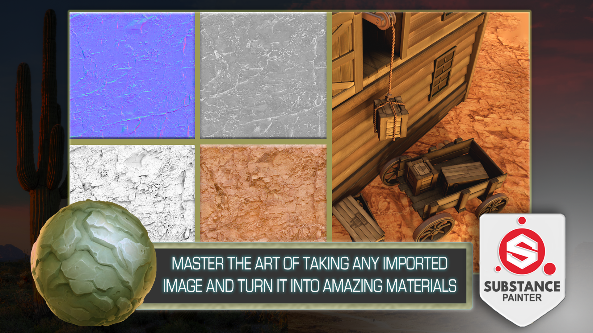
2. Substance Painter UI and Asset Import Basics: Hello and welcome everyone to Substance Painter beginner's
guide to game texturing. Once we have our substance
painter opened up, we're introduced to
the home screen. So I'm just going to write away, just close this down like so. And we get ourselves a program, a software that will allow us to texture or freedom
matched by default, if you've used something like Photoshop or something
along those lines before, you'll notice that there are some similarities in
regards to the layout. We have layers, we
have Properties, tab whatnot on the bottom
right hand corner. But just in case I'm going
to play an introduction or a video to the UI of
the whole software. So it would be easier to
follow along this course. And then afterwards
we're going to get into the course itself. So, yeah, I'll see you in a bit. Welcome to the substance
painter UI introduction video. Once we have our substance
painter opened up and our asset imported within it are graded by
this sort of view. Within the middle, we'd have
or viewport where we see our assets along with the textures that are
being applied upon it. Upon the left side, we
have our asset library. This will include
all the materials, all the texture maps, alphas and decals that
are set up by default within a substance better than going even
further to the left. We'd have brushes, didn't
really set up to Photoshop. If you've ever used that, we'd have stuff like
brushes, eraser, and clone tool set up in that location and go
into the right side. On the top, we'd have a
texture set list which will include all the materials
being applied onto the asset. Right now I only have a material named cubed material
applied onto it. That is why we only see
one thing applied onto it. But if you're working
with multiple materials, you'd see a longer list. On the right side we
have display settings, which we can make
use of to change the way we're seeing
within our viewport. So right now, we can e.g. change the way our
opacity is within the viewport and see the type
of background that we have. There are a lot more
settings within this that we can make
adjustments for. Environment settings,
camera settings, as well as the
viewport settings. However, this doesn't affect
any of the texturing. So let's go ahead
and close this down. The next cyber setting
would be shaded settings. Using the settings we can
make use out of the way we perceive our material within
the substance painter. But this also does not
affect our texture maps if we're exporting it and using different software
to render our asset, this won't make any difference. So just keep that in mind. Now, moving on, next step, we'd have ourselves
the layers tab. This will show you all the types of materials that are
being applied onto your asset and every
other information that is being used
to make a texture. Right now I don't
have anything on it. With by default, this would
have a normal layer setup, which I usually delete and start off with a filler instead, just because it has more
control over your texture. But anyway, we'll get into
that a little bit later. If we were to click onto
the texture sets settings, which is next to the layers tab. We'd get ourselves
into a different tab which has different types of channels which we
can add and remove. This will include base
color, Roughness, metallic types of debt
is generally used within PBL rendering
than scrolling down. We have ourselves
baking mesh maps. We're going to go
into it later on. But basically we
can make use out of this bake out normal maps, ambient occlusion, as well
as our generated maps. Anyway, going back onto layers, going down within the
Properties tab with ourselves, all the types of settings
that we can use to make adjustments for layers as
well as for the brushes. This is dependent on the type
of layer you have selected. E.g. the normal layer would
have these type of settings, whereas the fill layer
would have different ones. So based on the type of
player you're using, you'd have different type
control over the Layer. Properties tab also
allows you to make changes for your
brushes as well. So if I were to scroll
app within this tab, or if I were to
click on the brush, we could go ahead and we could go ahead and make
some changes to it. The tabs themselves are easy
to manipulate and you can easily make them larger or smaller depending on how
you want them to be. You can also drag them out and have them be separate
or attach it. That a window will be
on your convenience. If you made too
much change and you want to go back to
the default layout, you can always do so by
clicking on the Windows tab on the upper section
of the substance Bader and clicking Reset UI. Thanks for watching this
introduction video. Now let's get back
to the course. Alright, now that we're
back within the course and we have familiarized
ourselves with the program. I'm also going to just quickly reset myself the uy just to make sure that we have
the same type of a setup. And we're going to start
by importing ourselves an asset to the program because otherwise it's
going to be empty as is, which might be a little bit
complicated for a beginner. So I'm also going to play a quick video
in regards to that, to familiarize yourself with
the Import menu and how to actually get a mesh
within the software. Hello everyone and welcome to the substance painter basics
of importing a 3D asset. Once you open up your
substance painter, in order to start up
your texturing process, you'll need to import your model into the substance
payer software. For us to do that. There are two ways of doing so. The first way would
be to locate yourself a free day model file
within your file explorer. And then all you'd have
to do is click and hold and then drag it into
the software like so, this will prompt up
a new project menu, which we can then use to
import ourselves, say mesh. Alternatively, what we can do is we can go into the
upper left corner, click File, select New, and get the same new project. In this case, however, we'd need to click, elect to select
ourselves or file. Once we locate ourselves
the mesh file, we're going to select it. And click Open. This will set up the
location for the file. Both ways are valid and can be used to bring up
the same result. Not only have ourselves, the file setup, we're going
to select ourselves template. The template itself,
whichever you pick, doesn't give much of
a difference other than changing some basic
parameters, like e.g. the normal map for much, which we'll come
back to in a bit. Right now, I'm using Unreal
Engine four template. It doesn't matter which
exactly template to use. It changes some basics
of the project settings. However, you can
still export out the types of texture maps
that you need in the future. Though, don't worry
too much about this. I personally use Unreal
Engine four as it gives me the normal
map format of Tarek x, the type of normal format will change depending on the
template that you have. E.g. if I change
the Unreal Engine four to be a unity
HD Render Pipeline, I'd get myself a normal
map format with OpenGL. However, I'm going to go back
onto Unreal Engine four. We get myself a Direct
X normal map format. Instead. If you're working with
something like blender, you would have to make sure that this map format
is set to OpenGL. Thence lender uses OpenGL
normal map format. Alright, so next, if you go back a little bit,
document resolution, this value will determine the texture map that we're going to be using while texturing
within substance painter. By default, for me, it is set to 2048. However, I would
recommend you to try going lower if your
computer is slowing down a little bit and upscaling within
Unreal Engine four and going to higher
resolution textures is quite easy to do
within the project. I wouldn't recommend you going anything under 1024 though, unless you're using
multiple materials within your object. So for now I'm going
to keep it as 2048. Then we have compute
tangent space per fragment. We don't really need
to worry about this. And usually I recommend
you keeping a tick down. Next one is going to
be UV tiles settings only have this ticked on only when you're
working with students, which is basically a type
of texturing method which uses more than zero to
one UV texture space. We don't really have
to be worried about this when we're working
with normal assets. So usually I recommend you
having this ticked off. However, if we were to use it, make sure it is set to the
first one and not legacy one. With this, you'll be able to
texture multiple parts at once with a seamless
workflow for right now, I'll keep this off. The next setting,
import settings. The input cameras. In case you had a camera
imported within your scene. Substance Painter will
allow you to make use out of it and help you
get the same angle that you needed
in order to check the way your mesh looks
like from a specific point. Usually that's not really necessary when
texturing, though, keep this off then outer
unwrap only use 0 to unwrap if your UVs are not unwrapped within
a different software. If you were to have
this clicked on, what this will do
is it will delete all of your already existing UV unwrapped and replace them
with a new automatic unwraps. This is a nice little feature for whatever you're
trying to make. Quick texturing map
wherever normally you'd want to have more
control over your UVs. And I'd recommend you doing UV unwrapping for whenever you're doing your own 3D modeling, you have greater control for
where the UV shells are, as well as the way
they are positioned. We do have couple of options
within this menu over there, only basic ones, and I'd
recommend you keeping them as default if you are
using this functionality. The other two settings in
Port bake mesh maps and color management are for
having greater control. This one would allow us to add our own already baked
texture maps right up into the substance painter
and color management. It's an attempt to
change color space, but we don't really
need to worry about it. And I recommend you are
keeping it as legacy as it works just fine
for texturing purposes. So once we have
the settings done, we can now go ahead
and click. Okay. Thanks for watching everyone. Now, let's move on
with the course. Alright, welcome
back to the course. Now that we have familiarized ourselves with the Import menu, we're actually going to make
use out of it and import our own custom mesh
into the software. But that's going to be
happening in the next lesson. So thank you so
much for watching, and I'll see you in a bit.
3. Preparing Mesh for Texturing: All right, Welcome
back everyone to Substance Painter beginner's
guide to game texturing. In the last lesson,
we left it off by familiarizing yourself
with the program and getting ourselves
introduced to the import settings
within the software. Now, once we have familiarized
ourselves with it all, we're actually going
to start up by getting a mesh within
the program itself. We're going to go on the
upper left-hand corner, click File, click new, like so. And we're going to get
ourselves a new project. Then afterwards, we're going
to get ourselves a template. I personally prefer
to make use out of the Unreal Engine one. So let's go ahead and do that. The Unreal Engine four, it says that it's for
Unreal Engine four, but it works just as well
for Unreal Engine five. Just in case you're wondering, the biggest difference is
within a normal map format, which is said to Direct X. That's all we need to know. And now we're going to
go ahead and change up the mesh in which we
want to make use out of. And we're going to click on
the Select button over here. I'm just going to locate the resource folder
that we have. Let's go ahead and do that. Resource pack licks. And we have couple of FBX
files already set up. We have high poly, low poly and we have an
example of bad mesh. So as a startup, I'd like you to go over the
differences on how the bad mesh was
fixed in regards to getting it properly set out
for the texturing phase. And a lot of the work comes down to preparation and actually setting it up just
to make sure that we have a good base mesh
maps in the future, which will allow us to generate some real nice smart
materials and textures. And in general, in regards
to the artifacts and we're going to get ourselves
much nicer results. So, yeah, without further ado, let's go ahead and select the
example bad mesh and we're going to go over it real quick
to see what's up with it. So I'm going to
go ahead and keep the rest of the settings as is. Let's make sure that
the order and wrap is turned off because it does have UVs already
set up for this course. We don't need to
worry about that. If we were to have this enabled, it would simply overwrite
those already existing ones. So it's actually
really important that we have this ticked off. Afterwards. We can tick off import
cameras as well, although it doesn't
have cameras, so it won't make much
of a difference. But I like to do that
regardless. Though. Yeah, once we're done with that, let's go ahead and click. Okay, like so. Wait for our mesh to load in. And we're going to get
ourselves this sort of result. And now we have
ourselves a mesh. Of course, in order
to move around, this software will need to familiarize with the
camera movement itself. So for us to do that, I'm actually just
going to quickly play a basic introduction video
to the camera motion. Welcome to the Substance Painter camera movement
introduction video. Once you have your
substance painter opened up and your mesh file imported, you're going to be graded
with this or result. The window in the
middle will allow you to view your object. You can scroll up and down using your mouse to zoom
in and out of the object. The way you zoom in, it depends
on where your mouse is. So e.g. if I have my mouse
on the corner of the asset, I'll be zooming in
to this exact spot, but this is something
worth knowing. When zooming in and out. Additional camera
movements depend on the Alt button holding. Alt will allow you to rotate your camera using alt
and left mouse button. By holding Alt and
middle mouse button, it will let you pan
your camera around. With these type of motions. You're able to manipulate your camera within three
dimensional space. Quick tip. If you have your camera outside of your object and you're not able to see it
like the letter F. Reposition your camera to
the center of an asset. Another functionality for
what you can do within the camera view is rotate your lighting
around your object. For us to that, we'd need to click and
hold Shift and then use right mouse button to
move or lighting around. This doesn't just move
the light source. It moves an entire environment and rotates it
around your asset. What I mean by
environment is over to Chris this and Reese,
environmental thriller. What we're basically
doing is we're moving the environment are
round or object like so, which changes the
way it is being lit. We can also change the
viewport by clicking on the upper-right
corner and selecting. This icon over here. From it, we can change
it from three D to B to D. This will give us the result of our
UV texture maps and we can texture or
asset using this viewport. We can also have it's
split between the two. And b can be set up to be
both 3D and 2D viewports. And also we can just go
back and work on it, mainly on the 3D
view port like so. Now there's also a
setting which can change your view to
be orthographic, which you can do so by
clicking on this button over here and changing it
to orthographic view, this will basically
remove all of your depth from the asset. I only use it on rare occasions. But I figured I'd mentioned
this in case you're having some weird perspective results that you're not sure
of what to do with. But again, going back to
perspective, view is usual. The way to go and texture within here is usually the best way. Thanks for watching this
introduction video. Now let's get back
to the course. Hello and welcome
back to the video. Now that we have familiarized ourselves with the
camera motion, let's go ahead and check what is up with this sort of a match. So for starters, if
we have a look at it, we can see that in the
background we have a really bizarre type of a
look or the water tower, by the looks of it, it seems
like it's still has a shape, but it's not quite there in regards to how we're
perceiving it. So when we're looking
at it from the top, we can see the bottom down view. And if we're looking
at from the bottom, we can see the top-down view. The reason why this is
happening is simply because the normals
are inverted. If I were to open up the mesh within a 3D modeling
software blender. And I actually provided us with the resource pack in case you want to check that out as well. So there's a blank
file for that. And basically within it
you will find yourselves a mesh that also has bad
mesh scene collection. So if I were to hide
everything except for that, real quick, I can show
you what this is. By default, you can see that the water tower looks
quite fine as is. But that is because blender
uses two-sided shader, meaning that no
matter the normal, the way the normals
are being faced, we're still going to be
seeing the mesh just fine. However, within a
substance painter or any game engine
for that matter, usually by default,
you'd find that they're only showing you from one side. So that is one way of
saving performance in regards to the game engines and Substance Painter
for that matter. And in order for us to
see that within Blender, there is a way for
us to do that. So there's an icon over
here that allows us to enable the face orientation. And we can see the entire
mesh is being read. So that just visualizes us that this normal is
facing the wrong way. And within a pretty soft words, it's usually rubber easy
to invert the mesh. Why would that be Blender
Maya or whatever? It's actually quite
simple. So e.g. right now I can just
select this entire mesh, go to the topology, and click Shift and real
quick and that'll just recalculate the normals
as you can see like so. So now the whole mesh
is going to be blue. And once we have
it, reimport it, it's going to fix our issue in regards to how this is being
seen within substance later. So now we can go ahead and
check the rest of the mesh. We can see that the rest
looks somewhat okay, but what if we want to get baked mesh maps in regards
to the mesh itself, we might get some issues
in regards to that. For now, real quick, I will show you what happens when we try to make our mesh. In regards to that,
I will go into in more detail in regards to how
the bake mesh Maps works. But for now as an example, I'll just do it real quick. I'm going to go into
the texture sets settings and bake
out the texture map. Again as an example, I'm just going to go
ahead and bake mesh maps. Go ahead and select
the 2048 legs. So I'm just going to
leave the rest as is in regards to the basic
settings are just real quick. I'm going to go ahead and
select the textures. Again. You don't need to do
this at the moment. I'm just showing
you what it's like when we have some
artifacts within our mesh. This is what we are getting
after the bait mesh maps. And as a starting point, you can see that we have some issues in regards
to the sign e.g. let's go ahead and see
what is up with that. The result seems like there are some overlapping UVs as
the ambient occlusion especially darkens up the
bits where they should pay any dark in bits and we get some really bizarre
type of artifacts. So real quick, I'm just going to within a texture
sets settings, locate this type of a sign. And I believe that's going to
be under rooftops perhaps. I'm just going to ice click Isolate button over here
to just kinda go through each and every single one
on until I locate the sign. Again, you don't
need to do this. I'm just going to show
it as an example. So it's actually what our
roof door sign material. And let's go ahead and see
what is up with the sign. I'm going to actually, we're just going to
pause this video here and we're going to continue on in regards to fixing up
the mesh in the next one. So thank you so much for watching and I'll
see you in a bit.
4. Fixing Bake Mesh Map Issues: Welcome back everyone
to substance painter beginner's guide
to game texturing. In the last lesson, we left
it off by fixing up some of the issues commonly seen within the mesh for
the texturing phase. And now we're going to continue
on with this and cover up a couple of extra ones
that would usually see, I'm going to go into the
free due to the type of a view just to
see what it's like. And I'm just going to
click this one over here. So as we can see, what we're having is
basically we have some of the mesh seemingly overlapping
with the rest of assets. So that is causing or issues in regards to
the base mesh maps, which all it means that
within the blender software, we just simply have to change
up the UV coordinates. So within this sign, e.g. if I were to go on to the UV Editing and see
how this mesh looks, we can see that
the rest is fine, but if I have it all selected, I can see that we
have some issues. So in order to fix that, all we gotta do is just make
sure that we repack that. So by going into our CG-islands, we can just go ahead
and click on it and that would fix your issue
in regards to that. So that is another way to
solve this sort of an issue. And actually real quick, just going back to
the water tower since we're on this
same material. In case you're wondering, in case you are having
a high topology type of a mesh and you're worried about the way the normals
are being flipped. In regards to the same problem
as for the high topology. You don't need to
worry in that regard because within the
big mesh bags, usually by default, you're going to have Ignore back face. And if were to take this off, it will basically allow you to bake the topology
of the high mesh regardless of how the
basis or being blade, they're going to still big
onto the mesh properly. So in case you're
worried about that, you just simply need to
have this ticked off if it is within
the high topology. So there is that. Moving on, if we have
a look at our issues, so let's go ahead
and see the water. The water seems to be the
same kind of an issue. So I'm just going to look at the water type of a
material real quick. There we go. We have the same issue. However, in this case, when we're talking about the mesh playing split off
in regards to the UVs. I treated a little bit
differently in regards to that because this is a water-based, a type of water plane. And we're going to
use within our scene, meaning that it should
be transparent. And because we're going to be using a transparent
shader for it, I recommend splitting it
off onto another material. Though, the ones
that would be solid as a texture would
be in one material. And this type of a water plane
would be in the numbers. So within a Blender
3D modeling software, what I like to do is just
simply select this as a plane and just simply
get a new material for it. So with this arm, I'm just going to add
a new material and call it transparent mad. Like so. And I'm just going
to leave it as is. So going back to the
substance painter, Let's go ahead and have a
quick look in regards to the high topology mesh
within this type of a setup. If I were to go
back to the free, the only view again, we have ourselves only
a small portion of a mesh that actually makes
use of the high topology, and that is going to be the
rocks and the cactuses. So for us to bake that out, I'm actually just
going to go ahead and go click on the
texture set list. Cactus and rocks. And I'm going to bake mesh maps. Then within here by
default if you want, if you don't have any
selection over here, they'll just try to bake it
off with the low topology. So I'm just going
to now go ahead and add a high topology
using this button over here. And I'll make use out
of the hyperbolic. Again, we're going to go over it in more detail in a bit though. For now. I'm just going to make
sure I have this on and make sure that only
this is being baked out. I'm going to click on
this box over here. So only this type
of a material is going to make use out
of the hive topology. Once we bake it out, we
can see that we have certain issues within this one. And that is going to
be the reason for it, is basically because
the mesh doesn't quite align in regards to the
hype topology variance. So right now we have some
bits that are kinda go in black and some bits that I just end up being applied anteriorly. But the easiest way
for us to fix that would probably be to try out going onto bake mesh maps and increasing max rental business
and max rate distance. If we were to set this
one to 0.1 on bulk, like so, just multiplying it. And I'm going to bake
out cactus rocks again. And this should give us better
results. So there we go. Although it's still
giving us some bits of artifacts since the mesh
does not quite aligned. If we look at the example, going to go on to example real quick and see how
this looks like. We have some rocks and we have high topology and low topology. And if I was to show the
difference between those two, but this is the high topology and this is the low topology. We can see that we have certain business is
going way too far out. So basically, whenever you're having these kind of issues, it might be because
the mesh doesn't quite align to one
another as well. Then afterwards, if we
have a look at it or this sort of an issue over here, we can see some bits. We're not quite
going as they are. We can see some artifacts
going in-between those meshes. The reason being is because
contrary to what we had previously where
we had to increase the bake distance in this case, because the mesh has such gaps that are so
close to one another, we actually have to
decrease this amount. So if I were to change
this to 0.01 instead, write a fixed this cactus rocks. Let's go ahead and see
how this would look like. And once we do that, we can see that there are no more artifacts
in-between those gaps. So that's another
way of fixing it. And I believe we have we
also have an issue over here where we have certain bits of artifacts going along
this way as well. The reason being for
this occasion is if I were to go to the 3D
modeling software over here. If I were to isolate
the view real quick, we can see that the vertices are actually just kinda
overlapping with one another. So when modeling, you're
going to make sure that it is being fixed in
that regard as well. Otherwise, you're
just going to have some issues later on. So now going back to the mesh, if we have a look, continue looking
at this area in C, we have certain issues in
regards to this area over here. And if we look at the roof, we see that It's
likely of Tilden. And although right
now it baked off quite well in regards
to this area. If I were to go between
the texture maps, still getting a nice
result actually. But usually what happens is in regards to
substance painter, in regards to how it's textured. They always by default try to triangulate the entire mesh. If we were to export this mesh, which we can do by going on to file and export mesh
button over here, we'd notice that
the default type of a measured actually
be triangulated. The reason being
is that the mesh itself or is automatically
triangulated. So although e.g. blender would make use out of
the n guns and we could use a type of topology that wouldn't have just a free
sites are four sides. It will have more than that
and it would handle just as well in substance
painter to avoid that, they usually triangulate it. So one way of fixing that, as you can see within the
mesh, we have certain bits. Where are they are just
simply triangulated. And that just allows us, especially with organic shapes, where they have more
intricate type of a form that allows us to have more consistency
within our meshes. And when baking them out, we'd get better type of results. But there is that if you're having any issues
in regards to e.g. where there's like a triangle where they shouldn't
be making sure to simply have a mesh
triangulated in that regard. And if you do want to
keep squares, e.g. and whatnot, especially
within game engines when you animate something
that's quite useful, I'd recommend you
to have two meshes. One mesh would be
complete triangulated if you're getting some
inconsistencies in regards to the mesh, where you'd use
it to the side of a triangle mesh to be
textured out and whatnot. And a second mesh would
be a variant of that, would be the original
mesh in which was just in simple squares
or n guns and whatnot, or whichever way you prefer, make it easier for you to just modify the
topology afterwards. Keep in mind though, that if you're doing
this kind of way, you wouldn't be able to adjust the UV coordinates afterwards. So just make sure that
if you're triangulating, it is going to be the
final type of a mesh. And yeah, that
pretty much covers it in regards to setting up the mesh and fixing
it from its artifacts. And then in the next lesson we're actually going
to make use out of the fixed mesh and start the
texturing process or rubber, we're going to actually
set ourselves at home with proper baked mashed maps. So thank you so
much for watching and I'll see you in a bit.
5. Importing and Checking a Mesh: Hello and welcome
back everyone to Substance Painter beginner's
guide to game texturing. In the last lesson, we
covered up the type of artifacts that we
could get that would cause some issues
whilst texturing. Now we're going to continue
on and actually get ourselves a proper
mesh within the scene. And so for that, we can either
start up a new project or if during the fixing of all the issues we wanted to
just kinda update the mesh. I'll show you a way
to do that as well. There's a really simple
way for us to do that. If we were to go to the
upper left-hand corner, click Edit is something called
Project configurations, which if we were to open up, we can make use are the file location to change
up the measured we have. So after fixing
the certain issues and having our mesh
export it out, I'm going to select
the newer one. So this one over here, and I'm going to hit Open. And this way if I
were to click Okay, I'm going to have this
entire mesh updated. But as you can see, because we have an updated, they still have those
same UV texture maps. In regards to the ambient
occlusion and normal maps, which would cause
some artifacts. So e.g. if I was to
go over in this area, you can see that the detail disappeared completely
and that is because that actually it tried to create a new material for it which
cause certain bits of issues. So instead of, and I've just
realized that the reason is being doing that is because basically when we're
creating a mesh, if we were to happen to have
a duplicate out of the mesh, it would duplicate
the materials as well within 3D software blender. So it ends up creating new ones. And because of it, it'll basically hide
the original ones, the ones that I had
or baked mesh maps. Or if we add some textures
applied, it will also do that. So the way to fix that would be simply to go ahead
and go into blend a real quick and kinda quickly
adjust this entire mesh. So right now, I'm just making sure that every
material is named in exactly the same way as
it did previously as it had been previously. And now I'm just
going to go ahead and go into project configurations. Go back onto the environment
which I re-exported out. And now once I hit Okay, this should be updated like so. And now we're getting some really interesting
artifact because of it. But basically, now that we have ourselves with the
same type of materials, we can basically
add or adjust or modify mesh in a
certain type of a way. And yeah, that's pretty much it in regards to
setting it all up. I'm actually just
going to create a new project out of this
instead of using the same one. But if you want to fix this
is actually rather simple. All you'd have to do is click on the big mesh maps and kinda
rebate all the textures, which we are going to
go in a bit anyways. So for now though, just
to get a brand new start, I'm going to go ahead and just open ourselves up
with a new mesh, the one that's actually set up properly for the
texturing purposes, making sure that automatically
wrap is turned off. Also, we're going to talk a little bit
about your students. I'm going to click Okay, and I'm going to just start
discard my old project. And we're going to get
this sort of a result, which is going to look much better once we bake
out mesh maps. So let's go ahead and
do that right away. We're going to click
Bake mesh maps. We're going to select
the first to be as 2048. Usually what I like to do when texturing something out
before the entire process. I like to just make sure that entire big mesh maps
don't have any artifacts. And so the easiest
way to do that is simply going onto
a lower resolution, which is 1024 or 2048. I started off as 1024 or 2048. The main reason for
it is because it firstly exports them
out really fast. So we can have a quick
preview of the mesh. I don't go lower
than 512 resolution. It becomes very blurry and very hard to see how the high
resolution would look like. And then afterwards
the final result is going to be in 40 96, which is 14 resolution. So it's the highest
one is going to be giving us a really
crisp type of a bake, which will make sure that
the entire mesh looks much, much nicer than
within a mesh maps. We're going to click
on this button over here and de-select
all mesh man, the only way that it can go wrong is basically
the way it bakes out, which the easiest way
to check that would be to just enable ambient
occlusion and normal maps. And now we can just simply
click Bake selected textures. And it's going to be a much
easier and faster type of process in order to check
the entire type of a mesh. Again, this is just to
check how it looks like. Afterwards we are
going to get ourselves better resolution in regards to the four K type of textures. Now that we have
everything, export it out. In regards to the big mesh maps, we can see how it looks like and we can see e.g. the rock. It doesn't have the high poly, so I'm actually just going
to fix that up real quick. Going to select
cactus rocks over here in texture said lists because there's a
separate material, we can just separately
baked those two off. Though. We have a high poly of cactus and a
high-quality of a Rob. And with the cactus
and Rock selected, we can click Bake mesh maps, which will allow us to quickly
check how it looks like. So now, high-definition meshes, we need to make sure we have
it selected because again, this is only a partially hide
topology type of a mesh, meaning that only
certain bits of that high topology and this is going to be for
cactus and rocks. The rest of them can be done
in regards to the details. We've just simple PBR textures. But once we are done with that, we're going to click
Bake cactus rocks and we're going to keep the
default settings as is. Let's see how they look like. And there we go, we go to
sell some nice results. So as you can see previously, we had some artifacts
coming out of Iraq, but now the shape is fixed and we don't have
those type of issues anymore asked for a
cactus because we used a low amount of a distance. We don't have
anything in-between in regards to the
artifacts over here. So that's quite nice as well. And this section in the
middle is also fixed, as you can see over here. And now let's look at
the rest of the mesh. As a quick recap, we fixed
up the inverted normals, which now gives us
the right type of a mesh for the water tower. Also asked for a saloon. It doesn't seem to
give us any more of the issues because the
UVs are fixed as well. And looking down, we just need to make sure
that the water is separate because when we're going to be adding
opacity to it, we'll need to make sure that it is that as a differentiator. So again, I have a material
called glass of water. I had it called
transparency material, but I quickly renamed
it since that would be easier to see which it was. And also at the same time, I made sure that
this water is set up with the same material
as the bottles in the bag. Because we have some bottles
basically within the crate, which also is going
to be transparent. We might as well use the
same shader to set them up just to kinda save up in
regards to the texture space. And speaking of texture space, if you look at the top
right hand corner, we have texture set list. And we can see that
there's a bunch of textures throughout this
entire environment. Because we need to make sure that we're getting a
lot of texture density within our scene since it is a rather large type of a scene. So to get the density,
that extra density, we basically split every single
piece in the way that we want in multiple categories based on the materials
that they're using. So within Blender, if we have
a quick look at the mesh, we can see that there
are different colored, but basically they don't
have to be different color. But you can see that
every type of a piece has a different type
of a named material. And that's exactly what
Madison this case, which allows us not
only to kind of split each piece in the same
textures that list, it also allows us to kinda isolate each one
of those like so, which will help us to texture. And not only that, it also allows us to bake separately in regards to the high topology and how it interacts with
the world basically. So, yeah, as in regards to
the UTMs though, if e.g. we had them split up
based on the UVs, which by default, by the way, if I was to go to
a 2D only view, we can see that it is uv space over here to make it a
little bit brighter. And usually it uses a zero
to one type of a space. But you them's, what will allow us to do is basically
use more than that. And it would attach those additional squares
next to it and set us up with the texture set list as different materials based on those UV coordinates. So right now again, because
this is just a square, we're going to use a more
basic type of a technique. But students are just basically
an automated way of doing that and would allow us
to texture everything at once while still
giving us the density. And that would be more advanced
type of a topic though. So I am keeping this
out of our, of course. And we're going to texture them all in split up type
of material packs. And it seems like I have
some issue with wagon. So real quick, I'm
going to fix that. But right now when we want
to bake out mesh maps, because we have that
high definition for the cactuses and rocks. We're going to have it as a
separate type of an asset. If we want to rebate
anything else, we'd have to make
sure that we use use low poly mesh as high
poly mesh this time. Because otherwise it would
attempt to make use out of the same type of an
acid as for the rocks. And that wouldn't work
out quite as well. So now once I have it selected, I'm just going to quickly
big small wagon out. And see what it looks like. That should fix the
issue once we have it. So like so we can
now go ahead and actually look properly
into our mesh within the 3D view in
regards to how the image occlusion and how the
normal maps are baked out. And for us to do that, the easiest way is actually
to change up the view. Within the top
right-hand corner we have something called material. If we were to change this, we'd be seeing it not only
a material type of review, which includes all
the PBR values to get a proper type of a render with also have an option to just see each one of the
channels individually. Though there's something
called mesh maps. If we were to scroll down, we can see the name
over here and we have an option underneath
the mesh maps called normals and
M, the occlusion. If we were to switch
between those two, we can basically
check how our mesh looks like in regards
to the normal values. E.g. the rocks and a
cactus is because they have high topology,
high mesh topology. They have all the
detail over here. But even so, we still need
to consider in regards to the normals and how they are being applied, route and mesh. So e.g. right now through the ammeter occlusion because it's easier to notice as well. We're going to just go through each and every piece and see all the areas and make sure that basically we
don't have any artifacts. So e.g. this barrel might
be an issue if we were to move it out of the way because
it is between two meshes, it's causing us to get an, a darker type of a tone. But if I were to click
back onto material mode, which we can do so through
the top right-hand corner, clicking on this
button over here, going all the way to the top
and selecting the material, we can go back to
our usual state and see how it is borough logs. And we can also check in order to how it's being affected
by lighting and whatnot, but with both the
barrel anaerobe, when you get your
own data unpack these issues will be fixed. The problem with the
barrel is that we copied the uv space
from one barrel. So any ambient occlusion
on the main barrel at the side was transferred
from the barrels in a wagon. They're all we actually gave a separate material to it and UV unwrapped it with
a little more love. Though. These are some of
the problems you may find in your own built. And it's important to make
sure your base are as good as possible before
starting detection process. But here when doing this, sort of that up, we got to make sure that
each and every piece is looking quite alright within M inclusion and normal values, the rest of the big mesh maps are going to look quite nice. After all. If avid occlusion and
normal maps are baked out, they're going to look good in regards to the rest of them. But sometimes not always, we're going to get
a perfect type of results we just gotta
consider if it's going to be affected within our scene and environment and
now ask for rest. Are pretty much done
checking and we can move on to basically
doing the texturing works. So we're going to start off
with that in the next lesson. So thank you so
much for watching and I'll see you in a bit.
6. Setting up Custom PBR Material: Hello, Welcome back everyone to Substance Painter beginner's
guide to game texturing. In the last lesson, we left at all by setting ourselves up with the proper type of a mesh
which is nicely baked off. And now we're going to
continue on in regards to the process of working
within Substance Painter. And we are actually
going to start off by getting so materials. So for starters, I'm just
going to quickly reset my Windows real quick
just to make sure that I have it back
on to the default. And I think it was just set
to a texture sets settings. I'm just making sure
again that the layout is staying the same just to make it easier to follow
along the course. So once we have all of the baked mesh maps
out of the way, we're now going to
make use out of the layers tab over here
on the right-hand side. And we have couple of
options within it. But the ones that we
needed to be worried about now are the ones that will
give us the materials. We have three ways
to actually set ourselves up with the materials
within Substance Painter. The first one would
be to add layer, so this part over here, the second one would be
to add a fill layer. And then a third one
is at a preset layer. So this would
basically be material. On the left-hand side, we can see the asset library and within this Materials
tab over here, we could see all of
the materials that are provided by default
within Substance Painter. And we can even just hover over them and see how they look. All in all the layers, the fill layer and the
material act in a similar way as in regards that it provides
a material information. But the material
type of a preset is basically kind of clustered up compact type of
a version of that. So actually started off, we're going to make use
out of the bilayer. 90% of the time we do make
use out of a fill layer, there is an option
to use a layer, simple layer which will
allow us to brush. But within substance beta, what you'd rather do
is make use out of a fill layer and use some
masking techniques which we will learn in the future
in the moment to get some nice overlays in-between
the material information. Now though, we're actually
going to create ourselves, our material for the terrain, you get ourselves a nice type of a look within this scene. And before that, looking at it, this looks a little
bit too contrasted. I'm really quickly just going
to change the background. We can do so from the
top right hand corner, which is in the
display settings. If we were to change
up the opacity, we can change up how the environment within a
background looks like. And we just wanted to
increase it just a little bit like so you get this sort of a look which is going
to look much nicer when we're texturing
out this scene. Okay, so now that we
have it set up like so I'm also going to
go ahead and just close this down and we can delete the default
layer that we have. Since it is an empty type
of a layer by default, it's going to go
ahead and select this click Delete like so. And we're going to start by adding ourselves a fill layer. What Fill layer will have is the default type of PBR values. Fill layer. Once we have it selected within a bottom
right-hand corner, we have all of its properties. And basically it's a type of a material that we're able to make use out of in regards to how the usual PBR
material would work. So if I were to scroll down, we have some
material panels over here and we have
the usual color, the roughness and
wellness of a PVR value. We also have height and normal, which would affect your
detail within the mesh. I'm going to scroll
down and find myself the terrain
type of a material, which should be a
go to rain, rocks, this one over here, I'm going to make sure is the one by clicking on
the focus mode, which will allow me
to hide the rest of the mesh from this
single type of material. And we can see is the
one that we want, which is this material based
over here for our platform. So now we're going to actually go ahead and
select the layer. We're going to delete
this original one. We're going to click on
it selected like so, we're going to create
ourselves a fill layer type of a channel which
will allow us to apply a material anytime material PVR values and
all onto our match. So if we were to go down on the bottom right-hand corner
with this layer selected, we can see its properties. Basically. We have at the very top, if I were to scroll down using this bar over here, if
I were to scroll down, we can see we have
the projection, which is by default
set to UV projection, meaning that the
uv space zero to one in a 2D space that
we saw previously. Is going to be just
simply overlayed. Is, which in this case doesn't matter because we just
have a simple color. And we have some filtering, some UV unwrap set to repeat. By default, all of these
values are going to be fine and we are
going to make you use a lot of in regards to the UE transformations to get more detail out of our mesh. That's going to be
in a bit though, if we were to scroll down, we also have some materials. And I'll switch again. We can change by simply going
and clicking on these ones and just changing up the
color, e.g. like so. Or we can also go into
the roughness value, e.g. going increasing,
decreasing it just like that and make it super
shiny, e.g. like so. Again, this is not what we want. We want to actually make use
out of our own material. So in order for us to set it up within a fill layer to use some additional detail
on our terrain. We can do so by actually going and importing our
own type of values. So within the resource tab, what we're going
to find is going to be the textures folder. If were to simply open it up
like so regard some textures and we want to make use are the West large rock
and West rocky. So these ones are going to be helping us
detection the rain. For now though, we're going
to set ourselves up with the simple type of a
material first, though. I think we're going
to start with a, a West large rock. We're going to
double-click on it and we're going to get
these textures. We got ambient occlusion, we got base color, we've got normal
map and we've got roughness values like so. So all I'm going
to do right now is just simply drag it across, make a selection out
of four of them, and then drag it into
our assets library, like so, which will prompt up with an important
resources window. And we'll need to start off by making sure that they
are set up as textures, that there are actually, these are seeing, they're
actually seen as textures. So for us to do that, we're
going to simply click on this button over
here and we're going to select textures like so. And to make it easier
for ourselves, we can speed up this process by selecting one holding Shift, selecting the upper, having
multiple selections. And then if we were to
change this to texture, we can change all
of them at once. And for now, I'm
going to change, which we're going
to store our data, how we're going to
start textures. And I would personally like to store it simply as
the current session, which means that if we
close down this project, they're going to disappear. But that's okay because afterwards we're actually
going to be setting them up as a Material which are actually going to be saved up within
our assets folder. So keeping it as current
session is totally okay. We're going to now click
Import and we're going to create a cell as
our first material, using it to create our
custom material again, with the fill layer
created like so, using this button over here, of course, we gotta sell
us a new fill layer. We're going to start adding
up the channel information. So we're going to start
off with the base color. This is what controls
the color itself. And forced to do that, all we gotta do is just make
sure we locate our color, which is this one over here. By the way, if you're
not seeing the naming, we can also just hover over them and see the naming
properly like so. I'm just going to
locate the base color. I'm going to click and
hold and then drag it into the base
color, just like that, into its square, like so, which will replace the color
information and it will give us this sort of a result. Now, this looks quite nice, but of course we need to get all of the rest
of the PBR values to make sure that it
gives us a nice kind of reflection because right now it's way too shiny and whatnot. It's way too flat. Looking for the next one, we're going to import
ourselves in width, the roughness to
make sure that it doesn't look quite
as shiny or rough. We're going to drag it into
the channel over here, which I'm actually going to hit Escape to cancel this operation. Going to scroll down a little bit to see it
a little bit clearly, a little bit more clearer. And I'm going to just simply
drag and drop it like so. So we're going to get
ourselves proper value. So now if I were to
rotate our sun around, we're going to see it in a
much nicer kind of a view. Of course, the resolution
for now is quite low. We're going to change
that up in a bit. But we're going to continue on with this and get ourselves some height value information or some additional detail
to make sure that the mesh doesn't
look quite as flat. And with that said, we're going to make use out of the normal value like so we're going to
click and hold and then drop it into the normal
value just like that to get this sort of a result which is already
looking quite nice. Paella one is going to
be ambient occlusion. By default, ambient
occlusion within the materials don't
come out as just that. Because if we have a look
at the properties fill that we don't have ambient
occlusion channel, but I'm an occlusion actually does help in regards to giving us more depth our raw
materials so often, as often as we can, we make use out of them, especially when we have such material where it has
quite a lot of debt within it. This helps in regards to
vacant up the lighting and how deep certain
date is e.g. this area over here where
I'm hovering over my mouse, actually going to be
much deeper looking. So in order to get ourselves that child
for ambient occlusion, what we need to do is
actually we need to go onto the texture
sets settings. We're going to go onto it. And not only can
we bake mesh maps, we can also enable
certain channels. So I'm actually just
going to scroll up like so until we get to the
Channels tab over here, I'm going to click on
the plus symbol like so. And I'm going to add
ambient occlusion. Once we add ambient occlusion, we're going to get ourselves
an additional value like so over here, we're going to make sure
that this is enabled. I'm actually just going to
go to Layers real quick, make sure that the fill
layer is selected. And I'm going to enable the ambient occlusion
channel over here. If we were to scroll
down, we can now see yourselves ambient
occlusion value, though with that said and done, we're now going
to click and hold and drag it into the ambit
occlusion value like so. And we can see that it
darken up these bits. And when we move Sun, it actually looks like there's some additional
depth to it. So that's actually
quite nice that we set ourselves up with our
first gusts of material. I'm also going to
quickly rename this. I'm going to select this, and I'm going to simply
rename this fill layer. So now we can actually save
it out as a proper materials. So if we were to
double-click on the name, we can change its name and we're going to call
this one rock. Or rather I'm going to call
this western rock like so. And I'm going to keep it as is. Then finally, to save it out
within our assets library, what do we need to do is within the properties filled tab, where you need to right-click. And we need to basically select Create material preset,
which once we do that, we can see that
within our assets we create ourselves, our own, very own type of a material which actually
doesn't like to be renamed. So I'm going to, in order to rename it within
assets library itself, we need to right-click on it. And we can now have
ourselves a name. And I'm just going to make
sure that this is also named western rock, like so. Now this is going
to be over here. So now in order to search it, we're just going to
make sure that we are within the base material tab. This one over here, we're
going to search for rock and we're going to get ourselves western
rock over here. Just like that, we're able to create a solid state material, which now we can drag it
into our mesh like so. And it'll give us
the material right away with everything set
up the way we have it. I'm just going to make
sure to delete it to make sure we only have one
type of material. And now in the next lesson
we're going to continue on and actually set
ourselves up with a nicer type of terrain look. So thank you so much for watching and I'll
see you in a bit.
7. Blending in PBR materials: Welcome back everyone through substance painter beginner's
guide to game texturing. In the last lesson, we left it all by setting ourselves up with a custom PBR
type of a material. And now we're going
to continue on and actually start applying it on tour terrain properly
because right now it doesn't look
quite as nice. So to start off, we're
going to actually make it smaller to get more detail in through this entire terrain. And in order for us to do that, to change up the scale
of a material or what we can do is if we were to scroll up within the
properties fill tab, there is UV transformation step, make sure we have this opened up and it will have
a styling option. With dialing option
is super easy and simple to change up the tiling. So if we were to click
on it and hold it, we can see how it changes up. Alternatively, we can
click on this type of a valley itself and
change it manually. And if we want to, we can totally change up how
much stretched up it is. So if I were to click
this button off, we'll be able to change
the X and a Y type of a will be able to change the height and
the width of a texture. So e.g. if I were to
select a spore on this, we're going to be
able to stretch out the wrong insert cases we
want to make use out of it. However, I prefer to keep
this button on as usually we want to make sure that the texture is
staying proportional. So with that said, we also have another
option called rotation. If we were to use this, we're going to be able to rotate our entire texture around. And that's going to give
us some real nice type of results in regards to how we're able to control which way the rock
is going. So e.g. I. Want to maybe change
this 180 degrees. We can also click on this value over here and change
in one degree. So we just basically
flip it around. And that's going to give us
some nice results as well. I'm actually thinking that
this is still too large, so I'm going to increase
this to a value of four. Maybe that's going
to look much better. That looks much nicer. But right now, what we have in regards to an issue
we're facing is it looks too repetitive because we titled this up by four, is going to get, in regards to the pattern is going to be quite a
lot more noticeable. So e.g. this streak across
here or this pair over here, we can see them identical. And of course it doesn't look quite as nice so
far as to fix that, we're actually going
to create a cell as a new custom PBR materials. We're going to click on the fill layer to
add it up like so. We're going to start off by
going into our resources tab. So this one over here, I'm going to go back on the textures folder and
we're going to get ourselves West rocky material. We're going to
select all of them, drag it into our acids just
like we did previously. Making sure that all of them
are selected ice textures, making sure that the current
session is thick tone, and then we're
going to import it. So now we're just going to do exactly the same
as we did before. Base color is going to
be this one over here. I'm going to put it over here. Then we got ourselves
the ambient occlusion, which actually goes
all the way down. But as well put
it in right away. We got ourselves
normal value and we got ourselves a roughness value. So this is going to be
going over here like so. And I'm also going
to just change up the tiling to be set
to four as well. Or maybe even more in this case, I'm going to set it to eight. And that's going to
look much nicer. We want some nice smaller
pebbles going across like so. The downside right now is that because we're applying a filet, It's actually going to be overlaid on top of
the previous one. I'm actually just
going to quickly create a material out of this. I'm going to double-click
on this and call this Western rocky, like so. And I'm actually just going to fix up the name for
the previous one. Like so. And I'm going to make sure
I have this selected. And then within the
properties fill layer, I'm going to right-click
create a new material preset. And now, here we go. And I'll
make sure that this is also renamed so Western rocky. And then afterwards. Yeah. Going back to the
issue in regards to setting it up
with the overlays. If we were to hide one
of the layers like so, we can see that some of
the detail disappears. And the reason being
is because by default, the way the textures are being layered is all dependent on the way the channels are being overlaid
within one another. Within the right-hand side, within the layers tab, we have a tab that
says base color. And this will basically
show us the channel within each one of the
layers for base color. Of course, we can
change the properties for all of them at once. But the ones that we are having control in
regards to opacity, e.g. which we can do so for
the right-hand side. So this one over
here, we're only going to be affecting
the base color. So even though I turned it
down all the way to zero, we can still see
the smaller rocks over here in regards to
the normal value, e.g. So with that being said, in order to actually
overlay them properly, in order to make sure that we don't have a
material information from the material that's underneath be overlaid
on top of this one. We need to make sure that we
change the overlay option or a height value for a
normal value that is. So for us to do that,
we're going to click on this channel over here to
change it from the base color. We're going to change it to
a normal value over here. And by default you can
see what it looks like. It actually uses the normal
type of a blending mode, which allows us to kinda overlay some nice
results on top of 1 h. But in this case we
don't want this. I just wanted to be
normally blending in. So far as to do that, we're going to change
the blending mode. If I were to click,
we have a bunch of our options put all
we need to know is that right now
we're going to make use out of the normal
type of an overlay, which right away,
as you can see, because we're
overlaying those rocks, the information from the
normal map disappears. So this way, we
can actually make use out of this entire type of a material and kinda overlay it with the previous
one in nicer way. Of course. Of course, right now, if we were to just send
enable it on top of it, it's just going to cover up the entire thing and we
don't want this to happen. So the way we're going to fix it is actually going to be by making use of a
masking techniques. So I talked before how 90% of the time we're going to make
use of the three layers. And the reason being is because
when using fill layers, It's really hard to adjust some additional information
if we were to try to color it in because we can
only make use out of those bilayer type
of information. But in order to kind
of blend in the values together in regards to
having multiple layers. But we can do is make use out
of the masking techniques. Though for us to do that,
we're going to select the layer that's above it. We're going to
click on Add Mask. We're going to start off
by adding a black mask, which will right away, we'll show you that the whole, entire material disappears. It didn't actually disappear, it's just being masked out. The black value would mean that the entire material
is not being visible is the black is
equivalent to a value of zero in regards
to computer code. And if we were to
change this e.g. to a white mask, which
would change your tail one, a value equals to a full material will get
the usual type of overlay. So going back to what I said in regards to applying
a black mask, what we can do is make use out
of the masking in order to overlay some nicer type of
patterns within our textures. And right away, what
we'll notice is once we have the masking applied, we see that it actually is highlighted in blue in
regards to this entire box. But this will mean that the
mask is selected basically. And we have some properties on the bottom right-hand
corner for this mask. And if we want to go
back on to changing up some properties or the
material we need to click back onto material
like so we now see that the blue square is
being highlighted for the material itself
and not the mask. And again, this all, it'll mean that we're
able to make use out of the properties
for this area. So if we want to change
up the tiling, e.g. we'd go back onto this type
of a square over here. And if you want to
make use out of the masking will need to
make sure that again, this is being selected
for the mask. So now with this selected, we're actually going to make
use out of a masking brush. We're going to make sure we delete a filter for
the base material. And we're going to go on to
the brushes tab over here, which will show us with a bunch of different brushes
to make use out of my favourite one is
actually if we were to scroll up and you're going
to be the artistic brush. I use this quite
often to be honest, and it gives us a really nice
type of a stylized look. So let's go ahead and
make sure we used that. We are going to click on it. We're going to select it. And now we can see that when
we hover over our terrain, we get ourselves with an
interesting type of an alpha. So the way we'll make use
out of it within a property spent that when we have
the masking selected, we can see that the Alpha is
set up and then next to it, and we can see the
white type of a color. All this will mean is that
if we were to scroll down, we have ourselves a grayscale. So this white ball will represent the color for
the gray scale everywhere. To change this up, we can see the different
type of change, but what we'll need to know
is basically the white will again represent
the white mask. So once we start
painting this on, we can see that
we're actually able to put in detail
for those pebbles, which is pretty nice. One to switch between those students that have
just scrolling between gray scale
from zero to black. What we can do is in order
to change up the brush, we can invert a value with
this button over here. Or alternatively within
the viewport itself, we can click X, which will again invert this color,
which is pretty nice. So once we have it set to black, we can delete the
information from the mask. And once we have
it set as white, we can add information to it. So it's really, really easy and simple
way to make this arrow. And now in regards to the brush, what do we need to also know
is how to change the size. So top left-hand corner there is a size option which if
we were to change it, we can go ahead and
add more detail to it. And then we also have a flow, the second option for
a control of a brush. And that gives us some
real nice control how we're overlaying the brush. So e.g. although we now
have it set as one, if you have a low
set as real low, basically not affect
the world too much. And this will allow us to blend in the values
really real nicely. So if we set it to a
value of 30 or a flow, we can blend in the values
really nicely and we get some additional
information coming out of a material underneath it. That is how we're
going to be kind of blending in the values in
regards to this entire section. So then with that
being said and done, we're actually just going to
make use out of the brush. And I'm going to quickly add some additional
detail throughout this terrain and
making sure that I added where there
is a pathway, e.g. so when we're going
down the stairs, we're going to have
some additional kind of rocky probably type of an area. And then the rest is just
kinda using it to split up this type of a pattern of
a simple rocky terrain. I'm just using it to
kinda tap it out slowly. Get some nicer type
of the results over here a little bit as well
over here, and like so. Alright, so now that
we're done with it, we're actually going
to continue on in regards to seeing how we can adjust the material color and
whatnot in the next lesson. So thank you so
much for watching, and I'll see you in a bit.
8. Adjusting PBR Material Color: Hello and welcome back
everyone to substance painter beginner's guide
to game texturing. In the last lesson,
we left it all by setting ourselves up with some nice variation within or texture or the terrain
of our environment. Now we're going to continue on working on this real quick. And then we're going
to adjust some of the color values and see how we can actually manipulate
some of those materials, you get better results. So I'm going to firstly
just continue on working real quick in
regards to setting this up. Like so. That's going
to look quite alright. We can have some
over here as well, maybe close to this
edge piece over, over like so. That
looks quite okay. I think I like this entire result maybe
a little bit over here. I'm also going to change
up the size of the brush. Maybe just get some additional
bit next to the wagon, maybe some over here as well. And I think we can work
on it as much as we want. But once we're done with it, we're basically now
going to adjust the color variations of
each of those materials. So let's go ahead and do that. We're going to firstly start off with the
one at the base. So we have ourselves a
nice material setup exam. And we can exactly changed
up the color by default, since we're already
using color information. So what do we need to do
is actually we need to overlay another fill
layer on top of it. You get that sort of a result. But we can't just
do it by simply adding another layer
within the channel. We need to actually
set ourselves up with a new fill layer. And we can either do it by creating ourselves
a fill layer within the simple layer at
the top of this material. But e.g. if I wanted
to only affected this type of a material
that's like above it. The one that we created overlay, the one that's underneath. It would be hard for us to control the color
just on one material. So anyways, the way we're going to do is actually rather simple. We're going to
create a fill layer within the layer that we already have and we were
going to do it is actually we're going
to click Add effect. And we're going to choose
Fill layer as an effect. And this will make sure
that it basically creates a new folder within
this layer, like so. Now all we gotta do is
just make sure that we have ourselves a
proper filet setup. By default, it gives us all the PBR values
within a channel. So color, height, roughness, metallic, and all of the rest. But we need to just
make sure that we only use color information
for now since we just wanted to change up the already existing
information for the material. So we're going to make sure that only this base
color selected, we can de-select each
one of them manually, or we can hold Alt
and click on Color, which will make sure
that everything is this selected except
for the base color. And by default,
the blending mode, just like we did with
the normal value or a detail basically for the
normal values of the texture. By default, this is set as
normal with 100% opacity. That's basically mean that we're just replacing
the color entirely. But by changing our
normal value from a simple normal to a
color variant like so. If we were to select
this one over here, we can now change up the color itself of the entire texture. So by clicking on
this box over here, we can now change
up the color and see how it's being affected. So e.g. if I were
to get this sort of result like so, brownish
type or within, it's already looking quite nice, but this also is blending in
entire type of a mesh value. So if only we want to just
simply adjusted just barely so it would keep us some
additional color variation. What we can do is just
change up the opacity for it with zero at
one be affected. But if we were to increase
it to this amount, we can see that it is being
changed and we can see that it's actually
looking much better in regards to them
overall color. So by just adding an
additional layer opacity, we're going to get this result. Now as for the other one, I think we can also do the same. So I'm going to go ahead and select this material
that's above it. Going to add an effect at Fill. Make sure that we only have
the color material enabled. And we're going to make sure that we also have this set as color and change it to be
more of a red type of a tint. I think that's going
to be much better. So this or off, a result of being that's
going to look quite alright. So really orangey type of look. Of course, the opacity
is way too much, so I'm going to lower
it down and get it to a value of 20. And just like that, we're going to get ourselves
some real nice variation. Like so. Let's say we want to kinda
dark in the overall color. What we can do is above
this material fill, we're going to add
another fill layer. We're going to click on
Add opec at the layer. And we're going to again, just make sure that we
have the color selected. With this, we're going to lower it to be
quite dark like so. And instead of just
using a normal value, we're going to change
this to multiply. Multiply will do is
basically it'll just darken the entire texture color
without simply overlaying it. And we can see the
type of results. If we were to change
this to white, it won't be doing anything. But once we start
darkening it up, it's going to give us
some real nice results. So the way it works basically right now, if
we have a look at it, if we're to change
up to a masking, we can see that these
bilayers disappear. What this will mean
that basically, whenever we're working
with material, we have some effects that we can add on
the masking layer, which we will do
so in the future. And we have some effects that
we can add onto a material. And depending on which one of these is selected and we can see the different type of an
effects that are being applied. Then one more thing that
we need to consider is the order of how
they're being applied. So right now, by default, the original fill layer is going to be applied
as the default. So this entire type of material
is going to be applied. Then afterwards the
coloring material is going to be
applied on top of it, which will affect the color, making it a little bit more red. Or actually I'm
just going to make it just a little bit extra read, Excel, quite like it, like so. And finally, the multiply is going to
be applied afterwards. So we're going to get some
real nice type of result. I might just want to lower
this down just a little bit like so this sort of a look, which is looking quite nice. That is how we apply
different types of coloring who
are PBR materials. It might look quite
complicated at first, but all it is, is
just a simple order. And talking about orders, if we do want to change up the way that order is organized, we can click and hold
and then drag it. Like so. This will mean that the
multiplier is being applied, and then afterwards,
the color layer is being applied on top of it. It's important when we
want to adjust the type of an order that we have for
each one of those layers. But yeah, that's all it takes
in order for us to set up a terrain with Ben
substance painter. And once we're done with data, we can now move on
to our sections. So I reckon I'll end this
lesson a little bit short. And we're going to continue on with detection process
and next lesson. So thank you so
much for watching, and I'll see you in a bit.
9. Creating Base Stone Material Folder: Hello and welcome back
everyone to substance painter beginner's guide
to game texturing. In the last lesson, we left
it off by finishing off the terrain for the base
of our environment. And now we're going
to continue on working with the
outside props actually. And we're going to
start setting ourselves up with the rock and a cactus. We're going to get ourselves into the material that we need. And I'm just going
to lower down this a little bit so we'll get to
see the texture set list. And we're going to
just simply scroll up until we find the
cactus ash Rocks. Let's go ahead and
open this up and let's go ahead and delete the original layer
since we don't need it. Just in case I'm
actually just going to open up the focus mode just to see that they are the ones that we're looking
for and yes, they are. So that's quite nice. Okay, so now in order to get
ourselves all the detail in, we're going to start
off by setting up a base material for
the color of the rock. We're not going to
make use out of the custom materials
that we had. We actually just going
to set ourselves up with our own material that's going to make use
of the baked texture maps. We're going to see
that in a bit. But yeah, as a starting point, we of course need to make sure that we have a nice base color. And I'm just going to click
on adding a fill layer. We're going to change
up the color to be a yellowish tint. Something to this
type of a value. And I think I'm
actually just going to turn off the focus mode at the moment just so we can
see what we're doing. So, yeah, we got
ourselves a rock and we are going to start off by turning down the roughness
value because right now it is way too shiny. So we're going to close
down the base color. We're going to go down to the
roughness value and we're going to increase this
to roughen it up. And I'm just thinking to
which value we should get. And we should probably
take it a little bit lower the value of
0.6 to that value. So it'll give us a nice kind of a default type of a
lighting for this rock. Actually, I'm just going to make this a little bit more orangey. So there you go. That's going to fit more with, in regards to the terrain. That's going to look quite nice. Now the next step
that we need to do is actually get ourselves some base type of a texture
for these rocks as well, since they are quite
stylized type of rocks. And we can just simply make
use out of some type of a grunge noise to get some
nicer type of a bumblebee, because right now it's,
although it is a sculpted out, it still looks too
smooth as Iraq. So what I like to
do is just simply create a new fill
layer, like so, instead of just using the channels just like
we did previously, we're actually going to make use out of the material mode. And this will just
replace the philia to a material basically like we
set ourselves up previously. So that's going
to be quite nice. Within this material mode, we're going to
search for concrete. The concrete that we're going to use is actually just going to be on creed a to just
hover over them. Concrete barrier. I think that's going
to be quite alright. That's going to give
us this result, which doesn't look quite nice because the height pathology, if we're working with
more organic shapes, they're going to have
a lot of UV seams. And even if we were to
increase the tiling too, let's save something like four. We can still see
the themes going on all around us and we
don't want this to happen. So quick way of
fixing those seams. It's actually just by changing
up the UV projection. By changing the UV
projection from UV protection to try
planar projection. It'll basically
allow us to project our textures from all six
angles like so from up, down and different size and whatnot they're going to meet are basically
in the corner. So if I were to
increase the hardness, we can see that they actually meet up in these kind
of angles like so. But because if we were to lower this down
all the way to zero, we're just going to blend
in these values together. And that way we're
actually avoiding all of the same textures
that we usually have. Now the other thing that
we need to consider is the scaling of an asset. A scaling of the
material that is, so because this is an entire type of an
environment that we're using, of course, the scaling is
going to be quite different in comparison to if I was to just be texturing
a simple rock. So we need to consider that and actually increase
this to a value of, I'd say like
something like eight, that's going to be
giving us a good value. And now not every ourselves. With this, we of course
need to consider how we're going to apply this entire yz. And the easiest way will
simply be to just lower down the base color in order to get ourselves
back with the colors. So if we were to
start lowering down, even if we were to
lower down to zero, we're still going to
get some roughness and some height values of normal map value out of this
rock, which is pretty nice. But if we were to
just simply add a little bit that extra touch. Let's say to a value of ten, we're going to
overlay that a little bit of an extra
detail on top of it. And it'll give us some real
nice type of a result by simply adjusting the base
color and opacity of ten. We're getting this
sort of a look. Now. We're still getting some issues in regards to the
highest value, e.g. I think it's way too intense to this type of a small rock. So of course, we need
to adjust that as well. And the way we're
going to do it is we can either go through the
technical parameters, just adjusting these
values over here, or alternatively,
we can go on to the channel and go into the high channel and adjust
how this is being applied. So I think this is going to go, we're going to be applying
the height value of this. And just by changing this down within a high
channel, again, we're going to get ourselves some real nice type of road
bump value within our rock. And it's going to look
really nice as a base. And it's not going to look
as smooth as it did before. And we can even check
out the roughness value looks so although we
had set up previously, this is going to be completely overridden within this
channel over here. So normal, they're
still using normal. So we're going to get
this sort of a look. And if we were to
change the material from a material channel
to a roughness value. So this time we're going
to use single channels, the ones we used before. Mesh maps are just
completely pure baked mashed map information. But right now, since we are
applying type of textures, we're going to want
to see those sectors. So we're going to make use
out of the roughness value within a single channel to
see what it looks like. And this is what we're
getting basically, I think by default
this is too much, so I'm actually just going to
take it down lift so to 70. Now I'm going to go back
to material which by, instead of just going to this type of a tab on the
upper right-hand corner, we're going to click em to go on to the material tab like so. And we can see the type of
result that we're getting. So default one
looks pretty nice. And just in case we forget, we're also going to change up the channel from roughness back to base color
because again, by default this is
what's being used. And in case you're wondering
why my rock is like that. It's because we need to
rebate our mesh maps, which we're going to
do in the next lesson. So let's continue on with this. And we still have some ways to go in regards to how
we have it set up. For now though, we
need to make sure that we're only applying
these layers, these materials only
on the rocks because these are also combined
with the cactuses as well. And obviously we don't want the stone cactuses in the scene. So for us to do that, we'll firstly create ourselves a folder just to
make sure that all of the upper layers are going
to be placed within here. Then we will apply a
mask on top of it. So it'll mean that all of
the items that are within that folder are
going to be simply placed underneath that
same type of mask. So for us to do that,
we're going to click on this button over
here, add a layer. We're going to call
this one rocks like so. And we're going
to holding shift, we're going to select the
both of them like so. And we're going to of
course drag and drop it into the folder
just like that. So now we have
ourselves a folder. If we were to close this down, we can see that everything is within this material folder, which if we were to
hide and unhide, we can see that it is affecting the layers
that are within it. Don't be open this up and we can just rename the materials
that we have within here. Bottom one can be
called base color. And the one above
it can be called the micro detail or just detail, like so. That'll be okay. Now, once we have
the folder sorted, we're going to click on it. We're going to select it,
we're going to right-click and we're going to
add a black mask, just like we did previously. This time instead
of painting it, we're going to make use out of another tool on the
right-hand side, sorry, on the left-hand side,
we're going to find ourselves to polygon
filter like so, which is a shortcut
for four by the way. So if we are within a brush, we can click for and
that'll just go onto this type of a
polygon fill tool. And we have couple
of options using it. We have a underneath the
properties polygon to fill tool. We have some triangle fill, we have polygon fail, we have Nashville and
we have UV chunk fill. Each one of the bits have unique functionality in regards
to how they fill up the, and how they mask out the areas. But we're going to make use
out of the mesh fill tool, which is basically just going
to find a mesh connected to the entire thing
and it's split up. So e.g. this rock and this cactus or have
you separate meshes. So if I were to isolate them, they're split off into
two separate meshes. They're now going to
be affected if our worst to mask one out. So that's why we're
going to make use out of the mesh filter. Also, we have color, so zero to one, and usually we're just
going to use zero to one. We never usually use
the color in between. So make sure that we set, in this case the one which
if it's set to zero, we can click x like we did previously to flip
them around like so. And by having set,
set it to one, by using a color of
one for the mask, we can click on a
rock and we're just going to apply the
mask just like that. So we're going to now
just click on each one of those rocks like
so to select them. If let's say there are a couple of rocks
next to one another, I'm going to click have to
make sure I reset my camera. I had zoomed in previously
in the right way. If, let's say we have
multiple assets, we can hold our mouse
button and just drag it across like so
to select the square. And it'll give us this result. Now of course, the cactus
is not part of the stone, so I'm going to click X
to go to the black color, to the black mask and
tap on it like so. I'm going to click X again to make sure that the white
mask is being applied. And just like that,
I'm going to make sure that the entire masking
is done for the rocks. So now we can click one to make sure that I don't
see the frame to go back onto my brush on
the left-hand side, which will give us
this sort of a result. And actually I'm just
going to make the brush smaller just so it
wouldn't get in the way. Today go, we got ourselves
some nice rocks. Of course, they're not
quite finished just yet because they don't
look quite as nice. But in the next lesson we're going to actually
start making use of smart masking
and bake mesh maps. We've got ourselves
better results. I think at this point, I'm going to go to the texture
says Settings, yeah, we still haven't
set ourselves up with the higher-quality
base mesh maps. So we're going to do
that in the next lesson. And yeah, thank you so much for watching and I'll
see you in a bit.
10. Baking All Mesh Maps: Welcome back everyone
to substance painter beginner's guide
to game texturing. In the last lesson, we left
it off by setting ourselves up with some nice rock
texture material, but it's not quite done yet. It looks to plane and we've been getting
along just fine by setting ourselves up with material and making
use out of them, without making use out of the, any of the big mesh maps. But at this point,
we're going to start actually making use out of them. So to do that, we're going to go on to the texture
said settings. We're going to get into
the big mesh maps. Again, just like
we did previously. This time, we need
to make sure that we use low poly mesh as high poly mesh since we have a high polymerase only for characteristics and
rock that is though. And we'll need to select
all the mesh maps is time. And we're going to set them
up as four K resolution because they're going to be all selected and they are all
set as four K resolutions. It'll take quite awhile. We're going to leave the
default settings as is, they're set up quite nicely for this exact type of projects. So 0.014 max and rare
frontal distance. And we're going to sure that
the match is that as always, our y's is not going
to work quite as well. Then the rest, we're
going to leave it as is. And let's go ahead now
and finally bake out the selected textures. Like so. And now while we wait, I am actually going to
give you more in-depth explanation in regards to the big mesh maps
through a simple video, since it will take
quite awhile for us to export everything out and bake all the detail that
we need in that regard. I'll see you in a bit. Hello everyone and welcome to a substance painter basics
video in which we're going to learn about baking mesh maps in order to bake
ourselves to texture maps, we're going to go on to the
texture sets Settings tab, and scroll down a little
bit if you don't see it until we find
ourselves HashMaps, let's go ahead and click on it. We've got ourselves
the bacon window. By default, this is what
you're going to get. They're going to be
multiple parameters which we can go through. You're going to start up
with the common settings. And within these common setting, all these settings
are going to be applied onto your
other texture maps. So right now the
output size, e.g. by default it is going
to be set to 512. I recommend you to either go to 2048 or if you want
higher resolution, you can go to for K resolution
and select 40 96 instead, this will give you
much better results, although it'll make the
baking process much longer. So before doing that, I recommend you to
always start up by going to 2048 or even 1024. If you want to check the way your extra maps are
being baked out, since getting the
right results on your first go is
usually quite rare. So just keep that in mind. Then afterwards,
dilation with what this does is it bleeds
out the texture map. Make sure that there
are no edges in-between the seams seems themselves are going to be less visible
with the setting on. So keeping it out of
default 42 is usually fine. So let's go ahead and
leave this as is. We don't really need to
worry about diffusion. So let's move on. The high poly parameters. In this section, we're
able to select ourselves a higher poly version or our mesh by clicking on
this button over here, we can select multiple meshes in case we're working
with multiple parts. Or alternatively, we can make use out of our default mesh. And select use low poly
mesh as high poly mesh, which one gives us any of
the normal detail, e.g. but it'll help us to get
generate a maps that will help us to texture the asset
though right now, because I don't have a
high definition mesh. I'm going to make sure I
go ahead and click this. So whenever we're using
high poly meshes, we're making sure that
this is ticked off. The cages are used
for whenever we want more control over our
asset with the baking, this helps us to
prevent the bleeding. But I'm going to show you a
different method that doesn't require cage and prevents
the bleeding onto an object. So let's go ahead and skip this. Moving on Macs, frontal
distance and max rare distance. These two settings
determine the ways that rays are hitting
off onto an asset. The thing is, we need
to balance them out in order to make them not
too big or too small. Whenever they are too big, it gets some bleeding effect
in-between the crevices from the normal map and ambient occlusion map textures
if they're too small, however, the detailed wouldn't
be able to get baked in. So if it's too far off from
the default original mesh, the hypovolemic status,
it might not be able to pick off all the detail
if this is too small. Usually, by default, I tried
to use a value of 0.03. To get myself the first bake and see how it looks like
within the 3D space. So those are the types
of settings that I use as a default value. But after a tryout, some settings and
check how it looks like with smaller values
are larger values. Am I want to go with
different types of settings that all depends on the type of object that we're texturing. Then moving on average normals, relative bounding box and ignore backspace are usually good
ones to keep tectonics, the back face would allow
us to texture or asset while ignoring the inside
basis of the asset. So e.g. when the
rays are hitting from one end and they're
passing through, they're not going to see
the inside of your object, which sometimes can cause some issues and average normals. It basically tells how
the rays are being hit. So e.g. on this cube, the normals would
be facing upwards. The race would be
hitting from the UP, which is usually what the way you want it to be though keep an average normals is
usually the way to go. Then moving on anti-aliasing, this one helps you to sharpen up your edges and corners for
your generated texture maps. I'd usually keep this at two times two for
the final result. I don't start with
this whenever I make an initial bake
for the textures, since this slightly slows
down the generation process. So I start off by none and then find
the file and results. I'd go up to two times two
or even four times four. We don't really need
to go anything above. So whenever I'm going with five resolution
and also increase the subsampling to
four times four, just to get a nicer, sharper and crisper result. So when we were talking
about the cage, I mentioned there is a different result to avoid the bleeding onto our mesh for
when we're baking or normals and ambient
occlusion, right? So this is the way when we're
changing to buy mesh name, what this would do is
they would compare the high poly and low
poly and their names. So when it would have
two types of names, it would overlay
them on top of one another and bake
them separately. It doesn't matter if the
low poly and high poly, we'd have more parts, but the parts would
be taken out and base separately
based on the names. The difference with
the names though, is that the low
poly would have to have the ending with
underscore low, while the high folate
would have to have exactly the same name
difference being is that it would have to
have underscore high. This will help the software determine which is
low, in which is high, and that will allow you to bake the mesh information
into an asset. If you're not getting any
types of bacon results, make sure that you check your bakes by setting
this to always. And this will basically disable the naming convention
and will help you see how it looks like
without the naming. Because sometimes what it
does is misspelled the name, even by having a capital letter somewhere and not having a capital letter and
the other place, it's not going to match them up. If you're not having
any results at all, you might want to consider
checking your mesh by having this to always, then moving on outside of
the common perimeters, somebody's wouldn't even have any types of parameters
by themselves. So e.g. if we go to normal map, you see this says it
has no parameters, so we're going to
leave it as is. Whitespace normal also
does have parameters, id maps, a D maps. Depending on the type of
texturing you're using. Id maps help you
with masking out the materials or within an object when you're
baking them out. This can also use vertex color, which is quite
useful for ZBrush. I believe that's the
one I usually use. There's also a way to
use polar group e.g. which also makes
things much easier. But usually when
I'm masking out, I try masking them out based on objective
ease and whatnot. So although baking them out
is quite a fast process, when I'm baking all
the texture maps, I just baked them all at once even though I'm not using it. Okay. Then moving on to
ambient occlusion. Ambient occlusion would
have a bunch of settings. And what you need to know is that if you increase
secondary, raise, your quality for the
ambient occlusion would get better
over the baking. We take much, much longer if
you are doing it to maximum, is makes sure to set yourself up for our longer wait time. Now, ambient occlusion
at normal maps are used within the
PBR rendering forever. Why do we use the other ones? Well, we use them to generate our masks
for smart materials. So first of all,
whitespace normal. This one have any
of the parameters. And that is because it
will basically determine the location of an object to tell where the top
and a bottom is, which can then be used to apply, let's say mass on top of an object or
something of the sort the curvature would tell where
the edges of an asset are. This helps us to create a
nice edge where for asset. And I will be talking about
it later on when I show you the smart materials
and the way to use them within a substance
painter position. This determines where
the asset is within the 3D space and
you can make use out of it to tell the mass, e.g. to go diagonally or across. The entire asset, which is quite useful in
certain cases as well. And finally, the thickness is really nice for when
you're texturing an asset that's partially
transparent as it can make use of additional
color information. This can also be used
for whenever you try to make an additional
depth to the object. And it also has similar
settings to ambient occlusion. So increasing
secondary race e.g. would give you higher-quality, normal and ambient
occlusion maps. Both are going to be
used for PBR workflow. Over the rest of
the extra maps are usually there to help you out
within a texturing process, and they will basically
help you generate masks. It'd be more specific
to an asset. So e.g. something like a curvature
map would help you generate masks around the
corners of your object. And they will help you
make some nice edge where or when you
need them up in that, this is the one that will allow you to make some selections. If you have multiple materials, it usually want to make sure
all of them are selected. And then you can click bags
like the textures to bake all the texture maps at once for every single
material that you have. That that's pretty much it. All we need to do is go ahead and click Bake
selected textures, which will help you out. Bake all of them at once. Once we're done with
bacon out the textures, all we have to do is click, okay, and quick tip. If you want to check out how the texture maps
turned out to be, the easiest way to
do is making use are the upper-right corner
within the viewport. What this tab will let you do is select different
channels independently. So if we scroll down, we see ourselves the mesh maps, and these are all the
mesh maps that we baked out during the baking process. So we can select Normal, we can select curvature
and check out the big maps turned out to be once were then
checking them out. We can also go back up and select the material to
go into the normal view. Alternatively, what we can do
is we can click letters C. You scroll through them. Letter C will allow
us to scroll through every single big texture
map that we did. So by clicking C, We can go scroll down through
every single one of them. Then we can click letter M to go back into
the material view. Just like that, you
can also scroll down through the channels
by clicking the letter B. We go between the
baked mashed map, licking the letter M would help you get back onto
the material view. Thanks for watching everyone. Now, let's move on
with the course. Right? Welcome back everyone. Now that we're done with the
baking and we got ourselves introduced with the overall
setup or the big mesh maps. We can start finally, move on onto the smart
material making. Before doing that though,
I'd like us to quickly bake out the high-quality
detail as well for our rocks. So with the cactus
and Rock selected, we're going to go
back mesh maps, working resolution,
and we're going to make sure we
this time use this. So let's make sure that we
have this box and ticked. We're going to click
Bake cactus rocks. And again, which is
going to weigh this time it's only going to
be ten texture maps, so it's not going to
be as bad as it was. There we go. Okay, so now that
we're done with this, we're going to end
this lesson here. So thank you so
much for watching and I'll see you in a bit.
11. Creating First Smart Material Layer: Hello and welcome back everyone. This substance painter
beginner's guide to game texturing. In the last lesson, we
left it off by getting ourselves all of the
big mesh maps done. And now we're going to
actually make use out of them to set ourselves up with
some smart materials. But before doing that, I'd like us to go over a quick
video for the introduction of smart materials list to get ourselves up to
speed on what they are. Welcome everyone to the
introduction video for substance painter materials and smart materials with
substance painter software, you can find yourself
materials within the assets library absence
painter has a bunch of different materials for you to choose if you
want to apply them, all we need to do is
simply drag and drop them into our
Layers tab like so. Make sure you drag it above the upper layers and make sure it gets applied
on top of them. If you are working with
multiple texture sets, we can make use out
of it and simply drag it and drop
it onto our mesh. Apply the material with different texture sets
by doing it like so, I'm able to apply material
onto its different body parts. So what is a material? Well, material is
basically made up out of texture sets that use different channels to
create a material. Usually they are set up to be or the VBR material workflow. And what that means is
that it has a base color, a metallic Channel,
Roughness channel. And then sometimes
they'd also make use out of a normal
map or height map. What this means is that
materials are usually set up our base
color texture maps, as well as the metallic and
roughness texture maps. Now, depending on the type of
material that you're using, they might have a
different channel map. So e.g. for this brass, it only uses these free, but if we go to the
concrete material, it would also use the
height map to get more bump detail.
What a texture. What's nice about
combining all of these texture maps to create a material is that it is going to behave as
a single entity. Alright, now, if I were to go to the body and try to
change this pattern, let's try to upscale it
a little bit like this. We'll notice that the
entire pattern is being held up with all these
different material parameters. So e.g. the base color
and the roughness color. Both of them will be scaled down to fit the value
for scale of four. And in turn, if we go
back to the material, because the roughness
value was scaled up together with the color map, we're going to be able to see that the lines where
they're black, because the roughness values
were set to be higher. Therefore, there'll
be less shiny. It'll be creating
a nice realistic material for this asset. So that's pretty much
what our material is. And they're used within
different types of software. Although they can be varied depending on the type of
workflow they're using. And if they're using a
PBR workflow or not, e.g. but what is a smart material? Well, first of all,
if you go onto the upper left corner and
click Smart materials, these are going to be
our smart materials. But what exactly are they? Since they are more specific to the Substance Painter and other software tend
to not use them. Well, if I were to drag one
of them onto our material, Let's pick something
nice and let's go with this bronze
armor material, e.g. if I was to drag
this onto the mesh, the top of its head, e.g. we get this result. If you look at it, we noticed we'd get some detail
around the edges. Smart materials make use out of degenerate masks that recreate
during the baking process, raw materials come in folders. So if we have a look at it, what's inside and open one up, we'll see that it
is actually made up of different layers. So what does that mean? Well, basically beforehand, the one layer that we had
was the material itself, and it was just a
layer on its own. In this case, however, we have multiple layers which are overlaying
with one another. So let's have a look
at one of them. If I was to hold Alt
and click on the mask, will see that edge damage would give us this type of mask
around our curvature. And what does that mean? Well,
if we take it off and on, will notice the difference
that it actually puts an edge detail on our material. And the way they do
it is if we click on the mask editor and
then scroll down. Well, notice that
this mask editor, this one makes use of
multiple vague maps, including world space
normals, position, gradient, thickness, curvature,
and ambient occlusion. If I was, let's say
remove one of them. You'll notice that the entire effect water curvature
edge disappears. That is because it
uses a curvature map. If it doesn't have that, e.g. let's say we go to
texture said settings. And if we were to remove
the curvature map, again, you'll notice the
entire peg disappears. So for smart materials, you've got to make
sure that you have the generated maps that
smart material requires. Take. So we can do so by going here. And right now I'll just
quickly make a curvature map. By rebasing it. I get myself the curvature applied back onto our mesh maps, which in turn allows us to use mask editor that
uses the curvature map. So thanks for watching
materials and smart materials.
Short introduction. Now, let's get on
with the course. Alright, I hope this video was informative and productive, and now we're going
to make use of this information and set ourselves up with the very
first smart material layer. So we're going to
go onto layers. Of course, we are still within cactus and rock's
texture settlers. And we're going to open
ourselves up with this folder. We're going to click on details just to make sure
that the next layer that we're creating is going to be graded right above this. And it's going to be
within the rocks folder. Since the creation is
always a lot of layers, it's going to be right above the selection
of the previous ones. So again, we're going to
select the Details tab. We're going to click on
the fill layers like so, which will create us a
fill layer just like that. And it'll give us this result. By default is just the
white type of a bilayer. So right away we're going
to change this up to be dark type or color with
a high roughness value. So let's increase
this quite a bit like so to get this result. And the very first one
that we're going to create is actually going to
be super nice and simple. All we gotta do is just make
use out of a black mask, which if we were to click Add black mask and
add black mask, we're going to get the results similar to what we
had on the terrain. Again, because it
is a black mask, it'll mean that it is not being applied at all within
our mesh currently. And we're going to
make use out of it to add an effect at generator. And within a generator we can
find ourselves a bunch of different smart masks that were able to apply
onto her fill layer. So we're going to go
ahead and do that, Just that actually we're
going to click generator. We're going to go through
all of these lists like so. And we're going to start
by just applying dirt, Martin material tomorrow mass that is, go ahead and select it. And by default we're
going to get this sort of a result which is
looking quite nice, but it might be a
little bit too much in regards to what
we're having right now. We have couple of
options. By default. Hello, if we were
to lower it down, we have a couple
of more options. All we need to worry
about at the moment is their level and
their contrast. By lowering dirt level, we're just going to
decrease the amount. And by switching up
the dirt contrast, we're going to sharpen up
the entire mask or take it down and blend in the entire
value a little bit more. So by just playing
with these two values, we're going to get ourselves some real nice
results. I reckon. We can increase
the dirt layer to this amount and increase
the contrast to something of this maybe lower
the third level, like so. Okay, this looks quite good. Just looking at it through different angles,
looks quite nice. Now we need to consider though, how it's going to blend in, in regards to the entire college
cell as it currently is. It's a little bit too much. Although we didn't use
black type of a value, the roughness values and
everything does just going to be too much and we're not going
to see much color out of it. And even if we aren't
using a stylus mask, stylized type of a
cell within this, we still need to consider how
it's going to be applied to not make it too
much standing out. And we're going to actually just going
to use the opacity, not the one that we
had previously with in regards to the base color switching up the
opacity from here, we're going to switch
up the masks opacity. And the difference being with the mask opacity is
that we're basically taken off the mask
information completely. But we have changed this to zero is going to take
it off entirely. That's not only for
the color channel, even though we have
this selected, it's also throughout, it goes throughout the
entire PPR values. So that includes the color
and roughness values. And that means that
if I was to go to, from material to
roughness value, we can see how much
it switches it up. If I were to get closer
and switch this, we can see that the
way it blends in is through the entire Fill Layer and not just the base color. When I'm working with masks, you gotta consider the
opacity of them as well. And I'm actually just
going to go ahead and click em to go back
onto the material mode. Basically lower this down
to a reasonable amount. Something like 70 will do the trick because the
nine is a good value. And we're just going
to move on with this. I think that's going to give us a real nice result for
this type of Iraq. We now need to consider though the rest of the rocks as well. If we need to add
some value to them. What can we do in order to
get some additional value? Well, we can just simply
add grunge amount. There is within a bottom corner, something called Grunge amount. If we were to increase this, we can kinda add additional
type of an overlay or these rocks and that's going to help us get more
detailed out of them. And just like that
we're able to get, uh, so some really,
really nice results. So that's going to be it in
regards to our first layer. Let's go ahead and
double-click on it and call this dirt like so. And now we're going to
move on and actually start overlaying this yet
even nicer results. So yeah, we're going
to continue on in regards to the rocky type of immaterial in
the next lesson. Thank you so much for watching
and I'll see you in a bit.
12. Setting Up Smart Material Preset: Hello and welcome
back everyone to Substance Painter beginner's
guide to game texturing. In the last lesson,
we left it all by setting ourselves up with a real nice type of smart mask to help us get
more detail out of Iraq. Now we're going to continue
on working with this. And as you can see when
we rotate our sellers, the sun, this light source, we're going to have somewhat of a flat looking surface
because by default, if we were to go on to the
roughness single channel, we're just going to have
a really basic type of information for a
roughness value course. We want to get more
detail out of it. We want to make use out of that. You get some nice micro
detail within the material. And so for that, we're going to make
use of the fill layer, which will only be set
as roughness values. So let's go ahead and
add a new fill layer. We're going to double-click on this and right
away we're just going to call this
roughness overlay. Overlay, like so. Then we're going to
make sure that we only use the roughness channel. So let's hold Alt and let's click on the roughness
channel like so, which will give us this result. Of course, we need to make sure we apply a different
type of a value. So we're going to
go onto a roughness and we're going to actually
make use out of grunge masks, that substance beta has
a lot of grunge masks. All we gotta do just
within search bar. We're going to search
for grunge, like so. And we get ourselves a
bunch of different ones. The one that we're
looking for is actually going to be called crunch dirt. Let's go ahead and
search for that. And I'm just wondering
which one it is. It's actually going
to be grunge dirt. Large a go. That's the one. It's really nice to split up the different type
of roughness value. So with this, of
course now it's going to look really bizarre
because firstly, it's not set up properly, but to help us visualize how the roughness values
are going to look, we need to go from the material to the
roughness value like so to see what is actually happening in
regards to the information. And because it is split up differently
in regards to the UVs. To fix this issue, we're going to go onto
right-of-way from projection UV protection
to try planar projection. Let's go ahead and select that. We're going to increase
the UV tiling too. Eight maybe is a
little bit too much. Maybe 44 is just right. Or actually I'm going
to increase it to five. We have five is perfect. There you go. Let's make use out of that. But of course, we did have a
lot of information already before in regards to
how it's being applied, the crevasses and whatnot
from the dirt mask. So we don't want to lose
a lot of in that regard. But there are multiple ways to kinda overlay our
roughness values are different information
from the fill layers and about not using the
different blending modes. We already experimented a
little bit in that regard. We already tried some on, but the one that we're
going to actually use is going to be a blend, a value that will
only brighten up certain areas because we don't want it to be too
shiny for a rock. The default was too much. So we're going to go from the base color to
roughness to make sure that we change the
Blending value for the roughness itself. Then we're going to change
this from normal to screen. And this will basically apply brighter areas onto
the brightened, up, onto the dark and pieces. And basically it'll just
brighten up the roughness value. It'll make it rougher
in regards to that, I'm going to click em and
just see how it looks like. And we can see that it has that small micro detail that's
going to look really nice. I don't think it's
quite as visible in regards to the camera. It is looking much better
in regards to that, I'm actually just going to go back on the roughness value, which by the way, the shortcut, but when going from a material
to single layer is see. If I was to click
see it basically start flipping between
the single channels. So clicking C is going to allow you to switch between
them like so. Clicking B, on the other hand, will allow you to go
between mesh maps. So B will allow you to do that. C will allow you to do that. And again, going by clicking, again, by clicking on em, were able to go
back onto material. I'm going to click C to go into the roughness value and going
to check how this looks, and I think this looks good. We can also adjust some
roughness values as well. So e.g. a, bank balance
can be increased, brighten it up a
little bit like so. The contrast can be used to
sharpen it up a little bit. The mask, I think
it's okay as is. And we can, we might as
well make another one. Since we can, we can actually get some darker spots
using a roughness overlay. So I'm actually just
going to duplicate this to make it
easier for myself. Going to select this, I'm
going to click control C control V to make a duplicate. And straightaway,
I'm going to change this roughness overlay
to use different one. So instead of grunge dirt large, I'm going to use crunch slats. That's the one that's
going to look quite nice. Again, because this is a screen, it's not going to
look quite as nice. This is the default ones. We're going to look much
better in that regard. And I think in this
occasion we need to lower down the hardness
just to kind of blend in the values
a little bit more. Yeah, I might as well
lower it all the way. Now. Instead of using
normal blending within the roughness channel or using screen to kinda
brighten it up. I'm going to use Multiply, which does the opposite, basically off the screen
type of a blending value. Multiply will basically darken everything in regards
to the values. And because it was
like this already, it was a pretty dark texture. It's going to take up a lot of other information for
the roughness value. It's a little bit too much
in the default state. So I'm just going to lower
this down to a value of 40. Something like that is going to give us this sort of a look. And if you click M, we can
see how the rock would look like and it's already
looking Much, much better. I'm just making sure
that the smaller ones are looking quite as nice throughout the
entire environment, then they do look quite nice. Now I reckon we can
also kinda break up the color a
little bit as well. We're going to do
just that actually, we're going to make sure that the overall color is not just
a single type of a plane. Look, if we click on see within our Substance Painter
and scroll through them, the base color just looks
too plain as the default. So let's go ahead and
fix that right away. We're going to fix it by creating ourselves
a new fill layer. We're going to make
sure that this one is only set with base
color and roughness. So base color and
roughness like so. Sorry, I'm going to hold Alt, make sure that the
color is enabled and then roughness enabled. Afterwards, we're
going to increase the roughness to this one
and we're going to change up the base color to be a bit of a brownish dark tint like so. So it'll look like some nice
dried-up type of a dirt. And then afterwards, what we're going to do is we're going to make use of a black mask. We're going to set this up
with a fill layer and we're going to make use out of
the dirt splat again, this time just to make sure that the variation is there with the triplanar projection that
is hardness set to zero. We're going to change this to a value of, let's say seven. That's going to give
us a nice result. Here you go. Oh, we're going to get
this sort of look, which is already
looking quite nice. But I think it's a
little bit too much. We're just going to lower
down your value of 40. And is before and after. We can see that it
kinda overlays it nicely in regards
to their overall. And just as a final touch, we also need to make sure we kinda highlight the edges and crevices a little
bit more just to kinda highlight the overall
shape of each rock. So for us to do that, we're going to add a curvature
in detail within a rock. So let's go ahead and
create a new fill layer. We're going to change up
this base color to be a bit more of a yellowish tint
like so a creamy color. As for the roughness value, we don't want to go too high up, but a value of 0.6
will do like so. And I think that's going
to be okay for now. Let's go ahead and add a mask. Let's add a black mask, like so. And this time we're going
to add a generator that allows us to make use
out of a curvature mask. So let's go ahead
and add a generator. Let's add a curvature
mask like so. And just like that,
we're able to get ourselves some
real nice results. Of course, we'll need to
adjust them a little bit. So let's go ahead and change up the global balance by
lowering it down, we'll get. So some really realize type of look like so just like that, we can check the
other rocks as well. We can see some of them being a little bit more
bad and, and what not. And it's just looking quite
nice overall as we're highlighting those edges
within the rocky surfaces. So that's all it
takes to set it up. I just think it's a little
bit too much too intense. So we're going to lower intensity for the opacity
within the mask itself. I'm going to just
lower it down like so, down to a value of 40. I think that's going
to be quite okay. And we're going to
get this result. Of course, let's not forget to actually rename
those fill layer. So the one before it was
just an overlay color. We're going to call it like so, over lay color, like so. And the second one
was curvature. So let's go ahead and
rename it, occur richer. Overture, like so. And we're pretty much
done in regards to setting it up as
a smart material. We got some ambient occlusion,
some curvature values. And this gives us
some real nice type of a rocky result
within or seen. All we gotta do now is
just make sure that we are able to reuse it in
our future projects. And it's actually rather easy to save out a smart material. We just simply go to select the Smart mask, smart materials. We just simply gotta select the folder for the
smart material and we're going to
right-click on it. And we're going to, if I were to find it
within this massive list, there you go, create
smart material. We're going to click
on this one over here, which will give us smart
material called rocks. Just like that,
we're able to now, if I was to delete
this one, e.g. I. Can simply reapply this again, it'll give us the
right kind of result. One thing to keep
in mind though, is that it's going to keep
the mask for it as well. So in the future, if you are reusing it, just make sure to
right-click on it at black mask and
this will reset the mask and then you'll
have to just simply kinda re-select the
meshes just like that. I'm going to click Control
Z to undo my step to keep the same mask since this was
that for all of these rocks. So yeah, that's
going to be it in regards to setting
up a smart material. Thank you so much for watching. And then in the next
lesson we're going to continue on with the work with setting
up those cactuses. So again, thank you so much for watching and
I'll see you in a bit.
13. Creating Cactus Spikes Texture: Welcome back everyone through substance painter beginner's
guide to game texturing. In the last lesson, we left
at all by getting yourself some nice rocks using
smart materials. Now we're going to
continue on with the texturing process
for more organic shapes. And we're going to get herself some nice actors lectures
for a city that we're going to close down the rocks folder like so we're actually going to go back onto the
base color channel just so we wouldn't forget. And we're going to
begin by clicking on the folder itself and
grading a new fill layer. The reason we click
on the folder itself is because we
want to make sure that the fill layer is created right above the folder
that we just had. There we have it like
so we're going to also at the same
time create a group. And we're going to drag this fill layer right
into the group. So now we can create a simple mask for the cactus or wouldn't
affect the rocks. We're going to add a black mask. And we're going to select this
cactus over here, like so. And actually real quick, I'm going to go back
onto the fill layer. I'm going to scroll down and
I'm just going to change the color just so we could
see what it looks like. Just like that. And this is because we picked a different color and
we'll be able to see it better in regards
to the cactus. And now we can go back
onto the mask itself, onto this one over here. And we can use polygon to fill, to just use the object
mesh fill, clicking F4. And then I'm just going to apply it onto all of the
cactuses that we have. We have one over
here, over here. And I think that's
pretty much it. I'm going to isolate
view real quick. Make sure. Yeah, there you go. We only have precalculus
is in here in the scene. We can now go back out of it. We can click one to make sure
we don't see the wireframe. And we're going to start by getting a cell is
the basic fill layer. So the base color is a
little bit too green disk. In this case, I'm
going to make it more yellow and I'm going to
lower down the saturation, just going to darken as well. That's going to look quite nice. Something like this
will do like this one. Okay? Of course the roughness
values way too much. So we're going to close down
a base color and we're going to increase the roughness
value to a value of seven, like so we're going
to get ourselves a nice base to begin
with the work. And by default, it does look to smooth as
a simple type of, if you like, texture will need to make sure
we switched it up. I'm going to quickly rename
the fill layer though to a base like though and
the folder you cactus. And of course now we're going to play around with
a new fill layer. Let's make sure we select
the base material. We're going to click
New Fill Layer. We're going to begin by having just a roughness
and black color. I'm going to change this up to a value that's close
to black like so. And a value that's actually going to be
somewhat like this, a bit more of a glossier type like so that's going to
give us some nice results. Now for the mask that
we're going to use, we're going to add a black
mask and we're going to make use out of grunge. There has some nice
grainy result. Let's go ahead and
add effect at fill and add grunge, not dirt. We're going to add a grainy. So ranch wife grain is going to be really
nice for a cactus, going to give us some real
nice results overall. Just in case we're
going to make sure we also remove the
seamless texture. If we're struggling to
see the mask itself, what we can do is actually get hold Alt and we can click
on the mask itself, which will give us the mask view within the top
right-hand corner, like so. And if you want to go out of it, we can just click
em to go out of it. But anyways, by going into
the mask view just like that, we're going to be
able to see a much better result in regards to how the mask is being applied. You can see it being applied
on the rocks as well. That's because we're only seeing this type of a mask result. But keep in mind that
above it we have the cactus mask for
just the cactuses. So that's why we're not
seeing this type of a branch mask being applied
onto the rocks as well. So moving on, we're
going to make sure that this is set to
try planar projection. We're going to increase
this to a value of eight. I'd say, Hey, might be
a little bit too much. I'll drop it down to
six and the Hardness down to zero just to make
sure soften up the edges. This looks quite nice. Let's go ahead and check out. Looks like we're going to click em and see how it looks
like within a cactus. And there you go. We're getting some really nice
pattern already. Of course it's not quite
done because we need to set it up in regards
to the wavy bits. So let's go ahead and do
that. Actually, we're going to create ourselves
a new fill layer. We're going to start by
getting ourselves Black Mask, get a generator, and we're going to make use out of the
curvature mask like so. The default one is
looking quite nice, although we should probably
lower down by quite a bit. I'd say this amount, this is good amount and maybe increase
the contrast as well. Now, let's not
increase the contrast. Let's lower down the
global balance even more with this amount like so. Of course, we still need
to probably break it down quite a bit in regards
to the curvature mask. So what I would say is
let's go ahead and do that. What we can do in
order to break it up is easiest way would be to just add another layer on top of it. So let's go ahead and add
a fill layer on top of it, which we will make
use of to Kara delete some of the detail from
the curvature mass. As you can see, this is
the curvature that we had. This is the one that's
being overlaid, will firstly need to find a grunge that will
help us do so. Let's go ahead and actually
reset the search bar. And we can do so by clicking
on this button over here, I'll go to the default
kind of a naming search. Now we can just search
for grunge like so. And I'd say probably
make use out of this, although I'm looking
for the ego, does streak, grunge does streak is going to give
us really nice results. Force, we're going to go into the trie planar projection and set the tiling simply
like to eight. This is going to give
us some nice results. Are going to increase
the contrast and balance a little bit as well. I'm actually going to
leave the balance like so that's going to
give us a nice looks. And let's go ahead and also take off the hardness
all the way. And now in order
for us to take off the curvature information
using this mask, what do we can do is
simply we can go click on Normal and make use
out of the subtract. This will just remove
all the information, the additional information
to help us break up this overall type of mask. We can also increase
the balance even more to kinda help us in
regards to breaking it up. And it's going to give us a
nice kind of results like so. And I'm thinking that maybe
it's a little bit too much. Go ahead and lowered down
or actually I'm going to go back through curvature
and change this to 0.02. This is going to
give us much nicer, stronger type of result. And now I'm going to use
this to kind of break it up. Like Sophie, that's
going to give us much, much nicer type of results. Let's go ahead and go
through all the way to the back to see how the ones
that are back look like. But these are
different cactuses, but even so it will still look quite nice
in regards to that. I'm just making
sure that we have it nicely set up with the
smaller ones as well. Of course, we need
to add some flowers. We're going to do that in
a second for now though, I reckon that's
going to look quiet. Okay? One more thing that we
need to do is of course, lower down the intensity for
the curvature mask at say, a value of 80, that's going to give us the right
type of result. Like so. Before and after AD is going
to give us the right result. Go ahead and keep it as 80. And as for the subtraction, we can also lower this down. What will this
loop basically is? Make sure that some of
the bits are still being applied even though we're
using the Subtract mode. So I'd say 95 is good. It'll give us that
slight bit of an edge. That'll make it a
real nice and subtle change to the edges
of the cactus. Now that we are done with this, although I will say that we need some extra spike sections
or the actors as well. So I think we're going
to do just that. We're going to create
some real quick. We're going to add a new layer. And this time we're going to make use out of
the height value. For us to do that,
we need to set ourselves up with a nice mask. Then, just like we
did previously, we're going to make
use or a black mask. We're going to create
a generator and we're going to get herself
scurvy mature mask. Of course this is
going to be too thick, but we can't just simply
make use out of this either. But we want to have more or less of a straight line going across. So what are we going to do
is actually we're going to set it as 0.03. And now we're going to thin
out this entire line just to help us out in regards to making some nice lines across
for the spikes. So the way we're going
to do is actually we're going to add another
effect and we're going to add a filter
which will help us to bevel out these masks. We're going to get it like so. And this'll help us
to kind of get it nicely set up to help
us see the mask. I'm going to hold Alt,
click on the mask like so. And now we're going
to be able to work with it a
little bit better. We're going to lower this
down to say this amount. And this is looking quite nice. Now we can actually
make use out of it. But let's go ahead and click em and make actually use out of it. We're going to go
back onto the mask. We're going to increase
the height value, which will in turn basically
give us some Bump Value, similar to what we have the
rock e.g. for the hyperbolic. But in this case, we're going to be using instead of
the normal maps, we're going to be using
the height value. Which by the way, I'm just letting you
know straight away. It doesn't matter
if you're using height value or normal
maps or details. In the end, they're still
going to be exported out within a normal extra map. They're still going to be
converted regardless whether or not you're using height map
or you're using normal map, though of course, this doesn't look like spikes at the moment. We need to go ahead
and fix them up first, we're going to hold Alt, click back on the mask. And let's go ahead
and quickly do that. Well now though what
we're going to use is a fact layer effect, which will apply on
top of the bevel. And now we're going to go
ahead and search for spots, which should give
us grunge stains, positive Ego, going to
give us the right result. I'm thinking that maybe we
shouldn't use another one, but know that's going to give us the right
type of a look. Let's go ahead and
make use out of it. But pitiful, they're going to be too large and they
need to be set as try planar with
the lowest hardness. And the tiling should
be quite high. So 24, even two or even higher doesn't seem to be
wanting to go higher than 42, but we can also increase it for a number writing into
the value ourselves. So 60 war might be better. We gotta decide on
how big the spikes, where you want it to be. So maybe even larger AT is
going to be okay, I reckon. So let's go ahead and
make use of that. So now in order to overlay this detail onto
our previous mask, this one over here, we're
actually going to click on Normal and change it to overlay. This will give us some
nice detailed kind of spots going throughout
the cactus like so. And it's going to make it
look so much better in regards to their overall
type of a texture. What is cactuses? And I'm just looking for out and seeing how they look like. They look quite alright,
so let's go ahead and keep them as is we do. Might want to keep different get ourselves
a different color. I'm actually just going
to go ahead and do that. Going to go ahead and hold Alt, click on a color
for the fill layer. Since we haven't
changed that just yet, I'm going to actually
darken them up like so. That doesn't look
quite as right. So I'm actually
just going to get it to be a bit more
of a brownish tint. I think that's
going to be quiet. Okay. Like so you go. So that's going to
look quite nice. Let's go ahead and
keep it as is. And if you want to
adjust the height value, we of course need to go ahead and enable the height
value as well. There you go, That's
what we're going to get. So it's looking quite nice. We might want to increase the height value,
but not by too much. We've got to make sure that
it still looks quite nice as a detail in regards to the overall shape
of the cactus. Yeah. We're pretty much done with
the cactus base material, but we're not quite
done in regards to how they're being presented
within the scene. So we're going to continue on with this in the next lesson. So thank you so much for watching and I'll
see you in a bit.
14. Using Position And Directional Smart Masking: Hello and welcome
back everyone to Substance Painter beginner's
guide to game texturing. In the last lesson, we
left off by setting ourselves up with a bass
texture for the cactuses. And now we're going to
enrich them even more by learning some new
masking techniques. So firstly, we're going to
learn how to set ourselves up with in regards
to the base of mesh. And we want to darken them
up a little bit to get some nicer results and make sure to fit in nicely
with the ground itself. The easiest way for
us to do that would be to make use out of
the position masking. Which in order for
us to do that, we're going to create a
selves new fill layer. And actually before
doing that real quick, I'm just going to
go ahead and rename them the materials we
created previously. So this one was the
one that's an overlay. So I'm just going to call this
one overlay color like so. Then the next one was
the curvature highlight. I'm going to rename
it like that. Finally we go to
sell us the spikes. Let's go ahead and
call them spikes. And how we're going
to create ourselves a new fill layer
that's going to be called base brown,
brown vase Diego. And with this, we're
going to straight up, just darken it down. This is going to be quite okay. Then roughness value,
we're going to increase it by quite a bit. That's a good type of a result. That's a little bit
reddish tint like so. Okay, so know that when we
gotta sell us a nice bilayer, we're going to add a
mask, a black mask. We're going to add a generator. And as for this generator, we're going to make use out
of the position masking. So what this will
do is if we were to select this position
masking like so. Once it loads up, it's not
actually going to show us a lot because we're
going to hold Alt. We're going to click
on a mask just to get it better visualized. We're going to go back
on their position, mask parameters, properties, and we're going to start playing around with it. So what we have within
positioned mask is global balance, the contrast, just like we did previously,
they had previously, and I recommend you to set it
to global contrast as one. So we would actually
see what is happening. And once we increase the
global balance like so, we can see that it
is being positioned, the top is being masked out and a bottom is being
turned to black, which is quite
interesting result, if we want more controls, there is position gradient, which if we were
to open this up, we'll see a bunch of different options and we can change it from left to right, from top to bottom,
front to back. So basically if we have
a look at the axis, top to bottom would be
basically top to bottom. Is. Then we have, if we were to turn this off, we have front-to-back e.g. which will basically mean that everything at the
front is going to be highlighted and
everything at the back is going to be taken
out like this. And again, we can play around with these
as much as we want, but all we need right
now is top to bottom. We need to set
them up like this. And if we want to
invert the mask, what we can do is if
we were to go up, there is an option
to invert the mask, which is exactly what we want, because we want to invert it and make it that the bottom
would be masked out. Again. Of course, because the
mask has been inverted, we need to play around with
the value a little bit like so we need to take
it down to this amount. And once we get ourselves
to this type of a height, we're now going to play
around with the contrast. So we have conscious set as one which is going
to be really sharp. But once we start
dragging this lower, we're going to get ourselves a real nice transition
in-between objects. Of course, afterwards we
might need to readjust the global balance
and a little bit get this sort of result. I'm just looking
again for the base to be kind of
highlighted like so. And this is only going to give us a smooth type of transition. So if you want to break it apart even more in regards to
how the mask is behaving. I'm just going to wait until
this is getting saved out. Let's make sure to hit
Control and S throughout the project to save
out the Adobe. Go. Now we're going to go
ahead and add an effect, add a fill layer, and we're going to select
a nice grunge mask. I'm actually just going
to reset the search bar, going to search
for dust, like so. And this is going to give
us some nice grunge dusts. And I'm just looking
for the ones that we're going to make use out of. I think. Yeah, I think we're going to
make use out of the grunge. Does the powder soft? Let's go ahead and
make use out of that. Of course, we're going
to make sure that we are setting it up with
treppe lineup rejection. No hardness turned
on and quite a lot of tiling eight in this
case because again, we're using an
entire environment, the texture this out. And let's have a look
on how this looks. I think that looks quite nice. Let's go ahead and change the. Where it's interacting with the previous mask with overlay. This is going to
give us this result. Let's click em and see how
this is actually looking. And it might look alright, but I think we need to
increase it by quite a bit. Let's go ahead and turn off the isolation just to
see how this looks, we might need to go
back onto position and can increase the
balance a little bit. There you go. To get this result. I'm just looking at the
molar characters as well to make sure that it looks
quite nice and I think it's looking overall quite nice. So now the next step is
going to be making use of a number type of a
masking technique to make sure that we get
some additional kind of a color information in regards
to how it's based on sun. So e.g. we'd have some sun facing all the
way from one direction, then some of it would end up affecting the entire cactus and how it's getting
bleached out. So we're actually going
to simulate that sort of look by making use
of a new fill layer. Let's go ahead and
create a new fill layer. We're going to hold this one. Position. No, not
position, sorry, directional mask, like so. And we're going to
start off right away by creating
ourselves a black mask. We're going to add a generator and this time for the
generator would like us to use is going to
be called light mask. So let's go ahead
and add that up. And we're going to get ourselves
this sort of a result. Now, we have two options
within it that will help us to adjust the way the direction
is being positioned. I'm going to hold Alt firstly, tap on the master so
we can visualize it. I'm going to actually isolate
this entire view just again so we could visualize
how the mask looks. So we have horizontal
angle which will affect how it looks like
in regards to his horizon. You can see it turning
around like so. Then we have ourselves
and vertical angles. So if we wanted to be a kind of a form
from the ground up, we can do so if you wanted
to go from the top, we can also do so like that. The default angle, which was something like this,
was quite alright. We just need to play around with the horizontal angle and
get something like this. So we know that the
direction is going to be facing from this
sort of an angle. Then afterwards we have
some additional options, the highlight, glossiness, e.g. which will basically help us to get more sharper type
of a mask basically. And then we also have
light attenuation, which will increase, decrease
the brightness of this. Usually leave it as the default and it gives me the
right type of a mask. And then we also have
highlight level, which again is going to play
around with the intensity. Keeping it as zero though
is going to be just fine. So again, going back to
the highland glossiness, let's go ahead and play around
with how much we want it. We want to increase it to say, yeah, we're going
to have it as 0.53. I mean, that's going to give us the right result, as I said, highlights not only from
this kind of an angle, but it kind of helps
us to underlay the one shaped pieces that
are closer to the main body. So now if we were to click
em and see how this looks, we are going to get
this sort of a result, although I would say that vertical angles should
be a little bit steeper. So I'm going to
lower this down to three or four, maybe 305. I'm going to manually type in a value and just to
kinda play around with it a little bit too much. I'm going to go ahead
and go ahead and use a 295 of a value that's going to give us real
nice kind of look. Of course, this by default
is a little too much. So we're going to
break up the mask. We're going to make use of
another type of a mask. Let's add an effect at fill, and let's add this time
of a simple branch dust. So grunge, that's
why there you go. We're going to add this one. We're going to change it
to dry plane projection. Turn off the hardness, change the styling to four
up and that's going to be quite alright then
change this to overlay. Like so. You get this sort of result. And I think I'm going to change the opacity
of the light as well too a bit lower
down over value. We don't need to overdo it in
regards to how this looks. I'm going to give us
this look and that's actually exactly what we want. So it's going to highlight
the entire shape. If you click em and make sure we are out
of isolated view, we're going to see how it looks. I'm also going to go out of the red planet
prediction by clicking on the material is itself and see again how it looks like
without the projection inbox. Because otherwise if
we had the selected, it's going to have us that massive box for
AAA and projection, which we don't want to see when we're previewing our work. So yeah, that's all it takes in order to set ourselves
up with them. Nice. I have a material
for the cactus. Yeah, that's all it takes
in order for us to set ourselves up with a
nice cactus material. We still got ourselves
up to worry about with, in regards to the
flowers themselves. But we're going to continue
on with this the next lesson. Thanks so much for watching
and I'll see you in a bit.
15. Cactus Flowers Usingn Mask Painting and Layering: Hello, Welcome back everyone to Substance Painter beginner's
guide to game texturing. The last lesson we left there
all by setting ourselves up with a nice cactus texture. And now we're going to continue working on it and actually set ourselves up with some
nice petals on top of it. So for starters, let's close down the folder that
we use previously. So this one over here, we're
just going to close down. We're going to select on the
top of the folder and we're going to add a new
fill layer, like so. Then we're going to create a new folder by
clicking Add Group. Then we're going to
simply drag and drop this into our folder like so. Now, by default,
if we were to just simply tried to make
use out of this filet, we can see we will
have couple of issues. The first one will be
that the height map is being overlaid on
top of the layer. But because we're using a group
and not only just a fill, fill layer like we did
previously for the terrain, we're going to have
couple of issues. So for starters, let's go
ahead and try to fix that. We're going to go
from the base color, we're going to go into height. If were to change this from
this blending mode to normal, we can see that
nothing is happening. And the reason
being that not only the blending mode is being
affected within a layer, but also because now
we have a folder, we also need to make sure we change this to normal as well. And this will give us the
right type of a result. Just like that. We're going
to get this sort of a look. And I'm just going to go
back to the one at the back. So just to see how
it looks like. And now I'm going to
show you how to make use of the fill layer to actually paint in the detailed manually. And I'm just going to rename this fillet
by double-clicking, calling it base color, like so. And let's go ahead and
just get ourselves a nicer type of touch
for the color itself. So I'm just going to
change this base color to be more of a red, pinkish type of a
color like. So. This might look quite
nice for our cactus. We might change
it in the future. But for now it's going
to be quite nice. And also roughness
value, I'm going to lower it down by a bit. Like so. This is going to be quite okay. Alright, so now in order
for us to paint in detail using the fill layer, it's actually rather
simple because we already went over the
masking techniques. All we gotta do is just go
onto the folder selected, make sure we add a
black mask like so. And then we can
simply click one to make sure we are within
the brush paint like so. And then we can just start
basically applying this type of a texture and paint
in the detail ourselves. The reason we're using
fill layers instead of just simple paintbrush tool
is because afterwards, even when we're done
painting everything out, we can still mask out. Well, let's say we masked out
this kind of a flower like so we can still change
up the information, the color information, and
adjust that afterwards. So it's a really nice way
of playing around with values and creating
ourselves and nondestructive workflow. And that is why even if you
want to paint in detail, I recommend you use
the Fill Layer. And it's exactly the reason
why I said at the very start, at 90% of the time, you're going to be
making use out of the filet instead
of just paintbrush. Because once you
apply a simple layer, which we're going to learn
about in the future. We won't be able to
change the detail later on, so there's that. But anyway, with
that said and done, let's go ahead and
start creating ourselves a mask real quick. I'm still using the brush
the same brush better way, which if we have a look at it, is going to be the
artistic brush. This one over here,
because I like it so much. It's a real nice brush. And to change the
size, by the way, I'm using shortcuts that are
closed and open brackets, square brackets like so. It was really nice way of kind of going over the
flowers that we have within here and just adding those details in
manually, like so. And just like that, you go, we've got a couple
of flowers over here, so let's go ahead and make sure we add in the detail as well. We're still not quite done with the detail adding in regards to those flowers because we want to make sure we add some a bit of, an extra way of edge highlight, but we'll do that in
a bit for now though. I messed up in regards
to their painting. So I'm just going to click X,
switch up to black masking. So within my gray scale. And just going to remove that
mask a little bit like so. And I think that's going
to be quiet, okay? Just like that. Alright,
might need to add. Over. Here. You go. Now we have our cells, all
the flowers section here. Let's go back on their
smaller cactus as well. Since it also had a couple of
smaller flowers over here. And actually I'm thinking about speeding up this
process a little bit. Let me just have a look. If we can do that, we can try to make use out of
the polygon tool. And this time. Instead of me, just go ahead and go on to the polygon tool. This time I'm going to make use of the triangle
fill tool like so. We're going to make
sure that the camera doesn't have anything, any other objects in behind. And we're going to make
use out of it with the color set to
one by simply just selecting them like so we're
going to be able to have ourselves some real nice
selection for this flower. The answer of it
though is that we'll need to fix the edges over here. And yeah, the transitioning
isn't looking quite as nice as we had before while manually
painting in. But the upside of it though, is that we actually have sped up our
workflow a little bit. We don't need to
worry about some of the areas not being filled in. So that's quite nice. Now I'm going to
position my camera like so there's nothing in behind us That's also going to be
picked up with the mask. So let's go ahead
and do just that. Like so this is looking like
a nice type of a setup. And we have couple of
other flowers over here. So I'm also just
going to quickly do a nice mask over here
and this one over here. Finally, the last one over here. We're going to do
it just like that. Mainly having my camera
facing downwards again, so there are no rocks or any other cactuses in the way when I'm doing
this sort of a selection. And just by simply holding mouse button and just
dragging a square out, we can get some nice
elections now we can click one to go back onto
our paintbrush. And with this paintbrush we can simply go around the
edges a little bit and just kinda manually transition them out in
regards to how they look. Again, this will
make sure that it's going to look much
better in that aspect. I think I ended up texturing
the rock underneath. Let me just go ahead
and quickly click Control and Z to fix that up. And yeah, I'm going to be quiet. Okay. Now, just in case we have some issues
in regards to the masking, if we're worried
about the mass being picked up by rocks, e.g. because we can still
paint this type of a texture on rocks, what do we can do is
actually we can make use of another folder and set it up to be used with regards to the mass that we used
previously for the cactus. So the way we're going to
do it is first of all, I'm just going to call
this folder flower. Like so the one
we're going to do it is we're going to
create a new folder. We're going to drag and drop our flower for all
the interests folder. And now we can just
copy our cactus mask and put it on to the mass
that we have for this folder. So the way we're going to do
it is we're going to create a new black mass for
this folder like so, it will remove all
the color information because that's what we're using. And we're going to go
on through cactus mask. We're going to right-click
and we're going to see ourselves a
bunch of options. But the one we want is
going to be copying math. So it's going to
be Control Alt Z. And as you can see, there's also another option afterwards, paste it into the mask, which is going to
be Control Alt B. So we can make use out of that. So I'm going to use copy
mask and then I'm going to go back onto the mass
that we had previously. I'm going to click
Control Alt V, like so Control Alt V. And that's going to basically give us this right
type of a result. Now as you can see, we still have an issue in regards
to the height map. So I'm just going
to quickly change this to a normal blending. There you go. So that'll fix us in regards to the spice that we
had on the flowers. And I'm actually just
going to go back onto the base color
height information. From the height information
to the base color, like so. I'm just going to check to make sure that they look alright. And I think I'm quite
okay with that. But basically we just
got to make sure that when we're working
with these two, we don't have we don't have them two mixed
up because otherwise e.g. if I start adding some mask
on the first folder, like so, I'm just going to call this tag, this flower mask, like so. If we start making use out of this and just start
painting it out like so. If we go to the upper
part, the flower part, we can paint out the bits
where the cactus is, but you can see that it's going to give us
a patch like so. So again, when doing this
kind of like folded layering, just make sure to not
mix up the type of masking that you're
using and only do e.g. if we have a cactus mask
over here in Denver, never paint on that mask and instead just go back to the
flower mask that we had previously set up to do some additional like painting
in the detail basically. That's pretty much it in
regards to the cactus. We're pretty much done
in regards to that. We now just need to
make sure we add a bit of an extra detail to it. Which we can do is by simply
adding new fill layer, adding a black mask. And of course I had the
base color selected first, so it will go up above, this filet would go above it. Then I'm going to go
back onto the mask, going to select a generator, going to add curvature like so, and going to play around with the value just a little bit, I'm going to turn it
down all the way. Going to go add a generator, going to add a generator
for ambient occlusion. And we're going to turn it
down all the way like so. You get some nice
kind of result. The flowers, of course, this is going to be a
little bit too much. So we need to take
this down a notch. Let's go ahead and do that. We're going to make sure we
take it down by quite a bit. Like so. It's going to give
us some nice results or the mask like that. And I'm thinking that we should probably only use color
channel for this one. I'm going to hold Alt, take down everything else
by clicking on the color. And we should probably add some additional type
of a grunge to it. Or actually we're going to add roughness value
just a little bit. I'm going to click C to scroll through the channels until we
get to the roughness value. I'm just going to, anna
increases a little bit late. So I'm going to have some nice variation within our flowers when
coming to a head m. And I'm going to see how
this would look like. And this looks quite nice. So let's go ahead
and keep it as is. I'm going to go ahead and
check the mask and behind us. Like so. Yeah, sort of flowers look
quite nice for the cactuses. We're going to keep it as is. And now we're going to close
down the folders like so, and move on to the novice stage. So, yeah, thank you so much for watching and I'll be
seeing you in a bit.
16. Creating Stylized Rope Material: Welcome back In
prone to substance painter beginner's guide
to game texturing. In the last lesson, we
left it all by texting or sell us the cactus
flower specifically. And now we're going to
continue on moving through the area within the
balloon itself. Let's go ahead and move through the back
and we're going to start off with the
rope over here. So I'm just going
to go ahead and select the texture set
list for the rope. So this one over here
is going to be in, I'm going to delete the
original layer like so. And I'm going to start
off by getting myself a nice type of a
base fill layer. So let's go ahead
and click on that. Then we're going to
change the base color. So we're going to change it to a brownish kind of look like. So we're going to take off the
roughness almost entirely. So 0.9 is going to give us
the right kind of result. And we already are getting a nice kind of a
look of the rope. Now, of course, we need a
pattern for ourselves or wise, the rope isn't
going to look quite as nice with just that. And the way we're going
to do is firstly, we need to talk about
how it is set up. I'm just going to click app to within the viewport, not F2. Sorry about that. Free, you see the main view port like so for the UV coordinates. And as you can see, although they have some bit of a bend, have one type of direction
which will allow us to basically give us a pattern that Kara warps around
the rope itself. So with that said and done, if were to go back clicking
f two onto the 3D view port, we're going to now make use
out of it and actually set ourselves up with a
nice type of a rope. So to do that, we're going to create ourselves
a new fill layer. We're going to start by
just getting a mask, black mask like so. And we're going to get
ourselves a bit of a pattern by using
the fill tool. Like so fill effect. We're going to search
for fibers like so we're going to
pick fibers to, and that's going to
give us nice result. Of course by default, it's going to be way too large for what
we're trying to do. So we're going to scroll up, we're going to increase
the tiling and we're going to see how it's
going to look like. Just by doing that,
we're going to see ourselves with
a nice pattern. We might even increase
it even more. So for, Let's try that. And having support is
going to look quite nice. But as you can see, it just
kinda goes straight upwards. We don't want that,
we want it to be going a little
bit more diagonally. Then we're going to
change up the rotation a little bit like so. We're going to change
it to an angle of they were going
to rotate it until we get it to be set as
more of a diagonal way. But this will do the trick. I think that's
looking quite nice. Okay, so now that
we have it like so we're going to make
sure that we have it using some height
value information. We're going to go back onto the layer and we're going to start increasing
the height value. And just like that,
we're able to get ourselves a real
nice type of a rope. I think the color though
is a little bit too much. So we're going to change
ourselves up with that. We're going to change
the base color to be more of a brownish, light color like so. Nothing too much
because we're now going to take off the
opacity, but quite a bit. We want to keep the
base as it was. And as for the reference value, we're going to only increase
it just by a little bit. So eight to 0.85, I think is going to give
us the right result. We can click C to go
ahead and go into the roughness channel view and see that it gives us a
nice bit of variation, which is exactly what we want. So it's already
looking pretty nice, but we don't have any like fibers or any way of
breaking them up. So we're actually going to
go back onto the fibers like so we're going to change this
up with a new fill layer. We're going to add a new
filler and we're going to add ourselves out with
fibers, not fibers. We're going to search
for fabric like so. And we're going to find
ourselves the law bold medium, which is looking quite nice, but I'm actually looking for go. It's going to be grunge laugh
as the one that we need. Let's go ahead and add it up. And this time we just need to make sure that we have it set up properly so the tiling is going to be
quite high as well. 64 might give us
the right result. Let's go ahead and look at it. Going to delete it
first and they go 64 is going to give
us the right result. Let's go ahead and
change this though, with regards to the
blending to overlay. And we're going to take
it down by quite a bit. So this is just to help out
to break up the entire mass. We can hold Alt, click on the mask and see
how it looks like. Actually, just by doing that, we can see that it actually
helps us to kinda get ourselves a nice
type of a bribery. Look for this value. It's anatomy habit
like so we're now going to add another type of a variation this time is going to be in regards
to the mesh itself. These ropes are actually
split into two meshes, as you can see, like one goes around where ligand
around the number. And this actually helps us to get a nicer result
in regards to that. As we can actually
make use out of the polygon topology
fill tool to mask out one area
and get ourselves a nice type of a rope variation. So we're actually
going to do just that. We're going to add a fill layer. We're going to make sure that
only the color is present. We're going to hold Alt
on the color channel, click on a color channel x. So we're going to
change this one to be. Let's say a bit
lighter, like so. Not too much. And I'm sure I'm actually just
going to take down the opacity by quite
a bit like this. So we get a small
amount of variation. We're now going to add
a black mask, like so. And we're going to tap or mask. We're going to have four to
go into the apology fill. We're going to make sure that
the Nashville is enabled. And now we're going
to start masking out every other type of measures and could see it gives
us this result. We're going to adjust the
color in a bit though. So for now, let's go
ahead and just click and select every other
mask within this area, we have a bit of
a mask over here. We need to do, Let's
go ahead and do that. And that looks
okay. There you go. Okay, so now it's a little
bit too much we're going to which is up in
regards to that, you're going to take
it down a notch and I'm actually just
going to go back onto the previous mask to set up the
high-value information. But before that, let's go ahead and actually start
renaming the filet. It's otherwise, it's going to
be a little bit too messy. So let's go ahead and select
the original one and we're going to call this
base color like so. Then the second one
is going to be fiber. And the third one is going
to be color variation. Like so. Within a fiber, we're going to actually go into
it and lower down. I think it's a little bit
too much in regards to that, it is such a small rope. Usually prefer to
keep it a bit higher, but because it's
such a small pipe of a rope within this scene, we're going to keep it as is. And now we're going to go back
onto this color variation. And actually I'm just going
to lower this value by a little bit as well as to
be like a minimum amount, but enough to kinda
get ourselves seeing that there's two different types
of distinct ropes. So with that said and done, we got ourselves some nice row, but of course we're
not quite there yet as we need to have some
additional information, some color information
within it, we're going to add
a new fill layer. We're going to make it quite
dark with low roughness. There we can make a roughness
to a value of 0.97 leaks. So we're going to
add a black mask. With black mask, we're
going to add a generator. And as for generator, we're going to make use out of the dirt mask like so to
get this sort of result, of course is going
to be too much. I'm going to hold Alt
Tab on a mask like so, so we can see what we're
doing and how we're going to play around
with the values. I'm going to lower this down, going to make sure
that we are using try planar projection
to avoid the seams. And as for the grunge
amount and grand scale, Let's go ahead and play around
with this values as well, going to increase this
to quite a large value. So we could seek
grunge scale itself. And I'm going to lower or actually increase
the scale amounts. So we can actually see some
nice little within it. Then we're going to lower down the range of my bag, like so. And I'm thinking in
regards to their contrast, we might keep it like so. And let's click em and
see how it looks like. It's looking quite nice, but of course it's
overlaid a little bit too harsh in regards to
the overall setup. So I'm actually just
going to take down this empire by puffy mass by quite a bit and setting
it to down to nine. I think it's going to give
us a nice type of a look. A little bit too much though. Let's actually go
back onto color. I might as well just
increase the color, the type of a look like. So it was a little bit
too dark in my opinion. So that's going to
look much better. I'm actually just
now going to go back onto the mask
real quick and lower down this
intensity like to 75. Again, this is just changing up. The overall weight is blending in because by default it
was a little bit too much. 75, I think it's going to do as he's going to give
us the right result. I'm going to go back onto
their toe and just going to lower this down a little
bit, increase the contrast. And I'm just playing around
with the overall values, making sure that the edges
are kinda being highlighted. Because not only does it being affected by the
shape of the rope, it's also being affected to
where the location of it is. So e.g. this is closer to the wall and it's going
to be masked out more in comparison to the ropes
that are more in the open or like this
row, e.g. over here. So I'm just trying to get an overall nice picture in regards to how it
visually looks. And I'm going to click M, just see how this looks and I think this looks quite okay
For the rope though. Yeah, we're going
to leave it as is. And we're going to
move on in regards to lecturing other pieces. For now though,
we're going to leave the hook eyes is as we're
not having ourselves. The metal created just yet. So I'm actually just going
to create a new folder, going to tap on the
very top fill layer, going to rename this one
actually has stirred like so. Going to create a new group, going to put everything for the rope into this
group like so, double-tap on the folder, call this one rope. Like so, misspelled
it, the hago rope. And now we're going to be
able to close this down. I'm going to actually
this time at a white mask because we have
most of the object selected, it only has the
rope and this hook. So using white mask is
actually easier to do. So by making these are
masked, white mask, we just need to remove
the bits that we don't want it to be applied.
We're going to hit F4. We're going to select
the mesh fill and we're going to hit X to make sure that the color
is set to zero. We're going to tap on
this hook over here. And we're going to continue on with this in the next lesson. So yeah, thank you
so much for watching and I'll see you in a bit.
17. Setting Up Base Metal for Smart Material: Hello and welcome
back everyone through Substance Painter beginner's
guide to game texturing. In the last lesson, we left it all by setting ourselves up with a nice row for our crane. And now we still have one
more area to texture. That's going to be
the hook itself. But for that, we're
going to need to set ourselves up with a nice metal to be
used within an area. Though, I reckon instead of just texturing it on this
small type of a surface, we're going to find ourselves
a larger area to work with. And we're going to set ourselves up with a real nice type of smart materials to be used throughout this entire
scene for the metal. So let's go ahead and do that. We're going to actually
think we're going to use this water tower and it's going to have a
top lid for metals, hoping that's going
to work quite as well in regards to
the metal itself. And I'm just going to find it where it is. So there you go. Water tower. So we're going to
select this texture. Settlers poured the water tower. I'm going to go ahead and
delete this layer like so. And we're going to
start actually setting ourselves up with a nice metal. So as a starting
point, we're going to create ourselves
a new fill layer. We're going to rename this
one as a base color, like so. And afterwards, the way we create a metal is
actually very simple. We have within the PBR options within one of the channels
for the properties. For this fill layer, we have a value that's
called metallic. And usually what it
is in regards to the metal is a metal or not. So from zero, if we were to
turn this all the way to one, we'd get ourselves a
metallic type of material. But that's not only going to be, it's going to get ourselves a very basic type of
look for a metal. And we of course wanted to make it look fitting
within this type of a roughened up scene that
has more detailed than that, we're going to create
some nice overlays on top of it to get ourselves
some better results. And for stylus or
finger, I'm also lowering down the
base color just a little bit just to make
it darkened up, like so. So I think that's going
to be quite okay. Alright, so this is a nice
starting point for a metal. We're going to create ourselves a new fill layer, like so. And this time we're going to
just lower the base color to be quite low to
make it quite dark. And although saying
that a metal would be either zero or one in regards
to the material itself, when you are applying
a PBR materials, if you're having some
additional overlay, e.g. imagine a dirt going
onto your metal. Obviously the dirt itself
wouldn't be as metallic. So those kind of overlays will of course need to
be non-metallic. We're going to go back
onto the layer like so. And we're going to change this, makes sure that it is set
as zero metallic, like so. And I think we can also increase the roughness and actually just going to turn
this off real quick. I totally forgot to change up the base color roughness
for this one as well. I think we need to lower this down to make it a
little bit more shiny. That's going to give us
a nice dipole result in regards to the
contrast overall, the glossiness of the metal. So the base color
will have 0.2 value. And ask for this one. We're going to go back onto it. We're going to change this one to be a little bit more rougher. We're going to change
this to a value of 0.6 or a value
that's close to it. But its value is going
to be quite alright. And then afterwards what
we're going to do is we're going to add a black mask. We're going to add a
generator and there's a real nice type of
regenerate that helps us to get more edge type
of detail for the metal. We're going to open it
up with the generators and we're going to
find metal edge where this is a really nice and
quick way to get ourselves some simple type of
detail from our metal. But now we're going
to make use out of the ambient occlusion just
to kinda give it more depth. And actually I'm going to set it up with
ambient occlusion. So this one over here, we're going to hold Alt, click on the mask itself, just so could visualize it
better how it looks like, because It's really hard
with the metal to work out what exactly the type of
mask is good and whatnot. It only comes out nice once we overlay
everything together. So again, let's go ahead
and make sure that this is looking quite nice. I'm
going to darken this down. I'm actually going to invert
this entire mask like so, going to increase this
mass by a little bit, we get this sort of a result. And now I'm thinking
that it might be a little bit too far, so I'm actually just going to blur it out a
little bit as well. But it's going to
give us the sort of edges in regards to the seams. Instead of just using this
normal kind of a blur, what we're going to do is
to add ourselves a filter, let's call it levels, which
will help us to kind of ease in the mask itself by simply taking down the
contrast manually. We're able to kinda aerosols in much nicer type of a result. I think that's a little
too much though. Let me just go ahead and
take it down by this amount. And I'm also going to play
around with two levels itself. We get this sort of
look now by default, this is a little bit too
much in regards to the mass. So I'm actually
also going to take down the overall mask like so. And I'm going to click em
and see how this looks like. Going to turn it off and
on and see how they go. We go to ourselves
some minimalistic type of an edge where
within the crevices. So it's already looking much
nicer in regards to that. Now I'm just going to
make sure it looks okay In regards to
the color itself. So base color is going
to look like this. That's looking quite nice. We might need to increase it in regards to the
ambient occlusion. Just a little bit more. Something like this. I think it's going to
give us a better result. Let's go ahead and check. There you go. It's always it was
not standing out quite as much as I hoped for. And then the next type of a mass that we're
going to talk about is after we rename this one
to edge, where like so. The next type is going to be, that's going to help us
out in regards to getting some nice metal detail
within our material. And we're going to create
ourselves in new fill layer. This time we're going to
get ourselves a wide, simple type of API layer. We're going to make sure
that it only uses color. And also I think, yeah, we're going to make use out of roughness value and
we're going to increase this a little bit as well to this amount that's going to give us a good type we'll look. So we're not worried
about in regards to metal ion channel itself because we already have some crevices in this
type of material. For now, we're just
worried about in regards to using some color and some roughness values
to get some more detail out of our metal
overall material. So we're going to do that
by adding a black mask. And this time we're
going to use, make use out of a
really nice type on edge where generator
we're going to make use out of something
called Metal Edge where, so this one over here, It's actually really
nice whenever we're using metal to create
some additional detail. And I'm just thinking
that it might be a little bit too much or not enough. Actually, we're
going to increase the edge where and
we're going to decrease the contrast just to soften up the entire type of a result. Something like this. We're also going to make
sure that the grunge amount is lowered down by
quite a bit because we only want the edges
to be highlighted. So I'd say something like like this is going to give us the right result
and ask for a grand scale. This is too much, so I'm actually going to increase the grunge
scale real quick. I'm going to play around with the grand scale
value or the scale. So this is looking quite nice
and be a little bit higher. So grand scale for
t. Now we can lower this down to the previous part, which was something like this. A value of 0.06 is going to
give us the nice result. And we can also go down to play around with
some additional parameters. At smoothness is pretty nice. It gives you some nice control over how the edges
are being laid off. And I'm thinking
that we can keep this nice kind of a
value of 2.252, 0.3. Something of that
value is going to ease off in regards
to the entire edges. Then we have ambient
occlusion masking. We're going to keep it as
is as this is going to be affecting in regards
to the crevasses and about nod off our mask entirely, I'm actually just going
to hold Alt and tap on a mask itself just to see
visually how it looks like. So again, this is what the
amine occlusion is doing, so we're going to keep
it as the default 0.5. Otherwise we're just
taking off from the mask itself too much. Then we have curvature wave, which is the one that
controls the edges. We're going to keep it as
is one in this occasion. And if we want more controls, there is micro
details tab as well, but we're not going to touch
that because that's going to be basically over complicating
or mask for no reason. Instead, what I'd
like us to do is instead of just making
use of all of these, I want to also kinda like blur out a little
bit this detail. Because otherwise if click em
and see how it looks like, it just straight up, sharpens it up too much. In regards to the
overall result, I'm going to go on
through filters. I'm going to add a new filter
and we're going to make use out of a blue
blur filter like so. This will help us to
blur out the mass. So you can see before and
after in regards to the blur. And I'm thinking
that maybe it's a little bit too much in
regards to the blur itself, we can lower this down so zero will not do anything basically. But zero point, I'd say 0.2 is going to give us a nice
type of a result like so. We're going to click
em, see how this looks and this is
looking quite nice, but I don't want it
to be blending in, in regards to the previous
type of an edge aware that we had set up ourselves
using ambient occlusion. I wanted to kinda overlay
nicely in regards to the color. So we're going to actually lower this color opacity
up by a little bit, by quite a bit
actually, but we're going to lower it
to a value of 24. So this is going to
basically give us a nice type of a
highlight overall shape. You are metal and it's going to look so much
better in regards to that. And whilst also kinda
underlying the roughness value. So we're looking at
the roughness value like so we can see there's
a lot of detail over here, and that's actually
exactly what we want for our metal material. So now we're going
to move on to, in regards to adding even
more detail to our metal. We're going to need to add some additional cavities in regards to where
the crevasses are. We'll need to also overlay some additional
roughness information because right now
the metal itself looks way too smooth as it is. Though. We're going to continue on with this in the
next lesson though. Thank you so much for watching
and I'll see you in a bit.
18. Highlighting Metal Detail Using Smart Masking: Hello and welcome
back everyone to Substance Painter beginner's
guide to game texturing. In the last lesson, we
left it all by setting ourselves up with some
base metal texture. And now we're going to
continue on moving with it and add even more detail
on to our material. So for us to do that,
we will firstly, we'll need to rename the
one that we did previously. We're going to go ahead and call this metal edge where like so. Now we're going to
continue making use out of the already used up
type of filters. And kind of go a little
bit more in-depth in regards to what they
do and how they work. So as a starting point, we're going to make sure we get ourselves some nice cavities within these type
of metal areas. We're going to add
ourselves a new fill layer. We're going to call this
one cavity, like so. And we're going to add ourselves
a black mask right away. Just like that. Now we're going to simply
add ourselves up with a generator for cavity, like so. And we didn't touch a lot in depth in regards to the cavity. I'm just going to go into
holding Alt again by clicking on the mask just so we can visualize the mask again. Now we're going to talk a
little bit in regards to how the cavity masking works
within curvature mode, there is additional options
that we can make use arrow, we can open up this
tab and there's mode that we can
change from edges. We can change this to
cavity and we have this result which will basically replace
instead of edges, we're going to get all the
crevices highlighted itself. We're then going to
love it as down by quite a bit actually
by this amount. And not only we have
control over here, we also have a bunch of control over at the bottom of the
cavity mode, we have sharpness, fine, soft, and a lot more of other options that
it easiest way to have control over them is just to simply
see what they do. We can lower them
down and increase them to the max and just
see what each value does. And basically, that's
the best way to learn in regards to
the value parameters, what each one of them do. So this is the softness. If we were to lower this, there will be a
sharper type of mask. The medium one is going to give us basically a larger type of detail in comparison to
the fine detail that we had playing
around beforehand. And we're going to
get this result. Then we have large, which again is going to
give us even large detail. Again, maybe this is not
the best area to show. Maybe this would be a little bit better in regards to that. So we have large area over
here that we can play around. And it kinda effects overall
mask basically and big and huge is going to be even greater in regards
to masks editing. I'm actually just going to give these settings as
this more or less. And we're going to play
around a little bit more in regards to
how they're set up. And actually big is a
little bit too much. I'm going to lower
big and huge and get those smaller
crevices in here. Maybe even large should
be lowered as well. That should be, yeah, that's
going to be quite alright. Now and then we
have this sort of a mask like so where
we only have crevices, we also need to break it up a little bit in
regards to that. So within the curvatures mask, There's also an option
that says use texture. We're going to make
sure we enable that, which will give us this
sort of a tab for texture. And also we need to make sure
we select ourselves with a proper setting for it or what kind of
information we need to use. So not only does it give us this tab which I'm going
to go over for now, and also with an
image inputs gives us a black texture that we need to change up with
improper grunge map. So I'm actually just going
to search for grunge. Like so we're looking
for dirt or yeah, we're looking for dirt dry. So something along those lines. Let's go ahead and
see what we can find. These are not the ones
that I'm looking for. Actually. It's going to be
grunge league dirty. That's going to
be quite alright. Actually, let's go ahead
and make your Saturday, which is not going to give us the right results because
we actually need to go back on to the Texture tab that we had
previously opened up. We need to make sure that the
texture opacities increase. And once we started
increasing, we can see the type of result that
or it's going to give us. And as you can see,
the blending mode, which is similar to the modes
over here that we find, is actually going
to be over here. And by default it's
set to overlay, which is already pretty nice. We might need to increase
the scale though for the texture soda settings
in here that you find are pretty much similar
to what we'd see Froude the parameters
of a fill layer. So we have a scale contrast,
brightness and whatnot. And we're also going
to make sure that we use triplanar just to break up those kinds
of shapes like so we have a bit of
a line over here, but that might be okay as
we're going to be able to get ourselves some nice type of way to break up
the entire shape. Doffing. We're going to leave
this line over here. I'm going to click em. And yeah, there you go.
That's going to be fine. Since this entire thing is
actually going to be what? I'm more worried
about, this area over here and what's it
like underneath. So all in all this
is a nice mask. We just need to make
sure that again. We fix up the texture
a little bit, so I'm going to actually change up the contrast a little bit. Like so maybe it's a
little bit too much. I'm actually going to
increase the brightness or decreased a little bit. We get this look. So that's going to
look quite nice. And I don't like the
blending mode for Overlay. I'm actually going
to increase it to subtract in this occasion,
going to love it, the brightness and we
should get ourselves this sort of a look That's
looking quite nice. We need to increase the scale. Now. This amount you a value of seven and the brightness should give us the
right results. If we were to play around with the contrast a
little bit as well. Here you go. So okay, I think that's going to look quite nice
actually overall. That's going to give us
a nice kind of results. But I do want to increase the overall
brightness even more. Maybe play around with the
contrast. Without further ado. I think we just need to
increase the scale even more. Like so. I'll set it all the way to ten, although we can go even more by riding in a value
ourselves manually. But that's going to give
us the right kind of look. I just think that
we should probably lower down the overall scale. Now that I look at it, it
is kind of a mountain. Let's go ahead and click empty. See how it looks like
within our metal. So we're going to have
it on bars over here. Now that we have
ourselves an extra mask, Let's go ahead and get
more detail out of this. And I like to overlay some additional color
information in regards to this overall type of result
that we already have, I'm going to actually
make a duplicate of this cavern mask by selecting
it, clicking Control C, Control V, make a
duplicate of it, going to hold Alt, go
into the curvature mask. And now I'm going to
actually increase this value by quite
a bit like so. We're going to take down the overall texture
opacity by quite a bit. Makes sure that the
scale is taken down by quite a bit as well until
we get this sort of a look. So that's already
looking pretty nice. But I'm thinking that
maybe we should also increase the blurriness a
little bit of it as well. Not by much, by a value of 0.1. Let's go ahead and do that. So we're going to get
this sort of a result, which is going to
look quite nice. Of course by default, this is now going to look
quite okay because we need to adjust some bilayer
information itself. For this time, we're going to darken it up by quite a bit. And we're going to also make sure that we only use
roughness value over here. We're going to increase
the roughness you a value of 0.6 this time like so. This is going to
give us this result. Of course, this is not looking quite as nice because
we still need to adjust the overall type of a result with what
we're getting. So what are we going to do
now is actually we're going to set ourselves up with
lower down mask in density. We're going to take it down by quite a lot like so I think there's going
to be quiet. Okay. I'm just looking at the
overall color itself. It might be a little
bit too dark, so I'm going to
increase the value. The easiest way to increase it without changing it
from black to white is making use out of
the S, H, S, and V, which is going to give you a lot of control
over the saturation, the hue value, and the value for the
darkness and brightness. By using this type of a borrower able to change
it up quite easily. So that's going to
give us nice results. Again, we're not looking
in this area over here. We're mainly focusing
on the crevices inside and that's actually
looking quite nice overall. Just going to make sure we have the nice type of a result. That looks quite nice, I'm quite liking with the overall result. Might need to soften it
up a little bit though. So I'm actually just
going to go back into it, going to increase
this to 1.5, like so. And now we're going to get a
much softer type on a load. Okay, so now we have it
like so and we're going to continue working with it in regards to the overall
light variation. Just like we did
with the cactus, we're going to use the
light generator to get a directional type of
a look to get more depth out of our shapes for
the metal hover is going to be slightly
different in regards to how we're
going to apply it. So let's go ahead and get
started on it right away. We're going to create
ourselves in new fill layer. We're going to rename it, call it color variation. Now in order to set it up, we're actually going to apply it directly onto the
fill layer itself. But actually looking
at the time, we're kind of
running out of time. So I think we're going to continue on with this
in the next lesson. So thank you so
much for watching, and I'll see you in a bit.
19. Color Variance Using Light Generators: Hello and welcome
back everyone to Substance Painter beginner's
guide to game texturing. In the last lesson,
we left it off by getting yourself some
nice cavity masks, by customizing them
a little bit more in-depth in regards to the
smart Mask Properties tab. And now we're going to continue moving from this and
set ourselves up with some nice color variation
using light generators. So let's go ahead and
do that right away. We already created ourselves a very basic type
of a fill layer. So we just have a fill
layer that's renamed. That's all it is. We're going to continue on
with this and actually set ourselves up to only
make use of the color. So for us to do that, we'll need to just
simply click and hold Alt and tap on the
color itself, like so. Then we're going to add a
fill layer on top of it, which if you'll notice, it'll change up
right away from the metallic and non-metallic
because this material, this fill layer also
has channels for all the color like so for all the PBR information
we need to hold Alt and again selected
within the filter Fill Tab. This type of a color result. We're going to apply
a generator like so. We're going to, again, because this was a fill layer that only had a color
channel this time, it also creates
ourselves a new type of a layer within this layer itself that has all
the channels like so. We only want to make use of the color value,
just like we did. So we're going to hold Alt, we're going to select this. N is going to give us the
right type of results. So now we can go ahead
and add a generator and we're going to select
ourselves with delight leg. So we're going to hold Alt, we're going to tap
on the material which I just realized that it's not because it's not a mask, we can't exactly do that. So instead, I'm going to tap, see couple of times to go
through all the textures and I'm going to get
myself a base color. So base color over
here. Okay? Now we can play around in
regards to this. I'm going to make sure that
we have it set properly. We're going to make
sure that all of these are set up to
the top like so. I'm going to give
us a nice kind of result just like that. And we're going to play around with the highlight glossiness. So by just playing
around with this, we're going to highlight
it from the bottom down, like so, and is going to give us a really
nice app results. I'm actually just going
to type in the values for myself tonight it to make sure that they're facing
properly upwards like so. And I'm going to take down
the light attenuation, going to increase or actually
decrease the glossiness. So yeah, we're basically
getting this sort of a result, the default type of a diffuse
Hello from the ground up. We're going to hit M and
see how it looks like. And it's looking a little
bit mess in regards to that at the moment because
we need to of course, that ourselves up
with it properly. I'm actually just going to tap C just to see how it looks like. And it seems like we're
getting some artifacts over here just wondering
why that is the case. Because if I were
to turn this off, it's looking quite okay. So I think what are we going
to do now is going to, we're going to change
the overall type of an overlay for it. We're going to make sure
that we save the project. First. I'm going to go back
onto the color variation. And I'm going to change the
way that blends in from normal to a divide. So this one is going to give us this sort of a result. Course. This is way too much in
regards to what we're having. So we're going to change this
from 100 to a fury like so. We get this off a look. It's a little bit too
much in regards to that. So of course we need to adjust how it's
going to look like. I'm just wondering
why it's giving us this kind of result. I'm just going to go real
quick in back into generator. And now for some reason it kept, kept up the entire
channels up like so. So real quick, I'm
going to hold Alt, going to click on a color
and just take them off. And there you go,
we're going to have ourselves this sort of result. If I were to change
this up to 100, we can see that actually
brightens it up, keeps the top kind of darker. So it's going to look, I'm going to give us a
real nice type of, Hey, look, we're going
to keep it down to, down to further actually. And I'm thinking
that we're going to play around with levels
a little bit more. And we're going to talk about
how they actually behave. Because we only touched this
value over here at the top. And we didn't actually
go in depth on what it actually does and how
it's being affected. So let's go ahead and talk a little bit more in-depth
in regards to that. At the very bottom, we have
ourselves two arrows so that, that basically affects the output maximum and
output minimum. And basically, if you want
to brighten everything up, the overall type of a color, if we were to increase this, we'd get this result. They're just going
to turn this to 100. So we could probably
see and doesn't seem to be quiet doing as much
as I hoped for in regards to showing off this
type of a level. But basically, if we were to
use it from the upper end, we can darken the overall
type of a texture. And you can see that it
basically darkens everything all at once and kind of
washes everything away. In regards to this
color information. At the top though
we have something called input minimum
and then input. Gamma and input maximum gamma is basically the way you control the contrast or the levels
for this type of information. We can go increase it
to kind of increase the overall type of a contrast. And then we can decrease it to soften up the entire
type of a color. I'm going to keep it as one. We can also just
right-click reset button over here to reset it
tourists original values. We got ourselves to
input a minimum, which basically will allow you to make dark
areas even darker. Like so. As you can see, like the bottom bit
is being changed up and the top bit is going to
do the opposite of that, which will increase the color of the information for the
brightness of the color. We're going to go into that
a little bit more in depth in regards to how it works when we have a
proper used to it. When r is going to
be quite alright, especially when we're
going to be making what we'll need to make use
out of levels properly. Though, at this point
though we're just going to make use out of it and kinda like brighten this up a little bit and lower
down the contrast, just like I mentioned
previously. That is amount. I think there's
going to be quiet. Okay. And we might want to try to play with overall result as well. There you go, that's
going to give us nicer type of result. Yeah, there you go. Okay. So we're going to change
the color variation to be as soft light. So this one over here, and we're going to take
it down to Friday. And that's going to give us
the right type of a kind of a highlight for
the shape itself. So it's going to give us really nice overall IPE overlook. So you can see before and after It's just a soft
dipole will look, but it kind of highlights the bottom bits and gives us
better overall aesthetics. Now, we're going
to actually make use out of the color variation, again, to get even
more detail out of it. I'm going to select
this color variation, going to hit Control
C, Control V. This time we're going to keep
this at 100 for opacity. So light itself will need
to make use out of that, but we're going to
remove the levels. So we can click on this Export
and over here to remove the additional layers
sublevels themselves. And I'm thinking instead
of using a divide, we're going to use
overlay for this one. Because the reason
being is because we're going to make use out
of a darker color. We're going to go back
onto the fill layer. We're going to select
the base color to be a bit of a bluish tint. I'm just going to go
ahead and get ourselves that more blue like so, so this sort of a result That's going to
work really well for us. And we're getting already an
interesting type of a look. The light itself, though, we need to make sure we
play around with that. So we're going to go
ahead and do that. We're going to make sure that the horizontal is set as zero. We're going to reset it. And then vertical we're
going to actually increase it to 2070, like so. You get it to the
very bottom and that's going to give
us the right results. I'm going to play around
with the glossiness. And we can see what it does is a very minimum kind of a change. But it's going to give us
really nice type of look. But of course we need to make
sure we don't overdo that. In regards to the overall color, I'm going to make sure that
only the color channels are enabled for both the fill layer
and the generator itself. And now all I'm going to
do is just lower this down by quite a bit on
both ends, actually a go. So we're able to darken it up. In regards to the vertical
angle for the light, you get this sort of results. So just a small minimum
kind of a change, but it's going to get us a more in-depth kind of
a shape for the metal. And it's just going to make
it look so much nicer. But overall shape. Anyways, moving on, we're going
to continue on with that. We're going to get ourselves some additional lighting
information this time we want to make use out of a more stylized type of a look. So for us to do that, we're going to create ourselves a new type of a fill layer. Let's go ahead and do that. We're going to add new
fill layer like so. And in this case, we're actually going
to make use of an interesting type
of a generator. We're going to go ahead
and add ourselves, not a generator actually, we're going to add
ourselves a filter. And it's going to be a
real nice in regards to how it behaves to
the lighting itself. We're going to add something
called a lighting stylized, sort of bake out
the light in itself and we can see the type of results that we're
getting from it. It's already looking quite nice and that will
help us to get even more depth out of
our shape for the metal, only thing that we
need to do is probably go onto the fill layer
and just make sure we have it all turned off in regards to everything
except for color. And that's going to give
us some nicer results. I'm just looking
at the wrist and thinking if we should have
anything else to that. But know, that's going
to be quite alright. So by default is going to
act quite nicely already. We can play around with
the way it behaves, but honestly, I think
we're just going to leave it as is the default. Going to give us
the right results. Maybe set it to 0.04 for this. And probably that's going to be we're not going to
touch anything else. I don't think we can
check the sunlight, but we also have lighting
sources as well for it. It gets a little bit more
complex if we try to adjust it. But default, one is going
to just basically get us some nice depth to the
overall result of our metals. So yeah, we're going to
keep it as is basically, we might need to lower
down this though. And I think I'm going
to change it to now. I'm going to keep
it as a normal one. Going to lower this down
to a value of three, just to kind of
lighten everything up in regressor overall
shape like so. And we're going
to now move on in regards to setting
ourselves up with more, even more detail for the BBR metal because
it's still quite smooth. We changed up the
color and whatnot. We got ourselves some
nice overall results. But it's still not quite there. We still haven't got any of the edge weights or
anything of that sort, which we're going to continue on with that and next lesson. So, yeah, thank you so much for watching and I'll be
seeing you in a bit.
20. Setting up Smart Metal Material and Adding Grunge Roughness: Welcome back everyone
to substance painter beginner's guide
to game texturing. In the last lesson, we
left it all by setting ourselves up with a nice type of a color variation using
the generators for light sources as well as a
filter for Bakelite stylized. Now we're going to
continue on with getting even more
variation out of this. We're going to start
setting ourselves up with some roughness,
grunge masks. And we're going to start off by actually getting ourselves in with a bit more of an extra detail in
regards to the edges. Just a little bit more. I'm going to show you
how to set it up using the levels and not just
actual molar mass generators. So we can do that
manually by our cells. And actually, I think I'm going to rename
this last layer that we just created to
bake a lighting Excel. And now we're going to go ahead and create
a new fill layer. We're going to call this one, which are edge, like so. And we're going to make
sure that we only have color as well as
roughness value like so. And ask for a base color. We're going to get
ourselves a bit of a darker type of colors, somewhat of a greyish tinged with some bit of a yellow tone. So I'm going to increase the saturation for that
using this value over here. Just a little bit. Minimum amount like so. As for the roughness, we're
going to keep it to a value of 0.45 or 0.5. Actually, we're going to keep it as default neutral
type of a look like. So now we're going
to add a black mask. And instead of getting
ourselves a generator, generator, we're going to
add a fill layer like so. We're going to
within this bilayer, just delete everything and I mean everything from
this entire field. Then we're going to search for curvature, curvature like so. And we see that not only do we have a curvature generator, but we also have a bunch of
different types of textures. And we're going to select
a one that's going to be called the same one
as the texture settlers. So water tower, we just need to hover over and find the one
that we're looking for. The thing that's going to be, it's actually quite
a lot of them. So let's go ahead and
quickly find ourselves. The one that we're looking for. That's going to be
this one over here. Curvature map from
mesh water tower. We're going to select it. And now even though if
we were to save this, this is going to be changed
based on the material, but at the texture
set is used, using. So that's actually
quite nice for us, although we're going to
duplicate it in another area. That's going to give
us a different change or when we're using it in
different texture set list. Though. Yeah, anyways, once
we have it like so, I'm going to hold Alt and
tap on the screen to see the default type of
a curvature mask. We're now going to
play around with the information itself by making use of the levels tool and
by making use out of this, it's actually rather easy
to set ourselves up with some nice manual type
of a mask ourselves. So what we can do is just simply get ourselves
with the value. So if we're to change
up the dark value, we can see that all this
gray area that's dark and dark gray is going to
turn to black while still going to give
us the same kind of cola information for the wider
areas that we're going to increase this to a value of
something like 0.48, like so. We can also double-click on this to change out
the value like so. And we can just type
in the value ourselves and ask for the one. We could increase the whiteness, but I'd rather keep it as is. Then we also have, of course, the contrast to play
around so we can kinda ease in the results, are sharpen it up in
regards to the contrast, but we're actually
just going to lower this down to a value of 80.8 or something like that. It's going to give us a
really nice type of a look. And I'm just going to
check how it looks like in regards to their overall
results. Yeah. Okay. We're going to get ourselves
a nice result out of that. So just a simple type of an overlay to the
overall result. Like so, which we're also going to lower down the
overall fill layer. So that's going to lower
down the overall opacity, but not only for the color, but also for the
roughness value. So let's go ahead and do that. A value of 90, like so. We're just going to apply a
bit of a sort of a result. So it's already
looking pretty nice. Now we're going to start
playing around with the grunge masks or
the roughness values. So we already touched
a little bit in regards to that for our rocks, for the stones that
we did outside of this environment in regards
to how we set it up. So we're going to do something similar to this in
this regard as well. We're going to add
ourselves in new layer. We're going to hold
Alt and we're going to only select the
roughness value. Of course, what a
roughness value might want to adjust this to be
a little bit lower. To get more bit of
an extra shine, we're going to
find ourselves and nice grunge mass for
the mass, the use. So we're going to
add a black mask, we're going to add a fill. We're going to select this
to use grunge, like so. And we're going to
search for grunge dust. And this is the one
that we're looking for. Grunge does wide. Let's go ahead and use that. I'm going to hold all
to see the mask itself, going to tap on a mask. We're going to get this result. And I'm thinking that maybe. We're going to
change this to try planar projection right away. We're going to increase
this beta value of eight. Let's try that. There you go. We're going to lower
down the overall type of a look or this results. So I'm looking at the balance, going to actually increase
this by quite a bit, but I want to lower
the overall mask, so I'm actually just going
to love it overall opacity. You gave us this sort of a look. So I'm going to give us a
go, something like that. And maybe I'll
increase the tiling a little bit more for
this specific scene. Again, this trap
later projection is going to behave based on the overall scene
setup because it's an entire environment and
not just one of an asset, we're going to get
this sort of a result. But if you're using this in another scene, in another area, you might want to
consider to lower this down later on in
regards to the tiling. Anyways, once we get to
something like this, we're going to hit M and
we're going to see how it looks like in regards to
the tiled up texture. So by looking around with, in regards to the
sun, we can see some bit of an extra variation. We can click C and scroll
through this and see that it added up to
our overall results. So it kinda breaks up
the overall masks and whatnot and gives us a slight
bit of an extra grind, of course, but not quite done. Just yet. We need to add
it a little bit more. I'm thinking that maybe, yeah, Now we're going to keep
it to a value of 18. There you go. That's going to give
us a much nicer look. Now we're going to add
even more of that value. We're going to overlay
additional results. We're going to actually just
rename the fill layer first. Let's go ahead and call
this one roughness Excel. We're going to make a duplicate of this to make our lives
a little bit easier. We're going to select it
Control C, Control V. And we're going to
increase this back to 100. So we're seeing
what we're doing. We're going to hold
Alt, tap on the mask. This time we're going to
select this branch dust wide. We're going to change this
to a different grunge. Let's go ahead and
delete this like so, and look for the one
that we need to use. And I think grunge
concrete Dusty is going to give us the
right kind of look like. So first we need to look
a little bit adjusted. E.g. is still using
AAA and protection. The roughness, the hardness needs to be taken
down by quite a bit. For this particular one, I'm looking for a
contrast value as well. The tiling is a
little bit too much. I'm going to change
it to a value of six. I think that's going to
look quite much nicer. Let's go ahead and go on to
the roughness channel itself. And I'm thinking about lowering
this down by quite a bit. Like so we get this result. So it's going to make it look really nice in
regards to the metal, in regards to the
overall design. Though, yeah, I think we can
leave it as is basically, and aerosols are a
little bit of an extra in regards of
this current concrete. If we were to look at a mask is being applied all
over the place. And I'm thinking that
maybe we shouldn't get it in the gravest said about
not the same kind of a mask. So what we're going to do is
actually we're going to add a generator on top of
this grunge concrete. Let's make sure that the granite concrete
is selected first. So we'll add it right above it. And then for this,
we're going to add an ambient occlusion. We're going to make
sure that we have it enabled by quite
a high amount. We're going to invert this
to get us the server look. Then we're going to simply
select this to be subtract. And it's going to take it out
from these edges like so. We don't want it to
take it out completely. So I'm just going to lower
this to a value of 80, 85. And this is the result
that we're going to get. We can even check the roughness value like so
and see how it looks like. But yeah, it's going
to look pretty well. There you go. Alright. Now, if we want to control in regards to the overall color, we can go all the way back to the base color and we
can change this up. And it's going to be also adjusting the color
of the metal itself. That's quite nice
in regards to that. Since we pretty much set up everything overlaid on
top of this base color, we can change this to get
some nicer results out of it. Basically, we can lighten
up the metal e.g. if we want, we can darken it up and we get a whole
bunch of controls. Heart of this simple
metal layout. Once we're done with
that, of course we're going to need to set it up as a smart material.
Let's go ahead and do that. We're going to select
the upper most layer. We're going to
click on Add Group. We're going to call this
one as a stylized metal. So let's go ahead and do that
stylized metal. Like so. I'm just going to select
every single one of those materials holding Shift, selecting the first
one holding Shift, and then select the bottom one. And now I'm going to
click and hold and drag it into the
stylized metal like so. Then one more thing that we
need to do is we need to consider how it's going to be applied onto the
future projects, e.g. so although this metal
is looking pretty nice, if we'd have some
additional information, I'm going to Control Z, going to add a
quick layer on top. So as an example, I'll add a simple. Type of height variation, e.g. we can see that it doesn't
quite work out as well. Again, I'm just doing
this as an example. Just real quick. I'm going to set it up like so and make sure that the fill
layer is added with Phil. So basic type of,
let's say grunge, height value of whatever we have on underneath
the stylized metal. But as you can see,
even though we apply the salads
metal on top of it, it's not going to override
the color information, the height information
that we had in the nave. And that's kind of an issue, especially if we're working
with multiple materials and let's say we have some
wood grain underneath. We want to just kinda
overlay or metal on top. Just having this as
a simple type of smart material is
not going to give us an override that we want. So we're going to make
sure we have that override properly set
up for us to do that. We're going to make
sure that we go on to the height value or our folder. We're going to change
this to normal. And we're going to go on to the normals and change
this to normal as well. So this will make sure that
basically even if we have some additional
information on underneath, that smart material
is not going to affect our methyl
the way it looks. So that's going to
be pretty nice. One more thing, actually, not really think about it
just before saving this out, we're going to go on to the
bottom edge, metal edge. And I'm going to also add a bit of one
height value like so. So if we want to have
more battery type of a look for a metal, we can also make use out of the metal edge way that
we had previously. This one over here, or actually the metal edge
where this one over here, we're going to make a
duplicate out of it, like so. And we're going to
make sure that this is only set up with,
without the blur, just a metal edge where
the original one, we're going to lower this
down in regards to this. And we're going to get
more grungy amount like so with a higher grand scale because otherwise it's a
little bit too little. Referring to, I'd say is going to give us
the right result. So also we'd probably
want to lower this down. Okay, So this sort of
a look is going to be perfect for what
we're trying to do. So we're going to go
back onto the layer. We're going to hold Alt,
Click on the height. And now we're going to lower this height by minimal amount. And that's going to give us some real nice type of an edge where just like that we're able to get ourselves a real nice
type of results. So I'm also going to change this up to be
called height, like so. And yeah, it's if we want some edge where
we can add it up. If we don't, we don't.
That's quite simple as that. Okay, so now we have
ourselves setup with the stylized metal. I'm going to delete
the fill layer that we had underneath
that as an example. Let's go ahead and
actually make use out of it and set it up
within the assets tab. I'm going to make sure
we have it selected. I'm going to right-click
and I'm going to create smart material out of it. Just like that. This one actually
doesn't have any type of a master's
automatically going to be nicely set up if
we were to want to delete this and put it in, we're going to get it like so. Then we need to add a black mask and just
apply it wherever we want. In this case is going to
be on top of our tower. So let's go ahead and
select this lid over here. Something like that. And it's going to
look quite nice. Although now let's go
ahead and for now, keep it as is, we already
have solid metals, so we're just going to apply
it on to where the road was. And let's see if it
actually looks good. And then later on we're going to work with the tower separately. So the rope is over here. We're going to isolate it. See the hook. I'm going to add
a style is metal on top of the rope like so. And it's going to load in, going to add black mask, going to make sure that
the hook is selected. And that's all it
takes to set ourselves up with a nice metal material. So yeah, that's pretty much
it in regards to the metal. Thank you so much for watching
and I'll see you in a bit.
21. Setting up Smart Wood Material Base: Hello and welcome back
everyone to subsist paid a beginner's guide
to game texturing. In the last lesson, we'll
afterall by setting ourselves up with a
nice stylized metal, which we're now going
to be able to make use out or within the
entire project. And we already got ourselves
a nice look over here. We will make use out of it
within a water tower as well, since we were using it
to create the material. But for now though, we do need a certain bit of an extra
material we need to set ourselves up with
would actually make sure we are able to texture
the rest of the assets. For us to do that, we're
going to actually get ourselves a nice wood
area for us to work on. And I'm wondering that maybe there'll be the best to
make use out of the walls. It's going to look through
the entire texture is set and find ourselves the area
that we can work with. A thing that's going to
be bottom would I'm just going to isolate this and see
that it's going to be in, okay, let's go ahead
and work with this. That's going to be a
great area for us to get a nice type of a
wood that up. Okay. So just like we did
previously with the metal, we're going to delete the
layer that we had originally. We're going to create
ourselves a new fill layer. And we're going to call
this one base color. And as a base, we're going to change this to a nicer type of Fame base color. So it wouldn't be just a
gray type of a result. We're going to get
ourselves a bit of an orange tint for
this type of a wood, which by the way is going
to look a little bit different in regards to
the overall typo is setup. Once we're done with
it, we're going to have so many overlays or this
type of a material. Right away, we're
going to go ahead and actually adjust the
roughness value as well. We're going to increase
this to quite a high value. Let's go ahead and
use a value of 0.8. They're going to
be a nice type of a setup for the base
type of a word. The next step is, of
course going to be setting ourselves up
with a wood grain. We don't have anything in regards to that at the
moment. It's just plain. And so for us to
make use out of it, we're going to go ahead and actually create ourselves
in new fill layer, which is going to be on the
color for the base color. And then ask for bicycle itself. We're going to search
for if we were to delete the grunge that
we had previously wood, we're going to
search for wood and it will give us a
bunch of options. But the one we're
looking for is actually just going to be this one
over here would be 01. Let's go ahead and
make use out of it, which actually has
additional options like nuts and hardness, but we're going to leave it more or less the
same except, yeah, let's go ahead and remove the nodes because we
only need to make sure we have just a simple grain throughout this entire area. With that removed,
we of course need to make sure we have
it set properly. We're going to go all the way up and changed up the tiling. So by changing it to eight, we're going to get this result. Of course this is not
going the right way, so we're going to change
the rotation to be going Nanodegree sideways and we're already getting some
nice look out of our result. Of course, this is
not exactly what we want in regards to how it looks. But before continuing on, I'd like us to go over
how the UVs are set up. Because usually within avoid, you really need to worry about
the rotation and whatnot and the overall grain the way
it goes in one direction. So if we were to go and
click f free on our window, we can see how it looks like. And we can see that
all the longer type of UV shells are actually
going in one direction. And that helps us out in
regards to their overall setup. As all the planks that has
more length are going to be able to go in the right direction,
as you can see here. So even though like this e.g. beam is vertical,
It's still going to go in regards to the wood
grain in the right way. With that said and done, we're going to make use out of it. And yeah, a quick thing as well. The way they set it up, it's actually rather simple. Usually automatic, UV
unwrapped wherever that the blender or Maya or
other software, they'd set up the
longer UE chunks by default to be going
in one direction. As there are a lot of
different materials that just relies on the
directional Canada blow off the entire grain
within the PVR texture itself. So, yeah, anyways,
to set ourselves up nicer in regards to
how this looks like. We're going to go ahead and
make use of the filters, layers, sorry, not
layers, levels. We're going to make
use out of it to have more control
over how this looks. We're going to lower
this down a little bit to darken up some bits. And we're going to also
sharpen this image up a little bit just like that to get
this sort of a result. I'm wondering though that
maybe it's a little bit too much in regards to the
overall type of grain. So I'm actually just going
to go back real quick and changes back to, let's say six. Let's go ahead and see
how six looks like. A little bit too little. So let's go ahead and use seven. Now to set it all up. All we gotta do is just lower this to a value at a
reasonable amount. Let's say to a value
of 43 or five. Something like this to
get this sort of a look. And, um, although, although
it looks quite right, It's still too much. So we're actually going to
go back onto the levels. And we're going to start using the bottom-right output maximum. You kinda lower up, lower down
the overall brightness of this to quite a
reasonable amount that say something like this. And then we're going
to get ourselves some basic type of a weird gray, which is looking quite nice. But it still doesn't
look quite as good as in regards to
the overall planks, the way they're being
positioned and whatnot. And we don't have any of additional color information in just the overall material. So of course we are
going to be fixing that. We're going to create ourselves
a new fill layer like so. We're going to make sure that this fill layer has
just a black color. Like so. Not entirely black with close to close to
complete black like so. And now I'm looking for a roughness value
of roughness value can be that as 0.6 is going
to give us a nice result. And I think that's
going to be okay. Now we're going to set
ourselves up with a mass to be highlighting some of that
detailed up a little bit. We're going to add a
black mask like so. And we're going to make use of a generator for a
curvature like so. And I'm thinking that, yeah, instead of just using the
normal kind of a color, we're actually going
to set it up with the multiply blending modes. So let's go ahead and do that. We're going to change it
from normal to multiply, which will basically
darken everything down and not at a lighted it up
anything in that regard. And we're going to go
ahead and hold Alt, click on the mask itself
and play around with the values a little bit to
get a nicer type of a look. Something like this value. Maybe even make use out of blur. I'm not always too keen
about using glucose. It always tends to mess
up the overall shape. So I prefer to keep it as is. We're going to go on
through curvature mode itself and increase the
big value by quite a bit. And maybe huge as well. Now that's a little
bit too much large. We're going to
adjust it like so. It looks quite alright,
let's go ahead and keep it. And I'd say we might as well change up some bits of a value
using some levels as well. That gives us a nice control. I liked the overall results that we're getting out
of this since it gives us some nice chunky waste
of lining up those areas. But the overall shape of a mask is not quite as pleasing for me. So I'm actually just going
to go ahead and lower this down a little bit. Wrapping it up, sharpen it up. Sorry, just going to lower
the contrast like so. That's going to look good. But now I don't like the
edges being sold it up. I liked overall variation
within this mask, but we're going to take off a lot using another
curvature actually. Let's go ahead and
add a generator. Let's go ahead and
add a curvature. Make sure that this is set up. Subtract like so that we
can make use out of it to take off some of that additional information
just like that. And we're going to go onto
the curvature itself. We're going to increase
the large, like so. And I'm thinking that
maybe it's, yeah, there you go, that's going
to be quite alright. And at this point, yeah, we are going to make use
out of a blur a little bit. Just a little bit to a
value of 0.2, like so. And yeah, we are going to increase the
softness completely. And yeah, something like that
is going to give us a nice kind of a result. Perhaps even using a huge
values of, well, there you go. That's going to give us
some real nice kinda looks. Let's go ahead and hit em
and see how this looks like. And there you go. We're going to be able to
darken it up like that. I'm actually just going
to lower this overall mask a little bit
like this mask, but I don't like the way
it's being sharpened up. So I'm going to go back into the mask real quick and play around with this
to see it better, I'm going to go back onto normal blending mode and kinda play around with
this overall mask. So like this, maybe lower down the blur or actually
increase it like so. And we're going to lower down the fine detail as well
as the medium detail. Going to give us some nicer
type of chunkier result. There you go. Those are edges that
we're looking for. Now we can go ahead and
go back to our subtract. And it's going to give us some nice subtracted
lines out of it. And even might get away with increasing
this a little bit. That's the wallet global blur. Your 0.42 seems to
work quite nicely. Let's go ahead and click
em to see how this looks. And yeah, this looks quite nice, although we're not
quite done yet, we need to continue on
with working on this. So let's go ahead and
actually do just that. But before doing
that, like, yeah, we're going to go ahead and go back on domestic
real quick and just lower down this by
a little bit like so. So we're going to
get this result. So this is going to
look quite nice. Now we're going to continue
working with this. And this time we're going to again create ourselves
in new curvature. So actually, I'm going
to call this one. We need to make sure we
rename them properly. So wood grain,
like so one before and this one is going
to be edge aware. So looking quite nice. Now one more filter
that we're going to make is going to be
another edge where, but this is going to be
a little bit different since we're going to
add a black mask. And we're going to
make use out of a curvature generator that's
also set up as a curvature. So it's going to be
somewhat similar, but at this point is going
to be making use out of the, instead of edges is going to
make use out of a dual mode, which is going to give us
this interesting result. And actually we're going to continue on with this
in the next lesson. So yeah, thank you so
much for watching. And I'll see you in a bit.
22. Adding Edge Smart Masking to PBR Wood: Hello and welcome back
everyone to substance painter beginner's guide
to game texturing. In the last lesson, we
left it off by setting ourselves up with a
nice material for the word including the grain and also some edge
where now we're going to continue on working
with this and set ourselves up with some
additional curvature details. So let's go ahead and
get right into it. We're going to quickly go ahead and make sure that
we have a normal, proper fill layer applied. This one is going to be
quite dark as well, like so. And we're also going to get ourselves a value
for the roughness. That's going to be
this sort of a value. It's going to be a
little bit rougher, but not too much in comparison
to the previous edge where we're going to go ahead and select this
curvature like so. And this time we're
going to again hold Alt, go into the mask view, go ahead and select
the curvature. Make sure that the sharpness is turned off fine is
also turned off. Softness is going to actually
somewhat in this area, going to play around with the medium and see
how that looks. This looks alright. Going to play around with large, going to keep it as this sort of a look or actually even lower. Now, this is going
to be perfect. And this is the nice result
that we're trying to get. So there you go, That's
looks pretty good. We just need to
make sure that we also love down the
brightness is, works in a similar way to what the Opacity option
this one would do. The brightness would
give us nice result. We also have an option to
kinda sharpen up the mass, but we don't want to do this. So let's go ahead
and keep it as is. And yeah, let's go
ahead and click em, see how this looks like. And this is the result
that we're getting. So before and after, this is kind of
splitting up the entire would in regards
to how it looks. But I'd like to ideally kinda blur out the
entire value for this because it ends up getting some edges that
I don't quite like. So I'm going to add a filter
that has a blur, like so. And I'm going to also
enable Bullard warp, which will help us to kinda get some nice results out of that. So I'm going to simply just blur out
this entire mask like so to get this sort
of a look, a go. And that's the type
of a mass that we're getting basically
before and after. We're able to get some
additional darkened up areas. If you're wondering in
regards to certain bits being masked out too
much or too little. So we're getting these
kind of results. You don't need to worry
about them just now because we're going to be
able to fix them in a bit. Now though, I'm going to
change this to multiply as well to even get
some darker details out of this entire word. And we're going to go ahead and start using the edge where. So let's go ahead
and actually call this curvature or keep it
as elsewhere, like so. And this time we're
going to make a new fill layer and call
this one metal elsewhere. Although this is not
metal, of course. We're going to make use out of the generated mask that we had previously used
for the metal. Because it's really nice
to make use out of and it gives us some real nice
way to break off the edges. So let's go ahead and do that. Actually, we're going
to add a generator, we're going to add a metal edge where like so of course
we need to make it as some adjustments because
otherwise it looks too unnatural in regressor
overall results. So we're going to firstly
lower down the grunge Ahmad. We're going to increase the overall grand scale to quite a large value
for the two, I'd say. We've got some small types
of variations like so. We're going to also use
try planar projection. In this case. We'll make sure that we avoid
any of this seems like so. And finally, after looking
at a little bit at this, yeah, we do have some
nice variations overall. We'd hold Alt, tap on this. And we are going to
add a filter that's going to give us a bit of
a blur to it, like so. And actually I'm going to
go back to the Metal Edge, lower this down in regards to the level that we're going to get ourselves
minimum amount. And I'm thinking, I'm just
thinking that maybe we should also increase the
contrast just a little bit though to this amount. And we're going to get some
really thin type of edge where that's also going to be
quite nicely repositioned. Basically, this blur is a
little bit too intense. I'm going to lower down
to 0.3 to get this sort of look hand by clicking m,
we can see how it looks like. It's looking really
nice of course. But of course we need to adjust the edge of the
fill layer itself. Let's go ahead and do that. Let's go ahead and
click on this. And I'm going to change
this to be a bit of a dark end up kind
of a result like so. And roughness is going to
be a little bit higher than it was for
the previous one. So this one is going
to be 0.66, like so. You get this sort of a look. So we have some edges
that are barely touching. Basically, they're kind
of stand out in-between, but the edges themselves are
going to be darkened up. And that's giving us some
real nice kind of results. I don't quite like
the original edge aware that we started off with. So I'm going to go
into it real quick. I'm going to adjust the
fine detail out of it and I'm going to try to get myself nicer type of
a look out of it. Because otherwise it looks like it's too much broken apart. So I'm going to
release the sharpness, actually going to play around with the huge values
like so a little bit. Maybe go back onto,
there you go. By lowering down
the global balance, we're able to get ourselves
some nice results. And maybe I'm going to play
around with the global blur. Like so. Yeah, there you go. That's the, that's the one we're
looking for and we're going to click em and
see how this looks like. We're going to get ourselves
some nicer results. Although the blur
is a little bit too much green to lower this
down a little bit like so. And I'm also going to lower down overall type of a
multiply result. It is amount that's
going to give us a really nice type of
variation within the word. There you go. Okay, So going back to the
edge where it Let's go back onto the metal
edge-weighted we had. And this is looking quite nice, although the original is
a little bit too much. So I'm going to lower down
the opacity by a little bit like this since we're still keeping that roughness
value change. If we look at a roughness, we can still see that it gives us some real
nice kind of an edge. That's exactly what do we want
within this kind of wood. So afterwards we're going to consider ourselves in
regards to how we're going to get some cavities highlighted as well within
out of these shapes. And we're going to create
ourselves new fill layer. We're going to call
this cavity like so. I'm actually just going
to rename it properly. So wouldn't misspell it. There you go. I'm going to only the color and the roughness value again. And we're also going to go ahead and add black mask
plaid at generator, at curvature like so. And we're going to change this curvature to
be using cavities. Of course this is a
little bit too much. Let's go ahead and lower
this down for the balance. And we're going to lower down a large and big values and
huge values to a minimum. This is going to give us
this sort of a result, which is actually
really nice already. Looking like some real
nice type of a look into lower down the
softness as well little bit and increase the global
balance overall. That amount that's going
to look pretty good. Let's go ahead and go back
onto our fill layer and then play around with the
values that we have over here. So we're going to start by darkening it down a little bit. We're going to get ourselves
dark and gray like so. This value bit lighter
than we did previously. This is going to
look quite nice. The roughness value, we can
set it up to a value of 0.67. Like so. It's going to give us
real nice type of a look. Then finally we're
going to move on, I reckon, in regards
to the rest. And I'm just going
to check how it looks before and after. And yeah, this is
going to give us some nice variation
within the word for sure. Next one we're going
to make use out of the height information and
apply some additional detail. So micro detail using the values that will bump
outs the texture itself, we're going to add
a new fill layer. We're going to simply set it up as a complete black
color actually as well. This time, we're going to
add a bit of a yellow tint. So let's go ahead and
click on this over here. Just light saturation like so. It's going to go with a
real nice type of a result. As for the roughness,
we're going to make it completely rough like so. Then we're Next. The next step is going to be to make use out of the
height information. We're not going to do too much, so we're going to bump it
inwards on the plank itself. So we're going to use
a negative value. So -0.02 going to give
us a nice results. So bare minimum amount is going to give that micro
detail that we want. Of course, we need to make use of masking techniques
to set it all up. So let's go ahead and
do that right away. We're going to add a black mask. We're going to this time at a generator that's an
ambient occlusion. And actually we're
going to combine it together with curvature. But for now though, let's go ahead and
fight ourselves. And with occlusion,
we're going to hold Alt, Click on a massive, see
what it looks like. We're going to lower this
down to this amount. That's actually pretty good. And now we're going to
also add a curvature. Let's do that at a
generator at curvature. Like so because we're
replacing it with this, we can see how it looks like
the curvature isolated view. And we want it to be
around this amount now if we change
this to be screen, so only the light areas are going to be applied
on top of this mass. We're going to get this result. I think though, it's a
little bit too much. So we're going to
actually make use of a blur a little bit. No, not blurry.
Sorry. We're going to lower this down using this kind of a way by just
lowering down the opacity. We get this sort of a look. And we also need to make sure that we can blur out
the entire details. So we're going to add a
filter and blur like so. And we're going to get
this sort of look, which is already
looking pretty good. But we probably need to switch up in regards to the ambient occlusion
a little bit. Need to kind of
play around with. There you go, lowering
it down a little bit. So value of 0.18 is going to give us
nicer type of a look. There you go. Now we're going to hit
M and see how it looks like within our entire results. So again, we're
darkening it down the entire result and we're also applying a fair amount
of minimum height value. Of course we could do
it a little bit more, but I recommend you
not to overdo it. And just the minimum
micro detail is going to be more than
enough in this regard. Yeah, that's pretty much it. In regards to the overlays, we still got quite
a way to go in regards to setting it all up and make it look all nice as
a smart material woods. So we're going to continue on with this in regards
to the next lesson. So thank you so
much for watching. And I will be seeing
you in a bit.
23. Creating Wood Dirt Detail: Hello and welcome back
In prone to substance better beginner's guide
to game texturing. In the last lesson, we
left it off by setting ourselves up with some bilayer. That also gives us
a nice high detail out of our world just to kinda highlight overall
shape a little bit more in regards to the
indents and whatnot, but we totally
forgot to rename it. So let's go ahead
and quickly do that. We're going to call it edge. I'd like so. And we're going
to keep it as is. Now as for next one, we're actually going to
set ourselves up with a nice light generator, just like we did with the metal. Just to kinda again highlight the overall shape and bring it up in regards to all of the planks that we
have within the mesh. So right away, Let's
go ahead and do that. We're going to create ourselves in new
fill layer and we're going to make sure that
only the color is set up. Let's go ahead and select color. Then we're going
to quickly rename actually this to color
variation, like so. So it wouldn't get it in Norway. And we keep our organized
project nice and tidy. And of course we're going to add a generator for the light. Let's go ahead and
find light leaks. So as for light itself, we're going to pretty much do the same as we
did previously. We're going to get ourselves
90 degrees on both of them, just so we could get some bit of a highlight from
the bottom piece. Then we're going
to go all the way down and change these up to lossiness light at an ancient 20.0 to get this
sort of a result. Yeah, I think that's
looking pretty good, although we need to play around with some additional
information. So I'm actually going to go
ahead and add a levels like so and start just kinda taking down the overall
contrast by little bit. And then also, I'm going
to make sure that I also take down the overall
levels like so by little bit, we're going to get ourselves
some bit of a kind of a variation in regards to
the position of our planks. And that's going to look
quite nice overall. But of course we need
to set ourselves up with a nicer type of a look. So we're going to change
this to be set as divide, like so to get this
sort of a look, then we're going to set the
entire thing as soft light. You apply it like so. And finally, we're going
to make sure we kinda lower down this entire
setup by little bit. And that's actually not going to give us the right kind
of results as I expected. I'm just going to lower
this quite a bit then. And it showed if we were
to check before and after, it's still not giving me
the right kind of look. Oh, it's totally it's
because I forgot to change the generator to only use
the light. Here you go. That's going to give us
the right kind of result. They go though before and after. It's just going to highlight
the overall shape. Looking already quite nice. We're actually going to
get ourselves another one. So let's go ahead and make
a duplicate out of it. We're going to take
off the levels. We're going to change this to be an overlay instead, like so. And we're going to
set this one up with bid less of the
soft light, like so. And I'm going to check
the overall result in regards to the light generator. So we'd get a bit more
control on how this looks. And we're going to actually
just make sure that all of them are kinda
flipped around. So this one is going to be 2070 and this one is going
to be 2070 as well. Let's go ahead and flip them up. We're going to get
the bottom instead, or sorry, not the bottom. It's going to build
from the top disk in this case because
the one underneath, It's going to
highlight the bottom. And this one is going
to highlight the top. So it's going to look
quite nice All-in-all, although the color variation might need to be a
little bit increased. Yeah, let's go ahead and
increase it all the way to 50. We get this sort of a look and it's already
looking really nice. But of course, we
still need to break up the overall versatility of our grunge map and
our grunge masks. Let's go ahead and
add a new fill layer. I'm making sure that I select the top layer like so
adding a new fill layer. And for this one we're going to set it up to be pitch black, just completely
pitch black legs. So with roughness value. So to close this down, make sure that you
have selected, hold Alt, select
only the color and the roughness value is going
to be set as well as one. So completely rough
value for our material. We're now going to go ahead and apply a quick dirt generator. But in this case, this is the
one that's going to give us the most issues when we're applying onto our
smart materials. So I'm just letting you
know in regards to that. So we're going to lightly make some adjustments in regards to how we approach to this layer. We're going to make sure that we have more control
in regards to that, because it really depends on the location and position
of this word. So e.g. if we have this wood underneath
the planks over here, it's not going to look
quite as nice and we'd have to make some additional
adjustments to it. But all in all, it's
a good mask to have. So in general, what
I tend to do is when I apply a generator
for this mask, like so, I'm going to make
sure I also add dirt. The dirt is really useful to have ourselves a really
nice kind of results. But again, it's going to give us different results depending on how we're making use out of it. We're going to lower this
down by quite a bit. For the contrast, we're going to increase it just a little bit. Like so. As for the triplanar, we are going to use try planar, but we will need to
increase the grand scale. But let's go ahead and increase the grand scale of
by quite a bit. Let's say to a value of eight, that's going to give us
a nice kind of result. And I'm thinking that
we should probably scroll down a little bit
to the edge masking. We're going to lower
the edge masking. What this will do is
basically the edges on the side are
not going to be as effected as the mask itself is going to be removed if we
were to apply it as one. So we're going to
lower this down. So more of this
dirt is going to be applied in general than
the grunge amount. We're actually going to lower
this down so it wouldn't be applied throughout the
wood as much like so. And we're getting a real
nice type of a look. I'm just going to go
ahead and click hold Alt, Click on this and see
how this looks like. And it's looking quite nice. But again, we're going
to set ourselves up with in regards to how this
looks for most of the void. And we need to make sure that we have more control over
the entire setup. For us to do that. We're going to also change
up the naming and whatnot, but actually just looking at it, I'm going to go into
the micro details to see how this looks like. And we're not going
to use micro details, but we might change up the
lecture for the grunge. Or rather I might just
increase the scale of grunge and it might
fix the issue because I think it's a little
bit too much. There you go. Changing it to ten,
you integrate. Trig is going to give
us the finer detail. That's exactly what I want. And I might lower it
down a little bit in regards to the overall level. So yeah, that looks quite nice. Let's go ahead and click
em and see how this looks. And yeah, this looks like a
really nice type of a one. But again, it will cause
us a lot of issue, especially underneath
the staircase, e.g. it's too dark, too much in
regards to this overall dirt. So what I'm going to do is I'm going to double-click
on this fill layer. I'm going to end Capitalist
just write third, like so. So when I'm scrolling
through this entire section, I'll be able to see it and we'll be able to
adjust it within in regards to the other
sections of our wooden areas. We also are going to select
the dirt or the mask like so. And we're going to add a
fill layer for the paint. So this will allow us to have more control over
our dirt masking. So e.g. whenever this is underneath the
staircase like so we can make use out of it and add using the brush
which we already used. That's going to be
artistic brush. With this, we can click X, makes sure this is black
and remove some of that grunge from the underneath the staircase like soap force. This is a little bit too much. So what I could recommend
doing is they've done the flow by quite a
bit to down to 13 e.g. and just brighten up the wood so it'd be
more visible basically. And just like that, we'll be
able to get more detail out of this kind of a
smart material. But now though, I'm
going to make sure I keep this as a
default type of paint. So I'm just going
to take it off and going to add a new paint and just going to call this
custom paint like so. And I'm going to keep this as a default for now since
I'm planning to basically get us a smart material which
is going to be reusable in our throughout this
entire project or for other projects as well. If we were to start painting
in right away though, it's just not going to help us out much because when
we're going to be starting applying this same
type of paint is going to give us some bizarre results and we'd have to reset
it every time. With that. Then we're also going to
make use of our time and set it up with a quick
Bakelite stylized. Let's go ahead and
add a new layer, call this Light Bakelite
vitalized, like so. It's going to make sure that
the name except properly. And just like we did previously, we're also going to
quickly set it up with basic type of a color. And actually instead of
using this fill layer, we might as well make use
out of our usual layer. We haven't touched yet. So let's go ahead
and actually make use out of this
opportunity to do so. I will delete this and we are going to add a layer like so. And instead of a painting it is. Although most of
the time we make use out of the fill layer, this also allows us to add
some additional sublayers, just like we did with this. But the original
layer does not have any information on
top of it. So e.g. like we had with coloration, this one had the base
color information as is, which if we were to change it, it would affect the
overall material, which of course we don't want. So I'm just going to click, close this down real quick. Click Control Z
real quick to make sure that it has set as default. And now with this, it
doesn't have anything. So it's going to be left as is. We can simply add
filter like so. We can add baked lighting
stylized like so. And it's going to
give us this result. If we were to set
this to pass through. And if we were to lower
this down by quite a bit, we're going to get ourselves
some nice results. But maybe I'm just
going to look real quick in regards to the sun sky. You want to make sure yeah, the default is going to be okay. And yeah, it's just
going to help us get some nicer type of
results overall. So I'm going to change
this up to 25, like so. And this will help us to
darken up the wood and get some more detail out
of the overall mesh. Which again is going to be a bit of a passive
process in comparison. And although we can't have kind of a change
that we had previously, this is just going to
mean that we don't need to go back and
forth in between those. All we gotta do is
just make sure that these are set up properly. And we don't even need
to worry about too much in regards to
the overall channels. Because if we were to
scroll through them, we can still see that
we have the same detail regardless of whether
or not this is enabled. That's because the input is set as metal roughness and output is diffuse and specular
and it doesn't add anything additional
in regards to that. So we only have some
color information. So with that said and done, we're just going to go ahead and continue on with the
wood in next lesson. So thank you so
much for watching and I'll be seeing you in a bit.
24. Aging Stylized Wood Smart Material: Hello and welcome
back everyone to Substance Painter beginner's
guide to game texturing. In the last lesson, we left
it off by setting ourselves up with a layer for
Bakelite stylized. And we've got some additional dirt information on what not to enhance our entire
wood material. But now we need to
actually get into some of the final touches for the wood and we're
going to do that. But before that, we need
to make sure we have every name properly
and that includes this final layer that we did. I'm just going to
double-click on it, call it bake lighting
stylized. Like so. Now the next one that
we're going to do is actually going to be an
additional curvatures mask. So we're going to
quickly create that. We're going to pretty much do
the same way as we did for the metal or any other
type of a curve mask. So let's go ahead and
make use of a black mask. That said with a curvature
mask, we're going to hold Alt, we're going to tap on the side and we're going to go ahead and lower this down to quiet
a minimum amount like this. And that's actually
going to do it. We don't need to do
it over to too much. We just need a minimum amount just to kinda highlight
overall edges. And I think though
we need to lower this entire mask
a little bit like so to get to this amount. And finally, we just need to
go back on therapy layer. We need to make sure that this is the one that's
being adjusted. I'm going to switch up.
Yeah, there you go. That's the one. So we need to make
sure that this is kind of a light brownish
type of a color like so. We have a low saturation
and actually a bit darker like this. There you go. That's
going to be quite nice. Maybe a bit darker actually. I'm going to make use of
This sort of a color. There you go. So small
type of a highlight is going to give us and really, really nice type of result for
the world, just like that. Of course, we don't need
to use any other channels. So I'm going to
hold Alt, Click on the channel for the color and just get myself just
the coloring of the edges. Just like that,
we're able to get ourselves some nice results, which actually might need to
be increased a little bit. So I'm actually going to
go back onto the mask and increase the opacity for
it just a little bit. The value of 40, that's
actually going to be looking really nice for us. Now as for the roughness value, let's go ahead and create ourselves a custom
layer for that. I'm going to quickly rename
this curve richer color. So I'm going to add a new
fill layer this time, we're going to make
sure that only the roughness values enabled. We're going to set it
as a value of 0.7, 0.8, or value in between,
actually 0.7, 5.6. So we're going to call this
one roughness, like so. We're going to add a black mask. And for starters, we're
just going to get ourselves a simple grunge mask. Let's go ahead and add a fill. We're going to add
a grunge rough. And the one that we're
looking for is going to be crunchy, rough, dirty. So yeah, this first
one over here, go ahead and add it like so. Then we're also
going to make sure that it's set up properly. We're going to hold Alt,
go onto the mask itself. But let's go ahead and do that. And the default one is actually going to
look quite right, but we probably need
to play around in regards to how it's set up. So I do want to make
some adjustments to it, but I think the best
way would be to go ahead and make use
out of the levels. And just make sure that we
brighten this up a little bit. And also maybe, yeah, let's go ahead and add some
additional contrast you go. So that's going to look really
nice in regards to that. We're going to increase it
by quite a bit because we're going to have some small
minimum type of a mask like so. So now we're also going to apply some additional
mask on top of it. And the next one that
we're going to do is going to be if we add a fill, we're going to add
ourselves grunge stain. So let's go ahead and search for that orange stain like so. And we're going to
search for small ego. So grandstand, small hollow. Let's go ahead and do that. I'm going to increase the
balance by quite a bit. And I'm looking at the tiling, maybe it's a little
bit too much. So yeah, let's go ahead and
change the tiling to-to. Going to give us those kind
of stains are actually two for even there you go. But of course we
need to make sure that it fits in
properly with the rest. So I'm actually going
to use soft light. So let's go ahead and use that. And that's not it. So let's go ahead and try light. That's not it
either. Linear Burn. And I'm just go that's
going to be light. There you go. Linear Light. That's going to give us
this sort of a result. It's kind of applying the light, but at the same time, it blends in the
values underneath. We can take it down a
little bit and see how it, if it's being affected
within our mask. And I'm keeping
this as AD Excel. So we're getting the previous
mask results as well. Then we're also going to make use out of
the same caliber, the kind of away. And we're going to
make sure we have this grand stain selected. We're going to click on
Control C, Control V, make a duplicate out of it, or control C, control
V to make a duplicate. And this time we're going to change this grunge to be set as leeks grunge range
elites like so we're going to get into
this one over here. Let's go ahead and
make use out of it. And this one, the
tiling we can set it, has to make it a
little bit higher up. And we're going to also
increase this opacity, make sure we get this result. So before-after is going
to be nicely overlaid. So overlaying multiple type of alphas to get
ourselves a nice kind of a different opacity mask for the overall result of the roughness value is going
to be real nice overall. Now we can go ahead and
check out looks like in regards to the
overall roughness value. So we're going to go click M, we're going to click C actually. And we're going to
go into roughness is to see how it would look
like before and after. And just by applying that, we can see that there's
a lot more information coming when the sun shines and it's going to look so much
nicer in regards to that. So yeah, now we're
done with that. Let's go ahead and add
one more final bit. We're going to add yet another grunge mask for the roughness. We're going to create
ourselves a new one. We're going to hold Alt, Click on the roughness channel. And this one is going to be
a value of 0.58, like so. And we're going to
go ahead and add a black mask, or the black mask, we're going to add
a fill that's also going to be a grunge maps. So let's go ahead and
search for grunge 14. Like so. This is the one that
we're looking for. Let's go ahead and
add it right away. Just like that. And I'm going to hold Alt, tap on the screen just to
see how it looks like. It looks quite nice, but
I'm going to increase the contrast with the balance a little bit to get this result, we're now going to
go ahead and add a generator for the curvature, which is going to
be overlaid on top. Like so an alphabet increase it. We're going to get herself
this sort of a look. And that's going to be look
quite alright, actually, I'm just wondering
that if it's a little bit too much in regards
to the one underneath. So I'm going to lower
this down by quite a bit. You get this sort of a look and they run with the
values a little bit to get. This look is going to
look quite nice actually. Let's go ahead and keep it. I just want to
increase the size for this UVs like so to size two, I'm going to click them just
to see how it looks like. And yeah, that's
going to look quite nice in regards to
overall type of result for the world
because we get ourselves some nice
variation within it. I'm going to check the roughness
value, how this looks. So before and after, we're going to get
these nice values within our roughness color. Okay, So we're pretty much
done in regards to that. Let's go ahead and just
make sure we set it up as a smart material
for the week. We're actually going
to rename this one as a rough minus two, like so. And actually one more
thing before we do that, we're going to get
ourselves some edge where in regards to
the edges themselves, we're going to add
a new fill layer. We're going to hold Alt on a height value and we're going to lower this
down by quite a bit. Then we're going to go
ahead and add a black mask. We're going to add
generator and we're going to add metal
edge where like so. What is a metal edge where, what do we want to do
basically is just set it up with some nice grunge
and mountain lakes. So the grand scale is
going to be like this. And as for the branch itself, we're going to use
a custom grunge. That's going to be once
we enable this, use, custom grunge, we're
going to go all the way down until we find image inputs. Because some grunge,
we're going to change this to a grunge, which is going to be just dirt. They go towards plants. That's the perfect one
that we're looking for. Let's go ahead and use that. We're now going
to go all the way up and increase the groin scale. Be this sort of a value. And I'm wondering that we should probably change how
this looks like. So I'm actually
going to go ahead and change the amount of grunge. So I'm going to
lower this down by quite a bit like so so now it
looks like chipped up wood. And probably more of in
regards to the scale. Going to change it to 16. There you go. That's going to look quite nice. Range of MOD doesn't
need to be too much. So, yeah, something like that. A little bit more. And also might as well use
try planar projection. No, that's not going to
look well in this case, we're now going to use Stripe
planar projection because it's going to mess up
our UV coordinates. So I'm going to hit M and
see how this looks like. And that's the type of
results that we're getting. So it's already looking
quite nice actually. Let's go ahead and keep
it before and after. And if we want to increase it,
if we want to decrease it, all we gotta do is just within this edge where we're going to just go ahead and
use this where level. And that's all we're
able to control. The wear of this entire would. As an extra step. I'm also going to set it up with some extra color just
to darken up this bit, I'm going to get a base color, just as black like so. And with a minimum
amount of red like this. And of course we need to make sure that we set it up with in regards to how high
the opacity is, I'm going to get it to 20. So just a minimum amount, like so we can click C and get into this result and
see how this looks like. N, yeah, minimum
amount is going to be perfect in regards to
that. Yeah, there you go. We're going to increase
it to actually 45. And yeah, before and after. And if you want to increase it, we're going to be able
to do it like this. So yeah, that's quite a nice way to play around with the word
to get some nice results. We're going to keep it
as a value of 0.61. And we can call this
one edge where exactly. So, yeah, we're pretty much
done in regards to the board, we can continue on working with the rest of the asset
or this environment. But for now though, let's
go ahead and move on. And we're going to continue on with this
in the next lesson. So thank you so
much for watching, and I'll be seeing you in a bit.
25. Adding Paint to Stylized PBR Wood: Welcome back everyone to Substance Painter beginner's
guide to game texturing. In the last lesson,
we left it off by setting ourselves up with all of the needed extra layers for our small material
off the wood. And now we're actually
going to set it up as a smart materials. So let's go ahead and
do that right away. I'm going to select
the top layer, like so going to
create a group for it to just simply select
this edge where again, all the way to the top, to the bottom hold
Shift, mouse click. And now we're going
to grab all of them. But it's in a folder like so. Take a while to
put everything in. And now we're going to
call this one mart. Or we could call it the
stylized would excel. I think that's
going to be better. Now we can go ahead and simply close this down and
we pretty much are ready to right-click and create
smart material out of it. But that's all it
takes to get smart, stylized the wood out of
our substance painter. For Cyrus before actually making use out of it
on our materials, on our material layers,
textured set list. We're going to go ahead and
fix up this stylized would in regards to the
underneath of the porch because it looks way
too dark in this area. So we're going to open ourselves up with the folder
and we're going to find ourselves dirt that's
been created over here. Since it actually is making
use of ambient occlusion, which if we look at it, is darker in this
area over here. So of course it's
going to give us some additional issues
in regards to that. To fix this though,
we can just go ahead and go on through
custom paint area. We're going to make sure we click one to go onto our brush. Click X to make sure we have a black properties
pane tab, brush. And with the low flow
where it's going to quickly brush out this darker area and
just kinda open up ourselves with that Would that
we had previously set up. So we're going to get
this sort of result. We're not going to overdo it
too much in regards to that. I'm going to keep
it very basic and nice looking just like that. All right, I think this
looks quite alright. Actually we're going to leave
it as is our side as well. Let's go ahead and
make use out of it to kinda take
it down a notch. There you go. So by just
quickly painting it over, we get all of the type of void crane back to see
within our material. And now we're done with that. Let's go ahead and actually
make use of the stylist. Would I think we can
do the balcony next. Let's go ahead and open this
up. Yeah, there you go. That's going to look pretty
nice in regards to that. We're going to start with
the staircase or sorry, that's not the staircase, that's just a railing. We're going to start with
derailing the staircase. We're going to do
it in a bit though. And let's go ahead and simply delete the
original layer like so, and drag our own
stylized wood into it. And this should
automatically apply a really nice type
of a base material. Let's go ahead and see
how this looks like. Once it loads up, like so, we're going to get
ourselves this sort of a result which is
looking pretty nice. Actually, I'm going to hit
M and see how this looks. That's looking pretty
nice. We're going to add some paint on top of it. So on easiest, easiest way to actually get some
variation out of this book is to add an additional type of a filler above
this folder like so. We're going to grab a
quick color to hold Alt, Click on the child so only the green color is being applied. And we're going to actually get ourselves
a green color like so. So this sort of a green is
going to look quite nice. Maybe like so. Then afterwards we're
going to change the blend mode from
normal to screen. A little kind of add that
additional lightened up effect. It will make it look so much
nicer in regards to that. Finally, we can't just simply
have it as is Hawaii is. It's just not going to
look quite as nice. So what we're going to
do instead is we're going to make use out
of a dirt smart mask. We're going to add a mask
at a black mask or yeah, we're going to add a black mass, but we need to firstly apply some of that black
mask on top of something. So I'm going to hit F4
to go onto the polygon. Phil, going to make sure that fill is selected
and I'm going to select this as well as these
couple of railings over here and these
ones on the side, I'm just going to hold
my left mouse button, scroll through them
just to select them, make a quicker selection, and I'm just selecting these entire railings just like that. And now to get it
properly fixed up, what are we going to do
is simply we're going to go ahead and add a generator. We're going to make use out
of a degenerate or like so. And we're going to turn
this one into multiplies. So wherever the dark is going to give us some
darker areas as well. And I'm just thinking
if it's going to be a right or if we need to
adjust some settings, I think we need to
increase the contrast by quite a bit like so. Going to increase it
to seven or eight and going to crease the third level as
well by little bit. So this is looking quite nice. Hello, graduate mount
might need some change, but now I think all in all
I think that's quite okay. We can leave it as is. And just by doing that, we can see that we're
getting some nice results. Although this screen overlay, I don't think it's quite
fitting because what it is, this type of a texture, it might be a little
bit too dark. So instead of using screen, I'm going to change this to overlay and see how
this would look like. And let's go ahead and
see how this looks. It looks way too much. I'm trying to figure out
why that is the case. Might be a little
bit too, too dark. Let me just increase the
brightness and there you go. We're getting a nicer type of a look, something like that. And I'm just going to
rotate the light a little bit around just to see
how this would look like. But yeah, all in all, this is looking quite nice. I might need to adjust
it in a second though. Maybe I'll get a bit more
greenish type of a tint. But yeah, we're making sure that even though it
looks like it's painted some other edge
where is still there and that's why
we're using dirt to negate some of that
symbol color and highlight the overall
wood texture. Yeah, I think that's
going to be okay in regards to their
overall that up, I'm just thinking about
the bottom piece. It might look a
little bit too dark, so we are going to go into the dirt layer like
so custom paint and we're just
going to paint out this section over here
manually, just like that. Just to get back all
this type of a texture. But I'm not quite liking this overall type of
a setup for a word. So we are going to
make a wreck and a variation for the
floorboards out of it. And since we have ourselves a nice setup for a smart
material for its allies would, it's actually going to be
super easy and simple to do, but we're going to do that
in the next lesson though. And for now actually we
still got some time. So we're going to
make use out of the green paint
that we just did. We're going to
rename it like so. And we're going to make
a duplicate of this. You get ourselves
white paint instead. So we're going to
select them mask, we're going to get a black
mask out of it, like so. And this time we're
going to change this to be more of a white tint. We can make it the value of
0.5. That's totally okay. Like so. We're going to go ahead and now go
back onto the mask. We're going to select all
of these railings like so. I'm actually just going to
isolate this entire view, going to hold Shift and kinda
snap my camera to the side. And I'm also what I'm
going to do is I'm going to change my perspective
mode or for graphics. So we can see this sort of look. And I'm going to select all of these railings just like that. So we get the entire selected and I will change my blending mode from
overlay to screen. So this one is going to be much better since it is that kind of a color that will allow us to blend in the
values properly. Now let's go ahead
and change it back to perspective mode, like so. All we gotta do
now is just simply get the same dirt mass
that we had previously. So let's go ahead and
select it from green paint. Let's go ahead and
select this third mask, Control C. Go into this dark
mass for the white paint, which we should also
rename it by the way, white paint like so. Let's go ahead and
select this mask and Control V to make a
duplicate into it. Then we're going
to get ourselves this sort of a result,
which is pretty nice. Now, if we want to lighten
up the entire setup, we can do so by simply
going onto the base color, by the way, and just kinda
lighting this up for the word. And that's going to give us a much nicer type
of overall result. The ones is done loading up. We're going to see
how it looks like. And yeah, it's looking pretty
nice, although the green, I don't quite like the
green the way it's set up, so I'm just going to
change that up real quick. Going to make it a
bit darker and a bit more green, like so. And I might lower
down the overall, overall overlay and
that is down to 80. Think that's going
to be looking great. Otherwise, it's not
quite as nice-looking. We do need to make sure it
looks like Ben paint layer. So now I think that's
looking quite nice overall. Let's go ahead and keep it as is and worst-case,
we can come back, but I do need to lower down
the saturation a little bit, so I will do just that. So that's going to look
much better overall. Okay, so now that
we're done with this, we're going to continue on
working with the word setup. We have green paint, we have white paint
to be used throughout this entire environment
or the stylized. But we need to also
learn how to get some additional stylized
would variations of this model material
that we just created, which I'm going to show you how to do that in
the next lesson. So thank you so
much for watching and I'll see you in a bit.
26. Creating Wood Variations: Hello and welcome
back everyone to Substance Painter beginner's
guide to game texturing. In the last lesson,
we left it off by setting ourselves up
with the front porch and adding some white
paint as well as some green paint
within our saloon. Now we're going to
continue on with the width variation and
learn how to make use out of our stylized more materials to get even more better
results out of it. So for now, I'm just
checking how it looks like and it looks pretty
nice as a wood. But e.g. in this area, the word just looks too
similar to plane overall, so we can add some
additional variations within it by making use of some
additional parameters. Basically, let's go back
onto the wall that we had. So that was if I'm not mistaken, that's going to be Autumn building bottom one,
this one over here. Let's go ahead and check
that out real quick. And I'm just going
to see how this looks like in isolated view. So that's the one we
just created, okay? And yeah, for us to get
more variation out of this, what we're going to do is we're going to go into the
stylized would itself. We're going to go all the way down for where the
base color is. Right above it. We're going to select the
Base Color right above it. We're going to
create a new layer, Excel, which will be
only for the color. It's also going to be
set as overlay now. And we're going to now
add a generator for it. So let's go ahead
and add a generator. This time, however, we're
going to make use out of the UV chunks to can I get more variation out of this one? So for that, we're going to go into the generator and we're going to get herself something
called UV random color. So based on the UVs,
each one of them, or is going to have its
own unique type of color. I'm actually going
to go back onto normal blending mode just to see what the difference
is like and we can see what it is based on that. Yeah, With this, we can make use out of it to get
some nice variation. We're going to hold Alt
Click only on a color just to get color variation and
nothing else basically. And then afterwards we have
some additional inputs, additional settings to set up, but we by default have
it set as random. What I usually like to do is just set it up as
custom gradient. With the help of this, we can get ourselves a
nice custom grunge map, which I often like to use cells. Those cells to is the way
for me to go whenever, whenever I want some more
variation out of it. Once we have it selected, we can just play around
with the contrast. We can play around with
the balance and get some really nice basic
type of a setup for it. We can go into noise parameters
as well and resemble, if I was to change up the scale, wouldn't be able to
basically change up the overall result of each one of those
planks just like that. Keep in mind though, using UV random color is only
for the UV chunks. So what I mean by that is
if I were to click Free, we can see that
each one of those basically gets
randomized if they are using this or not in regards to how much
they're being applied. So with that said and done, we're going to get ourselves
some interesting patterns. And even though it
is a nice function, we need to consider how it's
going to look like e.g. if the bottom of the planks are not going
to be the same color. So in most of the case, I think they're
going to be okay. I'm just going to check. But in certain areas
there should be cases where some of the
bits are highlighted, but our bits are not as
highlighted basically. And that's definitely going
to cause us some issues, but we're not going to
get a lot of variation. I'm not sure why. Maybe
it's just loading up excel. Anyways to get it
properly sorted. I'm just going to make
use out of it with that. And maybe I'll just get more scale to get more
variation out of this. Or we're going to get more variation out of this using different type of
balance and whatnot. Yeah, it's just a
simple kind of variance in regards to the
lightness of this texture. We're going to set this up as overlay as well, by the way. And I'm thinking, yeah, we're going to lower this down, overlay that 20 like so. Just to get a small variation, as you can see within the wood, that's just going to
look really nice. All in all. We're all together and yeah, I think we're going
to leave it as is. I do want to add a bit
of an extra color to it. So I will go into
the base color for this and I will add
more saturation, just a little bit more
saturation to it. Not too much though. By adding, changing
it up the base color, we can have so much more of a color control
over this word. All in all, we're going
to leave it as is. And then we're going to move on. In regards to if I were to make this a
little bit lighter. There you go. That's
going to look much nicer. All in all, this is
going to look alright. We need to worry though, in regards to how the wood on the side of the vertical beams are
going to be affected as well. In regards to the
UV random color, I'm going to add a quick
white mass to this. And I'm just going to
make sure that these are going to be taken away
from this and have a look. Let's go ahead and do that. Now we're just going
to apply this UV, a random color of
UB, random color. So only for the
planks over here. And that's actually
going to be quiet. Okay. So yeah, once
we're done with that, we can pretty much reapply this entire thing onto
the wood pieces as well. I'm just really wondering
if we should have more variation out
of this or not. And I think it's okay. I think we're going
to leave it as is. Now, to reapply this
entire material, we're going to
just simply select this, select this entire group. We're going to click on it. We're going to click control C. And we're going to go
on to the building top wood building top board is going to be this
one over here. All we need to do is just
delete the original layer. Make sure we have
it within layers. We're going to click
Control V to paste it in. And after it's done
loading it all up, we're going to get ourselves
this sort of a result. We need to be concerned about the variation within
UV random color. I'm just going to quickly
add a white mask again. And I think I'm going
to just in case, select the black mass for
these upper ones here. Let's go ahead and
do that real quick. And I'll actually leave
the ones over here. But I do want to deselect
these ones like so. So we wouldn't
have those kind of variations. Just the
ones that are bad. And these, the rest
are going to be fine. Let's go ahead and see
how they look like. And yeah, that's going to
be actually really nice. And we can now go out
of our isolated view. We can see how it looks like. And all in all this
looks quite nice. Now to set ourselves up with in regards to
different grain, e.g. for this type of a wood, what we can do is
actually we can make use of a different
material and kinda get a combination of a wood material and are smart material to
kind of blend in together. To do that, we're
actually just going to close down this folder. We're going to go back
onto the balcony like so. Now what we're going to do is just we're going to
create ourselves and new stylized wood
material like so. This time we're only going to go ahead and add a black mask. We're going to isolate
this entire view. We're going to make
a quick selection proud of this entire area. I'm going to hold Alt, going to select this on a mask. And I'm going to get off of graphic view to make
a faster selection, going to click F. So
could go back and reposition my camera,
going to click F4. And I'm just going
to start making the selection throughout this entire section
just like that. But just a quick selection throughout this entire
area just like that. Going to give us an
entire type of a look. And now we can go back
onto the perspective view, click em, see how this looks. We need to fix up the
dirt and whatnot. So for now though, I'm going to turn off
the dirt real quick just so we could see how
it looks like without it. Without it. And of course, we are
now going to be adding ourselves a new material from a resource pack
regardless of its texture. There is one called Wood course. Let's go ahead and
make use out of it. So we're going to have
all of these setup. Let's go ahead and add them all up within the
materials area. We're going to simply
add them up by sectors like so in
session important. Now, the ones that
the way we're going to make use out of
it is actually going to be just before the dirt
material, the dirt layer. So after the color variation, we're going to create
ourselves a new fill layer. And this is where
we're going to place our newly created material
into for the wolf. So just like we did before in regards to
the terrain and whatnot, we're going to just mix
everything in together. We're going to add a base color. We're going to add a
normal value as well. We're going to add a roughness. Going to be over here. Metallic doesn't need
to be to be honest, it's already black as is. So it's all right then ambient occlusion and might as well add an amine inclusion. Each new material
texture set is going to have its own type of shader
with its own shape channels. So we need to manually add an ambient occlusion to make sure that this one is
going to have it like so. And now, once we
have it enabled, we're going to be able to enable the image occlusion
in here as well. So that we have placed
in, in this area. We're going to increase
the tiling by quite a bit. Let's go ahead and use seven. I think that's going
to be quiet. Okay. Maybe it's a little
bit too much. Let's go ahead and change it
to 67 are quite like seven. Let's go ahead and use seven. That's a real nice
type of setup. We're going to change
the color to overlay. And now in order to control
how this is being overlaid in regards to the overall
type of a setup, what we need to do is just
basically add a black mask, add a fill layer. And fill layer is basically
going to allow us to control how we are overlaying
this entire wood texture. So one is going to be
completely overlaid. Zero is not going to
be noticeable at all. And this will allow us
to basically control not only just the base
color opacity through here, but the entire channel, all the channels at once. So that includes roughness
and Amitabh occlusion, normal values and whatnot. So oliver, the intensity is going to
be controlled all at once. And I'm thinking that
we might as well make use out of it
to a value of 0.3. That's going to give us
a nice type of a look. There you go. Yeah. We're now going
to enable the dirt back on which we need
to fix actually, but that's all it takes to set ourselves up with some
nice void within the area. We're going to
continue working on this though in the next lesson. So thank you so
much for watching and I'll be seeing you in a bit.
27. Texturing Rooftop Using Custom Smart Wood: Hello and welcome back to Substance Painter
beginner's guide to game texturing. In the last lesson, we left
it off by getting ourselves some more variation out
of our stylized wood. And we got ourselves some
UV chunk based variation on color or our
planks over here. Also, we got ourselves some
nice additional type of a would overlay for
the texture itself, which is going to add up to our entire look for
the Western salon. But we need to go ahead and fix ourselves with dirt
that we have over here. So as a starting point, I reckon Since this
is going to be more or less the same kind
of look for dirt. If I were to click on this mask, we can see what it looks like. We can actually just lower down before starting using the paint and see how it looks like
with overall results. So we're going to lower
down the dirt level like so I'd say this sort of a mount. We can click them and
see how this looks like and this is already
looking quite much better. We still have some areas underneath the roof where
they need to be fixed. So let's go ahead and
do that right away. I'm going to go ahead and
isolate this entire view. We're going to use custom paint. Click one to enable the brush. And make sure with the low flow, we're going to
just kind of paint these bits out a little bit like so just so they wouldn't
get too dark in this areas. Just like that. We're able to get ourselves
much nicer type of a look. And yeah, this is definitely
going to look much better. I'm just thinking
if we need to do the same thing for the
bottom piece as well. But I reckon that's
going to be quite okay. Just in case though,
I am going to do in this area
specifically, like so. And there you go. You're going to get ourselves
a real nice type of a look with that said and done. We gotta sell some nice look. Actually, we might want
to go ahead and go on to the base color and change
this up in regards to color. So even though we
apply the material, we can still change up the overall color,
how it looks like. So once we do that, we can see how it looks like and I think we need to get
more of a yellowish tint. So I'm actually just
going to do that. Like so this is going
to be much better, going to give us
much nicer results. Yeah, there you go. That's exactly the type of
color they we're looking for. I'm actually just going
to make sure it's some type of a tint over
here, maybe less saturation. Like so. Yeah, that's,
that's actually perfect. That's exactly what
we're looking for. Let's go ahead and keep it.
I am just worried though, in regards to the height value, what we have, basically we have two textures overlaying
with one another. So I am going to take it down a notch in regards to
other being overlaid, I'm going to go onto height value real
quick for this one, change it to normal as
well as for the normal, and change this to
normal as well. Then another thing
that I want to do is just switch up
the height value because this is too intense
or this type of a word. So we're going to go back onto this whatever we had previously, which he forgot to name it. So let's go ahead and
quickly rename this. We're going to call this
would base, like so. And we're also going to
change up its height value. We're going to go on
through high value, sorry, not the height
value, normal value. Since we're using normal map, we're going to change this down and bring this down
by quite a bit. I think that's going
to be much better. There you go. Much
better results. So if the normal
map is too intense, we can always bring it down, which is super easy
and simple to do. If we sometimes want to
increase the intensity, what we can do is just
simply we can copy this layer and that will give us more intensity out of this. So that's one way to
increase intensity. Super nice and easy, simple way of doing so. So, yeah, I reckon we can just go ahead and go through each and every bit to set it up in
regards to how this looks. And I'm quite liking
overall design, but building would
top and bottom. I think the mainframes, they need to be in slightly
different color to kind of get it to what
M2 stand out basically, let's go ahead and
do that real quick. I'm actually just
going to go ahead and create a new fill layer on top of it, I'm going to hold Alt, select the color
and make sure that this is somewhat of a light brownish tint like so that's
going to be quite alright. We're going to change
this to be an overlay. Like so or not overly
sorry about that. When it's more of a
brighter type of a color, it's easier to use screen. And I'm just going to just
slowly lower down the opacity. So that's going to be
much nicer universidad. You go, okay, so now we're
going to add a black mask. We're now going to
add these pillars to be their own separate
type of color like so. And I think that's
going to help us get a nicer type of a look overall. I'm also going to select
these bits over here, and these bits over here. Let's go ahead and visualize it. It looks like in regards
to the overall result, a little bit too much. So I'm actually just going
to take it down a notch. And yeah, that's
actually perfect. That's exactly what
we're looking for. But we're going to call
this one lightened up. And yeah, that's all it takes to get some more additional
hello variation out of, or would we might even want to do it for this
piece over here, but that's in different modes. I'm going to leave
it as is for now, and we're now going to continue
on the texturing process. And let's have a look at
the top section over here. This might be quite
alright to texture it. And I'm just going
to go back onto the balcony to get the with that we had
previously set up. So stylized, would
this one over here. I'm going to go ahead and actually rename this real quick, stylize them with like so
going to grab this control C, going to go on to the
rooftops like so, Control V. And I'm actually just going to delete the layer underneath. So I'm going to right-click
add a black mask. Going to now go to isolate a view to see which
ones are which. And yeah, these are the
ones that we want to have with disgust
them wood grain. So let's go ahead and quickly add it up to our collection. We're going to start applying
them on these bits on top, like so, just like that. And also on these
smaller planets as well. It was like I selected
one by accident. So let me just go ahead and actually positioned
my camera like so. So only the planks can be seen. And we consider gap and we
can just do it like so. And get ourselves a quick
selection of these edges. And actually I'm going to do the same thing on the
other side as well. Like so. Make a quick selection. And that's pretty
much it in regards to his was super
nice and simple. Once we got ourselves
an entire would made, It's actually super
simple to set it all up. Although I reckon the UVs are a little bit too large to small, that is, we're going
to make them larger. I'm going to go ahead
and change that up to a value of five. There you go. That's going to
be much better in regards to the overall setup. And we might need to
actually load is down. I don't quite like a
mustache being shown. So I'm going to lower this
down overall setup for the mask and make it less visible than they
are on the top. They're going to be more
bleached out basically. And because of it, we also need to change up
the color a little bit. I'm going to make it a bit
more orange and like so. That's going to give us better
type of result overall. Reckon that's going
to look much nicer. And actually wood grain, we're going to lower this
down by quite a bit. Now. We're going to keep
it as is actually, it looks quite nice, quite
like the overall result. But we sorted out this word. I'm going to isolate
this and see that we do have some additional
wood areas over here. Real quick. We're going to
get them sorted as well. And I'm just going
to go ahead and make use out of the smart
materials from here. And we're going to search
for smart materials, which is this one over
here, smart materials. Let's go ahead and select it. And we're going to
search for one, which should give us the
silos. Would they go? Let's go ahead and drag this in. Like so. And I'm just going to
select right-click, add a black mask, and just simply add all of
these ones over here. Just like that. We're going to have all
of them in one area. Yeah. That's going to
be quite alright. Need to make sure we have
those couple of bits as well. Although these metals,
these are going to be metal bits at the end. So I'm going to instead make use out of the
polygon to fill, which will allow me to make quick selection based on that. And that's actually going to
look much better overall. So yeah, that's pretty much it. In regards to the
wood or the rooftops. We're going to have a real
nice type of a look overall. And I'm just wondering
if we need yeah, we definitely need some metal. Let's go ahead and add some
stylized metal real quick. One that we created stylized
metal. This one over here. Let's add it onto
the top section. And of course to texture it, we're going to add a black mask. We're going to isolate this entire view just so we
could see what we're doing. And we're going to select
these banks over here. So I'm going to select
these ones over here. But these ones are believed
the other part of one mesh. So I'm just going to go ahead and select the polygon fill. I'm going to actually
position my camera like this. And the easiest way
for us to mask this out is just by simply pass
this entire section and then hold click X to
go to Black Mask and then kinda mask out the
beam supports over here. So this way we're going
to get a nice type of result or the mask. But that's pretty much it. And we can check how it looks like in regards
to the rooftop. Everything is nice because a metal bits and that
looks quite nice. And yeah, that's pretty much it. In regards to the rooftop, we've pretty much got
everything textured out. Let's go ahead and
have a quick look. We might need to
adjust some bits in the back in regards to how
dark it looks. But all in all. Hey, that looks quite
alright actually. So, yeah, in the next lesson
we're going to continue on with the
texturing process. And we're going to start
on the rest of the assets. We might start on
a Windows next, so yeah, that's going
to be it for now. Thank you so much for watching and I'll be seeing you in a bit.
28. Adding Plank Detail Using Material Projection: Hello and welcome
back everyone to Substance Painter beginner's
guide to game texturing. In the last lesson,
we left it off by texturing ourselves the roof using our custom
setup wood material. And now we're going to
continue on with the process. And I was thinking about
doing the windows, the glass plan, but we still
have the very top left over. We have the water tower, and we have this area over here as well that we need to
set ourselves up with. But let's go ahead and
get right into it. We're going to go onto
rooftops supports, which is going to
make sure that this is the one that I
wanted to texture. This is the one that we
texture before and I'm looking for the one that
gives us the water tower. So let's go ahead
and go into it. That is going to be water
tower, this one over here. Yeah, That's the one. Okay. We're going to start
texturing this bed. And it's actually going
to be rather easy, but we do need to make some
additional settings for it. Or sorrows though.
Let's go ahead and get ourselves the
width, the metal. So I'm going to simply
drag this into our layers. Style is metal like so. We're going to get this result. Of course we need
to mask it out. So I'm going to
add a black mask. We're going to
start masking out. So the top piece
over here, like so. And we can do it just like that. Now as for this area for
the rings and whatnot, it's actually going to be
quite easy to set it up. I'm going to isolate
this entire view to make it easier to see. We're going to change this
to orthographic views. So could see the rings
in a nice straight way. We're going to get ourselves
only the polygon field. And we're going to
start just tracing them over like that, top, the bottom. And now we're going to switch
up the colors back to black and going to get all the bits
in between just like that. And it was simple as that
to get them masked out. Super nice. And now we can check
how they look. And yeah, that
looks pretty good. Now, we're going to do
same thing for the handle. Actually, we're going
to just mask it out. I think we can just make use. There you go. We can use the mesh will
get this sort of a result. And yeah, as for the
sign itself though, I think we're going to have a wooden that's going to look much better in regards to that. Though. I'm just thinking I think
the metal pieces on the bottom need to be metal
as well, or the tower. To go ahead and do that. Look quite nice. And of course we can now set ourselves up with
the stylized would. But let's go ahead
and look for that. So would the radius greatest
stylist, would they go? We're going to add it
onto our material tab, onto our layers at the very top, we're going to right-click add a black mask and we're going to very much aerosols
sorted in regards to that. So I'm just going to select
this entire water tower going to go to isolate a view, going to go to side view, orthographic view like so. And we're going to
switch up the sun. And I'm going to hold Alt actually going
through masking mode, going to select that topology. And of course, black color. Now we actually need to
deselect those rings. So that's going to be a
little bit different. I'm going to do a
quick selection over this entire thing and then kinda make a selection in
between them like that, be actually much easier
for us to handle. And clicking M to go
back onto material view. This doesn't look quite as nice. So we're actually going to set ourselves up with a material for the one which is going to be a little bit different
for startups though, I'm going to turn off the wood grain that
we have or this area. So I'm going to call this
one water tower would like. So since it that's going to be only specific pour
this water tower, we're going to go
all the way down until we find wood grain. I'm actually going to
turn this off and I will set it up with a
simple black color. Just to kinda dark
in this base color. Or actually I'm going to
darken this base color as is and just kinda make sure that we have a nice base color setup. So something like this,
that's going to do well. Now, in order to set ourselves
up with the grain itself, we're going to go on
to the resource pack, which I have it over here. And we have Textures folder. Within the texture folder,
we've got wood planks, so this is used for whatever. We don't have enough of the, of the detail, we're going to be able to make use out of
it to set it all up. Let's go ahead and do
that actually real quick. We're going to go ahead
and open this up, drag all of these
into our assets tab. Make sure that all of
them are set as textures. And we're going to import it
into the current section. Then afterwards, right above
third, alright, undeterred, we're going to create
ourselves new fill layer, which we're going to
populate with all of these. So the normal goes
all the way down. So this were the normal girls, metallic we don't need and
this is going to be roughness. You go. Finally, we got
ourselves an occlusion which I think will need to
create a new channel for that. And with occlusion,
there you go. Now we're going to enable this
within our channel though. And this is where it goes. Alright, so now
of course this is going to be too much of, in regards to the tiling. I'm going to set it
up to four for now. But what do we need to do is actually set a
different projection. We want to make sure
that it goes all the way around this of a tower. But as you can see, the middle
is kind of split off from the top and it doesn't quite
go with the bottom either. So we need to make sure that it goes in a nice kind
of a pattern way. For us to do that. We're going to change
the projection. We're going to change
the production to a cylindrical projection. What this will allow us to do is we can basically make use out of it to project it
into cylindrical manner. We just need to make
sure that the power is set with the center
being within the center. So if you're not seeing
this by the way, this kind of a Gizmo within
a top left-hand corner, there is a way to
enable this gizmo, which you can click
to enable by the way. And just make sure
that this is shown, which also is set as Translate
tool by the way as well. And now we're going
to go ahead and go on to the upper kind of
a view holding, Shift, snapping it to the top, making sure that we have orthographic view
enabled and we're going to position it at the
very center just like that. And that's going
to be quiet. Okay. I'm just wondering. Yeah, we're going
to need to make some a couple of
adjustments afterwards, but anyways, we're
going to keep it as is. Now I'm going to turn off
the orthographic view. That's going to be quite okay. We don't need to have in
regards to the height. We don't need to worry
about that too much. But yeah, this is a little bit too much and
regressive tiling, so I'm just going to set it. And actually that's, that's
looking quite perfect. So that's really, really
nice as it looks. I'm going to make sure that
we overlay it properly. So we're going to make sure that this color is
set as overlay. And we have that as we need
to add a black mask at fill. And we can control the
overlay with the fill. So that's going
to be quite okay. Now let's put enormous. This
is a little bit too much. So I'm going to lower this
down the intensity for it. And ever going to have ourselves a nice type of a wooden hour. You do need to consider how
the legs look like though. So let's go ahead and see and everything are
actually okay. Don't like the way
they look like though. I think we are going to
go ahead and go back to the default type of I
would would stylized. Let's go ahead and add
another one on top. Or actually, let me just go
ahead and quickly check. We're going to just take
off the mask from this. Like so. Just like that. We've taken it off from
the topology itself. I'm going to see
how it looks like. And we need to add a
stylized would separate one. I'm going to add a black mask. I'm going to start masking
these areas out like so. The legs should be separate, different color to the
wood at the bottom. I think I'm going
to keep it as is. And also I'm going to set it up to be the same manner as
the frame on the side. So let's go ahead and
do that real quick. I'm going to select these bits
over here. Nice and easy. We're sending out, setting
it all up like so. This is looking quite nice, but a color I don't
like quite the color. I'm going to change
up the color. I'm going to go back to
the base color so we can actually see
which layer is which. And I'm going to actually cut to increase the color like so. There you go, brighten
it up a little bit. That's going to look quite nice. And yeah, I think all in all, we might need to brighten it up a little bit more actually. Just want to make
sure that it looks similar to the frame
that's underneath. So this is looking quite nice. Okay. Now as for the we do have
a door frame as well, so let's make sure we
have this setup as well. There you go. The door. Okay. Now as for the sides, we're going to do something
similar to water tower. But for now, I'm actually
going to try using the same color of wood as for the sides of the
bottom of the tower. And yeah, you know what? I quite like the
overall results. So let's go ahead and keep it as is now for the
size of the tower, we're going to add
the pretty much the same detail as we
did previously. But for now though, let's
go ahead and keep it as is. And then in the next lesson
we're going to continue on the texturing process in
regards to the wood itself. So yeah, thanks so much for watching and I'll
see you in a bit.
29. Texturing a Wooden Sign: Hello and welcome
back everyone to Substance Painter beginner's
guide to game texturing. In the last lesson, we left
it off by setting ourselves up with some nice texture
for the water tower. And now we're going to continue detection process
in regards to the shed away here since we're
still have that left to do. So for starters, we're going to get ourselves to roof done. And I think the easiest way would be to just simply make use out of the same boards we have
for these roofs over here. So let's go ahead and
get right into it. We're just going to locate
this one over here. So I think that's going to be the rooftop supports
if I'm not mistaken, let me just go
ahead and click on it and see that up real quick. Yeah, that is the one. I'm just going to hold Alt and click on the mask just to
see which ones are which. This is the stylized custom one. Let's go ahead and select
this click control C for it. And go back onto
our motto tower, which was over here. When to go ahead and
click back on it. Then I'm going to close
down this folder, going to select this folder, click Control V to
paste within it, going to make a black mask. Just wouldn't do it for
all of them at once. And I'm just going
to click four and start selecting these
links over here. I think that's going
to be quiet, okay, although this is
a little bit too dark for this type of a
roof at the very top. So I'm Rick, I reckon
I'm going to lower it down in regards to its color, but I'm going to check third, so it's not because of
dirty dishes in general. This is quite a
dark dipole color, so I'm going to just increase this base color
value for this roof. And it should give us
nicer results overall. But there you go. Also, we have some interesting
reflections going on. So I think though it's okay. But we might want to
consider I will turn down the dirt level
real quick just to see if that affects
it too much and it doesn't seem to be
affecting it that much. So I went to check this and
this seems fine as well. This is also fine. And edge where is fine as well. So I'm not really sure why
this is being so dark. What happened to it? Maybe some color variation. The variation seems
to be alright. It goes to edge height. So for some reason this is
a little bit too intense. So I'm going to go ahead
and quickly picks that up. So I went through each of
the layers and or Alt, making sure that I check, check basically how
each one of them looks. And yeah, this seems a little bit too much in regards to that. Going to go ahead into
the ambit occlusion and just take down this value
a little bit like so, brighten up this roof
and now it's going to look so much better
in regards to that. Go. Alright, so now going back on through with texturing
onto this shed, we're going to set
ourselves up with pretty much the same texture as we had for the water tower. So I'm going to actually go ahead and quickly select this. Hit Control C. Go back onto this hit
Control B, make a duplicate. And I'm going to change
this to be a black mask. Going to simply select
this in the back like so. Then I'm going to simply
go onto where to find it. That's going to be. There you go. That's
the fill layer that we're looking for. A girl. I actually need to retain
this to base color. Like so. And of course we need
to change up the way it interacts with the rejection. So this time we're going to exit as strep planar projection. I'm going to move this
in this area over here. We don't have to be perfect, but we do need to rotate it. So I'm going to click E and I'm going to get myself
this sort of a gizmo. And I'm going to,
within this gizmo, there are a couple of options, but we want to make
sure we only rotated 90 degrees in regards
to horizontal axis. So this green one over here, when I hover, it turns yellow. I'm just going to
rotate this like so and see how that goes. And that's yeah, there you go. We're going to fix it like this, making sure it's facing
the same kind of web. And instead of rotating
this entire angle, what I'm going to
do is just rotate the texture itself within
UVA transformations. Going to change
this to 90 degrees. And that's how we're getting
this kind of result. And then I'm going
to change the tiling to something like
four or even eight. Yeah, it is going to
be quite alright. That's all it takes in
order for us to get ourselves a nice
type of customer. And I'm just going to call
this custom projection. Make it easier. And I
might as well just in case going to save this
out as a smart material. So instead I'm just going
to call it stylized. Asked them would projection. So if I were to
search for stylized, It's going to pop up with
the noise search bar. So right now I'm just
going to right-click and add this to a
smart material. Write it as a smart
material. There you go. There's going to be
next to the other one, which is pretty nice. Okay? Now we're going to
actually make a duplicate out of this
control C control V. Make a duplicate of it. Right-click and right away we're going to change this
to a black mask. We're going to then select
this door over here, click for select this door and change up the
projection for him. Let's go ahead and
find this projection. Change the tiling rotation to zero. We're going
to get the cells. This or a result might be
a little bit too colorful. So I think I'm going to
change up the color itself, going to go into the color. Then you just stop,
widen it up a little bit. How this looks. I quite liked this result. Yeah, it's looking
much better actually. Let's go ahead and
keep it. And I think I'm going to do something similar for this one as well, for the previous one
that we created for the size of this one. I'm just going to go ahead
and do that over here. Make it a little bit more
yellowy and brighten it up. There you go. That's more likely. That seems
like a nicer type of wood. It's in more nicely with
the rest of the rain. There you go. That's all it takes in order for us to
adjust ourselves with. In regards to the word itself. It might be a little bit too much too intense in this area, so I don't quite like that. I'm going to go
onto the base color would going to change
this to normal. And I'm going to lower
this down by quite a bit. Just to flatten it
out a little bit. I didn't quite like
it. I think it was a little bit too
much in regards to that. Now that it looks good, we're going to finally continue on with what was the jack
with the saloon sign. Okay. That's actually going to be
a rubber easy thing to do. All we need to do is firstly, we need to go ahead and
get the stylized food. We're going to click on
this and see how this goes. It looks quite nice, but I
don't like this middle bit. So I think we'll add some
additional blank students. But now though, let's
go ahead and just select all of these
letters like so. And then the next
step is going to be select this one over
here polygon Phil, going to click X and
I'm just going to de-select the back leg. So as for a bag, I think we can make use out
of the out of this one. This one over here. I'm just
going to select this mask. I'm going to click Four, going to try and select
it using white mask. And there you go, it actually
works out perfectly. That's, I'm really
happy about that. Yep, that looks
really nice actually. Alright, so now that
we're done with this, we of course need to add
some paint and we can get the paint from
our previous work, which was within a balcony. We're going to get ourselves
green and white textures. Let's go ahead and
do that real quick. We're going to locate
green and white paint. We're going to select
both, hit Control C, and then we can go back onto
our force to locate it, which was water tower Diego. Let's go ahead and select it. It takes a while to load
everything back in. Let's give it a second. Once it loads back up, we're going to close
down this folder, select the folder
and hit Control V to make sure it pastes above it. Then we're going to
make sure that both of these have lack masks. I'm actually instead
of removing these, what I'm going to do is the fastest way would
be to just select it, going to add black mask. And this one is going
to have the same type of a dirt overlay that I want. I'm going to select this
going to hit Control C, and then going to hit Control
V. And then I'm going to repeat the same thing.
But it's one as well. This will just make
sure that both of these black masks are
completely empty. Because we were doing
some work on the NIF. We might have selected some things by
accident at the top. I don't want this to happen. So in case I miss something, I just wanted to have
it completely empty. Anyways, going back
to the green paint, we're going to select
the back like so. It's going to look quite nice. And I'm just going to deselect the one in the middle
and thinking about it, it might be easier to make, to make use out of the
UV chunk field because this is just going to be
one piece in the bag. I'm going to make sure
it's black and move. Just one-click were able to deselect this entire
thing because it was UV unwrapped
based on an angle. I know that this is going to be a separate UV base of a year. So that's why we're able to
make use out of UV chunk. And this is a separate piece. And again, it's just so much faster sometimes to make
use out of the right tool. Looking back at it, looking
at the entire sign, making sure that
everything matches nicely. I'm going to go ahead
and make use out of this or the
letters themselves. But let me just go ahead and
quickly select them like so. And for this one, I might want to lower down
the whiteness for it. It might be a little
bit too intense. We might want to keep it
a bit more washed out. So what I'm going to do is
just I'm going to lower down this amount by quite
a bit like so. And I think that's going
to be a little bit more fitting for this
overall environment. So yeah, that's pretty much
it in regards to that. We might even play around with the dirt a little
bit with how it is being applied and might increase it just a
little bit more like so. That's going to give us
nicer type of a result. Yeah, I think that's
going to be okay. Anyways, once we're done
playing around with this sign, Let's go ahead and move on to making some glass for
reference section. We're going to do that in
the next lesson though. Thank you so much for watching. And I'll see you in a bit.
30. Creating Glass Smart Material: Hello and welcome
back everyone to Substance Painter beginner's
guide to game texturing. In the last lesson, we left
it off by setting ourselves up with some nice
textures for the sign. And now we're going to
continue on working and get some more textures out of our areas where
the windows are. Make sure that we have are cells setup with a
nice glass smart material. So what further ado,
let's get into it. We're going to go
ahead and select the Windows texture set lists. We're going to delete
the original layer since we're not going
to use it anyways. And we're going to start by creating ourselves a
fill layer for it. But right now we're using
it for the entire glass. And I'm actually just
going to isolate this. And I'm thinking about, we're going to get a nice
green tint for them. We're going to change
the base color to give it a nice color. Let's go ahead and do that. I'm going to go ahead and
get this sort of look, maybe a bit more towards
green and darker as well. Let's go ahead and darken
it down a little bit. Like so this looks
like a nicer color, but I want to also load
down no saturation as well, just by a little bit until we
get this sort of a result. I think that's going to
be a nice starting point. Now as for the roughness, the roughness can stay the same. But here's the thing with glass. If we just keep it as a
default type of a look, it's just going to look
quite plain and plasticky, even if we were to increase the roughness value or lower it for that matter
to make it more glossy. So for that, we're
going to actually increase the metallic
value itself. We're going to get it
closer to a value of one, but not quite there. So we're just going to get
it to a value of 0.85, something of that sort. This way we're going to get a nice chrome kind
of a reflection which last week you usually
have. One more thing though. We're not going to make at the moment a transparent glass, but we will be making
ourselves transparent texture. So I will show you how to set yourself up with the
opacity for that matter. Well now though, again, we're just going to
create ourselves a nice stylized
glass that's going to be looking quite nice
is in regards to the prop. And we have ourselves
the planes anyways, we're going to
continue on with that. The next step that
are like us to do is actually get some color
variation out of this. And I'm actually just going to quickly change the
name for the base. And so we're going to call it, then asks for the collaboration. We're going to create
ourselves a new level layer. We're going to make
sure that we have this set as only one color, nothing else our channels. And we're going to
get a cyan type of a color, light blue. This sort of a log
might be quite nice. Maybe more towards
the blue area. Let's go ahead and try that. Yeah, color like that
is going to look nice. Now, let's go ahead
and change this to a different opacity,
different blending mode. We're going to change
it from normal to color just to make sure that we're only
changing the color. So even after we
change the base, we're still going
to be able to get some additional
adjustments out of this. That's going to be quite nice. And we were going to
go back onto this. I'm going to call this
one tenth, like so. Now we're going to
set ourselves up with some variation out of this. So for that, we're
going to make use our cloud mask and we're going to add
ourselves a fill layer. And within this we're going
to search for Cloud like so. And I'm looking at the type of climate we're going to make use. Thinking about Cloud to is a really nice type of grunge mask to get some
variation out of them. But let's go ahead and
make use out of them. And usually I don't always have the plane
setup like this. Sometimes they are
split off and whatnot. So just in case for that reason, I want to have some consistency
throughout the glass itself and some of the
UVs for some glass e.g. might be a bit different.
For that matter, we're going to change
the projection from UV protection to drop lane projection just
so we could in the future, like if you're using it on
different kinds of projects, we can have more
consistency proud of glass, even if they're not
the same UV space. So with that said and done, we're going to get ourselves some nice Cloud
variation using this. But I think by default is
a little bit too small. So let's go ahead and increase
this to a value of eight. And that's going
to be quiet. Okay? And we're also going to change up the
contrast a little bit, increase the contrast and have the balanced slightly
increased as well. Then afterwards we're going
to add a filter for a blur. Like so. This way we're able to blur
out this entire detail. And we're just going to increase this by quite a large amount. That's going to
be quite alright. And I'm thinking, yeah, we're going to also lower
this down by quite a bit. So we're just having some bit of an extra thing on our glass. Like so although a little bit less just like that is going to give us a
nice kind of result. Though, before and after
you can already see there's some nice glass color variation is going to give us a
nicer type of results. And then afterwards
we're going to add ourselves a new layer. We're now going to need
to add any information this we're going to set ourselves up with
a stylized light. So we're going to just
simply use a layer of setup. And we're going to add a filter, and we're going to select the
Bakelite stylized like so, which will add us a nice type of a look
right off the bat. I'm just going to go ahead and from the
material going to go onto the base color and just see how this
would look like. And yeah, we do have
some nice type of tones, but we need to adjust the sunlight intensity
in regards to its angle. If we were to
rotate this around, we can see the type of look
that we're getting out of it. And I'm asked for the sun color. I prefer to have it more
towards a yellow tint. So let's go ahead and
get that sorted as well. Just a bit of an
extra yellow tint. So it'll do so much
more of a difference. It will give us better
type of a result. And then finally,
the sky intensity is going to give us more of
an ambient type of a look. But again, that's
more in regards to getting an overall
type of coloring. And for now though, we're just going to
go ahead and get ourselves a nice type
of an angle like so we're going to
change this the way it blends in to be
soft light instead. And that's just going to give us a nice highlight overall. But that's pretty much it. And also I'm going to just
change it to a color so it wouldn't be affecting anything
else in regards to that. And before and after, It's just going to darken up the areas and
lighten up some of the bits where it would give us a nicer type of a
look for lighting. Afterwards, we also
need to create ourselves some cavity as well. But before doing that,
let's go ahead and call this vague light like so. And we're going to go ahead and create ourselves a new
fill layer or the cavity. We're going to write away, call this one cavity deeper
selves more organized. And as for this one,
we only need to fix color and roughness
values like so. And now we're going to
make use out of this to get some nice detail in regards to the edges
of the windows. So next to the frames that be powered with some
additional type of dust or smudge or whatever
that will help us to get a nicer shape
out of our glass. And so I'm going
to start off with getting a nicer actually. Yeah, I'm going to get
ourselves a nicer base color. We started off, it would
be too bright otherwise. And to reflective, so
we need to lower it down now reflectiveness,
a value of 0.7. Go ahead and do that. And this should give us the nice typeof a result if
it's a little bit too dark. So I'm going to increase the
value a little bit as well. Something like this
for starting point is going to be good for us. We're now going to add
ourselves a black mask. We're going to start with a generator for a
curvature like so. And we're going to make
use out of this richard to aerosols, some
nicer crevices. So we're going to
change this mode from edges to cavities like so. To get this sort of a result, we're going to take
off big and huge, just like that, to
just get ourselves a bit of this sort of a look. And we are already
looking pretty good and we might need to just take
off the softness as well. And this is looking quite nice. We're going to increase
the balance overall. I'm going to hold Alt, click on the mask
itself just so we could see what the
masks looks like. And now we're going to
go ahead and actually lowers down by a little bit to just sharpen up the
mask a little bit, and to increase the overall
width of this mass. Instead, what we're going
to do is we're going to go onto a filter. We're going to make use
out of a Bevel tool. So Bevel filter will allow us to control how wide the mask is. It allows us to expand
the mask overall. This is pretty
useful for whenever we want to extend it, like so. Whilst not affecting the
overall shape of a mask. In regards to degenerated
the curvature mask. In this case, we're still
keeping somewhat off the overall shape whilst
having an expanded, but the edges aren't
quite as nice looking. So we're going to increase this moving a little bit like so. And we're going to get ourselves
this sort of a result. Now, this is a nice mask, but it's too basic in
regards to the shapes. So what we're going to do is
actually we're going to add another filter that will help us to distort this overall mask. So for that, we're
going to make use of something called
or to find it. Hey go warp. We're going to make
use the warp tool. This will give us this sort of a result which basically helps us to kinda get it
a little bit more distorted in regards
to the overall mask. There is a intensity divider, but honestly, if
I was to use it, I often just use it as a default and then kind of get it
to this sort of a shape. So with this, we
are now able to get some nicer detail out of this
and overlay some grunge. So we're going to
add a fill layer. We're going to
search for grunge. Third, like so large. Let's go ahead and find
ourselves grunge large. We're going to add this up. And I'm thinking that
maybe it's going to be not quite as nice if we were to use simple
portray plane projection. If we were to use a simple
UV protection, that is, we're going to make use of Trent planar projection instead. And it's going to
give us this look which by default might be
a little bit too large. So we're going to go ahead
and use a value of four. So it's already looking quite
nice in regards to that. Although the balance is
a little bit too much, I'm going to lower this
down by quite a bit. So this is a nice
type of a look. We can now overlay this with our already existing
type of mask. Let's go ahead and do that. And we're going to get
this sort of a look. Although this seems to be
a little bit too much. So what I'm going to
do is I'm going to lower the curvature a
little bit like so. And just by lowering down, we can kinda work our way
with it in regards to the grunge dirt large and see
how this is being affected. So we can see the type
of effect is giving us. And it's actually giving us
a real nice type of look, although the intensity for the war might have been
a little bit too much. So I'm going to lower this down. And that's looking
really nice actually. So before and after we can see the way
it's being broken up, this kind of unmask. The final thing that we need
to do is actually we need to break apart this kind of a chunky areas and
we can do so with another effect for
the fill layer. Let's go ahead and add a fill. We're going to add a band dry
type of a grunge, like so. And we're going to again
play around with the scale. This time we want some really
intense type of a scale, some high type of a value. So something like 12. I think that's actually
perfect for us. We're going to increase the
contrast by quite a bit. Let's go ahead and use
this value like so. And we're going to
increase the balance as well until we get
this sort of look. Now we're going to make use
out of this to subtract all of the values and get this
sort of look at them. Looking at it, we might need to, we need to definitely
invert this value overall. There you go to ask the type of results we're going to get. So we're just going
to break apart all of these meshes of
these masks to get some really nice window type of an edge where some dust
laying around and whatnot. And so yeah, although we're almost done in regards
to making a glass, we still have a quiet way to go, so we're going to continue on in regards to
that in the next lesson. Thank you so much for watching, and I'll see you in a bit.
31. Texturing 3D Window Framework Using Smart Masking: Hello and welcome
back everyone to Substance Painter beginner's
guide to game texturing. In the last lesson, we
left at all by setting ourselves up with a
nice window texture, but we're still not
quite done there. For starters, we don't
have the cavity set up quite as nicely in regards
to the edges of the windows. They don't blend
in quite as well. Luckily, we only use if
we were to scroll down, we only use base color
and roughness for this. So in this case we're
just going to lower down the overall opacity for
the color and fix that. And actually we're
also going to change up the way it blends in. So from normal we're going
to change it to screen. This will allow it to lighten up the areas on the edges only. And then we're
going to just start lowering this down until we get to around this amount. This is going to give us a
real nice type of a look. If we were to scroll
back a distance, we can see that it's
actually giving us some real nice cavities. But while looking at it, you can see that the
windows themselves look a little bit too plain. They look a little bit to clean. In regards to the
middle section, though, of course we're
going to be fixing that. And for us to do that, we're going to go ahead
and Crater cells, a new fill layer like so. We're going to take everything off except for the
roughness value. Let's go ahead and hold Alt, Click on the roughness channel. So right away I'm just going to rename this layer as roughness. Then afterwards
we're just going to change up the roughness value to a value of 0.75 or
valued as close to it, like so, so before and after
this is going to give us some nice overlay in regards to the roughness
values overall. And afterwards
we're just going to go ahead and add a black mask. We're going to add a
fill layer like so. And within the spillway, we're going to
search for a wipe. So within this should
find ourselves. There you go, grunge brush. It's really nice to
make the windows look like they have some
additional texture. As you can see, it already is looking much nicer
in that regard, but it's a little bit
too large in overall, in regards to the overall type
of a design or the window. So what I recommend you to
do is to lower this down. I'm actually just going to
go right away into the mask, going to hold Alt, Click
on a massive could visualize it a little bit
better in how this looks. And I'm going to
increase the tiling to something like four or next, even depending on the type
of glass we're having, I'm not going to change
the UV projection from UV protection to
trip planner because I do want to have some variations
in case I'm using some certain other glass that has all of those
planes split up. In regards to the UVs, though, I am going to leave the EU
protection as is in this case, it doesn't matter
exactly because we have some really thick
frames that helps us to break up the shape itself. So if I click M, we can see the type of
results that we're getting and we have some
real nice diaper wipes. And of course, if we want to change up the
amount that it has, all we gotta do is
just scroll down and change up the
balanced for us. So if we were to increase, this would get more
rougher type of windows, more messy and whatnot. And if we were to low it is, we are able to kinda
take this away out completely while still
keeping some of that detail. So depending on the
type of window we want, we can just play around
with this and we'd be getting some real
nice dipole will look. And I just want to mention something before we
move on in regards to why we started off
with the cavity first and then the roughness
channel afterwards. Reason being is that after
looking at some references, especially for the
Western type of windows, we have some white
end up staying dust, but it's not exactly type of a like a mud that just goes on top of it and it kinda blends in more with
the glass itself. It almost is kind
of like staying out in regards to
the detail itself. So I wanted to make sure
it kinda looks like it's part of glass instead of
just layering on top of it. And this kind of a result
by just overlaying roughness value on
top of it to get that extra detail on
top of this much. And we already have the
cavity is what's going to give us some real nice kind
of a detail overall results. So I think that's going
to work in our favor. Yeah, that's pretty much it. In regards to how
we set ourselves up with a nice type of a glass, we can just move
around the camera and see how it looks like. And if we want to e.g. change up the color, we can do so by going onto the base color, we can just change up
the base color and the tint and everything else is going to be overlaid
quite nicely. So e.g. if one sum of a
bluish type of a glass, we can do so as well
as though this is a bit too much of a gritty scene
for that sort of a result. Or we can go ahead and add more of a yellowish
tint as well. It's still going
to look quite nice overall because all of these type of layers are merging in nicely
with one another, then we can also just
go ahead and e.g. make it super gradient whatnot. And it's still going to look. Like it's a real nice
type of a glass. By just playing around
with these values, we can get some
really nice results. Again, I'm just
going to go back to the default because I
quite like this one, although I will say
that I should probably lightened up this overall
window just a little bit. Just to kinda make it
look nice in regards to the shape and how it looks. And I think I might
come back to it in a bit once we're
done with the frame, since right now the
frames are so light, we can exactly get the right type of a result
out of the windows. I think though this is
the right color, though. Yeah, we're going
to go ahead and save this out as
a smart material. Let's go ahead and this
time actually we're just going to select all
by clicking Control a. And let's go ahead
and select it all. I'm actually just going
to go ahead and create a new group with the
roughness channel selected. So it would create
it at the top. I'm going to click Control
a to select all this time. And I'm going to
hold Control and deselect my folder
just like that. Then I'm just going to drag
it all in interests folder, going to double-click on this. And I'm going to call
this one stylized. And yeah, that's all it
takes in order for us to set ourselves up with a
nice type of a glass. I'm just wondering though, if it's not too much in
regards to the overlay, I might just want to lower
the grunge wipe just by a little bit to a 90
per cent of an opacity. And this way we're
still getting that underneath type of
a roughness value that's overlaying with the previous channel
for the cavity. So we're going to get, I
think, a nicer result. The, I quite liked
that a lot more actually blends in much nicer. And we're going to move on now on to setting it up
as a smart material. Let's go ahead and right-click. We're going to find ourselves
create smart material. Let's click on it.
And there we go. We've got ourselves a
nice stylized glass to use within our project, which by the way, we're also
going to make use out of it in the glass
behind us over here. But it's also going
to be a bit of a different material since
it needs to be transparent. So we're going to work on
that in later lessons. And I think we can just go
ahead and get ourselves some nice last place for
these areas over here. So what are we going to do is I'm just going to go ahead and click on Windows frame just
to see what it is for a mesh. So these are just the frames. There we go. So it's
actually going to be quite nice in that regard. And so, and so for it, I'm just actually going
to take the frame, the green paint with the
word that we already set up. And I'm going to adjust
that to our liking. So the easiest way would be instead of just
grabbing it from here, we're actually just
going to go ahead and bind it in the
texture said list. I'm going to go ahead and
go all the way to the top. Scroll up if you don't see it. So onto the balcony, go
ahead and select it. And I'm going to lower
down this older like so. We're going to grab green
paint and stylized word. We're going to hit Control C, and we're going to go back
to the window frames. We're going to delete
this layer like so. And we're going
to paste this in. This way. We're going to get this result, which is of course
not what we want because we need to make sure that this black is set
as proper type of black. I think it's already
It's already being somewhat used
in regards to that. So what we're going to do is we're going to fix
that up real quick. The easiest way to fix it is to make use out of the
poly fill tool. We're going to select on
the black mask instead of just removing it
like we did previously, we're going to click four. We're going to go on to
our polygonal tool room. We're going to make sure
that we select Nashville. We're going to zoom
out from the scene, makes sure that the
color is set to black and we're just going to
paint everything out like so this way is going
to just kinda reset it all. And I'm actually thinking that it might be
best if we were to just quickly actually paint
everything in our ones. I'm going to go back
onto doing that. So what we're going
to do instead is we're going to
select the color one. We're going to simply paint
all of that in action. That's going to be Much
better in regards to the mask is just that the
dirt is not quite working as well as I hoped for. So I'm trying to figure out why that is. I'm going there you go. I'm going to lower down the
dirt and we're going to get some scratches and it's going to highlight the entire
would like that. It's actually going to
look much better in regards to their
overall that up. We might even want to
do it a little bit more depending on what kind
of Brazil that were getting. But I think that's
going to be quite okay. Although I'm going to increase
it slightly. There we go. That's better. Since the word when we're
painting usually on actual avoid the
color for the pain, actually soaks in
into the wood itself. So even though
there is some edge, we're still going to have
a certain amount of pain, which is exactly what
we're having over here. So actually that's quite
a lot nicer looking type. And one of the things that we
need to adjust is of course going to be the
dirt layer because all of these windows
are underneath. As you can see, this one e.g. looks a lot different in
comparison to the ones that are over here. For Cyrus. I reckon. If we were to go on to this, yeah, it does look a
little bit different. And the reason being
is because they are so opened up in comparison to
the rest of the window. So what I'm going to do
in this specific case is I'm actually just going to lower down the ambient
occlusion we've been dirt level itself
got to fix this issue. All I'm going to do is I'm
going to on top of this layer, I'm going to add a
paint layer like so. I'm just going to paint
in the values myself. I'm going to go ahead and go
into the paintbrush mode. Going to go and make sure
I select artistic brushes. It's so nice in regards
to adding a texture. And I'm just going to with
low-flow kinda overlay this upper section with a
white mass. There you go. So it's going to cover it up with certain amount of paint. That's going to be much
nicer in regards to that. Now let's go ahead and have
a look at how it looks. And I think that's looking much better
in regards to that. Let's go ahead and keep
it as is now as in regards to the dirt itself, Let's take a look at a
stylus would itself. Let's open this folder
upward style as wood, and scroll all the
way down until we find it in capital
letters, dirt. We're going to open this up. We're going to hold Alt. We're going to hold
Alt and we're going to tap on the mask itself. I'm actually just
going to isolate this entire view and then I'm just going to play around
with this a little bit. We get the desired result. So I'm going to lower this
down by quite a bit just to make sure we highlight
it a little bit more in regards to overall dirt. There you go. So it wouldn't take off
from the color itself. I think that's quite
nice in regards to that. But again, we're going
to have an issue in regards to the top
sections of a year. Though, what we're
going to do in this case is we're
just going to enable the grunge amount by
bringing this up the value, we're just going to ignore the overall ambient
occlusion type of values a little bit
more and it's going to start actually
overlaying more of that neutral type of
grunge value for this. And I think in this case is a better fix in
regards for that, we're going to get this result, although this looks like it's a little bit too much in
regards to the bottom piece. So what I'm going
to do is actually, I'm going to take this value a little bit downwards like so. And it's actually going to
give us some really nice type of a looking color. But that being said, I
don't quite like how it's so matching with in regards to these
poles over here. So what I'm going
to do is I'm going to scroll down onto
the base color. I'm going to just take it down a notch and that should fix
the issue actually, no, I'm going to go all the way up onto the green paint and I'm going to take it
down a notch over here in regards to
the base color. I'm just going to lower this
down in regards to here. And this is going to give
us a nice diaper off, a look that's going to
stand out a little bit more and it's going to give
us a better contrast for the windows themselves. So that's going to be it
in regards to this video. Thank you so much for watching and I'll be seeing you in a bit.
32. Changing Wood Grain Texture for Chair and Coffin: Welcome back everyone
through Substance Painter beginner's guide
to game texturing. In the last lesson, we left off by setting ourselves up with a nice framework
for the windows. And we can now have
a look on how they look like in regards to
their overall color. And if they sat out too
much or if they're actually just writes for the environment. And I think if they
actually look quite nice or in regards to
the overall design, all we gotta do is just
perhaps switch up the color for these doors over here since they don't
look quite as well. And also we do need
some hinge work over here for the metal. Let's go ahead and real
quick fix that up. I'm going to isolate
this entire view. So could I get a better, I could get a better
approach to them. And I'm going to now go ahead
and fix the metal pieces. So for Cyrus, we're
just going to find ourselves two methyl afford a stylized metal that we have. Stylized metal. So this is going to be doing
is going to be this one. But just in case border
like to do also as well, is I like to go onto this arrow over here
and select your assets. So only our credit assets
are going to be seen. So even though we
close this down, we can see all of the
acids that recreate, recreated basically
ourselves and made the smart materials for. And yeah, we're
just going to make use of this style as metal. Let's go ahead and just drag it in to this area over here. We're now going to go ahead
and fix that up a little bit because otherwise it looks
a little bit too much. In regards to recolor. I'm just going to check
how this looks and yeah, okay, this looks quite nice. I'm going to add a black mask, going to add these masking
for the hinges like so. And as I said before, this looks a little
bit too bright, so I'm going to go all the
way down onto the base color, going to lower this down. And we're going to get us a
much nicer type of result. Although it looks like I went to load down because I was
changing up the silos word. So let's go ahead and find the metal base
color over here. And now I'm going to
go ahead and change up this color like so. And we're going to get ourselves
this sort of a result. Although looking at it, it might still be
a little bit too much in regards to recolor. So I'm going to go ahead and
find the curvature edge. That's the one, that's
not the one actually. Now I'm going to go
a little bit lower until I find the Edgeworth. So that's the one
I'm looking for. It doesn't seem to be
working quite as well. So I'm actually just going to go into ambient occlusion simply because it's underneath
all of these assets. Didn't quite pick up the Image
Occlusion quite as well. So let's go ahead and go into the edge where we're going to adjust it until we get the right kind of result.
And yeah, there you go. That's going to look
much nicer in regards to the overall metal already
looking so much better. And yeah, that's all it
takes for us to set it up. In regards to the metal itself, we can go ahead
and keep it as is. Although yeah, I think
it looks quite nice. Okay, so now in order
for us to fix up the color for these bits
on the door itself, since I don't quite
like it to be so green. We're going to go ahead and
go on to the green paint. We're going to select
the paint itself, enriched, going to
click off on them. And hopefully it should
give us nice result. Just like that. We're
going to just pick them off and we're going to
get this sort of a look. And just by looking
at it and it's looking quite nice thing
we're going to keep it. But I don't quite like
how bright this color is. And we can try changing it within a stylized would
itself the base color I'll do keep in mind
that the green color is also going to be changed because it's an overlay to
this base color over here. So while changing it
around quite like that. And so instead what I'm going to do is I'm just going to go ahead and add a bit of an extra
paint on top of it. I'm going to add a fill layer, going to select
the color itself, and I'm going to add a black mask that I'm
going to select all of these blanks over here with the white masking, like so. Just real quick. So we can have more control over this
entire setup for the color. Like some. What I like to do is now
in order to darken it, I'm going to set this
to multiply and add. The default color can
be kept as white. So this is not going
to affect anything, but once we start
turning it down, it's going to darken up the entire setup and we can even adjust a bit
of color as well. So e.g. make it a little
bit more brownish tint. Think that's going to look
much nicer in regards to that. Although I prefer to
lightly raise it up. Yeah, we're going to
raise it up a little bit. So before and after
slight adjustment, but it's going to look so much nicer in regards to
their overall setup. I think I'm going to look much
better in regressor that. Okay, so now that
we're done with that, let's go ahead and move on to the smaller props over
here for a chair, we still need to texture that
in front of our environment since it's been standing out as is wave part
much of a texture. Let's go ahead and
bind ourselves. That I think is going
to be the front porch. I'm not quite sure. There's a lot of acids, so
I'm actually just going to go ahead and isolate
this entire view and just going to
quickly go through them all just so I could
see what they're like. These are not the ones
these are not once. It goes to chair coffin,
small wood parts. That's the one that
we're looking for. Now though we're going
to set ourselves up for the wood of the chair and also the word of
the coffin itself. We're not going to
touch the poster jazz, yet we're going to do
that in the future though when we're working with
regards to the stamps. And as far as coal, we're going to do that in the next lesson. So for now though
again, let's go ahead and just get ourselves
a nice wood. Or this chair. I'm just looking at the stylus would be don't need
the custom projection, we just need a stylized
would input one. Let's go ahead and add this up. Let's make sure that we
have the proper dirt setup. So we're just going to
change this up a little bit. In regards to the
district level. And I think that's quite okay. Maybe a little bit more. I think that's perfect. There you go. Now we're just going
to have a look at in regards to how this looks. But overall setup and yeah, this looks a little
bit too dark, so I'm actually just
going to go all the way down until the base color. I'm just going to
brighten this up. Like so I think it's going to look so much nicer
in regards to that. I do like them. We're all set up.
But as you can see, there are some patterns that
aren't going the right way. So in order for us to fix that, I will show you a way
how to do that in case you have some areas in an asset that doesn't quite
go in regards to the overall flow
of a wood grain, it's actually rather easy to do. I'm just going to make sure I duplicate this wood
grain over here. So control C, control
V. Now we're going to go ahead and add a
white mask onto it. So I'm just going
to select it and actually is there
would be probably to use this menu over here
going to add a white mask. I didn't actually mention why
I'm using this Over menu on the right mouse button
because it pretty much has the same add black
and white mask over here. But it might be easier
off to start with this menu over here since
it's less cluttered up. But anyways, going back to this, we've got ourselves
a white mask. I'm going to click Four to
go on to the fill tool, going to select the UVs one. And I'm going to
hit X to make sure that this is inverted and then gradual color to
set it up as black. And I'm just going to click
on this one over here. Then we're going to go onto the wood grain
that's on a top. We're going to enable this in
regards to the visibility, we're going to make sure that
this is set in right away. So rotation is going to
be set as zero, like so. And then finally, we are going to go ahead and add a black mass to
this one over here. We're going to make
sure that this is enabled for only this one piece. And there we go. We're pretty much enabled
ourselves with a nice green. If we want to see a
little bit more of that, we can just increase
this and we can see that there is an additional
grain over here. It might be a little bit too
low resolution in regards to the share at the moment to see. But yeah, it's definitely going to look much better
in regards to that. So yeah, that's how you
change the chair itself. Now let's go ahead and
have a look at how the bottom piece looks like
in regards to the coffin. And I think it looks quite okay. But I'm wondering in regards to the dirt out that
is being applied. So I'm actually just going to go onto the dirt layer itself. Click holding Alt,
click on the mask. See how this looks. And I don't quite like it. I like how it looks in regards to the dirt for this piece, but not for the coffin itself. So I'm actually
going to fix that. And the way I'm going to fix it, it's actually going
to be to make use of a different material. And actually, I'm
thinking that we can make use of the word prediction
that we had previously set up. So let's go ahead and
actually do that. We're going to go
ahead and just click, click on it, drag it into our
scene on top of it like so. We're going to make
sure that only the coffin is being affected. Or rather, we're going to see how this looks like by
having the view isolate it. So again, Black Mask. And I'm just going to select this entire type of
an asset over here. Like so just to see
how it looks like, of course this
doesn't look quite as well because we need to change up the entire
base material. So if I were to scroll down, we have base color over here. And then we're going to
go for this entire list. I'm actually just
going to make this a little bit smaller, like so. Just going to put it underneath in here real quick by
just shuffling around. You help me find it
a little bit better. So base color wood, that's the one
we're looking for. And the default one,
if I'm not mistaken, is actually, yeah, it's actually just a plain
type of Planck world. The one I'm looking for
is actually going to be within the materials. And just looking at it, we might need it to the
word out of our area. So I'm saying that I didn't
actually save it out. I'm going to go ahead
and real quick go back on to the rooftops. This one over here
or actually, sorry, not the rooftops
where we did use this material is it
is within a rooftops. Okay. So basically, yeah, we need to make sure we grab this type of a base
material from here. I'm just going to go ahead and real quick save it because by looking within my assets, I don't have this saved out. So just real quick, I'm going
to go ahead and do that. So within a stylized customer, going to open this up, and I'm just going to go
ahead and save this out. It might actually
be easier if I were to save this out as
a smart materials. So I'll just do that real quick. So it is called
stylized custom word. So we have a stylus, stylus customer
would projection. So those are for the patterns and then style as custom wood. Let's go ahead and
save this out. I'm going to right-click on it, create smart material like so. And this should be within here. So I'm just going to actually close this down and make sure that your assets is selected and now check the
created materials and go style as custom one. Let's go ahead and make use
out of that real quick. We're going to go all
the way down until we get to there you go, chair coffin,
Smallwood plot parts. We're going to make use
out of this in here. And I'm actually just going
to real quick delete this. It'll be much easier
for us to set it up. So let's go ahead and delete it. We're going to now go ahead and make use out of the
style as custom wood. We're going to add it over here. And that's going to give us, if we were to change
this to black mask, then add this with a polygon
fill, which by the way, I had just realized
that I'm going to reset a UI just to make it again
easier to work with. In regards to following
along the course. I'm going to now go
ahead and just quickly select this entire
section like so and see what is up in regards
to the overall UV layout. So let me just go
ahead and real quick go onto where it says would pay. So that's the one
we're looking for. I'm going to
increase this to 24, see how that goes and that needs to be
increased even more. We decrease the 64. And this doesn't seem to want to behave the way I wanted to. So I'm actually just
going to go on here and kinda enable this
overall that up, see what the texture is like. And I'm just going
to try one to eight. What's that like? So we definitely need to
rotate this by 90 degrees. Keep in mind that we are
working in regards to and 2048. So if we were to look at
texture said settings, we have size 2048, which during this process
we can change to 40 96 e.g. to visualize how it looks like, I'm just letting you know right away that it will take you some time to reprocess this. But once it's done, we can
see it in high definition. But when texturing during
detection process, I recommend you to
go back onto 2048 to make sure that it is giving you the proper
type of performance. So I'm actually just going
to play around in regards to the tiling right now
and see that actually, I do need to change this
to a rotation of zero. That's going to give
me the right results. So 24, Let's go ahead
and see how this looks. And pretty to maybe go freely
choose the perfect amount. Let's go ahead and
allow lower this down in regards to
the fill layer, like so, just to
kind of blend it in a little bit more in
regards to the overall setup. And that's actually
looking really nice. And I'm just looking
about in regards to the edge where height,
that's not it. That's going to be
Metal Edge were or edge where I'm just quickly looking through the
edge type of a setup, which I think is going to be up. There you go. That's the
one we're looking for, edge where over here, I'm actually just
going to lower down this mask because I think it was too much in regards
to the edges themselves. And that's going to
be a nice setup for this type of a often. I'm just going to also
make sure that I take off the role and the nail and I'll do the same thing for the stylized would as well. Going to do this though. And we also have some areas
that are top as well, as well as this one over here, which we're going to continue on in regards to
the next lesson. So, yeah, thank you so much for watching and I'll
see you in a bit.
33. Reusing Wood Smart Material Groups: Hello, Welcome back
everyone to substance painter beginner's guide
to game texturing. In the last lesson, we
left it off by going through the coffin and setting ourselves up with a nice grain, as well as switching over the grain of the wood
within the chair itself. So it's going to look much
nicer in regards to that. Now we're going to
move on and actually continue on with the texturing
for the word process because I didn't realize
there's actually a couple of other pieces leftover over
here that we need to do. So let's go ahead and go
over them real quick. And I think the easiest way that we're going to
start with is firstly, we're going to go back
onto a stylized wood. We're going to go onto its mask. We're going to hit F4 onto
the polygon fill with the color set to black and
the mesh fill tool enabled. We're going to deselect all of these ones over here
at the back end, which is going to get ourselves a fresh start for these areas. I'm just going to
position my camera like so just drag it across all
of them just like that, making sure that these
already selected. And I'm just going
to go in closer just to see the double-check basically if there are actually the selected any SAR,
that's everything. Alright? Okay, so now we can move on to texturing these areas over here. Though, for these ones, I reckon we're going to be using the same idea as we
had bought a coffin, but I don't like
the overall texture because I didn't want to often to stand out a little bit in regards
to the overall color. So e.g. if we're
looking at this, we can see that
slightly stands out, although I will say that it should probably
send out a little bit more. So I'm actually just going to
go back onto coffin itself and I'm going to
try to lighten up the color even more so. But that's going to look much
better in regards to that. Yeah. Okay. Anyways, and I think I'm going to take down the
saturation just by a little bit. There you go. We do have a bit of an
issue in regards to this, So I'm trying to figure
out why that is the case. Going to go into the
stylized word custom, would they did try to select these areas
over here and see if that does the trick
and seems to work. Alright, okay, Anyways, move on. We're going to go onto
this piece over here. Again, as I said, it's going to be somewhat
similar to the coffin, but at the same time, we want to keep the same look as we have for the
top floors of a year. What I'm going to do
is I'm just going to grab the stylus
custom mode again, and I'm just going
to drag it on top of this one over here so we can have ourselves
a new fresh start for it. Going to create a self-serve
black mask for this. And we'll start just adding
those blanks in like so. Let me just have a
look. If they look nice and they do look
quite nice in here. So I'm going to go ahead
and keep this as is. Then the planks over here
also needs to be added up. I'm going to isolate
this entire view and see how this looks like. And I think we can
just positional camera from the top and just kinda select all of
them just like that. That should do the trick. I don't like this
one to be selected, so I'm going to
de-select it like so. And yeah, while working, we can make ourselves multiple
smart material or folders. But whilst doing that, you need to keep in mind that
it is going to apply all of those same layers over again onto our area and that might cause some
performance issues. So although it does speed up the process that we can
just simply grab a new one and just kinda relay or
it down and get ourselves with the different
color of color in comparison to what
we had previously, it would affect overall kind of performance whilst lecturing. So I recommend you keeping
that to a minimum. And now we're going to work on getting the same frame as we
had for this area over here. So I'm going to find it
or the rooftop supports. I believe that's the
one that we use. Let me just go ahead
and have a look. That's not the one
that's going to be building a bottom
would I believe that's the one that we just go
ahead and have a look. Yeah, that is the one
that's actually quite nice. Alright. Think in this case, I'm just going to go
ahead and grab it. I'm just going to go ahead
and grab this lineup of wood. This one over here going to hit Control C to make
a copy out of it. And now we can go all the way
back to the chair coffin. We're going to go back
onto the selection. It'll take some time
to load everything up. But once we go back in, we
can select the top folder. We can hit control V to paste. I'm going for now to
just add a black mask. And now what we're
going to do if I was to just kinda
isolate entire view. And actually I'm going to hold Alt gone through mass so we could see it
easier a little bit. We're going to basically
make ourselves a new paint layer on top of this. And I'll show the
reason why we're going to add an effect at paint. And this way we're going to
basically get to sell us the same result with the
topology fill the poly fill. We're going to start adding it in the areas for
where they went. Where do we want the
frame to be basically, let's go ahead and select
it like so. Just like that. Yeah, that looks pretty good. Now as in regards to this bin, we might want to get ourselves this area over
here as well highlighted. So I think we're just
going to select it, but this one now is
selected as well. So I'm going to go
into the refill, going to deselect
these bits over here. So only the top bit is selected. We're going to get this sort of selection is barely visible, but there is a slight
change in color. And that's actually
exactly what we want in regards to changing
it up, put a frame. And all I'm wondering
though now is. Have it all selected. Just going to go
around real quick and see if everything is okay, that seems to be okay. Anyway. So now to move on, what we can do is basically
we of course need to put this mask the same type
of math that we have right now into the stylized, would overhear that we
use for chairs, e.g. and the way we can do it, it's actually quite simple to get the same type of texture. We can just go ahead and copy
this type of a paint layer. We can select this or like so, we can hit Control C and
then we can put it in here, select this mask over here. We can click Control
V to make a paste. And of course by default this is now going to look quite as nice because we also need
to make sure we change up the blending
from normal too. Green. This will make sure
that the entire mask is just being added on top
of the previous one. And now we're going to get ourselves some nice
wood over here. And I'm thinking, yeah, because we did a change up, the overall shape
is going to look a little bit different
in regards to the overall color to the frame. But that might
actually be better as it stands out quite nicely. I quite liked this
overall result. Okay, so we're pretty
much done with that. Now. I'm just wondering in regards to the metal itself where
we needed to set it up. Let's go ahead and quickly
add a stylized metal. I'm just going to go ahead
and add it over here. Going to then add a
black mask, of course. And we're going to start
by adding an object mode, this nail for starters, since we'll need it
to be metal anyways, and look quite nice. Then we're going to
add these metal pieces over here, like so. And that is pretty much it in regards to the metal going to give us a nice
kind of result. And actually let's not forget the word that's
over here as well. I'm just looking at
this would like so. And we do need to set it
up as a stylized would. So let's go ahead and
do that real quick. I'm going to select this
entire selection like so. I'm going to see
how this looks like in regards to the overall setup. This might look a little bit too light. I don't quite like it. So actually I'm going
to click Control Z to undo my selection. Or rubber. I'm going to click Control
Alt Z to a, sorry, control Y, in this case, to redo it, which is going to be
this button over here. So redo control a y and
undo control Z by Y. And then some other softwares, it's usually Control Shift
Z or something similar. But anyways moving on, we're going to Iraq
and add a bit of a different color for
these frames that upfront don't quite like them, how they look like
as though I am going to go ahead and
select this bit at the top, going to add a new fill layer. And I'm just going
to select Color, going to make sure it's
set to multiply like so. And I'm going to add
black color like so. To just select these
ones over here. That's going to
be quite alright. And I'm not sure about
the one in the middle. I might keep it as is, although I'm just going to make sure that this is
dark enough as well. Alright, so with
this dark and up, we're going to have
a much nicer result. We have a look at it, going
to look much nicer overall. And we might need to darken
it even more actually. So depending on the preference, I don't want to
keep it to light. So darkening it down
is going to give us a really nice type of a look. Let's go ahead and
keep it as is. And then in the next
lesson we're going to continue working
with this sort of a material set and we still have ourselves,
the horns to do. So. We're going to
do that in a bit. And before we leave, actually we're going to
go back onto the metal and texture out
those nails as well. Let's not forget about them. So I'm just going to quickly
tap on each one of them. And so yeah, that's going
to be it for this lesson. Thank you so much for watching
and I'll see you in a bit.
34. Setting up Base Skull Material: Hello and welcome
back everyone to Substance Painter beginner's
guide to game texturing. In last lesson, we left off by getting yourself
some nice texture for the rest of these areas within this material over here. So we've got some nice
Brandon and we got the frame or this set as well. And I've just realized that I've been lecturing in
for K resolution. I did say not to do
it and how to avoid it if possible, some real quick, just going to go down to
2048 resolution to lower the density of the entire
mesh or the extras. And it's not actually born
in time mesh because if we were to go on to our other
bits within an asset, we're going to have
their own unique type of size over here. So right now I'll
change it to 2048. So of course you're
going to be the same, but basically if you change the resolution per
year to 40.96, the other one would be still
kept us 2048 by the way. So just letting you know
that if you do want to upscale all of the document, you'd have to do it like
each of them individually. And if you are going for a
24096 type of resolution, just make sure to scale it down afterwards once you're
done with the material, since later on it's easy to upscale everything
upwards anyways, as Substance Painter is
really good with that. When you want to
export out all of the textures is going to give you some really nice results. But yeah, moving on, going back to this and we're going to isolate this
entire view like so. Actually we're just
going to keep it as is quiet like this
overall setup. And yeah. Just in case you're wondering why I just changed
up the door wide, it has a different
looking vague. The reason being
is because within the blender project itself, what happened was
there was a bit of a UV issue in
regards to that. One of the UV areas for this apology was hidden and it was basically overlaying it
within the UV editing mode. So all I did was basically I had the whole thing selected
within the edit mode. I made sure I unhide all of
the pieces of order topology and then I unwrapped everything
again and that seemed to have fixed the issue
because otherwise, again, there was a bit of
an issue in regards to how somebody's topology, especially actually in
this area over here, I've noticed there was
a bit of a UV overlap, so after close inspection, I ended up fixing that. So you're not going to have that same issue in
regards to the course, but I'm just letting you
know that throughout this entire texturing process, it does happen that sometimes you end up
checking and seeing some artifacts within the
UVs whilst only texturing. And then you need to
basically quickly go in and go on to Edit Mode, change the project
configuration, and change up the FBX
file real quick and then rebate your
mesh maps though. Yeah, With that said and done, let's get back
into the texturing and I'm just going to go ahead and start on
lecturing this bull's head. So I'm just going
to have a look. That's the one we
had for the world. We're going to create ourselves
a new folder right away. And we're going to get ourselves new fill
layer on top of it. And let's just make sure that
this is within a folder, so we have it nicely set
up for the base color. We're going to change
this real quick so we can see what we're doing. A yellow tint like so, or a base type of a bone
material for the skull. And then right away, we're going to go ahead and
start renaming them. We're going to double-click
on this oldest base. As for the folder itself,
we're going to call this bone like so. And we're going to right-click, we're going to set
it as black mask. We're going to just simply
start masking this out. And I think that's
going to be okay, although I'd prefer to have
the horns in this as well. And then afterwards
we can just overlay some grunge mass together
to get some nice results. So with that said and done, let's go back onto base color. Currently, it's a
little bit too rough in regards to color itself, in regards to the material, Let's go down and up scale this roughness value to
a value of 0.77. Let's say something like that. That's going to give us
a nice typeof, a result. It's going to give us a nice
default type of a look, which we're then going to be
able to make use out of n, set ourselves up with some, somewhat a nicer mask. So by default, this mesh looks
quite basic, quite simple. And of course we need to
go ahead and fix that. We're going to add more detail
using masking techniques. Because if we look at the baked mesh maps by
rotating the bakes. So Ambient Occlusion has
some additional death while curvature has some
additional edge detail. And within our
material we can make use out of that to
mask out those details and get even more out of this simple looking
type of a skull. So without further ado, let's go and get started. We're going to start
off by getting a nice base color overlay
for the fill layer. We're going to call this one, actually we're going
to call this wonder. And we're going to get ourselves a brownish type of a tint. So something like this will do. Let's put our roughness. We're going to increase
the roughness. You a value of 0.9. Like this. And we're going to start
off by getting yourself a black mask is going to
be an ambient occlusion. So we're going to do that. We're going to find
myself ambient occlusion to get
a bit more depth. I'm going to hold Alt,
going to go onto the mask, and then I'm going to play
around with this overall mask. So I'm going to get
this result and I'm going to blur it out
a little bit as well. So this is going to look quite
nice as a starting point. But of course we're not
quite done just yet. I think I'm also going to lower this down for the opacity. So we're going to get a weak
type of an overlay for this. And then of course we're going
to add another generator. This time we're adding a dirt. Go ahead and add that. But of course by default
this is I would set up, so let's go ahead and
adjust it up real quick. Well, firstly, make sure
that it's not too much and we're only using this
to highlight overall shape. But we're also using
a lot of grunge, so we're going to increase that and the grand scale as well. We're also going to
increase that a little bit. We get this sort of results. So this is already
looking quite nice. Edge masking. We're
going to actually want to increase it a
little bit as well, all the way to nine. So with kinda highlight
those eye sockets and whatnot and get more
detailed out of them. And this is going
to look quite nice, but we need to
make sure we blend in with the underneath mass. So what we're going to
do is we're going to get ourselves into a soft light. Or actually no, sorry, not soft light we're going
to get ourselves into. Let me just go ahead and scroll
through them real quick. And yeah, thank God as the
one we want, linear dodge. So this is going to allow us to overlay this on
top of one another, and in turn is going to give us this sort of a slight result for a quick highlight
basically of the skull. Of course, we need to probably darken down
the base color. So let's go ahead and
do that real quick. Just by a little
bit. Not too much, of course, it's just the base. But now because we're
now going to be adding another color overlay, let's go ahead and do that. We're going to add a color. This time we're only
going to add color. We don't need any
additional information. We don't want too much
noise in regards to that. We're going to hold Alt,
get ourselves a channel and get ourselves a dark
gray type of a look, something like that, and
maybe a bit of a brown tones. So I'm actually
just going to add some saturation in
regards to that, like so. Then we're going to
go ahead and rename this one sum as a or. Actually, let's make use this and set ourselves up
with the horns instead. Since we need to differentiate those two meshes to make
sure that there are different materials whilst at the same time because they're going to be dried-up
type of bone material. They don't need to have
different roughness. So actually, yeah,
we're going to make use out of this and set ourselves up with
a horns like so. We're going to right-click
on this, set this to black, and we're going to make sure we use for fill tool for the mesh. This one over here set as white. We're going to just
quickly do that. And by default, this is going to be a
little bit too much. We're going to go into
multiply and we're going to start multiplying
this overall color. And yeah, I think that's going to be much better in regards to that. We're going to get
this sort of result, which from a distance is
already looking much, much nicer as we darkening up those alerts for the hordes. Then afterwards we do need some additional detail
for those horns. So we're going to add
a new fill layer. Like so we're going to call this hole this one horns detail. And I think for now though we're just
going to add a black mask. We're going to go into real
detail itself in the bid. We just want to make sure we get the overall result that we like. We're going to add a fill and as fulfill if we were
to search for lines, we should get ourselves
some nice results. So lines away we'll have as
if some interesting pattern. The point that we're using right now is a little
bit too small. I'm actually going to
increase the tiling. And I just realized
we also need to fix up the UVs as
well since we need to avoid those UV
overlays for the seams. And so for that, we're going to just simply
use strep planar projection with the hardness set to zero. We're going to start increasing
the tile by quite a lot. Let's go ahead and
just use 12ths, something else out,
what sort of a value? I'm going to give us some
interesting results. So we are already seeing
that we're getting some real nice type of a look, but it's not quite
done just yet. We might need to increase it
even more actually, like so. And I am going to rotate
it a little bit like so. Just to spread out this
entire alignment route, the horns were only looking
at the horns bite away. But we're also making
sure that it kinda goes in nicely into the
edges of the skull. And I think it does. Now I think we also need to add a filter for the blur
or not the blur. Instead, what we're going to do is we're going to use a warp. Yeah, we're going
to use a warp in order to break up the edges. Not too much though.
Just a little bit. We've got a more
natural type of a look. And finally, we just
need to make sure we highlighted overall in regards to only using it for the horns. So we're going to add a paint. We're going to click
four and we're going to just click on this scale over here
with the mesh tool. So that's the type of a
thing that we're getting. We just need to
make sure now that we go back onto fill layer. And I'm thinking we can just
go ahead and use color. Let's go ahead and just set it up to quite a
dark color like so. And at same time
we're also going to make use out of
the high channel. Bump it inwards a little
bit just like that and we're getting some really
nice results at the moment. I'm quite liking that. But I think we should
probably overlay this type of a dirt
that we already had before a little bit more. So what I'm going to
do is I'm going to just set this up as an overlay and I'm going to just lower down in regards to
the dark base color. So this is a type of
result that we're getting. We might have it
a little bit too much in regards
to their heights. So I'm just going to
lower it to a value of zero. And negative 0.03. Going to give us a
nice type of result. And yeah, we've got ourselves
a nice base for the scalp, but we still haven't
highlighted any of the detail. So we're going to continue on with this in the next lesson. Thank you so much for watching
and I'll see you in a bit.
35. Creating Additional Detail For Lowpoly Mesh Skull: Welcome back everyone
to Substance Painter beginner's guide
to game texturing. Last lesson, we started
off texturing our skull, but we're not quite
finished, Jesse ad, which has got ourselves a very
basic type of immaterial. And now we're going to
enhance this overall look by making use of the mass we
talked about previously. The curvature mask especially
and ambient occlusion. So these are the ones that
we're going to make use out of to get ourselves in
nicer type of a look. And for starters, we're going to make sure that the
horns are actually going inwards into the skull
in a bit of a better way. And the way we're going to
do it is actually we're going to make use
of a fill layer. We're going to make use out of a generator That's going
to be a simple dirt like. So. Now to see what's
going on better, we're going to hold
Alt and we're going to just simply tap on the mask. Now when we're adjusting this, we're just going to be worried about the bits in the middle in between the goal and
the horn stem cells. So it's going to increase
the contrast and just kinda play around
with these values like so. I think that's given
us some nice results. Although of course
we will now need to lay it off in regards to
the rest of the area. And the way we're going to do is we're going to
go on to the mask. We're going to add a
paint on top of the dirt. And we're just going to
select this as a multiply. This way when we're
adding dark pipe over mass is just going to take
it off as easy as that. So we're just going to
start painting it off. And actually to go back
onto our default brush, we're going to go to all libraries within assets that we're going to
click on the brush. And we're going to make use
of the basic, soft, basic. Solve this one over here. And we're simply going
to start lowering down this overall kind of a mask around this skull,
just like that. And we want to do it
in most of the areas. I think I'll leave this
though in the sockets. A nose as well, just to give us some nicer type overlook
the rest of the areas, they definitely have
to be taken off. I'm just going to make
sure I reposition my camera and just get it from
behind the horns as well. That's going to look quite nice. Or actually, instead
of doing that, what I'm going to do is
I'm going to click four. I'm going to just take it
off from the whole skull. And then I'm going to click one and go back onto my paint. I'm going to set this as
one and then I'm just going to go around
the horns myself. Just like that with
this soft of a brush. And we should get ourselves some nice result like so I'm
going to click Control Z. This is a bit of an easier
way to mask it out to reckon, Since we already have a
nice setup for the horns and even the go the
socket as well. Let's go ahead and just add
a quick one just like that. And a quick one in the back
as well, just like that. Alright, now that
we have it like so we're going to click M and we're going to
see how it looks like in regards to
the fill layer. We're going to make
sure that we set it up nicely in regards
to the base color. So let's go ahead and do that. We're going to lower this base color to be
a little bit darker. Actually, I'm thinking to
use multiplier as well. With the lightened up color. We're just basically darkening up the color just by little bit. And we can already
see the nice results coming in this areas like so. Then we're going
to make use out of the high channel to
kinda bring it in words. And we're going to get
these sort of looks, which I think is looking actually quite nice
in regards to that. Though, let's go ahead
and keep it as is. And then finally, I don't think we need
roughness too much, but just to get some lower value in
regards to reflection, since this is like
kinda inwards going in, we're going to lower this
down to a value of 0.95. Yeah, we can call this
once cavity dirt, like so. Then the next step is going to be to make use out
of a curvature mask. So let's go ahead and do that. We're going to add
a new fill layer. We're going to add a black mask. We're going to set it up with a generator and we're going
to add ourselves curvature. We're going to hold Alt.
We're going to tap on the mask just to see
what we're doing. And we're going to
play around with this basic type
of value like so, until we get this sort of a result that's actually
looking quite nice. Let's go ahead and
maybe increase it just a little bit more. I'm quite like the horns, so we're going to take
them off in a second. But for now though, I think that's actually
looking quite nice. Yeah, let's go
ahead and actually take them off right away. I'm going to add a paint, going to go on to the fill mode, going to take these off. So using black mask. And yeah, that's looking
really nice actually, but we do need to break off
the shape a little bit. So we're going to add ourselves a new fill layer that's going
to be clouds are really like using Clouds to break off the shapes and especially
clouds to just has such a consistency
in regards to the noise is giving us
a really nice results. We're going to make this as trade planar just to get
ourselves better values. And we're going to change the tiling to something
of a high-value. Although keep in
mind if you're using an upper type of
projects are bones. If we're having a project that's much smaller in
regards to scale, because right now again, we're
using this entire scene. You'll need to lower this down the tiling for the details. So just keep that in mind
when working with this. Although there is
an option right now to use physical scale, I personally find it not to
be quite as nice if e.g. I. Was working on a human scale and then I was working on
something waist smaller, That's going to be converted
up in larger scales. But yes, working with a physical size might
be sometimes nicer, especially if we wanted to e.g. ourselves, or with project
files that will help us get proper results within
the physical world. So even though the skull is within this massive
project like so, it's still going to be scaled
up to the proper size. And this is actually worked with a proper human scale for
this type of an environment. But we will be getting ourselves the right type of a
skull scale for this. But moving on, we're going to go ahead and just go back
onto the spill layer. We're going to start setting
ourselves up with the scale. And I think the default was
a little bit too small. I'm going to increase
this by quite a bit. Let's say this amount is good. So value of 60 cm is going to give us a
nice kind of a look. Went to decrease the hardness to kind of blend in the
values a little bit. Then we're going to
change this to overlay. Just like that.
We're going to get ourselves some real
nicely result. Of course, we now
need to get ourselves played around with
the blending in a little bit and
contrast perhaps as well, and decrease that. And I think that's going to
give us a really nice look. Let's go ahead and click
em to see how it looks like within the mask itself. And it does look nice, but I think it's a little bit too much in regards
to the curvature. I'm actually just going
to lower this down. And overall type of
curvature opacity. You get this sort of a look. And of course we
need to play around with color and whatnot itself. So let's go ahead and do that. Actually, we're going to go
ahead and make use out of the color channel to give it
a bit of a greenish tint. So it's going to
be like a bit of an age type of a
look for the skull. Into darken this
up a little bit. And I don't want to change
the roughness values. I'm going to hold Alt,
click on the color, but I do want to
change the height a little bit since we
can just bump it up a little bit to
the skull itself and it's going to give
us some nice results. But overall type of a look, I am worried though that this might be in regards
to the richer. Yeah, this might be not blending in quiet as
well as I hoped for. So I'm actually just
going to blurred this. I've tried to use a
blur a little bit. Sometimes it does give us some nice results in
regards to how the mask is. And yeah, I think that's going to be
giving us better result. Let's go ahead and see, and
that's actually quite nice. Although the height value
is a little bit too much. So I'm going to go back
and just make sure it's really low value, so 0.004. Yeah, that's, that's
exactly what we want. So before and after I'd
just a slight increase, a minimum amount actually
going to look quite okay. Then we got ourselves
a thickness. Well, we're to
have a look at it. The thickness is just
going to give us a kind of a nicer ambiance in regards
to the shape itself. We're going to set
that up real quick. And before doing that,
I'm just going to rename this one as additional dirt. That's going to be
a good name for it. And then again, we're going to create a salsa
new fill layer or use the thickness we need to add a black mask and we need to
create a cell as a fill. And there is no quick way of making use out of
the thickness map. Now, we don't have a generator, so we're going to find
ourselves generator itself. We're going to make it by hand
using thickness extra map. Let's go ahead and
search for it. We're going to search for
chair coffin Smallwood. Let's go ahead and
look for that. Actually, I'm going to
just search for thickness. There should give us
the right result. There you go. That's the
one we're looking for. Let's go ahead and open this up. And we're going to
hold Alt, go into it. And of course, to
play around with it, we're going to use levels. So we already touched
this sort of a subject, but now we are going to be going to tweak those
valleys a little bit more. Get this sort of a look that's actually
looking quite nice. Horse, we can't just make
use out of it as is, we need to get ourselves
a nice a type of result. Regardless, we're going
to add a blur to blur out the overall
shape of a detail, not warp. Sorry about that. We're going to go
and add a blur. I'm going to reset
the search bar, blur Diego, default
one looks quite nice. Then we're going to simply make use of it out of this to kind of highlight
the entire shape. I'm going to hold
Alt, go onto color. And then I'm going to
just simply use screen to make sure that we have a
bit of a yellow tint to this. This would be too much. I think something like this
is going to be just fine. So we're just kinda
highlighting this entire thing, making it look like it's been
bleached out by the Sun. Venus is going to
be quite alright. I'm going to lower this down
to an opacity of 80 though. Just again, just to
make it a minimum amount of change in
regards to that. And now we need
to think about in regards to the grunge
masks and whatnot. So let's go ahead and do that. Actually, I'm going to rename this one as thickness
map, like so. And then the next one, I'm
going to add a fill layer. And we're going to start
doing the grunge mass. So for that, we're going to get ourselves a
brownish kind of a tint like so that's going to be in regards
to the roughness, actually quite a bit less rough, but it's still
going to look like a dried-up type of a material. So yeah, a value of
0.65 is going to trick, although it's a little bit
too much in saturation. So I am going to lower this
down to a kind of a result. Let me just rename
this one to grunge. And for the mask, what we're going to
do is we're just going to add a black mask. We're adding a simple fill
with Ranch Lake like so. And for the lake, we're just going to
make use or off. That's not it. So leaky. There you go. Branch leaky paint. That's the one
we're looking for, is going to give us
a real nice result in regards to the wipe. And we're going to change this one to how we
had it previously. In regards to it being trapped, planar projection and the
scale set to physical size. So we wouldn't have
to worry about it in the future even though we're using it on a different object. Let's go ahead and just
play around with the scale. I'm going to hold Alt, go into the grunge and get ourselves
to ride kind of results. So I think this is going
to be quiet, okay? The contrast should be
a little bit higher up though, something like this. And that's going to look quite okay not to break off this, we can also add a fill that's
going to be a cloud go and we're going to
use cloud free this time since it's really nice and helpful to break apart
this type of a look. We're going to again set
it up as physical size. We're going to increase
this a little bit like so. Yeah, I think that's
actually okay. We're going to have
more of a contrast. We're going to then make
sure that this is set as subtract like so and we're
getting some nice results, but I don't want it to
be completely taken out. So 50 is going to do the trick. So before and after
it just helps us to break apart the
shape a little bit. We get this sort of a look. Now I'm just wondering if it's actually going
to look quite alright in regards to
the overall overlay. So by default it might be a little bit too much
for the horns, e.g. so I'm just going to lower this down and see how this looks. And yeah, this looks quite
nice, quite alright. We might want to change up to be a little bit less saturation
and a bit brighter like so. And yeah, okay. I quite like this one. Although I will increase the balance just a
little bit more. There you go. So we can have it
like so totally broken up a lot of branch. It's going to look
real nice but to keep it not too much in
regards to the noise. And then finally,
we've got herself some cracks to think about, but we're going
to continue on in regards to that in the
next lesson, though. Yeah, thank you so much for watching and I'll
see you in a bit.
36. Adding Cracks to 3D Skull Using Particles: Hello, Welcome back everyone to Substance Painter beginner's
guide to game texturing. In the last lesson,
we got ourselves more of the highlights
for the skull and it's already
shaping up pretty nicely in regards to that. But we still haven't
finished up with this. As in we still need to add some cracks and make it
look like it's been there, hanged up for a while. So we're going to go
ahead and do that. Firstly, I will show
you a quick way to have a basic type of cracks
and then I'll show you a custom way of doing that
using the Helps of particles. So before doing that though, let's go ahead and just quickly
go over how to set it up. In regards to just
basic type of cracks, we're going to add
ourselves a filter, a new layer, then
add a black mask. And we're going to
quickly add a fill, which by the way will be broken. Broken or not broken. It's going to be
called the cracked. Like so we've got
ourselves crack concrete. So that's exactly which
one we want to use. Going to look by
default, quite basic. So grunge concrete cracked. It just looks a
little bit too wide. So we're going to start
it off with this. We're going to use
trig planar projection and with the
physical size set to quiet high or forced to
play around with this, it's a little bit hard
to see actually at the moment in regards
to the physical size. So let me just go ahead and
see what's up with that. And yeah, we might as well
just start off by getting, getting ourselves more
of a contrast to it. Hey go, we're now able to see it a little bit more
in regards to that. But anyways, in
order to set it up, in regards to the
overall grunge concrete, we firstly need to invert
this entire parameter. So let's go ahead and do that. We're going to apply this. And we're going to
actually hold Alt and tap on the mask itself just so we
could see what we're doing. And we're going to
play around with in regards to the size itself. And I think the default size is a little bit too,
was way too small. So they go using
a size of 200 in this occasion is going
to give us this result, which is exactly what we want. And we're just going to play around with the balance a little bit whilst keeping
a high contrast. And it's going to give us some nice cracks in these areas. And just in case if you want to make use out of
this and set it up more in regards to where there's more of
an edge or thickness, what we can do is just, we can go ahead and add
a generator for that. We can make use out of
the curvature tool. And we can set us up to be quite a high value
actually like so. That's going to
be decent amount. And then afterwards, the inside of these horns next
to it and everything else. You're going to be
okay. We're going to now basically just hit multiply and that's going to remove it from those
edges like so. And yeah, we can just play
around with this and get it to a nice kind of a setup until
we get the desired result. We can also blur the
bits out as well. So it's not going to be
quite as obvious next to the edges of the crevasses. And actually, yeah, I
totally forgot about it. It's not the curvature, It's the crevices
and we need to go ahead and use some
real quick just going to go back to the
normal just to see how this looks like going
to take off the blur. And I'm going to go
all the way down to the curvature changes to
crevasses the cavity. Sorry, Go to get this result. Now we're going to
increase this and get this result because we don't want it to be
within a cavity. They're usually more
dense and usually harder to break apart in regards
to overall apple cracks. So by getting this out, we're now going to go
ahead and actually invert this global
channel to only get it within those crevasses
are now going to make use out of the multiply
and get this result. And actually I
might as well just use a blur a little bit as well. We kinda easing between
edges and that's yeah, that's going to be
pretty much it. The other thing that we
can do is of course, break up the edges, which we can do using at Bill. And we're going to use clouds, just like we always
do. This time. We're going to use clouds free and set it up to
triplet and projection. Use the scale for physical size, which is going to
be pretty high. One, let's say 300 this
time, or even 500. That's going to give us
the right kind of result. And I'd say, yeah, let's go ahead and
keep it as is. Then lower the
balance a little bit. And let's go ahead
and use the multiply. So we can actually just play around with the value within it. You get this sort of a look. And if you click them, we
can see how it looks like. So of course this is not a
type of a crack that we want, so we need to go into the mask itself, into the fill layer. We need to change this to be
quite a dark value like so. And we need to lower
down the height value. And just like that,
we're able to get ourselves some basic cracks within the skull of
really nice and easy way. Yeah, it's already
shaping up pretty nicely, but right now we still want to play
around with the cracks. We want to make sure we set
them up ourselves nicely. So I'm actually just
going to go ahead and create a custom fill layer. And this will help us to
keep our overall bone. They're a little
bit more organized, so I'm going to call the one
underneath crack generated. Like so. And this one is going
to be cracked custom. Now the way we're going
to do it is we're going to add a black mask. We're going to start by actually changing up the filler to be low in height value and a base color to be
quite black as well. And I totally forgot about
the roughness value. Let me just go ahead and go into the roughness value for
the crack generator. And we need to basically
make sure that the roughness value for
these ones are quite high. Otherwise, the crevasses are
going through the cracks. They're going to look too shiny. And I'm now going to give us the right type
of values basically. So let's go ahead and do the same thing for
customers as well. And we're going to
go on the mask now. We're going to add a paint so you can have more
control over this. And then within here, we're going to go ahead and
use assets of all libraries. We're going to go
on to the brush. And we have a lot of
iterations within here that we can make use. There are concrete
cracks and whatnot. But actually I'm just thinking
that maybe we can make use of the Alphas. So yeah, I'll show you how to
set up an alpha real quick. We have a whole bunch
of Alphas in here, in this icon over here, which we can make use
of within our brush. So for Cyrus from just making sure that the brush
is set properly, which in order to make
use out of these brushes, I recommend you
to start off with all the jitter set to zero. This will basically,
this is kind of like a randomized in order to get more organic
shapes and whatnot. But if you want to
just simply stamp out certain values using Flow Jitter as zero is going
to be the default state, which is going to work out
much nicer in regards to that. Then afterwards,
we're just going to make use out of the
brush right away. Make sure that the flow
is set to 100 for it. And we're going to search for
cracks within the alphas. And we do have some cracks, such as just cracks
or crack cells, which are looking pretty nice. So let's go ahead and use
just cracked like so. And we can just simply
start stamping it out. And already we can see the type of result that
we're going to get. Just by doing that, we can see that it's actually looking
quite nice and interesting. And it's going to give
us more detail and we can play around with the
size a little bit as well. So e.g. I want more of a frank within this
area over here, which we can totally do so by just getting it down
to a nice value. And we can even increase the
height value even more just to kind of get it more
highlighted in this section. And now, in order to get it
shape more interestingly, we can make use out
of the particles. So particle brushes are going to be underneath
the brushes and report the search for particles like so we have a
lot of different options. But the ones for crack
are usually the best with the broken glass. Recommend you using that if
you want some nice cracks, that gives you some really
nice type of results, Let's go ahead and select this. And I'm actually just going
to apply a new paintbrush. So we wouldn't mix
it up in regards to what we had
previously stamped out. So I'm just going to use
this paint area like so. Now if we have it's small
or if you haven't large, it all affects the particles. We're not going
to go too much in detail because there
are a lot of options. But yeah, just by
changing up the scale, we can see different
type of value. This is obviously way too large, so we're going to click
Control Z and we're going to fix up the scale to
make it much smaller. And this is still too large. So let's go ahead
and keep making it smaller until we get
this sort of result. And now let's see
how it looks like. And yeah, it looks
like the middle bit is a little bit to open that up. You can see there's an open
hole so far as to fix that, we're actually going to go into the Properties tab and
just kinda fixed that up from within the
article editor for it. So we have a lot of particles that has a
different type of parameters. And you just need to worry mainly about the particle life, which will basically affect how long the particle
will travel. If I make it super small, we can see it travels up to here. But if I make this to attend, we can see that it'll start
traveling for way longer. And it'll give us a bunch of different interesting
cracks from this point on. So this might be somewhat of an interesting way
of working with it. But I'm just going to
set it to a value of 0.1 just to kinda give it
a quick crack like so, that's going to be quite nice. But for now though, I think we need to fix up
the hole in the middle. So let's go ahead and do that. Spawn radius is the
one that we need. If we were to set
this to one, e.g. 2.5 is just not going
to be as visible 0.01 like so it's going to start giving
us better results. So let's go ahead and
use the spawn radius of 0.01 and particle life, we're going to get
back to 0.1 IRAC. In this way, we're able to crack it up nicely
next to its eyes, e.g. next to its nose, and whatnot. And I think that's
actually looking quite nice overall, like so. But I do want to bottom one, the one that we had
customarily set up to be a little bit
more starting out. So what I'm going
to do is I'm going to select the paint
at the bottom, going to add levels. And I'm just going to
highlight it using this type of a setup. So by just increasing this one, we're going to be able to
get more out of the mask, like so then we can add the
other ones on the top end, we're going to get ourselves
some nice results. Although I do want to lower this down a little bit more like so. Anyways, I think
this has worked out pretty well, especially
from a distance. If we look at it,
we can still see this type of cracks which
are looking quite nice. And yeah, we're
pretty much done in regards to playing around
with the particles. They are sometimes a
little bit overwhelming, especially if you're
just starting out. So what I recommend you to do is just play around with the max, the lowest and the highest values and see what kind
of changes you get. And if you don't want to do
that, that's fine as well. Did bold type of
particle brushes are usually set up
quite nicely already. All you gotta do is
just make sure you use the right brush size. So if you think something
is to chunk it, just lower it down and it'll give you the
right kind of result. And yeah, we're
going to pretty much leave it as is in
regards to bone. We can even save out
this bone smart material by going onto it
and right-clicking. We can create smart
material like some. And it's going to be another
one within this area. So yeah. Anyways,
thank you so much for watching and I'll
see you in a bit.
37. Texturing Crates and Wagon: Welcome back everyone to Substance Painter beginner's
guide to game texturing. In the last lesson, we left
it all by getting a cell, some nice cracks within the skull and actually
setting it all up. Look quite nice overall
as a frontal decoration. And now we're going to continue on working more
with the backend, some other assets that are
hidden away a little bit more from the main
type of a frontal. So let's go ahead and
actually get with them in regards
to the texturing. So we're going to go ahead and simply go through
the texture satellites. We're going to find the ones
that we're looking for. We already did
rooftops, balcony, building bottom, we're building
top word vectors, rocks. We also did as well. We also finished off the
chair coffin, glass, water. We're going to come
back to that later on. Then rope. We also
did that more wagon. Let's go ahead and make use
out of this and set ourselves up with some nice textures for is going to be rather simple. Actually. We're going to make use out of the smart materials
we already created. So it's going to be really
nice and easy to set it up. We're going to start off with a stylized, just a simple one. We're just going to drag
it right into the scene, which will add it
onto your layers. I'm just making sure
that there's no off that extra layer of paint
that we usually have, since they're quite likely
to delete it straight away. Anyways, let's go ahead and
see how they look like. And I quite like the overall design for the
wagon which procreates. I want to use that
custom type of a word. What I'm going to do is I'm
going to add a black mask. I'm going to start masking everything out basically
in regards to that. So let's go ahead and do that. And actually, I think
the easiest way would be to just simply go on the top-down view and kinda get all the masked out
detail just like that. That's going to look quite nice. Like so you don't need
to worry about too much in regards to the mask. Looks like at the moment. I'm just making sure
that this entire bar, I'm going to select it like so it's already
looking pretty nice. And now I'm going to go into the dirt mask like
we usually do. We're going to start
basically kind of play around with the values
a little bit like so. More of a grunge amount. You go, we get this
sort of a result. I think that's going to look quite right because I'm always worried about in regards
to the middle section. But now it's looking like this. I'm quite liking overall design. And I'm thinking
that maybe we should lighten up the upper section, but we're going to switch up the frame or the rates as well. So I think we can do that
in one layer, in one go. So we're going to put up, just go on to adding stylus
customer on top of this. So let's see how this
would look like in regards to applying
it as a white mask. And right away it actually
is looking quite nice. Not too bad, not too bad. You just got to consider
how the size of this overall looks a little
bit wood-based. Let's go ahead and increase
this by little bit. That it up to six perhaps. Well, let's see if this
would look better. I think 12 is going to look much better in
regards to that. We're actually going
to make use out of it. We're actually 24. Let's see how 24
would look like. And this might be a little bit
too much in regards to 24. So maybe 18.18 is going
to look much nicer, but it's a little bit
too little or too much? Yeah, it's a little
bit too much, so I'm going to keep it. Yeah, we're going
to keep it at 0.14. That's going to look
much nicer in regards to the overall result. Let's go ahead and
keep it as is. Then we're going to go ahead
and start masking process. We're going to create
it as a black mask. We're going to start masking
them out just like that. And just like that.
And we do have some additional areas from
the bottles themselves. Since these bits are the top, they're not going
to be transparent. They are within a
separate material, which is why they look like
they're just floating. If we're isolating the view, which we're going to fix
that in a bit. By the way. For now though. I reckon we can
just go ahead and select all of them
at once, like so. And we're going to fix
the bottle bits in a bit. Then we're going to select
the crates as well. Which I think the best way
would be to select it would be to just do it from a side
kind of a view like so. And I'm just going to
go ahead and quickly do a selection just like that. And just clicking every
single one of them. Individually. We get a
nice type of a look or these grades to
make sure that of course in PR, having
them different. And just in case I'm
going to hold Alt, going to tap on the mask and see that we do have a
selection for the wagons. So let's make sure we don't
de-selected basically. And yeah, I think that's
going to look quite okay. This is looking good.
This is looking good. We're also going to select
these ones as well. We're just making sure that
the credits are selected. And then afterwards we can
work with the mask itself. And I think that's going to
look quite right. You go. So, yeah, that's looking good. Let's click em and
see how they look like in regards to create. This is looking not as much of a difference in regards to how the
walls look like. So I'm actually just
going to go onto the base itself for color. And I'm going to
make it a little bit more of a reddish tint. Just a little bit and maybe
lighten it up a little bit. Like so. It goes
something like that. Go ahead and see how they look. Now this looks a
little bit to red. Now going to increase
this just a little bit. Or actually, yeah,
it looks quite nice. I quite like this overall
design. More of a yellow tint. It go, Let's keep it.
Definitely stands out more in regards to how it looks like
next to the wall. But at the same
time we still are having that bit of
an extra variation. So we also need to
make sure we have this selected in regards to the floating box. Let's
go ahead and do that. We're going to do
it just like that. And it's looking quite nice. As for this, I'm thinking
that we're going to have the same type
of a word as the wagon. Let's go ahead and do that. Only put these bits though, because the rest is
going to be metal. Though. I think this is also
going to be one like so. And this bit in the middle
is definitely metal or no, I prefer to have these
as metal as well. So let's go ahead
and add some metal. Actually, we're going to add some violence metal
just like that. We're going to right-click on it right away
at a black mask, we're going to just simply select it from the
side, select this bit. And this looks quite nice. Let's not forget to add some
bits over here as well. Just like that. This looks quite nice. So, yeah, I think
this is looking okay. We now need to
figure out how we're going to set it up in
regards to the wheels, e.g. since they are going
to be wooden as well, I'm actually just
going to go ahead and quickly select that. And we are going to go ahead
and get into the Allies would select these bits
over here. Just like that. Do need some rings
going around at which we are going to work
on it in the bed though. But for now, let's
just go ahead and we have it selected just like that. All of these areas. So making sure that
everything is selected. And yes, it does look like
everything's selected as good. Okay, So now for starters, let's go ahead and figure
out what we're going to do in regards to
the frame itself. And we're going to make sure that the frame for
the wagon as well as the frame or the crates are going to be
slightly different. So I've been, all we need
to do is just go ahead and add a new layer with
simple color channel. And we're going to call
this one Color Overlay. So we're going to change
this to an overlay. We're going to get ourselves
more of a orange type with tint like that.
Not too much though. There's going to be
okay before and after. And we're going to
add a black mask. We're going to start
playing this over here. Just wondering if it's
a little bit too much, but it's probably yet probably is actually
I'm going to lower this down quite a bit in regards
to how to darken them down. And actually I'm going to just take off the opacity
a little bit, but a little bit
itself. There you go. That's a perfect type of a look. Let me just check how it looks like in regards to
the wagon self. And that actually looks
quite nice as well. So let's go ahead and use that. Yeah. Okay. So basically what we're doing
right now is just making sure that although we're
using to smart materials, one for a grade, one per wagon, we are overlaying
both of them at once and basically saving
up our entire process instead of just duplicating
those smart materials and making sure that they are going to look quite
nice and All-in-all. And of course they're
going to look like they're different
materials because of it. So that's actually going
to look quite okay for us. And we're probably need to do the same thing
over here as well. So let's go ahead and have
a look how they look. Yeah, that looks right. Okay. I think I missed this one over here as
well. There you go. Alright, so now that
we're done with this, we also need to set ourselves
up with these ones as well. Go ahead and do that. Like so. And again, once we're
done with this, we're now going to move on onto setting it up the metal rings around
the wagon though. Since if we were to
just simply apply ourselves with metal
rings right away, or if we were to just try
to use UV chunks as is, you're just going to
look a little bit too flat from the side view. So of course we need to
go ahead and fix that. But we're running out of time, so we're going to do
this in the next lesson. Thanks so much for watching, and I'll see you in a bit.
38. Creating Rusted Metal Detail for Wheels: Welcome back everyone
through Substance Painter beginner's guide
to game texturing. In the last lesson, we
left off by setting ourselves up with some
nice textures for the wagon and the big
crates, and it's back. But now I reckon
we're going to add some additional metal rings
to the wheels themselves. But I think actually
before doing that, I would like to change up the color overlay
just a little bit. We're going to go back into
real quick and I'd like to ideally and a blur out the
amount that we're using feet, That's going to be much
better in regards to that. Otherwise, I think it was just a little bit too saturated. And actually because of it, I'm even going to go into silos. We're going to take off the
saturation from here as well. So since I want it to be a
little bit more bleached out in regards to
the overall setup. Maybe something like
lighter as well. And that's going to look
much better overall. Yeah, there you go. Looking much better. Going to make it maybe even
more yellowish tint ago. Anyways, we're spending
too much time on it. Let's go ahead and
actually get ourselves more in regards to the detail
of the size of the wheel. And we're just going to close
down this type of a folder. And we'll start with
making a duplicate out of the stylized metal because otherwise it's not going
to work out quite as well. The reason being
for it is so yeah, for us to do that,
we're going to make a duplicate out of
the silos metal. Let's go ahead and do that. And to hit Control C, Control V. And we're going to create
a solid mass that will allow us to have more
control in regards to how it goes around
the object itself. We're going to simply start by going all the way around
in regards to mask this out, Let's go ahead and click F4
to go into the polygon fill. And we're going to make use
out of the UV chunk bill. And we'll start by just simply going around the
wheels just like that. I'm actually just going to
go to isolated view and start kind of quickly
going around. I'm going to hold Alt actually
and just make sure that nothing else is
selected other than these ring areas over here. This is actually
also selected just going to quickly
disliked it like so. And again, this is rather
simple and because most of them are set up
in a nice kind of way, we don't need to
worry about it too much in regards to
how to go into now. But we will need
to also actually set ourselves up with
some rest as well. And I will show you how
to do that in a second, is actually a rather
simple process. So once we have it looks like, so we're going to hit M and
see how they look like. And of course they're going
to look too flat by default. So what we're going to do is hold Alt, going to tap on this, and I'm going to get ourselves
a filter for the mass. So let's make sure that
the mask is selected. We're going to add
a filter for it. We're going to add a bevel. And just like that, we're
able to get ourselves some real nice and quick
results for these. And you can see that the UV lights are also
getting some of that. Bevel, which in
this case works in our favor because if
we look at it actually looks like they're
being split off into multiple pieces
in that regard. And it's going to give us some really nice results
because of it. I'm just going to
make sure that we are getting some nicer results. So maybe using a value of 0.02, negative value that is, and we're going to get
ourselves this value. We're going to use no smoothing
and a corner and type. If we were to change it to an angle that we're going to get ourselves a sharper
angle over in this case, I don't think it will
work out quite as well. Yeah, Let's go ahead
and keep it as is. We're going to hit M and
see how this looks like. And they go, going to get ourselves a much
nicer type of look. Now, if you want to have an additional height
map, we can do so. We can go into the
folder itself and we can add a fill layer that
only has height value. They can rename
this one as height. So let's rename this
as height, like so. And we're going to just
bump it out basically. And that controls the
thickness of those wheels by just doing it like
so we're able to get some nicer type of results. And I think that's
actually okay. Not too much like so. Alright, so now for
us to continue on, I'm actually going to start
off by going all the way down and change the color
overlay to be much darker. Like so. I'm sorry. That's not the color
overlay for the metal. This is the one I just
want a little bit too low. Let's make sure we
grab the right one and let's take it
down by quite a bit. Like so. That's a nice starting point for the metal of these whales. Now then we're going to go
ahead and actually grab them. Make them look a
little bit more rusty. We're going to go all
the way to the top. And the way we're going
to do is we're going to grab ourselves a fill
layer. What is fill layer? We're going to get
the material mode and grab our cells rest. So raw scores, this
is a really type of a nice rise to use for whatever
we want, some basic look. And we're also going to change
this up to be troponin and projection with dialing set
as something like eight. That's going to give us
some nice fine details like so of course we don't want
it to overlay completely, so we need to be
finishing that up a bit. But before doing
that, we need to change up the color itself. So some of the materials have their own
different parameters. In this case, Ras course has
a breast color and cavities. We're going to leave
the cavities as is, but the colors we
need to change and we need to just desaturate
it and lighten it up. This amount that's going to give us a real nice typo result. But then once we have
it set like this, we need to just right-click, add a black mask and
start overlaying it with in regards
to the metal itself. So we're going to add a fill. And a fill itself has a
nice grunge photo, rice. If we were to search for us, we have ourselves a grunge rest. Fine, we're going to use that. Yeah. That's all it takes
for us to set it up with a nice travel
and projection to avoid the extra seems in case
we're going to get them. And I'm might as well increase the tiling to
this amount to four. And yeah, by just
changing the balance, we're able to just increase our lower amount of rice we're getting
out of these wheels. And I'm also going to
lower down the opacity. So if I were to set
this to a value of 60, even if we were to
increase it to more, It's still going to blend in nicely with the metal itself. So that's going to give
us really nice results. I think that's going to
make it look real nice. We can even check it in
regards to how it looks like a metal itself to the
entire environment. I'm going to make sure though I like the trap line projection, so we wouldn't have that
massive box in our area. And I do realize that some of the people just don't want
the edges to be like that. The bell functionality that
we used for the whales aren't really great in
regards to the UV seams, they actually make it worse. So for us to fix that, what we can do is
just hide them away. So e.g. in Blender right-of-way, but I ended up doing was
with the wheels selected. I'm just going to go ahead
and show you what I did. I just opened it up with
in regards to the UVs. I marked myself the
sharps in regards to the bottom pieces
so I can hide them, those scattered bits away. And then afterwards,
I just grabbed them in regards to the entire center. I ended up just unwrapping it
like so and then repackage everything afterwards
to make sure that it is placed within
the right position. This way allows, it
allows the wheel, the entire wheel to not
have those kinda seems. And it still gives us some nice results in
regards to the rings. Well, it does actually give us the ring in
regards to that. If I was to isolate
this entire view, we do still have the
rings at the very bottom, but they're hidden away
with the terrain itself. So we don't need to worry
about in regards to them. Within a project, you are
going to get yourselves the ones with the
proper type of a wheel. So again, you don't need
to worry about that. Yeah, moving on
with the project. And I think that's actually
looking quite alright. Let's go ahead and
move on in regards to the rest of the items
which we need to do, we still have those areas for top bits over
here, leftover. I think we can do them
right away though it's a rather simple type
of a material setup. We're going to isolate
this entire view. We're going to see these type
of little ones over here. And I'm also going
to quickly go onto the base color just
so we wouldn't have to deal with the
lighting and CVs. Let's like so yeah, these are going to be a rather
simple and easy to set up, but just in case I'm going to select a new folder to create, going to add a new fill layer. I'm going to add it in here. And we're going to start by just getting ourselves
very nice kind of a base color of a yellow
tint. Go ahead and do that. This result is going
to look quite nice. Then the next thing that
I want to do is actually add a variation in regards
to the material itself, we're going to add a new layer. We're going to make this
actually darker right away. We're going to start
off by getting it as a fill layer and are
not filled layer. Let's go ahead and add a mask
or the fill layer like so. Then we're going
to look for spots, which is going to give
us a lot of variation, but we want the
Gaussian spots like so. And we're going to
lower this down with AAA and projection
that has no hardness. Going to tile this to
eight or 12, like so. It's going to give us
some nice results. We're going to make sure to use level to sharpen up this mask. Like so. Actually we're going to do it like
this and you go. And the final thing that we need to do is actually we need to increase this Gaussian
spot to B24 instead, that's going to
look much better. There you go. Okay, Now that we have it like
so we're going to basically leave it as
a low type of a value. Just a little bit,
just like that. And we're going to now go onto
material view, clicking m. We're going to make
sure that the height is turned up a
little bit for them, the roughness value is going
to be as 0.8 on one and then 0.95 on the other on the holes will give us
this sort of a result. Then finally, we're going to add an additional noise
on top of this. So let's go ahead and add it onto the mask for
this gray area, we're going to add
some extra clouds. Let's go ahead and add, fill, add clouds like this. We're going to use
Cloud one this time to get a more stable
type of result. Going to use Stripe planar
projection and I'm going to use a value of 42,
just like this one. And we're going to instead of just overlaying
and just give it a small bump using some
bit of opacity like that. And they go, We're
going to get ourselves a nice type of a look at
the top of the bottles. So now we can just have a look at it and
see how they look. And maybe change the color
a little bit as well. Like so, maybe that
will be better. Now we can finally go ahead
and rename this to lid up. Right-click add black
mask and make sure we have them textured like so. And just for an extra touch, we can also set it up for a material to be
used in the future. We're going to double-click
on this, this base color. We're going to
double-click on this call, this whole detail. And then we're going to create ourselves a new fill layer. We're going to add a black mask. We're going to get ourselves a generator with a
curvature that's going to basically highlight
some of those edges because otherwise they're not going to look quite as nice. So let's go ahead and just kinda highlight the shape
itself just a little bit. Not too much though.
And as a little bonus because we were using
** detail in the past, this is adding to its shape. And if I were to just simply
use a shape eye on its own, it's not going to
look quite as nice. So what we're going to
do is actually we're going to make sure that we use anchor points in regards
to its micro detail. But I just realized that we
are running out of time, so we're going to
continue on with this type of material in
the next lesson, though. Yeah, thank you so
much for watching and I'll see you in a bit.
39. Using Anchor Points to Generate Mask Detail: Hello and welcome
back everyone to Substance Painter beginner's
guide to game texturing. In the last lesson,
we set ourselves up with a nice material for the top of our jars
within the cradle. But we still haven't touched much in regards to how they're affected by the mask for
the whole stem cells. So right now we have a curvature mask
applied on this one. And we have some whole
detail applied over here. And I'm gonna go real quick to just apply this in
for K resolution so we could see a little
bit more in detail in regards to this
because it's probably a poorly chosen example
to do the work. But I do want to show
you what it's like in regards to making use
of anchor points. So I think this is the best
place for me to show that because we do have some extra detail that
we're trying to apply, but we need to highlight
some of those edges. So once we have it converted
to fork a resolution, I'm gonna go ahead and make
use out of the curvature, which looking at it
now I'm going to actually go ahead and get some
more of that whole detail. I'm going to just simply get the Gaussian spots to be
appearing a little bit more. Going to increase the
contrast for them. We're going to add a bit
more of a balance like so and change up the
EV transformation would be for a two like so. Or even more actually, 64. There you go. That's going to be much
better in regards to that. So there you go. Once we have it like
so we're going to have these holes, but again, the curvature is not going to
be shown up on these holes. They're not going to be
taking that information up. So what do we do if we
do actually want to pick up that sort of information or our curvature generator or an malocclusion
generator for that matter. So the way we're going to
do it is actually going to be by making use
of anchor points. And what I'm being my
anchor point is once we go onto the mask itself
at the very top, we're going to add an effect
called Add Anchor Point. This is just going
to give substance better needed information
to kinda pick up everything that's underneath this within this type of a mask. And it's going to use it as a reference point for
additional information. Afterwards, we're going
to make use out of. So once we create ourselves
and anchor point, we have no additional properties evident ability to change
the name, which by the way, the name itself should be as the whole detail because
we already had it renamed. But that's going to be okay. And yeah, we're going to go back onto our curvature detail. I'm going to hold Alt, going
to go into the mask itself. And now I'm going to click
on a curvature detail. Within this area, we got something called
use micro details. Micro details is what will allow us to make use out
of the anchor points. So let's go ahead
and enable this, make this set as true. Then afterwards we're
going to go all the way down before making use out
of the micro details tab, we're going to go
all the way down and there's micro normal
and micro height. What do you notice before
is that within this area, within the field tab, that is for the whole
detail that we used, high detail like this. Though. Because of it, we're able to
now go on to the curvature, which again, I'm going
to visualize it like so. And we can use the macro height to get some
additional information. I'm going to set it up with anchor points within
the search time. Not only do we have
the ability choose basically out of the
grunge masks and whatever. We can also make use out of the anchor points
tab over here. So now because we set ourselves
up with anchor point, we can even hover
over it and see which exactly point
is within it. And by just hovering over it, we can see that this was
for the whole detail. It is being highlighted
so we can click on it, make sure it's the same one. And we get this result that's already picking up
all the detail from it. But by default, it might be a little bit too intense
or not enough intensity. So this is where the micro
details tab comes in handy. If we were to open it up, we can have some control
over the intensity. So Hide Details. Intensity. If we're to start
lowering this down, we can just get enough
detail basically to pick it up in regards to the edges as well as those
holes over there. So I'm going to set it
up to a value of 0.1. Or actually that's a
little bit too much. 0.01, perhaps. That's a little too little. So let's go ahead
and put it to 0.03. Let's see how this
would look like. And 0.02, it goes so
it's going to mix in between the holes and the
edges for the crevasses. And that's going to
give us this result. Now of course, we
haven't set ourselves up with a proper layer or this. So let's go ahead and do that. We're going to highlight it
a little bit for the edges. We're going to set this
up the screen to just make sure that it can
increases the color itself. And I think I'm just
going to hold Alt, click on a color itself. As for the roughness,
we might as well make use out of it
and set this up to a value of 0.06
or 0.96, like so. To get this result, I'm going to lower the opacity. And that's all it
takes to set it up nicely in regards
to the curvature. Which by the way, now that
we have it set up nicely in regards to the
curvature intensity, we can change it up
from a standard e.g. and it'll give us a
nice Ricardo edges. Actually that might be better
to just looking at it, making sure it actually
looks quite nice. And we can even go
on to the balance, global balance and kinda
adjust that as well. We give this sort of result. Again, it all depends on
the type of option we want. But now that we have
the ability to have some information from
the layers underneath, we can get additional generated the detail
out of our masks, which is pretty nice. I don't think I'll
go too much in-depth in that regard other than that. But I'm just going to
change the color a little bit just to get
a nicer type of look, I'm going to go click the
couple of times to go under base color and just see
how it looks like an ear that's going to look much
better in regards to that, I might need to
change up the height. But now, once we are going to
be changing up the height, this is also going
to be affected, so we need to be wary of that. So if we are changing that, the mask itself should also
be changing up a little bit. Because again, we need
to make sure that the intensity is being consistent. I'm going
to click Control Z. I think the original
intensity was quite okay. And one of the things
that we need to mention is that
the way the anchor points work is also based on
the position of the layers. Right now, the curvature
is being able to pick up this whole mask, all the mask. But if I was to drag
this fill layer, which I'm going to rename this curvature mask looks so if I were to drag
this down underneath it, what you'll notice is that
if I were to look for it, it'll basically not, not able to bind this type of
an anchor points. So this is quite
important when working, is that we got to make sure that these anchor
points are set up underneath the generator masks that are trying to
make use out of them. And now once we put it back up, we'll see that we get ourselves to all the mask back from it. So they all, there are always working downwards
from the ground up in a way that they're
picking up those anchor points, but they never are
going to be above them. And yeah, that's pretty much it. In regards to the top, I reckon we can keep them as is, they're going to look quite
nice in regards to that. Although I will say this, that maybe I'm just going to
lower down the height value. This was quite too intense
in regards to that. And that's going to look
much better. I think. Not too much, not too intense. I will check this. The curvature is going to
be a little bit increased. Our Eigen to 0.03. There you go. That's going to be much
better in regards to that. And yeah, for us to move
on to the next step, we're pretty much
done with this. We're going to move on
to the Upper East now, let's go ahead and
actually start texturing the perhaps toilet. Let's go ahead and use this as texturing
of our next step. So it's a rather simple process. We're just going to apply the texture that
we already have. I'm going to go to
the smart materials and start applying them. And we'll start up
with stylized word. We're going to just
apply this like so. I'm going to hit Add a black mask at the
roof bits at the top. I think I'm just going to
grab the very edges like so to get myself a quick
setup for the mask. And we are also going to get these ones on the
side per frame. The ones in the
walls are going to be done in the same way
that we did the top, where we added an extra detail, which we already have it set up. So that's going to
be quite alright. And also the door as well. Whoops, I'm going
to click Control Z. Make sure that we only
have this frame selected. The door itself is going
to be done the same way. But now we're going to also
add these boards as well. In the same way. There you go. Alright, so now
that we have it like this, we also probably
need to like this. And yeah, we also need to make sure that we have
the frame setup properly, although we need to fix up
the dirt first probably. So let's go ahead and do that. I'm going to go ahead
into the dirt area. Let's go ahead and fix
that up real quick. And yeah, the ones
that are back are a little bit messed up. So I'm going to go ahead and open ourselves up with
the custom paint, which we can use
to just lower down the amount of mass
that we're having. I'm going to open up a brush, which we of course
need to go into our libraries for
artistic brush. There you go. That's the one we're
going to click one, select artistic brush, and click X with a low flow set, going to manually take out some of that detail
just like that. We don't need to worry
about it too much in regards to it because
I'm just looking to make sure that you don't have the basis to dark blue are still having some
additional information. And I think that's
going to be it. In regards to this lesson, we managed to get
somewhat in detail in we still need to color in the framework and get that
additional wall color as well. And also we are going to
be working on asylum, but that's going to be
afterward done with in regards to texturing all of
the environments. So, yeah, let's go ahead
and end this lesson here. Thank you so much for watching. And I'll see you in a bit.
40. Changing Wood Grain in Smart Material: Hello and welcome back
everyone to subsist painter beginner's guide
to game texturing. In the last lesson, we left
it off by getting ourselves some nice anchor points for the crate of those
lids for bottles. And we also started off detection process for
this type of wood. But looking back at it, I am going to go back real
quick on to the brain itself, I believe so this
is the one because we left it all has
four K texture. And again, as I said,
the texture settings work in the way that's if I was to go to the toilet material
is going to be two k. Now if I were to go into the smaller wagon
or not small wagon, going to be the brain. They go 4096. We need to make sure that
we always set it back if we happen to
make use out of it. But again, let's go ahead and make sure that this
is properly textured. Now, we're going to go back
onto this one over here. So we already have a nice setup, like so, but the frame, of course needs some work. So I'm actually just
going to go ahead and add ourselves a nice
overlay for that. I'm not going to worry
about copying it from the sides like I did previously. I'm just going to create
it myself one real quick. That it up with color overlay. Like so. Get it set up as an overlay, makes sure it's set with
a nice type of a color. Just brighten it
up a little bit, giving it a yellow tint. That's going to be quiet. Okay, maybe we need to
set it up as a screen. If we need to lighten it up, we always use the
screening that gives us a nice kind of a
blend. There you go. Something like this. It'd be more towards the yellow. And that'll that'll
will do actually, I'm just not quite sure if I
wanted to be so desaturated. So I am going to increase the saturation a little bit like so and bring it upwards
just like that. That's going to look quite
nice for this type of a setup. Maybe a bit more orange. There you go. That's
the color like, Okay, I'm going to add a mask. Now we're playing too
much in regards to that. Going to add these
frames like so, makes sure we don't miss click. And that's going to be
quite nice. You go. Frames over here as well. Too, like the way
it's turning out. But I'm think I'm washing them
out a little bit too much. So I am going to take down a positive for
them quite a bit. Going to increase this
a little bit more and take down the opacity even more. So that's going to
be quiet, nice. We have some variation for
the roof and some framework. And now we're going
to add ourselves the previous material
that we set ourselves up. So stylized, custom
would projection, that's the one we use. Let's go ahead and add
it up to our setup. And we're going to
set it as black mask. We're going to add
these ones on the back. And just like that,
we're going to get ourselves a nice
type of a setup. We don't need to
worry about it too much in anything else. As I think it'll look
quite nice overall. Are we also need to do the door. So let's go ahead and click
on it and see how this looks like and this
looks like pitch black. So I'm just wondering
why that is. It's probably
because of the dirt. But let's go ahead and go
into the dirt layer like so and manually doped it out. So there you go. That's the dirt. Yeah. That is the reason why the rest
of them looked fine. So I'm just going to
use the custom paint, brush out the detail over here. I'm going to just go back
and see how it looks like. And there you go. That looks
quite nice. I am though. As for the door itself, Let's go ahead and actually get ourselves to the same
type of a setup. And I'm thinking,
yeah, instead of just duplicating this entire layer, just to make it
easier and easier. He's off on a performance
or our computer. Let's go ahead and actually grab the base color
would over here, we're going to duplicate it. Control C. Control B, makes sure that this is rotated. So let's go ahead and do that. We're just going to grab
this by 90 degrees. So actually turn
this back to zero. So it's going to be overlaying on top of
the previous ones. So of course we need to
go ahead and fix that. We're going to go
on through height, like soak, set this
up to be normal. This should replace in regards
to our previous value, but I was actually not a height value, that
was a normal map. So let's go ahead into the
normal value and change this to a normal will give
us the proper results. Of course, they are
overlaying with one a number, though we need to,
of course fix that. But before doing that, we're
going to go onto the mask. We're going to click F4
and select a UV fill. And we're going to apply
this to the door like so. Now we're going to go back to the base color,
base color channel. We're going to do base
color would as well. And we're going to make sure
that for the first one we're going to add paint
on top of this fill. We're going to remove
this for a door and we're going to do the opposite
for the rest and the back. So we're going to
select this at paint. And we're going to
select an object. In this case, we're going to
click on this one over here. And so that's how we basically change ourselves
in regards to their parents. So all we're doing basically is where masking out or masking it out for the door in regards
to the entire texturing. And then for the bit behind, we're just doing the
opposite of that. And that's what we're getting. So we're just going to check in case we are having
anything additional. So I think that
looks quite nice. We might even add a
little bit more dirt. In regards to the
contrast itself. I'm going to go on to the
contrast for the dirt. Going to just increase it a
little bit more just so we could have some additional
darker areas for that. But that's looking pretty nice. Yeah, I think we're done
with this texture set list. Let me just go ahead
and have a look at it. We do have some
additional area to work with and that's actually
going to be over here. So let's go ahead
and mask this out. Actually, we can
probably make use out of the stylus would have wondered
we set up previously. Let's go ahead and
just add it up here. Let's see how this
would look like and looking quite okay. But we are having a bit of an issue in regards to the sideways with
so I'll teach you, instead of just changing
it up within the UVs, I'll show you how to do it within a substance
painter itself. We have some bits over here and some bits at
the bottom as well. We're going to do it
in a similar technique that we just previously did, but we are going to
slightly automate it. And the way we're going to do it is if we were to open this up, go all the way down
onto our wood grain, we're going to add ourselves
a white mask for it. So let's go ahead and do that. I'm just going to add
white mask like so. So it's not affecting
anything else except for when we are using
polygon to fill, where are you going to
set it up as black color? And we're just
going to see where we have the wrong kind of grain. We're going to hit C to go onto the base color so we could see the grain a little bit better. Then we're going to
start clicking them off in where we don't
want them to be. So this was okay. Back is not going to be visible. This isn't, it needs to be
changed as well as this. Now we're going to click control C control V to make
a duplicate of it. And instead of just
manually redoing it, what we can do is we can go
on two levels and there's a neat functionality
within levels which allows us to invert
this entire setup. So basically we're going to
get exactly the same type of a wood grain except on the areas where we
had this selected. So that's actually quite
nice because what we can do now is go onto this
wood grain and change of the rotation to
be from 90 degrees to zero, which will give us the
proper type of a setup. And it's actually super
nice and easy to do that. So yeah, that's pretty much
it in regards to that, we're going to continue on with this in the
next lesson though. And actually I'm going
to show you how to sculpt out some additional
detail to your, um, because this one just looks a little bit to play
in in regards to that. So yeah, we're going
to work on that. And thanks so much for watching. And I'll be seeing you in a bit.
41. Scuplting Using Textures: Hello and welcome
back everyone to Substance Painter beginner's
guide to game texturing. In the last lesson, we left
at all by playing around with the wood grain on our current section of the
environment where the horse, this will be helped. But now we're going to add
a bit of an extra detail in regards to this type of
a word, because by default, it does look, this area does
look quite nice with itself, isn't just right there in
regards to the detail. It does have a bit of an
extra type of grunge, but it's not quite there. So let's go ahead
and actually add ourselves The them manually ourselves to kinda get
it more weathered out. And yeah, The way we're
going to do it is actually going to be
quite interesting. We're going to set ourselves
up with a fill layer. And we're going to start off by getting a simple black mask, which we're going
to then make use out of it with in
regards to the brush, of course, the same brush
that we're using is going to be the artistic brush. Like so. Which if we were to use it right away with the white
type of an algorithm, we're going to get this result. Now if I were to
use it simply in regards to making a change
to the height values. If we were to just add
up our own values, customs like that,
we're going to get this result which quite
look, looks quite nice, but it doesn't fit in with the scene even
if we were to darken it, It's not going to look
quite as well because mainly we don't have enough variation for
this PBR type of value. So what we're going
to do is firstly, we're going to set
ourselves up with a nicer type of roughness value. I'm going to go ahead and go
into the roughness channel. Actually, I'm going
to set this up only to a value of 30%, like so. The opacity for the roughness is actually going
to be overlaid with in regards to the rest
of the roughness values. So as you can see, this is
what we're getting right now. It's already looking quite nice, which is darkening this
better because if we're thinking about the row
being tied up and whatnot, it would be constantly
nudging against this area and weathering
down this type of a poll. That said and done, we're
now going to set ourselves up with an ambient
occlusion values as well. Because even though if we were to make use out of
the height value, this is only going to affect the intensity on the
side in regards to that. So e.g. the middle
section over here is still going to be
exactly the same. But only the intensity on
the edges are going to be affected in regards
to its values. So what do we do if
we want to actually have more depth look out of it? The way we're going to
set it up is basically going to be by making
use within the channels. We're going to make use out
of ambient occlusion in this case to get
more detail Arabic. Now that we have ambient
occlusion within here, if we were to enable
this channel, what we can do is just we
can lower this down all the way down to a value of 0.1. We're not going to
go completely black, but we're going to go into
a value that's close to it. So now if we look at the values for ambient
occlusion over here, we can see that this
is how it looks and it's already
darkening it down, even if we were to take
off the color e.g. x. So it's going
to be darkened up. So the color itself is still going to be stated
at the same word. But we're going to have a much target type of
result for an occlusion. Now they're looking at it, might be a little bit too much, so I am going to move it up. In that regard. We are
going to basically decide what's the darkest
value going to be like. And I think the darkest
value could be set as 0.3 is going to give us some additional
depth out of this. And while moving the light
based on the light's position, it's also going to affect
how this is going to look. So with that done, what we're going to do
now is basically we're going to reset this
to a black mask and we're going to start using this brush as a way
to scope that out. And actually instead
of using this brush, I sometimes prefer to use are distinct
heavy sponge as well. It looks like a bit
of a harsher type of a brush and it really helps with those organic shapes,
especially for a vote. So let's go ahead and
make your startup that we're going to go
ahead and select it to get it into R. And we're going to also
reposition the sand so to be right in
front of this pole. And also actually
before doing that, I'm thinking that maybe we should brighten it
up a little bit, but it might be quite alright. Anyways, we move on. What we're going to
do is we're going to lower the float to be quiet, a minimum amount to a
value of, let's say five. And because there's
going to be so low now, once we start sculpting it in, we're basically shaping in that kind of detail
into our wood. And it's looking quite
nice in regards to that. So we can see that it's actually going inwards really nicely. If we look at a
mass, it's actually super soft even though
we're using a hard brush, because the flow
of this brush is set to such a low value is giving us a
really nice results. I'm even thinking,
considering about using a even lower value for the flow. I'll think I'll do that. I'll set it down to a one. Let's go ahead and
make use out of that. And it was just slightly above. In words, I post slope. We're going to get a nice
type of scope variation. So set this down to five. It'll speed up the
process a little bit. We're going to get ourselves
some real nice results. E.g. a. Rope was here and it's going to give us
this sort of look. And that's going to
look quite nice. We can even go on
to the master's, see how this looks like. Might need some
additional loci here. Or even I'm just going to
leave it as is actually n. Yeah, it looks like
a nice kind of I didn't indent from
the side view. Of course it's not
going to change. The geometry is going
to be the same. But if we're looking
at it from a distance, it's actually going to
look like there's a bit of that sort of a
sculpting done. That's quite nice. I think I'm going to do
it over here as well. Just a little bit like so. And again, because this is a non-destructive
way of sculpting, we can also change
that out later on and actually even on
this ends over here, we can even add them in like this and get ourselves
some nice results. I'm going to click X and just kinda help them out just
a little bit like so. And this is going to give us some real nice,
as you can see, results over here into the same, the same thing on
this end as well. Going to reposition
my son a little bit, going to increase the brush, get it in words like so, and use a black variation to
take it outwards like so. This way we're going
to get ourselves some real nice type
of the result. Just like that. And that's all it takes and we
still have ourselves the base color that as normal and amateur collusion is of course going to be
darkened up in this area. So, yeah, that's
all it takes to set ourselves up with
the sculpting mode. I'm just thinking that maybe we can even just make use out of this to kinda get more bit
of detail over here, e.g. are bit of over here and just kinda break
apart this entire would, maybe even on the corners. But again, of course, we should not overdo it in
regards to the coordinates because the geometry is still going to be kept the
same and it's going to look a little bit too flat in regards to those kind of values. So with that being said and
done, we can do it like so. And now once we're done with it, we have some variations to make use out of because this
is only a mask and not on like a sculptor
or anything of the sort we can go into it, e.g. add a filter that would resemble blur out
or values like so. We can just blur everything
out and it's going to give us some real nice
typeof, a result. Just like that. We can also, I'm actually going
to make use out of it and set it to value 0.1, just to make it look
a little bit nicer. So before and after kind of helps us to ease
in with these values, are actually setting up 2.2 to maybe give us
a better result. I don't like that
though. I'm going to set it back to 0.1. And that's going to give
us real nice type of look. Another way we can
do it as of course, play around with the
height value itself. So if e.g. we don't like and how intense the
high-value looks. We can take it down a notch
and are even but it upwards, which wouldn't look
quite as well because the ambient occlusion is set
to this kind of a result, we can play around with
these values and get ourselves a better
type of a look. But honestly, I quite
like this sort of setup. Our alternatively what we
can do once we set it up, if we wanted to both decrease the height
and ambient occlusion, we can go into the mask itself. We can add a fill layer, which is then going to
be set as multiply. And then if it's set as one, It's not going to
affect anything. But if it's going to
be lowered down is going to actually remove
those type of details, which is pretty nice. So just like that, we're able to have more
control over this. Then alternatively, we
can also do is we can add a fill layer that's going
to be that as a brunch. Let's go ahead and
search for grunge. And we can find ourselves like a dried-up
type of a grunge, which would fit
really well for us. I'm just looking for what we
can make use out of grunge. Stuart Murray is going
to be pretty nice. Let's go into the details tab and see how this looks like. I'm going to set it
up with a simple try planar projection with a height value like
so and no hardness. Then I'm going to simply
put this with an overlay. And just like that,
we're able to kinda overlay these
values to get more interesting type of a transition between
those results. So e.g. if we wanted to be looking like it's dried
out a little bit more, we can totally do so. And if we were to play
with the opacity values, we can just kind of
blend in the values together quite nicely. So yeah, that's pretty much
it in regards to and are getting ourselves a nice
way of scoping out these. If e.g. we want to
set ourselves up with a nicer bump values is going to be a
little bit different. We'd need to switch
up the layer. I'm actually just going
to rename this one a sculpt layer like so, right, so if we want to actually sculpt some of the
additional detail, what we need to do is we need to set it up in a
bit different way. So I'm actually just
going to make use out of the same kind of a layer. We're going to hit
Control C, Control V. And instead I'm
just going to add an additional type of a crunch. So this one is going to
be maybe like over here. That's going to be quite nice. Something like so or maybe
even I'm just going to use a soft brush and just going to start rushing in the
value over here. Maybe that's a little
bit too much though. Let me just go ahead and do
that with a softer flow. Going to add it up in here. Just like that. Going to take off the
grunge Marie, like so. And just, and I get
these values like so. Alright, so now in
order to get ourselves a nicer type of an
ambient occlusion. Because right now we're only
using a dark and values. We're going to switch them up. And for Cyrus, I'm also going to switch up the height
value like so. So it's going to bump out the
value instead, like soap. For us to fix up the
ambient occlusion, we can just simply have it as
a white because by default, the ambient occlusion
is set as white. And not only that, the ambient occlusion is also being overlaid in a
different kind of matters. So if we were to check now the
channel for the roughness, we're going to change it
to ambient occlusion. We can see that by default
it is set as multiply. We need to change
this to screen. And what this will do is
basically it will make sure that the areas where
we use this type of an ambient occlusion
is actually going to apply it directly onto. If I were to look at this, is going to directly
apply it onto the mask itself
because otherwise, if it was the case without
it, we've just multiplied. It's not going to do
anything basically as much. The multiply is just
affecting it in a way that's lowering the
value themselves. So this might not be quite as
obvious right now, but e.g. if I had an ambient occlusion
layer that's underneath it, like so by default, by the way, if we were to create a layer, we get ourselves ambit
occlusion right away. It was enabled within the
texture sets settings. Afterwards, it gets
enabled right away. So if I have this
set as white and then try to set
this up not wide. Let's say if it was set
as 0.5 value like so. And then afterwards
this is still multiply. It's not going to show up. Basically, we need to make sure that this is set a screen. So that's probably the best
example of what I can give. Once it's, this is, a screen is actually going to
lighten this bit up. So that's the reason why
we need to make sure that this is set as screen. And this can be sculpt layer up. Bring the detail up basically. And yeah, that's pretty much it. In regards to the overall
sculpting session. We can pretty much
make use out of this same kind of result and just get the values
gout going outwards. But I will say this. I'd recommend you
to only get most of the detail that goes
inwards because by default, the mask for ambient
occlusion is set to white, where as white is actually going to give you
the neutral type of a look, it only goes darker in
areas where they're closer or inside of an object. So yeah, just make sure to not overdo it in regards to
this sort of a layer. And mainly tried to use the one that goes inwards in
regards to dance. And that's going to be in regards to the
sculpting session. Thank you so much for watching. And then in the next lesson
we're going to continue on. In regards to the
texturing, though. Yeah, I'll see you
in the next lesson.
42. Texturing 3D Asset Duplicates: Welcome back everyone
to subsist paid a beginner's guide
to game texturing. And last lesson we
left it off by getting ourselves better shape in
regards to this tool over here. Otherwise it would've
looked too flat. Now it actually
gives us a more of an interesting shape in regards to when we look at
it from a distance. Especially. Now we're going to continue on with this texturing process. And we're going to continue
with this part over here, which is going to be
wagon trapdoor barrels, steps of a texture said, let's go ahead and
get it right into it. We're going to open
ourselves up with it. And we're going to
start off by just getting ourselves the
same kind of a look. Us actually put a barrels
that we had over here. I'm thinking that maybe
it would be faster. We were just to make a copy
out of it since we already had pretty much nicely set up, set ourselves up in
regards to its color. So yeah, that might be best. Actually. We're going to go ahead and
go on to the small materials, get ourselves with
our own assets. And we're going to start
with this stylized wood, which is this one over here. Let's go ahead and
just drag it in. And of course it were.
Let's go ahead and delete the previous layer like so. This is a type of result that
we shouldn't be getting. And we need to, of course, picks up which layers
are being used by this. So let's go ahead and
add a black mask. We're going to make sure that
only the ones that we want our selected and
actually are about that. Let's go ahead and
add a white mask. It might be a little bit
easier to sort that out since we can just deselect
everything that we don't need. We're going to deselect this. And the breast. We left off is because now
when we add a metal to it, like so, we can simply
just add it on top of it. And this doesn't
look quite as right. So let me just go ahead
and have a quick look. And what this is all about
in regards to the metal itself might be because
of the way this is. I'm just going to
go ahead and lower down the base color real quick. Like so. Then it's going to look much nicer in regards to
the smallest detail. But let's go ahead and do that. Afterwards. We're going to go
ahead and add a black mask and start selecting some
of those rings, e.g. like. So I'm actually just
going to go ahead and enable the mask. Visibility. Would be able to
see what is going on better. And just like that,
we're able to select all of these
rings like so. And we're also going to
select this one over here that's going to
be needed be as metal. And these handlebars are also
going to be needed as well. And I'm just looking at it. I totally forgot about this
metal handle over here. Let me just go ahead
and quickly fix that. I'm going to go on to
the toilet material like so and just going to
look through them. And yet we don't have a metal. I'm just going to drag
this inwards like so I'm going to
add a black mask. I'm going to set these up
to be metal just like that. So that's going to
look quite nice. Just like that. Okay, Now going
back to the wagon, let's continue on
working with this. I think is going to be quite alright in regards to the world. It might need to be a
little bit lighter. So I'm actually just
going to go onto base color and start increasing its value for
the lightness like so. And I'm thinking that maybe I'll make it a little bit
more greenish yellow. And of course, let's not forget to get ourselves the
metal pieces as well. These rings of a barrel. Let's go ahead and
do them real quick. And actually it's going
to be super simple and easy to do because
the reason being is the barrel over here is actually a replicated version
from the ones inside, or should I say the ones inside are going to have the
same UVs are as here. Because if we look at
the UV coordinates, if you click f three, we can see that they actually have UV coordinates on the site. And I'm going to explain the reason in
a bit for now though. Let's go ahead and
see how that actually behaves within the space itself. I'm going to click F1 to have my view split in regards
to the UV coordinates. And I'm going to start
actually adding those stack of a metal in regards to the
Rings route this entire area. So I'm just going to start
selecting it like so. And as you can see, once we started
selecting it over here, this is also going
to be selected, which means that these barrels are also going to be selected. So it actually speeds up our workflow a little
bit in regards to that. I'm just going to
continue on doing that. So we get all the way around. And now for the top and
the bottom, Ms. clicked, let me just go ahead
and just select the rings top section as well. Anyways, once we have these selected and we can
see that these are actually going to be identical in regards to the barrels
in side of the wagon. Reason being is
the ones inside of the wagon aren't going
to be quite a scene. But even so, we're still able to save up a lot of texture. If I were to check
like so the base color were able to save a
lot of texture density by just simply having those. Materials being pushed
off to the side. And one more thing that
we need to consider well, working with this
sort of a layout is that when we're baking out ourselves with the which is
going to bake mesh maps. We're going to have ambient occlusion and normals baked on top of one another. If we had them simply overlayed those same coordinates
within the same UV space, the substance better with
try to overlay them as well. And there would be some definite artifacts
visible within our assets. But because we're now having them outside of the US UV space, they're going to be
completely ignored by the big mesh maps. And that gives us an asset that's going to be identical to the ones that are within the same UV
space of zero to one. But I will say this though, when you're doing
this kind of a way, you got to make sure that
they are identical spot. And what I mean is that
they gotta be moved in regards to the UV coordinates
in exactly one units. So e.g. within Blender, if I click g x, I can transform
them in the x-axis. And then I tried to transform
them in the same way. So I will actually show them
show it to you right away. And I will go on to the barrels
themselves like so e.g. this type of a ring over here, you can see is
over in this area. If I were to click G and X, I can move them up to the side. But if I were to
specify my location, I will transform
them by minus one. And they were actually
overlay directly in the same spot us,
they're duplicates. And that's exactly
what we want because otherwise it wouldn't
work quite as well. It won't work in the
same way at all. So yeah, we gotta make
sure that they are overlaid as a texture map is
just going to be duplicated, basically 0-1 space all the
way to this area over here. This is not a viable option
if you are using you them's, that's just going to
create a new material. So that's one of
the upsides for y, just using standard is zero
to one coordinate space is sometimes better as it helps us to get those
kind of results. Anyways, once we're
done with that, let's go ahead and actually
I'm just going to click F2 to go into the normal view. Let's go ahead and actually set ourselves up with this
fabric over here. Now we also got ourselves a
fabric to make use out of. So let's go ahead
and set it all up. For us to do that. We're going to make use out of the materials that is
within Substance Painter. We're going to create
a fill layer and set this up as a fabric material. Let's search for fabric. What are we going to
use is actually going to be not fabric bamboo, It's going to be fabric. Denim base is actually a really nice starting point for a simple type of a material. We're going to lower down the
styling or increase this by quite a high amount
until we get this sort of a look there,
looking pretty nice. But at the moment the height
value is delivered too much. So what we can do is just go within the
technical parameters. We can just take down the neural intensity
and we're going to take down the height range. So if we were to
lower this down, we're going to be able
to basically lower down the entire
height range like so. And I'm being, by
lowering it to a value of 0.4 is actually going to be giving us a nice
type of result. And yeah, we just need to make sure that the color is
going to look quite nice. We're going to actually
create ourselves a new group. But this in a folder, call this one a break like so. Eigen going to rename
this one as base. Then we're going to add
ourselves a new base color. Change this to screen. We're going to then make this a yellowish tint
and kinda darken this down until we get
this sort of a result. That's going to
be quite alright, maybe even lighter, like some. We're going to right-click and set it up with a
simple black mask. And since we are
running out of time, we're going to continue on
with this in the next lesson. So yeah, that's going
to be it for me. Yeah, That's going
to be it from me. Thank you so much for watching
and I'll see you in a bit.
43. Creating Frabric Wrinkle: Welcome back everyone
to sepsis beta beginner's guide
to game texturing. In the last lesson, we
left off by setting ourselves up with a
nice bag and material, and by making it out of
the duplicated Texas, we were able to speed
up our workflow. And now we're going to
learn how to set ourselves up with a nice fabric
for this area. So let's go ahead
and get started. We're going to start off by
just applying a new group. So I'm actually just going
to select the top folder, going to apply a new
folder on top of it. And I'm going to
add a fill layer, which I'm then going to drag
it into the created folder. Now, we're going
to start off by, I can just changing up the
color real quick so we can get ourselves a nice mask provided for this dipole pay fabric. And then we're going to right-click on the folder
and add a black mask. Or alternatively, we
can make use out of this sort of a button over here, which does pretty much the same. Then we're going to go ahead
and just simply click F4 and make use out of the
film mode for the object. We're going to select
this one over here. So this way we're
now going to be able to get started on
creating fabric. Though. I reckon
we can just rename the folder to be called fabric, like so, then the
second fill layer can be just called base. And for the base itself, we're going to go ahead and
right away use material for the fabric just to speed up our workflow instead of just
creating it from scratch. And we're going to make use of the material
mode for that. We're going to go ahead
and just research, reset the search bar and we're going to search
for fabric, like so. Then we have a lot
of options actually, but not a lot of the
type that I like. And I'm thinking that we
might as well make use of a fabric that's going to be yet. Let's go ahead and make use
out of the fabric denim base. I think that's going
to be the nicest wanted to start off with. And by default is going
to give us this result, which of course we need
to change up real quick. So we're going to just change up the tiling and
it's going to give us the right type of result. The reason we're not worried about in regards to
the seem somewhat No, we don't use the
AAA and production. This occasion is because
this entire setup is made using, if I
were to look at it, this entire thing for the fabric is made
in regards to having an entire shell set up as
just one UV type of a chunk, which not only helps
us to avoid UV seams, we're also going to
be able to make use out of it to get
ourselves a nice results. But we're going to come back to that in a bit for now though, let's go ahead and actually get ourselves to
right type of scale. We're going to change this to eight. Let's go
ahead and check out. This looks like the more tiling we add the binary the clothing
is going to look like. So if we were to change
it to something like 32, we're going to get ourselves some really fine type of a look. But I reckon that's a
little bit too much. So let's go ahead and go to 16. Maybe 16 is a little too little. So maybe 24.24 is going to do. I think that's going to give
us nice type of a result. It's not too much,
not too little, I think just this just right. Of course, the color
itself though is not quite as what I hoped for. So let's go ahead and
change the color. We do have some parameters
for this type of a fabric, which is only the,
the roughness. We don't have anything else in regards to the color
itself by the seams, but it looks of it though, but we're going to do instead is we're just going
to lighten up the base color itself penalty
by using a fill layer. Let's go ahead and
make use out of that. We're going to make use
out of the color only. And we're going to blend
in the color for screens. So this is only
going to brighten up the color and we're just going to play around
with the base color, see what we can get. By default. This was the original. We just wanted to be
lightened up and I think we can add a bit of a yellow
tint as well to it. So let's say we're looking
at it from a distance. Something like this
as a base is going to give us the right
type of result. Although now that I look at it, I think that we might
need to increase the base type of tiling since it looks a little bit too rough when we're looking
at from a distance. Let's go ahead and
do that real quick. I'm going to actually
change it to 20th. Let's go ahead and see
how this looks like. And virtue is going to give us nicer type of
a look. I reckon. There we go. Okay, So now as for
the detail itself, what we can do is actually we're going to
go back on their bilayer. We're going to rename
this one real quick. Color overlay, like so. Then the next step that
we're going to do is actually set ourselves up
with additional detail. In order for us to
do that, let's go ahead and add a fill layer. We're going to make use
out of the masking. And for this one we're going
to add a generator that's going to help us in regards to getting some nicer wrinkles. So one thing that we can
do is in regards to adding those wrinkles is to make use out of something called
inflate shrink wrap. This is a real nice
tool for when we want some additional
detail on our mesh, which by default we can't
exactly see it at the moment. So we're going to go on
through masking this fabric. We're going to hold
Alt, click on the mask itself and we can see that it is actually giving us some
interesting results on our material. It doesn't look quite as well in the material view itself, but Mask is already showing
off some nice results. And that's another
reason why we were using one single UV chunk. Because when working with inflate shrink wrap
type of a generator, by default, you
definitely need to set yourself up with a nice UVs. Otherwise, if you had
some seams and whatnot, they're going to stand out quite a lot in regards to that. So luckily though, most of the
fabric that you work with, they're going to be
kind of like laid off in a nice kind of a flat
way or the seams, e.g. if we're talking about
something like a pillow, e.g. would be able to
nicely and wrap it in a chunky mesh type of a way. The main point of it is
that we need to make sure that these are
sudden large scale. And these, by the way, there are two pieces for those. The one underneath is what, the insight section
of the wagon. And that's this bit over here. And the second one is
for the upper side. But yeah, All-in-all
is just one piece. So we're going to
make use out of it. And we're going back to the
inflate shrink, a generator. What we have is firstly, we have couple of presets
to make use out or we haven't played it
back and pull and tight. Each one of those are
going to give you different type of a look, which is going to look
really nice actually. But I think we're going
to stay with tight As it gives us
some nice wrinkles around the edges and whatnot. Then the other one that
I like to talk about, we have some
additional settings, but the main ones that we want to talk about
is going to be the scale which will affect
how large the wrinkles are. Basically if you increase this, we're going to have so many
more wrinkles basically. And if we were to decrease it, they're going to be
very type of soft. And maybe in this occasion, we want to not overdo that in this regard
because of course, this is a wagon. It will not have those super
obvious type of wrinkles. Then we also have a
wrinkle range which will affect the shape itself, which is also quite useful in regards to
having some control. Recommend you playing with
that as well a little bit. And of course not overdo
it because this is the type of result that
we'd get otherwise. But say to this kind of a value is going to give us a real nice type of a look. Now, as in regards to the
overall type of a wrinkle, will be adding something
on top of it as well. But for now though I'm looking
at that up and we can see some artifacts coming out
of this inflate shrinks. So the first thing that I'd
like us to do is actually add a filter to blur everything
out in that regard. Let's go ahead and do that. And I'm just going to
blur it out enough to kinda hide off those
height of these pixels. So 0.25, I think it's going
to give us the right type of a result that afterwards we're actually going to make
use out of the levels. So let's go ahead
and add that just to kinda get ourselves the right
type of mask for Saturday, we're going to want to invert
this entire area and just kinda get the mass to be
washed off like that. So we'd be able to make
use out of it to get more details that go
inwards into the fabric. And that usually is a better choice in regards
to these kind of options. And right now I'm just playing around with these
values to the top, I'm looking at the graph, seeing the color information being in this area over here. And I'm just making use
out of it to get myself some nice wrinkle
areas in the middle. Like so. I think that's actually
going to be quite alright. And then we're also going
to add another quick fill. But for this one there
is a nice kind of a fabric brevis crease that we can make
use out of silver, go onto the gray scale, we can search for
Chris and we have some fabric crease
which will kinda simulate the type of
creases that we want. I think we're going
to make use out of the software and we don't
want it to overdo it. And I think we're also going to increase the tiling
to this amount, which we're also going to, I reckon, just turn it around
90 degrees. There you go. That's giving us some real
nice type of results. Then we're just going to
overlay that on top of it. And that's going to help
us get some nice type of bits on top of
this entire match. So all in all, this
was before and after. If that's going to
be quite alright, maybe we want to lower down the opacity just by a
little bit like so. And let's go ahead and click em and see how
this would look like. Of course, we haven't done anything with the layer itself. So let's go ahead and
quickly make use of that. Out of that, we're going to
lower the height right away. And we can see that
we're actually adding some real nice textures onto
our fabric. Just like that. We're getting some additional
detail out of it, like so. So before and after we
can see the difference, It's definitely adding some additional nice
type of detail. We're going to call this
one creases like so. And I'm thinking that
we're only going to make use out of the
height channel like so. Which might be a
little bit too much. I'm going to lower it down
a little bit like this. And you might as well add a
bit of our base color that's going to darken it down by
quite a bit, not by too much. So I'm just going to use a capacity of ten.
Oh, sorry about that. Let's go ahead and
click Control and S. So yeah, opacity of ways
to complete black color. So I'm just lightly, if we look at a
base color slowly, changing it up just
by tiny amount, I think that's going to
be looking quite nice. So with this information, we can make use out of
it within our dirt. Generator actually, and we're going to create ourselves
in new fill layer, just like we did with
the bottles in the bag. We're going to make use of the same technique in regards to making use out
of anchor points. So let's go ahead and
do that real quick. We're going to add a
black mask for this. And I'm actually just going
to go back onto fill layer, change this up to be dark, and then go back onto the mask, go at a generator
or dirt like that. So now we're going to go
onto creases like so. And on the very top of this, we're going to add
ourselves and anchor point, which is going to help us to anchor down some
additional detail. We're going to go
back onto the dirt. We're going to make sure
that we add custom detail using a if I were to find it
micro details, there you go. If we're to go into it, we're going to enable micro
details for our height, since that's what we're
using within this fabric. Then we're going to go
all the way down until the micro height
and we're going to go on to anchor points for it. Press Chris mask, like so. She gave us this
sort of a result. I think we're just
going to play around with the value for
the dirt itself. And I think that's going to give us the right
type of result. We're going to play around with the height
detail intensity, as it might be a little bit
too much in that regard. So let's go ahead and just
play around with that. And maybe that's quite okay. I'm not quite sure if we
were to set it to zero, it's not going to give
us the right results. So go A0 depth, Let's go ahead and
use it as 0.0. Perhaps as 0.02 is going
to look quite nice. And we're just going to go ahead and make
use out of this to set it up with some nice type
of a dirt level like so. And the thing that's going
to be quite alright, actually, it doesn't look quite as well because of
the ambient occlusion. So what we're going to do
is actually because of the ambient occlusion being
affecting this entire area. We're going to make
sure we fix that. We're going to lower
this down actually like so it will be
get to this point. Then we're going to help
ourselves in regards to this upper area
which we're going to do so using the ambient
occlusion depth, I believe. Let me just go ahead
and have a look at it. Quite like this overall setup. So I'm actually
just going to click Control Z and go back onto this. I quite like this area, but not this one over here. So I think I'm going to go
ahead and manually fix that. I'm going to isolate this
entire view and just kinda brush these
points off myself. Going to add a paint brush and using an
artistic paintbrush, we're going to be able
to get with a low flow. That is, we're going
to be able to brush off this entire section
just like that. And I think that's going to give us a nice type of result. We need to make sure that
these areas are actually like. So yeah, we're getting some real
nice type overlook actually might as well add some
additional detail over here just to kinda highlight those gravis is myself manually. And just by looking at
it, we can see that we're getting some
real nice dipole will look actually quite like
this overall design. Let me just go ahead
and click back to out-of-focus or this object
and see how it looks like. And, and we might need to
lower down the overall color, but firstly, we need to increase the roughness
value like so, and maybe change this to
more of a brownish type of a look just like that to get some nice third
type of a result. And I'm thinking that maybe we might as well just
a little bit down this entire opacity just a
little bit so we'd be able to get that whiteness back in. And yeah, we're
pretty much done in regards to setting ourselves
up with the fabric. Let me just go ahead and
rename this to dirt. And we're going to
end this lesson here. Thank you so much for watching, and I'll see you in a bit.
44. Creating Transparent Water and PBR Seethrough Glass: Welcome back everyone to Substance Painter
beginner's guide to game texturing. In the last lesson, we
left ourselves off wave, setting ourselves up with a
nice fabric for the wagon. And now we're going
to continue on with the lesson and
actually get ourselves so nice transparency out
of the materials for the water as well as
for glass in the back. So let's go ahead
and get started. We're going to find ourselves the texture set
that we had before, which is going to
be if I were to look through it, glass water, let's go ahead and select this, which is going to be an
empty one of course, because we haven't
touched it just yet. We're going to delete
the layer like so. And we're going to play
around with the water itself. So as I said before, as I mentioned in the
previous lessons, in regards to how we
set up the materials, it's usually best to keep the transparency
material separate because those require
different shaders and different shaders
are used the route, whether that be Blender, Render or some sort of a game
engine like Unreal Engine. You will always see
multiple shaders being used for the take up, getting better looks
within the scene. And right now, we're using
glass and water within the same shader because
they're going to have the transparency set
up for us to do that. We're going to go into the
texture said settings. And we can't simply just add ourselves a channel
or the opacity. Because by default, if we
were to try doing that, which I'm going to start
with adding a fill layer. Actually. Let's go ahead and do that. If we're to look at
the channels we don't have ourselves and opacity
child to work with. So by going into the
lecture sets settings, we're also not going
to be able to do that because the default
shader that we use within substance
painter does not provide us with the
Opacity channel. So for us to make use out
of a passive channel, we personally have to change the shader itself within
Substance Painter. And for us to do that,
we're going to go ahead into the shader settings
upper right-hand corner. Then within it,
we're just going to change the PBR
metal roughness to be using VBR metal roughness
with alpha blending. This will allow us to change the channels differently
in regards to the shader, we're going to close this down. And now if we have a look
at the channel itself, we can see that we have
different options, one of which is
going to be opacity. So let's go ahead and
make use out of that. And then right away, we go back onto layers and we'll go
on to the fill layer. We can see that we have
ourselves on Opacity channel. So if we were to enable this, we can basically
have control over this entire water
just like that. We can see the transparency
of this water. And it actually is quite helpful for us to get some
nice results out of it. And so as a starting point, we're actually going to set
ourselves up with water. So within a resource pack, Let's go ahead and get into it. We're going to find ourselves
something called water, or let's go ahead and
open this up and we've got some alpha textures for it. Let's just drag them all in, into the assets folder. Import all the assets
just like that. And we're going to just
select them as lectures. We're going to
import them within the current section and let's go ahead and import it like so. So now what we need to do is
just make sure that we need to just reapply it
onto the fill layer. We're going to start off
with the base color. Let's go ahead and
import it like so. Then we don't have a height. So let's skip that. The roughness value
is going to be this one over here is quiet, a shiny type of a material. And actually to see
that I'm going to increase the bison just so
we can see what we're doing. And then we have metallic because the water is
actually going to give us a nicer results
if we set them up as a bit of a metallic
type of a value like so you can see
it looks much more reflective and much
nicer as a liquid. Then of course, water needs some normals to get even
more detailed out of this, which you can see it already is giving us some real
nice type of look. Then ask for the
ambient occlusion. We might as well make
use out of that as well. Actually, let's go ahead and
go on to the texture sets settings and add ourselves ambient occlusion
onto the channel, which now we should have ourselves ambient occlusion
channel over here. Let's go ahead and enable it. And then ask what
ambient occlusion, Let's just add it to
just get a little bit of an extra step
out of this water. So that's what a opacity. We're going to be
able to control it ourselves or ranking. That's going to give us
the best type of results. We're not quite getting the type of capacity as I had hoped for. Actually, I'm just wondering if that's going
to be quite okay. Because the bottom of this
is actually quite dark, as you can see, it's pitch black because of the
ambient occlusion. So just as a quick fix, I'm actually going to go back on to the area that we
were doing, this width. This is going to be
if I were to just start hiding all
of them away like so we can see which one
is going to be hidden under and that's going to be there you go under toilet trout. I'm just going to
go ahead and click Show All bag just to kinda located exactly which one it is going to go back
onto the toilet. A drought. I prefer material. And now what we're going
to do is just simply locate the dirt that
we had previously. So I think this is going to be the underneath style as well. Just to check, I'm going to hold Alt, going to click on this. And yeah, that's the one in
which go into it real quick. I'm going to click m, going
to actually just isolate this entirely like so from the rest
of the water and whatnot. Then I'm going to locate dirt, going to just make use out of the custom paint brush and kinda just bring back the color
in like so there you go. Just like that,
we're able to get it back onto seeing the
word that's underneath. So actually that's
going to be quite okay. And I think that's
more than enough. Let's go back onto
the water real quick. And this is going to
be glass of water. Like so. We're going to turn off the isolation
and we're going to head back the opacity
that to a nicer value. I think setting it to a value of 0.8 is going to give us
nice results of 0.7. Actually just a little bit of an extra visibility or
actually in-between 0.75. And that's all it
takes for us to get ourselves nice control
over the water. We're actually just going to go ahead and call this one water. And we might as well save
this out as a material. Let's go ahead and
right-click on it and not right-click on
it on the thing itself. We're going to within
the Properties tab, we're going to
right-click here and create material preset. Now we're going to actually get ourselves a material
preset over here. And I'm going to add a black mask and I'm just
going to click four. Select this as water because in the back we now have ourselves
some bolts to work with. I'm going to go ahead and just reposition my camera
a little bit like so. And I think we have some
glass to make use out of. So let me just go
ahead and quickly use are acids that were created. They go stylus glass,
Let's make use out of it. We're going to drag
it into our layers. We're going to start off
by just right-clicking, adding black mask and just getting ourselves all these
glass bottles sorted lists. So they do look quite nice, although I don't
like the base color, so I'm just going to
change that up real quick. So to maybe something like that, maybe a bit more grayish in our day ago,
something like that. We can play around with
them as much as we want, but honestly, we don't
need to overdo it. Maybe I'll change it up to
be a bit more brownish. Like so since they are kinda
moral whiskey bottles, then they're going to look
much nicer in that regard. Now go, they might look
quite nice as that, but maybe I'll brighten
it up just a little bit. And yeah. Okay. Anyways, to make sure that we have some transparency
within them, what we can do is just simply add some additional
settings to it. So we have an opacity channel and because we
already enabled it, all we gotta do is just simply
enable a passive channel. Over here. Are playing with the value
is going to decrease it, I think by a value of 0.9 and we're going to get this result
now again, as you can see, that's the downside of
using transparencies because we can see through
the transparent layers. Of course, if you're
using like irate and whatnot within the
Adobe substance, which we're going to come back
in the end of the project. We can see that it will
work just as well actually. So we don't need to worry
about that in this regard. But if you're using
something like a real-time renderer
or something like a game engine that might
cause you some issues. So with that said and done, we now have ourselves. If we click C to scroll
through the channels, we can see that opacity layer over here and we can
see how it looks like. Of course, by default,
this is just the glass, so we need to work
on overlays as well. And the easiest way
would be to just find a yourselves to roughness
value over here, which is going to give
you this sort of a mask, which I'm actually going to
fix ourselves up real quick. I'm going to change this from UV projection to try
planar projection. And I'm going to change this
up to a value of eight, maybe more, 24, they go, That's going to give
us some nice results. So we're going to get ourselves
this sort of look out of the opacity within
the roughness value. We're going to enable the
opacity as well a little bit. And we're just going to make sure we increase it a little bit higher than the one before
it to get this result. And now if we look at it,
we're going to get ourselves this sort of a look which
might not look quite as good, as good, again, because
we need to set ourselves up with the bracing. And if we look at it from here, we might be able to see it
in a better kind of a way. Although they don't look quite as noticeable
being in a box. So maybe that was a little bit of a poor
example, but yeah, when I'm working with
glass and whatnot and you make you need to make
sure you add some smudges. Just make sure to
play around with the opacity values a
little bit as well, just to make sure we get that extra realism out
of our PBR values. And yeah, that's pretty
much it in regards to that, we set ourselves
up quite nicely. I do recommend we need to make it a little bit of more
of an interesting color. So I think I'll add a bit of a green in the end.
Something like that. That's going to look a little nicer as bottles in the back. And yeah, we're pretty much
done with the texturing now, all we got to do is just add
a couple of extra detail in regards to Samson alphas, which we're going to start
off in the next lesson. So yeah, thank you so
much for watching. And I'll see you in a bit.
45. Setting up Stamp Tool: Hello and welcome back
everyone to substance painter beginner's guide
to game texturing. In the last lesson, we
finished off ourselves a scene for the
transparency or whatnot. We've got ourselves a nice water as well as some glass
bottles in the back. And now we're going
to continue on with the environment and
set ourselves up with some environmental detail by
making use out-of-sample. So to start off, I
reckon we can make use out of the sample,
the wagon itself. It has a real nice area
for us to make use out of, but it has no detail
within here whatsoever. Though. Within the resource bank, we actually have a
real nice type of a setup with a resource pack. We're going to go
on to the texture itself and there is a
folder called Sites dam. So let's go ahead
and make use out of that. We're going to open it up. We're just going
to drag it all in, into our assets folder like so. Then we're going to
go ahead and make use of that to set it
up as textures, everything except for
the alpha itself. The alpha needs to be
set up as an Alpha. Since we're going to make
use out of this tomb, set ourselves up with a stamp. So let's go ahead and set it up as current section session, and let's go import it
into our environment. So now that we have
it like so we're actually going to go
ahead and locate it, the wagon area or
where to use it. And I'm just going
to quickly just hide everything down like so
until we get there you go. That's the wagon one over here. That's probably the
easiest way to find it. Like so I'm going to
go right into it. And now, before we made use out of all of the fill
layers and whatnot, you have a lot of
control over assets while still keeping that non-destructive
kind of a workflow. But now we're going to make
use out of a simple layer. So let's go ahead and do that. We're going to click Add Layer, which by default
it's not going to have any information within it. It's just going to be completely empty now that we
have it like so I'm actually just going to drag this upwards like
so to get into, more into Properties
tab over here. So now that we have it like so this layer can be
used to stamp out some additional detail and
are set ourselves up with some line stam that can
be placed over here. And it's actually super nice and easy to make use out of all, we gotta do this
firstly, set it up. We're going to go
on to our Alpha. We're going to change this
alpha as a default Alpha, and it's currently
renamed name like this, but I'll make sure to rename it properly for the resource pack. Let me just go
ahead and drag this into the shape alpha over here. The next ones that
we need to set ourselves up is going
to be if we were to scroll down underneath as
material channels as well, you got to make sure
we plug everything in. Next one is going to
be the base color. Let's drag this into
the base color like so. Then roughness value is going
to be this one over here. Let's drag the roughness
value in here. And we got ourselves a metallic, which is also going to be needed since this sign has
metallic border. Then finally, for this
additional detail, for the micro detail, we're going to use normal
for that extra bump type of information to
get some nicer look. And then we also got
to make sure that we've been this type of a brush, by the way, I'm making sure that this is set as
just normal paint. We've got to make sure
that these low size and angle jitter is all
of them are set to zero. Otherwise it's not going
to work quite as well. And the stroke
opacity set to 100, whilst the flow on the top over here is set to 100 as well. This way we're making sure that this entire stamp is being
stamped out properly. Basically, I simply
stamping it on top of our wagon wouldn't
get this sort of a look, which is looking pretty nice. But I will say this, that we might need to
adjust overall color. And we can do so in a bid, although the controls for it
is going to be a bit harder. Although before doing that, I'm going to click control
the set and talk a little bit in
regards to the control so we can see the Alpha, we can see the overall shape. But if we wanted to position it even more, what we can do, we can either right-click to get some controls
from within it. Or the easier way would be
to just hold Control and use our left mouse
button to go up and down in the mouse like this. And by doing that, we're able to control
the shape itself. Then afterwards I prefer to use a keyboard shortcuts afford the brackets to make
it smaller or larger. Or also holding
right mouse button and scrolling sideways
diagonal legs. So to kinda get it more dynamic, kind of a way of
changing our size. So holding Control, right mouse button then going sideways. You're going to do that
while holding control. And left mouse button is going to allow you to go up and
down and change it up. Just be careful not to
go sideways and mix them up when doing holding
control and left mouse button. Otherwise, you're just changing
up the flow over here. As you can see, it's being
changed up this one over here. So just make sure to keep the
flow at 100 and make sure only to go up and down while
changing the rotation. So with that being said, I'm just going to go ahead
and kinda reposition it like so put a sign up just like that. Now in order for us to
switch up the color, all we have in regards to
the options is basically. The ones for the
overlay opacity because we already stamped out the detail with this
can't be changed. Basically, this is just
this information as is. And we can kinda get in regards to the color e.g.
we can change that up. We can change also the normal
a little bit as well for this channel and
overlay them a little bit better in that
regard as well. But again, we don't have as much control in a
non-destructive way as we did in regards to with
the fill layers themselves. And yeah, we're pretty much
done in regards to that. Let's go ahead and now reset ourselves a brush because when we want to make use out of
it in some other masks, e.g. they're not going to give
us the right kind of way. So I'm just going
to click back onto artistic brush and that's just
going to reset the brush. Or are our users, actually I'm just
going to set it up as a basic hearts and
stuff like that. That's the hardest brush
not to mess it up. It has all the sides and flow jitters and
whatnot set to zero. So we're able to just add some alphas on top of it
and be fine with that. Yeah, Now as in regards to setting ourselves up
with a basic Alpha, we're actually going
to start it off with making use of that as well. I'm going to go back
onto the resource pack, onto alphas folder instead. And we have couple of alphas. There have some variations, but we're going to start
with the most basic one. I'm good. I've got
myself a toilet sign. I'm just going to drag this into the Adobe substance and I'm going to also change
this up as alpha. And this time I'm going to
add it to the library just to make sure that this Alpha is
going to be kept over here. And once we set
ourselves up with brush, Let's just make sure
we save it into our substance painter
library itself. So all we gotta do once we
have it all set up with the normal metallic
roughness value set and whatnot alphas as well. All we gotta do
is just basically right-click on this
area over here. We're going to right-click
on the properties for the pain and we get
a couple of options. The one that we want to make
use out of is going to be great tool creating
simple Brush Preset. This will just save out
the alpha as well as the jitter options or
whatnot the size as well. The material preset
is going to save out the material channels
that we had set up. By creating a tool preset, it will allow us to
keep this entire thing. So if I were to change
this to something else, let's say just to quickly
show as an example, I have everything else
loaded up differently. But now by going onto the new tool that
we just set it up, like so it's going to give
us all the channels back with this type of an Alpha are we going to do now is
just simply rename this. So I'm going to right-click on this one and click
Control a to select it. Delete the name, original name, and I'm just going to call
this Western line like so. So now we're moving to
search if a word worst. If I was to search
for Western sign, I'm going to be able to find it. The downside of it
though is that we can only say this
type of a preview. I'm not sure why
that is the case, but it's still better
than nothing in regards to visualizing
what we're using. So yeah, we got ourselves a
simple tool to make use out of which already has
all the information and it's able to easy. Yeah, we got ourselves a simple
stamp to make use arrow, which allows us to
add a quick detail onto our mesh throughout
this entire area. If we want the sign like
this on a Saturday, we can do so as well, although it doesn't
look quite as well. But now we're just playing around with this type of a tool. It's really nice and simple
to get some nice results. And for the next
step we're going to continue on working with
just simple alphas. Since we still have a
lot of detail to set ourselves up where we
have the toilet sign. We have a Western water tower which looks completely
plane at the moment. We need something of
a side over here. And we need some areas for the windows as well as
for the spouse over here, which we left it off
completely empty. So yeah, we're going to continue on with this
in the next lesson. Thank you so much for watching
and I'll see you in a bit.
46. Making use out of Alpha Brushes: Hello and welcome back
everyone to substance painter beginner's guide
to game texturing. In the last lesson, we
left it off by setting ourselves up with a sign stamp, which we can now make use arrow. But in order to reset our brush, what we need to do is just
quickly take everything off. And the easiest way would
probably be to just take it off manually like so by just
removing all of them. Since otherwise,
if I was to e.g. make use out of the
artistic brushes which we made use of before. It will still give us that same material that
we had previously set up. So yeah, I'm just going to tick them off
manually like this. Just like that, we're
able to have it off. And now as a next step, we're going to go on
the resource pack. We're going to locate ourselves
a sign for the toilet. So this is the one
spoken about and we're going to just simply
drag it into our resources. And this time we're going
to get it as an Alpha, but we're going to
make sure that this is going to be kept
within our library for later uses the
case we want to be able to use that
in the future. Let's go ahead and add it
to our assets like so. So we got ourselves a
toilet sign which we're going to make use out of
in this area over here. That's located texture
saddle is for it. We're going to scroll down until we get ourselves a toilet trout. Let's go into it. And now we're going to simply make use out of it to get ourselves
some nice results. So we're going to
close down the folder. We're going to select
the folder at the top, like so we're going
to create ourselves a simple pipe or the
layer just like that. And decided off we're going
to get it setup properly. So what I mean properly
is we're going to firstly get ourselves
a dark in color. We're going to for
the roughness, I reckon we can leave
it as is actually, I'm going to hold Alt, going to tap on
the color itself. And then we also need
to enable height, which we're going to lower
down by quite a bit. Then afterwards we're
going to rename this fill layer as a damp. And I'm going to
add a black mask. We're going to add a paint. Reason being is that we'll
be able to make use out of it to have better control
out of this thigh stamp. Then we're simply going to, with the help of simple brush, we're going to add
a toilet sign. Let's make sure that
nothing else in regards to the material is enabled. And I think we have. We also definitely want
to make sure that there's no jitter in regards
to angles and whatnot. Then we're going to get
ourselves this sort of result that we're
going to hold Control and use our left mouse button to push it down,
basically like so. Rotate it around into the
right type of a location. So this is looking
actually quite nice. All I'm going to do
right now is just stamp it down like so to get this result which doesn't
look quite as well because the reason being
the lowest set as 15, let me just increase
it all the way to 100. And there we go. We've got ourselves
this sort of a look. Now, this looks quite nice, although it's not quite set up. So what I'm going
to do is actually, I'm going to get a bit
of a better result. We have some control over
in regards to the height and over in regards
to the color itself. But just by having it like so it's not going to
look quite as nice as it doesn't have any of the grunge for
the pain or whatnot. So what I'm going to
do is I'm going to actually duplicate this stamp like so Control C, Control V. And in this area, I'm going to start setting
it up in regards to the color being kind of
bleached out a little bit more. So we're going to go onto the one stamp layer
that we had previously. I'm going to rename this
as height, like so. We're going to only make
sure that we hold Alt and select only
the height itself. Now as for the upper one, the one that helps
us to get the color, we're going to make sure
that we only get the color. And we're going to add up
onto the paint itself. We're going to go into the mask. We're going to add a fill. We're going to get ourselves
a grunge, like so. And for grunge, I reckon we
can search for grunge dirt. That's going to give
us a nice results. So pink, the grunge, dirt, scratchy or grunge, they're
thin. It's going to work. Evil one is going to
be quite as well. I'm going to hold Alt, going to select on this and
then play around with the values in regards
to track planar projection. This is looking quite
okay, although too large. And this is the value
that we're looking for a wrecking that's I'm
going to change it to 12, maybe a little bit more even. But it too is looking around in regards to
how they look like. And this is looking
quite right actually, let's go ahead and
make use out of this. We're going to
make use out of it by overlaying it on top. Or actually sorry about that. We're going to make this
out of the subtractor to subtract out the
values themselves. I'm also going to go into the grunge dirt
scratch and gotta use the contrast to take out some
of those values like so. And yeah, we're just
playing around. We can get this sort of a
look which if I click M, we can see how it
turned out to be, which turned out
actually quite okay. We are able to scratch out this entire black
type of a surface, which if you think about
it, how it's set up, if you're using like Potsdam
to get that sign in, you them be stamping and out. Whilst at the same time, the board, if it's course, it would have some
grain in detail and it wouldn't just completely
be just simple black. So that's why we're using
this sort of a result. And I'm actually just going to. Increase this value by a
little bit more of an extra. Like so, maybe a
little bit more. This will do quite well. And I'm actually
just going to lower this opacity of subtraction. We get basically this
sort of results. So we're able to stamp in
detail for the height whilst simultaneously removing some of that color from it slower, which is basically
mixing these two together and getting
this sort of a result. Now, if, let's say we'd want to add something extra
within this paint. All we'd have to
do is just simply paint in the detail
e.g. over here. If I wanted to add,
We, of course, I'm going to show it as a
different kind of science. So as an example, I'm
going to use one of the alpha's set up within
Substance Painter. And I might as well just put it over at the corner
over here, e.g. if I want to make sure that this detail is also
being applied onto the black mask itself,
onto the black color. That is, we're going to
just simply select this. We're going to hit
Control C. We're going to go on to this upper paint. We're going to hit Control V, and then we're going to
remove the one that's underneath to make sure
there are too many times. I'm just going to go
back a little bit. We're going to remove the
one that's underneath. And this will make
sure that basically this paint layer
is being updated. And now we have ourselves
a black color back onto it that slightly
subtracted with the upper one. So that's how we do
it in regards to Kara stamping it out with
some nice additional color. And we're also going to
make use out of this to set ourselves up
with this sign as well. So we're still not quite
done in regards to making this type of
material for the sine. Real quick, we're going
to create ourselves a scroll for this area. And for that we're going to go onto the area where
the the coffin is. I'm just going to scroll
through each one of us. So while holding the
left mouse button, I'm going to do that until
we get this hidden away. That's actually going to
be all the one on the top. There you go. The coffin is over here. I'm going to unhide them
or hide them all selected, isolate this entire
selection, like so. And let's wait it out until actually loads up. There you go. I'm going to hide the bone
that we did previously. We're going to start
by creating a sells a new fill layer on
top of the bone, going to add a
folder and I'm going to drag this into
the folder like so. Now we can just simply change this fill layer to
be yellowish tint. And right away we're going
to add a black mask. We're going to make
sure that this is set with a yellow tone. And of course we'll need
to make some adjustments so we can call this
one scroll like so, or rubber paper
actually that would be better for the fill
layer, for the base. We're going to call this base. We're going to make sure
that this is switched up to something a bit more unique. I prefer to honestly make use out of lever
starting point, since that gives us some
real nice kind of effects. So actually within
the material mode, I'm going to search
for leather and we're going to get ourselves
a lever rough since although it's not quite exactly a simple
just kinda lever, it is giving us some real
nice base to work with. So by styling it with eight, we're getting this sort of look and it's looking really nice. Although by going to parameters, we get ourselves
to color control. So let's go ahead and make it yellow tint type of a
look. There you go. And I think the normal
value is not normal. This material does not happen. The normal it has height. We're going to
change up the height a little bit to decrease this, make it a little
bit more smoother. And I'm going to set this to 20. I think that's going to
be a really nice type of a base or this sort of a look, which we're then going to
change ourselves up to. If we add a fill, we're going to
sort, not that kind of a film going to
click Control Z. I'm going to add a
Bill base and make use out of it to set ourselves
up with a crunch mask. Let's go ahead and add
a fill to this mask. That is, let's go ahead
and Black Mask add filter. Here we go. We're now going to
search for dirt, scratched, and stuff are quiet like this
one for the paper. Let's go ahead and use That's going to be
there, it goes there. Scratch. Let's make
use out of that. We're going to set
ourselves up with a better tiling. Rankin. We can just simply make
use out of AAA and projection or we're going to make use adductor planar
projection with in combination to Gail being
set as physical size. We're going to increase
this one by quite a bit. Reasonable amount, that is, and I'm also going to hold Alt, click on the mask and
then play around with the value a little bit just to kinda decrease it to
a minimum amount. So this is going to help us get even more of a value
for the Grunge. So now we're going
to change this to a base color of a dark, like so. Yeah, it's going
to look like some nice dirt going across. We're going to increase the
roughness all the way to one. And actually we're
going to lower down the opacity for the mask itself. So it's going to blend in
nicely with the paper. And I think that's going to be quite alright if we
want more of that, we can also increase this
and it's going to give us nicer type of result. So yeah, we set ourselves
up with a paper, but we can add some additional detail
for the stylized look, which we're going to continue
on in the next lesson. So thank you so
much for watching and I'll see you in a bit.
47. Creating Wanted Sign Stamp: Hello and welcome
back everyone to sepsis beta beginner's
guide to game texturing. In the last lesson, we
set ourselves up with a nice time for the toilet, and we're going to continue on setting ourselves up with that. And this time though, we're going to create ourselves
a poster of this coffin. And we're just going to create
ourselves a wanted poster. So we got ourselves
a paper started, but it's not quite
there just yet. So, yeah, we're going to get ourselves more
detail out of this. And I think we should probably start by just highlighting
edges a little bit. We're going to go on
to add the layer. We're going to make
this as black and we're going to probably keep the
roughness values as this. I'm going to hold Alt, going to just click on the layer itself. Then we're going to just
make use out of this. We're going to
create black mask. We're going to add a
generator and we're going to set it up as a
curvature like this. So with this, we'd be
able to get ourselves a nicer type of local
DO looking at it. It might not actually
work out in this case, since sometimes the mesh
might be a little bit more problematic in regards
to making is out of that, I'm just looking at
the way it looks. And we might still make use
out of this regardless. I'm just going to check back ligand B in regards to
them with occlusion. You might be able to
make use out of that, but doesn't seem to be likely. And let's go ahead and actually make you sad
of the curvature as is. But I'm just going to check it one more time in
regards to how this looks. And if we were to
increase it too much, it's not going to give
us the right results. What I'm going to
do is going to, I'm going to go
onto curvature type of settings and I'm
going to take off huge, big, large, medium and soft. And that should give us fine
and sharp as the detail, which should give us
this sort of a look. And now we will look at it. It's going to actually look quite alright in regards to highlighting the overall edges. Although that's
still might not give us the best type of results. So I'm just wondering
if that's be quiet. Okay. We might need to go on to adding levels
onto this as well. Kind of highlighted all like so. And is that going to
be better or not? I'm not quite sure. As it's not C, it
doesn't seem to be changing a lot
of our results. So yeah, I think we are
going to keep it as is. It gives us some nice
highlights on the edges. And to continue on
with our poster, we're going to move onto it. And I'm just going
to rename this one as overlay grunge Excel, and the other one as curvature. Like some. And I
think just in case I am going to try out making use out of
the filter for blur, for bevel, sorry for blur. Which just go ahead
and try using that, which maybe will give us
better type of results. A go it is blurring
it out and actually helping us with getting some
nice edge highlights today, go before and after it's
kind of highlights the edge. Just a little bit more thing that's really nice
in regards to that. So okay, now Tim, who own with, in regards to adding
some details of our own, what we're going to do is actually going to
be quite simple. We're going to go
onto resource pack. We're going to find
ourselves the cowboy, and we're going to drag
this into the scene. So we're going to
import the textures. We're going to set
this up as an Alpha. We're going to bring it into our assets and we're
going to click Import. Then afterwards right away, we're just going to
set it up properly. I think though for the paper, it looks quite nice as a base. So I'm actually going
to quickly just add it onto our smart
material, like so. And then move on onto which
now has seemed to have lost. So I'm going to go on to Alpha, Go to your assets and should
give us. There you go. That's the cowboy that
we're looking for. We're going to start off by
adding a simple fill layer. Now we're going to
add a black mask. There we go. And we're going to make use out of the car Boy, within our brush paint. There you go. Just like we did previously. I'm going to set it
up in regards to the size and its rotation, like so, we're
going to make sure that it is the
right kind of look. And I think that's
going to be quite okay. Let's go ahead and
stamp on this, which also is going to go
on top of the other areas. So don't quite like that. I'm thinking on What did
do in regards to that. So in this case, I'm
going to actually, I'm going to click Control
Z to make sure that it has a setup as a paints and that
will give us more control. In regards to the later on, we're going to make
sure that also the flow is set to 100 and now we're going to stamp
it out like so over here. So to avoid these kind
of brushes in behind, what I'm going to do
is I'm going to add a paint layer that's going
to be just called them. Were actually instead of
adding a paint layer, what we're going to do best, I think it'll be to just
add a simple folder group. We're going to drag this
into the folder group. And for this, we're just
going to make sure that we have a white mask or actually black mask with this post is selected
like socialist, only going to be
affecting the poster. Everything that's
within this fill layer like so it's much easier and faster way off just isolating everything in
regards to the mask. Now we're going to go
back onto paint and we're going to actually
add ourselves. Some additional texts so we
can some suspect is actually super easy to add some
custom text to this area. We're going to make
sure that we check all the libraries
and within alphas, if we were to search for Font, were able to get ourselves
a substance, fonts. So the ones that
says substance is basically they are the
customer type of fonts which doesn't have a lot to be honest in regards
to how many we have, but if we do find the right one we're able
to make use out of. And I'm just thinking on what one we can
make use out of n. The font Blacks. Black Ops might look quite nice, although I prefer to make use out of something
more simple. Let's go ahead and have a look. Perhaps just the
carrier one over here. If we were to select it, we can now paint it on, but I'd recommend you to set
it up as a different paint. Otherwise, it might be hard, a little bit harder to
control. What I mean by that. I'll talk about it in the future lessons in regards to when we're grading the
windows a little bit. For now though, let's go
ahead and add a paint layer. So this is going to be
split off like that. And we're going to make
sure that the font is selected and now within its
parameters we have text. If we were to open this up and
we can change this text to say wanted, wanted they go. So we're going to have ourselves a wanted sign being we
can change the date go, we can change the type
as well to be bold, which is actually going
to be much nicer. And go, I'm just going to
stamp it and wanted sign. Then as for the bottom, we can also add
another text as well. I'm going to change this up
to regular and I'm going to just have dead or
alive texts like so. I've seen there's going
to be quiet nice, although right now
as you can see, because we have so
much within this text, is not picking up the entire
thing within our Alpha. We can see it being cut off. If I were to stamp it out. You can see it's not complete
as in regards to the text. So what do we need to do is
actually we need to change the size itself in here
within the perimeters, which I'm not sure why that does it because we have
control afterwards in regards to size by just if we were to use the right mouse
button, there you go. We can just change the
size just like that. So I'm not even
sure why the size over here or even
matters to be honest. It should not be an option
in my humble opinion, but this is what it is. So if you have more of a text, you just need to make sure
you change up the size. And we're going to make sure to add it up like
that nicely aligned. Everything looks well. Let's go ahead and
click or actually I'm going to make it a
little bit bigger. There you go. That
looks quite nice, although it doesn't
look quite as well. If we're to change this
to four K resolution, it will start to pick it up. So I'm not worried about that. Now as in regards to
the overall setup, we're going to go back,
we're going to change this to a black type of a look. And we're going to
also probably yeah, we're going to keep the roughness or increase
the roughness a little bit, but not by too much. So I'm also just going to lower down the paint
values for both of them. And I think that's going to
give us a nice kind of look. And you go wanted that are live. We're going to make the
roughness values as well as the color from underneath and is going to give us
to write a look. And if we were to zoom
in and have a look, we can see that it is looking
pretty nice actually. So yeah, that's pretty
much it from that. Now, we still have couple
of other things to work on. We still have the window
signs over here to set up, as well as the one
on the water tower, which we're going to continue on working with in
the next lesson. So that's going to be it for me. Thank you so much for watching
and I'll see you in a bit.
48. Spacing out Alpha Stamps on Windows: Hello and welcome back
everyone to subsist better beginner's guide
to game texturing. And last lesson, we left it
off by setting ourselves up with a poster in
front of the coffin. And now we're going to
work on the windows that are at the
front of the saloon. And we got ourselves a nice
type of an alpha for that. Let's go ahead and open that up. We're just going to make use
out of this saloon alpha. And so for that,
we're right away. It just going to just drag this into our Substance Painter. We're going to change
this to an Alpha. And we're going to add this
to your library of assets. So we're going to click Import, which should give us with a
nice type of saloons sign. And then I'm just going to find ourselves two
windows that we have. This one over here.
We're going to isolate this entire view and see
what is up with that. So far as to actually make use of proper use out
of this saloon sign, what do we need to do
is actually firstly, we need to set ourselves
up with a fill layer. We're going to create ourselves a nice type of a fill
layer just like that. We're going to make it
black with a bit of an extra roughness or recommend something of a
neutral type of a look. I think that's going
to be quite alright. We might adjust that
in a bit though, and I'm going to
call this one sign. Then we're going to
add a black mass. And for Cyrus, we're going to add a paint layer within it. Now, the reason we're adding paint layers is because it has more control over it allowed us to get more
control out of it, which I'm going to
show you in a bit. I'm going to select this saloon
sign for are alcoholics. So by just clicking on it, and I personally prefer to have a saloon type of a text to
be in between the frame. So right now we can just
have it set up in a window like so which would be
too small as a sign. Or alternatively, we can just have it over
to Windows like so which would show that the letters would be
cut off in the middle. So what I prefer
to do instead in this situation is
actually make use out of the paint sub tools that we have within the
sign that we have, sorry, within the Alpha. And I'm just going to
basically make it the size of, around this amount of thing
that's going to be good. And we're going to
stamp in the SAL, we're just going to worry about the left-hand side within
this frame over here. And I'm going to
stamp it out like so. Then we have a thing
to worry about the upper lattice now, which I'm going to
start off by clicking two and going onto brush. And now I'm going to make
the waist smaller and just start deleting
them out like so. We're going to get ourselves
SAL only then I'm going to click back onto one and we're
going to stamp out our bid. But if we do it on
this same layer, we're going to be
starting deleting the SAL as well when
we're doing that. So instead what we're going
to do is we're going to add an effect and we're
going to add another paint. Then we're going to basically
add the three letters. So some like that. Then we're going to go
back onto the eraser. And because this is
on another layer, we can just delete
these overlays like so, and get ourselves
with a nice type of a look for the letters. Although it gets a little bit too far off, I'm going
to click, click, click Control Z and redo that, make it a little bit closer
to the word like so. And now I'm going to just
quickly redo this step. So just like that, we're
able to get ourselves and real nice type of a look alone. Yeah, we're going to
make it look a little bit nicer in regards
to the text itself. And we're just going to make
sure it stands out a little bit more with the white
letters, just like that. And I'm also probably going to think about in regards
to how it blends in. And also I'm going
to just change up the opacity for both
of them to around 50. And that's just going to
give us a nice dipole of a look in regards
to how they blend in. And I'm also going to go back
onto this paint over here. I'm just going to remove
if I were to check. So this is SOL and
this is the one. Okay, So this is the
one that we need to remove in regards for this
little window over here, which if we were to select
this pain, there you go. We're going to
start removing it. And yeah, I think
we're going to do this for the windows as well. Let's go ahead and
do that real quick. So just like we did before, we're actually going to make
use of the same technique. We're going to make use out of this paint layer
that's underneath. You set it up with
SAL letters, like so. And then we're going to remove these additional type
of letters from here, which we can make use
of a large brush. Then we're going to go onto
novel paint layer and just basically add in these
our letters like so, which we're of course
going to remove the first part of the word. So yeah, we're going
to get ourselves some real nice type of a
look out of these windows. And we're here to
do the same thing over on this window
over here, like so. And we're going to
remove this over here. I'm going to go onto
the other paint layer, going to start stamping this one in and get ourselves
this sort of a low. So yeah, that looks pretty good. I'll do right now. It doesn't have as much
of a breaking point. So what I'm going to do is right now I'm going to go on to adding a fill layer
and I'm going to make use out of grunge. We can make use out
of dirt, scratches. Got the nice type of
texture with yeah, we're going to keep the
same human projection, but we will need to increase
the tiling to around four. I think there's going
to be quite alright. Then we're going to
make use out of it with in regards to multiply. And if you think about
multiply and subtract. Subtract will basically take off everything that's white
in regards to the mass. If we look at a mask, while multiplier will take everything that's in regards to black. So basically they kinda
do the opposite of that as you can see,
which by the way, we can probably make use
out of the same kind of a way by just inverting
the parameter over here. And it will basically give us the same result and preferred to use the
multiply in regards to that. Now if we were to
increase this value, we're going to get ourselves some texts would be broken
off a little bit more. And I think I'm just going
to lower this to 90 like so. So it wouldn't look
quite as obvious. And it's still going to look quite nice in
regards to that. If it's a little bit too
much going to decrease that. Yeah. I think I like this
kind of a setup. And yeah, that's all it
takes in order for us to set ourselves up
with a nice texts. And at the same time
I might as well do it on our end as well. So just real quick,
we'll do that. I'm going to go onto
the paint layer over here, start with SAL, then go onto eraser, erase these bits over here, go to our paint and
put it up in here. And just like that,
we're able to get some really nice
type of results. We already had a
grunge mask already, so that was already applied. And let's go ahead and
continue on with that. Let's not forget the
switchback layers. And get ourselves
some nice letters in the windows. Like some. For those of you who might be wondering why we're not using a symmetry tool in
this type of an area, since we could probably do
that for the Windows reason being it actually inverts
the text itself as well. So we're going to manually do
it, basically, both sides. Like so and it's actually
going to turn out quite okay. But it's not too long
of a process anyways, we might as well make
nice stamps out of these windows like
so n is going to look pretty nice once we
actually have them on. So, yeah, I think this is
looking pretty good so far. I'm not going to
add those kind of science at the very
top and I'm just looking at these sort
of burnout boards. And I don't quite like
the steps itself. And thinking, I have some bit of an extra time
to fix that real quick. So in order to fix
up these steps, I want some dirt to be going
on top to kind of blend in the values for that to make it look like it's part
of this environment, like people have been
working at this area. That real quick, I'm
just going to go ahead and start seeing where it is. So this is the wagon
area over here. I'm going to go ahead and
it would all go on to the wagon and add some
dirt on these steps. So just real quick, I'm
going to make use out of a material that we set ourselves up previously
within our assets. Going to be just a
simple material, just going to look which
one I prefer more. And I think I'm going to use
these rocky ones over here. I'm going to drag
it into on top, going to right-click,
add a black mask. And I think by default was
a little bit too large, so I'm going to
change it to eight. Let's go ahead and see
how this would look like in regards to
adding a brush. That's if we were to check with an artistic
brush. There you go. We're going to start
adding these over here. And let's just make
sure that we don't have anything material enabled. And I think that's going
to look quite okay. So by default, of course
is a little bit too much. I think we are going
to instead add a paintbrush effect onto it to just add some
brushes over here. Like so. Maybe make this a little
bit smaller, like that. And I'm also going to lower down this value over
here from the bottom. So I'm sorry about that. Let's make sure to have it
selected with the paint layer, going to remove it
from over here. Now make it look too off since some there would
be just going off like that. And once we have it set
up like this thing, we just lower down the value. Or if it's going to look
like there has been some dirt whilst people walk in this type of Saloon and think this
is looking quite right. We might need to add some
dirt over here as well. I'm just going to go ahead
and quickly do that as well. Actually just going
to find the fingers. The balcony one or either that or yeah, that's
the balcony one. Let me just go ahead and
make use out of that. I'm going to go into
this, going to again, make sure I set
ourselves up with the rocky type of material. Going to add this
here, going to make sure that this is
set properly in regards to the size and that's not the one
I was using actually, let me just make sure that
we're using the same one. And this is going to be 12, maybe even more, 18. Got my thing. That's looking quite nice. Going to add a picture to make sure that they have
consistent carpet Pebbles. I'm going to make use out
of trouble and prediction. This will just
make sure that you see these rocks and whatnot, whatever order does
they're going to look much nicer in regards
to being them together. Into, Chris says a
little bit more, going to change this
to a black mask. I'm going to start
adding a paint, which will then be able
to overlay it in a bit. This doesn't look quite as nice. I'm going to lower
down the flow. Manually painting. That's a little bit
too much going to make sure I don't overdo it out. And yeah, I think that's
going to be quite okay. Hey, go. Although I don't like this
kind of setup over here, going to lower this
down a little bit. And yeah, that's all it
takes in order for us to set ourselves up with the
science and the windows, as well as adding some
bit of an extra dirt to make it look like it's part of the same type
of an environment. So thank you so
much for watching. And then in the next
lesson we're going to continue on with
the stamps and set ourselves up with some nice
because we're going to learn how to project them onto the water tower and the
crates in the back. Yeah. Thank you so much for watching and
I'll see you in a bit.
49. Using Decal Alphas: Hello and welcome back
everyone to subsist better beginner's guide
to game texturing. In the last lesson, we
made use of the stamps to set ourselves up with some
nice window decorations. While it's also
adding some bit of an extra texture on the
stairs and entrance. Now we're going to
continue working with, in regards to the alphas. We're going to grab
ourselves a nice ones. In regards to once
for the credits, we're going to start
off with the wheat and grapes and whiskey, since we have some crates
to set ourselves up with, going to grab all three
of them holding control, just going to drag it drag
it into our assets area, just going to select them
and set them up as alphas. African, set them up within
our library app assets. You can import them right away and we're going to
get this result. Then afterwards
we're just going to locate the barrels over here. I'm just going to
scroll through each one of them just to
see which one it is. And this is not these
aren't these aren't the ones they go so
small wagon, right? Let's go ahead and show it all and go back onto the
small wagon create. And we might as
well just isolate this entire view and
just see how it looks like for us to actually set them up in
regards to the Alpha, what we're going to do is
actually going to be much easier in regards to
stamping them out. We're going to start off by adding ourselves a fill layer. For now, e.g. this is a nice place to
put a whiskey sign on. I'm just going to, instead of
setting it up in the mask, what we're going to do is
actually we do need a mask, so let's go ahead and
add a black mask for it. And what we need to do now is
just simply click and drag. And then once we start
dragging it into our scene, we can see this sort
of a square which allows us to set
it up as a decal by just putting it up onto
our crate and setting it up as a mask like so. We're going to apply a mask on top of this type of a material, which we can see that it is
visually looking like this. If you're not seeing
this, by the way, just make sure to have
this enabled as well as this symbol is being shown. So we can now see
how it looks like. And of course this is a
little bit too large, so we can make use of these
tools over here to move, rotate and scale it
up or the decals. And we can just use q, w, e. And so not curious, Huggy. You will only turn
this off and on. W, E, and R is going
to allow us to basically go between
these as a shortcut. So that's what I'm going
to use it from now on. We're just going to make it much smaller in regards to that. We also got to make sure that we don't have anything too
close to this object either. Because if we have a look at it, once we start dragging
it over here, and once we're
positioning the camera so we can see that it actually kinda overlaps with one another. So if we get it a little bit too close
in regards to that, we can see that it would start basically it will look
at a mask itself. It would go underneath
the crate as well. So in this case, it doesn't matter too much in
regards to that. But just in case is
a good practice. I recommend you to not
overdo it in regards to the scale itself and position the detail to be not overlapping with the
mesh in that regard. So yeah, there you go.
That's looking quite good. I'm also going to rotate
this a little bit like so, and that's pretty much
it and how to set it up quite nicely and easily
in regards to that. And we can make use out of other ones quite easily as well. If, let's say we were
to drag the wheat one onto here and
set it up as a mask. We can see that it
actually creates ourselves up with a new layer, which by the way, I just realized that we did
create ourselves a layer, but it created ourselves
a new layer for that. So I'm actually just
going to remove the layer that we created previously
and ask for a width capacity. I am going to remove
this as well, since if we want to have
multiple logos at once, multiple opacities, instead of just dragging it and
the second time, instead of doing that,
I'm going to remove this. But I prefer to
do is just simply change the color to
make it a bit easier. And so for that, we're going to simply click on this fill, since that is the one for the
decal, this one over here. We're going to select it and then we're going to
make a copy out of it. So let's hit Control C, Control V to make a copy out of it, which will give us
a secondary one. By the way, doesn't show
it by default because the reason being is
it is actually there, but it's not showing up because the mask itself is
black and white, so everything else is black. For us to have multiple ones within this same
type of a layer, which we need to do
is basically change this blending mode
from normal to screen. And now we can see the
duplicate just like that. So once we have a
change to a screen, we can change it
up to a duplicate. And we're going to change our gray scale
from the whiskey logo. We're going to change it
to the width, like so. And we're going to get
this sort of a result. So that's looking quite nice. Of course, we need to make
sure that we bring it on over to our crates, e.g. maybe this one over here
is going to be the width. We can go ahead and
keep it as is like. So that's going to look
quite nice actually. And then we can also make a duplicate
out of this as well, control C, control V. This is because now it's
set up as a screen. It's not actually going to overlap too much in
regards to that. I'm just going to put
it onto our crate. Like so, if we're worried
about the position, the location that it
might be a bit harder. We set it up as
like right now it's being this form basically
distorted too much. We need to focus on
the arrows themselves, this show which way
it's being projected. So we just got to realign
them to make sure that we fit in within regards
to the create itself, the mesh that is. So make sure we do
that. There we go. We're going to get ourselves
a nice type of a setup. Think it might look
nicer if we have a set like this, maybe. We also need to consider
how it looked like in regards to the
Roper I can sell. There you go. That looks quite nice. Then finally, like kind of grades to be in
this area as well. I'm going to hit
Control C, Control V, and going to reposition
this a little bit easier. So right now, once we
have it set like this, it might be a little
bit hard to set it up. And I'm going to actually
scale it up though, for us to kind of reset this original
rotation and whatnot, we can go onto the
production settings. There is a bunch of
options over here, but we need to worry
about the rotation. I'm just going to set them
all up to 000 for rotation. And that's going to give
us the default guide, a rotation like so. So it might be easier to start off from that
kind of an angle. And then we're going to put
it up downwards like so. And yeah, there you go. I'm going to look quite
nice. Of course this time I'm going to want
to use the grapes. I'm just going to
do that like this. And I think that's
actually quite nice to make sure if we rotate it properly
though. You go. And now as for the just
breaking up the entire thing, or actually, we need to make sure that we have
proper colors setup, going to set this up as black. And also, yeah,
we're going to get the roughness value to be
somewhat lower in comparison, if I were to check
the roughness value, there you go, That's the reference category
that we're getting. We're going to lower
down just a little bit too, sort of a look. So it looks a bit
shiny actually, since there's been stamped
in us for the color itself, we're also going to break
off the text a little bit. In that regard, we're going to add a fill layer on
top of this mask. This one is going to
be called just crunch. Like so. We're going to add
a grunge for dirt. Scratched is totally
fine in this regard. We're just going to make
sure this is AAA and projection with a
high tiling set. And I think that's
going to be quite okay. I'm going to go into it
just to see how it looks. It looks quite fine actually. Let's go ahead and
make use out of it. Now we're going to change
this to a subtract. And that's might
look quite okay. Let's go ahead and
see how it looks. It looks reasonable but not too much in regards
to breaking that apart. So I'm going to make
sure that this grunge is properly set up
in that regard. I'm going to
increase the balance a little bit and I'm
going to love it overall capacity that
helps us to break off all the shape itself. And that looks quite
nice actually. But I don't quite like it. I'm trying to think
what else we can do and the way we're going to lower down the
overall opacity for this is we're going
to add a fill layer. And this fill is going
to be set as multiplies. So once this is just one, it's not going to do anything. But once we start
dragging this downwards, is actually going to remove the overall opacity for them and they're going to
blend it nicely. Within regards to the setup, this whiskey sign is
totally not straight down. I'm going to go
ahead and elected going to just rotate
this around a little bit more like so and
probably bring it upwards. Just like that. There you go. I think that looks quite
nice. No, not really. I don't quite like the setup. Yeah. Quite preferred it this way. Okay. So basically, yeah, we can play around with
the decals and whatnot, but we're going to keep them as is then the final
bit that we need to set ourselves up is going to
be the watertight or nine, which is probably the last
thing that we need to do. So let's go ahead and
actually do that real quick. We're going to find
the water tower. So that's the one water tower. Let's go ahead and go into it. And as for the sign itself, I'm just going to set
it up real quick. I'm going to add
a new fill layer, going to make sure that as a black mask going to
call this one stamp. And I'm going to add
a paint on this, which asks for a paint can
probably make use out of the font or the font. I, yeah, that's the
one I want to use. This is going to look real nice. So pumped Black Ops, going to look super
nice and this one. And we can pretty much write whatever we went on
to be honest on this, but I'm just going
to make something that sounds Western ish. So West Water in order to kind
of break up the text e.g. right now, we only have one liner to have a
second line on this. And just hold them, just click Enter and we're going to get
ourselves a second line. And I'm going to add ink dot, and that's going to
look quite nice. And we also have alignment just makes sure that the
alignment is set in the center. In this way, the light, the text basically it's going
to set B set in the center. Also the size probably
needs to be smaller. So as long as it fits within
Alphabet is going to be fine to make this much
larger in that regard. And probably this is going
to be quite alright. Cook. And of course we need to make sure that the Angle Jitter and Size Jitter is not
changed. There you go. Looking. If this is fine and
that kind of looks, that actually looks
quite alright. Just doing the break
up the text using the Grange or the dirt go, right blend of
protection, of course, with this time no hardness
because it has such curves that is quite important to
use that to set it up by 24, maybe not 24, 12. That's actually quite fine. Going to set it as subtract. And that is actually
looking quite alright. I'm just going to make
use out of it too. It's a nicer results. Definitely will need to
increase this a little bit and might as well just
to make it like this, something like that. I think that's
actually more than enough. It's quite fine. And I might as well
just lower down the overall paint just
to kind of blend in overall color and the values and the roughness needs
to be increased as well. And that's pretty much it. Yeah. Thank you so
much for watching. That's going to be eight
in regards to texturing. And now in the next
lesson we're going to continue on
with this project. And I will show you
how to set up or the rendering of irae. So yeah, I'll see you in a bit.
50. Using Normal Stamps: Hello and welcome
back everyone to Substance Painter beginner's
guide to game texturing. In the last lesson, we left it off by setting ourselves up with some nice decals
for our scene. And now we're actually just
going to continue on with that and get even more detail
this time for the crane. Right now, it looks a little
bit too plain to blend. So we're going to
make use out of the layers functionality and add some normals on top of it. So if we're to select
the small wagons, crane creates texture said, we're going to go
onto its layers. We're going to make sure
that we are at the very top and we're going
to start adding a new layer with a new layer because this is the way it works in regards to information. We can have multiple color. And that includes not only just like a
simple type of color, but also normal type of color. So what I mean by that,
if we were to look at alphas are the
textures we can search for normal
and we can find ourselves some additional
detail to make use out of. These include the type of detail that will
help us to bump out the certain amount of additional
texture out of our area. But by default, it wouldn't
look quite as right if e.g. we were using the height value, since that would only
allow us to go in and out in one direction. But what the normals
would allow us to do, basically these
values would allow us to bump in certain areas. As for the other bits, they will be going outwards. What I mean by that is, again, if we're to make
use out of this, I'm going to actually
just rename this one normals real quick. So I'm going to make use out of this in regards to normal. So let's go ahead and
make sure we do that. I'm just going to go
within the Properties tab, go all the way down
until actually I'm just going to turn
off the Alpha for now. I'm going to keep it as is. I'm going to turn everything
off except for normal. So let's go ahead and, oh, hold Alt, going to click
on normal like so. And we're just going
to start applying the detail from here on
to neural little bit. So we have a bunch of
options over here, but the one that we're going
to make use out of his gait, mainly going to be bolts over here since it
is a Western scene, we don't want it to be
too sci-fi looking, but by just clicking on it, we should be able to, if I'm not mistaken, now, we need to definitely just simply drag and drop
this into normal. And once we do that, we can simply start stamping
out the details. So for it to click on this, we can see the type of
detail where we're getting some of the bits are
going inwards and e.g. the bolt itself is
going outwards in regards to the way it looks. And so we can make use out of this information to get ourselves some real
nice type of look. So I'm just looking at
what exactly we can make do with in regards to this. And bruce, we can
have some of that. We have some of this as well. And we can make use out of a lot of different
type of detail. But if you want to add our additional own wants
and we can do that as well. So it's a pretty neat function
now, in regards to that, I'm just making sure that
we're having a nice type of a setup and think, I'm just going to
search for bolts. I might get a better
result in regards to that. So let me just go
ahead and do that. Bolt or screw go. We're going to have a
bunch of screws and yeah, we just want to get ourselves a really basic type of a look. So maybe this one over here, let's go ahead and see
how this would look like. And this isn't, This isn't the one that we just go ahead and drag this in words like so, let's see how this
would look like. Maybe this looks
actually quite alright, so we can just rotate it around and see how it looks like
from a different angle. And we'll just position
it in the middle. So let's make sure that
we don't have any jitter, which we actually do in
regards to size and flow. We need to make sure we're
consistent in regards to that. We're going to
position it like so and on the other end like so. And here we go. Basically we gotta cells. So nice detail in
regards to the bolts. Now in order for us to make use out of it and set ourselves up with the curvature detail
to be applied on this. What do we need to do is
basically we need to grab this and go all the way
to bottom piece. We're just going to leave it
at the very bottom, like so. That's at the very bottom
underneath all of the folders. And actually that
doesn't seem to be doing it quite as well as
they had hoped for. So we need to make sure that we putting it in into
the stylized folder, into the metal itself. I'm going to put it right above the base material because
this is actually overlaying the height as well as the normal value in regards to if we look
at the fall itself, there we go, we can see
that the blending is set as normal as well as the
height value to normal. So that's the downside of making use of these
type of values. Because if we were to put the normals type of
information underneath it, it's not going to pick it up, but that's okay
because we're just putting it into the
folder right now. And of course because of
that, we can actually, if we were to add
ourselves and anchor point directly onto this layer like so we can make use out of this, we get some really nice details. So I think there's going to
be quite alright for now. This is going to be normal. And let's just go
into zinc metal edge where that Let's go into
that middle edge where I'm going to select the
metal edge weight itself, going to go into it. And within it there's
an option if we were to scroll or the micro details, which should be able
to go open that up. This time because
we use normals, Let's go ahead and
turn ourselves up. In regards to the
micro normals like so. Then we're going to
scroll down until we get micro normal lecture, which we're going to
make use out of in regards to the
normals over here. So we're just going
to select this leg. So it should be giving us
some additional detail. If we were to play
around with two L is a little bit which doesn't seem to want to give us anything. So I'm just wondering
why that is the case. And it's actually going to be because if
we were to scroll down within the micro normals, we need to change the
reference channel from base color to normal. And that should give us the right type of a
look. There you go. That's what we're looking for. We're just going to apply
it onto our screw, like so. And it's just going
to start giving us that additional type of a
look in regards to the mask. And we can pretty much
do that proud other ones as well for the
cavities and whatnot. I'm actually just going to go into the curvature roughness, e.g. yeah, there you go. That's going to notice
not going to work because the curvature edge only made use are the
curvature map directly. We're not able to
set it up in regards to the anchor point, but that's okay because
we're pretty much done. We don't need to overdo
it in that regard. We just had to make sure that
if we were to look at this, we're going to get
additional detail out of it. And that kinda helps
him to blend in with the overall type of a
material over here. I'm just wondering
though that maybe the blur intensity was a
little bit too much in that regard or maybe the edge where we additionally
added to it. I'm just looking into that. So I go that looks quite nice. And edge where actuaries a little bit too
much in that regard. I'm just going to
lower down quite a bit like so actually see how
this would look like. And I don't quite
like the edge where the reason being in
this occasion is because it's basically
inside of an asset already. So we're not going to have
quite as nice of a result, but all in all, I think it looks quite
okay in that regard. And we might as well add some
bolts over here as well. So I'm just going
to go ahead and select this piece over here. I'm going to pretty much do
the same thing in regards to the bolts on this part as well. So Let's go ahead and
do that real quick. We're just going to add
couple of bolts over here. I'm going to quickly actually
locate the stylist metal, going to open it up, going to go at the very bottom next to the base color, and
then right above it. Let's go ahead and add a
simple layer, which with it, we already have the
screws, syrups, all we got to do just
quickly on this. And it should give us
the right type of look. I might as well just rotate
and I want just like that. And there we go. And of course, now
we're going to set it up with the anchor point, which I'm going to click Control Z because we firstly
should probably rename this one to normal faults
like so something like that. We're going to add ourselves
the anchor over here. Then ask for the edge where. Let's go ahead and add ourselves up with the anchor point. Let's go ahead and do that. To make sure that we
enable the micro details. We're going to add
the micro detail, the normal ago bank or point. Make sure that this
is set as normal. And then we're going
to go over here. And it's already quite working, quite alright, so let's go ahead and look, see
how it looks like. Again, the yeah, the ambient occlusion
doesn't seem to want to work quite as well as
they had hoped for. I'm going to change that up, but it's quite tedious process in regards to the anchor
points to be honest, because we got to basically do that for every
single one of them. And it might take a bit
of time, but all in all. Yeah, that's that's
how you do it. Basically, you changed
it up and go to Normals, micro detail and adjust that makes sure that this
is set to normals. And there you go, we're going to get ourselves
a nice type of details. Just play around with the
values to get most out of it. That's fine. Alright, there you go. I don't think that's
going to look quite nice. There is one that's not giving me the right
type of a look. So I'm just wondering
which one that is. And I think that's noted. There's one that's
not quite working out in regards to
the mask itself. I'm just looking
for the one that stands out a little bit
more in that regard. It's edge where you go. I think that's the
one occlusion one. It needs to be readjusted. Actually, sorry, not the
end, but occlusion is going to be this one
over here, believe. Yeah, there you go. We just need to
readjust it slightly. In regards to the
overall grand chmod. Let's go ahead and
do that real quick. Go let's go into look much
better in that regard. And yeah, we're
going to pretty much leave it as is in
regards to that. So yeah, I reckon that's
going to be eight. In regards to this lesson, we
might also quickly adjust. Um, it's over here. I'm just going to
check the metal over here in this piece. And actually I might adjust them while we're
at it over here as well. Just to kind of fit in with
the overall scene is I don't quite like overall
type of a color for this. We need to check the
dirt as well real quick. And might as well lower
this down a little bit. Something like this
amount I think we'll do. Let's go ahead and make
use out of that then. Just making sure it's
the one that I'm looking for here is the
one that I'm looking for. And finally, I'm going
to make sure that it is more of a yellow
tint and a bit more. Or perhaps you go. Alright, so, yeah, in the next lesson we're going
to continue on with this. And I think we're
going to finish it off by just getting
the most composition. Or more like the one final look in regards to the entire
environment than just read, tweaking and adjusting certain values to make sure it fits quite nicely in regards
to oral type of a scene. So thanks so much for watching
and I'll see you in a bit.
51. Tweaking Material Values for Better Environment Composition: Welcome back everyone
to Substance Painter beginner's guide
to game texturing. In the last lesson, we left at all but pretty much completing the entire texture setup and how we're going to move on
to the rendering part. But before doing that, but
I like to personally do is just overview the entire setup and how it looks like
from a distance. And just make sure
that everything works out quite as well. So right now, e.g. if
we look at a word, it might look a little bit dark, too dark in certain places, especially looking
at spiral over here might look a little bit
too dark in that regard. So what I'm going to do
real quick is I'm going to go for all the
textures and basically set them up to have a nice overall composition
for overall scene. So the sorrow of Iraq in yeah, let's go ahead and fix
this barrel over here since it looks a little bit
too dark in that regard, we're actually going to go onto the wagon texture set list. Let's go ahead and select it. And I'm just going to go
ahead and make sure that this is set for the stylized
word that's very bottom. Let's go into it. Then we're going to
check the dirt itself and the barrel looks
a little bit to darkish in this regard
where I can We're going to dark in this
overall setup lakes. But now, once we
have a look at it, the wood itself might look
a little bit too light, so we're going to be
fixing that as well. And even we might lower down the opacity for
this one overall, so it wouldn't just completely
overlaid the texture. Then we're going to
go down base color, and we're going to darken this down and a finger
at same time I'm going to increase
the saturation. So something along
this line they go That looks much nicer to
the overall setup. And I don't quite like this setup in regards to how
wide these railings are. So let me just go ahead and fix them up real quick as well. We're going to locate
it where they are and the easiest way
would probably be to just go through them like so. And there you go. I think we missed it already. So it was going to be there
you go, balcony over here. Let's go ahead and select it. And I'm just going to isolate the entire view just like that. Then afterwards
we're going to find ourselves the white
paint for the balcony, since I think it's overall
too dark in the whole scene. So for that, we're going
to locate it over here. And I'm thinking that
we can just darken this down completely and see
how that would look like. There we go, we're getting
a much nicer type of a look is going to look how
it looks from a distance. And I think that's a
little bit too dark, so I'm just going to
widen it up just a little bit more like so. Then afterwards
what we can do is perhaps switch up this kind of third at the front of the stages at the
end of the stairs, since I think they stand
out a little bit too much, we want to make sure that they blend in much nice
in that regard. So just like I did previously, I'm just going to just start hiding everything out
and see where it is. There's our by holding
my left mouse button, I'm just scrolling through the entire texture
satellites and I think it was
there. There you go. The wagon trapdoor,
barrel of steps. That's the one. It's going to go ahead
and open this up, make sure that
everything is visible so we could see how it looks
like in the contrast. And I think that's the one. There you go. So what I'm going to do right now is just simply I'm going to actually add a fill layer
on top of this one already. I'm going to add an effect at a bill that's going to be
set only for the color. And this color is
going to be done with a multiply type of a blend. And I think, yeah, we can just go ahead and start darkening this down just to get this sort of a local
thing that's going to be looking much nicer overall. Actually, I might as
well just blend in and values of the overall color
to give a little bit better, which we're going to use this a by three over here just to kinda London in
the entire setup. In which case I need to lighten up this color a little bit more. And I think there's
going to be okay. Now I'm going to
darken it back down. It's going to look
so much better. And I think the height values are a little bit too much again. So I'm going to go into
the main material, going to select that, going
to go into normal values. And just going to
lower this down just a little bit
like associated wouldn't be by breaking off
the steps just like that. I think just a small amount
is going to be quite okay. And looking at it now, we might need to adjust the
darkness areas over here as well for the area
next to the water. So let's go ahead and
do that real quick. I'm actually just
going to go back onto the base color channel just to make sure I don't mix
that up later on. And I'm just going
to start closing these down and see
which one is which. So this one is for that. I'm just wondering if
yeah, there you go. We definitely need
to lighten up to overall type of
darkness in here. We're going to go
ahead and go into it. And we're going to
find ourselves. If I were to look for it, stylists were there you go. Let's go ahead and just lower
down the dirt a little bit. In regards to the
opacity of thing, that's going to be much better in regards
to that they go. I just need to make
sure that the one at the back also looks quite as nice since this is also
being affected by it. So something like that going
to work quite alright. Then we also had another
salads, but over here, so I'm going to do pretty much the same over here as well. Just lowering this down like so that's going to look
much nicer overall. And I think we're, we used it in the front
section a little bit as well, although the bag bag might be. I'm just going to make
sure I have everything and hidden and see how
this looks like. Quite liked overall setup. Maybe it's a little
bit too dark over here on this edge and a little bit too dark over in
this area as well. So we need to go ahead
and fix that up. So the overall composition is going to be you're
looking quite nice. And then in regards
to the darkness, we have these areas
way too dark off. I think, though, I'm also going to go ahead
and fix that up. So just real quick, I'm going
to go for all of them and just kinda just and tweak
out the values a little bit. Which is super easy
and nice to do because we pretty much have the
entire setup already done. So all we gotta do is
just basically play around with everything and
get the right type of a look. And yeah, going back
to the stylist, would let's go ahead and
see how this would look like without and with dirty I. This is way too
much in regards to the world setup amongst also going to isolate it
real quick just to see how it looks like the top. I quite liked the top, but not as much for the bottom. So I think what I'm
going to do is in this occasion I'm going to
make use our custom paint. And instead of just using it, I'm going to click
on four by the way, instead of just using it zero to one like we did previously
throughout the entire thing. I'm going to set it
as a value of 0.5. So this way I'm just
taking it off from it and just to make sure that it doesn't completely
just overlaid. So if I were to just do it
like that for the bottom, it's not going to
look quite as well, but we need to do is just
change this up to multiply. So this will only start
removing the texture, not adding on top of it. And now we can look at how
it looks like overall. And I think this would look
much better in that regard. And let's go ahead and
see the balcony as well. We might as well go into it and just apply the same
kind of a setup. The bottom piece as well. I'm going to go ahead and actually I'm going to go
ahead and do that as well. Going to go on to the
stylus would go into, make sure that we
are within a dirt. Change this to
multiply and I'm going to remove half of it
from the bottom piece. So yeah, we can just
do it like this. I'm worried a bit about
the ones on the top. So I'm going to actually change this up to
a value of one and just kinda add the darkness
back onto the pulse itself. We can see how it looks
like and think, yeah, it looks nice right now when
we have removed this amount, like so, we can
even lower down now overall opacity, just like that. And it might look a little
bit better in that regard. And next one is going to
be this one over here. Let's go ahead and
actually make use out of the same type of a setup. Now that we have the
textures all done, we're going to make
sure that the lectures basically overlay one with another in regards to
the overall setup. So making sure that overall,
yeah, there you go. This bit is definitely too dark. So what I'm going
to do is basically the same thing in regards
to the control of the dirt. Let's go into this. Let's change it to multiply. And let's add in This sort
of a 0.5 or even 0.3. So basically it removes
everything but like 40% of the values over here. And it's going to look
much better overall. There you go. It's going to
look a little bit more bland, but at same time it's not going to give us as much
of a darkness, especially next to
the barrel over here. So looking back, we need to continue
on with this process. We are going to check
the top would as well. Let's go ahead and see
what's up with it. And yeah, just looking at it. We have I don't quite like these dark bits as
well on the balcony, so I'm actually going to
change that up real quick. But before doing that,
let's go ahead and change up this real quick. I'm going to think lower
down the overall dirt. Let me just go ahead and see. Yeah, this is for that. And I'm just going
to hold Alt Tab or mask and see what's up. Yeah, the insides are
completely pitch black, so I don't quite like that. I'm going to lower this
down by quite a bit, like so until we get this result and then I'm going to increase
the grunge amount so we would start adding the
overall dirt Judy's areas. So yeah, just looking at it. Crunch amount. There you go. Third level may be
need to be increased. Let's see how that
would look like. Actually, we're
going to go back. It's now it's broken up. It's going to look
better, reckon. Yeah, there you go.
It looks better. I might just lower down
overall dirt over here. So I think that's going to
be much nice in that regard. Yeah, definitely. It looks better in
regards to the weather, the front especially as well. Although it's a little
bit too much now. So I'm just thinking like
maybe crunch them out and be quite as visible
in that regard, the amount of grunge and we
had something like that, but now we need to just adjust the base color and I wanted
to make it a little bit more red maybe for the front
at a bit more saturation. And it looks quite nice
actually. Buy like that. I don't want to overdo it. But something towards this area. Maybe even writing an app
but with more saturation. Like so. I'm wondering how
this would look like. Maybe like this. Okay, Let's go into it too much. We can play around
as much as we want. But I think all in all that's
going to be quite alright. Although again, I'll just
go back real quick and just love it down saturation
just a little bit like so. That's going to be much nicer. Okay. Yeah, let's go back. And
I did say I wanted to change the balcony roofs
as well real quick. So I'm going to do just that. I think that's going to
be knocked over here. Rooftops perhaps. Yep, It was within the rooftops. Images go into it real quick and adjust those
values over here. And I'm just going
to check the dirt. And the dirt looks
quite alright, but it's still giving us a
lot of darkness over here. So I'm just trying to figure out why that is the case may be because of the black
light stylized. Nope, it's not edge
where perhaps. Nope. So I'm just going to quickly skip through each
one of them just to see their masks
and make sure that I understand which one is which. That's easy way to set that up. But this is fine. This is fine. Hello variations
don't seem to be changing it up. Edge
height perhaps. Yeah, there you go.
It's edge height. We're going to fix that
up actually real quick. So what I'm going
to do over here is I'm just going to
simply take off the ambient occlusion from
this and that should, hopefully that wasn't
the one the curvature, that's the one
that's going to be affecting it the most probably, which is still not the case. So curvature is fine. So it is the amine
inclusion negative. We need to lower it down. And it's still not giving us
the right type of a look. I'm just wondering
why that is the case. I'm going to click
Control Z Real quick. Stern, do this step or an after. That's not the one.
That's not a one. And maybe this one just going to start turning off the layers
at this point and see which one is going
to be affecting us the most and disregard. And maybe it's not even
on this mask either. So I'm actually, what I'm
going to try to do is just, I'm going to hide away the
stylus would entirely, and that was not the
one actually for it. So let me just go ahead and
go into this one over here. The hardest look,
so dirt was okay. But am with occlusion for
some reason didn't want to look as well. So I think it was
the capillary wall. No, it was elsewhere. And edge we're over here. Or even doesn't look like it
wants to changed too much. There you go. So that's the edge height
that we had previously. I'm actually just going to start taking it off completely. And that's going to give
us a much nicer type of a locus as well,
for the top as well. I think that's going to look
much nicer in that regard. And we might as well bring in some color just a
little bit more. Otherwise, it doesn't look quite as saturated,
quite as nice. And I'm just going
to do then you go. That might give us a
nice the type of a look. We don't want it
to do it too much. Because of course this is for the top of the western area. And I quite liked overall setup. And as the panel thing,
what we need to consider is when changing one texture, the other one is going to might not quite as
aligned as much. So we got to the bottom as well as the bottom
one over here. And I think I'm going to
fix that up real quick. I'm going to go to the top
word first because I don't like the way this
is such tinted red. I'm going to change it up
more of a yellowish tone. I think that's going to
look much better over here. Then I'm actually going to copy the same base color and I'm going to paste it in
for the bottom piece as well to get the same
consistency throughout. Going to make sure I copy
this code over here, click control C to copy it. Then I'm going to go onto
the bottom would over here, going to find myself the
same base color over here. I think that's the
same one. I'm going to check it real quick. In regards to the mask and it
doesn't even have the mass, so it definitely is the one. We're going to go back
onto the base color, going to just delete
the code over here and paste in the value myself. And we're going to get hopefully the same
consistency throughout, although the UV coordinates
are a thing missing it up. Yeah, definitely is mixing
it up in this regard. I'm actually just
going to fix that up real quick because otherwise, it doesn't look like it
is going quite as well. So yeah, let's go ahead
and do that real quick. We're going to change up
the UV random real quick. And let's try playing
around with the values, see what is up with that. Doesn't want to switch up. It seems I'm wondering why that is the case and it
might vary in this case to just remove this
entirely and kinda use the restore defaults to
randomize it for hours. Just looking at the cells. It
doesn't seem like it wants to show me any type of details. I'm just wondering
why that is the case. And it might be within a
parameters attributes known. There is nothing here. But if we tried to
flip them over, it seems like it's a
nice kind of a setup, but all in all, it does not seem
to want to work. So I'm just wondering
maybe the scale that up they go to scale is going
to help us affect this. And they go by just
having this value set. I'd 69, we're going to get
these kind of results. And I think that looks
all in all so much nicer and better throughout
this entire design. So yeah, that's
pretty much it in regards to setting
ourselves up with a nicer type of a
look or the scene. And now we can finally just go ahead and actually
get everything textured out and actually get everything rendered
out in the next stage. So thank you so
much for watching, and I'll see you in a bit.
52. Iray Render Basics Introduction: Hello and welcome
back everyone to Substance Painter beginner's
guide to game texturing. Now that we're
done, we're setting ourselves up with the textures. We're now going to go ahead
and render out this scene. But before doing
that, I'm going to play a basics video
in which is going to explain entire render a built-in within the
substance painter. So let's go ahead and
get right into it. Hello and welcome everyone to Substance Painter beginner
tutorial in which I will show you how to render out your asset within the
substance painter itself. So before rendering
out your asset, what you'll have to make
sure to do is go to texture set settings and upscale
your texture parameters, which you can do clicking
on this icon over here, all the way on the
top of this tab. So by default, if you are
texturing out your asset, you'd probably want to
have a lower resolution just to save up some performance
within the software. But when you're up scaling it, it will affect the renderer. So we're making sure
that the texture for it is going to be higher
than the default one. And I think default
one was 2048. So I'm making sure
that it is set to four K just to get those sharper
and crisper textures. Once we get it done,
we're now going to go on to the renderer itself. So by clicking on
the upper corner, we can click this
button over here and we get right away into renderer. There are a couple of
options that we can choose from within
the render settings. The first one that I'd
like us to do is increase the max samples by increasing
it to a max samples. Because the way the
render works is it ever goes to the max limit of
iterations or the max time. So because we're setting the
max samples all the way up, that means that we
can basically tell how long you need to render it out just simply based on time. So if I were to
increase this e.g. to 15 s, now, what it'll do is it'll render
out your time for 15 s. And this is crucial
for rendering out an asset because I re, is using ray casting. And what this means is if I were to set the max
time to five, e.g. or even lower acidity
free all the way down. And I were to adjust my camera. Because every time you
adjust your camera, it tries to retrace every pixel individually and give you
the most accurate result, because we're only rendering
3 s of the renderer, we're going to get a
noisy type of texture. And even the shadows in the background are going
to be quite a lot noisy. So that is something
to consider when we're rendering out our asset. By simply increasing this, we're going to give the render a longer time to work
with this image. And it'll give you a nicer and crisper image for the purpose of
this tutorial though, our lower this down to 5 s, just so I wouldn't take my performance away while
recording this video. We're now going to talk
about display settings. This is where we control all the additional
settings for the renderer. By clicking on this
display settings icon, we get the environment settings, camera settings, and
report settings within it. So first things first,
the environmental map. We can change the background by clicking on this button over here and select any type of
environment that we like. So e.g. if I were to change
it to benefit show street, we're going to get this result. And if I were to danger
to glaze Paschal, we're going to get this result. The way our background
gets applied also depends on the dome. So if we scroll down, we have a dome type. And if e.g. we were to
pick infinite sphere, you'll notice that we
don't exactly see how far away or how close we are
within our environment, even if we zoom in or out. So by sticking up with
spirit and ground, we get our asset
placed on the ground. While if we zoom in and out, we noticed quite a bit
of distortion because the sphere that
we're using right now is really close to us. And instead of the infinite
one where it's just infinite, far away, we can't
actually get to it. If we were to scroll all the way up back onto our
environment settings, we'll notice that some of
the settings are hidden. And that is because
they are also being used within
our normal viewport. So it is also used
outside or renderer. So this way we can change
the opacity and whatnot. But if they are blurred
out and hidden, that means that
they're not being used by the ray casting
functionality, we can however, make use are the environmental exposure and environmental rotation to make some quick adjustments
to our map. This will affect how the environment reflects a
light on the asset itself. So if we darken it, we see
a darker kind of a scene. It's hard to see the asset
and if we brighten it up, we get much glossier, shiny edges and also
the brighter asset. So I'll just go ahead
and keep this as the default and
environmental rotation. We'll do exactly the same
thing as if you were to hold Shift and right-click and rotate your camera
around, honestly, I would recommend
you to start out by choosing the right type of environment to
give you the most, the best type of
lighting that you want. And then afterwards,
what you'd do is you'd go outside
of your rendering. And based on this viewport, you are now able to make some quick adjustments to the way your camera
is positioned, as well as rotate your camera around using Shift
and right-click. But If you want to enable the environment to see
how it looks like, we can always increase the
opacity, lower the blur, which obviously only affects
the viewport itself. But using this, we
can now determine the way the environment
is affecting our assets. So with this, we can position
our camera the way we want and have the lighting
the way we wanted it as well. Then afterwards, if we were
to go back onto renderer, will notice that the
camera that we add is going to be the one in
the renderer as well. But now that we
positioned our camera and the lighting that we want, we're going to go onto
display settings. And we're going to scroll down to go for more
of the settings. If you don't want to have an environment
within your scene, we can always turn that off
within the render itself. If we select Clear color, we can get the color
and background. That's going to be
only a solid color. And we can change the
color as well by click on this square over here to get the type of
color that we want. So if I were to make it with
a blue tint, I can do so. Now, keep in mind
that even though we are changing the
clear color background, the type of lighting that
we're going to get is going to be affected from
the environment itself. So it is always crucial that
we pick the environment and we want to work
with and rotate our lighting to the way
we wanted it to be. Because afterwards, it
is going to give us the reflection based
on that environment, even if we are using
a clear color. So keep that in mind. Afterwards, we have
a ground which will give us shadows at
the bottom of this asset. And by default, what it should
be is it should be set up. So the very bottom
of this asset would be barely touching the
ground of the slain. So basically, it'll
give us a nice shadow. But if we were to use
y-values and adjust this, we can always manually
reposition our ground like so. Then we can also affect the way the reflection is
being set up for this ground. And if we were to
change a threat, e.g. we'll notice that we have some red thinned coming from it. But by default, it's usually better to keep it
as black and not change this value
after which we have the way the ground
is being glossy, which gives you a different
type of ten if we have the reflection on with
different type of color. But again, because
I'm using black, it is not going to
be quite as visible. Then afterwards we have
the shadow intensity. It will affect how
strong shadow is. And we can't go pass
the value of one. So it's basically 0-1 value. Then we have visible from below. This will basically say that if the ground is
two-sided or not, which is sometimes
useful for when you have the ground that's right
above your assets, e.g. if you want to have
a certain effect. But honestly, this is
not quite as useful, so don't have that own. Basically, I'm just
going to reposition my ground back to
where it was like so. And now I'll turn off the
visible from below going down, we have cameras settings. With these settings, we
firstly have preset, which will help you get
different angles on your asset. The front camera, the back, the sides are all
here nicely set up or whenever you wanted to render out your asset in multiple ways. You can always go back to
the default one for where you had your camera setup and it will have that saved out. And also we have some
additional cameras settings, field of view, focal length, focus distance, and aperture. All of these settings affect
the way your camera behaves. Something to keep in mind though is depending on the
camera preset to use. It is going to have
slightly different ones. But if we have to adjust them, and when we do adjust them, we're going to have
different types of settings for which
one of the cameras also make sure to restore it if you wanted to get back
to the default settings, which is easy to do by clicking this button
on the right side. We can just restore this
camera settings like so. Now I'll go back to
the default camera. Okay, post-process effects,
all of these effects are going to be applied
after the rendering is done. So what it means is
even when we rotate it and have the status
set is finished, we can still make adjustments to the active
post-process effects. If you're not able
to see them though, make sure you have
your icon TikTok. This can sometimes
be hidden away by this tiny bar at
the bottom, though, whenever you don't see the act of post-processing effects, make sure your bar at the bottom is slid
all the way to the left. Once we have this
thick down though, we got some settings
for color correction, depth of field or mapping, glare, vignette and
lens distortion. Color correction would
do exactly as it says if we were to enable it first by clicking on
this icon over here, and then open up this tab. We can make a bunch of adjustments to the way the
rendered image looks like. So saturation
contrast, brightness, bias, and all those good stuff just to make it give
off the feeling. We want, we also have
Sophia tone ratio, which makes for an
interesting effect as it highlights
this entire shape. Finally, we have the white
balance temperature. What this will do is
it'll affect the way the lighting is being
presented onto your asset. By lowering down, we'd
get a color effect, which happens because
we're getting like a blue tint onto our assets. And by increasing it, we get like an orange tint, which makes it look like a
hoarder type of environment. We can always hit Restore to default to go back to
the default settings. And if you don't want to use it, we can always turn the setting
off by taking off the box. Secondly, depth fulfilled is not usually something you'd use whenever you're
rendering an asset, because render already uses
a double depth of field, so you don't really
need to worry about this tone mapping. Tone mapping will allow you to increase exposure and gamma, and this will affect
the entire scene. Keep in mind that we are
using a post-process effects. So this will apply it
on top of an image, meaning that it wouldn't
affect the way the glare or the specular auditing
glossiness of an object for when we did it
with just an environment. So first of all, let's make sure we
enabled own mapping. And again, by increasing
the exposure, we can highlight or darken
the entire scene or gamma. You do a similar effect. Also, there is a linear functionality which
we can change to auto and have a completely
different outlook to it. Now we also have mapping factor. Honestly, it's better to
leave this advert it to this default value will give you the best type of
look that you need. We can close down the tab now. And if you don't want to use it, we can always take the box off. Or when we are
coming back to it, we can always take it on. Next one is glare. So let's go ahead and
enable that layer. As you can see, we'll
give you the type of sparkly shiny effect for your
product, for your asset, just to exaggerate the
shininess and brightness of the object is also affects the environment
as well though. So if we'd have like
a lighter area, let me just turn on
the environment again. If we were to have
a lighter area, you see how we are adding
the glossiness on top of it. So before glare and after glare, you see that the type
of difference it makes. So usually whenever
you're using glossiness, keep the clear color home
because we don't want it to be showing the glare effect
from the environment itself, going back onto the
Bosporus effects, there are a couple of ways to affect the glare
using luminance, threshold and re-map factor. Then we also have the type
of shape that we can use. So by changing it to
an after image, e.g. we get a complete
different glare effect. So by playing around with those, we're going to get a nice effect for the shiny parts of an asset. So moving on, we got Vignette. Vignette is really nice for
whenever we want to darken up the edges to make sure for whenever our acid
is in the center, our eye is going to
naturally focus it on it more and it's going to be popping out a
little bit more. The way vignette achieves that
is by darken up the edges. We don't really
want to overdo it. Because if we do the
strength too much, it's going to
completely black in it. So I recommend you if
you want to use it, only do it slightly. So even a value of 0.3 will slightly darken up the edges we can see before
and after effect. And I'll also give
you a nice thin to a solid color that we
have in the background, but just try not to overuse it. And honestly, anything over
0.4 would be way too much. So I wouldn't recommend you
doing anything over that. So next up, lens distortion. It can give you a
really nice effect for a camera and lens you can see if I enable it and play around
with these effects, we get a really
nice camera effect, which you can make use out of. You achieve a really nice
effect for camera look. Moving on, we have some further changes outside
of post-process effects. So let's go ahead and disabled post-process effects for now. And continuing off, we have
actin temporal anti-aliasing. We can see what this one will do by hovering over our mouse. And it tells where basically
how we are sharpening up the size of an asset
and just making sure that the shape
itself is just sharper. Instead of having
some jagged edges. Usually though, if you are
having higher resolution, you don't really need to use it. But if you do use it, just use a default value and
oval do the trick. But if you're doing like a high quality
resolution render, you don't really need
to worry about this. Afterwards we have active
subsurface scattering. If you're doing a skin
or foliage or any of the sort and you're making use of the subsurface
scattering, enabling this will help you
to allow you to see how your object looks with the subsurface scattering
texture enabled. But because I'm not using a texture or the subsurface
scattering for this one. So I'm not going to get
much of an effect with it. Again, keeping the
default sample to 16. We do the trick for whenever you're using this
sort of an effect. Later on, we have
active color profile. And it's also, I think it should also be part of the
post-processing effects. Since when we activate it, we're just applying sort of color gradient on
top of our image. And if we were to select e.g. one of the many presets, we get a much different look for the image that
we're going to render. So we're getting, we can get a bunch of different
types of effects just by simply changing the type of preset that we're
using for a color. Like so. We can also
use white point just to make sure we're
affecting it differently. Based on this profile. Moving on, we have tone mapping. If we hover over, over our tone mapping, it'll tell us the information. And it basically changes the dynamic range of
the color mapping. And we'd get a slight
different result. This is applied after both the color profile
and active post effects. So based on these, we'd get some slight
different color change. But using linear for
rendering is the one I recommend you to
use because they'd give you overall better
images in my opinion, at least moving on, we got viewport settings. This viewport settings
are setup only for the viewport itself. And we're basically
not going to use them because it doesn't
exactly affect our scene. So we're going to
leave it as is, and that's pretty much
it for how to set up your rendering image within the substance painter
software itself. I hope you enjoy the video and I hope it was
informative to you. And now we're going to
go back to the course. Alright, welcome
back to the lesson. It was quite a lengthy process, but now we're going to
actually go and make use of this learned
information to set ourselves up with a nice render. So thank you so
much for watching and I'll see you in a bit.
53. Rendering an Image: Hello and welcome
back everyone to Substance Painter beginner's
guide to game texturing. In the last lesson, we
left ourselves of way of gaining some information
in regards to the IRA. And now we're going to
make use out of it to actually set ourselves
up with a nice shot. So as a starting point, what I like to personally do is get myself a nice angle
to work with. So we're going to grab
ourselves a nice composition. I reckon something like this
is going to be quite nice. Maybe we can do math
a little bit like so. Since worst-case, we
can always crop out the bits that we don't need
once it is rendered out. And the starting point is going to be just simply to get
all of these textures into four K. Now what
I'm going to do is just simply set ourselves
up with a camera. Like so. And I'm thinking that, yeah, Let's go ahead and straight up, change up to resolution
because right now it's 24 to eight
for each one of those. And to get a sharper image, we're going to upscale that
up to a value of four K. And there is a way to do
it like if we were to select the texture subtle
list within one of the lists. One of the items we're
going to click Control a, and that allows us to select
them all and we could change that technically two
for K resolution. However, we do have 15 in total different
materials applied. And if we try to
do it all at once, it might crash the software. So before doing anything, I'd recommend you to
save out your project. Click Control and
S to save it out. You can see it in bottom-right, it being saved out. And then once it's
done with that, go ahead and select the uppermost extra
set list and then I recommend you just
hold control and select couple of,
couple of them. I'm going to do it by but once, but if it does crash
on your computer, just make sure to do it in
regards to less of them. Or alternatively, just skip
on to the rendering part. And you'll be totally fine
in regards to that as well, since it's still
going to give you some real nice type of detail. Afterwards. I'm just going to go
ahead and change them up to four K resolution
just like that. Which should, if we
look at the bottom bar, we can see that it's loading up. So it is up-scaling
them all at once. All we need to do is just wait and then we get this result. And then afterwards, instead of just go in-between the
texture satellites, I'm still going to stay
within the rooftops one. And then I'm just going
to make sure that it doesn't go and load up
our layers basically. So afterwards I'm just going to go ahead and see which
ones have selected. So this is the last
one I've selected, since if I were to look at it, it's still gives us the
4096 type of resolution. And if we were to select one has 4.40 96 and other one is 2048, is not going to give us the
size anymore so that we know is this is the other type of a density
for the resolution, and I'm going to
select six in total. So five plus the one
that we had previously, and I'm going to change
it to 49.6 like so, which is going to change up those four K resolutions
to these ones. But the one that we had
previously selected, it is still going to have
that for K resolution, so it's not going to
do anything to it. So let's go ahead and
wait it out. Now. There you go. Now I'm going
to continue on doing that. So we're going to select this, going to see which
one was last one. That was last one. So let
me just go ahead and make the final selection like so
change it to or K resolution. And there we go. After we're done with this, we're going to go
back onto rooftops. And yeah, if you want to go
back onto texture and just make sure to select them all
and change it back to 2048. Since this is too high
of a resolution for texturing and usually the performance would
definitely suffer, especially when we have
15 different materials applied onto the scene. And actually I'm just
going to change up the environmental little bit more so we could see the
tower a little bit. We can see this wagon over here. So we can go on to the eye ray. And right-of-way within IRA. It'll take some time
to start it off. Once it does, we're going to
get this result right away. I want to though, lower down the max time to get ourselves
shoulder type of render. I think 5 s is going to be more than enough
in this regard. If you're seeing
everything to noise, you can increase this time. It's only for the
preview at this moment, so we don't need to
worry about data. We can move this around. It's going to be a bit Jaggard. So when I move air in anything, I prefer to do it
outside of the eye ray, which by the way, in order
to see shadows and whatnot. But I also recommend you
to do is to go to display settings and turn on the
shadows outside of the eye ray. That is because that
way we're going to see some additional
visual shadows over here. And it'll help us to determine what kind of lighting setup
we want out of our scene. Of course, the by default IRA because it is using
IoT technology, is going to give us a proper shadows right off the bat and we don't have
that option within here. So that's why, that's the
reason why we have that. And let's go ahead
and right away, just change up the
environment map. We're going to change this
up to a 0 plus ground. That looks like a real
nice type of a setup. And depending on
the camera view, what I prefer to do is
I prefer to change up right away the type of
a dome we're having. So by default it has
sphere with ground. If we're having more
of a top-down view or preferred to have this
as infinite sphere, since it wouldn't affect
the overall type of a perception within our scene. Or alternatively, because I
prefer to have this type of composition to be formed from the ground up for
this type of camera, I'm going to keep it as is. I'm going to also take off
the eye ray real quick, change up the lighting a little bit in regards
to the scene. And I'm going to go back
into it real quick, going to enable the
display settings and, uh, we'll be
changing the ground. I will actually
turn off the ground completely since I don't want
any shadows to the bottom. And I'll want to change this sphere with ground
since I find it that this is going to
look much better when we're having
this sort of look. There you go. We're going to have
this sort of setup. Then afterwards, we're
going to go ahead and just go into the
post-process effects. Basically, let's go
ahead and activate, activate the post-process
effects, which by the way, once we start changing these up, they're not going to affect the rendering in
any shape or form. These are the post-process type of information that we
can easily change up. And it's not going to give us any of the additional
render times. And we're going to start off with glare,
which I, by the way, I want to change up the
camera lived but again, like so I think that's
yeah, there you go. That's much better
in regards to that. We're going to enable glare. We're going to increase the
glare luminance to a maximum, which will allow us to then
work on the threshold. The threshold is
basically allow us to control where the glare it starts and where the areas for the glare
basically don't exist. A will change up the
shadows real quick actually at it more to the side. I think that's going to look
better in that regardless. Go back onto the right, Ira, go that's going to
look much better. We're going to go onto
display settings, luminance set to max threshold, play around with it. The ones some shine on the top left-hand corner
where the metal is, a bit of it and then
we can just break it down to take it off
from the scene. So yeah, we're going to have
a small amount of glare. Not too much, not too little. And it's going to be quite okay. Oh, and also by the way, we have a shape type of a glare as well. Forgot about that.
We should probably change it up to bloom. Since that will,
if we look at it, I'm actually going
to change this to something like 50 e.g. which doesn't seem to allow me. That's alright though. Threshold day ago going to change the threshold
and the illuminance. If we were to
change this, bloom, is basically going to give
us different types of shapes that we can
get ourselves with. And bloom is the nice way to increase that extra
brightness to make it look nice. And we're going to play around
with the bloom threshold. There you go at this
sort of result and take it down to a value of two. That's quite okay. Yeah, Afterwards, we're
going to go ahead and play with color correction. We're going to enable this leg. So we're going to open this and we're going to increase
the saturation array. I can buy little
bit to 1.1 eighth. We can really leave the contrast as I like contrast
as is brightness. We can turn this up a
little bit as well. Like so 1.2 is good, IS like so temperature. The temperature is
going to control how hot the entire
environment looks like. We can take it down and
it's going to look like a nighttime actually,
which is pretty nice. But we're going to take it
up a notch like so and make it look like middle of a
day hard type of a setup. So afterwards we got ourselves. If we were to scroll
down tone mapping, we can enable this as well. We can change these
up a little bit. Exposure will allow us to get more brightness out
of a scene in which, by the way, we also have an option for here
environmental exposure. But that's only going to expose the N-word environment in a bag. And this is just going to do it the post-process kind
of a way to do it. Not only the
environment in the bag, but also within the scene, just the brightness itself. So, yeah, let's go ahead and change it to a one-point
one over value. Gamma is going to just wash
it out a little bit as well. I reckon that's going
to be quite alright in regards to how bright
the scene looks. Let's go ahead and do
that mapping factor. We can leave it as is. And yeah, that's pretty
much it in regards to that, we're pretty much done with Dad. I'm actually just going to
scroll down and activate and the aliasing we can increase this value
to a bit of a larger. Want to make sure the
edges are sharpened up. We're going to change
this up to a value of 42. That's going to be much
better in regards to that. And we're going to leave
the rest is pretty much it. So now we're going
to continue on and actually export
it out this image. And we are going to
increase the maximum time. So instead of seconds, we can just set it up as
bring hundred seconds. I reckon that's going
to be quite alright. We can see that
it's actually 5 min and we might be a
little bit too much. It really depends on the type
of situation we're having, but because we're having
some translucency at the front, as you can see, we have some water
that's going to give us some really bizarre type
of scattering results. So it's going to take a bit
longer in order to fix those, these kind of noise issues. So if you're having
too much of a noise, basically just makes sure to increase the rendering
and that'll be fine. Yeah, in the next lesson we're
going to continue on with this and export
ourselves out and image. So thank you so
much for watching. And I'll see you in a bit.
54. Exporting out an Image: Hello and welcome back
In prone to substance painter beginner's guide
to game texturing. In the last lesson,
we left ourselves up with a nice render setup and now we're going
to continue on with this and get ourselves an image. But before doing that, I'm actually going to real quick just play a video in which
I'm going to explain now to the export
options throughout the entire IRA setup and how it behaves in regards
to the transparency e.g. so, yeah, I'm going
to see you in a bit. Hello and welcome everyone to substance painter
beginning guide for renting out your asset from within the substance
painter itself. Right now I have my asset set up within the rendering, IRA, and I have my camera, my lighting environment, and all sorts of stuff
already set up. And now what did we do to
actually render out the image? Well, first of all,
be sure to have watched or other
substance beta basics, setting up the renderer. And now let's make sure
that everything is rendered out and amount
of time that we want. I'm currently rendering
it out only for 30 s and I get myself
28 iterations, just making sure that
the samples are set to max and the time is
set to amount I want. And basically notice how there is like some noise on the image. If we increase the
iterations are re-cast, are going to cost
more race and we're going to get rid of those noise. So basically if you're
seeing any type of noise on your image and
you want to get rid of it, just make sure to increase the time and it'll do
the trick for you. What you should know though, is that the quality
of your image is also going to be affected
by the resolution itself. So right now I have my
resolution set to four K, which is 496496 pixels. And as you can see,
because of it, I'm getting a square or the
render that I have, though, these black bars
are not going to be visible in the image
because we're just having an entire
viewport filled out by setting up render resolution, we can change up the
ratio that we want. If you're not able to
change those pixels, you need to click override
viewport resolution, and you'd be able to change
them if you'd like to get a default resolution
ratio of 16 by nine, which is often used within
YouTube videos, e.g. the type of resolution I would
recommend is 1920 by 1080. Just to give you a default HD quality resolution that you'd see on YouTube
images, e.g. so anyway, with
that said and done, I'm now going to talk about a little bit about the
background itself. Then status quite important for when we're
rendering out an image. If you have from the display settings that you're clear color for the background. And it doesn't matter which
type of color you're using. If you have this
clear color selected, what can happen is you can get a transparent background
for your render. And the reason this happens is when you're saving
out to render. If you have the format
set S, P, and G, it will save out a transparent
background as well. But when you're saving it out, remember that a shadow is
also being saved out as well. It is pretty neat as
the functionality, because what you can do
is have a transparent, partially transparent shadow to be with your
transparent background. If we don't want it, we
can always disable it though by ng-click in the ground from the
display settings. But by saving out as
a PNG format with a solid color background with get a transparent background. So right away, once we
click the Save render, we're going to get a
pop-up window where we need to locate where it's going to be saved,
the image itself. But right now I'm
going to save it out within the render as folder. And I'm going to save this
out as a render ENG, like so. And click Save. Now, if we were to want
to keep the solid color, we can always save it
out as a JPEG instead. This will basically stop it
from saving the background. And it's the easiest way to keep your background as the
default solid color. I'm gonna go ahead and
call this a render JPEG. Jpeg, and click Save. And now if I were to go on to the folder
that I save my file, here we can see the
clear difference between apec and a PNG. So the one on the left, the JPEG format will contain
the solid background. The one on the right, however, will have it removed. Right now, I'll actually
show you why it's so nice to have a
transparent background. If I have an image imported
into Photoshop and just simply change the color for
the background. Like so. I can have any type
of background. And it will include also
partially transparent shadow. So it's actually really
nice for whenever we want to write our own
custom backgrounds, or just put it on top of any types of images
that we want. But just like that,
we're able to create some really nice effects. For our own render, that is the way that you'd make use out of the rendered image. However, I would
recommend you to, if you're using it this way, not cut out the shadow. Because right now, if I were
to rescale it has you notice the shadow would
be completely cut out from the rendered image. So basically, if I have
it rendered like this, I would rotate my camera around a little bit and have the
shadow just like that. So it wouldn't cut
it off at the edge. So anyway, that's all
it takes to render out an image from within
the substance painter. I hope you enjoyed this
gouache basics tutorial. And now let's move
on with the lesson. Hello and welcome back
everyone to the video. Natalie, introduce
ourselves in regards to how it behaves
with the Save render. I'm actually just going
to continue on with this. And although I personally
prefer to keep this override viewport
resolution change, I do like this
overall composition, so I don't think I'm going
to change it right away. And I was rendering this out. And 500 s was a little
bit too long of a time. So when I lower this down, you can see that rendering
time was free minutes, and this turned to 1 min 40, which is 100 s. So yeah, basically added up just
lowering this time. And I'm going to
export it out as is. And it's going to show
us that as, as Dan, since the rendering time
was a bit longer than that. So yeah, we're going to straight away just click Save render. We're going to just select the area where we
want to save it out. I reckon I'm just going
to save it out in images. And I do want the background
to look like this. And we're going to save
it out as a JPEG format. I'm going to call this, we're pretty much done. I'm going to save it out
and see how it looks. And that's going to
be it for me guys. We went through
an entire process of Substance Painter environment texturing and made use of the best of what substance
beta has two over. I'm sure that at
this point you'll agree that the process
was worth it and that you have picked
up new techniques for you to use in your
future projects. I really hope you enjoy
the course and I hope to be seeing you in our
other courses as well, which by the way, we have another substance
painter course, a massive class that shows you
how the texture and set up a wagon scene using UTMs and how to set it up within
Unreal game engine. Speaking of game engines, we also have dungeon prop
and its level design course, helping you to create a
fully modular pack to help you create entire scenes
of environments in minutes. So head on over
to check that out as well as I'm sure
you won't regret it. But here, that's going
to be it from me. Thank you for watching and I
hope to be seeing you soon.
 3D Tudor, Bestselling Blender Author & 3D Educator