Transcripts
1. Welcome to the Class : Sunsets provide a rich and
diverse color palette. I think for the same reason, every artist love
to paint sunsets. No matter which is
their favorite medium, sunsets would be their
favorite subject. Hi everyone. My name is Janina and I'm an artist and
an art instructor, and also an author to the book Bold and Beautiful,
Aticular Skies. For those familiar with my work, you will very well know my
love for vibrant colors. Today, I'm here
to invite you all to a seven day
verticlar challenge, where we're going
to try painting the most beautiful sunset skies. In this class, we'll uncover stunning color combinations and techniques tailor to vividly portray the beauty
of sunsets on paper. It's a seven day Otic
color challenge. And every project offers
a chance to explore fresh techniques and experiment with unique color palette. We will start by building a solid groundwork in
understanding art supplies. We will then transition
into offers project. With each project, you will
discover a technique section, thoughtfully crafted to
familiarize you with the colors, methods, and the
process in advance. In this section,
we will also have a look at the color properties, how you can mix sun match
colors for your sky. We will also talk about the very basic things like
how to hold your brush and how to create
various effects by cheers changing the amount
of water on your brush. Completing this
one week challenge will leave you with
a compilation of seven striking sunsets and new found confidence to embark on your own
sunset creations. If you're interested in giving
these sunset skies a shot, join me along and let's
try them together.
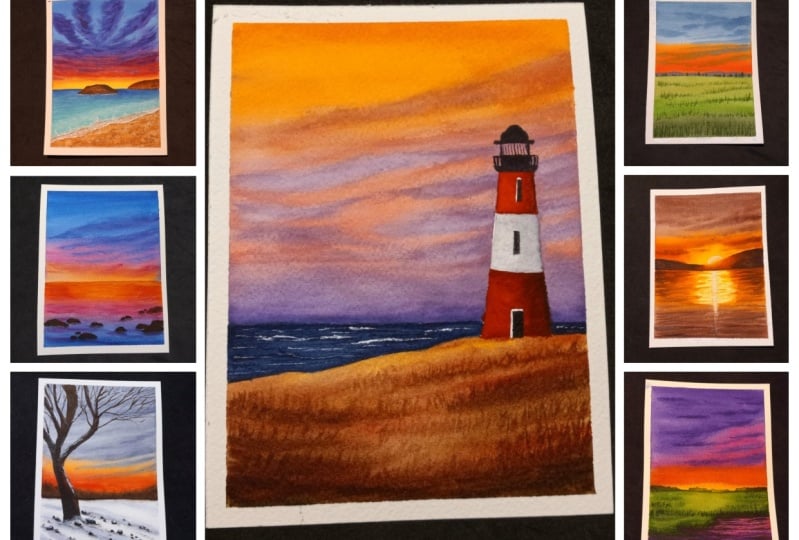
2. Class Overview: Before we start, I want to give you all a quick idea about what the class is all about
and how it is organized. As the class title sees, we're going to paint
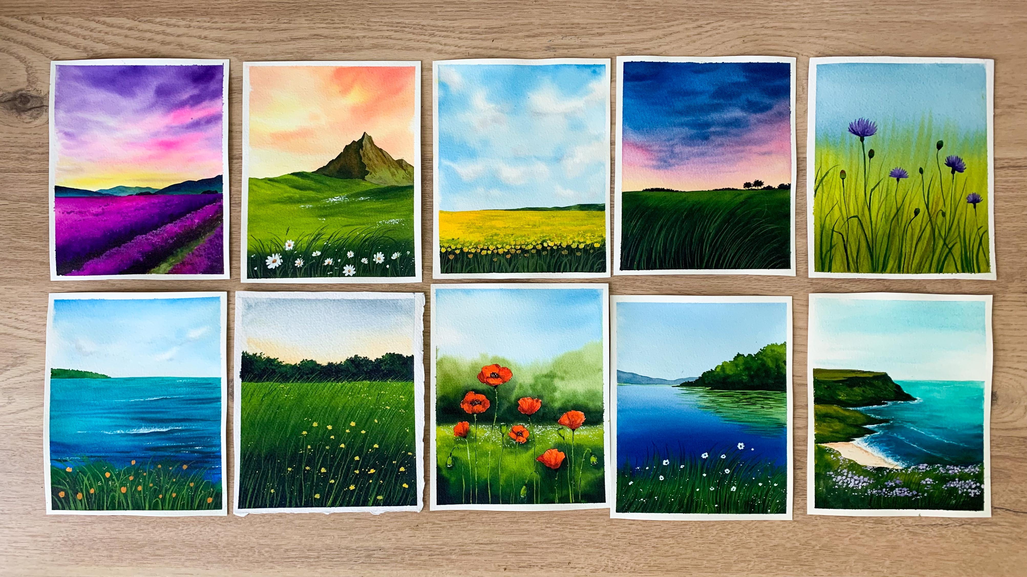
seven stunning sunsets. Throughout this
class, we all will delve into some techniques and a wide range of color palette to capture the beauty
of sunsets on paper. With each painting,
we'll explore a unique color palette
and composition, providing an expansive
understanding of color selection, blending different
colors techniques, and the art of composing
your artworks. You can see all these paintings are unique from one another. Not just the color
palette, the mood, and the entire setting of
every painting is different, which will make
the entire journey a lot more exciting
and interesting. Those are the paintings we're
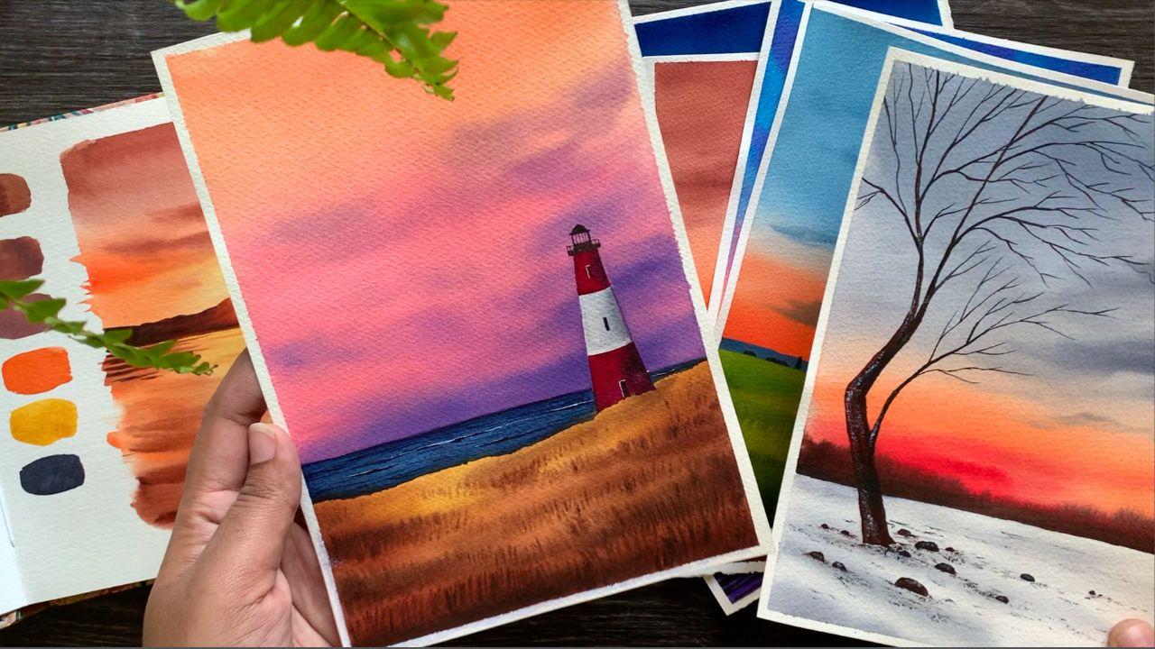
going to do in this class. There are seven sunsets. We have a simple pastel sunset. Then there is another
simple winter sunset here. These are very unique
color combinations and if you look
at this painting, there is a beautiful
lighthouse here, as well as a subtlety
in the background. The sky is one of my
absolute favorite. I just love the colors and the way the painting is composed. And here is another
one, you can see the gorgeous sky and that
beautiful grassy meadow. Every painting opens up a lot of opportunities for you all to learn new techniques centric. For every project, there is
a technique section to give you a solid understanding of
the methods and the process. In advance, we will talk about the color palette and the
essential techniques, And incorporating them, we will try a quick version
of the same painting. This way you can be a lot more confident throughout
the NT process, as you already know the methods and the techniques
that you have to use. You can see all the colors here. We will do a similar exercise
for all the projects. If you're an absolute beginner, the section is going
to be really helpful. You'll get a better
idea about the colors, the tonal values,
and the techniques, and how you can incorporate
them in your painting. So yeah, there are some stunning sunsets awaiting you all, and I think it's a
wonderful opportunity for you all to come out of your comfort zone and try some new techniques and
color combinations. If you are ready
to give it a try, join me the next section and let's together have a
look at the materials.
3. Materials you'll need: Before we start with
the exciting paintings, let's have a look at the
materials you will need. I will start with
the paper as usual, because according to me, it is the most important aspect
of a watercolor painting. So this one here is
from brand call arches. It's an artist grade
articular paper, which means it is specifically
made for waticular, it is 100% cotton. Artist grete papers are
mostly 100% cotton and student grade will
have a combination of cellulose and cotton. Try to go with the paper
that is 100% cotton. Now the next thing is this
paper is cool pressed, articular paper, which means it has a slight
amount of texture. It is not flat and it
is not overly textured. You can find hot pressed
particular paper which doesn't have any texture. Then there is rough green paper, which is a bit more
textured than coal priced. If you love working
with textured paper, you can go for rough grain. To me, personally, I love
using cold press for my aticular paintings.
There's one more thing. This paper is 140 LB, which means the paper is
quite thick enough to handle multiple layers
of water or paint. Okay, now coming to the size, this one is an four
size paper pad. For the paintings, I
have chosen five size, which means I've just
cut the paper into half. Here's one of the sunset
that we're going to do. So you can see here, I have
just cut the paper into half. That's the size I'm going with. You can go with any
size that you prefer, but go in a similar
proportion as I have composed all the paintings
in a portrait manner. Okay, that's all about
the verticlar paper. If you can try to go with the good quality
artist great aticlor paper so that you can have a best experience in
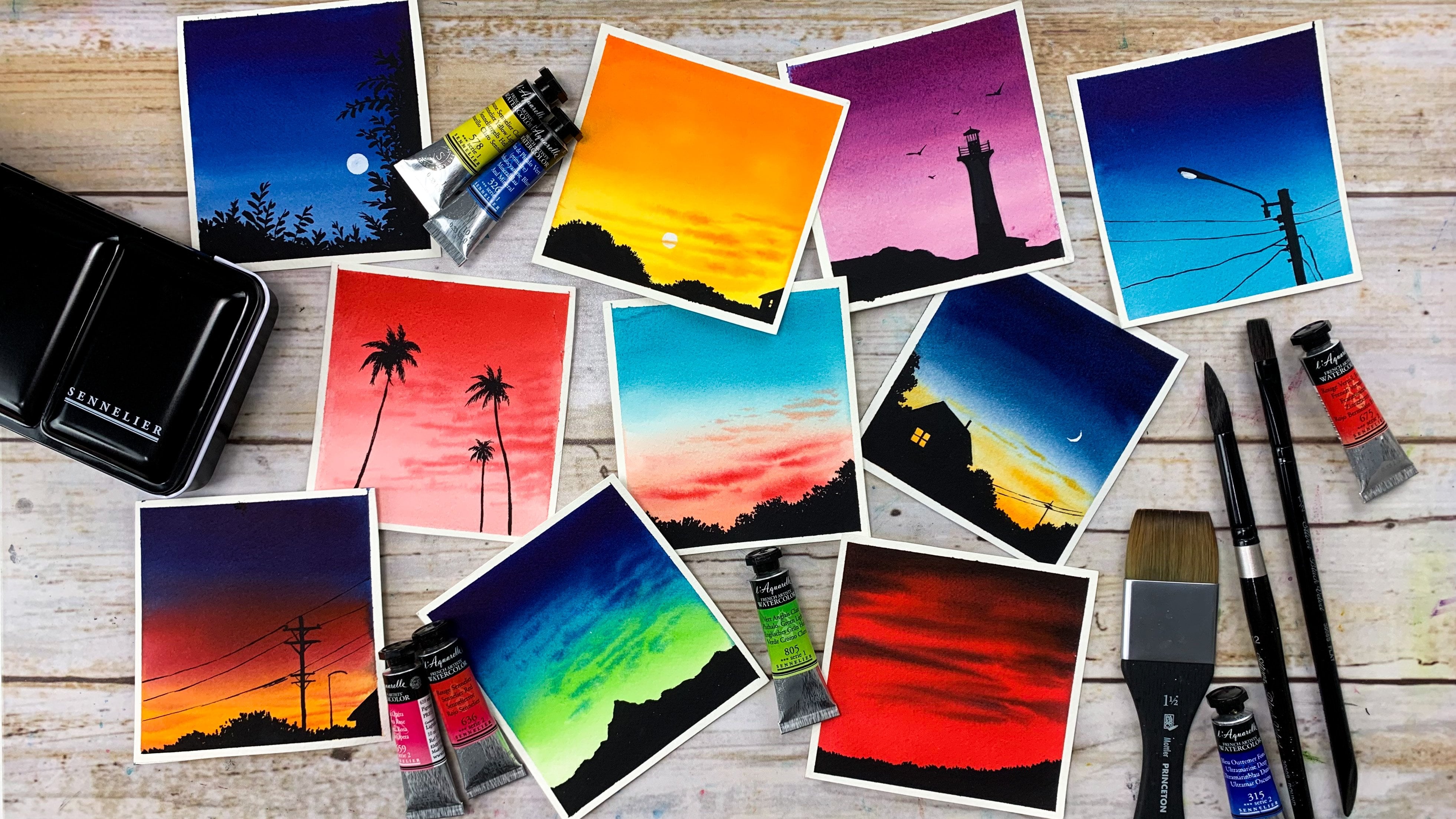
exploring verticls. Okay, now the next material I want to talk about
is the Aticlors. I'll be using verticlar
tubes from various brands. I'm not sticking to
one brand because I have favorites from
multiple brands. Over here you can see Seneliar, Megilomision, Shinhan,
Rembrandt, and Art Philosophy. These are various vaticlar
brands and they all are good. So you can just go with any
aticlar brand you have got. It doesn't need to be any of these brands, It
can be different. I will explain the colors in detail at the beginning
of every painting. Okay, now to mix your colors, say will need a mixing palette. This one is a ceramic
mixing palette. I'll just squeeze out
the paint directly onto a palette and I
will mix it here. You can go with
plastic or ceramic, any part you've got. I personally love using
ceramic because it is very easy to clean and it
doesn't stain the palette. This one is with me for
more than three years now and it is still perfect. Yeah, it is good to invest on one or two ceramic palettes. It will last life long anyways. Now let's go the
next art material, which is the watercolor brushes. These are my absolute favorite brushes to
use for watercolor. They all are from the
brand silver brush. Now let me talk
about each of them. The first one here
is a 1 " flat brush. It is basically to apply
water onto the background. For this, you can go with
any of your wider flatbrsh, make sure it is clean before you apply water onto the background. Okay. So that's the first one. I have one more flat brush in this collection which is
a half inch flat brush. This one here. I'll use this brush to apply paint
onto the background, especially if it's a blend
of two or more colors. Okay, now I have one more brush here which is the size
number 12 round brush. You can either use
a flat brush or a round brush to apply
paint onto the background. Just go with the one
that works best for you. It can be a half inch or a
three by four inch flatbush. If it's a round brush, it
could be eight, or ten or 12. Now I have three more
round brushes here. The first one is size
number eight round brush. I will be using
this brush mainly to add some clouds onto the sky or maybe to apply paint onto a landscape or a
medium sized area. Then I have two
more brushes here, one is size number two and the other one
is size number six for all the medium sized detailing albusing
size number six brush. Now the last one here
is size number two. This one is basically for
the minute detailing. When dipped in paint, it has a very nice pointed tip which makes it best for all
those fine lines. You can see that
beautiful pointed tip for all the minute details and fine lines albusing this brush. Okay, so those are
the brushes albusing. If you don't have the exact same size, that's totally fine. There is nothing
to worry. Just go with something that
is nearly similar. Now, the next thing I want to talk about is jars of water. As you can see here, I
have two jars of water. Ones to resolve the
paint from your brush, and the other one
has to stay clean. We can use this water in
case if you need to dilute some paint or if you need to apply some water
onto the background. Okay. Make it habit to work
with two jars of water. The next material
is a masking tape. This one is a very
normal masking tape. It's not an expensive
pinto tape or cross tape. It works okay for me. So I've never felt the
need to change it. You can go with any tape
that you normally use, and I'll be fixing my paper
directly onto the table. You can fix it onto your table
or onto a drawing board. That's totally your choice.
Now, the next two materials is a pencil and an eraser. There isn't a lot of
sketching involved, it is just some horizon line and some rocks and mountains. So just go with a regular
HB pencil and an eraser. Now, last but not the least, you will need a paper towel. We can use this to dab off the excess amount of water
or paint from our brushes. Okay, so that summarize all the materials you
will need for this class. Get them ready and join
me in the next section. It's tamped to paint over
first standing sunset.
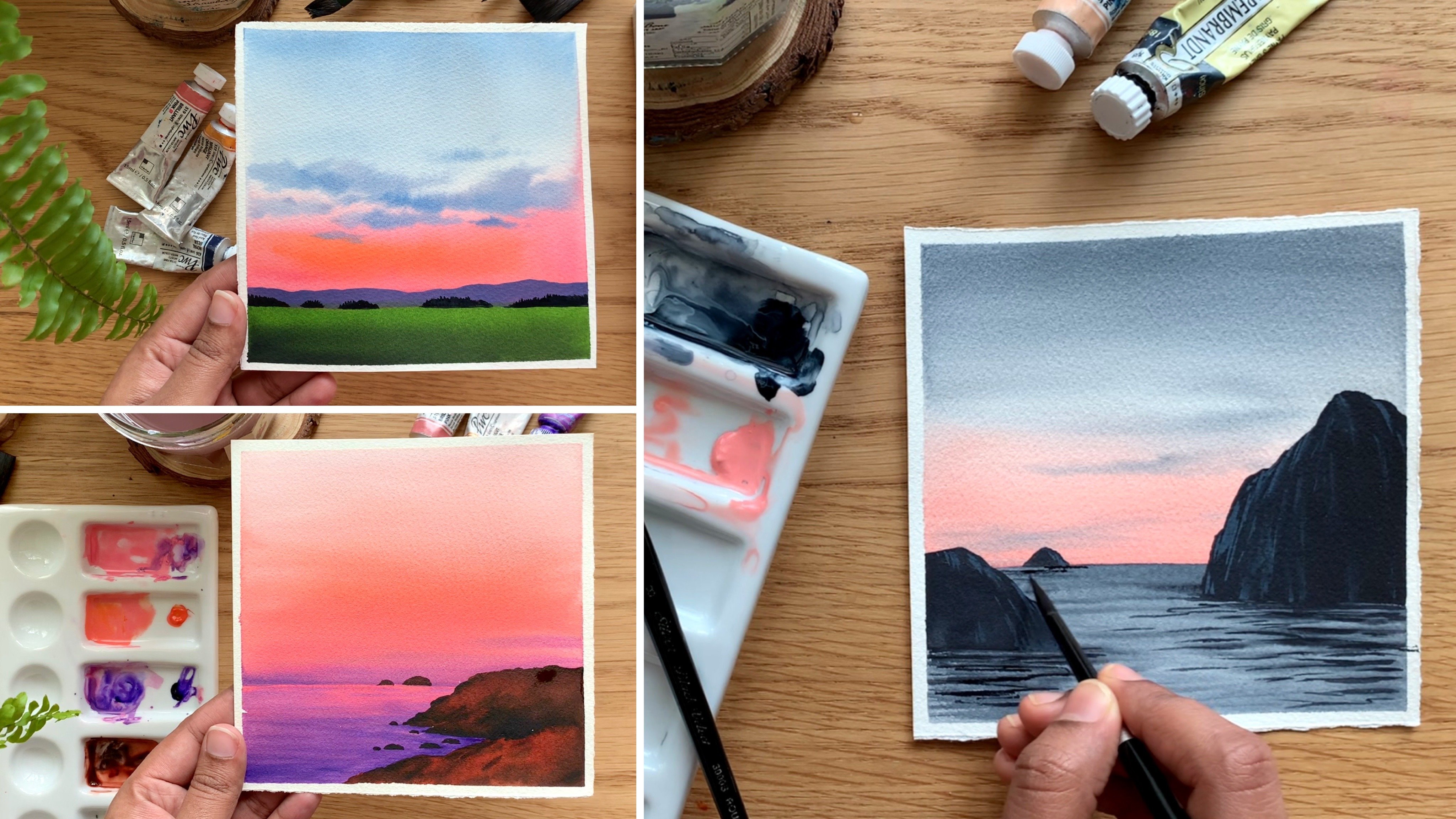
4. DAY 1 - Sunset by the Meadow - Techniques: Hello dear friends.
Welcome today, one of the seven
day sunset series. I'm very excited, and here's the first painting
that we're going to do. It's a gorgeous sky with
a stunning green meadow. First we can take a look
at the color palette. Then we can gradually
try out the techniques. If you're an absolute beginner, you can give it a try. Otherwise you can just give
it a watch for the sky. I will be using two colors, which is a blue and an orange as you could see here. Blue. You see here is Indico. This orange here is brilliant
orange from Shinhan. It is very much similar
to cadmium orange. Let me show you the swatches. First I'm going to take out
some paint onto my palette. You can go with any brand. Just ignore the brand
that I'm using here. Even the colors, they don't
need to be exactly the same. Here's the color
I'm going to use. Indico and brilliant orange. Indico is from Art philosophy, and orange is from Shinhan.
It's a Korean brand. Now I'm going to take out
some paint that is into, instead of Indico,
you can also use Prussian blue or any other
blue of your choice. The next color I will
need is brilliant orange. Don't have brilliant
orange. Just go with any kind of
orange you have. Or you can use vermion
or you can just make some yellow with vermin to
create an orange color. Just go with colors
that are available with you. Now,
there's a trick here. I won't be using indico acetous, I'll be adding some
white aticlor to it to turn that
into a Patel blue. This one is completely optional. I know some people doesn't use white watercolor in
their paintings, but then this is a
very easy method to turn your colors
into a Basel color. I really love it. There are so many pacel colors
available in the market, and they all use white
aticlor to create them. This is the same thing,
we are just mixing and creating our own pacel colors. That's only difference here. I will swatch out indigo
acetus by adding some water, and I will turn that
into medium tune. That is Indico. This one
is from art philosophy. Indio can be a bit different
with different brands. I have another Indigo from Shinhan which is actually a
bit more taker than this. Now I'm adding some white
with the same color. Here is how it has turned out. It's a really
beautiful Patel blue. Add some white with any
blue that you're using. As I mentioned Eli, it
doesn't need to be indico. You can go threshing blue, cobalt blue, or any blue. That's a difference.
For the first one, I used water to make it lighter. The second one, I used
white watercolor. If you'd like to work with
transparent watercolor, maybe you can go
the first option where you just use water
to dilute your color. I'll show you one of the
pastel watercolor I have. Here's lavender from shin hen. The pigment information clearly says there is some
white pigment in it. And that's exactly
what we have done here by adding some white
waterclor into indigo. Okay, Just decide
on whether you want to use white, just water. I have a huge collection
of pastel watercolors. Here's one of the color I
love the most, see that? It's a very beautiful
pastel violet. Honestly, it is not really necessary to invest on
pastel watercolors. You can create them
easily by adding some white water color with any color you want to
turn into a Basel color. Here is Basel Pink. This is another color
which is so gorgeous. Anyway, that's a first color I'm going to use for the sky now. The second color is orange. This one is brilliant
orange from shinhen. It's a very bright
and bold orange. For this watch, I
only used water. We'll be using a similar
tonal value along the horizon to a trecento. We'll make it lighter by
adding some white verticlor. Again, if you don't want
to use white waticlor, you can just dilute it and make it lighter by adding water. Or if you want to give
this technique a try, you're more than welcome. I'm very sure once you try it, you're going to love using
pastel water colors. Okay, So those are the two colors I'll
be using for the sky. We will go for a blend
of blue and orange. Then to add the clouds, we will again be using in Tico. Okay, so those are the colors
we'll use for the sky. If you want to try
out a different color combination,
that's totally fine. Just use the same techniques and go with any color choice of your preference for the cloud as well as for the mountain. In the background,
we'll be seeing the same color in a
slightly darker tone. You can see the mountain here. We'll increase the
amount of blue and reduce the amount of white. Okay, Now coming to the meadow, the color you see on the top, it is actually a mix
of green and orange. I mean sap, green and orange. Sapcreen is a very fresh
and beautiful green. I don't want the
colors to be too fresh as we're painting
an evening scene. Typically the colors
will be slightly dull compared to morning
and a daylight sky. I will show you the color
that I'm going to use. There is one more color you will need, which is neutral tint. Paints gray. They
are both similar. Just go with either paint
scray or neutral tint. Okay, I have green, orange, and neutral tint here. Now I'm going to
create olive green. Maybe some of you may
have it with you. In that case, you don't
need to mix and create, you can use it directly. First, I will swatch
out sap green. Then I will mix and
create olive green. I'm very sure you all
have Sac with you. It's a pretty common color which comes in almost
all vertical sets. Okay, this one is from Shinhan. You can go with any
brand for the meadow. We'll be using a combination of olive green sac crane
and a Dako green. The color right
here is sap green. Next I'm going to mix
and Crete, olive green. I already have some
orange on my palette. I'll just pick a little of
that and mix with sap green. Let's see how that is
going to turn out. This is the color
I'm talking about. You can see that dull
green along the horizon. Let's mix some green
and orange together. I have an olive
green from Bangkok. But for some reason I love the color which
I mix and create. The other color is
quite tall tenders. Okay, I'm mixing some
orange with sap green. And you can see the
color I have created. It's a slightly dull green, which is the kind of green
we need for the meadow. Now, let me show you
the Swatch. Okay. That's the color
we have created. Depending on the amount of green and orange you're mixing, the color can be a bit different and that is totally fine. It's nature, the
colors can vary. It doesn't need to
be exactly the same. It's a very simple mix of
sap, green and orange. And that's a green
we have created. Okay, let's go the last color
which is a darker green, That's a mix of neutral
tent and sap green. We'll be using this color
to add the deeper tones. As I said lo, it could be either pinscray or neutral tent. Just mix a little of green with that and you can see the
color at the bottom. Also those trays
for all of that, we'll be using a taco tone of cream by mixing some paints, gray with sap cream. Okay, that's the final color we'll need for this painting. Typically we need
in Tico orange, sap green and neutral tent and also some white to create
all the Basel colors. Now before I show you
the demo of the sky, there is something
you need to know about Nico and Orange. They are complimentary
the color wheel which means if you
mix them together, they will create a muddy
brown for the sky. When you use them, you
always have to make the color lito on the area where these
two colors are meeting. Right here, I'm
using a Patel tico, now I'm going to make it lito. Then towards the other end, I will introduce some orange. Over here, I'm using a
really light orange. Have added some white. Okay. The color is
not that muddy. The only reason
is because we are using white water
color along with it. See that when I'm mixing them, they're not create a muddy me. Now towards the other end, I will introduce
some bright orange. Right at the center
where you have orange. And intgo mating, we'll have
to make the color lighter. In this case, I
used white aticlor and have made orange
and inticolighter. But if you're not
using white aticlor, you will have to make
the color lighter by diluting it. Okay. This is the color combination we're going to use for the sky. Maybe to get a better idea, I can show you the
same color combination without adding white, you will clearly
see the muddy color that is being
created in between. I'm taking some Intigo, again without any white. That is the indico.
It's a medium tone. Now, I'm making a bit
lighter with some water. Next I'm picking some orange. You can see the color created. These two are
complimentary colors. If you mix them in their
actual intensities, they will create a muddy color. That is the reason we are making the color lighter towards the center where blue
and orange is meeting. Okay, I hope you all got an idea now let's
try out the sky. Before we go ahead, just make up your mind whether
you want to go worth a white water color or just
water to apply the paint. Albus on rush the soon as
the size number eight rush. First I will start
by applying a coat of water onto a small section. We're just going to try
the color combination and how to add those clouds. If you're an absolute ******, take out a scrap piece of
paper and try this out. If you already know how
water color works on paper, and if you're a pro
in creating clouds, you just need to
give it a watch. You don't need to try it every time before you add
water onto your paper. Just make sure your
brush is clean. Now, let's start with
that pastel plue. I'm adding that on the top. See that? That's the
color I'm using. Now I'm going to make
it lighter towards the center by picking a
bit of white water color. Okay, now I'm again
washing off the paint from my brush and I'm switching
to pistol orange. Clean your brush before
you pick orange. Now let's add that
pistol orange onto the sky towards the
bottomost area. I'm going to make
it more brighter. I want to bring in a
contrast in the sky. Okay, first let's blend these
well with a clean brush. When you're working with
complimentary colors, make a habit to clean
your brush in between. Okay, now I'm picking a bright orange and I'm adding
that along the horizon. The striking contrast is
the beauty of the sky. Otherwise, it can be
quite plain and boring. Okay, so we have a
pastel blue on the top, then a lighter tone of orange
and blue at the center, and a very bright
orange at the bottom. That is our base layer. When we're painting on
a bigger scale paper, it will be a little more easy to blend the color than this. Now I'm going to keep
this pressure aside, and I'm switching to a smaller
brush to add the clouds. To add the clouds as
I'm using indigo, the same pastel color, and I'm adding some random
clouds onto the wet sky. See that when you're
adding clouds, always make sure your
paint is not too watery. If it's a lot watery, dab it on a paper towel before you're adding
clouds onto the paper. If it's too watery,
they can spread into the background in a
very vigorous way, they won't have any shape. Okay. Now I have added some clouds on the top and a few at the bottom. I don't want to
add a lot towards the orange part because the
color can be a little muddy. You can add in as
many clouds as you want and as little as you want, you have the total freedom
to decide on that. Okay, right here, I think
I have added enough. I don't want to add a
lot for the background. We used pastel colors, which means we have added
some white aticular water. For the same reason
the clouds you're adding will have a better shape. They won't spread a lot. But if you're using Atclar
in its transparent form, if you're only using water
to make the color lighter, the result can be a bit
different than this. Okay, that's how we're going
to paint the sky here. Have used a lot more clouds. If you're adding more clouds, you just need to
work quite fast and you need to add them all
before your background tries. Okay. That's the only thing
you have to keep in mind. Next we are going
to try the meadow. We already tried
creating the color. We'll be using olive green, sacrine, and also a daker
green for the background. Okay, let's try it out. First we'll have to
paint the background. And for that I'm using my
size number eight brush. I will start with
that olive green. Then in between,
I will introduce some saccrine as well
as a daker cream. Then onto that background, using a smaller brush, I will
add some grassy pattern. Okay, I'm starting by
applying a coat of water. I'm leaving a little gap in between so that I
won't spoil my sky. Okay, just make your
background even wet. Now, I'm switching to my Trish. It's a medium sized Ron Trish. I'm starting off
with olive green. We already tried
creating that color. It's a mix of orange and green. Our idea is to introduce
different tonal values of green into the background to make
it look more realistic. Looks like there is no green
there. It's all orange. The color looks very muddy. I'm going to take out some
more green onto my palette. If you want the color
to be more dull, you can use burn cena
instead of orange. That will result in a
beautiful olive green. Anyway, I'm applying this
color along the horizon, it looks like there's
a lot of orange there. The color looks quite tall. Anyway, that's not a problem. Depending on the proportion
of orange and green, your color can be a lot more
muddy or more greenish. That is olive green. Now, I'm going to pick some
clean sap cream, then I will drop
that in between. Okay, we have some
olive green on the top. Now I'm using some sap cream. Now towards the bottomst area, we want the green
to be more darker. I'm mixing some sap
green with neutltan. I will add that along
the bottom part. Okay, that's our next task. The darker tones are
really important to show that depth and shadows
in our painting. Okay, just make some paint, sky or neutral tent with sap green and add that
along the bottom. Okay, we have added all the
greens onto the background. Now I'm going to keep
this pressure aside. I'm switching to
a smaller brush. Using that smaller brush, I'm going to randomly add some
lines onto the background. See that they're just
some thick lines. I'm just dragging my brush and adding them on
the wet background. We don't need a lot
towards a horizon. Add in two or three
towards the bottom. Very less towards a horizon. They can be of any length and they can be
of any thickness. To make it more visible,
use a darker tone. Okay, just add them while
your background is still wet. Don't beat for a longer time. And use any of your
medium size brush or a smaller size brush. Painting the background
is the very first step. Now adding these lines
is the second step. Now we're going to go
with the third step. For that, you will need any of your smaller brush
or a brush with a pointed tip and go back
with a darker tone of green. Now using this brush,
we're going to add some grassy pattern again
onto the wet background. Now there are a few things
you have to keep in mind. The first thing is your pain
shouldn't be too watery. Add them along the
lines we have added here on the background, we have added a few
lines using a taco tone. We need to add these grassy
lines following those lines, go with the pain that
is not too watery. And keep adding some
rough lines onto the background while
it is still wet. We don't want the lines
to be too prominent. That is the reason
why we're adding them on a wet background. Keep adding them along. That medium tones and
taco tones we have added retain the lighter space. Retaining that lighter space in between is what makes your background look
more realistic. That's a key. Don't
get rid of them. Keep adding your
grassy pattern onto the area where you have your
medium tones and a cartoons. I think you can already feel
the way it is turning out. It is starting to get
a realistic touch. Keep preparing the same step until you're happy
with the result. I'm not going to put
a lot of effort. My idea is to just convey the technique and give you a solid understanding
about the process. And the approach you
need to follow can put a lot more effort and we can refine it better as we paint. Here's a technique over here, we need some olive green, then you can introduce some sap green onto
the background. And after that, make it
darker towards the bottom. Then again, using a darker tone, add a few lines onto
the wet background. Finally, along that line, you have added introduce
some grassy texture. These are just some random
lines using a smaller brush. It doesn't have any proper
shape or size or length. We are just adding them onto the wet background to create some texture and add
a realistic touch. You can use a daco tone
towards the bottom most area and then a medium the
along the top. All right. That's a technique, as
I mentioned earlier, retaining that lighter
space in between is the key to get that
realistic feel. Keep that in mind when
you're about to paint. Here's a closer
look of the meadow and you can see how
beautiful it has turned out. I think it looks very realistic. Anyway, that's the
meadow technique. These were the two major
things I want to discuss. The rest is quite simple. Then we will just need to
add a mountain using Tico, the same color we used here. We'll be adding that
along the horizon. Then to make it
look complete and also to define the horizon line, we'll be adding
some small trees. Maybe we can try
adding them quickly. I already thank you. I'm going to use the same Patel
Intico I created earlier. It doesn't need to be too dark. Maybe you can use the
same tunel value that is used for the clouds, okay? Now start by adding an outline, then you can just
simply fill it. Go with a similar height, don't make it too huge. Now just fill it up. It is exactly the same
color as the clouds. As we have a darker
orange in the background, the color is appearing
a bit darker. Okay. Now just fill it up. We need a straight line
along the horizon. Okay, that's a mountain. Next I'm going to show you
the trees. Let this dry. I'll show you that on a
scrap piece of paper. The trees we're going to add on the painting is going
to be super tiny, but maybe I can show
you the same on a bigger scale so that you
can have a better idea. Look at that. They
are super tiny. That's the size we have
to use for the painting. This will bring a
sense of distance, Focus on the size when
you're adding them onto your painting right now as
we're just trying it out, maybe we can try that
on a bigger scale. The color I'm using
here is a darker green. It's a mix of sap, cream, and paint scray.
That's a left side. Now I'm going to clean
my brush and I will pick some sap cream and I will
finish up the shape. Okay, That's how
we're going to paint the trees. This
one is quite big. That's the reason why
I used two colors. If they're super tiny, you
can just use a darker green. Or just paint Scraye on
Nutriltent and finish off your trees when it's super tiny. Those tunal values soon be visible only if it's
slightly bigger. You can use two different
tonal values of green or even that is
also not necessary. You can just go the darker
green and add trees. Okay, so that's a horizon
details I think we discussed about everything you need to know before
you get started. And I really hope you guys were able to follow
the techniques. If you want to try it
out, give it a try. And join me the next
section so that we can paint our first
stunning sunset.
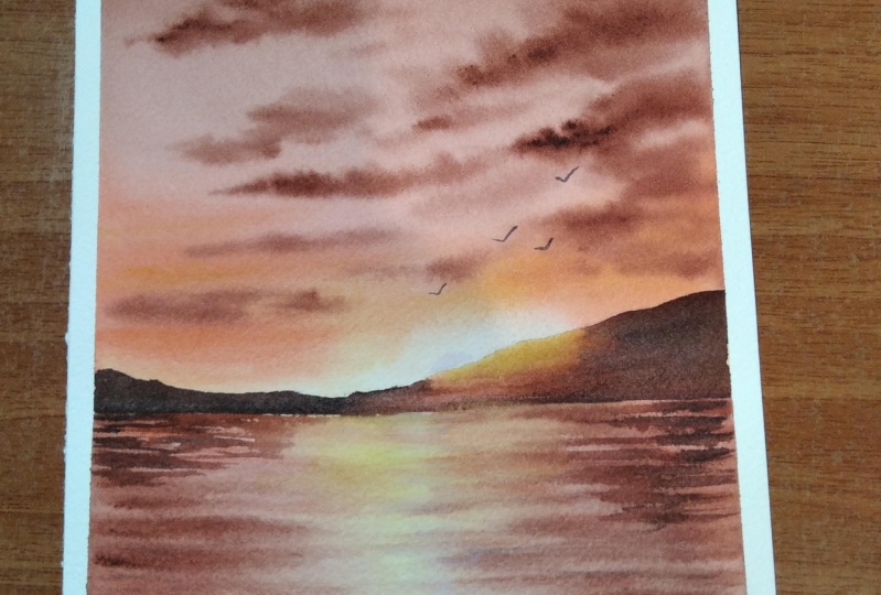
5. Sunset by the Meadow - Painting: All right, so I have
a clean palette and have fixed my
paper onto my table. We already had a look at essential techniques
as well as the colors. The first color you
will need is Tico. Then you will need some orange. You can go with any orange. The one I'm using here
is brilliant orange. I'm going to squeeze out some
white Waticulor as well, onto both of these colors. It doesn't need to be gas, we only need some white aticlar. Okay, I'm going to take
out some white aticulor. I will add that here and here. Okay, Those are the two colors
I will need for the sky, no matter which
painting you're doing, If it's a veteran wet sky or
a veteran wet background, always keep your colors
ready before you start. This way you won't lose any
time in between anyway. I'm going to start by
adding the horizon line. I'm adding that a bit below
the center of the paper. The top part is
going to be the sky. The bottom is going
to be a meadow. Okay? The only skit
you need to add. Now, as we have
the colors ready, we can start applying a
coat of water onto the sky. Go with any of your wider brush Before you apply water,
make sure it is clean. Now, this is the
brush I'll be using to apply paint onto
the background. Then using a smaller
round brush, I'll be adding the clouds. Okay, technically these are the three brushes I'll be using to apply paint onto the sky. Now I'm starting by
applying a coat of water using my 1 " wash brush. Let's apply a nice even coat. Keep running your brush multiple times so that we don't
have any pools of water. It is even okay. I have applied water
onto the entire sky. I'm running my brush again to make sure there's an even coat. Okay, now let's start applying paint onto this wet background. I'm starting with Tico. I'm mixing that with
a bit of white. We need a medium tone of Tico. You can just water it down or you can add some
white water color. As I'm doing here now. I'm applying that on
the top of the sky. Okay, I'm picking more paint. It looks like there is some
green color on my brush. Let me clean it again. I'm picking more paint. I'm adding that onto
the background. You can see the blue is
a bit different now, earlier my brush
was slightly dirty. Okay, I have applied blue
onto half of the sky. I'll just wipe off the
water from the border. Okay. Now let's add
some more blue. Now, I'm going to clean
my brush and I'm picking some white and I'm going
to make the color lighter. Just make sure your
brush is clean. Then pick some white water color and add that right next to
blue and make it lighter. If you're someone who don't
use white verticlar at all, this might seem a bit we heard, but you can just water it down and make
your color lighter. Now in a similar way, I'm
adding some white with orange. And I'm adding that onto the
remaining area right here, we're using a pastel orange. And I'm blending that
with that pastel Tico. As we have added
white verticlar, these colors wouldn't
create a muddy mix. Now I'm going to clean my brush, and I'm going to pick some
more fresh and bright orange. And I'm adding that
along the horizon. See that I'm using a much more brighter tone
of orange right now. And I'm adding that
along the horizon. Okay, so we have
a lighter blue on the top and a lighter
orange at the center. Then towards the bottom, we have a really bright orange. We can make it a
bit more brighter. We're trying to play with
that contrast in the sky. Trust me, you'll be surprised to see the way the sky
is going to turn out. Okay, now I'm cleaning my brush and I'm
going to blend it. I have accidentally
drop some water. I'm going to fix that next. Then I will add some clouds
onto the background. I'm picking more orange
and I'm just smudging it. Okay, so that's our base layer. Now I'm going to keep
this pressure aside. I'm switching to my round brush. This brush is size number six. I would recommend
going with any of your medium size brush,
not a bigger brush. Size number four or
five or six is perfect. Now I'm going to go
back with the intgo, the same intigo I
created earlier which is a mix of
white and Intico. Now using that, I'm going to add some beautiful clouds
onto this wet background. We don't need the paint
to be super watery, just dab it on a paper towel. We need a paint that
is moderately wet. Now, I'll add some random
clouds onto the sky. You can add them
however you want. You can go for bigger clouds or smaller clouds can
be in any shape, but the key is adding them while the
background is still wet. Don't wait for a longer time. Keep adding them while the
background is still wet. Otherwise, they
won't spread into the background and
they will look too prominent and rough to get
a smooth and soft clouds. It is very important to add them while your background
is still wet. You can see the way
how I'm adding it doesn't have any
particular shape or size. I'm just randomly adding them
onto the wet background. Right now, I have added
them on the top and also at the center where
we have that lighter or
6. DAY 2 - Glowing Sunset - Techniques: Hello my dear
friends. Welcome back and welcome today two. So here's the painting that
we're going to try today. It's a beautiful
color combination. We're going to play
with some brown, orange, and yellow today. First, I will introduce
you all to the colors, then we can have a look
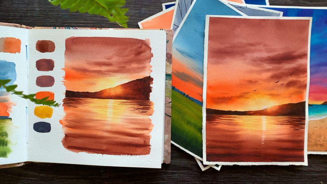
at the techniques. The Brown I'm going to
use is permanent brown. If you don't have brown,
you can use burn scena. This one is from art philosophy. Permanent brown is more
like a reddish brown. And burn scena as more
of a yellowish brown. That's a major difference. If you have brown, I would
recommend going with that. But if you don't have
it, that's truly fine. Just go with burn scena. Okay, that's the first
color you will need. We'll be using that for the sky, the water, as well
as for the mountain. One of the major color we will need is brown or burn sena. The next color is orange. If you don't have
orange, you can use vermilion or can mix and create an orange by adding some yellow
into Vermilion. Okay, that's our second color. Now there is one more color you will need which is yellow. We'll be using brown, orange,
and yellow for the sky. It can be any yellow. The one I'm using
is Indian yellow. You can go with Gamboo yellow, primary yellow,
transparent yellow, or any yellow you have got. Okay, so those are the three colors I'll
be using for the sky. Now, along with these, I will also be adding
a bit of white. You can see the color on the
top. It's a pastel brown. I have added some
white into brown. It's the same way how we made pastel blue in the
previous painting. So that's the color
you see on the top. Then we have orange
and some yellow here and we have made it
lighter, closer to the mountain. Okay. Those are the colors
I'll be using for the sky. Now, I will take out
some white asphalt. Then I can show
you the swatches. It is just some
white water color. It doesn't need to
be white quash. Let me take out a little. Okay, have all the colors
ready on my palette. First, I'll show you a
medium tone of brown. Then I will add
some white to it. And let's see how the
color is turning out. I'm adding some water and I'm turning that
into a medium tone. And here's the color.
It's a beautiful brown. I love this particular
color from art philosophy. Then I love brown
from Shinhan Asphal. Okay, so that's a color. Now into the scene, I'm
going to add some white. And let's see how that
is going to turn out. Right now, I'm mixing
some brown with white. All the colors are
not available. In the paste version,
you'll find pink, blue, violet, green, and a few other
colors. But not brown. This color is very unique. And that's a one, see that it's a very opaque
and creamy color. Maybe we can add some white and see how that is
going to turn out. Depending on the amount
of white you're adding, the color will be more
lito and more creamier. The previous color
was a bit tark. This one is similar to
the one I'm using here. Okay, Now the second color
you will need is orange. This one is a very
beautiful orange. It is brilliant
orange from shinhen. Cadmium orange is very much
similar to this red orange. Okay, that's the second color. Now we have one more
color which is yellow. This one is Indian
yellow from shinhen. Again, you can go with
any yellow you have got. Okay. That's a color
palette we'll be using for the sky, for the Lee asphalt. We're going to use
the same colors. But along with these
you will also need one more color which is
neutral tint or pain scray. We'll be using this to add the deeper tones as well
as for the mountains. If you don't have
pinsky or neutral tint, just go with black. Neutral tint or pain. Screy is a beautiful color if
you don't have it. I would really recommend adding
that to your collection. Because if you add black into your colors
to make it darker, it will appear a bit dull. But with pinscray or neutral
tint, that doesn't happen. And also it is a wonderful color to paint monochrome paintings. Okay. That summarize
all the colors you will need for this painting. You will need some
brown, orange, yellow, and neutral tint
and also some white. Okay, now we can start
with the techniques, just the same way how we
tried for the previous one. I will show you how to paint
the sky and also the lake. Then we can try the mountain
as well as a reflection. It's a beautiful technique. You can use this in your
future paintings as well. Give it a try,
especially if you're a beginner or an
intermediate artist. Okay, first I'm starting
by adding a line, the horizon line, Then I
will add a simple mountain. So that's my horizon line. Now I'm going to add a
very basic mountain. Now here is where I'm
imagining my sun to be. Over here, we will
use lighter tones, and towards the top we will
use more of medium tones. That's a plan, Let's try it out. Before you start,
make sure you have the colors ready
on your palette. Now I'm starting by
applying a coat of water onto the sky. Using my 1 " flatbrush. We just need a shiny coat
of water. Don't add a lot. I'm adding that
only onto the sky. Okay, my sky is even wet. Now. I'm going to keep this aside
to paint the base layer, I'm using my half inch flatbrh, a flat brush or a round brush, and I'm starting off
with a pastel brown. It's a mix of brown
and some white. I'm using a medium tone of that. You can go a medium tone or a lighter tone according
to your preference. That's the color I'm going with. I'm adding that on
the top of the sky. Okay, I'm adding some more. Then gradually I will
switch to orange. That is pastel brown. Now let's clean the brush. Let's go with pastel orange. I already have some
orange and white here. I'm mixing them together and I'm adding that pistol
orange right next to brown. And I'm blending
them after that, I'm picking some
brighter orange. I'm adding that onto the left. I'm leaving the center part act that's where we have the sun. Now, let's clean this brush and let's switch
to a round brush. Now with that clean brush,
I'm picking some yellow. I'm not going to add any
paint at the center, that's where we have the sun. If we can retain
the lighter space and add yellow onto
the remaining area, then you can just much it. This lighter area holds
a lot of importance. That is what creates that
glowy effect in our painting. Try to retain some
lighter space here. Okay, so that's a background. Now onto this background, we're going to add some
clouds while it is still dry. With the same brush,
I'm picking some brown. Okay, It's a medium tone. Now, I'm just
dabbing my brush on a paper towel just
to make sure that the paint is not too watery
and I'm adding the clouds. When you're adding
clouds, you have to be very quick and consistent. You need to add them before
your background dries. So we have some pastel
colors in the background. For the same reason when you're
adding clouds over there, they will look a little lighter. On the remaining area, they
will appear a bit darker. We'll have a combination
of different kind of tonal values and that's
the beauty of the sky. Okay, now I'm going to add some more clouds while the
background is still wet. You know what? Personally, I prefer using a paint
which is not too watery. When I'm adding the
clouds this way, I have a better control on
the way they are spreading. If it's a very watery paint, they will spread a lot into the background and it
will lose the shape. Now, there's one
more thing I do. I used to go with a clean brush, a clean tap brush, and I will gently smudge the paint to give it
a more smoother look. This will also prevent the
paint from further spreading. Okay, that's how the
sky has turned out. Now maybe we can add
some more clouds on the top using a
slightly darker tone. Make it a bit more dramatic. If you're already happy
with your sky and if you feel it is starting to dry,
just leave it as it is. At any point, if you feel your paper is starting to
dry, that's your sign. Don't add any more cloud, just leave the way it
is you might feel. I will add just one more, but then maybe that one
stroke will ruin your sky. Anyways, that's how the
sky has turned out. I still managed to retain
some lighter space here. You can see that right
above the mountain, we're going to use the same sky for our main painting asphalt. But we have a lot more
space to play with. We can add some more clouds and we can do some fine tuning. I'm going to write a way you
start with the leg first, I will start by applying
a coat of water. The sky has almost dried. Gently apply a coat of water
onto the entire bottom part. If your sky is still wet, leave a tiny gap in between. Okay, that is even wet. Now, to apply the paint, I'm switching back
to my flat brush. I'm starting with yellow. Before you start
picking your paint, make sure your brush is clean. Now, over here, I'm going
to add some yellow. With my flat brush, I'm picking some yellow. It's a medium tone. I'm adding that right
underneath the mountain. Just add that in a exact way. Next, with the same brush, I'm picking some orange. I'm adding that
onto either side. From either side, I'm dragging my brush
towards the center. Okay, we still have some
yellow at the center. I'm adding orange
onto either side. Now, with the same brush, I'm
going to pick some brown. And I'm adding that
towards the bottom. Just roughly blend
that with orange. Okay, so we have some
yellow at the center, orange on either side, and some brown at the bottom. Now, with the same brush,
I'm adding some lines on either side to add in
some medium tones. Okay, now I'm going to
keep this brush aside. I'm quickly switching
to our arm brush. Clean round brush. Now comes the trick with that
clean, damp brush. I'm going to lift off some
paint from the center. Drag your brush down. Lift
off some paint every time. Clean your brush before you
go with the second round. Okay, we're just lifting
some paint in a linear way. It's a vertical line. I know it looks. We
heard pick some orange, a medium tone, and gently add some lines back and
forth and see that. Beautiful, right? So we have
easily created a reflection. Now I can add some more lines. When you're adding these lines, don't add them too
close to each other. Try to lay some cap in between. Okay, that's a reflection
now with the same fresh, I'm picking a taco
tone of brown. I'm going to add some
lines onto the background. This needs to be done while
the background is still wet, so we don't have
any time to waste. We need to add them right away. We still have that
reflection in place. You can see how beautiful
it is turning out. I'm adding some
thick brown lines. The color is much more
darker at the bottom. As I'm going towards a horizon, I'm making it a little lighter. Okay. That lighter tones
you see in between is the beauty of this painting and that is what
makes it glowing. Okay. Don't add a lot of lines
when you're adding them. Don't forget to lay
some cap in between. Take out a scrap piece of
paper and try this technique. It's a beautiful
technique which you can use in your future
paintings as well, no matter which color you're
using for your background. This technique works
like magic. Try it out. Just take out a scrap piece of paper and do it on
a small section. Okay, I'm adding
some more lines. I'm adding the lines
mostly at the bottom, and I'm leaving some
cap in between. That's how we can achieve
that chloe effect here. Lifting up the paint is
the major feature here. That's why I'm asking
you to try it out. This way you will
have a better idea about your paper, you know, how long it is taking to try, and how fast you need to
work to lift up the paint. That's the sky and the lake. Now we're going to
try the mountain. You can see that
glowing effect here. Then we have this reflection. These are the two things
we have to try creating. This effect is
also quite simple. Let me show you. We will
use the same colors. We need some yellow,
then a bit of orange, brown, as well as neutral tint, or paints gray on the top. Over here we will
use some yellow. The idea is to use lighter tones where we have the sun and then around that we can use more of darker tones to
create that contrast. All right, so have
all the colors ready. Now I'm starting by cleaning my brush. Make
sure it's cleaned. Before you start over here, we're going to use yellow.
Let's start with the yellow. I'm picking a
lighter tone and I'm adding that towards the
topmost area of the mountain. Okay, maybe we can
make it a bit lighter. I'm using a Ta brush and I'm smudging the paint to
make it a bit lighter. Now with the same brush,
I'm picking some orange. And I'm adding that
right next to yellow. So just like we painted the sky, we need to read in some of
the lighter tone around the top part of the mountain
to create that glowy effect. Now, I'm adding orange around yellow and with a clean
brush, I'm just mudging it. Okay. So that is
yellow and orange. Now I'm cleaning my brush again, and I'm picking
some more yellow. The other colors
didn't blend well. I'm just mudging it again. Okay, that is yellow and orange. Now let's go with the next
color or which is brown. It can be brown or burn sina. Now let's add that
onto either side. Okay, right next to orange, Introduce some
brown or burn sina. You can start by
adding the sheep, then you can just fill it up. I'm using a darko tone of brown. Here go the similar tonal
value, don't make it too light. Okay, now just fill
that tir shape. Let's much that with orange. I'm picking some more
orange to make it easier. Okay, maybe we can clean our brush then smug it because there's a lot
of brown on my brush. I'm fixing the line. Aspholl, I need a straight horizon line, now I'm picking more brown. Adding that on the other side, basically, wherever you're
indicating the sun, you need to use lighter tones. Then around that you can use more rough medium
tones and taco tones. Okay. Now I'm going
to fill this area. Then I need to smudge it
with orange and yellow. It doesn't look very smooth. I'm picking more orange
and I'm smudging it again. I will have to do the
same thing with yellow. For some reason. It is
extremely hot here today, and my paper is drying
up quite quickly. I think I should have used
a bit more watery paint. Anyway, that's how
it has turned out, so we need some
yellow on the top, then some orange around it. Towards either side, you can introduce more brown
and neutral tint. Okay, So that's a mountain. You can keep smudging the paint as I did once you
have applied it. Okay, Maybe we can add
some more orange here. The only thing you
have to keep in mind is to retain that
lighter tones here. The rest, you can add the
paint however you want. Now, there's one last
thing I want to do, and for that I'm picking some neutral tint and I'm
adding that onto either side. Okay, Onto the extreme sides we can introduce some taco tone. And towards the
center where we have the sun way to retain
the lighter tones. That's a truck. It
isn't that complicated. Give it a try on a
scrap piece of paper, especially if you're a beginner. Okay, That's how we are
going to paint the mountain. The next thing we have to
try is the reflection. But before that, I will just
make this a straight line. It's not a straight line, it looks a bit wavy. I'm just fixing it. Then we can start adding the reflection. Okay, that is done. I think there is something about this color palette which
makes it look so magical, especially the glow
and the reflection. Anyways, let's quickly try the reflection that we can
try this on a bigger scale. For the reflection as well, I'm going to use
Brown and Teton. You don't need to wait
for the mountain to dry Between the reflections
and the mountain, we will leave a tiny cap. Okay, we can start with
the reflection right away. I'll start with the
medium tone of brown. We won't add any additional
details towards the center. We're adding the reflection
only on either side. Let's start with the
medium tone of brown. See my size number
six. Push here. Go with any of your
smaller size brush or a medium size brush. Okay, I have taken some
paint on my brush, now I'm going to add some
lines on either side. I'm starting with the left. Be sure to go the medium tone. Now, simply keep on adding some lines in between,
try to lay some cap. Okay, these are just
some random lines, some of them are longer, some of them are shorter. There is no particular order. Now I'm picking a daco tone and I'm adding that
onto the extreme side. Okay. Only onto
this extreme side. It is not a new line. I'm just adding
the taco tone onto this left side of the same
lines I have added earlier. Additionally, I'm also adding some shorter lines.
What's the bottom? Okay. Start with the
medium tone of prown, add some lines,
then onto the end, you can introduce
some taco tone. Now in a similar
way, I'm going to paint the reflection
on the other side. It's again a simple truck. We are just playing with
different tonal values to get that beautiful
reflection. First, go back with your medium tone and
simply add some lines. Adding them, try
to leave a gap in between to make it
look more realistic. The weight will look like
the moment in the water. They are just some random lines. Okay, Right now, the color I used as a
medium tone of brown. Now with the same brush,
I'm going to pick some taco tone by adding a
bit of neutral Tn to brown. With that, I'm adding
some taco tone onto the right side,
only onto the right. That is something you
have to keep in mind. Towards the center, we
have a medium tone. Towards the extreme sides, we have a taco tone. Now I'm adding a few more
lines towards the bottom, just a few tiny lines. That's a reflection.
We're going to use the same technique
on our main painting, asphalt, but it's going to be
in a bit more larger scale. We'll have a lot more
space to play with. Yeah, if you're an
absolute beginner, try out these techniques on a scrap piece of paper so that you have a better idea on how to approach your painting this way. You won't make any
mistakes and you'll be a lot more confident
throughout the process. We have tried all
the techniques. Now it's time to give it a try.
7. DAY 2 - Glowing Sunset: All right, so I have all the
colors ready on my palette. Now I'm going to start by
adding a horizon line, which is a bit below the
center of the paper. Okay, now we need
to add a mountain. You can either go
in a similar height or you can add it
however you want. You can modify the shape of the mountain
however you want. You can add that
only onto one side. Now at the center,
we'll be adding a sun. And it's reflection. And that's the interesting part
about this painting. Now, before I start, I'm thinking to
modify this side. I'm making that a
bit more higher, otherwise it will look
the same throughout. But if you want to
make it symmetrical on either side, that
is totally fine. Okay, so I'm just making
this area higher. All right, so that's a
sketch. Now let's begin. I have some permanent brown, orange and some
yellow on my palette. Now, along with this,
you will also need one color which is white. All right, so I
have all the colors ready now on the top of the sky, I will introduce some brown, then to, at the
center, some orange. And over here we'll
add some yellow. Okay, so keep all the colors
ready before you start. Once you have the colors ready, go with any of your clean, wider brush and start applying a coat of water
onto the entire sky. Make it evenly wet
around your brush multiple times so that there's no pools of
water in between. Okay. Always make sure your brush is clean before
you apply water onto the sky. I used to make this mistake. It's only when I drop
water onto the sky. I realize it's a dirty brush. Just make sure your
brush is clean before you start applying
water onto the sky. All right. My sky
is evenly wet now. Before I start
applying the paint, I'm going to wipe off this
excess amount of water along the border in case if
there is a lot of water. Take a paper towel
and wipe it off. Now let's start
applying the paint. I'm picking my flat brush, it's a half inch
flatbush and I'm creating a pastel
version of brown. Just add some white
water color with brown or burn sina or any
other color that you're using, and apply that color
on the top of the sky. Okay, we can add a bit more, almost half of the sky, you can apply this brown
color. It's a pastel brown. If you don't want to use white, just go with a medium tone and apply that onto your paper. Okay, so that's the top part. Now with the same brush, I'm going to pick some orange. You don't need to
clean it, just pick some orange and add some white. You're using a pastel orange. Now add that right where you stop your brown and blend them. This is the area
where we are going to introduce some yellow.
Keep that in mind. Next Tim, I'm going
to pick a much more brighter version of orange. And I'm going to add
that everywhere, except for the area where
I'm going to add yellow. Now I'm going to clean my brush and I'm switching to a
medium sized ton brush, this one size, number
six now picking some yellow with that brush and
I'm adding that over here. See that? Just add some yellow and keep pushing and pulling
that into each other. Right above the
mountain, we need some yellow exactly over here. Then the rest can be some
orange and some brown. Okay, this is where we are
going to introduce the sun. Over here, we need some yellow. See that over here,
you need some yellow. Then around that you can add some orange. That's
a background. Now, I'm just going to smudge it to give it a
bit more smoother. Look, I'm picking
some more yellow. I will just keep pushing and pulling the paint
into each other. Retaining yellow right about
the mountain has a lot of importance in this painting.
Never get rid of that. No matter how much orange or brown you're introducing
onto your painting, try to retain that yellow. Now, with the same sh, I'm
going to pick some brown, a medium tone, that I'm going to add some clouds
onto this wet background. We have tried the same in
the technique section. You know how to approach it. You can discern how
much clouds you want, whether you want to
make it more dramatic or whether you want to
add just a few clouds. That's totally up to
you. The major thing here is you need to add them while the
background is still wet. And also the pain that
you're using to add the clouds should
not be too watery. If it's too watery, dab
it on a paper towel. Okay. Now let's keep
on adding more clouds. I want to add a few
towards the bottom. Massiple. I don't want to
add a lot towards the top. I want to retain that
pastel brown tone. I want to make it more dramatic
towards a horizon line. That's what I have in my mind, but you don't need to
follow the same track. You can add the clouds
however you wish. Okay, this silos. Pretty good. Now I
need to add a few. On the left, I'm
picking more brown, I'm adding some clouds
onto the left side. As we have used white in
the background on the top. When you're adding them,
the clouds will look really creamy and fluffy. Over the area where
you have orange, it will look more
bright and prominent. We will have different
tonal values in your sky. That is exactly what makes
your sky look more beautiful. Okay, I will add a few
clouds where I have orange. See that you can clearly see
the difference on the top. The color is more
soft and subtle. Over here, the color is
very much prominent. Okay. That's how it has turned out. Looks like my background
is almost dried up. I wanted to add a few more, but then it is not a good idea because it might not spread and it
will look quite rough. Anyway, I want to add some
paint onto this corner. Maybe I will just turn
that into a cloud. Otherwise it might
look a bit weird. I'm just spreading that
into the background. Maybe I will add one cloud. Okay, That's my sky. I think it turned
out pretty nice. Every time I'm done with my sky, I do one thing which is cleaning my brush
and then going with a damp brush and I will
smutch the paint a bit just to give them
a more softer look. It's a clean brush and I
don't put a lot of pressure. I will run my brush around these clouds and I
will smug it a little, very little without
disturbing the actual shape. Anyways, that's how the
sky has turned out. Now let's leave it for drying. All right? So the sky
has dried completely and the colors are still
looking very vibrant. You all know water
color tends to fade a little when it dries up. So I always go for a brighter tone while
I'm applying the paint. That even if it dries, it will be still vibrant
in a way that's a sky. Now let's start
painting the lake. I'm going to use the same
colors which I use for the sky. And I'm starting by
applying a coat of water. We don't need a lot of water. Just apply a nice shiny coat
and make it evenly wet. Okay, that's a background. Now let's start applying
the paint again. I'm going back with my
half inch flat brush, right at the center. I'm going to introduce
some yellow. Just add that in a random way. Okay, so that is a yellow. Now, with the same brush, I'm picking some orange
from either side. I'm tracking my brush towards the center while retaining some of the yellow
at the center. Now quickly I'm switching to brown and I'm adding
that at the bottom. Okay. We have yellow,
orange, and brown. Maybe we can make it a bit more. Tucker, that looks really nice. Now, just the same way
how I did earlier, I'm going to track some
lines from either side. I'm adding a few
lines and that's it. That's our base layer. Now,
I'm going to clean my brush. I'm going with the brush. A clean brush. It is just damp. Now, with that brush, I'm picking some paint
from the center. From here, I'm just
dragging my brush down. See that I'm lifting off some paint to create
the glue at the center. Now I'm going to pick some
orange, a medium tone. Let's simply add some
lines onto the background. I think that white
space is mostly con, I'm going to add that again. First I will clean my brush and I will tap that
on a paper towel. Now I'm lifting off some paint. Maybe let's do it one more time. This looks fine. Now, I'm
going to go back with orange. Let's make sure the
paint is not too watery. I'm going to adapt
that on a paper towel. Otherwise, the paint
will spread a lot and I won't be able to retain
any of that lighter space. Okay, so let's keep on
adding some lines onto the background along the center to make it look more natural. Now I'm going to repeat the
same step using some brown. I'm going to add brown
mostly at the bottom. And the lines are going
to be much more thicker. So go with the brighter tone of brown and just add some
lines onto the bottom area, leaving some cap in
between. See that? Adding them only towards the bottom and a little
towards either side. I won't be adding
any at the center. I'm going to retain that area. Actus, just add a few
lines onto either side, then a few towards the bottom. The lines that you're adding on either side has to be
much more thinner, lighter than the colors
you're adding at the bottom. Towards the bottom, you can make them more thicker and darker. Okay, that is
something you have to keep in mind over here, the lines can be more
thicker and darker. Also, try your best to retain the lighter tone we
have at the center. Don't get rid of that while
you're adding your lines. Okay, I'm very
happy with the way is turning out that
clothes really beautiful. Now I'm going to clean my brush. And I'm picking a bit of orange, a medium tone, not too dark. And I'm adding a
few lines towards the center just to bring in some texture
in the background. Go with a pain that
is not too watery. If it's watery, dab it on
a paper towel and just add a few random lines towards the center where we have yellow. This is just to introduce some more texture onto
the background. If you feel there is enough, you don't need to
add more lines. Now, there's one
more thing I want to do before I leave
it for trying. Just make the lines at the
bottom a bit more darker. For that, I'm squeezing
out a bit of neutral tint. Now I'm mixing that with brown. It's a mix of neutral
tint and brown. You can use pinscreen instead. Okay, now I'm just going to
add some lines at the bottom. Only over here, I already
have some brown lines here. I'm just overriding
the same lines again to make it
a bit more taco. Okay. And you can clearly see, I'm adding them
only at the bottom. I'm leaving the top part actus. Okay, so that's a leak. I'm very much happy with it. It is really glowing now, we'll have to wait
for this to dry before we add the final details. Welcome back to your friends. Now our next task is
Painting the mountains, which is a very
interesting task. We'll be using four colors
to paint the mountain. We will use yellow, orange, brown, and neutral
tent right over here. We will add some yellow. Then gradually we
will use orange, brown, and neutral Ten, I think I will need
some more brown. Okay, I have the colors
ready on my palette. Now you can use any of your
medium sized Rom brush. It could be six, or seven, or eight, but before
you start painting, make sure it is clean. It is very important as you're going to start
with yellow here. Now, with your clean brush, pick some yellow and add that along the top
part of the mountain. Okay. That is a lighter
tone of yellow. Next, I'm picking some orange. I'm adding that right
next to yellow. So we have some
yellow on the top. Then we have applied orange
on the top of the mountain. We have some yellow around that. We have introduced some orange
now with the same brush, I'm going to take
out some brown. I'm adding that right
next to orange. Okay. You can use
brown or burn cena, which will be the color
you have with you, and add that right
next to orange. You can see at the center,
I still have some yellow. I haven't touched
that. I'm adding brown around orange
towards the outer side. Okay, so that is yellow,
orange, and brown. Now we can go with a
much more taco tone onto either side and we
can finish off the shape. It's a very simple
trick actually. With a careful play of colors, you can create a beautiful glowing effect in your painting. Anyway, next Tim, I'm going
to pick some taco tone. I'm picking some neutral tent. I already has some
brown on my brush now, rating the yellow at the center. Towards either side. I'm introducing this daco tone. Okay, this contrast will make that glowing effect
even more beautiful. You can see that
beautiful effect we have caught here. So that's
the right side. Similarly, I'm going to add some taco tone on the
left side asphll. You can just introduce
that daco tone and you can finish up the shape. Okay, so I'm done
adding the paint, now I'm cleaning
my brush and I'm picking some orange over here. The paint looks a little rough, so I'm just ching that I also need to make the
horizon line straight. Right now it doesn't
look straight. I'm just adding some orange and I'm trying to make
it a straight line. Okay. That's how
it has turned out. As I said earlier, it's
a very simple trick. You just have to
play with the colors to get that glowing effect. Right where you have
the sun. You need to use lighter tones. It could be yellow or a
lighter tone of orange. Then around that you need
to introduce more of brown and taker tones to
create that contrast. Okay, that's how
it has turned out. I'm very much happy with it. Now we have one more task left, but before that, we'll have
to wait for this to dry. I'm really loving the
glowing effect here. You can see how beautiful
this area has turned out. Anyway, our final task is
to add the reflection. I'll be adding reflection on the right side and
also on the left. Clean your brush. I'm using a medium sized tone brush here. I'm starting with
a medium tone of brown. Go with the medium tone. It could be burn sena or brown. But use a medium tone which is not too
dark and too light. Okay, I'm starting
with the right side. I want you guys to give
it a watch before you try it over this area. I'm adding some lines using
a medium tone of brown, just some random lines. Some of them are longer, some of them are shorter. It doesn't have any
proper shape or size. I'm just randomly
adding them in. As you can see, I'm adding
that only on the right end. Maybe we can add
a few more lines. Okay, that's a few lines. You see brown, a medium tone. Now, the same brush, I'm picking a much more taco tone to the
end. I'm introducing that. Okay? As you can see here, I'm adding the Daco
value only towards end. I'm not adding any
towards the inner side. Maybe we can make
it a bit more taco, only on the outer side. I'm taking some more brown. Maybe we can add a little
neutral tint to make it darker. This doesn't seem that dark. With the same brush,
I'm going to pick some neutral tint and I will mix that with brown with
that color as well. I will repeat the same step. Okay, I'm picking
some neutral tint. Adding that on
this extreme side. I'm not adding any
on the inner side. Okay. Toward the center where we have the
sun's reflection, We want to retain those
lighter tones and white space. Don't add any darker
tone over there. You can add a deeper value
only onto this right side. Okay, now on the other side, Aspher, we're going
to use the same technique to paint
our reflection. Let's switch back to that
medium tone of brown that we can add the first set of lines underneath the mountain. I'm just adding
some random lines. Don't add them too
close to each other, leave some tiny cap in between. Okay. So that's a first step. Now with the same ph, I'm
picking a taco tone of brown. I'm adding that
onto the left side. On the right, we
added them over here. And now let's do the
same on the left side. Go with the taco tone and add that on the
extreme left side. Okay, now I'm going to make
it a bit more darker by introducing some neutral tent again onto this extreme side. You can add a few more
lines towards the bottom, maybe on the other side as well. On the side, it
is not that dark. We started with a medium tone of brown and we added
some lines using that, and then we added
some Darcotones onto either side and
also some lines. That's how it has turned out. I think it is pretty nice. That glow here is
really beautiful. I just love that subtle
reflection we have caught here. Maybe we can add a sun here
and maybe some birds as well. I think that will add to
the beauty of our painting. Let me first wash my brush. First I will add the birds. I'm switching back to
a Dacoton of Brown. You can either use
paint screen or neutral tend acts or can
go the Darcoton of Brown. I'm going to add
two or three birds, just a few simple ones. First, I'm adding here, that's my first bird. It's a simple shaped bird. I'm not adding any
extra details. I'm making one wing thicker. Similarly, I'm
adding another one. Now, another one on the top. Maybe one more towards the
bottom, that can be here. Okay. So those are the birds. If you want to add more,
you could do that. Maybe you can add
another group on the top or maybe a few more
in a scattered manner. Okay, next I'm going
to clean my brush. My next step is to make the
reflection more prominent, as well as adding a sun. For that, I'm picking
some clean white Pq quite and I'm adding some lines. All right at the center. I don't want to make
it too prominent. I'm just adding a few
lines towards the bottom. That's where it is
not really visible. And you can see the lines, they are quite thin. And I'm not adding a lot, I'm just adding a few. Okay, that's a reflection. I think it is pretty good. I don't want to add more
now with the same paint, I'm introducing a sun here, right above the mountain. Only half of it is visible. You don't need a
complete circle. Just a half circle
is all you need. Right here is
completely optional. If you're happy with your painting and if
you don't want to add any more extra
reflection or sun, you can just ignore this step. To me, I felt like my
son was a bit misplaced. It wasn't really
about reflection, that's why I added that again. Anyways, that's
finished painting, now I'm going to peel
off the masking tape, and here's the
finished painting. I'm really, really happy
with the color combination, the clue, and that reflection. I think it turned
out pretty well. I hope you all enjoyed it. If you haven't tried it
yet, be sure to try it. You're going to love that clue. And the reflection here. It's a very
interesting technique. Oh, which isn't that difficult. It is just the play of colors. So just play around and let's see how that's
going to turn out. So that's all for the day. Thank you so much for
joining and happy painting.
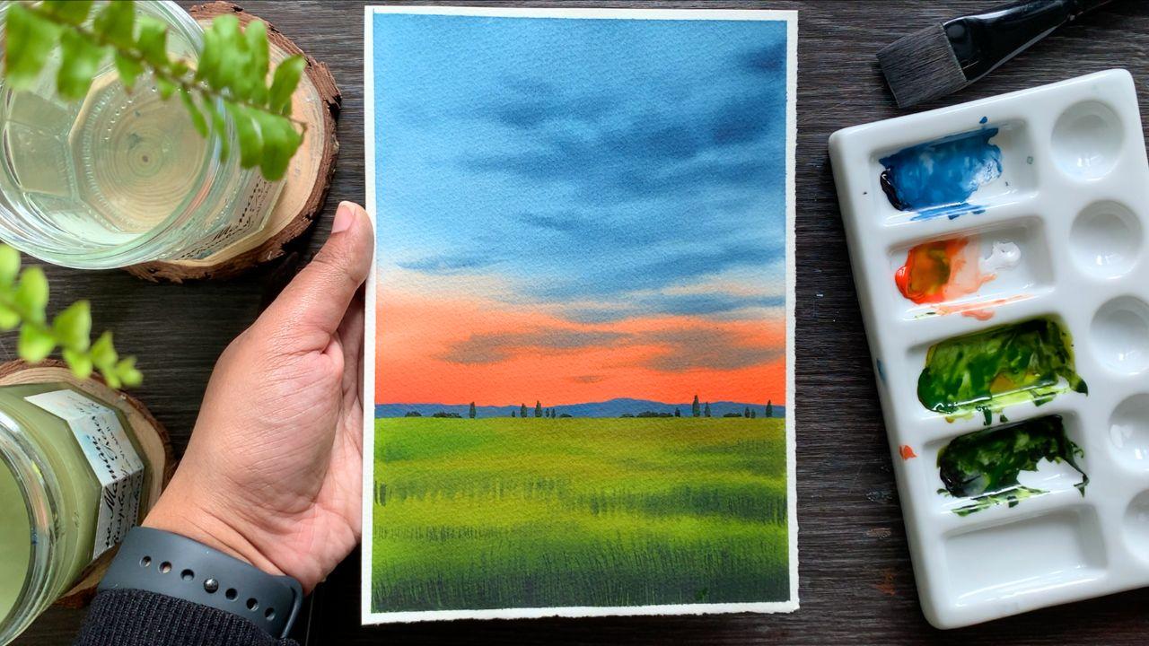
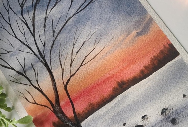
8. DAY 3 - Dreamy Evening - Techniques: Hello dear friends.
Welcome to day three. Here's the next painting
we're going to try. It's a beautiful
color combination. As you could see here,
we have used violet, pink, orange, and
yellow for the sky. First we will go for a
blend of these colors. Then on to that we will
add some cloud violet. A major part of the sky is
going to be pink and violet. Only at the bottom we have
some orange and yellow. That's the beauty
of this painting. Now towards the bottom,
you can see that meadow. We have tried a similar painting
earlier, This one here. I'm going to use
the same technique to paint this grassy area. The colors are a bit more darker here. That's
only difference. It's the same technique. I think I have used much
more patterns here. The grassy pattern is a lot more compared
to the other one. Okay, so we have already
tried that technique. I hope you guys are able
to follow that technique. Now, coming to the lake
for the base layer, we will use pink and violet. Then onto that we will add
some lines using green. We have tried a
similar technique here for these reflections. Actually, today's painting is a combination of
day one and d two. Obviously, the color
combination is different and we're adding the reflection
here in a staggered manner. We don't have any mountain, we are not adding them
onto either side. There's only a
little difference. But we're going to adapt
all the techniques we used for these two paintings
into today's painting. Okay, I'm hoping you
guys have tried this. Now let's have a look
at the color palette. The very first color
will need is violet. This one is violet
from white nights. You can go with any violet
or purple you have got. It can be from any brand. If you don't have any violet, you can mix and create one. Okay, That's the first color. The second color you will
need is permanent rose. This one is nearly over. I need to get a new tube.
It's a beautiful color. I love to use this
in my sunsets. Now, the third color is orange. This one is brilliant
orange from Shinhan. It is another color which
I'm madly obsessed with. Okay, we have violet,
rose, and orange. I missed to say this earlier. If you don't have
rose, just go with crimson or any similar color. Okay. Now there's one more color you
will need for the sky, which is yellow
minus Indian yellow. You can go with any yellow
ka, it can be Gamboo, yellow, primary
yellow, or any yellow. Okay, those are the four colors we'll
be using for the sky. Now let's swath them out. I'm starting with violet. This one is a very
beautiful violet. It is highly pigmented. This one is from white knights. I had another one from Shinhan, which was another
beautiful violet. You can see how
gorgeous that color is. Next I'm going to go
with permanent rose. Wow, so beautiful. Right. See that? It's again, a highly pigmented color. But as I said
earlier, if you don't have rose, there is
nothing to worry. You can go a crimson
or car mine, we're going to add
some white with it. We are not going to
use the color assets. It doesn't really matter
whether you're using car mine or crimson
or any other color. When we add some white
water color into it, they all look the same. Okay. I'm going to
squeeze out some white. Now in case if you have
a pastel color with you, I mean a pastel rose,
you can use it directly. You don't need to mix and
create a pastel color. Today's sky is going to be a combination of a pastel pink, violet, orange, and yellow. The only pastel color we're
going to use is pastel pink. Such a beautiful color, right? It's a best color
to paint flowers. If you are someone who
love painting Florence, I think you should
try with this color. Okay, that's a second color. Next I have here is orange. My favorite brilliant orange, again, a highly pigmented color. I think this color
palette is just perfect for our vibrant sunset. How beautiful those colors are. Okay, now let's go to the
last one which is the yellow. This one is Indian
yellow from Shinhan. Except for violet, all the
colors you see here is from Shinhan only violet
is from white nights. All right? So those are the colors
you will need for the sky. Violet, pastel, pink,
orange, and yellow. Now on a small section,
I'm going to show you how to paint the sky
so that you'll be a little familiarized with
the colors and the way they blend it is a wet on wet sky. The very first step is to apply coat of water onto your paper. For that, I'm using
my 1 " wash brush. Pick some clean water and
apply a code onto your paper. Okay. Before you apply water, always make sure
your brush is clean. Also, before you
start painting a sky, make sure you have all the
colors ready on your palette. Those things, actually
can save a lot of time. You can be very quick in picking the colors and dropping
them onto your paper. Okay, my sky is evenly wet. Now, I'm going to keep
this pressure aside and I'm going to
pick my flat brush. This one is a half inch brush. You can go with a flat
brush or a round brush. Now I'm starting
with a pastel pink. I already have some
white here and rows. I'm mixing them together. That's the color I'm going with. Maybe I will switch the palette here so that I can see all
the colors that I'm mixing. All right, I already have
some paint on my brush. I'm going to add
that at the center. I'm not sure the color
is a bit different. I think there is
some leftover paint. Let me just wash it now. I'm going to pick
some more paint and I'm going to add
that towards the top. We have some space left on the top as well
as at the bottom. Next, I'm going to switch to
violet with the same brush. You don't need to
wash it. You can pick violet and add
that on the top. Okay, that is pink and violet. Now onto the bottomst area, I'm going to introduce
some orange. Let's clean the brush
clean properly. Dab it on a paper towel so that you can be sure
there is no leftover paint. Now, I'm adding
orange right over here and I'm blending
that with pink. Now I'm adding some of that onto either side haspel leaving
some gap at the center. And that's where I'm
going to add yellow. Okay, let's add some
yellow over here. For the main project, I won't
be adding this much yellow. I would only be adding a
little towards the bottom. See that along the horizon I have added only a
little bit of yellow. Okay, now I'm going to
clean my brush again. I think I can add some
more orange here. I want the orange to be
very bright and prominent. Maybe we can add a
little pink asphalt. The pink can also be a bit more vibrant because when
the background dries, the colors will
look a little dull. It's a good idea to go
with the Daco tune. I mean, a vibrant tune. I'm going to quickly
blend that with violet so that we can
start adding the clouds. Otherwise our
background might dry. Now to add the clouds, I'm going with my
medium sized Re brush. To me personally, I
always prefer using a medium size brush when
I'm adding the clouds. This one here is
size number six. Okay. Now to add the clouds, I'm picking some violet, a medium tone, which
is not too watery. Now let's start
adding the clouds. You can add clouds
however you want. You doesn't need to
follow the same pattern, just add that onto that
background however you like. The key is adding them while your background
is still wet. And also using a pain
which is not too watery. If it's too watery, it will spread a lot and it won't have any shape go the pain
which is not super watery. Now, I'm going to
add clouds mostly at the top where I have pain. Can violet? I won't be adding much towards the bottom
or in and yellow. Because violet and orange
and even violet and yellow, they are complimentary
colors on the color wheel. So if you add clouds using violet on top of
orange and yellow, it will end up looking muddy. That's the reason why I'm not adding any clouds
towards the bottom. I think I have added
enough of clouds. Now I'm going to clean
my brush and I'm dabbing that on a paper towel and
with a clean tamprush. I'm gently smudging the paint. It's more like a feather touch. I'm not disturbing
the base layer. This is something I do once I have done adding the clouds. It's not a compulsory step. I always feel this way. The sky looks a
little more softer. And also by doing this,
I'm actually controlling the way the paint
is spreading. Okay? That's how it has turned out. It's a really beautiful
color compinion. If you're an absolute beginner, I want you guys to try it
out on a scrap piece of paper so that when you
paint your main painting, it's going to be a lot more
easier now, just in case, if you want to add more clouds, if you feel your background is still wet, you could do that. You can make it a
bit more dramatic. Technically, my idea where the sketchbook exercise
is to make you all comfortable with
the color combination. Also get an idea about how
they blend into each other. And also the water control. You will get an idea about how fast you should be
adding your clouds, how fast your paper drying. Okay. Those are the things
you need to keep in mind. It is not really about the
way I'm adding clouds. You can add them
however you want. Now, the next thing
you're going to try is the meadow. We have
already tried. So I think I'll just
show you the colors. Even we have had
the color saspher, but not a problem.
Let's try that again. The color I'm going to use for the background is olive green, which is actually a mix
of sap green and orange. I already have some
orange on my palette, so I'm going to take
out some sap green. Now if you don't want to use olive green, that's
totally fine. You can just go with Sap Green
acts for your taco tunes. You can just add some
paint screine to it. Okay, I've taken out
some soap crine, now I'm going to mix that
with a bit of orange. Before that, I think I will
take out some neutral tint. Tasphole. Okay, for the meadow, we will use sap
cream, olive green. Add some neutral tent to
have the deeper tones. Neutral tin and
pinscre are similar. Wherever I'm using neutral tent, you can use paintcray instead.
This one is sap cream. It's again from Shinhan. Next, I'm going to make
some sap cream with orange. Let's see how that is
going to turn out. We'll pick a bit, you can do the same thing
with burn seen asphalt. The color will be a
bit more brownish. Okay. That is olive green according to
the color you want, you can choose to add more
orange or more green. Okay, I have seen floral artist using
this color to add the leaves and
all the foliage. If you're someone who love doing floral paintings for once, switch from green to this color and see how that's
going to turn out. Okay, that is green
and olive green. Now I'm going to add a bit of neutral tent into sap Green. First, swash out
neutral tent, Acetis. This one is also from Shin Hen. Shin Han doesn't
have paints gray. Instead they have neutral tent. That's why I don't have
paints gray with me. I have paint scray
from another brand. Okay, now I'm going to add some sap green
into the same color. I'm going to create
a Dacu green. We'll be using this color to add the deeper tones then for that trace in the background
and also for the reflection. Okay, that's a Dako green, as I mentioned, Olio, you can
just go with paint scray. If you don't have paint scray, just go with a bit
of black or in Tico, you can mix that
into your sap green to create a Dako tone. Okay, technically we have tried all the
necessary techniques. We have tried the color caspo. Now the only thing that we
can try is the reflections. We have tried similar reflection in our previous painting, but just to make you
a bit more confident, maybe we can try
it out right now. I'm going to show that
on a plain paper, we don't have any
background here, but when you have a background, it will have a different effect. Okay. So just keep that in mind. Now I'm starting with a
medium tone of green. I'm using my size
number six brush here. Go with any of your
medium size brush or even a smaller brush, simply add some lines. I want you guys to
give it a watch. Then maybe after
that you can try it. I'm just adding some lines onto the paper using a
medium tone of green. They are just some random lines, some of the, some of the mat. Next I'm picking a Daco tone. I'm adding that in between. Okay. Now, with the same color, I'm going to add few more lines. They are not perfect, you can just simply add
some random lines. When you have a
background color, it will look a lot more
beautiful and realistic. Right now, I'm not really sure whether you're
getting a feel of it, but it is just
some random lines. You have to leave some gap in between when you're
adding these lines. That's the only thing you
have to keep in mind. I think I will show you the
paintings so he will get a better idea. Here it is. We have a violet color
in the background, and I have simply
added some lines. Maybe you can add a few more
lines if you feel like it. Some thicker lines in
between using a taco tone. Okay. That's how we're going
to paint the reflection. Honestly, when I started
watercolor painting, I used to skip painting
anything which has a lake or any water body in it because I was so scared of
painting reflection. I have to admit, I'm
still a bit scared, but not like earlier, but now I love to try it. I love to explore the methods
in creating reflection. That's a big difference.
If you're scared of painting reflections
with you, don't worry. That's very normal.
I have been there. But gradually you
will get over it. Now, there's one
more element here, which are the
landscape far away. Maybe we can try that too. You have to begin
with a yellowish grain to the same color. You can add a bit of a yellow. Then you can start
with that color. Then gradually as we go
to the extreme ends, we're going to make it darker. We try the same technique
in our previous painting. The only differences we have
used different colors there. We used more of brown, orange, and neutral tent. In this case, it's
a green landscape, so we have to use
more of green colors. Brown. Okay, start with a yellowish green,
then go with sap. Green acts and towards
the extreme end introduce some neutral tent
or paint screen and finish up the shape. It's a very simple element, but it will make your painting
look a lot more beautiful. We're going to add them where
we have yellow in our sky. It will make it look
like the sunlight is hitting onto these plants. That's how we're getting
that glowing effect. Okay, So that was the
last thing we have tried, all the essential techniques. The only thing I want you
guys to try is the sky. Now anyway, I have a lot of
green left on my palette. So I'm just going to
add a green patch here. I just want to show you how
the sky is getting enhanced. When we are adding green, I will add some
taco tons Asphal. You can already see the
difference it made. We're going to try
the same technique for our main painting asphalt. You can see the yellow color
and the green landscape. That contrast is very beautiful. If you're seriously looking forward to improve your
water color skills, what you can do is just try out some skyes on a scrap
piece of paper, maybe something similar to
what you see on my sketchbook. This size is just perfect. It doesn't need to
be a huge paper. Just try exploring different
color combinations and try adding clouds. This way you will have
a better understanding of how the colors work, how long your paper
is staying wet, and how fast you
should be working. So keep a small sketchbook or some scrap piece of paper and try out different
kind of skies. This is definitely going to help you in your article again. Anyway, we had a look at the
colors and the techniques. Now, without wasting any
time, let's give it a try.
9. DAY 3 - Dreamy Evening: All right. So I have
my paper ready here. I have fixed it onto my table and I have the colors ready. Asphal, we already had
a look at the colors. I might need some more violet. The rest of the
colors looks fine. We have yellow, rose, orange, and a bit of white. Okay, to paint the sky, we will need all these colors. So before you start, keep
them ready on your palette. Next, I'm going to
add a quick sketch. I will just add
the horizon line, but it's a little below
the center of the paper. A major portion of our painting
is going to be the sky. Next, I'm going to add an irregular line to
show the ground. Then we also have a small
water body at the bottom. Okay? Just go for
an irregular line. We can fix it as you paint. Okay. Now, just in case, if you want to modify a
bit, you could do that. Or if you don't want
to show the water body even, that is fine. You can just ignore adding
that irregular line and you can turn your entire
ground into a grassy meadow. Okay, that's a sketch. I'm hoping you all have
your colors ready. It's going to be
a wet on wet sky, which means you'll have to
apply coat of water before you start using any of your
white or flatbrush. The first color I'm going to
start with is a Basel Pink. It can be a mix of any kind of rose or crimson with white. To apply that I'll
using a flat brush. Now, when you're applying pink, try to leave some cap
along the bottom. That's where we're going
to introduce some yellow. When you're applying pink, try to leave a cap
at the bottom. Now go with any of your
wide or flat brush and apply an even coat of
water onto the entire sky. When you're applying water, always make sure
your brush is clean. You can just dab that on a paper towel just
to be 100% shower. Okay, I have applied a nice one quarter of
water onto the entire sky. Now I'm keeping
this pressure aside and I'm picking my
flat brush again, making sure it's clean. Now the very first
thing I'm going to do is preparing a pastel pink. I already have some rose here and I'm mixing
that with some white. See that it's a
beautiful pastel pink. Now leaving some
gap at the bottom, I'm going to apply
that almost to three fourth of the paper
from the bottom. I'm going to, at the top, you can mix white with
crimson or quinacrodone rose or any pink and just apply
that onto your wet paper. Okay? It doesn't need to
be in a straight line. You can add that in
an irregular way. Okay, keep adding more paint if you're not really
happy with the color. If you add more white, the color will be more lighter. And if you want to bright pink, add very little amount of white. Now with the same brush, I'm
going to pick some violet. You don't really need
to wash off the paint. You can use the same
brush. Add a few drops of water and turn your
violet into a medium tone. And apply that on the top. It's a medium tone,
it's not too light. You can see I'm adding violet onto the area we have
left on the top. It's not in a proper shape
or any proper pattern. I'm just adding that
onto the remaining area. Now I'm going to clean my brush, and I'm switching
to a round brush. Every time you pick a new brush, just make sure it is clean. The brush I'm going to
use is size number six. You can use any of your
medium size brush. It could be four,
or five, or six. Okay, now I'm going
to pick some violet. Right now, we have
just applied pink and violet next to make it
look more beautiful. We're going to add some clouds. You don't need to
pick a lot of paint. Once you've taken the
paint on your brush, just dab it on a paper towel. If your paint is too wet and if your brush
has a lot of paint, they will start spreading in a very vigorous way and you
won't be able to control it. Go for a paint that
is not too watery, then keep adding the clouds
onto the wet background. How do you want to It
doesn't need to have any proper shape or
any proper pattern. You can add them
wherever you want, but make sure your paint
is not too watery. Okay. I'm adding them more to the area where I have pink on the top. I have enough of violet. I'm not really worried about adding any clouds on the top. I want to focus on the bottom
where I have the pink. Okay, I have added a few
clouds at the bottom. Now I'm going to go for
a Dako tone of violet. And I will add a few
on the top as well. Otherwise, it will look
quite plain and empty. So let's add a few on the
top using a taco tone. Again, make sure your
paint is not too watery. Just keep adding
some random shapes while the background
is still wet. That is the important
thing here. You should not wait
for a longer time. You need to add your clouds while your background
is still wet. I'm just running my
bridge back and forth in a random way and I'm
adding these clouds. I'm really loving the
weight is turning out. As you may have noticed, the shape of the clouds
are well in control. Reason for that is I'm
using a smaller brush. If you're using a bigger brush, the shapes will be much more bigger and by the time they
spread into the background, it will become even more bigger. It's always good to go with a medium size brush so that
you have a better control. All right, That is
violet and pink. Now I'm going to keep
this pressure aside. Before that there is some
water along the border. I will just wipe it off. Otherwise they will
float back into the painting and might create some blades
along the border. Okay, this part is done. I'm going to clean
my brush and I'm switching to orange now. Let's add orange
along the horizon. You can go with any orange. Now I'm adding orange
on top of the pink, you can see have left some
space along the horizon. I'm not adding any orange
over there onto that space. I'm going to introduce
some yellow. It's a very small gap, but be sure not to add
orange over there. Okay? You can add
a few lines onto the pink asphalt to make your
sky look more interesting. We are adding orange to
bring a contrast in our sky. This will turn our evening
into a gorgeous one. Okay? So that is orange. Now I'm going to clean my brush, and I'm switching to
yellow. Clean it properly. You can dab it on a paper towel just to be sure there is no
orange left on your brush. Now, pick some yellow, it can be any yellow. You can go for primary
yellow, cambo, yellow, Indian yellow, or any
other yellow of your toys. Once you have taken
paint on your brush, apply that along the horizon, right underneath the orange, This will create a glowy
effect for your sky. See that? Just apply that along the horizon
and that's a sky. I accidentally add
a drop of water here before I leave
it for drying. I'm going to try to fix that. I cleaned my brush and
I'm picking some pink. It's the same color
I used earlier. It's a mix of rose and white
and I'm just smrching it. Okay. That's done. Luckily the background
was still a bit wet, so I could fix it easily. Anyway, that's how the
sky has turned out. I think it has come
out really nice. That yellow and orange is adding a beautiful
touch to the sky. I hope you guys like it too, Ty. Adding the yellow onto the
sky was a last minute plan, but I think it was
a good decision. It came out really beautiful. Even that orange,
I think that tint of orange is making the
sky look more vibrant. Now, when we add
the horizon details as well as we paint
the greenery, the sky is going to look
even more beautiful. Meanwhile the sky dries. We can start with the lake. I'm starting with pink. It's the same way
I created earlier. I'm mixing some white
with permanent rose, and I'm going to apply
that on the top. Then as I come
towards the bottom, I will switch to violet. Right here I'm applying
that beautiful pink. You can see how
beautiful that color is. I just love using this color. I will add some more pink. Then for the rest of the area, I'm going to apply violet. That is pink. Now let's
pick some violet. Let's add that on the
remaining area at the bottom. Just apply these two colors
onto the entire lake. However you want to
then just blend it. Then gradually onto
this bed background, we will start adding
some lines to create a texture and that
movement in the water. Otherwise, it will
look quite plain. Okay, quickly apply
the paint and blend. Now, before we start adding
those texture on the water, we need to add some deeper tones underneath that patch
of land right here. Then onto this corner,
and also on the top, we're going to add
some deeper tones to show the shadows and
the deeper values. Maybe we can add a bit more. Okay, now let's go with
our smaller brush. We can start adding
those teeny tiny lines to create the texture and
the movement in the water. Again, don't go for
a watery paint. Go with a paint that
is not a lot watery. Now, just keep on
adding some teeny tiny lines on to
the te, or lake. These lines doesn't need to have any particular length
or shape or pattern, just keep on adding them
to bring in a texture in the water towards the bottom. Maybe you can go for
a daco ton of violet. Add on pink, you can
use a medium tone. Just keep adding
them at the end. We'll also add some
more reflection on this using a darker tone. This is just a first round, a fine tuning will
happen at the end. Okay, for now, just
keep on adding some random lines and
fill up that entire area. Don't go overboard. We still have to see those
background colors on the top. Use a medium tone of violet and adding some thin
lines at the bottom, you can go for a
slightly dakotune, not too dark, just one tone darker than the color
we used in the background. Otherwise they won't be visible. Okay, I think I can add some more deeper tune
on the left side. The right side is looking
nice in a similar way. I'm adding some deeper
tone on the left side. Onto this leftmost area. I'm picking more
paint and I'm adding some long lines from
the left side towards the center because I
want the Syria to be a bit more darker
compared to the center. Okay, that looks fine. I think it is pretty decent. We can call it done for now. Then we can add the final
details at the end. Okay, we painted the
leak as well as the sky. Next we need to
paint the greenery, but before that
we'll have to make sure the background
has tried completely. I think it's a good time to take a short break or to
speed up the process. You can use a blow Ryo. All right, so the background
has tried completely. Now we can start
painting the greenery. For that, I will
need some green. I'll sing sap green. And to add the deeper tones, I'll be using neutral
tint, that sap green. I will also need some
yellow and orange, which I already
have on my palette. The next color I will
need is neutral tint. If you don't have neutral
tint, just go with paints. Gray. They are similar. Okay, I have the colors ready. Now. The green I'm
going to use is a mix of orange and sap green. I don't want to use that
fresh green painting, a sunset scene, so the colors won't be that fresh and vibrant. Okay, so let me show you the
color that I'm going to use. I have some orange here. I'm picking some sap green and I'm going to mix
that with orange. This color is more
like a olive green. If you have olive green, you
can use cactus or you can just mix and create
your own olive green which is really easy. You just need to add some
orange with sap green. That's a color I'm going to use. Okay? Now, depending on the proportion of orange
and green you're adding, your color might look
a little different. This is the color, I'm
adding some water. Now we can see the
color clearly. First, I will apply this on to almost half
of the section. Then I'm going to add some
sap cream in between. Just to bring in another
tonal value of cream, Make sure to go the
similar tonal value, don't make it too dark. Now I'm picking some sap cream. Now I'm going to add a few
lines from either side, just some random lines. Okay, so just keep
on adding them. Don't add any green
at the center. At the center, we can
retain that olive green. Now I'm going to fill up
the rest of the area. See that we have two different tonal values
of green here at the center. I retain that olive green. Then towards the bottom, I'm just adding that
sap green acetus. Then I also added some
lines on either side. Okay, that's a base layer. If you look at the
way I have painted, I have deliberately left
some olive green in between. You can see if
you're on the top, Then in between as well, you can see some olive green. Now the same brush, I'm going to pick
some neutral tint. And I'm mixing that
with sap cream to create a darker cream. Using that as well, I'm going to add some darker tone
onto the background. It is just some lines. I'm not adding any
on the top now. In between, I'm just
adding some lines. Again, I'm trying to retain
that olive green right now. Our background is still wet, so you have to make
use of the time and adding new pertoons, now I'm adding them along the bottom line of
that patch of land. Add some tar paton here, then along the other sides. Okay. We have one more
section at the bottom, Over there as well,
I'm adding some paton. Okay. Right now there's a lot more varieties of
green in the background. We have olive green,
we have sap green, and we also have a daco tone. I'm really happy
with the colors. We have got a beautiful
range of greens. But I think we can add a few more lines
using a daco tone. I'm adding them
on the right now, A little on the left. See that? Just add a few lines while retaining some of your sap
green and olive green. I think you can already
feel the glow here. It is mostly because the
olive green we used, It is very well
going with the sky, you can see that
color in between. All right, I'm nearly
done adding the pertunes. Now we have one more step. We'll need to add
some grassy pattern onto this background. All right? So I'm just keeping
this one aside. I'm switching to
a smaller brush. This one is size number two. Go with any brush that
has got a pointed tip. Now we're going to go with
a darker tone of cream. I'm mixing some neutral
tint with sap cream. Using that color, I'm going
to add some grassy pattern. Now there's one major thing
you have to keep in mind. We're not going to add
any on the lighter tone, we're adding them
on the darker tone. Okay? Skip the areas
where you have lighter tone and add them where you have
applied your darker tone. Right now, I'm adding them
along the bottom line. Gradually, I will add some more where I have
added those lines. See that you can already
feel the effect. Just keep these
areas where you have olive green and just add them on the areas where you have
applied to deepertunes. Trust me, if you follow that it is going to turn
out really beautiful. Just keep adding
your grassy line on to the area where you have your deepertunes
and medium tunes. Skip the area where you
have your olive green. Okay. Try to add them while your background is still wet so that they won't
be too prominent. Also go with a smaller brush or a brush with a pointed tip. You can see the
lines are adding, They are not very perfect. The only thing is I'm using a smaller brush and the
lines are not too tall, they are quite messy, they
are not at all perfect. I'm just adding them along. The medium tunes and
tacotones I have applied, that's the only thing
I'm following. Okay. So yeah, I just go ahead use any of your smaller brush and go with a Tacotone of green. Add some lines on
the wet background. Okay. Now I need
to add a few along the bottomost area,
asphalt over here. We had a look at the
technique at the beginning, so I'm quite sure you guys
know how to approach it. Okay. So let's quickly add them in
before the background dries, okay? So this is how
it has turned out. You can see how
beautiful it is looking. Now I'm going to add a
few more towards the top. I won't be adding any
along the horizon but a little over here and they're going to be
much more shorter. It looks like the background
has almost dried, so I don't want to ruin it. I'll just add a few
and I'll call it down. You can see here, I
haven't added any. Along the horizon over there we have a clean,
olive green color. And that is exactly
what we need. Now maybe along the bottom line, we can add a few more
lines using a tat. The bottoms area is where we have lots of shadows
and depertoons. Just to enhance that, I'm
using a much more taco tone. I'm adding a few more lines here this time of the color I'm using doesn't have
a lot of green. It has more of neutral tent. Using paint screen
reduce the amount of green and add more pain
screen into the mix. Now let's add few lines
along the bottomost area. Okay, only over here. I'm not going to add
any towards the top. As I mentioned, Dolio, these lines doesn't need
to be super perfect, just keep on adding them using
any of your smaller brush. Don't make them too thick. That is one thing you
have to keep in mind. For the same reason,
try to go with any of your smaller brush or a
brush with a pointed tip. If you look at the painting now, you can see those medium
tones on the top. Then gradually, as we
come towards the bottom, it is getting more
taker and taker. And that is exactly
what we need in our painting to enhance the
glue along the horizon line. Okay, that part is done. I think I said this earlier, adding that yellow along the sky was a last
minute decision, but it is going so well
with the greenery. I can really feel the glow here. Anyways, our next task is
to add the horizon details. I'm going with the same
color and the same brush. I'm using a daco tone of green. It's a mix of neutral
tint and sap green. You can either mix paint
screen or a bit of indict, sap green and
create a daco tone. Now first I'm going to add
the detail on the left side. I will start by adding a line, then I will add some
irregular shape on the top. Then I will simply fill that up. Okay, one major thing you have to keep in
mind is the size. Don't make it too huge. Go with the similar height
for your landscape. If you make it too huge, your painting will go
out of proportion, okay? To bring in that
sense of distance, it is very important to
go with a similar size. Now I'm going to
simply fill that up in a taco tone of green. So these are some
trees or plants far away as you can see here. Right now I'm using a
taco tone of green. But as I add these landscape
towards the center, I will make the color lighter. Okay, this set is done now, leaving some gap in between. I'm going to add
another set of plants. Just watch out
before you add them. First I will add a line. I leave some gap in
between. I'm adding a line. Okay. Now I'm mixing some yellow with that cream
color I used earlier, and I'm making it more lighter. See that? Just add some yellow into the same
color you used earlier. And just fill up that
shape. See that? Now I'm picking more yellow
and I'm going to add that on the right side to make that
glue even more beautiful. Okay, go the similar height, don't make it too huge. As I said earlier, you can feel the distance
in our painting. The reason is the
size you're using. Here go, the similar size. Now I'm going to
add another group of plants towards the center. I'm using the same color, the same yellowish green. Now I'm going to add a tiny
shape next to this one. It's going to be super tiny. I don't want to make it to pick, I'm picking a little of green, adding that onto the shape. Okay, that's our next cluster. Now I'm going to add one
more towards the right side. I'm starting with that
greenish yellow I created earlier over here.
I'm using this color. Then gradually as I go
towards the right side, I will make it more darker. Now, I'm adding some
green over here. I'm ting that lighter
tone towards the right, I'm going to make
it more greenish. Now let's go with a
much more taco tone and finish up that shape. It's a very simple technique, but you can create
a beautiful effect by using this technique. Start for the greenish yellow, then you can go for olive green, and towards the end, you can
use a much more taco tone. I think you can really feel that some light
heating on the plants. To me, I feel like that effect
has come out really nice. I hope you guys are
loving your painting too. Anyways, now I'm going to
quickly finish up that shape. We need to add some
paint at the bottom. Also, I need to
clear the shape on the top that will be
done with this section. Then the only thing
left is adding the reflection deliberately
left some gap at the center. But if you want to
add another section of plants at the center,
you could do that. That's not a problem. Okay, I'm nearly done fixing the sheep. I thought of adding some
more lighter tone here and I'm just merging it
to make it look clean. Okay. So that's effect
we have got here. I'm really loving it. Sometimes adding a small
element or bringing in another color can make a lot of difference
in your painting. And that's exactly
what happened here. We added some yellow in the sky, and also we incorporated that on the landscape to make it
look like it is glowing. Okay. That's where
we are right now. Our next task is to
add the reflection. And for that I'm going to
go with a green color. And I'm using my size
number six round brush. I'm keeping the other one aside. We're going to add them
on the pink area first. Then we can gradually add
them onto the other area. Okay, I'm starting with
that olive green color. It's the same way how
we created earlier. It's a mix of sap creen
and a bit of orange. Pick a little of orange and
mix that with sap green. You can also use burn
cena instead of orange. Even that will create a
beautiful olive green. When you're painting sunsets, it's a great color to use. You can see that color here. It is always a better
choice than sap greene. Anyways, let's start
adding the reflection. First, prepare the mix of grain. Go with any of your
medium size fresh. Now I'm going to start adding some lines onto this background, just some random lines. But while I'm adding them, I'm leaving some cap in between. We need to see that
background color. Don't add them too
close to each other. That's the only thing you
have to keep in mind. Okay. Some of the lines can be a bit thicker and some
of them can be thinner. This will make it look
more natural. See that? Right now I'm using Oli green. Gradually I will pick
a much more taco tone. Okay, let's keep adding some lines using
olive green first. Just keep in mind to leave
those cap in between. Now, I'm going to add a few
onto the left side. See that? First focus on the area
right underneath that land. Then we can gradually add
a few towards to bottom. Now I think I can go with
a bit more taco tone. I'm picking some sap green. Then I'm going to add a
bit of neutral tint into that to turn that
into a taco tone. Now let's add some more
lines using a taco tone. It's the same technique. Try to leave that
cap in between. Now we can see we have two different tonal
values of green here. Okay, we try the same in
the technique section. I'm guessing you guys
are able to follow, It is not complicated. All you have to do is
just add some lines. They can be a bit
longer or thicker. We need a combination
of different lines. That way it will
look more natural. Now, I'm missing a taco tone. I'm adding some thicker
lines here. See that? Let's add a few more.
Don't be afraid, just go ahead and add them in. As I said earlier,
just keep in mind to leave some cap in between
when you're adding them. You can add as many as you want. I'm going to add more
on the left side, I think onto the right. I won't make it too crowded. Okay, over here you
can see some of them are a bit thicker and
some of them are thinner. Go in a similar way, you can see the weight
is turning out okay. Right now I have
added them along the bottom part of the
ground now in a random way, I'm going to add some tiny lines to make it look more natural. See that? I'm not adding
a lot, just a few more. In a very random way. This will make it look
like the water is moving and it will make it look
more natural and realistic. Just add a few more like
this, some broken lines. Again, they don't have
any particular shape, or pattern or size. Just add some rough
lines like this. Okay, That's how
it has turned out. I'm pretty happy with it. Now I'm going to
go back with that. Take what I would want to do
is I want to fix this line. It is not looking straight, so I'm just going to fix it. I think not just this line, even the other lines
are not straight. I'm just going to fix it. I'm missing a really taco
tone of green and I'm adding a line along the
bottom part now, on the next side over here. Okay. Right now, that
is looking like a line. It doesn't look natural. So what I'm going to do is I'm going to add some grassy line along the bottom to make
that line disappear. Because right now
you can clearly see a thick line along the bottom. It looks pretty weird. I'm going to switch
to my smaller brush in the same way how I
added grassy line earlier. I'm adding them from the
bottom towards the top. Honestly, this is just to
make that line disappear. Otherwise you can see a
thick line along the bottom. The purpose of
these grassy lines are just to cover that up. Okay. If you're already
happy with your painting, if you don't feel like adding this line, that's totally fine. You can just watch
what I'm doing here. Okay? Now, in case if
you're adding these lines, they don't need to
be a perfect line. You can just use this side of your brush and just
drag them onto the top. You can just mudd the paint. It doesn't need to
be grassy line. Okay. I think now it
looks so much better. It looked a lot more
define than earlier. Okay. So that is done. Okay. So this is how it
is looking right now. You can see how beautiful
it has turned out. I'm very happy with
the entire painting. The sky looks really beautiful, especially the orange
and yellow over here, and then the grassy meadow. The only thing I'm not really convinced
is the reflection. I'm just thinking of adding
some more lines on the water, especially onto the left side. So I'm just going to go
back with my size number two brush and I'm picking
a darko tone of green. This is optional only if you want to add few more
lines, you could do that. Otherwise, just leave
it as it is for me. For some reason I feel like I can add a few
more lines here. Only on the side, I'm not
going to touch the right side. Maybe you might not feel
the need to add it. These kind of things can be very different from artist to artist. If you don't feel like adding
them, go with your cuts. Don't add it. Anyways, I'm just adding some random lines
here using a taco tone. As I said, Dolio, I'm adding
them only on the left. I won't be adding
any onto the right. It's a taco tone of green. And I'm using a smaller brush. I'm adding a combination of
thick lines and thin lines. Okay? You can still see that violet color
in the background, which is exactly what we need when you're
painting on reflection. You should not cover
that entire color. They need to go hand in hand. All right. So that's it. Now I'm pretty satisfied. As I said, I haven't added
any lines on the right. I just focused on the left side. Okay. I think I should
start adding lines. Otherwise, I might overdo
and row in my painting. You can use the same technique
to paint reflection. The background color
can be different, but the same technique
can go with any painting. All right, so that's
our final painting. Now let's remove
the masking tape and have a closer
look at the painting. You might know this, but always
wait for your painting to dry completely before you
peel off your masking tape. And remove it at an ankle so that it won't
rip off your paper. Okay, I'm carefully
peeling the bottom part. Now we have one more side left. All right. So that's our
painting. I just love it. When I get a clean border, it makes me feel some extra
love towards my painting. Anyway, here's a closer look. I think everything
came out really nice. The color combination, the grassy meadow,
even the reflection. I think they all go
very well together. I'm not sure if you try it along with me or if
you had to try it. If you're red to try
it, do give it a try. I'm very sure you're
going to love it.
10. DAY 4 - Winter Evening - Techniques: Hello, dear friends.
Welcome today, four. So, today we're going to try a simple winter sunset
painting snow in Waterclor is something that is very interesting and very easy. Come to that for the sky. As you can see here, I
have used a gray orange and a bit of red towards the bottom. That's a
color combination. I'm going to go with the sky for the snowy ground as well. It's a lighted tone of gray. We'll just add some lines on a wet background to
create that snowy ground. The white you see here
is a paper white. Then to enhance it, we will add some dry
textures and some rocks. Okay, that's how the
ground is going to be. We have a tree here, that's a major feature
of this painting. Anyway, now I will take
you through the colors. Then we can tie up the sky, maybe we can try how to create that texture
on the ground. I already have a
Patel gray with me. This one is from Shinhan,
but I won't be using this. I'll mix and create my own gray. You can see here
the pigment number. It says PBK seven and P six. Pbk is a black pigment
and P is a white pigment. Obviously, it's a combination of a black pigment and
a white pigment. That is exactly how
we're going to create all gray instead of black. I'll be using neutral tint.
You can use paints gray. Instead, I'll mix these
two colors together, neutral tint and titanium white. I'll create a gray which I like. It can be a bit darker or lighter according to the
amount of white you're adding. Okay, first I'm going to
squeeze out some paint. Neutral tent is very
similar to paints gray. So don't worry. If you
don't have neutral tent, just go with paints gray. And if you don't have
both paints gray and neutral tent, you
can go with black. Okay, now I'm going to take
out some white Asphal. The next color we
will need is orange. You all know my favorite orange. Yes, it is brilliant orange. The same color that I have been using for the other paintings. Let me take out a
bit of that Asphal. If you don't have orange color, you can go with vermillion. On the top we have
a pastel gray. Then over here we
have a pastel orange. Vermillion will work, You
can just add some white into that and turn that
into a pastel orange. Or you can just mix
and create orange by adding some yellow
into vermillion. Okay, that is brilliant orange. Next we need be more
colow, which is red. The one I'm going to
use is piral red. Again from Shinhan. This is the one you can go with
any red you have caught. It doesn't need to be piralred. We're going to add
some lines onto the sky to make it
really interesting. Just a bit of red. Okay, those are the colors we'll
be using for the sky. We will need a pastel gray, pastel orange, and a bright red. Now, along with the
sky, we will also need to add these landscape
in the background. We'll be adding them while
the background is still wet. Along with the colors
you're using for the sky, You also need to have some
brown or burn cena on your palette to add those
trees and plants far away. We'll be using a taco to brown. This one is permanent brown. I'll be adding a
bit of neutral tint to turn that into a taco brown. That color also ready on
our palette before you start painting the sky.
These are the colors. We have, neutral tint,
then some white, then we have orange, and again some white, then red and brown. Now let's swatch
out these colors. I will start with gray.
As I mentioned earlier, you can either go
with pink, gray, or neutral tent, or black if you don't have
the other two colors. First I'm going to swatch
out neutral tend, acts. This is the color, okay. Now into the same, I'm
going to add in white. And I'm going to
show you how the color is going to turn out. It's going to be a beautiful
gray. I love this color. This color goes very
well with pink, orange, and even a
tint of light blue. You can try using this
color with any other color. You prefer to create a
soft and a subtle sky. Okay, next I'm going to show
you orange for the sky. The major color is going
to be a pastel gray. Then as you're
approaching the horizon, we will go with a Patel orange, the color you see here. Then we will blend that
with the grey. Okay? The color is going to be a
very light orange right now. The color you see is just
water. There is no white in it. You can either go with this way or can add some white in it. Next, I'm going to add some white and I will
show you the color. You can just decide on which
one you want to co with. On the left, what you
see is just water. Just water and paint. The swatches on
the right side is paint plus some
white water color. Yeah, you have both options
right in front of you. You can go with
either one of it. You can either add some water
or some white water color. Anyway, the next color
you will need is red. This one is a very
bright and bold red. It is called Pyl red. You can go with permanent
red or cadmium red or any red Got. Okay, it's a beautiful
color combination. We're adding red to
create that contrast. Now just in case, if
you don't want to add red, that's totally fine. You can go for a soft
and a subtle sky. All right, that's a
color combination. We're going to go for the sky to add the cloud,
Asphll, albus gray. A little darker tone than the
color we use for the sky. Otherwise it won't be visible. Here's the color combination. As I mentioned earlier, you
can just have a look and decide on whether
you want to add water or white water color. Now the next color you
will need is brown. If you don't have brown,
just go with burn sena. This one is permanent
brown from art philosophy. This is one color I really
love from art philosophy. I have never seen such a
pretty brown see that. It has a beautiful red undertone and that's what I love about it. But if you don't have brown,
there is nothing to worry. Just go with burn.
Sena. All right. So those are the colors. Now I'm catch neutral tint again without adding much water in its original intensity. We'll using this color for the rocks as well
as for the tree. For the tree we will use brown and neutral ton to
have the per toons. Okay, so that's a color
palette for the tree. If you want to go for a
different color combination, you could do that
instead of orange, maybe you can go for pink. Now before we start,
I want to show you all a quick demo of the sky. This way you can be a lot more confident and well
informed about the steps. The major portion of the
sky is going to be gray. You can see the color here. Then we have a Patel orange and some right along the bottom. You can either go in a
similar proportion or you want to increase the amount
of orange. You could do that. Keep the colors ready
before you start. It's a wet on wet sky. The very first step is to apply coat of water onto your paper. If you're a bigirl,
I would really recommend trying this out. If you're familiar with water
color and the weight works, you don't need to try it out. You can just give it a watch. I always keep some scrap pieces of paper with me whenever I'm trying a new color
combination or whenever I'm not really
sure of something, I always try it out before
I go onto my main paper, because waicolor paper
is quite expensive. Anyways, I have applied
a coat of water. Now I'm switching
to my flatbush. You can use a flatbrush
or a round brush. This one is a half
inch flatbrush. Go with a medium size brush. Now I'm starting off with gray. First, I'm making sure
my brush is clean. There were some leftover paint. I'm picking a pastel gray. It's a mix of new 1210 and
white water color. See that? That's the color
I'm going with go. The similar tonal value will make it too dark or too light. Now let's apply
that onto the sky. You can apply that almost
to 34 of your sky. Just apply it if you want
to make it more lighter, add some water or some
white water color. Okay, that is gray. Now, I'm going to
clean my brush. I'm going with pastel orange. It looks like there's
still some leftover paint. I need to wash it again. Okay, let's pick
some more paint now. I'm going to add that right next to gray, and
I'm blending them. There's one thing you
have to be careful about. Orange and gray are
complimentary colors. If you mix them together,
you will get a muddy brown. Always make sure to
lighten your color when you're mixing
orange with gray. Okay, now I'm using a much more brighter tone of orange and I'm adding
that at the bottom. Now I'm going to clean my brush and I'm switching
to a round rush, a medium sized round rush. I'm picking some red and I'm
adding that at the bottom. Also, adding a few lines onto the sky to create
a dramatic effect. You can go the brighter
tone and add a few lines. Okay, that's it. Now I'm going to clean my brush. First, I will clean
the area a bit. There are some rough lines
there. Okay, It looks better. Now, with the same brush, I'm going to pick some pastel gray. A little more darker tone than the color we
use for the sky. If it's too watery, dab
it on a paper towel. Now with that color, I'm going to add some
clouds onto the sky. I don't want to make it overly dramatic, I'm just adding a few. That color looks a bit dark. You can see on the painting, the color is a bit more
softer, isn't that prominent. So you can either go
with a darker tune or a lighter tune. See
that? Muddy brown. So that's what I
was talking about. Let me clean it and
pick some more paint. Yeah, before your sky dries, add in as many
clouds as you want, Maybe you can skip adding those gray clouds and you can have a plain
gray on the top, pastel orange and
some bright orange and red towards the bottom. If you want to keep it that way, even that will be
a wonderful sky. Now I'm adding a few clouds towards the bottom
using a lighter tune. Next, I'm cleaning my brush, and I'm dabbing that
on a paper towel and with a slightly wet brush. I'm just going to smug it very gently to give it a softer look. Okay. I'm not putting
a lot of pressure. I don't want to disturb
the base layer. Just to give it a softer look, I'm simply smudging it. Okay, that's a sky. But we are not done yet. There is one more thing
we have to do before we leave it for trying for that. I'm picking some brown. We need to add those landscape
details along the horizon, create a darker brown. Or we can use burn
tuber along the bottom, along that horizon line. We're going to add some
random shapes to create those plants and
landscape far away. Start by adding a line, we need a blurry look for them. That's the reason
why we're adding them on a wet background. Now in case if you don't
want a blurry look, you can wait for your sky to dry and then add your landscape. Okay? Just go to
the Dakota Brown and add some random
shapes like this along the horizon at some places to make it a bit more realistic. You can make it higher
at some places, you can make it shorter. Okay. That's how we're going to paint the sky
and the landscape. I will just make the
horizon line straight. Then with that, we'll be
done with this exercise. Then the next thing
I want to show is the dry brush technique,
the snowy ground. We're going to work with
a very minimum detail. The only thing
we're going to add some tri brush techniques. Okay, that's what I'm
going to show you next. All right, that's a sky. Once you're done
painting the sky, the major part of the
painting is done. Then the next thing
you have to add is a tree and also some very
minimal details on the ground. It's a very simple tree. First you need to add
a thicker tree trunk. Then on to that, you can add
in as many branches as you want using a smaller brush or
a brush with a pointed tip. Also, you can compose your
painting however you want. If you want to add
the tree towards the center or towards the
right, that's totally fine. I have added that on the left. Anyway. The next thing I want to show is the tri
brush pattern. You can see those dry
texture on the ground. That's what I'm
going to show you. Pick some darker tone of paints, gray or black or neutlcent on any of your smaller brush
or a medium size brush. Now, take a paper towel and
keep cleaning your brush. Dab it on a paper towel multiple times just to make sure there is no water
content on your brush. The paint that you have on
your brush is dry right now. That is exactly what we need. Okay. Now that brush, I'm going to add some
patterns on my paper. See that those are the patterns we're going
to add on the ground to make it look a little more
realistic on a wet background. We will add some
lines using paint, scray a lighter tone. Then once it has dried, we will add some tri
patterns like this. Okay, You can pick some paint, then you show a paper towel and then keep adding
these kind of patterns. All right, so that was the
last thing I want to show you compared to the other
sunsets we have done so far. This one is quite easy. The major part is the sky. We don't have a lot of
elements in this painting. Okay, Now that we have tried all the techniques,
let's give it a try.
11. DAY 4 - Winter Evening: Okay, have my paper
and colors here. Let's start by adding
the sketch first. I'm going to add a horizon
line somewhere here. Okay, so that's a horizon line. Next, you can add a tree. This is not really necessary. You can add that as you paint, or you can just simply
add a shape For now. I'm adding that
here. I'm going with a nice curvy shape to make
it look more realistic. For now, I'm just
adding the tree trunk. The rest of the branches
we can add as we paint. You can add that towards the
center or towards the right. You can compose your
painting however you want. For now, we just
need a basic shape. Okay, that's my tree. That's the shape I'm going with. Maybe we can add one
more branch here. All right, that's a sketch. As we're painting, we'll be adding some rocks on the ground. You don't need to
add it right now. We can add them as we paint. We'll be adding them in a very random way, here and there. Okay, that's a sketch. Now we can start painting. I hope you all have the
colors ready on your palette. If you don't have them ready, prepare them before you start. We will need some grey, some
orange, and a bit of red. I'm not going to use yellow. Initially, I thought
of using yellow Asper, but then I changed my mind. I wanted to go with
gray, orange, and red. The only color I would
need is a little of white. So I'm going to take
out some white. I will need this to mix with orange to create
a pastel orange. Okay, I have all
the colors ready. Now. The first
thing I'm going to do is apply a coat of water. For that, I have my
1 " flat brush here. So I'm dipping my brush in clean water and I'm applying
that onto the entire sky. Okay. Apply that along the
horizon and make your sky wet. Okay? Whenever we're
painting a wet on wet sky, we only need a shiny coat of
water. We don't need a lot. Always run your brush multiple times back and forth just to be sure the coat of water is even and there is no
pools in between. Okay. My sky is evenly wet. Now, I'm going to keep
this pressure aside. I'm going to switch
to my flat brush. It doesn't need to
be a perfect plan, so you can use your
arm brush instead. It doesn't need to
be a flat brush. Go with any of your medium size brush or a beacle size brush. I'm starting with gray and
I'm applying that on the top. We already had a
look at the colors. The color I'm using
here is a pastel gray. It's a mix of paints,
gray and white. You can either apply your
paint this way or you can just use water to
make your color lighter. Okay, now I'm going
to clean my brush. I have applied gray almost
to three fourth of my paper. Next, I'm going to go
with a pastel orange. Mixing orange with some white and creating a pastel orange. And I'm adding that
right next to gray, looks like there
is a muddy brown. Because I mixed orange and gray. Now with a clean brush,
I'm going to add some more paint and I'm
going to blend them. I had mentioned this
earlier, gray and orange. They are complimentary colors. If you mix them together, they will end up
creating a muddy mix. Every time you have
run your brush on top of orange and grey, it's good to clean it before
you add your next layer. Okay, that is orange and gray. Now I'm going to
clean my brush again, and I will pick a much more
vibrant one of orange. And I will add that onto the entire area
towards the bottom, you can go the
pastel orange first. Then gradually you can
make it more bolder. Okay, next, let's pick a
much more brighter tone. Let's add that
towards the bottom. We have a pastel
gray on the top. The major area is a pistol gray. Then we have a pastel
orange towards the bottom. Along the horizon, we have added a much more brighter
tone of orange. Next, with the same brush,
I'm going to pick some red, a very bright and
intense tone of red. And I'm going to add
that along the horizon. To me, I personally love adding
that contrast in the sky. I feel that contrast make
the sky more captivating. But if you don't want
that, it's totally fine. You can just use a
darker tone of orange. Now, I'm adding some more
towards the right side. Okay. I have added
all the colors. Now I'm going to keep
this pressure aside. I'm switching to a
medium size brush, a clean ran brush, make sure your brush is clean. Now let's pick some
pastel orange again, and I'm going to gently
smudge the paint. Right now, we can
see those lines. The red lines are quite strong. I'm smudging it to
give it a softer look. That cut is done. Now we can start adding
the gray clouds. To add the clouds, we need a gray that is a bit tarker than the background color
into your pastel gray. Add some mono teltent
or paints gray. Now with that color, let's
keep adding the clouds. We need to be quite
quick and consistent. We need to add them
before the background dries and you can add in as
many clouds as you want. I'm not going to add much
towards orange part. I'm concentrating
mostly on the top. Now. I'm dabbing my brush on a paper towel with that very
little amount of paint. I'm going to add few
clouds over here. I don't want to add
a lot because when you mix gray and
orange together, it will end up in a muddy color. I don't want to ruin my sky. I'll just add one or two
using a lighter tone of gray. Okay? So go that Patel gray
and add a few over here. Okay? So that's it. Now I'm going to add few more on the top using a taco tone. Luckily, the sky is still
wet, very hot here. Anyway, let me quickly
add the clouds. Otherwise it might
end up drying. I'm not following any
particular pattern or anything, I'm just adding some clouds
towards the right side. For some reason, I
always prefer adding clouds from the right and
I go towards the left. I don't know why is that,
but my hand automatically picks up that a path.
Anyway, that's a sky. Next I'm going to
add those landscape. I'm cleaning my brush and I'm
going with a Daker brown. This one is brown. You can either go with
brown or burn sena. I'm adding a little
of neutroltan to turn that into a color which
is similar to burnt Mper. Now, before this
drives, I'm going to quickly add that landscape. First, I will start by adding a line which is my horizon line. Then I will add those patterns towards the top
onto that bed sky. You can already see the way the paint is spreading
into the sky, leaving a beautiful
pattern in a similar way. Let's add a few more here. Wherever those
patterns are missing, start by adding a line, which is your horizon line. Then towards the
top, you can add a rough shape to indicate
those plant entries. Next, I'm going to add a
darker tone along the bottom. For that, I'm picking
neutral sent. I'm adding a tacon along the bottom part just to
give it some more depth. Okay, I'm going to leave
the top Act is I really like that blurry effect we have created. Only along the bottom. I'm adding some paton
now I'm thinking to make this area a bit higher
to create a visual interest, I'm adding some more trace here or plants or whatever
you want to call it. Just making it a bit more tallow and maybe towards
this end as well. That's it, That's our
sky and the landscape. I think it turned
out pretty well. I really like the
color combination. It's a very soft and a simple sky with a
touch of contrast. Anyway, now we'll have to
leave this for drying. After that we can start
painting the snowy ground. All right, so the sky has dried. I think it turned out
really beautiful. Now when you're starting
to paint the snowy crowd, there is one thing you have
to be really careful about. When you're adding water,
Try to leave a tiny cap. Don't add any water
onto the landscape, so be really careful when you're adding
water onto the ground. Leave a cap along the top. Don't let your wet brush
touch those landscape and the sky over here
leave a tiny cap. Okay. Now, I feel I should have started
with a snowy ground, then this wouldn't
have happened, but you just have to be a
bit careful. That's all. Okay. Now, to add the paint, I'm going to use my
medium size brush. I have cleaned it, now I'm
picking a medium tone of gray. You can either go
with that pistol gray or you can just go for a medium or a lighter
tone of paint. Scree or Neutltont. Okay. So I've taken
paint on my brush, now what I'm going to do is I'm just going to randomly
add some lines onto the wet
background one here. Okay? So my background is wet. And onto that using a
medium tone of gray, I'm adding a few lines. I'm adding them in
an angular way. And also, if you feel your
paint is really watery, you can dab it on a paper towel so that it won't spread a lot, okay, onto your wet background. Keep adding some lines. You have to leave
that paper white. Don't add a lot of lines when you're painting
a snowy ground. The major part has
to be your paper white and that's how we
create that snowy effect. Okay. I have added a few lines if needed, you can
add a few more. I'm picking a much more
Daco tone just to emphasize those lines and be sure not to go the
really watery paint. If you're using a
really watery paint, those lines will start spreading a lot and you will end
up having no paper, white try to go the paint
which is not too watery. If you feel it's watery, you can dab it on a paper towel. Okay. That's how
it has turned out. Now what I'm going to do is
I'm picking a bit more Daco tune and I'm adding a few
more lines under the tree. Only over here, because right here we will have a lot of
shadows and deeper tones. And just to create that, I'm adding some more tipa tone. Now, once you are done
adding all the lines, you can dab a brush on a paper
towel with a clean ambush. Just much the lines to give
it a more softer look. Otherwise those lines
will keep spreading. Again, this way you can actually proven the way they
are spreading anyway. That's how it has turned
out. I'm very happy with it. The same thing can
be done with Indico, or Prussian blue, or
ultramarine blue as well. If you're painting a daylight
snowy scene right now, we're painting a sunset. That's why I have used gray
for the background anyway. Now let's leave it for trying. All right, so that is dry. Next, we need to add those rocks on the ground as
well as the tree. For that, I'm going to use
a darker tone of brown. I already have the
colors on my palette. I have brown as well
as neutral tent here. Okay, just go with brown
or burn sina and some pins gray or neutral tent or black to make your color
a bit more darker. I'm starting with brown and I'm using my medium
size press here. This one is size six. I'm picking a really
dark tone of brown. Okay, now using that color, I'm going to add the
shape of the tree. You can go with any shape you prefer and you can add
that wherever you want. Okay. So right now I'm using brown and I'm adding
the shape of the tree. Gradually I will switch to paint screen to add
more deeper tones. Now at the bottom where
you have the roots, you can just leave it actus, Just go for an irregular
shape and I'll leave it. The tus, we're going to try to make it look like
there is some snow there, so the snow has
covered all the roots. Okay, So just leave it actus. You don't need to
put a lot of effort. Next ti I'm picking
some neutral tint and I'm adding that
at the bottom. You can use paint scray or black if we don't have
neutral or paint scray. Okay. Now I'm going to add that color
towards the top asphalt. This one is just to create some texture and some
deeper tone on the tree. Now let's add more branches
with that Daco tone. I'm extending the tree, I'm adding that
towards the right. On the left, I have
a medium tone. Onto the right, I
have a taco tone. Now I'm creating a Akon Brown. If you have burned number,
you can use that directly. You don't need to
create a Taco Brown. Now the only task we have here
is to add as many branches as we can to make it look
like a very interesting tree. So you can add your
branches however you want. You really don't need to
follow the way how I'm adding those branches.
It's totally up to you. You can add them towards the
right or towards the left, or just add as many branches as you can and make it
really interesting. Okay, so let's go ahead and add those branches using
a taco tone of brown. So that's how it has turned out. I have added some
branches on the top. Now I'm adding one here. I'm extending that
to at the top. Then on to that I will
add some more branches. The key here is using a smaller brush or a
brush with a pointed tip. The brush I'm using here
is size number six, but it has got a really
nice pointed tip. This brush works
just perfect for me. If you want to go for
a smaller brush or a detailing brush,
feel free to do that. I think the tree still
looks quite empty. I will need to add
more branches. That's what I'm
going to do next. This particular task might
take a little of time, but then the more
branches you add, the more interesting
your tree will look. Wherever you feel there
is some empty space, go ahead and add in as
many branches as you can. Trust me, this is going to
make your painting look a lot more interesting even after you're done
with your painting. Maybe if you feel like
adding some more branches, you can come and add them in. Also, as I said earlier, go with any of your smaller
brush or a bridge with the pointed tip and get those very delicate
and tiny branches. Now with this brush, I'm going
to add some dry patterns. I'm picking a paper
towel and I'm going to dab my brush on a paper towel just to be sure
the paint is dry. I'm just dabbing it
now with that brush. I'm going to add some random
patterns on the crown, mostly around the tree. So be sure the paint is dry. All you have to do is
keep dabbing that on a paper towel and then go ahead and add
in the dry patterns. We don't want to add a lot, we just need some here and there. We just need some very
minimal patterns. Okay. So wherever you have added those lines
in the background, maybe you can follow
that pattern and add your try patterns over there and also some
underneath the tree. Okay. I'm just adding them
in a very random way. I'm not really looking
at the pattern, the size, or anything
with that dry paint. I'm simply adding some patterns. This is just to create
some texture on the. Otherwise, it will look
quite flat and empty. It wouldn't have that
realistic touch to it. Even though these
patterns are messy, they will add a realistic
touch to over painting. Now, after we're done with this, we will also be adding some
rocks in between with that, the snowy crown will look
a lot more interesting. Okay. You can use a darktn of brown and also
some paints gray. And adding some patterns
here and there, I think I have added
enough of patterns. You can see how beautiful
it has turned out. Next I'm going to
add some rocks. To add the rocks you can
either use paint Scra or neutral tent act or can
go for a Dakone of brown. Okay, I'm missing really K which is very much close to
paint Screyor neutral tent. Now with that color I'm going to add some
rocks on the ground. Again, there is no
particular location or particular shape
that I'm following. I'm just adding some small
or medium sized rocks. That's the size I'm going with. They are not very pick, simply add some
shapes on the ground. You can focus on the
area where you have those tri patterns and go the
different size and shape. Earlier I added a
medium sized rock, now I'm adding a super tiny one. Just go with the varying size
and different locations. Now I'm adding here, this one
can be a medium sized rock. Okay. Along the bottom you can just go for
an irrecular line. You don't need to put a lot
of effort, just add them in. Okay, I have added three now. I'm going to add a few more in a very random way to the tree. I don't want to add a
lot towards horizon, that area is quite far. I'm just focusing on the
area which is closer to us, which is the area
around the tree. The only thing you have to
keep in mind is to play with different sizes and
different locations. Don't add them at
the same place. Add them in a scattered manner and make it as
realistic as possible. Okay. All the rocks are in. Now with the same bridge, I'm going to add some
more trip patterns. I have some paint on
it. I'm dabbing that on a paper towel
underneath these rocks. I'm adding some patterns mostly wherever there is
no patterns over here, I have no patterns on the
ground also over here. Then there is two rocks
right next to that. The two underneath that as well. I'm adding some tri patterns. All right. That's a I think
it turned out really nice. It was very minimal effort. We started off with some
lines using paint screen, then we added some
tri patterns and now we added some
rocks. And that's it. I still feel the tree
is pretty empty, so I'm going to add in
some more branches. I'm using a smaller
bridge this time. This one is size number two and I'm going to use
neutral tendactous. Okay? So if you want to add more branches,
you can add them in. Or if you're happy
with the result, you don't need to anthem. I feel there is still
a lot of empty spaces. The tree is not
looking that tense. It is quite empty. I have added a lot of branches, but I think I can
still add more. I'm adding one more here then There is so much of space
on the left side over here, I'm adding some more there. The brush I'm using here
is size number two. It's again, a beautiful brush, just like my size number six. These are the two
brushes I love the most. They're very versatile. You can add those tiny details so easily with these brush. You can also use a lineup
brush if you prefer that. For some reason I never get
a hang of the lineup brush. I prefer using a smaller
brush like this. The brush doesn't
really matter here, we just need some branches
onto all direction. You can just take a step
back and have a look at your painting if
you feel there are some caps or if you feel
there is some branches that needs to be
thickened like this one, I'm making it a
bit more thicker. Okay. Those additions
can be done right now. If needed, you can add more
branches later, asphll. Once you're done
with the painting, you can come back
and add them in. That's not a problem, honestly.
There's no limit here. If you can add more branches, that's going to make your painting a lot
more interesting. Wanted to add more, but
then at this point, I'm really bored of adding them. Maybe I will come back
and add them in later. For now, I'm happy with this. All right, I'm done
adding all the branches and I surely think it
looks so much better now. Now, there is one last thing
that I want to do for that. I'm going with some white, I need to add some
white texture on the tree as well
as on those rocks. I have some paint here. Just a tiny bit of
paint is all we need. Once I've taken the brush,
dab it on a paper towel. Now, with that dry white
paint on your brush, we're going to add
some white texture on the tree. See that? Just a little.
That's all we need. We don't need a lot. Just
go with the white paint. It doesn't need to be quash Once you have taken
the paint ap it on a paper towel and just keep on adding some dry
patterns onto the tree, We're trying to make it look like there is some
snow on the tree. The same thing can be
done on the rocks as well. The rocks are tiny. You can focus on the ones which are a bit more bigger in size. Now I'm adding some
towards the bottom. The branches are very
thin and delicate. There is no point in
adding onto them, which means we can
go with the rocks. I have taken some white paint
onto these bigger ones. I'm adding some
dry white texture. See that? Just a
tiny per to solve, we need, we don't need
to be too prominent. All right. That's a
beautiful snowy sunset. I hope you all liked it. It's a simple
painting compared to the other ones we
have tried so far. We don't have a lot
of elements and we don't have a lot of techniques
involved in this painting. It was pretty simple and I
hope you all enjoyed it. Now it's time to peel
off the masking tape. I'm going to carefully
peel that at my ankle so that I
won't rip off my paper. Okay. That's the
painting for the day. It's a simple, yet
a beautiful sunset. If you are yet to try, do give it a try and let me
know if you liked it. Thank you so much for
joining and I will see you soon with another
beautiful sunset.
12. DAY 5 - Dramatic Sunset - Techniques: Hello to your friends. Welcome
back. Welcome to D five. And here's the painting that
we're going to try today. It's a really beautiful
multicolored sky. There is yellow, pink in
between. There is some orange. Then after pink, the rest of the sky is going to be a blue. Then on to that, we'll be adding some clouds using violet. Okay. So it's a very dramatic,
yet a beautiful sky. I have added a lot of clouds. If you don't want to add this
much, that's totally fine. We'll give it a try so
you can decide on whether you want to add more
clouds or very little. Also, there's a special
pattern I have followed while adding the clouds,
so you can see them. I have added them from the
top towards the center. From each side, it is actually
coming towards the center. We can try that in some time. Then we have some
mountains far away, some brown mountains.
Then there's a sea. A beautiful sea. We will be painting the sea
and the sand together. We'll make the entire area bet. Then we'll start with blue. Then as we're coming
towards the bottom, we will introduce some brown. Okay, now let's have a look at the colors then we
can try the sky. I have taken out
the colors already. The very first color, I'm
going to show a Serulin blue. That's the blue you see here. If you don't have cerulean blue, you can go with any
other blue you have got. It could be Prussian
blue, Cabal blue, ultramarine blue, or any
blue off your choice. Okay. So that's the color
you see on the top. It's a beautiful blue. I love to use this color for
daylight skies. The next color I have
here is permanent rose. These two are from Shin hen. If you don't have
permanent rose, you can go with
crimson or car mine. This one is a bright rose. If you want to go for a more
bright and dramatic sky, maybe you can go for
Opera Rose as well. It's more like a neon pink, but I think it
will make your sky look even more interesting. Okay, so that's
the second color. Next color I have here
is naples yellow. It's a pastel yellow. It is not really necessary to
go for a Patel yellow. You can go with any of
your normal yellow. I don't want the yellow
to be too bright. That's the reason why I thought of going with a pastel yellow. Now in case if you want
to go for a patel yellow, some white into any
of the yellow you're using and create
a similar color. Let me take out some yellow
tubes and let me show you. I have here is Indian
yellow and Maple yellow. If you look at maple yellow, you can see there's a yellow
pigment and a white pigment. Obviously, there is some
white in Maple yellow. In Indian yellow, it
doesn't have any white. It's a pure yellow pigment. Just by adding some
white water color into any of your yellow color, you can create a pastel
yellow quite easily. It might not look
exactly the same, but you still can
create a pastel yellow. Okay. Those are the
colors I'm going to use. For the background, I'll be going from bottom
towards the top. So I'll start with the yellow, then pink, and then blue. Then onto that background, I will be adding some
cloud using violet, especially to the area
where we have blue. That's the next color violet. The one I'm going to use
here is from white nights, we will use violet mostly
towards the top where we have blue and towards the bottom
where we have yellow, we will add some
cloud using rose. Okay, that's the color
combination I'm going with. If you want to,
you can skip using yellow and maybe you
can add orange instead, or you can just go
with blue and pink, Then add some cloud
using violet. Okay. So feel free to modify the color combination
as you like. Now, I'm going to quickly show you how you can paint the sky. I have all the colors ready. I'm starting by
applying a coat of water using my 1 " Flo brush. First, make sure it's clean before you add water
onto your paper. If you're a beginner, I would
recommend trying this out. If you're an intermediate artist as well, it's good to try. Because the sky
that we're going to try today, it's a bit dramatic. It's not a simple sky. It would really help you in your class project if
you can try this out. I'm not really
able to understand where I have applied water. The paper still looks a bit dry. Maybe I will add some more. I think that area
is entirely wet. Now, I'm going to switch
to my flat brush. This one is a half
inch flat brush. The first color I'm going to
go with as Naples yellow. I think I'll switch the
palette to the other side. Okay, so that is naples yellow. Now I'm applying
that as the bottom. I'm starting from the bottom and I'm going towards the top. Just apply some
yellow at the bottom. Now, with the same
brush, I'm picking some rose and I'm adding
that in right now. The color has an
orangish touch as we haven't washed it. And
that's totally fine. I deliberately added that to add a touch of
orange in the sky. Now I'm going with
a clean rose color, and I'm adding that in. Okay, now I'm cleaning
my brush again. I'm going with blue. Now
for the remaining area, I'm going to apply a medium
turn of Erlian blue. As I mentioned li you can go with any blue of your choice. It doesn't need to
be erlian blue. You can go with bright
blue, prussing blue, cobalt blue, or any blue,
even turquoise blue. Now we need to blend
blue and rose. After that, we have
to start adding the clouds before the
background dries. Okay, that's a base layer. Now I'm going to keep
this pressure side. To add the clouds, I'm going
to use a medium sized bunch. This one size number six. You can go with six,
or four or five. I'm paying a little
of rose first. And I will add a few lines here, just some random lines. I don't want to add a lot. I will just add a few
now with a clean brush, I'm just munching them to
give it a softer look. Okay, that's all. I don't
want to add a lot here. Next, I'm cleaning my brush again and I'm going to pick
some violet, a medium tone. Once you've taken
the paint, dap it on a paper towel and just make sure your
paint is not too watery. Now I'm going to add some clouds onto the background
using violet. First, I will add a bit
towards the rose part. Then I will focus on the blue where I'm going to
add more clouds. I'm adding the clouds
in a particular way. Just have a look. I'm
adding them from the sides. I'm going towards the center. It is not that difficult. Maybe you can just watch the way how I'm moving the brush. Then you can follow the same
pattern from the sides. I'm adding them
to at the center. Now I'm leaving a
cap in between. I'm adding another
set of clouds, again towards the center. Okay, now leaving gap again, adding another set from
here toward the center. Now from the other side, from this corner
toward the center. Again, for all these clouds you can see there's a
blue cap in between. And that's the beauty
of this painting. Okay, now I'm
adding another one. I have left some cap, can clearly see that pattern
I have created here. The clouds are converging
towards the center. Okay, Start from the sides and add them towards the center. If you want to add
more, you could do that only if your
background is a little wet. If it's starting to dry, it's a good idea to
leave it as it is. Okay. I have added
enough clouds. Maybe I can make it a bit
more brighter at some point, especially towards
outer corners. Okay. That's how
it has turned out. I think it is looking
very beautiful. Okay. That's how we're going
to paint the sky. You can give it a
try if you want to. I think that cloud pattern
is very interesting. You can try the same with any other color combination
of your choice. You just have to add the clouds while your background
is still wet. And also when you're
taking your paint, dab it on a paper towel so
that they won't spread a lot. Otherwise you won't get these caps in between if
the paint is too watery. Okay. So that's a sky. We will recreate the same
sky for our class project. Now let's have a look at the
other colors you will need. The next color is cobalcreen. We'll be using this
color for the sea, along with cerulian blue. Okay, I'm hoping you
all have Cobalcreme. If you don't have
it, you can go with Chercoise blue
along the horizon. We will use seruliin blue, the color you see here,
that is cerulian blue. And towards the bottom, we
will introduce Cobalcream. Right after that, we will also
introduce some burn sena. What is the color I'm
going to use for the sand? Okay, so we'll make the
entire background wet. Then we will start
with cerrilian blue. Then we will switch
to some cabal crane. Then towards the bottomost area, we will add some burn sena, a medium turn of burn scena. There is one more
element in our painting, which is those brown
mountains far away. Along with burn scena. To
introduce the deeper tones, I will also be using
some neutral tent. In neutral tint, you
can use paint screen. And if you don't have paints,
gray and neutral tint, you can go with black. Okay, I have all the colors
ready on my palette. Now. First I'm going to
sweat out Cobalcreene, we already have a spatch
of cerlian blue here. There is no point in
adding that again. Cobal green is one of
my most favorite color. I just love this color. I use it for tropical beaches
as well as Northern lights. Okay. That is cobalcreen,
it is from Shinhan. It's a good color to
add a new collection, especially if you
allow painting beaches and northern lights. Now the next color I'm going
to sweat out is burn Sena. This one is also from Shinhan. Okay, We'll be using a medium tone of burn
scena for the background, for the sand, for the mountains. We will use a much
more taco tone. Okay? It can be brown aspher. Both will work. Okay. So
that's the next color. Now we have one more color
here which is neutral ten. We'll be using this color
mainly to add the deeper tones. We'll create a Daco brown by mixing some burn scena
with neutral tend. If we have burned number,
maybe you can use it directly. You don't need to mix
and create a Daco brown. Okay, that summarize all
the colors you will need. Along with these,
you will also need some white verticlor to add
the texture of the wave. We will start with Erlian blue, then we will use
some cabal cream. Oh, here we will use a medium
tone of brown or burn sina. Then once that has dried,
we will add a wave. Then finally, we will
paint these mountains. Maybe we can quickly
try them anyway. I have some Burna
neutrals in here. I'm starting by
picking some burna. I'm using a medium
tone and I'm going to add a shape using
my brush itself. I'm not going to add a sketch, I'm just adding a very basic
shape using burn sena. You can see the tonal
value I'm using here. It's a very rough shape for
our class project Asphal. We will go with a similar size. Okay, so that is
the basic shape. Now with the same
rish, I'm picking some neutral tent
and I'm creating a taco brown by
mixing them together. As I said earlier, if you have burn number, you
can go with that. You don't need to mix
and create a taco brown. Now, I'm just going
to add some dots and some tiny shapes onto
that background. It's a wet background,
just drop that in. My intention is to add
some texture here. Just drop in that wet paint
onto the wet background. Looks like the
background has dried already. Anyway, not a problem. I'll just clean my brush and I will dab that
on a paper towel. It's a clean brush,
slightly wet. Now, with that, I'm just
merging those patterns. I have so many tricks. Luckily it's a very small shape
and I can quickly fix it. Now I'm going to add some more deeper tone towards the bottom. It's just a matter of adding those deeper tones onto
the wet background. They don't need to look perfect. The only as to add some texture, now I'm going to go back
with that taco tone. I'm mixing some burned
sena with neutral tent. And I'm going to add a shape
onto a top of the mountain, more like a platform. This step is
completely optional. It's a mountain far away, so you don't need
to add a lot of details from the center. I'm adding an irregular
line on the top. And I'm just filling that up. It is more like a platform. Or maybe you can say there is a flat surface on
top of the mountain. To me, I feel like it gives a three dimensional
field to the mountain. But if you're not
really happy with it, there is no need to add it. You can just add some texture on your background and
leave it as it is. I will show you the painting. So here's the mountain. It's the same technique
I have used here. I have added that deeper
tone on both the mountains, but the one at the
center is a bit more detailed in a way that summarize all the colors you
will need as well as the techniques you should
know if you can try the sky, that's going to
be really helpful when you do the class project. Now that we know the
colors and the techniques, it's time to get a try.
13. DAY 5 - Dramatic Sunset: All right. I hope you guys have all the colors
ready on your palette. Now, I'm going to start by
adding the sketch first. As usual, I will add
the horizon line. Okay, it's a bit below
the center of the paper. Next, I'm going to
add the shore line, A simple line for now. We can modify that
later as we paint Next, we need to add a
mountain far away. I'm adding that
right at the center. Go the similar size. The shape can be different now. Another one towards the right. Okay, so that's a sketch. Now we're ready to start. Before you begin, keep all the colors ready
on your palette. For the base layer, we will
need yellow, rose, and blue. And then to add the cloud, we will need some violet. Keep all these colors
ready on your palette. That is very important because we need to work
quick and consistent. If you don't have
the colors ready, you might lose a lot
of time in between. Okay, so keep them ready. Now, I'm going to
start by applying a coat of water onto the sky. Using my vage brush. It's clean. Before you apply
water, make sure it's clean. That's something I always miss. You can dab it on a paper
towel and check if it's clean, then apply a clean even coat of water
onto the entire sky. Okay, we don't need
pools of water, so keep running
your brush multiple times to be sure the
coat of water is even. Okay, So my sky is evenly wet. Now, I'm going to keep
this brush aside and I'm switching to a flat brush to apply paint onto my background. You can use a flat
brush or a round brush, but before that I'm going to wipe off the water
along the border. Otherwise, it might float back and create some
bleeds along the border. Okay. Now let's start
applying paint. This is the brush
I'm going to use. It's a half inch flat brush. I'm starting by
picking some yellow. Make sure your brush is
clean before you pick paint. Looks like there is some
leftover paint on it. Now, I'm starting by
picking some yellow. This one is naples yellow. You can either go with a pastel yellow or a normal yellow. Now, I'm going to add that
along the horizon line, okay? Just apply a bit of
yellow along the horizon. Go for a straight line, then you can keep applying
paint towards the top. Just randomly add that in. It doesn't need to be
a clean straight line. Okay, So that is the yellow. Now, with the same brush,
I'm going to pick some rose. Maybe we can add a bit more. Okay, now let's pick some
rose with the same brush. The color is more like
an orangish color. That's what I'm
adding right now. Okay, now I'm going
to clean my brush. Then I will pick
some clean rose, some fresh and vibrant rose. I'm adding that onto
the wet background. Right here we have some yellow and a bit of orange
and some rose. Next I'm switching to
blue, it's rule in blue. You can go with any blue, have cart go with a
medium tone and start applying that from the top
and come towards the bottom. Okay, the major portion of
the sky is going to be blue. Now, as you're approaching pink, you can mix it and
blend it together. Maybe you can add some more rose to give it a better blend. Okay, so that's a base layer. I'm thinking of adding some more rose into the background. Right now it is quite dull. So I'm cleaning my brush and
I'm picking some more rose, a vibrant tone. And
I'm adding that in. Okay, that's a background. We have added all the colors. Now I'm going to keep this
pressure aside and I'm switching to my medium sized
to brush to add the clouds, This one and size number six. Make sure it is clean before
you start adding the clouds. First I'm picking some rose. Using that, I'm going to add
some lines onto the sky. Mostly where I have yellow
and orange and rose. I have added the lines. Now I'm cleaning my brush and I'm picking
some more yellow. With that, I'm smudging the paint to give
it a softer look. Now if needed, you can
add some more lines using rose to make your sky look
more dramatic and interesting. Okay, Just a few lines. Don't overdo it. Now it's
time to go with Violet. I'm cleaning my brush and I'm going with
violet, a medium tone. Now, when you're
adding the clouds, you have to be really
quick and consistent. I'm adding a few
over here first. Then gradually I will
go towards the top. Then I will add that
towards a center. Just the same way how we try
in the technique section. You can either just add
some clouds like this, you can go for any
pattern you like. You don't need to
make it too dramatic, like the way how we try
in the technique section, Maybe you can just
add some lines like this and leave
it the way it is. There is some blue missing here. I'm adding that back in. At this point the
sky is quite pretty. If you want to leave
it actus without adding a lot of clouds,
that's totally fine. Anyway, now I'm going to
go back with violet and I will add some more
towards the top here. I don't want to add a lot, I'm just going to
leave it as it is. Let's keep it quite simple at the bottom because
we're going to add a lot more to
what's the top. Every time when you're
trying a new sky, you can add the clouds
however you want. You already know the color
combination and the approach. Just add that in your own way. That way you will have a lot
more focus on your artwork. Okay, just don't follow the
way I'm adding the clouds. Have that idea in your mind
and add that in your own way. Okay, now from all the sides, I'm going to add the
cloud towards the center. I'm leaving some gap in between while I'm
adding the clouds. So we have some violet clouds and in between we
have some blue, follow the same pattern. Okay, now I'm going
to add that here. Now again from this corner, I'm adding them
towards the center. Maybe we can go for
one more layer. Right underneath
this, over here, you can see the way, how
the sky has turned out. It's a very interesting
and dramatic sky. We have followed a pattern, and we have added clouds
towards the center. By leaving some gap in between, you can try the same thing with any other color combination of your choice and see how
that is going to turn out. The major thing you
have to learn is adding the clouds while your
background is still wet. So sometimes if you're trying to achieve a dramatic
sky like this one, you'll have to work quite
consistent and quite quick, otherwise your background
will end up trying. Now, with a clean brush, I'm just smudging the paint. I think it is looking
quite perfect. I don't need to smudge a lot. Okay, so that's a sky. I'm very, very happy with the
way it has turned out, especially the
color combination. It's a dramatic and
a beautiful sky, and that pattern
of clouds we have created here is
very interesting. Now, let's leave it for drying. Okay, the sky has
dried completely. I'm really happy with the colors and the pattern we
have created here. I hope you guys are
happy with your sky too. Anyway, next we are going
to paint the beach, as well as the sand we already discussed
about the colors. You will need some blue. It can be cerulean blue
or any other blue. Then we will need
some coval green over here towards the bottom. We're going to add some burna. Okay, keep all the colors
ready on your palette. First, we'll apply God of Water. Then we'll apply all
these colors together. The only color missing is a have some cerulean
blue on my palette. Now the next two
colors I will need is burn sina and coval green. Okay, I'm going to
squeeze out some paint, then I can start
applying that onto the background that
is Cobalcreme. If you don't have cobalcreen, just go with turquoise blue. And if you don't want to
turn that into pistol color, you know what to do, just
add some white water color. You can also use brown
instead of burn scena. Next, I will need some Neutlant or pintscreen to add
the depot value. We're going to add some texture while the background
is still wet. Okay, I have all
the colors ready. You will need any kind of blue. Then you will need
some Cobalcreurncina, or brown and Neuteltent, or paint Screy to
add the depo tunes. Now first I'm starting by
applying a coat of water. You see my 1 " wash, brush, clean even code. As I mentioned earlier,
we're going to apply paint onto the entire
background in one go. So you have to have all the
colors ready on your palette. Okay. My background
is evenly wet. Now I'm switching to
my half inch flatbrsh. You can go with a medium
sized ran brush or flatbush. I'm starting with cerulean blue. Okay. Just use the same
blue you use for the sky and apply that
along the horizon. Go with the medium
tone and add a line. We only need some blue
along the horizon. The rest is going
to be copal green. Don't add a lot, just like how I'm doing it
here. Just add a line. Okay, that's it. That is erlian blue. Let me just make it
a straight line. As the background is wet, the colors will start
spreading a little, which is totally fine.
Don't worry about it. Okay. Just randomly add some
blue along the horizon. Now I'm going to fill my brah, I'm going with copal green. I'm adding that right next to
blue and I'm blending them. It's a beautiful color. You can see that here. It is the best color to paint
seascapes and tropical beaches. Okay. I have applied cerulean
blue and cabal green. Now I'm going to clean my
brush for the remaining area, I'm going to make the
color lighter. Okay. Let's clean the brush. Maybe
we can add a bit more. Okay. Along that shore line, I'm making the color lighter. Okay. That part is done. Now, I'm going to clean my brush again and I'm going
with burn scena. I'm using a medium tone
and I'm applying that from the bottom and I'm
going towards the top. Okay. As the background is wet, you won't be able to
follow that line. Exactly. I mean the short line. What is totally fine, we'll be adding that in using white gao, white water color. It doesn't really matter
if you don't have a perfect line there for
no simply added colors. The next step is
to atom texture. For that, I'm using
a darko brown. I'm mixing some neutral
tint with burn scena. I'm creating a color which
is similar to burn temper. Now using a round brush, I'm just adding some tiny dots and some random shapes
onto the background. Go the similar size, don't make huge patterns. Okay, simply drop that in. They will spread a little
and they will create a beautiful texture and add the texture is mostly
towards the bottomost corner. I don't want to add a
lot towards a beach. Okay, just add few patterns
and some random shapes here. That's it. I think we have
added enough texture there. I don't want to overdo it. This needs to be done while
your background is still wet, which means you have
to be quite quick and add some random patterns before
your background dries up. Okay, that's a bottom part. Right now, it might look a bit messy, but
that's really fine. When it dries, it will
leave a beautiful texture. They will look a
lot more soft and subtle when the
background writes up. Okay, now we have one more thing to do before
we leave this for trying. I'm going to clean my, I'm
going with ceruliin blue. We haven't added any texture on the sea. So that's
our next task. I'm picking some cerulian blue. I'm adding a few lines. If it's too dark, you
can add a bit of copal. Cream can go the softer color. Just add a few lines
onto the background. Mostly towards the horizon
line and antony the mountain, then a few towards the bottom. Okay. We are trying to introduce
some texture here. It doesn't need to be too much. Just a few lines
are all we need. Okay. That's how
it has turned out. I think it is pretty decent. The colors are
looking so beautiful. I have got enough texture on the sea as well as on the sand. Now, I'm going to
leave it for trying. All right, now the only task left is to paint
these mountains. We'll be using burn
scena and paint screen. I hope you all have the colors
ready. We try the same. In the technique
section, we're going to apply burn scena or brown
onto the entire shape. Then we will add some
patterns using a taco shade. The brush I'm using
here, a size number six, Go with any of your
medium sized Bh. Now apply brown or burn scena
onto the enter your shape. Okay, so that's a base layer, now we can start adding the deeper tones
with the same press. I'm picking some neutral tent, mixing that with burn sina
to create a taco brown. Now I'm going to drop that onto the surface of the mountain
to create some texture. We have to do this while
the background is. We also, if you feel your
paint is super watery, you can tap that on
a paper towel and go the paint which is okay. I'm going to add some
random patterns onto the background to
create some texture. This mount is really far, it is over the horizon. You don't need to
put a lot of effort, just keep on dropping some
random shapes and dots onto the surface and create
some texture here. Okay. You can add a few
along the bottom line, then some onto the
surface asphalt. It is not too complicated task, all you have to do is
just add some texture. Okay, that's how
it has turned out. If you're happy
with the texture, you can just leave it as it is. You don't need to add more
now in case if you feel those patterns are a bit
too much bo, paper towel. And just keep smudging them
to give it a softer look. Okay, So that's a
first mountain. Now in a similar way, I'm
going to paint the other one. First I'm going with burn sina, adding that onto
the entire shape. Then onto that I will
randomly add some taco tones. Okay, so that's done CPC right. Now there's one more
thing that I want to do for which I'm switching
back to a taco tone. I'm going to add a Daco
tone onto the top. First I'm going to add a
shape on top of the mountain, then I'm going to fill
that in a daco tone. I'm just trying to
create a platform or there's a flat surface
on top of the mountain. Okay. This one is completely optional. If you don't want to
add that Daco tone on the top, you
can just leave it. The weights see that? That's how it has turned out. For the other one, I'm not
adding any extra patterns, I'm just going to
leave it attus. Okay. So that's where
we have reached now. The only task left is to
add the shoreline here. For that, you will either need to have some white
guash or white watercolor. I'm missing white water color. Even that will perfectly work. It doesn't need to
be a white gash. Okay, so first I'm going to squeeze out some paint
onto my palette. Now, gash is much more
opaque than aticlor. If you have white
guash with you, you can use that directly.
That's not a problem. Okay, now this is the pressre, I'm going to use it's
size number two. Now I'm adding a
few drops of water. I don't want to
dilute it so much. Just a few drops of
water is all we need. Now, go with a thick paint. Now, this step is going to make a huge difference
in your painting. Okay? Go with any of your smaller brush and
go with white paint. It can be any white paint. The first step is to
add a Waviar line here. Okay? Right where you have that brown and cabal green
meeting right there. Add a waal line. It's
just an irregular line. Once you have added that, you
can make it a bit thicker. You can see the
line I have added. I have only added
the basic shape. Now I'm going to define it
better by adding more paint. Okay, So I'm making it
a little more thicker. Okay, so I have
the line in place. Next I'm going to add
some dry texture. So what I'm going to do is
I will pick a paper towel. Then I'm going to my
pressure on that now. I'm smudging the paint towards inner side to create
some texture. Okay, so the bottom
side has to be a sharp line and you can add all those
textures into the sea. Okay, so just keep
dragging your and create some texture right where you have that cobalcreen and burn
scena on your background. Along with that,
you can also add some random lines as well. This will make your painting
look more realistic. Maybe first you can start
with those try patterns. Okay, I have added
all the dry texture. Now I'm going to add a few more drops into the same paint. With that slightly watery paint, I'm going to add
some random lines. Okay? Use the tip of your brush and just keep
adding some random lines. Don't use an opaque
paint for this. Go with the paint
which is slightly watery, Not a lot watery. If it's too watery,
they won't be visible. Just add few drops of water and add some lines to create
a more natural texture. You can see how beautiful
it has turned out. I just love the colors and
the way it is looking. Now there is one more
thing we have to do, which is adding a shadow
underneath the wave. But I think maybe we can
add some lines underneath the mountain asphalt just to make it look like there
are some crashing waves. Go with the same paint at
very few lines over here. They have to be super thin and
it can be in a broken way. It doesn't need to be a
thick continuous line. The lines I'm adding
here is super thin. See that go in a similar way trying to make it look like
this area is quite far. The lines doesn't need to be too prominent and too opaque. Okay, so that is the waves. Now, just like I said earlier, there is one last task left. What's just adding a soft
shadow underneath the wave? I have cleaned my brush
and I'm going with brown. It has to be a
really light tone. Add a few drops of water and also try to go with
the smaller brush. Okay, minus size number two. Now I'm going to add a very thin line underneath the wave. It's a broken line. I'm not adding that in a continuous way. In between, I'm
leaving some cap. Be very careful about
the color you're using. Go with a lighter tone. Okay. And just add
a very soft line. It shouldn't be too prominent. Okay. So that's a
wave and the shadow. Now just in case
if you want to add some more texture into the
background, you could do that. Anyway, we have some paint here, pick that Dako brown and then
taby bush on a paper towel. Okay, now simply add some try patterns onto
the sandy area. This is completely optional. If you already have
enough texture, you don't need to add more. Or maybe you can try adding
a few here and there. Okay, they don't need
to be too prominent. Go the paint and just add a few patterns here and there.
All right. So that's it. That's our painting for the day. It's a beautiful sunset. I hope you all enjoyed
painting this. Now it's time to peel
off the masking tape. All right, so here's our super dreamy yet
so dramatic sunset. I hope you all liked it. It's a beautiful color
combination. Give it a try. If I get to try it, I'm very sure you're gonna love it. Okay. So that's all for the day.
Thank you so much for joining. I will see you soon
with the next sunset.
14. DAY 6 - Sunset by the Lake - Techniques: Hello, hello. Welcome back
and welcome to day six. Half painting, gorgeous sunset. Here's the painting that
we're going to try today. It's a simple, yet
a beautiful sunset. It doesn't have a lot of
details like the previous ones. We have a simple sky where I'm
going to use three colors. You can see a blue here, then to at the center,
and then orange. That's a color combination
I'm going to use for the sky as well
as for the lake. Then to make it a bit more
interesting and captivating, I have added some
clouds for the lake. We're going to use a
mirror of the same colors. We'll start with orange, then rose, and then blue. Then again, we will
add some lines to create the ripples and the
movement in the water. Okay, it's a pretty
simple painting. I will first show
you the colors, then we can start
with it right away. The blue that I'm going
to use is Presi blue. This one is from art philosophy. You can go with any blue. You have card if you want to go for ultramarine blue or any other blue,
even that is fine. Okay, this one is presiu blue. We'll be using a vibrant tune. You can see that here, almost
half of the sky is blue. Okay, so that's the first color. Now I'm going to clean my brush. The second color I have
here is permanent rose. This is the one that
is from Shinhan. If you don't have
permanent rose, you can go with crimson or
carmine or any similar color. And this one is pretty
bright compared to crimson. That's the only
difference. But you can go with crimson as well. That's totally fine.
That's a second color. Now, I'm going to use
one more color for the sky is orange. It's the same orange I have
been using, brilliant orange, which is similar
to cadmium orange. That's my third color. We will start with blue, then we will go with
rose and then orange. This is the orange
I'm going to use. Okay. It's again from Shinhan. Just go with any
orange and rose to have got it doesn't need
to be the same colors. You can also go with a
different color compinion if you prefer that
instead of blue, you can go with violet. Okay. That's the colors I'm
going to use for the sky. Now. We're going to use the same
colors for the Lake Casal. We will start with orange, then rose, and then blue. The next two colors you will
need is brown or burn scena. We're going to use that
to add those rocks. The one I'm using here is permanent brown from
art philosophy. If you don't have Brown, go with burn scena, that's totally fine. Along with Brown to
add the depo tones, I will also be using
some neutral tin. You can use paints
gray or black instead. Okay, so that's the last
color you will lead. It's a simple color
palette and a symple sky. We have tried so
many sky so far, they were quite complicated
than this. Comparing to them. This one is going to be
really easy for you guys. Okay, I don't think I need
to show any techniques. It's a simple sky. You all know how to blend colors
and add the clouds, and that's all you need to know. I think we are good to go without wasting any more
time. Let's give it a try.
15. DAY 6 - Sunset by the Lake : Okay, so my paper and
the colors are ready. I have Prussian blue, permanent
rose, and some orange. So these are the three colors
I'll be using for the sky. I will start with blue, then towards the center
I will use some rose. Towards the horizon,
it's going to be orange. Now I'm starting by adding a
horizon line just in case. If you want to try the
same painting with a different color combination,
that is totally fine. Maybe instead of blue, you can go with violet. Okay, Anyway, that's a sketch. We just need to
add a horizon line as we discussed already. We will start with
pressure blue on the top, then some pink and some orange. Keep all the colors ready on your palette
before you start. Now I'm going to start by
applying a coat of water onto the entire sky using
my 1 " flat brush. As I always say,
before you start, make sure your brush is clean. We just need a shiny
coat of water. Just keep running your brush
multiple times and make sure the coat of
water is even okay. My sky is evenly wet. Now I'm switching
to my flat brush. This one is a half
inch flat brush. Again, make sure your brush
is clean before you start. Now I'm starting
with pressure blue. I'm using a color
that is pretty dark. Okay. Now I'm going to apply that
on the top of the sky. That's a tonal value.
I'm going with, you all know water
color tends to fade. I want a bright and
vibrant end result and that's why I'm
using a taco tone. Okay, I think we
can add some more. The pressure blue I'm using
here is from art philosophy. You can go with any brand. I will just wipe off this water, otherwise it will
just see back into the painting and we'll create some dirty bleeds
along the border. Okay. Now I'm adding
some more blue. Okay. That is press and blue. The second color I'm going to
go with is permanent rose. You can see a major part
of the sky is blue. Almost for the half
I have used blue. Now I'm going to clean my brush. Let's go with Rose again. I'm picking a medium tone,
it's not that light. I'm adding that right over here. Then I will blend
that with blue. When you're blending colors, run your brush only in
horizontal direction so that you get the best blend. Okay, just run your brush
in a horizontal direction. Now I'm going to
clean my brush again, and I'm picking some more rose. I'm adding that here.
Okay, now cleaning again. I'm going with orange. I'm picking a bright tone again. I will add that over here. Now, as I'm coming
towards the bottom, I want the color to be lighter. Wash out the paint
with some clean water. Make it lighter
towards a horizon. Okay, that's a base layer. Now we're going to
add some clouds into this base layer
as it is still wet. App layer colors as you
like go for a clean blend. Now let's keep this
pressure aside. We can go with a smaller or a medium sized drawn brush
to add the clouds. The Brehm could use
a size number six. Go with 64 or five,
make sure it is clean. Now I'm picking some blue. I'm adding a little of
rose with it to create a violet or something
more like a purple. Okay, just mix rose or crimson with some Prussian blue and create a color that
is more like a purple. Now with that color,
I'm adding some clouds right where the rose and
blue is meeting. Okay. Right at this juncture,
I'm adding some clouds using that purple color. Okay. I wouldn't be adding any towards the top or towards the bottom. I just want a few
towards the center. Okay. But in case if you
want to add more clouds, you could do that,
that's not a problem. You can add some at the
bottom or towards the top, but be careful about the
colors that you're using. If you're adding clouds
towards the orange, you can use a darko turn
off rose towards the top. You can use a much
more darko purple. Okay, now I'm adding
a few more here than. With that, I'm
done with the sky. I don't want to make
it too dramatic. I want a vibrant,
yet a simple sky. Okay? Just be mindful about
the colors over here, Towards the orange part, I'm using rose, actors see that. Now, towards the top
or towards the center, you can use a color that
is more like a purple. Okay. See that depending on the color you have
in the background, you have to keep
changing the color you're using for the clouds. Otherwise you will end up getting a muddy
color in your sky. Okay, I think I can
add some more clouds, especially on to the
area where I have blue. Right now, the colors
are very saturated, the clouds are not
really visible. Maybe I can go with a much more taco tone and I can add some more
clouds on the top. Just to make it a bit
more interesting, just take a look and
see if your background is still wet or if it
is starting to dry. If it is starting to dry, it will be a great idea
to leave it as it is. Don't add any more clouds. Okay, so I'm using a much more taco tone and I'm
adding a few more clouds, Not a lot, just a
few here and there. Okay, that's it. I think it has come
out pretty nice. Maybe one more here
and that's it. That's how the sky
has turned out. I'm quite happy with it. It isn't that dramatic, but the colors are still
very bright and beautiful. Now we'll have to
wait for this to try, and then we can start
with the lake, Okay? So the sky has tried
completely and the colors are still very
vipert and beautiful. Now we couldn't use the same
colors for the lake asphalt. We're just going to use that
in the opposite direction. Okay. So first I will start
by aplyencta water. Then I will use my flat
brush to apply the paint. Then to add the rippers and
the lions on the water, I will use my medium
sized front brush. Okay, so I'm starting
by appliancto water. We just need a nice, tiny code. We don't need a lot of water. And try not to add any
water into the sky. Be careful when you're
applying water over here. Okay, so that's it. We have applied a nice
shiny coat of water. Now I'm switching back
to my flat brush, and I'm starting with orange. We're going to use the colors
in the opposite direction. Go with the medium tone and
apply that along the horizon. We need a straight line
along the horizon. Okay, just apply orange. Now, gradually we are going to switch to rose and then to blue. It is exactly the
mirror of the sky. Along the top, we
need orange. Okay. I have made it a straight
line now with the same brush, I'm going to pick some rose.
And I'm adding that in. I'm blending that
with orange. Okay. Now, with the same
brush, I'm going to add some paint from either
side toward the center. You just need to
drag your brush from either side at the center. Okay. Now I'm going to
apply some more rose. Then I will switch to blue, some fresh and vibrant rose. Now let's clean our brush. Let's go with Prussian Blue. Now, onto the remaining area, I'm going to add blue. I'm using a Taco tune. Okay, that's the base colors. We have orange, rose, and blue. Now I'm going to wipe off
that excess amount of paint, and I'm trying to
blend that a little. Okay, that looks fine. Now I'm keeping this
pressure side and I'm switching to my iron rich to
add those lines and ripples. Just like the clouds,
we have to add these lines while the
background is still wet. So we don't have a lot
of time in our hands. We need to action right now. First I'm using rose and
onto the upper half, I'm going to add the lines and those ripples using rose Actus. Looks like I need more paint. For the bottom half, I will
use a mix of blue and rose, just the same way how I did
earlier for the clouds. Okay, so I have taken some
paint now let's add the lines. I'm using a medium tune and
onto that wet background, using the tip of my brush. I'm simply adding some
lines from either side. Okay, right where
we have orange. I'm not going to
add a lot of lines. I want to retain
that orange color. Next, I'm picking some blue, and I'm mixing that with rose to create that purple color. With that bright color, I'm adding some lines
towards the bottom. Okay. While adding these lines, you have to leave
some cap in between. Don't add them too
close to each other, They are too close
to each other, they won't look like lines, it wouldn't look like water. Leaving that cap in between
is really important. When you're adding these lines, the same principle has to be followed on the top
and the bottom. No matter which color you're using or which color
is in the background, you need to leave some cap. Okay, that's how it
is looking right now. I think I need to
take some more blue. The lines can be a bit more
darker towards the bottom. I need a bit more pressing blue. Okay, now I'm going with a much more darker tone and I'm adding some
more thicker lines. Only at the bottom. See
that you can see the cap. I'm adding one more here, maybe. Let's go with purple. All right, so that's
a background, you can see those lines
and the weight has turned out the colors
are really beautiful. Now let's leave
this for drying so that we can add
the final details. Okay, so that's right. To now we can add the rocks. I'll be adding them
towards the bottom. Mostly I'll be adding them in a very random way in
different sizes and shapes. Now, in case if you want to, you can start by
adding a sketch. You can take out a pencil. You can just adding some
shapes wherever you want to, if that helps. Okay. So that is one way of doing it. Otherwise, I can just go
with your brush itself. It's not a complicated
shape or anything. I'm not going to add any sketch. I'm using my brush directly. This is my size number
six round brush and I'm starting with
a daco tone of brown. I have some brown here.
Using that daco tone, I'm simply adding some shapes. That's the first one. See that go in a similar size, you can make it a
bit more bigger or a bit more smaller.
That's totally fine. Okay, that's the
size I'm going with. Now towards the bottom, I'm going to introduce
some more daco tone. I'm picking some neutral tint. I'm adding that
towards the bottom. Okay. It's a very simple shape and
a very simple technique. On the top I'm using brown and towards the bottom I'm
introducing some neutral tent, it could be paints gray asphal. Okay. Now in a similar manner, I'm going to introduce some
more rocks here and there. Okay, so that's
the second shape. I have added the
shape using brown. The color we have used for the
background is pretty dark, so you really cannot distinguish between brown and
paints gray here. In that case, you can just
go with a darko brown actus. You don't need to switch
between two colors. Just try out if they are really distinguishable.
It's good. You can use brown first. I mean, on the top
you can use brown, and towards the bottom, you
can introduce a daco tone. Otherwise, just use
a darko tone of brown and add in the shades. Okay, for me here, the colors are not
really visible. I cannot really tell if a
dark brown or paints gray. I'm just using that
daco tone acetus. Okay, so I'm going to quickly add some more shapes
onto the water. I have one smaller
one on the top. Now I'm making this
one a bit more bigger and just giving
it an interesting shape. Okay, now I'm going to add a few more so you don't really need to follow the same spot
and the same shape. You can add that as you like. Just go with a taco toon of
brown and add the shapes. If you look at the
painting, you can see the varying sizes and
shapes I have gone in with. This is something you
have to keep in mind. Don't make them
all look the same. Go for different sizes and
shapes so that it will look more realistic and
more beautiful ways. Now I'm going to continue
adding these rocks. I think I will add a few
more towards the left side. We have quite a few on the right and towards
the center as we have added some smaller
ones and some medium sizes. Now onto the left, I'm
adding a bigger rock. Now, right about this one, I'm going to add another one, maybe in a similar size. Okay. The size and the shape
is really important here in order to make your
painting look more realistic. Okay? You can see the
weighing size have used here. Add them in a similar way. Okay, So that's how
it has turned out. I think I have added enough. Maybe we can add one more here. Just have a look
at your painting. If you feel there's a
lot of gap in between, you can add a few
more in between. This is the last one
I'm going to add. If you want to add more,
that's totally fine. You can add some smaller ones in between or a bigger
one to at the left. Okay. That's it. We have
added all the rocks. Now we need to add a
reflection under this. That's our next task. It is just some ransom lines
I will show you. And for that I'm using a
tact, one of neutral tent. Try to go the brush that
has got a pointed tip. I'm using the same brush
now with that I'm just adding some irregular
lines underneath the rock. See that? I'm not
going to add a lot, just a few underneath the rock. Now for this one, leave a tiny cap right
underneath the rock. Then add your lines. They don't need to be perfect, just add them wherever
you have these rocks. Okay, that's a third one. Now I'm adding over here, see that they don't have any
particular shape or size. I'm just adding some random, irregular lines there
now for this one. Okay. It's a pretty simple method. Just try once on a scrap piece of paper, then you
can add them in. See that as I said earlier, they don't need to have
any particular thickness or size or shape. Just add them
underneath the rock. Some of the lines
can be a little more longer and some of
them can be shorter. Add them how you can. Okay. Now I have two more
left and the last one here. Okay, That part is also done. We have the rocks as
well as a reflection. But if you look at the painting, they lack a little. That is our next task. But before that,
if you want to add some more lines
using a Taco tune, if they're not really
visible, you can add that in. Okay, that is done. Now I'm going to add the text. So I'm cleaning my
brush to add the text, So I'm picking some orange. I'm using a medium tune. If it's too bright, you
can add a little of brown to it to make
it a little subtle. Okay, maybe we can add a tiny
bit of brown with orange. Okay, that looks fine. Now with that paint, I'm just adding some dry
texture on the rock, mostly on the top part. See that it's a
very simple trick. There is no need to add any white or any other
color into it. Just go worth orange. If it's too bright you
can add a bit of brown or burn cena and make
it a bit subtle, then adding some dry
texture on the rocks. Okay, The same technique
that we use to add snow on those black rocks. It's the same
technique right here, we're using a different color. That's only difference,
okay, onto the top. Add a few lines
and some texture. It's a very simple
and easy technique, but it will have a huge
impact on your painting. You can see the difference here. The rocks on the left side
looks very plain and boring, but the ones with those texture
looks very interesting. They look a lot more realistic and it looks more
three dimensional. Okay, just add some dry
texture on the rock. If you feel they are too much, you can go with the wet
brush and smudge it. Okay, now I have one
more left onto that. I'm going to add some texture. It's a quick and easy technique. You can use this in your
future paintings as well. Every time when you're painting rocks to give it some
extra dimension, you can add some texture
using orange or brown. Now in case if you
want to soften those texture, go
with a wet brush. And just much those patterns, just like I mentioned
earlier. Okay? Only if you feel it is too much. Otherwise you can just
leave it as it is. Okay. That's a trick. If you
feel those patterns are too loud or too prominent
or out of place, you can just go with a
damp brush and smudge it to give it a more
soft and a subtle look. Okay, that's it. That's our painting for the day. I hope you all liked it. For some reason, I
feel like adding one more rock towards the
right side over here. Let me try to add that in. I'm picking some brown and I'm going to add a basic shape. Okay, over here, the color
we have is not that dark. We can play with
different tonal values. Right now I'm using brown. Act is now on to that. I'm going to add some
deeper tones using paints. Gray, just a little
towards the bottom. Okay, Take a step back and
have a look at your painting. If you feel you want
to add one more rock or you want to add some
tiny ones here and there, go ahead and add that in. It is totally fine. Okay. I think this one is
a great addition. Yeah, if you want
to add another one, go with your intuition
and add that in. Okay. I'm just going to
modify the shape a little with the same colors. If needed, you can
add a mountain far away along the horizon. Even that will be a great
addition for a change. I thought of leaving the
horizon line clean and actus, but in case you want to add a mountain far away,
that's totally fine. Okay. Now I'm going to add
a tiny one next to that. I think this one is going
to be never ending, I promise this is going
to be the last one. Okay, That's my last rock. Now, I'm going to
pick a little of orange to add those texture. I'm cleaning my brush
and I'm picking some orange along the top. I'm adding some text just a little on the top
and I'm smuching it. Okay. So that is done. Now, I'm going to add some more
texture onto these ones here. Anyway, I have some
orange paint on my brush. I'm just adding some
more texture here. This one is completely optional. Take a look at your painting, and if you feel you need to add some more texture,
you could do that. Otherwise, just leave
it the way it is. Okay, Now I'm smudging it
maybe a bit here as well. That's it, the rocks are done. Now I need to add
the reflection. For that, I'm picking
some neutral tint. Okay. Now, the same way how I did lo, I'm going to add some lines
underneath these rocks. I have a small one, then I have a bigger cluster
on the right side. It's just some random lines. Add them underneath the rock. See that? Just add some
random wavy lines. They can be of different length. They don't need to be perfect. Okay? Some of the lines can be thicker and some of
them can be thinner. When you start
adding those lines, you will automatically get
an idea how to proceed. Trust me, you will gradually
figure out all those things. You will understand whether the lines are enough
or you need to add. They have to be more
thicker or thinner. You will figure out everything
with time and practice. All right, so that's a
painting for the day. I hope you all like it. The only thing I'm still
wondering is whether I should add some words anyway,
let's call it done. I'm going to peel out the
masking tape if needed, I can add them later. All right, my lovely friends. Here's our gorgeous
sunset for the day. Look at that. I really love those reflection and the
rocks, and even the sky. It's a gorgeous
color combination. You can try the same with
a wild asphalt instead of blue and that will make a
beautiful color combination. So give it a try if you get to try it and let me
know if you liked it.
16. DAY 7 - Pastel Sunset - Techniques: Hello dear friends.
Welcome back. Today we're going to try the
last sunset from the series. And here's a painting that
we're going to try today. It's a beautiful painting, I just love the
color combination. Then we have a
lighthouse here to make our painting even
more captivating. It's a very soft and
simple evening sky. We have a pitel
orange, a pestel pink. Then to add the clouds, I'll be using some
pastel violet. It's a pixel sky, but there is no problem If you don't have
any piecel colors with you, I will show you how you
can make your own colors. It's a combination of
orange, pink, and violet. I have a collection of
Pasel colors with me. Here's Basel pink and Lavender. It's a combination of
white and red pigment. You can see the
pigment numbers here. Pr20 9.6 for lavender asphalt. It's a combination
of blue pigment, violet pigment and
a white pigment. Yeah. You can turn any
color into a Basel color by adding some white particular into it. It's a simple truck. You don't really need to buy all Basel colors
available in the market. I'm using this color. It's a beautiful pink. I just love to use that color. For orange and violet, I'll be just adding
some white into it. If you don't have
any pistil pink, you can add some
white into crimson, or carmine, or even red. Okay, Those are the three colors I'll be using for the sky. Brilliant pink, brilliant
orange, and violet. Now I'm going to squeeze
out the colors and I'll show you the swatches so
that you have a better idea. This one is brilliant
pink from Shinhan. Now I have brilliant orange. You can go with any orange or you can go with
vermilion asphalt. We're just going to add
some white with it. We just need a pistil orange. Okay. The next color I
have here is violet. This one is from white nights. If you don't have a
readily available violet, you can just make and
create your own violet. It's not a problem. The colors can be a little
different from this. We're painting a sky.
Obviously. The colors can change and vary. That's not a problem. Okay, so I have the colors ready here. The next thing I need is
some white watercolor. This one is nearly over. It is titanium
white from Shinhan. You don't need qui,
just white waterclors. All we need, I will take out
a little onto the area where I have orange as well as onto the other section
where I have violet. Okay, so these are the colors I'm going
to use for the sky. Now I will swatch
out the colors. I will start with pink. It is one of my most
favorite color. I have so many Basel
colors with me. But this is the only
color I always go with. It is called brilliant pink. And it is from Shinhan. Most of the articular
brands have Basel colors. Right now, it is very common. If you want to grab one or two
colors, it's totally fine. But then it is not
really necessary. You can just add White
articular with any of the colors and turn that into
a Basel color quite easily. Next, I'm going to show you how you can create Basel Orange. I have some white,
articular and orange here. I'm mixing them together. Depending on the color you need, you can add more
white or more orange. Okay. So that is basil orange. You can see how easily
we created that. Yeah. In a similar way, you
can create pastel blue or pastel red or pastel violet
or any color you prefer. Okay, that's our second color. Now there's one
more color we need, which is pastel violet. In the same method, I'm going
to mix some violet with white water color that is Basel violet for
the background. We're going to use Patel
orange and pistol pink. Then to add the clouds, we will use some violet. Again, the color can be a bit different according to the amount of violet
you're adding. That's not a problem. It can be a bit more darker or lighter. Anyway, those are
the three colors I'm going to use for the sky. As a simple sky, we're
not going to add a lot of clouds on the top,
we will use orange. Then towards the bottom
we're going to use pink. Then onto that we
will add some clouds. Okay, So that's where
the sky is going to be. We have a lighthouse here. When we're painting the sky,
we will apply some masking deep onto it to preserve
the paper white. You can also use masking fluid. Okay. Now the next set of
colors you will need is yellow ochre, brown neuteltant. We're going to paint
a summary sunset. These are the colors
I'll be using. Yellow ochre, permanent
Brown and Neutelton. You can either use
brown or burn sina, that's not a problem. Instead of neutral
tint, you can use paint screen for
all the paintings. We used green and brighter
colors for the crowd. Today, for a change, we
can use some earthy tones. Okay? That is yellow ochre. Now you will need some
brown or burn scena. Then to add the deeper tones, you will need neutral
tint or paint scray. If you don't have
neutral tint or paint scra, you
can go with black. Okay, those are the colors
you will need for the ground. It's only the colors
that are different. The techniques are
going to be the same. We have tried this technique
to paint a grassy meadow. Earlier, we have used green instead of brown
and yellow ochre. We'll apply some brown and yellow ochre onto
the background. Then we will add some
lines using a deeper tune. Then onto that,
we're going to add some grassy patterns
using a smaller brush. Okay, we have used the same
technique for this painting. See that over here we have used a lighter
green and sap green. Then onto that we have added some grassy pattern
using a taker cream. Okay, the same technique, we're going to try using brown and yellow ochre
instead of green. That's only difference. Now I'm going to swatch out the colors. The first color bel,
near is yellow ochre. The yellow ochre I'm using
here is from Shinhan. In case if you don't
have yellow ochre, you can just add some
brown or burn sina into any of the warm
yellows, not lemon yellow. Go with any warm yellow and add a bit of
brown or burn sina, then you can create
a earthy yellow. Okay, so that's the first color. The next color I have here is permanent brown from
art philosophy. As I said earlier,
you can either go with burn sina or brown. Okay, that's a second color. Now there's one
more color you will need with this neuteltint. I won't be using
neutrtint acetous, I'll be using that to
create a Dako brown. I'll mix some brown
with neuteltan to create a Daco brown. Okay, that's a third color. Next, let's have a look at the color you will need for the C. The color you see here is
a mix of violet and indigo. You can either use Indico acetous or you can just
mix a bit of violet to it. This one is Indico
from art philosophy. Go with any Indico you have got. I will first swatch out
Indico as is the color. Indigo can be slightly different according to
the brand you're using. Some indigos are more bluish
like the one you see here, and some are more grayish. Okay, don't worry about
those variations. Go with any color you have got. Next, I'm going to add a bit of violet with the same indico. I will show you how the
color is turning out. I'm picking a bit of violet and I'm mixing that with Intco. Here's how the color
has turned out. This color is a bit
more warmer than Tico. You can either go with indico, acetus or you can create a similar color by adding
some violet with Tico. Okay, so that is the next
set of colors you will need. Now there's one more color you will need, which is crimson. For the lighthouse,
we're going to use crimson and a lighter
tone of paints, gray. It's a red and white lighthouse. For the red part, albusing crimson and for the white part, albusing really light
tone of paints, gray. You can either go with
crimson or carmine or even brown or any
kind of radio like. Okay, so that's the next
color you will need. First I will swatch out a
light tone of paint, scray. You can see the color here. That's tunel value.
We'll be going with. Add enough of water into paint. Scray on your tilton and turn
that into a lighter tone. Okay, that's a first color. Now the next one is crimson. Crimson is a common color. I'm guessing you all have it.
If you don't have crimson, you can use brown, or carmine, or even a red color. Okay. Those are the
two colors I'll be using for the lighthouse
to add some details. I'll also be using a
taco tune of brown. All right, so that summarize all the colors you will
need for today's painting. I think this is the
first painting where I have used such a wide
range of colors. For the other paintings
we have done so far, it was limited color palette, but the techniques we're going
to try are quite simple. It's a simple sky and
for the ground asphalt, we have tried the
same technique. So I'm guessing the process is going to be much more
easier for you all. Anyway, let's give it a try and see how it is
going to turn out.
17. DAY 7 - Pastel Sunset: So my paper is ready and
I have a clean palette. Now, the very first step
is to add the sketch. First I will add
the horizon line, then right underneath that I'm going to add
an irregular line. This one is to separate
the land and the sea. Okay? Now, towards
the right side, I'm going to add a lighthouse. You have to add two inclined
line on either side. Okay. That's the size I'm going with. You can make it a bit
more taller or wider. That's totally fine. Next I'm going to add a horizontal
line on the top. And also we need to add
that roof structure. Okay. Next, I'm adding a
rectangular box, a thing. Now from there to vertical lines and a triangular
roof on the top. Okay. That's a basic shape. Right now, it doesn't
look three dimensional, but as we paint, as we
apply light and shadow, it will look a lot more better. Also, I have bed
three divisions. Okay, So the sketch is ready. Now onto this, I'm going
to apply a masking tape. You can use a masking
tape to hide it, or you can use masking flow. This one is a 1 " tape. I'm digging out a small piece, then I will stick it on
top of the lighthouse. Okay. Now I'm going to trace
the shape using a pencil. Only that inclined line. Just focus on the basic shape
and trace out the outline. Now we're going to cut it and we're going
to paste it back. That's how we're going
to mask the lighthouse. You can either go
with this method or you can just
use masking fluid. We just want the
lighthouse to be masked when we're painting. That's all you can go with, any method that you prefer. Now I'm taking a scissor, then we have to
cut out that shape and we have to paste it back. When I'm painting, whenever
the structure is very basic, when it are straight lines, like a deck or a
lighthouse, like this, or a tree or something, I go with masking tape instead
of masking fluid. If it's a complicated shape, obviously this way you
cannot approach it. You'll obviously have to
go with masking fluid. Like if it's a curvy
shape or something else, you cannot cut out
your masking tape. Okay, so that's a piece now I'm going to stick it back
following the outline. All right. So that's
in place now. I'm running my finger just to
make sure there's no caps. Okay. The background is set. We have the sketch, and we
have applied masking tape on the lighthouse to
preserve that area when we are painting the sky. Next we have to take
out the colors. I'm starting with
brilliant pink. We already had a
look at the colors. You can go with pastel
colors or you can make some white with it and turn
that into a pastel color. The first color is pink. The second one is violet. Violet, I'm musing here
is not a pastel violet. I will add some white with it. The next one is orange. This one is brilliant orange. Go with any orange you have got, or you can also
go with vermlion. Okay, let me take
out some orange. Now the colors are ready. Now the next thing I want
to squeeze out is white. I will add it next to
violet and also orange. I want to turn these two
colors into a pastel shade. Okay? So we have all
the colors ready. Keep all the colors
ready before you start, we need these three
colors to paint the sky. Now I'm starting by applying
a coat of water onto the entire sky using my 1 "
wash brush before you start. Always make sure
your brush is clean. Okay. Now I'm going to gently apply a coat of water onto
the entire sky. We need an even coat of water if you feel like there's some pools
of water in between. Run your brush multiple
times back and forth until you have got
an even coat of water. Okay, my sky is evenly wet. Now, I'm going to
keep this pressure aside to apply the paint. I'm going to use my flat brush. You can use a flat
brush or a round brush. It doesn't matter. We're just going to apply paint
onto the background. Okay. Now I'm just making sure it
is clean before I pick paint. Now, the first color I'm
going to go with is orange. We need a pastel orange. So I'm mixing some white with it to turn that
into pastel color. Okay, now I'm going to apply this color on
the top of the sky, almost to a half of the sky. I'm going to apply
this pastel orange. It's a beautiful orange. You can use this color to paint
very soft, evening skies. Okay, now I'm going to clean my brush and I'm going
to go with pink. This one is already
a pastel color, so I don't need to
add any white in it. I can use the color directly. Okay, now I'm just adding
that next to orange. And I'm blending them
beautiful colors, right? It is very soft and subtle. I will add some
more paint towards the bottom, some fresh pink. And I'm going to add that until
I touch the horizon line. The background layer is a blend of pastel orange
and pastel pink. And I'm using a flat brush and I'm applying the paint
onto the wet background. Okay. That's a base layer. Now onto this, we're going
to introduce some violet. Otherwise, it will look
quite plain and empty. It looks quite boring. Okay, with the same brush, I'm picking some violet, adding some white to turn
that into a Patel violet. Now I'm going to add
this color towards the bottom, along the horizon. I'm just dropping that onto the wet background and I'm
adding some lines as well. Closer to the area where
I have the lighthouse. Okay. I'm going to switch to a round rush to
give it a softer look. I'll just apply violet
in a very messy way. I'm just going to
keep this aside. I'm going with my medium
sized round rush again, making sure it is clean before I start now with a clean brush, I'm just pushing and
pulling the color into each other to make it look softer. See that if needed, you can add some more lines in between with the same brush,
you can pick some violet. And you can add a few more lines to make your sky look
more interesting. But before that,
I will just wash my brush and I will add some orange on
the top corner here. Okay, that seems fine. Now I'm going to switch back to violet to add some more
clouds onto the sky. With the same press, I'm
picking some violet, then I'm dabbing that on a paper tuggle just to make sure the paint
is not too watery. Now I'm going to add
some random lines onto the sky to
create some clouds. Okay? You can go for
thicker or thinner. They can be of any shape. Just add them onto your
sky while it is still wet. There's one thing you
have to be careful about when you're adding
cloud swing, violet. Focus on the area
where you have pink. The sky is looking
pretty decent right now. Maybe at this point
you can stop it. Or if you want to
add some clouds onto the area where
you have orange, go with the color
which is more pinkish. Don't go for that violet color. Now that pinkish color, add some clouds only
if you want to. I think this isn't
really necessary. The sky is looking
very good otherwise. Okay, that's how
it has turned out. Now I'm going to clean my brush. I'm dabbing that
on a paper towel now with that clean brush, I'm just merging the
paint very gently. When you're doing this, you
have to go very light handed. Don't put a lot of pressure, just use the tip of your
brush and smudge it a bit to give it a
softer look, okay. That's a sky In case, if you want to add
some more clouds, you could do that if the
background is still wet. Otherwise, it's a good idea
to stop it right there. I want to add a few more using a Taco tool to make our sky
a bit more interesting, but this one is totally optional only if your
sky is still wet. Go for it. I want to add some clouds
around the lighthouse. This is the main reason why
I applied a masking tape. Otherwise it's going to be
really difficult to add these clouds if you have
that lighthouse over there. Okay. So that's it, that's how the sky
has turned out. I'm very much happy with the colors and the
weight is looking. It's a very soft and
a beautiful sky. Now let's take a short break and come back when the sky
has tried completely. All right, so that is right. Next we're going to
paint the ground. We're going to go for a more summary look for this painting. So I'm going to go with
more like an earthy tones, yellow ochre, burn,
sina, and Dako brown. Okay, so those are the kind of colors I'll be using
for the ground. I think for this painting, more than green tones, brownish tunes will
be more suitable. These are the colors
I'm going to use. Yellow ochre Brown, Neutelton. Okay, I'm going to squeeze out some paint onto my palette. You will need yellow
ochre brown or burn sena. Then you will need
some Neutelton or paint Screy to add
the deeper tunes. Okay, I have the colors ready. The first step is to
apply a coat of water. We're going to use
wet on wet technique here using my
bigger armbrushI'm, applying a coat of water. This one is size number 12. Carefully follow the outline and then apply an
even coat of water. Okay, so just add that onto the background and then we can start
adding the colors. All right, so the
background is evenly wet. Now to apply the paint, I'm going to use
a smaller brush. Size number 12 is quite
big for this area. This is the one I'm going with, it is size number eight. Okay, Now I'm starting
with a yellow ochre. And I'm going to apply
that onto the background. While I'm adding yellow ochre, I'm leaving some gap in between. And onto that gaps I'll
introduce some brown. Okay. Just add yellow ochre
onto the wet background. You can add it however
you want on the top. I'm leaving a tiny
cap over there. I will add some blue color to show that C in
the background. Okay. I have applied yellow
ochre along the top line. Now I'm just adding that in a
random onto the background, leaving some cap in between. Okay, So that is yellow ochre. Now, with the same brush, I'm
going to pick some brown. And I'm going to
add that in between these color with the same brush, I'm picking some brown. It can be brown or burn scena. Go with any color you
have. Then again, randomly add that onto
your wet background. You can see between we have some yellow ochre and
there is some brown aspho. That's how you should
be applying that don't go for separate layers. Start with yellow ochre, adding it, leave
some gap in between. Then onto those gaps,
introduce some brown. Okay, now towards the bottom, I'm going to add a much
more deeper value. Again, I'm randomly dropping
that in onto the background. Along with that, I'm
also adding some lines, just some random lines, to create some texture
in the background. Okay. That's how it has turned
out. It is a bit messy. So I'm going to clean my brush with a dam brush. I'm
going to smart it. Maybe on the top we can
add some more paint, then we can smudge
it after that. Okay. I'm gently smudging the paint to give
it a softer look. I don't want those lines to
be too rough and prominent. Okay. That's a background,
I'm quite happy with it. I'm going to keep
this pressure aside. I'm going to go with a
much more smaller brush, this size number two. Now with this brush, I'm going to add some
grassy pattern. We have tried the same
technique earlier. For the first painting we did, the only difference
is the colors we have used for that painting. We have used green color. Here it is more of
brown and yellow ochre. That's the only difference. This is the painting
I'm talking about here. We have used a lighter
green and a darker green. Then we have added
some grassy pattern at the same technique here. The only difference
is the colors. Okay. Go with any of your
smaller brush or a brush with a pointed tip and keep adding some grassy lines while your
background is still wet. I'm not adding a lot on the top, I'm just going to
leave the seria act is just a few here and there
to introduce some texture. Other than that I won't be
adding much on this part. I will focus on the bottom. Okay. Go with any of
your smaller brush and add them along the darker lines you have added in
the background. So if you look at
the background, you can see those brown lines, those thicker lines we have
added along that line. Keep adding some
tiny grassy pattern. Let me tell you, it doesn't
need to be perfect. Just keep adding them while
your background is still wet. This way they don't
look too prominent. It will have a very soft and a subtle look and that's
exactly what we need. Okay, so just keep on adding them with any
of your smaller brush. I'm missing a taco tone
of brown here and I'm focusing on the
area where I have the taco tone in the background. And onto those areas, I'm just randomly adding
some grassy lines. You can see they are very messy. They don't have any
particular shape or thickness, or length. I'm just randomly adding them
and filling up the spaces. Now I'm adding them on the side along that line I have
in the background. Okay, now we can add a bit here. Our only intention here is to create some texture
in the background. Keep on adding them until
you're happy with the result. First, you have to
paint your background. Start with yellow ochre, then introduce some
brown lines in between. Then at some places, make
the brown more darker. By going with a darker tone, you can either go
with burned timber directly or can mix
and create a darker brown by adding
some paint scray or neuteltan into brown
or burn scena. Then you need to introduce
your grassy pattern while your background
is still wet. So go on to all those areas
where you have Daco Toons in your background
and onto those areas, add these grassy pattern. And that's it. It's a very
easy technique. Give it a try. You will get a very beautiful, summery grassy land. Okay. So that's how it has turned out. I'm very happy with it now, before we go with the next step, we'll have to wait
for this to try. Okay. So that is right now, I think we can remove
this masking tape. I'm hoping it worked
anyway at see, cool. It worked. That's a lighthouse. We have preserved that area. There is no paint on it. There is a sharp corner here. I think we can fix it when
we paint the lighthouse. Anyway, the next task is to paint the sea
in the background. For that, I'm going
to pick some into, I will mix indico with
a little of violet. Then that's a color I'm
going to use for the sea. First we'll apply even
wash onto the entire sea. Then once that is right, we will introduce
some texture. Okay. I think before that we
can paint the lighthouse. I'm starting with the
bit up, neutral tint. You can use neutral tint or paint scray go with
the medium tone. Now I'm going to apply this
onto the middle section. I'm starting with
that medium tone on the right most side. Be careful to
follow the outline. Now I'm picking some water. I'm making it lighter
towards the left. Start with the medium tone, then using water, make it
lighter towards the other end. Carefully follow the
outline you have there. Cleaning my brush with water, I'm making the rest
of the area light. Okay, We're trying to show
the light is falling on the left side and we
have all the shadows on the deeper values
on the right. This one is not
touching the sea. Meanwhile, the section dries. We can easily paint the sea. The idea is to show that this
section is white in color. The section on the top
and the bottom is red. We'll be using crimson for that. Okay, once you're
done with this, we can go with the other two. Now, let that dry. In the
meantime, we can paint the sea. I have already taken out
some indico on my palette. I'm going to add a tiny
bit of violet with inco. So let's pick some
violet and some indico. Let's mix it together. You can use Indico directly. That is not a problem as we
have used violet for the sky. I thought it would
be nicer to go with the color which has
a violet touch. That's why I'm mixing
violet and Indico together, but that's not really necessary. You can either go with Indico, acetous or violet acts. Okay, now I'm going
to apply that color onto the C. For now, don't worry about the
texture or anything, just apply that color
onto the entoC. We need a straight horizon line, that's the only
thing you have to be careful about the rest, you can just fill it up. Okay, so that's a color, it's a mix of violet and indico. There's only a slight
bit of violet. The major color is still blue. Okay, now I'm going
to fill it up. The background layer
is just a solid wash, so simply apply the paint. Once the background layer dries, we can create some waves and
some texture in the sea. Okay, so for now, create that mix of indico and violet and apply that
onto the entire sea. I have applied paint
onto the entire area, but for some reason I feel
like it is really light. So I'm just going to go for a medium tone, the same color. I'm going to apply that
onto the entire area again. Because if you go
for a lighter tone, when it dries, it will
be even more lighter. I want a color which
is more like a darker. Okay. So this color looks perfect. Now, I'm going to
leave it for drying. Okay. Let us ride. And you can see the color. It's a bit darker than
the color I used earlier. Next we're going to add some waves and some lines
onto this background. For that, I'm going to
go with a smaller brush. This one is size number two. The color I'm using
here is indicac. Using my small brush, I'm going to add some random
lines onto this background. The lines are super thin, that is something you
have to be careful about. Some of them can be
thicker in between. One or two can be
thicker like this. The rest of it has to be very thin on those thicker lines. We'll be adding a white texture later to make it
look like a wave. Okay, the maturity of the
lines has to be really thin. Using a darker tone
of tico in between, you can turn some of
them to be a bit more thicker to make it
look more like a wave. Maybe you can start by adding those thin lines onto
the entire area. Then you can choose one or
two and make them thicker. Okay. They are just some random lines and I'm adding them
onto the background. It's a combination of
long and short lines. It doesn't have any
particular length or shape or thickness. Just add them in. It's a very small section, so you don't need to
put a lot of effort. We're only trying to
create some texture here. Okay, now I'm going to make
one or two lines thicker. I think it's looking
quite beautiful, the color and the texture. Everything has come
out really nice. Now, let me add one
more thicker line. I'm picking some more paint, then I'm adding a
thicker line here. See that? That's it. That's how it has turned out. Maybe I can add one
more thicker line towards the left side. Over here we have a few thicker lines and the
rest is all thin lines. So that's how it has turned out. Now I'm going to call it down and I'm going to
go with a lighthouse. We have already painted
the section at the center. Now we have two more sections
on the top and the bottom. To paint that I'm going to use. Some crimson will
take out some paint. You can go the
crimson or carmine, or even a darker tone of brown. Okay, Have taken out some paint. Now to apply the paint, I'm going to go with
my medium size brush. This one is size number six. Now I'm picking a
very bright tone of crimson and I'm going to apply
that on the top section. Carefully follow the outline, This is really important here. Follow the outline and
fill up that Ent section. Red and white is a
classic combination to paint a lighthouse. I always enjoy painting
this color compination. This red and white
color compinationly stands out a lot no
matter whether you're using a tale color
compination for your background or some green or some vibrant
color combination. No matter which color you're
using for the background, the red and white color
compinional stands out. And that is what I love about
this color combination. Okay, this is crimson. I'm using a brighter tune and I'm applying that
onto the entire section. Then gradually, I will introduce some darker tune
on the right side. Show the shadows for now, just follow that outline and
fill that entire section. Okay, have carefully applied paint onto that entire shape. Now, with the same brush, I'm going to pick some neutral tint. It can be neutral
tint or paints gray. And I'm going to add that
onto the right side. With the same brush, I'm picking some neutral tint and I'm going to add that onto the right side. Okay, I have applied some neutral tint
onto the right side. Now I'm just blending that into the background bush on a paper
towel and just smudge it. Okay, that's a top section. Now we're going to use
the same technique to paint the bottom
section as well. Start with crimson. Apply
that onto the entire section. Then gradually introduce
a neutral tint onto the right side to show the shadows on the bottom. You can see I have used
an irregular line. Okay. It looks very natural. It will look like it
is just standing right there and that grass is
covering the bottom part. Okay. That's how
it has turned out. You can see that gorgeous
color combination. That lighthouse is
really standing out. It looks like a three
dimensional structure. Now, we need to add
the roof structure and the remaining details
onto the lighthouse. But I think before
that we can go with some white paint
and add the waves. For that, I'm using
my size number two. I already have some
white watercolor here. It doesn't need to be guard. Just go with white watercolor. Go with an opaque paint.
Don't add a lot of water. Just a few drops is all we need. And go with any of
your smaller brush. Now if you remember, we have
added some thicker lines. Focus on those lines
right about that line. Add a thin white line
in an irregular shape. Okay? Don't add a straight line. Go with the way we irregular shape and add that right above the thicker
lines we have added. Okay, That's the first wave. You can see how beautiful
it has turned out, that darker line is
looking like a shadow. Now, similar way. I'm going to add next wave, maybe we can make it
a bit more thicker. Now there is one here. It's a very soft thin line. We don't want them
to be too prominent. Add them in a similar way. Wherever you have
that thicker line in the background about that, add an irregular line
using white paint. I'm using white articular here. It doesn't need to be gah, but if you prefer using
guash, that's totally fine. Okay. That's how
it has turned out. It's a very small detail
but I think it has lifted the entire
more of the painting. Okay. That's Now the only thing remaining is the lighthouse. We need to add the
final details. I'm just going to
clean my brush. I just noticed a small
error over here. You can see there is some paint. What I'm going to do is I'm
picking some white color. I'm going to fix the shape. That shape is not
really perfect. I'm just adding some white paint and I'm fixing the shape. Okay, that looks fine. Now, I'm going to go
with the roof structure. For that, I'm using
a Taco brown. You can use a Taco brown
or paint scra acetus. Okay. I already have
some paint here. I'm just mixing some
brown and neutral tint together to create
a darko brown. Now the first thing
I'm going to do is to add a rectangular
shape here. First I'm adding a
line at the bottom, then I'm turning that
into a rectangular shape. Okay, so that's a
very first step. Next I'm going to add
two vertical lines on either side with the
same paint, one here. Now adding a horizontal line, maybe we can extend
that a little. It's more like a edge shape.
I have added that in. Now I'm filling up the center
part with the same paint. Okay. Next I'm going to add another horizontal
line on the top. Along with that I will add a triangular shape to
show the roof structure. Okay. Now let's fill that Asp. This one is a very basic,
very minimalist lighthouse. If you want to add more
details, you could do that. Now, finally I'm going to
add some vertical lines. I'm going to show the hand rails first I will
add a line here. Then extend that
into the structure. Similarly on the
other side, Aspho. Next we can add some thin
vertical lines on either side. All right. Now in
a similar manner, I'm going to add some
vertical lines towards the center Aspho onto
that entire structure. These lines has to
be really thin, so you can go with your
detailing brush or a pen. Okay. That's it has turned out. The next thing we need
to add is the opening. We need to add the opening
onto the lighthouse. Go with the same paint and add a rectangular opening
onto the first section. You can see the size. It's
a very small rectangle. Now, in a similar manner. Let's add onto the
white section. I cannot tell you how much
I allow this painting. The color combination
is really beautiful. The lighthouse, even
though it is quite small, it is making the entire
painting look more captivating. Now I'm adding a
last opening Anthem. In a way, as it is
falling in a line. Okay. That's a lighthouse. I'm really happy with the
way it has turned out. That's a last painting
of the sunset series. All right. Now it's time to
peel out the masking tape. All right. My dear friend. So here's the finished painting. I think there's one
thing that is missing. We could actually add
a white outline for these openings where we have
red color in the background. I think that is going to
make it even more beautiful. Those openings will be
a lot more prominent. Okay. So I'm going to go
back with white color. I have some leftover paint here and I'm using
my smaller brush, I'm going to add
an outline around this opening, only on the top. And on the left side
add a straight line, a vertical line, and a
horizontal line on the top. And that's it. It's more
like a inverted L shape. It's a very small addition, but I think it added a lot
of dimension to those tours. Okay. So that's our last
painting from the series. I hope you all enjoy it. If you're here to try, do go to try and let me know
if you liked it.
18. Thank you for joining :): If you made it to the end.
Thank you so much for joining. I hope you all enjoyed painting these gorgeous
sunsets with me. There are a lot more
color combinations and subjects that
you can explore. Just take out one of
the painting have done and try that in a different
color combination. Let's see where
that is taking you. Or you can look
for some reference images from Pintrest or Splash and get inspired by them and try them
in your own way. Thanks again for joining. It's time to wrap up the class, but don't consider
this as an end. Consider it as a beginning. Take out a new sheet of paper, clean out your palette, and squeeze out some
juicy hybrid colors. Put out those colors
on a wet paper, and keep exploring and
keep experimenting. And just keep your
creative juices flowing until I see you with
next class. Bye for now.
 Zaneena Nabeel, Top Teacher | Artist