Transcripts
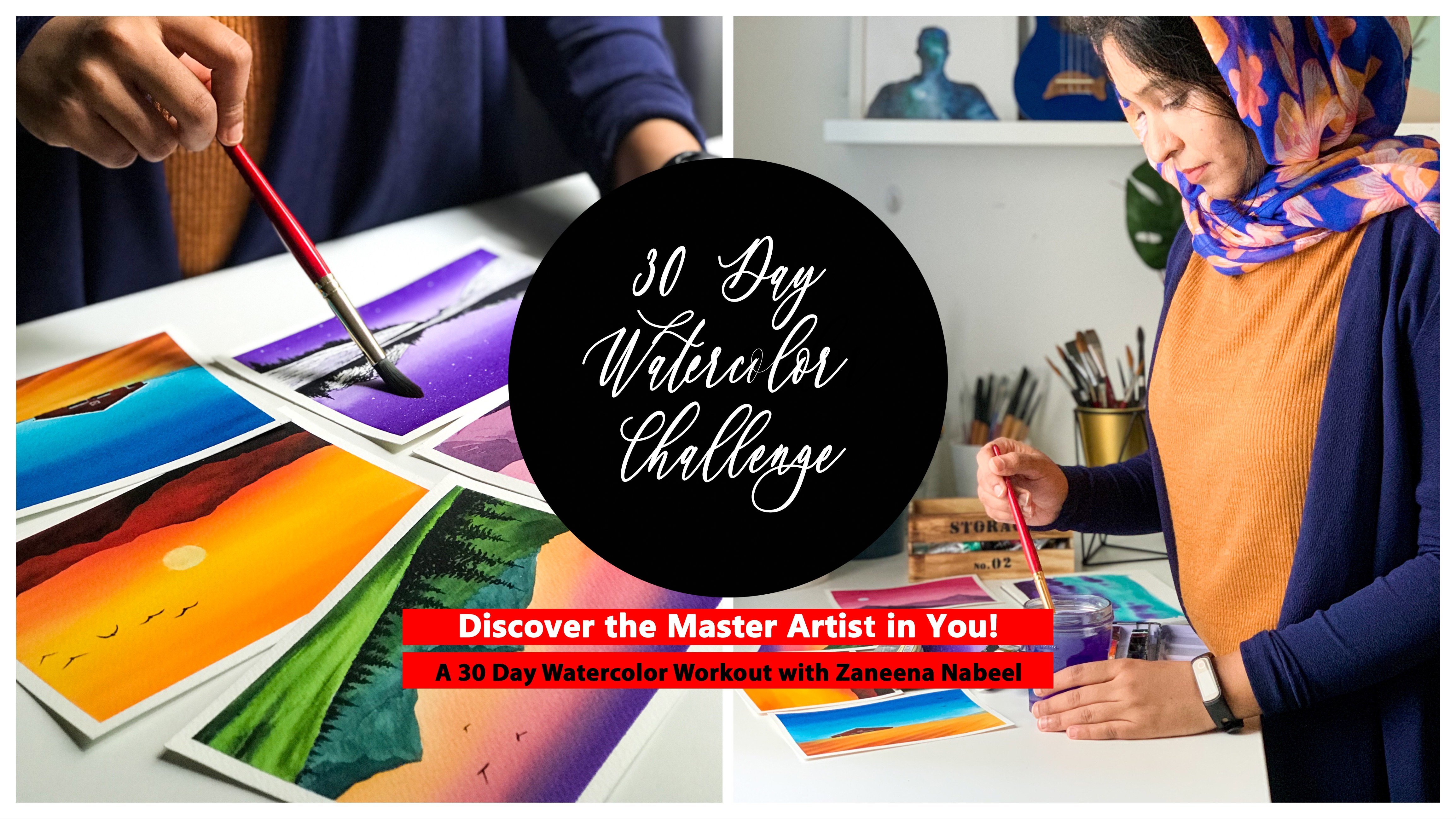
1. Welcome to 30 Day Watercolor Challenge : Spring is the season
off New Beginnings. Flowers blooms for the
first time in many months. The sunshine, again, bringing an end to the end-to-end
darkness of winter. In charge. Spring is the season where the landscape comes
to life after a cold winter. Hello everyone. My name is Anna. Anna. Anna, I'm a mother, an artist and architect
and an instructor. I'm originally from India and I'm currently residing in TBI. So today I'm here
to invite you all to try new totally
watercolor challenge, where we're going to
paint a series of coal, just plain landscapes
for the next 30 days. It's a season of new beginnings and I think it's a
perfect time to start a new hobby or in the same
time, improving your skills. And trust me, there is no better way than
shining a watercolor. Paintings will be
doing this challenge is absolutely unique
from each other. We have colorful and vibrant and will make you feel
so much close to nature. Before we start with
the word class physics, we will have a fun color
story that went together, curate a spring color palette
exclusive for our 32-bit. Let's watch. This section will also help you understand
how you can choose violin, colloquial classic physics to
make them really stand out. Every day, we will start with a quick sketch book
exercise to understand the color palettes as well as the techniques you will need for that particular T is painting. This exercise will make you confident when you're
attempting the class protect. This class is not just about creating 30 spring landscapes, but it is more
about understanding different techniques and how you can work with vibrant colors. Throughout this 30-day
watercolor challenge, you will learn to paint
different kinds of Skies, mountains, reflections,
and so much more. If you're allowed to build
a creative routine as well as you want to improve
your watercolor skills. I'm here to help you join me on this 30-day
watercolor challenge, and let's go together.
2. Class Overview: Thank you so much for tiny. I'm super thrilled to have
you here and the study of watercolor challenge baby
will be together painting, coating called your
spring landscapes, have put a lot of effort and choosing the
class projects so that you have plenty of techniques to learn from
each of the painting. This class is designed
as a daily challenge which will run for
60 days actually. So starting from today,
every ordinary day, we'll be painting
a spring landscape for the next 60 days. So by the end of this class, you will have 30 cardia spring landscapes right
in front of you. All the projects will do in this class will
take you somewhere 30-40 min or maybe
a bit tomorrow. I don't want the
procedure tie you. Rather, I want you guys to enter the process and be there fully. And that's the main
reason why I'll be uploading the class
predicts every alternating. So you can either do them on the same day or you can
do them as a whole at the end of every
week or whenever you find time for
the creative break. Before we start, I will give you a quick overview of the
subsidy watercolor challenge. First and foremost, I
will take you through all the materials
you will need for this anti-authoritarian
watercolor challenge, starting from paper to pencil. From there, we will jump onto a quick color study
where I'll be explaining about each and every collaborative using this 30-day
watercolor challenge. While I'm explaining the colors, I'll be showing the
real class project. So you will have a
better understanding of what the colors factory biggest
thing in the coming days. So when we have an
understanding about the materials as well
as the color palette, we will start on the work
first-class protect. Each and every project is
divided into two sections. The first section will take you through the colors as well as the techniques you will need
for that particular project. We will talk about the
colors, their properties, as well as partner cheats if
you don't have those colors. In this section, we'll also
try some techniques so that you can approach the class predict with
a lot of confidence. The anterior classes
for London realtime, given a lot of importance
to minute details, you'll find all the
information in this class, even if you are starting
out with watercolors. So don't worry if
you're a beginner, I'm here to help you out with each and every minute detail. As you all know, this course isn't a daily challenge format. So it is ideal to follow
them daily to get more comfortable and
confident with the medium. But you're welcome
to come back and finish this at different times. You can choose to upload
your paintings every day, or you can upload them as
a collection of paintings. At the end of the
challenge, either wave, aggravating to see your
beautiful spring landscapes. So without wasting any more
time, Let's get started.
3. Art Supplies: Alright, now let's take a quick look at the
materials you will need for this anti-authoritarian
Watercolor Challenge. Have everything ready here. Let's start with the
watercolor people. So according to me,
watercolor paper is the most important aspect of any watercolor painting to get the best results as well
as to enjoy the process. It is really
important to work on a good-quality artist
grade watercolor paper, which is how quantum
percent cotton, if you're getting frustrated
with particulars, the main reason could be using the wrong kind of art supplies, especially the watercolor paper. So good-quality
watercolor paper has a lot of impact on
your interests. And compared to student
grade watercolor paper, they can be quite expensive. Trust me, it is going to make the whole process a lot more
easier and more than that, when you're using the
right kind of paper, you're going to enter
the process to the last, which is really important when you're spending
some creative time. So the paper that I'm going
to use for today's class as Canson Heritage cold
press watercolor paper. This paper is or 140 LP
thickness and it is 100% cotton. Canton has a lot of
varieties of paper, but this one here
is one of my most favorite from their
entire series. This works perfectly for
watercolor landscapes. I'd ask all the right
amount of texture. You can go with any brand. It doesn't need to be canceled. It can be archosaur, Fabriano or any other
watercolor paper that you're comfortable with. But be sure to go with an
artist grade watercolor paper. Don't use student grade
watercolor paper. When you're looking
for watercolor paper, you might see different
varieties of papers. Some of them say is 25% cotton and some of them
say 75% cellulose. Those are not the
right kind of paper. Go with the paper which is of 100% cotton had is the paper that you
should be going with. Student grade paper
is inexpensive compared to artist
grade watercolor paper. It is just because
student grade papers made out of cellulose
or wood pulp. For the same reason,
it cannot stand multiple layers of paint
and makes it really difficult when you're trying different watercolor
techniques I use to integrate people mostly for experimenting
the techniques and testing the colors
for my final artwork, I always go with artist
grade watercolor paper. Alright, so here's
your checklist. When you're buying
a watercolor paper, it has to be 100% cotton, which is the most
important thing. It has to be at
least 140 LP thick. This means the paper is quite
thick and it can handle multiple layers of water without
making the paper buckle. And the last thing is that
people should be cold pressed. Cold pressed has the
kind of people that I prefer for
watercolor landscapes. It is just moderately texture, which makes it perfect for
watercolor landscapes. Now for this entire series, I'm going with a
portrait orientation for all the paintings. And the size of each
of the painting is 14 centimeter by 17 centimeter. You are free to choose
any size that you prefer. It can be much more
bigger or smaller. Okay, so that's all about
the watercolor paper. Now, everyday before we
start with our painting, I'll be explaining
some techniques as well as we will
do a color study. And for that, I will
be using a sketchbook. You can just try them out
on a scrap piece of paper. It doesn't need to
be a sketchbook. This one is a
handmade sketchbook with artist grade
watercolor paper. Now, these exercises
that we're doing every day doesn't need to be
documented like this. You can just use
scrap piece of paper or it can use the
backside of any of your older findings
every time when I'm not too sure about the
tonal value of your color, whether it's too
dark or too light, it is really important to try them on a scrap piece of paper. So keep a scrap piece of paper like this
right next to you. As I said earlier, it can be the backside of any of
your older painting. This is just to try
the colors before you apply them onto
your main painting. It's a very simple step, but you can have a lot of
mistakes by doing this. Be sure to keep a scrap
piece of paper next to you. Okay, so that's all about
the watercolor paper. Now, let's take a look at
the next art material. In order to get a clean border, as well as to prevent
your paper from buckling. You will have to fix
your people onto a packing code or
onto your table. For that, I'll be
using a masking tape, this one as a half-inch
masking tape. And I'll be fixing my paper
directly onto my table. If you prefer fixing your people onto vacuum board,
you could do that. So this one is a very
normal masking tape. I caught it from a
stationary shop. You can use any of the
normal masking tape that you normally use. Now let's talk about
the watercolors that I'm going to use
for this challenge, for this anterior challenge
of using watercolor tubes. If you have got both watercolor tubes and watercolor pans, I would recommend to go
with watercolor tubes that particular pans. Because at sampling, since
you will have to use that thick creamy paint to
get the right consistency. This might be a little difficult with your watercolor pan, so it is better to go with particular tubes
if you have them. So these watercolor tubes
or from the branch in him, It's a Korean vertical upright. And these are their premium
quality watercolors. It's been awhile since I'm using the strands and I really
loved the equality. It is a bit cheaper compared to the other artist
grade watercolor. And they are really
vibrant as well. So you can go with
any of the normal watercolor brand that you use. It doesn't need to
be the same for. All you do is just
try to go with the similar colors to
get a similar result. I know I haven't spoke
about the colors you will in which I'll be
doing in the next section. From that section, you will get all the necessary information
about the colors they have, pigment number and how to create a similar color if you
don't have the same color. Okay, So you will get all the necessary information
from there. And not just that at the beginning of
each day's painting, I will be explaining about
the colors you will need for that particular thing to make
the process a lot easier. The next thing you will
need a mixing palette. I'll be using ceramic mixing
palette to mix the colors. I written law ceramic mixing
palette because they're quite easy to clean and it
doesn't stain the palette. I also have a plastic palette, which I use for my practice. I never used to
clean this palette because it's a huge task. So I just leave it as it is. But then ceramic is
quite easy to clean. You just need a wet wipe and
you can easily clean them. That's main reason why
I love ceramic palette. You can use a plastic or
a ceramic mixing palette, which will you
have God with you? Now, let's take a look at
the watercolor brushes. I'll be using
colored brushes for this verdict vitamins
that are six of them. The black ones are from Silver Brush and the red
ones are from Princeton. Now let's take a look
at each of them. The big red rushes see here
is a one-inch brush, brush. This is mainly to
apply an even coat of water on the
entire background. You can use any of your bigger
brush for this purpose, but be sure the brush is clean before you apply water
onto your paper. The bigger the better
so that you can apply water onto a larger
area quite quickly. Okay, so that's the first brush. Now let's take a look at the
restaurant. The brushes. I have four on brushes here. The first one is size number 12. I'll be using this
brush to apply paint onto a larger area, especially for the background. It have a bigger brush. You'll be able to apply paint ontologically real quickly
before the background tries. Okay, The next
question I have here, a size number eight round brush. For the background and
foreground elements like adding some droppers are adding the mountain sand
similar details. Then the next
question I have here, a size number four round brush. This one is for the
smaller elements. Then finally, I have
one around race was a size number two round
brush for the minute detail in this brush comes back
to a very nice pine, which makes it perfect
for detailing. Like adding some flowers, leaves or any other mining T2. This brush is really
important as we will be adding flowers on
almost all the paintings. So just go with any
of your detail and brush or use a brush
which has a pointed tip. Now the last pressure happier
as a half-inch flat brush. This is also for applying
paint onto the background, especially when I want a gradient wash or I need
to blend the colors. Okay, so those are
the brushes you will need throughout this challenge. You will need a wash brush to apply water onto your
entire background. Then you will need a
bigger size term, fresh, medium sized round brush and
a smaller sized round brush. Then you will need
a detailing brush as well as a flat Trish. The next important art
supplies we'll need for this class as
a masking fluid. This one is from Art Philosophy. I'll be pouring a little
off masking fluid onto this plastic cap. And I'll be using one
of my older brush to apply masking fluid
onto the painting. This one is a brush
which I badly use. We will need masking
fluid everyday. We'll just use it for
three or four paintings. This one is a really old brush. It has got synthetic hair. Doesn't really work for
my watercolor paintings, so I had kept it aside. But it really works for
applying masking fluid. So it has got some use now, in case if we're using masking
fluid for the first time, there's one thing that
you need to keep in mind. Masking fluid doesn't work
on all watercolor paper. Especially if it's
a handmade paper or It's a paper which
has lot of texture. So it is really
important to try out the masking fluid on the
watercolor paper that, uh, using before you go
to your class project. This is about the painting. There will be using
masking fluid. We will mask those class and
we'll paint the background. Then when it dries,
we will remove the masking fluid and
paint loose flowers. If you don't have masking
fluid, don't stress out. I will be giving you
an alternate way to work around if you don't
have masking fluid, the next thing you will
lead us to jars of water. I prefer using glass jars
for my watercolor painting. This is mainly because I can see when the water
is getting dirty. So first jar of water, servants of the paint
from your brush and the other child
has to stay clean. We'll be using the second jar whenever we are in
need of clean water. If you're using just a
single jar of water, be sure to get it
from your seat and replace the water whenever
it is getting 30. Because in order to get clean and fresh colors
in your painting, it is really important to
use clean water as well. Last but not the
least, you will need a pencil to make some sketches. Then you will need an eraser in case if you make
some mistakes. And finally, you will
need a paper towel. You can also use a cotton
cloth or paper towel. Okay, so that's some rice. All the materials
you will need for this anterior 30-day
watercolor challenge. Go get them ready and
time in the next section.
4. Spring Color Palette: Okay, Now it's time to do a font color steady
before we start with our class projects
so that we have a better understanding
about the colors we'll be using in this 30-day
watercolor challenge. I have taken a whole sheet here. I'm going to pass the
colors on the sheet. You really don't
need to do it alone. Maybe you can try the
colors on a piece of paper. Or if you're really interested
to do it, just go ahead. Okay. So whenever you
think about spring, there are few colors
which comes to your mind is obviously green. I'll start with the greens. I'll show you some of
the paintings will do in this 30-day particular challenge to get you into
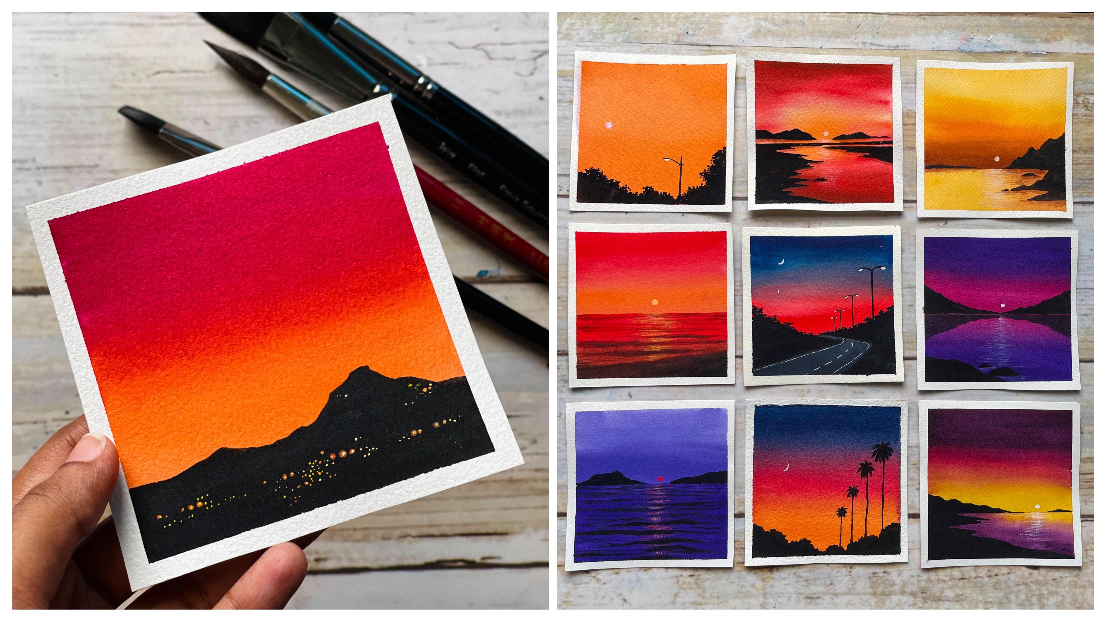
that spring mode. So here are a few
of the painting. You can see that bright
and beautiful green here. So first I'm going to introduce to the greens that
we'll be using this 30-day watercolor challenge will be using green
in different ways. In some paintings, we'll use
it in its original form. And in some paintings
we'll add some indigo or taco blow into it to turn
that into a darker green. This is just to bring
in different modes and different look TO painting, but then the base color
remains the same. Now, let me show you the green
colors that I'll be using. So the first one is leaf green and the second
one is sap green. I'm not too sure if you
all have leaf green. It's a yellowish green, which
is really easy to make. And the second column
is saccharine. Now, along with
these two colors, especially for the middle, I'll be using integral to turn the current
into a darker one. For most of the green paintings, I'll be using these
three colors. I'm going to quickly swap
these colors for you. As I mentioned earlier, maybe
you may not have lifting. The other two colors
are quite common. Sap green comes in almost all
the basic watercolor sets. And if you don't have indigo, you can use any other taco. Blue will be just using that
to make the green taco. We won't be using that directly. So instead of integral, you can also use Prussian blue. You can just mix a little of that with saccharine
to turn yellow, green into a dark Homer. I have taken out all the
colors onto my palette. Now, I'm going to quickly
switch them on my paper. First, I'm starting
with leaf green. It's a very bright
yellowish green which can be used for
your spring coronary. I really love this color. But if you don't have this
color, It's absolutely okay. You can just use a little
bit of lemon yellow, or you can just mix a
little of lemon yellow with sap green to
create a light green. I'll be showing
that in some time. So don't worry if you
don't have the screen, you can see how pretty
that green is looking. Now there are few
paintings where I'll be using this
green asset is, you can see that
college is cream. I'll be using that for
the background mostly. I'll be showing you how you can create this color in some time. So don't worry if you
don't have the screen. As I'll be using
this quite a lot. Maybe you might be thinking, I won't get my painting right if you don't
have this color note, there is nothing like that. You can just use lemon yellow. Or as I said earlier, you can just mix a
little of sap green with lemon yellow to
create some Locrian. Next, I'm going to
swatch out sap green, which is a very common color. Sap green is a
really pretty color. I love to use that
in my landscapes. I'm not a fan of viridian green. I don't use it much. Maybe if I'm painting
an evening or night, sometimes I use that
in my landscapes. Otherwise I always
stick to sap green. So that's a second color. Next, I'm going to
swatch out in the cold. Indigo is one of
my favorite color, especially I allow
indigo from Sennelier, the brand of the watercolors
that I'm using for this 30-day watercolor
challenge is called Sheehan. It's a Korean brand. I'm not a fan of this integral. It's a really dark one. So sometimes I used
to add a bit of blue into it to turn that
into a bluish color. So anyway, you can use
any of the integral that we won't be using. That acetone will be just adding some green to turn that
into a darker tone. Now, the next color
that I'm going to swatch out a school of green. You can see the color I have
used for the mountain here. It's brownish green, which
is like the name says. I'm going to mix a little
of burnt sienna but Sap green to create
that olive green color. So first I will spice out burnt sienna acidosis because
we'll be using punchy. And also in our paintings. I'll show you some of the
paintings that we'll be doing. For this one, for that pathway will be using burnt sienna. And for this painting here, for the background, we'll also be using a bit of burnt sienna. I'm going to scratch
out burnt sienna. Then I will mix
alert, love, sap, green to it to turn that into all the green,
burnt sienna. It's also pretty common. So I'm guessing you all
have phones in our tool. You can use brown
or burnt sienna, both of them with Bach. I'm going to swatch
out buoyancy now. It's a beautiful, earthy brown. Next I'm going to
show you how you can create olive green. Olive green is a beautiful
color to use for mountains as well as for metals.
So let's try that out. And picking like love sap green and mixing that with some brown. Olive green is
unhealthy green asset as some brown tone in it. It's a beautiful color,
especially if you'd like to use muted greens
in your landscapes. I just mixed a bit
of bonds in how exactly to create
that olive green. I already have an olive
green color with me. This one is from vanco, but I don't use it much. I always prefer mixing and
creating my own olive green. So in case if you already
have only bring the theory, you can readily use
that you don't need to mix and create a color. The next color, I'm going to
show you a survey in blue. This is one of my most
favorite color to use for sky. So for almost all the
painting where we are using blue for the sky,
using this color. If you don't have saline blue, you can use Prussian blue or cobalt blue or any other
blue that you prefer. I really love this guy, especially for that too
bright blue, cloudy skies. So this is certainly in blue. You can see how private
equity that blowers. But if you don't have three in blue, that's absolutely okay. It is not going to
affect your painting. You can use any of the
other plutonium car. Okay. I will quickly show you
few of the paintings where I have username
blue for the sky. This is the first one. I have another one here. You can see how
colleges that blows looking and how use the same color for this
cloudy sky as well? Yeah, I have used it for
quite a lot of paintings. The next color I'm going
to show you is neutral. Send. This one has more or less
similar to paints gray. You can see those
fluffy clouds here. I'll be using this color
to add those clouds. The watercolor brands
I'm using here, Shinzen, it doesn't
have Payne's gray. Instead they have nutrients
and that is the reason why I'm using neutral term
instead of Payne's gray. But you can use Payne's
gray if you haven't. It's a beautiful color. I used to use it for my
monochrome paintings. You can use neutral
terms or Payne's gray. If you don't have both the
colors you can use a bit of plaque will be using this
color only for the clouds. So even a lighter value
of plaque will work. So don't worry if you don't have Payne's gray or neutral scent. I missed to show
you this painting. For this one as well. We'll be using cerulean
blue for the water, will be just using a
Pareto value over here. And for this guy, let
me use a lighter value. Okay? So that's early in blue. Now there are few
paintings where we will be painting water. This I just drew
from the collection. And as you can see here, we will be painting
a beautiful ocean. And over here the color
you see is cobalt green. So that's the next color. I'm going to show you a subdued fruit pistol,
bluish green. It's a wonderful color to
use for tropical beaches. I use this quite a lot
for my light as well. I love to use it against
indigo as well as violet. If you're a frequent
student of my classes, I'm very sure you
might have seen me using this color quite a lot. It's a beautiful color to
add a new color palette, you can use it for a
basal sky as well. Okay, so that's cobalt green. Now there are few
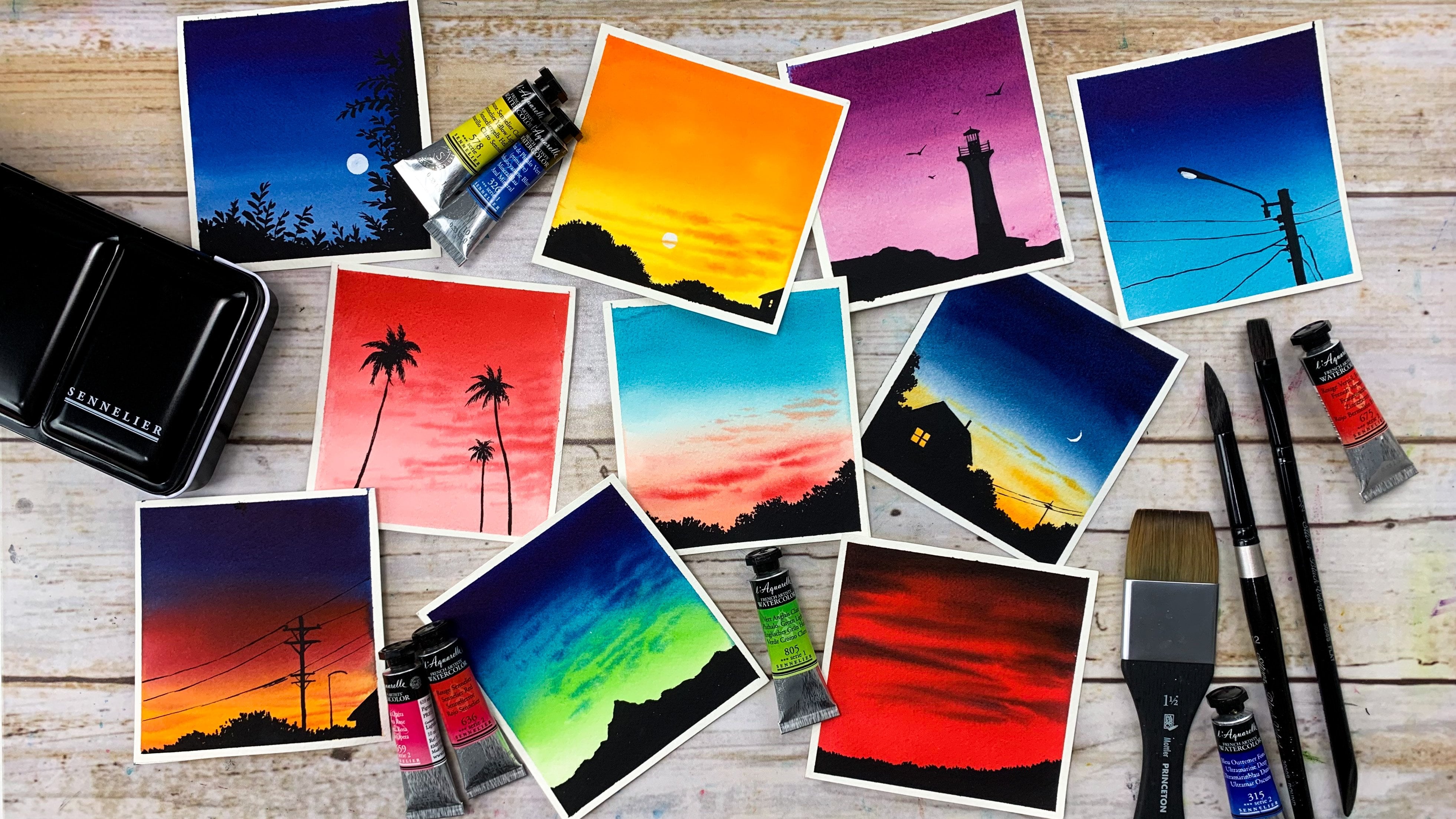
paintings where we will go with a dramatic sky, insert off a soft blue sky. These are few of them. We will learn to paint
beautiful cloudy sky with a vibrant
color combination. My main motor with
this class is to help you understand different
watercolor techniques, as well as how to use
vibrant colors together. In the coming days,
we'll explore some dramatic and
beautiful skies. And this is one
of the color that I'll be using quite a lot. This is called Naples yellow. It's basically a loop
and it is really does not like the other bright
and vibrant yellows. You have seen. That
a few more colors I'll be using for this guy, which is vermilion, red
and permanent roles. So right now, I'm
just going to scratch all these colors
just to make you understand how they're
gonna look like. So for this guy you see here, I have gone with a violet and opera pink color combination. In the coming days,
we'll mix and match all these colors
and we learned to paint white trans guys. I don't want to
kill the surprise, so I'm not showing all the
painting fat we'll be doing. But trust me, you'll
be surprised by your own skills that are so
many ECB to paint a car, just sky, which you will
see in the coming days. I'm swatching out
Naples yellow here. This is one of my favorite
color to use for skies. I love to use Naples, yellow with blue and violet. You can create a beautiful
moody sky with those colors, will see that in
the coming days. So the color that is
passed here as well, Merlin, and now I
have titled red here. This one is a bold
and bright red, will be using this to
paint the flowers, and we'll also be using
this for the sky. It's not a common color. If you have any kind of red, you can use that
instead of pyrrole red, or it can just use vomiting for this painting here to
paint those flowers, we'll be using fido tread as
well as brilliant orange. These two are really
bright and vibrant. You can see that from
the painting here. First I will splash
out brilliant orange at something similar
to vermilion, but it is more
bright and vibrant. Exactly how to name things. So that's brilliant orange. But if you don't have this
color, that's absolutely okay. You can just use glomeruli. But if you have red,
it's going to be really helpful when you
add those flowers. If you don't have pyrrole red, you can use permanent
red or not, red or cadmium red instead. If you don't have any of them, you can just make fell
in love crimson with vermilion to turn that into
a little more brighter. If you don't have any
of the colors that I'm using here, don't stress out. We'll find a way around. Now for this painting
here for the sky as well as for that
lavender fields, I'll be using opera
pink, oprah pink, which brings in that vibrant and bright look
for this painting. Again, this one is
not a common color. So if you don't have it, you can just use crimson. So obviously, if
you are not using the same colors
you're painting is going to look slightly
different from mine, but that's absolutely okay. We are here to learn
the techniques and we are here to
understand the process. So a slight difference
in your painting is not going to affect
the intracellular. The color you see here that vibrant fingers are
wrapping. Along with that. I love to be using
permanent violet for the lavender field
as well as for the sky. So don't worry if
you don't have any of the colors that
I'm using here. I just wanted to show you this is not going to affect
the anthracite. You're still going to enter the process and you're still
going to love your painting. Okay, so that's
permanent violet. And it's not really
necessary that you should have a violet
in your color palette. You can mix and create
your own violet by mixing any of the blue with
crimson are rules. There are few other
paintings where I'll be using valid for the flowers. So you can see this
painting here. We'll be mixing a little of
white quash with violet. And for this one, I'll be using opera pink for those
bright pink flowers. If you don't have opera pink, you can use crimson or rows. For this one here, I'll be using violet
for the flowers again. So right now, my
intention is to make you understand about the colors
that we're going to use. And this 30-day
watercolor challenge, I'll be talking
about the colors in more detail at the beginning of each day's painting will have a thorough look at
the colors will need for that particular day. So don't worry if you missed out any color and if you
don't have any of them, I have here is permanent rose. I absolutely love this color. For most of the time. Instead of crimson,
I used to go with this color because
it is more vibrant. But if you don't have this, it is very similar to crimson.
You can use Chrome cell. I'll be using this color for the sky as well as to
paint some flowers. Now the last color
I'm going to show you is cadmium yellow. The coming days we'll paint a beautiful yellow till upfield. This one here. It is one of my most
favorite painting from the whole series. And this an asphalt. We'll be using cadmium
yellow for those flowers. I love how simple and pretty
these two paintings are. It's a gorgeous color
compensation for that. The yellow you see here,
I'm using cadmium yellow. You can use a dilute
that have caught. It can be gambled yellow or Indian yellow or
any other yellow. We just need some
kind of yellow. That's allows colors
in my color palette. We have splashed out
all the colors that I have included in my
spring color palette. You can see how vibrant and
bright and pretty they are. Now there is one important
color that you will lead, which is white gouache
or white watercolor. If you have a white gouache, I would prefer to covert white gouache because
it is more opaque. We'll be using this to add the highlights as
well as some details. You can see those
wild flowers here. For that, I'll be
using white gouache. Now I'll show you another
painting that I'm using, white for the flowers. This one here, not
just for flowers, we'll be using vi to
paint those waves and to add some highlights
for some other paintings, we'll be mixing some
white gouache with violet and other colors to create a lighter
and opaque version. And we'll be using
that for the flowers. So obviously white gouache is more opaque than watercolor. So if you have wash, I would prefer to use
gouache or watercolor. But if you don't have gouache,
It's absolutely okay. You can just use
white watercolor. And finally, before
wrapping up this section, I want to quickly show you how you can create leaf green if you don't have the same
color, It's really easy. You just need some sap
green and lemon yellow. Now, there might be
some other colors in your color palette like greenish yellow or
light green or green. Or there are so many colors
similar to leaf green. There is another color
called green gold, which can also be used
to interrupt leaf. So we just need a
yellowish green, which is bright and vibrant. But all the colors that I
mentioned and greenish, yellow, green, green, cool, these colors are
not really common. So the easiest way to
create a leaf cream as just by mixing some lemon
yellow with sap green. So let's try that out. So this is my lemon
yellow from Sennelier. I'm going to squeeze out
a bit onto my palette. I already have some
sap green over there. I'm just going to
pick a little up sap green and mix that
with lemon yellow. It is really easy, depending
on the color that you want, you can adjust the amount
of green or yellow. If you add more green, the color will be more drainage. If you add more yellow, it
will be more yellowish. So depending on the color that you want to use
in your painting, you can adjust the amount
of green and yellow. So that's the color as a
vibrant yellowish green. Maybe we can try adding a little more green into the same color. And let's see how it is looking. I'm picking some more sap green, mixing that with the same color. Wow, that's a pretty color. See that? Beautiful, right? So these are some ways how you
can create a leaf green if you don't have leaping or any of the colors I
mentioned earlier, it's an easy task. And we'll leave this
color for quite a lot for paintings. Give it a try. I think I will add a
swatch of leaf green right next to this so that it
can understand the color. That's leaf green. I think I like the other ones
better than live screen. The one where we have added
lemon yellow and sap green. The colors are
mixed and created. It looks more fresh and
vibrant and leaf green. So yeah, there is
nothing to worry if you don't have the cream, you can mix and create
your own color. All right, so that summarize all the colors you will need for this 30-day
watercolor challenge. As I mentioned earlier,
we'll be using these colors in
different ways and different paintings will mix and match the colors according to the mode of the painting. For some painting we'll use
violet and blue for the sky. For other one will
use violet and pink. Before I end the session,
let me tell you, if you don't have the same
colors, don't worry about it. At the beginning of
every day's painting, we will talk about
the colors in detail. And we learned to create an authentic color
with the colors we have in our palette. That's on me. Don't worry about it now. Okay, now we're almost ready to start with the
first painting. Check out the next section
to understand about the colors as well as the techniques you will need
for the first painting. The mountain Jacqueline. I'll see you there.
5. DAY 1 - Mountains are Calling: Hello, Hello,
welcome to day one. And here is the car just
painting that we're doing today. You can see that
beautiful based on sky that caused his
Green Mountain, that beautiful meadow flowers. You just need to
follow the steps. It is really easy. I think by the end
you'll be surprised to see the car just painting
that have created. Now, I'm going to
walk you through the colors you will need
for today's painting. You can already guess most of
the colors that we've made. But in this section, I'll also be explaining
some techniques which is going to make
the whole processes here. First, let's start with the sky. I have my sketchbook ready Here. I'll be switching
the colors as well as I'll be doing the
techniques in the sketchbook. For this guy, I'll be using three colors. As
you can see here. It's a yellow and an orange sky. Yellow that I'm using
as Naples yellow. This one is a pistol yellow. It is not like the normal yellow like gamboge yellow
or cadmium yellow. It has some white in it, and for the same
reason it is not as bright as the other yellows. Now, along with Naples yellow, I'll also be using vermilion
as well as pyrrole red. So I'll be applying yellow
onto the background. Then onto that, I'll
be adding some clouds using formalin as
well as federal rate. If you don't have red,
that's absolutely okay. I just wanted some brighter
tones. Your head there. Especially over
here, you can see that brighter red, that's pilot. But in case if you don't have
it, that's absolutely okay. You can just use a
brighter tone of one-millionth and Naples yellow. That will give you
a good result. So forget about right,
if you don't have it, you can just use Naples,
yellow and family. And now I'm going to swap
these colors quickly. Let me squeeze out
all the colors. I'm starting with Naples yellow. That's Naples yellow. You can see the color. It is not like the
normal yellow. It's a pistol to Edison that
right, It's adult color. And also we can see
that small blacks quo, that indicates the
color is opaque. I will take another yellow
and show you the difference. So this one is cadmium yellow. You can see here
this one is black. That means it is opaque. This one is just half
black and half white. And that means it is
semi-transparent. And this one is vomiting. That is an empty square, which means it is transparent. The reason why Naples yellow is opaque is because it
has some white in it. Now I'm going to take out the other colors and let's
take a look at dispatches. The woman will need to take
out a bit of bread as well. As I mentioned audio,
this red is optional. If you don't have it,
don't worry about it. You can just use yellow
and orange for your sky in case if you'd like to add those deeper values in your sky, you can use Chrome some instant. This is where I'm
going to use the red. You can see little
brighter tones here. That is pirate read. The rest is all
vermilion and yellow. So feel free to skip that
if you don't have red. Now, I'm going to
scratch out the colors. I'm starting with Naples yellow. The swatching exercise. You really don't
need to repeat it. You can just watch over the
colors and keep them ready. You can see that color. Just paint some yellow. It's a beautiful
color to use in sky. It's a dull yellow, not like a bright yellow, so you can use it
against some purple or blue or even orange, like the one we're doing today. Now, I'm going to
swatch out vermilion, which is a very common color. I'm very sure you all have it. So that's 4 million. Next color we have humourous
pattern would read. This one has a really
bright and bold red. I love to use this
for evening skies. But today they're not using that intense rate
will be just using a letter and we'll be turning
that into a paste or dread. So those are the three colors
I'll be using for the sky. Now, in case if you don't
have Naples yellow, you can use any of
your other yellow. It can be cadmium yellow or Indian yellow or gamboge
yellow or yellow. I would suggest to go
with a warm yellow. I'm going to squeeze out a
bit of cadmium yellow here. Then I will show you how you can turn that into a
pixel, the yellow, you might be
wondering, I can use gamboge yellow or chasms
and look for the sky. Why am I using Naples yellow? The reason is I want a softer and softer
look for the sky. I don't want it to
look too bright. If I use cadmium yellow
or Campbell cello, the sky will look really
bright and vibrant. But I'm looking for
some patient tones in my sky rather than
flight colors. And that's the main reason
why I'm using Naples yellow. Now, I'm going to add in some white watercolor
into cadmium yellow. And I'm going to turn
that into a pixel color. So this is the
method you should be following if you don't
have Naples yellow. As you can see here, there is a small black square which indicates whitespace
and opaque color. This is same thing happened
with Naples, yellow. It has some white pigment in it. And this cave and opaque and beta tilde character
Naples yellow. I'm mixing a bit of white, cadmium yellow, and I'm turning
that into a pixel below. Now, let's pass that out. You can see that call
just pixel below. See that? Looks too good, right? If you have never tried
Naples yellow or a Paisley, a loop for in your sky and the ratio you're going
to love to the sky. So we'll be using this
against 1 million ads by red. And that automatically turns all the colors we'll be using in the sky into a pixel one. So I'm really excited
to give it a try. This is the one we're
gonna do today. You can see that
called your soft sky. Before we start with
the woman project, I will quickly show you how
we're going to do the sky. So this will give you a better
understanding value during the sky and you won't
make any mistakes. I've made a small section here. So the first task was
to make that area wet. I'm using my one-inch
brush brush and applying a clean CO2
water over there. We're gonna go with
a baton wet sky, new brush multiple times to make sure that entire area is wet. Now, I'm going to
use my round brush. I'm using my size number eight brush for our class project. I'll be using size
number 12 round brush asset is quite big. Now I'm picking some
Naples yellow and I'm F9 back onto this
anterior division. You can leave some white gaps
in between if you prefer. Otherwise just apply that
onto the entire area. Okay. So I have
applied Naples yellow. Now, I'm going to
pick some watermelon. Just too little. You
don't need a lot. You're just adding some clouds. You can add them. How will you want? Maybe at some places you
can go with some lines, and at some places you can go
with some irregular shapes. This will make your
scale of more beautiful. So as you can see here, the orange turned into a pistol, orange as we have yellow
in the background. So this is the reason why I applied yellow dots the
anterior background. This will turn the entire
sky into a pistol one, no matter which will be the colors we're
flying or to the sky. Now, I'm going to
apply some red onto this corner to make
it a little brighter, but that looks really bright. I will pick some yellow and
turn that into a lighter to see that even that red we have applied here as
looking like a place to two. So this is the magic of that Naples yellow we
applied in the background. All the clothes
we're applying on the sky is turning
into a place to shade. It does not really
looking at Pride. This is a really easy
and colleges sky. You can use it in your
future paintings transform. Now just in case if you
feel like any of the colors have blended properly or if
they're looking too strong, you can just pick a
little off Naples yellow and try to blend
that into the background. Okay, so that's the sky. I really loved that
top-right corner. This is exactly what we're
going to do on our painting. Give it a try and be confident before we start with
our main class project. For the class project
to paint the sky, I'll be using my size
number 12 round brush. When you're painting a sky, it is better to go
with a bigger brush. With a bigger brush,
we'll be able to get better shape
for your clouds. And also you'll be able
to apply the paint onto the background quickly
before the background Reiser. That's all about the sky. Now let's take a look at the colors you will
need for the mountain, the metal asphalt,
asphalt flowers. It is quite obvious that
you will need some grains. So these are the four
colors I'll be using for the metal as well as
for the mountains. You will need leaf green, sap green, indigo,
and burnt sienna. The slip ring is not
really a common color. If you have checked out
the color palette section, you will know how to
create this color. Are they explain that again. The rest of the colors are quite common and very sure
you all have Sap, Green, burnt sienna,
and integral. If you don't have indigo,
you can use any of your darker blue mixing, let love indigo into sap green to turn that
into a darker green. So instead of
integral, you can use any other blue caught, especially along the
bottom where you have those flowers over there will
be using a darker green. Now let's fetch all the colors. I will quickly squeeze the
colors and we'll split it out. I'm just using a wet wipe
and I'm cleaning the palate. This is the main reason why I love ceramic mixing palettes. It is so easy to clean
and there is no stains. It just looks as knew. Anyway, I'm squeezing out
the colors, that leaf. Then you have Sap, Green, burnt sienna, and indigo. So those are the four colors I'll be using for the mountain, as well as for the metal. Out of these four colors, only leed green is
quite uncommon. The rest of the colors
are quite common. So I will quickly
scratch out, lift cream. It's a beautiful green. It can be used for that
fresh and tender greenery. It's a very refreshing color. This is the color. You can see how pretty it is. Set both a color we
can use for spring. Now, I'm going to quickly
swatch out saccharine, been seen as an integral. Alright, so those
are the scratches. Now there's one more color
that we need to scratch out with, just olive green. You can see the color, how
useful the mountain here. It's not sap green
or it's not C. Now, how it makes sap green and plants interact together to create
an olive green. So that's what we're
going to try next. I'm just picking some sap
green and mixing that with one Sina to turn that
into an olive green. It's a gorgeous color
which you can use for your mountains to bring in
that earthy feel into it. Look at that. It's a pretty green. This is the color we'll be
using for the mountain. You can experiment
with the same color. If you add more green
into the same mix, it will turn into
a different tree. So just try different
mixing options and learn about the color. Right now I have added more
gray into the same mix. And this is the color have
gone causes cholerae. So I had only bring with me, this is from Bangkok. It's a gorgeous color, but for some reason I always
loved to mix my color. I haven't used it much. But in case if you have an olive green color
but you already, you can use it as it is. You don't need to mix
and create your color. Now, as I said earlier, leaf print is not
that a common color, but you can easily create a similar color using sap
green and lemon yellow. So let's give it a try. I already have lemon
yellow and sap green here. I'm going to squeeze out both
the colors onto my palette. We need to use more
yellow and less green. So we already had a look at the same exercise and the
color palette section. This is just in case if
you missed that one. I'm going to make it real quick. I have some lemon
yellow on my palette, and I already have
some sap green here. I'm taking a bit of sap green and I'm mixing
that with lemon yellow. In your mix, you should be using more yellow and less clean. I think we already cut
a leaf green here. Now let's back that out. It's a beautiful green. You just need to use lemon
yellow and sap green. This is more like
a greenish yellow, so you should be adding
more yellow into the mix. Now maybe we can add
some more yellow and see how the curve
is gonna look like. Now, in case if you
don't have lemon yellow, you can use any other
yellow you have caught, preferably a cool yellow. The code may look slightly
different from this, but then that's absolutely okay. You don't need to
worry about that. We'll be using this
color against Sap green. So it wouldn't affect
your painting a lot. Okay, so here's
the color I made. I think this one is really
looking like the leaf green. Alright, so those are the grains you will need for
today's painting. Just give it a try and
understand how you can make the screen
using sap green and lemon yellow will be using this color quite a lot
in the coming days. So it's gonna be really
helpful if you can give it a try and understand how
we can meet this color. Our next task is to try out that beautiful mountain before we go with our main
class project. First, I'm starting
with a sketch. I'm going with a tapering shape, adding some ups and
downs here and there. And going with a very beautiful
shape for the mountain. Now I'm adding an
irregular lines starting from the tip of the mountain
and I'm taking it down. It's a very messy
initial color line. We will apply some
olive green and some brownish tones onto
the anterior mountain. For that, I'm mixing some sap, green and brown, just
like how we did earlier. Now I'm simply going to follow that outline and I'm going
to cover that mountain and this color in case
if you would like to use more of a greenish
color or a brownish color, just adjust your color mix. Maybe you can use more
crane and less brown. And in case we want
a brownish color, you can add more
brown and less green. So feel free to go with
any color that you prefer. You just need to follow that
outline and fill that up. Now, I'm picking some brown at adding some brownish
tones as well. Going back with olive green. Now picking some sap green. So my intention is to use
different tonal values of green and brown in the mountain to make it
look more realistic. And that is the reason why at some places I'm adding color green and at some places I'm dropping some brown
and sap green. You can see how colleges
that is looking already. This is the base Bosch. Now we'll have to
wait for this to dry. And once it dries onto that, we'll be adding some details
which is going to make our mark and look more
realistic other than the color. In order to make your
mountain look more realistic, you should be going with
interesting shapes as well. Don't go with the
normal curvy shape, as you can see here. Adding some little ups
and downs here and there. And also you can add a
point, the papering shape. Okay? So that's the basic
shape of the mountain. Now I'm going to
leave it for drying. Meanwhile, the mountain dries. I think I will add the names for these colors I have added here. So it looks like the
mountain has dried. Now we're going to add the
remaining details for that. I'm using my size number
four round brush. You will have to use any of the brush which
has a pointed tip. It can be a smaller sized
brush or a detailing brush. Now, I'm picking some grain and mixing that with a
little off into code. I want to create a darker green. So just make some indigo or any other darker
blue with green. Now first task is to add that irregular line
at the center. This line is really important. This is what gives you a
mountain or a realistic look. So if an A2 confident, maybe you can add that
with a pencil first and just follow that
line with your brush. Now before we add on this line, you will have to make
sure the background has dried completely. Otherwise, the line you're adding will have a blurry look. We want a sharp and clean line. It shouldn't be blurry. Just wait for a few more
minutes if you feel like the background
hasn't dried yet. I have added that
irregular line. Now. I'm adding some more paint
along the same line. Right now, we're going to focus on the left side
of the mountain. This is where we'll be
adding more taco values. We're going to leave
the right side acetals. We wouldn't be added more
taco values over there. So I added some taco values
along that irregular line. Now I'm going to
do the same thing. Wherever I have
these pointy end, I will add a little
darker values over here. But I'm not going to take
the line completely down. Maybe I will stop
at somewhere here. Similarly, I'm going to add some darker values here as well. You can add them. How
will you want to? We just need some darker
values here and there. So that is the first step. Now I'm going to
push the paint from my brush and I'm going to
switch to a brownish green. I'm just mixing some
sap green with brown. I'm using less green
and more watery paint. And now I'm going to apply that on the left side
of the mountain. You don't need to
worry about the darker tones you
apply the earlier. Just follow the shape
of your mountain and apply that brownish color. Earlier, we just apply them
as some rough patches. We randomly added some
darker tones here and there. Right now, when we're applying this brownish
tone on top of it, it will have a blurry look. It wouldn't really stand out and that is exactly
what we need. We can see the results. We have some taco
values here and there. But it's not really prominent. Mountain is already
looking so beautiful. It should be sharp
and clean like this. So you'll have to wait
for your pattern to dry completely before
you do this step. Now, I'm going to wash all
the paint from my brush. And I'm switching back to that light brownish
color we made. Again, I'm going with
the watery version. It isn't that torque. Now in a similar way, how we add a darker tone tone
to the other side. We're going to add
some medium tones on this side as well. So when we add a deeper
tones on the left side, we concentrated on those
pointy area in a similar way, contemplate on that pointy areas and add some medium tones. All I need to do is just
add some random lines. You can see the color
I'm mixing here. It isn't that hard
to medium tone. I have just mixed sap, green and brown to create this color. And I'm just adding
some random lines onto the right side
of the mountain. The only thing you need
to keep in mind is that it shouldn't
be a darker value. Go with a medium
to lighter tone. And just add some broken
lines onto the side. Just randomly add few lines. And whenever you
feel like you have added enough, you
can leave it there. Okay. So that is about Green Mountain. We'll be adding a similar
mountain onto a painting. So if you have tried this now, it is going to be really helpful when you're doing
your class project. You will have a lot
more confidence and you will make any mistakes. So we spoke about the background and the
foreground elements. That is one thing missing, which are these flowers. It's a very simple flower. I'm going to quickly show you
one or two flowers so that you will have a
better idea before you go with the
main class project. To add these flowers, I'll be using white gouache. If you don't have white gouache, you can use phi two articles, but you'd have to go with
a thicker consistency to make them look opaque. I'm just adding a patch here. I just mixed integral
and sap green. In our main class project, we'll be adding a taco
down at the bottom. And that is exactly
where we'll be adding these flowers when you use a taco tone for the background, those white flowers we are adding build really stands out. And that is a main
reason why they're making the bottom
area and darker. I'm just dropping in some more
integral onto this patch. Now, we'll have to
wait for this to dry. You can see the flower. It's very simple one. I don't think I
need to show this, but anyway, I have
added a green patches. They're at a single flower. I will show one or two. And then we can start with the word class project.
Let's give it a try. I'm taking out some white
gouache onto my palette. My first preference
is white gouache. In case if you don't
have wide quad, you can use white watercolor. The main reason is
that white quash is a lot more opaque
than white watercolor. When you add in those flowers, it will really stand out. It won't fade away when
the painting dries. That's the main reason
why I'm telling you to use white gouache instead
of white watercolor. But if you don't have
it, that's okay. You can just use
white watercolor. Now to add the flower, I'm using a smaller size brush. This one is a size
two round brush. You should be using any
of your smaller brush, which has a pointed tip. Otherwise your
flower will look to pick and your painting
will go out of proportion. Okay? So I'm just adding some petals. Look like the background
hasn't dried yet. Never mind. I'll just go ahead and
add in the flower. It isn't that complicated. It's a very simple one. This is exactly like how we used to draw flowers
when we were kids. So that's my first flower. This is the kind of size I'll be using for our main painting. Asphalt. Maybe one or two can be slightly bigger and few
of them can be smaller. So when you add in your
floss onto main painting, play with different sizes. I will add one more flower here. In a similar way.
I'm just adding petals and I'm filling
up that shape. Okay. Maybe we can make
it a little bigger. I'm just following
the same shape and making those petals speaker. I have added two flowers here. Now at the center of this class, we need to add those
stigma and filament. I hope I'm using the
right word for that. I'm picking some yellow. I'm using cadmium yellow. You can use any of
the yellow data used earlier for your sky. I'm going to pick some paint
directly from the tube. And I'm going to add an oval shape at the center
of these two flowers. It doesn't need to
be perfect oval. It can be an oval around just dropping some yellow
right at the center. You just need to
press your brush and add in some yellow
color over there. It doesn't need to have
any particular shape. So that's the yellow. Next, you will need bond C. Now, we have already used this
color for our painting. You just need to listen. If you have some leftover
paint on your palette, you can just use that. You don't need to
squeeze out new paint. Now using the same brush, I'm going to add some
taught right at the center. We have, we have
added that to yellow. Just some random dots. And that makes our
flower complete. If a single shot.
Alright, so this isn't really how we will
be adding travelers onto a wall painting. You can add how
material you want to. I'll just be adding
few here and there. I won't be adding a lot. Alright, so that's some rice, all the colors and
techniques you will need to know for
our first painting. I hope you all are total with the colors as well
as the techniques. Now without wasting
any more time, Let's talk with all
of his painting.
6. Mountains are Calling - Part 1: Alright, so I have
my paper ready here. I have applied masking
tape onto the full size of my paper and have
properly secured it. We already had a look at
the colors you will need. And also they had a quick
look at the techniques. Now it's time to add
the pencil sketch. So as you all know, we'll
need to add a mountain. I'm going to add it
somewhere over here. We'll just add one
tall mountain. As we only have one
single mountain. I want this to look
very interesting. I'm going to tapering shape and you can see
the mountain here. But if you'd like to go
with a different shape, if you want a low-lying
mountain or if you want under mountain,
you could do that. So that's the sketch. So we're trying to make it
look like this mountain is in the background and we
have a beautiful meadow and the four count
will be going with a more brownish and Ollie Green kind of a color
for the mountain. And we'll go with some fresh and vibrant green for
the foreground. I'm going to add on the line on the right side just to make the different divisions
for our metal. This will make our painting
look more interesting. And over the bottom will be
adding some colleges flowers. Okay, so that's
the ventral catch. Now it's time to
squeeze out the colors. We already had a
look at the colors, so we are very well aware of the colors that I'm going
to use for the sky. I'll be using Naples yellow, as well as a bit of vermilion
to add those clouds. If you would like to use a
different color combination for your sky, that's
absolutely okay. You can follow the method and you can paint
a sky in any of your favorite color
combination and doesn't need to be a yellow
and orange sky. So I'm squeezing out
some Naples yellow. We already discussed about the properties of Naples yellow. If you want to try out
this guy in a similar way, you can add a bit of white
to any of your yellow. The next color that I'm
going to squeeze out as formalin will just
need a little, we're not going to use these
colors for anything else, so don't squeeze out a lot. That's it. This kind that we're
doing today is going to be really different from the
ones who have done earlier. And the main credit for that
goes to Naples, yellow. So that is the color which is
going to make the sky more beautiful because it
has a pixel tone in it. So how squeezed out Naples,
yellow and vermilion. I think I will need
a bit more right. Asphalt just to make some
areas a bit more brighter. So I'm going to squeeze
out a pyrrole red. This one is optional. If you want, you can
use a darker tone of vermilion interrupt read. We can use any of the red
that you have caught. We just need a little just to make some areas a
bit more brighter. So we have the colors ready. These are the three colors
we'll be using for the sky. So first I'm starting out by applying a clean coat
of water onto the sky. I'm using my
one-inch wash brush. I'm applying a clean
even coat of water. You can apply the water
on top of the mountain. That's absolutely okay. You don't need to worry
about leaving that are here. So keep running
your brush multiple times just to be sure that the word has rays
travel anywhere and go to water is even. So my skies evenly wet. Now I'm going to go to my
size number 12 round brush. Just cleaning my brush
just to be sure there is no other paintings
on my brush. As they're gonna
go with a yellow. The brush that I'm using here, a size number 12 round brush from silver black velvet brush. And I'm starting off with a medium tone off Naples yellow. So we can simply apply
yellow onto your sky. How will you want to? There is no particular order or there is no particular shape that
you need to follow. Simply apply that
onto your background. You can leave some
white gaps in between. But again, that's
optional if you want to cover the
entire sky in yellow. That's also okay. Now I'm taking a bit of
orange with the same brush. I haven't washed the
paint off from my brush. Now I'm just dropping in that orange on top
of the yellow. I'm running my brush
in a linear way. Maybe I will add some clouds
onto this right comma. You can add them
however you want to, whether you want
to add some lines or whether you want some clouds, you could go by a
Chinese as you're applying that orange on top of the yellow, how
will you apply? It is going to look
really beautiful. I think you should
give it a try. Now, I have taken some red and I'm dropping that
onto the background. I want some areas to be a bit brighter to make our
sky look more dramatic. So whenever you feel
like your colors are not blending properly, you can take out some yellow. And using yellow, you can try to smash the colors to
make it look smarter. You really don't need to
look at what I'm doing here. The base color has to be yellow. You can apply yellow onto wet background
however you want to. Then again, onto that you can add some vermilion as well as some red that also you
can add and how will you want to enter? It depends on how we have
added paint onto the sky, whether you have conduit
more yellow or more orange, those things are
absolutely okay. You can add a new color. How will you want to? But just
follow the process first, you need to make
your back on wet. Then you need to drop in some yellow onto that wet background. Then you can go with your
second and third color, which is 1 million Android. Then you can add some clouds, some rounded guns are
some linear ones. How will you wish? So that's this guy. Now, we need to wait
for this to dry. The main color I used
here as Naples yellow. It is because of this color we got that beautiful pixel sky instruct this color if we use the normal yellow gamboge
yellow or cadmium yellow, the sky is going to look
entirely different from this. This yellow sky. A more soft and a scepter look. If you have gone with
some cadmium yellow or Campbell cello of a sky
will look more brighter. That's the only difference. But if you'd like to
have a practice guy, you can use your normal low
interrupt Naples yellow. Now we'll have to
wait for this to dry completely before we
start with a mountain. So let's take a small break. Okay, so this guy has
dried completely. Now I'm going to squeeze out
the colors for the mountain. First I'm going to take
out some burnt sienna. I'll be mixing this
with some sap green to create a fully
green kind of a color. So that's the color I'm going
to use for the mountain. We don't need a lot of
burnt sienna just a little. Now the second color
I will need for the mountain as sap green, for the metal will be
using sap green Tacitus, we won't be mixing
that with town. But for the mountain
we want more of a brownish cream rather
than a fresh green. And that's the
reason why they're mixing that with balancing. So here's my sap green. Let me squeeze out a bit
of sap green as well. The next color you
will need is a fresh and a vibrant light cream. For this entity class, I'm using watercolors from
the brand called Sheehan. It's a Korean brands. And these are their
premium watercolor. So they have named this
color as leaf green. But I'm very sure the other brands doesn't
have the same name. A hacker, light green, lime green than May green, and so many different color. So the name doesn't matter. We want a fresh and vibrant
light green like this. If you don't have
a similar green, you can just use
some lemon yellow and mix that with
and love sap green. The next color you
will need this integral to add
some deeper tones. We'll be using this mainly
over the bottom where we're adding those
flowers are also, we'll use the same to add some medium tones
onto the mountain. Okay, so we have
the colors ready. Now, I'm going to take out my size number
eight round brush. You can use any of your
medium-sized strong crush. You can use size number eight
or ten, or any medium-size. As we discussed earlier, I'm going to make
some sap green and brown to create an
olive green color. And that is a color I'm going
to use for the mountain. I'm just following that shape
and I'm adding the paint. I will start from the
tip of the mountain. That's the bit of brown. I'm picking some sap
green Mexican Pet world to create an olive green
as a brownish green. And I'm going to add
that onto the mountain. Looks like the paper has dried completely, still slightly wet. So I may have to wait for
couple of more minutes. We want a really clean and
sharp shape for the mountain. You have to make sure your
sky has dried completely. Okay, I use a blow dryer
to speed up the process. Now, I'm going back
with that olecranon, picking some more sap green, I'm mixing that with brown. Now. I'm just
following that shape. Looks like this guy has
dried completely now. Hello, that shaped properly. And adding your color. Be very careful. It should
have a beautiful shape. You can try out the color
on a scrap piece of paper, if not too sure about the
color that have created, we have simply mixed a bit of
brown as well as sap green. And that's the color
you're seeing here. For the top of the mountain, we are using an
olive green color. So you can use this color almost three-fourths
of your mountain. And just along the bottom, you can go with Sap Green. Be sure to give it a good shape because this is a main focal
element of our painting. The rest is gonna be a metal. So you can call this as a major
element of your painting, are the major substance. Okay, so focus on the
shape of the mountain. Now, I'm going to
switch to sap green, and I'm going to blend
that with this color. You don't need to wash out
the paint from my brush. You can readily
covered sap green. Apply that right
where you stopped your olive green and
just blend pattern. It doesn't need to
be cleaned blend. It is just that we
shouldn't be seeing any strong separation
between these colors. Now as you're coming down, you will need to switch
to your third color, but just that leaf green. For the mountain, we have used a brownish green as well as a bit of sap green
along the bottom. Now for the rest of the area, I'm going to go with
that light cream. We want a fresh
green for the metal and then brownish green
for the mountain. Applying a bit more
lifting over the bottom. Then I will switch
back to sap green. You can see how
colleges that color is. It is perfect for that
tender and fresh greenery. Look at that. Such
a particular right. Okay, maybe I will add a little
more towards the bottom, then I will switch to sap
green. That looks nice. Now I'm going back at Sap green. So towards the bottom, I
want more of a darker green. This is the area where
I'm going to add the flowers so that the background has a
really light color. Those flowers doesn't
have any focus. So in order to make the
flowers stands out, we need to make them sit
on a darker background. And that is the reason
why we're making this area taco
compared to the top. So drop in some medium tones and darker tones
along the bottom, I'm still applying
some sap green. But right after this, I'm going to add
some indigo asphalt to make the bottom
even more darker. Just keep in mind,
we're not looking for a smooth and fluid
gradient here. We just want some taco
tones at the bottom. The only thing is that we
don't need a sharp separation. It shouldn't look like
different blocks of colors. So that's the only
thing we need to keep in mind. For that. You just need to simply
keep on applying the paint onto the background
while it is still wet. This way the colors wouldn't
look like different bands. It will have a really
smooth look this way. So start off with
your leaf green or lemon yellow or any
other lighter cream. Then as you're coming down, switch to sap green and
try to along the bottom, you can go with some indigo
and make it even more darker. So I have added enough of
darker tones at the bottom. But you can see here
it is looking really via some washing up the
paint from my brush. And I'm going with
some fresh cream, Picking love sap green and
mixing that with leaf green. I'm just running
my brush back and forth to make it look better. So as I said earlier,
we are not looking for a smooth and clean blend here. We don't want a strong
separation of colors. That's the only thing we
need to keep in mind. So keep pulling the paint in and out and make it look better. I'm happy with the
weight as TomTom. Now, I'm switching to
a smaller size brush. Before the background dries, we need to add some medium tones of green on the top asphalt, some using some sap green mixing pad with a
little off lift frame. I want a soft green. That's the reason
why I'm mixing a little of leaf being
but saccharine. Now I'm just adding some
lines along the top. Remember those notions
we have added? Right now, those pencil
lines are not visible. So just go with an assumption and add some lines like this. Background is still
slightly wet, so make yourself the
time and add some lines. Now there are chances
that your background is starting to dry or it has dried. So there is a trick
that you can follow. First, you need to add
them, those lines and those medium tones using
green onto that background. Adding those lines and
make those divisions. Once you have added that, wash out the paint
from hemorrhage and go back with the leaf green or any of that brighter
green you were using. Now using that color, you can simply keeps matching
color into the background. So this will give
you a more smoother look in case the paint
has dried already. Okay, so once you have
added those lines, go back to your leaf green
and keep pushing and pulling the paint into the
background to give it a more smoother look
at is really easy. This is just in case
if the background has dried already but is still wet, you are on the safer side
wanting to worry at all. You can keep on adding those medium tones and
add those divisions. So as you can see here, just following that line, and I'm adding some deeper
tones along that top line. But my background
has started to dry. It is not really wet. So I need to go
back to leaf green. And I need to keep
pulling and pushing the color into each other
to make it look smarter. I think it is going
to be better if I use a medium-size brush, does match the colors
rather than a small brush. I'm taking out my size
number eight brush and making it smarter. This way it is easier
for me to smash the color as the
brushes quite big with the smallest size
brush that will be too many brushstrokes and it
meant I've looked at mode. Okay, So how might
this area wet? Now, I'm going to go back with my smaller brush and I'm
going to add those lines. Again. Our intention here is to add some medium tones
onto the metal, especially over the top. And we're going to make
it look like a valley. So we'll need to add some lines to make it look more realistic. Otherwise it will
look quite plain. I have added a menu
as two sections, and I'm just adding
some medium tones along the top line of those
sections to make it visible. Technically, it is just
have lines that I'm adding along the shape
of those valleys. And whenever I'm feeling
like the background is dry and the paint is
not blending properly. I'm going back but some leaf green and I'm blending that into the background so that those lines wouldn't look
really rough and sharp. Just add in some lines. Let's make those shapes visible, be shown, or to use a
really dark tone of green. You can either use sap green
acidosis or you can mix a little laugh leaf
green or lemon yellow to sap green to make
it a little softer. But be shown how to use indigo or any other taco
green over here. I have added some lines. Now I'm using my bigger brush and I'm going with
some leaf green. And I'm just running
my brush on top of those lines to make
it look smoother. There's nothing
complicated here. You just need to keep
on pushing and pulling that paint into each other
to make it look smoother. If you use a bigger
size pressure, it is going to be a little more quicker and easier
than a smaller brush. So go with any of
your medium-size brush when you're doing this. Right now you can see
how soft it is looking. I'm adding some more
lines from the top and maybe I will repeat
the same step to make it look smoother
because I don't want those lines to be too
sharp and prominent. I want them to look a
little soft and smooth. Although it is bottled
the of lines I'm adding, I'm just following the same
profile up tos valley, bringing them down in
an inclined to wait. Okay, So this is the way
you should be adding them. Don't go for straight lines
or any other kinds of lines. Just follow the same
profile of your Valley. I'm really happy with
the way it as Toronto, but I also want to add
a bit more deeper value of cream along the same
lines I have added. I won't be adding a lot just along the same
lines we did earlier. I will drop in a
medium tone of cream, maybe a little more over here, dragging it towards
the top so that we have a clear separation
between those two sections. In case if it is to draft, you can pick some more leaf green and try to blend
that into the background. I'm really happy with
the weight as downtown. Now, I'm going to keep my
precious down because I'm really worried I may owe
will come from backgrounds. So let's not make that happen. I'm really happy with
the way that stands out. So now we have to wait for
this to dry completely. So once this dries
completely, on, the next step is to add some
details onto the mountain. Right now it is looking
quite plain and flat. It doesn't have any life. So we're going to
give it some life by adding some tuple values. We have to make sure it
has dried completely. Because the details
that we're going to add onto the mountain should
look really sharp. It shouldn't be blurry. So you have to make sure the mountains has
tried 100 per cent before you call the next step
at a still slightly wet. Meanwhile, the mountain drives. I'll just explain what
we're going to do next. We'll just take all my
pencil and I will show you roughly how are we going to add those lines
onto the mountain. So our intention is to
give a good shape to the mountain and make
it more prominent. So starting from the tip of the mountain will be
adding an irregular line. We will continue that
line to the bottom. It's going to be a really
odd and irregular line. So that's what the
beauty of this mountain. I'm not really sure
if you're able to see the line properly because
of the colors here. Now, mine is a very
simple irregular line. So what I did here is that I divided the mountain
into two sections, one on the left and
one on the right. And we'll be adding
more deeper values and more shadows onto the left side will
be just adding few lines using a lighter
value on the right side. So that's all we're going
to make the mountain look more beautiful,
Andrea, elastic. It's a very simple
step, yet it is going to have a huge
impact on the mountain. This depot values are going to define the shape
of the mountain and it will automatically define the shape of
the metal as well. Right now you can see the metal is not
really defined as we have similar tones of green on the mountain as well
as on the metal. When we are adding both Depot
values on the mountain, the metal will also get
automatically defined. Okay, so let's give it a try. We need a darker value. So I'm mixing some
integral with sap green. I'm using my
smallest size brush. This one is my size
number four round brush. You will need to have a brush
which has a pointed tip. First, I'm going to add
in that irregular line. So be very careful with this. We need a really
strange irregular line. Maybe you can watch out
the way I'm adding it. And you can add it
with a pencil first, then you can copy the same
shape with your brush. Okay? So that is the line. Now using the same brush, I'm going to add
some deeper values onto the left side
of that shape. I'm not going to fill
that entire shape. I will just add few patches. Just follow that
line you have added there and add in some color. Okay, So that's the first step. Now we have another
tapering and here, this one you see here. Now from the tip of this part, I'm going to add another
small irregular line. I'm not going to continue
that till the end, just adding some
tuple values there. And over here as well. Now I'm going to wash
the paint from my brush. And I'm picking
some burnt sienna. Mixing that with a
little olive green. But in the mix I'm using more of points in a
and less of sap green. And I'm going to fill the
anterior area and bad color. At some places you have a darker value and at some places you have
a brownish tone. This will automatically make your mountain look more
beautiful and realistic. Okay, so onto that in-between areas drop in some
brownish tone. Once you have added
that brownish color, try to smudge it
and to each other. While you're doing this, try to define the shape
of the metal. Right along the bottom. There you can use
that darker value. Now, go back to that brownish color and
fill up the remaining area. Your major focus
should be on that. It'll align you have
added at the middle. The rest of the lines
doesn't really matter as your NAV going
to smash the color. But you have to
be really careful about the line you're
adding at the center. It should be really
sharp and clean force. You have to make sure
the background has dried completely before you
add in that line. Now, you've seen
that brownish tone. I'm going to add some lines
on the right side as well. Just some thick and
thin lines in-between, but makes sure the
color is not too dark. You can see the color
I'm using here. It's a medium tone. It isn't too dark and it
isn't too light as well. It has to be visible
flexor point, but it shouldn't
stand out a lot. I hope I'm making sense here. Okay, so go with
a medium tone of that brownish color and added
some lines over here also, you can create some pockets to make your model
look more interesting. Now you can keep on
adding some lines. Be very careful not to
make them too dark. Go with a medium
to lighter tone. You don't need a lot,
just few here and there, so that you can see how
pretty mountainous looking. I'm really happy with it. Now the anterior painting
has caught a life or there it was looking
to plane and flat. It is the beauty of
that irregular line we have added that made
the whole difference. Now there's one more
thing that I'm going to do before we cope
with the next step. Right now the mountain
looks really defined. It is looking so beautiful, but not the metal. The metal doesn't look like. It has a defined shape. To give it a defined shape, I'm going to go back with
a little leaf green. First, I'm going to
add that over here. This is just to make this
area slightly lighter. So you can see that two
dimensions properly. Right now, even though
we have added the metal as two separate sections, it doesn't look like that because we use the
same color throughout. And that's the reason why I'm
making this area lighter. Now. I'm going to
wash the paint from my brush and I'm dabbing
it on a paper towel. I'm simply dragging those color towards the top to
make it look smarter. Now I think that looks a
lot better than before because the metal
was really defined. You can clearly see
those two sections, one on the top and
one over the bottom. And it is really looking
like a valley now. Okay, so feel free to add lighter values
wherever you want to. I have just used
leaf green assets. I haven't added any whitewash
or in watercolor into it. For this task, you don't
need an opaque green. Which green that you
were using before. That really works for this. Or we can simply use
a lot Lachlan and green and add a pinch
of sap green into that. Okay, so once I have
defined that shape, if it is looking Ralph, wash out the paint
from your brush and go the slightly wet
brush and try to smudge the color to
make it look smooth. Okay, so that's nearly done. Our next task is to add
some flowers at the bottom.
7. Mountains are Calling - Part 2: So we already had a look at the flowers in the
technique section. I'll be using the
exact same method to add floss in our
painting as well. I'm going to squeeze
out some white gouache onto my palette. As we discussed earlier, if
you don't have white gouache, you can use white watercolor. So let me just write this area and make some
space for white gouache. This is the main reason why I
love using ceramic palette. It's so easy to clean. So we have the
color already here. Now for the flowers, I'll be using my
smallest size brush. Before that, I will just clean this brush and keep it aside. Okay, so here's the brush I'm going to use
for the flowers. This one is size number
two, round brush. It has a nice point, which makes it perfect
for adding those flowers. You can use any of your smaller size brush which has pointed to, or you can use a
detailing brush. I just flipped my palettes that it is easy for me to work. And I'm adding a
few drops of water. I'm starting with
my first flower. I'm going to add that
on the left side. So you can add as many
photos as you born, but focus on the area that you have taco tone in
the background. Otherwise your flour
and be really visible, focus mostly on the
area at the bottom. We have added those
deeper values. Maybe you can add one
or two on the top, but focus more on the
area that you have deeper values so that the flow goes will
really stand out. These are very simple flowers. I thought we can start with simple funds and creditability. We can level up the cane and we can go with some
complicated flowers. So I'm adding my first
flower in a similar way. I'll be adding five
or six of them. Some of them will be bigger and some of them
will be smaller. And in-between. Are we
adding some parts asphalt? Now just in case if
you don't want to add this kind of a flower and you want to go with a different one. That's totally okay. These
are very simple flowers, but this is a very
simple flowers. But to add them all, it
might take some time. So don't rush. Take it slow. If you want to take
a break in-between, just go ahead and go for
a walk or have a cup of coffee and come back when you
are in your creative mode. Because if you don't put
100 per cent heart here, even though it's a
very simple step, you won't get it right. So if you're not
feeling like doing it, always take a break and come back when you're
up for it. Okay. Now, I'm picking up some yellow. I have some Naples yellow here, so I'm just using
the same yellow. I'm not going to take
out any other yellow. And I'm adding a small irregular oval shape
at the center. The thing they probably discussing the
technique friction. And after that I'm picking some brown and I'm adding some towns. Okay, so that's my first flower. Now in a similar way, I'm
going to add few more flowers. I'm going to switch
back to white gouache. I think first I will fix
the shape of this flower. I'm not really happy
with the pattern because this one is quite big and it will be really visible. Let's fix the petals first and then I will go with
the second flower. As I said earlier, you can
add as many as you want. I won't be adding a lot. I'll just add five
or six of them. I'll also be going
with different sizes, but not because until now
let me add a second one. So once we add me flowers, we'll be adding
some crazy pattern. So right now the flowers may look like they're
floating in the air. By just don't worry about that. I'm adding my second flower a
little about the first one. Let's make it a bit smaller
than the previous one. To make it look more natural. You don't need to follow
the exact same location that I'm adding my flowers. Just go with your cuts and
add the variable you want to. Maybe you can stop looking at the screen and come back when you're finished
adding your flowers. Okay, so that's
my second flower. Now I'm switching to yellow, adding some yellow
at the center. We calculated earlier.
So that's yellow. Now I'm picking some brown
and I'm adding a few dots. So that's it. That's
our second flower. For the rest of the class, I will first add the byte shape. Then once I'm done with that, I will come back to yellow and brown and add the
remaining details. So I'm going to quickly
add few more flowers. You can add them
variable you want to, as I said earlier,
you don't need to follow the exact same
locations, but I'm adding them. So just ignore
what's happening on the screen and add
in your flour. The flower I added right now, I didn't complete the shape. I just added half of the petals and I'm going to
leave it as it is. So this will make my painting
look more interesting. I will have different kinds
of flowers and it will add a natural value to the painting.
Let's add the next one. You can see the way
I'm adding them. I'm adding some of them at the bottom and some
of them at the top. I'm playing with
different sizes. So just keep those
things in mind. Don't add them in a similar way. Go with different sizes. And Adam in a very random order, don't add them in a line or
in a particular pattern. Okay, So some of them can be bigger and some of
them can be smaller. And add them in a
very random way. Alright, so I have added
enough of flowers. Now I'm just adding some dots. Maybe just three
or four of them. Again in a very random order. These are going to be the buds. Again. So I have
added four of them. Now, I'm going to wash out
the paint from my brush and I'm going to switch
to yellow. Right now. We have just added the shape. Now to make our
flowers look complete, we need to add that
detail at the center. So go with any of the
load you were using earlier and add a
dot at the center. Do that for all the
flowers you have added. Once you're done with the
yellow, golden, brown, and add in some dots and make
your flowers look complete. Okay, so that's our next task is to add in some crazy
lines at the bottom. Now you can see the flowers
are just floating here too. And this graphing lines, we need a lighter green. So I already have some
Naples yellow on my brush, which is a place to lay
low potassium white. So I'm just mixing
that readily with sap green to create a lighter green. You can just mix a little
of white quash that saccharine to turn that
into a lighter tone. Now, using that color, first, we can add a stem for all
these flowers we have habit. Go with a thin line. Don't make it too bored. So be sure to use a brush
which has a pointed tip. Just add a curvy line for all these flowers as
well as for the buds. This is the first step.
Now along with this, we'll also be adding some
grassy lines and some leaves. So first let's finish up this. Pick all the flowers
we have added, and add in a line using
a lighter value, queen. If you use a darker tone, it won't be visible as we have a darker tone
in the background. That's the reason why I mixed a little bit of Naples
yellow with green. We have done adding the
stem for all the flowers. Now, we need to add some grassy lines as well
as some leaves. I'm using the same green. And I'm going to add
some random curvy lines as well as on grassy patterns. I'm going to fill up the bottom. Right now you can see it is
quite planned at the bottom. So we're going to
fill up this area by adding these kind of lines. So it does just some freehand
curvy lines which can be considered as grass
or long pointy leaves. Now when you're adding
to the grassy lines, at some places you can
deliberately skipped the floss and some places you can add them on
top of the flowers. This will make our painting
look more beautiful. The step is really important to make your painting
look complete. Otherwise, tours flowers
will look really weird. So choose any of your
smallest size brush, or any other breakfast
as a pointed tip and go with a lighter value of cream and add in some crusty lines. It is just some freehand lines. You don't need to worry
about how they're looking. You just need to make
that area dense. So keep on adding
some lines like this and fill up that
enter your bottom line. Okay, So I have enough of lines using a lighter
value of green. Now, I'm gonna go with a
slightly tackled value and I'm going to add
some more lines. So some of them can be longer and some of them can be shot to make them as
interesting as possible. You can take them a
little into the middle. This will make your painting
look more beautiful. Try not to restrict your hand at them in a very
free hand curve. This will make your painting
look even more beautiful. So try not to break
those lines in between Adam in one go. So using that darker value, I'm going to add few
more crafty lines. Maybe I will take
them a little into the metal to make the painting
look more interesting. I'm adding some
integral with sap green to turn that
into a darker green. And I'm going to randomly
add some more grassy lines. I'm deliberately making some
of them overlap the flowers. In a similar way. You
can add as many as you want until you feel like
you're happy with the result. You can see how pretty is
looking right now when we added those scratchy
lines earlier, it was looking quite
empty and it was really looking like the flowers
for floating in the air. It didn't had any
realistic value to it. But now those grassy lines has changed everything or pleadings
looking so beautiful. For this painting,
we went in with a very prominent shape
for the flowers. And they're quite big castle. And that's the main reason
why I added the grassy patch. After I have added the flowers, The paintings where the
size of the flowers are quite small and they're
not too prominent. We'll be adding a
grassy pattern first, then we'll be adding
the floss on top of it. But for this painting,
the flowers are quite big and they're prominent. So we need to make them
go with the background. So we need to make some of
the crazy lines overlap with the flour to make them look like they're going there
with the background. I have added in a grassy lines, you can keep switching from taco value to lighter value and adding as many as you want until you feel like you're
happy with the results. I'm happy with the results. I think I can call it done. Now I'm going to
wash with paint from my premise and I'm going to
switch back to white gouache. Now, I'm going to add
few dots here and there. Just some teeny tiny dots to
make it look like there are some smaller flowers and between
I'm using the same size, number two brush, and I'm adding some teeny tiny dots
in a very random way. At some places you can
add three or four dots together to create
some smaller cluster. And at some places you can add one or two in a random way. These doesn't need
to be too prominent, so be sure to make them too
tiny to go to pick a size. Now in a similar
way, I'm going to create another
cluster over here. I'm adding some white
dots close to each other. They are super tiny. You can see the size of them. If you're not too
confident and adding them, you can skip this step. But in case if
we're adding them, they have to be super tiny. You can see the files. These
are quite far from us, so we shouldn't be making
them too prominent. So you'll have to use a
brush which has a pointer to any of your detailing
brush will really work. We can add some similar
ones here as well. This is really optional. If you don't want to add them, you can totally skip this step. I would just add two more here. And we'll be done with
our painting for today. Alright, so I have added some white plaques in
the bathroom, asphalt. I just loved everything
about this painting. The color combination, the sky, the mountain, the
meadow, the floss. I think everything is just
going so well to ketones. Now it's time to peel
off the masking tape and stare at a record
just painting. When you pick the Moscow day, be sure the painting
has dried completely. If it is still wet, leave it for some more time and let
it dry completely. And we're pulling it off
remotely periods at an angle. This will prevent your
people from ripping off. Be very gentle and
period at an angle. All right, so here
several first painting. I cannot tell you how
much I love the sky. I'm very sure I'll be using this guy in one of our
upcoming painting, asphalt. So here it is. You can see that
colleges mountain, the metal and those
beautiful flowers. Everything is looking so pretty. I hope you all enjoyed
our first painting. Thanks a lot with China today. I'll do it tomorrow, but
I will skip painting.
8. DAY 2 - Purple Corn flowers: Hello, Hello,
welcome to day two. Here is the gorgeous painting
that we're doing today. It is pretty easy
and quick asphalt. When I first tried this
color combination, I wasn't really sure how
it is going to look like, but I was so surprised
to see the results, how well that green and violet is complementing each other. So let's have a look
at the colors you will need for today's painting. I'm very sure you guys
can guess half of the colors that I'm going
to use for this painting. Obviously, you will need
some blue for the sky and that leaves green
for the landscape. Also some sap green then
violet for the flowers. Yes, that's right. Those are
the colors I'll be using. Any way. I will quickly surpass those
colors on my sketchbook. Then we can start with the
techniques right away. The background is going to
be a wonderful exercise. We're going to paint
the interior background in one single layer. Will first make the
background white. Then we will apply
blue and green onto the background and will
create those graphic pattern. It's a very interesting one. I'm so excited to show
you how you can create this background for this guy. I'm going to use
certainly improve. I already mentioned this in
my color palette section. You can use any other
blood type code. We just need a medium
tone off any of the blue. Then for the landscape, I
will be using leaf green. You can use any of the
lighter green you have car, or you can use lemon
yellow asset is. Then to add those long
leaves and grassy pattern. I'll be using sap green as well as a little
of burnt sienna. Okay, So these are
the first set of colors you will need to
create that background. I will take a little
off all these colors onto my palette. Then I will swatch one by one. Just like I mentioned earlier, for the sky, I will be
using cerulean blue. You can use Prussian
blue or cobalt blue are any other
blue of your child's? We just need a
medium tone and we will be applying a
solid bars for the sky. Now for the grassy background, the main color, I will
be using a cliff cream. You already know how you
can create a similar color. If you don't have like cream is roughly print or
any lighter green, you can also use
lemon yellow acids. The next color you
will need a sap green. We'll be using sap green to add some medium tones as well
as the final details. Now along with this,
you will also need some glancing at some places to make our painting
look more natural. I'll be using olive green. So we'll be using a little
of burnt sienna along with sap green to make our
pattern look more natural. I have squeezed out four colors. Cerulean, blue, leaf green, sap green, as well
as burnt sienna. Now, I'm going to space
out the colors one-by-one. So this exercise is mainly
focused for beginners. If you're an intermediate artist or if you're an advanced artist, you can skip this exercise. Maybe you can directly go
with this technique section. You can skip the color
swatching exercise. So my focus here is mainly on the bigness who might not be that familiar
with the colors. To be honest, until
three years back, I never knew about a color
called sirloin blue. I just knew Prussian blue
and cobalt blue because those are colors which comes in the normal watercolor set. So I think this exercise is really important for
beginners who are just starting out with
watercolor that is serene blue. Now I'm going to
swatch out lifting. You already know how to create this color if you don't
have a similar one. And also you can use any
other color which is similar, like green, gold, or migraine, or any other color. Next, I'm going to
swatch out sap green, which is again a common color. For the background, will be
mostly using leaf green. We will first apply that
until the entire background. Then we will add some medium
tones using sap green, and also a bit of burnt sienna. So that's how we're
going to create that soft and subtle
queen background. We won't use any taco values. Okay? Now finally, I'm going to
pass out burnt sienna, which is again,
another common color. It comes in all the
basic watercolor sets. So I'm guessing you all have it. Now, just in case if
you don't have one, you can use a bit of vermilion or any other kind of orange. We wouldn't be using brown asset is where we mixing a little of that leaf green as well as actually to create
a brownish green. You can see that color here. We'll be using that
mostly for the bottom. So that brown color is
not really visible. So just in case if you
don't have bones in our, any other problem, you can use boolean or any other orange. So I just mix a bit of
brown with Zachary. That's the clue will be
using for the bottom. So this is the reason
why I said it is okay not to have one Tina Brown. I hope that is clear. And also we don't
need a lot of brown. Just quiz out a teeny
bit of burnt sienna. Don't squeeze out a lot. Okay, so that's some rice, all the colors you will
need for the background. So just like I
mentioned earlier, we'll be playing mostly bit
lighter and medium values. And only for the flowers and for those parts we will
use a taco value. You can see those
leafy patterns here, even for that, will be
mostly using medium tools. Okay? So before we start with
the class project, I'm going to quickly
show you how you can create that background. Because painting that
background is really easy, but at the same time,
it can be a bit tricky. We'll be using wet on wet
technique for the background. And you have to apply
all the colors onto the background in a quick
and consistent way so that we can apply them before the background drives and also we can get that
blurry background. So I'm going to quickly show
you how you can do this. I have created a
small section here. Now, the first step is to
make the backroom wet. I'm using my one-inch wash
brush and I'm going to apply a clean coat of water
onto this anterior area. The anti-tobacco
has to be evenly wet so you can take out any of your bigger brush and clean water onto the
enter your background. Keep running your brush
multiple times just to be sure the water has
raised her everywhere. Okay. So how I made my background, but now I'm switching
to my flat brush. You can either use a flat
brush or a round brush. It doesn't really matter, but go with a medium
to pick a size. Now, I'm adding a few
drops of water and I'm turning back serene
blue, intermediate tone. You can see the way how I have applied paint onto his car. It's just a solid wash. It is plain and simple. Just apply a flat wash off
surly and blue onto the sky. I'm going to apply the
paint will almost center, or maybe a bit about
the center. Okay. Now from here, I'm going
to switch to leave Crete. Water, the paint from your brush properly, especially green. Now, apply this onto
the leftover area. You can also use
lemon yellow or any other greenish yellow
or yellowish green. Now when you're almost
reaching the bottom, switch to that brownish green and apply that at the bottom. It doesn't necessarily
need to be a clean blend. Our intention is to dropping the colors before
the bathroom tries. So start with the sky. You can use any
blue have caught. Then quickly switch
to your second color, which can be any
yellowish green. And towards the bottom
we can introduce a bit of sap green or
that Philip Green. Okay, So that's the background. Now we've talked
about on dries out, there's one important
thing that we need to do to create that
blurry background. For that, you should
be using any of your smaller to medium-sized brush. I'm using my size number
four round brush here. And I'm just going to drag that yellowish
green into the sky. I haven't taken any
paint on my brush. I'm just dragging my
brush towards the top. I'm just using the paint which I already have in the background. See that this has the effect
we're going to create here. We don't want the sky and the landscape to be
seen separately. We want a seamless blend here. That is the main reason
why we are doing this while the
background is still wet. So keep on dragging your
brush towards the top. There is nothing to worry here. You can simply keep on
dragging your brush towards the top until you feel like you have got a seamless
field over there. We have used a lighter tone for the sky as well as
for the landscape. So even if you pull the
blue down into the clean, it wouldn't really
affect your background. So don't worry
about such things. Those are not going to
affect your painting. Now, I'm going with a
medium tone of sap green. I'm using the same
brush and I'm adding some leafy patterns or maybe grassy pattern
at the bottom. Again, I'm just dragging
my brush towards the top and I'm adding some
long and thick lines. Are packing industry wet. So we have to make
yourself the time and make the bottom
area more denser. Otherwise, your
background will look really plain and lifeless. You can see the way how I'm driving my brush
towards the top. You don't really
need to worry about the shape of these lines. Just keep on adding them. Even if you put a lot of
effort as the background, the sweat, then they tries,
it will look blurry. So there is no point in
putting a lot of effort here. At some places you can use a bit more brighter
tone of cream. And at some places you
can use that olive green. So these things will add
a lot of natural value to 0 painting to make
it look more realistic. This is the exact
same method we'll be using to paint our background. You can see how
pretty it is looking. Then we added those
leafy patterns as well as the flowers. The major thing we
need to keep in mind is the tonal value
of the colors. You shouldn't be
using darker values, even for the sky as well
as for the background, go with lighter values. In case of fields, darker
values for the background, these flavors that
we're going to apply, it won't stand out. So be sure to use lighter to medium tones for
your background. Next, I'm going to show
you how you can add these leaves as plastic flowers. Adding those long leaves
and grassy pattern, you should be going with
a medium tone of green. Don't make it too dark. And also to light, it should be visible
from the background. And also you should be a bit
careful about the shape. These are going to be
the full count elements. So they're going to
be really visible. Now I'm mixing
some water and I'm turning my sap green
into a medium tone. The background hasn't dried it. So I will quickly show you some leafy pattern on the right side. For this exercise, you
will have to use any of your smallest size brush or any brush which
has a pointed tip. So press your brush against
the paper to make the lines thicker and then make
it cool way at the tip. That you can make it in different shapes and
different sizes. And also different tonal value. Some of them can be shorter and some of them can be Lanka. And also some of
them can lean on to the right and some of them
can lean out to the left. So make it as
interesting as possible. Be confident that your
brush and tell yourself, I'm going to get it right and adding a beautiful
freehand line. To be honest, this is
a very simple line and if just one or two, it won't look nice, you should
be adding a lot of them. So that is what brings some time density in your painting. So in a similar way, you will have to add lots and lots of leafy patterns at the bottom and make your painting
look more interesting. You can see how pretty
that line is looking. Let's add few more.
Maybe for the next one, I will use a slightly
lighter tone of green. See that? So that's a lighter
tone of cream. In a similar way, you should
be adding these lines using different tonal values
and different kind of green and olive green. That maybe I will
pick some brown. And I will add another one
using a brownish green. Play with different tonal
values is the easiest thing you can do to bring in some
interest in your painting. I have squeezed out some brown, mixing some green with them
to create an olive green. Now using this color,
I'm going to add in some more leafy patterns that have used a greenish brown here. Maybe we can add
one or two more. Shorter one here. So try to make all these lines
different from each other. Don't add them in a similar way. Some of them can be more curvy and some of them
can be straight. You can see how I
have played with different tonal values as
well as different shapes. Just keep that in mind so you know how to approach
your class project. Now, I'm going to add some
similar leafy patterns onto the background
we painted earlier. Right now, it has
dried completely. So just add in some
long leaf in lines. You don't need to worry at all. I had them. How
will you want to? As I mentioned earlier,
some of them can be longer and some of
them can be shorter. And some of them can be using a medium tumor and some of them can be using a taco value. Be as confident as possible, and add in your line. It is okay, even if you mess
up the shape of your lines, there is nothing
to worry about it. But just be sure not
to use a darker value. Concentrate mostly on
medium and lighter tones. Because we want the background
to be soft and subtle. We don't want it to be
too busy and board. So that's the only thing
you need to keep in mind. There is nothing much to worry about the shape of the leaves. Okay? So let me quickly add some more leaves onto
this background. Okay? So this is how it
has two on top, will be adding more
leafy patterns onto our class project to
make it more dense. So right now we
haven't added much. And for the same lesson, you can find it a
little blank and empty. But never mind, I'm
here to make you understand how to approach
the class project. Let's try not to
focus on perfection, and let's try to understand the process as well
as the techniques. Now before we wrap
up this session, we'll need to try out how
to add those flowers. You already know the color
that we're going to use. I'll be using permanent violet. I already have wild watercolor with me in case if you have one, you can use that directly. Otherwise you can mix and
create your own violet. You just need to mix
Prussian blue and crimson or any other
blue and crimson. We just need some violet, whether you mix and
create your violet or whether you use a ready-made
Violet doesn't matter. I've taken some violet now. I'm going to take out
some white quash as well. We need to turn the violet
into an opaque ocean. So for that, we need to
use a bit of whitewash. If you don't have white gouache, you can use white watercolor. But my first preference
would be white quash asset is more
opaque than watercolor. I have taken some
white gouache as well. Now to add the flowers, I'm using my size
number four on crush. The flowers that
we're going to add onto our painting is called, its original name is
century as sinus. I'm not really sure if
I'm pronouncing it right. Anyway, this is the flower. So it seems like in the past it often grew as a
weed in conflict, and hence it got its name. Whenever painting we'll be going with a very
abstract shape. We won't be adding
a lot of details. And also I'll be using a
wider sheet for the flowers. You can use violet or blue. It can be either
ultramarine blue or blue or pretty blue
or any other blue. So this is a color
that I'm going to use. Before I decided
to go with violet, I tried both violet as
well as ultramarine blue. And I was convinced
with a wide adoption as it had a better contrast
compared to the blue. But the choice is yours. You can either go
with blue or violet. Other than that bright color, there is one more
thing which attracted me towards this flower. It is nothing other than
it's upright posture. It seems like these
flowers can grow in any type condition as they always keep themselves upright. I think this is
something that we should learn from contrasts. We should always stand
tall and stand proud. Always keep in mind, you are unique and magnificent. I think now is the perfect time to try these gorgeous flowers. As I said earlier, I'm
gonna go with violet. You can choose violet or
blue for your flowers. Use any of your smaller
to medium-sized brush. First, I will space out
the color and I will make the color palette
complete for this painting. So that is permanent violet. It's from the branch hand. It's a gorgeous color. I use it quite a
lot for night sky. This tube is almost over. I think it's time
to get a new one. The other violet allow
us from White Nights. That's another pretty violet is really vibrant,
just like this one. Okay, Now let's try
out the flower. I'm going to add a
bit of white quash to violet to turn that into a
lighter and an opaque one. No matter whether you're using white gouache or
white watercolor, you're going to follow
the same method. So if you're using
white watercolor, just add in a bit of white into violet and turn that
into a lighter tone. Now let's try out the flower
at a very simple one. So I already have some
violet paint on my brush. Now I'm just going
to add some lines, some curvy lines
close to each other. At the bottom you can
make them closer. And at the top you can leave
a little gap in-between. So just keep on adding some curvy lines starting from the bottom towards the top. That's the basic
shape of the flower. Now we can clean that shape. I'm just running my
brush along that lines I added earlier to give
it a better shape. The one I added right now, it is quite big for
our class project, we'll be using some
medium-size flowers. It won't be this big. So that's a basic shape. Now, I'm going to pick
some white gouache and mixing that with violet
to make the color lighter. Now using this color, I'm going to add some
highlights on the top. So I added some white
gouache with violet, and I turn that color
into an opaque version. It was a medium tone. And I added that basic shape
using that medium tone. Right now, I'm using a
lighter value violet, and I'm adding some
highlights on the top. If you look at the
flower, right now we have different tonal
values of violet. And now I'm washing off the paint from my brush
and I'm going with a much more deeper value of violet and try it at the bottom. I'm just adding
some people value. So just add that at the bottom. You simply need to drag
your brush towards the top. We don't need a lot
of darker value here just to let us all we need. So we have three
different tonal values of violet in that flower. And that is what makes
it more beautiful. Earlier it was looking
very flat and lifeless. Right now when we add a
different tonal values, it is looking more cautious. Now, I'm adding some blue with green to create a darker value. And I'm going to argue for shape right at the
bottom of this flower. See that? Now our flower is complete. We'll be using the
same method to add flowers onto the
background as well. So maybe you can give it
a try so that you'll be really confident when you are attempting our class project. Now just in case if you want to make your flower more detail, you can check out any of
the images that I shared earlier and try to replicate
that shape in your painting. Otherwise, you can go with a very abstract shape like
the one I added here. Now the next task is
to try out some birds. I'm using the darker
value of green, which I use to add that U-shape at the bottom
of the flower. And I'm adding a
long curvy line. You can understand
how will you want to, you can make it more Kirby, or you can call it
a straight line. Now I'm making it Coby
and I'm bringing in town. And over here I'm adding a
U-shape, an inverter Dequeue. So that's the basic shape. Now I'm adding some
multiple value here using the same color. I will add one more over here. So this one is facing up. So we have added that U-shape. Now I'm going to wash all
the paint from my brush. Now I'm picking a
lighter value of cream and I'm finishing
up that shape. So at the bottom we have
a darker value of green, and at the top we have a
lighter value of cream. I'm gonna do the same over here. But onto the top, I'm going to introduce
a bit of bonds now. Just to make it little
different from the other one. Because I love bonds. And add that at the top
of the bud. That's it. So those are two kinds of birds we'll be adding
in our painting. Let me just take
the class project. So you can see here for these
two buds on the left side, I have added a brown
tone on the top. And for the others, I have simply added a lighter
green on the top. So that's how we'll be adding the buds and the flowers
in our painting. I'm gonna just add the
name of this color. It is permanent violet. All right, So data set, I hope you guys
have the colors as well last year our total
with the techniques. Now they're all set to
start our second painting. As I mentioned at the beginning, it's simply get an
interesting painting. I really love the
color competition as well as how the battle totally ready to give it a try and join me
the next section, Let's start with our
second class project.
9. Purple Corn flowers - Part 1: Before we start with
the class predict, I want to remind you
a few quick things. I hope you guys had a look
at the technique section. If you haven't, it is really important to have a look at it. We're going to paint the entire background as one single layer. We'll start with the sky and will together paying the middle. So there's going to be
really helpful if you can try out the technique on
a small piece of paper. It doesn't need to
be perfect one, just grab a small piece
of paper and try it out. To be honest, it is a
very simple painting. There is no much complicated
techniques involved in this. We are going to use
wet on wet technique to paint the background will be dropping the colors onto the wet background
one after the other. So we're planning to paint the anterior background
in one single go. That's the reason why I told you to try other technique first, this will give you a better
understanding and a clarity about the class project
and how to approach it. Alright, so here we are. We have all the colors ready, and I have already taped on
my people onto the board. Now, I'm starting off by applying a clean
coat of water onto the entire paper using
my one-inch wash brush. We are going to paint the
entire background in one cool. It's going to be a very
interesting painting. I'm beautiful one as well. So first apply a clean coat of water onto the
entire background. Okay, so I have made
the people wet. Now, I'm going to switch
to my flat brush. Let's press a half
inch flat brush. You can also use it on fresh. It doesn't really matter. We just need a medium to,
because I splatter brush. Now I'm starting off with a
medium tone of cerulean blue. It shouldn't be too light and it shouldn't be
too dark as well. I'm going to apply
the blue almost to hear about the center of the paper and can use
any blue of your choice. It doesn't need to be
certainly in blue. So I made the bathroom wet and I'm using a
medium to another cerulean blue and I'm
applying that onto the sky. Okay, so that's the sky. I haven't added any clouds or I haven't went with a fancy sky. It's just a solid wash. Now I'm washing
off the paint from my brush and I'm
switching to light green. This is the color that
I'm going to use. You already know how
to create this color. If you don't have a similar one, you just need to
use lemon yellow and a bit of sap
green, mixed them. Well, I will get a
similar color. Now. I'm applying that onto
the leftover area. I'm not leaving any cap and applying that right
next to the blue, where you have your sky
and the meadow meeting, you will have a slight
greenish color, but that's absolutely okay. You don't need to
worry about that. Just go to the flat
wash and apply that on to almost
the anterior area. You can leave a little
gap at the bottom. Over there. I'm going to
introduce a brownish green. I'm just picking some sap green and mixing that with
a bit of brown. I want an olive green color. I'm not going with
that fresh sap green. So I just mix a little
of brown with sap green. This is the color that
I'm going to use. That. Now I'm going to apply
this onto the leftover area. In case if you have an olive green color with you already, you can apply that directly. You don't need to make
some make the color. Okay, So that's the background. We have settled in blue for the sky and try to have
this top sirloin blue. We have started off
with lift cream. And towards the bottom,
we used a holocrine. So that's the base
layer. Now before the background layer drives, there are few more
things we need to do. So right in the middle
and the sky is meeting, we need to apply
some grassy patterns to make it look more natural. I don't have any leftover
sap green on my palette, so I'm going to squeeze out
a bit first, just a little. Okay. Now I'm going to switch
back to leaf green. The color from the sky
has gotten down into the grassy meadow and you
can see a patch over there. I'm just trying
to make it clean. Just running my brush
back and forth and trying to get rid of that,
we'll patch. Alright. Now comes the fun part. We're going to create
some graphic pattern on the wet background using the paint The only
have on the meadow. You can use any of your
medium-sized round brush. Maybe you can take a look First. I'm just dragging the
brush towards the top and I'm pulling that
green paint into the sky. And I'm creating
a grassy pattern where the sky is
meeting the metal. So my index here is to
get a blurry background over here where the sky
and the metal is meeting. So I'm just dragging my
brush towards the top. If you feel like there
is no enough paint and if the background
is starting to dry, you can pick some paint and
keep on dragging the brush. And in-between you can
switch to sap green also that will open and keep
repeating the same steps. Don't go with any darker tones, go with a medium tone. We want the background to
be really soft and subtle. So let's not try to
use darker values. Over the bottom, you can use sap green as well as a
bit of olive green. We wanted to make as
natural as possible. So mixin use the colors if
you only use sap green. Look that natural law at some places you can use
that will have green, and at some places you
can use sap green. Bailey's up quick, we need to do for the background tries. If your background
dries, you won't get that software so big
as quick as possible. These doesn't need to have
any particular size or shape. You just need to keep on
pulling your brush towards the top and add an *** many
crashy patterns as you want. It's really simple. Maybe you should
give it a try and understand that by yourself. Don't be scared. Just keep on repeating the same steps until you're happy
with the result. So right now you can see here, I went in with a bit
of brown venues, different tonal values of
sap, green, and holocrine. It will automatically make your background
look more natural. We're nearly done. I'm quite
happy with the background. You can see that blurry look where the sky and the
metal is meeting. This is exactly what
I had in my mind. Now onto this background
when it dries, we're going to add some flowers. If you use darker values
for your background, the flower that we're going to add won't really stands out. And that is the
main reason why I use lighter values
for the background. You can see the colors
I have used here. They are looking
very soft and fresh. So try to go with a similar
color palette and be sure not to add any more lines
if the background is dry. Now, just in case if you couldn't add lots
of grassy lines, if you're back on track quickly,
that's absolutely okay. You don't need to
worry about that. Once the background dries, we'll be adding
more grassy lines. So don't worry if you couldn't
add a lot at the moment. Okay, now, let's take
a small break and let's wait for the background
to dry completely. Alright, so the background
has dried completely. For the next step,
I'm going to use my size two round brush. You will have to use any of
your smallest size brush, which has a pointed tip. We're going to add more grassy
lines onto the background. I'm starting off with sap green. I'm using a medium tone. Even for this term, we are
going to use any taco values. We are restricting
ourselves to medium tones. What are the color
that you're using? I haven't mixed any blue
or any indigo into cream. I'm just using sap green acids. Looks like my background
is still slightly wet. Never mind. I'm going to
continue with the grassy lines. So this time I'm making
them much more long code. You can just go with
one single line or it can add some
more leaves onto that. But go with those long lines. We are trying to make it look
like those are long leaves. Again, I'm just dragging
my brush towards the top and I'm adding
some long lines. You can make it more wavy and kiwi to make it
look more natural. You get added as
many as you want, but just be sure not to use a darker value and go
with a medium tone. See that you can see the
kind of lines I'm adding. Some irregular long lines. There's nothing much
complicated here. Some of them you can
take a bit into the sky. God, different kinds of lines. Some of them can be more COVID and some of them can
be a bit straight. And some of them can be longer and some of
them can be shorter. Again, put this to pass wall. You can use sap green as
well as full of grain, but try to use medium tones, don't make it too dark. So this is actually the
second layer of crazy lines, if you remember, we first added them on the
wet background. Right now the background
has dried and we're still using a medium tone off sap green as well
as what Ukraine. And we're going to add
some old crusty lines and some leafy pattern. All these crazy lines
we're adding right now, they all our
background elements. For the foreground elements, we should be going with a much more darker value of cream. So that's gonna
be the last step, will be adding one more round of grassy lines using a slightly
darker tone of green. Okay, so for now, you can use the medium tones and add in
some long irregular lines. So there is no particular
number of grassy lines that you need to add and
there is no particular limit. Whenever you feel like you're
happy with your background, you can stop it there. I will be adding few more, especially onto the left corner
and to the right corner. I haven't added Mitchel
what they're high concentrated mostly
on the center. So I'm going to add a few more and I'll be done with
the second round. Okay, so here we are. This is how our painting
is looking right now. Now, as I said earlier, I'm going to go with a third
round of grassy lines. So this one has to
be slightly more darker than the color we
have used in the background. Go with a bit more
darker value of green. You still can use sap
green asset of zero need to add an any blue are
integrated to that. You can just reduce
the amount of water and go with a slightly
brighter tone of cream. Also, you should be using a brush which has a pointed tip. So go with any of your
smallest size brush or any brush which
has a pointed tip. Now, I'm loading my
brush with sap green. I'm going with a much more
brighter tone than earlier. I'm starting off the first-line. So these are the foreground
elements and that is the reason why you
should be going with a much more taco value. Otherwise they won't be visible. We'll be adding some
flowers onto this. So this one has to
be really frighten. You can see the color
that I'm using q, it is really visible
from the background. I have made some
mistake over here. I'm going to cover up that
with the crusty line. Just covering that with
a darker value of green. Looks better. Now, I'm going to add in some more grassy lines using that same tonal
value of sap green. As you could see
here. Right now, I'm going with a much
more defined shape. Earlier, I will simply dragging my brush and I'm creating
some long lines. But right now I'm giving them a good shape as this a
foreground elements. And they have to be
slightly more detailed than the background elements,
give them a good shape. Just like I said
earlier, you can switch from suffering
to olive green. Some of them can
be with sap green, and some of them can
be with all the print. And also you can go with different lengths and
different shapes. Some of them can be longer and some of them can be shorter. And in a similar way, some of
them can be leaning towards the right and few others can
be leaning towards the left. So bringing different
kind of leafy lines and make it as interesting
and as natural as possible. Some of them can be
overlapping as well. All these little
details will add a lot of realistic
value to your painting. Okay? So this is our next task. You can add as many as you want. But whenever you
feel like you have added enough, you
can leave it there. You really don't need to look at the number of leaves and adding. And also the way I'm adding, you can add them how you want to just patch or the
color that you're using. It should stand out
from the background. So go with a slightly
darker color than what we used
for the background. That's the only thing
you need to keep in mind once we are done. But those will be
picking few lines from this and we will
be adding flowers onto them and planning to
add three or four of them. I won't be adding a lot. And also in-between we'll be
adding fuel, What's as well. So right now your task is
to add an *** many cross the line size you want and make it as interesting
as possible. Okay, so here we are. I think I have added
enough off there. I tried my best to use different shapes and
different heights. And I'm pretty happy with
the way you test on top. Now, our next task goes to
add in the flowers for that, I'm using permanent
violet color, which I really love
from my collection. And I think you can see that by the condition of the tube, it is nearly over. I've switched out some
violet onto my palette. Intensive how Violet watercolor, you can use it as it is. If you don't have a wild world, that is absolutely okay. You can just mix and create a violet using Prussian
blue and crimson. Are any blue and crimson. So don't worry if you don't
have Violet watercolor. Now the next color you
will leave it as white. It can be white gouache
or white watercolor. How white gouache? I would prefer using
white gouache or white watercolor as
it is more opaque.
10. Purple Corn flowers - Part 2: Before we start adding the
cone flowers onto a painting, I just want to remind you, it is absolutely okay to use
any kind of blue or violet. You don't need to stick to Allen just because I'm doing it here. You can either use
ultramarine blue or any other brighter blue of your
choice instead of violet. Also, I'm gonna go with a very abstract shape
for the flowers. I'm not making it too detail. So you can take a look
at these images here. And if you'd like to add more
details, you could do that. Okay, I hope it is clear. Now we can start adding the
flowers onto a painting. This is the color that I'm
going to use for my painting. I tried both the colors
tonight really loud. How the wild I've looked
on the screen background. There's a reason why I
thought of going with pilots rather than blue.
I tried both of it. So this is what I
like to give it a try before you're choosing
your color for the flowers. Maybe you may like Blue
Button and Violet. Who knows? So give it a try. Alright, so I have squeezed out some violet as well
as white gouache. Now, I'm going to mix
these colors well. And I'm going to create a lighter version of
violet, which is opaque. So you're adding white
gouache into your paints. So that will turn your pins
into an open question. As you all know, watercolor
is a transparent medium. So when you use it acetals, there are chances it may fade out when the
painting dries. So when we turn our paint into an oblique motion by
adding white gouache, even after the painting dries, those flowers will
really stand out. And that's the main reason
why we're doing this. When you're adding
white flowers, you can use your white
gouache acidosis. But when you want to add
those colorful flowers, like violet floss or
yellow or orange flowers. You will have to mix a little
of white gouache to any of the color that you want
to use for your flowers. So that's what I did here. Now, I'm going to add my
first flower IN your floss. Try to add them at
different height. As you can see here,
for my first flower, I use the longest line. So this is the longest green
line I have in my painting. The rest of them are
much more shorter. So I'm trying to add
them at different height and this will make my
painting look more natural. So I have added
the base shape is the same way how we try
in the technique section. First, you need to
add that base shape at a very simple flower. You just need to keep on
dragging your brush towards the top and try to
get a similar shape. Okay, so I have added the beak shape using a
lighter value of violet. Now I'm going to
pick some taco tune. And I'm going to drop
that right at the bottom. Again. I'm dragging my brush
towards the top. At the bottom we have
some taco value. See that? That's
our first flower. Is he right? It's
not too confident. You can try it on
a scrap piece of paper and pen to get
that shape right. You can add that on
your main painting. So start off with a
lighter tone or violet. You just need to make
some white gouache into wildlife to create
that lighter value, which is an opaque
version of violet. And an attorney with
that you can use violet acids and add some
deeper values at the bottom. That is set. It's a
very simple flower. Give it a try. I'm very sure
you're going to love it. Okay. Now to make it complete, we need to add one more detail. For that. I'm going to switch to green, but this time we need a
darker value of green. So I'm picking some
cerulean blue and mixing that with sap green
to create a darker tone. Now using that color, I'm just adding an
oval shape here. That is a vessel first flower. Now in a similar way, I'm going to add
three more flowers. You can add as many as you want. There is no limit here, but then add them at
different heights. This will make your
painting look more natural. And planning to add my
second one over here. I'm trying to go with
the smallest size. Are they adding all of them at different heights to make
it look more natural? Okay, so just like
how we did earlier, start with the base shape. Once you have that V-shape and add some taco value
right at the bottom. It's a very simple yet a beautiful flower.
Just give it a try. If you haven't tried it yet. Don't be scared. Just give it a try.
I'm very sure. I'm very sure you're
going to get it right in your first try itself. So the second flower
is almost done. I cannot tell you how much I
love the color combination. As we used a lighter
value for the background, those wildflowers are
really standing out. And this is the exact
same reason why I used a lighter tone
for the background. If you use taco values, those flowers wouldn't really
stands out. Right now. Those colors are
complementing each other. Okay, so that's
my second flower. Now I'm going to screws
out of the integral. I don't have any cerulean
blue on my palette. So integral to turn the
green into a darker one. I'm mixing that
with a bit of sap green, small oval shape. It's not a complete oval. Maybe I should call it small gu. Okay, so that's
our second flower. Next, I'm going to go with
a darker value of green. And I'm going to add some leaves as well as some parts
onto the painting. I'm just mixing a
little laugh integral with Zachary to create
a darker value. It isn't that dark. Maybe slightly darker than the
color that I used earlier. Now I'm just adding
some leafy pattern. Maybe let's add some highlights as well using the same color. Now I'm going to add a few
leaves using the same color. Then I will add
some parts asphalt. I would recommend
not to add lot of Legos using that taco value. Maybe you can add one or two here and there, but not a lot. Let's concentrate
more on medium tones. If we add lots of depot
values in the foreground, it will make opening
look busy and it will automatically kill that fresh
and soft Luca for painting. So just to add few leaves
using that taco value, I'm going to take this line and I'm going to add
a part onto this. Does exactly the same way how we tried in the
technique section. First, we will add a U-shape. Use a darker to
medium tone of green, and add in that U-shape. Fill that with some color. You can just add some paint
in a very good look closely. At the bottom you
have an ice cube, and at the top we have
some watercolor paint. Now I'm painting
some burnt sienna. Again, a lighter value. And I'm finishing up that shape by adding some burnt
sienna on the top. So that is all first two.
But now in a similar way, I'm going to add another bird. You can add your boards
wherever you want to. You don't really need to follow the same location
that I'm adding here. Just follow the technique. You need to add a Jushi using
a medium tone of green. Then to finish on that shape, you can either use a lighter
value of green or brown. I'm planning to add
my second one here, right next to this flower. Adding that U-shape. Filling that top area
in Iraq, low-wage. Now I'm washing
off the paint from my brush and I'm
switching to bonds in a lighter to meet
internal funds, sienna. And I'm adding that on the top and I'm finishing
off that shape. That is, it is really easy. It has a different look when you add green and then
you add brown. So let's try to use both
the Batson about painting. A few of them can be with green, two of them can be with brown. This will make your painting
look more interesting. I'm trying to see how
it will look like if I add some brown
leaves as well. So I just picked on a lot
of white gouache and I mix that with burnt sienna to
create a lighter value. Really light. Now
I'm trying to add some leafy patterns in the background using that
light tone of brown. I just wanted to see
how it will look like. We can add few here and there using that lighter
value of brown. See them. It's a really
light tone of brown. I just added a little off
white and some green into it. It's not a fresh brown. It's a very dull and
muted brown. Okay? So if you want to add few more leaves using
that brownish tone, you could do that, Otherwise you can completely
skip the step. I just wanted to know
how it will look like. If you look at a painting, you can see some brown
leaves in-between. That's what I added right now. I think it is looking nice. It added a different
feel to the painting. Maybe you could add them to, but don't add a lot. Just a few here and there. They are trying to make it look like they are in the background. So go with a lighter value. I'm really loving the way
the painting is progressing, especially when you have that different tonal values of brown and green in
the background, those wildflowers are
really popping out. I never thought this color
combination will work, but I'm really surprised. Anyway, let's add
few more flowers and let's make the
painting more beautiful. Now, I'm going to add few
floss onto the right side, especially towards the bottom. I won't be adding any of
them towards the top. So I'm switching
back to that violet and I'm adding my next
flower over here. So this one is going to
be slightly smaller, maybe something similar
to the second flower. I won't be adding
any big flowers. I'm just adding some curvy
lines from the stem. The first step is to make
that shape complete. Add some lines close
to each other. At the bottom, they can be
closer towards the top. You can lay some cap in between. So that's a base
shape of the flower. I'll add one more here. This one is going to
be much more smaller. I think I will just
stop with this one. I wouldn't be adding
more flowers. But if you want to add more
flour, you could do that. Maybe you can add a big one or a smaller 12 at the bottom. Now when picking a
darker value of violet, and I'm adding some darker
tones of that bottom. I think it is looking too dark. Maybe we can pick some white and added some
highlights at the top, just like how we did for
the first two flowers. Okay. That looks better. Early it was looking too dark. Just a few highlights
here and there. And that is the same
for this one asphalt. Those highlights I added
are looking quite strong. So I'm going to
wash the paint from my brush and using some water. I'm just matching the color. To make them less prominent,
that one is done. I'm going to do the same
for this one as well. Just matching the color. All right, so that's
done to maybe let's add some more Depot
value at the bottom as it isn't really visible. And we added those highlights. Now to finish off the flower, we need to add that
U-shape with the pattern. So I'm switching to a
darker value of green. And adding that
small u over here. That's complete.
Same for this one. That's done to. Finally, I'm going to add some birds
using the same color. I already have some
darker green on my brush. And I'm going to add some
buds at random places. I'm going to add
the first one here. And I'm taking the
line a little into the sky to make your
painting look interesting. Now, I'm adding that U-shape. This time, I'm going
with a darker green, washing up the paint from
my brush and going with a lighter green and a
flourishing of that shape. That at a very simple step. In a similar way,
Let's add few more, but you can add them variable you want to
and how will you want to. Maybe some of them can be facing down to make your painting
look more interesting. I'm going to add
another one over here. Facing down. These two
are really small parts, so I'm just using
that medium to dark green to complete
that anti O'Shea. Maybe we can add one more. Alright, so data set, I have added in a four
flowers and birds. But in case if you want to
add more, you could do that. You don't need to stick
to the same numbers. So I just stepped up from my seat and I had a
look at the painting. And I felt like I
should be adding some more leafy and classic
pattern at the bottom. Especially towards
the right side. I feel the right
side is quite empty. So I'm going back with
a medium tone of green. I don't want the
color to be too dark, so I'm just adding
some leaf green. I want a pleasant green. That's too light. Let's pick some more sap green. Okay, that looks fine. Now using that color, I'm going to add few more
leafy lines over here. This is what I felt was
missing in my painting. If you look at your painting, you may feel like you have
added enough of fluffy lines. In that case, you don't need
to add any extra lines. You can leave it as it is, but you may feel like
you should be adding one or two extra
flowers if you fail, so just go ahead and add them. Or if you're 100% happy you don't need to
add an inhibitor. You can just talk and
you can call it done. Okay? I'm going to quickly
add few more leafy lines. I'm not sure if I'm
going overboard any way. I would just add one arc tool
and I will call it done. Alright, so here we are. I'm really, really, really happy with the way this
paint has turned out. I know I said this
multiple times, but I'm really happy with
the color combination. Now, I'm going to quickly
peel off the masking tape, but I will show you
the finished painting. And here it is. Look at those colleges details. I cannot tell you how
much I love this kind of companies and those
flowers and those parts, everything has come
out just perfect. I hope you all had
a lovely time. Pinellas, beautiful
spring landscape. Thanks a lot for
joining me today. I'll be back tomorrow with
one extra in landscape.
11. DAY 3 - Yellow Tulip Field: Hello my dear friends. Welcome to deeply. Today we are going to be in the car
just yellow till upfield. You can see how simple and we'll also try
this cloudy sky, which you can use in your
future paintings as well. You can see those
colleges details. It is really easy
to create again. So without wasting any time, let's have a look at
the color palette. By looking at the painting. Can already guess
yellow is gonna be the major color that we are going to use for this painting. The yellow that I'm using
is cadmium yellow light. You can use gamboge, yellow
Indian yellow primary law or any other yellow
will have caught. The difference in yellow is not going to affect
your painting, so don't worry about that. That's a major color.
Now for the sky, I'll be using cerulean blue. You can use any of the
blue you have caught. It can be Prussian
blue, cobalt blue, or any other blue will be just using a medium
tone off this blue. Along with that to
create those clouds, we will need either Payne's
gray or neutral scent. So this is a blue
which I really love. I use it quite a lot
in my paintings, especially for those discard. This one is a great addition
in your color palette, especially if you love
to paint the sky. Now, along with the
blue, you will also need either Payne's gray
or neutral scent or plaque will just need a really, really light tone of
either of these color. You can see that
shadow of the clouds. If you have Payne's
gray, you can use that. If you don't have Payne's
gray on Eutelsat, you can use a really
light tone of plaque, will be using these
two colors only for the sky. So we
don't need a lot. You will just need to
squeeze out a letter. The next important color
you will need a sap green, which is quite obvious
from the painting. Along with this, I will
also need a little love integral to add the deeper
tones will be using integral mostly at the
bottom where we have those yellow tulips
have to create a darker background for the
yellow flowers to be visible. Now, if you look at
the painting closely, you can see some orange
tones here and there, especially in the background. We'll need a lighter tone of orange to add some details
on the background. Otherwise, it will look
quite plain an empty. So to bring it back tap, we will need to add
some details onto the field using a lighter tone of green as well as an orange. For that, I will be using a little laugh Palmer
and yellow orange. You can use any of
the yellowish orange you have card oregon, just mix a little
loud woman in with any of the yellow you
are going to use. We just need a soft
yellowish orange. You can create your
own or you can use any of the orange
you have cut already. Along with these
clothes, you will also need some white gouache. We will be mixing
white gouache with the yellow to create
an open question. And we'll be using that
to add in these tulips. That's summarize all the colors you will need for
today's painting. Now, I'm going to quickly spat out all the colors
from my sketchbook. You are already familiar
with these colors. There's nothing
complicated here. The only color you may
not have as neutral tent. I think I already mentioned this in the color palette section. The brand of the watercolor that I'm using here, which
is called Sheehan. It doesn't have a color
called Payne's gray. Instead they have no salts. And so that's the reason why
I'm using neutral tint here. Payne's gray is the
perfect color to add in the shadow
for your Clouds. So if you don't
have neutral tint, that's absolutely okay. It says use your
paints gray or black. I wouldn't really
recommend using black. It is only if you don't
have Payne's gray, you can use a lighter
tone off black. Okay. So I have squeezed out cadmium yellow and permanent
yellow, orange. Now, I'm going to squeeze out
the other colors as well. That is thoroughly in blue. Now, a little off neutral. We just need a little
dance crews out a lot. Now that sap green. And finally we have indigo. Okay, so we have all
the colors ready here. Now just like how we did
in the previous days, I'm going to quickly swap these colors from my sketchbook. This exercise is mainly to help beginners
understand the color. If an intermediate artist
or an advanced artist, you can skip this excise
and go directly to the technique section that is serene blue at the structure. I'm kind of obsessed
with this color. Next, I'm going to swatch
out some neutral zone. We'll be using a really, really light one of neutrophils
and dark Payne's gray, which is hardly visible
when you're painting. Just be sure to keep a scrap
piece of paper next to you to test out the color. That is neutral term. So these are the two colors
we'll be using for this guy, we're going to paint a
beautiful soft, fluffy, cloudy sky, which you can use
in your future paintings. Next, I'm going to
scratch out yellow. This one is called
cadmium yellow light. It is such a pretty
vibrant yellow. You can just use any of the brighter yellow
you have COPD. It is this bright
yellow which will make our painting
really special. So good. Any of the
brighter yellow you have caught the next ambulance patch or permanent yellow, orange. As I said earlier, you can use any of the yellowish
orange you have caught, or you can just make that
thing yellow with vermilion. Now, I'm going with sap green. This is a common color.
You all may have it. I think for almost every day we will be at SAP
clean and integral. So the last color I
have here is obviously indigo will be using indigo to add some deeper
tones at the bottom. Instead of integral, you can use the same blue you
use for the sky. Just mix that with sap green
to create a darker green. We'll summarize all the colors you will need for
today's painting. Now let's have a look
at the techniques. I have created a
small section here. We will start with the sky. So we're going to try this call, just fluffy, cloudy sky. It's really easy to do. We're going to use the
wet on wet technique, obviously because step
is to apply a clean coat of water onto that
anterior area. So whenever you're attempting
a baton wet technique, I'm in a baton wet sky or a baton wet background
does really important to make
your colors ready before you apply water
onto your background. This way you can keep your
back on wet for a longer time. It's a very silly
mistake we all make. Some times we might have applied a nice shiny coat of
water onto the paper. Then we might take some time
to squeeze out the paint. So by the time you add the
paint onto your background, it might have slightly dried. So always keep the color
ready on your palette. Now, I'm gonna go with a
medium tone acetylene clue. Go with a medium to light
it on Australian blue. I'm using my size number
eight brush here. You can use any of your medium
two because size brush, if you're doing a cloudy
sky for the first time, this might be a bit tricky, but then it is rarely
seen. Give it a try. You will know how
to approach it. The first step here is to apply blueprint onto
the background. Leaving some gaps in between. The gaps are going
to be the clouds. We'll just take a look. You can see the shape
I left in between. That is, well, first Cloud. Now in a similar way, I'm going to leave some
people white in-between. You can go with any kind
of shape for your Cloud. When you're doing this, you
have to be a bit quick. You need to add them
before the Bactrim tries. And also will need to
add the shadow for the clouds while the
background is too wet. So make it really quick. Don't worry about the
shape of your clouds. They're going to look
pretty by the end. You can see here my sky
is looking or really messy and the clouds are
in a very rough shape. But that's okay. Task is to apply that blue paint before the backend dries. Now, I'm going to wash the
paint from my brush and I'm switching to a lighter
tone off neutral send. It's a really,
really light tone. Now we're going to
drop in a really light tone of Payne's gray on your total along the
bottom line of the clouds. Just follow the shape
you have added there. And add an, a really
light tone of nutrients and dark
Payne's gray or black. Do this for all the clouds, you can see my
pattern does too wet. So be quick, adding before
your bactrim tries. Now I'm going to dab my
brush on a paper towel. And I'm going to just
match the color upward. Don't do it towards the bottom, do it only towards the top. Towards the top, we
only have the paper why we haven't applied
any paint over here. So it is really easy to
match the color that is set. This guy has tried and this
is how it has turned out. We'll be doing a similar
Skype for our painting. And we'll be going
with a bigger cloud and few smaller clouds. So depending on the size of the clouds you want
in your painting, you need to live
that whitespace. And also to get the best results go to 100% cotton
watercolor paper, which is at least 140 LB
and that is cold pressed. The sketchbook that I'm using
here for the techniques is made of 100% cotton
watercolor paper, which has handmade, handmade
paper has a lot more texture than the normal
hundred percent cotton watercolor paper with
this machine made. For the same reason,
I'm not really a fan of handmade paper because sometimes it is really
difficult to get the technique right with that grainy texture
of the paper. For my landscape paintings, I always prefer
cold press paper, which is 100% cotton, which is machine made. But that's just a
personal choice. You can go with any
paper that you prefer, but just be sure it is 100% cotton and as an artist
grade watercolor paper. So this guy has
dried completely. We're going to use
the same technique for our class project. So just keep in mind how
you want your clouds, whether you want them
as big or small, you should believe
in those whitespaces according to how you
want your clouds. So keep that in mind. Now let's try out
the tulip fields. As you can see here, it's
a very abstract one. We aren't going into
a lot of details. Only at the bottom we
will add some flowers. Okay, so let's give it a try. I already have created
a small section here. I'm starting off
with cadmium yellow. I'm going with a
fresh, vibrant yellow. And I'm just applying
that onto the paper. I'm not adding any water. I'm applying the paint directly. So here we are going with
the wet on dry technique. Now I'm mixing that yellow with some sap green to
create a lighter tone. And I'm randomly adding
some small lines and some patterns on the
scale of background. The matrix or the background
still has to be yellow. We can just drop in some
green here and there. It can be some lines or some dotted pattern or any
kind of random pattern. We just need some green tones
on that yellow background. Now, I'm going to
go with a medium to deeper tone of sap green. And I'm adding that
at the bottom. Now what will pick some integral and it will
make the green darker. We'll be adding
the two lips over here where we have
the start codon. So it is really
important to have a darker background so that
the tulips will stand out. If the background
is really light and all those tulips
won't stand out. So make this area really
dark compared to the top. Keep in mind, they're not
looking for a clean blend here. You can just apply
yellow on the top. And as you're coming down, you can switch to saccharine
and then to a darker green. We just need some
darker values here. It doesn't need to
be a clean blend. It can be really
rough and messy. You can see the background
I have added here. Maybe we can add some
more darker values. Color we used here
is kind of down. So let's make it a
bit more darker. You can see it is
really rough and messy. You can leave it like this. It doesn't need to be perfect. Now, let's wait for this to dry. Once it dries, we'll be
adding the tool of flowers. And we'll also be adding
some more details in the background to make
it look more realistic. Okay, so it looks like the background has
dried completely. Our next task is to
add in some tulips. For that you will need some
white gouache will be mixing white quash with the yellow
to create an opaque version. So that is our next task. Squeezing outlet loved squash. Now I'm switching to my
smallest size brush, this one as my size
two round brush. And I'm mixing that white
gouache with cadmium yellow. So we just need an
opaque yellow here. It can be any yellow. All you need to do with
just add some white quash into it and turn that
into an OP question. If you don't have gouache
can go with watercolor. This is how we're going
to add the flowers, right where the yellow is
transitioning into cream. So go with an opaque yellow and keep adding some
small flowers here. I'm just pressing
the tip of my brush and I'm adding a
very random shape. I'm not focusing on the
shape of the flower. To me, I feel you
don't need to put a lot of effort in
detailing the shape. We can go with a very
abstract shapes. We're going to add these flowers along this anterior line. So at the end it is going
to be really beautiful. But if you want to put more effort in detailing the sheep, you could do that.
There is no problem. Once I finish this, I'll quickly show
you that as well. So let me add few more flowers
and let me finish this. You can see how rough and
messy though, Salazar. Our intention is to
fill up that area. They're not really
looking at the shape of each of the flowers. Now, I'm going to switch
to a lighter green. I already have some yellow paint on my brush and opaque yellow. And we've seen that
with love sap green. Now using the sap green, I'm going to add
some stems as well as some leaves at the bottom. For all these tulips. Foods, you can add a straight
line or inclined line, which is the stem of
each of these flowers. Along with that,
you can also add some point D long leaves. So according to the
position you want for your leaves as well
as for those lines. You can go with the
smallest size brush or any other brush which
has a pointed tip. So yeah, if you're
too keen about getting them thin and delicate, you can use any of
your detailing brush. Otherwise you can
just use any off your normal brush which
has a pointed tip. You can see here, I'm not really looking a lot into the detail. I'm just adding some lines. So first I added a stem
for all the tulips. Now I'm just adding some
long pointy leaves. You can simply fill
up this entire area and some stems as
well as some leaves. I think the color we used for the background is slightly dull. So for our main class project, we'll be using a taco value. Otherwise those tulips,
one reversible. So we'll fix this value, are doing our main painting. Now I'm switching to a
darker tone of green. I'm repeating the same step. I will just add field
long leaves and some stems with a
darker tone of green. I just mixed a little
off integral with sap green and I created
a darker green. I felt like there is no
enough Taco terms over here. So that is a main reason why I'm using a
darker tone here. Simply add some more
long leaves and stem. We need to make this
area look really tendons that insert it the same way how we'll be adding flowers in our main painting, but then we will find two unit. You can see the taco value
I used in the background. It is looking far better
than the exercise. It is just because I used a really darker tone of
green for the background. So those tulips are
really standing out. Now I'm switching to a little laugh pulmonary yellow, orange. And I'm just adding
some highlights for all these flowers here. There's just a simple
touch of orange. It doesn't have any
particular shape or size. Just had a simple orange
highlight for all these flowers. Now, using the same color, you can add few dots in the
background, some small dots. Then you're adding these dots in the background go to
a really light tone. It shouldn't be too prominent. So go to really light
tone of orange and add some dots in
a very randomly. We are trying to add some
texture in the background. So we don't need a loan.
Just add few here and there, and make sure to go
with a lighter tone. Now, I'm going to wash out
the paint from my brush. Repeat the same exercise with a lighter tone of green as well. Again, I'm adding some thoughts. The green also should
be a lighter tone. It shouldn't be too dark. See that? Now we have added enough of
texture in the background. We are trying to make it
look like these are all tulip flowers and this
area is quite far from us. So we shouldn't be
using a taco value and those patterns
should be really small. So you have to make
sure you're using a lighter tone as well
as a smaller size brush. We just need some texture in the background which
is not too prominent. We are only concentrating at the bottom where we're
adding those to live class. Our next step is to try
out those mountains. It's a very simple mountain. There is nothing much
complicated here. First, we will add a big shape using a lighter tone of green. You can use any light green. I'm going to use the
same green that I used for those grassy lines. And I'm going to add the
basic shape of the mountain. As you can see for
the class project, I added the mountain
only on to right-side. I left half of the horizon
as a straight line. I think that's a better
way of doing it. You will have a different
composition for your painting. But for now, I'm just
going to fill up this entire horizon line so that you guys can
see how I'm doing it. No matter whether you're
adding a mountain onto the anterior horizon
line or just half of your painting with a
straight line at the bottom. You can see on our
main painting, I have cut a clean line. So that's how it should be. Okay. So decide on the shape
of your mountain. Don't make it too high
or low lying mountain and fill up that entire shape
in a lighter tone of green. I have the shape here. Now. I'm going to
pick a darker green. I'm just adding a
little off integral. I'm going to add some dilutions
onto the same mountain. We have just applied that
green so it is still wet. Now onto this wet background, I'm dropping in some taco tones. So basically I'm creating
some divisions here. Now. I'm going to
go to the vet brush and I'm smudging that
into the background. So depending on how you
have additive mountain, you can add in some divisions. You can smart stores taco
values into the background. It's a very simple mountain, as it is quite far from us. We're not going to
add a lot of details. First, add in your shape using
a lighter tone of green. Then onto that while
it is still wet, add in your taco value. Then it's much that
into the background. So that is set. I just wrote down the
name of these colors. Now before we wrap
up this session, I'm going to quickly show
you how you can detail out these tulips in case
if you want to go with a more detailed look
for your tulips. So let's give it a try. First, I'm going to create
a darker patch of green. I'm going with a
really dark tone. The color that I used
for the technique section is quite dull. We should be using a much
more darker tone of green. So we should be going
with the color which is similar to the one
I'm adding right now. Added enough off dark blue or indigo into sap green and
create a darker tone of green. That is the color you should
be using. Over the bottom. I have created a patch here. Now we'll have to
wait for this to dry. And I'll be adding some
tulips onto this background. This is just in case
if you want to add a more detailed
version of tulips, you can see these ones are
really rough and messy. The main reason why I didn't
go with the display shape is that we'll have to
add quite a lot of them. So it is time-consuming. Even to add these
little flowers, it may look really simple. But then to fill up
that entire area will take a lot of time. So that is the reason why I didn't go with the
detailed shape. But no mind. I'm going to show
you how you can add them. Just in case if you
want to go with a detailed flower,
you could do that. So I'm mixing some white
gouache with cadmium yellow. I'm using my
smallest size brush, the same brush which
I used earlier. This one a size number two. Now I'm going to
add the flowers. So basically you will just
need to add three lines. That's the first line, second line, third line. Okay? So that is your two lips. Just in case if you want to make them look a little
more like tulips, you can use this method. You just need to add three lines and overall shape needs
to be something like you. And on the top you
will have three lines. Okay? So this is the way it should
be adding your two lips. If you want a more
detailed look, I'm just pressing my
brush and I'm creating some random shape
for the tulips. I don't have the patience to
add in these many tulips. I prefer going with a
simple abstract shapes. I have added my second to look at is just a combination
of three lines, too curvy lines on either end and a straight line
at the middle. I will add few more. And maybe we can add a stem as well as toes pointed leaves. Okay, so I have added
for tulips here. Next, let's add those ten as
well as those pointy leaves. I have some yellow on my brush and mixing that with sap green. This the same way how we did earlier to create a
lighter tone of green. This time they will be
really visible as we have much more darker
value for the background. So this is going to be
really interesting. First we will add this TIM, which is a straight line
on an inclined line, a long pointy line. We can add that for
all the tulips. We have added this term. Now using the same color, I'm going to add some
long pointy leaves. You can add them towards
either direction. And you can add
them at any height. Okay, so keep on adding
such leaves onto either direction and make the bottom area
look more denser. Let me tell you, I
wouldn't be putting this much attention and adding those tulips as well
as these lines. I'll be adding them
to quickly hand. I wouldn't be
looking at each and every flower and
each and every line. Okay, so just keep that in mind. I just wanted to give you guys an idea how to add
them in a neat way. Okay, I hope the idea is clear. Now. I'm going to quickly add
more leaves over here, and I'm going to
finish this off. I really can't wait to start
with a world-class predict. So let's quickly finish this. Just keep in mind to use a
darker tone at the bottom, you can see the
difference here of our main class project is
looking too bright and pretty. But the technique section
is looking quite dull. So be sure to use a darker
tone for the background. Next, I'm going to
pick some orange and I'm going to add some
highlights for these flowers. We use the same technique for the previous flowers as well. But then they were
mostly refined abstract. This is how you should be adding them onto all the levels. Add some orange highlight. It is just some thick line on
the right or the left side. Tools for all the flowers
to make them interesting. Now using the same orange, you can add your
two lips as well. Okay, so I hope you guys
have a better clarity and better idea about how to
approach this class project. In fact, you can try out the same painting with
any other colors. Maybe you can go with
an orange to live or a red tulip. Tulip. You can use the same step
and just alter the color. Okay, So we have checked out
all the colors as well as all the techniques to master this car, just spring landscape. Now let's give it a try.
12. Yellow Tulip Field - Part 1: The spring landscape has to be the easiest. Infinity is one. I have ever played
it in my life. You can see those
cards are details. It is very easy to create. So we already had a look
at the technique section. Now we're going to incorporate
that in our main painting. If you haven't checked the
previous section where we explain about the color palette as well as the techniques. Please have a look at it, especially if you're a beginner. This way, you will have
a better clarity about the project as well as you
will make any mistakes. So the main motor of the
technique section is to make you confident when you're
attempting the class project. So give it a try if you
haven't tried it yet. So I have my paper ready here. I have a clean palette, two jars of water, and the colors are also already know before
we start painting, I'm going to divide
people into two sections. I'm going to apply this almost three-fourths
of the paper. So three-fourths of the
paper is gonna be the sky, and just one-fourth of the paper's going to be
the tulip field. Take a small piece of masking tape and apply that
almost over here. Okay, So we have divided the
sky and the chiller field. First, we will paint the sky, and once the sky
dries completely, we will paint a tool upfield. So this much is going
to be the sky and this Manchester to
look for guilt. Now, I'm going to use the same
colors that I mentioned in the technique
section for the sky. As I said earlier, I'm
going to use cerulean blue and add the shadows. I'll be using neutral tint. Instructor in blue can
use any other blue that have caused it can be
Prussian blue, cobalt blue, ultramarine blue,
or any other blue will be working with a medium
tone of cerulean blue. So I'm going to squeeze out these two colors
onto my palette. We're gonna go with
a wet on wet sky. So once I've taken the paint, I'll need to apply
a clean coat of water onto the entire scar, will be dropping in the colors
onto the wet background. We would need a lot of paint because we'll be
using this only for the sky and we'll
be working with a medium tone,
even neutral tint. We don't need a lot,
just a teeny bit of these two colors
are all we need. Let's quiz this
onto our palette. As I mentioned, the
technique section neutrals and is very much
close to paints gray. You can use Payne's gray
instead of neutral tint. Now let me squeeze these
colors onto my palette. We just need a little
of both the colors. So that's serene blue. Now we need a bit
of neutral atom. If you don't have neutral
tint or Payne's gray, you can just use a
teeny bit of black or integral will be using this color to add the
shadow of the clouds. So any of those colors
will really work. It doesn't need to be
Payne's gray on your Tolson. We just need a little so we
have both the colors ready. We're gonna go with
a wet on wet sky. So we'll have to
apply a clean coat of water onto the anterior sky. I'm going to use my
one-inch wash brush. You can use any of your
bigger sized brush. We just need an even coat
of water onto the sky. It doesn't really
matter whether you're using a flat brush
or a round brush. This is just in case if you
don't have a flat brush, have a flat brush,
you can use that. You can make the coat of water even apply for water onto the sky and make
it completely wet. Keep running a brushy multiple times just to be sure
that what has raised everywhere because the
pattern has to stay wet for a certain time in order for us to get those
fluffy clouds. So we just run your
brush multiple times and make sure the
papers and tally wet. Okay. I think I have
applied paint onto the anterior sky and
it's evenly wet. Now I'm going to keep this
pressure side and I'm going to switch to my size number
eight round brush. You can use any of your
medium two because size brush don't
make it too big. If your paper is too big, yes, you can go to
a bigger brush, but depending on the
size of the paper, choose your brush wisely. I just cleaned my brush
thoroughly just to be sure there is no painstaking
from the previous painting. Okay, so that's clean. Now we are going with a
medium tone of cerulean blue. You can use any other blue. You have caught fewer drops of water and create a medium
tone of acetylene blow. It shouldn't be too dark and it shouldn't be
too light as well. As we're gonna go with a wet on wet sky and the color dries, it will look slightly lighter. Go with a medium tone. In the technique section, I used a really light tone
of cerulean blue. And when the bathroom try it was looking
even more lighter. So I don't want to make
that mistake here. I want the sky to be
really bright and pretty. And not just that,
almost three-fourths of our painting is
going to be the sky. So it has a lot of prominence
and this painting, let's make it bright,
vibrant and pretty. I think the sky has dried a bit. I kept talking and talking. I'm going to grab my
one-inch brush pressure King and I'm going to apply
some water onto the sky, especially at the bottom. I think it's almost dry.
Now we're good to go. Just like how we did in
the technique section, I'm going to leave some spaces, which is gonna look like clouds. So it can be some random,
irregular shapes. It can be big or small according to what you
prefer in your painting. So keep applying the paint
onto the background, leaving some spaces in between. You can see the shape
I'm living here. The background despite the pain may spread into each other. So make sure to leave
enough space in between. You can see the size here. It's a pretty big cloud. Go the similar size
for one or two clouds. If you make it too small
at the beginning itself, by the time the
background dries, it will become
even more smaller. I'm going to make
the color lighter. I'm just picking some water and I'm making the color
lighter over here. You can see those
Bihar looking clouds. I have a bigger one on the top and a few smaller
ones here and there. I think that a lot of
pins stuck at the middle. I'm just going to
dab my brush on a paper towel and I'm trying
to push and pull the color. You don't need to do this if
your sky is looking perfect. I just felt like there's a
lot of painters were there, so I'm just trying to Smart
Start into the background. Looks fine now. I'm going to wash out
the paint from my brush. Doubling my brush
on a paper towel just to be sure the
brush is clean. We have to call it a
really light tone of Payne's gray or neutral
tint or plaque. We're going to add the
shadow of the clouds. This color has to
be really light. It's not a medium tone, it's a really light tone. So be sure to check your color
on a scrap piece of paper. If you're not too sure about the tonal value of your color, there shouldn't be
a darker value. It has to be really
soft and subtle. So-called the really light tone off neutral center pane screen. Once you have taken the paint, that baton of paper towel and make sure it
is not too watery. Now we're going to drop in this lighter value of neutrals. And at the bottom line of all these clouds we
have added here, we are just going to follow that shape and we're going to
drop in some lighter value. See that? You can see the
color I'm using q. It's really light. This is the kind of color
you should be going with. It shouldn't be prominent. You have to use a
lighter value of neutral tint or
Payne's gray or black. Now keep on following
that shape of the cloud and just
add that shadow. Don't be scared,
just roughly follow that shape in case if you don't get it right,
that's absolutely okay. Our indigenous not to follow
that exact same shape, they just need a
rough shape here. So keep on dropping
that lighter value of neutral center paints gray
and complete that shape. You can see how messy
my sky is looking. But trust me, when it dries, it's going to look beautiful. The only thing you need to
keep in mind here is to use a lighter value of neutrals in dark Payne's gray or black. So that's done. I scanned my brush and there's still a
lot of paint at the center. Right over here. I'm just using a
clean wet brush. For some reason there's a
lot of paint over here, especially closer to
that bigger cloud. I'm just pushing and
pulling that color to capture it off that
strong patch over there. Now it looks fine. Now, let's leave it for drying. As I'm using 100% cotton
watercolor paper, the background is too fat. And that is the reason
why I could do this now. Now it looks fine. I'm really happy with
this bigger cloud here. At the bottom. I don't really get
a good shape for the Cloud would never mind. Now let's leave this for drying. Alright, so this guy
has tried perfectly and you can see those
beautiful fluffy clouds. This is the reason why I
told you it is absolutely okay if it does not looking great at the moment
when it dries, it is going to be so pretty. I will just show you
how we just looking before when the
background was fed. So here it is. The colors were quite
strong when it was wet, but many tries, it is
looking so soft and fluffy. Now our next task is to
paint the tool upfield. I'm going to slowly remove
that marketing team. I wanted a straight and
clean horizon line. That's the reason why
I apply the masking t. You can see that
call just horizon line. Now it's time to paint
the tulip field. You already know the color
that I'm going to use. It is cadmium yellow light. As I said in the
technique section, you can use gamboge yellow or
Indian yellow primary law, any other yellow that air-con, It doesn't need to
be this yellow here. We just need to try
to introduce yellow. Then along with that law, to need saccharine
as well as integral. I'm going to squeeze
out all these colors onto my palette. And let's start with the
tiller field right away. Alright, so we have
the colors ready here. Now to paint a tulip fields, I'm going to use my size
number two, I'll round brush. You can use any of your
biggest size, strong, fresh. This way you can apply paint
onto the background quickly. I'm washing it thoroughly
just to be sure there is no other pain
stains on my brush. Because we want that fresh and vibrant yellow
for the background. We don't want any other color
to get mixed with the ClO. It should be fresh and vibrant. So take out that yellow
paint on any of the pressure using and apply that
along the horizon line. Be very careful. We need
a straight line here. I haven't applied any
water onto the bathroom. Straightaway going
with yellow paint, you can apply yellow onto almost three-fourths
of the section. We just need to leave a
little off cap at the bottom to apply sap green
as well as integral. We want the bottom
to be darker and the top to be really
bright. And Turkey. Apply a load on the top
of your to love freedom. You can see the color
I have used here. I haven't added any
other paint onto it. It is looking so
bright and protein. You're going to get
almost the same result even if you're using
Campbell cello, I think that is the most
common yellow you might have. You can also use
primary yellow or Indian yellow or any
other bright yellow. The difference in the yellow is not going to affect
your painting much, so don't worry about that. Okay, So right now
we can see we have simply applied yellow
on to the account. We haven't added any
details onto it. It is looking quite
flat and empty. The next step is to
add some details. For that, I will need
a lighter green. I already have some
yellow on my brush. I'm mixing that with
a bit of sap green. This one is more like
that leaf green color. I already have some yellow here, so I'm not going to
take out any screen. You will just need to
mix that with sap green. Now you've seen that
lighter tone of green simply add some random
lines onto a background. You can see the color I'm using here that is really light. It is not that prominent. So simply keep on adding some
highlights here and there. There is no particular order or shape that you
need to follow. We just need some greenish tones and that yellow background. The major color,
has to be yellow. So you shouldn't
be adding a lot of green and be sure to
use a lighter value. So simply keep on adding some
highlights here and there. We can see that small
amount of green on that yellow popcorn
made a lot of difference. Polykleitos looking
very empty and plane, but that small patches of green, but a lot of difference. Okay, Now I'm going to switch to a smaller brush and I'm
going to keep pushing and pulling the color into each other to make it a
little smoother. Some of these lines are
looking quite strong. These are really far from us, so it should look really subtle. I think now it looks fine. Now we need to fill
up the bottom area. For that. I'm going to pick
some sap green. We don't need a
smooth blend here. So wherever you have stopped
your yellow from there, you can start adding green. You can leave it
as a rough patch. That's absolutely okay. Okay, So we'll start with a
light green, olive sap green. And with the same color, you
can simply keep on adding some thoughts and some
irregular patches here, some small ones. See that I'm using
a light green here. And I'm just pressing
the tip of my brush. I'm not really worried about
the shape or the size. I'm just adding some dots here, right where these two
colors are meeting. Okay. That's enough for now. To fill up that remaining area. We need a darker value of green. Some just mixing a little
of integral with sap green. I'm just going to fill this
video using bad taco green. It can be really dark. That's absolutely okay. Just like I said earlier, we don't need a
clean blend here, which is dropping
that darker color. At this point you're painting
might look a bit weird, but that's absolutely okay. It is part of the
process, right? Where we have this
transition from yellow to green will be adding some
beautiful yellow tulips. And that is going to cover up all the mess we
have created here. So just don't worry about
how it is looking right now. This is how it is that it
is part of the process. So keep on adding those
darker values at the bottom. On top of the dark
green background, we will be adding some yellow tulips for them to stand out. The background has
to be really dark. I have applied enough of
Taco values at the bottom. Now, I'm going to dab my
brush on a paper towel, and I'm going to switch to
a medium tone of green. Now I'm just pushing and pulling the color into each other. So basically I'm just
matching the color. I'm picking some more
medium tone of green. And I'm gently running my
brush and matching the color. Again, this doesn't need to look perfect. It can be messy. That is absolutely okay. So just keep on
pressing the tip of your brush and add some
greenish patterns over there. Now using the same brush
you can add some at the backroom passport is a medium tool and I'm just
adding some smaller patterns. It is not too huge. Just wash out the color
that you're using. It shouldn't be dark. So go to the lighter to
medium tone of green and add few dotted pattern here and
there and a very random way. Please keep in mind,
we don't need a lot, we just need a little. And also be sure to use a lighter to medium
to large screen. Okay? Just go ahead and add in
few patterns here and here. Okay, so that's time. Now for the next step, I'm going to switch to
a smaller size brush that specifies number two brush. And I'm taking some yellow. Now you see this yellow color. I'm going to add some
graphing lines over here. The background is already wet. So when you're adding these
grassy lines using a loop, they will turn into
a lighter green. So that's the trick. Keep on adding some lines. It doesn't need to look perfect. I know the background
is still wet. So when you're adding them, they may not really have
a problem in shape. That is absolutely okay. We're just building
the density over here. We'll be adding a final round of grassy lines and
leaves at the end. Once everything dries. For now we can carelessly add some lines on the
sweat background. Now, just in case if
your background has dried already, you
don't need to worry. You can go with a
lighter value of green, mixing yellow with saffron
and create a lighter value. And keep on adding these lines. They don't need to be perfect. As I said earlier. They are just building
the density will be adding more lines when
everything dries. So yeah, they can be very
rough and messy lines. You can clearly
see what I'm doing here is looking
absolutely messy. So don't worry about it. Keep on adding some lines. This is also part
of the process. I think I have added enough. Now we'll have to
wait for this to dry completely before we
go with the next step.
13. Yellow Tulip Field - Part 2: Okay, So that has
dried completely. Now our next step is
to add in the tulips. For that I'm going to take out some white gouache and I will be mixing that
with the yellow. Otherwise the tulips
won't be visible. We need an opaque
version of yellow. So in case if you don't
have white gouache, you can use white watercolor to add the tulips will need
a smaller size brush. I'm using my size
two round brush and I'm mixing a
little white quash, but the yellow to turn that
into an opaque yellow. Just like how we discussed
in the technique section, I'm gonna go with a very
rough shape for the tulips, will need to add
quite a lot of them. So it is impossible to
give them a good shape. We need to add them along
this anterior line, starting from left to right. So I'm just going
to press the tip of my brush and I'm going to
create a random shape. Here's a closer look of the
flowers I'll be adding. You can clearly see it's a
very rough and basic shape. I haven't detailed it. But when you add so many of
them close to each other, it has a beautiful effect. And that is exactly what
we're going to do here. Okay, So let's add them. I'm starting from the right and I'm going towards the left. And I'm adding some
lighter green area as well as on the
darker green area. My intention is to fill
up this band where we have that transition from
sap green to dark green. We're going to
cover this section and jelly in yellow tulips. So we will start from left or right and keep on
adding these flowers. The step might
take a bit of time as will need to add
quite a lot of them. But this is what makes your
painting look beautiful. It is what brings tactile upfield character
to your painting. So this step is
really important. If you are feeling
Lizzy or food, just leave your painting there
for now and take a break. Come back when you're
feeling refreshed. What I'm trying to say here is, don't push yourself
to be creative. Do it only when you
feel like doing it. Okay, So I'm going to add more flowers and I'm going
to fill up this entire area. As you can see, I'm adding few on the darker green asphalt. Go to the smallest size brush or any other brush which
has a pointed tip. We don't want these
flowers to be toothpick. You can see the size
I'm adding here. This is optimum size. It can be even smaller, but don't make it much
bigger than this. And also you should be using
an opaque version of yellow, otherwise they won't be visible. When it dries,
they may fade out. Just mixing the white gouache or white watercolor with any of the yellow that you're using. And turn that into
an opaque version. Then you can keep on
adding these tulips, right where these darker green and lighter
green smoothie. Okay, so let's do this. Also when you're
adding these two labs, you can add some smaller dots aren't at that yellow
pack on asphalt. Just to have a continuation, it can be just some dots. It doesn't need to
have a proper shape. Okay, So I'm hopped down. You can see the
difference between the right side and
the left side. You cannot really make out what is happening
in the background, whether you are
having a clean blend or refine this trunk fat. This is why I said earlier,
trust the process. When we add the two
lips over here, everything's going to look okay. Now we can see that in Rio. Now I'm going to quickly add more tulips and I'm going
to finish this line. Alright, so that's done. Our next step is to
Admiral Graf Spee Lyons asked for less and
leaves for these tulips. Earlier, we added these lines when the background was fed, so they're not really prominent. Now, I already have some
yellow paint on my brush. I'm going to mix
that with some cream and a few drops of water. And I'm creating a
nice light green here. That yellow already had
some wide questionnaire. So the green that
I'm creating right now will be opaque as well. If it does not really open it, you can add a pinch
of white quash. Now we're going to find a stem for all these tulips we have here is nothing but a thin line using a
lighter tone of green. You can see the color
I'm using here. It is visible from
that tap background. That is exactly what we need. So add in some yellow
and white gouache into your sap green and
create a similar color. Now, along with us, we'll
also be adding some leaves, some long curly leaves. Just the same way how we did
in the exercise section. This step is also willing to
take a bit of time asking me to add this throughout
this entire area. So be patient. As I said earlier, if you're
not feeling like doing it, take a break and
come back when you are relaxed and refreshed. I think for us we can be called the tulips here and
add a stem for them, which is nothing other than at ten straight line or
an inclined line. So first let's finish that. Okay, that's a stem. Now, let's add some
long pointed leaves. Some of them can be cool, we, and some of them
can be straight. And some of them
can be lean more to the right and some of them can
be leaning on to the left. So go with different kinds of arrangements and make them
as interesting as possible. We're adding these lines
on a darker background. So you will have to use
an opaque version of green for them to be visible. Into the same game that
we created earlier, by adding an globe
white gouache, you can add a little
sapling asphalt to turn that into a light cream. Now using that color, adding this term as
well as those leaves. Okay, So this is how it
is looking right now. I added enough off stems as well as leaves using a
lighter tone of green. Now, I'm going to go
with a darker tone. I'm just adding a little
off into code sap green. Now, I will add some stems and some leaves using
this color as well. This is just to bring
some density here. So we'll have to use
different tonal values of crew to make this area look
more natural and realistic. Middle need a lot of lines
using this dark green, you can simply add
few in-between those light green
lines you have added. So we'll just need few
darker lines here and there. About prominent color
should be that light cream. Okay, So that is it. I have added enough
darker lines. Now using the same color, I'm going to add some
taco values around some of the tulips just to
make them stand out. This is a very fun and
interesting stuff. Just use add taco value of cream and clean up the
shape of your tulips. So all you need
to do was go with a slightly darker
value of green. You can just make them laugh integral or any other
blue into sap green. And using that color, we're going to clean up the
shape of the tulips, which means you're just adding some taco value around
the tulips. Okay? So this is more like that
negative painting technique. We are adding some
darker values around the yellow tulips to make
them really stand out. We just need to do this at
the areas where you feel like your two lips are very
dull and lifeless. And Alienware, you
already have a taco tool. You don't need to do this,
especially over the bottom. But along the top there we
have that lighter green. You can do this in order to make your flowers pop up
at the simple step, but it has a huge impact. You can clearly
see the difference between the right side
and the left side. The flowers we have on the
right is really standing out that color and the
shape is clearly visible. But on the left side you can clearly see they're very towel. So you just need to take a darker value of
green on your brush. You will have to use any of your smallest size brush or a
breakfast as a pointed tip. And keep running your brush
around the tune of flowers. To make the flowers prominent as well as to make them stand out. So technically you should be doing this for the flowers at the bottom line that you have that taco green
in the background. For the ones on the top there, we have a lighter green
for the backyard. They be doing the same step using a medium to
another screen. For now, concentrate
on the flowers at the bottom line and add a
darker value around them. So this one is actually
an optional step. If you're already happy
with your background and you don't want to
add this darker values around the flowers. It is absolutely okay. For the technique
section, we didn't add this darker value
around the flowers. So maybe you can take a look at your practice piece and understand whether you
want to add it or not. This is just to make
those flowers pop up. Okay, so I have added darker values around the
flowers at the bottom line. Now I'm washing
off the paint from my brush and using that
slightly wet brush, I'm just matching the colors. So bad we double values
are not too prominent. Maybe we can take a lighter
green and maybe we can repeat the same exercise using
a lighter value of cream for the flowers which
are not too prominent. So just run your brush around those flowers and
make them prominent. But this time using a lighter
to meet him to now cream. It is not as dark as before. Okay, So this is how our
painting is looking right now. I think I'm in love
with the readings. Turns out, I hope you guys are happy with your progress to now, our next step is to add some highlights for
this tulip flowers. For that, I'm going to take out some permanent yellow orange. You can use any of the lighter
orange or I can make that a woman in with cadmium yellow or any other yellow
you were using? We just need a teeny bit. I'm just mixing that
with the yellow to turn that into an
opaque quotient. Okay, now I'm going to pick up all these clubs we
have at the bottom. I'm going to roughly add some highlights for
all these flowers. And using the same color, I will add few more
tulips, Asphalt. Okay, So using orange, add some highlights
on these flowers. It is just a line on the
right or the left side. So all we need is just an
orange tones on these flowers. We try this exercise and the technique section
in a bigger scale. So I hope you guys are clear
about it as a simple step, but this will make
your flower look more prominent and more natural. Just go with an opaque orange, a light orange, and add some highlights for
all of these flowers here. Okay, So that is nearly done. Now using the same brush, I'm going to add some teeny
tiny dots in the background. Just like how we did
using that green color. We can add few right
behind the skeleton, as well as in the background. To make your painting
look more natural, it has to be a really
light tone of orange, otherwise, it will
be too prominent. We want a really subtle and
soft look for the background. So be sure to go with a
lighter tone of orange, which is hardly visible. Keep on adding some
teeny tiny dots in the background using
that orange color. Maybe with the same color, we can add some tulips as well. At the bottom. I was
planning to do earlier, but then I missed it. So I'm going to add few tulips
using this orange color at the bottom where we have
that darker tone in the background. I
will add one here. A small orange, Julian. I will add one more
on the right side. Yeah, another one
over here. Okay. I'm going to add some teeny
tiny dots in the background. Just to bring in more
natural field TO painting, it has to be teeny
tiny dots and you should be using a
lighter value of orange. It doesn't need to
be too prominent. We want a very soft and subtle
field for the background. So just be sure not
to use a darker tone. Okay, So this is how our
buildings looking right now. We have added some teeny
tiny dots using orange. Now I'm going to show
the paint from my brush. And I'm going to repeat the same exercise using a
lighter value of green as well. I'm switching back
to green and I'm going to add some
teeny tiny dots in a very random way using
with lighter tone of green to bring some
depth in our painting. Let me tell you there is no particular order
or rule for this. You can add too
many or too little. So you can keep on adding them until you're happy
with your painting and concentrating mostly
at this area where we have that transition
from yellow to green. I'm missing the smallest
size brush here, and I'm adding some
teeny tiny dots using a lighter value of cream
in a very random way. So just like I said earlier, we are doing this exercise to bring in some depth
in our painting. Otherwise the tulip fields will look quite blank and flat. Okay, so add some
teeny tiny dots using a lighter value of cream
in a very random way. Okay, so here we are. I'm really happy with
the way it is right now. Now, I'm gonna go with
that lighter green. Again. This time I'm using a slightly thicker
and creamy abortion. And I'm going to add some
more leafy lines over here. The ones we added earlier, we're looking to Dow. They are not possible. So I
thought of adding few more. I think the color I used
earlier wasn't really opaque. So all of them fade it out. Right now I'm using a much more opaque and creamy
version of green. I'm hoping this will stay. Here it is. Now the last step is
to add a mountain. I'm using the same green
and I'm going to add a low lying mountain
onto the right side. I'm leaving half of the
horizon line empty. I want a clean line
on the left side. And I'm adding the
mountain only on the right side that there
was a very small mountain. Don't make it too huge. We're trying to make it look like this is really far from us, so it has to be really tiny. Go with the low lying mountain. You can make it
even more smaller. The smaller the better. So once you have decided
the shape of your mountain, fill that entire shape
and light green. I'm using the same color that I used for the grassy lines, so it has some white Internet. So you can either use
that color you use for the classic pattern or you can simply use a lighter
tone of sap green. Tried to go with the
clean line at the bottom. So maybe a smallest ice
pressure would help. I know we went back
and forth with adding those teeny-tiny
patterns at the bottom. But I think at the end,
it was all worth it. It has turned out so beautiful. We added this mountain. It is really looking like
a call just to look. Earlier. There was something missing, but then I think the
mountain made it complete. Okay, so I have added the
base shape of the mountain. Now, I'm going to pick a
darker value of green. I'm just taking a bit of indigo and I'm mixing
that with the screen. We're going to add
some deeper tones on the mountain to
make it realistic. Right now it is flat. I'm going to pick
all these junctions and I'm going to add some
taco values over here. So depending on the
shape of your mountain, you can decide on where all
you want is taco value. Our background is still wet. Right onto it. You can add these
darker value of cream as this mountainous do small
and just really far from us, we don't need to add
a lot of details. You can simply add some
deeper tones where you have these junctions and just merge
that into the background. You don't need to put a lot
of effort does all we need. Okay. So that's the mountain as this acid blast that you don't need to put a
lot of effort here. Now I'm washing off the
paint from my brush. Now there's one last
thing I wanna do, please don't hate me for this. I'm going to switch back to
orange and I'm going to add few more dotted pattern
closer to the horizon line. I feel like the area closer to the horizon
line is quiet plane. But this is absolutely optional. You don't need to
do what if you're already happy with
your painting? For me, for some reason, I feel like it would
be nice if I add some orange tones
over here as well. It is a lot yellowish over here. I'm just going to quickly
add few taught at patterns. And then we'll be done
with the painting. Alright, so that effect, with that, we're done with
our painting for day three. It was a very simple step and I used a really
light tone of orange. Now it's time to peel
off the masking tape. I really loved the
color company share the simplicity as well as
the beauty of this painting. I hope you all had a
great time painting. Good car just to look for you. Thanks a lot for
joining me and I will see you soon with the
next print landscape.
14. DAY 4 - Spring Evening: Hello, hello,
Welcome to day four. And here's a painting
for the day. It's a very simple one. You will learn to
paint this call just sky and that call just middle. You can see those
details in the horizon. It's going to be a simple lyric, pretty painting, which
is really easy to do. Okay? Now let me take
you through the color. For the sky. I will be
using three colors. You get already guessed them
by looking at the paintings. So I'll be using a blue, then a parent, and a yellow. Here's the colors. I'll be using, cerulean blue, permanent rose,
and Naples yellow. You can go with any blue, any rows and any yellow, instead of civilian blue
channels, Prussian blue, cobalt blue, ultramarine blue, or any other blue. We just need some
kind of bright blue. Then over the middle, the color you see there
as permanent rows. Instead of permanent rose,
you can also use crimson. We'll be using that
over the middle. You can see that
color over here. So that is permanent rose. I'll be just using a
medium tone of this color. Then over the bottom, over here, the color you see here as Naples yellow. It's
a pistol yellow. It's not that bright. It's a dull yellow. But if you want to use some
criteria, you could use that. So you can go with
cadmium yellow or any other yellow
that you prefer. Instead of Naples yellow, you are sky will be a bit
more brighter than mine. That's only the friends.
You can go with. Any yellow hinges need to be Naples yellow or any
other base level. Now, I'm going to swatch
out these colors on my sketchbook compared to the other days to spending
doesn't have much of details and it will
take you hardly 30 min. So it's gonna be a
quick one today. Now, I'm going to
squeeze out all the colors onto my palette. I'm starting with cerulean blue. For the majority of the sky, we'll be using blue
and we'll be using very little Permanent
Rose and yellow. So don't squeeze
out a lot of paint. We will need these three
colors only for the sky. Now, I'm going to space
out permanent rose. Just like I said earlier, you can also use crimson or any other color
that you prefer. And finally, we
will need Naples, yellow or yellow.
You have caught. We spoke about Naples yellow
in our first painting. So this was a basal yellow. It isn't as bright
as a normal yellow. It has some white paint in it. I will show you the
pigment number and make you understand
more about this color. Here is Naples yellow. If I look at the pigment number, you can see here it
says BY 35 and PW six. So this means that
our two pigments in it to pave I35 and P w and P W6 is a pigment
number of white. Let me take a white
watercolor tube. You can find the pigment number
on your watercolor tube. So I have my white
watercolor tube here. Now let's take a look
at the pigment number. So this one is titanium white. Pigment number as PW
sex and hence proved. So the Naples yellow I
have here is a combination of white and the
pigment nimble PW 35, which should be a yellow. So it is quite obvious
that there are some white pigment
and Naples yellow, and that is what makes
it a pixel color. Now I have a cadmium
yellow here. And for this one,
the pigment MOOCs, PW 35, and that's the
same pigment number. We have her Naples yellow. That means Naples yellow is made of cadmium yellow
and titanium white. So it is not at all
necessary to have a Naples yellow in
your color palette. You can mix a lot of white with any of your normal
yellow and create a, basically a low
which is going to be exactly like Naples yellow. Okay, now I'm gonna spit
out all the colors. I'm starting with cerulean blue. You can use Prussian blue
interrupts rule in blue. Now I'm going to
wash the paint from my brush and I'm switching
to my second color, which is permanent rose,
internal permanent rose. You can use crimson,
which is a common color. And if you have quinacridone, rose or any other rules,
you can use that as well. Okay, so that's my second color. Now I'm washing off the
paint from my brush again, and I'm going with
a third color, which is Naples yellow. So in case if we would love to use a basal yellow
in your painting, you can mix a little white
watercolor with any of the yellow that you're using
and create a basal yellow. Otherwise you can use
any of the yellow acids. It will just make your
painting a bit more brighter. That's the only difference. Okay? So it has spaced out
the three colors I'll be using for the sky. You don't need to stick
to the same colors. You can use any other
color of your choice. Now let's take a look at the colors you will
need for the metal. It's quite clear you will
need some sap green, integral and leaf
green for the metal. Over the top, I'll be using
sap green and towards the bottom I'll be using
indigo to make it more darker. And for those details as well, I'll be using
integral then to add some final touches
of using leaf green. Those are the other three
colors you will need. I'm going to quickly surpass
them onto my sketchbook. You guys are already
familiar with these colors, so I'm making it really quick. Alright, so it has flashed
out all the colors here. Now I'm going to show
you a quick color mixing exercise just to make sure the colors you have chosen will work perfectly. I'm going to apply the colors in the same order that I
have used for the sky. So I'm starting
with cerulean blue. And then applying
that over here. You should be following
the same order and apply that color
onto your paper. That's really in blue. Now I'm washing
out the paint from my brush and I'm switching
to permanent rose. Taking a little off
permanent rose and applying that right
next to the blue. I'm washing my brush again and I'm picking some
clean permanent rose. Now, let's go the third color
with this Naples yellow. And I'm applying that at the bottom right next
to the permanent roles. These are the three colors
I'll be using for the sky. And if you use them
in this order, it will save color combination. They won't create a
muddy mix in between. So it's a very safe color
combination to use in your sky. Now just where you
are mixing cerulean, blue and permanent rose, you might end up
creating a violet, which is absolutely okay. It will add a lot of
beauty to your sky. It is not a muddy mix, so that's absolutely okay. Blue and crimson
or blue and roles as a safe color combination. So just in case right after
yellow, if you use blue, again, you might end up
creating a gray sky. So that is not recommended. So in a similar way
when we add clouds, want the yellow
part, you may end up creating a muddy
green over here. So are we only added
the clouds only on to the area where I
have pin can peel. Now, if I take some blue and add that right
next to the yellow, you can see I have created
a green in-between. The spy I said earlier, you shouldn't be using
blue right next to yellow, or you shouldn't be using it
for adding clouds as well. So it is quite obvious this
order of colors is not safe. This is something
really simple and easy. You should be trying
this exercise whenever you're trying a new
color combination, which you are not
really confident about. Take out a scrap piece
of paper and try a different mixing options
and understand they won't create a muddy mix or green or any other color which is not really recommended for a sky. So we'd be going
with a top order, blue, pink, and yellow. We won't be adding any
clouds onto the yellow area. We just add them on the top as it may create
some thin clouds. We had a look at the colors
we'll be using for the sky. Now, I'm going to take you
through a quick exercise. We will try a simple variegated wash of these three colors, as well as we learn to
create those clouds. Which way you are comfortable
with, you can go with that. I have divided my paper
into two sections. Now the first step is to apply a plane could have water
onto the entire sky. We're going with
the wet on wet sky. So I'm going to grab
my one-inch wash brush and I'm applying a clean coat of water onto the entire paper onto
both the divisions. I'm applying water onto both the sections and I'm
going to paint them together. My papers evenly, right? So first I'm going to apply a simple variegated wash off the three colors I
have chosen here, which is a brilliant blue, permanent rose, and yellow. And to apply the paint, I'm going to use a size
number 12 round brush. I'm using a bigger
brush so that I can apply paint onto the area as quickly as a bigger brush can hold quite a lot of paint. I'm starting with cerulean blue. I'm going with a medium tone, and I'm applying that onto
the top part of the paper. So applying the paint onto
both the sections together. You can go with any
blue of the child. It can be Prussian blue, cobalt blue, or any other blue. It doesn't need to be
certainly in blue. If you don't have saline
blue, that's absolutely okay. It is not going to
affect your painting. I have applied serene blue, almost half of the paper you can see for the
painting as well. I'm going to go with
the same proportion. Now I'm going to walk through
the paint from my brush. And I'm going with
my second color, which is permanent rose. In your case, it
might be crimson if you don't have
permanent rose. Now I'm taking enough
of paint on my brush and I'm applying that
right next to the blue. If you can try to make it a
small kind of clean blend, keep running your brush
from left to right in a horizontal way and
make it a clean planet. I'm just washing
out the paint from my brush and I'm picking
some clean paint. Again, adding that over here. Now let's wash out the
paint from the brush I came and cool with yellow, which is the last color. Now, apply that on
the remaining area. We have applied yellow,
rose, and blue. Now let's try to make
it a clean black. I'm running my
brush from left to right in a horizontal way. And I'm trying to make
it a clean blend. Washing up the paint, making the brush clean, picking some more pink. Again, try to make it a clean
blend where the blue and pink as meeting patterson, we have beta two sections here. I'm going to leave the first one assets onto the second one. I'm going to add some clouds. I would recommend you to try all the same exercise on
a scrap piece of paper. You can take a small piece of
people and divide that into two sections and go
in a similar way. Apply the paint onto
the background, the anterior background,
then onto one section. Let's try adding some clouds. This exercise is purely
for beginners who haven't tried wet-on-wet technique much, especially adding clouds. If you're already an expert
in wet-on-wet technique, as well as adding the clouds. You can skip this
exercise and start with the class project or I can
just give it how much? Now let's add the clouds
before the background rise. For that, I'm using a
size number four brush. You can use any of your
medium to smaller size brush. Depending on the size
of the clouds you want. If you are looking
for a bigger cloud, you can go to pick up brush. Now I'm creating some
bluish violet here. I'm just mixing some blue
with permanent rose. Now using that color, I'm simply adding some lines and some random shapes onto
the wet background. See that There's absolutely
nothing to worry here. Just make sure your
background is still wet. Now using a bluish
violet or a dark blue, keep on adding some clouds. At some places you can use a darker tone and at some places you can use a medium tone. You can go with any shape,
but don't add a lot. We still need to see
that background colors. Just add few, leaving
some space in between. Don't add them too
close to each other. And also when I'm
adding these clouds, I'm not adding them
towards the bottom, especially where I have yellow. I'm stopping when I'm
reaching the pink part. I'm just adding a
few lines here. I'm not making them
too prominent. So when you are closer to
this area, be little careful. Don't add a lot onto
the yellow area. So this is how it is. Now if you want to
add more clouds, you can go back
with a darker blue and add few more here and there. I'm already happy with the
way it has turned out. So you can compare
the left side and the right side is
the same background. Onto the second one,
we add some clouds. I'm picking some
more darker violet. I think it's more like a glue, Maybe not really violet. Now. I'm just adding some more clouds just to
make it more traumatic. And now I'm washing
up the paint from my brush and I'm dabbing
my brush on a paper towel. Now using the same brush, I'm just matching the colors to make them look more smarter. Right now, they're
looking quite strong. Okay? So I'm pushing and
pulling the color using a clean brush to make them look soft and sub two. So that is it. That's those Kai, I hope you
guys enjoyed this exercise. If you're an absolute
beginner who's still trying to figure out
wet on wet technique, I would really recommend
to try this exercise. You can try with the same colors or any other color
of your choice. So make your back on wet, then apply any color
onto the background, then add some clouds
and see how it works. So we're going to try the
same sky painting as well. We'll be using the same colors as well as the same technique. If you're planning to use any
other colors for your sky, just try the color mixing exercise on a scrap
piece of paper. And we show the color combination
you are using us safe. They don't create a magic mix. Now just in case if you want to make your sky look
more brighter, you can use cadmium yellow, Indian yellow or
Campbell shallow. You don't need to go
for a pistol yellow. You can use any of your yellow without mixing white into it. And if you'd like those
muted yellow for your sky, you can try mixing
white watercolor with any of your yellow to
create a pistol yellow. Just decide on what are
the colors you want to use for your sky and get them ready? Bow, this guy has dried completely and I have
added all the names. You can see how pretty that color combination is
looking and those clouds. This is exactly
what we're going to try in our class project. Now before we start,
there's one more thing that I want to talk about, which is this nice curly lines. You can see those
thin, delicate lines. I found some of you have trouble in getting those
lines clean and precise. What is absolutely common? When I started out,
I still remember. I was really nervous. My hands were shaking whenever I tried those clean,
precise lines. I never got it right. And it took me a while
to get them right. I try different
brushes thinking it is purely the problem
with the brush. But then I realized I need
some practice as well. So I decided to put
some time every day and I tried practicing
some freehand lines. And finally, after
many practice, I started getting
a decent result. So give it some practice. Whenever you find some time, take out a scrap piece of paper. It doesn't need to
be an artist crepe paper and try adding some freehand lines using
any of the brush you have caught any pointed brush. So that's one thing you can do. Now there are some
types of brushes available in the market
called script liner, rigger brush, like the one
you see on the screen. This one is a size
number to recur brush from Zen art supplies. You can see the long hair of this brush and it has
appointed to pass both. These type of brushes
are mainly used for straight lines or
to add precise lines. A rigger brush is also called as a liner or a scrub brush. So sometimes you
may find them with the name script liner
at the same brush, it will have longer hair
than our normal brush. I have taken out a
scrap piece of paper. Now, I will show you how you can add line to sing this fresh. See that you can add long lines, which can be straight
or chart or code. It's quite easy to add
lines using this brush. You can add those grassy lines. As for super long
pointed, curvy lines. It is quite easy
to have these kind of lines using this brush. But I have been practicing tie lines using my
other smaller brush, and I'm quite comfortable
with that as well. So if you want to give it a try, you can get a rigger
brush or a script liner. But before you jump and
make that purchase, I want you to try the same
with your normal brush. Any of your brush which
has a pointed tip. And keep practicing
these freehand lines. The first step here is to
letting go of the fear. When you're adding these lines, you may feel like
stopping them in-between. Or your hands might be
shaky or you feel nervous. So first thing is to
conquer that fear and learn to add these free
hand lines and Embry way. Obviously, a rigger brush or a liner brush will
be really helpful. Asset is commonly used for
hassle-free long lines. They can be streamed
chapter code. So there is no doubt getting a rigger brush will help you in your so there is no doubt getting a rigger
brush can really be helpful. But I want you guys to try it using your normal
brush as well. So whenever you find some time, take out any kind of paper. It can be a Xerox paper. And try practicing
these freehand lines. That's something you
have to do before getting fresh water
brush you're using. You need to get your
hand muscles free. Otherwise you will still have
that friction in your hand even when you're trying these
lines using recompression. Now before we start
with our class project, I'm going to quickly
show you how you can add these teeny tiny trees. They are really symbol at
a small irregular shape. I'm going to pick
some integral that is the color I'll be using
to add these trays. So first you have to add
a small irregular shape. It can be how you want to, but don't make it too huge. So that's a shame. Now we can add the tree trunk, which is just a straight line. Again, a thin straight line. So that's your tree. If you want to make
it more beautiful, you can add some dotted pattern along the outer
shape of the tree. So that will make it look
like to saddle leaves. I'm going to try another one. I'm just randomly adding
the paint and I'm creating a shape that, so that's a tree cover. You can add it. How will you want
to, if you want a big tree, you can make it big. If you want a smaller tree,
you can make it smaller. It's a very random shape. Now I'm adding a
thin straight line, which is the tree trunk. So that is how we will
be adding the trees. Just add a line here so that
it will look like three. Alright, so that is it. I think we have
discussed everything you need to know to
create this painting. We learned about
the color palette as well as the techniques. Now it's time to give it a try.
15. Spring Evening: Okay, so here is the
painting that you're doing today at a simple one. Unlike the previous days today we're not adding any class. It's going to be a
beautiful green meadow. The main highlights
of this painting, as this beautiful sky, will be using three colors
for the sky will use yellow, some rows and some blue. You can see that contrast between the yellow
and the green. The color palette is
really courageous. I absolutely love the transition from the sky to the metal. We already had a look at
the colors you will need. Now, I'm going to
squeeze out each of those colors onto my palette. So as I mentioned
earlier, for this guy, I'll be using cerulean blue. This is a major color I'll
be using for the sky. Then along with that, I will also be using
some permanent rose, as well as some yellow. Just like I mentioned earlier, instead of permanent rose,
you can use crimson. And instead of Naples yellow, you can use any of the
yellow you have caught. Or it can mix a
little white with your normally allowed to
create a pistol yellow. Now I'm adding the horizon line. It is just a line, a little bit of the
center of the paper. So more than half of the
paper is going to be the sky, which means this guy is the prominent feature
of our painting. So just try other
techniques section if you haven't tried it yet, so that you'll be lot more confident when you're
painting the sky. I'll be using a bigger
size brush for the sky. And I'm not really sure
whether the screen, no. I sometimes miss to
clean the brush. This is a very bad happened. This will really affect
the life of your brushes. So never do that. Always clean your brush right after you're done
with your painting. Now, I'm consequence or the
colors onto my palette. I already have some
saline blue there. So next one is permanent
roles or crimson. And the last color as Naples yellow or yellow, you prefer. We already talked
about Naples yellow. It's a pistol yellow. If you don't prefer using a
pixel yellow in your sky, you can use any of the bright
yellow you have caught. But just be a bit careful not to mix that directly
with the blue. If you do that, you might end up creating a
green in your sky. So this is the color that I'm
going to use for the sky. I'll be using a little of
yellow as the last laugh rows. The majority of the sky is going to be in
certainly in blue. We have the colors ready. Now the first step
is to apply a clean cut to water or to
the entire sky. The agreement about on wet sky, use any of your bigger
brush and apply a good amount of water
onto the anterior sky. Keep running a bridge
multiple times just to be sure the coat
of water is even. We don't want puddles
of water in-between. We want a nice shiny CO2 water. Now I'm going to use
my size number to a damp brush to apply
paint onto Sky. Because with a bigger brush, it is easy to apply the clouds. So don't use a smaller brush. Try to go with a medium
to bigger size brush. We're going to apply the
colors from top to bottom. Some starting off,
it's really in blue. I'm going with a
nice medium tone. Almost will three-fourths
of your sky you can apply serene blue are pushing blue or any other
blue data using. I'm not trying to paint
in a horizontal way. I'm just going with
some random shape and I'm adding some
blue like this. I don't want this guy to have some horizontal bands
are different colors. That is the reason why I went
in with our random shape. We have added blue. Now it's time to go
with the second color. Wash the paint from
your brush properly, and go with your second color. In my case, it is
permanent rose and I'm applying that right when
I stopped the blue. You can see how we've got a
light violet tone over here. Now, I'm washing all
the paint from my brush and I'm going to clean rules. I want the sky to be
really bright and vibrant at that almost
234 of your sky. Now again, wash the paint from your brush and go with your third color with
this Naples yellow. And adding that onto
leftover area at the bottom. I feel the colors are
looking really dull. I want them to be pride. I think I will add
one more layer on the top and have it make
the colors more vibrant. So I'm washing all the
paint from my brush and I'm starting off
with blue again. So it is exactly the same way
how I added paint earlier. I'm starting off with blue and I'm applying blue
on top of blue. Go with the same order and apply the paint
in a similar way. I mean, light blue on
top of blue and grows on top of rows and yellow on top of rows don't mix up the colors. My background is still wet, so there's nothing
to worry here. You can keep on applying the colors on the
previous layer. In a similar way. I'm doing this step just to
make the colors more vibrant. I think the previous
layer was really tough. You are very well
known watercolor tends to fade when it tries. So when we have lighter
tones in the background, when it dries, it will
look even more lighter. That is the reason why I'm
going with the second round to make them look pretty okay. Now I'm switching to permanent
rose and I'm applying that right next to blue in a similar way
how I did earlier. So it created a
white in-between. I washed the paint from my brush and I'm applying some more
clean rolls over here. That looks nice. I'm really
happy with the colors. Again, washing up the paint, clean your brush properly,
and go with yellow. When you're applying
yellow, your brush has to be completely clean. Otherwise you will end up getting a muddy
color in the sky. That is the base layer, which will be the
colors you have chosen. Apply that onto a sky. I decided to use more blue and less rules and less yellow. You can go with any kind of
arrangement that you prefer. If you want to add more yellow
or more rules in your sky, you can reduce the amount
of blue and add the paint. How will you want to?
That is the base layer. Now before this dries, we'll need to add some clouds. To add the clouds, I'm using a size number four round brush. You can use any
of your medium to smallest size brush depending on the size of your painting. First I'm using a bluish violet. So I'm plugging a
lot of rules and mixing that with
Shirley and blue to create a bluish violet. Now right where I have this
rose color on the sky. Over there, I'm going
to add some clouds. The patron be too dark and
it shouldn't be too watery. With a medium tone,
which is not too watery because the
background is already wet. If you go to really
watery paint, it will start spreading into
the sky in a vigorous way. So we don't want
that. Now you can use the same color and add some clouds on the
blue area as well. It is just some to Canton lines. You can go with bigger
shapes are smaller shapes. But just make sure the
background, the silhouette. Now onto the corners, I'm going with much more
darker tone feedback. So you can play with
different tonal values of the same color when
you're adding the clouds, this will make your sky
look more beautiful. But before you add the clouds, just be sure the
background is still wet. If you feel like the
background is starting to dry, don't add more labour Tacitus, you might end up
ruining your sky if you add more when the sky
is starting to dry. Now, I'm gonna go with a
little more darker tone and I'm adding some more clouds. My background is still wet. I'm going to make
use of the time. So I am adding some
more clouds using a darker blue to make my
sky look more traumatic. Concentrating more
on the blue area. I'm not adding much
over the bottom, especially the yellow
am leaving a Tacitus. I'm not adding any clouds over there because when the yellow and the blue
comes in contact, it will create a muddy green, but does not really
recommended for the sky. So let's be very careful at
the area where we have jello. Don't add any clouds over there. I'm really happy with the
way it has turned out. The only thing I regret is I should have gone with
a brighter pink. It is looking slightly
dull but no mind, but the overall sky has come out really nice,
so no complaints. I think I will add
some more clouds, maybe a little onto the top corners and feel
more onto the pink area. This is actually optional if you're already happy
with your sky, you don't need to
add more clouds. I just have to have it
of overdoing everything. The back on the silhouette. So I just felt like adding some more. But just ignore what
I'm doing here. If you're already
happy with your sky, just leave it as
it is and be sure not to add any clouds
onto the yellow area. Okay. I think I'm calling it done. I don't want to
ruin it because I'm really happy with
the weight of total. I'm going to wash
out the paint from my brush and I'm going
to leave it for drying. Whenever you're doing a sky
using wet on wet technique, it is really important to know
when to stop adding paint onto your sky whenever you feel like the background
is starting to dry. That's your hint. Don't add any paint after that. I have ruined quite a lot of paintings by all
working on the sky, which is something
that I do quite often, even though I know when to stop, I obviously like, maybe if I add some more color,
it will look nice. But no, it used to end
up spoiling my painting. So what I'm trying
to say here is, whenever you're happy
with the results, don't add more paint. Watercolor is a
transparent medium, so if you make a mistake, especially the sky, you
cannot really fix it. So it is better to
start whenever you feel like you're happy
with the result. So these are the three colors
I used for the sky is blue, permanent rose,
and Naples yellow. Even though it didn't turn
out the way I imagined, I'm still happy with the
way it has turned out. So let's leave it for drying. This guy has dried completely. Our next task is to paint the
middle for the two colors. I'm going to use a sap,
green and integral. This time I'm not
using any light cream directly going at sap
green at the bottom, I will use a really
dark tone off integral. If you don't have
integral, you can use Prussian blue or any
other taco blue. Just mix that with sap green
to create a darker green. Are indigenous just to get a
darker green at the bottom, it doesn't really
need to be integral. Okay, So I have the colors
ready on my palette. I'm starting with sap green. And to apply the paint, I'm using my size
number 12 round brush. You can use any of your medium
two because size brush. If it's a bigger
one, you can apply paint ontologically
real quickly. And I'm not applying any
water onto the background. I'm directly going
in with a paint. I'm using a very intense
and try turn off sap green. And I'm going to add tat
along the horizon line first. I'm taking it down. Try to get a clean
line at the horizon. You can see the color
I'm using here. It is really pride. It's not a light tone. For this painting compared
to the previous one. We are going with darker colors. So we'll start with a really
bright tone of sap green. You can see how the sky is
lighting up when we added sap green as a gorgeous
color combination. Now I'm going with indigo and I'm going to
fill up the rest. So we have a nice and
pretty Sap green at the top and a darker
green at the bottom. Just like I said earlier, you can use any darker
blue and mix that with sap green to create
a darker green. It doesn't need to be integral. This is the way how you should be painting your background. Knowing and applying
these paint, it doesn't need to be a
clean and a small plant. We just need some sap green at the top and a darker
green at the bottom. I just want to remind
you there's nothing to worry if you didn't
get a clean blend. Looks like the top video
is starting to dry. So I'm picking some
more sap green, a slightly what revulsion. And I'm going to add
that on the top. I want this area to be red. That's the only thing
I'm worried about. Not a clean blank. So just like mine, if you feel like you're back on
the starting too wet, you can go for one
more round of sap green and apply
that onto the top. Now I'm picking
some more integral and I'm applying that
onto either corners. You can see here, I'm not really worried about
a clean blend. I just wanted some darker
tones on either side. And also at the bottom, maybe we can drop some more
darker tones over here. A little background
is really bad as we have just
applied the paint. Now, I'm going to
wash the paint from my brush and I'm going to
keep this brush aside. And I'm switching to a
smaller size crunch. This one as my size
two round brush. You can use any of
your smaller brush or any breakfast
as a pointed tip. We're going with a
very interesting step. So we already have some wet
paint in the background. I'm just pushing and
pulling that paint. And I'm creating some
grasslands here. For the first round,
you don't need to take any paint on your brush. Just keep pushing and pulling that paint you already
have in the background. And create some
grassy lines here. Don't push that into the sky. The horizon line is on the mat. These doesn't need to
have any proper shape. You can randomly keep pushing the paint towards
the top at the bank. Understood. But even if you put
a lot of effort, the shape is not going to
stay the same when it dries. So there is no point in
putting any effort right now. For now, keep dragging
your brush towards the top and create
some grassy lines. As you keep on doing this, at some point you
may feel like there is no enough paint
in the background. Pulling and tracking business. At that point, you can take out some more paint and keep
repeating the same exercise. So right now I
took some integral and again creating
some grassy lines. I'm going with a curvy shape. They're quite long asphalt. Even though the alarm, I'm being very careful not
to add any onto the sky. The horizon line is my lemon. Right now. My idea is to create
a blurry background. That's the reason why I'm doing this while the
background is still wet. And also focus on
the bottom area. Don't add a lot
of Taco values at the top along the horizon line. If you can still keep that
sap green, well and good. You can keep repeating
the same exercise until you're happy
with the background. We can make the
bottom more denser. So go to Taco value and add some grassy lines
only at the bottom. Towards the top,
adding very little. You can already see how pretty the resources and the background
does not really visible. It doesn't matter
whether we gotta clean blend or a rough blend. This is exactly why
I said earlier, we're not really looking for
a clean and a small trend. You can add in the paint.
How will you want to? Right now, I'm going with a much more darker
value of integral. And I'm adding some more
lines at the bottom. We need this area
to be more dental. Come back to the top. So we'll have a nice
depth novel painting. Let's add some more. You can see how I still
maintain some sap green over here without
any grassy lines. Even though it is a small area, it will really add
a lot of depth in our painting as we are playing with
multiple tonal values. So along the horizon line you have a medium
tone up sap green, and towards the bottom you
have a really dark tone. That transition is
looking really pretty. Now, I'm switching
to a lighter green. I have some leaf
green over here. I'm not adding any white
quash or any yellow into it. I'm directly using leaf cream and onto the same
width background, I'm going to add some
more crafty lines. So right now the backup
has started to dry. It is not as wet as before. So the color that
I'm applying will stay much stronger than audio. Even now, you don't need
to really put a lot of effort and adding
those grassy lines. It can be some
random messy lines. Okay, so keep on adding
these lines using a lighter green until you're
happy with the result. If you don't have leaf green, you can add a little
yellow to sap green. And just keep on adding these
lines using that color. You don't really need to add any white gouache at the moment. Right now we're not
trying to make them look opaque and bright. They are simply adding fuel onto the background to
make it really tense, will be adding few more
classy lines using an OP quotient once
everything dries. So right now, just add some grassy lines
using integral as well as a light gray and create some tensity
in your background. So this is the color I used.
It is called leaf green. I didn't add any white cloth
or any other client would. I simply use this color acidosis as a really pretty light cream? I think we discussed about this color and the
color palette section. You can also use lemon, yellow, and green, or you can mix
and create your own life. Okay, So this is
where we have raised. I'm really happy with the way the painting is
looking right now. I think it doesn't need
much of the material. It is already looking
like a pretty painting. Now we'll have to
wait for this to dry before we add the
remaining details. So let's take a
small break and come back and everything
has dried completely. Alright, everything
has dried completely. Our next task is to add some details along
the horizon line. You can either leave
it as it is or it can add to mountains or
whatever you prefer. I'm just going to add few
trees and some little details. For that. I'm using indigo directly. My plan is to add some teeny tiny trees and few landscape. I'm not going to
make it too busy. Just watch or the size of the
tree that I'm going to add. It is super tiny, so you'll have to be using
a smaller size brush. Otherwise, you may
end up adding up the tree and everything
will go out of proportion. Just like how we tried in
the technique section. You can add a small
random shape, then add some teeny tiny
patterns around the shape. Don't make it to pick. This is a size I'm going, but now along with that, I'm also adding some landscape. So everything that
you're adding along the horizon line has
to be really small. You can see the
size of the tree. Now, the landscape has
to be even more smaller. As I said earlier, I'm
just using indigo. You can use any of the darker
green you have caught, or you can just use
integral as status. Now I'm going to add another
tree right next to this one. I'm making it a little
bigger than the first one. I'll be just adding two trees. If you want to add more,
you could do that. Maybe you can add one or two on the left side as
well, or maybe three. So that's totally up to you. In case if you are
adding more trees, go with different sizes
and shape for either side, don't make all of
them look the same. You can see how short they are. Now am I in a tree trunk
and few tiny branches. Now I'm adding some landscape
along the horizon line. You can see the size and shape. I'm just randomly
adding some shapes. They are very small. That's the only thing you
need to keep in mind. It can be how will you want to? Maybe we can make
this tree slightly because I'm adding
few more patterns. And I'm making that tree
cover slightly larger. Now let's go back to the
landscape and add in some more. I'm just thinking, should I
add another tree over here? Or maybe no, I will just cover up that and turn
that into landscape. But you can ignore
what I'm doing here. If you want to add more trees, you could do that by just
be careful about the size. Don't make them to pick. And also what are the size
of the tree trunk if you're not able to get that teeny
tiny line using your brush, maybe you can use your
black pen and add a line. Nobody's going to know that. So be careful not to make
your treatment too thick. I'm so happy with the
way it has turned out. The right side looks
pretty complete, but the left side is
looking quite empty. So along the horizon
line we can add some more teeny tiny
patterns like this. You can see the size I'm
adding here that's too tiny. This is how you should
be adding them. Maybe in-between you can
go for a bigger cluster, but be sure that is
not to pick the brush. I'm using a size number two. It has a nice pointed tip. And the color I'm using
curious integral. I'm just pressing the tip of
my brush and I'm creating some random irregular patterns
which are super tiny. It's a very simple step, but then it will make your
painting look complete as well as it will give you that sense of distance
in your painting, you can see the size
of the tree is we have added here
there are two tiny, the size is really
important here. If you make it really big, it will look like it
is closer to you. And if you go with
the smallest size, it will feel like they
are really far from us. So that's how you
bring in that sense of distance by playing
with different sizes. These are some very basic, simple tips to
bring in that sense of distance in your painting. You can try that in your
future paintings as well. You can clearly see
the difference in those tiny details meet, I will just show you a
comparison before and after, so that you will understand the importance of small details. Okay, So here it is. If you look at the left
side and the right side, you can clearly see
the difference. The painting is looking a
lot more complete and a lot more pretty by adding
those teeny tiny details. There are well details, but even then you can
really see the difference. It has brought a sense of
distance in our painting. And it easily made about
painting look complete. Now there is one more task left, which will make your
painting look more complete. Orbital is nothing
other than adding some more grassy lines
over the bottom. So right now, our background
has dried completely and I'm going with
a lighter green to add the grassy lines. So I mentioned this earlier. We are going to add
some classy lines on the white background. Earlier we were adding them
on the wet background. I'm picking some
Naples yellow as well to make it a bit opaque, Naples yellow has already
gotten brighten it, so I don't need to squeeze
out any white quash. If we're using a normal
yellow or a normal cream, maybe you can add a bit
of white gouache or white watercolor to turn
that into an opaque one. But we don't want them
to be 100% opaque, so don't add a lot of white
gouache or white watercolor. That looks really opaque. That's not the color I want. So I'll have to make it lighter. So my intention here
is to just make those grassy lines
slightly visible, but I don't want them
to be too prominent. Mix and create a green
which isn't 100% opaque. And go with a brush which
has a nice point at two, and add some nice curvy lines. You can add them all
towards the same direction. So it will look like there are some nice weekend and please hitting the grass and they
are leaning towards one side. Adding in a form of
grassy lines like this, if you can make them Kirby, otherwise we can add them. How will you want
to? You can see the way I'm adding them
and making them cogwheel. The human cool way
to the right side. So as I said, if you can make
them go away well and good, otherwise also
there's no problem. Be comfortable and add
them. How will you want to? I know some of you
have trouble in creating this point
at thin lines. So the first step is to identify a brush which you are
comfortable with. This one I'm using here is a
size number two round brush. I use it quite a lot. And I'm really comfortable
with this brush. I use it for all
these minute details. I showed you another brush
in the technique section. You can also get a rigger
brush or a script liner. Maybe you can try with a cheap brush and
understand how it works. And then maybe you can invest on a good-quality script liner or watercolor brush to add these kind of thin,
delicate lines. So this is something that comes good when you
practice a lot. Whenever you find some time, take out a scrap piece of paper and take out a small brush
which has a pointed tip. And keep on adding
these grassy lines. Make your hand free. So
when you're adding thin, delicate line, there will be some kind of pressure
in your hands. We need to conquer that. We need to let our
hand muscles free and we should learn to
create these lines in a very brave way. It takes some time. Keep practicing on a
scrap piece of paper. It doesn't need to be an
artist grade watercolor paper. You can take out any people and some leftover paint and keep creating these
freehand lines. Trust me, you're going
to get it right. Maybe you won't get it right on the first try or the second try. But gradually you are
going to get there. I still remember when I used to try this exercise
in the beginning, like 23 years back, my hand seems to be shaky. I used to be really nervous. Then whenever I used
to find some time, I used to practice
the hand lines and I think I'm good at it, but there's a lot more
practice left to master it. Hopefully one day
I'll get there. Okay, So that's our painting. I think I have added
enough traffic lines. Are painting looks really
complete right now. So once you're sure you're
painting has dried completely, you can peel off
the masking tape, pilot at an ankle and be very gentle so that you
want to pop your paper. Okay, so here's have a
painting for day four. I hope you guys are happy
with your painting and it was really quick one compared to the other paintings with it. I'm really happy with
the way testing allows, especially the color
compression we have used here. And that beautiful sense of distance we captured
in this painting. Alright, thanks a lot
for joining me today as a backup zone width of
an expert in landscape.
16. DAY 5 - Wildflower Meadow: Hello, hello,
Welcome to day five. And here's the gorges
wildflower meadow that we're painting today. The meadow in today's
painting is actually a modified version of the
one we did yesterday. So onto a similar
background will be adding some yellow wildflowers. But today we are going
with a very soft sky. And also for those details, in the last case, we'll be making it a
little more detail. And bachelor
yesterdays, you can see those beautiful detailing and those beautiful wildflowers. Okay, so let's give it a try. Unlike the previous day's, I'm not going to
show any techniques today because this
painting is quite simple. We just need to know
the colors will need. We're going to
paint the middle in a similar way like
yesterday is fun. So you guys are already
familiar with the approach. So without wasting
any more time, let me quickly introduce
you to the colors. I'll start with the sky. As you can see here. It's a very soft and subtle sky. And the colors that
I'm going to use, our integral and
permanent yellow, orange. Let me take them
out. Here they are. I'm going to use integral and
permanent yellow, orange. I'll be using watercolors
and a really light tone. You can go with any other
color of your choice, or you can go with a
different color combination. Maybe you can go with a
single color as well. So those things are
totally your choice. So that's integral.
Instead of integral, you can also use Payne's gray, a really light tone
of Payne's gray. Or you can use Prussian blue. We'll be using indigo quite
a lot on this painting. We'll use that for the metal, especially over the bottom, and also for those trees and
landscaping the background, the base color is
going to be integral. So you will require a lot of integral for today's painting. The next color I'm going to swatch out is permanent
yellow, orange. This one is a beautiful
yellowish orange. But I will be using a very light one of
the scholar as well. As you can clearly see
from the painting, it's a really light tone. So you can go with any yellow,
orange, yellowish orange, or even a whole range, but just use a very light tone. I'm going to squeeze out of bed. Now I will quickly ****** out. My idea here is to make
the foreground prominent. That's the reason
why I'm going with a very soft and subtle sky. I don't want the sky
to be too prominent. Okay, so that's
the second color. You can see that
color at the bottom. Now, let's go the third color. We spoke about the colors
you will need for the sky. Now, let's talk about the colors you will
need for the metal, which is quite obvious, you will need leaf, green, sap green, and integral. You guys are really
familiar with these three colors as I'm
using them every day. So badly. Let me quickly,
as fast this out. Just to complete
the color palette. It's a beautiful green. You can either use lemon
yellow instead of this color, or you can mix and create
light green of your own by adding a little bit
of sap green to lemon yellow or
any other yellow. I'll be using that color
to add the details as well as for the area along
the horizon line. The next color we will
need a sap green, which is a really common color. And it's one of
the most important color for this painting. We need to create that
fresh cream metal here. So you will need quite a lot of sap green
for this painting. Okay, so that's sad. Now heading on to the last
color for this painting, which is the color for these
beautiful wild flowers. I'm going to use cadmium
yellow for these flowers. You can use any of your choice
or any eluted have caught. It can be gambled
yellow Indian yellow or yellow to make
them really opaque. Mixing a little of
white quash to it. Otherwise, it will be
slightly transparent. So right now I'm
just washing out the color in its original form. I'm not adding any
white gouache into it. We can try that out and we
are doing the painting. So I'm going to
space this color. It's a beautiful yellow. And there you go. That's the last color. You don't need a lot of
colors for this painting. It's a limited color palette and a beautiful or Nashville. It will really fresh and vibrant and makes you so
much closer to nature. So these are the flowers
that we're going to add. It doesn't have any
particular shape. I'll be just pressing the tip of my brush and I'm going to add some teeny tiny random flower just in case if you don't
have white gouache, you can also use
white watercolor, will be just mixing
these two colors to get an opaque yellow. You can see the shape
of the flowers. See that they are super tiny
and they're super messy. Alright, so that's summarized all the colors you will
need for today's painting. Now without wasting any more
time, Let's get started.
17. Wildflower Meadow: Okay, so here is the painting
that they're doing today. We already discussed
about the color palette. It's a very simple
painting yet a pretty one. We won't be using
any complicated techniques for this painting. I think it's a pure
beauty of sap green. Okay, so I have my
paper ready here. Now first I'm going to
apply a piece of masking tape almost a little about
the center of the paper. So the top part is going to be the sky and the bottom is
going to be the middle. And it's going to
be very simple sky, as we discussed in
the previous section. I'm going to use a little lab integral as well as
permanent yellow, orange for the sky. But I'm going to use a really
light tone of the colors. I have bought the
colors ready here, let me squeeze out a
bit onto my palette. You just need a
teeny-tiny bit of further commerce as we're going to go with a
very light tone. In case if you want to try a different color for your
sky, you could do that. If you want to skip the
yellowish orange and just add a lighter
tone of integral. That's also okay. Or if you wanna go
with plain blue, even that is also okay. I have taken some
indigo on my palette. Now, I need some
yellowish orange. So we have both
the colors ready. Now the first step is to apply a clean coat of
water onto the sky. For that, I'm taking my one-inch wash brush
and I'm applying a clean, good water onto the entire sky. Don't add a lot of water just to shine equal to war
to solve we need, okay, so my sky is evenly wet. To apply the paint onto the sky, I'm going to use my size
number eight round brush. I'm just cleaning
it properly just to be sure there's no other
paints, tints on my brush. Now I'm adding a few drops
of water to integral, and I'm turning that
into a lighter tone. You can see the color
I created here. It is really light. Now I'm going to apply this
on the top of my paper. So it's gonna be a
variegated wash off, a light tone of integral as well as permanent
yellow, orange. Towards the top. You
can use a light tone of integral or any other
color that you prefer. It can be a blue asphalt. It doesn't need to be integral. Now I'm washing my brush and
I'm cleaning it properly. Make sure your
brushes thoroughly cleaned before you
go to second color. Now, I'm going with a light tone of permanent yellow, orange. And then applying that on
the bottom, towards the top. You can see the way how
I'm applying the paint. I'm not taking it till the blue. I'm just leaving it in
between. That's a sky. I went in with a
really light tone of indigo and permanent
yellow, orange. It can be any other
color that you prefer. It doesn't need to
be the same color. That's the sky. We don't need to wait
for this guy to dry. We can straightaway
start with the middle. As we have applied the
masking tape at the middle, we're not removing it right now. We will do that once
we paint the metal. Okay, So these are
the three colors I'll be using for tomato, leaf, cream, sap
green, and indigo. You can use lemon
yellow sap green and indigo or any
other taco blue. So I already have some
paint on my palette. I think I will need
to squeeze out a little more onto the same areas. So I'm squeezing
out some sap green. Now I need some lift crane. And I think I already
have quite a lot of integral on my palette on
the previous painting. The colors are ready. I'm going to apply these
colors onto the metal. And for that I'm using a
size number 12 round brush. You can use any of your
bigger brush so that you can apply paint onto a larger
area quite quickly. First-time going
with leaf green, you can use any of the
lighter green card, or you can just use a
little lemon yellow. Now, apply that along
the horizon line. I mean the masking tape, you can apply that over here. So we just apply a little. Now you can switch to sap green. You don't need to wash the
paint from your brush. You can readily COVID sap green. As I'm using a
bigger size brush, I'm able to apply the paint onto a larger area quite easily. Now I'm switching to integral. Again. I'm not washing
the paint from my brush. Now for the remaining area, I'm going to apply integral. You can make it really dark at the bottom because this is where we'll be applying
the grassy pattern as for elasto flowers. So in case if you want them to stand out
from the background, we will have to
set darker color. This is how the background
has turned out. I think my paper is really wet, so I'm going to wait
for a few minutes so that the water can
then settle down. I don't want a lot of water
on the background right now. It is really floating
here and there. I think it has settled. Now I'm applying some more
integral at the bottom. You can see the color
I'm going with. It is really dark. I'm using integral and
its strongest form. Now I'm switching
back to sap green, the green column I crush. Let's pick some more sap green. I think the background
is quite light, especially over here, bashing up the paint
from my brush I can, and I'm picking some leaf green. And I'm making it smooth. So we don't need a
clean gland here, you can simply apply a
light cream than sap, green and indigo
onto the background. You can apply TO YOU want to. It doesn't need to
be a clean blend. Now, I'm switching to my
size number to Ron Fresh. And I'm simply dragging some color into the background to create some grassy lines. Just the same way how
we did yesterday. This is a very cool technique which you can try when the
background is still wet. You don't need a clean
blend for the background. You can see the way how
I have applied paint. Now I'm simply dragging my brush towards the
top and the bottom. And I'm just randomly
adding some long lines. This is your first step. In case if your
background has dried, you can pick some paint as well. Simply keep on dragging
your brush back and forth. And Timothy long lines. This is definitely to look
perfect. You can add them. How will you want
to don't be scared, be prey, and add in a fourth
long lines like this. I want to say this again. We're not looking for
a perfect background. We are just trying to
build some density here. You can simply keep on dragging your brush and add some
messy lines like this. You can go into carefree manner. Please don't worry, you're not going to spoil your painting. So just keep on adding
some lines using your smaller brush or any other branch which
has a pointed tip. You can add some
along the top Aspen. I'm just making use of that pain that I already have
in the background. I haven't taken any paint. If you feel like you're back
on the starting to dry, you can pick some
paint as well and keep on adding some
random lines like this. As you can see here, I'm
randomly pushing and pulling the paint into each other and I'm creating some messy lines. So at some places
I have a darker green and at some places
I have a lighter cream. I got this just because it was randomly pushing
the paint from top and the bottom without really worrying
about the result. Even though it was
a random results, I'm really happy
with the way it has turned out. So no complaints. Now the background has dried. There is no paint left on the background so that
I can push and pull. So I need to pick
some new paint. I'm starting with leaf green. And I'm again going to
add some grassy lines. Maybe I will add
that at the bottom. So it is just a watery motion. It isn't an opaque one. At this stage, we don't
need an opaque paint. You can go the watery
version of a light cream and keep on adding some long grassy
lines on the background. You can see how
messy my lines are. So you don't need to
worry about perfection. You can keep on adding
these messy lines. We're just trying to add
some depth and density to the background so you can keep on adding them how you want to. We'll be adding a final
round of grassy lines at the end using an opaque
version of cream. So at that point we can
put some more attention, but for now you don't need that. I will quickly add some
more lines to the bottom where I have a darker
tone in the background. So I'm starting right from the masking tape and
I'm dragging my brush towards the top and I'm
just adding some lines. You can use any lighter green or you can use lemon yellow. Or it can just make
some sap green with lemon yellow to
create lighter cream. And you can use that color. As I said earlier, it
doesn't need to be opaque. So when we're adding these grassy lines using
a lighter tone, and we're adding that
on a taco background. So the color will stay a bit even though it is not opaque. This is what we need for now. It doesn't need to be super prominent at this point. Okay? So keep on adding some lines until you're
happy with the density. Okay, so we have added enough offline Sanders
how it has turned out. Next, I'm gonna go
with the same color, but this time I'm not
adding a lot of water. I want it to be a little
opaque than earlier. Slam using a thicker
wash, not like cream. I'm not adding a lot of water. If you feel like it is
really dull and transparent, maybe you can add a little
white quash into it. So just like I said,
I haven't added any white quash or
any right into it. And just using the same
green unethical form. So maybe you can try in
a similar way first. And if it's not really opaque, you can add some white gouache or white watercolor integrate. Now using this color, I'm going to add some
irregular lines, which are going to be
the stem of the flowers. Just some long Pinter,
irregular lines. You have to use any of
your pointed brush. Otherwise, this line
to be really thick. You want some thin
and delicate lines. Some of the lines
can be thin and pointy and some of
them can be cool. We got with different kind of
arrangement for your lines. And also some of them can be
long as modem can be shot. Okay, so go different
kinds of lines. This will add a lot of realistic
value to your painting. Please don't make all
of them look the same. Okay, so go ahead and
add an enough of lines. Does your sentence
stems and trenches, we'll be adding the
flowers onto this. So concentrate on
the bottom area. I can thin and delicate
lines like this. Be sure to use a brush has a pointed tip or a
detailing brush. Otherwise these
lines may turn thick and it will affect the
proportionality of your painting. Be sure to use the pointed
brush or a detailing brush. Now go back and add
in a fourth lines, especially at the bottom, start on the masking tape. And at some places you can
add some smaller lines. And at some places you
can make them taller. For some of these lines, you can add multiple branches. And for some of them you can just add one or two branches. So this will also bring a lot of interest in your painting. Okay, now, go ahead and
add in a fourth lines. I'm almost done with
the right side. I have some area left
on the left side. So I'm concentrating
on this area and doing the same exercise. Alright, so that's done. This is how our painting
has turned out. I'm really happy with how
vibrant it is looking. Now, we are going to remove the masking tape.
Be very gentle. Don't put a lot of pressure
and move it at an ankle. Now we're going to add the
landscape in the background. Don't worry about the white band we have at the horizon line. We are going to cover why
the ad, the landscape. And for that, I'm using my
size template, Ron Fresh. And I'm starting with indigo. I'm using indigo and
its strongest form. It's a really dark
and vibrant color. And I'm going to add a thick and dense
landscape over here. And since that's more like
the previous painting, this time I'm going with a
thick and bigger landscape. You can fill up the entire horizon line and similar shape. So just keep on adding some
random irregular shapes at the horizon line using a taco tone of green
or just use integral. Fill up that entire line
in a similar shape. You can see how pretty of
opinions looking already. It is looking complete, starting to have
some depth in there. And I think the colors we have to send is going fell together. I'm nearly finishing this line. I just used a darker tone of
integral to add the shape. Now I'm going to switch
to my smaller brush, my size number two brush. You can use any of
your smaller brush and go the lighter
green are sap green. We're going to add
some highlights onto this using a lighter cream. So how big some light cream. And I'm just adding
some dots and some random patterns
onto the background, especially onto the top. I mean the outer shape on that landscape we have added here. I think you can already see
the effect we got here. So I applied the base shape using a darker tone,
I used integral. Then out of that, especially
onto the outer shape, I'm adding some lighter tones. I'm just adding some highlights using the tip of my brush. You can clearly
see the difference between the right side
and the left side. The right side is
looking super realistic. So all you need to
know what's first add that base shape using a
darker green or integral. Then out of that,
while it is still wet, you can add some highlights
using a light cream. You just need to
keep on pressing the tip of your brush and add some random patterns
onto that taco background. Will have to do this
until the entire line. I'm going to pick
some more green. Progressing towards
the other side. It is starting to dry, so I will add some
bigger petals first. Then I will keeps marching band. Okay, so I have added
some bigger patches of light cream on the top. Now I'm just running
my brush along that patches and I'm smudging
that into the background. Along the top, I'm adding some dotted pattern to make it look like
those other leaves. Lovely technique,
which is really easy. You can see how easily we
created that landscape. And it is looking
super realistic. So you just need to
add some shapes for the background using a taco
tone of green or integral. Then onto that you can add
some green highlights. Then onto the outer
shape we can add some leafy pattern that is set. So until now we add these highlights when
the backroom was wet. So it was easy for us
to smash the colors. Now the barcode has
started to dry. But again, using the same color. I'm going to add
some dotted pattern towards the lower area. I'm just pressing the tip of my brush and I'm adding
some more leafy pattern. This will make your painting
look more realistic. We are actually using the same approach that we
use for the metal. We paint the background in
a darker tone of integral. Then onto that we added those long graphing lines
using a lighter tone of green. But here, we first added that background using integral.
I'm in the landscape. Then onto that right
now we're adding some leafy pattern using a lighter green to
bring in some depth. And it's basically
the same approach, a resistor different shape. So this is how it
has turned out. I cannot tell you how much
I loved that landscape. It is looking super realistic, using the same color. I'm going to add
some more grassy lines in the background. I think earlier we didn't
concentrate at this area. And now let's add some
more classy lands over here using a medium
tone of sap green. You can see on the left side, I haven't added
any grassy lines. So let's just add few. Now these lines doesn't need to be as long as the previous ones. You can go with
some short lines. Also use a medium tone of green. Don't use a darker tone. It doesn't need to
be too prominent. We just need to see
them in the background. And a very subtle way. Focus on the area
where you haven't added any of these lines and add some and add some
along those areas. And also when you're
adding these lines, they can overlap with the
landscape in the background. This will make your painting
look more beautiful. So just don't
worry, if the lines are overlapping
with the landscape. That is what we need. So if you look closely, you can see the way how
I'm adding those lines, intentionally taking them little higher and I'm overlapping
them with a landscape. I think we should go
with a lighter tone of green and add these lines I can, especially along
the horizon line so that it will be really
visible right now that overlap is not
that visible through that use lighter tone
of cream and again, add some lines along
the horizon line. You can intentionally make
some of them HIO and make it overlap with those trees and landscape in the background. To make your painting
look more natural. You can clearly see the
way how I'm adding them. Use a lighter tone of
green and keep adding some short grassy lines along the horizon line.
You can add them. How will you want to? Maybe at some places you can leave
some gap in-between. And at some places you can
add them close to each other. So go with any kind of arrangement that you
want to go what? And also using the same color, you can add some
grassy lines over the bottom asphalt just to bring in some more
interests to our metal. When you do this, there
will be lots and lots of different kind of tonal
values in the background, which will automatically add a lot of beauty to 0 painting. So keep on adding some
lines wherever you want to. But just be sure to use a
breakfast as a pointed tip. We don't want these lines to be too prominent and too thick. Okay, So let's finish this off. If you look over here,
you can see how I deliberately made some
of the lines taller. And it is really looking pretty. So this is what I said. Some of them can be taller and some of them can be shorter. And go What, a very
random arrangement. Now let me finish this off. Alright, so I have
finished adding those lines along
the horizon line. Now using the same color, I'm going to add some crafty lines over the metal as well. In a very random way. I'm not adding a lot
just to bring in some more density and picking some random places and I'm adding some more lines. I think that a synapse, we don't need to add a lot. It is looking really pretty. I don't want to
make it too busy. So I'm going to call it down and I'm going to go
with a final step. We're just adding those
colleges yellow flowers. For that you will need
some white gouache. We need to turn the yellow
into an opaque one. So you will have to either use white gouache or
white watercolor. And we'll have to mix that with any of the yellow dots are using cadmium yellow here, you can use gamboge,
yellow, Indian yellow, primary yellow, or any other
yellow you have caught. Or if you want to try
a different color, you could do that as well. Maybe you can use
orange or white, or maybe pink or violet. So go with any color
that you prefer. Now, I'm going to
mix a little of white gouache with a yellow. This one is cadmium yellow. And I'm turning that
into ethical form. You can see how thick
and creamy it is. I just mixed a little white
quash with cadmium yellow. And here is the consistency. It's thick and creamy. Now using this color, I'm going to add
some branches and flowers onto these terms. I won't be adding a lot. I'll just add them here and
there in a very random way. And also, I'm not following any particular
shape for the flower. I'm just pressing
the tip of my brush and I'm creating a
very random shape. These are really small. So I'm not going to
add any highlights or any further details onto it. I'm going to leave it as it is. I don't know how to explain
the shape of this class. I'm just pressing the
tip of my brush and I'm creating some random
tiny flowers. All of them are of
different shape. So we're just press the tip of your brush and add
some teeny tiny floss. I would recommend
not to make them too big and not too detailed. You can use any color
of your choice, but then make them really small. So first I'm going to add some travels in a very randomly. I'm not focusing on
any particular area. I will add some water to the top and some more to the bottom. Okay, so that's the first step. Maybe you can
concentrate more on the area that you
have taco tones. Over this area, the flowers will be really
bright and pretty. Because you have a really
nice contrast here. Okay, so concentrate on the darker area and add
more flowers over there. Along with us. I'm also adding some
teeny tiny dots. You can see they are
a group of dots. I'm adding three or four
dots close to each other. This is just to bring in more
interest to your painting. Add some flowers,
and along with that, you can add some
teeny tiny dots. Hospital, you can go with
any color of your choice. It doesn't need to be yellow. Maybe you can use
white or you can use pink or orange or
violet or even blue. So choose any color
of your choice and adding as many
flowers as you want. As I said earlier, this doesn't have any
particular shape. I'm just pressing the
tip of my brush and I'm going with any shape
that I'm getting there. So some of them are super tiny and some of them
arrow for medium-size. I'm trying to make
it really random. You can already see how
treatable paintings looking at the right side. So gorgeous right? Now in a similar
way, I'm going to add some flowers onto
the left side asphalt. First I will pick
all these terms. I will add some
onto the top tip. Then I will add some random
flowers at the bottom. Okay, so let's add
in a fourth levels. And along with that, we can add some teeny tiny dots, as you can see the way
how I'm adding them. They're super tiny. If you're not too sure about the sizes, maybe you can add them on
a scrap piece of paper, then add on your main painting. I'll be adding some similar dots in the background as well. Especially closer to
the horizon line, just to make it
look like there are some flowers in the
background as well. I cannot tell you how much
I'm loving this painting, especially those colors are making me feel like
running into that metal. And all those tiny flowers. I really want to go.
Anyway, we're nearly done. I'm going to add some
teeny tiny dots in the background closer
to the horizon line. And that's gonna
be the last time. So be sure to make
them too tiny. We don't want them to stand out. Has to be super tiny to make them look
like they're far away. So the size is really
important here. And we don't need to add
any bigger floss over here. Just some teeny tiny dots using the same color which you
use for the flowers. It is actually a very
simple painting. There is no prominent element or there is no
particular subject here. It's a very simple
wildflower meadow. I think it's more
of the beauty of the colors we used together. They are going so well together. We have got a nice contrast. And also the way we detail those trees and landscape
in the background. I think that also has a lot
of impact on our painting. Anyway, I can't tell you how
much I love this painting. Everything is just perfect. I think the color we chose
for this guy, the landscape, the metal, everything is
complementing each other. I think it's time
to call it Dan. Otherwise, I will keep on
adding more and more flowers and it might become
a never-ending task. So let's call it down and
let's remove the masking tape. And here are several
painting for the day. I absolutely enjoyed painting this phi flowers and the metal. I hope you guys
enjoyed it as well. Thanks a lot for
joining me today as a Bacchus on with our
next spring landscape.
18. DAY 6 - Flowers by the Sea: Hello, hello, Welcome
to the effects. And here's the car just painting
that we're doing today. At the soft and
simplicity is key. You can see those cards is
color and a beautiful beach. It's really easy and it
is so pretty as well. I hope you will
enjoy this process. First, let's take a look
at the colors you will need to create this
car just painting. I will start with the sky. I'll begin with a
simple gradient wash for the sky and the color. I'm going to use
a survey in blue. You already know how much
allows certainly in blue, and that's one of the color
I use the most for my skies. Today, spending
is no difference. I'll be using civilian
blue for the sky. You can use any other
color of your choice. It can be Prussian
blue, cobalt blue, turquoise blue, or
any other blue. We are going to go with
a simple gradient wars, so any color would really work. Okay, so that's the first color. The next color I have
here is cobalt green. This is one of the major color
I'll be using for the C. It's a pistol, bluish
green is a gorgeous color. It's not a very common color. It doesn't come in two
basic watercolor sets, so I'm not sure how
many of you have it. But no mind. I'll be showing you
how you can create this color by taking a look
at the pigment number. Okay, so I will teach
you that in Schottky. For now. Let's take a look
at the restaurant, the colors you will
need for this painting. The next colors you
will need our sap, green, some yellow
for those flowers, as well as orange
and integral to add the darker tones have taken out all the
colors on my palette. Now, I will switch
out one by one. I will start with cerulean blue. By now, you guys are quite
familiar with this color because I've been using it
almost every day for the sky. Let's tap it serene blue. As I said earlier,
you can go with any of the blue you have caught. It doesn't need to be
certainly in blue, will be just using a medium tone of this color for the sky. And we'll just go with
the basic gradient wash. The next color. I'm going to
start out as cobalt green. It is one of my most
favorite color. I use it quite a lot for nightclubs and also
for tropical beaches. So it's a very cool color
to add a new color palette. But now mind, you can
create this color by the colors that are
available with you. Okay, so that's
the second color. Now let's pass out the third
color with the sap green. Just watch how the
paint from my brush and I'm going to sap green. So obviously we'll
be using green for that grassy pattern
at the bottom. But along with that, will also be mixing the
less love sap green with cerulean blue to create
a moraine green color. First, I will finish out
swatching all the colors. Then I will show you how
you can create that color. Okay? So we have squashed
out three colors, cerulean blue, cobalt
green, and sap green. Now I'm swatching out integral. This is the color we'll be
using to add the depot values, like how we do with
the other paintings. So that's integral there. Now what's left is the
color for the flowers. I'll be using orange and
yellow for the flowers. As you can see here. The yellow that I'm going to
use, this cadmium yellow. You can use any of
the yellow will have caught it doesn't need
to be cadmium yellow. You can use gamboge,
yellow Indian yellow, primary yellow, or any of
the logo of your choice. When we are adding the flowers, I'll also be adding a
little white gouache into yellow to turn that
into an opaque one. Right now I'm just
fetching yellow acids. Yellow, so transparent color. So in order for them to visible, you need to turn them
into an opaque version. So you can either use
white cloth or buy toward the club will also be using white gouache
to add those waves. You will need either
white gouache or white watercolor
for this painting. Along with yellow, we'll
also be using orange. You can see those
highlights here. We will leave a little amount of orange to add some highlights onto all these flowers to make
them look more beautiful. But then the choice is yours. If you want to go with
a different color for your floss,
you could do that. It doesn't need to be
the same colors that I'm using q are true. Want to add any flowers that
is also totally up to you. I'll be using brilliant orange. You can use any of the
orange you have caught, or you can mix yellow with vermilion to turn that
into an orange color. Okay, so that's the
last column I have on the list. Let's pass that out. I'm washing out the paint from my brush and I'm going
a brilliant orange. It's a gorgeous color. I
love to use this color for those bright and
beautiful sunsets compared to the other
orange and vermilion. Just like the name says, the color is really brilliant. It's super vibrant and bright. So that's the color. Now let's take a look at
an interesting color, which is blue or green. If we look at the
painting closely, you can see a beautiful bluish
green towards the bottom. So that's not compile. Crane will be using a color something
similar to moraine blue. I already have this color
in my color palette, but then it's again,
not a common color. So now I'm going to show
you how you can create a similar color by the color
value already have with you. It is absolutely simple. You just need to make sap green with any of the
blue stereo card. So here I'm going to use
safranin and cerulean blue. It can be Prussian blue
or any other blue, which is called
the brighter blue. Don't use lighter blues. I already have serene blue
and sap green on my palette. Now, I'm going to
mix these colors. You can take equal
parts of saccharine and Amy blue that you're
using and mix them well, I think I already
got that color. I will dispatch it out
so that you guys can also see the color,
a beautiful color. Try mixing any blue and Zachary, and it will be standard with the color that you have created. This is a gorgeous
color that you can use in your
seascape paintings. It's a beautiful
moraine, blue or green. How you want to call it. Now, I'm taking some
water and I'm making the color lighter so that you
can really see the color. See that it's a beautiful color, something similar to fellow
turquoise or moraine blue. The simple mix of civilian
blue and sap green. And you can see the color is
color you have created here. Give it a try. I'm very sure you'll be stunned
by this color, along with cobalt green. This is the second color
that we'll be using for our C to bringing
those deeper values, especially at the bottom, and also to add some shadows. This goes very well
with cobalt green. So give it a try if you
haven't tried it yet. I missed to add one color
and the color palette, which is leaf green. So I'm just going
to make some sap green with this
yellow I have here. To create a lighter green. We will just need some
kind of light gray. You can either mix and
create your own light green. Or if you have a readily available watercolor
too quickly, you can use that directly. This is the color I created. I'm too lazy to squeeze
down, lift cream. We'll be using this color to add some grassy lines at the bottom. Now let's see how you
can create cobalt green. I'll just clean this
section of my palette. And I was quiz out
the color here so that I have enough off
place to mix the color. This is the main reason why I love ceramic
watercolor palettes. It is really easy to clean and it doesn't
stay in the Padlet. Okay, so I have my
cobalt green here. Now let's take a look at the pigment numbers
of these colors. This one assumption hand. And the pigment numbers
are BY 53 and p G7. So this simply means cobalt green is made
of two pigments, which is P G7 and PY 53. So our task is to find out
which are these pigments. And we will try
and mixing them to see which is the color
that we are cutting. Okay, so let's try which
are these pigments. If you look for these pigments, you will understand p27
as a green pigment. The color as well as
the pigment number may vary according to the watercolor
brand that you're using. For Shin hand. P27 is viridian green. Actually, we just haven't. It's more like a kilo cream. So for now, we have
viridian green with us. The next color BY 53
is a yellow ocher, which is kind of similar
to lemon yellow. So I'm going to squeeze
out these two colors onto my palette. So we found our cobalt
green is made of a green pigment as well
as a yellow pigment. So I've chosen colors which are closer to those
pigment numbers. They are not exactly the same. But still we can manage to make a beautiful
cobalt green with these two colors are mixing viridian green and a
bit of lemon yellow. You can see that causes
color I have created here. Still not like
cobalt green because we haven't added
any white into it. I will just pass out this color. Looks like I have added
more yellow into it. I need to reduce the amount of yellow and add more
gradient green. And we'll add a little
white gouache as well. It can be white gouache
or white watercolor. They're just turning bad. Colonial pixel one. I will take out
some white gouache and we'll mix that
with this color. Let's see how that
is going to look. I have some white gouache here. Let's quiz a bit of that. Now, let's mix that with
the color we created. It instantly turned to a
beautiful cobalt green. Now let's add a swatch
on our sketchbook. That's the color I have created. It's a call just cobalt green. It is not looking exactly
like the other one because the pigment numbers we have used here as different, we just use to build in
green and lemon yellow. The colors may vary according to the pigment
that you're using. But I think it is still
a pretty cobalt green. Now I'm mixing a little more viridian green
into the same x. And let's see how that
is going to look like. So keep trying different
color combinations by adding more viridian
and less yellow. And decide on which color
you want to go. What? So this is the color
I created right now by adding a little more of the red and green into the same mix, I think that's a gorgeous color. Let's add some more white and
see how it will look like. There it is. It is another piece to blue. So in a similar way, play with different color mixing options. First, you can try adding
more viridian green, then add more white into
it and see the difference. I think this one is
looking more like a cabal crane is
looking so pretty. So to create this color, we used viridian green, lemon yellow, and the
left lobe, white gouache. You can either use white
gouache or white watercolor. We just need some kind of white. Now, in case if you
have a turquoise blue, you can create a much more
beautiful cobalt green. So telcos blue is made
of three pigments. Pg seven, that is
viridian green. Then P B20 that is
ultramarine blue. And PWC that is wiped. Usually turquoise blue
doesn't have white in it, but this one from Shinzen, they have added some white into turquoise blue for some reason. Now, into this, I'm going to have less
locked lemon yellow. Let's see how that color
is going to look like. I have taken out
some turquoise blue and I'm going to take a
lead, love lemon yellow. Now I'm mixing that,
but turquoise, blue. That's the color. See, it easily turned into a beautiful cobalt green
without much effort, as it already has
some white in it. I haven't added
any white into it. Now you feel a scholar
I have created here, I'm going to apply
a background wash. Let's try out how you
can add those waves. That's only new technique
we will need today. We have tried the rest
of the techniques. I'm just using this cobalt
green I created here. I'm using turquoise,
blue, alert love, lemon yellow and mixing
some white into it. So that's the color
I'm using Q, C back. It's such a pretty color. So in case you have
two guys, blue, you can directly use that with a lemon yellow and some white. If you don't have
turquoise blue, you can use viridian green and lemon yellow plus some white. Now, I'm taking that marine
green we created earlier, and I'm applying that onto a
leftover area at the bottom. For our class project as well, we'll be applying the
colors in a similar way. If you have cobalt
green, you can use a Tacitus or it can mix
and create your own cobalt green using the methods we discussed earlier and
apply that on the top. And as you come
towards the bottom, you will have to switch
to this matter and cream. The background layer
is pretty simple. It is just a blend of cobalt
green and that marine green. It's a perfect color combination which you can use for
tropical beaches. I'm really loving these colors. So this is the color we
have tried at the bottom. And the one I used here
is a little more darker. But never mind, we're
just trying it. It can be brighter or
lighter as per your toys. Okay, So that's the background. Now, we'll have to
wait for this to dry. I'm going to draw us, we can
try how to add these waves. It's a very simple technique
and you can create a car just escape painting using
this technique quite easily. Have never tried this technique, Collier, I'm very sure
you're going to love it. Okay, So let's wait
for this to dry. Now before we go with
the class project, if you don't have a
cobalt in watercolor, just try this exercise and create your version of cobalt
green and keep it ready. Okay, so here we are. The background has
dried completely. Now let's add these waves
using white gouache. You can either use white
gouache or white watercolor. As I always say, my
gosh is mobile pigs. So my recommendation
would be white gouache, or only in case if you
don't have white gouache, you can use white watercolor. I already have a little of
leftover paint on my palette. That would be enough. Now I'm switching to
my smaller size brush. You can use any of your
medium to smaller size brush. It doesn't need to
have pointed tip. The one I'm using here, a
size number four round brush. And I'm going to add an irregular line using
this white gouache. I haven't added much of water. I'm using a dry paint and I'm
adding an irregular line. You can see it is a
messy irregular line. It's a broken line. It's not a continuous line. So this is the way how you should be adding
your line asphalt. Now what I'm gonna do
is I'm going to take a paper towel and I'm dabbing
my brush on a paper towel, we need to remove the water
content from the paint and that is the reason why we're
tapping it on a paper towel. Now using the dry brush, I'm simplest matching the color. By doing this technique, you will have some nice
white texture on the paper, which will look like
that for me, water. Trust me, it is a very
simple technique and I really love this technique.
I use this technique. Why a lot of my
gouache paintings whenever I'm doing
a beach painting, if you're following
me on Instagram, you might know what
I'm talking about. So that's my first wave. Now in a similar way, I'm going to add another one on the top. All our class project we'll be adding two or three
similar waves. If you're adding two waves
closer to the horizon line, which means it is
really far from you. So they have to be really thin. You shouldn't be adding a lot of details for the waves
which are away from you. Like the one I'm
adding right now. For this one, I
used a thinner line compared to the other
one we added earlier. Now I'm smarting the
color using my dry brush. Now, let's add another one. Maybe we can add
that at the bottom. Let's make it a
little more detailed. Maybe for that one we can
go with a different shape. I'm going to make this
one allergy movie compared to the other ones. So depending on the kind of
way we want in your painting, you can go with
any kind of shape. It can be straight or it
can be maybe like this one. Depending on whether
the wave is fine. You can make it more thicker. If it's new, you will
have to use more white and you have to
make it more thicker. If it's far, it can go with a thinner line,
but less texture. So this one has much
more closer to us. So I'm making it tomorrow. No, I'm going to dab my brush on a paper towel and I'm adding
some tribe rush patterns. So when you dab your
brush on a paper towel, the people table will
absorb the water content of your paint and it will
leave the paint to dry. This way, you can turn that
paint into a dry paint quite easily and add
these dry brush patterns. And also using the
textual people. It is my TCA degree this textures because people
already have some texture in it and the white paint we are applying will get trapped
on those textures. So compared to non
textured paper, you can create this effect quite easily on a textured paper. In the coming days,
we'll be trying one or two others
escape painting. For those ones,
we'll be going with a beautiful splashy waves. So this technique is going
to be really helpful in the coming days and
also in EOQ to predict. So give it a try. If you're
new with this technique. I'm just making it
slightly bolder. We're simply as much
in the paint using a dry brush and creating
some texture on the paper. And you're trying to
make it look like a wave using a dry
brush effect key here. If you feel like your
paint is not too dry, keep dabbing your brush
on a paper towel multiple times until you feel like you have got dry
paint on your brush. Then you can keep on scratching
on the paper and smudging that color to create these
textures that are set. Now we need to add
a small shadow for this waves to make it
look three-dimensional. And for that, I'm
going to pick a little of Marin green that
we created earlier. We don't need a lot of pain
just to let us all we need. Now, right underneath the way, following the shape of the wave. At a medium tones don't
make it too dark. Go with the color
slightly darker than the color that you have
used for the background. And add some shadow underneath the wave
falling the shape of it. Then you can merge that
into the background. See that it is quite easy. You can see the
difference it made. The waves are
looking more lively. Now, we'll be using this technique in our painting
in a very subtle way. We'll be going with
soft colors and we want to be adding a lot
of details on the wave. But there are some
wonderful class predicts waiting for
you in the coming days. And for those paintings, we will use this technique
in a much more advanced way. Alright, so that's summarized
all the colors and all the techniques
you need to know to paint today's class project. Now it's time to give it a try.
19. Flowers by the Sea - Part 1: Alright, so how my
paper ready Here? We already had a
look at the colors as well as the basic technique. Now, I'm going to start
by applying a piece of masking tape about the
center of the paper. So the top part is going to be the sky and the bottom
is going to be the same. For this painting
we're doing today. We're going to focus on
soft and subtle colors. For all the paintings
we did so far, we went in with Python
color combination. The colors that
we're using today are com soft and relaxing. It's gonna be really
different from the other paintings
with it so far. Alright, so I have divided
my paper into two sections. The top part is
going to be the sky and the color that I'm going
to use, the cerulean blue. You can use any other
book of your choice. It doesn't need to be
certainly in blue. We're going with the gradient
wash off cerulean blue. On the top. I'm going to
go with a medium tone. And as I'm coming down
towards the horizon line, I'm going to make the color
lighter. For today's sky. I'm going to go with the
wet on dry technique, which means I'm not applying
any water onto the paper. I'm going to go directly with
a wet paint on a dry paper. We're going with a
simple gradient wash. We're not adding any
clouds onto the sky. So it is manageable to apply
the paint on the dry paper. If you're not comfortable
with wet on dry technique, you can apply a coat of
water onto your sky. Then you can apply your
paint onto that background. Now I'm going to
watch the paint from my brush and I'm going with some clean water and I'm making the color lighter closer
to the horizon line. So the simple gradient wash on the top we have made him
to an Australian blue. And what's the horizon line? It is slightly lighter. So that is the sky. Now the three for this to dry. Looks like this guy
has dried completely. Now I'm going to peel
off the masking tape. Be very gentle and remote it and ankle so that it won't
rip off your paper. Our next task is to paint the C. And the main color
that I'm going to use for that is cobalt green, which we discussed in
the previous section. And also there is
one important thing you need to be careful about. We need the horizontal
line to be clean as we're not going to apply a lot
of details over here. I'll be adding some
small mountains and a very lighter tone. It will be really
nice if you can manage to get a
clean horizon line. So just be careful
when you're applying the paint onto your C. Now, I'm going to squeeze
out a lot of cobalt green onto my palate. It's a pastry shade which
has some white in it. And we already tried how you
can create the same color in the previous section in case if you missed it to have a look
at the previous section. Okay, so that's cobalt green, along with cobalt green. The next two colors I'm
going to use for the C are certainly in
blue and sap green. So I'm going to squeeze out these two colors
onto my palette. Interested in blue, you
can use any other blue. We'll be mixing that
with saccharine to get our moraine blue color. So we have the colors ready. Maybe I'll squeeze out a
bit over here as well. For the landscape part. Along with that as quick
or some integral asphalt, we'll be adding
those grassy lines while the background is too wet. So keep all the colors ready. Now to apply the
paint onto the C, I'm going to use a bigger
brush so that I can apply paint onto a large
area quite quickly. This is the brush
that I'm going to use a size number 12 round brush. Go with any of your
beaker on trash. And I'm starting out
with cobalt green. Maybe I think we can go with, but on wet technique, assets are quite large area. So let's now take a risk. I'm going to go with my
one-inch brush pressure. And first I'm going to apply a clean cold water onto
the entire bottom part. Be a little careful when you're closer to the horizon line. Don't add any water onto Sky. We need a clean horizon line. Maybe you can leave
a tiny gap in between so that you won't
accidentally touch the sky. And we can fix that. Well, you are
applying the paint. Now it's switching back to my size number to a round brush. I'm going back
with cobalt green. And I'm going to apply that
along the horizon line. So the color I'm using
here is kind of light. It's not too vibrant.
That's the color. I have added enough for
water into cobalt green. Now I'm carefully adding the paint along
the horizon line. Keep it straight and clean. Don't add any paint
onto the sky. Okay, so that's
the horizon line. Now we can start applying the
paint towards the bottom. I'm going back with cobalt
green and applying that. Okay, so that's the color. Now I'm going to mix a lot laughs happening
with cerulean blue. You can mix any blue. Attacking, can be crushing
blow, or any other blue. Now, I'm going to apply
that color over here. And I'm trying to blend
that with cobalt green. You can see the colors
I'm using here. They are not too bright. I'm going with a medium tone. Now you can fill up the
remaining area and that color. I love this color
quite a lot and I use it in my seascape paintings. You can see how
pretty that color is. That's a background wash. I think it can make it
a little more brighter. Maybe when it dries, it may look slightly dull. I'm picking some more marine green which is a mix-up
sap green and saline. And I'm adding that over here. This time, I'm going with a
little more deeper value. Okay? Now I'm going to wash
the paint from my brush. And I'm going back
with cobalt green. I have taken some cobalt
green and I'm running my brush on top of the
layer I applied earlier. And I'm trying to
make it look smarter. Just be sure not to add any deeper values
around horizon line. You can add some
over the bottom, but keep the top acids. Okay, now what is looking much more brighter than earlier? So when it dries, it will
be still bright and pretty. Okay. Now, onto the same background
we are going to add some multiple values
using a smaller brush. We need to add them while
the background is still wet. So let's take out a
smallest size brush, this one as my size
four round brush. You can use any of your medium
two smallest size brush. And I'm going back with that bluish green which
I created earlier. I'm going to simply add some
lines and some highlights onto the water just to add
some more deeper tones. So the background
is still wet and I'm randomly adding some lines, especially towards the bottom. You can see the color
I'm using here. It is still not that dark. I'm still using a medium tool. I don't want those lines
to be too prominent. So that's the reason why I'm
still using a medium tool. Now using the same color, I'm going to add some
deeper tones onto the left side, onto this corner. Because I'm going to
add a mountain at the end along the horizon line, just onto the side. It's a shadow or reflection of that mountain that
we're going to add. The background is still
wet so you can simply add a medium tone
over here only on to this corner so that we don't need to come back
and add any other details. Okay, so that's done. Now, I'm going to pick
a little off indigo, and I'm going to
mix that with sap green to create a darker green. So just some darker blue or integral mix that is saccharine. Now isn't that color? I'm going to add some crazy
pattern at the bottom. So the first step is to
create that basic shape. Back on the silhouette. It
hasn't dried completely. Urine to wait for it
to dry completely, you can apply the green
color right away. So it's been awhile
since we have applied paint onto
the background, especially at the bottom. So it isn't that watery, it is just slightly wet. You can apply the paint directly onto that wet background, does nothing to worry here. You can see the paint is not spreading a lot
asset isn't that? The first step is to
create a background shape. I'm using a taco
tone of green here. I just made exactly in an integral and that's the
color I'm using right now. You can go with any kind
of shape that you prefer. I just made the left side and the right side a bit
higher than the center. The next thing I'm
gonna do with, I'm just going to push and
pull the paint into the sea. And I'm creating some
crafty lines along the outer border of the screen
shape I have added here. You don't need to wait for
the background to try. Keep pushing the paint into the water and create some
soft grassy lines over here. You don't need to
take any extra paint. Keep pushing that paint
you already have there. And push that into the sea
and create similar lines. It can be slightly
blurry and messy. That's absolutely okay. This is just the bottom layer. Manner drives will be adding more lines onto it
using an opaque color. So I added a little
more integral into the same mix and I made
the color slightly darker. And I'm again adding
those grassy lines. I'm trying to make the
outer corners more darker. So maybe we can add more darker values towards the bottom, closer to the marketing team. And we can keep
pushing the paint into the sea and create
some grassy lines. So there is nothing
to worry here. Keep adding these kind of
lines they can be missing. That's absolutely okay. So these slides will look
really soft and subtle than the background drives
aspect applying this on a wet background. So it will have a more natural
field when we are adding the final round of grassy
lines onto this background. Okay, so that's the
main reason why we are adding these lines
on a wet background. You can keep on adding them until you are happy
with the result. Onto these outer corners, I'm adding some long curvy lines to make it look more natural. You can add them
in a similar way. This will make your painting
look more beautiful. So just keep on
pushing that paint and make some more
lines more long-term. Especially on to
the outer corners. We have used a similar tone, a value of green for
this anterior area. Now, we need to make
some of the areas more darker to make it
look more realistic. So let's add some more
lines using a darker green. I'm picking some indigo and I'm mixing that with sap green
to create a darker green. Now let's add some more lines using a darker tone of green. I'm focusing mostly on
the bottom corners, the right and the left corner. And from that masking tape, I'm simply dragging my
brush towards the top. I'm randomly adding
some lines like this. The background is
still slightly wet. The brush I'm using
here a size number two is the smallest size brush. Even now the backroom
hasn't dried completely. So the lines that I'm
applying right now, they don't have a precise shape. They are slightly spreading into the background. They're
looking blurry. But that's okay. We can
come back later and add more sharp lines at the
end when everything dries. So at this point, you
don't need to worry about the precision and
you can add them. How will you want to? For now, you don't need to
worry about the shape of the lines you're adding. You can keep on adding them. Go with a nice curvy shapes. Some of them can be longer and some of them
can be short-term. Go to very natural and
organic arrangement. Okay? I think I will add a little
more onto the left side. Okay. So this is their
behalf, the East. You can see how pretty
it is looking on ready. Now, I'm going to
add some water into the same color and I'm
going to make it lighter. And the bad color, we're
going to add a mountain along the horizon line at the
small low-lying mountain, and it's quite far from us, so we won't be adding
a lot of details. I'm picking some green and I'm
mixing that with integral, adding lots and lots of water and turning that
into a lighter tone. So this has to be really light. Maybe you can try it
on a scrap piece of paper just to be sure the
color is not too dark. As this is quite far from us. We shouldn't be
using a darker tone. Once you have created
that light to turn off bluish green atom, the shape of the mountain, the kind of shape
that I'm going with. You can go with any other
shapes that you prefer. I'm only adding this
towards the left side. I'm going to leave that
right side as it is. Now. I'm picking some water and I'm making the
color lighter. And I'm just filling up
that shape of the mountain. See that? So that's
the color I'm using. It is not too light, but when it dries, it will
look slightly lighter. That's the reason why
I'm using a medium tool. Once you have decided on
the shape of your mountain, that anterior shape of mountain in the color
you have created. Be sure not to make it too dark as this is
quite far from us. We don't want that to
be too prominent case, so that's my first mountain. You can see I went in
with a long mountain. You can go with any
shape that you prefer. Now to make your painting
look more interesting, I'm going to add
another small mountain next to this using
the same color. So leave a small gap and adding
another small piece here. One can have a different shape. So that's my second mountain. I'm not going to add
more the system. Alright, so this is
where we have the East, I'm pretty happy with the
weight has turns out, especially the
colors we have used. I can see that there's
something wrong with my people, especially towards the bottom. But never mind, it might
be some sizing issues. But I'm quite happy with
the weight of standard out, so I have no plans to change it. Okay. Our next task is to add some more grassy lines at the bottom using a
lighter tone of green. I have cleaned some area over here and I'm going to squeeze out a little
love leaf green. Right now the background
has dried completely. We want a slightly
brighter green. So I'm going to mix a little of saccharine with leaf green. I don't want the green
to be too light. So you can mix a little of
lemon yellow or any other yellow with saffron to create
a medium tone of green. So we're going to use that
color to add the grassy lines. I'm picking some
sap green and I'm mixing that with leaf green
to create a medium tone. I haven't added
any white gouache or white watercolor into it. I'm quite happy with this
consistency and this opacity. I don't want it
to be too opaque. We don't want them
to be too prominent. So go the medium tone of green. You can either mix lemon yellow or any other
yellow with sap green. All can just makes
lifting with Sap green. So the point that I'm
trying to make here is it shouldn't
be too prominent, but it has to be visible. You can go with any
color that you prefer, which is visible
from the background. So you can see the
color I'm using here, the lines I'm adding right now, they're visible, but
they're not too prominent. And also, I'm not still
worried about the shape. And randomly adding some lines. Now onto the outer corners, I will be adding more
curvy and long lines to make it look more natural.
So you can add lines. How will you want to?
Maybe you can make some of them longer and
some of them shorter. And at some places
you can take it a little intro to C. Okay, so go to the very natural
and organic arrangement to make it look more realistic. Over here, I'm making the lines more curvy, add more taller. And I'm taking that
little into the scene. This will make my painting
look more interesting. I will do the same on
the other side as well. See that I'm really loving
this color combination. The lines that we
added earlier at the bottom there we have the green color in
the background. So those ones can be slightly messy and it doesn't need
to have any proper shape. But the ones that we're
adding right now, which we are taking
into the sea. Try to make them
little prominent. Be a little slow, and try to
give them a proper shape. You can see how dense
and ticket is looking already because we played with different tonal values of cream. The base color was
a darker green. Then onto that we added some grassy lines using a
much more darker green. And now they're using a
medium tone of green. So everything
brought in a lot of density and thickness here. And it is looking so pretty. We'll be coming back
with one more round of grassy lines at the end
when everything dries completely using a darker tone of green as well
as a lighter tone. So those lines will be much more prominent than the ones
we added right now. And along with that, we'll
also be adding the flaps. So for now, let's leave it like this and let's add the
waves on the water. What is going to be a
really interesting step to add the ways you can either use white gouache
or white watercolor and we'll be adding
them over here. It's a very
interesting step which adds a lot of beauty
to 0 painting. You can either use white
gouache or white watercolor. Use white watercolor only in case if you don't
have white quash. Because white gouache
can be more opaque than white watercolor and it will
make it really prominent. Alright, so it has squeezed out some white gouache
onto my palette. Now I'm going to use my
size two round brush. You can use any of your
smaller to medium-sized brush. Don't go with a bigger brush. Also keep a paper
towel next to you, which is really
important for this step, will need to create some
dry brush patterns. So what is really important
for us to travel brush on a paper towel to remove
the excess water content. Now I'm going to add the first, we'll have taken some
paint on my brush. And I'm adding that
as a broken line. It doesn't need to be a
continuous smooth line. Deliberately break your line in-between and coat
the similar line. It's an irregular, broken line. Some places you can
make it thicker. And at some places you
can make it thinner. So that's our first wave. This is the thickness
I'm going with. I'm not making it more thicker. I'm planning to make it look
like this quite far from us. I'll be adding other wave
right in front of this one, but will be
multi-color than this. Now I'm adding either
smaller one and the background in a
similar thickness. Adding these dry brush patterns
from the water to make it look like waves as one of
my most favorite technique. I love this technique. It's a very simple step,
but the beauty that it brings to the painting as
something extraordinary, you can easily create a cityscape painting
using this technique. Now, I'm going to add
some white over here as well to make it look like there are some water splashing
over here as well. So pick some white and add
few underneath the mountain. We don't want to make
it too prominent as it is quite far from us. So just watch out the amount
of white you're adding or show pig very little paint on your brush and add some white highlights right
underneath the mountain. So that a cell. Now we need to focus
on the other waves, especially the one
in the foreground. Have some paid left on my brush, which is really light. And I'm adding some texture over here onto this wave and also onto the way you
write about this one. Just adding some
white texture here. That is it. Now, let's
go with our main way, which is in the
foreground, which I'm going to add
right over here. This one is going to be slightly thicker than the other two. You can take some more paint for this one and go with
and irregular line. As I said earlier,
at some places your lines can be thicker. And at some places
it can be thinner. Add it as a broken line. Don't add a straight line. So just go with the
neuroglia wavy line and adding the base shape. If you're using a
text to people, it is really easy to
bring in this texture. The paper that I'm using here, It's not that extreme, but still we can do it. If you feel like there's a
lot of paint on your brush, dab it on a paper towel, and keeps matching
the color using a dry paint onto the
top side of your wheel. Don't add any at the bottom. Just match that color. See that? It's
nothing complicated. Just keep on dragging your brush and smudge
that into the background. If you're trying
this technique for the first time, don't be scared. It is really easy. Take it slow. First, add in
that basic shape of the wave. Then taboo brush
on a paper towel, then go with some dry paint and keeps marching
that color into the background to make it
a little soft and septum. You can keep smudging
the color until you feel like you have
got a wave there. So get up from your seat and take a look at your painting. Maybe you might have already got a standing wave over there. Okay, So we're nearly done. I'm simply scrub your
hands matching the color into the background to
make it look like a wave. Now using the same color, I'm going to add something
random lines over here, which isn't that prominent. I have just added a
few drops of water. The color that I'm using
here is not that opaque. And it is slightly
watery so that I can add these
lines quite easily. It isn't that dry. Just add some lines
right next to the wave. Alright, so this is
where we have raised, I'm really loving the soft and coming wipes
off this painting. I think the colors are
going so well together. So there's one simple tip
that I want to share with you all when you're painting and then you're watching
your painting too closely, you may not really get the whole perspective
of the painting. Sometimes it is really
important to pass the process and take a look at your painting from
few steps back. When you do this, you will understand
whether you need to add more details or whether
it is having enough. Okay, so get it from
your seat and have a look at your painting before
you go with the next step.
20. Flowers by the Sea - Part 2: Our next step is to
add some clouds. I'll be adding some
yellow flowers over here, but that's the next step. I think maybe before that, we need to add the
shadow for these waves. For that, I need to take
out some serene blue. I don't have any paint
left on my palette. We just need a
teeny bit of blue. So don't squeeze
out a lot of paint. You can see the amount of
paint I took on my palate. Now I'm adding a
few drops of water and I'm going with a medium
tone of cerulean blue. Now just like how we did
in the technique section, I'm adding a medium to an
Australian blue light. And then either way, to give you the
three-dimensional feel, you shouldn't be using a taco. Don't go the medium tool and apply a thin line
right underneath the week. After you have applied that
line keeps matching that collapse the background
and make it look soft. For the technique
section, we used a much more darker tone because the background
was more taco. For the class project. I used medium to lighter tones
for the background. So that is the
reason why I'm using a lighter tone for
the shadow as well. So depending on the color you have chosen for your background, choose the color for
your shadow accordingly. If you have used darker,
don't turn your back on, you can use a darker tone
for your shadow asphalt, or if it's like light and medium tones like the
one I have done here. Go the assembler sheet
for your shadows. Don't make it too prominent. Okay, now our next
task is to add some grassy lines using an
opec question off-screen. Earlier to add
those grassy lines. We didn't go with
an opaque paint. We didn't add any
white gouache or white watercolor into
the color we used. But right now to
make them stand out, we need to add a little white gouache or white watercolor. I'm picking that low
white gouache and mixing that with the green
I already have here. I added a pinch off
sacrum to the same mix to make it a little brighter. Now using that color,
I'm going to add some grassy lines in a similar
way how we did earlier. But this time I'm paying a little more attention on the shape of the
lines I'm adding. Not like earlier because
the background has dried completely and the
lines that we are adding right now will
be really prominent. So pay a little attention on
the shapes you are adding. Don't make it messy
like the ones we added. We don't need a lot. You can just add
two here on there. The button is already looking
quite dense and thick. We added quite a lot of lines
using a taco tone of green. So right now, we don't
need to add a lot. You can just add few in-between. This is the shape
that I'm going with. I'm being very careful
about the formatting here. That one came out nice. So just like how we did earlier, I will make some of them are longer and some of them shorter. And some of them are
making more curvy. And I'm taking that into the sea to make it
look more realistic. So this way we will have a lot
of tonal values over here, and it will automatically make your painting
look more cartoony. So that's the main reason
why they're adding another round of crossing
lines using a lighter tone. So you can add as many
lines as you want. Some of them can be long and
some of them can be shot. Make it as interesting
as possible. If you feel like the
color is not visible, you can add some more
white quash into it and make it opaque. So right now I have added a little more white
gouache into it, and I'm adding some more
lines using a lighter tone. This week, we will have
multiple tonal values. I wouldn't be adding a lot using this color that is
looking really prominent. Maybe I'm in our title
block using this color. Maybe I will add few more onto the right side and then
I will call it done. In a similar way. Add
in as many lines as you want until you're
happy within a sentence. If you feel like your
paint is too dry, you can add two
drops of water and turn that into slightly
looser consistently. Otherwise you wouldn't
be able to add these lines in a precise way. The lines you're adding
little bit try and broken. So don't be afraid to
add a few drops of water if you feel like
your paint is dry, this won't really
affect the opacity of the paint, so don't
worry about that. Whenever you're
feeling your paint is dry and you're not able to complete a line and just
add two drops of water. Now, let's add some more
lines and finish it off. Alright, so that's done. Now I'm thinking
whether I should add some darker lines
also in-between. Maybe let's give it a try. I'm picking some integral. And I'm adding a few
lines in between. Just a few here and there. I'm not going to add a lot. I'm just randomly adding few lines on the left
side and the right side. I'm not going to add a lot. I'll just add a few
in-between these green lines. I don't want to
make it too busy. Let's add few onto the
left side as well. I just felt like
those darker tones are not readily visible. That's written by
I'm adding these, but be sure not to add a lot. You can just focus on those in-between spaces
and add one or two. Alright, so that's done. Now the last step is to
add the flowers in simple, basic flower using yellow. The yellow I'm using
here is cadmium yellow. Along with that,
I'll also be using some orange to add
some highlights. So let me take on board the
colors that cadmium yellow. You can use any yellow
you have caught. It doesn't need to
be cadmium yellow. Or you can go with any of
the color of your choice. It can be pink, white, or purple flowers depending
on your color choice. So I have decomposed the
colors on my palette. I will be adding
just a few flowers. I'm not going to add a lot. I'm going with the yellow mixing that with some white gouache. You turn that into
an opaque paint. If you don't have white gouache is called white watercolor. And we start with any of
the yellow you have cut. Now let's add the flowers. So I'm just pressing the tip of my brush and I'm creating
some random shapes. Some of them are bigger
and smaller the mass smaller the size of the brush that I'm using
here, a size number two. This is the kind
of size I'm going but don't make it to pick. If you want to go with a different shape
for your flowers, if you want to make it more
detail, you could do that. You don't need to follow the
shape that I'm doing here. This one is very basic. You can see that quite clearly. So just decide on whether you
want to add these flowers or something better and
keep on adding them. So I'm just adding
some at the center. I won't be adding
a lot of flowers. I will add some on the top
and some at the bottom, and it will make
them really random. Okay? So again, see the ones I'm adding
right now they are too tiny and it is just a
small messy taught. Okay. So in a similar
way, I'm going to add some onto the
right side as well. Once I'm done adding
these flowers onto that, I will add some
orange highlights. So let's finish off
the right side. This is how it does turn duct. I think it is looking
quite pretty holiday. I'm just confused whether I should add some orange
highlights or not. Anyway, let's give it a try. So you'll see the same brush. I'm going to pick some
orange the Fallopian to have on my brushes are
pig into the same mix. I'm going to add some orange. Now using that color, I'm going to add some
random highlights onto all these flowers. So basically the step
is not necessary. I just felt like having
some orange highlights. If you're already happy with your yellow flowers, you
don't need to add them. Or you can try it
on a scrap piece of paper and just see
whether your liking it. Otherwise, there is
one more option. You can go to the end of this
video and take a look at the finished flower and just decide on
whether you want to keep the mass yellow or you want to add some
orange highlights. I'm randomly adding
some orange color onto all these flowers. I'm not really worried
about whether I'm adding them at the
right place or not. My intention is to just
add some orange color. Okay, so that's done. Now using the same color, I'm going to add
some petals as well, especially at the bottom, to make up a flower
look more beautiful. And picking some more orange. And I'm adding one or two petals at the bottom of these flowers. For the big ones, we can
leave the small ones acids. They're already too small, so we don't need to add a petal. You can see here, it's
a very basic flower. I haven't put a lot of
attention on the detail. But in the coming
days we're going to focus a lot more on the flowers. We'll be using masking
fluid and we'll be painting some big can
beautiful flowers. So those paintings or something
which I'm really looking forward to now using
the same color, I'm going to add some teeny
tiny flowers as well. I'm just pressing
the tip of my brush and I'm adding some
orange floss in-between. They're super tiny. Okay, now I'm going to wash
the paint from my brush. And I'm going to
pick some integral. Now using indigo,
I'm going to add a thin and delicate
stem for these plants. At some places you already
have a grassy line. So what those places you
don't need to add them. Variable, they are missing.
You can add a thin, delicate line using a taco tool. It can be a darker
green or integral. Okay, make sure they
are really delicate. Don't make them to take. So that we are done with
double painting for different. Now I'm going to
quickly peel off the masking tape and I will show you the
finished painting. So here's our painting
for days six. I'm really happy with the
color that is looking so soft and pretty
simple painting. But in the coming days we'll
be using the same techniques and we'll be painting a little more details escape painting. Okay, so give it a try and
let me know if you liked it. Thanks a lot for
joining me today. I look back, is done with
our next spring landscape.
21. DAY 7 - Wildflowers: Hello, hello, Welcome to D7. Today's painting
is one of my most favorite from this entire
spring collection. You can see it was
beautiful pink flowers and that beautiful background. To be honest, I really loved how this bathroom turned out
more than the foreground. It is going to be a
little time-consuming because we need to add little
details here and there. But then trust me, this one is going to be the
most simplest one. You have Apple painted without
wasting any more time. Let's have a look at
the color palettes, as well as the techniques. Before I go with the colors, there is one important
thing that you will need for this painting, which is a masking fluid. Before I go with
the color palette, There's one important thing that you will need for this painting, which was not there
for the other ones. With this masking fluid. You can see those fence
there will be masking those places and
will be written in the paper white using
a masking fluid. This one is from Art Philosophy. You can use any of the masking
fluid you have caught. And also you need to
try that on your paper because masking fluid
doesn't work on all papers, especially if it's a handmade paper with a lot of texture. Now just in case if you
don't have masking fluid, you can also use a masking tape. I think before we
go any further, I will explain how
you can use masking tape instead of masking
fluid for this painting. So the basic idea
here is we need to somehow mask outdoors fences. It can be either using masking
fluid or masking tape. I will take you
through step-by-step. So first we will add a pencil
sketch at a simple scatter. So this is how this
cat is gonna be. Because for this fence will
be using a lighter tone. And because for
this fence will be using a lighter tone and also
it has an irregular shape. So it does really easy for us to ignore the fence and
paint the background. That is the main
reason why we are applying the masking
fluid onto it. So will the masking fluid
that I'm going to use for this painting is
from Art Philosophy. You can use any of the masking
fluid you have caught. So I'll be taking out a
little of masking fluid onto a lid and then
using an old brush, I will apply that
onto the sketch. This one is really old brush, which I don't use anymore. It has got some
Medicare and have kept that aside for applying
masking fluid. Now there is nothing to worry if you don't have masking fluid, it is absolutely easy to
masters using a masking tape. Just take out a piece of masking tape and apply that
on top of the sketch. Now using a pencil,
just copy that outline. This one is really easy
because the sketch is simple. But in the coming days we'll
be painting some flowers. So at that point, using a masking tape
would be a bit difficult. Okay, so I have copied the
sketch on the masking tape. Now, I'm going to slowly
remove this very gentle. Now using a scissors
cut that portion out and then we have
to stick it back. I'm just going to show you one, but this has to be
done for all of them. If you're using masking tape, you will need to copy
each of the shape, then cut the masking
tape and apply it back. I'm going to quickly
cut this out. Okay, so I have cut that out. Now. I'm going to put it back. Okay. So this needs to
be done for all of those wouldn't post if you are
using a masking tape. And also don't worry
if you didn't follow the pencil sketch
exactly acceptance. It's absolutely okay because
when we apply the paint, those cats won't be visible. So your masking tape can be entirely different
from your sketch. Now I'm going to take
out a little off masking fluid onto this lid. This one is a disposable
that I just got my kitchen. I'll be using a brush, the one I showed
earlier and older brush to apply the masking
fluid onto the sketch. Okay, so that's how
it is going to be. You can either use masking
fluid or masking tape. In case if you're
using masking fluid, I would really recommend
you to try that on the paper that you're using
for your class project. Because masking fluid doesn't
work on all kinds of paper, especially if it's a
textured handmade paper, the right chances
the masking fluid may rip off the paper. So it is really
recommended to try out the masking fluid on the
paper that you're using. So feel free to go
with masking tape. You don't have masking fluid. It is not going to
ask to your painting. You can make your
fans more thicker or thinner according
to your choice. So in this section, while I so in this section where
I explain the techniques, I'll be using masking tape, not masking fluid
so that you can understand it is really doable
with your masking tape. Okay, so that's all about the masking tape
and masking fluid. Now let's keep them aside and have a look at the
color palette. Atom. It is quite obvious
from the painting itself the colors are going
to be green mostly. I'll be using leaf green,
sap green, indigo. And then for the central
be using burnt sienna. And for those bright
pink flowers, I'll be using a pyrene. Let me take out all the colors and now we'll do a
quick scratching. The only color you may not
have might be a pyrene, which is a bright pink. We'll be using that
for the flowers here. But it is absolutely okay to use any other color
of your choice. It could be yellow
or orange or white. So here is indigo sap
green, and leafy green. These are the three
major colors you will need for this painting. You can see the darker tones
in the background that is integral and that light
green is leaf green. Then you have Sapling
in-between wherever we are using that
medium tone of green. So those are the
three main colors you will need for this painting. If you don't have integral,
you can use any of your taco blue or
even Payne's gray. We'll be using that to apply some taco tones in
the background. The next color is a pyrene. I'll be using this one
for those flowers. It's a bright fluorescent pink. I'm not sure how
many of you have it, but don't worry if
you don't have it. As I said earlier, you can use any other color of your choice. You can use any kind of
red or orange or pink, I think vermilion
or apply to orange, but also look good. So don't worry if you
don't have a pyrene, you can use any kind
of pink or orange. Even crimson would also work, or purple or blue as well. So just choose any
color of your choice. We'll be adding some
white gouache into it to turn that color
into an opaque one. I think any color
would really work. It doesn't need to be a
pyrene, does just that. This would look much
more brighter than the other colors as it
is a fluorescent color. So just go with vermilion or any other orange or
crimson or rows. Now the last color I will
need is burnt sienna. I'll be using this
color for the fence. Okay, so that's some rice, all the colors you will
need for today's painting. Alright, so I'm going
to quickly spot out all the colors
from my sketchbook. At most of the colors
are quite familiar. Only opera might be a new
color if you're a beginner. Otherwise you may have it or you might have
heard about it. Anyway, we will be doing
the technique section where we will try
this background. So maybe you can try that
color on the background, on the sampling account
and try if it's working. It can be yellow or
orange or purple or blue. It can be any color
of your choice. Now, along with his watercolors, I'll also be using
white gouache to turn that pink into
an opaque one. And also for the leaves as well. You can see those
light green leaves for that as well as
for the flowers. I'll be adding a little
of white gouache. Okay, now it's time to take out the paint and add the swatches. So we will need fat green, indigo or any other taco blue, light green, or leaf green. Then Oprah pink, or any
other color of your choice. Then some burnt sienna. I have taken out all the colors. And I was watching out
one-by-one, That's leaf green, sap green, indigo, opera pink. And finally we
have burnt sienna. Now I'm going to
divide my paper into a small section and we'll quickly show how you
can do that background. It's really easy. We just need to apply the paint
onto the background. Then we will need to wait for that to try to add
the final details. So I have applied
masking tape over here. Now for this one,
as I said earlier, for that fence, I'm going to use masking tape, instruct
masking fluid. And I'm going to apply
the masking tape acetals. I'm not going to add any sketch. This way. I'll be able
to show you how to do the wooden texture
on a bigger scale. So I thought this would
be much more easier. That's the first
piece of fencing. Apply to more piece
of masking tape. So by the time we finished
this technique section, you will get an understanding. You can also use
masking tape instruct masking fluid for this
particular painting. Now there are some paintings that we'll do in
the coming days. Fair, masking tape doesn't work. So getting a masking fluid
would be a great idea. If you want to try out
some cool techniques. Applied masking tape,
you can just run your fingers on top
of them just to be sure there's no
gaps in between. Otherwise the pain may
seep through and you won't be able to get a
clean space over there. Okay, now it's time to apply
paint onto the background. Now, let's apply the
paint. For that. I'm using my size
number 12 round brush. You can use any of
your bigger brush. And I'm starting with integral. For the top portion, I'll be using quite a lot
of integral and sap green. I want this area to be really dark compared to the bottom. We'll have a bad
color, indigo there. I'm just washing
up the paint from my brush and I'm
switching to sap green. Looks like I might need to
take some more sap green. So to paint the background,
it is quite easy. You just need to
apply the colors onto the back home in a
very random way. It doesn't need to have
any particular order or any particular blend. It can be rough blend. We're not really looking for a clean and a small plentiful. So the only ideas make the top area more darker
and the bottom lighter. So I started off
with some integral, then I dropped in
some sap green. You can see how messy the
background and now I'm switching to leave
Cree and I'm going to apply that
towards the bottom. In-between. I will drop
in some sapling as well to make it little
more interesting. So first you can apply the
cream or any light cream. Are, you can just
mix a little lemon yellow with saffron to
create a similar green. Now, I'm picking some sap green and an adult
that here and there. So this is just to bring in some texture and some
tapped into the background. It doesn't need to
be a clean blend. It can be a very messy
and a draft blend. So use some taco tones on the top and lighter
tone to the bottom. In-between again, drop in some darker tones like
this in a very random way. But try to read most of the
lighter tones at the bottom. Only for the top we can add
more and more darker tones. Will be using the
exact same technique to paint our class
predict asphalt. So when you try this
technique is going to be really helpful when you
try the class project. It will be a lot more confident and there is no
room for mistakes. I have added some
more taco tunes. Now. I'm going to take
out a smaller brush and I'm going to apply some lighter tones onto the background, especially onto the tile. There we have taco tones. So this one is my size
number four round brush, and I'm picking some leaf green. So at this point, you
don't need to add any white gouache or
white watercolor into it. You can use that
to paint acidosis. We're just dropping in some lighter tones on that
vets background, especially on the top. So randomly apply
some lighter tones onto that wet background. We're just trying to create some texture in the background. So we'll pick some light cream or leaf green color,
lemon yellow. And simply drop that
onto that background. It can be some random patterns
and some messy strokes. We just need some light
tones and the background. That's it. At this point, your background might
look really messy and it might look
absolutely weird. But that's absolutely okay. It is part of the process. So just don't hurry. Keep applying that
lighter tones onto the background while
it is still wet. Ignore how it is
looking right now. Okay, so I have added
enough of lighter tones, and that's how my
background has turned out. If yours is as messy as this
or if it's more messier. I think you are on
the right track. Now let's leave this for drying. Trust me, you're going
to love this painting even though you're not liking
the bathroom right now. As we have applied
multiple layer of wet paint on the
same background, when it dries, it
will look blurry. And that's going to
enhance the foreground. So we will get a similar result
when the painting dries. Okay, let's leave it for drying. Alright, so that has
dried completely. Now I'm going to slowly
remove the masking tape, the paper that I'm using here, it's not that great
with masking tape at 100% cotton handmade
watercolor paper. So it always report my paper whenever I'm
pulling the masking tape. So I'm being very careful and I'm gently removing
the masking tape. So that seems fine. The major thing
with this paper is that it takes a lot
of time to dry. So I don't need to wait for
the paper to dry completely before I pull out the masking
t. Even if it's like 1%, it might rub off my paper. The second one also what we are trying now to painting
using a masking tape, we will have to
wait for it to dry completely. I'm in
the background. The background has
to dry completely before you peel off
your masking tape. The second one has a
slight drop-off here. Now mine That's okay. I was a bit worried whether
it will spoil the background, but this one is
still manageable. Now, let's paint those fence.
For the background layer. I'm going to use a lighter
tone of burnt sienna. And I'm going to fill all
of them in that color. You can either use
burnt sienna or brown. So go with a lighter tone and simply fill up all
the shapes we have there. So this fence has a
much more proper shape than the one we are going
to use in the painting. And it is much thicker asphalt. So obviously you
will have to add more details compared
to the class project. So you can decide on which
one you want to go work. A straight shape or
irregular shape. And also I think this
one is quite huge and it looks a bit
out of proportion. This one is a half-inch
masking tape. So I think you should
either Cartier masking tape and to have or you should use washi tape
of a similar thickness. So just be sure not to use
such a thick muffin tin. I think that fence is looking quite viewer because
of the size, but never mind, I'll
be able to show you the texture quite easily
on a bigger size. So I'm taking that
in a positive way. Alright, so the first
step is to apply a light, medium tone of burnt sienna or brown onto the anterior friends. Some places you can
use so much more brighter tone and
a tongue blade. You can use a lighter tone depending on the size
of your friends. Because this one is quite huge, I think I will make some area more brighter and some media model to give it a
more natural for you. But for our main painting, I'll be using a lighter
tone as it is quite small. Okay, so let's fill that up. Okay, so that's times now we'll have to wait
for this to dry. Now, meanwhile, this dries. We can start applying some
leaves in the background. For that, I will need leaf green or any of
the lighter green. Squares are some paint
onto my palette. So you can either use lemon, yellow and fat with a lot of sap green and create
a lighter cream. Or you can use any other
lighter green that'll cut. So don't add a lot of water. Go to slightly thick
ocean of paint. Now we're going to
add some random leafy pattern onto
the background. So you should be leading
the top part acids. You can apply that leafy
pattern right about the final. Don't add a lot of leafy
pattern towards the top. There we have those
darker tones. The leaves that you're
adding right now doesn't need to have
any proper shape. You can simply keep on tapping your brush and leave this area. Acetals don't add any
loose on to the top. At this point, you
don't need to add any white gouache or
white watercolor into it. You can use the paint acids, and keep on tapping
your brush to create some random patterns like this. As I said, it doesn't need
to have any good shape. You can keep on adding them. You can add some patterns
about the friends and also in-between the fence to
add texture on the word. So be sure not to add any
leafy pattern onto that, will be adding them at the end. Once we have added
the wooden texture. So at templates, you can use
a lighter tone of green. You can use your
late clean assets. And at some places you can
use a little off sap green. So keep playing with
different tonal values of green and you're adding
these leafy patterns. So I'm going to stop this here, and I'm going to add
similar patterns in-between the
fence fantastical. If it can add more, just go ahead and add as
many as you want. The more the merrier, it will make it more denser
and more pretty. Okay, so we have added
enough off leaves using a lighter tone as well as
a medium tone of green. Now to make them
look more prominent, we need to use a
much lighter tone, which means you will need to use an opaque portion
of clean as well. For that, I'm going
to squeeze out a little white gouache
onto my palette. And I will mix that with
the green I have here. I have taken out
some white quash. Now using the same brush, I'm mixing that with the
leaf green. I have here. To create an opaque screen. Maybe we can add, let
love sap green as well. Now using this color, I'm going to add some
more leafy pattern. You can see how
visible they are. So right now we are adding another tone and value of green. And you can see how pretty
that cluster is looking. Different tonal values. Now just like how
you did earlier, randomly adding
some leafy pattern using that lighter tone asphalt. Okay, so what Tatas
also done? Now? I'm going to wash out
the paint from my brush. I'm going to switch
to a smaller brush. This one is my size
two round brush. Now our task is to add
some texture on the word. For that, Let's go with a
slightly darker tone of brown. It doesn't need to be too dark, just want to add darker than
the color you have used. Now adapted toilet paper towel. We're going to add some
dry brush patterns onto the background. So does randomly keep on adding
some dry brush patterns. It doesn't need to be cleaned. It can be messy. You can see the way
I have added it. But for every project will be going with
the female friends. So we won't be adding
a lot of details. But for this one, as the size is quite huge and
asset has thicker, will lead to add
some more details. So let's go with a
similar color and add some dry brush patterns
onto the other two. Maybe we can make
it a little more darker by adding an integral. I'm adding some integral
and I'm turning that coloring to something
like burnt umber. Again, to having my
brush on a paper towel, removing the excess
amount of water from my brush and mixing
the paint dry. Now I'm adding some
more tribal patterns. So this can be really random. It doesn't need to
be neat and clean. You can add some messy patterns. They just tried to
bring some texture on the wood. It can be messy. For our class project, we'll be using a thinner fine, so I won't be adding a
lot of details like this. But you can use
this technique in your future projects
whenever you are painting would it can be used for tree trunk and even
for wooden floor. So we have added the texture. Now, let's add some
more details onto it using a darker tone of brown. I'm picking for more
integral and mixing that with bonds sienna to create
a darker tone of brown. You can also use
burnt umber acids. Or it can just mix and create
a darker tone of brown by either adding a
little of integral or a darker blue into brown. I'm just adding some
irregular lines and some patches here and
there using a thin brush. This one has a nice pointed tip. So the lines are quite
thin and delicate. They're very irregular. It
doesn't have any proper shape. So what some places
you can make it thicker and at some places
you can make it thinner. And in-between, you can add
some small patches asphalt. So we are trying to
add all sorts of texture onto it to make
it look like a vote. You can see how pretty it is looking compared
to the other two. So in a similar way,
I'm going to add some random lines and some random patches onto
the other two asphalt. You can simply add
some irregular lines. You can see how carelessly
I'm adding them. At some places, I will make
it thicker and more bolder. And at some places I will
just make it up thin line. So don't worry, adding some
thick and thin lines in a very random way using a smaller brush or any other brush which
has a pointed tip. So when we add the
final details onto the word that dry brush
patterns we applied earlier. It is not really visible, but it added a lot of beauty to the world by
bringing some texture. So does just that
in the background, adding a lot of
beauty to the world. And that is the same reason
why I told you earlier, don't worry, even if
it's looking messy. Okay, So we're nearly done
with the wooden texture. I'm going to add some more lines and I will finish this off. And after this,
we're going to add those bright pink flowers
into the background. And then we'll be done with
our technique section. Okay, so what does a
very heavily used, I think before we go
with the flowers, I will add some
leaves overlapping the fence to make it
look more natural. So I'm switching back
to that light green and I'm adding some leaves
overlapping the fence. I won't be adding a lot. I will just make some of
them overlapping the fence. I will add some cure. Now. Maybe we can add some leaves
on the firstborn asphalt. So again, just switched to
a lighter green as well as a medium tone of green and add some leaves
overlapping the fence. Just in a very random way. You don't need a lot, just
a few here and there. And now it's time to add those pretty pink flowers
onto the background. I'm squeezing out some white
gouache and I'm mixing that but OP wrapping to turn
that into an opaque paint. As I said earlier,
you can either use pink or crimson or yellow or purple or any other
color rocket tiles. You can see that bright pink. Now I'm just pressing
the tip of my brush and I'm creating some
random dots here and there. It is, exactly the same way
how we add those leaves. I'm using the same
technique here, but we don't need
to add that many. So just keep on
pressing the tip of your brush and add some flowers. Wherever you want to. You can use any color of your choice, but which will be the
color that you're using. Be sure to add a
little white gouache or white watercolor into it, otherwise they won't be a peak. Alright, my reference so that summarize all
the techniques as well as the colors
you will need to pay this car just
playing landscape. I cannot tell you how much
I love this painting. I was really waiting for this day to show
you this painting. You will need that
so many little, little details. That's
the only thing here. But then it's a simple process. And I'm very sure you're
going to love your painting. Adding the sketch, which
is just a simple fence, and decide on whether you want
to use a masking fluid or a masking tape and decide on the thickness of your
masking tape as well. Don't use a thick masking tape. If I using a thicker one, just cut that into half. It doesn't need to
be a straight line. So I have taken a 1
" masking tape here. I'll just use a scissors
and cut that in half. So when you're cutting a tape, cut that in an irregular way. So it will look more natural. To be honest, if you
are using masking tape, you can just cut out
some shapes like this and apply that
onto your paper. You don't need to
add a pencil sketch. Okay, I think we're good to go. Keep your paper ready
and add in your sketch. Apply masking tape
or masking fluid. Let's paint a roll call, just pink white flowers.
22. Wildflowers - Part 1: Alright, so we already had a
look at the color palette, as well as the
techniques to paint this car just playing landscape. I cannot tell you how much
I love this painting, especially that
blurry background and the foreground details. Everything is
complementing each other. I really can't wait to
paint this picture a lot. So I have my paper already here. I already fixed
that onto my taper. Now, just like we mentioned
in the previous section, we'll need to add
a pencil sketch. Then out of that, you
will need to either apply your masking fluid or a masking t. So the one I'm using here is
from Art Philosophy. As I said, you can use any of the masking fluid
you have got R. You can use masking
tape just the way how I explained in
the previous section. So first step is to
add the pencil sketch. So you can either
follow the same shape and the same spacing, or you can add it in a more takeaway with more
spacing or less spacing. So those things are
totally up to you. I'm going to add the
second one here. So it's a very simple shape
and it's quite thin as well. If you want to make
it more thicker, even that is up to you. Okay, So let me quickly
add the sketch. Okay, So that is the sketch. Now, what do these when we are painting at the end,
once everything dries, we'll be adding a string using white gouache, like
something like this. You want to add it right now, I'm just showing you how it's
going to look like a hint. Okay? So that's a pencil sketch you can add if you want to, and just decide on
whether you want to use masking fluid or masking tape. If you are going
with masking fluid, you will need to
wait for couple of hours for it to dry completely. We cannot apply the paint while
the masking fluid is wet. So you will have to
wait for couple of hours depending on
your masking fluid. I normally leave
this one for one to 2 h. So the major thing here is you cannot
use a blow dryer or a heat tool to speed
up the drying process. You need to live it for trying
and let it dry naturally. So that will take a couple of hours depending on the
masking fluid you are using. Now just in case if we're using masking tape, you can
paint right away. You just need to cut them and
paste on top of the sketch. Just decide on which method you want to follow
for your painting. And either apply masking tape or masking fluid and
keep your paper ready. So this is how you should be
applying your masking tape. Now, I'm going to pick out
some masking fluid onto this plastic lid and
listen man off my brush. I'm going to apply that
on top of the sketch. So our task here is to somehow
plus L the paper white, where we have the fence. If we preserve these areas, it is going to be really helpful when you're
painting the background. You can apply paint onto the background without
worrying about the fence. So that's gonna be really easy and it will make our
life so much simple. Now using an old
synthetic brush, I'm going to apply masking
fluid onto the fence. I'm someone who's
really lazy and using masking fluid
for my paintings. Just because of that
extra time it consumes. But to try out some interesting
and cool techniques, masking fluid is a must, especially because watercolor
is not an opaque medium, is a transparent medium. There are some
limitations for adding lighter values on
top of Taco values. So you all know so far for
all the painting's fair. We added those flowers. We added some white gouache into the color that we want to
turn into an opaque version. So that's one way of doing it. But then it is only
for smaller area. Whenever you need to
paint a larger area. That is not really practical. And also for those ones, we didn't add a lot of details. But in this case
it is different. We need to add a
lot of details onto the years to bring in
that texture of the wood. So it is really important
to preserve the paper. Why? Okay, So let
me quickly adding masking tape onto all the
shapes I have added here. Alright, so that's time. I will just clean my brush and I'm going to leave
this for trying. Alright, so here we are. The masking fluid that I
applied has dried completely. Now, let's start applying paint onto the background
in a similar way, how they tried the
technique section. For the technique section, I used wet on dry technique. But for this one, as the bathroom does quite larger than the
technique section, I'm gonna go with wet
on wet technique. So first I'm applying
an even coat of water onto the
anterior background. I'm using my warning
to wash brush and I'm gently applying a
clean even coat of water. I just want to make the entire background wet before I apply the paint so that it will
stay wet for a longer time. Now these are the three colors I'll be using for
the background. Indigo, sap green,
and light green. You will just need any darker blue fabric and lighter cream. I already have some
paint on my palette, but that might not be enough. So I'm going to squeeze out some more paint that integral. Now I need to take out some sap green as
well as leaf green. So it's roughly green. You can use lemon
yellow acidosis. We can just make folate law
Sakhalin with lemon yellow. That is the easiest way
of creating a leaf green. Okay, so I have the
colors ready here. Now onto the wet background, I'm going to add the
paint in a similar way how we try the technique
section to apply the paint, I'm using a bigger brush. This one's a size
number 12 round brush. And I'm starting with a very bright and
darker tone of indigo. If you don't have integral, you can mix a little
of Payne's gray, but Prussian blue and you
start color are again, just use Prussian blue acetals. We just need some
darker tones in the background. That's integral. You can see I have
added quite a lot. Now, let's go with Sap green. You're going to wash the
paint from your brush. You can really go
with saccharine and apply that right
next to the integral. So we don't need to
clean went here. We're just trying to create some texture in the background. And you just need to apply the paint somehow
hunted the background. It doesn't need to be a
clean and a small blend. Now I'm taking some leaf green and I'm applying
that at the bottom. We have indigo on the top, then we have sap green, and at the bottom
we have leaf green. Now onto this, I'm just
dropping in some taco tones. I'm not at all worrying about how it is going to look like. I'm simply dropping
in the paint. At some places I want a taco tone and at some
places I want a lighter tone. So just randomly
apply some medium and darker tones of green at the bottom and
create some texture. So that's the base layer. Now I'm going to switch
to a smaller brush. This one is my size
number four round brush. And I'm going to add some
lighter values on the top. So I'm gonna go with
leaf green here. You can use any light
green that you have carved or you can just
use lemon yellow. Now onto the wet background, keep on dropping some lighter
tones in a very random way. This doesn't need to have
any particular shape or any particular pattern
before the background dry, you can keep on adding
some lighter tones onto that taco background. So this step is
absolutely random. There is no particular rule or pattern that you
need to follow. You can simply keep
on applying that lighter values on
that wet background. So this is how it
has turned out. I think I will
switch to integral and it will add some
more taco tones. I think there is some taco
to one's missing here. It is mostly medium tones. So let's add some more
darker tones over here. And in between you can drop
some lighter tone task fall. Our intention is to just bring some texture and tonal
values in the background. At the towel we need
mostly taco tones and at the bottom we need mostly
lighter and medium tones. But you can drop in the
colors however you want to. I'm picking some
more lighter cream and I'm dropping that
onto the background. So I'm just matching the
color into that background. It is not really a clean blend. In fact, we shouldn't be having a clean blend for
the background. We should have a really
messy and a rough blend. Otherwise we won't get that blurry effect
for the background. So we'll make it messy
and rough as possible. Keep adding some lighter
and darker values in the background and make
it really interesting. You can see how pretty
it has turned out. The background is still wet. I'm just matching the color. I hope you guys are enjoying the process and you're happy with your painting
is perfectly fine. There is nothing to worry here. You can simply keep on applying some darker
and lighter values onto background without worrying about how it is
going to turn out. As you are applying wet paint onto wet background
when it dries, it will have a blurry field. So this will make our full crown look automatically beautiful. So our task is to just drop in different tonal values of
green onto the wet background, darker tones on the top and
medium tones at the bottom. I can also drop
some darker tones here and there to make it
look more interesting. Okay, so now we'll have
to wait for this to dry. Okay, So this is how
it has turned out. Now, our next task is
to add some leaves over here using a lighter
tone of green. The same way how we tried
in the technique section. So I'm going to use leaf and I'm going to
add some leafy pattern. Right about the fence. The brush I'm using here,
a size number four, you can use any of
your smaller to medium-sized brush and go with any of the light
green you have card or you can just
use lemon yellow. Now right above the friends, you can add some leafy pattern. So it doesn't need
to be that clean or it doesn't need to
have any proper shape. So just load your
brush with enough of paint and keep on
pressing the tip of your brush and create some patterns like this
on that white background. You can add as many
patents as you want. There's no rule hard limit. So I just keep on adding
lots and lots of leaves. If you add more, it will look
really dense and thick and that will automatically add a lot of beauty to 0 painting. So keep on adding these
leaves me feeling her board. You can see here, I'm adding these leaves closer
to the fence. I'm not adding any on the top. I'm going to leave
the top area acetals. I just want that plain
background there. I don't want any liens or
any flowers on the top. So concentrate mostly on the bottom and area
closer to the fence. And also at some
places you can use a medium tone of grain
to add the leaves. You can just have a
list of sap green to green to turn that
into a medium tone. Okay, so keep on adding these leaves using different
tonal values of green. I just wanted to remind you all. Again, these leaves doesn't need to have any proper shape. You just need to press
the tip of your brush on the paper and create
some random patterns. We're going to look at
the painting as a whole. We're not going to look
at each and every leaf. You don't need to put a
lot of attention here. Add those leaves however
you can become and be relaxed and just add some
Nephi, hands and patterns. Okay, So this is how
it has turned out. I think it is really pretty. I hope you guys are
happy with your pattern until now we need to
add some more leaves, especially on the top, using a lighter tone. When we add this leaves
using a lighter tone, that transition
from background to foreground will be
more prominent. So that's the main reason
why we're going with a lighter tone and add
in some more leaves. So for that, I'm going to
squeeze out some leaf green. And then I will mix that with some white gouache to turn
that into an opaque one. So data some leaf green there. Now, let me take out
some white gouache. If you don't have white gouache, you can also use
white watercolor. We're just mixing that with leaf green to turn that
into an opaque color. So even a white
watercolor would work. Alright, so I have all the
colors ready on my palette. Now, I'm going to next leaf, cream and white quash to turn
that into an opaque color. Now using that color, I'm going to add
some more leaves, especially on the top. It is exactly the same
stuff we did earlier, but this time using
an opaque color. And they're adding more
leaves on the top. To make that
transition more clear. Now you can clearly see the difference between the
background and the foreground. Earlier we didn't
have that prominent difference between the bathroom and the foreground because
we use similar tonal values, but right now, they're using a really light tone that is making a real
difference here. Use a lighter tone of green at some white gouache or
white watercolor into it. And at similar leafy pattern, especially on the top. You can clearly see the
difference here when we added the leaves
using lighter tone. So don't skip this step. This step will help us in defining the foreground
and the background. So keep adding them
along the top. So if I look at
my painting here, you can clearly differentiate between the foreground
and the background. Just because I added inner fall leaves using a lighter
tone at the top. Take a look at your painting. And if you feel like you have differentiated the foreground
and the background, you can stop adding the leaves
using this lighter cream. Now using the same green, I'm going to add some leaves
at the bottom mass from, I'm just running my brush and I'm adding some here and there. Whenever you feel like
you have added in a fourth layer so you
can stop it there. You don't need to add more. But first, focus on the top and differentiate between
foreground and the background. Our next step is to add
some flowers onto this. For that, I'm going to
use a pair of pink. As I said in the
previous section, you can use any color
of your choice. It doesn't need to
be aware of pink. You can use yellow or orange, or purple or blue, any color of your choice. So this is the thing
that I'm going to use. It's a bright fluorescent pink. Along with this color, I will also need some white gouache. So that's opera pink. You can see how bright
and ready that covers. I haven't used this
paint quite a lot. I think this is maybe
third or the fourth time. So that's the color. You can use any other color of your choice for your flowers. Now, I'm going to squeeze
out some white quash asphalt and we can start
adding the flowers. Now, let's turn that into an opaque paint by mixing
with white gouache. To add the flowers,
I'm going to use my size two round brush. I will add few drops of water. Then I will mix up your
rapping with white gouache and turn that into a
nice creamy consistency. I'm not adding a lot of water. I want the color to
be really opaque. Now comes the fun part. Let's add these pink flowers. So I'm just pressing
my brush and I'm adding some small dots. I've templates and
creating a cluster by adding three or four
dots close to each other. Places, I'm just
adding one or two. With some spacing. You can add them. How will you want to? Maybe you can make
them as a group or you can add the mask
individual flowers. I'm focusing more on the top and I'm adding more
flowers over here. Towards the bottom, I will just randomly add few
flowers here and there. I won't be adding a lot. The spendings reminds me of those wild pink bucking the law. I think it really
looks like that. Especially the color.
Maybe I should call it. While booking the
lasso something. I'm a huge fan of bugging villa. I have quite a lot of
them in my balcony because that's the only
plant will survive with me. It's a tough plant. Even if I ignore
them or even fight on water doesn't they
will just flourish. So that's my plan. Okay, coming back
to the painting, I'm going to add more
and more flavors. Mostly on the top. You can see how
pretty disturbing already the colors are
going so well together. Okay, so I'm going
to quickly add some more flowers on the top
as well as on the bottom. And I'm going to
quickly finish this. Okay, so I have added
so many pink flowers. I'm quite happy with the
way it has turned out. Now. I'm going to wash the
paint from my brush, and I'm going to
keep this aside. Now there is another fun part which is removing
the masking tape. Before you peel off
your masking tape or before you peel off
your masking fluid. We show the background
has dried completely. Otherwise you may end up
spoiling your background. So just wait for some time. If you feel like
it is still wet. I usually peel off the masking
tape using my fingers. I just rub it like this. Your hands also has to be clean. Otherwise you will
add some paint to pack into those whitespaces. I've seen other artists
use an eraser to do this, but then I never
caught it right. Sometimes it used to
rip off my paper. I have always find my
hands the most easiest to use any of the normal method to use
and Morty masking fluid. If you used masking
tape, rule that as well.
23. Wildflowers - Part 2: Okay. So I have removed
the masking fluids and I accidentally rip off my
masking tape at the bottom. So I'm just replacing that
with a new piece of masking tape so that it is now our next task
is to paint the fence. For that, we will need
a large blob bond. This one is going to
be so much simpler than the one we tried
the technique section, as this fence is
quite small so we don't need to add a lot of
details like the other one. Okay, so let me take out some burnt sienna
onto my palette. You can either use
burnt sienna or brown. In the technique section views
to lighter tone of brown. But I think for this one we can use a burnt umber
sort of a color. It's more like a rusty brown. So I'm thinking to add
a large laugh integral into brown to turn
that into an ampere. Just a little off into color. Mixing that with one Siena. It's more like a darker brown. Now let's turn that into a lighter tone by adding
a few drops of water. So that looks like a nice color. You can even use
burnt umber acetals, or you can just mix the left
half integral or any blue into brown to turn that
into a darker brown. Now let's apply that
onto all of these fans. So I have created
enough of paint. Now, I'm going to fill all
of this fence in that color. It's just a solid wash. Okay, so that's
done. Now onto this, I'm going to drop in
some more darker tone of brown for that am taking
out some more integral. And I'm mixing
that with the same firm we created earlier. And I'm dropping that
onto this wet background. I'm just adding some lines and some dots onto that
vector background. And that will spread
into the background, leaving some texture
and some pattern. So competitive on subpoenaed
in the technique section, these are quite thin. So be a little careful when
you're adding the paint. Right now we're just
creating that wouldn't background now onto
this when it dries, we'll be adding more
details and more textures. Now, let's wait for this to try. Okay, so that is
dried completely. Now I'm switching to my
smallest size brush, this one, a size number two. And using this brush, I'm going to add
the final details. Again, creating that darker brown by mixing indigo
and burnt sienna. As the spend is quite small, I'm not going to add
a lot of texture. So I'm going to readily add some lines and some
smaller batches. But in case it have a big fence, you can add those dry
brush patterns first and then add these lines
and some scribbles. I'm just randomly adding
some broken lines and some patches onto these funds to make it look more beautiful. We are trying to create
that wooden texture here. So we can just go
with any kind of lines and scribbles
that you want to add. But make sure they
are very thin. Don't add two more lines at some place that you
can add some thought and some thicker lines. But those sticker pages
has to be very limited. Focus mostly on thin
and delicate lines. You can see that the code
path I added right now. So like this one,
you can add some in-between, even this one. So it's like an oval shape over this I just to give
it an old wood for you. Okay. So that's how you
should be adding them. You can add some
broken lines and some thoughts and
some messy patches. But be sure to go
with a small brush, don't make them too
bold and thick. So that's the first one.
Now in a similar way, I'm going to add some lines and some patches onto all of them. I simply added some lines
onto those fence and you can clearly see the
difference in a similar way. Let's keep on adding some
lines onto the other ones. It is just some
brokerage clients and some little patterns. The only thing else those
lines are really thin and delicate and only at someplace
and making them thicker. Otherwise, if a
tenant the delicate line and I'm randomly adding
them onto those friends. I think it is really
looking like a word. As I said earlier,
I'm not going to add a lot of details onto this. I will just add some
thin and delicate lines. And along with that, I will
also add some small patches. That Is it, because
this one is quite small and the thickness
is also very little. So it is better not to add a lot of details and make it busy. Let's keep it simple because the background is
already a lot messy. So let's keep this as
simple as possible. You can see the one I added
right now in a similar way. You can add some smaller
patches here and there. Otherwise you can
simply add some lines. And also, if you want to
make it more realistic, you can play with different
tonal values of brown. For some other lines, you
can use a lighter tone. And some of them you
can use a medium tone, the same for those
patches as well. Some of them can be
using a medium tone of brown and some of them
can be using a taco tone. So all of those
will add a lot of texture and that realistic
fluid to the foot. And that will automatically make your painting
look more beautiful. So you can see this one. I have added too many
lines and some partisan between and they are looking
so pretty similar way. I'm going to add some passes on to the other ones as well. So that's what is
missing on the rest. Some more lines and
some more patches. Right now I'm using a much
more darker tone of brown. Earlier I used a medium tone, so that's not really visible. Now I'm using a taco tone, adding some lines and some
dots at some little patterns, literally some patches and
some broken, messy lines. It's nothing complicated. When you add a lot of them, it will really look like wood. It doesn't need to
be in the heat. It doesn't need to have
any particular order, just some lines and
some massive patches. But make sure to use a smaller brush or
any brush if it has a pointed tip because
this one is really thin, so the line shouldn't be bored. I'm adding another small
batches. So that is also done. Now adding some water, this
one as for some lines. Now one or two small patch. One there, another one here. Okay, so that's done. Now what I'm gonna
do is I'm going to wash the paint from my brush. And I'm going to
switch back to green. Now to finish up the painting, we need to add some more
leaves overlapping the fence. This is actually to bring more realistic features
to oil painting. You don't need to add a
lot of them just pick random places and add some
leaves overlapping the fence. Some of them can be on the top and some of them can
be at the bottom. Once you have added them using
a light to turn off grain, you can switch to a
darker tone and do the same just to be whole
painting look more realistic. Okay, So the leaves we added
where with a lighter tone. Now let's add some using
a taco to an asphalt. I'm just mixing the same
color with integral. And I'm adding
some darker leaves overlapping the friends, just like how we did earlier. You can't pick few
spots and those places, you can just add some leaves,
overlapping girlfriends. For this philosopher, if you
don't need to add a lot, just a few here and
there. So Albini. So the leaves are in. Now I'm washing out the
paint on my brush again. Now we need to add some flowers. These flowers also can
overlap with the fence. So that's the main point here. All of these little details
we are adding right now is to make our painting
look more realistic. So let's add some leaves and some flowers overlapping
the friends. Otherwise the fans and
the landscape will look like they are two
different elements. Let's add these little
details overlapping the fence to make it
look like get-together. I haven't added a lot of
levels in this painting. But if you want to
add a lot of them, if you want to
make a thick bunch of pink flowers,
you could do that. I'll tell you don't
need to follow the exact same location where
I've had in the flowers. Those things are
totally up to you. If you don't want to
add them on the bottom, you can just ignore that. Or if you want to
add more at the top, you can add them to just be
confident enough to take all those decisions for your
painting and your guts. Okay, So that is also done. We annually finishing our
painting for day seven. I'm washing all the paint from my brush and we're
going to go with the last step for that and
picking some white gouache. And I'm mixing that
with a little half integral to create a
light tone of blue. We're going to add that string onto the fence using this color. So I'm thinking it's more
like a simple color. So if you have some Payne's gray or black
on your palette, you can mix that with white
and create a grayish color. Or we can simply add
some blue or integral into that to create
a lighter blue. Now using that color,
I'm going to add a thin, irregular line onto the fence connecting all of
these wooden post. You can see the line I'm adding. It's very thin and delicate. And I'm breaking that
in-between variable. I have these flowers and leaves. And then I'm continuing that. I can see that it's an
irregular thin line. Now we need to add a similar
one at the bottom as well. Somewhere over here. So I'm starting from this end, touching the first food
and post, continuing that. Again, stopping here,
continuing that. So it's an irregular line, it's not a straight line or a curvy line and does not bold. It's a very thin, delicate line. This is how you should
be adding them. To add those, you can also use a white gel pen if you're
more comfortable with that. You first step is to add
a thin and delicate line, two sets of lines on
the top and the bottom, using a lighter tone of gray. Okay, so that's the first step. Now I'm going to wash
out the paint from my brush and I'm going
to switch to integral. I'm using a really
dark tone of integral. And I'm going to add
a shadow for this. So it's gonna be a broken line right underneath
this white line. Again, you don't need to add
it as a continuous line. You can break it in between. So this one also
shouldn't be a decline. Go with a thin and delicate line and it doesn't need to
be a continuous line. You can see the
way I'm adding it. I'm going with a
broken line and I'm adding that Anthony
the white line, give it some highlights. Otherwise it won't
be really visible. So right now it has a 3D feel. That is it my dear friends. We are done with our
painting for D7. I hope you all had a great
time painting this car. Just buy flowers for me. I know it took a while
because we had to add lot of teeny tiny details. But the painting is worth
all the time we spent. I never tried this
kind of a painting. It's for the first time, I tried creating that blurry background. And I'm really happy with
the way it has turned out. I'm very sure I will try this technique in
the future as well. So here it is. Since I will call just
painting for the day, I cannot tell you how much
I love this background. I love it won't have
the full count. That blurry feel. It is really
looking like a photograph. I don't know if I'm
talking too much about my painting,
but I cannot help. I really love how
this one has two. Thanks a lot for
joining me guys. I'll see you soon with
the next painting.
24. DAY 8 - Red Poppies: Hello my lovely friends. Welcome to the eight. Here's the coccygeal red poppies that they're painting today. You can see how beautiful it is. It really looks
like a photograph. I'm super proud of
how the sector, and trust me, it is super
easy to do this painting. It might look a
little intimidating, but then it is really
easy to do this painting. They stay with me and
watch the process. I'm very sure you'll
be surprised to see the intercept now, just in case if you
are thinking you will need masking fluid
to attempt this painting? No, you don't need
masking fluid. Excited, right? I will quickly take you through
the colors you will need. Then we can have a look
at the techniques, and then we will right away
start with oil painting. So I'm guessing
you all have tried this painting where we created
that cautious background. So that's a similar
technique that we're using in today's
painting asphalt. We'll be using the same colors
to paint the background, which is integral
saccharine and leaf green. But unlike the
previous painting, we will make it that arc. We will try to retain most
of the lighter tones. The main colors you will need our integral sap green
and leafy green. You can use any of the darker
blue is rough integral, and it's roughly clean. You can also use lemon
yellow or any other library, just like I mentioned
in almost a holiday. Okay, so these are
the three colors I'll be using for
the background. You can see how gorgeous
this pattern has turned out will be just applying them onto the background
in a very random way. And we'll try to create a blurry field
for the background, which brings him
that macro view. It is that blurry
background against a super sharp flowers makes
it look like a photograph. Just like how you are capturing photographs on your phone
using the portrait mode. So I'm really excited
to show you how you can do this quite easily. I already have all the
colors on my palette. Maybe I will squeeze out
a bit tough sap green. Rest of the colors
are already there. So first I'm gonna
spat out lifting. I guess by now you guys are
familiar with this color. You can either use lemon
yellow acidosis or you can turn that into a light cream
by adding some sap green. Or you can use any other
colors like green, green, gold, or any color which is similar
to a light cream. To create that cautious contrast between the red and the green, we need to use a lighter cream. It can be any green. It does need to be lifting. Choose the lighter green, or you can just
use lemon yellow. When you mix that
with sap green, you will automatically
get a light cream there. Okay? Now the next
color I have here, a sacrum, which is a
very common color. So you all may have it. The last one is indigo. You can see on the top
that darker color. That's integral. And the medium tone, I have used a sacrum then that
light green asleep. So those are the three colors I'll be using for
the background. Now coming to the colors that I'm going to
use for the flower, you can see the bright
red and orange hue. It is the contrast which makes this painting
more beautiful. So you need any kind of
brighter orange and red. The one I'm going to use this brilliant orange
and pyrrole red. It can be any red and orange. It doesn't need to be the same colors that
I'm using here. We can also use vermilion
and a bit of transit, or permanent red
or any other hand? An orange. I know different brands
or different names, so we just need some kind
of bright orange and red. Okay, so just ignore the name. Go with any kind of
orange and red that have caught fire tower, brilliant orange, just
like the name says, it's a brilliant color. I use it quite a lot of
paint and bright and vibrant evening skies.
So that's the color. It's a pretty orange. The next color is pirate, which is again,
another brilliant red, so bright and vibrant and is highly pigmented. Permanent red. You can use that or quinacridone
red or any other red. We just need a price and highly
pigmented read like this. Just to add some highlights for the back-end wash will
be using brilliant orange. Then after that, we'll be
adding some red highlights. And also we'll be mixing
a little of integral with thread to add
those deeper tones. So yeah, those are the colors you will need
for today's painting. Along with this, you will also
need some white gouache or white watercolor to add
some little details. But we won't be using it a
lot like the other race. We will just need a
little off white gouache or white watercolor today. You can see that little hair
I have added for this term. It is to apply those
delicate hair, we will need white gouache
or white watercolor. Now, I'm just going
to replace the water. I'll just get some clean water. Now let's try one
or two puppies so that it is really easy for
you to do the class project. So first I'm going to
add a simple sketch. I will add few images here so that you can try
any of those shapes. I'm just going with
a very simple shape. If you want, you can try some other interesting
shapes for your puppy. Maybe you can try
one of the shape from these images
have added here. Okay, so just adding the
shape and add a stem. So first we will fill the anti-inflammatory
in an orange color. Then onto that, we will
add some highlights a little under these petals. Then also we will add those color towards
the top like this. So that's how the
flower is going to be. So you can see this
pencil shading I have added on the flower. We're going to apply the
darker and the medium tones in a similar way. That is a sketch. You can add a flower
however you want to. Now, let's start
adding the paint. I'm taking some brilliant orange and I'm going to apply that
onto the entire flower. Let's begin. As I
mentioned earlier, these are the two colors I'll
be using for the puppies. Brilliant orange
and peddled red. You can use any of the orange
and red you have caught. Right now, I'm going to
only show the flower. You guys are quite familiar
with the background from the previous painting so that we can try when we're painting
the class protect. Okay, So I'm going to start
with this bright orange. I'm going to take some
paint on my brush. I won't be adding
a lot of water. I want the color to be
really bright and pretty. I'm using that and
it's high-intensity. And I'm just following the
outline of the flower. And I'm going to fill
that up in this color. Instead of drilling orange,
just like I said earlier, you can use any of the
orange or vermilion. Watermelon is also
highly pigmented. So this also works
perfectly for the puppies. Okay, so just don't worry if you don't have brilliant orange, use Woman in instead. Now, let's simply fill that
entire shape in this orange. Don't add a lot of water. Go the really bright
and vibrant color. Otherwise we wouldn't be able
to bring in that contrast. Now, a painting, you can see
the orange that I'm using. Q. It is highly pigmented and I haven't added
a lot of water. The colors very rich. I will fill that entire
shape in this color. So when we're doing
our class project, we will paint the
background first, and then that drives, we will paint the
flower. Right now. I'm just going to
show the flavor. I'm not showing the background. Okay? So I have added orange
onto the entire shape. Just like I said earlier, if you want to go with a
much more interesting shapes we're popping, you
could do that. The process is going
to be the same. You just need to apply orange onto the entire shape first. Then we need to add
some highlights. To add the highlights and
picking some pyrrole red. I'm adding some deeper
tones underneath the petal. And also I'm dragging
my brush towards the top from that bottom part. And I'm adding some highlights. So right at the center, I have a bigger, better. And I'm trying to make
it look like there are shadows on the other
two small petals. Okay, So culture that
bottom point of the flower. And from there you can just
drag your brush towards the top and add some highlights. So that is the second step. First we have added orange
onto the anterior flower. Now we have added some
deeper tones using right, we simply tractable brush
towards the top from that bottom point and we have added some
bright highlights. Now we need to go with a
much more deeper tone of red for that tamping a
little off integral. And I'm mixing that
with a little of red. It doesn't need to be too dark. Just a little of
integral solving it and mix that with any of
the words that you're using. So you might get a darker brown. That's a color we need. I just like how
we did earlier at some taco tunes from the
bottom of the flower. Now just drag your brush
towards the top from that bottom point and add
some highlights using a taco. Don't overwrite. Don't add
a lot of darker tones. The majority of the color
should be orange and red. So just add a little at
the bottom of the flower. Right now, those
highlights are looking a little messy way to
make them look smarter. Washing out the
paint from my brush, dabbing a ton of paper towel. And I'm just dragging that with a slightly wet brush and
I'm making it smarter. See that looking so
much better, right? Okay, now we need to go with
a much more deeper tone. I'm taking some more integral and I'm adding alert some
shape or what's here. Now, just like how
we did earlier, Let's drag that towards the top and add some more
highlights using a taco tune. We just merge the colors using a wet brush so the
background is still wet, especially at the bottom. So we can easily add
these darker tones, just like how we did earlier, at some darker tones
underneath the petal. And also can just dry
your brush towards the top from that bottom point. So we have multiple tonal values of red and orange on the flower. And that is exactly
what makes up a flower look more realistic. Now, maybe we can add
more taco tune over here. I'm picking some
integral directly and I'm adding a small
shape right at the bottom. Now I'm trying that
towards the top. So you're going to drag it a
lot like how we did earlier. The shape can stay. You can see how I have left
the shape of a flower. Now, I'm going to
pick some sap green. And I'm going to add this
Tim for this exercise. I'm just adding the
stem using sap green. But for our class project we'll be adding it using
a lighter tone. And onto that we'll
be adding lots of details to make it
look more natural. But for now, this
is all we need. Now I'm just adding some parts. Again, we'll be
adding more details why we paint our class project. I just want to show
you how easy it is to paint these colleges,
flowers and plants. Okay, so I have
added about there. Maybe I will add one more. Before we try our class project, I would really recommend
you to get some shapes. You can take the reference
images I have added here, or you can try some images in cocoa and just try
sketching different shapes. Then onto those shapes, try adding the color like
how we did right now. Start with an orange. It can be vermilion
or any other orange. Then out of that you can add some highlights using
any brighter red. Finally, add some more
highlights using a darker red. You can just make the last
laugh integral or any other blue to red to
make it more darker. So try to write in orange. We just need to add these
highlight only at the bottom. So try out some interesting
shapes for your flavor. I think the one I
have added here, it looks much
better than the one I have added in
the class project. So just go with some
interesting flavor for your class project. It can be much better than this. So try some Google Images and sketch it out before we go
with the class project, depending on the number
of petals you're adding, the shape of them. You will need to work
out on the highlights. Maybe you will need to add more. Okay? So just get it out and understand how you should
be adding the highlights. You can see how pretty
that red poppies looking. So I used a brilliant orange interrupt that you
can use vermilion. I'm guessing you all
have a woman in. Now just in case if you
don't have any kind of red, you can take out a
little after Thompson. Then you can mix a
little of crimson with formalin and use
it instead of red. Maybe I can show you
a quick exercise. Have Clemson and bubbling here. I will quickly, as
fast as on a paper. As crimson is not as
bright as spiraled read, the colors will look
slightly different. So there are chances that the flowers that you're going to paint may not look as bright as the ones you
see on the screen. Don't worry about it. You'll flowers will
still look pretty. Okay. So let's try switching
out the colors. First. I'm going to swatch
out vermilion, which will be the orange
that you're using, whether it's 1
million, are scarlet, go to really brighten, don't add a lot of water. So does that brightness, which brings a contrast
in our painting. Now, instead of pyrrole red, we will mix a little
of Clemson with 1 million to create
a bright red. Okay, so that's what I'm
going to show you right now. I have taken out some formalin. Now, let me squeeze
out some crimson. Okay, so we have
watercolors here. First, Devils fight
out 1 million, which is a quite common
color, even Clemson. These two colors comes in all
the basic watercolor set. So I'm just assuming you
all have these two colors. First traveled,
spattered, vermilion. Now let me scratch out warmly. So here is the color. I think it is as bright and
pretty as brilliant orange. So you don't need to
worry about orange. That's a pretty color. Now when picking some crimson and mixing that with 1 million, again, I'm not adding
a lot of water, it just a teeny bit of water
to make the color Lewis. Now let's factor out that color. That's a color I have caught. I think that is
also really pretty. I'm just trying to add
some more crimson to see what the color
is going to be like. Okay, so that looks a
little more darker. I think this one
is small, prettier than the previous patch. Let me add some more Clemson and see what's the difference. Okay? So you can choose from the color that you like
from these patches. I have just added some
crimson clover, Merlin, and I think that second
mixes really pretty to me. That color really looks
close to pirate, right? So I think there is
nothing to worry if you don't have pirate read
her brilliant orange, you can just use
formalin and crimson. Instead of pyrrole
red, you can make sense doctrines and
with vermilion, I would recommend you to try and mixing the colors and understand how much cramps and you
need to add a woman in to create that bright red. So just give it a
try before we go the class projects and
keep the colors ready.
25. Red Poppies - Part 1: Okay, so we had a
look at the colors. I hope you guys have them ready. As I mentioned earlier,
we wouldn't be using any masking fluid
for this painting. The flowers are quite big so we don't need
to mask them out. We can manage paint
without masking them. Okay? So in case you want
to use masking fluid, if a field that is
more comfortable for you, you could do that. Alright, so I have
my paper ready here. Now, I'm going to
add a pencil sketch. We'll be adding two puppies, one bigger one,
and a smaller one. So the one I'm drawing
now is the bigger one. Then I will add a smaller puppy a little below to this one. So I'm just adding some
reference images here so that you can go with
a much better flavor. Okay, so just add your puppies. How will you want to, if you just want one flower,
you could do that. Or do you want three
data sets up to you? So just add ten. Okay, so those are the puppies. Now along with us.
I'm just adding too much asphalt one or was she the one facing down
next to the smaller puppy? So if you want to add more
parts, you could do that too. Okay, so I have two
puppies and two buds here. Now we need to take
out the colors. As mentioned in the
previous section. The three colors you will
need for the background, our integral saccharine
and any light green. I will squish them
onto my palette. Instead of integral, you can use any other darker blue just in case if you
don't have integral. And also iteratively print, you can either use lemon yellow or you can just
create a leaf green. You can just go with any other lighter green
you have caught. So that's leaf green. Now let me squeeze
out some integral. Now we need sap green. There you go. We have
all the colors ready. Now to apply the color
onto the background, I'm using a bigger brush. I'll be using my size
number 12 round brush. Along with this,
you will also need a smaller brush to
apply the paint onto the area closer to the flower so that we won't add any paint
into the flower by mistake. So just keep two brushes ready, one bigger one and
a smaller one. Like I said earlier,
if you want to go with the masking fluid,
you could do that. That would be more
comfortable for you. Just apply masking fluid onto the entire shape and then
leave it for drying. Apply masking fluid wouldn't be a feasible option
because the shape of the flowers quite big and also it is not
a regular shape. But then if you have a bigger masking tape like
a two-inch or a bigger one. You can cut the
shape of the flower, then apply that on top of it. So there are two ways you
can either pro-Soviet people wide by using masking
tape or masking fluid. Or it can just follow the
method that I'm using here. I'm ready starting
with the paint. I'm not applying any water
onto the background. So it's gonna be a
wet on dry technique. I'm starting off with Sap green. I would recommend not to add any water onto the background. Let's go with wet
on dry technique. If you add a lot of water, there are chances
the water may enter the flavor and it won't get a
clean shape for the flower. Let's go with wet
on dry technique. If you're worried about whether
you'll be able to blend the color when you're applying the paint onto a dry background. That's possible. Just
don't worry about it. There's a trick for that. Now I'm picking
some leaf green and I'm applying that right
next to sap green. If you're using a bigger brush, you'll be able to
apply the paint on enlarging your quite quickly. So use one of your bigger
sized round brush. I'm adding some leaf green
on the side as well. So you can see I'm not adding any paint closer to the flower. I'm just leaving
that area acidosis. And I'm using my
smallest size brush and carefully applying
paint around the flower. We're not really worried about how the blend is going to be. We don't want a clean
blend with the background, will be just dropping in some toggle and
medium tones onto the background to make it look
like a blurry background. So just don't worry if your background is
starting to dry. The only thing you
need to be concerned about the shape of the flower. Try to pre-sell the
paper right over there. Okay, so let's keep on applying the paint
onto the background. Right now. I'm just using sap
green and light green. Once we have applied paint
onto the anterior background, we can start dropping some darker tones, which is integral. Okay? So let's fill the
anterior background and sap green and light green. You can keep switching
from one color to another and you can add
them however you want to. Carefully applying paint
around the flower. So that's Tom. Now, I'm switching back
to my bigger brush and I'm applying paint
onto the leftover area. We have one more flower that
also we need to preserve. I'm just using leaf green. You can apply paint
on top of the buds. That's okay. So that's how
I'm applying the paint. I will carefully on
my brush over here. Okay, that looks fine. Alright, so that's nearly done. We have a little
area leftover top. So be careful when you're
closer to the flavor. The rest is quite easy. You can simply apply the paint. It doesn't need to
be a clean blend. You can apply sap green on the top and as you're coming down, you can switch to
any light cream. So you can clearly see here, my background is
looking quite messy. It's not a clean blank. I have simply applied
Sap green on the top and light green
at the bottom, and have preserved
the paper white where we have the flowers. Okay, so that's the first step. Now I'm going to switch
back to saccharine, taking enough of
paint on my brush, and I'm applying that onto the background in
a very random way. You can keep dropping that
medium tones of green. How will you want to? You don't really need to follow
the way I'm doing here. So we need some deeper
tones at the bottom. We already have some at the top. So let's add some at the bottom. For this one as well, you
can use a bigger brush and keep on dropping some
medium tones of green. Now at the bottom, I'm just
dragging my brush towards the top to create some
crazy lines like this. The background is still wet
and we're using wet paint. So this will look blurry
when the painting tries. And that is exactly
what we need. When you're applying the
medium tone of green. Try now to fill up the
entire background. We still need a good amount of light green in
the background. Otherwise you won't get
that beautiful contrast. So just keep in mind not to add a lot of sap green
into the background. Now I'm switching to integral and I'm mixing that
with a little of saccharine. Now we can start
applying the taco tones. I'm using my smallest size
brush the background disturbed by dropping that paint
randomly into the background. Again, this doesn't need
to be a clean blend. We're just dropping
in some taco tones. We're not really worried about the blend and how it
is going to look like. You can apply the darker tones, how will you want to and
variable you want to. So basically we
are trying to add different tonal values of
green onto the background. When it is wet. You can go with a taco tune
and lighter tone in-between. We can see the way
I'm adding them. I'm not worried about
how it is looking. I'm simply dropping in the color onto that wet background. We can add some around
the flower asphalt. Carefully, apply some taco
tones around the flower. You can use a smaller brush, otherwise you may actually add some paint onto the flower. Run your brush carefully around that shape and add
some darker tones. For the smaller
flower. I won't be adding a lot of darker
tones around it. Now, I'm switching to a bigger brush and I'm
just matching the color. Again, I'm not really worried about getting a clean blend. I'm just matching the
color back and forth. Let's add some more
deeper tones over here. It looks like the background
is starting to dry, but now mind, we can fix it. Right now. You can simply keep on adding your deeper tones using a bigger brush or a smaller brush, which
will you prefer? Now, wash the paint
from your brush and switch back to
that light green. Go the watery version. Using a bigger brush, you can
keep on pushing and pulling the color to each other to
make them look smarter. Okay, So this way we are
making the baton wet again and we can keep on
dropping more deeper tones. So we can see that beautiful
result we have caught here. Everything's looking blurry
and it is looking cartoons. So that's the reason
why I told you. It's absolutely okay. If that background is
looking really messy, they can come back and fixed it. So I'm just trying to make
the bottom part by taking, I'm taking my brush around the flower and I'm applying some olive
green all over here. Maybe we can leave this bird and fill up the remaining area. So the background is wet. Again. We can start adding more deeper tones
onto this wet background. Okay, so let's switch
to a darker tone. I'm going to use my
bigger brush and I'm randomly dropping some
more darker tones onto that wet background. There is no particular order or all that I'm following here. I just want some taco
tones at the top and some medium tones and
lighter tones at the bottom. So that's the only thing
that I have in my mind. I'm not really looking
at any photograph or I'm not trying to
replicate anything. Now I'm using a
medium Tonle Sap, Green and Madison grassy
lines at the bottom, just like how we did earlier. It doesn't need to be too dark, just a little darker than the background so that
they will be visible. Now these lines that
you're adding right now doesn't need to be perfect. They can be thick and messy. That's absolutely okay. We are adding these lines
on a better background and using wet paint
when it dries, it wouldn't have a proper shape. So there's no point in
putting a lot of effort. You can simply keep on
dragging your brush exactly like how I'm doing
right now. Okay? So we're just trying to create some texture and some
patterns in the background. So do not worry about how your paintings
looking right now. It might be slightly messy. I think we can add some
more darker tones, maybe a little
around the flower. And also on the top, I'm going with the
taco tone of green. I simply mixed a little into
integral worth sap green. And I'm randomly dropping
that onto the background. Just to create
some more texture. Maybe we can add a little
around this flower as well. Just be careful when
you're applying that closer to the flower. Don't add any paint
onto the flower. So basically if you want to make your backroom attacker,
you could do that. Or if you want to retain more of a lighter tones, you
could do that as well. You can drop in the paint,
how will you want to? Maybe you can add more
darker tones on the top, and maybe you can add some
at the bottom as well. So all those things
are totally up to you. It doesn't really matter
what I'm doing here. You can make your
backroom or darker or lighter as per your child's. And the best part is we
need a messy background. We don't need a
clean background. I'm just picking some
more lighter cream. I'm trying to smudge
the color over here. Okay. So whenever you feel
like your paint is too dry or it is looking too rough, just take off some
light green on your brush and keeps
matching that color. Okay, So it is really easy. There is no way you can make a mistake while your
paintings background. Because our intention is to
create a messy background. Okay, so this is very happy. I think I will add some
more darker tones, especially at the top. And picking some more integral. And I'm dropping that on the top again in a
very random way. So I'm leaving some
gap in-between and I'm trying to retain that
sacks in the background. So don't add a lot close to each other in-between
least some sap green. This way we will have
lots and lots of different tonal values of
green in the background. And that will automatically make your painting
look more beautiful. Now I'm just adding
some more here. I'm not adding any
onto the bird. Now picking some light cream
and smudging that color. Because it is looking
quite rough over here. You can see the way my
background is looking. It's not a clean blend. I'm
just dropping in the colors. And whenever I'm feeling
like the paint to dry, I'm picking some light green
and I'm smarting the color. Now. I think we can drop in
some more darker tones towards the right side. And also, I'm just
leaving this part acetals as the color that we're using right now is quite dark. So I'm deleting that
lighter tones on the bird. That is it. Now as I said, I'm going to pick some
more darker tones, and I'm going to add that
onto the right side. Just like how we did earlier. I'm randomly dropping that
color onto the background. Whenever I'm feeling
like it is to try, I'm going to take a
look last leaf green, and I will select that color. Okay, So let's do this. Okay, so I have added
enough of darker tones. You can see how messy it is. Now, I'm going to wash
out the paint from my brush and I'm going to switch to a lighter green and then we can
smudge the color. Okay, so I just cleaned my brush and I'm picking some leaf green. And I'm just matching these colors to make it
look a little better. Right now those patches are
quite strong and prominent. I'm just pushing and
pulling the paint into each other to make
it a little better. But again, I'm not
going for a clean Ben. I just want those passes to
be seen as prominent shapes. That's only reason why
I'm smashing the color. You can add new darker tones. How will you want
to and you want to, if you want to make it more
darker, you could do that. So when I feel like either
your paper is starting to dry or those patterns we applied are
looking to prominent. You can pick other
lovely gray or any other lighter cream,
one lemon yellow. And the dark color
you can smudge those patches and
make it look better. Elephants motor actually. That's how the background
has turned out. Now, I'm gonna go back with
a medium Tonle Sap Green. And I'm just going
to add some leaves onto the background
using a medium tone. My background is
still a little wet. It is not completely wet. It is all wounds dry. And I'm using a
medium tone and I'm simply adding some leaves
like this, some long leaves. This is a color you
should be using. It shouldn't be too dark. We won't be adding
any other leaves. After we are done with this, we will right away
start with our flower. And we will just add the stem. Other than that, we won't be
adding any other details. Okay. So those are the leaves. It doesn't need to
be well detailed and you shouldn't be
using a taco tone. Go with a medium
donor sap green. Maybe we can add some more
leaves using a lighter tone. I just wash all the
paint from my brush. Let's traveled to
match this video. The passes are
looking quite rough. Okay, now let me take some leaf green and mix
that with sap green. And I'm adding some leaves
onto the left side. Just one or two. See, I'm using a lighter tone, a little lighter than the
color that I used earlier. And I'm adding some long leaves. Alright, so sometimes you might be feeling the pattern
is not looking great, but that's absolutely okay. When we add those
bright red poppies, it would make all
the difference. Now just in case
if you feel like your background is
looking really messy, what you can do is take out
a bigger brush and take some light cream or leaf green or lemon yellow
on your brush. Don't make it too watery. Now, using that brush keeps matching the
color you have in the background to make it
look a little smoother. This will give you our passes, a blurry look, and that's
exactly what we need. You can see I have taken some
green paint on my brush. It's a bigger brush and
my brushes slightly wet. And I'm smashing
dose darker cream using that light green. And I'm making those
patterns look smarter. This will make a lot of
difference in your patterns. So if you feel like you're not really happy with
your background, take out a loss, leaf green, lemon yellow on your brush. And wherever you feel it
needs a little adjustment. You can do this trick. Okay, so data set, now we'll have to wait for
this to dry completely. And then we will
add red poppies.
26. Red Poppies - Part 2: Okay, so here we are. The background has
dried completely. And again see that caused the screens we have caught here. Our background is a
mix of dark green, medium green, and a light cream. And I think it is looking
really courteous. So now it's time to
paint the flower. These are the two major colors I'll be using for the puppies, brilliant orange
and pirate, right? So we already discussed
altering colors you can use if you don't
have these colors, if you haven't tried it out, do check out the
technique section. Okay, so I hope you guys
have the colors ready. I will flip my palette
and I will squeeze out some brilliant orange as
well as pilot, right? These two are really bright
and vibrant colors and that is what makes
your painting look more cartoony. Title spiraled. Read. Now, let me take out
some brilliant orange. We have the colors ready on the palette to apply the
paint onto the flower. I'm using my size
four round brush. You can use any of your
smaller to medium-sized brush. You need to carefully apply the paint along the
shape of the flower. Just go with any of your
medium to smaller size brush. I would recommend not to
go with a bigger brush. First, I'm going with
brilliant orange. So if you're using vermilion, you can use for Merlin or any other orange
of your choice. So go with your orange color and apply that onto
the entire flower. Try the techniques
section. This is going to be really easy. We tried this
already and I think the technique flower look
much better than this. So I'm gonna go with a different
shape for your flower. You could do that.
For this painting. I don't use any masking fluid. I just prefer that people white. I was a bit careful while I was applying the paint
onto the background. As the size of the flow was
quite big, it was manageable. But in case if have used masking fluid or masking tape
to preserve the white, remove that, and then
start applying the paint. So I'm just carefully
following the outline of the flower and I'm
applying some orange. You can see how bright
and pretty that color is. We have already got a
beautiful contrast here. Now when we add
more deeper tones using red and that darker red, it will look more
and more beautiful. Okay, so the first step is
to follow the outline of your flavor and apply orange
onto that anterior flavor. The beauty of this painting is the contrast that we
have caught here. So be sure to go the really
bright and vibrant color. Don't add a lot of water, don't dilute the paint. Now, I'm picking some red and I'm going to
add the highlights. I have a little area
left on the top. No mind also that while I'm applying paint
onto the other petal, I'm just dragging my brush
towards the top and I'm creating some random lines
starting from top to bottom. And I'm adding some
highlights using pirate read. Once you have added
some red highlights, go with a darker red. Just pick a little off indigo
or any other darker blue or Payne's gray mixed type of error that you're using
and create a darker red. Now, again, add
some highlights at the bottom using
that taco, right? So it is nothing but just some lines start from the
bottom of the flower. And keep tracking your
brush towards the top of that petal and
adding some lines. You can see that orange, that brighter red,
and the darker red. We can see three
different tonal values of orange and red here. Just like how we
painted the background, these different tonal values
of red and orange will make your flower look more
beautiful and more realistic. So that's the petal. Now in a similar
way, let's paint the other bigger petal as well. If you have added a
different kind of level, you need to do this
for all the petals. First I'm adding
that deeper tones. I will just add some thin
lines onto the flower. I think maybe we should add
red onto that leftover area, then we can add deeper tones. So let me switch
back to pirate ride. You can also use
permanent red or quinacridone red
or any other rate are you can just makes
it a lot warmer in with crimson and try
using that color. We tried that in the
technique section. You'll be able to mix and create a color
which is very much close to Petrograd using
crimson and vomiting. So if you don't have any kind
of red, that's your way. Now, let me pick some orange and smudge that into
the background. Alright, so that's the flavor. I think we can add some more
darker tones at the bottom. For this big petal. The other one is looking fine. Our poppy is looking so pretty. I think it's the beauty
of the colors we have used here and
that contrast. Now let's add some
more deeper tones right at the bottom
on the flower to make it look more realistic. And picking some more darker
and adding some more lines. I'm just dragging my brush towards the top from the
bottom of the flower. I'm just adding some lines. Look at that. I will probably
is looking so pretty. Now in a similar way, I'm going to paint the other flower, whereas for the smaller one. So first we need to fill
up the entire flower in brilliant orange or vermilion or any other brighter orange. Then onto that, we need to add
some highlights using red. Then again using a darker red. Okay, let's quickly do this. Alright, so I have a
slight orange color onto that entire shape. Now I'm picking some great and I'm adding some highlights. So once I'm done with this, I will call it a taco
to unafraid current, and that'll be adding
some more highlights onto the flower using that
taco to enough, right? So to create the
taco to unafraid, I'll be just mixing a little off integral but red
instead of indigo, you can use Prussian blue or any other blue or even paints gray. So let's add those taco tones. Starting from the
bottom of the flower. I'm just dragging my
brush towards the top. And I'm adding some lines
from this bottom point. Now to make the flower complete, there is one step remaining. We need to go with a
little more darker tone. To create that. I'm picking
some more integral. That's a really dark tone. You can see the color here. Now you see that color. I'm adding some
highlights at the bottom. So firstly, you need to
add a small shape there. And then you can keep dragging
that towards the top. You can see the difference that darker tones made our flowers looking more realistic now
when we add those taco tones. So keep on dragging
your brush and add some more lines
in that taco tool. Right now in alpha level, we have so many tonal
values of pride and orange. And that is exactly how we make our flower look
more realistic. Okay, so those are our flowers. Now, we need to add the stem. We also have the buds to add. So first let's add in this
term for these levels. I cannot tell you how much I
love this color combination. You can see that
causes contrast. Here is the beauty of the green and the red
we have used here. So these are the two
colors that I used, brilliant orange
and pirate read. Both of them are
highly pigmented, which you can already
see from the painting. Now, I'm going to
squeeze out a bit of white gouache
onto my palette. I'll be mixing
that with a little green to create a lighter cream. And using that color, I'll be adding this term. I have taken out
some white gouache. If you don't have white gouache, as I always say, you can
use white watercolor. Now I'm mixing that with light cream to create an opaque portion of
that light cream. Maybe we can drop in a little
off sap green Asphalt. Okay, so either use
white gouache or white watercolor and create an opaque version
of light cream. To add a stem, it is better to use a brush which
has a pointed tip. Don't make it too thick. Now, let's add the stem. Started from that
darker tones we have applied and bring it down. And continue that until you
reach the masking tape. Do this for both the flowers. Okay, so that's the stem. Now we need to add some deeper. Don't sound too this for
that I need some sap green. I'm just cleaning this part of my palette so that I can squeeze out
some fresh sap green. Now let me take out some
green onto my palette. Now using a medium
Tonle Sap green, I'm going to add some highlights onto the right side of the stem. Be sure to use a smaller brush, otherwise the line
will be really thick. Now, take out a medium
tone of sap green. You can make fat with
that opaque screen. Now let's add a thin line along the right
side of the stem. Don't make it too dark. Can see the color I'm using
here, system medium-term. See that now that's
Tim has got a 3D look. So that's the
reason why we added that medium tone
on the right side. Now let's do the same on
to the other one as well. It's just a simple line. It has to be really thin, don't make it too poor. So first we added the stem
using a lighter tone of green. We just mixed light
green but white gouache, and we turn that into
an opaque color. Now we added some highlights using a medium
tone of sap green. That second stem is
looking really tell, I think I will coat
pocket or lighter green, and I will make the
left side lighter. Now, that is looking better. So the flowers are done. The next task is
to paint the buds. I'm going back with
saccharine using a medium tone and
applying that onto this. But I have here, I had added
one more on the right side, which is not really visible. Now mind, we can fix that. So I'm starting off with a
medium tone of sap green. And to have applied
that at the bottom. Now I'm switching back to that
opaque washed off screen. So this one is a mixture of light green and white gouache. Now onto remaining area
I have on the top, I'm applying that light cream. Now we need to smudge the color. We need to get rid of that strong transition we
have at the middle. So right now you can see that saccharine and
the light green, it is looking like two
different patches. We need to smudge
the color over here. So that's the base layer. Now when picking some integral and I'm applying that
at the bottom of the butt. Now just like how we
did for the flower, I'm just dragging that
color towards the top. Maybe we can add some
over here as well. A darker tone of integral. It's really doctrine
of integral. I haven't added any red
into it. In a similar way. Let's add some darker tones
for this one as well. Just a little for it
to really stand out. Now let's switch back to that. But I'm dabbing my brush on a paper towel and
matching the color here. So on the top we have
a lighter green, and at the middle we
have a medium tone. And at the bottom we
have a darker tone. So that's a base layer. Now,
all the top part of this, but we need to add some
teeny tiny dots using a darker tone of indigo
or a taco tone of green. So good. Any of your brush
which has a pointed tip and take out some taco turn off integral or a darker green. You should be using
a smaller size brush or any of the brushes
as a pointed tip. Because we need some
teeny tiny dots here. You need to leave it
alone cap at the top, and then add some
teeny tiny dots using the tip of your brush. Just add some dots
at the center, leaving some cap around it. So that's our first, but
now using that same color, I'm going to add some
highlights onto the stem. It's a thin broken line. Let's do the same for the
other flower asphalt. Now we have one more bud left. I'm switching back to sap green. I'm going with a medium to
darker tone of sap green. I'm not adding any
integral into it. I'm using the faculty and acids. And I'm going to fill up
that burden this color. I haven't heard a
lot of water I'm using are really
bright and vibrant. One-off sap green. And
I'm drawing an oval here. This one is slightly different
from the other part, the shape as
philosopher details. Now we're switching
to that light cream where I have mixed a little
bit of white gouache. Now, I'm just dropping that
color around the school. Well, just follow the outline of your wealth and add
that lighter tone. We need to make the border
lighter and inside darker. So you start opaque version of light cream and drop that along the outer
shape of that bird. So first we apply
the medium tone of green onto that anterior part. And now we're using
a lighter tone, which is an opaque quotient. And we're adding that
around the shape. So this is how your
butt should be looking. A medium tone inside and
a lighter tone outside. Now I'm picking some integral and I'm adding some darker
tone at the bottom. Now we need to add the stem
for both the parts. For that. I'm going back with that light cream and opaque
version of light cream. And I'm going to add
the stem. For this one. I'm adding this term asset, the bud is hanging down. So this one is gonna
be a nice curvy line. Let's make it go away. So that's a stamp for this one. I'll just make it more thicker. So I'm just using an
OP question of green. I just make some
quash leaf cream and I created an opec
question of light cream. Now using the same color, I'm going to add the stem
for this one as well. For this one, I'm going
with a different shape. So that of a painting
will look more natural. Once we have added this term, we need to add some
highlights onto this using a taco tone. I'm already loving how the
painting is turning out. Honestly, I never had type
painting flowers before, or maybe I never tried
painting flowers. So the spring
watercolor challenge has been a game changer for me. I cannot tell you how much I love painting flowers right now. I have created a
folder with tons of reference images to try them. So you can see the same color. I added some highlights
onto the others to Moscow. Now, I'm switching to a
medium tone of green. And just like how
we did earlier, Let's add some pilots, one to the right
side of the stem. Just follow the lines, have
added their adaptation line. Don't make it to bold. This needs to be done
for both the stem. In case of have added more
butter or more flowers, you should be doing
this for all of them. I have just started to
close and two parts. I think maybe I should
have added some more, but never mind, I'm quite happy with the
way it has turned out. So let's just keep this way. When you add these
deeper tones and lighter tones onto the stem
I'm in this highlights. It will automatically make
them look more realistic. It will give it a more
three-dimensional look. Okay, so that's
important to have this darker tones
and lighter tones. Now I'm switching to
a smaller size brush. And I'm using some
white gouache. I'm picking a less love
gouache from here. I don't want to
pick up more paint. I'm adding a few drops of water. Now we need to add some thin and delicate hail onto these Tim. You can see the
reference material. So this is what
I'm going to try. I'm using a size number
two round brush here. If you can go with a much
more smaller brush or a detailing brush, that
would work better. I will just try with this. If it's not working, I will use a detailing brush or you can
use a white gel pen as well, whichever you're
comfortable, but we need to make them afternoon
delicate as possible. I'm going to start
with this one. I'm carefully adding
something until you get lines onto either side. We can add some highlights
as well along with that. Okay, Now let's keep on adding those thin and delicate
lines onto either side. You can have a look at
the reference image and add it accordingly. Make it asked and then
delicate as possible. If you will want to, you can use a white gel pen or any
other detailing brush. I'm being very careful not to
make it to bold and thick. I'm leaving enough
of gap in-between. Unlike the image here. I think I'm not really getting
a try with this brush. Maybe I think I should
go with a smaller brush. I think that would
be much better. Have different detailing brush. This one has a much
more pointed tip. Now I'm going to
add the remaining lines using this brush. So we just need to add some
thin and delicate lines onto either side
of all the stems. It has to be super thin, otherwise it will look
out of proportion. So go the detailing brush or any other brush which
has a pointed tip. And adding these lines. This might seem like a very
simple and silly step, but then, trust me, it has a lot of importance. It will make your
painting look more realistic and more natural. So keep adding them. We do add similar lines
around the bud as well. So I'm starting with this one. I'm carefully running
my brush along the anterior bird and I'm
adding some teeny-tiny lines. Now queen back with this term. You can see how thin and
delicate those lines are. If you're using a thick paint, you wouldn't be able to
get this thin lines. So add some water into white
gouache or white watercolor, and turn that into a
loose consistency. Then only you can add
these thin lines. So just keep that in mind. I have two most am left. Let me quickly add some little lines onto those ones as well. And we'll be done with the
appending for the day. All right, my dear friends. And with that, we're done with the whole
painting for the day. You can see how pretty those
colors are looking to meet. Really looks like a photograph. I clicked on my phone that
I use the portrait mode. I'm really, really happy
with weight as Toronto. You can use the same technique and create collages, paintings. Maybe you can just try adjusting the color
for your background. You can change the flavor. Ok, now I'm going to peel
off the masking tape. I hope the painting was CC. You guys enjoyed it as well. And here are several colleges
painting for the team. I really loud the red poppies as well as that
blurry background. I can either just
looking so perfect. I hope you guys
enjoyed it as well. Thank you so much for time this Saturday
watercolor challenge, I cannot wait to come back with a one next
spring landscape.
27. DAY 9 - Blue Lake: Hello my lovely friends. Welcome to D&I. Here is the car just painting
that we're doing today? It's a beautiful blue
lake founded by some DCS. It's a very simple project, will be just using
a gradient wash and we'll be adding
some details onto that. Maybe when you look
at the painting, it might look a bit difficult, but that's not the case. It's absolutely simple, which you will get
to know gradually. Now let me take you to
the colors you will need for the sky as
well as for the league. I'll be using a blue. Here's the blue that
I'm going to use. It is called royal blue. That's kinda branch in hand. The blue which is highly
pigmented and I love it. So these are the other
colors you can use. Instead of royal blue, you can use ultramarine blue, cerulean blue, or Prussian
blue, or any other blue. We just need an intense
and bright blue. So it can be any blue
that have caused. It doesn't need
to be royal blue. We'll be using a lighter
tone of the blue for the sky and for the league
will be using a brighter tone. So just go with any blue
that you have caught. Now let's take a look at the rest of the
colors you will need, as well as we can sweat
out all the colors. I already have all the
colors on my palette. So we'll start with the blue. You can see how pretty and
vibrant bright colors. And that's the main reason
why I'm using this blue. We'll be using a
lighter tone for the sky and a brighter
tone for the late. So any blue will work. You can use ultramarine blue or Prussian blue
or any other blue. For the sky will
use a lighter tone. And as we're coming down
will make the blue darker. So that's how we'll be
painting the background. Now let's check out
the next color. Next one is leaf green. We will need to leave clean
as well as saccharine. We'll be using that for the background details as well as for the
foreground details. You can see these plants
and those crafty patterns. So for that, we will need
leaf green and sap green. You can use any of the leaf
green you have caught, or you can just mix a little ours tackling with lemon yellow. That leaf green. So far for all the paintings
we have used leaf green and Sakhalin
and even integral. So we'll need those three colors for this painting, asphalt. And I'm nearly
finishing my factory. Maybe I need to get
a new tube before we finished the 30-day
particular challenge. I have another one from
a different brand. Maybe I will use that. I guess we'll have taken
out some sap green. Now, I'm going to
swatch that out. Sapling is a very
beautiful green. I really love this color. I don't know for some reason, whenever I look at sap green, it instantly made me feel so good and so much
close to nature. I think the beauty
of that color. The next color we will
need an integral. We will need indigo to
add some details in the background as well
as in the foreground. Indigo is another
favorite of mine. I really love this color to
use for monochrome paintings. I love the integral from
Sennelier mode handles, I think I've said this before. This one is more darker and the integral from
standard error is small, bluish, and that's a
very pretty color. Okay, So we have all the
blues and greens here. Now comes the color we
need for those flowers. Obviously, you will hit white
gouache to add those PCs. And along with that, you will
also need some yellow and orange or yellow that I'm going
to use as cadmium yellow. You can use any of the
little handcart will be using this to add those details at the center of the flower. And also we will add
some smaller flowers like this using
yellow and orange. The color that I'm going to use, this cadmium yellow
for the flowers. Basically you will
need white gouache or white watercolor. Just in case if you don't
have white gouache, then you will need yellow. In yellow will work. We'll be using yellow
to add some details, as well as some small flowers. Along with that, it will
also need an orange, the one I'm going to
use this woman Lean. We'll be mixing yellow with us to turn that into an orange. Okay, so that's 1 million. That summarize all
the colors you will need for today's painting. We will need a bright blue, which can be any blue card. Then we will need some
light green and sap green, then in yellow and an orange, then to add some deeper tones, you will need integral
or any other taco blue. So that's all about the colors. Now before we go with
our class project, I want to quickly
show you how you can create a gradient wash of blue. Because the foundation of this painting is a gradient wash will be using a
gradient both for the sky as well as for the lake. That background
layer of blue has a lot of impact on the painting. So let's give it a try. For our main project,
we will go with wet on wet technique and we will paint the sky and
the lake together. Will first apply
a coat of water. And we go the lighter tone for the sky and we are coming down. We'll make the color
more vibrant and darker by reducing
the amount of water. That's going to be
the background wash. But here I'm going to try
the wet on dry technique. I'm not going to
apply any water onto the paper as this
section is quite small. So I think we can manage
by wet on dry technique. So right now I'm
using a light tone of blue and I'm applying
that onto the top. What is the sky? Now
as I'm coming down, I'm going to make the
blue more darker. So I'm picking some darker blue. And I'm applying that over here. I'm just running my brush
in a horizontal way. I'm trying to make it a clean blends to apply the paint
onto the background, it is better to
use a flat brush. The bigger the better are a
bigger size, strong crush. It is my TC degree the gradient wash using
a bigger brush. So if you have a flat brush, I would recommend going
with a flat brush. Otherwise you can use a round
brush, bigger one. Okay? So don't use a smaller brush. Obviously, when you're
using a bigger brush, you'll be able to
apply the paint onto a larger area
quite quickly. This way you can avoid unnecessary brush movements and the blend will look
a lot more time. So that's my background. I have just wash the
paint from my brush and I'm trying to make it a
clean blend at the top. So you can see here
on the top I have a lighter blue and as
I'm coming down, I have a darker blue. This is exactly
how we're going to paint our background
for our class project. For our class project, we will need this much
amount of Taco blue. I think I went quiet
overboard here. For this guy, you should
go with a lighter tone. Then as you're coming down, we can make the blue darker, especially when you're
closer to the landscape. And for the lake asphalt
at the beginning, the blue needs to be lighter. So you can either split the sky and the lake and paint them separately or you can paint
them as one single layer. Right now We tried
wet on dry technique. We didn't apply
any code of water. But for the class project, I'll be applying a coat of water first and then onto that, I'll be applying the blue. Now just in case if
you're interested, I would like to show you how
you can create royal blue. This one assumption,
hence, the name might be different
for different brands, but the information that you can rely on is the pigment number. If we take a closer look, you can see the
pigment numbers here. They are PP 15 is 23, and PB 66 have taken
my cerulean blue here. And you can see
the pigment number is the same as P wave 15 is 23. Now we need to find out
which color SPB 66, which obviously has to
be a darker blue to turn that colon for darker one URI. So Pb 66 is indigo. So that means if you mix
integral and cerulean blue, you will get royal blue. You can clearly see the
pigment number here, P B6, C6, and PPV
tends to three. Now if you check out the
pigment number for royal blue, it phase it is made
of two pigments, which is PB 15 is 23, and PB 66. So that's how you can
create drive blue using the colors you have
with your hydrating. Whenever you come
across a new color, the first thing you
have to do is look at the pigment number and just say if you have any
of those colors. Now in case if you don't have the exact same pigment number, go the one which is closer
to that pigment number, and try and mix and create
that color you have seen. Okay, so this one has
dried completely. Now let's add some trees in the background and we
try the reflection. I'm going to add
it almost towards the top because the color of
the bottom is really dark. I have added a small
pencil sketch there. Now onto that, I'm going to fill up some indigo
and sap green. I'm going to really talk
to enough integral. I'm just going to
randomly fill the color. We'll talk about this in
detail in our class project. Go the really intense tone of indigo and apply
that at the bottom. Tried to make it a straight
line at the bottom. You can see the color
I'm using here. It's a really dark
tone of integral. If you don't have
integral, you can use any taco tone of blue. Maybe you can sustain blue
that I used for the lake. Now, I'm switching to sap green. I don't have a lot
of paint here, so I'm just mixing that
sack in which leaf green. And I'm adding that
towards the top. You can add some leafy patterns, the top to make it
look more natural. At the bottom we
have a darker tone, and at the top we
have a lighter tone. So that's how we add
in the landscape. I'll just make that
bottom line straight. Then we will have to
wait for this to dry. And after that, we can
add the reflection. Okay? Now let's leave this for trying. Okay, so that is dried. Now to add the reflection, I'm going with a
medium tone of green. I don't have enough
of talking to us. I'm just picking on her love
integral and mixing bad, hopefully clean to turn that
into a medium tone of cream. Now using this color, I'm just going to
add some lines right below the landscape that
we have headed here. You can leave a tiny gap. Then you can simply
start adding some lines. Some of them can be wider and some of them can be shorter. When you're adding these lines, try to leave a tiny gap
in-between so that you can see the blue asphalt this way your water will
look more realistic. So you can see the
way I have added it. I have used a medium tone of green and I'm simply
adding some lines. Some of them are wider
and some of them are shorter and have less than cap in-between
bellum adding them. So the blue can also be seen. In case we want to make it
more beautiful and realistic. We can go with a taco tone and add some lines using
a taco to an asphalt. Just feel in-between. Pick a darker green and just turn some of the
lines into a darker one. You can simply add them on top of the line to have
added earlier. Don't add them too
close to each other. Alright, so that is how we will be adding the deflection
for our class project. It's a very simple technique. You can see how
pretty it is looking. For this one, we have
used a lighter tone off the green because the
background is lighter. And have carefully lesson
cap in-between bilabials. Adding these lines, you can see some blue
in-between these lines. So it is really making
it look like ripples. That's the main
reason why I told you at least some cap in between when you're adding these lines. Don't add them too
close to each other. Okay? So that is all about
the techniques and the colors you will
need for today's painting. Now it's time to give it a try.
28. Blue Lake - Part 1: Alright, so how many people
are and colors ready here? As we discussed earlier, I'm going to use royal
blue for this painting. You can use any of
that WE have caught. It can be Ultramarine Blue, brushing blue,
cerulean blue car. Okay. So feel free to go with any
of the blue that I have got. Now the first step
is to add a line, which is the horizon line. This is just to indicate
until where we have the sky. And from there we need to start making the
color more brighter. So that's the horizon line. On the Tau will be applying
a lighter tone of blue. And from this line will start making the
color more y-prime. Okay, so from here we will slowly start making
the blue more darker. And over here we'll
have some landscape. That's a rough sketch for us to understand how we should add. The paint. Will start with a lighter tone of blue
and as we're coming down, will make the blue more darker. So the first step is to apply a clean coat of water
onto the entire paper. As I said earlier, for
our class project, I'm going with wet
on wet technique. Earlier we tried wet
on dry technique. So a player clean coat of
water onto the entire paper. Because I stretch and make
sure your paper is wet. So my paper is wet. Now to apply the paint, I'm going to use my flat brush. This one is a half
inch flat brush. You can use a flat
brush or a round brush just to be sure to go with a
medium to be the size brush. Now, I'm starting off with blue, the one I'm using
his royal blue. First, I will take
a medium tone. And I'm going to apply
that on the top of my sky. And as I'm coming down, as I'm approaching
the horizon line, I will make the color lighter. So you can either go with
a gradient wash or it can just apply a solid
wash off a light blue. Okay, so that's
the blue that I'm using. It's a light tone. Don't make it too dark. I'm just running my brush
from left to right in a horizontal way to
make it a clean blend. That's a sky. Now, we can start applying the
paint onto the lake. You can start with
a medium tone. And as you're coming down, we can make it more darker. Now I'm picking more paint
and I'm applying that. We're here. At the bottom. I'm going
with an irregular shape. This is where we'll
be adding the cream. Now, apply your paint and try
to make data clean blend. So slowly keep running
your brush from left to right in
a horizontal way. And try to make it
a clean planet. Don't run your brush
multiple times. And also don't put a lot of pressure because it will
put a lot of pressure. And if you run your
brush multiple times, even after the pain drives, those brushstrokes
will be visible. So be very gentle. Now I'm washing
off the paint from my brush and tap it
on a paper towel. I'm trying to make
it a clean blend. So I don't have any paint on
my brush. It is just dumb. Now I'm running my brush
from left to right in a horizontal way and I'm trying
to make it a clean blank. Whenever you feel
like your blend is looking clean, just
leave it there. Don't run your brush
multiple times. This might find that
beautiful blend you have already caught there. So whenever you feel like
you're happy with the result, just leave it here.
Don't overdo. Now, I'm going to
switch to green. I'm using leaf green here, and I'm applying that
onto the leftover area. This is the green
that I'm using. You can also use
lemon yellow acidosis because we're applying that
right next to the blue. So obviously you will be
creating a green there. So you can use a lighter
green or even lemon yellow. So first fill that entire area, but the leaf green
are in light green. Then you can pick some sap green and chop pat
at the bottom. Right now, we're
just trying to bring different tonal values
of green over here. Just ignore how it is looking. The only thing you need
to be concerned about, static clean blend of blue. Start with a lighter tone. And as you're coming down, make your blue more brighter. And then you can switch to
the crane are in light green. So the background is still wet. I'm just making that
green a bit more. That looks fine. Now I'm washing up the paint
from my brush. And I'm going to switch
to a round brush. This one, as I said before, you can use a medium
to smaller size brush. Now using this brush, I'm going to simply keep on tracking the green
into the blue. So at some places
you'll be tracking the blue back into
the green as well. But just ignore that. That's absolutely okay. Our background is still wet, so we have to make
use of the time. It might look a bit messy
like this, but that's okay. Just ignore that for now. We need to make use
of the time and you need to do this
before the backend dries. So keep on dragging
your brush towards the top until you finish
that entire area. At some places your
lines can be taller. At some places, it
can be shorter. We are trying to get rid of that strong transition
from blue to green. We want to make it
look more natural. So that's the reason
why they're doing this. Now, let's pick some green and add some more crafty lines. I'm just adding some
long curvy lines. We're here. I'm taking that into the lake to make it
look more beautiful. Now, I'm just matching the color at the bottom
before he tries. So pick colors like green
and match the color. Okay. I got it off that weird time. I don't have enough of
leaf green on my palette. So first I will
squeeze out some paint and have a lab tomography
lines using a lighter tone. Even though we use a lighter
green for the background, because we push that
blue into the cream. It is looking like
a medium green. So we have to go with
a lighter green and add some more lines before
the background dries. Go with a nice long
curvy lines like this. Make it free hand.
Don't read that in-between. You can
see those lines. They are looking really smooth. We don't have a prominent shape because the background
is still wet. So we have to make
use of the time and add these lines while the
background is still wet. We have tried this technique and few other paintings as well. I'm guessing you guys are comfortable with this technique. Go with nice long curly lines. Few of those grassy lines
can be really taller. This will make your painting
look more beautiful. Use a lighter tone of green and add an enough
of lines like this. At some places make
them hung and curry. And at some places make it shorter and make
it really organic. Alright, so that's done. Now. I'm going to wash
the paint from my brush. I'm going to switch
to a darker green. I'm just picking some royal
blue and let love sap green, mixing them well to
create a darker green. Using that color as well, I'm going to add
some crazy lines because the background
is still wet. And then you add these lines, they will look really
smooth and blurry. And that will add a lot
of beauty to 0 painting. And that's the reason
why I'm rushing and adding lots
and lots of lines. Because when you
add these lines, when everything has dried, they will look really prominent. But when the background is fed, they will look really
soft and blurry. So add some more lines using
a darker tone of green, especially at the bottom. Alright, so this
event, we have these. Next, let's start adding the
landscape in the background. So before that, you need to make sure your
background has dried completely neglected to
add the landscape here. So the CEO has to
be completely dry. So first we need
a greenish blue, a lighter tone
operating cash flow. I'm picking some dark blue
and mixing that with Zachary. Anti-american few
drops of water. You can use any of the blue
that you use for the lake. Mix that with a lot of sap
green and add some water. Turn that into a lighter tone, will be adding two layers of
landscape in the background. So this is the first one,
which is far from us. So you have to go with
a lighter to meet him to don't make it too dark. This is the color
that I'm using. I simply makes her look locked
while blue with sap green. And this is the color icon. Try to make it a clean line at the bottom and add it
somewhere to the center. So you can see here, I made it really short. Go with the similar high.
Don't make it too huge ***. This isn't the
background data set. Now, I'm going to wash my brush. Let's wait for this to dry. Okay, so that is dry. Now for the next
step, you will need a darker tone of
blue or integral. I'm going to squeeze out some
integral onto my palette. If you don't have
indigo, you can use Prussian blue or any
other darker blue, but go the really intense tone. Now using this
color, we're going to add the second
layer of landscape, which is in the foreground. You see my size
number four on trash. And I'm going to really
intense runoff integral. It is really dark. And I'm starting
by adding a line. The previous layer
has completely dried. And you can see this
one I'm adding, it is not in the same level. I added that a little
below the first layer. First add a straight line using integral or any other taco blue. Then you can add some
paint towards the top. It doesn't need to
have any proper shape. We just need to add
some paint over here. But try to make it a
clean line at the bottom. That is quite important. Okay, so carefully make
it a straight line. Now simply push
that color towards the top and add some
paint over there. As I said, it doesn't need
to have any proper sheep, as we'll be switching
to light green. And then we'll make
it a proper shape. Now let's wash the paint from my brush and switch
to a lighter cream. First I will use sap green, and I will add that right
next to this integral. I'm just pushing and pulling
the color into each other. Now, again, I'm going
to wash the paint from my brush and I'm going to
go with the leaf cream. So at the bottom
you have a darker green and what's the center? You have a medium green. Towards the top, you
have a lighter cream. Now we can add some
leafy patterns using that light cream. I think I will extend this
line a little. Leaf green. I'm extending that a little, not a lot. Okay. Now I'm gonna go back
to that top part. And I'm simply as much in the color grading some
leafy pattern at the top. Now you can see how
pretty it is looking. We started with integral, then we went with sap green. Now we're using light green. You can add them lean
towards the bottom as well. So just keep on pushing and
pulling the color into each other and create different tonal values
and some textures. We won't be adding any
more details onto this. So make yourself
the time and adding some light green towards the top as well as
towards the bottom. While the back on this too wet. Alright, so this
is where we have these tree can see those
colleges textures. We simply added some nice green onto that better backdrop, and we kept on
watching the colors. The card, some really
nice textures. To complete the background will need to add the reflection, but for that, we need to
wait for this to dry. And we'll be adding the
reflection for those two layers. Okay, so let's wait
for that to dry. Meanwhile, we can add some more grass and
plants at the bottom. And for that template
switch to a smaller brush, this one as my size
number to Ron Fresh. I need a light green
which is kind of opaque. So to turn off a light
green to an opaque version, we need to add some white
gouache or white watercolor. So I just squeezed out
some white gouache onto my palette. Now, I'm going to mix
that with the leaf green. And maybe I will add a
little of saccharin. Have created an opaque
version of light green there by adding
some white gouache. Now using this color, we're going to have
some more grassy lines. Right now that bottom area
has dried completely. So the lines we are adding right now will be too prominent. It looks like the
paint is too dry, so I need to add few
more drops of water. Now it looks fine. So you need to paint
with a slightly running. It shouldn't be too dry, otherwise you wouldn't be
able to add those lines. They will look really
try and cracking. So add a few drops of
water if you like, your paint is too dry. So I added a nice curvy line. Now onto this, I'm going to
add some grainy pattern. I'm just pressing the tip of my brush and I'm adding
some dark tones. All these while we
will just adding some grassy lines
onto a landscape. For this painting, I'm going to add some grainy lines as well. We just need a few of
them, we don't need a lot. So just go in a very random way and add few here and there. Using a lighter tone of green. We're doing the same
using a taco to an asphalt to make your
painting look more beautiful. I'm adding some more water into the paint to make
it really loose. And r10, otherwise, it will be a little difficult
to add those lines. They will look really try. Have added my second curvy line. Now onto this, I'm just
adding some thoughts and let your patterns in a similar way. I'm going to add few more. I will add few on the
left and on the right. I'm missing a lighter tone. You can play with different
tonal values of green. For some of them you can use a really light tone
and a few other, you can use a medium tone. Now, along with
this, while you're adding them using
the same color, you can add some leaves as well. Some nice long curvy leaves. Now you don't need a lot
of leaves like this. You can just add
few here and there. Okay? So go ahead and add in those grainy lines and
these grassy lines. Okay, so I added one more. Now, I'm gonna go with
a taco tone of green. I'm just mixing
some sap green with integral using that color, I'm going to add a similar
line, that grainy line. So first I added a curvy line. Now onto that I'm adding some dots and I'm adding
some grassy lines as well. Okay, so try to play with different tonal values of green. At some places use a darker tone and at some places
use a lighter tone. This will add a lot of realistic character to your painting. I think I have added
interfacing and taco tool. I'm going to switch
back to a lighter tone, and I'm going to add some more lines using a lighter tone. You can see how beautiful
our painting is looking already with those
different tonal values. So clean. That bottom part
is looking so beautiful. All these wide for all the
paintings we did so far, we only added some grassy lines. We didn't add any
extra details onto it. So right now we are going
with the second layer of line and we're making
it more detail. Okay, so go ahead and
add those grassy lines and grainy lines until you feel you're happy
with the rosette. Try to play with
different tonal values and make some of them are taller and some of them shorter. Okay, so that's now our next
task or to add that flexion.
29. Blue Lake - Part 2: Okay, so this is where
we have reached. In this section, we
are going to add the reflection as
well as the flowers, and that will make our
painting look complete. Okay, so let's start
with the reflection. So just like Habitred in
the technique section, I'm going to go with a
medium tone of green, and I'm going to add some lined right underneath
those landscape. Go with a medium
to lighter tone. Don't make it too dark. Okay, so I have added enough water, and I have turned that
into a medium tone. Now, leaving a tiny gap, I'm starting my first line. The first line I added is
a slightly longer line. You can make some of them more longer and some of them shorter. And maybe in
between, you can add some continuous
zigzag lines as well. But be sure to
leave a little gap in between when you're
adding these lines, don't add them too
close to each other. You can see the lines
I'm adding here. They're quite thin. And I'm
just randomly adding them. Some of them are longer, and
some of them are shorter, but I'm making sure I'm leaving some gap in between
while I'm adding them, so you can clearly see that
blue color in the background. When you're doing this,
you don't really need to replicate the shape
of the landscape. You can simply add some lines. So right now, I'm using green, which is slightly darker than
the color I used earlier. I think the previous color was looking really dull and light. So I just used a darker tone. Which isn't really dark, you can see it is still a medium tone, but it is slightly darker than the color I
previously used. So at the bottom, I added
some scattered lines, and you can see how pretty our reflection is
looking already. This is a very simple technique. You don't need to add them
while your background is wet. Adding the reflection
while your background is still wet is slightly tricky. Sometimes I get it right and sometimes I don't
because you need to rush and add them
and you need to manage to get them right
before the background dries. So that can be a little tricky, especially if you're a beginner who is still learning
water control. But this method is quite
easy. Anyone can do it. Now using a lighter tone, I'm going to add some reflection for that background
layer as well. This one is a little
more far from us, so you can use a lighter tone. Don't use a medium tone, make it a little more lighter, and add some lines over here. Okay, so that is it, we are done with the reflection. I hope you guys are happy
with your painting so far. Our next task is to
add the daisies. And for that, I'll be
using white gouache. If you don't have white gouache, you can use white watercolor. And along with white
gouache or white vertcoor, you will also need some
yellow and orange. So the yellow that I'm going
to use is cadmium yellow. I need to squeeze out a
bit of gouache first. The one I had earlier
was all messed up. So first, we need to
add those daisies. I'm using my size
number two round brush, or maybe I think I should
use my detailing brush. That one will be much
better than this. So here I have my
detailing brush. This one has a much more
pointed tip than the other one. So I'm very sure our daisies will look more pretty with this. So I'm just keeping
the other brush aside, and I'm going with a very thick and creamy version
of white gouache. So use any of your brush
which has a pointed tip. We need to make our daisies
as pretty as possible. So choose the best brush. I'm not planning to
add a lot of daisies. I will just add five
or six of them. I will be adding
them very randomly. So the first one I'm
adding over here. When you're adding your daisies, try to make some of them bigger
and some of them smaller. And also, you can go
at different shapes. So this one, I'm going to add a complete flower
with a normal shape. But for some of them, you
can make it facing upward. I mean, the petal facing
upwards or facing downwards. So go with different kind
of shapes for your flowers. This will make your painting
look more realistic. Okay, so that's a
complete flower. Now I'm going to
add the second one. I'm adding that over here. For this one, I'm
trying to make it look like the petals
are facing downwards. So I won't be adding that
complete flower shape. I will just add the
petals facing downwards, and at the top, I will
add that yellow detail. Okay, so that's the second one. Now in a similar way, I'm going to pick some random spots, and I'm going to add
some more flowers. As I said earlier, I'm
not going to add a lot. I will just add five or six to the maximum, not
more than that. So it's totally up
to you. You can add as many flowers as you want, and wherever you want to add. But please try to go with
different shapes and sizes and add some of them on the top and some of
them at the bottom. So these things will make your painting look more beautiful. Okay, so I hope
the idea is clear. Now let's add the flowers. Just in case if
you're wondering, the size of the brush
is two by zero. It's a miniature brush. It is mostly used for detailing, and that's the reason why I'm getting these petals quite nice. I use this brush mostly for my gouache paintings whenever I need to add some
small details. Okay, so let me quickly add
the rest of the flowers. He Okay, so I have added five daisies,
and I think it's enough. I don't want to add a lot. But if you would like to add
more, you could do that. Maybe you can add some bigger
ones and some smaller ones. I'm quite happy
with this number, so I'm going to just
top it with this. We have only added the
basic shape of the daisy. Now, to make it look
more realistic, we need to add the
remaining details. So for that, you will need an orange as well as an yellow. So first, I'm going to squeeze out some yellow onto my palette. The one I'm using here
is carame yellow. You can use any of the
yellow you have caught. I already have some white
gouache on my brush, and I'm mixing that with some yellow to turn that yellow
into an opaque one. Just in case if you
don't have gouache, it's absolutely okay to
use white watercolor, but go with a thick
creamy consistency. Otherwise, it will fade out. So I have created an
opaque version of yellow here by mixing some
white wash into yellow. I'm just adding a dot at the
center of all these flowers. The flowers that I added
right here isn't that big, so I'm just adding
a smaller dot. If yours is much more bigger, you can make the yellow
dot much more bigger. Right now, it isn't
really visible. We'll have to add some
orange highlights onto it to make it visible. So first add a yellow dot
onto all the flowers here. Now, once you're done
with that, you can add some teeny tiny flowers
using that yellow. Just use that same opaque yellow and add some dots
onto the background. Add them as some small groups. So I'm just pressing the tip of my brush and I'm
adding some dots. It's just a random dot, but I'm adding three
or four close to each other to make it
look like a bunch. So in a similar way,
I'm going to add some more yellow dots
in a very random way. Just like I said, add
three or four of them close to each other to make it look like a bunch of flowers. You can add some on the top, some at the bottom,
make it really random. Okay, so let me
quickly add them in. Okay, so that is it. Now we need to take
out some vermilion to add the remaining details. Or maybe before that, we can add the stem
for these flowers. I already have some opaque
yellow on my brush. I'm mixing that with
a little of cream. And I'm just adding
a thin delicate line for all the flowers. That's a stem. Go
with a light cream, which is kind of opaque and add a nice thin line like this. Let's do it for all the flowers. B we So I have added all this stem. But still, there is
something missing. We need to add the final
details using a darker tone. For that, I'm going to
take out some vermilin. They're going to create
some orange color, so I'll mix this with
the yellow I have there, and I will create
an opaque orange. We just need a teeny bit, don't squeeze out
a lot of paint. Now I'm mixing that with
some yellow and white. So that we have
an opaque orange. Now onto that yellow
dot we have added. I'm just adding some dots
using orange. See that? It's just some teeny tiny
dots to make it look visible. Earlier, when we used just
yellow, it wasn't visible. Right now, you can
see the difference. Now, using the same orange, you can add some dots onto
those yellow flowers as well. I mean, those bunch
of yellow flowers, randomly add some orange
dots onto those bunches. Okay, so we're nearly done. We just have some more flowers
to add on the left side, and with that, we'll be done with our
painting for the day. I'm really happy with the
way this one has turned out, especially the
color combination. I think that blue and green
is going so well together. It really has that spring vibes. I really hope you guys are
happy with your painting, too. Okay, so that is it. Now it's time to take
off the masking tape. And here's our
gorgeous blue lake and those gorgeous daisies. I hope you guys had a great
time painting with me, and you loved the
painting you created. Thanks a lot for
joining me today. I'll be back you soon with
our next spring landscape. We
30. DAY 10 - Poppy field: Hello, hello,
Welcome to day ten. Today we are painting
of turning poppy field. You can see both colleges
puppies and discard the sky. So today they're trying to cool technique to paint
this gorgeous guy. It's really easy. I'm very sure you will be
surprised to see the result. So without wasting
any more time, let me quickly show
you the colors you will need for
today's painting. I already have my
sketchbook here. The most important color you will need for this
painting as red, the one I'm using for this
painting as thyroid read. We use this color when we did
the other poppy painting. So you can use any
red you have cut. It doesn't really need
to be peddled red. You can use permanent
red or any other rate. Or it can mix and create your read by the same
technique we tried to. I, we did the other puppy. Remember this? So you can try and create
your own read by this way. You can see that third one here, that was a mixture of
crimson and formalin. So try to choose any of
the red you have caught. It doesn't need to
be this bright. You can just mix watermelon and crimson and create a right, okay, so that's the first color. Now the next color you
will need as vermilion. We'll be using red
and vermilion for the sky as well as
for the poppy field. I will squeeze out a bit of
a woman in, onto my palette. This one is a common color. I hope you guys have
it or you can use any other orange hair cut if
you don't have vermilion. Its antidote, bright orange. You can see how
intense this color is. That's formalin, which
is our second color. We'll be using that
for the puppies as well as for the sky. Now can see this
yellowish orange here. So that's a third color
with the need for the sky. That's the color that I'm
going to show you next, which is permanent
yellow, orange. We'll be using this
color only for the sky, is just a simple
yellowish orange. If you don't have
permanent yellow, orange. Just like the name sales, you can just make solid
laugh yellow into any of the orange and
create a similar comma. So that's our third color. We'll be using these
three colors for the sky. The sky something similar to
the one we did on day one, but we are going to make
it more dramatic today. So these are the three colors I'm going to use for the sky. Permanent yellow, orange,
vermilion and pyrrole red. Go with any yellowish orange, all can just use gamboge, yellow, then watermelon,
and any right? Okay, so those are the three
colors we'll be using for the sky and for the poppy
fields will be using these two. Along with this, you
will also need sap, green, and some indigo. So those are the next two
colors you will need. Factory and integral. Let me quickly add the ******, salt those two colors and
finish our color palette. I have some leftover
sapling cure. I think I need to get a new
tube before we finished the 30-day vertical
excellence and nearly finishing my sap green. So that is happening. Now the last color you
would need this integral. I have that as well
on my palette. So that's integral will be using indigo to add some final
details at the bottom. As well as you can see those landscape along
the horizon line. For that as well, we'll
be using integral. So that's sap,
green and integral. So those are the five colors you will need for this painting. Now, along with this, there is one important color
that you will need, which is why to watercolor. Today we're going to try
this guy in a different way. I'm sure that you might
have never tried this. Just like how we apply a
coat of water onto the sky. Today we are going to apply
color to white onto the sky. Then after that, we'll
be applying the colors. Now let me tell you the
reason why I'm doing this. So when you apply white onto the entire background and then you apply the colors onto it. The colors will
have a pixel tone. And that's the main reason
why I'm doing this. So you can see the pigment
number of Y TO airspeed W6. I have some pixel colors here. Let's take a look at the
pigment number of these colors. So I have green pill, shell, pink, and gray here. If you look at the
pigment number, this one has got a pigment
called PB K7 and P W6. So that means that
as white in it. And again, for this one, it says p are nine and P W6. So that's again right there. Now for the green pill, if you look at the
pigment number, that's P G7 and PW six. So that means for all the colors to turn
them into a pistol color, the manufacturer has added
some white color into it, and that's exactly what
we're going to try today. So this is a technique
I used to use when I never had any
pixel colors for me. I used to add a little
white into the colors that I wanted to turn
into basely shade. Later, I thought it is better to apply
color to white onto the entire paper rather than turning eight of them
into a pixel color. So that is what I'm
going to show you today. How my white watercolor here, I'm going to squeeze out
a bit onto my palette. Now using my bigger brush, I'm going to apply white
onto this section. I haven't, honestly, I haven't seen anyone
using this technique, so I think I can use
to enter credit. Alright, so I have my size
number 12 round brush here. Now I'm going to pick
some whites and I'm going to apply that onto
the NTU background. This is exactly what we'll be doing for our class project. Okay, So take out some white watercolor atom water and apply that onto
your entire paper. Okay, So we made the people
wet using white watercolor. We're still trying wet
on wet technique here, but then we have added
some white into water. We are not using plain water. Okay, Now, I'm going with some
permanent yellow, orange. I already had some
white on my brush. I haven't washed it off. So by mixing some white and
permanent yellow orange, I got a pistol,
yellowish orange. So it is quite similar to these pastry colors which are already available in the market. The only difference
is we have manually mix some white into our orange. Now, I'm going to randomly
apply that color onto the sky. You can see that car just
based on the yellow here. So depending on how much
yellow you want in your sky, you can add that accordingly. Now, I'm going to pick some
brighter, yellowish orange, and I'm going to apply that onto the sky to make
it more dramatic. Now, I'm gonna go
with woman lean. Applying that onto the sky. I haven't washed the
paint from my brush. I already have some pixel
orange on my brush. Now I'm really going with
formalin and applying that onto the sky as he already has that bright
color in the background, the colors that
you're applying onto the sky will automatically
turn into pastry shade. And that's magic
of this technique. Okay? Now I'm gonna go with
some brighter rate. I'm not washing out the
paint from my brush. I'm really good with some trade. I'm dropping that also
onto this background. You can see that
based on red here. It is just because we have
some white in the background. So all the colors
that we're applying onto the sky is turning
into a pastry shade. A particular right? So technically you don't need
to buy any pistol color. If you have white
watercolor with you, I'm quite sure you
haven't used it much. You can try this technique with any other color of your choice. You can go with blue
and pink or violet. Just apply a color to white
onto your entire sky. Then add any color
of your choice. I turn that into
a place of color. Okay, So I have
washed the paint from my brush and I'm dabbing
it on a paper towel. My brushes just slightly wet. Now I'm just merging
these colors in and out to make
it look smarter. So wherever you feel the colors
are looking quite trough. You can just merge them
using a slightly wet brush. You don't need to
take out any paint. And there shouldn't
be a lot of water. It should be just slightly wet. If you feel like there's a
lot of water on your brush, just dab it on a paper towel, and then keeps
merging these colors. Before we go the class project, I would really recommend
to try this out. You're going to enjoy
those protests. It's a super cool technique. You can save a lot of money. You don't need to buy
any pixel colors. You just need white
watercolor with you. Apply that onto the background, then dropping all the
colors that you want to add onto the sky and create a car. Just baseless guy. Okay, so here's our
pretty peaceful sky. We're going to try the same
for our class project. We might go with
the brighter colors to make it more dramatic. Alright, so take out
that white watercolor, which you thought
you would never use. This is the time to
use this magical tool. You don't need white gouache
is white watercolors. All we need. Alright, so that's some rice. All the colors, as
well as the techniques you will need to paint
this card is poppy field. Painting that probably
feel is quite easy. So I'm not going to
explain that now. We can try that while
we're painting. We're not going to go with
their detailed shape. It is quite simple. Alright, so keep the
colors ready and try that car just chi and
time. In the next section.
31. Poppy field - Part 1: Alright, I hope you
guys have tried the sky and you are ready to go
with the class protect. So I have my paper and
colors ready here. I have already taped on
my people onto my table. We're going to use
the same colors that we used for the
technique section. I hope you have them ready. Now first I'm going to apply
a piece of masking tape. Alyssa below the
center of the paper. We are going to separate this
guy and the poppy field. And first we will paint the sky. Then when that dries, we will remove the masking tape and we'll paint the poppy field. Okay. Okay, so I have applied
the masking tape. Now, I'm going to squeeze out
the colors onto my palette. I'm going to use the
exact same colors we used in the previous section. I have permanent yellow, orange, vermilion
and parallel trends. As I mentioned
already, you can go with any yellowish orange, any red and any kind of orange. It doesn't need to
be the same colors instruct permanent yellow, orange, you can use
yellow Tacitus, you can use gamboge yellow or any other yellow and interrupt pyrrole red,
you can use Clemson. Or it can go with any other
color of your choice. It can be completely different from the ones I'm doing here. So feel free to go with
your favorite colors. I have the colors
ready on my palate. Now the first step
is to apply a color to white onto the entire sky, like how we tried in
the technique section. So we need to take out some
white particular aspect. I mentioned this
earlier as well. It doesn't need to
be white gouache, we just need some
white watercolor. Okay, so let me take out some white watercolor
onto my palette. Alright, so we have all the
colors ready for the sky. Now the first step
is to apply a color to white onto the anterior sky. I'm missing titanium white here. Its function, hence, the
brand doesn't matter. Just go with any white
vertical you have caught. And I'm going to use my
size number 12 round brush. I would recommend to go with any of your bigger
sized round brush. Add enough for water and turn that slightly loose consistency. And apply that onto entire sky. If you're using a bigger brush, it will be quite easy for you to apply the paint onto
the entire sky. Just like how we apply the first-quarter water
when you're trying. But on wet technique, you
cannot see because it's height, so you need to keep running
a brush multiple times just to be sure what
the white color has raised everywhere. Okay, so I have applied white. Now using the same brush, I'm gonna pick some
permanent yellow, orange. You can see the color turned into a paisley,
yellowish orange. And I'm going to drop that onto the sky in a very random way. I will just add some over here
and maybe some on the top. I'm not following any image and they don't have anything
idea in my mind. I just want some
yellowish orange, some orange and
some red in my sky. That's only thing that
I have in my mind. So at some places I will go with a brighter orange and at some places I will go
with a dull orange. I think I'm quite happy
with this guy already. That yellowish orange and
white is looking so pretty, especially this area, they
have this brighter orange. Anyway, I'm going to pick some watermelon using
the same brush. You don't need to wash
your brush in-between. You can really go with
formalin and see Pat color. It's a car just paste Loren. There is nothing to worry here. Switch from one
color to another. However, you feel like you don't need to
follow the same order. If you want more yellowish
orange juice guy choose to add more
yellowish orange. And we want more readiness
guide, choose more red. Okay, So just keep applying the paint however you want to. If you feel like your
paint is too watery, you can dab it on a paper towel. I have applied some yellowish
orange and some vermilion. I'm going to pick some over Merlin and then applying that on the top of my paper onto
the left top corner. I'm just dropping that
paint onto the background. I'm not really worried how
it is going to look like. I just want to have some fun applying the paint
onto the paper. You really do need to follow
the same brush stroke. You can apply them
however you want to. We have applied some
white watercolor onto the background and
the paper is wet. So keep applying your paint onto the wet background
however you want to. I would recommend
using a bigger brush. This way it is easier
to apply the paint. Now I'm switching to read and I'm dropping that
onto the background. I'm implying that
onto this corner. You can see the way how
I'm dropping the paint. At some places, I'm adding
some bigger clouds and at some places I'm just going
with some smaller patches. Okay. I'm not pulling any
particular order. I'm just randomly adding the colors onto that
white background. You can see how gorgeous
that is looking already. It is quite easy to apply the paint onto a
white background. You have to try it first to
understand that you are. So now I'm gonna go with a
bit more brighter, right? And applying that
onto the same corner. And maybe I will drop
some over here as well. So right now my sky has
started to dry and you can see how weird
that sky is looking. I couldn't blend the
colors as easy as before. But don't worry,
there's a trick. First, wash the paint from
your brush and make it clean. I would have written
a paper towel and go back with some
white watercolor. If your paint is too watery, dab it on a paper towel again. Now you see that
white paint keeps merging those clouds
and make it smoother. It is quite easy to do. I intentionally added more
paint onto the sky when it was drying so that if any of
you are facing this issue, you can fix your
sky quite easily. So go back with some
white watercolor and keeps merging those clouds
and make it smarter. Don't add a lot of
pressure pre, very gentle. Keep pushing and pulling
the color into each other using that white paint. I'm going back with
some more white. And I'm going to fix this area. You can see how pretty
the sky is looking at. If you're trying this with me, you would know how easy
it is to create the sky. I cannot tell you how much
I love this technique. I haven't seen anyone
using this technique, so I think I should take
the full credit for this. Just like you say, necessity
is the mother of invention. I discovered this
technique when I desperately wanted
to try a pixel sky. First, I use to add
white watercolor into all the colors that I wanted
to turn into a pastry shade. Then I realized that it
was taking a lot of time. And by the time I apply
the paint onto the sky, it was kind of dried already. Then I thought,
why don't I apply a white coat onto
the anterior paper, then apply the paint onto that. So that will instantly turn off all the colors since
opaque to shade. So honestly, I was
very much surprised by the recent icon when I
tried this technique. So I thought I should
share it with you guys as well who always
trust what I teach. So here you go. You just learned the
coolest technique to paint a pencil sky. And surprisingly, it is
much more easy to create these clouds when you have that white color
in the background, you can try the same
wet background. Just use plain water and make
the background wet and dry. Adding these clouds. I bet it is going to be a lot
more difficult than this. But just give it a
try for yourself to understand what
I'm talking about. That's how our sky
has turned out. Now. I'm going to pick
some more brighter, yellowish orange. And I'm going to
drop that over here. This is absolutely optional. If you're already
happy with your score, you can leave it as it is. Now. I'm just merging
back into the background. As it felt like making
the orange more brighter. Now I'm picking some
white using white paint. I'm just matching the color. So this way you can fix your
sky at any point of time. So wherever you feel like those clouds are looking strong, can go back with a dog bite and semicircular to make
it look smooth. Alright, so that's my sky. Now, we'll have to wait for
this to dry completely. I cannot tell you how
much allowed the sky. I hope you guys are happy
with your sky as well. It's a very cool technique. If you're yet to try
and to give it a try, you can try the same with any other colors of
your choice as well. Okay, so let's wait
for this to dry. This guy has dried
and the colors are looking so pretty and vibrant. I just apply the code or white watercolor
onto the entire sky. As we discussed earlier,
there are quite a lot of diesel colors available
in the market already. If it's a basal pink, it would be a mixture
of pink and white. You just have to look
at the pigment number. You don't really need to buy all the paisley colors
available in the market. You can use this
technique whenever you want to try a pistol sky. So I really hope you guys
enjoyed this technique. Now, I'm going to peel
off the masking tape and let's start painting
the poppy field. We will have to wait for
your entire sky to dry completely before you peel
off your masking tape. Otherwise, there are chances
you may rip off the paper. So if it's still wet,
wait for some more time and be very gentle when you're removing
your masking tape. Look at that chi my dear
friends, so courageous right? In the coming days,
we'll be trying out the same technique with some
other color combinations. Now it's time to paint
the poppy field. First-time going to
squeeze out some sap green and integral
onto my palette. For the base layer will be still using pirate right and vomiting. So you can use any of the red
and orange, sorry Alcott. Instead of pirate red,
you can use Clemson. Have squeezed out
some sap green. Now I need to take
out some integral, which is the color I'll be using to add the final details. Instead of integral, you can
use any other taco blue. Okay, So I have
the colors ready. I'm starting off
with petrol dread, and I'm using my five
number eight round brush. You can go with any of
your medium-sized brush. Use a really bright tone of red. This one is really
bright and intense rate. If you don't have thyroid red, you can use permanent
red or any other red, or just use crimson. You can do worse, just
makes a little laugh. Clemson with vomiting. And you start color instead. Okay, so go with any of the Radiohead card and apply
that along the horizon line. Make it a clean line
along the horizon line, then bring it down. So closer to the horizon line will be applying a solid color. Onto that, we'll be adding
some little details. But in the foreground
will be adding some proper flowers will
make them more defined. Asset is much closer to us. Now I'm picking
some watermelon and I'm applying path
next to the red. Once you have applied
some mumbling, washer, the paint and K and
make it lighter. So closer to the masking tape, you need a lighter
tone of orange. And along the horizon line
you need a brighter tone. So make it really light at the bottom and really
bright at the horizon line. Okay, So that's the
background layer. Now onto this, we're going
to add some deeper tones. For that. I'm going to pick some integral and mixing
that with Petrograd. Just a teeny bit of
integrals are we need, we just need to
create a darker red. See that? That's the color
that I'm going to use. Instead of indigo, you can use Prussian blue or any other blue. Now keep adding some
teeny tiny dots on that wet background. If your paint is too dry, tab turn a paper towel and
keep adding some random dots. Don't make it too dark. You can see the color
I'm mixing here. It isn't that dark. We're trying to create
some texture here. Keep on adding some random
dots onto that red background. So we just need these
only at the top. We don't need any at the bottom. So keep adding them closer
to the horizon line. Go to slightly
darker tone of red. You can either add some indigo or any other blue into
the red you're using. And keep adding some small dots onto that Tibet background. Now I'm picking some more integral and mixing
that with red. This time I'm going with a
little more darker shade. Early the color I used
was a medium tone. Now I made it more darker. See that it is looking a
lot darker than earlier. Now I'm randomly
adding some dots. Now I'm picking another brush. And I'm taking some
red on my brush. And I'm smudging that color
to make it look smarter. I don't want them to
be too prominent. So the idea is to introduce
some texture and some details over here using a medium
tone and a darker tone. So once you have added red and orange onto the background, you can keep on adding some teeny tiny dots using
a darker tone of fluid. So here I used really
love integral and I'm excited with thread to
create a darker tone. Then using another brush, I'm smudging bad color. We just need some texture
and some details here. We don't want to leave it plain. That's the only
thing. It doesn't need to look perfect right now. Alright, so this is a valley has now we'll have to wait
for this to dry completely. Okay, so here we are. The top part hasn't dried
completely, but the bottom has. So we can make use of the
time and adding the sketch. When I say sketch,
don't be scared. It is nothing complicated. We're going to randomly add some rough shapes
of poppy flowers. It is literally
some rough shapes. You can see they're not well d t. I'm going to add
similar shapes and I'm going to fill
up this entire area where we have applied
this lighter orange. Add them very randomly. Some of them can be bigger and some of them can be smaller. Please don't put
a lot of effort. It is a very rough shape. You don't need to detail
out how the petrol and it doesn't need to be
a proper shaped poppy. I hope you guys are
able to see the sketch. Add them in a similar way. You can add some over the
top and some at the bottom. You don't need to add them
closer to the masking tape. We can leave some
cap over there. So what I'm planning to do was once I'm done adding
all the shapes, I will go with
Sakhalin and integral, and I will add those
colors around the shapes. Okay, so that's a time. So first let's finish this. You can see the shapes
I have added here. Add similar shapes and
fill up that entire area. Just in case if I'm not able to really see the sketch
I'm adding here. Here is a much better picture, but you can clearly
see those shapes. Okay, so that's as
kitsch, I hope that off. So it's just a rough shape. There was no need to
put a lot of effort. So these are just a
guideline for us to understand where we should be adding the green paint here. So I'm starting with sap green. I'm using a size number two
round brush shell code. Any of your smaller to
medium-sized crush. Don't go with a bigger brush. Now, let's start applying that around these flowers
we have added here. Basically we are trying
to envelope that shape. I think now you guys can guess why I made the
color lighter here. So if I use a bright red here, I wouldn't be able
to apply the screen. It wouldn't really show up. So that's the main
reason why I made the color lighter.
Along the bottom. Use a medium to
smaller size brush and apply sap green around
these poppy flowers. So at some places I'll
be using sap green, and at some places I'll be using integral to
make it darker. So there is no particular
order are all here. Wherever you want a darker tone, you can use some indigo
or any other darker blue. And in-between you can use
some sap green as well. Okay, So keeps getting
from Sakhalin to integral and add
different tonal values of green at the bottom. When you are closer
to the flower, be a little careful not
to add any paint onto it. Okay, so let's go
ahead and add in green and integral
around these flowers. Okay, So this is
there I have reached, you can see the way
how I have applied green and integral
around the flowers. In a similar way, we
need to add integral and sap green onto
this emptier area. We need to envelope
all those levels. Now when you're
along this top part, you can leave the paint assets will be using some red
to smash the color. So right now, don't worry
about how they're looking. Just apply the paint around the flowers and leave
it like that for now. Also take a look at the
shape of my poppy flowers. As I said earlier,
they are really rough. I'm not going with a
very detailed shape. You don't need to worry
about each and every petal. Just add a very rough
and random shape. Okay, so let me quickly add
green onto this left side. I'm nearly done and I'm quite happy with the way
it is progressing. I think the colors are
looking so good together, especially that contrast
of red and green, because we use a
lighter tone over here, you can clearly see
that sap green. In between, I'm dropping
some integral as well. I have some more area over
here and the top will be done. Once we're done with this, we'll be going back with
a darker tone of red. And we will apply the
dark who don't offer it, where we have this transition
from red to green. Otherwise it will
look quite wierd. I hope you guys remember the yellow tulips
fields with it. It's kind of a similar
approach we're using here. But for that, we used an opaque version of yellow
to add the tulip flowers. But right now we're not
using any opaque color. We are trying to reach
in the red color we have applied in
the background. And we're just applying
green and integral around those shapes to give it
a more defined shape. How few more to add at the top? Over here, I'm gonna go
with some smaller flowers. I'm not going to make it as big as the ones we have at the down. Just ran from the add few
more flowers at the top. Okay, So this is a very heavily. Now I'm going to
wash the paint from my brush and I'm
switching back to red. I'm using the same brush. If your paint is too watery, dab it on a paper towel. Now, I'm going to add some red along the flowers
we have on the top. This is just to make that
transition look most motor. Right now the transition
is looking quite viewed. The red on the top
and the green over the border is looking like
two different elements. We're trying to make
it look more natural. So go with a darker tone of red and apply that around
the flowers on the top. Now you can add
that red right next to the green and keeps
matching the color. Doesn't need to look
clean and perfect. It can be rough and messy. That's absolutely okay. Now I'm picking a little more integral and I'm making
that right more taco. Now you've seen that color. I'm just adding some
teeny tiny dots and some small patches here. Just keep on adding some
teeny tiny dots and some small patches using that darker red right
next to the green. You can clearly
see the difference between the right side
and the left side. Once we are done adding
this darker red, we will go with some clean read and we will smudge that color. Okay? So right now, go with
a darker tone of red and keep applying that
right next to the green. Just add them around
those flowers. If you want, you can add
more flowers in-between, maybe some smaller flowers. I think I have added
enough of Taco Tuesday. Now I'm rational, glean from my brush and I'm going back
with some clean trade. I'm just applying that wet paint right next to the darker
tones I have applied here. And I'm smashing the color. See that? First we applied a darker tone off right where we
stopped the cream. Now using a clean dry, we're just matching the color. To make it look smarter. Keeps matching the color using a smaller size brush without filing the
shape of the flower. That looks nice. Maybe I need to pick
some more clean trade and match the color. Maybe you can just apply a clean cut off right onto the
entire background. And B, if you want, you can drop in some more
darker tones in between. I'm just using a
lighter tone of red. And I'm just merging
these colors so that it doesn't
look too rough. Okay, so we're done
with the background. Now we have to wait for
this to dry completely. Then we'll have to detail
out the poppy flowers. We'll just add another
cutout, right, and orange onto
the poppy flowers to make them look brighter. Okay, so let's wait for
this to dry completely.
32. Poppy field - Part 2: Alright, so everything
has dried completely, and this is how our painting
is looking right now. Before I detail out
the poppy flowers, I'm going to add some trees and some plants along
the horizon line. I'm using indigo for that. Just make sure everything
has dried completely. First-time going to
add a straight line. You can either use
a darker green or you can just use integral. I'm using a really
dark tone of integral. You can clearly see that here. So first, I will add a line. I want a clean and a
straight line here. Then onto that shape, I will be adding some
teeny tiny dots and little patterns to make it
look like to suddenly leaves. Okay, so first let's add
a line, a thick line. Now let's give it a shape. Just take a look at the size. Don't make it too huge. If you make it too huge, it will go out of proportion. So just take a look at
the size that I'm going. But if you want, you can make it
much more smaller, but don't make it bigger. So that the size I'm going
but I'm just using the tip of my brush and I'm creating some random patterns here to
make it look more natural. Earlier it was just a line. You just need to keep
on pressing the tip of your brush and add some teeny tiny talks
and some patterns. And those patterns
will make it look like there are some
Pangea, trees and plants. Okay, so let's do this
for this anti-align. Okay, so that's done. You can see how
pretty well paintings looking it instantly define the horizon line and draw out a lot of
contrast in our painting. Now with time to
detail the poppies. So I'm going to wash the paint
from my brush and we need to switch back to where
Merlin and pyrrole right? First time picking some great. If you don't have red,
you can use Clemson. Go with a brighter tone. Now, apply that along
the bottom part of this pump is here. So we have left out
so many shapes. Some of them are bigger and
some of them are smaller. And they're kind of
a very rough shape. So you can see the way
how I'm adding red. I'm just adding a little onto the bottom part of
all these shapes. We need to do this for
all the flocculus here. So first I will
add the red color onto few of the flowers. Then before that dries, I will switch to woman in and we'll apply watermelon onto
the restaurant Glover. I'm just washing out the paint and I'm picking some formalin. Again, I'm going to really
brighten a woman lean. Now, let's add that onto
the rest of the flower. So we need to do this for
all the flowers here. At the bottom we need
a brighter red and on the top we need
a brighter orange. Once we are done
adding the red paint onto all the flowers, we will go with a
darker tone of red. And it will add that at the
bottom of all the flowers, just like how we
painted the big puppy. So first let's finish
the base layer. Also, please make sure
to use a smaller brush. Otherwise you won't be able to apply paint onto
that small shapes. So just really important
to go with any of your smallest size brush or any brush which
has a pointed tip. Carefully follow that outline
and adding the paint. I think we can just
use either one, Merlin, alright, for
all the flowers. It doesn't really matter
if you use watercolors because it doesn't
clearly visible as the size is too small. Maybe for the remaining flowers, I will just use red asset is I wouldn't be
using two colors. Just use either vermilion outlet and fill up all the flowers. Please be sure to
use a smaller brush and also don't add
a lot of water. Carefully follow the
outline and add new paint. Okay, so let's do this. Okay, so that's the last level. I just use straight and I
filled up all the flowers. You can see the
difference it made. Now the next step is
to add that taco tone, which I mentioned earlier, just like how we painted
the big puppy. So let's make the left laugh in takeover thread and
create a darker tone. And let's add that at the bottom portion of all the flowers, he'll make a darker tone of red. You can either use integral
or any other blue. Mix that with a little outright and apply that right
at the bottom. You don't need to
put a lot of effort in blending that
into the flower. It can be just a small
dot or some lines. Just leave it as it is at
the flowers are quite small. Don't put a lot of effort. Just add some darker
tones at the bottom. You can see the way I'm adding
it. It's just too dark. I'm quickly running my brush
along the bottom part of all the levels and I'm adding a darker dot over
there. That effect. I'm not going to detail it. See that? So we're done with the
whole the flowers. Now there is something missing, which is the stem
and the leaves. But that will be done
with our painting. So that's our next task. Now to understand, I need a light green which is OH, peak, because the background
is quite dark, so we cannot add a
darker line there. So we obviously will
need a lighter green. I already have some
white watercolor here. So I'm just mixing that
with some sap green. I'm not going to take
out any white gouache. Now, let's just add a
line for all the flowers. At thin delicate line,
which is this term. We call the flowers. And starting from the
bottom, add a thin line. Using a light cream. This is opaque. You can either use white
watercolor or white quash. It doesn't really matter. Both of them will work. As I already have
some white watercolor here. I'm just using it. Now along with the stem, you can also add some long leaves. So we need to do this for
all the flowers here. Start from either left or right, and continue that until
you reach the other end. You don't need to add a
lot of lives wherever you feel like there's a
lot of gap in-between, you can add one or two
leaves over there. Okay? So first add in all the stem, then you can add two or
three leaves in between. Okay, so first let's
finish all the stem. Then we can come back
and add the leaves using the same color wherever there is quite a lot
of space in between. So let's add all the stem. Alright, so I have
added all the stem. Now it's time to add the leaves. So it's gonna be just
some simple long list. I'm not going to make
it too complicated. So I'm just gonna go
around and wherever there's quite a lot
of gap in between, I'm going to add some
leaves over there. It is just some
curvy, pointy lines. You can add them variable, you want to don't add a
lot and make it too busy. So here you can see that
there's quite a lot of gap. I'm adding fewer leaves. So they're similar
way that I feel there's a lot of gap in-between
to fill up that gap. I'm adding some leaves. Now you might have
understood why I always say if you don't
have white gouache, you can use white watercolor. You want a white
watercolor would work. It may not be as opaque, white quash, but still it works. Right now. I'm using white
watercolor, not white gosh. I have mixed that with sap green to create an
opaque version. And using that color, I'm just randomly adding some waves. So we're nearly done. I'll be adding few
more leaves data set, but that will be done with
about painting for Dayton, you can use a
similar technique to paint a tiller field, last form. Interoperate, go with yellow and start detailing the
shape of the tulips. And you can apply
green paint around it just the same way how
we did in this painting. Okay, so just try
to explore how we can use the same techniques,
new future paintings. All right, my dear friends, and with that, we're done
with our painting for data. I'm going to quickly peel
off the masking tape. I'm quite happy with the way this painting has turned out. The colors we choose
for the sky as well as the poppy field is
going so well together. I think the beauty of
the colors we used. And this guy Give it a
try if you're yet to try, I'm very sure you will
enjoy the process, especially painting the sky. I'm going to show you will be using this technique to paint your skies and your future
paintings quite a lot. It's a very simple technique, but has a lot of impact. You can see those call just
clouds and that baseless sky. Alright, thanks a lot
for joining me today. I hope you all had a great
time painting with me. I cannot wait to be back here with our next
spring landscape.
33. DAY 11 - Green Meadows: Hello my dear friends.
Welcome to day 11. Shares the lush green
meadows that we are painting today as
a similar project. And you don't need
a lot of colors. You can see those
gorgeous mountains and the lush greenery. So for today's painting, there is no much complicated
techniques involved. It's a quiet, simple one. I'm going to quickly
take you through the color palette
and we're going to start painting right away. So for this guy, I'm going
to use suddenly in blue, you can use any color
of your choice. It can be Prussian blue, cobalt blue, or any other blue. We'll be using cerulean blue for the sky as well as for
that Blue Mountains. That's the first color.
Now the next color is obviously sap green, which you can see from
the painting itself. Green is the major color we'll be using for
this painting. For the mountains as well as for the metal. You
will need sacrum. Okay, so I have taken
out two colors. This is the one I'm using. I really love this color. It's from a brand
culture in hand as nearly over and I think
it's time to get a new one. So the next color you will
need this light green. You can see that college is
green in the background. For that, I'll be
using leaf cream. You can use any
light when you have caught or you can just
use lemon yellow. So that's a third
color. The next color you will need as integral, will be using integrate
to add some deeper tones. We won't be using indigo
acids will be mixing that the sacrifice to turn
that into a darker green. You can see that tracing the background as well as for the classic
pattern, the fulcrum. For that, we'll be using
a darker tone of cream. Okay, so it is just to
mix with the green. You can go with any darker blue that Epcot if you
don't have integral. Now the last color you
will need as Byrne Tina, will be using burnt
sienna for this pathway. See that we'll be using a really light tone
of burnt sienna. And then we'll be mixing
a little of indigo with burnt sienna to create a bond
on both sort of a color. Okay? So the last color you will
need is burnt sienna. Now, I'm going to
quickly sketch out these colors on my sketchbook. So it's quite a simple color palette for today's painting. I'm not going with
any fancy colors. The only color you may
not have a sleepy, but then it is easy to create or you can just
use the lemon yellow. So first, I'm going to swatch
out certainly in blue. You all know how much
I love this color. I think for most of
the painting variable I use blue for the sky. I had used fairly and it's
a really pretty color. Now the next color
and sap green, which is a really common,
get a pretty color. Springs all about
that lush greenery. So there is no way you can paint a string landscape
without sacrum. So that is obviously
my second color. Now the third one as leaf green. As I mentioned earlier today, we are not trying
any techniques. The ones we're going to use for this painting is quite simple. You already know how to
create those classic pattern. That's only thing we'll be
using for this painting. The rest is quite simple. Now the next color
I have here as integral will be using this
one to add the deeper tones. Interrupt integral. You can
use any other darker blue. Or we can just use the same blue that you're using for the sky. And the last color I
have here response, now. We just need a little
of burnt sienna will be using that
for the pathway. Alright, so that's some rice, all the colors you will
need for today's painting. But obviously to add flavors, you will need white gouache
or white watercolor. Will be deciding
some cluster are small white dots to
create these flowers. And for that, I'm going
to use white gouache. If you don't have white gouache, you can just use
white watercolor. Okay, so that's all
painting for the day. We're going to paint
this gorgeous mountains which you can use in your
future paintings as well. To really easy painting
yet occurred is one. Ok, So quickly grab
all the colors, I get ready. Let's
give it a try.
34. Green Meadows - Part 1: Alright, so what we had to
look at the color palette. Now it's time to paint
this lush green meadows. How my paper ready here already. Now I'm going to add
a pencil sketch. The pencil sketch
is really simple. We just need to add some
mountains in the background. We have two sets of mountain, a snowy one at a green one. Almost threefold of the painting is going
to be the metal. We just have a little
scar here on the top. Now I'm starting by adding
the snowy mountain. I'm going to add that
one on the left side. Now I'm adding another set of mountains right in
front of this one. So the one in the background is going to be a snowy mountain. And the one right in front of that is gonna be
a Green Mountain. Now I'm adding another one here. This one is going to
be some trees and some plans will be using
a darker tone of green. So we have a snowy mountain or Green Mountain and
some landscape. So you can see there are three
different sections here. Okay, so that's
the pencil sketch. Now there's one more
thing that I need to add. I'm adding an irregular line. Here. This line will separate our
landscape into two sections and there will be adding the pathway will have a
small pathway over here. We don't need to sketch it. We can add that while
we're painting. Okay, so it is gonna be
somewhere over here. Okay, So this line is
just an indication, will be first painting
the top portion, and then that rise will
paint the bottom part. Over here we will be adding some thick bunch of grass and
plants, but some flowers. You don't need to add
these grassy lines. I just want to show you
how it is going to be. Okay. So that is
our pencil sketch. So we have everything ready. The people with the
sketch and the colors. It's time to start
painting for the sky. As you all know,
I'm going to give civilian blue will just need
a teeny bit of Amy blue. It doesn't really matter
whether it's Prussian blue, cobalt blue, or any other blue. We're going to go with a
lighter tone for the sky. It's going to be a very
simple gradient wash. So I have taken a little
bit of blue over there. Now let's start
painting the sky. First, I'm going to apply a clean cold water using
my one-inch wash brush. You can apply that onto
the mountain. That's okay. It's a very small area. We don't have a lot of
sky for this painting. It is absolutely okay to call
it wet on dry technique. If you don't want to apply
water onto your sky, you can directly apply
paint onto the paper. Now to apply the paint, I'm going to use my
half-inch flat brush. You can either use a flat
brush or a round brush. Now, I'm going to go with
a lighter tone of blue. And I'm applying that
onto the wet paper. So it can be either a solid
wash or a gradient wash. I'm not going to add any
clouds and I'm not going to make it complicated
at the simple sky. You can see that
college is blue. No wonder why I love
this color so much. It's so pretty right. So that certainly in blue. Now I'm going to wash out
the paint from my brush. Meanwhile, the sky drives. We can start with the first
section of the metal, which is this one on the top. For that, I'll be using
leaf green and sap green. I think I will need
to take out no pain. So this is the color
that I'm going to use. You already know
how to create leaf green or we can just
use lemon yellow. So that's leaf green. I might need epitaphs
happening as well. I don't have a lot of
lateral paint on my palette. I will pick out some paint
so that I don't need to panic in-between the lead, any kind of light
green and sap green. If you're a beginner or
if you're someone who don't buy a lot of
pink unnecessarily, you might not have a
leaf green with you, but you can use lemon
yellow or you can mix any yellow but sapling to
greater similar color. Okay, so don't worry if
you don't have leaf green. Now I'm applying this leaf
green onto the metal. I'm just adding a
straight line here. So be a little careful the
sky might not have dried. You can either leave a tiny gap or it can be to your sky to dry. I haven't added any
water onto the paper. I'm directly apply
the green paint onto almost three-fourths
of the section. I have applied leaf green. Now I'm picking some sap green and I'm adding
that over the bottom. Now using the same brush. I'm just adding some lines
onto the right side. Some long and some short lines. I think we can make
it a bit more darker. I'm picking some more sap green and I'm making those
lines a little darker. Don't add a lot. Just add one or two lines, leaving some cabin between. Don't fill up that
entire area in green. You can see here those lines
are looking quite strong. So to make them smarter, I'm going to use my farm fresh. I'm just washing my brush just in case if there
is some leftover paint. Now I'm picking from
leaf green and I'm just dragging my brush back and
forth to make them smarter. You can clearly see
the difference. They are looking a lot
smarter than before. So in case if you're not really happy with the way
they are looking, you can pick some
more paint and just drag your brush back and forth
to make them look smarter. You can do this multiple times until you're
happy with the result. The backroom is too wet, so it's going to be easy. You can see here, I left
most of the lifting asset is I just added some sap
green onto the right side. So the majority of
your background should be that light cream, no matter which cranial using
radian most of the Queen. Now I'm picking
some more sap green and I'm just cleaning
the shape over here. I'm following that
line they have added and I'm adding some
more sap green at the bottom. Now onto this we're going to add some more darker
tones using integral. You can clearly see the way how my background just looking, I didn't go for a clean blend. I first applied a light
green or to the background. Then onto that I added
some lines missing sacrum and also
towards the bottom. Now we're going to
introduce a darker value. For that. I'm using
my round brush and I'm mixing some
integral with sap green. And I'm adding that over
here along that line. So we have some light
to green on the top. Then we have a medium-term. Now using this longer
side of my brush, I'm just pulling the
paint towards the top. So first we will keep on
pushing the paint towards the top to this for
that anti-align. I think we can make
it a bit more darker. So I'm picking some more integral and then adding
that, what's the bottom? Now I'm again going to push
that paint towards the top. We have a really dark tone
of green at the bottom. Now I'm going to wash
the paint from my brush. And I'm switching to a
lighter tone of green. I'm using a lighter to medium to an off Sapien and I haven't
had a lot of water. If you feel like your
paint is too watery, dab it on a paper towel, it shouldn't be too watery. Now keep on pushing
that paint towards the top and add some
classic pattern. So we need to do this
for this anterior line. We need to finish this off
before the backbone tries. So value quick and keep on dragging your brush
and add some classy pattern. Some of them can
be quite longer. Anti-modern can be shorter. Keep pulling the paint until
you finish that anti-align. The background is
still slightly wet, so we need to make
use of the time and keep on pushing back
pain towards the top. Right now, I used factoring. Now, we need to
do the same thing using a light green as well. I'm going to wash the
paint from my brush. And I'm going with elif cream. Some area has already
started to dry. You can see this portion here. It has already tried. Anyway, I'm going to
quickly pick some leaf green and I'm going to add
some more grassy pattern. As I said, if you
want to go with a smaller brush,
you could do that. But right now we're not
really worried about the shape of the
graph will be coming back and we'll be adding
more classic pattern at the end using a darker
and lighter tone. So for now, the shape
doesn't matter. You can simply keep on
adding them using any brush. Let's add some more grassy
lines using a light cream. We need to make them longer at some places to make our
painting look more natural. Don't use a darker tone. Just keep on adding these
lines using a lighter tone. Now, keep on pushing
that paint towards the toe and atom
natural curvy lines. You can add them until
you're happy with the result that is not live yet. But try to read in that leaf green we have in the background, what is the beauty
of this painting? So let me add some more
pattern over here. And I think the tap, I can call it on because
the background has dried, so there is no point
in adding them. Now, maybe we can
go with a taco tone and add some more lines at the bottom. Just at the bottom. I'm not making it longer. Just at the bottom using
a darker tone of green. I'm adding some grassy lines. I think that we
can call it done. Our next step is to
paint the mountains. For that, I'm going to take out the less loss fresh
indigo onto my palette. I had to paint on my palette, but I had mixed fat
with sap green. I need some clean integral. Now, I'm going to mix that with a little off suddenly in blue. I don't want to
use integral asset is I want a slightly
more bluish color. That's the reason why I'm mixing cerulean blue with integral. And I'm going to meet him tone. It's not too dark and
it's not too light. Asphalt. This is the color. I have just makes a little off into COVID,
certainly in blue. Now I'm applying that onto
the first set of mountain. I'm just following the shape
we have added there earlier. I'm filling that in the screen. You can either use integral
acetals or you can just mix a little of integral with any of the bladder
eagles for the sky. Now we'll have to
wait for that to dry. Alright, so everything
has dried completely. This is how our opinion
is looking right now. Next we are going to paint
the second mountain. Just be sure everything
has dried completely. Not the same color that
I created earlier. I'm going to add some sap green. To create a bluish green. It's again a medium tone. It isn't too dark and it
isn't too light as well. Just makes any of the blue with Zachary and create a medium
tone of bluish green. Now carefully fill up that
second layer of mountain. In the foreground. You have to make
sure the background has dried completely. I mean, the Blue Mountain
has dried completely. Otherwise, the paint
is spreading to each other and you won't
get a clean line. Okay, Now let's pull
up that second layer of mountain in
that bluish green. You can see how beautiful
the painting is looking already,
especially those colors. It is looking so refreshing. And slowly our paintings
getting alive. So that's the second layer. Now autos wet layer. We're going to drop
in some darker tones to make it look more beautiful. I'm picking some integral. I'm just adding a line and some deeper tones towards
the right side of that line. Maybe we can drop a
little logo here as well. So we will have to do this
before your background tries. Add a line and inclined line, then onto the right side of
that line at a deeper tones. According to the size and
the shape of the mountain. You can add multiple
lines like this. Okay, so theta sub a
second layer of mountains. Now we'll have to
wait for that to dry before we add paint
onto the next one. So meanwhile, the paint
for the background to dry, we can start painting the
bottom part that we have, the pathway as well
as that landscape. For the pathway, I'm gonna go with a lighter tone
of burnt sienna. I'm being really like to
have added enough water. You can see the color. Now I'm carefully adding that over here. Following the line I have about you don't need to give any proper
shape for the pathway. We can just leave the way
how I have done here. It doesn't need any
proper shape for now. Okay. Now onto this, I'm going to
drop in some darker tones, some picking from integral, mixing that but bunt sienna to create a bond on
both sort of a color. Now along this top line. And just dropping
in some taco tones are directed bit background. So just keep on
adding some lines and some little dots
on fat eight here. Let that spread
into the background and create some texture. Maybe we can pick a little
more darker tone and add some more patterns and begin some more integral
mixing that with blond. See now again dropping some
dots and some little lines. They just trying to bring
in some texture here. Go different tonal
values of brown. And keep on adding some
lines and little dots or two that red background.
Make use of the time. We need to do this before
the background tries. Okay, so right now you can see those paths are
looking quite strong. Now. We need to make them smarter. So I'm just washing
out the paint from my brush and I'm dabbing
my brush on a paper towel. Now I'm running that
slightly wet brush on top of the patterns that I applied here to make them look smarter. Okay guys, I think it
is better to apply a lighter brown onto
this anterior area. I'm just going to do that. But don't worry, you don't
need a clean blend here. It is. Absolutely okay to
have a rough plan. Just take a lighter
tone of brown and apply that onto the anterior left
toward area at the bottom. Please don't worry if you
don't have a clean venture, me an audit or looking
for a clean vent. If it's rough, it's better because it will have a
lot of texture there. I can. Now just in case
if you want to add more darker tones at the
bottom, you could do that. Now that anterior area aspect. So maybe we can drop in
some more taco tools. I'm picking some more
integral and I'm adding some lines and
little dots over here, just like how I did earlier. Now it is starting to look
nice for some reason. I wasn't really
happy with the way it was looking earlier. That's the reason why I went
in with multiple rounds. If you're already
happy with the result, you will need to add
more darker tones. You can just leave it Tacitus. I just wanted to add
some more darker tones over here along this line. I think now it is
looking really nice. We should have
done this earlier. Any way better late than never. Now, I'm going to go
back with a darker tone. I'm just adding
some more dots just to make it look like there
are some stones over here. Some teeny tiny stones. So go with the taco tone
and just add some dots. All right, So that said, I think now we can call it done. No, we'd have to wait
for this to dry. But meanwhile, we can
paint the other set of landscape that we
have in the background. I'm going to wash the
paint from my brush. Let's paint this guy here. This layer of landscape
is a bit more closer to us compared to
the other two mountains. So we can go to Taco tone, mixing some sap green with integral to create
a darker green. I'm just going to fill up that with a darker tone of green. It doesn't need
to be super dark. Just go with the color
will just slightly darker than the other
green we have in the background that we can differentiate between those
three layer off landscape. The story mountain,
the Green Mountain, and the other one. And so our idea is just to differentiate
between those shapes so it doesn't need
to be too dark. Okay, So I have to look
that entire shape. Now, we need to add
some deeper tones onto this to make it
look more natural. So to apply the deeper tones, I'm going to use the
smallest size brush. This one is my size
number four, I'm Trish, and I'm seeing some
more integral with the same green to
create a darker green. Now using this color, I'm just going to add
some teeny-tiny lines and some patterns onto
that green background, especially onto the top. To make it look like there
are some trees over there. Just add some teeny-tiny
lines in a very random way. Along that top shape. Some of the lines can be taller and some of
them can be shorter. You can see how colleges are painting is looking for already, especially when we added
all those mountains. The painting looks
already complete. Now in a similar
way, we need to add some lines onto the
left side as well. First I will add some over here. Then I'm going to do the same
thing onto the left side. Over here, I will make
some other lines taller. It is just simple lines. You don't need to worry whether
they are straighter thin. It can randomly add them
onto that wet layer. Okay. So the only thing
is at some places make them taller to make
it look more natural. Alright, so that we are almost done with
the background details, but there is just
one thing left, which we can do at the end. We'll need to add some snow
onto that Blue Mountains. We can do that by
adding the flowers. Now we need to concentrate on the foreground and we need to
add the remaining details. We need to add some
crazy pattern over here. And also we need to
add some troubles. Let's go with that.
35. Green Meadows - Part 2: Alright, so this
is where we have. Our next task is to add
some traffic pattern at the bottom using a
darker tone of cream. So firstly, I'm starting with
a darker tone of sap green. I'm not adding any
other color into it. I'm just using sap green acids. First-time filling up this
area. Be a little careful. Don't add a lot of
paint over here. Just add a little
along the bottom, along the masking tape. Now we can start adding
some grassy lines. I'm using a size number
four round brush here. You can use any of the brush
which has a pointed tip. Now keep on adding
some grassy lines using a medium to
darker tone of green. It is just simply hand lines. You can keep on dragging your brush and add some
grassy lines like this. In-between it can go the
much more darker tone of green and add similar lines. We are trying to bring in more tonal values of green over here. So at some places you can
use Sapling asset is, at some places you can
mix of indigo or any of the darker blue to green
to create a darker green. So let's keep on adding similar lines until you've
finished this entire area. I will need some more integral. I don't have any
left on my palette. So let me squeeze out some integral and we need to add
some darker lines, asphalt. Okay, so let's quickly fill this entire area and
some grassy lines. As you can see here, I have deliberately left a little
off area on the left. I'm going to add more
on the right side. Once we are done adding
these glassy lines onto this anterior area are a little off the part
we will be seen. So that's main reason why I left a little off here
on the left side. Okay. So just add them.
How will you want to add some places make your line taller and at some
places make it shorter. And also at some places use a darker tone and at some
places use a medium tone. Keep on switching from
sapling to that darker green and added some grassy lines until you feel that
enter your area. Okay. So this is there,
I have freakish. You can see at some places I use factoring and at some places
I used a darker tone. Now, I'm going to switch back to saccharine and I'm going to
add some more grassy lines, especially on the top. I feel like there's quite a lot of darker tones over here. So it looks fine. It is looking quite
tense and thick, and I'm pretty happy with
the way it has turned out. Now, I'm going to take out a lovely green onto my palette. You can use any of the
light green you have caught or you can just
make filler to laugh, sapping the lemon yellow or any other yellow to
create a lighter cream. Now listen a slight green. I'm going to add some
more grassy lines. I'm not adding any white gouache or white watercolor into it. I'm just using
that pain Tacitus. I don't want it
to be too opaque. So I have just added
few drops of water. And using that light green, I'm adding some
more classy lines, especially on the top. Dislike I said earlier, some of them can be longer and some of them
can be short-term. Go the very natural
and organic shape to make it look more beautiful. And you can see how tense
and ticket is looking. It is looking so pretty as well because they use
different tonal values. And that made it
look so natural. Now using the same color, I'm going to add some pattern
to look your asphalt. In the background. This
area has dried completely. So the line is you're adding
will be quite prominent. They don't need to
be 100% opaque, So there is no need to add any white gouache or
white watercolor into it. You can just use that
light green asymptotes and just keep on adding
some lines over here. You don't need to
put a lot of effort. Acid is not 100% opaque, So just keep on adding
some random lines dataset. Alright, so this is how our
painting has turned out. Now the last step is to add some flowers as well as some
snow onto the mountain. For both of them, they will
need some white paint. It can be the white gouache
or white watercolor. I'm going to take out
some white gouache only in case if you don't have white gouache code
white watercolor. Otherwise I would
recommend going with white gouache as
it is more opaque. So let me take out
some white gouache. Alright, so I have the paint
ready to add the flowers, as well as to add the snow. I'm going to use
a smaller brush. This one is my size
number two, round brush. Go with any of
your smaller brush or a brush which
has a pointed tip. First, I will add the
snow onto the mountain. I have taken some
paint on my brush. It doesn't really watery. It is slightly dry. Now I'm adding an inclined
line from the tip of the mountain and I'm just
adding some dry patterns. The paint that
you're using doesn't need to be 100% opaque. It can be slightly lighter. Just add two drops of water and go with a slightly
lighter paint. Then add some inclined line
from the tip of the mountain. And also some tribes battles. Be sure not to add a
lot of white patterns. This mountains
quite far from us. So just a little is all we need. In case if you feel like
your paint is too watery, just dab it on a paper towel and then add some
dry brush patterns. They have to be really
soft and subtle. So don't go with
an opaque paint. It shouldn't be too prominent. Alright, so data set, we are done with the mountain. Now the last step is to add the remaining foreground detail. First, we will add some more crafty lines using
a lighter cream, which is slightly opaque. So I'm picking a lot
of white gouache, mixing that with the screen. Now I'm simply adding
some more grassy lines, especially at the bottom. This tip is completely
optional just in case, if you want to feel like
adding some more grassy lines, you can go ahead with this. Otherwise we can just
ignore this step. I just felt like adding some
more longer ones over here, overlapping with
the other one in the background to make
it elegant, beautiful. But then it is
completely optional. If I'm already happy
with your result, you can just keep this tip. Okay? So let me
quickly add some more. Once we are done with this, we'll need to add the flowers, and that's gonna
be the last step. Alright, so that's done. Now the last step is
to add the flowers. So just waterfall the paint from your brush and go with white
watercolor or white clash. Don't add a lot of water. We need an opaque paint. Problems that I'm going to add doesn't have any proper shape. I'm just going to press
the tip of my brush and I'm going to create some teeny
tiny dots here and here. At some places, I will
go with a cluster, which means I will be adding three or four dot close to each other to create
a smaller group. So if you want to go with a
different kind of flavor, if you want to add
some daisies or if you want to add some
other kind of level, you could go with that. I can just create some
wild flowers like this, some teeny tiny
white, white flowers. And also if you want to go
with a different color, that's also totally up to you. You don't need to go with white. If you want to go
with pink or yellow, that's totally up to you. So just go with the color of your choice and
add some flowers. Now just in case if you don't
want to add any travel, that is also okay. So I'm just adding
some teeny tiny door to seeing white quash. I'm not really looking at
the shape of the flower. At some places. I'm going
with a group of dots. At some places I'm just
adding one or two. You can either use the smallest size brush or you can just use a white gel pen and just keep
on adding some white dots. Okay, so I'm going
to quickly add some more flowers
in a similar way. Let's finish up the painting. All right, My lovely friends. So with that, we're done with
our painting for the day. I'm going to peel off
the masking tape. So whenever you're paying
off your masking tape, Be sure that the painting has
dried completely unchanged, built at an angle so that it
won't rip off your paper. Okay, So Todd is about painting. We just use the classic
sprinklers for this painting. You can see that light green and the sacrum is looking
so good together. And those are the
flowers that I had it. It doesn't have
any trouble shape. I think before we call it done, we can just add some
flowers in the background. Asphalt. This area is
looking quite empty. I'm just going to add
some teeny tiny dots, which are super tiny. And I'm going to add some
flowers here as well. Earlier. I thought
it would be good just to add them
in the foreground. But now we're looking
at the painting. I think I was wrong. I should be adding some teeny
tiny flowers here as well. As I mentioned earlier,
you can also use a white gel pen as this one doesn't have
any proper shape. So even a white gel pen
will work perfectly. Okay. This one has to be really tiny. Go with the detailing brush or any other brush which
has a pointed tip. And keep on pressing the tip of your brush to create
these small dots. Alright, so tired of it, I think now we can call it done. So here is the
finished painting. You can see that the call just greenery,
Antarctica flowers. I hope you guys enjoyed painting today's lush green meadows. Thanks a lot for
joining me today. I'll be back soon, but I
want to explain landscape.
36. DAY 12 - Yellow flowers: Hello, my dear friends. Welcome to D2L. Today we are going
to paint this car just yellow flowers surrounded
by some lush greenery. It's a gorgeous painting which
was really easy to paint. Let's start with
the color palette. Haven't started with the flower. The major color for
the flower is yellow. The yellow that I'm using
as cadmium yellow light. You can go with any of the
Louisville have caught. It doesn't need to
be carrying yellow. You can use gamboge,
yellow, Indian yellow, primary yellow, or
any other yellow, we just need some
kind of yellow. So that's the first color. Then you will need burnt sienna. Will be adding those medium anticodon towards the
flower using burnt sienna. See that? You can see those lines and also little
dots at the center. For all of that. We'll
be using burnt sienna. Along with that, we will
also need some integral or Payne's gray to add
some deeper tones. I'll be using integral. If you don't have
integral, you can use any of the darker blue, like Prussian blue
or any autoplay, or you can just
use Payne's gray. We need to create a
darker tone of brown and we need to add some details
at the center of the flower. So to create a darker brown alga missing some indigo
with Bandzoogle. Okay, so those are the colors you will need for the flower. We will just need three colors. Any yellow, burnt sienna
are proud and integral. Now, let's take a look at the colors you will need
for the background. As you can see here,
the background is done using different tonal
values of grain. So obviously, I'll be using Integral wherever I
need that darker tone. And then I will be using
yellow, green today. Then along with
that, you will also need viridian green and Zachary. They thought of
introducing a little awkward and green
into the background just to play with
a different green because all these
things we're using saccharine and also my
saplings nearly over. So it's a great excuse to
try viridian green today. So those are the colors you will need for today's painting. Now, I'm going to quickly
spasm on my sketchbook. It's a simple color palette. Then I'm going to use any
complicated curves today. We'll just need some
kind of yellow. I think the most
common yellow gamboge, yellow, that works perfectly. Then we need sacrum, which is another common color, which comes in all the
basic watercolor set. And then we need
some burnt sienna, again, a common color. You can also use brown
instead of bonds Sina. Okay, so we have three colors, yellow, sap green,
and burnt sienna. The next color I have
here is viridian green, which is also
another common color that comes in all the
basic watercolor sets. Then the next color and the last color I have
here as integral, which is a color that I'm
going to use for Depot values, have taken out all the colors. Now that Ms. Faster. I turn the beauty of
this painting is that pride contrast of
yellow and green. So the first color
as a bright yellow, as I said, it can
be gaining yellow. Next we will use sap green. So that's our second color. The next color is
viridian green. I haven't used this color match. Maybe I have tried it a few times for a cityscape painting. And maybe a nice guy. Okay, so that's brilliant green will be using this color
along with saccharine. Next color you will
mean as bouncy. Now, the color
we'll be using for the flower to add those
medium and deeper tones. Okay, Now the last color
we will need as integral, which will be mutually using for the background to create
that deeper tones. You can see that deeper
tones around the flower. For that, I'll be using integral that summarize all the colors you will need for
today's painting. Atom. We can quickly try a flower before we call
it the class project. So it's gonna be
really easy for you. I'm going to add
the pencil sketch. First. I'm adding an oval shape. Now around that, I'm just adding some random petals and I'm
just finishing up that circle. So that's the first step is
to paint that center portion. For that I'm going to use yellow and I'll be using a
smaller size brush. You can use any of your
medium to small sized brush. I think I will take
out some more yellow because yellow for
the background as well as for the flower. So let's take out some yellow. First. I'm going to apply that
yellow onto the center. Onto that oval-shaped
we have added. So just go with yellow, which will be the yellow data using and apply that
onto the center. I'll just keep this pressure
side and I'm going to pick another brush and picking
some burnt sienna. And I'm just adding some dots onto this yellow background. You can just keep on pressing
the tip of your brush and asymptotes are to
that yellow background. We can go with a medium to darker tones and
just keep on adding some dots onto those willing to add some more
dots using a darker tone. For now, use brown and
just add some dots onto that yellow background.
Don't add a lot. We still need to see that yellow color
and the background. So be sure not to add a lot. Okay. Now I'm going to wash
the paint from my brush. And I'm going to start
with the petals for that. And again, picking some yellow. I'm going to apply that
onto the entire shape. That center portion
hasn't dried completely. So Baylor, careful when
you're applying the paint. Be very gentle when you're
closer to the center. You can either wait
for that to dry. We can paint straight away. I have few more petals left. As I said earlier, the color I'm missing here is cadmium yellow. You can use any of
the loo have caught. We just need a bright yellow. It doesn't need to
be cadmium yellow. One more petal. So that
the background layer. Now, before this drives, we need to apply
some medium tones using burnt sienna onto this. You don't need to wash
your brush directly. Pick some bonds with
the same brush. Now just add some lines
starting from the center. Fill up that entire circle
and similar lines starts from one point and just go around until you
reach the same point. It has to be a medium-term. Don't use a dark tone. Now simply keep on
dragging your brush from the center and add some lines. As this some random lines, they are quite thick. It's not a straight line.
They are very messy. Now in a similar way
as some lines from the top asphalt from
the top of the petal. Dry your brush down and again
add some similar lines. You can see the color I'm
using. It's a medium tone. It isn't too dark. It's something similar to the color I used for the center. Okay, so this is how
flavors looking right now. You can see it is
looking quite weird. It is not at all
looking realistic. Now to make it more realistic, we need to darker tone of brown. So I'm picking some burnt
sienna and I'm mixing that with a little of integral
to create a darker tone. Now using that color, I'm just adding some
dots at the center. And now you can see
the difference. Wallflower is looking
so much realistic. It made a lot of difference when we added these darker dots. That is above level. It will look more beautiful
than the ad the background. See that? So this is how it will look mainly
at the background. Now, I'm watching the paint from my brush and I'm going
back with yellow. I think we can try one but asphalt and picking some yellow. I'm using my size number
four round brush. First, I'm adding a
U-shape as simple goo. And then filling that in yellow. When we are painting
of a class project, we will be adding a sketch
for now and can simply add a U-shape and fill that in yellow. So that's a base layer. Now let's pick some bonds in and add some
line tone to this, just the same way how we
painted those patterns. So starting from the top
and two on the bottom, you can simply add some
lines using a medium tone of our ideas to just introduce
some brown tones on top. Now, I'm going to pick a slightly more darker
tone of burnt sienna. And I'm going to add
that on the top. Just onto the top. The rest
I'm currently acetals. So on the top we have a
taco tone of burnt sienna. Towards the bottom
we have some yellow and some medium tones
have been savor. It is almost similar to the
picture we painted earlier. I'm just adding some
more darker tone of brown or to the top. So that is the base layer. We'll have to wait for this
to dry and then it dries. We'll be adding some dots onto that top portion using
a darker tone of brown. Now, we can try painting
the background. It is that contrast which enhance the beauty
of the flowers. So we need to go
for a darker tones. Have some sap, green
and indigo here. I'm just mixing them well. I'm going to apply that
onto the background. I might need to take
more sap green. I don't have any paint
left on my palette anyway. I'm just starting off
with what is left there. If you would like to, you can go with lighter tones
for the background. I want to bring
in that contrast. That's reason why I'm using
very dark and intense colors, especially onto the area
where we have travelers. So that contrast will make the flowers
look more beautiful. I think I need to take
out some more integral. And maybe some more
sap green as well. So that's indigo. Now, I'm going to apply that taco tone around the flowers. When you apply paint
closer to the flower, maybe you can go to the
smallest size brush that you want to apply any paint on the flower accidentally. I have taken some indigo
and some viridian green. Now I'm applying that
around the flower and carefully taking my brush
along the shape of the flower. Along while you are applying the paint onto the background, be sure to clean up the
shape of your flower. Though might be
some pain that you actually applied
onto the background. Maybe you couldn't follow
the shape properly. So this is a time where you
can fix those mistakes. When I'm applying the
paint onto the background, give you a flavor
of proper shape. I have taken some viridian
green. Now I'm applying. And now I'm picking some
yellow and I'm applying that. We're here to make that
viridian green lighter. You can use viridian
green or saccharine any Greenville work carefully, apply that around the
shape of your flower. As I said earlier,
if you want go to the smallest size brush or any other brushes
as a pointed tip. When you're closer
to the flower. When you're painting
the background, there is one main thing that
you need to keep in mind. Our intention is not to create
a smooth and clean blend. We are not at all
looking for that. We just want different tonal values of green in
the background. It doesn't need to be as
smooth and clean blend. So we can apply your colors
however you want to. Just keep switching from
one color to another. At some places you can
use a darker tone. And at some places you
can use a medium to. Okay, so that's the only thing
we need to keep in mind. You can apply your paint.
How will you want to, if you want to go for more targeted towards,
you could do that. Or if you want to use
more of lighter tones, that is also totally up to you. Okay? I have some more space left
on the top to calculate on my brush over here and apply
paint around those petals. Maybe first I will
finish the bottom and picking some yellow and
applying that over here. So I have some lighter
tones at the bottom and really intense and
dark tones at the top. We can apply that
over here as well. I'm carefully running my
brush around the shape of the bird and I'm filling
up those whitespaces. You can see the impact of
that green background. It instantly made
of a flower look more beautiful and
more realistic. The class project as well, we'll be using the
same approach. In fact, you can use this technique for any
flower that you prefer. You can just paint
the flower first. It can be some daisies
or some tulips are some lilies which will
flower that you prefer. Then around that you
can apply some taco and lighter tones of green and
fill up the background. In the coming days, we'll
be doing underpainting. We're going to use
the same technique. We will paint the flowers first, then we will paint
the background. But for that, we will destroy
greens and we'll go with some sunset colors
so that you get an idea how to use the same
technique in different ways. I have some more
space leftover here. Let me quickly fill that out. Alright, so that's done. Now just in case
if want to drop in more darker tones anywhere,
make use of the time. You can apply some
darker tones at the bottom or at the top
before the backroom tries. Now, I'm going to
wash the paint from my brush to make the
background look more natural. There is one last thing
that I'm going to do. For that I'm picking
some light green. I have some yellow here. I'm mixing pad with
some viridian green. Now I'm just adding some lines and some leaves onto
the background. On that wet background, especially on to
that darker area. Simply atom leaves
and some lines. As you're adding these details on a wet background
when it dries, it will have a blurry look and that will make your bathroom look more and more beautiful. This one is quite small, so you don't need to
put a lot of effort. You can simply add two
leaves here and here. But for the class project, we will go with
multiple tonal values. We'll use a lighter tone,
then we'll use a medium tone. And we'll also be
using some taco tones to create that
blurry background. Okay, so that's the background. Now, we need to add this Tim. And for that, I'm gonna go with a much more lighter tone and
kinetic out some yellow. And it will mix that with the cranium to make
that more lighter. My bathroom hasn't
dried completely, so the lines that I'm applying kill may not look
really precise. But when you're doing this, you will have to wait for your
pattern to try completely. Otherwise, those lines
will look blurry. So just add a line that system. Now onto that you can add some leaves as well
using the same color. Now we need to add a
stem for this bird. That's gonna be a long line. You can use a
smaller size brush. Now add some leaves. Maybe we can add some of
the background as well. Alright, so that's done. Now using the same green. I'm going to add some
details onto the bird. We need to add some green
lines at the bottom. I don't know what
these are called. We just need to add some
lines starting from the bottom onto
the body of that, but that's done now there's
one last thing left. For that. We need a
darker tone of brown. I'm picking some brown
and I'm mixing that with indigo to create
a darker tone. Now I'm just adding some
dots at the top of this, but just some random dots. Maybe you can add
some flower asphalt using the same color. Alright, so that is set, you can see the difference now. Those darker tones where a lot of different
store oil painting. We're gonna do the same thing for our class project as well. Just in case if you want to try a different color for your
flower, that's totally okay. You can go with a pink or an
orange or a purpose level. It doesn't need to be yellow. Okay. So if you remember
this painting with it, I think this was on
D8. The red poppies. For this one, we
paint the background first and then we
painted the flower. But today we're going to go
in the opposite direction. First we're going to
paint the flower, and then we will
paint the background. And onto the background. We're going to add some more
details. For the Pompeii. We didn't add a lot of details. It was more of a
blurry background. Okay, So it's kinda
the same approach, but we're going in the
reverse direction. So this means you
can't use the flavor into any other flower
of your choice. It can be daffodil, are tulips are DC's. It can be any flower
and any color. So first you need to paint the flowers and then you
can paint the background. Alright, I hope you
guys are clear with the techniques and now it's time to try our class project.
37. Yellow flowers - Part 1: Alright, so it's time to paint our colleges yellow flowers. This one is really
easy to paint at. You guys have already got an idea from the
previous section. So without wasting
any more time, let's start with wall painting. I have my paper ready here. Our first task is to
add the pencil sketch. I'm going to add
some simple flowers like we did in the
previous section. You can go with any kind
of levels that you prefer. I'll be just adding two flavors. If you want to add more,
you could do that. You can be really creative
with your flowers. You can go with any shape, any size that you prefer. You can add as many as you want. Just make sure not to
make it too small. If you make it too
small, it will be really difficult to apply the paint because we're not going to use
any masking fluid. We're going to paint
the flowers first, then we will paint
the background. If it's too small,
it might get a bit difficult when you're
painting the background. Alright, so I'm going to
quickly add the pencil sketch. You can either follow
the same pattern or you can add them
variable you want to. Alright, so we have
added the sketch. I have to close here. Now, remember those while
you're painting will be adding so many lines and so
many stems like this. But we don't need
to add right now. We can do that while
we're painting. Now. Along with this, we also
need to add some buds, which we need to add right now when we're painting the flowers will also be in the buffer. So we need to add
them right now. We'll be applying the
yellow paint onto it. Then we will apply paint
onto the background. Okay. So that's the first part. It is just a U-shape, just as we tried in
the technique section. Now I'm going to
add another one. I'm going to add that
towards the left side. So I think I will
add that over here. As I mentioned, I'm just
going to add three, but if you want to add
more, you could do that. When we are painting,
we'll be adding so many stems and
leaves over here. So even if it is looking quite empty right
now, that's okay. I think I will add
the next bud or here a little below
that big fluffy. So that's how I have
combust my painting. As I mentioned earlier, we'll
be adding lots and lots of stems and leaves onto the background to make
it look more natural. Right now, you just need to add those buds and those flowers. We're going to start by painting the flowers and these
other two colors. I'll be using cadmium
yellow and burnt sienna. You can use any of
the Elodie of God. Now along with
these two, you will also need integral our Payne's gray to mixed with the burnt sienna to make
that into a darker brown. Now let me squeeze out all the colors and less targetable. First level, the
technique section, it's a worst, quite informative. And I'm pretty sure you
already have an idea about a poster I'm going
to use for this painting. First we will paint the
flowers and the bugs. Then we will apply
different tonal values of green onto the background,
preserving the flowers. So that's what
we're going to do. Now, I'm going to start
with the first level. Make sure your brushes
thoroughly clean tenders, not a pin strain on your brush. The brush that I'm going
to use a size number four, you can use any
of your medium to small sized trash and go
the very nice clean kilo. First we're going to paint the
center part of the flower, which is called a
pistol or the carpel. First we can apply yellow
onto that Antioch shape. It's just an oval shape. I have applied yellow. Now I'm
picking some burnt sienna. Now I'm going to add
some random dots onto that yellow shape. The background is still wet. You can simply add some dots. Make sure not to add lot. We still need to see that
yellow color in the background. So just keep on adding some
yellow dots with some gap in-between so that the yellow
color is still possible. Now, I'm mixing
some bonds in our integral to create
a darker brown. It's a really dark brown. You can see the color here. Now with this color also, I'm going to add some dots, just some random dots, but we don't need a
lot like the brown. Just add few here and there. Okay, so just add few more
dots using a darker brown in a very random way to make
it look more realistic. Be sure not to add a lot. We still need to see
that yellow color. You can see that we
have added here. You can still see yellow, proud and that taco brown. This is how you should
be adding them. Okay? So this one is done
now in a similar way, we need to paint the
other one asphalt. So just in case it have
added more levels, you have three or four of them. Follow the same process and
paint all the central paths. Okay, so that's time. That was quite simple right? Now. We're going to
paint the flower for that and picking
some clean yellow, make sure you have clean
your brush properly. Now, let's apply that
onto the entire flower. The yellow that I'm using
here is cadmium yellow. You can use any of the
yellow you have caught. It can be gambled
yellow primary yellow, Indian yellow, or
any other yellow. Just go with whichever
yellow you have cotton. Apply that onto anti-TNF lover. You really don't need to put
a lot of effort in following that outline is something
goes after that outline. That's absolutely okay. We can easily fix the shape of the flower when we're
painting the background. So it is absolutely okay if you couldn't really follow
the outline properly. I have three more petals left. If you remember
the red poppies we painted for that first we
painted the background, then we painted the flowers. For this one, we're going to go in the opposite direction. First we will paint the flower, and then we will
paint the background. I'm nearly done with the flower. You can see how beautiful
it is looking already. I think it is the
color combination. And those details we
added at the center. I have two more petals. I'm just following that outline and I'm filling that in yellow. Alright, so that's done. We have our pattern
layer already. Now onto this we need to add some medium tones using brown. I mean, burnt sienna. I'm just picking a left laugh bonds, xenon, a hand wash all
the paint from my brush. So it is looking more
like a golden yellow. Now using that color, I'm
just adding some lines. I will start from the center and I'll add some line
towards the other side. It doesn't need to
be too visible. So go with a lighter tone. Don't add a lot of brown. Just mix a lot of
ground with yellow. And just keep on adding
some lines from the center. You can simply drag your brush. It doesn't need to
be a proper line. At some places you can go
with a bit more brighter brown to make it
look more realistic. Now I'm using a little
more brighter bonds. See now, earlier it was more
like a yellowish brown. Alright? You can see the difference.
Those lines meet. You can see the intensity of
the colors I've used here. They are kind of medium tones, haven't used a lot
of darker tones. This is how you should
be adding them. Don't make them too dark. Now in a similar
way, I'm going to add some lines from
the top as well. So from the top of the petal, I'm just dragging my brush down and I'm
creating some lines. That looks nice. I think
we can call it done. Now in a similar way, I'm going to paint the
second flower. Okay, So I have applied yellow
onto that entail flower. Just in case if you want to add an extra petal,
you could do that. All those modifications
can be done at this point before we
paint the background. Okay, so I have added a small
pattern on the left side. Now we need to add some
lines using burnt sienna. I'm not washing the paint and directly picking
some burnt sienna. I'm adding some lines. So just like how we
painted the first flower. First we can add some
lines from the top. Then from the bottom. I will just add
few more lines and the tattoo will be done
with our second flower. As you can see, the
color I'm mixing. It isn't that dark. It's a golden yellow. So it's a very simple flower. The first step is to fill up
the entire flower in yellow. Then you can add
some brown lines from either side of the petal. I think we can go
with a darker tone of brown and add some more
dots at the center. The ones we added
earlier is looking quite faded because we added
them onto wet background. Right now the center
has completely dried. So we can add some more
thoughts using that taco tone. I think that looks a lot
better than earlier. I didn't do dots made of a
flower look more realistic. Now in a similar way, I'm going to add some dots
are to the other one as well. You can see it is
looking quite faded. It is rarely done. Let's go with a darker tone and
add some random dots. Now, that looks better. I haven't added a lot of
details onto the flower. You can see it is quite simple, but I think it is still pretty. Now when we paint
the background, it is going to look
a lot beautiful. But if you want to add more
details, you could do that. Maybe you can go with a
much more deeper tone of brown and add some more
lines on to the flower. But be careful not
to hide a lot. The prominent color of the
flower has to be yellow. Now I'm washing
off the paint from my brush and I'm
switching back to yellow. And I'm going to apply
that onto the bucks. I have three buts here.
So the first step is to fill them in yellow. Simply apply that onto
the anterior part. Now, just like how we
painted the petals, I'm going to pick some brown. Using that medium tone of brown. Let's add some highlights
onto the blood test flow. Flows. You can add a medium tone, tone brown onto the top, SLS onto the bottom. Simply add some lines just the same way how we
painted the petal. At some random lines. Onto the top and
onto the bottom. We just need some brown tones. There. We're not going to
put a lot of effort. So that's the first step. Now, let's pick a little
more brighter tone of burnt sienna. And let's add that onto the
top. Just turn to the top. I'm not going to add
any onto the bottom. You can see the color I'm using. It is a bit more brighter than
the color we used earlier. And now, let's
simply add a little onto the top of all the bugs. In case if you have
four or five of them, you should be doing
this for all of them. So overall, you should be
having a U-shape for your part. Just in case if that brown
color is looking quite strong, you can pick some
yellow too much that into the background
to make it a bit smarter. So those are the bots. Now, we have to wait for this to dry before we go
with the next two. Let it dry completely,
take a break, have a coffee, or
take a walk and come back when you're painting
has completely dried.
38. Yellow flowers - Part 2: Alright, so we have painted
the flowers and the buds. Now it's time to
paint the background. You already saw how I'm going to paint the background in
the technique section, It's quite simple, but
you need to be a bit careful when you're close to the flowers. That's
the only thing. Otherwise it is a
very simple task. Now I'm just cuz are the
colors onto my palette. I first thought of
creating some sky onto one of the corner. So that's the reason
why I'm taking on some blue on my palette by just ignore that later IT in my mind because it wasn't
looking that great. Then I added some green and
integral on top of this. So just ignore that blue
bead who need that. So I have taken out some indigo, sap green, viridian green,
and cadmium yellow. These are the four colors I'm
going to use for the sky. As I mentioned, just
ignore the blue. And I'm using a size
number eight brush to apply the paint. I'm starting off with the blue, which I'm going
to cover up later because it didn't turn out
the way I wanted it to be. I really wanted to bring in
some sky into the painting, but then it wasn't
really looking great with those yellow flowers. So just ignore this blue than
adding onto the painting. Honestly, when I decided
to go with blue, I thought it will look nice, but then it didn't
drink that contrast. So I decided to cover that
up using crane and integral. So you can just ignore
what I'm doing here. And it can readily start with either saccharine or integral. So I'm picking some
sap green and I'm applying that right
next to the blue. They're not really looking
for a clean blend, just like I mentioned in
the technique section, we're simply going to apply different tonal values of
green onto the background. So closer to the flowers, I'll be using mostly integral
to bring in that contrast. The color that I'm using
right now It's an integral. I'm using a really talked
to enough integral. And I'm applying that
carefully around the flower. We need to retain the shape. So be careful when you're applying paint next
to the flowers. You can either use a
smaller size brush if that is more
comfortable for you. Okay? Just follow the shape
of the flower and apply that taco tones right around the flower for this painting, along with sapling, I'll
also be using viridian green and some places I'll be introducing yellow to
make the green lighter. So today I'm not going
to use a leafy greens. You can see here that blue is not really going with
the yellow flowers. I feel that blue is
making it look towel. I'm not able to bring
that contrast here. So I will cover that
up and indigo shortly. Now I'm switching to
sap green and I'm simply applying that
over the bottom. Over here. We don't have
any flowers and birds. So we can simply keep
on applying the paint. I'm picking some yellow and
I'm making the color lighter. So I'm switching from
sap green to green, green to yellow,
and I'm applying all those colors
onto the background. There is no particular order
that you need to follow. At some places you
can apply the lean green and at some places
you can use sap green. And at some places you can use a darker green like the one
I'm applying right now. Over here, as I
mentioned earlier, I'm going to apply some
integral to make that contrast. I think this is looking far, but that blue wasn't
looking great. Now I'm happy with the rosette. I'm picking more integral and I'm applying that
next to this level. So be really careful when applying paint
around the flower. Now, along with
that, you can also apply some taco tones
towards the bottom. So as I said earlier, there is no particular order
that you need to follow wherever
you want to apply darker tones, you
can apply that. Wherever you feel like applying lighter towards you
could do that as well. I just applied some
viridian green. Maybe I will pick
some yellow and apply that over here
to make it lighter. You can see how I'm
switching from one color to another without really
washing the brush. There is no need to
wash your brush. You can keep on switching from one color to another like this. Because our intelligent
as to just bring him different tonal values of
green onto the background. It doesn't need to
be a clean blend. So wherever you feel like
applying lighter tone to Quito and where we want our ketones, you
could do that as well. Okay, So this is how our
painting has turned out. I had left some area around the buds and also
the flowers there. I'm going to apply some taco
tool to bring the contrast. So I'm picking some
integral mixing that with viridian green. And I'm applying that around the bugs as well as the level. So keep applying
the wet paint onto the background and keep
pushing and pulling the paint into each other so that
they won't look like a separate shape
or strong patch, which will be the color
that you're going with, whether it's a dark
green or light green, keep applying that right
next to each other. And do the mass mortar look. All the colors that
we're applying should spread into each other. So that'd be held
blurry background. That is a beauty
of this painting. So right now I'm applying
the paint around the boat and being really careful so that I can
do it in the shape. Now you can switch the
color if you feel like the colors are looking
quite strong. See that? In a similar way. I'm going to apply paint
around this bird asphalt. Maybe we can go with a much
more darker tone over here. Technically there is
no particular rule for painting this background. You can apply the colors
wherever you want to in case if you feel like going with more lighter tones,
That's totally okay. If you want to go with
more darker tones and reduce the amount
of lighter tones, even that is also
absolutely okay. So just go with your gut and apply the paint how you want to. The only thing you
need to concern about as preserving the
shape of the flower. So if you feel like you need to go with the
smallest size brush, feel free to do that and
apply the paint carefully around the flavor that the
shape is well retained. Now, I'm going to quickly add a darker tone of integral
around the flower. And I'm carefully reading
the shape of the flower. Now in case if you want to modify the shape of the petals, this is the time we were at some places you accidentally apply the
paint onto the background. While you're applying the
paint onto the background, give you a flavor of good shape. Right now, I'm mixing some integral that sap green and
I'm creating a darker green. And I'm going to fill the remaining area and
this taco tool and maybe onto this left corner where I applied to all in
blue at the beginning, over there as well, I
will apply a taco tone. They get really
slow and be really careful when you're applying
paint around the flower. This can make your painting look beautiful and also it can
grow in your painting. If you don't put a
lot of attention. It's very simple, but then
you have to be extra careful. I have a little more
space left over here, over there, and
applying a darker tone. And I'm giving those
petals are good shape. Let's carefully fill that gap. So we have applied paint onto
the anterior background. Now where do we want to apply some darker tones so
you could do that. Maybe we can apply some Dakota. Onto the right side. We have a lot of
green over there. So I'm spacing out some indigo, applying some water,
adding that over here. It made a lot of difference. We have so many tonal values
of green on the background, and that is what makes our
painting look more beautiful. I'll apply that onto
the scholar as well. So in case if you're already
happy with your background, you don't need to apply any taco tone so you can
leave with acids. Just because I'm applying more deeper values doesn't mean you should be
doing the same. If you're happy with
your result dataset. Maybe I can apply some darker
tones over here as well. Right now it has a
lot of contrast, and that is the beauty
of this painting. So that's only reason
why I'm applying multiple values
around the flower. To make that contrast
more interesting. I'm picking some yellow. I'm smashing the
color or worship. Whenever you feel
like there is some strong patching your background, just pick some yellow
and smudge the color. As I said earlier, we're not really looking for
a clean blends, so it doesn't really matter whether it's looking
quite patchy. So this is where
we have reached, this is how the background
is looking right now. The next task is to add some stem and some leaves
onto this background. The background is
still slightly wet. It hasn't dried completely, but we can go ahead and
add them right now. I'm taking my size
number two round brush. And I'm mixing some yellow with some viridian green to
create a lighter green. It's kind of thick and creamy. I haven't had a lot of water. Now using this color, I'm going to add some lines. You can see that color,
It's kind of a neon green. Now simply keep on
adding some lines and some leaves onto that
slightly wet background. This way, the lines
for applying will have a blurry look and it will make it look like they're
in the background. We'll be adding more
lines at the end using an opaque color that will
stay really prominent. And this will have
a blurry look. So just add some
nice curvy lines or two that slightly wet background
using a lighter green. You don't need to add any white gouache or white watercolor. Resist need this color for now. It doesn't need to
be 100% opaque. At some places the background
might have already tried. That's okay. You can still
continue adding that line. Okay. Let me add some more at the top where we have
that Dr. O'Kane, it will look really nice
when we add them over here. Okay, so just go
around in a random way and add some lines using
that lighter cream. You will need to add a lot of wherever you feel
like adding them, just add few lines. Don't make your
background too busy. Alright, so I have added some lines now using
the same color. I'm going to add
one or two parts. So this one will
have a blurry look when the painting dries. That's the only reason
why I'm adding them. I don't want them to
be too prominent. I will add one over here
and another one here. I won't be adding more. We have three yellow parts, so I'll just add one or two. If you feel like your
paintings look to empty, you can add some more lines
and maybe few more parts. Okay, so I'm going
to quickly add few more lines using
the same cream. Up to this, I will be
switching to a darker green. Again, add some more lines
using a darker green. So right now, our background is a combination of wet and dry. At some places it is wet and at some places it is
dry. But that's okay. At some places your
lines will be blurry and at some places it will
have prominent shape. Now I'm switching
to a darker tone. I think I'll just stick
with it in green, a slightly darker tone. And I'm just adding some lines in a similar way how we added the earlier ones. But this time I'm not
going to add a lot. I will just add three
or four of them. I don't want to make
the backlog too busy. So just a few lines that
correspond visible. So I'm picking some yellow and I'm making that color
into a medium tone. And I'm again adding
some more lines. We can pick some integral
and make that into a darker one. That looks better. So our intention is to bring in different tonal
values of gray in the background to make
it look more natural. At some places you can
use a lighter tone. And at some places you
can use a medium tone. Then again, you can go with
a darker tone as well. Okay. So that is where
we have reached. I have just added few
darker lines as well. Along with those lighter ones. When I use it, they
didn't green asymptotes. It wasn't really visible. So I have a little of
integral into that. Now using that color
and simply adding some leaves onto some of these lines I have
added earlier. It's a very simple leaf. I'm just pressing the brush
and I'm creating a small, basically go around and add in as many
leaves as you want. You can add them at the
lighter areas, fair? It will be possible
onto the darker area. Maybe we can go with
a lighter tone at the end and add more leaves. Or maybe they can
do them right away. So I'm picking some
lighter green again. And I'm adding some more leaves
using that lighter cream. So you can see here, I'm just pressing and leaving my brush. And that's how I'm
creating those leaves. It's a very basic one. You can add leaves
however you want to. It doesn't need to be this
basic if you want to make it more like a leaf-shaped. Okay, maybe we can add few more. I'm trying to make
the background look as natural as possible. Let's add some auto this darker area that they will be visible. So I'm just pressing and dragging my brush to
create those leaves. I think they doesn't
look that bad. They're kind of okay. I'm
really loving that depth. We have caught him so many
different tonal values of green in the background, as well as in the foreground. Atom. It is looking
really pretty. I hope you guys are
enjoying your painting to the chat some more leaves
using both lighter tool. Then we can go back to a darker tone and add some
more leaves using a taco tone. Now I'm picking some integral and I'm adding some more
leaves using integral. The thing we, how
I added them all, you're just pressing and leaving the brush and
I'm creating a leaf. It's already basically, and I'm going in
a very random way and adding few here and there. I think that looks good enough. Okay, so this is where
we have reached. Now the last step is
to add this term. We already added some lines
and some random stems, but then we need to add
them for the levels as well as for the
bucket. For that. I'm going to take out
some white gouache, and I'm going to mix that with the cream to turn that
into an opaque one. All of the ones
we added two now, they're not really opaque. But for the stem that
we're going to apply for the flowers as
well as for the buds, should be really prominent because they all have a subject, so they cannot be blurry. So I have taken
some white gouache. Now, I'm going to mix
that with a light cream. And I'm using my size
two round brush. You should be using any of your smallest size brush or any other branch which
has a pointed tip. That's the color
that I have created. It doesn't look
like a green sheet. Maybe I need to take
out some sap green or yellow and mix that with this with colors
looking more like a bluish green because I
used to put it in cream. I was trying to say the pain but doesn't look
like it's healthy. Way. When you're
applying this time, you need to make
sure the background has dried completely. Then only you should
be adding your stem. Because be really prominent. Let me try it with this color. This color doesn't
have a natural feel. I think I need to take out
some sap green or some yellow and mix that with this color to make
it more greenish. So let me take out some yellow. The yellow that I
used for the flowers. This one is cadmium yellow. I'm going to mix that with
the screen I created here. Just a little to turn that
into a lighter cream. That looks nice. Now I'm going to apply
that onto the stem. I'm just following the same
line that I added earlier. And making it more greenish. This color looks nice. Now, I need to do
the same thing onto the other flower as
well as the buds. So I'm adding a stem over here. Use a small brush, don't make it too thick. I need to fill that gap. Picking some more paint, filling that tiny cat,
continuing the stem. Now we have three buds. I'm gonna do the same
for the blood test for. So I made this one
crossing the other one. These little details for light a lot of realistic value
to your painting. I should have taken that
as a straight line, but then I made it
cross either one. So pay attention to
those minute details whenever you're
adding your stem. Now, I'm going to
add few more stems. I'm just assuming there is
some flavor on the other end. And I'm adding some states. You can see these ones as well. I made it cross the other one. Addie stands in a similar way to make your painting
look more natural. Now we need to ask them
for this last part here. I'm going to take it
towards the left side. I'm not going to bring it down. Now filling this cat. That's done to now
using the same color, I'm going to add
another one here. Taking it to the top and assuming there's some
flower over there, you can see how beautiful our
painting is looking at in the major reasons for use
different tonal values of green for the background as
well as for the foreground. I will just add
one or two lines. Then I will add some leaves
using the same club. Okay, So that John, I just added some small
leaves, haven't had an alarm. Now, the last task was to
add those lines aren't any the paths and
picking from Taco cream. First I will see whether
this color is possible. If it's not visible, I will switch back to that
lighter green. I think this essentially
are reversible. We can go back with that lighter cream and picking the same color that I
use for adding those terms. I'm adding these lines at
the bottom of the bugs. Depending on the
color you have in the background and can
go with a medium tone or a lighter tone and just add some lines underneath the bird. Okay, so that they are
done with our painting. Now it's time to peel
off the masking tape. I cannot tell you how much
I love this painting, especially that contrast
we have got here. If I consider my
interior art courier painted a lot of flowers. I mean, this big proper flower. This might be my third
or fourth painting. I'm not sure why I never
tried painting flowers. It's really fun. I'm very sure once I finished
this watercolor challenge, I'm going to paint
a lot of flowers. Look at those colleges. Yellow flowers. Looks
like I missed a detail. I need to go back
with a darker tone of brown and I need to add
some thoughts onto those, but I missed to add them. If how wash the
technique section, you might remember how I added those teeny tiny dots onto
the top portion of the bugs. We need to do the
same thing to make them look complete right now, which looks like there's
something missing. It doesn't look complete. So I'm going to go back
but a darker brown. I'll just pick some integral
and I will mix that with some brown to
create a darker tone. Now I'm just adding some teeny
tiny dots are to the top. Leaves some cap at the
top, then add some dots. We need to do this for
all the other words. Okay? So with that, we're done
with your painting for date. Well, it's a very
simple leaves here, but then it made our
painting look complete. It was looking like there is
something missing hopeless, but now it's complete. So here's the finished painting. You can see that college is contrast and that
beautiful background. I really love how the
weight has Toronto. Thanks a lot for
joining me today. Are the packages sold would
have an exponent landscape.
39. DAY 13 - Beach Sunset: Hello, my dear friends. Welcome to day 13. Today we are going to paint in
college just beat sunset. You can see those colors
and that beautiful sky. I really love the
color combination. And the way this
guy has turned out. When you look at the
painting, you might feel the sky is little
of cancer pain, but then it's not.
It is really easy. You might remember
the technique we used very applied white onto
the entire background. Then we added paint onto that. They're going to use
the same technique today. And it's quite easy. So first let's take a look
at the colors you will lead, as well as the technique. I have my sketchbook ready here. Here is the painting that
we're gonna do today. So you can see from here
the colors that I'm going to use for
the sky is blue and an orange combination and some yellow towards
the horizon line. The blue that I'm going to
use is certainly in blue. You can use any other
blue of a child. You can use Prussian blue, cobalt blue, ultramarine blue, or any other blue and orange that I'm using
here as well, Merlin. Then I'll be using a
little off yellow towards the horizon line that
we have the Sun. These are the colors, cadmium, yellow, vermilion, and
certainly in blue. These colors for the sky
will also need to invite. You will just leave white,
watercolor nor white gouache will be applying
white onto the entire sky. And then we will apply blue, orange, and yellow onto the sky. The major color that we'll be
using for this car is blue. You can see almost three-fourths
of the sky is blue. Then we have some orange and a bit of yellow towards
the horizon line. Okay, so those are
the three colors I'll be using for the sky, for the base layer actually. Now to add the clouds, I'll be using integral. You can see those dark clouds. That is integral. Okay, So those are
the four colors I'll be using for this guy. Now I will add this fast,
solve these colors. The first one is cerulean blue. As I mentioned
earlier, you can use any other blue of the child's. If you don't have civilian blue, can go with Prussian blue or ultramarine blue or cobalt blue, or any other blue. So that's fairly in blue. Now the next color we
have as vermilion, which is a common color. Or you can use any other orange, will be turning that
into pistol color. We won't be using it
in this intensity. Okay. So that's our second color. We'll be using this towards
the bottom of the sky. Now, along with these two will also be using a bit of yellow, where we'll be adding the sun, just a teeny bit of yellow. The one I'm using here
is cadmium yellow. It can be any yellow
can be gambled, yellow, Indian yellow,
or primary yellow. Those are the three colors I'll be using for the base layer. Now, just like I
mentioned earlier, to add the clouds, I'll
be using integral. You can see that darker
color here, that's indigo. If you don't have integral, you can mix a little of Payne's gray with any of
the blue that AOC. And you start interrupt
indigo for the sea as well. I'll be using indigo
and cerulean blue. So that's our next color. I already have a bit of
integral on my palette. Now, I will add the swatch. That's integral. It's a beautiful color
to use and C-scale. Okay, so that's
our fourth color. Next, let's take a look at the colors you will need
for that landscape. For this mountain as well as
for this foreground details. The gray that I'm going to
use this viridian green. Today, I'm going
to use sap green. So the next color
is viridian green. I hope you all have
written green. If you don't have, we can use Sapling or any other
clean that Alcott. So that's our next color. Now the last color you
will need is violet. I'll be using permanent
violet to add these flowers. I'll mix a little
off white gouache with violet to turn that
into a lighter tone. So this is the one
that I'm going to use. You can either mix
and create your own valid or we can use
any other valid. If you don't have an individual
violet tube like this, will be just adding
some toggles close to each other to create
those flowers. The last color as violent. This one is called
permanent violet. It's a beautiful color. I mostly use it for skies. See that such a
beautiful color, right? So that's the last color we will need for
today's painting. Alright, so that's some rifle, the colors, as I said
earlier, along with these, you will also need
white watercolor, which will be applying
onto the entire sky first. Then we'll be applying these
colors, might do that. Then to add those levels, you will either need white
gouache or white watercolor. There are some patchy
or here we tend to see. Other than that, I'm
pretty happy with the sky, especially the colors
and the worst clouds. It's time to give it a try before we go with
the class projects so that you guys will be
a bit more confident. I tried another one. This was a sample piece I did. For this one, I
use lighter colors and for the predicted thought of going with some
darker colors. So you can decide on whether you want to call it a taco tone to lighter tones are just decided that now
let's give it a try. I already have all the colors there except for some global. So let me take out
some more slowly and so we have the colors ready. Honestly, painting the
sky is pretty simple. You just need to keep on
applying the paint onto that white background
before it dries. That's the only thing we
need to keep in mind. Now, I'll just since the water, This one has to enter
without any fear, you can keep on applying the paint onto that
wet background. Give it a try. I'm not seeing you may get
it right in the first try, but then you might know
how to approach it. So I'm just creating
a division here. Now onto this section, I'm going to apply some white watercolor using a bigger size, fresh, the semester size
number two, round brush. I'm picking some
white and randomly applying that onto the
anterior background. There is nothing to worry here. Just keep on applying that
white however you want to. We just need to make
the background wet. Okay. Now I'm picking some blue. I'm not washing my brush. I'm directly picking
some cerulean blue. And I'm applying that
onto the wet paper. You can see the blue
turned into a pixel blue. And that's the
main reason why we applied white onto the
entire background. Now for our class project, we'll be applying blue
almost till three foot of the sky for the exercise. I'm just tapping it. Okay, now I'm going to switch
to the second color, over 1 million pixel normally and apply
that onto the sky, again, onto that wet background. There also we got
a basal orange. I will really allow these
two colors to meet each other because they might
create a muddy color. So that's a base layer. Now onto this, I'm going to add some clouds using integral. For that. I'm using
a medium-size brush as soon as size number eight, and I'm taking a good
amount of integral. Now onto this wet background, I'm going to add some clouds. You can see that color.
Again it based on color, but then a darker wash it. Okay, So just keep on adding some clouds onto
that red background. Don't be scared, just go for it. I'm very sure you will be
surprised to see the results. This one is not as difficult as when you try the normal
wet-on-wet technique. As you have that white
in the background, blending the colors
is much more easier. Okay, So just let go off or
interfere and give it a try. I have cleaned my brush. Now I'm picking some vermilion. That seems a bit tough. So I'm picking some white
and making that lighter. Now I'm adding some
clouds using formalin. Just be sure not to add
much onto the blue portion. This might create a muddy cream. I'm picking some of whites
and I'm smudging Pat. For this technique, I have used a lighter tones compared
to the class project. For the project I'll be
using more of Taco tones. Now I'm picking some yellow and applying that at the bottom. And for the main project, we'll be using mostly blue
for the sky and will be just adding a little of yellow and orange towards horizon line. For this one, I didn't really think of the
proportion of colors. I simply added them. Now I'm picking some more
integral antiemetics and more clouds while
you back on the street. But you can apply as
many clouds as you want. But then if you feel like
you're starting to dry, just leave it Tacitus, don't apply anymore clouds. The sky will be going with a much more deeper tones of the same colors for
our class project. For this one, I used mostly
lighter and medium tones. So that has dried completely and I'm gently removing
the masking tape. This paper doesn't really
go with masking tape. It always took off my paper. I think it is because of it as 100% cotton watercolor paper, which is handmade and has
got a lot of texture. So I'm guessing that
could be the reason. I have to be really careful when I'm pulling up
the masking tape. Oh, he's so that's this guy. You can either go with Taco
tones are lighter tones. Now for the class project, we'll only have sky almost hear. The rest will be the C, just like the one you see here. That summarize all the colors
and the techniques you will need to paint this
car just beat sunset. Now it's time to give it a try.
40. Beach Sunset - Part 1: Okay, So I have the colors
and my paper ready here. Now I'm starting by applying
a piece of masking tape, which will divide
the sky and the sea. I have uploaded allergy below
the center of the paper. Okay. Now onto the nascar will need
to apply whitewater color. That's the first step. The rest of the
colors on my palette. So I need to squeeze
out some white areas, just white watercolor
or white gouache. So let me squeeze out a bit. Before you apply why
turn to the sky, just keep all the cholesterol. So these are the four
colors you will need. You will need some
yellow, vermilion, saline, blue and integral. For the base layer,
we'll be using blue, orange, and yellow. It can be any blue,
yellow, and orange. She doesn't need to
be the same colors. To add the clouds will
be using integral. I have all of them
on my palette. Keep them ready before you
apply white onto the sky. To apply the paint onto the sky, I'm going to use a
size Dimetrodon brush. Use any of you
because I start fresh so that we can apply paint onto a larger area
quite quickly. I'm adding some water and I'm applying that
white onto the entire sky. Now just in case if
you want to apply the paint directly
on a bet background, if you don't want to use
pipe, that's absolutely okay. Just give it a try and
see the difference. The sky with the white
looks more creamy and soft. But then it's
absolutely your choice. If you want to go
with clear water, that's absolutely okay. Now, I'm picking some blue. As I mentioned earlier, the blue that I'm using here,
a civilian blue. Now, applying that onto
that white background, almost half of the sky,
I will apply blue. Now I'm washing off the
paint from my brush. And I'm switching to my second
color, which is 1 million. If there is a lot of
water on your brush, just dab it on a paper towel before you pick
the second color. Now let's pick some watermelon. If it's too intense, you can
make some white with that. And let's apply that
onto the leftover sky. You can try this guy with any
other color of your choice. It doesn't need to
be blue and orange. Now I'm washing out the
paint from my brush. I have clean my brush. I'm just running
my brush on top of this layer to make
it a bit smoother. Now it's time to add the clouds. Now, the pink layer doesn't need to be clean, smooth plant. When we add the clouds,
it doesn't really matter. So even if you don't have a clean then that's
absolutely okay. So just don't worry,
if you don't have a clean blend and picking
some more darker integral, I'm just adding some clouds. You can either use
a bigger brush or a smaller size brush, depending on the size of
the clubs that you want. Now keep on adding some clouds. How will you want to before
that background tries? If you feel like
it's too watery, dab it on a paper towel, and then add your clouds. It can be darker
or lighter ones. Let's add some
orange area as well. I wouldn't be adding
a lot of work here. I will just add
one or two clouds. I won't be adding a
lot because it might create a muddy color in the
sky, and I don't want that. Now I'm washing
off the paint from my brush and then
picking some white. See that I have taken some
white paint on my brush. Now I'm dabbing that
on a paper towel. And I'm simply
running my brush on top of those clouds to
make them look smarter. So that you can use to turn your clouds into
beautiful one instantly. If you feel like they
are looking quite strong and patchy, take some wild, if
it's too watery, dab it on a paper towel and gently run them on top of
the clouds you have applied. Now I'm picking some
more taco integral. Am adding some more clouds. I'm not really happy
with the intensity. I want the cloud
to be really dark. You can see the way
I'm adding the Cloud. They are looking quite messy. But don't worry, once I
have added these shapes, I will come back with some white watercolor and
that will make them smarter. Let's add some more
darker tones on the top. If you want to go
with some medium and lighter tones,
you could do that. Just because I'm using darker tones doesn't mean you
should be doing the same. For the exercise
we tried earlier. I used mostly medium
and lighter tones. If you want to go with
lighter tones next to clear choice,
you could do that. I have added enough of clouds. Now I'm taking some
white watercolor on a smallest size brush. I'm dabbing it on a paper towel just to be sure it
is not too watery. Now, I'm just running
my brush on top of those clouds I have added
to make them look smarter. I'm not putting a
lot of pressure. I'm simply as much
in those colors. I'm happy with the colors, so I'm not going to
add any orange clouds. But just like how we tried
in the technique section, if you want to add some cloud to sing orange, you could do that. In case if there is a lot
of orange in your sky, that would be a better idea. Right here. I don't have a lot of orange. Most of the sky is blue. So I'm just going to add
some blue clouds over here. Before we wrap up the sky, I'm picking some more white, white-collar and I'm just
running my brush variable. I feel like the clouds
are looking quite strong. So this will smarter than them. Gently running my brush, especially at the bottom. That looks perfect. Now the last task for this
guy is to add some yellow. And just adding a little of yellow along the horizon line. I won't be adding
this anywhere else and adding that on
top of the orange. Just a little background, this is still slightly wet. If it has dried completely, just keep adding yellow. If it's still wet, you can add
a little yellow like this. Otherwise, just ignore it. Okay, so that's the sky. Now we'll have to
wait for this to dry before we call
it the next step. This guy has dried completely. Now I'm going to gently
peel off the masking tape. Okay? Now it's time to
paint the scene. Before that, we need to
add a simple sketch. We need to add the
shape of the mountain, which is in the background, as well as the landscape
in the foreground. So I'm taking out a pencil and I'm adding a long
mountain over here, which isn't really high. It's a low-lying mountain, a long piece of mountain
closer to the horizon line. Now I'm adding the
landscape at the bottom. Today we'll be using
viridian green and some taco tones
for the landscape. It won't be like the
previous paintings. Spit it. This one is a sunset sky. The landscape wouldn't
have that fresh greenery like the daytime paintings. I have added the pencil sketch. Now we'll start by
painting the water. I'm in the C. First I will apply
a color to white. And then onto that I'll
be applying the paint. But you certainly in
blue and integral. I think I have a bit of white left on my palette.
I'll just use that. I'm going to take
out more paint. I wanted a lot like the sky. They just need a
little on the base. Okay, So have followed that outline and I
have added some white. Now, I'm picking
some subtle in blue. First, I'm using a
medium-size brush and then picking from
certainly in blue, I'm just adding
some lines back and forth in a horizontal way
or to that wet background. Let's just some simple lines, some thick and thin lines. Keep adding them.
You shouldn't be filling the entire layer
in one single color. Just keep adding some lines, leaving some cap in-between nowhere picking some integral
and I'm doing the same. I'm just running
my brush back and forth and I'm adding some lines. Again, give some
Captain between. Looks like I need a bit
more subtly in blue. So let me take out. Now I'm
again adding some lines. I'm not going to fill
up the anterior area. I'm just adding some lines
leaving some cap in between. So this way you will
have that lighter blue in-between that will make
you look more realistic. So you can see the
way I'm adding them. I'm simply adding some lines by moving my brush and
back and front direction. Now along the horizon line, I think I can make the
color a bit lighter. So I'm picking some white and I'm adding that
along the horizon line. Make it a clean line. We won't be adding any
mountains and the horizon line. We're going to leave it as
it is. So make it clean. Now I'm picking
back so mostly in blue and I'm going to
add some more lines. I'm just running my brush
in a horizontal way. And I'm leaving some gap in-between whenever I'm
adding those lines. Now let's go with a darker
tone and do the same. This is an easy way to create a beautiful and realistic see. As we are playing with
multiple tonal values, these lines will look
like the airways. As you're painting
and evening see the colors are pretty intense. I'm not going to
make them lighter. In case if have used lighter and medium
tone for your sky, you can make the lighter. You don't need to use such
bright and intense colors. I'm quite happy with the C.
I think the scenes really complementing the sky and the colors are really
looking so good together. The horizon line is
not looking straight. So I'm just adding some
paint on either end. I'm not adding any at the center because that is where we
will be adding the sun. So let's make that area lighter. Alright, so the C is done. Now we have to wait
for this to dry. And after that we will
be adding some waves and some details onto the scene at the end using white gouache
or white watercolor. So let's leave this to dry. Alright, so that is
dried completely. I cannot tell you how
much I love this color. The sea and the sky is
looking so good together. Maybe I think I should try the same with a violet color
combination as well. Or maybe a red, orange, and yellow, meaning sky. We can use the same technique for the sky and for the water. Instead of glue, we
should be using a red or a wine it any
color that you prefer. And for the C, if
you're using red, you can use red
and a darker red. And same for the wireless. If you're using violet, you can use violet
and a darker violet. Okay, so it's literally
the same technique. If you find it interesting,
just give it a try. Anyway. Now it's time
to paint the landscape, as well as the mountain as you're painting and
evening sky today. Instead of sap green, I'm
mixing viridian green, and I will be using a
lot of lighter tones. I'll just clean this section. And I will squeeze out
some neutral tint, as well as building
green over here. For the darker tones, I'll
be using neutral tint, especially for the mountain. So that's built-in green. Now I'm going to squeeze
out some neutral tint. Neutral centers, very much
similar to Payne's Grey. So just don't worry if you
don't have an alternative, you can use Payne's
gray or black. It is just that this brand
has named differently. So they have called
it neutral tint. Okay, so let me take
out some neutral tint. We have the colors ready. Now to paint. I'm going to use the
smallest size brush. And I'm starting
with neutral tint. I'm going with a
really dark color. Now I'm adding that along the bottom line of the mountain. Towards the top, I will
be introducing some viridian green along the top. I'm going to go
with a really dark and intense tone
of neutral tint. It can be Payne's gray or black. If you don't have Payne's gray. Let's add some neutral
tint onto the mountain, leaving the top area over there, we will need to add
viridian green. So let's add neutral
scent first, our paints gray or black. At the bottom. You can see
the color I'm using here. It's pretty much close to
black or Payne's gray. So don't worry. If you don't have neutral tint. When we add the mountain
or painting will look more beautiful because of
that striking contrast. And also just watch old the size of the mountain
that I'm adding here. This one is quite far from you, so don't make it too big. I'm adding a long shot mountain. It is not really sharp. It is just that the mountains far from us
and it is appearing shorter. Now I'm washing
off the paint from my brush and I'm switching
to reading cream. Now just fill up
the remaining of the mountain and viridian green. Be sure not to make it too big. You can see the size
I'm adding here. I'm going the long,
short mountain. You can either follow
the same profile for your mountain or if you want to go with a
different shape, That's totally up to you, but just don't make it too big. And also, I'm just adding one
mountain on the right side. If you want to add another one on the left, you could do that. But again, what's the size? Don't make it too big. If you make it too big, you're painting will lose
its proportion. So go with the similar size, even if you're adding
two or three mountains. Okay, so that's done. Now I'm picking some
more neutral scent. Making a clean line
at the bottom. Right now, it looks
a little off. I'm just making it a clean line. This one is quite far from us, so we won't be adding any other details onto this mountain. At the end when we are adding the reflection will
also be adding some leaves and some
white highlights along the bottom part
of the mountain. Okay, So that's the
only thing left. Other than that we
won't be adding any other details
onto the mountain. Now, our next task is to paint the landscape
at the bottom. For that, I'm going to use
a darker tone of green. I'll just use indigo
at some places, then I will use viridian green and also some neutral tent. And along the top
portion I will be adding little of yellow
to make it lighter. So I'm starting with indigo. There is no order for this. You can start with viridian green or Payne's gray
or neutral tint. I'm just switching
from one color to another without no order. I started off with integral. Now I'm adding some
viridian green. My intention is
to make it really dark at the bottom and add some lighter tones around the top because we already
have a darker see. So when we add taco, don't sit on the top line, it will be really difficult to differentiate between
the C and the landscape. So let me pick some already in green and apply that over here. The color that I'm using
here is really dark. It's not a lighter tone. Use similar colors
for your landscape. Now I'm picking some yellow. I'm adding that along the top. Instead of yellow, you can
use a light green directly. I had some yellow
left on my palette. We had only used a
little for the sky, so there was quite a lot of
yellow left on my palette. So I thought of making
use of that waste in it. That's the reason why I
didn't use light green. But in case if you want to use light pain, that's totally okay. So go ahead and add some lighter tones
along the top line. The rest can be darker. The yellow that I
applied here is looking too bright
and prominent. I need to make it lighter
by adding some more crane. Just keep in mind it doesn't
need to be this bright. I'll make it more HDL and less prominent when I'm applying
the taco tones at the bottom. For now, let us stay like this. Anyway, I'm not looking
for a clean blend here. I'm going to simply drop in different tonal values of green. And I'm gonna go with a very rough and messy plant onto this layer will be adding
lots and lots of flowers. So even if you have
a clean blend, it wouldn't be really visible. That the reason why I said it doesn't need to
be a clean blend. Now I'm picking some over it in green and I'm making the
bottom media more taco. We just need a lighter
tone only at the top. Risk can be really dark
and intense colors. So this is where
we have reached. I think it is still light. We need to make it even
more darker because we're painting an evening sky and
enter your surroundings dark. So the landscape
also has to be dark. We cannot use fresh and
light colors only for the landscape that may make
your painting look weird. So I'm going to pick
some more indigo, making the bottom
part more darker. On the top, I will leave
some lighter tones. Other than that,
I'm going to make the entire area more darker. So you can pick
either Payne's gray or indigo and make the
bottom area more Taka. I'm just matching the
color using my brush. I'm just leaving
them in a roughly. I'm not putting any
effort in blending them. It doesn't really matter,
as I said earlier, we'll be adding the
flowers on top of this. We'll be adding a
bunch of flowers. So it wouldn't really matter if we have a
clean blend or not. So just dropping more
taco tones at the bottom. Okay, so tight, I said
that's a base layer. Now in the next video, we'll be adding the sun and the reflection and the
flowers onto the landscape. So let's take a break and
leave this for drying.
41. Beach Sunset - Part 2: Okay, So here it is. Everything has dried completely. Now the first step is to add the sun and the
reflection in the water. Then we can gradually add a levels and finish
up the painting. So that's only task left, but then it's going to take some time because we're going to add some small levels
on that entail alkene. So yeah, if you want
to get it right, it might take some time to
add those teeny tiny flowers. Anyway, let's start
with the sun. For that, I'm going to take
out a little white gouache. Will be adding the
sun, the reflection, and some waves in the
water using white gouache. To do that, I'm going to use my size number tool entourage, go with any of your
smallest explanation. A brush which has a pointed tip. If you don't have
gouache, you can also use white watercolor. Now, I'm going to add the sun, which is a small circle. Don't make it too huge. Goat a small circle. That's the reason
why you should be using a smallest size brush. Otherwise, you may
accidentally add a big circle if you're
using a bigger brush. This is a sign that
you should be going. Now let's add the
reflection. Reflection. I'm going to go with
a slightly dry paint. So once you have taken
the paint on your brush, dab it on a paper towel, and keep adding some
teeny-tiny lines, right, Anthony the sun. Please don't add bold
and thick lines, go thin and delicate lines. And also don't go with a
thick and creamy paint. We don't want them
to be too opaque. So first add few drops of water into white gouache
or white watercolor. Then double brush
on a paper towel just to be sure the
paint is not too watery. And with that
slightly dry paint, keep on adding some lines, something and
delicate lines right underneath the sun until
you reach the bottom. Some other lines can be wider and some of
them can be shorter. We have used a really
dark tone for the free. If you use a really opaque white paint for the reflection, they will be really prominent. So that's the reason why I'm using a medium tone
of white here. I'm not going with
an opaque paint. Keep on adding some lines until
you reach the bottom end. Okay, so that's join. You
can see how sub tinnitus, I haven't made it prominent. I have used a
lighter tone a wise, and I have simply added
some lines right in any of the, okay, now, using the same white, I'm going to add some
highlight right underneath the mountain to make it look like there are some water
splashing over here. For this, you can go to slightly opaque paint which is dry. Don't add a lot of water. We just need to add
some dry brush patterns here using that white paint. It can be either white
gouache or white watercolor. The only thing you need to be careful not to add
a lot of water. Go with a slightly dry paint and also use the
smallest size brush. And just add some dry brush line right underneath the mountain. So these white highlights will make it look like there are some waves hitting on to the mountain creating
those splashy water. Again, we don't
need to add a lot. We just need to create
a subtle effect here. So that's done. The last step is to
add any flowers and that's going to make a lot
of transport painting. Before that, I'm thinking to change the shape
of the tour here. I'm picking some viridian green and I'm just
altering the shape. I want this area to be
slightly more darker. And I'm just matching the color. As I said, I don't
want a clean plan. It doesn't really matter because
when we add the flowers, it's not going to be visible. Let me switch the color
using some viridian green. I'll be adding more
flowers over here. So if I have a darker
tone in the background, they will be very prominent. So that's done. Now let's add the flowers and
finish up the painting. So as I said at the beginning, this might take some time, but don't rush to finish it. We are going with
a lighter tone of wireless and we're going to
create a bunch of levels, some teeny tiny flowers. I already have some
white gouache here. Now I need to take some violet. If you want to use a different
color for your flowers, that's totally your choice. The one I'm going to use,
this permanent violet. You can use pink or red
or orange or yellow. You can just use by Tacitus. Okay, so just use the color
of your choice and we need some whitewater color
of white gouache to turn that into a lighter
and an opaque color. I already have the colors here. Now the brush set I'm going
to use is a detailing brush. It's a two-by-three
row detailing brush. Now I'm picking some violet and mixing that with white quash. I want a light violet
which is opaque. Adding these flows are
quite easy and you're just going to add some
dots close to each other. And we're going to create
a bunch of levels. Okay, so first take a
look how I'm adding them. Then you can add your
flowers in a similar way. Okay, so let's do, have taken some violet on my
brush, ally to violet. Now I'm just adding some
dots close to each other. And I'm creating a bunch. Some dots are slightly bigger and some of
them are smaller. I'm adding them
close to each other. I'm creating a group of levels. So they're trying to make
it look like there are some violet travels down
this ETL at templates, this element, the group beaker, and at some places I'll
make them smaller. Now I'm going to add some
more teeny tiny dots to make it look like it has
spread onto a larger area. Okay, so that's the first bunch. You can see how
pretty it is looking. In a similar way.
We're going to add different patches of flowers
onto this background. So right now you can see
the background is not really visible when
we add these flowers. That's the main reason
why I said earlier, it doesn't matter whether you
got a clean plant or not. Now, I'm going to add some
teeny tiny flowers over here. That is nothing
complicated here. It is just some dots. You have to use a smaller face
brush or a brush which has a pointed tip to get
these teeny tiny dots. That's the only thing you
need to keep in mind. Otherwise with a
very simple step, but then it might
take a bit of time. If you're getting bored, maybe you can take a break and come back and add them later. If you want to add
a different level, like a DC or some
other bigger flavor so that you can wrap it up quickly.
That is also up to you. You can choose whatever
Java that you want to add and whatever color
you want to go with. Okay, so feel free to
go with podium behind the scene and adding
flowers accordingly. Now, I'm going to
create another bunch over here. In a similar way. I'm just adding some
dots close to each other using a
smaller size brush. So let me quickly finish this. So this is where we have reheat. I have added quite
a lot of levels, but Titus and I
want to add more, and I want to fill this, enter your area and some wild flowers. Actually, I wanted to fill
the anti-A green area and these kind of violet
flowers to make it look like it has gone wild. But then it might
take a lot of time. So I'm just going to
add them here anterior. But again, I will add
as much as I can. Okay, So just keep going. Adding four flowers
are gleefully. You're happy with the result. You can see how colleges
it is looking already. If you want to stop it here, it's totally okay
because we have already added quite
a lot of levels. But I feel like I have one more. So we can clearly see here, it's a very simple technique. Even though it is
taking a lot of time. We are simply adding
some dark close to each other and we're creating
a bunch of levels. And because we have
different tonal values of green in the background, it is making it even
more beautiful. I hope you guys are pretty happy with the way your
paintings Crocker thing. Okay, so I'm going to
quickly add some of levels. I added some white into the same color and
made it lighter. Now, I'm just adding
some bigger dots onto the same bunch
in a very random way. Onto the same bunches
we created here. Add some bigger dots. Maybe just trigger
for onto a bunch. This will make them
more prominent. That's the reason why I'm
using a lighter tone right now where we don't eat a lot, just add few here
and there should be a combination or bigger and smaller dots and also different tonal
value of violet. And that will make your
painting look more beautiful. Alright, so we're done
with the whole painting. You can see how
pretty it is looking. I cannot tell you how much
I love those flowers. Now it's time to peel
off the masking tape. I'm gently pulling off my
masking tape at an ankle. That's a clean
border. On the top. I didn't get a clean border. There is some pain
sifting through. Now let's remove the
tape at the bottom. I think I might have
cut a clean border. On the top we use
multiple layers before step lighter
color to white. Then onto that we
applied cerulean blue. Then we again vented
with integral. So I'm thinking that might be the reason why the
pain CIP ten through. Anyway. I have some
white gouache left here. So I'm just covering
up those mistakes. I don't do this usually it is just because I have
some paint here. I thought of making use of that leftover paint
without leaving it for wasting any way at the end and planning
to cut the border. Because I saw one
of the students did that and it looks wonderful. I think at the end, I will cut the bottom and stick all
of them onto my wall. I really love the
colors we use for this painting,
especially the sky. Those clouds are
looking so pretty. And even those levers, I think everything has
come out really nice. It's a car just
color combination. Because we added
violet onto the sky. It made it look even
more beautiful. If you were to try
to give it a try, and if you have
tried it already, do upload them onto
the class protect. Okay, So thanks a lot
for joining me today. I'll be back soon with our
next string landscape.
42. DAY 14 - Spring Valley: Hello, hello, Welcome to day 14. And here's the colleges painting
that we're doing today. We're doing a valley
full of white flowers. Look at that soon, Fontan
and those little cottage. It's a relaxing painting. I'm very sure you're
going to enjoy it. So without wasting any time, let's take a quick look
at the color palette, as well as the basic techniques. I will start with the sky. You can already guess the
color that I'm going to use. Blue. I'm going to
use blue for the sky. You can use Prussian blue, cobalt blue, or any
other blue of the tiles. Today we'll be doing
a simple cloudy sky. I hope you guys remember
this painting better. So for this one, we added a very light shadow
for the clouds. You can see that lighter
tone of gray over here. But for today, we're going
to leave them as white. They're not going
to add any shadows. That's a very single sky
which you can use in your future paintings
will be giving that a try before we call
the class project. Now, in case if you
want to add shadows, there is no problem
you can add shadows. So that was the first
color, cerulean blue. Now, the next color is integral. I'll be using indigo to
add the deeper tones, as well as for the
snowy mountains. So that's the second color. The next color is
obviously green. To paint that meadow, I'll be using factory
and lift crane. I have got a new green. Honestly, I didn't really
like this color much. I couldn't find the shin
and watercolor tube in stock in any of
the articles here. So that's the reason why I
went with Winsor and Newton. It isn't really pigmented and vibrant like the
one function one. But for the time being,
I think I will just put this the next color we
need, this leaf green. It can be any kind of light
cream you have caught, or it can just use lemon yellow. Those are the two major colors
we need for this painting. You can see the major part of the painting is
that green valleys. So you will need a good amount of saccharine
and in light green. The next color you will
need is burnt sienna, which we'll be using
for the cartridge. You can use burnt sienna
or any kind of brown. So that's the next color. Now along with all these colors, you will also need
white watercolor or white gouache to
add the flowers. So that summarize all the colors you will need for
today's painting. Now let me quickly switch all these colors
on my sketchbook. We'll be using a medium
tone of blue for the sky. It can be any
blueberry or caught. It can be Prussian
blue, ultramarine blue, cobalt blue, bright
blue, or any other blue. So just go with a
blue dot m card. It doesn't need to be
certainly employer. So that's the first color is the color we'll be
using for the sky. The next one is integral, which is a taco blue. And I'm going to use that
for the snowy mountain, as well as to add the
deeper tones at the bottom. You can see these darker
tones at the bottom. For that I'll be
using indigo and also for the snowy mountains. Okay, so that was
our second color. The next one is leaf green, which is the major color I'll
be using for that valley. And to add the medial tones, I'll be using sap green. These are the two
major colors which brings in that character
of the painting. So disquiet important to have a light green and sap green. I hope almost all
of you have sappy. If you don't have lifting, you can just use lemon yellow acidosis or
it can just make select love sap green to lemon yellow to turn that
into a lighter green. Okay, so that was
the fourth column. And the last one we
have here as bonds, which is the color I'll be
using for that cottage. We're going to paint
some wooden cottage. We don't need a lot of
bones in our we'd be using that only for
the cottage hand. You can see the
size quite small. So don't squeeze out a lot of paint that summarize all
the colors you will need. Along with us, you
will also need white gouache or
white watercolor. That is set with
the color palette. Now let's try out the sky. It's a very simple sky. And for this we'll be using wet on wet technique will first apply a clean even coat of
water onto the anterior paper. Okay, so let's do that. I have my one-inch wash brush here and I'm dipping
my brush in water. This isn't really clean. But I think for the time
being, I can use it. It is not making any
stains on my paper. So I had applied a coat of
water onto the entire paper. Now I'm switching to
a medium-size brush. So depending on the size of
the sky that you're painting, you can choose the brush
that you want to work with. This one is a size
number eight brush. If the skies to pay, you should be going with
a much more bigger brush. Now I'm picking a medium
tone officer lean blow. It isn't too dark and
descend to light asphalt. Because to get that
beautiful contrast of that white clouds
and the blue sky, you need to go with a
slightly brighter color. So what I'm gonna do here is
when I'm applying the paint, I'm going to leave some
shapes in-between. Some very basic random shapes where I'm not going
to apply any paint. I'm going to leave
that as white. So that will eventually
turn into our clouds. So you can see that. So first cloud, now I'm
adding the second one. So the idea is to
lose some shapes in between when you're
applying your blue paint, which will eventually
turn into your clouds, you can go for bigger
clouds are smaller clouds. We have three Clouds
and we have 1 mol, so we have four clouds here. So as you all know, when watercolor dries, it
will fade a little. So that's the reason
why I told you to go to slightly
brighter color. When the painting
dries, the blue will look slightly lighter, but the white will
stay as it is, as it is trying to paint. This is the color of the paper. So to get that
beautiful contrast of the Cloud and add blue sky, you should be Clement, a
slightly brighter color. Okay, so that's how we'll
be painting the sky. Now, I'm going to
leave this for drying. Alright, so that is dried. You can see how beautiful
this guy is looking. Those clouds are looking
so fluffy and soft. And again, see that bright blue. Now there's one more thing
which I want to make you guys quickly try briefly
called the class project, which is those snowy mountain. So how a piece of paper here. And I'm going to add a
simple sketch first. For the painting. We'll be going with the simple snowy mountain, which doesn't have
a lot of details. But I want to show
you how you can do a much more detailed
snowy mountain which you can use in
your future paintings. Which is the whole point of this anti-authoritarian
watercolor challenge. I want you guys to learn
as much as possible from this challenge and flourish
in your watercolor journey. So first I'm going
to add a sketch. I will just add one
mountain with a pointy tip. Now I might even irregular
line at the center. The slide is quite
important whenever you're painting a snowy mountain
in the quickest way, this line will tell you
how to apply your paint, where to add the deeper tones and bad to add the
lighter tones. Technically, this line indicates where you need to add a shadow. Okay, so let's give it a try. I have a jar of clean water
I have replaced by water. You need to keep a paper
towel or a piece of cotton cloth next to you when you're painting
astray mountain. Now I'm picking some integral and I'm mixing that
with Shirley in blue. And then turning that
into a lighter tone. I don't want a darker tone. I'm adding enough for water. It has to be a
really light tone. Once you have taken the
paint on your brush, dab it on a paper towel, remove the excess
amount of water. Now, you've seen that paint. We're going to add
some dry brush patterns onto the mountain. Opinion story mountain,
the technicals, the paper, white
becomes the snow. And the blue color that you're
adding will be the shadow. That means to get the
perfect snowy mountain, you need to leave
most of your paper white and just add some blue, very little blue here and there. Okay. So onto the left side, I have added some
dry brush patterns, as well as a lighter
tone of blue. Now we're considering the
shadow to be on the other side. So I'm picking some
more blue paint and I'm going to fill
up the other side. That looks a bit dark
matter and some water. And I'm carefully following
that line I have added at the centre and I'm
applying the paint. You will have to wait for
the other side to dry before you apply the paint
onto the right side. Now I'm dipping my brush
in some clean water. I'm smudging the color and I'm making it lighter
towards the bottom. So that's a snowy mountain. On one side, I retain
most of the people white and I made it
look super snowy. Now, onto the other side, I added a medium tone, and I added some shadows.
On the other side. We have a really nice
contrast here that will make up a snowy mountain
look even more beautiful. So this is a technique that we'll be using for our painting. When you paint the
sky, the mountain will have a more
three-dimensional feel. Right now. We don't
have a sky here. So that's why it is
looking quite flat. Now, let's try another mountain. This one is also going
to be really simple. I'll start with this kit. So you have two options
to choose from. You can try both of them and decide on which one
you like better. I have added the sketch. Now. I'm going to use the
same color that I used for the previous mountain. I'm going with a medium tone. And from the bottom, I'm just dragging my
brush towards the top. And I'm creating
some angular lines. Now I'm picking some water
and making the color lighter. And I'm again adding
some angular lines. For this mountain.
I'm simply dragging my brush from bottom to the top. And you can also see I'm leaving some white
cap at the top, which is gonna be the snow. It's a combination of a medium
tone and a lighter tone. You just need to
keep on dragging your brush from bottom
to the top and leave some white cap on the
top to make it snowing. Now what should the paint from your brush and go with
some clean water? And again, drag those
lines with a top. This way over here, the area closer to the tip of the mountain will
have lighter tones. You can see it clearly here, that's a tip and the
bottom shadowy part. So this is another way of
doing a snowy mountain. Now onto this to make
it even more realistic, we can add some deeper tones. I will quickly show
you how you can add more deeper tones and
make it more realistic. How picks some integral which is a bit darker than
the color we used earlier. Now using that color and again, tracking my brush
towards the top, and I'm just adding some darker
tones only at the bottom. I'm not going to touch the top where we have that people white. So depending on how much texture you want to introduce
a new mountain, you can go with
different tonal values. You can pick more and
more taco tunes and apply them at the bottom and leave
the top video acidosis. We need to get that contrast
to make it look snowy. Have added enough of
medium tone to the bottom. And you can see
that's no easy tip. This portion. Now let's do the same
onto the other one. For this, I'm just adding
some dry brush patterns. Onto the right side. There. We have added those shadows just to bring in
some more texture. Now, let's add a little onto
the other side as well. So just keep on adding some
dry brush patterns onto that already painted background and add in some more texture. You can clearly see the
difference between the mountain that we have on the
painting and this one here. This one is much more detailed. You can use this technique
if you're painting a mountain which is much
more closer to you, if you want to
create an impression that the mountains
quite far from you. In that case, you shouldn't
be adding a lot of details. You can just apply
that lighter tone like we have in this painting. Now using that medium
tone of integral, I'm adding some
dry brush patterns onto the second
mountain asphalt. So depending on your painting, how far or how close
to mountainous, you can add more texture
and new patterns. As I said earlier,
for the painting, we'll be going with
that base layer. We won't be adding a lot
of details because we want a more soft and simple
look for the painting. See that we'll be using
much more lighter tones. And we won't be adding
a lot of details. Now before we start
our class project, I thought I will
show you how you can paint your pine trees. For the project will be going
with some basic shapes. We won't be detailing that. But then I thought it is quite important to
show you how you can paint it so that you might find it useful in
your future paintings. Here's a closer look of the
trace that we'll be doing. They're super tiny and
they're super basic. So let's give it a try. There is no much paint
left on my palette. I'll just use photons there. I'm just mixing some blue, light green to create
a darker green. Let's use that color. Now I'm starting with
a straight line, which is the tree trunk. Now onto the straight line, we're going to add some
messy lines towards either side. Starting
from the tip. Let go off all the Fill, make yourself free and
just keep on dragging your brush towards either side and creates a messy patterns. They're super messy.
But the only thing we need to keep in mind is that overall you should be having a triangular shape
along point triangle. Other than that, you
can keep on adding those messy lines until
you reach the bottom end. And towards the
top, you should be adding some shorter lines. And as you're coming down,
you can make them move wider. Okay, so that's the
easiest way to create a pine tree. Give it a try. I'm very sure you will get to try it in the first
or the second. Try. It is just some messy lines. Let go off all the field
and bravely give it a try. The major thing is loosening
your hand muscles, letting go of all the fields, meet your cell-free and
keep on adding those lines. Now I'm going to show
you how you can add the same one in a miniature way, which is the one we'll be
adding for our painting. Again, I'm starting
with a straight line and I'm quickly running my
brush onto either side. And I'm creating
some messy lines. So that's our pine tree. This is how we will be
adding them on our painting. It's quick, it's easy. It's just a basic shape. We're not going to detail it. Give it a try maybe two
or three or four times, and make yourself comfortable
with the pine trees. Pine trees are a
wonderful element to add any old watercolor projects. So this exercise is going to help you for today's project as well as for many
other predictors we're going to do
in your future. Alright, so that's summarized
all the colors and all the techniques you
will need to know to paint today's call
just green valleys. Now, it's time to give it a try.
43. Spring Valley - Part 1: Alright, so we had a look at
the color palette as well as the basic techniques you need to know to paint this
car just Valley. I cannot wait to show
you how to paint this. It's super easy. We'll go step-by-step. First, we'll start
with a small mountain, then we'll paint that Blue
Mountain to the fulcrum. Then we will paint the valley. Just follow the steps at your
own pace and don't rush. Okay, so let's begin. I have my paper ready here. Now, I'm going to add
the pencil sketch. First. We need to
add that valley, making a taller at the right end and I'm bringing it down. I'm adding a really
light pencil sketch. So just in case if you're not
able to follow the sketch, you can look at the
finished painting here and adding new
sketch accordingly. So first we need
to add a valley, then we need to add to
Cottage, to small cottages. And finally, we need to
add the snowy mountains. We have one in the
background and then another set of
mountain in the foreground. So quickly add a
new pencil sketch looking at the image here. Okay, so I have
added the sketch, but I'm thinking to
change the shape of that snowy mountain. I want to give it a more pointy and a tapering end at the top. I also am adding a line and irregular lines starting from
the tip of the mountain. This will be really helpful. Then we are applying
paint onto the mountain. So just add an irregular line starting from the
tip of the mountain. You can look at the video and
add that in a similar way. The sketch is ready. And the color that
I'm going to use for this guy is cerulean blue. You can go with any
other blue of a child. And we're going to go
with the wet on wet sky. So the first step is
to apply a coat of water onto the entire sky. I'm using my
one-inch wash brush. I'm applying a coat of
water onto the sky. I'm not applying any
onto the mountain, especially the snow you want. Okay. Now, I'm going to take my size number
eight round brush. I'm cleaning it
thoroughly just to be sure there is no other
paintings on my brush. Now I'm adding some water and I'm turning that blow
into a medium tone. Now just like how we tried
in the previous section, I'm going to add some
blue paint onto the sky, links and cap in-between, which will turn into the clouds. You can see the
first cloud there. For this painting. We
don't have a lot of sky. It's just a small area. So go with smaller clouds, don't make them too huge. And also you will need
to add a lot of clouds. Just two or three
is all we need. Now carefully apply blue paint onto the anterior area, I mean, the leftover area and finish it off quickly before
the bank don't dries. You can see the
size of the clouds. They are quite small. I have used a medium tone
of blue for the sky. So there will be a
really nice contrast between the blue
sky and the clouds. You all know what, that tends to fade a little when it dries. Lighter tone, it will
fade again once it dries. So once the painting dries, everything will
look really doubt. If you use a lighter tone and the clouds won't
be really visible. That's the reason
why you should be using a medium tone of blue for the sky that is high. Now, let's wait for this to dry. We won't rush. We
will go one by one. So when this guy drives, we will paint the
snowy mountain, the one in the background. And when that dries, we can paint the other
set of mountains. So let's leave it for drying. Okay, So that is
dried completely. Now it's time to paint
the snowy mountain. For that, I'm using my
size number four on Trish. Go with any of your
smallest size brush and make sure it is clean. There's no other pins
to Antonio brush. I'm going to take out
a bit tough integral. Making sure your
brushes clean is really important as we'll be using clearly light tones of
blue for the snowy mountain. Just dab your brush on
a paper towel and B, 200% sure that your
brush is clean. Now let's paint
the snowy mountain for that and taking a bit of indigo and I'm mixing
that but cerulean blue. To turn it more blue wash, we need a really light tone
for the snowy mountain. So adding enough water and
turn that into a lighter tone. So the integral that I have here from this branch in hand, It's kind of a dark color. It's not really bluish. And that's the main reason why I'm externally fluff indigo, It's cerulean blue to turn
that into more bluish. In case if you're using integral from Sennelier or
any other brand, if it's more bluish, you can directly use that. You don't need to mix that with cerulean blue or any other blue. Okay, So the color is ready. Now before you start,
it is really important to have a piece of paper
towel or a cotton cloth. Next two, you will need to turn the paint into a trie one. So we might use a paper
towel in between. So I'm dabbing my
brush on a paper towel to remove excess
amount of water. And I'm going to try paint. And I'm simply adding some lines onto the left side
of the mountain. I'm leaving most of
the people white. I'm just adding some
lines here and there. It's not really trying to
do some irregular patches. So in assembler week
we'll try paint and actin patches onto the
left side of the mountain. In-between you can use
some water and smudge them if you feel like
they are quite strong. Now in a similar way,
I'm going to add some patches on the
right side as well. We tried two different
types of snowy mountain. So you can go with
any of the type that you prefer using
for your painting. I hope you had tried it. The one you're comfortable with, you can use that
for your painting. I have added some dry paint
onto the anterior mountain. Now I'm putting some more paint with a slightly darker than
the color that I used. And I'm going to run that along the irregular line I have
added at the center. Now, I'm going to fill
that on the right side. I'm just adding some paint. Now I'm washing
off the paint from my brush and I'm going with some water and I'm making it
lighter towards the bottom. So that's about snowy mountain. It's ton. If you want to clear the shape, you can add some more
paint on the top and make it clean.
So that's subtle. Snowy mountain. Now let's
wait for that to dry. So that also has dried. You can see how pretty that mountain and the sky is looking. Now we need to be in the
other set of mountain, which isn't the full cramped compared to the other mountain. This one is in the
foreground, but it's still not closer to us. We are trying to
make it look like both the mountains
are quite far. For this mountain as
well, we're using blue. Let's do something similar to
the color we used earlier, but I'm going to
make it a bit more darker as this one is
in the foreground. So I'm taking enough of
saline blue and into that, I'm adding a little of integral. Go with a medium tone. The brush I'm using here
is size number four. Now, along with us, you will
also need a clean brush, which can be a medium
or a bigger size brush. So keep another
clean brush study. We'll be applying the paint
onto the mountain first, especially on to the top. And then as we are coming down, as we're approaching that value, will make it lighter
by adding some water. So I'm applying that blue onto the outline
of the mountain, especially onto the top. So I have just follow the
shape of the mountain. Now I'm taking some clean water and I'm making the
color lighter. As I'm approaching that value. This would make it
look like this far from us and there are some fog. Okay, so apply that blue onto the top part
of the mountain. And as you're coming down,
take some clean water. If you don't have an
extra brush, don't worry, just watch the paint
from your brush and take some clean water and
make it lighter quickly. Okay, so that's a base layer. Now before this dries, I'm going to add some medium
tones onto this mountain. For that I'm using
indigo, a medium tone. It's not too dark. And I'm randomly adding that onto the top
of the mountain. The background is still wet, so the color that
you're applying will nicely spread
into the background. So some thick and thin lines, I'm just adding them
from the top to bottom. Now, you can pick a
slightly more taco, do enough integral, dab
it on a paper towel. I'm using a smaller
size brush here. Now I'm adding that onto these little corners we
have on the mountain. You can see the shape
of the mountain. There are some little grooves in between onto those Syria, I'm adding that medium
tone of integral. If they are looking
to strong washes of paint from your brush, dab it on a paper towel and smash them to make
it look smarter. So I'm just dragging
my brush from top to bottom to make them smarter. I think they're
looking quite okay. Let the rest of the
textual stay acids. Now, let's leave this to dry. Once this dries, we will paint the other mountain
in a similar way. Okay, so that is dry. Now let's paint the
other mountain. I'm using the same color. I mixed a little absurdly
in blue with integral. Now I'm adding that along the
top part of the mountain. It's a car just color. Now as I'm coming down, I'm switching to clean
water and I'm making it lighter. It's lighter tone. So you don't need to
link those cartouches. You can apply that on top of it. So just keep in mind,
you should be feeling this mountain only after
the first one has tried. Otherwise they may
spread into each other. So that boundary won't be clear. Now I'm picking some
more darker tone. I mean, the first
color that I used. And I'm adding that over here to differentiate
between the shapes, the serious quiet down. So there will be some shadows and some deeper tones over here. And also this will help us differentiate between
the two mountains. Alright, so that's
the base layer. Now in a similar way
how we did earlier, let's add in some medium tones
onto this using integral. I'm switching to
my smallest size brush and I'm putting
some integral. It's a medium tone. It isn't that arc. Now, just like how
we did earlier, I'm just adding some lines
that looks a bit dark. Let me add some water. Make it lighter. That looks fine. So before
the bathroom dries, let's add some lines onto
this wet background. It doesn't need to
have any proper shape the backroom to sweat. So we're trying to create
some texture here. Drag your brush down from the top and create
some lines like this. Once you have added them, go with a slightly wet brush, which is clean, and smash them into the background
to make it look smarter. Okay, So that is also done. Now we'll have to
wait for this to dry before we go the next step, the next step is to
paint the valley. Alright, everything has
dried completely and you can see those cold snowy
mountains we have got here. The next step is
to paint a valley. For that, I'll be using
leaf green and sap green are also a
little off into code. What's the bottom to
make it more darker? So let me take out the paint. I think I already have some
sap green on my palette. I need to take out
some leaf green. You can use lemon yellow or any other light
green burial caught. It can be any kind of light cream which you
were using earlier. So this is the
color that we'll be using me to leave
for the valley, will be using sap green to add some highlights and also add some darker tones at the bottom. Have taken out the paint. Now to apply the paint, I'm going to use my bigger
size brush so that I can apply paint onto this
larger area quite quickly. This is not like the sky and
the mountains we painted. We have quite a lot of
area for the valley. So it is better to use
a bigger size brush and also make sure your brush is clean before you
apply the paint. Being that fresh
green at the top. Once you have a clean brush, take out some leaf green
or any other light gray, and upload that onto
the entire area. Okay, So to count any of your bigger brush
and go with a light green on lemon yellow and apply that onto
the anterior valley. There is nothing to worry here. It doesn't need to
be a baton wet code. You can go with wet
on dry technique. Okay. So take out a
good amount of paint and apply pattern to
the anterior area. Okay, So I have
applied that light green onto the
entire background. Now I'm going to switch
to a smaller size brush. I'm gonna go with a
medium tone of green. This is my size number
eight on brush, you can go with any of your smaller to medium-sized brush. It can be size number six, size number four or
six, number eight. Now I'm taking some sap green and mixing that with
that leaf green. Now let's add some medium
tones onto the valley. I'm dragging my brush down sloping way to make it look
like a sloping Valley. So just follow that
line we have added there and add a sloping line. Along with that, I can also add some medium tones onto
other areas of the valley, but I'm focusing majorly
on the sloping line. And over there, I will be
adding more medium tones. I took some more green. I'm adding that stroke in line to define the
shape of the valley. When we add the sloping lines, it will really look like
the valley is broken down. It will say 100% cotton,
watercolor paper. Your background will stay
wet for a longer time. So it is quite easy to apply these highlights
onto the valley. So in case if we're using cellulose paper or a
student grade paper, be really quick and add new medium tones before
the background tries. So I'm picking some more green and I'm
dabbing my brush on a paper towel and making
that line more prominent. You can see my back
from the server and unable to blend those
colors quite easily. So that's the reason
why I always told it is important to work
on 100% cotton, artist grade watercolor paper. The MTO process is
going to be really easy if you're working with
the right kind of paper. Otherwise you may find
it a bit frustrating. If you can. It is really recommended
to invest on a good-quality watercolor
paper even before the paint, so that it will have a
better learning experience. I'm picking some more green. This time. I'm going with a
much more brighter green. And I'm applying
that at the bottom. I need to make the
bottom area more darker before the
background tries. Just applying some sap
green at the bottom. So just keep dragging
your brush in a sloping way and meet that
spread into the background. You can see how pretty
it is looking already. I'm loving those greens. Now. I'm dabbing my brush on a paper towel and
using the same color. I'm making this area
more prominent. The shape of the valley. So it really looks like this is sloping down and we have
another section in the back. Okay, That looks nice. Now the shape of the
valley is more prominent. Be sure not to use a darker
tone of green over here. Just use Sapling acids. We need that fresh and
light green at the top. Now we can clearly see
that sloping Valley. Now I'm going to pick some more green and I'm adding
that at the bottom. It's time to introduce some integral to make it
even more darker. Let's pick some indigo
or any other taco blue. And just like how we used to
do on our other paintings, make the bottom area
more taco bot really dark because we'll be adding
the flowers over here. So to make them
really prominent, we need to make this
bottom part more taco. To pick more grain and
apply that at the bottom. I'm just randomly adding
some lines over here. I'm making them sloping. Now. I'm dabbing my brush
on a paper towel and, and added some more deeper
tones over here along that sloping line to
make it more prominent. Now I'm picking some
light green and I'm just matching that
to make it smoother. Whenever you feel like
the line to have added, they're looking quite strong and prominent to make them softer, you start light green or
lemon yellow or green. And just run your brush on top of them to make it smoother. Glorious water go with a
light green or lemon yellow. Now, again, adding some
more lines at the bottom. When I'm closer to that valley and making the line sloping, I'm just dragging my
brush towards the top and I'm adding
some slanting lines. I think that looks pretty nice. Okay, so that's done. Now before the bathroom drives, there is one last thing
we need to do. For that. We need a smaller size brush and we need some white gouache
or white watercolor. I'm going to use
white watercolor because I don't want
them to be too opaque. So I'm squeezing out
some white watercolor onto my palette. I'm using my size and
my children trash. I'm adding a few
drops of water and turning that into slightly
lose consistency. And using that
slightly watery paint, I'm just adding some dots onto this valley in a
very random way. These are the flowers
in the background so they don't need
to be too prominent. And that's the main
reason why I'm adding them on a wet layer. So be sure to cover the smallest size brush
don't make it too big. And keep on adding some
dots close to each other to create a
group of levels. It just needs to be
slightly watery, don't make it too watery, but the paint is too watery. They will spread into the
background very vigorous way. They won't stay small. So check your dots first. Maybe you can apply
one or two and try to see if they
are spreading a lot. If they're spreading a lot,
that means you need to debit portion of paper towel and
then repeat the same step. Okay, so that's the only thing
you need to keep in mind. Go to slightly watery paint. And it's a smaller size brush, and keep on adding some
dots close to each other. Please don't use a
bigger size brush. If you use a because I stretched the dots will also get bigger. That means they will
spread even more. And they will
ultimately look really large and your painting
will go out of proportion. So go the smallest size brush, preferably any brush
which has pointed tip. I'm nearly done adding
these dots at the top. Now in a similar way, I'm going to add some at the
bottom as well, where they have those
darker tones of green. I'm going to use the
same paint at a slightly watery it's not two or three
in case of it's too watery, just have a ton of paper towel and keep adding those
flowers at the bottom. Here are the flowers will
be a logging prominent at the top as we have a taco
tone in the background. That's okay. When it dries, it will look slightly faded. And once everything dries, we will come back and add some
opaque flowers at the end. Okay, so let's quickly
add some more flowers at the bottom where we
have these taco tones. You can add as many as you want. If you want to add very little. That is also absolutely okay. So I hope the idea is clear. I'm just using a
slightly wet paint and the background is still wet. And I'm adding some
white dot onto that wet background using
a slightly wet paint. So let me quickly add some more. Let's finish it off. I'm almost done. Now I'm adding some more teeny tiny dots in
the background. You can see how pretty
it is looking already. Now when this dry
and we'll come back and add some more
flowers at the end. Now our next task is to
paint the cartilage. So we'll have to wait
for this to dry. Then we will paint a cottage.
44. Spring Valley - Part 2: Okay, so that our
strike completely. Now, our next step is
to paint the cottage. For that you will need some
burnt sienna or any Brown. Had me take out a
bit onto my palette. We will need a lot, will just need a little for the cartridge. We won't be using
brown anywhere else. Now, Japan, the cottage, I'm using a smaller size brush as the cartridge is quite small. And mixing bad with a little
more white watercolor. We just had a lighter tone
of brown or black center. You can either choose to
add some white or water. So create a lighter
tone of brown and apply that onto the roof as well as the wall
on the right side. So this one is going to
be a wooden cottage. I have added two here. Maybe you might have had
three or four or just one. So how many cottages
you have added, apply this onto the roof
as well as on the wall on the right side. So
that's the rule. I'm going to apply the
same onto the other one. Now let's apply the same
color onto the wall on the right side, that
triangular wall. These cottages are really small, so try to go with the
smallest size brush and carefully follow that
outline you have added. Okay, So I have a play
that light tone of brown onto the roof as well as onto
the wall on the right side. Now, we have to wait for this to dry before you paint
the next wall. For that, we'll be using
a darker tone of brown. Okay. So let's wait for that to dry. Okay, So that is also dried. Now, let's paint that or the
wall in a darker tone of brown for that and
picking some integral. The mixing that with
the Luftwaffe bond Sina greater tackle tumor. You can either use
bond number acids or you can create
your own taco brown. Now let's apply that
onto the other one. Be sure to use the
smallest size brush and carefully follow that
outline and fill that up. So my intention is to make it look like
a vote on cottage. That's why I'm going with Brown. If you want to go
with a different color, that's totally okay. Okay. So that's the first wall. Now in a similar way, I'm going to fill up the
other wall as well. And after this, we need to add some lines on the roof as well as on to the other one to make it look like
a wooden cottage. You can see the difference
between these two cartilages. That taco tone gave it a
more three-dimensional feel. I think it looks
quite good already, but we'll need to add some lines to make it even more beautiful. Now in similar way,
I'm going to add some darker tone of brown
onto the other one, the one that is missing. Let's fill this up and also be sure to make your
cottage is really small, something similar to this, or even more smaller. Otherwise your painting
will go out of scale. So be really careful
to make it too small. And also use the smallest size
brush to apply the paint. I have applied the base layer
onto the entire cottage. Now it's time to add
the remaining details. For that, we need a lighter
tone of the same color. So just add a few drops of water and turn that
into a lighter tone. And be sure to use the
smallest size brush. We want these lines to be
really thin and delicate. Now let's add some
lines onto the roof. They have to be parallel and make it as clean as possible. To get a thin line,
you have to be using a smaller size brush or
any detailing brush. Don't use that
because size brush. Now in a similar way,
I'm going to add some lines onto the
other roof as well. Use a medium tone,
don't make it too dark. Now let's add some lines
onto those walls as well. So these are going to
be straight lines. A smaller size brush and
use a medium tone of brown and add some straight
lines onto both the walls. Once we are done with those, we need to add a small doors. And the third will be
done with the cottage. I have added lines. You can see how thin
and delicate they are. Go the similar line. Use any of the smallest
size brush you have caught. When switching back
to a darker tone of brown to add the door, something similar
to the color we used for that taco wall. Go the same color and add a small door
onto both the walls. It is just a small decline
quite far from us. So you don't need
to DTMF just add a small decline using a
darker tone of brown. Okay, so this is
where we have raised. You can see those two tiny
cartilages upon the value. I think it makes a
nice holiday cottage surrounded by some
snowy mountain. So that's where we
have race right now. Next, I'm going to
add some bunch of trees and some landscape
around the cottage. So for that, I'm picking
some green factory. I'll mix blue with us to
make it slightly darker. First-time going with a
darker tone of green. And I'm adding that
we're here. Right now. I'm really looking at the shape. I'm just adding
that Taco Tuesday following the shape
of the valley. Similar way. I'm adding some tones
over here as well. Washington the paint. And I'm picking some sap green and a finishing up the
shape of those landscapes. So I'm just adding some
random shapes here, a taco down at the bottom and the lighter tone at the top. Over the bottom, I used
a darker tone of green. I just mixed a little
laugh integral. What's happening?
Then towards the top, I'm using sap green as it is and I'm finishing
up that shape. Okay, So in a similar way, I'm going to add some
different bunches of trees and plants
around this valley. I'm not going to add them
throughout the entire valley. I would just add some
closer to these cartilages. Then I will add another
bunch towards the left side. Let's start with the
taco Donald Green. Then go with some sap green. And maybe you can use
some light green as well to make it look
more interesting. And also just keep in mind
not to make them too huge, GO the similar size. These are quite far from us. So it has to be proportionally with the size of the cartilage. Okay? So just follow the
shape of the valley and add some bunch of trees. Okay, so that's the
first bunch of trees. Now in a similar
way, I'm going to add another bunch a
little away from this. So I'm picking some darker green and I'm adding
that to what? I'm starting with the dark green and I'm adding
some random shape. Now I'm washing off the paint. And I'm picking some sap green. And I'm adding the
remaining shape. Towards the bottom, you
should have a darker green. Towards the top, you should have a medium and a lighter green. You can go with
any kind of shape. If you want to fill up
the anterior Value Line, you could do that. Or you can add them
in a similar way. How I'm doing it here. I'm adding a bigger bunch here. No, I will add some
smaller bunches. Maybe aren't the
right and towards the left. You can add them. How will you want to? But the
main thing you need to keep in mind is that they
shouldn't be too huge. Go with the smallest
size selectors because they are
too far from us. If you make them too big, the painting will
go out of scale. So keep that in mind when
you're adding the landscape. Alright, so here we are. We have finished
adding the landscape. Now, I'm going to go back
with a darker tone of cream. And I'm going to add
some pine trees, some teeny tiny pine tree. This maybe three
or four of them. So we already tried how to add them in the
technique section. It doesn't need to be detailed. It just needs to be
a very basic shapes. So don't put a lot of effort. They are really small, so be sure to go with
the smallest size brush. Don't meet them too huge. If you don't want to add them,
that is absolutely okay. So maybe you can try that
on a scrap piece of paper. And if we're getting dry, you can add them
onto your painting. So I added two pine trees. You're really smart ones. Now, I'm going to add few more. I won't be adding a lot. I will just add few
next to the Cartesian. If you want to add more of
them, you could do that. You can fill the empty or valley with lots and lots
of pine trees. Or if you want to skip them
totally, that's okay too. Just go with your gut and add
them however you want to. Okay, so that's done to now our next step is to add some
more flowers at the bottom. So I'm going to go back
to y, to watercolor. You can either use white
watercolor or white gouache. I already have some paint here, so I'm just going with
white watercolor itself. Now onto the same area where
I added flowers earlier, I'm going to add some
more white dots. But this time I'm missing a much more opaque version
of white paint. Color we used was
slightly watery and they apply those flowers
on a white background. That's the reason why they're
looking slightly dull. But right now it is
quite the opposite. The background has
dried completely and they're using an
opaque paint right now. And drive now using that
opaque white paint. I'm just adding some dots onto the same media that
we added earlier. So if we look at the painting, we can clearly see you
have a combination of LDL and opaque white. And that is exactly what we want to bring in depth
in the painting. So keep on adding
some dots until you feel like you're
happy with the result. So I have added quite a lot
of white dots at the bottom. Now in a similar way, I'm going to add some over here as well. So right now I'm just adding some teeny tiny dos
using white watercolor. It can be white watercolor
or white quash. Both of them would work. But once this dries, we will come back and add in
some bigger flowers as well. In a very random way, we'll just be adding five
or six of them. The rest is going to
be just dots. Okay? So let me quickly finish this. Alright, so that is, I have some white paint
left on my brush. Now you've seen that I'm
going to add some highlights onto the mountain to make
it look extra snowy. I don't have a lot of
paint on my brush. It is dry, it is not watery. So what I'm doing here
is I'm just dragging my dry brush on the mountain to create
some white texture. If your paint is too watery, you can tap it on a paper towel. And I'll repeat the same step. Just add some dry
brush patterns onto the mountain using white
gouache or white watercolor. Makes sure your paint is not too watery and doesn't
need to be too opaque. Similar way, let's add some
onto the other one, asphalt. So it is a combination
of some lines and some dry brush batons to
bring in some white texture. So these little white
highlights will make your mountain look
even more realistic. You can simply pick all
these little corners we have on the mountain. And from there you can add
some dry brush patterns. They don't need to have
any particular shape or a particular pattern.
You can add them. How will you want to just
be sure not to add a lot? Does Martin's quite far from us. So just a little exogamy. Okay, So here's how our
painting is looking right now. The next step is
completely optional. So what I'm gonna
do is I'm going to add some of levels
and I'm going to add some grassy texture to make that bottom area more
prominent in case, if you would like
to have very subtle and very soft look
for your valley, you can just leave it as it is. You don't need to
add those extra level Santos grassy pattern. I think it already
looks quite nice. This is just in case
if you want to elevate those levels and those
textures a bit more, you can add some
more flowers and those grassy texture using
a taco tone of green. If you want to go
for a softer look, you can leave it
as status, okay, so just decide whether you
want to add them or not. Now to add them, I'm going
to use a smaller size brush. This one is a detailing brush. I'm just washing them. I think there was some hints on it. Okay, So the brushes clean. Now I'm going with
some white watercolor, which I already
have on my palette. And I'm going to add
some bigger flowers. So the ones I added earlier
was some simple dots. But this time I'm
giving it a shape. It isn't like any detail
shape for anything, does just a basic
four petaled flower or a five petaled flower. And also, I won't
be adding a lot. I will just need five or six of them in-between
those white dots. So I will go in a very randomly and I will add these
very basic levels. You can see them
clearly right now, is just that basic
five petaled flower. There is nothing fancy here. The thing is you should be using a smallest size brush or
any of the detail brush. Otherwise they may
appear because you can also use
a white children if feel that it's
more comfortable. Anyway, we just need
some teeny tiny flowers. The smaller the better. So go with any
detailing brush or a white gel pen and add few
of them, they randomly. Alright, so the flowers are in. Now the last step is to
add some grassy texture. Because right now those flowers are looking quiet to here. So I'm going back with green, a slightly darker tone, but which isn't really opaque.
I have added some water. Okay, So the color that
I'm going with this not really opaque at
slightly watery. Now I'm just adding some lines, some random lines closer to these levels we
have added here. I'm trying to bring
in some texture here. It doesn't need to
be any proper shape or it doesn't need
to look perfect. I think this image will
give you a better idea. You can clearly
see those are not really any perfectly
shaped lines. They're just some
random basic shapes. I'm just going to add them
in a very quick manner. I'm not really worried about how they're going to look like. We just need some texture. So simply keep on adding some teeny-tiny lines
using a smaller size brush and don't go the really
opaque paint go with a slightly watery paint so that they wouldn't
be really prominent. We'll just need some
texture here. Okay? So let's keep on
adding these lines. You can see the way
I'm adding them. I'm not really looking
at each and every line. I'm just quickly adding them. These lines will
elevate the flavors. It will make a really
good contrast here and also give some
texture to the grass. So there are two reasons why
you should be adding them. We don't need to add
them in the background. You can leave the
background asset is where we have
those lighter tones. Only at the bottom there
they have applied that medium and dark tones.
You can add this line. So let me quickly finish this. I hope the idea is clear. Okay, so those are
there we have raised, you can clearly see that colleges texture we
have caught here. If you don't add these lines, you're painting
with black texture and it will look quite clean. So to give it some
interesting character and to bring in that depth, I think it is quite
important to anticlines. Now we can really see that emphasis the flowers has caught. They're looking so much
prominent than earlier. Alright, so that's done. Now before I wrap
up the painting, I'm just washing out the
paint from my brush. And there's one last thing
that I would like to do. I'm going back to
white watercolor. I'm going to add some
teeny tiny dots. When I looked at the
painting, I felt like making those flowers
spread a little more. That's only reason
why I'm doing this. If you're quite happy
with your painting, you don't need to do this. I'm adding some teeny
tiny dots at some places. I want to make it
a bit more denser. And also I want
to spread it out. I'm taking some more white
paint and I'm going to add some more teeny tiny dots
to make that spread wider. That looks nice. Maybe we can add some
at the top as well. I cannot tell you how much I love the feel of this painting. It really feels like
Queen for a vacation. I look at this painting,
especially to Switzerland or somewhere where you can
learning to a value like this. I also wanted to thank
was wonderful brush. You can see those
teeny tiny dots. I never got them right with
any of my other brushes. So I think there's
quite important to have a detailing brush or a miniature brush in
your collection. So that whenever you want to add these super tiny details, it can be done quite easily. Alright Maria,
friends. So with that, we're done with our
painting for default team. That is very refreshing
to look at this painting. I think it is that clean
and the snowy mountain. I hope you all had a great
time painting with me. Let me quickly peel off the masking tape and show
you the finished painting. And here's one car,
just painting. I really love
everything up here. I'm just painting the
color combination, the snowy mountain,
those cartilages, everything has come
out really great. I hope you guys are happy with your painting too and
had a relaxing time. Thanks a lot for
joining me today at Bacchus on with our
next and last game.
45. DAY 15 - Forget Me Not: Hello, hello, Welcome to day 15. And that means we're halfway through our spring
watercolor challenge. And here's the car just
painting that we're doing today at the simple one. But then it might
take a bit of time because we'll need to add millions of flowers
at the bottom. You can see it was called
just forget me, not. That may take a bit of time. Otherwise it's a very
simple painting. You can see those
colleges details. It's a very simple flower. But then as I said, we'll need to add quite a lot of them. So that might be a
bit time-consuming. Otherwise it's a
simple painting, which is really easy to do. Okay, so let's start with the color palette
as we do every day. For the sky, as
you all can guess, I'll be using cerulean blue. This time we are going
into very simple sky. You can use any blue
will be just adding a medium tone of blue
onto the entire sky. So they can be any blue,
can be Prussian blue, cobalt blue, ultramarine blue, or any other blue one. You can add some clouds as well. Let me swatch out
our first color. Cerulean blue. I already have all the
colors in my palette. I'll just use this. We'll be using serene blue for the sky as well as
for these flowers. So the blue you see here
is certainly in blue. We'll be adding a little
white gouache with cerulean blue to create
that light blue. Just 0 p, which will be the color that
you're using for your sky. You can use the same color
for your flowers as well. To turn that into
an opaque color, you will either need to add some white gouache
or white watercolor. Okay, so that's all first color. The next one is a
darker blue or indigo. You can see these darker tones will be using for the landscape. For these bunch of
trees and plans. For that you will either need integral or any of
the darker blue. Integral is our second color, will be applying integral
at the bottom as well, where we need to add
those deeper tones. Okay, So let me
scratch out indigo. I'm very sure you guys can
guess the rest of the colors. So after integral, you will
need leaf green and sacrum, which is the major follow you will need for the landscape. That's integral. The next color is sap green. I think for almost all the
painting we have usually free, in fact, in an integral. It is those signatures
sprinklers which we cannot avoid that factory. Now the next one is leaf green. I think this one is
not really lifting. I have added some
sap green into it. Never mind, you know the color. You will need any light
green or lemon yellow. Okay, So those are
the four major colors you will need for this painting. Now there's one more
color that you need, which is neutral scent or Payne's gray or
black for that road. Are we missing limb
or white watercolor worth neutral tint to
create that beautiful gray, which really looks like
the color of the road. So that's our last color. If you don't have neutral
tint or Payne's gray, you can just use black data
or white watercolor or a pinch of white
gouache button to turn that into a
beautiful gray like this. Okay, so that's the last color you will need for this painting. It's a very simple
color palette and a simple painting which doesn't require a
lot of techniques. I'm very sure you all are
going to love this painting. We have the color palette
really will need civilian blue, indigo sadly, leave cream and neutrals into our
Payne's gray goo. We just need five colors. Along with this, you
will also need by two articular or white quash. Now let's try some techniques before we go the class project. Honestly, there is no much
complicated techniques you will need for this painting. But I wanted you guys to try
those landscape as well as these flowers before we go the class projects so that it will be a lot more confident. You can see the landscape
in the background. So that's what I'm
going to try right now. I'm starting with integral. Usually when we do watercolor, we always start with
a lighter color and then we keep on adding
the taco tones onto it. But today I'm gonna go in
the opposite direction. So I'm adding a basic
shape using integral. You can see here the color
that I'm using a really dark, it is so much close to black. It's dark and intense. So I'm just adding
a basic shape here. You might be wondering
that looks like rock, it doesn't look like
some trees or plants. Trust me, trust the process. You're going to
love the interface, even though it looked
at the moment. Alright, so I have
added a basic shape. Now, I'm going to wash
the paint from my brush. And I'm gonna go with some
sap green and light green. Now what we're gonna do is we're going to drop in some leaf green and sap green onto
this wet background. And we're going to
add some texture onto this dark background. So onto that super
dark, we Archie, just dropping sap
green, olive green. You just need to
press the tip of your brush and add
in some patterns. It can be just dots are some scribbles and
doesn't matter. I don't have any leaf
green left on my palette, so I need to take
out some leaf cream. It can be leaf green or any
light green or lemon yellow. This is one of the major color you will need for
this technique. So onto this darker background, I'm going to add some
teeny tiny dots and scribbles using a lighter green. Especially onto the top, that you can keep on adding these kind of shapes to
give it more texture. Honestly, there is
nothing to worry here. First, apply your
background shape. It can be any kind of shape using a darker tone
of blue or integral. Then onto that, while
it is still wet, I drop in some lighter cream. You can keep on adding some
torts are some patterns. We just need to bring
in some texture. It doesn't matter what kind
of patterns you add onto that wet background
will be using this technique in
our class project to add those trees in
the background. It's a very easy technique
and it looks quite realistic. Casper, I think can
already see that here. So all I'm doing here
is I'm just adding some random shapes and dots and scribbles onto
that background. And I'm smashing them to give it a more
beautiful texture. So depending on how much texture you want to introduce
new landscape, you can keep on repeating the same step until you're
happy with the result. Right now, I'm using
lifting Tacitus. I haven't added
any white gouache or white watercolor into it. I'm just using leaping Tacitus in case you want to
turn them into more opaque. If you want to introduce
more and more texture, maybe you can add a
little off white gouache or white watercolor into green. And you can add more
similar patterns. So that way those patterns you're adding will
be more prominent. If use an opaque paint. For this painting, we just need leaf green or any light
green or lemon yellow acids. There is no need to add
any white watercolor or white gouache into it. Now you can also
see how I'm adding those leafy pattern along the outer shape to make
it look more realistic. You can see how
beautiful it is looking. I hope you enter the transition
from rock to landscape. It's a very simple process. I'm very sure you will get it, try it on your first try. So give it a try
for you to try it. The rest of the
painting is quite easy, even this we're facing. So there is no much
complicated techniques involved in this painting. Now the next thing I
want you guys to try, if the shape of the
flowers you can see we will need to add
quite a lot of them. I'll quickly show you
the shape of the flower is just a simple
five petaled flower. For that, I'll be using an
opaque version of blue. I'll be mixing a little
off white gouache with cerulean blue to create
that college is blue. I have that color
already on my palette. So that's just a
mixture of saline, blue and white gouache. You can either use white
gouache or white watercolor. You can just use what
you have with you. It doesn't need to
be serene blue. It can be Prussian blue, cobalt blue, ultramarine
blue, or any other blue. So I'm just mixing a little
loud white gouache with cerulean blue to create
a lighter or big blue. So as I mentioned earlier, it's a very basic flower. We're going to go with a
five petaled basic flower. I'll just show one
flower, a big one. Honestly, it's a
very basic flavor, the one we used to draw
when we were young, that basic five petaled flower. This is the one for
our main painting. We will go with some
teeny tiny flowers. It won't be as big as this one. So don't worry a lot about
the shape of the flowers. Now I'm going to show you the flowers that we will
be adding on the class. Protect those teeny-tiny ones. So it's a very basic shape. It's not a fight patella
or for pestle flower. I'm going with a very basic
random shape for the flower. As we're adding
quite a lot of them, the shape of each of them
doesn't really matter, and they are too small, so don't focus a lot on the sheep. You can clearly see the
clubbers I have added here. They don't even
look like flowers, but then that's all we need. When you add a lot of them
on that green background, they will look really nice. You can see the painting
here on the right side. So the beauty of
this painting as those teeny tiny blue flowers, you will need to add quite a lot of them to get that for you. Okay, so once we're done
with the basic shapes, we'll be adding a Y dot onto
the center of these flowers. I'll just show you that
on our main painting. This hasn't dried yet. You will have to wait for
it to dry completely. To add that by thought. Maybe I will add that white
dot on the big flower. These ones are still wet. I might need to wait
for a couple of more minutes for the
smaller ones to try. So this is what I said. You will need to add
a teeny tiny white dot onto the center
of these levels. And also we'll be adding some white dots in
the background. Okay, so the beauty
of this painting as these teeny tiny flowers, those white as
well as the blues. So that's something
that might take some time when we're
doing the painting. I think these flowers has dried. Let me try adding a white
taught at the center. To add the white
dot, you can either use white gouache or
white watercolor. But then you have to make sure the background has
dried completely. I think some of them has dry
and some of them hasn't. Anyway, it's nothing
but just a whiteout which we'll be adding onto all these levels we have added. So this is how it
will look when we add those blue flowers
and the white tops. You will need to add quite a lot of time to get this field. That summarize all
the colors and all the basic
techniques you will need to follow today's painting. Alright, so you will
leave any kind of blue for the sky as well
as for the flowers. Then you will need indigo
or any other darker blue. Then you will need sap green and leafy green or any
other night cream. Then you will also need some Payne's gray on your charter. Alright, so those
are the colors. I think now it's time
to give it a try.
46. Forget Me Not - Part 1: Alright, now it's time to paint. So first we need to
add a pencil sketch. I'm starting by adding a line a little about the
center of the paper. Now we need to add a road and on either side of the road we
have a beautiful landscape. So let's add the road, added a nice curvy line, then add your second line. So that's a road over here. We'll be adding some
forgive me notes. I have some paint over here. No, mine to be
adding a taco tonal. What is so we can cover that up. Now in the background,
we'll also be adding some trees
and some plants. You don't need to add
this case right now. I'm just showing you how
it's gonna look like. Okay. So that's a sketch. Now for the sky, I'm going
to use cerulean blue, as I said in the
previous section, I will need to
replace the water. So here's my clean water. It's time to start with
the whole painting. I will start with the sky. It's gonna be very simple sky. I'm just going with a medium
tone off civilian blue. This is a color that I'm
going to use for the sky. You can use any of
the blue you have caught does need to
be suddenly in blue. First, I'm applying a clean
coat of water onto the sky. I'm using my
one-inch wash brush. Once you have applied
water onto the entire sky, switch to a round
brush or a flat brush. As I said, I'm not going
to add any Cloud or any other details onto the sky. I'm going to go
with a medium tone and I'm gonna go
to the flat wash. You can either go the
gradient wash or a flat wash. Some starting off with a
medium tone of civilian blue and then applying that
onto the wet background. If you want, you
can make the color lighter as you're
closer to that line. Or if you want to
add some clouds, that's also totally okay. I just thought of going
with a simple planes chi, alright, so that's a sky. You can either wait for this to dry or it can capitalist
start with the road. I'm going to start with
the road right away. And for that, I'm going
to use neutral tint. You can either use neutral
tint or Payne's gray or black. And apply the paint. I'm using my medium-sized brush. Size number eight, Ron Fresh. The color that I'm using
this new transcend, we just need a gray shade. So first I will show you how it will look like when you apply nutrients and Tacitus
without adding white. Okay, So that's how the
color will look like. If you're just using
water to make it lighter. You can see all those textures. I would want to turn that into
a more of an opaque color. So I'm going to add a little
white watercolor into this, and you will see the
difference in the color. I'm just mixing a little of white watercolor
with neutral sense. And you can clearly see
the difference right now. It is looking more opaque
and is looking more smooth. This is the way how
I'll be painting the road will need a
medium tone of gray. You can either use
water to make the color lighter or I can just add a little white
watercolor like this. This way the road
we'll look more opaque and it will
look more smooth. That's only reason
why I'm adding white. Now when you're closer
to the line, I mean, the horizon might be really careful because the
sky hasn't dried yet. Maybe you can leave a
teeny tiny gap over there so that the gray color wouldn't spread into the sky. Follow that outline and
carefully fill up the shape. Okay, so that's it all. Now we'll have to
wait for this to dry. Then we'll paint the landscape. Okay, So let's take
a small break. Alright, so that is
dried completely. Now let's paint the landscape. And I'm starting
now what integral? Just like how we try in
the technique section. So along the horizon line, I will add those
trees and bunch of plants and a taco tone,
which is integral. Then out of that, I'll be adding some texture using a
lighter tone of green. The same way how we tried
in the technique section. I hope you guys have
tried it already. So first we need to
add the basic shape. I'm not reading it too high. I'm going with a medium-size. So first let's add the basic
shape onto the left side. I'm going with the higher shape. And as I'm coming towards
the road and making shorter. Okay, so that's the basic shape. Now I'm going to
wash the paint from my brush and I'm going to switch to a lighter
tone of green. And at the bottom has to have a ladder medium tone of
cream or with the sap green. Then I will switch to light green and fill up
the remaining area. So the color I'm using
right now, a sap green. I'm adding that right underneath where I
stopped integral. I'm washing off the
paint from my brush. I can I'm going with leaf green, which is a really light cream. You can use any of
the light when you have caught or you can just make solute loves
happening with lemon yellow to create
a similar color. Now fill up that remaining
area and that light cream. We started off with integral and we added those basic shapes. Then we switch to saccharine. And after that, we
supposed to leaf green, which is the color that
we're using right now. And I'm trying to blend them. So that's the base layer. It doesn't need to be cleaned, then just leave it as it is. We'll come back to this later once we finish that
top landscape. So I'm switching back to
sap green and I'm adding some texture onto
this dark background. As we did in the
technique section. I'm just dropping in some
medium and lighter tones onto this dark
integral background. While it is still wet. Our intention is
to just bring in different textures
and different kind of leafy pattern
onto the stack back. At some places you
can use Sapling, which manner we really visible. So in that case, you can switch to a light green or yellow. And again, repeat the same step. Those leafy patterns and texture
will be allowed visible. I have added some sap green, which isn't really visible. It is quiet OVS willing to
go with a lighter shade, which is leed green. Now using live clean, I'm just adding some thought and some scribbles onto
this wet background. You will slowly see how
it is getting alive. Right now it is
looking quite weird. But once we add the
lighter tones onto this, it is going to be so beautiful. It is just some thoughts
and some little patterns. It doesn't need to
have any proper shape or any proper pattern. You can keep on
adding them while the background is still wet
and create some texture. When using that light green, you shouldn't be
adding a lot of water. Go to slightly thick
and creamy paint so that those leafy
patterns will be visible. Otherwise, we can add our flour, white gouache or
white watercolor into that color
that you're using. Whether it's green or it's
like cream, lemon, yellow. Adding white paint
isn't really necessary. This is just in case
if you want to make them more opaque
and more prominent. Looks like I have added
enough afflicted patterns. It is looking quite nice. Now let's add some onto that
green area at the bottom. I'm just washing up the paint, making some more light green. And I'm adding some
texture at the bottom, especially at this
area where we're transitioning from the
trees into that grass, go with a lighter tone
of green and just keep on adding some dots
at this junction. Now, along with this,
you will also need to add some dots
over here that you have that light cream just
to bring in some texture. Otherwise, it may look really playing with a medium
tone of green, which isn't really dark. And just keep on adding some torts and Leslie
patterns at the bottom. This is just to bring
in some texture. So you can keep on adding
more and more dots at the bottom until you're
happy with the texture. By just be sure
not to use a taco to go to meet him to
lighter tone of green. And keep on adding some towns. Don't add a lot to
make it too busy. We just need some here and here. We can see the way
I'm adding them. I'm not really looking at this shape or the size
of those patterns. I'm just pressing the tip of my brush to create
some texture here. Okay, so that looks cool. If you want to add
more, you could do that or you can
just stop it here. As I said, to make
it to the scene. I think it is
looking quite fine. I'm going to leave it here and I'm going to
switch to integral. I just want to add some
more leafy pattern at the top just to make that
shape more prominent. I'm just adding some leaves. If you're already
happy with the shape, you can leave it as it is. You don't need to
add these leaves. I just felt like
that overall shape can be eligible better. Maybe we can add some dots
at the bottom as well. Okay, so I think we
can call it done. I'm quite happy
with this result. Now we need to paint
the right side or two in a similar way. Some starting off with integral. And I'm going to add that
basic shape at the center. I'm going with a shorter sheet. And as I'm going away
to the other end, I'm making them more taller. So first let's add
that basic shape. You can either use
indigo or any taco blue. Okay, so I have added
that basic shape. Now it's time to
add the texture. So first let's clean the brush
and switch to sap green. Let's drop that onto the wet background and
just randomly adding them. But then that looks too dark. So I'm picking some leaf green
mixing pad with sap green. Again adding some more towards and some scribbles
and some patterns. All I need is some texture. It doesn't matter
how they look like. We just need to some
medium tones of green and lighter tones
of greens in between. It can be any shape. So just don't worry how
they're looking right now. You can keep on adding those patterns and scruples
onto this wet background. Trust me, at the end, it is going to look beautiful. So just keep going and keep on adding those teeny tiny
dots and lines and scribbles onto this
integral background until you're feeling
happy with that texture. Alright, so this is
how it has turned out. Now it's time to paint
the grassy area. For that, I'm switching
to a bigger size brush. I'm going with leaf green. And I'm just going to apply that are into this
anterior area. As I'm approaching
towards the bottom, I will switch to sap
green and indigo, and I will make the
potting media more taco. Now we're going to
add those flowers. First, start with any of
the light can you have caught before we add
paint at the bottom, Let's go with some sap
green and add some texture over here right
underneath these trees. Just add some thoughts and some general patterns
onto that wet background. So I'm just merging them into the background to make
it look smoother. And again, adding
some more tools in a very random way to
bring in these textures. The same way how we
did on the left side. I don't want to make the
background really busy. So I'm only adding a few
dots in a very random way. And you can see the color I'm
using. It's a medium tone. Now I'm smudging them. I'm switching back to green. I mean that light green. So let's add some more
light green over here. Then we can switch
to saccharine and integral and make the
bottom area more darker. Now I'm picking some
sap green, adding that. I'm just merging the
color into each other. I don't want to clean blend. I want more of a rough
and domestic plants because we're going to
add some flowers here. If it's really clean and smooth, it will look quite weird. Now I'm picking integral and I'm adding that
at the bottom, towards the bottom tried to go the really dark tone of green. That's the reason why I'm using quite a lot of indigo over here. I want this area
to be really dark, otherwise those flowers
won't stand out. So it is really
important to make the city are really,
really dark. I will need some more sap green, maybe some more integral as well to finish this entire area. You can see on the top we have a lighter cream and
aspect coming down. I supposed to sap green, which is a medium green. Then I'm using quite
a lot of indigo to make that area
more and more taco. Use a medium to
bigger size brush and fill up that entire area. As I said, we don't
need a clean blend TO you can keep on
smudging the color. You can just keep on pushing and pulling the color into each other until you feel that
transition is looking natural. Alright, so this is how all
background has turned out. I'm not really happy with the
taco tones at the bottom. So I'm picking
some more integral and I'm making the bottom
media more darker. You can see how carelessly
I'm adding the paint. I'm not really worried about
how it's going to look like. Because when we add
the texture and when we add a flower this
nothing is going to show up. Just keep on pushing and pulling the color into each
other and smudge them. Okay, so that's the background. I'm quite happy with it. It is looking something
like what I have imagined. Now before we leave
this for drying, There's one more thing
that we need to do. For that. I'm using a
smaller size brush. You can use any of your
small and medium-size brush. I'm using this one. It's a size number
two round brush. We're going to add some
texture onto the background. So I'm picking some leaf green. Adding some random scribbles
onto this background. When I say random scribbles, it is exactly that. You can add some
lines, some dots, some scribbles, some patterns, anything that you want to add. The intention is to
create some texture here. As I said, when we
add the levels, nothing's going to show up. We just need some texture and some patterns
in the background. So that is what matters. It doesn't really need to be
any proper shaped patterns. You can clearly see the
way I'm adding them. I'm not putting any attention. It's literally zero attention. I'm just adding some pattern
on ten scribbles over here. The only thing I have in my mind is to bring in some texture. So just keep on adding them until you feel like you
have got some texture, then you can use
a lighter tone at the bottom so that
they will show up the same way how we tried for those landscape in
the background. And as you're going
towards the top, make sure not to add allowed. You can use a medium
Tonle Sap Green, but isn't really a peak. We don't want these lighter
area to be too busy. So just add few patterns,
don't add a lot. It looks like there
is a patch here. So I'm picking some leaf
green and I'm trying to smash this area to get
rid of that patch. Okay, that looks fine. Now I'm switching back to
my smallest size brush and I'm again adding some dots. We have a little more area and then we are done with
this background layer. So after that, we'll
wait for this to dry. The next step is to
finish off the painting by adding millions
of forgiveness. Forgive me not as a
beautiful flower. I really admire God's creation, the color palette he chose for those little flowers
are really adorable. Anyway, I'm nearly done
adding those patterns. You can clearly see
it is quite messy, but no mind, we are
going to turn this into the prettiest
plural nato ever. Having these textures
in the background is quite important. It doesn't really matter how they're looking
like right now. When we add the flavors,
Nothing is going to show up. Now I'm going back
with a lighter tone of green and I'm adding some
more patterns over here. You can see it's a
really light tone. I don't want to make
this area to proceed. Okay, so that's done to. Now finally, I'm going back with a much more opaque
version of leaf green. First, I will clean this area. I'm going to make
it a proper shape. Now using the same color, I'm going to add some teeny tiny leaves onto those trees
we have in the background, especially on to the top. So this color that I'm using here is a much more
opaque version. I haven't had a lot of water and it's kind of
thick and creamy. Now let's add some leaf
onto the site asphalt. So this is completely optional. If you don't want to add
them, you can skip it. I just felt like having
some more leaves here. That there is a lot more
texture in our painting. Alright, so now let's wait for the interior
painting to dry completely. And then let's add those
beautiful blue flowers.
47. Forget Me Not - Part 2: Alright, so that's
our base layer. Everything has dried completely. Now we can start with adding the details for so I'm going
to add the road marking. And after that, we can add the details onto the landscape, which is some grassy pattern, as well as the flowers. Now, to add all
of these details, I'm going to use a
miniature brush. So here's the brush that I'm going to use
throughout this section. It's a miniature brush
with a size number to buy it from an Indian
brand called restroom. You may find similar brushes
from many other brands. It isn't that expensive like the normal watercolor brushes. You might get a
bunch of detailing brush for a very little price. Okay, so I have taken
white paint on my brush. I had some white watercolor
left on my palette. So I'm just using that. And I'm just adding a thin line following the
profile of the road. So I'm adding this
right at the center. I'm following the same
curve of the road and I'm just adding a thin line
right at the center. You can see how delicate
and thin that liners. This is the magic of
miniature brushes. These miniature brushes
are mainly designed for these kind of
teeny tiny details. So having one or two brushes in your collection will
be really helpful. Now in case if you don't
have a detailing brush, pick the smallest
breadth area card. It can be size number one or two or go the brush that has a
pointed tip and adding a thin, delicate white line and
finish off the road. So that's done. Now the next step is
to add the flowers. To add the flowers as well, I'm going to use the same
brush as we already discussed. I'm going to use blue
for the flowers. I need to turn that
cerulean blue into the lighter tone and
opec one as well. So for that I'm going to squeeze out a bit of white gouache. I already have a bit of
white watercolor there, but I think it is better
to go with white gouache. So the flowers will be
more opaque and Prominent. Have taken out a bit
of white gouache. If you don't have white
gouache does absolutely. Okay to use white
watercolor, no pressure. I have cerulean blue as well as white gouache on my palette. Now I'm going to
mix these two well, to create a light
opaque version of blue. Just had few drops of water, don't add a lot of water and turn that into a
those consistency. If you make it too loose, it won't have that OP character. So be sure to add only
fewer drops of water. That's the color I'm going
to use for the flower. Now, just like how we tried, I'm going to add so many
flowers onto this area, especially at the bottom where
we have this darker tone. Because over here, then we
add those glucose levels. It will be really prominent. If you add them
onto the area where we have medium and
lighter tones, they wouldn't be
really prominent. It is better to add them there. You have to start ketones. Okay, So let's add them in. It's a very basic,
simple flower. I'm not going to put any
effort in making them perfect. I'm just going with a
simple abstract shape. Because if I focus on
each and every flower, it is going to take ages
to finish this painting. So just go with a similar shape. It doesn't need to look perfect. We just need to have so many
flowers in the background. That's the only thing
they're concerned about. Just like how we try in
the technique section. Add in a fourth level.
I have added two. I need to add so many more, which is going to take
another 30 min maybe. Right now, I'm thinking
whether I need to add some graphing lines
are just some flowers. It is looking really nice, but I think if we add
the crafty lines, it is going to look
even more better. Maybe it will have a more
realistic feel. Right now. It might look like it's
floating handles, grass. So maybe we can add
some grassy lines. Anyway. I'm quite
happy with the color. You can see how pretty
that blue flowers are. Have just mix a little of white gouache with
cerulean blue. You can use any blue. It doesn't need to be
certainly in blue. You can use Prussian blue, cobalt blue, or any other blue. Just add a little
white gouache or white watercolor with that to turn that into an opaque one. So I decided to add graphing
a line to the bottom. So for that, I need
a light to cream. I have some sap green here
and the top leaf green. And I'm adding a
little off white. Not a lot, just a little. And I don't need a really
opaque washed off green. I'm going with a slightly
watery consistency. I'm going to simply
add some grassy lines using a light tone of
green which is watery. I don't want them to be too
opaque and two prominent. So I'm just adding some lines, some nice curvy lines. I'm going to fill up
this bottom area. Make sure to go with
the smallest size brush to make those lines
as soon as possible. The plebiscite we're going
to add are super tiny. So let's keep everything
in proportion. Okay, so choose the
smallest size brush or any other brush which has a pointed tip and go with a light cream which
isn't really opaque, make it slightly watery,
not a lot of water. I can. Now using that color, add an inner self classy
lines at the bottom. So the left side is done. You can see I
haven't added a lot. Now in a similar
way, we need to add some lines onto the
right side as well. So let me quickly do that so that I can come back and add
those pretty blue flowers. I cannot tell you how
much I love this crash. It is just because of this brush and getting them so pointing. Otherwise, I used to struggle
with the Nantucket lines. It doesn't come
that easily for me. This brush has really saved me. Alright, so that's done. Now it's time to go back. But the blue and add
remaining flowers, I'm spitting back
to cerulean blue. That lighter tone
off thoroughly in blue that I have mixed
a little white quash. I'm going to add as
many flowers as I can or maybe until I feel bored. So just like how we tried
in the technique section, this one is a very
simple, basic flavor. It doesn't have a proper shape. You can go with
an abstract shape and add in as many
flowers as they want. Focus mainly on the bottom area where you have taco tones. You don't need to
add a lot of levels where you have the medium and lighter tones because they
won't be really visible. So put your focus on the taco area and add
an innovative levels. You can see how pretty
it is looking already. I think that blue flowers
are going very well with the background because we
don't have a lot of colors. So those flowers are really prominent and the alkene grade. So in a similar way, I'm
going to add so many flowers. Try to add them close to each other to make it
really interesting. Okay, so let's do this. I have only reached
a little off area. There's a lot more to add. I hope you guys are
clear with the idea. As just some small little
flowers with a basic shape. There is no need to
put a lot of detail. So just go ahead and add in
as many flowers as you want, especially at the bottom part that they have that taco tones. And also don't leave a
lot of space in between them close to each other and
create a bunch of levels. This will make your painting
look more interesting. So let's go ahead
and finish this off. So this is a very heavily
used and still not happy. I think I can add some more flowers to
make it really busy. And also just because
I'm using blue color, it doesn't mean you should be going with the flow as well. You can go with purple
or pink or yellow. Okay, so be sure to go
to your favorite color, which will be the
color you have chosen, adding plenty of flowers, hundreds or thousands
of levels until you feel like you really want
to run into that metal. Finally, I'm done
adding the flowers. Again. See I have added
some tiny dots in the background as well
along with those flowers. Now I'm going to
wash the paint from my brush and I'm switching
to white gouache. Our next step is to add a small dot at the center
of all these flowers. The flowers are
already super tiny. So it might be a little difficult to add
those white taught at the Center on a flower which
is already super tiny. So you have to use
a breakfast as a pointed tip or we can use a white gel pen if you feel
that would be more exceed. Alright, so go ahead and add in a white dot onto the center
of all these levels. If I skip one or two in
between, that's okay. That is not going to
affect your painting. Alright, so go ahead and
add in that by Todd. Well, we're nearly done. I think I have covered
almost all the flowers. There is a few more left
on the top. That is done. Now with the same brush, I'm going to add
some white dots, which is going to be
some small flowers closer to these glucose levels as well as in the background. So this one is really optional. If you can take a look
at my finished painting, you will see how it
is going to look like when we add
those white dots. So you can decide on whether
you want to add them or not. And if you feel like it is
looking really beautiful, you can add them in,
again as monster, but then it might
take a bit of time. There has to be really small. So I'm just adding
some in-between these flowers to
make it look busy. And after this I will add some
in the background asphalt. So that's done. I have
added enough at the bottom. Now, I'm going to proceed
to the background. Onto the background, I'm
going to add some more. I'm going to add
them close to each other to create an
impression that there are some white flowers as for like a bunch
of white flowers. So add them close to each other. As we have a lighter tone here, it won't be a lot prominent. And that's the beauty
of this painting. You have a really nice prominent blue flowers
in the foreground. And some soft and subtle white
flowers in the background. Make them really tiny and add
them close to each other. Maybe you can just
follow the curve of your old and add them along
that curvy line. Just be sure to add
them as a group at them close to each other to
make it more prominent. Otherwise they wouldn't
be really visible. So add a bunch of levels along that curvy
line of the road. You can do this on the
other side as well. You can see how pretty
it is looking already. It really looks
like a white metal. Now in a similar way,
I'm going to add some teeny tiny dots on
the other side as well. I'm getting this starts really small because I'm using
a miniature brush. If you don't have
a miniature brush and in case if an arc
getting them right, you can completely
skip this step. Your painting will be still beautiful with
those blue flowers. So just don't worry if you couldn't add these
white flowers. Alright, so with that, I'm done with double
painting for the team. I cannot tell you
how much I love those blue flowers and this anterior field
of this painting. I'm going to quickly peel
off the masking tape. And I can't wait to show
you the finished painting, especially those details we
have added at the bottom. It's a very simple painting, but I know it took
quite a lot of time. As we add two, add those
hundreds of flowers. It's something which
you cannot avoid. Asset is the identity
of this painting. If we don't add
those blue flowers are painting will
look quite plain. You can see these
colleges detail. Oh my God, look at those flowers and those
background details. I cannot tell you how much
I love this painting. I hope you all had a great
time painting with me. Thanks a lot for
joining me today. If I had to try it,
to give it a try, I'm very sure you're
going to love it. So come back here. So for
our next spring landscape.
48. DAY 16 - Dreamy Daisies: Hello, my dear students,
welcome to Day 16. Today we're going to
paint those colleges, DC. You can see how soft and
retailers painting is looking. It's quite easy to paint and you don't need
a lot of colors. It's a very simple
color palette. You will just need some green, some yellow and brown sienna. So let's quickly take a look at the color palette and some of the techniques for
today's painting. We are playing with
most of light too and medium tones
and a major color you will need this leaf green or any light cream or lemon yellow. So that's a major color. Then along with that, to
add the medium tones, I'll be using sap green. So those are the
two major colors will need for the background. It's just a combination
of Sakhalin and lift cream and just around the flower to
make it a bit darker. I'll be adding a little lab, certainly in blue to maybe
green, slightly darker. You can see that
darker green right next to the flowers and
also for that stem. But still it isn't that dark. It's not like the other
paintings created so far Today to grave
and bouquet effect, we are playing with more of
medium and lighter tones. Okay, so let me quickly add all the colors on my
sketch book does leave. If you don't have
leased printing can use lemon yellow as well. Using that against green, you will automatically get
a lighter green over there. So don't worry if you don't have leaf green or any
other eye cream. The next color is sapling. Sapling I'm using here is
from Winsor and Newton. I'm not really happy with
the brightness of the color. It's not as good as the
one I used from Shannon. Anyway, let's use that
for the time being. So those are the
two major colors you will need for
the background. Along with that, as I said, you can choose to
add a bit of darker green or you can just
leave it as status. So I'm just going to
create a darker green by mixing a little of
civilian blue with sap green. We'll be using the same
color for the stem. So I'm just mixing a bit tough sirloin blue and sap green. I think I added a
lot of silken blue. Anyway. We just need a darker green
with some really dark. So that's the dark
green I have created. It doesn't need to be this dark. We just need a medium tool. You can see that color
here for the stem as well. So that's the next color. Now let's take a look
at the colors you will need for these
two beautiful DC. For the petals, we're going to leave the paper white acetals, and we'll be using a very
light tone of neutral tint, and we'll just add some shadow. You can see that
lighter gray here. You can either use Payne's
gray or you can use black, will just need a
really light tone. And I don't want
that Iraq to need some yellow burnt sienna. It can be any yellow will be just using that to add
the center details. So the one I'm going to
use this cadmium yellow, and then I will be
using burnt sienna. It can be any brown and yellow. Okay, So let me stress them out. I think all of the colors
we'll be using for this painting as kind
of common colors. It comes in all the
basic watercolor set. You don't need to
stress out about the colors and the process
is fairly simple as well. So I'm quite sure you guys are going to enjoy this painting. Alright, so I have taken out all the colors on my palette. Now, I'm going to
swatch out one-by-one. I will start with nutrients. And if you don't
have neutral tint, you can use Payne's gray or
black, this neutral lithium. And we'll be turning that
into a really light tone, a really light gray. And that's a color
we'll be using to add a shadow for the flowers. Will be turning neutral
center of Payne's gray into a really
light touch like this. And we will be seeing that color to add the shadow
for the flower. Now the next colors
you will need are yellow and burnt sienna. What I'm using here
is cadmium yellow. We'll be using that only
for the center details. Now to add those dots
and finishing details, we need some help on Sina. Now, along with these colors, you will also need
white gouache or white watercolor to
create that book effect. I'll be using white gouache. But if you don't have wildcard, you can also use
white watercolor. Now there's one
more thing that you will need for today's painting. You can see that circles we have added on the painting
to create that effect. To add that you can either use a circular stencil or you
can use something like this. This one is a washi tape. So I'll be using this one
to create those circles, will need a medium-sized circle. So I'll be placing
this on the paper. So I'll be placing it like this. And then I will apply the
paint following that circuit. So that's how I'm going to
create this bouquet effect. I'm very sure you'll
find something similar. It doesn't need
to be washi tape. It can be any other
circular thing which you can use
to add the circle. So this one is another T
which caught our recently. And that's slightly smaller
than the other washi tape. This is the kind of
size that you need. It shouldn't be too big. The smaller that's okay. But then don't make it too big. I'm going to show you,
I'll find something. You just need a hollow
circular shape. It can be anything. Maybe take a look at
your kitchen or maybe take a look at your office
stationary section. And I'm going to show you
you'll find something similar. So once the background
has dried completely, we'll be adding these circuits. And that's how we'll be
creating that bouquet effect. So that's some rice, all the colors you will
need for today's painting. There isn't any
complicated techniques. We'll just be adding to DC's. I'll be adding fuel majors in the next section so that it can take a look and throw them. Maybe before we go with
the class project, I will quickly brief
you the process. So first, I'll be
adding two daisies. You can see the one I have
added here, very simple shape. There are two ways
how you can do this. You can either choose to paint the background first or the DC. Right now, I'm
painting the DC first, but for our class project, I'll be painting the background. And then when that dries, I'm going back and
painting the TCS. So you can either
choose to paint the DC first or the backup. Right now I have added
a very light tone of neutral tint onto the petals. I think this one is quite dark. It doesn't need to be this dark. Anyway. I'm not going
to wait for this to dry and directly
going to yellow. And I'm adding that
at the center. So my intention is
to quickly show you how that process
is going to be. Before we call it
the class project. I'm not gonna wait
for this to dry and I'm not going
to put a lot of effort here because we're going to do the
same thing anyway. I just want you guys to have an idea how to
approach the painting. I have added some yellow.
Now, I'm using some brown and I'm adding some dots
onto that wet background. The petals, the center part, everything is still wet. I'm going to ignore
that and I'm gonna go ahead and add the
rest of the details. So I'm using burnt sienna and
I'm just adding some dots. Now, I'm going to taco tone. I added some neutral tend to bonds in order to
create a darker tone. And I'm again adding
some more thoughts. Right now. I have painted the flower.
Now. I'm going to paint the background and
washing of the paint. And I'm going with some cream. I'll keep switching from
leaf green to sap green. There is no particular order wherever you want to
add some lighter tones, you can use leaf green
or lemon yellow. Light green. Then wherever you want some
medium and brighter tones, you can skip to sapling and add that and just follow the
outline of the flower Catholic. That's the only thing you
need to keep in mind. Other words, you can apply your paint however you want to. If you want to introduce more taco tone, that's also okay. As I said, I'm gonna
go with more of software and medium colors
for the background today. I'm not going to
make it too dark. So right now I'm
using sap green. And I'm just matching that with the light green right here. We painted the flowers first
and now we're painting the background for
our class project. We'll be going in
the opposite way. We will first paint
the background. And when that dries, we will paint the flowers. If you guys remember,
we have tried both the techniques for
the red copies we painted. We first did the background and then we painted the flowers. Then for the yellow flowers, we painted the flowers and
then painted the background. So we have tried to pull the
techniques you can go with, which will be the one
you're comfortable with. You can either be
in the background or it can either paint
the flowers first. Okay. We're told me the method
that you're filling, Be sure to go with a
smaller size brush and give a clean
shape to the flower. Don't add any paint onto it. Because we're going
to retain the people why to create that by disease. So that's the only thing
you need to keep in mind. Other than that, you can go
with any of the methods. I'm going to add
some more dots at the center using a darker tone. I'm just mixing a little last neutral tend with burnt sienna. I'm adding some more
dots at the center. Right now. It looks
quite unfinished, so let's add some more time. For this one. I didn't
really put a lot of effort. I just wanted to
finish it off quickly. My intention was to give you an idea how to
approach the painting. It's pretty easy, but it's
nothing complicated here. Even for the bokeh effect, you can either use some clarity or if you couldn't
find anything, you can just draw the
circle by your hand itself. Okay, so that's some rice, everything you need to know
to create this car, just DC. For our class project. As I mentioned earlier, we will paint the
background first, then when that dries, we will add that bouquet effect. And after that, we
will paint the DCS. Alright, we're good to go. Now, let's give it a try.
49. Dreamy Daisies - Part 1: It's time to start with
the whole painting. First, we need to add
the pencil sketch will need to add two daisies. If you want to add three, or if you want to go with just
one, That's totally okay. But go to slightly bigger size. This will make it easier for
us to paint the background. If it's too small, it
might be a bit difficult. Okay. So just go with a
medium to bigger size. I'm going to start with my
first DC to make it easier, I'm going to add the finished
painting here so that it can take a look at it
and do your sketching. Alright, so let's
add a pencil sketch. I'm just going to
add two daisies. I'm not going to add
any bugs or any leaves. If you want to add
some but solely use, that's totally okay. So feel free to modify your
painting however you want to. Maybe you can go three
flowers or just one flower, and also can change the
orientation or location. Alright, so let's add
the pencil sketch. Okay, so this case study, now what will first
step is to paint the background for that. As I said earlier, I'll
be using leaf green, sap green and a bird tops early embryo to create
a darker green. So let's take out the colors
and start right away. I have taken some leaf green. Now, I will need some sap green. Okay, so we have
the colors ready. Now let's start painting
the background. To paint the background, I'm going to take two
brushes, one bigger brush. And when smaller brush, I'll be using a bigger brush to apply paint onto a larger area. The smaller brush to apply
paint closer to the flavor so that I won't accidentally had any paint onto the flower, will need to preserve
the paper wide. It's really important to use the smallest size
brush when you're applying the paint
around the flower. Okay, So let's begin. I'm starting with
the leaf green. First, I'm using
my bigger brush. This one is a size
number 12 round brush. Now, in case if you
want to use masking fluid to preserve the
white of your flowers, you could do that as a bit more easier if you have masking
fluid on the flowers. So in case you want to use that method, that's
totally okay. Apply masking fluid onto the flowers and wait
for that to dry and then come back and paint the background so that you don't need to
restrict yourself. You can apply the paint
onto the background quite quickly because you don't need
to worry about the flavor. You can apply pinned down
to the anterior background. If you want to use
masking fluid, feel free to do that right now the color that I'm
using here is leaf green. You can use any of the light green or you can just
use lemon yellow. So carefully apply that. Don't add any paint
onto the flower. Now I'm going to
switch to saccharine. And to apply that, I'm going to use the smallest size brush. Maybe we can mix that with a little off screen and turn
that into a lighter tone. Now, carefully,
follow the shape of your flavor and add that in. Painting this background
is quite easy. It is just that you
will have to be a bit careful when you're applying
the paint around the flower. Because for today's painting, we're not really adding
any color onto the flower. We're going to see people
like to create those by TCS. That is a reason why
you should be really careful not to add any
paint onto the flower. Now, applying green
around the flower, you can drop a little into
the background as well. In a very random way. You can add your paint
wherever you want to. There is no particular
order or pattern here. Wherever you want,
some darker green, you can add in some sapling. And wherever you wanted to solve that lighter green, you
can leave it as it is. Now, just in case you
make little mistakes like what I did here.
Those things are okay. We can fix them with
white gouache at the end. Okay, so don't worry if you
make such simple mistakes, but then try to avoid them. Okay, so let's carefully add
paint around the flower. As I said, go to
smallest size brush. Don't use a bigger
brush and you can smudge some color into
the background as well. Before it dries. You have some nice texture and
pattern in your background. Okay? So be really careful when you're applying
paint around the flower. Use a smaller size
brush so that you won't accidentally add any
paint into the flower. So let's do this. Okay, so the first
flower is done. Now in a similar way,
I need to apply paint around this flower
asphalt to first-time smashing the color using my
bigger brush and I'm applying some more leaf green around the flower just to
make that area wet. And also if you feel
like in your data has some strong color patches
or some rough patterns, you can apply some more
green and smudge them. Because today I want more
of a software background, unlike the other days. So use a bigger brush and go the watery paint and
keeps matching the color. Now I'm going back with sap green and I'm just dropping that onto the
vector background. Randomly dropped that as
the background as well. They will nicely spread
into the background, creating a softer effect. Now let's add that
around the flavor. Be really careful when you're applying paint
around the flower. Don't add any paint
into those patterns. Okay, So let me
quickly finish this. So then adding the green
around this clever, if you want to drop in
some more medium tones around the other flower,
you could do that. We can do these modifications only when the
background is spread. So make use of the
time and add in some medium or taco tones
wherever you want to. But be careful not to add
any color into the petals. I'm just dropping in some
sap green onto this corner. You can see I'm not
making it too dark. I'm just using sap green. I won't be adding any blue or anything into
that for the moment. At the end, I will try
to make some areas a bit darker just to
bring in some contrast. For now, I'm just using
leaf green and sap green. You can see here I accidentally added some paint onto the petal. So these kind of mistakes
are really okay. It is not going to
spoil our painting. We can either modify
the shape of the petal. I'm going to make
it a bit smaller so that I don't need to apply
any white gouache at the end. But then you can also choose to apply some white gouache or white watercolor at the end when everything has
completely dried. So these kind of small
mistakes are okay. Don't worry if it happens. We can either fix them
with white gouache or you can modify the
shape of your petal. I'm nearly done
adding the paint. I have a small area
leftover here. I'm carefully running my
brush around that petal. I'm trying not to add any
paint into the Fetzer. Okay, so that we have applied paint onto
the anterior background. We have used leaf
green and sap green. So right now we have used
mostly medium tones. Now, I'm going to use
my biggest size brush. I'm going to switch the color
to make the backend wet. And I'm going to drop in
some more medium tones. If you already have medium
tones in your background, you don't need to
add any other paint. You can live with
acetals. I'm just going to drop in
some more sap green. I feel like the background
is really light. I wanted to introduce
some more medium tones. So I'll just add some around the petals so that we have a really nice contrast when
we add those white clovers. Just add in some paint. And that's not looking soft. You can take some leaf green on a bigger brush and
just match that. So right now I'm using a bigger
brush and you can clearly see the way I'm smarting
the color to make it soft. When you're smudging the
color, there are two things. First, you should be
using a bigger brush and then you should
be going with a slightly watery paint. This way it is really
easy to smudge the color. It will leave any strong
or rough patches. So technically you can
go multiple rounds. You can go for three
or four layers and make your background
more and more intense. Right now, I'm using sap green and I'm just adding
that around this level, especially on the top. Over here, I have more
of a lighter tones. I want to make it a
bit more brighter. Now if you're using 100%
cotton watercolor paper, your people might stay wet for a longer time so that it is quite easy to
apply the paint. And it's easy to smart Sim, the cost of people can
hold a lot of water and it will stay wet for a longer time compared
to the cellulose paper. So in case for using
student grade paper and you paint has
already started drawing, you don't need to go
for multiple layers. You can leave it as it
is. For the last step, I'm going to squeeze
out some cerulean blue. I want to make some
media slightly darker, especially the area
around the flower. Some taking a look,
love sap green. And I'm mixing
that with cerulean blue to create a darker green. But it is not too dark. It is still a medium tone. I don't want to make
the background too dark, like the holidays. So perhaps a color I'm using. I think I'll use my bigger
brush to smash the color. So you can see the color
that I'm using here. It is in that dark. It is still a medium tone. Now, adding that
wherever you want to don't make it too dark, it is not a necessary step. If we're already happy
with your background and blend, you can
leave it as it is. It is only in case
if you want to add in some darker tones, you just need to
go with this step. Otherwise it is completely
okay to ignore the stem. Now I'm picking some leaf green and I'm smashing the color. So keep adding your color
and to smudge that, go back to a lighter tone of green and use a bigger
brush, just match the color. Keep doing this simultaneously. If you wait for a longer time, it might be a bit difficult
to smash the color. So once you have applied
your darker tone, go back to your medium
or lighter tone of green and keeps
matching the color. That area looks nice. I think we can add some taco
tones onto the other flower. Also in a similar way. This area is looking
really nice. It has got a really
beautiful contrast. In a similar way.
I'm going to drop in some medium tones
on the top as well. We already have quite a
lot of lighter green. I think we can add some
more tones over here. You can see the brush
I'm using here. It's a bigger size crash. Smart Socolow, always
use your pico brush. So it is really easy
to smarts the color. It will leave any brush mark. To paint a baton, always
use a bigger brush. If you're using a smaller brush, when the painting dries, you can really see
that brush mark. So depending on the size
of the painting and go with the bigger size trash
if it's a bigger painting. And also if you have
a lot of failure, it is always good to go
with a bigger brush. I'm using that darker
tone of green. And I'm adding that over here. And I'm just merging back into the background using
some light green. You can see how
easily am able to smash the color using
a bigger brush. So use a bigger brush and
the watery paint is match the color is quite an easy tree using the right kind of paper. Okay, So let me quickly add
some more deeper tones over here to bring in that contrast
before the bathroom tries. Alright, so that's
our background. Now we'll have to
wait for this to dry completely before we
call it the book effect. Alright, so the cell
dried completely. The colors are still looking. So private equity, I'm quite happy with the latest
looking right now. Now for the next step
you will need something. So color shapes,
some hollow circle. This one is a washi tape. We can either use something similar or you can
use a stencil. So I hope you guys have found something in circular
shape, which is hollow. Now we'll need
some white gouache to add in the wars
bouquet effect. You can either use white
gouache or white watercolor. For the first set of circles. We'll go with the
watery white paint. It can be the white gouache
or white watercolor. First we will add
the circles using a slightly transparent white. And then when that
rise at the end, we'll be adding some
opaque white circles. Now just in case if
you couldn't find any hollow circular
shapes, don't worry. You can use some lead saw
something and Footscray the outline and then fill that in white quash
or whitewater. Just don't worry if you
couldn't find any shapes. Now before I start, I'm going to change the water. This one has called dirty. For the next steps we are
doing to paint the bookcase, I tend to paint the flower. You will need clean water. Just replace your water
if it has become dirty. Alright, so let's start. I have some white gouache and
a jar of clean water here. I'm adding a few drops
of water and I'm turning back white gouache into
slightly watery consistency. I'm not going with
an opaque paint. And I'm going to
take my washi tape and I'm going to add
my first circle here. First, I'm not gonna
go with a full circle. I'm just adding that closer to the border to three-fourths
of the circle. I used a slightly watery paint. It is not 100% opaque, and I have added
my first circle. We can see the color here. Just again, if you want
to adjust the shape, you can go with some paint and modify bad with your brush. Now with the similar paint, I'm going to add
another one on the top. I'm loading my brush with
some paint and I'm going to place my washy tape
almost over here. And I'm going to fill
that with white paint, which isn't 100% opaque. You have to be really careful when you're applying your paint. Try to get a beautiful circle. Maybe you can add an
outline first and then fill that with white if that is
more comfortable for you. So that's my second circle. For the next one, I'm going
to use my yellow tape. This one is slightly
smaller than the other one, so that I can create
different sizes of circles in the background. If you couldn't find
anything in a similar size, you can use some lay
door or something. And you can add an outline first and then fill that
with white gouache. Okay, so just don't worry if you couldn't find any
hollow circles. Now for this one,
I'm using a paint with a slightly thicker
than the previous one, so that we can have
different tonal values of white in the background. And this will make
up a book effect more beautiful and realistic. I'm just following the shape of my yellow tape and I'm filling
that with white paint. Looks like the shape
hasn't come out nicely. So I need to fix
it with my brush. I'm just running my brush
to make it a clean circle. I won't be adding
a lot of circles. I'll be just adding
four or five of them. You can add as many as you want and variable you
want to add them. It doesn't need to be the same locations that I'm
adding them here. I'm adding the next one
somewhere at the bottom, closer to the other circle. I added hold it tightly
so that it doesn't slide. And adding the paint. You can see the previous one
is looking really light. And because we use the watery paint and the
one we added right now, it's a bit more opaque. That's the beauty of
the bouquet effect. You should be playing
with different tonal values of white. Some of them can be using a lighter tone and some of them can be using a medium tone. And for some others you
can use an opaque white. So that's a beautiful
bouquet effect. You should be playing with
different tonal values of y. Now, I'm going to add
few more circles using this medium tone of white poster I'm adding at the bottom. Then maybe I will
add at the top. Okay, so feel free to add
them variable you want to, you don't need to restrict yourself to the
location that I'm adding TO variables you want to. So this is how our
background has to own tout, have adequate out of so-called using that medium tone of light. Looks like I don't have
a lot of paint left. I need to take out some
more white gouache for the next one sphere
using an opaque white. So obviously I will
need more paint. So I'm going to squeeze
out some white gouache onto my palette. Okay, So I have the paint ready. Now for these ones, I'm going to directly
go with my brush. I'm not going to use
any instance Lorine hollow shapes because I
don't have a smaller one. For the circles that
I'm adding right now. I'm using a much more
opaque portion of white. I haven't added a lot of water. So this one is kind of opaque. Now overlapping
that bigger circle. I'm adding a smaller one here using that opaque
version of white. If you can't find any hollow
shapes, you could use that. I couldn't find anything. So I'm just adding that
you'll see my brush. Or you can just add an outline using a letter or something and then fill that shape with white gouache or
white watercolor. Don't rush, it goes low and
create a beautiful circle. So in a similar way, I'm going to add a few
more white circles using an opaque
version of white. I have a ring here. This is
the only thing I could find, but then I'm not really sure
if I can use this assistance because it's too thin and it means slider when I'm
trying to lift it off. Only if it has some thickness, we can lift it off easily. Otherwise, it may slide
or fans match the color. I'm not going to take a risk. Rattle. I can apply an
outline using a pencil. Maybe we could try that. Have taken a pencil
and hammering here. No, I'm just trying
to create an outline. I'm taking that inner shape. Have a sketch there. Go with a light pencil sketch. Don't make it this dark. Now we have to fill this
with some white paint. So this is one step
you could follow. If you couldn't find
any hollow circles, you can take something which has a circular shape and
create an outline. Then fill that with white quash paint or white watercolor. So I'm going to fill that shape. I'm using a size number
two round brush here. And after I'm done with this, I'll be adding few more circles using an opaque white paint. You can add them
variable you want to, you don't need to
follow the same locations that I'm
adding them here. So let's add them in and
finish up the background. Alright, and then we are
done with all background. You can see that car just bouquet effect we have got here. It was easy right? Now. We'll have to
wait for this to dry completely before
we paint the DC.
50. Dreamy Daisies - Part 2: So the bank industry, now it's time to paint the DCS. For that, I'm going to use a lighter tone of neutral tint. If you don't have neutral tint, you can use Payne's gray. Or if you don't have
neutral gender being free, you can use a bit of black. Okay? So we're going to turn this
into a really light tone. So I'm going to take out a
bit tough, neutral tint. I'm going to add quite a lot
of water to turn that into a lighter tone, which
will be the birth data. Using wash it thoroughly and make sure it is
completely clean. And you need a jar
of clean water. Don't use dirty water. So depleted ACs, I'll
be using two brushes. It can be medium or
smaller brushes. The size doesn't really matter. You'll see the first
brush, I'll be applying a really light one of
neutral tint onto the petals and using the other brush out this
matching that using clean water. So that is what these
two brushes are for. Okay, so I'm starting with
a flower at the bottom. I'm using my size
two round brush. And I'm applying or
really light tone of neutrals and starting
from that center, I'm just dragging my brush down. Now using clean water. I'm smudging that. I'm not using a lot of water. I don't want any water or paint to get into that
green background. So be really careful. If you can use the
smallest size brush that will be really nice. So let's add some lines. Then smudge that using
a smaller brush. Now, we need to do this
for all the petals. So you can see I'm using
a really light tone. And for this one I think I
don't need to smudge it. I'll just leave it
asset. An asset is quiet light already. For some petals you
can smudge the color. And for some of them you
can leave it as it is. We should use a really
light tone of gray. Don't use a lot of water. So go petal by petal and
finish out the flavor. It's a pretty simple step. Be sure to go with a
lighter tone of gray. And also the other brush which
I use enforced munching. It shouldn't be watery. It shouldn't have
a lot of water. It just needs to
be slightly down. If you're going with
a watery brush, there are chances the
water may spread into the green background and
the spoil the background. So just use a damp brush, don't make it too watery. So let's finish out the flavor. After I'm done with
this in a similar way, I'll be applying the
background layer to the other flower asphalt. So they're just trying to
add some shadows right now. Then I'm gonna go with
a lot of details. We are trying to preserve
the background people lived, and that will be the
color of the flower. Okay, so that's our first level. We have painted the
background layer. In a similar way. I'm going to paint the
other fluorouracil. So first I'm going
to quickly add some lines using a
lighter tone of gray. Then using my other brush, which is slightly damp, I'm smudging the color into the background so that the
line to only two prominent. Okay. So just like I said earlier, they're trying to preserve
the people, right? We are just adding some shadows using a lighter tone of gray. I hope the idea is clear. Now let's quickly finish
this flower asphalt. Alright, so that is
how a desk turns out. Now, let's wait for
this to dry completely. And after that, where we
added the center details. Alright, so the background
layer has dried completely. To paint that details
at the center, I'm going to use yellow
and burnt sienna. These are the colors
that I'm going to use, cadmium, yellow, and blue on. The first step is
to apply yellow onto that subclass shape. We have at the center, that
irregular circular shape. So I'm squeezing out
some cadmium yellow. It can be any Lu have God, it can be Indian
yellow primary yellow, gamboge, yellow, yellow
ocher, or in yellow. So use a smaller size brush and apply that onto that shape. You have at the center. I have taken out some bonds
in an asphalt. I'm using my size number
four round brush. And I'm going with
a bright yellow. Okay, So go too bright yellow and fill up that
shape at the center. So I'm just applying
yellow on the top and I'm leaving some random
shape at the bottom. Over there. I'll be
applying bonds center. I'm going to fill the top of
this one as well in yellow. Then I will switch to one center and fill up
the remaining area. I'm not washing out the
paint from my brush. I'm directly picking
some burnt sienna. I'm adding that at the bottom. As you're applying that
color using the same color, you can add in some dots asphalt onto that
yellow background. This is just the base layer. We'll be adding more deeper
tones when it dries. First start with a yellow.
Add that onto the top. Over the bottom, you
can use burnt sienna or brown and add that in. Then using the same color, you can add in some dots as well to make it look
more realistic. You can already
see how beautiful our paintings looking. Earlier. It was looking so lifeless. Now, when we added
that brown and yellow and is looking
so pretty and lively. So just like how we did earlier, I'm using brown and I'm
adding that at the bottom. Looks like I added
quite often brown here. So I'm picking some yellow
and I'm smashing them. Then I think I liked this brown. This one is much darker than the one I used for
the previous one. Let's go back but some darker
brown and add that or heal. I think the darker brown is making it look more realistic. So once you're done with this, you will have to
wait for this to dry before you add the
remaining details. You can see how
pretty it is looking. For our techniques section. I did it quite quickly. I didn't wait for this
to dry. Right now. I'm thinking really slow. And you can see the
difference above. Flowers are looking a
lot realistic panel. You're now using the
same darker brown. I'm adding some dots onto
this yellow background. Just some teeny tiny dots. You will have to wait
for the background to dry before you add
in these tops. Otherwise they may spread
into the background. So wait for a couple
of minutes and adding these teeny tiny dots onto the center using that
taco tone of brown. The same has to be done
for the other one aspect. But then I think we can make
it slightly more darker. So add in some more neutral sent into the brown and
make it more darker. Add some more dots
at the bottom. It says tall here.
Leave the top area. Acid is only at the bottom. You need to add
these taco tones. So that is how we should be adding the
details at the center. Was we added yellow and
round for the background. Onto that'd be added some dog to using a medium tone of brown. And right now we're using
a darker tone of brown. And we're adding botox
only at the bottom. Now in a similar way, I'm going to paint the
other one as well. I already have some darker
tone of brown on my brush, so I'm starting with that. So first let's add the dots at the bottom using this
darker tone of brown. We don't need a lot, we just
need some at the bottom. Now I'm going to
wash the paint from my brush and I'm gonna go
with a medium tone of brown, which doesn't have a
lot of neutral tones. And I'm going to add the
remaining thoughts onto the topic area that
looks a bit dark. I need to make it a
bit more lighter. Okay. So leave some gap in-between and adding these
teeny tiny dots. You should be using a brush
which has a pointed tip. Otherwise they may
look really bake. It shouldn't be too bad. If you add them
in a bigger size, your painting will
go out of scale. So be really careful about the size of those dots.
It shouldn't be too bad. Now for the next step, I'm using a brush
which is just ****, it isn't too watery, it is just slightly wet and
it doesn't have any paint. Now, I'm just pulling that brown color from the
center into the petal. And a very simple way, I'm not putting a
lot of pressure. And I'm simply spreading
that color into the petal to bring in some
brown tones on the petal. This will make up a flower
look more realistic. Don't put a lot of pressure and don't go with a brush
which is too watery. Your brush should be
just slightly down. Don't go the watery brush
that's above level. You can clearly
see the difference between the one at the
bottom and the top. The one at the top is
looking at large, realistic. We're nearly done
with this lever. To add some final touches. I'm going back with a
darker tone of brown. I'm adding some
neutrals tend to bond scena, scena taco tool. And using that color, I'm going to add some
more dots at the bottom. This is going to make
it look more realistic. So that's done now on washing off the
paint from my brush. And I'm going back with gray. Again, lighter tone of gray, something similar to the one
we used at the beginning. I'm just adding some
lines onto the petals. I'm just picking fuel and random and I'm adding some
lines like this. We don't need to add
them for all the petals. Just pick one or two in-between and add in some lines like this. That's done to finally, just in case if you
feel like some of the petals need some
modification and the shape, you can wash out the
paint from your brush and come back with an
opaque white paint. And you can choose Character
shape using a white paint. This is optional.
This is only in case you feel like you need to
fix the shape of the flower. Just in case if you feel like those petals needs a
little off fixing. You can go with either
white gouache or white watercolor and fix
the shape of the petals. So that's done.
Now, I'm going to follow the same steps
for the other flower as for first-time washing out the paint from my brush
using a damp brush. I'm just matching the
color from the center into the petals just to create some
brown tones on the flower. Okay, So let's do this. As I said earlier, don't
make your brush too watery. It has to be just slightly wet. Now keep repeating
the same steps until you finished to
enter your flower. So at the top you will have a yellowish color and at the bottom you will
have a brownish tone. That's okay. You just need to pull that
paint into the petal. Just don't worry which
color you're getting there. So that's done. Now
the next step is to go with white gouache and fix
the shape of the flower. I'm using my size
two round brush and I'm using an
opaque white paint. And I'm going to clean the
shape of these petals. This step will
give you a flavor, a more refined look. Okay, so that's done. We are done with the flowers. Now the last step
is to add the stem. So first I will use a pencil
and I will add a line. For this one, it is
going to be a long stem. I have added the line. Now when you're painting, we
can simply follow that line. Have added the stem
for board of levels. Now to paint them, I'm going to go with a
darker tone of green. I have mixed up
steadily in blue but sap green to create
a darker green. And I'm going to add that
at the top of the stem. This part of the stem is
right underneath the flower. So you have to start with the taco tone and be sure to
use the smallest size brush. Don't make it too thick. I'm going to add the same color for the other one, asphalt. So once you have added
that taco tone on the top, you can switch to sap green and fill up
the remaining stem. As I mentioned at the beginning, I'm not going to add in the
leaves onto this painting. I want this painting to be
really soft and simple. I don't want to
make it too busy. I have no plans to add
any lease or any paths. I'm just going to
leave it as it is. Now. I'm picking some sap green and I'm going to fill up
the remaining stem. Okay, So I have
painted Buddhist stem. You can see I started out
with a topical cream. Then I used a medium
tone of green. I added that are
still remaining stem. Now I'm gonna go
with a lighter tone. I already have some yellow
and some white Lectio. So I'm just going to mix them to create an opaque light shade. Now using that color, I'm going to add some highlights on the left side of the stem. It is just some highlights. It doesn't need to
be well detail. You can see the difference between the right and the left. This one has a more
of a 3D field. Using a light tone. Just add some highlights onto the left side
or the right side. Now, we need to do the same thing for the other
one, asphalt. And picking that same paint, mixing some yellow and some
white. It's a bit watery. I'm not going with a
really opaque paint. Now, let's add the highlights. I'm just adding a thin
line or to the left side. And I'm smudging that
with some grain. It is just some soft highlights. It doesn't need to
be too prominent. Once you have added that line. It's much that, but some
medium tone of cream. I think I need to make the
taqueria a bit more smarter. So I'm just picking some water and I'm smarting this area. It looks like that is done. I really love how this
painting has turned out, especially that bouquet effect. Now it's time to peel
off the masking tape. And here's our dreamy DC. I really loved the
color completion. That soft look at the bouquet factors really
going well with the TCS. I hope you all enjoyed it too. Thanks a lot for
joining me today. I'll be back as to what
would our next and last key.
51. DAY 17 - Spring Evening: Hello, hello, Welcome to day 17. Today we're gonna do a very
quick and easy painting. We are going to
explore the wet-on-wet technique and we're going to paint a car just spring
evening for change. We're not going to
use any green today. The color palette is
entirely different from the other paintings
we have done so far. Okay, so let's take a look at the colors and let's have
a look at some techniques. For the sky. I'll be
using three colors, which is crimson, a watermelon,
and cadmium yellow. I'm guessing you all have
crimson and vomiting. Instead of cadmium yellow, you can use any other yellow off a choice for the major
part of the sky, we will be using Crimson. And then over the middle we
will be using some vermilion. And two at the bottom,
we will use some yellow. If you want to go with a
different color combination for your sky, you could do that. It doesn't need to be the same colors that I'm using here. Maybe you can use violet, pink and yellow, or maybe
blue, pink and yellow. So you can use any
color of your choice and make the sky more
traumatic and interesting. So I have taken
out some crimson. Now, I will need 1
million and yellow ones have taken out all the colors. I will do a quick scratching. We are using very
familiar colors today. You will just need crimson, vermilion, or any other
orange and some yellow. These colors comes in all
the basic watercolor sets. So I'm quite sure
you all may have it. So I have the colors ready here. Now I'm going to
quickly swap them out. I will start with chromosome. The meter color that we'll be using for this guy is crimson. You can see the painting here. Almost three-fourths
of the sky is crimson. For the flowers as well,
we'll be using crimson. So that's our first color. Next one is vermilion. You can use any other orange. So that's our second color. Now the third one is yellow. We'll be using yellow
towards the bottom. We'll just need a little of
yellow where we have the sun. Other than that, the
major portion of the sky will be
crimson and vomiting. So those are the three colors
we'll be using for the sky. Now for the sky as
a background layer, I'll be applying some
white watercolor. It doesn't need to be
white. Gouache will just apply white watercolor. And onto that, we'll be
adding these colors. So we'll try a quick exercise to understand how
this guy is going to be if you apply just water and if you apply
whitewater color. So I'll complete the color
palette and we can try that exercise will lead to more colors for
today's painting are witches burnt sienna,
and neutral tint. Instead of neutral
tint, you can also use Payne's gray or black. These are the two other
colors you will need, will be using these colors at the bottom where we had
those plants and landscape. Okay, So let me sketch out these two colors and
finished the color palette. And we can go with our
techniques right away. These two colors are
also quite common. You may not have neutral person. In that case, you
can use Payne's gray or just a bit of black, will be adding that into burnt sienna to turn
that to a darker tone. So I'm going to swatch out
bonds, xenon and Eutelsat. One thing that comes in all
the basic watercolor set, you all may have it. Then the next one
up, new tightened. It is very much similar
to paints gray. If you don't have Payne's gray, you can use black. You can see the color here. It is very much close to
black or a Payne's gray. So that's the final
color you will need. Then, like I said earlier, we will also need some
white watercolor. Alright, now let's try. Alright, now let's
try this guys. So I have created
two sections here. On the first one, I
will apply some water. Then onto that I will
be adding the colors. And until the second one, I will apply well to watercolor
onto the background. Then again, onto that
I will try adding the colors and we'll see
what's the difference. I have applied a CO2 water. Now onto this wet background, I'm going to apply crimson. We'll Merlin and yellow. Like I said earlier,
the major part of this guy is going
to be crimson. So let's switch
to a round brush. Let's start with Clemson. I'm using a size number
eight round brush and I'm going with
a medium tone. And I'm applying that
on the top of the sky. It's a car just color. Have applied that onto
almost half of the paper. Now I'm washing
off the paint from my brush and I'm
switching to a woman. And I'm applying that
right next to chromosome, making it a clean blend. I'm again washing up the
paint from my brush. I'm going with some yellow and I'm applying that at the bottom. We have crimson,
orange, and yellow. Try to make it a clean blend. Onto the other section as well. We'll be using the same
method to apply the paint. But instead of water will be applying a photo
white watercolor onto the background to turn the color into a pixel
and a creamy one. Okay, so that's the
only difference. The technique is
gonna be the same. Okay, Now, onto this background, I'm going to add in some clouds using a darker tone of trypsin, am using the same brush. And I'm going to
pick a much more darker tone of chromosome. And I'm just going to
add some random clouds onto this wet background. You can give it
any kind of shape, but be sure to add them before the background drives so that they will spread
into the background and will look really beautiful. So be really quick and adding the clouds using a darker
tone of Trump said, I have added some clouds
on the top and you can see how pretty and
vibrant they are. We can add some clouds
at the bottom as well. Now we have 1 million. For that, you can go with
a much more lighter tone. It doesn't need to be as bright as the ones we added about. They look really bright. I'm just going to wash out
the paint from my brush. And I'm dabbing my
brush on a paper towel. And I'm just matching them to
make it look more smarter. Okay, so that's this guy. I'm pretty happy with the
colors here looking so y prime. So this is how the normal wet-on-wet technique looks like. But for our painting, we'll be applying for the white onto the background and we'll be adding the colors
on top of it. And that's exactly what
I'm going to try next. I have take notes and white
watercolor onto my palette. Now let's try the other sky. But before that, I
think I will add a small sand onto this wet
background before it dries. And then we can start
with Alyssa can sky. So does just white watercolor, does not white gouache. I'm adding a small circle here
onto that wet background. Let it dry. So it will
have a blurry look. So that's a full sky. Now for the second one,
as I said earlier, I'm going to apply a code or white watercolor onto
the anterior background. For that, I'm using a
bigger size, strong crush. This one is size number 12. And I'm adding
meaningful water into white watercolor and turning that into a loose consistency. And I'm applying that
onto this entire section. For the previous exercise, the background layer
was just plain water. But here we're using
white watercolor to turn the color into more creamy
and more peaceful tones. To do this, use a
bigger size brush so that the paint will
reach everywhere. So the base layer is tricky. Now I'm switching to my size number eight round brush and I'm going to apply the
paint in similar way. Happy to tell you, I'm
starting with Clemson. And you can already
see how thick and creamy that cholera is looking. So gorgeous. It is looking so much opaque
than the previous one because we have added white watercolor onto the background. Okay, so that's the first color. Now I'm going to wash her
the paint and I'm going to go with the second
color, which is 1 million. And you can see that
instant paste will orange. See that. I really love this technique
to create baseless guys. It looks so creamy
and I just love it. So that's a second color. Now I'm cleaning my brush and it's time to go the third
color, which is the adult. Let's apply that at the bottom. Okay, so we have the colors
ready on the background. Now it's time to add the clouds. For that. I'm gonna go with
a darker tone of chromosome, just like how we did in
the previous section. Now in a similar way, have added clouds, add some
clouds onto this one asphalt. The major differences
for the previous one, we use clean water, and that's why the colors are
looking more transparent. But for this one, we used whitewater color
for the background. And because of that, the colors are looking more
thick, creamy and opaque. Give it a try and see
which one you like better and go with that
technique for your sky. With the first one, the
texture of the paper is really visible because the color
is a lot of transparent. But on the second
one you can see the texture of the paper
is not at all visible. As we're using an opaque paint. We have white in the background. So the colors are more opaque. In case if you'd like the
transform property of watercolor and you don't want
to use white watercolor. That's absolutely okay. Just apply clean water and
then add new colors onto Pat. If you apply white
watercolor or not, the process is going
to be the same. So just choose the
metal that you like. For me. I like the second
one better because it is looking so creamy and thick. And I loved that
basic colors as well. I would definitely
go the second one. So that's a second method. I will add some more clouds. Maybe using vermilion. I will add some over here. And after those will need to add a sun using white watercolor. Dislike how we did
in the previous one. Okay, so before the bathroom
drives, Let's add fun. I'm using my
smallest size brush, and I'm just adding
a small circle here using white watercolor. Use the same method to print the first and the second sky. The only difference is for the first one we
used plain water. And for the second one
as the background layer, we use white watercolor. You can clearly see the
difference between these two. So choose the one that you like and you start for
your class project. Now let's link this will dry
and let it dry completely. And then we'll try adding
some elements onto this. Alright, so this has
dried completely. Now let's try adding
some foreground elements onto this project. We'll be adding some
plants and some flowers. Here we will try Mountain on the first floor and we'll
try adding some plants. In the second one. You can use any of your
smaller to medium-sized brush. So the ADA closer to
the Sun will have some sunlight falling
on it over there. To create that glowy effect, we need to use lighter tones. I make some warm and yellow
to create an orange color. And I'm going to add the
sun using this color. The area closer to
the sun should be in a yellow and orange
color like this. Now, for the rest of the area, we can go with more taco tones. I'm taking some brown and I'm adding that on the
remaining area. So here we need
some lighter tones. And onto the other area, we can add some darker tones. So be really careful not to add any taco tones right
underneath the sun. I mean, the area
closer to the sun, it should be in a lighter
or a medium tone. Now let's pick some
more darker tones and add that onto this corner. So this area is quite
far from the sun, so you can use more
darker tones over here. So keep in mind the
area right underneath the sun has to be in
lighter and medium tones. You can use some orangeish, yellowish colors over there. For the remaining
area, you can use brown and a darker brown. I think you can already
feel that sensitive glow here because we used a medium
to lighter tone, right? And I need the sun. Onto the remaining area. We
used more of Taco tones. So you can really see
that contrast here. So whenever you're
doing a sense of painting, the basic temporalis, you should be using medium to lighter tones right
next to the sun. So that means you should be
using more of yellows and orange colors right underneath the sun and the area which
is away from the sun, you can use more often Brown and Board and bustle of colors. So you can really feel that sense it glow
in your painting. No matter whether
you're painting trees or mountains or anything, the temperature is the same. You should be using light
to medium tones on the area closer to the sun and onto
the area from the sun, you can use more
off-target tones. Now using the same technique, we're going to try some plants. On the second section, I'm
starting with a light orange. And I'm going to add
a plant right next to the sun using
this light orange. You can see it's a
very light color. Well here are the sunlight will be hitting hard on this plant. So it will appear really light. It's a very basic plant. Will be adding similar plants onto our class project as well. So that's our first plant using
a lighter tone of orange. For the next one, I'm
going to pick some brown, a medium tone of brown
which isn't really light. And I'm adding that or show. As I'm going towards
the right side, I will make the
color more and more darker because we are
going away from the sun. So this one is a medium tone and just slightly darker
compared to the other one. Okay. Before we start making
the color more darker, I will go back with
a lighter tone, and I will add one
new plan towards the left side,
closer to the sun. So it can really see
that difference. That's a plan using a
lighter tone of orange. Okay, now let's start making the color more
and more darker. So I'm going back with brown. And imagine the next
plant over here. For this one, I'm using
a much more darker tone. Come back to the previous one. I have added this term. Now onto this, I'm going
to add some random leaves. And for the next one, I will go with a much more
darker tone of brown. I will be adding
the shaft neutrals tend to make it
even more darker. So that's how you
keep on building the intensity of the colors. For the ones which are
closer to the sun, you should be using
medium to lighter tones. The foreground elements in
your painting can be anything. It can be some people, animals, trees, or mountains. The approach is the same. In order to create that
sensitive, glowy feel, you shouldn't be using
lighter to medium tones for the subject that is around
the sun or closer to the sun. And for the subject that
is away from the sun can be more often darker
and medium tones. Okay, So this is
exactly what we are going to do in our
class project as well. But then we'll go with a
much more detailed way. You can already feel
that center glow here. I have used lighter tones
next to the sun. Right now. I'm missing a much more
darker tone of brown. And I'm adding the last
plant using a darker tone. Okay, so I hope you all got a quick idea about the technique
that we're going to use. We're going to use the same
approach for our painting. We'll be using lighter to
medium tones next to the sun. And for the area we just
added from the sun, we'll be using more
of chocolate tones. Now let's quickly try
out some flowers. For the flower, I'm
going to use crimson. It's a very basic shape. It's more like a
shape of a hand. So I'm just adding some
lines close to each other and I'm creating
a very rough shape. The flowers are not going
to be those details. You can see them
on painting here. It's gonna be a very
rough and abstraction, but you're free to
make it more detail. This is the kind of flower
that I'm going to add. Maybe you can go with a
five petaled basic flower or a more detailed level. That's totally your choice. We'll be adding some
flowers onto these plans. So overall, it's a
very simple painting and it's a great one to
explore wet-on-wet technique. Okay, so we are almost there. We can start with our
project right away. Decide on which you
want to go with, whatever you want to add
white particular onto the background or
just plain water. Decide on that. Also,
if you want to go with a different color
combination for your sky, that's totally okay. Interrupt Thompson. Maybe you
can go with some brownish, reddish color or maybe
some populist tones. So those things
are totally okay, which will be the color
that you have chosen. Just give it a try so that
it will have a better idea. And you will be
really confident when you're attempting
your class project. Alright, now it's time to paint this quick and easy
spring evening.
52. Spring Evening: Alright, so here's the painting that we're going to do today. It's really quick
and easy painting and we're going to explore
the wet on wet technique. We already tried a simple form of the same painting in
the previous section. I hope you guys
have tried it and you guys are quite confident
with that approach. I have my paper ready here and we already had a
look at the colors. So the first step is
to apply a code or white watercolor onto
the anterior paper, will be applying the colors onto that white background to turn
that into a pistol tone. I'll be using crimson, wool, Merlin, and yellow. You can go with any
color of your choice. It doesn't need to
be the same color. I already have the colors
ready on my palette. So let's take out
a bigger brush and apply some whitewater color
onto the entire paper. That's gonna be the first step. Use any of you because
ISPOR so that I can apply paint onto a larger
area quite quickly. Otherwise, it may
take some time. The brush I'm using
a size number 12. It's quite bright. And applying white watercolor onto
the entire paper. It doesn't need to
be white gouache, we just need white watercolor and go with a slightly
loose consistency. And just like how
you apply water onto the background when you
try wet on wet technique, just apply a color
to white watercolor onto the anterior background. Applied bite onto the
entire background. Now I'm going to
go with crimson. I'm not washing all the paint. I'm directly picking
some crimson. I'm going to go with
a really bright tone. Let's apply that on
the top of the people. On the top, we will have crimson and over the middle we
will have one Merlin. And towards the bottom we
will have some yellow. I have applied some crimson. You can see how soft and
creamy that color is. This is the reason why a light white onto the
anterior backyard. If you try the same thing on a bet background where you
have just applied water, the result will be
entirely different. You already saw that result
in the previous section. You guys very well
known the difference between these two methods. Now I'm going to go with vermilion and I'm applying
that right next to Clemson. You can see that pixel orange
haven't added any byte. We already have some white in the background. So
that's familiar. Now, I'm going to
pick some yellow. You can make the colors
as bright as you want. Linear painted this background
will have to be real quick so that you can apply
the paint before it dries. Now over the bottom, I'm going to apply some formalin will lead to introduce more
of brown tones over here. First we can start
with vermilion, and slowly we can introduce
more of brown and taco tones. So that's the base layer. Now I'm picking
some burnt sienna and I'm applying
that at the bottom. This is why we will
have some leaves and plants and some levels. So we have to introduce
more brown and taco tones at the bottom. For now. We can leave it like
this and we can start adding the clouds
before this guy tries. That's a major step.
And for that I'm using a size number
eight round brush. And I'm going with a really
intense thrown off, crimson. We'll have to add in the
clouds before this guy tries. So go with a darker
tone of crimson. I'm in a really bright and
creamy version of crimson and adding some lines and some shapes onto
that wet background. If your brush is too watery, dab it on a paper towel, and repeat the same step. You can add in as many
clouds as you want. I'm not going to
introduce any taco tones. I'll be just using crimson. If you want to make your
prompts and more darker, you can introduce a good laugh, neutral tint, dark brown
into the same color. You can add some
more darker clouds. The sky is really wet. So let's make yourself
the time and add in some more clouds using a
brighter tone of crimson. Just adding some random shapes
onto that wet background. It will automatically
spread into the sky as it is really wet. You can see how pretty
those colors are looking. Now I'm going to add
some more clouds towards the bottom where
we have the orange color. Okay, so just add
some clouds where you have disjunction of
these two colors. Now I'm washing off the
paint and I'm going with formalin using warmly and I'm going to add
some more clouds. I'm using a medium tone. You can choose to go with
a medium or a taco tone. That's totally your choice. Now, let's add some clouds right over here where
we have orange. We can also add some lines
onto the yellow area as food. That's sky. I'm not going
to add more clouds. I'm quite happy with the
way this looking right now. If you want to make
it more brighter, you can add some
more clouds using a brighter tone of
orange or crimson. Now before we add more
brown tones at the bottom, there is one more thing
that we need to do. Wash the paint from
your brush and go with some white watercolor
and just add a circle. I'm adding that
towards the left side. You can add it to the center or towards the right type,
wherever you prefer. It's just a white circle. So the background is still wet. So the color that
you're applying will be slightly dull and that
is exactly what we need. And also keep in mind, don't go with a bigger circle, go to medium-sized
circle like this. Okay, so that's our Sun. Now we can start adding
the rest of the details at the bottom for that and
picking some burnt sienna, we will need to introduce
more brown tones over here. So let's use burnt sienna. And we can also make them laugh neutral tint or
Payne's gray with burnt sienna to make it more taco and add that at the bottom. Closer to the sun don't apply a lot of darker
tones over there. We need to rate in most of
orange and lighter tones, we can add more darker tones
towards the right side, which is away from the sun. This is where we have reached. Now what I'm gonna do is
I'm going to simply smarts the color into the background
to create a blurry effect. So all these things has to be done while the
background is still wet, otherwise you won't get
that blurry effect. So just keep pushing
that color towards the top and create some patterns here so we
can see it is quite messy. Now what I'm gonna
do is I'm going to switch to a smaller brush and I'm going to add some grassy patterns and some leaves. So you can use a lighter
tone of brown or formalin. Don't go with the taco tone. You can see the
color that I'm using here is a lighter tone. Now, just keep on
pushing that color into the sky and create
some patterns here. By doing this, we'll get a beautiful depth
in our painting. I'm in the interior
background dries. We will go with a taco tone and we'll add the final details. And that makes our
painting complete. For now, you can simply
keep on pushing and pulling that paint into the sky and
create some random patterns. You can simply add some
grassy lines and some leaves. Just need to be
some basic shapes. You don't need to
put a lot of effort. So keep doing this
until you get rid of those patches
shapes at the bottom. You can see the difference. So you can see here
right below the sun, I haven't added any patterns. Or there we need to go
with a lighter tone. We shouldn't be using brown. Wash the paint from your brush and go with the orangeish color. I'm just mixing a
little of yellow but formalin to create
an orange shade. And I'm adding some
grassy patterns and some leaves over here
using that lighter tone. We already tried to
simple exercises in the technique section on how to create that sense of clue. We try the technique with mountains and also
with some plans. The same technique
that I'm using here, closer to the sun, you should be using medium and lighter tones. And the places with this
other from the center can use medium tones
and darker tones. So you just need to know how to approach a sunset painting. It can be either mountains,
trees or plants. It's the same way. You need to use lighter tones
and medium tones, like some orange and yellowish
colors closer to the sun. And when you're
away from the sun, you can use more of a
brownish, blackish tones. So right now we have used a similar tone of
brown at the bottom. We don't have a lot
of darker tones. So that is our next task. Before the background dries, I'm going to drop in some
more taco tones of brown, especially at the bottom. And what's the right side? You can simply keep on adding some random shapes and
some grassy patterns. You don't need to put a lot of effort for this
because they will try anyway and they will
have a very blurry look. Even if you put a lot of effort, it won't be really visible
when the backroom dries. So just keep on
adding some dots and some leafy patterns and some lines and create some
taco tones over here. The only thing you need
to be careful is you should be adding them before
the background tries. Otherwise they will look really prominent, which we do need. We will be adding those
prominent leaves and glands at the end when the
backroom completely tries. But for now, we just need some messy lines and
leaves like this. Okay, so this is where
we have reached. I think we can make
it even more darker, especially at the bottom
and also to the right side, which is away from the sun. Okay, so let's go with a
really dark tone of brown. I'm just missing a
little off neutral tint that burnt sienna to
create a darker tone. You can either use
burnt umber acid-test or you can just create
a darker tone of brown. Now I'm dropping that
Taco down at the bottom. And a very messy way. I'm not really worried about
the shape and size of them. I just want some darker
tones over here. When it dries. As I said, it will have a blurry look. So it doesn't really matter. You can simply drop in some
taco tones at the bottom. Okay, so before the
background dries, Let's drop in some
more taco tones. I'm just matching the color and I'm creating some
messy patterns here. So when I see these patterns can be messy, I really mean it. You can take a look
at this image here. I have added some plants in the foreground using
a taco Donna Brown. And you can clearly
see the background is not really visible, but we still can feel a
depth in our painting. And that's the only
reason why they are adding these
patterns right now. So just don't worry about how
they're going to look like. Simply keep on adding some random messy patterns
before it dries completely. Now I hope you guys
are convinced. So that's my background. Now we'll have to
leave this for trial. So the background is done. Now there's one more
thing that we can do. The sum is not really visible, so maybe you can
go with some more white and just add
a small circle. So it has to be
slightly smaller than that you have created there. It shouldn't be
of the same size. So out of white circle, inside that yellow circle. Alright, so data set. Now we can leave this for trying to let it dry completely. After this, we can add
those final details. Okay, So what the Biden
has dried completely. Our next task is to add in those plants using a taco tone. So I'm using my
smallest size brush, this one to five number
four round brush, and then picking a medium
tone of brown first, the approach is the same. You should be using medium tones when you're closer to the sun. And for the area
with this Every from the sun you can use more
rough darker tones. So I'm starting off
with a medium tone. I'm going to add
the first planned some starting with a line. And I'm going to add
some leaves on to that. I'm just pressing and
adding a very basically, you can make it
taller or shorter. Those things are
totally your choice. You can add them. How
will you want to? And you can add as many
plants as you want. You can make it more
attendance and tech, those things are
totally your choice. I think we can make
this a bit more darker. It is looking quite dull. So I'm just picking a little
more darker tone of brown. And I'm adding some more
leaves using that taco tone. So here you can add those
plants however you want to. You can make it more
tall or more tense. The only thing to
keep in mind is the tonal value of the
color that we're using. You should be using medium and lighter tones closer to the sun. And it can use more
of darker tones when you're away from the
sun. That's only thing. Other than that you can add your plants however you want to. Okay, so let's keep
adding those plans. I'm going to add more on the
right side over the left, we don't have a lot of space. So over there I will be
just adding one or two. Okay, so we just need to be
some symbol plants like this. First you need to add the stem. It can be long or short, go with a nice curvy thin line. Then onto that, simply keep
on adding some leaves. Once we are done adding all the plants will come back and add new flavors for the flowers
I'm planning to use crimson. Okay, so let's keep adding the plants and finish
it off quickly. I'm adding my second class. I added this term now onto that using a
darker tone of brown. I'm just starting the leaves. You can add multiple branches and add more layers to
make it look more denser. So you can see the
color that I used here. It's a darker tone of brown. I mixed a little off
neutral tint with pontine, articulate this taco tone. Now for the next set of leaves, I'm going to add
some neutral tint. And I'm making that even more darker and much more
darker tone of brown. I'm going to add
some more leaves at the bottom as well as to
what's the right side? Okay, so we're done
with the right side. You can see how pretty
it is looking already. We use different tonal values of brown to create this effect. Now, to make it even
more dense so we can add more leaves
or more plants. Now we're slowly coming
towards the sun. So we need to make
the color lighter when we're adding those
plants over here, which is much more
closer to the sun. So wash the paint
from your brush. Let's go with formalin. I'm using a medium
tone of warmly. And first, I'm going to add the first plant using that
medium tone, a woman name. Over here. We can use a
medium tone, a woman. But when we are adding the
planets closer to the sun, we need to make it
even more lighter. It's exactly the same plant. The only thing is we're using a different color right now. It's a medium tone are formally. So I have added the stem. Now onto that, I'm adding
some waves using vermilion. If you want, you
can make your plant more taller and COBie, those things are totally your
choice. Adding new plants. How will you want to and
make it more interesting? Okay, so I have added some
leaves using a medium tone. Now, I just dip my brush in some water and I made
the color lighter. The next set of plants has
to be in a lighter tone. So go with a lighter
tone of orange and add the next set of plants
using a lighter tone. We are so close to the sun, so be really careful to use a light tone of
orange or yellow. I think you can already get that filled up that sunset clause. This is the main reason
why we should be using lighter tones
closer to the sun. Otherwise you
wouldn't be able to create that glowy effect. Now I'm planning to meet the
bottom area more denser. So I'm going back with Brown. And I'm randomly adding
some patterns at the bottom to bring in some texture and make
this area more denser. I'm using a taco tone. I'm just adding some leaves. Only at the bottom. I'm not adding any leaves
closer to the sun. So use a medium to
darker tone and add some leaves and some
random patterns to make it more denser. This painting can be done with
any color of your choice. Instead of Thompson,
maybe you can use violet or maybe a darker
orange or paints gray, any color that goes
well with the sunset. And also you can add some
dramatic clouds as well, like the one we tried
in the beat sunset. So experiment with
your painting. How will you want to, you can
make his chemo traumatic. At the same case with
all the paintings are they doing in the Saturday
watercolor challenge, you need to get that
approach right. Try incorporating
your own elements and you can try it
in your own way. Okay, So I'm going to add one more plant onto the right
side to fill up that cap. I think there's quite a gap over here. You can add one or two. It's totally your
choice depending on the space you
have leftover there. Alright, I think it
looks quite nice. I don't want to
make it too busy. So I'm going to wash all
the paint from my brush. And let's start
with the flowers. The flowers, I'm using Crimson, a darker tone of Thompson. I'm not going to add any
white or anything into it. I'm just using
Chrome, some acids, and I'm using my smaller brush. Now I'm simply going to add some flowers onto
these branches. It's a very basic shape. We already tried this in
the technique section. If you want to make
it more interesting, you can go with a
different shape. So wherever you have
these branches onto that, you can add some flowers, right? Are we using a darker
tone of thompson? So just keep in mind not to add any flowers closer to
the sun over there, we need to go with
a lighter tone. So right now, concentrate
on the right side and add more flowers over here using that prior
to turn off chromosome. We can add in as
many as you want. You can add them on to the
tip of the branches and also in-between to make
it look more dense. So it's a very simple
painting actually. And you can see it is only
less than 20 min till now, and we're nearly done. The major thing here is playing with different
tonal values of yellow and orange and brown to get that
glowing effect, right? The first set of
levels are down. Now maybe we can add
some in-between asphalt, or maybe before that, we can go with a
lighter tone and add them onto the other area
which is closer to the sun. So let's add in some water
and make the color lighter. Let's add some more flowers
and a lighter tone. So you can really see
the difference here. It's the same way,
how you play with different tonal values
in the background. That has to be done in
the foreground as well. To get that feel of glowing sun, otherwise you won't
get it right. So in fact, this
painting is quite simple and it was really quick. The only thing we need
to be concerned as a tonal values of the
colors that you're using. Other than that, there is no
other complicated technique involved in this painting. The same approach can be used in any other senses painting that you're gonna
do in the future. Whether it's a forest
or some mountains, the area closer
to the sun should remain lighter and brighter. And area away from the
sun should be darker. So that is what brings that glowing effect in your painting. Now, I'm gonna go back with
a darker tone of crimson. And I'm going to add
some more levels. And that would be done with
our painting for a day 17. Alright, I have added
enough off-flavors. Now I'm going to just
add in some dots in a very random way to make
it a little more denser. But that we are done
with our painting. Now it's time to peel
off the masking tape. Alright, my difference. So here's several
painting for the day. I'm really happy with the
colors and that glowing effect. But I feel like we can meet
those flowers a bit better. Right now the shape
is not that nice. I really cannot convince
myself to leave it this way. I'm just going to go back with more darker tone of Clemson. And using a smaller size brush, I'm going to make the
shape a bit better. What I'm planning to do was I'm just adding
one or two petals onto all the flowers using
a darker tone of crimson. And I'll make it a bit
bigger and better. So this is completely optional. Maybe you have already put a good effort in making
them look great. But then minus and
looking that great. So I thought I'll add
in some more petals and maybe some more
flowers in-between. So feel free to
skip this step if your flowers are
looking great already. So here it is. I think it looks a lot
better than earlier, especially those
flowers, they're looking so much
prominent right now. Alright, so that's a
painting for today. Thank lot for
joining me today as a package with the one
next thing, landscape.
53. DAY 18 - Waterfall: Hello, my dear friends. Welcome to day 18. Today we are going to be in the
car just waterfall. You can see how pretty it is. It is quite easy to
create this painting. We are going to use the dry
brush technique quite lot to create those textures
as well as the waterfall. Okay? So the major technique that
we're going to use for today's painting as the
dry brush technique. Alright, so let's take a quick look at the colors
you will need, and then let's try
some techniques. The colors are quite obvious
when painting itself. So the major color you will need a sap green, olive green. You can see those
colors dominating in the background as
well as in the water. So those are the two major
colors we'll be using. I already have the
colors on my palette, so I will quickly add a swatch. The first color is sap green. This is the major color we'll be using for that background
as well as for the water. And also to add the textures
will be using sap green. The next major color you
will need this leaf green or any lighter green or even
lemon yellow. With work. You can see that color in the background as
well as on the water. So that's our second color. Before the two
colors, you will need majorly sap green
and leafy green. Just like I used to see for
almost all the painting. If you don't have the
crane, you can use lemon yellow or any other
lighter cream. Now for the water
along with sap, green and leafy will also
be using a darker tone. You can see that reflection
I have added here. For that, I will
be using indigo. Right underneath the rock, will be adding a taco tune. For that. I'll be using indigo. You
can use any other taco blue. That's the next color. We'll be using this color
in a very intense farm to add the reflection as well
as to other deeper tones. So that's our next color. Instead of integral, you
can also use Prussian blue or any other taco blue if
you don't have integral. Now the next major
color you will need this neutral tint or
Payne's gray or black. You can see this really
dark tone I have used for the rocks will be applying a darker tone
onto the east rocks. And that will be
adding some textures. So for that you will
either need neutral and our Payne's gray or black. Okay, so these are the
four colors you will need majorly, sap green, leaf green or green or lemon, yellow, indigo,
and neutral tint. Now you can see on the right side of my painting,
I have added a tree. That's not a necessary element. Only in case if you want to
add it, you can do that. Otherwise you can totally
skip this for that. If you're adding, you will
need some burnt sienna. This is the tree
I'm talking about. It's not necessarily only in case if you want to
add it, you can do that. Okay? So that's the last color. Now allow others. You will also need some white gouache or white watercolor. Mainly degree that
forming water. Okay, so those are the colors you will need for
today's painting. Now let's try some techniques so that you will have a
better idea on how to create those textures and waterfall before we go
with our class project. Let's try that out. So first-time adding a
very basic pencil sketch. I'm adding to what Ken lines,
which is the waterfall. Then onto either side, I'm just adding
an irregular line to create the outline
of the rocks. That's a very basic sketch. I'm just indicating where the waterfall is and
where the rockers. There is nothing much
complicated here. It is just some lines. Now I'm starting off
with neutral tint. You'll have to go with a
really dark and intense runoff neutral tint or
Payne's gray or black. The color has to be really, really tuck something
similar to black. You can see the color
I'm mixing here. I don't have a lot of
paint left on my palette. This color is not that dark. For our class project,
we're going to go with a much more dark and
intense turn off. It'll tell you. What I'm gonna do is leaving that waterfall at the center. I'm going to apply
this darker tone onto the anterior drop. Onto the tall, we can add some
sap green and light green. But towards the bottom
you should be adding a really dark tone of neutrals and dark
Payne's gray or black. Be careful not to add any
paint onto the waterfall. Because for the waterfall, we're gonna be eating
most of the people that are going to add
any paint onto it. Now I've switched to sap green. I'm applying that onto the top. I don't have a lot of
color to my palette. I'm just going to
use for Lectio. I'm not going to squeeze
out a lot of paint. Apply that green
following the outline, but don't add anything
to the center. So what will be the
width of your waterfall? You can live a little of
extra space on either side. You can see I have added
neutral tint and Zachary, I have left some
space at the middle, which is my waterfall. Now I'm going to switch
back to neutral term. And I'm dabbing
Aboriginal people tell, well, we need to try
paint on our brush. For this step, you
will either need a cotton cloth or paper
towel next to you. So once you have taken
the paint on your brush, dab it on a paper
towel multiple times to be sure there is no
extra water on your brush. Now, we're going to add some dry brush lines
onto the waterfall. Just add some random lines onto the waterfall using
that tried paint. Be sure not to add
a lot and also don't make it too
dark and prominent. The major color has to
be the people wide. Just few lines are all we need. Just go with a medium tone off neutral tint or
Payne's gray or black. Once you have taken the
paint on your brush, W Bush won a paper towel and add some dry brush
lines at the center. So once you have added
that dry brush lines, you can clean up the
shape of your rock, deciding on how thick cotton you want your
waterfall to be. So cleanup that shape. Painting the waterfall
is quite simple. I'm very sure you will
love this class project. Just follow the
steps. Don't rush. I'm not really happy with
the color of the rock. I think it looks really dark. I'm just going to go back with a darker tone off neutral tint. And I'm adding that
at the bottom. So it doesn't need to
be clean blend Avi, we're going to add
some texture onto this so it doesn't
really matter whether you have a clean blank are not simply dropping that taco tones. On the Tau, we should have some lighter tones
or medium tones. And at the bottom we need a
really dark tone like this. So I'm just going to
leave it like this. You can see how rough and messy to add colors are lacking. But that's absolutely okay. It is not going to
affect our painting. So right now we have painted
the background layer. Now we have to wait
for this to dry. The next step is going to
be fairly interesting. And that is what will make our painting look more
beautiful and realistic. Our next step is to
add these textures onto the rock to make
it look more realistic. Right now we have just
applied a background layer using a darker tone of
neutral tint and sacrum. Now onto that tried
background layer, we're going to add some
travelers patterns to create these gorgeous textures will be using sap green
and also light cream. For the waterfall we're going to reach in
most of the paper white men are going to
add any paint on to pad. Okay. Let's give it a try. You should be using any of your medium
two smallest size brush. I'm using a size number
four round brush here. And we're going to randomly add some dry brush patterns onto the rock using a
lighter tone of green. For this to pass
fail, you will need a paper towel or a cotton
cloth to dab your brush. Okay, so I'm taking some
light green on my brush. I'm not adding a lot of water. Now I'm dabbing my
brush on a paper towel and I'm just scratching pack paint onto this rock
to create some texture. So this doesn't need to
have any particular shape or pattern or size. You can simply keep on dragging
and smudging that paint onto the rock to create some texture using
a lighter tone. At some places you can use SAP clean when you're
adding the textures. And at some places you can use light cream of the
cream or lemon yellow. When you use different kinds
of greens for those texture, it will make your work
look more beautiful. So just keep adding that dry brush patterns
onto the rock, especially that you
have darker tones. Onto the top, it won't
be really visible. So concentrate over the bottom and too much that paint
into the background. Be sure to call the dry paint. Okay. So right now I'm using
a much more lighter tone of green and I'm just crashing my brush to
create some patterns. You can keep adding it until you're happy
with the result. This is exactly what we're going to do in our
painting asphalt. You can see how gorgeous
those Texas alkene. So you can keep adding as
many textures as you want using lighter tone as
well as a medium tone. Alright, so that's nearly done. Next, I'm going to show
you how you can paint the water for that. As I said earlier,
we'll be using leaf green, Sakhalin, and integral. So let's try that. I'm washing up the
paint from my brush. And I'm starting off
with leaf green. Adding that at the bottom. Now, I'm going to go
with some sap green. Adding that onto
the remaining area. Good Really intention of sap
green and apply that at all. So at the bottom you should
be using a lighter green. It can be lemon yellow or green
or any other light green. And towards the
center, you can apply some medium tone of
green with the sacrum. Using the same color, you
can add some lines as well. Now we need to add some
darker tones underneath the rock to make the reflections most struggle and prominent. Right now the colors are
not looking that great. So we'll have to
introduce a darker tone. And for that, I'm
picking some integral. I'm adding that right underneath the rocks on either side. So I'm just adding
some lines from either end towards the inside. I'm just dragging my brush
and I'm adding some lines. The step needs to be done
before the background tries. So you have to be really quick and add some
lines from either side. After we are done with this, we'll have to wait
for this to try. And the final step is to
create that splashy water. Okay, So onto either side, right underneath the rock, adding some darker tones
and also add some lines. Alright, so that's done. Now we had to wait
for this to dry. Okay, So that has dried. Now the final step is to add the splashing water right
underneath the waterfall. So for that you will either need some white gouache
or white watercolor. I'm going to use a
bit of white gouache. So let me take out a bit
of paint onto my palette. If you don't know why gouache, you can also use
white watercolor, but I would prefer going with white gouache asset
is more opaque. Now use any of your
smaller size brush. Don't add a lot of water. Just one or two drops of water solvent need go with
the dry opaque paint. And first add some thoughts and some scribbles
right underneath the waterfall where that water
is falling onto the lake. We are trying to create
that splashy field. So just keep pressing your brush and create some texture here. You can add some
dry brush patterns as well using white gouache. So go with the dry
paint and keep adding some patterns on the water to make it look like
the water splashing. Just keeps matching your brush and create some
white patterns here. I think we can already get
that feel of a waterfall here when we added
that white patterns. So that's magic of this
dry brush patterns. They're using the
same technique for the rock as well as
for the waterfall. Now, just in case
if I have added some taco patterns
onto the waterfall, you can cover that up with
some white gouache and fix it. Onto this corner. I have some taco tones
and also onto the side. So I'm discovering that using white gouache and also adding some more
patterns on the water. For our class project, we'll be adding two
similar waterfalls. One will be hidden behind a rock so the bottom
part won't be visible. And for the other waterfall, they'd be going with
a similar technique. Alright, so being nearly done, I'm just adding some
more lines to add to the water and using
white gouache. Some random lines to make
it look more beautiful. Alright, so that's summarized
all the colors and the basic techniques
you will need to know to paint these
cars is waterfall. Now it's tempting to try.
54. Waterfall - Part 1: Alright, so let's start
with the pencil sketch. It's a very simple sketch. We just need to add that
waterfall at the center. Then onto either
side we need to add some big crops. That effect. There is nothing much complicated
in the pencil sketch. So I'm just adding two
lines toward your lines. Then I'm just adding some
irregular line on either side. We're going to make them
look like rocks at the hand. For now, just add
some lines like this. Now I'm going to add another set of rocks in the foreground. I'm just going to add
some random shapes here. Similarly, I will add some
on the other side as well. You can see it's a
very basic sketch since they added
a vertical line, which is the waterfall. And to add some huge rocks on either side by just
adding an irregular line. Now I add it out of
the stuff box and the foreground. So dataset. Now just in case if you're not really able to see the
skater highlighted here, you can take a look at
the finished painting here and add in your
pencil sketch accordingly. I think I have gone with a
really light pencil kids, so it might be a bit difficult for you to
understand the way. So I hope this helps. Anyway, we have added
the pencil sketch. Now it's time to start painting. I already have all the
colors ready on my palette. For the first step,
you will need some sap green and leafy greens. If you don't have leaf clean, you can use any of the
lighter green that have caught or I can just
use lemon yellow. We are not adding any
sky for our painting. We are going to directly
start with green. For that top area, which is supposed to be the sky, we're going to go with
light green and leaf green. I'm using my size
number two, brush here, and I'm starting off with a
medium tone of sap green. And I'm going to apply that
onto the top of my paper. So go to the medium tone and apply that onto the
top of your paper. You don't need to add
in any CO2 water. It is simply apply that green. Now I'm going to switch to light cream and apply that
onto the remaining area. Simply follow that outline and fill up that
with light green, olive green or lemon yellow. Now we're going to introduce more darker tones
towards the top, and they're going to
retain lighter tones at the bottom where the area which is closer to the waterfall. I'm going to pick some more
taco, do enough sap green. And I'm dropping that
onto the background. Onto either corners. I want to make the top area and both the corners
more darker. And I'm going to
read them all off lighter tones at the bottom. So that's what I'm
doing right now. And simply dropping
in some taco tunes off sap green onto
that wet background. I'm just making the top and
the corners more darker. We don't need a
clean brand here. You can simply keep on
dropping that paint onto that. But background, it can be messy. This is gonna be the background, will be adding more patterns at the end and the
background dr, using a medium-size or
smallest size brush, just keep on dropping some
taco tones onto either corner. And also towards the top, you can see how I
have written that lighter tones where I
have the waterfall. Because how you
should be doing it, you can make it
even more darker on the corner. That's
totally up to you. But the center has
to be lighter. So just keep on dropping
some medium and taco tones onto either kernels as
well as onto the top. I haven't used a
lot in darker tones or have gone with
more of medium tones. But if you want to
make it more darker, you could do that. Alright, so that's done. Now, we have to wait
for that to dry. Meanwhile, we can
start with the water. To paint the water, I'll
be using three colors, leaf green, sap
green, and integral. Over the bottom
we will have leaf green or any other light cream. Then over the middle
we will have sacrum. And towards the top onto the area closer
to the waterfall, we will be introducing
a taco tone. Some starting with
leaf green and taking a good quantity
of leaf tree, applying that onto
the dry paper. Now I'm directly
switching to sap green and I'm applying that right
next to a leaf green. So I haven't applied any
water onto the background. I'm directly applying that
paint onto the dry background. If we can try to
blend the colors. So we have a lighter tone
of green at the bottom. A medium tone at the center will be introducing a
darker tone at the top. But for now, let's fill up that anterior area
and sap green. And we can gradually introduce
integral on top of it. So I'm just going back at sap green and I'm just
adding that over here. I'm just filling up that
entail ear and sap green. You don't need to worry about that waterfall area for now. Adding your paint will
be adding some white quash over there to
create that for me feel. Now I'm switching to
a medium-size brush. And I'm going with a really dark and intense
tone of integral. Go really dark color. Don't add a lot of water. You can see the color
that I'm using here. It is very dark and it is
very much similar to black. So good with such
an intense color. And add that right
underneath the waterfall. And also Antony, these rocks. I'm just pulling
that paint down. We're going to create some
reflection over here. So keep your brush in a
horizontal way and keep pulling that paint down and add some
darker tones over here. It's very simple. So you can see this horizontal
part of your brush. Take enough of paint and
just keep dragging down. You can also use a flat
brush if you prefer that. I'm just dragging my brush. I'm keeping my brush
in a horizontal way. I'm just pulling
that paint down. It does nothing
much complicated. Just give it a try. So keep adding that darker paint right underneath
these rocks. Okay, so I have added
the darker tones, but you can see it is
looking quite messy. So I'm going to wash out
the paint from my brush. And I'm going back
with that light green. And I'm just running my brush in a horizontal way
and I'm pushing and pulling the color into each other to make it more smarter. So take enough of leaf green or light green and lemon
yellow on your brush. Once you have taken enough
of paint on your brush, just keep dragging your
brush from left to right and create
these kind of lines. This will make your bathroom
look more smarter and also it will make your
reflection most realistic. Don't be afraid, It's
very simple step. Just take enough of
paint on your brush. You should be using
a lighter cream. And just keep running
your brush in a horizontal way and
add in some lines. So by doing this, you will automatically blend the colors and it
will be creating some lines that will make your application
more and more cultures. Okay, So this is where
I have preached. Now, I'm going to take some more integral and turn
the masking tape. I'm just pulling my
brush what's inside? And I'm adding some lines. It is some thick lines and
I'm just dragging my brush. Some of them are longer
and some other mugshot. So this is a reflection
of that particular rock. In a similar way,
I'm going to add some reflection on the
other side as well. So from this masking tape, just keep adding some freehand
lines towards the inside. You can leave a little gap in between when you're
adding these lines. Just take some darker
tone of green or integral or any other
darker blue on your brush. From the masking tape, just pull your brush towards the
inside and add a line. Some of the lines can be longer and some of them can be shorter. This will make your
reflection more beautiful. So that assessment, we
are done with the water. Now we'd have to
wait for this to dry before we call
it the next time. Alright, so that is dried. The next step is
going to be really interesting and simple asphalt. So first we're going to paint the background
layer up the rocks. When it dries, we
will add a texture. Right now, we need to paint
the background layer. For that. I'm using
neutral tint and sacrum instead of neutrals. And you can also
use Payne's gray. Or if you don't have
Payne's gray on your top center,
you can use black. This one is very much close
to black or Payne's gray. It's a really dark tone. So right at the bottom, I'm going to use this color. And towards the top I will
be adding some sap green. So right now we're just
painting the background layer. It might look quite
flat and boring, but just trust the process. We're going to add
some interesting textures when it dries. So start with a really dark tone of neutrals and our
Payne's gray or black and add that fill
in the shape of the rock. Some styling from
the right side. We have added some rocks in the foreground as well
as in the background. You don't need to
worry about the shape. You don't need to
differentiate between the foreground and the
background right now. Just add in some
really dark tone of neutrals and dark Payne's gray
or black onto that shape. So that's the first drug which
we have in the foreground. Now I'm continuing that
color onto the background. We can see how dark that covers. It is very much close to black. So that's the reason why I
said you can also use black. We'll be adding more texture
onto this when it dries. It doesn't really matter if you use Payne's
gray or black. Now, I'm going with some sap green and I'm going to fill
up the rest of the area. Now there's one thing that
you need to be careful about when you're adding paint onto these rocks in the background. Don't add any paint
onto the waterfall. We have added two
what can line to the center, That's
the waterfall. So for that, we need to read in the paper white will be just adding some drivers
patterns onto that to create a waterfall. Other than that, we won't be
adding any paint onto it. So be really careful when you're applying paint closer
to the waterfall. I used to love,
love, light green. And I added that to the top. Falling patchy. You can see here,
I haven't added any paint onto the waterfall. So I'm going to wash the
paint from my brush. Go to a really light
tone off neutral. We're going to add
some dry brush line onto the waterfall. So you will need a paper towel. Once you have taken
the paint W brush on a paper towel to remove the
excess amount of water. Now just add some
dry brush lines closer to the waterfall. So the first one can be
using a neutral scent and then you can pick some sap
green and do the same. Now using sap green and some
neutrals and you can fill up that leftover area.
That's a right side. Now, I'm going to
do the same thing on the other side, asphalt. First you can add
some dry brush lines and then we can slowly fill
up the remaining area. I already have some
neutral syndrome. I brush, I'm just adding
some dry brush lines. You can add some
other center as well. But make sure you go in
with a really light tone. And also the paint is dry. Don't go with the watery paint. You can see how it
is looking artery. So we just need some dry
brush minds at the center. Whenever you feel like
your paint is watery, tab a ton of paper towel, and keep adding some lines. It has to be dry brush lines don't go with the watery paint. Now, let's add paint
onto the leftover area. I'm actually thinking of
adding onto waterfall. Maybe let's give it a try. Maybe I can add another
smaller waterfront over here. I already have some
dry paint on my brush. So I'm just adding
some dry brush lines to create my second waterfall. This is completely optional. I feel like that rocks we
added in the background. It looks like a screen. So to break that, I added another waterfall. It's just a matter of adding some dry brush lines and
leaving fact be provided. So you have your second
part of already. Now in a similar way,
how we painted the rock. I'm going to add
some neutral scent and sap green onto
the background. And I'm going to fill
up that remaining area. And after that,
we'll need to add more and more texture
onto this many tries. And that's when you're
painting look more realistic. I know right now it is looking
quite flat and boring. But don't worry, we're
going to fix it. So we have some space here
between these two waterfalls. Carefully apply
paint over there. You can see the color I'm using. It is really dark and it is
very much close to black. Go the similar color. It can be Payne's gray, neutral tint or plaque itself. Apply that taco tone
onto the background. Leave a little gap
at the top where we will be adding some
sapling at the end. So in a similar way, I'm using a really dark tone
of neutral tent. And I'm going to fill
that onto this left side. We have some drops in the full crown and
altering the background. They're trying to
make it look like the waterfall is
behind this rock. So again, simply fill that
shape and neutrophils and or black color Payne's gray without worrying
about the waterfall. Okay. I'm just going to fill
the spot and neutral. Now. I'm going to
wash the paint from my brush and I'm going to
switch to level off sap green. And I'm going to add
that at the top. Okay. We'll just pick some sap
green or a lighter cream. Add that onto the
top of this rocks. You can just follow the shape of the rock you have added there. Simply from that and be careful not to add any paint onto the waterfall and try to
reach in the paper white. We have some more area
left to work here. And we are done with
the background layer. Now, we'll have to wait for
this to dry completely. And once this dries, we'll be adding some
interesting textures onto this to make it
look more realistic. That's gonna be the
most interesting step of this entail painting. You will be stunned
to see that aside. I know right now it is
looking really boring. But then don't worry, this
painting is easily going to be one of the best ones from the 30-day watercolor challenge. So just trust me,
trust the process.
55. Waterfall - Part 2: Okay, so the background
has dried completely. Now it's time to
add the texture. For that, I'm mixing
my medium-sized brush. This one is a size
number four round brush. And I'm going with
some sap green first. I'm taking some pain,
dabbing it on a paper towel. And I'm going to add some
texture onto the rock. As we did an exercise section. First we will use
some sap green. Then we will go with him light cream to
create the texture. So as we discussed, there
is no particular order or pattern or size
or shape for this. You can add them. How will
you want to go with a tripod? You can use a medium tone and lighter tone of
green and add them. How will you want to
concentrate mostly on the darker area so that the patterns
will be more visible. You can add asked me,
says Texas as you want until you feel like
you're happy with the result. So go ahead and add some
drivers patterns onto the rock using a medium tone as well
as a lighter tone of green. You should be using
and try paint if you like. Your
paint is too watery. Dabigatran of paper
towel and keep adding that tribe rush
patterns onto the rock. So we have added two rocks in the foreground on either side. Onto the one we have
on the right side, I'm going to add
some leafy pattern, some teeny tiny patterns using
a lighter tone of green. I haven't added
any white gouache or white watercolor into it. I'm directly using some sap
green and some light gray. And I'm just adding some
leafy patterns onto this. I'm trying to make it
look like there are some wild plants
clone onto the rock. The other one we have
on the left side, I'm going to leave it as it is. We will just add some
patterns onto that. We won't be adding any leafy
patterns or plants onto it. Only for this one. I'm just going to
add some leaves. It's gonna be companies now, drivers patterns as
well as leafy patterns. On the top, I will add
some leafy pattern. And two at the bottom, I will simply add some
dry brush patterns like how we are adding onto that rock we have
in the background. This doesn't need to be
that neat and clean. You can add some rough
and messy patterns. I just wanted to create some
difference in the painting. Otherwise it is going to be entirely with some
dry brush patterns. So that's the only reason why I'm adding some
leafy patterns here. If you're adding it, just
use a lighter tone of green atom leafy patterns. Using the tip of your brush. In-between you can use and
meet him to an asphalt. And towards the bottom you can add some dry brush patterns. The spinning is mostly about
this dry brush technique. We need to create
as much as Texas as possible to make it
look more realistic, especially onto the background. We have we have those
rock, the big rocks. I think this one is
looking quite nice. I have added enough
off leafy pattern. Now I'm dabbing my
brush on a paper towel. And I'm going to add
more and more texture onto the rock using a dry paint. Wherever you feel like
your paint is watery, tablet or on a paper towel. Don't forget to do
that. Otherwise you wouldn't be able to get
those drivers patterns. So whenever you feel like
your paint is too watery, you can taboo version of paper
towel or a cotton cloth. So the paper towel or a
cotton cloth will absorb the excess amount of water and
we'll leave the paint dry. So it is quite easy to
create these patterns. Alright, so this is
where we have reached. Before we add the rest
of the drivers patterns, I thought we can finish
off the waterfall. So I'm going to squeeze out
a bit of white gouache. We have one more rock
on the left side. So once we finished this area, we can paint that easily. I'm just washing
of the paint from my brush and I'm going
with some white gouache. You can either use white
gouache or white watercolor. Both of them will work. Okay, so we have the paint ready now to add those
tribals patterns. I'm using a smallest size brush. This one is a size
number two round trips and have taken some
try paint on my brush. I haven't added any water, have taken that opaque paint, just like how we tried in
the technique section. I'm going to add that dry
paint right underneath the waterfall to create
some forming water here. So just keep pressing the
tip of your brush and add some dry brush patterns here using white gouache
or white watercolor. Be sure not to add
a lot of water. You should be using a dry paint. If you like. Your
paint is watery. Just dab it on a
paper towel and keep adding these travelers patterns using white gouache
or white watercolor. I'm just adding some dry paint here using the tip of my brush. There is nothing
complicated here. You can keep adding it until you feel like you're
happy with the result. You can keep smashing the color. And create some
tribals patterns here. We can add some more texture. So I'm dabbing my brush
on a paper towel. Again, adding some
patterns here, using and try paint. You can add some
onto the rock as well if you want to alter
the shape of the waterfall. So I'm just adding a
lesson on to this corner. And also you can cover up any
mistake if you have added any taco tones or any prominent
Lions onto the waterfall, those things can be covered
using white gouache. At this point. I'm going to add some more drivers patterns onto the water and also
onto that waterfall. I feel like these lines
are quite strong. So I'm adding some
white quash on top of it to make it septum. Okay, so that looks fine. Now I'm going to dip my
brush in a little water, just a teeny bit of water. And using that watery paint, I'm going to add some
lines over here. Just some broken lines.
We don't need a lot. Just add some teeny
tiny broken lines next to the waterfall. Be sure not to add a lot
of water into your paint. If you add a lot of water, the paint will lose its opacity and it will look transparent. We don't need a
transparent paint here. Just add a few drops of water so that you can add some lines. Okay? Now using the same color, I'm going to add some lines
underneath the rocks as well, the smaller ones we
have in the foreground. You can see the way
I'm adding them. It's a very thin line. Don't make it too bold. You should be using a
smaller size brush so that you will get some
thin lines like this. And with a gap in between, don't add them too
close to each other. We can add some more lines. So this is the line that
you shouldn't be having that looks really
opaque and thick. And just munching that using
a slightly watery brush. Again, adding some more lines. You can see the
way I'm adding it. There's some Captain between and also the lines are really thin. Now in a similar way, I'll need to add some lines
on the other side as well. Using white gouache. For this, we're using a slightly
watery paint on dry paint. And I'm using a
smaller size brush, the brush I'm using herbicides. Number two, we should be adding something and
delicate lines like this. It shouldn't be
too bold and tech. I'm done with the water. I had enough of lines on either side. If I don't stop it right now, I may work and
spoil my painting. So I'm just going
to call it down. Now using the same brush, I'm going to add some lines to this waterfall we
have on the left side. I already have some
white paint on my brush. This waterfall looks
quite artificial. So that's the reason why I'm adding some dry brush lines on either side to make
it look more natural. So you can either add
some dry brush lines or I can go to
slightly watery brush and smudge the color on either side to make
it look more natural. So right now you can clearly
see the shape of the rock. We are trying to
make it look like this waterfall is
behind the rock. The bottom part
from the visible. Alright, so that's done. Next. I'm going to add some
texture onto the rock we have in the foreground for that
and picking some light green. And I'm just having some
patterns onto that BlackRock. Again, you can add
the pattern towel. You want to have
added some patterns. Now I'm smudging that the paint that I'm using
here is not really dry. It is slightly wet, but it's not too watery. Using light green and sap green, I'm adding some random
patterns onto the rock, especially onto the top part. And then m's matching that to make it look
a little softer. Okay, so this one is
in the foreground, so I don't want to make
it too busy and messy. That's the reason
why I'm not using, I'm trying to paint and they don't need a lot
of patterns here. That darker color has
to be still visible. So I haven't added
any white gouache or white watercolor into that
paint that I'm using here. I have just used leaf
green acids and Sap green. At some places I
used sap green and at some places I used
light and cream. I'm randomly creating
some patterns onto that black background. Once you have added
the patterns, just match that with
a slightly wet brush. This is a really easy
method to create that a wet moss filled rock. You can see how pretty
it is looking already. You can use this technique in your future paintings as well. So the first layer has to
be a really dark tone. You can either use
indigo or neutrals and dark Payne's
gray or even black. Then onto that you need to create these kind
of patterns using a lighter tone of green and a medium tone of
green in-between. Maybe you can
introduce some town as well to make it look more
beautiful and realistic. For now, I'm not going
to introduce any brown. I'm quite happy with the
way it has turned out, so I'm not great at it. Now the next step is to add the remaining texture onto the rock we have
in the foreground, these two ones we
haven't touched. And also we need to add some
more onto the right side. So that's gonna
be our next step. You already know how to create
those dry brush patterns. You can go with some
sap green as well as some lighter green ones have taken the paint
on your brush, dab it on a paper towel, and be sure you're using a tripod paint and create as
many textures as you want. You can simply scratch your brush and create some
brand and dry brush patterns. It doesn't need to have
any particular order or any particular size. It can be really
messy and trough. Okay? So go ahead and create as
many textures as you want. Don't add any paint
onto the waterfall. That's the only thing you
need to be concerned about. Okay, So let's do this. Right now. I'm using a
really light tone of green and I'm adding some
more travelers patterns onto all the rocks. Maybe we can add some over here asphalt using a lighter tone. Then some onto the rocks
in the background. You should be working with
different tonal values of green to make it
look more realistic. I haven't added any
white gouache or white watercolor into the
paint that I'm using. I have simply went in with
sap green and light green. It doesn't need to
be really opaque. You can go with your
watercolor asset is there is no need to add any white
watercolor or white gouache. So I hope the idea is clear. Now, I'm going to quickly add some more patterns
onto these rocks. Okay, so that's done. You can see how pretty that backwards-looking that Texas
has come out really nice. Now onto this rock here, we have on the right side, I'm going to add some
more leafy patterns using a much more lighter tone of green to make it
look more prominent. So these are gonna be
some teeny tiny leaves. It is not too big. And I'm randomly adding
some more leafy pattern. Okay? We don't need a
lot, just a little onto the top so that you can really differentiate between the elements in the foreground
and the background. Otherwise, it will
all look the same. You cannot really
differentiate between the elements in the
foreground and background. That's the only
reason why I'm adding these leaves using
a lighter tone. So that's done. Now the next step is to bring in some more depth in our painting, especially onto the top. We have just applied
that backroom layer. We haven't added any
details over here. So I'm just gonna go with
a medium tone of green, a medium tone of sap green. And I'm creating some
leafy patterns here. Onto either side. I wouldn't be adding a lot of the center where we
have the waterfall. I'm concentrating mostly on
the left hand right corner. And I'm adding some
random patterns here using a medium
tone of green. So it is a messy leafy
pattern using a medium tone. I'm just keeping on
pressing the tip of my brush and I'm creating
some random patterns here. Right now, I'm using a
medium tone of sap green. I will make it a
bit more darker, especially on the corners, to bring in more depth
in our painting. This step is
completely optional. If you want to call it time, he can do that actually in the painting already
looks quite complete. So this is only in case
if you want to bring in more depth in your painting and add some additional detail. Be sure to go with a medium to smaller size brush
tool, make it to pick. If you said because I stretched those patterns will also be because your painting
will go out of scale. Use the smallest size brush or a medium-size brush and add some teeny tiny
patterns like this. You can see it's a
very messy pattern. Right now I'm using a little
more darker tone of green. I have US-led laugh integral and have mixed
that with sap green. As you can clearly
see, the difference between the left side
and the right side. So you can decide on whether you want to add a ton turnout. Obviously it will add some
more depth in your painting. So I would say it's a
good step to add it. So there's nothing
to worry here. It's a very random,
messy dotted pattern. And you're adding them
close to each other. So the major colors should
be a medium tone of green. You can use a medium
tone of sap green. And only towards the corner, again, make it a bit taco. Alright, so I'm
done with the right side now in a similar manner, I'm going to add some patterns onto the left side as well. Okay, so that's down to, you can see how colleges are
painting is looking already. Now, there's one more
step that I'm going to do with this.
Again, optional. I'm going to add in a tree. It's a very simple
tree and I'm going to add that to what's
the right side. This is completely optional, as I said earlier, I just feel like the painting is
looking the same throughout. So I thought of breaking
that by adding a tree. I'm starting out
with white gouache. Using white gouache,
I'm going to add the base shape because we have so many taco
tones over here. So if you use bonds in an
acid is it won't be visible. That's the reason why I'm starting off with white gouache. But just like I said earlier, the step is completely optional. If you don't want to add
it, you can completely skip this step and you
can call it a ton. So first I'm adding that base
shape using white gouache. It's gonna be a
thin, simple tree. And I'm going to add just
one or two branches. There is nothing
complicated here. In case if you are following me along, if you're
still painting, you can add a base
shape like this using white gouache
or white watercolor. Now onto this, we're going to introduce some brownish tones. For that you will need
either burnt sienna or any kind of brown. We
just need to let till. Now using the same brush, I'm going to introduce some
brown tones onto the tree. I already have some white
gouache on my brush. The paint that I'm picking
here will be slightly lighter and it's going
to be an opaque version. Okay, Now let's add
that onto the tree. It looks a bit dull, so
I think we need to cope with another layer
to make it opaque. You can add one or two tree
that's totally up to you. Maybe you can add, um, the
one on the other side. Now, I'm going to add
some branches onto this. I will add one branch over here and maybe another
one on the top. So I'm using that same paint. I have added some white
gouache with brown. And that's the reason why
it is looking opaque. Okay. So it's a very thin basic tree. I'm not going to make
it too complicated. Next, I'm going to wash out
the paint from my brush. And I'm going to add some
deeper tones onto this. And for that, I'm
mixing some bonds are both neutral sense to create
a really doctrine of brown. And using that color, I'm going to randomly add
some lines onto the stray. Something random lines. Does this some simple lines. We are trying to create
some texture on the tree. That's the reason why
we are adding this. Some of the lines can be longer and some of
them can be shorter. We don't need a lot of lines. Just add them in a very randomly and create some
texture on the tree. And that's done. Now using the same color, I'm going to add one
or two branches, especially at the top. Let's just add some
lines onto this branch. Then using that same
darker tone of brown, I'm adding another branch here. In case if you want to add
more practice onto your tree, that's totally your choice. Maybe you can go the
detailing brush and add some teeny tiny branches to make your painting
look more interesting. And also you can add some more hanging
branches from the top. Okay, so feel free to alter
the painting however, you want to have added another
branch on the left side. And with that, we're done
with the opinion for the 18. I cannot tell you how much
I love this painting. The colors and enter your fill of this
painting is really great. I hope you guys enjoyed it too. Now it's time to peel
off the masking tape. And curators here is have
a car just waterfall. I cannot tell you how
much I love this texture. I really enjoyed the process, and I absolutely loved the way the painting
has turned out. I hope you guys enjoyed it too. Thanks a lot for
joining me today. I will focus on with our
next thing, landscape.
56. DAY 19 - Cherry Blossoms: Hello, hello, Welcome to the 19. Today we are painting a bunch of colleges to read blossoms. Cherry blossom, all
the Sakura flower is actually the symbolic
flower offspring. And I think they're a bit
late to paint the cherry blossom better late than never. So today we are painting
with colleges flowers. Okay, so first let's take a look at the
colors you will need. I already have them
on my palette. We can also try one flower
with the background so that it is easy for you guys
to paint the trunk protect. Okay, So I'll start
with the color that you will need for
the cherry blossoms. These are the two
colors I'll be using, crimson and white for the flavor as well as
for the background. I'll be using some
titanium white. It is absolutely okay if
you don't want to use it, you can just use water
to make it lighter. For this levels to
make it lighter, I'll be using white
watercolor into the water. But then it is
absolutely your choice. If you don't want to
use white watercolor, that's perfectly fine. Now for the bathroom,
I'll be using permanent violet and integral along with these two colors. I'll also be using some
white to make it lighter. You can see that creamy, peaceful color on the top. So to get that creamy color, I'll be using some white. I think that paisley
color looks really nice. That's the reason
why I have used white watercolor
for the background. But again, it is your choice. If you don't want to
use white watercolor, you can just use water to
make the color lighter. To paint those branches
you will need some ponds. Sina are any problems
along with that evolved from eating threatened
or Payne's gray or black, to add in some taco tones that summarize all the colors you will need for
today's painting. Now, I'm going to
space them out. I'm starting with crimson. This is a color,
you all may have a two color that comes in all
the basic watercolor sets. So that's a major color we'll be using for the cherry blossoms. And along with this,
as I said earlier, we'll also be using some white watercolor to make
the color lighter. So those are the two
colors you will need for the flower next to other
colors for the background. So fs $1, you will need
integral and some violet. You can choose any other
color of your choice. If you want to go
with some green or brown backdrop,
that's totally okay. That's integral. The
next color, violet. If you don't have
wireless, you can mix and create your own palette. I actually tried a
different color combination for this painting first, instead of integral,
I used cerulean blue. So the backend was
looking really light and I wasn't
really happy with it, so I change that into integral. Now the next colors are
brown and neutral tint. These other colors will
need for those branches. The one I'm using,
Curtis bonds c Now. The last color as neurotoxin. If you don't have
any, then you can go with Payne's gray or even black, will be using this to
add some taco tools. We'll be mixing this with bonds in articulated darker brown. So those are the colors you will need for today's painting. Now we will try a quick exercise on how to paint a flower,
as well as the background. Cherry blossom as a simple
five petaled flower. It's not a very
complicated shape. You all can draw this
flower. It is quite simple. It's just a five petaled flower. It grows and bunches
and just add punch and the color that
makes us level more special. Okay, So I'm going to add
a simple sketch first, then we'll try painting it. You can see the image
I have added here. It's a very simple flower. Okay, So let's add
the pencil sketch is just a basic five
petaled flower. I'm starting by adding a circle. Then around that circle, I'm just adding five petals. Phi similar petals. So that's the flower. Now I'm going to
add some branches. We can add a meter thick branch and outsource model branch. Okay, So that is
the ventral catch. Now we can start painting. For this painting we are going
to paint the flower first. And for that, you will need some white watercolor
as the base color. Onto that. We'll be
applying some crimson. So I'm going to
squeeze out some white for the color onto my palette. As I said at the
beginning, if you don't want to use
white watercolor, you can just apply
a coat of water. The colors will be a little
more creamy and opaque. If you use white watercolor,
that's only difference. But if you like that
transparent look of watercolor, you don't need to use
white watercolor. You can just apply
coat of water onto all the buttons and then follow the same steps that
I'm going to do here. The first step is
to apply a color to white onto all these petals. I'm going to use my
medium-size brush. And I'm taking a
generous amount of white, just slightly watery. And I'm going to apply that
onto all these petals. The base color is
going to be byte. Now after this, we'll be
applying a medium tone of Trump's going to bring
in that pinkish shade. Apply some white watercolor
onto all the petals. Now using the same brush, I'm going to pick some crimson. First. I'm adding
that at the center. And I'm just dragging that towards the petal
from the center. You can already see
that pixel pain because we applied whitewater
color on the background. Now I'm washing over the
paint from my brush. And using a clean brush, I'm just matching the color. Just much sad color and make those patches
more beautiful. Right now those colors
are looking a bit weird. You can either go with
a slightly wet brush or some white watercolor. In ways we just need to
smash that color into the background to make the
petals more beautiful. So that's our base layer. You can see that cargo
space we'll paint. This is the reason why I
use white watercolor here. If we're using water, it will look slightly
different than this. But then taking a tie us, if you want to use
water, that's okay. Now, I'm going to pick
a little more crimson, a much more darker tone. And I'm going to add
that to the center. I want the center
to be a bit more darker compared to the petals. So let's pick a
little more Clemson. Chopping that at the center, which is roughly dropped
out at the center. It doesn't need to be
perfect because we'll be adding towards line Santos
details at the center. So just don't worry if it
hasn't blended properly, you can just leave with acids. Once we add those white lines and those details, this
won't be possible. Okay, So that's a flower. Now we'll have to
wait for this to dry. And after that, we will
paint the background. Then we can add
the final details. Alright, so that
is dry completely. Now let's paint the background. As we already discussed. I'll be using indigo and
violet for the background. You can go with any other
color of your choice. Maybe you can go with some blue and pink or maybe some green. It's totally your tiles. Now first I'm starting with some white and I'm applying
that onto the background. I'm not adding a lot
next to the flower. Bit. Careful when I'm
next to the flower. You can just apply some
white around the flower, leaving some cap in between so that you don't accidentally added any paint onto the flower. It looks like I added some
crimson in the background. Never mind. Anyway, I'm going to use some indigo and violet. So that pin doesn't
really matter. Now I'm going to
pick some integral and I'm dropping that onto
the white background. We can see that basely shade. I'm carefully running my
brush around the flower. You should be applying
paint onto the backyard only after the flowers
has completely dried. Otherwise, the paint
is spreading to each other and you won't get a
clean sheet for your flower. So that's integral. Now
I'm picking some violet. You can see that
basal violet here. That's a major reason why I
used white in the background. I want the colors
to our pixel tone. So just apply white onto the background or you can
just apply some clean water. But when you're applying
by two or water, be careful not to add a lot
of water next to the flower. They were tiny cap around
the flower so that you don't accidentally add any paint or water
into the flower. So that's the only thing you
need to be careful about. Now at some places
you can go with a darker tone and at some places you can
use a lighter tone. And carefully run your
brush around the shape of your flower and fill
up that background. Right now, we don't have a lot of space around the flower. So it's gonna be a bit difficult
to play with the color. But then for the class
project we are doing, there's a lot of space
around the flower. So it's gonna be really fun to play around with
these pixel colors. Just in case if you want
to use masking fluid, that's gonna be really easy. You can apply masking fluid onto the flowers and first
being the background. After you're done with the
background and when it dries, you can take off the masking
fluid and paint the flowers. It's going to be really easy
if you have masking fluid. I got quite a lot
of messages from my students saying they
don't have masking fluid. So they prefer some projects which doesn't use masking fluid. That's the main reason why I tend to use masking
fluid for this project. But masking fluid is
a real game changer. In watercolor paintings,
you can mask on the floor or any other
elements in your painting. So you can easily paint
the background without really worrying about
that fulcrum element. Okay? So if you can get your hands on a masking
fluid and try it out. Anyway, as you can see, I'm nearly done with
the background. I didn't apply any paint
onto that bigger branch, but then the smaller one, I just applied paint on
top of it because we're going to use a really dark
tone for that smaller brand. Now, I'm going to pick
a little more integral, and I'm going to add
in some darker tones randomly onto the background, a little at the
bottom and other top. Alright, so that's
the background. Now, we'll have to
wait for this to dry and then we can
add the final details. Okay, So that is dried. Now it's time to add
the final details. For us. We will paint the branch, then we can add the remaining
details on the flower. So do you think the branch, I'm going to use point Siena? First, I'm going to apply bonds in our onto the anterior branch. A medium tone of burnt sienna. Apply that onto the
anterior branch for our project as well. We will have one
thick main branch. Then from that, we'll have
some smaller branches, will be using the same method
to paint that as well. So I have applied bonds in
our onto the anterior branch. Now, I'm going to pick
some neutral scent. If you don't have
neutrals and you can either use Payne's
gray or a bit of black and apply that along the bottom
line of this branch. The background is already wet, so just dropping that paint
along that bottom line. Now watch the paint
from your brush. A ton of paper towel,
pick some burnt sienna. I came and spread that
into the background. You have a darker tone at the bottom and lighter
tone over the top. Now clean your brush
again and go with some white watercolor or white gouache,
slightly watery paint. It doesn't need to be opaque. And apply that along the
top part of this branch. Just add a little. You can
see the color I'm using here. It is not really opaque. We're just adding some
highlights on the top. You can really see the
difference when we added white
watercolor over here. It has a more three-dimensional
feel right now. Okay, so first you
will have to apply burnt sienna onto
the anterior branch. Then you will need to add
some darker tones over the bottom and some white
highlights on the top. And that will give you a
very realistic branch. Now we need to add the remaining
details onto the flower. And for that you will need a white gel pen or
a detailing brush. We need to add some thin
lines like these ones. So you can either use
a white gel pen or a detailing brush and some white gouache
or white watercolor. It is just some white
lines at the center. We can either add them using a white gel pen or
detailing brush. I'm going to switch
to my detailing brush because there's something
wrong with my fight chalcone. I'm going to pick some
white to what Club because I already have
a little on my palette. And I'm going to add some lines
using my detailing brush. Don't add a lot of water
into paint called a slightly thicker paint because these
lines has to be pink. Now simply add some thin
lines at the center. They can be slightly
longer like this. Start adding that line from the center and simply
take that into the petal and add them until you finish
that entire circle. Okay, if X chart, now, I'm going to pick
some bonds Siena, using the same brush. I'm going to add a dot onto
the outer end of these lines. So I'm just taking
some burnt sienna. And it's a simple dot
onto the outer end. At that for all the
line to have added. And that will complete
your Sakura flowers. This is the same
method that we will be using for our class
project as well. But then we'll go
into much more slow. Okay, we won't rush it. Now, I'm going to pick
some neutral tint. I'm going to add the
final set of branches. I'll add smaller one, which is leading to this flower. And I'm just wanting fat
into that medial branch. And I will add some more
branches using the same color. Maybe we can add one over here and maybe another
one on the top. Okay, so that's summarized
all the colors and the techniques you
will need to paint his car, just Sakura flowers. Just like how we
discussed earlier, you can either go
with white watercolor or plain water for
your background, as well as for the flower. If you want a more
creamy and paisley shaped like this, use
white watercolor. Or if you'd prefer more of a transparent field
for your painting, you can just use water waves. That process is going
to be the same. So you can just follow
what I'm saying. I think now it's time
to paint his car. Yes. Class project.
57. Cherry Blossoms - Part 1: Alright, now it's time to paint this beautiful cherry blossoms. How many people
are already here? And I'm going to start
with the pencil sketch. First, I will add a line
which is gonna be the branch. Okay, So that's a branch. Now onto this, I'm going
to add some flowers. You can add it to
wherever you want to. I'm going to add my
first flower here. So cherry blossom as a
simple five petaled flower. You can simply add five
petals around that circle. I'm planning to
add three flowers and maybe two or three birds. You can add flowers
variable you want to, and you can add as
many as you want. Maybe you can go with
four or five or ten. Okay, so compose your
painting however you want to. So that's the first flower. I have added the flower
on top of the branch. So this one is our main branch. I'm going to add another
line and I'm making a thick. That's my brand. Tried to go the really
organic and natural shape so that it will look
more realistic. Don't go with the
curvy straight line. Now onto this, I'm going to
add some smaller branches. And then I will add
two or three flowers. I will add one flower
towards the top. And along with that, I would like to
be adding a part. And in a similar way, I will add another flavor and deeper
towards the bottom. This flower is going to be
in a different orientation we are looking at
from the friend. The other one was from the top. So I have added three petals. Now I need to add
two on the top, one over here, and
another one over here. So that's again five petals. Now I'm going to add another
branch from here onto that. I'm going to add a bird. Okay? Now in a similar way, I'm going to add a bud and a flavour towards
opposite direction. So I will add a branch from
here. I don't want that. I'm going to add some
love level and simpler, but okay, so just add the same thing
in the opposite direction. I might even image of the finished painting
queue so that it can take a look at the painting and add new pencil sketch. I think that's gonna
be much easier. Okay, so I have added
the other flower, and now I'm going to add few more branches and
maybe one or two parts. I will add one show. Then maybe under one
tried below that. You can compose your
painting cover. You want to, if you want to add more levels or more
parts or more branches, that's totally your tiles. I'm thinking we can add
another branch at the bottom. And maybe we can
turn the other one into our part. In this one here. I'm just going to erase that. And I'm going to turn
that into a part. If you want to add
more branches, you can add that
while we're painting. Okay, so that's a ventral catch. Now I'm going to write
always have the flower. We discussed the colors already. I'll be using whitewater
color as the background. Then onto that, I'll be using some crimson to add
that pinkish tones. So I already have
crimson over there. I'm going to squeeze
out some white watercolor onto my palette. And we can start right away. For the base layer, we'll
just need these two colors. Now, I'll be using two
brushes simultaneously. The bigger brushes
to apply white paint onto the anterior
flower anti-patterns. Then I'll be using
a smaller brush to add some clumps and tones. Just be sure your brush is
clean before you start. Now, I'm going to begin
with some white watercolor. I have added some water and
I'm using watery paint. This is just white watercolor,
non white gouache. You can use either one of them. And then applying that
on to all the petals. So carefully apply that following
the shape of the petal. Now using the other brush, this one's a smaller brush. I'm gonna pick some crimson, a medium tone of Thompson. And I'm going to apply
that at the center. Just like how we tried
in the exercise section. Now, I'm tracking that from the center towards the
bottom part of the petal. In case if you don't
use white watercolor, you have applied water onto
the petals, the same process. Once you have applied
water onto those petals, become mediums, one of crimson
and do the same thing. Now, I'm going to
wash the paint from my brush and I'm dabbing
it on a paper towel. And I'm smudging that
into the background. Make sure your brush
is not too watery. We just need a damp brush
and smudge that color. You can go with a damp
brush or you can just pick a level of white on your
brush and do the same thing. You can see how pretty
that color is looking. We have caught up
colleges, pink here. And that's the exact
same color of the cherry blossom flower.
That's a base layer. Now we'll have to
wait for this to dry. Meanwhile, we can paint all the other levels
and the buds. I'm going back with
white water color. And I'm applying that
onto the other flower. For this one, I'm just applying white onto
the bottom petals. First, we have two more
petals at the top. For now, I'm going
to ignore them. And I'm going to paint
these three petals first. And once it dries, we can
paint the other ones. Again. Now, I'm going to switch back to my smallest brush and I'm picking some crimson and I'm
adding that at the bottom. So this time I'm dragging my brush from the
bottom towards the top. Again, just adding some
crimson tones at the bottom. Once you have added that, you can smudge that into the background and make your
petals look more beautiful. Dabbing my brush
on a paper towel. Dams margin that color. Just like how we did for
the previous flower. It is just that this
time the shape of the flowers have been
different But then, but the process
is just the same. You will need to add
either white watercolor or just water onto the petals. Then you need to add
some pink tones onto those flowers. Now
what is similar way? I'm going to paint the other flower we
have at the bottom. I will paint the first three
petals first and other two, I will paint at the end when
it dries. So let's do that. Okay, so BAPTA, we have to wait for this to try
to win the other petals. Meanwhile, we can
paint the bottom. So I'm going to start
out with white. Let's apply white onto
all the parts we have here. So that's the first one. This one is gonna be
just like the petals we painted baby just
applying a bit of crimson at the bottom to bring in
some pinkish tone. Applied y. Now I'm going to
pick some crimson. And I'm going to apply
that at the bottom. Go with a medium tone, apply that at the bottom. Then SmartArt into
the background. I'll apply crimson onto
the other parts as well. Then I will smash them together. We have one more, but here I'm just adding some
crimson at the bottom. I think maybe we can make the
color a bit more brighter. Just like how we
painted those petals. We're going to match the
color into the background. For that, you can either go with a damp brush or
you can just pick some white watercolor and merge them into the background to
make it look more smarter. Okay, as to what
the buds are done. Now we need to paint the
petals that we missed earlier. To paint them, I'm gonna go back with my
smallest size brush. This one is a size
number two round brush. And then picking some crimson. Adding that with
white watercolor. Now carefully applying
that around this petal. The color that I'm using here is a medium tone of crimson. I have just added some
white into crimson. Apply this at the bottom. You can follow the
shape of the petal. And simply from that
bottom part in this color, up to have applied
a bit of pink. Switch to white and
smarts the color. At the bottom, we
will have a lot of shadows and deeper tones. That's what we have
applied right now. Hi, I picked my
other brush and I'm adding some white dots
marching the color. Try to follow the
shape of the petal. Maybe you can use the
smallest size brush if that is more
comfortable for you. Okay, So this one
has nearly done. We'll be painting the other
flower and a similar way. Okay, So that time, now we had to wait
for this to dry completely before we
paint the background. So let's take a small break
and wait for this to dry. Alright, so that is
dried completely. Our next task is to
paint the background. So I initially started off the same painting with these two colors for the background, I used violet and cerulean blue. And this is a painting
I did earlier. But then I felt
that blows really bright and it looks really fake. And that's when I realized I should be changing
that into integral. Okay, So these are the two
colors I'm going to use, indigo and permanent violet. You can use any other
color for your background. It can be cerulean,
blue and pink or violet or green or any
color that you prefer. Okay, So don't stick to the
colors that I'm using here. If you want to try out a
different color combination, feel free to do that. Have taken out some integral and I already have some
violet to what their. Next, I'm going to squeeze out some white watercolor
onto my palette. I'm nearly done with
this Fight Club. We already discussed
this multiple times, but just in case if
you don't want to use whitewater color
for your background, just apply a coat of water, leaving some gaps
around the flower. Let's begin. As
you can see here, that brand is passing
through the anterior paper. So technically, our Packard has divided
into two sections. So first I'm going to
paint the bottom half. This way. We don't need to
be really worried about the background trying now, we can first concentrate
on the bottom half. And after that is done, we can paint the top half. Okay. So to paint, I'm going
to use a because I stretched and I'm going to
apply white watercolor first. I'm picking a generous amount of whitewater color and I'm
applying that at the bottom. I'm being very careful when
I'm closer to the floor. I'm not adding any paint
closer to the petals. I'm leaving some cap around the flower and I'm adding
some white for the club. So that brands are the
center is my division. And considering the top and the bottom to be two
separate divisions. Now I'm picking
some integral and I'm adding that onto
the white background. So we can already see that this will color we
have caught here. Okay, So that is integral. Now, I'm going to
pick some violet. You can go with any
order if you want to add more violet on your background
and that's totally okay. Or if you want to
add more integral, even that is also okay. So go to your guts and add in the payment
however you want to. Make it really interesting. At some places you can
go with the taco tune, and at some places you can
go with a lighter tone. This would make you back
on, look more beautiful. You can see how creamy
the colors are looking because we applied white
watercolor onto the background. Right now, I'm using a much
more taco to knock Clemson, missing smallest size brush. And I'm carefully applying
that around the petals. Before you go with this step, make sure the flowers has
tried out completely. Otherwise, the colors
may spread into each other and can spoil the
beauty of your flask. So that's one thing
that you need to be completely sure before
you go with a step. Now carefully apply the
paint around them buds, as well as those petals. You can decide on
whether you want more violet in your
background or more integral. So choose your colors accordingly and adding
that in your background. So technically there
is no particular order that you need to be following. Wherever you feel
like applying violet and hand wherever you
want to apply integral, add that in Nashville. Okay, so let's carefully apply paint onto the leftover area. You can keep switching
from integral to violet. As I said, there is
no particular order and there is no particular room. Go with your gut and adding
the paint how you want to. The only thing is
you should be a bit careful when you're
next to the flower. Don't add any paint
into the flower. That's only thing you
need to be worried about. Alright, so we'll have applied paint onto that entire section. Now, I'm going to
wash the paint from my brush and I'm going
to pick some white. I'm just randomly dropping
that into the background. Just to make the
colors more smarter. Because at some places the
colors are not looking. So I'm just adding some lines. If you're already happy
with your pattern, you don't need to
do this data set. Now, I think we can make
some media a little darker, especially the area
around the flower. To introduce a little more
contrast in our painting. Okay, So that's gonna
be the next step. The background is still wet, so you can just drop in that darker tone
variable you want to. I'm going to add a little
around the flower. Let's add some
around this petal. And maybe around
this part as well. I'm not going to add a
lot of darker tones. I will just add few
onto this corner and a little around
the buttons levels. That's it. We're done with the bottom part. Now, I'm going to start
with the top portion. For the top portion
compared to the bottom, I'm gonna go with more
of a lighter tones. So I'm first starting
off with some white. I think I had some
blue on my brush, so I caught a lighter blue
here, but never mind. Anyway, I'm going to
apply some colors onto this so it
doesn't really matter. Just like how we did earlier. I'm going to leave some
cap around the flower. Then I'm adding this white
color onto the background. Now I'm going to
pick some violet, and I'm going to add that
onto the background. I want more violet
tones on the top. And I will add a little laugh, integrate towards the bottom, closer to that branch because we already have similar
colors at the bottom. So to get that continuation, we need to add similar
colors on the top as well. You will have to be
really careful when you're applying paint
around the flower. Maybe you can use the
smallest size brush. The spatial world is
really pretty right. I think it's a car just color. And it's kinda bringing
a foggy feel too. Oh, painting. The
color is looking really creamy just because
we have added white. If you're using this to water, you might not be
getting this result. Your background might be a lot more transparent than this. But that's a personal
choice if you prefer that no pressure,
just go with water. Now let me quickly apply paint around the
bots and the flower. Finish off this area. I haven't
added any integral yet. I'll be bringing
some integral when I'm closer to that
bottom branch. Because we have
integrated the bottom and we need to continue that
color over the top as well. So onto the remaining area, I will have to use
some integral. As we have applied whites in the background
compared to water, it is a bit more easier
to smash the color. You will be able to
get a smooth blend. Just dropping some integral
around the flower closer to that branch to continue
that bottom color. So be really careful when you're applying paint
around the petals. You can use the smallest
size brush so that it won't accidentally add
any paint into the petal. Now just in case you
accidentally added some paint. Don't worry. We can fix that with a lot of white gouache or
white watercolor. Okay, so let me
quickly drop in some integral onto the
remaining area. Okay, so that's the background. Are back on the still wet. So if you want to drop
in some darker tones, you could do that. Make use of the time,
and maybe drop in some darker tones around the flower or closer
to the branch. Okay, now we'll have to
wait for this to dry completely so that we can
add the final details.
58. Cherry Blossoms - Part 2: Okay, it's time to add
the final details. I will just wipe off the
color from this section so that I can squeeze out some
burnt sienna and Eutelsat. Reducing burnt
sienna and neutral tend to paint the branches. You can see how quickly
I clean my palette. This is one of the
major reason why I love using ceramic palette. It doesn't stain the palette. You can quickly clean
it with a wet pipe. Okay, so I have made some
space for the new colors. Now, I'm going to squeeze
out some bonds in our annual total
installed fonts. You can use any kind of brown. Interrupt neutral Cindy,
you can either use Payne's gray or a bit of black. So I have taken out the colors. Now we need to apply burnt
sienna onto that branch. Go with the smallest
size brush and carefully applied that
following the outline. Don't go too because I stretch. Make sure not to add a lot
of water in your paint. Go to slightly dry paint so that it doesn't spread
into the background. I have loved to small
cap at the bottom. You can either fill up
the anterior branch and burnt sienna or leave
a tiny kept like this, where we're going to
apply the darker tones. In a similar way. I'm going to add some burnt
sienna onto this part. We have on the top, again, I have left a small
cap at the bottom. Now I'm mixing a little
off neutral tint with Ponzi now to create a
darker tone of brown. And I'm adding that along the
bottom part of this branch. Just like arbitrage in
the exercise section. Item that Taco
down at the bottom towards a dog will
be adding some white to bring in
some highlights. Okay, so at the bottom we are trying to add
the darker tones. And on the tall they are trying to add some lighter tones. Simply add some darker tones
following that outline. Once you have done adding
that darker tones, you can smudge that losing
a slightly wet brush. You don't need to put a lot
of afford that Brown is still wet using a slightly wet brush, just my sad color
into the background. Once you're done with that
brush while the paint from your brush and go to invite watercolor or white crash, we just
need to let them. It doesn't need
to be too opaque. Now, add that onto the top
portion of your branch, the top line of your branch. Over the bottom, we
added some deeper tones. Now on the toga adding
some lighter tones. You can already see the
difference here is looking a lot realistic right
now when we added that lighter tone, okay. It's kind of a soft highlight. It doesn't need to be too
opaque and prominent. So go to paint with
a slightly watery, don't go with an opaque paint. The slide to highlight, we make our plans
look a lot realistic. Right now you can see it has
got a 3-dimensional field. Now will have to
do the same on to the other smaller part we
have on the top asphalt. Okay. So because slightly
watery white gouache or white watercolor and add some highlights and smarts
that into the background. Okay, So the major
brands is done. Next, I'm going to go the
really dark tone of brown. I'm mixing some
neutral scent that burnt sienna to
create a darker tone. I'm going to add the
rest of the branches. You can either use
burnt umber directly or you can create a
darker brown like this. Okay, so I have added a small shape at the
bottom of that flower. Now I'm going to
add up thin branch. So that one is done. Now in a similar
way, we need to add a branch for that bird as well. I wouldn't be adding a
lot of details for this. I'll just go to
Taco tone of brown and I will simply fill
up that bottom detail. So first I will add that branch. So to our major branch, this one is really thin. So you don't need to
put a lot of effort by going with different
tonal values of brown, you can simply use
a darker tone and Philip that detail
only for this, but I didn't add any paint
onto those details at the bottom for the
rest of the tastes and playful that entire
burden pink color. But then it doesn't really
matter because we're using a really dark tone
of brown right now. Even if you have filled up that antibody and a pink color, it wouldn't be a problem. Okay, so this one is done. I'm not going to add any
more details onto this. Maybe when it dries, we can add a small white
highlight onto one of the side. Okay. Now I'm gonna go back with
that taco tone of brown. I'm going to add another
branch, ethical branch. When we added this case, we have added a
branch over here. It is not really usable, so I'm just adding a branch. Have used a darker
tone of brown. Now I'm washing off the pain. I'm going with a slightly
lighter tone of brown. And I'm adding that
at the bottom. So this one is a thicker branch. Assuming that this is going to the other side and there are some platters and buds on that. Okay, So that's a little branch. Maybe you can add some
darker tones onto this end, as well as the bottom
line of this branch. The shape looks a bit off here. I'm just making this
portion a bit thicker. Only the CTO that's done. Now, I'm going to wash
the paint from my brush and I'm going with some white
with a slightly watery, it is not a peak. And I'm adding some
highlights on the top, just like how we did for
the previous branch. Again, just in case if you feel like your
paintings looking empty, you can add more branches. Okay, So this one is done. Now, I'm going to finish
the remaining branches. We have two buckets and
one more flower there. We need to add the
remaining details onto that. So let's do it. Okay, so that's time. Now for the next step, you
will need to bite gouache. If you don't have white gouache, you can use white watercolor by gosh is more opaque
than white watercolor. So if you have it, I
would recommend going with white gouache
internal whitewater color. Okay, So let me
squeeze out a bit of whitewash onto my palette.
We just need a little. First, I'm going to add some more highlights
using white quash. The ones we added earlier is
not really visible right? Now when it dried. I'm going to repeat
the same step using a slightly watery wash
now of white gouache. And following the same areas
where we added earlier. And I'm adding some highlights. Let's add some over here and onto the smaller
plant accessible. When you're adding
that white highlight for the smaller branches, make sure it is a
really thin line. Don't make it too prominent. I'm going to repeat adding that highlights onto
this major branch. Add onto these ones as well. So add that as a broken line. Don't make it too
bold and opaque. So just take a look
at your painting. If you feel like you have
already added in a fall white highlights
onto those branches and they are looking
quite visible. You don't need to add more. This just in case you feel
like they're not enough. Always do what is best
for your painting. Just because I'm doing something doesn't mean you should
be doing the same. Sometimes adding
those highlights. For the next step,
you will either need a detailing brush
or a white gel pen. We're going to add those
white lines onto the flower. That detail at the center. I just realized I didn't add any deeper tone to the center. So first we can add
some deeper tones onto that bigger flower. I'm picking a darker
tone of Thompson. And I'm adding that
to the center. I'm just adding some
dots at the center. It doesn't need to have
any proper shape and it doesn't need to be
blended into the background. So just add some darker tones at the center of this
bigger flower. Now, I'm going to go back
to my detailing brush. So you should be either using a detailing brush
or a white gel pen. Both of them will work. Maybe for the first flower, I will use a white gel pen. And for the rest, maybe I will use my
detailing brush. Let's see which one is working. So it is nothing but
just some lines. For this one starts from
the bottom and add that. What's the top? I can
keep adding them. Have to be little longer. So it should come
outside the Pacto. Keep adding them until
you reach the other end. So right now I'm using
a white gel pen. This can be done using a
detailing brush gospel. We shouldn't be going
with the cannonball line. So go to the breadth
which has a pointed tip. If you're using a brush, we need some thin and
delicate lines and go than opaque version of white watercolor
or white gouache. Now what are the
tip of these lines? I'm going to add
a small brown dot at the same way how we did
in the technique section. So-called some brown and add a small town onto the
tip of these lines. Okay, so that makes our
first flower complete. Now in a similar
way, we need to add details onto the remaining
flowers as well. For the rest, I'm going to
switch to my detail in brush. Has a really nice pointed tip. It's a miniature brush actually, just perfect for these
kind of smaller details. Have taken paint on my brush. Now, I'm going to
add some lines. For this one, we
need to start from the center and take
the line outward. And you need to add them until you finish that entire circle. So start from one side and
keep adding those white lines. It has to be thin and long. Keep adding them. If you feel like white gel
pen as much better, just go with that.
It doesn't matter. We just need some white lines. So let's keep adding them. This brush is really nice. I'm very sure you have
seen me using this multiple times in this
watercolor challenge. It has a really
nice pointed tip. I use it for my gouache
painting cesspool, where I need to add
those thin lines. It's a brilliant brush. These brushes are
not that expensive compared to the artist
grade watercolor brushes. And for these miniature brushes, you don't need to
go with the most expensive brands as well. You can go with
any cheaper ones. Even the cheaper
brushes really work. So try one of the brushes
and see the difference. You will get the mass. We need two brushes on
detailing brushes. You just need to have one
or two in your collection. That's it. I'm done adding the lines. The next step is to add those brown dots onto a tip off these
lines we have added. So you can see the difference, those white lines
and that dark need. The flowers are looking
a lot better right now. They look complete. We're actually done
with your painting, but then I feel like adding few more branches have taken
a darker tone of brown. I'm just adding a
branch or here. I'm not going to add
any highlights or any other medium to
answer anything onto it. I'm just using a darker tone and I'm adding a smaller branch. Similarly, I will add
one or washer as well. If you want, you can
add more branches. I'm quite happy with
the weight as Toronto. So I'm kinda call it down here, several finished painting. You can see those pretty flowers and the beautiful background. I hope you all had a great
time painting this car. Just Lars, thanks a lot
for joining me today. I'll be back soon with the
one extreme landscape.
59. DAY 20 - Green Lake & Pink Flowers: Hello, hello, Welcome to the 20. Here's the painting that
we're going to do today. It's a painting you
will learn how to paint that mountain and alter
this floral middle. It's a pretty simple painting and you will learn
quite a lot of techniques in this
painting which you can use in your
future projects. So I will quickly
take you through the color palette
which raise painting. And also we can try
out that mountain. That way it's gonna be really easy when you try out
the class project. I already have the
colors ready here, so I'm going to swatch
out one-by-one. So I will start with the sky. For the sky, I will
be using cerulean. Blue will just need
a medium tone. This is one of my
most favorite color. I use it quite a lot
for my blue skies. I already have the paint here. I'm going to add a swatch. It's a beautiful blue. We will just need a little. You can use any blue
of your choice. You can use Prussian blue, cobalt blue, or any other blue. The next color is indigo
for the mountain. The top color, you
see that as integral. If you don't have
indigo, you can just use Prussian blue or any
other taco blue. So that's integral. I'll be using this
for the mountain as well as for the taco tones. So that's our second color. Now towards the bottom
of the mountain you can see in green here that sacrum. So that's our next color. For the mountain will be using
both Indigo and sap green. Over the top, we will use a medium tone of indigo,
and towards the bottom, we will use a medium Tonle
Sap green color factorial. Now, if you look
at the pink too, you can see these trees
in the background, these darker ones here. For that, I'll be using a
really dark tone of green. So I'll be mixing a little
half integral, but sadly, to create that color,
the next color you will need is cobalt green. This is the color I'll
be using for the lake. It's a car just basically green. I'm a huge fan of this color. I use it quite a lot. I use it for night skies, and I use it for
tropical beaches and also for clear water
lakes like this one. It's a gorgeous color. In case if you don't have cobalt green, you can use a lighter tone off turquoise blue for the lake. Okay. So that's
our fourth color. The next color you will
need it to be cleaned. We will be using sap green, leaf green and indigo for
the metal at the bottom. Along with saccharine
and integral. To add some lighter tones, you will also need some
leaf green or lemon yellow. So these are the three
colors I'll be using for the metal lid clean, factory, and integrate.
That's our next color. We already have integral and sap green on our color palette. So the next one is liquid. It's a college is green. I have listed quite a lot
in the string particles. Excellent. Okay, so that's my next color. Now, the last color
is permanent rose, which is a color we'll be
using for those flowers. Permanent rose is
not a common color, so you can use crimson instead. If you want some
bright pink flowers, you can go for Oprah
pink or any other color. You will also need some
white gouache or white particular to turn the color
into an opaque version. That's a color we'll be
using for the flowers. I have just added
some dads close to each other to
create a fill off. There are some group
of flowers there. Okay, so it's literally some
Todd's using a rose color. So that's the last color you believed for today's painting. Now just in case
if you want to go for a different color
for your flowers, maybe you can use violet or orange or yellow or even white. So those things are
totally your choice. You can decide on
which color you want to use for your flowers. It is just some doors. There
is nothing complicated here. So you can use any color FHIR. Alright, so that's summarized all the colors you will
need for today's painting. You will need some
blue for the sky. Then you will need integral sap green and lighter
green or lemon yellow. You will need a piece of
blue or green for the lake. And finally, you will need some bright color
for the flowers. It can be any color
of your choice. So we had a look at the colors. Now let's try with the mountain. Will use a quick try so that
it will be really helpful. Then you paint the
class project. You will know how
to approach it, and also you can improvise
it or modify it. Menu already know how to do it. Okay, so let's give it a try. First, I'm going to
add a pencil sketch. You can add any amount
and how will you want to. I'm going to add a
simple mountain. When you're sketching
your mountain, always go with the natural
and organic shapes. You can add in some ups
and downs in between. This will make your mountain
look more realistic. Never go with the
simple boring Curl. Okay, so I have added the
basic shape of the mountain. Now we need to create some
pockets onto the mountain and decide on where we are
going to add the darker tones. So starting from all the tip, we can add some irregular nine. And that's where we'll be
adding the chocolate tones. You can see the painting
on the left side, and you can clearly see
those darker tones. So it just goes deeper
tones which will make up a mountain
look more realistic. So it is really important
to add those guidelines. If you're quite confident you can add them by your painting, you don't need to really sketch. Now, I'm adding a line. Alright, so that's our sketch. Now we can start painting
for the mountain. I'm going to use
integral and sacrum. I'm using a medium-size brush. This one is size
number atrium Krish. I'm starting off with a
medium tone of integral. You just need to
follow the shape of the mountain and add
this medium turn off integral onto the top
portion towards the bottom, as you're approaching
the horizon line, we will switch to sap green and fill up the remaining area. So carefully follow that outline and add a medium
tone of integral. If you don't have indigo,
you can use Prussian blue. Again, go with a medium tone. Don't make it too dark or too light. Let's add
some more paint. I will add this almost to
the center of the mountain. So towards the top
we have integral and towards the bottom we're
going to add some sap green. I'm washing off the
paint from my brush. Here. I'm going to
add some sap green. Again, I'm using a medium tone. It is not that line. It's upright and critical. We all know that watercolor tends to favor metal
when it dries. So if you go with
a lighter tone, it will fit again and the motor will look really tell
when it dries out. So go to medium tone
so that when it dries, you can still have
a pretty color. Now simply add green towards the bottom and add a straight
line at the horizon line. This one has a really
quick and dorsal mountain which you can use in
your future project. I'm quite sure today's painting
is going to be an essay. You're going to learn
a lot today because mountains are a great element to add in your
watercolor paintings, whether it's foreground
or background, they add a lot of
life to the painting. So yeah, you will learn to paint the cars is green
and blue mountain. I have applied some integral on the top and some sap
green at the bottom. Now, I'm gonna go with a little more darker tone of integral, and I'm simply dropping that
onto the wet background. I'm not blending that are
unmarked making it smooth. I'm just dropping in that
color onto the wet tobacco. Okay, so that's a base layer. Now we'd have to
wait for this to dry before we call
them next time. Okay. So the base layer has dried
and you can see the color. It is not as bright as before, then the back-end will sweat. And that's the main
reason why I told you to go with a medium
tone, not lie to him. Our next step is to add
some medium tones and darker tones onto the mountain to make it look more realistic. Right now it is
looking quite flat. And for that, I'm going to
go with a medium to enough integral with a slightly darker than the color we
use for the background. And I'm going to create
those irregular line from all this tapering point. I'm using a size
number four on crush. You can go with any of
your smallest size brush. And from all those steps
you have on the mountain, add an irregular line
using a medium tone. Don't go with a darker tone. If you carefully look at the
mountain you have added, you will find so
many little peaks. We're going to concentrate on those little peak
and we're going to add the deeper
tones over there. Okay, so pick one
by one and you can add some deeper tones
onto those pockets. Just some irregular line. It can be thick and thin. There is no particular
shape for length for them. You can simply add them using
a medium to darker tone. Don't make it too dark. It just has to be
one or two tones darker than the
background color. Now, I'm going to add them onto this bigger peak over here. So starting from that tip, I'm adding an irregular
line. I'm taking it down. I feel like it is too dark. You can dip your brush
and some water and smarts that color into the
background using a wet brush. You can already see how
predictable margins looking when we add
those darker tones. So depending on how much detail you want to
add new mountain, you can keep on adding these kind of lines
onto the mountain. If the mountains
really far from you, if it's in the background,
you don't need to add a lot. If it's closer to
you, obviously, you will need to
add more details. You will have to work
with more darker tones to make them more prominent. So the amount of
detail will depend on how far or how close
the mountainous. If it's like really, really, really far, you don't need
to add these details. You can simply add
that background layer. We used integral and Sakhalin
and just leave it as it is. Especially if you
have an another layer of mountain in the foreground. So that's the one mountain. Now, I'm gonna go back with a little more darker
tone of integral. I'm going to add that
onto these pockets. First, I will add
that over here. I have a small pocket here. Now onto this bigger peak. Now onto this little pocket. In a similar way,
you will have to pick all those
pockets you have in your mountain and add in some medium to deeper
tones like this. It is just some irregular line. It can be a combination of
dry lines and red lines. In case if you feel
like the color you have applied is really dark, you can go with a wet brush
and smudge that color into the background to
make it look more smarter. Now, along with us, you can also add some random lines using a lighter tone of integral onto the mountain to add
in some more texture. Okay, so we're done
with the mountain. Now, I'm going to go the
really dark tone of green. I'm mixing integral with Sakhalin to create
a darker tone. I'm going to add those trees
along the bottom line of the mountain, these fonts here. So first I'm going to add a line using that darker tone of cream. Now onto this, I'm just going to add some lines close
to each other. You can use the
smallest size brush or any other brush with a pointed tip and simply add some lines close to each other using that darker tone of green. Some other lines can be longer and some of
them can be shorter. This way it will
look more realistic. So there's just
some plain lines. These trees are
quite far from us, so we're not going
to detail them. Will just need to add some
lines close to each other. I want to finish adding them. You will really feel
like a group of trees. So it's a very simple step. You will just need to go with the smallest size brush or
a brush with a pointed tip. And keep on adding some lines close to each other like this. We'll be using the
same method to add trace onto a
painting as well. We'll have two
similar setup trees. The first set is going
to be something similar, will be adding that on the right side along the
bottom line of the mountain. And we'll also be adding a similar set of
trees along the lake. Okay. So let me quickly finish this. As I said earlier, I'm using
a darker tone of green. I have added some empty COVID sap green to create
this darker tone. I'm simply adding some lines. Right now. I'm
making them shorter. So it will look like
the trees over here are shorter compared
to the right hand. So I hope the idea is clear. Now, let me quickly finish this. I really love this
technique and I use it quite a lot
in my paintings. Whenever I'm adding some
trees in the background, I never used to put
a lot of effort. This is the way I usually
go with it is quick, easy, and it looks
realistic asphalt. It really looks like a
dense sampling pine for us, which is really away from you. You just need to add some
lines close to each other. As I mentioned, to make
it look more realistic, you should be going
with a smaller brush and add some thin lines. And also when you're
adding these lines, don't make them in
the same height. You can make some of them taller and some of them shorter. This will make your face
look more realistic. Now, I'm going to add
some shorter ones here. And I'm going to call it done. Maybe we can add some lines at the bottom and maybe we can
add some color for the gas. Well, I'm quite happy with the mountain
as well as history. I think it's a really
gorgeous color combination. You can use it in your
future paintings. Now, I'm going with some cobalt green and I'm going to
add that onto the lake. I'm not going to put
a lot of effort. I'm simply adding some
cobalt green onto the water. As I mentioned at the beginning, if you don't have cobalt green, don't worry, you can just use a lighter tone
of turquoise blue. First, I will add cobalt
green onto the entire league. Then right below the mountain, I will introduce some
reflection. Using sap green. You can see how
pretty that color is. It's a gorgeous color, especially if you want to
paint towards Clearwater Lake. Now I'm picking some
sap green and I'm just adding some lines
closer to the mountain. Just some random lines. Whenever you're using cobalt green or turquoise
blue for your water. I mean Les Carr, a tropical beach or
something like that. It is better if you
don't add lots of details and make it
look complicated, it is better to leave it simple. Make sure not to add
a lot of reflection. If you make it too busy, it will kill the
beauty of that color. So let's keep it simple. We'll just add some reflection, right, Anthony the mountain. And for these flowers,
I have just added some doors close to each
other using a pink color. It is just some simple thoughts which I have added
close to each other. So that's something
really basic and simple which you can follow while we're doing the painting. Alright, so that's some rice, all the colors and the
techniques you will need to know to create
today's painting. Now let's give it a try.
60. Green Lake & Pink Flowers - Part 1: Alright, so our first step
is to add the pencil sketch. We will need to add a mountain. And we'll just need
to add a line at the bottom to separate
the lake and the meadow. I was taught by adding a line a little above the
center of the paper. And that's where
I'm going to add the mountain just had a
simple straight line. Now we can add new mountain. As I mentioned earlier, go with a very natural
and organic shape. Don't go with the simple code. You can add some
ups and downs in between to make your model
look more interesting. Okay, so that's the mountain. Now, I'm going to
add another line here where I'm going
to add some trees. For now, you will just
need to add a line. We can add the trees
when we are painting. For now, you just
need to add a line. Now, I'm going to add
another line at the bottom. Just a simple irregular line to separate the lake
and the meadow. That area at the
middle is the lake and what we have at
the bottom estimator. Okay, so that's a pencil sketch. As a simple sketch, there is nothing much complicated here. You will just need to
add that mountain. The rest is quite simple. Now, let's start painting. We already had a look
at the color pallet and you all know the color that I'm going to
use for the sky. I'll be using a medium to
unnecessarily in blue. You can use any other blue. It doesn't need to serene blue. And I'm going to go
with a wet on wet sky first and x line coat
of water onto the sky. To paint the sky, I'm
going to use a flat brush. You can either use a flat
brush or a round brush. Go the medium tone of blue, which will be the
blue data using. Now, I'm going to just apply some lines onto that Bet Sky. It's a very simple sky. You just need to drop
in some lines using a medium to an upload
onto that wet background. When you're adding the lines, try to leave some
white gap in between. This will make the sky
look more beautiful. So once you have applied
water onto your background, just adding some lines using
a medium tone of blue. If you want, you can go the
gradient wash where you have a meeting tone at the top and a lighter tone
over the bottom, or it can go the
cloudy sky as well. We have tried all
kinds of skies, so you can choose the one
that you want to go with. Now, I'm adding a few
more lines onto the sky. The ones I added earlier, it's not really visible. So I'm just adding few more. That is it. Now we'd have to wait for this to dry completely before we
call it the next time. Alright, so this guy
has dried completely. Next I'm going to
paint the lake. And the color that
I'm going to use for the lake is cobalt green. If you don't have cobalt green, you can use any other pixel, green or blue that
Epcot or I can just use a lighter tone
off turquoise blue. So I'm going to
squeeze out a bit of cobalt green onto my palette. First, I will be
applying a solid wash of this color onto
the anterior leg. Then I will add some lines
closer to the mountain using a bluish green to indicate those reflection have
taken out the paint. Now, I'm using now
medium-size brush, this one a size
number eight brush, washington properly so that
there's no other paint on it. We need a clean
blue for the leg. Don't add a lot of water called
a bright color. See that? It's a car, just
basically cream. Now, I'm going to
apply this onto the entire league using
this medium-size brush. I'm nearly done
adding the paint. You can see how
price and rotate it. A car just color. This color Benson, a different
motor, your painting. So I would say it's
a gorgeous color to add enough collection. Now, I'm going to
pick some sap green. I'm not washing up the
paint from my brush. I'm directly picking
some sap green and I'm adding some lines
closer to the mountain. You can turn it into
a little bluish color by adding a little blow into it. It can be any blue.
It doesn't need to be certainly don't use a
paint which is too watery. So if you feel like your
brushes too watery, tablet on a paper towel and
keep adding some lines. If the paint is still watery, it will spread into
the background in a very vigorous way. We don't want these
lines to spread a lot. And that's the reason
why I told you to wrap your brush on a paper
towel or a cotton cloth. Now keep adding some more
lines right underneath the mountain using either
sap green or a bluish green. With your eyelid affliction, try not to go with
a darker tone, go to medium tone like this. Don't make it too dark. And also we don't need to
add a lot of reflection. You just need to add them
right underneath the mountain. You don't need to bring
them towards the bottom. The major color of
the lake has to be still that cobalt
green or cobalt blue? I'm picking some
more cobalt green and I'm just
wondering the color. I feel like the
colors a bit lighter. So I'm just going
with the code and I'm making the color
more brighter. This tip is really optional. If you're already happy
with your background, you don't need to
add another code. I just felt like the
colors a bit lighter. I want the color to be
really bright and beautiful. That's the reason why I'm
going with another code. Okay, So just in case if you want to make
it more brighter, goes under the code
of cobalt green, or any other blue data by using. Okay, so that's done.
Now, I'm going to add few more reflection right
underneath the mountain. I'm going back what's
happening and that bluish green and I'm
adding some more lines. As I said, we don't need a lot and don't go with a darker tone, go to medium tone. So data set, I think
we can call it a ton. I'm pretty happy
with the colors. Now, let's leave
this for trying. Once it dries, we will paint the mountain and also
the Florida middle. So let's take a short break
and leave this for trying. Our next task was to
be in the mountain. For that, I will
need some integral. So I'm just making some
space for integral first. I'm just wiping that
paint with a paper towel. Temkin squeaks out an
integral onto my palette. Just like how we tried in
the technique section, will be using sap green and
indigo for the mountain. I already have some sap
green on my palette. Okay, so we have
the colors ready. Now, I'm going to start with a medium to another integral, and I'm going to add that
onto the top of the mountain, almost a half of the mountain, I'll be using integral
and towards the bottom, I will switch to sap green, and I will add that to
the remaining area. You will have to go
with a medium tone. Don't make it too
dark or too light. So I'm picking some
medium to another integral and I'm carefully applying that onto the mountain. You already have
an outline there. Follow that carefully. We need that sharp
shape for the mountain. Almost to half of the mountain, you can add an integral
as just a medium tone. You can see the color here. Don't make it too
dark or too light. The color has to
be private entity because when the
watercolor dries, it will tend to fade a little. So at the beginning itself, you will have to go
with a medium tone. Now I'm picking a medium tone, a sap green, and I'm applying
that onto a leftover area. This is our base layer. Once this dries, we will be
adding some details onto it. We'll add some lines and some texture to make it
look more realistic. For now, you will just need
to add a medium tone of integral on the top and a medium tone of sap
green at the bottom. The color that you're
applying right now doesn't need to
be a clean plant. It can have some rough
patches in-between. That's absolutely okay. Baby will be adding
some dry brush patterns and some details onto this. So how the background is looking right now, it
doesn't really matter. It can be messy and
it can be rough. Okay, so the base
layer is ready. Now, we'll have to wait
for this to try to add the meeting details will be adding some drivers patterns and some medium tones onto those to make it look more realistic. So the base layer has dried. Now it's time to add
the remaining p teams. We need to make them out and
look forward to elastic. Right now it is
looking quite flat. And for that, I'm going to use
a medium tone of integral, just like how we tried
in the exercise section. And to add those details, I'm going to use a
smaller size brush. This one is a size number 400. Okay, so I'm picking
a medium tone off indigo color with a slightly darker than the color we had used on the background. And I'm going to start from
the tip of the mountain. Okay, So go the medium
to enough integral or any other taco blue and starting from the tip of the mountain
at an irregular line. Now I'm using underbrush, which is slightly wet, and
I'm smashing the color. I don't want those
taco tones to be too prominent that the reason
why I'm doing this. Now onto this drop, I'm going to add
some darker tones. And I'm gonna do the same
thing using a wet brush. I'm smashing that color. If you closely look
at your mountain, the shape of the mountain
you have headed, you will find these
little ups and downs onto all those areas. We're going to add
some deeper tones and we're going to smash that. Take it slow, don't rush. Go to all those pockets
and add some deeper tones. And using another brush,
you can smudge that. If you don't add
the deeper tones, your Martin will
look quite flat. It wouldn't have any texture. So this step is really important to make your mountain
look more realistic. So pick all these little
pockets you have in your mountain and add some
deeper tones over there. If the paint is too prominent, you can Smart Start
with a wet brush. You can already
see the difference between the right side
and the left side. The left side is looking more realistic compared to the right, as we have added multiple tones and add some texture over here. That's main reason why we
should be adding this. So townscape, take it slow and add some deeper tones
variable you want to. Especially onto those drops
you have in your mountain. The same process can be used for any other mountain
that you're painting. It doesn't need to
be blue and green. You can use the same
technique to paint a brown mountain or
a snowy mountain. Are you in a completely
Green Mountain for the top, we can go with a medium
tone and what's the bottom? You can go to much more
darker tone of green. And you can use the same style to paint the clouds
just Mountain. Make use of the techniques
that you're turning in today's painting in
your future projects. Now I'm picking some sap green and I'm just
adding that over here. I feel like the colors
really dull and light. And I think that is something
wrong with my paper. I'm not sure if the paper
has lots of sizing. You can see those weird
texture on my paper. Anyway. I'm just going to fix it. I'm not going to
change my painting. And again, I'm
dropping some more darker tones at the bottom. I will add some
more darker tones. The novel Smart Start
with a wet brush. Those darker tones I added right now is looking
quite prominent. I don't want them to
be too prominent. So I'm using a wet brush and I'm smashing that
color into the background. So the site is done. Now in a similar
way, we need to add some medium tones onto
the other side as well. If you want to add more deeper
tones, you could do that. I'm just adding some more
lines over here using a lighter tone and a little
over the side as well. That looks good.
In a similar way, I'm going to add some texture
on the other side as well. On the side, I won't be
adding a lot of darker tones. I will use a medium tone. Okay? Now using that
medium tone of integral, I'm just adding some
lines, some random lines. Some of them are tech,
some of the Martin. And I'm just adding that
towards the bottom. I'm not going to add a
lot towards the top. Towards the bottom, I'm making
the lines won't pick up. My intention is to just add
in some lines and bring in some texture to get rid of that flat fill
up the mountain. It doesn't need to be
smooth and perfect. You can simply add new lines. Be sure to use a medium tone. Don't make it too dark. Concentrate more on the top, make this area really
clean and neat. Towards the bottom,
you can just drag those lines and
leave it as it is. Because at the bottom
will be adding centuries. These patterns we're adding right now won't be disciplined. Focus more on the top. Over here, you can simply drag your brush and create
some trends and patterns. It doesn't need to be clean. Now I'm just going to add some greenish tones
over here as well. Some tracking my bridge from
bottom towards the top. And I'm creating some lines. Okay? So today we are
done with the mountain. Now we have to wait
for this to dry. And we'll need to add those strings to make
it look complete. For now, this is all we need. I'm not really sure
what is wrong with my paper because
this guy looks fine. Only the mountain
looks a bit weird. I have some messy texture at
the bottom of the mountain. Mind. I remember
the ad, the trees, it won't really
show up anywhere. Let's leave that for trying. And we can start with the
landscape at the bottom. For the base layer,
as we discussed, I'll be using leaf, green, sap green, and integral. So I will use a
bigger size brush to add the paint onto this area. I need some sap green. Let me take out some
green onto my palette. By the way, I caught
my favorite green. I wasn't happy with
the green icon from Winsor and Newtons while I was eagerly waiting
for this to be back in stock. I'm using a bigger size brush and I'm starting off
with some, leave. This one as the five
number 12 round brush. You can use a bigger size
brush or a medium-sized brush. I already have a bit
tough lifting over there. I think that would be enough. For this area. There
is no particular rule or method that you
need to follow. You can simply drop
in a lighter green, then a medium tone of green
and a darker tone of cream. It doesn't really matter how
you're applying the paint. Because onto this will be adding some leafy pattern and
some grassy lines. And at the end when
everything dries, we'll be adding some
travels onto this. Okay. So just don't worry about how your background
is looking right now. It's not going to
affect your painting. I have added some
medium tones and lighter tones onto
the background. Now we need to introduce
more of Taco tones. To add the deeper tones, I'm going to pick some integral, and I'm going to add
that at the bottom. You can add those
deeper tones along the bottom line and also
towards either side. Okay? So pick a generous amount of integral and add that
onto the wet background. And keep adding more darker
tones at the bottom. On the top, we can leave
those lighter tones and medium towards Tacitus. Onto the bottom, we can
introduce more off taco tools. You can see how messy that background is looking,
but nevermind. Trust the process
and keypad he attack ketones until you feel like
you're happy with the result. So just let the mountain, they're trying to
create some texture and some patterns here. We don't want a flat
and plain background. I could have added enough off taco tones and medium
tones onto the background. For the next step, I'm going to pick a smaller size brush. And I'm picking some sap green. And I'm going to create some grassy lines on
the wet background. So keep pushing and pulling that paint and create
some grassy lines, Just some random ones. You will have to do this
when the bank industry wet, don't wait for that to dry. Keep adding those lines and
create some texture here. For today's painting,
we'll be adding like hundreds and
thousands of laws. We'll be adding a
bunch of pink flowers. Literally will be filling this entire area
and pink flowers. So how the background
is looking right now, it's not going to
affect your painting. You can keep on adding those
lines and some patterns. Now you see the
same tone of green. I'm going to create
some patterns and texture over here
along the top line. First I'm just adding some
dots. Using a wet brush. I will smudge sat
into the background. I just want to
create some texture here where it looks quite plane. Okay, So just keep adding
some dots over here. Then we can use a medium tone. We don't need to
make it too dark. So I'm adding some dots using my smallest size brush along the top line
of this landscape. I'm going to do this
for this entire line is just some random
dots and some patterns. Once you are done with that, you can watch the paint from your brush and go with a
lighter tone of green. Just match that color. So all these are going to be the texture in the background. We don't want them
to be too prominent. That's the reason why
I'm smashing them. So go with a lighter tone
of green as much time. Enter your background
layer is done. Now, we need to add more details to make it look more realistic. We need to add those trees
as well as the flappers. So let's take a small break
and wait for this to dry.
61. Green Lake & Pink Flowers - Part 2: Alright, so this is
where we have raised, everything has dried completely. Our next task is to add the
trees in the background, as well as the flowers
in the foreground, will be just adding some lines over here right
underneath the mountain. Will be adding them
close to each other to create a group of trees. Okay, So let's do that. Now. To end this, you
will either need a brush with a pointed tip or
smallest size brush. Don't go with a bigger brush. We want those lines to be
really thin. So let's add them. I'm gonna go with a
darker tone of green, just mixing a little of
indigo with sap green. And using that color. First I'm going to add a line
just to define that area. Along the bottom line
of the mountain. Add a thick line using
a darker tone of green. Or we can just use
integral acids if you want a really dark tone. Now onto this, I'm going
to add some lines. Just keep on adding
some lines close to each other and fill
up that entire area. Okay. You don't need to put
a lot of effort here. You can simply keep on adding some lines close to each other. When you fill up that emptier
area and similar lines, you will really get
a feel of trees. Okay, So keep on adding them. I think you can already feel that we are done with
the right track. I'm going to make the land shorter as I'm approaching
towards the center. On the right hand, I
will have taller trees and all the center I
will have shorter trees. Okay, Now, let's keep on adding some lines and finished
this anterior line. Just like I said over here, I'm using smaller lines. So it really feels like on
the right hand you have toiletries and as you are
approaching towards the center, they are getting shorter. Okay, So the site is done. Now in a similar way. I'm going to add trace on
the other side as well. Just like how we did earlier, I'm going to make the trees
taller on the left hand. As I'm coming
towards the center, I'm going to make
them shorter, go with a darker tone of green. And it's the smallest size brush or a brush with a pointed tip. And keep on adding some
lines close to each other and finish
that entail area. You can see how pretty old
paintings looking already, those trees made a lot of different areas
looking really pretty. And we have covered that
bottom area of the mountain. This is the reason
why I told you not to put a lot of effort here. We'll be adding some trees and
we'll be covering that up. So this is what I meant
when I said that. We have some more
area left here. Over there. I'm going to
add some shorter lines so that we can see that part of the lake
in the background. I'm really happy
with the background, the mountain and those strings are looking so good together. I think it's the beauty of
the colors we have used here. I hope you guys are
happy with the painting. To the only thing I'm
not happy with this as the texture of my paper looks like there's
something wrong with it. Maybe it's an old paper. Anyway, there is nothing
that I can do right now, so I'm just going to ignore it. We're nearly done adding the trees onto this
and I'm just adding some taco tone and maybe one or two rocks,
some smaller rocks. This is some small cheap
just add one or two. Okay, So with that, we're done with the trees. Now it's time to
add the flowers. Before we add the flavors, we need to add some
more texture here. And for that, I'm going to go with a darker
tone of green. I'm randomly going to add
some leafy pattern and some grassy lines onto this background using that
darker tone of green. And there's just some
random patterns. And we're going to add
the flowers on top of it so that there is some
texture in the background. So it's a combination of some grassy lines and
some leafy pattern. You can add them in a
very rough and messy way. You don't need to
put a lot of effort. As this is going to
be in the background. We're going to add hundreds
of flowers on top of this. So these patterns won't
be really visible. They are just trying to
create some texture in the background to make it
look more interesting. Okay? Just keep on adding
some dots and some lines and some messy
patterns like this. You can use a medium
to darker tone and just add some patterns. You can see how carelessly
and adding them. I'm not putting a lot of effort. I'm just randomly going around and adding some leaves
and some lines. My intention is to just
bring in some texture here. As I said, these are going
to be in the background. On top of this, we'll be
adding a bunch of levels. Let me show you the finished
painting so that it will have a better idea of
what I'm talking about. Here is our finished painting. You can see those patterns
in the background, the green patterns and beautiful pink
flowers on top of it. So this is the reason why I told you not to put
a lot of effort. You can simply keep on
adding some random patterns. It can be a very rough shape. You don't need to
put a lot of effort adding each and every leaf. Just keep on adding
some thoughts and some patterns using
the tip of your brush. And along with that,
you're going to also add some graphing lines to
bring in more textures. Keep adding them until you feel like you have
got a texture there. Once we are done with this,
we can add our pin travels. Alright, so that's done. Now it's time to
add those colleges, pink flowers and
Trisha for painting. I don't have enough
space on my palette. So I'm just going to
clean up this section using a wet paper towel. I'm dipping my paper towel and some water and I'm
wiping that pain. And there you go. Have made some clean
space for the pink. Now let's take out the
paint for the flowers. I'm going to use permanent rose. You can use crimson or
any other pink tone. Or if you want to go
with a different color, maybe you can use
violet or yellow or white or orange in
color of your choice. If you want the flowers to
be really bright and treaty, you can also use opera pink, go, the color that
you have chosen. And we need to add some white
gouache or white watercolor into it to turn that
into an opaque color. I'm just squeezing out
a bit of white gouache. If you don't have
white gouache, you can use white watercolor. Now, I'm going to mix some white gouache with
permanent rose to create an opaque color
and to add the flowers, I'm using my smallest expressed. This one is a size
number two, round brush. Go to any of your smallest size brush so that I can
add smaller dots. Have created that pain. Now comes the fun part. I'm going to randomly
add some pink taught onto this emptier area. I'm going to add hundreds
and thousands of them. I will just enter the area
to be filled and pink flowers system doors
close to each other. It doesn't have any
particular shape or size. I'm going to add them
close to each other to make it look like there
are some punch of levels. Go with any of the
color you have chosen. Atom white gouache in Tibet, it can be crimson or violet or orange or yellow
or even white. It can be any color
of your child, some white gouache
or white watercolor. To turn that into
an opaque question. If we feel like the
paint is really thick, you can add few
drops of water and then use the smallest size brush or a brush with a pointed tip. And keep on adding some torts
like this close to each other to make it look like there's a group
of levels over there. It's easy and it's fun. But then it might
take a bit of time as we have to add
quite a lot of them. So anytime you feel bored of adding these levels,
take a break, get up from your seat and
go for a walk or grab coffee and come back
and add the remaining. This is a brush that I'm using, a size number two round brush. So go with any of your smallest size brush or a brush with a pointed tip and keep adding some tiny dots
close to each other. It will be better if we
can go to Pride color, don't go with any color. You can use Chrome cell
instead of permanent rose, or it can use opera pink if you want them to
be really bright. Or it can use some vermilion, try to go too bright
and vibrant colors so that they will
really stand out. Because for this
anterior painting, we have just used blue
and green so far. The color that using for
the flowers as well, I'm going to make your
painting more catchy. So try to go to
the bright color. It can be any color
if your child. Now, let's keep on adding
more and more dots. I'm not lifting my hand. I'm just adding as many
dots I can in one go. So you can see here I have two different tonal
values of pink. I have a bright pink
and a lighter pink. That just happened. It was not intentional or it
wasn't a deliberate action. The first time when
I pick the color, it was really bright. And the second time
when I pick the color, I think I added some
more white by mistake. I've got two different
tonal values of pink here. But then I feel like
those different tones are adding more
beauty to a painting. I think it would be nice to use different tonal values of pink. At some places you can
use a darker tone. I'm in a brighter tone. And at some places you can add some white and make it lighter. Now let's keep on
adding these dots. I'm trying to fill this asap. I'm nearly done with
the right side. You can see how pretty
it is looking already. Now, I'm going to add onto
this bottom-most corner. Over here we have a darker tone. And I think there we have a
really beautiful contrast up that pink and darker green. I think we should have used more darker tones in the background. Anyway, the side is done. Now in a similar way,
I'm going to add more flowers onto
the other side. I'm starting from this
top and I'm just adding some task close to each other using an opaque wash. Now froze. If your paint is too thick, just add two drops of water and keep on adding these dots. It's really a fun
and quick exercise. You can even mute me, hand out the rest
of the flowers. This is the only step remaining. Weathers will be
tangible painting. You can use this
technique in your other paintings as well. It can be a valley
or Florida metal. You can change the color and use the same technique to create
a call just Florida middle. I really hope you guys are loving the way of
paintings progressing. I'm loving it and I'm really happy with the
way it is turning out. And I'm enjoying it asked for I really like these kind
of steps in my painting. They can just sing and pain. You are never going
to make any mistake. Okay, so I'm going to put on some music and I'm going
to finish off the rest. Alright, so we are done
adding the flowers. You can see how
pretty it is looking. I can't tell you how much I love this painting that lay candles, pink levels are looking
so good together. Now there's one
last thing you can do if you're interested. We have some leftover
white paint here. I started with using have
cleaned my brush properly. And I'm going to slightly
watery wash now, white quash. Just a little. We
don't need a lot. It doesn't need to
be an opaque paint. Now using that color, I'm going to add some
highlights or to a mountain just to make
it look more snowy. This is a really optional step. If you're already happy
with your painting, you can just call it tan.
You don't need to do this. So in case if you're
following this step, go to slightly watery version of white gouache or
white watercolor. And add some lines. Just be sure the
color that we're using is not really opaque. We want a dull white. So go to slightly watery
paint and add some lines, especially onto the area
where you have lighter tones. Don't add them close
to the darker tones. We can add some onto this area where we have lighter tones. Onto the two passport. And
just some random lines. Maybe we can add a
little over here onto this green area that
looks a bit prominent. So I'm just dipping my brush in some water and I'm switching
to make it look lighter. The lines we're adding
shouldn't be too prominent. That's the reason why I told you to go with the watery gouache. Otherwise they would
really stand out. We just want some
vitamins here and there. We don't want them
to be too prominent. I'm going to add some more lines onto the tip of the mountain. And with that, I'm going
to call it Dan. Data set. We're done with the
painting for data. Now it's time to peel off the masking tape and
adorable, beautiful painting. Here are several
painting for the T. You can see how culture
those flowers are. Just some dots close to each other and discard this mountain. We can see that
texture on my paper. Looks like the paper is
starting to lose its sizing. Mine. I'm happy with
the overall painting. I'm just going to ignore that. I cannot tell you
how much I love this painting and the anterior
border of this painting, that lake, the flowers
and the mountain, everything is looking
so good together. It's a wonderful color palette. I really hope you
guys enjoyed it too. Thanks a lot for
joining me today, IP packets one, but our
next spring landscape.
62. DAY 21 - Stairway : Hello my dear friends. Welcome to the 21.
Today via painting and colleges stairway filled
with flowers on either side. It was actually a
very simple painting. You can see that
characteristic show we have on the stair, as well as door's
literally yellow flowers. The techniques that we're
using today are quite simple. And you can see those
sturdy love flowers. That's a simple, basic flower. We're not going to
put heart of efforts. But then when you add
quite a lot of them, it will look really beautiful. And that is exactly
what we're doing today. So let's quickly take a
look at the colors you will need as a simple
color palette, obviously, you will need
some green and some brown and some yellow
for the flower. Okay, So let's take a look. I'll start with the blue. You can see there's a lot of
sky that I'm showing here. So for that I will eat any
of the blue that I'm using. Perylene blue has always,
it can be any blue. It doesn't need to
be cerulean blue. You can use Prussian
blue or any other blue. We just need a letter back
to a really light to them. So you don't need to
squeeze out a lot of blue. Okay, so that's all first color. The next word is
obviously the green. Will need quite a lot of
saccharine for this painting. You can see there's a lot of
landscape on either side. So that's saccharine. We'll need three
different tonal values of green sap green
is a medium tone. Along with this,
you'll also need a lighter green as well
as a darker green. The bottom we can see
that darker green. For that, I'll be using
indigo and I will be mixing that with cream to turn
that into a darker green. Okay? If you don't have
integral, you can use any other taco blue. So that's our taco tone. Now we will need a lighter tone, and that is leaf cream. You can either use lemon yellow or any other
lighter green. Mario Kart shares the
color that I'll be using. It's called leaf cream
as a gorgeous green. We'll be using that
for the background, as well as to add these classic patterns on
the darker background. I won't be adding any white
gouache or white watercolor. I'll be just using leaf
green asset is to add those trashy pattern.
That's our next color. We don't want those grassy
pattern to be too opaque. That's the reason
why I'm not adding any wild crush or
white watercolor. But then if you want them
to be really prominent, you can add up the
two white gouache or white watercolor into
any of the green that we can do a quick exercise to understand the intensity and
opacity of the colors. Now coming to the colors you
will need for the stairway, you will need some
kind of brown or Pacino and some nutrients
into our Payne's gray. I'm mixing these
two colors and I will be creating a
burnt umber color. I wouldn't be using
the scalars acids. So the first color you
will need is burnt sienna. Then you will need
either Payne's gray or black or neutral tint. So just like I said, we'll be mixing these
two colors together to create a burnt umber or
a grayish brown color. We can try that out. Now, the very last color you
will need as yellow, which is the color we'll
be using for the flowers. You can use any other color. It doesn't need to be yellow. Ocher mixing, let love
white gouache with the yellow to get the opaque
version of yellow. The yellow that I'm
using, cadmium yellow. If you're using a low, it can be any yellow, it can be gamboge, yellow, Indian yellow,
primary yellow or yellow. It doesn't really matter. As we have darker tones
in the background, we need an opaque yellow. That's the only
thing that matters. So tutorial L0 into
an opaque shade, you will need to add
either white gouache or white watercolor into it. Now, I'm going to mix a
little of nutrients and with bonds Sina to show that color that I'll be using
for the stairway. This is the kind of color. If you want to turn
the color into more grayish or blackish, you can add more neutral
center Payne's gray. Or if you want a color which is more brownish like burnt umber, you can add more
prominent to it. Okay, so that's the kind of color I'll be using
for the stairway. Now, over here, you can see
that taco 2GM over there, I'll be using a darker
tone of neutral scent, as well as some brown. So that's summarized
all the colors you will need for
today's painting. Now, let's do a simple exercise to understand how to
paint the background, as well as how to add flowers. It's going to be really simple. So first I'm going
to start by adding indigo onto our section here. I'll just add a square
or a rectangle. And I will fill
that with integral. Right now. I'm not using any green, I'm just filling that
anti-sexual integral. But when we are painting
along with integral will also be using some green to
make it more natural. Right now, it is a
really dark tone. Okay, So that is the background. Now we had to wait for
this to dry completely. Before we go with the next step, we're going to add
some grassy patterns as well as some
flowers on to this. So let's wait for that to dry. Alright, so here it is. It has dried completely. Now the next step is to add some grassy
patterns onto this. And for that, I'm going to use a lighter green and I'm using
my smallest size brush. Just like I mentioned earlier, I'm going to use leaf cream. I won't be adding
any white gouache or white watercolor into it. I'm going to use
the paint acids. Do. We can either use
lemon yellow and mix that with a little offset clean to create a lighter green. Or we can use any other
lighter green color. Now I'm going to add
some random grassy lines onto this background
using that lighter green. I haven't added a lot of
water. It is still take. So you can keep on adding these kind of lines
on to backpack around until you feel like you have caught
a good density. Looks like the color I
used earlier was to lose. Those crops are not
looking that prominent. So I just reduce the
amount of water. I'm going with a thick paint. You can see the color right now. It is more opaque than earlier. Now using this color, I'm going to add some
more grassy lines. If you feel like the color
is not at all prominent, you can add a bit
of white gouache or white watercolor into it to turn the green into an opaque version and
do the same step. You can add as many
lines as you want. The more you add, the more
beautiful your craft will be. Because it will look
really tense and thick. And that will make your
painting look more natural. So keep on adding
these crazy lines until you feel like you have
got a beautiful rosette. Here. We have only used
indigo for the background. That is why it is
looking quite flat. For our painting, we'll use different tonal values of
green for the background, so that we'll have
a lot of texture and that will make your
painting look more natural. Now, the last step is to
add the flowers. For that. I'm picking some yellow. The yellow that I'm using
here is cadmium yellow. You can use any other
yellow of your choice. It can be gambled yellow or in the new law or
any other yellow. Or you can go to a
different color for your flavor if you prefer that, you can use white
assets or I can just use while at our orange or pink. Okay. So go with the color
that you prefer. You can see those flowers. It's a very basic flower. I'm not going to put
a lot of effort, but you'll have to
add quite a lot of them to make your painting
look more beautiful. Okay. I'm just pressing
my brush and I'm creating a random shape. It doesn't have any
pets hello or anything. I'm just pressing my brush. I'm just adding
some small shapes using that yellow paint. Yellows are transparent color. To turn that into
an opaque color, you will need to either add some white gouache
or white watercolor. Otherwise it won't be visible. And also they using a really dark tone for the background. The color you are
using has to have some opaque qualities
for them to be visible. So it can be any color, but then add a little
white gouache or white watercolor into it to turn the attempted opaque color. Okay, So keep adding
as many flowers, Esteban, the brush I'm using
here a size number two. Don't use a bigger brush. Go the smallest size brush. Otherwise your
flowers will be to pick and your painting
will go out of proportion. Use the smallest size brush and add enough of
flowers like this. You can clearly see the
way I have added them. It's a very basic shape. I haven't added any
petals are in details onto it. This is the base layer. Now we have to wait
for this to dry. And after that,
we'll need to add these small dots are to the center of these
yellow flowers. Okay, so that's the final step. I'm picking some neutral
tint and I'm mixing that with burnt sienna to
create a darker brown. I'm just adding a taut onto the center of all
these yellow flowers. Make sure to use the
smallest size brush or a brush with a pointed tip. That DOD has to be really small. Alright, so that is it. They have discussed
the color palette as well as the techniques. Now it's time to paint
the predict for the day.
63. Stairway - Part 1: Alright, so here's a painting that we're going to do today. It's a quick and easy one. First, we'll need to
add a pencil sketch. We need to add that stairway. So that's what I'm
going to do first. I'm attaching any wage heal over the finished painting so that it can easily add the sketch. Okay, so follow the image I have added and quickly add
your pencil sketch. Okay, So that is terribly now we'll have landscape
on either side. We have a bunch of plants
and flowers over here. So some of them will
overlap the stairway. And similarly we have some troubles or landscape
on the other side as well. But I'm not going
to draw right now. We can do that while
we're painting. The pencil sketches ready? Now we can start painting. First, I'm going to
start with the stairway. And for that the two colors, I'm going to use this
burnt sienna and neutral. Just like we discussed
in the previous section. I already have those
colors on my palette. You can use any of the
brown color you have caught and interrupt
neutral tint. You can either use Payne's
gray or a bit of plaque. Now to apply the paint, I'm going to use a size
number eight round brush and then picking a
little of burnt sienna, mixing that with neutral tint
to create a grayish color. It's a grayish brown. Now I'm going to apply
that onto the stairway, onto the flat area
where we keep our food. I guess most of you
know, I'm an architect. So when our architecture
terminology, this one is called dread. And the one I'm
painting right now, the bigger one that's
called Atlantic. The smaller ones are culturally and the thickness
is called a right? So okay, so the first step
is to apply that medium tone off brownish gray or grayish
brown onto the flat areas. Then onto that wet area, we need to drop in
some darker tones. So you can go to much more
tacos thrown off neutral tint. I'm just dropping that
onto that with background. They're just trying to
create some texture here. It doesn't need to
be neat and perfect. So I'm going to do this
onto all the flat area. I'm in those traits. So just mix some burnt sienna with neutral scent or paints grade or a bit of black and
create a grayish brown. Now, apply that onto
all the tribes. It has to be a medium tone onto the thickness will be
applying a taco tune, the civil first
step. Now onto this. While it is still wet,
we need to drop in some darker tones to
bring in some texture. I have one more
left at the bottom. Let me apply this medium
tone of brown onto this one asphalt.
That's the last one. No, I'm picking a medium
tone off neutral tint. I'm just dropping that
onto these wet background. It doesn't need to have
any particular size or pattern or shape. You can simply add
that deeper tone of neutral center Payne's gray
onto those wet background. We are trying to create
some texture here. So it doesn't need
to be perfect. It doesn't need to be completely blended into the background. It can stay rough. So keep repeating that until
you finished anterior steps. We have two more at the top. Now, the last one. Okay. So that's time.
Now we had to wait for this to dry before
we go to the next step. Okay, So that has
dried completely. Now it's time to
paint that thickness, which is called Reiser. This thickness here. So that's the next step. For that. I'm gonna
go with the taco, do enough nutrition and I'm
using a smaller size brush. This one is a size
number four round brush. When I added the sketch, I made everything like
straight and clean lines. But then as I'm painting, I'm going to make it slightly irregular to give it
a more natural field. So I'm not going to make
it a straight line here. Use a darker tone
off neutral scent or Payne's gray or pond ampere, or any of the darker tone. And just add an irregular line. At some places you
can add some paint, like some thick paint. There's some patches
using that taco tone. Now what I'm gonna do is
I'm going to switch to a bigger brush and then picking a light tone of
the color I used earlier. And I'm smudging that taco tones to make it look more natural. Okay, So keep two brushes ready. One smaller size brush. At a medium-size brush. Using the smallest size brush, go to Taco tone and add some
taco patches here and there. And got an irregular line. Don't make it a straight line. Then you can use your
bigger brush and it can either use clean
water or we can use a lighter tone of
the color you used earlier and match it to
make it look more natural. Now, I'm going to repeat the
same step for the other one. First, I'm adding
that taco to adding an irregular line and some messy patterns using
that taco turn off neutral. And now I'm switching
to my bigger brush. I'm picking some brown. I'm smashing the color. There's a really easy step for so you will have to
go with a darker tone. It can be either
neutral or Payne's gray or black stone staircase. So first you can define
the shape of that stone. Go with an irregular line. And along with that,
you can also add some darker patches
here and there. It doesn't need to have any
particular shape or pattern. Then using underbrush,
preferably a medium-size brush, you can go with a brownish
gray, grayish brown color. So that's how we're
going to do the writers, I'm in this thickness
of the steps. Now let's do the next one. I'm starting with that taco to sustain defining the shape, I'm adding an irregular line. And along with that, I'm adding some darker patches. I'm just using neutral tint. You can see the way
I'm adding that line. It's an irregular line. Now I'm picking my other brush and using that lighter tone
off the grayish brown. I'm just matching the color to make it look more natural,
more like a stone. Actually, we are trying to
bring in some texture here. That's the reason why I'm
switching from one color to another to bring in that
natural feel and texture. So this one is done. Now we
have one more at the bottom, then we have two at the top. In a similar way, I'm going
to finish up the rest. This one is done. Now we
have two more at the top. And picking from your trusted. And first I'm
defining the shape. You can see how pretty
it is looking already. I'm really loving
this texture and that natural feel of the story. So it's a very simple step. First, you need to
go with a darker tone, add some patches, then you can use a
lighter tone and smart stack so that we have different tonal values to make it look more natural. So that is done. Now, we'd have to
wait for this to try. Alright, so that's Terry
has dried completely. You can see how
pretty it is looking. I really loved those texture. Our next task is to
add in the landscape. And for that, I'm
starting out with a taco tone, which is indigo. Just like we tried in
the exercise section. Like we discussed, we
will need three colors, three different tonal
values of crane. You will need a
really dark tone. It can be integral or
any other darker blue, then you will need sap green, or any other clean
that you prefer. So these are the two main colors we'll be using for
the background. Onto that, we'll be adding some details using
a lighter green. And what I'm going to
use this leaf green. So those are the three colors you will need for the next ten. I have taken out some integral. I'll need some more sap green. So let me take out that Asphalt. Okay, so the colors are ready. Now I'm going to take out my
biggest size brush so that I can apply paint onto a
larger area quite quickly. This one is my size
number 12, round brush. And I'm starting off
with some integral. I'm going with a
really dark tone. I'm not adding a lot of water. See that? That's the
color I'm using. It's really dark. Now we can apply that are
due this entire area. Go the really dark
tone like this. Don't add a lot of water. Over the bottom. We can add a solid color. But towards the top, when
you're closer to the stairway, you can add some
teeny tiny pattern to make it look like
there are some leaves. Otherwise it might
look a bit weird. So just turn to the top, go with a really irregular line. Alright, so that is indigo. Now onto this, I'm
going to drop in some sap green as well as
some light green. If you don't have leaf green
or any other light green, you can use a bit
of lemon yellow. You can mix that with sap green to create a lighter green. I'm just wiping off
some paint from my palette and I'm making
some space for leaf green. Right now we have only applied integral onto
the anterior area. We need to bring in
some texture and some tonal values of green here to make it look
more realistic. Right now it is looking
quite flattened, weird. First-time picking
some sap green. And I'm just dropping that
onto this integral background. There is nothing that
you need to worry about. You can simply keep
on adding some leaf green and some sap green
onto that background. We are trying to create some
texture here using green. You can be really careless. Just keep on adding
some leaf green and sap green and create some tonal
values of green here. And also it can be
really rough and messy. There is no need to make
it a clean blend, okay, so simply keep on dropping
some sap green and some light green onto different area to
bring in some texture. Towards the top, we can
add some leafy pattern, just like we did earlier to
make it look more realistic. While we are painting right now, is the base layer will be adding those grass and flowers
onto this when it dries. There is no need to put a
lot of effort right now. We're just trying to
create some texture here using different
tonal values of cream, okay, so make yourself free and keep on dropping different
tonal Alice or clean. Right now, I'm using leaf green and I'm adding more
onto this wet background. You can see how carelessly
I'm adding that green. So in a similar way,
dropping some light green and sap green onto that
integral background. You can add in as
much as you want and stop with whenever you're feeling happy
with the result. Alright, so that's time. Now we're going to
paint the other side. We are painting the side in
a slightly different way. We're not going to apply
integral all over, but I'm struggling
with integral. So go the really dark tone
and apply that at the bottom. Be careful when you're applying paint closer to the steps. Don't add any paint into the
step, give it a good shape. If you want, you can use
the smallest size brush when you're applying
paint next to the step. And once you're done with that, maybe you can switch to
a bigger size brush. So go with any brush
that you prefer. Some carefully applying
paint closer to the step. Right now, I'm only
using integral. Over here. We'll need a darker tone. And as we're going
towards the top, we will use some sap green
and some light green. So be really careful when you're applying
paint over here. I made a small error here. You can see that here. I will fix that with
some gouache at the end. Luckily, it's a
very small error. I have added an integral. Now I'm washing
over the paint from my brush and I'm going
with some sap green. Take a good amount
of sap green and apply that right
next to integral. You can keep smashing the
color into each other. I'm using a bigger size brush so I'm able to apply the
paint quite quickly. We can add some more sap green. Towards the right corner.
I'll be adding some flow. So don't add any
paint over there. Concentrate on the left side. I'm adding some paint on the
top. As you can see here. I'm not touching the right side. I'm concentrating
on the left side. Over here, I will need to
introduce more lighter tones. So that is indigo and sap green. I think it is looking
quite pretty and ready. You can drop in more
target tones if you want. I have picked some integral and I'm just dropping that onto
the screen background. I'm trying to create
some texture here by introducing different
tonal values of green. That's just a
single tonal value. It will look quite
flat and boring. So keep dropping in
more darker tones to make it look more natural. Now I'm washing out the
paint from my brush. I'm switching to some light
cream, adding some water. Applying that over here. Again, I'm smarting the color. It doesn't need to be a
clean and perfect plant. You can simply smudge the
color into each other and create a more of a
rough and messy planned. This will make your
painting look more natural. It will look like there are some plants and trees over there. So just go that route,
blend that light green. Now, we need to introduce some blue onto
that tried Connor. I don't want a lot of sky, so maybe I will add
some more green over here, a lighter tone. The color I'm using
is leaf green. It's a courageous color. I have used it quite a lot
in the Saturday vertical, a challenge. It's a very fresh
and tender greenery, which is perfect for spring. Now I'm washing
off the paint from my brush and it's time
to switch to blue. So I'm going to take
out some cerulean blue onto my palette. I should have done this earlier. We just need a little,
we don't need a lot. Just a teeny bit of
blow soggy name. It can be any blue. Or if you don't want
to add any blue, you can just
continue that green. Some picking really
liked one of blue. And I'm adding that
onto this comma. Be sure to start
from the corner. Don't start on the green. Then you can keep smashing
that into the screen. So you have a really little
blue on the right corner. And the rest of soil greenery start from the
opposite direction. If we start from the green, you will end up having
green in your sky. You won't get that fresh blue. So start from the
right corner when you're adding blue
onto your sky. And also, if you want to show
more sky in your painting, you can reduce the
amount of green and adding more blue
onto right corner. Now before the background dries, there is one last
thing that we can do. We can add some more details onto the background. For that. I'm using a medium-size brush and I'm going with some green. And I'm just randomly dropping some leafy pattern
onto that background. It's really messy pattern. I just want to introduce
some more texture here to make it
look like a forest. So this is really optional. If you're already happy
with the texture, you can leave your
painting acids. Otherwise you can just
drop in some green and add some messy
patterns like this to introduce some more texture over the top onto area
which is closer to the sky. Don't use taco terms. You can use lighter tone
of green or a medium tone. This area go with a lighter
tone like I'm doing here. Don't use a darker tone. We need to retain that
lighter tone over here and don't add
any onto the sky. We only have a little of sky, so let's keep that in blue. Let's start this
table at the bottom, you can introduce
more taco tones, especially the area
closer to the steps. So just add in some more leafy
pattern or messy pattern, whatever you wanna call it. And let's finish
off the background. I think our painting is
looking quite good already. I really love the texture of that steps and the contrast
it has with the green. Now when we add the flowers, it is going to look
even more beautiful. So I'm going to add some more
darker tones at the bottom. And I'm going to call it. Alright, so now we have
to wait for this to dry.
64. Stairway - Part 2: Okay, So everything
has dried completely. Now comes the fun part. We're going to add the flowers. Are paintings already
quite beautiful, but then this tip is going to make it even more beautiful. Guys ready? Before
we add the flowers, there is one more thing
that we need to do. I hope you guys don't bow
habits at the technique. We will need to add those
graphic pattern using a green. So I already have
some leaf green here. Just like we tried in
the technique section, I'm going to add any white
car-sharing white watercolor. I'm using the paint acids. Now using this green, I'm going to ask them
leafy pattern as well as some crappy lines
onto this background. I'm starting from the bottom. First-time, just
add in some leaves. I'm not adding a lot. I'm going to focus
more on those graphing a line that is what I want. But then in-between I'm adding some leaves as well to make
it look more beautiful. Know, I'm going to add those grassy lines
using the same color. The brush I'm using
here, a size number two. You can use any of your
smallest size brush. And just use that green asset is you can use any of the
light when you have card, or you can mix a
little loves happening with lemon yellow to
create a similar color. And keep on adding
these crossing lines. If you feel like the color is really light, it
is looking dull. Add, if it is not
looking prominent, maybe you can add a bit
of white gouache or white watercolor to turn
that into an opaque color. Let's keep on adding
some classy lines and those leafy pattern. So this step doesn't
have any limit. You can add in as
many as you want. If you add more grassy
lines and those leaves, it will make it look
more tense and thick. And that will automatically make your painting
look more natural. You can add in as many as you
want until you feel bored. And maybe you can play with different tonal value as well. For some of the grassy lines, we can use a medium
tone of cream. And for the rest you
can use a lighter tone. You can reduce the
amount of water and use a lighter tone of cream. Right now, the
color I'm using as much more lighter than
the color I used earlier. And this one is much
more prominent. I haven't added
any white quash or white watercolor using
that leaf green acids. Now I'm just dropping
in some leaves as well. And with that, I'll be
done with the bottom part. Then we need to
do the same thing onto the top portion asphalt. Okay. So the site is down and
you can see the difference. Now in a similar
way, we need to add some classic pattern
on the other side, asphalt. Over the top. We have already added some leaves so we can
include that part. We just need to add them at the bottom where we
have that taco tone. So let's add similar
grassy lines and leaves over here as well. Using that lighter cream, you can use any of the lighter
green you have caught, or it can just make Phillips love cycling with lemon yellow. Just like I mentioned. We
just need them to be visible. It doesn't need to be the same
color that I'm using here. Alright, now let's keep on adding some grassy
lines over here. I did ask many as you want and make it look really
intense and thick. Nearly done. I thought a firing some thicker lines as well to
make it look more natural. So using the same color. And if you lift cream cone, and I'm adding some
thicker lines and different thick curvy lines
to make it look more natural. In-between, we can
add similar declines. When you're adding
these grassy lines, make sure to go with
a curvy dancing lines so that your painting will look more and more interesting. It will make it
look more natural. So don't add straight lines. Some of them can be longer and some of them can be shorter. And add the mask
COVID dancing lines. They can be in
different orientations. Those things doesn't
really matter. Now in a similar way, let's add some thick lines
at the bottom as far am adding few in-between
thick lines. I'm quite happy with the
way it has turned out, so I'm not going to add in. I will just pile it. Okay. So that looks pretty good. I think we can call it
time for the time being. If you want, you can
add more at the end. Maybe you can use an
opaque question of cream. If you are feeling
it as looking to tell or if it's
not too prominent. So those things are
totally up to you. You can modify your PDQ
however you want to. Next, I'm going to squeeze out some white gouache and yellow. We're going to add the
flowers right away. I have taken out
some white gouache. Now I will add some yellow. The one I'm using it
as cadmium yellow. You can use yellow or any
other color of your choice. The color that
you're using should have some opaque quality. So it is really
important to mix it with either white gouache
or white watercolor. To add the flowers, I'm using
a size number to Ron Fresh. This one is much more
smaller than that one. And I'm mixing some
white gouache with the yellow to create
an opaque yellow. Now let's add plenty of yellow flowers and make your painting look more
and more beautiful. We already tried how to add those levels at a
very basic shape. I'm not going to detail it. So I'm just pressing my brush and I'm going with a
very simple shape. If you want to detail it
out, you can do that. If you want to add some disease or some other flower,
It's totally up to you. Maybe you can clearly
show those patterns. I'm going to show
all the petals. I'm just going with
a very basic shape. So I'm just pressing the brush and what will be the
shape that I'm cutting? I'm just going with that. Okay. This is the
color I'm using. I think yellow
looks really good. But then if you
want to use pink or violet or white,
you could do that. You can go with the
color of your ties and add in your flour. Just decide on the color
you want to go over and sat on the shape of the flower that you
want to go with. Whether you want to go
with such a basic shape or you want to detail it, those things are
totally up to you. So decide on those things
and adding new flowers. Added as many as you want. You can make it really
thick and dense. I'm just adding fuel on the top. I won't be adding a
lot at the bottom. I'm just trying to create some
smaller groups in between. I wouldn't be adding a lot. But you don't need to follow
the way I'm doing it here. You can add as many flowers
as he warned against. So let's do this. The bottom part is done. Now, let's do the
same thing out of the top asphalt. Over here. I'm just concentrating
on the area right. About those crafty
lines we have added. I won't be adding a
lot onto the top. So I'm just adding
them at this level. The travelers add just a hint. They are very basic. So I'm just pressing the brush and creating some random shapes. To make a painting
look more interesting. You can add them at
different levels. Some of them can be
towards the bottom, closer to the steps, and some
of them can be at the top. Okay, So Adam, in
an interesting way. Alright, so this is
that we have raised, I think I have added
quite a lot of flowers. You can add more if you want. It is still not
looking to add tens. So it's totally up to
you if you want to add anymore, just
go ahead with that. I'm going to add
few more flowers in a very random way.
Not as a group. I'll just add few singles
levels in a random way. So I'll add one here, maybe one over here, and maybe another one
over here as well. Maybe we can add
few at the bottom. I think the bottom we
already have added in here. I can add in more
and more levels, but then for the time
being, I'm calling a tan. Maybe at the end, if I
feel like adding more, I will add that aside. Now. I'm going to
wash the paint from my brush and I'm going
to switch to Brown. We need to add that
dot at the center. I already have some
burnt sienna here. I'm mixing that
with neutral tint to create a darker brown. I'm using the same brush. You will have to use a smaller
size brush or a brush with a pointed tip because the
DOD has to be really small. The flowers we added are
quite small already. The dots you are adding
should be really small. Go with the smallest size
brush or we can use a gel pen. You can just use a black gel
pen and add those taught. It doesn't really
need to be proud. You can just use black. Okay. I'm going to quickly go around and add an adult
or to all these levels. This is going to
be a simple task. And that this will be done with oil painting and data set. We are done with our
painting for the T. Now, I'm going to peel off
the masking tape. Make sure you're
painting has dried completely before you peel
off your masking tape and gently pelleted and ankle so that it won't
rip off your paper. I think this one
is easily one of my most favorite painting
from the spring collection. I absolutely love the way
this painting has turned out, especially the texture on the step and those tiny flowers. Even though they are really
basic, it looks beautiful. If you look at the
flowers carefully, you can see how basic they are. It doesn't have
any proper shape, but we have added them
as a bunch of levels. And that is what is
making it more beautiful. Now, just in case,
if you feel like those graphic patterns
are not really visible, you can go with an opaque color and add it somewhere in-between. The same goes with
the flowers as well. If you want to add more,
you could do that. Okay. So that's all for today. I hope you guys enjoyed
today's painting. Thanks a lot for
joining every packet. So on with our next painting.
65. DAY 22 - Pastel Sky: Hello, hello, Welcome to the 20 to today's painting
as a college, a spring evening,
a pixel evening. You can see those cargos colors I use for the league as
well as for the sky. It's actually a simple
painting and I'm very sure you can
fill up the process. So without any more waiting, let's take a look at
the colors you will need for today's training for the sky as well
as for the league. We're gonna go
with pixel colors. If you already have
pestle colors with you, you can use them directly. So just in case if you don't have any peaceful
color with you, we're going to apply
color to white onto the sky as well
as multiple league. Just like how we have tried
in the previous painting. And onto that white layer
will be applying the colors. That's what technique we have used in our previous
painting as well. Which will instantly give
you a call just paces chi. So that's exactly what we're
going to use today. Asphalt. These kind of paisley colors are already available in the market. You can either get them
or I can just add some white into it and turn any
color interface of color. You can see the
pigment number here. It's SPR to row nine and PWC. The pigment number of
white is also PW six. I think I will get a
new tube so that I can clearly see the number.
Okay, here you go. So the pigment number
of why the speed W6. So that clearly means the spatial pain is a
combination of white as well as a pink color is the same thing with
this lavender as well. It's a combination of a
violet, add some white. So what we're going to do here is also the same technique. Instead of adding
bite into the paint, we are going to apply a color to white onto the background. And we're going to apply
the paint onto it. And these are the two colors
I'll be using for the sky, as well as for the league, indigo and permanent roles. You can go with any
color of your choice. It doesn't need to
be these two colors. If you want to go with
a violet and an orange, or maybe some pink and purple, blue things are
totally up to you. You can see the painting here and decide on
whether you want to go the same colors or some
other color combination. Also, instead of integral, if you want a bright blue,
you can use any other clue. I wanted a muted
color for the sky. That's the reason why
I used integral here. If you want your painting
to be really bright, you can go with Prussian blue in strophe indigo,
or even wireless. While it would be
a great choice. If you don't have
permanent rose, you can use crimson instead if you're going with the
same color combination. Okay, so those are the
colors you will need for the sky as well
as for the lake. The next set of colors you will need is the one
for the landscape, which is obviously some green. So you will need a
lighter green for that. I'll be using leaf green, then you will need sap
green for the medium green, and then you will need a
darker green for that. I'll be mixing some indigo with sap green to create
that tackle green. Those are the colors you will
need for today's painting. Other than that,
you will also need white watercolor to
apply on the background. And also some white gouache. If you have gouache to add
in those tiny flowers, I will quickly as fast these colors and we can
start with or painting. So first I will
go with integral, which is the color
I'll be using for the league as well
as for the sky. If you don't have
integral, you can go with any other blue. I just wanted a muted
color for the sky. That's the reason why
I'm using integral. But if you prefer
a brighter blue, you can use cerulean blue or pushing low or any other blue. Okay. Also be using integral for the landscape to add
the top ketones. The next color is
permanent rose, which is a bright rules. I really love this color. If you don't have this color,
you can use Chrome cell or any other rules are I can call it a different
color of your tires. So that's the second
pillar that we'll be using for the sky as
well as for the lake. Now comes the color that we're going to
use for the landscape, which we already discussed. We will need exactly because the major color we'll
be using for the landscape. I guess you already may have it. It's a common color that comes in all the basic
watercolor sets. I already have
indigo on the left, so the next one is leave cream. In drop this color. You
can also use lemon yellow or any other lighter
green that you've got. All these colors,
you will also need some white watercolor to
apply on the background. And some white gouache or white watercolor for
these tiny flowers. That summarize all the colors you will need for
today's painting. If you want to go with a
different color combination for your sky and the league, please feel free to do that, okay, now it's time
to give it a try.
66. Pastel Sky - Part 1: Alright, so let's pick him. I hate when people ready here. First we need to add
a Pinterest kit. It's nothing complicated. We just need to
add a horizon line and a small mountain and some
landscape at the bottom. There's some simple lines. Okay? So I have added a line
almost in the center. Now I'm adding a line over here with the sloping down
towards the right side. On the left I have a higher end. Towards the right,
I have a lower end. Now over here, I'm
just adding a land. It is just an
irregular line to show the land and also to
separate the water. So that is our sketch is actually a very basic
sketch. This is all we need. We can add the remaining
details as we paint. Ok. So now it's time
to start painting. We already spoke about
the colors that I'll be using for the sky as
well as for the water. So these are the two colors, indigo and permanent roles. In throw of permanent rose, you can also use crimson. Now, just like we discussed, I'll be applying a photo
white onto the entire sky. And I'll be applying
the colors on top of it to turn that
into a pixel tone. The step is completely optional. If you don't want to apply
white onto your background, you can skip that. You can just apply
a coat of water and add new paint on top of it. So I have all the colors ready. Now, the first step is to
make your backroom wet. I'm in the sky wet. For that. I'm using a 1 " wash fresh and an applied and clean coat of
water onto the entire sky. We can pin sky first and then we can slowly
come to the water. So that's a nice even
coat of water there. Now, I'm going to pick my
size number 12 to accomplish. I'm washing it thoroughly so that there is no
leftover paint on it. This is a size number
12 round brush. You can use any of your
medium two because as fresh and take a generous amount of white and apply that
onto your entire sky. I have applied Dakota white
watercolor onto the sky. I'm not going to
wash out the paint. I'm going to directly pick some integral using the same brush. So I'm starting
out with integral. This is the color I'll be
using on the top of the sky. You can see that
college is basically blue as a beautiful color, especially to use
for evening skies. Now again, washer the paint and mechanical
whatever second color, which is permanent
rose in my case, you can use crimson or any other color that
goes well with integral. Now applying that or to
the white background, I'm blending that well. I'm cleaning my brush again and I'm going back with
permanent rose right now, my brush may have
some blue on it. That's the reason
why I cleaned it. And then picking some more rules and I'm applying
that at the bottom. I want the bottom area to
be really bright and fresh. So apply some rules are
constant over there. So what we have done right
now is the base layer. Now we need to add
some clouds onto this. For that, I'm going to switch
to a medium-size brush. This one is size number
eight, round brush. To add the clouds,
I'm going with a slightly brighter
tone of rows. I will start from the
bottom over here. I'm just adding some lines
using that brighter pink. If you think Clemson go to slightly brighter
tone of crimson. Just add some lines. Now using the same color, I'm going to add
some more clouds on the top where
we have integral. Picking some more paint
and adding that over here. I don't want to make
the Skype too busy, so I'm just adding few clouds. I don't want a lot of them. But if you want to make
it really dramatic, you can add more clouds. I will just add few
onto the right corner. I'm not adding a lot. I really love this
color combination. Actually, I try the same feeling with another color
instead of indigo, I used thoroughly in blue, but in the sky was really pride. And I wonder a muted
color combination. I thought of trying with
indigo and I really loved it. If you want to go with a
different color combination, It's absolutely up to you. You can go with some
purple and orange. I mean, Payne's gray and orange. So try out with any
color that you prefer. If you want to turn
that into pixel color, you can apply color white
and the background first, then add new colors. I'm quite happy with
the weight as Toronto. You will have to
add these clouds quickly before the
backroom tries. Okay, so that's the whiskey. I cannot tell you how much I
love this color combination. Now we're going to use the
same color for the Lucasfilm. Will start from the top
and we'll start with pink. Then coming towards the bottom, we will apply some integral, just like how we have
painted the sky. So I'm going to go back
with my bigger brush and I'm going to apply
some white onto the lake. Because I'm white watercolor. And apply that onto the lake. The sky is still wet, so don't add any
paint next to that. You can leave a tiny cap. So pick some white
watercolor and apply that onto the lake, make it wet. So I have applied bite onto
the entire background. Now I'm going to
pick some rules. It's going to be a
simple variegated wash of rows and indigo. Some starting off with rules. If it using clumps and
you can use that or any other color that
you're using for your sky. So start with that. I'm going with a slightly
brighter tone down the sky. And I'm applying that over here. I will apply this color, almost half of the lake. It's a gorgeous pink because we have white
in the background. Now we can watch the
paint on my brush. Let's go with indigo. And I'm applying
that at the bottom. And I'm making it a clean blend. It's a simple variegated
wash of these two colors. You can go the same method, which will be the color
that you're using, whether you're seeing
pain can toilet or maybe Payne's
gray and orange, any color combination that you
are using the same method. Now, just at the bottom, I'm going to add few more
lines using integral, a darker tone of integral. On the top. I'm just
leaving a Tacitus. I won't be adding any shadow or flexion over there right now. We can do that later when
we paint the landscape. So I'm picking some
more integral. And just at the bottom, I'm just adding
one or two lines. It is just to show that
upwards, we don't need a lot. Just one or two lines. Use a slightly darker
tone of integrate and the background and do it before your background
drives that asset. Now we'll have to
wait for this to dry before we go the next step. Alright, so the background
has dried completely with the colors have become slightly to health than earlier. But then that is something
very abnormal with watercolor. So these are the
four colors I'll be using for the landscape. Actually you can
ignore been Sina, it is not really necessary. I realized that when
I started painting. Okay, so just go with saccharine into Cu
and some light cream. So technically we just need
a light cream and a medium green and a darker cream
instead of indigo, you can also use Prussian
blue or any other darker blue just to turn to
green to a darker one. So I have the colors ready. Actually, when I
started the painting, I thought of mixing
some light green with burnt sienna to create
a muted greens. So that's what you
saw right now. But later, I realized it
is not really necessary. We can just go with leaf
green and sap green. You can just ignore what I'm
doing right now and you can readily use leaf green
or any other eye cream. Okay? So start with that color. Then you can slowly
start adding some sap green to bring in
some medium tones. The majority of the barcode
has to be made him clean. We don't need to
use a lot of light green as your painting
and even seen, the colors won't be that bright, it will be slightly dark. Okay. We'll be using the light green only to add some highlights. So the majority of
the backlog has to be a medium green
and a darker green. I'm picking some more sap green. And I'm adding that
at the bottom. I think over here
onto this photo and we can retain
that lighter green. And for the rest of the area, we can go with a medium
green and a darker green. So let's add some more
sap green at the bottom. Just simply fill up
that anterior area, in fact came over to the bottom and to the kernels
will be adding some indigo to make it darker. Okay, So I have simply applied
Sap green over the bottom. Now, we need to add
in some darker tones. For that. I'm picking some
indigo mixing that exactly. I'm adding that
what's the kernel as well as at the bottom. We need to make this
area really dark to bring in that even
in kind of a field, right on the colors
are quite bright. They don't want him to
be too bright like this. So let's simply keep on adding some darker tones
and the bottom, as well as onto the background
in a very random way. So there is no particular
ruler order for this. You can just keep on adding that darker
tones how you want to. We're just creating
some texture here. So the way it is looking right now, it doesn't
really matter. We'll be adding some
flowers onto this. So does just a matter
of adding some texture. Now you see the same color. I'm going to add some shadow
underneath these spaces. So we call those pieces you
have and add some taco tool. First, you can simply
add a line like this. And once we're done with that, we can smudge that
into the background. So I'm just dabbing my brush on a paper towel and I'm
picking some light green. And I'm just marching
that over here. We just need some taco tunes. We don't want them
to be too prominent. That's the reason why
ants marching them. And also we don't want
them to appear as lines. We just need some darker tones. Okay, So keeps merging
them until they feel like they are not
appearing as lines. Once we are done with
this, our next task is to introduce more texture. At the bottom, right now we have simply applied a plain
wash off substring. We need to add more lighter
tones as well as more taco tomes to make it
look more realistic. So for that, I'm picking
from light green. I'm creating some
texture just at the top. I won't be adding a
lot at the bottom. Over the bottom, I will have
to go with a darker tone. So just go with any of the
light green that you're using. And simply keep on
pressing the tip of your brush and create
some texture here. Again, this doesn't have
any particular shape. You can simply add some
random patterns here. We're just trying to
create some texture. As I mentioned earlier, they don't have to be
in any particular way. You can simply keep on
adding some thoughts and some random patterns using
the tip of your brush. All we needed some
texture here to get rid of that Flatfile
of the background. So first, go to a lighter green and just
create some texture. You can see the way
I'm adding them. You can just press R, scrub your brush on
whatever you wanna do, and create some texture
here using a lighter cream. Once we are done with the step, we'd have to do the
same thing with integral to bring in some
darker tones at the bottom. It is only when you play with different tonal values of cream. Your painting will
look more beautiful. Otherwise, it will appear
quite flat and boring. So decree that real textures, it is very important to play with different tonal
values of cream. The reason why I'm using
light green right now. And that's the same
reason why I'm about to use indigo also on
the same background. So I think we can call
this done and we can switch to integral
and do the same step. Again. I'm switching to indigo and I'm just dropping
that at the bottom. Again in a similar way. I'm just pressing the tip of my brush and I'm creating
some random patterns. You can earn as much
as they want if you want a more darker background
and get introduced more, I'm focusing mostly on the bottom as well
as on these corners. I want more darker tones over here compared to the
rest of the area. Okay? So I'm just dropping
in some darker tones using the tip of my brush. Honestly, there's no particular
name for this method. I'm just scrubbing and
scribbling and adding some tall attack all sorts of things onto this background
is in a taco tone. We're just trying to
create some texture here. Now I'm going to wash
out the paint from my brush and I'm going to
switch to leave cream. So right now the background
is not that wet, it has started to dry. So those highlights
we're adding right now will be a lot more
prominent than earlier. Focus on this top line of the
landscape and over there, simply keep on adding some thoughts and
some random patterns, just like how we did earlier. But this time the
background has dried. And that's the
reason why they're looking a lot
prominent. And Galileo. So keep repeating the
step until you feel like you have caught some nice
texture in the background. You can clearly
see the difference those patterns made earlier. It was looking quite
flat and boring. Right now. It looks a lot realistic. That's the reason why we used
multiple layers of texture. First we added them
on a wet background, and right now we're adding them on an almost
dried background. And you can clearly
see the difference. These fonts are
really prominent and they're adding a lot
of beauty TO painting. I'm really happy
with the textures I have caught here is
looking cartoons. Now we need to switch to
a taco, don't have crane, and we need to add some darker
tones on the further end. Over here, we don't
have any texture. It is looking quite plain
compared to the bottom. Right. Underneath this area, we can add some darker tones. Depending on the shape we have followed for your landscape, you will have these
horizontal lines. Oh, there, we need to
add some taco tones. Don't add a continuous
line just to add some small dots and small lines
and finish off that line. This will make your painting
look more realistic. So add them wherever you
have these horizontal lines. Alright, so that done, I'm really, really happy with
the way it has turned out. Now we'll have to
wait for this to try. And after that, we can add
the rest of the details. Willing to add some trees
on the horizon line. And also we need to add the
reflection and some flowers.
67. Pastel Sky - Part 2: Okay, So this has
dried completely pink. We can add in some more
darker tones over here. We can add some more
darker tones over there so that the shape
will be a lot more defined. Okay, so I'm gonna go back
with the darker green. And to add that, I'm using
a smaller size brush. This one is a size
number photon trash. And I'm picking
some darker green. And just like what
we did earlier, I'm going to add some tiny dots and lines along
that bottom line. I'm adding them like
small tiny grass. I don't want them to be
a long, continuous line. So that's the reason why
I'm filling this area, but some tiny lines
and some dots. This will make your painting
look more realistic. It will really feel like there
are some grass over there. So just don't add a
simple straight line. Got some teeny tiny
lines like this, and finish up that area. You can do this along
that MTO bottom line to make it look more defined. Just add some teeny-tiny
lines and fill up that area. I think earlier I used
a medium tone and it is not looking back visible
that everything has tried. That's the reason why I'm
using a taco truck right now. Okay. So this is how it
is looking right now. It looks a lot more
defined than earlier. Our next means your
task is to add in the trees along
the horizon line. We agree with the medium
to another sap green. And first we will
add the pastry. Make sure your
background has dried completely before
you cover this tab. I'm just going to
add the base shape. We need a clean
line at the bottom. Now, what I'm gonna do here
is I'm going to create some shape of trees using
the tip of my brush. Using this top portion, I'm just pressing on the people
and creating some trees. See that on the left side
you have toiletries. And as you're coming
towards the right side, I'm making them shorter. The brush I'm using
a size number eight, you can use any of your
medium-sized brush and just press that on the paper
to create these trees. Now it became some light green. And I'm doing the same. On the left side, I will
have more target trees. Towards the right side. They will be shorter and they
will be often like to turn. My focus is on the left side,
towards the right side. I'm not going to
add a lot of trees. I will just Philip Tattaglia. I'm just switching
back to light green. And I'm adding few more
smaller trees here. And the rest of the area, I'm going to simply
get some sap green. This is just a base layer. We're here to add the details. We need to bring in
more tonal values of green onto those to make
them look like trees. Right now they're looking
quite weird, but it's okay. This is just part
of the process. First we need to create
that background layer. Then onto that we'll be
introducing some taco tones. Here. I'm just
filling that area. I'm not adding any trees. Now, we need to fill up this anti-abortion we
have left on the bottom, tried to make it a
clean straight line. At the bottom. You can see how pretty old
paintings looking already, especially that
color combination. We have used. The
green and the fingers complimenting each other and I think I'm really loving it. Okay, so that's a base layer. Now for the next step, I'm
using a smaller size brush, this fantasize number four, round brush, and I'm
picking some darker green. I have some integral here. I'm mixing that with
some sap green. And I'm going to define
the shape of the trees. You can see that pointy tip be created here using the brush. Those are individual trees
and we need to retain them, will be applying some medium
tones and darker tones, concentrating on those shapes. So I'm just adding
some taco tools onto the right side
of all those shapes. Also, we need to add some
darker tones at the bottom. Along the bottom, I'm
trying to make it look like there are some
bushy plants over there. I'm just leaving
some random gap at the bottom and then I'm
adding the taco tombs. This is really important. Don't add your taco tones
right along the bottom. You need to leave some cap. And then you can
add new taco tones. You don't need to wait for
the background to dry. You can simply keep on adding them on that
wet background. And also that shape at the
bottom doesn't really matter. You can leave a random
shape. See that? I have left some
cap at the bottom. I have added that taco
tone right about that. Now, let's start defining the
trees like we did earlier. So onto the right side, I'm adding some taco tones onto all the shapes I have here. So consider all those shapes
as individual trees and add some darker tones or
do one of the side and reading the lighter
tones on the other side. So right now, I'm not really looking at the way
it is looking. I think I can come back with a lighter tone to make
it look more defined. I'm just cleaning up the shape right now using a taco tool. So you can see those
individual trees I have created
using a taco tone. On the left side, I
have taller trees. As I'm coming
towards the center, I have made them shorter. Know I'm picking from light
green and I'm going to drop in that light to
accrete onto those trees. Just to make it look
more beautiful. I couldn't really retain
those lighter tones earlier. So that's reason why
I'm pulling back with lighter cream and adding
them onto these trees. You can see the
difference right now. It's looking a lot
better than all you're. Okay. Now, let's add some
random trees over here. Okay, so that's nearly done. As you can see here. I'm not really adding a lot of details onto the right side. I'm focusing more
on the left side. Now, overkill, I weren't
top into multiple tones. So I'm switching
back to integral. And I'm dropping in
some darker tones right about that gap we
have left at the bottom. And also or do the right side of the tree is to make
them look more defined. Just keep on pressing the
tip of your brush and add in some taco tunes onto
the right side of the trees to make them
look more defined. You can add some teeny tiny
patterns over here as well. Just some thoughts. Maybe we can add one or two, trace asphalt, some
small pine trees. Just add one onto
the right side. As I'm super small trees, you don't need to put
a lot of effort go with a very simple, basic tree. So that's the first dream. Don't make it too huge,
called the similar size. Now right next to this, I'm going to add one more, but I think the color I
used here as quite dark. Maybe we can go
with a medium tone. So I'm mixing some sap green. I might need to take
out some more paint. So I have taken out the paint and mixing that with
a bit of sap green, adding some tropical water. And I'm going to add the second tree right
next to this one. This one is much more smaller. Maybe we can add another one. I won't be adding a lot. I just wanted to
Syria to be quiet, empty as we already have quite a lot of
trees on the left side, maybe I can add one more,
a smaller one here. In case we want to add more darker tones
onto those trees. Or if you want to add
more smaller place, you could do that. You don't need to limit them just because I have added three. I'm just adding some
more darker tones onto the tip of these trees. We have two more here, just adding some talks onto the tip to make them
defined a little more. And maybe I can add two
more smaller trees. I think I should call it done. Otherwise I will add details and I might
spoil the painting. Our next major task was
to add the reflection. So for that, I'm
going to go back with my medium-sized round brush and I'm starting off with a
medium tone of sap green. We're going to
meet only focus on the left side that
had those trees. Start off with a medium
tone of sap green. Don't make it too light and don't make it too dark as well. It should be a medium
tone and little tiny gap, like a really tiny cap. Applying that made
him pronouns green, right about that pink. So we need to replicate a similar shape that
we have on the top. It's gonna be like
a mirror image. Apply that green as if it's a mirror image of that
landscape we have on the top. Now, let's pick some integral and add that
along the top line. And the bit underneath
where we have the trees. So right now we have added the reflection as a solid shape, but we need to get rid of that shape to make it
look more realistic. Good to add some
horizontal lines and we're going to
break that shape. For that, we're going to use
a lighter tone of green. And we're simply going
to add some lines, just some horizontal lines. They can be short and
they can be long. You can just pull
out those paints and add some lines like this so that we can
get rid of that shape. So there's just some lines using a lighter tone of sap green. You need to be really quick
and you need to add in these lines before
that base layer dries. So we're just
pushing and pulling that paint outside and we
are adding some lines. You can see here we have
broken that cheap and that flexion is looking a
lot beautiful right now. It doesn't look
like a weird shape. So you can keep on
adding these lines until you feel like you
have broken that shape. Now using the same color, I'm going to add some
lines over here as well, right underneath that shape. I'm just adding some lines here. I'm not making it too prominent
using the same green. I'm just adding some lines. You can stop adding those
lines when you read the spine. Okay, so that's how our
reflection has turned out. If you want to add more lines, maybe using a lighter tone
of green, you could do that. But don't go overboard. It should look something
like a mirror image of the landscape we have
above the horizon line. Okay? So keep that in mind when you're
adding these lines. For the final step, I'm
going with a taco tone. So I'm picking some indigo. And over here, I'm just adding some lines
from top to bottom. I'm just dragging my brush and I'm just pulling that paint down to make the reflection how beautiful it will look like the reflection
of the screen. So just pull your brush down
and add some taco tombs. Along this line. We can add
some over here as well, right underneath
those small trees. And with that, we're done
with the reflection. If you're really happy
with your painting, if you don't want
to add the flowers, that's absolutely okay. Because add the flowers
as our next step and we'll be done with
our painting for the day. So to add the flowers, I'm going to use white gouache. If you don't have white gouache, you can also use
white watercolor. And gouache. Gouache is a bit more
opaque than watercolor. So the color will stay
really opaque and prominent. But watercolor will also work. If you don't have white gouache, you can use your
whitewater color. And to add a levels, I'm using a smaller brush. This one is a size
number two brush. And I'm just going to
add some teeny tiny dots onto the landscape. I'm not going with the
permanent shape for the flower. But in case if you want
to add a proper level, maybe some DCS or some other kinds of flowers.
You could do that. Also if you want to go
with a different color, that is also totally up to you. I'm adding some super
tiny dots close to each other using a
smaller size brush. So they're gonna look like
some small wildflowers. And I'm randomly adding them. I don't have any particular
image or anything in my mind. I'm just creating some random groups of these white flowers. So add in as many
flowers as you want. You can go the different
flavor or a different color. Those things are
totally up to you. And if you don't want
to add the flowers, that's also totally up to you. So let's do this and
finish up the painting. Add the methyl group,
and also if possible, and go to the
smallest size brush or a brush with a pointed tip, don't add bigger dots. Make them as tiny as possible. I cannot tell you how much I
love this color combination. The sky and the lake has
turned out really great. It's a gorgeous color
combination and I think I would definitely try automatic
sky using the same colors. And also that pink and the green is going
so well together. I think it is
complementing each other. I really had a great time painting this car,
just faceless sky. I hope you guys
enjoyed this asphalt. Now it's time to peel
off the masking tape. You have to always wait for your painting to dry
completely before you peel off your masking tape and gently peel it at an angle. You can also use a
blow dryer or H02. This will loosen up the glue off the masking tape and it will prevent the paper
from dropping off. So here's our
painting for the day. I hope you all had a great
time being in the car. Just baseless guy and all
streets and the little flowers. Thanks a lot for
joining me today. I'll be back and so on with
our next spring landscape.
68. DAY 23 - Lavender Fields: Hello, hello, Welcome to Day 23. Today via painting and
cautious lavender field. I think this is one of the
most beautiful painting I have ever painted. I think this is one
of the best from this anterior 30-day
watercolor challenge. You can see because
gorgeous mountain, the car just sky and those bright and beautiful
lavender fields. I think it's a beautiful
color combination. It's a pretty easy painting. I know when you look
at the painting, it might seem a bit difficult, but that's not the case. It is quite simple. You will just need
to follow the steps. You already know
all the techniques that we're going to use
in today's painting. So I will quickly
take you through the color palette and I think we can start
painting right away. Okay, So these are
the three colors I'll be using for the sky. Violet, opera, pink, and yellow. Just like we did in
the previous painting, I'll be applying color to white onto the anterior background. And then we'll be applying these three colors onto the sky. So those are the colors
I'll be using for the sky. Opera pink and violet are the two major colors you will
need for today's painting. It is what makes the painting
look bright and vibrant. If you don't have opera
pink, don't worry, you can use any other pink
or rose color you have card. If you don't have
any pink and roles, you can use cramps and also, your painting may not
look as bright and vibrant as mine if you
don't use opera pink. But that's okay. It's still going to be pretty
so don't worry about that. Most of the artist
doesn't like Oprah pink because it is quite
bright and flashy. And also it might not be
a useful color for you. If you don't prefer using
bright and vibrant colors, decide on whether you
want to get it or not once we're done
with this painting. So just like I mentioned
at the beginning, I'll be applying color to
white onto the entire sky. And on top of that, I'll be applying violet,
pink, and yellow. Alright, so those are the colors I'll be using for the sky. Now, I'm going to
quickly swap them out. When we did above previous
painting for day 22, we already discussed about the pestle colors that are
available in the market. So if you have those colors,
you can use them directly. You don't need to apply white watercolor onto the background. Now, let's add the swatches. I'm starting with Wyman. That's a color
we'll be using for the sky and also for
the lavender field. The one I'm using here is
permanent violet from Sheehan. As a college is violet. I just love this color. The next color we have
here is Oprah, pink. This is another major color you will need for
today's painting. You can see that
call just neon pink. But if you don't have it, don't worry, you can use
any other pink or crimson. So that's holistic in color. Now, the next color is yellow, will be using these three
colors for the sky. We'll be using yellow
at the bottom, pink at the middle,
and violet on the top. You can see these
lavender fields here. For this as well, we will be
using opera pink and violet. And towards the bottom
to add the deeper tones, we'll also be using a
bit tough integral. Integral is our next color. For the mountains as well. We'll be using integral and
a bit of civilian blue. I don't like this integral
allowed that refund by mixing a little
extra lean blow with Interco when I'm
painting the mountain. So that's the next color. You can see the mountains here. For the one in the background, we'll be using a medium tone. For the one in the foreground will be using a darker tone. I'm adding a swatch of
cerulean blue here. If you're having a blue indigo, you can use that directly. You don't need to mix
any other blow into it. I really love cellular integral. So if you have it, you
can use it directly. So we have discussed all
the colors for the sky, the mountain and the
lab into figured. Now we can see that
small pathway at the bottom for that or you leave, you
will need some green. So the next two colors are
sap green and leafy green. We don't need a lot
of green today, we'll just need a
teeny bit of green. You can see that pathway, it is really small. So don't squeeze
out a lot of green. We will just add a
little for this section. Leave fleeing or a light
green is our last color. Actually, you already
have some yellow there. You can just mix that with faculty to create
some milk cream. You can choose to
make some green and yellow to create a
similar light cream. Because we just need a
metal, we don't need a lot. You can see that
portion at the bottom. Alright, so that's some rice, all the colors you will
need for today's painting. I can't wait to show
you how to paint. This college is lavender fields. I think now it's time
to give it a try.
69. Lavender Fields - Part 1: So we already had a look
at the color palette and now we can start painting. So how many people already here? First I'm going to apply
a piece of masking tape a little below the
center of the people. So the top portion is
going to be the sky and the bottom is going
to be the lavender field. So just apply a piece
of masking tape. This step is
completely optional. If you don't want to
apply your masking tape, that's absolutely okay. You can start meeting as
chi and when that dries, you can start painting
your lavender field. I just want to separate the
sky and the lavender field. That's only reason why I have
applied the masking tape. Okay, So that's ready. Now, we need to take out
the colors and we can start painting just like
the previous painting today also will be applying color to white watercolor onto the sky to turn the colors
instead pixel colors. So I'll be taking notes
and bite onto my palette. This is also optional. If you don't want to use white, you can apply the colors acids. That is white watercolor. Now, I will take out the rest of the colors or need a bit of civilian blue
for the mountains. Then I will need oprah, pink, violet, and
yellow for the Skype. So these are the three colors
I'll be using for the sky. You can go with four colors or you can just go
with two colors. Those things have
to clear choice. Or if you want to go with a
different color combination, you could do that as well. Now the first task is to
apply a coat of water onto sky for that and getting
my one-inch brush brush, I'm picking some clean water. I'm applying that onto the sky. First time making
the background wet. Onto this. I'm going to
apply some whitewater color. For that. I'm going to use
a bigger sized round brush. This one is size
number 12 brush. First, I will clean
it thoroughly so that there is
no paints tints on it because we're
going to use y. Now. I'm picking some white and I'm applying that onto the sky. You can just fill it up. So I have applied a
kudo white watercolor, or to the entire sky. Now we can start applying
the paint directly onto this white background.
As a beautiful technique. We have tried it
quite a lot of times. Make sure the white paint
has reached everywhere. Now using the same brush, I'm going to pick yellow first. I'm starting from bottom and
I'm going towards the top. Have taken some
yellow on my brush. As I already have some white, it has turned into
a pixel yellow. Now, I'm going to apply
this at the bottom, right about the masking tape. You can see that car
just basically yellow. If you already have this little, you can
use that directly. So that's yellow. I'm not going to go with
a lot of yellow. I just need a little
at the bottom. I have left some gap in between. Now I'm going to wash
the paint from my brush. I'm going with second color, which is Oprah pink. If you don't have
a pair of pink, you can use any of the pink
color or you can use Chrome. So I'm mixing that
with a bit of white. I'm applying that
right next to yellow. You can apply it
how you want to. You can see that car just
blend of colors here. That pink and yellow is
going so well together. I think I can make the
color a bit more brighter. It is really light right now. I'm picking some more
pink, a brighter pink. And I'm applying
that at the top. I'm going to apply
yellow at the bottom, pink at the middle,
and violet on the top. You can follow the same order. And you can apply your
paint however you want to. If you want to go
with a gradient wash, You could do that. I'm just randomly dropping in the color onto the
spite pattern. I'm not falling he
meets or anything. Next I'm picking some violet and I'm going to apply
that on the top. So you can decide
on whether you want more violet or more Pinckney
of sky or more yellow. Decide on those things. You can add a new color. How will you want
to? The only thing you need to keep in
mind is applying the paint while the background
is still wet so that the color will blend into
each other very nicely. You can see these clouds
I added on top of pink. In a similar way, I'll be adding more clouds using
violet on top of pink. Ones have apply that
base color ones have applied yellow,
violet, and pink. Our next task is to
add enough of clouds. For this as well. There's
no particular order. You can add more pink
clouds or more wild class. Those things are
totally your choice. But when the clouds go with a slightly darker tones and the background color so that
the clouds will be visible. So I'm picking some
brighter wireless. And I'm going to add the clouds. I think I can use the
smallest size brush for that. So this one is size
number eight round brush. And using this brush, I'm going to add some clouds. Maybe 4 s start with the pink. And I'm going to add some
bright pink clouds over here onto this in-between
space as well. So we can add them
variable, you want to just add them
before the background. Dr, That's the only thing
you need to keep in mind. We can go with any kind
of shape or any size. If you feel like
the paint is dry, you can pick a
little wide and you can smudge them using
some white watercolor. This will make your
clouds look more softer. So whenever you're not feeling happy with the shape
of your clouds or whenever you're feeling
like they're looking quite strong and rough, you can pick some white
watercolor and smash hit. This will make your
sky look a lot better. This is where I have
raised right now. I think I can add
some more clouds. Maybe I will call with wildlife. And I'm applying some
clouds on the top. I want the sky to
be more dramatic. Right now it is
looking quite soft. Let's make it more dramatic
by adding more paint. But then if you're happy
with your result already, and if you don't want
to add more clouds, you can call it done. Just because I'm
adding more clouds doesn't mean you should
be doing that too. Okay. I won't be adding any
Cloud to the bottom. I want the bottom media to be soft and the top
to be traumatic. I'm just wondering
whether I should add more clouds or I should
just leave it as it is. I'm already happy
with the result. I think I'll just
leave it like this. I don't want to take a risk. Maybe I might end
up spoiling my sky. Maybe I will just add one or two lines in the yellow part. Okay, So that is the
identity, this chi, if you want to make
it more dramatic, if your background is still wet, you can add more Cloud
using violet and pink. Okay? Now we'll have to
wait for this to dry before you go
to the next step. This guy has dried completely
and the colors are looking. Asked her Diaz before, I cannot tell you how
much I loved that traumatic Chi those colors
are looking so good together. Now I'm going to peel off the masking tape and start
painting the mountains. I already have some cerulean
blue on my palette. Along with that,
I will also need some integral for the mountain. So let's take out the color. This integral that
I'm using here. It doesn't really look like an integral from the other brands. Honestly, I don't like
this color a lot. It is really dark. It doesn't have any bluish tone. I'm mixing a little
of civilian blue with integral to make
it a bit brighter. You can use Prussian blue or you can use your
normal integral. So that's a color
I'm going to use. I'm adding a few
drops of water. Now. I'm going to add
the first set of mountain, which isn't
the background. The color that we're using
to be a medium tone. It shouldn't be too dark and it shouldn't be
too light asphalt. Just take a look at
the color that I'm using and go to similar tone. So first I'm adding my
mountain at the center. It's a very low-lying Mountain
Dew, make it too huge. This one is quite far from you, so-called the smallest size. So that's a size and
that's the color. I have just makes a
little half integral, but certainly in
blue, the color might be a little greenish because we have yellow in
the background. Just ignore that.
That's absolutely okay. Okay. So that's the first mountain. Tried to go. The simple
shape like this, don't make it too huge. Now we had to wait for this to try to add in the
remaining mountains. If you want, you can
use a blow dryer to speed up the process. I normally don't use
blow dryer a lot. I always let the
painting dry by its own. Only when I'm brushing, I use blow dryer. This has dried completely. Now we can add the
next set of mountain. So I'm going to
use a darker tone of the same color
that I created. I'm mixing some integral
with cerulean blue. I'm using the same pressure. This one is a size
number two round brush. And I'm going to
darker tone this time. I'm going to add two
mountains on either side. So the center we have this mountain but
isn't a lighter tone. I'm going to add mountains on either side using the taco tone. You can go to any
shape that you prefer, but don't cut up that
mountain in the background. I'm starting from here. And template you my curve. Onto the right side. On the top, I have
a darker tone. Now towards the bottom, I'm going to make
the color lighter. Same thing goes on
the other side. On the top I have a darker tone. Now I'm washing
out the paint from my brush and I'm picking
some clean water. And I'm making the color
lighter towards the bottom. This will make your painting
look more realistic. It's always great to play with different tonal values in your
painting to bring in that. That's the right side. We have to do the same. On the left side. I have already added the sheep. I think maybe we can make
it a bit more darker. Mustard color. I don't have any
paint on my palette, so I might need to take
out some integral. First we can add in that chain and then we can make
it a taco on the top. This is your background layer. We are going to add any other
details onto the mountain. Maybe we can add
some small trees are some landscape at
the bottom, at the end. But for now this is all we need. So we have added two
sets of mountain here. We have added barn in the
background using a medium tone, and right now we're
using a taco tone. Tonal values are
a great thing to achieve a beautiful
depth in your painting. So always try to play with
different tones and values. You can already see
the difference when we added the other mountain
in the foreground. So I'm picking some
more taco tone and I'm adding that on
the top of this mountain. And I'm against matching the
color like I did earlier. I think this guy is
looking even more pretty right now and we
added those mountains. I'm really in love with the
colors we have used here. Alright, so that is
chi and the mountains. Now we have to wait
for this to dry. And our next task was to
paint the lavender field.
70. Lavender Fields - Part 2: So everything has
dried completely. Now we can start painting
the lavender field. That's the most exciting
part of this painting. For that, I'm going to make followed love opera
pink with vomit. I don't want to use
the opera pink acids because it can be a
really bright pink. It can be really flashy
condone the painting. So I don't want to use that
asset is picking on love, opera pink mixing
that with wireless. So we have a nice
pinkish pipe palettes. I don't know what to
call it. So that's the color that I'm going to
use for the lavender field. Now before you start
applying the paint, I want to add in
some guidelines. We need to create that
perspective of lavender fail. So these lines are
really important. If you add these
lines before you start putting the
paint onto the paper, it will act as a guideline and it will help you understand
where to put the color. So I'm going to
add in the lines. I'm going to do my
vanishing point to be somewhere on
the right side. If you only can add new
vanishing point at the center. And from there we
can start adding inclined line
towards either side. But it is much easier to get
the perspective right if you add the vanishing point
onto one of the corner, I'm considering my
vanishing point to be on the right side. And from there I'm going to add some inclined line towards the bottom. So that's
the first line. Now I'm adding another line. Again, another one.
Now one more line. That the sketch, we will be adding other colors
according to these lines. You can see these
different sections here. They are going to
paint them separately. We will start with the
first one on the top, this bigger triangular section. I will just make this
line a bit more darker so that you can clearly
see that division. Now, let's start
adding the paint. I already have created
that bright violet here. I have mixing opera
pink with violet. Now, let's start
applying the paint. I'm using a medium-size
brush here, and I'm applying that
bright valid we have created at the bottom of
this triangular section. If you don't have
a pair of pain, go with any of the ping you have card or you can just
mix a bit of crimson with violet to turn that
into our purple color. Apply that color
towards the bottom. Just follow the shape
you have added there. Okay. You can use a medium
to be concise trash. Now towards the top, I'm going to pick some pinkish
color into the same color. I'm going to add some
more oprah pink. Let's pick some oprah pink. Mix that with some violet. Let's add that towards the top. Fill the remaining area using
this bright pinkish violet. You can already see that
car just lavender field. Now we need to add in some
more texture and some patterns onto this to get rid
of that flat look. Right now we have just
applied that wireless and pink color is looking
quite flat and boring. What we need to
introduce some textures to make it look more realistic. That is our next task. For that, I'm going to pick some violet and much more
darker tone of violet. I'm going to drop
that at the bottom. Over here. Along the bottom line, you
will have lots of shadows. We can just add in some texture. From the bottom. I'm just dragging my
brush towards the top and I'm creating some
random grassy pattern. It's not really a
grassy pattern. That's kind of a
message of pattern. I just want some Taco
Johns at the bottom. You can just pull
your brush towards the top and create
some kind of fatter. Now I'm going to dab my brush on a paper towel to get rid of
that excess amount of water. I don't want the watery paint. That's the reason why
I'm dabbing my brush. Now. I'm going to add
some dotted pattern onto the lavender frequent. To add in some more texture. Just go randomly, add some dotted pattern
wherever you want to. Especially at the bottom. Don't add a lot of patterns
closer to the horizon line. You can lead to serious
software and clean. So I'm going to add
some more texture. At the bottom. I'm just adding
some dotted pattern using the tip of my brush. The background is already wet. The color that
you're adding well, nicely spread into
the background. Don't use a watery brush. If you feel like your
paint is too watery, dab it on a paper towel. We don't want these
patterns to spread a lot, so just be sure the
paint is not too watery. Now I'm switching to Oprah pink and I'm going to
do the same thing. I'm going to add some
more dotted pattern. Be sure not to add an OT
towards the horizon line. You can concentrate
on the bottom. This is where you
will have lots of shadows and darker tones. As the serious quiet
closer to you. You can see how gorgeous
it is looking already. It's a beautiful color, right? Actually, opera pink is the main feature
of this painting. So if you're using Chrome
center or any other color, you're painting might not look this vibrant, but that's okay. I don't think most
of the art is like opera pink as it
is quite bright. So yeah, only if
you feel like you will use this colonial
future painting, you can get a tube of a pair
of pink or it can just go with crimson are permanent
rose or any other pink color. Now, we're going
to add some more darker tones at the bottom. And for that, I'm going to use a really dark tone of integral. So the darker tones we
are applying right now is going to define the shape
of the second section. That second row of lavender
use a smaller space Parrish, go with either a taco tone of integral or a darker
tone of violet. Now I'm going to create some bushy shape at the
bottom of the section. Goods and rough curvy shapes don't make it a straight line. This will make it more natural. Just run your brush
in a cliche when you're adding those darker
tones at the bottom. You can see the way I'm
adding those taco tones. I'm going with a
very irregular line. This is how you
should be adding in. Don't go the straight
line. So that's done. Now. I'm going to wash
the paint from my brush. I'm going with the
second section. For that. I'm starting off
with that bright palette. I'm mixing some oprah
pink with violet. Um, I do that right below
these patents we have created. You can really start
applying the paint. You don't need to wait for
that previous layer to dry. Please be sure not to go
with the watery paint. It is just that those colors should int float
into each other. That's the only
reason why I told you not to go with
the watery paint. Now you can clearly see that
second layer of lavender. And you can clearly see that
shape we have defined here. This is the main
reason why we applied a darker tone right next
to this event in with a very natural shape so that we can define the shape of
the second room much easily. Now towards the bottom, I'm gonna go with
a taco tonal File. On the top we have
a medium tool and towards the bottom we're going to introduce a darker tone, just like how we did earlier
for the previous section. I'm going to squeeze out
some violet onto my palette. And I'm going to
apply this color. But the bottom over here, we're going to introduce
some green as well, not like the previous section. So first I will add violet, then I will switch to Queen. So I'm just randomly applying that onto that pinkish color. I will just add a
little for now. We can add more. Now I'm washing up the paint
and I'm switching to green. So right over here, I'm going to add some sap green. We have already added that line. You can follow that
line and add in some sap green in-between. You can also drop in some leaf green to bring in a
different tonal value. Have you thrown a
flag, leaf green towards the top and
over to the bottom? I have used some sap green. Now I'm switching
back to wireless, and I'm going to add
some deeper tones. We haven't really
defined this section. So let's do that right now. Let's pick a bit
more darker tone of violence and add
that at the bottom. Along that line we
have added earlier, adding some taco
tones of violet. Okay, so that's looking
great for the time being. Now, I'm going to add some
violet onto this corner. And now I'm picking some pink. Let's add that onto the
top of this section. Does the same way
how we did earlier. We have a darker tone at the bottom and medium
tone at the top. Over the bottom, there'll
be lots of shadows. And it is really important to add those taco tones
to define the shape. On the top you can go with a
medium tone, lighter tone. And towards the
bottom you should be adding more darker tones. We're going to add more details onto these two sections
at the bottom. The smallest sections, we're going to leave that
topic area, acidosis. We won't be adding a lot
of details over there. Now I'm picking some more paint and I'm going to make
the colors motor. I have some rough
patches of violet here. And also at the bottom, I'm going to make
the CDS mortar. After we are done
with this tail, they will need to add
the final details. I'm just dropping in some pink here to make it a
bit more brighter. So that's done. Now, we can start adding
the final details. For that. You will need some
white gouache or white watercolor to add the final details willing
to lighter tone off while a champion for that album, mixing some white gouache
with that pink and violet. So I'm picking some quash mixing that with the
pink and violet. You can mix your
white with either pink or valid or the board, depending on what is left
there on your palate. Okay. So clear that light tone. I think I have used
more pink here. That violence, never mind. You can either use
pink color violet. Now, just watch out the way. I'm adding these lines. I'm adding some
teeny-tiny lines, but then I'm adding
them in a cursory way. First I'm adding them along the top portion where we
have this medium tone. They can be a combination
of small lines and dots. First you can add
them on the top and then you can slowly
start bringing them towards the bottom
Nikoli line. See that? That's how the lavender
field look like if you have seen some photographs or if you have
seen the material. So starting from the top
at some small dots and small lines and bring them
down in a curvy line. So this is how you should
be adding your lines. Towards the bottom there you're closer to the masking tape. You really have to follow this curvy shape
and you're adding, you started patterns and lines. But towards that
vanishing point, you don't need to
really follow it. You can simply add some
dark pattern and lines onto the top because that area
is quite far from us. So you're going to put
a lot of effort here. But at the bottom, following
that curvy line is quite important as it is
much more closer to us. So let's finish this off. Okay, So this is how it
is looking right now. You can clearly see that
a friend is looking a lot better than the
out of doors detail. Now you've seen the same color. I'm going to add few patterns
onto this section as well. Just some teeny tiny dots
in a video phantom V. I wouldn't be adding a lot. I don't want to make this area, but use the same color and add some teeny tiny dots and a variety of phantom pain. Okay, So that's trying to now we have one more
section left at the bottom. Onto the top. Just like how
we did the previous one. We need to add some rounded
proceed pattern of the top. Use the same color, adding some white question why toward the clever either
opera pink or violet? And create a light opaque, turn off either one of them. And just add some
small shapes onto the top to define the shape
of the lavender field. It is this step which will make your painting look complete. So just don't ignore the step. Now I'm washing up the
paint from my brush and I'm going to add some cream and picking
some leaf green. Just like we did right now, I'm going to add some
patterns onto this section. This is the pathway in between. So using a lighter
tone of green, you read the mix, any white gouache or
any white watercolor. You can simply use lifting acid-test or any
other light green and just add some
teeny tiny dots to make it look like there
are some crossover there. They're just trying to
create some texture here. Just add few patterns. We don't eat a lot. Okay, so that's time. For the final step. I'm going to switch to
a smaller size brush and I'm pulling
with some integral. And I'm going to add
some small shapes along the horizon line just
to make it look like that or some trees or
plants over there. It's a very smart
sheet. Using indigo. If you don't want to add
them, you can ignore the step you're painting is
already looking quite pretty. I'm just randomly adding
some small irregular shapes. These are quite far from us, so just a random
shape assault me. We don't need to add
an Amy Alto details. That's, that's maybe we can add one smaller
shape at the center. Okay. So bad that we are done with
the painting for the day. I'm really, really happy with
the way it has turned out. It is one of my most
favorite painting from this anterior collection. Now it's time to peel off
the masking tape and admire. Our goal is lavender field. I think it's the beauty
of opera pink that pride, wireless and Pringles really adding a lot of beauty
to this painting because we played with
different tonal values that lavender fields are
really standing out. We used a medium tone at the top and a darker
tone at the bottom. And we'll also add some
tiny details on top of it. Everything has turned
out just perfect. I hope you had a great time painting this college
lavender field. Look at tat. I cannot tell you how much
I love this painting. Thanks a lot for joining
me today as the packet, so on with our next
spring landscape.
71. DAY 24 - Green Mountains: Hello, hello, Welcome to day 24. Shares are gorgeous
painting for the t. It's a simple yet
a beautiful painting. We're going to try a new
snowy mountain today. You can see that
in the background. Also we are going to
try some pine trees. It's a really easy painting and you're going to learn quite
a lot of techniques today. So I'm going to quickly show you the colors you will need. I will start with the sky. So for the sky, as you can already guess and be
using cerulean blue. By now. You all know my
love for this color. I use it quite a lot in my days. A gorgeous color. So that's the color I'm
going to use for the sky, will be going to the
simple gradient wash. You can use any blue
that have caught. It can be pushing to cobalt
blue or any other blue. Now for the mountain,
as you can see here, I'll be using a muted green
and to create that color, I'll be mixing a bit
of burnt sienna, but certainly in blue. If you have only green or
any other muted green, you can use that asset is, or you can use burnt umber. We just want a muted
green or a mutant drown. So that's the color
I'll be using as just a mix of some cerulean
blue and burnt sienna. It's more like a muted
green. See that? That's the color I'll be
using for the mountain. We'll be using a really
light tone for the mountain. You can see that from
the painting here, we will leave burnt sienna
also for the tree trunk. For the mountain. It's gonna be a mixture of several in blue
and burnt sienna. You can use any of the blue that you're using for this guy. We just need to mix a little of cerulean blue or any other blue with burnt sienna
to create a muted green. So that's our next color. I think the rest of
the colors you can already guess by looking
at the painting. We will need a light green, sap green and indigo. I'm going to swatch
out sapling next. We will need this color
for the mountains as well as for the
landscape at the bottom, then you will need
any light cream. The one I'm using here is leaky. And the last one is indigo, will be using this color
to add the deeper tones. And we'll also be using
this for the pine trees. And other than that,
you will also need some white gouache to add
that snow onto the mountain. That summarize all the colors you will need for
today's painting. Next, I'm going to quickly
show you how you can draw this pine tree. It's
a pretty simple tree. It's not that complicated. So you can just try it out if you're not getting it right. If you don't want to
add it, you can skip it completely when you're
doing the painting. This is the one that we
are going to try now. First I'm going to
add a tree trunk. It's going to be a
slightly irregular line. And I'm using a size number
two round brush here. Now our next step is to add some lines on either side
of the straight trunk. On the top we will have smaller lines and as
we're coming down, we will have to make them wider. So start with some
smaller lines like this. It can be slightly
and irregular line. It doesn't need to
be a straight line. You can see the
line to the bottom. They are more wider than
the ones at the top. So this is how you should
be adding your lines. If you want to make
the tree look more dense so you can add more lines. So that's our basic skeleton. Now using the same color. I'm just adding some
irregular line towards the bottom part of those
lines I have added here. It doesn't need to be
a perfectly spaced, small lines or it doesn't
need to be perfectly shaped. We just need to simply
fill up that line. Towards the bottom, keep adding some lines and fill that shape. If you want to make
it more denser, you can add more lines. It's a very simple tree. Do give it a try. When you look at it, it
might look a bit difficult, but then when you start doing
it, It's really simple. You just need to add that
skeleton first and then you need to add these kind of
messy lines at the bottom. And you need to fill it up. And also when you're adding
that basic skeleton, you need to make sure
that you're not adding straight lines go with
an irregular line. This will make your
tree look more beautiful and more realistic. So depending on how dense and how thick you
want your tree to be, you can reduce the spacing
between those lines and you can add more lines in order to
make it look more denser. So that's the basic idea. You can see that tree
on the left side will be using the same
technique. We're nearly done. We have few more
lines at the bottom. And I'm just adding
those irregular, messy lines to fill it up. You can see over here, I'm going with much
more denser lines compared to the ones on the top. So I'm just adding
some messy lines. What's the bottom? I'm simply filling that up. You just need to give
it a try to understand how simple it is and the ratio. You're going to
love this tree and you can use it in your
future paintings as well. The more you try, the
more comfortable and more faster you will
get with your trees. Because pine trees are a gorgeous element that
you can add new painting. If you know how to draw it, it is going to enhance the
beauty of your painting. To give it a try before we
go to our class project. Next, I'm going to try these small trees we
have in the background. It's a very basic shape. It is not at all details. For this one as well. I'm starting with a tree trunk, which is just a straight line. There is no basic skeleton here. I'm simply adding some
lines on either side. And I'm just filling
that tree trunk. And then you go there, we have our tree. I'll do another one. First, add a line, then just keep dragging your
brush towards either side. And keep filling
that tree trunk. On the top, you should have smaller lines and as
you're coming down, we will have to
make it more wider so that it's super simple. We're adding them in the background so they don't
need to be that detailed. I hardly took 10 s for
each of these trees. It is that simple.
Take out a scrap piece of paper and try to draw
five or 10 h at street. And you will know
how simple that is. Also, you will get
really confident at it. You can use these trees near
future painting fast food, it can be a good element
in your background. That summarize the color palette and the techniques you will
need for today's painting. Now it's time to give it a try. Okay, so join me in
the next section.
72. Green Mountains - Part 1: Okay, so we're about to begin with our
painting for day 24. First, I'm going to
add horizon line. So almost three-fourths of all people is gonna be the sky. And we have just a small
area at the bottom where we'll be adding
some landscape and then we'll have
some mountains. First we can add the
mountain in the background. This is gonna be
right at the center. And just going
with one mountain. That's snowy mountain
and the background. I'll just erase all
that horizon line for the time being. We
can add that later. Once we add the second
layer of mountain, right in front of this, I'm going to add another
set of mountain. I'm going to add them on either side as the sloping
down towards the center. Okay. Now on the left side we're
going to add a huge pine tree. I'm just going to add a
reference line right now. Just to indicate a location. We can detail that
when we are painting. Okay. So that's a sketch. Honestly, there is nothing
much in the sketch. The major thing is that
mountain in the background. The only thing you
should be adding rarely the rest we can add
them you're painting. So we have this gets ready. Now, I'm going to take
out some cerulean blue, which is the color that we're
going to use for the sky. You can use any other color,
as I mentioned earlier, we are just going to go
the gradient wash of cerulean blue or any other blue. And also if you wanna go with the cloudy sky, you
could do that as well. Okay, So we're going to
try a wet on wet sky. And the first step is to add a clean coat of water
onto the entire sky. It's okay if you add some
water onto the mountain, it is not going to
affect your painting. So make your background
Where at a nice shine equal to water and make sure the
background is evenly wet. Now to paint the sky, I'm going to use a flat brush. This one is my
half-inch flat brush. I'm just washing it properly just to be sure there's no
other pain since on it. Now, I'm gonna go with a
medium tone of cerulean blue. I'm adding a few drops of water. I'm turning that
into a medium tone. Now let's add that on
the top of the paper. And as we're coming down, we have to make
the color lighter. So go with a medium tone on the top as you're coming down, or shut the paint from
your brush and go with some clean water and
make it lighter. So my brush doesn't
have any paint right now with is just wet. Now, I'm going to run my
brush from left to right, no horizontal way until
I get a clean blend. So the idea is we need
to have a medium tone on the top and a lighter
tone at the bottom. You can go from bottom
towards the top, or from the top
towards the bottom. Those things are
totally your choice. I know some people prefer
working out the way. I always prefer adding my taco tone first and
then making it lighter. But some people do
it the opposite way, which will be the method that you follow me just
need a gradient, wash off any blue. Now we have to wait
for this to dry. Alright, so that is dry. I used to blow dryer
and you can see that shape here,
the sphere shape. I think I blew too much
of air towards that side. Anyway. I'm just going to ignore that and I'm going
to go the next step. And for that, I'm going to
take out some burnt sienna. For the base layer
of the mountain. I'm going to use a
lighter tone of brown. I will take out some painful. Now, I'm going to
use my round brush, this one as my size
number eight round brush. I'm adding a few drops
of water and I'm turning that into
a lighter tone. For the base layer, we are going to use a lighter tone of brown. Just be sure that the background
has dried completely. Otherwise, wait for few more
minutes until it dries. On the top, we will
be adding snow later. You can see that shape
I left over here. We'll be adding
some white gouache. So you really don't need to
leave that area right now. You can fill that
area also in town. So I'm using a lighter
tone of brown and I'm filling that anterior shape of mountain we have added here. It doesn't need to
be a clean, smooth, solid wash. You can
add a new paint. How will you want
to? We just need a light tone of brown for the
background layer data set. Okay, so that's my
background layer. Now onto this, I'm going to add some medium anthem taco tones. I hope you guys
remember the muted green we created in
the previous section. So that's exactly what
I'm going to do next. I'm picking some cerulean
blue and I'm mixing fact but some container to create
a muted green. See that? That's a color I'll be using
to add the medium tones. You can use olive green
or maybe bond number. It doesn't need to
be the same color. Okay? So that's the color. Now using the same brush
onto this wet background, I'm going to drop in
some medium tones. If your paint is too watery, dab it on a paper towel. Just randomly add
some medium tones. You can add them
variable you want to. Okay, So just keep on dropping that medium tones
onto the vector background. We have used a really light
on brown for the background. And right now we are
using a muted cream. And you can see the way I'm
applying those medium tones. It's a very rough and messy. We never tried to get
the perfect blend here. Let it be messy and
let it be rough. Because we are trying to
create some texture here. Now I'm applying that green at the bottom and I'm
filling up that shape. I'm just pulling that
paint towards the top and I'm just
finishing it off. Okay. So that's the base layer. Don't put a lot of effort
to make it look perfect. We don't need a perfect answer. We want a rough
and messy results. Now, I'm creating the same color and a bit more darker form. So I'm picking some more serene blue mixing that
with burnt sienna. I came to make it
a bit more darker. Now, I'm going to repeat
the same process, and I'm going to add
some deeper tones onto the mountain using
the same color, but this time it is slightly
darker than earlier. If the paint is too watery, dab it on a paper towel, and keep adding some
medium-term seawater mountain. See that? I'm adding some
irregular random patterns. And also the background
has started to dry. It is not wet, but that's
okay. Keep adding them. You don't need to worry. Try not to add a lot and cover up
the background colors. We still need to see some brown and some green in between. Okay, so keep that in mind when you're adding
your taco tones. Now, I'm going to add a
little at the center. Once we are done, adding these darker
tones will be going with a wet brush and we'll be smudging all these
patterns we have applied. Even if your mountain is
not looking bad creator the moment you don't
need to worry about it, we're going to fix that. You need to trust
the process and keep adding your attacker
and medium tones. So I have added enough onto
the right and the left side. I'm going to add few more
lines at the center. You can see my margin
is quite messy. It doesn't look like
a mountain at tower. It looks really weird,
but that's okay. As I said, you have to
trust the process. Now. I have tickets and water on
my brush and I'm going to smash the color using
that wet brush. Okay, so once you have applied early or medium
and darker tones, wash out the paint
from your brush, then go with a wet brush
and smudge the color. So they're doing
this tip to make those patterns look more subtle. We don't want them
to be too prominent at this mountain
in the background. So by smashing the colors, we will have some
nice texture on the mountain which are
not really prominent. Go the clean coat of water
and match those patterns. Alright, I think
that looks great. We don't need to fill
up that top area. You can either fill it or not
valid. That's totally okay. Because we will be
adding some snow on the top using white gouache. So it doesn't really matter
whether you felt upon art. You can see those
causes textures. I want those patterns to
be a bit more softer. So I'm just washing up
the paint from my brush. And it's just a
clean, wet brush. And I'm a plane and
go to water on top of these patterns to make
it a bit more soft. So that's a real mountain. Now, we have to wait for this to dry before we code
the next time. Alright, so that has dried. Our next task is to add the
mountain in the foreground. For that as well, I'm going
to mix a bit of cerulean blue with burnt sienna to create
that neutered cream. But this time, I'm going
to really dark tone. It's not a light
tone like earlier. That's a color I created. It's a nice muted green. Now, I'm going to add the first mountain on the right side. So I'm just pressing the tip
of my brush and I'm creating some random patterns on the top to make it look like there are some
trees over there. This is the color. I have mixed them burn see now,
but certainly in blue. Depending on the
blue you're using, the color might look
slightly different, but that's not a big deal. You can use any blue. And it started with the
PyTorch brown or bouncing and apply that on the top. Now I'm washing the pin from my brush and using
clean water and making it lighter towards the bottom to create
that fog effect. On the top. Remember to add those
teeny-tiny patterns towards the bottom, you
can make it lighter. We're going to do the same
thing on the other side. But before that, we'll have
to wait for this to dry. You don't need to fill up
the anterior left side over there will be
adding another mountain. And that's going to be
slightly darker than this one. So it's going to
cover this area. You can just leave
this area acids. Now let's add the other
mountain on the left side. For that as well. I'm going
to use the same color. This time. I'm making
it a bit more darker by adding more subtle in blue. You can use any
kind of dark gray. It doesn't need to be a mix-up, certainly in blue and fancy now will be the standard dark
green for the smarten. You can make it, how
will you want to? Maybe you can mix a
bit of indigo but tap clean like we used
to do on other days. So go with any
method that you feel comfortable with and create
a darker tone of green. Using that color at the basic
shape of your mountain. And you can apply that color almost to
half of that shape. Now, I'm going to wash
the paint from my brush. For the previous one,
we use clean water, but for this one, I'm gonna go with a light tone of sap green. And I'm going to add
that at the bottom. On the top we have a
darker tone of green. And towards the bottom
we are using fat can go with a light tone of sap green and fill up
the bottom area. I'm adding some small shapes
towards the right side. We have a nice snowy mountain in the background.
Yeah, it to make it. And then we have another
mountain in the foreground. We made it lighter at the
bottom to create a fog effect. And for this third mountain, we used a darker
tone of clean at the top and towards the bottom. We used sapling dataset. Our next step is to
paint the bottom part. We have to paint a landscape, but before that, we'll have
to wait for this to dry. Okay, Now we're about to paint the landscape
at the bottom. For that you will need some leaf green or any of
the lighter green, sap green and some integral. Okay, So I'm just squeezing out some leaf green
onto my palette. This is a color I'll
be using on the top. I already have some sappy. So the next color
I will need some integral. We have
the colors ready. Now, I'm gonna go with my
medium-sized strong crush. This one is size number eight, and I'm starting off
with leaf green. I'm going to apply
this right over here. And as I'm coming down, are we making the
color more darker? So from this, I will
switch to sap green. And towards the bottom I will introduce some indigo
to make it more darker. Look like veins to try, I'm adding a few drops of water. Now I'm painting some sap green. Adding that next. Now let's just blend them. It doesn't need to be
clean blend because we'll be adding some
crazy pattern here. What if we have a clean
blend in the background? It won't be really visible. So just don't put a lot of effort in making
it a clean planet. Just start with a light cream. Then you can switch
to saccharine. And towards the bottom you
can make it more darker by introducing any
blue or integral. You can see the color
I have used two at the bottom, it is quite dark. Now. I need to make
it a bit smoother. Right now the colors
are looking really odd. It looks like there is a strong correlation between each color. So we need to make
it a bit smoother. So I'm just picking
some sap green and now picking some leaf green to make it a bit smoother. So just like I
mentioned earlier, it doesn't need to
be a clean plant. It is just that
it shouldn't look like different bands of colors. So I'm just running my brush back and forth to make it a bit smarter so that it doesn't look like different
bands of colors. That is the base layer. Now I'm going to add some crazy pattern for
the bathroom drive. I'm just keeping
this pressure side and I'm going to switch
to a smaller size, brush size number to use any of your smallest size brush
and keep pulling the paint towards the top and add
some graphing lines. You can just make use
of the pain you have in the background as
it is still wet. We have tried this
technique quite lot. No other paintings. So I'm very sure you
all know how to do it. You will have to
do this while the background is still wet. Make use of the time and
keep pulling the paint towards the top to create
some grassy lines. You can also pick
some paint in between if you feel like
it is getting dry. So right now I'm picking some leaf cream and
using this color. I'm adding some grassy lines. I'm just pushing and pulling
the paint to our turtle. And I'm adding some grassy
line at the bottom. You don't need to add
these grassy lines on the towel there we have
that lighter green. We just need them at the bottom where we have that taco tone. Right now, I'm using
a lighter green. I'm simply adding
some grassy lines. Once I'm done with this color, I'll be switching
to a darker green. And I will add
some more lines at the bottom along
the marketing team. So go with any light green. You don't need to add
any white watercolor or white quash into it. You can use that color acetals and keep adding some
cross your lines. Some of them can be longer and some of them can be shorter. Okay. So keep adding
this until you feel like it is looking
like the grassy meadow. Okay, so that looks fine. Now, I'm going to repeat the same step using a darker tone. I'm just picking
a laugh integral, mixing that with sap green. And I'm repeating
the same steps. This time. I'm just adding
them at the bottom. I'm adding those grassy lines starting from the masking tape. And from the masking tape, I'm just pulling
my brush towards the top to create
these grassy lines. On the top we have
a nice light green, which is closer to the mountain. And towards the middle
we have medium tone of green and at the bottom
we have a darker tone. This will really bring a
nice depth in our painting. Just be sure not to add any medium or darker
tone towards the top, closer to the horizon line, we need a light tone over there. Okay? So just add these grassy
lines only at the bottom. Alright, so that's done. Now. We have to wait
for this to dry. And after everything
has completely dried, we'll be adding those teeny tiny pine trees in
the horizon line. And also that big pine
tree on the left side. Okay, so let's
take a small break and let's wait for everything
to dry completely.
73. Green Mountains - Part 2: Okay, Now we're about to add the finishing details
onto the painting. First, I'm going to add those teeny-tiny pine trees
in the background. We try this in the
technique section. I hope you guys have tried it and you guys are
confident at it. It's a very simple
trick and we're not going to add a lot of details. Asset is quite far from us. So to add those pine trees, I'm going with a
darker tone of green. I'm mixing some integral
with sap green. And I'm going to add them
along the horizon line. For this step, you will have to use the smallest exponent. So start by adding
the tree trunk. That's my first ray. That's gonna be the size. Go the similar size, don't make it too big. So I have added a
thin straight line. Now onto this, I'm going to
add some simple messy lines. I'm just running
my brush towards evil site and I'm just
filling up that tree trunk. We are adding these trees
along the horizon line and we're making it look like they are really far from us. So you're going to put a lot of effort and you don't need to t, t, We just need a simple, basic shape of a pine tree. So that's our first tree. Now in a similar way, I'm going to add different
groups of pine trees. I will add three or four of
them close to each other. And then in-between adolescence, please, and again, alone
at similar groups. Now, along with this, to
make it look more realistic, I'm adding some plants as well. It is nothing but
just some dots. Again, they have to
be really small. You just need to keep
on pressing the tip of your brush and add
some dotted pattern. So that's a combination of
pine trees and some plants. Again, I'm going to add few
more pine trees next to this. And I'm going to
make it a group. First, start by adding
a straight line. This one is really small. That's a secondary. It's such a tiny tree. Maybe the next one we can
make it a bit more bigger. So my plan is to add some
group of pine trees. I'm not going to add them
along the entire horizon line. That would take a lot of time. Now, I'm going to
add the next one. So I have just added a line. And onto that, I'm just adding some messy lines and I'm
filling up that data set. We have added a pine tree. Now maybe we can add
another one over here so you can
compose your painting. How will you want
to, if you want to add more trees,
you could do that. Or if you want to
reduce the amount of trees that is also up to you, but be sure to go
the similar size, don't make it too big. Okay, so that looks like a
nice group of four pine trees. Now I'm just adding
some dotted pattern to make it look like there are
some plants next to this. Okay, So that's
Whole Foods Group. In a similar way, I'm going
to create another group. Let's start by adding
a straight line. Now onto those we can
add some smaller lines. I'm just running my
brush from left to right and I'm just filling
up that tree trunk. Okay, so that's our tree. Just like we did earlier. We are going to add some
dotted pattern next to it to make it look like
there are some plans. Now I'm adding my next tree. Have added the tree trunk. Now I'm filling data.
I'm adding the foliage. Okay, That's Alissa country. You can see how simple it is. We have already tried these trees in the
technique section, but just in case you missed it, I'm going to show that I
can on a bigger scale, I have a scrap piece
of paper here. So first I'm adding a line
which is the tree trunk. Now onto either side, I'm just adding
some messy lines. It's really messy lines. So as you're coming down, you will have to make them wider. On the top, they have to be shorter and towards the bottom, they have to be more wider. This one that I'm adding
right now is quite big. They're going to go
with a miniature version of the same tree. It is really simple. You have to let go
of that control and start by adding
a straight line. Then just add some messy
lines towards either side. Okay? So give it a try. I'm very sure you're going
to love your tree. Now, I'm going to try a smaller
version of the same tree, but it's the one we'll be
using in the painting. I guess we'll start by
adding a straight line. Then simply keep on
adding these kind of rough and messy line
towards either side. Just like I said, towards the top, they have
to be shorter. And as you're coming down,
you can make them more wider so that you have your
pine tree single right? Now Let's add some of
them onto a painting. We already have added
some onto the right side. We have to add few more
onto the left side. Okay, so let's do that. So you can see here, I'm adding those three SAS
different groups. I'm not adding them on
the entire horizon line. So on the right I added four trees and I left
some cap in-between. Then I added another
set towards the center. Now I'm again leaving some
cap and adding another group. So you can compose your
painting however you want to. You can add as many
trees as you want. By just the size. Don't make it too huge. We are trying to
make it look like these are really far from us because we are going to add another tree
in the foreground. So to get that
sense of distance, you have to make
them really small. That's something that you
have to keep in mind. Other than that there's
nothing to worry. You can add as many as you want. Okay, So I'm going to quickly add few more trees
towards the left side. Okay, so now we're going to
add a little bit pine tree. I'm going to add title here. So compared to the ones
we have added right now, this one is going
to be really huge, so it has to be a bit detail. We tried this already in
our technique section. I hope you guys have tried it. Okay? So I'm going to pick
some integral first, and I'm going to
add a tree trunk. I will just add a reference
line using a pencil. So it's gonna be this long. Okay? Now onto those will
be adding some branches. It's not going to be bad tens. So I'm leaving some gap in-between when I'm
adding these lines. This is just a reference line. You don't need to
add them. I just want to show you how
it's going to be. If you miss the
technique section. We're going to add a
long pine tree here. First-time starting off with
integral will also need some burnt sienna towards
the bottom. The brush. And using your
assignment number four, you have to go with any
of your medium to small sized fresh and add a line. It can be a bit irregular line to make it look more natural. Now, I need to take
out some burnt sienna. I don't have any
left on my palette. Later. Now towards the bottom
part of the tree trunk, I'm going to add
in some fancy now. Let's pick some burnt sienna and add that towards the bottom. The tree trunk can
be a bit thicker. So I'm just adding some
bones in our towards the bottom and also a bit
towards the left side. This way our tree trunk
will look more realistic. You can see that
beautiful irregular line got the similar line. It will really
make a difference. Don't add a straight line
for your tree trunk. Okay. So that's our tree trunk. Now onto this, I'm going
to add some branches. Maybe before that we can
add some crassly lines at the bottom to cover
up the tree trunk. I'm just matching the
color first writer. It doesn't look like it is
loaded onto the ground. First match the color. Then you can add some
grassy lines over there and cover up
that bottom part. You don't need to
add a lot of lines. We just need to cover that
part to get rid of that. We heard look. Okay.
So that's done. Now. We can add some branches
onto the straight trunk. I'm starting from
the top over here. I'm going to add
some thin lines. I'm leaving some cap in-between. If you want to make the
tree look more denser, you can reduce the space between those branches and make them
too close to each other. You can see as I'm coming down and making them more wider. To make the task is here maybe you can add some
guidelines using your pencil and then just follow that line
using your brush. You can see the lines
I'm adding here. I'm deliberately
making them a bit wavy to make it look
more realistic. I'm not adding them
as a straight line. Now as I'm coming down
just like I said earlier, I'm making them move either. Okay, so that's the
basic skeleton. Maybe we can add few
more at the bottom. Now onto this, I'm going
to add the foliage. That's my next step. I'm just filling up the bottom
that some small lines and some patterns will have to do this for all the
lines we have added here. If you want to make it
more dense and things, you can add more foliage. And also you can reduce
the space between them so that it will look
really dense and thick. Okay. I've added quite a lot of gap in-between for some reason
I like it this way, but then you can reduce the gap in-between and you can
add those branches close to each other if you want your tree to be really
tense and thick. The color I'm missing
here is a dark green. I have added some
integral into Sakhalin, and that's the color I'm using. I have added foliage on the top, but we have more branches
left at the bottom. I'm going one-by-one and
I'm going to fill that up. You can see the way I'm
adding that foliate, it is just a messy lines. I'm adding those lines
towards the bottom. So for the one that
I added right now, you can see the lines
are a bit more Lanka. This way you can play
with your foliage. For some of the branches, you can go with thick
and dense foliage. And you can make
those lines Lancome. And for some of them
you can leave it empty. Those things will add a lot
of beauty to your painting. Alright, so in a similar way, I'm going to add foliage onto
the other branches as well. You can see how pretty
old pine trees looking already have some more
practice left at the bottom. There is a lot of gap over here, so I'm just adding a new branch. I have are no branch. Maybe we can add another
one or to the left side. We have quite a lot
of space over there. It is looking really empty. So once I'm done with this, I will add another branch
towards the left side. Okay? So competitive brand
is on the top. I have added more foliage
on the ones we have at the bottom. You can
see the difference. On the top I have added smaller branches and I
have added less foliage. And towards the bottom, I have made them really
tense and thick. So you can really see
that natural transition. Okay, so that's all pine tree. Now we are going to
finishing step of this painting with this adding
snow onto the mountain. For that, you will need some white gouache or
white watercolor. I'm going to take out a bit of white gouache onto my palette. Just a teeny bit. They're not going to add any flowers onto
the metal today. We are going to leave it empty. So we'll just need this
fight for the snow. And I'm using my smallest size, brush, size, number
of full-time Trish. Make sure your brush is clean. I'm just adding that white
auto top of the mountain. Just take a look
at what I'm doing and you can follow
the same shape. I'm using an opaque paint. I haven't added much water. So whether you're using white gouache or white watercolor, go with a really thick
and opaque color. Now fill up the top of the mountain in white
gouache or white watercolor. And as you're coming down
the mass some lines. So just push that
paint towards the bottom and leave the
mass some lines. You can already see
that snowy mountain. It's a very simple step. So technically with
this technique, you can turn any mountain into a story mountain no matter what color you are
using the background. For today's painting,
we used a bit of brown and a muted green. You can use some blue or a
green for your mountain. Then you can add snow
using the same technique. But then you have to
be sure that we're using a lighter tone
for the background. Don't make it too dark. I'm adding some more white
gouache onto the top. And that can be done with a
wall painting for the day. You can see that
beautiful snowy mountain. We have easily made it snowing. It was just putting
mountain before. So now it's time to peel
off the masking tape. Here's the finished painting. You can see that
beautiful snowy mountain and those pine tree. It's a simple, common beautiful painting with the
right amount of TTD. I hope you all had a
great time painting. This college is green mountains. Thanks a lot for joining
me today as your packets, the one with the one
next green landscape.
74. DAY 25 - Red Tulips: Hello, hello, Welcome to Day 25. Today via painting a
car just tulip field. It's a bright and
beautiful painting. First we can take a look
at the color pallet. Then we can try
one or two tulips. The splenius actually a
repetition of multiple tulips. So you just need to
learn to paint one hard to tell labs and those leaves. Then you just need to
place them variable, you want to add
composite painting. So first let's have a look
at the color palette. I already have the
colors on my palette. We don't need a lot
of colors today. We just need a blue for the sky, then a red and orange
for the killer, and a light green and a
medium green for the leaves. So I'm starting with the color that I'm using for the sky. Obviously, I'm using
perylene blue. You know, my love
for this color. I'm obsessed with this color. So that's a color
I'll be using for this guy will be trying
a wet-on-wet guy. We're going to go with
a beautiful cloudy sky. You can see that glowing
sky we have caught here will be linked some cap in between to
create that white clouds. So that's a color I'll
be using for the sky. The next two colors are the major one you will
need for this painting. You will need any kind
of orange and red. The one I'm using this brilliant
orange and pyrrole red. These two are really bright
and beautiful colors. You can use vermilion
instruct brilliant orange, and you can use crimson
instead of pirate red, or we can use any other read. Some swatching out
brilliant orange next, just like the color scenes, it's a beautiful and
brilliant orange. You can see how
vibrant that color is. So that's the base color I'll
be using for the tulips. Then along with that, I will also be using some red, this one spiraled read
to add the medium tones. So don't worry if you don't have brilliant orange and red, you can use any red and orange. It can go the different
color for your children. Maybe you can go with purple
or a bright pink tulips. Okay. So those are the
two major colors I'll be using for the tulips. Now along with that,
you will also need a taco to know Fred to add those deeper tones at the
bottom and also on the top. For that, are we
mixing a little love, certainly in blue with red
to create that tackle tone. Okay, the next set of colors are the ones we'll be
needing for the leaves, which are obviously green. You can see from the painting, I'll be using three
different tonal values of green for the leaves. So you will need a light green. I'm using leaf green here. You can use any of the
liking you have caught, or it can mix and create
your own light cream. The next color you
will need a sacrum. You will also need a
darker tone of green. For that, I'll be mixing some
integral WhatsApp clean. Oregon mix the blue that
you're using for the sky with the green to
create a darker green, it doesn't need
to be integrated. So you will just need six
colors for today's painting. You will need a blue for the sky and an orange and
red for the tulips, and some green for the leaves. That summarize the color palette you will need for the day. Now let's try one or two
tulips. It is really easy. You just need to
learn how not to. Then you can kill this painting. First I'm going to
add a pencil sketch. I'm going to add the
base shape first. It is something like an egg. That's a big shape. Now I'm going to add
the petals onto this. So this is going to
be the base shape. It can be like a
U or oval shape. Now I'm going to add the petals. So that's the first petal. Now I'm adding one
onto the other side. We have a smaller
one on the top. There you have it two labs. This is how I'll be adding
the two lips in our painting. I'm not going to add a
lot of details because we have so many tulips there. So I'm going to let them
really quick and simple. But we will be adding them at different heights and
we'll be adding them at different orientation to get rid of that annoying reputation. Now let's try painting it. So first I'm picking
some orange. The one I'm using here
is brilliant orange. You can use any of the
orange you have caught. If you don't have
any other orange, you can use vermilion Asphalt. Okay. So I'm just adding vermilion along the shape of
that first petal. We have on the left side. Just follow the
shape of your petal. Now towards the bottom, I'm going to
introduce some trade. Just keep dragging
your brush towards the top and add some medium
tones at the bottom. That's the first petal. Now I'm going to pick a teeny
bit of cerulean blue. And I'm going to mix that but read to create
a darker tone. We don't need a lot of blue, just a teeny bit. Mixed, add that array it
and create a darker tone. Now, just like how we did earlier, had that at the bottom. We have a bright
orange on the top, a medium tone of
red at the bottom. Now we're introducing
a taco tool. Okay, so that's our first petal. Now I'm going to paint
the other petal. I'm using the darker
tone, offering it, animating that over here
and a bit at the bottom. Now, I'm going to wash out
the paint from my brush. And I'm gonna go with some ray. Let's add that right next to
this taco to enough, right? Give it a good shape. Now I'm picking some orange and I'm going to fill up the
remaining area on the top. I think now it looks
like a tulips. You can see how beautiful
it is looking already. The colors are so
bright and beautiful. Now we have one more small
petty left on the top. For that. I'm using
that taco tone of red and I'm going to
simply fill that up. So just like I
mentioned earlier, as we have quite a lot of
tulips in our painting, I won't be adding
a lot of details. I'll be really quick when
happy ending the tulips. But this is the basic method. If you want to
make a tulips more interesting and more realistic, you can add more details. You can look for
images of tulips and add all of it lives
in different way. It doesn't need to be
of the same shape. So this is the basic
method I'll be using. I'll be going with the
three petal tulips. You can add full petals or more. Or you can go with a different
shape altogether. Okay? So those things are
totally up to you. Depending on the level of detail you want
in your painting, you can choose to
decide on those things. Okay, so that's a tulip. I didn't wait for this to dry, so I'm just fixing that better. I think it is looking pretty decent even though we have
just added three petal. Now, let's add the
stem and some leaves. I have cleaned my brush and
I'm picking some sap green. And I'm going to add, fixed him just a straight line. So that's the stem. Now, let's add some leaves. It's gonna be a
long pointy leaf. That's a Firstly. Right now, I'm not going to play with a lot of different tonal values. I'll just add few
links using light green and maybe a
darker tone of green. But for our painting,
we'll have to play with different
tonal values. Will be adding some
leaves using light cream than some medium green
and a darker green. And we'll be filling
up the entire bottom. Actually the flowers
are quite simple. We want the leaves us some book. It's a very basic shape, but then adding quite a lot
of them might take a bit of time because we need to fill up the ante of
cap and the bottom. Anyway, it's an interesting
painting and I'm very sure you're going
to have a lot of fun. Alright, so that's summarized
the color palette and the techniques you will need to paint this column
as to the plant. Now let's give it a try.
75. Red Tulips - Part 1: Alright, so we had a look at the color palette
and the techniques, not as put them all together and painted car
just to live field. First, we will need to
add the pencil sketch. As you all know, we
will need to add quite a lot of tulips to
make it look like a figure. It's gonna be that simple
Tula they tried earlier, that fleet petal tulips. Honestly, you don't need
to follow the same way. I'm adding those flowers, you can compose your painting. How will you want
to, just in case, if you want to add in
your pencil sketch exactly the same way how I'm doing and attaching an image
here of the finished sketch. You can follow this
and adding EarSketch. Okay, so let's do this. We're nearly done
with the sketch. You can see the way
I've added the tulips. I have added them at
different heights to make our painting look
more interesting. Okay, so those are the flowers. Now when we are painting, we'll be adding hundreds
of leaves at the bottom. Just like habitat in
the technique section, we will be adding
so many of them to fill up that
entire bottom area. I'm just showing you how
it is going to look like. You don't need to
add them right now. Along with this,
we'll also be adding some small tulips
in the background. These small tulips, asphalt
urinates kiss them right now. We can do them when
we are painting. Maybe you can indicate
the location, but you don't need to
put a lot of effort. The major thing should
be those big tulips. Finish off your
pencil sketch and we can start with what
painting right away. So I'm going to start
by painting the sky. Like we mentioned earlier. I'm going to use cerulean
blue for the sky. I'll be going with a medium
tone so that we have a beautiful contrast between those bright red
tulips and the sky. I already have the
color on my palate. So first I'm going to
apply coat of water onto the entire paper using
my one-inch brush. You don't need to
look at the tulips. You can apply the
water on top of them. So just make your
entire paper wet. Use a bigger size brush
and our new brush multiple times just to be sure the
water has reached everywhere. We need an even coat of water. So my papers evenly wet. Now I'm using my size
number eight round brush to apply the paint onto the sky. I'm adding a few drops of water. And I'm cool with a medium
tone of cerulean blue. I think I will need
some more paint so you can use any
blue you have caught. It doesn't need to
be settled in blue. So feel free to
use Prussian blue, cupboard flow or any other blue. We just need a medium tone. So I have taken out some
more paint onto my palette. Now I'm adding a
few drops of water and I'm turning that
into a medium tone. My background is still wet. I'm dropping the paint
onto this wet background. While I'm applying this paint, I'm leaving some cap in-between, especially where I
have the tulips. You can see the way how
I'm leaving to spite caps. Those are going to
turn into the clouds. And the blue that I'm
using Qt is quiet price. It isn't that light. You can decide on
whether you want to work with a lighter tone or
a medium tone like this. So carefully run your
brush around those tulips. You can see my paint is
not spreading a lot. This is because my
background is evenly, but I don't have pools of water. That is one thing you
need to be careful about. You will need to run your
brush multiple times to be sure that
the water is even. Now, let's apply that
towards the bottom as well. We'll be using a really bright and vibrant color
for the tulips. That's the reason why
I'm not really worried about paying getting
into the tulips. So just try to leave some cap where you
have the two lips. It doesn't need to be perfect. And also you can
leave some clouds. It is just some people white. So we're done with the sky. Now we'll have to
wait for this to dry before we call
it the next step. Alright, so the
background has dried completely and my
sky is glowing. I'm really happy with the
way it has turned out. Our next task is
to painted tulips. They already tried painting one Tulip in the
previous section. I'm gonna follow the
exact same method. So just like I would try, I'll be using brilliant
orange and pyrrole red and I have to,
but she's ready here. I hope you guys have the colors. Just like I mentioned earlier, if you don't have
really an orange, you can use vermilion
or any other orange. And if you don't have thyroid, you can use crimson or
any other kind of red. So we have everything ready. Now, let's start painting. Just be sure the
background has dried completely before you
cope with the tulips. That's the only thing you
need to be careful about. Let's start with
brilliant orange. I'm adding a few drops of water and turning that
into a medium tone. First, I'm going to start
with those two lips. As we have quite
a lot of tulips, I'm going to make it real quick. I'm going to apply orange
onto the entail tulips first, then I will slowly start
adding those deeper tones. The technique section, we try
painting it petal by petal. You can follow one
of the approach. We just need some orange
in the background and some medium tones of red and some darker tones of
red at the bottom. You can follow any approach. So I have applied orange
onto the anterior tulips. Now I'm going to
pick some grade. I'm using my other brush so that I don't have to
wash all the paint. This way. I have minimum
wastage of paint. Using my smallest size brush. I have picked some red. Now I'm adding that
at the bottom. I'm just dragging my
brush towards the top and I'm adding some medium
tone at the bottom. Now, I'm going to
divide those petals. For this one, I have
added full petal. I have two bigger petal and one small petal on the left side and
also one at the back. We have the small petal
behind these two petals. For this one, I'll be
using a taco tune. And also for that smaller
one on the left side. So that's the basic shape. Now I'm going to
pick a bit tough, cerulean blue, mixing that with red to create that taco tone. First, I'm going to drop
that at the bottom. Again. I'm dragging my
brush towards the top and adding anti-matter infused
deeper tones at the bottom. Now, a bit over here to define
the shape of the petal. And finally, I'm going to fill those two patterns
and that darker tone. Now we can clearly see the
shape of those petals. It is rarely defined. It looks like that's done. I'm pretty happy with
weight has turned out those colors
are looking really pride temperature T.
Now in a similar way, let's paint the next two labs. If you want, you can
add more details. Those things are
totally up to you. So I already have
some orange paint or my other brush. I
haven't watched it. I'm picking some
more paint and I'm applying that into
the second chelates, the one we have
on the left side. So just like I did earlier, I'm going to apply orange
onto the anterior of sheep. And gradually I'll be adding
some medium tones and some deeper tones onto this to define the
shape of the petals. In the technique section,
we painted petal by petal. Right now we're painting
the entire shape first. So you can go with any
one of the approach. You can either use that
one hard, this one. Now I'm picking some gray
and I'm going to add that at the bottom and dragging
my brush towards the top. And also I'm defining the first petal, the
one on the left side. Now I begin that darker tone and I'm painting
that small petals we have at the back
is really simple. It's not that complicated. You will get the hang of it. Once you paint one
or two tulips, it's a beautiful painting. You can try out
the same painting with some other color
for your two lips. Maybe you can try
yellow or pink. If you're using a lighter
tone for your two lips, it is better if you can
apply masking fluid onto them and preserve
the people right? Otherwise, the colors won't that look when you have blue in the background right now using are really
bright and vibrant. That's the reason why we
didn't add any masking fluid. Now, I'm going to pick
a bit more darker tone and I'm going to hi
there at the bottom. All right, so that looks nice. We are done with 22 labs. We have a lot more to go. So let's go with the next one. Okay, so we're done
with three tulips. Now, I'm going to
paint the fourth one. I have already applied
orange on to that. Now I'm dropping some
red at the bottom. Now I'm picking some taco tone. Again, dropping
that at the bottom. Now I'm going to define
the shape of the petals. So we need to apply
that taco tool onto that small
budget we have at the back and a few at
the bottom as well. And that will be done
with our tulips. Honestly, it is really simple. I hope you guys have
got it right by now. We have tried for tulips so far. First you can apply that
orange are 1 million or any other color that you're using onto the anterior shape. Then it's just a matter of
adding some medium don't and some deeper tones to define
the shape of the petals. Okay, Now I'm gonna go
with the first one. Over here. We have two flowers
overlapping each other. So first, I'm going to paint
the one on the left side. Then when this dries, we can paint the other one. Alright, we have
progressed a lot. We only have few
more tips to paint. This one has dried,
so I'm going to paint the other one
which is overlapping. I'm starting with that taco tool because I already
have it on my brush. I'm applying that at the bottom. Now as I go towards the top, I will switch to
write and to orange. And I will fill up that
shape with some great. I'm adding red onto
the left side so that we can differentiate
between those two levels. Otherwise they may
look the same. Okay, so I have added some red. Now I'm picking some orange and I'm going to fill
up the remaining area. I think I'm losing my
patients somewhere. The first two flowers I painted, I was really patient. And I think we can really
see the difference. The ones that I painted right now are looking quite shabby. Anyway. I'm just going
to finish it off now just in case if you
are also feeling the same, if you're feeling bored of
painting too many tulips, take a break and come back
when you're feeling relaxed. Okay. Now we have some
more at the bottom. For these ones, I'm not going
to put a lot of effort. I will quickly apply a code
of orange and I'll drop in some medium and taco tone
in a really quick way. And also, if you want
to add more tulips, you can do that right now. We are going with a very
basic shape at the bottom. I'm not going to detail it out. First I applied orange
onto the anterior shape. Now I'm picking some red and
adding some medium tones. Now in a similar way, I'm going to paint the rest asphalt. Alright, so now let's
link this for drying.
76. Red Tulips - Part 2: So all the flowers are in. Now it's time to add leaves. For that. I'll be mainly using
sap green and leafy green. And we'll also be using a bit of indigo to make a
darker tone of clean. But then the beef
color is going to be leaf green and sap green. Okay, so let's
start adding them. I'm going to use my
smallest size brush to add the leaves. This one is my five
number four round brush. First I'm picking
some leaf green. And I'm going to add
a thick pointy leave. All the leaves should be
thick, long and pointy. Some of them can be long, some of them can be short. You can go with different orientation
and different kind of arrangement to make your
painting look more beautiful. Okay, so that's the first leaf. I have used leaf green here. Now I'm going to pick
a bit of sap green, and I'm going to add some medium tones onto the right side. You can see that
leaves is quite thick. This is how I'll
be adding delays. Maybe we can drop in some more sap green to make
this area more darker. So that's how we'll be adding the leaves we have just added. One will need to
add quite a lot of them to fill up this
entire bottom part. So I'm going to
add the next one. Now when you add in the leaves, try to leave a tiny
gap in-between. Don't make them
touch each other. In those in-between spaces, we will need to at least
using a darker tone. For now leaves some
gap in-between. We can come back and fill those areas when
these ones dries. Now I'm again adding one
more leaf over here. The color I'm using
this leaf green, and I'm adding another one. You can see the different kinds
of shapes. I'm going put. Some of them are
long and pointy, some of them are shot. And I'm adding them in
different orientation to make our painting
look more natural. Tried to make the tip pointing. Now I'm going to pick
some sap green and I'm going to add some medium
tones onto all these leaves. You can pick either left or right side and add
some darker tones. So I'm picking some sap green and I'm adding that
onto the right side. I'm starting with this leaf. At the same way how
we try the first one. You can just add in some deeper tones.
So that's done too. Now, I'm going to keep on adding more and more leaves to fill
up that entire bottom area. Now I'm picking a darker tone and I'm adding another
leaf in-between. I'm going to add that over here. So first I added a
tiny part on the top, and now I'm adding the
remaining at the bottom. In a similar way.
We need to fill up the entire bottom area. We need to fill up
all those caps. So first you can go
with a lighter green and add some veins. Then onto that we can add in some medium tones
using sap green. And when those dries, you can go with a
darker tone and add some more leaves
in-between to fill up all those gaps. So right now I'm
using a darker tone and I'm adding another
leaf over here. The leaves I have there
already hasn't dried yet, but I will just add some
more leaves in between just to make you understand how
this is going to look like. So I'm picking some
more darker green. And I'm going to add
another one here. You can see that small
in-between space. So our idea is to fill up
all those gaps in-between. You can play with different
tonal values of green. At some places you can
use a lighter tone. Then you can use a medium tone in-between and also
a darker tone. Now I'm picking some leaf green and I'm adding the
one small leaf here. We can pull that a
bit into the sky. So be creative and add in your lives in a
very natural way. Some of them can be long and
some of them can be shot. Play with different
kinds of orientation and thickness and also
different tonal values. So this area looks
quite complete. I have some more capital
over there as well. I'm going to add a
light green leaves. The site looks complete. And making that line
a bit more long ago. Now, maybe we can drop
in some medium tool that you can add new leaves
however you want to. You don't really need to follow the same way. I'm
adding them here. Maybe you can make them
more longer or shorter. We just need to fill up
that entire bottom media. There shouldn't be any cap. That's the only thing you
need to be careful about. The rest is totally
up to you. Okay. So the situs nearly done. Now I have a small
gap leftover here. Over there. I'm
adding another leaf. You can see the way how
it is looking right now. We have filled up
all those calves and it looks quite complete. We will need to
do the same thing on the other side as well. So that's our next task. So first I will add some
leaves using a lighter green, and then I will drop in some
medium tones on to that. And then those leaves drives, I will come back with
a darker tone and I will fill up the caps
using some darker leaves. I hope the idea is clear. Now let's go for it. I'm using my size number eight brush and
I'm using leaf green. I'm just randomly adding some leggings using
that light cream. So I have added the base shape. Now, I'm going to
pick some sap green and I'm going to add some
medium tones onto the cleaners. Randomly adding them. I'm not really worried about
whether I'm adding it on the left or the right and simply dropping
in some taco tones. Alright, so that's ready. Now to make the
process real quick, I'm going to use a blow dryer. And I'm going to quickly
make this dry so that we can go with
the next layer using a darker tone of Queen. Otherwise, I may have to wait
for quite a lot of time. Okay? So you can either wait or
you can use a blow dryer or a heat tool to
speed up the process. Alright, so that is dry. Now I'm going to pick a
darker tone of green. I'm mixing some integral with sap green to create
a darker tone. I'm using my size number
four round brush. And onto all these
in-between spaces, I mean, all those gaps. I'm adding a leaf. You can go with any
shape and size. They can be longer or shorter. Our intention is just
to fill up those caps. We shouldn't have any
gaps at the bottom. That's the only thing
I'm worried about. The rest is totally your choice. They can be long and pointy. They can be, they can't go eat. Those things are
totally your choice. Now I'm adding another one here and I'm filling
up that cap. Alright. We have some more space
on the left side. So depending on the way
you have additive leaves, you might have more
caps or less cap. Now your task is to fill up
all those gaps using a taco to just be sure to go the very natural
cheap for your leave. This will make your painting
look more interesting. Some of them can
be long and COVID, and some of them can
be taken pointing. So play with different
kinds of shapes. Okay, So I have to
let those caps. Now, our next task is
to add in the stem. For that, I'm going
with sap green. I'm just going to
add a straight line for all these tulips. At some places you might
need to break the line. Okay. So this one I'm stopping Kia. I'm not taking it to the friend. It doesn't need to be thin line. It can be slightly thick. Okay. So go the similar thickness. Now I'm adding for this one, maybe you can take it with a friend or I can
leave it there. In a similar way. Add in the stem for all the
flowers you have there. If you have a leaf or
a flower overlapping, you can break the stem and
continue from the bottom. Okay, so let's do
this simple task. It's just a line,
depending on whether you want it to be in the
friend or in the back, you can break your line. This one I'm stopping here. And for this one, I'm
trying to make it look like it is behind
the wheel slaves. So go ahead and add
in all the stems. All right, So that time now I'm going to wash
the paint from my price. I'm going to schools
are a bit or white watercolor
onto my palette. We're going to add
some highlights using whitewater color. I'm adding a little
bit of orange into white to create
a lighter tone. Now using this color, I'm going to add some
highlights onto the flower. This is basically to
define the shape of the petals just in
case if you feel like they're not
looking to prominent or the shape is not
really visible. You can add some
white highlights onto the right side of the petals. I'm in the opposite
side where we have added those
chocolate tones. It's just need to be
some simple small lines. Some thin lines. Don't go with white asset
is add some orange into it. And you can simply add
some highlights onto the flower to make it
look more defined. The step is completely optional. This is just in case if you feel like those flowers
are not looking back. I will just add some highlights
onto this one as well. So take a closer
look at your tulips and if you feel like they
need a bit of adjustment, you can go with a lighter
tone of orange and add some highlights onto it just
to make it more defined. Okay, I'm not gonna do this
for all of these tulips. I will just add them
onto these two. I just wanted to show you
that there are ways to fix your flowers if you're not
really happy with them. For the next task,
I'm gonna go with a much more pride to turn off
orange into the same mix. I'm going to add
some more orange. And I'm going to add some tiny
flowers at the background. For these funds are
not going to add any medium tones
or any taco tools. I'm just going with a very
rough shape and I'm adding some levels onto these
in-between spaces. You can go the similar size are much smaller ones
don't make them too huge as we are not adding any details or any
taco tones onto them. Okay, So pick up those gaps in-between and add
some more tulips. You can add in as many as
you want. There's no limit. But then watch out the size, don't make it too huge. That's the kind of
size I'm going well, maybe I will add but a washer. So depending on the way how
we have added the leaves, you might need to break
your shape in-between. That I made it look like this
one is behind those leaves. Okay, so go ahead and add
in as many as you want. Alright, so that's done. Now we're gonna go
with the last task. For that you will in
a darker tone of red, sand picking bit of cerulean blue and mixing that
with pyrrole red. I'm going to add
some deeper towards, underneath all these tulips, right where the
stem is starting. To add some darker
tones over here. Do this for all the
tulips you have. Alright, so that's time. That was the last task. Now there's one thing
you can do if you're not really happy with
the shape of the leaves, you can pick a lighter
tone of green. Maybe you can add a petal white, watercolor or gouache into it to turn that into
an opaque color. And using that, you can make the shape of
the leaves better. Okay, So this is just in case if you want to
fix the shape of the leaves or if you want to add some lighter tones in between. Okay, so that is it for the day. They are done with our
painting for today, 25. Now, I'm going to quickly
peel off the masking tape. And here is of a
car just ratchet. I think it's a wonderful
color combination. It has a beautiful
contrast. Give it a try. If I get to try it, I'm very sure you're
going to love it. Alright, thanks a lot
for joining me today. I do packets over the one
next spring landscape.
77. DAY 26 - Spring Evening: Hello, My dearest friends.
Welcome to Day 26. Today we're painting a really simple and really
pretty spring evening. It's a quick one which you can finish in less than 30 minute. So first, I'm going
to take you through the color palette you will
need for today's painting. We will start with the sky. I'll be using two
colors for the sky. The one you see on
the top as Clemson, and the one at the bottom
is brilliant orange. Okay, so that's crimson. Now the next one is
brilliant orange. If you don't have
brilliant orange, you can use vermilion
or any other orange, or we can even use yellow. So that's our second color. We'll be using the
same color for the flowers as well
as for the league. These are the two
colors I'll be using, crimson and brilliant orange. This is the same color
we used for the tulips. It's a gorgeous color. P 016 is the pigment number. Maybe you can try getting the same color from
a different trend. Okay, So those are
the two colors we'll be using for the sky. The next is the color you
will need for the landscape. Obviously you need
some light green, sap green and integral. So those are our next color. Have some paint leftover here. I'm just going to use that. So that sap green, which is the major color we'll be
using for the background. The next color is light cream. The one I'm going to
use, this leaf green, the color that I use normally. We will be using
this color to add those grassy pattern onto
that darker background. And finally, you will
need some integral, will be using indigo
for the mountain, as well as to add the deeper
tones for the landscape. I think I need some
more integral. I don't have any left there. So I'm going to take
out a bit of integral, will need quite a lot of indigo
today because today we're painting an evening scene and
the color should be darker. We cannot use fresh and
bright grains today. Okay, so that's our last color. It's a simple color palette,
as you can see here. And the painting is
also quite simple. And for the flowers as well, I'll be using
crimson and orange. We'll be adding a bit of
white gouache into it. Turn that into an opaque color. Okay, So that's all
about the color palette. There is no need to try
any new techniques today, you guys are already
quite killed. This guy is going to be
a simple variegated wash off crimson and orange
and the landscape. We have tried similar
ones already. And finally, those flowers
are just some dots which I added close to each other to make it look like a
bunch of flowers. Okay, now, let's give it a try.
78. Spring Evening: Alright, so here we are. I have my paper ready here. First, I'm going to
add a pencil sketch. It is just a simple sketch. We just need to add that
mountain in the background. And also we need to
add the outline of that small narrow
leak we have in the background. Let's
add the sketch. I'm starting by adding a line a little about the
center of the paper. So that's my horizon line. Now, I'm going to
add the mountain. I'm going with the
low lane mountain. I'm not gonna make it too huge. The cost is quite far from us. So that's the size
I'm going to go up. Okay, So that is the mountain. Now we need to add the
lake the lake asphalt. You should be going with
a small narrow shape. Don't make it too huge. We are trying to make it look
like this is far from us. So it has to be a small,
narrow, irregular shape. I'm adding a curvy line here. Now, I'm running that line
towards the other end. So that's the shape of the leg. You can go with a similar
shape or a different shape, but make it narrow,
don't make it too huge. So we have this case ready. Now, I'm going to
squeeze out the colors. I already have the
grain, so my palette, I will need some
crimson and orange, which is the color
we'll be using for the sky as well as for the lake. Okay. So let me take them out
in case if you want to try out a different
color combination for your sky, you could do that. Maybe you can try purple and
pink or maybe blue and pink. Any other color combination
that you prefer, just be sure to use the same
color for the leak asphalt. That's the only thing you
need to keep in mind. Okay. So just like I
mentioned earlier, I'll be using crimson
and brilliant orange. And I'm going to use my flat brush to apply
the paint onto the sky. I'm just washing
my brush to make sure there is no other
pain stance on it. For today's sky asset
is quite small. I'm going to go with
wet on dry technique, which means I wouldn't be applying any water onto the sky. I'm going to directly apply
the paint onto my sky. I'm starting out with a
medium tone of Clemson. And I'm going to apply that
onto the top of my sky. If you'd all have a flat brush, you can go the round brush, but be sure to go
with a bigger brush so that it is easy
to blend the colors. I'm using a medium tone and
I'm applying that on the top. You can see the way I'm
applying the paint. I'm running my brush
from left to right. Now I'm taking some
orange and I'm adding that right where
extract the Clemson. And I'm trying to make
it a clean blend. So this is called variegated wash. We're using
two colors here. And you are trying to create a clean blend of
these two colors. Towards the bottom, I'm
making the color lighter. So I have some water
along the horizon line. I'm making the color lighter. Looks like some water
dropped onto the sky. No mind, we can clean it. I'm going to pick
some more crimson and I'm adding that on the top. So that looks fine. Now I'm going to leave
this for drying. Okay, so this guy has dried, but I'm not really happy with the intensity of the colors. It is looking really dull. I want it to be a
bit more bright. I'm going to pick
some more color. I mean, a brighter tone
of crimson, red, orange. And I'm going to do
the same step again. You can see the intensity of the color that I'm
using right now. It is much more
practice than earlier. Now I'm washing
off the paint from my brush and I'm
switching to orange. Even that is much more
brighter than earlier. Now washing my brush again and making the color a bit
lighter towards the bottom. It's the same thing
that I did earlier. It is just that I wasn't happy with the
intensity of the color. So I decided to go
for one more layer. If you're already
happy with the result, you can leave it as it is. You don't need to do this. Okay? So that's done. I think the colors are looking much
more brighter right now. I'm quite happy with it. Earlier it was
looking really dull. So it has dried completely and this is how it is
looking right now. I think it was a good decision
to make it more tighter. Now the next task was to
paint the league for that. I'm going with a
lighter tone of orange, and I'm going to apply that
onto this entire lake. So we have added an
irregular shape here, follow that outline and add in a lighter tone of orange
onto that Antonio shape. Once we're done with
those, we'll be going with crimson and we'll be
adding some deeper tones. Now, depot maybe
some medium tones. I'm using my same flat brush and I'm using the tip
to add the paint. You can use a round brush, maybe a smaller one. Now, just in case they're using different
colors for your sky. You start color you have used
at the bottom for the lake. And do the same thing. Now to add the medium tones, I'm going to pick a bit of
crimson, just a teeny bit. And I'm dabbing my brush on a paper towel so that the
paint is not too watery. Now along these lines, these horizontal
lines we have here, follow these areas and atom
medium tone of Thompson. Just be sure the paint
is not too watery. If you feel like it
is really watery, dab it on a paper towel. Now we have to wait for this
to dry. I'm not gonna wait. I'm missing a blow dryer
to speed up the process. You can either take a break and come back when it has
dried completely. Or I can use a heat tool or
a blow dryer to speed up the process so that
astride completely. Now, our next task is to paint the landscape
at the bottom. For the base layer will be
using sap green and indigo. I already have sap
green on my palette. So I'm going to take out
some integral as well. Towards the top, closer to the horizon line will
be adding sap green. And as we come
towards the bottom, we will be switching to integrate to make
the color darker. So to apply the paint, I'll be using a round brush, this fantasize number
a trauma brush, and I'm starting
now, but sapling. Carefully apply your paint following the
outline of the lake. We need to retain the
shape of the lake. So be really careful when
you're adding paint over here. Maybe you can use the
smallest size brush so that you can easily
follow the shape. So go there, try to
turn off sap green, don't make it too light. You can see the color I'm using. It's quite dry. The brush I'm using here a
size number eight. It has a nice
pointed tip so that I can apply paint onto
these kind of videos. If you're not confident enough, you can use a smaller size brush when you're applying the paint. We have a small piece of land here which is going
into the lake. This little piece has
to be really narrow, don't make it too thick. The reason why I told you to go with the smallest express, if that is what you prefer. That's done. Now we can apply
paint onto remaining area. So almost half of the section, I'm going to apply sap green. And as it come down, I will be switching
to integrate to make the color darker be shown, or to add a lot of water, we need a really bright
color over here. So go with a medium tone. Now just in case if you're
running out of sap green or if you want to use split it in green, that's totally okay. Or maybe hookers green
or some other cream. Go the really bright
and vibrant tones and apply that almost
half of the section. Okay, so that's actually now I'm going to
switch to integral, amazing a bigger size brush. And I'm picking a good
amount of integral, mixing that with sap green. Then applying that over here, you can see that
color I'm using, it has really dark. This is the kind of color we
need because we are going to add some troubles and
some classic pattern here. Ok, So quickly fill up
that entire bottom area. We need a medium
tone of green on the top and a darker
tone at the bottom. You can use any green
of your choice. Okay, so that's time. You can see the
intensity of the colors. You have to go with
similar tonal values. Now you'll see that
same darker green. I'm going to add some deeper
tones and the background. I'm focusing on the
outline of the lake, and I'm adding some deeper
tones over here just to bring in some texture of
a background is still wet. So you just need
to add some lines and let it out onto this area. Don't add, Lord, we
just need a letter. We're just trying to
create some texture here. Otherwise, it will
look quite plain. Just add some medium tones over here before the
background trials. I think the color of the sky and that landscape is going
so well together. We have got a beautiful
contrast here. They both are
complementing each other. It was a wonderful
decision to make the color of the
sky more brighter. Now I'm adding some
small lines here, just extending that patch
of land into the lake. So that is set. Now we can start adding those classic pattern
at the bottom. I feel like making the bottom
area a bit more tacos. So I'm picking some more indigo and I'm adding that over here. I want those flowers to
be really prominent. That's the reason why I'm
making this area more darker. It doesn't need to be
clean blend because we're going to add some crazy
pattern onto this. So it doesn't really matter whether it has a
clean blend or not, because the background
is not going to be visible when you add
those grassy pattern. Let's add them in. For that. I'm using my
smallest size brush. You really don't need to wait
for the background to dry. So this one has a size
number four round brush. I'm using this pen to
add those grassy lines. Now to add those grassy lines, I'm going to use a
lighter tone of green. I have some lighter green here. This one is leaf green. I don't want the green
to be really light, so I'm just adding some sap green to make it a medium tone. And using that color, I'm simply adding some grassy
lines onto the background, especially onto the bottom
there we have those taco tomb. You can see my background. It is looking quite messy. So my main intention is
to fill up this area. You can see that patch here. I'm going to add
plenty of classy lines over here to cover
up that weird patch. As I mentioned
earlier, you don't need to wait for the
background to dry. You can totally go and
add in your crazy lines. This is the base layer, will be adding one molar
of coffee lines, then everything has dried. So right now you don't
need to worry about whether you have got a
clean blend or a draft planned and your background has tried or whether
it is still wet, you can just leave
those things aside and simply keep on adding
these kind of lines. You can see the way I'm adding
them and simply dragging my brush towards the top and I'm adding some
message behind. Your task was to simply cover that area by adding as
many lines as possible. Okay, ready, Let's do this. All right, so that's done. You can see how pretty
it is looking already. Our next task was to
paint the mountain. For that, I'm picking a
darker tone of integral. You can either use
a darker tone of green or we can
use indigo acids. I'm still using my size
number four, I'm Trish. And they have to add
a low line mountain. The sketch I added there, it's not really visible, so I'm just going with
a right hand sketch. See that? So that's the maximum size
you should be going with. Don't make it too huge. Using an integral or a darker tone of green
add in the best shape. You can see I have less
than gap at the bottom. Now I'm going to brush
with the paint from my brush and then
picking some sap green. And I'm going to fill up the remaining area
at the bottom. You have a darker tone on the top and a medium
tone at the bottom. Now simply fill that up. Use the smallest size brush and make it a straight
line at the bottom. You want a clean horizon line? Okay, so we're done
with the base layer. I have just integral on the top and settling
at the bottom. Now, we need to add
some texture and some details onto this to
make it look more realistic. For that, I'm picking
familiar cream. You can use any of
the light cream and just add some insight line from the tip of the mountain. And you can just
leave it as it is. You don't need to
blend them into the background or you don't
need to put any extra effort. And also, this has to be done while the
background is still wet. So those lines will
look slightly blurry. It wouldn't be too prominent. So tat, as said. You can see the way
I have added him. I haven't added a lot and I have added them
only onto the left side. I haven't added them
onto the right side. You have a darker tone on the right and lighter
tone on the left. That's done. Now
using the same color, I'm going to add some more
grassy pattern at the bottom. Right now, everything
has dried completely. So this is the time
when we should be adding our second
layer of crazy lines. Earlier we added
those grassy lines when the backend was fed. So right now they're
looking kind of blurry piano too prominent. So the ones we're adding
right now will be prominent. As a background has
dried completely. I'm adding a bit
of sap green into the screen because it
was looking too bright. I don't want those grassy
lines to be too prominent. Okay. So that's the color I'm using. Now, just like I did earlier, I'm going to add
some grassy lines onto the same background. This way, you will
have a nice density. It will really look like
it's a lush greenery. Go the smallest size brush or
a brush with a pointed tip. And simply keep on adding
these kind of free hand lines. Without lifting your hand, adding a bunch of
these kind of lines. There's just a freehand line. Keep on adding them until you feel like you have
got a current density. Alright, so that's done. Now what we'll find
that task was to add the flavors. For that. I'm taking out a bit
of white gouache, and I'm going to mix that with the orange and
crimson I have here. If you don't have
gouache, you can also use white watercolor. We wanted opaque version
of orange and crimson. Now I'm going to mix a bit of white gouache with
brilliant orange. Maybe we can mix
a bit of crimson also together with this. So that's a color I'm going
to use for the flowers. Now for the flowers,
I'm going to simply add some dots
close to each other. I'm just randomly
adding some dots. If you want to go
with a definite cheap, you can do with that. You can go with the file petal or a six petals, basic flower. This is the way I'm going
to add the flowers. I'm just going to create
some bunch of wild flowers. So you can see the
color I'm using hand the way I'm doing it. If you are not really liking it, maybe you can use
a different color and you can go with a different
shape for your flower. Okay, So feel free to
choose the way you want your flowers
to be and add them. According to that, I'm going with a very rough
and simple approach. I'm just adding some dots
close to each other, using the tip of my brush and creating a bunch of flowers. So I'm using the
same colors I use for the sky, for the
flowers as well. Maybe you can try
the same approach. If you use a different
color for your sky, it is better not to bring
in a different color. Tried to play with the same colors you
have in your painting. You can see how
pretty those flowers are looking because we have a darker tone in the background and they're looking
really prominent. So we're nearly done
with this side. I'm not going to add a lot of a lot of levels
on the right side in and slowly than other
switch to the left side. And also I won't be
adding any at the top. I will just add
them at the bottom where I have this darker tone. Okay, so that's the way
I'm going to add them. I'm nearly done with
the right side. Now in a similar way, I'm going to fill up
the left side asphalt. Amir lead an army travels,
as you can see here. I'm only adding
them at the bottom. I won't be adding
them at the top. If you want, you can add
them at the top as well. But be sure to code small dots don't make it
too huge like this one. So that's one thing you need to be careful when you're adding parabolas or to the top and also closer to the horizon line. Actually, I had tried
the same feeling with a different
color combination. I will show you that once we
are done with the painting. Okay, so I'm going to
add some more dots. Over here. You can see
the way I'm adding it. I'm just adding some small dots. I'm not adding any
punch of levels. Okay, So this is how our
painting has turned out. Now, have one small
final task left. We're going to add some
reflection on the lake. For that, I'm going
back with Clemson. This time I'm using
a really light tone. I'm adding a few
drops of water and I'm turning that chromosome
into a lighter tone. Now right underneath
this patch of land, this long piece of land here. And also anthony the mountain. I'm going to add some lines using the slide to
turn off crimson. We shall not use a darker tone, go to medium to lighter tone, and just add some
lines like this. You can barely see those lines. And this how you
should be having them. Now I'm adding similar lines
underneath the mountain. See that? Go the similar tone. Don't make it too dark. Okay, so that was the final task we are done with the
painting for day 26. Now let me clean up
the masking tape. Here is about finished painting. I really loved the
color combination, especially that beautiful
contrast we have caught here. This guy is looking so
pretty and those flowers, and that is going well
with the landscape. Now, I will show you
the painting that I was talking about earlier.
So here it is. A same painting. I use a
different color for this one. It is more of blue and green
that typical sprinklers. If you want, you can try
this tool at a simple, he had a beautiful painting. It's exactly the same. It's just a different
color palette. So that is it for today. I hope you all had a great time painting this car
just spring evening. Thank you so much for
joining me today as the packets on with our
next spring landscape.
79. DAY 27 - Canola Field: Hello my dear friends.
Welcome to Day 27. Today we opinion and
colleges can allow feel. They can see how
pretty it is looking. We're painting a
stormy sky and pride, yellow canola field as a
symbol and a quick one, you will take less than 30
min for today's painting. Okay, so first I'm going
to introduce you to the color palette,
which is quite obvious. I think you will need
an indigo for the sky, then some yellow and green
for the canola field. Yes, that's right. Those are the three
colors you will need for today's painting. But along with that, you
will also need some white. Will be applying color
to white watercolor onto the entire sky. And we will be using indigo
to create that stormy sky. You all know, I don't really like the integral
from this brand, so I'll be mixing
a little laugh, cerulean blue with
the same color to make it a bit more bluish, you can use any of the
Hindu you have caught. Here is the color that I'm
going to use for the sky. If you're using integral from
Sennelier are White Nights. I think they look perfect.
You can use them directly. The next two colors
you will need are yellow and sap green. I'll be using cadmium
yellow and sap green. You can use any of the
yellow you have caught. So those are the
three colors you will need for today's
painting in DB2, sap green, and yellow. Now, I'm going to swatch out these colors and mixing
a little of indigo, but certainly in blue to
create that bluish indigo. I think I've said this before. I'm not really a fan
of this integral. This one looks more of a
grayish if I use that asset. So to turn that into
more of a bluish color, I'm adding a bit
of acetylene blue. That's a color I'll be using. As I mentioned earlier, we'll be applying code or white watercolor
onto the entire sky. So the base layer is going
to be white watercolor. Onto that, we'll be applying
some integral will leave some cap in between and we will create those white
fluffy clouds. So that's how we'll
be painting the sky. You can see those
gorgeous clouds. That's actually white
wet cloth hair. Okay, so that's
our second color. Now, the next color you
will need as yellow. I will be using cadmium yellow. Actually, I started
off with lemon yellow, but then that was
looking really dull. So I change that
into cadmium yellow. You can use gamboge, yellow, Indian yellow, or
any other yellow. We just need a bright yellow. So that's our second color. Now the last one is
obviously sap green. It's actually a very
simple color palette. These are the three major
colors you will need integral, i, yellow and sap green. So that's our third
and final color. Now you can see a wind
turbine on our painting. For that, I'll be using
some white gouache. You can also use
white watercolor. If you don't have white gouache, It's Guangxi This better so that it will really stand out. It's a very simple shape, will be just filling
that with white gouache. That summarize the color palette you will need for
today's painting. I don t think you
will need to learn any extra technique
for today's painting. You all are quiet skills. You can pick them quite
easily as we paint. So it's time to give it a try.
80. Canola Field: Alright, so we're all set to
start my paper ready here. The first step is to
add a pencil sketch, which is nothing other
than just a line. So you will need to add
a curvy sloping line, which is what separates
your canola field and the sky. So that's the line. That's all you need to add. Now, we can start painting. As I mentioned earlier, I'll be using
indigo for the sky. If you have integral
from Sennelier or White Nights or
any other brand, you can use that directly. This one is more bluish color
that I would like to use. But then as I started
off with other brands, I thought I will
stick to that itself. So I'll be mixing a little
of cerulean blue with integral to create
that bluish integral, I have taken out of
the top integral. Now I'm taking a bit of
civilian blue asphalt, just a teeny bit
of cerulean blue. And I'm going to mix
these two colors well, to create a cardiac integral, but it's not grayish. Now you will leave
some white watercolor. So let me squeeze out
that onto my palette. Now. Oh, first task was
to make the sky wet. First, I'll be applying coat of water using my
one-inch wash brush. Then I'll be applying some
white watercolor onto it. So this guy will be really bad. And it will stay wet
for a longer time so that we can paint the
sky quite easily. Because with watercolor
making a background stay. But as the biggest task, if you can do that, then it is going
to be a lot easier here because we are applying
a coat of water onto that. We'll be applying a vet
code or white watercolor. These multiple layers will make couple backgrounds to
vet for a longer time. So I have made the backroom wet. Now. I'm going to pick my
size number two brush. And I'm going to apply
a generous amount of whitewashed glow
onto the entire sky. Go to slightly
watery consistency and apply that or
to the entire sky. You don't want white gouache, just white watercolor Rosaline. Apply that onto the entire sky. Use a bigger brush so that you can apply the paint easily. Follow that outline and fill up that entire area in
between. That's turn. Now the next task is to drop in some integral onto
this wet background. For that, I'm using my
size number eight brush. You can use any of your
medium-sized brush. I'm mixing a bit of
indigo with serene blue. That's a nice color. So that's the color
I'm going to use. Now. I'm starting off from the right corner,
the top corner. And I'm dropping that paint
onto this white background. Some cap in between, which
is gonna be the clouds. It is actually the
same technique that we used in some of our
other paintings, where we painted doors, blue and white, cloudy sky. So we can see both
shapes. I have left here. It is just that today we have some white watercolor
in the background. That's the only difference. Okay, So I have some
cap on the top. In a similar way,
I'm going to leave another cloud here,
a smaller cloud. Now, I'm going to make the
color lighter at the bottom, I'm just washing up the
paint from my brush and I'm picking some wine and I'm making
this area lighter. You can see my sky is
looking quite messy. Mind we can fix that. Have just apply the paint
leaving some clouds in-between. Now what I'm gonna do is I'm going to wash the
paint from my brush. Now, W Bush on a paper towel to remove the excess
amount of water. Now simply smash
those colors to make those clouds look more
smoother. Be very gentle. Don't put a lot of pressure. You just have to do this
along that outer shape. You don't need to touch
any of the other paint. Your brush should be just down. There, shouldn't be any
paint or water on it. If there is some water
or paint on your brush, it will start turning back
into the painting and it will create some blue and
some blades there. So be sure your
brushes just down. Okay, So that's this guy. Now we'll have to
wait for this to dry. Alright, so this guy has dried. For the next step, you will need some yellow and some Sap green. As I mentioned
earlier, the yellow, I'm going to use
this cadmium yellow. I actually started off
with lemon yellow, but then the color
wasn't that bright. So I changed that into cadmium yellow to make
it more brighter. So you can just ignore
what I'm doing here. And you can release
tablet cadmium yellow or gamboge yellow or any
other prior to yellow. I'm using my size
number 12 round brush. And I'm starting off with lemon yellow just like I said earlier. But I wasn't really
happy with the color. It just handle it is still dry. But then I felt like
it it's not really going well with the
color of the sky. Are we ready to
adjust my teaching? I don't know. Anyway, I switched from lemon
yellow to cadmium yellow. I wasn't really happy
with this color. In case you feel like lemon
yellow is looking nice, you can use that or it can use
any other brighter yellow. Okay, So I'm going to take out some cadmium yellow
onto my palette. And I'm going to
apply another layer on top of this to make
it more brighter. But it is absolutely
your choice. If you feel like lemon yellow is looking nice,
you can keep that. I'm just applying another
layer on top of it. Alright, so I have
applied yellow. Now, I'm going to pick some sap green using the same brush. And I'm going to apply
that at the bottom. Today we're not going to add a lot of darker
tones at the bottom. We're going to leave
it as medium tones. On the top you should have
some nice and fresh yellow. And towards the bottom you can introduce a
bit of sap green. Now make it a beautiful blend. You can see the color. We have a beautiful yellow on the top and medium
green at the bottom. Maybe we can make
the green energy more brighter at the bottom. But then don't touch the yellow. We need a fresh and
bright yellow on the top. That looks nice. Now using the same green, that lighter green, I'm going to add few
lines on the top. Just a few don't add a lot. We need to retain that yellow. I'm adding a line over here. This is to make it look like
there are two directions in the canola field and there
is some part over here. That's the reason why I'm
adding a division there. Now I'm thinking of making the bottom a bit more brighter. I think it is looking
really light. So let's add some more
sap green over here. I think we can make that
color Alice more darker. So I'm picking a
bit tough integral, a teeny bit, and a mixing
palette, sap green. And I'm adding that at the
bottom, only at the bottom. You can still see that color. It is not that dark, it
is still a medium tone. I didn't know what
it looks perfect. Now using the same color, I'm going to make this line
also a little more taco. Over here. I'm trying to make it
look like a pathway. So you have two options
for the canola field. What top part and
bottom part. Okay. So now we'll have to
wait for this to dry. And after that, we can
add the final details. Okay. Oh, Bactrim does ready. Now, smaller size brush. I'm going with a medium
tone of sap green. This one is a size
number two round brush. And I'm going to add some random grassy lines
at the bottom. You can simply keep on adding these kind of lines
using a medium tone. That is something you
need to keep in mind. Don't make it a
darker tone. Okay? So just keep on
adding these kind of lines and maybe you can add
some dots or so in between. We are trying to create
some texture here. It doesn't need to
be a perfect shape. You can simply keep on adding these by just like
I said earlier, go with a medium tone, don't make it too dark. So we're going to add them at the bottom where
we have the sacrum. Don't add a lot into
the yellow area. We'll be adding some yellow
flowers on top of this. So it doesn't really
matter where they have a clean lines are not. Some just adding
them at the bottom. And also where I have this junction where the yellow is transitioning into cream. Usually used to go to Taco tone, but then to review
using a medium tone, you can clearly see the
color that I'm using. Now you see all the same color. I'm also adding some dots. This will make our background
look more beautiful. Maybe you can pick
a bit of indigo, mix that with sap green to
create a slightly darker tone, but not to the heart. So let's keep adding
this until you feel like you have caught
some texts you there. Okay. So that's how
it has turned out. You can see over the bottom, I added some lines
and messy lines. And on the top there we have that yellow transitioning
into green. I added some dots in a
very random way. Okay? Next we're going to add some yellow flowers
at the bottom. Plus we can splatter
some yellow. Then we can add some
flowers using our brush. So I'm just covering up the sky and I'm picking some yellow. I'm not adding any white
watercolor or gouache into it. I'm just using yellow acids. Now. I'm using another brush, am tapping on the smaller
brush to create some splatter. And I'm adding them
right at the bottom. There they have this green.
We don't need a lot. You can just add a
little over the bottom. Just to create some
very natural texture. I'm just adding
them at the bottom. Now. I'm going to add some
dots onto this background, maybe like hundreds
or thousands, using the same brush and
using the same color. You can concentrate
on the leather yellow is transitioning into crane. And simply keep on pressing your brush and add
some random dots. It doesn't need to have any
particular size or shape. We're just trying to
fill up this area. Use the smallest size brush and simply keep on adding some dots. Go to slightly thicker paint. Don't add a lot of water. If you add a lot of water, when the painting dries,
it will look transparent. It won't be prominent. So just add few
drops of water and go to slightly thick
and opaque paint. Just keep on adding
some dots over here. You can see how pretty
that right side is looking where we added
these yellow dots. Now I'm gonna do the same
thing onto the left side. You can add as many as you want. There is no limit. It should feel like a natural transition. Okay? So keep on adding these
kind of yellow torques. You can see how it
has transformed. Maybe you can add some more
to the background as well, so that it will
look more natural. Now to make it even more beautiful and come to pick
some white watercolor. And I'm going to add
some yellow into it, create a slightly
lighter tone of yellow. Now using that color, you can keep on adding
some more dots. Once you do this, there'll be two different tonal values of
yellow in your background. And this will make your
painting look more natural. Okay, so keep on
adding these dots. Are the leafy like that. Yellow is transitioning to
agree in a very natural way. It shouldn't look like there
are two separate sections, so keep on adding them until they feel like it is
looking very natural. Alright, so that's done. Now. I'm going to wash the
paint from my brush. Now, I'm gonna go
with a darker tone of green and I'm going to make
this nine more prominent. So I'm picking a bit
of indigo mixing that with sap, green and dark. It is still a medium tone. So first you can add
that line over here. We're going to make it lighter
by picking some yellow, the color when we put stark. Use any of your smallest brush and just add a
darker tone there. Now what should the pain and
tap it on a paper towel. Now, let's multiply it. So I'm just matching the color and making it
lighter and softer. So we are trying to
make it look like there's a pathway over here. Use any of your
smallest size brush and go to similar thickness. And also use a medium tone. Once you have added the taco to simply keep on smudging
that into the background. You can go the damp brush or
you can pick some yellow. This will make it easier
to smash the color. I have cleaned my brush and
I'm picking some yellow. I'm going to make
this line clean. You can add a little
white watercolor into a yellow and go that opaque color. Now make the sign clean. There are chances
blue might have gone into the yellow or some
yellow mitochondria blue. So you might not have
a clean line here. Try to make it a
clean yellow line. Now in a similar way, I'm going to make this area also clean. That bottom area
underneath the green line. Now, we'll have to
wait for this to dry. We need to add a
wind turbine and also we need to add some
details along the horizon line. But before that, I'm planning to add some
details at the bottom, some more medium tones. So I'm picking some indigo, mixing that with sap green. And I'm randomly adding
some texture at the bottom. I feel like we can introduce some more darker
tones over here. That the yellow will
be more prominent. I'm going with a
slightly watery paint. I don't want them to
be too prominent. That is this that I want to
bring in some more texture. So I'm just adding some dots and some little scribble to bring
in some more texture here. This is completely optional, just in case if you want to introduce some
more darker tones, go the slightly darker tone, go the watery paint, and keep on adding some thoughts and some
lines and some scribbles. It doesn't need to have
any particular shape. You can see the
way I'm adding it. I'm just grabbing my brush
and adding some dots. I think it looks
a lot better now. Those yellow dots are
really standing out. You can see here I'm adding it. It is really some messy it
afterwards and some lines. Alright, so that is it. I'm quite happy with
the way desktop. Now our last step is to add those final details
along the horizon line. And also the wind turbine. I'm washing up the
paint from my brush. And I'm going to add the
details along the horizon line. For that, I'm using a
darker tone of green. I already have some
integral there. I'm squeezing out
some sap green. I'm going to mix
these two colors to create a darker tone. I'm still using my
size Dimetrodon crush. The details along
the horizon line has to be really small. So go to the
smallest size brush. The details are quite simple. I'm gonna go with a
small bushy shape. So along the bottom
make it a clean line. Follow that same line. Over the top, make it a bushy. She simply keep on
pressing the tip of your brush and add some small patterns
to make it look like. Those are leaves and plants. That's the kind of size
I'm going breadth, don't make it too huge
called the similar size. That's the reason
why I told you to go to the smallest size brush. Now I'm leaving some calf
and I'm adding another one. If you go with the smallest
size for your plants, it will really bring a sense of distance in your painting. If you make up to beg, you won't get that sense
of distance. Okay? So that's the size
I'm going back. Now, I will add another bunch of plants onto the left side, onto that left corner. Alright, so that's our last half goes to add a wind turbine. Before that, there's one
last thing I wanna do. I'm picking a medium tone of green and I'm just adding
some dots or Hill. And I'm continuing
that dot temp, taking it to the other end. I'm going to add that wind
turbine along this pathway, so we need to get
that continuation. That's the reason why I'm
adding these dotted lines. Okay, so I'm going to add
wind turbine work here. I was actually planning
to add a three over here, but then I came across
a reference picture. And a wind turbine looked
much better than a tree, and it is much
easier to like not. This wind turbines
completely optional. If you don't want to add it, you can call your painting done. You can add some more details
along the horizon line, or you can add a tree. Okay, so feel free to choose
what is best for you. So first I'm going
to add a line using my pencil just to decide on the height
of the wind turbine. So that's gonna be the
high TAM going wet. Now, we need to add
those fan blade. You will have three lines. From this point. I'm going to add one straight
line onto the left side. Next we will need to add an
inclined line towards the top and a similar one
towards the bottom. Okay, so that's the basic shape. I'm going to add an image here so that it is easier
for you guys to understand the shape.
It's pretty simple. It is going to add a lot of
beauty to your painting. So I would recommend
how to ignore it. You can either use your
white gel pen or we can use white gouache and
a smaller size brush. So I'm going to squeeze out some white gouache
onto my palette. I'm going to use my
size two round brush. First I'm going to add
that vertical line. It's going to be a thick
vertical white line. If you don't have
gouache, you can also use white watercolor, but be sure not to
add a lot of water. We need an opaque paint and use the smallest size
brush to add in that sheet. So the first task was to
add that to what Kim line. Okay, so that's done. Now we need to add
those three blades and Madigan image here. Similarly, you can look at
the picture and add them. So I'm starting with
the first one or two, the top, this
inclined one shell. So first you will
need to add a line, then you will need to add thickness towards
the bottom area. Okay, So let me try to
concentrate and add button. You can take a look at
the reference image and adding that
in a similar way. Just like I said earlier,
go the smaller size brush, otherwise you won't
get it right. If use a bigger brush, it will look really
thick and bold. So the interior painting
will go out of scale. Okay, so be sure to
use a thin brush, amino smaller size brush
with a pointed tip. You can also use a
white gel pen if you feel like that is more
comfortable for you. It always we just need
to get that turbine in, nearly done with
this first blade. In a similar way, I
need to add two more, one horizontal one and another inclined on
towards the bottom. So let's start with
the horizontal one and then come back
to that bottom one. Okay, so I'm picking
some more paint. And first I'm adding
straight line. I think it is much easier if I switch to my smaller brush. I'm in the miniature brush. Okay, so let me grab
my miniature brain. This will make the job easier. I don't know why I started
off with the other brush. This one could have
been a lot easier, any way better late than never. Okay, so I'm picking
some creamy, nice white gouache and I'm going to finish
off the second blade. That's the second one. Now,
I need to add one more. So just in case if
you want to add one more wind turbine like the one at the picture,
you could do that. Be sure to go to smaller size and it was a smaller
sites fresh. It is really important to
get that sense of distance. Don't use a bigger brush. So let's quickly
add the last one and finish off the painting. Okay, so we have
added the base shape. Now, we need to add
some shadow onto this for that and
picking some integral. And I'm mixing that
with white gouache to make it lighter tone. Now, I'm going to add that
onto the right side of this. What your mind. We are trying to
bring in some shadow. You can also use Payne's
gray instead of integral. Use a lighter tone and just add some shadow
onto the right side. So that your line is done. You can see how pre-deal wind turbines looking when
we added that shadow. Now we need to add shadow
for the Blake task force. In a similar way. You can have a look at the image here to understand it better. I'm using the same color, lighter tone of integral. And I'm going to add the shadow. I'm adding a line here just
to indicate that blade. Now I'm adding some shadow onto this bottom area
on the top plate. Now onto this one, I'm just adding a line
using a lighter tone of integral data set. You don't need to
put a lot of effort and don't go with a darker
tone, with a lighter tone. So that if you want to make it more
prominent like the image, you can go with a much more
darker tone of integral. That is it. We are done with the whole
painting for the day. Now, I'm going to peel
off the masking tape. I cannot tell you how much
I love this painting. It is really simple and it's so beautiful asphalt at
a simple color palette. And I think that wind turbine add a lot of beauty TO painting. I love this guy as well. So it's altogether
a lovely painting. I hope you guys enjoyed it. Asphalt. Give it a try if I had to try it and let me know
if you like it. Alright, so that's
it for the day. Thanks a lot for joining me. I'll be back. Get on with
our next spring landscape.
81. DAY 28 - The Cabin: Hello, My daughter's face. Welcome to Day 20 years. Today we're painting
this beautiful cabin on a flower field Valley. It's a simple yet a
beautiful painting. You already know
all the techniques that you'll need for
today's painting. You know how to paint that sky, the middle, and how
to add those flowers. So I'm going to quickly
take you through the color palette and we
can start right away. I'm going to start
with the color that I'm going to use for the sky, which is obviously serene
blue, my favorite color. Okay, So that's it I'm
going to use for this guy. Just like I say,
every day you can use any blue of the
choice for your sky. It doesn't need to be suddenly employee can use Prussian blue, cobalt blue, or
any other blocks. Will be going with
the wet on wet sky and we will paint a
simple cloudy sky. That's the first color. The next one is the color you
will need for this cabin, which is obviously brown. So I'm going to use
some burnt sienna along with that to add
in some taco tones. I'll also be using
some integral. So you will need to
round our burnt sienna. Then you will need indigo
to add the deeper tones. Instead of integral,
you can also use Payne's gray to
add the deeper tones. So that's our third color. I'll be using integral for the landscape password to add the deeper tones
at the bottom. So that's our third color. I missed to mention,
along with brown, I will also be using some permanent yellow orange
for the cabinet. You can see this area here. That lighter don't have you
as permanent yellow, orange. See that? That is permanent
yellow, orange. That's the next color. I'll be using the same color
to add the flowers as well. Yeah, I only brown or Ponzi now then some
permanent yellow, orange or any of the orange, and some indigo or Payne's
gray to add the deeper tones. This is the color that is
called permanent yellow orange. It's a yellowish orange. I'll be using the same color
to add the flowers as well. You can see that
on the painting. Now comes the color you will
need for the landscape. I'll be using leaf green, which is the color
you see on the top. Then you will need
some sap green, which is a medium green. Sap green. Now, along with this,
as I said earlier, to add the deeper tones,
you will also need the integral or any
other darker blue. Now comes the colors you
will need for the flowers. You can see I have added a
quieter flowers at the bottom. There are some white flowers, some orange and some blue. I'll do some cerulean blue,
that permanent yellow, orange, and some white
to add the flowers. Alright, so that's summarized all the colors you will
need for today's painting. Now let's give it a try.
82. The Cabin: Alright, so we're all set to begin our painting for today. First we're going to add
a simple pencil sketch. I'm starting by adding a
valley. On the right side. It is higher and towards the
left it is sloping down. Okay, so first add
a similar line. Now onto this we're
going to add the cabin. I'm going with the
bigger size because this is the main feature
of our painting. You can make it
much more bigger or smaller style by adding a triangular shape,
but just the roof. Now onto either side, add a small horizontal line. Okay? Now add another parallel
line to define the roof. Now you need to add vertical
lines on either side. So that's the basic
shape of the cabin. Now we need to add
induce onto this. So first I'm adding
a line over here. And I'm going to
add two windows. Been towards the left side and the one towards
the right side. So this one will be half hidden. So that's our pencil sketch. As you're painting,
we'll be adding some horizontal
and vertical lines onto this to define
the wooden texture. It's going to be
something like this. You don't need to
add them right now. We can do that where
we are painting. Okay? So to summarize
the pencil sketch, now we can start painting. I will start with the sky first. I'm going to apply
a cream could have water onto the entire sky. It is okay if you add
water onto the cabin. As we're going with darker
tones for the cabin, it doesn't really matter. But be sure the
cota waters even. Now, I'm gonna switch
to a round brush. I'm going to use my size
number e-tron brush. And just like I mentioned, um, can you settle into the sky? Go with a medium tone? Don't make it to lie. Now, I'm going to drop this
wet paint onto wet sky, leaving some cabin between, which will gradually
turn into clouds. Okay, so that's the
color I'm using. You can see it is quite bright and I'm leaving some
cap in between. There's some random shapes. Now, I'm going to continue
that towards the bottom. Writing some more clouds. Now filling up the
remaining area. So taxes chi, it is
as simple as that. So first you will have to
make the bathroom bed and go to meet him to an acetylene
blue or any other blue, and then apply that wet paint
onto the wet background, leaving some gap in-between, which is the pupil wide
world turn into the Cloud. Okay, so that's a
little pretty blue sky. Now, we'll have to
wait for this to dry before we call
it the next day. So let's take a small break and come back and the
background has dried. This guy has dried beautifully. You can see that
Collier's clouds. Now let's tag meaning the cabin. I'm just wiping off this paint and making some space
will print Sina. Now I'm going to take
out some burnt sienna, as well as a bit of
permanent yellow, orange onto my palette. You can use any kind
of orange and brown. It doesn't need to
be the same color. So that's burnt sienna and
pulmonary glow orange. Now I'm using my size
number eight round brush. First, I'm going
with burnt sienna. Be sure the background
has dried properly. Now I'm adding
that onto the top. I'm leaving the roof. I'm applying burnt
sienna onto the cabin. Apply that carefully
along the outline. As you're coming down, as you closer to that
horizontal line, you will have to switch to permanent yellow, orange or
any adult yellowish orange. Now over here, I'm going to switch to
permanent yellow orange. I'm using another brush. This one has a smaller brush. I'm filling this up.
That's a base layer. Now onto this, before it dries, we're going to add in
some deeper tones. I'm picking a bit off
suddenly in blue. Just a teeny bit. And I'm mixing that
with bonds and articulated taco drove problem. You can use any darker blue or Payne's gray to
create a taco truck. And I'm adding that
along the roof line. I'm just introducing
some darker tones before the backroom tries. Okay. So just add that
underneath the roof. Along this inclined line. Because the background is wet, the colors will spread into each other in a very natural way. So make use of the
time and added new deeper tones
along the route line. Now I'm going to drag
that paint down. I'm going to add some lines
to some vertical lines. So simply keep
pushing that paint down and add some lines. It doesn't need to be
equally spaced or anything. We're just trying to
create some texture here. So just keep pulling
that knee in towards the bottom and add some texture. Now I'm gonna go with a
darker tone of brown, a much more darker tone. For that, I'm squeezing on
some integral onto my palette. And I'm going to
stop it been seen how to create a really
dark tone of brown. Now let's add that
along the roof line. I think the color
we added earlier, it's not that dark. That's the reason why I'm
doing this one more time. So that's quite dark. I think it was a medium tone. It was in that dark. Now you can smudge that
if the background, to make it less prominent. For now, you can
leave it like this. We can add more
details when it tries. Now, I'm going to use
the same darker tone and I'm going to
fill up the bottom. I have mixed some
pontine out with integrated Corita taco tone. And I'm using my
smallest size brush. I'm adding that along
this horizontal line. So my idea is to make
the bottom area more darker and the top
area more lighter. Over here, I'll be using mainly
Tucker and medium tones. First start with a darker tone. Then onto the remaining area, you can simply fill up
a medium tone of bonds. Here. You can see the color I'm using, it is quite dark. You can simply feel
that emptier area and this color those
windows and fill it up. Now let's pick that taco tone. And let's add that along
the top line a bit more. Let's merge that
into the background. Now we can really see that
three-dimension field for the Cabinet earlier just
looking quite flat. So we're trying to
create that shadow. I think this area is
looking quite field. I think I'll need to smudge it. I'm picking some more
brown, a medium tool, and I'm smudging that
towards the bottom. I'm still keeping
that lighter tone. I don't want the
bottom to be darker. I want to read in
that orange color. I think it looks better now. Leave the color was
looking quite V0. Alright, so let's
leave that for drying. And once it dries, we can add the final details and
finish up our capital. That has dried completely. Now for the next step, I'm going to use the
smallest size brush. This one is size number
two, round brush. And I'm starting by picking
a darker tone of brown. We're going to add those
lines onto the cabin. So be sure to use a smaller
brush or a brush with a pointed tip onto
that triangular part. I'm going to add vertical lines to make them look like they're equally spaced and make
it as clean as possible. I'm just adding
some vertical lines until I finished that.
Enter your idea. Start from either left or right and keep adding
some vertical lines. So I have added those
vertical lines. Now, I'm going to dry paint, W Bush on a paper towel, and just add some dry
lines onto the same area. We are trying to create
that wooden texture. It doesn't need to
be too prominent. Be sure to dabigatran of paper towel and go to
slightly dry paint. Now keep adding some texture. We don't need a
lot, just a little. Now let's add some horizontal
lines onto the bottom. Here you might need to go with a darker tone because the
background is also dark. In order for them to be visible, you should be using
a darker tone and add equally spaced
horizontal lines. On the top of the
added vertical lines. And over here we are
adding horizontal lines. Here. You don't need
to add those texture because it is quite dark comedy
and it won't be visible. Now I'm picking a much
more darker tone. And I'm going to
add the bientot, leaving a tiny border. I'm adding two
rectangular pieces. So that's the first one. I'm using a really
dark tone of brown, more like a black sheet. Now, I'm leaving
some Kaplan between. I'm adding the second,
please. Please don't worry. If you couldn't leave a clean
bottle for your window. We can fix that using
white gouache at the end. Okay, so that's done. Now. I'm going to do the same
thing onto the other window, the one we have on
the right side. Alright, so the
cabinets nearly done. We just need to add the roof
and also we need to clean the shape of that window
that we can do at the end. Now, I'm going to
switch to my size number 12 round brush and we can start
painting the middle. I already have some
leaf green show. I will need some sap to Nashville and I think
I have some integral. So those are the three colors you will need for
the base layer. You will need any kind of
light cream or lemon yellow, then some sap green and a
darker tone of cranium. First time starting
with the leaf green. And I'm going to add that
along that sloping line. Go the beautiful
bright, light green. You can add that almost
three-fourths of your valley. You can see how gorgeous that color combination
is looking back to green and blue
sky is looking so good. Just to gather. Now
towards the bottom, I'm going to introduce
some sap green. Go with a medium tone and
apply that at the bottom. It doesn't need to be
clean and even blend. You can simply keep on applying a medium tone of sap
green at the bottom. I'll just fill up that area. So that's how I have
applied the paint. Now. I'm going to use my
smaller size brush. And I'm going to simply
push and pull the paint into each other to
create a texture here. It doesn't need to be
any crazy patterns. You can simply keep pushing
and pulling the paint. While we needed
some texture here. We're going to add some
flowers onto this. So to make it look more
realistic and cultures, we need to get some
texture in the background. And that is what I'm
doing right now. On the top you have a
really light tone of green. And towards the bottom we
have gone with a medium tone. You can add any kind of lines and maybe some
dark taskforce. Just like I said, our intention is to create some texture here. It doesn't need to be
any particular pattern. You can add some texture
in the background as well. But over here you should be
good with the lighter tone. Use a lighter tone of green and just add some
dots and some lines. You can see the
way I'm adding it. Just randomly adding
some texture. It doesn't have any
particular shape or any particular size. I'm just dropping in that wet paint onto the wet background. Similarly, keep
adding some lines and some dots onto
the background. Be sure to use a
lighter tone along the top barrier closer to the cabin and towards the bottom you can
use a medium tone. Okay. Look at that. So pretty already. I think to make it
even more pretty, we can add some deeper
tones at the bottom. For that. I'm picking some integral and I'm mixing that
with sap green. And I'm going to add
some similar patterns using a darker tone,
especially at the bottom. Maybe onto the corners
we can add more. Okay, So go to the darker tone. You can either
make some blue our integral at sap green to
create a darker tone. And just like we did earlier, keep on adding some lines and some dots using that taco tone. My background has started
to dry, but never mind. Let's add some more quickly, especially onto these corners. Because when we
add those flavors, if you have a darker
tone in the background, it will really
compliment those levels. That would make opening
they look beautiful. So let's quickly add some more darker
tones at the bottom. Before it completely tries. You can see I'm adding
that only at the bottom. I'm not adding any at
the top over there. I need to read in that
medium, add lighter tones. Just adding them over here. And again see how
VOD dislodging, because my package
has started to try. No mind. We have ways to
make it beautiful. That is it. Now, let's leave it for trying. It has to completely dry before
we go with the next step. Alright, so that is
dried completely. Now comes the most
interesting part about painting with this
adding the flowers. For that, I'm picking out some white gouache
onto my palette. And I'm going to wash
my brush properly. I think we can
finish out the cabin first and then come
to the flowers. That will make sense. Okay, so I'm picking some burnt sienna,
slightly darker tone. And first I'm going to fix
the shape of the cabinet. Onto the left side. I'm adding a straight line
and making that shape proper. I think earlier it was
looking like this slanting. Now, same thing onto
the right side. I'm adding a straight line here. That looks fine. Now fixing the shape
of these corners. That also looks fine. Now what I'm gonna do is I'm going to pick out
loud white gouache. I'm going to mix that
with some bonds to create a lighter tone which is opaque and it's in that color. I'm going to add the row
which is just a thick line. Use any of your
smallest size brush or a brush with a pointed tip and go the similar thickness and make a clean
line for the roof. You can see the color I'm using. A light tone of brown,
which is opaque. Add that on the
other side as well. Be sure to use a smaller brush. Otherwise you won't
get that shape right. Let's finish it off. I think the cabinet is
looking quite good already. It has multiple finished
look right now. Earlier it was looking quiet. Once we have added that rule, it is looking really beautiful. Now I'm just washing up
the paint from my brush. And I'm going with
that taco tone. I'm going to add a thick
wall onto the right side. Using a darker tone of brown, add a thick line over here
or a rectangular piece. Now I'm just washing out
the paint and I'm picking that same color to fix the roof. I added some paint over
here accidentally. So that's done.
Now. The last task was to fix the shape
of the venturi. For that, I'm taking some white gouache and
clean up that outline. For this step, it is
really important to use a smaller brush or a
brush with a pointed tip. Arm can use a white gel pen, which might be more comfortable. So if you have a white gel pen, feel free to use that. Okay. So let's go ahead and fix
that outline after winter. Alright, so that's done. Now comes the most
interesting part of the same thing with
this adding the flowers. So I'm using the same brush. This one is a size
number two round brush, and I'm taking some white quash. I'm going to add
some random dots onto the background
using, right. So as I mentioned earlier, I'll be using three colors
today for the flowers. I'm starting off with white, then I will go with orange. Then I'll also be
using some blue. I'm just having some
small and big dots using the tip of my brush. Doesn't have any definite shape. You can see the
way I imagine it. If you want to go
the definite shape, if I want to add some disease or some other flavor,
feel free to do that. I just want to fill
this entire bottom part that soon when you buy flowers. So if I'm going with
a definite shape, it might take a lot of time. So I'm just adding
some random dog. Especially at the
bottom there we have those medium and darker tones. We have used the same
technique to add flowers in our previous
meetings as well. So I guess it is a comfortable
technique for you. So let's add so many buy
flowers onto the background. And once we are done
with the white, we can switch to orange
handle the scene. And also if you're adding those levels in the background
closer to the cabin, go with much more smaller dots compared to the
ones at the bottom. Over the bottom, you can go with thicker and denser groups. But closer to the cabin and
closer to the background, go with smaller dots
and smaller groups. Okay, so let's do it. The bike lovers are in, I'm really happy with the
way it is turning out. You can see over here they're
looking really pretty. Then we have a darker
tone in the background. Maybe we can add some more and we can stop
adding white flowers. And we can go with our second
color, which is orange. I already have some
white gouache on my brush and mixing that
with permanent yellow, orange to create an opening
question of orange. Now using this color, I'm again going to
add more flowers. I'm going with the same method which I use for
the white flowers. Some dots are big and
some of them are small. And I'm adding them
in-between white. You can add them as
many as you want. But just like I said earlier, if I added them
closer to the cabin, make those Arte smaller
and towards the bottom you can go with thicker
and denser groups. Now just in case you want to add only white flowers,
That's totally okay. Maybe you can take a look at the finished painting and
compare it to yourself. It does not really
necessarily to add flowers using orange and blue. So feel free to go with
what your mind is saying. If you have with
me, if you want to add orange flowers,
Let's do that. Alright, and then adding
traverse fishing orange. Now let's go to the last
color which is blue. I already have some
certainly in blue here, which I use for this guy. Mixing that with some
y with this color, I'm just adding a few
dots, smaller dots, not as pretty as the
orange and white. Again, if you don't want to
add it, feel free to skip. I just want to make it look
like a Florida heaven. I think the blue is looking
good with these two colors, but I don't know what you guys feel like. You don't
want to add it. Just like I said,
feel free to skip it. I'm going to add some more time. And we'll be done with a
wall painting for the day. Alright, so that's time. I cannot tell you how much
I love this painting. Now there's one
last thing to do, but I just don't remember. So I'm just cleaning
my brush properly. And going back with
that leaf green, you will have to use
any lighter cream similar to the one
you used about. Don't add a lot of water. Go with a slightly
thicker consistency, and simply keep on adding
some small lines or show along the sloping line the
plaintiffs naught or peak. Maybe you can add a
pinch of white gouache, just a tiny bit
of white gouache. And you have to use the
smallest size brush. The glyphs simply add
some lines over here, make it apply that are classier. Along that sloping line. Simply add some small
lines close to each other. It can be some thick and
thin lines. On either side. They had the sky. It may not
make a lot of difference, but over here, they
have this brown cabin. It will make a lot
of difference. It will really look like there
are some grass over there. Okay. It's a very simple step, but then it is going to have a lot of impact
on your painting. So go with the smaller brush and use a lighter tone of green. If it's not opaque, you can add a little bit of white gouache or
white watercolor. And just add some teeny-tiny
lines close to each other. You can see the difference here. There you have the cabin. If you're using a really bright and darker tone for the sky, it will make a huge impact
on either side as well. Right now, the color we
have used for this guy is quite light over the bottom. So it does not really visible. But I think it has turned
out really pretty. Alright, so we're done with
our painting for the day. Now, it's time to peel
off the masking tape. Here's our painting for the day. I really loved the way
it has turned out. Those flowers and the cabin
and the colors. So pretty. I hope you guys enjoyed it too. Thanks a lot for joining me. I'll be back as well with
our next spring landscape.
83. DAY 29 - Cosmos Flowers: Hello, hello, Welcome to the 29. And here is the car, just Cosmos levels that
we're painting today. Honestly, I never knew these
flowers are called cosmos. They bloom in different colors, yellow, purple, pink, right? And so many colors, It's a
cartoon flower actually. I'll be using pin
for our painting. I'll be using three different
tonal values of pink. You can go with any
color of your choice. So first I will show
you the color palette. Then we can take a look at some images to understand
the shape of the flower. I'm going to start
with a color palette. These are the three colors
I'll be using today. Brilliant pink appearance
and permanent rose. But limping is a pistol pink. You can see that flower
at the middle where I have used a lighter
tone that is brilliant. It's a color you
can create easily. You just need to add some
white watercolor into any of the pink or rows that have caught to create
a similar color. So that's the first color. Now along with us, I'll also
be using two other colors, which is opera pink
and permanent rose. My intention is to play with different tonal values of pink. That's why I have included three different pink travels quiz how these colors
onto my palette. And I will spasm out quickly. Now just in case
if you don't have these many pink rose
color with you, you can just use crimson. You can simply add different
amounts of water or white watercolor to turn that into different
tonal values. Now, I'm going to swatch
all these colors. I'm going with Oprah
pink firm that, that neon pink you
see on the top. It's a very bright
and vibrant color. It is too bright for the
highest and I don't use it much sometimes in my sky. And maybe to add some flavors. Those things are fine,
but then otherwise you cannot use it in the
background, does really bright. The next color is
brilliant pink. Just like I said earlier, it's a paste with pink. And you can see that clearly. We can simply add
some white watercolor into any of the pink car rolls. You have got R. We can just add some white
into chromosome. Creating this color
is quite easy. You don't need to worry if you
don't have the same color. Now the last one I have
here as permanent rows. Instead of this color,
you can use crimson or any other pink rose
color, a brighter one. This way I have three different tonal values of pink here. I have a lighter pink,
which is brilliant pink. Then I have a pair of pink, which is really bright
and pretty pink. And for that darker shade, I have pulmonary drawers. So those are the
three colors I'll be using for the cosmos flowers. If you're going with
yellow or purple, you will just need to find our three different tonal values. Now, let's take a look
at some images to understand the shape and the color palette
of these flowers. Here's the first one. This one is more of a
lavender purplish color. It's not really pink. And
we have another one here, which is more like
magenta or a pyrene pick. The first one was a light tone, and this one is more
of a medium tone. And here's a
gorgeous photograph. There you can see
different levels and different tonal
values obtained. So we're going to try something similar, and here's another one. As wide, a light pink, a brighter pink, and so many different tonal
values of pink here. It's a gorgeous photograph. Or you can also see that
different tonal values of green, which adds a lot of
depth to the painting. The next set of
colors you will need is obviously some greens. I'll be using light green, sap green and integrate. Those are next colors
you will need. I'm going to quickly
expand them out. I already had the
colors on my palette, and I'm starting out
with leaf green, which is the lighter
green I'll be using. We'll be using this mostly
towards the bottom. You can use any of the
light when you have caught. So that's a good first screen. The next one is Sap green. Just like how we have used different tonal values
of pink for the flower. We'll be using
different tonal values of green for the background. So it's gonna be a
really nice combination. I guess. So that's
the second color. And the last one is indigo. Along the top part
of our painting, we'll be using indigo to
create a beautiful depth. You can see that here already. We have a really dark
tone of green on the top. Then we have some
medium green over the metal and the lighter
green over the bottom. So that completes
the color palette. Now, let's quickly try one flower before we call
it the class project. For this painting, I have used a side profile of the flower. I'm not going with a top view. That central portion
is not seen. I'm going to quickly
add a sketch here. You can go with five
petal or six battle, or maybe you can even
go with that top view. So those things are
totally your choice. And even the shape
you can go with some other shape
for your flower. I'm going with a
very basic shape and making it as
simple as possible. So right now, I have
added five petals. Now let's add this term. You can see it's a
very simple flower. And I'm adding this term,
which is just a line. So that's a sketch. Maybe we can add one more
petal over the bottom, a smaller one over here. Alright, so that is it. Now let's start adding
the paint onto this. For this one, I think I
will go with opera pink. No matter which color you're
using for your flavor, the technique is
going to be the same, whether it's different
tonal values of violet or purple or yellow,
it's all the same. Okay, so let's give
it a try and picking some opera pink is really
bright and vibrant pink. And I'm going to apply that
onto the entire flower. So the idea is to use a medium to lighter tone
for the background. I'm in that base
shape of the flower. Then using a slightly
brighter tone, we're just going
to add some lines. He has added
literally some lines which I'll be adding onto
each and every petal. So we'll be using a slightly brighter color than
the background. And we'll add some lines from the top of the petal
towards the bottom, as well as from the
bottom towards the top. It's gonna be really
simple flower. You will get to
see that shortly. You can see here
for our painting, I'll be going with four
levels and three bytes. You can go with a different
composition if you want. Also, if you want, you can
also use masking fluid. You can mask out the flowers and then paint the background. The background is done.
You can come back and remove the masking fluid
and paint the flowers. So go with whichever method
you're comfortable with. For this one, I'm not
using any masking fluid. I'll be painting
the flowers first, then I will carefully
paint the background. So that's the method
I'm following. But then your field
produced masking fluid, we have one more petal left
TO I'm going to fill that up. Then we'll need to add some
taco tones onto the flower. While it is still wet. The background is still wet. It hasn't dried. Now using the
smallest size brush, this one is a size
number four round brush. I have taken some permanent rose or darker tone of
permanent rose. I haven't had a lot of
water and I'm simply adding some lines from the
bottom towards the top, which will be the base color
you're using for the flower. To add the details,
you have to go with a slightly darker color than the background that
it is visible. Now, I'm going to add some lines from the
opposite direction. So I'm going to add some lines from the top to the bottom. It is awesome. Blast the towns. So you
just need to go for a medium to lighter tone
for the base layer. Then using a slightly
brighter color, you just need to add some lines from bottom towards the top, and also from the top
towards the bottom. Right now, uh, how
you store bright color for the base layer. That's why those lines
are not really visible. But you'll have to use
the same technique no matter which
color you're using. So that's a flower. We need to add the details
onto this using green. I'm mixing some leaf green with sap green to create
a medium green. I'm using the same brush. You will have to use a
brush with a pointed tip. We're going to add those lines at the bottom of the flower. I don't know what is it called? Those green lines. So I'm just adding some
lines to the bottom. You can see them clearly
on the painting here. I'm going to do the
exact same thing. Using a medium tone of creon. Simply add some lines. That's turn to now
the final task was to add this term using
the same color. I'm going to add a stem. I already have a
pencil line there. So I'm just following that
line and adding this time. So right now we have only added the flower for you not to
be adding a background. And that is when our
painting we'll get high. If you can see that
beautiful depth here, menu, just add the flag or
you won't get that for you. No matter how the
flower is going to be. When you add that background, it is going to make
a lot of difference. You can see here, I only liked the flavor where
I used for limping. The rest of them
are looking quiet. Okay. I'm not really happy with them. But then when I added
the background, it made a wonderful
impact on my painting. I really loved that depth and
contrast I have got here. I think now it's time
to give it a try.
84. Cosmos Flowers: Alright, so first we need
to add a pencil sketch. I'm going to add maybe
three or four flowers and maybe one or two buds. So first I'm just
adding the lines. Now onto this, I'm going
to add the flowers. At a basic level. We try them in the technique
section so you can add them. How would you want to and
variable you want to. I'm going to add the flowers
at different heights. This will make your
painting look more interesting and more natural. You really don't need to follow the same locations that
I'm adding the flowers. You can compose your painting
however you want to. You know, the shape
of the flower, so it hadn't met
where you went to. Okay, so I'm going to add the finished sketch
here so that you can look at it and add new
sketch at your own pace. Okay, so that's the lift catch. Now we can start painting. Just like I mentioned
in the previous section, for the flowers, I'm going to use different
tonal values of pink controls. These are the three
colors I'll be using. A pair of pink, Permanent
Rose and brilliant pink. We already had a chat
about the colors, so I hope you have
chosen your colors. Interact permanent
rose, you can use crimson and interrupt
opera pink, you can use any
other bright pink. And if you don't have
brilliant thing, you can add a little white to Crimson to create a similar
color or just water. We just need a
lighter tone of pink. Okay. This color is nothing other than some pink and some white. You can see the
pigment number here. It says PR 209 and P W6. Pw six is nothing other than white watercolor to
any pink or rows. You can just add some
white watercolor to turn that into
a similar color. I have taken out the
colors onto my palette. I have a pair of pink, Permanent Rose and
brilliant pink. Now we're going to paint the
flowers using v3 colors. To paint the flowers. I'm using my size number eight brush. Here it is. And I'm cleaning it properly. So that tells me other
paintings on it. I'm starting off
with brilliant pink. You can see that's a
car just paisley pink. You can simply add a bit
of white watercolor into any of the pinker rows to
create a similar color. And I'm going to apply that onto this flower we
haven't the middle. Now I'm going to
carefully applied that following the
outline of this level. You can either add some water to your paint or you can just
add some white watercolor. Now I'm picking some water and I'm making the color
even more lighter. And I'm filling up the
remaining of the flower. We have applied the base layer. Now onto those, let's
start adding some details. Right now it is
looking quite flat. I'm picking up the top permanent
rose and I'm just adding some lines at the bottom
that looks really watery. Let me pick a paper towel. We'll use any color
for the background. It can be a brighter
pink or lighter pink. And then we need to add
some details onto it. I just dab my brush
on a paper towel and I'm adding some
lines at the bottom. We can see the way I'm
dragging my brush. I'm just pulling
that paint towards the top and I'm adding
some taco tones at the bottom using a very light
tone of permanent rose. Now, I'm going to do the same thing from the
opposite direction. From the top, I'm dragging
my brush towards the bottom, and I'm adding some
medium tones over here. I have cleaned my brush. Now. I'm just
dragging that paint towards the bottom to make
it look more smarter. You can use any color
for the background. It can be a brighter
pink or lighter pink. Once you have applied
the base color, go with a color which is much more brighter than
the base color, and adding your deeper tones. Okay, so that's all first-level. For the next one, I'm going
to pick some pair of pain. I think we can apply that onto this one here. The
one on the top. First I'm going to fill up that anti-inflammatory
and opera pink. Opera pink is a really
bright and vibrant pink. If you don't like it, you can go with crimson or any other rules. Follow the outline
of your flavor and apply a pair of pink
onto the anti-inflammatory. It is more like a neon pink, which is fairly
bright and vibrant. I don't use it much,
but for some painting, it really brings out
a beautiful contrast. If you remember the
lavender fields we painted in that painting, opera pink really helped
to enhance the violet. It made the interior
painting so vibrant and pretty for that painting,
it really worked. But in general, I'm not a
huge fan of this color. But then for some
painting, it rarely works. So that's a base
layer. Now, let's have a deeper tones
using permanent rose, just like how we did earlier. Imagine that at the bottom. For this one, you can go with
a much more darker shade as the color we have used in the background is also
much more brighter. So before the background drives, add some lines on the top
as well as at the bottom. That is our second flower. Now for the next one, I'm
going with permanent rose. I'm going with a
really bright shade. And I'm adding that
for this level. The smaller one at the bottom. I think that is
looking really dark. Maybe we can add a little of opera pink to make the color a little
brighter or lighter. Okay, that looks much better. Now I'm going to fill
this entire flower and this color for the first-level
be used to lighter pink. And for the second one
we used opera pink, which was a much
more brighter pink. For this one, we're using
a much more darker pink. My intention is to go with
different tonal values of pink and rules to make your painting look
more interesting. You can try the same with any
other color of your choice. Maybe you can use yellow
or purple or violet. The color doesn't matter. What matters is playing with
different tonal values. That is what makes your
painting look more beautiful. They have painted
three flowers now, have one more left
for this one as well. I'm going to go with
the same color. I'm mixing a bit talk permanent
rose with opera pink. And I'm filling this one. This one is so much
more smaller flower. We only have four petals. I'm going to fill that up. Then we have three
buckets for that as well. I will use different
tonal values of pink. I will use a lighter
pink for one and a brighter pink
for another one. And for the third
one, I don't know. Let's see here we can use
some other kind of thing. Okay, So this one is done. I just used a flat brush
off permanent rose. I haven't added any
details onto it. Now. I'm going to wash
the paint from my brush and I'm going to switch back
to that brilliant pink. So for one, but I'm going
to use this lighter pink. Maybe let's start
with this one here. Please don't worry if you
don't have a paisley pink, you can simply add a bit
of white watercolor into Clemson or any other Pinker rows to create a similar color. Now, I'm going to add the same color onto
this one asphalt. Now, pitching a bit
of permanent rose, dabbing my brush
on a paper towel. And just like how we added
those lines for the petal. I mean, for the flowers, I'm going to do the same
thing for the badass, but don't go the watery paint. The paint is watery tablet
brush on a paper towel. And just add some
lines at the bottom. Let's do the same for this one. Asphalt. Just a little
darker tones at the bottom. Alright, so we have
one row but left. I think for that we can
use permanent rose asset is the same color I used
for chocolate tones. Let's fill that out. And this
will be done with step one, which is painting the flowers. So we have to wait for this to dry before we
go the next step. Alright, so that is
dried completely. You can see how called
just too slow silicon. We have used different
tonal values of pink and rows here, and they're looking for coaches. Our next step is to
paint the background. For that, I'll be using
different tonal values of green. I'll be using
integral on the top. A really dark tone of integral. I'll be using that over here. And as I'm coming down, I'll be using sap
green and leafy green. Towards the bottom, I will
have a lighter green. Okay, so that's the plan. First, I'm going to take all
the colors onto my palette. That's integral. Then you will need sap green, and we will also need
some leaf green. Alright, so the colors are in. Now to paint the background, I'm going to use my
biggest size brush. I will first start with a
really dark tone of integral. This one is a size
number 12 round brush. When you're closer
to the flowers, you will have to use
a smaller size brush because we need to retain
the shape of the flowers. First-time. Starting off with a really dark tone of integral. You can use indigo or
any other darker blue. You can mix a little of green to it to make it a darker green. You can see the color I'm using. It is really dark. Now. I'm picking some
sap green and I'm adding that right next to it
to make it a darker green. Our intention is to create
a darker tone on the top. And as we're coming down, we'll be using more of medium
tones and lighter tones. You can use any darker blue
mixed at the sap green are colored in green and
apply that on the top. Now I'm picking more sap
green and I'm adding that. You have to be really careful when you're closer
to those flowers. Use a smaller size brush. Right now, I'm not
really going to fill that area around the level. I'll come back to that after I have finished to
enter your background. Because over there we
will be using are rarely talked to enough green,
which is quite easy, differ but then over the
bottom will be using a lighter tone that is
more difficult. For now. You can leave some cap
around the flower. And we can come back to that once we have finished
the entire background. Now, I'm going to
pick some leaf green, and I'm going to fill
that at the bottom. I'm using a really vibrant to an athlete gray which
is little watery, so that it is easy to apply the paint onto
the background. If you use a bigger size brush, it is really easy. You can apply the paint onto
a larger area quite quickly. If I'm using a
smaller size brush, you will have to run
your brush multiple times to fill that area. Use a medium-size brush
or a bigger size crash. And you can clearly see that we have left some cap
around the flowers. I haven't filled that area. For that, I'll need to switch
to a smaller size brush. So I'm going to keep
my bigger brush aside and I'm picking my medium-sized brush to add
the paint around the flower. You'll have to be
really careful. Otherwise you might end up missing the shape
of your flower. Especially the light pink one. The brighter one
wouldn't be a problem. But be really careful when you're closer to
this lighter pink. This one is a size number
eight round brush. You can go with a much
more smaller brush if that is more
comfortable with you. Okay. Now let's carefully apply that light green
around this flower. Here we're going to play with mostly leaf green and sap green. Onto the top, there'll be
using more of Taco tones. You can just ignore
that top area for now, even if it is dry,
it's not a problem. We can still fix it. But over here we're going to add some flowers onto
the background, which is going to look blurry. So first we need
to fix the bottom, then we can slowly
code towards the top. So carefully, apply paint around the buds and
flowers at the bottom. I have a little more
area left here. Let me carefully fill that. So that's done. Now, I'm going to add the same
color around this flower. Be really careful. Looks like the background
has dried and never mind, we can fix that. Let's keep applying that light
green around the flower. You can, you can clearly see two different
paths of crane here. We're going to fix that for that and picking
a bit of sap green. I'm just dropping that onto the same area where we have
applied that lighter green. And I'm just going
to leave it Tacitus. The color will spread
into the background, leaving a beautiful
natural plant. You can see the difference now. You can simply smudge
the color in and out to create a natural blend. So they're not really looking for a perfect gradient here. We are simply pushing
the paint in and out to create a natural field. Keep pushing and
pulling and smudging the color until you feel like you have cut
a natural blend. Now, I'm picking
a darker tone of green and I'm adding
that around the flavor. Just want the top so that it will go naturally
with the flowers on the top. Okay. Before the background,
Dr. let's add that in. So it will very well smashed
into the background. You wouldn't need to
put a lot of effort. Okay, So that looks perfect
for the time being. Now, I'm going to wash all
the paint from my brush. And we're going to
switch back to paint. I'm using this brilliant pain that they still think
I used earlier. I think for this, I will
use my smallest size brush. This one has a size
number four round brush. And then picking
some pacer pink. Let us not too watery. And I'm just adding some random shapes
onto the background. They had that lighter green. We can pick a bit of
opera pink castle, and add some details onto what you will have to do this before the
background dries. So be really quick and add
as many flowers as you want. So over here as well,
we're trying to bring in different
tonal values of pink. So you can start with
that based with pink. Then onto that you can drop
in some brighter pink. Be sure the paint
is not too watery. If you feel like the
paint is too watery, diarrhea, brush
on a paper towel. Let's add some more pink flower. Go with different sizes. Some of them can be big and
some of them can be small. And also we can add
some dots as well, which will look like the buds. Now I'm going back with opera pink, adding
some medium-term. We are trying to make
it look like there are flowers in the background
which is really far from us. So the shape won't
be really visible. We need to get a blurry field. That's the reason
why they're adding them onto the wet background. I think I have added enough. Now. I'm going to
wash the paint from my brush and I'm
calling with sap green. We need to add some green
tones also in the background. Go with a lighter tone and just dropping that onto the wet background in
a very random way. This also has to be blurry. You can add them
next to the flower. I'm picking some water. I think over here the
paint has started to try using some watery paint. I'm smudging that so that
it will look more natural. I'm really loving
the results so far. Maybe we can drop in some more green before the
background dries. I'm picking some more cream, maybe slightly darker one. And let's add that around the flowers to bring in a little more depth
in our painting. I'm using 100% cotton
watercolor paper here. So the people will stay wet for a longer time compared
to the cellulose paper. If an odd using 100%
cotton watercolor paper, there are chances
your background might have tried already. In that case, you can
skip adding more green. You can just add some
pink flowers and some green and just
leave it as it is. Okay, So with that, we're
done with the bottom. Now. It's time to fill up the remaining area
we have on the top. For that, I'm going back
with a darker green. I'm mixing some
indigo with Zachary. And I'm carefully filling
the cap we have over here. I'm using a smaller size brush and I'm running my brush
around the flowers. Most of the background.
My toe tried already, just ignore that. You can keep adding that taco
tune around the flowers, going to smudge the color using some sap green and
sunlight cream after we have done
adding the color. For now, just keep continuing adding the
paint around the flowers. Okay, So this is where we are. And again, clearly see my
bag and has started to dry already. It is not wet. Now we're going to fix it. So I'm going to wash the
paint from my brush. I'm going with some leaf green. Maybe we can mix a bit
of sap green button, go the slightly watery paint, and then to match the color into the background to get rid
of that strong shape. Picking some more cream. And
it's merging the color over here to make it
look more natural. So wherever you feel like
the paint has dried, you have to pick a lighter tone. It can be lighter green, or it can be sap green. And just using a
slightly watery paint, smudge the color to make
it look more natural. Now, I'm running my
brush around this level. It's not a difficult step. Just give it a try and you will understand how simple it is. Okay? Now, I'm going to fix the left side and
picking more integral. And I'm adding that over here. Now picking up the
tough leaf green, smudging fat into
the background. Now washing out the
paint from my brush, picking some more leaf
cream, smudging it again. Alright, so now we have
some more area on the top. I'm going to fill that
up using integral. We need to fill that area
around the flower as well. I'm using a smaller
size pressure, the shortest
smallest size brush. And carefully run your
brush around the shape of your flower. Bud here. Then I have one more
flower on the right side. So we need to do this for
all the flowers we have. He'll be really careful. Try to retain the
shape of the flower. Okay, now I'm going
to fill this up and I have one more
flower on the right side. I'll do the same on to that one asphalt that is a bit
deaf kept left on the top. Let's do this. Alright, I'm nearly done
filling up this area. You can see how
pretty it is looking. Those colors are having
a beautiful contrast. Now I'm washing
over the paint from my brush and I'm
picking some leaf green and I'm just
dropping that onto this wet background and a
very random Murphy way. We are trying to create
some texture here. I don't want the background
to be really playing. I'm just trying to create
some texture here by dropping in a beautifully green
on the wet background. And I'm just matching that. I don't want this to
be a clean planned. So I'm dropping in more leaf green to bring in
a natural texture. I think it is looking
really nice right now, when we added those texture, maybe we can add a little more. Because the bank
understood that. Let's make yourself the time. That looks really cartoons. Now, let's leave
this field trying. Okay, So the background
has dried completely. Now our last step is to add the remaining details. For that. I'm taking out some sap green and I'm going to mix that
with a bit of leaf green. We need to add this ten
and the remaining details. I'm using my
smallest size brush. You will have to make
sure your background has dried completely before
you go with this step. So first I'm going to add the details onto the
bottom of the flower. We need to add that
spider-like thing. I don't know what it is called. It is just some lines right
underneath the flower. So depending on the color you
have chosen for your level, you might need to go
with a darker tone or a lighter tone. Over here. I think this color
works, it is visible. I think we can make it
a bit more lighter. So I'm adding some olive
green into the same color. And I'm just running my brush on top of the lines I
have added earlier. Okay? So this is much better. Now, we can add the stem
using the same color. Go with a thin line, don't make it too bold. Use the smallest size
brush if needed, or any brush with a pointed tip. Go with a nice curvy line. You get either started from the bottom or from
the side like this. This is the kind of thickness
you should be following. Don't make it too bold. Now using the same color, I'm going to add a
stem for the badass. For once I'm done with the bug, I will have to do the same thing for all the flowers are happier. Okay, So let's go one by one. I'm using the same
color for the bird. First we can add the
details at the bottom. It is just some
lines, some declines. So that is n. Now
let's add this Tim. For this one as well. I'm taking line from the side. You can add it either from
the bottom or from the side. Alright, so that's trying to, now we have three
flowers and two, but they have to add some details onto
those fans asphalt. For this one, the color we used earlier is not
really working. It's not visible. So I'm using a much more taco,
don't have cream. I think this one is flexible. So for this one you can use a darker tone and
using the same color, I'm going to add a stem. Okay, so that one is also done. Now we have one bud left to add the
details at the bottom. Now let's add this term. Alright, so that now we can add some leaves onto this and we can finish our whole
painting for the day. I'm using a medium
tone of green. I have just mix a bit
of sap green with leaf green to create
a medium tone. I'm just adding
some long declines and I'm calling it leaves. Okay, so just add similar
leaves in a very random way. It is just some short lines. Feedback. It's very simple
and it's a very basic shape. I'm not going to put
a lot of effort. Now using the same color. Let's add some onto
the top as well. There we have that taco
tone in the background. It will look really nice
when you add them over here. Because of that contrast, we can add some more, one more heel and maybe
some more on the top. I think we already have a good
texture in the background. So there is no need to
add a lot of leaves. But in case you want to, you can do that.
That is not limit. Alright, so that
does it for the day. We are done with the whole
painting for day 29. Now, I'm washing
out the paint from my brush and I'm painting
of the masking tape. And here is our
painting for the day. I cannot tell you how much I
love this color combination. Those trials are
really standing out. I hope you guys loved it too. Thanks a lot for
joining me today. I will pack your super soon, but our last painting
for the season.
85. DAY 30 - The Swing : Hello, hello, Welcome to day 13. And that means that
today's painting, we're wrapping up the 30-day
watercolor challenge. Here is what we are
painting today. It's quite different from the other paintings
we have done. You can see that swing the tree. I really loved
those textures and the Skype enter composition
is really my favorite. I haven't done such
a painting before. So this one was
really interesting. Without wasting any more time, let's take a look at
the color palette. And then we can quickly start with oil
painting for the day. Other than the
texture for the tree, the rest of the techniques are
quiet comfortably for you. We have try them all here. So I will only be showing
the color palette. The rest we can follow
while we're painting. The color that I'm
going to use for this car is hurdling flu,
which is quite obvious. I'll be using a really
light tone of civilian blue and have a listen Captain
between degrade those clouds. So that's the color I'll
be using for the sky. As I always say, you can use any other color that
you have caught. It can be cobalt blue, Prussian blue, or
any other blue. Turquoise, blue. So
that's the first color. Now, the next colors you
will need as grains. You will need leaf green. With the satellite to green I have used in the background. If you don't have this color,
you can mix a little bit of sap green with lemon yellow
and create a similar color. Or you can just go with
any like when you have caught that till the next color. Then obviously you
will need sap green. That's our third color.
Swatch out sap green. We'll be using that for the background as well
as for the fulcrum. That is sap green, which is a very important
color to paint spraying. You will need integral
to add the deeper tones. I'll be using that
over the bottom. And also for that plant
in the background, you can see the darker
shade. That's integral. So that's our next color. Okay, So we have cerulean, blue, leaf, green, sap
green, and integral. The next color you
will need is brown, which is the color
I'll be using for the tree as well
as for the swing. You can either use
brown or burnt sienna. And also you will need a
violet shade for the flowers. So alpha spat out brown. I loose flowers are optional. If you don't want
to add them, you can just leave it as green. Brown is our next color. To create a deeper
tone of brown, I'll be adding a little
half integral with it. You can see that
deeper tones have used to create those textures. So that is a mix of
indigo and burnt sienna. I'm in brown. And the last color
is permanent violet, which is the color I'll be
using to add those flowers. I'll be adding some white
gouache with violet to turn that into an
opaque lighter tone. And that is how I'll
be adding flowers. You can go with any other
color of your choice, or if you don't
want to add them, that is also totally up to you. Though, summarize the colors you will need for today's painting. You can see how gorgeous
this compositions. I really love the tree, the texture of the swing, the flowers, and everything
about this painting. You can see that car,
just tech sales. I think it's gonna be a
really helpful technique to use in your future paintings. Alright, so without
wasting any more time, let's start with the whole
painting to rotate 30. That issue you're going
to love today's painting. Okay, so let's give it a try.
86. The Swing - Part 1: Alright, so let's start
with oil painting. The first step is to
add the pencil sketch. So I'm going to add
a line over here. This is what separates
your sky and Alaskan. It is right at the
center of my paper. Now, we need to add the tree. I'm going to add the tree
towards the right side, and I'm just showing
half of the tree. You can add it towards
the left or the right. That's totally your choice. It's a pretty old tree. So when we are painting, I'll be adding some towards some old ground
roots at the bottom. And we'll also be
adding some holes and some details to make it
look like a whole tree. Okay? So that's a basic shape. I'm just adding half of the
tree on the right side. Now, we need to add a branch onto that will be
adding the swing. I'm just adding a
branch over here. And over here, I'm
adding the spleen. First add to what your lines. Now we need to add that would imply a little bit of
the center of the paper. So it's going to
be somewhere here. The rectangular piece
with a little thickness. And that's it. That's a sketch. When we are painting, we can
add the remaining details. We'll be adding more branches, and we'll also be adding some
plants in the background. So those things can be
done when we are painting, will also need to add
the leaves for the tree. Maybe we can add
the landscape here so that we have a reference to add the paint onto the sky. Just add a rough shape here. Okay, so that's a sketch and
how we can start painting. We will start with the sky. And just like I mentioned, I'll be using a lighter
tone absolutely. And blue for the sky. It's
gonna be a wet on wet sky. So let me squeeze out a bit of saline blue onto my palette. As I mentioned earlier, you can use any other blue
that have caught. It does need to
be cerulean blue, will just need a
lighter tone of blue. So just add some drops
of water into the blue. And it's the kind of color
that you're going to use. The first step is to apply a clean CO2 water
onto the entire sky. Use any of you
because I splatter, brush and apply an
even coat of water, you can add the water onto the tree as well as
onto the landscape. It doesn't really matter because we are going to use a really
light blue for the sky. Now, I'm just dropping
in that blue onto that background in a very
random and messy way, laying some cap in-between. You can see the way I'm
leaving those camps. I'm not really concerned about how it is looking right now. My only idea is dropping the paint before
the background tries, leaving some gap in-between, which is going to be the clouds. So I'm picking some opaque and I'm adding
that onto the top. You can clearly see how
messy my backgrounds. But that's all you
need when it dries, it's gonna be really beautiful. And also we'll be adding some
landscape at the bottom, and we'll also be
adding some leaves on the top so the sky is
not completely visible. So however you have got it
now, it's going to work. Don't worry about it. Okay, now, let's leave it for trying. This guy has dried completely. Now the next task was
to paint the landscape. For that you will need
leaf, green, sap, green, and indigo to
paint the landscape. I'm going to use my size
and my children crush. And I'm starting off
with leave Crete. This is the brush
I'm going to use. If you want, you can
apply a masking tape or masking fluid onto the swing
and you can preserve that. Or it can be careful
when you're applying the paint and you can just
apply the paint around it. I'm not going to mask it. But then if you prefer
that you could do that. Just run your brush around that swing and apply
a light cream. And as you're coming down, slowly, switch to sacrum. So you need a really light
tone of green towards the top and a darker green
towards the bottom. So I'm picking some sap green and then applying
that the bottom. I will color this area. Then I will introduce some integral to make the
bottom more darker. And also you don't need to worry about the roots of
the tree right now. You can simply add
your paint like this, will be fixing that and
we are adding the crowd. Okay, for now, simply
apply your paint. Now at picking some indigo. And I'm applying
that at the bottom. So we started out with
a lighter tone of green and truly we transitioned
into sap green. And right now we're using integral to make
the bottom darker. So right now you can
see the background is looking really messy. Now I'm going to keep
this brush aside and time switching to
a smaller size brush. We need to make the
background look better again. So that's our next task. Right now. It is really a mess. So take any of your smaller
or medium-size brush. Now go to slightly
watery version of sap green and keep
adding some lines. Mostly at the bottom. We're going to leave
the top area acids. We don't want any
lines over there. We need a clean light
green over there. So limit your line
towards the bottom. So by adding these lines are automatically making the
background look better. Keep pushing your brush back and forth and add some lines. You can see the
difference it made. That is looking a lot better. We'll be adding the
flowers at the bottom. So over there, it
is good to have a darker tone so that
the flowers will be visible towards
the background and try to leave it as
that lighter cream. Don't add any medium or
deeper tones over there. You can see the way
I have left it. Maybe I think we can add some more deeper tones at
the bottom and the top. We can call it down. So I'm picking some
more integral. And I'm adding some more
deeper tones over here. I'm just dragging my
brush back and forth and I'm adding
some random lines. Okay? We don't need a
clean blend here. You can link the lines acids. You can see my background. I haven't gone with
a clean planet. We'll be adding the grassy
patterns on top of this. So it doesn't really matter whether you
have a clean Blender. Not the only thing I would suggest is to go with a lighter
tone in the background. Leave it as it is without
adding more deeper tones. And towards the bottom
tried to get a deeper tone. That is it. Now we'll have to
wait for this to dry. So that has dried completely. Our next task is
to paint the tree. I'm making some space for brown. I'm just wiping
off that glow pain because we don't need that
again in this painting. I made some space for brown. Now let me squeeze out some
brown onto my palette. As I mentioned earlier,
you can either use brown or burnt sienna. This is going to
be the base color, will be applying this
color on the entire tree. And onto that, we'll be adding some details using a
darker tone of brown. So just go with burnt sienna. If you don't have brown, I'm
using my medium-size brush. This one is size number
eight, round brush. And then picking a
medium tone of brown. You can see how
pretty that color is. More of a reddish brown Bernstein as more like
a yellowish brown. I also have a small-sized brush right next to me other
than that medium brush. So whenever I'm
in need of adding some deeper tones, I'll
be using that one. I have created a medium
tone of brown here, and I'm applying
that onto the tree. You can see the color
here. It's a medium-term. Go to similar tonal value
of brown power plant Siena, and apply that onto the tree. Now to create a darker tone of brown and picking a bit tough subtly in blue and
mixing that but Brown. And I'm simply adding
some lines onto the tree. So go to base color, which is brown or burnt sienna. Then go to a darker
tone of brown and add some lines on to that item. We can apply brown or burnt
sienna onto the entire tree first and we can slowly introduce more
details and textures. When switching back to
Brown and filling up that anterior tree in a
medium tone of brown. You can see the color here
that is quite bright. It is not that light. And be sure to add
a similar hole on your tree because that is going to make your
tree look more older. That's gonna be a major feature. Don't miss to add Pat. I filled up the anterior tree
in a medium tone of brown. Now let's start adding
the taco tool. For that. I'm switching back to
my smallest size brush. I already have it ready here. Using a darker tone of brown, I'm simply adding
some lines onto the tree. It is to embed. So it's a good time to add
in your texture and details. Just keep adding some lines, just some phantom lines. It doesn't need to have
any particular thickness or any particular style. We can simply keep adding them. And towards the bottom, tried to add them
along the roads. Now I'm adding them
along that whole. Okay, so that's the base layer. We have added enough texture. I have simply mixed a
bit tough cerulean blue with brown to create
the taco tone. You can either mix up the top Payne's gray or
integral or any other blue. I can directly use burnt umber. Now I'm using a much more
deeper tone of brown. And I'm adding some more lines. First time defining that hole. And I'm randomly adding
some more lines. My intention is to bring
in as many textures as possible to make it
look like an old tree. Just add some lines onto
that brown background. And you feel like you have got some textures along
the body of the tree. You can randomly add some lines and you need to add
that hole as well. But towards the bottom
where you have the roads, you need to be a bit careful. You need to consider the
bottom of the tree as different segments and add the deeper tones onto
the bottom side. You can see the way
I have added it. So you have a lighter tone on the top side and a darker
tone towards the bottom side. That's all you should be adding the deeper tones at the bottom
where you have the roots. Okay, so that's a base
layer of the tree. We have more details to
add. It is not done yet. But before we go
any further though, we'll have to wait for
this to dry completely. Our next task is to
paint the landscape. It's gonna be really easy.
We have tried to solve. Maybe starting off
with integral, when we use an integral
towards the bottom and towards the top will be introducing more
of lighter tones. Letting me take out
some more sap green. So we have integrals, sap green and leafy
greens really there. Those are the three
colors you will need. I'm using my size number
eight round brush. I'm going with a really
dark tone of integral. We can see the color. I'm using it as much
closer to black. It is that dark. Now
add that at the bottom. Depending on how huge you
want your landscape to be, adding your integral or any other taco tone of
blue or dark green. Okay. Add that at the bottom. Villager, careful when
you closer to the tree, follow the shape of the
tree and add that paint over here. On the side. I'm trying to make
the landscape a bit taller compared to the rest. That's the reason why I'm
adding more paint over here. Now I'm washing
of the paint from my brush and I'm going
with a light green. I'm mixing a butterfly
cream That's Sap Green. And that's the color I'm using. I'm just adding that onto this darker color
I have added here. You can see the
difference already. Go to meet him to
smallest size brush. And just keep on
adding some dots and some literal
patterns onto that, that background to
create some texture. See that it is
looking so natural. That's the way we'll be
adding some leaves over here. Once we are done with this step, we'll be going with
a lighter tone and we'll be adding some more
leafy patterns on the top. So once you have applied
your base layer with this indigo or any of the
taco blue or darker green. Go to meet him cream and apply some random patterns on top
of it to create some texture. You can clearly
see the difference between the left side
and the right side. You can see how cars
and that is looking, it is looking very natural. It is one of my most
favorite technique to create that
natural-looking landscape. Now, I'm going to leave
this for trying and I'm going to add the remaining
details. When it has dried. You can either continue
the same pattern towards the left side or it
can leave it for trying. I just want to show you how
we're going to approach this. Okay. Let's leave this for trying. Alright, so that is dried. Now we can go to our next time. That is adding more leaves. For that I'm using my
smaller size brush and I'm going with
the leaf green. You don't need to add
any white watercolor or white quash into it. You can just use your
leaf green acids. Now using that color and using a smaller size brush or a
brush with a pointed tip, keep adding some leafy pattern
on top of the landscape. You're trying to
layering technique here. We have a darker background and we're using a lighter tone. And using that lighter tone, we're simply adding
some leafy pattern here to make it look
like some landscape. Now, we're gonna do the same thing throughout
this entire line. First I'm picking some
medium to now cream. And I think I will start from the left side and I will slowly progress
towards the right. You have your base
layer already here. We have started
out with integral. And onto that, we added some medium tone of green
to bring in some texture. And the left half for trying. And now we're using
a lighter tone of green and we're adding
some more leafy pattern. Everything has dried completely. So the leafy pattern
that we're adding right now will be
really prominent. And that's the reason
why we're doing this. So start from either
left or right and keep adding these kind of leafy
pattern along the top. Over the bottom, you
can leave that integral asked us you don't need to add any leafy pattern over there. That darker tone stay. And only towards the top, we can add this leafy pattern. Go with any of your
smallest size brush or a brush with a pointed tip. And use a lighter tone of cream. And simply keep
pressing the tip of your brush and create
some random pattern. That's the color I'm using. I'm not adding any
whitewater color of white gouache into it. I don't want them
to be too opaque. See that I'm just
running my brush in a very random way and
creating some patterns here. They're not really
looking like leaves. I'm not putting a lot of effort. I want that overall fail. I don't want to put a lot
of effort in detailing. So just keep pressing the tip of your brush and create
some lab pattern. Okay, so this is a
bad we have reached. You can see how
predators looking. We have a taco
tone at the bottom and we have some beautiful
leaves on the top. The next step is to go with that really liked one of cream. I'm just washing up the
paint from my brush. And I'm going to
leave green acids. And I'm adding some
more leafy pattern on the top using a really
light one of cream. Along that outer line. I'm going to add some more
leaves using a light tone. As we have just a really light
tone of blue for the sky, he believes will be possible. You can go with your
light green directly. So it's just like how
we had done earlier. You can add some more leafy
pattern around the top. You can see on the top we're using a lighter tone
of green right now. And over the middle, we have already
used a medium tone. And at the bottom we
have a taco tomb. So we are trying to
make it look like the bottom has lot of shadows. Over the top, we
have a lighter tone because the sunlight might
be sitting over there. So that is what I'm
trying to create here. You can keep adding
them until you feel like you're happy
with the result. I'm quite happy with the way
it is looking right now. I think I can call it done
and proceed with the tree. We need to have a lease
for the tree Haskell. I'll be using similar technique to create the leaves as well. I'll be just pressing the tip of my brush to create
that leafy pattern. Let's give that a try. I'm picking that
same leaf green. I'm using the same brush. And at some places I'm
adding a beaker patch, and at some places I'm
just adding some dots. Now I'm picking a medium
tone. I'm doing the same. Over here, asphalt,
we are trying to play with different
tonal values of grain. In-between you can
use a darker tone and in-between you can
use a medium tone. Now let's pick a taco tool. And I'm again adding
some dotted pattern to create some leaves. It's a very simple step. You have to give it a try to
understand how simple it is. You can see how easily
I created that foliage. Now, I'm going to
do the same thing over here, closer to the tree. I started with the taco tool and I'm adding a very
random shape here. Now around the shape, I'm going to add
some leafy pattern, just like how we did
earlier. Over the bottom. First you can go with
a medium tone and add some leafy pattern
at adjacent dots. Once you're done
with a medium tone, you can go back with a lighter tone and again add
some more leafy pattern. So you just need to keep
pressing the tip of your brush and add some
random patterns like this. Eventually it will start
to look like foliage. When you add quite a lot of
them close to each other. I'm picking more leaf green
and I'm adding more leaves. I'm not following any
particular order here. At some places I'm
using a taco tune, and at some places I'm
using a medium tone. Then I will also be
using some lighter to keep switching
from different color, different tonal values of green, and create your foliage. When you use multiple tonal
values to slaves will, automatically will look more beautiful and more realistic. That's the reason
why we are playing with different tonal values. This is really important
when you're painting a tree. And also when you
add in the leaves, try to leave some
gap in-between. You can see that it is
chi through those leaves. That will also add a lot of
beauty to your painting. So don't fill up
the entire area. Try to leave some gap in-between where the sky can
be seen through. Now I'm picking a darker tone and I'm adding some more leaves. I think I have added
enough off darker tones. Now let's go back to that leaf green and add some more leaves. Especially on to that branch where we're going
to add the swing. Okay, so that's done. Now, let's add the final
details onto the tree. We have to add more textures and more details onto a tree to
make it look more realistic. I'm using smallest size brush and I'm using a
darker tone of brown. I already had some
cerulean blue here. I just mix that with brown
to create a darker tone. You can either use
burnt umber directly or it can create your own
version of darker brown. First, I'm going to start with this whole I'm going to
make it more prominent. The center, I'm just adding some oval-shaped now,
leaving some cap. I'm adding another beaker. Oh, well. See that now, at some places you can
make your line molto. This will make it
look more realistic. So I'm just adding some shadow at the bottom of that hole. On the top and at the bottom, I added some deeper
tones and ethical way so that it will look like the
hole is really popping out. Now, we can add
some random lines and some texture onto the tree. As I said, the main
feature is the hole. Once you're done with that, brush on a paper towel and remove the excess
amount of water. And simply add some trade lines onto the tree to
create some texture. Make sure your brushes dry, keep dabbing it on a paper towel them and just add
some try patterns. We are trying to make it
look like It's an old tree. So we need to add more
and more texture. It is really important
to go with dry paint. Don't use the watery paint. Once you have taken the paint on your brush. If an auto sure. You can dab it on a
paper towel multiple times and then add
those dry lines. Okay. Our intention is to create
that really old bark texture. So keep adding them
until you feel like you have got
those taxes, right? So this is how my
tree has turned out and I'm quite happy
with the texture. It is looking really cartoons. Now to make it look
even more beautiful, we need to add some
more details to it. For that, I'm going
with the wet paint. I'm still using
darker tone of brown. I have some more
civilian blue here. I mix that with brown. Now using that wet paint, I'm going to add
some more lines. Just some random irregular line. Some of them are long, some of them are shot. They're very thin,
they are not in bold. That's the only thing we
need to keep in mind. Now, I'm adding them
along this route, just like how we did
earlier. This time. I'm going with a much
more taco to divide those roots section and
add some deeper tones. I'm going with the
second section, adding some lines over here. Now on to the last division. Okay, So that's John now using the same taco tone of brown
and using the same brush, I'm going to add
the branch as well. Mixing brown with that leftover, steadily improve and
creating a taco tune. And then adding that branch. I'm going to add a
lot of details onto this because it's quite thin. And even if I add the
details, it won't be visible. So I'm just using
darker tone of brown and I'm running my
brush along that line. I have added their earlier go with the irregular shape
to make it look more natural. Maybe onto this, you can add
some more thin branches. For that, you should be using a smaller size brush or a
brush with a pointed tip. Let's add some more thin
practice onto this. Try to make these branches
as soon as possible. Don't use a big brush. You can use the smallest
size brush or a brush with a pointed tip and add an aspirin you
practice as you want. I will just add one more here and maybe another
one on the left side. Alright, so that's turned, I'm really happy with the
way it is progressing. Now, our next task was
to paint the swing and also add the remaining
details on the landscape. We need to add some
grassy pattern, and also we need to add some flowers to make it
look even more beautiful. Okay, so let's do that.
87. The Swing - Part 2: Now we're about to add the final details and also
we need to paint the square. So first, I'm going
to leave cream. I'm going with a slightly
thicker consistency. I'm not adding a lot of water, and I'm using my smaller brush. Now using this color, I'm going to add some
teeny-tiny lines along this bottom part
of the landscape. It is just some simple lines. You need to add them
close to each other to make it look like
there are some grass. Go with any of your
smaller size brush or a brush with a pointed tip. And just keep on
adding those lines until you've finished
that anti-align. It's a very simple step,
but then it is going to have a lot of impact
on your painting. As we have a darker
tone in the background. These lines you're adding
will be really the sober. And it will really look like there are some crossover there. Okay, so let's quickly add these graphic pattern and
finish this anti-align. Okay, so that's done. Now, the major task was to add the crafty line
to the bottom. For that, I'm using
a miniature brush. This one has a much better pointed tip than the other one. So to add the grassy pattern, I'm using this brush. Go with any of your
smaller size brush. It can be zero or double
zero or even one. Now I'm just adding some
pointed grassy lines. They are very thin. You can
add as many as you want. But the only thing is, don't
go with a thicker brush, go to the smallest size brush, or a brush with a pointed tip. I use this brush quite a lot. It has a very nice pointed tip. You can see that
pointy grassy lines. It's good to have our
media to brush in your collection
whenever you need to add some thin
and delicate lines, this kind of brush is really
useful, as you can see here. First, I added the grassy lines, right Anthony the
tree to cover up the man's because we haven't added much of details onto the road. They were just left assets
to cover up all those. Vietnam. I have added some
grassy lines over here. First. Just keep on adding those grassy lines
right underneath the tree until you feel like
you have hidden those roots. Okay? And after that, you
can keep on adding some grassy lines in
a very random way. Over here we have a light green. So I'm picking some medium
green to add the grassy lines. We're not going
to add a lot over the background where we
have that lighter cream. I will just add some over here because it is
closer to the tree. So just go with a medium tone of green and keep adding
some more grassy lines. Over the bottom,
I'll be going with a darker tone as well
as a lighter tone. So first we can add
some more over here. And slowly we can start
building that density. We need to make it really thick contents to make it
look more natural. Let's pick some more green and add more and
more crafty lines. You can keep switching
from one color to another. At some places you can use a taco tune, especially
at the bottom. Right now, I have picked
teller laughs integral. And I'm using that
color over here. Over here we have used a darker
tone for the background. I'm just following the
same pattern and I'm using a darker tone while
I'm adding the grassy lines. So my plan is to make it look like there are some
shadows over here, and that is why it is dark. And onto the other area that
is some sunlight falling. And that's the reason
why I made it lighter. So that is what I
have in my mind. I don't know whether it
will come out like that. Anyway, let's give it a try. Using a darker tone here. Especially at the bottom. I'm going to add some
random grassy lines. Only over here. I'm using a darker tone
onto the rest of the area. I'll be using more of medium
tone and lighter tone. I won't be adding
any darker tones onto the remaining area. That's something you
need to keep in mind. Wherever you have medium
and lighter tones, just treating them and go with similar colors when you're
adding the grassy lines. Okay. Well, let me add some more over here and then we can
proceed towards the top. Okay, so I have added
them at the bottom. Now, I'm going to medium green. I'm using sap green. And I'm
adding some crappy pattern. Once I'm done with this, I'll also be using some
light green to add some more crafty line to bring in some different
tonal values of cream. So first let's use some sap green and adding
some grassy lines. You can keep switching from
different tonal values. You don't need to follow the same order that
I'm using here. We just need to
create some tense and thick looking
graphic pattern here. That's the only thing
what I have in my mind. Otherwise, it will look quite empty when we add the travels. So it is good to
have a dense and thick landscape at the bottom. Now I'm picking some leaf green and I'm going to
add some over here. So I won't be adding any grassy
pattern after this line. That is my lemon. I'll just add some using a lighter value. And the rest of the area. I'm going to leave
it as evidence. If you make the backroom
to see you won't be able to get that depth
in your painting. So does really importantly the background acids
don't make it busy. I'm quite happy with
the background. Now. I'm going to
pick some olive green and I'm going with one last
round of profit lines, especially at the bottom,
closer to the tree, as well as towards fat masking t. I'm just going to
randomly add them. There is no particular order or anything that I'm following. I will just do a quick run down. We'll add some
more coffee lines. So if you're already
happy with the result, you can just leave it as it is, or you can add more until you feel satisfied
with that as well. Okay, that looks so good. Now the next task is to paint
this when I'm washing with paint from my brush and
I'm going packet brown. I'm using a slightly
watery consistency paint. And first I'm going to
fill up that entire swing. I mean, that entail put and client in a lighter
tone of brown. It is slightly watery. It's not a medium-term or
it's not a darker tone. It's a lighter tone of brown. You can either use
burnt sienna or use the smallest size brush and follow that shape properly. Fill it up with a
lighter tone of brown. We showed to follow the shape. If you use a bigger brush, it might be slightly difficult
for you to get that shape. Use the smallest size brush or a brush with a pointed tip. Once you have applied a base
layer, pick a darker tone, a slightly darker tone, and just drop that onto
the wet background. You can add some
lines and some tones. We're just trying to
create some texture. So just dropping the paint
however you want to. For the next step,
you will need to invite what the Cloud,
you don't need. White gouache is quite
watercolor is all we need. I'm going to squeeze out of
the top white watercolor and adding that into
an inflow of brown. I want a lighter tone of
brown which is opaque. I'm being on a low
white water color. Mixing that with a dark brown. Here is the color
I have created. You can see that lighter brown. Now, using this color, I'm going to add some
highlights onto a tree. If you look at your
tree, there are areas where we added
that taco tool. We're going to add
these lighter tones right on the opposite side. Over the bottom we have
that Taco Tuesday. We're adding these lighter
tone onto the other side. It is just some simple
lines and won't go with a very prominent
color. Go to similar color. But it's not really prominent. We just want some
subdued highlights, so don't add a lot
of white watercolor. That's a color I'm using. I'm going to add those
highlights onto this top part. I think I should
call it top face. So I'm just adding
some highlights. Now let's add some onto
the whole asphalt. I'm using the same color and
I'm just adding some lines. You can clearly see the
difference right now. Now using the same color, I'm going to add some
random lines, asphalt. And I think that will be done. We already have some
textures on the tree, so don't add a lot and add
some thin and delicate lines. It can be some tie lines
and some broken line. Don't go with a
thick and bold line. That is a bit the tree. Now we have a branch on the top. We simply use a darker
tone of brown with air. Now onto that as well, I'm going to add
some highlights onto the top area. That top surface. Just add a broken line
or what they're using, that lighter tone of brown that we had done with the tree. Now, let's add the remaining
details onto the swing. Make sure it has
dried completely before you go with
the taco tunes. Now, to add the details, I'm using a darker
tone of brown. I have some leftover here. This is all we need. I'm adding two drops of water, then reactivated for that pain. Now first I'm going to
add this thickness, this wooden plank, we
have a slight thickness. So first let's add tapped. It will look more realistic. See that it already
has a predilection for you to it because we
added that thickness. So that's a first step. Now we need to add more details
onto that wooden plank. So I'm just adding
some random lines, some try lines and
some broken line. Again, you don't need a lot, just few lines, maybe
like three or four. Also, you should be
using a thin brush. We just need something
and delicate lines. Okay, so that was
the first step. Now we need a much more
darker tone of brown. I'm picking some
integral and I'm mixing that but some brown to
create a darker tone. It has to be a really dark tone. Now we are going
to add that row. You can see how
pointed this brushes. You should be good
with a similar brush or you can use a pen. Just watch old what I'm doing. Because it is
really important to go the very thin
and delicate line. Otherwise your swing will
look out of proportion. If you don't have
a similar brush, I would recommend to
go with a black pen. First we can add a
line to the bottom. I'm adding two dots
on either side. That's a foresight. Now, I'm adding two
dots on the side. Now from these dots, I'm going to add an inverted
V. That's a first-line. Now I'm making it
up. Similarly on the other side, asphalt. See that it's a
symbol inverted way. That it's nothing
complicated here. But be sure to go the
pointed brush or a pen. That is something which
you have to keep in mind. So that's the shape.
Now from this point, I'm going to add
a straight line. You can see that pointed line. That's the reason why I
told you it is good to have a pointed brush or
a miniature brush. I always used to get
know was when I'm adding some lines using
my other brushes. But this one as
like a safe here. It's a very cheap brush, but then I care for it a lot, maybe more than my
expensive brushes. Okay, let me show you this part. You can see a loop there
as just an oval shape. So that's how the rope is
connected onto the tree. Now similarly, I'm adding
underline on the right side. Once I have this at all, I will be adding a loop there. I think that looks really thin. Let me make that line
a bit more thicker. You can see how thin and
delicate that line is. So be sure to get
a similar brush or you can use your black pen. Now, I'm going to add that loop. Okay, so that's a rope. Now to make it even
more beautiful, natural, we need to add
but no detail onto it. And for that, I'm going back to that lighter brown we
have created earlier. And I'm going to add mine what he'll especially there
they have that landscape. Earlier this part
was not visible. So just add a thin line using
that lighter tone of brown. This will add a more
realistic feed to your swim. So don't skip this step. The line has to be super thin. That is something you
need to keep in mind. If you don't have a
smaller size brush. In that case, you
can skip this step. Or you can use a white
gel pen and go to the broken line that we
had handled the swing. Now the final task is to add
the flowers at the bottom. For that, I'm going to
use permanent violet, as I mentioned earlier, adding the flowers are
completely optional. If you don't want to
add them, you can skip it or it can go the
different color, that's totally your choice. I'm squeezing out a bit of
violet onto my palette. And I'm going to mix that
with some white watercolor. I'm not going to take out any
bike crash onto my palette. I will just use this
white watercolor. If you use the violet Tacitus, the flowers won't be visible. So we need a pistol
tune of violet. That's the reason why I'm adding some white
watercolor into it. And also we need
an opaque color. So that's the color I'm using. And I'm using the same brush. Now, I'm going to simply add some dots onto some of the
grassy lines I have here. I'm not going to go with any specific shape
for the flavor. It is just like I have
done on most of the days, and just adding some dots
close to each other. And that is how I'm going
to add the flowers. Now. I'm going to add some
on the bottom over here, the flowers will
be really visible as we have a darker
tone in the background. Compared to the top. These lungs are going
to be really pretty. Let's add more over here. Just in case if you
don't want to use violet or if you
don't have violet, you can go with any other
color of your choice. You can use white
acetals or can go with yellow or even pink, maybe orange, or even blue. Just like the forget me not. Just use the color of your choice and add
in your flowers. Also. If you don't want to add them, that is also completely okay. So go ahead and add in as
many flowers as Yvonne. This might take a bit of time. But please try not to
rush, go with small dots. They're trying to create some
small lives levels here. So just keep that in mind. If you want go to
smallest size brush in case you're adding
white flowers, you can use your white
gel pen directly. I'm really happy with the CDR. It is looking so pretty. Now in a similar way, I'm
going to add more flowers. And that's gonna
be the last task. Alright, so data set, we attend little painting
for the T. Now I'm going to quickly peel off
the masking tape and I will show you
the finished painting. Be really careful when you're peeling off
the masking tape. Make sure the painting
has dried completely. Maybe you can use a blow dryer. The heat from the blow
dryer will loosen up the clue and it will prevent
your paper from ripping off. Here's our painting
for today 30. I cannot tell you
how much I love the texture we have card for the tree and also this
teeny tiny violet flowers. I think it's a car
just compensation. I absolutely loved the way
it has turned out and I think it's a
wonderful painting to end the strategy consultants.
 Zaneena Nabeel, Top Teacher | Artist | Author