Transcripts
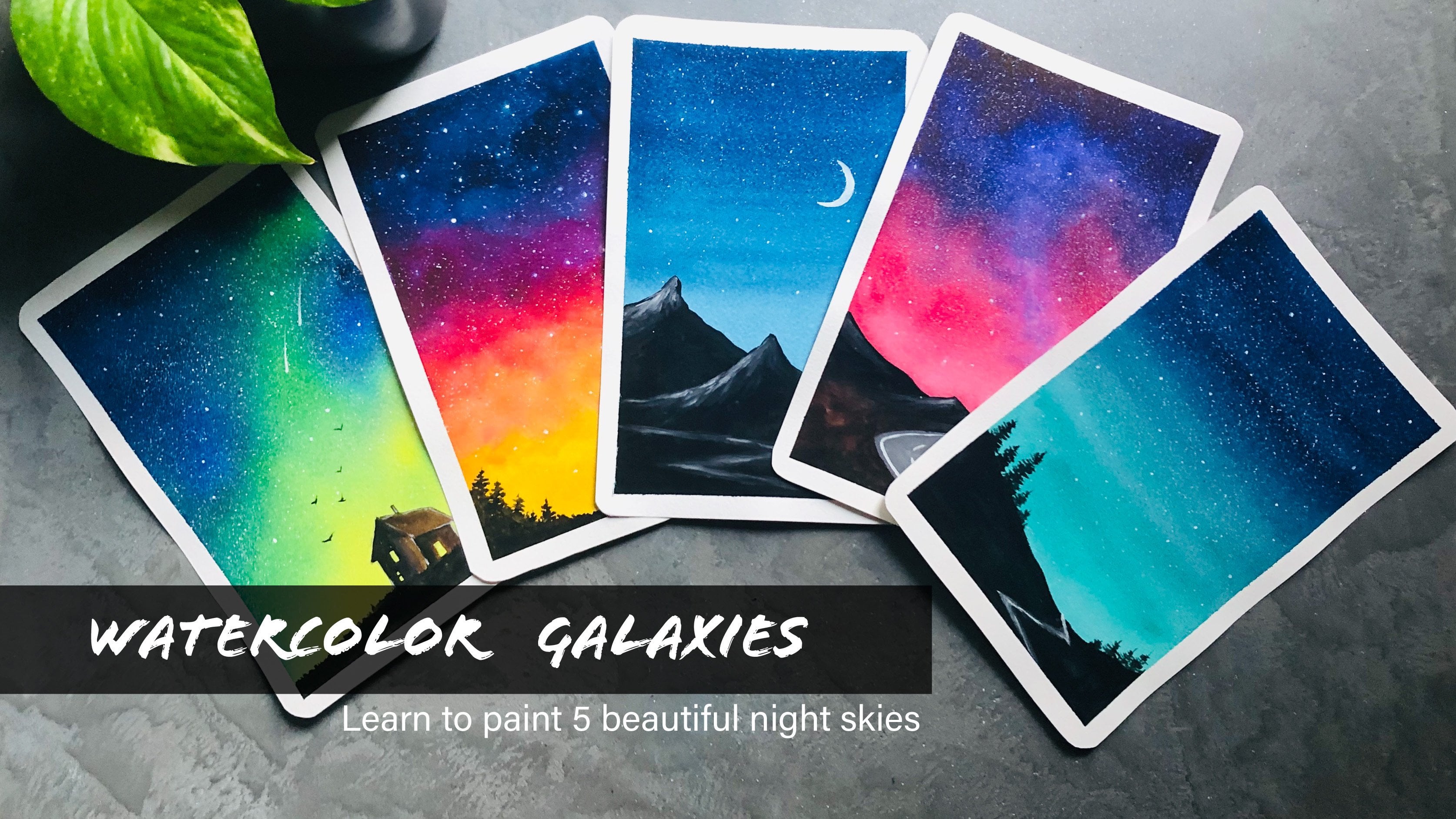
1. Welcome back :): Have you ever imagined how much better your ad would be if he spent some time practicing every single day. I want you to close your eyes and really imagine about progressives will make, I bet you're already feeling happy and proud of yourself. Say Mm, better washed up you. No matter what you're practicing, whether it's learning to play an instrument or exercise, or calligraphy or painting. Every time you practice, you teach your brain that what you're doing has value. And it is important to you when you commit to that daily practice, even if it's for just few minutes a day, you will make a significant progress. Hello everyone. My name is Ellen on appeal. I'm mater and artist and an art educator. I'm so both routes to invite you all to a brand new 30-day watercolor challenge. After a wonderful response to my first one, more than 3 thousand students joined me in my first 30-day watercolor challenge. That is one of the most popular flood zones can share. And very proud to say my classmate a huge impact on my students, and it really helped them improve their artistic skills. You can check out the hashtag, 30-day watercolor challenge, but see on Instagram to see all those beautiful clasps chips. This new watercolor challenge is designed to seal beginners who are starting out with the our Antoni. Starting from today for the next 30 days, we'll be exploring a new color composition and we'll be painting compiled and beautiful sky every single day. To make it a really quick everyday practice, I'm going with the very small, it's quite OCI, which is OK, just ten by ten centimeter. We all have other commitments interval D. So when you go with the smallest size, it doesn't overwhelm you. And this will allow you to relax and flavor technetium. But this 30-day watercolor challenge, I want you all to enjoy the pleasure of creating on a regular basis. This will help build a positive connection with your creativity and you will develop a trusting yourself that you can keep your commitments and also enjoy your creative practice. But to develop that trust in yourself, you can easily built confidence to go four pico projects. I'm really excited to take you all to this wonderful 30-day watercolor challenge. Come on in, welcoming you all. Let's build this world together.
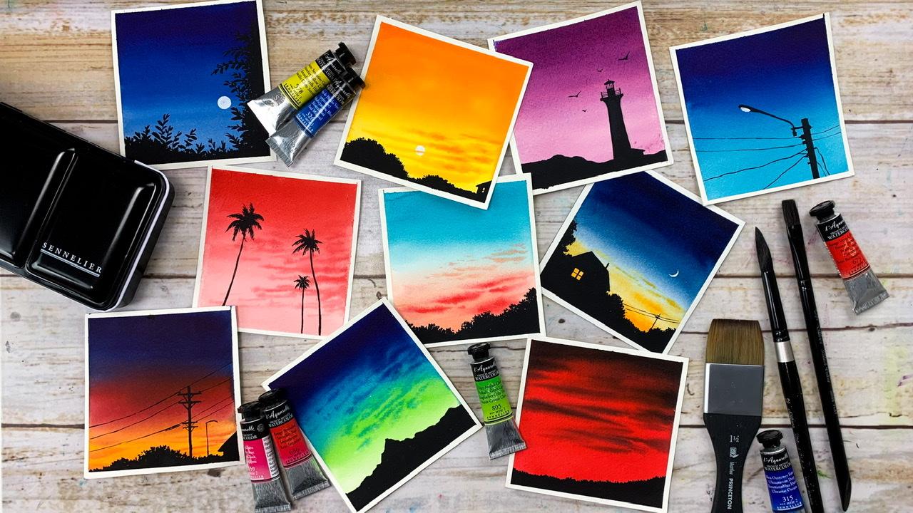
2. Materials you'll need: Hello, hello. Let's quickly have a look at the materials you will need to follow this class. And we'll start with the watercolor people for this project I will be using might cancel each cold press watercolor paper. According to me, the most important thing for any watercolor project as the people, This one here is an artist grade watercolor paper for to solve a 100% cotton. This one has one for the LV And it is a core press particular paper. To get the best result, it is very important to go with the paper off aren't as great quality. You can go with any brand. It doesn't necessarily need to be cancelled. Just make sure you paper as one for the LB. And it is a 100% cotton. Because most of the time I see students frustration with the herself. And they used to totally hey toward the cultures because they're using the wrong kind of people. When you start using a good-quality watercolor people, you will automatically start to enjoy the process. So to experience a real magical watercolors, you will have to use a good-quality watercolor paper. There are so many brands available in the market. Jews, one which suits your budget. Okay, so as you can see here, all the projects will be doing in today's class is just a small square size. This one is ten centimeter by ten centimeters Cuo I have just cut my people pad into ten by ten square pieces. And that is what you are seeing CIO, it is absolutely your choice to cope with whatever kind of size you prefer for your paintings. But then it is good if you can go with a smaller size as all the paintings will be doing, as just some skies and some sellout. There are no many details on it. So it is better to go with a smaller size to make him look Kyoto. You can see this quail pieces here. I have cut them and kept ready for the next 30 days. You can also do the same. Take out your paper pad and cut them into thirties quiet pieces. You Gaussian use a sketchbook insert of this pieces of paper that also would be craved to have a tunnel of Skies. Water, will you prefer? And that's all about the watercolor paper. Now let's have a look at the watercolors you will need for this class. As you know, each and every day will be trying different color combinations. So I won't be talking about every color and decision. I'll be explaining about the colors in detail at the beginning of every painting. Either BY using tubed watercolor throughout the class. And there will be multiple brands. Have a say. This one here is from Jim and I have seen allure or have Daniel Smith and I have Shin whom I never goes to buy a whole set IOS to crap loose scholars from different brands. And that is why I have multiple planets in my collection. So you're free to go with your tubed watercolour paint, watercolor. And also if you don't have the exact same Carlo, I will be giving you alternate colors. So please don't put yourself under pressure if you don't have the same color. Okay, now to mix your clothes, you will need a mixing palette. This one as a ceramic southern dish, which I use as my watercolor palette. You might have seen this in my other classes as well. I, Mr. mentioned this allow the watercolor. I will also be using black and white squash. This is from the brand Royal talents. For every painting to add another subject, you will either need black watercolor or black quash. If you look at this painting Q0 You can see the electric poster on that straight line TO for that treat light. I have used whitewash and to add on that electric post on all those electric lines, I have used two black quash to make this allows look really applique I bending with black guage. But it is not really necessary to use quash. You can also use your blackwater clear. So you can either use your black and white shot, black and white watercolor. You're watercolor would also work perfect for this class. And it's just that I wondered a little more opaque look for my sellout. And that is the only reason why I bend the squash. Feel free to choose whichever you want. Okay, coming back to my pilot, the main reason I allow ceramic pilot is that it is very easy to clean. You can simply use a bed cloth or a bad vibe and you can make it clean very quickly. And also your palate won't get those paints. Teens, how much will you try to clean those pains genes from your plastic pilot? It stays, you will never get that perfect white color back when your palate tos mu. For all the paintings, I won't be using more than four colors. And the span of has got four big divisions, which makes it perfect for this class. Everyday we would only need three or four close to the maximum. So any parallel would really work for this class. You can either use plastic or ceramic according to what you have got. All right, and about the paint and the people. Now the major thing left is the brushes. For this class I will be using for different pressures. The big wash parish is from Princeton, the other three is from Silver brush. The first pressure is this 1.5 inch brush brush, the spoon us from Princeton. I will be using this when to apply a clean code of water onto my entire paypal. So it is basically for vetting your people. You have a bigger brush, brush. It is very easy to apply a clean and evil go to water onto entry people. There won't be pools of water. The entire people will be evenly wet. And that is a main reason why every artist tend to use a bigger flat brush or a wash approach for letting the people, you can see the size of old paintings quite small. So if you don't have a wharf groups, you can use any of your beaker size flood prone. So don't worry about that. Now the next brush I have here as my half and flat brush. You can use any of your medium to be precise. Flood Trish, either half Uncharted, three by four inch. This is mainly to apply those agrarian washes onto your sky. So that is the second brush. Now I have two round pressures. The beaker round brush is to add in the details like when we are applying the clouds and VBR or painting the sky. We will need this size number, HR approach and the other one, the size number for us to add and all those little details, especially when we are adding those sellout. This British comes back to a very nice pointed to when dipped in water. So it is kind of great to add in all those medium to smaller size details. So I don't need to switch to any smaller sized pressure when I'm adding those lines and little details, soil will lead a flat brush either half uncharged three by four h, then you will need to round crushes, medium and a smaller size, strong crush. I'm using size number 8010 size symbol for if you're British, doesn't have a pointed tip. You will also need another retailing brush, which could be sized number one or 0, because we are lead to add some small detailing. If you go to bigger brush which doesn't have a pointed tip, everything will go out of proportion. So it is very important to have a pressure which has appointed to, OK, that's all about the pressures. Now you will lead a masking tape to tape down your paper onto your base. This is an inexpensive normal masking tape which I got from a stationary shop. You can either use your washington deep or masking tape, whichever you normally use. This is just to get that clean Bardo. Okay. Now, it is great if you can fix your people onto a boat. It could be a writing board, our cardboard piece, or your notebook or a magazine. Anything that she can tilt and turn around. I'm going to use this board, this actually re-purposed. I'll be just fixing my paper onto those boards so that it is very easy for me to tell them, turn around my people. Why am painting and when I'm adding goods T2, this one is actually made from my artists people pad. I just stuck up piece of wallpaper onto those board, repurposed it and I'm using the task, my drawing board, this board is quite thick and studies, so I didn't want to throw it away just like that. And the wall people has a plastic finish on the top surface, you will be able to apply your masking tape quite firmly on a class selfless or a plastic so forth rather than a paperless office. So if you're using a plain cardboard or anything which has a paper kind of our top surface. You might have seen that the people will rip-off along with masking tape than you are removing it does doesn't happen on a plastic or a glass office. You will be able to apply your masking tape quite easily on this kind of surface, and it is quite easy to remove it as well. The next material you will need, a suspenseful, will need to apply some miners ghettos here and there. So for that you will need a pencil. And next few believed to jars of Bordeaux. Wine has to stay clean. And the other one is rinse off the pain from your brush. So our beekeeping one jar aside and whenever I'm in need of clean water out the switching to that. Okay. And finally, you will need a cotton cloth or a paper towel to dab up the excess amount of paint or water from your brush. Okay, so those are the materials you will need to follow this class. Quickly go grab whatever you have caught, which is kind of similar, and join me the next section.
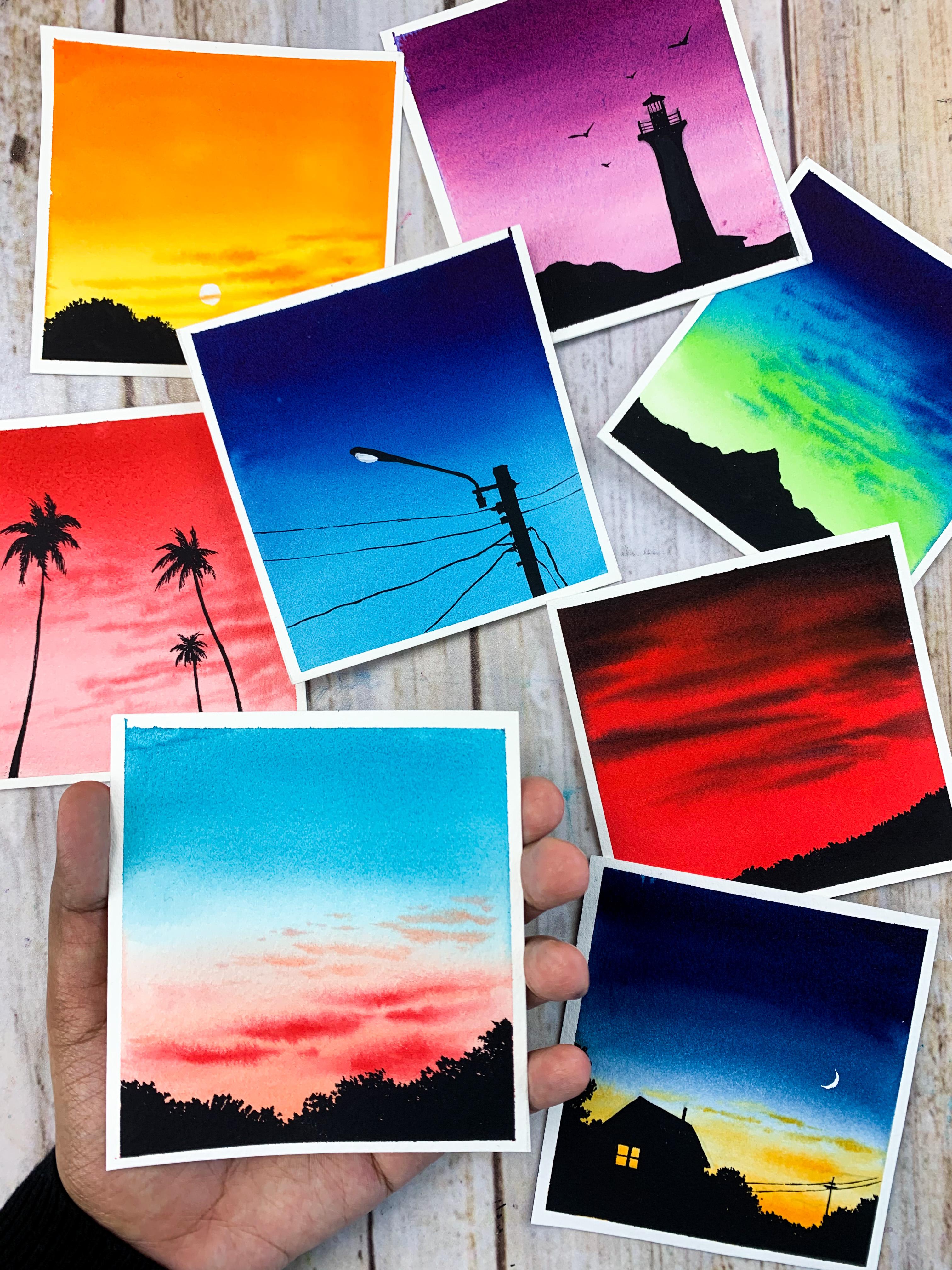
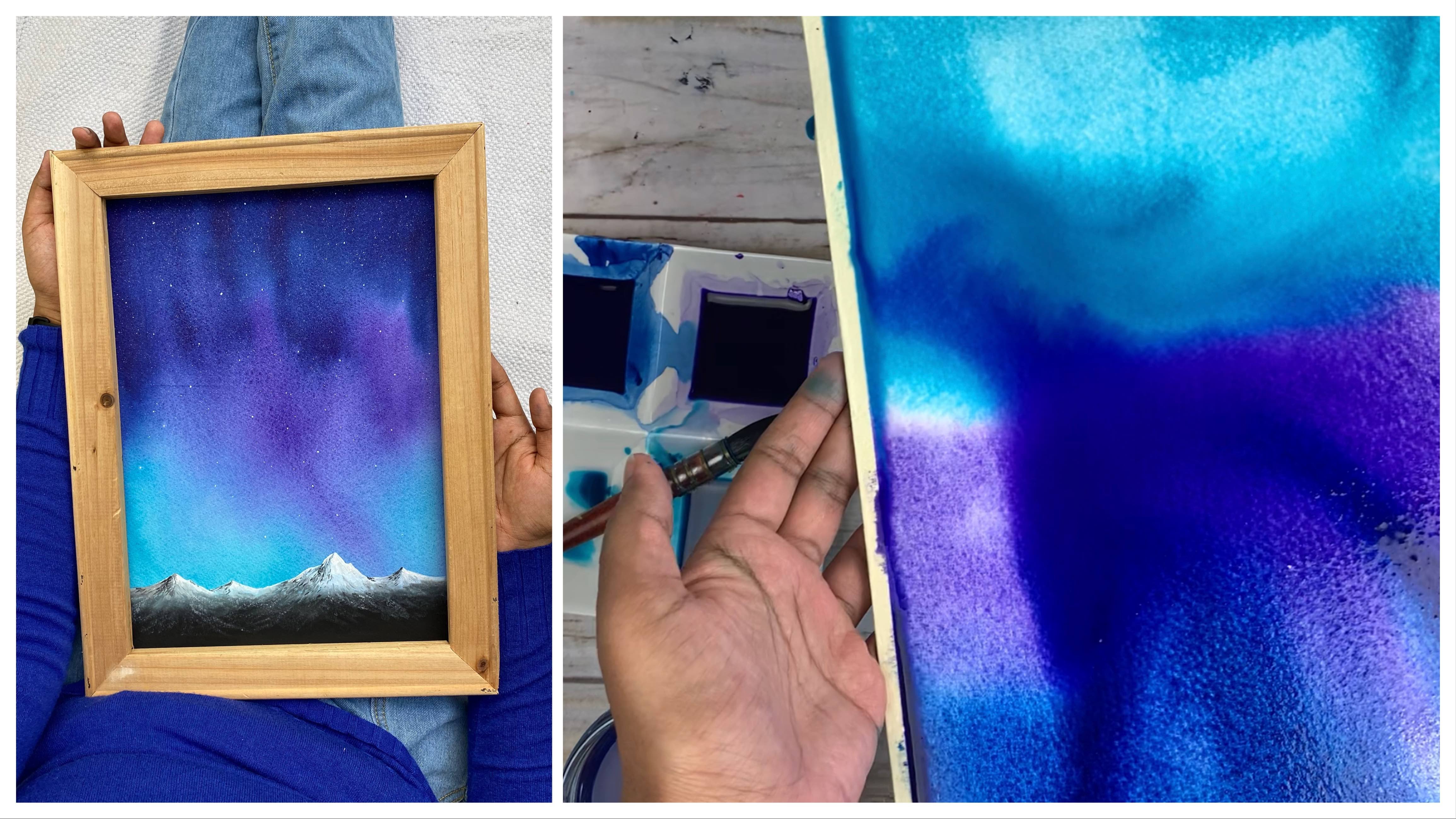
3. Before we begin!: Hello everyone. Thanks a lot for joining. Now before we start with our 30-day watercolor challenge, I want to talk a little about our challenges and general, not just this one. We all know daily art practice as good to improve our skills. That is no doubt in that it is this consistent practice which will help you develop a style and a confidence in your skills or what the time. But don't be days when you really don't want to do anything. Even though you're full of energy, maybe some days you don't want to paint at all. I totally get to because I have been there. On the other hand, there are days when you are so low in energy, but still you can spend hours and hours on painting. So I hope we drew all these situations. My last 30-day watercolor challenge was when my baby was two months old. I hardly had any time to create art on a daily basis, but somehow I managed to squeeze and 20 to 30 minutes a day. Some days it was during the early morning and some days it was at Late Night and some days it would be during the mid day when she's taking her nap, even though I didn't have a lot of energy, but then I was enjoying what I was doing and that gives me coin. But very recently I started out with a 100 day Procreate challenge. My Procreate challenge was going well for a week. I was really enjoying it. But after the first week, I kind of lost that enthusiasm. To be honest, the first days were literally like magic. I tried new techniques, new color combination. I tried recreating some photographs and everything came out so good and I was really enjoying it. But later I felt like I'm not enjoying it. It was more like tottering myself to stick to the challenge. I wasn't enjoying it at all, so I took a break from my Procreate challenge. Now I'm still struggling to get back to it maybe. And the next week or in the coming days, I will get back to it and I will forget about the daily challenge. I will do something whenever I feel like. So that's the plan. So all I wanted to say is never push yourself to be creative. You have to take enough breaks in between. If you feel like you're not enjoying what you're doing, consistent practices create, they will help you reach your cones, but you should never put pressure on yourself to be creative. Don't let your commitment become a burden. So this 30-day watercolor challenge, as designed to suit your piece, if you don't feel like doing it today, It's okay. Skip a day or two or you can even skip a week and come back and join me later whenever you feel like you're ready to go with a challenge. And this is the main reason why I kept all the paintings less than 15 minutes. And that is the recent why I went with a small square size. This way you will find ways to calm yourself and enjoy the process. I'm someone who keep on promoting the idea of daily practice as long as it works for you and you can make it work for you. You may have a busy day job or you might be a new water, or you have elderly people to take care of. So everyone has a different day and everyone is living a different story. Just because someone is able to stick to their 30-day watercolor challenge doesn't mean you have to do the same. You have to learn to be kind to yourself. Then only your creativity will help you come down. Otherwise, your creative time that look more like a burden to you. It will be like torturing yourself. So never, never, never do that. All right, I think I conveyed what I wanted to see. Now, coming to this challenge, as I mentioned in the introduction video, we'll be doing totally ball and beautiful skies everyday. We'll be exploring a new color combination. So the first day is really concentrate on simple gradients. And slowly we will progress into much more dramatic and exclusive skies with multiple colors. The intention that this class is to introduce you to my favorite colors, because every time I post a painting onto Instagram, I always get questions like, which is this color? Which plan do you use? Can I know the name of that color? And I get so many questions related to the colors. So I want to introduce you to new vibrant colors. This doesn't mean you will have to use the same color for your sky. You can try and use a color which is similar to the one I'm using, R, you can go with a totally different color. It is totally your choice. Now for the foreground subject will be doing US allowed. Every day will be going with a new topic. Some days it would be just a simple mountain or some wheat grass. And other days it will be a lighthouse. And it will be some pine trees, some electric lines that are so many things which I have planned. So every day you have a super vibrant sky. And to complement that, you will have a black sellout. Now it is not necessary that you should be following the same subject I'm painting for the foreground. If you want to go with a different subject for your foreground, you could do that too. At the end of the challenge, I will be adding a section where you will get more ideas on choosing the sell-out for your sky. And also, I will be explaining you how you can choose different color completion. You might have seen me sticking my paintings onto Blackboard in the introduction video. Just allocate a small space in your room and took your everyday paintings onto your wall. That is just 10 by 10 centimeters choirs, so it doesn't take up a lot of speed. You will have toting such choirs. So I would recommend you to do the same if you can. It's a wonderful feeling to look at your creations on track down the process you have made. Alright, I think we are good to go. So please keep this in mind if you ever feel like the daily practices becoming a burden on you. And if we're not able to concentrate on your other commitments, skip a day or two, or a week or a month, and come back and join me at anytime you want, I'll be here. The challenge will be your day. One can be any day and you're dead. 30 can also be NET. It doesn't need to start on a particular day or enter on a particular day, take it at your own pace. What matters the most as you enjoying the process. Okay, So let me officially welcome you all to this 30-day watercolor challenge. Congrats on indistinct time, on improving your skills. I promised by the time you finish this 30-day watercolor challenge, you will have a better idea abroad color combination and how to use them in your skies. Okay, let's start.
4. Day 1: Welcome to day one of our 30-day watercolor 10-inch. I'm so excited to have you here. Thanks a lot for joining me. So I have my brushes ready here, my board, my palate, a jar of clean water, everything was ready. And I have a base of people. This one is ten by ten centimeter and it is a cool press paper, which is a 100% cotton and 140 LB. Okay, now the first step is to tear down your people onto a board. Make sure you're fixing your people properly. Once he had applied the masking tape, you can run your fingers on top of it just to make sure those no caps in between and it is formally fixed. Okay, so I have fixed my people on to this board, as it is the foos DO photo to the watercolor challenge, I want to go with a very limited color palette. For this painting. You will only need to close any red and black. The radar losing for this painting as vital trade disappears from the branch. You can use Karla trade, similar rate or vermilion or any other red that you are caught. These are the other color options. Scarlet thread is another Creek Charles. The span is similar rate, which is almost close to pi or great viral, great pride and bold red. It is like that. Danger red. It is such a brightened, bold, raved. Okay, I have the color already. Now the first task was to apply a clean and even cold water on top wallpaper. And for that, I'm using my 1.5 inch flat. Now dipping my impression of water and at blind, clean, cold water to the people. Just make sure that there is no pools of water in between. Your entire paper needs to be evenly wet. You can see here might be budgets has got a nice shiny CO2 water on it. The water is not floating down and it is evenly bed. This is all you need is to have a big wash Crush. It is very easy to apply that even CO2 water. Like in this case, I just need to run my pressure two or three times to fill up that entire people. Whereas if I'm using a half inch or a one-inch flat brush, I need to run my brush quite a lot of time to fill up the enter your idea. So it is good to have a bigger size wash brush which you can use for better new people exclusively. Okay, now it's time to add independent, otherwise the background build try. So I'm switching to my half inch flat brush. And I'm going to apply our solid red color onto this entire paypal. So as I mentioned earlier, you can either use college rate or suddenly or red if you don't have those who can use war million, are any oranges shade. This one has a very bright red. It doesn't have that orange tone. If you only use Crimson or car mine, that is also totally fine. You can see the color here. It's a very pride to read. Now which will be the collar you have to assign, apply that color onto your entire people, whether it's crimson or vermilion or scarlet, or which will be the color. The first task is to get a solid color onto your enter your background. You can see how brightened, bold the strategies. I allow this color. This is one of the color artists used to sign their watercolor paintings because it is too dry. I just washed off to paint from my. Now, it's time to add in the remaining details aren't all sky. For that. I'm going to use Beach black. You can use ivory black asphalt. And I'm going to squeeze out a lot of black onto my palette. We just need a tiny bit of black. Now using black will be adding some lines onto the right background to make our sky look more interesting and dramatic. I'm using my flood proof, the same pressure used for applying that red paint onto the sky. I'm loading my brush with the black. Looks like that. Took a little I wanted a little more plaque. Now, again, I'm loading my pressure but blackwater kilo. So our background is still wet now all I'm gonna do is add in some lines onto the street background. I'm starting with the top. I'm adding some plaque onto the top. You can see I'm simply adding some thick lines onto the red background. Now you can see here the lines I'm adding debt not spreading a lot. This is just because my pack from does not too watery. If your background is too watery, you will have to wait for another minute before you add on these lines. If it's too watery, the lines you're adding them will spread into the background in a very vigorous Mano. It will be very difficult to control the way it is spreading. So wait for a minute. If you feel like your background is too watery. Now you can apply this lines in two different ways using your seem flat brush. The lines you're seeing here, the sharp lines there, but the tip of my brush. This is a way I added them. Now, if I'm tilting my brush, different, adding them using the side of my brush, the lines are looking much most moto. This is the way you should be adding them. Your lines would be much more modal if you use the side of your brush. By the tip of the British, I mean that flat who's on the line of your brush, the top line of your brush. Maybe I can show you that on a scrap piece of paper. So this is the lines using the tip of your brush. You should be adding them using the side of your brush. I hope I've made sense. Let me know if it's not clear, I can add a description or an image in their discussion section. Okay, so that's our Was Kai. You can see how bright and brilliant guy is looking. Now when you're adding these lines onto your red background, make sure you're leaving some gaps in between. So if you see here, you can see a red gap between those two lines. It is those negative spaces which adds more beauty to your painting. So now we'll add them close to each other and fill up your entire Red background. Let me take out a little more plaque. And I'm going to make the top area but more Bordeaux. So that I was sky looks more dramatic. If you back on has dried, leave it acidosis. Only if your background is still wet, you can make your colors mode taco. Otherwise, don't even touch your sky. And that's almost guy. I'm really happy with the way test on doubt. You can see even though we applied black, just because the background disturbance, that blank is looking like a dark brown rather than black. And this is exactly what we need. I'm really loving this guy. It looks so pooled and beautiful, right, makes justice to the title of the class. Okay, now let's wait for this to dry. And after that we'll add this allowed for this one. I'm going with a simple sellout where I'm just adding some plants and some landscape on the bottom. I'm not going with any other complicated topic for the first one. Let's keep it simple. Okay, so give it a try. And once it dries, join me back and let's add in the finer details. All right, I will paintings to lead, but the boredom media has tried. So at Tokyo to covet our detail and to add this allowed, I'm gonna use my plaque quash just like I mentioned, an art supply section, if at all, how grows you can use your black watercolor asphalt. That was just to make them look more RPQ, I'm going black quash, but at it's absolutely okay to use your blackwater clue. Now, I'm gonna switch to my size number for Round pro. I'm loading my pressure with inner fourth black wash. First, I will simply add a line over the bottom and I'll sue data. Once I've added that cheap along the top-line, I'll simply add some doctor pattern to make it look more realistic. Now it's totally your choice to go with any subject you prefer. If you want to go with a different topic, may be if you want to add some pine trees or if you want to add o lighthouse, are some palm trees or any other subject, you can go with that. It is absolutely fine. Okay. I have added the sheep. Now. I'm taking my brush along the top line, and I am simply adding these kind of unusual patterns to make it look more realistic. Do this along the entire line. Keep on pressing your brush on the top. You can add some dots and some little lines. This will make it look like there are some grass and some plants or what their you get also a little bit like a plane Kobe Line that will make it look like a mountain rather than plants. So either way it is fine. This painting took me less than ten minutes, but then I'm totally law with a color company should have used here. You can try out the same thing with other colors. Maybe you can go with the orange background first and you can add some brown lines on it. And that will make it look like a golden sunset. Or maybe you can go with purple and blue. Any colors can be used and you can create a wonderful sky in ten minutes. I'm really excited to see the college's Class Predicts you guys will be creating, do share them in the predict gallery. I clearly cannot wait to see them. Also, if you have any doubts, do start a conversation in the discussion section, just like we did in our first 30-day watercolor challenge. And I will try my best to respond to it as quickly as possible. Alright guys. And with that, we are done with the project for D1. Let's wait for that to dry and they'll quickly peer of the masking tape. I cannot wait to add this onto my wall. And the painting has completely tried. You can't see the carlos ours tool so bright. And these other two colors we used for the sky, peach plaque and pyro. Okay. Let's pay it off the mask containing. Every time you pull up your masking Di Vittorio packed on to dry completely. Otherwise, the people can come up with your masking tape. It's wildly popular people and it will damage your paintings. So always wait for your painting to dry completely. To speed up the process, you can use a blow dryer that is absolutely fine. Ok, so here several first painting. I hope you all enjoyed D1 or for wealth 30-day watercolor challenge. Thanks a lot for joining and see you tomorrow.
5. Day 2: Hello, hello. Welcome to day two of our 30-day watercolor challenge. So my table is in the same condition where I left yesterday. I just took out a new piece of paper and I changed my water. I have clean water in my jar. So yesterday we used red and black. We painted our enter your background in red color. And we added some lines using black, and we created our sky using two colors. Now today's exercises more about introducing you to one of my favorite color and the color rows of ultramarine by Daniel Smith. The scholar has quite a lot of interesting properties. This color is actually a brilliant blend of quinacridone rules and ultramarine blue. When you use this color in your paintings, the blue will settle down and the rules will start to float, creating a vibrant and dimensional purple. Let me fix my people first and in some time as we paint, I will explain more about this color and the pigments used on this color. Now if you don't have it also for ultramarine, That is absolutely ok. You can use any of your poeple. You can also use any other roles or violet If you don't have a purpose. My intention is to introduce you to a new colour and its properties. It is not necessary that you should be using the same color. If you don't have a readymade violet or purple, you can create one by mixing Prussian blue and crimson. In fact, we can use any Blue and mix type with Crimson or Carmine. If you add more blue to the mix, you will get a violet. And if you add more of chromosomal Carmine, you will get a proper tone. So depending on what kind of color you want for your sky, are then crimson and blue accordingly. Okay? So don't stress out if you don't have rows of ultramarine, It is absolutely okay and just enjoy this Kahlo. And if you're impressed with its properties, maybe in the future you can get it to all my people as formally fixed onto my end goal. Now I'm switching to my 1.5 inch wash crash. I'm adding the Clean Code of Watteau onto my people. A clean, even colder water mixture water has reached Adaptive EHR and there is no pools of water trapped in between. If you feel like there is a lot of water on your people, just run your brush few times across the entire paper to make the code a water even we just need a shiny cold water on your paper. It shouldn't be floating. Okay? So our paper is ready. Now, I'm going to apply a gradient Bosch of loss of ultramarine. For that, I'm switching to my half inch flat brush. You can see the color. It's a very nice purple. Now, I'm going to then talk to them on the top. And as I come down, I will be making my colon lighter. You can use any color. It doesn't really matter whether you are going properly or write it again, go with blue or pink or orange or any other color as per your choice. And all when you're adding ingredient wash, always make sure you're taking your brush in a horizontal manner. You shouldn't be going with different kind of washes. Take your brush in a one single movement and just see how I'm taking my pressure. I'm just taking my brush across the paper in a horizontal manner. Ok, so we have our background washed ready knowledge, we told that to try. You can see how beautiful the scholars looking once the color start drawing, the blue Androids will start separating from the scholar. It's a brilliant color which has grand leading properties as full. And my backroom has perfectly dried. You can see at some places it doesn't blue undertone along with the rows. So if you are someone who like that dual tone for your portfolio and if you like the crown relating properties, the scholars further try the pigment meals from this color SPB 29 and B we 19. Bb 29 is a big number of ultramarine blue and PV 19 is the biggest number of open acronym Andrews. So it's a beautiful mix of these two colors. You can see the color on my palette. The blue is starting to separate from that mix. And you can clearly see the roles and blow separating from that. Make sure it's a beautiful colored to have in your palate. It is a beautiful colored walkway. Now, if you already have ultramarine blue on quinacridone draws, you can conveniently mix and create a similar color. Okay, so that was some quick properties of gross of ultramarine. I have applied occluding varchar flows of ultramarine are my people, and that's my sky. And the backroom has completely tried. Now, it's time to add the foreground subject. For this one, I am going with a very simple lighthouse, a really simple one. And I'm gonna use my black brush, just like I mentioned in the art supplies section. You can also use your black water. Cool. Let me squeeze out some black quash. Now we again start by adding some simple Benson lines which would help you while you're adding the paint. We're not going in with a very detailed sketch. We are simply adding the major lines. And the one I'm going to draw here as a very simple one. If you want to go with a more detailed one, you can look for sellout off lighthouse and Google, and you will get to see a lot of options. Okay, so I have added the major shape of my lighthouse. Now, I need to add some details on the top. And after that, I will be switching to black Walsh. And I will simply fill up that Antonio sheep and black. Adding a rectangular piece on UDL rectangle. Now adding the rules, a triangle of sheep. Okay, so that's his sketch. Now I'm switching to my size number four, wrong crush. Our task was to Philip dot shape and black. Now carefully for looked at a major shape at the bottom and black. The brush and losing your assignment before round brush. Brush has a nice pointed tip, so I don't need to switch to my little English. I can use the same brush to add the small details on the top of the lighthouse. Now this one's a very simple gradient sky and we are going with a very simple lighthouse in the coming days may be in the second week. Third week, we'll do another Lighthouse. As you progress, I will also add water along with the skies will you will be able to understand how you can bring in those multiple colors in water. So we'll try to do one such multicolored sky and water along with a light house. Many of you shared your class prediction D1, and I really uncharted. All of you have got a stunning vibrant guy. I think this lighthouse also will go good with that red sky. Maybe in the future you can try something like that. So I'm nearly done with that major shape of my lighthouse. And carefully taking my brush along that outdoor life, it should be pico over the bottom. It should be thin onto the top. Over the neck. This is the kind of shape you will have to use for your lighthouse. Now, I'm going to add another tiny structural onto the right side, which will be like the entrance to though lighthouse. So that's the rules. Now adding a line from there. Now filling that sheep and black, it's a very simple structure. Ok. Now I'm gonna add an irregular shape over the bottom just to make it look like the lighthouse acidic illuminated area. So I would take my line onto the right side and an irregular Mano. Onto the left side, I will be calling with a little more taller mountain. You didn't go with any kind of shape for your mountain. Maybe you can have that $1 of mountain over the Meidum and place your lighthouse on the top. Feel free to reinterpret the foreground subject and add them probable. You want to? I have added the basic sheet. Now, I'm going to fill that up and black. If your boss to your class project onto Instagram, I will allow if you can use the hashtag 30-day watercolor challenge with z at the same hashtag which we used last year. So we can keep on building the same hashtag. I think every year I will come up with a 30-day watercolor challenge, maybe one or two. So that really keep on building that hashtag. And we can see all the Class Predicts under one single hashtag. Okay, the bottom part is done. Now let's bring the top ADR of our lighthouse. If you're British, doesn't have appointed to, please switch to your detailing brush. First, I'm going to add these two what your lines on either end. These are the hands. Now we have another piece or whether murder of rectangular pins. Now fill that up and black. Already simple rectangle. Okay, are starting to look more beautiful than we are adding the blacks allowed. Everything's jiggling, standing out. Now let's add the remaining details of our lighthouse. If your bridge to some have appointed to, please please switch to our detailing brush. Because we need to add some teeny tiny lines. If you go with very pecan gold lines, your Lighthouse will go out of proportion. So it is very important to have a detailing branch. You can see the kind of lines are adding cure, they should be ready. By. Now. I'm adding some vertical lines or in V3 are full according to the space you have got there. Now filling up that triangular piece on the top, which is the root of our lighthouse. Now, adding line on the top. And with that we're done with our lighthouse. Maybe we can add some boats onto the sky to make carbo painting look more interesting. Here is a closer look of our Lighthouse. I think the line on the left side is looking little choline. I need to fix that. Let me quickly fix the shape of the lighthouse. After that, we can add some boats. Whenever you add some boards on deal sky, it will automatically make your painting look a lot better. So for all this guys we're doing, if you want to add some boats, feel free to add them. And one of the coming days, maybe we can try a gorgeous chi and we can add some boards. I have fixed the sheep. Now let's go with the birds. I'm gonna use the same bridge to add the board Task2 as it has caught a point tip. The first step is to add a curvy line like this at like an inverted V, where the lines are little cogwheels. So you have a similar line on either side now adding a dot or what? The middle. So that's your bird. That is quite easily. Please try it on a scrap piece of paper if you are not sure how to do it. Now, just by changing the angle of those two curvy lines, you can create different kinds of birds. Some of the lines can be more Weibo and some of them can be moved closer. Just by changing that ankle between those two lines, you can create a variety of ports. Also whenever you are adding boards aren't your sky. Make sure some of them are smaller and some of them are pico, the spill bringing a lot of depth in your painting. Okay. I have added four of them. I think I'll stop it there. I'm not going to add anymore. Alright guys, with that, we're done with the painting for D2. Now let's quickly pull up the masking tape and have a look at the whole finished painting. So the color we used for the sky is rows of ultramarine, which is one of my most favorite color from Daniel's. And that's a wrap yet done. But day two of a 30-day watercolor challenge. I hope you've enjoyed beating this quake gradients chi and Lighthouse dual. Give it a try with any of your favorite color. Thanks a lot for joining me. I'll be back here tomorrow with another beautiful sky.
6. Day 3: Hello friends, welcome back. Today we are on T3 of our 30-day watercolor challenge. I have my palate pressures paper and a jar of clean water Reading. First, let's have a look at the colors you will need. Now it is absolutely OK to go with any color of your choice. At the beginning of this video, you already saw the painting that we're going to do today. And it is very clear that we are going with an orange color for this guy, but use an orange with a twist. I'm now going to use the orange acidosis. I'm gonna mix alert love rose into my formally to get orange, which as it was undertone. So to create that color, I'm gonna mix vermilion and permanent rules. I'm gonna mix equal parts of both the color to create that pure for orange, which has a ROS undertone, I'm guessing you all have will Mullin. If you don't have, you can use any of your orange. And instead of permanent rules, you can either use carmine or crimson and induce at most convenient colors. Now to add in this allowed, I'll be using black quarks, just like how we did in the previous days. Okay? So we have the colors ready. Now the first illustrative down the people onto my board. You can see my boarders very clean. It is very easy to clean asset as a plastic coat on the top surface. I just wiped off the pain streams from the previous days using vet cloth. And that's and there is one more advantage for this plastics office. You can fix your masking tape quite firmly onto this compatible carpet surface. We have two more sides left. So in order to get a clean border for your painting, it is very important to fix your people properly. Once you have applied the masking tape, just run your fingers across the four sides to make sure there is no caps in between as we are going. But Vietnam vet skies mostly if there is some gaps the water can seep into against boy nucleon Bordeaux. Okay. So either run your fingers or use a ruler and make all the sides tight. Okay, we already discussed about the colors. Now let me squeeze those two colors onto my palette. I'm gonna squeeze in the border colors into the same group as we're mixing them. I don't need to use another division for the second Kahlo. I can't readily add them into the same space. That was wobbling. Now, that's permanent roles. All right, let's start painting. The first step is to add a clean CO2 water onto an entire paper. I'm using my 1.5 inch wash brush at a clean quarter water onto your entire people. Make sure the CTO waters even. Now, I'm going to switch to my half an inch flat brush. This one is from silver black velvet brush. I had done a blue painting yesterday. I think that is true. Some electoral paint on my brush. Let me clean this properly. Okay, looks like it's clean now. Now, add few drops of water into your paint and mix those colors, square them. You can see the color. That's a very upright orangeish rules, maybe against bias on the colonial scrap piece of peoples that you can see the color properly. Before we go in the double main painting. So this is the column. Now, I'm going to paint a gradient sky using this color, which is darker on the top and lighter as I come down. So I will go with the taco tune over the top. Then I will make the color lighter as I progress down. I think you wouldn't be able to make out the difference of this colour band at this and its darkest tune. Now when I add water and when I make the color nato, you can see the actual color that we worship that Docker to compromise. And let me make the color lighter so that you can see the actual she'd okay. Look at this color. It is more like a current sheet, which is more like a pink and orange, which is blended together. And that is exactly the shape that I created by mixing woman Lynn and permanent rules. You will get an exact version of column if you added more of orange. Living coral was the Pantone color for 2019. Okay. I'm quite impressed with the creatine. I just made the top area a bit more brighter. Now I'm taking my brush across the people in a horizontal manner, making my gradient more smarter. So as it is a very small piece, it is easy to create your gradient. You just need a half uncharged three by four inch brush. As the size of your paper increases, you will have to go with a bigger size brush to get a proper gradient. Because if you're going for the big O paper and a smaller brush, you might need quite a lot of time to fill up your entire people. And this might leave some brush marks and you wouldn't be able to get that perfect gradient. Whereas if you go to bigger brush, you can add paint onto a larger area of the single swipe and you will be able to create a smooth gradient quite easily. So the thump rule is the more bigger your papers, the more bigger your pressure B. Ok, so we have a base layer ready. Our next task was to add some clouds onto the ADR or what the bottom. Very we have that lighter tone. I'll be going over the medium term of the same color. And I will be adding some grand and tiny lines onto the EDR over the bottom. So we have just applied the paint on TO people about paper is very bad. You have to wait for one or two minutes so that the paint will settle and the people will absorb it a bit. If it didn't your cloud immediately after you lay down your base Leo, those clouds will start to spread a lot. It will be very difficult to control the way they are spreading. So depending on the kind of paper you using, it is always a great idea to wait for at least a minute before you add in your clouds. Now, I think it's been a minute. I'm going to add a few lines and see the way it is spreading. Looks fine. It is not spreading a lot. Now using the tip of my brush, I'm simply adding some lines. For the first building we did for D1, I use the side of my brush to add in these lines. They were quite thicker and thicker lines. Now I'm using the tip of my brush and I'm adding some thin and tiny lines. I will be adding them only onto the right side. So using a medium tone of that orange, I added a couple of lines over the bottom. Now I'm going with a bit more taco tune. And I'm going to add few more lines over the top. And adding them or show that at creating the starting, this will make that transition Lookout in most moto and this area, the background-color is bit more taco than the bottom. So if you've entered at the medium tone of that orange, these clouds won't be visible. And that is a recent value should be going with a bit more taco Dong than the background color. Okay, I was chi is nearly done. For the bottom, they used a medium tone and for the TOEFL used are much more taco tone. And we simply added some random lines as the backend rules when they started spreading and created a shaped like clouds. Okay, so that's the sky. Now let's wait for that to try. Ok, the background has dried beautifully. I'm in love with this color. Now it's time to add the sell-out. I'm using my black quash. And for this one, I'm going to add some boundaries. Maybe three or four palm tree. If you want to go with any other topic, please feel free to do that. And I'm switching to my size than before round brush. I'm going to add few simple, small countries. If you want to go with a huge one, you can add just one or two. Or maybe you can simply add some hanging palm leaves from the top. As we just started with our challenge, I want to make it as simple as possible. So for this one will go with a very simple sheep. And as you progress, we can go with more complex and details allowed. Okay, so that's the tree trunk. I bend and with a little irregular shape. If again, type insolence of palm trees and Google or Pinterest, you will get to see a lot of options. So if you want to go with a more detailed palm tree, you can do that. Maybe you can have a reference image and try to recreate that. Okay, so that the tree trunk, I will make it a bit multicolor water pot. Okay, now let's add the palm leaves. I will start by adding that bacterial honestly IT view what was it called? I had to Google it to find out what is the actual vote for it. So those who doesn't know exculpatory all, I'm gonna add five or six of them. So that three, another 11 more. So that's already six, maybe two more. So there are eight of them. So we have the tree trunk and those main lines. Now it's time to add the palm leaves. Now you need to add certain lines close to each other, following the lines of your petiole. Just add your lines like they're dropping down from that means paying. You will have to use the smallest size fresh to get those ten lines. Otherwise your lines will be very bored and thick and your tree will go out of proportion. So switch to a smaller sized Pradesh, which has a nice pointed to so as to get those thin and delicate lines. Now, keep on adding them on either side of that main line. This is a very basic palm tree. I think even kids can do this. We'll be adding two more such trees. I'll go the smaller one right next to this. And maybe I will add. Another taller, warm, so that the composition will look a little more interesting. Whenever you are adding trees or mountains, Neville add them in the same height and in the same sheep. For the first three, I've ended with irregular shape. I didn't go with a straight line for the tree trunk. Maybe for the next one, I can go with the straight line so that it will look more natural. One is very tall and little cogwheels, and the other one is Trey tanned shot. So these kind of little things will automatically bring in a lot of interesting characters to your painting. I'm nearly done with the first tree. Now it's time to cool the second 1 first and adding the tree trunk. This boundary is going to be much more shorter than the first one. And I'm adding an inclined line, that's my tree trunk. Now in a similar way how we drew the first one. I'm going to start with those big tool first. Then I will add some teeny tiny lines following those curvy lines. So that's the base Calton affable pumped right now, adding those lines close to each other. That's already small tree. All you need to do is add those lines following that Kobe Line, Adam on to either side and finish off your tree. It doesn't need to be so detailed as it's quite small. Okay, so we're done with the second tree. I'm going with another one on the left side, which is going to be taller than the first one. So I'll go with the thicker tree trunk. You can arbitrary variable you want to, maybe you can go for a different composition. Maybe you can start to three from the side of your people and make it look like it as jutting out into the sky. It doesn't need to start from the bottom of the people. So if a fear Mike, you want to try something different. You can go the different kind of composition. So here's an example in this photograph, you can see that as one palm tree on the left corner, but there's only harvesting. And over the right side you can see one shooting into the sky. So in a similar way, you can look at some reference photograph and compose the way you want your boundaries to be. Some of them can be hanging from the top and some of them can be starting from the side of your people, which is shooting up into the sky. So gold, any kind of composition that you prefer, or whether you can simply add some leaves hanging from the top without showing the tree trunk. Alright, let me quickly finished his palm tree and the tag will be done with double painting 43. I hope you guys are enjoying the Italian so far. I have designed a challenge in a way it is easy for beginners to follow along. The first day we went in with a solid color for the sky and we added some black lines onto that, do make our Skylab more traumatic. And for the second day of events with the creating Bosch, and on the third day today, we went into the gradient Bush first. Add onto that we added some random lines using a medium tool to give it a feel that there are some clouds over the bottom. This meter was sky look more extra Su. So gradually I am trying to incorporate little techniques so that by the end of this challenge you'll be able to paint beautiful, traumatic and expressing sky. So all these while we were playing with one single column for the sky, in the coming days, we'll be switching to two shades. And then from there we'll go to 34. If I suddenly jump onto a sky which has three or four sheets, which is allowed traumatic. It will be difficult for you guys to follow along. So well, let's keep the space and let's go What small slow steps. Alright guys. And that we're done with the whole painting 43. Let me quickly remove the masking tape. I'm quite happy with the color. I really Lao how that gradient color has come out. But caudal shaders looking so protein, if you're bending hasn't dried, do wait for it to dry Dong Russia and remove the masking tape. It can damage your painting. Your people can drop off along with the masking tape. So all of these wait for your painting to dry completely. My pump tree hasn't dried yet for the backroom has tried. Anyway. I'm really careful while I'm removing the masking tape. I don't want to spoil my painting. And there you go. We have finished oh, painting 43. Thanks a lot for Chinese Alabama tomorrow with another largest guy.
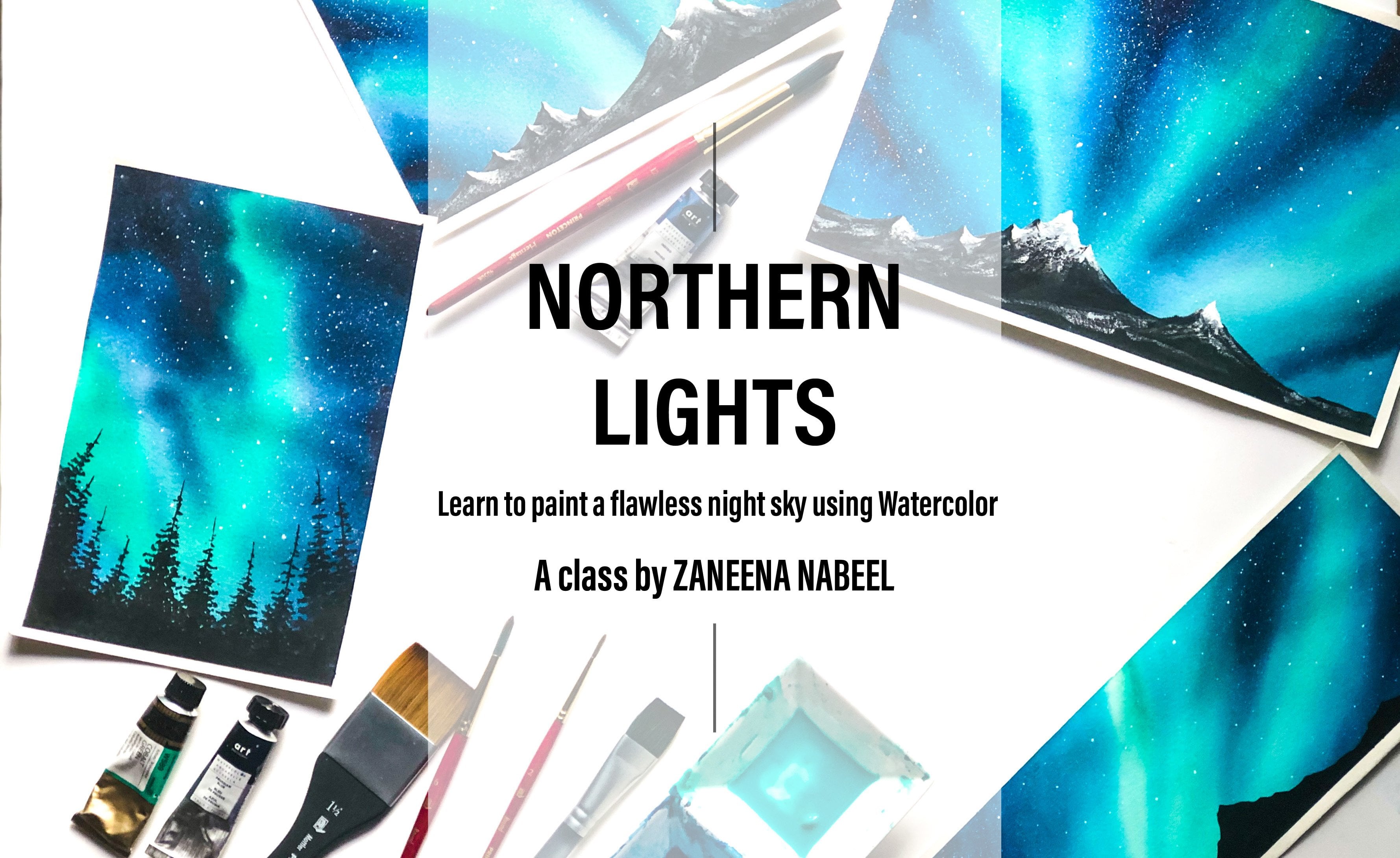
7. Day 4: Welcome to day 4 of our 30-day watercolor challenge. So for the last few days we've ended at red, orange, purple kind of sheets. I think of a wall is missing some blue today at all. I'll go with a blue sky. And the color that I'm going to use a steel blue, red. This is a warm blue. If you don't have Taylor blue, you can use ultramarine blue that to color with this so much closer to blue. Now if you don't have ultramarine blue, you can also use Prussian blue or any other brighter blue that have got. Now the first task was to fix the people. Make sure you're strongly fixed onto your board. That's the third side. We have one more left. Okay? So I have fixed my people. Now as you know, I'm going to apply a coat of water onto my people. And even coat of water. For this size of paper. Just wonder because all you need, as the brush is quite wide, you can cover up the entire people and one or two swipes. Ok. Now you can see the coat of water I applied as even the water's not floating, had a chance to shine equal to water. You'll see that there is no water floating down. Okay. I think we are good to go. Now to upload a base layer. I'm using my half-inch flat brush. There are some leftover paint on my palette, but that won't be enough. Red mix. I'm going to squeeze out some more pain. Okay. Now, adding few drops of water. The last few days be either went in with a solid color for the sky or the added a gradient wash first. But then for this one, I'm going to read in some of the people white to make it look like there are some white clouds floating in the sky. So the technique for today's guy is going to be a little different from the previous days and it also be adding a moon. So first, I'm going with a very dark and bright tone of blue. You can see it's a brilliant blue. You can go with any off the brighter blue diarrhea caught. It doesn't necessarily need to be to look through. Okay. I'm starting from the top wing with the board tonight. Now, as you paint, you need to leave a tiny capsule fight and between wages your people white. Does some streaks of white. We don't need a lot, just few here and there. So I added one line on the top. It doesn't need to be too thick. We just need some white lines on Abbas guy. Now as I come down, I'm going to leave another one there. No, Maybe I'm the one for this guy. Instead of coming back with a different color, we are trying to read in the paper white, which will look like clouds. So I kept on leaving some white gaps in between. Right? I did this guy. Now, I need to clean all those auto Bordeaux. I'm adding some paint over here to make it look clean. So that's how I was chi is looking right now. Now I'm going to wash off the paint from this brochure. And I'm going to switch to a smaller size brush. Make sure your brush is clean. There shouldn't be any paints gene on your brush. Now what I'm going to do is you can see all those white gaps were left in between. Now I'm going to carefully run my brush along those Bye gaps and I will disturb. I'm lifting off paint from those white lines. You can see that as some things seeping into the white line. By doing this, I'm trying to prevent the pain spreading into those lines. Our background is still wet. All you need to do is just run a clean brush fallen that white line you have in there. Well, again, I'm going to do the same. Every time you lift the paint off, there will be some blue paint on your brush. So it is very important to clean your brush after every time you do this step. So we already have left some white gaps in between now to make it look clean, we are running our brush along those lines and we're lifting off the paint to make it look more smarter. Gold one line at a time. Then clean your brush and go to the next one. Now, I'm going with this one on the top. See that I lifted quite a lot of things from dashed line. So every time you do that, make sure you clean your brush. Otherwise, when you go with the next time, it will add blue into your white lines and you will eventually lose those white lines. It will all look like blue. The same technique can be used to paint Walker SVM. You can already see our sky is looking like a rougher. Between each rebirths. You can leave that white gap and you can easily create a beautiful scene. So that is, I was Kai, I'm quite happy with the way the test tone down. So we've ended with a darker tone from the top, and we kept on adding the paint, leaving some white gaps in between. Once we finished adding the base layer, we started off lifting the paint following those white caps. We simply use DO smaller size brush and be kept on lifting the paint following that line. And every time we did that, we clean our brush and we kept on doing that. Now this sticking can be done with any color of your choice. Maybe you can go with the gradient sky of orange and yellow and do the same to get a beautiful sunset. Okay? So that has dried. You can see those whites crease in between the Oscars looking so protein. Now I'm going to switch to a white gouache brush. And I'm going to add a moon. Just a teeny bit. Clean your brush properly, and load your brush with white gouache brush. The first step is to decide on bed to add the moon. I'm going to add it over here, cutting through that white line. So we have added quite a lot of white lines here. I have one here, we have one novel the bottom, and there's another one on the top. Now choose any one of such lines from your painting and add half of your moon, right, about that line. I'm going to add half of my moon over here. So I'm trying to make it look like my mom is passing through that cloud and the cloud is hitting my more. I'm going to add half of the moon dried about that line. Once I'm done with that, I will add the remaining half on the bottom, leaving that white line in between. Don't add it as a full white circle at the top portion first, it can be hard for 3 fourth and add the remaining part of your MOOC over the bottom. You can see how I'm adding my moon. I added half of my moon on the top. Then I have that line passing through my moon. And now I'm adding lake a one-foot piece over the portal after that line. So altogether it should look like a subgraph no matter whether you're adding three-fold on the top or bottom, including that line passing through, it should be a circle. I have added the moon. You can see how that line is splitting my moon. Now what you have to do US Marshall the paint from your brush. And W Bush on a paper turbo. Now my brush is not too bad, it is just damp. Now focus on this tiny, but we're just passing through the model. The next step was to make those lines that are blurry with a clean, damp brush, just smudge that top and the bottom of bad. Why chiefs, we have added there the ADL where that line is passing through shouldn't look that sharp. It should look a little blurry to give that real feel of some clouds passing through anymore. So what we are doing this massaging exercise, choose to make that area looking blurry. Many are doing this beings make sure your brushes very clean. They shouldn't be any other things, Dean tony approach of that or some green now rate it can spawn your more. So be very careful, thoroughly clean your brush before you're smart, you're white color. Okay. We are done the double of sky to make it look more like a night sky, maybe you can use indigo or black instead of the blue. And also, if you do the same thing with the lighter blue and skip the more, you will get a beautiful base pi r, right? And with that, we're done with the sky. Now it's time to add this allowed, I think covers simply add some trees and some electric lines are not going to make it complicated. Let me squeeze out some black gouache onto my palette. Feel free to go with any kind of subject for your foreground and doesn't need to be the same that I'm doing here. So first, I will start with the electric learning. First I will add the electric post, just a straight the client. Then once we add the electric force triple add electric lines, you just need to add a simple thick straight black line. Now, I'm going to add some horizontal lines onto this that needs to be little to no. I'm adding two horizontal lines. Now. I'm going to add another one. And this one needs to be a little thinner compared to this one. And shorter as blue, again, herding to thin horizontal lines. Okay? Okay. In that field reports now, I'm going to flip the bottom in an irregular she got a very random sheet. At some places it can be a little taller and at some places it can be a little lower. And this will make it look more realistic. Once we are done with the base shape, will have to run our brush along the top line. And the need to create those teeny-tiny patterns to make it look more like plants and trees. So first let's add the sheep. As I mentioned earlier, you are free to choose your subject if you want to go with something different entities, feel free to do that. Now wherever you have added those electric post, you will have to raise that shape. You're adding them so that you cover up the bottom of your electric post and it doesn't look like it's floating in the air. Okay, I have added the base shape. Now. I'm simply pressing my brush on the paper and creating some teeny tiny dots along the top line to make it look like it's plants and trees. You just need to keep on pressing your brush. It can be some teeny tiny lines and some dots. There is no particular xi. You already have added a shape there. Now following that, she keep on adding these kind of dots to make it more realistic and interesting. At some places you can take your patterns a little more into the sky, make it as random as possible. Maybe you can add in some trees as well. Okay, So this is how it is looking so far. I'm going to add more teeny-tiny patterns. I'm really loving away, this is progressing. I was guide-tone a lot drip you home and we added that blacks allowed. Now onto this right corner, I'm going to add some more color patterns to make our composition look a little more interesting. Now, I'm going to dry my brush for one last round. And I'm going to add some more teeny-tiny taught and buttons onto the top line. All right, The last step is to add those electric lines for that, I'm using a black liquid ink pen. This one is from the brand pilot. I didn't somebody common pen. You can use any of your black children or ballpoint pen. It doesn't need to be waterproof. You can use any pen that you've got. The electric line should be very thin and delicate, so cold that band which has a pointed tip, don't use a sketch pen potassium board tip. It is known that easy to get to 10 clean flowing lines with a brush. You always tend to break your line in between. If you're confident enough to go with your brush, please feel free to do that. But for me, I prefer doing it with a pin at a so much ACO to add a line lighters using a pen. So this is the kind of line we have to add for electric lines. So I'm starting from here and I'm taking it to this point. And a similar we will be adding one onto the other one asphalt. So I'm starting from there and taking it to that point. Now in a similar way, are then add one right underneath this electric line. Okay. The second line, no, adding some dots on this. Just a tiny bit onto those horizontal line. Now from there, adding another line to the other post. Now I'm going to add another kind of took goes right next to the second one, which needs to be a little more shorter than this one to get that boast but two and proportion dry. So while the lighter line with my pen itself, now adding those horizontal lines with my pen. Then I'm going to add those electric line. 12th day. Now from this one, again, I'm going to add another set of electric lines, which I'm going to take to that landscape we have or whatever. I'm not going to add another post. I think three of them looks fine. If I add one more, it will look a little too much. So I'm going to switch back to my black. And I'm going to make this a little more taller and I'm going to cover up that electric line so that I don't need to add another post. I really want to try the same painting in purple or violet. You guys can give it a try. All right, and with that, we are done with the whole painting for day 4. I hope you guys are happy with your sky. Let's wait for that to try. And once it completely dries, let's speed up the masking tape. Alright, my painting has completely dried. So this is the kilometer I used for my Sky Theater glow red by the brand Rembrandt. So you can see the blue and red cheat and clean sheet. The one you get enriched sheet as more of a warm blue and the green shade as more of a cooler blue. Both of the muscle bulk bright, vibrant, and brilliant blues which you can use for your skies. The importance of the green sheet and the red sheet comes when you mix that color with other colors. Watercolors act so differently by New Mexico with other colors. If you're planning to give them to explore about the mixing options and choose the one that suits you the best. All right, and that we are done with double painting for day 4. I hope you all had a great time painting this BlueSky I currently to stick this onto my wall. Thanks a lot for joining me today. I'll see you tomorrow.
8. Day 5: Hello, hello, Welcome to Day 5 of our 30-day watercolor challenge. I can't believe we are a 100 Yuan De file. So yesterday we tried a gorgeous blue sky. I got today we'll try a color combination between haven't tried yet. So these are the two colors I'm going to use for today's sky. The first one is permanent yellow, orange. We'll be applying a gradient wash of this color first, and then we will be adding clouds using permanent drown. My permanent yellow, orange is from the branching and form an drown us from Art Philosophy. Now, if you don't have permanent yellow, orange, you can mix alert love warmly into gamboge yellow. Actually you can mix any warm yellow and orange. You will get the color which are so much closer to this one, you should be going with more yellow and less orange. Give it a try and check the color on a scrap piece of paper before you go with the painting. Okay, so that's all about the first color. Now, woman syndrome is a brown which has a slight red to do it. It's a beautiful brown. But don't worry if you don't have permanent drown, you can use bond Sina ordination trade or to greet the similar color. You can mix a pinch of red into bond Tambo. Okay, don't stress out, grab any color which is kind of similar. You don't need to have the exact same color that I'm using. Kill ME brown and orange will work. Habits. Quiz board the colors onto my palette and keep them greedy. That's permanent, yellow, orange. Now I'm going to squeeze some permanent problem. Okay. It's time to fix the people. We haven't tried yellow yet, so this will be a new pillow on our wall. I have fixed my people just making sure the sites are properly fixed and there is no gaps in between. Now using my 1.5 inch brush brush, I'm going to apply a clean, even cooler water onto my paper. Okay. Now switching to my flat brush, and I'm gonna go with permanent orange we have made to people wait. Now the first task was to apply the base layer. I'm going with the gradient wash, which is darker on the top. And as I come down, I'm really making the color lighter. Almost a little half of the people are that go the very bright tone. And as I come down, I will be making the color lighter so quickly with a very bold dawn of permanent yellow or orange. And I'm going to add that on the toe. Almost tool here. I will be going with the strong color. Okay. That's free pride. Now, I'm going to wash up the paint from my brush. Now, I'm running my clean brush starting from that orange color and I'm taking it down and a horizontal nano, I'm simply taking my brush into either side in a horizontal manner to get a smooth gradient, take your Bristol, the masking tape you have at the bottom to get a smooth gradient. Okay, so that's the base layer. The paint from my SSH. For the next step, we need our Rom brush. This one is size number 4, round brush. Switch to any of your medium to small sized round brush. Now, I'm quitting with brown. As I mentioned at the beginning, this more of a reddish brown. And just from Art Philosophy, diamonds, myth has got a brilliant formula in town. If you don't have permanent ground, that's absolutely okay. You can Colbert bonds, Sina are again add a bunch of red into bond on board to get a similar color. Here's a closer look up discourages color. These two colors go very well together, and it's one of my most favorite color composite philosophy. Now I'll do is wet background. I'm going to introduce some clouds. I'm starting from the top corner. Load your brush with brown. I will pack on the sprint. Now starting from this corner and simply dragging some brown into my wet background, I'm going to do very random shape that has no particular shape or all know that I'm flowing. I'm adding brown into the red background. And when you're adding the clouds, make sure you're not filling up the entire area. You need to leave some orange gaps in between. This is what will make your sky look more beautiful. So adding your crown, that is one thing you need to keep in mind of a battle does bread and we are adding wet paint onto the wet background. So obviously the Cloud side you're adding now will spread into the background. If you're dealing with a big bushy, I mean, if you're going with a bigger cloud that will spread into the background and it will turn into an even more bigger cloud and what you have applied. So you have to go with a medium to smaller size Cloud. Otherwise, it will completely spread into the background and you will end up losing. Although orange you haven't the background. Now I'm adding some clouds over the bottom MOSFET. I'm not going to add a lot overkill. I will be concentrating more on the top. Now, adding some more onto the top area. I'm quite happy with the bottom. I believe IT assets. I want that light to orange to be seen there. I'm not going to cover up that. Adding some more clouds on the top, going with the very top tone of brown. Ok. You can see the kind of size I'm going with that are too big and that are too small. As for my people have started to dry. Let me quickly add to more Cloud. Turn to the top left corner. It has almost dried. I'm not going to type more cloud cells is top with this one. Otherwise, those little clouds can call my sky. So I'm not attempting to add in more clouds. All right, so that's our sky. Now let me read for that to dry. Our sky is still wet, especially the top bar. The bottom has dried. I'm really loving this area where we have left that orange in between. Okay. I think we can go with this allowed. My bottom part has completely tried. It's just the top part of it is still wet. I'm switching to my plaid quash, squeezing out some paint onto my Padlet. Feel free to go to black watercolor if you don't have black squash. And this time we're going to add some building. A very simple skyline. I'm using my size and will fall down, crush. The first step is to add some simple rectangle blocks will be adding some and a horizontal manner and some in a vertical manner. In short, we will be adding rectangular boxes of different sizes. Some of them will be taller and some of them will be shorter. I'm starting from this corner, adding a tall rectangle first. Just a simple tall rectangle. You just need to follow the same line formatting here. Or you can look at some reference photograph and recreate that. So that's the first building. Now I'm going to add another block right next to it, which is going to be a little shorter than this one. So that's my second building. In a similar way will be adding rectangular boxes of different height and size. Once we finish adding all these rectangular blocks will be coming back to this and we'll be adding some more details onto it to make it more realistic. If we simply add these rectangles, it will look more like doors, Madeline blogs. It won't have that feel of real buildings. Or we'll have to add some more details onto this. This is just the first layer that was a long rectangle. Now living a little cap. And the next one, just a tiny camp, may be uncovered a bit taller one. The next one. Now adding another one close to that. So deliveries the other end, I will be keeping on adding rectangles like this. Some of them will be tall and some of them will be shot, and some of them will be longer. So in short, I will be adding rectangles of all kinds of sizes and shapes to make it look more realistic, you shouldn't be adding them all on the same height and same size. As you can see here. When I started, I went in with the huge rectangle. Then I reduce the height in-between. And some of them I went in with the linear manner. Now in a similar way, I'm going to keep on continuing some more rectangles to leverage the other end. Okay, I think the idea is clear. Now I'm adding another one, filling that in black. This is a little more shorter than the previous one. Adding another one, we just again shorter, swelling that in black. Now onto the right kernel, I'm gonna make my buildings a little more taller to make the composition look more interesting. Otherwise, everything will be in the same height and sizes. Over here. I think I will go with a different kind of a building. Maybe we can add a building with a step tourists. So just to add a step first, then fill that up. I'm actually an architect by profession. I think at least some of you may know that during UML finally, are we have to do a thesis project. You can decide on what project you want to do. You can do a hospital design, an ad for design, or it can go with the hypothetical project will be again to a house and Mars. Basically you can choose your own project. And I had chosen Islam rehabilitation project. It was a low-cost housing designed for the people who were living in a very tight slum. And I have read assign that Islam and to three-story apartment. Just like what you see here. All of them had the step tourists and that's a recent BI, I started with my thesis story. I hope I didn't bore you with my colleagues to resist in a way we have added the big shape. Now it's time to add in more details onto this. Okay, I'm going to start with the first building we have on the left corner. Adding a thin line first, then adding another thin horizontal line. Just to make it look like that word antenna. Now. And then with that, I'm going to add another tiny rectangle here, just a tiny bit. Now onto this fun, adding another teeny tiny line. Adding lambda or rectangular piece hill. And again, see how those buildings are looking more realistic now. Earlier it was just logic leg some lego blocks. It will Snort working right buildings. Now onto this one, I'm going to add a roof. Just adding in that teeny tiny triangle. Now adding a line here. For this one, I'm adding two tiny rectangles. Okay? Now, here, another tiny line. Canada, one, EV, another tiny one. I didn't know you might have got an idea what kind of details you should be adding. So I'm simply adding some tiny rectangles, some lines, some, some teeny tiny bits here and there to make them look more realistic. I'm really happy with the way the spline has tone dial. This guy is looking so pretty. I really love this color combination as looking like that golden sunset. So here I'm adding another thicker rectangle, which may look like a tower. And on to that they added another teeny tiny line. Now adding underlying onto this rules, we're nearly done with a both Caroline. So as you could see here, I started with some rectangles. I added some taller 110, some shorter ones. And I made some of them longer, just to make that composition interesting. Then onto the top of those buildings we introduce some lines and some teeny tiny pieces to make them look more realistic. And this is how I was kinda and is looking so far. Okay, Perez, completely dry. Now, I'm switching to my black pen, the same pen I used yesterday to add that electric lines. You guessed it a try. I'm going to add some electric lines onto this philosopher. You can either use a brush which has a pointed tip, any detailing brush, or you can use a pen. I think Ben works better because we need that thin and delicate lines. I'm going to make this one an electric pools. And from there, I'm going to add a line riding a horizontal line to make it look like an electric post. Now from there, I'm adding another line. Now, adding another one. In a similar way. We added the top line. Okay? Now it looks better, right? See that it looks more realistic now. So these kind of literally deals with LAD a lot of character to your skyline. Maybe in the coming days we can go with a much more realistic skyline, but some trees or roared more electric line science, I'm straight lines. Finally, I'm going to add a 100 or HIO. First add a line on the top, then add some vertical lines and make it to 100. Similarly onto this piece as well. All right, In another bit here, I think with that, we can call it done. Now let me quickly peel off the masking tape. If you want, you can add a more and some birds flying in the sky. That's a clean Bordeaux. Even this fun. It makes me so happy to see you the clean border, especially when the painting has turned out good. Sometimes my painting used to be so good and I would have ended up with Derby border. I hate that, you know, a good painting and a clean border is a perfect combination, right? Just like these two colors. I hope you guys enjoyed this color combination. Thanks a lot for me today. I'll be back tomorrow with another beautiful sky.
9. Day 6: Hello, hello, Welcome back. Hope you all are doing great. Today we are on D6 of our 30-day watercolor challenge. And today we are going to do another blue sky. And the colors that I'm going to use, our royal blue and turquoise blue. I hope you guys have turquoise blue instead of royal blue. You can use Prussian blue, ultramarine blue, or any of the brighter blue dot here I've got my turquoise blue is from the brand drum. And royal blue assumption one, right, blue is a very dark, bold and bright blue. We stayed any of the brighter and bolder blue, it doesn't really matter between your coin web. There are so many varieties of blues available on the market. You can choose the one you have caught. I just squeezed out both the colors onto my palette. The next step is to fix our people. Now, all of these days, from day one to five, we used one color for the base layer of ABA sky. For the first day, we used to rate the applied a solid color onto the entire paper. And then we added some clouds using black. For the next two days, we used purple and orange, and we started with a gradient wash of those colors. And for the fourth Davy use yellow, blue, red for our sky. We simply left some white gaps in between, which is the people white. And we created a cloudy sky. Just using blue for the full day. Yesterday we used permanent yellow orange. We started off with a gradient wash of permanent yellow orange. And out to that, we added some clouds using permanent town for 2D sky. We are going with two colors for the base layer will be using royal blue and turquoise blue. And we'll be applying a wash of two colors, will be roughly dividing people into two. And onto the top we'll have royal blue and over the bottom, we'll have to Christ blue. Now using my 1.5 inch wash brush, I'm going to apply an even wash of water onto my entire people. Let us quite a lot of water on my paper. I'm just turning my brush on top of it to make the coat of water even. Looks fine now. Okay. Now, I'm switching to my half-inch flat brush and pulling with the board and pride tone of royal blue. Adding that onto the top, almost to the center of the people, I will be adding royal blue, one to have reached the center of the people. I will clean my pressure and how the switch to turquoise blue. Over the top, you can go to very dark color. Washing of the paint from my brush. And switching to turquoise blue. Clean your brush properly before you switch to the second color, load your brush with turquoise, blue and type from that line there here I've stopped your royal blue. Start adding from there. We are trying to create a smooth gradient of royal blue and turquoise blue. So make sure you're taking your brush in a horizontal manner. Don't run your brush in any other direction. Just keep on running your brush from left to right in a horizontal way and add in your colors. Now, I have applied turquoise blue onto the area where the turquoise blue Android glucose meeting. I need to make that area look more clean. It is looking okay, but I want it to be under the most motto. So I'm taking my brush on top of that area. You can see the way I'm running my brush. I'm taking my brush and horizontal lines. I'm not putting a lot of pressure. My precious moments are very gentle. If I put a lot of pressure, it can disturb the people. I will people respect and the handwriting of operation multiple times so this can disturb your people. So if you're British, moments are very hardy or people may come off. I guess sometimes you might have noticed some people particles, some tiny particles of the people coming off when you're applying the paint on it to people. This is mainly because seal putting a lot of pressure and secondly, because you're overdoing it. So whenever you feel happy and satisfied, the Duke gradient wash, stop it. They're never run your brush on top of it, thinking, I can make it even more better, that might end up spoiling your creative work. So whenever you feel satisfied, call it done. Okay, I'm happy with my base layer. I'm going to wait for this to dry. All right, our background has beautifully tried. You can see that cleared in Washoe, royal blue and turquoise blue. Now I'm switching to my size number 4, round brush. And I'm queen with black quash for today is allowed. We are going to add an iterated post, the street light. Okay. I have taken black wash. Now adding few drops of water to it. And a mighty thick line first, this is the only thing we'll be adding in this painting. So it's going to be a little more detail than the previous ones. So quote, a very thick black line. As I said in the previous paintings, you don't need to follow the exact same subject that I'm doing here for the sell-out. I didn't mean you off, you are doing better than mine. And I'm really happy to see you guys exploring new subjects and compositions. So keep that coming. Okay, so that's my electric post. I think I need to make it a bit more thicker. So for today's sky, we use two colors and we've ended with a smooth gradient wash as the base layer. For the next few days, we'll be using two colors for our base layer. And slowly we will progress to three colors and foreclose and moving five colors. So slowly and gradually reveals progress and to some more traumatic and interesting skies. Okay? The journey is going to be so much interesting in the coming days. So never go away. Be here. Even if you're taking a break, Be sure to come back. Okay, I added a horizontal line. Now onto that, I'm going to add a rectangular block. Just a small rectangular block. The next task was to add up or straight light will be a badging that onto this block. I think I was getting to the defense in first. It's not going to be our detailed sketch, just a guideline so that it is easy for us to give the shape, right? So I'm switching to my pencil. It's a very simple sketch. Maybe you can wait for me to finish the sketch and copy that. I think that's going to be much more easier so that you will get an idea how big your street light has to be. Okay, that's the only line you need to draw. The rest we can add while we are painting. So I'm simply running my brush on top of that line. I added using my pencil. Just Following doors, Benson line. Okay. And that's how your line should be. I think I will make that line a little more ticker. So again, I'm running my pressure on top of that line. Actually I was looking for some sell-out off electric force term inotrope lines. And I had seen a good one. But I took out the C, LET I tried searching for that image but then I couldn't find it. So now I'm trying to recall what I saw and I'm trying to recreate it. And let's see how we'd goods I added as quite obese for what she'll right at the bottom of that rectangle we added earlier. Now, I'm just making that top area a little more thicker just onto the top. The next task is to add the light fixture. We'll be adding a lighter wash your for now we will add the sheep and once this dries, we'll come back with white quash and we add the light. Now, I'm adding that holder for the street light. You can't add in a similar kind of a sheep. Okay. So it's like a C kind of mushy. Not all here, we'll be adding whitewash, which would be the straight line. Now before we add industry flag, you'll have to wait for this to dry. Otherwise, there are challenges. The black and white camps March into each other and it can foil level is allowed. So let's wait for that to dry. Now it's time to BT allowed our electric post. I'm going to simply add some blocks here and there. To be honest, I really don't know if I'm doing it right. So if there are some electrical engineers or if there are some people who know about the parts of the electric post, BARDA, me. Okay, so we're added a teeny tiny block on the top. Then onto that I added in mind. Now I added two more lines and adding another tiny blog. Maybe onto the height setters for 11th, add another one, and adding a tiny line onto it. Okay, The next step is to add those electric lines. Today, I'm going to use my brush to add those electric lines are not going in with my pen. So just like we did yesterday and day before, if you prefer using your pen, please feel free to do that. If you're going with your brush, please make sure your brush has a very nice pointed tip. Okay, I'm going with the first line. This one has an irregular line, just add in the line as if few hammers shivering. So that's the first one. Now in a similar way, I'm going to add a long one starting from here. Okay, So starting from this point, I'm going to add an IRA globe continuous line. And I'm going to make it touch this electric paused. So as you could see here, the lines I added dan, not too thick, not too thin asphalt, so good. The similar thickness I added under tiny bit. And then those lines meant they love to boast. I added a tiny is quot. Okay. Now it's time to add the main electric lines. The last two days I used to spend today I thought I will try it with my brush fingers crossed, I hope by 12 pile in my painting. Okay, so that's the first line. Not that bad, but I had to break it in between. Now in a similar way, I'm going to add another one. The second line came out better. I think I've got some confidence when I did the first one. Now in a similar way, I'm going to continue that line onto the right side. All right, so that's done. Maybe Avalon add another line from here, touching this point. Okay, now just like the other line, I'm going to take it down. I think it's better. Three-phase talk with you are the vice. I will go overboard and keep on adding so many electric lines and make my painting looked at sea. So let's call it done. Let me wash up the paint from my approach. Okay, Now it's time to switch to white quash. Well, we just need a teeny tiny bit of white cars, so I'm not gonna squeezed out onto my palette. I will simply put my brush to this and take all the blame, but my brush itself. So if at all hogwash, it is absolutely all good to go with your whitewater color. If you're good with water glow, make sure to go with a thicker consistency just to make your life look more peak. If you go in with a very loose and watery wash or white watercolor, you won't get that opaque look to your street light. So only I feel drops a water into your water glow and go with a thick and creamy consistency. It's worldwide garage. You can also use two yellow squash if you prefer. Yellow line. Okay. So we are done with our painting for day 6. I'm really happy with away. This one has turned out at a simple get beautiful. Maybe you can add some trees also onto the bottom along with the electric lines, just to make your composition look more interesting. Now let me quickly peel off the masking tape. My painting has completely dried. As I always see. Please wait for your painting to dry completely before you remove your masking tape. And by luteal more detail, remove it at an angle. This can prevent your paper from dropping off. So keep those things in mind when you're moving your masking tape. All right guys, With that, we are done with double painting for days. So now for the coming days, we'll be using multiple colors for our sky. I'm really excited to show you the rest of the sky. Now, if you want, you can try out the same with other color competition, or maybe you can add some more details onto this. So give it a try. If you haven't tried it yet and join me tomorrow to paint. I have a beautiful sky.
10. Day 7: Hello, hello. Welcome to Day Seven of 133 watercolor Iceland. With today's painting will be completing one week. I really hope you guys are enjoying it so far. In the coming days, we'll be painting more traumatic and complex guys, so stay with me. Okay. Yesterday we tried a simple gradient sky using two colors. We used a royal blue and turquoise blue. We painted half of the sky in royal blue and remaining boredom path and turquoise blue. And we created a smooth blend of those two colors. Today, again, we're going with another gradient sky using permanent rose and cadmium yellow. Instead of permanent rose, you can either use carmine or crimson. And it sort of cadmium yellow. You can use any of the yellow you have caught. Okay, let me squeeze out these two colors onto my palette. And that's permanent tools. Next, I have a cadmium yellow. Feel free to go with any of the yellow lab coat. And I think most of you may have carmine or crimson. That's one of the column which comes in all the basic watercolor boxes. Okay? So we have the colors ready. Now, I'm going to fix the people. So for yesterday's guy, the colors we used, both of them were blue. And you were able to create a clean blend using those two colors. The colors we have to send 2D are different than yesterday. When you mix permanent roles and yellow you will get an orange. So even though they are just using two colors, like yesterday, I was cable and a padding three colors because when these two colors mix together, you will get an orange. Okay. I have fixed my people. Now using my 1.5 inch brush brush, I'm going to apply a clean coat of water onto my paper. I'm just running my brush few more times just to make sure there's no puddles of water. Okay. Now, I'm switching to my flood tree. I'm going with an intent to turn off permanent rules. So yesterday, border colors we used in their strongest form, reading dilute them much. On the top half, we added a darker tone of red, blue, and on the bottom half we applied of Brighton of turquoise blue. For this one, I'm going to do very intense turn off roofs on the top. Now I'm going to switch to yellow and I'm going to add a yellow starting from here. Let me wash with the pink. I'm switching to yellow. I'm going to add yellow over here, right where I stop permanent roles. You can see these two colors already created an orange there and mixing them well. All way to the bottom will be going with the lighter tone of yellow. Now, I'm going to wash it the bin sh, and I'm making the color lighter over the bottom. Some pink art mixed into my sky. No mind. It will make my sky look more pretty. I'm just blending those colors and to the background. Now onto a topic and see some watercolor blooms here. There were some leftover water on my masking tape and that just floored into my sky and created these blooms hill. I'm adding some rules on top of it and I'm cleaning that area. Okay. So that's the base layer of my sky. You can see how colleges that creating washes looking. We just use two colors, permanent, rose and cadmium yellow. And we ended up getting a beautiful orange where those two colors met. There are many other color combinations which you can explore, like Prussian blue and crimson. You will end up getting violet if you mix those colors together. So if you're using such collar companies, your sky will have three colors, even though you're using just two columns. This will make your sky look more cartoons. In a similar way, there are many other color combination which you can explore if you're going to the new color company should make sure to try it on a scrap piece of paper. Because some colors, even though they are individually beautiful, if you mix them together, you will end up getting a muddy color. Okay, So always trial colors on a scrap piece of people before you add them onto your main painting. My people has slightly dry. It's not too wet. I have some leftover rose on my brush and mixing that with the yellow I have on my palette to get that orange. So for the first day, if you remember, I had applied few lines using the side of my brush. Now in a similar way, I'm going to add one or two tricks like that. Just a few streaks of orange. Okay. You can also do the same thing using her arm, Trish. So that's our sky. Now let's wait for that to dry. Okay. Our background has completely dried. I was curious looking so pretty. If you want, you can add more clouds onto Sky. I simply added one thicker line there and then fuel lines onto the top. Okay. So now it's time to add the sell-out, right? Squeezed out some black quadrant. My family. I'm going to add a few drops of water. For today's allowed. I'm going to add a bridge, just the top part of Golden Gate Bridge. So to make the composition more interesting, I'm going to place it over here. I'm are going to place it onto the middle. So this is where I'm going to add my bridge. And I'm starting by adding a thick line, a straight line. This is why I allow fixing my people onto a board. You can tell your people, you can turn around your people. It is very convenient to an axial people onto a board. So that's a first-line. Now in a similar way, I'm going to add another line with a little gap. That's my second line. Now you need to make your line as thick as the first one. From being very careful with my line. That's why I'm not talking much. Okay. So that's the second line. So those are the two lines. Now I'm adding one line from Hill in an inclined manner. Now you need to complete that loop. Now on to the top. I'm adding more protection. Even on the site. Now, adding a line, a teeny tiny line on the top here as f2. Okay. So that's the top part of old bridge. Okay, so first I will start by adding a line here. It should be parallel to this line. So I'm adding that line. Now that we have that material left there. Now this needs to be divided into three equal parts. So using my pencil and I'm adding our guideline. Okay? Now I'm switching back to my SSH, running my pressure on top of those lines I added there. Now the next task is to make all these corner into rounded corners. So I'm adding a tiny Arctic. And to making all of them into rounded corners. We have one more left hill. So I don't want all of them into rounded corners. Now from here and here, I'm taking a little more out and making them more thicker. Just a teeny tiny bit. And continuing that line, making from here, continuing that line. Now from here, again, adding another tiny protection and continuing that line during the same onto this side as well. So that's the structure of a bridge. Now, I'm going to switch to my black pen. So the first task was to add the main strings. From this point. Adding null from this point, I'm adding another line parallel to that line. Now a battle to that from this point and adding another line. Okay? Now in a similar way, we need to add lines onto this side as well. So either be digging my line from this point to this point. Okay, Now from there, and it'll be digging into this point. For the next step, you will need a ruler. I have taken my ruler. Make sure the main structure of your pre-task dried. Now we need to follow this curvy line and add some vertical lines at equal interval. So I'm starting from hill first time a ladder vertical line from that point to the bottom masking tape. So that's my first line. The next line, I will start from the bottom string. From there, I will add a line. Now again, I'm going with the top string, adding a line starting from here to here. Now the bottom string, again go into the tops trait. In a similar way, I will be adding lines on this side as well. So you need to add a line starting from the top string all the way to the bottom. Then the next line should start from your bottom string. And that also should reach to the bottom. Then you should go back with your top-line them and you need to repeat that until you reach the other end. Now in a similar way, I'm going to add vertical lines onto the right side as well. I think one straight line. Now going bottoms tree, going back to the top string. Okay? So in assembly, add in lines at equal interval and finish off your bridge. I'm debating with myself whether I should have had a bone or not. Maybe it's a good idea to add a teeny tiny percent mono. Here. I'm directly picking the paint from my tube. I'm adding a teeny tiny. It's just a crescent moon. If you're more comfortable with your pen, even the main structure of your bridge can be added using your lane. Even the moon can be added using a white children. So until you feel comfortable local, but that it doesn't matter at all whether you're using a pen or a brush. All right, guys, With that, we are done with the painting for day 7. They are finishing one week. I'll follow a cartoony watercolor challenge. And I'm really excited to show you the rest of the painting for half-life, for this challenge. I hope you all had a great time pain in this quick sky and the Burch. Thanks a lot for joining me. I'll see you tomorrow with another gorgeous guy.
11. Day 8: Hello everyone, welcome back. So we've finished Week 1 or 432 watercolor challenge. Today we are on day for the past two days before exploding sky using two colors. On this six, recreated again in Washoe, royal blue and turquoise blue. We paint at the top half and dried blue and the bottom half and turquoise blue. And we created a clean blend of those two colors. And for Yesterday's sky also be used to colors be used permanent rose and cadmium yellow light. And we ended up having an orange in the middle. So on the top they had permanent rules and OT the middle we had orange and along the bottom we had yellow. Now today also, we'll be painting the sky using two colors. And the colors we are using, our Prussian blue and permanent yellow, orange. You can mix a little of yellow into your vermilion or any other orange to get the permanent yellow orange. It is more of a yellowish orange. And I'm guessing you all have pressure in blue. So those are the two colors we're going to use for our sky. These are complimentary colors, which means you cannot mix them together. If we mix them together, you will end up getting a muddy color, which cannot use in the sky. So I will show you how you can use these two colors without creating or my V-max. I took some Prussian blue on my brush and I'm adding that onto a scrap piece of paper. Okay, I have added blue. Now. I'm going to wash out the paint from my brush. And I'm switching to permanent yellow orange loading my pressure, but permanent yellow orange. Now when I add that next to my blue, you can see I'm getting a green there. See that? So the spleen, I cannot use these two colors and rice Chi if I'm mixing them or if I'm adding them close to each other, I will get a green. Complimentary colors are the colors which are opposite to each other on the color wheel. And if it makes any such color completion, you will end up getting a muddy color. So today we are exploring how to use these two colors without creating a muddy minutes. Okay, ready? The first task was fixing the people. Fix X2 people properly onto your board. After you apply the tip, just run your fingers on top of the masking tape to make sure there is no caps in between. But a bit this for all the four sides. Otherwise you won't get that clean border. We have one more side left on the top. I have fixed my people properly. Now, it's time to add the base layer of water. Using my 1.5 inch wash brush, I'm going to apply it. Clean water. Running where pressure on top of the people multiple times. Make sure the coat of water is even and that is no puddles of water in between. Now, do you remember? Well, I got some watercolor blooms along the top line of my people yesterday. Now that happened because I had some water left on my masking tape. And when I was applying to paint, this water started floating into my paint and it created those watercolor blooms. So you can't just wipe off that excess amount of water from your masking tape using a paper towel. So this will prevent your painting from getting those watercolor blooms. Okay, now I'm switching to my flat brush. This is my half inch flat brush. And I'm going with Prussian blue. Along the top line, I'm going to vary in dense dawn of Christian blue. I hope you all are having two jars of clean water because we might need some clean water in between. Okay. I'm starting from the top and applying an intense tone of Prussian blue. I have just applied a thick strip of glue along the top line. Now I'm going to wash off the paint from my brush. And now I'm dabbing my brush on a paper towel just to make sure there is no indents tone of blue on my brush. Now, I'm making the color lighter. So on the top I have an intense tone of blue. And again, cleaning my brush, dabbing my brush on a paper towel. You can see there is no much blue paint on my brush. Now, I'm making the color even more lighter. Just running my brush from left to right in a horizontal manner and making the color more and more lighter. So in your mind, roughly divide your people into two equal parts. When you're reaching almost to the same job, the people, you have to make your blue as light as possible. You will have to keep cleaning your brush to make sure your brush doesn't have that intense tone of blue. Otherwise you wouldn't be able to make your color lighter when you reach the middle of your people. Okay, so we have applied blue onto for people and have thoroughly cleaned my brush. Now I'm going to turn around my people and from the other end, I'm going to start applying orange. I'm going with an intense tone of orange. Now. I'm making the color lighter. And Washington paint off from my brush. Make sure your brush is clean. Dab it on a paper towel. Now, again, running my brush to make the color lighter. Keep taking your brush from left to right and a horizontal manner and make your color lighter. Now or to the middle you have a lighter tone of orange and light to turn blue. Now, I'm washing the paint from my brush and I'm gonna make my brush as clean as possible. Now run your brush in a horizontal manner. And this idea of red, orange, and blue as meeting. You have to make sure your brushes thoroughly cleaned. Now keep running your brush until you reach the bottom end. Okay. So that's our postcard. You can see how we have got a dark blue on the top. Then we have a medium tone of blue, then a lighter tone of blue. Then we have a lighter tone of orange, tan, an intense tone of orange. So you can see here, I had to use the same colors on the scrap piece of people. When I mix those colors together, I ended up getting a muddy queen there. Whereas if I'm working with a lighter tone, afford the colors, I won't get that my decreed in between. So there are many other color combinations like this. Blue and yellow is another one. So I had tried the same on a scrap piece of paper before I went in the dub or a main class project. Whenever you are confused about a color combination, try this on a scrap piece of paper because some of the colors they will be looking so beautiful individually. But then if you mix those colors together, you will end up getting a muddy color. So it is always a great idea to try out the color combination before you go ahead with your main painting. A good-quality watercolor paper is expensive, so we don't want to waste a lot of people for a simple mistake. So it's a great idea to try out your color on a scrap piece of paper before you go ahead with your main painting. Our background has dried. Now. I'm switching to black quash, squeezing out some glad quash on to my pan. For today's curve in Kubota sellout up some buildings. And I'm starting with my pen, the same pen I used earlier. You will need a ruler, will add the baseline to singable pen, then we'll be filling back to using black quash. So here on the right corner, I'm adding a tall building. That's the base shape of a building. Now right next to this, I'm going to add another shadow building. I might have to wait. The line from adding our kind of spreading. My background hasn't dried TROPOMI. Okay, I'm starting again, my background has dried. Now. I'm cleaning those lines I had added. Now onto this tall building, I'll be adding some balconies, maybe two or three balconies. That's the first balcony. Looks like a half space only for two balconies, so I'm adding only two of them. That's the first one. Now I'm making the bottom line of the code, which is a floor slab of your balcony. Now in a similar way, I'm going to add one more on the top. Right over here. You shouldn't be using a similar size for your second balcony asphalt and making the bottom line to code. Okay, So we have two balconies there. The next step is to add some boundaries on the top of the building. And also for these balconies. I will be adding some vertical lines to show the balcony handling. You just need to add some vertical lines close to each other at regular intervals to show your balcony handling. You can either go with your pen directly just like I'm to ensure, or to give them straight and clean. You can also use usual though. Now in a similar way, I'm going to add what a good line to the top of the building. Okay. That's done. Next, I'm going to add something too long war to Kelvin tools. Starting from here. I will be adding four or five till I reach the bottom. So that's one adding next one over here, close to the balcony. Now adding another one. Again, another one over here. And one mole right underneath that. So we have five windows there. Now, I'm switching back to black brush. Leaving those photos, I'm going to fill up the rest of the building and black. Okay, We are done mutable main building. Now going to be adding few more buildings are to the left side. And adding the next bar on the left column. I'm simply going with some rough shapes that is coming 20 minute. I'm not looking at any photograph or I don't. I'm trying to recreate in a skyline. I'm simply adding some blocks and some details onto it, just like how we did on day 5. I hope it was day Friday, there'll be painted orange and brown sky over the skyline. Just like that, I'm going with a very simple skyline. If you wanna go with any other city skyline, like if you want to try New York's Caroline, Dubai skyline, you are free to do that. You can look at some reference photograph and try and replicate any of the famous guidelines. Okay? Now, leading some gap in-between, I'm adding another long building and adding some commentary on the top. Just a straight line and adding some intuition. Okay, mental filling that bottom part in black. That's our next building. Now I'm quitting, but the other two, I added alleles and I'm adding some tiny projections on top of to make them look more realistic. A teeny-tiny is quiet there. Again, one more color and the line. Okay. So that was your son Tiny is CryoSat some lines. Now I'm going with the next venting. Now if you don't want to add Kyla, you're free to go with any other subject of your choice. If you want to add some mountains are some electric lines, or if you want to add some pine trees or a palm tree and it's all up to you. So you don't need to follow the same topic as I'm doing here for your sellout. Think out of the box and do something interesting for your Skyline. I just felt like machine that building a little more taller. And this would be the last bending. Okay. Adding a rule. Okay. So that was our last building. Now onto these gab we have Hill. I'm going to add some plan. You can simply add a drop shape first and onto the top part of that, she keep on pressing your brush and create a dotted pattern. And that'll make it look like some plants and trees. Now in a similar way, I'm going to add a bunch of plants onto the left side as well. Now, if you want, you can add some flying boats onto your sky that to add more beauty to your painting. Okay. And then we are done with double painting for today. Let me quickly peel off the masking tape. That black wash I applied hasn't dried properly, but I have no patience. I'm going to carefully remove my masking tape. That's the last side. Okay. I have got a clean border and I'm quite happy with the color combination and the subject we use four of us who loved. So I used permanent yellow, orange and crushing rule. Give it a try with any of the complementary colors to understand the process better. Okay, thanks a lot for joining today. I'll see you tomorrow with another beautiful sky.
12. Day 9: Hello, my dear friends. Welcome back. Today we are on D9. I'm really excited to see the college's class projects you guys have been chairing. Keep them coming. I cannot tell you how much happy and proud I feel than you guys share your class projects with me. So keep updating the predicts section. Every day I went to see all the glorious Kaiser, kaiser creating. I don't want to miss any of them. Okay, Let me quickly fix my people to revere, going to try a simply a beautiful sky using orange and yellow. This one might be the simplest we have done so far. And we see orange and yellow. You can go with any other color combination you prefer. I'm fixing my people properly. I'm running my fingers multiple times to make sure there is no caps in between. Because I want a clean border for my painting. All right, I have fixed my people. Now. These are the two colors I'm going to use for my sky. Permanent yellow, orange and cadmium yellow light. You can go with Amy, orange and yellow diarrhea card. Just like how the name sees permanent yellow, orange as more of a yellowish orange. It is not too intense. So if you're only required to have an intense orange color, you can switch to vermilion or any other brighter orange study are caught. Okay, That's Bowman and yellow orange. Now let me squeeze out some yellow has food. This one is cadmium yellow light. Both of them are from the branching. Okay, the colors are ready. Now, it's time to apply a clean, colder water on 20 people. For that, I'm switching to my 1.5 inch wash brush and regression water. Playing a clean even coat of water onto the anterior people. Just keep running your brush multiple times so that the coat of water is even. Okay. Now I'm switching to my flat dish. Now I'm going to load my brush with permanent yellow orange. I'm using discolored and its maximum strength and I'm going to apply that on the top. So on the top you have a very poor tone of orange. I'm going to apply that in dense tone of orange almost to half of the people. Now, I'm going to show the paint from my brush. Now for the next half, go with the Alone and create a smooth and beautiful blend of these two colors. Might people were starting to dry, and that is why I took my lighter tone of orange to the bottom. In fact, I was supposed to call it clean water, but I was too lazy to change my water. And that is a recent why I took that orange color to down. Now I'm switching to yellow and applying that closer to orange. I'm running my brush in a horizontal way to get a clean blend where those two colors are meeting. Okay, that's looking nice. I'm just adding some paint onto the top line. Okay. Now we're going to add some clouds onto our sky using the same flat brush decoder paper towel. We shouldn't be going back to watery paint because of a packer is already too wet. And if you go with the two watery paint, it will start spreading into the background quite fast. And it would be very difficult for you to control the way it is spreading. I'm going to add some lines onto the yellow part. I'm going to leave the orange area acidosis. I will be adding few lines only to the yellow part. You can see the lines I'm adding cure. They're not spreading too much. This is because I'm calling with a big iniquitous, not too watery. So if you're out in the cloud right after you have Lady obese Leo, you shouldn't be going with it. Too. Watery paint. If you're going with the two watery paint, the clouds you are adding, we will start spreading into the entire background and you might end up losing that your local, you haven't the background. Now you can see as my paint is not too watery, the lines I added haven't heard a lot. So we'll make sure to W brush on a paper towel if you feel like you're doing this too watery. Now, I'm calling with a bit of an intense tone of orange and adding that in between. This will make my sky look more dramatic. You can see here I didn't add a lot of lines because I want to read in that yellow in the background. And also when you're adding these clouds, make sure to leave some cap in between so that the yellow can be seen between the clouds, okay, Neville add them close to each other. If you add them too close to each other, your Antonio sky will turn into orange. Okay. So the key is going with the cleaned, which is not too watery, and adding your clouds, leaving a little gap in between. All right, so that's our sky. Now let's wait for that to dry. See that our sky is looking so pretty. I'm allowed with this orange. The bottom part is starting to try to help us to wet. We'll need to add a more. Meanwhile the sky dries. We can add a moon. So I'm switching to my white gouache. I hope you all know how to create your permanent yellow orange if you don't have one. We have discussed this earlier and that's the reason why I know depleted. So if you don't have one, you can mix and that love orange to any of your yellow. Just like the name sees it as just a combination of yellow and orange have different some white gouache on my size number 4 round brush. Now I'm going to add a moon. So we have added these orange cloud turnover sky beginning one of those. And RTO more. On top of that. She just add a tiny white circle. You'll only do cardio more into two pieces like we did in our blue-sky. You can simply add a whole wide circle, but make sure any one of those clouds are overlapping with your mole. You can see here, I added my white circle right on top of that orange line. So this how you should be adding your more. Now, I'm going in with a lighter tone of orange. Now using that lighter tone of orange, add a line. Just a simple line which is passing through the moon. By doing this, we're trying to make it look like the cloud is continuing. So quota lighter tone of orange with or something close to the color of the cloud. And continue that line. Okay, So I have add an orange line there. Once you have added the line, brush over the paint from your brush and the pressure on a paper towel. Then using a clean damp brush, smart stat, orange color into your mood. We want to make this ADR look a little blurry. We don't want a sharp line, particularly moon. So gently run your brush along that orange line and smudge that color into the background to make that area look blurry so that you don't have a strong separation line passing through the moon. It will look more realistic and natural. And that's done. Now it's time to add this allowed. I'm using my blood crash. Just make sure your background has completely dried before you go in with your solo. All right, looks like it has dried for this one. I'm going to simply add some plants and trees over the bottom. I'll give it really simple, just like this guy. So I'm starting by adding the outdoor sheep. So that bunch of trees is going to be this tall. Now adding a shadow bunch right next to that and filling that Antonio ship in black. You're free to go with any subject of your choice. You can add something else if you want. I'm going to keep this painting as simple as possible. So I simply added a sheep first. Now am feeling that shape and black. And onto that outer shape, I'm adding some teeny tiny dots to make it look more realistic. I will be repeating the same on to the other bunch S4. Then right next to that I will be adding another shoulder bunch of trees. And I will continue that to low reach the other end. As scholars looking so protein is really glowing. Now when we added this, blacks allowed us look more gorgeous. So if you ever feel confused about what to add onto your foreground, you can simply add some bunch of tricks, letters. It is the easiest thing to add and it will make your sky look more realistic asphalt. So whether we are going to art block or whenever you feel unmotivated, or whenever you have very little time in your hands, you can simply paint a beautiful gradient sky using any of your favorite color composition. And being allowed. This is one of the most calming and satisfying process arrow. Just like how we are doing in this class, you can go with a smaller piece of paper, just experimenting different color combination. It is really going to help you in your future projects. When you try a lot of color combination, you will automatically get a lot of confidence. You will also learn which colors go well together and which colors will create a more decomposition. So this exercise will automatically help you in choosing the right colors. Okay, so I have added enough grace and plants now onto this right corner, I'm going to add a teeny tiny house, just half of it. Now. I'm adding a winged tool. Now living that window, I'm going to fill up the rest of the house and black. Simply fill that up in black and looked at Pinto in yellow, which is your background color. Okay? Now finally, I'm going to run my pressure on top of this plan to have added here and adding some more teeny tiny dots to make it look more realistic. I will add a line over here, dividing that into a thin line. Okay? This is how it is looking. As chi is really blowing. This color combination has come out really nice and look at that more. Everything's looking so protein. Okay, but that they are done with our painting for D9. My painting has completely dried and I'm going to peel off the masking tape. Always wait for your painting to dry completely before you remove your masking tape. And also remove it at an ankles so that it can prevent other people from dropping off while you're removing your masking tape. At the Tibet, your people can come off along with your masking tape. So always wait for your painting to dry completely. And there you go. Here is our painting for D9. I think this is one of the quickest and prettiest painting I have ever done. This. Orange is looking so good. We simply apply the gradient wash of yellow and orange. Then we added some clouds using orange. You can try out the same with any other color combination you prefer. All right, that's all for today. Thanks a lot for joining. I'll see you tomorrow with another gorgeous color combinations. Hello.
13. Day 10: Hello, hello, Welcome back, My dearest people. Today we our own data and of our 30-day what declutter lineage, if you were with me starting from day 12, are watching this right now. I want to thank you from the bottom of my heart. So what are wasting any more time? Let's get onto our project for data. Let me quickly fix my people onto the board. Fix your people formally and make sure that there's no gaps in between. I'm quite sure you all are going to love today's class project. It's a beautiful purple sky with some string lights. And the best part is that it is very easy to do. For the past few days, we were exploring skies using two colors. Do they also will be doing the scene, will be using permanent violet and turquoise blue for the sky. And these are two colors I will be using. Permanent violet is from the branch in my turquoise, blue is from the brand Rembrandt. If you don't have permanent violet, you can use any of the violet who have got, or you can mix and create one. Now let me squeeze out both the colors to my palette. I have some valid overview. Maybe that form be enough time squeezing a little more. Now, I'm going to squeeze out some turquoise blue. Okay, so those are the two colors we'll be using for the sky. Now the first task was to apply a clean, good water onto the entire paper. I'm using my 1.5 inch wash brush and applying a clean even coat of water onto the anterior people might be, but as evenly right now, I'm switching to my half-inch flat brush. And I'm starting with turquoise blue, dipping my brush in water. And when the meeting tour of turquoise blue. Now for this guy, I'm going to apply the paint and now diagonal manner for all the skies we did so far, we apply the paint and a horizontal manner. We took our brush from left to right in a horizontal way. But for this one, I'm taking my brush in an inclined way. See that I'm simply taking my brush from that left side onto the bottom line. So I'm simply adding some inclined line using my brush and I'm fully almost half of the people. Okay, So this is how you should be applying your turquoise blue. Now, I'm spitting to permanent violet. In a similar way how we apply turquoise blue, I'll be starting from the opposite corner. Loading permanent violet. Now I'm starting from the topmost corner. I'm using the taco, don't know violet and I'm starting from here. And I'm again running my brush inclined manner. These two colors go very well together. It is one of my most favorite color company. Should I allow to pay night sky using violet and turquoise, blue. Okay, so you can clearly see how I'm adding the lines. So now we have reached the idea of every stop, turquoise, blue. You really don't need to blend these two colors together. You can simply drag your brush. You already have violet color on your brush. Now using that approach, simply drag the paint down and you can leave those lines and whether the middle. Make sure you're taking your brush in an inclined manner. C back to strike a bridge down and pull that into your turquoise blue. Now, I'm going to make the color more taco on the top. I'm going to the much more taco tunnel, permanent violet. And I'm adding that onto the top corner. I've learned one more line over here. See that I'm simply dragging my brush and pulling that into turquoise blue as just a freehand line. Don't put a lot of pressure and you don't need to take that line to the bottom. And washing of the feet. Sita, I was looking through cartoon. Now while you're pulling your permanent violet into turquoise blue, as I said, you should be stopping that somewhere in the middle. If you pick that to the bottom part, you will be covering up your turquoise blue with violet. So simply dry your brush down and stopping before you reach the bottom line. Indefinite really need to be like till the half or to the 34 and simply drag it down. The key is that it should induce the bottom line. If you do that, you will lose all that to Grice blue have over the portal and you will end up having the sky, which is mostly violet. So we don't need that. We wanted a combination of writer tend to Christ blue. Okay, so that's always cry. Not that difficult, right? We have credit cards. Now let's wait for that to dry. So these are the two colors are used, permanent violet and turquoise blue. You can try out the same sky using any other color combination you prefer. It doesn't need to be the same class I'm using here. So don't worry if you don't have the same color, you're free to go with Amy off your favorite color combination. Okay. Now let's wait for that to dry. I have quite a lot of leftover paint on my palette, maybe either to another night sky today with the same color combination. Okay, people, I was chi has beautifully tried. Now it's time to add this too loud on those slides. So first I'm going with my pen and I'm going to add that strings using my pen. This is much more easier than using a brush. So as we did in the previous paintings, US have been answered our full brush. If you're confident with your brush, you can go with that. There is no problem. So that's the first line. Now, I'm going to add another one. Starting from there. I'm going to take it to here. Now maybe, I'll add one more, maybe on the top. Okay? So those are our string. Now on to all of these, I'm going to add a tiny decline at regular interval. I'm adding one. There was just too tiny decline triangle with us and low spacing between all of these tiny lines. It might look a little reward if you go with different kind of spacing for all of them. Usually do decode your ruler and measure the spacing. It. Just go with the rough measurement. When you look at it, it should feel like they are equally spaced. Okay, now I'm going to add similar lines onto the bottom string. You can see how I'm adding those lines. It's just a tiny decline. Okay, now we'll add the rest of the trees and plants over the bottom. And once that dries, we'll come back with a light. So I'm switching to my approach and I'm quoting the black brush. I'm using my size number 4 ROM Krish, and I'm squeezing out some black quash onto my palette. Now, just like how we added plants and trees on the previous painting, I'm going to add a bunch of queries over the bottom. This time, I'm going with a much more because shape and pattern. I'll start from the right corner. Over here. I'm going with a taller tree. A taller bunch of things. It's not a single traits like a group of trees and plants. Just like I said yesterday, if you are quite gun to StubHub or do paint for your foreground. Again, simply add some plants and trees like this. It's one of the easiest and prettiest thing to do. You can see how colonists of us guys looking already then we added that bunch of trees over the right corner. Along the center, I will make my tree is little low lying. And as I reached left corner, I will again make my tree is to follow. So over the middle you have shorter trees onto the right and the left corner, you have taller ones. Okay? So I've had a rough shape first just to understand the high dynamic going with. Then once I have added that trough sheep, I've drawn my brush in an ordered manner. I will keep on adding those teeny tiny fragments along that auto sheep. Just to make it more realistic. It is a same process being used to yesterday and on the previous days. It is just that today we are going with the big O bunch of trees. So your tree is purely dependent on the way you have added those strings. If you haven't taken them to down, you can add much more taller trees. So on the left corner, I'm trying to overlap the trees and that string to make it a bit more interesting, I will be adding one of my light on top of that plan to have on their left corner. And I'm thinking to take those crease on the left side a little more into the sky because we have quite a lot of planes guy over there. So it might look interesting if I take it a little more into the sky. Let's see. When I'm reaching that side and if I feel like maybe I will take it more into the sky. Now let's focus on the right corner. So in a similar way how we did in the previous days. I'm running my brush and a daughter at Mono, I'm simply pressing my brush and creating these kind of teeny tiny patterns. Follow that shape you have added there and take your brush along that outdoor sheep and keep on pressing the tip of your brush. We just need some tiny dots and some tiny patterns. It doesn't have any particular shape or size. You can add them however you want to. I hope that is clear. Simply atom teeny-tiny buttons close to each other Following that outer shape you have added. Okay. Now let me quickly finish this. Okay, I'm nearly done. Now it's time to decide whether we should be taking the plant into the sky or not. I think it would look interesting if you take it little into the sky. Let's give it a try. Okay, I'm adding a bunch of leaves onto the side. I'm taking that little into the sky. As you could see. I'm simply pressing my brush and creating those teeny-tiny five tones close to each other. I'm not lifting my hand. I'm adding quite lot of them in one goal. Now, if you're happy with this guy, and it's a happy with the rest of the details you have added. You can skip this step. You really don't need to take your leaves into the sky like this. It is just tied. There was quite a lot of space between those two strings. And I thought of filling up that gap a bit. And that is the only reason why I'm adding this. Now you're free to go with any other subject of your choice as well. So, uh, let your creative juices flow and triangle with anything that you want to add for your foreground subject. There are many of you who are a 100 and doing that and I'm really loving it. So do check all your friends work, they are there in the project section. It will give you more ideas and it will also give you the confidence to try new topics. Okay, so do check them out. I'm gonna take my leaves are a little more into the sky. When you're adding a trees and plants, you can add them in any kind of shape. You can simply take your brush nobody, your friend to man organic manner and add them probably you want to, you really don't need to follow the same shape. I'm adding cure. It is totally your choice to make them tall or short. If you don't want to add these taller trees and plants, you can skip that and add them in a similar high, just along that bottom line. You don't need to take it into the sky like I'm to incur. Okay, so just run your brush in a very organic manner and audio trace and plants, how will you want to? Now let me quickly fill this gap and finish it off. The last remaining is to add those lights may already have added those teeny-tiny lines are going to be adding some whites that goes on to that. Okay, So that would be the final step on, but that will be done with double painting for deep tendon. I think it's better if I stop it here. Otherwise, salad for lunch after your sky with the sleeves fan. So I'm going to stop it there and I'm going to switch to a white quash. So there are two steps that we will have to follow. Once let me squeeze out some paint onto my palette. The first step is to add a so-called using a watery cohosh. So I'm going to add a few drops of water into my quash and tangling with a bit of watery consistency. I'm not going with that. The creamy opaque wash. So I'm adding some water and I'm dealing with a very loose consistency. Now using that loose watery paint, I'm going to add a so-called aren't all these tiny lines we have added hill. The reason why I am adding a so-called using a watery gouache is that when this dries, it will look faded. Okay. So this is how it will look when it dries, it has a faded look. This is exactly what we need. So go to watery kind of quash for the first layer and add these kind of so-called onto all of those tiny lines we have added. We'll be coming back with a bolder Bushman squash and we'll be adding another tiny dog onto the circles that will make it look like how the lights are blowing. I hope it's clear and you all got the idea. So the first step is to go with the watery paint and I had a so-called onto or leaf little lines. Okay. Let me quickly do that. And once it dries, I will come back with a thick and creamy, opaque gouache and add another tiny dog onto these circuits. Okay, We add it took us onto one string. Now we are on the bottom string. So onto this dielectric carnal we already planned, we'll make it look like the plants candle lights are overlapping, just like how we added the other so-called. We'll go ahead and add in your white circle on top of the plant. Don't put a lot of pressure. If you bought a lot of pressure, the background black can come off. So very gently add a white. Now I'm going with the top one. Okay, so the first step is done, I think are the lat var1 over here. All right, now let's wait for that to dry. Right now the paint is wet and that is a recent vitals circles are looking opaque. Now have a look at this. So this is how it will look when you're painting has completely dried. You can see those circles we added, they are looking very faded on blurry. Now the last two pis to go with that thick and creamy quash and add an opaque white dog onto all the circles we have added. So I'm going to take out some thick and creamy white quash onto my palette. Now pick one by one and add a tiny dot on to all these circles. Just a simple white dots. They already have the base Cellco goes one by one and add a white dark under the center of that. Okay, We just how the top string left now onto the center of all the circles, I'm going to add a white opaque dot. You can see those lights are looking at their clothing. This is a recent why we've ended with the first step. This is the same step I used to paint stars as well. When I'm painting a galaxy, I used to add a blurry right spot. Then once that dries, I used to add an opaque white taught onto the center of time to make it look like my staffs are shining. Do the same stuff I used here as flow to make those, to make those glowing lights. Okay, I hope the idea is clear. You just need to add a base layer that you have a blurry white circle, like a faded white circle. Then on top of that you should be adding opaque white taught. Okay. And that we are done with the appending for day 10. I'm really impressed with this guy and those lives. Even those trees are looking great. I'm happy with the antonio outcome. Hope you guys are happy with your painting asphalt and really excited to add this onto my wall. Thanks a lot for joining me. I'll see you tomorrow with another beautiful sky.
14. Day 11: Hello, my dear friends. Welcome back. Today we are on day 11. So yesterday we tried a sky using violet and turquoise blue, and I had some leftover paint from yesterday. So today I'm going to make yourself, along with violet. I'm going to use opera pink. It's a gorgeous bright pink is for appear up in you can use any kind of rules you have caught. And if you don't have any kind of rules, you can also use carmine or crimson. Okay? So these are the two colors haven't POC, a permanent violet and opera pink. Both of them are from the branch in hand. Appear pink because it's super bright, fluorescent pink. Let's squeeze out border colors onto your palette. So first let's qubit pair up. I have some leftover violet from yesterday. I think that is all I would need. So the colors are ready. The next task was to tape down our people. Fix your people formally onto the base. After you apply the masking tape, just run your fingers on top of it to make sure there's no gaps in between. I have finished my masking tape. I'm going to get a new one. I think by the time we finished a 30-day watercolor challenge will need quite a lot of masking tape. Okay, so I have fixed my people. Now it's time to add an even coat of water onto the entire paper. Apply an even coat of water onto the entire people. Keep running your brush and make sure the water has reached everywhere. Okay. You can run multiple times to make sure there's no puddles of water. Now, after you have applied water onto your people, you might have noticed there is some water on the masking tape. So always wipe this off using a paper towel or a CT and rods so that, that leftover water warm float into your painting. Sometimes you might have notice your people having a bleed along the border. This happens when that water on the masking tape float into your painting. So remember to wipe off that water from the masking tape if there is a lot. Okay. Now I'm switching to my flat brush and I'm clean with opera pink first, I'm loading my brush with appear up here. You can see that bold, bright fluorescent pink. I'm not a great fan of this color, but sometimes it, Aaron eyes glow to your sky, especially when you use it along with a bright blue or violet. Okay, so I have loaded my pressure that opera pink. Now, I'm simply going to add some lines onto my sky, leaving some cap in-between. Simply keep on adding lines like this. Now will be switching to violet and we'll be doing the same with violet aspirin. Okay, So I will pack from well-spent and onto that the applied some lines, some random lines using opera pink, leaving some tiny gaps in between. Now I'm switching to violet. Going with that pooled and intense tone of violet and adding that on the top. So you need to simply drag the paint into the sky. You can start from the left and drag that line in. Then go to the right and again, drag the painting at a simple fun process. All you need to do is. Your favorite colors go with two or three colors which call bell together. And go to your first color. Add some lines, then go with the second color. Again, add some lines from either side. Now I'm going with a little more intense tone of violet and adding some more lines. The ones I added earlier wouldn't that intense? So I'm calling with a second round and adding some more lines. So you can see here my sky is a combination of white, pink and violent. So wherever you have left those white gaps when you were applying the pink, it is those gaps tuned into this beautiful white areas in the sky. Now don't follow the exact same brush lines I'm using cure. Once you have got the technique, you can go with any kind of order and pattern that you want for your sky. Maybe you will be, if you want more pink in your sky, reduce the amount of wireless, or if you want more wine, it added more lines using violet and reduce the number of lines using pink. Also, if you want more whitespace in your sky, when you're adding the paint, remember to leave lot of gaps in between. Okay? So that's the base technique. The only thing you need to keep in mind is that your background should stay wet. Otherwise, those lines one blend into each other and you won't get this effect on your sky, the lines will stay sharp, so go in a very quick and consistent manner. If you feel like your paper is drying quickly. I'm going with a bit more brighter pink and adding that in between to make my sky look a little more Pareto. Okay? I think that is looking nice. I can call it down. Now, I want to share a very important information that Yochai's, I don't know how many of you know about sizing of watercolor paper. If you closely look at my painting, if you closely look at this watercolor paper, you can see some white creams on my paper. Blend is not that clean. I was actually about the discard this painting and start all over again. But then I thought it's a good information to share. So through this painting, I'm going to send out a warning to each of you whose truck up your watercolor paper and save it for future paintings. You can clearly see how irregular my blending, the colors I applied and spread and blend into each other. My people has absorbed most of the pigment. Okay, my sky has dried. You can still see those podocytes and greens. The blend is not at all smooth, but it's okay. I think I'm going to go ahead with this because I kinda like this guy for this painting. I'm going with the event ML for this allowed. As I add this allowed, I'll talk more about sizing. I'm going to add the base shape using my pen. Want to have the sheep, I will fill up that shape and black wash. And I'm going with a very basic, simple kind of interval, as most of you here are beginners. So if you want to go with the more detail kinda went well, you can look for some referencing nature's. You simply need to type in cell out of windmill and Google. And it will get to see a lot of varieties of went back and go with something which you feel like you can draw. Now, coming back to sizing of watercolor paper, watercolor, people can get damaged over time. Most of the watercolor paper are sized with gelatin, either internally or externally. So it incising that allows water or paint to sit on the surface or the people rather than. Can into the people 50 if you keep your particular people for quite long and if it is exposed to humidity, the siphon can get damaged, making the watercolor paper like a normal paper again. So if your stock, you'll people for a long time, the sizing can get damaged and the people will lose all its good properties. So if there is no sizing, the water and paint would be absorbed by the people and the colors won't move around. The people will start absorbing independently in these kinds of marks and you wouldn't be able to get your wet on wet technique, right? I'm sure at least some of you may have quantities and you might be wondering what happened to my people. Now you know the answer. You'll play perhaps losses, icing and that is a recent for that. Now using a Benson under the willow, I'm going to add that same, that fun kind of a thing, but you'll see on omentum. So the same as something which keeps on rotating. If you're looking at some reference images, you might see a differently on different images. So it all depends on the way you are looking at it. I'm going to depend on the angle which you are looking at it for the winter Milan drying kill, I'm taking my lines in a crisscross mono and I'm creating extra for shape. Now we need to add some glow crisscross line over here as f2. My pencil lines are not really reversible. So you can have a look at this painting cure. This is a finished painting and this is the kind of lines I'm adding shadow. Now, let's fill up that main structure and black quash. Now coming back to sizing again because there are few more things I want to add. So it might be either an old stock when you bought the people are, it might've been staying with you for a long time. So venerable, you're buying your paper, don't buy in bulk. So only by water need and keep using them. Don't stop them. Okay. I have added a tiny window there and leaving that acetals so you can't see that pink sky. See that. So Lu those windows acetals don't add black paint onto that. Now fill up the remaining. Now the people that I used for the previous bindings and this painting is the same as ganzen corporis sleeper, which is a 100 percent cotton. But this particular sheet as from a different set. I think I kept it for too long. The world one of two sheets left in that particular set. So I thought I'd finish that off and then go to my new set. I think it's been with me for maybe a year or more. Maybe the same paper pad would have stayed in the store for a newer than I kept it with me for a 100 year. I'm just simply guessing. I don't know how long it's been there and the stroke for whatever be the people has lasted sizing, I guess you all got a rough idea about watercolor paper and sizing. So never heard your art supplies, especially watercolor paper. Okay, now let me quickly finish this off. I'm going to fill up that entire structure in black. All right, so what we have done, adding paint onto that main structure. Now, I'm going to add some trees and plants over the bottom, right next to that. Then the same way how we did the previous teams. I'm starting from this corner. Then onto that outer shape, I will add some teeny tiny dots to make it more realistic. Does the exact same process which we use to yesterday. So add new shape first. Then onto that auto ships simply add some tortured patterns. That pricing issue mostly shows up in New York when with lighter tones. When your paint is transparent, it really shows up. You can clearly see that fiber texture of your people. Now as I went in with a much more brighter tone along the bottom, that is not that visible. But if you take a close look at it, you can see those batches. So when I realized my people have the sizing issue, I was thinking to discard this painting and start all over again. But then it is only when I show you the real problems you will get an idea about the medium and are much more wider perspective. I wonder So did a watercolor journey to be our foreign calming as well as informative experience. Now, at least some of you may be wondering, what if I store my watercolor paintings for a longer time after you have been done on the people. It doesn't really matter whether the sizing and get damaged or not. Sizing was no longer important after your painting is completely dry. Because once your watercolor painting has dried, it is prominent. You are never going to remove it and add more details onto it. That's not the way how we work with watercolor. So don't worry about your finished painting. There are Save. Now I'm going to add a teeny tiny tree over here, adding some branches. And just like how we added those plants over the bottom, I'm going to add those leaves of my tree. Adding those teeny-tiny patterns close to each other and I'm creating the fully each of my tree. All right. We are done. I'm really happy with this guy, mice, Kyle dirty clothing because of those white caps I left in between. But I'm not that happy with my bendable. So K Never mind. Now I'm going to add some boats onto my sky. And the dy dt will be done with our painting for date lemon. Just like I spoke about sizing today, maybe I will try to incorporate more topics and the coming days so that you will learn a lot about watercolor, not just about the colors and how to paint. I want this to be a whole experience. Also, if you have any question, feel free to add them in the discussion section. I will be happy to answer them. All right, my dear friends, that, that we are done with our painting for D level. Now let's remove the masking team. I'm quite sure might people might have absorbed the paint and I may not have a clean border. Let's have a look. Yeah, there you go. See bad. This is what happens when you are using a people which has lost sizing. You can see that we herald my people has absorbed the paint. No mind. I will clean that borrow using whitewash. So the meter thick away from this class predictive bad neighborhood, your art supplies, especially your watercolor paper. See you but I tell my borderless looking the people has clearly absorbed the paint that I have got a very nasty powder off the camera. I cleaned my partner. So I simply took white quash, the creamy white quash and and applied data onto those faint or have along the bottom. Okay. So what that travel finished painting. Other than the ciphering, sure. I'm quite happy with this painting. I hope today's project was 49 info to cancel out for joining me. I'll see you tomorrow.
15. Day 12: Hello, hello, Welcome back. Today we are on day 20, starting from today in a very gradual manner, we will add more details onto the sky. So for this 1 first we'll go with a gradient wash of two colors. We'll be using turquoise, blue, and low myelin. Once we have the gradient wash Trudy will be adding clouds onto that using for the background layer will be using a medium tone of turquoise, blue and 1 million. And to add the clouds will be going with a brighter tone of pyro, right? Okay, I already have some leftover paint on my palette because I tried to sample B is just to make sure the color combination goes well, I need to squeeze out them to cars. Blue dot is the color missing. If you don't have pyro red, you can use scarlet red are suddenly or read or any other Dutch are caught. If you don't have any red, you can use your warmly itself. We just need to go into a darker tone when you're adding the clouds. Alright, I have the colors ready. Now, it's time to tape down the people. So all of this, while we were mostly doing gradients guys be either went in with a single color or two colors. So from now on, we'll be adding more details on the whisker to make the journey more interesting. I know most of you have joined me in the 30-day vertical, lateral and child beginners. So there are chances you may not get it right on the first try, but that's absolutely okay. Don't get discouraged feeling and trying multiple times as part of the process, that is the only way you long. So if you're painting field in the first dry, take it as a challenge and give it one more go. Okay, so I'm going to apply a clean cold water onto the entire paper using my 1.5 inch brush brush. I'm running my brush multiple times to make sure that it's not pardons for water. Okay, So our paper as well. Now I'm switching to my half-inch flat brush and I'm pulling with turquoise blue first. I'm loading my brush with a medium tone of turquoise blue and adding that onto the top of this guy, we'll be adding two coins, blue, almost to the middle of the paper. You can see I'm going with a medium tone. Now. I'm going to wash the paint from my brush. I'm thoroughly cleaning my brush, dabbing my brush on a paper toggle. Now making that color lighter, you need to make your color as light as possible. And over to the murder, you shouldn't be getting a color which is more or less closer to y. Okay, so that's turquoise blue. Now, again, I'm going to wash the paint off my brush and I'm switching to 1 million. Instead of 1 million, you can use any of the orange you have caught. Go with a medium tone. I'm going to start adding that from the portal. At that time. Now you need to wash all the paint from your brush. Just like Harvard turquoise, blue. You need to make it as light as possible over to the metal. So we are going with a medium dome on the top and bottom and over to the middle where those two colors are meeting. We are dealing with a lighter tone so that these two colors doesn't get mixed into each other. So we add it to cause blue starting from the top and Wilmington starting from the bottom. And order the middle of the event in with a lighter tone. So once I added that medium tone off, turquoise blue and woman, I've washed the paint off my brush. I clean my brush thoroughly. And when you reach the center of the people, we made the colors as light as possible. We tried our best to prevent those two colors from getting mixed into each other. Okay, Now I'm going to load some more turquoise blue onto my brush. And I'm going to make that top area more even. Just adding some more blue on the top. The blend wasn't smooth than the color was indicted even on the top. And that is a recent why I went in with a second layer. If you're happy with your background wash, You can leave it Tacitus, you don't need to covert the second layer. Now I'm washing off the paint from my brush and I'm trying to make the color lighter. I'm happy with the bottom part where we have applied Guam million, so I'm not going to take my brush into the orange area. I'm going to stop this here. All right, now the blend is looking much more smoother and even. Ok. Now you can wash out the paint from your brush and it's time to switch to white or red. And we're going to add the clouds. Now, turquoise, blue, and orange are complimentary colors on the color wheel, and that is a recent why we shouldn't be mixing them. If you mix them together, you will end up getting a muddy color over the middle. And that is a recent why we made the color lighter over there. All right. Now I'm switching to pyro dry. I'm using my same flat brush and I'm going with an intense tone of Python dread. Now, I'm going to add some random lines onto the sky. You can see the way the paint is spreading my pattern as still a lot well. But no mind that it's a trick. Take out a clean brush, preferably a round brush. This brush should be cleaned. There shouldn't be any paint on your brush. And now using that clean brush, simply pull that into the background, the red you have applied. Just keep on pulling that into the background. Now you can see host more than Gorgeous of a cloudless looking. In a similar way, I will be adding more line to sing a brighter tone, afraid. And using my clean brush, I will simply pull that into the sky. And all. There are two reasons why I'm adding the clouds this way. If you are a beginner, you might have had a hard time being in the sky, especially adding the clouds. I get messages from my students seeing the clouds, they apply them blend into the background. They appeared as strong and try patches. Now the reason for this is that to your backend has dried and the clouds you added good and spread into the background. Now, I used to get another set of messages from students saying when they're adding the clouds that are spreading too fast and they're not able to control the way it was spreading. These are really common problems. If you're a beginner, it could be a little tricky to understand the timing when you have to add in your clouds eBay, you might have added the clouds when your pattern was too wet or you might have added it when your background has dried. It might take some practice to understandable the water control properly. So the trick I'm doing here is that I'm readily applying my pride to arrayed onto the wet background. You can see the way it is spreading into the background. Once I have added those lines, the red lines, which other clouds, I'm switching to a clean approach, which doesn't have any paint on it. And using that clean brush and gently pulling that color into the background to make them look more smarter. You can see the way I'm doing it. The clouds I added are looking quite sharp and strong. Now when I'm running my clean brush on top of it, they are looking much more smarter. You need to be as gentle as possible. Don't put a lot of pressure. You shouldn't be disturbing the peace, Leo, just like a feather touch, run your brush on top of those patterns and pull that color into the background. Now, I'm switching to a lighter tone of vermilion and adding some teeny tiny clouds on the top go with a very light tone. And I'm adding that their doors to close our meeting just to make that transition look more beautiful. Otherwise, you will have a blue band on the top and an orange band or the border. It wouldn't look like a sky. So you need to add some teeny tiny clouds where those two colors are meeting to make that transition look more beautiful and make it look like a real sky, you only need to add those lighter orange clouds where these two colors are meeting. Just to work, you don't get a lot into your turquoise blue. So this should be your limit. All right, so that's our sky. Sky has completely dried. You can see that bright red cloud sandals, orange clouds. I'm really impressed with the color combination. And Telescope has Commodus really nice. I accidentally dropped some water on the top right along this corner. No mind. Let's go ahead with this allowed and going with black wash them using size number 4, round brush. For this painting, I'm going to simply add some plants and trees over the bottom. I'm not going with any complicated solid because I'm absolutely in love with this guy and I don't want to cover that up. I will most of my sky to be visible because we have added those clouds just along the bottom. We haven't added them onto the top. So if I go with the details allowed, they may hide my beautiful clouds. So I'm going with a very simple landscape, which is just this high. So start by adding the shape and onto that outer shape, you simply need to add some teeny tiny dots. To make your plant and tree look more realistic. You can simply add a mountain. You can add any kind of topic that you feel would look good with this guy. But make sure you're not coding up your clouds. Those bright red clouds are what brings a lot of character to this painting. So don't cover them up. Each of turquoise blue, you can try the same sky using permanent yellow, orange and violet. Dark yellowish orange and to eyelid cause very well together. Again, they are also complementary colors. So you can try out the same sky using those two colors, Asphalt. Okay, now let me quickly run my brush along that outdoor sheep and adding some teeny tiny patterns. And that will be done with our payment for D20. Okay, My dear friends, we are done with our painting for date Val. I'm really, really happy with the way this has turned out. Such a carcass color combination, right? If you haven't tried it yet, do give it a try. And as I said at the beginning, don't worry if you didn't get to try it with the same enthusiasm and with the same energy and give it one more try. Maybe you will end up with a beautiful sky in your second or third try. So never give up trying something multiple times. It's not a big deal. If you're passionate enough and if you want to know on, you shouldn't be discouraged when you feel. You should go back to it with the same enthusiasm and energy. Because if you feel, and if you didn't try again, you will never know what you're capable of. So document another try. If you feel in your first or second try, don't give up. I think I can confidently say this one is my most favorite from the skies, we have tons of power. Maybe I may change it and the coming days, but then for now this is my favorite one. So we simply apply the gradient wash of turquoise, blue, and orange, and we added some bright red clouds onto it. Give it a try. I'm eagerly waiting to see your class critiques. Okay, thanks a lot for joining me guys. I'll be back here tomorrow. What I don't know, beautiful sign.
16. Day 13: Hello, hello, Welcome back. Hope you guys are doing great. Today. We are on d Thirteen of authority worker to lunch. I'm so excited for today's sky. We are painting a sky using three colors. I have my piece of paper ready here. Our first task was to fix the people. So all this while for our sky, we either use a single color. We created either a flat wash or a gradient wash his hands in cold color. For some of the others guys, we went in the two colors, we created a gradient of two colors. Now today we are going with three colors, will be creating a variegated wash of three colors, will be starting with blue. Then over the middle we will switch to turquoise blue. And as we are closer to the bottom, we'll be using a light green. So we'll be going with three colors for our sky today. All right, I have fixed my people. Now it's time to make our colors really. I already have some blue on my palette. The blue that I'm going to use as royal blue. This one is from the branch in hand. So I'm going to squeeze out some more into the spherical. I may need a little more. Okay, So that's blue. Now I'm going to squeeze out some turquoise blue. This one is from Ram prime. So that's turquoise blue. Now the third color that I'm going to use for today's guy is still green light. This one is from Sennelier. It's a neon green kind of a color. And this is what brings that not on lights, character trouble painting. If you don't have paler green light, you can mix a little love sap green into lemon yellow. Just a pinch of sap green. And you will get a beautiful yellowish green. But you can use instead of glow green light. So don't worry if you don't have to look green light on the top will have royal blue. And over the hurdle we'll have to Christ blue. And along the bottom we'll have to look green light. Okay, now I'm switching to my 1.5 inch flat brush and applying a clean cold water onto my paper, make sure water has reached empty barrel and your paper as evenly, right? Okay. Now I'm switching to my flat brush. And I'm going with royal blue first. I'm going with a very bright and bold dwarf, royal blue. And I'm going to add that on the top. You can use any blue Dario Guard installed royal blue. You can use Prussian blue or ultramarine blue, which will be the blue you're using. Go with a dark and intense join and add that onto the top. Okay, So I'm only adding this much of blue. Now, I'm going to wash up the paint from my brush. And we'll switch to the second color. You'll have to clean your brush thoroughly and make sure your brushes properly cleaned. W brush on a paper towel. And make sure you don't have much of blue on your brush. Now switch to turquoise blue. Now where you have stopped your royal blue. Start adding two coins, blue from there. Blend those colors well, okay, we have added two colors onto our sky. Now it's time to cope with the third color. Again, I'm going to wash the paint from my brush. The style you have to make your brush thoroughly cleaned. They shouldn't be any blue on your brush. To get that fresh and light green, your precious to be terribly cleaned. There shouldn't be any strain of blue on your brush. So make sure you're cleaning your brush multiple times. Now I'm switching to Cato Green Light. And I'm starting to dry it where I stopped turquoise blue, blending those two colors firm. And as I'm closer to the bottom and making the color more lighter, okay, we have applied all the three colors onto the sky. And all starting from that area where I applied the queen, I'm going to run my brush towards the top just to make the colors look most motor. Just one single trial starting from there to the top. I want to read them that fresh green. That is the reason why I'm not bringing the color from top to down. If I go in the other direction, the blue won't get mixed into my cream. So there's a recent why I started from the middle and took my brush towards the top. Okay, So that is our sky. Now it's time to add some clouds onto this. For that, I'm going back to ride flu. And just like how we did yesterday, I'm simply going to add some lines where I have two coins blue. So what I'm gonna do is where I have two coins blue, I'll be adding clouds using royal blue. And there I have that light green. I'll be adding clouds using turquoise blue. This way your clouds will look very soft. And sub2, if you add clouds using that dark blue on the screen, it will look very strong and sharp, and that is a recent why I'm switching the colors. Where am I in the clouds. Okay, So all you need to do is add some simple lines onto the turquoise blue. Using the blue which you have used on the top, it could be either Prussian blue or ultramarine blue or any other blue. It doesn't really matter. Now if you don't want to add the clouds and if you're happy with your variegated wash of three colors, you can leave the sky acidosis. You don't need to have the clouds. Now, I'm going to add some more water here. We're dealing with a bit more brighter tool there those two colors are meeting. To add the clouds, you can also use your round brush. It doesn't really need to be your flood Trish. Okay. So that is my royal blue and turquoise blue. Now it's time to switch to the bottom. For that, you will have to clean your brush thoroughly. Okay, now it's time to switch to turquoise blue, and we'll be doing the same thing which we did over here on the green but using turquoise blue. Okay, so let me wash all the paint on my brush and I'm going to switch to turquoise blue. I'm switching to turquoise blue. Now let's add that onto the screen. You can start adding them from where you stopped your royal blue clouds. Go with a medium tone of turquoise blue and add in some lines and some small patterns onto your green background. Don't add a lot. We want to read in that green color in the background. Now, I'm going to wash up the paint from my brush. And now I'm switching to a clean, damp brush. Make sure there is no paint on your brush. Thoroughly clean, and make sure your brushes clean enough. Now when a seam we hover did yesterday, I'm going to run my clean brush on top of these crowds. I added here. This will make my clouds look most motto in a very gender and soft mono, brand new, clean brush on top of those cloud to have added there. Make sure you're not putting a lot of pressure on your brush moment should be ready cento. You can simply push and pull that cloud to have added there into the background to make them look more smooth. Okay. You can see how gorgeous I was curious looking at such a beautiful color combination. You can see how gently and running my pressure on top of those clouds, you have to be as general as possible, otherwise you will disturb the base layer and the people may come off. All right, and that is our sky. We use three colors for the background. Royal blue, turquoise blue, and yellow, green light. Look at that and such a beautiful color combination right? Now, over the boredom, intentionally, I made the color lighter. So over the bottom we have a lighter cream, then we have a brighter green. Then we have two coins, blue and on the top we have that intense royal blue. So that's roughly four equal parts For today's allowed. I'm simply going to add some mountains, right where I have that lighter green. This will make my sky. You look at the purchase clothing that is a recent why I went in with a lighter tone over the bottom. So I'm switching to black squares and some backwash onto my banner. I washed off all that left to work quite I had on my palette. You can go with any other subjects you prefer for your foreground. I'm going to simply add some mountains. For that. I'm using my size number 4 round crush. The top area of my paper is still wet, looks like the bottom has dried. So before you add your foreground, you will have to make sure your people has completely tried. Okay, now I'm going to add a simple mountain and I'm going to finish off my painting. I'm starting with a taller one, right over the middle. Onto either side, I have a little go with low lying mountains. I will make them shorter. Only over the middle Africa with one tall mountain. Okay. So you need to run your brush in an irregular Mano. Don't go with a very smooth, clean coal. If you add in such small bumps here and there, your margin will look more realistic. So go to similar shape. And once you have added the shapes, simply fill up that shape and black quash or black watercolor. As we made the green light to go over the bottom, when we added the mountain of a sky is really looking like asymptote is gluing. And I'm really happy with the colors we used for this guy who looks like we're done. It took us less than ten minutes to finish the entire painting. For this guy, we use three colors, royal blue, turquoise blue, Anti-Luck green light. If you are painting a bigger piece, you can even go for four or five colors. And when you're adding the Cloud so you can switch between closed and add them according to the color you have the background. Okay? So when we are done with our painting for today, I'm really happy with the way this has turned out. That light green added a lot of beauty to the sky. Okay, I will painting has completely dried. Now let's build up the masking tape. I cannot believe we're already on day 30 and in two leaves will be hitting day 15. And it'll be halfway through this challenge. Painting these little skies. Every is like a therapy for me and I'm enjoying it quite a lot. I hope you guys are enjoying it too, and I hope you guys are loving your little sky. Okay, so here's have a finished painting. I have cut a clean border. I could really happy when my painting turns out good and I get a clean border. That's like a moment of celebration for me. Let me show you the Scala one more time. The one I used for this beautiful sky is phthalo green light by Sennelier. This is the color which made our sky looks so pretty. Okay. So we have finished our painting for d Thirteen. Thanks a lot for joining me today. I'll be back here tomorrow with another beautiful sky.
17. Day 14: Hello, hello, Welcome back. Today we are on before. We are There's one day away from hitting be 15. I can't believe we're almost halfway there. All right. So today we're gonna do a blue and an orange sky. We have done the same sky earlier. But today we're going to tweak that a bit and change that into a different guy. And he will describe it on the 18th. For this painting, we apply blue on the top half and orange on the bottom half. But for the painting we are going to do today, we'll be applying blue almost three-fourths of the people and just orbit to the bottom, we will introduce a little love orange. Okay, so I have fixed my people. Let me show you the colors that I'm going to use. So these are the two colors that I will be using for the sky. Prussian blue and permanent yellow, orange. If you don't have permanent yellow, orange, as I mentioned in the previous videos, you can mix a large amount of orange into any of your ear lobe and get a similar color. And I guess you all have pressure in blue. So those are the two colors I will be using. You are free to cope with any of your favorite color combination, okay, we have the colors ready. Now the first step is to apply an even could a water onto the entire people. For that, I'm using my 1.5 inch brush creek. Go with clean water and apply an even coat of water onto your entire people. Keep learning approach multiple times to make sure the CTO workers EPA. So you all a little blue and orange are complimentary colors. So we'll be applying blue almost to three-fourths of the people. So almost till here will have blue and over to the bottom, just overview, we will be adding orange. So most of the ADR of your sky will be in blue and there will be a little of orange over the bottom. As these two colors are complimentary colors, we will be mixing them directly. We will be applying blue, almost a three-foot of the people and they make it lighter, then we will switch to orange. So I'm going with a dark and Indians tone of blue. This is Prussian blue. I'm going to apply that on the top. And I'm taking it down. Now, almost half of the people are, we'll be going with an intense tone of blue. Then I will make the color lighter. It is almost the same steps for use for the painting videos on D E. So I apply blue to almost half of the people who can't see. I bent in that an intense tone. Now I'm going to wash all the paint from my brush and I'm going to make it lighter. Make your blue light to over here. Because from here we're going to switch to orange, which is a complimentary color. And if these two colors get mixed together, you will get a muddy color. So it is very important to make this area lighter. And also, before you go with the next color, you will have to make sure your brushes thoroughly cleaned. Now, we are going with permanent yellow, orange, orange on your brush. We just need a letter. I'm starting by adding few lines onto the sky. There. I have that lighter tone of blue. Some random lines like this. And now onto the bottom, I'm going with an intense tone of orange. Now I'm washing off the paint from my brush. And I'm going to make the color lighter. For this painting, you don't need a clean blend of blue and orange. At some places your orange January brighter, and at some places that can be later. You can see I have an indention of orange as for less or lighter tone of orange on my sky. Now where these two colors are meeting right over here, I'm adding few lines using orange. Just to make that transition more pure tofu. You need to have a people travel or a coordinate rock next to you. Then you're adding this line to have to make sure your paint is not too watery. So it just dab your brush on the People tab and make sure your paint is not too watery. If it's too watery, the lines you're adding the will start spreading into your blue and you might end up getting a muddy color over there. So make sure your pain does not at all watery. You can clearly see the lines I'm adding kill and they're not spreading much into the background. They are staying where I applied them. So this is how you should get your clouds. If the orange starts spreading into your blue, you will end up getting a muddy green or whatever. So please make sure your paint is not too watery. And there you're applying your clouds, you need to have a very light tone of blue. You can also see in my packet on task started to try. It is not too watery. So my background is just damp and I'm going with a bean which is not that watery. And these two things will prevent my orange from spreading into the blue. Okay, So these are the two things you need to keep in mind. You will have to wait for a little bit so that your background was not to walk through. It should be just damp and orange you're going which shouldn't be too watery as well. Okay? So adding some lines where these two colors are meeting, right, where you have that lighter tone. Just add few lines to put there so that the transition from blue to orange looks more pure tofu, just to remind to orange and blue are complimentary colors. So if you're directly mix them, you will end up getting a muddy queen. So it is always recommended to make your color lighter where these two colors are meeting. You can see that screen over here. So if you mix your orange and blue directly lectures, you will end up getting a Cree in your sky. And that is a recent by a made the color light to where these two colors are meeting. So this is how you should be working with complimentary colors. Okay, Now let's wait for this guy to try. All right, guys, the background has completely dried and it's time to add the sell-out. For that, I'm going with my black wash and my size number 4 round brush. So let me split out some mouthwash. So first I'm going to add a simple sketch of a house, which is going to be right over here. I'll just add a simple shape of this house. The rest we can add Bartleby paint so that so tranquil OCI than adding the rules. Because for this house, we need to add a window and we'll have to leave that window in orange just over here. We won't be adding black. And that is a main reason why I'm adding the sketch. So it is easy for us to understand that we have to leave that orange by looping. Okay, So that's a very basic house now, adding a chimney here. Okay. Now I'm going to switch to black crash the rest of the details you can add bile we paint. I switch to psi symbol for ground prep and to have loaded my brush with black gouache. Now I'm just following the shape I added hill. For the safer side. Maybe we can start with the main tool so that we don't forget to leave that be into in orange. So at the outline of your window, now you can fill up the rest and black. You can add that into partitions as for just a horizontal and vertical line. Okay, Now we're good to go. Now, we can simply fill up the rest of the shape and black. If you want to try out the same with any other color combination, I've done complimentary colors, you could do that. Maybe you can go with a blue and trade or a blue and orange. So feel free to go with any color combination that you prefer. You don't need to limit your imagination to the colors I'm using fuel. Explore as many color combinations as possible. The only thing you need to keep in mind is that whenever you are choosing your colors, make sure they're not complimentary colors. If you are choosing complementary colors, you will have to make your color lighter. There those two colors are meeting, or you may have to introduce a new color in between. There are some colors like yellow and wireless. Even though they're complimentary colors, they create a nice grayish color when mixed together, which can be used for clouds. So if you're using such close, you don't need to make your color lighter in between. You can make your colors touch each other directly. They won't harm each other. In the coming days, we'll be doing a sky using whiter time to yellow or violet and orange. We'll be exploring one's got in one of those color combination. So you will get to know what I'm talking about and you will get a better idea on how to play with violet and yellow. The colors we used for the sky, Prussian blue and permanent yellow, orange. They create a muddy green, whereas violet and yellow they created grayish color which can be used in your sky. So that is a recent why we made the color lighter when we use these to close. Okay. Now I'm going to add a chimney here. Actually, I had plans to add on the house right next to this one. Then I thought I'll add another one on the right corner, but I dropped the plan because if I added under house or if I add an any bigger detail over here, it will cover up my sky and that orange won't be visible. So I'm going to make it as simple as possible. Over here. I'm going to add some teeny tiny plants and trees, just like we did in our previous paintings. So keep on taking your brush in a dark minor. I didn't some teeny-tiny practice and for love this area, but some landscape. All right, so that's done. Now, I'm going to add an integer to post here. Just a simple straight line. Now, adding two horizontal lines on to that. Okay, that's the electric blues. Now we need to add electric line. I'm going to add it with my pressured so I cannot find my inulin next to me and I'm too lazy to look for it soon. Let me add that my pressure itself. But to get two lines cleaner, it is better to call it your pen. So feel free to switch to your pen to add in your inner trick line. Now, adding another set of line on the left side. And the nearly done. You can see how gorgeous of us Kias looking at orange and blue company, she is looking so beautiful. And those little clouds we added, they are making all this guy look even more prettier. Now you can try the same sky. Good, three-foot of the yellow and 1 fourth of blue. You can add more and more clouds and you can make your sky look even more prettier. That is a little patch of green over here. Looks like over here my orange and blue cart mixed into each other. So to cover up that I'm going to add some leaves on top of it. You can skip this step. This is just to hide that green color I have on my sky. Okay, so let me quickly add that in and we'll be done with our painting. And that's done. Finally, I'm going with my white quash. I'm to regulate picking some paint from the tube. I'm using my size number 4 round brush. And I'm adding a teeny tiny crescent moon or washer to make my sky look more beautiful. Teeny tiny crescent moon. You can go with a full moon. Asphalt extraordinary or chives are against keep the moon. Oh, okay. And we are done with our painting for day 4. I'm really happy with the way this has tone tau describes really looking cartoon. It's a beautiful color combination, right? I really hope you all had a great time painting those blue and orange sky. Thanks a lot for joining me. I'll see you tomorrow with another beautiful sky.
18. Day 15: Hello, my dear friends. Welcome back. Today we are on day 15 of what, 30-day watercolor challenge, which means we are halfway through our challenge and there are just 15 days left. Today we are going to paint a ball and beautiful sunset. And these are the three colors I will be using. Black, piebald rate and permanent yellow, orange. So instead of byte already, you can use any of the red data. God, it can be scarlet red or amiodarone. It, it doesn't really matter. We just want our yellowish orange and a red and a bit of black. So using my 1.5 binge-watch Krish, I'm going to apply a clean coat of water onto the entire people. Now switching to my half-inch flat dry. So I'm going start by applying rate. This is a bold and bright rate, and this is the same that I used for the first painting. Now, I'm going to add this almost to half of the people. Now from here, I will switch to permanent yellow, orange. So I'm going to wash all the paint from my brush. And I'm switching to permanent yellow, orange and filling up the restaurant, the IDA and that color. So you need to get a clean blend of red and orange here. Now continue that orange colored to your vista bottom. Simply fill that up. Okay, now to make a sunset more interesting, we'll be adding some lines onto this. On the top will be going with the dark red color. For that, I will be mixing some plaque into my pirate rate, just a pinch of black and mixing that the rate to get that dark red color. So we'll mix these two colors and kept her dark grid like this, that color. Okay. Now using this glow, I'm going to add some lines on the top. You can use the same flat brush you are using and simply add some lines on the top, some thick lines on the top. You can add your lines in a very thick Mano. So we have a nice dark tone on the top. Now I'm adding some more lines using that dark red color. The lines are little multicolored and the top lines adding another one. So onto the red background we added some decline to sing a dark red. To create that dark red, we mixed a bit of black into the rate. Okay, So that's the top part. Now I'm going to do the same thing onto the bottom, but I will be using red directly rather than going with a darker shade. And also at this time, I will be going with much more thin lines. I won't be adding such declines as we did on the top. I'm using the same flat brush. You can also use your round brush instead of a flat brush. Now simply add some random lines onto your sky, especially where you have that orange. You can see how random my lines are located. I just took my brush on to either side and added some lines. Okay, I want my red lines to be a little more intense. The guardsmen watercolor dries, it dries one shade lighter because the lines I added earlier, they were looking more like orange. So when that dries, it will be even more lighter. I wanted a brighter red line towards you and that's recent why I added more lines. Now, I'm switching to a clean dry brush. I don't have any paint on my brush and my versus not wet as it is a clean dry brush. Now very gently run your brush on top of these lines. This will make these lines look more soft to make your brush moments as gender as possible, it should be just like a feather touch. Simply run your brush on top of the line to have added there. Or keep people with that. We are done with our sunset sky. Now when you're adding these lines onto your sky, it doesn't need to be straight. It can be inclined or it can be thicker. It can be as random as possible. You just need to run your brush onto either side. It can be some thicker lines or tunnel lines. It doesn't really matter. Okay. So my background has dried and I'm switching to white quash. And I'm going to add a moon, just like cognitive underbar. For painting. I'm going to pick one grid line here, and I'm going to add a moon. Half of the moon will be on top of that red line and the rest of the heart that would be on the bottom. So pick any of the red line you have on your sky and add a mold like this. We had used this technique in two paintings. One was do four, and if I remember right, the other one goes on D, there be painted orange and yellow sky. So just like that, with any of the red line you have on your sky. And are there more last two pieces? It should look like that strip of clouds passing through your moon. Okay, so want to have out of the sheep of your more W brush on a paper towel and remove that being from your brush. Now we need to make this ADR little blurry. It shouldn't look like a sharp line cutting through the moon. So using your damn brush simplest much that India. But it's just that it shouldn't look like a sharp line. So simply run your brush and smudge that center area. Okay. My mom is looking like an oval head is not looking like the surplus, so I'm switching back to white gouache brush and cleaning the sheep. Just that outer shape. Looks better now, I'm going to do the same on the bottom asphalt. You can see how beautiful levels carriers looking and that mourn and that strip of cloud passing through it. It's making it look more beautiful. I'm really happy with the way it has turned out. Now, I'm switching to my black pen. You have to make sure your background has completely dried before you call it your sellout. Now for this painting, I'm going with a bit more detail electric post and electric lines. As I used to seeing the other days, you're free to go with any kind of subject try to prefer. Okay, let's start with electric post. I'm adding a long line first. You can decide on how tall you want your electric post, MI. That's the first line. You can meet both the ends rounded. In a similar way. I'm going to add another line right below this one, which is going to be a little more longer than the first line. It can be asked to cast the first one, but then it should be a little more long ago. If you're more comfortable with the little low, you can do sudo low by adding these lines. Okay, so I have added two lines, two horizontal lines. The first one is shorter and the second one is slightly more long-term. Now onto the center of this, I'm going to add a vertical line. For that. I'm using my ruler and I'm adding a straight line. Again, you can make the top end rounded. This one also needs to be a decline. So add that thickness first, then you can fill up that shape. Okay, so the main structure of our electric posttest ready? The next step is to add a connector line from the horizontal line onto the vertical line at a similar line onto the other side as well. Okay. Now to be the same or to the top ones. That's the first line. Now, adding the second time. Now onto either end of these horizontal lines, I'm adding a tiny circle. And the top. The next step is to add the electric lines. I'm going with some straight lines. And to get the lines straight, I'm using my little low. So the first line, making it passed through that tiny circle we added on the right. That's the first line. Now, adding the second line through the other tiny circle we added on the left. I'm going to add two more lines. The next one is going to be where the horizontal line and the vertical line is intersecting right through here. Oh, I just realized I missed to add that tiny circles on the bottom horizontal line. So I'm adding that to just a teeny tiny circles on both ends. Now added my fourth electric line. Okay, so that's our electric force to endorse electric lines. Now I'm switching to black cohosh know to break that street clean lines. I don't want them to be entirely visible. So to break that up, I'm going to add a bunch of plant on the right-hand side. I'm using my size number 4 round brush, and I'm loading my brush with black wash. Now I'll write over here. On this corner. I'm going to add a bunch of trees and plants. It is the same step we used in our other paintings. First you need to add your sheep. Then onto the top of that cheap you need to keep on adding those darker battle to make it more realistic. So I'm going to do the same or war hero. I'll start by adding the base shape. I'll quote the dark shapes so that I can cover those electric lines. Okay, I added a bunch of short phrase on the right side. Now, I'm going to continue to destroy the adult. Onto this side. I'm not going to trace out will make them shot off. You again. See how beautiful our sky and also allowed us looking. Everything's going so well together. I was actually planning to add something else for this allowed, but I came across a photograph which my friend had posted. I was really surprised to see that photograph. This guy had almost the same colors. I was scrolling through Instagram while the painting was drying. And it was that time I came across that photograph. So it was more like the universe is telling me then in Arctic this topic for yourself. So that is how I landed on this topic. Okay, now finally, I'm going to add some foods onto a sky. Maybe I will add two birds sitting on this electric line. I'm starting with a teeny tiny circle. So that teeny tiny circle is the head of the bird. Now, add hace like this. So you have the head and the body of topology. Now onto the bottom you need to add a triangular shape. So that top butt of your triangle will be covered in that heart and on the bottom area will be seen. And that's the bird. Okay, I hope that was clear. I have added touch too tiny boats onto the electric line. You can add three or four or 10. You can add how much will you wanted to. Now, I'm adding a few more words onto the sky and the tag will be done with our painting for Day 15. I added one board. Now adding the second term, maybe I will add one more. In one of the coming days, we'll focus only on boards will paint a beautiful sky. And they will simply add some birds in a bigger shapes so that it will help you in your future paintings. Okay, my difference with that, we have finished our painting for df of t. It's a gorgeous sunset. Try let me quickly peel off the masking tape. I can't wait to pin this onto my display board. I'm really happy with the colors and the boat and the electric post. Everything has come out so cool. You can actually give a pat on your pack from my end for finishing 15, beautiful sky. You are doing a wonderful job. Thank you so much for joining this 30-day watercolor challenge. I'll be back here tomorrow with under beautiful sky.
19. Day 16: Hello, my dear friends. Welcome back. Today we are on day 16, and today we're going to paint a soft, simple and beautiful sky. This one is not as bright and bold as the previous guys. This is going to get a little soft and simple. So these are the two colors I'm going to use for today's class. Two guys, blue and permanent violet. If you don't have wireless, you can make sanctuary to warm violet. Okay, So those other two colors you will need. Now the contempt on my paper. This one is going to be really simple and beautiful. It's going to be a soft sky. We won't be going with the bright and intense colors for this one. Correct? Or how fixed my paper. Now, I'm going to apply a clean coat of water onto the entire people using my 1.5 inch wash brush. I already have some turquoise, blue, and violet on my palette. I think targets all we need, we just need a little off turquoise, blue, and violet. As we are not going with an intense tool, we just need a bunch of these too close. Okay? Now I'm switching to my half-inch flat brush. And I'm going to apply a light tone of turquoise blue onto the entire people. It shouldn't be too dark. Just a light tone of turquoise blue. Fill up your entire paper. So simply fill up, you'll enter your background and a lighter tone of turquoise blue. This is the first step. It doesn't need to be a clean, even wash off turquoise blue. As you can see here. There are some taco color on the top and there is some lighter color over the border. So those things doesn't really matter. Simply apply a light tone of turquoise blue onto the entire people. Okay. Now I'm going to watch her to paint from my brush. I'm switching to wireless. I'm going with a medium tone, a wireless. Now we're going to apply some random shapes and lines onto the sky using a medium to an islet. I'm using the same plaid brush. This can be done using a round brush. Do you need to go with a medium to because I strong Krish, you can see the kind of patterns are made in cure. Simply run your brush on top of the turquoise blue background. At some places you can go with some thicker lines and at some places you need to go with some thinner lines. And some of them can be some random shapes as well. Don't be scared to add these lines. Trust me, it is going to be okay. You'll simply need to add some random lines onto your sky. The key here is having a good quality watercolor paper and having your pack on red. If you feel like your background is starting to dry, you will have to build a real quick and consistent. Okay. So all I did was I randomly added some lines of violet onto turquoise blue sky. At some places, I went in with a medium tone. And at some places I went in with a bit of Indians don't know, as you could see here, I less than blue gaps in between while I was adding the violet clouds. This will make your sky look more and more protein. So when you're adding your clouds, make sure to leave some gaps in between. Don't add them close to each other. Now I'm taking a bit more private or nonviolent and adding that in between so that I have all daughter Violet in my sky. Okay, so that is our sky now will have to read for this to dry. While that's a pretty sky, I'm really happy with the way this has Toronto. It's a gorgeous color combinations, right? As we used a lighter tone of turquoise, blue, and violet, I was sky is looking so soft and sub2, really obsessed with my sky. I hope you guys are happy with your sky too. Now let's add this loud for that. I'm switching to a black brush. I'm going to squeeze out a bit of black wash onto my palette. And I'm switching to my size number 4 round brush. Now for this painting, I'm going to add some palm trees over the bottom. I will be adding some bunch of trees. Then on top of that, I will be adding some palm trees. So first I will create that little dense forest over the bottom. I'm going with the black one and I'm simply adding the shape first. I'll start with the lower height. And as I go towards the right side, I will make it to follow. You're free to go with any kind of topic you prefer for your foreground. My intention is to make you explore new color competition and new ways to paint skies. So yeah, you can try out some interesting subjects for your full crown to chemical with anything that you prefer. Okay, So I have added that cheap. Now to make it more realistic, I'm going to add some teeny tiny bumps on fat dorms or the top, just like we did in the other paintings. I think this is already looking subroutine. Any way to make it even more prettier, I will add some boundaries. Actually, I was planning to introduce a bit of pink into the same sky, but then I was little confused. I thought introducing a third kilo might not be right at this moment. And maybe we can try it as we progress into our final setups, guys, maybe in the last five or 10 days, we can try out more interesting color combination. Okay, now I'm going to add a palm tree for I to watch your I'm starting the tree trunk. So this one is going to be our tall palm tree. Then next to this, I will be adding to our tree shorter ones. So that's the tree trunk. Now I'm adding the palm leaves. So once you have added that curvy line, you need to keep on adding some teeny tiny lines following that, go close to each other. And that's your palm leaf. Now in a similar way, I will be adding five or six of them. And I will finish up this tree. The next one. So that's the curvy line. Now using the tip of my brush, I'm adding some teeny tiny lines close to each other. Now I'm going with the third one. One more and the last one. Okay, so that's our first palm tree. Now I'm going to add another one, which is going to be a little shorter than this. As you can see here. It's not a very well detailed kind of a palm tree. It's a very rough ER, and abstract sheep. So you just need to add a similar shape. It doesn't need to be too perfect. I think these blacks allows are making all this kind of MOOC produce. The colors are really popping when we added these plaque sellout. Okay, I'm going with the second palm tree. I'm going to add that try to watch. It's going to be a shorter one. I won't be adding a lot of fun trees. I will be adding one more on the right side, and then we'd be I've allowed two or three on the left side as well. So feel free to add in as many palm trees as you want. And also you can add your palm trees bearable you want to, you really don't need to follow the same sport where I'm adding my palm tree. Okay, So those things are totally your choice. Don't restrict your creative freedom. Set it free. Okay, I'm going with the third palm tree. That's cetera. Now adding the palm leaves, you can try the same sky with other color combination as well. You can use yellow and orange or pink and blue, or maybe red and black. Any colors would really go with the sky. So from the two colors, you have chosen a big one and apply a lighter color of that onto the entire paper. Then add in some clouds using a medium tone of the second color. You can add any kind of shapes. They can be some declines or some rounded cloud pattern. So go with any kind of pattern that you prefer. So I finished adding three palm trees. You can see how colleges that sky and have a palm trees are looking. That color combination and blacks allowed is going very well together. Now I'm going to add the next palm tree. Hi. Okay, I'm pretty happy with the right side. Now. I'm going to add two more palm trees onto the left side. I'm going with the first one. Adding the tree trunk. When you're adding your boundaries, make sure all of them are at different heights and different sizes. Neville add them in the same height. Now I'm adding the palm leaves, adding those main branches. Now adding some teeny-tiny lines following that Kobe Line. Simply add them close to each other without leaving a gap in between. Philip, all those curvy lines, as you could see it as a very rough shape. It's not very well detailed palm tree. I'll be adding more and more palm tree right next to this one. I'll go the taller palm tree to make the composition look more beautiful. So I'm adding the tree trunk. It's going to be that tall. I'm making the lines thicker. Now, adding the palm leaves, starting with those curvy lines. Now filling up those curvy lines with another set of lines. I'm adding them close to each other, but outliving much gap in between. Now filling that up. So I added four trees on the right side and two on the left side. As I said earlier, you're free to go with as many as you want. And also again, add them variable you want to. You don't need to add them in the same way. I'm adding it here. So let your creative juices flow. And adultery is how will you want to, maybe you can fill up the entire bottom line in palm trees are again, go with an entirely different topic for your sellout. Okay. So with that, we're done with our painting for Dave 16. I'm really happy with this guy. None that happens to pop to use, but I'm really impressed with this guy. So these are the two colors be used. Turquoise, blue, and permanent violet. Okay, I hope you all had a great time. Meaning those cards is chi. Lets quickly peel off the masking tape and have a look at the finished painting. As I always say, which we're painting to dry completely before you peel off your masking tape. You can use a blow dryer to speed up the process. This will also loosen up the ACLU and to make it easier to remove the masking tape. So for your painting to write completely Avenue removing, remove it at an ankle. The supplemental people from dropping off. And here's our finished painting. I'm really happy with it. I hope you all enjoyed it too. Thanks a lot for joining me. I repack it tomorrow with another beautiful sky.
20. Day 17: Hello, hello, Welcome back. Welcome to Day 17, Alpha 30-day watercolor challenge. I'm really excited today because today we are going to paint the bureau the food ball sunset. The best part is this one is quite easy to do and quick Casper. And other exciting thing is that from today, we'll be going with much more advanced class projects. It doesn't mean the rest of the class projects are going to be difficult. No. It just means they're going to be a little more exciting and interesting. So I fixed my paper already. Now, we need to add a line a little below the center of the pupil, which is our horizon line. So on the top you'll be painting our worth. And over the bottom you'll be painting over c. And these are the two colors I will be using, permanent rose and permanent yellow, orange. Please enter the mess on my hands. I was spending a huge Northern Lights painting. And in between I got too excited and I used my fingers also to paint. So you need a yellowish orange and any kind of read, it can be either SCADA trade or crimson. Go with whichever ready you have caught. Now, apply a clean coat of water onto your entail people. Now, I'm switching to my flattering and I'm starting with permanent roles. First-time going with an intense tone of power, Andrews, and I'm going to apply that on the top of the people. As I said earlier, you can use any rate that you have caught. It doesn't need to be permanent rose. It can be either Carmine, crimson, our scarlet trade in Europe, it is fine. So which will be the radio you seen, go with an intense tool and apply that on the top of the people. Now I'm going to add some random lines onto my sky links and gap in-between. So on the top, I applied a thick band of that permanent rules. Then in-between I added some lines leaving some cap in-between. Now I'm going to wash of the paint from my brush and I'm switching to permanent yellow, orange. Now, as you could see, there are some white gaps in between on to all these gaps. I'm going to apply permanent yellow, orange. I'm starting from the horizon line, adding orange here. Now blending that and the rows, now adding a bit onto this gap or half q. Okay. So I'm simply pulling the brush from either side. I'm just dragging the brush in a free hand Meno, and I'm filling up all those gaps. So that fifth guy a totally depend on how much gap you have on your sky. So you simply need to drag your brush in and pull the paint into those camps and fill up all those gap to have on your sky. Okay. So that is our sky. Now, I'm switching back to orange and I'm going to fill up the bottom and a lighter tone of fallen. So start from your horizon line and simply fill up that entire area and a lighter tone of orange. As I keep saying, you can try out the sky also with any other color combination you prefer. It doesn't need to be the same colors I'm using qr. You can go with the night sky. You can try the same with blue and purple. So it's totally your choice. My intention is to pizza technique. The color combination is totally your call. Okay, now I'm switching back to rows. I'm going to add some deeper don't under the water will be adding those taking some dry toward the middle. So I'm not going to add much Joe for those over there. We need to leave that area in orange now, I'm simply dragging my brush towards the center from either side and then adding some deeper tones while the background is effect. So all I need to do is starting from that masking tape, drag your brush towards the center. Just tracking and leave a tree. You shouldn't be continuing the line to the other end over to the modal. We need to see that orange. Now, I'm going to repeat the same from the other side. I'm dragging my brush from the side and I'm careful not to add much off roofs onto the metal. This is where we will be adding the reflection. So to make that area look glowing, you shouldn't be adding much deeper tone to it there. You need to gently drag your brush towards the center. Okay, so that was chi and C. Now let's wait for that to dry. I will backroom has beautifully try it. Now. I'm switching to black quash, the same quash I was using earlier. I'm squeezing out a squash and I'm switching to my size number 4 round pressure. Loading my brush with black cohosh. Now I'm adding some teeny tiny mountains over the horizon line. As this is quite far from you, they should be small in size. You shouldn't be adding huge mountains. As I go towards the center, I will be reducing the height of my mountain. So on either side, I will go with a slightly taller mountains. And as they come towards the center aisle and reduce the height. This is just the way I'm adding it. You can go with any kind of shape and size for your mountain. It shouldn't be too tall. That is only thing you need to keep in mind because these mountains are beyond your island and they are quite far from you, so they should appear smaller to get that perspective, right. Okay, So adding a moment and horrible you want to, you can see I'm reducing the height of my mountain. I'm going with some shorter ones. Now. I'm going to leave it as love space in between. And I'm going to add the next mountain. I will be adding my sound right about the scap. And this is where the sunlight will be falling into the water. And that is the reason why I left it as love cap. Okay, now let me quickly add the mountains and finished assaults. The next task is to add a short line. So let's add in the short line and divide the water and the land. Okay, So this is how you should be adding your short line. Now we can fill up this area and black the IDA, but just right below that shoreline. We need to simply fill that whole area and black, it can be either black Gua Sha blackwater color and just fill that up. All right, that's done. Now. I'm going to wash old paint from my brush. And I'm going to switch to a white quash. You can use either white or white watercolor. I'm going to squeeze out a petabyte crash onto my palette. Now we're going to add the sun. I'm using the same size number falls on British, and I'm going to add a teeny tiny sun dried over here. So this is exactly about that cap I left. Add in a teeny tiny circle. Okay. So that's your son. Now let's add the reflection. Starting from that gap until you reach the bottom. Keep on adding some thin and delicate lines to center lines. Add them close to each other until you reach the portal. You can see these lines are thin and shot. Keep on adding them one after the other until you reach the shoreline. I will see is looking so pretty already. It looks like it was a glowing. Now it's time to add more deeper dorms onto the water and make it look more realistic. I'm going with a medium tone of orange, and I'm going to add hundreds of lines using this medium tone of orange onto the water. I wouldn't be adding them towards the center, just like Harvard did in the first wash. I will concentrate on either side. Make sure you're not going with an intense tool beneath a medium tone of orange. You can see the lines I'm adding here. They are very light in tone. This is the kind of color you should be going, but now, keep on adding some teeny tiny lines onto the water. Leave that center area. Acetone is fair. We have that light orange. Don't add any line to what they're. Just focus on the left-hand and the right-hand and keep on adding some teeny-tiny lines. There is no limit. You can add as many as you want. So there are two things you need to keep in mind. It shouldn't be too dark and it shouldn't be too long and thick crust would go with thin, delicate lines. The char short and lighting color. Okay, Now go ahead and add an Ask me lines as you want using a medium tone of orange. All right, We added plenty of lines using a medium tone of orange. Now it's time to go with a little more deeper tone. I added a teeny bit off rules to my orange, and I'm again adding some more lines. When you add lines using multiple tones of orange Andrews, it allowed a lot of beauty to your water. It will make it look more realistic. So keep on adding some more Lyons who sing medium tone of rows. Once we have done adding lines using this medium tone of rules, we'll come back with an intense storm and we'll be adding some more lines to make it more realistic. So the added some lines using a medium tone of orange, then a medium tone of rules. Now I'm switching to an indent torn off rose. And I'm going to the final round of lines. Go in a very random model and add in some more lines. So this time we are going with an intense color. But again, you should be cleaned with thin and delicate lines. It shouldn't be too thick and bold. Keep on adding some short and 10 lines. As I said earlier, you could try out the same painting that any other color combination you prefer. The beauty of this painting lies in that reflection. So what will be the color you're using? Go with a lighter tone over the middle of that, you have that reflection of your son. Then keep on adding these teeny-tiny lines onto your water to make it look more realistic. You should be going with a medium tone of those two colors. First, add in some teeny tiny lines using those two colors. Once you have added enough offline Susan, like medium tone, you can switch to an intense storm. Then keep on adding more and more lines in a very random manner. Now I'm going with a much more intense turn off rose. And I'm adding some more lines right underneath the mountains on either end. Just turn to the side and onto the other side where we had that taco. Don't know Cruz, I won't be adding them anywhere else. Just focus on these two ends. Make sure you're not adding them onto the center. We need to leave that area asymptotes, there shouldn't be much of line. So what am I do? Otherwise, your water wouldn't look like glowing. So to get that effect, you shouldn't be adding any lines or whatever. We just need those white reflection lines. Okay, so this is how our painting has turned so far. I'm really happy with it. Now we have just one task left for that, I'm switching to white quash. I'm loading my brush with white quash. I'm using my size number 4 brush. You can switch to any detailing brush are any other brush which has a pointed tip. Now I'm going to sharpen the shoreline. I'm just running my brush following the shoreline. We have there. Carefully run your brush along that line. Now when you're adding a shore line and doesn't need to be the same thickness throughout. It can be thin at some places and it can be thicker at some places. So don't worry about getting a perfect provide the client. As you could see here. I started with a thin and delicate line. Then in-between, I made the line Boulder right over here. Then again, I reduced the thickness of my line. Then I left that little area acidosis. I didn't add any line or what they're now again, I started off with a thin line that I increase the thickness. So similar pattern, it doesn't need to be the same thickness throughout. So don't worry a lot about that. Now continue until you reach the other end. If you want, you can add more details using white quash onto your C. Maybe you can add a second short line and maybe some dry brush patterns to make it look more realistic. So feel free to add in any additional details. My class focus on absolute big news, so I'm going to stop it here. I'm really happy with the way this has turned out. Now let's quickly remove the masking tape and have a look at the finished painting. I'm really impressed with the bright and bold colors. And because we added a lighter color over the motto, that a flexion and that clue has come out really nice. In shorthand. Really happy with Dove and Kio painting. Okay, there you go. Here is our painting for Day 17. I hope you all had a great time painting this college assumption. Okay, thanks a lot for joining me today. I'll be back soon with another beautiful sky.
21. Day 18: Hello dear friends. Welcome back. Welcome to day 18 of our 30-day watercolor challenge. After a wonderful response to yesterday censored, I thought we'll do understand said today we are going with violet and permanent yellow, orange. These two are complementary colors. It is one of the color combination I want you guys to explore and the 30-day watercolor challenge. So I have already derived on my people and I'm starting by adding our horizon line, which is a little bit of the center of the people. So almost three-fourths of your people will be your sky. And over the bottom, just on one foot area, you will have some mountains and a teeny tiny leak. It is going to be just a strip of water. It won't be a huge league. Okay, so that's the horizon line. Now I'm going with my 1.5 inch wash British applying a clean coat of water onto the anterior people and even bushel portal. Now switching to my flat brush. So for today's painting, I'm starting from the bottom, I'm going with a medium to lighter tone of permanent yellow, orange. And I'm going to add that onto that little piece we have over the bottom. And I will be continuing a little into the sky, then I will switch to wireless. So I'm simply fill that bottom part and permanent yellow, orange and take that a little into the sky. So we have a better medium tone of permanent yellow, orange or to half of all people. Now, I'm going to wash off the paint from my brush. Now. I'm going to make that color lighter. So I don't have any paint on my brush now using a clean brush and making this color lighter from various dropped, simply run your clean brush and make it lighter. Okay. Now I'm again washing of the paint from my brush and I'm switching to wireless. I'm going to the medium tone a wireless. Now adding that right at the bottom, which is actually the top of your people. I just turned around my peoples that it is easy to apply the paint. Now, I'm adding a lead in for a wireless. I'm not really going to make a clean blend of these two close. I'm going to stop it where I have added my Bowman little orange. Okay, So this is how my scars looking. Now I'm going to dab my pressure people to, well, I don't want a watery pink. I'm going with violet again. Now, after dabbing my brush, I'm simply adding some lines from either side. Just simply hand lines dragging the paint towards the center. So as you can see here, when I'm adding these white lines on top of my permanent yellow, orange, I'm getting a muddy color over there. It's more like a brownish color. When you mix these two colors together, as you're using a medium to know, violet and permanent yellow, orange, the color of the card, while these two colors mix together, isn't that in dense and it is not making over sky. Look beyond. It was a totally different situation than we used blue and permanent yellow, orange, we were getting muddy green when we mix those two colors together, which is not ideal for your sky. Whereas this one, we are getting a brownish tone, which isn't a strong color and it is not affecting our Skype much. Okay. Now I'm switching to 1 million to just a teeny bit of wiggling. I'm going with a medium tone. Our background is to read and the task was to add few lines using 1 million onto the sky. Make sure your paint is not too watery. If it's too watery, adapt to pressure people toggle. And adding this orange lines right above the horizon line. I'm adding feel hero. Simply add some random lines. Now I'm adding some onto the bottom mass Bu, Adam right at the center of this patch. You don't need to add them anywhere else because the rest of the area will be covering up in black, will be adding a tiny stupa of lake right at the center. So you only need that brighter tone of orange over there. The lines I added alleles, we're looking very done. So I went in with a brighter tone. So I added few more lines using a brighter tone of 1 million. Now I've washed the paint from my brush and I'm dabbing my brush on a paper towel. Now, I'm running my clean brush on top of those lines. You can see they were looking little messy. Now when I'm running my clean brush on top of them, they are looking much most motto. Okay, So what that is, Abbas guy. And now we have to wait for this to dry. As you can see here, I only add a little of 1 million right above the horizon line and below the horizon line, especially on to that center, because I want to create that reflection of the sky into the water. And that is a recent why I only added over the murder, we'd only be showing a tends to buffer lake right? To the merchants or the rest of the IDA doesn't really matter. You can lead them acidosis. So before I decided on the color combination, I tried it on a scrap piece of people just to make sure I'm doing a dry it and I'm going in the right direction. So it is always a great idea to test out your colors before you go with your main painting, the scanner, obviously a lot of time and frustration. I will quickly show you the color that you will get when you mix violet and permanent yellow, orange correctly. So that is wireless. Now I'm going to wash all the paint from my brush and I'm going to switch to permanent yellow, orange. Adding that tried extra violet and mixing them together. So you can see how I'm getting a muddy brown and between. This is exactly what happens when you add these two colors together without making them lighter. But it is not adhering to this color combination like blue and orange. You still can't manage to make your sky look pretty weird though. Brown between. Okay, So always test out your colors on a scrap piece of people before you go ahead with your main painting. Okay, so of a sky has completely dried. Now it's time to code this allowed. I'm switching to my black quash. How adding a bit of squash onto my palette. Now right down to that horizon line, I'm going to add some tiny mountains. I'm starting from the leptin has just a tiny mountain. Now. I will be continuing to the other end. Now when you're adding a mountain, make sure you're not covering up that orange color you have on your sky because we haven't added them a lot. So wherever you have that orange, make sure to reduce the height of your modeling so that that color as the Civil. You can see how I'm reducing the height of my mountain where I have that orange because I don't want to cover them well, now onto the other end, I will make my mountain up the taller because there isn't much orange over there. Now, I'm going to fill up that in black. Okay, We have additive and mountains and I'll leave it a little ADR or we'll show, I'm going to cover up the rest of the IDA and black so that it will look like the sky is reflecting onto the water. Added a nice curvy shape, fluid leak. Want to have your shape fill up the rest of the area and black. We are just showing the smallest drop-off lake right over the middle. So adding a curvy shape and cover up the rest of the IDA and black go with a nice curvy, free-flowing line so that it looks more real. Okay, I have added the shape of a lake. Now. I'm going to cover the restaurant block. Right over here. On this line, you can add some teeny tiny patterns to make it look like the resin plant and play solitaire. So once you have added those teeny-tiny buttons, foreign cut line, you can cover up the rest and black. You can see how medieval paintings looking already. You can clearly see that sky reflecting onto more water. This is the reason why we added a little of orange below the horizon line. So that's more intentional. Move easily created an effect of the sky reflecting on the water. So to make it more real, I'm going to add some tiny patches of black onto the water and then black strips to make it look like these are pieces of land. Okay, I added one such strip of land. Now, I'm going to add one more over here. Make sure you're going with a teeny, tiny super thin strip of land. If you go into began bocce, it will take up a lot of space from a water. So be really careful when you're adding these additional little patches of land. Write that down. Now it's time to cover the final step. I'm going to wash all the paint from my brush. And I'm switching back to orange, a slightly Indians Soon of orange, we're going to add some light onto the water right underneath those mountains. So the key is it should be visible, so which will be the color you have in your water? Whether it's a medium to another lighter tone, go with one. Don't darker than that. Once you have taken paint on your brush, W Bush Shona people toggle so that your paint is not too watery. Now using the tip of your brush, add in some lines right underneath these mountains. You should be going such thin line. If your paint is too watery, you will end up getting some declines. If your paint is too watery. Let me show you. This will be the kind of line 2 you'll be getting. And they will be bold and thick. So make sure to go with the paint which is not too watery. Now believing that teeny tiny cap had some orange light right underneath the mountain, don't make your lines touch the mountain. We need a microscopic gap between those orange lines and your mountain. Okay, so wherever you have your strip of land and those mountain right underneath that adaptation orange line. All right. And we're done the turbo painting for 18. I'm really happy with the way this has turned out. The color combination is really looking at night. So have remote my masking tape and curious the final painting. Hope you all enjoyed being in this gorgeous sunset. Thanks a lot for China meat of it back here tomorrow, but another beautiful sky.
22. Day 19: Hello my dear friends. Welcome back. Welcome to D19 of over 3000 watercolor challenge. Today we are going to do a night sky, a super, pretty super easy night sky. First, I'm going to tape down my people onto this board. Tomorrow will be on day 20, and then we only have 10 more days left. I'm really excited to show you the rest of the class critiques I have blind. And I really hope you guys are enjoying it so far. The first step is to add horizon line a little below the center of the people. So I'm switching to a pencil and adding a straight line slightly below the center of the people. Now let's have a look at the colors you will need for the sky. These are the two colors I'm going to use for the sky. Taylor Blue rate and permanent violet. Instead of Taylor blue, red, you can use any of the brighter blue hub code. You can either use ultramarine blue or Prussian blue, a darker blue. Then you need violet. If you don't have wireless, you can mix and create your own. Okay, so those are the two colors. Now I'm switching to my 1.5 inch wash brush. And I'm going to apply a clean coat of water onto the entire people. Keep running your brush multiple times to make sure there's no puddles of water in between and the coat of water, Stephen. Okay. Now I'm switching to my flat brush. I'm starting with yellow, blue. I'm going with an intense tone of data blue. And I'm going to apply that onto the top of the paper. Loading my brush with a darker tone of blue. Add that onto the top of your people. It's a beautiful blue. You can see how bold and bright, just looking. Okay. So I lived off intense tone of blue onto the top. I didn't go with the clean straight line. I simply dropped in some blue onto the top of the paper. Now I'm going to wash off my brush and I'm switching to wireless. Now, Adam violet onto that remaining either you have on your sky. We don't really need a clean blend TO, you can simply add a new violet onto that red background. So don't worry a lot about getting a clean blend of violet and blue. You can see at some places I have a darker tone and at some places have a lighter tone. I'm not going to run my brush on top of it to get a clean blend. I'm just leaving it to acidosis. Now bring that valid down and fill up the remaining area inviolate. You can go with any other color combination you prefer. Maybe instead of blue and violet, you can go with violet and pink, or blue and turquoise, blue. So it's totally your choice which colors you are using. Now, I'm going to switch back to blue. I'm going with an intense tone of blue. The horizon line we added, it's not really visible. So we have added that almost over hero, slightly below the center of the people. So keeping that in mind, I'm dragging my brush from either side towards the center. This is where we had the horizon line now focused on that area right below the horizon line. And drag your brush from either side towards the center. Will be adding some mountains right about horizon lines. So those reflection needs to be a little more darker. So I'm adding a bunch of black into blue to get a taco tone of blue. Just a little bit of black. Now I'm adding some more lines right over here. You need to add this darker dawns on either side, right below your horizon line so that when you add in your mountains, the spill look like your reflection. So we're trying to be in the sky, the water and the reflection in one cool. Okay, So go with a darker tone of blue. You can add a little of black into your blue are being scree. Just add an either Payne's gray or black and create a darker blue. And just add some taco dawns right below that horizon line or it'll end. So that's the reflection of the mountain. Now we need to add in some more reflection on the water. Using the tip of your flat brush. Simply drag that being down. You'll see that. Simply drag your brush down and leave it free. You don't need to take it to the bottom. So just use the tip of your brush and add some toggled on 20 or water. We'll be adding some rocks over here. Okay. So we have the reflection of the mountain. So other than the mountain will be adding two huge rocks on the water. We already added the reflection will be simply adding a rock right about this reflection, we added Hill. I use the tip of my brush. I already had blue paint and after deciding where I wanted to add the rocks, I simply drag my brush town. Okay, so that the water and discard. Now let's wait for this to dry. All right, I will painting has completely dried. Now. It's time to add this allowed for that I'm switching to my size number 4 round brush. And I'm squeezing out a little of black wash onto my palette. Now right over the horizon line, I'm going to add some mountains. On either end, I will be going with the Turtle Mountain and towards the Middle Arabic language, shorter mountains. So onto the left side and equal with that follow mountain. Because we added the darker dawns only on the left side and the right side. We didn't add much of those darker tone towards the middle. So are taller mountains on the, on the left hand or right? As you go towards the center, reduce the height of your mountains. Okay, Let me quickly fill that up. So I started off with a tall mountain, then either use the height. Now, I have a schwa most of my day. Again, this time with shorter ones. As I reached the right, I will make them taller. This is just because we have added those Taco Johns only on either end. As I said, Oh no, we haven't added much onto the middle. So concentrate on either end and adding your taller mountains on the right-hand and the left-hand. And the mountains are. The next step is to add those rocks, right where we have had a district flexion, started a straight line right about that reflection, you add it. Now, turn that into a rock. So that's the first one. Now we have a similar one on the left side. Along with us, you can also add in some tiny rocks where you have these toggled on. So I'm going to add in another one right over here. So on either end you already have darker tones. Make use of it. If you want to add more rocks at them onto either end, don't add them there you have that violet because we haven't added any deflection over there. Now along with that huge rock and adding a teeny tiny bit here to make it look interesting. Okay, now let's focus on the left side. I'm adding few more rocks or war hero. Similar to these shapes we added, I'm adding one shoe, adding another one driver behind that. So you can see here when I'm adding these strokes, I'm adding them only where I have that darker blue in the background. I'm not adding it where I have that y let you should be following the same. You can add asked me rocks as you want, but make sure you're adding them that you have that darker tones. You can add some teeny tiny ones like this. Okay, so that's done. Now let's wait for that to try. For the next task, we need to switch to buy it. So I'm switching to my white quash. I'm squeezing a bit of white quash onto my palette. Now, I'm going to add a teeny tiny moon, a simple teeny-tiny white circle. Now we're heading on to the last, but the most interesting step of this painting. It is nothing other than adding the reflection of the moonlight on the water. So I'm starting from the horizon line, adding some thin delicate white line. So starting white lines exactly when the horizon line. Some of the lines can be wider and some of them can be shorter. I'm calling that accomplished of crisp lines as well as some dried lines. It is this wide dry lines which makes your water looks as if it is shining. It is very easy to add those drive-by clients, you need to have bare minimum water on your brush. So if you feel like your paint is watery, you can tap the pressure on a paper towel multiple times and make sure that is too much water on your brush. And then add a new lines. It will automatically look like dry white lines. You can try it out on a scrap piece of people if you're not too sure about it. Okay. I have a scrap piece of paper here and I'm adding some white lines. If you're adding the lines immediately after you dip your brush in paint, your lines will obviously look OH, peak and solid. So you can either add multiple lines on a scrap piece of paper until you get that perfect dried lines are again W Bush on a paper towel to remove the excess amount of water from your brush. Now against the FA applied quite a lot of lines, that water content has almost gone from my brush and I'm getting some dry brush lines. Okay, so the key is having bare minimum water in your paint. You can either dab your brush on a paper towel or you can draw multiple lines on a scrap piece of paper until you get those dry brush lines. Now let me add a few more dry white lines and finish up the painting. This will really make your water look like it's shining and glittering. So once you have added some opaque lines, right where your horizon line or starting, you can add some dry brush lines later and take it down. You don't need to add it anywhere else. You just need some dry brush lines right underneath the moon. You can take it till the bottom. Now when you're adding these white lines, some of them can be wider. Okay, We're nearly done with the whole painting. You can see how gorgeous that water's looking at is really looking like it's shining. You can see I made some of the lines more wider. So we have a nice company, Chanel's dry brush lines and opaque lines, right where the horizon line is starting. I added up opaque white. Then onto the bottom, I added more of a dry brush lines. Okay, That's a gorgeous night sky painting. I hope you all had a great time painting this beautiful blue and violet night sky. Thanks a lot for joining me today. I repack you tomorrow with another beautiful sky.
23. Day 20: Hello, my dear friends. Welcome to Day 20 of what, 30-day will declare challenge. Let's quickly fixable people and get onto the painting for the 20 I really cannot believe there are just ten more days left. I hope you guys enjoyed the journey so far and do a loving water creating everyday. All right, I have fixed my paper. Now I'm going to start by adding a pencil sketch. So we'll be adding mountains on either side. I'll start by adding a huge margin on the right. Then we have adored passing through the mountains to get that perspective right. Euro to be wider when you're closer to your masking tape and when you go away from that bottom line, euro to get narrower. So keep that in mind when you're drawing new road. Now add some mountains in the background. Okay. So you have mountains on either side and the residual passing through the mountain. Okay, we have our pencil sketch ready now let's have a look at the colors you will need. Either we're using three colors for the sky, lemon yellow, the Ukraine, and Prussian blue. You can use it in green. Introductory leukotriene are any other green, it doesn't really matter. So we'll go with lemon yellow than any green and Prussian blue. Now let me squeeze out all these colors onto my palate. That's lemon yellow. Now squeezing a bit of yellow green. So for most of the sky will be using Prussian blue. We'll just needed literal off the yellow and green. We'll be adding a little off the yellow right behind those mountains. And then we will be adding clean and almost half of the sky you will be having Prussian blue. Okay, so don't squeeze out a lot of paint. I applied an evil go to water on the entire people. Now I'm switching to my flat brush and I'm going with lemon yellow first. We'll be adding a little of the law right next to the mountains. So good that intense tone of yellow. And add that dry towards you. Go with the super intense yellow and add that in. Now I'm going to turn my paper around. This B, it is easier to apply the paint. Now I'm going to wash the paint from my brush. I'm switching to tailor green at that next to urea law. Okay. Now, again, I'm going to wash the paint from my brush and I'm switching to blue. Now Philip, the restaurants guy in Prussian blue, you can go with an indent stone. You can either go with this mode, blend off a yellow, green, and blue. Are again simply audio paint onto the wet background and wait for it to create a very organic and natural plan. So it's totally up to you whether you want a smart guy or a dramatic sky, I'm going with a little more darker tone of blue and adding battle or q. So on the top, I will have a buddy target pool. Then I will have a green over the middle. Then some yellow over the bottom. Okay, So this is how our sky is looking. Now, I'm going to switch to a clean brush. And I'm dragging some green into the yellow to make that transition look more beautiful. Just dragging that green and adding some streaks of green onto the yellow. Okay, So Titus, I was sky blue and green is quite Tibet and I just starting to flow down. I don't want a lot of green to get into my yellow. We have quite a lot of blue and green, honorable sky. And there's a little yellow over here. When we add in those black mountains, this video will look like it's glowing. So I don't want anymore green into, get into that yellow as looking so protein now. So I'm going to keep my people in this position. I'll just skip something to support my board and keep it in a tilted position and leave it like that. Let it dry in this orientation. So how good my paper in the opposite direction so that the colors won't flow down and it won't disturb the yellow. Or to the middle where the green and the blue is meeting, you can see a call just naturally blend. This is because the colors started floating into each other and created that naturally blend air. Now let's keep it in this orientation and let it dry. Okay, I was curious, beautifully dried. That level, you look too intense and because we added those green streaks onto it, it looks like a neon green in between. Okay, now it's time to add this law and I'm switching to my black quash. I'll just remove that tissue box and keep my word flat on the table. You can see how beautifully these colors have mixed into each other. Because we kept a wallpaper in a tilted position. So that little green started uploading into blue. And you can see that call just blend. We have got hill. I think for us we can paint the road, then go to the mountain so that we can clean that outline of a word or as we paint the mountain. So I'm going to squeeze out a bit of white gouache onto my palette. Along with that, a bit of black crosshairs for either remixing white and black wash to get a Cree. And I will be painting that road in gray soils. Crews out both black and white onto your palette and mix them to get a light gray. And that's for the mountain. And this is for the road. Now let's mix black and white and create a gray. I'm using my size number 4 round brush, mixing black and white and creating a light gray. Now following that line we added, I'm going to fill up the anterior Dorian Gray. Simply fill that up. So you wrote should be narrow when it is closer to that mountain in the background. And it should be Wyandot man, it is closer to that bottom masking tape. Otherwise you won't get that perspective in your painting. So keep that in mind when Europeans neutral. If you don't have gouache, you can use your black and white water color. Or you can simply call with a lighter tone of black. Then I'm mixing black and white quash. I'm getting an open agree that as if you simply add some water to your black gouache and make it lighter, you will get modal for transplant and agree that it's only the friends when you're painting the role. It is absolutely okay if you are not able to follow that lines properly. Became clean those lines as to paint a mountain. So all these edges we can clean later. So don't worry if you didn't get a clean outline for your room. And I'll let's wait for this to dry, then we'll have to add that road markings out. So they had to bring the mountains and squeezing out some fresh whitewash. And I'm going to add the road markings first. Then once we are done with the road, we can ping the mountain. So go with the fresh, creamy, opaque white gouache brush. You can also use your white children. Now we're going to add those road markings. So you will have to switch to a brush which has a pointed tip. Otherwise you won't get that sharp and clean lines. If you go with too thick and bold lines, it will go out of proportion. Now falling the curvy line of feudal, add a solid white line. Simply follow that same sheep off-field road and add in a line. You can see how delicate and ten-mile liners. If you're not confident to add this with your brush, you can switch to a white children. In a similar way. Add another solid line on the other side as four. Over here, only this much part will be the CBO. The rest will be hidden by the mountain. Just don't that line around and make it meet the mountain. Now let's finish up the other line. Continuing that to the end. I'll go with a very thin and delicate lines. Okay, That's done. No, we have to add a dashed line right at the middle of these two lines. Add a line, lever cap and add a second line. Continue this until you reach the bottom end. So when I'm adding those dashed line test folder, you will have to roughly follow the code of your 2D. So the line I'm adding kill and falling the curve of the road. Now, living a little luck and adding the next one, battle and to the bottom line. So you need to somehow would replicate that curve and all these lines you are adding, this looks a bit wheel. I'm going to clean this line. I can It has to be a little more Coahuila. Okay. Now, I'm going to hide that a little bit and I'm going back to create canceling of that teeny tiny bit of white there. Okay. It looks clean. Everything was done in the last episode of Philip the mountains and black. Bound to the right, I have a huge mountain. I'm simply following the line I added earlier, and I'm going to fill that in black. Now. I'm going to collect side and I'm going to forget all to black. So a load your brush with black cohosh or blackwater. Follow that outline you have added there and fill up that entire model, Denton black. You can see how pretty I was. Kyle's looking when we added those black mountains. Lemony yellow we have in the background as adding a lot of beauty to what's guy. And this guy is looking like it's glowing. I'm really happy with those colors, especially that glow behind the mountain. And is looking so pretty. Okay. Now let's wait for that to try and peel off the masking tape. Here's the finished painting. I hope you all had a great time feeling this beautiful light. Thanks for joining me today. I'll be back here tomorrow. Let another beautiful sky.
24. Day 21: Hello. Hello, Welcome back. Today we are on day 21. I hope you guys enjoy the night sky via been painting in the past two days. Today we are going to be into super simple, super protein northern lights. And these are the two colors I will be using. Two guys, blue and permanent violet. This is one of my absolute favorite color combination. We already tried to add those guys using the same color cognition. So let's try a Northern Lights diaspora. Let me fix the people first. Make sure your paper is strongly fixed onto your board and there is no caps in between. Just run your fingers on the masking tape few times after you apply it to make sure there's no gaps in between. Okay, now I'm going to squeeze out what the close onto my palette. The first one is turquoise blue. This one is from the brand to Rembrandt. That's turquoise blue. Now, the next color we'll be using as permanent violet. This one is from Shinzen. It is one of my most favorite color. The pigment numbers p V3. It's a gorgeous color that mysql is that onto my palate? Okay, so we have the colors ready. Now, I'm going to apply a clean coat of water onto the anterior people. Run your brief few times across the entire paper to make sure the water has reached gravity rare and there is no puddles of water in between. Okay, I have applied and even coat of water onto the entire people. I'm going to wipe off that excess water from my marketing team. Otherwise, this water can float into our painting and it might create some watercolor blooms on the site. So I'm gently running our people to woo and dabbing off the waterfront masking tape. Now I'm switching to my half-inch flat brush. And I'm starting with two guys and blue go with a medium tone of turquoise blue. And using turquoise blue, I'm going to add a swatch. So starting from this topmost corner, run your brush in a nice follicle. It is literally like dancing with your brush, add in an ice water. Now, I'm going to make it a bit more typical, especially on the top. So we have a nice turquoise blue spoiled there. By the spores we are creating those dancing lights will be only adding one swirled right at the middle. Now, I'm going to wash out the paint from my brush. Okay, Now it's time to switch to permanent violet. I'm loading my brush with permanent violet and I'm again turning my version of spoiling Mano, adding another wireless world right next to the blue. Let go off. Audiophile. Simply run your brush in a scholarly manner right next to that blue SWOT. Okay, now we can fill up that true meaning IDA environment on board decides. First, let's fill up this portion. Then we can fill up that bottom part. Okay? Fill that up. This is a very simple technique and you will get a beautiful end result. The only tricky part is keeping your people but for a longer time. But as a whole, painting is quite small. I don't think that would be a problem. But if you're trying to see on a big copays, you might have to be quick. Otherwise your people might dry quickly by the time you reach the bottom. Okay, so I painted the remaining area in violet. Now I'm going to wash all the paint from my brush. W Bush Shona people toggle and make sure that no matter why Latanya brush, wash your brush thoroughly and make it clean. Now, I'm switching to a turquoise blue. Taking a bit of turquoise blue on my brush. Now, I'm going to run my brush in a swirly mano, Right where these two colors are meeting. Gently run your brush in a swale mono, right where these two colors are meeting. It is exactly like dancing with your brush. I'm sure some of you might be moving your body those same way, your precious moving. Every time we do this dabigatran of people TO then correlate the next one. Now I'm switching to a bit of violet and adding others world from the topmost corner and just dragging that into the blue SWOT. So here I took my swirled from corner to corner in a diagonal manner. You can decide on what kind of shape you want for your soil. So that's the whole sky. You can see how pretty the sky is looking. The colors are looking so good together. Now let's wait for this to dry. I only added ones for using blue, depending on the size of it before you can add to sports or tree swallows, It's totally your choice. Look at that beautiful dancing light. It has come out, so I'm really loving the color combination. Now it's time to add the SLA allowed for this one. I'm going to add a sellout of Arches National Park. If they're not familiar with Arches National Park. It is a National Park in Utah. This bar has or work 2000 Nasser's stone arches. So here it is. And this is what I'm going to add onto my sky. I'm quite familiar with the shape. I have been at quite a lot of time, so I'm not going with the pencil sketch. I think I can manage to Droid without a pencil sketch. If you're not that confident, you can start by adding a pencil sketch, r will be, you can go with a much easier reference picture. If you type in Arches National Park, you will get to see a lot of images. And maybe you can go with the different ankle, but you might feel confident to draw Oregon, go with a completely different topic for your sellout. Maybe you can simply add some mountains. So feel free to go with water where you feel comfortable. I'm going to have this onto the right side. So this is how tall it will be after beating with again, if you're not confident and adding the sheet, please forgive me to go with any other topic that you prefer. It can be some pine trees or mountain, maybe some trees, anything that you feel comfortable. But because I don't want you guys to heat your painting once you add in your salad. There are times when I managed to paint a beautiful sky and I spoiled it totally after adding the loud. So I don't want this to happen to you. So yeah, be smart enough to go with whatever you feel comfortable with. As I said at the beginning, this is one of my most favorite color combination. And I just realized we had. Repeated this to ice. Leo actually can use any other color combination for this guy. Maybe you can use pink and violet, are blue and violet, maybe green or blue. So the two colors we're choosing, one should be lightened bright, light lemon yellow, green, or a neon pink or cobalt green, any color which will look like glowing when you add that onto the SWOT. And the second color that you're using to envelope your swirl in the middle has to be our Doc hello. Otherwise, you wouldn't get that in fact, of her dancing lie to the murderer. Everything will be in the same tone and seeing intensity. So go to the light, but a bright colorful use foil. And again use any other darker colored to envelope that SWOT. This will make your dancing light more cartoons and it would make it look like it's glowing. So that's how you should be choosing your colors. One should be lightened bright, and the other one should be dark and intense. It is not that difficult to add this arch. You can have a reference picture open on your phone or laptop and tried to copy it bit by bit. Started with the pencil sketch. And once you have added your pencils kits, you can fill up that entire shape and black quash of black watercolor. If you type in Arches National Parks allowed are simply Arches National Park. You would find plenty of images and go find some photographs and our different ankle, which might look a little easier for you to draw. So to photograph which you feel you can manage to draw and tried to replicate that. So I have added the main structure. Now. I'm going to add a platform. She's just more low lying mountain by this artist resting on. All right, and with that, we are done with our painting for day 21. I'm really loving the color combination that dancing light has come up. So code and a while attentive class flows to console good together. I hope you guys had a good time painting this simply a beautiful northern lights sky. We hardly took ten minutes to finish this entire painting. Thanks a lot for joining me. I'll be back tomorrow with another beautiful sky.
25. Day 22: Hello, hello and welcome back. Welcome to Day 22. We are just eight days away from hitting day 30. I'm really excited. Today we are painting on gorgeous and symbol sky will be exploring two beautiful techniques today. I cannot wait. Let's start. Have already fixed my people. Now let me show you the colors that I'm going to use for today's sky. These are the three colors I will be using. Opera pink, permanent violet, and integral. If you don't have opera pink, you can use either carmine or crimson or any other Rosario caught. Then the next two colors are wireless and Interco and interrupt indigo. If you don't have it, you can use any of your darker blue. Okay, now let me squeeze all these three colors onto my palette. That's permanent. Violet at assumption. Next is for pair up pink. It is a very bright and bold. Pink is like a neon pink. That's the second color. Now, I'm calling with indigo. This one is from Sennelier. Okay, we have the colors ready. Now for this painting, you will have to fix your people onto board. Because in this painting we'll have to till 10 turnaround or people to get our natural blend. Don't fix your people onto your table, fix it onto a board. Now, I'm adding a few drops of water onto these colors have taken on my palette. Choose to add a few drops of water. We are going with the watery paint will make our background, but then will be simply adding those wet paint onto the wet background. And we'll keep on tilting and turning up of people around to get a natural plant. We will be using a bigger brush to paint the sky. You will simply keep on turning up or people around. Okay, so I'm starting with, I think you can see how a car Justice Scholars, it's a bright neon sort of opinion. Now, I'm going to add this onto the sky. I'm starting from the bottom, adding the paint and a diagonal manner. Now onto this material, I'm going to add in this Opera Pink. Go with that watery paint and add that onto the wet background. Okay, That's opera pink. Now I'm switching to violet, green with an intense tone of violet, which is again watery. Adding that next to appear, appear again in a diagonal Mano. Ok, now I'm switching to integral. Going with a darker tone of integral. It's a gorgeous color. Now, adding that onto that remaining area over the top. So we have added a three colors we have chosen for this guy. We started with pink, then we added two islet. Then onto the top we bent in the third taco ton of integral. Now I'm going to keep my brush aside and I'm going to simply keep on tilting my paper and all direction. Let the paint flow into each other and create a very natural and organic blend. It is a messy but a beautiful process. You will enjoy how the colors are bleeding and threading into each other. You can see that integral is floating into Vionnet and creating a beautiful blend over there. So you should be tilting and during your paper into all directions. If you do two people only in one single direction, for example, if you're tilting your paper from top to bottom, all the darker dawns will start floating into your p.sit. And you might lose that gorgeous being you have at the bottom. So keep on testing in all direction. Now, I have tilted my people from bottom to top in the opposite direction. And again, see how that pingers floating back into violent. It's creating a gorgeous blend over there. So we are keep on building up people hover over. You feel like this is a fun and a messy process. You can see that integral is floating down. We need to clean this area up here. Okay? I'm quite happy with the blend. The colors are looking so pretty. Maybe just onto the top I can add some more taco tombs. My pack on was Tibet. I'm calling with a bit more intense tunnels integral and adding back onto the top. Now I'm keeping my paper and attentive position so that the integral will float into violent, creating a beautiful blend or violet and into cool. But they're now when you're doing this exercise, your paint to be red and watery. Otherwise it won't flow down. So go the watery paint in the first layer itself. Otherwise your paint will be stuck at 1 and it won't flow down. It is very important to cope with the watery paint. Okay, I'm quite happy with the blend. Now. I'm going to keep it flat and let it dry. The integral I have on the top was still watery. It is still wet. So if I keep on building my people, it might float down. It might float into the pink. So I don't want that to happen. And that is why I'm going to leave it like this. Now I'm going to leave my people flat. Let it dry that way. So whenever you feel like you're happy with your blend, you can keep your people flat, just laid flat on your table and leave it for drying. Arrived my sky has completely dried now I'm switching to black quash. For this guy, I'm going to add some pine trees. We haven't tried pine trees yet. And to have a simple trip to paint a beautiful pine tree. I'm sure you're going to love this technique. So start with your tree trunk. It should be thin on the top and thicker at the bottom. So add in your tree trunk. Adding the fully described interesting for this tree. It might look funny at the beginning, but trust me, it's going to look beautiful at the end. Now, automated do we'll start adding some old sheep's. So smaller shapes on the top. And as you come down, increase the size and a very gradual manner. Okay, I think that's clear. So keep on adding some simple oval shapes onto either side of your tree trunk. It doesn't need to be a perfect oval. Go with the rough sheep. Okay, I added few on the top. Now I'm calling with a bigger one, adding another one on the right side, which is again a bit more beaker. Now queen with another beaker, one. You can see how gradually increasing the size of those shapes. Okay, now it's time for the trig. Remember how we added those bunch of trees and plants. And this allowed, we simply kept on adding some dotted pattern onto those outdoor shape of the trees and plants. I'm going to do the same thing here. Add some teeny tiny dots and some little batons along that outer shape of your overall. Simply keep on pressing the tip of your brush added as many pattern tests again and hide that oval shape. See that. Now that oval shape is not at all visible. It doesn't look like an oval. So the trip is, you will have to cover up that oval shape with those teeny-tiny protons. And this will automatically look like your foliage. You can see how my tree is ticking and sheep. Now, I'm going to do the same on to all the other little ones I have over top. Now when you're adding teeny-tiny patterns, you don't need to limit that onto the same side as your elbow. You can take it a bit onto the other side as well. This way it will look more realistic and natural. You can see those big oval shapes just vanished. Adult gorgeous tree is taking a cheap slowly. We have some more robots on the top. I'm going to repeat the same exercise of adding teeny-tiny dots and batons. If you wanted a more denser tree, you can introduce a gap when you're adding those ovals. You can add them close to each other. So when you're adding these tiny patterns onto your overall, if there is no much cap, it will look denser. Okay, so that's our first tree. I'm really happy with the way it has turned out. Now, I'm adding some empty branch Sass f2 to make our tree look more realistic. I hope you guys enjoyed this trick, and I hope that is easy for you. This is one technique which I always use, but I have never shared this ending where her, so you guys are the first ones to learn the strongly. Okay, So that toggle full-screen. Now let's go with the second one. I'm adding the second tree and right next to the first one, I'm going with a shorter one. Now adding those horrible shoes, starting with small shapes. And as I come down, either be increasing the size of them. So for this trade to make it different from the first one, I will be adding foliage to the bottom. And that means I would have to add oval shapes to that masking tape. It's a very simple technique. And this technique you will be able to bring into real looking tree. Okay, I have added dose or will she so you can see on the top or how small OCI and towards the bottom, I may boast shapes because now I'm adding those teeny tiny batons following that oval shape. So this streams we added are more like a guide or reference where you have to add those patterns. Now, our task was to hire that shape, what these teeny tiny battle. So keep on pressing the tip of your brush and add in these photons are the real covered up that oval shape. It shouldn't be with the book. Okay, Let me quickly finish this up. Switching back to the first screen, and I'm going to add some more foliage over here to make it more interesting. This is an optional step. I simply felt like adding some leaves over here. Alright, so we have two trees. Now, I'm going to add the code, one, going with a taller tree and the tree trunk. Whenever you are adding crease onto your painting, no matter whether it does this painting or any other being too, you're doing all these different heights. Don't add them in the same height. Your painting will automatically look so much interesting. If you play the tides. One of the tree can be super tall and one of them can be short. Some of them can be in our intermediate tied. So always play with different heights for your trees. And also some of the trees can be very thick and dense, and some of them can have some empty branches like the first one. All these pay attention to these kind of simple details. It will add a lot of character to your painting. For this tree, I left some gap in-between. Over there. I will be adding some empty branches and I will be adding those thick foliage on the top and bottom. So this tree will look a little different from the first two or three. Okay, now let me quickly finish this off by adding those teeny-tiny batons. And we are done with the whole painting for day 22. I'm really happy with the way the sandstone down the colors are looking So pretty quickly peel off the masking tape. So in Turing's painting, we explored two different techniques. One is for the sky. Onto the wet background, we added some watery paint and be kept on tilting up of people to create a national movement and be caught a cold. Just chi, and the second was the tree. And we tried a simple technique for the tree and we ended up getting a car. Just if you pay attention to those details, you can make it more realistic. Okay, guys, and that we are done with the couple painting for day 22. I really hope you guys enjoyed today's painting. Thanks a lot for joining me either packet tomorrow, but another beautiful sky.
26. Day 23: Hello. Hello, Welcome guys. Welcome back. Today we are on T2 and T3 or Halakhah duty watercolor challenge, which means we are just seven days away from hitting the 30 day mark. And today we're going to paint a ball and beautiful sky. Just like the, just like the name of the class. I've already taped on my people onto a board. Now I'm going to apply under the masking tape a little below the center of the people. So the top of my people will be the sky and the bottom will be the water, will be painting them separately. First, we will paint the sky, and then that drives, we will paint the water. Okay, Now let's have a look at the colors. These are the two colors I will be using today. Firewall dread and integral. Feel free to go with any red and blue. You can either use carmine or chromosome or even scarlet red with work. And if you don't have indigo, you can go with any of your darker blue. Or you can mix a little of Payne's gray to your Prussian blue to get a darker tone. You'll get almost a similar color to integral when you mix scary and Prussian blue. So give that a try or it can go with any other blue. Okay, now I'm going to squeeze out watercolors onto my palette. That is indigo next as pyro, great. Okay, so how border colors on my palette? Now, I'm going to apply a clean coat of water onto the sky. First, we will focus on the sky. Apply an even coat of water just onto the sky. Now I'm switching to my flat trend. And I'm calling that integral first. Looks like there are some leftover paint from my brush from yesterday. I'm going with an intense tone of integrals and adding that onto the top of the people. So almost half of the sky, I will be adding a talk to one of indigo. Then I will make the color lighter. Then I will switch to red for the remaining of the sky. You can see the kind of color I paint in, but it's a very dark and intense to on-off integral. You can see I didn't add any paint onto the bottom area. I left it. Ask people why. Now I'm going to wash off the paint from my brush and I'm making the color lighter. Just run your clean brush and make your color as light as possible. Okay. Now, again, I'm going to wash the paint from my brush and I'm going to switch to piratical dried for the remaining of the sky. Again, I'm going with an indent stone and I'm starting from the bottom. So they have applied your masking tape. I do paint right over there and go from bottom to top. You can see as I'm adding the paint, I'm leaving some white gaps in between. It is these negative spaces which has a lot of character to your sky. This way your Skype will have multiple tones of red and it will make it more realistic and beautiful. Now, I'm running my clean brush where these two colors on May 10. Just to make that transition look a little smoother. Okay. Now I'm calling back to an intense run afraid, a superintend stone. And I'm adding few streets of dread onto this guy. To make it more dramatic. You can add few lines right where it is to call us our meeting. But make sure you're archiving a lot over there. You can concentrate more on the bottom. One thing Can you to keep in mind is that you shouldn't be going with the two watery pink. If you feel like your paint is too watery to stop oppression of people toggle before you add those lines. Otherwise, those lines will spread into your background and a very fast mono and you won't be able to control the way to spreading. So always go with the pain but is not too watery when you're adding your clouds and these kind of lines. I'm not too happy with the intensity of the red lines when I'm going back with a little more intense red and adding few more lines. I'm just randomly adding some lines onto the sky using an intense tonal thread. You can see how bright and bold that looks like my paid as little water is who I'm dabbing my brush on and people took well and adding few more lines. Okay, so that is, now let's wait for that to dry. The next step is to paint the water. Now let me tell you if in case you're not happy with your sky ledger, be don't discard your painting. Trust me, everything is going to look okay then we add in the finer details. So keep going. All right, I'm going to remove that masking tape. Let's be in the water. I'm going with a medium to another and filling up that Antonio area in that medium tone. I'm not going to apply water. I'm directly applying the paint. Because if you added water that might spread into your sky and it can create some blooms. So apply paint directly onto the tribe people. Okay. Now I'm switching to Interco. I'm using my flat brush. Now from either sides, simply drag your brush towards the center. So over the middle you will have a nice medium to 10 fled and on either side of the half into Cu. You should be doing this with the flat brush and go with the paint which is not too watery. Keep on dragging that from the either side of the paper. Okay. So this is how our sky walkers looking at the moment. Maybe we can go with a bit more darker tone and add that tried over the horizon line on indigo side. Okay, now let's wait for that to dry. Meanwhile, the water dries, we can start adding disallowed. So I'm switching to my size and before round brush and I'm switching to black wash, I'm going to add some branches and leaves onto the sky. I'm starting from this cargo and adding a branch. First I will add few empty branches. Then onto that I will be adding some leaves. Add as many branches as you want and you can compostable. You want your painting to be. If you wanted to add it only from one single side, you can do that. I'm going to add one sort of branch from this corner and from the top also I will be adding another branch. Go with the brush which has appointed to so that you get those crisp and sharp lines. Okay, So add them and add them probably you want to, you can either use black Washoe, blackwater color. When you're starting your brand. It can be tick and when you're ending it, it has to be delicate lengthen. You can see those hanging branches there, but it can enter the kit. Now let's add some links and then go back to branches. I'm starting from Kill. I'm writing a simple leaf shape, adding a cluster. Often, I will add a branch hill, then I will fill that into your brand. Jim saw many leaves. I guess you all know how to drop a leaf. Now fill up your branches and those leafy shapes. Add them close to each other without giving much cap. Now when you're adding them to use, make sure to call with different shapes and sizes. Some of them can be big and some of them can be small. Over here, I'm going with a longer leave. Now. I will add another one that's a smaller one. And adding another one, she'll either those smaller one. So you can see the way I'm adding my leaves. All of them are in different shapes and sizes. These little details will automatically improve the quality of your painting. So as I always say, pay attention to those simple details which is going to make your painting look more realistic and notify. Now add as many leaves as you want and fill up those branches. I hope it does not so difficult, maybe I can show you an a because kill. It is a very simple shape. First audio branch, then add a leaf. You can see it's a very simple shape. Now keep on adding as many ligase axial bond. Some of them can be big, some of them can be small. And go over different shapes and sizes and fill up your brunch. You see right? Now go ahead and fill up your branches. Knowledge just like the size and sheep go with different types of bunches. For example, if you're adding a bunch of five leaves, don't repeat the scene. At some places you can go with a bunch of three or four, or maybe you can skip some leaves in between. Okay, I hope it is clear. Now go ahead and fill up your branches. But so many of these, I'm really happy with the way this is Tony. That dreads chi and those black leaves. It is looking so-called use to gather. Hi. Okay, I added a few empty branches. I was supposed to add beliefs onto that, but I caught between two. I'm going to leave it empty. I'm going to add some teeny tiny mountain tried over the horizon. So postmortem mountains, this is quite far from you. So to get that proportion dried, they should be too small. I'm using a size number 4 brush. This brush has a nice pointed tip, so it is quite easy for me to apply small details as well. If your brush doesn't have a pointed tip fealty to switch to a detailing brush. We just need some teeny tiny mountains. Don't make them topic. I'm going to leave some gap in-between and I will be adding a setting sandalwood there. Alright, and we are done with this guy and this allowed, now it's time to switch back to integral and add the final details onto the water. I'm using my same size number 4 round brush and I'm pulling with the leading tone of integral, I might need some more paint, so let me squeeze out some more integral quantum my Padlet. Okay? Now go to medium tone of integral. I have taken paint on my brush now, I'm going to add in so many teeny-tiny lines onto the water using a medium tone of integral. B has to be very thin and delicate. Simply add as many lines as you can. The more lives, the more privileged your water will be. So yeah, go ahead and add in as many lines as you can. The only thing you need to keep in mind is that it shouldn't be too bold and thick. Go with thin and delicate lines. Some of them can be long Qu, and some of them can be shorter. It doesn't really matter. We just need some line tunnel water. There is one knocking. You don't need to add a lot of lines over the middle where you have those red. She'd we'll be adding a sitting firm will be item that reflection. So what there? So you can skip that part. Focus more on the left and right side where you have those into. Cool. Okay. It doesn't really need to be straight. It can be little baby. You can go ahead and mix up all kinds of lines. Some of them can be babies, some of them can be straight. So it doesn't really matter. As I said earlier, we just need some light on the water. Now, let me quickly add in as many lines as I can. All right, I added the full set of lines. You can see how beautiful level paintings looking harder. Now I'm dealing with a boiler tone of integral. And I'm adding some declines in between. Just fueled the client here and there to bring in the character of water. Again, focus more on the left-hand right side where you have integral. You don't need to add them all with the middle. Just randomly add some decline. Even these funds can be baby or straight. It doesn't really matter. We just need some thick lines in between. So we started off by applying a medium tone of red onto the anterior walker. Then be introduced integral onto that using a flat brush BY simply attract integral color onto the water from either side. Leading, add much of paint over the middle of the left that area and trade. They want the backbone dried. We added some teeny-tiny lines using a medium to another integral will be bent in with some thin and delicate lines. Then now we're adding some thick lines in between, especially on the left and the right side. We are not adding them over the middle. So that's a quick summary of the steps we did so far. Now, we have some more ADR left. There. We have those mountain I'm adding some clients or watch your as food. And that's done. Now the last step is to add the setting sun and the reflection. So I'm switching to my white squash. I just pick the paint directly from the tube and I'm adding a whites only Silko hill. If you're more comfortable with the white children, you can switch to a TOFEL. Ok, I have added the sun. Now. I'm going to add some white lines onto water. Again, something and delicate lines. It can be a combination of some crisp lines and some dried lines. Keep on adding them until you reach some quantum. To be honest, I wasn't really happy with my sky. But when I add in that's loud, I really fell in love with the sky. And that is a recent lie. I told you not to discard your painting. If you're not happy with your sky, you never know. You'll have to trust the process and you have to keep coin. We're nearly done. Just feel more white lines on Feed be done with double painting for day 23. I really cannot believe they are just seven days away from hitting the 30 day mark, which means that it's just seven more to go. Okay, My dearest people, I have removed the masking tape and showed us the final painting. I cannot tell you how much I loved this painting. The color combination disallowed the water, those reflection. Everything has came out so perfect. I hope you guys and chart meaningless board on beautiful sunset. Thanks a lot for joining me today. Watercolor challenge. I'm really happy that you're coming cure and checking the thrusters actual everyday. But docs for you. Thanks again for joining. I would back into moral. That's another beautiful skies.
27. Day 24: Hello, hello and welcome back. I hope you all are doing great today. We are on day 24. Yesterday, we did a super pretty sunset compared to the previous guys we did. It was a bit complicated. I really hope you guys enjoyed it and you all got a good result. So today, adorable Cupid, a very simple yet a pretty sky that is no much details like yesterday. It's going to be a Vedic simpler one. I have fixed my paper. Now let me show you the colors. So these are the three colors I will be using for my sky. On the top, I will be going with royal blue. Then over the middle, I will call it permanent rose. Then I will go with cadmium yellow over the bottom. So when these two colors get mixed together, you will get a while it there. So that is one extra color there. Then when these two colors get mixed together, you will get an orange in between. So even though we're only using three colors for our sky, we will end up getting 1. Then the wireless second color, then draws three, orange, 4, and 5. So you will end up having five colors in your sky. Okay, Let's give it a try. I already have blue on my palette. Then let us elect of yellow there. Maybe I need to take a little love rules. Okay, So we have the colors. Now, I'm going to apply even coat of water onto the entire paper using my 1.5 inch wash brush. A clean even coat of water. All right. Now I'm switching to my flat Trish. This is my half-inch flat brush. The same brush I've been using throughout this 30-day watercolor challenge. I'm starting with blue, I'm going with the super intense tone of blue. This is Ri blue. You can use any other blue Dario code. It can be Prussian blue, ultramarine blue, bright blue, or any other blue. Just make sure you're dealing with an indent storm. Now, add that on the top of your people. Okay. Now I'm going to wash all the paint from my brush. I'm dabbing my visual people to woo, making sure my precious clean. And now I'm switching to my second color, which is permanent rules. Instead of permanent rose, you can use either carmine or crimson. Now adding that right where I stopped the blue so that these two colors will create a violet in between. See that we're getting a gorgeous, Why did there? Now I'm blending these colors together. So I have got a nice violet in between. Now, again, I'm washing of the paint from my brush, dabbing my brush 10 people at our Wu. Going back to goose, a clean version of screws. Adding that, blending those colors well, now again, I'm going to wash the paint from my brush. And I'm switching to yellow. This one is cadmium yellow. Add that to my you stopped your rules so that you will get an orange or they mix them. Okay? So you have blue, then violet in between, then Drew's than orange and yellow. Now I'm going to wash all the paint from my brush. Now for the remaining area, I'm going with a clean yellow, a light tone of yellow, ocher. So target is our sky. Now let's wait for that to dry. Our sky has built a fully dried. You can see those five different colors we caught on August. That is blue, violet, pink, orange, and yellow. Everything was looking so beautiful. Now it's time to add disallowed. I'm going to squeeze out a bit of black wash onto my Padlet. And I'm switching to my size number 4 round brush. Now for this painting, I'm going to add a simple mountain over the bottom. Then along with that, I will be adding some boats onto the sky. Boats are a great addition to your sky. It will automatically make your sky look more beautiful. So let's add a few boards. Then we will add a simple mountain over the bottom. All right, let's start with the first board at a curvy line. That's a wing of your bird. Now in a similar way, add another line to the opposite direction. Now add a teeny tiny dot at the center, which is the head of your board. Now, extend that bit over the bottom, which is the day. And that's it. We'll first boat. Let's go with the next one. I'm going to add that to what show, starting with an angular line, adding a little bit of thickness right where the line starting. Now from the middle of this line. I'm going to add another ampulla line. Now. Again, add some thickness where the line is talking to you that easy, right? So that's your second book. Now let's go with another one. We'll just kind of similar to the first one we added. This time. I'm making some more gap between those brains and making them wide open. That's only the frame. Adding that tiny circle in the middle and extending that water. So we'll record our third book. So these are the three types of boards I'm going to add onto the sky. I'm going to add so many boards onto a sky. Some of them will be small and some of them will be big, and some of them will be medium-sized. I'm going with all kinds of sizes just to get that sense of distance in your painting. You can see there I added a teeny tiny bird. Now adding a medium-sized one. Okay. You can add in as many words as you want. You can add them variable you want to, it doesn't really matter. Onto the left side, I'm going to add some more teeny-tiny books. Adding another one. Maybe of a mad been more. Okay. I think that that I'm going to stop adding bullets, Maybe one more. Okay. I'm calling it a ton. Finally, I'm going to add a mountain and I'm going to finish up the painting for day 24. You can add in as many boards as you want. There is no limit, there is no rule. You can go with any kind of composition you want. Maybe if you want to add only two or three big parts, feel free to do that. Or you can add some teeny tiny boards which are far away. So composts your painting Hubble, you want to be a great addition to your sky. It will automatically make your sky look more beautiful. Keep on practicing at least two or three type of bullets. I'm trying to master them. It is going to really help you in your future projects. Okay. We are done with an open-ended for day 24. I'm really happy with the colors. As we used a lighter tone of yellow over the bottom. Guy is looking like it's glowing. You can really get that effect of that or some light behind the mountain. So pretty right. This is the reason why I asked you to go with a lighter tone when you're finishing up your sky. It has a huge impact on our sky. Okay, Now let's wait for that to dry. Get us a finished painting. You can see how beauty of us Kias looking at are so simple and beautiful. We didn't go with much techniques. We simply apply the three colors onto what's chi. And we got a beautiful blend of those three colors, and we ended up having five colors and abos sky. I hope you all enjoyed painting this ECS beautiful sky. I hope you all enjoyed painting with simple and beautiful sky. Thanks a lot for joining me today. I'll be back tomorrow with another beautiful sky.
28. Day 25: Hello, hello, Welcome back. Today we are on day 25. There are just five more days left in our 30-day with the glitter land, which means we'll only be painting fine. Most guys, I'm so excited at the same time, but don't worry, I'll be back with more classes. Anyway. I have fixed my people. Today. We are going to paint another beautiful censored. It's not going to be that conventional close. We'll be going with different than unique color palette. Now, just like Kavita Dante 23, I will be dividing this guy and the water. So I'm going to apply masking tape a little bit of the center of the people. We will paint the sky first and then that drives, we will paint the water. Okay, now let's have a look at the colors. So these are the three colors I will be using for today's sky. Green-screen were Mullin and permanent yellow, orange will be a blind Payne's gray on the top right over here, will be applying paint scream. Then we will switch to 1 million. Then over the bottom we will be adding a little off permanent yellow, orange. And we'll be repeating the same colors onto the water. I had tried this color combination on a scrap piece of paper, so I have orange and woman in there. I still need a little of Payne's green. So I'm going to squeeze out some things green onto my palette. The rest of the colors are already there. So this is how the color combination will be, will be applying pin 3 on the top, then we will be adding Berlin. And over to the bottom we will go with permanent yellow, orange. Okay, Let's give it a try. I'm starting by applying the water onto the sky. Clean, even wash of water. If there is some parts of what DO only masking tape, just wipe that off with a paper towel so that it can float into your painting. Just try bedrocks. You can either use a paper towel or a cart and clot. All right. Now I'm switching to my half-inch flat brush and I'm cool with Payne's gray first, I'm going with a medium tone of paint gray and applying that into the background. See that? Apply O pins clear on the top of your paper. Now, I'm going to wash all the paint from my brush and I'm switching to 1 million. Okay, Now let's call it the Vermilion. Again, I'm going with a medium tone. Start applying that, right where you stop your beans crea. You can blend them well. How continued to that masking t? Now, again, I'm going to wash the paint from my brush. And I'm switching to a good, tough permanently look orange and applying that along the horizon line. Just to alert love pomonella orange, right where you have your horizon line. Now if you don't have permanent yellow, orange, you can mix your yellow and put a woman into that. Or you can go to your gamboge yellow directly because you have orange already in your background. So when you're applying your yellow on top of a tuple, get orangeish yellow. Now I'm going with an index, Dawn of War million. We want an Indian story of 1 million, which is not at all watery. So once you have taken paint on your brush, just dab the oppression of people, tabu. That the people will absorb the excess amount of water. Now, I'm going to add some random lines onto the sky using an intense tone of orange. And I'm adding a line shoe on other one. Looks like my paint is a little watery and dabbing my brush on people to avoid so that the people traveled to absorb the excess ammonia water. Now, I'm going to add an another line. Okay? So if you paid us not to water, you will get those clean lines of orange. Otherwise they will start splitting into your background. Now, if in case the line to applied, if they are spreading into the background, you can quickly W Bush on how people travel and run a damn brush on top of those lines. This will prevent those lines from spreading photo. Okay, my sky has beautifully tried. There are some journals hill, the water from the masking team ran into my painting. Mind. I will add some branches from hotel and I will cover that up. Okay, I have taken black cohosh on my palette. It's time to add the sell-out. For this painting, I'm going to add some empty drive branches on the left side. I'm starting with the main branch. I'm adding them on the left. You are free to add them on the right or you can add them from the Tabasco. You can simply add some tiny branches. So feel free to combos you paint in the way you feel like it doesn't really need to be the same way I'm doing it here. And also, it would be great if we can switch to a brush recess appointed to because it will look better if your brand decide whether entelechy. So for that you will need a brush which has a pointed tip. I'm going to make this branch or put multicore. This is the main branch and I will be adding some smaller branch is tremendous. Now, if you don't have Payne's gray, you can go with a darker tone of rate and you can make it a more traumatic sunset. Already can go with indigo just like how we did on T2 and T3. So whenever you do have a color which I'm using TO don't get stressed out. You can use whatever color you have, cognitive and doesn't need to be the same color, you can go with any kind of color combination that you prefer. So always keep that in mind. Not just with this class, even if you are taking any other class or if you're trying to recreate a photograph, just give me inspiration from that photograph and triangle, what your favorite color. Okay. Now I'm going to add an ASTM, a new process. I carry some teeny tiny branches from that main cry. Okay. Alright, that done. Now, I'm going to remove that masking tape will be applied to the middle. Let's paint the water. I'm really happy with the sky, especially those orange lines. Those orange lines where a lot of impact on our sky. Okay, now let's paint the water. I'm going back to my flat brush and I'm starting with a medium tone of permanent yellow, orange, adding tat right underneath the horizon line. So just like how we have those colors in the sky will be repeating the same close onto the water. I started with a yellow orange. Now I'm switching to a woman. Adding that in. You can add a little logo million onto either side of your people as well. Just drag that being towards the center. Over the middle, we want that nice orangeish yellow. Now I'm going to wash the paint from my brush and I'm switching to paint scree onto that remaining area. I'm going to apply paint scree. Again, a medium tone of paint gray just like this guy. Now, I'm going to pull that gray a little into the orange so that, that transient looks a lot smoother. It doesn't need to be perfect gradient to start with permanent yellow, orange, then covert war million. Then over the bottom covert Payne's gray. Now I'm going to add a bit more darker tone of Payne's gray and adding that right below the horizon line on either side. Right about those we'll be adding some mountains or these other reflection. Okay. Now I'm going to dab my brush on of people toggle. My brush may have attended grape, but it is mostly dry. Now, I'm going to run my dry brush on top of the Payne's gray. I added here. You should be going with very gentle brush movements when you're doing the step. Don't disturb the base pairs. Now, let's wait for this to dry. All right, everything has completely dried. Now, I'm starting by adding some teeny tiny mountains right above the horizon line. I'm using black wash and I'm going with my psi symbol for John Chris. Now wherever you have a deeper reflection, you can go with a bigger mountain. And therefore the reflection of small go with the smaller mountain. So follow the same way how you have your reflection there. Now all way to the end, I have a beaker reflection, so I'm making my mountains pico or HIO. Seeing onto the other side, onto the left end, the reflection is little more deep and bleak. So I'm going with a bigger mountain. Now as I'm coming towards the center, the deflection is smaller. So I'm making my mountain swallow. Okay. I would do the murder of V. Haven't added any reflection, so you can leave that area acidosis. Next, I'm going to add a patch of land over the bottom. Along with that, I will be adding some drugs on the water. We won't be adding a lot of reflection on the water will be going with some minimal line. So you can add this. Now. I'm really loving the colors we have used here. The water and the sky. Everything is looking like it's glowing. It is really looking like that. Golden are almost Carly and the water, everything's looking so soft and tricky. I cannot tell you how much I'm loving those colors. So I added that patch of land or water bottom. You can see I added some bumps in between. This is just to make it look like there are some drugs are working. When we add those rocks on the water, it will all make sense. Otherwise it won't have a sing. It will look like two different places. So some bumps on your land. No, I'm going to add some drops on the water. Just pick some random places and Adam threw rocks at them variable. You want to just make sure you're going with different sizes and shapes. Okay. That's tough. I added some teeny tiny warrants tool along with those big rocks. Now it's time to add the reflection. I'm going with a medium tone off Payne's gray. Dawn go the dark logo, the medium to lighter tone of paint gray. No actual lines right underneath the rocks you have added here. Make sure to leave a little gap when you're adding these lines. Don't make your lines trusted rocks. Those rocks are still but they haven't tried so beautiful. Careful when you're adding these lines. Make sure not to touch them. Leave a teeny tiny gap and then add your line. Now the next step is to add some lines on the water. Again, I'm going with the lighter tone of Payne's gray and adding some lines on the left and the right side. I won't be adding a lot over the middle As the same process as we did in day 23. But I wouldn't be going with a darker color. I will simply call with the lighter tone of Payne's gray and add some lines. Just some teeny tiny broken lines. Make sure you're not going with the board. Declines. Use a brush which has a pointed tip so that you get those thin and delicate lines. Please make sure you're going with a medium to lighter tone of Payne's gray. They shouldn't be too dark. You can see the color, I'm quitting, but the good of the salt looking water. So we don't want these lines to be too prominent. So please watch for the colonial using. It shouldn't be too dark. All right, and that's tough. Now I'm going with whitewash, picking something directly from the tube. And I'm going to add a sun. I'm going to add my settings on dry to work your way there. I have this type of cloud. So I'm going to add half of a dried about that orange line. And the rest of the half I will add over the bottom. We have used this technique and few of our other feeding store, but it's one of my most fealty technique. Okay, I have added the setting sun. Does looking so cautious right? Now let's add the reflection. This is going to be the last term and that, that will be done with the whole painting for 825. So starting from the horizon line, adding some white lines until you reach the bottom, go with thin, delicate lines. Actually, I was planning to add my son over here where those mountains are meeting. But when I saw that stupid clown, I thought either use our old technique and animal sound over there, which will make up a painting look more beautiful. So feel free to add your son variable you want to, if you don't have such a stupid Cloud, feel free to add your son at the middle, right, where those mountains are meeting. I'm going to make that quite a bit of a border right at the horizon line. Okay? And then we are done with the whole painting. You can actually do this with your white Chopin. You can add your son and those reflection using a token that is more comfortable for you. Just the same way how you use your brush. You can simply add some lines using your chosen. This way you can avoid using white quash you some blue, don't need to squeeze out an additional color onto your palette. So Goldwater you prefer, you can use your white children or white quash. And that we are done with our painted for the 25. Let's quickly peel off the masking tape and have a look at the finished painting. That blood guage or the bottom a little bit, but I'm being patient. Please be true your painting to dry before you peel off your masking tape. I'm being very careful. The last site and there you go. Such a soft and magic insensate, try it. I'm really happy with the colors and the way it has two on top. The sky and the water ever done was glowing. Thanks a lot for joining me today. I'll be back tomorrow with another gorgeous guy.
29. Day 26: Hello. Hello, Welcome back. Welcome to Day 26. I cannot believe they are just few days away from TEA Turkey. And today we are painting another sensor which is going to be a super-simple. You had a super beautiful sunset sky. I really hope you guys enjoyed it so far. To me, it was a wonderful experience to sit down for 15 minutes and they end up beautiful little sky. Every day. I tried to spend as these 20 to 30 minutes. It is not always a painting. Sometimes I just organize my studio or sometimes it's just a doodle, or maybe I will try out some color competition. No matter what I'm really doing, I enjoy spending time every day. I'm someone who strongly recommend daily practice. It is not just for improving your art skills, it is also important for your mental health. It will bring in a lot of positivity in your day. It doesn't need to be painting. You can read something or again, tried something. Spending that time that the ourself as what matters the most, it can be anything. Okay. So these two colors I will be using for today's sky. I had some leftover paint on my palette from yesterday. So I thought I will just make use of that paint. I'm using well, Mullin and pyrrole red. You can use any red and any orange. It doesn't really matter. Now, I'm going to apply a clean coat of water onto the anterior people. Okay, So I have applied a clean coat of water. Now I'm switching to my classroom. And I'm starting with the title dragged. I'm going with an intense tool, applying that onto the top of the people. Now, I'm going to wash all the paint. And I'm switching to a woman Lynn. I'm going with a medium tone, blending those colors by taking it down. Now I'm going backwards, red herring that and the rest of the area. So you have read on the top and bottom, over to the middle, you have a medium tone of orange. Just make sure they're not going with an Indian strong over the middle. We want that area to be other lighter compared to the top and bottom. So that is the sky and water. Now let's wait for that to dry. So I took a little break, I had a coffee and I came back and see this. I don't really notice the water on the masking tape and it created a cauliflower effect here. Never mind. I will hide that using this allowed. Okay, so I'm going with black cohosh and I'm adding a line, a little bit of the center of the people. Just a thin straight line. This is the horizon line. For this painting. I'm going to add some patches of land over the bottom. It is going to be very simple. And you will really love the endosome. So we had the horizon line. Now, I'm going to add some patches of land in between some strips of land. First, I'm going to add a strip of land on the right side. Okay, That's the first strip of land. Now, I'm going to turn that around and take it down. Now filling up data and black, you get the same thing with any other color combination you prefer. It doesn't need to be red and orange does just because I had some leftover paint on my palette. I thought off making use of that paint and on queen with a new color. You can try this with blue and white, or red and blue. Any color combination. Just go ahead and indent storm for top and bottom and over to the modal you can go with a medium tool. It's a very simple, yet a beautiful painting. Once you help Baidu background and you simply need to add some patches of land using black. You can add them how verbal you want to. It doesn't really need to be the same way I'm doing it Hill. Okay. Now I'm going to add another patch over the bottom, right, below this one. I'm going to extend that almost to the other end. Okay. I hope this is the scene. Now. Owe it to the bottom. I'm going to add another line and I'm going to simply fill that entire Ada and black so that I can hide those bleeds. So go with a very random line. A little Coby, a little bumpy line. Then for Latin black, you're actually halfway through the painting. If you only can actually stop your painting CIO and add a setting sun honest reflection using white gouache or white children. I'm going to add a tree to make it a bit more interesting. Just a simple tree with some empty branches. I'm not going to add any leaves onto it. This is where I'm going to add the tree. It is a very simple tree. I'm starting with a tree trunk. Your tree trunk can be a tickle. The rest of the brand is, has to be ready and delicate. So if your brush doesn't have a pointed tip, switch to a detailing brush or any other brush recess appointed tip so that you will get those thin and delicate lines. Don't go with tick and bore lines. There has to be asked and asked based ones. I'll be adding one more teeny tiny training next to it. Okay? Now go ahead and add any odd prime just however you want to. Okay? So those are the tree. Now, I'm going to add the reflection. Right below the tree. You can simply add some teeny-tiny lines until you reach the other patch of land over the bottom. In a similar way, let's add a reflection for the other tree as flu. This tree is not like the first one. It is not straight. So I'm fooling the same line of the tree trunk and adding those reflection. You simply need to add some black lines. Some teeny-tiny lines. Some of them can be a little wider and some of them can be shorter. Between some lines, you can leave a cab. So the background color will be the symbol in between. This would make your water look more realistic. You can see how permeable paintings looking artery. And it's just being six minutes and we already have a car just being there. To make up a painting look more interesting. I'm going to add a settings and add those reflection. I'm missing my wide open today. I'm not going with white gouache because this is much more ECO. And might even teeny-tiny white circle. Now with my gel pen itself, I'm going to add that reflection. Starting from the horizon line. It's the same way how we added those reflection using white quash. And it's just that today I'm losing my children. So starting from the horizon line, simply add some lines until you reach the bottom. Some thin and delicate lines. I'm really happy with the way this painting was progressing. It is looking so simple yet beautiful, and I'm really loving the color combination. I think again, never go wrong with red and orange. We simply meant in that the gradient wash of red and orange. Maybe if you want, you can add some streaks of red onto your sky to make it look more dramatic and beautiful. So that is the obligor choice. I was about to stop the painting, but I thought I will add some more Tata Sky, some tiny boats. Just three or four boards close to the tree. You can see they're super tiny, covert similar size. I'm adding the third part. I like those teeny-tiny words. Maybe I will add few more. That another one, maybe one or two on the top. Now instead of these teeny tiny birds, maybe you can add one or two big boats closer to that son. Maybe you can simply type in keywords like centered and bullets and Google or Pinterest. And you will get to see a lot of images. You can get your inspiration from any real photograph and adding your bird and are interesting way. Okay. And with that, we're done with the whole painting for day 25. I'm really, really happy with the way this has turned out. I cannot tell you how much I'm loving the color combination and the sell-out we painted. It is looking so simple. Get beautiful. I hope you guys enjoyed it too. Let's quickly peel off the masking tape. I'm really loving all the class projects you guys have been sharing with me. If you are posting them on to Instagram, do use the hashtag, 30-day watercolor challenge with C, and that will allow to share them on my Instagram. And thank the Lord for all the wonderful reviews. It feels so good to read them. If you are following the challenge and if you enjoyed the class, and if you haven't done a review it, please consider writing a review. It really helped my class raised to most students. And here's the finished painting. I can hardly took seven or eight minutes to finish the Antioch painting and look at the final result. I really hope you all enjoyed painting super simple, super gorgeous answered. Thanks a lot for joining me today and I'll be back here tomorrow. But another beautiful sky.
30. Day 27: Hello, my dear friends. Welcome back. Welcome today 27. Yeah, just read is a view from wrapping up this watercolor challenge. And I'm really excited to Libya going to paint a beautiful tropical beach will be painting a night sky. Okay, I have fixed my paper. Now just like the previous day's, I'm going to apply another piece of masking tape a little below the center of the people. Okay. Now let the previous days we'll be painting the sky first. And when that dries, we will be painting the water. Now, let's have a look at the colors. So these are the three colors I will be using today. Royal blue, permanent violet, and turquoise blue. So onto the top, I will be going with an intense tone of blue. Then I will be switching to violet. Then when I'm closer to the horizon line, I will be going with turquoise blue. Okay. Let's give it a try. I already have taken the colors on my palette. Now, I'm going to start by applying a coat of water onto the sky. Let's bring this guy first. Apply a clean, even coat of water. Okay? Now I'm going to switch to my flat trick. Just like I mentioned earlier, I'm going to start with an intense tone of blue. Maybe I might need a bit more covert and intense tone of blue. It could be Prussian blue, ultramarine blue, or any other blue terrier caught. Add an intense tone of blue on the top of your people. Okay, so that is blue. Now I'm going to wash of the paint from my brush. And I'm going to switch to wireless. Adding that right where I stopped the blue and blending them well. Okay. Now onto that remaining area, I'm going to go what to Christ blue. Clean your brush properly. And cobalt turquoise blue. Fill that remaining area. Again, blend them well. Okay. So that is this is how it is looking. Leads simply apply an intense fear of blue on the top. Then we went in with a wireless and all to the bottom, we applied a bit of turquoise blue. Now, I'm going back to violet. And in dense tonal Wyandot, I'm dabbing my brush on a paper towel just to make sure the pain does not too watery. Okay. Now I'm going to add in few strings or violet, right? Where the wild tend to coast blows meeting. So that just some random lines or wireless. This will make our sky look more interesting. You can add some onto the blue. As for the violative using right now shouldn't be too watery. If it's too watery, W brush on a paper toggle before you add these lines. And also doing are these lines right away after you have paid your sky. Wait for at least 30 seconds, maybe a minute, depending on how wet your packages. Once a paper start absorbing the paint when it's not two, but you can add these lines. Okay, So this is how our skies looking right now. Maybe I can add in one line there. As for now, I'm going to wash all the paint from my brush. And I'm dabbing my brush on a paper towel. Now you can see these lines, the ones on the turquoise blue, they are starting to bleed into the background a bit. So I'm running my clean brush on top of them so that they won't bleed much. And I can prove and the way they are spreading into the background. Okay, The rest is fine. So that is our sky. Now let's wait for that to dry. I was chi has completely dried. Now I'm going to remove this masking tape. I'm going to apply a light tone off turquoise blue onto the entire Ada and a lighter tone of turquoise blue. Now I'm going with a medium tone and I'm adding some lines on the water. Don't add them, then you are closer to the horizon line. Make sure you're leaving a lighter tone or CIO. So that when we add the moon, this idea of a look like asymptote is glowing with the more light. So leaves us 80 and a lighter tone. Now I'm queen with blue. Again adding some lines onto the water using blue. And next I'm going with wireless. And some more lines. You can see I'm not adding much of lines over here. This area I'm living in the lighter tone of turquoise blue. Okay. That's it. Now. Let's wait for that to dry. All right, so everything has completely dried. Now, I'm going to add a moon. Then I will add reflection of my more. Then I will add this loud. I'm using my white gel pen today. And I'm going to add teeny tiny moon over here. Just a small white circle. Now starting from the horizon line. Add that affliction. Absolutely. Adding some zigzag lines using my right to open. Taking it down. Now in-between, I'm adding some longer lines, simply extending back from the Omega and taking it a bit outward. Just like the previous days in sort of a white gel pen, you can use your brush and white quash. That is ever more and the more light reflecting on the water. Now I'm switching to my size number 4, round brush. And I'm pulling with my black brush. First, I'm going to add some small mountains along the horizon line. Don't add huge mountains. There has to be small because this is quite far from you. So to get that propulsion drive, they has to be small. You can go with a similar size. Here I'm leaving on camp. There I have the moonlight. Now I'm again continuing my mountains. Again. I'm going with some small mountains and I'm taking it to the other end. So today for this aloud, I'm going to add some palm trees. I won't be showing the tree trunk. I will simply add some huge palm leaves which are high into the sky from either side of the people. So I'm starting by adding some guidelines just to get an idea of where to add my palm leaves. So the first one, I'm going to add Hill. So that's the plus 9. I'm adding a very light pencil sketch, just the main line. This would really help me when I'm painting them. These will act as guidelines and it would be very easy for me to follow those lines and paint on top of them. And also my painting will be valid composed in advance. These palm leaves are really huge and it will have a lot of impact on your painting. So I don't need to really worry about that. I should be adding them by lamp painting. This reference lines will make it very easy. I'm adding the next one, hill above the horizon line. Okay. So that is offensives kit. You'll get Cv spends in lines up. I do like to point B only. I can't see them. It is just for my understanding there I should be adding my palm leaves. Now I'm switching to my black quash. I'm using my size number foreground crush. So I'm starting with this one here. First we will add the main line. Okay? Now onto that, I'm going to add some freehand lines. I'm being really careful not to make any of those lines touch my moon. Now let's add some of the lines on the other side. Just follow that main line. So start from there, then drag your line. And there's just some freehand lines. Start from Doug main line and some blue drag that line outward. You can add them close to each other without much cap in between. Okay, so that is a first palm leaf. Now I'm going to add another one shill, adding the main line. Now following that line, I'm simply adding some lines like this which are hanging down. Melphalan goes cap, writing few on the other side. This one before labor subunit, only half of which would be seen as adding another one show again following that curvy line and adding some 300 lines close to each Alto, fallen that Qu. And that's my first palm tree. That is quiet a lot of gap in between. Now simply filling that up. Okay. I think community can add one more leaf hill at looks a bit incomplete. Okay, that is the first palm tree. Now it looks complete. I'm going to add two more. I will be adding on to the 1 or Hill. And just like I showed in the pencil sketch, I will be adding on the one I'm bit about horizon line. You can add your palm leaves variable you want to, you don't really need to follow the same location that I'm adding kill. Maybe you can add some leaves hanging from the top. So feel free to compose your painting however you like. Okay. I'm adding my first palm leaf, adding line 2 on the other side of the main line. Now going with the second one. Now if you're not confident in adding these palm leaves, you can go with any other subjects that you prefer. It isn't that difficult actually, but it needs a level of confidence. So maybe you can try this on a scrap piece of people. And if you feel like you can't do what? Add them on your main painting. Otherwise, you can go with a bit more proper pencils gets, you can add all the line and simply run your pressure on top of the already can go with any other subject that you prefer. Maybe you can simply add a shore and fills that in black. Now I'm adding the last palm tree and in the main line, the falling that co, simply drag your brush down and add some freehand lines close to each other. Now, I'm claiming that the second one, again following that code and adding some lines, adding through lines on the other side. It won't be completely miscible. We just need to add a bit of that. Now. I have one more here. All right, so that is our tropical beach. Now let's quickly peel off the masking tape and have a look at the finished painting. I'm really happy with the colors. It is looking so pretty right? And that's the last side. And here is the finished painting. I'm pretty much happy with today's painting. I'm really loving the color combination and all told that tropic in pipes. The spending is really making me want to take a vacation to a tropical destination. I'm barely allowing the board off this painting. I hope you guys enjoyed it too. Thanks a lot for joining me today. I will back it tomorrow, but out of a beautiful sky.
31. Day 28: Hello, hello, Welcome back. Welcome to Day 28. Today we are going to paint another simple and beautiful night sky with a milky way. Let me quickly fix the papal. So all the skies we did so far where wet-on-wet skies today we are going to try a wet on dry sky, which means we won't be applying a coat of water to all people. We will be applying the paint directly on our tribe people. Okay, I have fixed my people. Now these are the two colors I will be using, royal blue and permanent violet. And to add the milk EV attributes in white quash, you can use your white watercolor as well if you don't, how white gratia. Okay, so those are the colors I will be using. Now using my size number e-tron brush, I'm going to directly apply the paint onto my people. As I mentioned at the beginning, I won't be adding a quarter of Watteau. I'm going to apply the wet paint directly on the dry paper. Okay? I already have the colors on my palette. I'm going with an intense tone of blue. Adding that onto my paper. You can see how bright and bold my blowers, this trial blue, you can use Prussian blue, ultramarine blue, or any other darker blue have caught. Now, I'm going to wash the paint from my brush and I'm switching to violet. Adding that tried next to the blue. Again going with an intense tomb. Now, as I'm closer to that bottom, I'm going to dip my brush in water and I'm making the color lighter. I want the light to turn on violet over the bottom. Okay. So you can see I simply applied blue on the top. Then I went in with violet and order the bottom. I made the color lighter. I didn't go with the clean blend or anything. I simply apply the colors. Now, I'm going to squeeze out a bit of white quash. Let's add in the Milky Way onto the spread of background. I'm using my size number 4 round brush to add the Milky Way. You can use any of your round brush. The other brush the size number h on pressure, which I use for applying the color onto my background. I have cleaned and kept that really will be needing this after we applied that white milky way, we'll be using a clean brush and we will be starting to scholars into the background. So I have taken white gouache on my size number 4 round brush. You can go with any size. Now simply adding some white paint onto your retina background. Go in a similar pattern. At this point, it might look a bit messy, but don't worry, keep on adding your white paint onto the wet background. It can be whitewater color or white quash. Okay. Now I'm going to switch to my clean brush. I'm going to keep this brush aside. Exercise number e-tron pressure, and it is clean. There is no paint on my brush. Now I'm simply earning my clean brush along that outer shape of the Milky Way. And merging this entity background, you can see how clean it looks now, I'm going to quickly run my clean brush along that entire Milky Way. The step needs to be done while you're back on the spirit. So you have to be a bit quick. Simply run nucleon Trish along that pattern you have applied to your smarts, that white color into your background. Doesn't need to be perfectly blended into the background. It can be a little rough and messy and that's absolutely okay. So all of these dark patterns, we'll add a log of beauty to your sky. It will make it look more dramatic. So don't worry at all. If your background is looking rough and messy, you can see how messy my evidence. But trust me, want to splatter the stars. It is going to look beautiful. So keep going and keep clean that shape. Simply run a clean brush along the shape. You have added Darrow and Smartsheet a bit. Okay. Okay, so this is how it is looking now I'm going back with love blue and adding some blue in between. Just a little girl with an intense tone of blue. Just add some small patterns like this in between. Dongle a big shapes that will cover up your entire Milky Way. Got some small shapes like this. Now W Bush, 10 people to our world. And against Marsh those close. This will make your sky look more dramatic. I will Milky Way is looking so protein. Now I'm going to add a little onto the bottom aspirin right toward here. That's the pattern. Now a tapping my brush on a paper towel, smudging that into the background. All right, now let's wait for that to try. The CDF still wet. If you want to make your Milky Way more vital, you can add more white quash. So you can make use of the time when your background is to regret and add as much as right as you want. Right now. I'm leaving it for trying. All right, so that has dried. Now I'm switching to my size number 4 round brush. And I'm going but some clean white quash. And I'm going to splatter some stars and few drops of water to your brush, doormat, a lot of water. So once you feel like the consistency striped, just tap on your brush using another brush and create these tiny stars. Adding as many stars as you want. If you like, your paint is too watery, just dab your brush on a paper towel and remove the excess amount of water from your brush. Keep tapping. This will give you these kind of teeny tiny house to house. I'm going to add a bit more. Looks like we have gotten a pop star. Now finally, I'm going to add a mountain, a very simple mountain, and I'm going to finish off the painting. Load your brush with black Washoe, black watercolor, and add in your mountain. I'm going with a low lying mountain on the left side, and I'm adding a tunnel mounted over here. Now filling bat and black. We hardly took six minutes and we are almost jam the couple painting. It's a beautiful night, sky. Blue and violet is looking so good to Catherine. If you want, you can go with pine trees or any other subject that you prefer. But for some reason, whenever I'm painting Milky Way and a night sky, I always prefer adding mountains. So over to the bottom event in with a lighter tone of violet and that is making our sky look as if it is glowing. This is the main reason why I made the color lighter. As you reach the bottom. Venerable, you're painting a sky, whether it's a sunset sky or a night sky. If you make the color lighter over the bottom, it can make a huge impact in your sky. Okay, now I'm going with my white gel pen and I'm adding some bigger stars in between. You can do the same thing with your brush. Go with the breath which has appointed to use white gouache or white watercolor. And adding some because they're awesome between o, I'm really happy with the way this has turned out. Let's quickly remove the masking tape. And here's the finished painting. I hope you are and chart painting this quick on AC night sky. Thanks a lot for joining me. I'll be back here tomorrow with another beautiful sky.
32. Day 29: Hello my dear friends. Welcome back. Welcome to Day 29 of our 33 watercolor challenge. We're just one day away from finishing this watercolor challenge. Today we are going to paint a beautiful evening sky. And let's start by fixing the people. I have some leftover paint on my palette from the previous T's, and I'm going to paint a sky using those colors. We're just one day away from dropping of the 30-day watercolor children. So I'm not going to squeeze out any new paint onto my palette. I'll just make use of the leftover paint for today and tomorrow. So fixing people properly, make sure all the sides are firmly fixed on top of the masking tape and make sure there's no gaps in between. All right, I have fixed my people. First, I will start by applying the water onto what people. Then I will show you the colors by the time that people will absorb the water a bit and it won't be too wet. Okay, So I've applied an even colder water on the entire people. Now let's have a look at the colors. These are the four colors I will be using for my sky or drug. Blue, permanent violet, permanent rose, and permanent yellow, orange. I will be item these colors onto the sky in the same order. Okay, so I'm starting with blue. I'm switching to my flat brush and I'm applying an intense tone of blue on the top. You can decide on how much blue you want in your sky. If you want to skip right it to cancel that. And you can call it three colors. So it's totally your choice. How much blue or pink or yellow you want in your Skype. Add new colors accordingly. So I bled a little blue on the top. Now, I'm going to wash with a clean damp switching to wireless. Again, I'm going with that intense storm, adding that next to blue. I'm not going with a clean, smooth planned. I'm simply dropping in the colors onto the wet background. Let it blend and spread in its own way. Okay, so that is blue and violet. Now I'm going to wash the paint from my brush and I'm switching to permanent rose. Now adding Daten, right where I stopped the wireless. I'm just simply pushing the paint a little into the violet so that the transition from violet to Rawls doesn't look too strong. So add that and keep pulling and pushing the color into each other to make that transition look much more smarter. Okay, Now, again, I'm gluten water the paint from my brush and I'm switching to permanent yellow orange. Going with an intense devotion of permanent yellow orange. I'm adding my horizon line first. Now filling this EDA and permanent yellow, orange. Again, just like I did earlier, I'm going to keep on pulling and pushing the paint into each other. So that is just an imaginary horizon line. I just wanted to show you where I'm going to add the mountains now against Philip, the anterior area in yellow. Okay, So this is how it is looking. Now, I'm going to switch to permanent rules and I'm going to add some light onto the water. Just a few lines. This is the same process we did in the other sensitive paintings. Spit it where we had sky and water. Have a rough idea where you want your horizon line. Now keep adding paint from either side of your people. Simply drag your brush towards the center. Now, I'm going to add few lines you're seeing while Jasper chimps down to the left side. Because on the right side I will be adding offshore and black. You can live the right side hazardous and add one or two line to violet onto the left corner. Don't add alert because that violet and orange, we'll create a muddy color. So just one or two lines are all we need just to show that Depot don't on the water. Alright, now let's wait for that to dry. And our sky has beautifully tried. You can see those vibrant colors. Now it's time to add the sellout. And if you wanted, just like yesterday, you can add a molecule using white gouache or white watercolor. Simply dropping some white paint when you're packing, desperate and you can turn it into a nice guy with the Milky Way. Okay? I'm going to squeeze out some black quash onto my palette. And I'm going to switch to my size number 4 round brush. First, I'm going to add the horizon line. So in this painting, I'm considering trifold to be sky and there's one foot to be water. So I'm adding my horizontal right? Or what HIO. For this painting, we're not going to add as much details. We won't be adding much of reflection. So it, but usually most of the test chi and just going to do 14 to be water. Okay, That's the horizon line. Now I'm going to add some small mountains along the horizon line. I'm going to continue the mountains from the left end to the right-hand. I won't believing in CAPM between and for this one, I'm not going to add anymore our sun. I'm going to leave it. Acidosis. Go with smaller sized mountains, don't make them to pick. You can see the kind of size m coin would add the medicine low size. Now continue that to the other end. Okay? So that is the mountain on the horizon line. Now, I'm going to add some huge trees and plants on the right side. I'm going to make it a little extra huge and towel so that I can cover up this blue, which is there on that Bordeaux. So this is the kind of shape I'm Coinbase. Now. I'm going to fill that in black. Then onto that outer sheath, I will simply run my pressure in a dotted manual. And we'll keep on adding some dotted pattern to make it more realistic. It is a sanely how we used to paint doors, bunch of plants and trees. It is just that on this painting, I'm clean water because highs, you can add this either on the left side or the right side. And also you can go with whatever size that you prefer. If you want to keep it a bit smaller, you can tell that you want to. Okay. And that's done. Now, I'm going to add the shoreline. Go with the simple coli freehand line. At some places we will take that black a little into the water. We'll add some patches of land and the worker to make it look more interesting. Now, add in your short line and from ADL or what the bottom in black. Okay, that's done. Now. I'm going to add some thin and delicate lines on the water along the horizon line to some thin and delicate lines right underneath the mountain. Leave some cap and between and add some fairly delicate lines. We just need to add a few of them, not a lot. Now, along with that, I'm going to add some teeny tiny patches of land in between where you have these long-term patches. Just add some teeny tiny pattern. It will make it look like there are some stones and rocks. These little details without a lot of character to your painting. So go around and add few of them in a very random manner. Okay? And then we are done with the painting for day 29. Here is the finished painting. I'm really happy with the colors. Everything was looking so bold and beautiful. To make this guy look more interesting, you can either add them with GUI or you can add some streets are volatile, read over the bottom. So you all know how to make your sky look more interesting. I simply added the colors onto the wet background and tie, let it blend into each other by its own. I didn't make it a clean blend or anything. Okay. Now let's wait for that to dry. Okay. I will paint he has completely dried. You can see those beautiful colors. Let me quickly peel off the masking tape TO celebrate. And four day 29, you can see how colleges this guy is looking. The colors are looking so bold and beautiful. Now just like I said earlier, to make it look more interesting, you can either add a MOOC UV, or some clout in between. Also, you can add a setting sun or a moon and to add to the flexion. So all this things will make your sky look even more beautiful. All right, thanks a lot for joining me today. I'll be packet immoral. But the last guy, or for what cartoony watercolor challenge.
33. Day 30: Hello, hello, Welcome back. Today the, our own data. And we are wrapping up the challenge today. I really hope you guys enjoyed it so far. Today we are going to paint a very simple yet a pretty sky. Let me quickly fix the paper. Then I will show you the colors. I'm going to make use of the leftover paint on my palette. As I said yesterday, I won't be squeezing out any new paint. So you can either go with the same color combination or you can go with any other color combination that you prefer. All right, I have fixed my people and these are the three colors I will be using for today's sky. Permanent roles, woman Lynn and permanent yellow, orange. Instead of permanent rose, you can either use carmine or crimson. And I hope you all have formalin. And then instead of poverty, yellow, orange, you can either use any of the ALU you have caught or you can mix a little of orange to your yellow to get a yellowish orange. Okay, so those are the colors. I already have these colors from previous tests on my palette. So I'm starting by applying a coat of water onto my paper. Apply an even coat of water onto the anterior. People. Keep running your brush multiple times to make sure there's no puddles of water. Okay. Now, I'm starting with permanent rose. I'm using my flat brush. Go with an Indian soon of rows or chromosome. Upload that onto the top of your people. You can see how pride and pulled my colors Colbert such a brilliant color. Okay, Now I'm going to wash out the paint from my brush. And I'm switching to 1 million. Now start adding 1 million, right? Where you stop, do rules and blend those colors together. Just add a new color and keep learning your brush from left to right in a horizontal manner. I added woman in. Now I'm blending those colors bell. Now again, I'm going to wash all the paint from my brush and I'm switching to permanent yellow, orange. Adding that. Now I'm washing over the paint from my brush and with clean water, I'm making the color lighter. And now I'm going to turn my paper around and I will try my pressure from bottom to top. Starting from that yellow, I will keep running my brush until I restart rules to get a clean blend. Okay, So that is the sky. Now onto those we will be adding some streaks of rows just to make our sky a little more interesting. So I'm going back with Drew's, going with an intense to moon. Make sure the paint is not too watery. So one tactic of paint on your brush, just dab it on a paper towel and remove the excess amount of water. Now, added some lines, right where you have applied that womanly. Just few random lines. You can see the lines I'm adding cure there are spreading too much. This is just because my paint is not too watery. So if a not too sure about the consistency, all you need to do was to W brush on a paper towel, then adding these lines. And this will prevent your lines from spreading into the background and you will get these nice red lines. Okay, so never forget to remove the excess amount of water from your brush. Now let's wait for this guy to dry. I was CLI has completely dried. Now I'm going to add a line show, which is going to be the road, and we'll be adding some street lights. Okay, That's adored. Now, I'm going to add the street lights. I will be adding some reference lines so that it is easy for us to add them in. I'm continuing my vanishing point to be somewhere hills, all your street light should be shorter on the left. And as it come towards the right end, it should be dollar. Get a ruler and add in your lines. So on the right side, I will have my tax rate law. The tallest one. Now as I'm going towards the left and making them shorter, this is bare. My vanishing points will be, and that's going to be the line of street lights. The second one. Now the next one has to be a little more shadow. Now the next shorter one. Okay, So those are the full reference lines. Now I'm switching to a black pen and I'm running my brush on top of the pencil lines. You can either use a pen or a detailing brush. I think it is much easier to add them with a pen. So crab upon, it doesn't need to be waterproof. The pen would work. Okay, so good. Either a blackboard or a detailing brush and follow those pencil lines. I added three lines and I'm going with a fourth one. All right, so all those lines are now using the same pen. I'm going to add outlines onto either side of these lines. It is very simple. It is just like how you act. Those birds. Now add in similar curvy lines on the, all the straight line to have added there. Okay, that's done. Now, I'm switching to my wide sharpen and I'm adding the street lights, just a simple oval shape. Add them on to all these lines you have added here. You can either use a white gel pen or you can use a detailing brush and go with your white quash and add them. And it is very handy to have a black children and white children. Most of the task will become much more ECO, but no pressure. Goldwater WW fleet comfortable and added the street lights. Okay. Now I'm calling with my black quash. I'm switching to my size symbol for it on-prem. And I'm going to paint the room. They have added this case now onto that idea, you can simply add black, white or black watercolor. Okay, and we have the rod and the straight line. Now to make it a little more realistic, I'm going to add some plans, just a bunch of small plants along this line. I won't be adding it throughout. I will just pick some random spots and add a bunch of plants like this. It is the same technique we used earlier. It is the same technique we used earlier. Simply keep on pressing the tip of your brush and create some teeny tiny daughter patterns. And adding some bunch of plants in between. You don't need to add them from the left to right. You don't need to cover up that entire line. You can skip some places in between. And also at some places go with the pico punish, and at some places will go with the smaller punish. This will make your painting look more realistic. Okay, We're nearly done with double painting. Now we'll have to wait for the store try. Then we will add the road markings to add a road markings hospital, I will be using my white sharpen. As I said earlier, you can either use your white children or your detailing brush and white goulash. That's totally your choice. Okay, I will paint has dried. Now let's consider the vanishing point. If you consider an imaginary line connecting all those straight lines, it is going to be somewhere over here. So it's going to be like conducting the top of all the street lights. Now in a similar way, you will have under the line over the bottom. Now we're going to continue this line and take it to the robot, and that is going to be our road marking. So from that vanishing point, simply add a white line and take it to the other end. If we don't have a white children, don't worry at all. Use any of your detailing brush and add a white line that is a little piece missing or will heal and fixing that. And also over the bottom, this little pushing, I'm going to hide that and black quash. Okay, So that is the first line. Now in a similar way will be adding another line starting from the vanishing point, which is going to be a dashed line. So I'm switching to my advice. Again, starting from the vanishing point, I'm adding a dashed line and a line level cap at the second line. And the next one, then a keynote cap. Okay, so Adam, similar lines until you hit your masking tape. And finally, I'm going to add a teeny tiny crescent moon onto the sky. I rarely leave the sky empty for some reason. For some reason, I find the painting incomplete. It there is no more. I just love adding a wound onto a sky, whether it's a crescent moon or a full moon. Mice class, you'd have a moon. But no pressure. If you're not a morning person, you don't need to add that you can live your sky empty. And the time we're done with the whole painting for day 13, which is the last day of our watercolor challenge. I'm really grateful to each of you who took this vertical a challenge. I cannot tell you how much it means to me. Being a mother of a 11 month old, I really know how valuable timess. So it's really a huge thing for me to see you guys joining me every day. And all of you are doing a wonderful job. I'm really loving the class projects. Urea to upload your class projects, do upload them to the project gallery. I would love to see them. And here is our last little pretty sky. I really hope you guys and chart painting it. I'm really sad that I cannot tell you. I'll be back here tomorrow with another beautiful sky. But don't worry, I'll surely come back here with more classes. Alright, I really hope you guys and charges 30-day watercolor challenge. Thanks again for joining me.
34. The 30 Day Collection: Show us the entire collection starting from D1 to copy. If you're joining lead, if you don't find time to follow along the entire challenge, you can pick your favorite fonts from the 13 and just paint them. All of the binding will take less than 15 minutes. So I would love it if you can't be in all of them, but only if you have time. Okay.
35. Bonus lesson - Part 1 - Exploring new Color Combinations: So we have wrapped up our 30 day watercolor challenge. I really hope you all enjoyed painting this pretty little skies everyday. We tried a unique color combination and we painted gorgeous little skies. So there's one question I always get from my students and my followers on Instagram. How do I decide on the color combination, the subject to paint? How do I know these colors will go well together? There are so many questions about color combination that I get on a daily basis. So before we officially wrap up the day-to-day watercolor challenge, I thought I will give you some quick tips and tricks on how to choose colors for your paintings. I'm pretty sure you all have a collection of watercolor, whether it's banned watercolor or tubed watercolor. No matter whether they are artist grade or student grade, you all have a water glyphosate, right? So we're going to pick some colors from marvel watercolor effect and will simply try exploring some color companies. Some of them will work and some of them may not. This exercise will help you get friendly with your watercolor and also it will make you more confident while choosing your colors. To be honest, choosing colors for your painting was not a difficult task. The more you explore your clothes and the more you play with them, it becomes very easy. If you're an absolute beginner, it might take a while to get familiarized with the colors and its properties, but it is going to be quick if you keep exploring. Okay, now let me tell you how I choose my colors. I have this pocket sketchbook. It's a buddy normal sketchbook. It is not an artist grade 1. This is my brainstorming book. I have multiple pockets. Get to books like this. Whenever I see a reference photograph or of animal and join the sky in trio, I can recreate that on my sketchbook, just the color combination. When I'm excluding the color combination, I was to put more than two or three minutes for one single sky. And I tried to make it as small as possible whenever I'm exploring or starting a new color combination, I never do that on a big piece of paper. Reference photograph is obviously one. We have y choose my colors, then the next US, I simply pick some colors from my collection. So for example here, or have permanent violet and permanent yellow orange. First I will try to create a gradient wash of the colors I have chosen. If that is not working, if that is creating a muddy mix, I will try to introduce a third color in-between, which close the doors to close. This is one exercise I do whenever I'm having an OD block or whenever I'm not motivated to paint anything new. So you could see here, I tried to do multiple statues, and I tried to blend them together just to see whether these colors are working well. You can see over the bottom, it's a very muddy mix. And I have tried blue and yellow. So I simply keep trying color combination. It is never a detailed one. It was just to know how these colors go together. Whether they are creating a muddy mix or whether they are looking good together though, I'll be doing a totally different sky. Maybe either be adding more clouds or maybe I will be calling with a simple blend. But this wouldn't make me understand how these colors complement each other. Or maybe you can add a third color like green screen or integral. Then add few more clouds to make your sky look more traumatic. It didn't work. You can go back to your first option. Okay, this one here, I think we did a color combination vectors and the bottom one, ASCO. So in this class we did 30 different skies. We exclude 30 different color combination. And you guys where recreating the same colors I used in the class. But if you do the same exercise by yourself, it will get registered in your mind, no matter what color combination you are using. Just pick some colors from your palette and try to put them together. It then our blending, well, try to incorporate a third color in between. If that didn't work, go back to your first option that you blend those two colors and try to bring in another color. So in the same way, you can try and explore multiple color combination. It can be a plane gradient blend, or it can be automatic sky that so many clouds are again, go with some complimentary colors and make the color when they are meeting together. We did this and feel fabulous guys. So in a similar way, you can try new colors to understand the properties and to know how well they blend together. Now, just like the color combination, I also do tympani painting. So whenever I'm trying a new technique or whenever I'm approaching a new style, or whenever I'm trying something, but it's out of my comfort zone. I tried to do a company of painting so you could see something kill. And another one on the top. See that this is something which I haven't tried to allow us all. I just wanted to see how the colors are going together. So I did a company of sketch there and to respond to the one item just to see how the colors are going together. The one here, you can see they are very messy, Indiana water to our perfect. It was just to get familiarized with the colors I have with me. So here I haven't written the names of the colors when you're doing the same exercise. You can also incorporate the names so that you can come back and have a look at the colors who have used audio. You can also mentioned the brand of the Kahlo because different brands whose different Whitman. So even if the name of the paint is the same, like if you compare it to a vertical or tubes. They may have the same name, but when you play with that, you will get a slightly different color. So it is a great idea to write the name of the pigment or the pain to have used along with the plant. So here is another one I tried but it didn't really work. I wasn't able to create a small plant will be if I introduce a gray or integral and add some clouds, it may look better until there's another one. I just wanted to see how the colors go together, especially that violet, pink, and gray. And here's another one. I was trying to create that light falling on the trees effect here. And here are some of those batches I did before doing that painting. This is a brilliant exercise which you can do whenever you're having an OD block or whenever you do know what to pay next, you will get so much fun right to the alkalosis and she will be close friends. And it will become a lot more confident in trying new color combination. So whenever you are buying a new color, keep on doing this exercise. Take out a small sketchbook and keep on adding new color combinations on to that, you can write down the name of the color and the brand. Once you keep on doing this exercise, you'll be able to create turning color combination, embedding easily. It is not just color combination will become dry down something against kids, something can stick something on to your sketchbook. It is going to be more like your art experiment channel. Now let's do some quick skies to Gatto. I'm going to use my white knight set. I don't want to squeeze out any tool. I'm just going to take. Directly from these pans. This is a very simple random exercise. You will really don't need to do it alone. Maybe you can simply watch. Okay, I'm gonna go with this green, this is called may cream. And adding few streets of that color. Now I'm wondering which color to color next. Maybe I'll go with turquoise blue. Adding that to starting few streets in between the queen. I'm actually trying these two colors for the first time. I haven't ever tried to completion of the screen and turquoise, blue. But as we know, green and blue goes Bell together. They don't create any muddy mix. So it is a safe choices, Carlos. I'm adding few more darker strokes of turquoise blue in between. So you could see where I mixed that green into Quest blue together, but turned into a queen at last that took YC shade. So if I'm trying these two colors together in any of my sky in the future, I will be careful to add a lot of turquoise blue on the top. Then I will slowly transition into crane so that my turquoise blue will stay intact. So I learned a little lesson. In a way, whenever you try new color combination, you will be able to understand meaningful things. All right, I'm happy with this color combination. The only thing I will be careful next time is that I will add more turquoise blue on the top. When I'm adding the queen, I will remember to leave more space on the top. Okay, now let's try another one. Again. I'm going to try another color combination which I haven't explored yet. Let me quickly adequate or water onto my paper, then I will decide on which colors to go with. There is a green on my people, never mind. We are just trying out some skies. It's not going to be a complete painting. So that's okay. I'll go with a darker tone on the top so that I can cover up that green. You'll be able to stop it. Okay. So for this one, I'm going to go with pink. And maybe took our eyes blue. This is a base tone and to gain from White Nights. And adding that on the bottom. And even coat of paint. We have half the sky left over there. I'm going to add two coins, blue. Or maybe I'll cope with ultramarine blue because pygostyle cause blue and the previous guy adding ultramarine blue. I'm dealing with an indent towards adding that. Now I'm trying to blend these colors together. Let's see how that goes. I'm going to run my brush onto either side in a horizontal manner. And I'm trying to blend these colors together. I'm not really happy with the blend. That columnists little bit more detail. I'm going to go with Payne's gray and I'm going to add some clouds where these two colors are meeting. So that I was sky will look a little more interesting right now we're just looking sotto. I'm simply adding some clouds onto the wet background. I'm going with a medium tone of gray, adding some clouds onto the pink as food. I think now it was cries looking hard better. Edison looking that towel. Maybe I will add some more clouds. I'll go with the darker tone of gray. And I'm going to add some more clouds onto this guy. I'm really happy with the way this is turning out when I added those gray clouds may be either Lewis's car in one of my painting. I never tried this color combination. Actually, I haven't used ways to close much. You can see all the space look a lesser have here they are quite new. I have an exploit him much. So your exercises to pick as many colors as possible from your Padlet and try and explore new color combination that you haven't tried. Folio. As I said earlier, it could be a smooth blend of two or three colors, or it could be. Or you can try a gradient of two colors as I did show, and agile cloud to sing a third kilo. So try and explore all kinds of possibilities, but the colors you have in your Padlet. Okay, now let's wait for this to dry and let's add in some subtle out onto this. Okay, of a sky has completely dried. Now I'm going to act on simple sellout. I'm going to finish off these two little skies. I have some leftover plaque quash or my palette. So I'm going to use that for the first one. I think I'll add some mountains, a simple one. I'm just using black to follow the same blank wage of all the other 30 paintings fitted. Keep in mind, this is just a brainstorming exercise. You really do need to add in your sellout or anything. But this exercise, I will intention is to learn how to choose different color combination. So all you need to do is pick some random colors from your palette. Try and explore a new kind of sky. As I said earlier, it could be a simple gradient or you can add some clouds. You can do whatever you want. For this guy. Maybe you can introduce a darker blue on the top and make it look more like a night sky. If you're a beginner when you're exploring a new color company should start with too close. If you add in more colors, it would be a little difficult for you to control the way they are blending. So start with two colors. I'm going to get confident with the water control and other properties. You can gradually add more colors into your sky. The best part about this brainstorming session start. You won't feel the pressure of getting those results perfect. As you know, it is just an exercise. You will take it very easy. You won't feel any pressure. And for the same reason you will enjoy the process completely. This is how you get close with your watercolor and process. Now for the pink and blue sky, I'm going to add some birds and some plant onto the bottom. As I said earlier, you really don't need to do it alone. You can simply watch. This is not a class project. I just wanted to take you through the process I do before I experiment a new color combination, then you do the same thing on a big piece of people. You will feel a lot of pressure. The main reason is that you don't want to based off your expensive art supplies and you'll be very careful not to make any mistake. And all this will automatically take up that jolly of creating. You will be so much into getting those results perfect. And this is the same reason why it is always good to create the same thing on a small piece of paper. Just a color combination, whatever you're feeling confused, you can create that on a small piece of people. And when you feel confident about the color combination or the detailed, you can do the same on your pico paper. You will be a lot more confident while creating your main painting and you will start to enjoy the process more. So keep a small sketchbook for your brainstorming exercise. It can give it a name. So whenever you feeling an art block or whenever you don't know what to click Next, you can simply pull out your sketchbook and try out a new color combination or trout some sketching exercise. Trust me, this little book is going to be your best friend. You can make as many mistakes as you want. It is going to be a journal of your learning experience. Just like you see in front of your best friends. You don't need to try to be perfect. It's the same thing QIO treated like your friend. Okay, so this is one of the way how I find a color combination for my skies. I simply bit colors from my palette. And I tried to come up with different kind of composition. Not all of the moves to work, but as it is just a learning experience, I enable us to put a lot of pressure on stress on this and very okay to make mistakes. So starting today, whenever you feel confused, all venerable, you don't know what to create. The card view colostrum and watercolor set, which you haven't explored yet. And try different type of skies with them. We already tried 30 difference guys. Again, simply choose the color and try one of them, but the colors, you have two. Awesome. Okay, So this is the first way. In the next section, I will be talking more about how I choose my color combination from reference photograph. That's another interesting way, and I'm pretty sure most of you use reference pictures a lot for your paintings. Okay, so now let's have a look at some reference photograph and let's see how we can get inspired by them without really copying them.
36. Bonus lesson - Part 2 - How to use Reference Images : In the previous section, we discussed about how we can explore and experiment different color companies just by picking some colors from your palette. In this section, I'm gonna show you a quick exercise on how you can't use reference pictures and how you can take inspiration from those pictures and create your own composition. First, let me show you the website which I get my inspiration photographs from. This one is called unsplash. It's a beautiful website where you can download free images and can use it for any of your project. The clearly mentioned the name of the photograph 0, so it is easy to give the credits. If you download your reference image from Google or Pinterest, it never really showed the photograph or sneeze. So unsplash is home to over 2.5 million free high-resolution images brought to you by the world's most generous community of photograph walls. This is how the website looks like. You can find images and all category. You can type in some keyboards and get referencing ages. Whether you wants to lie for whether you want any kind of object or whether you want some landscape or scenery, anything and everything you can find in Unsplash. I'm going to type in vibrant guys and let's see what other kinds of photographs coming up. This is the website I mostly use whenever amnesia for reference photograph or if I see some photograph on Instagram or any other website, I personally reach out to the photograph and just check with him if he's okay if I recreate a desert painting, most of them are okay with that, but not all of them. You can see these gorgeous images coming until vibrant guys. If you want to type in sunset, you could do that. You will be able to get a series of sunsets and religious close. So Unsplash grants you are non exclusive worldwide copyright license. You can download them. You can modify or recreate them without really asking for permission. But to me it isn't really that failed to recreate someone's hard work, even if it's a painting or even affect cell modification on that photograph. To me, I feel like it isn't right. So I always tried to get inspired by the colors or the composition of that photograph. And I used to recreate my paintings by combining multiple ideas from different photograph so that I can call it mine. So I'm going to download few images and we'll see how we can combine ideas from different photograph. All right, Let's have a look. I have thousands of photographs on my computer. I keep downloading colleges photographs and sometimes I simply catalog close. You can see this one here. You can really use that electric force down those lines for your salon. It or some gorgeous details. And this one here, It's a good gradient sky. And you can combine that sky and this electric post and try a new painting. The thickness, if you recreate a photograph acid, there will be thousands of other others during the scene. So somewhere there will arise a point of conflict or a point of confusion. So if you combine ideas from multiple photographs, nobody on the old would be able to create the same. Because the way you think and what attracts you will be different from another artist. Literally no one on the OT would be able to think the way you think. So what do grading will be totally yours, and it will be totally unique and you can confidently call it yours. Look at this fence is another gorgeous photograph. I really love to speak your colors in the sky. And I really now this group of birds flying in the sky, maybe I can use it on my painting. I really loved the whole composition, the colors and these birds, everything is looking so good. Let's take a look at some more photographs. I really loved this one. Those water splashes are looking, so this also looks nice, right? Maybe either download them and I will try it and goulash. So if you want to download any picture, you can simply click on that green tab here that says Download Free and all the details about the photograph or will come up there. When you click on one photograph, it will automatically show you a collection of similar photographs here because my photograph was a night sky and 10 at assuring me many other similar photographs for 10, ten night sky. Okay, let's go back to our vibrant skies. And just going back. Let's download few more immature. Whenever I get inspired by your photograph, it might be the color combination or it might be the foreground or background elements. I tried to sketch that out in my pocket sketchbook, which I showed you earlier. It is one of my favorite hobby. Just crossed to a 100 flash. Look at this photograph here. I really loved the mode of this photograph. Maybe we can use this wooden post and that little bored in the background we can use to assess allowed in one of our painting. Let me download, clicking on that green icon there. Okay, so that's downloaded. And here you can have all the details of the photograph. Let's keeps crawling and find some more photograph, though, many beautiful photographs at the beginning, I think I'm going to go back. I had seen so many beautiful sunset to the beginning. We can pick one of them and maybe we can combine the sell-out beaches downloaded. I guess you guys got a rough idea about my approach and using reference photograph. I already picked this allowed. Now I'm going to look through some more photograph to get the Colloquium Mission for my sky. There are so many cultural sensitive. All of them are looking so vibrant and protein. I really like this fun. I loved those intense red we have on the sky and the water. Let's look for another one. Due soon as also looking so pretty. I love that pink and red companies. Let's keep scrolling. I want to find that perfect guy for myself. I want something red and orange or yellow entry. Look at this guy here. So gorgeous, right? Those clouds are looking so pretty. I'm still not convinced with any of the skies heal. So whenever I find a beautiful photograph, I download it and I save it into a different folder. I have multiple folders and my computer for color combination for sellout and for full grounds of textual packet on subjects. I'm really loving this guy. Maybe we can use this for others. Allowed. Those wooden poles turn that board would look great with this color combination. I just downloaded this image. I think that's decided, kinda happy with the colors in this one. Just like how I wanted that red and yellow. Let's quickly scroll through some more emitters and let's get onto your painting. There are so many beautiful sunsets. I really cannot stop scrolling. Maybe in sort of vibrant scars. You can type in sunset or golden or evening sky and get more beautiful sunsets. Okay, if you look at this image here, you can see it is complimentary close. On the top you have blue and over the horizon line, you are having an orange here. So we'll just write covered it in our complementary skies. You will need to make the color lighter than the blue was making the orange. I just downloaded that too. Okay. I think we can call it done. So whenever you find an eye-catching reference in each, it might be the colors or it might be the subject. Rather than copying the enter your photograph. Try and get inspired by the color palette or the composition in that photograph. I found another gorgeous photograph. This one right here. The colors are looking so good. And also the tree hanging into the sky. I also like the skyline in the background. I'm really happy with this. Enter your photograph. You can actually break that photograph into multiple pieces. You can use those colors in one of your sky and that skyline in another one, and that tree in another one. And this one here, this is another complimentary color combination. I really loved that Caribbeans chi and oils palm tree. That is also a wonderful reference photograph. Okay. I think we got enough for photographs and let me go to my Downloads. Let's have a look at the two photographs we have chosen. This is for the color combination. We'll be creating our sky in these colors. And this is the one we have chosen for the salon. We'll be using those wooden boards sort of flexion and that tiny port in the background. So we're going to combine these two and we'll be creating our painting, our unique painting. I hope that a brutal explained here as clear. If you have any doubts, feel free to start a discussion and the discussion section, I will be happy to help. So in the next section, we are going to create a new painting and that we are going to officially wrap up our targeting for the collection.
37. Bonus lesson - Part 3 - Exercise: All right, Now I'm going to show you how I incorporated those two photographs and created a unique painting by incorporating different elements from DOS to photograph. The colors of the sky and the water is inspired from this photograph. And I put the subject for this allowed from this photograph. Okay, so I hope you guys got a rough idea on how I choose my color combination and subject for my painting from two different photographs. Now let's bring this together. I have my people really hear how my palette, a jar of clean water. And these are the two colors I'm going to use. Permanent yellow, orange, and permanent crown. On the top. I will be using a lighter tone of permanent yellow, orange. And as I come towards the horizon line, I'm using permanent crown. Then for the water. And B again going back, put permanent blue, orange. Okay, So let's fix the people first. If you all just sky to be more intense, you can add a woman in our Scarlett in between. So you can call what permanent yellow, orange on the top. Then you can switch to our 4 million or scarlet. Then you can go with bonds. Sina are permanent drown. So feel free to modify the colors. You really don't need to follow the same colors I'm using here permanently. And the orange is a yellowish orange, just like the name things. So if you don't have that, you can mix a love, love yellow to woman Lynn and create a similar color. Indirectly use gamboge yellow or yellow ocher. Okay, so that's done. Now, I'm going to squeeze out these two colors onto my palette. And some orange. Instead of permanent brown. You can use bonds. Are again mix a little warm, willing to burn center to get more of a reddish brown. This one is more like a reddish browns. Okay. I'm going to clean the water and the sky separately. So I'm adding a masking tape slightly below the center of the people that turn. Now, I'm going to apply a coat of water onto my sky. Use any of your beaker size brush and add a clean coat of water onto your pentose guy will be painting the sky first. Now I'm starting with woman and yellow, orange, I'm going with a medium tone first and adding that onto the top of the people. As I come down and making the color more intense. As I'm getting closer to my horizon line, I'm going to switch to permanent Zhang. And I'm going to add that onto the rest of the area. Now blend those colors. You can make your color more intense by introducing an orange in between a well million or scarlet. You can do that to maybe have an add some more orange and intense storm, right where these two colors are muted. So that my sky looks a little more intense center mark. Okay. So that is this guy. I linked some more brown as we'll be adding some clouds onto the sky, just some streaks. So I'm going to squeeze out some more proud onto my palette. I'm also wanted to make the color a bit in dense over the horizon line. Right over here. You can make it more intense if you want. Now, I'm going to add few streaks of brown onto the sky. I wouldn't be adding clouds like we have on that image. I'm simply going to add some strings. Right over here. I already have brown on my brush. I'm going to dab my brush on a paper towel so that the paper towel to absorb all the excess amount of water and my paint won't be too watery when I'm adding those streaks. Because of the painters too watery, those streaks will start spreading into the background and it will lose its shape. So just I Buber Shona people toggle before you add in those three weeks, I added one on the right side. Now I'm adding few more. I'll be putting one of these clouds and I will be adding the morning just like coveted in our other paintings. Maybe somewhere over here. I will be adding my moon. I'm going to add a few more clout. And the third will be done with the host guy. For some reason, I love this linear clouds, these kind of strips rather than those rounded clouds. But if you prefer more off rounded clouds, you can use a round brush and add in some fluffy round clouds. Okay, Now let's wait for this to dry. And after that we'll be painting the motto. Our sky has dried completely. Now I'm going to remove the masking t. Let's paint the water. For the water first. I'm going to apply a light tone of permanent yellow, orange, something like this are very light tone. Okay. So go to similar shade and fill up your entire water. I might need a little more paint. Let me squeeze some more paint onto my palette. Now go with that lighter tone off permanent yellow, orange and fill up, you'll enter your water. Just an even washer for light tone of orange. When you're near the horizon line, don't put a lot of pressure that Carlos mismatch into each other. Now called an intense tone of orange. And add in some lines from either side. This is the same technique we used in our other paintings. Add in some lines from either side. Don't hurt a lot onto the middle, we want this EDA to be lighter because we'll be adding our moon somewhere over here. And this is fair though, more light will be reflecting onto the water. So this ADR needs to be a little lighter. You can add some more lines using an intense tone of orange. Okay. No, maybe you can add fuel using brown as well. Just on the top on either side. Now we'll have to wait for that to dry. Meanwhile, I'm switching to a byte Joppa, and I'm going to add a little more. I'm going to add, tried to go here. Adding half the moon onto the top of this cloud. And half over toward the bottom. You can add your moon wherever you're going to. Okay. Now, I'm going with my black gouache brush. And I'm going to add fugu, small mountains along the horizon line. To add them. I'm going to switch to my size and before dawn crush. These are going to be too small. If you go with a huge size, you won't get that sense of distance in your painting. So to make it look like they are too far from you, you will have to add them in a very small size. Now, I'm going to add those pools in the walker. Either be adding three or four of them. First I'm starting from Kill, adding less trait black line. Now making it a little tick. Now I'm going to add another one right next to that. You can add as many as you want. When you're adding them, make sure not all of them are in the same hide. The one I'm adding now, I'm making it slightly inclined. Me be the first one. I will make it a bit more tunnel so that both of them will look different. Now adding a tiny one, keep adding another one. This can be a bit more taller. Okay. So I have added for wooden poles. As I said earlier, depending on the size of your people, you can add in more rural pools. Also, you can add them close to each other. Maybe you can just add four of them on the right side and left side free. Okay? Our next task was to add the reflection of this wooden poles. That is pretty easy. Stuff from the bottom of your ward and four. And from there, adding some zigzag line. You can use the same brush. See that it's a cold these exact line and they're not uniform. Some of them can be a little longer and tomato candid, blue shadow, golden, irregular and random pattern. And also add them according to the length of your wooden pool. If it's too tall, you can take it to the bottom. So yeah, add them according to the length of it. Wouldn't pull the one on the right side. That's more one. I didn't get the reflection till the bottom. I followed a similar length for my reflection. So what are we, the length of your Boolean poll? Your reflection should be something similar to that. I hope it is clear. You can see the way I'm adding these lines. They are very easy. You simply need to take your brush and now exact mono, the lines have to be little curvy. It is just like how you draw the leaves, but then the spacing has to be a little less. Okay? So that is how you add the reflection. Now let's add the reflection of the moon on the water. I'm going to use a white children. You can either use a pie chart open or it can use your white gouache or white watercolor. It is the same way how we added affliction and other things. You simply need to add some white lines on the water starting from the horizon line. You can take it to the bottom. Some of your lines can be wider and some of them can be short-term. So keep on adding some white lines starting from the horizon line right underneath the moon. So this is how our painting has turned out. I really love the colors for the sky. Now let's add a teeny tiny port. For that. I'm using my black gel pen to get that sense of distance. The boat has to be really small. So in order to get that perfect 10 delicate lines, you can either use a pen are a bit healing brush which has a pointed tip. Adding the sheep of the port. Now add a small human being. Be careful about the size of your board. It has to be very small, just like this. Otherwise you won't get that sense of distance in your painting. Now with my pen itself, I'm going to add a mirror image of that bought the shape of the board. It doesn't need to be perfect. Simply add a mirror image of the sheep of your board. Forget about that man. Business need to show this much. It is really far from US or don't vary a lot of other details. Okay, so here is our finished painting. I think I will make these mountains of the tomato follow on either end because I made them too tiny, it isn't really visible. So I'm adding a taller modern on either end. So that's a right side. Now in a similar way, adding a taller mountain on the left hand as food. All right, and that we are done with gabapentin. Now let's remove the masking tape. My beanie hasn't dried, but I'm going to go ahead and remove the masking tape if you can please Vittorio painting to dry completely. Otherwise it may damage your paintings, will be very careful about that. So the spinning we did here is a perfect example of how you can get inspired from photograph and create your own version of that. Never copy your photograph assets. You can always take out inspiration from photographs, just like I did here. You can choose the color combination and the subject and combos a painting in your own way. Our sky and water is literally gluing. Am really happy with the colors. I hope the process I explained here as clearer. This way you can create your own unique painting. So these were the two colors are used permanent drown and permanent yellow, orange. Both of them are from Art Philosophy. And we created a beautiful sunset here. I'm really loving the colors. It turned out. So could
38. Thank you for joining :): And they're officially rapidly proliferating water collected lunch. I cannot thank you all for joining me on this 30-day journey. I know it's a big deal to spend some time every day for last 30 days. I'm really grateful to each of you who've finished this entire challenge. And I would love to see your class projects. You've haven't posted them yet. I would love to see a collage of all the cookies guys. If you're new here and if you doesn't know, I have another 30-day watercolor challenge, which is a bit more advanced than this one. Interrupts allowed. We'll be exploring more subject and we'll be painting or complete landscape. So if you're just finishing up this challenge, I would recommend you to check that that is really going to help boost your confidence and playing that different composition and subjects. All right, thanks again for joining me. Don't consider the sustenance. This is just the beginning of endless possibilities will be explored. So many different color combination and so many different composition. Now gather all the knowledge and try your own compositions. And also if we can make it a habit to practice art every day, Some 10 or 15 minutes, like fit it in the last 30 days. These 10 or 15 minutes will add up and you will see a significant improvement over time.
 Zaneena Nabeel, Top Teacher | Artist | Author