Transcripts
1. Intro 1: Hey, everybody. Paul here. I have been a skill share
teacher for many years now and a watercolor
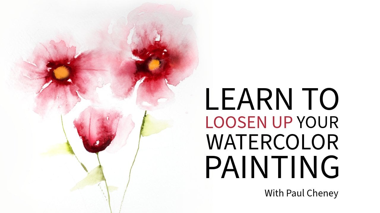
painter for even longer. Today, I'm gonna teach you how to paint this
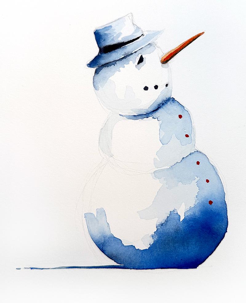
watercolor snowman. Snowman is a negative painting. By negative painting, I mean, we're painting mostly
the shadow area here except for the
nose and whatnot. But basically we're
painting the shadows. We're painting a white
on white subject. So this is a great exercise
for learning that. It's great for learning control over watercolor and
watercolor paint, how much water you should use versus how much pigment
you should use. It's great for loosening up
your watercolor painting. It's very simple, very
quick and very easy. This is a great
painting for beginners. It's a great painting
for anyone to do, actually, and it's
a good exercise. Every time I do
it, I always find I get a little bit better at it. We're gonna start by putting
down our base layer. You can see the base layer here in this little section here, very light, easy wash like that. And then we will
paint a second layer. And while that's drying, we're going to add
the carrot, the nose, and the buttons.
It's very simple. This is basically two layers. You could do a third layer here if you wanted to add more. Yep. But I think you
don't want to lose takeaway from these
watercolor marks and lines. Keep it very simple. Don't
try to rework your painting, once you put the
paint down, leave it alone and let it dry. That is how you get
these water marks here that you see up
in the shadow area. These down here, you can see
these great little marks. You can blend in some here, like some soft edges
that aren't hard. But for the most part,
we're just going to put this down in
very simple layers. First, I'm going to show
you how to draw it out. I mean, I do that
using a magic marker so that you can actually
see what I'm drawing. I'll start with a pencil
and then I'll go over it with the markers just
so that you can see it. I do not use a marker on
your watercolor paper. I'm only doing it dark so that you can see
what I'm doing. Okay, follow along and enjoy.
2. Drawing the Snowman: So for the drawing part of this, I'm using a fiber castle,
water soluble pencil. You can use any pencil you like. Just make sure you do not
press into the paper. If you press into the paper, you're actually denting
and causing a crease inside and against the
fiber that's going to get stuck there and it's going to make it
harder to remove. You really only need to press so that you can see it.
It doesn't matter. Like, if might not
show up on the camera, but you don't need
to press that hard. So when I'm drawing
this, I usually start with the top,
which is, say, we've got our hat here, which, if we look at it in
its simplest form, is a rectangle, okay? Now, in this hat, I like to add a little bit of, you know, once I
draw the square, then you can basically
come in and add some kind of crease marks, you know, to make the
hat a little bit floppy, if you want. You don't
have to do this. I like to do that. Okay.
So essentially there, we've got that part down. I'll go over it in the
marker here as you can see. So we've got our little
flop in the hat there, a little crease, and we'll
come over like that. But essentially, we started with a very simple rectangle, okay? Then we're going to come down on a slight angle this way and
a slight angle this way. That gives us our
brim, and we can fold that around
with a little curve on the bottom like that. Up here, I put a piece of, like, fabric or guess or whatever you would
call that band. You can make this
any shape you like. Okay, there. Now comes the easy
part. We've got a head. So if we draw the full circle,
we will go over the hat, so we will draw a partial
circle from underneath the hat. Like so, Wi there's our head. Next, the second
layer of the body, like this, next, the
third layer of the body. Like so. All I'm doing is connecting
these circles together. Don't worry if they're
not perfectly round. Don't worry if they don't
look exactly like mine. It doesn't matter.
Underneath this, we've got our little shadow, which I kind of just
drawing of here. Then we've got up here,
we've got our nose. Again, just think of it
as a simple triangle. Don't overthink this, right? Think about you're
actually making a snowman. Now, on my eye, I made
him kind of look a little bit more thoughtful
and concerned this time, but feel free to make
a simple circle. If you want to make
it look like mine, all I did was put a line
over top like this and then come down in a semicircle
underneath, okay? So again, we've got
a circle like that. Then we've got a
line over top, okay? Then I just kind of added it in and filled in those areas, okay? You can do it either way. It's gonna look just fine
as just a little circle. Okay. Then we've got our nose. If you're not comfortable
I'm sorry, our mouth. If you're not comfortable
making this smile, you can draw a litt line here like this to give you
the sense of a smile, and then just follow that line along and put your dots on. Easy, peasy. Same thing again. We're following the front here, so you can just
bring this line in, just copy it and run it parallel
like that, if you want, or you can just pull up on the dots on you can
add more buttons. You can add less buttons. There's no right or
wrong way to do this. One thing to note on the nose, we do have a shadow
underneath here. So this is essentially the
painting is orange paint, and then we've got a
lighter area there. We've got a darker area
there, and then I added a little tiny bit of
indigo on the bottom. But you can see that when
we actually paint it. Then our shadow area, that's it. Don't feel like
the need you don't want to dry in all the
shadows and stuff like that. It's just going to take
away. The more pencil lines you have is going to
take away from it. So don't feel like you
need to do all that. Just keep it very simple. Alright, now we're going to
move on to the painting.
3. Painting the first layer: First thing that we're going to do is we're going to put down this light layer here that
you can see the very, very, very base
layer there, okay? That's a very simple
wash. And to do that, I am going to use this brush, which is a number five, just a regular synthetic brush. Like any brush that you have, don't go out and
buy special stuff. You should never do that if
you get to a point where, you know, you want to try different things on
your own or whatever. But when you see classes
and courses like this, more often than not
the materials that you have on hand are probably
going to be fine. I do always recommend you
use artist grade paint, that's and decent paper. The paper I'm using here is
140 pound cold press paper, and it is fabriano soft press, sorry, which is very
similar to cold press. But you could use any paper. I wouldn't use hot
press paper for this. It's going to leave
different marks, and it might find you wondering why your painting is
looking so different. If you understand
how that works, by all means, feel free
to use hot press paper. Okay, so the first
thing we're gonna do, we've I've already
pre wet my paints. When I pre wet my paints, I usually just grab
some water and just kind of dabble it on there. Just gives them a
minute to rehydrate. You never feel
like the need that you need to use paint
out of the tube. The only difference between
paint out of the tube and paint on a pan is
the paint on the pan. The water has evaporated. When you put the water
back in, it's resaturated. And again, this works great as long as you're using
artist grade paint. So let's take a look over
here at the palette, and let's see what kind of
consistency that we're using. It's very light,
simple wash. You know, I want to get it
almost, you know, I'd say, looking at an opacity, we're going to say, let's
go 10% opacity, right? So 10%, maybe 20%. So grab some of
our pigment here, try to get as much, you know, when you're getting your
water and your paint, you want to be able to get as much paint on your
brush as you can, and, you know, be able
to carry it along. See, that's puddling
up and pooling, so that's probably a bit too much when it puddles and pools, but it's not the end of
the world either, okay? And I'm just
essentially looking at my painting here and seeing, Okay, where do I have paint
and where don't I have paint? Um, coming along there. Keeping it really simple. Don't feel like you need
to study this too closely. Just get the paint on, right? Avoid areas like where you're going to have the eyes
and stuff like that, if at all possible. Try to keep, if you can, keep a little separation
between some areas. And I'll explain
why in a second. I'm not going to worry too much about the
shadow under there. I'll put my little back fill
there, a bit more water. Just some running low there. Hey, well, come up. And I'm
essentially just coming down, following the curve of the snowman and putting
paint on the paper. This is not rocket science. Keep it simple.
Don't overthink it. You see how quick
I'm going here? Uh, go quick enough
that, you know, you're not leaving watermarks by your paint
drawing in between, but go at a pace that
you're comfortable with. Don't feel like it's not
a race, either, you know? Um, there's essentially, there really isn't a right
or wrong way to do this. Well, I guess there is,
but you know what I mean? I hope. Okay. So
there's our first wash. Super easy, super simple. It's quite dry in here,
so you can see it's already starting to get
some water marks up here. Which is fine. That's good. I think I
need a little bit up here. Underneath. I had a little bit of
shadow up here, didn't I? Yeah. There we go. Okay. Now, while this is drying, I can down here on the bottom, and in other areas where
I want to, you know, I can add some more
darker pigment. So this I'm going
to load my brush up with saturated paint, okay? You see how saturated that is. If you want beforehand, you can dab off some water and
that'll get even more. As long as this is still wet, I can get in some of these cool little water marks
and blossoms in here. I can start my shadow and just use the tip of your
brush along this shadow here. And now you're
gonna see it's kind of bleeding in quite
a bit up here. That's what this
is happening here where these little
lines come out. That's bleeding.
That's basically bleeding into the water
that was already there. So now I'm emptying the
pigment off my brush, and I want to get
some more dynamic effects on this guy, I think. Make it a little bit
more interesting than the one that I
have in the example. Now, you can see some of these lines are starting
to look pretty cool. Le look what's happening there. All I did was take clean
water and bring it in. I'm bringing in the clean water, it's pulling up the pigment. Okay. And I think it's a little bit too
diluted down here. I don't want that
shadow getting too big. But sometimes it just things get a little bit out of control, so I'm just gonna add a
bit more pigment in there. If you want to get
if you want to, you can do this entire painting. Sorry, the pigment I'm
using here is palo blue. That's what this blue is. You
could use ultramarine blue. You could use indigo.
You could use, any blue you want to use, you could use purple for that
matter. It doesn't matter. I just I don't know. I originally made it blue, and I think the original
one I first did was Prussian blue. You can do
whatever one you like. I got a little bit of
craziness going on. Over here, I could
leave that or I can try and dab it up and
see what happens. Not sure, but it's fine. Okay. But anyway,
so if you want to, what we're gonna
do is I'm going to darken my shadow
up a little bit. And to do so, I'm going
to grab some indigo, which look at how
much darker that is. And while this is wet, I'm
gonna plop some of that in. And that basically
gives us more contrast, which makes a more
interesting subject. Think about when
you're looking at your painting or a photograph
or anything visual, when you're looking at
it, you're going to have what's called like a spectrum, or you know, sometimes it would be referred to as a gamut. But think of it as like
a spectrum where you've got paper white is the
whitest white you can have. You can't make this whiter. I mean, you could, I guess, take acrylic paint that's bright
white and painted on, but for the most part,
with watercolor painting, this is going to be
your brightest point. In a photograph or in
Photoshop or in photo editing, that's called the
white point, or, you know, basically
the white point. Then you also have what's
called the Black point, which is the darkest point. So in this case, this is our black point here
is this indigo. That's going to be
our darkest point. I'm just going to
round this out a bit. It's Indigo is going to
be our darkest point, our darkest part of the shadow because it is the darkest color, the darkest value that we have. Then in between that, we have what are
called the mid tones. And ideally, what you want to have is you want to have a nice, easy transition, you know, or transition from your white
point to your dark point. So if I left this with
just the palo blue, my dark point
wouldn't be as dark. I wouldn't have
as much contrast. Therefore, my subject
wouldn't be as captivating, it wouldn't be as
nice to look at. So let's just feel
how dry we are here. We're going to come back in a
minute when this is dry and we're going to put
on the next layer.
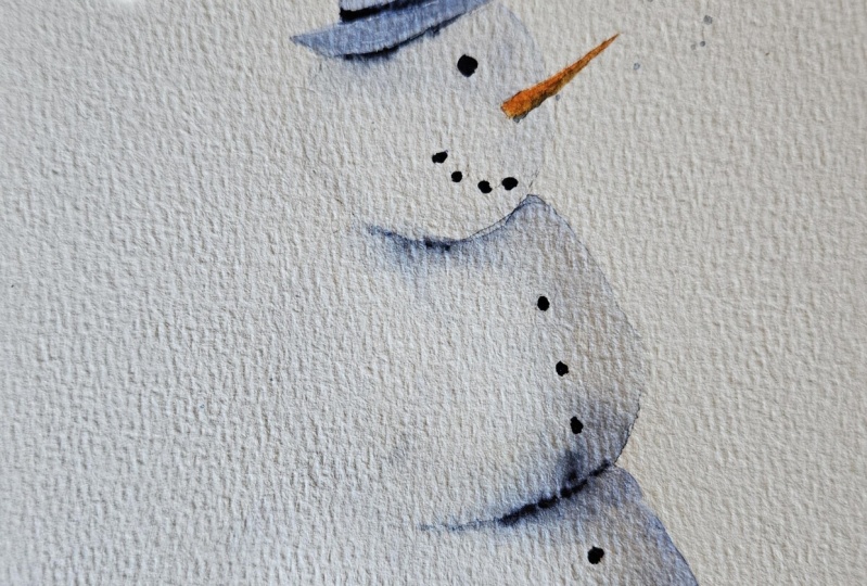
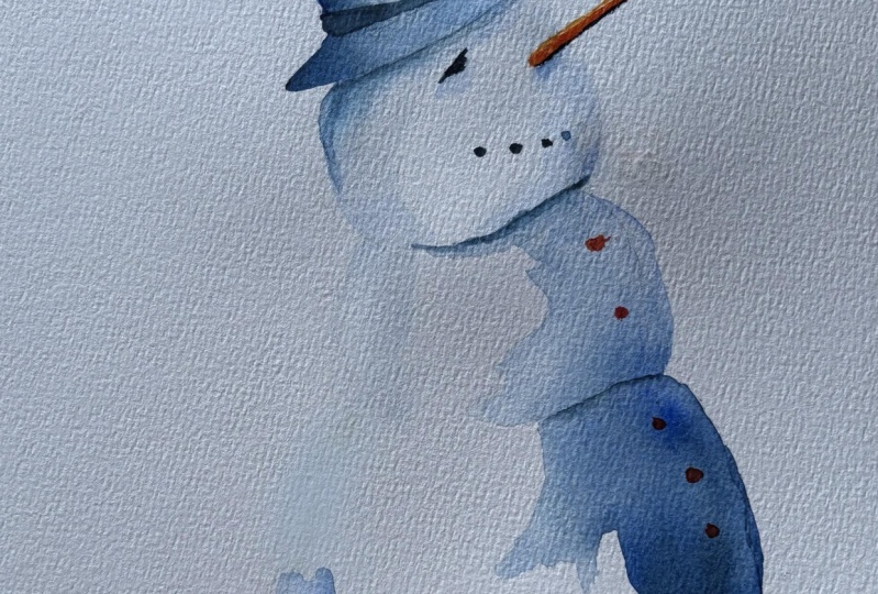
4. Painting the second layer: Went ahead and added in the
little nose here and whatnot. So let's take a look and see what we've got
going on here. Look at these shapes in here. So this is just by not touching it and just
putting the paint down. That's how we get our
watercolor marks, putting the paint on
and letting it dry. Now, let's looking
at the painting, after it dries, I think is a critical step that a
lot of people miss, okay? Even though this is
a simple painting, it's still very important to
look and see how this dried, because the key thing to
remember in watercolor painting, the most important color
the most important thing to remember in
watercolor painting, I should is not how
you put the paint on, but how that paint dries. Because when you look at
your finished painting, what you're seeing is dry paint. You're not looking at the
wet paint that you put on. So how did that paint dry? How does that translate
from wet to dry? Knowing that is how you control watercolor painting and how you understand
watercolor painting. So no matter how complicated the painting is or how
simple the painting is, you will learn that lesson and master that by
paying attention to. So on that note, let's take a look and see
what's happened here. We've got a nice continuous
flow along here. I went a little bit over
the brim of my hat here, and I think I'm a
little bit closer to the eye with my paint,
but that's okay. I'm going to use I'm going to have a shadow
here underneath. So I'm going to just put my
shadow line right there, and that will just bleed into that little bit there anyways. Okay. Then we've got another spot down here,
which is our back shadow. We've got our front shadow here. This bled in a little bit
more than I would have liked. I would have liked to
have seen some more dynamic ness in here, but it's okay as
it is right now. I might come back and put a
bit more on because as you can see that really dark paint with the exception down here, because it was wet, it's
a little bit lighter. Where it was drier, it's
a little bit darker. Doesn't matter. It's not
going to make the end painting look terribly
drastically different at all. So let's just go
ahead, and now we're going to add in
our second layer. So our second layer here is basically our shadow areas,
the brim of the hat. We got the nose,
we got the eyes. We should be able to do
all of this in one go. We're gonna put some
shadow under here. In here, we added a bit of
water that made it bleed out. So maybe a bit more
shadow up in here. Yep. And I think that's it. So let's go ahead
and do that now. Wet the brush. This time, we're gonna grab more
saturated paint. We don't want you know, again,
this is the darker area. So think about it,
like, you know, when you start off,
you've got lots of water, less water, less water, less water every time you go, providing that's the
look you're going for. Okay, so we'll start with
the brim of the hat here. Actually I did that at indigo. I didn't I in the
last one, but we'll start with this here and we'll see how this looks
with palo blue. Okay. It looks okay.
We'll come up here. Oh, I think that's
why I did it in indigo so it would separate. So I'll go over that after
and put some indigo on there. Now, you can make this
a hard line like it is, or it's up to you. You can soften the edges. Soften the edges, all I
did was grab some water, clean off my brush, and I'm just coming along and touching
those edges there. So now that paint
will bleed in there. It'll be a soft edge, unlike these edges here,
which are hard edges. If you want to use
a smaller brush for this part so that you have
more control, feel free. There's no you're not going to penalize by using
more than one brush. I'm going to use indigo now for underneath this
part here, I think. This is the underneath
the brim part, so I've grabbed some
indigo on my brush. Coming along here, coming down, and I don't want just, like,
a straight line like that. I want that to blend in, so I cleaned off my brush, grab some water, and I'm just
touching along the bottom. Okay, there we go. Just gonna push some
more water up in there to bring that down and
make it a little bit less. Honey, looking. Okay, let's grab a bit more pain put it down here on the
bottom of the brim. Again, clean water, touch
the bottom, spread it out. Spread the love. I have to
fix my hat here a little bit, I think, I kind of made a boob I might have to come
back and let that dry a bit. Not a big deal. Alright, so
there, we've got our hat on. I'm going to grab some indigo
and put it in the brim of that hat just because you could make this brim red or a different color if you wanted
to really make it funky. I'm just putting some indigo over top while it's still dry. Okay. Now, underneath here, we've got I'm gonna mix some
indigo and some pala blue. It's easier for you
to see that way. We've got underneath
our chin here. We're gonna have another shadow. So again, our shadow
is, you know, it looks kind of like a scarf like that cause
it's a hard line, but I'll clean off the brush. Come along here,
and wet the brush. Touch underneath. The more more water you put down here,
the more it's gonna bleed. Also, remember, too, the lighter that's gonna be
at the top, okay? So if you do add too much water, it will be lighter
up at the top there. Alright, I'm just
going around where I'm going to put the button just
that I can add it on now, and I'll have to
wait for it to dry. But if you wanted to come
straight down, you could. And Alright, so we've
got our shadow there. I'm letting this dry up here so that I can just put
a better line on there. While I'm doing
that, I'm going to grab some of my orange here. This is cadmium orange hue. Use whatever orange you have or mix red and yellow together. And then, again, mix whatever red and yellow you
have together. Just try for a warm version of it because carrots tend
to be a warmer color. And again, we're just
painting in this triangle. I'm just putting a line
on the bottom. Like that. And again, I can either let
it dry or to get the lighter. I cleaned off my brush, and I can just come along
the top here and touch that with clean water. Alright. Okay, we'll let that dry cause we'll put another
line on underneath after. Now our buttons, since
I've already got orange, I don't want to have to
clean my brush too much. I'm gonna do the
red buttons first. It's easier to get orange off your brush
than it is indigo. And I'm gonna put
my red buttons on. One, two. I'm just squiggling
the paint on there. Three in this little spot. If you put it in when it's
wet, it's gonna bleed, and you might
think, Oh, I ruined my painting, but it
might look cool, too. Okay. If you want to take some
red and put it underneath, then the uh Nose? Well, it's still wet. You can. So it just adds a bit of
shadow underneath there. You see that? Some of it bled
up too much here. And I'm going to do a little lifting
'cause it's still wet, so I cleaned all the
paint off my brush. Came along. There we go. Not very straight nose, is it? I guess carrots aren't
perfectly straight, are they? Okay, now we're gonna go back to the indigo for our um
what do we call it? We call it the nose. I mean, the e and the whatnot. Whoops. Okay. I think I should
be able to do this up here now. Should
be dry enough. Whoops. Look what I did. I spread my button, you got to watch
where your hand goes. I mean, well, don't do that. Anyway, so I made a little
Bobo there, but that's okay. I'm not too worried
about it because I'm not doing any of this painting other than
for the sake of the video, but you can see,
I put my hand in, and now I got it
all over the place. So try to avoid
that when you can. Alright, we're
gonna let this dry. We're gonna come
back and we will
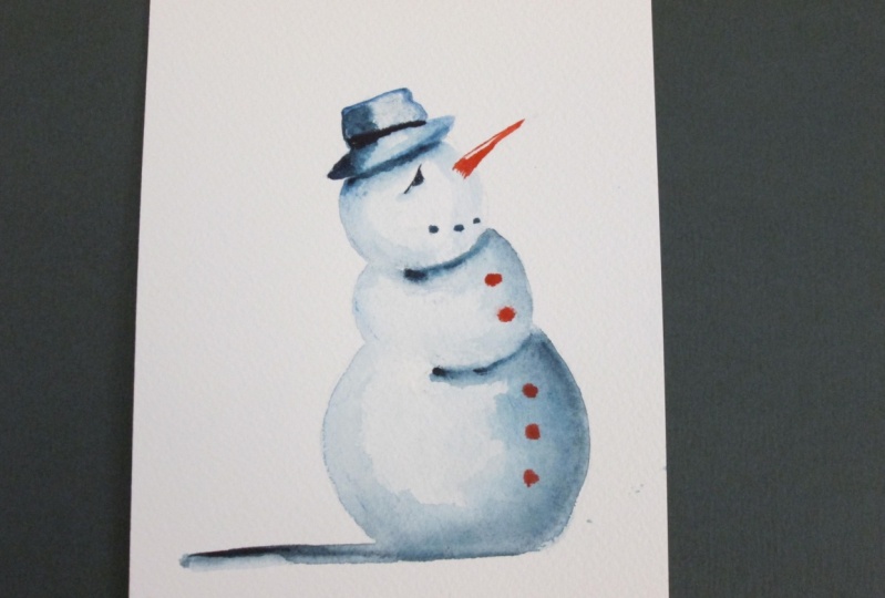
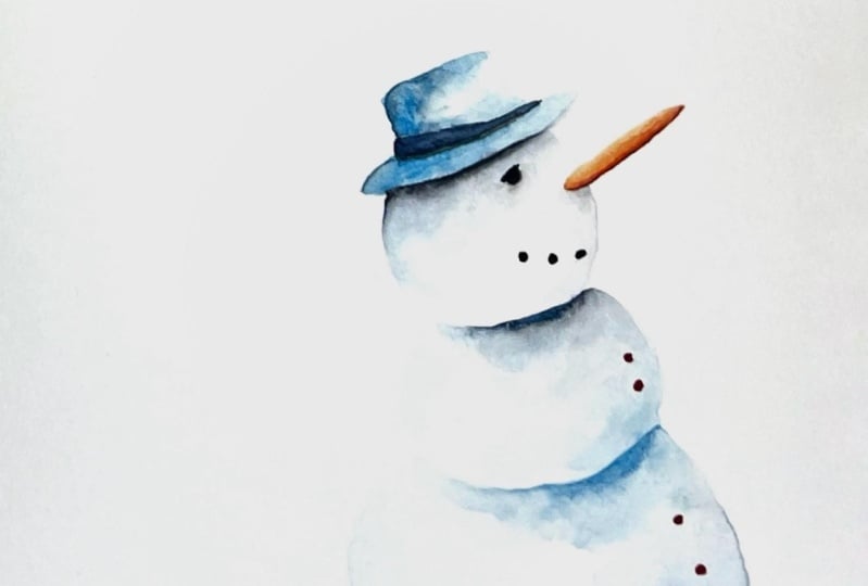
5. Reviewing the painting: Let's review our painting. So a couple of things
that I think, you know, when I look back, I'm like,
What would I do differently? I would probably not have this indigo down here it's dark. I think, you know,
I always do this. I start talking, and then
I'm like, Oh, I can do that. I start dabbling. I fill
that in a little bit. You don't need that
white space under there. And I just grab some clean
water and a little bit of, uh, palo blue and put
it underneath there. You could, if you wanted to
make a mistake like this, I used a non staining pigment, which I don't believe indigo is, you can usually pick those up. Now, the modern pigments like palo blue and stuff like
that tend to stain a bit. But sometimes you
can lift them enough by just pushing clean
water up in there. And it's good to
experiment like this. It's always good to, you know, whenever
I make a painting, I plan on making it two or three times sometimes
because it never, you know, it doesn't always
work out how I wanted to. But that makes a big
difference there. I just added a bit of
water in and push that up. You can keep going as you want. Just don't wreck the
paper. It will show up. But I can push
that up like that, and now it looks
more like a hat. What a big difference
that makes. Now the thing is
up here, I've got this dark shadow up here
we've got this dark shadow, and down here, I don't have
that dark of a shadow. I don't want the
original one either, but I can add a little bit of a darker color,
which in this case, we'll use some indigo and
then we will clean water, spread it out, just to keep it consistent with
the rest of it, right? You know. And for that
matter, I can add some more. I know I said, I wouldn't do this, but I'm
going to do it anyways. And you go down here
on the bottom shadow. Very simple. Basically,
they're just lines, clean off the brush
or get the brush clean and come along the top. Touch it along, just so
that it spreads out a bit and it's not a
straight, harsh line. Or it's also known
as a soft edge. Quite often, I will
use two brushes and a more complicated painting
or three or four sometimes. One has the color, and the other one is
just for the water. It's easier just to, you know, get the dirty water off the brush than it is
to remove the brush. It's also waste less
paint and whatnot. But being this is a very
simple painting is super easy. So I'm going to say we are done. If you wanted to make
the eyeball a little bit different like I did in the
original one, you could. Again, we're just putting
a horizontal line there, basically giving a little
bit of an eyebrow, making them a little bit
more thought provoking. That was a very simple
thing, just a straight line and a little underneath. Um, try not to stick your hand in
the white paint and then get it all
over the place. But for the most part, I think this looks
great. Works out well. We didn't add the dark shadow
underneath our nose here, which was just a
little bit of indigo. Very little you can
almost go along and dot. Like dab it, you
don't have to make a straight line and you know, you just want the very
tip of your brush, clean water along, whoops. There we go. A shadows a
bit harsher than I want. I grab some more orange. Go over top of
that. There we go. Probably look better without
the shadow in this case, but could be very careful. Use a small brush,
and you'll be fine. Okay. So there we've got our snowman with a little weird red
thing in the front, and walla you're done. Make this painting a few times. Don't feel like you
need to make it on a full sheet of paper, right? Like, whenever I'm
cutting my paper down, I'm always left with
scrap pieces of paper, and I keep them. I have a huge stack of
them, and if I want to test out a pigment or test out
something, I do it on that. You can make two
Stoneman on this easily using a small brush,
it's a great exercise. I hope you enjoyed
this. Please make sure you post your
finished painting in the projects and resources
section so that I can critique other people can
see it and become inspired. It really helps me and the
other students out a lot.
 Paul Cheney, Teaching watercolour and digital painting