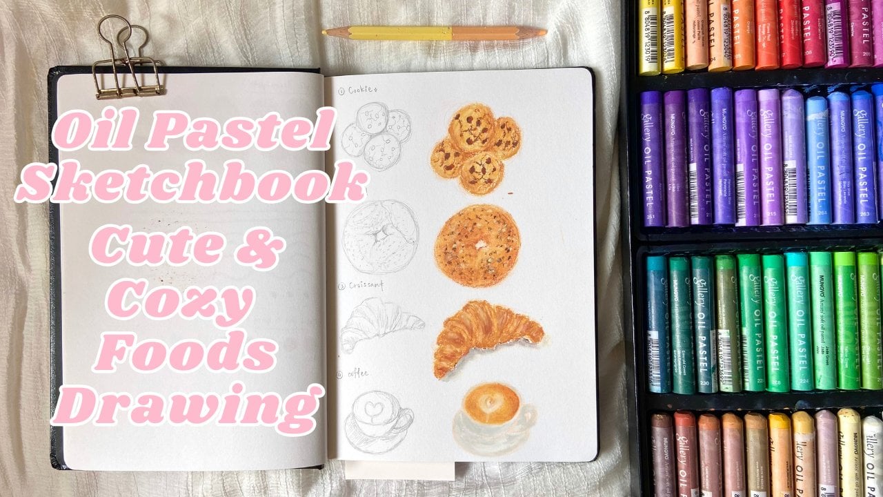
Transcripts
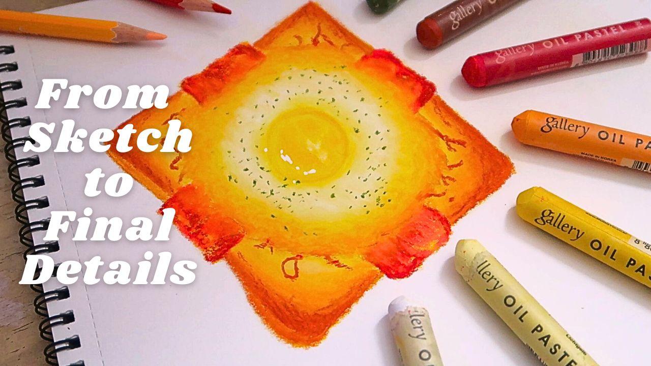
1. Introduction: Hello, and welcome.
In this class, I'll be guiding you step
by step through creating a delicious egg toast
illustration using oil pastel. This project is
perfect for beginner. You don't need any
pro experience, just your oil
pastel, some paper, and a willingness to
have fun with colors. We'll start by sketching and
building up simple shape, then learn how to layer colors
gradually by create depth. Pictures and highlight. Along the way, I'll be
sharing blending tips, color pressure control, and small detail that bring
food illustration to life. By the end of this class, you'll have your very
own egg tos work that look both tasty
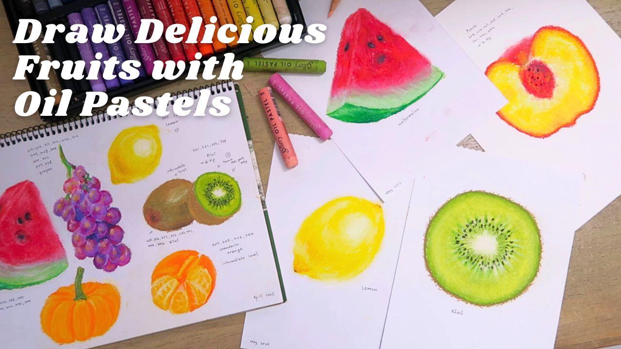
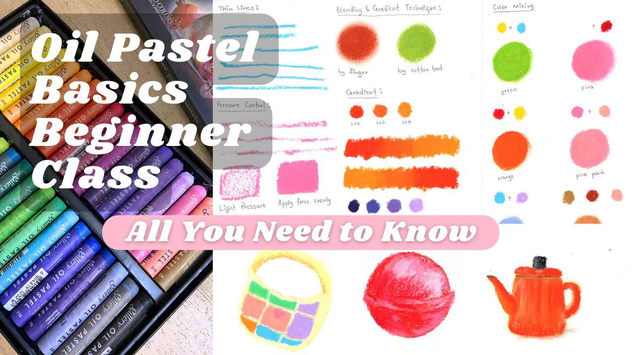
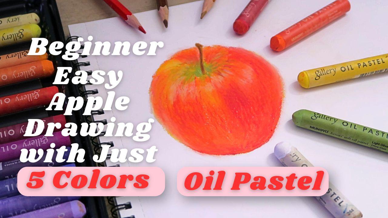
and realistic. If you enjoy this project, I also have other oil pastel
classes you can explore. You can learn the basics
of oil pastel techniques, discover how to draw
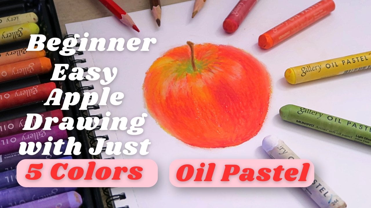
delicious fruit, or even try painting a vibrant apple using
just five colors. Each class is designed to help you feel more confident and creative with oil pastel
no matter your level. I release oil pastel
classes from time to time. So if you'd like to
continue learning with me, don't forget to
give me a follow. You can also check
out my Instagram and YouTube channel where I share more of my oil pastel upwards and behind
the scene process. So grab your oil pastel and let's get started with
our ETs illustration.
2. Tool: Hi, and welcome to the class. I'm so happy you're here. In this short lesson, we're going to go over all
the tools and supplies. You need to draw a
delicious egg and cheese toast using oil pastel
with just seven colors. Don't worry. You don't need
anything fancy to get start. Let's go through
them one by one. First, for paper, I recommend
using thick paper that can handle layering like mixed
media paper or pastel paper. I'll be using this A four
size, 135 grams paper. It's a no brand sketchbook. Next, oil pastel. I'll be using oil
pastel 36 color set. I recommend uno brand because
it's a nice oil pastel, easy to brand, and
it's affordable. But you can use any
brand you have. The color I'm using are white, pale yellow, yellow,
golden yellow. Scarlet, Roost more screen. I will be list out the
color name and number of uno oil pastel
on the screen too. If you don't have the
exact same color, feel free to use whatever
you have, that's close. We'll be using a pencil
and an eraser for sketching and some color
pencils for cleanup. The colors we'll be
using are brown, red, and beige as optional. Lastly, a white
colour paint marker, but it's optional, too. The brand I use is Posca marker and
also a cotton bud for blending. That's it. Very simple and accessible. Once you got your tools ready, let's move on to the next lesson and start sketching our
egg and cheese toast.
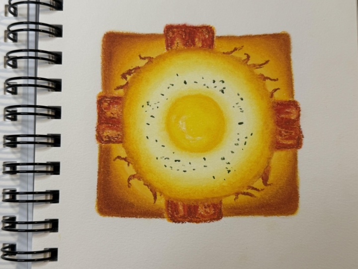
3. Sketch: In this step, we are going to
sketch our breakfast toast. I'm using a regular pencil so you can see it
clearly on camera. But if you're following along, I recommend using a light
page or cream color pencil. This way, you won't
need to erase the sketch later when we
move on to oil pastel. The light lines will blend
in nicely with the colors. Let's start with the bread. I'm drawing a loose
square shape. It doesn't need to be
perfectly straight, since bread usually have
softer uneven edges. This will be our base shape. Next, I'm going to lightly mark the
position of the bacon. Once I have that in place, I go back to the bread and
draw the outline again. This time, make it clearer
and adding more details. Think of this as our guide
for oil pastel later. The more details you add here, the easier it will be to place the right colours in the
right spot without confusion. Remember, bread isn't
flat like paper. I have thickness, so I'm adding a tree d edge along the side to make it
look more realistic. Now I'm sketched
the bacon outline. No need to be too detailed here. Just enough so we know
where it will go. Bacons have wavy, uneven edges, so feel free to make your lines a little
loose and organic. Finally, for the egg, I connect the egg white shaped by
sketching a circle like outline. But remember, keep
it slightly uneven. Then I draw a circle in
the center for the yolk, place it where it's filled, balanced with the
bread and bacon. That's it for our sketch. Keep your lines light and clean. And remember, this sketch is our roadmap for coloring
in the next step.
4. Base color: Before we add any color, I'm going to gently erase
my sketch just a little. Since I drew mine with
a regular pencil, I don't want the lines to smug
into the oil pastel later. If you use a beige color pencil, you can skip this step. That's one of the benefit of starting with a
light color sketch. Don't erase your
line completely, lighten them enough so
they're still visible. Now, let's begin with the break. I'm taking my golden
yellow oil pastel and first drawing the
outline of the bread. Then I'm filling in with the four corners of the
bread with the same color. This will help us start
building the base tone. Using the same golden yellow, I move on to the bacon. First, I outline
the bacon strip. Then lightly fill it in as well. At this stage, remember
to use light pressure. We only laying down
our first layer of color so we don't want
to press too hard yet. Next, I'll grab my
pale yellow pastel and outline the egg white, as well as the
circles for the yolk. Then I'll fill in the egg
white area, but not the yolk. We'll work on the yolk later. So for now, just leave it blank. Once our base color are in, it's time to blend. I'm using a cotton bud for
this because it gives me more control and helps keep
the colors inside the lines. If you feel confident about controlling your blending
without smudging, you can also use your fingers. It's quicker, but cotton bud
are safer for precision. I'll start blending
the bread area first, keeping the strokes
soft and control. Then I'll brand the bacon. And don't worry if it's look too similar to the
bread right now, we'll be adding more layers
later to separate them. Finally, I'll blend
the egg white. But here's an important tip. Always use a clean part of your cotton bud so the
golden yellow from the bread doesn't
accidentally smog onto the white of the egg. That's it for our
base colour stage. In the next chapter, we will
build up the layers and deepen the tone so the bread
looks perfectly toasted.
5. Building Layers (Toast): This chapter, we are
going to build up the layers and really start
bringing our toes to life. First, let's begin with
one corner of the toes. I'm using a rostered color
to draw the outline and then filling it in just a little bit of color around that outline. Right beside it, I
add golden yellow, but not on top of the root, just right next to it. Repeat this same process for all four corners
of the toes. Remember to keep your
pressure very light, especially when applying
the roost colour because we'll be
layering more later. If you're not sure how
much pressure to use, you can always test on a
scrub piece of paper first. I try to add the
roost color little by little to see if it meets my expectation and try to apply the golden yellow more
closer to the roosted color, so it will easier
for us when we do blending later and
look more smooth. It's okay to overlap
the golden yellow on top of the roost
a little bit, but just not all of it. Now it's time to blend. Using a cotton bud, Chan blend from the outer edge inward from roost into
the gotten yellow. Trying to make this look
like a soft transition. Don't forget to
rotate or switch to a clean part of your cotton bud so the color don't get muddy. Also, notice the direction
you move your cotton bad. Bending outward to inward, give a more natural
toaster look. You always can use your finger to do the
blending a little bit, but be careful not to smug
outside out the drawing. Next, I'm taking pale yellow
and adding it right beside the golden yellow
in each corner and then filling in all four
corners with this pale yellow. For this step, I like to use my finger to blend it out
instead of a cotton bad. If you decide to
use your finger, just make sure it's
clean and dry. Otherwise, the colors can
smug outside the lines. Blending with your fingers help the golden yellow and
pale yellow connect more naturally and smoothly. But you still can use
cotton bud to blend it. If you think cottonbud blend
it more better in your case. That's it for this tag. We have done with the tolls. In the next chapter, we'll move on to building up the
color of the bacon.
6. Building Layers (Bacons): Now that we have our tolls, let's move on to the bacon. This is where the color really start to make the
piece look delicious. First, I'm using
a scarlet color. Think of this step almost
like sketching with color. Start by outlining the
shape of the bacon, and then lightly fell in the areas where you see red
in the reference photo. Make sure to use very
light pressure here. If you press too hard, the g will look too strong and the bacon will look
raw instead of coke. Remember, we can always
add more layers later, but it's harder to
take colour away. Next, let's blend
the scarlet colour. Using a cotton bud, gently blend it out. Be mindful of the
direction of your strokes. Try to follow the natural
flow of the bacon. Also, make sure to leave some space for the yellow
underneath to show through. Don't blend across
the whole bacon, or it might look undercooked. Be patient at this step and try to not blend over to
the egg white areas. Now we're going
to add some that. Take a rosar colour and apply just a little bit on
top of the bacon. Not as much as the
scarlet we used earlier, hinge here and there to give it a richer,
more cooked look. Because rosette
is a dark colour, it's important to apply
it little by little. With dark tones, less is more. If you cover too much,
the bacon will look burn and it's very hard to correct dark colour once they are down. For this step, we won't
blend the roost colour, leaving it as it helps
create texture on the bacon, making it look more natural. That's it for our bacon layer. In the next chapter,
we'll move on to the egg.
7. Egg: Now let's move on to the egg. First, I'm going to use
yellow to color the yolk. I apply the color using
small circular motions. Don't feel it in too heavily. We'll blend it later and add other colors on top
to build more depth. Once that done, use a cotton
bud to blend the yolk. While blending, you can
also refine the shape of the yolk to make it
smoother and rounder. Next, take a golden yellow
and outline around the yolk. Follow the shape, but don't
make the outline too even. It should look more natural. Blend it out gently
with a cotton bud. Then repeat with golden yellow. This time, adding a little
more color on the darker edge. Then again, this layering will help give the yolk
a three dimension look. In some area where the
shadow look lighter, you can add more yellow. If you feel the yolk needs
a bit more golden yellow, you can also build
it out slowly. Around the yolk,
apply a little yellow so it blends more naturally
into the egg white. Instead of looking like the yolk and egg white are
completely separate. Next, we add golden
yellow on top of the yolk where you see darker spot in the
reference photo. Use light pressure here, then blend with a cotton ba. After that, use pale yellow in the lighter
areas of the yolk, especially next to the
shadows we just added. This contrast will make the yolk look even more
three dimensional. Then blend again. Finally, if you feel more
areas look too light, you can use a bit more
yellow to touch them up, but that step is optional. Alright. Now that we
mostly finish the yolk, we'll add highlight later
in the final chapter. For now, let's start building up the layers on the egg white. First, use yellow around
the edges of the egg white, but be careful not too much
yellow near the bacon area. Then use your finger to
blend out the yellow. Remember, the egg white
isn't just pure white. If you look at the
reference photo, you'll see it have an orange yellow glow
around the edges. That's the lo we're
creating here. After blending, take
golden yellow and layer it on the same level where
you just apply yellow. This time, make the area
smaller than the yellow one. Don't blend it yet. Instead, add a little
more golden yellow in between the yellow
and golden yellow areas. This will create a smoother
transition when we blend. Now, use your finger to blend. Be careful not to blend the golden yellow
too far outward. Keep it within the egg white. Focus only on blending the area between the
yellow and golden yellow. Don't touch the very edges because leaving some roughness there helps create texture. Next, add golden yellow where the bacon and
egg white meat. It's okay if some golden
yellow overlap onto the bacon. Then use your finger to blend, but be careful not to drag the bacon colour
into the egg white. To add more depth, use white. Apply it around
the yolk and draw a few irregular strokes towards the edges of the egg white. Blend gently with your
finger near the outer edges, but don't blend all
the white away. We want to keep some visible, so it really looks
like egg white. Then blend the white
closer to the yolk. If you find blending with
your finger difficult, you can switch to a cotton bud. A simple trich is to wrap
the cotton bud with tissue. This gives you a
clean tip so you can keep blending without
needing a new one. After blending, if the
white looks too faint, you can add more on top. You can also touch
up with yellow or golden yellow in areas
that need more there. Finally, to make the transition between the white and the
golden yellow smoother, apply pure yellow
in between them, and then blend it out
with a cotton bud. At this point, the egg
is almost finished. In the last chapter,
we'll add highlights, details, and final touches.
8. Final touches & Highlights: Now it's time for
the last chapter, adding the final details and highlight to bring our
fried egg to life. First, take roost and draw
thin strings coming out from the yolk onto the toes right
around the edge of the egg, as you can see in
the reference photo. Try to make this line uneven, different lengths with a
little curve here and there, so they look more natural. Next, use the same
roost color along the edges of the egg white
with very light pressure, sketch a few soft line
around the outer edge, then gently blend them
with a cotton bud. After that, layer golden yellow along the same edges and
blend again with a cotton ba. This extra layer
does two things. First, you separate the egg from the toast so it doesn't
look melted into the bread. Second, it adds dimension, making the egg appear
more three dimensional. Because these are already multiple layers of
color on the edges, blending with the
cotton bud here will naturally create some texture. This texture resemble
the wrinkly edges you often see on
a real fried egg. Next, take scarlet
and add it over the same strings where
you use roost earlier, but only in the session between the yolk and where
the strings connect. Then use golden yellow
again to fill in the transition area between
the scallot and the yolk. So the color blends
more smoothly. Reminder, at this stage, don't press too
hard when blending. Otherwise, you might lose the texture you
carefully build up. Gently blending will keep
the egg looking realistic. Next, use roost
and golden yellow to fill in any missing
parts of the toes. This part really depends on your own drawing adjust
as you feel is needed. Now let's begin the
cleanout stage. Use color pencil to
refine the outline, hos a light brown that's closest to the outer color of the toes, and draw thin soft lines around the edges to
tidy everything up. After that, take
most green to add a few irregular little
dots on the egg white. It's like a seasoning specs that appear after the egg coke. You don't need to overdo it. Just a few dot here and
there to add realism. Finally, it's time to
add the highlight. You can use either
your white oil pastel or if you have a white
paint marker like me, feel free to use that instead. Add bright highlight
on top of the yolk to give it a glossy, shiny look. Then with your white oil pastel, add softer highlight around the lightest areas of the yolk. If you feel the shadow on
your yolk aren't dark enough, you can go back in with golden yellow and
gently add more depth, then blend it in. As a final step, use
rose again to draw very light thin lines along the edges of the four
corners of the toes. This creates a subtle
toasted texture. And finally, your egg
on toast is complete.
 Michelle Gooi, Traditional Artist