Transcripts
1. Intro: Hi, everyone. Welcome
to this class. If you love dreamy
landscape and want to learn how to create
them using oil pastel, then you're in the right place. In this class, we'll be drawing a peaceful
mountain landscape with a soft blue sky and beautiful light and
shadow on the mountain. Oil pastel are such a fun
and inspressive medium. And in this class,
I'll show you how to use them to create
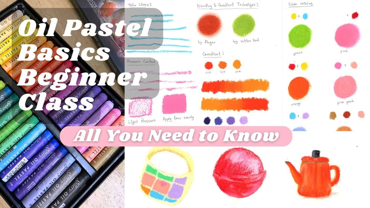
smooth gradient, soft blending, and
various colors to bring your landscape to life. Before we begin
our main project, we'll start with a
simple warm up exercise. We'll draw a soft sunset sky with gentle color transitions. This exercise will help
you practice creating smooth gradient between
different colors of the sky. After that, we'll move
on to our main project, where we'll draw this
beautiful mountain scene. In this project, I'll guide
you step by step through the process of building the
landscape using oil pastels. In this class, you'll
learn how to create smooth sky gradient
using multiple colors. Layers oil pastel to
build that and aches, blend colors using your
finger and blending tools, paint light and shadow on mountain to create
form and dimension, add texture and details to make your landscape
feel more alive. Even if you're completely new
to oil pastel, don't worry. This class is designed
to be beginner friendly, but it's also helpful
for intermediate artists who want to improve their blending and
layering techniques. If you feel like this class might be a bit
challenging for you, you can also check out my
other oil pastel classes where I teach basic
oil pastel techniques, fruit drawings, bakery
food illustrations, and more beginner
friendly projects. But if you're ready to explore landscape with oil pastels, grow your materials, relax, and let's start
creating together. I'm really excited to see
what you create. Let's begin.
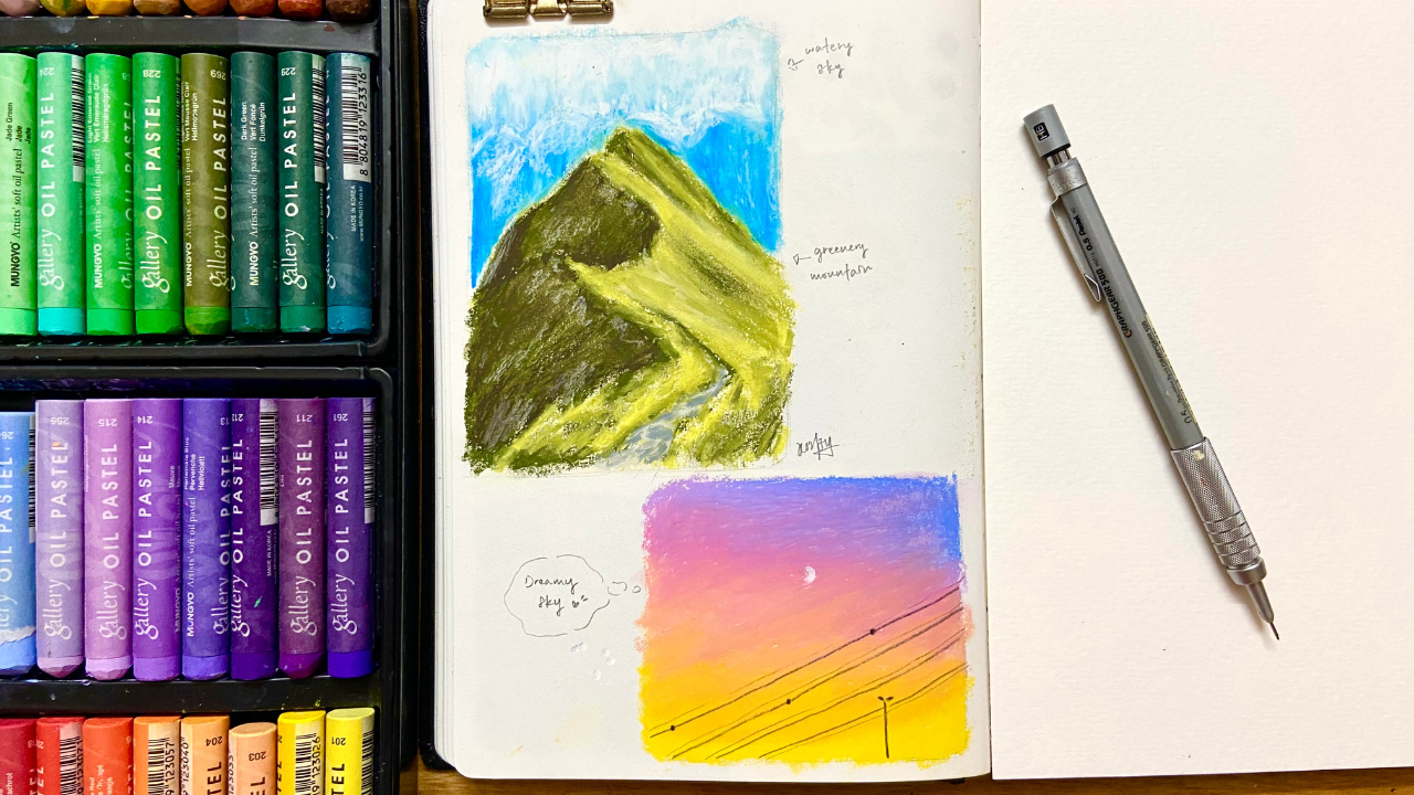
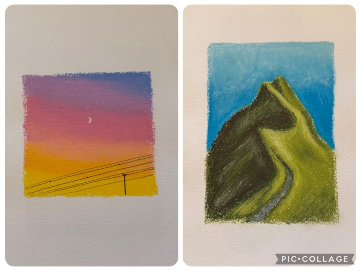
2. Dreamy pink purple sky: Hello, my friends. Before we
go into drawing a landscape, like the mountain
landscape above, let's warm up with a
simple sky drawing. The first drawing we're going
to draw is a purple orange, reamy sky with using these
colors which are sky blue, light purple, violet,
yellow, salmon, pink, please prepare a white color
pencil or white marker, or you can just use
your white oil pastel. This is our reference. First, let's draw the sketch. Draw a square shape. And start with the street
light, and then the wire. Draw a couple of line. You don't have to copy
exactly from the reference. Just draw whatever you like. When we using pencil
to draw the sketch, remember not to
draw too heavy on the paper because
it's just a sketch, and we're gonna erase the sketch later when we want to
apply the oil pastel. Put some small dt
here and the moon. Now, let's erase the
sketch, but not completely. Just as visible enough for as long as you can still
see the rough sketch. Now let's draw with oil pastel. Based on the reference, as
you can see the color is changed from purple,
pink and orange. We want to make a
very smooth gradient. So cannot directly just
use these three colors. We can use some color that can blend it together to make
it look more natural. I'll show you how to do it. First, use sky blue, apply from the top right corner, lightly draw the outline, then coloring with the
direction horizontally, slowly spreading out the
color with less pressure. Then change to the next
color light purple violet. When we apply all these color, remember not to put
full pressure when you paint because we want
to do blending later, so we need to leave some
spaces to let it blend. Then use the pink colour. Remember to keep your direction horizontally when you paint. Color more bigger area
with pink color this time. When you color the pink
slowly to the bottom, slowly lower down your pressure because we want to colour
it with salmon color later, but with pink colour underneath. Next, use salmon colour to apply mostly the bottom
area, but not all. We still need to leave
some space for the yellow. Add a little bit of salmon
color at the bottom. Then use yellow to
colour from the bottom, then a little bit to the middle. Then use salmon to add another layer to fill
up the white gap. Don't worry, even if you
still have some white gap, we will blend it later. Now, we just use back all the colors to
add another layer. So it looks more natural and easier when we
do blending later. Next, we do blending. You can use a cotton bud or use the blending tool like the
one I'm using right now. It has the same function. Blend from the bottom. Be patient, goes from bottom
and slowly to the top. If you don't like using tos, you can use your finger
to blend to like this. Now, let's add the streaks
light and the lines. Use black color
pencil to draw it, white your color
pencil tips when your color pencil have got
too much oil pastel on it. Draw a couple more
softer and lighter line. So the whole drawing
looks more natural. Then add a few dots that we positioned it with
pencil just now. Lastly, use white color
pencil to draw the moon. You can see that it's
hard to draw with white colour pencil when your oil pastel is too
thick on the paper. So there's some way you can do. You can use white colored
oil pastel to draw. It's quite tricky to
add such more details. You can use the palette
knife to cut a little bit of your oil pastel and apply
it on paper as the moon. But it takes
techniques to do it. So today we'll go with
the simplest way, which is using a white
marker is enough. H Then you can use your blending tools
like cotton Bud to clean up the details and
your drawing is done. Let's move on to the
mountain landscape drawing.
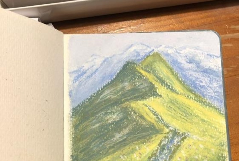
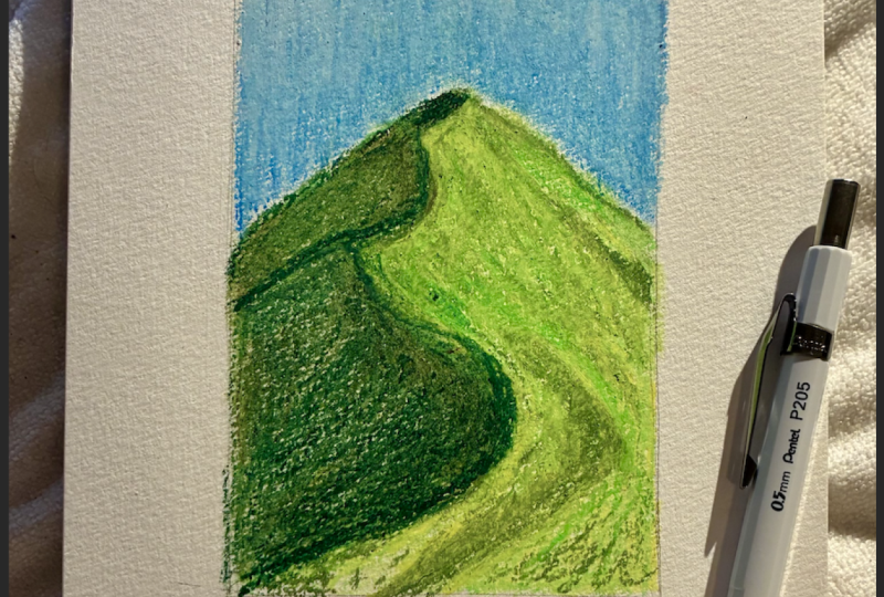
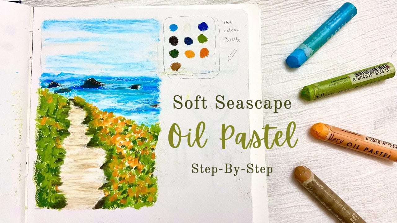
3. Mountain 1/2: In this chapter, we're going to draw a landscape
mountain like this one, and these are the
colors we'll use, which are pale yellow, yellow, olive, yellow, white, olive, raw amber, gray, silver gray, ice blue, cobalt blue, and roost. So let's start, draw the sketch. First, we draw the
mountain shape, draw an upside down triangular
shape at the center. Then add another upside down
triangular at the left side. We no need to draw two detail, roughly draw the shape. Draw another triangular
shape under it. At the walking path
along the mountain. And you can see there's a mountain behind
the upper mountain, but we can't see
the whole mountain, just a little bit of the side. Now we start to adjust the mountain shape and
also add a line here and there to make it seem trey instead of just
a flat surface. After our sketch is done, we erase the sketch lightly as long as
it's still visible. Now, let's start
applying colors. We want to use a color as
a base for the mountain. We go for olive yellow, not too dark or
too light colour, so it's easier for us to
create shadow and light later. We start with drawing
the outline of the mountain first and
also the walking path. Then we start to coloring
inside of the mountain. Don't apply full pressure
when you colour it. Just colour with light pressure because we still need to
layers more color later. After the light layer, gently draw again the lines of the mountain and
the walking path. But don't combine all the lines. Let it flow naturally
in short strokes. Then use finger to blend the
light layer area by area, don't blend it as
one whole image. Next, use olive as the
darker shade of green. Draw the lines of the mountain. Use the edge of your oil
pastel to draw the thin line. Then also color
the shadow areas. Remember to keep your strokes in the same direction
when you're coloring. Keep your strokes in tilted way. We'll keep using olive color
to create the darker green, as we see on the reference. Then use your finger to
blend this darker green. Try to careful not to
blend over the lines. So the base is done. We start to build
up the depth now. Use olive yellow to paint on some areas to bring out the
shadow of the mountain. These are the parts
we want to apply on. Then apply on some
around the lines, so it look more natural
and not too stiff. Then also on some area
look more greenery. We're not going to color
all the areas in green. Pay attention to the reference. You can see there
are some yellow and brownish yellow at the
right side of the mountain. So we leave some areas for that, and we'll add those color later. Now before we move
to the next color, we blend the second layer first. Use cottonbd or
bending tos like mine. Gently blend the left
side of the mountain. Don't blend it completely. We still want to keep
the texture looks. Then bend the right
side of the mountain.
4. Mountain 2/2: Now we want to add more darker color to the
left side of the mountain. This is the side that
the light cannot reach. Instead of using more darker
green for the shadow, we use raw umber, which is the color between
dark brown and green, so it will not look too dull. When we're adding the
raw umber as the shadow, we use finger to blend it at the same time to
soften the shadow. Only put a light pressure
when we apply with raw umber. Oh Then use blending through or cotton baa to blend
some of the shadow areas. Keep adding raw umber and blend on some part
for the depth. Keep in mind, do not blend all the shadow or it
will look too flat, and we also want to
keep the texture looks. Next, use white colour to add as the white strokes as we
can see on the reference. Only apply very lightly. If you think the white of
some areas is too strong, you can just use your hand to blend it to make look more soft. Next, we want to work on
the side where lights heat. You can use lemon yellow to
colour on some of the areas that have a little bit of yellow brownish
on the reference. When we colour the
areas near the bottom, we put less pressure
because we still need to put on some darker
shade color here later. Then apply some pale
yellow for the highlight. And color back with
lemon yellow on the parts that you think
need less highlight. Next, use silver gray to
color the walking path, but not fully color
the whole path, only like a few short strokes. Then use gray, which is more darker gray to the
walking path too. Also color it with
short strokes. Oh and add a few short
line around the periphery. Then use olive
yellow on top of it. Then add a darker green between the gray and
the olive yellow. Then use olive yellow to blend the darker green so
it's natural together. The mountain is done. Now we move on to the sky. We're going to use these
three color to paint the sky. First, we use the ice blue, paint a light layer
on the sky and use cotton bud or blending
tools to do the blending. If you accidentally put on other colour on the
paper, don't worry. Just use the ice blue
colour and paint over it and clean
your bending tools. If you think your finger works better than
the blending tool, then use your finger instead. Just use whatever works for you. If you think it's not
blend really well, maybe you didn't apply
enough oil pastel, you can add more blue oil
pastel and try blend it again. I recommend to use cotton
bad or blending tool to blend around the areas of the mountain because our
finger is too huge and hard to control and will
easily smudge the painting. Use blending two or cotton bad instead is much more
easier and convenient. Next, use Cboblue as the
darker shape of blue. Apply on the bottom of the sky and a little
bit on the middle. Then use ice blue to
blend this darker blue. Then use bending tool
or cotton bad to blend these blue color so the gradient
looks more natural. Lastly, use white colour to
create the mountain shape. Remember to clean your white
or pastel before you use. Before we draw the mountain, let's put on a thin
layer on the sky first. Then for the mountain, just roughly draw the shape. No need to details. Use your finger to blend
it at the same time. Make sure your finger
is clean, too. Now, we add more white above the mountain because we can see there's more
white on the sky. So we put on more
white on the sky and blend it to make
it look more smooth. Keep adding more
white on the sky and also draw the shape of the
mountain to add more depth. Use blending tools if
you think you need to. Then your painting is done.
 Michelle Gooi, Traditional Artist