Transcripts
1. Intro : Hello, and welcome
to this class. My name is Michelle, and I'm an artist who love working with oil
pastel and creating soft coming drawing inspired by everyday movements
and peaceful scenes. In this class, I'll be guiding
you step by step to create this dreamy coastal
landscape with gentle waves, distant rocks, and a
few of soft flowers. This class is designed
to be beginner friendly. So even if you're
new to oil pastel, you can follow along
at your own path. And if you already
have some experience, I hope this class can be a relaxing drawing
season for you. More than just
learning techniques, I want this class to feel like a quiet space for
you to slow down, take a break and enjoy
the process of creating. We'll start with a light pencil sketch to plan our composition. Then gradually build up
layers using oil pastels. I'll show you how
to blend colors, create soft textures, and add small details to bring
the whole scene together. You no need worry about
making everything perfect. Just take your time, follow
along and enjoy each step. I'll also be sharing small
tips throughout the class to help you feel more confidence when working with oil pastels. If you enjoy this class, you can also up my other oil pastel classes here
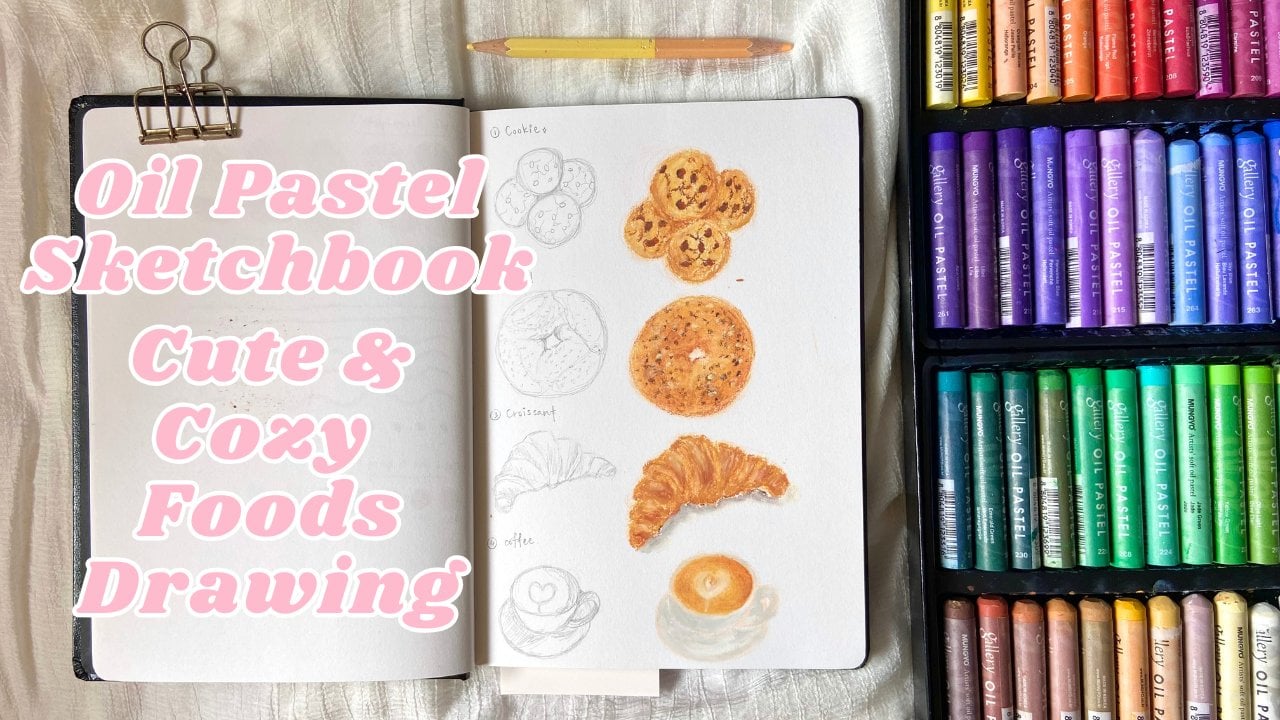
on Skillshare. I have classes on drawing food, bakery team, and
other landscape, and I always creating
new classes. You can follow my
profile to stay update whenever I
upload a new class, so you can continue learning
and drawing with me. And if you like, you can
share your artwork in the project section or
tag me on Instagram. I would really love to see
your version of this piece. So take a moment to get
your material ready, find a comfortable space, and when you're
ready, let's begin.
2. Materials: In this class, we're going to go over all the
tours and supplies. You'll need to draw the
beautiful landscape. Here's what I recommend using. For paper, I personally
don't really like to use very thick
paper for oil pastel, but also not too thin. The idea paper type will be
in 100-35 grams to 200 grams, like sketchbook or
mixed media paper and pencil for sketching. Or if you prefer to use light colour pencil to
sketch, it's fine, too. And a eraser to
erase the sketch. For blending, we use cottonbd or some blending
tools which you can get online or your local art
store for like two or $3. And also finger
for blending, too. For oil pastel, I'll be using Mono soft oil pastel 72
colors is a brand from Korea. You don't need fancy supplies, just grab what you
have, and let's play.
3. Sketch: Before we start sketching, I just want you to
take a moment to slow down and settle into this space. In this class, we are not trying to create
something perfect. We are simply spending
some quiet time drawing, letting ourselves
enjoy those process. One step at a time.
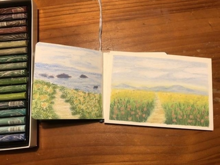
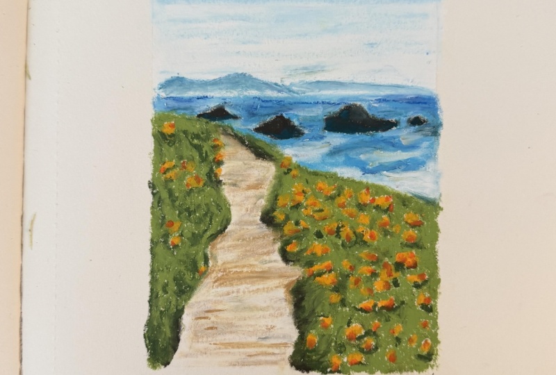
This reference is inspired by a peaceful
coastal scene with soft wave, distant rocks, and a
few of gentle flowers. As we draw, I want you
to focus less on getting every detail right and more on how it feels to
build the scene slowly. Feel free to pause
whenever you need. Take your time and
draw at your own pace. There are no rush here. When you're ready, we begin with a simple pencil sketch to
make up the composition. Now we're going to start
with a light pencil sketch. Try to hold your pencil gently
and don't press too hard. We just want to
create a soft guide for our oil pastel later, so keep your lines
light and lose. First, I'm going to draw a vertical rectangle to mark
the frame of my drawing. This will help me keep
the composition in place. Next, I'll start with the sea. I draw a simple horizontal line to separate the
sky and the ocean. Then I lightly
sketch the shape of the water and the distant land. Then I sketch the
path in the middle, keeping the line soft and
slightly curved and uneven. After that, I add the
rocks in the ocean. Don't worry about details, draw the basic shape. Take your time, and
when you're ready, we'll move on to adding colour.
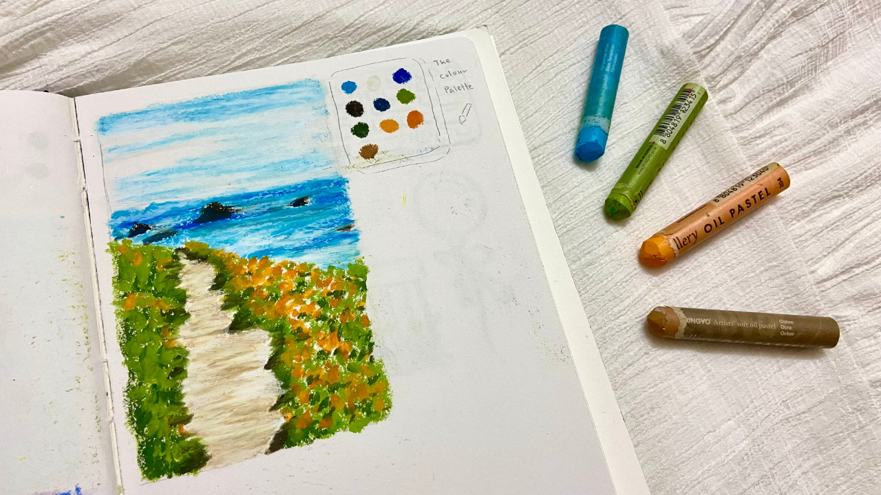
4. Sky & ocean: Now we are going to
start using oil pastel. The color we use for the sky
is white and turquoise blue. The ocean will be used white, turquoise blue, cobalt
blue, and raw umber. For the ground, we
will use light olive, moss green, meltic green, orange, and golden yellow. For the walking path, we
will use ochre and white. Now this chapter will be focused on the sky
and the ocean only. Before that, take your erasers and gently erase
the pencil sketch. Don't erase everything,
lighten the lines. This help prevent the sketch from smudging when
we start blending. We'll begin with the sky. I'm using Taqui blue and white. First, I apply the Tkoyblue at the top of the sky using
horizontal strokes. The top area is more blue, so I add more color there. For the middle area, I just add a few light
strokes and leave some space. Next, I use white to blend. Before using white, make
sure your pastel is clean. You can white it
with tissue paper. Start from the top and apply the white in
horizontal strokes. Slowly moving downward, then over the blue
areas to soften them. Then I go back with Turquoiblue and add
a few more strokes. Remember to leave
some white space. This will become the cloud. Now I use a cotton
bud or blending tool to blend everything gently. If you're using a
blending tools like me, make sure you clean
or wipe it before you start using or you will
smuch your painting, starting from the
top and moving down. If it feels like some
areas need more white, you can add a bit more and blend again to make it look
soft and smooth. On the sky is done, we move on to the ocean. I start again with Toko Blu. First, I draw the line between
the sky and the ocean. Then slowly fill in the sea
using horizontal shocks. Remember to leave
some blank space for the rocks and
also for the wave. Next, based on the reference, you can see there are some
dark colour on the ocean. So I use cobalt blue to add a few darker strokes
to create the deck, but don't blend yet. Then I use raw umber to
roughly draw the rocks. After that, I add a bit of malachite green to create
shadows on the rocks. Now, I go back with toqoiblue to adjust and fill in any areas
that need more colors. Then I use white to do
some light blending, but don't blend
the entire ocean. Leave the areas
where the waves are, especially near the rocks
and near the shore. I realized I missed one rock, so I'm adding it now. Before we start full blending, I add a bit more white. This helps the blending
process because oil pastel need enough
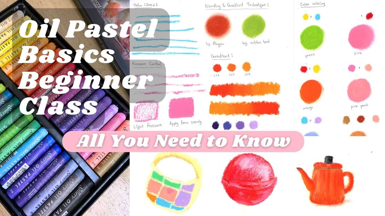
pigment to blend smoothly. If you want to learn more about basic oil pastel techniques, you can jack out
my beginner class and don't forget to
follow my profile, so you can find my
classes easily. Now we can start blending using a cotton bag or blending tool. Begin from the top of the ocean
and slowly move downward. Be careful around the
rocks to avoid smudging. Then I use white to soften the lines between the
sky and the ocean, so it looks more natural. If you look at the reference, you can see mountain
in the distance. I use turquoise
blue to draw them, then add a bit of white between the mountains and the
ocean to separate them. Next, I likely apply
white on the ocean. You'll notice it creates a very nice texture,
similar to water. This is one of the unique
effect of oil pastels. I also add white to
highlight the wave. The ocean is not
only blue and white. These are also hints of green. So I add a few strokes
of Malchic green, then blend it slightly. If the color looks too strong, you can softer it with white. Finally, I add any small detail or adjustment where needed. And now our sky and
ocean are complete.
5. Grass & flowers: Now we are going to work
on the grass and flowers. First, I use light olive
to paint the grass. I apply the color in
small circular motions. The edges can be uneven. That's completely okay. It will make the grass
look more natural. Try to vary your pressure. Some areas can be lighter and
some can be a bit heavier. If you feel like some
parts look too light, you can go over them again. But remember to leave some blank spaces for
the flowers later. Once the left side is done, we move to the right side. The right side have
a larger area, so I first catch the
outer shape of the grass, then slowly fill in the color. I still use circular motions, but in some areas, I also use strokes,
and that's okay. It helps create a
more natural look. Again, don't feel
everything completely. Leave some space
for the flowers. Now we can start
adding the flowers. I use golden yellow and apply it in the blank areas
we left earlier. You can use more dots or little circular shapes
to suggest the flowers. You can press a bit harder here, and it's okay if some flowers
overlap with the grass. After that, I go back with the light olive to
fill in some gaps between the flowers and add some more flowers
here and there. Oh Next, I use more screen to add
shadow to the grass. Before you start, take a moment
to observe the reference. Notice where the
darker areas are. Then slowly build
out the shadows. Starting from the bottom. In some area, you can use strokes and in others
circular motions. Keep your pressure
light. It's okay if you see small gaps. We can always build
it up gradually. Try to add shadow underneath
the flower as well. This will help them
stand out more. Also add some darker tones near the edge of the walking path. Then I use orange to add
depth to the flowers, making them look
more dimensional. Now, we start filling in
the remaining empty spaces. I use more screen first
then light olive. Alternate between
these two colors and slowly build up the layers. Try not to cover the flowers. Use the same process
on both sides. If some flower get covered, you can always go back with golden yellow and orange
to bring them back. Using both darker and
lighter green will make your painting look
richer and more dimensional. Finally, I use raw umber, which is a brown tone to
add darker shadow and soil near the edge between the grass and
the walking path. Then I plan it slightly by
adding more screen around it. And light olive next
to the most screen to connect the colors and make everything
look more natural. If it feels like you
need more flowers, you can always add a
few more at the end. And now our grass and
flowers are complete.
6. Path: Now we are going to
paint the walking path. I'm using ochre for this part. Start by applying the
color very gently with light pressure, using
horizontal strokes. You can vary the
pleasure slightly. Some areas a bit
darker, some lighter. But try not to press too hard. Next, I use white to blend. Remember to white
your white oil pastel before you using and
make sure it's clean. Start from the bottom
and move upward. Still using
horizontal strokes in some area where the colour
looks darker in the reference. You don't need to
blend too much. This helps keep some texture. Then I go back with ochre again. Starting from the bottom, I lightly layer
the color on top. Keep your touch very soft. You'll notice the
texture start to look different from just
applying color directly. This is called layering and it creates a natural
uneven texture, almost like a real stone path. Now we can begin blending. You can use a cotton bud or a blending tool like I'm using. Slowly blend from the bottom
upward little by little. Take your time with this part. I personally find this process
very calming and relaxing. Once the center of
the path is blended, we move to the edges where
the path meets the grass. Use a combination of
gentle shocks and small dipping motion
to blend these areas. This helps soften the transition between the path and the grass. Take your time here as well. There's no need to rush. Good things take time.
After finishing one side, move to the other side and
repeat the same process. Finally, adjust and lend any
small detail if needed. And with that, your soft seas
gap painting is complete. If you like, you
can also write down the colour palette you
use next to your artwork. Then draw a small
decorative boulder around it to make it
even more special.
 Michelle Gooi, Traditional Artist