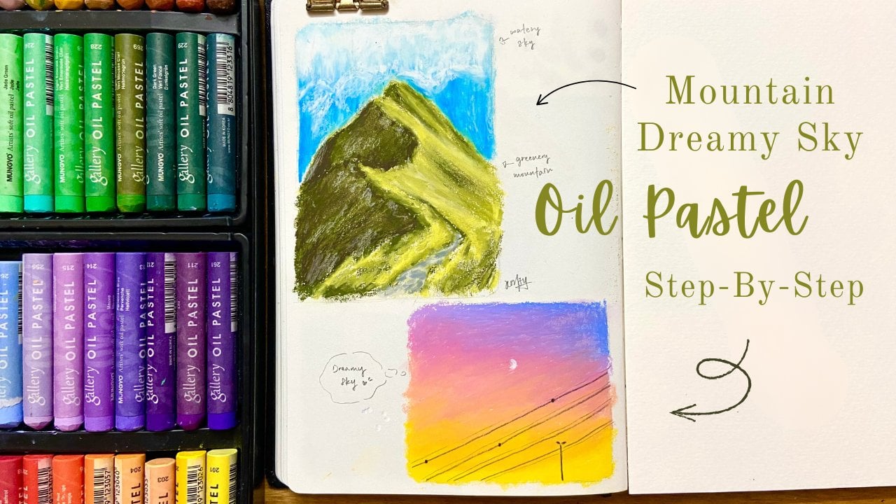
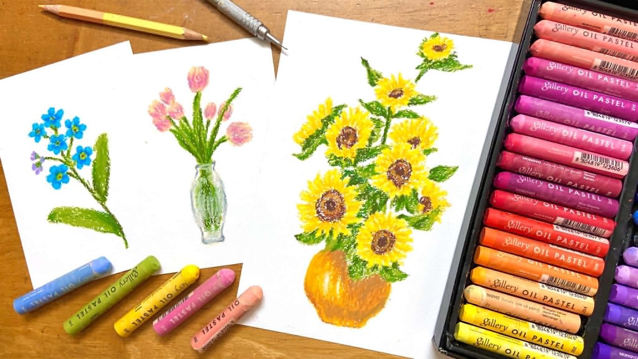
Transcripts
1. Welcome!: Hi, friends. Welcome to Oil Pastel for
Absolute Beginners. I'm so happy you're here. If you always wanted
to try oil pastel, but didn't know where to start, this class is for you. I create this class
for anyone who felt completely
new to oil pastel, even if you never
pick up one before. Maybe you've seen
beautiful drawing made with oil pastel
online and thought, I wish I could do that, too. And I want to show
you that you can. In this class, we're
going to take it slow and enjoy the
process step by step. I'll get you through all the basics like
how to draw thin line, how to blend using your
finger or a cotton bud, and how to control your
pressure for different effects. You also learned how to create smooth gradients and
how to mix new colors, which is super
helpful when you're working with a limited
color palette. Once we cover the basic, we'll move on to a
mini project section with three simple
yet fun exercise. First, we draw a colorful bag, a relaxing warm up to
practice color application. Then a lolly park where
we'll explore shadows, highlight and color layering. And finally, we'll
draw a teapot. It's a bit more challenging
but perfect for practicing, shape, form, and shading. After finishing this class, you'll feel more confident using Oil pastel and ready to
explore more details drawing. And if you'd like to
continue learning, I also have another
class here on Skillshare called raw Delicious
Fruit with Oi Pastel, where I guide you
step by step to draw three beautiful fruits
in vibrant color. It's a great follow up
to this beginner class. Alright, let's get started
and have fun with oil pastel.
2. Tool: Pastel are fun, creamy medium that feels like a mix
between crayon and hin. Unlike oil pastel, wax crayon are harder and more
brittle than oil pastel. They are cheaper but
tend to be less vibrant. Oil pastel are great for beginner because
they're affordable, portable, and super vibrant. For this class, here's
what I recommend using. For oil pastel,
I'll be using uno, soft oil pastel 36 color. For paper, I personally don't really use very thicker
paper for oil pastel, but also not too thin. The ideal paper type
for me will be in 100-35 grams to 200 grams, like sketchbook or
mixed media paper. And we will also use tissue or cotton buds for gentle blending. And we also need color pencil
like light colored pencil, like beige and yellow is
the best for sketching. And the last thing we need is
eraser to erase the sketch. You don't need fancy supplies, just grab what you
have, and let's play.
3. Basic techniques: Before we jump into drawing, let's practice a few
basic techniques. If you are using oil
pastel for the first time, I recommend making
a color chart, which is also called as color swap with color numbers
and names written on them. First, thin line. Try holding your oil pastel like a pencil and lightly
using the tips. Or you can use the edges part of the oil pastel to draw while
turning it little by little. It's not super precise
like a color pencil, but you can still get clean
lines with a steady hand. The more you practice with the turning technique
of the thin line, the more steady your
line will look like. Second, pressure control. Let's explore what's
happened when you press lightly S heavily. Try drawing a soft line with very light pressure and then gradually
increase the pressure. You will notice the texture
of the paper changes depending on how much
pastel you lay down. This is really helpful for shading and creating
soft gradient later. If you remove the power
and apply softly, you can see the texture of
the paper and the expression will be simple and warm like
drawing with color pencil. If you apply frost
and apply evenly, a creamy texture like an
oil painting will come out. You can enjoy various
expression of atmosphere by changing the amount of force applied when
painting colors. Third, blending and
gradient techniques. Now let's try blending. First, we bend it by
just using our finger. You'll see how creamy
and satisfying it feels. You can add more oil pastel
if you think it's not creamy enough or it's not
met your expectations. Then let's create another one. Keep in mind that don't press
your oil pastel too hard, or it will hurt for you when
you do the blending later. Try blending with cotton bad. You can see the result is almost the same
with the finger one. I usually like to use
finger to blend for bigger area and cotton
bud for small area. Now, let's create gradient. The color we're going to use is mili rough orange and orange. First, starting at vermilion, the darkest color lighten your
pressure little by little. Then apply the second color, which is rough orange. Then the orange color. Now, let's try from
the lettuce color to darks color using
the same techniques. From the orange color,
then rauch orange. Then the last one Emilien. Keep in mind that
oil pastel have the characteristic that
dark color tend to overlap. So if you try to layers
dark color on light colour, the light colour will
be blended and you will not be able to develop
the color vividly. It will be difficult to
create natural gradients. In such a case, a
natural gradient can only be created by layering
light colors again. Let me show you another
example to create a gradient by using four
different colours of purple, from the darkest color
to the lightest color, and then from the lightest
color to the darkest colors. When you feel like your
gradient looks not so natural, you can use your finger
to gently blend it out.
4. Color Mixing: Now let's talk
about color mixing. Oy pastel are a very
soft art materials, so you can blend color
and mix color naturally. If there is a color that cannot be expressed with
the color you have, you can create your favorite
color to stand by mixing it. It is difficult to
mix 100% cleanly, but some degree of color
mixing is possible. You can mix color directly
on the paper by layering. For example, try adding yellow, then blue, and blend with
your finger or tissue. You will get a greenish tone. And you can use cottonbd
to make it look more even and extra
tips for you. If you don't want to
waste too many cottonbd, you can use tissue
to wrap around your cotton bud and
continue to use it. The second example is if you layer white colour on
top of camien red, you will get a soft pink colour. The more red colour you add, the darker of pink
color will be. If you want the pink colour look more softer and
lighter at the end, you can add more white colour
like I do in the video. And the third example
is red plus yellow. So you will get orange. Remember to apply
only a little of red colour and
more yellow color. If you think it's not orange enough and it look too reddish, you can add more
yellow on top of it. And the fourth example is
pink plus this salmon color. You will get this
pink peach color. Remember when you're trying to blending two different color, don't press too hard when
using your oil pastel. Control your pressure when
you're using the oil pastel. Use it soft and gently, so it will blend
it easier later. You can keep adding
the color you want and blend it until it's reached
your desired color. And the fifth color is light
blue plus light purple. You will get this
periwinkle color. A little tips for you to
create this periwinkle color, apply only a little blue
colour and more purple colour. I make a little
mistake in this one. I add too much blue colour, so I need to keep adding the purple colour to create
the periwinkle color. And lastly, I use this roasted and salmon
color to create a color. Sometimes when we draw certain
food and we don't have the certain color to draw
the food, for example, if I want to draw bread, but I don't have the
color of the bread, so how do I express the color? First, I use ochre
as the first layer, use cotton bud to
blend it evenly. You can see the center of the color is become
more lighter, so I add more ocher
to the center. Then add roasted on top of it. Use cottonbu again
to mix it together. Make sure to blend it evenly before you
add another colour. Then add salmon
colour on top of it, then blending the colour. Uh Also, white plus any color will
create lighter pastel shades. You can also layer two colors
without fully blending them to create texture or
interesting color variation. Don't be afraid to experience. Mixing is where a lot of
oil pastel magic happens.
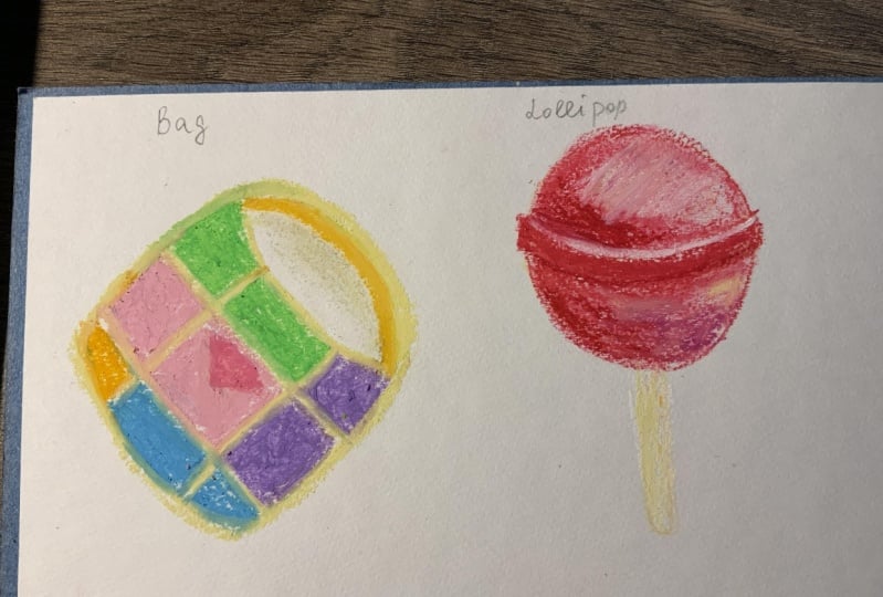
5. Exercise: Bag : In this class, we're going to draw three small
drawing that build your confidence
step by step from basic coloring to shadows
and shape observation. First, let's draw a
simple, colorful back. This one is our warm up, so no complicated shading
or technique yet. Just focus on enjoying
the color and getting comfortable with a little bit of layering and applying pressure. You can make the back
any color you like, or just follow the
reference photo like I do. Before we bring in any color, we always begin with
a light sketch to plan our composition and
guide the layers to come. I personally love using a beach color pencil for
this step. White beach? Because it's soft, subtle and doesn't overpower your
later layers of pastel. It's blend into the piece
beautifully and avoid the harsh ness that graphic pencil can
sometimes leave behind. So pick up your beach pencil, gently begin to met up the basic shape and
proportion of your subject. Don't worry about perfection.
This is just a guide. First, start by drawing
a rectangular shape, but don't make the
edges too sharp. Instead, round the
corner slightly to give the back a softer,
more natural look. Then move on to the handle. Observe where the handle connect to the top
edges of the back, and slightly draw an arch or a curve shape
connecting both sides. Make sure it's feel
balanced and smooth. Once you have the
main shape in place, you can start adding a few
details inside the rectangle, which are the stitching
lines and the logo area. Let your lines be
light and follow. If you need to adjust, you can easily go over
it or blend into it later with the pastel.
Take your time here. This stage, set the tones for
the rest of your artwork. One you're happy
with the sketch, we will move into
color together. These are the color
we're going to use, which are white, pink, turquoise blue, pure yellow, golden yellow, jade
green, and salmon. You don't have to follow
all the color I use. You can replace any
color as you want. First, I start with golden
yellow from the bottom. Then salmon above
the golden yellow. It's easier to draw
the line first then slowly sell
the color inside. Try to leave a small
gap between the color. Don't overlap it. After salmon, I use jade
green to paint above it, give yourself patient
and take time to slowly fill it the
color little by little. This way, let you practice
and learn to use oil pastel, draw the small of jack. We won't go over create shadow
or gradient in this stage. For now, you just focus on getting comfortable
with applying pleasure and fill up
different color in each area. Don't worry, cover up the logo. We already know where
the logo we will place, so don't worry about it. We will use another color, draw the logo on
top of it later. I suddenly want to add one
more color to this bag, so I add this purple colour. You can use any
color as you like. Then I use pink colour to
draw a triangle shape as the logo on the place where I have already
planned just now. Then I use pale yellow to draw the outline of the shape of
the back and also the handle. Don't stress about perfection. This is just to loosen up and get your hands used
to oil pastel. Then I use golden yellow to draw a soft thin line in the
inner side of the handle. And then I use pale
yellow to paint on top of it to gently blend it a little bit to
make it look natural. Then clean your pure yellow
oil pastel with tissue, then continue fill up the white area as you can
see in the reference photo. Next, slowly fill up the gap that we left just now
between the colors. Remember to use tissue paper
to clean your oil pastel, so the colour won't
look smudging. You no need to fill
up all the white gap just as long as you think
it look fine to you. You can stop at this
stage now if you like to. But if you want to
add more detail, you can use pink color to
gently tap off the side of the back and the inner top
areas to create more depth. Then use pale yellow to
gently blend it out. If you make a mistake like me, you can use white colour
to cover up the area. But keep in mind this only apply to light
color like this. I also like to use white
color to soften and lighten some area like this when I think the color was
too dark for me. Next, let's move on to draw
simple shape like lollipop. And this time, we will study
the shadow and highlight.
6. Project: Lollipop: Now let's draw a lollipop. This time, we'll practice observing shadow and highlights. We start by lightly sketching a circle by using a
beige color pencil. Then draw two arch or
curve at the center. Then draw the outline of the shape again by
cleaning up the line. Keep in mind that the
centre curve bar that we drew is going out a
little bit of the circle. Then draw two straight
line as the stick. And these are the
color we're going to use, which are white, pure yellow, pink, amilon,
caramine and scarlet. We use different tone of red to gradually build
out the color. First, we use scar to
draw the outline lightly, then slowly move to draw
the center bar outline. Remember not to put too much
pressure in this stage, we just draw it like
we are sketching. From the photo, we can see that the light source
coming from this side. So the highlight is here
and the shadow is here. So the next step
is we use scarlet as a base to slowly build
out the color later. When we choose color for base, we don't choose darker
color as a base, or it will difficult
to add shadow later. When we paint the base, we only put a very light
pressure when using the oil pastel and pay attention
where the highlight is. We need to leave some
white space and apply more or less pressure when we paint the area
near the highlight. Next, use cottonbd to
blend out the base color. We use cottonbud instead of finger because it's
more easier to control and it won't smudging
out from the outline. We start by blending
out the bottom part of the circle and then
move to upper part. Then lastly, to the center. Take your time and be
patient with the blending. M. After that, use your finger to blend the
highlight area first, then rest of the area. So it looks more
smooth and natural. Then use the same red colour, which is scarlet
to add more layers on the areas that have
more red and shadow, as you can see in the reference. Next, we start to
build up the shadow, use more darker color, which is carmine, to add
layers at the shadow part. Don't put too much pressure when you're adding darker color, only add it little by little. Don't paint too much
darker color directly because it were hard to adjust
it if you make a mistake. Next, I use colour to
paint the center bar. We want to leave some white
gap and gray texture, so we won't paint the
whole bar and keep in mind to leave align as
the highlight of the bar, as you can see in the reference. Then I add more pink around the red because if you can pay attention in the reference, there are some
pink in this area. I also add some dark orange, which is vermilion to make the lollipop look
more vibrant and pop. Then I add more red, which is colored
because it's look too orange right now
and it's less red. So I want it to be
a red lollipop, so the red colour will
be the main tone color. The other colours are
only here to help the red colour look
less bore or dull. Keep switching the
red, pink and orange. Study the photo. In this stage, we're learning to layering
and build up the color. There are no right or wrong that how your color
must turn out. You no need to draw 100%
same with the photo. This is art. It's
not the point to create an art that looks
exactly same with the photo. It's about to explore
your creativity, learn about the
medium you're using, and having fun with it. Next, I use white
color to gently blend out the pink and also
lighten the highlight area. You can use your finger to
blend the color a little bit, but be careful not to smoging
it out from the outline. Now, we move to the center bar. Use white colour to gently
blend out the red and use scarlet red again to draw the bottom line again if
it look less visible. And then use cotton
bad to gently blend out a little bit
at the highlight area. Then switching up between
white and scarlet red by layering to slowly build up this part to create more
depth and contrast. Now, we want to add
more highlight at here. Clean your white oil
pastel with tissue paper, then in it by add more layer, you can totally feel
free to stop at this stage and
move to the stick, but I want to make it look
more pop and vibrant. So I add more orange
and pink into this. The lesson that we have
to learn when drawing is learn to stop and stop
to make it look perfect. So here I'm adding a
little bit of yellow around the orange and pink to
make it look more vibrant, but this is optional. Now, we're moving
to draw the stick. We will use white
and pale yellow. So remember to clean up your oil pastel before
draw a new object. We use white colour to draw from the right side because the light sauce is
coming from the right. Be careful not to touch the
red colour from the top, or you was muching the
red colour to the stick. Then use pale yellow to draw
the left side as the shadow. Then use white
colour to paint from bottom along the way to the top. Then add more pale yellow if the yellow look
less visible to you. Lastly, I use white
colour to add as a thin line at the left
side of the stick. So your lollipop is done. This drawing teaches you
how to build out layers slowly and add them
just with colour. In next chapter, we will draw a kettle to learn the shading
and more tricky shape.
7. Project: Teapot : Finally, let's draw a kettle, or you can call
this as a teapot. This shape is a little
trickier than the ipod, so we'll take it slow. These are the color
we're going to use in this chapter, which
are vermilion, flame red, orange, white, gray, dark gray, and black. First, we'll observe the
main shape that form this it's like a
slinder and handle. So we start with a beige color
pencil to draw the sketch, start with a slender
from small on top and slowly become
bigger side to the bottom. Then draw a planton oval
sitting on top as the lid. For the handle, start
from the opposite side. It's like a tall
straight out C shape that connected to the body
at the top and bottom. Then add a small
rounded rectangle above it for the knob
on top of the lid. Keep your line soft and light. Next, draw the spout. Look carefully. It's curve
outward and then points out. Begin with a curve line from
the side of the teapot. Then draw the other
edge to shape it like a triangle
with a round base. Now that your sketch is done, use eraser to lightly
erase the sketch, and let's move on to colors. Now, start with a light orange, which is orange as your base. Gently fill it in the
entire body of the teapot. Using light pressure. Don't worry about perfect
coverage just yet. We'll layer on top later. Remember to leave a small gap between the lid and the body. We're not paint the spout yet. We will paint it later.
We just leave it for now. Then use cotton baud to
blend out the colour like we did in the
Lollipop chapter. Then I use finger to blend it to make it look
more smooth and soft. Next, take a mid term orange, which is flame red, layer it on top under the
lid and around the base, and especially on the areas
that need more depth. Now, bring in light
orange, which is orange. Draw next to the mid tome orange that we painted just now. Next, we can start
painting the spout. Use the same light orange, pay attention when
painting the spout. It's a bit trickier to
paint the curve shape, give yourself patience and fill up the colour
little by little. Next, use darker orange, which is vermilion
for the shadow, paint it under the lid
and around the base. Oh. Then use mid tone orange, which is flame red to add
more layers at the bottom. Then use light orange, which is orange to add on
top of the layer just now, and also under the lid. Then use the same light
orange to paint the spout, then use darker orange, which is familiar to
paint as the shadow. Then use cotton bud
to do the blending. Gently go up and down. Don't go circular strokes
because we want to make it look like metallic Now, we want to paint this part, add light orange and mid
tone orange to this area. Then use white colour pencil
to draw a curved thin line. Next, we want to create
light reflection. You can leave a small
area uncolored at the beginning or gently add white colour like I
do to make it shine. Next, use mid tone orange, which is flavored to add
more depth to the lid. And then darker orange, which is vermilion
for the shadow. Then use white
colour to blend out the color and also
lighten the color a bit. Then use darker orange
to clean out the line. Next, we move to the handle. Use mid ton orange, which is flared to paint the handle and then
use darker orange, which is milion to paint the inner side of the
handle to create that. Then use light orange to
paint the outline at the top of the handle and also
inner side of the handle. Then use white colour
to soften the color. If you want to cover up
some mistakes you make, you can use white
colour to cover it up. Use a gray for the not on top. You can use a new
cotton bag or you can use tissue paper to
wrap it up like I do, and it's like a brand
new cotton bud again. Then blend it by gently
tap the gray colour, then continue use gray
colour to connect the knot to the lid and gently use cottonbd to
tap for the blending. Then add black colour to
create them, band it out. Then add gray color
again for the contrast, lend it out, repeat the process until it
reached your desired. For the top of the spout, you can either use
black color pencil or dark gray oil pastel like
I do to draw the cover. You can also use this color to carefully add thin line for the separation between the lid and body and then blend it. Or you can just use black
color pencil to draw the line. Lastly, I add some
white me toon orange to create more contrast. Now, you can stop at
this stage if you want. The follow up step is optional. You can keep follow up just
watching is fine, too. Now that we finish
coloring our teapot, let's make it look like
it's really sitting on the surface by adding a
reflection shadow underneath. This type of shadow helps
ground your object, so it doesn't look like
it's floating in the air. It's also at a
realistic and finished look to your drawing
looks carefully. The shadow is not
just a dark circle because the light is coming from above and slightly to the side. The shadow stretches outward, especially in the direction
opposite the light. It has a soft oval shape, wilder horizontally, and
it fades out gently. Don't use black color for this. Instead, pick gray, something soft but dark enough
to show the contrast. Keep the overall shadow
soft and not too dark. We want it to feel
like a reflection on a smooth surface,
not a heavy shadow. Take a step back and
look. Your teapot should now look
like it's resting naturally on a surface with a subtle, beautiful
reflection underneath.
8. Final Thought: So much for joining this class. I hope you enjoy
learning the basics of oil pastel and have fun
with the mini checks. If you like to keep practicing and improving your
oil pastel skill, be sure to check out my
other class on Skillshare, draw delicious fruit
with oil pastel, where I guide you
through drawing through yummy fruits
step by step. I also be creating more
oil pastel classes soon, including how to draw
food illustration, pets and animals, flowers,
landscape, and more. So be sure to follow
me on Skillshare so you won't miss any
classes when they launch. I would love to see what
you create from this class. Feel free to upload your work to the class project section, even if it's just a
warm up or sketch. Thank you again
and happy drawing.
 Michelle Gooi, Traditional Artist