Transcripts
1. Intro of Oil Pastel Flowers Drawings for Beginners: Hi, everyone.
Welcome to my class. You always want to
try drawing flowers, but think it's so hard to draw flowers with oil pass down. It looks so complicated
or so much details. Actually, drawing flowers is
not as hard as you think. In this class, we will draw
three drawing featuring three different flowers and also learn to draw different
texture of vast step by step. Hi, I'm Michelle Guy, an artist and content creator. I love creating soft
dreamy illustration that feel comforting
and calming. I've been sharing my art
journey online and helping others explore creativity in
a simple and enjoyable way. In this curse, I'll guide you step by step
using oil pastel and focus on helping
you feel more confident and free
when creating art. We'll start by drawing
a simple blue flowers. In this beginning stage, we only focus on
drawing flowers. Understand basic oil
pastel techniques by airing and blending. Then we move on to
intermediate levels, which is drawing tulips
in a glass vast. We will learn how to control our oil pastel to
draw a thin line, colors layering, how to
draw the glass textures. Then we move on to
our last project, which is sunflowers in
a yellow brown vat. We will break down into start drawing the
flowers petal first, then the leaf, and
then the vast. And we will also learn
to draw directly with oil pastel without using
pencil sketch first. We don't try to draw in
a realistic art style. We will just try to bring out the atmosphere and draw
in a urban drawing way. This class is perfect
for beginners, hobbies, artists, or anyone who just want to relax and enjoy
a creative moment. You don't need any
peor experience. Just come with an open
mind and have fun. Your class project will be to create your own tree
flowers illustration. You can follow along
with me or add your personal touch and
make it uniquely yours. I'm really excited to
create this with you. And let's get started. I'll see you in
the first lesson.
2. Materials & Supplies: Now we're going to go
over all the tools and supplies you need
to use in this class. First, a piece of paper. We will cut into three pieces
for these three drawings. Or you want to draw on
sketchbook is okay, too. A beach or any light colour
pencil for sketching. And eraser to erase the sketch or any smudging caused
by the oil pastel. A blending tool like this
banding tool I bought online. You can find online. Just search oil pastel
blending tools, or you can just use cottonbd
we'll also do the same job. A set of oil pastel, I'll be using Muno soft
oil pastel 72 colors. It's a brand from Korea, but you can just find
any similar color with the oil pastel
I used in the class. And that's it. No need
any fancy supplies. Let's just start
the class and play.
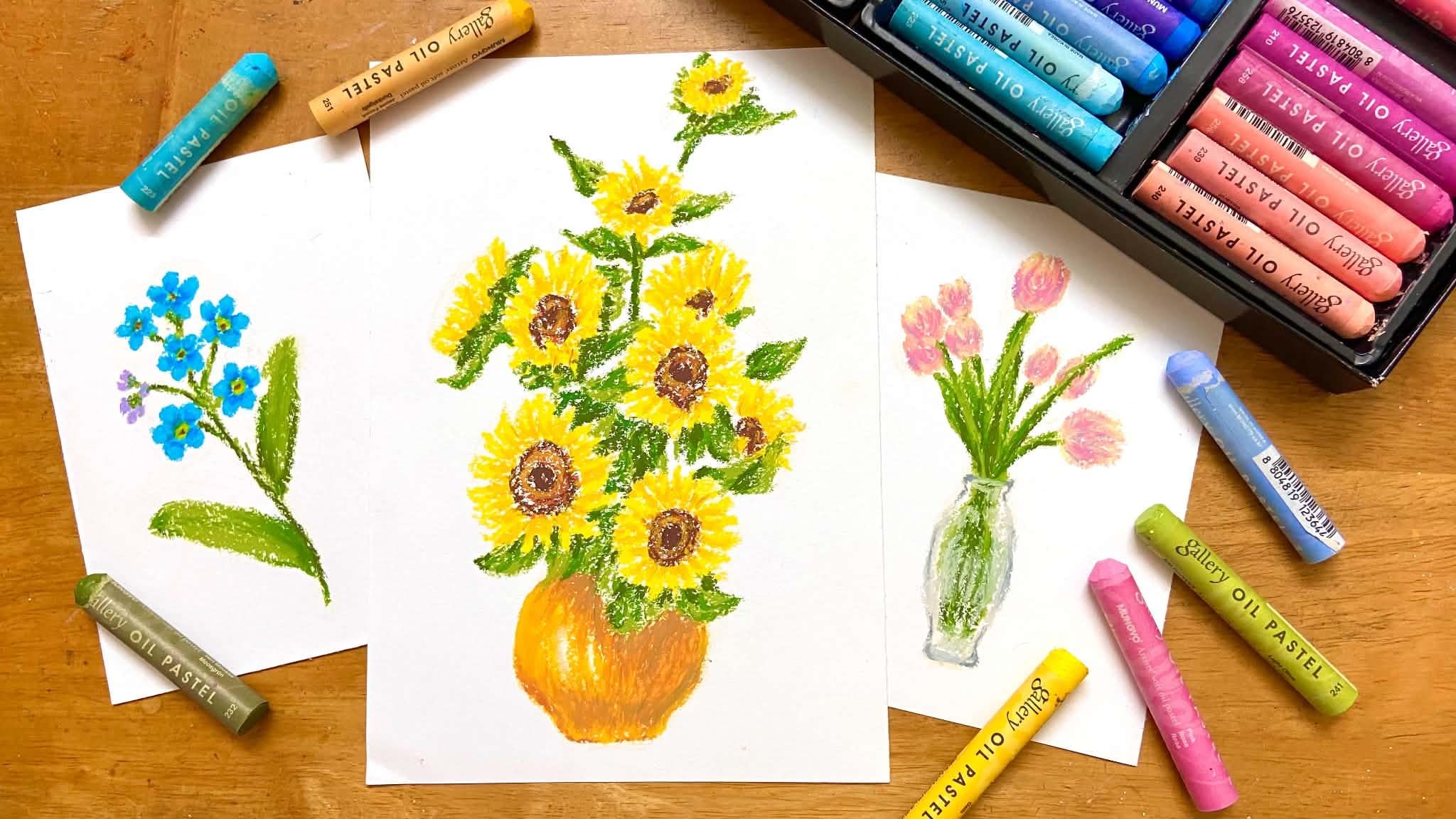
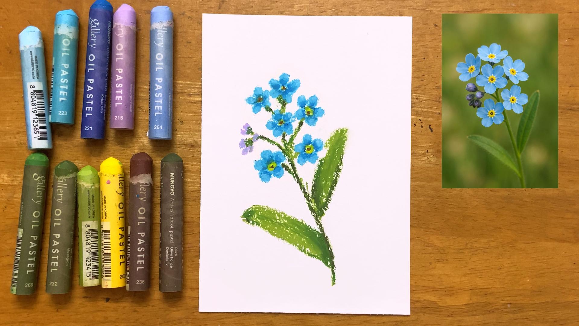
3. Blue flowers: Simple shape and blending: So in this class, we will
draw three types of flowers. One is the blue flowers. Second is these tulips
in a glass vase. Third, is some flowers
in a solid vase. But before we start drawing, let's cut out our
paper into three. I use A four size paper, cut into three different
size of paper. Or if you prefer
and want to draw on your sketchbook or any
other type of papers, it's okay. No pressure. But if you only have a four
paper, you can do it like me. First, I fall into half
and cut it in half. And take one of the paper, fold it in half again, and cut it in half. And then you got three papers. The two smaller side of paper we're gonna use for
the blue flowers and tulips because it's much more smaller
than the sunflowers. And the larger slide of the paper will be used
for sunflowers drawing. So we're going to start
draw the first flower, which is these cute
little blue flowers. The colors we're
going to use for the petals are Turquois blue, Corboy blue, ice blue. For the steam and
leaves are light olive, light moss green and olive. And for the little
flowers at the left side, we use light purple violet
and light Azura violet. And for the middle
of the flowers, which is the starment, we use yellow and brown. So get ready all the colors, and we can start drawing before we use oil pastel
to draw directly. We use beige color pencil or any other light colour
pencil you prefer. Or if you want to use
pencil, it's fine, too. But remember to use
eraser to erase half of the sketch so it won't get
much with the oil pastel. So now we just try to understand where all the
things should locate. We just roughly
draw an oval shape, so we know the position of
the flowers and the steam. I know it's hard for you to
see from the camera here, because when I draw, it's also hard to
see from my eyes because we just need to know
roughly all the position at, and I don't want to leave the mark of the
color pencil later. So now I just draw as
light pressure as I can. So the purpose for this is not to let us see the
sketch, actually. Is just to strain
ourself draw without a clear sketch and be more
confident when we draw. So we can draw with oil pastel directly and without a
pencil sketch in future. So now we just
need to understand the roughly position of all
the things in the drawings. So in the reference, it's
got six pieces of flowers. So I just roughly sketch all the six flowers
positions with six circles. And now we can start
with oil pastel. We start with toquoiblue color. We start with draw the
top left of the flower. Keep in mind all the
flower direction phase at. So when we draw the flower, we try to represent that too. We start with draw the petals. Each flower has five petals. I know it's quite challenging
to draw a small petal. So when you draw, try to hold your oil pastel in, like, tilted way, like
around 45 degrees. Not in a straight
upright way like this. So holding like this and apply your oil pastel little
by little on the paper. Be patient. Remember to leave
a small space in the middle for the stagments so let's draw five more
flowers like this. When the flower is
faced up to the sky, the petals that close to us will be more shorter
when we see. So try to draw a
little bit small or short when you
draw the petal, because if you draw all the
petal in the same side, it means the flowers
is facing at us. So keep in mind that when
you're drawing flowers, but it's okay if you
accidentally draw the petals a little bigger or the same side because I did that too sometimes. So it's okay. Just leave it. We are not
aimed for perfectionism. Our goal here is to have fun when we draw and
finish the drawing. Oh. So the hardest part
is already over. Let's draw the stagment
of the flowers. Use yellow to fill the
middle of the flowers. Then use brown to draw
a small.in the middle. Now we're going to add
that for the petals. Use cobot Blue, draw the
inner part of every petals. Don't worry, it looks weird now. We will blend it after. Then you could use
blending tools like mine, or just use cotton bud to
blend the blue we just apply. The direction we blend goes
to the outwards of the petal, but don't blend it totally like make the darker blue disappear. We still want to keep a little
bit of the darker blue. Then we use a more lighter blue, which is ice blue to draw on the tips of the every petals. Then our flowers is done. Let's draw the
steam and the leaf. We start with light olive. If you just draw it
directly on the paper, you see it will
turn out like this. So when you want to
draw something thin, like align like the steam, find the edge of your oil
pastel and use it to draw. When we want to draw the
long steam to the bottom, we can imagine the steam and
think where it should be at. The steam is a
little bit tilted, so we draw it like that, too. Then we add more steam at the left to draw the
purple flower later. Now we want to draw
the purple flowers, use light purple violet. Also use the edge of
the oil pastel to draw, draw a few short strokes, slowly add together, leave
some space for the steam. And use back the green colour we used just now to draw the steam. Then we use light Azure violet to add a little bit of
touch up to the flour, so it won't look too flat. Next, after we done
draw all the flowers and connect to the steam,
let's add the leaf. So the leaf are pretty big, so it's quite easy to draw. Let's just outline shape
of the leaf first. Then we feel colour
on the inside. But make sure not to fill up
with full coverage because we still want to add other shade of green later to
add more depth. Let's draw the other one. Next, let's you most green as a dark green
for the shadow. We also add to the
steam at the same time. When we add the darker
green to the steam, don't cover the
light green totally. Make sure you can still
see the light green. Then we use back
the light green, which is the light
lif to apply again on the leaf to
fill up the Y gap, but not all the i gap. The techniques of oil pastel is we don't use
full pressure and fill up the coverage when we paint unless you really
want it that way. Or not because it's hard to add more layers and color after. We usually use oil pastel but slowly build up the
color layers by layers. So it's the same.
You do anything. Patient is the key because
good things take time. We can use the olive as a more darker green to add more depth, but don't apply too much, the areas near the steam
and on the shadow. If you think it's left
too much white gaps, you can add more light olive and just use your
finger to blend it. And then your simple cute
little blue flowers is done. In next chapter,
we're going to draw a beautiful tulip
in a glass vase. See you in my next chapter.
4. Tulips: Colors Layerings: This chapter, we are going
to draw tulips in a glass. The colors we are going
to use are pink salmon. Pale yellow for the
flowers, light moss green, moss green, and light olive
for the steam or stem. I'm not sure how
to pronounce it, but just google it and realize
it's pronounced as SEM. I apologize that my
previous chapter, I have pronounced
it incorrectly. So I'm sorry. So the color of the glass as we will be using silver gray, light gray, and gray. Alright, let's get into drawing. Oh, you also can
add the color light tura violet for touch
up, but it's optional. First, we also using a beige color pencil to
roughly mark the positions. Let's mark the vast first, draw a line for the top
and also the bottom. You can't really
see it on camera because I draw very lightly. I do this every time I
draw because I don't want the color pencil will
smuch my oil pastel later. But if you want to
use pencil, go ahead. But I would suggest you erase half of the pencil
sketch before you start, put on oil pastel. Now I just roughly sketch
out the body of the fast. No need to detail. We just need to know
the shape roughly. Next, I draw a few circles to locate all the
tulips positions at. No need to draw out the
shape of the tulips. Now, I think I drew the
s a little bit too high. Let's adjust it to model. Now we use salmon colours
to draw the tulips. Start with draw a few strokes. Try to leave small gaps
between the strokes, draw it using with the
edge of your pastel, then repeat it and
draw a few more tips. Try not to draw all the
tulips in a same side, or it will look quite boring. We try to draw the
tulips unevenly. So it's look more natural and the composition will
look more interesting. We can draw the middle
tulips a little bit bigger, like she's the main
character of these flowers. And some small
tulips at the back. And this tulip that went down on the right side also have
quite big petals too. Next, we apply the
second layers. We are using pink to draw
the same way like just now. You must follow the
same stroke size like we apply with the
salmon colour just now. Just draw it naturally
with the strokes. Don't try to cover up
all the white gap. It's okay if there
are few white gap between it, it's
the beauty of it. This way, your drawing
looks more airy and free. Unless you want a different
style, then it's fine. Art is no wrong right. So as long as you're happy
with it, then it's right. Next, we use pale yellow apply on the top and the
bottom of the flowers. Because through the reference, you can see that a little bit
of yellow at the bottom of the flower and also the tips of the petals
are more lighter color. But we don't just use
white to emphasize that because our background
is white already. Unless you are using a
brown color paper or not, it will quite hard to
show up the colors. So we use yellow instead and because I want to
give it a warm vie too. So after we finish the petals, if you're not sure about
the stem positions, you can use Big color pencil to roughly sketch out the place. You could start using light
olive to draw the stem. Vary your pressure when
you draw the line. Don't use the same pressure all the way when
you draw the stem, or it will look very
stark and unnatural. Keep in mind when
you draw the stem, don't make it too
thick in the middle. Remember, we still
need to draw the vast, and the vast is quite small, especially at the
top of the bottle. I'm also drawing the
leaf at the same time because some of the leaf is kind of overlap
with the stem, so I just draw together. I'm not 100% follow
the reference. I'm just kind of go with the flow and make it seem
as natural as possible. Next, we use light moss green
as the darker shape for the shadow on the leaf
and also on the stem. If some of the colors
seem overlap or the light green don't
seem very clear anymore, you can add the light
olive color back to it. I'm slowly add more
leaf around the flower, so it don't look too blank. But it doesn't mean
you have to fill up all the blank space. Sometimes we have to
understand and know when to stop and let
your art breathe. Okay, maybe this
sounds too philosophy. Well, say it in an easy way is understand the
composition of a drawing. I'll try to make a class about composition of a
drawing in future. Then you use most green to add as a more
darker shade of green, but don't add too much, only a little bit, only
at where the shadow reach or between the gap
of the stem and leaf. And your tulip is done. In next chapter, we are going
to draw the glass first, and this drawing
will be finished.
5. Glass vase: how to express the texture of glass: So now we are going
to draw the vast. So the vast is made of glass. Usually, we draw glass. We will use gray to
present the color. So here we are using silver gray to draw out
the shape of the vast, start with the top of the vast, then slowly going down. We can draw the middle
of the outline first, then connect to the top, then draw the rest of
the bottom outline. Remember when we
are drawing line, find the pointed angle of
the edge of your oil patel. So the line will come out
more thin and less thicker. I'm just trying to
simplify the shape here. If you want to
follow the reference or if you want to be a
little bit creative, and draw a different shape
of the vast is fine, too. Next, I use the light gray. This shade of gray have a
little bit of blue tone. I use this light gray to
draw at the top of the vast, the middle outline of the body, and also the bottom line. And draw lightly at the
center of the vast. Then the bottom too. Then I use back the silver gray, which is the first gray color we use to paint a little
bit at the bottom. Then a few strokes around
the center of the vast. We only draw at the areas that the glass
reflect the light. Don't colour the whole vast, or it will not look
like glass texture. Then I use a darker shade of
gray to emphasize the glass. We don't apply too
much color of this. Only apply on corner
and recess area or area where light
don't reach it directly. Then I use light gray to
tone down where the areas. I think the gray is too dark. Lastly, your drawing
is actually done. You can stop at here or
you can add a touch up. I'm using light at violet color. I always like to
add a little bit of blue or purple on my drawing, so I add a few strokes
on every tulip with this colour and your tulip
drawing is finally done. If you follow here, you have done a great job. Let's draw a little bit bigger
painting in next chapter, Sunflower in a
brown yellow vase. See you in next chapter.
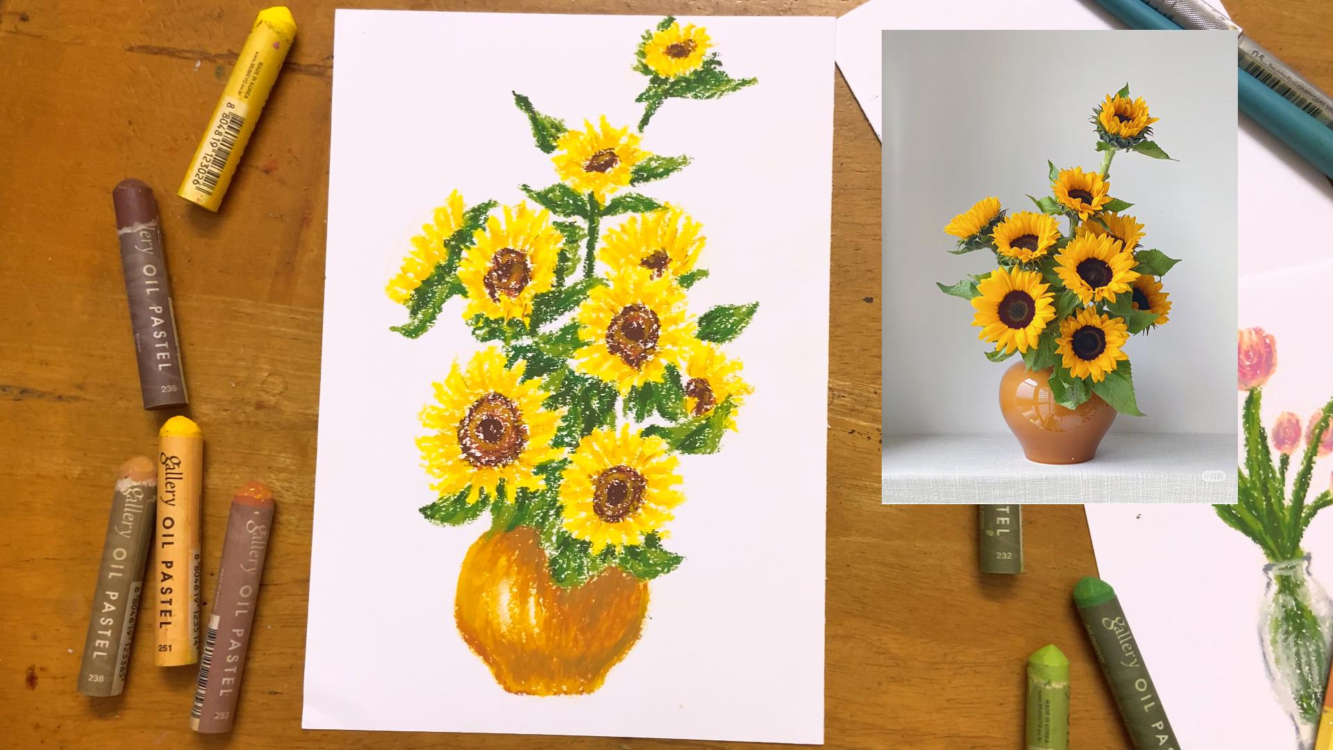
6. Sunflowers petals: Simple shape building up a drawing: This chapter, we are going to draw some flowers in a vase, and the colors we'll be using
are yellow, dark yellow, burn orange, and brown
for the flowers, and light olive,
light more screen, and more screen for the stem, and dark yellow, burn orange, and ochre for the vase. So as usual, we start with
a beige color pencil. Observe the reference. We don't sketch out the details. Think it as built
up with some shape. Start with draw a few circles to represent the sunflowers. We are just marking down the
place for every sunflowers. Some sunflowers is smaller
and some is bigger. So try to vary your size
of the circles you draw. Then also draw the vs too. We are not draw leave yet. We'll add it with
oil pastel later. So just leave it now. So now we start with oil pastel. We're going to draw
the petals first. Use yellow color. But first, make sure your oil pastel is clean before you
put on the paper. So we start with the bottom
one to draw the petal, we no need to draw the strokes
too thin or too thick, because if all the petals
too thin or thick, will be quite weird and it
will not look like sunflowers. Just draw the strokes
in a normal way. And hold it in 45 degree angle. And remember, the
strokes will become more small or thinner when
it goes outward. And keep in mind, keep a
circle shape in the middle. If you think it's
challenging to control, you can use the
Bach color pencil lightly draw a circle
in the middle. So you can keep drawing the
petals around the circle. Now, I feel like the middle
shape look like a square, and all the petals look
quite far in between. So I try to add some more petals and modify the shape to circle. Okay, now the petals
look more natural, so I repeat this to draw
the rest of the petals. See how each of the
flowers direction face at. Not all the middle
is round shape. And keep in mind that
when we draw the petals, the direction of your
petals determine where the direction of
your flower facing at. Next, we use dark yellow
to add for the shadow. See where's the shadow at. It's mostly at the inner part of the petals and a few at the
top of the petals, too. If you think you
accidentally put too much dark yellow or put
at a wrong place, you can use that yellow color to apply on top of it again. Keep in mind that the
direction of how you draw will determine the direction
of your flower facing at. And I mostly use the edges of my oil pastel to draw because it's more easier to control the thickness
I want to apply. Then we use burnt orange to draw the center
part of the flowers. Just draw it in a
circular motion, but don't apply full
pressure, normal pressure. Make sure it have wide gap in between and repeat
this in every flower. Next, we use brown color as
the darker shade of brown, draw a circle in the center and a few strokes
around the petals. Also do this in every flowers. It doesn't have to
be exact circle. When it come to some flowers that don't have around centre, just draw in the middle and feel strap around
the center will do. And I think the petals
and the center of the flower looks like a
little bit disconnect. So I try to use yellow and dark yellow to connect
it back together. Then lastly, also use
dark yellow to lightly draw a few strokes around
the dark brown color center. And your flower is
done in next chapter, you will be drawing the leaf.
7. Sunflowers leaves: relaxing coloring and layering: So now I'm going
to add the leaf. But before that,
I add more yellow to some petals that I
think look too thin. So now I'm using olive
to draw for the leaf. Let's try to use oil
pastel to sketch out the shape directly because
leaf is quite easy to draw, so we can challenge ourselves to not use pencil to sketch first. We just sketch out the outline. Look at the leaf as a shape instead of thinking how
to draw out the line. We also draw out the
stem at the same time. After we done the sketch, we can start the
coloring process. And I personally think this is the most satisfying
and relaxing part. I wonder do you feel the same? You see, when I'm coloring, I don't fill up the whole leaf. I'm leaving gaps in between, and the pressure I apply
is just normal pressure. I'm not fully pressed hard while coloring because we still need to add more layering for
the shadow and deck later. Next, we are using light more screen to
add for the shadow, only apply on those
areas that look darker or light don't
reflect on the leaf. We are not trying to
create a realistic style. We are just trying to capture
the n and atmosphere, draw in a sketching urban way. Drawing and colouring leaf is my most favorite
part when drawing flowers because we don't really need to think about
the colour theory, the details or any compositions. It's just a simple
easy coloring process. Like we are colouring
in a colouring book. Like, it's a relaxing and
brainless process to me. Lastly, we use a more
darker shade of green, which is more screen
to give it more depth. We don't apply as much as the dark green we
added just now. This time we only add a few because it's a
very dark green. So this time we only add a few and add some hidden part
underneath the leaf. I forgot to draw leaf over
here. Let's add it now. Use the same colour layering
techniques we use just now. Let's go back to add the depth. This way also will make our flower look more
clear and stand up. You see there's a bunch of leaf over here in the reference, but I don't copy it because I don't want
it look too crowded. I like to leave it look
more airy and free. So it's just
personal preference. If you like to fill it
up, you can also do that. You need must follow my way. Art is all about exploi, be creative and having fun. So now our sunflower
is completely done. In next chapter, we will draw the vast and the
painting will be done.
8. Sunflowers with vase: Colors layerings: Now we are going
to draw the vast. We're using this dark yellow
to draw the base color. But before that, if you are
not sure about the shape, you can use color pencil to
sketch out the outline first. Then we use dark
yellow oil pastel to sketch out the outline again. Then we start to colouring
inside the vast. But remember to leave the
highlight area out and leave more white gap at the right
side because we want to add more darker shade
of brown adhere later. Then use burnt orange
to add as the shadow, apply it underneath
the leaf areas, and also lower part of the vast. Then we use back the
dark yellow to blend it. Apply burnt orange again to
some parts that looks not so obvious and it's got totally blend away
by the dark yellow. Then use your finger to blend
these two colors together. The direction of
your finger blending goes in vertical downward. Don't do it in horizontal way. Next, we use or curl to add
as a less saturated brown to add around underneath the leaf and also the lower
part of the vast do. Don't apply in the middle part. Oh. You can use your finger to blend out a bit, but don't blend the colour away. Lastly, we use the
dark orange color back to add on some parts that I think leave too much white gap and also modify the shape a bit. Or if you don't want to add
and you prefer this way, then your painting is done, too. And your sunflower
painting is done. Thank you so much for
taking this class, and congrats to you
if you make this far. I would love to see your work. Please submit your artwork
in the project section or if you want to post your art
to Instagram and tag me, I'll be happy to see it, too. Feel free to take my
other oil pastel class and see you in my next class.
 Michelle Gooi, Traditional Artist