Transcripts
1. Intro: Hi, everyone. Welcome
to this class. If you always wanted
to create warm, cozy bakery illustration with
oil pastel like cookies, croissants, bagels, and even a sweet coffee,
you're in the right place. My name is Michelle, and I'm a traditional artist who specialize in oil pastel
and sketchbook art. I've been creating converting aesthetic artwork for years, and I love breaking down art techniques into easy
beginner friendly step. My artworks often focus on warm, vibrant color palettes, delicious food illustration,
and gentle textures. Today, I'm excited to share
all of that with you. What will you learn
in this class? In this course, you'll
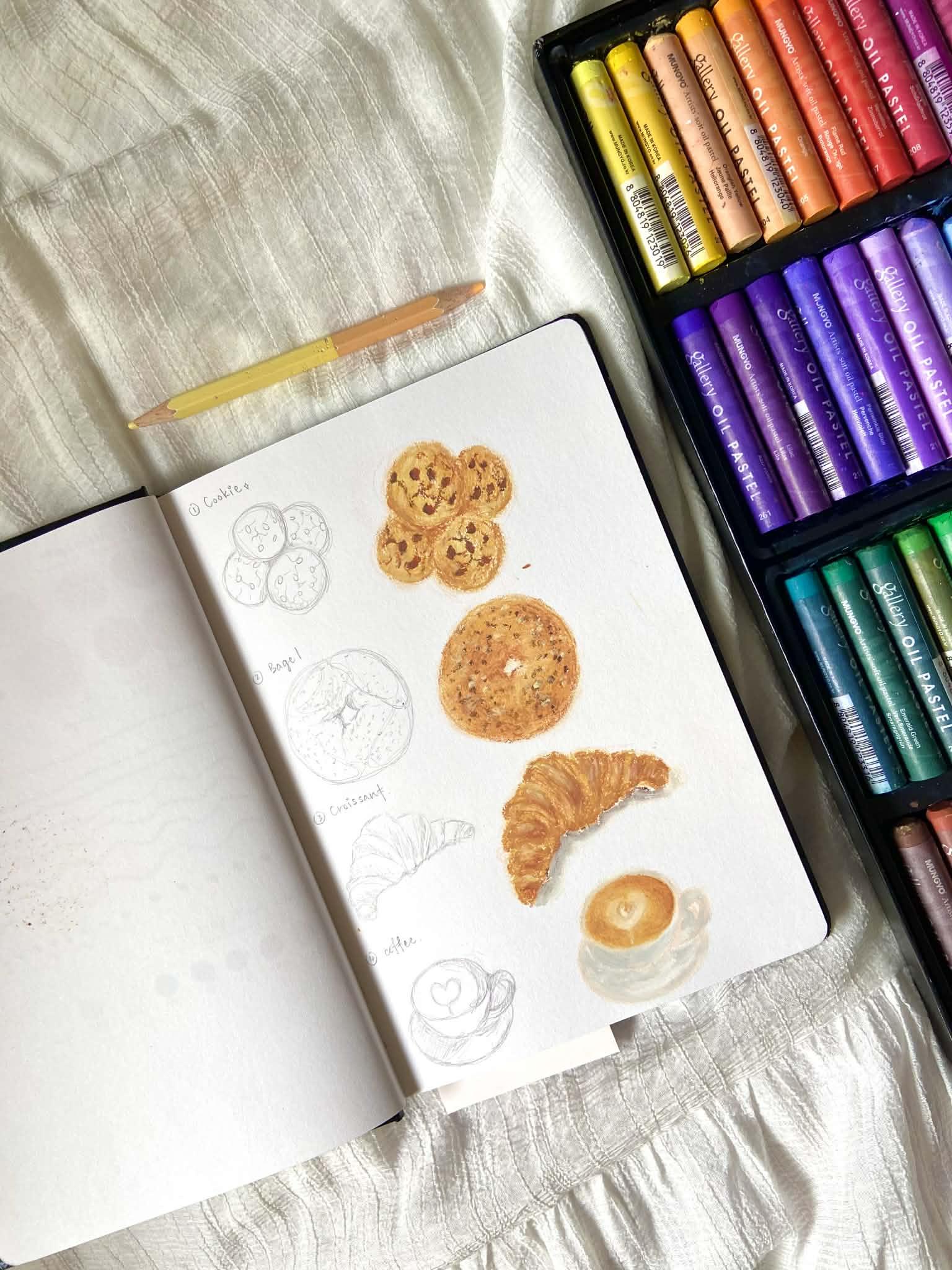
learn how to draw four cozy bakery items
using oil pastel. A cookie, a baker, a croissant, and a coffee
cup with latte art. You'll learn cross skill like how to sketch
simple food shapes, how to layer and bend
all pastel colors, how to create bake textures, how to highlight
and shape to make your food look
realistic and thready, and how to complete a full cosy decorative illustration
in your sketchbook. Learning this technique is incredibly helpful because once you understand layering,
blending, textures, and highlights, you can apply the same skill
to draw any food, object, or steel
life piece you want, not just bakery items. This class is perfect
for beginner and hobby. You don't need any
experience with oil pastel, I'll guide you step by step, and every chapter
is designed to be simple, approachable,
and relaxing. For tours, you only need a
few basic oil pastel color, a beige color pencil, a cotton ba, tissue, and your paper or sketchbook. I'll walk you through
everything from sketching basic techniques to building texture to completing
each drawing one by one. By the end of this class, you'll have your own set of
cosy bakery drawing and you feel confident
using oil pastel to create soft delicious
looking illustration. This class means a lot to me
because oil pastel helped me reconnect with the joy of creating art slowly
and mindfully. I hope it can bring you the
same comfort and creativity. All right, grab your sketchbook
and let's get started.
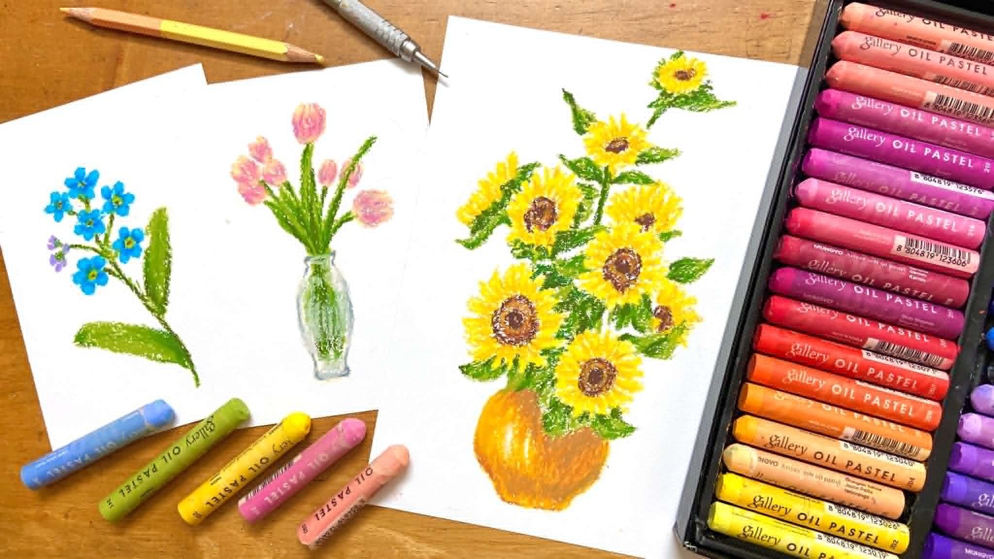
2. Tools: Before we start drawing, let's go through all the tools and materials you'll
need for this class. First, you'll need oil pastel. I'm using the Muno 72
color oil pastel set, but you can use any brand you already have as long as you have colors that are similar to the ones that we'll be
using in this class, which are pure ochre, golden ochre, burn orange. Rost, brown, silver
gray and white. Don't worry if you're not
using the exact same brand, try to find colors
close to this. Next, you need one beige
color pencil for sketching. In this video, I'm sometimes use a regular pencil so you can see the lines
clearly on camera. But I recommend using a Big colour pencil
for your own artwork. You'll also need an eraser, a tissue, some cotton
bud for blending, your paper or sketchbook. For paper, the sketchbook
I'm using is 110 grams. I recommend anything
100-10 grams to 165 grams. This range works very
well with oil pastels, of course, one of the most important tools is your fingers. We'll be blending a lot
using our finger too. Lastly, you'll need your patient and your willingness to learn. Take your time, don't rush
and enjoy the process. One you have everything
ready, let's get started.
3. Basic Techniques : Welcome to the basic
techniques chapter. Before we start drawing
our bakery foods, let's first learn how to use
oil pastel the right way. First, let's talk about how to hold the oil
pastel correctly. Don't hold it too
close to the top. Instead, hold it about three
quarters of the way down. This gives you better
control and help you apply the right
pressure when drawing. Now let's feel how
it's moved on paper. Gently color on your paper
using light pressure. Try filling a few small circles and keep your pressure
as even as possible. This exercise helps
you get used to controlling how much pressure you apply when using oil pastel. Next, we'll explore
blending with two color that will also be
using later in the class. Let's start with our
first blending method using a cotton bar. When you blend
with a cotton bar, you'll notice that it gives you more control over
the direction of your strokes and keep your blending clean without
going outside the area. This method is great for
blending small details. Now, let's test the
second blending method. Using your finger. Start with the
lighter color first. Then layer the
darker one on top. If you feel like the light
color looks too faint, you can add a little more. Then gently blend them
together with your finger. Uh, you'll notice that because your fingertip
cover a larger area, it's harder to control
the direction, so the color might
spread out of the shape. That's why this technique
is better for larger areas. Also, when these two
color blend together, they create a beautiful won tone that's perfect for
drawing bread, cookies, and other baked foods. Next, let's move on to layering. We'll use the same
two color again. Start with golden ochre, then layer pale ochre on top. Layering means ducking color on top of each other to create
tab and a more natural look. If you want the color to look
softer and more blended, just repeat the process layering both color again and again until you're
happy with the result. Let's practice this a few times. Now, let's practice
drawing line. When we draw, you might notice that the line come
out a bit thick. If you want to draw
thinner lines, look for the edge
of your oil pastel. While drawing, you can
also rotate the pastel slightly to help maintain
a thin even line. Let's practice drawing a few
straight lines together. Then you can also try curve or wavy lines to
loosen up your hand. Finally, let's
practice drawing dots. Press down gently on the paper in a small
circular motion. This creates small round dots, perfect for adding
cookies crumb later. If you want smaller dots, like for sprinkle or tiny
decoration on pastry, you can simply tap
your oil pastel lightly like dot, dot, dot. The harder your pressure, the stronger the
color will appear. The lighter your pressure, the softer and
fainter it will look. And that's it for our
basic techniques practice. In the next lesson,
we'll start with our first drawing
a simple cookie.
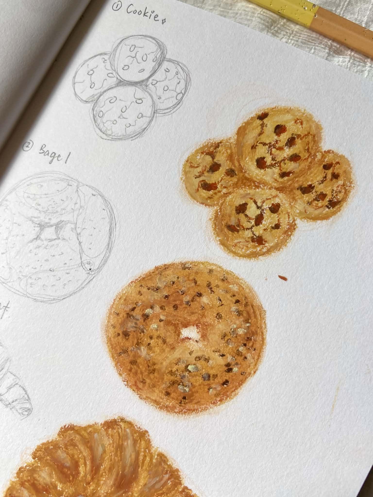
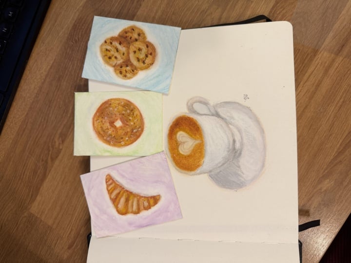
4. Cookie: Now let's start
drawing our cookies. I recommend using a
light color pencil, such as beige to sketch before
we begin with oil pastel. That's the color I always
use for my sketches. But so that you can see
more clearly in this video, I'll first demonstrate the
draft using a regular pencil, and then I'll switch to
the Bache pencil later. First, draw one circle and then another
circle just below it. Since this is just
a demo sketch, I'll draw mine a bit smaller, but you can draw your
larger if you prefer. Next, draw half a circle on the left side and another half
circle on the right side. When sketching, you don't
need to make it perfect. Just a rough outline is enough. We'll adjust the shape later with oil pastel as we colour. Now, let's add the
chocolate chips on top of the cookies and
a few crab lines. These are the big texture we
draw later using oil pastel. After that, likely mark
where the shadow will be. This will help us remember where to add darker tones later on. And that's it for the sketch. Now I redraw the sketch again with my beach
colour pencil. Et's start coloring. We'll begin with pale Okur as
our base color. Outline the shape first, then fill in the inside gently. Don't cover the entire
area completely. It's okay to leave
some white space. We add other colour
on top later. If your oil pastel
is getting shorter, you can peel off
the paper wrapper a little from the bottom,
not from the top. The top part shows
the colors number, so it's better to
keep that visible. Now color all four cookies
with this base color. It's totally fine if the
shave aren't perfectly round. Cookies that are slightly
uneven look much more natural. When you color all four cookies, remember to leave some
space between them. If you look at the
reference photo, the cookies overlap a little, but we still want to show that
they are separate pieces, not one big shape. Oce you're done, use your finger to gently
blend the base colour. Try not to blend
outside the outlines. If there are areas
that look too white, you can go back and add
a bit more pale ochre. Next, use golden ocher
to add the shadow. On the areas we marked
earlier in the sketch, it's okay if the shaded
areas are a little large. Apply the color lightly
without pressing too hard, then gently blend the
shadow with your finger. Don't blend them completely. Try to keep some
texture visible. If any shadow look too dark, or if you want to fix
the cookie edges, you can use pale occur
again to soften them. Now, use a darker colour, burnt orange to
deepen the shadow. You don't need much,
just a little. As you add this colour, blend it softly with
your finger as you go. If you make a mistake like accidentally smudging
color outside the shape, you can use an eraser
to gently clean it up. But this only works for
light marks or dirty areas. It won't remove
heavy pastel layers. Next, use brown to draw
the chocolate chips. Don't fill them in completely. We'll layer another
color on top, so leave a little space. Oh then use rose to go over the chips. This add that and warm
to the chocolate. Before we draw the cracks, let's add a highlight
using pale yellow. Apply it to the brighter areas. This will make your cookies look more tridy and realistic. Now, use Rost again to draw the crock lines
or bake setures. Use the edge of
your oil pastel to get thinalze just like we practice in the basic
techniques chapter. Don't press too hard. Then go over some of those line. Not all using brown. This gives the cracks more
variation and a natural looks. And that's it. Ours is complete. You can add a few
more small details or adjust the
shading if you like. Take your time and
enjoy the process. In the next lesson, we'll
be drawing a bagel.
5. Bagel: Before we start,
a quick reminder, please use a ***** color
pencil when you sketch. I only using a
regular pencil here, so it's easier for
you to see on camera. Let's begin with
a simple sketch. First, draw a circle. It doesn't need to
be perfectly even. Then draw a small uneven
hole in the center. After that, add tiny dots around the bagel to represent
the topping. And that's our basic sketch. Now, let me show you where
we'll place the shadow later. These are the areas
where we'll add darker color parts that are more bake or
naturally in shadow. These are also shadow
around the center hole. Okay, now I'll
start a new sketch again this time with
my beige color pencil. A When the sketch is done, we'll begin coloring with pale
or cur as the base color. After applying it, use your
finger to gently blend. Try not to blend
outside the outline. Next, we'll build up the
big color and shadows. Use golden ochre to create
the first layer of texture, applying very light pressure. Then use burnt orange
to add another layer, focusing on the darker big
areas and the shadows. Don't apply this color
over a huge area. Keep it smaller than
the previous layer. Remember to also color around the middle hole where
the shadow falls. I add some golden ochre to some part that I
think is not enough. Then use your finger to blend, but don't blend
everything completely. We want to keep some texture. After blending, you'll
notice the bagel is already starting to look
more big and realistic. Next, add pale yellow
to the highlight areas. Use your finger to blend while
you're adding the colour. Then use roost, which is a more saturated colour to increase contrast
around the bagel. Blend lightly with your finger. Add some of these color around the middle hole as well
to create some depth you can also add a bit around the outer edge of the bagel. Use eraser to erase if you have created smudge that you
make outside the bagel. For the topping, use
brown and pale yellow. Just tap slightly dot dot dot, making the dots uneven in size. When using pale yellow, because it's a
very light colour, it might be harder to apply, so you may need to press
a little harder or use the edge of the oil pastel to help the color go
on more easily. Finally, this part is optional. You can use a light
brown colour pencil to outline or refine the
shape of the bagel. For the final details, you can fix or adjust any
areas that look unfinished. For example, if the shadow around the middle
hole become too soft, you can add a bit more
burnt orange and then gently blend with
a cotton bud to soften it and make it
look more natural. And that's it. Your
bagel is complete.
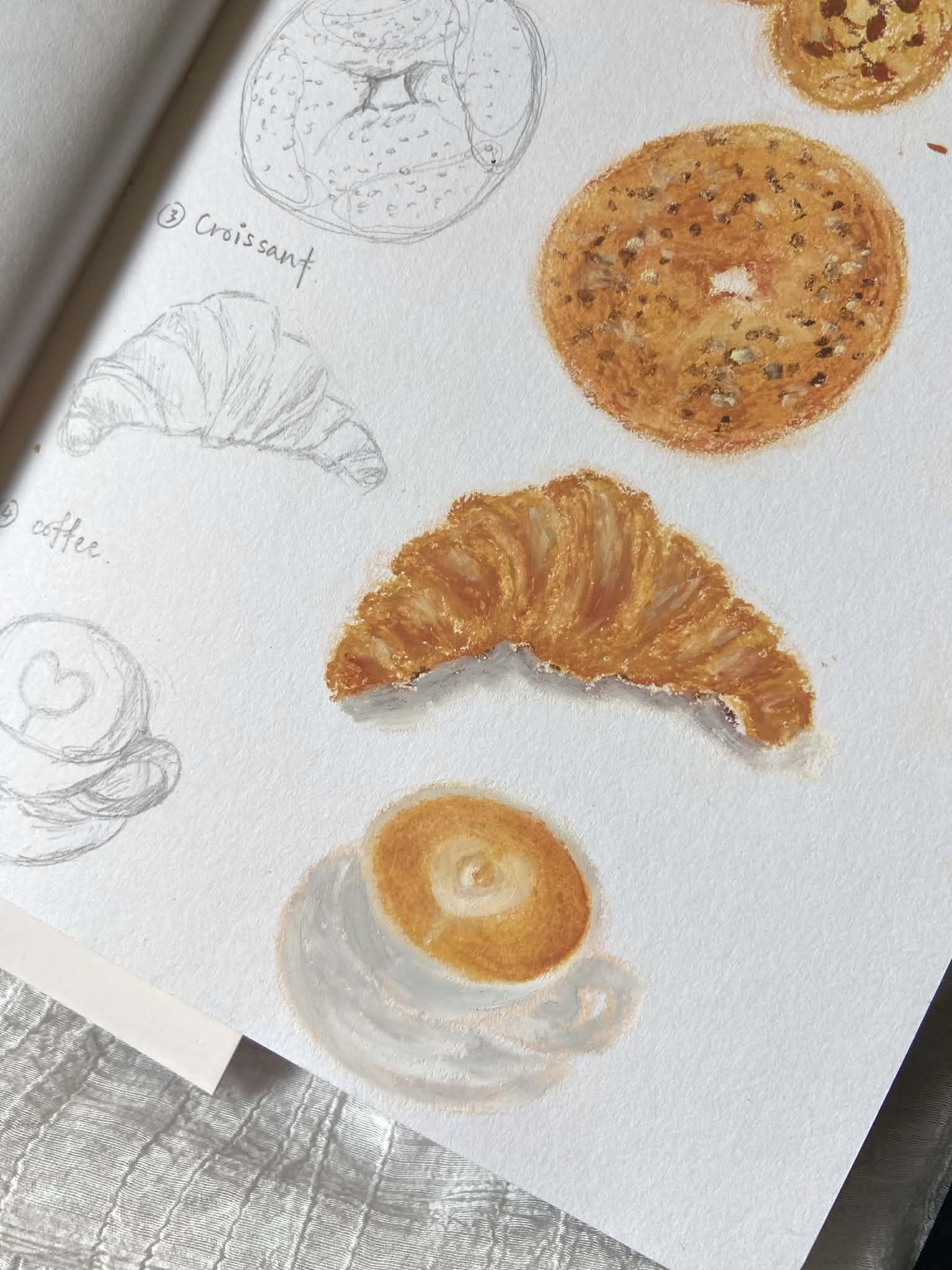
6. Croissant: Now let's start
drawing our croissant. Remember to use your beige
color pencil for your sketch. I'm using a regular pencil here so you can see
clearly on camera. First, draw a triangle shape, but at each corner, soften the point so it's
look round instead of sharp. Once you have the basic outline, start dividing the
croissant into section. Try not to think
of this as line. Instead, imagine the
croissant as three D shaped. Start by dividing the center, then divide the left
and right section. C Next, erase the original
triangle guideline. Slowly refine the
strap by following the natural curve instead
of straight line. Now let's look at the shadow. This area here will
be the shadow later where we'll add darker color to show depth and bake texture. Of course, when we
start adding color, this pencil mark will get cover, and that's completely fine. This step is just to give us a clear idea of where
the shadow should go. I always do this
before coloring. Now, I scan it again properly
with my beige color pencil. We'll start with pure OkalFs lightly outline
the Crosson shape. Then gently fill in the color. But remember, color it
section by section, not the whole croissant at once. This help you keep the
individual part visible. Balance slightly
with your finger. Then go back in with the
same color pear ocher, but this time, use
more pressure, not everywhere, just
in certain areas. This help define each section and make the outline
a bit clearer. Next, use golden ocher
to add more depth. You can also straten
the outlines a little. Take your time, try not to get confused by
all the sections. Don't colour the entire croson, keep some lighter areas, so the golden glow
underneath still show truth. Blend gently with your finger, but avoid blending the outlines
of the separation lines. Now use burnt orange. This colour really bring out
that delicious big look, apply it to the shadow areas, the darker bake parts, and some section of the outline. Next, use roost to make the croissant
look even more tridy. Apply it to the deeper shadows and the parts that
are more baked. Band lightly with your finger
to make it look natural. Then use Golden Ochre again
to fill any empty gaps and to help the color transition look smoother and more natural. Use burnt orange again to darken the shadow
under the croissant. So it's look more
rounded and dimensional. Now use pale yellow
for the highlights. Blend ely with your finger, so it looks soft and natural. From this point on,
you can stop anytime. The next step are optional. If you want your highlight
to pop even more, you can add a tiny bit
of white, just a little. If you feel you added
too much white, you can go back with pure
yellow to tone it down. If you want to add a grown
shadow under the croissant, use brown to add a soft
shadow underneath. Then add silver gray on
top as a second layer. And finally, use white to
create a smooth gradient. And now your croissant is
beautifully finished. Oh
7. Coffee: All right. Let's start
drawing our coffee cup. First, draw a horizontal oval. Then draw the body of
the cup underneath it. Connect the oval and the cup body together
with smooth lines. Next, draw the
handle on the side. Inside the coffee surface, draw a round heart shape
right in the center. And finally, draw the base, the little plate under the cup. Now let's look at the shadow. These are the areas we
will emphasize later, the shadow on the coffee itself on the handle and
also on the base. Don't worry, once
we start coloring, this guideline will disappear. They're just for
you to understand where the darker areas will be. Now I'll draw a fresh sketch
using my beige color pencil. We're going to use two
colour for the base. First, use pure co
as the first layer. Remember to leave the
heart shape empty for now. We'll work on it later. Use a cotton bud to
gently blend the colour. Then use golden ocher
for the second layer. Apply very lightly. Then again with a cotton ba. Now our coffee base is done. Use silver gray
to color the cup. Because the cup is
white in the reference, using white pastel alone
won't show on paper. Silver gray will help
us show the shading. Before you colour, make
sure your oil pastel is clean in case there are any
dirt or leftover color on it. When coloring the cup, do not fill the entire
cup with silver gray. Leave some areas blank
for the highlights. We'll fill those with white
later where the light hits. Then use white to colour
the highlight areas. You can also overlap a
bit of the silver gray to create a smooth transition
between light and shadow. Add some white along the
edges of the cup too. Use silver gray first to fill the shadow
areas of the handle. Then use white for
the highlight areas. Try to make everything
look smooth and natural. When coloring the base, leave a tiny empty line
between the cup and the base. This will help
them look separate and not like one solid shape. Use silver gray to outline
and colour the shaded areas. Please base for the
highlights and use white to fill those
areas. Bend smoothly. Okay. Next, use burnt orange to add a light shadow on
the side of the coffee. Blend it with a cotton bar. If you think the
shadow is too dark, you can always use pear
occur to soften it. Next, use roost or darker brown to gently
tap the shadow areas. Use a tapping motion,
not long strokes. Be careful not to
color onto the cup, but if you accidentally
do, it's totally fine. Just use silver
gray to cover it. And even if it doesn't cover
perfectly, it's still okay. It doesn't mean you mess up. It just means you're
learning and trying, and that's what really matters. Band again with a cotton bud, and like before,
you can always use Pear Oker to tone
things down if needed. Now let's work on the
heart shape in the middle. Use Golden Occur. Find the sharp edge of your oil pastel and
outline the heart shape. Draw a smaller heart inside too. You can blend this
with a cotton bar or leave it as it is. This part is totally up to you. Next, use white to color the
bottom part of the heart, push the white upward from
the bottom heart shape toward the top because the bottom area has the strongest
white highlight. Your heart shape might even less visible after adding white. Don't worry. Just use a brown color pencil to outline the heart
again if you need to. Then add more white where
you want it brighter. You can stop here
or keep adjusting it if you feel the
shape can look better. Lastly, I add a bit
more burnt orange around the coffee surface and
blend it with a cotton bud. Oh, and one more tiny details. Add a small white sauce coming down from
the bottom tips of the heart and maybe a little more white inside the
heart to make it pop. And that's it. Your
coffee cup is complete.
 Michelle Gooi, Traditional Artist