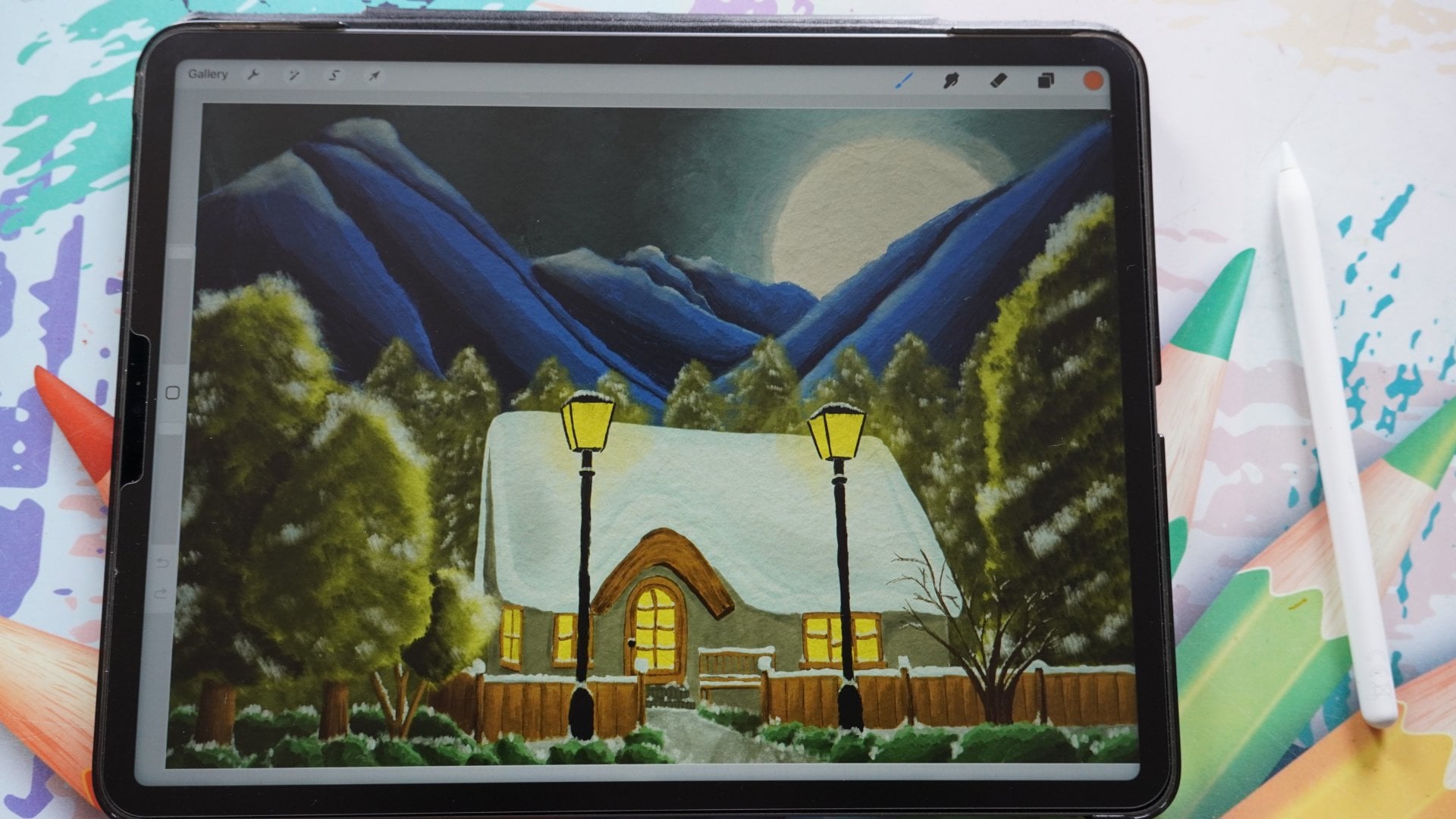
Transcripts
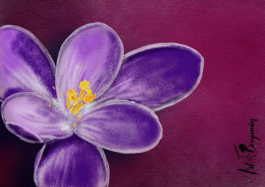
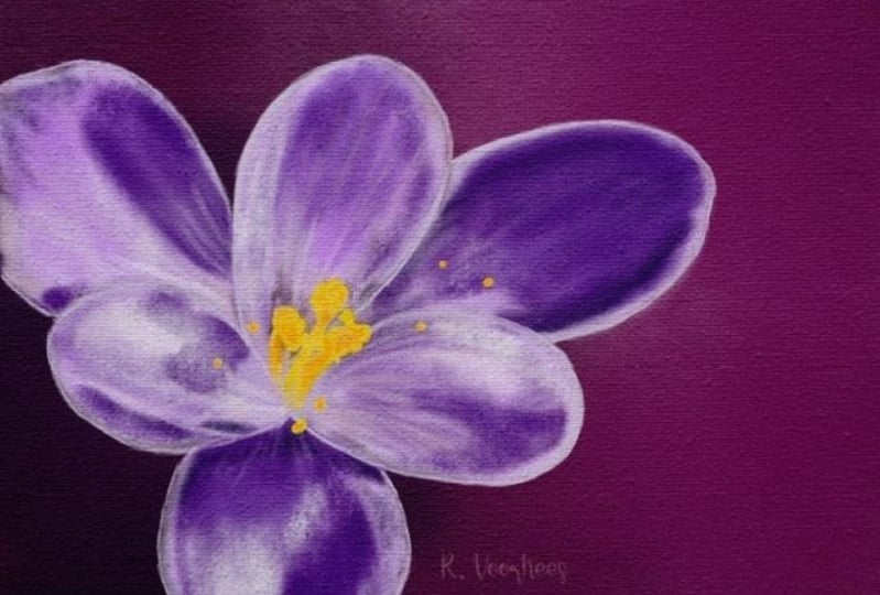
1. Introduction: When I look at site, I see some nice sunshine. See it's warmer weather because springtime
has arrived here. In springtime, all
these beautiful flowers are popping up everywhere. I went out just a few days ago, took some nice photos
of some Croesus. And I want to just make a
nice drawing with debt. Yes, I'm saying a drawing. We're not painting this time. We're gonna draw and what
we're going to draw if it's Chaco procreate
actually has some great charcoal brushes and I'm sure if many
people use them, but they're really fun
to use and you can create some really great
effects and drawing with them. Now that's not the only
one we're gonna do. We're gonna create a really
dramatic springtime image with some nice
contrasting background with some effects in it. Just going to have a
great picture at the end. Now when people
think about Chaco, they also thinks about
black gray tones, but we're going to
add color to it. And because we're
adding color to it, it's gonna look a bit
more like pastel, charcoal pastel with color. And we're going to add
some canvas effects to it. Because of debt is coming. Look pretty. It's sticking as if
you have drone that yourself with paper or
canvas in this case. And some pastels
mixing in some choco. When we're done, you're
going to end up with a beautiful spring
drawing to impress. Everybody knew show it to you. Alright, I'm gonna talk more. We're getting just go
and start with this. What I would say is go to the projects section first,
download the photographs. Once you've cut those
photographs in, we're going to start
drawing together, right? Well, see you in
the first lesson.
2. Preparing the Canvas: Welcome to this first lesson. We're going to paint beautiful
springtime flouted in it. For that, of course, we
need to prepare our Canvas, get some photos in, and then we can really
start painting and creating something really beautiful.
Let's start with that. I've opened the Procreate app already so I can
start right away. We're going to
need a new canvas. Now what I want to do
is I want to use an A4 and I'm going to create
an A4 size landscape. If you want to use
letter or legal, you have to get the measurements a little bit
different than mine. What I'm going to do,
show you how to do that I'm going to do plus with mine. There is already one, but
I'm not going to pick it. I'm just going to
create a new documents. And the dimensions I
want in millimeters. There you go. And then
the width would be off. An A4 is 297 millimeters and the height would
be 210 millimeters. I'm leaving the DPI on
300 in case I want to print layers is okay,
the color profile. You can pick whatever I'm using. Rgb, because when I
want to print that, it works the best
with my printer. But if you have a good modern new ink yet
I've got a laser, so that's why I'm
picking the sRGB. If you send it to an injured, you could do p53 time-lapse. I'm not going to
change anything. Canvas properties, I'm not
going to change anything. I'm just gonna say this one. I'm gonna call them A4 landscape so that I
know it for the next time. And I'm going to say
Create, There's my canvas. The next thing I'm gonna
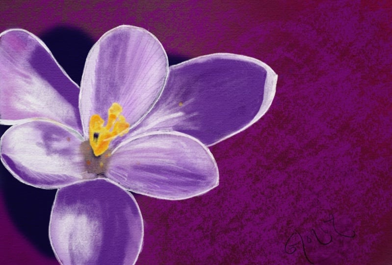
do is bringing the flower. Now, there's two flowers. I'm going to do instead of photo pick whichever one you like. I'm going with the
one from the top or the one with the one
bit under an angle. This one I'm going to work with. I'm just leaving it here. The next thing we're
gonna do is I'm going to tap on Canvas. So the wrench canvas, and we'll go and say
I want a reference, photo, reference, I
want the same photo. Now it is dead already. But I wanted as an
image because now it is from the painting we're making and whatever I
color and paint over it, that will disappear
and show up here. I'm going to say import image. I'm going to pick that
same flower again. There you go. I'm going to
move this to the sides. I'm using this later
on for my call us. I want to use that
for my colors. Well, the flower, the
next thing I got, the site is where I
want it to flow and I will definitely don't
want it in the middle. I want to have a bit
more dramatic effect. You're making sure you're
on the layer of where the flower is and I'm
going to move it. Let's put it up like here. I want it definitely larger. Disregarded other piece. I think I might want it here. I think this would create definitely the nice
dramatic effect. I want. I think I wanted like that. So this stays open, this part and I want my flower
right there in the corner, a setup my canvas. Now, what I'm gonna
do is I'm going to add one more layer
above of the flower. And I'm going to do the flower, I'm going to set its opacity to lot lower so that I can see
actually what I'm doing. And that will be 42%. That would be about good. All right, that's it. I've set up my Canvas, I've got my layers ready. I got the photo I need
for the columns later on. And that's it. I think I can start painting. All right, we'll do that in
the next lesson. Of course. In this lesson we've
prepared everything. Now in the next one
we're going to paint. See you in the next lesson.
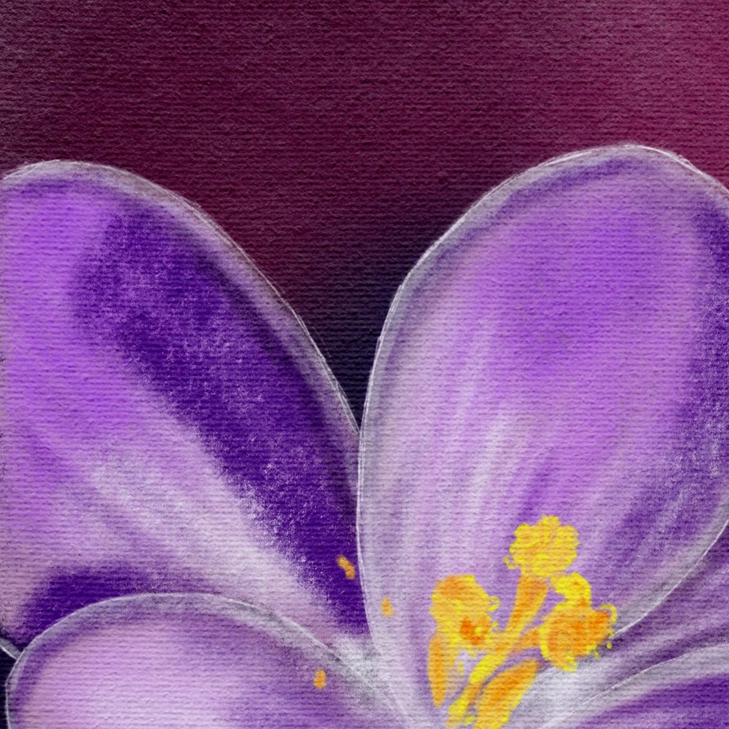
3. Drawing the Crocus Petals: Welcome to this next
lesson. We're gonna paint. Now normally I would
draw this flower, but we're gonna do this
slightly different. We're going to use what
we have already and start painting right away. No sketching, but painting
right away. All right, good. Let's do that. We've
got our canvas setup. One thing I do want to
do is lock this layer here so that I'm not
accidentally painting on it. So what we're gonna do is
we're gonna select the layers. Select the layer I want. Slide this over and say lock, this is locked now I cannot
accidentally paint on it. The next thing I'm
gonna do is layer two. That's where I'm
going to paint them. Now normally I would sketch a flower and then
start painting it. We're not gonna do that here. We're going to just use
the flower right away, this photo and paint
over the photo and then start working
from the reference. Now if you want to learn how to draw flowers and sketched him, I've got different
Skillshare classes for that. For now, we're just going
to make use of this flower. Now the next thing is we're
going to need a brush. We're going to use brushes
that Procreate supplies. And what we're gonna do,
we're gonna use two brushes. You find there the charcoals. We're gonna work with charcoals. Now we're not gonna work
black and white charcoals. We're going to add color to it. And that makes it
really special. The charcoal, I want to
use this various unit. I wanted to use this
willow charcoal. Let's start with that one. So select the willow charcoal, not like that of
college selected. The next thing is, let
me see a nice size. Let me try this.
What do I have for science that is a nice size. I'll show you what size it is. That is 5% opacity
or a 100 per cent, we need to color what
are you gonna do when you go to this reference? You're going to take your
finger, press on it, slide it over and pick
a light pink color. I've got to get to the
flower that is not pink. I guess this one would
work a nice pink color. What I'm gonna do, I'm
just going to go and draw over this flower. I'm going to start
just don't want to do these petals first. Draw them, paint them in nicely. Bit Around. Dh. There you go. Alright, Now, the
heart disappears. Notice no problem. We'll bring that back later on. And this is basically what I'm
gonna do with every petal. I'm going to do this with every petal paint
event like this. I'm going to speed up
podo. You can do that too. And once you've painted
all these petals in, if only the petals,
not the heart, then we're gonna
work on that hard. So I'm gonna do that now and
when I'm done, I'll be back. I've got that dish
flower already now. I will just paint in some of these nice colors
that are there. Okay, let's do that. All right, some colors. What I'm gonna do is I'm
going to pick some colors. Again with my finger, will go for that
nice dark purple. And we're going to look
mainly at the reference. So I'm gonna do is I'm gonna hide under one the photo for now and I'm going to just look at the reference
and we're gonna say, okay, I want some of that
darker color in there. I'm going to go to about 8%. And I'm just going to
nicely just bring that in. I stock color. There you go. A little bit around
the edge and I don't mind all these
patterns in it. That makes it quite
nice. Let's see. This one has that darker
color to this one. Basically I'm going to disregard light and shadow for this one. We'll get around that later on. Some dark color in here too. There you go. Let's see, I want
purplish color up there. I'm going to work on that one. Purple color. Yeah. It's kind of
purple, isn't it? As you can see, I'm not going
all the way to the edge. And I'm thinking that
would fit in nicely here to just gonna do some of these rough colors it has
begun next color for this one, this petal here, I'm getting a nice color
palette like this. Now this color, this petal, close to white and don't
want the white color. What I'm gonna do
is we're going to pick one of these
purplish colors. And then I'm gonna go do that
a lot lighter like this. And bring that nice light color. I'm gonna do two white
later on. All right. This one might bring in some of the color here to this one here. Gets it to a little bit
around the edge here, this one at the
bottom a little bit. The same counts for that
one. A little bit there. Light color in it that we go. All right. All right, for now I'm going
to leave it like this. In the next lesson.
I'm going to add a background to this
so that I can work on that Y2 because now we have totally white background and
we've got white background. We're not going to see how wise. And then when we're doing
the white background, sorry, when we're doing the background, we're gonna do too hard too. So in the next lesson, we'll do the background and the heart, and then we're going to work
on the petals some more. Alright, see you in
the next lesson.
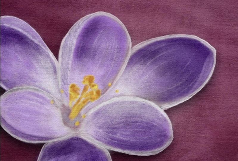
4. Creating the Background & Heart of the Crocus: Welcome to this lesson. We're going to continue with our Chaco crocus
flower paint painting. Calculate the painting them. Chaco drawing because chocolate, you draw if we have some
of the petals ready now, now I want to do the background
because then we can work later on to the petals and
use also the light colors. We do the background first and then once we've
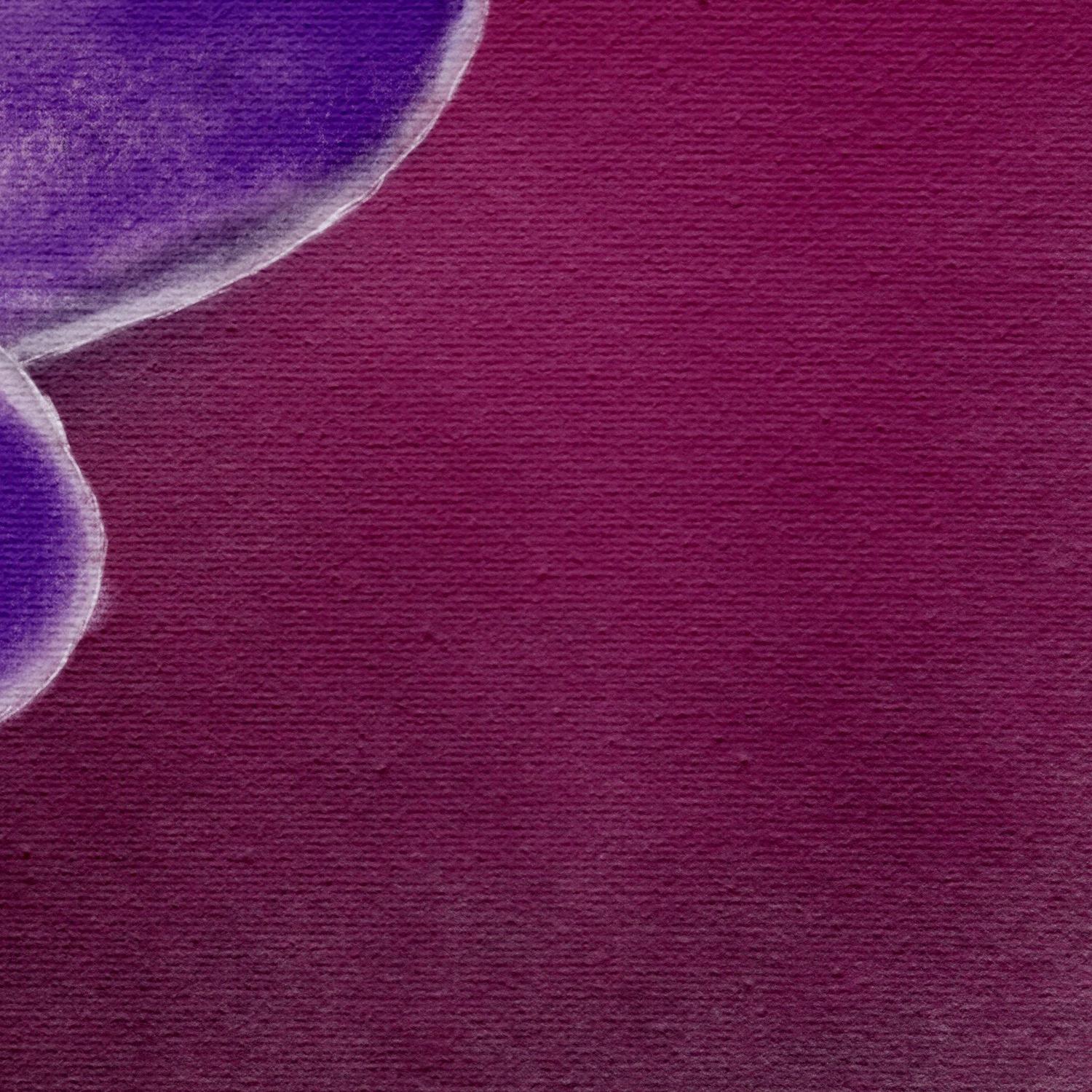
done the background, we're gonna do that hot. That's the background. Okay, so what we're
gonna do first, we're going to add a new
layer above the layer that we've locked
with the photo in it. So we get a new layer. Then we need a brush. We're going to pick
the carbon stick. And what we're gonna do,
we're gonna put it on a 400%, everything on 100%. Next thing we need to color, I want a beautiful
contrasting color. Going to the red OBGYN
a bit like that column. So what we're gonna
do them, select the column and I'm gonna
move this one up to the red, not indirect the border
of the pink and the red. Whereas getting a bit more
reddish, this is two pink, this is ready to, this
is to read around here. That would be a nice color. I'm going to slide this one over and pick around
color around. They're not too dark to light. And on this new background, what I'm gonna do is I'm
going to just stamp in. You need to stamp and
slide a little bit. I'm not pressing really hard. I'm just getting a
bit of that color in for nice dramatic
effect. There we go. That looks nice, that there's a nice contrast between
the other colors. Then I'm going to add
a new layer under it. So under the layer I've just
done what I'm gonna do. I'm gonna slide this
color over to dark, not black, but around
there I would say. And I'm going to add
debt color under it. And I'm doing basically
exactly the same again. I want this nice texture effect. I want to keep that go. And now what I want around here, I want some nice dark colors. This time I'm pretty
happy with this. I might do just slightly
darker around there. A little bit more
like that. Here too. If I add some more color, it will get darker. Anyway. I think I like
this as a background. Isn't that nice? I might want to have a light color around here. So I'm going to add another
layer between the two. I have already going for a nice lighter color,
not in the pink. I don't want to go into pink. I want to stay in
that reddish color. I'm gonna see if I can
add that a little bit. Right there. There you go. Now that looks nice. And what I'm going to do
here, I'm going to add a little bit more
darker color there. I did it on the same color. I'm sorry, on the same layer. At slightly darker and get
a nice interesting effect. Now that looks nice, doesn't it? We're gonna keep it
like this for now. Alright, now I can also work on that white
later on because at White will pop nicely off this page because of
the contrasting parts. Alright, well that's the
first part of the lesson. The second part I said, we'll be recreating that heart. We're gonna do that just now. All right, What we're
gonna do for that, I'm just simply going
to add a new layer above the one where
I've put the petals. And somehow I've did that already probably in
the last lesson, we are going to keep that
layer above the petals. We need a new layer. You could also rename
all these bottom. Not gonna do that. What I'm gonna do, I'm gonna
hide all the other layers. I'm going to bring back my photo because I need to
see a little bit. And of course, I want
my reference back, so I'm going back to the
Wrench Canvas reference. There we go. I'm going to just
paint in this heart. Of course I need a different
brush than I've been using. I'm gonna go good
willow charcoal or wouldn't go for the fine. I think I'll pick the
fine for this one. Let's go for the fine charcoal. Now we need some color. I'm tapping on the reference
holding my finger, picking a light yellow first. Let's see how large
is this sized, 3% first, it's good. Make sure I'm on
the right layer. Yes. That's good enough. All right. We're going to paint it in. I'm first going to do
same as with the petals. I'm just going to
paint shapes in. Then once I've done the
shapes, the rough shapes, I'm gonna go get a difference. Color in it. All
right, now let's see. I want some of these. It has these little
specs around here where I saw when I
took the photograph, there were a lot of bumblebees flying around and they made obviously a little bit of a mess which makes
it interesting. All right. I think I've
got that pretty much done. All right. What
I'm gonna do next, I'm gonna hide this layer. I'm going to add a new
layer on top of it. Still got that layer down. And what I'm gonna
do with this one, I want to pick a
really light color. I'm going to just zoom in. I wanted this color and
I'm gonna do these edges. And I might go with smaller 2%. And I'm going to just paint in these light colors
I see on here. You can clearly see them here. And I'm painting
them in roughly. This is a Chaco painting, so we're not gonna do details, but keep it a bit chocolate. Chocolate. So it isn't the word
management. I don't know. This one a bit more, of course. Now I'm also going
to the edges with this one really. Here's an edge. We're going to do these edges nicely where these
lighter colors show up. Some. All right. Now in the layer of the photograph
we have on here, because we lowered the opacity. These parts look
really almost white. But as you can see here, they're not white color. We've got that want some
around a little bit here. And some there. Getting some of these
lines in little bit here. There it is a bit lighter too, but that has a different color. So what I'm gonna
do, I'm going to pick the different color. Add that little bit to it. Alright, now I bring back
that layer under it. See how you get
that nice effect. Let's hide the photo. Bring back the petals for now. See, now, that looks
great, doesn't it? There's a bit dark
orange into two. We want that too. So on the deadline layer between the bottom layer and the
light layer of the heart, I'm going to add another layer, bring with the photo
height is petals. I'm going to go for
that really dark color. If it works, there you go. Yes. I'm going to look
the photo because I don't see that anymore
on my photo here. I can, I can hide that
petal, the petals. I'm going to leave the
light ones on top of it. That works now I can
see it a little bit. I'm on the wrong
layer. It tells me that that's why we There we go. It wasn't in a locked layer. And I'm roughly adding this darker color at some
of the places like here. There's definitely
darker color in it. Not pressing really hard. I'm just letting my
pen slides some here. This will be slightly dark
to very careful in here. Does it a little bit, I
think I might do some there. Let's see if we can
pick another color. Depth one that is less
orangey and that is good. Put it in there, put
it there a little bit. Little bit in here. On
the hair right there. And I want some, I think if we bring back the
heart now and the petals, we get something really nice. So I want to check
these spots there. Now. These spots, we want to add
some extra color to them. Alright. Let's hide the photograph. There you go. Now,
that's suddenly looks. If you look at it, very
detailed, doesn't it? Just add some colors
here and there and you get great effects. I want to bring back
the background and now you get that nice
dramatic effect. Let's hide this sketch for now. See, This looks nice
and details already, even though you and I know
there's hardly any details. There's just some lighter
and darker effects. And that's the same we're
gonna do in the petals too. And then we're having a nice
springtime drawing already. Alright, well, that's that part. We've got our background,
we've got our heart now, the next thing is we
need that same kind of details into the petals. We're gonna do that
in the next lesson. See you there.
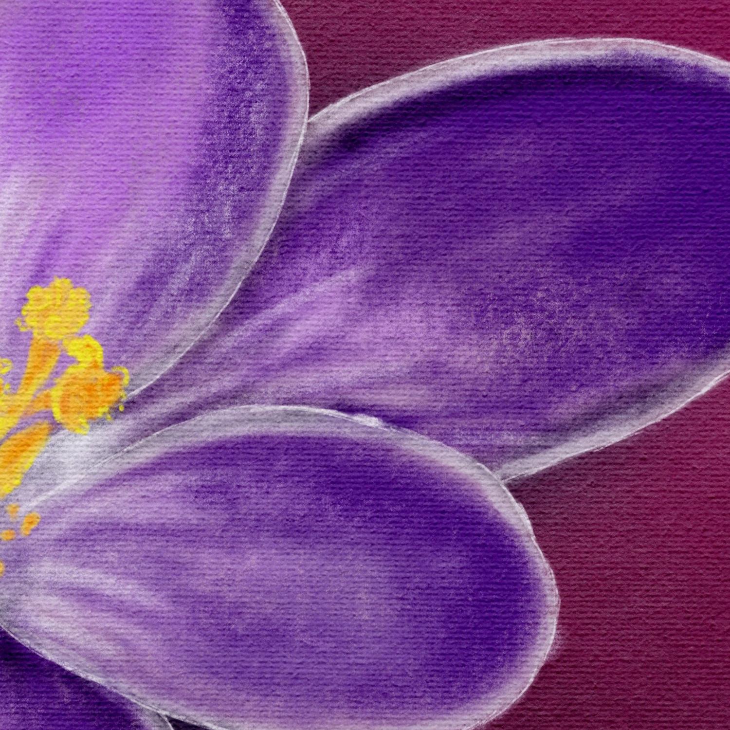
5. Drawing details in the Petals: All right, welcome
to this next lesson. We're gonna do these petals. We're gonna work
on these petals. Fomo get that same kind of level of detail as we
have in the heart, making it pretty all right,
let's start with that. Well, Let's see, how are we
going to keep this here? Why not? It doesn't matter. No, no, we're going
to hide everything. We're going to
exactly do the same actually with the petals. I'm sorry. If the heart, we're going to
hide this for now. We're going to hide
that background too. We want that photograph back. And we won't even
our petals come. What we're gonna do
first we're going to add a layer above our petals. And we're gonna get
that photograph back because I want
the real colors. I might slide a little bit. There you go. Now what we're gonna do, we're gonna pick that white color. We're going to start
with that one. Whitish color. I've picked
a white color holds. Well, I'm going to
use that same brush. I've got defined Chaco. I might keep the same two
free percent, that's good. I'm going to just
paint in these edges. I want to start
with those edges. Might be slightly
to fit this brush, but I don't mind. I'm going to make
duties edges first. Now, I'm noticing my brush
isn't totally white. So what I'm gonna do before I
do everything at this here, I'm going to stop here. I'm going to bring back
my petals under it. And I'm going to
do this and we're gonna see if this
is wide enough. Yes, this would
work fine for me. All right. Good. We're going to continue. So I'm just making sure this is what I want and the
color is wide enough. What I do want though is
I want to clear this. I want to put this
a bit smaller. I think 2% is nice. I'm going to add these edges in. All right? Good. Continuing here. Unless you can see for now, just doing the edges, I know that I like this 12. I'm gonna do this
one here lightly. There you go. Next
one is this one. There is an edge
going around there. This is a false,
so we're going to bring in that folder later on. Want to zoom in a
little bit better. There you go. And this one
we need to light color. All right, now once round
here to roughly you go this one to around here we got that
doesn't go well, missed it. Then this one, this
one has a fold to, so I'm going to do this fault. This one has a bit of shape. Alright, we go. Now. Here we go. Now I want to do this one
here. I forgot that one. I want to bring my petals back. Once I've got under it. I'm going to hide this for now. I'm gonna look at it, say
right, that looks good. But what I want to
do is where I have these white spots going to
bring back my background. You see the dark
background coming through. I really don't want that. I want to do is
I'm going to lower the opacity to about
50% of my white color. And I'm going to blend this in a little bit on the edge here. That dark color is gone. We're gonna do that here too. A little bit on these parts. Little bit with
the opacity down, make it a bit nicer. Here too. I've missed something
there. That looks good. To me. A bit of an extra edge
around here to height that that is under it. Creating a bit of a kind
of extra dimension. Go outside here too. This is a bit sloppy. I see one, I totally forgot. See that. Some more here. That's starting to look great. On some here too, obviously. Some there. Alright, want
to work on that later on. But better. I got
to do this one. Hiding everything again, bring
back my background, right? I totally forgot that. Put it back on 100%. That edge. There we go. All right, good. Now I'm going to do
exactly the same, bring it back to around 50% and add that little
bit of extra etch. Make it a little bit
more interesting. We go. Now we're going to
look at this petals which have these
lighter particle will bring back my petals. I'm not gonna do that. I'm going to go for
that light pink now. It is, I'm gonna bring that in. I might just do a new
layer above the petals. I'm going to bring
in a new layer with the same fine charcoal. I'm gonna keep it on 2%. Probably I'm gonna keep
it on 50% for now. Might go to the 1%. I'm just going to bring in
some of these lines. A bit hard to see, probably
feigns that you see. But if I bring back
the petal now, you get this phase, you see them a lot more clearly. All right, we're gonna
keep going with that. Let's say we do
want that here too. Actually a bit more
white in here. We're gonna go with, this
is really a lot of white. I'm gonna get a larger
brush free percent that color to it. I'm looking at how the
shape of this petal. That's what I wanted
to say here too. With this one. Obviously,
quite some white in a two. Good at it, slightly
more here too. Let's look at this one. This one has it mainly
clear with the bottom. What I'm gonna do now, we're
gonna need this white here. We're going to use
that same color. I'm gonna get that brush larger. And I'm gonna just
add that here. And when we bring back these, this heart, this will be okay. Let this color go into here a
little bit to around there. That's too much. Let's see where we're at now. Petals back, hide
the background. The foreground going
at all the stuff in. And let's take a look at it. And we're here now.
We're getting here. Only here. We need definitely some color. And that is because light
is shining on this part. Probably a new layer. I want that white in it. I'm going to go to the
willow charcoal Beck again, not that large, please. Percent. What are we good. Carefully, I'm going to add that I'm not going to
press hard like that. Then you get these stripes. I'm just doing it really carefully now I'm getting
that highlight in. We're gonna do the same here. Some nice bright strokes. Let me check that. Here it is two around here. Around that edge, a little bit. Down there. Up there, and around here too, we have some of that white. Alright, now, we need
to do a little bit. I'm going to just add
some of the lights in the heart with smaller
brush free percent. Spread that into the
petals a little bit. There we go. All right, now that's starting to
look good, isn't it? Let's see. We need
some here, probably. Some of that color. I'm going to add some of that. Dare to right now. We've got that. All right, so we've got our
lighter colors now. Let's see, we need
to bring back some of those darker
colors in a minute. Let me first see
if I'm happy here. If I am. There we go. It looks
pretty nice, it doesn't it? Now, we're going to
bring back some of the really dark color. I'm gonna do that's around here. On purpose, I'm picking
a darker color than it is so that I get a bit
of a nice contrast. Going see, and now you
get that nice folds idea. I'm going to bring in some of these shadows to arounds here. Slightly larger, 7%. This edge a little
bit to the ego. Now we're getting some
nice dark contrast. We're gonna do the same
rounded edge carefully. I want some more
dark color in there. I want some hint
of dark in here, especially around that corner. Carefully see, and now it's
starting to look really good. Let's see. Do we want here? We want some here. There's some there.
It's not that dark, but we're gonna do that dark. And we're gonna make
this a bit dark too. Just for a dramatic nice effect. Let's see now here we've got an obvious shadow
to from this petal. I'm just going to paint in
roughly around that shape. There's some up there too. Then we have the shadow
of this shape here. I'm going to just bring that in. But let's go to rough. I wanted that strong. What we're gonna
do with this one, lower the opacity 45%. I'm gonna do that again. That's better. Do some
in-between. Here too. Once some around they're going to lower my
brush free percent, uh, once some here too. Now what we're gonna look at it, I'm gonna say, all right, that is starting to
look pretty nice. I need a total overview. All right. I want some. Lines in there with that
same opacity, right? That looks better. I'm gonna
do the same right here. Bring in some lines, mainly at the bottom to create a little bit of a
sense of shape. Today you go. I'm gonna
do that right here too. Although we've got that
pretty much depth, but this one we don't see, petal has this shape. I want to do that here too. Bring in a little bit
of shape carefully. All right, now I just want a
bit of shadow on the hair, a bit more shadow over there. I want some shadow
on the same hair. Awesome shed out. In its day. You go dairy go, That looks a lot
better, doesn't it? Alright, so much add
some shadow right there. Some shadow on the hair to create the
impression of a fault. That's what we're
basically doing. By adding some shadow
around the edge. You're getting the idea that
there is a fault there. There's a little folder,
we're gonna do it. It just basically making
this very dramatic. How about that? We want some really
dark color around here. So I'm going to slide
it to a bit darker, plain color and day one that affects that same dark
color effects there too. Right? That looks better when it's shadow around there too. Now we're bringing
in some nice shapes, some nice folds on some shadow around there
too. There you go. We're gonna do that
around here too, just to create great
shadowing effect. Doing that at this bottom here. Bringing in a bit
of that dark color. Here to there you go. Giving the impression a
little bit of some shadow. Going on here too. Just adding to the
really dramatic effect. All right, Good. Now let me hide for now
this reference again, we're looking at it, see, looking pretty nice
already, isn't it? All right For this lesson, we're going to
leave it like this. In the next lesson,
we're going to add some final touches. Make it probably
even more dramatic. Display a little bit
experimental little bit, and see if we can enhance this
even more as we have now. Okay, so I'll see you
in the next lesson.
6. Making the Drawing dramatic: Welcome to this lesson. We're gonna do some
final touches on this. We're going to see
if we can make this really dramatic pop a little bit more
than it does now, just do some final touches. We're going to
experiment a little bit. Whatever I'm gonna do,
somethings may work. Some things may not work, but we're just going to
discover that together. All right, let's do that. First thing I wanted to
do, I'm looking at this. I want to do something
with that edge. I'm going to go to that edge. I want, I'm gonna do is I'm
going to lower the opacity. And C. This is too strong. What I want, I want to blend in a little bit
better than it does. I'm going to about 66%. Now I liked it. Now the next thing
I'm gonna do is I'm going to add a layer
on top of that. I'm going to just
pick some white. I have that purplish already, so I'm gonna go to the
really wide column. The next thing we need is a pen. We're going to go for
the fine charcoal cut that selected already. I want to put it on one
per cent, really small. Now, one thing you may
notice with this charcoal, I'm going to decide
it does this. If we're going to hold
my pen up straight, it makes these really fine
lines like a charcoal will do. And if you go to
get rid of that, we're gonna make
use of that clear. All right, we're
gonna go to the edge. So I'm gonna hold my
pen on this new layer. I'm going to add these fine
lines around the edge. Make sure you don't tilde it, hold it pretty much
a bit straight. That makes it really nice. Just sketching in. I don't mind that this is
really rough day you go onto. Gives me a really nice effect. Here to make sure that my
petals are really standing out. You can clearly see where
they're going and I'll just do that with all of the edge. Now I noticed this pen is, charcoal is quite sensitive. If I till it too
much right away, you get that thick line. I'm trying to really
go around the edges. Now. I'm just bringing in
just some final details, some definition that
you can clearly see where these petals go. Now look at that, that
is the nice effect. I want petal there too. Let's see how far
we got this one. We're gonna do this one here. That's too much
tilted a little bit. Let's go for this etch. See if we wanted to like that. Yes, we want it like that. That looks great
as another fold. Doing the same here. Regarding the folds. This one, we're just going
outside again. There we go. Got to put it up
the right sideway. Let's see. Did I get it? Oh, these two touch this one. Touch there to this one. We might just bring like that. That looks a lot better
and there's one more here. We go. All right, just a
little bit more there. Now we've got a nice effect. Let's see, spring
back that photograph. Let's look at that one. No white and we're
going to leave it like this one some more. Let's see if we can do that
when we go to about 4%. Just carefully. Some more of that. Widen it. Not everywhere. I think that is good. One, some around here. Just for the effect a little bit there. Just some small little
touching it up. Day he go. I think pretty
much like it this way. Height that again,
I'm looking at this. I'm going to say I might
need a little bit white. Yes, that creates the
better effect around that. I want that to go. A little bit of.
Background comes through when I don't want that. Good. I think I'm done with this. The next thing I'm
gonna do is bring in a canvas on it just to
see how that looks. Probably seen with the resources that the rider photos
and also some campuses. And you can download
those and we're going to play with
those a little bit too. For that we're gonna do. Make sure we own that top layer. And we're gonna say
same as with photos. And there's a number
of references. I'm gonna pick this one. And whatever it is,
just the canvas. I'm not even sure
which one does this. You can experiment a little
bit with all of them. I want to make sure it fits. I'm dragging it around. Now it fits nicely. I'm tapping on the arrow. Now my whole drawing is gone. What I'm gonna do
with this now on the top, that's inserted image, this inserted image, I'm going
to duplicate the top one. I'm going to say,
let's go for multiply. Let's go for about 50%. Then the underworld, the one
under it we're gonna do on, let's say Color Burn. Got to find my Color
Burn so that it brings in that Canvas effects. I'm not sure how
strong I want this. All right, and now look at that. Now you can clearly see that Canvas effect through
it and just giving it a whole different look
as if you worked on a real Kansas City,
Kansas effect. It's just a photograph I
took of a real canvas. You get that whole idea and you can determine how
strong you want this. If you do multiply,
only you get this. It doesn't really burn it
in there still the effect, but you're not getting
that real depth effect and that is why we
need that color burn. So if I'm not gonna switch
the color burn and you get an effect as if this is
really has some depth to it. That is just the
finishing touch. I think I like it like this. You could do it
stronger, of course. Strong as you'd like. That makes it a really dramatic. Pretty cool to see. Did you get all these
Canvas effects in it? Just finishing touch
we need with this. And if you play
with the opacity, It's going to get darker. You get a really dark
image like this. And I think the effect
is really nice, but too dark, I would say, that's why I want
this one to go a bit. Downloads 65, my weird. I think this is really
great seeing you get all the Canvas effects
in it, and that's it. All right, I'm done playing now. You could inferiorly
go one step further. It could bring final shadow
to this in the background. We could do that, alright, but we're not gonna
do it in this lesson. We're gonna do an
additional lesson. Let's do that. Let's
close this lesson. If you don't want to do
that, the shadow part, then I would say you're
finished, it looks great. Now, I'm gonna do one step further and add a background
shadow in the next lesson. See you in the next lesson.
7. Adding a Background Shadow: You've decided to come
to this final lesson. We're going to play
a little bit more of this and I'm
going to bring in a background shadow
on us if it is on the canvas and make that
flower pop a little bit more, at least, that's what
we're gonna try. Fury, we're gonna
make see if off, if the theory works
in practice too. Alright, let's try that. Okay, we've got
this whole drawing. What do we need now?
What I'm gonna do? I like it this way. I'm not, I don't want
to destroy this, so I'm gonna do, I'm gonna
go back to my gallery. I'm going to look at this image. I'm going to slide to the left. And I'm gonna hit Duplicate. Don't hit delete and it's gone. Duplicate. That means that this
one I'm keeping this one I'm going
to experiment with. I want a bit of a shadow. The background. What I'm gonna do with that
is I'm going to let me see. I'm going to keep all of this. I need those petals. This seems to be now
let's petal layer. I'm going to select
the first petal. Then I'm going to,
from the right, from the left slide
to the right, select the other petals
part to this part. These are all the free
petal parts I need. That should work. But
then there's this. Let's select dish with it too. Let's select all the whole thing though older, the whole flower. Once I've selected all the flower elements,
I'm going to say group. This group I'm
going to duplicate. I'm sliding to the
left, say Duplicate. That's great. Now, this one, this group, I'm going to say
flatten, there you go. Now I've got two of
them before as well. If I would move this around, see, there's another one. Yeah. Actually do want to move
this because I want this to serve as my shadow behind it. I want to put it. I would say
right there, that is good. Now this looks pretty
weird, doesn't it? All right, so we're gonna
do something about that. I'm going to almost color doesn't matter
which color you have. I'm going to go for a nice I don't want to black
column what I wanted. So I'm going to slide
this to the blue. About this light blue here. I'm going to select a dark
bluish color right there. That will serve me well, I think Let's see a bit darker. That's good around them. A dark blue color. All right, next
thing I'm gonna do is I'm going to hide
the whole flower. I'll have only that
flower I flattened. And we're gonna say alpha lock. I'm going to pick
whatever I want. I'm going to pick the
compressed charcoal block. Let's pick the book, put it on large. Let's go. Because I put it on Alpha Lock is going to be
nice and dark like that. Looking good, nice and dark. Now, if I bring back my flower, you get this nice shadow effect, which is way too strong. What we're gonna do first, I wanted to be a bit blurred. So I'm gonna go to
the magic wand. I'm going to say caution blur. And it tells me slightly
adjust. I'm going to slide it. Let's see if I can
have won't work. Because probably on
the right layer. This won't work because Benjamin forgot to put this
on off alpha lock. And alpha lock prevents anything to go outside of
what I've drawn. I tap on the layer, I'm gonna say alpha lock off. Now we're gonna do exactly the
same again, gaussian blur. And if I slide now, right, there we go. Now that's a bit too crazy. I would say this is
pretty nice already. About 20, 30%. Yes. And I'm hitting that
thing again. And there you go. Now, I'm gonna hide this. It looks like this.
I'm bringing it back. And I got that nice dark effect. And I think I might just
even leave it like that, not even change the opacity. We could try that of course. Even say darken. That will be nice. Multiplying you could
use to darken, multiply. A little bit less. Don't forget medicine much. Let's go for dark. And about 67 in a
sense, There we go. I'm just getting a little
bit of a nice effect on it. And that is it. Alright, yes, I do really like this. Let's switch it off again
without and with now I liked the effect gets you that adds
a little bit to detention. Brings that flower
a bit forward. Yes. This is good. All right. That's it. Now I'm really going to stop with this enough experimenting. My drawing is done. The only thing that is
left is the project. Yes, of course the project. Okay. I'll see you in
that last video then. See you in the last video.
8. The Project: Let's talk about the project. Now. What I would like you to do is when you finish
this class to post it posted in the project
section so that everyone can see your results
and we can all enjoy that. That will be the first project. The second project,
what you could do, there's some more
campuses with it. And you could
experiment with those to do some color burn,
some dark effect, lighting effects, and just
try out and see what happens if you do different of these layer effects
into the Canvas. You also could pick that other flowers is
the second flower. And just do this again, pick some other,
pick that flower. You might even change
the colors on it. Pink college, some bluish. Now that's not the
Canada Benjamin. There are no blue caucuses. Some pink, some whites. You can do that, Jim, yellow, of course, that's a
real crocus color. And just play little
bit with that too. Even change the
background colors too. Like we've now done a
dramatic gene reddish color and just create some
really heavy sprinklers. Yellow and green nation. Or you could change that to
display a little bit with it, change the colors and
see how that looks. Alright, so the project
is basically a little bit of experimenting with it or do a second one with
that all the flower and just give it some
different colors perhaps, and just have fun with this. All right, good, That's it. Well, thank you for being
with me in this class. I really enjoyed it,
really creating this nice Crocker springtime with
a bit of drama to it. I really, really enjoyed it. If you want to discover some
more classes on Procreate, I've got plenty here for
all kinds of subjects. I'm sketching,
painting in some form, even doing some illustrating
some cute figures. There's quite a number of
classes I got already here. Make sure you follow me
to here on Skillshare so that you know when
I create a new class, and if you want to
see what I'm up to, go to my profile
and just follow me on Instagram, for example. And then you see what I'm doing. I'm doing a lot more
than appropriate only kinds of projects. So if you're interested in that, just go to Instagram.
Follow me there. Alright, well, thank you
again and enjoy the project. Enjoy creating this. Really looking forward to
what you have created, please post it so that
I can enjoy it too. Alright, see you
in another class.
 Benjamin A, Art Teacher, illustrator Art by Benjamin