Transcripts
1. Introducing the Class: Welcome to go wash,
Procreate postcards. In this new series,
we're going to paint, as you can guess, some wash
postcards in Procreate. We're going to go through
various seasons in this series. And in this first-class, we're going to start with, we're going to paint a quick impressionistic wash
painting in procreate. We're not going to paint a highly detailed paintings were radical to give
me progression of the landscape and paint that on the one week from reading. Now for this series,
you do not need any experience
painting and drawing, not even in procreate. I'm just going to walk you
through everything you need to be able to create a beautiful
car wash painting input. Wash painting is a lot of fun, but we're going to add a little
bit of a challenge to it. We're going to just paint with one brush and limited
set of colors. I'm going to show
you that one brush Procreate already has provided
and just a few colors, you can create a
beautiful, lovely. Now as usual, I'm going to
take you step-by-step through this process and show you how
I approach painting. Wash. Well, I ready for some fun, ready to create a
beautiful postcard? Ready to start a
series of postcards? Then I would say, move to
the first lesson where we're going to start out and
enjoy painting together.
2. Starting up: Welcome to the first lesson. We're going to start
up our painting. For that, we're going
to set up a campus. We're gonna do a color palette. I'm going to show you how
to create a color palette. Really easy. I'm going to show you which
brush we're going to use. There's actually only one brush. And then we're basically
ready to paint. Now attached to this class, you will find the photographs
are used as a reference. Also, you will find my sketch, and you will find the
finished painting. In the next lesson,
I'm going to show you a little bit
about sketching. But if you do not want
to do sketching at all, then you can even
skip that lesson and dive into painting right away. Okay, let me first
show you how to set up everything to
work in Procreate, you obviously need a iPad
that supports Procreate. I'm using the Apple pencil. You take that with it, and I've already started procreate. Now attached to this class
you will find two files. One is called Winter
gouache postcard US, and one is called Winter
goulash postcard, EU. So one is for the
European Union, one is for the US sizes,
the postcard sizes. But what I've done,
I've unlatched them. So postcards is smaller. So my post US postcards, e.g. is 12 inch by eight inch one. Normally it will be
six by four inch, I think, around that size. And the U1 is to 920, 9 cm by 21 cm, while that would be
ten by 15 cm normally. But in case you want to just
decide to print it larger, you can do so scaling
down is very easy, but scaling up, we'll just
give you some quality issues. So we're going to work in
a slightly larger size. All of these are set on 300 DPI, so they're good to
go, good to print. And I've set that up. I'm going to work
in the EU size. The other thing you're going
to need is photograph. And there's two photographs
with this class. This is the one
we're going to work on and there's a
second photograph. And this photograph, this
one is for the projects. So for the project, you can paint this one, but for the class, we're going to use this one now. Actually we're not
going to use use it. I'm just following
this as a rough guide. So let me go back to procreate. And I'm going to start
the European size. And you can work in the US size if you need a different
size than that. Or of course you can
make your own size. And I've set up this sketch already so we can start
painting right away. If you don't want to sketch. If you just want to
go paint right away, then I would say skip the first
lesson where I'm going to show you a little bit about sketching and then go
to the second lesson, but stick with me for now. Aside from the sketch
and the reference image, we're going to need
a color palette. Now, I've already prepared
one so you can download it, but I'm going to show
you how to create your own color palette
by using some cops. We're gonna do some codes. I've got it here. But
the first thing you need to do it, you
need to press this. So you press on.
Bring your palette stop by pressing on the
color that is chosen. You hit this Plus and you
create a new palette, whatever palette
you want to create. Now, I'm going to go to
the old palette because I need these numbers, but you have now
an empty pallet. So I'm going to pretend
my palette is empty. You press on the disk
again, you get here. The next thing, instead
of working on the disk, what you're gonna do, You're
going to press value. You see all kinds of sliders in numbers. We can ignore them. We're going to need this
here, the hexadecimal code. So my black is one-by-one. We won't be, I'm going
to remember that number. I'm going to change the color
there to a different color. What you're gonna do is
you're going to tap there. You're going to remove
everything and say one, we want b1b and you enter and you see that
the color changes to black. Now that color is not in
your color palette yet, you need to press one of these empty squares
and dare you, colorists do the same
for the next one. So if we go to the white, the white color is f, f, f, f. That means
it's not a pure white. It's just slightly
off-white because if it is pure white,
it will be all F's. You're going to type
in that number, press Enter and hit
on an empty spot, and you get the second column. The third color is yellow. When 40 yellow, I have F6, F6, 06, and you don't need
to type that hashtag. That does it automatically. So F6, F6, 06. And for the gray
we're going to use I have a number, 9096. I was gonna say 96. That would work
too, but let me do it in Numbers 969-69-6096. Yes. And for the last color to blue, we're going to use 65dc, F, F type in every number. Add them to swell if you're
not already done so and then the Canvas is set up and
we're ready to paint. Well, that's it for this lesson. We're ready to start sketching or painting
depending on what you prefer. So either skip the
next lesson and use my sketch or go through
the next lesson where I'm going to show you
just quickly how to sketch such you
seem really easily. Alright, see you in
the next lesson.
3. Sketching: Welcome to this lesson. You've chosen to
discover a little bit about sketching before
you start painting. Now most of the time, people paint a painting, sketch what they want to paint. Now that doesn't need to be
a highly detailed sketch which takes hours no, really quickly, we
can set up a sketch which gives us a guide how
to paint this landscape. And of course, in this lesson, I'm going to show you that. Okay, let's get started. If you don't want to sketch, just skip this lesson, go to the next one
where we actually start painting sketching. Now, what you could do, you can sketch in two ways. Let me add a canvas to this. Let me hide this for now. What you can do, you can
press on this ranch. You're going to say
Canvas and you're going to say reference. So you tap that slide that over. You get your image which
you are working on by now. But for now it is totally wide. Press Image, import an image. And it's going to bring up
your calorie beverages. You pick the image and
now this is my reference. And I can move this around. You can do that with the pen. Pick it up just on top of it. You can move it
wherever you like. You can enlarge it
if you need to. Just pick the corner
and it enlarges. And now you can zoom in and zoom out just like in procreate. You can zoom in, zoom
out in this image. And once you've got it
on the size you want, you can basically
start coloring. So what you could do,
you pick, pick a pencil, go all the way down where there's pencils drawing
somewhere there drawing, sketching, sketching,
pencil, HB pencil doesn't matter that
the color doesn't really matter though
I prefer some gray, not the same gray
as in the image. So what I'm gonna do, I'm
gonna go to this disk. I'm going to make it
slightly darker gray. And with this pencil
I've got it set on his largest so that
it is a nice stroke. And she just can
start now painting. And just regard, look at
the photo and say, okay, my horizon line is about
one-third is down. Then right on top of it, we have this line there and
we have that hill there. And there you go. And right there we've got these now this is in the way you can move this around. And then we have the
trees right there. And as you can see,
I'm sketching that in. I just want to know where everything is and you
just do the water. And that is simply the
first way you could sketch, use this as a reference. The second way, of course, is you could use a second screen or a computer or your phone
and put the image on there, put it next to your iPad
and just draw the two. I'm going to hide this for now. If you really don't
know how to sketch, what I'm gonna do with this is what you could do to again, hit the wrench, add, insert a photo, take
that photograph, and then say Fit to Canvas. And depending on the
size of your canvas, it Eda fits or doesn't fit. So what you're gonna do is
take one of these corners and actually make sure it does fit. There you go. And then hit
the arrow. Now what's there? And what are you gonna do
next is with this layer, you're going to just lower the opacity,
something like this. Add a new layer on top of it when I hide
that first sketch. And now you could start
sketching the major items too. So really easy, like that. A don t have to do this
sketch accurately. It just, it is a sketch. We're using it as a rough guide where we're going to paint
by all these clouds. You don't need to do the sun, you don't need to do you just do the major parts so that
you have this sketch, not even the reflection
in these bushes. You want to make sure you pretty much know where
every main line is. And here's something
that is really about it. And that's all there
is to sketching. And once you're done
with sketching, you can eat a
height your sketch, or you can slide it over to the left and say Delete,
and now it's gone. And then you get a sketch. Once you're done, you get the complete sketch,
something like this. Just a simple sketch
where you can work from. And we need that sketch as a reference in our
paintings so that we don't have to go back to the reference every time
I paint everything. Now we have a nice
guide and that will help us to
speed up painting. Well, that's it. We've
got our sketch ready. We can start painting. In the next lesson, we're going to get that gouache brush. And we're going
to start painting this beautiful postcard.
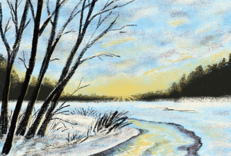
4. The Sky, Horizon and River: We're ready to start painting. We set everything up. We've got a sketch,
so now we can start painting the landscape
on the postcard. What we're going to paint in
this lesson is the horizon. We're going to paint the sky, and we're going to
paint the river, also, snow on the trees. We're gonna do in
different lessons. Let's start painting
the sky, the horizon. And now we are both
have the sketch. What we're gonna do
is we're going to work under the sketch. I don't want that go away. Under the sketch. We're
going to add a new layer. It's going to add it
on top of the sketch, of course, and I'm going
to move it around. Now. Whatever name that is, you can give this a
name by pressing on it, say Rename, type in a name, whatever this will be, this
will be my background. So I'm going to rename that back the limit right
away. Do that. That is the first layer, the sketch we're
going to keep on top. I've got some extra layers
which I'm going to remove now. Those are those extra sketches
from sketching lesson. What we're gonna do is,
I'm going to lock this, probably going to do it a
little bit more, less strong. So around 60% set the opacity, slide it over to the left and
say lock so that I cannot accidentally paint on my
layer the background. What we're gonna
do is really easy. We're going to not
paint the background. We're gonna just add
that blue color. So we're tapping
on the blue color. And we're going to
slide this over, let it go and let it
fill the whole layer. There's another way to do this. Let me clear this. Undo. You can go to the layer, tap on the layer
and say Fill layer, and it's going to fill
it with that same color. So that's two ways about this. I've kept this blue color. That will be my underpainting, the color which I'm going to use for the shadows of the snow, for the sky and for the
clouds a little bit. And over this, I'm
going to paint. We could do this the
other way, round two, as I've done with my
own painting class, you could actually
paint in the shadows, but we're going to use the
reverse process for this. We're going to
actually add a white. We've got our background. Now, the next thing we're going to need above the background, I'm going to start
with these batteries and the mountain
and hill, right? I'm going to bring back
actually my reference. Let me do that. So as I've shown, I'm going to keep that
reference up here. There you go. I'm going to use that as a little guide so that I at least have faint idea where
things are going. Well, move it a little
bit better, good. I'm going to start
with the background, so we're going to use
the black color to do, actually do the black,
the background. Now, normally I wouldn't
use black squiggly, but for this painting to
do it quickly, that works. And we're going to
need, of course, a paint brush for that. We're going to go
to the standard brushes all the way
down scroll if you have lots of own brushes and
they're going to painting. And there's a good wash
brush there and we're going to do anything with
the squash bus. Just select it. I can do it of course. Then
you get a different screen. Select the gouache brush, and then we're ready
to start painting. We're going to just
use one brush, probably way too small. So I'm going to say
around what is it, 14, 15, 12 per cent. That's good. Yeah. That's, that's a good stroke. Then I'm going to start
with this mountain and see, yeah, I'm good layer, I might call this
layer first and name. These are the hills, let's call it hills, the streets there, but
that will do for this. Now if this gouache brush, if you press really hard, you're going to get
a very firm stroke. If you press really soft, you can get C, as you can see, keep
the pressure low. You get a very light stroke. And we're gonna
make use of that. Because gouache, you can layer in real life too
and you just can put layers on top of it. But we actually may do a little
bit of blending later on. So I'm going to start
with these mountains. And I'm first going to
paint in my first layer. There you go. And I might want to
go here right away, lower seven, about
seven per cent. To add this in. There, we hope that
there's not a good stroke. I don't want that. We're going to just
make sure we're adding the background there stat going to add in this tree. So I'm just going to press a little bit like this,
gives the impression. Little bit of the trees there. And you can probably say, well, that is really quite black. I do agree that is quite black. But we're going to
solve that in a minute. Now with gouache,
what I will do, instead of getting this black, I would get a very
dark gray or mixing. A little bit of white or yellow. Yellow is even nice
with the black to get just slightly
different tone. So there you go. I'm going to take an eraser. For an eraser, I'm using a
brush and hard airbrush, medium heart, heart, airbrush, medium heart is good too. I want to erase bits. 20 per cent. Get a little bit
of a better horizon line. There you go. Now, I know there's
some more trees here. Can go smaller, 5%. And as you can see, I'm
just dabbing the same, so I'm not making these strokes. I'm dabbing them a
little bit in to get a little bit of color nuance. Now, that is good. Alright, let's see the trees. Now I got the smaller one. A little bit of that impression
of trees, they go, okay, the next step I'm
gonna do this is too dark because if I now
will do the tree over it, you actually wouldn't
see the tree, so that would fall away. And the three we're
going to do with black to what I'm gonna do. I'm going to change the opacity. So instead of adding mixing
in a different color, I'm going to just change
the opacity to 77%. That is fine with me. Behind this, we're going
to have, of course, the clubs entered the
sun, the sun setting. So what we're gonna do
is under the hills, I'm going to create this and
I'm going to rename this. I'm going to say sky,
but it's gonna be scary. And some, what we're gonna do next is we're going to
pick that gray color. And let me hide that
reference for now. Good. I'm going to put my brush first on large to
see what's going to happen. And we're going to just
type in like that. An interesting sky. We could just simply do it
like that with a huge one. Just quickly create
a sky like this. And what I want us, perhaps
some extra smaller clouds. So I'm now on 22%. There you go. I want to make sure a little bit of the blue gets through. The next thing I'm gonna
do is I'm going to pick my yellow color. And just at the bottom
here, where the sun is, I'm going to press
hard and the rest, I'm just going to press
softly or what we could do to change the opacity, 48%. That's pretty
decent, I would say. And for this, I'm
going to bring back my reference a little bit to see what's happening on
the lower end of my brush, 67 per cent. So that at the bottom, I'm going to create this nice color and read a
bit around the mountain to, and I may wanna do it
a large chicken and carefully add some here
and there in the sky. So not with that strong color, but still on the opacity nicely down to add some Diego
and there we go. The next thing I'm gonna do, I'm gonna take that white. I'm going to leave
the opacity down. I'm going to say the
brush slightly larger, around 34 per cent. And we're going to add
some white here and there. And just creates a little
bit more interesting. And I'm painting this in
a little bit around here to get a little bit more
of an interesting sky. And there we go. I think
that's pretty interesting. And we're going to add
a layer on top of this. I'm going to call
this the river. Renamed, let's say the river. And I'm going to now look
at the reference again. And I'm going to say, okay, this river has some
of that yellow in it, has some of the gray and it reflects the
sky a little bit. It has the reflection
of the bushes in it. I'm gonna start with
some of that yellow. And I'm going to lower
this brush to 14, 15%. And I'm going to bring
in that yellow color and still have my opacity down. And I'm going to paint in. Just a little bit of
that yellow reflection. Now I'm going all
the way up again. I'm going to 8% is good. And I want to create
a little bit of a stronger reflection
right here. Right there. And I'm just looking at this
reference a little bit. Even lower, six per cent. And I would say around here, I want some yellow too. And you already get right away
the sense of a landscape. And with a bit of
a larger brush, 12 per cent, bringing the opacity down
again to around 50%. I want to add some of
this color on the snow to just a little
bit. There we go. And around here,
I can see that in the image to bringing
it in a little bit. And there we go, That's good. Now, I'm going to
take that gray. I'm going to leave that opacity down and I'm going to add
some gray to the water. They go painting that
in a little bit. Especially around this part here where I can clearly see it. I need a smaller brush. There you go. And there we go. We've got some
interesting water. I'm going to put that
brush all the way up. I want I'm going to do
I'm going to bring in the shoreline check limit chips three per cent is good
answers. In a minute. We're going to go over
it with the black tube. But for now I'm going to
just create that shoreline. There we go. And now let
me do it around there too. Okay. And let me get the size of nine per
cent and now why hardly pressing on a little
bit of paint there. Okay, I'm going to
hide the sketch. I don't want to look
at my painting. I'm going to say, okay, back to the free per cent, five per cent, I
missed the connection. Definitely there. This I'm going to leave
like that. It's good. Day ago now look
at our landscape, see, we're already getting
a bit of a landscape. The next thing I'm gonna do, one change to black. I'm going to go, I
think 1% is good. And I'm just going to
bring in that line. You see here very
roughly two to get, add some shadow to it. There you go. And around here. I'm gonna do exactly the same. Creates some of that. Did he go? I want it
right on the dare to extended that you can see that the
river is going there. And we opened, I
don't want that line. And we have some mud here. Alright, good. Now the next thing, the
last thing we're gonna do, we're going to add a little
bit of white here and there. And I'm leaving it on the 1%. We could actually
under the black, just a little bit
of white there. And here To, under it. Just to make it slightly
more interesting. There we go. Alright, now I
want some in the water too, but I don't want that
100% want to put it back to 50 per cent. I've got it on, I'm about 11%. And we're going to add some
of these clouds in it. And now I'm not pressing, I'm mixing this in
just a little bit. We could do some blending
two if we wanted to. But for now I think
I'm okay with this. Alright? And now, if I hide
the reference to, you see that the landscape
is already appearing. Well, this is already starting
to look like a painting, but of course there's
a lot missing. We need to add a
lot more things, but the status there. So in the next lesson, we're gonna do the snow. And then already this
painting starting to look a lot nicer than
it does already. Alright, see you in
the next lesson.
5. Painting Snow: Since we have a
winter landscape, we're going to need some snow, of course, that is what we're
gonna do in this lesson. We're going to paint the snow. Now I said already, you can approach
this in two ways. Either leave everything
white and add the shadow, but we've chosen to add
the background color. So we need to actually
start painting some snow. And just with two colors,
a little bit of help. Perhaps of the blue, we're
going to create the snow. Well, let's start. The next thing we're gonna do. We're gonna add our snow. We need the white color. Or you might have to
white color there. We're going to add a new layer. And we're going to need
that above the river. And we're going to
rename that snow. And there you go. Now I'm going to
bring back my sketch. Because on the sketch, I have this hill clearly and I want some snow there,
here and there. I need some snow. So let's see. We've got, of course, the
gouache brush tool. I've got it on opacity
and its regular size. What we're gonna do is
around 13%, I would say. And I'm going to
start around here, create the snow on this
bend in the river. Bend in the river,
but on the ground, the little bit of the hill here. I'm just going to paint in this. I'm not going to use a uniform like nice stroke like that. No. I want some variations
where I would do some longer,
some short strokes. Just add a little bit of
variation between the strokes. Even lift up the pen and
stipple a little bit. And that would be,
this first part. Must go a little bit higher. There you go. The next thing, I want some
snow behind there too. But alone want to
cover everything. I'm fine with some of
that blue coming through. And I want to make sure that I'm going to
bring in some of the yellow later on to
again. Here you go. Now I'm going to use
some longer strokes. And there we go. Now over here does it a
little bit of a hill. So I'm gonna get my
size to four per cent. And now the hill, but something that's
slightly higher, we're gonna go to the gray. 1% is good. And under the snow layer, I want to just add
a little bit of a line and add it here to
the ego. And I may want it. Let's see, I'm fine here. And that's picker. Add a little bit more
here on six per cent, or that's better. Good. Play a little bit
with it around here to just bring in some variation
of strokes and call us even behind the hill here. There we go. Might be slightly
too strong that part, but I think we're okay. Okay. Going to definitely
add a little bit more here. Really create that multi-part. I may want to do slightly there to there is kind of a hill here. Let's bring back the reference, Diego, despite here on the here. So we're creating
a little bit of this part where
these lines are too. And I want to create a
little bit of the hill here. When I hide the sketch
for a minute to see what I wanna do differently. One, and a little bit
of gray as a shadow here on the hair to
add a shadow line. Good. Now we're gonna go with
this gray to 50% again, so that I can add some
better nuances of shadow to create a little bit better of
a river bank here. Getting the idea, you're
going up a little bit. Alright, I think that is good. And around here I'm
noticing it is darker. So what I'm gonna do
is I'm going to add more of this dark color here. But to create some interests, since all the interests is
pretty much on this side, what we're gonna do
is we're going to add a little bit of yellow here. Just let that sun reflect and it's not really
there in the photo, but it creates a little bit of a point of interests around this slightly boring area. Otherwise, I'm
going to go to the black and I still
have it on 50%. And I want to, that's
too high, too large. Five per cent. Want to add a little
bit right there. Just create a little bit
of sense of depth in it. And here I want to do that too. And I bring my sketch
back so that I can see where I want that, around here and around there. Okay. Now, that's the
painting for now. See you and it's starting
to get structured. Starting to look like
a quick painting. In the next part, what we're
gonna do is we're going to add our bushes and our tree. Or should I say the grass
and it's more grass. Grass and the tree will be
added in the next part. Now our landscape really
looks like a landscape. We could leave it like this, but it's kind of boring. It needs something to
draw our attention to. For that, we're going
to paint the trees. We're gonna do that together in the next lesson. So
I'll see you there.
6. Adding the Trees: While our landscape
looks pretty nice, we're still missing
that focal point. We're missing those trees. We're going to paint those
trees and a little bit of the grass bushes
together in this lesson. Let's start while we're getting a bit of a landscape already, but it's an empty landscape. We need a focal point. And the focal point, of course, in this photograph are these
trees and this part here. And you get a nice composition like this with some in
the background here, some nice in the
foreground here. A little bit of focus
here so that it's not all empty on this
side. Alright, good. We need to black. I already have the black. I want to put the black
actually unblock. Don't think I wanted to
dead launch two per cent. Let's give two per cent dry. I'm going to bring
back the sketch now. I'm going to paint
in yes, these trees, I'm going to look at the photo, what domain trees around here. So I've added that's too thin. Let me test the size. Six deaths. I might even go
77 is good for the main tree. So I only added the middle, little bit of the
middle of the trees. This is the outside. I know that this is
the outside too. And I don't want to go
Yeah, it does is good. Not that low, but I can
do that. And there we go. Now here's three. And what we're gonna do is we might
hide for now the background. So we can focus on these trees. And now I'm seeing that
I'm making If mistake, I'm working on the snow. I want to remove my tree. Yep, I do make mistakes
to pay attention. First of all, let's add a layer above the hills because this will
be the foreground. Yes, I totally forgot that. I'm going to call
this the trees. And there's more on it
than the trees only. But now I'm going
to paint the trees. So I've set it on black. I've set this on seven
per cent I wanted on. I've set the opacity totally onto the highest
and we're going to start with painting the trees. So these are the main trees. There's one. We're gonna make it slightly
thicker in a minute. Here's a tree, Definitely. Then we have a tree right there. Let's not go that high. Let's check. It's going to get thinner
at the end of the world, we're going to find them anyway. This one goes like this. And then we're having
a three right there. Good. Now already see that already
changed the whole image. And we're going to
just do these trees on the bottom
figure as trees go. Here too. Alright. She can see I'm not even
regarding callosum. These are *****
***** trees here. Some of them aren't. But we're not going to do color since we're working
with the contrast. I picture is going
to be quite dark. I need to get rid
of that for now. So that is not in the way. Next thing is I'm going
to lower my size 4%. I like that and
we're going to need some of these main branches. And from here, I'm
following my sketch. Then I am following
now the photo. I just want to give
the impression. Here's one. Let's see this one. We want to make like that. This one a bit thicker. Get one out of here. Let's do this one not all
the way because I'm gonna go thinner in a minute
than I am now. Let's add the history
here a little bit better. The tree is going
in front of it. So I want that to go in
front of it. There you go. Alright, Do I have all
of the main branches? I think I do. Let's go one lower
2%, 2% is nice. And now I'm going to
add some more branches. This is thicker,
so I may just as well at some more
strokes right here. Let's double, don't want that. And let's add some
extra branches here. Alright, we do want some branches and not just have an empty space. There you go. Alright, good. I think for now I'm
okay with this. Let's see. We're going to add that grass that is here and bring that
reference back again. Might zoom in a little bit, gonna do this clump of grass
that I want right there. And yes, again, I'm going
to go really rough. And let's see. I'm going to go to
1% at some finner to it creates a little bit of a variation on my go-to
per cent to first. That's good. And then behind there on the other side? Yes. Definitely some there
now and that's not good. When move those over there
a little bit further, then more like hair on top. Let's create a little bit of
a small hill right there. Now I'm going to 1% adding in some
extra branches. On a little bit.
This is a little bit random. There we go. Just create a little
bit of an extra focus. We could do a few branches
here to go a little bit stronger than two per
cent. Out of here. Some branches there, maybe here. Now go to the lower one. That's not good. Let's stay with
the two per cent. Yes, I like that better. And there we go. Good. And now we're getting
a winter scene. Now let's add some
grass right there too. Some of that dried crown grass. And see there is a
little bit around it. Let's add a little
bit around here. Now there's a bit of
a darker spot there. I'm going to go to, again
to 50%, say around 5%. And around here, add that
little bit of a darker spot in. There. There you go. I wanted to and on the hair a little bit
too for the shadow. Let's add a little bit on this
site and two that you go. And now we're creating
a difference between the back and the front. But carefully, don't
press too hard. Lat long strokes like this. Keep them a bit light. And that is not a good stroke. I'm going to remove
that. There we go. Now look at that. We're
getting a painting. Alright, now we need, of course, a little bit of a reflection. I'm going to keep
it on 50 per cent. I'm going to add a new
layer for the reflection. There you go. I'm going to actually
call this reflection to say that in Dutch
or a flux here. And let's call it reflection, but let's not reflection. Is it? Good? That is better. I missed. I needed a wrong letter. And what we're
gonna do is we need the reflection of this. That's not that
big, of course, 2%. Some fine with keeping
that on 50 per cent, but I don't want to go a
buffer the shore line. So I'm going to erase where I'm going to go
over the shoreline, I'm going to erase that. And again, this is
really, as I see, a reflection, an impression of the reflection on
the bottom here. Shadow. Go for some of
these thinner one's good. I think we're doing
fine like this. Let's see. We're getting there. I think we're getting close
to the end like this. Now, you could do a
lot more branches, you could do less branches. I think I may want to
put some more branches. I'm leaving this
action on 50 per cent, going back to the 2%. And I might just
add here and there, just some random branches. And by keeping this on 2%, sorry, under 50 per
cent, right there. We're adding interesting effect. A little bit of a depth as if it is smaller. So there you go. I think I'm okay with that. Except for around here, we might extend
these a little bit to enter and there we go. Alright? Now, if you want to do more work on it, please do so. If you think, fine with this, Let's hide the sketch for now. And you say, yes, I like
the painting the way this. Then you can move
to the next lesson, which I'm gonna do two. And the last lesson,
we're going to add a little bit of
effect to the trees, because now it's kind of boring. We need to make
sure they stand out from the specialty,
from the background. That's the last part
we're going to do. We've got something that draws our attention now, do trees, but we can improve on
this in the next lesson, what I wanna do is
the final lesson. I want to add some
light effects. Give some attention to
a little bit more snow, especially on the trees. And then we have a
finished gouache painting.
7. Light and Snow on the Trees: We're almost there. This
is the last lesson. We're going to add some
light effects to the trees. And I want to also add
some snow to the trees to proof this
painting even more. Now it's kind of plane. We have some black trees, but we're going to put
some light behind it. Judas really give the impression that the sun is
going down and just draw even more attention
to the trees and just make it all
look pretty nice. Alright, well, let's start
then with doing that. Let's do the last part. What I'm gonna do
is under the trees, I'm going to add a layer. And well, I might just call this effects or light effects or whatever you wanna call
it. I still see that. I've still kept the wrong
name for this layer. Reflection enter. Okay, I thought I
said that already, but apparently pressed
undo. Per accident. We're going to add a little
bit of reflection behind, not reflection, little bit of a light effect behind the trees. So I need to go back
to that effect. I'm going to go for the yellow. I'm fine. I think
we're 50 per cent. And what we're gonna do
is on the sun side, well, where the sun is
setting on this side, I'm going to add a
layer behind it, a little bit of a yellow. Let's keep it on the 50
per cent. That is fine. Might go slightly
larger for per percent. Speed this up a little bit, and add a little bit of a shine effect
to trees like that. Then we have also clue where these trees or I might
have to go on from here, but I think we're okay. They are. This tree here
needs a little bit. This tree needs a little
bit on top of it, this branch then
this tree under it. And as you can see, by just adding a
little bit of light, we're getting a quite
interesting effect. Adh works fine by adding
it right there two, alright, not everywhere,
but on enough places. They go to get district standout a little bit
better than it does. The street each
treason one-on-one. Don't wanna do it
on every branch, but on some of these
branches, there you go. That looks good. Let's go
for this a bit stronger. And now we get a nice,
very interesting effect, a little bit of a
play of light and shadow this way in the
water. While we're at it. I want a bit stronger. The sun there. We're gonna do that right there to get
that a little bit stronger. Now here I'm fine. I'm fine. What I may want to do is carefully in the
water, very softly, add a little bit
of yellow to it, creates a little bit of
this greenish effects, green and yellow that
will mix a little bit. There you go. Let's do
a little bit there. That's just perhaps
a little bit there. Now, let's do much. Good. A little bit carefully. On the top. That's better. Good. Alright. There we go. A little bit more down there. I like that. Let's add a little bit on
this hill here too. And just along the
river bank here. A little bit. Dare to know we need
some more white here. I'm going back now. I'm going to look
at my painting. I'm going to do some more snow, the white on leaving
on 50 per cent. I think I want to have a bit
smaller size four per cent. I want this to be a little bit better than it is at the moment. They go in here too.
I'm a little bit more. I like that better, good. Alright, and it's just
a little bit here. The rest I'm okay with. I can leave this
as blue as it is. Just in the back. I read a little
bit of slow, slow. Perhaps the glass is slow, but maybe I'm painting slow, but this is of course, snow. And let's add a little bit
of snow right here, two. Good. How about that? Let's take
one look at the photograph. See if we want to
change anything. Maybe I want to tone this down a little bit. There you go. I think I'm pretty much fine. If you want to do race,
you could bring them in. I don't want them. I don't want them
in my painting. What I want this perhaps here
a little bit more yellow. So I need to go
back to that sky. Get in. That is not yellow. That isn't white, of course. Different color please. Can in yellow here, a little bit stronger in
the clouds. Let's see. Might want to have some
still behind there. Yeah, Good. Let's
add a little bit. On the top of the blue. You go right there. Then refresh. And I think I'm okay with this. Then we have our
gouache postcard. Now, the postcard of course, is not this launch, the actual size of the postcard. We get a postcard size. This is a postcard size, will be like this. See, we're pretty close to that. That is the actual
postcard size. And on the sides like this, a quick painting like this
looks pretty good, doesn't it? So there's our gouache painting. Now, one thing you could
change a little bit here. This is now all yellow. We've cut the sky still here. You could do a little bit of white and add a little
layer of white right there. And it's still on two per cent. Now I might go to 34 per cent. An ad. Just an impression. Hey, go get the idea of snow on top of even
that black. Even there. There we go, That's good. Yes. We could do actually a little bit snow
on the trees too, if you wanted to do that. Now the reference
has some on a two. So we might just add a little
bit of snow here and there. So not where the light is but the opposite side
and laying on there, we need a new layer for that. Let's go with this. Under under the effects. Yeah, I don't know. It needs
to be on top of the tree. So I guess on top of the trees we're
going to add a new layer. And I'm going to call this the traditional cut this
on white on 50%, 3%. Let's see. We're going to add just a little bit of
snow here where it's laying basically
on these branches. Yeah, that is good. And by doing this, we're going to tell the fewer where these trees
actually do go like that. Here too. Not, no, no, don't, don't want to call
a buffer dead tree on some of their
little bit in here. Some snow, snow piling
up on these branches. Just a little they're seeing
that gives a different idea. Some hair. And we don't actually need
everywhere at softy spaces. Little bit on this branch. Also not going all the way. Um, that's good. Alright, little bit more here. If you had some there, That's branches,
suddenly somewhere else, then I'm whilst we can
do to move this one to create the impression that these branches are actually going out on an angle
out of the tree? Oh, I think I'm good with this. Yeah, he's good. Keep on
going with this, of course. Yeah. But we're going to stop
right here except for perhaps slightly some
snow down there. In front of here two and
the one that's there too. Alright, now, that is good. Okay, I'm going to put
my Apple pencil down. And we're going to say, I'm
done with this painting. Well, that's it. Our painting is finished. Looks pretty nice, doesn't it? This is a great
postcard. Senator. Friends, family showed online. Just a fun impression of a landscape without getting
into all kinds of details, but still making really
clear what it is. Well, last lesson is the project really
going to give you a nice challenge in the
projects. So see you there.
8. The Project: Now for the project, I'm going to give
you a challenge. I've attached a second photograph
with another landscape, slightly different
than this one, wrote. Now of course, some trees in it, so they'll go for
housing the background. I challenge you to
paint this painting as a project to see once you have picked up from the lessons
and to apply that. Now, if dead house, perhaps a little
bit of a challenge, you could just
leave out whatever element you want to leave out, changed a little bit
and make it so that it suits the level you're at. You don't have to do
the whole painting exactly as the photograph, but give that impression. And if you think something
is just too challenging, just leave it out and
make it your own. Well, I'm really curious to
what you're going to create. So posted in the project
section, I love to see it. Definitely your comment on it. As soon as you post it. And I just love to
see what you pick up through these lessons
I'm giving you. Well, looking forward to that. Thank you for being
with me in this class. Don't forget the small
Procreate classes I have here on Skillshare. So follow me. Then you get a notification
when the new class arrived, the next one in the series, or is look at some of
those older classes to keep you busy after
you've done the projects.
 Benjamin A, Art Teacher, illustrator Art by Benjamin