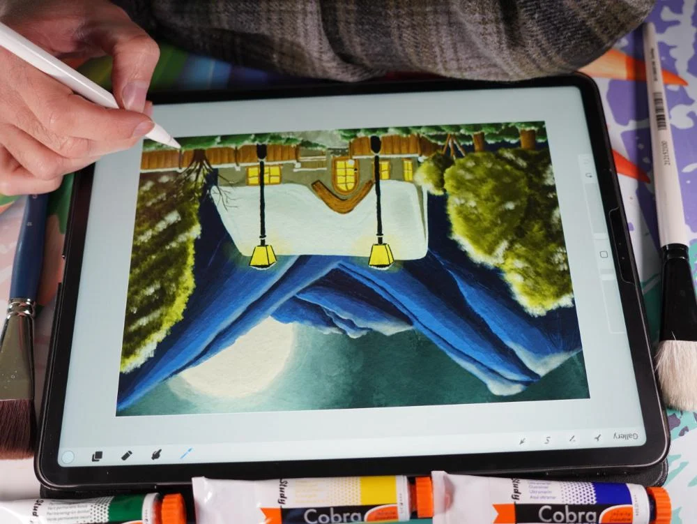
Transcripts
1. Class Introduction: Welcome to painting, a
winter cabin in procreates. We're gonna do some oil
painting and procreate, we're going to create a
beautiful winter seem. A cabin in the evening. So beautiful lights,
trees around, nice atmosphere, just beautiful painting, really fitting winter. Well, given that warm
feeling of the cabin, It's showing that
it is cold outside to be able to open in procreate, we need some brushes. In this class comes with a great set of oil
paint brushes. I want to show you how to use these brushes through creating
this painting together. Now, oil painting in
procreate is really a lot of fun and you can create
beautiful thing for here. I'm going to show you
step-by-step how to use these oil brushes to create
a beautiful scene together. I'm just going to
show you how to pay attention to certain details. How to create a light effects. Add some shadow to
your paintings. And how everything in
the painting works together to create something
beautiful and cohesive. Once we've gone
through the class, and I'm pretty sure that you know how to use these brushes. You can use them in your own artworks to
whole idea, isn't it? I want to show you how to
create beautiful scene. And with all these techniques and all the materials supply, you can create something
really pretty. The brushes under the only thing supplied with this class. I also supply the sketch so that I don't have
to walk through. We can just go
painting right away. And a color swatch. Really sitting
this winter cabin. So everything you need is
right with this class. The steps to follow
and all the materials. All you need to
bring is your iPad, procreate your Apple pencil, and then we're ready to go.
2. The Sky, Moon and Mountains: Welcome to the first
lesson in this class. I'm first going to take you through the materials
a little bit and Canvas I've created which you're going
to use the sketch. And once we've done that, we're going to just start
painting right away. Okay, Well, let's
start this class. I've already started
up Procreate. And here's the sketch
we're going to use. We're going to work on this one. We're going to create
a nice winter cabin, a nice winter scene. For that, you will find this procreate file
called winter cabin. The next thing,
you're going to need some brushes and a gold ABB oil, the provided with
this class too. The third thing
you're going to need is this winter cabin. I'm just going to show
you it like that. The winter cabin color swatch. Now you see mine is on top. That's because I created
this for the class. But if you download
it and install it, yours will be all the
way at the bottom, you have to scroll down
until you see winter cabin. Alright, And what
we're gonna do is we're going to use the cards so that I can tell you the colors I've renamed all the colors. Moon gray, moon, white skylight. And we know exactly
what we're going to use all these colors for. And if we're going to look at the file, what you see here. So the sketch, first layer, that is actually the sketch, we're going to need it and
height that once in a while. And when we're done,
we're going to hide it. We're going to start here. Obviously what we're
gonna do there. And then you see a layer with
an OH, group with papers. And there's three kinds
of papers in them. I'll show you them. There's this
yellowish tone paper. There's a bit gray tone paper
and another yellowish tone, but not as bright as that one. And later on we're going
to add a paper to it on top of it to make it look
like more like a painting. So these are the papers I've provided and you can
choose which one you like. But for now, we're
going to hide it all. And the only thing we're
going to need is the layer one where the sketches
on the Start Here, of course, the things installed. And that's all the
things you need for this lesson, for this class. So download the file
with the sketching it, download the brushes and
downloads D color swatch, and then you're all ready to go. All right, let's start painting. We are going to work
in layers with this. We're going to add layer
upon layer upon layer. We're gonna do oil painting
and an old painting. We're going to just
pretend. This is a one session oil painting, Alla prima, that is
called an old painting. But for us because we
can add layers on top, it is like as if it has dried
already the previous layer, if we do everything
on one layer, there will be a very
nice challenge. We could do that, but it
could be very tricky. Then every color would blend. So what we wanna do, we want to work in layers a little bit and give each part it's layer. Now normally what you would
do with an oil painting, I will put a color behind it. We're going to do that actually, but that will be the color of the snow to make
it ourself easy. You see, the roof
is gonna get snow. Here, some snow. We're going to add
some snow by hand too, of course, but there's
some obvious parts with snow like here too. There's some snow on the
bench, some snow there, some on the fence
too, and on the roof. So what we're gonna
do, we're going to add the snow as the back
layer for that. We're going to add a new
layer to start here. We're going to move
on top of this one. I'm recalling this layer
seeing renamed to r. Let's say backgrounds. Now let's call the snow, snow color, snow,
snow backgrounds. Let's call it like
that snow background. That's the best. And what we're gonna do now we're
gonna go to this catch. So the thing, we're
going to find, the snow, the light snow and the
snow light is right there. I'm going to tap on
it, changes the color. The next thing what I'm gonna
do is I'm going to drag this one and I'm pulling
it all over my layer. Now. Everything is
snow. Oh, that's it. We're done with this class. We've painted our Kevin,
everything is snow. Or do we want something else? Yes, of course we want
a lot more color. You don't want
everything snow, Dewey. But by adding it back layer, this will save us some time
painting in all the snow. We're going to add some
shadows to the snow later on. But for now, we're going
to start with the sky. Alright, this guy, now, this is a dark scene
and evening scene. So what we're gonna do,
you see here three lights, free, light, free skies. And most of the things I've
done in a light version, amid version and a dark
version and some of the deep dark we want
really dark colors. We're going to start with
this skylight column. And what we're gonna
do, we're gonna paint that part of the sky here. And we're gonna do
that slightly messy. And we're going to
create a nice sky with some nuances in it. So for that, we're
going to start here. Start here. I'm going to rename right way. And I'm going to
say this is d sky, Let's just call it Sky. That's good enough. I
want to pick my brush. And really doesn't really
matter which brush I pick. I'm going to take
this one, the oil, the oil dash paint, oil paint Desh for that. I want to put a nice enlarge and want to paint in
my sky like this. You get some nice color
tones right away. Now, let's see a little
bit here to make sure that everywhere behind
the mountains the sky is. So if it is a little bit
sloppy, doesn't matter. We're going to paint over that. Now. This is evening. So what I want, I want
some darker tones. I like these light tones
around the moon will be light, but we need some
dark tones there. So the next thing we're gonna
do is just take that sky mid blended in a
little bit there, carefully there, and around there a little
bit. There you go. The next thing we're going
to take that sky dark. And as you can see
that in a little bit. And now I'm going over very
lightly and blended in. These oil brushes will
blend it in nicely. There a little bit. Now blended in. If you go very softly. So if you press hard and
show that on a layer, this new layer, height dev onto. So if I press really
light, as you can see, the color blends in and takes on the color that is next to it. So that is, in this case
the white and blends it in. If I press really hard,
I get that full color. But if I now press really light, I can add in the
white that is here. Push it into the paint. That is how these
brushes all work. So if you want a nice dark
color, you press hard. If you want to blend
in the other columns, you press lightly again. Well, let's hide
this layer for now. Bring back everything,
including my sketch. Let's see. This probably is
slightly too light, so what I'm gonna do, I'm
gonna not press too hard. I'm on the wrong layer. Go back to this guy. Had a little bit of
that around here. Might just do it like that. There you go. That looks nice. Okay. That will be my
sky, nice and dark. The next thing I'm gonna do, the moon on top of that, I'm going to work so from the back work towards
the front slowly, but I might do some
front later on, earlier. The next thing is the moon. Rename this. I'm
going to say moon. The moon. I'm going to take, of
course, the moon white. I'm going to start
with dead one. And I'm going to take the oil
paint one or the round one. Now, let's take
the oil paint one. Let's probably most of it
we might do with that one. I want to zoom in a little bit, make it larger so that I
can see what I'm doing. Now, let's test this brush. Let's see what is the size. Oh yeah, that's a good size. Delta sizes on the
standard size, 12%. And we'll just
paint in this moon. And again, if I go over the mountain a little
bit, that's okay. I'm pressing. Not firm, but reasonably. Alright, there you go. That is the moon. Looking good. Now the next thing. What I'm gonna do is take that moon gray. I don't want to rename it. Press a little bit hard and add in a little bit of that moon gray. There we go. All right, I like
that. Alright, good. So we have that
mixed in some of the gray to let it be that light. If we now hide the
sketch and zoom out, we're already getting this. See, we're getting a
nice oil painting. Now what I wanna do is I want
to have some oil, sorry, something like I want
to have lots of oil, but don't want to
have some shine around here from the moon. Because the moon has a
little bit of a halo. Let's say I'm going
to add a new layer. We could do that on the
same layer technically. But I'm going to rename this. This is then a halo, moon halo, let's
call it like that. Why not halo? There you go. Back to that really
white collar. But what we're gonna do
is I'm going to change the opacity around
the half of it, 50 per cent, because I want the sky to come through
it a little bit. Let's paint a little bit
of that halo around it. Look at that. That is perfect. Without having to
sketch there, Diego. And at the end, we're not going to press hard. We're going to just press
really softly and let it fade away a little bit,
blended out slightly. Day go. Alright,
let me bring back the sketch that I
stopped my sketch. There you go. Alright, good. Now,
yeah, that is good. So I'm far enough here. I'm far enough there. Just a little bit of a halo. Alright, that's it for this. The next step will be, I'm going to remain the renamed
the tests layer of mine. So you need to probably
need to add a new layer. I'm going to rename
this to the mountains. Mountains. Yes. Thank you. Mountains spellcheck. Those would need to hide it. I need to clear it. So if you want to clear a layer, you just press on the
layer and you say clear. Alright, and we can
do the mountains. Now. For the mountains, we got different colors to
mountain colors. Here you go. We'll start with
the mountain light. This is the light
color and we're gonna put that behind everything. Now, need to slide my
opacity up to the full. Give my brush size
slightly larger. And I'm going to say, okay, let me see where the mountain is. There's a mountain here. There's mountain here, there's still mountain behind there. And obviously the
mountain is there. I'm going to just
press nice and firm at this mountain in
this first light color. And from there, I'm going
to just start painting. And I want to make it
a nice uniform color. So sliding this way, I can get rid of
some of that white, although some white
isn't a problem. But there you go. Not behind where
I want this snap. There is no mountain there. There's no mountain there. So We're okay. I've one mistake now. I don't want the
mountain on here. Later on, I'm going
to erase this, but let's continue painting for now and make it ourself, easy. Alright, then later on we're
going to erase this part. What we're gonna do,
I've painted it in, but I want this a bit better. So I'm gonna go back
to a smaller brush. I think around 8.9
per cent is fine. And had this coloring around the edge create a little bit of a better edge around here too, so that these mountains
really will become mountains. And paint this in
a little bit nicer to get rid of that background
color a little bit. Alright, do that here to get rid of some of that
white that is here. And I think we're
okay now if you go outside of the
lines slightly, not a huge issue. Alright, good. Now
here a bit white. I want to get rid of that. I've got my mountains
then let's see, There's mountain here too. Alright, good. Now the
next thing I'm gonna do, I'm gonna add that mid-tone. So the darker MIT. And we'll take a look
at these mountains. Now at the edges there
will be a bit lighter, but as soon as you move
away from the edge, like around here, that will
not be so light anymore, but the next edge, of course. And we're mixing this
in a little bit. This edge will be light
again, of course. So I'm starting around here, adding this air despite
of the mountain, leaving that edge a little
bit dark and light. And now I'm going to
press just a little bit, blended in a little bit. There you go, creating an edge. Alright, I'm gonna
do the same here. So this edge, and we're
gonna leave this here, I'm gonna go dark. And around there they go and I'm not going to
go of course, on there. And I'm going to blend
this in just a little bit. Make, create a bit of a
nicer edge. There you go. And for this mountain, I'm going to leave just light. So it will be very tricky
and we're gonna do this one, but I definitely need
a smaller brush. Let's go for three per cent. That's better. That way, I can actually paint in this a bit
nicer and around the edge now hardly pressing so that it can blend in these
colors a little bit. Alright, now around
here I'm gonna, we gonna do a dark one. So I'm gonna go to
the dark mountain dark with that same brush. And I'm going to just
add a dark line here. And paint that in slightly nicer blended in a little
bit. There you go. Alright? And of course I'm gonna
do that right away here to add that edge. And then blend in these colors. A little bit like that. See, and now we're getting
a nice tone to mountains. Alright, while we're at it, we're gonna do a line here
to blend it in at the edge. And Degas little bit, they're blended in a
little bit more there. And let's go for a slightly
larger brush here. I think I said for excellent and undo with my fingers, I'm 8%. Let's check. Yeah, 8% is nice. When we go around here too. Make sure we go behind the tree. And now at the edge, this edge, we're gonna just Hartley
press and create a nice line. Now, look at that. See, now
we're getting nice mountains. The next one, the next one which I'm going
to do for this one, we're gonna do that on
top of another layer, this one, so that I won't smudge that one because
I like this one. So we're adding a new mountain. I'm not giving it a name
later on when we're done, we can collapse all
these into one. I don't know what kind
of iPad you have, so I'm not sure how many layers
you can add to this file. Now I've got an
iPad which can do. Quite a lot of
layers, not the most, but more, plenty,
more than enough. But perhaps you don't
have that many layers. So we're going to make sure
that later on will collapse some of the layers so that
we can keep on working. We're going to show you how
to do that until you also, which lays you could
collapse now probably most of them are pretty logic. Okay, Let's go. Alright, so I've
added a new layer. I didn't call it anything. I've got the light color. I'm going back to the mid color. The mountain myths. There we go. And I'm going to add
that mountain mid color right behind there and
still have that same brush. I want to do this
edge a little bit, but not that edge. And right there we go and
then blend this in nicely, keeping a little bit
of a light edge there. Do that a little bit
darker too. Alright? And then back here
I'm going to do that really dark
column, but not yet. So let me do another layer. Now I think this is too large. Let's go for the
four per cent here. That is much better. The next one I'm
going to do it 4%, that gives me slightly more
control over where I'm going. And now we're going
to slide it up to about 8% again, for this part, speed that up and now
slightly blended in, I might create a nice edge here. There you go. Look at that nice. And around here, we're gonna
do, we're gonna do it. Let's go to 3%. Let's
add that line here. And around the top, yes, a lot until we're here
and we're blending in nicely around
here, blending it in. And there we go, right? Let's see. We do want some here and
blend it in carefully. There you go. And around here a little bit. Okay. Alright, that's, that's good. We're having some
nice mountains. We're going back to that
dark mountain, dark. I'm going to lower
my brush two per cent to see because I
want to do this one here, and especially down here. I do want that lot,
that dark color, a little bit of an edge, but I don't want it everywhere. So what I'm doing is
I'm pressing firm, add a layer, then
I'm hardly pressing to blend in with
the other color. And we're going to do
that around here too. Top here to create that line. And now I'm going
to blend in nicely, might do a little bit more here. And blend it in. There you go. We're getting some
nice mountains. Now for this next part, I can get the brush larger. Let's go for four per cent. I like 4%. Let's add
a line around here. They go. Blend this in a
little bit on here. I might want to do some
more around there, but like this, so that you
get a nice large size here. And I forgot one here. I see. Go back to
that in a minute. Alright, paint this in. And now at the edge, I'm not pressing anymore. I'm letting these
brushes do what they love to do and
that is blending. There you go. Nice. Okay, let me go to this layer, the mountain layer back. And I need that dark color
around this edge T2, so that you clearly see that this is actually
a different mountain. I might go like that, right? I was going to say all the
way but I'm not gonna do it. I'm going to leave
some light there. Alright, good, this is good. Now I'm going to
blend in carefully. The edge, hardly pressing
and just letting my Apple Pencil rest on the
screen, on the display. And then it's doing its thing. And then moving it
around. There you go. Now we're good. Now,
have corrected that. Alright, and we're going back to the right layer,
that is this one. And we're going to add that
dark color around there. At the top, a little
bit blended in. Rights. And there we go. That looks good, nice. Alright, and then we are
having only discolored the back here. Around here. I can do some nice sloppy
painting around here too. Alright, I'm already way too
far because their fence. And then around here, I've picked larger brush
for this bite away. And there's the mountain here. And let's do it like this. Bit nicer here. Some there. Check if I have done every part. There's no mountain here. One thing with the
cabin we're going to do probably different. We're not going to do let's
say there's a mountain. Yeah, let's do that. Now.
We're not going to work. We need some mountain here too. Let's add that here. And there we go, Good. The tree is coming there. Now I'm blending this in a
little bit nicer. There we go. That's good. Alright, now let's hide the
sketch for a moment. And let's take a look
at our mountain. See, our mountains are
looking great already. So we've got a nice part
of this painting already. That's the start. The moon, the sky and
mountains are there. Next one we're going to
do is go for these trees. We're gonna do that
in the next lesson. If you follow me
along, then right, move right away to
the next lesson. If you need to catch
up to that now, and I'll see you in
the next lesson.
3. The Trees: Welcome to the next lesson. We're gonna go
through those trees, got some nice trees in it. And they just complement
the scene nicely. We don't just only
want to have a house. I have a nice scene, nice tones and nice
light effects on it. And by adding some trees,
defense and everything, that completes this painting
in the end really nicely. Alright, let's go, right. We need a new layer. Now, what you can do
with these mountains, you could collapse
them into one. What you could say for this one, you could tap on
this mountain layer, the top layer, you
could say Merge Down. Now you have one layer less. You could do the
same with the moon. The moon halo and the moon, you could say Merge
Down and then you get a moon and that is
plenty for this moon. That's what that will work. So now you have two
layers, extract them. If you have an iPad with plenty, that can do plenty of layers, then you don't need to do that. But my shoulder,
so along the way, when we're painting certain
layers, you could combine. If you run out of layers, combine a few layers and
then you can continue. Alright? I'm going
to bring them back. And I'm going to rename this. Now might these mountains I
might do in one. Why not? Yes, lets do. I might need to add
no, I think I'm okay. I'm going to merge down
these mountains actually into one and the moon.
I'm just going to leave. Alright, so the next thing
I need is a new layer, and we're going to call this
the trees, rename trees. And there you go. Alright, I need to my sketch
back the layer one with the sketch because otherwise I have no clue where
these trees are. There's a tree here. Does some trees there? There's a little tree there. There is a tree here. But
this tree we're gonna do last because this one doesn't
have any leaves anymore. So real winter tree, and this one is a winter Hartree and these are more pine trees. For the trees,
what I'm gonna do, I'm gonna pick a
different brush. I'm gonna do this smudge. Now this is too much oil
and get a nice effect. I'm not sure if you're going
to use that in this class, but we're going to paint with it because it's great for trees. I remembered that from
a previous class. It is really great for trees. What we're gonna do,
We're gonna start again with the lightest color. Now, with oil painting,
you have a choice. You could start with
the darkest color, you can start with
the lightest color, doesn't matter,
they all blend in. And if I would do watercolor, I would need to go
from light to dark, but oil paint and I
can go any way I like. But I want to start with the
darkest, the lightest color. Let's see what am I gonna do? I'm gonna just paint all
these trees with this one. I'm just painting it in. And as you can see
around the edges, you get this nice cool tree. Yeah, not uniform effect, but some interesting lines in it because it's
a different brush. I'm gonna do all these
trees in one go. Yeah. Why not? You could do them
all on their own layer. So then you would
start with this layer. This is the top one. You would paint that in nicely. Then you will do
these factories, and then you will
do this one here. But I'm gonna do them
all on one layer. I think we're fine with that. Right around here. There's 12. I'm more dabbing this one, so stippling little bit more. And this one I'm painting in again and around
this edge down here. To edit like that.
Now, there we go. That is the light color. Here. Let's see around here. I need some more. If you can't see your sketch
well then what you could do, you could hide these mountains
to get your sketch back. I'm going to keep my mountains
to see what happens. And I'm not, I'm okay with this dark color behind here
and even dare some color. Alright, so let's do
this one too then. See how to use going until
here. That's the bottom. And again, a little bit sloppy, doesn't matter if we go outside, then we get a bit
more natural effect. There we go. That's the
light color of arteries. Now, this course, of course, is way too light for this color, so we need to mix
in some dark color, but we want to keep
this nice light color around the edges. And as you can see, already getting a little bit
of a nice scene now. Alright, the tree mid color. I've got the tree, I think
I got the treatment column. Now I've cut the tree
mid color for sure. Alright, Let's see this brush. I'm fine with the size. The size is 13%. I'm going to add the
mid color around there at the bottom. And as you can see, this one is blending a little bit less when it's painting
ones blending, it's actually, if you
produce it as a blender, is great, but it gives
me a nice control. So I'm adding just some
layer on top of a layer. But what I'm going
to make sure I'm going to leave the end here light and as you can
see, some light in-between. Now, I'm going to do it
around here to there you go. I think I'm okay with that. And then this tree. Needs some dark too. And I need to go around. There are two. Alright, let's do that like this a little bit. I'm okay with that, good. And later on we're going to add some shadow lines
so that you can clearly see which tree is which. And this one gets light from these lights to move
from this side. So the moon shines, decide, decide on here. And these lights of
course, add some. Create atmospheric
effects too. Alright. And make sure around the
edge, we're keeping it. As you can see, this one. I really don't care how
this tree it looks like. I want to turn this into
a pine tree in a minute, but for now, we're just
giving it its first layers. They go, now. We're gonna go to
the dark color, the tree dark and we
have a tree deep dark. We're going to use
it for different. Now with the next thing, I want to make sure
this is kind of a pain. So I need to go add
layers and move this way. They go turning into pi. And I want this to be
a nice large pine. So I'm adding These
ones like that, see, and I might
just stop there. That looks pretty good. And around there we're
going to add some really dark for this is good. Now, with this one, we
need to turn two ways. We're starting here at
these strokes around here. And then next up, we're
going to add these strokes. I'm not pressing
too hard for this. And turn this a little bit. See, even over there
into a pine tree. And see that is good. That is a lot better. Calf very carefully around. Just a little bit so
that you can see. And I need a little
bit more there. Good. And now that looks way
more like a pine tree. This one, Let's see. This is not a pine tree. This is just some
winter Hartree. So I'm going to stippled
is in so that I have full control
where everything goes. I might add a little
bit down the bottom. There you go. That's good. All right, good. The next pine tree, I need to add some
going this way. Here's the middle, I would
envision the middle here. And then from the other way
also right at the middle. And even in here, but they're more carefully,
not pressing that. Are, there you go. Nice. Now I'm going
to the last color, that deep dark color. And what I wanna do is I want to give around the edge here a deep dark color so that we get a difference between
actually these two trees. And I want some dark
color in here too. As you can see, doing
that a bit more careful. Alright, I want some dark
color here to lower it. It's not going to 13%. Let's
go for That's too small. 6%, 65 per cent. Add a little bit of
a layer around there to just showing that this tree is actually
under the other. That is why we're doing this. Because this is our front tree. So the others, we're
going to add around here. I'm going to add a little
bit of shadow there to make it a nice shadow. Now we're going
to this one here. Let's see. This one. Is it large pine? And we're going
back to that 13%, but I want to add some
branches in it like this, even till the end there. And carefully blend
that in a little bit, add some to it. There you go. Okay, Let's see. Around here. I need to add just
a little bit more. And let's hide that
sketch for now. And debt we go, we got some great trees
already looking good. Now we want the attention to
go to the house later on. So we're not going to
do too much in this. But I liked the effect. This looks good,
nice and dark here, some very dark parts and
it looks like a pine tree. These look like a pine
tree to might add a little bit right there where
it is slightly, perhaps to light but keep that light
effect but down here, get rid of most of the light. There you go. I like that better because
that one is behind and now it's catching some
light from the moon again. Okay, good. That's looking good. And
from the lamp post them. Next thing is bring
back that sketch. There it is. I need to do
of course, the trunks. The trunks. We need to do some
of the trunks. The trunks we're gonna do with this same oil paint brush one or should we take the wrong? Now let's take the
round brush for this, we're going to take
the round brush. We'll make it small 1%. I'm going to add a
layer under the trees. So the tree, the foliage, the needle is actually
of these trees. On the other one has
some whatever leaves. But under there between the
mountains and the trees, there's a new layer and I'm
going to call this the trunk. And later on, of course, you could combine
these two layers, two trees and the
trunks into one. Again. For that, I'm going
to take, of course, they would call I'm
starting with the MIT. Let's go for the
light color for this. That's good because there's
some light shining on it. And we're going to add this
one might be too small. Let's try two per cent. Yeah, that's better for this. Now I want to just add
this light color here, starting with the
strongest of this one. And the trunk. This one here. Good. And starting with a light
color, there we go. Here's another trunk painting that in I'm not
lifting my brush, but I'm just coloring
all of this in one go. So I have the nice
color I want here to just painting it in
and then go over it again to smooth it nicely. Get a nice uniform
color in here. A bit more there. And then there's one more. This tree we're going to ignore. All know that's
nothing here. That is it only these trunks. Alright, good. Let's go for the mood. The mood, the root, MIT color. I'm starting with this one. Now. This one is pretty much dark except for a
little line here. But I'm adding strokes
like this to create right away the sense of a bark. Diego, I'm okay with
that little bit there. Same here. Adding these strokes, straight strokes, Hartley
pressing at the end. Like that, That's good. Now this one I'm going to leave for now. I want to do that in a minute. I'm gonna go to that
dark color, dark color. And I'm gonna go back here. And at the bottom a little bit, I'm just playing a little
bit with the color. You go. Adding some nice
deep dark tones at the end and take my
brush, my eraser. Oh, by the way,
erase a little bit. What I've done outside. We go, I like that.
Alright, a set. We're not going to focus
the attention on this one. We'll focus more on the house. So I'm gonna do this one to round to bottom a bit more and then blended
in a little bit. And there we go. Nice. Now for this one,
this is quite small. So what we're gonna do is
I'm gonna go back first of all to that light
color would light. I'm going to go for 1% and add some where I've
missed a few paths, I'm seeing a go. Alright, now the
next thing which I'm gonna do is I'm going
to hide the sketch so that I can see better what
I'm doing and where I need to add some color or not,
right, that looks good. Alright, that looks interesting. And we're going to
add just a little bit of light with this light. This thin pen. She
can see that adds some nice texture in
it. There you go. Now we're going to
that dark color. For this tree. I'm going to
go in the dark right away. Skipping the mid tone. Adding the dark color
right at the edge. And then slightly adding
adhere to not pressing that hard anymore on the
top where shadow is, I want it to be slightly
more dark here too. And of course, there are two. There you go. Now. Now as you can see so far, we're not using any
Procreate tricks. What you technically
could have done, you could have added
a clipping mask, but we're going to really
paint with this one. So for now, we're going to avoid the clipping mask
around here to shadow, I said, so that must
be dark around. There. You go.
Painting that didn't. Slightly hardly pressing to blend it a little
bit better here too. Alright, me to do
that a bit nicer. And now I'm hardly pressing to blend all of this a
little bit nicer. The goal was to having that really small pen so
we can add some texture. See, now we're having
this looking a bit more like bark might
add some dark point, dark lines here and there. There you go. Now that
looks better, doesn't it? All you want a little
bit more here? Around the edge here to want
some shadow right there. Diego. And we need definitely some shadow right there
and some more right here. This might be covered
by some of the foliage, by the way, the
grass, which is that. Alright, good. That
will be the trees, the trees looking good. Alright, I like that. Nice. We've done the trees. Now later on we're going to add some more shadow to the trees. At the end, we're going
to add a shadow layer and perhaps my highlights. But for now we'll live in
the trees as they are. We're gonna do the grass two. Let's do the grass in
this, in this lesson two. Alright, the grass, we're going
to bring back our sketch. I'm going to add a new
layer on top of this. I'm going to call
this actually grass. The grass comes in a few layers. There's a layer behind, so there's some
bushes here behind trees and there are some
grass in front of it. So what I'm gonna do is
I'm called this grass. Let's leave this grass
now behind it, the trunk. So I'm going to add a new layer. I'm going to call
this the bushes. So spelling in Dutch. Bushes. Day you
go. Alright, good. So we're having the grass
in front of the trees were having the bushes back
or styling with the bushes. Alright, we're having
these green colors and we're having some
nice grass colors, light, midtone, and so on. Well, starting with the lights, what brush do we have? We have still the round brush. That's fine with me. Let's go a little
bit larger with it. And good. Start with this at
this light color. Alright, and it's mainly
fought the top of this. And around here,
that would be good. Okay. Good. That's the light color. I'm going to admit I'm skipping the mid
color for this one. I'm going to the dark
right away. Grass dark. I'm going to do the same. Just dab that in like that and leaving the top
a little bit untouched. And if I'm going under this grass doesn't matter
because we're going up here. And the last one
we're gonna do is the deep color at a deep color. And again, I'm just
dabbing in like that. And there you go. I think I am fine with this. There's a stem more
behind somewhere. That's good. But see you. We haven't fence. We're having some behind
and in front of the fence. Yeah, we might do
this part here too, which is behind the fence. So going back to
that light color, but I need definitely
smaller brush for that 3%. Oh, that's not the
light color, is it? That's better. Alright,
we're going to again depth. Let's do the same principle. There you go. That's the only
grass behind there. Yep. Alright, let's go
here for the mid tone. Since there's a lot of
light going on here. Adding in the mid
tone, a little bit. Going for the next tone, which is the dark tone. Let's see. We want to
have some dark back here. Here. Alright, good. And then we're going to
have that deep color here at the end, the bottom there. Alright, good. And that's it. Next one we're gonna go
to debt grass layer. We're going to start with
that mid color again. Grass light, sorry, not the
mid color, the light color. And what do we have
free per cent? Yeah, I'm fine with that. Three per cent for the front. And we're going to
add this in front of everything and
just dabbing it in. Degas. And for this to just doing lump, my lungs are really crass lumps, but we're making them
a bit more bushes. Okay, and there's
another one right here. Good. And later on we're going to definitely
make sure these have some snow to alright, good. One here and one there. And there are,
there are two here. Looking at you go, Let's see, we're
having one here. And as you can see,
we're doing this. Rod a quick poll, want to spend much
time on these bushes? Alright, there we go. There's one more. Let's
do at the bottom too, then here some 2M. Right? Now it's tomorrow, not one more. So we're keeping it
a small brush to get some more interesting
edges on top of it. Alright, That's that. Let's go for the mid-tone. Let's take a look at them. Alright, the mid
tone goes around. They're not at this. There's stays light
there, same here. Midtone down. Let's add the
mid tone here. Alright, good. Or keeping them
tops a little bit lighter than the rest were
filling in with the midtone. And let's do that
for this one to keep the top a little bit
light and add midtone up. For this we could, I've taken
actually the smaller brush, mid tone, their light tone. We're keeping it light
around the edge again. To differentiate between
the various bushes, grass, whatever they are. Alright, and the light
comes from this side. So I need to remember that
this is another one here. So I need some more there. The light comes from
this side and this is actually quite far
away from the light. Might do this even a
bit more like that. Good. This one. The edge, we're keeping light, we're doing the same here. Keep the edge light as
a little one up there, that there is going to be snow. And there we go. One more, two more free more. I don't know. They go, this one. Keep it light and this
one will keep it light. There are two, alright,
we're getting somewhere. We're going for the dark color. You could say, well, why not go for the dark color in one go? Because we want to mixing
all these colors together. Because these oil
paints mix colors, whatever is under
them, they make sense. So you get some nice tones. You can see a nice
tone difference between this front and
different between here already. And of course. Also the
techniques changed a little bit. A few really paint like this. You're gonna get some
uniform painting like this. If you keep on dabbing, you're going to
get these strokes. All NSC. I need to undo a lot. There, right there, right here, at the bottom there. This one, we need to go
there and go the other way. Some they're good at
the back there too. Alright. And we wanted to have
some at the back here because we're getting
further away from the light. And today you go good. The last color, the
grass deep dark. Day he go on. I have some around their
blending this in a little bit. Bit there. All right, Good. Adding a little bit
here. Too much. And then let's add
a little bit there. Blending in a little
bit around there, a little bit more around here. We really get the idea. There's different lumps
of kras or bushes, or turning them into bushes
like that. Alright, good. And that would be that. Let's hide the sketch for now and take a
look at what we have. We're having this now, see, that's starting to
look really nice. Thing I'm seeing is white, so I'm carefully
adding some color. There are the rest of them. Okay. Alright. Good. And that is the trees and the grass and the
bushes in the back. Well, we're getting there. We've got our trees now. We've cut the bushes, the grass in front, having some layers again,
cut our mountains. The next thing we're gonna do is we're going to paint the fence. And then we'll already quite advanced into the
painting, right? I'll see you in the next
lesson. We're going to need a difference. Yes. The fence.
4. The fence: I went to Kevin, is coming along nicely. Well, she doesn't know when
to Kevin and it is it. We're going to add that,
of course, in this lesson, we're going to add
the fence first, the fences in front of
it, and then behind it, we'll paint our winter cabin
or winter Kevin Cole will go reasonably fast because
this large portion today, although the windows
and stuff we need to pay some attention to. But let's go for the fence. In this lesson, we'll actually might do more than the fence, but we're going to
start with the fence. Alright, let's see. The fence needs to
go behind the grass. Now I'm adding a layer
in-between and I'm in-between, In-between naught in
B3, but in-between. I'm calling this very
surprisingly, defense. Alright, defense, Let's
go for the fence. Let's bring back that layer. Today you go now on top
of the fence does snow, so we only have
to paint this in. We're going to start
off the fence color. And we're going to take
the root color for that. We're starting with two lights. Were still having the round, but we're going to go
back to the oil paint. Oil paint, one brush. And was a nice size. I'm not sure what size with
this one on 4%, that is good. Alright, let's paint in defense. And now probably were
having a slight issue here. Not an issue, but we're
painting this in. It goes nicely behind the grass. That is not a problem. But I'm not seeing it
doesn't go behind here because these trees really
need to be in front of it. So I need to move this
layer and I need to move this behind the trunk and that should not be problem. Yes. Let's do that. Let's add a behind the trunk. There you go. That is better. Now, this pushes
should be in front. So what we're gonna do if this, what is erase, That's
way too large. You're going to go
for a smaller eraser. And just erase this
where these wishes are. Day you go now that's
shoot, that works fine. Alright, Now the rest,
we shouldn't have a problem because
this is behind. I'm just going to paint
in that whole fence. I just do this quickly. It might even go
behind the pole on the light pole and
that's fine. All right. I want to make
sure we get rid of the backgrounds as
much as we can. And let's keep on doing that. I'm going to turn this around. I'm going to make paintings
like this first layer, then a second layer. I wanted to just let
it blend in nicely. There we go. Alright, the pole. That's way too much outside, so I might just as well get
rid of that a little bit. There we go. Alright, good. That's the first part. Let's do the poll here to going in front of
that. That is good. Okay, nice. And I might as well
do this again. And another layer and
blending it into, I got a nice uniform color. And oh, that's too much erasing where I've
gone on my snow. Alright, good. Keep on going. But back to the painting. Might do the poll first here. There you go. Up there, good. Let's paint in the rest. No. Told them that they
go and that's back. And the last bit. And there we go. Alright, let's see. I want to make sure
I'm going behind here. Really well. Now what I need to do with history, by the way, I need
to give this tree, this one here, I need to
give it its separate layer. Let me show you how to do that. I'm going to the tree. I'm going to tap that
ribbon and put it on. You could do automatic. Let's do a rectangle, will go and draw a rectangle around it. There's not a good rectangle. I'm going to do that again with higher and higher day here. Choose this part. I'm going to say cut. So on the wrench, on ads say cut, that tree is gone. And alum going to say paste, and it's coming back
on his own layer. But I want this layer, Let's see to go
behind defense Diego. And now defense should go
over the layer in the end. Now it's gone there. So that's a little bit
of a change there. You could rename this to a tree. There you go. Alright, good. So it needs for now it
needs its own layer. Technically, you could blend
it in with the mountain to what type of debt could
work to blend it in, but make one layer of the mountain and this tree
because it's in the back, but it needs to go
behind the fence. I think I'm done
with the fence here. For this part. I only missed a part there. So I'm going back to the fence. I need to get that one
part in. There you go. Alright, next thing
I'm gonna do, I'm gonna go to that mid tone, the woot midtone,
that same brush, but I'm going to put it to 2%. And what I'm gonna do, I'm gonna just painting these lines here so that I know where I'm
going to paint in a minute. And then we're going
to hide my sketch. And you want to do
that behind there to actually these lines
and the shadow line there. That I haven't idea where
everything basically goes. And here's one here's
one behind there too. And we're doing the same, but from the opposite direction. The ego behind it, behind there. Alright, good. Now
I'm going to hide the sketch so the
layer one is gone. And we're going to look
at my fence rights goods. Now I get an idea
what I'm doing. Now here there's a
tree in front of it. Obviously. I haven't
painted that in, but I might just extend that
a little bit. Alright, good. Now, what I'm gonna do, I'm gonna focus on
this pole first. Let's do that before we
hide the whole sketch. This port, getting some
lines right there. And then it needs to go
to the really dark woods. And at the end item or might go for a little bit of shadow
right there from the snow. I think we're fine with this. We're gonna go to 1% brush so that we can add some
nicer strokes like that. Yes, I do like
that a lot better. There you go. And
do the same here. So add that line in the
back at some lines here. And a little bit of
shadow right there. And I'm realizing I've
cut that dark color. So I need to go
to that mid tone. Now I want to add that
mid tone right here. To its day you go,
that looks better. Alright, see, now
that looks nice. Now I should do it with
the dark tone again. At the end. They go, alright, good. Going to this one.
I'm making sure I'm going to the mid tone first. So I'm adding the
mid tones to it. I'm leaving this
edge, of course, little bit light, since
there's light shining on it. It will be the way that snow is. I need some darker color. There you go. And the next thing I'm gonna do is I'm going to add that dark color
around the edge, first of all, at the
bottom a little bit. And here, definitely at the top. And around there a little
bit. There you go. Alright. This one, it's a
little bit tricky. It gets light from
both sides, this poll. So what I'm going to
do with that one. I'm going to actually try and
get light from both sides. I'm going to add
that mid tone in, and then we're going
to go to the middle. I'm leaving this
light and I'm leaving the other side light except
for where the snow is. And I'm noticing that I may
need to erase this day, go Some keeping some
of that light color. Now I'm going to that dark color at the bottom and right
through the middle. Blending that in a little bit, creating a bit of a light
effect from two sides. Tricky. And this one just gets
it from one side. So we need that mid tone
right there. At the bottom. And at the back. There you go and keeping it a
bit light right there. And now we're going to
go for that dark color. At the edge day you go
at the bottom a little bit and then back. Good. All right, We're getting there. Now I'm going to
hide the sketch. Looking at my pollster,
looking good. There you go. That's
looking good. Alright, let's go for the fence. The fence. What we're gonna do is I'm
going to take that mid tone, going to get it to 2%. I think what we're gonna do is paint around the bottom
layer right there. Paint in some color like that, leaving the top and this edge a little bit of
light except for this one, of course, since we're having
that shadow running there. So this one painting like that, leaving this edge a
little bit like this. They go together. Interesting. Light effect. Alright? And we
don't need to have to do all of them exactly. So you could go one
higher or one lower. One of the front.
Here's another one. As long as you create a little bit of an
interesting light shadow play effect
that you can see that these are actually
planks of wood. Wooden planks. Now, i'm, I'm going a bit
sloppy here and see. I have to erase that a
little bit. That's better. All right. That looks good. Here, around here
to there you go. Where I've gone too sloppy. I'm just going to erase again. Plus enticing about Procreate. If you do that in real
life with oil paints, it's gotta be a bit harder. There's no erase the Tsar or erase button or undo button and stuff like that. Alright. Good. That needs some color on there. Some light color. Definitely. No, right or
correct that in a minute. Okay. Let's keep going
with that light color. That midtone creates some interests here and they're
creating a fence. And the last one, we
need some here too. Okay, there you go. See, now we're starting to
look like a nice fence. This one on this side, we're going to do it, of
course, the other way around. Let's do that here too. That we need to be
careful for the grass. Scoring. This somewhere just more or less paint all the way except for
a little bit of the top. Since this doesn't
get much light, this is on the back. Okay. Now here we're going to have some light
shadow effects again. But the light is on this
way because it's coming from the moon right there
and the pole on this side, the poll that is here. They're standing here,
shine some light on it. Plus the moon. Bit higher. Here you go. Nice. And up there a little bit. And the last one here. Good. Alright. Now this
one's a bit tricky. It gets from two ways. Let's go from the
opposite way since the light is polarized
here, shining on. Let's go for indeed decide. All right, good. Erased
the bottom a little bit. Where I've gone. A
little bit sloppy. There you go. The rest
are okay with this, except here we need to move. This slightly better, good. I want you to do that. Very
dark color will too dark. I'm going to go to the 1%. And let's see. I'm going
to add some on this one. Add a nice line here. There you go. This
one, I want dark, but I'm going to do debts
larger eight per cent. And let's add in that
dark color and mix that in a little
bit right there. And by mixing it and it shouldn't be the
darkest color anymore. Alright, I'm erasing
a little bit right there. Alright, good. Now I'm going to that 1%. Let's bring back
the sketch for now. With two, I'm erasing rights. Don't wanna do that with the 1%. How we bring back Sketch. Go for them 1% brush.
Let's do this, right? And let's add some
of these lines, which I now removed completely back again because you
don't see them anymore. Here they're quite obvious. I think Diego, while I'm at it, I think that pretty much they're still go on the pool
deck of the poll again. There you go. And here's one pole, and that's no good. There you go. And here I am. And last one. Now I'm going to hide the sketch to see if I can see clearly. Yes, I can see this
pretty well there. I need to have some
darker colors too. But I'm not seeing
it right here. That should be in line
going down there. Alright. Let's add it sides so that
you get a definite idea. Okay, looks good. The back of the poor I wanted. Let's go for this site too, so that you can see
that very clearly now. Good. And we want to add that
shadow line right there. Two, Good, done it right there. Alright, this we need
to change a little bit. Give that bit of that midtone, go for three 4%. It's behind the trees, but that shouldn't be
dislikes day you go top. Mixing that in a little bit. I think that is a
lot better except for a load like this one. I'm mixing in a little bit
more of that light color. Now I think I've
got a nice fence. Then I'm going to correct
my really sloppy part. I'm hardly pressing. I'm mixing in the paint to
get a better paying job. Alright, good ends. I don't want to touch that. I think I'm okay with this
fence being like this. Alright, good, That's the fence. In the next lesson, we're
going to do the light poles. We've done the fence now. Then we're going to
do the light pulse. Then we're gonna do that house. And then we're pretty much
done with the painting. But then we might see if we add some shadows
and sunlight to it. But the next lesson,
Let's do those posts.
5. The street Lights and Window frames: Well, we're getting
there. It's looking good. We're not finished yet. Let's do the lights
in this lesson. Let's start right away. Alright, the lights,
the lights now, nice, what we're
going to put a light. They're gonna go in
front of the trees, but behind the grass. So we're adding a new
layer under the grass. I'm calling it the lights. We're going to actually
need two layers. So I might as well at the newer, let's put one above it and we're going
to rename this one. What is that? A light pole. Let's call it like pork. Alright, we need to
sketch for this. Of course, there's the sketch. We need to have an idea. Let's do a light pole first. We're going to go for
a nice dark color. The light pole has just one
color and I'm fine with one color because we're going to add some light effects to it. We're going to start
with that light pole. Now, most likely that's
pretty decent for the poll. Okay, It's on three per cent. We're still having
that same oil paint. We're going to paint
in the light pole. Trying to get a
nice uniform color. Although some texture effects
on it isn't a problem. Right? And there we go. And now up here, we're gonna go for
a lower learn 2%. What are we good?
Yeah, that's still my goal to write the way to 1%, probably to paint this in. And there we go a bit
better around here. There's the light pole. The next thing we're
gonna do is take the top of the light pole. The cap on the lights. Want to paint that in. There we go. And later on we might actually
do some snow on it. The bottom, we got to painting. And now we need these edges going over
it a couple of times. And this edge we need
to do here you go. That's the first one. Let's go to the second one. We're going to start
then, of course, with the top paint in this part. Here you go. I'm gonna do the bottom to go. Now I'm going to
head in these lines. Alright? And we can do this pot off the poll
and then go back to the 2%. There we go. All right, good. The next part is two
per cent was declared. Three per cent could
do while 3% is fine. And there we go. We've got that. There I think. Alright. And then we need
the bottom part. And we go, alright, let's now go to the light layer. Go to the light color, that is this color light. And on top here. Let's just add in
the light color. All right. My keep it like this and have one I have a little bit of the
background come through. Now. That looks good. See how good that
looks by adding that. Now, this makes
sense right away. See this suddenly makes sense because there's light here now. And here too. Alright, good. And back here. And think, I'm pretty much for this corner. Okay, we've done what
we wanna do if this we want to add
just like the sun, a little bit of shine. So I'm going to
need another layer, I'm going to call this
delight, the light glow. Alright, and that's, we're going to see where
we're going to do that. We're going to lower the
opacity to about 40, 40, 50 per cent. Get a bit larger, ten per cent on the same brush. And I'm going to paint around
it a little bit like this. And not too much on the top, really on the sides, but on the top a little bit. And the ego just create a little bit of a
interesting lo Michael like this a little
bit around it. Let's blend carefully. These layers. Blend
this away a little bit. So let's do something like this. Not sure it should
show up with D. Once we go the snow
and things like that. Let's do just a little
bit wider down here. Up here too. Alright, good. Nap. That looks good. Now we've got that in it. Alright, the next
thing we're gonna do, we're gonna go back
to that light pole. We're keeping that yellow. We're putting it in 100% again. But we're going to go as low, as small as we can. And what we're gonna do,
we're going to add some of these lines in it. There you go. And we need the other one too. Whereas it there. And then you go, we're going to do the
same on the bottom here. This line I'm adding just
roughly and then I'm going to hide the sketch and
play with that. Alright, gone with the sketch, going to start right
here, C out at us. Perfect. Already see
how nice that is. And we're going to
do that the same really carefully around this edge to the pole
is catching some light. So I want to do with light
up here to the pole. Catching a little
bit of light that makes it just looks very nice. Let's do a little
bit up here too. Not everywhere, but just
slightly a little bit. I would almost say, bid random. Light up some of these parts. And around here, we're going to definitely add that on
the top, like that. Just to add some
interests to it. There you go. When we
might just as well do a little bit like that here too. I'm okay with that,
right? That's it. Good. Well, not just
gives that little bit, that edge just makes
the difference. Alright, that's the light. We've got the light now. Why not add now some
parts of the house now, how does light too? But we're going to leave
that for later on. First, we're gonna
do the windows, Let's do the windows,
the window frames. We're going to work on
the window frames now. And behind the window frames we're not going to put in glass, but we're going to add
light to the window frames. Let's do the window frames. Let's bring them the
first part of the house. Let's see. That is where is it? It's behind the fence
status certainty. It's behind the lights. It's in front of the trees. Not it's behind the trees too. So we're going to
behind the France. So that's the fence
right? On the defense. We're going to add the
first part of the house and we're going to rename
that, say window frames. Window frames. Yeah, It detects window frames. Alright, now, the window
frame look really strange because we don't have house will do the house
in the next part. But starting with
the window frames, all the woodwork that is here. Here. This is woodwork
to this part here, this large beam there.
This is what work. And we've got the bench to
well, we've cut some stuff. So let's go for the light would. We've got 1%. Let's see if it's that it's
good or is that too small? We might go for 2% on this one. That speeds it up slightly. We're bringing in
all the woodwork everywhere and definitely
need to go to 1%. For another part, they go, Let's go for the 1% because
that will work better. And this is, we
need to bring this into the window frame here. Need to make sure the
window frame is nice. If you go slightly outside, make it a little bit larger. That is not a big
issue. Alright, good. We're going to do to like this. Alright, now on top, we're going right there, but not there,
there's snow there. And let's go for this. Looking good. I'll make sure we cover
this really nicely and keep that shape in there. Later on we're getting the
house color behind it. That should look okay, the gray of the house. Alright. We go next. I think you get the idea. I'm going to speed this part up. Once I'm done with that, I'm going to add the details. I'll be back when we're
doing the details, but I've got to do all
of the frames now. First. While I've done
all of the woods, I've done all of the
frames now end the bench. I need to add some texture in it and some darker parts to
show where everything goes. Because now it's one big
blend. I don't want that. I want it to have some
definition, some definition. Let's go up here first, I'm going to take
that dark route. I've gone to go for 2%. And this is going to
be nice and dark. To show there's shadow, There's, this goes under it. I'm going to 1% now to
do the last bits here. All right, that is
good. I like that. I'm not gonna do anything
different to it on my desk. Do that here too. Day you go. Paint that in. Alright, now we've got that
nice dark parts like this. Let's go for this window here. Now, what I want
is at the bottom, I want to hide the
sketch and I'm going to take a look at
how it looks anyway. Alright, there you go. Yeah, Now I can see what I'm doing. I'm adding under here
a line like that. On the bottom here. This frame, I'm going
to give the back of the frame that
same dark color. And under here they go. Oh, gonna do a little bit like that and add
that shadow in here to show that this frame
is actually on top of it. This is on the bottom. Alright, want to add some
color like that here too. There you go. I might just
do that right there too. And this frame. If you need to look
at the sketch them, please go ahead and do so. Add that too. Let's add this coloring
carefully, this part two. Now let's mix this in
a little bit nicer. There you go. That looks better. Now for this frame on and just
blend it down here, some shadow and just add
some of this color to it. Some shadow under there. They go just to give it a
little bit of definition. Here too. We're going for the
back of the frame because the light is
coming from the inside. So the further away
from the light, we creating some dark
parts and just do. Some definition. Let's add shadow there too. And I hope it off shadow
on this side too. There you go. Alright, That
makes a good frame. Nice. This just needs a little
bit of wood texture. Now we could add some of
the mood, light color, but their mid color, I think I'm okay. Like this saves us some time. Same here, under here there
would be some shadow. I need that light
color back again because this is not done nicely. Now I'm going to that
dark color again. Add some shadow, but
we're going to add a little bit of frame top and mix this in a
little bit like that. Alright, give some definition. Same principle here. Where there isn't any light
from the window itself. I'm going to add a dark part. Then at the bottom here, I'm going to add
these dark parts to add the Min and the frame. I'm going to say this
frame is going like this. In this case. That's debts. And then what we're gonna
do next is I'm going to just blend this in a little bit, add some shadow blended
in a little bit. A few light lines
here and there. Do the same here, blend that in a little bit. This to add some light lines. And the shadow, I need to add a little bit of
lines right there. Shadow here, blending
in a little bit. And I'm adding a
few lights, lights, lines here and there to get
some good texture in it. This I need to blend into. Let's add some behind there too. There's gonna be some
light behind them, by the way. All right, good. Now here, extending the frame
a little bit down here, I'm adding that
line at the bottom, which I have on
the other one too. And now procreate won't turn. Thank you. Blending this in a little bit and
adding some lights. Now, you go, sorry, some lines, not lines. See it. Now we're getting some
framework. That's good. Alright, now there's
snow on this part, so I don't want to go there. Let's see. I'm going
to add, of course, on the top, on the
sides, add that shadow. I need that sketch back because I know there needs to be
another shadow line. Now here what I'm gonna do, I'm going to add
the shadow right there and make this
middle pole parts, this make that definitely
on front of it. I'm going to that light and I'm going to correct
my mistakes here. There you go. That looks better. And I'm going back
to the dark one and do the parts I can do. So. I'm blending this
in a little bit, adding a line at
the bottom just to create a little
bit of definition. And HER2 blending this in, adding some words,
blending this in, adding some water to it. And around here too. And we're gonna do
the same here too. Alright, now we're
gonna do that here too. And adding some little
strokes here and there. But blending them in more or less just needs
to be blended in. Good day, you go just
a little bit of water. This is too dark, too good. That looks better. Get a little bit of interesting
definition going on. Now, sketch back. And I'm going to draw
in with the dark color. This line. I'm going to add some
shadow around the knob. And in this line so that I know that there's
a door and the door frame. Okay. And needs
some shadow, right? Oh, no, I don't need Shadow
down where I've done this. You can't do that. Oh, hang on. I need to go back to the
light color to correct this. Need to mix this in with the
light color till it's gone. Now going back to
the dark color. Alright, and I'm going
to hide my sketch again. Now I can see where things
are going, right? Good. Now. I'm a runner. Blend this in, so
I'm hardly pressing now, especially around here. And they didn't little
bit as a shadow here too. And that makes it looks
nice, look nicer. The ego might as well, right away. At some of these
light strokes here. Blend this in while I'm good. Well, there we go. Creating the bid of
that arch ongoing. Strokes around it. A bit here. Blended away slightly. They go, alright, good. Now let's do this. Dark line right at this edge. Because debt is further
away from the light. Let's do that right
here at the bottom too. And that is covered by snow. Now, let's blend in
some color here. So my Hartley, again,
I'm hardly pressing. My hardly pressing does the
faint lines and they're looking like fein
So a little bit. And this way, we're going
this way. All right? And today we go again, we're going in an arch here and that we are there's the door. I think we're living in. A little bit more there. Yep. That's looking good except for perhaps down here, not as nice. And we need a bit
of lines in there. There you go. Alright, good. Now let's take a
look at the bench. Bench. We're gonna do the
same at these on top. Mix these in a little
bit simple like that. Perhaps a little bit
of dark in the middle. What does random? Let's do this. Slightly random. Let's see. We need a line down there. This needs to be
definitely darker. We need a line up there. Blend this in a little bit, and align back there
to get that idea. And here we need
slightly darker too. That needs to be really dark. And then this needs to middle part needs
to be really dark. This needs to be like that.
Alright, that's better. Okay? Correct that
a little bit de Gaulle, shadow under here. Alright, so we're
getting a bit of a bench shaped like that. Bottom here. Might just as well. And a little line of darker color to get the bent shape veteran and
we're doing the same here. There you go. That's good. A little bit
of color somewhere here. Okay, This one. There you go. A line like that. Adding in a little bit here. Add a line here too. I think our bench
looks good like this. Alright, there's
one window left. You go on first adding in again where
the shadows would be. Determining which
part goes on front. This will go in front, then the frame around it. And these fall inside the frame. Then the frame goes like this. That is the top beam. There we go. How about dance? There we have all of the
woodwork except for this bit. This bit will add some
shadow right on top of it. And they go, alright, and bits around the edge here. And on the HER2 some. Alright, good. And now the rest is
just the same as there are an add some random, some lines here and there to
get a bit of texture in it. At some down here. Alright, good. Now we're going to
create that arch in it by going for the arch
shape a little bit. Alright, well we're
gonna do with this one. We're going to take actually
that middle column, 3%. And since this is larger on us, smudge this in a
little bit like that. Two candidates, because this
is quite the large beam. Keep debts aren't shape. And you go that looks better. Especially around the edge. Where does snow gonna be? From the roof? That didn't go too well. Clear that up a little bit. Right now I'm going to go
to that very dark color. Might use the same size and add some extra strokes in it
here and there. Lightly. I'm doing this quite lightly. Alright, I think this looks
good. Alright, that's that. Now the one thing we need now is the light behind the windows. We're going to add that to yes, we're definitely
going to do that. So under old wounds, we're going to add a light. We're gonna call
this the window. Let's call it window lights. There you go. Window lights. With that same
light brush again, sorry, that light color again. And what we wanna do is, I don't have the light color. Let's do the light color and just paint with
the same brush. I think I've got
the 3% paint light. I'm gonna go over the
frames a little bit to the ego so that it lights up the frames a little bit to falling on the frames,
that light color. There you go. Now, that looks good.
I'm around here. I need to sketch because
see that snow there. So I'm going behind
the frame too. I'm coloring this in. Wherever I missed the frame, I'm going to add light tube. We want that snow. There you go. Alright, and now the
sketch can go again. And so you get this effect
C. Now the snow is coming to this window. Again. Painting on the frame too. Don't think I'm gonna
do glow on this one, probably leave it like this. And now you already get
the idea of a house, their house really for the next lesson and
then we'll have some finishing
touches, most likely. Well, that's it for now. We've done the window frames, we've done the lights
in the windows. The whole scene is coming together except for
one missing part, domain attraction, that house. Let's do that in
the next lesson.
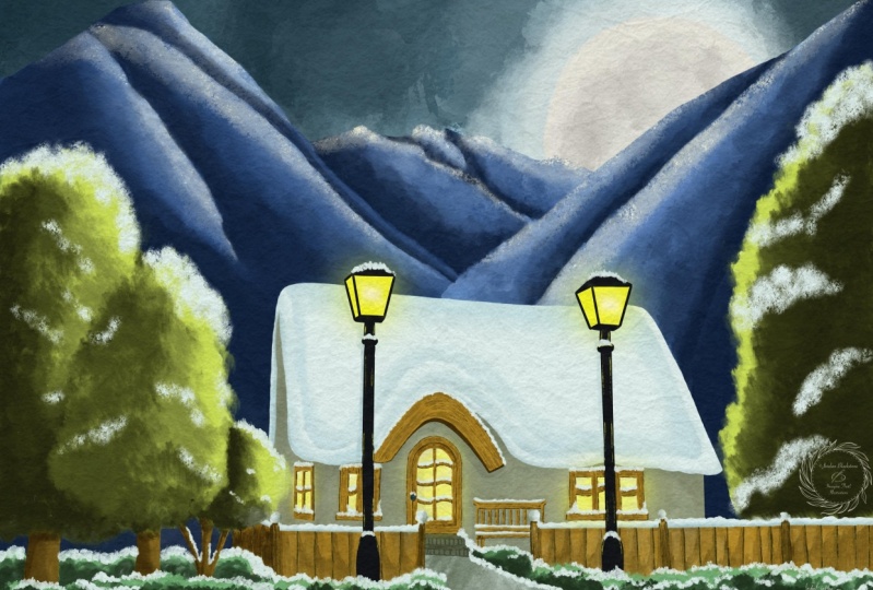
6. The House and some Snow: We've arrived at the final
part of the painting. Well, not we're not
done with the painting, but the final part, the final item to house. Let's paint the house together. Then this whole scene is
coming together nicely. Alright, let's do that. Their house for the house, what are we going to
do first is to war. I want to bring back my sketch. And then under the
window lights, I'm going to add a new layer. I'm going to call this, do all the ego, wall of the house and footwall. I've got some colors to vote. That is all as well. Yeah. Here snow snow steps, wall light the light
color of the wall. Let's start with that
and see how far we are yet. Now let's see. We need the wall there. Now we need to pay attention. I don't want to go
under the lights. I don't want to go under
the frames too much, but I also don't want to
go over to snow too much. Now here, what I'm gonna
do is make it myself easy. I'm gonna erase in a minute. So let's make sure we're
doing the house nicely. There you go. Then in a minute. When erase whatever needs
to be done, that is easier. The ego and some of these particle under
the window frames. So that's all the gaps of
white argon fill up nicely. Okay. Here you go. On this side, the steps
we're gonna do over it. So here we need to erase this. We need to do a bit better. Okay, Now here, behind here, there is still some wall
before the snow on top starts. And there we go. Behind. That's nicer. Alright, now what I'm gonna do is do this like this
too and erase the rest. If you want to paint
accurately, you can. I'm just going to
erase in a minute. And now there's the
last part here. There you go. Step
back part here. And we have a house. Good. Does I'm going to leave
that snow up there. Good. Let's take a look at it, and let's take now an eraser. For the eraser I've
cut the soft brush, but I don't think I want it. I'm going to switch
to medium brush in airbrushing or
a medium blends. Now medium brushes, fine, medium brush in airbrushing. Going to make it small
because, oh, here, I want to paint this
slightly better. There you go. Up there a little
bit. There we go. And now I'm going to
take that eraser. And where there is
snow, that is good. I'm going to just erase this and I need to
erase the background. By the way, in a minute too. Here is some, oh, now I need to paint this
into, let's do that. This part needs to
be painted too. Let's go for a one-percent. Adults too small, 2%, that's good because
this is wall of two. And then up there, we need to go 1%. Here. There you go. I think. There you go. I know you already see the shape of
the house coming. Alright, good. Let's
go for the 1% again. Let's erase these bits. Here. 1% is good. There's snow on this poll. Make sure we erase that. There's snow on this poll. And then the ego. I think I've erased off the snow except
for this bend here. I think we're okay, right. While we're at erasing, we've got to bring back the
roof now under snow here. Oh, hang on. We'll keep on erasing. There needs to be some gun
here to here to go to 1%. Day you go bring back that snow. Little bit here. Alright, um, okay,
was this good? And now we're gonna go to the
background, the mountains. Take that eraser. Probably need a larger eraser. And that's not an eraser, is it? I need a larger
eraser, six per cent. And we're going to basically
bring back the roof. Now. We're getting something. Let's hide the sketch for
now and take a look at it. See, now we're getting
a nice part here. And we can see what we
missed now, really good. Today you go now it's
one lieu of snow. We're going to add
some details to it. Of course. The one thing we
need to do is bring back the sketch and go for that
last three on the bottom. That is this tree. This tree I need, I need the sketch back. And let's see where
I need to erase. I need to definitely
erase some of this ego. That's not a reason. Everything. There we go. Good.
For some reason. I'm blending. I was blending for some reason. That doesn't work. There's snow around there. Then I need to go back to the mountains and
erase that bit too. And now we've got snow
wherever it needs to go. Let's go back to the house. Did we do all that? All right. We're going to add
stairs for that. We're going to go
to another color. We're going to get that warm. It's the steps now we
need to steps for that. Good. We're gonna go
through the steps. I'm not sure how large
we have, 45 per cent. It might be slightly too
large, I'm going to 2%. And since the wall is
behind everything, This is nice and easy
except for this part here. We need to be careful and we want some snow on the
steps, of course. So I should not have
painted all of that. Probably do it for now. And there we go. Make sure we've got a
nice blend going on. Alright, the next thing you
might have noticed already, there's a thing called mortar. Here. There we go. We
need small brush. And what we're gonna do, we're going to add these lines. Now when we hide the sketch, we should see them. I'm going over a
couple of times. Let's add one edge to D you go, That should do it. Let's hide the sketch for now. And there we go. See, that looks good. But what we wanna
do is with this, then add the top line here
at this line and really add this line to go for
the bottom line, C. And that makes steps. But we're gonna do though, blend this in a
little bit like this. Yeah, a bit nicer. Let's add some of that dark
color right there too. And add some on here too. And now we got to
erase some of that. And now we're going to
first go back to 0. We have that on the
wall, that other color, the wall lights because
obviously that is not good. We missed I missed some here. The rest is good,
that it's better. And I missed some war
behind there too. Let's blend that away. There we go. That's going, oh,
that is not good. 1% going over there. I don't want that the
grass, but behind here. I want to definitely
some of that light wall. Good. Alright, why don't
wanna do is with this bench and want to pull that all the way down to make it myself easy because
now debentures, floating fence, where
is the band that window frames go back to
that light would color. And I'm gonna just pull
this all the way down. Actually. Erase that
bit. There you go. That's better and now
get that darker color. Now, look at that.
That's better, right? Might make this slightly thicker to read a little bit
of body on that bench. Otherwise, you're
going to sit on that. You're going to be
in so much trouble. Good. Alright, and then we need some dark color behind here too. That looks better, okay, right now we've got this, we got that. We can do this. Go back to the wall and there
is stones ground or color. I'm adding a layer
under the wall. I'm going to call
this the ground, the stones, whatever you
want to call this grounds. I've renamed this ground. Now I'm going to go
to a different brush, the oil dep, one. I put it on large
but let's say 40%. Slower, slower and lower
the opacity to 50 per cent. I want to add this
to the ground. I don't want the snow to come
through just a little bit, but create an interesting
effect here too. At some points, bit more. Day you go, I like that. There are two. There we go. That looks good. Alright. Now I need to check
if I haven't done anything on the snow
I have like here. So I need to get
an eraser two per cent nice and erase that
wherever I've gone. Apparently over the snow. That's it. On a little bit there. Yeah. And there we go Now. That looks good, doesn't
it? There we go. It looks like a very nice scene. Although this is
one big white blur. I don't want that. We
need to correct that. We need to do
something with this. We're going to bring back the
sketch and we're going to go to D background. And we're going to add one
layer above the background to get a little bit of a
nice texture in here. For that, we have a snow MIT. We're going to take that. I think I might
stick to the brush, but not that large. Put it on how the
percent Let's see. Put it on two per
cent. That's nice. See you. And I'm going to add that all these edges around there and blend this in a little bit
just to get a nice subtle edge around this edge to
where it is darker. And back here to
want to add some of that blue color
here at the bottom. And you go up here. So that I get not
one huge white blur. And just blend it
in a little bit. And here you go. I need some there and
some around here. And we may do some
on this edge too. At the bottom, a little bit. At this bottom
here, a little bit. Definitely around here. And then there's some more
going on around here. And we need a little
bit around there. Okay, good. That should be done. And some at the top. Alright, that is just to create a little bit of interests and I'm going
to hide my sketch. And I'm going to show
you what we're doing C, or adding just a
little bit of snow. Shadow effect. When a large and his brushed is six per cent opacity around 50. And I'm going to
just blend this in a little bit here too. I don't want it that strong, but I definitely
want it to be there. And create nice snow edge here. There you go. See that looks a lot
better than one big white, blurry mass of snow. Might add some here too. A little bit. Why not here? Around this edge a little bit. Today you go on some here. Now, we're having
a nice snowy roof. See, that looks a lot
better than what it was. Let's do a slightly more dense. And up here, just
a little bit more blended in. Okay, good. What we're gonna do
next is going back to, I think that hundred percent. See if we can add around the
edges here a little bit, going to a smaller,
that's too small. 2%. Yeah, that's nice. Little bit here.
Just at the bottom. Go for some shadow
around there to see. And that makes all
the difference. How about here?
Just at the bottom? There's a little bit
Around dare to bid, they're a bit there, of course. And then we're going
to need some here too. Alright, bit shadow
there. Might do that one. That one looks a bit rate. I need to do something
about that in the wall. That one I'll leave.
That looks okay. That looks very weird too. Alright. But this one is strange. Let's go to the wall, get the eraser,
whereas the wall here. Let's go for a smaller eraser. Erase this a little bit, erase that a little
bit, give it shape. Even around the pole, or a little bit. There you go. That looks slightly better. And now go back to
the snow background. We're going to add
that color to it. Right? There you go. Now, they want this one needs to
be correct too. That looks weird. And where's that tree? Rats erasing? This slightly larger. There you go, that's better. All right. Now that looks
a lot better right away. And make that slightly larger to make it look like snow instead of, I
don't know what. Right, good. And then I need to go back to that background layer just above the background really, I think I might mix them
but might have mixed them, but you could again merge
those two together. And that's it, right? That's it. That looks really good now. A lot better than it was. Well, we're getting there. There's one more thing
I wanna do to this. I want to add some snow at
some point in the grass, perhaps on the trees,
and some other parts, and perhaps add a little bit of a deeper shadow
to certain paths. I'll show you that in the
next and the final lesson.
7. More Snow and some extras: We're going to add some snow to the part where it isn't missing. Perhaps add some darker parts here and there,
little bit of shadow. And then we're done with
this beautiful oil painting. Some snow. I definitely, I'm going to add a new layer on
top of everything. Grass there on top. I'm going to call this snow. That will be my final
layer of painting. I've still got that
light snow color. I need a brush. I've got a brush. Which
one do I have? I cut that. All of them. I'm
gonna go to that. Oh, depth, Daesh, I'm
going to use that. Let's see. I'm going to put that to 3%. Let's see all that is nice. That is a good, yep. Alright, let's make sure
I'm not on doing too much. One wanna do is with a
three per cent on here. I'm going to dab carefully
a little bit of snow. Day ego scene that looks good. I might actually go to
2% for the next one. That's better. I'm
actually really dabbing that snow enlight
that C, That looks good. Now here could be some
snow on a little bit here. There you go. Just
these final touches makes it look really nice. Now, what we're gonna do, we're gonna pile
up some snow here to there you go. That we need to pay a
little bit up here. And we're going to do exactly
the same here to go here. We're going to add
some snow around here. And the poles that this one looks disconnected
a little bit more we're gonna do is add
some snow like that too. It's that one is good. What we're gonna do here on
the bottom of the rider pulls are we're going to add
some snow like that. Each site actually carefully off the pole that looks good. Might just add a little bit. There. There we go. We're
gonna do the same here on the tree on this side. Pile up some snow there. And of course, then if
we'd done it on that side, we need to do it on
here a little bit too. In their carefully. All right, C and now we're
getting those final touches. And then what we're
gonna do next, we're going to add a little bit of snow on top
of the window frame parts, where there actually
could be some snow. Digital. Dead just adds some
extra final touches. Alright, we may need
some loud on top of some of the grass here too. We should go larger for that 4%. Just a bit random there too. That's good. Now we're getting a nice snowy landscape. Now, what we could
do is put it on. They're going to go
for a different brush, the smudge brush again. Because then we're getting
that better effect. Snow like that. Even around there on the top and some here and
there on the branches. Just to give it a little bit
of a hint of snow here too. Good. That looks good. All right. Oh, this one we missed a
little bit of snow like that. And now we're getting down. Look at that. That looks
really nice, doesn't it? Alright, what the
final bit we're gonna do is we're going to add
one layer on top of this. We're going to set that
layer to multiply. We're going to take the
regular round brush, oil paint on a round brush. Now let's go for
the round brush. We're going to set
this to shading. Well, my tried to flip. Let's try the flat
brush for this. And what we need
right on here, e.g. we need some shades, not like this, that's
too dark, too much. Two per cent. We're gonna do is
yes, that's better. We can just add shadow
line right here. Make sure blended
in a little bit, tau we go Now that's good. See, that creates a
nice, interesting edge. We're gonna do that
under here too. Don't press too hard. You could set the opacity, by the way, to a bit less
than what we're having. And we need that in here too, on the hair too. And there we go. There. That's too much. We're going to set the opacity to 30, 40. Plan descent. And a little bit nicer. That's better. All right, let's do that on the hair
to that in a little bit. So I'm now back to
about 40 per cent, 35. And the back of the house
couldn't shade on the hair. No. You go on the window a little bit around here. Just a little bit. In here. A little bit. And at the
back slightly that we go on some shadow there
and around there. And here To around, they're mixing in a
little bit of shadow. In the back of this
war. The benches. I want to add some
shadow here too. Alright. Extended. Slightly better. There we go. That looks right away
a lot better at some more right there since this is slightly darker
part of the house. Well, when I add some
shadow around the poles to just to show you go, to bring them out slightly better than what we have. Good. And let's add a shadow under
the snow here. Doing this. But roughly a bit quick. Even if we go over the
snow, not an issue, we're gonna give this
definitely shadow right there. See, now we're getting some
nice new answers. In parts. One is light, what is dark, or what is front? What is back? No, let's not do that. Let's do that slightly
more careful we're gonna do it but with careful under 32. All right, good. And we're going to enlarge
its 17, 80 per cent. And I'm definitely
going at this tree. And this tree two on the back. I want this to be
dark identities now. Alright, Good Hope
that is too much now. Okay, good. Let's carefully add some here, and there you go. Just a little. We're going to leave
the shadows like this. The only one thing I
wanna do is on the house, on the wall, I want some
texture, a bit boring. So what we're gonna do, find
that whoa, there it is. Add a layer on top of it. Press on that layer
a clipping mask. Now go for that motor
color or the warm met. We haven't used the warm up. Let's try the warm it. And we need to dapsone texture. We're going to go for
the dash this one again. Yes, let's try that
on really large. And we're going to add
a little bit like this. There you go. And that
might be, is quite strong. So what I'm gonna do
is that would work. I'm going to clear
this. I'm going to set it to 50 per cent. Right? Look at that. And then this back
slightly more. And at the bottom, one's slightly more C, and now we're getting a nice
texture on it. There you go. That looks a lot better. So we've got some nice texture now on the house that
looks a lot better. We've got the root, we've got some darker shadow,
lighter shadow here. One thing I wanna do
is on these mountains, add a little bit of
an edge on some of the parts to pretend get a
little bit of snow there. So if you have one more layer, we're going to add a layer
on top of the mountains. We're going to set
this to the moon white or should, which highlights. Let's try this one.
The highlights. We're going to take
that oil dashed. Know I want to have a just
a regular round brush. Set that to about 4%. Let's just add a line here. And that might be too much. Definitely, That should work. But not like this, see, but that's the effect we want. Okay, I'm going to clear that. And we're going to do the
opacity to 39 per cent. Let's give that a try. That's better. Now add a line to it and blend that in
just a little bit. And erase where it
shouldn't go. There we go. Let's take a look.
See that is better. Yes. Let's do that on here too. Just add that edge
just a little bit. There you go. Yes. And then
go for this on the top. And I'm going to
go for 2% around here so that I can go more
accurate than I have done. You go and blend this in. Just a bit more? Yep. Okay. And add some of
this pool that is a lot. Now I need a larger
brush to blend this in a little bit better can
blend with small brush. See you, I know we're
getting a little bit of that snow effect. Yes, that is good. This one. Let's add strong at the
top of it here too. And I don't think I
want to do there. And I'll go into what am I 1%. Yes, add a little
line there like that, and go into the large
156 per cent so that I can blend this in just a little. At the edges. They go, I like that better. See, That's good. Like some there. Erase where it shouldn't go. Creative enough that
snow effects on the mountains to day
you go, that's better. All right. Let's do this one. A go. One-and-a-half, some snow. Alright. Yeah. That's careful. It will be too much otherwise. Let's take a look
at that, right? So like that's good. If you don't wanna do this, then don't do it. Of course, obviously. Adding a little bit there. That's good enough. Good. Alright, That's
better except for here. Needed a little bit there, but not all the way
there, please. Right now. That's it. Good. Now there's one
thing still missing and those that do on up the
doorknob should be there. Let's bring back the sketch. There's a door knob. We don't have a doorknob. So I need to find
the window frames. If you have a layer on top of
a dual layer on top of it, if you don't have a layer, then do it on the same layer. I'm going to do that the
same as the light pole, that, that color
of the light pole. I need a small brush. Which one do I have
to round brush tool and I'm going to do
the oil paint one, make it small, small, and add that door knob to it. There we go. And then let's
hide that sketch again. There you go. Now we have a door knob, and now I only need to
find that snow there. And don't want that erase. Not all of it. Just a little of it might
be too much anyway. There you go. Now, look at that.
That's been app. We've gotta one-up, go
back to the doorknob. Want to erase a
little bit of it. Right down. At the bottom. We've got our door
with Bedouin up. Our painting is done. Now I realize this takes
a while to paint this, but if you spend the time, you get something
really beautiful, really beautiful
winter cabin scene. Now there's one
thing missing you. When you've downloaded it, you've probably seen that. And that is the paper. Yes. We need to add the paper to it. We're gonna do that in
the project section. So in the last bit,
we're going to add the paper and then I'll talk
you through the project.
8. The barren Tree: Well, I do realize there's
one thing missing. We've added everything now
except for the front three. We gotta do that,
that from tree. We forgot that. Let's put that, Let's see Where are
we going to put that? Let me get the sketch back. Let's look at that.
It's behind the grass. So under the grass, light poles, on top of the light poles, we're going to add
the barren tree. That's not really
barren instead, what's doesn't have a lease. So the next thing
I've got that sketch, so I'm going into sketch, I'm going to do this really
dark without any definition. I'm going to pick
their mood dark. I'm going to get that
oil paint one is fine. It is on 1%. Is there good? Right? And I'm going to
just paint this in. And I'm gonna go for it at
the bottom here carefully. Let's check. Yeah, this is the bottom two. Alright, I'm now at 4%, I'm going back to 2%. These parts of it. All right, Good. And
here we need this part. And let's see this bar two. And there's one
here in the middle. And older, some snow on top of it or
that's not a problem. We're getting rid of that, okay? Now we're at two per cent of this should
be fine for this. Okay, I think we're
going to go to 1% now and just trace
all these parts. But connect them. Here's one day you go. Oh, I think I had
that one already. Okay. Yes, One. Okay. Let's see, Here's one. Alright, let's hide the
sketch and see what we got. There you go. We've got that. Now. I'm going to go for this. I'm hiding the snow for now. I'm hiding the sketch so that
I can see what I'm doing. I'm, yeah, I'm keep on
going with that 1% and I'm going to hope that's too crazy. I'm going to create that tree just slightly better now
that I see what I'm doing, I might add some
more branches to it. And there we go. There's our missing three. I'm going to go to three
per cent this part. Carefully do it there too. Needs to be a three day you go. And like that's going to do 1%. Make sure I connect
everything to it. Now, there we go. I've got that barren
tree that looks better. See, that was missing still. Good. I want to do that. All right, good. Alright, so what
I'm gonna do now I'm going to go to that light would and I'm going
to add on this side, don't want to do data. That is two lights. So let's go for that
mid color them. And I just want to make sure. See at the trunk at least some slight
definition that you can see. Oh yes, these are different. There's another one. These are different
trees growing out of one, splitting into many. There you go. That
looks better, right? Good. Now, on here, I could
add some light color. Just a little bit of light
color on some of these spots. Making it slightly
more interesting here to, there you go. And now it looks a lot
better than it did. Go back to the dark one. This this one. I'm not happy with. There you go. That looks better. Now we've got an barren tree C, That looks better
now it's complete. Alright, my debt here. Okay, now we've gotta go back
to that snow because now the snow is in front of
the tree, can't have that. So what I'm gonna
do with the snow, I'm going to lower the opacity so that I
can see the tree fruit. I'm gonna get my eraser. And I want to be on the snow, not on the barren
tree. There you go. Right? Two per cent rule. Let's do much here. 1% large. Want to make sure my tree
is in front of snow. That is under three in the back. That's all the work
that we want here. I want to get a small one. Right? I think we're fine. Like this here a little bit. There you go. See, now the snow is in
the back on this tree, not on this tree DO now
we're talking about snow. We might add some snow to this tree at some of
the branches too. Now I'm going to put this
on the percent again, I'm gonna go to that snow color. I have that same that Deb
Rush. That works good. And on top of these
branches where I can at least see
it a little bit. I'm going to just
add some snow to it. There you go. That looks good. See in here to see. And now this tree is really serving its purpose. At a little bit of
extra to the scenes. Seen others good, no, need some snow on this one. Definitely. On this one. And in here a little bit. Alright. Alright, and that's it. Now, there's one more part. What I'm going to
show you something about those papers I added. They do something interesting
to this painting. But for now, we're
done with painting. So we're ready for the
final parts. See you there.
9. Optional - the extra Tree line: Welcome to this lesson. This is going to be
an extra lesson. You can skip this
if you want to. If you say, I'm done with
this, I like it this way. I'm ready to move to the last lesson where
we're going to play a little bit with the paper
because that's still missing. But if you want to add a
little bit more depth to this, we're gonna do one more thing after showing this
to some people. There was one remark, we think the mountains
are too close. Now in the scene, I created, the real seen. This cabin actually is at
the foot of the mountain. If you think the same, that the mountains are slightly too close, we can solve that. We can solve that
quite easily by adding a layer of
trees in-between the cabin and the mountain
to create some distance between the mountains
and the cabinet itself. Before we're going to do
that, what we're gonna do, I'm gonna go to my
gallery and I'm going to create a duplicate
of this painting. I want to keep that one and I'm going to press to the left, I'm going to say duplicate. It creates a second one and that second one I'm
going to mess with. So what we're gonna do,
we're going to create just quickly some pine trees. It's a scene of pine trees. And I'm going to just do that
on layer above everything. So pretty much even on the snow so that I can see
what I'm doing. Well, I'm going to add a
new layer there later on. I'm going to correct
that because it will be in front of everything. Well, we're gonna do, we're
going to paint one tree. We're going to pick that
all smudge brush again. And I'm going to go for the tree mid colors.
In this case. We're going to work with
mid colors and dark colors, probably not the light colors
to create some contrast. Let's see if that
adult is good enough. It is on 13%. I'm going to keep that on 13%. Alright, so I'm going
to create one tree. What I could do also
is I could hide everything and create a tree, but I'm going to create a tree
here so that I can see it. Well, let's say this will
be the top of my tree. And I'm just going to
create that tree like this. And there's three here, that's going to be three
here, trees behind it. So I need to paint
the whole tree. And I'm basically
gonna do the same. I'm going to go this way. And there we go. There's a pine tree and we're going to fill
it in like this. Doesn't need to be
great pine tree, it just needs to be a pine tree. And it's covering
nicely everything. Alright, good. And
there's the pine tree. And the next thing
I wanna do with this pine tree is
add a second color. So the three dark this one and give it a little
bit of dark in a two. There you go. Alright, I've gone a bit too much there. I'm just imagining
a little bit where these branches would
be going like this, going like that under
an angle like this. And like that. Basically as you would see, a pine tree bit in the middle. Alright. I think I'm okay
with this pine tree. Just correcting one bits. I'm going to go to that
tree mid color again. They're a little bit back. That's it. Good. Now that looks like a
pine tree, doesn't it? I want to make sure I'm getting
some color in here too, that it will cover everything. There you go. That's better. I wanted to cover that the mountain a little bit. And I'm going to treat dark
and create just a little bit. Now, that's good. That's a good pine
tree, isn't it? There you go. Alright, little bit. The top, very carefully. There you go. Now what I'm
gonna do if this layer, I'm going to actually
duplicate this. And this layer,
I'm going to move, remove my first pine tree
to the side all the way there. There we go. I'm going to my original layer. And I can move this pine
tree now behind or above, but make sure you
keep it inside. The drawings were not outside, then you end up with
half pine trees. There you go. I'm going to merge. I'm not going to merge these
two actually, no. I need to duplicate
this one again. Move this one. And now oh, that is not moving.
I don't want that. There you go. And these
two layers, I can merge. I got to keep this one. I can't merge this
one and this one. Then I end up when I copied it. A half pine tree,
I don't want that, so I'm going to merge these two. And this one makes sure
I'm merge that down, Merge Down, and then
duplicate this layer again. And these two pine trees, I'm actually going
to move like that. I might put these
slightly lower or you could put them higher
to create some different, don't get them all
on the same line. And you might even do
a flip horizontal. There you go, to create
slightly different pine trees. Good. The next thing is, I'm going to duplicate that layer again. I'm going to move these guys. I'm going to flip them again. I do. Actually even a little
bit lower and a bit closer. There you go. I'm
going to let's see, I might merge these,
all three of them. Yes, I'm going to
merge these all down. Merge these, duplicate it, then flip it and move
it till the end. And there you go. Create all these pine trees. Right? The next thing is now I can
merge all of this down, merge down, I end up with one
layer and now I'm going to move this layer
above the mountains. So let's find, move this c
till I find the mountains. There, there. Alright. Now the mountains,
I've cut this white. So what I'm going to
do first is merge these mountains and the white together. We're
gonna do that too. So these are now one
layer and now they're officially going through my
snow and through my house. What are we gonna
do with that is I'm going to create a
clipping mask of this. And that's why I wanted
above the mountains and made sure that the snow is
in the mountain stew. If I now say clipping mask, then they shoot a
nicely come forward. It only clips on the mountains. And since we already
erased the mountains, we now have this idea. Because we erased the
mountains from the cabin. Now the Kevin comes
through it again. So if you use a clipping mask, it only regards what's under it. And since we cut a piece
out of our mountains, it will not paint that. So it goes nicely
behind the tree, sorry, behind the house and
that's pretty good, isn't it? Now, there's one slight
mistake here perhaps, but I'm okay with that. And there you go. That is how we create some distance between
the mountains and the cabin. And you might even do some snow on that
if you want to do, I'm going to leave
it. Why not now? I'm not going to leave
it for that. Let's see. I'm going to, I have
this extra layer. I'm going to clear this layer. There we go, and
we're going to just add some snow on here. Let's see. We need that snow color
for that snow light. They go zooming in. I'm going to use
that same brush, going to lower it a
little bit seven. Now five per cent, let's see, and add some snow
to these trees. And now I'm making sure that
I could do it on there. So that's not really happening. This clipping mask is useless. So I still have to
pay attention, right? Then I would have to unclip. If I unclip this one, make this a regular layer, make that a clipping mask. Then it would regard
the trees and then merge them together.
You could do that. This would work like this. Just add some snow
here and there. Now we're down here. I might even go to
bid larger brush. And my dude it down
there a little bit too. Right now though,
we've got some snow on the pine trees to
that looks better, doesn't it set forth? This doesn't look so good. A little bit more snow on there. That looks good. Right there. Don't
like that either. Okay. Well, there we go. That just almost solves it. Just a little bit snow there. Good. There you go. Now we've
got some distance between the cabin and the mountains
by adding a line of trees, or if you want to, a couple of lines of trees, alright, And that's the,
that's the little addition. Now next up is adding the paper texture
in the final lessons, but you won't see the
trees in that one. So if you have the trees, it will look slightly
different than what I'm showing
there. Alright, good. I would say, let's move
to the final lesson.
10. Adding the Paper and the Project: Welcome to the final part. We're going to add the paper texture and we're going to talk about the
project a little bit. But let's do that. Paper texture for our painting is done and our painting
looks really good. It looks kind of, Yeah. What would you see? Duty toys painting. I would say we can
do one step more. I want to add some bit of extra atmosphere and mood
to it and show you that. That's why I prepared
those paper textures. Find them on top and the papers. And once you add
that paper texture, you're going to add some modes. Now, I'm going to walk you
through the first one I did. I created a pay protection. Three of them brought them
in here, and one of them, I had done a color burn that is foot onset it on 50 per cent. The other one is a multiply. Now, multiply alone would
create a nice paper texture. I'm going to show you that. Now you see a nice
paper texture here. It creates a certain
mood and atmosphere, but it darkens it a
little bit blurry. Now you could do it
only with a multiply. Let me add them, multiply. If I add multiply it, it adds the texture
on top of it. It multiplies everything
with the texture. It makes it slightly dark, but it looks pretty good
focusing on this part, but to compensate for
the slight dark and to bring it a little bit
of atmosphere and mood, we're gonna do a Color Burn, turn this color
into our creation. And as you can see,
that looks nice. Let me show you that you
can do that really strong. Really everything lights up where you can do a very little. I've chosen about 30%. This makes, it looks great, but you can do a lot
stronger if you want to. Now that is the first paper
texture is a bit yellowish. Second one is more just like a regular paper or
regular paper color see less yellowish, more grayish, still add something very nice
to the painting. And the third one is
a stronger texture, so a lot more texture on it. And I'll let you choose
whichever one you like. I'm going for the first one. I think that really
compliments the painting. Really nice. Now it looks like more as
if I've done it on paper. And also if you
look now at snow, it's not one uniform. Snow in the mountains
are not uniform. Now it has a bit of
structure in it, and that is simply by
adding a paper to it. And that completes this painting and other completes
this class too. Now we've got a nice
paper texture with it. You can choose whether
you like it or not. You can choose your own paper, put a canvas on it, use color, burn and multiply, combined
and see what you like. Yeah, you could do it
slightly different, or you could do it without
totally up to you. For the project. I obviously love to
see what you create. I would love to see how you
have done in this class. I realize it's a bit longer, but this needs some
attention and you can really beautiful scene by taking all these
steps we've done. Post it so that we can see
it and everyone can enjoy. You can enjoy it indeed. Why not give me a follow
up to here on Skillshare? This is not the
only class I made. I've created a lot more
when I tried to do one procreate class in a month and also a
traditional class. So check out the other classes. I do have just more
which you could enjoy and discovered some new things
perhaps in Procreate. Alright, well, that's it. I'm going to leave now,
want to do something else? I'm not sure what I'm gonna do. Oh, I know what I'm gonna do. I'm going to edit all
these things I filmed. Now you're seeing the last part, but I still need to edit everything and I'm going
to throw it on Skillshare. So back to the future
finger, bit, better future. I'm going to create it. And while you see it, it
already has been created. Well, post the project and I hope to see you in a
different cluster.
 Benjamin A, Art Teacher, illustrator Art by Benjamin