Transcripts
1. Class Introduction: Have you ever wanted
to capture the beauty of spring landscapes
in a unique way? If so, you're in
for a treat today. In this class, we
are going to explore the fun and creative world of painting polaroid landscapes. And what I mean by that is
painting on a small scale. It's a fantastic way to
bring the essence of spring into your artwork to create something truly special. Hi. My name is Madeline. I'm a watercolor artist and content creator on Instagram
TikTok and YouTube. My style of watercolor
is bright and playful, and I don't believe that watercolor needs to
be intimidating. This class is the fourth
installation of my series poloid landscapes where I
make painting landscapes achievable by taking advantage
of painting miniature. The landscapes that
we will be painting today are all inspired by the beautiful colors and emotions evoked by
the spring season. Each landscape is based off of a reference photo
that we are going to analyze and simplify together before
starting to paint. I hope you will join me on
this whimsical journey. I cannot wait to get started. I will see you in the next
lesson where I will go over all the supplies that
we are going to be needing.
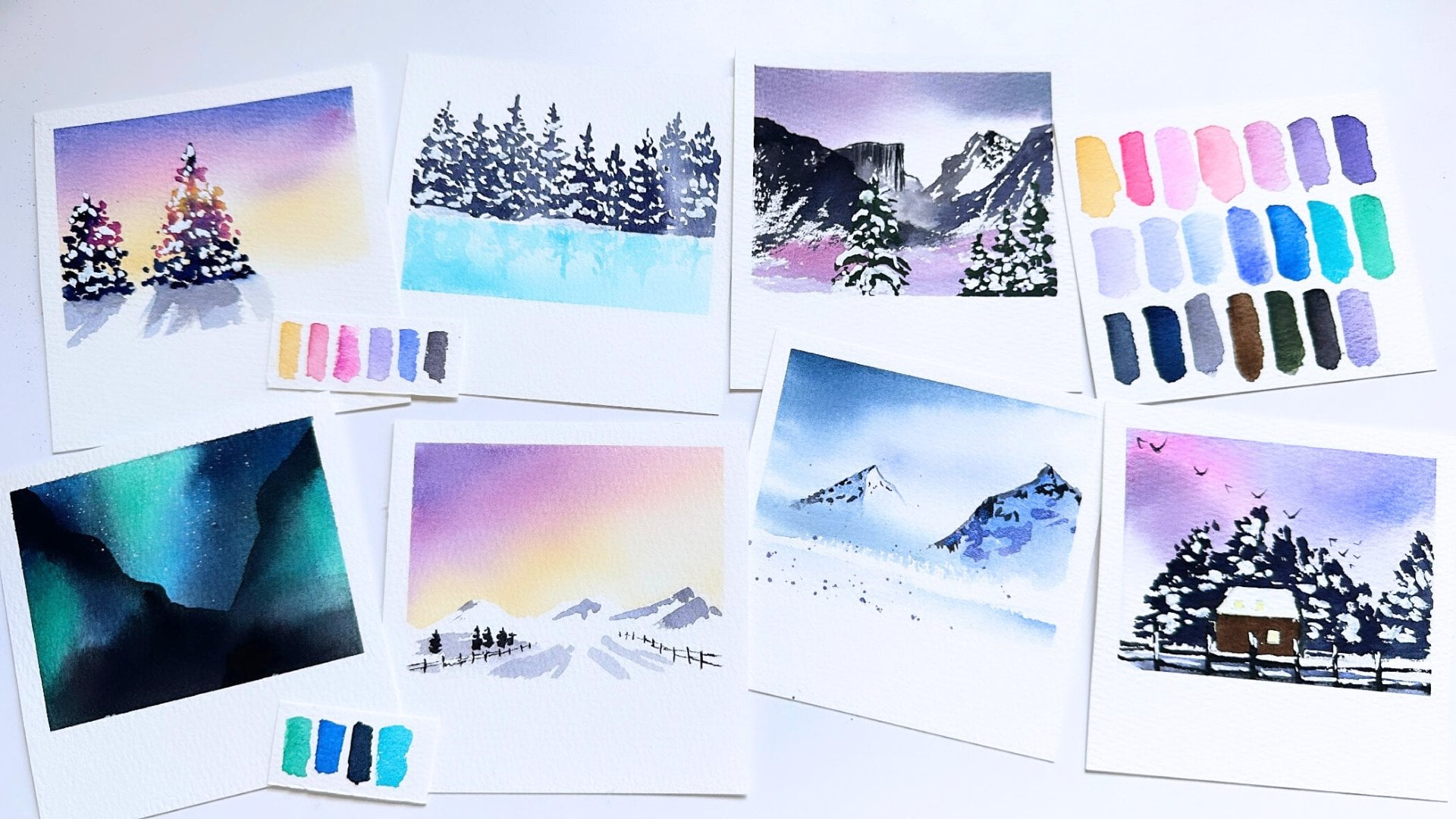
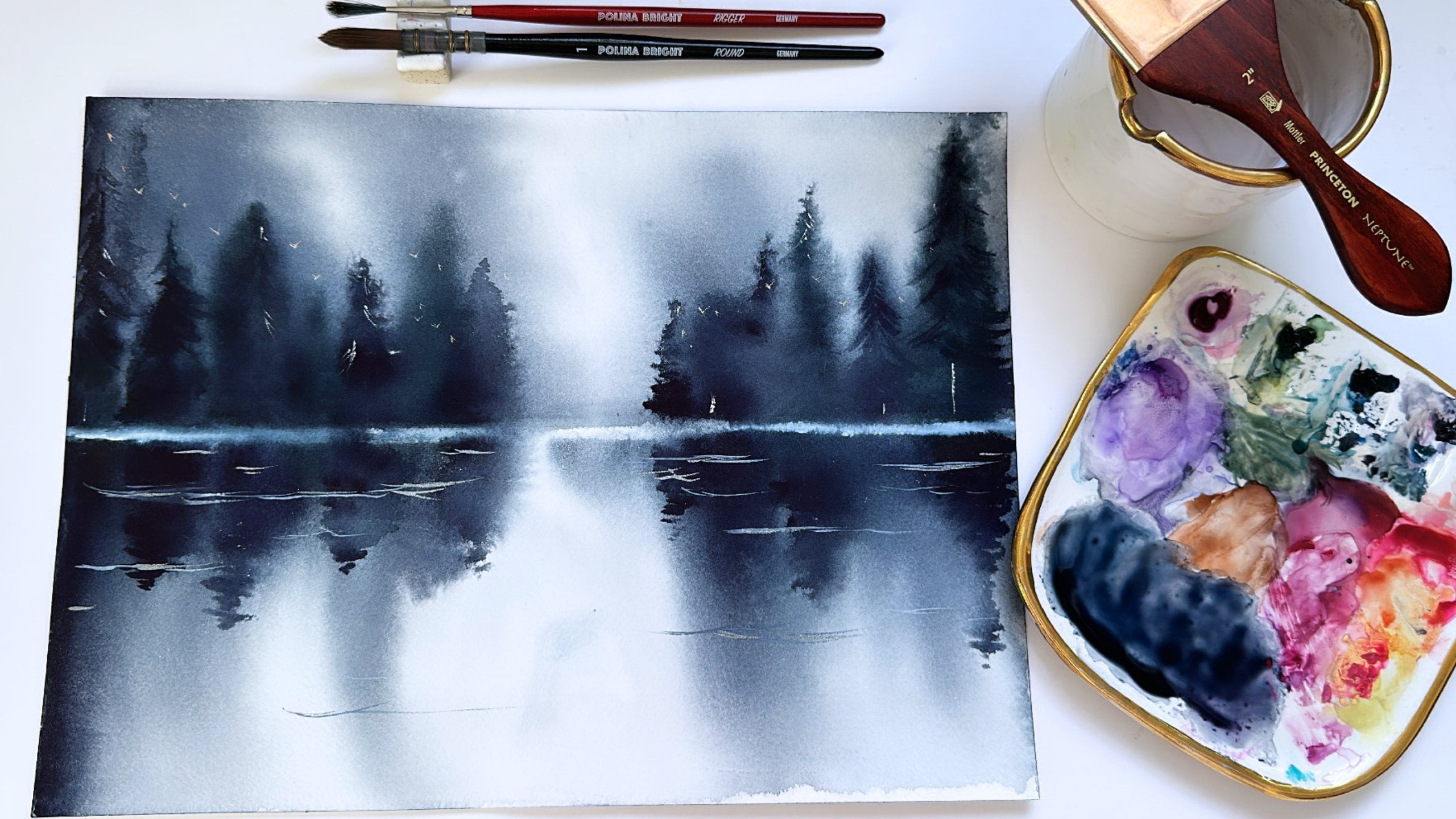
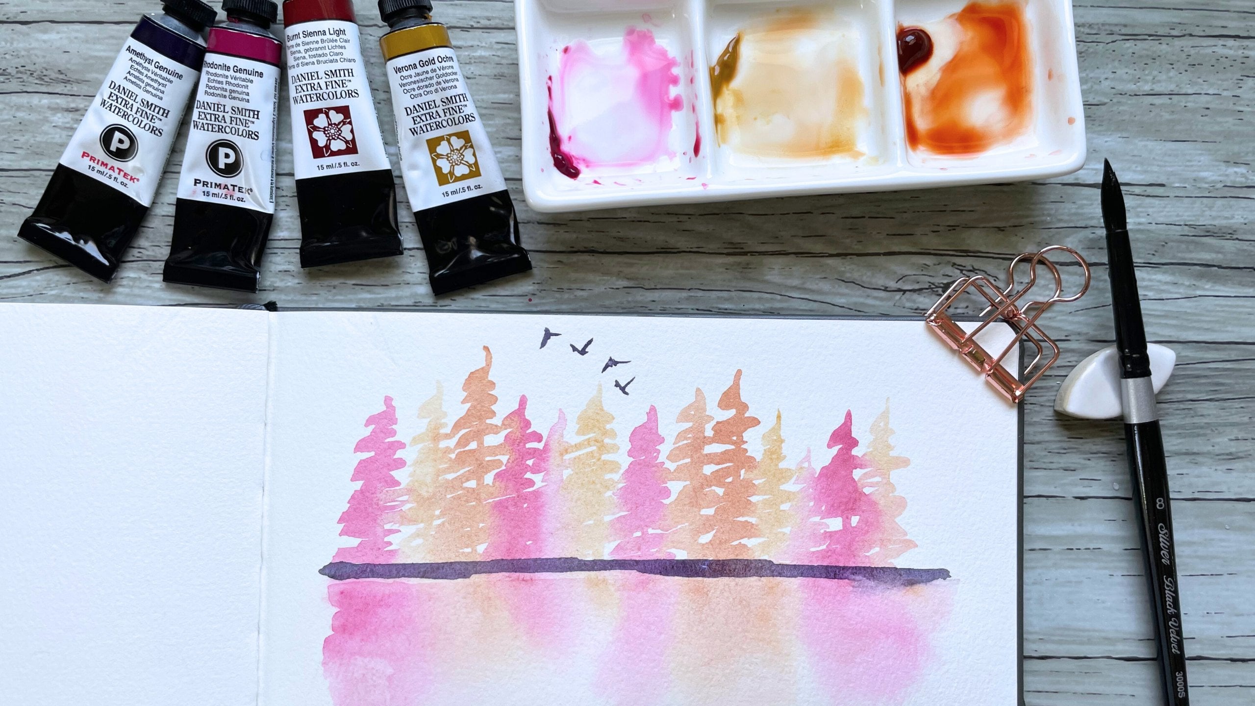
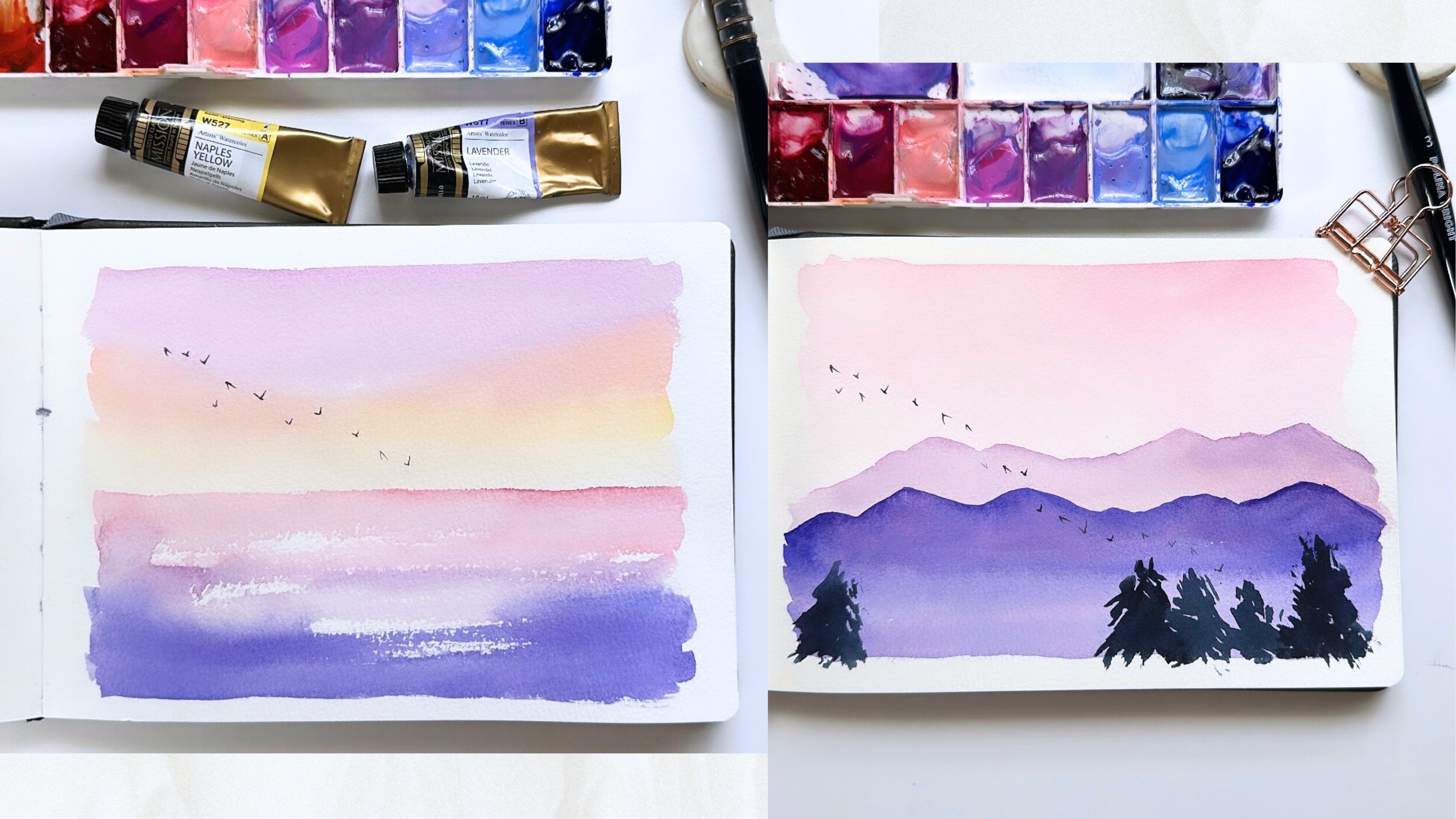
2. The Supplies: Let's go over the supplies
that we will be using today. I'm first going to swatch out all the different colors that I will be using in this class, as well as the types of brushes, and I will end this supply video with going over the paper that I use and how I prep my paper for painting each
of these polids. I will be using handmade paint, and sometimes it can be hard to get the exact same paint
colors that I'm using. But I will share what
color they roughly translate to so that you can
still find a similar color. So I have yellow
ocher, Cadmea Mill, Rosiena opera, Ultramarine Pink, pale pink or baby pink magenta. This is a warm purple
that I guess I would equate to maybe
dioxazine purple. Ultramarine, cobalt
turquoise, sap green, green gold, olive green, sepia indigo, And the last color
is neutral tint. As far as brushes, I refer to the brush
type oversizing because sometimes brush
sizes can vary greatly. So this is a firm round brush. Firm round brushes
hold less water, have more of a tip, and it's easier to get more controlled and
precise brush strokes. The next type of brush
is a soft brush. This is a round brush, but it holds a lot
more paint and water and is easier to use
for paint splatters. You can see this round
brush compared to the firmer round brush has just a wider brush stroke because it just holds
more paint and water. The next type of bruh I'll
be using is a mop brush. A mop brush is even more thirsty and absorbent
than the last soft brush, and you can see how much paint and how much wider
this brush stroke is. This is another soft
brush that I use. It is made of squirrel hair and is just
super super absorbent. The next type of brush, I refer to this as
a flower brush. It is a one slash eighth dagger. This brush is an
interesting brush. It's called a stroke brush. But what I would
equate it to is like, if a flat brush and a
liner brush had a baby. It is flat at the tip, but also has a very long belly. I use this to paint some of
the trees in this class. The next type of brush
is a liner brush. A liner brush has a very
long and narrow tip, and it's perfect for
getting fine lines, and I use this to
paint my birds. And the last brush that I use in this class is what I refer
to as my tree brush. It is a super old and
cheap round two brush that I've sort of
smashed the end of. And as a result, I get really nice foliage
brush marks that I wouldn't normally be able to get with a
regular round brush. I will also be using masking
fluid in this class, and along with that, is a silicone brush that is basically a brush
that has a silicone tip, and this makes it easy to
get and use masking fluid. And once I'm done, I can just wipe it off with a wet wipe. This is the brand of
masking fluid that I use. It's nice for masking off parts of our paper that we
want to preserve white. I will be also using doctor PH Martin's
bleed proof white, which is a white thick
and opaque watercolor. I'll be using masking tape
to tape off our paper, as well as a hot air tool to
speed up the drying time. The next thing I
want to share is the type of watercolor
paper I use. I will be using paper
from the brand Bau Hong. This is 100% cotton paper. It is their student line, and it's a rough texture, which this is kind
of like cold press. If you don't have
access to this brand, any type of cold press, 100% cotton watercolor
paper will do. And I cut my paper up into
four by four squares. The width of the paper is 4 ", and the height is actually
just a smidge over 4 ". So here I'm cutting the
paper into four inch strips. And then for the height, you can see by the ruler on my paper cutter that I'm
just cutting it a little bit over the four inch line so that it creates that kind of polaroid shape for when
we paint our landscapes. It's the perfect size for
a miniature painting. The last thing I want to
show you is how I tape down my watercolor paper so that it creates a polaroid
once we're done painting. So I tape the top and
the right and the left. I leave a little
tiny slither that you see currently covered
by the masking tape. And then for the masking
tape on the bottom, I tape off part of the landscape so that the very
bottom portion that is not covered by
masking tape is the same width of
the portion that we covered with masking
tape on the other sides. And then after we
paint our landscape, when we remove the masking tape, it will create a small
miniature polaroid. And one last note that I want
to share about supplies. It can be easy to get
overwhelmed when looking through an entire supply
list for a new class. So I just want to
reiterate here that you do not need to have the
exact same supplies as me to create all of the class projects in
this class successfully. I'm a big believer
in just using what you have and adapting
it to this class. Even though I shared with you the bruhes and the colors
that I'm going to be using, you will still be
successful in this class, not by copying my
exact landscapes, but by creating something that feels like it has
your artistic voice. Whether you use the same
colors I do or not. With that in mind, let's get
on to the first landscape.
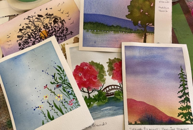
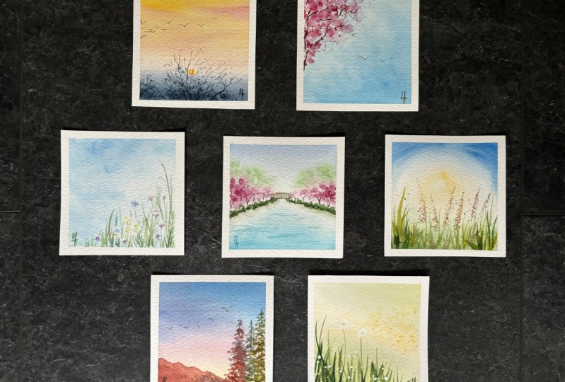
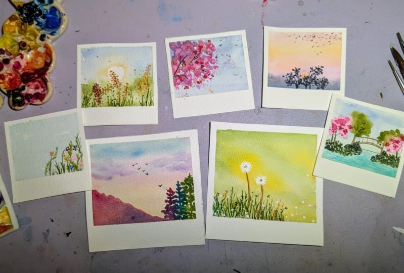
3. Day 1 Sunrise: Sunrises are some of my favorite reference
photos to paint. And for today's landscape, we will be painting this
beautiful Sunrise morning photo. Nothing says spring more to me than seeing the sunrise
earlier and earlier. And that's sort of the feeling that I have when I
look at this photo. I love the warm and soft
colors of the sky and how the sun just feels like it's barely above the horizon. The colors and the mood of this photo just feel
so peaceful to me. I can almost hear the
birds flying overhead, and I want to capture the
peaceful and serene feelings in our landscape by using warm
and soft toned colors. While I get my paper set up, I wanted to talk a little bit about how I'm going to break
this reference photo down. It's already a
pretty simple photo, so there's not a whole lot
that I need to simplify more. I just want to make
sure that I get the right colors in the sky, and I want to paint that tree that we have at
the center of the landscape. I don't want to get too
weighed down by painting a very detailed
tree because I can see that becoming an area
that I do over work. And so I'm going to
be intentional about making less brush
strokes and keeping in the gaps among the
branches so that the sky behind the tree
does peak through. We are going to start
this tutorial off by putting a small
washi dot sticker where I want my son to be. If you don't have small
stickers like this, you can also use masking fluid, paint a little circle,
and that will also block off the sun in this landscape. And the reason why we're
doing that is to preserve a small space for me
to paint the sun in. Now I'm coming in with
a flat brush and I'm wetting the paper before
adding any color. This allows the colors in my
sky to blend together very smoothly for a very soft sky. I'm grabbing a mop brush, and I'm going to start by
painting the bottom of the sky. Now, if you look at
the reference photo, the bottom of the
sky is a bit darker. It kind of has like
a purpliish blue. So I'm mixing in some indigo with a warm
purple that I have. And right above it, I'm going to add some pink because these polarids
are already so small. I have to be mindful of not bringing in that darker
bluish gray color. Any higher than sort
of where we have our sun so that we can preserve the brightness
in the upper half. Now I'm picking up
some yellow ochre and a touch of pink that
we used earlier, and that's going to finish off this initial background
wash for our sky. I just really, really
love these colors, and the only modification that
I really made to this was adding a little bit
of pink and purple to the colors that I already
saw in the reference photo. And it just really
ties in that softness. Now I'm grabbing a hot air tool, and I'm just drying this layer completely before
painting the sun. Now, I am going to
remove the sticker, and I'm picking up a round two brush.
It's a firmer brush. It doesn't hold as
much water because this is such a small little
area that we're painting in. I don't want the paint to spread too much outside
of this little circle. So I'm adding in some red, and I'm diluting it, and then I'm picking
up some yellow. And I'm adding that in too. I sort of want the
sun to sort of have, like, a soft orange. I want it to be a little bit brighter than
the yellow that we have sort of in our
sky above the sun. And so that touch of red is just going to brighten the sun up just a little bit. I don't want my sun to
be one solid color, so I'm going to drop in
just a little tiny bit more red so that the
sun has that texture. Now I'm going to dry it
off with a hot air tool, and we can start
painting the tree. Now to paint the tree, I am picking up some indigo and neutral tint
for a sort of bluish gray. You could also use pains gray, but I don't currently have paints gray in the
palette that I'm using. I'm going to outline
the tree trunk with a few branches
to sort of give myself a blueprint for where
I want the lighter foliage. And again, like I
mentioned earlier, less is more with this tree. I think it's tempting to sort of overwork it because if you look at the
reference photo, the tree is pretty intricate. But I'm grabbing my tree
brush and I'm just going to lightly tap around the
tree branches and the trunk. To create that tree so that the sky still peaks through and the sun can
still peak through. I don't want this tree to be
heavy or sort of cumbersome. I want it to feel kind
of light and loose. And so, by tapping
this brush very gently and leaving in a lot of space in between
the brush strokes, is my way of sort of keeping
this tree simple looking. I'm going to add a
few more branches to the sides to sort of even out so that the tree sort of is most of the lower
half of this landscape. I want a little
bit of it covering the sun but not too much. I want there to be
that contrast as well. Now, I'm going to grab one
of my smaller liner brushes. The last thing we're
going to do for this landscape is paint the flock of birds that is directly above our
trees and sun. I love how big the flock of birds are in this
reference photo. A lot of times, I do add
birds to my landscapes, but it's usually just a few, and so it's really fun to
see this really big flock. So if you take a look
at my brush strokes, you'll see that I'm
just very lightly tapping the tip of
this liner brush onto the paper to sort of create a very slight and subtle
brush stroke for these birds. I'm not even really
painting the entire bird. Painting them quickly
is also another way to not over think kind of where you feel like the
birds need to be placed. But it's just a large
flock above the trees. I kind of imagine them sort of all soaring
up at the same time. Now, I'm grabbing
my hot air tool. I am drying this last layer. Once everything is done, we can take off
our masking tape. And I just love the
feel of this landscape. It has that sort of cool early
morning springtime feel. I think adding in the
purple and the pinks for our sky really just
creates this sort of dreamy, almost romantic feeling
in this landscape. And yeah, I really, really like how this
one turned out. I will see you in
the next lesson.
4. Day 2 Cherry Blossoms: Cherry blossoms are always such a beautiful
harark of spring. They are bright and happy. And in this reference photo, I just love the blue sky behind
these beautiful flowers. This photo is simple, yet it evokes such
warm feelings. One of the ways
that I am going to simplify this reference photo is by choosing not to paint each and every cherry
blossom flower. And by doing that,
it's going to create just a really loose looking
cherry blossom tree. I'm going to start off by wetting my paper
with some clean water, and then with a mop brush, I'm going to pick up
some ultramarine blue, and I'm really going to
dilute it down to get just a really light
and bright blue. And that's really
it for our sky. So I'm going to grab
my hot air tool. We are going to dry it off, and now we are going
to work on our tree. Now, I am grabbing a
softer round brush, and I'm going to pick up
some ultramarine pink and some opera. To paint the cherry
blossom tree. What I'm going to do is use loose brush strokes to communicate the
different branches. I'm going to sort of dab my
brush in circular motion. This brush is more absorbent. It can hold more paint
and water unlike a, you know, firmer round brush. And so because the brush belly can hold more paint and water, you can see that my
brush strokes right now. I'm sort of making like
circular dabbing motions, and I'm also being
mindful to leave some space in between
the brush marks, sort of like sky poking through a tree when
you're looking upwards. And now I'm picking up a little
bit more of a darker red, and I'm sort of mixing it in. The pink mixture that I had
was a little bit light, and so you can see
towards the top there. It looks a little
bit more purple. So adding in some red is going to help preserve
some of that pink. And as I make my way out
to the edges of the tree, I'm actually using the tip of my brush and I'm just dabbing. And I like how the
smaller taps at the edge of the tree sort of create like a very
whimsical loose feel. I'm going to dry that layer off. And now I'm actually
going to grab some bleed proof white guash. This is opaque
white water color, and I'm just going to add it to the reddish pink mixture
that I have on my palette. And I'm going to splatter some of this
pink onto the tree. Just be mindful if this part
of the poloid isn't covered, be careful not to
get splatters there. Now, I'm adding a
little bit more opera, and I'm bringing some more pink to sort of that top
portion of the tree, which got a little
bit washed out. I'm just creating some darker
or brighter pink spots, adding a little bit more
white wash. And yeah, I'm just adding in some
brighter spots here and there, just to create more
texture and so that it kind of feels like
there's depth to this. I think one of the
hardest things about loose water color
and sort of having less breast strokes is sometimes your paintings or whatever it is your painting can
feel a little bit flat. Varying light and dark values of color will help to
create that depth. So I really like that.
I'm going to dry it off. And the next thing
we're going to do is create some branches. I am picking up a
firmer round brush, and I'm picking up a dark brown, and I'm just going to
paint in a few branches. I want to sort of keep most of this as cherry
blossom foliage. So this is just to sort
of anchor all of that. And now I'm going to grab my liner brush that I
like to use for my birds, and we're just going to
paint a few birds on this lower right hand
corner to sort of balance the landscape out so
that this side over here doesn't feel super
empty or hollow. And I just like how that adds something to the composition. We can completely dry
off this last layer, and once everything is dry, you can peel the
masking tape off. I love how this came out. One thing that is true of
loose water color is that I've found that even
very simple landscapes can still be very
beautiful and meaningful. And so I just feel like this
really captures spring. And with that, I'll see
you in the next lesson.
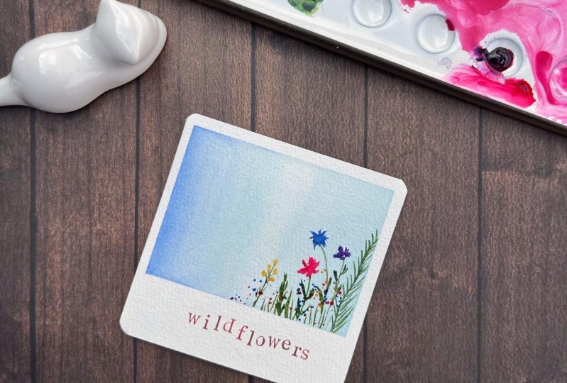
5. Day 3 Wildflowers: There is nothing that says
spring more than wild flowers. As a landscape artist, I confess that florals
really intimidate me. But in today's landscape, we will tackle florals
in a really simple way that will produce a
beautiful spring landscape, even if you don't feel confident in your floral
painting abilities. So, we are going to tackle this landscape in a
few different ways. The first thing I want to do
is mask off a few flowers, and that is so when
we paint our flowers, we can still use some bright
colors like yellow or pink that might not show up super bright if we
paint it over blue, like I did in the last lesson
with the cherry blossoms. Some of the transparency in our watercolor can get a little bit muted if we're not
painting on white paper. And so to keep the
brightness of our flowers, I'm going to use masking fluid, and we'll paint those in after we've finished
our background. And the second thing
I'm going to do is, and this is going to be
sort of our motto or our mantra for this class, and that's less is more. The reference photo has
a dozen or more flowers, but we're going to limit
it to just four to six, and that keeps the florals sort of to a minimum so that it doesn't
feel overwhelming. Yet we're still going to create a really, really
pretty landscape. I'm going to grab my masking
fluid and a floral brush, and I'm going to dip my
brush in some soapy water before dipping it into my masking fluid so that
it doesn't ruin my brush. And the way that I'm going
to paint these flower petals or think of it as making maybe some triangle shapes
and some short lines. I see these flower petals just as really short brush strokes. And in the reference
photo, there is, like, a smaller yellow flower
right here that kind of looks like it's made up
of some yellow bulbs. So I'm just painting five
or six little circles. And I think I'll add one
more flower right here. There's one in the
reference photo that just looks like it has, you know, short
lines in a circle. And so that's all I'm making. I'm making some short lines. Once you are happy with the flowers that you have
masked off, you can come in. You can either wait for
it to dry or like me, you can use a hot air
tool to dry it off. And then, now we're going
to paint our background. So I'm grabbing my
flat brush again. I'm wetting our paper. And for this background, I'm going to use two
blues side by side. On the right hand side, I'm grabbing a mop
brush and some very, very diluted coal
balt turquoise. I'm really watering it down so that the blue is
just very faint. And then on the left
side, I'm going to pick up some ultramarine, and I'm going to pull that. Maybe halfway in,
and I really like how these two blues
look side by side. So after you dry it off, you can scrub the
masking fluid off. There wasn't much masking fluid, so I just use my hand rather
than like a gummy eraser. And then now with a
firmer round brush, I'm picking up some purple, and I'm going to start
filling in the flowers. So like I said,
the masking fluid, It's a little bit hard to
see where I masked off. But like I said, we're going
to make little triangles and short brush strokes to
paint in these flowers. I'm picking up a darker blue. And for this flower, I'm just going to
make these sort of short brush marks
kind of in a circle, like there would be maybe
the yellow pollen center. And then now, I'm going
to pick up some pink. I'm going to mix it in
with some purple to create a brighter
flower down here. I don't know if this helps, but something I like to tell myself often to
sort of combat like a critical or perfectionistic
voice is that it doesn't have to look exactly like what
you're imagining. The thing about
loose water color is the brushstrokes
speak for itself. And so a short amount
of brush strokes is representing something that is a little bit more complicated. So even though I may not
be painting the flowers, exactly like how they are
in the reference photo, I'm painting something
that resembles them. And so we have this bright kind of yellow flower over here, and I'm just making
yellow circles. That looks really good to me. I'm going to pick up
a sort of sage green, and I'm going to draw the
stems for these flowers. I know that sometimes when
we're painting trees, there's kind of like a
tendency to just paint everything very equal
with these stems, I have to remind
myself not to just, you know, do a straight
up motion. I'm sort of bending the stem
on purpose because that's how it would
look in nature. I'm going to add just a
little bit more blue to this little flower here and I'm going to grab that green
again and I'm going to add a stem to this
little flower rate here. Then once the stems
have been painted, I'm going to grab a little
bit more of that green, and I'm just going to
paint small little leaves. The way that I'm
thinking about it, I'm just making an
upward brush stroke. So it doesn't need to
be super complicated. Then now right
here, I'm going to paint like a sprig of greenery. I made that swoopy, very soft S shape, and now I'm just painting
some brush strokes outwards. And even though this landscape
has, you know, flowers, and I'm very kind of hard on
myself when I paint flowers, I actually ended up liking
this project a lot. And so this just kind
of goes to show that sometimes we can have a
mental block with thinking, Oh, I can't do this,
I can't do this. But if you sort of give yourself the chance and be
kind to yourself, I think you'll be surprised
at what you can do. Now, I'm grabbing a
sort of a yellow green, and I just want to create some variation in the green so that it's not
all the same color. And then now I'm going to grab my absorbent round brush
and add some splatters. I'm going to splatter some
blue and semi yellow. I think splatters always make a landscape feel a little
bit more whimsical. And once you're happy with
your paint splatters, we can dry it off with
our hot air tool. Once that is completely dry, we can remove our masking tape. And like I said, this actually ended up being my favorite project
of the series, even though it's
on a subject that I don't feel comfortable
painting, like, at all. So I just want to encourage you to give
yourself the chance. And if you are afraid
of florals like I am, you can still create a
really fun spring landscape if you think of it in very
simple brush stroke terms. And yeah, with that furthermore, I will meet you in the next lesson for
our next landscape.
6. Day 4 Bridges: Today's landscape brings us to a peaceful walk in the park. I love the sounds of
water and rivers running, and I just love how in
this reference photo, the little bridge is just tucked away behind the bright
blossoming trees. We will capture the essence of this peaceful
springtime walk without getting tied down by all the different details that are in this
reference photo. One of the ways that I'm
going to simplify this photo is to omit painting
the entire river. I'm actually just going to
paint some bright sort of cobalt turquoise
at the bottom to just sort of give the illusion
that there's water there. I'm wetting my paper, and I'm using a soft
brush and I'm going to add some diluted ultramarine
to the top of our landscape. I don't want to bring
the blue too far down because I don't
want it to sort of cover the middle section of the landscape where I'm
going to paint our trees. Now I'm bringing in some of
that coal balt turquoise, and I'm just going to
leave it like that. We're going to dry this layer, and that bottom part is just
going to be our illusion of, like, a river or some water. Now, I'm grabbing
another soft brush, and I'm just bringing
some clean water into the mid horizon
section of the landscape. I'm wetting it because I'm
going to add some pink for the cherry blossom trees and some green for
the trees around it. And I want the paint
here to sort of feather out and get
kind of loose and soft. I don't want there to be any
hard lines with these trees. So I'm using some of
the leftover pink that I have in my palette from the second landscape in this project to sort of
keep some coherency. And I'm going to add a
little bit more water. And then I'm going to
bring in some light green. And for the green,
I kind of want this tree to just sort of be right behind our
cherry blossoms. I don't want the green to
overpower the pink either, so I'm not going to bring the green into
the pink too much. I'm going to dry that
layer completely. And then now I'm
going to come in, to add some more texture and depth to the cherry
blossom trees. And these trees are a little bit smaller than the
ones we painted before. So I'm going to add the little
accents of darker color. For this left one, I am
going to create some bigger, dark spots or areas with
a darker value of color. And I'm going to do the same
for this tree on the right. And you can see how
soft the trees look from adding that water before
dropping in that color. And I really, really
like how that looks. Now I'm going to
grab my tree brush, and we are going to create some texture right above the bright blue that
we have at the bottom. So I don't want the bottom of the landscape to sort of
feel like it's floating. So I'm going to kind
of anchor it by painting some shrubbery
kind of right above it. So I'm grabbing a
darker shade of green, a little bit darker than what
I used to paint the trees. I want it to sort of contrast with the lighter trees above. I like how that looks. So I'm going to dry off that layer and I'm going
to use a round two brush, and I'm just going to paint in some tree trunks and some
tree branches for our trees. I'm going to keep
the tree trunks on the thinner side
so that it doesn't look like the tree
trunk is too chunky, since this is such
a small landscape that you really have to take into consideration
proportions and not sort of making
anything feel too large, which can sometimes
be a little bit easier when you're painting
on a smaller scale. Now, I'm going to
paint the bridge, and I'm taking the brown that
I used to paint the trees, and I'm adding in a little
bit of pink to warm the brown up a little
bit so that it isn't the same exact shade of
brown as our tree trunks. I'm adding in a
little bit yellow to lighten it a little bit more. And I want to paint the bridge right
here as if it's sort of tucked behind part of it is tucked behind
the trees on the left. Using a lighter shade
of brown sort of helps the bridge stand out from
the trees on the side. And because I don't really have any sort of like pavement on
the landscape right here, I'm going to sort of lightly add some brown to kind of show where the bottom
of the bridge is. And I want it to sort of disappear into the
greenery on the left. So I'm going to add
some kind of like darker rocks right here
to sort of hide that. I'm going to add a little
bit of the darker rocks on the right side
just to even it out. And I'm going to dry
that layer completely. And once everything
is dried off, we can peel our masking tape. And I love how bright the
pink and purple trees are, and it really does look like a landscape that you're
just walking through the park and it just really
gives off spring vibes.
7. Day 5 Sunkissed: Today's landscape is called sun kissed because I love
how the foliage in this photo just feels
like the sun is just grazing it with a
dusting of sparkles. We will be playing
with shimmer paints. And in this landscape, I feel like the shimmer paints really lend itself to
that sun kissed feeling. We are going to
start our landscape off with our background wash, and I'm going to wet my paper, and you may all kind of know by now that I like wetting
my paper beforehand before adding any color
because I just love how it creates such a soft feel
with the water colors. Everything sort of
just, like, blends together really pretty. So I'm grabbing a soft brush
and some yellow ochre, and I want to create
that sun spot at the center of our landscape, and that's going to
be important because the greenery or the
flowers or the wisps that are in front of the sunspot or what is essentially
being sun kissed. So now I am picking
up some sap green, like a bright bright green, and then I'm adding in
a little bit of darker green to create
some perspective. And then for the top
of our landscape, the reference photo
has this really bright blue sky sort
of behind all of it. And so I'm going to pick
up some ultra marine blue, and I'm just going to paint like that top quarter of the page. I don't want the blue to mix with the yellow
ochre at all, and I'm okay leaving
that mid section a little bit white because we're going to come
in with the greenery. I dried all that off. I have a round two brush now, and I'm picking up some
bronze shimmer paint. If you don't have bronze, you could use gold
shimmer paint, anything that is sort of
like bright and sparkly. The foliage in the
reference photo is kind of like a
yellow and orange, which is why I decided on, like, a copper shimmer paint. And so if you look at the
brush jokes that I'm making, I'm just sort of like lightly dabbing and sort of painting, like all those little
wispis and I'm probably going to paint maybe like
five or six of these stocks, and I just want to paint the stems first so
that I can kind of lay out the composition of this landscape and
not end up sort of like concentrating
too much anywhere. So I'm going to go
back and pick up that copper paint
again and Yeah, we're just kind of like
I'm just very lightly. You can see my brush strokes. I'm just sort of like making, like, really small like dashes. And I'm letting there. I'm leaving some space
in between so that it kind of looks a
little bit wispy. And yeah, thing with
shimmer paint is it doesn't always at the angle that my
camera is right now, you can't really
see how pretty it is because it's just the angle. At the end of this lesson, I'll take the paper
off of the table and I'll show you how
pretty this shimmer is. I really love shimmer paint. I think it adds such a fun
dimension to landscapes, especially when it
comes to sunlight. Seeing as this landscape
is called sun kissed, and these, you know, flowers or foliage is just
sort of being lit by the sun. I just love that imagery. It just feels very
spring like to me. And I'm always sort of
looking for a chance to tastefully incorporate
shimmer or sparkle paints into
my landscapes. So this is just a really
great way to do it. I feel like the reference
photo really lends itself to that sparkly feeling. I also want to add a stock of I don't know what
these are called. If you know what
these flowers are. And if you would kindly not mind stopping me like a comment
somewhere in the discussion, I'd love to know if you
know what these are called. Anyways, I'm going to paint another stock with
some red paint. This is not shimmery paint, but I thought it
would kind of create some nice contrast with the
other orange sparkly ones. And now I'm just grabbing
some, some dark green, and I'm splattering some paint just to create a more
like whimsical feel. Now I'm grabbing some
of the red paint, and now I grabbed some of the red paint
and splattered some, and now I'm going to use the
same shimmer sparkle paint to create some sparkles
with that as well. The bottom of the landscape
feels a little bit empty. So I'm going to come in with my liner brush and
some darker green, and I'm going to create some
kind of like grass blades. I don't want to
do it all across, so I'll just sort of do some
in bunches here and there. I'm going to use a few
different shades of green. So this is kind of a warmer green than the first
green I picked up. And now I'm going to grab my
tree brush and I'm going to grab the same really
bright sap green that I used in the beginning, and I'm just going
to very loosely add some color so that the bottom
kind of looks more full. I'm going to dry that layer off, and that is it for this
landscape, and I'm really, really excited to show you
how pretty the shimmer paints are because I just
feel like looking at this landscape head on isn't
really doing it justice. But Yeah. If you can see, let me make sure my
thing is focused. But, yeah, it's so so pretty. It totally gives off that
sun kissed feel to me. So I hope you enjoyed that. I'll see you in the next lesson.
8. Day 6 Mountains: Spring reminds me of camping
trips and morning hikes. Our reference photo today
feels like waking up early and getting ready
to head to the trailhead. The sun hasn't quite
reached its peak, rather, it's just waking up and bringing warmth to
all that it touches. This photo feels
warm and inviting, and I want to capture
that warmth and the emotion behind these
springtime memories. One of my favorite things
to do when painting landscapes is actually using unique colors to
paint my landscape. I know photos of
nature tend to usually be of certain colors,
blues, greens, browns. And I usually like to add
in pinks and purples. I'm wetting my paper
with my flat brush, and like we have been doing. The first thing that
we're going to do is paint our base background layer. So I'm going to
pick up some yellow because I feel like with
any sunrise or sunset, there's always a warm yellow, I feel in the sky. And after picking
up some yellow, I'm going to pick up some pinks. I feel like that really
warms up a landscape by adding a bit of pink for the
upper portion of our sky. I am going to add some blue, but I am also going to add
some purple to it too. Feel like this color combination
just looks very dreamy, and I think it just really makes the
landscape really pretty. Adding in unusual colors. I mean, sunsets and sunrises can be filled of lots of
really beautiful colors. But even if the reference
photo doesn't have that, I just like to add it in because it just makes the landscape
really, really pretty. I really like how
those colors look. After I wipe off the
sides right here, I am going to dry
off this sky layer. Once the sky layer is dry, I'm going to pick up
a soft round brush and I'm picking up some maroon, and I'm going to
paint a small slope of mountains here
on the left side. The color of the mountains
in the reference photos, kind of a burnt sienna. So I'm adding kind of, like, a little bit of a warmer color. And then to paint
some of the shadows, I'm going to add in some
dioxazine violet, a purple. I think because we have some purple in our sky
using purple for shadows, it keeps the landscape
a bit more cohesive. And now I am going
to paint some trees. This brush is actually
an interesting brush. It's a like a hybrid between a liner brush
and a flat brush. It's almost like a really
thin, long flat brush. But anyways, I'm grabbing some
This is like a warm green, and I'm painting
we're going to paint a few trees right here
back to the brush. If you don't have
this brush, you don't particularly need it. You can use whatever brush that you like to paint
your trees with. But I wanted our trees to be
several different colors, and using the same colors
that we used for our sky is going to keep this landscape
sort of feeling harmonious. So now I'm picking up
some ultramarine blue, and I'm going to paint
this tree like a little bit behind the green
one that we have, and I'm going to
let that blue sort of bleed into the green tree. And then for the last tree, I'm going to pick up that
same sort of maroon color that I painted the
the Mountain with, and I just I really
like painting trees in different
colors and using the same colors as
the sky kind of keeps this whole landscape
feeling really warm. The last thing I want to do is paint a small flock of birds. I have my bird liner, and I'm just going to
paint a small flock, sort of going off
into the distance. I feel like it's like the
perfect finishing touch for a landscape, and I always like
to add some birds, and we can dry that off. And once everything is dry, we can peel our masking tape. And yeah, this landscape
just feels like such a calm and warm morning. Like we just woke up and we're getting ready to
set out for our hike. So I really hope you enjoyed
painting this one, too. I will see you in
the next lesson. I
9. Day 7 Dandelions: Congratulations on making it to the last landscape
of this class. I want to commend you for prioritizing your
creative practice. We will be ending
this series with this bright and happy
dandelion field. The yellows and greens
feel cheerful to me. And when I think of dandelions, I think of warm spring
walks with my kids, and I love their excitement
and wonder when they are blowing on
Dandelion flowers. That is going to be the essence
of our landscape today. We are going to start off this landscape by masking
off two dandelions. So I have my masking fluid, and I actually have a
silicone brush that I am going to use to
paint the dandelions. I am opting to use a
silicone brush over a actual paint brush because I just really want a circle with some lines in the middle. It's nothing too complex. And actually, silicon
brushes are actually easier to use with masking fluid because all I have to do is wipe the masking fluid off
with like a wet wipe. So after I mask off
these two dandelions, what I'm basically using
the masking fluid to draw is a center
And in the center, I'm trying to sort of create the lines that would be all the little like petal stems and
then a circle around it. The background that
we are going to be painting is like
super super bright. And so the masking
fluid is just going to help us preserve
that white space. And so now I am
wetting our paper. I'm grabbing a mop brush, and I'm going to bring
in a very bright yellow. I think this is like
a cadmium yellow. The yellow and greens in the reference photo
are just really, really bright and playful. So I want to try to
capture that tone. I'm grabbing a soft green and I'm adding it to the top and
the bottom of the yellow. I'm adding in a warmer
yellowy green to the very, very bottom of the landscape. And I actually am going to grab a soft round brush and I'm going to take some of that
yellow that I initially used, and I'm going to splatter
it onto the green just to sort of create more
texture and more depth. I'm going to grab my
round two brush now, and I'm going to use
some of that warm green, and I am going to sort of
make some upwards motions. I wanted to sort of capture
some greenery here, but I saw later after I dried the section off with my hot air tool that all of
this sort of bled together. And so there isn't those individual grass
blades, but that's okay. Now I'm going to use a raciena to paint the stock
of the dandelion. I'm going to dry that off, and I'm going to remove
the masking fluid. And I'm going to
add some more depth to this landscape because
right now it kind of just looks like the dandelions
are like just floating. Floating there. So I'm grabbing
a green, yellow green, and I'm going to add some grass blades back
to the landscape. And I'm going to be alternating between some various
screens to sort of create something a little bit more dimensional and less flat. And so I think with greens, greens are hard because
sometimes you have greens that like just don't feel like they're naturally occurring in the outside world. Like, greens are just hard. Sometimes the greens
can kind of look fake, I guess, is what I'm
trying to capture. So what I like to do is I just like to mix some of
my greens together. And that way, you sort of have a more interesting
green color. I'm now going to grab
some scratch paper, and I'm going to grab
some of the warmer green, and I'm going to do
some paint splitters. Be careful to not get paint splatters on that
very bottom section of the polaroid. I'm going to dry that off, and I'm actually going to
grab some raw sienna again, and I'm going to try to
paint out the little stems that we see sort
of inside the dandelion. I just think adding a
little bit of color to the center sort of makes the dandelion stand
out a little bit more. And now I'm grabbing
some whitewash, and I'm just sort of
adding some kind of, like, hay textures to the outside because with my masking fluid, I kind of painted a circle, and it just looks like
to kind of sharp. So I'm adding just a little bit of texture to the outside
of the dandelions. Now, I am going to do some white splatters
with my white guash. With the bleed proof white, you really have to
dilute it a bit to get it to a place where you can splatter
it like I'm doing. I like how it looks with
those white splatters. And yeah, once
everything is dry, this landscape is complete, and it's just the perfect
happy ending to this class. I hope you enjoyed
painting with me. Stick around for
the next lesson. I will share with you how
to upload a class project, how to leave a class review, and how to find other classes similar to this
that I am teaching.
10. Next Steps: In this video, I'm
going to share with you how to upload
a class project, leave a review, find
resources for this class, as well as where to
find future classes. If you scroll down on the class page to the
project and resources tab, if you scroll down to
downloaded resources, I will have all the
landscape reference photos for this class from
day one to Day seven. You can download them
if that would be helpful for you to
have open while watching the class to
upload a class project, scroll up on the
Project Resources tab, and on the right hand side, you'll see the purple button
that says Submit Project. It'll take you to this page, click Upload Image and select the file that
you want to share. It will then upload into this little
screen right here and you can adjust where you
want the photo cropped. I've noticed that
uploading photos as a landscape file works much better than uploading
it as a portrait file. Under the project title, you can share your name and any other information
you would like to add. And then once it
looks good to you, scroll to the top and hit
the green Publish button. This will then upload your
project to the class gallery. I really love to be able to see your artwork
and looking through the class gallery
for past classes is always a really big highlight
for me as a teacher. Now, I want to show you
how to leave a review, hit the reviews tab, and then hit the purple button
that says leave a review. I really value feedback and am always looking for ways
to improve my classes. And lastly, if you enjoy this class and are looking
for similar classes from me, you can head over to
my teacher profile, and I have my most up
to date classes there, as well as all other classes that I am teaching
on Skillshare. And that concludes this class. Thank you for taking the time
to learn and paint with me, and I hope to see you
in a future class.
 Madeline Kerrii, Watercolor Artist