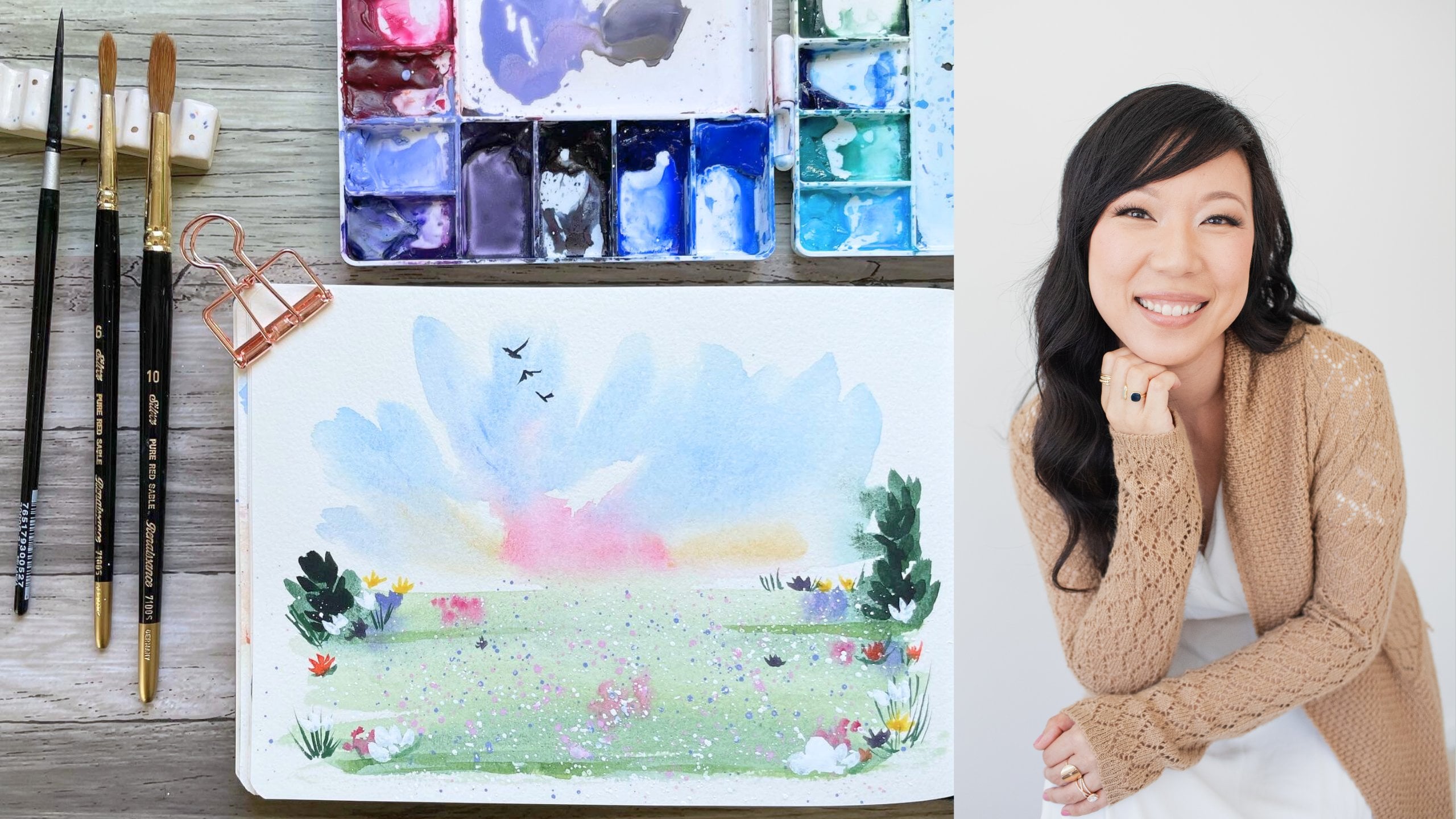
Transcripts
1. Class Introduction: Hi, my name is Madeline and I'm a landscape watercolor
artist and content creator. My style of watercolor
painting is soft and loose, and I love pastel colors. Skies and light are some of my favorite
subjects to paint. I also teach watercolor
on Patreon and YouTube. And I am a brand
ambassador for pulling up bright and all about
art International. In this class, we will paint for loose landscapes together. I will share tips on how to mute vibrant watercolors
into softer colors without needing to use white, opaque watercolors
such as white gouache. I love the transparency
of watercolor and learning how to use
it to portray light. I hope you enjoyed this class and I will meet you
in the next lesson.
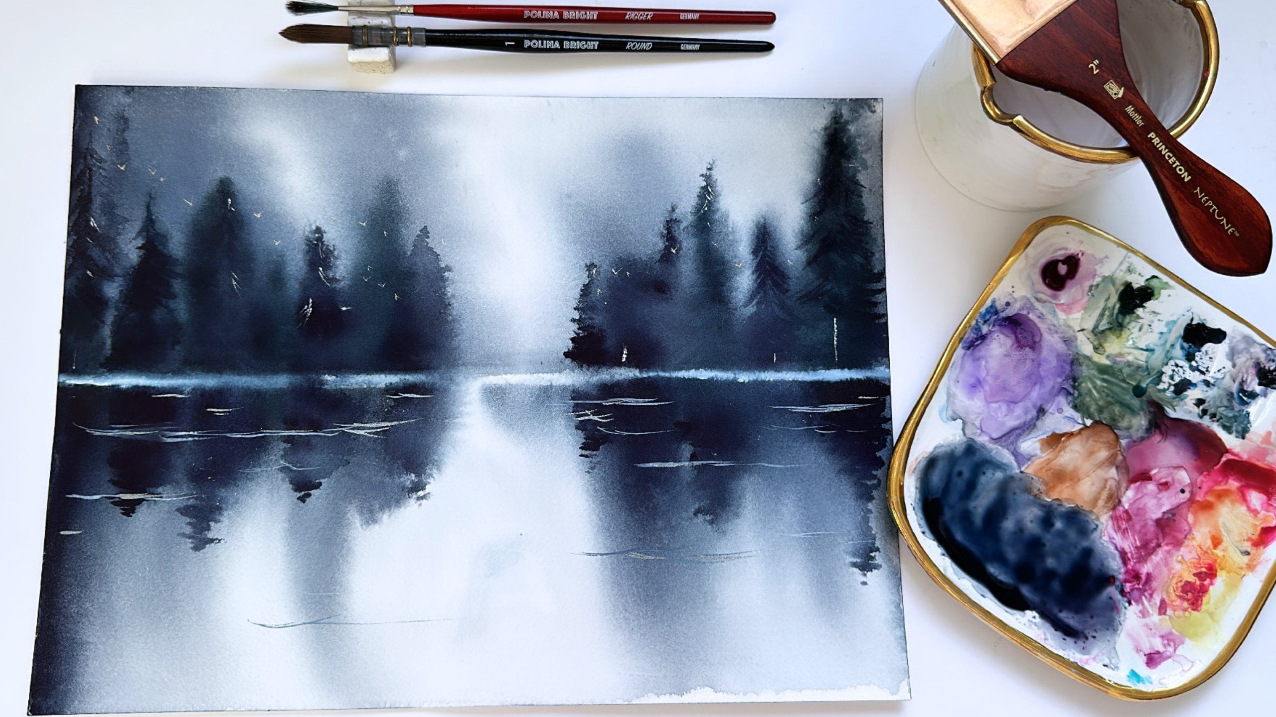
2. Supplies: Let's talk supplies. I will be painting this series in my
watercolor sketch book. The brand is a teacher and this sketch books
specifically is called their perfect
sketch book. It's made with 100%
cotton watercolor paper. And I really firmly
believe that to paint a lot of these wet
wash landscape backgrounds, hundred percent cotton, watercolor paper is really gonna give you the best results. It's a little bit pricier
and sometimes 100% cotton. Sketchbooks are a little
bit harder to find, but I just really feel like
you'd get the best results. If you don't have
a sketchbook with 100% cotton watercolor paper, regular watercolor
paper will do fine. You can also just like cut the paper up into
small little pieces. When I say sketches, what I mean are these are relatively quick and
easy pieces to paint. This is my paint palette. It is primarily made up of mission Magellan and
M. Graham paints. And I'm going to swatch out the colors that we're gonna be using in our tutorials today. So I have some Naples, yellow or yellow ocher. Use a touch of burgundy, red, but you could skip this if
you don't have this color. Compost, opera, shell, pink, lilac, lavender, reverted or blue. Ultramarine blue, ultramarine, pink, blue, violet. Anthro cannon, blue,
and neutral tint. So these are all the colors
that I use that we are going to be painting our
soft loose landscapes with. And I also use a few brushes. I use a mop brush, a round brush, and
a liner brush. You do not need to use the same brands of paint
brushes that I use. Just the general type of brush. So a mop brush around brush and a liner
brush, if possible. For these colors.
For these colors, you don't need to use the
exact same colors as me. You can use colors that
are similar in shade, even if they're from
a different brand. Or you can mix these colors
yourself if you would like.
3. Exercise 1: How to Get Soft Colors: In this exercise, we
are going to talk about how ticket
soft watercolors, especially when watercolors are, when the watercolor is that
you have are very bright. It's oftentimes really
can be very difficult for beginning watercolor
artists to get soft colors. And this is something
that I struggled with when I first
started with watercolor. So I'm going to take a color
straight from the well, which means pretty much
either straight from a half pan if you're
painting with pans or straight
out of the tube, if you our painting
with watercolor tubes. And so I'm gonna grab
this blue violet color. And I'm going to paint
just a brushstroke with it straight from the well, it's a pretty dark
and deep purple. If I were to go and paint a sky with just this
color right here, it would be really hard
to get a soft wash. And so my first tip or
trick to getting soft colors is
simply painting from your palette first rather
than from the well. So what I mean is rather
than just picking up paint from here and going
straight to my sketchbook, I am going to say my brush
is completely clean. I'm going to grab, oops, grab some of
this paint right here. And I'm going to mix it and disperse some
color into my palette. This is a way to sort of lessen the paint
load in your brush. So if I simply just drop some more of the paint here and
then go to my sketch book. You'll see that it is a much softer brush stroke than our first one going
straight from the well. And to get an even
softer tone than that, we can take our cup of water. And what I like to
do is I like to dip my brush in the
water once and then let that water come out by ringing it on the
edge of the jar there. And then going to
paint my brush stroke. And you'll see that
this third brushstroke is even lighter than
our second one. So these are two
techniques that I like to use when I'm using a round brush to get my
colors a little bit softer. Another way, another way to get our watercolors softer is by using a different
kind of brush. Round brushes generally aren't as absorbent as say a mop brush. They are thinner and
let me grab my mom. Let me grab my mop brush to
show you the difference. This is my mop brush
in the same size. You'll see that it's a bit
fatter in the brush hairs. And as a result, it's more absorbent and can sometimes be easier
to make soft washes. I'm going to do this again
with my round brush. First. I'm going to grab some
of the paint right here. And I'm just going to make
a brushstroke across. So it took a little
bit to get this light, but you can see the color here. Now, I'm going to
do the same thing. But with a mop brush. I'm really loading the color up. And it's a much softer
overall brushstroke compared to the round. And that's because
a mop brush is wider so it holds more water in addition to
a little bit more paint. And so when I do soft
background watercolor washes, I almost always use a mop brush because
it holds more water. It dilutes the
color a little bit more than a round brush wood. And I almost always paint from my palette and not
the well or the half pan. If I'm using a half pan, I will grab an extra palette and I'll grab a color
from the half pan, and I'll go straight to a mixing palette
rather than going from the half pan to my watercolor sketch book
or my watercolor paper. I'm going to do just a few
more demonstrations for you of color straight
from our well, and how to dilute it. So I'm gonna grab
some compost opera. And if I go straight from the, well, this is how bright it is. If I dilute some of it
by just putting some on my palette and getting some of that color
off of my brush. It's lighter than that
first brushstroke. And if we take our water right
here and we dip our brush in the water and let the water come off by ringing it
on the lip of the jar. We can get an even
softer brush stroke. And I'll do this again
with ultramarine. Ultramarine straight
from my, well, if I just take some of that
color off, even lighter. And if I were to dip
my brush in my water, we can go even lighter yet. And so that's probably the easiest way for me
to get lighter colors. And this is what I recommend
as we paint together.
4. Exercise 2: Painting Birds: I love painting birds
in my landscapes. I almost always add a flock
of birds at the very end, because I feel like
it really rounds out the watercolor piece or
the watercolor landscape. And I get questions all the time on how do I paint my birds? What brushes do I use? I'm just gonna go
over really quickly how I paint my birds and
what my technique is. So I almost always
use a liner brush. I personally love the da Vinci
colinear liner size zero. This is my go-to brush. But if you don't
have this brush, most liner brushes, we'll do. Another brush that
I used a lot was the silver black velvet
script liner size one. This was also my go-to brush for the longest time before I
got the da Vinci brush. And so my first
tip on how I paint birds is by using
the right brush and using a very fine liner. And so what I do is I take
a really watery mixture. I like to use neutral tint, but you can also use Payne's gray if you don't
have neutral tint. And the first key to how I
paint my birds is to always use very diluted paint. So I like my brushstroke
to sort of be this fine. And the finer the brushstroke, the more watery paint is. So if I were to get a not so watered down
brushstroke of neutral tint. You can see that it's sort of breaks and it's
actually kind of thick. And so if I don't water down
my neutral tint enough, a lot of times my birds can
come out kind of chubby. And so the technique
that I use for birds. So one advice, my first advice
is to not overthink it. Really birds are
just little v's, upside-down v's and upright v's. And I like to paint
in a diagonal pattern from the bottom right to
the upper left-hand corner. What I do is I just let me bring my camera a
little bit closer. So I take my liner
brush and I go down. And then sort of halfway up, I make the other v, other side of the V like that. So I can either make
it like a complete be or I could bring it down and go halfway up and sort of pulling
that wing out. And I liked that. Also. It kinda gives the
bird a little body. And then to go upside down, I just use really the
very tip of the brush. I make two downward
brushstrokes like that. And the key to this is having the right brush and having the right consistency of paint. And then the faster you go, the less you think about it, the more natural-looking
It's going to be. And that's really all it
is to painting birds. But yeah, I do hear that a lot of
people struggle with it. And I hope that by seeing
my brushstrokes here, you'll see that it's not that hard as long as you
have the right tools. So I'm just painting a lot now, just so you can kinda see them
in different brushstrokes. I try to make them
proportional to my mind landscape piece. So let me show you
for this piece, this mountain piece that we're
going to paint together. You can see this mountain piece. I would not paint my
birds like this big. That would be just too
big for this landscape. So try to keep your
birds proportionate to your paper size and
your landscape size.
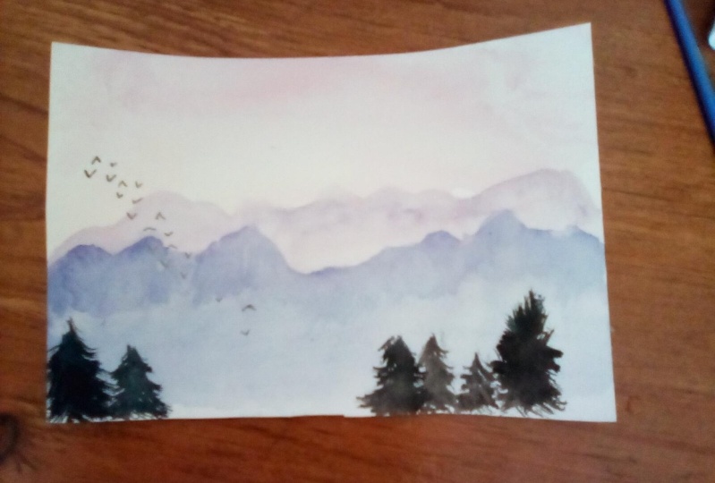
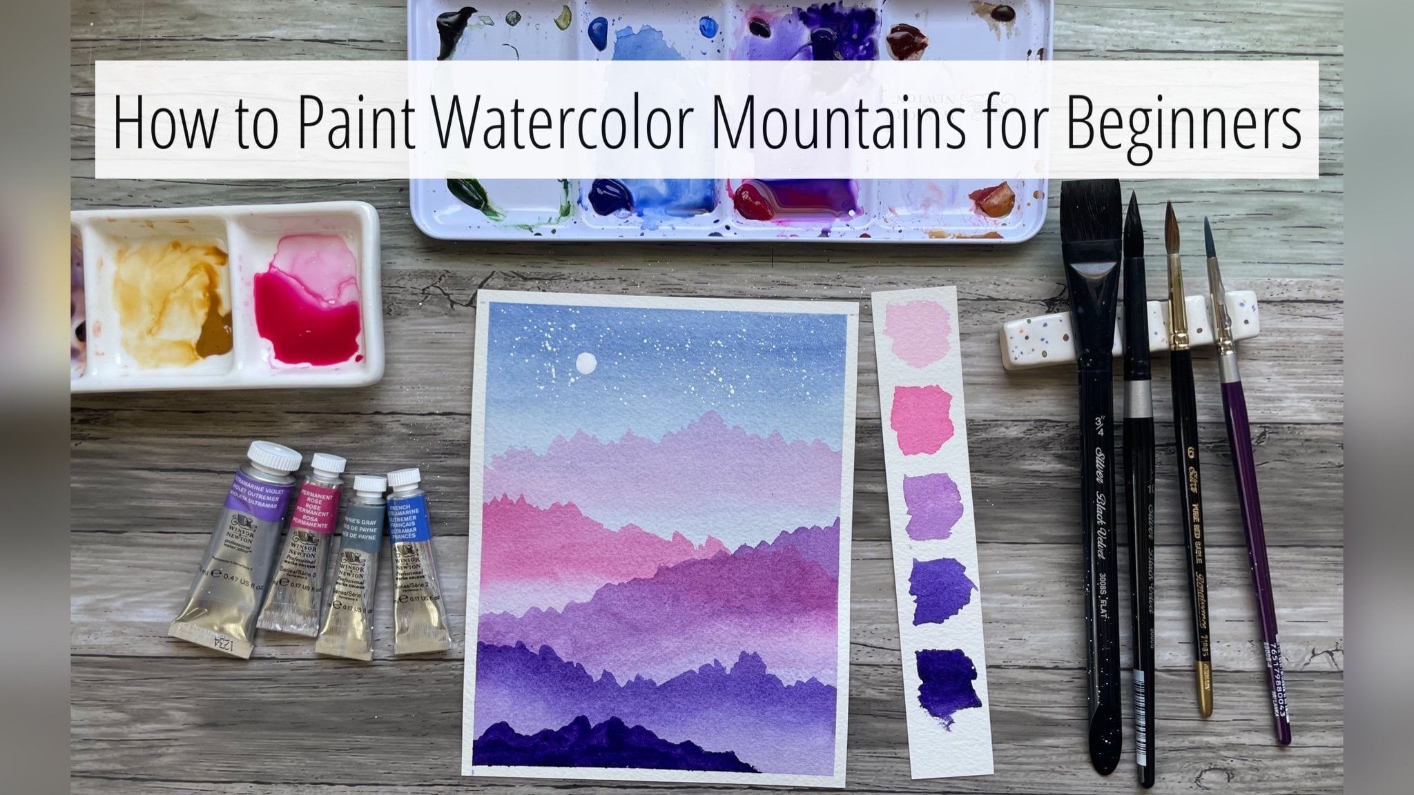
5. Project 1: Purple Mountains: Let's start this lesson
with our sky wash. I have my mop brush here, and I'm going to grab
some compost opera. And I have a little bit of leftover shell pink
on my palette. And we're going to
use these colors to paint our sky wash. Then we're going to bring
that all the way down. I liked the very top of my sky
to be a little bit darker. So I'm just going to add a
little bit more compost, Sabra, maybe a touch
of burgundy, red. I liked that first wash. I'm going to grab my hot
air tool and I'm going to dry this layer. Now. I'm going to switch over to my round brush and
I'm going to grab some blue violet or
any purple will do. I'm going to add it to my pink sky mixture to
make a pretty pale purple. And I'm going to paint
my first mountain range. And it's going to be the
further mountain range. So it's going to
be the lightest. And my paper is just a
little bit damp still, so I'm going to dry
it one more time. And then from there
I'm going to dip my brush in my water. I'm going to bring
that mountain down. So that's our background
mountain layer. I'm going to grab my hot
air tool and I'm going to drive this first
layer of mountains. And then now we're
going to paint the mountain ridge in the front. And I'm going to grab more purple and a little bit
of ultramarine blue. And then we'll pull this
mountain all the way down. So I like that and
now I'm going to dry this second
layer of mountains. And then now I'm
going to grab my Shift tree brush. It is a very old Princeton
heritage round to brush, which I have repurposed
as a tree brush. So don't do this with any of
your nicer or newer brushes. Do this with a very old brush, but I like to smash
it like this. And then I can get really cool tree textures
when I paint with it. So I'm going to grab
some Payne's gray. And we're going to paint some
trees in the foreground. I'm just going to make
a triangle like tree. You can use any dark
color for this. Is Payne's gray. You can use neutral tint. I'm going to paint in a
smaller one right next to it. I'm going to add one on
the left side over here. Then to finish this off, I'm going to grab
my liner brush. And we're going to
paint some birds. And I'm going to use just some really
watery neutral tint. Start down here. The key to painting
really good birds, in my opinion, is to
have a very fine liner. And this is the best set of
all the ones that have tried. And to use very watery paint and to just sort of
not overthink it. So I'm doing fees and
upside down bees. And there is our pink and
purple dreamy mountain scape.
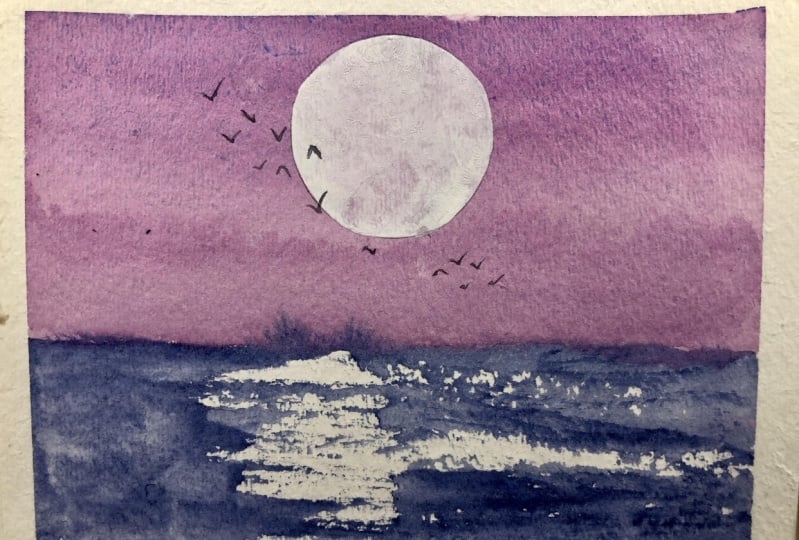
6. Project 2: Lavender Ocean Skies: We're going to start with
the background wash. Again. I'm gonna grab some ice
and some verdict or blue to get a sort
of light purple sky. And again, we're going
to start with the top of the sky wash. What I love about mops
is they just hold so much paint and pigment. I'm going to switch
over to my round brush. And I'm going to grab
some anthro cannon blue with some verdict or blue. And a little bit of lilac too. For the ocean. We're gonna do a little bit of dry brushing
and I don't want it as, even as our sky. So I'm going to start
on the left side. I like that dry brushing
there for the waves. To sort of get these
dry brush marks. Using a round which is not
as thirsty as a mop helps. I don't mind that it bleeds a little bit there into the sky. I like how that looks. It's part of staying loose. I liked that. So I'm going
to dry this first layer. And so I like how that looks. The sky is kind of purplish
with the soft blue undertone. And I'm going to grab some I'm going to grab
some white gouache, and I'm just going to paint a small little moon
in the corner. I'm going to grab
my round circle here in this right corner. And I'm going to
grab my liner again. We're going to add some birds with some watery neutral tint. We'll just paint some birds
starting in the middle. That was a little bit too thick. So it makes sure the neutral
tint is very watery. And there we have
our final piece.
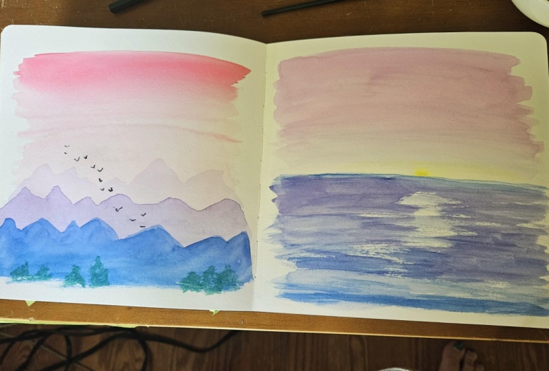
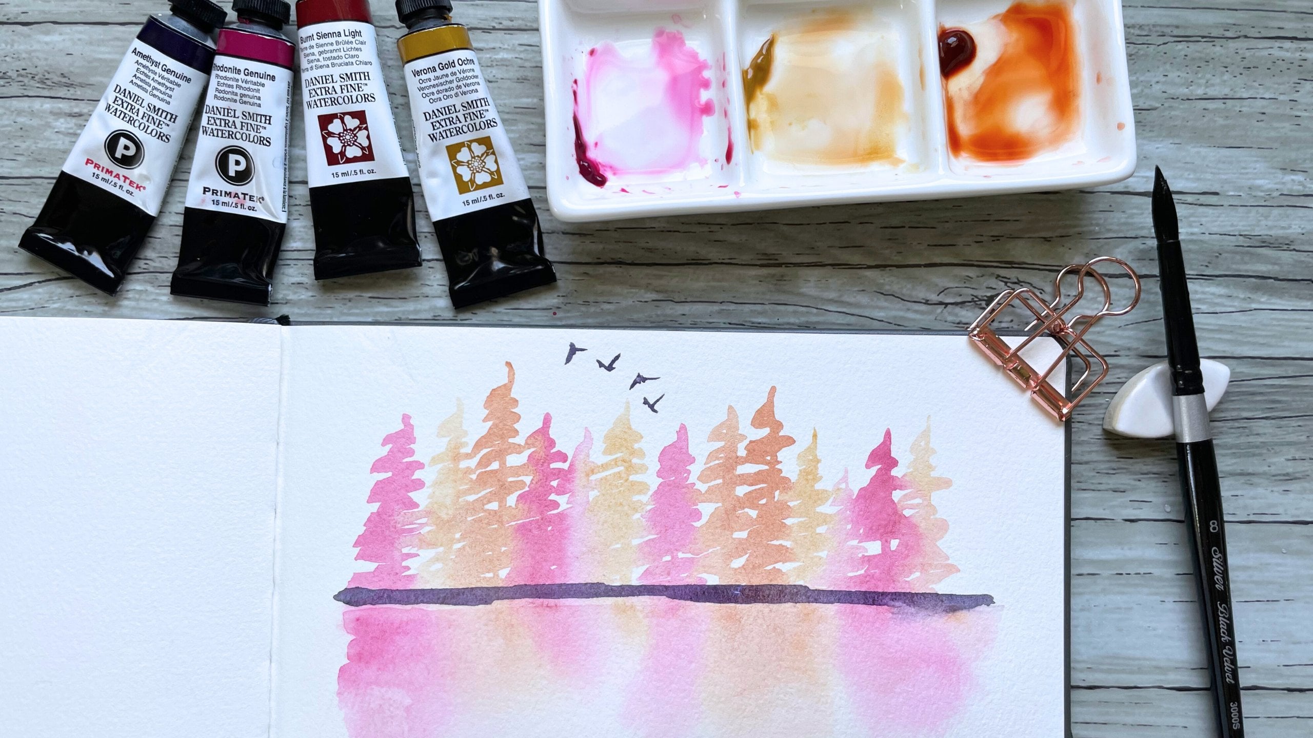
7. Project 3: Ombré Mountain-tops: So to start off
with our sky wash, I'm grabbing some Naples yellow and some yellow ocher
for a warm light yellow. So I'm going to start
with the top wash. And I'm going to dry this layer. Now. I'm going to grab
some burgundy red. And I'm going to mix it in with yellow to get a nice orange. And we're going to paint the
very furthest mountain top. The nominal dry this layer. Now I'm switching
to my round brush. I'm going to add some
compost opera to that mixture and some lilac. And we're going to paint
the second mountaintops. And now I'm going
to dry this layer. And then my third
mountain range is going to lean more purple. So I'm going to
grab some lavender. Now that it's more
of a light purple, we're going to paint the
third mountain range. Now I'm going to dry this layer. So this mountain range is a little bit on
the thinner side. And so you can kinda see the
mountain from the other. You can see it
behind the mountain. It doesn't personally bother
me because I like sort of this really loose look. But if it bothers you, you can bring the purple
all the way down. And then you can paint, you can paint the purple
all the way down. So I'm going to grab my round and then I'm
going to add some ultramarine blue to the purple. And I'm going to add
some compost opera. And we're going to paint another one just
right over here. Now I'm going to dry this layer. And then now I'm going to
add some blue violet to that mixture to make it a deeper purple and some
Anthropocene and blue. And I'm going to start with the last mountain
over on this side. I'm going to dry this
last mountain range. Then I'm gonna grab my liner brush and
add some, some birds. Okay. I'm going to
start right here. I'm gonna go upwards. And there's our piece.
8. Project 4: Warm Sunset Skies: To start our sky wash
off with this one, I'm gonna grab some
ultramarine pink and really diluted down. Make our first Sky brush stroke. Then I'm gonna grab some shell, pink and Naples, yellow. Some compost opera. Let's see, I'm trying to make an orange. So let's try that one more time. Add a little bit
more yellow ocher. There we go. I'm going to paint a
few strokes like this. And then I'm gonna
grab yellow ocher. I'm going to rinse my
brush so that it's just water and we're going
to smooth out these lines. And I'm going to
dry this sky layer. And now I'm going to
switch to my round brush. And we're gonna do the same
dry brushing technique for our ocean that
we did earlier. I'm going to add some more
compost opera to the orange. Maybe a little bit
of shell pink. And we're gonna start with
the ocean right about here. Okay, so let's a
little bit too dark. So I'm going to rinse my brush, and this is just water. A little bit more. Now I'm going to switch
to some purple, lavender. Rinse my brush so
it's just wander. Then I'm going to add some ultramarine blue and
some blue-violet. I'm gonna get a
pretty cool purple. Some ultramarine pink too. So I like that. And I'm going to dry this ocean. I'm going to grab my
liner brush again and some watery neutral tint
and draw a few birds. And this is our last loose
soft watercolor landscape.
9. Resources for Your Project: Now that you have
finished all the lessons, it's your turn to take the watercolor principles
I've shared with you and to put them into
your watercolor practice. If following my
tutorial as close as possible is where
you are right now, then I want to point
you to the project and resources tab at the
bottom of the class. Here you will find
attachments on the right side here for you
to download if you need it. I will include a list of
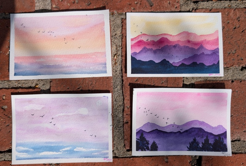
all the supplies I use, a photo of my watercolor palette and what colors are in it, as well as photos of all four of my finished landscape pieces. However, I cannot
emphasize enough that you do not need to follow
my tutorial exactly. Feel free to adapt it in your own way and to make
these paintings your own. If you enjoyed the
class or if you feel there were things I
could have improved upon, I would love for you
to leave me a review. Simply hit the reviews
tab below the class and click the leave Review button right here on the
right-hand side. And lastly, it feel free to connect with me
over social media. If you're on Instagram
or Facebook, feel free to tag
me in your work. I love seeing the work
of my students and would also love a chance to
get to know you as well. Thank you so much
for taking my class, and I really appreciate
you being here.
 Madeline Kerrii, Watercolor Artist