Transcripts
1. Class Introduction: Are you just starting out
on your watercolor journey, wanting to paint
loose landscapes, but not really sure
where to start. Are you painting here and there, but looking at Instagram artists and just puzzled
because you can't figure out how to create the paintings that you
see them creating. Well, my name is Madeline carry, and I'm a self-taught
watercolor artist. And I had all these
same questions myself. I was always drawn to painting watercolor pieces that
looked really simple, but also really pretty. I hope to help you
overcome some of the obstacles that I faced
when I first started painting. Issues with my watercolors
not blending very seamlessly. I was seeing other people's
How to Get loose whimsical watercolor splatters because I was tapping my paintbrush
just like the teacher was, but no paint was splattering
out and I was so confused. In this class, we
will be painting this loose watercolor
mountain scape with a starry night sky. And I hope to go over some of these techniques that
I struggled with. And I hope after this class, you will feel
confident in painting loose watercolor landscapes with these techniques that I learned. And I hope that you have
fun and enjoy this class. And I'm so excited to
have you here with me.
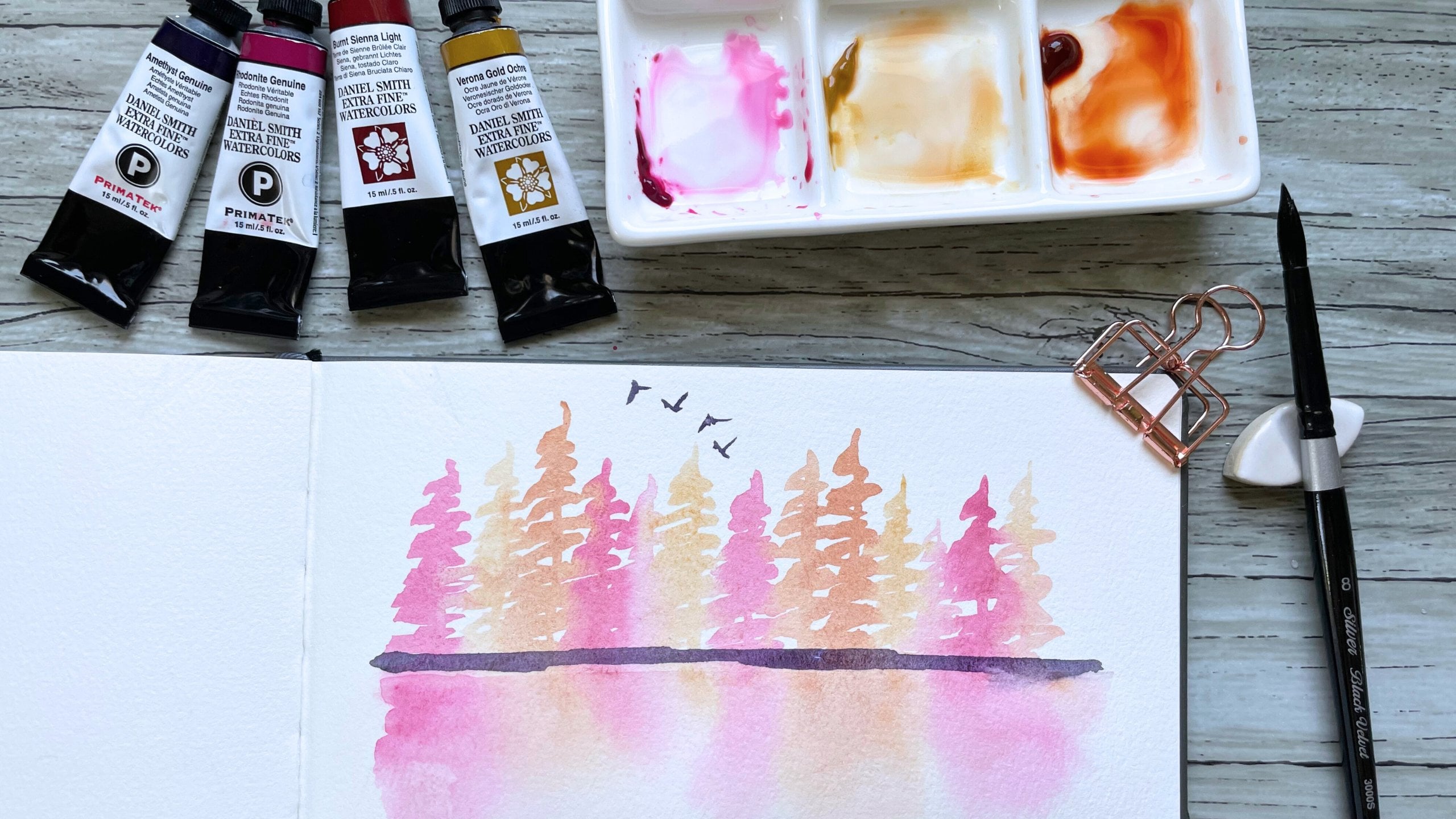
2. Supplies: Here are the supplies that
we will be using today. I have a jar of clean water. I will be using four
different brushes. Flat wash brush to easily wet my paper for our wet
on wet technique. A black velvet round ten brush, a red sable hair around six brush that I'll be using
for our paints splatters, and a synthetic round brush
that is on the springer side. We will be using four
different paints. Ultramarine violet,
French, ultramarine, little bit of Payne's gray
and some permanent rose. I will go over these colors and swatch them in
the next section, as well as letting you know what alternative
colors you can use if you don't have
these specific ones. I have my Dr. Ph Martin's
bleed proof white paint, which I will be using a squash. I have this little
ceramic palette here. Then I'm going to
use to mix colors. I have my masking tape,
and most importantly, I have my arches, 100% cotton cold
press paper, 300 GSM. These are all the supplies
that I will be using today. I will also have a
list of everything in the resources section of photo with everything
listed out. So feel free to go back and look at that reference
paper if you need it.
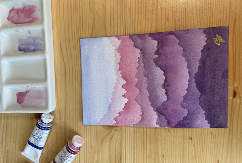
3. Color Palette: Let's swatch our colors
so that you have a general idea of the different colors
and shades so that I'll be using
for this piece. The top of our sky is
going to be made up of French ultramarine mixed in with a tiny bit of Payne's gray. Just to darken it a little bit. We're gonna get this dark
blue for our sky. There. We will be painting our mountains with a few
different colors and shades. So this is the swatch
for permanent rose. We will also be using a mixture of permanent rose
and ultramarine violet to get a light
pinkish purple like that. And our last color is going
to be Ultramarine Violet. Trying to get a creamy
consistency of it. We have this nice purple. These are the colors
that we will be using. If you don't have
these specific colors, you can use what you
have in your palate. Some other colors
that will work for the sky is if you just have regular ultramarine
that will work too. You could also use cobalt blue and mix in some Payne's gray. You can even use indigo, which is a pretty deep blue. If you wanted to, you
could dilute it a little bit to get a
lighter value of blue. For our permanent rose. It is similar to opera rose, which is the pink in
different brands. Another color similar to this in the Daniel Smith
brand that I use often is rho tonight genuine? For ultramarine violet, you can substitute this with
any purple you have. If you don't have a
purple in your palate, I'm going to show you
right now how you can mix your own Purple. So I'm going to grab some
of my french ultramarine. Actually give me 1 second. I'm going to clean
off my palette here. Okay, so I'm gonna grab some
of the French ultramarine. And I'm going to add
some permanent rose. And if you mix those together, you get a really pretty purple. If you want to add
a little more blue. You can play around
with the ratios, but I will swatch this next to our colors and you can
see it's very similar. So if you don't have a purple, you can mix your own. And if you do, you can, you can use that. But these are the
colors and shades that we will be using
for our mountain scape.
4. Paint Splatter Technique: For this lesson, we will
be going over how to create paint splatters
for our starry night sky. And I hope after this lesson, you'll practice a bit yourself doing some paint
splatter so that you feel comfortable
making them when we do our class project together. So here I have some
permanent rose. I'm going to spray a little
water onto it to wake it up. I'm going to grab some
clean water and I am going to mix up my pink Permanent
Rose paint right here. For our starry night sky, we're actually going to
be using white gouache, but for demonstration purposes, I'm going to use this pink so that you can see
what I'm doing. When I first started painting, I cannot splatter
for the life of me. And what I learned was
that I wasn't getting enough paint in my brush head. And so the paint was either too thick or too
creamy and so on. I was tapping it,
nothing was coming out. So for this exercise, I'm using a red
sable hair brush. And this brush is actually
more absorbent than say, a regular synthetic brush
like this brush here or something like
Princeton heritage with a more absorbent brush. If you get it really
loaded with color, like I am right here, that is the key to
getting a good splatter. We also always want to double-check that there
isn't any water right here because sometimes water can be there and then
when you tap it, it splashes along
with the paint. And we don't want
unwanted water splatters in addition to our pain. So I'm going to show you, I'm going to go about
five inches above my paper and start
hitting the other brush. And you'll see here that I get
some pretty big splatters. So the closer that my
brush is to the paper, the bigger those splatters
are going to be. You see how that's good? Pig's bladder. The higher that I go is, the higher that I go, the
smaller the splatters will be. So I'm gonna grab another
piece of paper to show you. So I'm gonna go
higher up this time. You'll see that if I tap my
paintbrush higher up here, the paint splatters
are smaller and finer. And so this is what
we are going to be looking for for our
starry night sky, these ones, we don't want
this because I don't know, I guess that could
look like planets. We want just like even
small, tiny stars. And so I want you
to play around to get the right splatter that
you want for your piece. So another thing I also
want to mention is that if your paint is on the
water ears side, then it's going to
be easier to get those really big splatters if your paint is creamy or thicker, sometimes it can be harder to get the spiders that
so kinda play around and see if you can get the texture and the
splatters that you want.
5. Wet on Wet Technique: I want to go over the wet on wet technique and
more specifically, I want to show you
the difference that you may find using this
technique on different papers. So I will be using
100% cotton paper. But a lot of times
people do paint with what we call
a cellulose paper. And the reason I'm going
over this is partly to help us to frame
our expectations. Watercolor is all
about knowing what to expect and how to get
our expected outcomes. In my experience,
I have found that 100% cotton paper is a
lot easier to achieve, a very smooth, soft, wet on wet wash and
sometimes not all times, but sometimes I
have a harder time getting a really smooth and even wash with unwanted streaks
on cellulose paper. Now there's nothing wrong with using paper that
isn't a 100% cotton. It's cheaper and more affordable,
more wildly assessable, but it can sometimes
just be slightly harder to achieve the same look
that I have in this class. And so what I want to show
you is the difference. And just so you know, it isn't necessarily skill, it might just be a
little bit of the paper. So I have my Arches cold
pressed paper here. I have wet it already and
I am putting on some of my french ultramarine
and I am just going to do this soft wash that you
see me doing right here. Very simple. Clean wash. This is on 100% cotton
paper and now I'm going to use the Canson paper. Just to show you
the Canson paper, it came from this sketch book. This was the first sketchbook
that I started out with. I painted with it for
at least half a year. It is cold press, but it isn't a 100% cotton. In the beginning when I
first started painting, I was just always like
confused why i'd, I'd watch people's Instagram
Reels and they would get these really smooth,
blended even washes. And I just couldn't achieve the same effect with my
Canson sketchbook paper. I'm just going to
show you really quickly kind of the difference. And it's so subtle, some people might
not even notice it, but I'm just really meticulous
when it comes to details. So I was like, my washes don't look the
same and I don't know why. So I'm gonna show you just the difference that I have noticed between
these two papers. So I did the same
thing, wet on wet. And I just dragged that
French ultramarine down to get this kind of
even smooth gradient. I'm going to dry it
with my hot air tool. Another thought that I had is 100% cotton paper
is going to hold water slightly longer
than cellulose paper, meaning the paper will stay wet evenly for a
longer amount of time, so that gives you more
time to paint wet on wet cellulose paper
can dry a little bit more quickly and
it can sometimes cause a little bit more warping. So if you look at these
two pieces closely, and again, it's very subtle. But if you look at
the Arches paper, I feel like it has a pretty smooth gradient
versus with the Canson. The bottom have been kinda hard to see that I
had pulled color there. I feel like the wash isn't as even and noticeable
as the Arches paper. And so I prefer 100%
cotton paper when I do these loose landscapes that require a lot of
wet on wet technique. The second thing I wanted to
show you is the difference between wet on wet
blending and wet on dry. So these two pieces of paper are arches, 100% cotton paper. And I'm going to wet
this one and show you what a wet on wet
blend that looks like. So I'm going to wet
the paper all the way. In. I'm gonna grab some
French ultramarine. I'm going to start my wash and
I'm going to pull it down. I'm going to clean my
brush and I'm going to grab some permanent rose. And I'm going to
do the same thing, but I'm going to start
from the bottom to get these two colors to
blend really nicely. So that's what we
would call wet on wet. And I'm do the same exact
thing on this piece of paper, but I'm not going to wet it. So this isn't gonna
be wet on dry. I'm going to take some
French ultramarine. So already you can see that
it's a little bit darker than when I painted it
on already wet paper. I'm going to grab
some permanent rose. And so you see, it doesn't blend as well
and the colors aren't as soft as our wet on wet piece. So I'm going to dry this. This is wet on wet, wet on dry. And if you look at these two, you can see that the wet
on wet is a lot softer. The colors which I
really like when I do my landscapes and the wet on dry is a little
bit more vibrant. And you can see that
colors didn't mix as well on the wet on dry in
comparison to the wet on wet. So that is the main difference or one of the differences
between these two techniques. And so I just wanted to
show you so that you have an idea of the
importance of wet on wet and how it
really helps create these really soft and
loose looking landscapes.
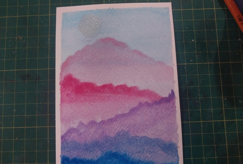
6. First Layer - Background: Let's start off our starry
night sky mountain scape. I am going to grab my
paper and my masking tape. And I'm going to tape down the edges of our
paper for a border. Now that our paper
is taped down, I will be using my
flat brush and I will be getting some clean
water to wet my paper evenly. We will be starting out with
wet on wet technique to paint the first layer and
background to our landscape. I am going to be
grabbing my round brush. And we will start by painting the upper half of our landscape. So I'm gonna be grabbing
French ultramarine. And I'm mixing in a tiny bit of Payne's gray to get a dark blue. And I'm going to start
here at the top and slowly move my brush down
for a very even wash. I'm going to grab
some more paint. Start again at the top. We want the top part
to be the darkest. So as we move down the page, it's going to just gradually
get lighter and lighter. I'm going to stop right here. And I'm going to grab
some ultramarine violet. And I'm going to start the wash again on the bottom and I'm going
to move my way up. So wet on wet
technique allows us to have the blue and the purple blend really nicely
in the middle like that. So one important
thing I want to note, the reason that we are getting this really soft blended wash is because the paper is wet and so there's kind
of a time factor. You need to work quickly enough that the paper
doesn't dry out. If you do encounter your paper drying out before your wash is
completely finished, then what I would
recommend is to re-wet the entire paper and to try to get to restart the wash over. Because once it starts to dry, you lose this really soft feel and you're going to start
getting hard lines, which we don't want. I'm going to take
a paper towel and just wipe up the excess
paint on the sides. And I will be grabbing my hot
air tool to dry this layer. And this is our first wash.
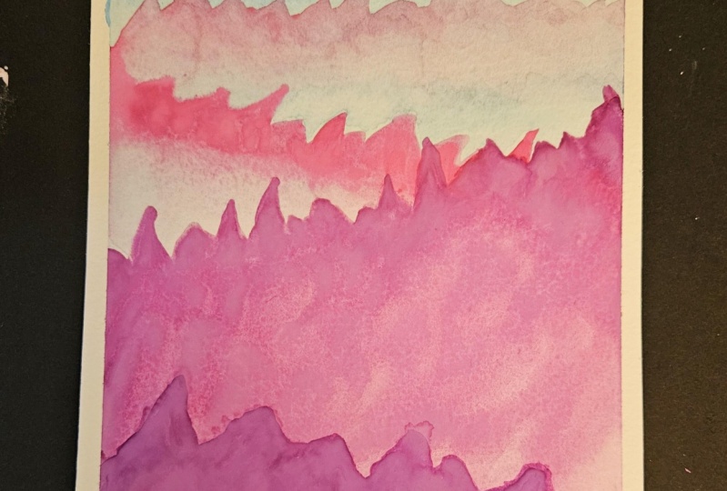
7. Second Layer - Mountains: Now that our first layer is dry, we are going to start
painting our mountains. And you can see that the background has
dried really nicely. And painting the
mountains onward, we are going to be
doing wet on dry. I'm going to grab
my round brush. And we're going to be painting
several mountain ranges. And I'm going to start off
with some permanent rows. So I'm going to use my
mixing palette right here. And I'm gonna be
mixing some colors to get different shades
of mountains. I'm going to first
start off with permanent rose as
the first mountain. This first mountain is going
to be the furthest from us. So we're going to use the lightest value
of permanent rose. So I'm gonna grab some water and we're going to
be diluting it. So I'm going to swatch for you how light and
I have this color. So it's going to, it's going
to be like that light. And as we move closer
to us in perspective, the mountains are
going to get darker. So let's paint this first set. I'm going to start right here. And I'm just going to make these loose up and down strokes. I'll grab a little more paint. I'm going to fill
it in right here. Now this part is
an important step. I'm going to wash my brush so that there's only
clean water now. And I'm going to run it along the bottom like that to smooth out that hard edge
and to make it soft. So it kinda looks like
foggy, misty mountains. And we do that by using
clean water and our brush. I'm going to dry this mountain before we go on to
paint the second. Now that our first
mountain is dry, I'm going to be grabbing
some more permanent rose and we will mix a
darker value of pink. So here is the
swatch for you guys. So a little bit darker. So I'm going to
start right here. And I'm going to go down a little to make this
more natural looking. And again, I'm going to wash my brush with clean water, only. Going to run my brush along the bottom to blend that softly. Now I'm going to dry this layer also with my hot air tool. For our third mountain, I am going to be mixing
some ultramarine violet with permanent rose to get this kind of pinkish
purple shade. So let me swatch that for you. So that's gonna be
our third mountain. I'm going to start
on the right side. And I'm gonna do
the same technique. So you want this third mountain
to be dark enough that it covers the pink from
the second mountain. But if you look at mine, my shade of purple pink isn't quite covering
that second mountain. And that's, this feature is
kind of unique to watercolor. If we were using gouache
or even acrylic, this third mountain would completely be
opaque and it would cover whatever part of the second mountain
that we painted over. But because we're using
watercolor and because watercolors unique feature
is it's transparency. I can kinda see a little
bit of the second mountain. That looks fine to me. I, I personally like that
feel with watercolor, but if that bothers you, because you can see that
mountain underneath and you can just grab a darker, you can add more
purple to your mix or you could not have
the mountain overlap. But I like how that looks. So I'm going to leave it
for our fourth mountain. We are just going to
use ultramarine violet. So I'm going to grab a little
bit of a darker shade. Swatch this out for you. So there we go. I really liked that gradient as the mountains come closer to us in perspective,
they get darker. And again, if you
don't have a purple, you can mix your own purple by mixing a blue and the pink. So let's start our fourth ten. This is all way creamy
consistency than the last three. I'm just going to make
these up and down notches. Going to wash my brush again. And I'm going to smooth
out this bottom. Since we are really
close to the bottom, I'm just going to
smooth it all the way down. There we go. Okay, Now we're off to
drawing this fourth mountain. I am going to paint one
less mountain down here. And I'm actually going to grab my synthetic brush because
it holds less water. And for this very
bottom mountain, I want a much creamy or
consistency of purple. And with my synthetic brush, I can kind of get
that really creamy, creamy color just like that. We're going to paint
this last mountain down here and this
really dark purple. And I'm going to fill it in like that. Now I'm going to
dry this mountain. And our last step and our final touches
will be to paint the sky.
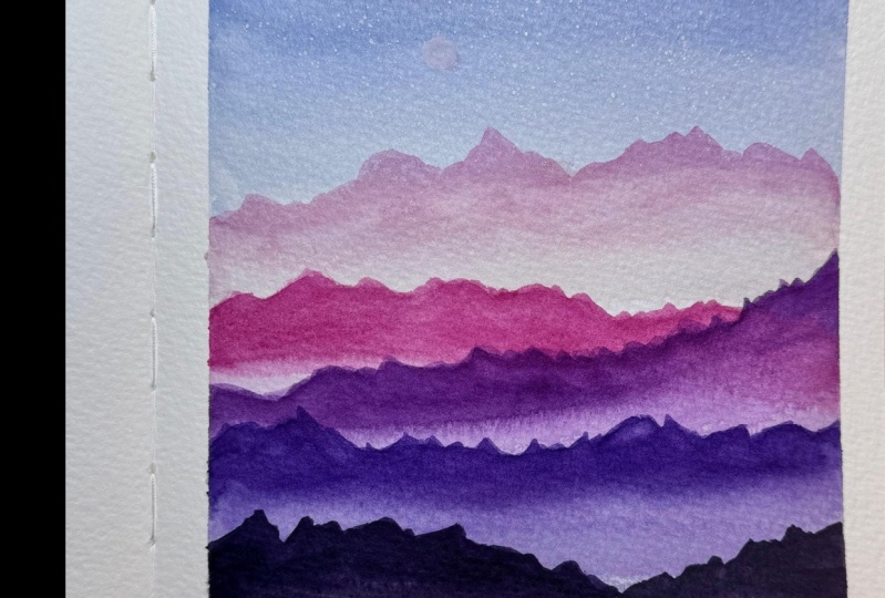
8. Last Layer - Stars: We are at the final step of our painting and we will be painting our starry
night sky with Dr. Ph. Martin's bleed
proof white paint. I swear by this as my
go-to white gouache. I have used other brands, but I really just love this one. It's so easy, it's in a jar
and it's thick and creamy, and I use it for everything. So as we set up to do
our star splatters, because I don't want stars
all over my mountains. I'm going to grab some scratch paper and
I'm going to cover my mountains so that we don't get mount paint
splatters all over it. So I'm going to grab my red
sable hair brush because I find it to be the most absorbent when it comes
to doing paint splatters. I'm going to wet my brush and grab a good amount
of white paint. I really want the brush loaded. So there we go, a lot of paint. And I'm going to
grab another brush. And I'm gonna do the
splatters a little bit higher because I
want small stars. Oh, I see. I have some water. They're
always check to make sure there isn't any water
beating up right there. So I'm going to go higher up and start splattering my stars. And now I am just going to grab a little bit more
white gouache and paint a small little
moon right here. Let's see. Let's
do it right here. You can paint a crescent
moon if you want. I like the look of a full moon. So I'm going to
paint a full moon. And there we have our
starry night sky. I hope you enjoyed this class. And I hope today I have made watercolor little bit less
intimidating for you. I think watercolor can be so therapeutic as a hobby if
you know what to expect. And I hope I have helped with
some of your expectations because for me that
was the hardest part when I first started
painting with watercolor. I just didn't really know how to get the
look that I wanted. And I hope the
different techniques I shared today are helpful and I hope you continue to
really enjoy watercolor and find it relaxing,
fun, and peaceful.
9. Class Project: So for our class project, I will be encouraging
you to paint your own loose watercolor
mountain scape with the starry night sky. If you want, you can use the
paints that I went with, or you can use a color
palette of your own choosing. I hope you liked this
class and if you did, it would mean so much
to me if you left me a review on Skillshare, I would also love
for you to upload your projects because I
love seeing your work. And if you want to connect
with me on social media, my Instagram handle
is Madeline carry. And if you tag me, I would love to share
your work in my stories. And if you have any questions, please leave me any comments
and the discussions, or feel free to reach
out to me on Instagram. I try my best to
answer all my DMs and I honestly love connecting
with all of you guys. I've made so many friendships
and it's just been so fun creating and being a
part of this art community. So thank you for being here. It means so much to me. And I really hope you
enjoyed this class, and I hope you feel more confident painting
loose watercolor landscapes. And I hope you've learned some techniques from this class. And thank you so much.
 Madeline Kerrii, Watercolor Artist