Transcripts
1. Introduction: Welcome to Winter Polaroids. A skillshare class on simple watercolor
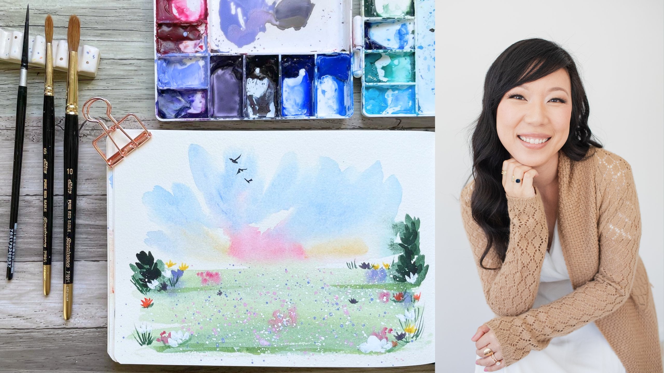
landscapes for beginners. Hi, my name is Madeline, and I am an artist and
content creator on Instagram, Tiktok, Facebook, and Youtube. And I'm a brand ambassador
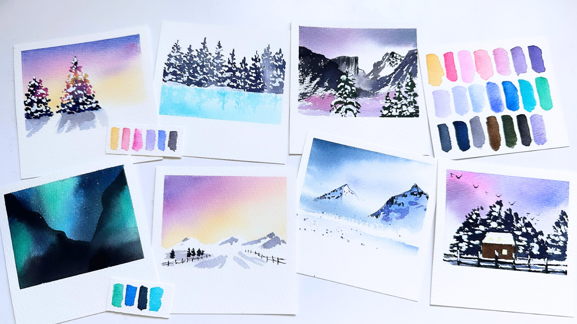
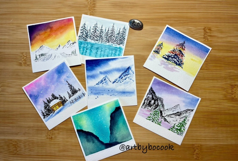
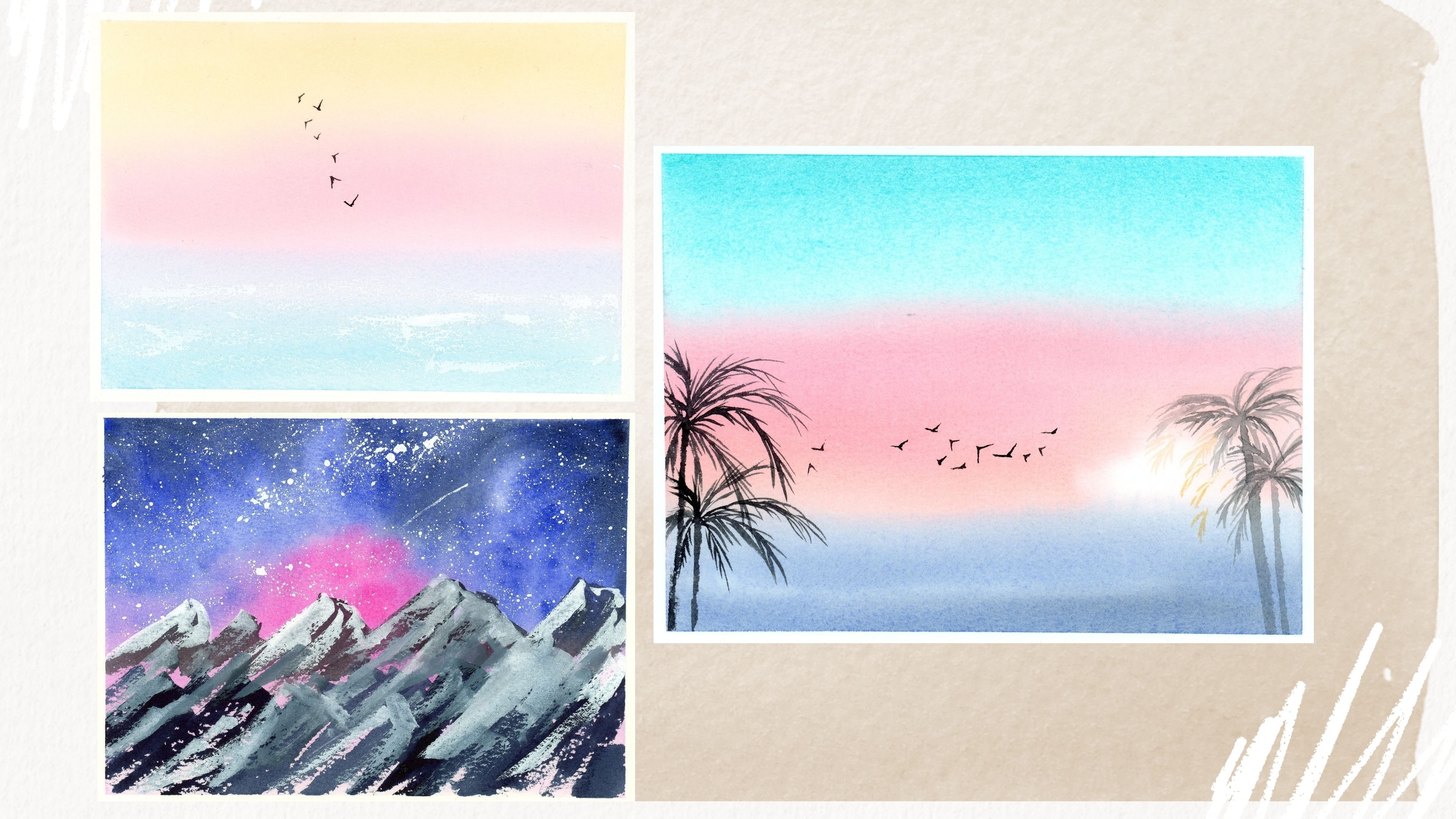
for Polina Bright Fairs, well press and Stakiwi colors. Here is a look at all the different
landscapes we will be painting in this class today. Something that is unique
to my artistic voice is my color palette and
my ability to paint landscape photos with a
unique combination of colors. In this class, we're going to explore several different
winter landscapes. And we will paint mountains,
trees, northern lights, and more together, all inspired by the beautiful
colors of winter. I can't wait to get started. I'll see you in the next lesson.
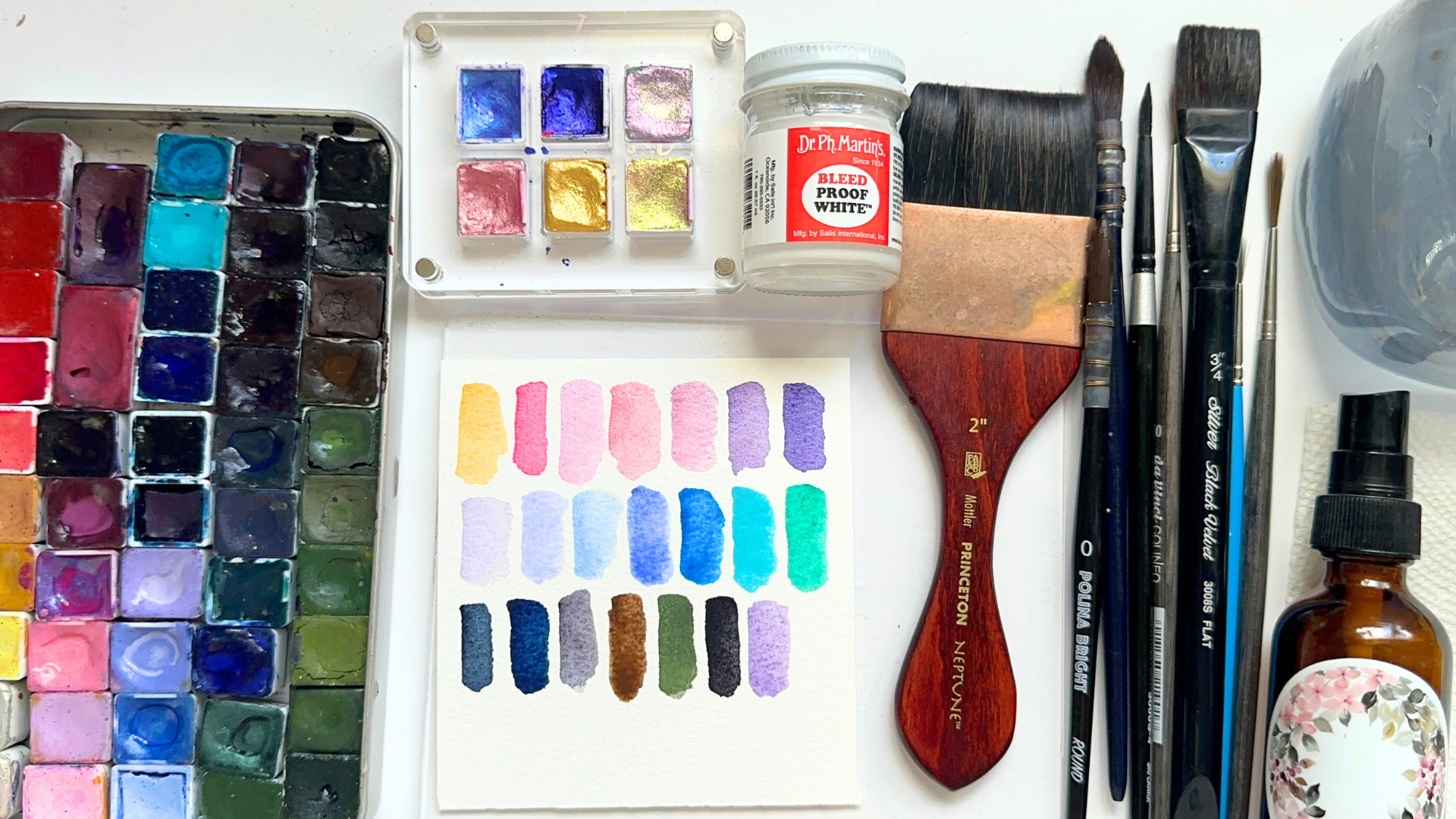
2. All Our Supplies: Let's go over all
the supplies that we will be using in today's class. I am going to start
off with brushes. I have a Princeton
Neptune two inch Motlerbrush as well as a black
velvet 34 inch flat brush. And I will be using both of these brushes to wet our paper. I have a polina bright
size zero round brush and a size one mop brush. I have a black velvet round four brush and several
different liners. Two of which are Da
Vinci colonial liners, size zero and size four, as well as a Princeton
select ten dash zero liner. The last brush I want
to share with you about is my makeshift
tree brush. It is a super old Princeton
heritage round two brush. And I take the bristles
of the brush and I smash it into a palette at a
90 degree angle like this, I really, really get those
bristles frayed out. This brush makes the perfect
tree brush textures. And we will be painting trees in one of the landscapes
with this brush. And I just really love how these trees come out when I
paint them with this brush, my recommendation
is to obviously not do this with any new
or expensive brush. This is probably one of
the oldest brushes I have. So it's a way to
repurpose the brush and to get very unique
brush strokes out of it that I wouldn't
otherwise be able to get if I had just left
this brush as is. I will be painting with 100%
cotton watercolor paper. This is probably one of the
most important supplies. Our paper really makes a difference in our
overall final painting. I have cut them out into
four by four inch squares. I will be sharing more the next lesson how we will cut up
and prepare our paper. But the brand of
paper is Bow Hong and this is their
Academy Rough line. I feel like the quality
of this paper is just really good and it's
also very affordable. I have an acrylic bar
that I will be using in one of our landscapes where we paint the
Northern lights, as well as a small water
bottle that I'll use to miss our paper
as we are painting. I also have some paper
towels close by. I have a jar of clean water and today I'll be using
handmade paints. I'm going to swatch out all the different colors
that I have so that you can get an idea of the range of colors that we're
going to be working with. You do not need the exact
same paints that I use. Even though I know it's
tempting to always want the exact same colors
that the teachers using. I feel this very often. But I do encourage
you to look for similar shades in
your existing paints, or feel free to use whatever
colors called to you, even if they are different
than the ones that I am using. The first color is a warm
yellow ocher, ish color. I use two different
shades of opera, I use several different
shades of pink. A lot of them are pastel colors. If you don't have
a pastel pink or a light pink color in
your color palette, you can also create
a pink by mixing some white wash with
some red paint and playing around with the ratios of more red paint or
more white guash. I also use several
different shades of purple. Purples can be mixed by mixing
a cool red with a blue. And varying the
different amounts of red and blue will give you
different hues of purple. I also will be using several different blues,
including lavender, ultramarine blue,
cobalt turquoise, thalo blue, indigo,
and paints gray. I use a warm brown, a dark green, some neutral tint. The last color I want to
swatch out for you is a very pretty metallic blue that I will use
to paint shadows. One of the most important
supplies in this class is this bottle of Dr. ph
Martin's bleedproof flight. It is an opaque
white water color and we will be using it to
paint a lot of our snow. This is very crucial
to our class. I will also be using
white masking tape to tape off the borders to
our watercolor paper, as well as this hot air tool which is going to help me
speed up our drying times. That is all the supplies that we are going to
be using in our class.
3. Preparing Our Paper: Now that we know what supplies we'll be working with today, let's get to
preparing our paper. When painting with
watercolor paper, I really enjoy buying
paper in large sheets and then cutting them up
with my paper cutter into sizes that I
want to paint with. I like doing it this way because it is a bit
more affordable. And then we can really tailor the watercolor paper to the
exact size that we want. For today's class,
I'm going to be cutting up this large piece of watercolor paper and I'm
going to be cutting them down into four by 4 ". So if you look at the
ruler on my paper cutter, you'll notice that my paper
is 14 " wide and 12 " long. I cut it width first into a sheet that is 12 " and
then 8 " and then 4 ". And then once I have
them in strips, I cut them again at the eight inch mark and then
again at the four inch mark. Then I have a perfect stack of little tiny
polaroids to work with. Next I'm going to
show you how I turn a square piece of watercolor paper into the
perfect little polaroid. I have masking tape right here. And I am going to tape off a very thin little border like what you see I did
in the video right here. For the upper edge and the edge on the
right and the left, I am going to tape
off the same width. And then for the bottom edge, I am going to leave
uncovered a tiny slither of paper that is the same width as the edges that I covered
on the other three sides. And that leaves us with
a Polaroid canvas.
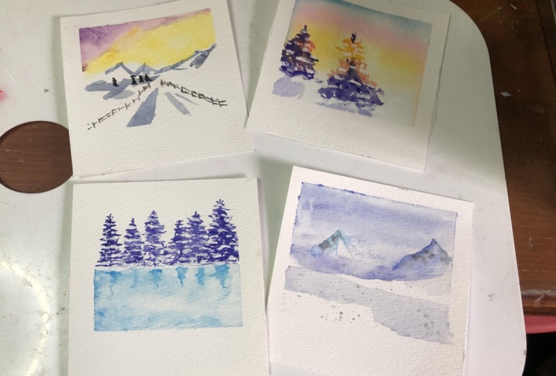
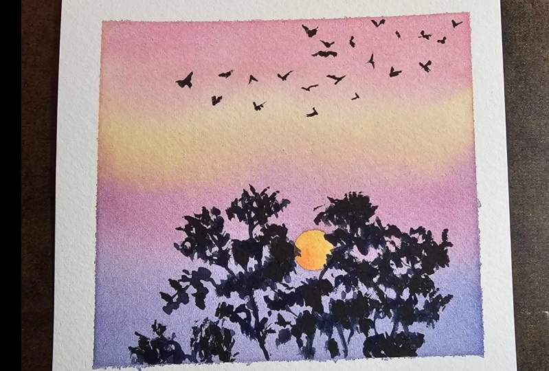
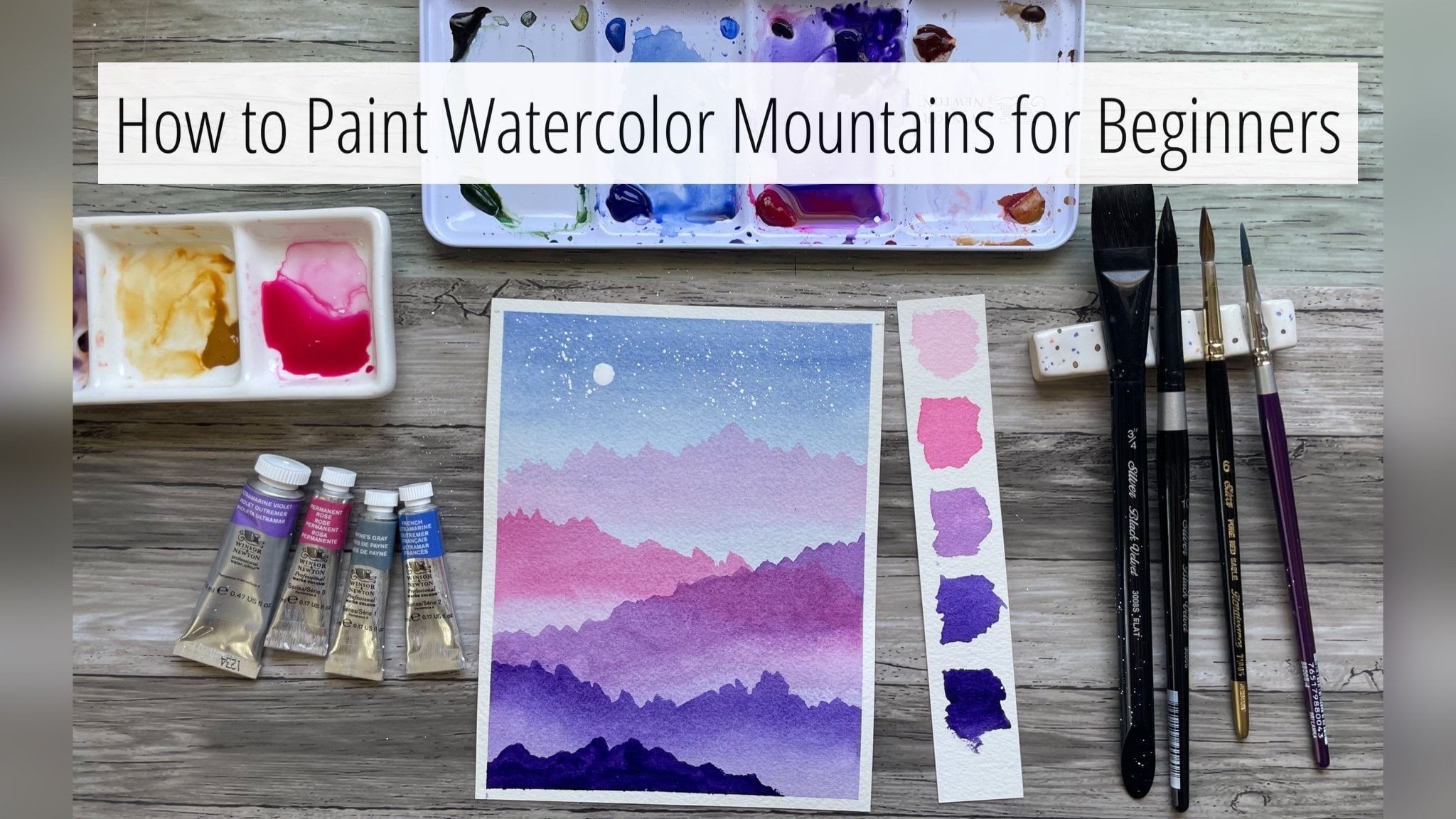
4. Day 1 Snowy Mountains: Hi and welcome to day
one, Snowy Mountains. While I'm getting
my paper prepped, I wanted to share the reference photo that we will be painting together today. It is this beautiful
sunrise morning. The sky is just beautiful, colorful and we have a snowy
mountain in our midground. I'm just so excited
to paint this photo, to really capture that
beautiful sunrise sky. We are going to be using
wet on wet technique today. I have a mop brush right here and I'm only
going to wet the sky. That is where we
are going to have our beautiful watercolors
blending together. And I am making sure to leave a silhouette
for our mountains. They are going to be white, so we will be using
negative space to essentially highlight
our mountains. I'm now switching over to a round brush to get
the color into the sky. This is a warm yellow ochre, and I'm going to start off on
the horizon in a little bit of yellow by
painting our sky and dropping the colors on wet
paper instead of dry paper. It helps all the colors to
really blend into each other. And you don't see any hard lines as the colors
are next to each other. Now I'm going to
grab a few shades of pink to add above the yellow. I'm just using my round
brush right now to further define the mountains
just a little bit more. Now I am picking
up a warm purple. I'm just going to add it to
the top left hand corner. And I'm going to let those
colors blend into each other. I'm going to add a
little bit more pink. This really resembles the
colors in our reference photo. This looks perfect to me. I am going to grab
my hot air tool and I'm going to dry our sky. Now, I'm going to grab
some blue, a darker blue. I am going to water it down
with a little bit of water. And I'm going to add a
little bit of indigo. With these two colors, I'm going to start painting
the tops of our mountains. I am going to do
that by very lightly tapping my brush at
the very top corner. And pulling that brush, it's a little bit
like dry brushing, but without as creamy
as a paint mixture. I'm going to add more of that dark blue mixture to
the left side, right here. Now I'm going to pick up my Da Vinci Coloneo
size zero liner. And I'm going to pick
up some paints, gray. We are going to paint
the fence that we see over on the right
hand side first. I like using liner brushes when painting small details
or fine lines. It is a brush that is a little bit longer
and as a result, it just gets the sharpest lines. I'm using that to paint
the fence right here. I'm not trying to make
the fence perfectly even. I am okay if the lines
are a little bit wonky, it makes the fence feel
like it's a little bit older and weathered by
the snowy elements. I'm going to do two
posts between each line, getting smaller as we get
further away from us. Now, I'm just going to dry the existing paint I have
on the paper because I want to a fence on the
left side and I don't want any of these colors
to bleed into each other. One tip to getting really fine lines is to have
a watery mixture of paint. If your paint is a
little bit too creamy, it's going to be hard
to get fine lines. And the second tip
would be to not have really any water
in that liner brush. You really just want
that really watery paint and you don't want there to
be excess water in the brush. Now, let's dry off this fence. I'm now picking up the same liner brush
but with a bigger size. This is a size four. I'm going to paint just
a few little tiny trees right here on the left side. There are trees in
the reference photo. And I think it just adds
a little bit more to the composition to
have a darker tree, a few trees on the side. To contrast the really light
snow, to paint these trees, I'm just making a straight
line down and moving my liner brush left and right
to paint the tree branches, they just look like very
tiny little triangles. Now I am picking up
my round brush that I used earlier and
I'm going to pick up some very light blue. And I'm just going to make some light brush marks here to signify that
this is a road. This makes it look like the snow is a little bit darker
on the sides of the road. And it really helps you focus your eyes to
the mountaintops. That's it for this first day. Once everything is dry, we can remove our masking tape, and we have our very
first winter Polaroid. I really love how
this turned out, how soft our sunrise sky is, and the mountains just
look so wintry and snowy.
5. Day 2 Frosted Trees: Welcome back to day
two frosted trees. I am so happy to have
you back with me. This is our reference
photo for today. I just really love that bright turquoise
color from the lake, contrasting with
that soft forest of trees that we have all covered
in a powdery, soft snow. And that's what we are
going to be painting today. As I finish up taping
off my Polaroid, I'm going to be grabbing
an extra little piece of tape and that's
going to separate our forest from our lake. After taping that down, I am going to grab
my liner brush. This is the Da Vinci
colonial size four liner. This is a brush that
is going to do all of our magic when
painting our trees today. I'm going to grab some indigo. I'm going to grab a
good amount of indigo. And I'm going to grab
some water and water it down on my palette to
the right right here. And in our reference photo, we have a huge forest of trees. And I'm going to
simplify that by only painting one row of trees. I'm painting a line down
for the trunk of our tree. And then I am making very light tapping motions
with my liner brush. And if you look closely, I'm sort of making little
circular squiggles. And I'm going from
top to bottom. And as I get down to
the base of the tree, I am going wider. So that, like I said
in our last lesson, tree kind of looks like
a little triangle. I am going to vary the height
of my trees so that they don't seem like cookie cutter
trees all looking the same. But I just want you to be very
relaxed with the way that you're holding your
brush and to really be light and soft with
your brush marks. Making sure to alternate between little dashes and little
circles with your brush marks. For this third tree, I am going to have
it be a little bit more sparse
than the first two. I'm leaving more white space in between each row of branches that I'm painting with. This tree that I'm painting now, I'm using a lighter
value of the indigo. This is a little bit
more washed out. I'm going to have
that contrasted with the next tree by picking
up more indigo so that there is a variance of darkness and lightness so that
our trees don't look flat. And so I'm picking
up more indigo now. And you can see that this mark is a lot darker than the
tree to the left of it. Now that I have some
darker trees over here, I can see that the trees on
the left are a lot lighter. So I'm just going to drop in
a little bit of indigo just to the base of the corner in
the left side, right here. Just to give some depth and
dimension to our trees. I don't want them to
look flat since we're using one color all
the way across. The way that I achieve
that is by varying the tones of the tree
colors from left to right. You'll see right
here that my line going down for the trunk
wasn't completely straight. And I'm just here to
remind you that trees in nature are not always
fully upright. They are not perfect and when you are painting your
trees with in water color, they do not need to
be perfect either. Like you'll see my
line is a little bit squiggly and
that's going to be okay because the
branches are going to cover up that line.
For the most part. I'm making this one a little bit darker than the one
that I just painted, so that the one in the lighter shade of indigo kind of looks
like it's further back. And now I'm going to take
my hot air tool and I'm going to completely
dry all those trees. And now I'm going
to come in with some Dr. ph Martin's white wash. This is a very opaque
white water color. I just love it. I feel like it gives the
perfect snow textures. And now I'm going over the trees with very similar brushstrokes
that I did to paint them. I'm adding a layer of snow
to these trees so that it definitely feels like winter in our landscape when you're
painting the snow. One rule of thumb
that I use is I like to skip every
other branch so that it feels like there is snow settling just on
top of the branches. And that there is some
darkness underneath from where the tree branches would be that don't have
snow covering them. I'm going to skip this tree, the second to last tree because that one is a little
bit further back. I really like how that looks. I'm now going to rip off the tape that I had
to tape off the lake. I'm using this 34
inch flat brush and I am going to wet the paper
directly beneath the trees. Being careful not to paint water over the trees
that we just painted. Now I'm grabbing some cyan. I think this matches
the color of the lake. In our reference photo, I'm dropping some darker
color right beneath the trees and right at the
very bottom of our landscape. I'm going to dry this layer
off with my hot air tool. In our reference photo, there is some snow piled up
at the base of the forest. I'm just adding a little bit of snow that it looks like there is a little pile of snow right above where the
lake would start. Now I'm going to grab
with a liner brush, the same one that I used
to paint the trees. I'm going to grab the
same color that I used to paint the lake, but I am going to water
it down a little bit. I am going to very lightly trace out the reflection
of the trees in the lake, which we do see in
our reference photo. My tip for this step is to
not paint the entire tree. We are just very quickly painting a silhouette
reflection. I recommend using the same color of that you use to paint the
actual color of the lake. That way it feels more like a reflection and doesn't
stand out too much. In terms of contrast, some of my reflection trees are a little bit darker
than the others. That's okay. I'm trying to vary the values to keep
it looking loose. I really like how that looks. We can dry this last layer
off with our hot air tool. Once everything is dry, we can peel off
our masking tape. There is something
about that snowy lineup of trees and that
beautiful reflection that just look really
beautiful to me.
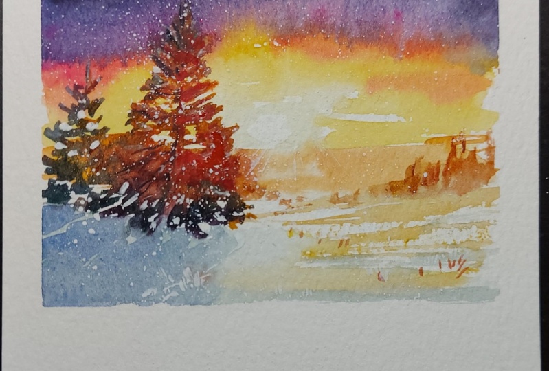
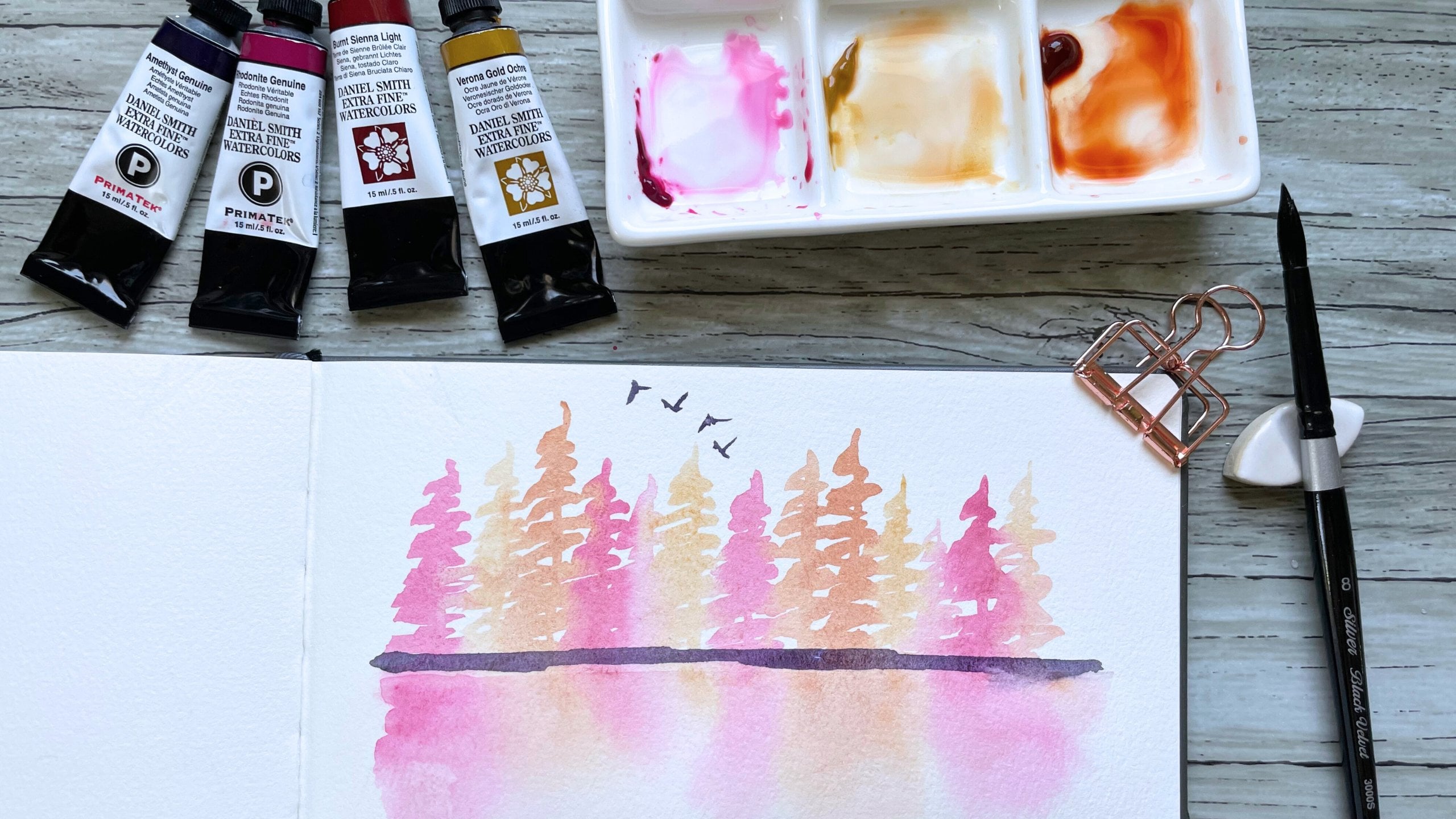
6. Day 3 Winter Sunrises: Welcome back to day
three winter sunrises. In today's lesson, we are going to be looking at
this reference photo. And I'm going to share
one of my favorite ways of breaking down and
simplifying reference photos. I like to see a
reference photo as a blueprint for what I want
to paint composition wise. And more often than not, I like to choose my
own colors rather than relying on the colors exactly from the
reference photo. Today we are going to
paint a few trees that are in front of the brightest
point of our sunrise. And instead of
using the blues and dark blues and greens that we
see in our reference photo, I'm going to be playing with
pinks and purples and blues, colors that you wouldn't
normally see in nature, but that still go together and still look beautiful
when painted as a tree. So the first thing we're
going to do is I'm going to grab my
Princeton molar brush. And I'm going to wet
our entire paper because we are going to
lay down our first wash, which is going to be
our background wash. I am grabbing my round brush and some yellow ochre
and I'm going to lay down the brightest point
of the background, which is the yellow that
we see from the sun. Now I'm going to pick up some opera and paint
that above the yellow. Then I'm going to grab some
blue and paint it above that. I initially grab some of the indigo paints gray
on my palette. And quickly after swatching it, I realize that it's a
little bit too dark for me, and I pivot and use an
ultramarine blue instead. If you ever pick up a color and as soon as
it touches the paper, you realize that
you don't like it. One easy way to correct that is to lift the
unwanted colors out. The way that you lift color
is to wash your brush, dab off the excess water or the clean water from
your brush so that your brush is wet but dry, like there isn't a big glob
of water in the brush head. And with that, we can lift whatever color that
we've put onto our paper that we don't want. As long as the color, the water colors are still wet, There is the ability to lift
the paint in water color. The absence of color creates
light or brightness. And by lifting a small
circle in our sky, that's going to help
us paint the sunrise. Once we get to the trees, I'm adding a little bit
more yellow because I see that it has gotten a
little bit washed out. Now I'm going to use my hot
air tool and dry off our sky. If you painted day two with me, this is going to be piggybacking off of the trees that
we painted in day two. But I am using some
yellow ochre to paint the tree branches
directly in front of the sun. What we are going to do today is paint a tree that looks back, lit by the sun by using
different colors. As we paint the tree, this warm, pinkish opera color is
darker than the yellow. It looks like the yellow part of the tree is right in
front of the sun. And then as we move further
from that center focal point, the tree is going to get darker. We are going from yellow
to pink to indigo, with yellow being
the brightest point and indigo being the darkest. The indigo parts of the
tree are the parts of the tree that are not
back lit by the sun. This is one of my favorite ways to portray light
and water color. Earlier I mentioned in
a tiny pop up to keep a tiny slither of white
here in the foreground. And I am going to be careful
not to paint my tree into that white foreground because that is where we are
going to paint our shadows. I'm looking at my tree now, and I see that the
indigo has seeped into where I had painted
pink parts of the tree. And I'm just taking
my brush and I'm lifting that indigo
from the pink. It's created a little
bit of a blue. And I don't mind that too much, so I'm going to leave it. Another way that I
simplify my photos is by taking out things
that I don't want to paint. In the reference photo, there were three or four trees, but I'm only going to paint two. And I'm just going to paint one more to the left, right here. I'm not using any yellow
since this tree is not. But I imagine the branches to the very right of the tree to have some light
bouncing off of it. I'm using the Opera to paint just a little handful of branches to the
right of the tree, and then I am painting
the rest of it in indigo. I like how that looks, so I'm going to dry
this layer off. And now I'm going to grab my bleed proof white paint and we're going to add some snow
to these tree branches. The last thing I want to do is to mix a color for the shadows. I'm using some blue and indigo
and I'm watering it down. And I'm just painting some
shadows behind these trees, further accenting the light that we have captured
in this landscape. Once everything has tried, we can take our
masking tape off. And this might be one of my favorite projects
in this series. I really hope you enjoyed painting this winter
landscape with me.
7. Day 4 Icy Shadows: Hi, and welcome back to
day Four, Icy Shadows. This is the reference photo that we will be
painting from today. When I was picking
reference photos, I came across this photo and I felt like this must
have been taken maybe during a blizzard because
the sky looks a little bit ominous to the left
and I just felt cold. And I bet the shadows, I thought shadows from these mountains will
be so fun to paint. That's what inspired
today's landscape and what I thought when I was looking at this
reference photo. At the very end of the lesson, we're going to use
some metallic paint and give these shadows a shimmery reflection to them that I think captures
the feeling of ice. The first thing that
we're going to do is wet our background and we are
going to paint the sky. I am grabbing my mop brush and I'm going to pick up
some ultramarine blue. And I'm going to start to paint that really intense sky that we have with this reference photo for that upper left hand corner. I'm going to grab
a darker blue to create that moodiness that
we see in that corner. I'm going to start to
build some of the shadows. I'm going to add some of
that darker blue right here. Now I'm going to pick up
a smaller round brush. This is the black
velvet round brush. And I'm just going to lift
a little bit of the blue because in the mountain that we have a little bit
further from us, you actually see the brightness of one side of the
mountain face. I just want to lift
some of that color so that mountain face is a little bit on the
more white side. Now I'm just going to get a pencil and I'm
going to trace out this mountain so
that I know where I want my shadows to be. Now, still using
that black velvet, I am going to pick up some blue. If you look at the sketch that
I did of the mountaintop, there are two mountain
faces that we can see. I am going to paint in
the shadow of the one that is not facing
the source of light. Then there's a larger
mountain on the right side. In the reference photo, this mountain is
completely in shadows. I'm going to pick up
ultramarine and I am going to fill in this mountain
because it's closer to us. It's going to be darker than the mountain that's a
little bit further away. That allows us to keep the
perspective of this landscape. Both mountain tops have a lot of black rocks
scattered across them. And I'm going to paint those in as little tiny specks just so it gives our mountains some more dimension and so
that they don't look as flat. Again, I'm going to make
the rocks on this mountain just a little bit darker than
the mountain further away. Then now for the fun
finishing touches, I'm going to grab
my metallic paint. I'm going to do some paint
spotters in one corner. I'm also going to paint
some icy reflections. Because you know the ice, it is reflecting the sunlight. And so I can imagine in
real life that there are in parts of the icy mountain
that are more glimmering. And that's what this
metallic paint represents. Once everything is dry, we can remove our masking tape.
8. Day 5 Early Cabin Mornings: Welcome back to day five,
Early Cabin Mornings. This is the reference photo that we will be
painting from today. I love how soft the sky is with really pretty
pinks, blues and purples. And I love the tiny
little cabin just nestled away in the mountains. I imagine the family living
there to be waking up on an early morning and getting their coffee ready for the day. I'm going to start off by
painting a yellow glow, and then now I am
going to trace a very, very simple cabin
over that glow that I want to be emitting
from the cabin windows. After this, we will move
on to painting the sky. I am going to grab my Motlerbrush and I'm going
to wet the paper so that we can paint a really
soft and beautiful sky above our tiny little cabin. I grab some lavender
with my mop. Then I'm going to pick up
some pinks and some purples. The sky in the reference photo does have some moodiness to it, so I am going to pick up some of the darker blue and indigo
colors on my palette. And I'm going to drop in just a few darker brush
strokes of color. Then I'm going to
dry this layer and then now I am going
to get my tree brush. I shared in the
supplies video how I made this brush and why I
love it for painting trees. But I'm going to
grab some indigo and bring it over to my palette. And we are going to paint
some dark trees around the cabin that is going to highlight the snow
on top of the cabin. It's also going to make the yellow lights coming from
the cabin windows seem that much brighter because
it is being contrasted with really dark loose
trees around it. I love this tree. It is so, and it really just paints so many different
foliage and tree textures. If you didn't watch the
supplies portion of this video, be sure to check that part out. Now that I have the cabin
surrounded by dark trees, I am going to grab my black velvet
round brush and I am going to gently
color in the cabin. I'm going to have
the four walls of the cabin be a nice warm brown. I am going to make
sure to outline the windows and I'm
going to use white wash on the roof so
that it looks like the cabin is just
covered in powdery snow. Now I'm grabbing the white wash and I am going to
paint our roof. Now I'm going to use the
white gouache to paint some fallen snow on the
trees around the cabin. Now I'm going to take
my hot air tool and everything and I'm going to grab my Da Vinci Coloneo
size four liner. And I'm going to pick
up some neutral tint And I'm going to paint a fence that I want
in the foreground. I just want this fence
to frame our photo. As I'm painting this fence. I realized that the
blue that I had swatched in the foreground
here is really washed out. I'm going to dry my fence
and I'm going to make a with some ultramarine. And fence wasn't as
dry as I wanted it to, so it smeared a little
tiny bit, but it's okay. I just needed it
to be white behind the fence so that the snow on top of the fence
would actually show up. And the last thing
I want to do is add some birds to our sky
as finishing touches. And once we're done with that, we can peel our
masking tape off. I hope you enjoyed painting this early morning
sunrise cabin with me.
9. Day 6 National Parks: Welcome back to Day
Six National Parks. This is the reference photo that we'll be
painting from today, this photo of Yosemite. If you have been following
me on Instagram for a while, you'll know that I have painted this exact shot in
almost every season. I think now I have painted
a winter version of this. But this is a new photo
that I haven't painted yet. I'm excited to get started. The first thing we're going
to do is wet our paper, and I'm going to drop some moody pinks and
purples for our sky. I'm using my mop brush and I'm going to
pick up some opera. And I'm going to mix it with
some of the purples that I have on my palette to
create a moodier purple. Then now I'm going to pick
up just a little bit of paints gray and drop it
in the right corner. We are going to dry the sky. Then now I'm going to get my black velvet round
four brush again. I'm going to pick up
some neutral tint and I am going to start painting the outline of
our mountains right here. I'm also going to leave the reference photo
up in the corner just because I am going to be trying to paint
most of the outlines. And I think just having
the reference photo to look at will be helpful. Just a reminder that when you're painting from
reference photos, you can pick and
choose what parts of the reference photos
you want to keep. I'm keeping the
silhouette outlines of the different mountains
all together, but I am going to simplify
other aspects of this photo. The mountain range that
we have on the right over here is primarily in the
shadows in this photo. So I'm going to be grabbing a stronger hue of neutral tint so that it
looks a little bit darker. Then for this cascading mountain
on the left right here, it's closer to us than the mountain that I
painted just behind it. I'm also going to paint this in a darker value
of neutral tint. When creating perspective
with water color, the objects closer to
us are usually darker and the objects further from
us are usually lighter. By alternating those
values in color, it creates perspective
in our eyes. There are a lot of
trees in the midground, and the colors in the photo are some muted
purples and pinks. I'm simplifying all
those trees by just adding a light layer of purple right in front
of the mountains. Then now I am going to
grab some pink and I'm going to drop in pink
in there as well. I am dry brushing some of it and I'm leaving some
intentional white space. Now I'm going to grab my
colonial size four liner and we are going to paint
the green trees that we have in the foreground. I am grabbing a
dark moody green. I'm going to paint
this tree right here. It is taller than the rest of the trees
and you see that it has a lot of really
droopy branches that are covered in snow. I am going to make little semicircle brush marks to signify those
droopy branches. And next I'm going to paint this clump of trees over
here on the right side. They are similar trees to that droopy tree that I painted, but they are kind of
all bunched together. So I'm going to paint
these trees a little bit differently so that
it kind of breaks up our foreground and that
there are different areas of interest and different
trees over here. I like how those trees look now. I'm going to dry this layer off. Now I'm going to grab my bleed
proof white paint again. We are going to add some
snow to these trees. I'm using the same brush
for this tree right here. I really want to highlight
those droopy branches because the mountains behind the tree and the tree
itself are all really dark. The white that we're adding for the snow is really going to make this tree in our foreground
really pop out at us. And then now I'm going to add some snow to these trees
on the right as well. Let's try that layer
off really well. Now I am going to pick
up some neutral tint. And I'm just going to
add some rocky details to the mountain faces so that
they don't feel as flat. I like how that looks. Let's dry this layer
off completely. And once everything is dry, we can peel our
masking tape off. This is day six National Parks.
10. Day 7 Northern Lights: Welcome back to day seven. Today we are going to be
painting Northern lights. And there is nothing more
iconic that represents winter more than a bright
set of Northern lights. This is our reference photo that we will be
painting from today. I painted Northern lights for the first time last
year and I quickly fell in love with how fun these were to paint
in watercolor. I am going to be
taping our paper down to acrylic board because
we are going to be misting our paper
with a spray bottle and to get the movement that we see with the
Northern lights. We are actually going to be
getting our watercolors to move and we are going
to have so much fun. This is going to get
a little bit messy. So make sure to have
paper towels or paper cloths nearby to help clean up the mess for
all of our polaroids. I have been taping off
the very bottom part, leaving a tiny little space. But I just want to point out that this
little strip of paper that normally is uncovered
with our masking tape, I am going to add an additional piece of tape just to cover it because I don't want there to be water color on this bottom little strip for
today's northern lights. The three main colors that
we need are thalo green, thalo blue, and either
indigo or paints gray. I don't have a thalo green
in my palette right here, so I'm just squeezing
some out from a tube. Now I am grabbing a pencil
and I'm just lightly sketching out where I
want my mountains to be. I'm not going to paint out the person in the
center of the photo, but I am going to have the northern lights
reflecting off the mountains. Now I'm going to
grab a flat brush and I'm going to wet our paper. Once our paper is fully wet, I'm going to pick up some
thalo green and I'm going to start painting the brightest
point of the lights. At the top center of our photo, we see a beautiful ray
of northern lights. And I'm going to add some
green on the mountains because it is reflecting off the icy mountains in
our reference photo. Now I'm going to
pick up thalo blue. I am making diagonal
brush strokes to help convey the movement in this photo by laying down the brighter colors first and painting the darker
colors over them. It helps to preserve the light. Now I'm going to
grab some indigo, and I'm going to
drop some indigo at the top of our landscape. And I'm also going to change
the angle of my camera so that you can see what I'm
doing a little bit better. But after we drop the
indigo at the top, I'm going to grab a little
water spritzer bottle and we are going to spray
this dark indigo paint. And we are actually going to
get it moving on our paper that is going to help convey the movement that we see
in the Northern lights. Yes, the paint is going
to get everywhere. It's going to get messy, but it's also so, so much fun. What I'm doing is I'm dropping
darker color at the top. Then I'm using gravity to create the movement
with the darker paint. I'm using my brush and I'm
wetting the rest of the paper, and now I'm grabbing
more indigo. I am dropping it in the
right hand corner and I'm going to tilt
my paper so that the paint flows down
in a diagonal line. I'm also being
careful and trying my best to preserve some
of the green on the paper, but using gravity, tilting
your board and using the water bottle to spray at the paper is going
to create that movement. And I am using some paper
towels to pick up excess water. Also, there's no right or wrong with how this sky is
going to turn out. And I love that there is an unpredictable
sentiment with this. It just feels really
fun and sort of in line with how nature would be
now that I've dried it off. I'm grabbing some neutral tint and I'm going to paint
in the mountains. I am going to
remember the sketch that I did prior to
putting down any color, and I'm going to trace
that mountain shape. How I am going to preserve
the green reflection on the mountain is by
taking just a wet, clean brush and softening that initial line that I
painted on the mountain. I'm going to do the
same for the mountain. On the left, I am going to trace the silhouette of the
mountain with neutral tint. And I'm going to
paint in the parts of the mountain that are not
reflecting the Northern lights. Then now I am just
getting a clean brush. And I'm softening that hard line right there so that it looks like the Northern
lights are just reflecting off of the mountain. I like how that looks. We are going to dry
all that off then. Now I'm going to grab
some scratch paper. I am going to add star
spots to the sky, but I don't want there to be splatters on the
actual mountain. Let's dry all of that off, and once everything is dry, we can peel our
masking tape off. I just love how this turned out. Northern Lights are
so fun to paint and I hope you enjoyed
painting these with me.
11. Your Class Project: Congratulations on
finishing this class, and I really hope you enjoyed learning and
painting along with me. In this lesson, I
want to go over a few resources that I
want to share with you. Including how to upload
a class project, how to leave a class review, and where to go from here. If you are on the class
website and scroll down to the project
and resources tab, I want to direct your
attention to the files here under the
downloaded resources. Here will be all of the reference photos
that I painted from. You can download the
photos and have them open next to the class while
the class streams. I also have a file with
all of my class projects, along with all of
the class supplies, and a photo of all of the different colors
swatched out that I used. If you scroll back up
on the right hand side, you'll see a purple bar
that says My Project. Hit the Submit Project button, and it will take you
to this screen Right here under Project Title. Feel free to put your
name or a title for your project and then hit
the Upload Image button. I recommend posting photos
that are in landscape format. Once you select the photo, you can crop it to your liking. And once it looks good
to you, hit Submit. It will appear in
the class gallery. I really enjoy seeing
all of your work and it makes me really happy to see people
enjoying the class. To leave a class review, hit the reviews tab and
then hit the button. Leave a review. I welcome any and all feedback and would really love to hear what you thought
of the class. If you enjoy my
style of teaching, feel free to find my
Skillshare profile. On my Skillshare profile, you'll see a list of all
of my recent classes. And you can hit the
follow up button to get notified when I publish
future classes. Thank you again for
taking my class and I hope to see you
in a future lesson.
 Madeline Kerrii, Watercolor Artist