Transcripts
1. Introduction: Bright skies, fresh greens, blooms and blossoms all around. It's a perfect season
to paint spring. If you have been wanting to try watercolor landscapes or
practice painting spring scenes, this class is just for you. Hi, I'm Rania, a aticlar
artist based in the UE, and I'm so happy
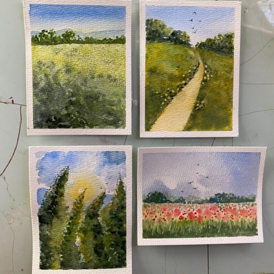
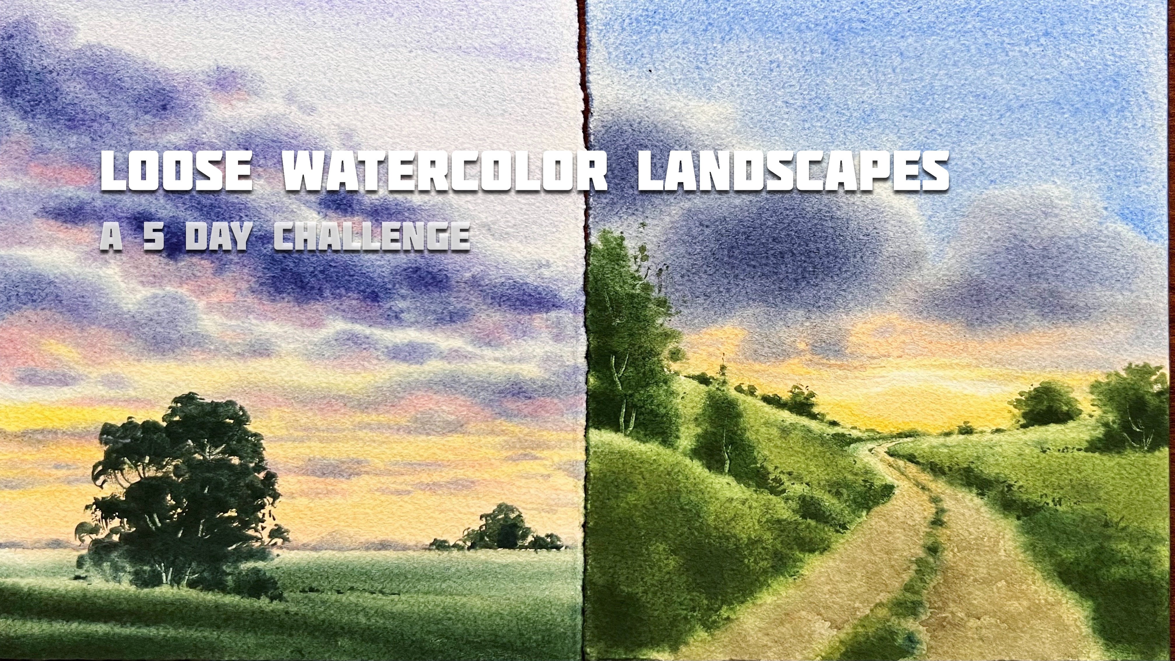
to have you here. In this class, we'll paint 15 beautiful spring landscapes
over the next 15 days. Each class project is
designed to be completed in just 15 to 20 minutes
you can either watch the full video and then paint or paint along with me. You will also be able to
download the pencil sketch and the finished painting of each class project from
the resource section. We'll begin with simple, easy to follow paintings
and gradually move towards slightly more
detailed paintings. This is a relaxed challenge. It's not about perfection
but about enjoying the process and making time for creativity in your busy day. We'll be painting in a loose and impressionistic
watercolor style focusing on bright, airy, fresh spring landscapes. Along the way, I'll also show
you how to fix mistakes, work more confidently and use a few fun techniques
and materials to create interesting
watercolor techniques. By end of this class, you
will have a collection of 15 spring
landscape paintings, along with practical
tips and techniques that you can use in
your future work. This class is
intermediate level, but also suitable for
those at beginner level. Even if you are
just starting out, you can follow along
easily as the projects are structured to gradually
build your confidence. If you have any questions, feel free to ask in the
discussion section. I'll be happy to help. I hope you enjoy this
class and I'll see you in the next lesson. M
2. Materials: Hey, thank you so
much for joining. And in this video, let's
see all the materials. So I'll start with the paper. I'm using fabriano
artistico watercolor paper. This is 100% cotton and 300 JSM. These are very large sheets, which I cut down
into small pieces, measuring 16 into
14 centimeters, almost A five size
for the painting. You can use any brand
of watercolor paper, which is 100% cotton and
300 JSM and cold press. Now let's see the brushes
and some other materials. So for wetting the paper, I'll use these two brushes. One is a hake brush size 30 MM, and one is a
Princeton wash brush. And for the painting,
for the main painting, I'll use these round brushes, size 16, ten, and two. And also these two flat
brushes for some details and painting techniques
and a detailer and a very small size flat
brush for lifting. And we'll also need
some other materials. I'll use a spray bottle.
This is by Derwent. It gives very fine spray, pencil and eraser for sketching and pepper knife for some scratching techniques. We'll also explore different
watercolor textures using different materials. So we'll use table salt and some soft tissue papers for
some lifting techniques. I'll show you that
in the projects and also a masking tape. And we'll need some sponge. We'll use the sponge for some easy but realistic
foliage texture. So this is the one I'm
using this artist sponge, and it is kind of
different texture. So you can use the
normal sponge. But if you have this, you can use this too, which will give some
different texture. And for the colors, I'll show
you the color palette of each painting before we
start the glass project, so you can easily refer. And if you are looking to invest in a good
brand of watercolor, I highly suggest this brand. These are Michael Harding
watercolor paints, a premium honey based
range known for their rich pigmentation and excellent light fastedness and most of the colors
are single pigment, which helps you achieve clean and vibrant mixes
without muddiness. If you're planning to invest in a high qualty watercolor brand, this is definitely worth trying. They're available on Jackson's and their official website. And you'll need two j of water, one for rinsing your brushes, and one for wetting and rewetting the paper
with clean water. I'll also use my hair dryer
to speed up the process. And for stretching the paper, I'll use my acrylic glass
board with masking tape, which is a common method for
stretching watercolor paper. I also want to show you how I set up my table with
all the materials. So if you're right handed, you have to keep the
paper on left side and all other materials
on the right side. Your palette just near the
paper and the water cups and a big cotton cloth or something
to wipe off the brushes. And you can keep the
extra materials like your head dryer or something like that, just near to that. And if you're left handed,
it's just opposite. I also keep an extra
tissue paper in my left hand to
keep my brush damp. This will always help us to control the amount of water and the pigment we are using and to keep the
brush always damp. Most of you might already be
using a similar technique, but I just want to
show you my setup. It really helps to create a smoother and more
efficient workflow. And that's pretty much all about the materials we
need for the class, and I hope you're ready
for the challenge. I'll see you with the first class brijet in the next video.
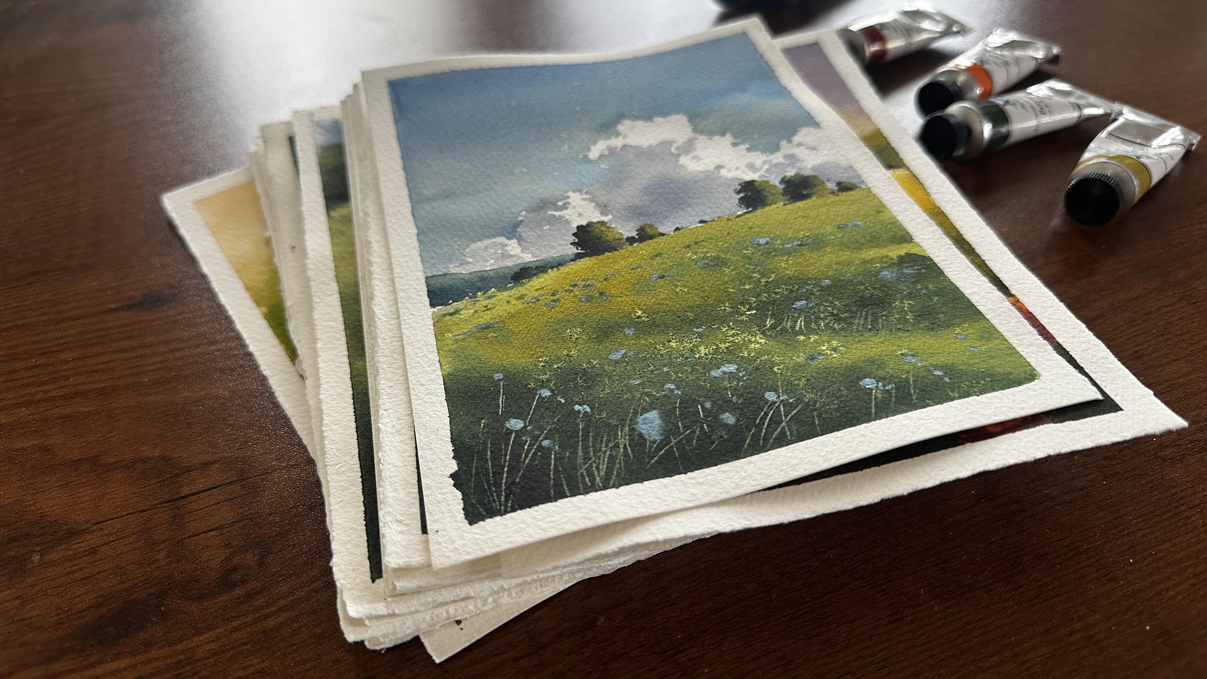
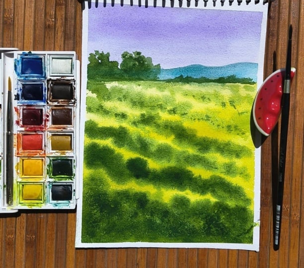
3. Day 1 - Spring Meadow: Hey, everyone. Thank you
so much again for joining, and welcome to Day One. And today, we're going to
paint a simple meadow scene. So let's see the colors. I'm going to use Cobalt blue
and opera pink for the sky. So if you have a
muted violet shade, you can use that too. And for the meadow,
I'll use green gold and perlin green and indigo for
some background details. Here, I have already prepared my paper by fixing
it with masking tape on the acrylic lash booard
I have my palette ready. So let's start with sketching. I'm fixing the horizon
line very high and just adding a
line about that for the background mountain and some very loose outlines for symmetries around
the horizon line. You can also download the pencil sketch from the
resource section. Yeah. Now I'm just
wetting the hall paper. Yeah, you have to move
your brush back and forth multiple times to get
an even layer of water. Yeah. Now, let's start
painting the sky. For that, I'm using a mix of ultramarine blue
and opera pink. I forgot to add that I used
ultramarine blue for the sky. I plan to use cobalt
blue, actually, but now only I'm noticing that. So you can use either
ultramarine or cobalt blue, and you can also mix it
with some opera pink. So you'll get a
nice violet shade. So with that, I'm
just fixing the sky. For the upper part, I'm just making it
darker and as it coming downward towards the horizon
line, keeping it lighter. Yeah. Now, let's start
painting the meadow, which is the main
part of this project. So for that, I'm using
my size 16 round bridge, and I'm going to start with
first layer with green gold. Yeah, I'm just loosely
adding that color, starting from the foreground and then slowly going upward. You can see how I'm
moving my bridge like in his exact lose style, I'm just filling that color. And as it going upward, I'm trying to keep it lighter
in color. You can see that. So we need more darkness in the foreground and more
lighter as it going away. So you have to use a very warm green shade or you
can use lemon yellow also. So that is a first layer. Before the first layer dries, we need to add the second layer. I'm taking the darker green, which is perylin green, and you can also notice that
the paint consistency is slightly thicker
compared to what we used earlier for
the first layer. So I'll start from the
foreground and instead of moving my brush
horizontally in a flat way, I'm using vertical strokes. This helps create a sense
of texture along with light and shadow effect
in that foreground area. So you can see I'm adding a few thicker vertical
lines in the foreground, and this is what gives a
natural meadow like texture. Remember, when you're
working with greens, try not to just fill the
area in a flat wash. Use varied vertical brush moments
to build that texture. Once it dries, it will give a much more interesting
and lively effect. And as it going away, I'm also making it smaller and smaller
and lighter in color. I also have an extra
tissue paper in my left hand to wipe my brush, to control the moist
in between painting. I'm doing it frequently. You can see that here. Also, you have to use a smaller brush, so we'll take more
time to fill it there, and it gives a nice texture. And you can see that
as it's going away, I'm trying to make it very
narrow and small lines there. While adding the
darker green strokes, make sure to leave
some gaps here and there so that the lighter
first layer can show through. This contrast will create
a beautiful natural effect and add depth to your meadow. As we move towards
the horizon line, I want the strokes
to become lighter, softer and more subtle. While in the foreground, they should appear darker, bolder and slightly thicker. And remember, we are working
entirely wet on wet here. We have already pre wet
the paper before starting, and now we're adding these
darker greens on top of that initial wet
layer of green gold. This layering on a
wet surface is what helps us achieve that soft
blended meadow effect. It may take a little
practice to get this right, especially understanding
the timing, water control, and brush moment. But if you closely follow the
steps and observe the demo, you'll be able to achieve it. Just give yourself some time to practice and it
will come naturally. Now you can see that the paint
has just started to dry, so I'm going back into add a few darker
touches here and there. Using the tip of my brush, I gently adding some small
round darker green dots to create a bit more
contrast and interest. For this, I'm also switching to a size two round brush to get better control over
these finer details. I'm almost done with
the meadow area to enhance the texture further. I'll sprinkle a bit of
salt before paper dries. The salt will absorb some
of the pigment in places, and creating a beautiful
organic texture. Let's see how it turns out. You step back now a little or view the painting
from a distance, you will notice how
the darker tons in the foreground gradually
shift to lighter ones. This creates a beautiful
sense of depth, making it feel like a meadow is receding
into the distance. That's exactly the effect we
are aiming to achieve here. While salt is
absorbing the paint, I'm also adding some tiny
darker dots here and there again on the lighter green areas of the meadow to
build more interest. I don't want to look it flat, so I'm gently going back in
and reworking in layers. And paper is not completely dry, so we can work on more
softer kind of details. That's it for the meadow.
Now let's move on to adding some details
around the horizon line. I'll start with the mountain. For this, I'm using a
mix of cobalt blue, along with the green mix
we used for the meadow. Also, as we have
added the meadow, the horizontal line naturally
becomes more defined. So I'm keeping that in mind. I'm also gently blending
that line using a flat brush to soften
the edge of the meadow. Now let's add some trees. For this, I'm using
a thicker mix of Perlin green with
size two round brush, and the mountain layer
is still slightly wet, so I'm adding these
trees wet on wet. But Don worry, if your
layer has already dried, you can also do it
wet on dry as well. Just take a slightly thicker
paint consistency and add some small dots and tiny marks
to suggest distant trees. You can see here, I'm
using the side of my brush to paint the trees, and to paint some fine
details around the trees, I'll use the tip of the brush. Now, to make some trees a
little more bigger and taller, I'm using mix of ultramarine and green gold to make it a little lighter and adding
some more details. Again, you can see that
I'm using the side of my brush to
create that thicker, still loose, soft kind of
strokes for the trees. And then around that to add more small and tiny
strokes to shape the tree, I'm using the tip of the brush. Now, I want to add some more shadows to the
trees because it looks flat. So I'm going to add some little thicker dark green mix to
one side of the trees. So as you can see here, the meadow is looking lighter on the right side and the left
side is more with shadows. So same like that on the
left side of the trees, I'm adding some darker greens with little thicker
mix of paint. So, yeah, that's it. We are done with the painting. Let's see the final look. I'm also drying this completely
before peeling the tape. So, yeah, that's our
first class project, and we have finished it in
around ten to 15 minutes. And you can see that
beautiful texture in the foreground that was our
focus for this project, and I hope you enjoyed this one, and I'll see you in
the next project. Bye.
4. Day 2 - Meadow Path: Hello, hello. Welcome back
to today's Clash project. And again, today we'll
paint something similar. We'll paint a meadow with a walkway and some trees
in the background. So let's see the colors. I'll use Kobalt blue for
the sky and green gold and perlin green for the
meadow and titanium white for some details in
the foreground and indigo for the distant trees and
yellow for the pathway. That's it. And here
my paper ready. So let's start with sketching. Again, I'm fixing the
horizontal line very high and more like a loose wavy line rather than a straight
horizonal line. Now let's add the pathway. I'm keeping the
pathway quite narrow, not too wide, a small
walkway through the meadow. And also, it starts straight from the foreground
and moving vertically. And then around the middle, I gently curve it
towards the right. Yeah. This way, we get a nice sense of depth and
perspective in the painting. You can also download
the pencil sketch from the resource section and you
can trace it if you want. Yeah. And as you can see here, I'm keeping it very narrow and pointy as it going away
towards the horizon line. So that's it for sketching. Now, let's start the painting. So before that, I'm just
wetting the paper completely. Just a gentle reminder again, use only a very thin light layer of water on the
paper. Not too much. Right now, we're going
to paint the sky. Just before that,
I'm gently wiping off excess water from
the edge of the meadow just below the
horizon line because I don't want the colors
to flow downward. Now I'm adding
some bald blue for the sky using a round
brush around size ten, and I'm applying
the color loosely, keeping it slightly darker
in the upper corners and gradually lighter as it comes down towards the horizon line. Yeah, then I'm gently
moving my brush back and forth to create a
smooth, soft gradient. That's just a simple
wash for the sky. Now, let's start
painting the meadow. Same like our previous
clash project. I'm starting with green gold, and from the foreground,
I'm going upward. And again, you can see how I'm moving my brush just loosely, adding colors there
in a zigzag style. And also I'm leaving the
pathway, you can see that. And if you want, you can also
wipe the water from there, so colors will not spread
towards the pathway. And slowly, I'm making the very foreground little
darker using perylene green. So it's like we're painting the first
layer with green gold, and then second layer
with peline green. And also, you can see that.
I'm just painting till that curve of the pathway. Um. From there, we have to
make it very lighter. So now I'm working on that three dimensional
look for the meadow. So with Perlin green and
using my round bridge, and also I'm wiping it around
the outline of the pathway. Yeah. This loose
style of painting will turn out a little
differently for everyone. So keep in mind that we're
simply enjoying the process, and you can see those beautiful soft blends
in watercolor, and it's very therapeutic. The final results may vary, and that's exactly what
makes each painting unique. Now I'm slowly spreading that colors towards
the horizon line. I want to keep it lighter. And also, I'm using
some lemon yellow to keep it very warm
and light as it's going away and just feeling that color there till
the horizon line. I'm always controlling
the moist of my brush bristles by wiping it
on the tissue paper. Yeah. Now, again, going back to the foreground
and trying to make it a little more darker and
more contrast there. As it begins to dry, we can gradually add
more colors and layers, which will create softer yet
more interesting contrast. That's what I'm
trying here to get that soft and bright
colorful meadow effect. Yeah. Now, I'm mixing the
green mix that is green, gold, and perlon green with
some white, opaque white. And I'm just adding
some very tiny, tiny dots and lines
there as it going away. So we have to keep it
thicker and bigger and darker details
in the foreground. And as it going away, we have to keep it very
thin and lighter in color. Yeah, I'm just reworking
here and there and slowly building that
beautiful meadow effect. Gently adding some little darker effects as
it's going away, since I don't want to
keep it very flat. Yeah. That's it. Now we have to work
on the pathway. So I'm using my size
two round brush, and again, with pel in green. I'm just adding a thin line there to get that
vanishing effect. As it coming towards
the foreground, I'm going to add the
darker effect on one side of the pathway
that is the left side. So I'm just adding some
shadows or some edges. The paper is still slightly wet, so we can continue
working wet on wet. It has started to dry, but I can feel some moisture
in the tooth of the paper. By adding these slightly
darker lines and details, the pathway becomes more
visible and defined. M Keep it a bit darker and make sure it stays very narrow as it recedes into the distance to create a sense of
depth in the meadow. Also, I'm defining some edges on the right side with
the same color, you know, and slowly creating
that shape for the pathway. Also, I'm carefully working around that curve
of the pathway. I don't want to ruin that
beautiful perspective of, like the pathways receding
into the distance. That's it. Now, let's add some trees around
the horizon line. Before that, I'm gently wetting that sky part using
my flat brush. Yeah, I'm not
pressing it hardly, very gently, adding
some water there. That's it. Now, let's add
some trees wet on wet. So for that, I'm starting
with perylene green again. And also, I'm mixing
some ultramarine blue, like a very dark green mix. And with that, I'm just adding some trees around that line, and you can again see that
I'm using the side of my brush bristles for
the thicker strokes. And then I'll come back
there to add some details. Yeah, starting very loosely. And also towards
the pathway line, I want to make it very shorter. I don't want taller trees there. So from both sides, I'm adding toller trees. And as it coming towards
the pathway line, I'm keeping it shorter. So we'll get that depth. We're not blocking the
view with trees, right? Yeah. Okay, now,
before it dries, let's add some lighter effect. So for that, I'm going to use the same green gold and just gently adding
that color there. Since it's wet on wet, both colors will blend nicely the darker
and lighter colors. Yeah. I'm also being careful about how I place
the trees on the meadow, how they sit along the surface. I want to keep them a bit
sharper rather than too soft, so we get a nice defined effect. In a way, these trees are also helping to define the
edge of the meadow. Now going back to all the trees again and adding some
tiny tiny dots with a tip of my brush and
slowly shaping it again. That's what we're done with
the meadow and the trees. Now let's add some very
light colors to the pathway. So for that, I'm
using yellow ochre. I don't want to leave
the pathway white. So let's add some
yellow ochre there. And also, I'm just mixing
it with some perilin green. Yeah. And you can see that by adding colors
to the pathway, I'm also defining the
edge of the meadow on both sides because
it's completely dry now, so we can easily create that
nice edges for the meadow. Again, adding some dots
and lines here and there around the pathway
to create that like, we can see the pathway
through the meadow, leaves or the bushes. By mixing some more pelin
green to a locre with a little more darker brown and stadding some
dots here and there, again, wet on wet. The previous layer
is not dry and to create that little
interesting contrasting effect. Adding some dots here and there, again around the
edge of the meadow. M We're almost done
with the painting. Now, let's go for the final
step that is like we're going to paint some flowers
or blooms on the meadow. So for that, I'm mixing lemon
yellow and opaque white. My opaque white is titanium
white from Daniel Smith. So you can use any
opaque white and mix it with some yellow
or sorry, lemon yellow. And gently adding some
yellow dots here and there, especially on that light
green spots on the meadow. Mostly keeping it on
the light green spots, but also I'm just painting
some dots on the darker green. Some very small dots and some little bigger dots and some are in little different shape. Make it little irregular, lose and just enjoy doing it. To add a bit more contrast
between those flowers, I'm just gently adding
some green here and there, just in between those
white yellow dots we added for the flowers. Yeah, so we'll get some
nice depth and contrast. Also, for these flowers, I'm using my size
to round brush. Finally with black color, I'm just adding some boards. Yeah. Oh That's it. We're almost done
with the painting. Now, let's try this
completely before removing the tape. I don't know. I'm not that satisfied with
that curve of the pathway. So I'm trying to just fix it by lifting some
colors from there. Yeah. That's it now. Let's remove the teap and
let's see the final result. So yeah, I hope you can see
that beautiful texture, soft meadow effect, which will give a nice peaceful
feeling to use. So yeah, I'll see you with
new painting tomorrow.
5. Day 3 - Spring Bloom Field: Hello, and welcome today three. Today, we'll be
painting a very loose, simple and cute flower
meadow landscape. So let's see the colours. We'll use just a few
colours cobalt blue and indigo for the
sky and clouds, Elizardin crimson
for the meadow and Perlin green and green gold for the meadow and
the background trees. Yeah, that's it. So you can use any red
shade you have and cobalt blue and a warm green
and dark green. That's it. Now let's start the painting, and I'm only adding the
horizon line a little lower. We won't be adding any other
details for this sketch. If you need a detailed one, it's available in the
resource section. Yeah. Now, as always, let's completely wet the paper, and then we'll start
painting the sky. I'll take cobalt blue for the sky using my size
ten round bridge, and I'm going to start from
the right side upper corner. Yeah, loosely adding
colors there. We're not painting the sky
entirely with cobalt blue. Slowly, I'm leaving a bit of white space on the left
side for the clouds. Yeah. Just a soft
and loose sky wash. Now I'll start adding
shadows to the clouds. You can already see that
reserved white space, and I'm gently adding shadows with indigo
and some walt blow. So just loosely adding
some shadows there, and it's also wet on wet. So we'll get some
nice shadow effect. I'm also wiping my brush on a tissue paper in between
painting to control the moist. Yeah, we need to use a very damp brush for
painting the clouds, so we will get nice control
over the pigment in water, which is a basic role
in watercolor painting. To enhance the highlights
and make them look brighter, I'm softly lifting some
pigment with tissue paper. Just gently press it on to the white space between the sky and cloud shadows we added. It's important to do this
while the paint is still wet so you can get that
soft beautiful effect. We're keeping the
sky simple for now. We will practice
this sky technique in upcoming projects also. Now let's go for a
very simple sky. That's it for the
sky and clouds. Now let's move on to the meadow. I'm just wetting the area
again before we start. In between, I felt like sharpening some
cloud shadow edges, so I'm refining them again. The it's totally okay to go back and refine
a few details, right. So I'm just adding some
tiny, tiny strokes. I mean, dots with indigo to get a little crispier kind of
effect for the clouds. Now, let's start
painting the meadow. So I'm starting with
lazarin crimson. And with lots of water, we are starting with
a very light wash, and then we'll add
darker layers. So just below the horizon line, I'm adding lazarin crimson, and towards the foreground, I'm going for greens, which is green, gold,
and perylene green. Now we'll just fill
in colors with very light wash and we'll come
back later to add details. Maybe we'll build it up in two or three layers to get
that loose meadow effect. I'm going for a little
more darker green effect in the very foreground. So using perylene
green directly from my palette and adding
that in the foreground, Okay, now comes the fun part. Adding the flowers
with a darker red. I'm using a slightly thicker
mix of Alizarin crimson, and with my size
two round brush, I'm adding some small
round circular strokes here and there over the pinkish red wash.
We added earlier. The paper is still wet, so we'll get a nice soft effect. You have to use little
thicker consistency of paint to add this
soft floury effect. Okay, let it dry. We'll
come back later to add more details to the
meadow using wet on dry. So we'll get some
nice, sharper effects. In the meantime, let's add some background trees
along the horizon line. For that, I'm using a
mix of perylene green and indigo for a
slightly darker green. The sky part is almost dry now, so we can paint the trees a
bit sharper using wet on dry. As always, for
painting the trees, I'm just using the
side of my brush bristles for the thicker strokes and then adding some tiny, tiny details around that
with the tip of my brush. If you want detailed class
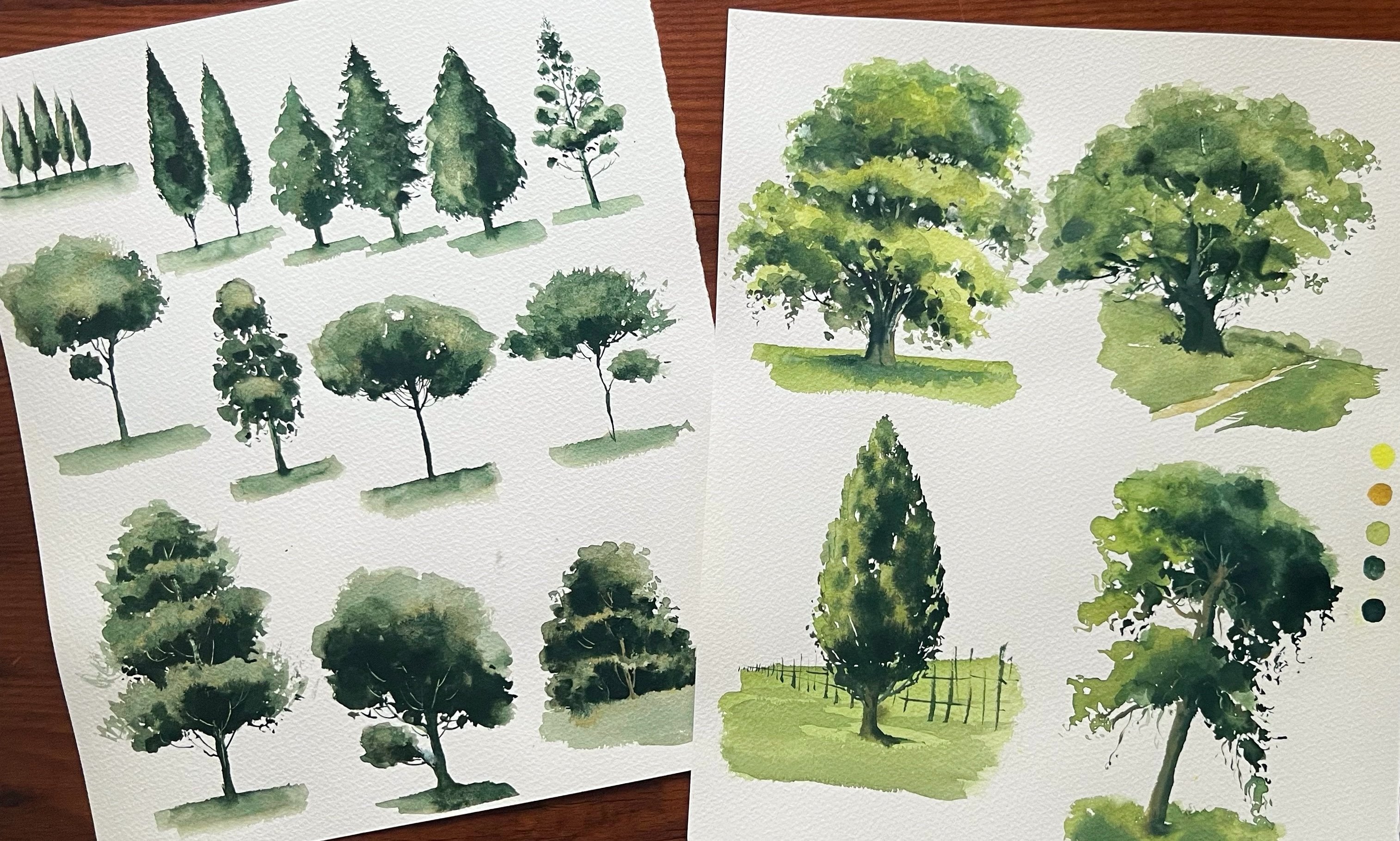
on painting, just trees. You can check out one of my
previous class all about painting trees using different brush techniques,
so you can check it out. Now I'm adding trees
in different sizes. So very short, tiny, tiny dots and marks, some little taller and
thicker trees also. With some cobalt blue, I'm also adding some
lighter effects here and there on the trees. It's very important
to not overdo it. Just add some
little bigger trees on both sides and
coming to the center, make it very shorter and tiny, tiny strokes. That's it. I'm again working on the
trees to make it a little more natural and detailed. For some dry texture
here and there, I'm using the cobalt
blue and indigo mix. Yeah. Almost I'm scratching
or pressing hardly my brush bristles there to get that dry texture you
can see on the trees. And for the down
part of the trees, I want to make it
a little darker, so adding more dark colors. Bye. Okay, that's enough
for the trees. Now, let's go back
to the flowers. Okay, it's almost dry now. I'm going to make some of the red dots a bit more sharper. I'm adding another layer over the Alizarin crimson dots to get more sharper
edges here and there. We're basically building it up in layers to get that soft, slightly crisp meadow effect. So again, you can use little thicker consistency of paint and then add some tiny, tiny dots here and there, and you can make
it a little bigger and thicker dots as it
coming to the foreground. It's like a very loose and abstract meadow effect
we're painting. Keep it very tiny and small, sharp dots as it's going away
towards the horizon line. And also, I'm using my size two round bridge for
these sharp details. Now you can see that effect that flowers are slowly
coming to the shape. Same, like, let's
refine the greens. Okay? So I'm going to
darken the foreground part. Again, with perylin green, I'm adding some leaves
or grass to the meadow, like some very straight
vertical lines. Just loosely adding
some lines vertically. I'm also wiping it
with tissue paper here and there to keep it still soft. A That's enough for the foreground darker effects. Now I'm going to add
some darker dots with the same green in between those red dots to get a
kind of continuation. Again, I don't want to
overwork adding some tiny, tiny green dots here and there. Yeah, that's it. We are almost
done with the painting. Okay, now I'm going for the final step,
adding some birds. Using the indigo mix, I'm just gently adding some
boards. That's it now. Let's remove the tape, and let's see the
final painting. Yeah, that was a very cute
and loose meadow painting. I hope you understood
how to create an easy meadow effect using
layering in watercolor, combining both wet wet and
wet tone dry techniques. I'm really happy with
how it turned out. It looks simple
and very springy. So yeah, I'll see you tomorrow
with a new project by.
6. Day 4 - Under the open Sky: I'm a little extra excited
about this painting because it's like a little experimental today. I hope you enjoy it. So let's get started and
take a look at the colors. We'll use John
Brilliant number two or any little opaque yellow shade
for that sunlight effect. And for the sky, we'll use cobalt blue and intigo for that shadows on the clouds. And for the trees, we'll use
green gold and peron green. So it's like a very
limited color palette. For this painting, we won't be doing any initial sketching. We'll paint directly. However, if you prefer
starting with a pencil sketch, you can download it from
the resource section. Here I'm wetting the paper
completely with clean water. We'll start by painting the sky sunlight and
the clouds first, and then move on to the trace. For the sunlight, I'm using
John Brilliant number two, which is lovely opaque, peachy, yellow shade that gives a soft glowing effect
around the sun. I'm just preparing
the colors now. Since the paper is fully wet, I'm gently lifting some
water in a circular shape, create space for the sun. Around that, I'll apply this yellow shade so the colors
don't flow into the sun, keeping that small
white circle intact. Alternatively, you can also use a circular piece of
masking tape and stick it onto the
paper before wetting it to preserve that
clean sun shape. I'm using my size ten
round brush and with gentle circular motions and blending and spreading
the color outward. The paper is perfectly wet and which helps the
colors flow smoothly. And also, I'm using tissue paper to fix it here and there. Next time, quickly adding
the sky using cobalt blue. And also I'm aware of where
I want the clouds to be. Just like in the
previous painting, I'm not covering
the entire area. I'm intentionally leaving some white space here and there. We will later turn those
areas into clouds. So I'm keeping that in mind while applying the cobalt blue, and also to control the moist, you can see that I'm
using a tissue paper. Yeah. I'm going around that sunlight very carefully
and with some water, I'm just blending
it here and there. So you can loosely add
some colors for the sky, and then we will
paint the clouds. And you can also notice the consistency of my
paint on my palette. It's like a milky consistency, not very watery
or not too thick. Alright, that's
enough for the sky. Now I want to define
some cloud edges. For that, I'm using a
tissue paper and gently lifting a bit of color
from the blue ideas. This helps create soft
cloud shaves yeah. I'm just lightly dabbing
and lifting the paint. And as we remove the color, you can see those
beautiful cloud forms starting to appear. You can use a tissue paper or even a soft cloth and
just gently press and lift on the paper to achieve these natural looking
shapes for the clouds. And also, do it very
gently and carefully, so we will not ruin the
colors we added for the sky. Now, you can see that it's slowly forming
that cloud effect. Now I'm quickly adding some shadow tons to those
clouds or white spaces. The paper is still wet. But since we lifted some color, the surface feels slightly dry while there is still
moisture underneath. For this step, we'll use
indigo in a very light ton. Make sure to dilute it well with plenty of water and start with that soft lighter
shade for the clouds. And also, I'm mixing
the indigo with Um, the yellow mix we
used for sunlight, which is John Brilliant number two to make it a
little more grayish. And later we'll
also build it up by adding slightly darker
indigo in a few areas. So first, begin with a very light wash. And you can also see that I'm
not covering it entirely. I'm leaving some spaces
towards the sunlight and then adding some tiny dots here and there by leaving again
some white spaces, tiny, tiny white spaces. To make it more lighter
towards the sunlight, I'm adding more bald
blue on those corners. Yeah. So I'm repeating the same technique for
all these three clouds. And also, I'm using my
size ten round bridge. And also, while the
paper is still wet, you can even lift colors again and again to get that
perfect shape for the clouds. While adding these shadows
and being very mindful of the edges and how they help
define the cloud shapes. As you apply the indigo, make sure not to
cover everything. Leave some white spaces, especially on the sides of the clouds facing the sunlight. This will create a
beautiful highlight effect, and then you can go
back and add some tiny, tiny dots on those white edges. So we'll get some nice depth. Again, I'm adding some kobalt
blue to the very corner, so we'll get that
lighter effect, that transition from
darker to light. I'm also going back to the
sky in between painting the clouds to make a few
adjustments and refine it. Again, I'm working on
the cloud edges by using a tissue paper to
gently lift some color. This process is all
about layering. We can keep refining
and adjusting as we go. You can always come back and fix or improve any part
of the painting. All right, that's
enough for the sky. Now let's move on
to the fun part, which is painting the trees. For that, I'm using green
gold for the lighter tons, and then we will add depth and shadows
using perylene green. And remember to prepare your
color in a milk consistency. You can clearly see
that on my palette. And also, I'm preparing the perylene green with some water in the
same consistency. That said, both
colors are ready. And remember to
prepare your colors before we start
painting the trees. And for this, I'm
using a sponge. I hope you have checked the material section to see
the type of sponge I'm using. But you can also use
any regular sponge. Now I'm taking green
gold with the sponge, and I'm just folding it into a shape that feels
comfortable to work with. And using the tip of the sponge, I pick up the color and gently
press it onto the paper. We're painting the trees from
a looking up perspective. So we're focusing only on the
upper parts of the trees. These are evergreen pine
trees I'm painting, so keep that in mind while
creating the shaves, and you can also experiment
with other tree forms. Just loosely build up that foliage to give
it a natural look. And You can also use a size two or a detailer brush if you are not getting
enough control with a sponge and especially for creating that sharper effects
at the top of the trees. And also keep in mind that
the paper is still wet, so we are mostly working on wet. And however, in some areas
especially around the clouds, the paper started to dry and you can see that texture as well. Yeah. I'm painting some
little more taller trees from the foreground, and from both sides, I'm adding some
little shorter trees. And also, it's very
important to not overwork. We are not covering the
sky and clouds entirely. Yeah. It's very much fun to do this, but it's important to leave
some gaps here and there so we can get that beautiful
see through sky effect. Alright, that's enough
for the lighter green. Now I'm adding shadows
using a darker green with the same sponge
and the same technique. I'm not covering everything. We still want a
lighter green to show through beneath
the darker layer. So I'm being very careful about where I place the perlon green. And also remember to keep
the shadows consistent, placing them on the same
side for all the tres. You can see how I'm holding the sponge
to get that control. So you can also use
the detailer brush, and you can create
some crisp and sharp, tiny dots and lines
here and there. Now, with my size
two round bridge with little thicker
perylin green, I'm adding some dots
and lines here and there to refine the trees. Also, towards the foreground, I want to make it a
little more darker. So I'm adding more green
that is perlin green there. Reworking again and again
for the top part of the trace to make it more
sharper and more refined. Yeah. This is really a fun technique, but it does require a bit
of patience and practice. If you're feeling unsure
or a little intimidated, try practicing first on a
separate sheet of paper. Use the sponge and
experiment with pressing it on to create that
foliage effect. Once you feel more confident, you can move on to
your main painting. I always recommend keeping
an extra sheet handy to practice the techniques before applying it to the
final painting. Here you can see
that I'm keeping it more warmer and brighter for the right side trees
and a little darker and more deep for
the left side trees. Yeah. So always we
need some lights and shadow effect for the trees
to feel that liveliness. That's it, we are done
with the trees and we will add the trunks
and branches next. But before that, let's include
some birds sing black. I'm adding a few simple
birds near the sunlight. Now for the final step, I'm adding some white lines
to suggest the tree trunks. For this, I'm using a
paper knife and gently scratching the surface
of the paper to create sharp and light lines and focusing more on the
darker areas of the trees, so the lines stand out clearly. And for this
scratching technique, timing is really important. The paint should be in
that in between stage, not too wet and not
completely dry, just beginning to try. That's when you
can easily scratch the surface and reveal
those clean white lines. We're done with the painting, and I'm just fixing
some final details. And let's peel off the tape
and see the final result. That's it. I hope you found this painting simple
and enjoyable. Remember, you don't
have to aim for the exact same result or watercolor effect that
I demonstrated here. Feel free to bring
in your own style, maybe change the
shape of the trees or edges the cloud or even
skip adding birds. Always use your creativity while following the
techniques shared here. I hope you had fun creating this bright and beautiful piece with these playful techniques, and that's all for today. I'll see you tomorrow with
a new painting. Bye. But
7. Day 5 - Golden fields: Hello, welcome to Day five. Today we'll paint a
beautiful golden glow, a calm, peaceful
morning full of life. So let's see the colors. I'll use lemon yellow
and opera pink for that background,
glow effect. And for the greens,
I'll use cadmium green, perylin green, and
indigo and opaq white. Here, I'm going to paint
directly without sketching. But if you prefer
having a guide, especially for the
delicate leaves or grass, you can download
the Louis pencil sketch from the
resource section. I'll start by wetting
the dire paper, then we'll begin building
the first layers to create that soft
sunlight glow. As always, I'm using my wash brush and gently
wetting the deer paper, moving it back and
forth to make sure it's evenly covered with
no dry spots left. All right now, let's start
painting the sunlight. For this, I'm mixing lemon
yellow and opera pink. I'll begin right
at the center of the paper and creating a soft, circular shape and then gently spreading the
color around it. Since the paper is wet, the colors will blend
and flow smoothly, making it easier to spread. And also, I'm using my
size ten round brush. And I'll slowly build up layers, adding slightly
darker towns around the sunlight by mixing
in deeper colors. But for starting, I'm keeping it very light with
the first layer. I'm also using a tissue
paper to lift off any excess water or
color whenever needed. You can also notice how I'm moving my brush in
a zigzag motion. This helps create a bit of
depth and subtle darkness, especially in the foreground, and we'll continue to build
on this later by adding more layers and deeper tones in that area to create
that contrast. And also, you can notice the
consistency of my paint. It's not too watery and
also not too thick. As it moves towards
to the sunlight, I'm adding tiny dots and
strokes in the foreground. I'm keeping the stalks slightly taller and darker to
create that depth. I'm also being very careful to preserve the white space
for that sunlight. I don't want to lose that glow, so I'm painting
gently around it. Right now, I'm going in with slightly darker tones
for the foreground. For that, I'm mixing a bit more opera pink and lemon yellow, along with some John
Brilliant number two. I actually forgot to mention this color at the
beginning of the video. So just adding that in here. Slowly building up
those dark tons, layering in the forkgowdeffect. Now I'm going to add a
soft, blurry green effect, suggesting some bushes in the background around
that sunlight. So for this, I'm mixing cadmium green with the existing
yellows in my palette. I have already prepared like
opera pink and lemon yellow. Gently painting
around sunlight very loosely while the paper
is still slightly damp. My brush is also lightly
damp, not too wet. You can see I have tissue
paper in my right hand, and I keep wiping the brush in between to
control the moisture, and the paint mix is also
not too watery either. It's at just the right
consistency for this effect. Also, I'm being very careful to preserve that bright sunlight a, so I'm avoiding
painting over it. I'm not painting it in one go. I'm using small strokes to slowly create that soft
blurry bush effect. Okay, now I want to
create a very soft and blurry glow
around the sunlight. For that, I'm again mixing
the same colours opera pink, lemon and this time adding
a touch of gamboch. Using my size two round bridge, I'm creating some very tiny, tiny strokes and dots around the sunlight to get that
soft and blurry effect. I'm slowly building the layers, but I felt the paper
started to dry. But since we are working on the background with
wet on wet layers, I lightly missed it
with a spray bottle. I'm spraying from a bit
of distance not too close to keep the moisture even without
disturbing the paint. We already applied and slowly adding a little more
darker greens here and there, building that kind of soft and blurry effect
around the sunlight. H Now, I want to soften the area
around the sunlight a bit more. For that, I'm using
a flat brush kept lightly damp and to gently
lift off some color, creating the effect
of soft sun rays, spreading out and touching
the meadow or nearby bushes. With some more strokes, I'm slowly building that little darkness around the sunlight. But remember, this is
all just the background. We'll add more layers
on top of this, so you don't have to be that precise or too focused
on these layers. You can even skip this
part if you want. I'm also adding some more that glowy yellow effect around
the sunlight again. That's it. Now, let's move
to paint the foreground. We want to make it a little darker than the bushes
around the sunlight. So I'm starting
with cadmium green. We already have that yellowish
orange glow underneath, and layering cadmium green on top will give a nice
glowing effect. Then we'll keep adding more layers to deepen
the darker color. I'm using cadmium green
with less water this time, so it's a bit thicker and
just painting over it. Also, I'm not going all the way up around the
sunlight and bushes. We still want a soft but
visible horizontal line between the land and
that background bushes. Keeping it a little
more detailed as it going towards
the sunlight and more loose and plain in
the very foreground. Now I'm going for a little
more darker effect, so I'm using perylene
green and just adding that darkness in the very foreground,
you can see that. Yeah, I'm not
covering it entirely. As we go, I'm also softening some edges and
blending here and there. You can see that while
the paper is still wet, we can work on the edges, right. So I'm doing that as well. If you feel like softening some edges or blending or
lifting a bit of color, you can do that now. I'm again splattering and spraying some water in
between the painting to keep that looseness of the painting and also
to keep the moisture. And you can also skip this part if your
paper is staying wet. Now it's time to
paint the grasses. For this, I'll add
some grasses, leaves, and a few flowers for the meadow using both wet on wet and
wet on dry techniques. We're starting with wet on wet, so the paper is still wet. I just played some water, as you already sow. I'm starting with the leaves using my size to round brush, just loosely moving
it upward and using just the tip of the brush
and very little pressure. I'm not pressing it hardly. We want very thin lines. So with a light hand and
the tip of the brush, you can also use a liner or
detailer brush and gently paint some leaves and meadow grass here and there
around the sunlight. As it gets closer
to the sunlight, keep the strokes lighter
and more delicate. You don't have to be
that much focused, painting these
leaves or details. We're just creating a kind of loose and soft effect that will turn into
a nice background. Once this layer dries, we will build it up
again with wet on dry leaves to create more
depth in the meadow. So you can also practice
this on another sheet of paper before working on your beautiful soft background. And don't forget you can
download the pencil sketch from the resource section
for the grass outline. Now, the paper has
started drying a bit, so it's the perfect time
to sprinkle some salt. I'm doing this in the foreground
to create some texture. The salt will absorb the
paint and give a nice effect. And always remember to sprinkle the salt when the paint
has started drying, not completely dry,
but also not too wet. In between, I'm also lifting some paint here and
there to create a soft glow like that sunlight reflection in the foreground we
already painted. I'm just using a flat brush and lifting the color
in a downward motion, as you can see here, and I'm also wiping it
on the tissue paper. You can lift colors and also paint again the leaves,
however you like. So thicker, some thinner, and some a bit taller
and some very short, keep some darker and some
more delicate and lighter, especially as they go
towards the sunlight. So make it irregular with
different sizes and in different directions and
just enjoy the process. Again, I'm going
for another layer to make it even more darker in the foreground using
perylin green. Also, you can use a mix
of indigo and sap green. I'm sprinkling some more salt in the foreground since we disturbed the earlier
salt effect we got. I'm also adding some
thin dark lines in the foreground by lightly scratching the paper
with a paper knife. So you can also skip
this part if you want. That it now, we have a
nice glowy meadow effect. We will add some more delicate
and sharper details next. But before that,
let's dry this layer. I'm using my head dryer. Okay, now it's time to paint the more precise
delicate details, again, using wet on dry. So we have to paint this
part a bit more carefully. I'm using my size
two round brush, and the paper is almost dry now. I'm just repeating
the same pattern. We painted wet on wet for
painting the meadow grass, starting from the bottom
and gently moving upward and bending the line slightly towards the sunlight. From those lines, I'm
also adding some tiny, tiny strokes for some
flowers or little details. And you can see that we are starting with a
lighter green first, and then later, we can go with a little
darker green. Yeah. Right now, I'm using green gold, mixed with a little
amount of perlin green. You can also observe how I'm moving my brush
painting these leaves and practice it on a separate sheet of
paper, if you want. Keep everything very delicy, thin and ftless and always feel free to practice
on another paper. And also, it's very
important not to overwork this once
we get into it. We feel like adding
more and more, but it really matters how much you add and how many
details we include. And remember to keep them in different sizes and
different directions. You can see that I'm
slowly going for little darker grass effects. Yeah, just around the sunlight, especially to get that I'm also adding some leaves or this grass in the foreground. I'm also adding some
continuation to the stems of the meadow
flowers around the sunlight, pulling a few thin lines
downward to connect them. And you don't have to paint every single grass fully
in one complete shape. You can break it here and there, paint only on one side, or just add a few lines
or even some dots, tiny, tiny dots here and there. Make it a mix of everything. But overall, it
should still come together nicely
and look cohesive. That's it. We're almost
done with the painting now with these wet
on dry flowers. You can see the
difference, right. So, yeah, we are done
with the painting. I hope this was a nice technique that you can try with
different colours. Maybe you can paint a lavender
field, a sunflower field, or even a wheat field, whatever you like, and you'll get a beautiful
meadow effect. Now, let's peel off the tape and take a look at
the final result. Only thing you need to remember is that we're building
the painting in layers using both wet on wet and wet on dry
techniques again and again. That's what gives us that
nice depth and glow. It's also a great
way to practice these techniques and create
something really beautiful. I hope it was simple. I'll see you tomorrow. Bye.
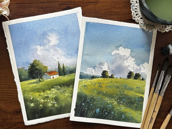
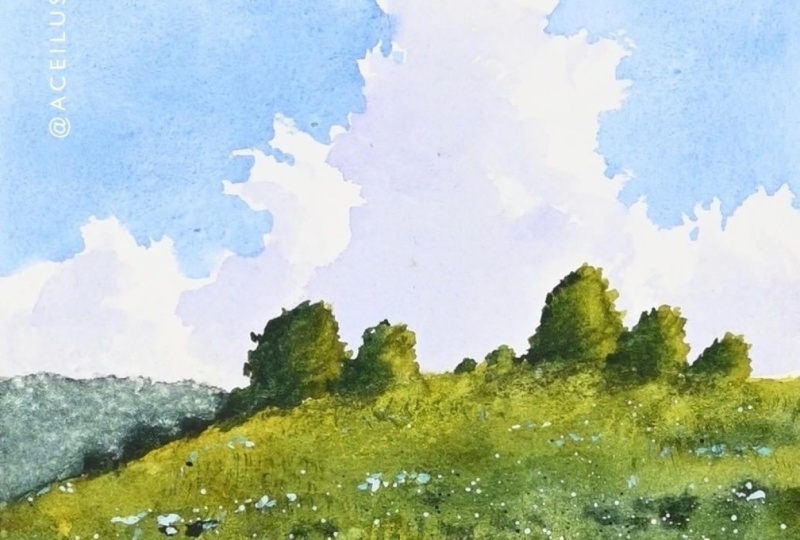
8. Day 6 - Blue Meadow: Hello. Welcome back,
and it's day six. Today, let's paint soft clouds
over a blooming meadow. And let's see the colors. I'll use Kobalt blue for the sky and for the clouds,
especially for shadows. I'll use opera pink and indigo. And for the trees and meadow, I'll use Perlin green
and green gold. And for the wildflowers, you can see in the foreground, I'll use titanium white
mixing with cobalt blue. My paper is ready here, stretched with
masking tape and fix it onto my acrylic glass board. First, we'll start
with a pencil sketch. I'm adding a line for
the foreground meadow, starting slightly below
the halfway point of the paper and curving it
gently towards the right side. Just above that, I'm placing the horizontal line
mainly on the left side. And that's it for the sketching. Now let's start the painting. And remember, you
can also download the detailed pencil outline from the resource
section and trace it if you prefer. Now, let's start. I'm wetting the paper
only for the sky area, not on the meadow part, applying water till the
foreground meadow line we added carefully wetting
it using my flat brush. First, we will paint the sky, then we'll add some
clouds by lifting. I'm starting by adding
the sky colors for that. I'm using kebalt blue and
with Si 16 round brush. I'm gently applying the color on top part of the paper and
slowly bringing it down. And I don't want it to be too
dark as it comes downward. Gently and loosely moving
my brush across the paper. Alright, we need to keep that white space where we're
going to paint the clouds. I'm also just slightly lifting my boat to get a
nice flow of colors. Now, while the paper
is still very damp, we have to lift some
colors for the clouds. For that, I'm using
a soft tissue paper, folding it to get a
nice tip and gently lifting some color from the white space we
left for the clouds. This helps us get a
nice edge and shape for the clouds and later we
can add shadows here. Also important to not
overwork while lifting. You need to have a clear idea in min about the size and
shape of the clouds. Based on that, you can lift
the colors accordingly. Make sure to do this while
the paper is still wet. That way you will get a soft
white space for the clouds, and then you can refine
the shape nicely. Okay, now let's add some
shadows for the clouds. For that, I'm mixing
a bit of intigo with opera pink to get
a cool grayish shade. You can use intigo or any
blue along with opera pink or any red shade you have and
mix it with plenty of water. I'm adding shadows from the left side since the light is coming
from the right side. So we have to keep in mind
that throughout the painting, even for trees or some
background details, the light will be from the right and shadows on the left side. Now I'm gently adding the shadows on the left
side of the clouds and also trying to create some
nice, slightly sharp edges. We can build this
in layers as well, making it a bit darker in some areas to get a nice
dimensional effect. For that depth along the
edges of the clouds. I'm adding some tiny dots. It's a mix of big loose strokes
and very small strokes. Right at the edges, I'm using some tiny dots or short brush strokes to create that nice
depth for the clouds. I forgot to mention that I'm
using a flat brush for this. You can also use a round brush. Now I'm adding
some more darkness here and there by
mixing cobalt blue, indigo, and some opera pink, and I'm applying it while
still the paint is wet. So by lifting the colors in
those areas of the clouds, that part of the paper
has become almost dry. That's why we are getting those nice edges
for the shadows. And now I'm carefully adding a few shadows on the right
side of the clouds as well. Mm. I'm going over
it again and again, adding some more
tiny shadow strokes or little dots over
the highlights. At the same time, I'm
also shaping the clouds. I'm refining the
shape by adding a bit more kebalt blue
to the sky area. It's almost like
negative painting, and it's very important to do this while the
paper is still wet. If your paper is dry, don't touch that sky
part we already painted. Okay, that's perfect. Now let's move on to painting the meadow. For that, I'm mixing cobalt blue with green gold to get
a slightly darker, not too warm kind of
green for the meadow. And for more depth, I'll use perylene green. Now mixing it with some water to get a nice milk consistency. For the edge of the meadow, I'm just using the green
gold that's already on my palette to get a nice warmth and light
effect on the meadow. And then as I move
toward the foreground, I'm adding the mix of
cobalt blue and green gold. Here I'm also mixing
some lemon yellow with green gold to get
that light color. I'm going till that line
we added for the meadow, and now I'm going for the darker color to
paint the foreground. And also, remember, we didn't wet the paper before we
start painting the meadow. So we're painting wet on dry. And for the foreground, to get that nice effect, like some texture, I'm just loosely moving my brush
in his exact style. Slowly adding some
perylin green to that mix and making it
a little more darker and adding some loose strokes to get that dimensional
effect for the mato. And as it's going away, I'm keeping that line very thin. Again, adding some
more indigo and perylne green to make
it even more darker, especially for the foreground. Yeah. So we're working on many layers to get
that nice effect. So when you're painting
with a darker green, remember to keep
your stroks thick, loose and bigger
in the foreground. And as it goes further away, reduce the size and thickness
and make it more narrow and small to create that
vanishing effect or that sense of distance. Now, while it's still damp, I'm just adding some salt
to get some nice texture. Okay, let the salt
absorb some paint, and it will create some
nice white spots there. In that time, let's paint
the distant details. So I'm going to add a very distant mountain
or something like that by using indigo and some perlin green mix and loosely adding that color there. By mixing more indigo, I'm just making it a little
more darker here and there. Alright. Now, let's add some trees on the
edge of the meadow. For that, I'm mixing a bit of perylin green into the green I already have on my palette and using a size
two round brush, I'm loosely painting
trees in different sizes. So slightly bigger,
some smaller, just simple irregular
semicircle shapes. The important thing to remember is to build the
light and shadow. First, I'm adding
the darker color on the left side of the trees. Then I'll clean my
brdh and bringing in a warmer green that is green
gold on the right side. This creates a nice contrast and gives the trees a
natural sense of light. I'm also adding a few soft
shadows on the meadow, so it feels like the trees are sitting naturally
on the ground. The shapes are quite similar to that big cloud in
the background, smaller semi oval forms, keep the left side darker
and the right side lighter. To make it feel more
organic, I'm adding tiny, tiny dots and smaller shapes
in between the larger trees. This helps break the
uniformity and adds depth, especially when you
vary the sizes. And if you would like
to practice more, I also recommend
checking out one of my previous
classes focused on painting trees where we explore different styles and brush work. That's enough for the trees. I don't want to overwork this
area with too many trees. I'm just adding a few
bigger trees along with some very small tiny ones
in between. That's it. Now, let's move to
the foreground. You can see that salt
texture forming, and the paint here is
not completely dry yet, but it has started to dry. That's the perfect stage for scratching if you want
to add some highlights. So I'm going to
gently scratch into the paint to create highlights for the grass
in the foreground. Notice those dark tons
almost black in places, along with some
lighter green areas. I'm adding these fine white
lines over the darker spots. I'm using a paper
knife for this, but you can also use
anything slightly sharp. This technique works best when you are using
thicker watercolor paper, as it allows to
scratch more easily. That's enough. I hope you can
see those white lines along with the tiny white dots
created by the salt effect. That's just enough for a nice textured meadow like
feel to the foreground. Now I'm going to
add some flowers. You can use any color you like. I'm using a blue shade, mix it with a bit of opaque
white to make it brighter. And you could also go with red or yellow or any
color of your choice. Make sure your paper is
completely dry before this step. Then make sure you paint in a slightly thicker consistency and start adding small
dots here and there. These little pops of
color really bring a beautiful flowery meadow
look to the painting. This is the final step, and it's actually very
therapeutic to do. Just remember to
reduce the size of flowers or dots as they
move further away. This helps create an
eye sense of distance. For the blue dots on the lighter green
areas of the meadow, they're not as visible like the blue dots on
the darker areas. You can see that
in the foreground. So to make it a little more
pop and add some contrast, I'm adding some shadows
just underneath those blue dots on the
lighter green parts. I'm using a very
light indigo mix and just adding it there
and also adding some tiny, tiny dots, just
some final steps. And That's enough. We're done with the painting. Now, let's remove
the masking tape and see the final look. I hope you enjoyed this one. This is one of my
favorites so far, and I really love the result. You can use these techniques
in any painting of your choice or even try changing the
composition a little. And yeah, thank you
so much for watching, and I'll see you with a new
painting tomorrow. Bye.
9. Day 7 - Meadow Stream - Part 1: Hi, everyone. Welcome to
today's clash project. Today we'll be
creating a peaceful, calming meadow stream with a few red flowers
scattered here and there. Let's take a look at the
colors we'll be using. I'll use kabalt blue and indigo for the sky and
the water reflections. And for the meadow, I'll use
green gold, perlon green, and lazarin crimson and yellowc and apa white
for the flowers. So that's the basic color
palette we need for today. Okay, I'm starting
with a pencil sketch, placing the horizontal
line a bit higher. And then I'm adding the
outline for the stream. It should be wider in the
foreground and become thinner and narrower as it
goes away through the meadow, and I'm not drawing it
as a straight line. I'm making it a
little wavy to get that natural edge of the stream. You can also download
the pencil sketch from the resources and
trace it if you want. Or you can sketch
it along with me. That will really help imbrove
your loose sketching. By keeping the basic
composition in mind, you can easily follow along. I'm not adding anything else, the horizon line and
the stream outline. Also, when we sketch
streams or pathways, it's almost the same idea, wider and more detailed in the foreground and
narrower as it goes away. This effect comes from the
shape of the line we draw, so we have to be very careful
when we are sketching. Now I'm wetting the whole paper and starting with
the first layer. For this, I'm using green gold, mix it with a little
lemon yellow, beginning just below
the horizon line. I don't want the colors
to spread upward, so I'm wiping off the extra water there
with tissue paper. And as I come towards
the foreground, I'm making the green a
bit darker by mixing some bald blue and indigo that I have
already on my palette. In between that, I'm also wiping all the water
from the stream. We have to paint later. So we have to keep the sky and the water reflections
on the stream white, so we can paint it lighter
compared to the meadow. I don't want a flat wash. I'm adding slightly darker
tons here and there to get a nice dimensional
effect in the meadow. And as it comes closer
to the foreground, I'll keep adding
more darker mixes, and then we will build more
layers to add details, and we'll mostly be working
wet on wet for this, similar to the technique we used in the previous paintings. As you can see here, I'm keeping it a little darker
near the line. We added for the stream by mixing cobalt blue
with green gold. And then I'm just
loosely filling the spaces around it to
get that grassy effect. I'm using vertical strokes, as you can see here. And just below the horizon line, I applied the paint in a horizontal way to
get that flat effect. And for the grassy
texture in the meadow, you can move the brush in a vertical or slightly
zigzag motion like this. That's it for the first layer. Now, before it dries, I'm going to add a bit more
darker tons, wet on wet. For that, I'm using
perlin green, mix it with some indigo and loosely adding it around
the line of the stream, and then I'm blending
it softly with my damp brush to get a
nice soft meadow effect. You can see on the right side, I'm adding the darker tons by
breaking it here and there. This way, we'll get some
nice highlights for the grass along with a
bit of shadow effect. So don't cover everything with dark color,
leave some gaps, then move your brush in a
vertical motion to get this, so you'll get a nice
grassy texture. And also, to get
that soft effect, it's very important to work
on these layers wet on wet. So if your paper
is started drying, you can spray some water
from a little distance, and you have to keep that moist on the
surface of the paper. Yeah. I'm just lightly fixing the horizontal line to make it like a straight one. Okay, now comes a very
important technique that we use only in watercolor,
which is lifting. You can see those darker
spots around the stream. From there, I'm going to create some lighter lines by lifting
to get that grassy texture. And for this, I'm using
my size two round brush, or you can use a liner or
a small detailer brush, and I'm keeping it damp, not too wet, or too dry. That damp brush, I'm just loosely running it over
that darker areas. The paper should be
also in a damp stage, not too watery or not dry. So timing is very
important here. You can move your
brush in any direction you like to create
different grass shapes, and in between, you can wipe your brush and
then continue again. To break that view, I'm also adding some
very taller lines. You can see that here on
the left side of the paper. This is actually a
beautiful technique we can use only in watercolor. The main thing to
remember is the timing. You have to do this
while the paper is still damp and your brush
should also be damp. If there is too much water, it can ruin the effect. Okay, now in between to make those lighter lines more
visible and popping, I'm adding some darker tons, again, in between those lines. For this, I'm using
perylene green. And since the paper
is still wet, I'm just adding
some lines, dots, and small strokes here and there between those
lighter lines, so we'll get a nice
shape for the grass. And remember, by adding all these darker details
around that line, we're also shaping
the stream, right? So we have to be careful how we are shaping the stream also. Now I'm very carefully
adding a bit of darker effects along the
line where the stream fades into the distance using my size two round brush
and placing some sharp, fine details to keep
that sense of flow. So it still feels like the water is moving
through the meadow. This helps create a soft,
beautiful, vanishing effect. I feel like the midground
looks a bit flat, so I'm not overing on it, but just adding a
little more darkness here and there with
some green gold. You can also skip this part if you don't want
to touch it there. I'm gently adding some
darkness there very loosely and also softening
the sharp edges. I just want to gently
remind you that you can definitely add your own
ideas to the painting. You can choose to remove some
elements that I'm painting and include something of
your own to make it unique. I'll be more than happy to
see such class projects. So always try to bring in a bit of your own creativity and personal ideas or try placing elements in a
slightly different way. I'm really excited to see
that kind of class projects. And also, remember that you can watch the entire video
before you start painting. Each class project is just
around 15 to 20, 25 minutes, so you can easily go through it once and
then follow along. You can also reduce
the playback speed just like on YouTube, so you can paint
at your own pace. Since I paint daily, I might be a little faster, so slowing down can really help. You can also post the video anytime and complete that
step and then continue. I just want to gently
remind you of that. That's it now. Let's add colors to the water
or the stream. I'm using Kobalt blue, mixing it with the paints
already on my palette, which is green,
gold, and indigo. I don't want a very
bright cobalt blue, so this gives a
slightly darker tone. I'm loosely filling this color in the foreground and starting from there and then pulling
it towards the midground. As it goes away towards
the horizon line, I'll keep it lighter and a bit darker in the foreground
for the water reflections. And then we will
build more layers to add some meadow
reflections on the water. While filling that
area with cobalt blue, I'm also very careful of
the edges of the meadow carefully painting around
them without touching. The paper is almost dry now, which makes it easier to
work around those edges and achieve a slightly sharper and more defined look
for the meadow.
10. Part 2: In between that, I
felt like adding some crisp white lines
with some opaque white. So I mixed opaque white
with some amnlolo that I have already
on my palette and just adding some tiny, tiny lines here and there. So meadow part is
almost dry now, so we can easily work
on dry and dry effect. That's it. Now I'm going
to add the reflections. For this, I'm using a mix of perylene green and starting
from the foreground. You can see I'm adding some
tiny small horizontal lines, not covering everything,
just kepping it loose. So I'm using a size
two round brush and adding separate
lines horizontally. In between, I'm also adding
a bit of a pack white, mix it with green gold, placing some smaller
lines here and there to get some nice
highlight effects. You can also slightly
shake your lines to get a nice soft flo effect
in the water reflections. Okay, now I'm adding
some very thin, small lines overlapping
the stream. On top of that, I'm carefully placing
some tiny lines and dots. I'm also adding a few slightly
darker touches around the white lines we created by lifting to enhance
that grassy effect. Again and again, I'm working on that meadow edge
towards the stream, adding tiny very
crisp dots and lines. This really helps to bring out that beautiful final result. Okay, now comes
my favorite part. I'm going to add
some red flowers, which will really break that monotonous feeling
of the painting. I'm mixing Elserin
crimson with opaque white in a very thick consistency
without adding water. And before adding the flowers, make sure the painting
is completely dry, so we'll get a nice pop effect. And remember to vary the size of flowers, some bigger flowers, especially in the foreground
and some very tiny, tiny dots as it going
towards the midground. You can definitely use any
other color for the flowers. Maybe even yellow
would look nice. Feel free to use your
creativity here. You can add the flowers in
different directions and shapes or follow your own
idea while painting them. The only thing to
keep in mind is not to overwork with
too many flowers, and as you come towards
the foreground, make them a bit bigger and thicker and more
loose. That's it. Now, let's add a very
loose and simple sky using cobalt blue. I'm starting from
the top and then pulling the color
downward with some water, and to make it a little lighter
towards the horizon line, I'm using a tissue paper
to gently lift some color. The And I'm also adding some small
distant mountains or trees along the horizon line. For that, I'm using
perlon green. The sky is not completely dry, so we're painting wet on wet. This helps to get a
nice soft effect for the distant mountains or trees
without any sharp edges. I'm keeping it
smaller and tinier, especially on the right side. And as it coming
towards the left side, I'm keeping it a little higher. I just want to wipe
that line on the sky. So with my damp flat brush, I'm gently wiping
colors from there so we can keep it softer
without that sharp line. Finally, I'm going to splatter
some yellow dots. So I'm mixing lemon
yellow with a pack white and gently splattering
some paint there. So we'll get some nice tiny, tiny dots. That's it. Now. Let's see the final result. I'm just peeling off the tape. I hope you enjoyed this
painting and learned some techniques like using
layering technique and lifting technique
and to use ton wet and tone dry techniques
in a smart way. I really love how today's
painting turned out. It feels very soft
and inviting to me, and thank you so
much for watching, and I'll see you with a new
painting tomorrow. Bye.
11. Day 8 - A Path through the Wildflowers: Hello, everyone. Welcome back. Welcome back to Day
eight Class Project. So many students are
joining this class, and I'm really
happy to see that. I also want to apologize for continuing this challenge
after such a long gap, life has its own way of going and somewhere
along the way, I lost that excitement
to continue. But yeah, I'm here now. I've been seeing all your
beautiful class projects, and thank you so much
for sharing them. It really means a lot to me. So yeah, let's start
today's painting. Today we'll be painting
this lovely meadow scene, and, yeah, let's take
a look at the colors. We'll use ultramarine blue
and indigo for the sky and background mountain
and lemon yellow, green, gold, perylin
green for the meadow, and yellow ochre
for that pathway. And maybe I'll use Kobal
to blue for the shadows, opera pink for the flowers. I also lizain crimson and titanium white for
some fine details. So that is the color
palette for today. Yeah. I hope you have stretched your paper and you're ready
with your paints and brushes. Let's begin with the sketch. And if you want to trace it, you can download the
sketch from resources. Or if you prefer
to keep it loose, you can sketch along with me. And yeah, I'm starting
with the horizontal line, placing it a little above
the center of the paper. Then from almost the center, I'm drawing that line
towards the foreground, the left side of the paper to form the outline of the
pathway in the foreground. Now I'm adding the line on the right side of
the pathway as well. Next, I'm sketching a few mounting lines
in the background. I'm also adding some
trees here and there, some taller ones
like pine trees and a few semicircle shapes to suggest some thicker,
shorter trees. I'm adjusting the
outline of the pathway. Once more, I don't want
it to look too straight, so I'm creating
some uneven edges to give it that soft meadow
feel in the foreground. And now I'm just adding a few
more trees here and there. So that's it for the sketching. We have a very simple,
loose outline. Now, let's wet the
paper completely. I'm applying plenty of clean water over the
interior surface, and then we'll get started. Okay, now let's start
by painting the sky. I'm using a mix of indigo with
a tiny bit of ultramarine. I already have a very light
tint of green on my brush. I forgot to deep clean. So the color is looking a
little warmer, but that's okay. The paper is perfectly wet, so we are working wet on wet. I'm starting from the
horizon and spreading the color upward with a
medium sized round brush. Keep your brush very loose
and move it smoothly. I don't want the
sky to be too dark, so I'm wiping some color from the upper part to
make it lighter with tissue paper and keeping it a little darker
towards the horizon line. Okay, before the lower
part of the paper dries, I'm just revetting it again. Let's start the first
layer of the meadow. Mixing green gold with the lemon yellow
already on my palette. We'll start with a
warmer, lighter green, and then build up
the shadows with darker greens to create that
beautiful fluffy effect, just like in our
previous projects. I'm loosely adding the
color from the foreground. You can see how I'm
moving my brush in a loose zigzag vertical motion to create that grass texture, and I'm keeping the strks
taller in the foreground and gradually making it shorter
as I move further away. This helps create
that perspective. And remember to use a medium or small sized
brush for this. Bigger brush will not
give that effect. I'm carefully filling
both sides of the meadow while leaving
the space for the pathway, which we'll paint later. Okay, before this dries, let's start adding
the darker colors. I'm using perylene green. Mix it with a tiny bit of
cobalt blue and green gold. You can also see that I'm wiping my brush in between
to keep it damp. Both the paper and
brush should stay damp to get that beautiful
wet on wet effect. I'm using the same loose
zigzag vertical stalks, starting from the foreground, but I'm not covering the
lighter green completely. I'm leaving some
gaps here and so the lighter colors show
through later as highlights. Carefully working around the
pathway and adding darker, thicker stalks in
the foreground. As I move further away, I'm making the stroks
lighter and smaller. I'm just repeating
the same technique on the other side of
the meadow, as well. N. Here I'm trying to create that vanishing effect
for the pathway by adding a very thin line
with a little darker color, which is perylene green and making it look like the pathways disappearing into the meadow. As it goes further
and further away, I'm keeping the strokes more minimal and
lighter in color. O Okay, that's it for the mid for now. We'll come back later
to add more details. Now let's paint the
mountains in the background. Using the same green mix. I'm starting with a mountain on the left side of the paper. Behind that, we'll add a few more blurry
mountains to create depth. I'm being very careful with
the edges of the meadow, while adding the colors
for the mountain. We are shaping both
at the same time. Before it dries, I'm adding a
little more perlin green to the same mountain
to make it slightly darker and create more
dimension and tip That's it now. Let's paint
the background mountain. I'm using the same
green mix with some indigo to make it
more cooler and darker. With this diluted color, I'm carefully
adding the mountain on the right side of the paper. Always remember to vary
the mountain edges, avoid making them too straight. Gently shake your brush as you paint to create more natural,
beautiful mountain edges. I'm just adding a little more dark grains here
and there before it dries to get that
interesting effects, maybe some trees
in the background. Yeah, we will later
paint more bigot trees. Okay, now let's add
colors to the pathway. I'm mixing yellow
ochre with a little opera pink to make it warmer. The paper has started to dry, so I'm quickly
adding the pathway. As I do this, I am also creating some nice crisp
edges for the meadow. You can see I'm not
softening these edges. It's almost like
negative painting. We are creating sharp meadow
shapes around the pathway. A Before it dries completely, I'm quickly adding some
shadows from the left side. I'm using a thick mix of
cobalt blue and yellower with very little water and applying it wet on wet with
a size two round brush. Just adding that loosely, there some small
horizontal lines. I'm going over it again
and again to build a nice clean edge between
the meadow and the pathway. And now you can see
that beautiful shadows. And it instantly giving that
glow to the Indy landscape. Okay, now is the perfect
time to come back to the meadow and
add some details. The paper is almost
dry not completely, but it's damp enough to
do scratching technique. I'm using a paper knife to
gently scratch in something small vertical lines and create those little
meadow details. And also, you can
see that I'm doing this scratching on the
darker green spots. I'm not going for
the lighter greens. So from the shadows, we're creating some
light, thin lines. And if you're using a lower
GSM or thinner paper, this scratching technique
may not work as effectively. That's enough. Now it's time to add some beautiful red flowers, my favorite part
of the painting. I'm using Elsanin crimson, mix it with opaque white. I'm keeping the
mixture very thick without adding any water and gently adding flowers here and there with the
size two round bridge. I'm making the flowers
bigger in the foreground and gradually smaller as
they move further away. I'm also placing more flowers
closer to the pathway and loosely adding different
sized dots here and there. You can use any color
you like for this. I'm using Alizarin crimson, but you could try blue
or even yellow flowers. Just remember to mix
your color with a pack white and keep the mixture
thick without water, so it's easy to paint flowers. And you can also see that I'm
adding the flowers only on the lighter green areas or
the highlights of the meadow. And since we created
those white, thin lines scratched mainly
on the darker greens, this contrast helps create that beautiful sense
of perspective. And I'm adding more and more tiny, tiny flowers here and there, and also I'm just darkening some shadows and sharpening some edge just here and there. That's enough. We're almost
done with the painting. Let's finish it off by adding some trees in the distance
along the horizon line. For this, I'm mixing
green gold with intigo. I'm not using perlin green this time because I want a
more colorful green. I'm also using
very little water. The consistency should
be quite thick, almost like honey, and you can see the consistency
on my palette. Using a size down brush, I'm loosely adding some
trees in different sizes. So small trees,
slightly larger trees, and some tall, thin
pine like trees. Mix it with shorter,
fuller trees. Just keep it loose and paint
the trees however you like. And if you'd like a
more detailed utorial on painting loose trees, I already have another Skillshare class
dedicated to that, where I explain
brush holding and different brush strokes for creating various
loose types of trees, you can check out that as well. When painting loose trees, you can use the side of your bristles to create
thicker strokes. Then use the tip of the
brush to add tiny dots, leaves and smaller details
around those strokes. By gradually building
up these shaves, you can easily form a
beautiful lose tree. That's how I usually
paint my lose trees. I'm adding a few more tiny dots here and there to represent
the distant trees. And, yeah, that's it. We're done with Day
eight clutch project. And let's take a look
at the final result. I hope you enjoyed this
painting and learned some beautiful watercolor
techniques including layering, scratching and on wet painting. So, yeah, I'll see you
tomorrow with day nine. Bye.
12. Day 9 - Sunlit cottage - Part 1: Hello, hello,
welcome to Day nine. We are already more than
halfway through the challenge, and I hope you're
enjoying it so far. Today's clash project is, again, one of my favorites. I really love how this
painting turned out. And in this project, we will also see how I fix
some mistakes. I got a little confused while painting the
clouds in the sky, so I decided to rework them, and you'll see
that whole process in this clash project as well. So let's take a
look at the colors we need for today's
clash project. For the sky and clouds, we'll be using cobalt blue, perra, pink, and indigo. And for the meadow, we'll use
green, gold, cadmium green, and perylene green
for the house or that cottage details we'll be using zarine crimson
and queen gold. We'll also use lemon yellow and opaq white for
some fine details, especially in the foreground. I wanted to add some
meadow flowers. So, yeah, that's our
colour palette for today, and let's start
with the sketching. I'm dividing the
paper into two parts and fixing the horizon
line almost in the center. Then almost in the
center of the paper, I'm adding that cottage, starting by sketching
the outline of the roof. And then going down
to add the walls. And I'm just finishing
it by adding that bottom line to give the effect that the cottage
is sitting in the meadow. And I'm also adding a few small squares for
the windows and the door. Near the cottage, I'm
adding a few trees. One tall thicker bigot tree, maybe an oak tree, and a few pine trees. Then I'm adding a
small mountain line in the background just
above the horizon line. And I'm not adding any details for the foreground
part of the sketch. I'm just adding a
small line there. Maybe I will add the
details while painting. But you can download
the pencil sketch from the resources and sketch it
in more detail if you want. Now I'm wetting the
dire paper with plenty of water
using my flat brush. I'm moving the brush back
and forth across the paper. Paper has a nice
even coat of water. Before we start bending, I'm gently removing
all the moisture from that cottage and the tree because we want to preserve that area and keep
them lighter for later. Now let's start
painting the sky. I'm going to place a large cloud almost in the center
of the composition, and then I'll paint the sky
around it using kabalt blue, starting from both corners. As we paint the sky, we're also defining the shape of the cloud by simply
painting around. I'm gently outlining
the cloud first, and we'll come back later to
add the shadows and details. And one more thing to notice is the consistency of my paint. My bat blow is not too
watery or too thick. It's about a milk
like consistency. Mixing your paint this way gives you much better control over how it spreads on the wet
paper and making it easier to create clean,
soft cloud shapes. Yeah, now I'm using
a tissue paper and pressing it a
little harder on that white space to make it dry because we have to paint
the shadows of the clouds, um, almost wet on dry. And at the same time,
I'm just trying to create some nice soft edges and, um, more beautiful
shape for the clouds. Now, again, I'm adding a few soft touches of
kobalt blue here and there to refine the edges and make the cloud shape a
little more interesting. That's it for the sky. Now, let's add some
shadows to the clouds. For that, I'm mixing indigo
with a little bit of opera pink to create a
slightly purplish, cool, grayish shade, and I'm also
mixing it with a cobalt blue that is already on my palette to get that exact color I want. I'm going to start
adding the shadows from the left side of the clouds while keeping the highlights
on the right side. And you can also
see that I'm wiping my brush in between the stroks. So make sure to keep
the tissue paper in your left hand and remember
to keep it slightly damp. And now I'm just adding
a few separate strokes, some bigger strokes
and some tiny, tiny strokes on the left
side of the clouds. And this will help create that beautiful
dimensional effect. And remember, the paint
consistency should be very watery to paint
the shadows on the clouds. Since we are painting a
transparent white object, we're just creating that shadows to get that beautiful effect. I'm keeping the highlights very sharp only on the top
part of the clouds, and as we move down, I'm gradually adding a
little more darker shadows. Remember to keep the
area where you're going to paint the
shadows fairly dry. If there is any excess water, you can gently wipe it
off with a tissue paper. Also make sure your paint
mix is very diluted. We'll start with a
very light value, then gradually build up
the darker shadows later. While painting the shadows, it's very important to leave a few white spaces like this. That will create a
very nice effect and preserve the
highlights in the clouds. If you're feeling a little confused or finding
this step difficult, you can definitely practice on another sheet of paper first. It will help you get a better control of your
breaststrok and make it easier to leave those white
spaces here and there instead of covering
the died cloud with that purple color. I'm also adding some
darker shadows on top of that by mixing cobalt,
blue, and Indigo. So we're working in
multiple layers. Here is actually where
I made a mistake. So I made this clip into three. The sky had already
started to dry, but I went back in with more cobalt blue and tried
to repaint that area. It didn't look very nice. I ended up overworking it. I also overworked
the cloud shadows, and I don't know why, but I just felt
like adding more. This point, I was a little disappointed,
but that's watercolor. It is not always very forgiving. But still, you can
take decisions quickly and you can
often fix mistakes. So I picked up my
spray bottle, gently, misted that sky area and tilted my paper to
create a nice flow of water. And then I used a
tissue paper to lift off the excess
water and paint, and somehow I managed
to rescue it. After that, I mixed a little cobalt blue with a
pack white to create a softer slightly
or packed shade and repainted that section. And I also reworked
the cloud shadows. I was very careful
not to overwork them. I think it turned
out much better. By the time I started
painting the landscape, everything looked
quite natural again, and the sky and the
clouds blended in nicely, and it didn't look
like I had fixed or overworked that area at all. So if you ever get stuck or made a mistake while painting with
watercolors, don't panic. You can often fix it. The only thing is
to act quickly. Once the paint dries completely, it becomes much harder to lift the colors or
correct the mistake. That's it. Now, let's move
on to painting the meadow. For that, I'm mixing green
gold and cadmium grain. And I'm just filling that
color around that cottage. And I'm not touching
the cottage. We have to keep it
white in color. So if there is any water, you can wipe it
with tissue paper. As we get closer to the cottage, I'm mixing in a little lemon yellow to create some
soft highlights. Then I'm gently filling that area with the green
mix and lemon yellow. You can also notice that
I'm leaving the foreground, but unpainted for now, we'll come back to it later. And in between that, I'm also softening that edge of the meadow towards
the horizon line. I don't want to keep it sharp. Now let's move on to
painting the foreground. For that, I'm mixing perylene green into the green that's already on my palette. We just need a
slightly darker green here to create that shadow
effect in the foreground. You can see that I'm
moving my brush in a vertical zigzag motion to
create that grassy texture. The paint consistency is, again around a milk
consistency as I'm joining the darker foreground with the lighter green meadow
we painted earlier. Intentionally leaving a few tiny white
spaces here and there. We'll use those later to suggest some little flowers or add
some foreground texture. If you couldn't leave
these white spaces while painting, that's
absolutely fine. You can always use a pack white. I'm also adding a bit more perylin green
here and there to create some gentle waves and
variation in the meadow. I don't want the
landscape look too flat, so some subtle
value changes help make it feel a little
more dimensional. I'm also sprinkling
a little water in the very foreground
to create some texture. You can maybe also use a little salt while the
paint is still wet. It creates a really nice texture to feel free to experiment
however you want. U that's it for the
meadow for now. Let's add on to adding
some background details. I'm painting a very blurry
mountain in the background. For that, I'm mixing
some peryln green into the cobalt blue and indigo mix we used for
the sky and clouds. With this darker moody green, I'm adding some soft
rounded shapes just about the horizontal line to define it and create some
background elements. Then for a few highlights, I'm adding a little green
gold also here and there. So I'm using the
darker green mix for shadows and for highlights, I'm using green gold. And I'm adding it very gently
and trying not to overwork. I'm also trying to
make it a little more contrasting by adding more darker shadows using more cobalt blue and
pealing grain mix. And still the paper is wet, so we can create some soft shadow or blurry
effect in the background. And we can create some nice contrast between the cottage and the
background elements. I felt like to make
it a little more darker in the background. So I'm adding some more indigo without mixing too much water. I'm gently adding some
darkness here and there around the cottage
in the background. Very gently, I'm wiping away any unwanted paint that
has spread upwards. I want to keep the top
edge a little smoother, so the background mountains and trees have a
soft distant look. Trying to shape the
mountain again and again and adding more layers and details and also sharpening the horizontal
line a little more while painting the mountain
in the darker shadows. Now, let's add some trees
around the cottage. First, I'm very gently lifting a little paint from the
background mountain, using a tissue paper. It's still slightly wet, so it's easy to lift off. For the first tree, I'm starting with green gold and carefully adding it
to the right side. And then for the left side, I'm using perin green without much water to create
a nice dark shadow. The tree should be darker
than the background. So
13. Part 2: And the background.
So if you want, you can also mix a little indigo or black with a pet in green. While painting the trees, I usually start with a
bigger shape and then gradually add smaller
details to refine it. Once I'm happy with the shape, I add the trunk and
then the shadow. For the shadow here I'm using bald blue and gently
painting it onto the meadow. Uh Now, let's add a few pine
trees on the right side. Again, I'm using a
darker Perlin green mix for the shadows and green gold. Mix it with some opaque
white for the highlights. To get that soft effect between the shadows and
highlights on trees, it's very important
to paint fastly. You can paint the shadows while
the highlights still wet. Once it's dry, it will not
get that soft blended effect. I'm adding one more pine tree, starting with shadows
and then painting the highlights with a back
white green gold mix. M now let's paint the cottage. Maybe we'll add more trees
in the background later. I'm starting with the
roof of the cottage. For that, I'm using a very warm, light brown shade because the cottage is going to be the main focus of the painting, so I want it to stand out
with a nice warm shade. I already have some lzarin
crimson on my palette, so I'm mixing in with
queen gold to create that warm brown and using
it to paint the roof. You can also use light
oxide red or burnt sienna. And if you want a
slightly warmer brown, you can mix in um, a little queen gold
or gamboge, as well. I'm starting from
the top part of the roof and gently
pulling the color down towards the bottom with a damp brush creating
that soft transition. By mixing some opaque white, I'm also fixing the
other side of the roof. I'm adding some shadows to the
front side of the cottage. For that, I'm using the Kobalt blow mix that's already on my palette
with lots of water, and I'm gently adding some very light shadows to
create a nice contrast. And also, for all these details, I'm using a size
two round bridge by artifi mixing in some indigo and trying to make the
shadows a little more darker, and I'm working on
it very carefully. I don't want to overwork. And we can also
use tissue paper, maybe if you're feeling
like to wipe of some color. For the right side wall, the light is hitting that
side of the cottage. So the roof and wall look
a little more warmer. And I'm just adding a
thin line of cobalt blue right under the roof to create a nice
contrasting shadow. And also, I'm fixing that
chimney and some tiny squares for The tree we painted has started to dry, but it's not completely dry yet, and this is the perfect
time for scratching. I'm using a paper
knife to scratch a few thin white lines and
create some delicate branches. I felt like adding some more tiny trees
in the background, especially on the right side. So with a thicker mix
of perylene green, I'm just adding some tiny trees just above the horizontal line, some semicircle shapes
in a very loose style. That's it for the cottage and the background
details and trees. Now let's move on
to the final step. I'm going to add a
little more darkness and texture to the
very foreground. My paper is completely dry now. I forgot to record the part where I used my head
dryer to dry it, but it's perfectly dry now. And I'm mixing some lemon
yellow with a pack white and using my size two round Bridge to create some loose flowers
in the foreground. You can already see the tiny white spaces we left earlier. So I'm adding a few more
flowers with this lemon yellow, or pack white mix by placing tiny little
dots here and there. Next, I'm adding a bit more
variation to the meadow. I'm starting with
a lighter green, which is cadmium green
and green gold mix and gently adding some loose zigzag strokes here and there to create
that grassy texture. As I move into the
very foreground, I'm using perlin green and carefully painting
around the flowers. A This helps create a nice sense of depth. It's always good to keep the foreground a little darker
while the background and midground stay lighter to make the landscape
feel more dimensional. I'm just adding these
details very loosely. If you'd like, you can
even skip this part or simply use a back white
and lemon yellow mix to add a few more
flowers instead. I'm also adding some tiny, tiny dots here and there to get that beautiful texture
and detailed effect. Since we are working wet on dry, we can easily control the
brush strok we're adding. And we can also soften
the edges as we go. I'm just adding
some more darkness with perylene green
here and there to create that contrasting
effect of the meadow. And We're almost done with the painting. Now let's add a few birds. For that, I'm using
a dark brown shade. M that's it now. Let's peel off the tape
and see the final result. I hope you enjoyed this project compared to the previous ones. This might have been a
little more challenging, but I hope you learned a few new techniques like creating texture
in the foreground, especially that meadow
texture and painting contrasting lights
and shadows on the cottage and even
fixing mistakes, just like we did in the sky
by spraying a little water. And yeah, thank you so much
for painting along with me, and I'll see you tomorrow with another beautiful painting. Bye. B.
14. Day 10 - Golden Hour Meadow - Part 1: Come back, everyone. Today, ten. Today, we'll be painting this beautiful glowing gold
in our meadow landscape. It may look a little
complicated at first, but it's actually
quite easy once you follow a few simple
watercolor techniques, you can also download the pencil sketch from the
resource section, which will make it much easier to get the composition
and proportions right. Feel free to trace the
outline if you'd like. Now let's have a look
at the color palette. For today's project,
we'll be using perylene violet or any dark
violet shade that you have, especially for the
clouds and cobalt blue, and we'll use lemon yellow, quin gold, and perylene
green for the meadow. And for some details, we will use burn tumber
and Elazadin crimson or any red shade that you have
for the flower especially, and we'll need intigo. So these are the colors we'll
need for this painting. We'll also be using a
little bit of salt to create a beautiful textured
bloom effect in the meadow, which will add a nice, natural touch to the landscape. That's all for the materials. Let's get started
with the sketch, and just a quick reminder again, you can download both
the pencil sketch and the finished painting
from the resource section. So you can easily
trace the sketch or use the final artwork as a
reference while painting. First time starting
with a line that will divide the paper into
the meadow and the sky, draw a slightly curved line just below the halfway point of the paper and let it raise
gently toward the right side. Then just above that, add a few simple
distant mountain lines. That's it for the
background details. Now let's sketch the flowers
in the very foreground. I'm simply adding
some loose circles. You can wiggle your
pencil as you draw them instead of making
perfet circles. There is no need to add any details to the
flowers at this stage. Just a few simple
circles like this. I'm also varying their sizes
in the very foreground, especially on the right corner. I'm making some of the
circles a little bigger, and as they move further
into the distance, I'm making them
smaller and smaller. And some of the flowers can
overlap with each other, as well, which helps create
a more natural look. I'm not adding too many
flowers just enough. And that's it. The sketch for today's painting
is complete. Now, let's prepare the
colors for painting the sky. First, I'm mixing perylene
violet with some cobalt blue. Then for the sunlight, I'm mixing queen
gold with lemonlo. So these are the main colours
we'll be using for the sky. And we're going to paint a glowing gold in
our sky and meadow. So we'll be using these
beautiful warm colors. Now I'm wetting my dear
paper using a flat brush. As I always say, you can move your brush back
and forth several times to create an even at of water across
the paper surface. I'm going to place the
sunlight on the left side. Before painting it, gently lift a little water
from that area. I'm using a tissue paper
and lightly pressing it onto the paper to keep
that small section dry. Then just around that dry area, I'm applying the yellow mix to create a nice, clean,
circular glow. Now I'm loosely filling the surrounding area with
the same yellow mixture. I also like to
keep my brush damp by dabbing it on tissue
paper whenever I need it. Next time applying kbt blue
just above the yellow. Move your brush a little
faster so the colors blend together smoothly while
the paper is still wet. Now let's paint the clouds. For that, I'm using a mix of perylene violet and cobalt blue, and I'm loosely adding a few
soft clouds across the sky. Using a medium
sized round brush, I'm painting thicker
and larger clouds, especially along the top part of the sky and from both sides. As the clouds come
towards the center, I'm making them
narrower and thinner. This helps create a nice sense
of depth in the landscape. You can start from both
the left and right sides with thicker brush strokes, and then gradually
move your brush toward the cenre while making the
strokes thinner and lighter. Can also add a few tiny lines with the same color to
suggest some distant clouds. By mixing a slightly thicker mix of perylene violet
with some cobalt blue, I'm making a few areas of
the clouds a little darker, especially along the
top part of the sky. This adds a bit more depth
and contrast to the clouds. I want to keep the clouds a little more warmer
around the sunlight. So I'm mixing the perylin
violet and cobalt blow mix with the same sunlight
color we used earlier, which is quin gold
and lemon yellow, and this gives a beautiful
grayish orange shade. I'm using that colour to add a few more narrow
clouds here and there, especially around the sunlight. With these same colors, I'm going to paint a mountain
in the far distance. On the side where the
sunlight is hitting, I'm using the yellow mixture. And for the other side, which will be in shadow, I'm using the mix of Beryl
and violet and cobalt blow. And also the paper has already
started drying a little now I'm using my head
dryer to dry these layers completely the sky and the clouds and the
background mountain. Once everything is
completely dry, we'll paint a few more mountains in the midground, as well. Now I'm using the
same quaint gold to paint a mountain from the
right side of the paper. For the sunlight as, I'm using quin gold, and for the shadows, I'm
using perylene green. And I'm simply planting
the two colors together to get a nice contrast between
the shadows and lights. Then I'm adding another
mountain from the left side. For this mountain, I'm
using a mix of burn timber, perylene green and quin gold. I want this one to be
a little darker and slightly larger than the
background mountains. So I'm adding some burn
timber to the mix, which gives it a warmer tone while still keeping
it nice and dark. This creates a bit more contrast and helps bring the
mountain forward. Now, as it going
towards the sunlight, I'm adding some queen gold to
get that highlights. Yeah. And I'm blending
all these colors to get a nice soft effect. And the paper is almost
completely dry now, and we are working wet on dry. Just loosely, adding
the colors there, and I'm also extending that mountain towards
the right side by adding some very tiny dots and lines to suggest
some trees maybe. Yeah, some very tiny, tiny dots with the same dark mix of burnt timber and
very lean green. The mountain layer is still wet, so we're adding these
colors wet on wet. That's it. Now, let's move
on to painting the meadow. For that, I'm using, again, a mix of queen gold and Perlin green with this
warm yellow mixture. I'm filling the entire
meadow part while carefully leaving the circles we sketched for the flowers. If your paper is
completely dry by now, it'll be easier to paint around those circles without the
color spreading into them. We want to keep those circles white because we'll paint
them later with red. And there are a
few other ways to preserve the white
circles as well. You can use masking fluid or you can paint the
meadow first with a yellow and green
mixture and then lift the paint from the circles
using a tissue paper. But I think painting around the circles is the
easiest method. You can also leave a few tiny circles as they go
further into the distance. Later, we can turn them
into small distant flowers. I'm using a medium sized
round brush for this, and I'm using the tip
of my brush to paint around those circles
and to fill larger as, I'm using side of
my brush bristles. Before the quin gold lay dries, I'm fastly adding
some perylin green, especially in the foreground. I'm again mixing it with the quin gold I already
have on my palette, and I want the foreground
to be darker than the background to
create more depth. So it will give a nice
dimensional effect without making it flat. Again, I'm mixing a
slightly thicker, darker mix of perlin green, and I'm adding it again to the foreground to make those
areas even more darker, especially between the flowers.
15. Part 2: I'm also adding some tiny, tiny green dots just below
the tiny white spaces. We left for some
tiny flowers later. Now, I'm going to sprinkle
a little salt over the meadow part to create
a beautiful bloom effect. Make sure to do this while
the paint is still wet. I'm just lightly sprinkling
some salt onto the surface. And as it absorbs the
moisture and pigment, it will create a lovely
textured effect. Let this layer completely dry. Then we will paint the
flowers in more detail, so you can use either
your head dryer or you can wait for some time. Now, the paper is
completely dry, and I'm going to
add the stems and a few leaves to the flowers. For that, I'm using the
same thicker mix of petal and green with a
size two round brush, and I'm simply adding some thin vertical
lines starting from each flower and
pulling them downward. And I'm also adding these stems to the distant
flowers as well. Use just the tip of your
brush and paint them very carefully to keep
the lines nice and sharp. And Now we are coming to the final part of
the painting, the flowers. For the first layer, I'm mixing quin gold with Elazarin crimson, and we're going to paint
the flowers in two layers, the highlights first,
then the shadows. For the highlights, I'm using the quin gold and
Elsarin crimson mix. And for the shadows, I'm
using a darker mix of Alizarin crimson and perylene
green with a little indigo. We'll begin with the
warm highlight color, which is the quin gold
and Elsarin crimson mix. And before the
first layer dries, we will quickly add the
shadow color wet on wet. I'm using my size two round brush and painting
the flowers one by one. First applying the
warm highlight color, then immediately adding
the darker shadow mixture. This creates a beautiful light and shadow effect
on each flower. You can paint the flowers
however you like, but try to keep
both the highlights and shadows on every flower. It gives them much
more depth and makes the final painting look
more vibrant and beautiful. Remember to paint the
flowers one by one. First, apply the
warm highlight color over the dire flower in one go. Then while it's still wet, add the shadow color, as you paint the shadows, make sure to leave
the upper part of each flower with a warmer
color for the highlight, just like you can see
here and concentrate the darker shadow mix
towards the lower part of each flower to create a nice
sense of light and depth. And you can repeat this to
all these flowers one by one and also for the tiny
flowers in the distance. While adding the
shadows and lights, it's very important to
not skip even any tiny, tiny flowers or details. That will give a lot of depth and beautiful effect
to your painting. And you can see here while
I'm painting the shadows, I'm not using that much
water to the mixture. It is a little thicker mix, so we can easily control
paint spreading. And if you would
like, you can also practice this technique on
a separate sheet of paper. That way, you'll feel much more confident when painting
flowers on your final piece. Using the same technique, I'm also painting the tiny
flowers in the distance, even though they
are much smaller, I'm still keeping
the highlights and shadows to give them
a sense of depth. You can also see the
beautiful bloom texture created by the salt, which adds a lovely natural
effect to the meadow. M, I'm adding a little
more darker mixture here and there around
the flowers using the same shadow colors
we used earlier. This helps increase the contrast and makes the flowers
stand out even more. Now, I'm just adding a few white dots and
lines here and there, using opaque white to finish the painting with a
few delicate details. That's it. We're done
with today's painting. Now let's peel off the tape
and reveal the final result. I felt like adding a few tiny birds to the
sky to finish the scene, and that's our completed
painting for today. I really love how
this one turned out. I especially like that
I kept the flowers minimal instead of filling
the entire meadow, which gives it a
nice, balanced look. I hope you enjoyed
this clash project, and I'll see you tomorrow
with another painting. Bye. Oh
16. Day 11 - Meadow River: Hi, everyone. Welcome back. We are on day 11 and almost
at the end of the challenge. We just have four
more days to go, and I hope you
have been enjoying painting these beautiful
spring landscape so far. Today we're going to paint a glowing evening
landscape compared to the day nine and day ten classjetsThis one
is much easier. So if you have been following the challenge from
the beginning, this project will feel
a lot more relaxing. I intentionally kept the
composition simple so you can enjoy the process without
it feeling too complicated. Now let's take a look at
the colours we'll be using. For the sky, we'll be using
John Brilliant number two, or you can use a mix of opaque white with
a bit of orange, and we'll need quin gold, opera pink, and cobalt blue. And for the meadow, we'll be using cadmium green, perlon green, and
ultramarine blue. So this is the color palette
for today's painting. I'm drawing the horizon line as a straight line right in
the middle of the paper. Just above that, I'm adding a mountain range along
with a few distant trees. Remember, you can always
sketch the lines very loosely. You can hold your
pencil loosely, so you'll get that natural
feeling to the sketch. Next time sketching the river, making it wider towards
the foreground and narrower as it goes
into the distance. I'm creating it in a gentle zigzag shape to
give it a more natural look. When you're sketching
pathways or rivers, it's always a good idea
to make them wider in the foreground and gradually
narrower as they move away. This creates a nice sense of depth and gives a
vanishing effect. So here I'm slowly building
up that shape of the river and also the composition by
sketching it very loosely. And finally, I'm adding a small tree in the
right side corner. I'm just darkening some
lines, and that's it. The sketch for today's
painting is complete. Now, if you didn't
sketch it with me, you can download the
detailed sketch from the resource section and you can sketch it or you can trace it. Yep, I'm reminding you
that with every project, Okay, now let's move
on to the painting. I'm wetting the dire
paper with plenty of water using a
Princeton wash Bish. We will start with the sky. Now for that sunset glow, I'm using John
Brilliant number two, which is a opaque
yellow shade with a little queen gold to make
it slightly more vibrant. And with that mixture, I'm loosely painting
the warm sunset color just above the horizon line. Next, I'm quickly painting
the upper part of the sky with a soft
grayish purple shade. For that, I'm mixing opera
pink and cobalt blue. And with this light
purple color, I'm simply filling the
upper part of the sky. We just need a simple
gradient wash here. Now, let's add a few clouds
keeping them nice and loose. I'm using the same colors
from the gradient wash, which is John Brilliant
number two and Queen Gold, which is already I
have on my palette and along with opera
pink and cobalt blue, mixing these four
colors together gives a beautiful opaque
grayish purple shade, and I'm also adding
a tiny bit of indigo to deepen
the color slightly. With this mixture, I'm painting a few loose clouds starting from both sides
of the sky and I'm keeping them thicker near
the edges and gradually making them narrower as they
come towards the center. It's just a very simple
loose sky, yeah. Now let's paint the river. Before we start
painting the meadow, let's first add the reflection of the sky colors
into the water. I'm using the same
colors we painted in the sky for the foreground. I'm using the darker
grayish purple mix because it reflects the upper part of the sky that's closer to us. Then the river goes
further into the distance, gradually making the reflection
lighter and adding more of the yellow mixture to reflect the warm glow
near the horizon line. And also, remember to keep
your brush damp here. I'm using a medium sized
round brush for this. Now I'm going to paint the meadow with some
vibrant greens. For that, I'm using cadmium
green and mixing it with some queen gold
that's already on my palette and to make the
foreground a little darker, I'm adding some perin
grain to the mixture. My paper is still
in a damp stage, so this is a perfect time to paint the meadow to
get that soft effect. The colors will spread
softly while still giving us enough
control to create a beautiful natural
looking meadow. H I'm carefully working around the edges of the
river because I don't want the green colors to spread
into the water area, so I'm slowly adding the
colors along the river bank, making sure to keep
the edges clean. Also, I'm trying to
create some variations in the meadow by making certain
areas slightly darker. For that, I'm mixing a little indigo to the green mixture to
deepen the colors. As I move further
into the distance, I'm keeping the
colors lighter and warmer by adding
more queen gold to the mix for the very foreground and along the edges
of the meadow, I'm making it darker and richer by mixing perylene green
with cadmium green. Yeah, I'm just
slowly building up the layers and adding
depth to the meadow. Adding one more layer with perylene green and
cadmium green mix, which is also in a
thick consistency, and I'm slightly making
it even more darker, especially for the edges. Before it dries, I'm going
to sprinkle some salt, especially in the foreground
area so we can create some beautiful natural texture as the paint dries
in the meadow. Oh Now I'm going to paint distant mountain
just above the horizon line. For that, I'm using the same mixture we
used for the clouds, which is a blend of opera pink, cobalt blue, and quin gold. And I'm adding a little more
indigo to deepen the shade. And with this mixture, I'm loosely painting the
background mountain, and I'm keeping it very soft and simple because it's
a distant element, so we don't need too
many details there. That's it. I'm not
overworking the mountain. Now, let's paint some
background trees on the right side for that I'm mixing perylene grain in a thicker consistency
with less water, and I'm lightly ccratching my brush over the
paper and pressing it a little harder to create a nice dry texture
for the trees. And my paper is almost dry now, so we can easily
build the shapes. I'm slowly adding the layers and making the trees a
little bigger as I build up the foam,
making it asymmetrical. I think I want to add a little moment to the
water reflection. So I'm using the
same mix we used for the mountain
and lightly adding some small horizontal lines to create a wavy
effect on the river. And for this, I'm using a
size two round bridge and a very light paint mixture with more water
and less pigment. Here, I don't want to
overwork the water, so I'm just adding a few lines here and
there very gently. I'm starting from the edge of the river and moving
towards the center, similar to how we
painted the clouds. This will create
a soft reflection and add some natural
moment to the water. That's it. Now, you can see that beautiful salt
texture on the meadow. It will create some lovely
blooms and flower texture, which can add a nice
feeling to the landscape. Now let's paint one more
tree on the left side. First I'm using green gold
to add the warmer tones. Then I'll build the
shadows with Berlin green. Again, I'm using the
dry brush technique by using less water and a
thicker paint consistency. I'm just lightly
scratching my brush over the paper which helps create a beautiful natural
texture for the tree. Also, remember, if
you want to learn more detailed techniques
for painting trees, you can check out one of my
previous classes dedicated endily to paint beautiful
loose watercour trees. It includes lots of brush
work techniques that will be very helpful when you're painting
trees and landscapes. Here I'm darkening
the shadows of that tree with
more perlon grain. And carefully, I'm adding the trunk of the tree
along with some shadows. And for the shadows, I'm
using a lighter mix of blue. A On the edge of the meadow, I'm adding some tiny
grass texture by creating some very small vertical
strokes in a very loose style. These little details
will help bring more natural texture
and life to the meadow. In between that, I'm slightly darkening the
background mountain again so we can sharpen
the horizontal line also. Now it's time to
finish it off by adding some more
flowers to the meadow. For that, I'm using a pack white mixed with a little cobalt blue, and I'm gently adding some dots here and there
in a very loose style. I'm keeping the dots slightly bigger in the foreground and making them smaller as they move further into the distance, which will create a
nice sense of depth. That's what we're done
with the painting, and now I'm just finishing it off by adding some
bods in the sky. And Now, let's peel off the tea and
let's see the final painting. Yeah, I hope this was an easy and comparatively
relaxing painting. You learned some techniques
for color mixing, painting the meadow and creating water
reflections in the river. I hope you enjoyed this session, and I'll see you tomorrow
with a new painting. Bye.
17. Day 12 - Cottage in the Hills: Hi, everyone. Welcome
back to day 12. Today we're going to paint this little cottage
in the hills. We'll mainly focused
on the cottage and the trees around it and
the sky and clouds. For the meadow and foreground, we'll keep it a little
more loose and expressive. I hope you're ready,
so let's get started. Here are the colors
we're going to use today for the sky and clouds. I'm using abal blow and intigo and for the meadow
and little flowers, I'm using Elizadin crimson,
and for the greens, I'll be using green
gold and Perlin green. I'll also use yellow ochre and bone tumber for
the cottage details, and for some fine details, maybe I'll use titanium white. Yeah, so that's our
palette for today. Here, my paper is already prepared and fix it
with masking tape. So let's start with the sketch. I'm beginning with a
simple horizontal line, the line that separates
the meadow from the sky. I'm not adding any details or outlining the
cottage or trace. If you'd like to have
an exact outline, you can download the
pencil sketch and you can tres it onto your paper. Here, I have already prepared my paper by wetting it with
plenty of clean water, so we can paint the sky using
the wet on wet technique. Now I'm directly
adding the sky colors. I'm using kabal blue and gently applying the color to
the upper part of the paper, while intentionally leaving
some space for the clouds. Then I'm using the
same technique we used for the
previous projects. I'm taking a tissue
paper and folding it into a comfortable,
slightly pointy shape. With that, I'm gently
lifting some of the color from the
areas I left white, creating nice soft
edges for the clouds. Later we'll add some
shadows to these clouds. So first, you can paint
the sky colors by intentionally leaving some
space for the clouds, using a negative
painting technique. Then you can make
the clouds just a little sharper by gently lifting the color
with tissue paper. And finally, we can
add some shadows to the clouds using
slightly grayer colors. Okay, now let's quickly
paint the shadows. So remember, after lifting
with tissue paper, the white space for the
clouds is almost dry. So the surface of the
paper is very dry, so we will work wet on dry. So now I'm going to
paint the clouds. For that, I'm mixing
yellow ochre with the already mixed gobalt blue
that I have on my palette, which we used for the sky. And this will give
a nice gray shade. You can also mix a little bit of indigo to make it
slightly cooler. With that color, I'm gently
adding the shadows to the clouds from one side and leaving some highlights
on the other side. Here, I'm keeping the
shadows a little darker on the right side of the
clouds and on the left side, I'm leaving some
white spaces without touching so we can keep
those nice highlights. And also, I'm wiping my brush in between painting
to keep it damp. Now, by mixing a little more thicker cobalt blue
and yellow cer mix, I'm going to paint one more
dark layer for the shadows. The previous layer is still wet, so we can add more colors and we can create that soft
contrast and depth. A Meanwhile, I felt like the
sky is too light. So I'm going to
paint one more layer with clean kebalt blue, and I'm carefully painting around that edges of the clouds. Yeah, you can add some
tiny dots here and there around the edges of the clouds, especially on the highlights, which will create
some nice effect. That's it now. Let's move
on to painting the meadow. Before that, I'm wetting the inter meadow part
with my flat brush. I'm directly using green gold to paint that warmth or the
highlights of the meadow. And as it's coming
towards the foreground, I'll add more perlon green
or more darker green shades. As you can see here, I have left some space around the
edges without painting. I want to keep it
that way for now. You can also leave some
space there because later, we can paint it into some sharp details to get a nice shape for
the meadow edge. Now I'm loosely painting the foreground with
perylan green, and gently I'm blending both colors to get
a nice transition. You can always notice
the consistency of my paint from my palette. It is not very watery
or not too thick. It's like almost a
honey consistency. So you'll get good control
over paint spreading. Now you can see
that I'm creating a wavy effect for the meadow
by adding some loose, thick horizontal
lines or strokes, gently shaking my
brush in a at way. So we'll get that depth or some kind of
texture to the meadow, and I'm also reducing
the thickness of these strokes as I'm going away towards
the horizontal line. And here I switched my brush to size two and just
adding some tiny, tiny lines and dots here and
there for those shadows. Again, coming back to
the foreground with more darker perylene green and adding some more
darkness here and there. Once you try, it will
be more lighter. So you can add more
darker colors here. Yeah, that's it. Now we got
a nice loose meadow effect, and I'm gently blending that edge of the meadow
with some water, and I'm very carefully
creating that line. I'm also sprinkling some
water in the very foreground, or you can also use salt, so we'll get some nice effect. Okay, now comes
my favorite part. Let's add that cottage
and some trees. So I'm going to paint the
trees with green gold, and then I'll add the shadows to the trees
with perylene green. I'm using the same colors
that we used for the meadow, and my brush is damp
and the paper is dry, so we'll get some nice control. We can create the trees
with a little dry texture. I'm starting with a small
curvy, loose shape, and then around that,
on the right side, I'm adding some Berylin
green to create the shadows. And with the same technique, I'm adding some more
trees here and there, especially on the right
side in different sizes, and I'm also using a size
two round brush for this. And in between all of that, I'll add the cottage. That's it for the trees. Now I'm going to
add some flowers, some very loose
flowers in the meadow. For that, I'm mixing opaque
white with lazarin crimson, and the paint or the layer on the meadow that we painted
is not completely dry yet, but it has started drying. So this is a perfect time
to add some flowers. And remember, you can paint the flowers in any
shape you want. Here, I'm just
making some circles, some bigger circles
in the foreground, and as they go further away, I'm keeping them tinier,
smaller and smaller. So you can paint the
flowers however you want. Maybe you can also use
the techniques we used in some of our previous
last projects. Here I'm going with a
very loose approach. And for these flowers, I'm using a size
two round brush. It's very important to
keep it smaller as it's going away to get that
beautiful perspective. That's it for the flowers. Now I'm slightly drying
the paper with head dryer, so we can add some lines by scratching for some stems
or some grass texture. Yeah, now the paper
is almost dry. There is very little
moist on the surface, and I'm using my paper knife and gently scratching some
paint for some stems. That's enough. Now let's
sketch the cottage. I'm starting with the
front side of the house and then adding the
roof and walls. I'm keeping this
sketch very simple, adding a few tiny squares
for the windows and doors. We just want a very
simple outline to guide us while painting. I'm starting to paint the
roof with burnt timber, and for some shadows, I'm adding a tiny bit of indigo. B Adding the other side of the roof, also, like, a very thin line. Mm It's very important to paint these details
in a very minimal way. Now I'm drying this
layer with hair dryer so we can paint shadows to
the walls of the house. So for that, I'm
mixing indigo with a bit of locre to
get a grayish shade. And with that, I'm adding
shadows to one side wall, and I'm keeping it more
lighter to the front side. I'm slightly adding shadows to the front side
of the house also, but in a very light shade compared to the
sidewall shadows. And once the dry, I'll add some colors
to the tiny squares for the door and windows. I also felt like to add some
more green dots here and there in between
the meadow flowers to get some nice depth. So with the same greens and
using wet on dry technique, I'm adding some tiny dots here and there in
between those flowers. That's it now. I'm adding
the final details, that is the window and
doors for the cottage. Maybe you can also use
a fine liner to add this very tiny squares. Here, I'm using a
dark mix of paint, which is intigo and adding those squares with my
size two round brush. Yeah, so that's our
day 12 clutch project. I hope you enjoyed painting this with me and learned
a little more about this loose and
expressive style of painting landscapes, clouds and cottages and creating a beautiful summer landscape
or spring landscape. And thank you so much
if you are still here with me throughout
this 15 day challenge. I'm truly so grateful for you and thank you so much for
painting along with me. I'll see you tomorrow
with a new painting. Bye.
 Raniya Ali, Justartsbyraniya Watercolor Artist