Transcripts
1. Introduction: This is Hi, Devin. I'm Raniya, a watercolor artist and educator living in ui, and I share my work with over one lack art lovers
on Instagram and YouTube, and I've been teaching here thousands of students
on Skillshare. In this class, we'll
slow down and paint two beautiful winter landscapes under soft Northern Sky effects. We'll begin by going through all the materials and
colors you'll need. And then in a separate
warm up lesson, we'll learn how to paint
pine trees step by step. I'll show you the inter
process clearly helping you understand how to paint pine trees in a realistic
and easy style. We move into the class projects, we'll also practice one of the most beautiful
watercolor techniques that is wet on wet. Wet on wet technique is often an underused watercoloor
technique yet it's perfect for creating
soft and dreamy effects with beautiful depth
and dimension. With the right materials
and proper water control, it becomes a very relaxing
and therapeutic way to paint. In these two paintings, we will explore this
technique in detail, including how to
stretch your paper and manage water properly for
perfect wet on wet layers. While painting the Northern Sky, we'll also focus on soft
and gentle color blending and learn how to lift
colors effectively. We'll then paint
the landscapes with pine trees and cozy
winter huts and some foreground details using simple techniques to
create realistic, snowy texture, overall depth, and a beautiful sense of mood
and life in the painting. Class is best suited to
intermediate to advanced artist. But if you're a beginner,
I highly suggest to come out of your comfort zone
and try something new. I'll be right here to
guide you step by step. By end of the class,
you will have two beautiful winder landscape paintings that you can frame or you can show to
your friends or simply enjoy as a reminder
to pose and breathe. I'm so happy to have you here. Let's begin and enjoy the
process of painting together.
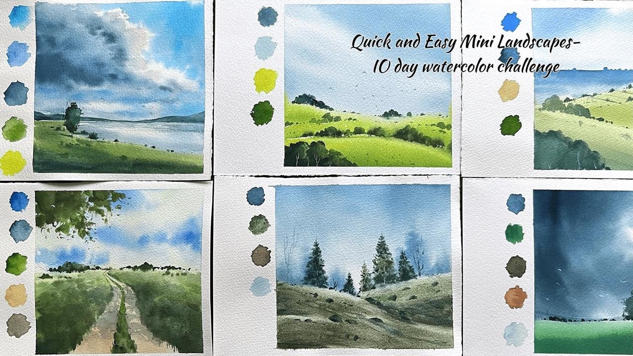
2. Materials: Before we begin, let's
quickly go through the materials we'll be
using for these paintings. You can use whatever
materials you already have. You don't need to use the same brand or
supplies that I'm using. I'm only sharing
mine as a reference. The first and most important
material is the paper. I'm using fabriano
artistico watercolor paper, which is one of my
personal favorites. This is cold press, 300
Jasim and 100% cotton, and I'll be working on 20 20 centimeters
square loose sheets. You can use any
watercolor paper as long as it is 100% cotton, at least 300 Jasim. Since we'll be working
mostly wet on wet, the paper needs to be thick and able to hold a lot of water. And I also strongly
recommend using loose sheets rather
than a watercolor pad, sketchbook or
spiral bound books. For these paintings,
we'll be soaking the paper and
wetting both sides, which is much easier and more effective
with loose sheets. Now let's look at the brushes. I'll be using a
large flat brush, which is a hake brush
for wetting the paper. Along with that, I'll use two
medium sized round brushes. One is size ten and size four. These are by artifi, but any similar round
brushes will work. And also, I'll use a fan
brush for color blending. I'll show you some techniques, using a fan brush
for color blending. Next, I'll use a medium
size flat brush, size ten, and a small angle brush for some lifting and a
few other techniques. If you don't have
an angle brush, you can also use a small
size, um, flat brush. For the details, you will
need a small detailer brush. Along with that, keep a pencil and eraser
and something sharp, like a paper knife or a blade for some
scratching techniques. Yeah. Now let's move
on to the paints. It's important to use
good quality paints to get glowy vibrant
effic in the paintings. The main colors I'll be
using are cobalt green or turquoise green and permanent
green, lemon yellow. And for the darker effix, um, I'll use indigo,
paints gray, and oxide black to add a few
warm touches and details, especially for the
winter houses. I'll be using gamboge
and bone timber, and we'll also need a
bit of a pack white for some fine highlights
and small details. So this is our basic
color palette. Before starting each
class projectile again, show you the exact colors we'll be using for that
particular painting. And along with the paints, we'll need a few
basic materials. Since we'll be working mostly
with wet on wet layers, we will use the soaking
method to stretch the paper. For that, you'll need a
glass or plastic surface to place your paper on. I'm using an acrylic
glass board, but anything non
absorbent will work. Avoid wooden or
cardboard materials. And you can also use a
head dryer to speed up the process to dry up
the layers in between. And we'll also need
two jars of water, one for cleaning the brushes, and one for mixing colors
and wetting the paper and keep some tissue papers or a cotton cloth to
wipe with brushes. That's all you need.
And most importantly, just join me with a
calm and happy mindset. Let's start painting.
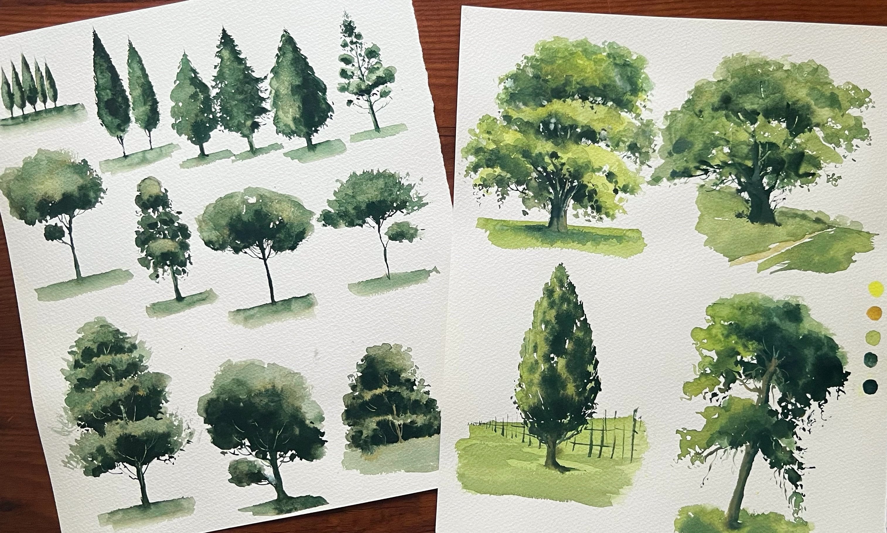
3. Pine Tree Painting Techniques: This is a warm up
lesson for painting pine trees before we
start the class projects. I just want to show
you the basic shape or the skeletal shape
of a pine tree. Once you get this idea, you can paint it however you want in a loose and
realistic style, maybe. First, I'll show you
assemble line drawing just to explain the
skeleton of a pine tree. The top part of the branches
will be pointed upward, and as it comes down, the branches will start
pointing downward because of the heaviness of the foliage or that weight of the leaves. This is a basic shape you
need to keep in mind when you start painting thicker
strokes to form a pine tree. Now I'm going to
draw another version with some foliage or
leaves on the branches. I'm just loosely sketching another version of the same
tree as it comes downward. You can keep the branches thicker and give
them more volume. And for the top part, you can keep it
sharper and thinner. And it's also very important
to keep it irregular and asymmetrical to create
that realistic effect. So you can paint
each branches or the foliage in loose
and little shaky lines. You can also keep the down part of each section of
foliage little darker to create the shadow
effect and also to enhance the volume
of the foliage. And even while
painting the branches, you still need to
remember how this works. It's the same as the
overall shape of pine tree. Each branch is almost like
a coconut leaf shape. And if you are painting a snowy effect or trying
to create more volume, you can paint it with a slightly
rounder shape like this. You can still keep the
lower part a bit sharper and more detailed and the upper part a
little more rounded. And also, for the down part, you can keep it a little
darker like this. I'm just shading with
pencil for some shadows. It can create some nice effect, and we can easily make that
lights and shadow effect. Yeah. So when you paint shadows, it should be on the down part of the foliage and the upper
part should be brighter. So that's it for the basic idea. Now, let's see how to paint a pine tree while keeping
all these points in mind. I'm using just one color here, starting with the lighter shade, and then I'll add
more shadows later. As always, I'm starting with
a straight line vertically. And from that line, I'm adding branches
on the sides. For the top part, I keep
it thinner and minimal. And as it comes downward, I will make it
bigger and thicker. And you can also see the way
I'm painting the branches. I'm trying to create a kind of irregular shape for
each branch as well. With some darker paint. I'm adding a few
details here and there and some shadows and
darker foliage effects. You can also keep
it a little sharper and detailed with
some dots and tiny, tiny lines here and there, and you can also keep it
looser and thicker strokes, especially for the center part
and acid coming downward. So yeah, we can always use our creative ideas to paint it in our own style
or in different ways. And finally, I'm fixing
that tree trunk. And when we paint
the tree trunk, it can give more
perspective to the tree. So it's very important how
we're painting the tree trunk. I'm also giving that combination of the tree trunk
through the foliage. Especially on the high
light part of the foliage. And before the
first layer dries, I'm going to add
the second layer, which is the darker
layer for the shadows. So we'll get a
nice softer effect for the lights and shadows. So yeah, we are
working wet on wet. You have to be a little faster
to paint the second layer. And you can also use a little thicker paint
for the darker effets. This is the basic
idea of painting a pine tree in a loose but
still realistic style. You can use the same
method for painting snowy pine trees or for
an evergreen pine tree. Now, let's paint a small
forest or a group of pine trees using
the same techniques or how we can paint layers
of pine trees. Yeah. First time starting
with distant trees. I'm creating loose shapes
using a small angle brush, or you can also
use a flat brush, and I'm starting from the
bottom and going upward. And as I lift the brush slowly, the lines become pointy
at the top part. This helps create that distant
pine tree effect easily. And you can also see
that I'm not starting all the strokes or these trees from the same straight line. Some trees feel a little more in the foreground and some feel
more in the background. Now I'm adding some bigot trees
using the same technique. We already practiced. I start with a vertical line and then adding
the side branches. You can always use
your own style for painting pine trees. Just keep the basic
shape in mind. The way you apply the strokes
is completely up to you. I'm adding taller
trees on both sides, and as it comes
towards the center, I'm keeping the trees shorter to create that distance
and perspective. Some trees are slightly
leaning towards the light, which is also a nice way to add more interest
to the landscape. So you can practice this
pine tree technique before starting the
class projects. When you know how to
paint a good tree, creating a landscape
becomes much easier. If you understand
this technique, the other parts of the
painting will feel easier too. So, yeah, that's it.
I hope this helps you understand some ideas
about painting pine trees. Now let's move on to
the class projects. Yeah. H
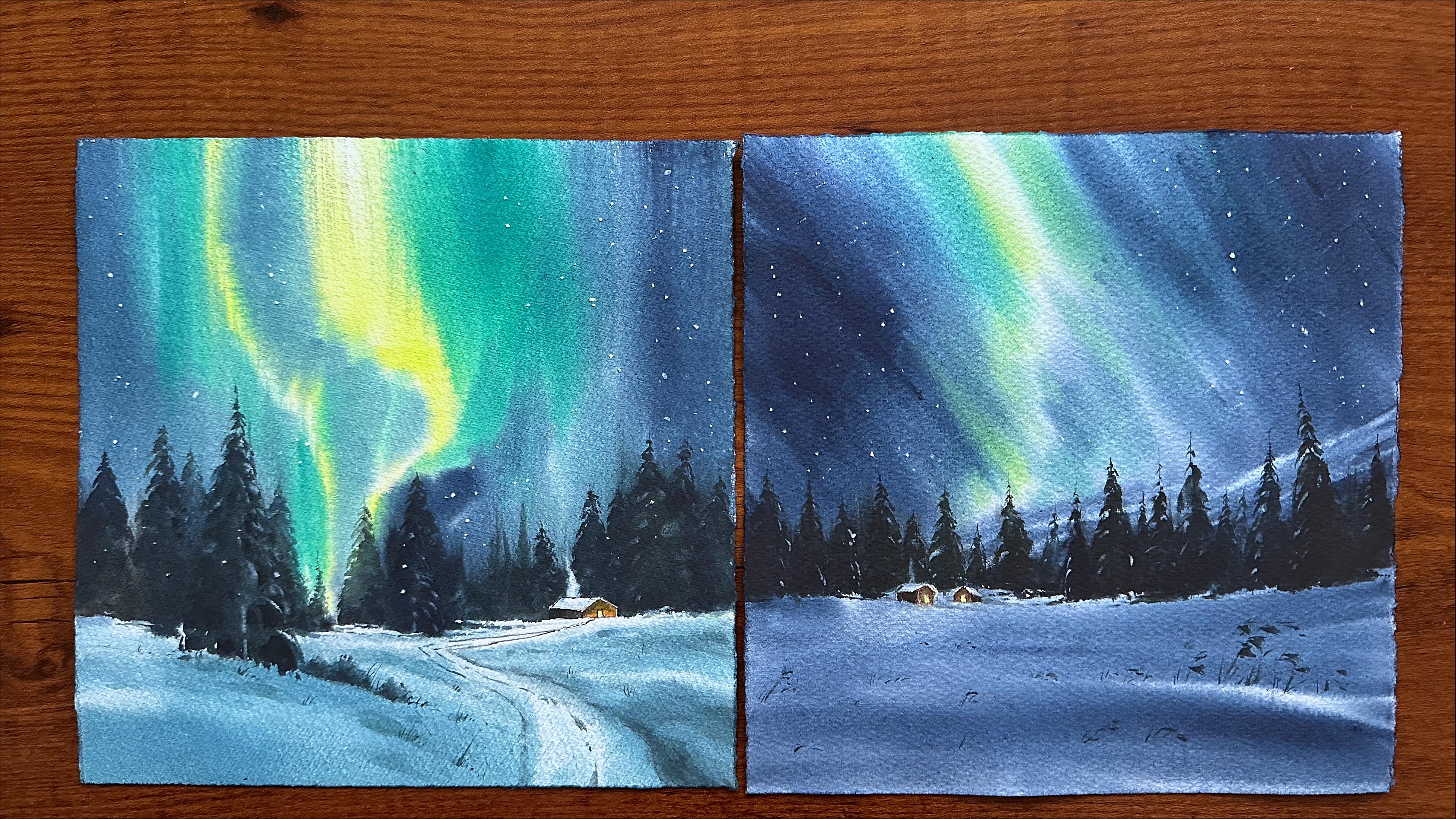
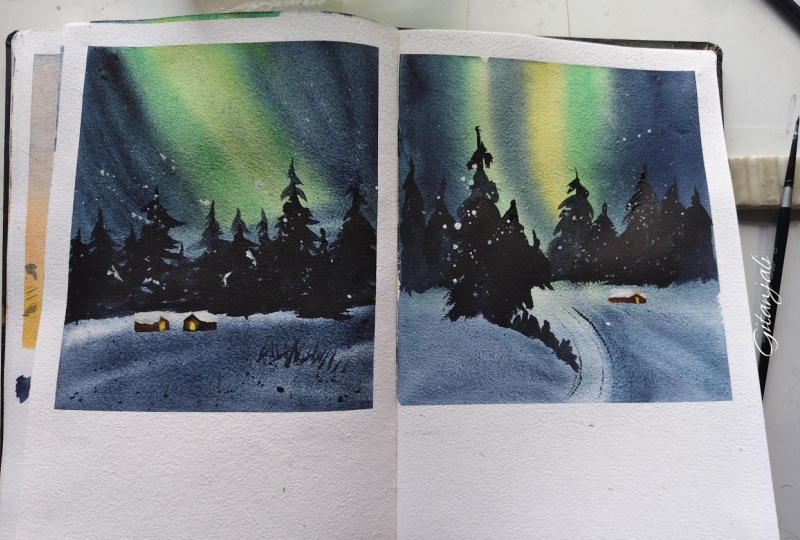
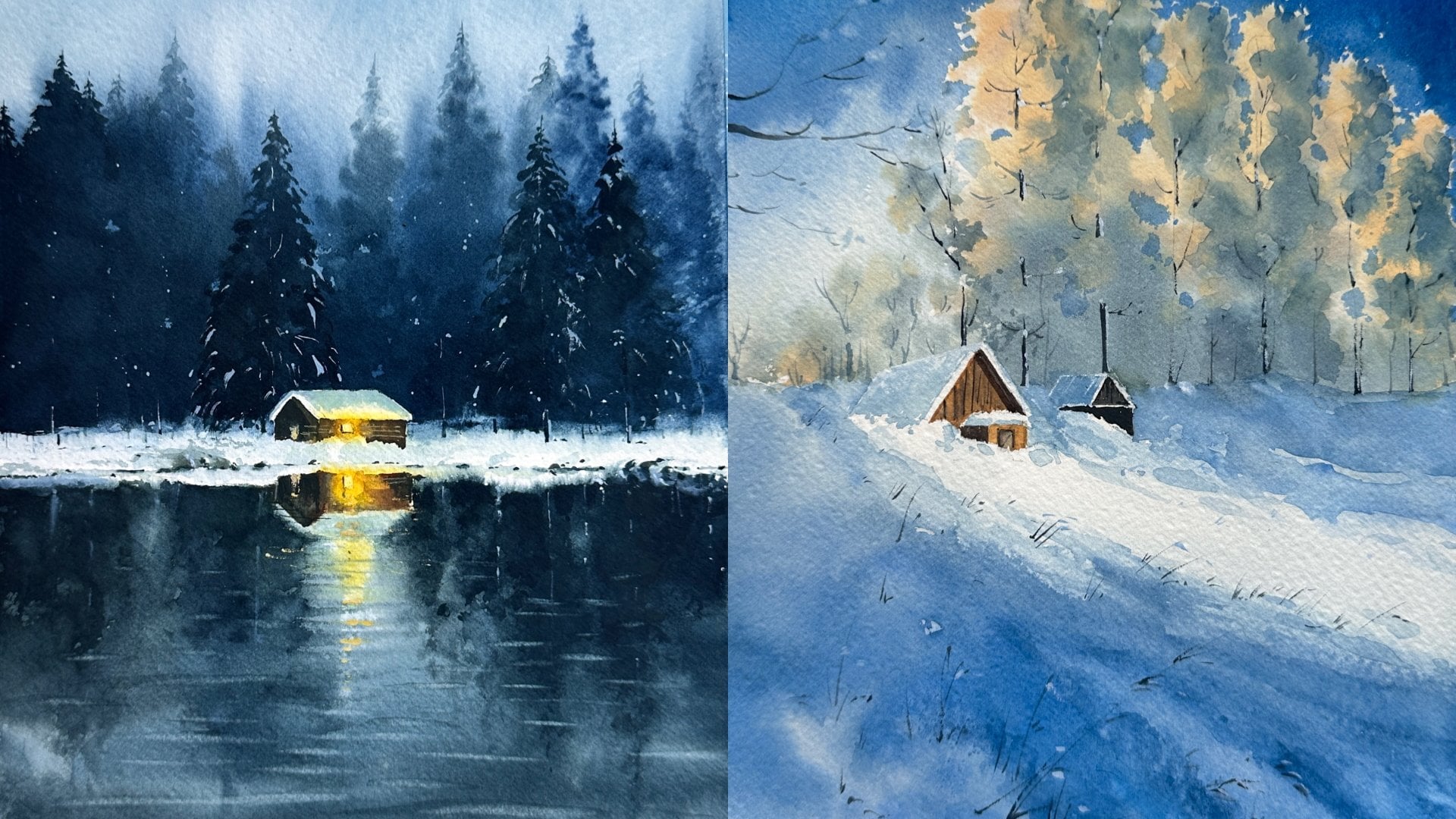
4. CLASS PROJECT ONE - Color Palette, Sketching & Paper Prep: Hello, Don, welcome to
our first class project. And this is the painting
we're going to learn today. We'll be painting a
beautiful Northern Sky with glowing lights
and a snowy landscape. So let's quickly go through the colors we'll be
using for this painting. I'll use lemon yellow
and permanent green. It's very important to
use transparent colors because then only we'll get that beautiful glow
effect in the sky. And you can also use turquoise green instead
of using permanent green. And for the dark
effect in the sky, I'll use indigo and pains gray. And for the pine trees, I'll use Pains gray
and oxide black. And for the small
hut or winery house, you can see somewhere
in the background, I'll use burn
timber and gamboge. We'll also need opaqu white
for some fine details. So yeah, these are the colors we'll need,
and let's start. Remember, you can download the pencil sketch from
the resource section. You can trace it if you want, or you can also sketch
it along with me. Here I'm starting by fixing
the horizontal line. Since we are painting a
Northern Sky landscape, most of the painting will be the sky and that Aurora effect. And only a very small portion
will be the landscape. Roughly one fourth of the frame will be
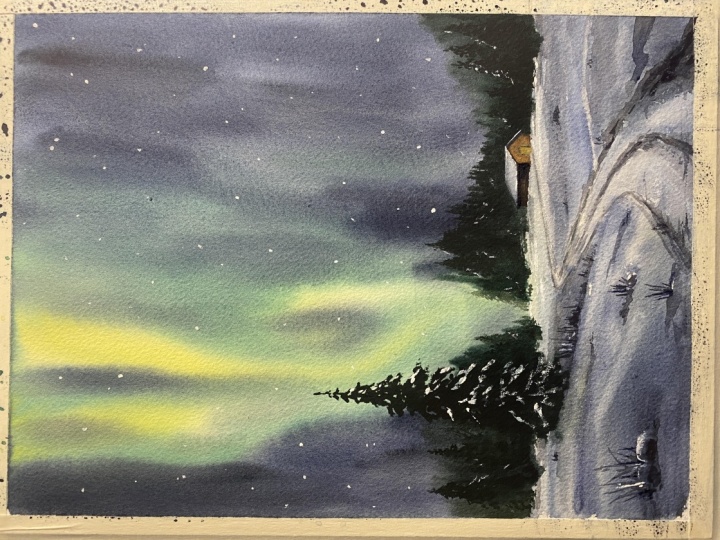
the snowy landscape. Now I'm loosely sketching some pine trees in
different sizes. Just above the horizon
line we already added. You can keep this very loose. There is no need to follow any specific shape
at this stage. We are simply
outlining the trees and we'll add more details
when we start painting. Okay, next, I'm fixing the
outline for a small house in the background slightly towards the right
side of the frame. I'll begin with the roof, then outlining the wall and adding a small square
for the window. Okay, now I'm sketching a pathway leading
towards the house. It's important to get
the curve of the pathway right to create a good
sense of perspective. The pathway should
appear to narrow as it moves towards the house and become wider in the foreground, giving the feeling that it's
vanishing into the distance. Since we're painting
a snowy landscape, we'll later add subtle shadows and textures to the pathway. Okay, now in the foreground, I'm adding a gentle
curvy shape to suggest a small snowy
peak in the landscape. From there, I will add
a larger pine tree placing closer to us to enhance the depth and
foreground interest. That's it for the sketch. It's meant to be very
rough and loose. If you found it difficult
to follow along, you can download the sketch
from the resource section and trace it so you can focus
fully on the painting. Alright, let's start painting. As you can see here, I'm using an acrylic glass board
to place my paper on. I'm stretching the paper using both side
wetting technique, which is very helpful when we're painting a
Northern Sky effect. You can use a glass surface or a plastic surface for this. Just place your
paper on it and take a wide brush and flip the paper over and wet
the back side first. Use plenty of water and move
your brush back and forth, so the whole surface
is evenly covered. Then flip it back in wet the front side of
the paper same way. Make sure to wipe off any
extra water from the board. We don't want any water pulling the only moisture in the paper. Okay, right now, you can see
the paper has a nice thin, even layer of water, no puddles or no dry patches,
even leave it. Let it sit for a
couple of minutes so the paper can absorb
the water properly. This will help for working
wet on wet for a longer time. While we wait, we can also prepare the colors
for the painting.
5. Painting the First Layers of Sky, Northern Lights & Landscape: A permanent green here and
I'm mixing it with some sirlin blue to cool it down
and make it less vibrant. This helps mute the
green slightly. I actually forgot to mention that color in the
beginning of this video, and even you can also use cobalt green or turquoise green. Yeah. And for the glow
or that lighter shade, I'm using lemon yellow, and I'm mixing it with
just a tiny bit of permanent green to make
it slightly greenish. So these are the main two
colors we'll start with for painting the
Aurora light effect. As you can see here,
I'm starting with a line from the upper part of the paper and pulling it downward in a soft curvy motion. And then I'm filling in
one side of that line with the same color and notice how I'm moving
my bridge upward. This will help to create
that direction and gives that flowing
effect for the light. Now I'm repeating
that yellow streak again on the right
side of my paper, and it's a little thinner
compared to the previous one. Next time, quickly, take the darker green
mix and applying it just beside this
yellowish area. I'm gently mixing both colors
to get that soft effect, and also I'm adding the same
color on other side as well. Remember, the paper
is perfectly wet. We are working wet on wet. Because of that, you won't see
any unwanted spreads here. This is why the
amount of water on your paper and on your
brush is very important. You can also use a
tissue paper to wipe off excess water from your brush
in between the painting. Or the darker areas, I'm using indigo mixing
with a bit of paints gray. Adding darker colors
is what really helps the lighter
glow standing out. So this step is very important. Be careful not to use
too much water here, go with a little thicker mix. While I was painting, I felt like the background could
be a little more darker. So if you're using
indigo and paints gray, keep the mix a little thicker
and richer, not too watery. This way, once it dry, the darker areas stay
very dark and vibrant. Now I'm filling this area very carefully because I want
to create that effect where the light or the sky appears to vanish towards
the horizon line. So I'm keeping the
yellow and green streaks quite narrow as they go down. You can start from the upper
part of the paper with slightly thicker
and wider streaks and then you can slowly go down, making them narrower
as they disappear. It's similar to how we
paint pathways or road where they appear to get smaller
as they go farther away. You can see that
the colors are not spreading downward
because we need to keep that area lighter
for the snowy landscape. If your colors are starting
to spread downward, you can use a flat brush and gently lift or wipe off the
excess paint from there. But if your paper
is perfectly wet, it will not spread
into that area. As you can see here, I'm
adding another layer to deepen the sky and enhance
the Aurora effect. As the paint dries,
it looks lighter, so I'm using a little
more thicker paint to get more contrast and to get a little more clearer
and sharper shape for the light effect. Yeah, the paper is still wet so we can continue
working wet on wet. Now I'm moving on to
paint the snowy land. First I'm using a very light
wash with the same mix of colors I already have
on my palette and, you know, snow reflects the
same colors on the sky, so you can use the
same mix of colors. And slowly, I'm adding a bit more contrast in the foreground to create
that soft shadows. Remember to use a damp brush and always remove extra water
using a tissue paper. Also, I want to remind you again that the importance of using
this stretching method. If you're using watercolor
paper pad or something or you're using a masking tape
to stretch your paper, you'll not get this much time to work on wet on wet layers. So it's very important
to use this technique. So you can create that
soft and glowy effect for the painting by slowly
working on multiple layers. As you can see
here, I'm creating gentle curvy shapes
for the snowy land, so it doesn't look flat. And also, I'm trying
to lift some colors, especially along the pathway
to create that highlight. And for lifting, I'm
using a flat brush with very little water and wiping it on a tissue
paper in between. So you can hold a
tissue paper in your left hand if you're
painting with your right hand. I'm trying to make more
lights and shadows, especially in the foreground by lifting more colors and also, again, adding more dark
colors here and there. So you have to be very
patient and build that snow effect
slowly in layers. Yeah. Since the paper is still wet, we can work on
multiple layers and we can fix any mistakes
by lifting colors. So this stage is very crucial. Yeah, now you can see
that slowly and building that kind of shape for
the snowy land part. Now it's perfect time to blend all the colors we added
for the Northern lights. So I'm using my fan brush and keeping it damp by dipping it in water and just wiping it and make sure the paper is
at the right stage, not completely dry
or not too watery. This is a perfect time
to work on blending. Using the fan brush gently, move it back and forth
in a vertical motion. This will create a
beautiful texture and those subtle raise
like streaks that can give a soft light raise effect flowing downward in
the northern lights. If there is too much
water on your breast, remember to dab it lightly on a tissue paper and work very gently and avoid pressing too hard to keep the effect
soft and natural. Now, hopefully you can see that subtle texture
in the light with the beams gently flowing downward as very
fine, delicate lines. That's exactly the effect
we were trying to create. Next, we're going
to paint the trees. But before that, I'm going
to lift some colors from the tiny house to create a soft steam effect
coming out of it. So for this, I'm
using a flat brush and keeping it slightly
damp and slowly wiping away some of the color in the shape
I want for the steam. You can also use a tissue paper to wipe the color if you want.
6. Adding Trees : First Layer: A Now, let's move to paint the trees. So to paint the pine trees, I'm using a mix of
paints gray, burn amber, and a bit of oxide black and indigo to make it a
little more darker. I avoid using black directly, so this mix works perfectly. We'll get a little transparent, but still dark kind of shade. So we're painting almost like some silhot of pine
trees. So, yeah. Using a small bridge, start creating upward strokes
with a little pressure, and as you move upward, gradually lift off the bridge. So you can create that
nice and sharp pointy end at top of the trace. And later we'll add more details to shape it into trees. Yeah. First, you can start with the basic shape or
that abstract shape, and then you can
add more details. As you can see here, I'm leaving a small space for
that foreground tree, which we'll paint later, which is slightly
bigger and more prominent since
it's closer to us. And also, remember to keep
the trees in different sizes. On both sides, you can
paint them a little larger, and as you move toward the middle or that
center of the frame, make them shorter to create
that sense of depth. When painting around the house, be a bit careful
and take your time. Also keep an eye on
that line where the darker trees placing
on snowy foreground. That contrast is
really important. Make sure this line is
not straight or perfect. Keep it slightly curvy
and broken in places. That variation can give a lot of depth and make the landscape
look more natural. Some trees are
closer to us while some trees are placed
far in the background. Painting them this
way will help you achieve a nice sense of
depth in the painting. I'm shaping the top
part of these lines for trees again to make
them feel more pointy. So I'm loosely adding some vertical lines
in an upward motion. Okay, now let's add more
details to the trees. I'm mainly focusing on top part of these black lines we added. And you can shape these into pine trees and
remember to not our work. Yeah, I'm starting with a short and straight
vertical line, and from there, I generally move sidewise to create the
branches or foliage. And as you move downward, you can paint more loosely
with slightly thicker strokes. The top part of trees should remain sharper and more defined. I'm using a small
size down bridge. To paint these trees in a
nice and balanced shape, take your time and
work very slowly. This is the step
that truly requires patience painting the
Northern Sky and that light effect is
relatively easy and even the snowy landscape
doesn't take much time, but shaping these trees
is more time consuming. So there is no rush at all. Take it slow and relax and maybe enjoy a cup of coffee or any beverage you
like as you paint. Just about the Aurora light
effects in the background. I'm painting the top portions of some trees using
some lemon yellow. This can create a subtle reflection effect
where the light hits the trees and also keeping it very minimal
and avoid overworking. I hope you have referred to the lesson where
we're talking about painting pine trees in a
natural and loser style. Yeah. I'm also using a
small size detailer now to paint some
very fine details. And as you can see here, I'm using a tissue paper to wipe off the extra water or paint in
7. Trees Details & Texture: Painting. It's very
important to do that before you touch
your brush on paper. Yeah. Since we are
painting wet on wet, paper is started drying, but I can feel that there
is water inside the paper. So yeah. As I said earlier, while painting top
part of the trees, I'm also keeping an eye on the bottom part or how the
trees are sitting on the snow. So I'm adding a very
loose and irregular lines there to keep it more natural, irregular and to create that
kind of depth And also, I noticed that when I started
adding these black trees, the camera light kept adisting and made the
video look darker. So I tried to fix
it during editing, but I apologize if it looks
uncomfortable for you. I'm carefully going around that space where we're
trying to create that depth the distance of the painting
or the landscape. So I'm trying to
keep the trees there very short and minimal, yeah. Like we can see
some pine trees or some distant elements far in the distance through the
trees that are closer to us. So you can also notice
that I'm painting these short and tiny trees right where the Aurora
light is going down. This creates a really
beautiful effect and aaturally becomes an attractive focal point in the painting. So you can place this a smaller distant trees
just in front of the downward light or along that narrow line where we
painted the light flowing down. So this is just a
simple composition idea that you can try and use
in your own paintings. Can guide the viewers
attention and keeps their focus
within the pininty. Yeah, I hope you got that
feeling I was trying to convey. I'm continuously working on these details for the
trees and going for a little more darker
layer to make it more contrasting and also refining the details again and again
until I feel satisfied. And remember to leave that
little space for the steam coming out of the house
or that wintery hut. Yeah, you have to paint around
that house very carefully. But that's okay if you are
painting on top of that, by mistake, you can use opa
white and you can fix it. No problem. Or you can also
lift the colors from there. That's also fine. So, yeah.
8. Adding a Foreground Tree: Okay, now I'm moving to
paint that food down tree, which is slightly larger
and more detailed. You can spend a
little more time on this one and add more details compared to
the background trees. And I also keep an eye on how the tree sits
on the snowy land. Try to make it a little
irregular by leaving some gaps or white
spots here and there. This helps create a more
natural look instead of making it very
plain and flat. G.
9. Defining the Pathway: Okay, now let's add more
details to the snowy land. I'm darkening the
pathway lines we added earlier using
a light indigo mix. If you're feeling like some
edges are looking too sharp, you can always soften them with a dam brush while
working on layers. That's what I'm
trying to do here. And I'm also enhancing the snowy curves in the land to create some lights
and shadow effects. It's very important to use
very light mix of color, so you can use a lot of water
to thin down the paint mix. Here I'm using the same mix
of indigo and burn timber, and I'm using a lot of
water and just creating a nice contrast between that snowy peaks
on the land part. Yeah. I'm trying to make it a little more darker
for the very foreground. Yeah, so we'll get that nice
effect for the foreground. It's like adding more
and more colors to create that contrast
and at the same time, softening the hard edges
to keep that softness. I'm carefully going around
that part of the pathway. I don't want to
drain that beautiful curvy shape of the pathway. Yeah. So I'm just trying
to darken the line. And also, I'm working
on that mid line. And as it coming
towards the foreground, I'm trying to make
it a little more darker and slightly thicker. Yeah. And you can see that in between painting for
my comfortability, I am switching my brushes to a small size flat brush and a retailer and a medium
size round brush. These are the three brushes
I'm using for these details. I'm trying to add some
more narrow shadow effects on the snowy land as it
going towards the trees. At the same time,
I'm also working on some background details
again and again. Yeah. So you can always look at your painting
from a little distance, and then you will
understand where you have to work on some details or if you want to remove
something, you can do that. Yeah. So it's always nice to
take a break and come back
10. More Details to the Snowy Land & Foreground: So it's always nice
to take a break and come back to your
painting later. So yeah. And also in the foreground, I'm adding some wintry
grass and tiny stones and some small and fine
textures using the same mix of colors to create that depth and
foreground interest. And I don't want this
a look very flat. So I'm adding some
tiny strokes and lines to make it
feel more natural. You can make some tiny semicircle
marks for that bushes, like it is sitting on the
snow and for some grasses, you can paint some straight
lines with cili yeah. So these details can create beautiful effect
in the final result. Yeah. Also, I'm working on
that foreground snowy peak. Yeah, I'm trying to make it
more darker with shadows. Next I'm adding some
snowy highlights and light reflections
on the pine trees. So I'm using opaque white
with slightly thicker paint. I'm just adding some dots and
small lines here and there, and again, keeping
it minimal and slightly sharp for
a clean effect. So remember to take
thicker paint. Don't mix it with water. So you'll get that
sharper effect. Yeah. I'm adding
this white effect on one side of the tree, as you can see here for
that light reflections. Lightly dabbing your tissue
paper on that to make it a little softer and
blended, kind of effect. And also with the
same white paint, I'm working on that line of the snowy land part
trees for white details, I usually prefer using watercolor whites
like Daniel Smith, titanium white or
Windsor and Newton, white paint is also fine. I avoid using white gouache, especially when mixing with
watercolor for pastel shades, for painting clouds or
moody skies because it can ruin that floy
texture of watercolor, and white gouache can still
be used for small details, but I mainly stick
to watercolor white. It works well with
thick and thin or even wet on wet to create
foggy, moody soft effects. And again, adding some details
to the background trees also seem like we painted
for the forkgowd tree. And it is very important
to not overwork. We have to be very
careful while adding each line or that dot. Yeah. Using the same mix of indigo, I'm adding a few more
loose and soft strokes on that snow and with my medium sized round
brush to create kind of a gentle texture
or some details. O repeating it on the other side of
the pathway as well, and feel free to skip this part if you don't want
to make it that detailed. And I'm adding some more
grasses here and there, especially in the
foreground. Yeah. Now I'm working on the
bushes again and just adding some dots here and
there to make it detailed. Always, we can create kind of illusion by adding some dots
and lines here and there. We don't have to paint the exact things in the
same or that perfect shape. We can just add some tiny, tiny details like
some dots and lines, so it can create that
kind of detail. Look,
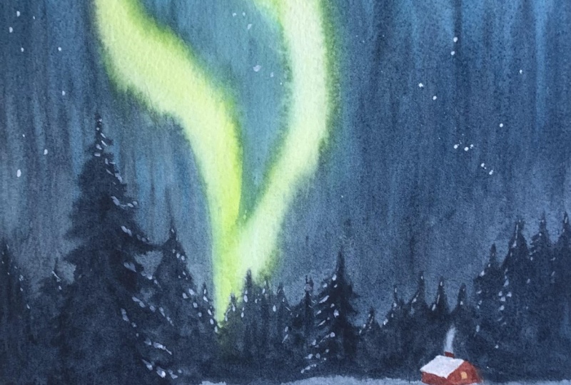
11. Painting the House , Stars and Final Touches: Now, let's paint the house. For this, I'm using warmer
colors, mainly burn temper. But before that, I'm just adding this indigo to that roof. I don't want to
leave it very white. So I'm just adding some
shadows very lightly. Yeah. You can add the colour to one side of the roof gently and pull it to the other
side with some water. So you'll get some nice
effect without overworking. It At the same time, I'm also shaping
that steam effect by adding some darker
colors on both sides. The all over painting looks very cool with all the cool shades, so I'm excited to
add a small touch of warmth by painting that
house. So let's start. Here I'm starting with
gamboch to paint that window, filling that small
square with color. And I'm filling in the walls, keeping the left side
slightly darker and front side lighter and warmer to show that
light and dimension. You can use a round brush
with a pointy tip or a detailer or maybe a small size flat brush
for these details. And also I'm using a paki to just add some more
sharper effects here and there on the house, especially for that snowy roof. And same like trees, it's important how the house is sitting on the snowy land. You can make it a little
irregular and curvy shape, not like a straight line. It can give a kind of
effect that some snow is covered with that
wall of the house. Yeah. So when you're painting colors for
the wall of the house, you have to keep
that in mind. Yeah. And here is a secret tip. When your paint is too dark or you want to
remove something, instantly, you can
use a tissue paper, just dab it on your paper and you can wipe off that color. You can see I'm doing that here. I want to make that front side of the house a
little more lighter. So I just dabbed tissue paper on that and I made it lighter. And then I worked
on that window. So, yeah. So in watercolor, it is not that difficult
to fix mistakes, but you have to
work very fastly. And if you want to
fix any mistakes, you can still do that
while the paint is wet. When it's dry, we have some
other techniques like lifting and layering or using
white paint or something. Yeah. I'm using a fine liner and fixing and sharpening
the roof and wall lines. We're almost done
with the painting, and the final step is to
add some stars in the sky. First, I tried to use opaque white and adding some
dots individually, but it didn't give
the effect I wanted. And you can also use
plattering technique if you're comfortable with that. I personally prefer very
fine and sharp stars, so I'm using a
scratching technique. So with a paper knife, I gently scratch some tiny dots into the paint to create
some delicate stars. So if you're using
thicker paper, this is easy to do. So, yeah, that's it. We are
done with the painting, and this is the final result. I really love how
everything came together and especially the Northern lights and the snowy landscape, creating such a calm and
beautiful atmosphere. I hope you enjoyed painting
this along with me, and I'll see you
in the next one.
12. CLASS PROJECT TWO - Color Palette, Sketching & Paper Prep: Welcome back to our
second class project. This is a painting we're
going to work on today. It's a little different
from the previous one, especially the way we
paint the Northern lights. We'll be doing it in a
slightly different direction. And overall, this
landscape is going to be easier compared to the previous
one and more relaxing. We'll paint a soft
background mountain, and then slowly, we'll add some trees and a
few tiny houses. And the foreground
will be very simple. The color palette for this
painting is almost same as the previous one with
just a few small changes. This time, I wanted
the Northern lights to feel a bit more
subtle and blurry, not too bright or vibrant. I think in real life, northern
lights often appear soft and diffused rather than
very sharp or white. So I wanted to create
that effect here. To achieve that softer look, I'm using kobalt
turquoise green, along with lemon yellow
for that light effet. And the rest of palette
remains the same. We'll use intigo,
paints gray and oxide black for the trees
and some darker effects. And for the house, we will use gamboch
and burn timber, and we'll also use opaque
white for some details. So overall, the colors
are very similar, but we're trying to
create that softer, cooler and more blurry
kind of sky effect. That's it, let's get
started with the paint. As always, in starting
with the horizon line, about one fourth of the
frame will be the land part, and the larger upper
portion will be for the Northern lights right
above the horizon line, I'm adding some loose trees. We'll refine them later. For now, it's just
to get an idea. Remember, you can download
the pencil sketch from the resource sections and you
can trace it if you want. I just want to remind
you that again. Just behind the
trees, I'm adding a rough line for the
background mountain. The mountain is slightly
higher on the right side and gradually slope down toward the horizon line
on the left side. Remember to not draw
it as a straight line. Keep it loose by holding
your pencil further back. Right above the horizon line, I'm adding two tiny houses. We're not going for any details, focusing on the roofs, since the rest of the house will be hidden in the distance, maybe under some snow. I'm adding one more house and filling the horizon
line in front of that. I also adding a small square
for a window or door. In the very foreground,
I'm sketching a few lines for
some snowy peaks. We'll add more eff later. I don't want to
leave it very flat. So that's it for the sketch. Now let's start
wetting the paper. The process for wetting
the paper is almost same. Flip your paper
over and place it on an acrylic glass
or plastic board, and use a flat brush or hake brush and start wetting
the back side of your paper. And remember to move
the brush back and forth several times to create
an even layer of water. Then flip the paper to the
front side and wet it as well. This wetting technique
is very important for stretching the watercolor
paper for these paintings. It helps to achieve a soft and glowy effect
in the painting. If you skip this step or you're using a watercolor
pad or sketchbook, your painting won't have the same softness and
glow once it dries. Now, let's wait for
a few minutes and allow the water to
soak into the paper. So it settles nicely to
the tooth of the paper, and I'm also wiping off all the water from the
four sides of the board.
13. First Layer, Wet On Wet: Important for stretching the watercolor paper
for these paintings. It helps to achieve a soft and glowy effect
in the painting. If you skip this step or you're using a watercolor
pad or sketchbook, your painting won't have the same softness and
glow once it dries. Now, let's wait for
a few minutes and allow the water to
soak into the paper. So it settles nicely to
the tooth of the paper, and I'm also wiping off all the water from the
four sides of the board. Let's start the painting. I'm beginning with
the first layer, and I'm covering almost the
entire paper with indigo, leaving out the tiny houses. So I'm using a
slightly thicker mix of indigo with less water, so the color stays rich. You may not be able
to see the paint on my palette since
it's on the other side, but I'm loosely applying this color over both
the sky and the land. And you can also notice the direction of the
strokes as I work. For this layer, I'm using a
medium size round bridge. In one go, I'm covering the
whole landscape and sky, leaving the small houses and a few areas in the sky for that soft gloy
Northern light effect, which will later
add colors there. This is another way to
paint Northern lines. You don't have to always start with the lighter,
brighter colors. You can begin with the
darker colors and build the lights later using the
negative painting approach. I also forgot to mention that, make sure to wipe
off all the water from the tiny houses to keep it white while we paint around
them with darker colors. I hope you approach
this ton wet layer with a playful mindset
down very too much. Just allow yourself
to experiment. Ton wet painting
is very relaxing. All you need is a little
control over the amount of water and pigment to
achieve these soft effects. And if at any point you are feeling unsure
or uncomfortable, you can always ask your
questions in the discussion box. Here, as you can see, I'm slowly building the
white space for the Northern lights by adding darker colors
on both sides. And also notice how I have kept the land area slightly lighter compared to the sky
we have already painted. I'm adding some soft shadows on the land and a slightly
darker thicker line in the very foreground to create gentle curvy snowy peaks so
the land doesn't look flat.
14. Painting the Aurora Lights and Background Mountain: Okay, now it's the
perfect time to add colors for the
aurora light effect. The paper has perfect amount
of moisture on the surface. There is no pooling
water or no dry patches. So if we add colors now, it won't create any
unwanted blooms or spreads. Before the paper
gets completely dry, I'm going to start
adding more colors. I'll be using cobalt green or turquoise green and
some sirlin blue. And I'm not filling
the entire area. I'm leaving a small space in the center and adding
colors on both sides, just gently adding the colors. And don't press too hard and don't load your brush
with too much paint. Always try to keep
the brush damp. Yeah, you can use a
tissue paper and you can wipe it in between painting. I'm also trying to soften
the edge very gently. I'm just blending
the colors there, so you'll get a
nice glowy effect. As you can see here,
I'm using tissue paper to wipe the lifted colors. Slowly, I'm shaping
the light effect and creating that flowing
aurora form in the sky. At the same time, I'm working on darker values on both
sides using indigo, and adding darker
colors on sides will make the light effect in the
center look more brighter. You can always keep
a tissue paper in your other hand and wipe your brush in between to control the moisture and keep it damp. Now I'm going to add a lighter color that
is lemon yellow, and I'm mixing it with
a very tiny amount of permanent green to make
it slightly greenish. And with that mix, I'm adding color to that
white space we left earlier. Again, I'm not overworking it. We just want a soft slightly
blurry aurora light effect. So avoid very vibrant or
highly contrasting colors. I'm gently adding colors and softly blending everything
using a dam brush. As you can see here, I'm also trying to create
a vanishing effect. The light is slowly coming
down in a pointed shape. That's something you
should keep in mind while painting
this aurora effect to get that beautiful depth and perspective
for the painting. Now I'm using a fan brush to softly blend all the
colors together. I just dip the fan brush
in water and wipe off the excess water
on a tissue paper. So it's slightly damp and then very gently moving
it on the paper. This helps create a smooth
soft transition between all the colors and make sure
you don't press it hard, keep the touch very light, and also remember
always to blend in the same direction as the
light we painted earlier. Blending in opposite direction
can disturb the glow and ruin that soft luminous effect
we're trying to achieve. Okay, now let's add a soft mountain in the background
by lifting some colors. I'm using a flat
brush and having a tissue paper in my other hand. Since the paper is still wet, it's easy to lift the paint. I'm gently lifting the color
in the shape of a mountain, starting from the right side and moving slowly to the left side. And in between lifting, I wipe the brush on
the tissue paper so it stays clean and
doesn't get muddy. If you feel your brush is
holding too much paint, just rinse it and wipe off the
excess water and continue. I'm just continuing to
lift the paint here and there to create some
soft and bright highlights. Okay, now I'm going to add a
few shadows to the mountain. You can already see
some darker areas forming and especially
towards the right side, and I want to deepen
them slightly to create a nice contrast between the lights and shadows
on the mountain. So I'm using a mix of indigo
and burn tumber to get a deeper tone and
gently adding it over the areas that
already look a bit darker. And I'm not overworking, just placing a few darker spots here and there to
enhance the dip. And I'm using a small
size angle brush. Just continuously adding
some darker spots here and there and trying to make
that overall shape.
15. Painting Distant Trees: Okay, that's it
for the mountain. Let's leave it
like that for now. Next, we will paint
the pine trees. For that, I'm using a
slightly thicker paint mix, not too much water. The colors are indigo, burn timber, and
touch of oxide black. With this dark mix, I'm going to paint some
distant pine trees. If you have already watched the pine tree technique lesson, this part should feel
much easier now. I'm using the same
small size ankle brush and making some loose strokes
for the distant trees. I start from the bottom
and move upward, gently lifting the
brush as I go. So it naturally forms
a pointed shape. Yeah, you can see that. I'm also not keeping the
bottom lines straight. I'm making it irregular, so it feels more natural. Like some trees are
closer to us and some are farther away
in the distance, trying to vary the
sizes and spacing of the trees and avoid making
them look too uniform. Yeah, that irregularity really helps create depth
in the landscape. Now I'm going for the
left side of the paper with the same technique
to add some trees. And later we'll add some
more details to these trees. I'm painting very
carefully around the houses because I want to
keep these trees shorter. I don't want tall or
large trees behind such tiny houses as that
can block the view. By keeping the trees smaller
and more controlled here, we create better
depth and naturally guide the viewer's eye
into the landscape. So when you're painting
around the houses, work very slowly, keep the stocks precise and
make the trees shorter.
16. Painting Detailed Trees - Part 1: Okay, now that's it
for the distant trees. And let's add a bit more
detail to some of them. I'm switching back
to my round brush, and I'm mainly focusing on the top part of the trees to
give them more structure. I'm using the same
pine tree technique we practice Dollar, starting with a thin vertical
line and then adding small, slightly thicker
rounded strokes on the sides to suggest
branches and foliage. And also, I'm pinning the
trees in different sizes, keeping them shorter and adding a few taller
ones on both sides. Try to keep everything
irregular and asymmetrical, so it feels more natural. As you move downward, you can make the strokes
looser and a bit thicker. At the top part, keep the shapes sharp and precise
with minimal details. I'm also letting some of the trees lean slightly
towards the light, especially on both sides. We'll add light or snowy
eficlaor using some white paint. So don't overwork this stage.
17. Part 2 and Adding Snowy Details: Okay, that's enough
for the trees. Now let's add some soft light reflections on the pine trees. I'm using a pack white, and the mix is quite thick. I'm gently adding some white
touches here and there. Just a few, not too many. It's really important to
not overwork this step, keep the strokes
sharp and minimal. And also, when I feel the
white feels too bright, I'm trying to lightly dab it with a tissue
paper to soften it. I'm doing that in between just to keep
everything balanced. And remember to pay attention
to the direction of light. For the trees on the right side, I'm adding the white highlights on the left side of the trees. And for the trees
on the left side, I'm adding the highlights
on the right side. This helps suggest the light reflecting consistently
across the scene. So always keep the
light direction in mind while adding
these final touches.
18. Foreground Details: Now I'm adding a few
foreground details, some windoy grass or
some small leaves. You can see a light white
area in the foreground, which suggest light
reflection on snow. So using that a base, I'm adding a few grassy lines. I'm using the same
technique as before, starting from the bottom
and moving upward, slowly lifting the
brush as I go. As you reduce the pressure, you'll get a nice
fine pointed tips for these grassy lines. In between that, I'm adding a few slightly
thicker strokes to suggest some leaves
or some details. You can keep this very loose and paint it in your own style. I'm also scattering
a few tiny grasses here and there in
the foreground, just enough to add interest. I don't want this
area to look flat, so the minimal
details help bring it to life without overworking.
19. Painting the Houses, Stars & Final Detailes: Now it's time to add details
to the winery houses before starting the gently
rubbing my brush over that area to keep
it clean and white. If there is any unwanted paint, you can lift it using
a small flat brush. I'll start with the front
side of the houses, which is slightly
warmer in tone. For this, I'm using gamboge with just a tiny
touch of burn temper. I'm softly adding this colour to the front walls of both houses. For the other side,
I'll go a bit darker by adding more bone temper
and a hint of indigo. Painting one side warmer and
lighter and the other side darker helps create a nice sense of depth and dimension
in the houses. Before moving on
to finer details, I'm just making sure the base stones are placed
evenly and kept soft. And also, remember to keep the roofs of the houses
white since we're painting winery houses. But don't worry. You can also use Opaq white
to fix the white details. I'm also carefully adding
a small line with opaq white to suggest that steam
coming out of the house. Yeah. These type of tiny details are very
minimal and small, but altogether, it can create a beautiful feeling
to the painting. Now I'm just quickly
drying this lad, and then we will
add the windows. Okay, I'm going to add
the window, but for that, I'm using very thick paint that is opaque white
and lemon yellow. Yeah, so you have to use very thick paint
without any water. With that thicker paint, I'm just adding some dots here and there in
the background. Maybe some houses or
some light reflections. We can interpret it
any way we want, just trying to create
that illusion. Okay, that's enough. Now let's go to the final step that is adding some
stars in the sky. Here also, I'm using this
scratching technique. You can use any technique
that you're comfortable using white paint and
splattering or using a gel pen, and you can add the
dots individually. You can use any technique, but try to keep it very tiny, tiny, not thicken bigger dots. So with scratching, we can easily create very
tiny, tiny dots. So I'm using that
technique here. Yeah, paper is
completely dry now, so we can easily scratch. And also, I'm doing that on the darker spots on both sides
of the sky. So that's it. So yeah, this is the final
result of our painting. I really hope you
enjoyed this one. Personally, I think I like this version a little more
than the previous one. I really love how the
light effects turned out and how minimal it
complete the details feel. And I would love to know
which one you liked more. So do let me know. And that's it for this session. Thank you so much for
painting along with me. If you have any questions, doubts or felt unsure at any
point during the process, I'm always here to help.
20. Thanks for joining: And with that, we have come
to the end of this class. Thank you so much
for joining me in this soft and glowing Northern sky landscape painting class. It truly means a lot to
me and I really hope you enjoyed this relaxing
watercolor painting journey. I would absolutely love to
see your beautiful paintings, don't forget to applaud your project in the project
section and you can also download the pencil sketch and the final painting reference
from the resources. If you have any
questions, doubts or need feedback at any point, feel free to ask in the
discussion section. I'll get back to you
as soon as possible. And if you enjoyed this class, I would be so
grateful if you could take a moment to leave a review. Your support truly helps me
and means more than you know. Thank you so much always
for your love and support. I'll see you very soon
with a brand new class. Until then, keep learning, keep experimenting
and keep painting, happy painting, take care. Bye.
 Raniya Ali, Justartsbyraniya Watercolor Artist