Transcripts
1. Introduction: Hello, everyone. I'm Dania, a watercolor artist
based in the UA, and I'm so excited to invite you all to this ten day
watercolor challenge. In this class, we'll paint
a quick, approachable, easy to follow mini landscapes
for the next ten days. We'll explore different
landscape elements like painting, clouds, sky pathways, mountains, trees, hills, water
reflections, sunsets. So basically, you'll
need 15 to 20 minutes to complete each
of these projects. Even if you're short of time,
you can still establish a daily painting practice
that will definitely help you to improve your
painting skills as well as your
mental well being. Start the class by talking about all the materials we need, and then for the
first few projects, we will follow very
easy loose landscapes, and then slowly
we'll move to paint a little more advanced
and detailed paintings. Also, if you're looking for more advanced, detailed
painting challenge, you can also check out my
12 day wind landscape, watercolor challenge, which is perfect for intermediate
and advanced artists. So yeah, grab your paints and
brushes. Let's get started. I'll see you in the next video.
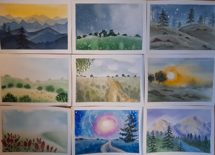
2. Class Overview: The aim of this class is to be consistent, not
to be perfect. So if your painting didn't
turn the way you want, you still have to be consistent
with the next project. So for the same reason, we're going to paint on
small size papers that is almost 13 to 13
centimeters square papers. You can also paint on same size papers or
you can go smaller. I don't suggest to go
bigger size papers because we have to finish the painting almost
in 15 to 20 minutes. So, yeah, I don't want
you to feel overwhelmed. If you're choosing
bigger papers, that will take too much time. We just have to be consistent with painting for
the next ten days. By end of the challenge, we can establish a daily
painting habit. That is the aim of this class. I mean, this
watercolor challenge. And for the projects, we will start with very simple, beginner friendly
watercolor landscapes like we'll start with
mountain landscape, and then we'll go for spring hills with some
rolling hills and some trees, and day four, we'll paint a stormy sky and a
countryside landscape, which is going to be simple. We're not going for
too much details. And then slowly, we will paint a little more
advanced paintings. So for the fourth
clutch project, we'll paint a foggy landscape
with some pine trees. Yeah. And for the next day, that is the fifth class project, we will again paint a seaside view with
some hills and trees. Yeah. And for the
sixth day, again, we're going to paint
a foggy landscape, and for the seventh
day we'll go for a little more advanced
landscape painting that is a pathway and some trees and some details in the foreground and shadows. So it's going to be a
little more advanced compared to previous
class projects. And then we will paint again a sunset or
nocturnal landscape. Yeah, we're going to paint with a little more colorful palette. Yeah. And for the
next day, again, we'll paint a beautiful mountain with some pine trees
in the foreground. And we'll finish the challenge with a beautiful landscape, which is one of my favorite
from all this challenge. We'll start with a beautiful
cloudy sky and a river going through the landscape and a tree near the river that
is going to be the focus. That is the final class project. Yeah. I hope you will enjoy this challenge and yeah I'll
see you in the next video.
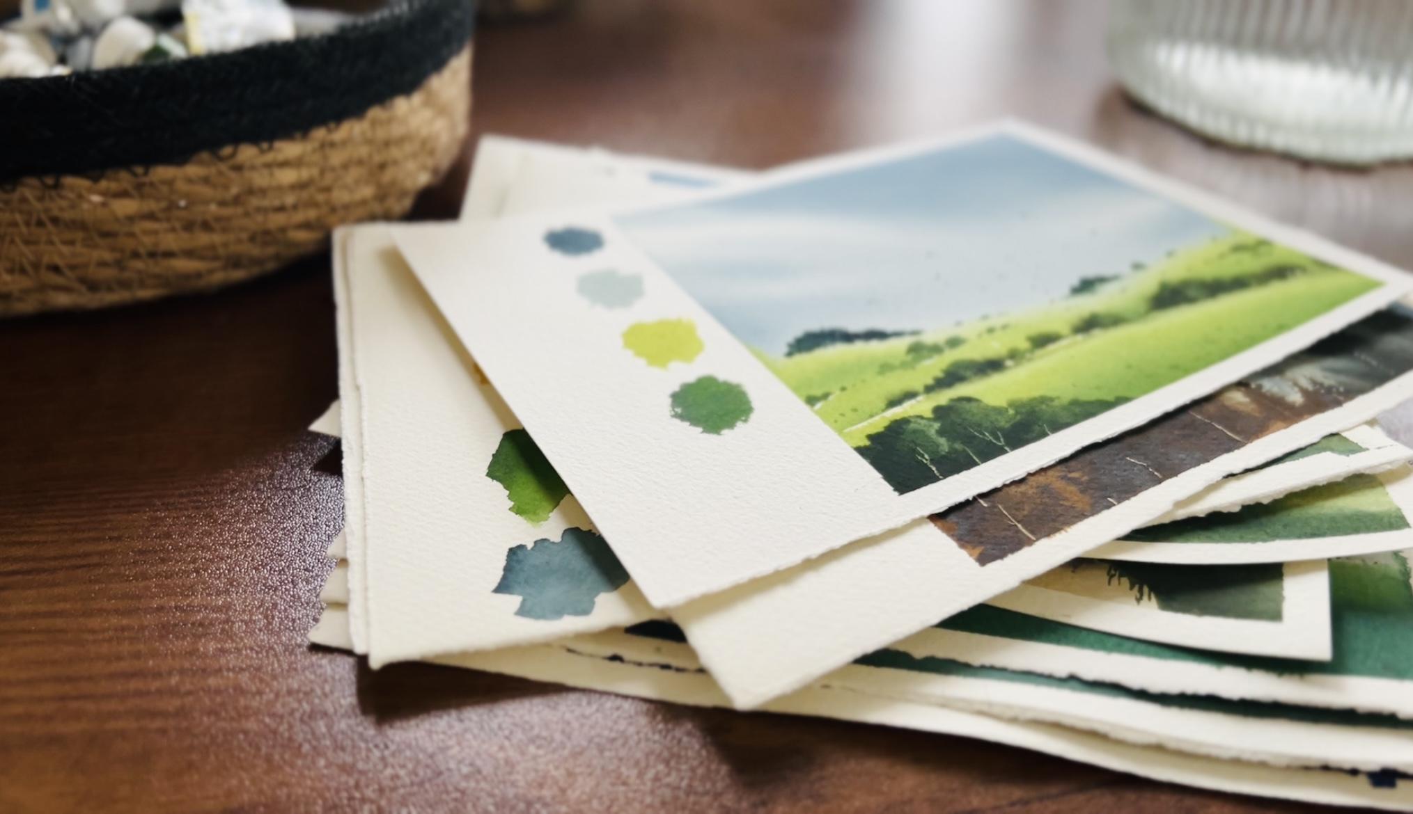
3. Materials you'll need: Before moving to the challenge, let's see the materials
we need for this class. So I'll use fabriano
artistico watercolor paper, which is 100%
cotton and 300 GSM. Here I'm going to
use lose sheets. This is 11 into 15 ", and I have already cut it
down into A five sizes. It's almost 19 into
14 centimeters. Yeah. You can use any
brand of watercolor paper with 300 JSM thickness and
100% cotton and cold press. Fabino artistico watercolor
paper is one of my favorite. I love this texture of
this called press paper. This is how I'm going
to paint on it. I'll use it like
a square 13 into 13 centimeters
square for painting. And the other part, I'm
going to swash the colors. It's almost like poloids. You can also tap down your paper like this before each painting, or you can use square sheets. Yeah. Okay, now, let's
see the brushes. So for wetting the paper, I'll use this wash
brush by Princeton, which is perfect for when you're painting on small size papers. Yeah, you can also use a little bigger flat
brush that you have, or you can also use a
hake brush like this. This is 30 MM si. And the main bridge I'm going
to use for the paintings, this medium size round brush. This is by artif. It's size
12 and also very pointy tip. You can use a round
brush or a more bridge. And I will also use this medium size flat
brush, this size ten, and some other brushes
I'm going to use are a small size angle brush
and a filled but brush, which is not necessary. And for the details, I'll use this rigor brush. This by Paulina bright
and a small size, flat brush, mainly for
lifting and one detailer. Yeah. So these are the
brushes I'm going to use. And we'll also need a scale and a pencil
and eraser. Yeah. Always remember that, you
can use whatever you have. You don't have to choose all the same brands or
materials I'm using. I'm just showing all this for an idea for you to
refer. So yeah. I'll also use my head dryer to dry up layers in
between the painting, which is necessary
because we will work on multiple layers
for some projects. So to speed up the
process and to save time, you can use a head dryer. Yeah. And this is the
mixing palette I'm using. This is a metal palette. You can use whatever you have. Maybe a ceramic plate or
a dinner plate will work. So I think metal
or ceramic surface will be easier to mix colors. Yeah, instead of using
plastic palettes. Now, for the colors, you will see the colors before
we start each painting. I'll show you all the colors and details before each
project. So yeah. And we'll also need
one jar of water, maybe two jars to rinse your brush and to use
clean water for painting. And also, we'll need
one cotton cloth or some tissues to wipe your
brush in between painting. And I'll also use a masking
tape to stretch the paper. So these are the basic materials
we need for the class. So let's start. I'll see
you in the next video.
4. Day 1 - Blue Mountains: Hello, everyone. Welcome to
our day one class project. This is the picture
we're going to paint. We will start with a
very simple project. We will paint a
very simple sky and then some mountain layers
and some pine trees. So yeah, I hope you're ready
for this ten day challenge. So yeah, let's start. Okay, so first let's
see the colors I have used for this painting. So for the sky, I
used Naples yellow. Here, when I was watching, it's already mixed
with some indigo. That's why it looks a
little more darker. And I also mix naples yellow with vermilion and
also lemon yellow. And for the mountain, I used a mix of indigo
and ultramarine. And for the very
foreground details, I also used oxide black. For some fine
details around here, I used opaque white. So these are the
colors I used for this painting, and let's start. Okay, so for this, we're going to paint
without sketching. We're going to paint directly. So yeah, I'm going to, uh, wet the whole paper. As you can see here, I'm leaving a little space here,
four color swatches. So yeah, I just
mastered it with tape. Yeah. So I'm just using a lot of water to
start the first layer. Yeah. I'm using a little
bigger flat brush. This is a wash
brush by Princeton. This is the brush I'm going to use for all these projects. Yeah. First, for the sky, I'm going to use naples yellow. Yeah. And to make it a
little more warmer, I'm going to mix
it with vermilion. Yeah, a nice beach shade. Maybe I'll mix it with
some lemon yellow. Yeah, that's enough. And with that color, I'm going to just fill the
upper part of the paper. Yeah. Just add your color
very loosely. We don't have any plan to make clouds or any
special effects. Yeah, we're just filling
the color on the paper. Yeah, maybe I will make it a little more
darker around here. So I'll mix more naples
silo and some vermilion, more vermilion and some nipples
yellow and lemon yellow. And with that color,
I'm going to add a little more darker effects
here. Yeah. That's it. It's okay if your colors
are spreading downward. We will cover all these
parts with lots of layers. Yeah. That's enough for the sky. So now I'm going to dry
this layer with head dryer. Yeah, that's it. Now my
paper is completely dry, and let's start
painting the mountains. So for the mountain, I'm going to use a mix of
intigo and ultramarine. Yeah. I need a little darker but
still cool blue shade. So again, I'm going
to use a lot of water because we're
going to start with very lighter layers
and then we'll come to the foreground
with more dark layers. Yeah. So for the first layer, I'm going to use a lot of water to this indigo
and ultramarine mix. And you can paint the mountain lines in
any shape you want. Yeah. So I'm going to
start it like this. You just have to elevate
your mountain lines. Yeah. That's it. And now I'm going to fill
the entire down part. Yeah. Yeah. I think let's make it
a little more higher. Yeah. You can just shake your brush
like this to make it more natural. Yeah. That's it. Now I'm going to
again dry this layer. You can also wait for
some time to get it dried if you're not
using hair dryer. Okay. Now I'm going to mix
a little more darker color. Yeah, indigo and ultramarine
and not very dark. You just have to
make it a little darker compared to
this one. Yeah. And I'm going to make
another layer of mountain just going around
the previous layer. Yeah. Again, you can
make different shapes for the mountain without completely covering this
previous layer. Yeah. And again, covering it
tenderly. Yeah, that's it. And let's try this layer again, or you can wait for some time. You have to confirm this layer
is completely dry before adding more layers of mountain. Yeah. So otherwise, you will
not get this sharp line. So I'm going to mix a
little more darker, mix of indigo and ultramarine. And let's paint another
layer of mountain. Yeah, I'm going to
start from here. And I'm just
elevating this line. Yeah. And again, I'm
just filling this spot. I said, maybe let's add a little more darker effects for the mountain here and there. Yeah. That's enough. And again, let's dry this layer. Okay, now I'm going to
start with another layer, which is a little more darker. Yeah. So I'm going to mix it with very little
water and more paint. That is ultramarine and indigo. I'm using more ultramarine
and little indigo. Yeah. And just another little
darker layer of mountain. Yeah, which is going to be
a little more near to us. So yeah, let's make
it a little more darker because watercolor
will dry lighter, you know. So yeah. Yeah, that's it.
By using a lot of layers and lighter
and darker shades, we can create a kind of
nice depth to the painting. Again, I'm going
to try this layer. Okay. Now let's go for
the final two layers. So I'm going to
mix very dark um, mix of intigo and ultramarine. And yeah, I'm going
to start from here. Yeah. And I'm just shaking my brush to make
it a little wee wee. Yeah. That's it. And, uh, yeah. That's it. It's a
very simple process. Anyone can paint it. If you have a head drier, yeah. The only thing you have to notice that you should not cover the previous layer of mountains when you
paint more layers, you just have to leave
it like that to get that view or effect
depth for the painting. Yeah. That's it. Now again, I'm going to dry this layer. Now let's go for the
final layer of mountains. I'm just using indigo and I'm
going to make it very dark. And yeah. I'm not using that much water. Yeah. Yeah, that's it. And I'm trying to make it more curvy. Yeah. I think that's enough.
That's perfect. Let's dry this layer also. That's enough for the mountains. Now, let's add some pine
trees in the foreground. So I'm using this detailer. You can use a small size brush, and I'm just using indigo again. Very thick paint. I'm
not using any water. And, uh, I'm going to
add one from here. Yeah, starting with a very
thin line vertically. Yeah. And let's add some leaves and branches and
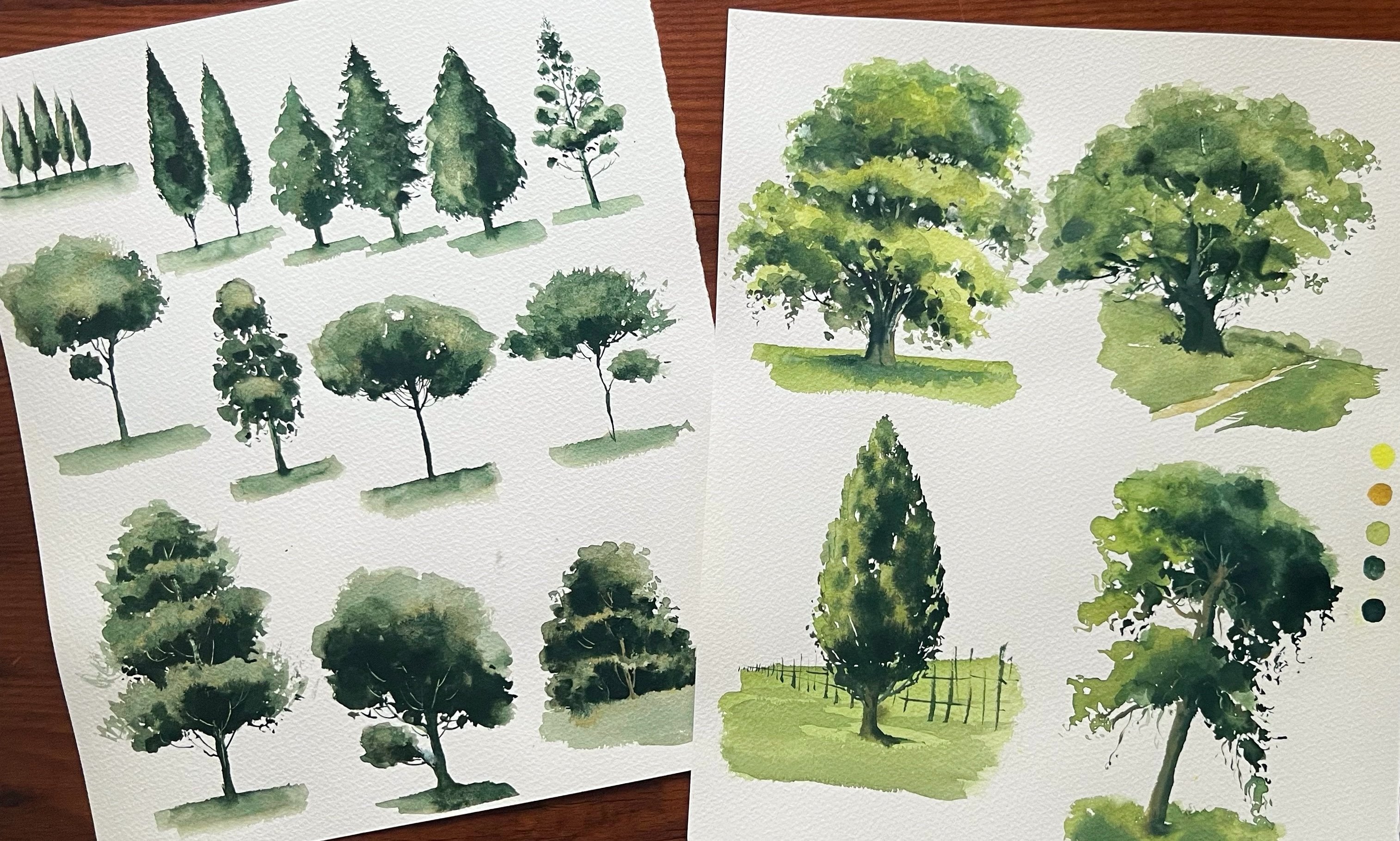
make it into a nice tree. You can also check
out my previous class all about painting
watercolor trees. There are pine trees, oak tree and many other types of trees. How to use different types of brtrops or different brushes. You'll learn many things. I'm going to make some
branches sidewise. Yeah. We can just leave some
gap here and there, don't cover it endily with
lots of branches or leaves. Yeah. You can start
a line like this. Yeah, and then add some leaves. So downward strokes. Yeah. The other side also Yeah, I'm going for more, little thicker and
bigger strokes for the down part of the tree. You had to make it a
little more crispier for the top part and more looser and thicker
for the down part. So you'll get nice
effect for the tree. Yeah. That's it. I'll make
it a little more detailed for this spot. It's very important
to not overwork, especially when we
paint pine trees. Now, let's paint
some more trees. Yeah. Let me to
paint one from here. Yeah. I'll start from here. And let's go for the
sidewise strokes. You just have to
paint it loosely so you'll get some nice
natural effect. When you're painting one
by one very carefully, it will not be natural
or asymmetrical kind of effect. Yeah. I think we can also use black. So you'll get more darker. In this making it a little
more sharper for the purport. I think I'm going
to use this brush. Let's make it a little more
sharp for the upper part. You have to control
how much paint or water is there on your brush. It's very important when
we paint crisp details. I mean, thin details
with a bigger brush. Now let's paint one
tree around here. Yeah. So I'm using a mix of
oxide black and indigo. Yeah. I'm going to paint
a very tall tree here. I'm going to start from here. Yeah, you can see the line
I'm adding. It's very thin. Also, even you can
use a fine liner and then you can add these sidewise
details with your brush. Yeah, I'm just adding more thicker branches and
leaves as it coming downward. Sometimes it's very
therapeutic to paint this kind of details, but sometimes a little anxious. Yeah. But yeah, still, the final look
will be beautiful. Yeah, that's what we keep
going with the painting. Yeah. That's it. Maybe let's add some tiny, tiny dots here and there. Yeah. Maybe here. Actually, pinning sil
hots is very easy, but for me, it's a
little challenging. I mostly enjoy painting
bright scenes, bright sunny scenes. That's it. I think I want to make that
tree a little more visible. So maybe I'll make
some apa white. And let's see, I'm just going
to add some effects here. Like some highlights or
yeah, very tiny lines. Without overworking. Yeah. Maybe some
light reflections. Yeah. This side also. Yeah, that's enough. I will add one more tree. Okay, around here,
which is very small. And also very loosely
I'm adding it because we don't
want to make it that detail since it's
in the background. I think you'll add one more. And I'm going to blend that down pot with the mountain
layer. That's it. Let's add some more lines
here. Yeah, like that. Some very distant trees. I'm just adding some small
lines vertically. That's it. I'm stopping it here. You can see that layer of mountains is giving a lot
of depth to the painting. So yeah, let's see
the final look. Now I'm going to swatch
all these colors here. So first, we have
used naples yellow. Yeah. We have also
used vermilion. It can make it like
a round swatch, like in a circle and
just making it loosely. Now I'm going to
swatch lemon yellow. For the mountains, we have used indigo and also ultramarine. And also, I used oxide black and the very foreground
for the trees, especially. That's it. So I hope you enjoyed our
day one class project. So yeah, see you tomorrow
with a new project. Bye.
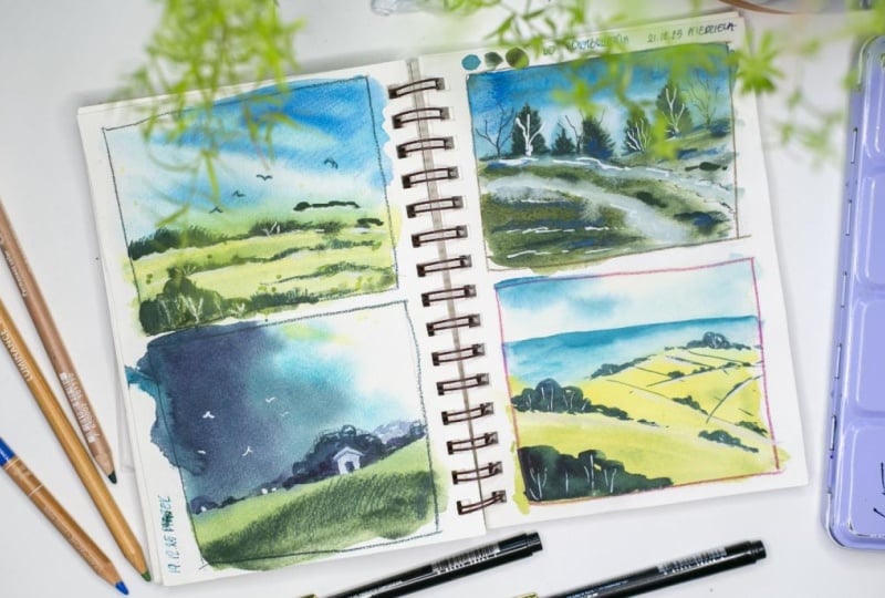
5. Day 2 - Spring Hills: Hello, welcome to day
two Glass Project. And today, we'll paint
this simple landscape with some rolling hills and
trees under a soft sky. So yeah, let's see the colors. For this sky, I'll use
indigo, a pack white. I'll use a mix of both to
get a soft and moody sky. And for the land part, I'll use lemon yellow and sap green. And for the trees,
I'll use sap green, indigo, and some van **** brown. I forgot to add that color here. So please remember to keep any dark brown shade that you have before
we start painting. I'm going to paint directly
without any sketching. So yeah, I'm just wetting the whole paper
with a flat brush. Yeah, I'm just rubbing
my brush on the paper multiple times to get
an even layer of water. And we'll start with some wet on wet layers for the sky
and the land part. So yeah, I'm mixing indigo and opaq white
with some water, and I'm going to paint
the sky from one corner. Yeah. Loosely, adding
the colors for the sky. I'm not going to make any
clouds or any special effects. And also making it a little
lighter as it's coming downward and more darker
in the upper corners. Yeah. That's enough for the sky, very simple sky effects. Now I'm wiping all the
water and paint from the down part of the
paper to paint the land. So for the land part,
I'm mixing lemon yellow, and sap green, adding some
water to make it a thin mix, and I'm going to paint the land. Like, we're going to
paint some rolling hills. So here I'm making
some curvy shapes. Yeah. We have already wiped
all water from that part, so it's almost like wet on dry. Yeah. And by leaving
a little gap there, I'm just going for another curvy shape or
that thicker strok. Again, I'm going for
another one by leaving a small white line
in between that. That's where we will
paint the trees. And also, I'm just
filling it here and there to make it like
a very thin line. Yeah. Now I'm mixing sap green, indigo and some van **** brown to get a very dark green color. And I'm just painting some shadows to
these rolling hills. So we will get that
correct shape for the hills or that
dimensional effect. Yeah, just adding some little
darker green, wet on wet. Now I'm going to
paint the trees. So I need a very thick mix of Vandyck brown and indigo
with sap green. Yeah. I'm not mixing it
with too much water. So now I'm painting some wet on wet trees just on
that white lines. Yeah, some blobs of colors. You can paint it very loosely. Yeah, and you have
to keep it a little bigger and thicker once
in the foreground. As it going away, you can
make it more smaller in size. Also, I'm just wiping that paint spreading downward
from that white lines. So the down part of the trees
should be a little sharper. Yeah. Okay, now I'm drying
this layer with my head dryer, and then we'll paint more
details if I don't dry. I wanted to work on the trees to make it a little
more sharper, so I'm going to paint
another layer for the trees. Yeah, I'm just shaping
it here and there, like, with some thicker
round kind of strokes. Yeah. Also, I'm going for
the distant trees, focusing on the top part of
the trees and making it a little sharper with some
small curvy shapes. Yeah. I wanted to wipe some colors
from their foreground trees. It looks very dark. So I'm just trying to make some light effects
because it's still wet. It will not work if
it's completely dry. Yeah, now my favorite
part is painting some very distant trees that is going to create that
depth to the landscape. So I'm just making some tiny, small semicircle marks
for the distant trees. Yeah, just using the tip of
my brush and just bending it gently so we can create that small semicircle shapes
for the distant trees. By adding more and more of them, the landscape is looking more
detailed and interesting. You have to think like
you're painting some shapes, not trees or anything
that is realistic. You're just making some marks or some kind of shapes loosely. Yeah. And painting it
in different sizes like some very tiny marks or trees and little bigger
ones here and there. Yeah. So we'll get that depth. Reworking or reshaping the
trees again and again. And now I'm going to
splatter some paint in the very foreground for some kind of illusion
for some tiny details. Yeah. Now I'm going to scratch some paint from
the trees for tree trunks. So I'm using a paper knife and just scratching some
paint that is still dry, sorry, wet because
scratching will work only wet paint or
wet surface. Yeah. Now you can see that
white lines in the trees. That is like tree trunks and trees are looking
more realistic. So yeah, now I'm going
to paint some birds. That is a final step
in this painting. Again, that is not
with any darker color. I'm just using the same
mix of colors we used for the sky that is indigo
and or pack white. So yeah, I don't want to make the birds
that much visible. Yeah. That's it. We are almost done
with the painting and just fixing some more trees. I'm just making some
trees a little more bigger that is in the distance. Yeah. And also, I'm
lifting some colors from there to make that line a little more visible and sharper. So we're done with the painting. Now, let's say the final look. I'm going to peel off the tape. I'm just swatching all
the colors I used for this painting that is
indigo and opaque white, and we have used lemon yellow. All colors I'm swatching
from the palette. That's why it looks
a little different. So yeah, that is the
final look of a painting. I hope it was a simple and
easy to follow project. So yeah, I'll see you in the next clutch
project tomorrow. Bye.
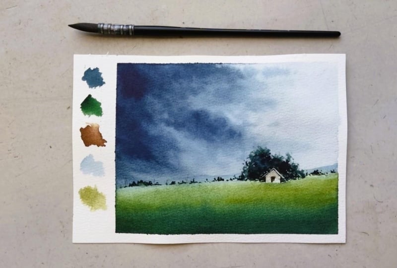
6. Day 3 - Storm Sky: Hello. Welcome
back to Day three. And today, we're going to paint this beautiful
countryside landscape with a house and some trees in the distance and under a
beautiful, dark, cloudy sky. So it's also one of my favorite from all these paintings
in this challenge. So let's see the colors. I'll use indigo and
permanent green, Vandyk brown, burn
temper, and Opaq white. I'll use a mix of
indigo and Opaq white. Same like our previous
painting for the sky. And for the house also, I'll use Opaq white. For the land part and trees, I'll use permanent
green and indigo. Yeah. And here, again, I'm going to start painting
without sketching. So I'm directly
wetting the paper, and first I'm going to paint
the sky or that dark clouds. So I'm using a small
size flat brush, and I'm mixing indigo, a pack white, and some
van **** brown to make it a little darker
moody kind of effect. So I'm just painting
from one corner and, I want to leave some white
space to the right corner. So I'm just making some cloudy kind of
effect, wet on wet. And as it's going down, I'm just making
some narrow lines horizontally also for some
very distinct clouds, and I'm also controlling that wetness or
moist from my brist. Yeah. So I can spread the
colors very gently. Yeah. So you have to keep
a tissue paper or a cotton cloth on your left hand if you're
painting with your right hand. So you can wipe in
between the painting. And again, I'm going with
another layer to make it very darker in
the upper corner. So I'm just painting
with indigo. I'm directly painting with
indigo without mixing water, so we'll get that
darker vibrant effect. And also, I don't want to spread this dark color to
the right side of the paper because I want to keep that space white to get
that sunlight effect. But still, I want to make some small and light
cloud affix there. So I'm just spreading
colors there very gently by wiping my brush on the tissue paper,
as you can see here. Yeah, now you can see that
small little clouds there. Yeah. So we will get that depth so it's very important to use a dam brush to
paint these clouds because too much water on
your brush will not work. Again, I have painted a little darker layer for those clouds to get
that shadow effect, for the left side. In watercolor, working on
layers by lifting and adding more colors is the
only way to get depth and dimension
to the painting. So you can always start
with bigger shapes, and then you can shape it with some smaller tiny
details here and there. So yeah, Okay, that's
enough for the sky. Now let's start
painting the land part. For that, I'm mixing permanent
green and maple silo. Also, you can use maybe yellowcre which is
almost similar. And with that color, I'm
just filling that land part. Yeah, lose filling. And to make it a little
darker for the foreground, I'm going to add some indigo. Yeah, you can see here. Actually, it is indigo
and Vandyck brown mix. Yeah. With that, I'm
just making some shadows or some darker effix in
the very foreground. And that's enough
for the land part, and I'm drying this layer completely to paint
more details. Okay, now I'm
switching my brush to this round one to
paint the details. We have used a medium
size flat brush for painting the
clouds and land part. Yeah. Now, with that, I'm going to paint some trees just around
the horizon line. So I'm using a mix of vandyke brown and permanent
green with indigo, which is almost
like black color. So with that color,
I'm just making some very tiny marks around the horizon
line for some trees. Yeah, I'm going for some very tiny trees
and little bigger ones. Yeah, making some marks. Think like you're painting some shapes or
some tiny strucks, not trace or anything
realistic. Yeah. So you can follow that kind
of shape for this trace. Also, you can see we are
painting wet on dry paper. So we'll get that correct
sharp shape for these trees. I'm just going for
little thicker trees for the right side. Yeah. Now I want to add a blurry mountain line
in the background, just about the horizontal line. So with light indigo mix, I'm going to add a small line
just about that land part. And I'm keeping it very thin since it's in
the background, and I'm trying not to overwork. Still, for both sides, I'm making it a little
higher as you can see here. Yeah. You can also
skip this part. If you don't want to
paint this mountains, you can just add the
land part in some trees. Yeah. I'm just adding a small mountain in the background with
very lighter colors, just going around that
trees carefully yeah. You can also paint the mountain line before
adding the trees. I felt like adding a mountain line after I
painted the trees here, just going with the flow. And as you can see here, I'm making it a
little higher for both sides and for
the center part, I'm keeping it very thin. Yeah. If you are
finding it difficult, you can skip this part. Yeah. Or if you're watching the video before
starting to paint, you can also paint the
mountain line first. Then you can add the trees. Now I'm adding more
tiny, tiny trees, just some very tiny dots using
only the tip of my brush and making it little bigger
ones here and there. Yeah. Okay, now I'm going to add a house in front of that bigger tree we
painted on the right side. So I'm using a pack white, or even you can also
use masking tape or masking floyd before
we start painting, and then you can remove it. And you will get a white space there and you can
paint the house. That's also fine. But I think for big nurse, this
would be better. So you can use white paint
or you can use white gauche, and you have to paint
a small house there, starting with a square, and then you can make a triangle
shape for the top part. Let it dry, then we'll
add a door to that house. And also remember to use very thick white paint
to paint this house, and the paper should
be completely dry so we can paint easily. Now, I'm also adding
some birds on that beautiful dark clouds
using the same white paint, which will definitely enhance the overall look of
landscape painting. Now, I'm adding the
details for that house, which is a symbol door. And also, I'm just making it a little more darker
around that house. To make it contrasting. Yeah. Just working
on that trees. I just want to make
it a little more higher the trees
around the house. Yeah. So I'm using dry
on almost dry technique, and I'm using the
same mix of green, permanent green, indigo
and Vandyke brown. You have to use a mix of
almost similar colors. Don't use black from
the tube directly. So yeah. Then only we'll get that harmonies look
for the painting. Even if you have to paint
with very darker colors, you just have to mix
almost same colors we used for the painting. Yeah. Now, again, I'm just
working on that house. Yeah, using a little
more white paint, and I'm again shaping it. Adding a small, sharp line, step out of the
house for that roof. Yeah, I'm using a
detailer brush. Yeah. When we paint with opaque color, especially with gauche, it
will dry in a dull look. So here I'm going
for another layer of white paint for
that house. Yeah. Now I'm adding some tiny vertical lines in
the background, maybe some electric post
or something like that. Like, you know, we're
creating a kind of illusion that something is
there in the background, some kind of elements are there. Yeah. I feel like working on
the trees behind that house. I want to make it a
little more higher. So I'm using the same detailer, and as you can see here, I'm just scratching my brush over there to get that
dry on dry effect, using the same mix of
colors and scratching my brush over the paper to get that dry effect for the bushes or the trees
in the background. Yeah. Finally, adding more
birds with white paint. Yeah, I'm adding one tiny
bird just about that trees. Yeah, that is the final
result of our painting. Yeah. I'm just swatching
all the colors we used. That is indico permanent green, and we have used Vandyke
brown and also burn temper. I have used burned
timber for that house, and especially for the door. I forgot to mention that. And also, we used a pack white. So, yeah, that was a very
beautiful project today. I hope you enjoyed it. And I really like this one, the clouds and the trees
and house. I love it. So, yeah, I'll see you tomorrow with the new project. Bye.
7. Day 4 - Misty Morning Slopes: Hello. Welcome to
today's painting, and I'm so happy that we
are here on day four. I'm a little feverish today. That's why my sound
is different. So yeah, let's see the
colors for this painting. So I'm going to use Indigo
and Opaq white for the sky. And for the land
part, I'm going to use Davis gray mainly. That is the color I'm
going to use today. And also, I'll mix Vandyke brown to make
it a little darker, especially for the
trees and some details. So Davy's gray is the main
color for today's painting. If you don't have that color, you can also use olive
green and to mute it down, you can mix it
with a gray shade, maybe neutral tint or pink gray. So you'll get almost
same like this color. Now, here I'm going to paint the sky directly
without sketching, and I have already wet my paper. And yeah, I'm just
loosely adding the mix of a pack white
and indigo for the sky. Just loosely moving my
brush horizontally. We're going to make
a little foggy kind of effect for the sky, so we're not going to paint any clouds or any
special effects, loosely adding this color
to the sky, wet on wet. Now let's squeeze out some
Davis gray to the palette, and let's start
painting the land part. Before that, I want to make that sky a little more
smoother and even layer. So I'm just rubbing my brush, wash brush by Princeton. And reworking on the sky to
make it like an even layer. Yeah. I'm making it a little more darker for
the upper corners, lighter as it coming downward. And directly, I'm going to
start painting the land part. For that, I'm just mixing
Davis gray with some water. Again, not very loose mix. And I'm painting a
small curvy shape or a hill part in
the foreground. Yeah. And for the other side, also, I'm going to
make a small hill just using the same color. Get that foggy effect, I'm trying to make the foreground details
a little more darker. And as it's going away, the background details a little
more lighter and blurry. Yeah. Reworking on the
hill again to make it like some shadows and lights
for that dimension effect. Yeah. Just adding
some more thick paint here and there to get a
little darker effect. And now I'm mixing
van **** brown to David's gray and making it more darker to the very foreground, maybe for some shadows or some kind of texture
on the hills. Yeah. And also, I'm leaving a little gap between both hills
to get that light effect. Yeah. Now you can see that
rolling hill effect. Yeah. As you can see here, I'm lifting and adding
more colours to these hills to get it
into a nice shape, and my paper is still wet, so I can lift colors
and add more layers. Yeah. And also, I'm using a tissue paper to wipe my
brush in between the painting. Yeah. Okay, that's enough. Now let's paint some
background trees. So for that, I'm mixing
indigo and opaque white, and my paper is still wet. So we're going to paint
wet on wet trees. Yeah, I'm just painting
some pine trees, just loosely making
some pine trees. Yeah. Just going for the bigger shapes and then making some details. Yeah. You can start
with a vertical line, and then you can add
some sidewise lines or strokes to make it into
a little detailed look. Anyways, it will be in the way background and
it will be blurry, so you don't have to
worry about details. You're just adding some darker
colors or effect there. And I'm also making
it more sharper and tiny towards the center, but in more taller
trees on both sides. And also, you can see that
I'm controlling the moist from my brush using a tissue
paper on my other hand. So you can also keep
a tissue paper or a cotton cloth on your
other hand to do the same. So we'll get that nice wet on wet effect with
good water control. I'm trying to make it a little more sharper here and there. Yeah. And always remember
that you can pose the video and paint
it in your own speed. Yeah. Now, people started drying and that's enough
for the background trees. Let's start painting some foreground trees
with Davis Gray. So with the same bridge
with the same technique, I'm painting another
layer of trees, that is going to be in the foreground with a
little more darker colors. Um, if you want detailed
class on painting trees, you can check out
my previous class, which is all about
painting pine trees, oak trees, and many other trees. And you will learn to use your
brush, in different style. Yeah, so you will get different effects for
painting trees. Yeah. Here, I'm just using
the tip only for pinning those sharp details, especially for the
top part of the tree. And for the base, I'm using a little
more thicker strokes with complete
bristles of my brush. I'm using a medium
sized round brush. Yeah, and you can see that the paint mix I'm using here is also a little
thicker, not very loose. I didn't mix it with
too much water. Yeah. It's almost like a milk consistency or
honey consistency. Yeah. Now I want to paint
some more darker trees. So I'm mixing Van ****
brown, Davis gray, and some indigo,
and I'm going to paint more taller
trees on both sides. And as you can see here, for that center part, I'm not painting taller trees. I'm making it shorter
because I don't want to block the view from there. Yeah. So we'll get that and you can always start with
bigger shapes and then go for the details, especially when we paint trees. Yeah. Now I'm painting
one more shorter, darker tree that is
almost in the center. Yeah. Also with the same color, I'm painting some details on
the hill or that land part, like some rocks, stones or some kind
of details like that. Just some semicircle marks
here and there. Yeah. Also, I'm painting it
in different sizes, some mini tiny dots and some little bigger
ones here and there. When we're painting
loose landscapes, it's always like we're
creating a kind of illusion. We are not painting
it realistically. We will make a kind of effect, and we're suggesting
to the viewer and they can loosely
interpret how they want. So we are leaving a kind of space or freedom to the viewer. So yeah, that is the beauty
of painting loosely. Now here you can
see I'm working on more details like more tiny, tiny strokes or marks
here and there. Yeah, I'm using the same
brush and same mix of colors, and I'm working on
an almost dry paper. Yeah. Now I want to add some dry branches or
trunks in between that trees. So I'm just making some very thin lines
using the same brush. You can even use a liner or a rigger brush for
the same purpose. Or also you can use
a fine liner to paint these fine sharp lines. Yeah, here, I have switched
my brush to a detailer, and I'm just making a
straight vertical line and then going for some
line side wise also. And you can see here I'm just starting with
some pressure. And as it going upward, I'm just slowly
lifting my brush back. So we can make it
a little thicker downward and more thinner
as it going upward. Yeah. I'm adding some more tiny, tiny branches and stones that marks here and there to make
it even more detailed. Yeah. And I think I want to make the trees on the right
side a little more darker. So I'm going for another
layer with the mix of indigo, **** brown and Davis gray, and I'm just making some details and some sharper
effects here and there. Now we're almost done
with the painting. And for the final step, I'm going to scratch some
paint with this pepper knife. And yeah, I'm working on the pine trees to make
some tree trunks. So I'm just scratching
some paint from the trees. And also, I'm breaking
it here and there. I'm not going for a straight
line, as you can see here. Yeah. Now you can see that
white lines on the trees. Yeah. And also, I'm just working on some more
shadows for the hills. Yeah. I think in watercolor, it's all about
working on layers. We can create beautiful effects
by working on wet on wet, wet on dry, dry on dry layers. So yeah, it's like we need some patience and
good water control, and we can create
beautiful effics. So final touches
on the pine trees. You can always look
at your painting from a little distance so
you will know where you have to add more details
or if you want to lift some colors or some paint,
you can also do that. Now, that is the final
result of our painting here and peeling of the tape. Yeah. Now I'm just swatching
all the colors we used. We used Indigo and Davis gray, which is a beautiful
green shade, a muted green, earthy shade. I love it for this
landscape painting. And we also used Vandyke
brown and Opaqu white. So, yeah, that's it. That
is today's clash project. I hope you enjoyed this session and see you tomorrow
with a new painting by.
8. Day 5 - Summer Fields: Welcome back,
everyone. And today, we're going to paint this calm, breezy countryside
landscape with the sea view on
the horizon line. So yeah, we are on our fifth day of painting
many watercolor landscapes. Yeah, so let's see the colors. For the sky, I'll
use cobalt blue, and for the sea view,
I'll use indigo. And for the land part, I'll use yellow ochre and sap green. And also, I'll mix indigo with sap green
to paint the trees. So these are the colors. Here I have already
taped down my paper, and I'm going to
wet the hall paper. We're going to paint
without sketching. As always, I'm just rubbing
my brush multiple times on my paper to get it into an
ice even layer of water. So now I'm going
to paint the sky directly with cobalt blue, just starting from the
top part of the paper and just going down by
blending the colors, making it more darker for
the upper part of the paper. Yeah, I'm just loosely moving
my brush horizontally. Again, we're painting
a very low sky, so you can just add some
colors that is cobalt blue. Loosely, yeah, just
a plain bright sky. Now I'm mixing locre and sap green for
painting the land part, starting with the curvy line for the foreground
hill part and just loosely filling colors there that is yellocre
and sap green mix. And for the very foreground, I'm just adding some indigo
to make it a little darker. Yeah. Now I'm going for another hill section that is going to be in the midground. Yeah, I'm just painting loosely a small curvy line
there and filling it without overlapping
the foreground hill part. Again, I'm just making it a little more darker
for the shadows. Yeah. We have already
painted something similar. I think that is the
second clash project. Now, you can see that
little white line between the foreground hill
section and the other one. I'm lifting some colors from
there for some highlights for the hills to get
the dimensional effect. Yeah. I'm doing it very
gently and also I'm wiping the lifted paint
on a cotton cloth. Yeah. I'm using my flat
brush for lifting. Now, I'm drying this
layer with head dryer. Yeah. Now I'm going to mix indigo and sap green to
start painting the trees. So we're going to
paint the trees as we painted in the second
class project, just making some marks, like, very loosely using a
medium sized round brush, as you can see here,
trying to create some round circular
kind of brush stroks. And as you can see here, I started with bigger shapes, then I'm going for some details like some very
tiny dots and strokes. And I felt like it's too dark, so I'm wiping some colors from that tree with
a tissue paper. And then, again, I'm shaping it like maybe some
lights and shadows. Yeah, I don't want to
leave it, like, very flat. And I'm again working on
the top part of the tree to make it a little more detailed
here and there. Yeah. Now I'm mixing some
more yellocre s naples yellow with indigo, and I'm going for more trees. Yeah. Loosely, adding the trees. Don't stress out. You can
just paint it loosely. And always remember
that you can paint in your own speed by
posting the video. You don't have to
rush out if I'm painting fastly
compared to your speed. Yeah. And one more thing I
want to remind you that you can always take a step back and look at your painting
from a little distance. That always helps me understand how everything
comes together. And if I want to rework on something or if I
want to add something more, I'll get many ideas. When I take a step back.
Yeah. Coming to the work, here I'm painting a lot of trees on the hills
in different sizes, as you can see here,
some very tiny dots and some little bigger ones, and in the foreground,
very bigger trees. Now I'm going for some lines on the hills in
different directions, as you can see here, I'm painting it from
different directions. Yeah, I'm just trying to make
some kind of square shapes, and I'll paint more tiny, tiny trees on those lines. So you'll get some
depth to the landscape. Yeah. Here for
painting the trees, I'm using only the tip of
my round brush and bending it gently to make that
tiny semicircle marks. And again, remember that you're painting some marks
or some shaves, not trees or anything realistic. Yeah. With that mindset, we can paint tiny,
tiny details easily. Here I'm painting
small tiny dots and marks on those lines. Yeah, and you can
see the painting is coming together slowly. And also I'm painting some trees on that
outline of the hill. Yeah. So bigger ones
and some smaller ones. By adding more and more of
this tiny marks and dots, you can create beautiful
depth painting slowly. Yeah. We're almost done with hills and trees. And now let's paint a sea
view in the background. So for that, here, I'm using a roller, and that was a flop. So please don't use roller. You can use masking tape. You can dry your
paper completely, and then you can use
masking tape and you can paint a straight line
there just about the hill. Here you can see I didn't
get a straight line. Yeah. And I'm trying to work
on it to make it straight. Yeah, here you can see, I
just added a straight line. Then I'm blending it
downward with clear water. Yeah, because we don't want to make it that darker
towards the hill part. So we'll get that contrast between the trees
and the sea view. Yeah. And for painting, the sea, I used cobalt blue
and indigo mix. Yeah. Now I'm reworking
on that side of trees. Yeah, I'm just making it a little more darker
with another layer. Reworking on the trees again and adding some more
dots here and there. Now I'm going to add
some tree trunks, especially for the
foreground trees. So for that here, I'm
going to use opaque white. Usually, I do scratching, but the paper is
completely dry now, so I'm using white paint and just adding some
very thin lines there. Yeah. You have to take
very thick paint. Otherwise, opaque paint
will dry in a dull look. So when you're taking
little thicker paint, you can still keep it brighter. Yeah. I'm adding
some white lines for the distant trees also. Yeah, we're almost done
with the painting. That's it now. Let's
see the final look. I'm going to peel off the tape. Yeah. I hope this project was relaxing and a
simple painting. I hope you enjoyed
painting along with me. If you have any doubts or
anything you want to know, you can always ask in
the discussion box. I will replay as
soon as possible. Or you can also contact
me on my Instagram. I'll always message you
as soon as possible. Here, for the colors, I used cobalt blue, indigo, and yelloca
and sap green. With this four colors, we painted a
beautiful landscape. So that's it for today. I'll see you with a new
painting tomorrow. Bye.
9. Day 6 - Misty Dawn: Hello, everyone. Welcome
to today's class project, and, yeah, we are already
halfway through the challenge. And for day six, we're going to paint a
foggy landscape with a tree and a blurry sunset in the background. So
let's see the colors. I'll use indigo, gamboge
and John Brilliant, lemon yellow, sap
green, and cobalt blue. Yeah, so these are
the colors we need. We just need a few
yellows and oranges and a green and a blue shade. Yeah, here, I've already
deped down my paper, and I'm going to wet
the paper completely, and we're going
to paint directly without sketching again. I always we need a very thin
layer of water on the paper, so I'm rubbing my
brush multiple times, to avoid any water
bottles. Yeah. Now I'm going to mix colors for painting the sunset
in the background. So for that, I'm using new
gamboge by Daniel Smith, and I'm going to paint the sunlight directly
with this color. Yeah, I'm going to make a
circle, as you can see here. Yeah. That's it. Now I'll fill
colors around that. You can see how I'm moving my
brush in a circular motion. And I'm going to fill the upper part of the
sky with the same color. And also, I'm mixing
gamboge with yeah, so we'll get a little peachy
shade for the sunset. And remember my paper is wet. We are working wet on wet. Yeah, I'm slowly spreading
the colors upward. Okay, now I'm going to take some cabalt blue for painting
the top part of the sky. Yeah, you don't have to
worry that the blue and yellows will make muddy
green or grayish colors. It's okay. You can go like this. Since we are working wet on wet, it will create
beautiful gray shades. That's also fine
because, you know, sunsets are very unpredictable. There are multiple colors if you are observing carefully. Yeah. I'm trying to lift
colors from the sunset continuously to keep it bright since we are
working wet on wet. Okay, now I'm mixing indigo
and opaque white with some Gabalt blue to paint some blurry effics
just under the sunset, maybe some very distant
mountains or some effects there. So yeah. And I'm
slowly spreading that colors downward to
create that foggy effect. Also, remember to keep your
brush very damp because we don't want any unmounded
particular effects. Yeah, here I'm gently spreading
that colors downward. To get that foggy effect, we usually see from
the mountaintop. So for that, I'm using a lot of water and very little
paint that is cobalt blue, and very gently spreading
that color downward. And again, I'm making some shadows or some
little darker spots by using some more paint to get that little fluffy
dimensional look for the fog. In between that,
I'm also lifting colors from the sunset
to keep it bright. Yeah, I'm again, just adding some colors here
and there to make it a little contrasting for
that blurry mountain line around the horizon line. Yeah. And also, I'm just adding some more
little darker colors around the light to keep it bright because for this
foggy landscape effect, we are painting
completely on wet paper. So it's very important
to lift and add more colors again and again
to keep it in that shape. Yeah. Now I'm going to paint the foreground details
that is a mountain top. So for that, I'm mixing
indigo and sap green. Yeah. And I'm loosely painting
a slope in the foreground. And remember my paper is still
wet, not completely dry. Um, and I want to make it a little more darker for
the very foreground, so I will add more colors there. At the same time,
I'm keeping the edge lighter to get that
dimensional effect. Yeah. And to create some
kind of texture or detail, some stones or
something like that. I'm trying to make
some darker spots with more thicker paint. That is the same
mix, sub green and intigo and as you can see here, I have tissue paper
on my left hand to wipe all extra water from
the brush because yeah, we're painting with damp brush. And now with the
same mix of colors, that is indigo and sap green. Also I mixed some Vandyk brown
to make it a little more darker compared to
the mountain slope. So with that color, I'm painting a tree just in
front of the sunlight. Yeah. The sunlight is almost blurry now because of the wet paper. We will work on it later. We'll lift colors
from there again. Here I'm painting a tree. As always, I started with a bigger shape or
a bigger stroke. Then around that, I'm
painting some smaller dots, some sharp little effixs here and there to
shape it into a tree. If you want to paint
more detailed trees, you can also check out
my previous class, which is completely
about painting trees. Here I'm using a
small flat brush, and I'm trying to lift colors from the sunlight to
keep it brighter. And again, I'm just
adding more colors there. That is gamboge and
John Brilliant. And with that, I'm just adding another layer
for the sunset. Yeah. When we're
painting wet on wet, it's very important
to work on layers. We need more patients. With this project, I hope
you will learn about water control and how
to work wet on wet. We can slowly create the
shape by adding more layers. While working on the sunlight, I'm also trying to create that sunrays heating
effect on the tree. So for that, I'm lifting
from the sunlight and going towards the tree
like in a straight line. Yeah. And in between that, I'm also wiping
the lifted colors on the tissue paper,
as you can see here. And with a detailer, I'm just making some lighter
dots here and there around that sunlight and the tree to make it a little more
detailed and interesting. Yeah, I'm using a mix of
sap green and anti coo mix, and I already mixed it with
the sunset colors we used. Yeah, with the same color, I'm just making some bushes or some trees on the edge
of that mountain slope. Paper started drying. But yeah, we can still work wet on wet. I'm trying to shave
the trees with more and more tiny
dots here and there. And we'll dry this
layer completely, and then we will add
more details wet on dry. On that edge, we're painting some bigger trees and
also some very tiny dots. So by doing that, we'll get kind of depth and detailed look for the painting. And now I'm going to add some
details to that slop, also. Yeah. So for that, I'm using
a little more thicker paint, and I'm adding some round
and loose strokes or marks. I'm just blending it
here and there to keep it not that sharp
but a little blurry, since we are painting
a foggy effect. Okay, now I'm going to work again on the background details. So I'm just using that same
intigo and cobalt blow mix, and I'm working on
that mountain line. And also, I'm just wiping all that yellow
colours spreading downward because the
paper started drying, but still it is not
completely dry, so we can fix mistakes fastly. Okay, now I'm going
to rework on the fog because we have to create
some little darker spots. We don't want to
leave it very flat. Yeah. So I'm trying
to make some very tiny, loose horizontal lines. And that is also wet on wet. We have to make it very soft
without any sharp edges. When we're painting
transient subjects like fog, smoke effect or clouds, it's very important to use
very little colors and to work wet on wet and
also to keep it soft. Um, it's like we are creating some kind of color or some
kind of shadows there. I'm again lifting some colors
from that horizonal line or that blurry mountain we added to make it a little more
sharper and visible, and I'm using my flat brush. Yeah. And I'm going for another layer for
shaping the fork. Now I'm going to dry
this layer completely, and then we will work on
some more tiny details. Yeah, here I'm going to work on the tree to make it a little
more sharper here and there. So with the same mix of colors, I'm just making some
very sharp dots and lines and strokes
here and there. Yeah, I'm just
trying to make it a little more darker and defined. Adding some light dots
also towards the sunlight. Yeah, using that yellow mixture. I'm trying to make it
a little more detailed with more lines and
dots here and there. Yeah, I'm going to paint some
dry tree trunks or stems. That is going to be
like very fine lines. Yeah, using my detailer because this mountain slope and the trees are going
to be in the foreground. So we had to make it a
little more detailed, but still in a little
foggy blurry look. That's what I'm trying
to create here. Yeah. So, yeah, we're done
with our painting, and let's see the final look. That was a beautiful foggy, simple landscape painting today. Yeah, I hope you
learned how to paint foggy effect and wet on wet
technique and water control. Yeah. So let's see colors. We used gamboge yellow. And also, I think I mixed lemon yellow for
good to add that color. And maples yellow,
red, and cobalt blue. And we used sap green
and indigo. Yeah. So these are the
basic colors we used. I think I used lemon yellow when we are
painting the sunlight. So that's it. And be ready
for Tomorrow's project, which is going to be a
little more advanced one and one of my favorite.
So see you tomorrow.
10. Day 7 - Through The Meadows: Welcome back, everyone
to day seven. So today's class project is a little exciting for
me because, you know, I love painting
countryside landscape, especially with sunny
warm atmosphere. This was very fun to paint. So let's take a look at the
colors I used for this one. I used Kobalt blue and indigo, Kobalt blue, especially
for painting the sky. And for the meadow
and the trees, I used sap green, and I used Vandyke brown to make it a little
darker for the meadow. So yeah, let's start
with a pencil sketch. I'm starting with
the horizon line, um, almost in the middle. Yeah, just a straight line. And from there, I'm
going to paint, sorry, outline the pathway. I'm keeping it narrow towards the horizon line and wider
towards the forkgwd. Now I'm adding a mid
line to the pathway. Yeah. Remember to keep it very narrow as it's going away to get that
vanishing effect. Yeah. Now let's add some
details in the foreground. I'm adding a tree branch that is leaning to the scene. Yeah. And in the distance
around the horizon line, I'm just making some
more distant trees. That's enough for the sketching. Now, let's start the painting. So for that, I'm going to start with wetting the sky part. We're going to paint a
very clear sunny sky. So for that, I'm
mixing cobalt blue, and I will add some very
loose blobs here and there. And, you know, by
adding the sky colors, we can also shape the clouds. Yeah. So here I'm using my
round brush, and with that, I'm just loosely adding some kind of round
shapes or some blobs. Going for another layer with a little more dark colors
that is cobalt blue. And remember, we are
working wet on wet. If you're feeling like
your brush is too wet, you can also wipe it on a cloth or tissue in
between the painting. Yeah. And now I just want to add some
colors for the clouds, some very light shadows. So for that, I'm mixing
naples yellow with indigo and with a very
light gray shade. I'm adding some shadows there. I don't want to leave it
bright or white color. Yeah. To paint clouds
in sky like this, it's very important to control the wetness of
your paper and brush. Here, I'm using only the water or that wetness on my paper, and I'm using a very
damp brush and wiping it on a cloth in
between painting. By doing like that, you can paint very soft looking clouds. Yeah. As you can see here, I have added one more
layer for the sky. Now I'm going to
paint the land part. So I'll start with
painting the pathway. So for that, I'm using naples yellow with
some burnt temper. Yeah. Before that, I'm
going to wet the land part. Yeah. And straightly, I'm
painting the pathway, adding the colors very loosely. I'm keeping it a
little darker towards the foreground and more
lighter as it's going heavy. Yeah. And before
the pathway dries, let's add in the meadow. So we'll get that soft looking
edge just between both. So for that, I'm mixing sap
green, and lemon yellow, and some van **** brown
to mute it down a bit. And with that mix, I'm just painting the meadow. As you can see here, I'm starting from the
foreground with some small vertical lines for that grassy texture and going
towards the foreground, sorry, horizontal
line very carefully. Now we're loosely
adding colors there, and then we will go for another layer to make it a little more darker
here and there, especially for the foreground, and we'll create some more
texture to the meadow. And you can see that I'm not adding colors towards
the horizontal line. I'm just spreading the
already painted colors there, just blending it
with some water, to keep it lighter compared
to the foreground. So we'll get that
nice perspective. Yeah. Now, to paint
another layer, especially for the foreground, I'm just mixing some sap green and indigo and also
Vandyke brown. We need a little darker, warm green shade. Yeah. And now I'm going for another layer for the
foreground part of the meadow. You can see that I'm
just painting some wet on wet vertical lines. Yeah, and loosely adding
some blobs here and there and just trying to make the edges a little more
sharper and visible. And as it going away,
I'm painting it smaller. Yeah. Again, I'm trying to make it a little more
darker to the very foreground. So I'm mixing indigo
and Van **** brown and adding some
more colors there. By adding more and more layers, we will get beautiful effects. Yeah. Now, I hope you can see that volume and dimensional look
for the meadow. So we'll use the same technique for the right side
of the meadow. Here. And also I'm trying to keep the edge
just a little more sharper. So for that, I'm just adding some very tiny vertical lines
with more darker colors. That is Vandyke
brown and indicomix and going towards
the distant part of the pathway very
carefully. Yeah. Now you can see that the pathway is coming to the shape by adding more and
more darker colors on both sides for the meadow. Yeah. Okay, that's enough
for the meadow. And now let's add some distant
trees on the horizon line. So for that, I'm
using the same mix of green that is indigo and van ****
brown with sap green, almost like a very dark
green or black shade. And with that, I'm just making some semi circles or
some marks there. And the meadow part is
still wet and you can see that the colors are bleeding
downward. That's okay. We'll get some nice effect. Since we're painting
loose landscapes, yeah, we will get beautiful
watercolor wet on wet effects. And I'm also adding some this
darker dots tree effex in the meadow making it more sharper and smaller
towards the pathway. Yeah. Just loosely adding some
dots on the meadow, I'm trying to shape
the distant trees and trying to blend
it here and there. Yeah. That's enough
for the trees. Now let's add that mid
line for the pathway. So using the same colors and
just filling that space. Yeah. You can see that I'm moving
my brush vertically for that grassy texture and making
it a little sharper for both sides and going narrow
towards the distant, part of the pathway. Yeah. And we'll add some little darker spots
on that midline later. Yeah, I'm going very
carefully to make it sharper. As it going away? And the
paper is almost dry now, so we are working on dry. And now you can
see that I'm just making some darker spots with a little more thicker
and darker paint that is Vandyke
brown and intigo. I felt like adding a little more darker colors to the foreground, so I'm using the same mix
of colors, sap green, Vandyck brown and indigo and
adding some more texture and some darker epic in the foreground that
is wet on dry. My paper is almost dry now. And you can see that I'm just
blending it here and there. Yeah, and adding some more tiny, tiny details here and there. And yeah, just
fixing some details. Okay, now I'm going
to paint that leaning tree branch
in the foreground. So for that, I'm
mixing sap grain, Van **** brown, and intigo. Again, we're using
same mix of colors. Also, I mix it some
lemon yellow to make it a little lighter because we'll start with a lighter layer, and then we'll go for
more daca layers. So as you can see here, I started with a
little bigger stroke. Then I'm going for some tiny, tiny dots and lines. Yeah. You can see how
I'm using my brush. I'm using only the tip of my brush to paint
in sharp details, and I'm using the side of the bristles to make
it a little bigger. Yeah, just giving a
little more pressure to make it a little wider
and bigger stroke. And around that, I'm
adding some tiny, tiny leaves, I mean, dots. Now I'm going for a little darker paint for another layer. As you can see here,
I'm just going for some tiny branches, yeah. Remember, you can always look at your painting from
a little distance, so you will know how
you're going with the branches and foliage
and all details. And if it's coming
together nicely, ah, here I'm painting
more and more tiny, tiny details around that. You can start with
especially to paint foliage. You can start with bigger
strokes or bigger shapes, and then you can paint some
tiny details around that. So you'll get some nice effects. So now on that lighter layer, I'm going with some
darker paint, you know, to kind of shadow or some
little darker effects. That's it. Now, let's
go for the final step that is painting the
shadows on that pathway. So for that, I'm mixing cobalt blue and
some naples yellow, and I'm trying to get a little cooler, light, grayish shade. Yeah. And with that, I'm just painting some shadows. I'm going very carefully. Yeah. I'm using a tissue paper to control the moist
from my brush. Yeah, I'm just adding
some loose light strokes. Yeah. I'm making it a little
darker here and there and a little lighter and smaller
dots here and there. Yeah. And also, I will paint
the shadows on that meadow, not only on the pathway, yeah. So when you're painting shadows, one thing you have to
be careful is that you need to mix very
lighter colors, and then slowly, you can
make it a little darker. But first, we have to start
with very lighter colors. You know, we're
painting shadows. We can see through. So to get that
transparent effect, we have to keep it very lighter. And then you can
make it a little darker here and there. Yeah. So for the first layer,
keep it very lighter. Here I'm trying to blend
it here and there, especially for the foreground. Now I'm mixing a little
more darker colors. That is, again, cobalt
blue and naples yellow, and I'm going to paint that shadow continuation
to the meadow, just going with
some light strokes. Yeah. That's the foreshadows. Now I want to make the
foreground a little more darker because you know what color will dry
lighter in color, so we can go for more layers. Yeah. So here I'm working on that foreground to make
it a little more darker. And. And with a flat brush, I'm trying to lift some colors from that darker layer we added. And also, I'm trying
to shape it here and there and fixing some details. Now we're done
with the painting, and let's peel off the tape, and let's see the final look, and we also have to swatch
the colors we used. I used cobalt blue, indigo, sap green and yellow or Aprils
yellow and van **** brown. So yeah, that was a very
beautiful class project today. I hope you enjoyed it. If anything was difficult for
you to paint along with me, this class project, you can always ask in the
discussion box. I'm always here to help. So yeah, see you tomorrow
with the new project. Bye.
11. Day 8 - Moonlit Pathway: Hey, everyone.
Welcome to Day eight. Today we'll paint this
beautiful nocturnal landscape. We'll learn to paint
the glowing moonlight and beautiful tree and
a simple landscape. So let's see the colors. I'll use naples
yellow, red by vanco. You can also use John Brilliant
number two by Shinhan, which is also similar
to that shade. And the next color I'm
going to use is lilac, which is also
similar to lavender. So you can use that color. And the next color we're
going to use is ultramarine, and we'll also need indigo and Van **** brown
for the landscape. So these are the colors. Okay, I hope you're
ready for the painting. Let's start with
a simple sketch. So here I'm fixing a
horizon line very low. And I'm going to add a very distant mountain line
just above the horizon line. Yeah. Now I'm adding
a small pathway. So as always, I'm keeping
it narrow as it going away and making it more wider
towards the foreground. Yeah. That's it. Now, I'll add a
mid line for that pathway. Now, let's start
some distant trees around the horizon line. So I'm just adding some
marks like some semicircles. That's enough for sketching. Now, let's start the painting. Here I'm going to wet
the sky part only. I mean the upper
part of the paper. Yeah, as always, you
can rub your brush multiple times to make it into a nice even layer of water. I'm going to wipe water like in a circle to
paint the moon light. So I'm using a tissue paper and just wiping it in a circle. So the colors will
not spread there. We can keep that space
white for the moonlight. You can even use a masking tape. You can cut it into a circle
and you can stick it there. Or you can also use masking
fluid or you can use white paint and you can fix the moon light once the
painting completely done. Here I'm starting with
naples yellow red and painting it around the
moonlight to get that glow. And for the next color,
I'm using lilac. And as you can see here, I'm
moving my brush very gently and going in a circular motion
very softly and slowly. And you can see that I'm using the paint directly
from the palette. I'm not using water to mix it. I'm only using the wetness of my paper to blend
all these colors. Now I'm using ultramarine and just painting
around the moonlight, and I'm going to cover
the entire sky part. Yeah. My brush is damp. I'm using a cotton cloth to wipe it in between
painting to keep it damp, and I'm only using the wetness of my paper to blend
all these colors. So you'll get that control over the pigment
spreading on the paper. Trying to make that outline for the moon to a perfect circle. Yeah. You can blend it
continuously until you feel satisfied to get that beautiful glow
around the moonlight. Now, I want to make
it a little more darker for the corners. So I'm mixing indigo
and ultramarine, and I'm just painting
that color for the corners to make it
a little more darker, so we'll get that focus
towards the moonlight. Yeah. And remember, my
paper is still wet, so we are working wet on wet. And you can see that I'm using a tissue paper to
wipe my brish Yeah. Blend, blend, blend, blend
it continuously to make it into a glowing, soft sky. That's enough for
the sky. Now let's start painting the landscape. So for the landscape, also, we'll use the same colors
because it's like in a silhot. We're seeing the
landscape because of the moon light reflection. So we're using the same colors. Here, I'm starting
with the pathway. So I'm using the same mix of
naple yellowed and lilac. And I'm just painting
it on the pathway. Now I'm going to
paint the land part. So for that, I'm using indigo. Yeah. I'm just
filling that colors for both sides of the pathway. Yeah. And remember, as I
painted the pathway, I lightly wet the
land on both sides. So we're working wet on wet with indigo for
the land part now. And as always, I'm keeping it a little darker
for the foreground and more lighter as it going away towards the horizon line. I'm just adding some
darker dots or, um, effects for the outline of the pathway to make it a little more visible and distinctive. Yeah. I'm using a
little thicker paint. Yeah. Now, with the same mix of paint, I'm going to add that
mid line of the pathway. Yeah. So for that also, I'm keeping it a little
thicker and darker for the foreground and more thinner and lighter
as it going away. So we'll get that
vanishing effect. That's it. Now, let's add
some background detail. So I'm going to add that mountain just
above the horizon line. So for that, also, I'm using indigo and
ultramarine with naples red and just loosely
adding a mountain line there, and just under the
moonlight I'm keeping it a little warmer with
naples yellow red. Yeah. Okay. Now I'm going to add some distant
details like some trees. So for that, I'm mixing a little thicker paint that is indigo without mixing water. Yeah. And just above
the horizon line, I'm adding some very tiny marks or dots, like some semicircles. We have already practiced
how to paint distant trees. To make marks for distant
trees and details. So you can use that
same technique. You can add some semicircles like in a very tiny size. Yeah. And also for that, you can paint it a
little bigger ones here and there and some
very, very tiny dots. Also, you can paint it in various sizes to get that
depth for the landscape. Okay, that's enough
for the landscape. Now we have to paint the
bigger tree in the foreground. So before that, I'm going to
dry this layer completely. So yeah, then we'll
paint the tree. So I'm using my head
dryer to dry the paper. Okay, now I'm going to draw a
rough outline for the tree. So yeah, we're going
to make it a little bigger and thicker tree. Okay, I'll start
with naples low red. Yeah, then we'll go for
more darker colors. Yeah, you can see that
my brush is damp. So yeah, I'm starting
with naples yellow red, and just near to the moonlight,
I'm adding that color. And for the other side, we'll make it a little darker. Yeah. Remember, naples yellow
red is a very opaque color. So you can paint it easily
for that light affix for the tree on that
ultramarine background sky, you don't have to
keep it transparent. Now, you can see that I'm
using very thicker paint for painting the other
side of the tree. So, yeah. I'm just loosely adding indigo. As you can see here, I'm using a little
thicker mix of paint. As it going towards the
edges of right side, I'm making it a little more
darker for the shadows. So I'm using more thicker
mixture of indigo. Yeah. Actually, I'm painting
directly from the palette. I'm not mixing it with water. Yeah, it's almost like black. And you can see that
I'm just scratching my brush over the paper
to get that dry texture. You can make the edges
or the outline of the tree a little more
detailed with some tiny, tiny dots or lines
here and there, and you can keep it
more thicker and looser as it's coming
to the cender part. Yeah. I'm adding more and
more tiny details to make it into a nice shape, especially on the edges. Now I'm going to add a little
more naples yellow, red, which is an opaque color, to make it like some shadows
and light reflections. So I'm painting on the indigo
layer we already painted. We'll get some nice reflections. Now I'm going to add some more darker paints here and there on that
light reflections, so we can make the shadows
a little more defined, and we can create that
depth for the tree. Now you can see that it's
forming to a beautiful shape. On the shadows, also, I'm
adding some Naples lo red. I also mixed it with
some white guh. And on the shadows, also, I'm adding some details like some white spots for
that reflections. There is no specific step by step process for
painting loose trees. You can start with some
thicker, bigger strokes. Then you can add some tiny, tiny details and you can
form it into a nice shape. If you want more detailed
class on painting trees, you can check out
my previous class, which is completely about painting beautiful
trees in watercolor. Now I'm using my
paper knife and I'm just scratching some paint from the shadow part we painted, and we're trying to create some tree trunk and details
like some branches. Yeah. That's it. Now. Let's peel off the tape and let's swatch all
the colors we used. And let's see the final look. Okay, we used Nipris
yellow red and lilac and ultramarine and
indigo and Vandyke brown. I mix it Vandyke brown with indigo to get that
darker effects for the tree, especially. So that's it for today. I hope you enjoyed
today's clash project. I'm very satisfied with today's project B I love
painting nocturnal landscapes, and, yeah, see you tomorrow with a
new project tell them by.
12. Day 9 - Golden Peaks: Hello, everyone. I can't
believe we have reached day nine of our mini
Wat landscape series. I hope you're enjoying
the journey so far. So today, we'll paint this
beautiful mountain landscape. We'll see how to paint
glowing light on the mountain and some pine
trees in the foreground. So let's see the colors. I'll use Naples Siluette and gamboge for that glow
on the mountain. And the next colors
I'm going to use are lilac and cobalt blue for
the shadows on the mountain, and I'll also use sap green and indigo for the landscape
and the trees. So these are the colors. Okay, I'm going to start with
sketching a symbol outline. So here I'm drawing
the mountain, starting from the center, and then going down for both sides. Yeah. Now I'm drawing some details for the landscape that is
going to be in the foreground. So I'm adding some distant trees and also a thin river line
reflecting in the background. So I'll add some white
lines to suggest that. And in the very foreground, I'm adding more trees. Yeah, that is going
to be the focus. Yeah. Now I'm wetting
the whole paper, and we'll start with
painting the mountain. I'm just wiping some colors from that peak of the mountain so we can keep that space
white when we paint the sky. Yeah. With cobalt blue and lilac, I'm going to paint
a very plain sky. Yeah, I'm just
feeling that colors. They are wet on wet. Yeah. You can make it a little
darker for both corners, and towards the mountain, you can make it a
little lighter. Yeah. Okay, that's it. Now I'm going to
dry this layer with my head dryer so we can
paint the mountain easily. To paint the mountain,
I'm going to start with that glow effect. So for that, I'm using
naples yellow, red, and the paper is
almost dry there. We have already wiped
water from there. So yeah, I'm just filling
that color there. And then I'll add some gamboge to make it a little
more warmer. Yeah. I'm just spreading that color with lots of water downward. Before it gets dry,
I'm adding gamboclo. As you can see here,
it's like wet on wet. Yeah, loosely, adding gamboclo
on napleclo red layer. Going to add more
details to the mountain. So here I'm mixing lilac and cobalt blue and indigo,
and I'm adding some. Previous layer is still wet, so we're working on wet. So you'll get some
nice soft glow. I'm just adding
the shadow colors here and there. I
don't have an idea. I'm just going with the flow, and let's see how
it will turn out. Yeah. And also, I'm just spreading
that color here and there. I don't want to keep it that contrasting between the
glow and the shadow part. So let's create some
kind of texture there. So I'm just spreading that shadow colors with my
damp brush here and there. Let's add and lift more and more colors and
let's work on more layers. So we can make the mountain
into a nice shape. Now you can see that shadows
are looking more darker now. And also, I want to create that focus towards the
peak of the mountain. So I'm just adding some
more shadow colors. That is intcocabalt blue and
lilac mix on the other side, the downside of the mountain. So we'll get that focus towards the glowy peak part
of the mountain. In between that, I'm also using a small size flat brush to lift some colors
here and there, and I'm trying to shape it. Yeah. Okay, now I think I want to add more colors to the shadow pot. So I'm mixing a little
more thicker paint that is covald blue
indigo and lilac. And I'm just adding that
color to one side of the mountain and making it a little more darker
acid coming downward. Adding some tiny,
tiny thin lines here and there with a small
brush, create that texture. Yeah. I think I want to add more gambo
hello for that glow. So here I'm mixing again, naples hello red and gamboge and I'm just
going for another layer. It's already dry there, so I'm working like
wet on dry and just adding that
colour there and I'm just softening the
edges with water. You can see that I'm using
a small size bridge. I think that is filled
board bridge in small size, and I'm trying to
create that glow again. So what color will
dry lighter so we can work on more layers to make
it a little more vibrant. Now I'm going for
more darker mix of paint to make the shadows
a little more darker. So in watercolor that is
how things will work. Like we can create shape slowly by adding
more and more layers and lifting some colors. Yeah, we can start
from a lighter layer, and then we can go
for darker, darker. So slowly, we'll get that shape. I'm adding some more tiny, tiny dots and lines
here and there. Now, I'm trying to lift some colours for that
light effix again. So paper is still wet. So I'm just trying to make some more effix
here and there. And also, you can see that
I'm using a tissue paper, so we can wipe the
lifted colours on that. I think I'm going
to stop it there. Otherwise, I'll over
on the mountain. So here I'm wetting the down
part to paint the landscape. Yeah. And also, you
can see that I have softened that edges of
the mountain colors. Now I'm mixing sap green and indigo to start
painting the landscape. I'm just filling
that color there, and I'll create some
distant pine tree effic by adding some wet
on wet vertical lines. Yeah, you can see that I'm
using the tip of my brush, and also I mix it
some cobalt blue because to get that foggy effect for the distant trees. Yeah. So now I'm using a mix of sap green indigo
and cobalt blue. It's like a pastel shade, and I'm also wiping my brush in between
painting to keep it damp. Yeah. Again, we're working with
the wetness of the paper. My brush is very damp, so we'll get that control. You can see that I'm trying
to create some tiny, tiny vertical lines in the very distance for
that pine effect. And as it coming
towards the foreground, I'm creating more darkness with more intigo
and sub grain mix. And also, I'm trying to make it a little detail
for some trees. Yeah. By adding some sidewise
branches and details. As you can see here,
for some trees, I'm just making
some more details. Okay, now with the
same mix of colors, I'm going to fill the
down part entirely, by leaving a little gap there
for that river reflections. You can also use a
white pen or a pack white for that line if you
can't leave space for that. Now, for the very
foreground part, I'm going to make it a
little more warmer with locre and sap green. Yeah. So I'm just fill in that color in
the foreground part, and we'll paint some
bigger trees there. In between that, I want to add some more trees in the
background, foggy trees. So with lilac and cobalt blue, I'm adding some
more trees there. Like, some very tiny
vertical lines, yeah, for the left side part of
the background tree section. Okay, that's it.
Now we're going to paint the foreground details. So before that, I'm just
softening the edges. With a flat brush, I'm just using some water
to soften the edges. Now I'm going to loosely fill
the sap green mix there. Then we will paint some trees. In between that,
I'm also trying to rework on some details
in the background. Like I'm lifting some more
colors from that white line. Be wet paint will spread again there and it will
get out of shape again. So we can rework on that and we'll get it
into a perfect shape. And also, I'm trying to add some more trees here and there
in the background again. Yeah. Okay, now I'm going to add some little
darker paint foreground part. Yeah. I don't want to
leave it that lighter. So I'm just adding some sap green and indigo
mix there, wet on wet. Since it's in the foreground, I'm trying to create some
kind of details or texture there by adding and lifting
more and more colors. That's enough. Now, let's
paint the bigot trees, which is my favorite part. And yeah, I'm going to
paint some pine trees. So I'm starting with a very
sharp, thin vertical line. And then from that line, I'll paint some tree leaves
and branches sidewise. If you want to know how I'm using my brush for
these thicker strokes, you can also check out
my previous class. I'm explaining that
in detail there. Yeah. So you can use the tip of your brush for that
sharp details, and then you can bend complete bristles
to make it thicker. And as it coming downward, you have to paint it a little
more looser and thicker. Now I'm going for another tree. Yeah. Now you can see
that correct perspective. Yeah, we are near
the bigot tree, and we can see that mountain and the distant trees
in the background. Some elements can change the
whole look of the landscape. So these trees are the focal point of this
painting, actually. Also, the glow on the
mountain is the focal point. But I think painting this tree giving more life
to the painting. Now I'm painting
some more trees. Yeah. I'm starting
with a vertical line, a thin, sharp line. And then for both sides, I'm using some thicker strokes to paint it like pine trees. Going for another tree also. And remember to
mix your colors in very thick consistency so you can keep it darker
compared to the background. I'm only using sap
green and intigo. Now again, I'm trying
to make it a little textured for the very
foreground part. Now I want to add one more tree on the
left side of the paper. I'm using a medium size
round brush for this trees, and its tip is very pointed, so I can paint sharp details. At the same time, I can also
use it for thicker strokes. Now, I want to add some
light reflections on the pine trees because it
looks very flat and dark. So I'm using a mix of
apa white and yellow. I think that is naples yellow. So with that mix, I'm just adding some strokes and details on the left side
only of the pine trees. Yeah, you can see that beautiful
reflections on the trees. And also, I'm trying to add some effects on
that forkgowd part. We're almost done
with the painting. Again, I'm trying to rework
on the background details. Yeah. I'm feeling
like that white line for the river reflections
is looking too bright, so I'm trying to blend
it here and there. Yeah. I think that's it. We are done with our painting. Now, let's see the final look. I used Naples silhouette and
gamboge for that glow on the mountain and also Lilac and cobalt blue for the
shadows of the mountain. And also, I used sap green
and indigo for the land part, and also I mixed indigo for
the shadows of the mountain. So that is a final result
of today's painting. I hope you enjoyed
today's class project, and we are almost at the
end of this challenge. So see it tomorrow with
the final project. Bye.
13. Day 10 - A Lone Tree: Welcome back,
everyone today ten, and today is going to be the final project
in this challenge, and it is my favorite from
all ten clash projects. So yeah, let's see
the color palette. I'll use Serlin blue and
Kobalt blue for the sky. And for the clouds,
I'll use indigo. And for the land part, I'm going to use sap green
and lemon yellow. So yeah, these are the
colors you'll need. I'll start by
sketching an outline, so I'm going to start with
a lower horizon line. And from there, I'm going
to add that line for the river going
through the land pot, and I'll also add one
tree near the river. Yeah, and a mountain
line in the background, just about the horizontal line. Yeah, that's it
for the sketching. Now let's start the painting. So for that, I'm going to wet the whole paper
with clear water. Yeah, I'm just adding an even layer of
water to the paper, and we'll start by painting
the clouds and the sky. To paint the clouds, I'm
going to use mix of indigo, back white, and cobalt blue. So we'll get a cool
grayish shade. And also, I'm using some water to make it a little thin mix. Yeah. And with that, I'm going to paint the clouds straightly you can always start with a bigger
shape or bigger stroke, and then you can
add some details or small strokes or dots and
lines to make it detailed. So you can see that
I'm keeping it more thicker and looser for the
upper part of the clouds. And as it coming downward, I'm keeping it more narrow,
thin, horizontal lines. So we'll get that
perspective for the clouds. Yeah. Now, for the sky, I'm using a mix of cobalt
blue and Serlin blue. And as you can see here, I'm leaving a little
gap between the sky and clouds to keep that
highlight for the clouds. So almost like we're
painting negatively. And also, you can see
that I'm using some dots and lines with the
blue mix for the sky. So we'll get some nice
edges for the clouds. Yeah. And we can also add more layers for the clouds
to make it more darker. And also, I'm going between the clouds with the sky color. So yeah, we can keep
that perspective nicely. Now I'm going for
another layer for the clouds with the
same mix of colors. Yeah, you can see that
little darker effect. I'm going through
the highlight part of the clouds carefully. I don't want to
cover it entirely. So yeah, I want to keep that
space a little brighter. A, I'm adding more
and more tiny, tiny effix or lines with
the darker gray mix. And also I'm mixing or
blending it with some water. Yeah, I don't want any
hard or sharp edges. Yeah. I'm working on more
and more layers to make it a little
more contrasting. Yeah. And I will blend
the edges with water. Yeah. So you can work on
multiple layers to make the sky and clouds contrasting and in a
dimensional look or effect. I'm trying to make
some more effects on the clouds with
more intego mix. And I'm using water to
keep the edges softer. I'm going through
the down part of the clouds again with
some Kobalt blow mix. Yeah, I want to add some sky effects through
the clouds. Yeah. I'm using a small
size angle brush. You can use any detailer
for tiny details like this. I think that's enough
for the sky and clouds. And let's start
painting the land part. So I'm going to start
with the river. I'm using the same
colors we used for the sky for the reflections. So first, I'm wetting
the paper and adding the same colors that
is indigo and cobalt blue. I'm not overworking, just adding same colors for the river. Yeah. Now I'm going to
paint the land part. For that, I'm using a mix of
sap green and lemon yellow. It with that, I'm just filling the
foreground part of the paper. Yeah. I'm trying to make it
a little darker for the very foreground by
adding some indigo. You have to paint it around
the river line carefully. Yeah. I'm trying to make it a little more darker
for the foreground. Around the river line, I'm adding some loose lines or dots to make it
a little detailed. Like maybe some stones or some bushes or some kind
of effects like that. Yeah. Okay, now I'm going
to dry this layer, and then we'll add more details. Okay, now let's paint
the background mountain. So for that, I'm
using indigo and sap grane and some cobalt blue. A little dark and
cool gray shade. And with that, I'm just filling
the background mountain. I'm trying to keep the horizon
line sharper and straight. Yeah. Now, you can see that the land part and the
river is more visible now. And with a little
more thicker paint that is indigo and sap gran mix, I'm just adding some distant
trees around the mountain, just above the horizon line. Loosely adding some dots and
small small effix there. Okay, now with the
same mix of colors, I'm going to add some
reflections for the river. So I'm using the same mix of colors we used for the
mountain and adding some straight lines horizontally just under the horizontal line. I'm not overworking
carefully adding some lines. Okay, now let's add the tree, which is going to be the
focus of the painting. So for that, I'm using a mix of sap green and some indigo
to make it a little darker, not too dark, yeah. And I'm going to
paint the tree there. We have already added
an outline there, so I'm just filling
that space carefully. Yeah, I want to make it
a little dry effect, so I'm not using
that much water. You can see that I'm just
going in loosely, yeah. With the tip of my brush, I'm adding some lines for the tree trunk and some
details here and there. Yeah. When you paint trees or clouds
or any kind of effects, you can start with some bigger
shapes or bigger strokes. Yeah, and then you can shape it with more tiny tiny details. Yeah. First, you
can make it exist, and then you can make it better. Okay, now I'm adding some
shadows the same mix of colors. Now I want to add some details around the tree and
the river line. So I'm just adding
some darker dots or some semicircles for the
distant Tree details. Yeah, some bushes or some kind of effects
in the distance. So I'm just adding some dots
and lines here and there. And also, I want to add
some birds in the sky. Yeah. So I'm just adding
some very tiny birds. And I'm trying to lift
some colors from the tree. I felt like it's
too flat and dark. Using a dam brush, I'm trying to lift
some colors from there and making it a little more
darker for the other side. That is the left
side of the tree. So yeah, we are done
with our painting now. Let's peel off the tape and
let's see the final look. Oh we used, Serlinblue and cobalt blue for the sky and for the clouds, indigo, and for the land pot, sap green and lemon yellow. So these are the colors we used. And that is a final
result of our painting. I hope you enjoyed
today's clutch project. And yeah, I really like the
result of today's painting. It looks like a beautiful, sunny bright day landscape. So that is a final clutch
project in this challenge. Celia.
14. Thanks For Joining: Thank you so much, everyone
for joining this class, and I'm so happy
that you're here by completing this
ten day challenge, and I hope you enjoyed painting along with
me and you learned some techniques about painting relaxing landscapes
in watercolor. I'm so excited to see
your class projects. Please applaud them in
the project section, so I can give you feedback, and other students
can also engage. And if you have any
questions or doubts, as we paint along, you can always ask in the
discussion box. I'll replay as soon as possible. I can't wait to know your
feedback about the class, please leave a review
on the Skillshare. That will be very
helpful for me. Thank you so much again,
and I'll see you with a new class very
soon. Till then bye.
 Raniya Ali, Justartsbyraniya Watercolor Artist