Transcripts
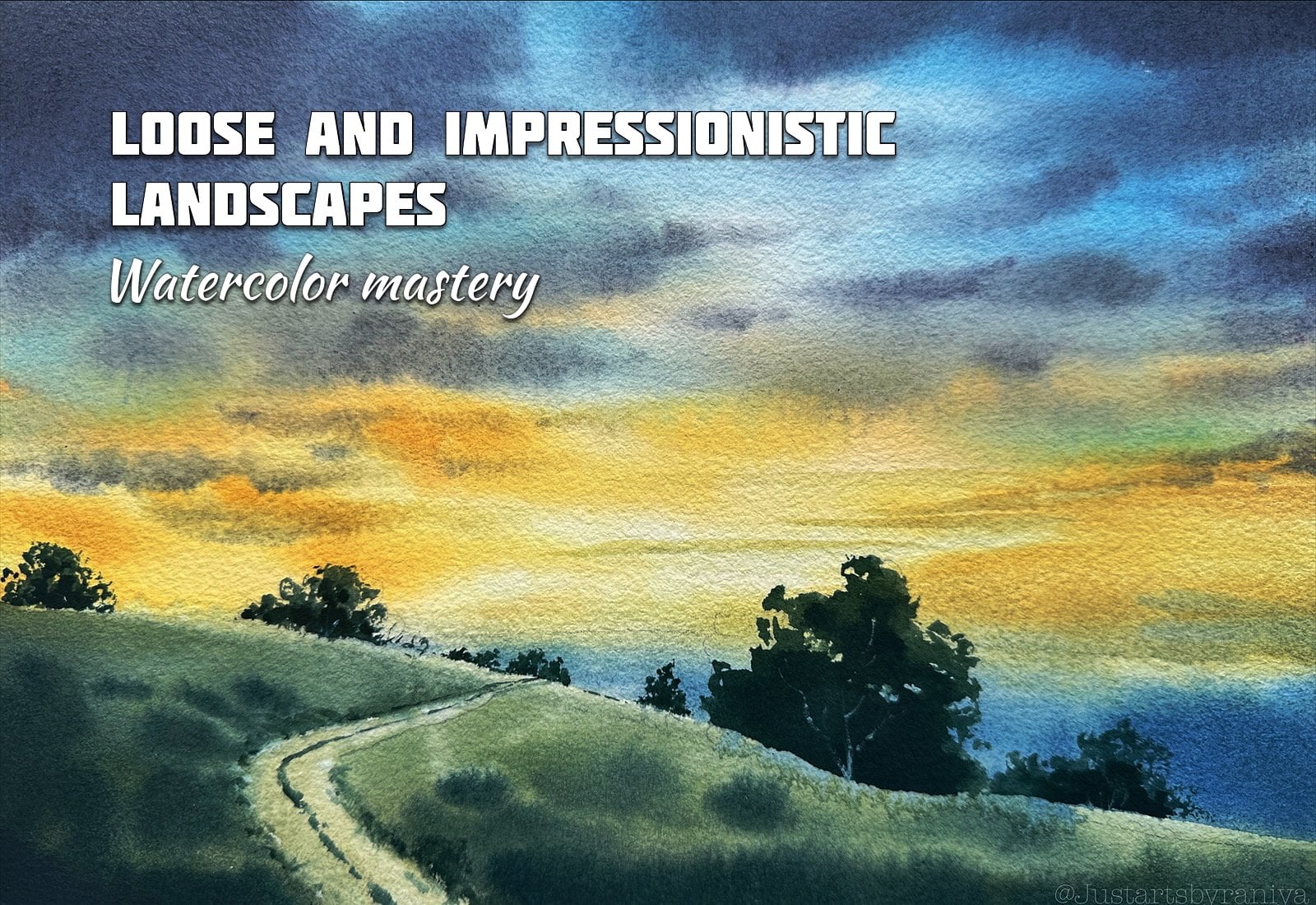
1. What is this class about?: Hi, everyone. Welcome
to the class. I'm Rania. I'm an
artist based in UI. I'm thoroughly
inspired by painting nature related subjects
like landscapes, escapes, sky and clouds and
trees and sunsets, like, basically anything
related to nature. So in this class, we
are going to paint seven glowing sunsets
using watercolors. This class is mainly
focusing on painting gly, transparent effects
in watercolor. First, we'll start by talking about all the materials
we need for this class. And also, I have designed this class as a
14 day challenge. Like seven days of painting
seven glowing sunsets and seven days of practicing all the techniques for
each class project, like a warm up session. So it will be like
a 14 day challenge. So you'll get a thorough
knowledge about various watercolor
techniques that you can use in any
landscape paintings. And basically, you can imbro your painting process and all
over your painting style. So yeah, grab your brushes and paints and yeah,
let's get started.
2. Materials: Before moving, Let's talk
about all the materials we need first and most important
is watercolor papers. I'm using a 100%
cotton, 300 GSM. What grade papers,
which is called press. And by Fabriano
artistic or you can use any brands that is a
100% cotton and 300 DSM. Because we are
completely working wet-on-wet for all the projects. And also I'm going to use
this to sketch books for practicing the techniques and some color swatches
for each project's. Coming to watercolors, we
need artist grade paints, which is more vibrant than
any student grade paints. And also this class is all
about painting a sunset. So we need few
shades of yellows, oranges and browns, and
also some greens and blues. And I'm also going to use some white gouache
for little details, exact shades I'll be mentioning
in the class projects. For the brushes,
I'm going to use these two hacker brushes
for wetting the paper. This will hold a
lot of water and we can cover larger
areas very easily. You can use any big flat
brush for the same purpose. And also I'm going to use this round brushes for some details. For the same purpose. I'm also going to use
these round brushes, do this by Golden mapper. These long hundreds are very comfortable for loose painting. And also we need fuel liners
for some fine details. These same brushes are
not at all necessary. Basically, you will need
one big flat brush and fewer round brushes in
different size and one-liner. That's it. I will also use
fuel more brushes for painting the
sky specifically. And obviously we need a pencil
and eraser for sketching. And also I'm going to use this spray bottle for re-weighting the paper
in-between the process. Infill projects. I am also going to use masking
fluid for some details. We can also use white
gouache if you don't have masking fluid
for the same purpose. And I insist you would have
a hair dryer because in some projects we are working
in a semi wet surface. So having a hairdryer will
helps in speedy process. And we need to just have water. One should be very
clear for writing and rewriting the paper
in between the process. Also few napkins or cotton cloth for wiping brushes and
lifting the colors. And we need a waterproof
board to stretch the paper, which should be a plastic
or glass material, note any wouldn't
or paper material which absorbs the water. And the stretching method we are using for the
end Derek clause. I'll be showing in
the next video.
3. Preparing paper: First thing before
every painting is stretching your
paper perfectly. Let's see how to do it. Like I said, I'm using an
acrylic last board here, which is waterproof
and lightweight. Make sure that you want to otherwise this technique
will not work. Also, your paper weight
should be at least 300 GSM. So what I'm going to
do now is I turned it out my paper and
with my hacky brush, I'm going to wet the backside
of the paper completely. I'm carefully covering the
complete surface after this, the paper will but
club but that's okay. We'll stating it by
wetting the friend side. So let's turn it back and start wetting
the friend side too. Now I'm wiping all
the extra water on the surface using
a tissue paper. Wet the edges of the paper multiple times as they
normally drive faster. Now you can see that the
paper is completely stuck to the board without
any air bubbles inside. And this is the amount
of water you need on the surface are very
thin and shiny layer. With this stretching method, we can walk away, don't wait for longer
time on it helps in getting a smooth gradient, transitions of colors,
which is very important to get a glowy look for years. And said paintings.
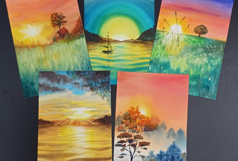
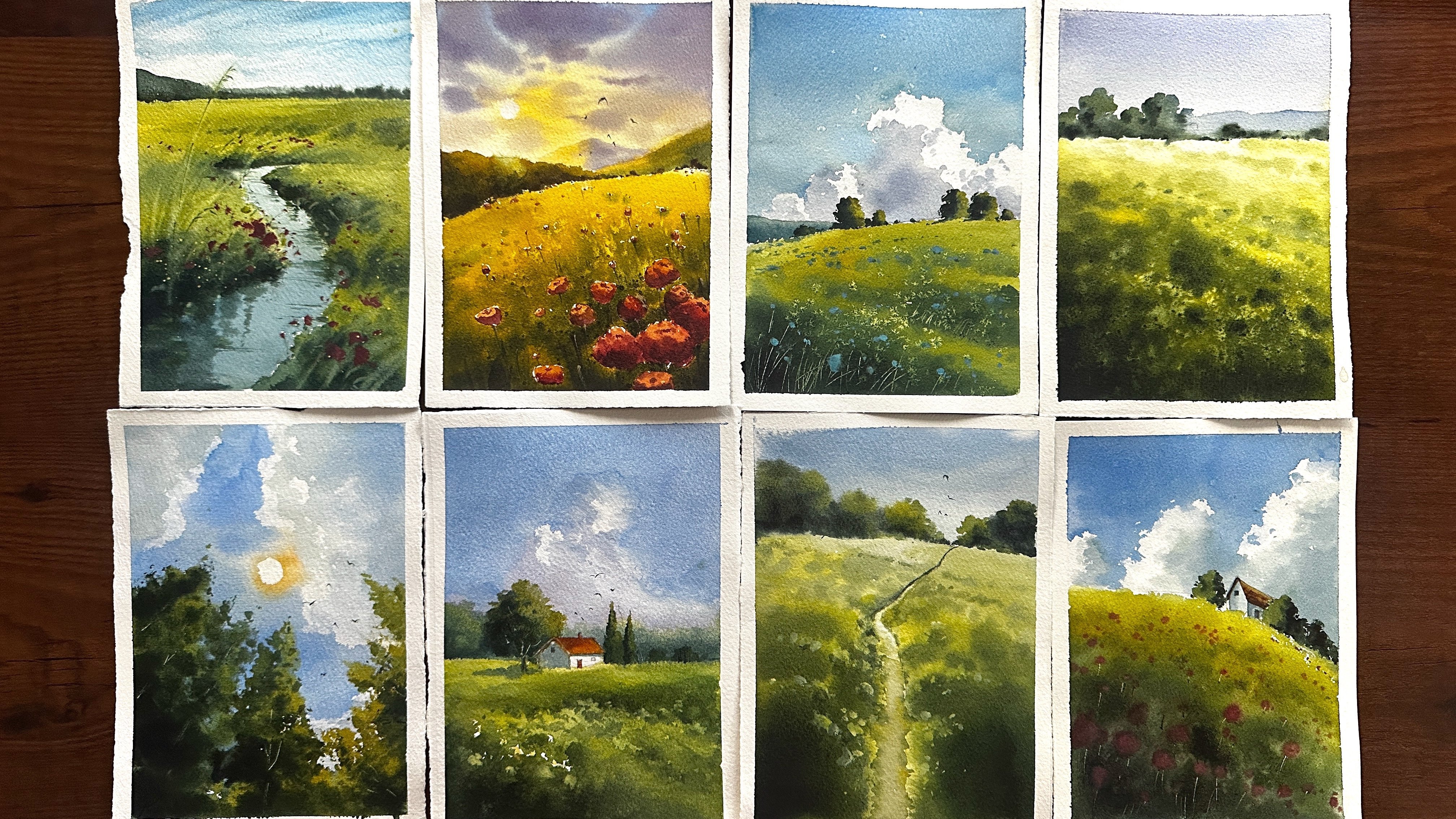
4. Day 1 : Class Project One - Practicing Techniques - SUNSET SEASCAPE: Hello, Welcome to our
first class project. This is the reference
we are going to use. This is a sensitive escape. In this video, I'll be
covering all the techniques we need to practice
for this painting. So let's say the color palette. Firstly, we need lemon yellow. Lemon yellow is very
bright and transparent. Yellow shade, which
is very important to get the perfect it
glow of the light. Like sunlight or a street light, candlelight, whatever
you are painting. The first color around the
light should be lemon yellow. Next we need cadmium
yellow for the sunset sky. And also, I'm going to
use mics off or better, and cadmium yellow
for the peach color. In the picture. This beach, it is
important to get that warm but cool mood for the whole Sense8
picture. We are using. Also, I prefer to swatch
colors like Degas. I start with the color firstly, then I mix with water to spread
the color a little more. To get the different
tonal values of the colors in one swatch. The darker tones and the lighter tone of the
same color in one swatch. And for the shadows. So the waves in the picture, I'm going to use
light dockside red. You can use any dark brown. And for the sale
horde of the bird. In the reference picture, I'm going to use a mix of
light oxide, red, and indigo. I prefer to mix my own black according to the
picture I'm painting. Instead of strictly using
the black from the palette, it gives more transparency to the whole picture
we are painting. Okay, so let's move
to the techniques. I am my standing the
paper with my brush. And let's see how to create
the sunlight and the sky. As I said here, I'm starting
with the lemon yellow. I'm using a size four brush. With the very tip of the brush, I'm creating a circle
on the wet surface. Here we need a very
steady hand to get that perfect circle
for the sunlight. So if you are uncomfortable
to start directly, you can practice in other
paper before getting directly. Here, I'm using only
wet-on-wet technique, and now I am adding
cadmium yellow as the second color
around the sunlight. Then I will apply peach color, which is a mix of operator
and cadmium yellow. Here to get that
glow of the light. The transition from one color to others should
be really smooth. So I'm carefully
mixing the cadmium yellow and lemon yellow
with a wet brush here. Now I am softening that
outline around the sunlight, which is also important to
get that perfect glowing sun. I'm making the upper
part of the sky, which is separate from
the sunlight and in more darker peach color
and light oxide rate. So now we're almost done with the technique for the
sunlight and the sky. So now you can see that glowy
effect of the sunlight. So please follow
the same technique to get that same effect. Moving to the next technique, which is the light
reflection on the water and the waves and the whole
water part of the picture. So for the light
reflection in the water, I'm going to use masking fluid. I am applying with a
small size flat brush. I am applying it as a vertical line,
straight vertical line. And then some tiny
lines as the reflection on peak of each waves
lead today to get it dry. And then we will wet the
paper and start painting. Okay, Now it's almost done. So let's start painting. We'll start with the first color that is very near to
the horizon line, which is here, lemon
yellow and cadmium yellow. Then we will use the
darker colors here. The peach color and
light oxide red makes for the foreground in the water. But here, if you don't
have masking fluid, the other option is obviously
using white gouache. Like once the painting
completely dried, you can apply a very thick
layer of white gouache, same like we applied the masking fluid with
the flat brush with a small size flat brush and applied vertically
straight line. But the pain should be very thick to get the brightest look. Okay, now I'm going to
add waves in the water. I'm using a size
two round brush. Now, the paper is
perfectly weight like without any
flowing water or paint, almost like a semi wet stage. So I'm going to add shadows
of the waves with the brush. Some straight lines
horizontally. Do not try to mix
our shape the lines. Now, the water content in the paper will naturally
spread the colors. You will see the
effect in the end. And as it goes
towards the sunlight, making it smaller lines
for small leaves. Here I'm going to show you
again how to create that straight lines for
the waves in water. So I'm using the
same size two brush. And now on the wet surface I'm creating straight
and steady lines, not like I'm slow and
curvy lines like this. So you have to move
your brush like very steady, little faster. You can practice this as
much as you can to stabilize your strokes if you're not confident to directly apply it. Okay. Now, I'm drying the paper to remove the masking fluid. So this is the look after
removing the masking fluid. So I'm going to shave
that lines with some white gouache to get that perfect reflection
on the peak of views. And I'm adding some more tiny
dots on the nearest waves. Okay, so now let's see how to roughly sketch that bird
in the reference picture. Here I'm using a
small size liner. You can use any de
dealer or a liner brush. I started from aids. Big then do its head
and do its body. Now I'm adding the legs and next day I'm going
to add the reflections, some wavy lines,
thicker to dinner. The bidding the same in
the wider part we painted. This is actually not
from the reference, but I know that they all
love adding those tiny, tiny birds at the
end of the painting. I love doing it, especially
around the sunlight. It gives a little more
depth to the painting. So these are the important
techniques we need to practice before painting
the first-class project, which is going to post tomorrow. So see you in the
next video. Bye.
5. Day 2 : Class Project One - Final Painting Process - SUNSET SEASCAPE: With all the techniques in
mind from previous video, Let's greatly moved
to the painting. Here. I'm starting this kitchen by fixing the horizontal line, then outlining that
little reference here, same like the technique
firm previous video, I'm applying masking
fluid with a flat brush, like a vertically straight
line and then some tiny lines. Masking fluid is
completely dried. So I'm wetting my paper on both sides and fixing
it on my glass board. This is the way I am stretching my paper for all
the class projects. In this class. I have already uploaded
a detailed video about this paper
stretching method and why I'm using this method for all these paintings in the previous section
of this same class. Repeating the same techniques. I am starting with lemon
yellow and creating a circle before
the sudden light. Painting around with
the same color. Here you can see that
glow with just one color. That is the brightness
of lemon yellow. Moving to the upper
right of this guy, which is a little more darker
in the reference picture. Here, I'm mixing lemon
yellow and cadmium yellow to get that beach
shade. Since it's guy. Here, I am mixing the colors. We'd like dockside ride to get that darker
tones in this guy. Here you can see that smooth
flow of colors on the paper, which is only we can get by proper stretching of
what color paper. Moving to the mid
portion of this guy, I'm using cadmium
yellow and Naples yellow for that Walmart
shades in this guy. I'm adding in lifting more
colors here until I'm getting satisfied with the
focus of the satellite. Okay, Now we are almost
done with this guy. We painted around
the sunlight with more colors and more layers
without touching the light. So let's move to paint
the reflections. I am directly applying lemon
yellow on both sides of the masking fluid and then filling that space with the
same colors of the sky. Cadmium yellow,
light peach color. We'll mix it with cadmium yellow as the reflections coming to the foreground and
making it more darker by mixing the same colors with light oxide rate
and darker brown. Alright, now let's start
painting the waves Coraline the same technique
we discussed earlier. Using a size two brush. I'm going to add those
straight and steady lines horizontally for the waves, especially the
shadows of the views. Without mixing it together. And making it bigger lines
for the waves in foreground. And as it goes towards
the horizon line, it should be lighter
and smaller in size. Here the edges not really clear. So I'm adding more colors to get it more clear that horizon line. Now I'm adding more darker brown on the top of already
painter waves. Do they did more darker, repeated with more
layers and the like it more smarter and
contrasting these. Now here you can see more
clearer views which helps to get that feel of the
movement of the water. So we are almost done. I'm again adding
some lemon yellow around the masking fluid we applied to get that same
shades of this guy. I'm going to dry the
paper with hairdryer, then we'll remove
the masking fluid. Paper is completely dry and I'm removing masking fluid
with a very clean hand. Here. You can use any rubber or anything to remove
the masking fluid, but I'm more comfortable with my own hand to remove it
without drawing the paper. Now I'm adding more
lemon yellow around the whitespace that is
wet on dry technique. I'm trying to shave that
whitespace by adding more brown lines in-between
for the shadows of the waves. And also with white gouache
for the reflections on WVU's. Here, if you didn't
apply the masking fluid, as I said earlier, from the starting
of the painting, you can now add
that thick layer of gouache for these reflections. Now, let's do the final
step by using a mix of indigo and brown for
the board, settle hard. Starting from its
beak to its body. Then I will add the
reflections in water. Adding some lemon
yellow on the board, dry on dry for that light
reflection on its body. Now, we are almost done
with the painting. So let's put the final touches. I'm adding some a
lighter color boards around the sunlight and more darker buds that
little away from sunlight. So here's the final
look of the painting. We got a beautiful, glorious and sits this k. So I hope the techniques for useful and you follow
the same techniques. So see you in the next
video with N in there. Beautiful collage project.
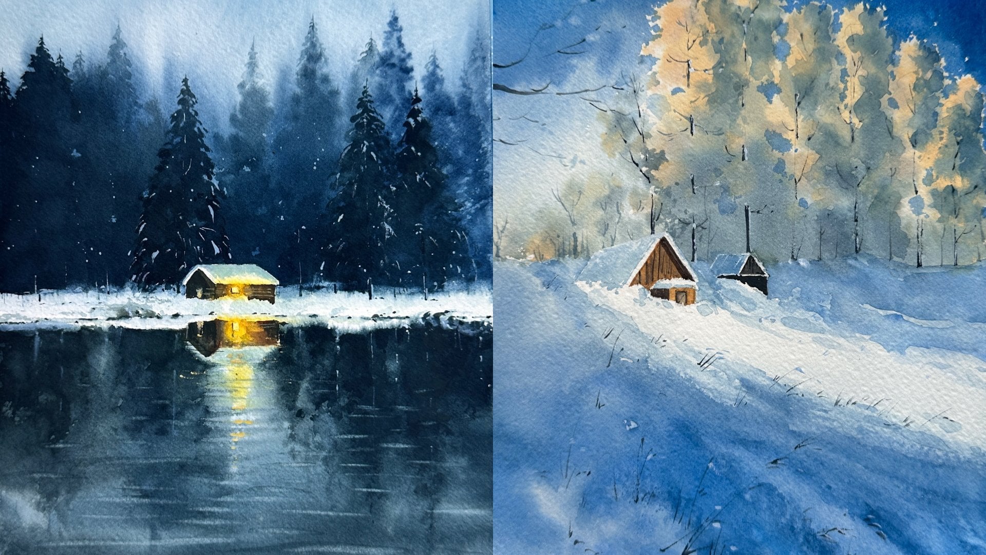
6. Day 3 : Class Project Two - Practicing Techniques - MISTY WINTER SUNSET: Welcome to our
second class project did this is the picture
we are going to paint. This is a misty sunset forest. So let's see the color
palette for the Misty fields. I'm going to use a
little opaque colors. The first one here I swatch this Naples yellow from Xin Han. And the second one
is Naples yellow, red from vanco, which is
almost like it in shade. And also I'm going to use a
mix of operator and Naples, yellow, red for the
sunset fields in the sky. This is the lavender
shade from mango, which is our most liking, a bad color, which is also
perfect for the mistake veins. In the picture. I'm going
to use ultramarine blue and indigo for the civil hoards and the darker tones
in the picture. So let's see the techniques. As always, I am
wetting my paper. Same like in the previous video. I'm directly started to paint the sunlight with Naples yellow. And I also added some
lemon yellow for the glow. After that, I'm going to
fill the sky with Naples, yellow, red, and a para. In any tutorials or
painting videos, especially in what colors? One thing we have to observe
is the British moments, like the directions of
each drugs depression rate gives so that we can understand the
techniques more clearly. This guy in the reference
picture is almost like a misty without clouds
plane kind of sky. So here I am just filling
the space with colors, more warmer colors
around the sunlight. And as it goes to
the upper side, I'm adding more cool shades. Next technique is those loose pine trees
in the background. So I'm wetting my paper and creating a base like a
snowy ground for the trees. Adding indigo for the
shadows in the ground. And also I'm going to leave some colors for the highlights. I'm going to paint
the trees here. Firstly, a straight
line vertically, then some sidewise drugs
like this, very loose child. But without crossing
that ground, we painted adding one more tree
in the foreground with more darker tone
of the same color. There are different ways
to paint pine trees. You can paint in any style
that you already learned. In the final painting. Actually, I'm going to add one more bigger tree in the foreground that is
crossing the sunlight, which is actually not
in the reference. So let's see the
technique for that. Firstly, I am here
fixing the sunlight, then I'm going to use
indigo for the sale hold. You don't have to use all these black for every single
hot in the picture. With the smaller size brush, that is size two round brush. I'm painting the
trunk of a tree in upward direction and adding
some tiny branches too. As always, as it goes towards the sunlight and making
it more lighter in color is painting leaves with the color that
reflects on selfhood. Then I will add shadows under each bunch of
leaves with indigo. Around the sunlight. The
leaves should be more lighter in colors that I'm using
here, Naples yellow. Now I'm adding
shadows with indigo and more tiny leaves and branches for getting
your fine look for the complete
shape of the tree. As it goes towards the sun. It's more highlights and
shadows as you can see here. This enlightened by
adding more leaves with lemon yellow
and Naples yellow, which helps to get that
warm look of the sunlight. I'm going to be doing the
same techniques here for more clarification
of each steps. So you can paint along with me. We're almost done with the
techniques for this painting. I actually suggest to practice each of the techniques
multiple times until you feel confident to start the final painting
of each project. So you can get a thorough learning with all these techniques will
paint this picture tomorrow. So see you in the next video.
7. Day 4 : Class Project Two - Final Painting Process - MISTY WINTER SUNSET: Hello, Welcome back
to today's video. I have my paper ready. So let's trailing mood painting. This is the reference picture. Actually I got inspired
for this class project, but I'm not taking
it completely. I will add some changes in the trees as we already
practiced in the previous video. Starting with the sunlight, I'm using a mixture of lemon
yellow, Naples yellow. And very slowly, I am moving my brush in a circular motion
with a very steady hand. We already practiced this
exercise in previous sessions. Now I am covering the surrounding areas
with Naples yellow, red, and a para. So just filling this guy with
the colors of this answer. Now I'm going to add a little more darker colors in there per bite of this guy. So we can get the focus towards the sunlight for an easy
flow of the colors, I am tilting my paper is moving to paint the
trees and snow line. I'm starting with the same color of the sky that is near
to the horizon line. Then now I'm adding a
little lavender color. And then I will add more
darker colors as it coming towards the
foreground, which is indigo. So now it's look like
a darker foreground. And the snow Holy Land is
fading away as it goes. So let's start
painting the trees. This painting, some very loose pine trees that is
going to be very blurry in the background of the final look
of the painting. And as it coming near
to the sunlight, I am adding yellow shades
are shaping the trees. The trees for a pine tree look. Adding few more trees in the left side of
the sunlight and more dollar and lighter
trees around this enlight. Okay, Now let's add
few more trees in the mid ground of the painting
with more darker colors. That is going to be a mix
of indigo and lavender. Here do not mix that three colors towards the snowy
ground because we need to be more lighter than the
trees so that we feel like the sun is reflecting
on this no part. Adding more trees and
bushes in the mid ground. To get that more
contrast between the snow land and the trees, I'm adding more darker colors around the trees and bushes. Here. You can see that by adding more darker colors in the trees, the surrounding snow ground
is getting more lighter. That is what we need in the
final look of the painting. We have to paint
one more tree that is a cell heart in
the foreground. So I'm going to
dry the paper with hairdryer because we need
to paint it wet-on-dry. I'm not making it
very loose here. Same like we practiced
in the previous video. I'm painting the
trunk of a tree in upward direction with very
little pressure on the brush. I'm using only the
tip of the brush. Or you can use a liner here. If you're not comfortable
with round brush. Now I'm adding
more tiny branches and coming to the leaves. I'm using Naples yellow, red. And adding shadows to the
leaves with the goal. Adding some yellow
mix for the sunlight, reflection on the
trees and making it more lighter
around the sunlight. I'm adding more darker
shadows and tiny, tiny leaves and branches here. And to get that finest
look of the tree, I'm going to make it little more by adding more leaves
around this analyte, which is going to be
very lighter in color. Adding more and more tiny
leaves and branches. Like it, satisfied with the
whole shape of the tree. Now, we're almost
done with the tree. I already overworked
in some areas of the leaves and the shadows. But that's okay. Let's see the final
look of the painting. Here you can closely
see the texture and beautiful mix of colors. And I like that contrast between the tree and
the sunlight here. So that's it. Pseudo more within
a class project.
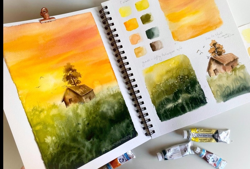
8. Day 5 : Class Project Three - Practicing Techniques - SUNSET WITH A HUT: Hello, welcome back to
our third class project. Today, we're going to use this censored picture
for the painting. So let's say the color palette. Firstly, I'm going to use
lemon yellow for the sunlight. And we also need cadmium yellow and
Naples yellow red for that Misty
fields in the sky. And we need some
green shades for the grass field in the picture. So I'm going to use olive green, lemon green, and shadow green, which is going to
be more darker. I'm in the picture. Also we need yellow, gray, and dark brown for the house
and JC Hart in the picture. So that's all about the color
palette we're going to use. Let's see the techniques. Firstly, I am going
to show you how to create that similar sky
effect from their friends. As always, we are
using wet-on-wet technique for this guy pod. I started with lemon
yellow around the light, adding more darker
tones around it. That is cadmium yellow
and Naples yellow, right? This guy here is our most similar to the previous
class project. We are using the same colors
and using the same method. Adding a little darker colors in the upper corner with darker brown and mix it
with cadmium yellow. And just loosely adding some strokes that is
going to be some clouds. Which will also gives the
focus towards the light. Here I'm actually
intentionally using that smaller size brush for this guy because I needed that. Some shapes of the strokes I'm applying with
a bigger brush, we can get that effect. Okay, now let's move to
the second technique, which is very important
in this painting. I'm just filling the
space with some colors. And we need to
learn about lifting technique for the grass
effect in the picture. Using a size two brush, I'm very loosely
applying the colors lemon green and
then olive green. And in the foreground
of the picture, we need it to be more darker. So I'm going to
use shadow green. Here. You can see that VLM
covering that, but I Left some little space
in between that. So that is going to be the highlights of
the tufts of grass. Now from that darker part, we have to lift the colors
and shapes of grass. That is the main technique
for this painting. For lifting the colors, I need the surface in
a semi with stage two, I'm going to use my hairdryer for drying the
paper a little bit. Here the point is, with less water on surface, it's easier to lift the colors because it
will not spread too much, but with more water or
flowy paint on the surface, it's harder to get that space in the correct
shape, rename it. Now I'm using a
liner and dipped in water than in an
upward direction. I am lifting the colors
for the grass effect. In-between the
process, you have to deep depression water frequently
because the wet brushes, what playing the role here. I'm continuously
doing it and like it, satisfied with the shape. I hope it is visible now, you can see that
lifted space is grass. Adding more colors and lifting
again here under the part. Far more jealous. Let's quickly see
the technique again, another piece of paper. You can practice this multiple
times actually to get a perfectly shaped
the lifted space is in your watercolor painting. The water consistency
or the water control is the main factor
in this technique. Wetting the paper and I'm going to fill it
with the colors. That is the same greens, same like earlier. I'm going to dry the
paper with hairdryer to get a semi wet surface. Now, you can clearly see that how much water we need
on the surface that is very, very thin, shiny layer. And using liner, I am lifting the colors
and upward direction. By dipping frequently. You can use any brush that
is a very pointy tip. Just keep lifting
and you can see that lifted space is coming
to the shape slowly. Now before getting
it completely dry, I'm going to add some
darker colors in-between the lifted space to get
it more contrasting. So that's it for now all about lifting technique
in this painting. Watercolor is not only about
adding colors to the paper, but lifting is also
an important part. With proper lifting and
good water control, you can create beautiful
effects in your paintings. Now let's do a rough sketch
for the tree and a house. In the reference picture, I'm going to do a
very rough outline. I'm painting the house with
very lighter tone of yellow, gray, just covering the space. Then I will add darker
colors to make it in shape, to add a detail So
the roof and lowers. Its always and always from lighter to darker
colors in watercolors, even to paint any tiniest
things in the picture. Here do not blend. The ground is near to the house because we need it to
be a little sharper. So we'll get that focus
towards the house. For the trees, same like in
the previous class project. I adding the tree trunk
in upward direction. Then I will add
some tiny branches and painting the leaves
with lighter tones. Then I will add shadows
with more darker brown. Finally, we are going to add some tiny boats
around the light. So that's it for Ali about the techniques for
this class project. And this is the painting we are going to paint in the next
videos. So see you there.
9. Day 6 : Class Project Three - Final Painting Process - SUNSET WITH A HUT: Hello, Welcome back
to today's video. I hope you already
practice the techniques we need for this painting
from previous video. I have my paper ready, so let's start with
a rough sketch of that house and tracing
heart and their friends. Now let's add the tree. I'm using the same
method for stretching, maybe burned by
letting both sides and placing it on a glass board. Here you can see how the
paper is straightening and fixing on the glass by
wetting it smoothly. So the paper is
perfectly with now. So let's start with painting
the sunlight firstly, same like in the
previous class projects. And I am using lemon yellow and just moving the brush
in a circular motion for the sunlight and then covering the surrounding parts
with the same color. After that, I will add
more darker tones of yellow dot is here,
cadmium yellow. Then I will gently blend it. Moving to the upper part, demanding Naples yellow, red, foreign Misty fields in the sky, also mixing the colors with the same colors
with white gouache, which will make not
transparent look. Here when the water
content on the paper, the paint will spread towards
the sunlight that will run the brightness
in-between the process, keep an eye on that butt and lift the colors gently
with a clean brush. Adding more cadmium yellow and a thick consistency
and own the sunlight. It beautiful glow and
focus towards the light. In the reference picture, you can see that the
sky behind I'm in the space behind the
house a is little foggy, so I'm not doubting
more warm colors. I'm just giving a light wash
of Naples, yellow or red. Now I'm going to add some
pinkish clouds in the sky. For that, I'm using a mixture of white gouache with
Naples, yellow, red. And just moving the brush in a very gentle way
for some clouds. With this darker clouds, as I always say, the focus towards the
sunlight will look brighter. I will keep doing it until I
get a blow off. The light. We are almost done
with this guy. So my paper is still wet. Let's quickly move to
paint the grass field. Here I'm using a mix of olive
green and white gouache. And then loosely
filling the space. I said coming towards
the foreground, I'm adding more darker colors. That is shadow green. In the left side
of the picture for a suddenly fail and the grass field and
using more warmer green, that is leaf green. Or you can mix lemon yellow and sap green for
the same shade. Making it a little cooler in the right side of
the house and coming to the left side of the house and making it a little warmer colors because the sunlight
is coming directly to this, but I'm in the left side. Now I'm adding more darker
colors in the foreground. Again, the focus towards
the house and sunlight. I also added some salt here and that's what you are
seeing like blooms. And I'm adding more darker
layers in the foreground. Okay, Now we're almost done with adding darker layer
is in the foreground. We have to lift some colors
for some grass effect. So I'm going to use
my hairdryer to get it in a semi wet
stage, the surface. And we are using the same
technique like lifting the pigment in upward
direction with a wet brush. That is, I'm using a liner. I came doing it and
getting a good effort for tough shift jars
in the foreground. Now I'm making some
crispy fields on top of the guy's by adding more paint, more contrasting
field or kind of dab in-between the Browse, I'm adding more darker colors. So we are almost
done with the grass, but these are very
loose technique for painting grass or bushes. Like we are creating
the shape by lifting and RD, adding
colors continuously. So we need a little patience for getting that kind of effect. I'm going to dry the paper
so we can move to paint the house and final details using a Locrian Van **** brown that is any dark
brown you can use. I'm filling the friend
side of the hallways. For the right side, I want a little
Walmart Touch shoe. I use a red color. Denote blend. The color is too much towards the garage part. We needed more crispier. Now I'm going to add colors to the right
side of the house. Like without blending it
towards the front and side. I'm adding some little
details and there's grass add own policy for a
kind of crispy feel. Very tiny dots and grass. Moving to the roof of the house. I'm adding some lines that is going to be
kind of texture. And then I will blend it. I'm going to add
more darker colors. For some shadows. With too many layers, it looked like more darker. So I'm lifting some Carlos from the side that the sunlight hits. Now let's paint
the final element in the picture. That is the 32. I'm starting with
the tree trunk, then to the branches and the
leaves with lighter colors. And I will then add
shadows to the leaves, the same order that we
practiced in the next session. I forgot to add that friend
side door of the house. You know, I'm earning dad. We are almost done
with the painting. This is a little longer video, but the end result is
looking beautiful. I already loved the
glow of this painting. Finally, I'm adding some
tiny birds around the light. And this is the final
look of the painting. Here you can closely
see the African recreated with
lifting technique, which turned into a
fluffy grass meadow feel. Yeah, I'm satisfied
with this one. So see you in the next video.
10. Day 7 : Class Project Four - Practicing Techniques - LAKESIDE SUNSET: Hello, It's the day for
our fourth class project. For this, I'm going to use this censored still hard
by a lakeside. And the colors I'm using
Boolean blue for this guy. And I'll be painting the
clouds with Payne's gray. And for the sensor to light, I will be using lemon yellow and cadmium yellow,
Naples yellow. And for the sill
height in the picture, I'm going to use Van **** brown. You can use any dark
brown or you can mix burnt umber with some indigo
for sim, similar shade. Also like dockside
read and primary red. Now let's see the techniques
and the reference picture. This guy looks like little cloudy with a very
bright sunlight. So we'll be painting the
sunlight with lemon yellow and slowly will move
to paint the clouds. And then we fill the
sky with cerulean blue. Here I started with lemon
yellow for the sunlight, just leaving a little space. And the sender then covering the surrounding patch with cadmium yellow and lemon yellow. We are completely working
wet on wet for this guy. Now we're moving to paint the
clouds using Payne's gray. Just creating some similar
clouds like in their finish. Here I'm making
it smaller clouds around the sunlight or
near to the horizon line. And bigger clouds
in top of this guy. Which helps to create that correct perspective
of this guy. And I'm using a size four round brush for
painting the sky. Now I'm filling the sky
with Sara Lee in blue, adding more layers
on the clouds and more tiny clouds
around the light. Now I'm adding some lemon yellow under the clouds for Tim, many flexion of the sunlight. So that's the way
we are going to paint the sky in
the final project. Now, let's see how to paint that name still hold
the water part. I'm creating that
light for this guy. So we have to create some
reflection on the mountain. Will be painting the mountain
like in the center portion. We are using lemon yellow
and cadmium yellow for the sunlight reflection on the mountain and for
both sides will be making it more darker
with dark brown. I'm using here Van **** brown, you can use any
dark tone, browns. In-between the brown and yellow, I'm using here light dockside read and primary red
for a warm touch. Now when filling the left
side of the mountain to now from that yellow
bar demo when I left some colors for the
sundries effect. So just lifting colors
by using a wet, clean brush and after
a very lifting, I am wiping it on
a tissue paper. Let's see the same technique. Once again, I'm using lemon yellow and creating
the mountain. And then I'll be painting the both sides with
more darker colors. That is brown. So that will get the focus
towards the send it. But for the sound light
reflection on the mountain. I also added some light, dark side red and cadmium yellow and the mountain part
for some warm touch. Now I'm lifting colors from that yellow part for sun rays. Let's see how to paint the water and light reflections
in the water. Sewer just under the light. I'm using lemon yellow, just adding is straight
vertical line. By leaving a space in the center and discovering the surrounding part
with Naples yellow. While painting the
water do not touch that white part
because we need it to be really bright for the sunlight reflection
in the water. Now, let's paint some
waves in the water. I'm using really dark brown. And same like our first project. I'm just creating some
straight horizontal lines without mixing it
to the yellow part. Here for painting such ways
we need the first layer. Should we VD lighter here we use the very light
shade of yellow. So it looks more contrasting and really
get a nice effect. As it going towards
the horizon line. I'm making it more smaller
and lighter waves. Now I'm adding some
dark colors just January the mountain
for some reflections. Sound straight lines parallel
to the horizontal line. With dark brown. Here the paper is dyed
and I'm using wet on dry technique and adding more
darker layer on the scene. Adding a little more
cadmium yellow around the light for getting
it more brighter. I'm repeating the
same this turner, the sunlight, a vertical
line with the lemon yellow. By leaving a space
in the center. For both sides, I'm
using cadmium yellow. Then I'll be covering
the underwater part with Naples yellow and
cadmium yellow me. Now with very dark brown
in thick consistency, I'm creating the reuse
this few strokes horizontally without mixing
it to the yellow part. And then adding reflections
of the mountain in water by adding some lines parallel
to the horizontal line. Now, let's see how to create that foliage in the
foreground of the reference. Really tiny branches. Firstly, using a size
two round brush, I'm painting the
leaves like this, pressing the tip of a brush and slowly lifting it downward. Let's see again, like
the tip of the brush I'm pressing and lifting
it downwards, slowly. Just press it and
lifted downward. Like that, will create tiny
leaves and bigger leaves. And altogether we can create a nice foliage in the
foreground of the picture. One other thing we have
to notice here is we had to paint the leaves
lighter toward the sunlight. And we are using lemon yellow, cadmium yellow mix for the same. So we are done with the old techniques for
this class project. In this technique we are going
to paint this beautiful, sensitive settle
heart lakeside view. So see you in the next video.
11. Day 8 : Class Project Four - Final Painting Process - LAKESIDE SUNSET: I hope you practice techniques
from the previous video. So let's greatly move
to the painting here. I am fixing the horizon line. Now. I'm wetting my paper
and are strictly more to paint the sky. Lemon yellow. I'm going to create that
bright light firstly, then I will move to
paint those clouds. Here the sunlight is
not in a round shape or a circle like from our
previous class projects. So for the same effect day, I'm just leaving
space in the center and covering surrounding
parts with lemon yellow. And now I'm going to add
cadmium yellow around it. Just move your brush very gently and softly on the
surface of the paper. So we'll get that nice
transition of colors. Now, let's paint the clouds. Here. I'm going to create
some bigger clouds on top of the paper
with Payne's gray. I'm just adding some loose
strokes similar to reference. Now I'm using a size six
round brush for the clouds, coming towards the
sunlight and making the clouds more lighter
and smaller in size. For that and mixing Payne's gray with a little lemon yellow. Now let's fill the sky
with Sarah Lynn blue. I'm just filling that whitespace and making it lighter in color. Coming towards the yellow. I'm going to add a second
layer of Payne's gray on top of the clouds for a
little more darker shadows and some more little clouds
around the sunlight. We are done with this guy. So let's move to
paint the water. Just under the light. I am creating a
vertical line with lemon yellow on both sides. By leaving a space in the center for the
light reflections. And then adding a second
layer of colors with cadmium yellow in
the same direction. Now I'm going to fill
all the water part with Naples yellow and
cadmium yellow mix. Here do not touch that
whitespace while you are painting the surrounding
areas with low, because we need
that space really bright for the
sunlight reflections. Now, let's add some way
using the word data. I'm using Van **** brown and
thick consistency and adding some straight lines horizontally without mixing it to
that, a lower layer. For more darker shadows, I'm adding more darker layers on top with the same strokes. And as it going towards
the horizon line, I'm making more lighter
and smaller waves. Now I'm lifting some colors on the highlights of the waves for a more bright
looking reflection. Next, we have to paint the
cell harder the mountain and some foliage in the
foreground that is going to be dry on wet. Now, I'm fixing this
layer with a hairdryer. The paper is dry now, so let's paint the mountane. I'm mixing Van **** brown
with some indigo for a darker tone for the mountain and
painting it from a side. And as it coming
towards the sunlight, I'll will make it more lighter. I don't want to mix it
to the water part two, I'm carefully filling space. Now I shifted the color to
light oxide red to make it more warmer and lighter
towards the sunlight. Making it more
lighter just under the sunlight with
cadmium yellow. And for the right side, mundane, I'm repeating the same
like left-side mountain we painted and creating the
focus towards the sunlight. Now, you can see that on both
sides of the mountain we created it with more darker colors and
coming to the sender, but we made it lighter. So this way we can get that light reflections on the
mountain very easily. Now, we have to create some sun rays effect
on the mountain range. So I'm lifting colors here using a very clean brush and lifting the pigment
very carefully. Like I said in the
previous technique part. Before each time lifting, I am cleaning the
brush with water and by being on tissue paper to make the lifted space not
my d. So that's it. Now, we helped to create
some reflection on the mountain, on the water. So I'm creating some
lines that is parallel to the horizontal line
with same mix of browns. Now let's create the
foliage in the foreground. So I'm using a size two round
brush with the very tip of the brush and
I am pressing it and lifting it downward. Like that, we'll create tiny
leaves and bigger leaves. And altogether we can make
a good foliage effect. This part we already practiced
in the techniques videos. So if you skip that part, please go back and
watch it to get that fine looking leaves. Same like the mountain. We have to make the leaves
lighter towards the sunlight. So I'm mixing the browns with lemon yellow
and cadmium yellow. Here one thing you'll
notice is denote paint our leaves
in the same size. You can paint some
bigger leaves and coming towards the
tip of the branch, you can create some tiny, tiny leaves so that
it will create a good dimension to the
whole look of foliage. Now with the liner, I'm adding some branches
to connect the leaves. Am I adding more lighter
and smaller leaves here? And we are done with the painting
congrats on completing a beautiful lakeside
sunset view. So, see you in the next class.
12. Day 9 : Class Project Five - Practicing Techniques - SUNSET MEADOW: Hello, welcome back to
our fifth class project. Today we're going to paint
this beautiful sunset middle. So let's see the color
palette here for this guy, I'm going to use ultramarine
blue and cerulean blue. And for the sunset shades, we need lemon yellow, cadmium yellow, and Naples
yellow, Naples yellow, red. You can use any warm
yellows that you have, like Indian yellow or a mix
of lemon yellow with orange. To get that perfect
sunset shades. For the meadow, we
neared few greens. I'm going to use leaf green, which is a very
warm, lush green. And also I'm going to use
sap green and shadow green. So that's it for
the color palette. Now, let's see how to create that similar sky effect
in the reference. It is looking like a beautiful blend of two or
three colors in the picture. So here I'm starting
with the sunlight. I'm using lemon
yellow and creating a small arch shape just
about the horizon line. And I added cadmium yellow. And now I am using Naples yellow and spreading the colors
in upward direction. Like always here, I wet
the paper before painting. And now I am shaping that
arch shape of the sunlight. Here. I don't want to mix
the yellows and blues and to get a green shade to the sky. So I am starting with
the ultramarine blue and adding it to the top part by leaving a little
space in the center. And then I will blend it upward direction from
the yellow part. I also added some cerulean blue, the standard
ultramarine blue layer. And now you can see how I am mixing yellow to the blue
in an upward direction. I'm mixing the
colors very gently. This way we can keep the yellow
part very bright without mixing it with blue colour or creating a green
shade in-between. Now, let's see the technique for creating that meadow effect. Here, I'm wetting
the paper and I will add some lush
green just under the sunlight to get
this same shade even you can mix lemon
yellow with some sap green. Now I'm adding more darker
greens just on both sides of the sunlight here I'm using sap green and shadow green mix. As we know, there is
no light without dark, so they have to create that darker effect to get the
focus towards the sunlight. Here in the reference picture, you can see that the
sunlight reflection on the middle jars in
foreground is very visible. For the same effect. I'm living a little space in
the foreground of tomato, but in the painting. And I will add more
lighter green. For that same effect. I'm just loosely adding
some colors and creating that little contrast and
focus towards the sunlight. Now for that middle grass
affecting the foreground, I'm adding lemon yellow
and light green mix. And for some shadows
ever switch the color again to the darker
green that is here. Green. You can make Spain's crave it some sap
green to get the same. She'd like shadow green. With a liner. I am creating some upward strokes
for the girls. I'm creating a good contrast by adding more darker greens, just under and over. The light green we added. I will cover the entire
foreground part with grasped by adding those upward strokes. I'm keeping top of grass a
little sharper and thinner. So we'll get that nice effect. Next, I will use the same
lifting technique from our third class project where we painted a similar meadow with a hard I'm adding some table salt and tomato for some loans. Now, I'm lifting colors
for the sun rays. Like I always see here. I'm lifting colors by
using a very clean brush. And before each time lifting, I'm cleaning it and wiping
it on a tissue paper. With that time the foreground
pods started drying. So I am lifting colors for some highlights on
the girls using a liner. I'm lifting the big men
in an upward direction, same like we painted the grass. By dipping the brush
and water frequently. You can see that effect now. So that's the way
how we are going to paint the meadow in
the final painting. Now, let's see how to create
that grass flowers crossing the sunlight and
a little tree in the background here
with the same liner, I'm creating a very thin
line with darker green, that is shadow green. And I'm creating a
thicker stroke on top of that line for
the grass flavor. Now, let's see how to create the same with crossing the sunlight. Starting with the
dark green line and coming towards the sunlight, I'm switching color to yellow. And I'm not crossing the light, but I'm gonna connected by
blending with clear water. So the point here is whatever crossing the
sunlight should be very light so that we will get
the glow of the picture. Now I'm painting
that grass flower with more darker colors. So let's add the same
in the painting just starting with the
dark green line and I am switching color
to yellow and just crossing the sunlight
by not touching it. And I'm creating
the grass flower with more darker colors. And I will add more
grass flowers in different directions that
is crossing the sunlight. Now we have to add some
more grass flowers and foreground of
the middle show. I'm creating the same
darker green lines. And for the flower, I'm using a bag, colors that is white
gouache with yellow, and painting it in different directions
and different sizes. So the final element
in the picture is that tree in the background. So here I am just showing
how to create that. Starting with its trunk and
using dry brush technique, I'm creating the use
by just scratching. And I'm using the darker green, that is shadow green. And I'm adding more darker layer four dimension for the leaves. Let's are the same
in the picture, half of the tree
trunk is not visible, which is hidden by the meadow. So just starting a
small stroke for the tree trunk and creating
the US with lighter green, then adding more darker
layers for the shadows. And by adding more
details and colors, I'm shaping that whole
look of the tree. So that's it for all
the techniques we need to practice before
the final painting. And here is a look of the final picture we are
going to paint tomorrow. So see you in the next video.
13. Day 10 : Class Project Five - Final Painting Process - SUNSET MEADOW: Hello, Welcome back. So let's move to
the painting here. I'm starting with
wetting my paper. And as always, I'm going
to start the painting with sunlight with a mix of lemon
yellow and Naples yellow. I am creating an arch shape. This tape out a horizontal line like you can see
in the reference. And I'm spreading the color is in upward direction
for the sky. And also I used a little
bit of cadmium yellow. Here. I'm mixing some
cadmium yellow with a little bit of a para to get that cool and Peachy
effect for the sunset. Moving to the top
part of the sky, I'm using a mix of ultramarine
blue, cerulean blue, and cobalt violet, and discovering the indirect space
using return wet method. I forgot to mention this cobalt violet shade
in previous color, so I think section. So it's okay, you can even use this ultramarine blue
and cerulean blue mix. Here, I am spreading
the colors in an upward direction without
mixing the blues and yellows. So we go to nice blend
of colors for this guy. Now, I'm going to fix this
layer by using hairdryer. Then we'll move to
paint the middle, starting from the
very right corner of the meadow and creating
the horizon line. I'm using shadow green and as it coming
towards this light, I'm using light green, that is here, leaf
green specifically. Then also I'm mixing it
with some cadmium yellow. And just under the light, I'm mixing the colors
with just water. And on both sides of the light
reflections on the middle, I'm creating a darker effect
by using shadow green, and then covering the entire
space using the same color. By leaving a little space for
the foreground middle part, where we have to paint
some light reflections on the grass flowers
like in the reference. Just under the sunlight, I'm adding a little
more yellow colors and softening the edges. Then we will lift some color
for this and race effect. Here I'm creating
that horizon line or the edge of Meadow, just very near to the sunlight by using
very light colors. Now I'm lifting colors
for sun rays using the same method as from
our previous sessions. Just lifting colors
with the small brush. I'm adding some table salt for some blooms in the
middle on the wet surface. Moving to the foreground
of the meadow and starting with the
low and light green. And I'm mixing both the colors by moving the brush
in a circular way. I said coming to very down part, I will switch the color
to a darker green. And I will cover the interior, but by moving the
brush in the same. So Claire way. This way we can get nice wet on wet Boucher Fe for the middle. Adding more darker green in the mid part of the
middle to get that focus towards the grass and flowers in the foreground
part of the middle. Also adding more darker layer on the foreground for
some darker shadows. Okay, now we're going
to use the same adult from our third class project. Like we will lift some big meant from a semi wet
stage of the paper. So I'm using hair dryer
for wetting the paper, sorry, drying the
paper a little bit. And using a liner, I'm lifting the pigment in
an upward direction for some grass effect by dipping the brush
frequently in water. Now I hope you can see that lifted space as some
highlights on grass. So I'm going to fix this
layer with hairdryer. Next, same like the reference. We have to add some grass
and grass flowers that is crossing the sunlight and few more in the
foreground of the meadow. So here I'm using the same
liner and with darker green, I have added a straight line down without touching the light. I'm painting the garage
flyover using yellow and green and blending it very
lightly towards the light. Adding few more in different directions that is
just crossing the sunlight. We already practiced this
part in our previous video. That is the techniques
part of this painting. Just starting with a very
dark line using darker green. And by crossing it
without touching the light directly and
blending the colors. Then only TO adding the Dutch flower with
more darker colors. Now, let's add few
more grass flowers in the foreground of the meadow. Here I'm using opaque
colors for the flower. That is a mixture of white
gouache, red, yellow. One more that is
crossing the sunlight. And I'm adding feel
more in the foreground. Know we have to paint that tree and whether disturbed
background. When starting with
the tree trunk, half of the trunk is
hidden by the middle. So we had to paint
it very small. And using the dry
brush technique, I'm going to paint the
leaves without any water, scratching the
color on the paper. Then we'll mix it here
under for some shadows and the whole depth of the tree. I'm adding a second
layer of colors and shaping the whole
look of the tray. So that sick we are done with the painting
here you can see the soft and glowy effect
of the meadow we painted. And yeah. So see you in the next video with energetic class project.
14. Day 11 : Class Project Six - Practicing Techniques - MONOCHROME LIGHTHOUSE: Hello, welcome back to
our ethics class project. Today we're painting
the slide dos picture, but I will paint it in
little different way. I use the elements
of the picture and we'll paint it
in portrait mode. So we will make a thumbnail
sketch for asleep. And also we are using monochrome painting technique
for this class project, which means we are using this one color for the
complete painting. Here Let's see how to create a simple sketch
for the painting. I'm starting with
the horizon line. And I'm creating
the coastline that is the line dividing the
water part and land part. And some rocks in the land
but in different sizes. Now I'm adding shadows
to some of the rocks. And this is more
of a mountain near to the horizon line
and a small house. And also the final part
will be the lighthouse. And I will fix this analyte
in almost right side. And there is also some
clouds in the sky, some bigger clouds
in upper part, and some smaller and tiny clouds towards the sunlight
and horizon line. So that's it for a simple thumbnail
sketch for the painting. Now, let's see how to create the painting with
just one color. I'm going to use this color. This is Van **** brown. Van **** brown is a
cool but warm shade and also it has
granulating effect. So if you have the same color, that would be great. But you can also use sepia, which is almost
similar to this color. Or you can use a mix of
burnt umber and in lingo, which creates some
similar shade. So there are two ways to
create monochrome painting. One is using different
tonal values and one is layering technique. Using different tonal values
means we are painting with just one color by using its different tones
from light to dark. That is, we are using different amounts
of water to the color. With more water, we can
create more lighter tones and with less water we can
create more darker tones. Here I'm swatching
the same color with different amounts of water to show you it's different
tones we can create. I hope you can see
now the lightest to darkest tone of the same color. The second technique
is layering technique, which means we are
painting a second layer of same color on top of an
already dried first layer. We are using both
the techniques in this painting and it
makes her way. We'll use. The lightest to darkest tone of the same color
for the painting. Same time we'll use it in
layering technique to. So here I already applied
the first layer of colors and use my hairdryer to dry it. And now I am adding
a second layer of colors on top of that with
same mix of brown color. So now I'm moving to paint
the sky and cloudy effect. And as always and wetting my paper with very lightest
tone of the color. I'm going to add the
first layer for this guy. And then I will paint
the clouds with more darker tones
of the same color. This writing this surface with very lightest tone of the color. And now I'm going to
add the clouds with more darker tone
of the same color. Some bigger clouds in
upper part of the space. And as it coming towards
the horizon line, I'm going to make
more smaller clouds. Now I'm adding more darker
colors on top of the clouds for some shadows and a kind
of contrasting effect. Now we're almost done
with the clouds. Now let's move to pain. The water bought and land part. Firstly, I'm just washing the water part with the
lightest tone of the color. And now I'm creating
the coastline that is dividing the land part and water pot with some really
dark tone of the color. And then I will fill the land
part with the same color. Now, let's add some rocks in the land part with a very
dark tone of the same color. Using wet-in-wet
technique, just loosely adding some round strokes for the rocks seemed
bigger and smaller rocks. Making more smaller
rocks and stones as it going towards the horizon line
and some are in the water. Now, let's add small
mountain in the background. Then we will see a small sketch for the lighthouse
and the House. Starting with the roof of the house and then
to the details. Here, using a liner
for all the details. You can use a liner or a small sized round
brush for the same. We are done with the house. I added the shadows to
one side of the house. And for the French side, I added more lighter colors. Now let's see how to
sketch the light dose. Just starting with the base, adding two straight
lines parallelly. And then I will add
shadows to the left side. And then I will
spread it smoothly to the right side for some
highlights on Lighthouse. As you can see now, I'm spreading the colors with a little water to the right
side of the lighthouse so we can create some contrasting lights and
shadows to the lighthouse. Now I'm adding the fine
details on the top of lactose. Now I'm adding doors, windows, and other details
to the hallways. I think that's more
mundane in the background. And now let's see how do repeat the same in the
left side painting. Here I'm showing you
again how to paint that land part with rocks. Firstly creating
the coastline and then filling the
space with the color. And now using
wet-in-wet technique, I'm adding some rocks, some bigger dogs
in the foreground. And as it going towards
the horizon line, I'm creating more smaller rocks with their darkest
tone of the color. And also I lifted some colors for some highlights
on the rocks. And now I'm filling the water board with the very
lightest tone of the color, grading the reflection of
the sunlight to the water. And finally, I'm adding
some tiny birds in the sky. That's it for the
techniques and this is the painting we are going
to paint in next video.
15. Day 12 : Class Project Six - Final Painting Process - MONOCHROME LIGHTHOUSE: Let's straightly move
to the painting. I always suggest to practice the techniques
before painting. From the techniques part video i shared before
every class project. Because it will
definitely help you to understand the
techniques thoroughly and to get an easy process for each painting we are doing. Here i am starting with a
very light sketch for the light house and a small
house in the background. And then I will
add the coastline, same as in the previous video. Adding a small mountain in the background and
some details on the light house and some bigger and smaller
rocks in the land part. Now I'm preparing the lightest
tone of the color for the first wash. And then I'm going to wet both
sides of the paper. My paper is perfectly wet, so I starting with some
smaller clouds in, almost mid part of the sky using the
very lightest tone of the color that
is Vandyke brown. Moving to the upper
part of the sky, I added a first
layer of colors with the lightest tone
of Vandyke brown. And now I am adding some clouds with little
more darker color. I'm adding more darker colors on the clouds for some shadows. Adding more bigger clouds in
the upper part of the sky. Now I'm adding more clouds in different sizes just
around the light, that is going to be
the center part, that white portion. Adding more and more
tiny clouds and more darker layers on
the bigger clouds. Because it will helps to
get a contrasting effect to the light and between
the light and clouds. I'm quickly lifting
the colors on the light house so we
can keep it lighter. Now you can see that,
the center part is more brighter and the
surrounding parts are more darker with the clouds. So now I'm moving to
paint the other details. Painting a small mountain
in the background, to get a more clearer
horizon line. I need to get the focus
towards the sunlight, so i am adding more colors
in the upper corner. And then blending the edges. Moving to the water part, I'm adding colors in both sides by leaving a little
space in the center part for the sunlight reflections,
using wet-on-wet technique. Now I'm adding a small mountain in the right side of the
horizontal line too. keep an eye on the light house and lift the colors frequently because we need it
to be lighter in the final look of the painting. Or even you can
use masking fluid or masking tape for
the same purpose. Moving to the land part, I'm filling the space with lighter and darker tone
of the Vandyke brown. Making a clearer coastline
by adding some shadows. Adding more darker details on the lightest layer
of the same color. Now let's move to paint the rocks using the
same technique from our techniques practicing
video of this class project. Just loosely adding some
oval-shaped strokes, with the very the darker
tone of Vandyke brown and using
wet-in-wet technique. And as it moving
towards the horizon line, I'm adding more tiny, tiny rocks and stones and some stones in
the water part too. Here you have two add the
rocks on wet surface. So that we will get that blended but
realistic kind of rocks and stone effect
in the land part. Here I'm sharpening the
edge of the land part. I'm adding a little
more colors to the left side of the water part. So we can get that focus towards the light reflections
in the water. Creating some movements
to the water by adding some very subtle waves. Here, I'm not adding any
extra color to the paper. Just spreading the same colors
that is already applied to the paper by moving the
brush in a horizontal way. Okay, Now I am lifting
some colors from some of the rocks for some light
reflections or some highlights. Also adding some
extra colors to the rocks for some shadows. Here I'm lifting and adding colors repeatedly until I get satisfied with the rocks and
the complete foreground. Here the rocks and it's
the reflections in water looks like in a blended way. So I'm lifting some
colors for a fine Look. I am sharpening the
edges and adding some tiny rocks in
the water part, making some fine details
continuously and adding some more dark
paints here and there for some more contrast. Okay, now let's dry this
layer with the hair dryer and then we'll paint the
lighthouse and final details. Okay, so for lighthouse, I'm adding some
darker Paints to the left side of the lighthouse. Then I will spread the colors with the wet brush towards the
right side, so we can get nice light reflections
on the right side of the light house and its
shadows to the left side. And finally, we will get a dimensional look
for the lighthouse. Moving to the other
details of the lighthouse, I'm adding some
shadows to the house part. Now, adding little
more darker colors to that frontside of the house part and coming to the roof i am painting it with more lighter tone of
the Vandyke brown. Okay, there is one more small
house in the background. So I'm adding shadows
to one side and for the front side and
making it more lighter. And then we'll move to
the roof of the house. And after that, I
will add doors and windows and
other fine details. For all these details, I'm using a small
size round brush with a little long handle. So that is helping
me very much for the details without touching the other parts of the painting. Now, I'm painting that
door of the light house and then I'm moving to
paint top details. Adding the fine details and some doors and windows
to the houses. And then I'm going
to fix the sunlight with some white gouache
using my finger. Yeah, that's it. So now let's add some
birds in the sky. So yeah, thats it for the
final look of the painting. And I hope you
learned something for how to paint a picture
with just one color. So see you in the
next class project.
16. Day 13 : Class Project Seven - Practicing Techniques - SUNSET SEASCAPE WITH SAILBOAT: Hello, welcome to our seventh
and final class project. For this class project, I chose a simple
sunset seascape. So let's see the color
palette for the painting, I am going to use few yellows. That is lemon yellow,
cadmium yellow, and Naples yellow. And for the mountain silhouette in the
background we need yellow ochre and any dark brown. Here, I'm using sepia. And for the sky and seascape, we need cerulean blue, indigo, and Payne's gray. So that is the color palette
we need for this painting. Now let's see how to
create that sunset and the sky. Here I'm wetting the paper. Now with lemon yellow. I'm going to create
an arch shape , just about the horizontal
line for the sunlight. Then I'm using Naples
yellow and cadmium yellow to spread
the colors upward. Okay, now I'm going to fill
the space with cerulean blue. And for the upper
part I will add more darker colors
like Payne's gray. Here for a smooth
transition i am spreading the yellow colors
towards the blue colors. Do not worry about
getting a greenish or grayish look because the sky is not always blue or
a yellowish colors. There are a lot of different
colors in sunset sky. Now I'm filling the upper
part with Payne's gray. So that is the way
we are going to paint the sky for the painting with a smooth transition of two or three colors by
using wet-on-wet technique. Now, let's create a
small mountain silhouette that is crossing
the sunlight. Here. I'm using Naples
yellow and yellow ochre and creating the
mountain line that is just near to the sunlight. And with more darker colors, I'm spreading it
towards the right side. For the darker colors, I'm using a mix of
indigo and sepia. And I will repeat the same technique for the
left side Mountain too. Now I'm softening that mountain lines that is
near to the sunlight. Lifting and layering colors in the mountain for some textures. And now creating sun rays effect by lifting
colors and some straight lines in
different directions using a very clean brush. So that is the way
we are going to paint the glowing sunset, now let's paint the
reflections in water , here with the same yellows i am creating two straight vertical lines that is just under the sunlight by leaving a little space in center for the glow of sunlight
in water reflections. And now I'm filling both
sides with Naples yellow. And for the down part, we will repeat the same colors. That is cerulean blue and Payne's gray for some waves and it's reflections
and shadows. Adding more lemon
yellow on both sides and Softening the edges for glow. In watercolor , for softening
sharp edges, I always use a wet brush
that is not too much water or too dry bristles but with a little moist
on the bristles, it will much smoother to blend. And now by moving the
brush horizontally, I'm creating some little
smaller, lighter waves. And for the down part, I'm creating waves
with cerulean blue, more thicker and bigger
waves in the foreground. And as it goes towards
the horizon line, I'm creating more lighter
and smaller waves. And now I'm adding shadows
to those waves with Payne's gray, with multiple layers i am creating more contrast for the highlights and
shadows in the waves. So that's it for how we are
going to paint the water part and sunlight reflections
and the waves. Now let's see how to
sketch an easy sailboat. Here with some dark paint, i am sketching a boat with
a small size round brush. Now adding some details in
the boat like some silhouette of people or some
other things in the boat. Adding more details
like the sail and other elements
of the sailboat. Now let's add its
reflections in water. I'm adding some sunlight
reflections on the boat with some dry paint that is
white gouache and yellow. Now adding boat
reflections in water like some small
lines horizontally. And then I will add the
reflections of sail details. Okay, so now let's repeat
the same in painting. Here you don't want to
paint the reflection of that straight line completely. You can break it and
paint it only on shadows of the waves by leaving the
highlights . So you'll get that wavy
look for the reflections too. Okay. Let's
complete it by adding some tiny birds
around the sunlight. So we are done with practicing techniques
for seventh class project. So let's paint the final
picture in next video.
17. Day 14 : Class Project Seven - Final Painting Process - SUNSET SEASCAPE WITH SAILBOAT: So let's start the
painting here. I'm starting with
the horizon line, and I will add a rough sketch
for the distant mountains. And then I will wet
both sides of the paper. Now, I'm going to paint the
sunlight ,an arch shape, just about the horizontal
line with lemon yellow on the wet surface. And then spreading
the colors with Naples yellow and
cadmium yellow. Now I'm moving the
brush smoothly to spread the colors upward. Here I'm going to
fill the sky part with cerulean blue
and Payne's gray. Mixing both the colors with
wet brush very gently. So that's it for
the sunset sky. We got a smooth
transition of yellows, blues, and Payne's gray. Now let's paint water reflections
here iam starting with the sunlight reflection using lemon yellow , created
two vertical lines. Just under the sunlight, then covering both sides with cadmium yellow
and Naples yellow. Without touching
that center part for the light reflections. A light yellow color wash for the complete water part
of the painting. Now, I'm going to paint
waves with cerulean blue , using the same technique we practiced in
previous video. Some thicker waves
in foreground and more smaller and
lighter waves as it goes towards
the horizon line. Okay, now I'm adding
shadows to the waves with Payne's gray and
indigo mix. Few straight lines horizontally. By repeating more darker layers, I'm creating that contrast between shadows and
highlights of the waves. Now adding more lighter
and thinner ways towards the horizon line. I am repeating the
same until i get satisfied with the complete water part and the
waves and reflections. Okay, Now moving to
paint distant mountain, starting with the
darker colors that is Payne's gray and dark brown. And as it goes towards the
sunlight i am making it more lighter with cadmium
yellow and yellow ochre. So lifting colors for sun
rays effect on mountains. And I'm going to repeat the same for the right side mountain too. Okay, now I'm drying
the paper and then I will paint the
sailboat silhouette. Just reshaping the sunlight
with lemon yellow to get that correct
shape for the light. Using the same method from
techniques practicing video. Firstly, painting the boat, and then adding some tiny
details inside the boat. A straight vertical line
for the details of sail. You can use a liner brush
or a black sketch pen for painting such straight
lines in your paintings. Now I'm adding boat
reflections in the water. Adding reflections of
other details with the boat too. Here as I said in previous video, you can paint the reflection of the straight
line in a wavy style to get that correct
reflective effect in water. Completing the
painting by adding some tiny birds
around the sunlight. So that's it for the seven
class project here you can see a nice glow of that sunlight
and it reflections in water. And all over a nice peaceful scene of a sunset seascape. So we are done with all
seven class projects.
18. Conclusion: So finally we are done with
all seven class projects. I really hope you
enjoyed the class. I tried my best
to share a lot of watercolor techniques and all my watercolor
knowledge with you. So my suggestion is to
practice continuously to get that realistic
watercolor effects in your paintings. So yeah, thank you
so much for joining my class and uploading
your class projects. And also if you have any
doubts regarding the class, you can ask in discussion box or you can connect with me in Instagram and See
you very soon with another beautiful class with an interesting object.
Till then, bye.
 Raniya Ali, Justartsbyraniya Watercolor Artist