Transcripts
1. Welcome to Class! : Hello, dear friends, and
welcome to class. I'm Lisa. I'm an artist and a teacher and also a coach
and a performer, and in all of my
creative endeavors, I try to make things easier so that the threshold is lower
to do what I want to do. So in this class, we're
actually going to take the threshold
a little bit up. Another class of mine
that I made back in 2021 features a
kind of stylistic, small scene with little house, and we're keeping the
white of the paper as the snow and then making a
splash in the background. This is an intermediate
version of that, where instead of using kind of that stylized
little house scene, we're using more complex
reference photos. You can choose your own or use the ones that I've provided, and I'll show you two
different versions so that you can use the same
techniques, same approach, but use it into
more complex photos and more complex
scenes to level up. Your watercolor skills. You only need one
paint as this is another one of my
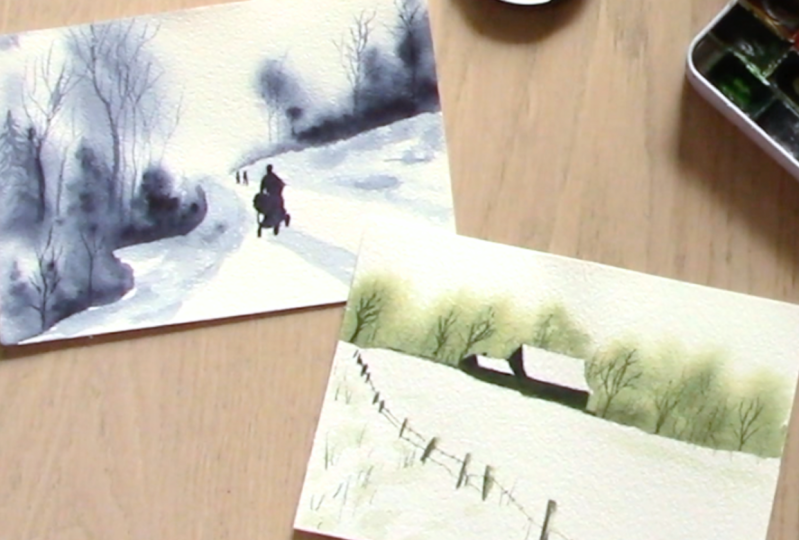
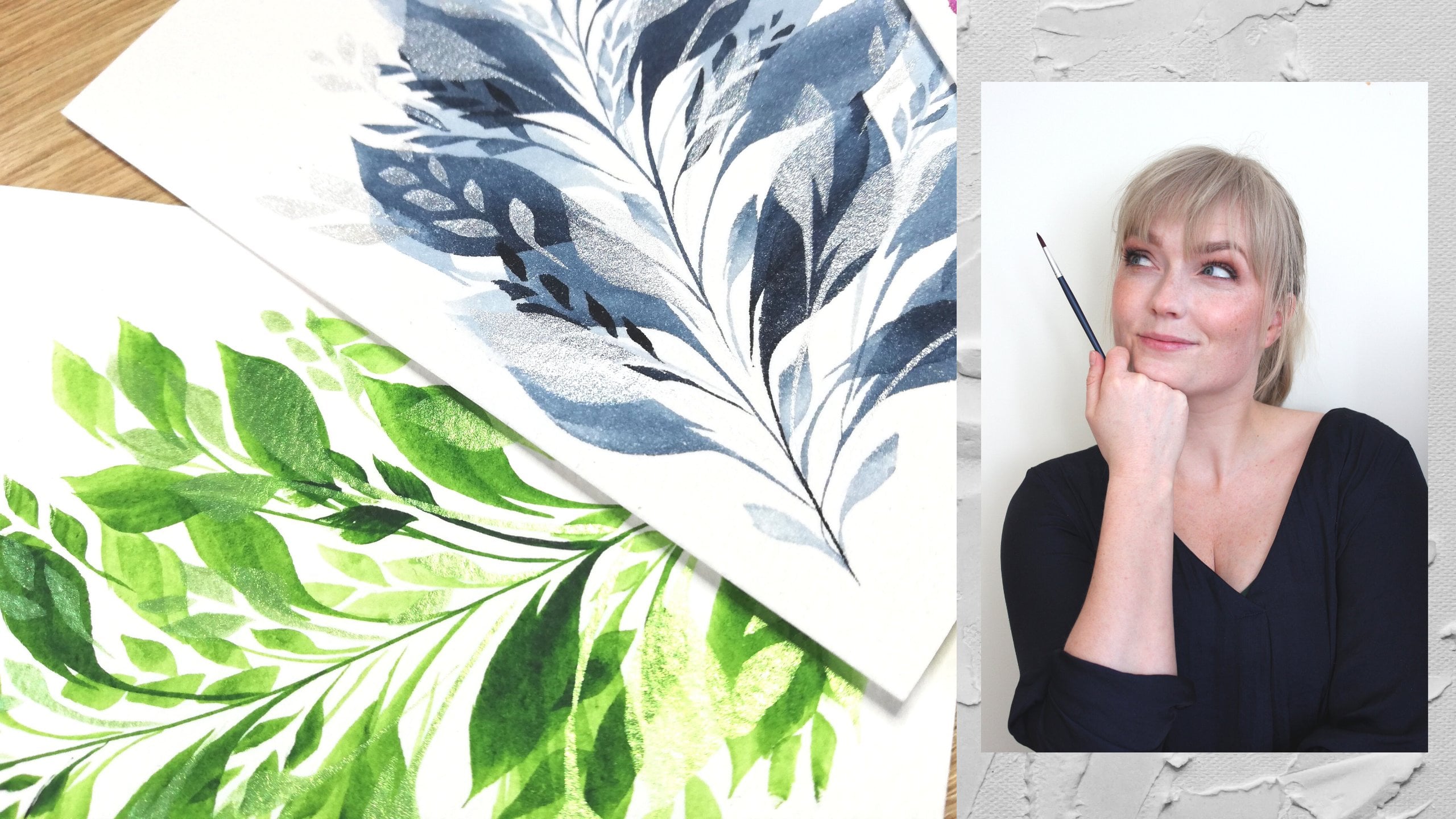
monochrome classes. I love painting in monochrome. You can see some of my
artwork here. This, actually. This is closer to the kind
of scene that we're making where the point is to
collaborate with your paper. Everything you see here
that's white is paper. We don't paint the white areas. We use the white of the paper to make the illusion of snow,
we paint everything else, which makes watercolor
really unique and really special and
interesting to work with. And that's what
I'll give you tips and tricks and techniques for. Today. If you've taken any of
my other classes, you know, I usually refer to splashing and the flow of the paint
when the water is wet. That's also the technique
we're doing today, which is called a wet
in wet technique, which is when the paper is wet and you put wet paint on it, you get that unique watercolor effect of
the paint spreading, but there is a way to do it that doesn't frustrate
the life out of you, and I'll give my best
pointers on that. You can also find all of that information in
the other class. You can go back to that
first and you don't have to. If you're more of an intermediate
painter and you know your supplies well enough
to go straight in, do. I'll be showing you how to
paint two different scenes. You'll find the reference
photos in the photo gallery. And also, I want to mention if you're worried
about hyperrealism, which you never have to
worry about with me, I'll be sharing how I think
when I look at a photo and I change it to monochrome
so that I can see the range and the difference between
the light and dark. But I also want to
simplify it a little bit. What am I looking for to make it easier for myself
to paint a scene? Because I don't want to make a perfect, realistic rendition, 'cause the goal is to make something to enjoy the process
of painting in for me, it's more enjoyable to paint
something that's finished than it is to paint
something that takes me hours and hours, and
we're different there. If you love that, there are
beautiful other classes on that subject. This is not that type of class. Here we go through
pretty quickly only two layers of what we're painting so that you end up
with a finished artwork, which is what I love when you sit something
and you're like, I created this and this thing didn't exist
before I made it. The feeling of creating
is one of my favorites. So I'm really glad you're here, and I hope to see you
in the next video where I'll talk about
our class project, what that looks like.
Welcome to class.
2. Class project (and pep talk!) : Welcome to your class Project. As suspected, probably, your
class project is to finish a scene either with
the photos that I've provided or with a photo
you've chosen yourself. But I would love you
to make a wintry scene where you really collaborate
with the paper of keeping the paper white to represent the snow and then
paint everything else. See if you can make
the difference between the light and
the dark parts really, really clear, get
a lot of contrast. And to get that, it's a good idea to choose a
color that's pretty dark. If you choose a yellow,
the difference between the darkest yellow and the lightest yellow is not
as big as the darkest dark, blue or green or purple up to the lightest lightest pastel almost not there shade of blue, purple, neutral tint, paints
gray, anything you like. I recommend choosing paint that has a really dark,
darkest shade. Class project gallery, you
can share your artwork. You can also share
it on Instagram, if you like, if you're so inclined to share
your art there. I love seeing my
students projects. It makes me very happy and to see how you also
inspire each other. I'm inspired right back by the images and the ideas
that come into your brain, which is completely
different from my brain. And I've seen images of people expanding on
ideas that I've had that make me feel incredibly
fortunate to have shared this idea and sparked an idea in someone else's mind. I love it. So feel free to use the techniques in any
way you like. You can't. You do it wrong. You
can't do art wrong. You can't do creation wrong. You can't do playful
watercolor explorations wrong. You can make something
you don't like, which is normal and
perfectly fine. And you'll learn
a lot from that. Maybe your supplies were wrong. Maybe for the technique
that you're using, maybe your water dried up
too quickly on your paper. Maybe your house is super warm. The difference
between the situation that we're in when
we're painting can also impact the results, and don't let that
discourage you was my main mission to say, so that you keep exploring
and playing and not take it so seriously that you hinder yourself
in even trying. Yes? Deal? Okay, perfect. So share it in the
project gallery. You can watch through
the entire class, or I'm going to paste it so
that you can follow along. We'll paint the
different layers. You can see it on the
lessons on the side, and then you can
share it afterwards. You can paint your own. You
can paint two versions. You can paint it in
different colors. You can also, if you want, keep exploring and
keep playing and change up the colors
and not go monochrome, but use different colors with the different parts
of your painting. You want to make a
blue, beautiful forest in the background, and
the houses are red, what's I'm not going to hinder
you in doing anything that makes you create more and paint more and have more creativity
and art in your life. And I also love to say
that your watercolors and your paper and your supplies and your brushes want to be used. They want to be used by you if you're worried about
starting because you think that you don't deserve or you're not sure that you make something beautiful
that you like, and it's a waste of supplies. I want you to take that thought
and put it in the trash. Please know that
anything you create that comes from you is perfect. It doesn't matter if it's ugly. It doesn't matter if
you don't like it. You've put paint on
paper and you created something and it changes
the way your brain works. It changes the way you
confirm your identity. I also have some
classes on that. If you're interested
on creative habits. What does it mean to
be a creative person? And you can check
those out if you like. But my main point is to not
be so worried about starting, so worried about the
result that you don't try, that you don't explore. If this class, when you're going through it
feels like too much, feels like too high of a level if I'm going through
it too fast, please know you can always
go back to the first class where I go through the
techniques much slower. I also have my watercolor
splashes class, which is more of a watercolor one on one if you're
a true beginner. I'm not saying you
can't take this class. I'm saying there's
information there that might help you build more of a foundation to know what I'm
talking about in this class that we establish the vocabulary so that you understand
what I'm talking about, so that you have a
better time, which is all I want for you
in this class. In the next video,
I'll talk about our supplies and how I use
them and how I choose them, and then I hope you
find your supplies and join me in painting today.
3. Supplies : So if you've already watched
the other winter's splashy, snowy class, you'll know all the
supplies that we're using. I'm just gonna show
it to you one more time. These are my
favorite paints. These are some Roman Schmaltz
and some white knights. I love that they're
in full pants. I will never finish these. I do have a backup for this one, actually, the Aquarius
green, which is lovely. But you'll want something
with a bit of a range. And by range, I mean, something that's dark enough so that you have a big stretch from the
lightest to the darkest. Yellows, light oranges maybe won't give you that same effect. And while that's
being said, you can, of course, use any
color you like. Use your favorite
one. I'm probably going to use my
indigos over here. Make sense with the snow,
but you can also make, you know, brown, dark, spooky ones, purple ones, maybe a nice green one for
spring spring and snow. Strange. But you'll choose
the colors you like the most. I always encourage you to use
plies that make you happy. So I want to use some of my favorite colors.
These are magnetic. Just always recommend having your swatches available
because these, how would you tell these apart? If you didn't know
what they referred to. Get your paints. I always like having two jars
of water and I like having lids on them so that I can
store them without spilling. I like having one for
clean water that I pick up clean water with
to make my clean splashes, to put clean water on the paper, and one for rinsing
off my paint brush. Often, I'll keep
a separate brush, which is only for
clean water dripping. And also keeping them
as clean as possible. It's nice to have two. We
need watercolor paper. Paper is one of our most
important supplies. I like this is a rough one. I like the ones with
a bit of texture. So we have cold
pressed and rough. Today, I'm going to show
you two different examples. And this cold press one has some nice texture that will give us more
like granulation. If you're using a
paint that splits, these are glued on the sides, and then you open them
where it says open. You open them where they're
not glued by sticking a ruler or something not super sharp
in between. Taking it off. The reason they're
glued on the sides is we're going to
use a lot of water. Water and paper are not friends. So the water will
make the fibers expand on your paper and
make it a little wobbly. And then when it's
glued on the sides, when it dries, it kind of stretches it back
out into shape. But if it doesn't have
anything glued or taped down, it kind of stays a bit
wobbly and when it dries, it can dry, not flat, which is not an issue,
but I like my flat paper. You can also stretch them
out. Afterwards, you can tape them to your board, if you have singular pieces of paper, tape them onto something. But it's really luxurious to have some that are taped on the sides that have
glue around the sides. I also like paper wise
to bring a sketchbook, something to, like, doodle
on or test colors on. This is an old 2022, an old splatty one, a really beautiful
granulating obsidian brown. I've taken my rainbow class,
that's where those are. So having something a
sketchbook or some scrap paper and also a rag to wipe your brushes on
it's nice to have, as well as a
selection of brushes. I like to have a fluffy one
and put this pencil away. This is for our sketch.
Fluffy one for clean water, a smaller tapered one,
a pointed round brush. This will get more pointy
when it's dipped in water. It doesn't look super
pointy now, but it will be. This one's for clean water, and then I like a rigor brush. We're going to make some
trees today as well, and I'm going to use this
one just to show you how to make branches. You can
make it with this one. Just practice your
water control, your brush control so that this one has a
really nice, fine tip. This one holds a bit of
water because it's long, but it also gives you that nice. It's very easy to make
branches that look like branches and
not just a log line. So I'm going to
show you how I use this one as well today. This is just a normal
mechanical pencil. I'm not going to draw a lot, but I will make some
outlines to know where the line for the horizon
goes where my splash starts. This one has an eraser with it. Or I actually recommend having a needed eraser
so you can pick up. You just push it. It's like
rubber. You push it down
4. Tips for reference images: Just wanted to show you quickly some examples of some
imagery that you can use. I try to find photos that
have a clear horizon line. That way, there's a
lot of snow and I also keep the edges of
the paper white. This is a nice one that
has a nice big splash, use a softer splash
for this big one, branches and the trunk and then have more of a
tighter splash down here and something like this where there's
a horizon line. There's some other splashes,
and there's a lot of white. With a photo like this, what you could do is go to Edit on your phone and then you
find where it says, adjust and you adjust
the saturation. And when you take
the saturation, all the way down, you get
a black and white photo. With a black and white photo, it's much easier to
see the contrast. If you're working in Monochrome, it's much easier for me to see the contrast than if
it's different colors. This one has super
different colors. It's just blue and white. But still, this gives me a much better idea of
how dark is that person, how dark is that shadow, how dark would the splashes be, and I'm not distracted by the
light in the sky as well. I think this is the one we're going to be working with today. This is one of the ones
we'll use for our scenes. I'll make two different ones. I also recommend is going on royalty free sites and you can find lots of beautiful
image there. This is a bit of a
strange one because this house is
completely covered. But you see what
I mean with there being a lot of white space. A lot of white, we're going to collaborate
with our paper. Let the paper be the white. Here as well, we have kind
of two horizon lines, and we need to arc person. And then this is one
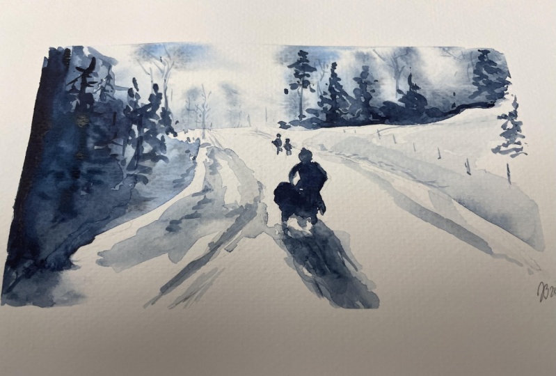
of the examples, and it's made out of this photo. This is a photo I
turned black and white. It had a bit of color in it, and then this is the imagery. This is the painting that
came out of this one. You see it's not
exactly the same, but you see the idea of
trees in the background. This one has splatters
of white snow. You can add that with
a gel pen if you like, or ink or quash. But I really like to splatter
some extra snow on top. Afterwards such an
option as well. But it was made for this one. Yeah, looking for some imagery, maybe you have some
on your phone. Here's a nice one. The splash would be tight around
the back there, and then some splashes
here on the sides. We're back at that first
one. Find some imagery, find an image you want to try. Or you can follow
along with mine. I'll add mine to the resource
gallery so that you can work on the same exact
image as me. Let's do it.
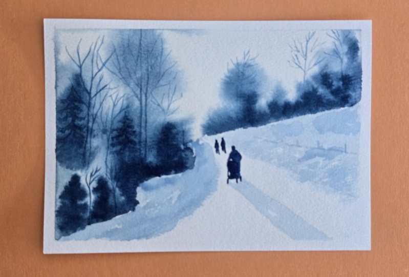
5. Blue - First layer - Wet in wet: I'm gonna find the
reference photo we made earlier. Which is this one. And I want to make
I'm not going to make a perfect perfect reference. But I want to find going to find the middle and make sure that
one's left pretty clean. And then slightly
down from the middle, up to the side, I'm gonna make a horizon line with my pencil. I'm gonna make a lead a bit
of a horizon line here. A little swoop here looks like
a little half of a heart. I'm going to do a
splash here as well, but this bottom line will
be a little bit looser. So, find the middle,
slightly down. Loosely up here. And then that one. Further out. I want to try to
make a person here. Later, I'm just making
the sketch that I need. Don't need that much. I also don't need to make the
person. You don't have to. I kind of want to make
splash and splash. Besides. So what's
also a good idea is to start activating my paints first and get some
water on my brush. What are we going anyways,
guys? Let's do indigo. Feel like this is my
painter identity. So getting some indigo
in my brush, now, that's just ready because
what I'm going in with first is just clean water. Taking the clean water brush. And I'm going to make these
splashes at the same time? And what you need to
know about watercolor is also that you need to
work. Go white fast. So we need to make sure our
water stays our water stays, our water stays on the paper, that our paper stays wet. This can be tricky
because sometimes we're scared of going
in with too much water, and we feel like we
lose control with too much water, and we can. But what we're looking for,
what I want you to look for is a sheen on the paper. And you can also
fix your mistakes. You're going back and forth
with the water until the, the paper is saturated, but it's not dripping wet. I'm going to show you what
I mean. A little closer. So what I want is that type of sheen without
it being dripping wet. And then I'm going to adjust how much water is in my brush, how much water and paint that
indigo is pretty thick now. I'm going to put it down
where I want the most paint, and the darkest color, the darkest range, which will
be along this edge first. Oh I what I meant. It's fine. This one also has
a bit of color. It's gonna be along
this edge first, and then I'm going to do some
splashes of these trees, and those are going
to be accentuated with more like
trunks afterwards. We're going to do
wet on wet first, where the paper is wet
and the paint is wet. When everything is dry,
we're going to do wet dry, which is exactly what
it sounds like of putting wet paint on dry paper stays exactly where we need it. So now comes moment of truth. I'm going to get a
little bit more water on my brush because that
indigo is so thick. And then my favorite
part of all paintings. So we're going to start
making that top bit. There's a tree up here. We can add some more water into some of the trees if
we feel like they're not spreading in the
way we like them too. I can also see up
in that corner. It's a bit too much water. It's a bit too wet, so that took some of its paint,
took some paint with it. I'm going to make a trunk here so that I can
stay like that. Over here, I'm actually
going to add more water to my paint to make
these splashes. A little more a little
lighter in color, actually. Whereas at the bottom here, it's gonna be quite dark. This is still all wet enough. You can add some more
there if you like. This is all still wet enough. And then slightly outlining the, like, general shape of trees. And, of course, I'm
interpreting I'm interpreting this
reference photo. It's not going to be
an exact replica. I'm also like, I'm going to add some trees here
that are not really there because then we get
this, like, swoopy effect. I want makes some
tdle trees up here. See how it's kind
of coming together. Do I want this all the
way to the edge? Yes. Right. I'm getting it all the
way to the edge here, and that feels like it needs to be all the way
to the edge there, and then I'm getting some of
that lighter splashy effect here and some of the darker
splashy effect elsewhere. As you see, I'm working
pretty quickly. Look at this beautiful
spading and splashing. Yeah, I'm not going
to do anything with this dry patch
this dry area yet. If at any point, look
at beautiful water, at any point you feel
like for example, this tree supposed to be a little bit in the
background, looks quite dark. I'm just going to go in with some clean water to
soften that a little bit. I still want there to
be play, color play. I want to be able
to layer trunks on top of this and
then it can't be at maximum darkness.
Does that make sense? I can't put another
trunk on top of this, but here there will be
trunks and branches in the lighter area with a darker shade of indigo afterwards. I can't do that if it's already at its maximum
darkness or here, it won't matter if I
layer more paint on top. Because it's already so dark. And that friendly friends
is our first layer. Good luck with yours. I'm
gonna let that dry completely. 'Cause also, it's
starting to dry. The paper is starting to dry. See, there's still
that sheen on it. This is the joy of cotton paper. You can play with
it for a long time. But it is starting to dry, so I'm gonna leave it so
that I don't mess with it. I just messed with the floor. That's okay. This is also why
watercolor is so nice because you can
just clean it off. I'm going to leave that, and we're going to
come back to it after. What you can do in the meantime
is make a second version. Make another background, make another starting point of another image if
you would like to. With another one of
your reference photos, you can make a similar
one in a different color. You can try both
at the same time. You can see if you want to try this one, but on a
different paper. Up to you. I'm going to try another background
on the rough paper, actually, so that we have two
backgrounds to play with. I try out. I'm gonna
try a different color. All right. I'll see
you in the next one.
6. Blue - Second layer - Wet on dry: So we are back, and this is entirely dry. You can see that there's
no sheen on the paper. It's gone back to
being entirely flat. Isn't that nice. So now
we have our background. We have our soft splash,
the splash that we've used. The second part I want to do on this painting is
everything that has, like, a really light value, like, where there's lots of water,
this type of value up here. And I want to do that
on the road and on this triangle part here
that's in the shadow. Little bit of dry brushing here. After that, I'm going to
go in with my trunks, my branches for this tree. It's going to be up here. The point isn't that
we're going to make a perfect replica of
a realistic painting. That's not where we're
going with this, but to have that imagery. What I also want to
measure is how much of the painting is that
person in the foreground? It has a perm and has a shadow, and I do want to
have that in this. You can also take anything out. This is your choice,
artist, friend. You can take out anything you don't want to
paint in a painting. You can take a
reference photo and you can stylize it the
way that you want. You can take out the
people, you can take out the houses, you
can take out details, especially details
that scare you, you're allowed to
take those out. You know. So what I'm going
to use to help me get this very light part
is I'm going to use the lid of one of my
water jars to mix a really, really light shade of blue, and I'm going to
test it on these little It doesn't super matter. I mean, you can go in with
a light shade of blue, lots of water in
your brush and just go for it, which is
what I often do. But if you wanted more control, you can mix your
paint in this in advance and test that you
have the shade that you want. If you're unsure of how dark you want it, always
start lighter. You can always make it darker, but it's really hard to make it lighter and take paint away, depending on how
tinting that color is and you can scrape some off. But always a good idea
to start with the light. So I'm going to keep this
as my clean water brush, and I'm going to go in with
my lighter brush brush. And since there is
going to be blue on it, I'm just going to put
it in the blue water because it doesn't matter. It's going to be blue anyways. So getting some of that indigo, mixing it, adding
some more water. We're getting a
very light shade. I always recommend
having palettes that are white or
lightly colored. If this had been on a black
palette or a black bowl, I wouldn't have seen the color
and the shade as clearly. See, that's pretty light. Then not too much
water in my brush. I can see if that is the type
of shade that I would like. It's really light,
but that means it gives me a good base and then I can add more color on top. So let's look at our reference photo again.
You brought it up here. So this is the second
kind of light shade. I want to put it
here, and I want to put it in this triangle part, and I want to do this shadow, and then I'm going to put in
the person at the very end. That's gonna be
really dark again, like these parts
and these parts. So just leave that there for us. Yeah, it's starting
to take shape. So using this, I can
mix more if I want to. I'm gonna make I didn't
make a line here, I'm gonna start in
this corner here. I go to make this entire area. And if I like dry brush a
little, like over here, there's some lighter parts, not to make it too, like, super um like, it's not cut with
a ruler, you know, it's just snow bunching
up here on the sides. And there's a little
more color up here. That's also where
the trees start. If I wanted to, can
add some more paint. My palette, make a bit
of a medium shade and, like, drop in some more. Some, like, a little bit darker. Gonna do the same thing
on the other side. Get that really
watery shade first. As you can see, I'm going back and forth
because I know I have the opportunity to adjust it. And as my brush
runs out of water, I get those nice dry
brushing effects. Starting to take shape, let me show you a little bit closer. And then I know that there's
a shadow from this person, and that shadows pretty sharp. Sharp as in the lines are
pretty clear because the shadow the person giving the shadow
is very close to where the shadow is landing. Does that make sense?
If I put my hand here, that shadow is
sharper than if I put it here. Does that makes sense? Because that person
is standing here, that shadow has
clear crisper edges and a more like direct, a more direct shadow. So what we can also do here
is add in a little bit more more of that medium
shade into this part. That's now op. As you can see, I'm going back and forth, adjusting as I go, trying to see where my lights and darks are in my reference. And if I make something like, Oh, that looks a
little dark to me. I could just add more water. I can still keep lending
while everything is wet. Also so that this part
doesn't look as sharp, but still show
that there's snow. And we can keep layering
forever, obviously. This is your artwork. But I also like when the
strokes are quite loos. Like that. See what I mean? Yeah. So I'm not going to mess anymore with
these two areas. What I'm going to do now is
go into these dry areas. I don't want to mess
with these because if I put in the shadow now, that's close to a wet part. It's close to a
part that's shiny, and I don't want it to bleed. So I don't want to do
anything close to this part, but I do want to
make my branches and my trunks into these two areas. Not going to make all
of them, not going to make every single trunk
and every single branch. We would be here forever. But I do want to make some
of the details. Okay. Whoop. Some of the details
up in those trees, especially on the left side and a little bit on the right. So that's what we're
going to do now. I'm going to take
my rigor brush. You don't have to have
a brush like this. But this just gives
really thin lines that can keep going for quite a long time
because this brush, because it's narrow,
but it's long, it'll keep more paint
in the bristles. Whereas if you have a very,
very short, very thin brush, that'll run out of
water really quickly, which is why I
prefer these ones. So this type of brush
can give you really, like thin lovely lines. And by working kind
of straight down, putting it straight
down on the paper. I'm not dragging it like this. Putting it straight
down kind of helps me with kind of jerky movements, helps me get more
like the type of branch feeling that I want you see what I
mean, that top one. So it's not too smooth, if that makes sense to you. This is my brush. This is
the one I'm going to use, and I'm going to
show you how only if I only had a brush like this, I would make sure that I
had very little water in my brush and then I'll flip this around so
you can see the difference. Here we go. I was going to put that in my
mouth and then I realized, you won't hear what I'm saying. With very little water, the tip on this brush goes very sharp. That can also be used to make those branches in
those trunks. See what I mean? But you need to make
sure that your water control is on point. Yeah, so that point
stays nice and thick. Nice and thick,
nice and not thick. If we get too much water, I just dipped this
into water and didn't take anything off. The brush will release, more water, and it will
also not be as dark. It's harder to control when there's a lot of
water in the brush. That was my point. So. Here's the brush you have. Let's get our reference back. So I'm going to make like
four maybe trees here, five, one on the edge, and then a couple of
small trees over in this area to get into
this blob and this blob, which will be the indication that there are other
branches there. Stop. Getting quite a dark shade and not too much
water on my brush. Always want to start on the
thickest, darkest part. La start down into this one. I'll get pretty. Like, holding it
pretty straight down. I can always again, you can always go
lighter, sorry. You can always go darker,
start light and you can always go thicker branches, but it's hard to take the
branches back if you've made thick branches
and thick trunks. We're going to start
very narrowly up here and then you can add more water if you
want thicker trunks. You want to start something
that is little bit thicker. I'm just making why shapes and trying to balance out
where those are coming from, how thin, how thick, so that it doesn't look too
much like a cartoon tree. It starts looking
like actual trees. And then you can also,
if you like this, it's not the best brush to
make this kind of tree. But if you wanted to
make any pine trees, you can also do that, I like working from the
top down to make some of those pine trees more pronounced more pronounced
in the background. See how that disappears
into the rest of the growth, the androgrowth. Then you can see if you feel
like you need to go darker. Add some here in the foreground, even though it's
not super easy to see because they're on
top of something else. But it gives the impression
that there's more going on. Little pine tree. So we have the effect of more trees and do one more on
the other side. There's a really
tall one over here. Ots of little branches. I also try to not have branches start in the
middle of nowhere, which is easier said than done. They don't disconnect
from the tree. Here there are also a couple of small trees
here at the front. And as a general rule, anything that's closer to you in a painting will be darker. So what I'm noticing
now is that this tree is a little darker,
which is strange. Like, perspective wise, that doesn't make sense
because these are closer. So I'm going to darken some of these with more
paint in my brush, more paint in my paint mix, so we have that contrast making sense in how far
away something looks. Which is also why it's nice to turn things black and
white because I'm like, Is this green, darker
than this pink? I don't know. Then you turn to black and
white and you're like, Oh, yeah, know it is. Making those front
trees a little darker brings them
closer to you. See how I mean, see how I
mean, you see what I mean? Then having maybe a
little bit more water for the trees here
in the background that are further away. I don't want to
overdo this. I don't want to make 7,000 branches. I will be here forever. You can, if you like. But I challenge you to also see
how little you can get away with and indicate to
indicate where the trees are. I can bring these up
a little bit more, but I'm also like, I'll see if I like this.
It's harder to go back. I'm going to stay here for now. And then what we'll do for our
last step is just bringing this person which I do
want to sketch first just so I have a better idea of the shape that I want
this person to be. So just got one more step and then you can keep
adding details and you can keep adding texture and
you can keep adding, but you can also see if it's uncomfortable for you to
let it stay like this. You know, now that I'm
seeing it go all the way up, I'm tempted to make some that go all the way up and
out of the frame. And as a reminder
for ways when you're painting, it's not that serious. I mean, it can feel like, Oh, but I wasted this
time or I wanted this to be really good or it's a present or it's a
commission or it's something. I'm like, Well, yes, but you can also I just
realized I did that, like lending it into
this bottom part. Making it nice and smooth. Seeing if there's
anything else I want to change, bring it closer. Yeah, add little grass,
little somethings. They're a little they're tiny little trees out
into this snow as well. And here, there's there's
a fence. You can see that. Like a little fence for here
now that this part is dry. Some details just to have
some more interest there. So we're gonna
leave that for now. I'm going come back to this
person in the last part. But this is where we're at after the second round of this.
7. Blue - Final touches and details: Last part of this
one is going to be the people, the humans. I'm not very good
at painting humans, but this kind of silhouette makes it a
little bit easier for me. So I'm going to draw them in. I actually want to do
the two tiny people at the back. Those two up there. But I really want
to do this one, it's okay if it's
a little abstract, it's a little imperfect, it's all right. Joy of painting. I want to draw them in,
and I want to make sure that he's is that this person is ish the same
proportions as on this. I can actually because this
paper is not very large, I can zoom in for this to be about the same size as my
paper, a little bit more. To help myself, see how
big this person is, it's about the same size as
in this photo right now, see if I can show you
how much I'm cheating. I want to do a little
head up here in the up into this
portion up here, there's a bit of shoulder ridge. There's actually a little
triangle opening here. And then there is a tram, a tram, a tram, a trolley. So there's an elbow
sticking out here, and then that actually
is pretty flat area. So I'm trying to
get the silhouette. And trying to keep the
parts open that are open. These two and the
very black are very small and they have to be moved a laid
weight to the side. The main thing I can see
in these two is blob on top and I can see that their legs are separate,
that they have two legs. That's the only thing I'm doing. See what I mean? I'm only sketching that they
have two legs. I'm sketching the wheels and then this line here and this opening here
trying to keep those. If they get locked,
that's okay too. That's the only
thing I want to do on this painting
for the very end. I'm getting a really dark indigo on my rigor brush so
that I get the details. I could have gone in with
this pointed brush as well. I feel like, I'll get a lot of control to get those thin lines and the thin lines of the legs
if I go in with this one. So, learning from my mistakes, I'm gonna go from left
to right so I don't put my hand into it if I start here and then
put my hand here. I'll put my hand
into paint like I already have.
There's green there. But I'm gonna do these
little humans first. We wee little blob,
two little legs. Little blob. Blob.
And two little legs. And basically just using
my brush, like a pencil. So they're quite far away. And then this, I'm just
coloring in my own sketch. And here, as well,
it's easier to go smaller and then expand out
than it is to start too big. I'm getting the prim. What I could do
as well, is going with the other brush
when I'm filling in, I can do the outlines with this. This one goes pretty
much straight in. Pretty much straight
across to this wheel. MGs keep on turning. Running. Rolling. Well, now we have that outline, and then I can actually use the other brush to help myself make it easier
to fill in the rest of that. Which looks like right now, it looks like a very large penguin. Um, making sure that I
keep that opening open, that triangle there
so that it looks like a tram when I finish, and then I'll see if I
need to adjust anymore. So I'm going to use this brush, go into my nice dark indigo mix here and just fill this in keeping both of those
little triangles that I talked about
earlier, open. And if you can't, it's fine. You will not be arrested. Ah, there's actually a bit of
an angle out on that elbow. If I feel like anything
looks strange, I'll just keep adjusting. Yeah. What does this wheel
look so angled? Sometimes it's
easier to see, like, if I'm looking straight
on it, I'm kind of keeping it this way
to show you here. I'm like, Yeah, I see in the
monitor, I see on my camera. But that wheel looks
a little strange. To exaggerate the
way that looks. But that it feels pretty good. And then also see how
that light opens up, and there's a little bit
of opening in the shadow. Magical. And that
my beloved friends is actually that one finished. I'm not gonna mess
with that one anymore. I could add more here. We can add more of that
dry brushing on the sides. I could reinforce this
fence, make that darker. But I actually really like
the way it looks now. You can also splatter some
snow on this if you like. You have some white ink. But I'm gonna call this finished. Oh, never forget. To sign your artwork. I really like, like, the visual of signing
with a pencil. 2025. But also, feel
free to sign with a pen. It just makes it all come
together and look very much like artwork. Look at that. Cute. Beautiful. I love it. And I hope you enjoy yours too. And if you don't, you
can always start over. It's it's all new. Alright. We're gonna do one more full
painting with another color, another reference photo.
So stay tuned for that.
8. Green - First layer - Wet in wet: I wanted to do one
more example for you because this is one of the favorite paintings
I've ever done. I still have it in
a frame in my home, and it's this one. And I was so proud at this, splashy background and how I've kept the white on the roof. It's such an efficient way of working with the
white on the paper. So for this one, I wanted to try to use
a different color. I want to try to use
my favorite green, and it's pretty neat to see this with its reference
photo side by side. This is the reference
photo. It's from Unsplash. I'll leave it in the resources. I'm going to have to
make a sketch for this to keep those houses. And then there's some of
that fence at the beginning. I did Splatter snow on this. Don't have snow
today, but that's in the first video. I really,
really love this one. I wanted to show you how quickly you can make
something like this. I love finishing a painting. I love when a painting
is done and, you know, one sitting, makes me
feel very accomplished. So recommend. This is a photo by Robert
Themen it's from Unsplash. You go find royalty
free pictures. Don't go on Pinterest.
Don't go on Instagram. Don't steal someone
else's photo. Photographers are
working as well. So if it's just for your
own practice, sure. But for something
like this, I really wanted to make sure that
the photos I'm showing you and using for my
references are either taken by me or from
a royalty free site. Just a little artist tip there if you're
establishing your artistry. So this one. Now we're going
to use the rough paper. This has even more texture. I'm excited to work with this. I can see that the texture of this surface has more texture. I'm going to use my pencil
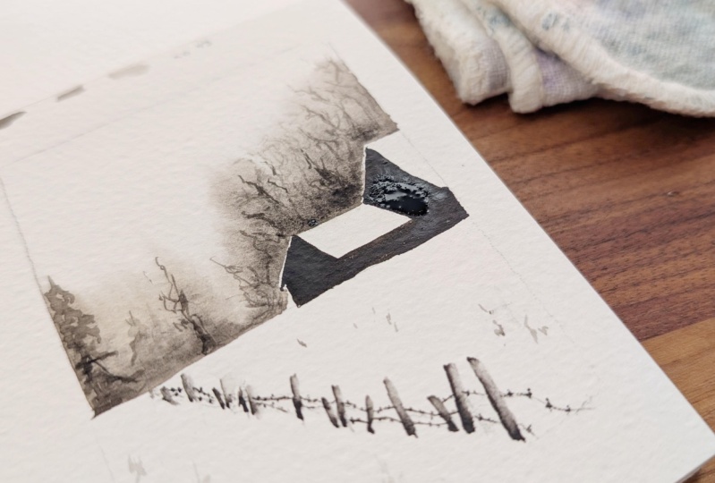
to map out the horizon line, the fence posts, and the house. So it's a little bit
above the middle. Starts a little bit
above the middle here. And then it goes
slightly downward. Here. It doesn't
have to be perfect. We're gonna splash
color over it. And we're gonna make
one little house. And since the houses
are gonna be so dark, it doesn't really matter
if my pencil lines are a little dark, as well. So there's a little roof here. There's a splash on
top of that house. And then there's darkness
from the walls of this house kind of overlapping
going out this way. And as per always, it
doesn't have to be perfect. It doesn't have to be seamless, doesn't have to look like mine. Yeah. And then this
middle fence post. About in the middle
about halfway up. So we get that fun perspective. I'm just going to make one line. I'll fill it in with
my paint afterwards. And there's one that's
a little angled. And then there's two quite
close to each other, a little angle that way, up. And then they kind of go back up and then there's one more tree up
here on the side. That's all I'm going to
do. The rest of this, I'll just fill in as I go. Let me show you the bare
bones of my sketch. Look at this artistry. Glorious. So I just
have my fence posts. I have my horizon line, and I have my houses, and
that's really all I need. So what I want to do first, like always is put my clean water on. So I'm going to start
along this line. In my experience, rough papers
soak up a lot of water. So I really want to make
sure that I saturate this. And because my paper is
glued, this block is glued, I have I have the opportunity to go
in with a lot of water. What you want to
make sure you're not doing is getting any
water onto the roof, really staying away
from those roofs because that's what's
staying entirely white. That's apart from
the bottom here. That's the whitest
part of that top part, which will be really
beautiful contrast to that splash of the trees. So following along
my horizon line, it's okay to go a
little bit over the horizon line so that the
pencil line isn't showing. So if you want to go
just over it, you can. Just along it just so the
pencil line is hidden. See how I'm just
crossing over it, I'm getting that nice
sheen on the paper. As long as there's sheen, as long as it's
wet, we can work. Now for this one, unlike the other one, I don't want
to go all the way up. I just want to go here,
but I want to give my paint space enough
to flow. See that? I want to give it
space enough to flow. And I also don't want to make a very dark splash
in the background. I want to make it quite light. And what I want to
do, now for this, you can also use the top
of the lid if you want. But I'm going to go
in with my aquarius green and make it a little bit thick,
but not super thick. And since time is
of the essence, I'm going to go
in with a splash. Now, so you know, there's one splash over here. I want to not mess
with it very much. There's one splash here, and I realize I realize that this having the contrast of
the green with the snow, I realize it's a little bit strange because then it
looks like it's springtime, but there's also snow,
so maybe this is like freshly fall and snow. And you can always add whoop
little bit more water. You can see how this is,
like, bleeding and blending. And you can obviously
work with the colors you like the most, go full, you know, artist vibes and make it purple, make it whatever you like. Then I can also I can
reference the reference photo, but I can also reference
my old painting. So I'm going to make it
a little bit darker down here towards the horizon. And I want to make
sure that these trees, 'cause they're not pine trees, they're kind of fluffy trees. And by fluffy, I mean, they have leaves and
not pine needles. So that's also where I want to make sure that it's not too dark because I know that I
want to make trunks on these. But I do want to get that. See that seamless blend upward. And it is now covering that
pencil line at the bottom. We're getting a
nice foresty line. And to hide that pencil
line here at the bottom, even though on the photo, there's no trees right there, I am going to make it
because I'm the boss. You decide. It's your
painting. It's your artwork. So now while all of this is wet, it's important not to mess with. It's important not to then
start going in with a really, really dark green that I'm
going to put on the houses. I'm just going to work with
one color here as well. But I don't want to go in with the green in the
house because that's gonna bleed out into
the wet parts here. What I can do is work on this bit down
here at the bottom. Sticking with my choice
making green snow. So for the fence, I'm going to use this brush for the beginning of the fence. And then for these little like the wires
between the fence. I'm gonna use the rigor
brush from earlier, that really long thin one. But for these ones, I'm gonna go in with
a tip of my brush. A pretty dark shade of paint. And like we said
earlier, anything that's closer makes sense to dark So I started
on the wrong end. Hot tip from artist. Start on the right side. If you're left handed, start on the left side if
you're right handed, and you'll drag your
brush across the paper just so we don't put your
hand into your paint and do this all the
time. I apologize. Actually, I don't apologize, but it's a little little
honesty moment for you there. Um, I got too excited to start with this big one at the
start, you know? So can make some of that. And then I can also help
myself by looking at my reference photo and see if there's
anything that I did. So I see that I have
blended a little bit off the sides of those. To get that the effect that
there's snow on these. So the way to do that is to
go in with a clean brush. I'm not gonna give the water
a lot of space to flow. So these are still wet.
They can still flow. Not gonna give it a
lot of space to flow, but I am gonna give it a bit of clean water here on the sides. So make sure they're not
very thick to begin with. That one looks a little too wet. Did you notice that
I did the exact same thing and started on the right. So that gives the effect
of there being some kind of little bit of snow
on the sides of these. See what I mean? Just on the
right side on all of them. Then I'm gonna go
with my rigor brush. This is one I'm gonna use for the wires on the fence and also for all of these little,
like, grass parts. And then at the
very end, I'm gonna make these, like, dunes. There's one little
gress over there. We're gonna do him as well. So gonna get my rigger
brush. This is my green now. And this is just
drying and having a good time in the meantime. You can use a sketch
here. I'm just gonna try to not be
a perfectionist. And it's okay if these
are a little imperfect. So there are two lines of wires, and you can't see both of them on every single one
because of the snow. So I can't really see
the ones between those. Then I can only see one going
from that one to this one. I can't see the bottom one
at all. There's non there. Then I get two that
just go off the edge. So get down diagonal
T two, right? And then you can make
the little crosses. Where their little
ties, just details. Try not to put my hand
in the paint, like, adjusted and make a little
mark there. Each okay. And as far as like
foreshortening goes, which is when something
is further away, when something is
angled towards you, there's a foreshortening effort. Like, my hand looks
like this this way. If you're drawing my
hand from this side, would just draw my
fingertips, you know? So that means if we're
seeing this from the side, these
are further apart. But when we get to see them, they're further apart like this when we see
them from that side. But when you see
them from an angle, they look like they're
closer together. So coming up the year,
they'll be smaller, of course, because
they're further away, but they'll be because
they're angling this way. They'll also be closer
together on the wire. I'm just using the very
tip of my brush for that. And then I'm getting
my grass ready. And here I'm just playing. And this is very, like, wherever you feel like there would
grow a bit of grass. There's some grass here. Just recently, there's
our one guy over there recently
covered with snow. So you can see if you want
to add more of these later. This is also the
brush I'm going to use for the trunks for this. But as you can see, you see how wobbly this part is. You see how much that
paper has expanded. So what we're going
to do with this, we're going to let it dry. Then I'm going to go in with the wet on dry for these houses. Go to go in with a little
bit of soft pillowy snow down here and the trunks
of all the trees as well. That's where we're going
with this painting. We'll see you in the next one.
9. Green - Second/final layer - Wet on dry: Right. We are dry. And we're coming back to do the trunks and the house and the pillows of snow down here. Is it called pillows of
snow in not in English, I think, but it is in Norwegian. I'm going to start with the houses because
it's very satisfying. I'm gonna get a really
dark shade of green. For houses and for
anything with texture, you can also go in
with dry brushing, but they're so far away
that I'm just gonna go in with the paint where
those houses are. See that first little
house actually has a tiny, tiny chimney. And next to the big
house on the right side, there is a little part here. I'm going to
do those as well. Gonna start with the walls all the way up in these corners. Carefully, carefully
tracing what I'm really I was
gonna say worried. Not worried. But what I'm
really taking care to not do is get anything
up on that roof. The roofs staying white are such a big part of
this, of this work. So I'm being very careful, I have a lot of control on
my brush because there's not a lot of water in the paint. And because it's wet on dry, the paint is not going anywhere other than where I put it. Now, as you can see, as you can maybe see,
as I will show you, when I'm dragging it
out further this way, the water that's further up in my brush is actually coming down so that it's getting a little bit
of a lighter green. It's not an issue.
It's just good to notice if you want to refill your brush with more paint for the whole house
to be even darker, beware that you might
want to go back in and fill your
brush up with paint. Again. And now I'm considering if I want to go all the way down to the
pencil line that I made. And since that
hasn't been painted over, I have another option, which is, um, to erase it
when the building is dry. When the houses are all dry, I can see if I want to go back in and erase a little
bit of that paint. But I can also pull
this house down to that line and also to that little square thing on the side here that
I don't know what is. I don't know what that
is. There's actually a little fence over here because I had some
paint on my brush. And then that tiny,
little square chimney. Alright, there. And that. That's all we're gonna
do with the house. Now, in the monitor, I saw that this one needed to come out a little bit 'cause it wasn't it wasn't
matching the side here. That is where we're going
to leave the house. Lovely. See how nice that contrast is? That
is really, really dark. Now, I could go
in with this one. I could use the same
brush to make my trunks. Go to mix myself a really dark, nice green here and making sure I can get
that off on my palette. I can also get some off on my cloth here and using my brush straight
down onto the paper. That's when I'll get the
thint most delicate lines. It won't be as
thin and delicate. Well, maybe my nose also
a little bit too wet, but I find it much easier to make these thin and
delicate lines. Oop with my rigor brush. So that is what I'm gonna do. I just want to give
you the option. If you don't have a rigor brush, you don't have to have one. Just make sure you have
a really dry Brush. So that the tip stays really, really sharp and gives you
those thin lines thin lines, those thin lines that you want. So I'm actually
gonna change brush. Tools one. Making
sure that it's clean. Let's have any other color on it because 'cause there
was blue on it earlier. Here we go. Getting all
of that delicious green, making sure this is
also not too wet, but it just makes for
a more elegant line. And I'm not just like
on the other painting. I'm not going to attempt to
make every single branch, but I am gonna make
enough branches that I feel like it's
giving the same illusion. Getting balancing out. I'm kind of I'm trying to
shake my head a little bit, which might sound strange, but that is what I'm doing, to get those kind of erratic
natural lines because I don't I don't like it when
the trees are too perfect. So getting trying to
keep the same darkness, making some trunks
thicker than the others. But this is all I'm doing just going back and forth
and you can add as much as you want or
as little as you want. You can also just keep it
as a splash, if you'd like. That's all so fine. Like not add any trees and details
and branches at all. Those are our
options, too. You are the artist. You get to choose. It's not supposed
to look like mine, and it won't because
you're a different artist. And you have different supplies and different
preferences. And that's, you know,
the peut we have it. There's actually also a
little fence over here. I have never seen before. Gonna make little lines
for that one as well. Now, for the sake of argument, I'm going
to leave it there. Then we have that
nice row of trees. Last thing you want
to add. Astasn final. No, it's like, Well, this is the last
thing I want to add. Um, I want to make
it really, really, really light shade of green. You can again test this on
your scrap piece of paper. See if that feels light enough. I'm actually gonna
add some more water. Just almost just lit a bit of colored water to
make these, like, dunes of snow softly making So like so that it makes sense
that those that the grass is growing
out of somewhere. And there's just a
little bit over here, as well, if anything
gets too dark, you can always use your
cloth to wipe it off. A little bit up
here. Little bit of shading to get some texture. And that my lovely artist is
prints all we're gonna do. If anything gets too
dark, you can also, like, tap it, and then you
can go darker after. But you want to stay
pretty light this whole way so that you know what so you know what
you're dealing with. No, so you know what
you have to work with. And then All we're
gonna do is sign, and then I'm gonna
show you how I open this and take
those paintings off. Gonna sign it with my pencil
because I love pencil. Right, 2025. Well, there.
That's all we're gonna do. That I love it. I love the contrast
between the really dark. This is all just one
color. Hm, aticals that. This is why I love
watercolor so much. Let me get the reference without it being
a perfect match. See, I can go darker here down in this corner if you like. Just want to give you the
options of how you can play with making something out of a reference photo that won't
look exactly the same, but you'll see that it's inspired by something
and you get the effects of the
watercolor doing its job, you know, making those
beautiful blends. And those, like, soft
spo slashes. Gorgeous. Perfect.
10. How to remove watercolor paper from a block: My favorite thing to
use to get these off of their block is a plastic
ruler, but I do not have that. So we want to get
something that's not too sharp in between there
and then just cut it off. Like this. Maybe we'll need to peel
some of that glue off this takes it off the
block. Perfectly. I want do that one
more time. In there, cut around the edge. L so. And there, you have
your painting. So, of course, we're
gonna take these off. For the perfectionism. There you have. Your
paintings ready. I hope you've
enjoyed this class. We'll do one more it'll
video at the very end. There you have your
reference photos monochrome using the
splash technique to get different
types of results. I hope you enjoyed it
and I'll see you in the next lesson for
some fine oak parts.
11. Before you go! : Just like that. You've
finished the whole class. You've gone through
every single lesson, or maybe you haven't,
but how would I know? I'm just filming
my own apartment. But I hope you had
a really good time. I hope you learn
something new about yourself and your supplies and your watercolor preferences. And anytime you take a class, anytime you make something,
you update what you like. You learn more about what
kind of painting you like, what you don't like, what you'll take with you, and what
you'll leave behind. And that is the goal. The plan is for you to give
this a chance and then get the information that
you need from it and take it into your artwork
and your practice. If you're like, Oh, I
don't like that at all. I don't like using
this type of brush. I don't like using
this type of paper. I I hate working in Mona Chrome, I always want to range with
100 colors at the same time. Perfect. Isn't that good
information to have, you know? So now what I hope
happens is that you leave your artwork
in the project gallery, that you upload a photo,
tell me how it went, tell me what you struggled with, if anything, and I'll
comment back to you. I always respond and gush over all of my
students' artworks. And if you leave a review, it'll help other students know what to expect
from this class. They're just coming to
a class. They're just clicking on one of the
thousands and thousands of classes on this beautiful site that I enjoy very
much being a part of. And why would they
choose this one? How would they know
what to expect if other students
don't tell them? So it's really, really
helpful for me and for others and also because who
doesn't like feedback? How would I know what
you like and what type of classes you like
if you don't tell me? Do you like it? Perfect.
I'll do more of this. Don't you like it? Cool. Let me see if I can
tweak something to help you better in class. If you want to tag me on
Instagram, that's Elisa Obachin. That's also where I do my
coaching and my other stuff. So if you're like,
Is this an art page? Yes, it is. That's how you get ahold of me. If you want to
send me a message, if there's anything
you're wondering about. Related, life related. It's been such a big part of
my life and my development as a person to have this type of creative practice,
figure out what I like, not to feel embarrassed about the way that
I paint, which is, sometimes I can feel like
the way that I paint is really easy and that must be cheating if it's easy and
it makes a beautiful result with not lots of hard
effort to practice. I want you to make beautiful
artwork immediately. I want you to make something
that you're proud of. One of my favorite
feedbacks that I've ever gotten from one of my classes was someone who's like, I'm a beginner artist,
and the results from this class these are the first paintings
I've really wanted to show someone that I've made. I'm gonna try not to cry. I cry in every single class. It makes me so happy to see my students change
the perspective on themselves of what
they're capable of, of what you're capable of. If you painted something
throughout this class, please know that your
brain has already changed. It's too late. You can't help it. You've already grown in a new way because you did something that you
haven't done before. That's how our brain develops. That's how our brain grows, as well, is new input. And then filtering
it through what we need, taking what we want, leaving what we don't
like, which is life, but also taking the time
to be a creative person, taking the time to
confirm your identity to yourself as someone who takes the time for creative practice, who uses their art supplies who creates in a world where
there's a lot of destruction. Let's not go into that. Creation, art, joy, play
is the opposite of that. We can only do that when
we're not in survival mode, so it makes me very happy
to know that you're here. Signing off on that note. I'm really glad
you're here. I really hope you enjoyed this class. I hope I see your artwork in
the gallery or on Instagram. Now see in another
class, another time.
 Elise Aabakken, Voice Coach - Teacher - Performer