Transcripts
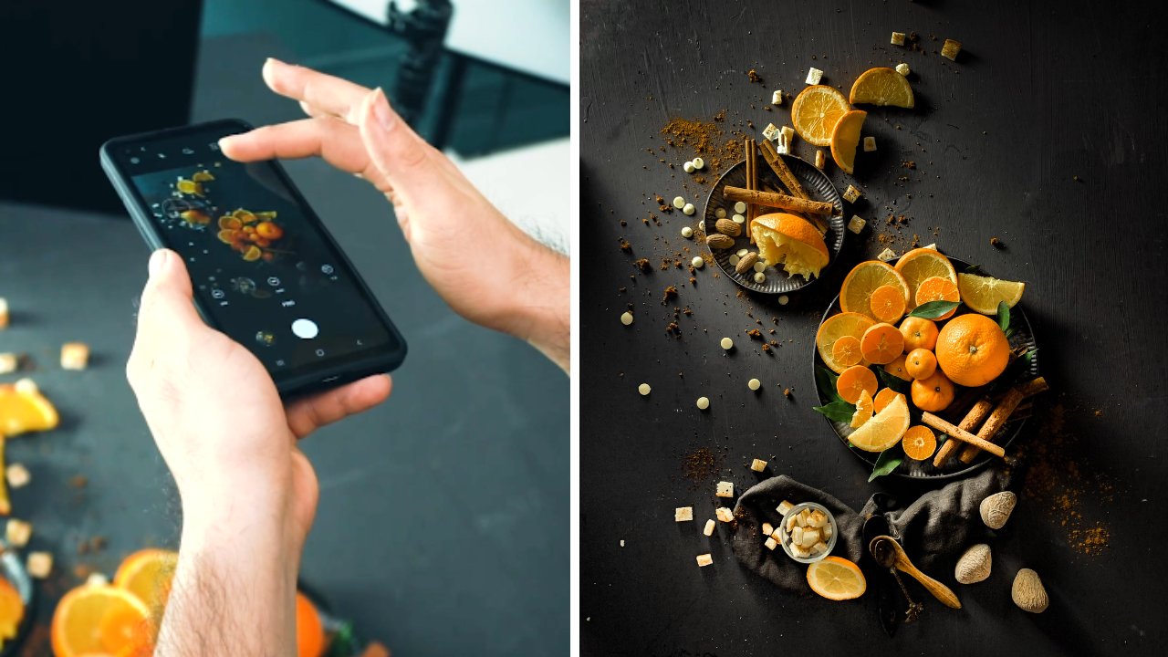
1. Introduction: Okay guys, welcome in
this course again. So this is a course where you learn to shoot
using smartphone. And then we will explain to you step-by-step how we create a beautiful rustic style
using your smartphone. Okay, So this is the picture we pay for this entire course. And you will learn exactly
how we plan our background, how we plan our props, how we blend the color and some techniques to
set our lifetime. How to create a
beautiful lighting that is suitable
for rustic style. And then step-by-step
in the editing, okay, so you don't
have to worry. And then for the smartphone, we don't use very
specific smartphone or very expensive smartphone. We just use ordinary
smartphones. So we can show you that standard smartphone also can produce a professional result if you follow this entire
course and then maybe some of you have already
used the smartphone debt, have so many lenses
on your phone, but this time in this course we only use the standard lens. We don't use portrait lens. You didn't use any
specific lens that maybe your phone doesn't
have that feature. Okay, we just use the
standard lenses in our phones so to make sure
that you can also do it. Regardless, you use
the Android phone. It again, this you use the iPhone as long
as it's smartphone. Okay? Yes, this is the introduction. And then for the practice, I suggest to you to watch
the entire course first. And then while you
are practicing, I suggest to you to practice exactly the same scene
that we set first. Okay? You practice here and you open
the field due next to you. So you can copy every single
technique that we use for the first frame to
make sure that you follow the entire
course and practice it. Okay? Yes. And then I will see
you in the next.
2. Introduction of Smartphone Camera: Hey guys, I have
a tapes for you. If you shoot using the
smartphone camera in many smartphone camera
and mostly they use wide angle lens
in your smartphone. The wide-angle lens is very
common in every smartphone, exists in this world
because it is very easy to use light angle
in the smartphone. So if you want to
shoot anything, then you can cover all
your views here, okay? But the limitation and white
lands in your smartphone. It has the dispersion. I will explain to you. You don't have to worry if
you're not familiar with the word distortion
because I will exactly show you
that difference. Okay, so I have my assistant
here and the first picture, I'll stand here and then I'll take a picture from here, okay, using the normal lens
in your smartphone, the normal wide angle lens. Okay. I will take
one picture here. K. Yes. As you can see in this result, the limitation of
what angle lens is, they're stretching area in
the side of the picture. As you can see in this area, you can see that the picture is stretched to the age and also the other side is also dredged to the edge
of our picture. So this is the limitation
of the wide angle lens because this distortion make the picture loops
and proportional. So in the next picture, I will explain to you how I
solve this kind of problem. We still use the same camera. We don't change it to
another lens because I think that not every
single smartphone, half the portrait bands. So I just assumed that we all have funded
camera in our phone. Okay, so with the same angle, with the same lens, but this time I
suggest you to zoom in 1.5 until two times, okay, for this picture, I
used two times in the Zoom settings and then I
will take the picture here. Oh, okay. Yes. As you can see, there is no stretching area, so the picture looks more proportional and I'll show
you the difference here. You can see side-by-side
here in the left side. Yeah, this is the picture of wide angle lens
without any Zoom In. And the right side here is
the picture we're zooming in. You can see the difference in
the side area of the beach. In our case, this is the
little secret that will increase the quality of the picture you take
using your smartphone.
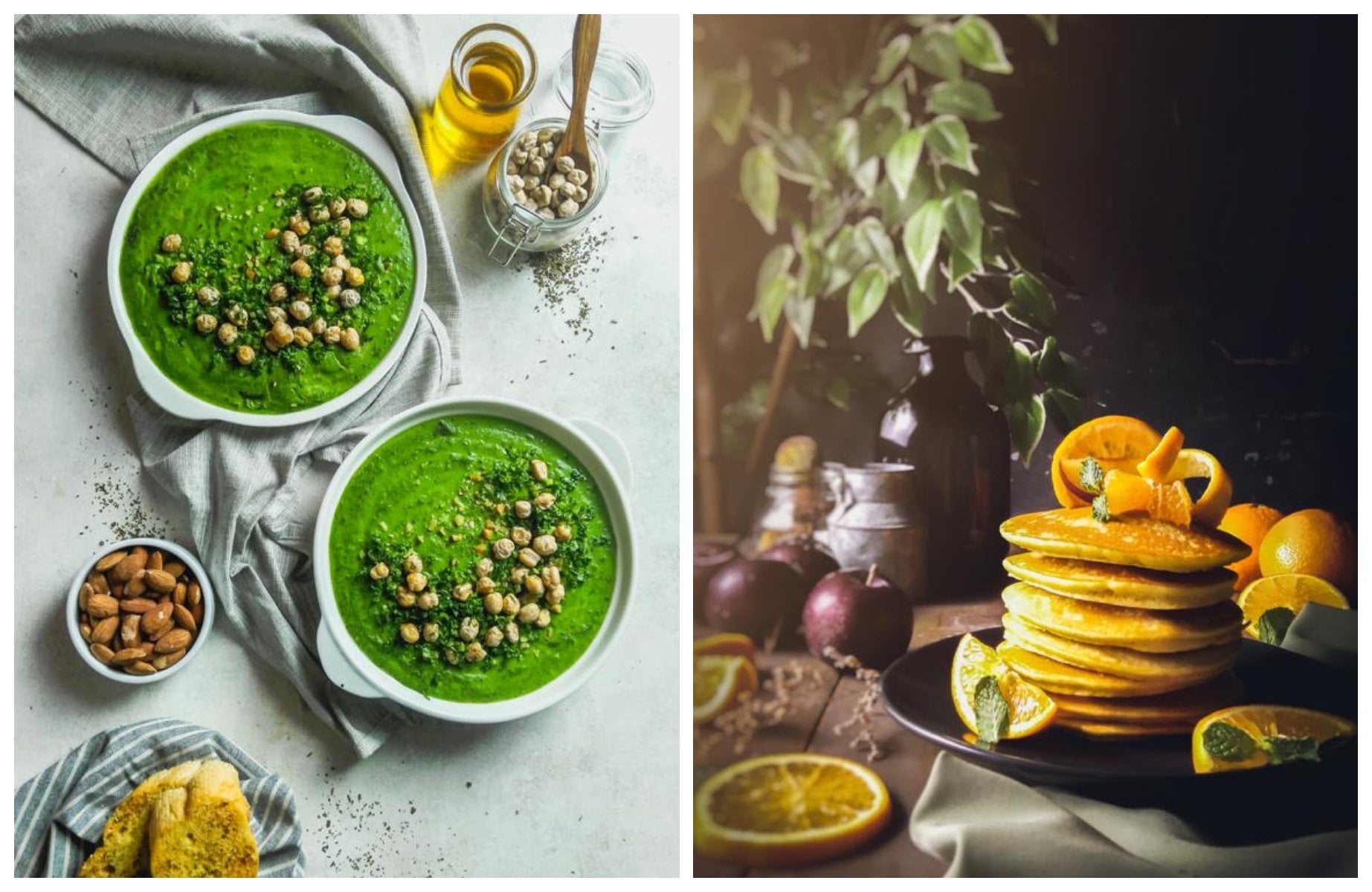
3. Project 1 : Choose the right props & Compose It!: Okay guys, Welcome
to this section, and this is our first
voltage is tension. So before I explain to you, then I will show you this is the result of the
picture we will take. Okay. And then I'll show
you the preparation. Actually, if you do the
proper preparation, then for the photoshoot
section will be much faster. Okay, so I'll show
you the thought behind how we choose
this kind of prompts. How we choose these
kinds of settings, how we choose this
kind of arrangement. So in this accident, I will show you the reason behind choosing the
prompts and background. Okay, we're going to
shoot the rustic style. And then because we really should the darker rustic style, then this time I choose the
wooden background here. Okay, I will explain
to you about how we get this kind of would. Initially, this is just the ordinary
world with no texture. And we create the
texture by ourselves. So we use the nails to create
the texture in the woods. So if you take photo
using this one, you can see the texture
of the wood K and then another KPI
is in most cases, when I'm searching for
the word out there, if I wanted to use that
word for the photoshoot, usually the problem is I
find a beautiful wood, but the color is not
the same each other. Okay. There's the darker kind of wood that is brighter
kind of wood. And when I arrange it together, the toddler is not the same. So how to deal with that? The trick is, I find the longer word is
like three meters, four meters, and cut them. Short-lived version. So if I arrange it like this, then the color is still the same because it come from one. Okay? And then another trick
for the prompts, selection and
ingredients selection. Okay, So this is our
main subject here, okay? This beverage, it is
made from the coconut, so I use the coconut
here. This is pretty big. It is very tricky to use
the big items if you want to use the item like this in the surrounding
of your settings. But one trick for you is you
have to remember that you always have a choice to change the shape
of this one, okay? This coconut, you can
just put it like this, then take the photo shoot. And you can also have choice to break this down into
small pieces like this. So this is the first texture and you can change
the shape into large pieces like this and changed to the smaller
pieces like this. So you get three texture
from the same object. Okay? When doing a photo
shoot is not that you have to like buy a
lot of ingredients, but even if you have just
some kind of ingredients, you still have choice to make it beautiful when you change
the texture of the object, okay, with using
one object here, I create the smaller pieces like this and larger
pieces like this. And some of them, I place it in the word
container like this. So just one object. I can arrange it into
many kind of form. Okay? So we place it like this. And some of them, I place it in front like this. And then another ingredient
we use is the cinnamon, okay? This is another trick. If you don't have
enough cinnamon, you can always put pepper hour here inside the glass so
it will pop up like this, okay, so you don't have to
use so many ingredients here. And then another
ingredient is ginger. You have to aware about the color of the object you
put in your background. I mean, in the surrounding. Okay, so let's say that the
main area of the photo shoot, the main subject is here, okay? And then we want to set
the surrounding, okay? It is very important to pay attention about the
color you put here. Okay? I suggest you
to put the object have same tone color with
your background again. So that's why I use the
wooden container like this because the color is quite in the same
with the background. So if you put it here, then people still can see
clearly the main object here. And then people
still can enjoy the surrounding because
the surrounding just give another texture, but it doesn't distract
the viewer's eye. So when they see the picture, they automatically direct to
the main subject here and still can notice the story because you put the object here, but since have the same
color with the background, so it doesn't distract
the viewer's eye. Okay, same as this. I use ginger is here
because it also have the same tone color with our background and
also the cinnamon. Okay? So it gives texture, but it doesn't add any
color that can distract. Okay, and then for another props here as the glassware like this. So I suggest you to have the glass like this
because it is very easy to use in any kind of background because it
will blend to your, wouldn't be grown like this. It will blend to the bright background and many
kind of bare ground, okay. So in this scene, I put the ginger
inside the glass here. If I make the different texture with the ginger that I put
in the background here. Okay, so pay attention. This is very simple, but you have to aware that
if you have the same ginger, but it will not be the
same if you put one ginger on the background and you put
the ginger in here, okay. In our mind when the fever see your picture,
it is not the same. Okay. So I suggest you, if you don't have
many ingredients, I suggest you put the
ingredient in many forms. Okay. You can put the ingredients
on the top of the background. You can put the
ingredients on the jar. He liked this. And you can also
check the ingredients in smaller pieces and
put in another place. Okay, so please do that because
it will give the texture. So your picture will
have the rich texture and feel it focus in
our main subject here. And then I'll show
you one technique. It's called layering, okay? Because sometimes
when you shoot, the color of the beverage
is slightly like orange. It is not white but like there's yellow and
orange color inside. So if you put this beverage on the background and the color
tone is still the same, even if it is brighter and the background
darker, but the car, It's still the same to
make your subject pop out, I suggest to you to use the
layering technique, which is, I put the white plate here
to separate the colors. So if I put the
white plate here, it's separate the color. It will make our main
subject here more pop out. So this is the
layering technique. Layering means
brown, white, brown, okay, so we put white layer
to separate the brown. Okay, this is the
layering technique. And then another one I'll
explain to you about the close. Okay, So for this
kind of settings, I suggest to you, if you don't have the brown cloth to make the color The same
with the background. I suggest to you to still use the dark clothes because
if you use the bright one, it will drag the
fever attention. Okay, I have another
tip for you, usually layering
technique like this. I only focused the layering
below our main subject. You can also put the
layering on the background, but I prioritize the layering
on the main subject first, because if you use the
layering technique, but you use the
layering technique on the back area like this. Yeah, and you put
the subject here. You can see that the people's
attention can be here. Okay? So please be careful. So I prioritize to use the layering technique here
on our main subject first, okay, if you want to explore, you can put another one here. But I suggest to you to
prioritize this 1 first, because this is the
main actor here. So you want to give the
spotlight here first? Yeah. Okay, Here's the strategy and the thought behind how
we choose our props here. And then in the next section, I will explain to you about the lighting technique
we use to shut this one.
4. Project 1 : Lighting Setting: Okay guys, Welcome
to this section. In this section, we will explain
to you about the secret, how we set our lighting here and how we set our
talent here, okay, so we set our lighting in the left side of our
main product here. And then I'll explain to you the distance between our main
subject to the lighting. The distance between
our main subject to the lighting here
is about 1.1 meter. Then the hate difference
between our background should alike thing here is
about 50 centimeters. And then why we use the site
lighting for this thin, because it is very easy
to define if you want to maximize the texture
of your object. If you have the tall
object like this, the face of your objectives
in the front, like this, then the sidelight thing is the best because I really wanted to show the gradation between the highlights and the shadows. So the position here is our assistant will hold
the glass like this. And then if we are using the site lighting
here, only one thing, there will be nice highlight
in the left side of the glass and there will be a nice shadow and the
right side of our glands. And this is the texture we
want to have in our picture. And then the body of
our talent here is facing the lighting so we get nice texture
in this area also. Okay, guys, maybe someone
can ask if I zoom in 1.5 times until two times
using my smartphone camera, then we'll reduce the
quality of the image. I know that some people
asked about this because the zoom feature in our smartphone is a
digital zoom, okay? Not mechanical Zoom like
photography lenses. Photography lenses
using mechanical Zoom, so it doesn't reduce
the pixel of the image. But if you are using
the smartphone camera, then you zoom in, then actually it
lower the quality. Yes, but you don't have
to worry because we have another secret in
the editing section. So even if you get lower
quality of the image, you can increase the
quality using the editing. And if you do it right, okay, only a few people
cannot taste that in this picture is taken
using smartphone, okay? Because you will
increase the quality, you will reduce the noise and the quality of the
picture will be great. Okay, So that secret, we will refill in the editing section so
you don't have to worry. Okay, I'll see you
in the next section.
5. Project 1 : Photoshoot & Photo Preview: Hey guys, We have just taken
the picture, just know. And then I will show
you the raw picture. So here you go. Then if you want to know, I didn't finish and then
I will just show you the comparison between before
and after the editing. So you know the goals
of this picture. Okay, so here we go. The comparison between before
and after the editing. Okay, and then if you
want to know the secret, how to make a beautiful
rustic picture editing style. Then the next section, we will show you the secret and step-by-step how we increase
the quality of the picture, how we set the right color tone for the rest take picture. Okay, so I'll see you
in the next section, in the editing section.
6. Project 1: Edit Your Scene with Lightroom!: Okay, hello, guys. Well, now we've entered to
the editing section, guys. Well, here, we are going to edit the photos that we've taken
to make it better, guys. Well, now, I'm here using an application called
Addo B Light Room Guys. So, guys, we can just edit
it directly from your phone. Well, now here, I've entered
the initial display when your photos have been
imported into dBightoomGuys. Well, this is a photo that
we haven't edited at all. Well, now, I'm going to just go straight to the
first stage, guys. That is, we have to crop the photos first
guys here, our crop. Well, when it's in accordance with the crop
results that I want, I can immediately click the checklist in the
sign below guys. Well, then the photo
will be cropped. Well, the crop function
is actually to trim areas that we
don't want guys. Earlier, I didn't want
an area that was too big in the section guys in
the coconut area, guys. Well, now we'll move
to another menu, the first menu, guys. Well, here, there is such
a thing as the light menu. Well, in the light menu guys, we can directly adjust the
lighting level of your images. Well, there is something called
the exposure here, guys. Well, what is the exposure. The exposure is the overall
light level of your photo. Well, here's an example. If I increase the exposure, then all the images in this
photo area will be bright. If I darken it, then the entire area of our
photo will be dark. Well, because of that,
I'll brighten it here. But just a little
guys, turn over to it. Here I'll increase it to 0.50. Well, now if we
set the exposure, we can immediately next to the one called the
contrast, guys. Well, for this picture, I didn't really
set the contrast, but for the contrast is
the same as the exposure. It will increase the overall
contrast in our image. For example, if I
increase it here, then all areas in our image
will increase the contrast. If I lower it, then the contrast of the pictures as a
whole will decrease. Therefore, I don't
set the contrast. Here I'll keep it at
zero for the contrast. Well, for the highlights
themselves, guys, here, I'll reduce the highlights.
What is the highlight? The highlights are
the reflection of light from our lighting
that hits our object. For example, here is a highlight on the
glass, which is white. Well, this is part of the
highlight itself, guys. Well, in this photo, I'll reduce the highlight to -70 guys. Well, the highlights of the
picture will be reduced. Well, why is it so
dark like this? Well, let's continue. If
the highlight is lowered, then it will indeed be dark. Therefore, here, I'll increase the light by increasing
the shadows, guys. Well, what is the shadows? Shadows are the shadows
from your photos. If I increase the shadows, then the shadows
will become lighter. If I reduce it, the shadows
from your photos will be. Therefore, here, I'll add the
shadows up to plus 50 guys. Well, we'll enter the
part called the whites. Well, the whites will also
brighten your image guys. Well, but the whites will only
enhance the white objects. An example is this plate glass and also some coconuts guys. It's white. If I
increase the whites, then the white object will
increase its illumination. Well, here, I'll increase
the whites up to 70, guys. Okay, let's move on
to the blacks, guys. Well, the blacks are
the same as the whites. But the blacks only set the
black level of our object. For example, when I
increase the blacks, black objects like this
background will become brighter. But here because I want to
darken the black color here, I'm going to reduce the
blacks to around 20 guys, 20, almost two 30. Why? Because I want the color of our black background
becomes darker, guys. Well, that's for the
exposure settings, guys. Here we'll go to the color menu. Well, for dot room itself, the menus are at the bottom, guys, guys, you can
just light around. There are lots of menu here. Well, here, guys, you can immediately search
for the color menu. Well, usually it's right
next to the light menu. Well here for the color menu, there is something
called the temperature. What's the temperature? That temperature is
the white balance of your photos, guys. For example, if I add it here, the photo will
increase in warmth. If I read it, then
the temperature of your images will be
colder or bluer. Here, for the temperature, I don't set it guys. But what I set here is the tin. Why do I set the
tin because I see here there are some
purple objects, guys. Well, I'll reduce
the tin to -30 guys. Well, there's also the fibrins
and the saturation here. But I didn't adjust them at all. Here I'll go to the menu
called color mix guys. Well, above this, on the
side of the grading menu, there is something
called color mix. Well, here, just press it, then several colors
will come out, guys. Well, here, I'll
set the red color, I'll add the hue up to plus 100. As for the saturation, reduce it to minus
eight, almost two -90. Well, for the aluminNs here, I'll reduce it to -55
for this image, guys. Well, let's move on
to the next color, which is orange guys. You can slide it right away. Well, here, I'll add
the hue to plus five. Then for the saturation, here, I'll reduce it two -26. Well, for the luminans I don't set it for the orange
color here, guys. We continue to the yellow part. Well, in this yellow color, I just added the hue to around plus nine
two plus ten guys. Okay, let's move on to the
next color, which is green. Well, here because there
is no green at all. Here I don't set
the green color. There is also
turquoise color here. In the turquoise color, I don't set either because the image doesn't
have turquoise color. Well, here is the blue one. Well, in the blue color, I'll reduce the saturation, guys. Let's move on to the next
color, which is purple. For the purple color here, I'll reduce the
saturation to -100. Why? Because in some
areas of our photos here, there are purple ones. I'll reduce the saturation to make the purple color disappear. Well, let's move on to pin guys. Well, in the pin, it's
the same as the purple. I'll reduce the saturation. We can immediately
click done here, guys. Well, if we've set
the color menu, we can go directly to the
section called the effx menu. Usually, it is located on the right side of the
color menu, guys. Well, in the effx menu, there are the texture, the
clarity, and the dehaze. However, if I set
in the effect menu, then what will change is all
parts of your photos, guys. Well, that's why I'm
here only setting the finne to -38 guys. Well, because the finet will adjust the edges of your
image to be darker. Well, the goal is to change
the mood of the picture guys. Here there is such a
thing as the midpoint. Well, here, we'll change
the midpoint of the igne to zero guys so that it becomes darker and also the finte
will spread as a whole. Well, for the roundness, here, I'll add plus 90. Then for the feather
here I'll add up to 100. Well, if the effect
menu is finished, we can immediately move
to the details menu. It's also usually next
to the effect menu. Well, in the details menu, there is something
called sharpening. The sharpening is the
sharpness of your images. If you change the
sharpening to the right, it will add sharpness
to your image. Well, here, I'll
add around 130 guys for sharpening in this image because your image
will be sharper. Usually, certain images
will cause cracks, guys. Well, here, I'll counter it with what is called
the masking guys. Here, I'll change
the masking to 100 and I'll also counter it with
the noise reduction guys. The noise reduction here will reduce the noise
from your image. Here I'll add up 2505. Okay, guys, that's all for
the details menu, guys. Well, just by setting
four menu from Adoroom your photos are
actually ready guys. This is the B four And this is the after guys. The photos are getting better, getting sharper
and also the photo looks like it was taken by
an expensive camera guys. Even though this photo was
only taken with a smartphone. This is the before and
also the after guys. However, here, I'll add
additional tips for you guys. Here in Adoroom there is such a thing as
the healing menu. While the healing brush
tools menu will select your images so that the
images become smooter. Well, here, I'll heal
or brush the spots, guys, because it bothers
me a little guys. Well, if you're done, guys, you can click the
checklist right away. The image of the background, it's a little bit better. Okay, guys. Well, here now, I'll enter the menu
called the masking menu. Well, what is the masking menu? The masking menu is
a menu where you can directly select certain
parts of your images. For example, I want to
select this section guys. You can just select this part in the masking section
and adjust it without changing your
settings in other images. For example, guys, here, I'll immediately click at here. I'll choose the brush guys. Here I'll brush the gardens, which is cinnamon guys. You can also delete it. There is an eraser here. If you've already selected the part you don't
want to select, you can delete them right away
according to your wishes. Well, if you're done here, I'll arrange for the
light part, guys. Here I'll add the whites to this gardening section so that this gardening section
looks brighter. I'll add the whites
to the 90s guys. After that, I'm here to change
the color section guys. I'm going to move to
the color section and I'm going to reduce the saturation guys
to -19. Okay, guys. Well, if you're done, this is the results that
we've selected guys. Well, now here, I'll
select on the left guys. I'm going to duplicate it here. Then here I'm going to add
a brush to the left guys. Well, if it's selected here, I'll change the
saturation to -20 guys. Well, this is the result, guys, after we've
selected the object. You can see the
only thing that has an effect is the object that we select in the masking
section guys. After that, here, I'll select all parts except
for the background. Like this, guys.
I'll add the brush, then I'll brush all parts
of our object except for the background. Like this guys. Here I'll change the fx menu
guys in the fx menu guys, I'll add the texture without
adding the texture from our background by adding
the texture up to plus 30. Well, here I add another brush. Then here I'll add
the brush section in our foot stylish clothes. Then here I'm going to reduce the texture guys because
if you take a look, the texture on this
costume is a bit too much. I'll reduce it to minus 70s. Well, here, I'll
add another brush. I'll select all parts
of the costume guys. Then here I'll add the
texture guys up to plus 100. I duplicate it. Well here I'll change
the texture to zero. Then I'll move to
the details menu. In the detailed menu, I'll add the sharpness to our
food stylist costume. If it's done, I'm here to add another brush selection to
this part of the glass guys. I'll select the glasses. Well, if it's like this, you can go straight
to the effect menu, then you can just add
the texture right away. Well, here, I've
added the texture. Then I'll go to
the details menu. Then I'll add the
sharpness up to plus 100. Well, guys, here, I'll return to the selection where all
the garnses are selected. Well, here, I'll duplicate guys. Well here because I
changed the saturation, here, I'll return
it to zero again. Well, in the duplication section of our garnish selection, I'll adjust the lights, guys. Then I'll reduce the shadows, so the garnishes
will look darker. Then here, I'll increase
the whites so that the brightness is like
normal brightness, guys. So it's not too over
guys for the shadows. Well, the result
is like this guys. Okay, guys, if you're done here, I'll duplicate it in the
selection section of the glass. I'll duplicate it. Then because we've already set the effect
and also the sharpness, here, I'll reduce it two zero. Back to the
beginning. That's it. Well, on the selection layer, I'll change the lights
menu on the glass guys. I'm here reducing
the shadows two -47, and also the whites, I'll add guys two plus 30. Well here, guys.
I'll also reduce the saturation just
a little guys. Because here if you
look at this object, it looks a bit too over. I'll reduce the saturation
a little at 14. Well, here it is, guys. Our image has finished, guys. This is the before and
this is the after guys. Guys, you can directly export your image by clicking
the share icon above, then selecting port
to Camira Role. Well, you can wait first. Well, if there is a
notification like this, your photo is already
saved in your gallery. Well, that's all for the
editing section, guys. We'll meet at the next
meal guys. Thank you.
7. Project 2 : Choose the right props & Compose It!: Okay guys, Welcome
to this section. And in this section, I will explain to you the
preparation for this scene. And maybe while doing
the photoshoot, you always have limitation. Like I have limited fraud. I have lemon ingredients. I have only simple foot here, only pizza with minimum pumping. How to create this
in beautiful, okay, The first I will explain to you about the props we use here. We decide to use smaller,
perhaps like this, smaller than our
main object here to make sure that it
is not too obvious. The purpose of this
perhaps just add some texture but not dominating
our main subject here. And then I use this
small battle with olive oil inside to
add more story here. Okay, I have only one
ingredients here. Please put it in different position to make sure that the pitcher
not too boring. Okay, you can decide just put all the tomato on the top of the background
and short like this. But I suggest to you to
give more variation. You can put some
tomato on the top of the background and then
put another tomato on the top of this
container to give the field that it's
different, okay, like this. And then our explain to you
about the leveling technique. While you want to shoot a pizza, maybe you can just put the
pizza here and then shoot. Okay, but there is a way to improve this picture by using
the leveling technique. What is the leveling technique? Yes, leveling is the number of items below our main subject. Okay? So our main subject
is a bizarre here. If we only put the pizza here, then we only use
one level, okay, So only one level on the
top of our background. But how to increase
the leveling? We've put the chopping board here and then you
put below the pizza. Ok, so we have 12 level, this is level one, the chopping board, and
level two is the exam. Okay, So we have
two levels here. How to add another level? Because I suggest to you that
you have minimum for Adele five levels in your picture
so to make it more dramatic, okay, So the third level, we put our garnished here. Okay. And this is
the third level and a forklift is later, I will ask my
assistant to pose like this as if Q1 to
style this pizza, Okay, this is the
fourth level, okay? So the first level is
the chopping board. The second level is
the pizza itself. The third level is the basil leaf on the
top of the pizza, and the fourth level is the basil leaf on the
top of the pizza. Ok, so this is how we use
the leveling technique. Actually, you can also use
an editor tools like maybe nine or maybe spoon or
four on the top of years. So to increase the
leveling or event, you can use the close here yeah, To App Model leveling. Okay, but for the
leveling technique, I suggest to you to focus on the main subject first so you apply the leveling technique
on the main subject first. And then if you want to apply the leveling on the surrounding, it is later after you
apply on the main subject. Okay. The next one is, I will explain to you about
the background here, okay? And this is just the
ordinary route planning. And then if you want, you have the dark background. Actually this is, we paint it by ourselves. It is very easy. You just get ordinary
wood plank and then paint it with the wooden pain
with the duff one, actually, there is
two kinds of pain. There is glossy one and
the one are the duff one. Okay. So I suggest to you
to go with the map one, and this is dark gray. If you want to decide
to paint your beggar, I suggest to you to
go with the gray one, not the black one. Okay. Because if you
have the gray one, you can use the
lighting technique to make it gray or make it black. But if you only painted
using the black one, it is very difficult to
brighten it up, okay. You have to use many lighting to shoot this kind of
background to make it gray. Okay. So I suggest to you
if you want to have the rusty and also dark, I suggest to you to paint it into a gray instead of black. Okay. So I'll see you in
the next section.
8. Project 2 : Lighting Setting: Okay guys, Welcome
to this section. In this section, I
will explain to you about our lighting
technique for this frame, I have a simple tricks for you. Actually, our main subject here is beautiful pizza over here. And if you want to decide
lighting direction, I suggest to you to identify
your subject first. The pizza here, we can see that the texture of the pizza is
on the top of our pizza here, okay, It's on the top. So the best likely
position for the food half top area as its main
texture is the backlight. Backlight position is here
when I shoot over a year. So delighting is on
the back of our foot. Okay. The face of our main subject is on the
front of our subject, okay? Like different, like this. The face of our subject
here is on the front, so the best position
for this item is on the sidelight
because we will get beautiful highlight and shadow on the front of our object. Okay, So this item, sidelight and the item that have the main
tension on the top, you can use backlight, okay, there is my simple tricks to get the most beautiful texture
by recognizing our subject. And then the distance
between our food here should alike thing
is about 1.3 metre. And then the hate difference between our background
should the lighting here is about 70
centimeter, okay? And then in the
likely position here, you have to pay attention about the lighting
position here. I made sure that I tilt
down the lighting. The lighting here,
we'll come through our product here and
bounced to our camera. This position will get the most texture of
our pizza here, okay? And then to increase
the texture, I decide to open
the cloth here on our softbox to increase
the texture of the pizza. Okay, yes, this is the lighting position
here in this setting. And then let's move
to the next section.
9. Project 2 : Photoshoot & Photo Preview: Okay guys, Welcome
to this section. Just now we have
done the photo shoot and then I will show
you the result. Okay? So this is the
result of the row picture. And then this is the
comparison between before and after the editing. Okay, Then let's walk
cuz I didn't picture. And let's zoom in, in the pizza. Ok, so as you can
see that there's beautiful texture in the pizza. This is because we used the backlighting technique
for this kind of food. It will increase the texture. You can see the
beautiful texture. You can see the beautiful
highlight on the pizza. It is because we use
the backlight thing. Even if you use like
very expensive camera, you use very expensive lighting. But if you don't use the
backlight technique, you use the sidelines, they are frontline thing. You cannot get the beautiful
texture like this. So this is very important to pay attention with the
lighting direction, okay? Yes. And then if you are interested
to know how we edit this picture into the
beautiful rustic style editing again. So the next section is yours. I'll explain to you in detail about
side-by-side we edited. Okay, so I'll see you
in the next section.
10. Project 2: Edit Your Scene with Lightroom!: Okay. Hello, guys. We've entered the second dish, guys, which is pizza guys. Well, here, the pizza is
full of texture guys, so I'm going to change this image to be
even more textured. Also to be sharper by
using Ad Bit room guys. You can also directly download doblatRom on the play
store or app store guys. Not an endorsement, but we
do use the application. Well, are you curious, guys? Let's just follow the
step by step, guys. Okay. First of all, we'll enter
the light menu guys, the lighting menu guys. Here, guys are reduce the
exposure to minus 30s. For the contrast, here
I'll stay at zero guys, and also the highlights here, I'll reduce it two -100. Then at the bottom
of the highlights here, there are the shadows. The shadows here, I'll
add up two plus 100. The whites, here, I'll
add guys up to plus 70. Then for the blacks, here I don't add it at all. Why? Because the background
here is still a little guys, so we don't need to blacken it. Well, here at the top
of the lighting menu, here is something
called curve guys. Well, in the curve,
we can just press it. Here you can immediately change the shape of the curve
to what you want. At the bottom is
the shadows, guys. If you change the bottom, then you'll change the shadows. Well, here, I'll
improve a little for the shadows section by clicking on trees
tags like this guys. One, two, and three. Well, if it's done guys, you can immediately change the bottom part or just
a little shadow up. Well, for the mid
tone section, here, I'll add a bit guys
to be like this guys. Then at the top, there is a
section, the highlight guys. Well, here, I'll reduce
just a little bit. Well, what will change
is the highlights. If it's done guys, you can
immediately click done. Okay, the lighting
menu is finished. Let's go straight
to the color menu. In this menu, I'll reduce the temperature to
make it cooler, guys. Then for tin, here, I'll also reduce it to get
rid of the purplish colors. If the temperature and the
tint have been changed, we'll immediately enter
the mixed menu guys. Okay, guys, here in the color
mixed menu in the red part, here I'm going to reduce
the saturation guys to -20. Then for the lemons here
I'll reduce it to minus two. Then here I'll move
to orange color. Here in orange, I'll increase
the hue up to plus seven. Then I'm going to reduce
the saturation down to -20. Then for the luminan
I'll keep it at zero. Then in the next color
here on the yellow part, I'll reduce the
saturation guys to -24. Okay, let's move
on to the green. In the green color, the hue, I'm going to reduce it to -20. The saturation here, I'll
also reduce it to minus. It's almost close to minus
ten guys minus nine. Then for the min here, I'll add up two plus 16. Then here we go to
the turquoise color. Here, for the turquoise
color, I don't set at all. However, I'll reduce
the blue color for the saturation to -100. Then for the purple color here, I'll also reduce the
saturation to -100. Then for the pink color here, I'll also reduce the
saturation to -100. Okay, guys, the color mixed
menu section is finished. We can go straight to
the effax menu, guys. In the effax menu, I'll reduce
the fine to the 30s, guys. Then for the mid point here, I'll reduce it to
zero guys so that the hint spreads
throughout the image guys. Then the roundness, here, I'll add almost to 100. Then for the feather
here I'll add up to 100. Well, that's it for
the fax menu guys. Now we'll proceed to
the details menu. In the details menu, I'll add
sharpening up to 130 guys. For the masking, here, I'll add it to 100. Then for the noise
reduction here, I'll add it to the 30s For
the color noise reduction, here, I'll add up to 100
guys in the details menu. Yes, guys. If we've edited
the four menu here, I'll go to the menu called
the Optics menu guys. Well, in the Objects menu, I'll only change remove
chromatic aberration guys. I'll click the checklist guys. Well, like that. Okay, guys. If you have set five
menu from dot room guys. Then you've got a better image
than the raw image guys. This is the before, and
also, this is the after. You can see the
picture is getting sharper and it's also
getting better guys. Actually, if you have set
the five menu earlier, you can just export
it right away because the pictures
have gotten better. And it's also better guys. However, here, I'll
add some tips. I'll use a menu called
the masking menu guys. Well, you can get the
masking menu if you upgrade Adoroom But guys, don't bother because if you have set up the five
section of this menu, actually, your images
can be directly exploded and it's
already finished, guys. However, here, I'll
add another menu to fix this image with
the masking menu guys. Well, here, I'll just click on the masking menu,
then I'll add it. Well here, I'll add a
linear gradient first. Well, in the linear gradient, I'll make a selection at the bottom guys at the
bottom of the pizza table. Here I'll change the
lighting menu guys in the exposure menu. I'll reduce it two
minus left a line guys. So that the image
from the bottom of the stable is darker. Also the highlight here, I'll also reduce it guys up to -100 so that the image from
the bottom of the stable, it's getting very dark guys. Well, you can see
it becomes shaded and it also becomes
pitch black guys. Well, that is gold to
select at the bottom of the table for the pizza guys
to set the lighting part. Then here I'll add more
with the brush tool guys. Here I'll brush on
the garnish part of the small tomatoes guys. These cherry tomatoes here, I'll select, and here, I'll set it in the
lighting menu guys. I'll reduce the
highlight down to -100. Then for the shadows, here, I'll add up to plus 50 guys. Okay. Once it's finished, we can immediately
click the checklist. Then here I'm going to brush
again on the garnish part, which is this little leaf guys that our food
stylist is holding. We can also delete the part that we don't want
to select guys. Well, we've made a selection on the green leaf,
which is being held. Then here I'll reduce
the highlight part in the lighting me
guys, two -100. So that on the leave part, there is no highlight, guys. Okay. Let's move on. Here, guys, I'll add the brush tool to
the pizza as a whole guys. I'll first select using
the brush tool here, the whole pizza guys. You can also remove
your selections using the eraser here. If you've made selections in
the pizza in the section, I'll add the f menu guys, the texture guys.
I'll add plus 20. Okay. Then on the details menu, I'll also set the sharpness
guys at plus 60 s. Okay, we can just click the checklist. Well, here, I'll also select
the garnish as a whole. On the cherry tomatoes, guys. I'll change the color menu guys. I'm going to reduce
the saturation because the red color of
the cherry tomatoes is quite disturbing guys. I'll reduce it to -18. Okay, then here, guys. I'll copy the selection on the pizza section by
duplicating guys. Click on the selection.
Click on the layer, then you can select duplicate. Well, because earlier we
have set the effects, we lower it first
so that it resets. Then here, what I'll set is the highlight in
the lighting menu. Well, here, I'll reduce the highlights two
minus third ts. Okay. Then I'll click the
tick, click the checklist, then I'll add another brush tool here in the pizza section, guys. Well, in the pizza,
there is lighting or a slightly bluish highlight. Therefore, here, I'll
select it. Okay. Okay, guys. If it's done, here, I'll go to the
lighting menu first. In the lighting menu, I'll add the shadows up to the 80s, guys. Okay. Then here I'm
going to the color menu. Then I'm going to add the
temperature up two plus ties. Why did I add it to
change the temperature, which was a little
cold to a little warm. Okay, guys, that's the tips
from the masking menu guys. This is the before, and this is the after guys. Well, the image is
getting better, right, guys, it's also
gone at the bottom. The areas we don't
want are good too. It's sharper on the pizza side, and this is the
image we want guys. Well, if you follow the steps, you can just export it
directly to this share icon. Then, guys, you can directly
export to mira Role. Then guys, wait a minute. Okay, guys, that's the end of the editing section
for this food. We'll meet again at the
next meal, guys. Thank you.
11. Project 3 : Choose the right props & Compose It!: Okay guys, Welcome
to this section. And in this I said,
I will explain the preparation quiz
shoot the scene. In this section, I will introduce
you the negative space. Okay? What is negative space? Okay? I will explain to you, but it's showing this picture. This is the picture that we produce in this section again. So this is the result
and then symbol to say negative space for me is the empty area usually we
provide in our pictures. So maybe some of you
tend to feel that if I don't put
anything in this area, this area seems empty
or you feel that the picture is too empty
and it's too boring. Maybe some of you can feel that way if there are so
many negative space. But the main purpose of negative
space or the empty area, is to make sure that the
fewer of your picture, the one that consume
your picture, can easily notice the main
part of your picture. Okay? The main part
of our picture is the scene that my
assistant whole red here. And this is the main thing. We want to make sure
that even anyone that see the picture only
two or three seconds, they know the main
message of this picture. They know the main feeling we want to show in
this picture, okay? So negative space
is very important. And this time the negative space or we provide is in
the background here, in the dark area. And also the usage of
negative space is to make sure that anyone
that use your picture, they can also put any writings or copyrighting
in your picture, okay, So if you provide so
many negative space, it is easier for anyone to use your picture for
publication usage, okay? If anyone wants to pose
as Instagram story, anyone can easily put
any copywriting and they don't have to think hard where to put the
copywriting, okay, So it is very easy to
use then in this scene, this is the main message
that we want to highlight. So the breadth and
its ingredients, it is very simple actually, we only have one
dark cloth here. I want you to make sure
that I use dark color because I don't want the
cloth becomes timeout. And I mentioned
the globe doesn't distract our main subject, but it adds beautiful
texture in our image. And then we have
bottle of oil here. I wouldn't like this
and wooden spoon here. Maybe some of you feel that
there is no purpose to put wooden background
using wooden container like this is in wooden
spoon like this. It doesn't stand out. Yes, because the only
purpose we want from this one is it adds
any texture and story, but the color matching
the background, so it adds the story, but it doesn't distract anyone from seeing the
main subject here. Okay, so we want to make sure
that it doesn't distract. And then about the eighth, okay? Even if you only have a as
your crops in your scene, instead of like put
your eight here, Okay? Well, it like this, you always have a
creative choice to change the position of the egg and change
the form of the egg. Okay, So is it like putting like this that makes the
picture looks boring? We put it here on the
basket and then we change the form of the egg to change the texture even if
it's the same object. But in food photography, if you change form, it is two different story, Okay? This is the fresh a and
if you put this one, the story is different. The story is someone
is making a breadth. So it is not only
the ingredients, but if you put a satellite
here, the story changed. Okay, so I suggest
to you to change the form of the ingredients if you have limited ingredients. So just change the form. Just put it on the basket. Some of them like this. You can put it on
the background. And then you can also use the small shell like
this on your background. So it is also the different texture
that you can use, Okay? Yeah, like this. And we also use the small
chopping board like this. I really suggest to you, if you want to use
chopping board, you are selling your food and you are not
selling your prompts. Because of that,
I suggest to you to use small chopping
board like this. Because small
chopping board make your food more pop
out like this. So it's full of your hood. And I don't like really large chopping board because if it's too large first, it will make your
food look smaller. And then the second one, if the chopping
board is too large, then it seems like you are selling the chopping board
inside of your foot. Okay. That's why I usually invest the small chopping
board like this. My simple rule is I don't by chopping board more
than 25 centimeters. Okay? Yes. I have throbbing but
more than 25 centimeter, but that's just
one or two pieces. But I have so many form of a chopping board that is
under 25 centimeters. Oh, okay. That's how we prepare our
scene and prepare our prompts. So I'll see you in
the next section. In the next section,
I will explain to you about how we set the lighting. Okay. I'll see you in the next cell.
12. Project 3 : Lighting Setting: Hey guys, in this
section I will show you the technique that we use
for our scene this time. Okay, so I already have
my assistant here, so he hold the breath here. And the sliding position is called backlighting
because we use the lighting position
behind our subject here. Backlighting as
very popular when you are doing the
food photography, especially if you want
to make your product or subject more pop out
using backlighting, you can easily increase
the texture of your image, okay, this time we use
the lighting here. So sometimes when we use should we have the direct
backlighting like this? Okay. Let's say if I
shoot from here, okay. So the lighting is
directly in front of me. Okay? This also called
backlighting and can create very textural image. But sometimes the case is when you shoot with lightning
position like this, subject is, looks good, but sometimes the background
is over light, okay? Because the lighting
to the background bouncing to your camera and then the background will
be very bright if you find this kind of situation, I suggest to you keep
using backlight, but the lightning come from the left corner with this
kind of lighting version, you still can get
textural like thing. Yeah, you can increase the texture in your
subject here and the same time you can reduce the
highlight in the background. Okay, so this lightning
is also my favorite. And then next I will show you
the lagging position here. This is our main
area of photoshoot. So the distance between here to our lighting is about 1.3 metre. And then the distance between
here from the subject here, should alike thing is about
like mine piece anti-matter. Okay? The Hate different between our background to our
lighting is about one meter. This is the lighting
position here. And the advantage of the
high angle like thing like this is you can cover
most of the area, okay? Especially if you have
many items here and you want to show the texture
of every item here. So the backline thing with
high angle, like being here, slight good for you, our k. So this is the explanation
of the lighting position. And then I will see you
in the next section.
13. Project 3 : Photoshoot & Photo Preview: Okay guys, we have just done our photo shoot and then
I'll show you the result. But before I show
you the result, maybe you feel that, okay, the Photoshop's session
doesn't have to be dead pass. The lawsuit session
doesn't have to be that easy as I do right now. Okay? Maybe some of you
feel like that, especially if you are
using smartphone, actually it is very easy to change your angle
from portrait, landscape, or even
flatly, because Yep, smartphone is very
easy to use and the Photoshop's accent
to be very long. Actually for me, when I
shoot using smartphone, the photo session is very fast, but the one that takes time is the preparation before like deciding what kind of
background to use, what kind of crops to use and to success practicing
the scores. I suggest to you that
you can really make all of the picture that I have shown you the behind the scene. Yeah. I challenge you
to really make it so you don't have
to plan anything, just remain with
all the background and prompts that you have
and then see the result. What is the difference between a professional photographer and the one that have just
started to do the photoshoot. Actually, I don't know. Maybe you have friends as a
professional photographer, but as long as I see many professional
photographers before one scene like this, maybe they should like
a 100 or picture and only use like three until
five per cent of it. Like out of 100 picture
maybe they only take like three until
five favorite picture, okay, and they feel great. But for anyone who have just started photography
while professional, take a 100 and
feel happy for it, even if they only
like five pictures. But for anyone who has just
started and they take like three and picture and feel stressed about it and feel
that they have no talent. I know that some of you
maybe relate because I also on that stage before when I shoot and I take
like three until fire picture and I feel
that I'm not talented. Okay. So if you feel that way, I suggest to you
that because you have to know one tips for you, be like a professional
photographer. Feel free to take as many
pictures as possible. And feel free just
to take three and the five picture of
it and be happy. Because the main process is when you move this a little
and you take another picture, you move the ligand and
take another picture. I feel that I don't
like this one. I like this one. I don't like this picture. I like this picture. When I reviewed my own picture, I see many pictures
as alternative. Okay. So there's no right
or wrong picture, but I take many of them
as alternative because there will be a probability that if you take like
printed picture, you can see that maybe you have one until tree
favorite picture. Okay, That is the way when I do the photoshoot to
enjoy the process. Okay, so easily stressful when you just take tree
and there's five Victor, feel free to explore, okay, and then I will show you
the result of this piece. Hey, if you guys want to
know about the process of the editing for this one
to get red color, tone, and perfect sharpness to increase the quality
of the image, then you have the opposite to
the section after this one. Okay, I'll see you
in the next section.
14. Project 3: Edit Your Scene with Lightroom!: Okay, guys. Now we've entered the third meal guys,
the bread guys. Well, now I've entered the initial view in
Adobe light room, guys. Well, this is the image
we want to add it. The image is still too big. Here I'll just go straight
to the crop menu. Then here I'm going
to crop it on the right side on the
bottom. Okay, guys. Okay. Okay, guys, if we've
got the position we want, now we can just click the tick. When it's finished
in the crop menu, we can go straight to
the lighting menu. Here, for the exposure, I'll add 1.50, guys. For the contrast, here I don't set it for the highlight here, I'll reduce it to -90. Then for the shadows
here, I'll darken guys. Here I'll reduce it to
-70 for this image guys. For the whites, here, I'll add up to plus 70 guys. Okay. Okay. Then for the
blacks here, I'll reduce it. I want this image to be darker, guys, so I'm going
to reduce it to -16. Okay, guys. Once it's finished, we can immediately enter the curve menu.
Lighting menu section. Well, here, I'll make
three dots first, then I'll change
the shadows, guys. Then for the mid tones here and also the highlights,
I'll change. Okay. If it's done, we can immediately click done. Now the lighting
menu is finished. Now we'll enter the
color menu, guys. In the color menu, I'll reduce the temperature and
the ten to -13. Okay. If it's done, we can immediately enter
the color mix menu here. In the part here, I'll add the hue, the saturation
will be reduced to -50. Then for the luminance, here, I'll also reduce it to -50 guys. Then in orange color, here, I'll just add a little
hue at plus seven. For the saturation, here, I'll reduce it to -20 guys. For the luminance,
I'll let it be zero. Then for the yellow color here, I'll add the hue at almost ten. Then I'll not adjust the
saturation and the min guys. As for the green color here, I won't set it in advance. And also the turquoise color, guys, we go straight
to the blue color. Here I'll reduce the
saturation to -18. For the purple color, I'll reduce the
saturation to -100. Then for the pink
color, it's the same. I'll also reduce the
saturation to -100. We can immediately click done. We'll move to the effect menu. In the effect menu, I'll go straight to the
Vignette section guys. We go to Vignette,
then I'm going to reduce the int down to -30. Then I'll make the mid 0.0. I'll add the rounds
two plus 90s. I'll add the feather
here to 100. Guys, if it's done, we can immediately move to
the details menu. In the details menu, I'll add the sharpening up to plus 130. Then we're going to the masking. The masking here,
I'll add to 78 guys. Then there is such a thing
as noise reduction guys. Here I'll add round. Then I'll change the
color noise reduction here to 100, write a line, guys. Okay, if the details
menu is finished, we'll go to a menu called
the Optics menu guys. Here, I just have to press the checklist on the removed
chromatic vibration. Well, if you set
these five menu, guys, you'll get good
images actually. This is the before image, and this is the
after image guys. Well, your pictures
are getting better, sharper and also
more cinematic guys. It doesn't look
like that the photo is taken from a smartphone guys. Actually, you can just export
this image right away. But if you've upgraded
your Adbightroom, you can use the menu, the
healing brush tool menu guys. Well, in the healing
brush tools menu, we can patch objects that
we don't really want, like the dots on
this background. We'll remove them first, guys so that the image on this background
becomes smooth guys. There are no distracting images
in this background, guys. Okay, guys. If you finish removing
some of the annoying dots, guys, you can just
click the Tick guys. Then here I'll use a menu
called the masking menu guys. It's located next to the
healing brush tool menu. Here, I'm going to
brush it first. We select the brush tool, then I'll brush on the clothes from our food stylist guys. Okay, guys. Here on the fx menu, I'm going to add the
texture in the part I've selected two plus 100 guys. Okay. Here, I'll add another brush to the
background guys. In the background
guys, I'll brush. Then here I'm going
to the fx menu. Then I'm going to change
the texture to -100 guys. I'm going to make this
background smooth, guys. Then for the clari T here, I'll also reduce it to -12. If you're done here, I can immediately
click the checklist. Then guys I'll add a linear
gradient. We drag here. This is a straight
line where you can select directly
with a straight line. I'll select at the bottom here. Then guys, we'll change
it in the lighting menu. I'll change the
highlight guys to -100. I'll click the Tick guys. Then here I'll also
select again on the left using a
linear gradient guys. Yes, it's done more or
less in the section. I'm going to the lighting menu. I'll reduce the exposure
first then guys. I'll also add a linear gradient in the top right corner, guys. Then here I'll change it
in the lighting menu. I'll change the exposure
to minus 20s to 30s. I'll check list it here, guys. Then I'll brush again
using the brush tool. I'll select on the table, guys. Okay, guys. If you finish selecting, you can go directly
to the color menu. I am here reducing
the saturation guys to minus almost -40. Okay, I click the tick. While guys here,
I'll also brush on the bread that is being
brought by our food stylist. I'm going to the color menu. I'll change the saturation
to minus eight. Then here I'll also brush
on the clothes again, guys, right here, down here. Okay. If you're done here, I'll set it in the
lighting section. Here I'll add the
highlight guys. I'll also add the shadows. I'll also add the whites here, guys up to plus 17. For the blacks here, I'll reduce it to almost ten. Then guys here, I'm going
to the effect menu. In the effect menu, I'll add
the texture up to plus 100, so it's sharper guys. For the details menu, I'll reduce the
noise here at -13. I'll add the sharpness
again at plus 70. We can click the
tick right away. I am here to brush up on
the background again, guys. Then I'm going to
the lighting menu. I'm going to reduce
the highlight guys in this section to -100. Then here, guys,
I'll select again at the bottom using just a
little linear gradient. Don't get to the top too much. Then here, I'm going
to the lighting menu. Then I'll change the
exposure to -60. Then I'll set the
contrast to zero. The highlight, I'll reduce
it to almost 100 guys. Let's click the tick. Well,
so that at the bottom, there is a gradation from dark
to light. That's it, guys. Guys will select again, guys on the bread section, but on the right
side of the bread. Okay, guys, if it's done here, I'll change it in
the color menu. I'll reduce the
temperature to minus six. Then I'll reduce the
saturation to minus ten guys. Then I click the
tick. Well, lastly, guys, I'll select all
parts of our food. Here, guys, you can immediately delete the parts that you
really don't want to select. Okay, guys. If it
has been selected, here, I'll go to
the details menu. Then I'll add the sharpness
guys to plus four t. Okay, here, I'm going to click
the tick. Okay, guys. If it's finished, then this
is the image we create, guys. This is the B four, and this is the after
guys after we edited. Well, the images are sharper, more conceptual and also
more cinematic guys. Ordinary people
wouldn't think that this photo was taken
using a smartphone. Why? Because this picture
looks like it was taken using a DSLR or other
advanced camera guys. If you look at it,
this is the B four, and this is the after.
That's it, guys. If you follow the steps on
this video tutorial guys, you can immediately click
the share Congo above. Then, guys, you can click
Export to Camera Roll. Okay, then your image have already saved in
your gallery, guys? Well, that's all the editing
tutorial on this food guys. We'll immediately move on to
the next meal. Thank you.
15. Project 4 : Choose the right props & Compose It!: Welcome guys to this section. And in this section
we will start to create another beautiful
picture, drastic picture. Okay, so we have a
beautiful route here. And then have you ever
questioning about how to create a simple concept, but it looks beautiful. Okay. Have you ever see a beautiful
and simple concept, but when you try to remaking
it, it doesn't work. Okay. So and you still don't
know why it happened. So maybe you have to
ask one question. Do you apply the
leveling technique? Why? The layering technique? Okay. So what is the
leveling technique? Okay, I will explain to you the background is
the first level. And in this picture we will set this beautiful
tablecloth here, white one as the second layer. And third layer is
this chopping board. And the fourth layer
is our bold here. Okay, So make sure that there's enough level
in your frame, specially in your main subject, do the left leg and your
main subject first option. You can also do the left link in the background area, okay? But I suggest that you do it
in the main object first. Then what is the
layering technique? Okay, so the way I
choose the prompts below our main subject is
I create the layering. This is the brown background, Okay, I'll use the
white tablecloth. The next one, I use the brown chopping
board and white bowl. Okay, So the layer is
brown, white, brown, white. It will also give the
effect of complexity, but at the same time, it also complexity within
the range of our food. And it will also help your viewer to focus
on the main subject, but it doesn't look too simple. It adds texture, but it's still focus
on the main subject. Okay? If you doesn't use the
layering technique, you only apply the
leveling technique. You only care about
how many level, but you don't care what items you put below your main subject. Maybe we'll unlike this, okay, if you only care about the leveling technique,
is this the same? It is the fourth level, but you don't apply
the layering. So you can see if
I don't apply it, maybe I'll just randomly
use brown background, then brown chopping board. Why? Tablecloth and white ball. Okay, if I place it like this, it doesn't look too
beautiful because it is really hard to recognize
which one is tablecloth, which one is your bowl
because it blends together. Okay. So this is not a good layering
technique, in my opinion. Okay? The way you should do it is if you want to use
the layering technique, use maybe like brown,
white, brown, white. It also works if you
want to use like black, white, black, white,
and another color. Okay? Yeah, this is the
layering technique. And then after using this layering technique and leveling technique in this area, in the other, I only use
very simple prompts here. It is just the broth and
then just some leaves. Okay? Yeah, this is very simple. This is how we create a simple
thing but powerful one. So I will see you in
the next section. Next exam is one of
the important area because I will show
you how we create a beautiful highlight
in the egg yolk. So your picture looks more dramatic and
it looks beautiful. I k. So I will see you
in the next slide.
16. Project 4 : Lighting Setting: Okay guys, In this axial, I will explain to you about the lighting position
born this book. Okay, So we have a very
beautiful food here. And then before you start to decide which kind of
lightning you want to use, which direction of the
lighting you have to pay attention in the
food you want to shoot. Okay, so in this, there is a beautiful area
on the top of this photo, which is a y'all. And then I really wanted
to highlight the egg yolk. So it looks beautiful. Have highlight. It looks round. So the way to create
beautiful egg yolk, the perfect lighting
position for me is the backlight, the
perfect backlight. So I will shoot from here and then the lighting is
straight in front of me, exactly behind our
food is our lighting. So we are on the
straight line here. So when the lighting keep our egg yolk and it
bounds you are lighting. So it will create a beautiful
three-dimensional effect. It will create beautiful
highlight in our egg yolk. So I will show you the
difference between the perfect backlighting and the one that we should
without backlighting. Okay, so in the left side is the image that we should
with backlighting. You can see the detail in the
egg yolk is very beautiful. But in the right side, you can see that we showed with the sidelight thing and there's no highlight in our backyard. Okay. And then for example, I will simulate the
lighting position. Okay, so you guys can
understand what I mean. I will show you on the
screen the difference. Just now I turn off
the studio lighting so you can see exactly
how my phone screen. Yeah. Okay. Here's the lighting position
for the backlighting. I will take a picture here. Okay. Yeah. As you can see, if I zoom in into the picture, you can see it a
beautiful highlight, our egg yolk and our spoon here. There's beautiful highlight
actually in this spoon, you also have to create a texture so it doesn't
look flat, okay? Because if there's no
texture in the spoon, when you hit the
backlighting like this, it will look very flat. And this is the backlighting. This is the result that I want. I want to create a
beautiful highlight on the top of our egg
yolk and on the spoon. And then I will show you if the position is
not backlight, okay? If we move the camera here, okay, Then if I shoot from here, then the likely direction
from me is on the left side, then you can see on my
phone screen, okay, we lost the highlight
of our egg yolk. We lost the highlight
on our spoon. I think the picture just now, and you can see that
there's no highlight on the egg yolk and there's
no highlight on the spoon. Ok, so this is how we can create a beautiful
with photography just only you understand the
lighting direction to create a beautiful highlight
on your food photography. No matter how expensive your camera on or
whether how expensive your lighting and how expensive
your computer to edit. Then if you lose this kind of settings in
your lighting direction, then you lost all the texture in your beautiful food here. So yeah, this is how we can create beautiful highlight
in our food photography. Okay, and then on the
spoon here, okay, we also add the texture
inside this so it doesn't look flat
because if you only put the liquid on your spoon, then you don't put anything
on the top of the spoon, then it will look very flat. Okay, so I will show you the difference
between two picture. On the left side,
you can see that there's no texture we're
going to highlight, but with no texture, the spoon will look very flat because it's just
ordinary liquid. But on the right side, you can see that we got a
beautiful highlight and we add the texture on
the top of the spool. You can see the
texture beautiful. Oh, okay. Yeah. This is how we plan the
lighting on our picture. Okay. So and then I will show you the lighting
position here. If I shoot from here, then the distance between our
food here to the lighting is about 1.2 meter,
120 centimeter. The distance between
here to here, and then the Hague difference between the background should a light thing is about
nineties and Demeter, I put the lightning exactly
behind our foot here. So this is how we
set our life thing. And I will see you
in the next section.
17. Project 4 : Photoshoot & Photo Preview: Now we have done our photo shoot and then I will show
you the result. Okay, so this is the rod comparison between before and okay guys, usually when you are
doing a photo shoot, especially using smartphone, sometimes when you shoot, you still feel that
the color is off. You don't like the color, you don't like the texture, you don't like the contrast. And the picture somehow looks not sharp or a
little bit blurred. There's noise, okay. There are so many thing that you have to delay because
when you shoot, you cannot increase
the sharpness until you come to
the editing part. Sometimes when you are doing the shooting, just be faithful. Believe that when
the editing section, you can also increase
the quality, okay? If you find that the picture
quality is not really great, the color, the texture, you can fix it. In the editing section, we will explain to
you the step-by-step how you do then I have
a few more tips for you while you are doing the photoshoot using smartphone
and backlight like this. Okay. So when you're shooting
backlight like this, like gray to the
lighting like this. Sometimes I cover my lines like this to make sure
that the lighting doesn't directly hit my lens because
it will make the lens flare so it will damage
the color in your picture. Okay. So I covered
a little bit just right to make sure that my hand doesn't show
up in a picture, but it will make sure
that the lighting doesn't hit directly to the length
k. So this is my symbol. If you shoot using direct
backlighting like this. Okay, so I will see you
in the editing section.
18. Project 4: Edit Your Scene with Lightroom!: Okay. Hello, guys. Now we've entered the
fourth foot guys. The foot is noodles, guys. Noodles with egg on top, guys, and also some mustard greens
guys, the vegetables. Okay, guys, here, I'm going straight to
the lighting menu. In the lighting menu,
I'm going to reduce the exposure just a
little bit, guys. Here I'll reduce it two -0.03. Then I'll leave the
contrast here at zero. For the highlight, I'll
reduce it to -100. Then here I'll also reduce the
shadows to make it darker. And also the whites,
I'll add to make it lighter on the white
part at plus 70 guys. For the blacks here, I'll
reduce it to -29 guys. Okay, let's continue to the curve menu in the
lighting menu guys. Here I'll add three dots first. Then here I'll change
the bottom, the shadows. Here I'll increase it. Then in the lighting section, I lowered it a little. In the highlight section, I
lower it a little at the top. Then in the mid section here, I'll just increase it a little, so the result will be like this. Then we're going to click done. Okay, we'll continue
to the effect menu. In the effect menu, I'll
reduce the fine two -40. Then I'll reduce the
mid point to zero. I'll add the roundness
up to plus 90. The feather here,
I'll add up to 100. Okay, then we'll move
to the details menu. Well, in the details menu, guys, you can immediately add
139 for the sharpening. Okay, guys, for the masking, I'll add up to 100 here. Then here I'll add the
noise reduction up to 34. Then for the color
noise reduction here, I'll add up to 100. Okay, then here I'll
move to the optics menu. Here I'll activate the
removed chromatic aberration. Okay, guys, in the color mixes
the hue in the red part, I'll add up two plus three. Then for the luminance here, I'll reduce it to minus nine. Then we move to
the orange color. Here, for the hue, I'll
add two plus seven, then I don't set the
saturation and the luminance. Then for the yellow color, I'll reduce the hue
here to minus three. I don't set the
saturation and luminance. The green color here, I added the hue to plus 17. I don't adjust the saturation. I'll reduce the luminance
here to minus seven. In the turquoise color, I don't control it at all. The blue color here, I reduce the saturation to -45. Then for the purple color, I reduce the saturation, left a line -100. Then for the pink color, here I reduce the
saturation to -100. Well, guys, if you have set the optics in the optics menu, then your image is
finished, guys. This is the before image, and this is the after image. The color is getting sharper. The texture is
getting better too. The color of the egg yolk
is also getting better. Well, this is the
image we want, guys. Well, if you're done, guys, you can immediately click
the share icon logo above. Then guys click Export
to camera Role. Well, your photo can be directly saved in
your gallery, guys. Okay. Okay, guys, that's all for the
editing tutorial in the fourth dish, guys. We'll immediately move on to the next meal, guys. Thank you.
19. Project 5 : Choose the Right Props & Compose It!: Okay guys, Welcome
to this section. I'm so excited with
this section because we have so many items
here, actually, so many numbers of item, because if you count
the time of the item, it's not that many. But yeah, I'm so
excited to set all of this because we will
create a beautiful picture. Okay? So our goal is we want
to create like this one. Okay, As you can
see in the picture, then it is taken we using the smartphone and
I will show you exactly how we sat many things like this
into a beautiful frame. Okay? So the first principle is, for example, we have
apple here, okay? So you have to decide to
change the form of this apple, also change the placement
of this apple, okay, So in this apple, we cut it off like this
to create more variation. And then we also
put the apple in different location,
different location. I mean, we put some apple on
the top of the background. We put some apple
on this container. We put some on the first
level of our chopping board, and also we put the apple on the second level of
our chopping board, okay, because this is the first level and this
is the second level, by putting your apple in different position
will also help you to make your picture looks more beautiful and like
naturally crafted. And then the second one is because we have so
many item here. The one that I limit is
the number of color. So to make it more beautiful, I limit the number of colors so the number of color
in this frame, It's only green
and bright yellow. Okay, So that is the only
color that I wanted to put in this frame to make
it well-coordinated. And then for me, the maximum number of color in
the background. I mean, if you shoot
something on the plate, I don't limit the color on
the plate because you can put any color on the plate
because the plate is the star. If you take although on a plate, but on the background
outside your main subject, I usually limit the number
of color on the background, not more than four
colors to make it more simple and to make it more
focus on the main object. Okay, So there is
another tip and then also we have another
ingredients here. I also put it in different positions and
different bowl like this. We have less small
wooden bowl like this. If you put it like this, and also create different shapes and different hate of
your cherry tomato. Okay, so I count this
setting as one item. Okay, So we didn't
just cherry tomato. You can like so many items. Let's count how many
types of settings of cherry tomato that
we use in this frame. Okay, So this is the first one, this is the normal one. This is two plus one, and
this is the second one. You can see we put it in this burn bowl and then
this is the third one. We cut it in half. So it did different texture
because we cut it in half. And then also we put
the cherry tomato on the top of each level
of our chopping board. Okay, the first-level
of chopping board, we also put some tomato here
on the background also, and on the highest level
of the chopping board, also our k, and then also we
have some breadcrumb here. I want to put
different textures, smaller texture in our frame. So also use darker
bowl like this. Actually this one
is the wooden one that I painted by myself. So you can get
darker bowl again. And then another
ingredient is the leaves. Okay? Yeah. Then maybe you ask how to set all of them to make
it well-coordinated. Okay? So the first one is, even if you have so many items, don't put all the items
on the same level. If you put this on
the same level, which means you don't
use any chopping work to form the leveling. Like this. No matter how many items
you put on the background, the picture will look so simple, even if the background
is already full, but you still feel
like it is not right. Okay. On the picture, I suggest to you to
put as many levels as possible to make it
more dramatic, okay? Yeah. Okay. And then another tapes start with the
biggest items first, I count this one as one item, so we put all the
biggest item first, like this one. Okay, This bread. And you can continue with the second largest
item, which is Apple. Yeah, we can put the apple
and then the next one is the smaller commando Cherry, yeah, and the cheese. Okay. And then you can follow with
the leaves and the levels. One, you can end it
with the breadcrumb, the smaller one, okay? That is how we set
our frame, okay, start with the larger one and
end with the smallest one. And then what props that
cannot be in this frame, okay, The first row is, I won't put any color, any object with a
color that is not match with this one, okay? For example, if you put a big solid white
jar on the setting, then it will destroy all
of your harmony because large white jar will distract the attention of people
who feel this picture. The one that I suggest to you to use the jar like
this, the glass jar, that if you put it like this, then it will blend with the dark background
over here, okay? And then also the
small jar like this, it is also will make your
settings well-coordinated. Okay, I also don't
use many crops because it is also sometimes
can distract our eyes. Yeah, there is some days and I will see you in
the next section.
20. Project 5 : Lighting Setting: Hey guys. In this section, I will explain to you about
the lighting position here. Okay. So because most of the item
shape is round like this. Okay, so I wanted
to make sure that round items looks pop out,
looks three-dimensional. So I want you to make sure that there's proper
highlight and shadow, every single shape
of the items here. So who makes sure that
it looks beautiful? R, k. So the lighting position here
on the right corner there. Okay, I'll explain to
you the position first. The distance between the
center here to the lighting is about 1.3 metre, 130 centimeter. And the distance here
from the center here to the lighting is about
50 centimeter and the hate difference
between the background to the lighting is
about 70 centimeter. Okay. One thing you have
to make sure is because there is
high items here. If we shoot it back light, you have to make sure that this shadow doesn't make
this item looks dark. That's why I make the lightning is higher because I
want to make sure that there's proper lighting on the front area here because
this is quite high. And if I shoot it with the low lighting than this area on the front
will become a shadow. Okay, that's how we
plan our lighting here. And then to make sure that my chair here also
get the light theme, I made sure that my chair is
still over the light source. Okay. I don't want
to make the chair look over here because
there's no lighting gear, so it will be very dark
and there's no point. You put the chair
over here, okay. Because this chair is black and the background
is also black. If I put it like this, they won't get any
lighting at all, then you won't see
any chair over here. Okay. Yeah. Be mindful to put it
facing the lighting source there to make sure that there's beautiful texture over here. Okay. It is that simple. This is how we live
our life being here. And yeah, you can start
do the Photoshop.
21. Project 5 : Photoshoot & Photo Preview: Just taken the photos in here and then I will show
you the result. Reason between before and after. Okay, I have some tips for you. If you are shooting in the dark, raspy mode like this, okay, using the
smartphone, okay. So when you shoot it, we have the low light
using smartphone. I suggest to you to check every single photo
that you have taken. I suggest to you to zoom in in very detail to make sure
that your picture is not shaking because it
is very easy to get this shaky picture when you take in low light
condition like this. Okay? Yeah. Then in
the editing section, I will explain to you
how we get proper color for this green and then also the proper exposure
for all of them. And also because this route is brown and I will make
it look a little bit gray using smartphone and how to make the
drain look natural. We will explain it step by
step in the editing section. So I'll see you there.
22. Project 5: Edit Your Scene with Lightroom!: Okay. Hello, guys. We've entered the
last meal guys. This is a very busy meal guys, lots of fruit and
also other objects. Well, guys, I'll
edit using the steps that I've provided in
the previous video. Here, I'm going to the
lighting menu guys. Well, in the lighting menu, I'll first reduce the
exposure to -0.03. As for the contrast, I
don't set it at all. For the highlights here, I'll reduce it to -70. Okay guys, if it's done, I'll set it in the shadows. For the shadows menu,
I'll reduce it to -100. Then for the whites, I'll
add the plus 75 here. For the blacks, I don't
control it at all. Then here, I'm
going to the curve menu under the lighting menu. I'll make three dots first. I'll just add a
little at the bottom. I increase it a little, then I lowered it just a little bit in the
highlight section. Then for the mites,
I add a little. Okay, guys, until
it's like this, then we can immediately
click done. If you're already on
the lighting menu, here, I'm going to
the color menu. In the color menu, I'll
reduce the ten to -13. Then here, I'm going to
the color mix, guys. In the color mix in the red, I'll first reduce the
hue to minus three. Then for the saturation here, I'll reduce it to -20 to -21. Then for the luminz I'll
reduce it at minus nine, almost to minus ten. Then I'll move to arrange. Then I'll add the
hue at plus seven. Then for the saturation here, I'll reduce it to -49. For the luminance here, I don't set it at all. Then for the yellow color, I'll reduce the hue
to minus three. Then for the saturation,
I'll reduce it to -57. Then for the luminance,
I'll let it stay zero in green color because
there's a lot of green here. I'll increase the hue
until it's plus 17. Then for the saturation, I'll
reduce it to -17 as well. Then for the min, I'll
reduce it to -70. Then intercoe color here,
I don't say it at all. Therefore, I'll
continue to the blue. In the blue, I'll
leave the hue at zero. Then for the saturation, I'll reduce it to -18. For the mins, I
leave it at zero. Then for the purple
and pink colors, I'll use left a line or
-100 for the saturation. If it's done, then
I'll click done. Okay, guys, we'll go
straight to the fx menu. Well, in the fx menu, I'll use the Vignette at -30. Then I'll change the
midpoint here to zero. Then for the roundness here, I'll add plus 95. In the feather here, I'll add it to 100. We move to the details menu. In the details menu,
I'll add the sharpening up to 130 close to 140. For the masking, I'll add
it to 100 or align it. Then for the noise reduction, here, I'll add it to 34. Okay. Then for the
color noise reduction, I'll add it until it
is right line guys. If it's done, I'll move
to the Optics menu. Well, in the Optics menu, I'm going to remove
chromatic aberration guys. I click the tick. Well, then here I'll use the masking menu guys to
mask the areas we want. If you don't have
the masking menu or you haven't upgraded
Adobc room guys. You can adjust this color
in the color mix menu guys. Just adjust it according to your need guys with
the colors here, because I've already changed the saturation to
be small in number. Therefore, I'll set it
in the masking menu. Well, in the masking menu, I'll first select the
fruits first guys. Here I'm going to
select the fruit, our fruit object
in this section. If it's selected, I'll
set it in the color menu. Here I'll increase the
saturation to plus 28. Okay guys, here,
I'm going to select the bottom part of this photo
using a linear gradient. I'll select from the
bottom to the top. More or less like this, guys, then guys, I'm going
to the lighting menu. In the lighting
menu, I'll reduce the exposure to minus four guys, which is left align. Then here, I'll also reduce
the highlight two -20, guys. Then here I'll also reduce
the blacks at minus five. If it's done, we can
immediately click the tech, then guys here, I'll
select the top part. It's the background here, guys, because there are lots of
leaky areas guys here. Therefore, I'll use the
select subject guys. Well in the select subject, you can automatically select
the subject you want. For example, here, I'll
select the section. If the object you want
is not all selected, you can just use the
brush tool directly, then you can brush
manually like this. Okay, guys. Okay, guys. If you've selected all
of these sections, you can just infert immediately. Click Invert to select outside the sections
we've selected. You can see here, the part that's red is the
one that we've selected. However, what we want to
change is the background. Therefore, I want to set it in the part that we
haven't selected yet. Therefore, I'll invert the part that we selected using
the invert mask, so it will be like this guys. Well, if it's like this guys, you can just delete the parts you don't want to select guys. For example, like this. Yes. Well, if you're done, you can go directly
to the light menu. I'll reduce the
highlights to -100. Then for the shadows here, I'll reduce it to -100. For the whites here,
I'll reduce it to. Then for the blacks,
I'll reduce it to the left line, which is -100. Well, if it's like this guys, you can immediately
click the tick, then the background
of your photo will be dark or full black. Well, this is the image we
want guys for this foot. This is the B four.
There are still lots of leaks on the
edges above and below. When we've edited it, the results is like this guys. The image becomes more
focused on the foot and also other areas become
darker in color. Well, if it's like that,
we can just exp directly, click the share icon
above, then, guys. You can directly
export to camera. Okay, guys, when it's finished, your photos will be immediately
exported to your gallery. Well, that's a tutorial on how we can edit rustic photos, guys. Actually, to edit
rustic photos, guys, you only need to set four
menus or five of these menus. It's actually finished. You only need to practice
little ball to have an edit sense of how you can process images according
to your preference. If you want to edit, you can immediately see the tutorial. You can edit while
watching the tutorial. Follow the step by
step carefully, guys, so you can get the
images you want, guys. And also the images that are worthy of being posted, guys. That's all for this rustic
smartphone photo tutorial. See you next time.
Thank you, guys.
23. Bye bye!: Okay guys, finally we're
reaching the end of our course, but actually, this is the
start of your journey, okay? So actually I have
some tips for you. The first one is sometimes, I also feel that if I start
learning something new, it is easy to feel frustrated when we first
do the practice part. Okay. It is very easy to feel frustrated like when
you first practice. Oh my God, I think
this is wrong. Oh my God. This is row. Oh, my god, I shouldn't do
this. I shouldn't do that. Okay. It is very easy to feel that. But the one that you
have to pay attention is even for a professional
photographer, like myself, when I
do the photo shoot, the first 15 minutes
of my photo shoot, maybe like 20 until 25 picture. I pay for the first 15 minutes. Most of the time I delete
those pictures because most of the time I use pen until 15 minutes to
trial and error. Okay. So when you are
doing your practice, you don't have to be frustrated before
your first one hour, your first two hour. You don't have to feel
frustrated because the enjoyment of this entire
photoshoot is the process. When you take the first picture, you add another element. You take another picture, you move the lighting, and you take another
picture to do to compare each
of those picture. And vinyl you take 2020 per cent of the picture
that you want to add it. Okay, so feel free
to change and apply many techniques that I have
already shared in the course. And then I suggest to you if you are doing
your photo shoot, you can also play this
course once again to make sure that you follow every detail of the instruction. Wow, I'm so excited
to see the result. If you have already
do the practice, feel free to share. And then I will see you
again in the next course.
 Foodior Class, Professional Food Photography Trainer