Transcripts
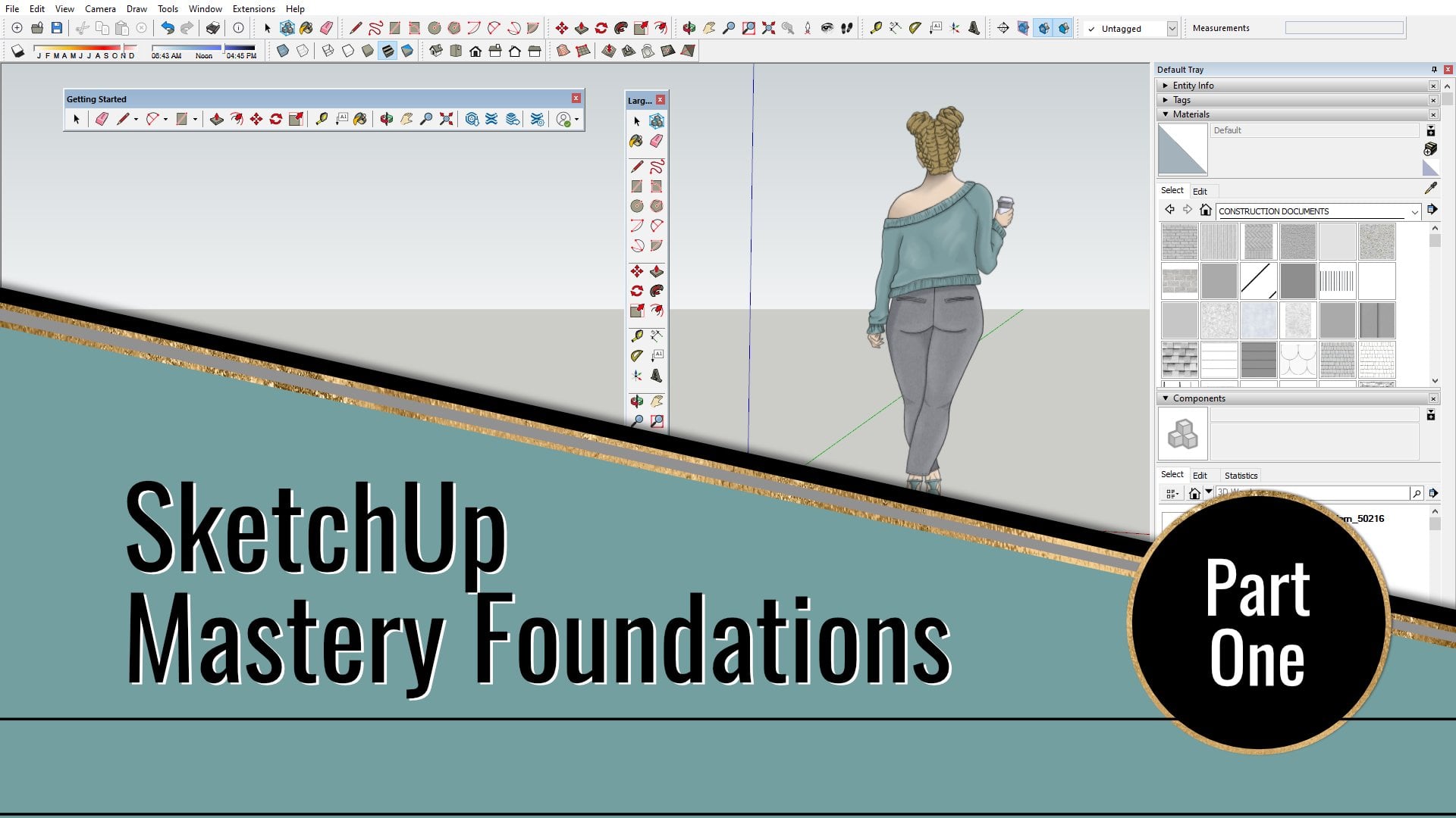
1. Introduction: Hello, and welcome to my SketchUp Mastery
Foundation series. If you're seeing this class, and there's a good chance
you've already gone through the Part one and Part
two in this series. My name is Victoria Wilson, and I'm so happy you've decided to join me for this
foundation series. I'm a designer, digital creator, and teacher here at Skillshare, and I'm looking
forward to sharing the knowledge I've
gained through years of experience using sketch upp in the
design industry. I want to share my tips, tricks and techniques that I've collected and developed
along the way. We're building the
foundations you need to design all kinds of
projects and sketch upp. This course will be building on the tools and techniques that I shared in my Part one
class and Part two class. While you can definitely
take on this class without going through Part
one and two in the series, I do highly recommend
taking those classes first. In this class, I may gloss over the drawing and
editing tools that I covered in the first two
parts of the series. So if you feel a little loss when it comes to
some of those tools, then it might be
helpful to revisit those and then return to
this Part three class. In Part three of my
foundation series, we'll be adding a few new tools, tips and techniques
to the lineup. We'll touch on things
like shadows, styles, watermarks, fog, along with some of my
top efficiency tips. Just like with the
first two classes in this foundation series, it's all about the
foundations you need to work quickly
and efficiently, no matter what you choose
to use the software for. Sharing my experience
learned through years of building models of
homes and interiors to help you save time figuring out all the tips and tricks and shortcuts to make
your modeling process easier and more organized. And I can't wait to see what you create by the
end of this class.
2. Your Class Project: All right. Let's talk about
the project for this class. In the projects and
resources section on the Skillshare
website for this class, you'll see some information about getting started
with sketch up, some links you might need, and some information
about the project. For this class, what
I want you to focus on is creating some new scenes and views of your model using the different shadow style and fog settings that you're
going to learn in this class, and I want you to create
some different looks. More than one would be ideal, but even if it's just
one, that's okay. And I want you to use one of the provided logo style
images that I'm giving you or create one
from scratch to create a watermark style
to use in your model. And if you want to
go the extra mile, add some different
components, forms, details or materials
to the model that I'm providing you with or one
that you create from scratch. I want you to use the
tips that I give you in this class to export
views of your model, to share in the project gallery, or you can take some screenshots to share with your project, showing how you've used different scenes and
styles and tags, your general setup,
anything like that. That's the general gist for
this particular project. And I've also given you some different resources here for the three D mouse that I'm using and some the
location where you can find updates for the drivers because you'll need to do
that every once in a while. And then down here
at the bottom, this is where you'll see
the resources that you can download from the website. There's a PDF with your keyboard shortcuts that
we're going to talk about, as well as the exported keyboard shortcuts of my own in case you don't
want to start from scratch. And the sample model
that I have created and provided you with that
we're going to be referencing throughout
the entire class. Then there's a zip file of some images that I'm
giving you for your logo, where we're going to
create a watermark style. This is your resources
to get you started, and this is where you'll
go to upload your project. I can't wait to see what you create by the time you get
to the end of this class.
3. Reminders: Okay. So before we get into the nitty gritty of
this full class, I wanted to go over
a few reminders. I am currently working in SketchUp Pro 2021
on a Windows PC, and I'm using the
version of sketch up that is 21.10 0.332. And if you're not sure which version you're
currently using, you can go to the top menu
to help about sketch up, and it will tell you right here which version you're using. So if you're working
on a different release or on a different
platform than me, then you may notice
some differences. If you haven't worked
through my Part one and Part two
classes in this series, I strongly encourage you to go check those out before
continuing with this class. In Part one, I covered a lot of the basics about how
the program is set up, along with the drawing and modifying tools
that you'll need. And in Part two, I covered
using components and groups, materials, tagging layers,
section cuts, and more. So this class will be adding
to that foundation of knowledge and throwing in some time saving
tips and tricks. And if you saw parts one
and two in this series, then you may remember me talking about using a three D mouse, and I'll put a picture of it up here on
the screen for you. But this has become a
staple for me at this point in my sketch up work that so I'm going to be
using it in this class, too, and I'm going
to include a link in the class description for the current three D
mouse that I'm using, as well as an alternative
version because recently, I found out this model that I'm using is a discontinued version. You can still get some updates, but I don't know how
long that'll last. I actually have, like,
at least two of these. So at some point, I'll upgrade
that to the newest one. There's not a lot
of differences. It's, you just got to replace hardware every
once in a while. So if you see me moving around the model without using, like, a Zoom command or without
using orbit or scrolling, that means I'm using
my three D mouse. So I will highly
encourage you to get a The D mouse because it just makes such a
difference than if you're, you know, like, scrolling with the wheel or if
you're using orbit. So I highly, highly
recommend it. Takes a little bit of practice, but it's going to
move your process a lot faster and smoother. So, definitely recommend it. And it's going to
save your finger from constantly scrolling and
clicking and all of that. So the last reminder I have before we really dive in
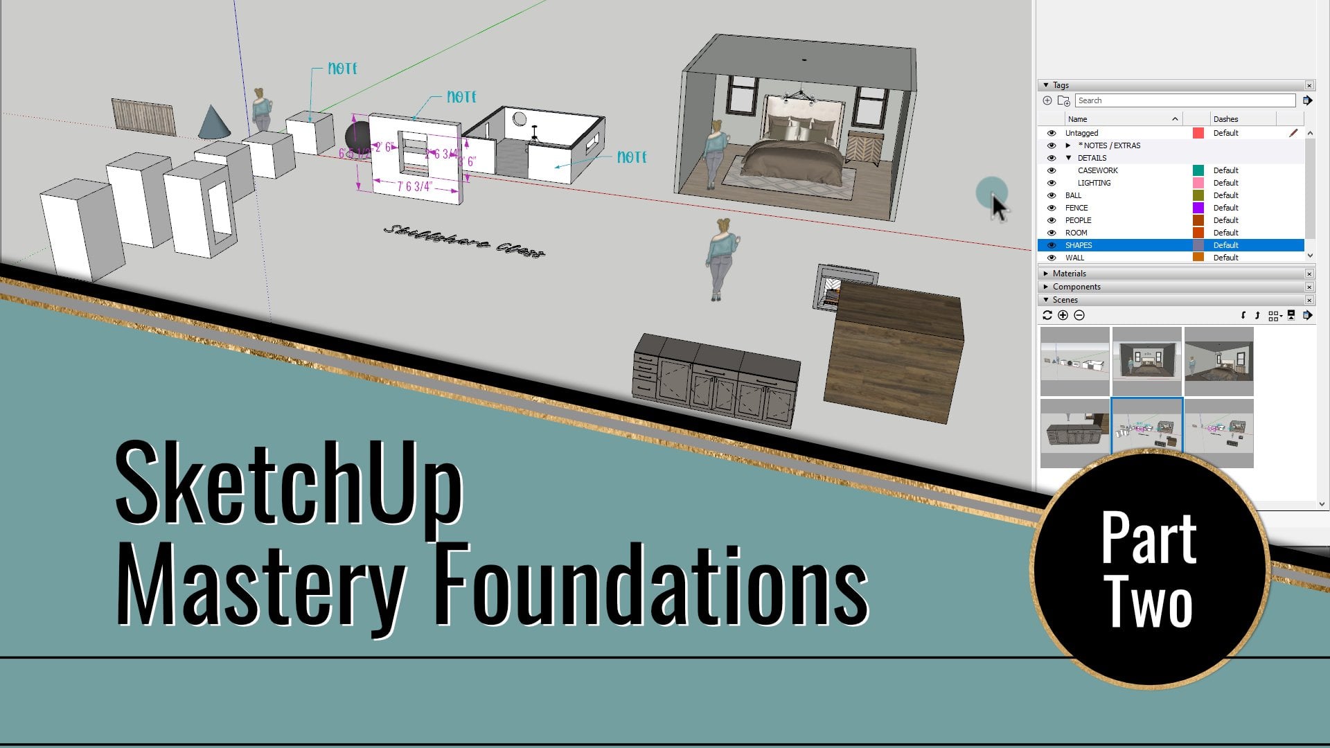
is the example model. So class in Part one and
Part two in this series, I gave you guys a
model each time, and we built on it. Well, in Part three, we're
really stepping up our game. So I am stepping up the
model that I'm giving you. So this that you see here is the example model that I'm providing in the
class resources. It's obviously different
than parts one and two. This one's more advanced because we're going
to be talking about some more advanced things. And I just wanted you to
have an example that's more than just some forms just
hanging out there in space. So make sure that you
download this if you want to follow along in some of the examples that I'm going
to be showing in this class, and let's move on
to the next lesson.
4. Class Model and Resources: For parts one and
two of this series, I gave you a really basic
model to start with. But for this final part in my sketch up Mastery
Foundation series, I wanted to step it up and opt with a more advanced model. So this model came from as built dimensions taken
from an actual space, and I've included a few
custom made finishes, and you'll also notice a few furniture and decorative
elements in the model. So I built from scratch
and some I downloaded from the sketch up three D
warehouse and customized. Pretty much
everything you see in this model can be done using the tools and the techniques that have already shown
you in parts one and two, plus what we're
going to learn in this part three of the series. You'll notice that I've created several scenes shown in the
tabs along the top here. Some of them have
special settings that will go over in this class. As always, I've
created a scene called working right here that
will be your go to scene. If you ever get
lost in the model, zoomed in or out too far, got stuck in a wall or whatever, just click that working scene and it'll take you
right back here. Just for a refresher, you can take a look at the default tray over
here to review any tag, material, components,
et cetera in the model. So you can see all
of that there. You can download this model from the class resource
section and use it to follow along with me
throughout the class. And when it comes to
your class project, you can customize and
add to this model, or you can start from scratch and share something
completely different. I just want to see
how you take what you learn and run with it and
implement it in your own work. Another thing you can find
in the resource section is my personal
keyboard shortcuts. So you'll have a list in there, but I've also exported these same settings for you if you want to use
the same ones I have. And we'll talk more about
that in a later lesson, so you don't really have
to worry about that now. I just wanted to make sure
that you knew it was there. Now that we've got
that out of the way, let's move on to using
shadows in your model.
5. Shadows: Okay, so in this lesson, we're going to take a look at the different ways to use
shadows in your model. We'll learn how to turn them
off and on how to change the shadow settings and when different settings
are better than others depending on
what you want to show. So we're going to start out
with the shadow toolbar. One way to get the
shadow settings is to turn on the
actual toolbar. You can right click on
an existing toolbar. And select shadows to turn
it on and then move it wherever you want it to sit
in your user interface here. Now, just a little reminder
that I've mentioned this in a previous class
in this series. If you turn on your toolbars and then move them around to new places and organize
them differently, the program might not remember those the next
time you open them up. That is, unless you used a little trick
that I've discovered, arrange your toolbars put
them where you want them, then close the program before you actually start
working on your project. When you open it up again, they should be
where you put them. If you place them and then start working, they
may not stick. I think it may be a
bug in the program. I'm not really sure. I just know that that trick
always works for me. Another way that you can turn
on the toolbar is to go to the top menu and go
to View and toolbars. And in the dialogue box, you want to scroll down
to select shadows. And once it's checked,
you can hit close, and it'll bring up the toolbar.
That's just another way. So the first button on the toolbar is the
toggle of off and on. So if you click it,
you're just turning on shadows in whatever the
current settings are. And this first slider, that is what sets your date. So as you slide it along, you can see that it's changing your shadows depending
on the date. And then the second
slider is your time. So you can see that also
plays into effect here, just like, you know, real
shadows in real life. So you'll notice that if we click back to
the working scene, the shadows turn
off automatically. That's because that
particular scene is saved without the
shadows being turned on. So if you add shadows
and want to save those settings for that
particular view that you're in, you'll need to create
a new scene or update the scene that you're
working on to save those. And just remember that
if you update a scene, any new current settings will override those previous
scene settings. So for the purpose
of this class, don't worry about
updating any of the scenes that are
already set up. If you want to create
a new one, go ahead. But I don't want
you to risk losing the settings that are
currently on those scenes. So just a little reminder there. Another way to access shadow settings is
in the shadow panel. And in part one of this series, I went over setting
up your default tray, which is this here and adding more trays to
divide up your panels. I keep my shadow
panel under what I call my Documents tab
or my documents tray. So if I click it under there, it's a secondary area
stacked in my default tray. So I've got the
default tray here, my documents tray here. The panels I keep in
this particular tray are not ones I use for
regular modeling purposes. It's tools I typically use for documenting and presenting. That's why I keep them
sort of separate. So if I click on my
Documents tray here, I've already got the
shadows panel turned on. If you don't, you can right click up here at the top
and say manage trays. And when you click
on one of these, you can toggle on and off which dialogue panels
you want to show up. Please keep in mind that if
you have more than one panel, the dialogue panels can
only show up in one tray, so they can't show up in both. So it's an either or scenario. So just pick whatever
settings you want to be. You can copy mine exactly, or you can create
something all your own. It's completely up to you. So if you click the
top bar of each panel, they will collapse or expand. So what I'm going to do is
I'm going to collapse all but the shadow panels so that that's only what
we're looking at. We're not going to get
distracted by the other ones. In the shadows panel, you can see that you have
all the same settings as the shadow tool bar, but it sort of steps
it up a notch. You have more control
over your shadows. So on the toolbar, you can vaguely choose
the time and date. But in the panel, you
can set the time and date down to the exact
minute or the exact day. And you have full
control over that. You can even control
the time zone. So it a lot more options
you get in this. You can also control the light
levels, the dark levels. You can check on
sun for shading, and you can use the sun for shading with or without
shadows being turned on. And if your shadows
are turned on, you can have control over if it displays on the faces on the
ground or from the edges. So you need a lot more control
over your shadows using the panel as opposed
to just the toolbar. And just remember that,
like I said before, once you change your
shadow settings, they're not going
to be saved unless you update or
create a new scene. Now, let's take a
moment to talk about shadows for exterior
versus interior. Using shadows can make a big difference in
how your model looks, and settings that work for an exterior view may not work the same way for
an interior view. One reason is because
an interior view has more surrounding elements to
block the sun, essentially. So sometimes you may have
to just play around with the settings until you get the desired look that you want. It may not down to the
day and time, you know, exact, realistic, but it may be the aesthetic that
you're going for. So just keep that in mind. Since this model has more
of an interior focus, I want to share some of
my personal settings that I found to be
the most helpful. So we're going to start
by clicking on the scene tab up here at the top
that's labeled PER one, and that stands for
perspective one. So if you hear me say
perspective one scene, that's what I mean. So there's two perspective one. So this first one is what
we're going to choose, and it'll take us directly
to an interior view that I've already set up with
a few different settings. And in this scene, the
shadows are turned off. So it's essentially what you might find with some of the
standard default settings. Yes, this style that
I have in this model does tweak some of those original default
sketch up settings. But for the most part,
when it comes to shadows, these are going to
be your defaults. So if I click on the
scene right next to it, that's got the SH at the end, you can see that
our scene changes. And that's because I have
tweaked the shadow settings. And if we go over here
to our shadows panel, you can see that I've
now checked sun for shading and my go to default settings
for an interior scene, I set the time at 12:00
P.M. And the day at July 1, my light is set to 80, my dark is set to 75. And like I said, I use
the sun for my shading. So if we compare
these two scenes, you can see the sliders move
as we go back and forth. But you can see the
difference in how this looks. It's the same exact
scene, but visually, one, I personally think looks better than the
other. One is brighter. The colors are a little more true than if you're
using, you know, this other one because we know that the ceiling here
is a white color, but you can't tell it
so much in this view, but whenever I use my
interior shadow settings, you can see that it is, in fact, a white ceiling. So these are kind of like my go to settings for
an interior setting, but that doesn't mean
it has to be yours. So play around if you
don't want to use my exact settings, play around, find something that fits
the look that you want, and just keep that in mind. Keep that. Like, make note
of it until it sticks in your head that these
are your go to settings. And on a side note, I want to mention that you can actually orient
your model to show realistic shadows if you need to for a specific
project or presentation. So if you know where North is in relation to your building, then you can rotate your model or the axis to reflect that. I would recommend
having a separate model for that specific purpose so as not to throw off any
straight directions along your axis,
but it can be done. If you do end up
working on a scene or project where
you need to show the progression of shadows, it's important that that you create multiple scenes at
different time settings. So that's going to be how
you save your progression. So if you have one scene, and let's say it's 12:00
P.M. You have another scene, it's 1:00 P.M. Another
scene, 2:00 P.M. So when you export those images
or export the animation, you will get that progression. An example of when you might use this is if you're trying to show how the sun hits an outdoor patio
throughout the year, or maybe you want to see
how much sun a pool gets, or maybe you want to see how sun comes through windows in a space and lights it up to see how
it affects the interior. Now, if you're doing this
for an interior setting, one thing you want
to keep in mind is your transparency settings for
the glass in your windows. So we're going to use
this as an example. Now, if you have
your transparency. If there's, you know, any color coming through, we're going to select
our glass here. So this is our glass. I've
sampled the material. You can see that the
opacity is at 80. So it's the sun, you know, finger quotes here, the sun is not
going to be able to get through that as well. So let's go back to let
me go back to this scene. Okay. And we are going to
go to our shadow settings. We're gonna turn those on.
You can see it's very dark, and we may want to play with
our sun setting so we can kind of see where it
would come through this room here if we were
playing around with that. Okay. So you can see that with the opacity
where it is right now, there's no sun coming through
any of these windows, okay? So if we go over here to our opacity and we pull
that all the way down, you can see that now we
have sun coming through. So if this is something that is important to show for
an interior space, then that's something that you need to take
into consideration. You need to adjust your
opacity because otherwise, you the sun can't get through. You can't see the
sun on the interior. So that's something really
important to take into consideration when you're doing shadow settings for
an interior space. Okay, so that pretty much wraps up shadows
for this lesson. In the next one, we're going
to be talking about using style settings in
your model and how you can tweak the look that way.
6. Styles Toolbar: Okay. In this lesson, we're going to be
taking a look at the most basic way to change
the style of your model. These are the basic presets before you really start messing around with customizing the look of your model and your scene. So we're going to look
at the basic styles. We're going to start
with the style toolbar. So we're going to turn that
on by right clicking up here. One of our existing toolbars and selecting styles
to turn that on, and you can move that
wherever you want it to. You can also go up to the
top menu and go to view, and you can adjust styles with the edge style and
face style options. Now, we're going
to be looking at those options through the
buttons on the toolbar, so I'm not going to select
any of those right now, but you can also get them there. Alright, we're going to
work our way through the buttons on this toolbar. And the first step is the
Xray. That's this one. So if I click it
with this style, you can see the
materials are faded and you see all the lines in the model through the groups. And you just click this button
to toggle it off and on. And that is Xray. The next one is back edges. So when you click this, it's very similar to the X ray, but the materials are less transparent than
they were before, and the back edges are dashed lines while the front
edges remain solid lines. So it's very simple, very basic. You can click the button
to turn it off and on. Next up is wireframe. So with this one, very drastic difference,
no materials are shown, and all you see are lines. So you'll notice that Xray and back edge are not options that you can
combine with this style, and you just click this
button to turn it off and on. And the next one is hidden line. So if I go to Hidden Line, you can see that
all the back edges and the materials in
your model are hidden. So it's just plain. Everything's just white
and line works, right? You'll notice that
Xray and back edge are now back to being options that you
can combine with this. You can see that you can get very different looks
if you combine those. So I'm going to turn that off. Next is shaded. So with this style, it simplifies your materials into just basic solid colors. And you can notice
that the X ray and the back edges options are available to
combine with this. The next button is
shaded with textures. So this is typically the style that you're
going to use when you're trying to show off an
interior scene because this one displays all of your materials with their
photo textures on them. And you'll notice
you can combine the Xray with it and
the back edges with it. And that's what we saw when we first looked at those, too, because that was the kind
of like the default go to setting is shaded
with textures because if you're putting materials
like your hardwood, your rug, your fabric, all those kinds of
things, I mean, you're going to want it to
show up until you don't. So shaded with textures. The next one is monochrome. So with this one, it displays your model in only
the front and back textures. So this can come in
handy when you're working with a
rendering program that references the look of the front and the back
of your textures. This style will also
help you see if a face in your model or
in a component or group needs to be flipped so that
it can show up properly for a rendering program
or a plugin because we've talked before about
your default material, the front being white
and the back being blue. So you can see we've got a
couple of blue faces here. So those may not render
the way you think they in a rendering program. So this style will
help you see that. And once again, the X ray and the back edges are
available for this. So before we go back to
the shaded with textures, you might be wondering where the plant went in
some of these styles. So if we switch back to our shaded with textures,
we see the plant, right? But in some of these
other ones like this, it's just a white thing. Here, it's just a colored thing. Here, it just kind of disappears because
there's no edges, and there you really
don't see it. So the reason why you're not seeing some of
these things, well, this specifically is because that particular component
is not a three D form. It is a two D camera
facing element. You'll notice that if I use my three D mouse to move around and hover
around the area, the plant will always
stay facing the camera because it is a two D
camera facing element. So no matter what, it's always
going to face the camera. And if I go to the
flat section cut, you can see that it
seems to disappear, but trust me, it's still there. If I go back to one of
the perspective views, you can see that
it's still there. Even if I go from the flat cut to the
perspective of the floor plan, you still see that it's there, but it is a two D
camera facing element. Now, creating these
two D elements can come in very handy. It's great when you need to show a hanging light, a house plant, or a scale figure of a person, but you don't really
have the time or desire to build a full on
three D element. That's where these
can come in handy. And I will say, though, that these kind of
elements don't always play so well with rendering
programs, though. I can do a whole separate class on ways to create these types of components if
that's something that you guys want to see, so be sure to let me know in
the comments for this class. But two D camera facing
elements are very handy. And if you have some of
those in your model, keep that at the front of your mind whenever
you're looking at different styles and seeing how those styles interact with
those two D elements. So now that we've done the
basic, basic style settings, now we're going to talk about the style panel and how to use it to further
customize the look of your models and how it differs
from these basic settings.
7. Styles Panel: Okay, so in the last lesson, we looked at styles
through the style toolbar. Now we're going to take that up a notch by looking
at the Styles panel. So let's go to my
Documents tray, where I already have the
Styles panel turned on. If you don't, you can right click on the tray
heading and choose Managed trays and select which dialogue panels
you want on your tray. If you click the
heading of each panel, you can toggle them as
expanded or collapse. So right now, I have all of them collapsed except for
the Styles panel. At the top of the Styles
panel right here, you will see a thumbnail for the current style that's active, along with the name and the
description of that style. You'll notice that
changes as you click on other scenes that have
different styles set to them. So you can see that this
one is a different style. Under that, you will see the
select edit and mix tabs. So we're going to look at
those each individually. Alright, so first up
is the select tab. You'll see arrows right
here that allow you to navigate backwards and forwards through style windows that
you've already looked at. So these may be grade out until you are moving through a
few different options. Then you have a button right here that looks
like a little house. That's your in model styles, fingerqotes here,
I model styles. So when you click on that, you'll be able to see all the styles already loaded
or used in your model. And if you click a thumbnail, it will select that style. So you can see that
if I switch those up, it will select that style. Whatever style is
currently in use will have this blue
outline around it, and you'll notice that
that changes as you click on the different scenes
or the different styles. So when you click
around, you may see some differences
here, see how it changes. Next is the drop
down selection menu. You can click on the
bar or this arrow here, and this lets you
see the different built in style categories
that come with sketch up. If you pick a category, so let's just pick this one. If you pick a category, then you can click on
any of these styles, and it will switch up what
your model looks like. So you can quickly just apply a style and get certain looks. And remember that the style settings that you're
looking at won't be saved unless you create a new scene or update
an existing one. And once again, I
encourage you to at least leave the working scene that I've set up for you as is, just so you have
that to come back to if you get lost
in your model. But I would recommend leaving
all of my existing scenes, just so you have those style
settings to reference. And you can quickly and easily start to edit any of these
preset styles just by changing the settings for
the edges and everything and the materials that we looked at earlier on the styles toolbar. And also you can play around
with the visibility of section cuts depending
on what scene you're looking at
and what you're actually wanting to view. Alright, so next up
is the Edit tab. I'm going to go to the
first perspective scene. Remember, that's the one
it's Perspective one. I'm going to go to that scene, and then we're going
to go and select a style from the style Builder competition
winners category. And I'm going to choose this one called stained
Edges with frame. You can see that the name pops up when you hover. So I'm
going to choose this one. And you can see that
just by choosing this, you get a drastically
different look. So let's go to the Edit tab, and you'll notice that there are five different
little buttons up here for different parts of
the style that you can edit. First is the edges. This is where you can
turn edges on or off, adjust the profile extension and level of detail
in the settings. You can see what
stroke is being used for the lines and the
color it's shown in, and you can change those things. So, for instance, if we change the color to this, hit Okay, you can see that it starts changing the settings for your
style and the look of it. The next button here
is the face settings. So this is where you can change
the default face colors. We talked about that, the
front and back colors. You can choose a
style like what you want to what you would find
in the style toolbar here, so you can choose that
there, and you can determine if transparent
materials show up in your model. Next is the background settings. This is where you can change
the background color, the sky ground, et cetera. This one is the
watermark settings. If there's a watermark
like this one, we've got the frame here. If there's a watermark or
more than one in the style, it will show up in this panel. You can add a watermark or
change the visibility of one, and we'll come back to the watermark settings
in the next lesson, where I'll be showing
you how you can add your own logo to your
model with a watermark. So that'll be fun.
And the last button is the modeling settings. Here you can adjust a lot
with colors of items, like if something is selected or locked or even
your guide color, you can adjust the look
of your section planes, use the check boxes to change the settings
for hidden elements, sections, et cetera, and adjustments for if you're adding foreground or
background photos. And you can see that as we
adjust things right here, the thumbnail will get this
sort of refresh circle. So if you click that thumbnail, it will update that
particular style with the new settings
that you've done, but it won't save it in your model unless
you update a scene. So if you make some changes, then you're going to want
to, you know, save those. And the last tab
here is for mixing. Now, this is where you can mix different looks from
different styles to make something
completely different. You'll notice that when
you click the mixed tab, you get this secondary
selection window. This allows you to drag
elements from a style here into these
different settings to mix and match to create
something different. So for instance, if I want the let's say this
background color here. I can pull this up and
say background settings, and you can see that
it changes it here. Or this has different
edge settings. So let's click and
drag to edge settings, and you can see that our
edge settings will change. And so this allows you to play around with
different parts and pieces from different styles to create something
all your own. Now, if you want to create a new style that you want
to use over and over again, you can hit this button up here to create a new style with whatever settings
you have going on, and you can name it. You can change the description. You can, you know, save all of that by
creating a new style, and it will end up
in your Styles panel in this model as being used. Okay, so here's a helpful
hint when it comes to styles. In part two of this series, we went over exporting
your scenes as images. That's a great way to
present your model to a client in a
variety of ways. When you get into
creating styles with interesting stroke
looks for your edges, you may need to play around
with your export settings to make sure you're getting
the look that you want in the final exports. So if we go to file and
Export and two D graphic, this is where you can choose
where you want it to export. And then down here
at the bottom, if you choose options, you'll see that you get
image size settings, but along with that, you get
the line scale multiplier. This is important if
you have special edges. Like maybe on the screen, it looks really sketchy and, like, jagged lines, but you're wanting to export the image really big. You might want to
play around with your scale multiplier
so that you make sure that the look
that you're seeing on the screen matches what you
actually get in the end. And to test those out, you can even add notes about the multiplier in your
file name when you export, so that you don't have to, like, have it memorized. If you add it in the file name, it helps you compare two different settings without losing one and replacing it, you can just see them side by side if you add it in the title. That's a little
tip there for you. One last thing to mention about your Styles panel is that
when you have it on select, this button right here next to your selection dropdown,
you'll see this little arrow. This is your Details button. And this is where you can
add or open new collections, add or remove them
from favorites, as well as change
the thumbnail sides or switch to a list view. So next up, we're
going to take a look at creating a unique style that includes your logo and or project information
as a watermark.
8. Creating a Style with Watermark Logo: Okay. Alright, so now that you've gotten a
rundown on how to mess around with settings to
create your own styles, it's time to dive more into those watermark settings under the Edit tab of
the Styles panel. In the resource
section of this class, I've given you a folder of
six different basic logo and project name style
images to give you an idea of how you can add
a watermark to your model. So if you haven't done it yet, take a moment to download those and save them someplace
you can quickly access. Going to start out in the
perspective two scene, and we'll go to the
Watermark settings. So I'm going to choose the one with the shadow
settings turned on, and we're going to go to Edit
into the watermark setting. So we're going to
click the plus sign and navigate to where you
have those images saved. Alright, so we're
going to select an image that you want to use. For now, you can
change it later, but I'm going to
select this one. So I just double click. And when you select it, you automatically get a
little pop up window, and the image goes right to
the middle of your screen. So in this pop up, this is where you can
name your watermark. You can leave it as is. You can call it Logo, whatever you want. And this is where
you'll select if you want it to be set as overlay, it's in front of your
model or background. So as you can see,
it's behind the model. So background might be if you wanted an image as
your background, maybe it's like a sky view or trees that you see
through a window, something like that, that's where you might want
to use the background. For this, since we're
doing the logo, we're going to choose overlay. And we're going to say
next in this next screen, this is where you can either
use the image as a mask. So if you say create mask, it essentially whites out whatever the image
is over your model. So we're not going to do
that for this instance, but that's what that means. Down here with the slider, you can choose the blending
of your image to your model. So all the way to
this end, full image, okay, all the way
down, full model. In between is where you
would adjust the opacity. That's what you're doing
here. An example of when you might prefer to
have your image as semi transparent is if you inserted
an image with a phrase like for approval or design intent or
something like that, the same way that you
would add a watermark to a document if it
isn't the final copy. Like, maybe you're
sending an image to your client to get it approved before you
finish designing things, but it's not quite done yet. That might be an instance
where you would use an image with it being
semi transparent. So in this instance, we're
going to go all the way up to image. And then hit next. On this screen,
this is where you choose how you want
it to be displayed. So right now, it's
set to stretch to fit screen with the
lock aspect ratio. You can uncheck that and
you see it stretches it. So that's that one. Then you've got tile
across the screen, and you can adjust
the scale here. And see how that looks, you know, all the way like this. You can say position
in the screen. This is where you can
choose a certain location. So I'm going to choose the
bottom right hand corner, and I'm going to adjust
the size a little bit. So yeah, right about there. We're going to go
with that. And we're going to say finish. So now when you look
at the style panel, you can see the watermark
is listed above the model. You can repeat this process to add another watermark,
if you want. Like, for example,
if you want a frame or more than one note, like a logo and, like, a disclaimer tag,
something like that. If you have more than one
watermark image inserted, you can use these arrows
here to change the hierarchy of them so you can move it in
front or behind something. Just by using those arrows. If you want to
delete a watermark, you use this minus button
and it'll get rid of it. To adjust the settings of your watermark or to swap
out an image for a new one, you can either double
click the image, and it pops up the
edit dialog box, or you can hit the settings
button right here, and this is where like, Oh, the scale needs
to be changed. So let's put it in this
corner instead or whatever. This is also where
you would click this little file folder
and select another image. So for instance, if you
want something like this, where it's got the project name and number or
something like that, an instance of how I used this whole image swap
thing for example, is if I'm sending out
images of the model to a client for approval or maybe we've finished up a meeting
and it's just the follow up, I may have a watermark
with the date on it, and then let's say we come
back and we make some changes, and now we need to
send some new images. So I will go back
to that image and change the date and
reinsert an image, just swap it out for another one with a
different date on it. And that would be an example of how I would use that swap. And I may sound like a
broken record right now, but don't forget to update any necessary scenes
with your style changes. And in the next lesson, we're going to take a look
at using fog settings to change the look of your scenes and when that
might come in handy.
9. Fog: Okay, so in this lesson, we're going to take
a look at using the fog feature to give your
scenes a different look. You can access the fog
setting from the top menu, view and then fog and that
should pop up the fog panel. It may or may not. I keep my fog panel in the
documents trace. So I'm going to minimize
the other panels in here, so we're just looking at fog. So if you haven't turned
your fog panel on, take a moment to do that
from how I've showed you before and place it
wherever you want it to go. We're going to start out by
looking at the working scene. This is this first one here, and you can see that
I've turned the fog on, and you can see how it looks, turn it on and off with the
display fog checkbox here. And you see the slider. This allows you to adjust where the fog
is, how much it covers. You can slide the settings from the front end of it
or from the back, and you can see how
it changes the look. You can click and
drag these or you can click on one of
them and then use the arrow keys on your keyboard to adjust
it in increments. See how you can see that
in little increments. That way, you're just
nudging it along. And just like with the
other style settings, your fog settings won't be saved unless you create
or update a scene. The only time I ever really use the fog
setting is when I'm setting up an interior or
exterior elevation scene for documenting or presenting. And let's take a look at
what I mean when I say that. So we're going to click on the next to last
scene up here. So it's the section
interior elevation scene. And we're going to see this
is an example of just like a standard elevation
interior elevation scene using a section plane and one of the standard
views over here, so we're using the back view, and we've got parallel
projection turned on, so it's completely flat. And if you don't
remember how to do that, we talked about that in the
second class in this series, the P two in this series. So if you need a refresher, you can go back and
visit that there. But that's how this
scene is set up. I've even gone through
and turned off the layers for the furniture
so that those are not shown. You can see they're still there. They're just turned off
in this particular scene. Now, if I were to use the
fog settings, to adjust out. Let's say, I just want to
see the front of this. I don't want to
see the back wall. I just want to see the beam
and where it cuts through. So just like with the shadow
settings where I showed you the perspectives with one
with shadows and one without, I did this for the interior
elevation with fog. So the last scene, if you click on it, you can see that it's the exact same scene, the exact same section cut, all the same settings, except fog is turned on, and it has been adjusted. So you can see how
close these are. It's been adjusted to where it's essentially masking
out that back wall. So you're getting the beam, you're getting where it cuts. You're getting the
wall corner over here, but you're not seeing
that back wall. An example of when you might use this is if
you're working on an elevation of a
kitchen and you want to show the front
side of an island, but you don't want that
back wall of cabinetry. Maybe it's a rangewall or
sinkwall or something. You don't want that back
wall of cabinetry showing up because it would be confusing because you just want
to look at the island. So this is when you might
use the fog settings to hide that back wall without
having to go extra steps. And it takes a little
bit of practice and some patience to get the look just right
for what you want. But is highly beneficial for interior elevation
scenes when you don't necessarily want to
turn off certain layers, you just want to mask out stuff. So that's when it comes
in really, really handy. The last setting under fog is this right here.
So it's color. This lets you choose if you want the background color
for whatever your style is to be showing for the fog or if you want to
set up a different color. So right now we've got
it set to background. If I uncheck this, I can click this box and
choose a different color, like, let's choose a
random color here. You can see that the fog is
now this purply pink color. That's a little,
it's a little much. So background color. That's typically
what I you there. Otherwise, it's a little much. But that's fog. That's how easy it is to
have your fog setting. So essentially, you would set up this scene and then save it. Change up your fog, get it wherever
you want it to be, figure out, you
know, what's this? Maybe you want the back
wall showing a little bit, but not so much. You know, you can
adjust it like this. And then you can
right click and say Add so that it's all
the same settings, you're just adding a new
scene with the fog turned on. And it's as simple as that. Hope that makes sense. Now
let's go to the next lesson.
10. Keyboard Shortcuts: Over the next few lessons, we're going to be taking
a look at some of my tips and tricks to speed
up your process, work more efficiently, and even reduce the size and
strain of your model. First up is keyboard shortcuts. Not everyone works
with these shortcuts, but I find them so
important for my process. They really help speed
up your workflow, so you're not having
to move away from what you're doing on the screen to track down the next
tool that you need. Some keyboard shortcuts are
already built into sketch. We've gone over some in
the previous parts of this series when we were looking at different
modeling tools, but you can also add your own keyboard shortcuts from the beginning or
as you go along. If you find yourself using a tool over and over
again and thinking, it would be really nice to have a shortcut for it. Then add it. That's how I got some of mine, and that's how simple it is. To see what shortcuts are
set and to add your own, you're going to go to the top
menu to window preferences. And then on the left, you're going to
choose shortcuts. And this is where
you're going to assign more and see
what's already done. You have a list of functions to the left,
and then on the right, you can see where to add a shortcut for the
selected function, or you can see what is already
assigned to that function. Some of these that are
set up in here are default for sketchu and
some I've added or changed. And if something is
already assigned to a command and you go
to assign a new thing, it will pop up saying
that, you know, like a little warning saying, This is already assigned to this tool, do you
want to change it? And that's one way
that you'll know. So you can either start typing
a function like let's see. Let's tape. Like, you
can see that this is assigned T for tape
measure, if that makes sense. But you could change it. You could scroll through the
list and figure out, Oh, it'd be nice to have this or what what is the shortcut for this? And you can see those. So you can reset them. When there is a
shortcut assigned, you will see on
the tool up here, you will see a shortcut
assigned to it. So even if you just browse
through some of these, you can see if they
already have one assigned and what it is
just for a quick reference. Let's go back to this window. You can see down
here at the bottom, you have the ability to import keyboard shortcuts
or export some. So in the resource
section of this class, you'll find a file that includes my own personal
keyboard shortcuts. You're welcome to use
the Import feature here. And add all of those. That way, if you want to
use the same ones I do, then you don't
have to go through all these functions and
set them up individually. This is totally up to you. The beauty of these shortcuts
is that you are making them work for you to make
your job easier. So if a shortcut doesn't
make sense to you, don't use it or change it
to something that does. I've also provided you with
a cheat sheet that shows the standard shortcuts
built in to sketch up my personal ones that I
have either changed or added. Then there's also a space
where you can write your own. If you end up changing one
of these to something else, you can write your
own and you can keep this with you so that you have a quick easy reference as you're learning them
throughout your process.
11. Paste vs Paste In Place: Okay, so I believe
I very briefly talked about this next tip in a previous lesson in
this foundation series. But since I use it so much, I felt it was necessary to
go over it in more detail. We're going to take a
look at the difference between paste and
paste in place, along with when you might
use one over the other. I'm going to start off in the plan section scene with
my preferred shadow settings. Okay, that is the
fourth tab over here. And I'm going to orbit around for a little
bit of different view. Now I'm using my three D
mouse for easy access here. Okay? So let's go
right here. Okay. In this example, let's
say that I want to add some more trim details to
this section of the wall. I'm going to use
the rectangle tool. I'm going to use R
for Kubo shortcuts, and I'm just going
to draw a rectangle. And then I'm going to
use the offset command. I'm going to say 3.5
" and delete this. And then I'm going to push it, and I can either type out a dimension or I can
just hover over this, so it's the same dimension. Okay. Now I'm going to triple click and either
right click and say, make a group, or
I use my keyboard shortcut of G to
make it a group. And now I have trim
for this wall. I have a little trim detail
going on for this wall. And you can either use the buttons on the toolbars
or the keyboard shortcuts, whichever makes it makes the
most sense to you, okay? Now, my trim group has
a material applied to the overall group instead of the individual
elements inside. And if you guys want
a further in depth lesson on my setup for materials and groups
and stuff like that, we can do a whole
other lesson on that. But if I click on my trim group, I can see up here in
the entity info that it is assigned to the
trim layer or tag, which I'm still
going to say layer. And the group itself has a
pink color applied to it. Okay? But if I go
into the group, I can see that all these
individual elements, they do not have a material. They are the default material, and they also don't have
a tag because for me, it makes more sense to have the overall group
get the tag and get the materials because it
just makes it so easy to go in and apply with one
click a pink color, and all the trim is colored in the whole model
or in the whole room, however, you know,
however you're doing it. Now, I want to take this
loose piece of trim, and I want to put it
in that trim group. So what I'm going to
do is I'm going to use the keyboard shortcut
of Control X to cut. You can also come
up here to edit and cut or the scissors here on the toolbar
and do it that way. I'm going to go into
my trim group here. Now, this is where you'll see the difference between paste
versus paste in place. If I do Control V for paste, you can see that I have
my loose piece of trim, and it's wanting
me to put it here, wherever I want
to put it, right? So if I put it here on the wall, then I'm going to have to
click and I need to move it, and it wasn't necessarily
centered before, but let's say we're
centering it here now. Okay? So that is how I would get it into where I wanted it to go, right? Now, that's paste. Okay. The difference
between paste in place is I'm going
to delete this, and I can go up here to edit
and say, paste in place, and it comes back in the same exact
location it was cut from. It pasted in the place
it came from, right? Now, I have a keyboard
shortcut for this. So paste is control V, paste in place, I
have said to be Alt V. To me, that
just makes sense. And since I use it all the time, I mean, all the time, it made sense to have a
keyboard shortcut for it. So that is how I do it. And because my trim group had the material
applied to the overall, I call them family groups, then it automatically comes
in with that material. And I don't have to
go in and assign it. It's already done already done. So you can see how this is like a very handy process because you can use this
in so many different ways. Let's say you create something, you forgot, Oh, I drew
this outside of the group. It really needs to go
with this paste in place. You come in with
a light fixture, you put it somewhere
in the room, and it really needs
to go in a group, or it needs to, you know, you need to move
it out of the way so you can do something
and put it right back. Cut paste in place.
Very, very handy. Let's say for another example, that you decide all your
window and door trim needs to be different from your
baseboard trim, okay? So in that example, I'm
going to come in here. I'm going to go into this group, and I'm going to hold down
Shift and I'm going to select all the door
and Window trim, okay? I'm going to cut, click
out of the group. I can Alt V to paste in place where you
can go up there to edit. While it's still selected,
I can right click, make it a group or use G
for my keyboard shortcuts, and now it's all together. Then I can use my materials, let's say, select the wall color and maybe I want it to
be all the wall color. I don't know why,
but let's say I do. So now you can see
one click and all of the door and window trim has been assigned a
color, one click. That's the beauty of doing the grouping system
that I prefer to use. So let me pick a different
color and show you how easy it is one click and
it's assigned a color. I could make it, any
of these colors. And then, you know, you get some contrast, and it's easy and simple. Paste in place means I
didn't have to come in and put them in their
original locations. I just cut and paste, and they go where
they're supposed to. So hopefully this makes sense to where you can
see the beauty of this. Like, let's say I decide, I want this piece of shrim. I'm gonna cut, and I can go into this trim
group and paste it, and now it has that
color assigned to it. So from here, I would go and
put this on the trim layers. And I have two
different trim groups. And that, you know,
paste in place made it super easy for
me to do this and get everything all assigned
in very minimal steps. So I hope this makes sense, and you can see how handy it is and how it can speed
up your workflow. And in the next lesson, I'm going to share
my favorite tip for cleaning up your model and potentially
reducing the file size to make it go faster.
12. Purging Your Model: Okay, so in this lesson, I'm going to share my
favorite tip for cleaning up your model and potentially
reducing the file size. At one time or another, you may have heard that you can delete something
from your computer, but that doesn't mean that
it's completely gone, that there could
still be a trace of it somewhere on your system. Firstly, that's totally true. Secondly, the same can be said
about your sketchp model. Let's say you're working on a furniture arrangement
for your space like this. So you end up pulling in several different
furniture elements to see what you do and
don't like in the space. And you keep what you like, and you delete what you don't? So it's no longer being used in your model. But
here's the thing. Your model is holding onto all that information
in case you decide, Hey, I really do want that
purple sofa after all. So your model holds onto the component information and the materials and styles
associated with it, which means your file size is probably bigger
than it should be. And now you have a bunch of stuff in your model
that you don't actually need and you most
likely don't even see. So no worries, though, because we're going
to go through how to purge your model of that
unwanted information. There are several different
ways you can do this, or you can skip to
the fastest way, but I want to make sure you know all the ways just in case. So we're going to take a look at purging components,
materials, and styles. So for components, we have
our components panel open. We're going to go to the home
button, so in your model. And this is where you'll see
in this little dropdown, you'll see all the components that are currently
in your model. Now, you can see these two
sofas that I pulled in. We know they are
not in the model. We don't see them,
but your model is holding on to
that information. So what we're going to do is we are going to go over to details, and you see there's a
button that says purge use. So if you click it, what it's going to do is
it's going to purge all the components that are currently that are not
being used in your model. So it's only going to leave the items that are
actually being used. So we're going to
say purge unused. If you click it again, you
can see it's grade out. So if you see it grade out, then that means that
you're good to go. You don't have any
unused components lurking around in the
background of your model. Next up, let's look at materials. So we're going
to do the same thing. We are going to hit
the in model button, and this is where you see all the materials being
stored in your model. Now, remember we
had those sofas. We purged those, but the materials are most
likely still here. So we're going to go to details, purge unused, and you can see our list got
a little bit smaller. That's because those
sofas are not there. The materials still were. Now we've purged
those. The other thing you can purge are your styles. So remember mine's on
my documents panel. I'm going to go to styles
Inmdel and details. So purge unused is grade out. That means I'm good to go, and I don't have to
worry about that at all. So that's how you perche
those individual elements. If you're using this method to purge everything
individually, I'm going to recommend
that you go in that order. And the reason why, so that's components, materials,
then styles. The reason why is because if you purge those materials first, then you go and purge those
sofas you're no longer using. As you saw, those
materials are still there. So then you have to go back to materials and do that again. So components,
materials, then styles. This is a multi step method, and this is how I
used to do everything before I realized it
was a better way. So let's throw a couple
things in here again. I'm just going to go to let's go back to interior elements, and I'm going to throw
in some accessories. Here's a laundry basket, and I'm going to
put it right there. So here's this. We're thinking, Oh, this would be a lovely
addition to this space. And then, oh, no, this
is an laundry room. Let's get rid of it.
So now we know we have a component and
we have materials. We can see at least three
materials in the thumbnail. So here's another way
that you can perjure your model all at once
in one step, okay? So if you have the standard
tool bar turned on, you can see this
last button here. It's called Model Info. If you click it, it's going
to bring up this dialog box. That's what we need. If you
don't have that turned on, you can go to Window
and Model Info. It's going to take you
to the same place. And then over here on the left, you want to go down
to statistics. And this is where you can see information about your model. You can see all kinds of
counts and everything here. So we want to purge
all of that stuff. Well, there's a button
that we can click Purge Unused and we can see our component
definitions went 50-46. So it purged. All the components,
materials, styles, anything we weren't using, it purges it in one step. Much simpler, right? Much simpler. I
recommend purging your model often to make sure you don't have
anything extra, taking up space, making the file larger or
slowing down your model. I think I probably
purge my model before closing every time or every other time depending
on what I'm working on. This the statistics Window is also a good place
to see if you have any loose geometry in your model instead
of grouped elements. So if you see account
for edges or faces, then that means that there's something
loose in your model, and I prefer to work with everything
grouped in one way or another because
I've learned that that actually speeds
up your model. As opposed to everything just being connected with
edges and faces, plus, working in groups
helps prevent you from accidentally editing
a part of your model. So if something is connected to something else or something
is behind something, you might accidentally
delete something, might accidentally grab onto a different point,
stuff like that. Alright, so we're almost ready to wrap up this
foundation series. In the next lesson,
we'll review what we've learned and talk
about your class project.
13. Wrap Up and Review: All right, so it's time to
wrap up not just this class, but this sketch up Mastery
Foundation series as a whole, as this is the last
class in this series. Hopefully, you've learned so much about how to
get started with sketch up from the general setup to the different tool bars
and the different tools, how to draw things, how to modify things. And then now we've moved on
to shadows and styles and watermarks with your logos
and different ways to use that and using fog for elevations and
just different looks, and then speeding up
your process with keyboard shortcuts
and paste in place. Love that. And how important
it is to purge your model. Hopefully, this will
help you to move on to create a ton
of new things, whether you're using this
for interiors like this, or maybe you're working
on three D printing, and you want to
create some models for that or just anything. There's so many possibilities
with sketch up and I've really enjoyed sharing all this foundational
knowledge with you guys, and I can't wait to
do some more classes. We are going to talk about
creating other components, building your own libraries
of components and materials, and getting into actually
building specific models and maybe even a few
more series where we start off small and
just build on something. So I'm excited to see
where all this goes. If you have a request
for a particular topic, or a project, then
please let me know. I'm always happy to take your suggestions to heart
and run with it and do something fun and
creative and teach you something new or help you build on a skill that
you already have. And I'm always available
if you guys have any questions or want to
see anything specific. Stop by my website or my
Instagram, and let's connect. Let's have a conversation. Let's go into more
sketch up detail. That's a wrap, and I'll see
you guys in the next class.
 Victoria Wilson, Designer & Digital Creator